
If you want to customize the ribbon in Excel then you know simply changing doing it through the front end is only going to work on your computer. The customization isn’t technically saved within the file and it won’t move from one file to another unless you actually adjust the xml.
It’s by no means an easy process, but if you’re just looking to add a custom tab with some buttons for some macros that you have, I can show you a quick way to do that as painlessly as possible. It’s by no means comprehensive, but it’ll get the job done.
Step 1: Open your Excel file in a program like Winzip/7-Zip
If you right-click on your Excel file you should have an option that says Open Archive if you have a program like Winzip or 7-Zip installed. There, you should see something that looks like this:
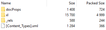
These are the files and folders that are within the Excel file itself.
Step 2: Create a folder called customUI
Step 3: Open up notepad and paste the following into it:
<customUI xmlns="http://schemas.microsoft.com/office/2006/01/customui">
<ribbon startFromScratch="false">
<tabs>
<tab idMso="TabHome">
<group id="myMacros" label="My Macros">
<button id="Macro1" label="Macro1" imageMso="HappyFace" size="large" onAction="cbMacro1" />
<button id="Macro2" label="Macro2" imageMso="TableDrawTable" size="large" onAction="cbMacro2" />
</group>
</tab>
</tabs>
</ribbon>
</customUI>
What the code will do is add two buttons to the end of the Home tab. I’ll show you how to modify it further down this post.
Save the file as customUI.xml
Step 4: Put the file into the customUI folder that you created in Step 2
Step 5: Back in the archive, navigate to the _rels folder and open the .rels file (in Notepad)
Find this line: <Relationships xmlns="http://schemas.openxmlformats.org/package/2006/relationships">
and then insert the following right after it:
<Relationship Id="R4863ef4e23f1404c" Type="http://schemas.microsoft.com/office/2006/relationships/ui/extensibility" Target="customUI/customUI.xml"/>
Step 6: Close the archive, save changes and open the file
You should now see the two buttons at the end of the home tab:
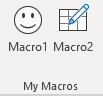
The problem is that they don’t do anything just yet. In the code that you copied back in Step 3, there were some callback items (‘CB’) that we need to reference back to inside VBA. Those are effectively a link from when a user presses the button on the ribbon to the macro that you’ve coded.
What you’ll need to do now is go into a module within VBA and enter the following code:
Sub cbMacro1(control As IRibbonControl)
***name of your macro***
 End Sub
Sub cbMacro2(control As IRibbonControl)
***name of your macro***
 End Sub
In the subprocedures for the two buttons all you need to do is call your macro (in place of the code within the ***), and now the buttons should work.
Modifying the code to add more customization
In Step 3, the code there was for a couple of buttons that you could add to your ribbon. If you want to add more, simply following the sequence you can easily add another button:
<button id="Macro3" label="Macro3" imageMso="Smile" size="large" onAction="cbMacro3" />
The button id doesn’t matter too much itself. The label is what will show up underneath the button. ImageMso is the image that will show up. If you do a google search for ImageMso you’ll find what some of the different codes are.
You can shrink the image down to “small” by changing the size attribute here. Note that some of the ImageMso’s are already small and can’t be made large, but you can shrink large ones down in size.
The most important item when adding a button is the onAction attribute as this is what your callback code needs to reference inside VBA. Obviously the more consistently you name your buttons the easier it’ll be to add more without getting lost in your code.
Adding a new tab
In the above code, I added the buttons to the Home tab. However, if you’ve got more that you want to add then you can put them on an entirely new tab instead.
What you can do then is just change the following:
<tab idMso="TabHome">
into this:
<tab id="MyMacros" label="My Macros">
And now all of your macros will be saved onto a new tab rather than take up space on the Home tab. You can also group your buttons based on the group code as well.
This is a small sample of what you can do to customize the ribbon in Excel. The benefits of making these changes through XML and not within Excel’s interface is that your modifications are stored within the file regardless of what computer you open it on and won’t be lost.
There is another way that you can do this using the CustomUI editor and I’ll include that in a later post.
If you liked this post on How to Customize the Ribbon in Excel Using XML, please give this site a like on Facebook and also be sure to check out some of the many templates that we have available for download. You can also follow us on Twitter and YouTube.
Excel Ribbon — XML
This module provides a brief overview of:
- how to add a new Group to an existing Excel Ribbon Tab. In the example we add the
xlf Toolsgroup to the ribbon Home tab - the XML code used in the
xlf Toolsexample - the VBA Callbacks used in the
xlf Toolsexample
Custom ribbon
A list of Ribbon customisation techniques
- Use the sequence (Excel 2010, 2013, and 2016).
- These are application specific (not part of the workbook)
- Easily implemented by the user
- Can be Exported / Imported with an Excel Customizations.exportedUI file
- Does not include access to XML originated workbook level customisations
- Use an XML file and add to the workbook customUI folder
- These are workbook specific (not part of the application)
- Difficult to implement for the user because XML coding is required
- Easy to maintain, and cannot easily be changed by the user
- XML code for customUI can be:
- Written manually, as in this example, using a text editor (NotePad++) and zip file editor (7-Zip)
- Written using packages such as the Custom UI Editor, the RibbonX Visual Designer, or VSTO.
The xlf Tools example
Three buttons are added as a group to the right hand end of the Home tab (figure 1).

XLF Tools group — the XML code
Links breaks do not render in this SyntaxHighter version of the XML code module. Click the code window (code 1) for the formatted version of the button items (rows 6 to 8). The addition line break code at line 7 of code 1 (line 18 of the image version) and the centre image of figure 2. is the HTML number for a carriage return (ASCII 13). This can be used in combination with , the HTML number for a line feed character (ASCII 10)
Each button in the group has different settings — see figure 2

- Fig 2: — Mouse Hover event —
- (left image)
label=«xlVersion» ; - (centre image)
label=«Option Pricer»,supertip=«Pricing Models: Black-Scholes and Binomial Option types: European or American, Put or Call option» ; - (right image)
screentip=«Close the Active Workbook»
XLF Tools group — VBA callback
Each button has an onaction property, in this case the onaction items link to the callback macros in code 2.
Code 2: Macros for control callback
Sub GetXLver(control As IRibbonControl)
    Call GetXLver99
End Sub

Sub OptionPricer(control As IRibbonControl)
    Call FrmOptpricer
End Sub

Sub CloseWB(control As IRibbonControl)
    ActiveWorkbook.Close SaveChanges:=False
End Sub

Private Sub GetXLver99()
    MsgBox "GetXLver99 placeholder"
End Sub

Private Sub FrmOptPricer()
    MsgBox "FrmOptPricer placeholder"
End Sub
Creating the UI in Excel 2010 or later
Setup the xlsm file
- Example based on Excel 2010, 2013, or 2016
- Create a New blank workbook in Excel
- Open the Visual Basic Editor (VBE) and insert a new code module using the menu sequence
- Copy and Paste the code from code 2 above (19 lines) to the VBA module in point 2
- Save the Excel file with a .xlsm extension, named customUIdemo.xlsm in this example. Close the workbook
Create the customUI XML file
- On your Windows Desktop create a new Folder. Name it customUI.
- In NotePad++, create a new text file with file type .xml (described as eXtensible Markup Language file (*.xml; *.xsml; *.xsl; *.xsd; *.kml; *.wsdl; *.xlf; *.xliff; *.config) in NotePad++)
- Copy and paste the XML code from code 1 above.
- Save the XML file from points 6 and 7 with the name customUI14.xml and store it in the customUI folder
- (Alternative points 6 to
 — you can download the customUI14.txt (including line break formats), change the file type extension to .xml, and then save it in the customUI folder. The xml version is also available customUI14.xml
Modify the xlsm file in a zip environment
- In Windows Explorer, change the file extension of the customUIdemo.xlsm file from .xlsm to .zip. The file is now named customUIdemo.zip
- Right click the customUI folder, then select to display the Add to Archive dialog box
- Select ① the target archive file, Archive: customUIdemo.zip and set ② the Archive format: to zip (see figure 3), then click OK

Modify the xlsm relationships settings
- Open the customUIdemo.zip in the 7-Zip File Manager
- Select the _rels folder and open the .rels file in edit mode, then add code 3 to the Relationships (inside the relationships tags). See figure 4 and code 4 for details

Code 3: XML code located in file .rels (_rels) folder
<Relationship Type="http://schemas.microsoft.com/office/2007/relationships/ui/extensibility" Target="/customUI/customUI14.xml" Id="rId4"/>
- After adding code 3, the .rels file should look like the example in code 4
Code 4: XML code located in /_rels/.rels file
<?xml version="1.0" encoding="utf-8"?>
<Relationships xmlns="http://schemas.openxmlformats.org/package/2006/relationships">
<Relationship Type="http://schemas.openxmlformats.org/officeDocument/2006/relationships/extended-properties" Target="docProps/app.xml" Id="rId3" />
<Relationship Type="http://schemas.openxmlformats.org/package/2006/relationships/metadata/core-properties" Target="docProps/core.xml" Id="rId2" />
<Relationship Type="http://schemas.openxmlformats.org/officeDocument/2006/relationships/officeDocument" Target="xl/workbook.xml" Id="rId1" />
<Relationship Type="http://schemas.microsoft.com/office/2007/relationships/ui/extensibility" Target="/customUI/customUI14.xml" Id="rId4" />
</Relationships>
- Save the xml file to update the customUIdemo.zip
- Finally, change the file name extension from .zip to .xlsm Note: after the file is opened in Excel, the Relationship Id may change from Id=»rId4″ to something more cryptic (random) like Id=»Raf2455916749499e»!
When you open the xlsm file in Microsoft Excel you should see the XLF tools custom group (figure 1). A copy of the completed customUIdemo.xlm file is available at this link [13 KB].
References
Microsoft, [MS-CUSTOMUI]: Custom UI XML Markup Specification Download pdf file [11,339 KB] Accessed: 25 January 2017
Microsoft, Office 2013 Help Files: Office fluent user interface control identifiers Download zip file [2,513 KB] Accessed: 25 January 2017
Alexander M and R Kusleika (2015), Excel 2016 Power Programming with VBA, Wiley, (Ch 17: Working with the Ribbon)
- This example was developed in Excel 2016 (Office 365 ProPlus).
- Revised: Saturday 25th of February 2023 — 10:12 AM, [Australian Eastern Time (AET)]
[Some of the links in this Excel Tutorial are affiliate links, which means that if you choose to make a purchase, I will earn a commission. This commission comes at no additional cost to you.]
The Excel Ribbon is the main component of Excel’s user interface.

If you do a quick online search, you’ll notice that there are several forum threads where people ask for advice regarding the topic of customizing the Excel Ribbon with VBA.
 If you’re working with Visual Basic for Applications, you may be interested in creating a custom Excel Ribbon from time to time.
This is understandable. After all, there are several reasons why you may want to create a custom Excel Ribbon. In Mastering VBA for Microsoft Office 2016, author Richard Mansfield provides the following examples:
- Create dynamic Ribbon effects (for example, hiding, disabling or displaying particular items during run-time) based on particular criteria, such as the behavior of the user (for example, opening or closing a particular Excel workbook or an add-in).
- Hide features.
- Add-step through wizards.
- Create custom-designed Ribbons.
- Automate the management of the Ribbon.
Here’s the deal:
Usually, customizing the Excel Ribbon has been considered to be unintuitive and difficult. For starters, if you follow the usual approach to customizing the Ribbon, you’ll realize that your VBA knowledge isn’t enough, but you also need to learn and understand XML (which I introduce below).
My purpose with this Excel tutorial is to provide you with the tools and information that will help you start creating custom Excel Ribbons immediately in just 7 steps (plus an optional eighth step), without the need to become an advanced VBA developer or having to learn XML. I discuss the main approaches to customizing the Excel Ribbon, along with the main reasons why I chose the approach and tools that I cover in this tutorial, below.
The following table of contents lists the main sections within this Excel tutorial:
Let’s start by understanding…
Excel Ribbon, Tabs, Groups And Buttons
If you’ve been using Excel for enough time, you probably know what the Ribbon, Ribbon tabs, Groups of Commands and Buttons are. However, as I show below, you’ll probably work a lot with these elements whenever customizing the Ribbon.
Therefore, in this section, I provide a few screenshots and brief explanations of what each of these objects looks like within the Excel interface. Let’s start with…
The Excel Ribbon
The following screenshot shows an Excel Ribbon.

The Ribbon was introduced in Excel 2007. The Ribbon replaces the previously existing menus and toolbars. Overall, as explained by Excel guru John Walkenbach in the Excel 2016 Bible, the Ribbon is simply “a collection of icons at the top of the screen“.
The Ribbon, as mentioned in Excel 2016 Power Programming with VBA, is organized in a hierarchy where:
- Tabs are across the top of the Ribbon.
- Tabs consist of Groups of Commands.
- Groups of Commands are composed of buttons and other controls.
The following sections show each of these items.
Ribbon Tabs
The Excel Ribbon groups commands in different tabs. Therefore, the commands that appear within the Ribbon change depending on which tab you’ve selected.
You can identify the different tabs using their labels, which appear above the icons of the Ribbon. The following screenshot shows an Excel Ribbon with 10 different tabs: (i) File, which takes you to the Backstage View, (ii) Home, (iii) Insert, (iv) Page Layout, (v) Formulas, (vi) Data, (vii) Review, (viii) View, (ix) RC, which is the Ribbon Commander tab, and (x) Developer.

The precise appearance of your Excel Ribbon may differ from the above. The following are some possible reasons for this:
- Add-Ins or other programs may add tabs to the Excel Ribbon. This is the case, for example, with the RC (Ribbon Commander) tab that appears in the screenshot above.
- Excel includes certain Contextual tabs. These tabs are displayed whenever needed. This is usually the case when you select certain objects (such as charts, shapes or tables) and Excel displays a Contextual tab that includes particular tools and features that you can use on that particular object.
- As I explain below, you can customize the Ribbon by, among others, adding new tabs or Groups of Commands.
Groups Of Commands
As I anticipate in the previous section, what commands that you can see in the Ribbon depends on which tab you’ve selected.
Within each tab, commands are further organized (or grouped) in different Groups of Commands.
For example, the following image displays the Home tab and its 7 Groups of Commands: (i) Clipboard, (ii) Font, (iii) Alignment, (iv) Number, (v) Styles, (vi) Cells, and (vii) Editing.

Buttons And Other Controls
At its most basic level, the Ribbon is composed of different controls. You access or execute commands through buttons and other controls that appear in the Ribbon.
There are several different styles of controls. I explain several of the most important ones, and how you can start creating them, below.
For the moment, as an example, let’s take a look at the Font Group of Commands within the Home tab of the Ribbon.

This particular Group of Commands contains the following controls:
- Simple buttons, such as those corresponding to Increase Font Size and Decrease Font Size.

Whenever you click on a simple button, the relevant command is executed.
- Toggle buttons, such as the Bold and Italics buttons.
Toggle buttons have 2 basic characteristics:
Characteristic #1: When you click on a toggle button, it toggles between 2 different states. In the example above, the Bold and Italics buttons toggle between applying or removing bold or italic formatting.
Characteristic #2: They display information about which of the 2 options is currently enabled. For example, the screenshot above shows that neither the bold or italic formatting is currently applied. The following screenshot shows how the Font Group of Commands looks like in Excel 2016 (the actual look is different if you’re using an earlier version of Excel) if the italic formatting is currently applied:

- Drop-down lists, such as the Font Face and Font Size drop-downs.
When you click on the arrow of a drop-down list, additional options appear below. For example, the following screenshot shows an expanded Font Face drop-down list.

- Split buttons, such as the Underline, Borders, Fill Color and Font Color split buttons.
Split buttons are, roughly, a combination of (i) simple buttons and (ii) drop-downs. In other words, they have the following 2 parts:
Part #1: The simple button part. If you click on this part of the split button, the relevant command is executed.
Part #2: The drop-down part. If you click on this part, additional commands appear.
- A dialog box launcher.
If you click on a dialog box launcher, Excel displays a dialog box that provides access to further commands that may not be available in the Ribbon. For example, when you click on the Font dialog box launcher that appears above, Excel displays the Format Cells dialog box, with the Font tab selected.


The most basic way in which you can customize the Excel Ribbon is by using the features within the Excel Options dialog.

The Excel Options dialog allows you to customize a few aspects of the Ribbon, including the following:
- Adding new tabs and Groups of Commands.
- Adding additional commands.
- Hiding or unhiding tabs.
- Renaming tabs.
This way of modifying the Ribbon isn’t what this post focuses on. I may write about this particular topic in a future blog post. If you want to receive an email when I publish new content in Power Spreadsheets, please feel free to register for our Newsletter by entering your email address below:
This doesn’t mean that I consider these basic modifications useless. In fact, I usually use the Excel Options dialog for purposes of customizing the Ribbon and Quick Access Toolbar. I appreciate how easy and simple is to customize the Ribbon using the Excel Options dialog box.
However, if you rely solely on the Excel Options dialog box when customizing the Ribbon, you’ll be subject to a few limitations.
In other words, modifying the Ribbon through the Excel Options dialog is easy and simple. It isn’t particularly flexible nor powerful. As stated in Mastering VBA for Microsoft Office 2016:
VBA programmers may want to customize the Office applications’ Ribbons programmatically (via macro code as opposed to the user manually manipulating the Options dialog box).
If you’re searching for ways to modify the Ribbon with code, you may find that most resources make reference to RibbonX. I provide a few examples of useful resources and add-ins about this particular topic further below.
Following a similar line of thought, in Excel 2016 Power Programming with VBA, authors Dick Kusleika and Mike Alexander state that:
You can’t perform any Ribbon modifications using VBA. Rather, you must write RibbonX code and insert the code into the workbook file — outside of Excel.
This post doesn’t focus on RibbonX either. As explained in Excel 2016 Power Programming with VBA:
The topic is complex enough to be the subject of an entire book.
For purposes of this tutorial, you probably just need to know that RibbonX:
- Is Extensible Markup Language (XML).
I provide a brief introduction to XML below.
- Describes the characteristics of the controls within the Ribbon. These characteristics include the location and appearance of the control.
I may cover the topic of RibbonX in more detail within future blog posts. If you want to be notified whenever I publish new content in Power Spreadsheets, please feel free to register for our Newsletter by entering your email address below:
Another relatively common (although even more complex) way of modifying the Ribbon involves writing Component Object Model (COM) add-ins.
This post doesn’t cover COM add-ins either.
The main reason why I chose to focus on the Ribbon Commander Framework within this Excel tutorial (instead of RibbonX or COM add-ins) is that, in my opinion, the Ribbon Commander is simply more convenient. In particular, I consider the Ribbon Commander Framework to be significantly easier to understand and use than the more traditional approaches to Ribbon customization.
For example, in Excel VBA Programming for Dummies, Excel guru John Walkenbach states that:
You can make automatic changes to the Ribbon with Excel 2007 and later versions, but it’s not a simple task.
Walkenbach also states that (i) users may realize that modifying the Ribbon isn’t particularly intuitive and (ii) XML “is way too complex for the beginner VBA programmer”.
Along similar lines, in Excel 2016 VBA and Macros, experts Bill Jelen (Mr. Excel) and Tracy Syrstad describe the process as being “not that simple” but “not impossible”.
The resources and Excel authorities I cite above were making reference (mostly) to how to customize the Ribbon using XML. Therefore, the comments above don’t apply to the Ribbon Commander Framework that I cover in this blog post. As I mention at the beginning of this blog post, I consider that the Ribbon Commander Framework (combined with this Excel tutorial) allows you to easily start customizing the Excel Ribbon without the need to become an advanced VBA developer.
Despite this tutorial not focusing on RibbonX, you may find that some basic knowledge of XML helps you to better understand the procedure and example for customizing the Excel Ribbon that I describe further below, therefore, let’s take a look at:
Extensible Markup Language (XML): A Brief Introduction
In Mastering VBA for Microsoft Office 2016, Author Richard Mansfield provides a good basic description of XML:
It’s a way to surround data with descriptions of that data.
XML (as implied by its name) is a markup language. As explained in this thread at Stack Exchange, you can use markup languages “to control the presentation of data”. In other words, XML doesn’t really do anything. It provides formatting or description information.
As a consequence of the above, statements that use XML usually have a structure such as the following:
- #1: A descriptive tag.
- #2: The data being described.
- #3: A closing tag.
In other words, when you use XML, data is usually enclosed by an opening and a closing tag.
However, as explained by experts Dick Kusleika and Michael Alexander in Excel 2016 Power Programming with VBA, XML sometimes uses self-closing tags. In this case, the structure of a statement is slightly different from the one I mention above.
Further to the above, the elements within XML are organized in a hierarchy. In other words, similar to what happens in the Excel VBA object model, each XML element can contain further (child) elements.
I provide further details of the Ribbon Commander object model in a section below.
For the moment, let’s start to take a look at what you need to do to customize the Excel Ribbon. For these purposes, you must…
Download, Install And Activate The Ribbon Commander Before Beginning
As I mention in the previous sections, the method of customizing the Excel Ribbon that I explain in this blog post relies on the Ribbon Commander Framework. The Ribbon Commander is a framework for rapid Office user interface development.
The main purpose of the Ribbon Commander is to both simplify and extend the prevalent XML-based programming model for the Office user interface.
Therefore, for purposes of following through with this tutorial, and customizing the Excel Ribbon in the 7 (plus 1 optional) steps that I describe below, you must be able to access and use the Ribbon Commander framework. To achieve this, simply do the following:
Step #1: Download The Ribbon Commander
You can download the latest version of the Ribbon Commander by clicking here.

The Ribbon Commander comes with a 30-day free trial without restrictions to the framework functionality. You can also purchase a 1-year subscription by clicking here.
Step #2: Install The Ribbon Commander
You can find the instructions to install the Ribbon Commander here.
Step #3: Activate The Ribbon Commander
If necessary, please refer to the activation instructions here.
Once you have downloaded, installed and activated the Ribbon Commander, you’re ready to continue with this tutorial and follow the example. Let’s start the journey into the Ribbon Commander Framework.
Introduction To The Ribbon Commander Object Model
For this particular blog post focusing on the Excel Ribbon, I (mostly) make reference to the 2 following resources:
- Resource #1: The Ribbon Commander Documentation.
- Resource #2: The Custom UI XML Markup Version 2 Specification [MS-CUSTOMUI2] at the Microsoft Dev Center.
Some of the concepts that I introduce in other blog posts (such as The Essential Guide to Excel’s VBA Object Model And Object References, VBA Object Properties: An Excel Tutorial or Object Methods In Excel VBA: Fundamentals Training) are roughly applicable and may help you understand the Ribbon Commander Framework. In my opinion, this is one of the main advantages of customizing the Excel Ribbon with the Ribbon Commander Framework.
Despite the above, the differences between the Ribbon Commander Framework and some of the other topics I cover in Power Spreadsheets are substantial enough to justify spending some time going through the main elements and the basic structure of the Ribbon Commander Framework’s object model.
The object model is an object hierarchy of all the objects you can use. An object hierarchy has several levels:

- Level #1: At the top of the hierarchy, you have a single element.
This may be referred to as the root.
- Level #2: The root contains some child elements or contained controls.
- Level #3: The elements in level #2 may contain further child elements or controls.
- …
- Level ##: Elements may contain other controls. If you continue going down the hierarchy long enough, you eventually reach a point where elements don’t have any children.
To a certain extent, this way of organizing the different elements can help you understand what’s going on within the Ribbon Commander Framework. More precisely, as explained in Mastering VBA for Microsoft Office 2016:
In XML, the order of the elements matters. XML is hierarchical (also known as nested or a tree), meaning that you need to put elements inside each other in the proper order.
In order to understand the Ribbon Commander Framework, let’s start by taking a look at the root element, which sits at the top of the model hierarchy: rxCustomUI. This object models the CT_CustomUI element of the Custom UI XML Markup Version 2 Specification.
In other words, rxCustomUI is the root element that serves as the parent of all other elements within the custom user interface hierarchy.
As a consequence of the above, you’ll see rxCustomUI being used constantly throughout this blog post.
rxCustomUI contains 6 controls:
- Control #1: rxBackstage.
rxBackstage models the CT_Backstage element of the Custom UI XML Markup Version 2 Specification. This element specifies a reference to the Backstage.
- Control #2: rxCommands.
rxCommands models the CT_Commands element of the Custom UI XML Markup Version 2 Specification. This element specifies a list of commands.
- Control #3: rxContextMenus.
rxContextMenus models the CT_ContextMenus element of the Custom UI XML Markup Version 2 Specification. It specifies a list of built-in context menu controls.
- Control #4: namespaces.
Namespaces help you avoid conflicts of element names. Within the Ribbon Commander Framework, the namespaces element contains a collection of XML namespaces that can be used within the control’s context.
- Control #5: rxRibbon.
rxRibbon models the CT_Ribbon element of the Custom UI XML Markup Version 2 Specification. CT_Ribbon sets a reference to the main Ribbon of the relevant application. In this particular case, the specified reference is to Excel’s Ribbon.
- Control #6: ribbonXControls.
ribbonXControls makes reference to the collection of all Dynamic RibbonX controls contained within the relevant context.
Each of these controls, in turn, is capable of containing other controls. For example, rxRibbon (control #5 above) can contain the following 5 controls:
- Control #1: rxContextualTabs.
rxContextualTabs models the CT_ContextualTabs element of the Custom UI XML Markup Version 2 Specification. This element specifies a list of contextual tab sets.
- Control #2: rxOfficeMenu.
rxOfficeMenu models the CT_officeMenu element of the Custom UI XML Markup Version 2 Specification. It specifies (and you use it to reference) the built-in Office Menu in Office 2007.
- Control #3: rxQat.
rxQat models the CT_Qat element of the Custom UI XML Markup Version 2 Specification. This element specifies the Quick Access Toolbar.
- Control #4: ribbonXControls.
As I explain above, ribbonXControls makes reference to the collection of contained RibbonX controls.
- Control #5: tabs.
tabs models the CT_Tabs element of the Custom UI XML Markup Version 2 Specification. It specifies a collection of tab controls.
The process repeats itself. Each of these 5 controls can contain other controls. For example, a tab control (rxTab) contains the following 2 controls:
- Control #1: groups.
groups is a collection of Groups of Commands within a Ribbon tab.
- Control #2: ribbonXControls.
ribbonXControls, as in the previous levels explained above, refers to the collection of contained RibbonX controls.
To finish the exploration of the section of the Ribbon Commander object model that is most relevant for purposes of this Excel tutorial, let’s take a look at the 17 controls contained within a group (rxGroup) control:
- Control #1: boxes.
boxes is a collection of rxBox controls.
rxBox models the CT_Box element of the Custom UI XML Markup Version 2 Specification. More precisely, rxBox is a grouping container. The child controls of this container are then aligned horizontally or vertically.
- Control #2: buttonGroups.
buttonGroups is a collection of rxButtonGroup controls.
rxButtonGroup models the CT_ButtonGroup element of the Custom UI XML Markup Version 2 Specification. rxButtonGroup is also a grouping container. Child controls of rxButtonGroup are visually grouped together.
- Control #3: buttons.
buttons is a collection of rxButton controls.
rxButton models the CT_Button element within the Custom UI XML Markup Version 2 Specification. You can use rxButton to specify a standard push button. In other words, these are what I describe above as simple buttons.
- Control #4: checkBoxes.
checkBoxes is a collection of rxCheckBox controls.
rxCheckBox models the element CT_CheckBox of the Custom UI XML Markup Version 2 Specification. You can use rxCheckBox to specify a standard check box control.
- Control #5: comboBoxes.
comboBoxes is a collection of rxComboBox controls.
rxComboBox models the CT_ComboBox element of the Custom UI XML Markup Version 2 Specification. You can use rxComboBox to specify a standard combo box control.
- Control #6: controls.
controls is a collection of rxControlClone controls.
rxControlClone models the element CT_ControlClone of the Custom UI XML Markup Version 2 Specification. You can use the controls of this collection to enable, disable or clone built-in controls.
- Control #7: dialogLauncher.
dialogLauncher is a collection of rxDialogLauncher controls.
rxDialogLauncher models the CT_DialogLauncher element of the Custom UI XML Markup Version 2 Specification. rxDialogLauncher allows you to specify a button that opens an additional UI. I show an example of a built-in dialog box launcher above.
- Control #8: dropDowns.
dropDowns is a collection of rxDropDownRegular controls.
rxDropDownRegular models the element CT_DropDownRegular within the Custom UI XML Markup Version 2 Specification. You can use rxDropDown to specify a standard drop-down control.
- Control #9: dynamicMenus.
dynamicMenus is a collection of rxDynamicMenu controls.
rxDynamicMenu models the CT_DynamicMenu element of the Custom UI XML Markup Version 2 Specification. rxDynamicMenu allows you to specify a particular menu control where the contents are dynamically populated at run time.
- Control #10: editBoxes.
editBoxes is a collection of rxEditBox controls.
rxEditBox models the element CT_EditBox within the Custom UI XML Markup Version 2 Specification. You can use rxEditBox to specify a standard edit box control.
- Control #11: galleries.
galleries is a collection of rxGallery controls.
rxGallery models the CT_Gallery element of the Custom UI XML Markup Version 2 Specification. rxGallery allows you to specify “a gallery control that displays a drop-down grid of selection items”.
- Control #12: labelControls.
labelControls is a collection of rxLabelControl controls.
rxLabelControl models the element CT_LabelControl within the Custom UI XML Markup Version 2 Specification. You can use rxLabelControl to specify a control displaying a string.
- Control #13: menus.
menus is a collection of rxMenu controls.
rxMenu models the CT_Menu element of the Custom UI XML Markup Version 2 Specification. rxMenu allows you to specify a standard drop-down menu control.
- Control #14: ribbonXControls.
ribbonXControls is the collection of all contained RibbonX controls.
- Control #15: separators.
separators is a collection of rxSeparator controls.
rxSeparator models the element CT_Separator within the Custom UI XML Markup Version 2 Specification. You can use rxSeparator to specify a vertical line separator control.
- Control #16: splitButtons.
splitButtons is a collection of rxSplitButton controls.
rxSplitButton models the CT_Splitbutton element of the Custom UI XML Markup Version 2 Specification. rxSplitButton allows you to specify a split button. Split buttons, as I explain above, contain (i) a primary (or simple) button, and (ii) a drop-down menu.
- Control #17: toggleButtons.
toggleButtons is a collection of rxToggleButton controls.
rxToggleButton models the element CT_ToggleButton within the Custom UI XML Markup Version 2 Specification. You use rxToggleButton to specify a toggle button control. I provide some examples of built-in toggle buttons within Excel above.
Notice how several of these controls match the 5 types of commands that appear within the Font Group of Commands within the Home Tab of the Ribbon.
Going into the details (such as properties and delegates) of all of these controls exceeds the scope of this tutorial. I may, however, cover them in future blog posts. If you want to receive an email whenever I publish new content in Power Spreadsheets, please register for our Newsletter by entering your email address below:
Graphically, the portion of the Ribbon Commander Framework object model that I describe above looks roughly as follows:

The image above shows a limited portion of the Ribbon Commander Framework. Based on this, it may seem that identifying the elements you need for purposes of working with the Ribbon Commander Framework is a complicated task.
Fortunately, this isn’t really the case. As explained by author Richard Mansfield in Mastering VBA for Microsoft Office 2016, when you’re working with the Ribbon, the usual order of elements you need to understand is as follows:
- Element #1: Ribbon.
- Element #2: Tabs.
- Element #3: Tab.
- Element #4: Group.
- Element #5: Button, or other relevant control.
In fact, below, you can see how I use precisely this hierarchy when customizing the Excel Ribbon with the Ribbon Commander Framework. Additionally, notice that the list of elements suggested by Mansfield precisely matches the main Ribbon elements that I introduce at the beginning of this tutorial.
Now that you have a good idea of how the object model of the Ribbon Commander Framework works, and the main objects you’ll be working with, let’s take a look at…
Properties, Methods, Delegates And Events In The Ribbon Commander Framework
In addition to containing other elements (as I explain in the previous section), each of the elements within the Ribbon Commander Framework has properties, methods, delegates and events.
- Properties are, generally, the attributes of an object. In other words, they describe the objects.
- Methods are, from a general perspective, the actions or operations that you can perform with a particular object.
A special type of method you’ll be working with in the Ribbon Commander Framework are static methods. Generally, you can use static methods even if you haven’t initialized the relevant class. In other words, you can invoke a static method even if an instance of the relevant class doesn’t exist yet.
- Delegates are, from a broad perspective, pointers.
To understand delegation, it may be helpful if you think in terms of sender and receiver. Usually, when the sender receives a request, it points to the receiver. The receiver is generally the element that actually does the work.
- Events are, as implied by their name, simply something (an action) that happens.
Don’t worry if things aren’t absolutely clear at the moment. In the sections below, I explain some of the most important properties, methods, delegates and events you need to understand when working with the Ribbon Commander Framework.
To do this, let’s take a look at a practical example of a program you can use to customize the Ribbon by using the Ribbon Commander Framework.
Create A Custom Excel Ribbon Using VBA: Example
For purposes of this tutorial, I’ll show you how to create a custom Excel Ribbon using the Ribbon Commander Framework in 7 (plus 1 optional) easy steps. The resulting sample Sub procedure is called “Custom_Ribbon”.
This Excel VBA Custom Ribbon Tutorial is accompanied by an Excel workbook containing the macros I use (including the “Custom_Ribbon” Sub procedure). You can get immediate free access to this example workbook by subscribing to the Power Spreadsheets Newsletter.
Step #1: Create A Reference To rxCustomUI
As I explain above, the object at the top of the Ribbon Commander Framework model is rxCustomUI.
Therefore, rxCustomUI is the parent of all the other elements you’ll be working with throughout this example.
For purposes of getting the reference to the relevant rxCustomUI instance, you can use either of the following 2 static methods of rxCustomUI:
- Static Method #1: create.
create is the factory method you use for purposes of working with rxCustomUI objects. The consequence of using create depends on whether the relevant context already exists or not:
If the context doesn’t exist, the create method creates a new context.
If the context already exists, the rxCustomUI object created by the create method joins the previously existing context.
- Static Method #2: defaultInstance.
defaultInstance, as implied by its name, makes reference to the default rxCustomUI object within the current session.
For this particular example, I’ll use defaultInstance. defaultInstance doesn’t have any parameters.
Therefore, I start the Custom_Ribbon procedure by inserting the following 2 statements:
Dim myCustomUI As rxCustomUI
Set myCustomUI = rxCustomUI.defaultInstance

Let’s take a closer look at the 2 lines of code above to understand what they do:
Line #1: Dim myCustomUI as rxCustomUI
This line of code uses the Dim statement to declare the myCustomUI object variable. myCustomUI is declared as of the rxCustomUI object type.
Line #2: Set myCustomUI = rxCustomUI.defaultInstance
You can use the Set statement to assign an object to an object variable. In this particular case:
- The assigned object is rxCustomUI.defaultInstance (the default rxCustomUI object).
- The object variable to which the object is assigned is myCustomUI.
Despite the above, whenever you’re creating production code, the recommendation is to rely on the create method for purposes of avoiding potential conflicts with other applications. Therefore, let’s take a quick look at the main parameters of…
The Create Method
The create method has the following 4 parameters:
- Parameter #1: contextID.
contextID is a string that identifies the context. It’s default value is null.
- Parameter #2: description.
As implied by its name, description is a string that describes the context. It’s default value is “Ribbon Commander”.
The description parameter only has an effect when you’re creating a new context. In other words, if the rxCustomUI object created by the create method joins a previously existing context, description doesn’t have an effect.
- Parameter #3: dispatchScope.
dispatchScope allows you to determine the dispatch mode of the rxCustomUI context. The dispatch scope is what determines which parts of a program can access or refer to the rxCustomUI context. The dispatchScope parameter can take either of the following 2 rxDispatchScope values:
Value #1: DispatchScope_local which, as implied by its name, results in local (VBA class) dispatch.
DispatchScope_local is the default value of the dispatchScope parameter.
Value #2: DispatchScope_global which, as you may imagine, results in global (VBA standard module) dispatch.
One of the main differences between using DispatchScope_local and DispatchScope_global is the lifetime of the relevant context.
If you use DispatchScope_local, the lifetime of the context is tied to the lifetime of the rxCustomUIs within the context. As explained within the Ribbon Commander documentation, “when the last rxCustomUI of the context is destroyed, the context is also destroyed”.
On the other hand, when you use DispatchScope_global, the relevant rxCustomUI is added to the globalCustomUIs collection. This collection includes all the rxCustomUIs within the current session that have a global dispatch. This includes, among others, the default rxCustomUI object (defaultInstance) to which I make reference above. This particular member of the collection is read-only. As a consequence, you can’t remove the default rxCustomUI object from the globalCustomUIs collection.
Once an rxCustomUI is added to the globalCustomUIs collection, you must explicitly remove it from the collection for purposes of destroying it.
- Parameter #4: customUIMode.
You can use customUIMode to specify the state or mode of the relevant rxCustomUI context. The customUIMode parameter can take either of the following 2 rxCustomUIMode values:
Value #1: CustomUIMode_static, which refers to static mode.
Value #2: CustomUIMode_dynamic, which refers to dynamic mode.
CustomUIMode_dynamic is the default parameter value. Since it generally allows for smoother rendering, it’s also the suggested choice.
In a previous section, I quote technology author Richard Mansfield, who states that the usual order of elements you work with within the Excel Ribbon is as follows:
- Element #1: Ribbon.
- Element #2: Tabs
- Element #3: Tab.
- Element #4: Group.
- Element #5: Button, or other relevant control.
In the following steps, I show how you can start working with each of these elements when using the Ribbon Commander framework to create a custom Excel Ribbon. Let’s start with element #1:
Step #2: Create A Reference To The Ribbon
As explained within this example within the Ribbon Commander documentation:
Each rxCustomUI object owns a unique rxRibbon object.
As I explain above, rxRibbon:
- Is one of the controls contained within rxCustomUI.
- Models the CT_Ribbon element of the Custom UI XML Markup Version 2 Specification.
- Creates a reference to the main Ribbon of the relevant application.
To create a reference to the Ribbon, I use the following 2 statements. Notice that they’re materially similar to those that I use above when creating a reference to rxCustomUI.
Dim myRibbon As rxRibbon
Set myRibbon = myCustomUI.ribbon
At this point, the sample Custom_Ribbon Sub procedure looks as follows:

The 2 new lines of code proceed in a substantially similar way as that I explain in the previous step #1. In other words:
- Line #1 (Dim myRibbon As rxRibbon) uses the Dim statement to declare the myRibbon object variable. myRibbon is declared as of the rxRibbon object type.
- Line #2 (Set myRibbon = myCustomUI.ribbon) uses the Set statement to (i) assign the main Ribbon within the rxCustomUI instance (myCustomUI.ribbon) to (ii) the myRibbon object variable.
Once the Sub procedure has the reference to the Ribbon, we can proceed to the next element we need to work with:
Step #3: Create A New Tab
When I introduce the object model of the Ribbon Commander Framework above, I list tabs as one of the controls contained within rxRibbon. As I explain there, tabs:
- Models the CT_Tabs element of the Custom UI XML Markup Version 2 Specification.
- Specifies a collection of tab controls.
However, most of the time you work with a particular object from a collection.
This is the rule that applies in this case. Therefore, to insert a new Ribbon tab, you use rxTab. rxTab:
- Models the CT_Tab element of the Custom UI XML Markup Version 2 Specification.
- Specifies a Ribbon tab control.
rxTab has 15 properties. Several of them model the equivalent attributes of the CT_Tab element within the Custom UI XML Markup Version 2 Specification.
Within the sample Custom_Ribbon Sub procedure that I show within this tutorial, I only use 2 properties. These are keytip and label, which I explain below.
However, since you may need to work with other properties of rxTab, let’s take a look at them. For these purposes, I group the 15 properties of rxTab in the following 4 groups:
Group #1: ID Properties (3 Properties)
You can use the following 3 properties to specify identifiers of different elements or controls:
- Property #1: id.
id makes reference to the identifier of the custom UI element. id models a ST_UniqueID attribute of the Custom UI XML Markup Version 2 Specification.
- Property #2: idMso.
idMso refers to the identifier of a built-in control. idMso models an ST_ID attribute of the Custom UI XML Markup Version 2 Specification.
- Property #3: idQ.
idQ is a qualified control identifier. Qualified control IDs can be useful, as they allow different add-ins to modify the same custom object (such as a group or tab).
idQ models a ST_QID attribute of the Custom UI XML Markup Version 2 Specification. You can generally use idQ to refer to controls or elements that are created by other custom UI documents.
As a general rule:
- Identifiers should be unique. Therefore, all custom UI elements must have a unique ID.
- id, idMso and idQ are mutually exclusive. Therefore, you shouldn’t use them together. Specify a single one of the properties on your custom controls.
In general, as explained in Mastering VBA for Microsoft Office 2016, “Mso” stands for Microsoft Office and, when appended to a particular property, it makes reference to built-in items. Similarly, “Q” stands for qualified. Plain properties that don’t use the Mso or Q suffixes (such as id above), are generally references to custom elements.
Group #2: Insertion Location Properties (4 Properties)
You can use the following 4 properties for purposes of specifying the location where the new tab is to be inserted:
- Property #1: insertAfterMso.
insertAfterMso allows you to specify the built-in control after which the control you’re referring to is inserted.
insertAfterMso works with built-in controls. Therefore, you work with idMso identifiers, as I explain in the previous section.
- Property #2: insertBeforeMso.
insertBeforeMso is the opposite of insertAfterMso. In other words, you can use insertBeforeMso to specify the built-in control before which the control you’re working with is inserted.
- Property #3: insertAfterQ.
insertAfterQ is similar to insertAfterMso. Therefore, you can use it to specify the control after which the control you’re referring to is inserted.The main difference is that insertAfterMso works with built-in controls, which insertAfterQ works with qualified controls. Therefore, when working with insertAfterQ, you use idQ identifiers, as I explain in the previous section.
- Property #4: insertBeforeQ.
insertBeforeQ is the opposite of insertAfterQ. Therefore, you use insertBeforeQ to specify the qualified identifier of the control before which the control you’re working with is inserted.
Generally:
- insertAfterMso, insertAfterQ, insertBeforeMso and insertBeforeQ are mutually exclusive. Therefore, you shouldn’t use these properties together.
- If you don’t specify any of these properties: (i) the relevant control is appended to the existing controls and (ii) the order in which controls are organized is that set forth in the applicable XML.
Group #3: Read-Only Properties (2 Properties)
The following 2 properties are read-only. Therefore, you can’t modify them.
- Property #1: isEmpty.
isEmpty allows you to check if the relevant control is empty or not. If the control is empty, isEmpty returns the Boolean value rxTrue.
- Property #2: isLive.
isLive can be used to check if the relevant control is live or not. If the control is live, isLive returns rxTrue.
Group #4: Other Properties (6 Properties)
The following are the remaining 6 properties of rxTab:
- Property #1: keytip.
keytip allows you to specify a particular string that acts as the KeyTip for a control. If you don’t specify a keytip string, no KeyTip is displayed.
keytip models a ST_Keytip attribute of the Custom UI XML Markup Version 2 Specification.
- Property #2: label.
label allows you to specify a string to be displayed as the control label. If you don’t specify the label property, no label is displayed.
- Property #3: parent.
parent makes reference to the parent object of the control you’re working with.
- Property #4: tag.
tag is custom data.
- Property #5: visible.
visible is a Boolean property (rxTrue or rxFalse) that allows you to specify whether the control you’re working with is visible or not. The default value is to make the control visible.
- Property #6: xml.
xml, as explained within the Ribbon Commander documentation, “returns the xml node that corresponds to the state of the control.”
Now that you have a good idea of the different properties of rxTab, let’s go back to the sample Custom_Ribbon Sub procedure and see how we can create a new tab:
For these purposes, I include the following statements in the sample macro:
Dim myTab As rxTab
Set myTab = New rxTab
With myTab
.keytip = “Y2”
.Label = “Power Spreadsheets”
End With
myRibbon.tabs.Add myTab
Let’s take a closer look at each of the new lines of code:

Line #1: Dim myTab As rxTab
As in the previous 2 steps (creating references to the rxCustomUI and the Ribbon), I start by using the Dim statement to declare the myTab object variable. I declare myTab as an rxTab object.
Line #2: Set myTab = New rxTab
Once again, as in the previous 2 steps, I use the Set statement to assign an object to an object variable. In this case:
- The assigned object is a new rxTab (New rxTab). For these purposes, I use the New keyword.
- The object variable to which the object is assigned is myTab.
Lines #3 And #6: With myTab | End With
These 2 lines of code are the opening and closing lines of a With… End With block.
The main purpose of a With… End With block is to simplify the syntax of the macro. This is achieved by executing several statements on a single object.
In the example we’re looking at, all of the statements within the With… End With block (lines #4 and #5 below) are executed on the object represented by the myTab object variable.
Line #4: .keytip = “Y2”
This statement sets the keytip property of myTab to be equal to the string “Y2”. In other words, this line of code specifies that the KeyTip of the newly created tab is “Y2”.
As a consequence of the above, the resulting keyboard shortcut is “Alt + Y2”.
In case you’re curious, the reason why I chose “Y2” as keytip is because the keytip for the Ribbon Commander is “Y1”.

When you’re creating your own custom Excel Ribbon, you can set a different keytip property value, or avoid specifying one. If you choose to set up a KeyTip for your new tab, bear in mind any other previously existing KeyTips for purposes of avoiding conflicts.
Line #5: .Label = “Power Spreadsheets”
This line of code sets the label property of myTab. I set the label to be equal to the string “Power Spreadsheets”.
Line #7: myRibbon.tabs.Add myTab
As I mention above, tabs specifies a collection of tab controls.
In the previous lines of code within this step #3, I make reference to myRibbon. myRibbon is an object variable holding an rxTab. In other words, I use rxTab for purposes of specifying an individual tab control.
This line of code #7 makes reference to the tabs RibbonX collection. More precisely, it uses the add method to add an item (myTab) to the collection.
Now that the custom Ribbon has a new tab, we can move on to the next element we need to work with:
Step #4: Create A New Group Of Commands
rxTab is the parent of 2 controls, which are contained within it:
- groups, which is a collection of groups.
- ribbonXControls, which is a collection that includes all contained ribbonX controls.
In other words, any rxTab has a collection of rxGroup objects.
rxGroup models the CT_Group element of the Custom UI XML Markup Version 2 Specification. rxGroup “specifies a grouping of controls” within a tab.
rxGroup has 21 different properties. However, 15 of these properties mirror properties of rxTab, which I explain above. Therefore, let’s start by pointing out which are these properties, whose basic characteristics I introduce in the previous section.
- Property #1: id.
You can use id to specify the identifier of a custom control.
- Property #2: idMso.
idMso allows you to specify the identifier of a built-in control.
- Property #3: idQ.
idQ specifies the qualified identifier of a control.
- Properties #4 And #5: insertAfterMso and insertBeforeMso.
insertAfterMso and insertBeforeMso allow you to specify the built-in control after (in the case of insertAfterMso) or before (with insertBeforeMso) which the control you’re working with is inserted.
- Properties #6 And #7: insertAfterQ and insertBeforeQ.
insertAfterQ and insertBeforeQ work in a similar way to insertAfterMso and insertBeforeMso. The main difference between insertAfterQ (vs. insertAfterMso) and insertBeforeQ (vs. insertBeforeMso) is that insertAfterQ and insertBeforeQ work with qualified identifiers of controls, whereas insertAfterMso and insertBeforeMso work with identifiers of built-in controls.
- Properties #8 And #9: isEmpty and isLive.
isEmpty and isLive are read-only properties (you can’t modify them) that you can use for purposes of checking (i) whether the control is empty (with isEmpty) or (ii) where the control is live (with isLive). These properties return the Boolean values rxTrue and rxFalse.
- Property #10: keytip.
keytip allows you to set a KeyTip for the control.
- Property #11: label.
You can use label to specify the label of the control.
- Property #12: parent.
parent is the parent of the control.
- Property #13: tag.
tag is custom data.
- Property #14: visible.
You can use visible to determine whether the control is visible or not.
- Property #15: xml.
xml returns the xml node corresponding to the control’s state.
As mentioned above, I explain all of these properties more thoroughly in the relevant section above.
Considering the above, there are only 6 properties of rxGroup that I don’t explain in previous sections of this blog post. Let’s take a closer look at them:
- Property #1: autoScale.
You can use autoScale to determine whether the contents within the relevant control resize automatically as the size of the window in which they’re displayed changes.
autoScale is a Boolean property. Its default value is rxFalse. Therefore, if you omit the autoScale property, the contents of the Group of Commands aren’t automatically resized.
- Property #2: centerVertically.
centerVertically allows you to specify whether the contents of the control are centered vertically within the relevant container.
centerVertically is also a Boolean property. Its default value is also rxFalse. As a consequence, whenever you omit the centerVertically property, the contents of the Group of Commands are aligned at the top of the applicable container (instead of being centered vertically).
- Property #3: image.
image which is the property you use to specify a custom image or icon for the control.
image models an ST_Uri attribute of the Custom UI XML Markup Version 2 Specification.
- Property #4: imageMso.
You can use imageMso to specify a built-in image or icon for the control.
imageMso models an ST_ID attribute of the Custom UI XML Markup Version 2 Specification.
imageMso is substantially similar to the image property. Their main difference is that image works with a custom image or icon, whereas imageMso works with a built-in image.
image and imageMso are mutually exclusive. Therefore, you should use one or the other. If you use neither, no icon is displayed.
- Property #5: screentip.
screentip allows you to specify a string for a ToolTip (a small window with descriptive text displayed on mouse hover) for the control.
If you don’t use the screentip property, no ToolTip is displayed.
- Property #6: supertip.
You use supertip to specify a string for an Enhanced ScreenTip (larger than regular ToolTip).
If you don’t specify the supertip property, no Enhanced ScreenTip is displayed.
Now that you’re aware of the different properties of rxTab, let’s take a look at how you can use this information to include a new Group of Commands within the new tab created in step #3 above for the custom Ribbon:
For these purposes, I add the following statements:
Dim myCommandGroup As rxGroup
Set myCommandGroup = New rxGroup
With myCommandGroup
.autoScale = rxTrue
.CenterVertically = rxFalse
.Label = “Example Macros”
End With
myTab.groups.Add myCommandGroup
Notice that the structure of the newly added lines of code is substantially similar to the code added in step #3 above (when I created a new tab):

Let’s take a look at new lines of code:
Line #1: Dim myCommandGroup As rxGroup
As in the other similar statements explained previously, this line of code uses the Dim statement to declare the myCommandGroup object variable. myCommandGroup is declared as of the rxGroup object type.
Line #2: Set myCommandGroup = New rxGroup
Following other similar statements, this line of code uses the Set statement to assign an object to an object variable. More precisely, this statement (i) assigns a new rxGroup (New rxGroup) to (ii) the myCommandGroup object variable.
Lines #3 & #7: With myCommandGroup | End With
These statements are exactly the same as those in lines #3 and #6 of the previous step #3, where I created a new tab. They are the opening and closing lines of a With… End With block.
As a consequence of using the With… End With construct, all of the statements within the block (lines #4, #5 and #6 below) are executed on the object represented by the myCommandGroup object variable.
Line #4: .autoScale = rxTrue
This statement sets the autoScale property of myCommandGroup to rxTrue.
As a consequence, the contents within myCommandGroup automatically resize when the size of the containing window changes.
Line #5: .CenterVertically = rxFalse
This line of code sets the CenterVertically property of myCommandGroup to rxFalse.
The consequence of this is that the contents of myCommandGroup aren’t centered vertically. Rather, they’re aligned at the top of the container.
Line #6: .Label = “Example Macros”
This is the equivalent of line #5 in the previous step #3 (adding a new tab).
The statement sets the label property of myCommandGroup to be “Example Macros”.
Line #8: myTab.groups.Add myCommandGroup
This line mimics line #7 of the previous step #3 (when I added a new tab to the Ribbon).
This line #8 uses the add method to add myCommandGroup to the groups collection.
Now that we have added a Group of Commands (myCommandGroup) to the newly created Ribbon tab (myTab), we can move to the last element we’ll be working with (following the hierarchy suggested by author Richard Mansfield above).
Step #5: Create New Buttons Or Controls
When introducing the Ribbon Commander object model above, I list and explain the 17 different controls that are contained within rxGroup:
- boxes.
- buttonGroups.
- buttons.
- checkBoxes.
- comboBoxes.
- controls.
- dialogLauncher.
- dropDowns.
- dynamicMenus.
- editBoxes.
- galleries.
- labelControls.
- menus.
- ribbonXControls.
- separators.
- splitButtons.
- toggleButtons.
For this particular tutorial, I focus solely on one of the most basic control: rxButton.
Some of the controls I list above contain themselves the button control. In other words, what I explain below may also help you when working with controls such as rxBox, rxDialogLauncher and rxSplitButton.
Let’s take a closer look at rxButton:
rxButton: The Standard Ribbon Button Control
As I explain above, rxButton:
- Models the CT_Button element of the Custom UI XML Markup Version 2 Specification.
- Allows you to specify a standard (push) button control.
rxButton has 24 different properties. Several of these properties are the rough equivalents of other object properties that I cover in previous sections of this tutorial.
Therefore, let’s start by taking a look at the properties whose basic characteristics I introduce when explaining rxTab and rxGroup.
I explain the following 15 properties in more detail when covering rxTab above:
- Property #1: id, is an identifier of a custom UI element.
- Property #2: idMso, makes reference to the identifier of a built-in control.
- Property #3: idQ, refers to a qualified control identifier.
- Properties #4 And #5: insertAfterMso and insertBeforeMso allow you to specify the built-in control after (in the case of insertAfterMso) or before (when using InsertBeforeMso) which a particular control should be inserted.
- Properties #6 And #7: insertAfterQ and insertBeforeQ allow you to specify the qualified control after (when using insertAfterQ) or before (in the case of InsertBeforeQ) which a certain control is inserted.
The main difference between the 2 sub-groups properties above is that one works with built-in controls (insertAfterMso and insertBeforeMso), whereas the other works with qualified controls (insertAfterQ and insertBeforeQ).
- Property #8: isEmpty allows you to check if a control is empty.
- Property #9: isLive allows you to check if a control is live.
- Property #10: keytip allows you to set the control’s KeyTip.
- Property #11: label allows you specify the control label.
- Property #12: parent is the parent of the control.
- Property #13: tag is custom data.
- Property #14: visible determines whether the control is visible.
- Property #15: xml returns the xml node corresponding to the control’s state.
Similarly, I provide more details about the following 4 properties when introducing rxGroup:
- Property #1: image.
image allows you to specify a custom image or icon for the control.
- Property #2: imageMso, which allows you to specify a built-in image or icon for the control.
- Property #3: screentip, which you can use to specify a ToolTip string for the control.
- Property #4: supertip, which allows you to set up an Enhanced Screen Tip.
All of these leaves the following 5 properties:
- Property #1: description.
description models an ST_LongString attribute within the Custom UI XML Markup Version 2 Specification.
More precisely, description allows you to set a string that is the extended description of the relevant control. This description is displayed in menus with itemSize set to large.
- Property #2: enabled.
enabled is a Boolean property. You can use enabled to specify whether the control is enabled.
- Property #3: showImage.
showImage is a Boolean property. You use showImage for purposes of specifying whether to display the control’s image.
- Property #4: showLabel.
showLabel is, again, a Boolean property. You can use showLabel to specify whether the control’s label is displayed.
- Property #5: size.
size models an ST_Size attribute within the Custom UI XML Markup Version 2 Specification. You can use size to specify the size of the control (usually rxsNormal or rxsLarge).
Considering all of the above, I add the following statements to the sample Custom_Ribbon Sub procedure for purposes of adding a new button:
Dim myButton1 As rxButton
Set myButton1 = New rxButton
With myButton1
.imageMso = “_3DPerspectiveDecrease”
.keytip = “L”
.Label = “Last Row”
.ScreenTip = “Find last row with data”
.Size = rxsLarge
.supertip = “Finds the last row with data in the active worksheet”
End With
myCommandGroup.Buttons.Add myButton1

Let’s take a look at each of the new lines of code:
Line #1: Dim myButton1 As rxButton
This line is substantially the same as that used in previous steps. It uses the Dim statement to declare a new object variable (myButton1). myButton1 is declared as of the rxButton object type.
Line #2: Set myButton1 = New rxButton
This line of code follows the same structure as that used in previous steps. It uses the Set statement to assign an object (a new rxButton) to an object variable (myButton1).
Lines #3 And #10: With myButton1 | End With
As the previous lines #1 and #2, code lines #3 and #10 are substantially the same as those used in previous steps. They open and close a With… End With block.
All of the statements within the block (lines #4 through #9 below) are executed on the object that the myButton1 object variable represents.
Line #4: .imageMso = “_3DPerspectiveDecrease”
This line of code uses the imageMso property for purposes of specifying the image that is used as icon for Button1.
Since the property that I use is imageMso (instead of image), the Sub procedure uses a built-in image. The identifier of the built-in image that I chose is “_3DPerspectiveDecrease”. This is the identifier of the following built-in image:
There is a huge amount of unique icons in Office 2013. The Ribbon Commander Framework allows you to benefit from the Dynamic Icon & Image Ribbon Browser add-in. This add-in allows you to easily search and use the appropriate names to use in your code.
Line #5: .keytip = “L”
Line #5 uses the keytip property for purposes of setting up a KeyTip for Button1. The KeyTip that I’ve chosen is the letter L.
As a consequence of this, and the Keytip of the Power Spreadsheets tab that I add in step #3 above, the complete keyboard shortcut for the command associated with Button1 is “Alt + Y2 + L”.
Line #6: .Label = “Last Row”
This line uses the label property. It sets the string “Last Row” as its value.
Line #7: .ScreenTip = “Find last row with data”
Line #7 sets a ToolTip for Button1. In this case, the string I choose as Tooltip states “Find last row with data”.
Line #8: .Size = rxsLarge
This line of code makes reference to the size property, which specifies the control’s size. For Button1, I choose the value rxsLarge.
Line #9: .supertip = “Finds the last row with data in the active worksheet”
This line uses the supertip property for purposes of creating an Enhanced ScreenTip for Button1. The string that is displayed as Enhanced ScreenTip is “Finds the last row with data in the active worksheet”.
Line #11: myCommandGroup.Buttons.Add myButton1
Line #11 is substantially similar to other lines code used in previous steps. It uses the add method for purposes of adding myButton1 to the buttons collection.
Once you’ve completed this step #5, you’ve gone through the main elements you work with when customizing the Excel Ribbon:
- The Ribbon itself in step #2 above.
- Tabs in step #3 above.
- Groups of Commands in step #4 above.
- Buttons (or other controls) in the current step #5.
As you can probably imagine, you’re almost done customizing the Ribbon. Let’s move on to…
Step #6: Render The Context UI
The steps I describe above allow you to modify and customize the Ribbon.
However, for purposes of optimizing performance, the Ribbon Commander Framework carries UI updates in the following 2 steps:
- Step #1: Update the rxCustomUI state.
- Step #2: Render the updated UI.
If you’ve followed the previous steps in this tutorial, you’ve already updated the rxCustomUI state (step #1).
To render the updated UI (step #2), you use the refresh method of rxCustomUI. To do this in the sample Custom_Ribbon Sub procedure, I add the following statement:
myCustomUI.Refresh

Strictly speaking, we’re now ready to execute the Custom_Ribbon Sub procedure. However, I suggest that you wait until we’re fully done with step #7 below before actually running the Sub procedure.
The following screenshots show the results of the customizations to be carried out by this sample code. Notice the following things”
- The following elements are added: (i) a tab labeled “Power Spreadsheets”, (ii) a Group of Commands labeled “Example Macros” and (iii) a large simple button labeled “Last Row” with the chosen icon (blue arrow pointing down).

- When I hover the mouse over the Last Row button, a ToolTip displays the chosen ToolTip (“Find last row with data”) and Enhanced ScreenTip (“Finds the last row with data in the active worksheet”).

- The KeyTip for the Power Spreadsheets tab is “Y2”.

- The KeyTip for the Last Row button is “L”.


The previous 6 steps show how you can create a custom Ribbon with tabs, Groups of Commands and buttons (or other commands). However, the work isn’t complete…
In particular, up until now, the button (or other commands) added to the Ribbon don’t do anything when clicked. The following step shows you how to fix and complete the creating of your customized Ribbon:
Step #7: Add A Callback
rxButton has 12 delegates. However, for purposes of adding a callback (to handle when a user clicks on a button) within this tutorial you only need to understand 1:
onAction.
The onAction delegate of rxButton allows you to specify the name of the callback function that is called when there’s a user action. You use the onAction delegate for purposes of specifying what happens when the user clicks the relevant button.
In other words:
This step is what allows you to execute a specified macro when a user clicks on the button.
To understand callbacks, it may help if you draw a parallel with VBA events. More precisely, as explained in Excel 2016 Power Programming with VBA:
VBA responds to user actions using events. The Ribbon uses a different technique: callback procedures.
Let’s go back to the onAction delegate:
Within the Ribbon Commander Framework, delegates are:
- Of the rxDelegate type. You create delegates by using the make_delegate method of rxCustomUI.
- Always associated with (or owned by) and created via a unique rxCustomUI instance.
Therefore, for purposes of specifying what happens when the user clicks on a button, you proceed as follows:
- Step #1: Create an rxDelegate object by using the make_delegate method.
- Step #2: Use the onAction delegate to hook up the rxDelegate object you created in step #1 and the already existing button in the custom Excel Ribbon.
In the sample Custom_Ribbon Sub procedure, I do this by adding the following statement:
myButton1.OnAction = myCustomUI.make_delegate(“myCallback1”)

This statement connects the onAction delegate with myCallback1.
Notice that we haven’t (yet) provided myCallback1. You can, however, do this in the following 3 easy steps:
Step #1: Right-Click On The Name String
Within the Visual Basic Editor, go to the relevant callback name string, and right-click on it. In this case, this string is “myCallback1”.
After you’ve done this, the Visual Basic Editor displays the following contextual menu:

Step #2: Select “Insert [rxButton.onAction] stub”
Click on the following items within the contextual menu:
- “Ribbon Commander”.
- “Insert Delegate Stubs”.
- “Insert [rxButton.onAction] stub”.

Once you do this, an empty delegate stub is automatically added. This looks roughly as follows (the name will vary depending on the callback name string you use):
Step #3: Modify The VBA Code Within The Delegate Stub
The delegate stub created by the Ribbon Commander raises an error and, therefore, it won’t work.
You need to update the code by including the statements that you want to be executed when the button you’ve created is clicked on.
In this example, I include the following VBA code:
Dim myLastRow As Long
myLastRow = ActiveSheet.Cells.Find(What:=”*”, LookIn:=xlFormulas, SearchOrder:=xlByRows, SearchDirection:=xlPrevious).Row
MsgBox prompt:=”The last row is Row No. ” & myLastRow

The purpose of this VBA code is to:
- #1: Find the last row in the active worksheet.
- #2: Display a message box indicating the number of the last row with data.
I explain this particular macro, along with pretty much everything you need to know about finding the last row in Excel with VBA, in this VBA tutorial.
Now the custom Ribbon is ready. You can now execute the Sub procedure you’ve created to customize the Ribbon. Once you’ve done this:
- The Excel Ribbon is customized in accordance with the code you’ve created using the Ribbon Commander Framework.
You can see the Ribbon that results after executing the sample Custom_Ribbon Sub procedure above.
- Once a button within the custom Ribbon is clicked by a user, it is appropriately handled.
In the case of the example that I show throughout this tutorial, once the Last Row button is clicked: (i) the last row in the active worksheet is found and (ii) a message box displays its number.
To test whether this is working properly, I type “Test for macro customizing the Excel Ribbon” in cell B34 of the example workbook that accompanies this Excel tutorial.

This Excel VBA Custom Ribbon Tutorial is accompanied by an Excel workbook containing the macros I use . You can get immediate free access to this example workbook by subscribing to the Power Spreadsheets Newsletter.
The following image shows the message box that Excel displays after I click on the Last Row button. Notice that, as expected, the message box displays the number of the last row with data (34):

Strictly speaking, the 7-step process I describe above is enough for you to start creating custom Excel Ribbons with the Ribbon Commander Framework. However, if you want to make your code more compact, you may be interested in…
Step #8 (Optional): Make Your Code More Compact
The Ribbon Commander API is designed to take advantage of the With… With End VBA construct.
Therefore, whenever you use the Add method to add a particular object to a collection, the method returns the added object.
As a consequence of the above, you can write your code using a different structure from the one I use in the previous steps of this tutorial by relying on:
- The Add method.
- The With… End With statement.
For example, the sample Custom_Ribbon Sub procedure that we developed above can be rewritten by using a series of nested With… End With blocks as follows:
- Block #1, works with the myCustomUI variable created to reference the rxCustomUI (as explained in step #1 above).
Additionally, just before the End With statement that ends the With… End With block, it renders the updated UI (the rough equivalent of step #6 above).
- Block #2: Creates a new tab, the rough equivalent of step #3 above.
- Block #3: Creates a new Group of Commands, the rough equivalent of step #4 above.
- Block #4: Creates a new button, the rough equivalent of step #5 above.
The following Sub procedure (Custom_Ribbon_Compact) shows this:

Reset The State Of The Ribbon
The Sub procedure structure that I use throughout this Excel tutorial creates a new tab (labeled “Power Spreadsheets”) every single time you execute the Sub procedure. This is probably not what you want.
Furthermore, in other cases, you may want to clear the old state of the Ribbon and reset the default rxCustomUI.
To do this, you just need to proceed as follows:
- Step #1: Use the clear method of rxCustomUI, to clear the control’s state.
- Step #2: Use the refresh method of rxCustomUI to render the updated UI.
The following sample macro (Clear_Custom_Ribbon) does this:

Conclusion
After completing this Excel tutorial, you’re ready to start crafting code that customizes the Excel Ribbon. In addition to knowing how to create a custom Excel Ribbon in 7 (or  steps, as well as how to reset the state of the Ribbon, you have a good understanding of the following topics:
- The main components of the Excel Ribbon.
- The most common approaches to customizing the Excel Ribbon, and why they’re less powerful and/or more complicated than using the Ribbon Commander.
- What is the Ribbon Commander Framework, and why this is a better approach (vs. the more common ones) to use when you want to customize the Excel Ribbon.
- What is XML.
- How is the Ribbon Commander object model organized, and how you can use it to customize the Ribbon.
Books And Resources Referenced In This Excel Tutorial
- Alexander, Michael and Kusleika, Dick (2016). Excel 2016 Power Programming with VBA. Indianapolis, IN: John Wiley & Sons Inc.
- Jelen, Bill and Syrstad, Tracy (2015). Excel 2016 VBA and Macros. United States of America: Pearson Education, Inc.
- Mansfield, Richard (2016). Mastering VBA for Microsoft Office 2016. Indianapolis, IN: John Wiley & Sons Inc.
- Martin, Robert, et. al. (2008). RibbonX: Customizing the Office 2007 Ribbon. Indianapolis, IN: John Wiley & Sons Inc.
- Walkenbach, John (2015). Excel 2016 Bible. Indianapolis, IN: John Wiley & Sons Inc.
- Walkenbach, John (2013). Excel VBA Programming for Dummies. Hoboken, NJ: John Wiley & Sons Inc.
The following links are affiliate links, which means that if you choose to make a purchase, I will earn a commission. This commission comes at no additional cost to you.
- 30-day FREE trial of the Ribbon Commander Framework; or
- 1-year subscription for the Ribbon Commander Framework
| Автор: Новиков Максим Глебович Первая версия: 15.05.2007 Свежая версия: 17.04.2021 |
Низкоуровневый XML-редактор интерфейса Microsoft Office Fluent UI.
Поддерживает Microsoft Office 2007-2019 (Word, Excel, PowerPoint и Access) 32 и 64 бит.
Протестирован в Windows XP (32 bit), Windows Vista (64 bit),
Windows 7 (64 bit), Windows 8.1 (64 bit), Windows 10 (64 bit).
Редактор для создания ленточного интерфейса:
- наДстроек приложений MS Office;
- отдельных документов приложений MS Office;
- шаблона Normal, что приведёт к внедрению этого интерфейса в каждый ваш документ.
Программа Ribbon XML Editor не требует установки. Просто распакуйте её бесплатными архиваторами 7-zip (http://www.7-zip.org/) или PeaZip (http://alpinefile.ru/peazip.html).
Не пугайтесь срабатывания некоторых экзотических антивирусов. Это ложное срабатывание, в чём можно убедиться на сайте https://www.virustotal.com, посмотрев на результат проверки наиболее мощными антивирусами (например, такими, как ESET-NOD32, Kaspersky и т.п.)
Если при открытии документа Access брандмауэр Windows запросит подтверждения функций связи для сервера, разрешите их. Доступ к базам данных Access производится 32-битным или 64-битным (в зависимости от местных драйверов и формата базы данных) локальным сервером из пакета программы, связь с которым программа осуществляет по сетевому протоколу TCP. Отсюда и запрос брандмауэра.
Если Вам понравилась моя программа, буду очень рад вашему поощрению, отправленному на любой из моих кошельков: Яндекс.Деньги или WebMoney, и/или всяческой популяризации этой программы в сети Internet.
 |
Версия 9.4 |
Скачать Ribbon XML Editor версии 9.4 (сборка 1651) — 9.6 МБ
Скачано 20939 раз
На случай непредвиденных поломок, предыдущие версии Ribbon XML Editor — 8.1.3, 9.3
Скачать 111 дополнительных тем для Ribbon XML Editor версий 9.2+ — 12.51 Мб
Скачано 2659 раз
Низкоуровневый XML-редактор пользовательского интерфейса Fluent UI для MS Office версий 2007+. Позволяет редактировать ленточный интерфейс основных приложений MS Office. Имеет функцию экспорта и импорта кода интерфейса через файл настроек ленты, поддерживающийся с 2010-й версии офиса. Поддерживает внедрение интерфейса в надстройки, документы или шаблоны Word, Excel, PowerPoint и Access (форматы docm, docx, dotm, dotx, xlsm, xlsx, xlsb, xltm, xltx, xlam, pptm, pptx, potm, potx, ppsm, ppsx, ppam, accdb, accde и accdr).
Уроки по изменению интерфейса: http://fluentui.blogspot.ru/
Суть необходимости программы:
Интерфейс Microsoft Office 2007, в котором впервые появилась лента, вообще не обладал возможностью высокоуровневой пользовательской настройки. В Microsoft Office, начиная с версии 2010, этот недостаток был частично исправлен; тем не менее, реализованные в нём высокоуровневые средства конфигурирования не всегда позволяют добиться желаемого. Так, к примеру, для добавленной вкладки и группы нельзя определить динамические атрибуты; нельзя группировать элементы при помощи box; на вкладке можно разместить только стандартные элементы либо кнопки запуска макросов; нельзя сохранить настроенный интерфейс внутри шаблона, документа или надстройки.
Работая в Ribbon XML Editor, вы не только можете легко создать интерфейс любой сложности (благодаря, в том числе, контекстно-чувствительной функции автодополнения), но и полностью контролировать этот процесс на уровне XML-кода. Кроме того, на основе построенной разметки интерфейса и использованных в ней имён процедур обратного вызова, редактор может сгенерировать шаблоны этих процедур в виде отдельного VBA-модуля и внедрить его в документ. В дальнейшем эти шаблоны можно наполнить реальным кодом, открыв внедрённый модуль в редакторе макросов Microsoft Visual Basic (запускается из приложений Word, Excel, PowerPoint или Access по нажатию горячих клавиш Alt+F11).
Краткое описание:
Низкоуровневый — это, конечно же, не означает, что он хакерскими методами правит «экзешники». В то же время, построение интерфейса идёт без использования высокоуровневых инструментов самого приложения Microsoft Office. Редактор Ribbon XML Editor позволяет напрямую работать с XML-кодом, на котором базируется разметка пользовательского интерфейса.
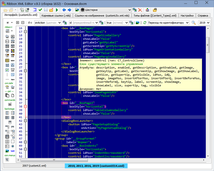
Основные возможности RibbonXMLEditor:
- Быстрое построение xml-описания интерфейса ленты (ribbon), закулисья (backstage), команд (command), контекстных меню (contextMenus) и панели быстрого доступа (qat) путём нажатия на кнопки, соответствующие различным элементам интерфейса или путём вставки этих элементов из списка контекстно-чувствительного автодополнения.
- Импорт внешних изображений для значков элементов интерфейса.
- Внедрение интерфейса в документы Word, Excel, PowerPoint или Access.
- Импорт/экспорт xml-макета интерфейса в файл настроек ленты, поддерживаемый офисом начиная с 2010-й версии.
- Генерация на основе построенного xml-кода модуля «.bas» для VBA с шаблонами процедур обратного вызова и внедрение его в документ.
Редактор имеет много полезных функций, таких как:
- Контекстно-чувствительное автодополнение
- Всплывающие подсказки по коду
- Встроенная галерея офисных иконок, содержащая несколько тысяч изображений
- Автоформатирование кода
- Валидация кода
- Запуск документа в родном приложении не выходя из редактора с возможностью выбора версии офиса, если у вас установлено несколько версий одновременно.
- Система поиска, в том числе с помощью регулярных выражений
- Система быстрого поиска по идентификатору
- Фолдинг (сворачивание содержимого тегов)
Удобство работы с редактором обеспечивается следующими свойствами редактора:
- Подсветка синтаксиса
- Подсветка парных тегов и текущей строки
- Возможность быстрого перехода к началу и к концу ближайшего тега (Ctrl+< и Ctrl+>)
- Мощная система настраиваемых стилей подсветки кода
- Откат и отмена отката
- Встраивание пункта «Открыть в Ribbon XML Editor» в контекстное меню проводника операционной системы
- Запоминание списка последних документов и возможность автоматически открывать последний
- Доступ к связанным с интерфейсом структурам документа (файлу корневых ссылок, файлу ссылок на изображения, файлу типов файлов)
- Информативные всплывающие подсказки кнопок элементов с указанием дочерних элементов
- Справка со схемами иерархии корневых элементов commands, ribbon, backstage и contextMenus, списками идентификаторов вкладок и групп и описанием приёмов работы с программой
Видеоурок по созданию своей кнопки на ленте:
Краткий видеообзор предыдущей версии 8:
Благодарности
Выражаю особую благодарность Евгению Маркову и Александру Витеру за их активное участие в тестировании программы, а также за многочисленные предложения по её улучшению. Также выражаю благодарность всем, кто своевременно сообщал мне о замеченных ошибках, а также оставлял пожелания по наращиванию функционала.
Writing and adding the XML which defines a custom Microsoft Office Ribbon UI can be a time consuming and error-filled experience. A Microsoft article explains the manual process here. However, it doesn’t have to be a long aggravating procedure if you use an editor specifically designed for this work.
Note: Although I am using a Microsoft Windows Office version in this post, the ribbon can also be customized on the Mac version of Office (versions 15.17 or higher.)
The Right tool…
If you search the Web for “office ribbon editor” you will find several programs that match the criteria. Some are free others not. Some are stand-alone programs and some are Office addins. They all have their strengths and weaknesses. Some claim to be more up to date than others, some more WYSIWYG. A few of those which appear more often on the web are:
- RibbonX Visual Designer 2010 – an Office Add-in
- RibbonCreator 2016 – Shareware
- Custom UI Editor for Microsoft Office – Free (this is a file download link)
I used to favor the Custom UI Editor, and have used it a lot with my VBA projects. While there is no longer a support website or central distribution link, you can get it from the link above.
An updated version of the Custom UI Editor, the Office RibbonX Editor, has been released as a new open source project by Fernando Andreu. The latest version can be found here. It incorporates significant upgrades and added features that make the tool stand out amongst the others. It is now my ribbon editor of choice and I will use it for my following examples. Whichever tool you chose to use, it is much easier than opening up an Excel© file (for example) and inserting your own handwritten XML.

Understanding the Essentials…
For the sake of a tutorial, I will use the Office RibbonX Editor to open and edit the XML of a file named Blank Sample.xlsx. The workbook is just a blank file opened from Excel’s New Workbook option. What is important to understand about adding a custom ribbon tab it that the Office file must be macro-enabled if you want to add custom VBA code to the menu items. The file extension “xlsx” is not for a macro-enabled file, it should be “xlsm, or “docm” for a Word© file. The custom UI needs code (macros) to load the custom tab and for the actions each menu item calls. However, for this example, this file is fine.
XML is finicky about everything; spelling, character case, spacing, keywords, and grammar (quotes, commas, and such.) The Office RibbonX Editor makes it easy to check your XML for correctness, simply click the button with the red checkmark labeled “Validate.”
The Setup…
Remember, that this is just a basic intro to using an Office ribbon XML editor. You will need to spend several hours learning the fundamentals and quirks of the Office ribbon.
The Office RibbonX Editor comes as an “exe” file that contains the program’s installer. There are several files available for download. The file named “OfficeRibbonXEditor-Installer-NETFramework,exe” will install without any additional components if your Windows system has the current .NET framework installed. Running the installer places the editor is in the “C:Program Files (x86)Office RibbonX Editor ” folder with a link on your start menu.

Getting Started with the XML

Use the Open command on the toolbar to open an Office document, or select a previously opened file from the File menu item. The document’s name is shown in the pane on the left of the window after it is opened (as in the following image.) An Excel workbook is used here, but you could also a Word or Access© file or any document which uses the Office Fluent interface.

After the file is opened you will need to select the type of XML which you will be using, customUI.xml (Office 2007 and later) or customUI14.xml (Office 2010 and later.) The Office 2010 custom UI schema is the latest XML for the ribbon and it’s still being used in the latest versions of Office including versions 2013, 2016, and Office 365. Which type of XML with which to work is a choice that is explained here and here. For the purpose of this short tour of the editor we will use the top selection (customUI14.xml.) I have always used the newest.

Next, select the example XML to view...Insert > Sample XML > Excel – A Custom Tab. After this selection, you will see the following text in the editor’s right window pane. It is the XML describing a custom Excel ribbon tab named “Contoso”. It is set to be inserted after the “Home” tab. The rest of the XML is standard for a custom menu, however, there are many more items that can be added, customized and defined. This Microsoft document explains the Ribbon elements and Callback Names in detail (dated 7/08/2014.)

The following screenshot shows the editor with the example XML which describes the new Ribbon tab.

Saving the Menu
Before saving the XML you should always run the XML validation routine by clicking the Validate button on the editor’s toolbar. If there is a syntax error in the XML you will see a message such as the one at the bottom of the following screenshot. Most of the time the error description is good enough for you to locate and fix the issue. The validation will not catch errors in referencing any user-defined text, such as the button id, label, or the onAction statements.
I removed an end tag from the first line in the following screenshot, ran the XML validation routine and the error message was displayed at the bottom of the window.

The error is noted as “Ln 2, Col 2: Name cannot begin with the ‘<‘ character, hexadecimal value 0x3C. Line 2, position 2.” As you can see the closing “tag” (>) is missing at the end of line 1. Though not as cryptic as with some other editors the validation error messages may take some minor detective work to find the offending issue. In this case, simply add the tag and the XML will validate.

After saving the XML, start up the workbook and the new “Contoso” tab will be visible, after the “Home” tab. Remember that the new tab will only be available on the Blank Sample.xlsx workbook. Your custom Ribbon tab is not installed application-wide within Excel but just within each workbook that contains the custom XML.

Final Details
The Contoso ribbon tab does not use any custom VBA code at this point. To have your new tab items run macros or use other “custom” VBA coded actions you will need to save the workbook as “macro-enabled” and do some programming. To simplify creating VBA sub-routines which can be called from the custom ribbon tabs items, click the Generate Callbacks button on the editor’s toolbar.
The Callback Viewer (as shown below) will open with the outline for all the required VBA sub-routines. Copy and paste the callback procedures into a code module within the document, add your own code (to execute from the onAction statement) and you have a fully functioning custom ribbon tab. Of course, this is a slight oversimplification, especially if you are not familiar with VBA or Office macros programming.

There is much more that you can do with the Ribbon UI such as making the tab item labels change to match the state of the workbook, add checkbox functions or add a custom “popup” (right-click) or Context menu. The Office RibbonX Editor has links to several very helpful resources; select from the menu Help > Useful links for a listing. You can see examples of different types of menu items by downloading and opening my free Total Cost Model workbook in the editor.
Related posts: Disabling (and enabling) Context menu items in Excel, Total Cost Model
Даже если вы не умеете программировать, то существует множество мест (книги, сайты, форумы), где можно найти готовый код макросов на VBA для огромного количества типовых задач в Excel. По моему опыту, большинство пользователей рано или поздно собирают свою личную коллекцию макросов для автоматизации рутинных процессов, будь то перевод формул в значения, вывод суммы прописью или суммирования ячеек по цвету. И тут встает проблема — код макросов на Visual Basic нужно где-то хранить, чтобы потом использовать в работе.
Самый простой вариант — сохранять код макросов прямо в рабочем файле, зайдя в редактор Visual Basic с помощью сочетания клавиш Alt+F11 и добавив новый пустой модуль через меню Insert — Module:

При таком способе возникает, однако, несколько неудобств:
- Если рабочих файлов много, а макрос нужен везде, как например макрос преобразования формул в значения, то и копировать код придется в каждую книгу.
- Нужно не забыть сохранить файл в формате с поддержкой макросов (xlsm) или в формате двоичной книги (xlsb).
- При открытии такого файла защита от макросов будет каждый раз выдавать предупреждение, которое нужно подтвердить (ну, или отключить защиту полностью, что может быть не всегда желательно).
Более изящным решением будет создание своей собственной надстройки (Excel Add-in) — отдельного файла особого формата (xlam), содержащего все ваши «любимые» макросы. Плюсы такого подхода:
- Достаточно будет один раз подключить надстройку в Excel — и можно будет использовать её VBA процедуры и функции в любом файле на этом компьютере. Пересохранять ваши рабочие файлы в xlsm- и xlsb-форматы, таким образом, не потребуется, т.к. исходный код будет храниться не в них, а в файле надстройки.
- Защита от макросов вас тоже беспокоить уже не будет, т.к. надстройки по определению входят в доверенные источники.
- Можно сделать отдельную вкладку на ленте Excel с красивыми кнопками для запуска макросов надстройки.
- Надстройка — это отдельный файл. Его легко переносить с компьютера на компьютер, делиться им с коллегами или даже продавать

Давайте рассмотрим весь процесс создания своей собственной надстройки для Microsoft Excel по шагам.
Шаг 1. Создаем файл надстройки
Открываем Microsoft Excel с пустой книгой и сохраняем ее под любым подходящим именем (например MyExcelAddin) в формате надстройки с помощью команды Файл — Сохранить как или клавиши F12, указав тип файла Надстройка Excel (Excel Add-in):

Обратите внимание, что стандартно Excel хранит надстройки в папке C:UsersВаше_имяAppDataRoamingMicrosoftAddIns, но, в приниципе, можно указать любую другую удобную вам папку.
Шаг 2. Подключаем созданную надстройку
Теперь созданную нами на прошлом шаге надстройку MyExcelAddin надо подключить к Excel. Для этого идем в меню Файл — Параметры — Надстройки (File — Options — Add-Ins), жмем на кнопку Перейти (Go) в нижней части окна. В открывшемся окне жмем кнопку Обзор (Browse) и указываем положение нашего файла надстройки.
Если вы все сделали правильно, то наша MyExcelAddin должна появиться в списке доступных надстроек:

Шаг 3. Добавляем в надстройку макросы
Наша надстройка подключена к Excel и успешно работает, но в ней нет пока ни одного макроса. Давайте её наполним. Для этого нужно открыть редактор Visual Basic сочетанием клавиш Alt+F11 или кнопкой Visual Basic на вкладке Разработчик (Developer). Если вкладки Разработчик не видно, то её можно отобразить через Файл — Параметры — Настройка ленты (File — Options — Customize Ribbon).
В левом верхнем углу редактора должно быть окно Project (если его не видно, то включите его через меню View — Project Explorer):

В этом окне отображаются все открытые книги и запущенные надстройки Microsoft Excel, в том числе и наша VBAProject (MyExcelAddin.xlam) Выделите её мышью и добавьте в неё новый модуль через меню Insert — Module. В этом модуле мы и будем хранить VBA-код наших макросов надстройки.
Код можно либо набрать «с нуля» (если вы умеете программировать), либо скопировать откуда-нибудь уже готовый (что гораздо проще). Давайте, для пробы, введем в добавленный пустой модуль код простого, но полезного макроса:

После набора кода не забудьте нажать на кнопку сохранения (дискетку) в левом верхнем углу.
Наш макрос FormulasToValues, как легко сообразить, преобразует формулы в значения в выделенном предварительно диапазоне. Иногда такие макросы называют еще процедурами. Чтобы его запустить, нужно выделить ячейки с формулами и открыть специальное диалоговое окно Макросы с вкладки Разработчик (Developer — Macros) или сочетанием клавиш Alt+F8. Обычно в этом окне отображаются доступные макросы из всех открытых книг, но макросы надстроек здесь не видны. Несмотря на это, мы можем ввести имя нашей процедуры в поле Имя макроса (Macro name), а затем нажать кнопку Выполнить (Run) — и наш макрос заработает:
Здесь же можно назначить сочетание клавиш для быстрого запуска макроса — за это отвечает кнопка Параметры (Options) в предыдущем окне Макрос:

При назначении клавиш имейте ввиду, что здесь учитывается регистр и раскладка клавиатуры. Поэтому, если вы назначите сочетание, например, Ctrl+Й, то, по факту, вам придется в будущем следить за тем, чтобы у вас была включена именно русская раскладка и жать дополнительно Shift, чтобы получить заглавную букву.
Для удобства можно добавить и кнопку для нашего макроса на панель быстрого доступа в левом верхнем углу окна. Для этого выберите Файл — Параметры — Панель быстрого доступа (File — Options — Customize Quick Access Toolbar), а затем в выпадающем списке в верхней части окна опцию Макросы. После этого наш макрос FormulasToValues можно поместить на панель кнопкой Добавить (Add) и выбрать для него значок кнопкой Изменить (Edit):

Шаг 4. Добавляем в надстройку функции
Кроме макросов-процедур, существуют еще и макросы-функции или как их еще называют UDF (User Defined Function = пользовательская функция). Давайте создадим в нашей надстройке отдельный модуль (команда меню Insert — Module) и вставим туда код такой функции:

Несложно сообразить, что эта функция нужна для извлечения НДС из суммы включающей НДС. Не бином Ньютона, конечно, но нам для примера сгодится, чтобы показать основные принципы.
Заметьте, что синтаксис функции отличается от процедуры:
- используется конструкция Function …. End Function вместо Sub … End Sub
- после названия функции в скобках указываются её аргументы
- в теле функции производятся необходимые вычисления и затем результат присваивается переменной с названием функции
Также обратите внимание, что эту функцию не нужно, да и невозможно запустить как предыдущий макрос-процедуру через диалоговое окно Макросы и кнопку Выполнить. Такую макрофункцию нужно использовать как стандартную функцию листа (СУММ, ЕСЛИ, ВПР…), т.е. просто ввести в любую ячейку, указав в качестве аргумента значение суммы с НДС:

… или ввести через стандартное диалоговое окно вставки функции (кнопка fx в строке формул), выбрав категорию Определенные пользователем (User Defined):

Единственный неприятный момент здесь — это отсутствие привычного описания функции в нижней части окна. Чтобы его добавить придется проделать следующие действия:
- Откройте редактор Visual Basic сочетанием клавиш Alt+F11
- Выделите надстройку в панели Project и нажмите клавишу F2, чтобы открыть окно Object Browser
- Выберите в верхней части окна в выпадающем списке свой проект надстройки
- Щелкните по появившейся функции правой кнопкой мыши и выберите команду Properties.
- Введите описание функции в окно Description
- Сохраните файл надстройки и перезапустите Excel.

После перезапуска у функции должно отобразиться описание, которое мы ввели:

Шаг 5. Создаем вкладку надстройки в интерфейсе
Финальным, хоть и не обязательным, но приятным штрихом будет создание отдельной вкладки с кнопкой запуска нашего макроса, которая будет появляться в интерфейсе Excel после подключения нашей надстройки.
Информация об отображаемых вкладках по умолчанию содержится внутри книги и должна быть оформлена в виде специального XML-кода. Проще всего писать и редактировать такой код с помощью специальных программ — XML-редакторов. Одна из самых удобных (и бесплатных) — это программа Максима Новикова Ribbon XML Editor.
Алгоритм работы с ней следующий:
- Закройте все окна Excel, чтобы не было конфликта файлов, когда мы будем редактировать XML-код надстройки.
- Запустите программу Ribbon XML Editor и откройте в ней наш файл MyExcelAddin.xlam
- При помощи кнопки tabs в левом верхнем углу добавьте заготовку кода для новой вкладки:

- В пустые кавычки нужно вписать id нашей вкладки и группы (любые уникальные идентификаторы), а в label — названия нашей вкладки и группы кнопок на ней:

- При помощи кнопки button на панели слева добавляем заготовку кода для кнопки и дописываем к ней теги:

— label — это текст на кнопке
— imageMso — это условное название изображения на кнопке. Я использовал иконку с красной кнопкой, которая имеет название AnimationCustomAddExitDialog. Названия всех доступных кнопок (а их несколько сотен!) можно найти на большом количестве сайтов в интернете, если искать по ключевым словам «imageMso». Для начала можно сходить сюда.
— onAction — это имя процедуры обратного вызова — специального короткого макроса, который будет запускать наш основной макрос FormulasToValues. Назвать эту процедуру можно как угодно. Мы добавим её чуть позже. - Проверить правильность всего сделанного можно с помощью кнопки с зеленой галочкой сверху на панели инструментов. Там же рядом нажмите на кнопку с дискетой для сохранения всех изменений.
- Закрываем Ribbon XML Editor
- Открываем Excel, заходим в редактор Visual Basic и добавляем к нашему макросу процедуру обратного вызова KillFormulas, чтобы она запускала наш основной макрос замены формул на значения.

- Сохраняем внесенные изменения и, вернувшись в Excel проверяем результат:


Вот и всё — надстройка готова к использованию. Наполните её своими процедурами и функциями, добавьте красивые кнопки — и использовать макросы в работе станет намного проще.
Ссылки по теме
- Что такое макросы, как их использовать в работе, где взять код макросов на Visual Basic.
- Как сделать заставку при открытии книги в Excel
- Что такое Личная Книга Макросов и как её использовать