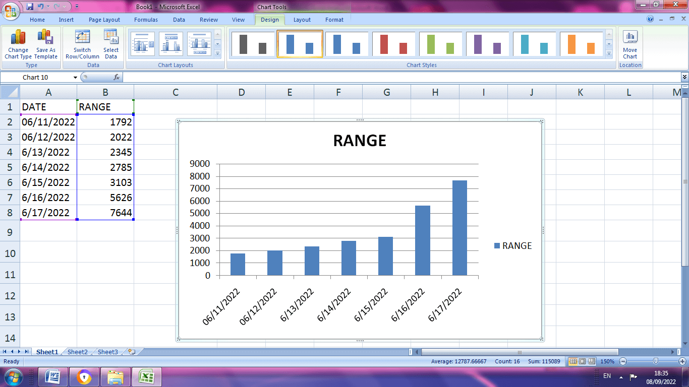
Sometimes, when you create a chart in Excel, you may want to switch the axis in the chart (i.e., interchange the X and the Y-axis)
It’s really easy, and in this short tutorial, I will show you how you can switch axis in Excel charts with a few clicks.
So let’s get started!
Understanding Chart Axis in Excel Charts
If you create a chart (for example, a column or bar chart), you will get the X and Y-axis.
The X-axis is the horizontal axis, and the Y-axis is the vertical axis.
Axis has values (or labels) that are populated from the chart data.
Let’s now see how to create a scatter chart, which will further make it clear what an axis is in an Excel chart.
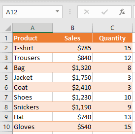
For creating a chart, I will be using the below data set, which contains products in column A, Sales value in column B, and Quantity value in column C.
In order to create a chart, you need to follow the below steps:
- Select a range of values that you want to present on a chart (in this example B1:C10)
- Go to the Insert tab
- Select Insert Scatter chart icon
- Choose the Scatter chart
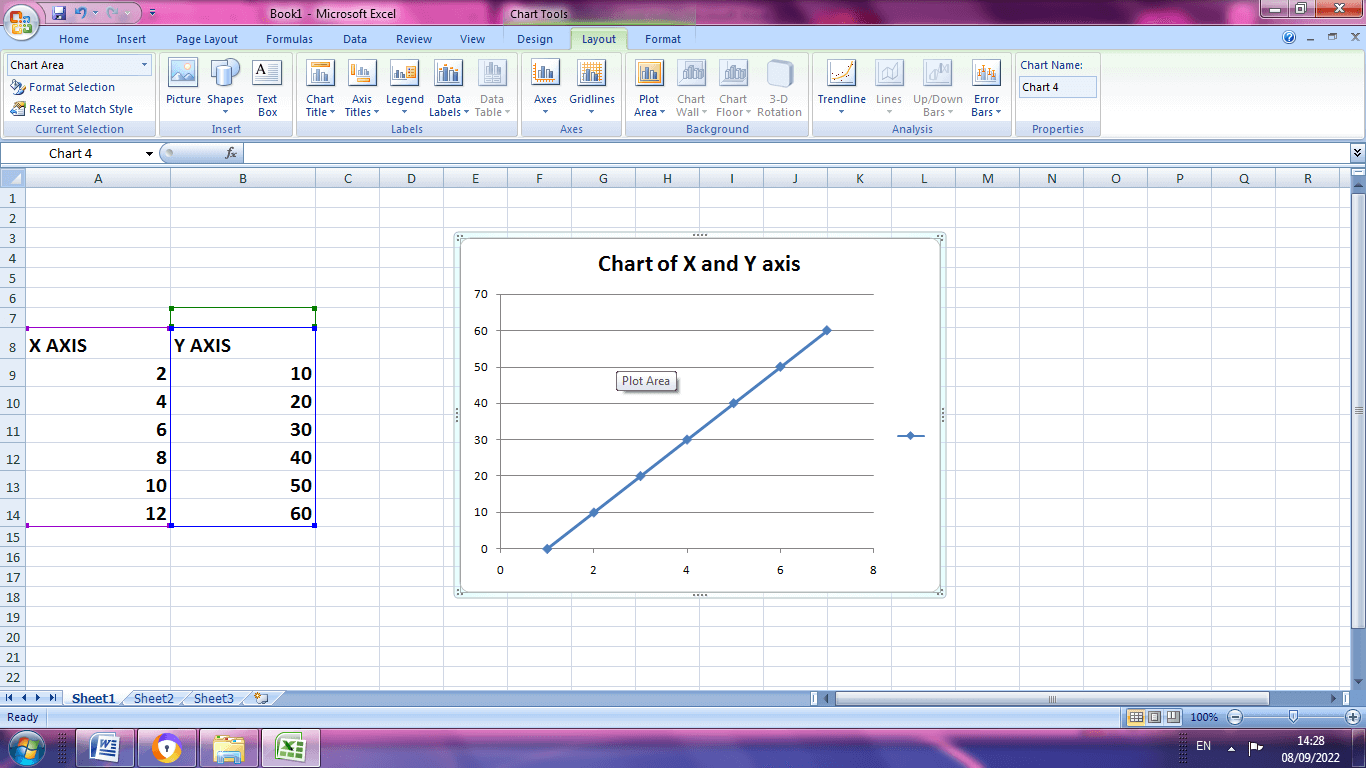
As a result, you get the scatter chart as shown below (where I have highlighted the axis using the arrow).
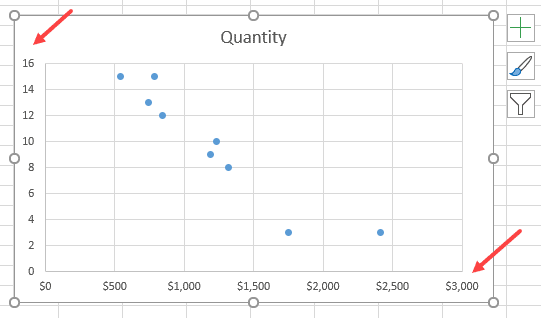
This chart has the X-axis (horizontal) with values from the Sales column and Y-axis (vertical) with values from the Quantity column.
When you create a chart in Excel, it automatically decides the range that needs to be shown on the axis.
Now that’s all good!
But what if I want a chart where Sales are on Y-Axis and Quantity on X-axis?
Thankfully, Excel allows you to easily switch the X and Y axis with a few clicks.
Let’s see how to do this!
Now, if you want to display Sales values on the Y-axis and Quantity values on X-axis, you need to switch the axis in the chart.
Below are the steps to do this:
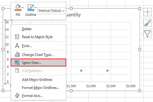
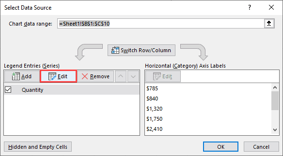
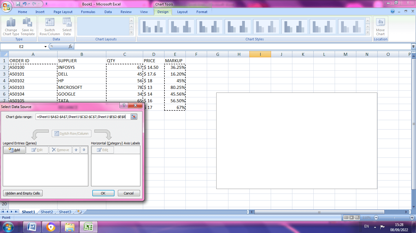
- You need to right-click on one of the axes and choose Select Data. This way, you can also change the data source for the chart.
- In the ‘Select Data Source’ dialog box, you can see vertical values (Series), which is X axis (Quantity). Also, on the right side, there are horizontal values (Category), which is the Y axis (Sales). You have to click on the Edit on the left side in order to switch axes.
- In the pop-up window, you can see that Series X values are range “=Sheet1!$B$2:$B$10”, and the Series Y values are range “=Sheet1!$C$2:$C$10”.
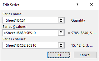
- In order to switch values, you have to swap these two ranges, so that the range for series X becomes a range for series Y and vice versa. So, in Series X values, enter “=Sheet1!$C$2:$C$10”, and in Series Y values, enter “=Sheet1!$B$2:$B$10”.
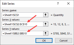
- After you confirm changes, you will be redirected back to the Select Data Source window and click OK.
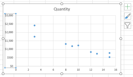
Finally, your chart has a switched axis. As you can see, Sales values are now on the Y-axis, and Quantity values are on the X-axis.
Also read: How to Add Secondary Axis in Excel Charts?
Rearrange the Data to Specify the Axis
The above method works great when you have already created the chart, and you want to swap the axis.
But if you haven’t created the chart already, one way could be to rearrange the data so that Excel picks up the data and plots it on the X and Y axis as per your needs.
Excel, by default, sets the first column of the data source on the X-axis and the second column on the Y-axis.
In this case, you can just move Quantity in column B and Sales in column C.
Switching the axis option in a chart gives you more flexibility for adjusting the chart axis. Also, this way, you don’t need to change any data in your sheet.
So these are two simple and easy ways to switch the axis in Excel charts.
While I have shown an example of a scatter chart in this tutorial, you can use the same steps to switch axis in case of any chart in Excel.
I hope you found this Excel tutorial useful!
Other Excel tutorials you may also like:
- How to Move a Chart to a New Sheet in Excel
- How to Add Axis Titles in Excel?
- How to Insert an Excel file into MS Word (3 Easy Ways)
- How to Create Bar of Pie Chart in Excel?
- How to Insert Chart Title in Excel?
- How to Add Border to a Chart in Excel?
- How to Create a Waterfall Chart in Excel?
- How to Make Box Plot (Box and Whisker Chart) in Excel?
Contents
- 1 How do you add X and Y-axis?
- 2 How do you add an x-axis to a graph in Excel?
- 3 How do I make text X-axis in Excel?
- 4 How do you add alt text to an Excel graph?
- 5 How do you add data labels in Excel?
- 6 How do I create a clustered Pivotchart in Excel?
- 7 How do I change the y axis in Excel?
- 8 How do you switch the X and Y axis in Excel 2021?
- 9 How do I change the x-axis in Excel 2020?
- 10 How do you alt text in a graph?
- 11 How do I add alt text to an image?
- 12 How do you use alt text?
- 13 How do I fix the data label position in Excel?
- 14 How do I add data labels in Excel 2016?
- 15 How do I add a secondary axis in Excel?
- 16 What is a clustered bar chart in Excel?
- 17 How do I add a clustered column combo chart in Excel?
- 18 How do I change the layout of the bar chart to layout 2 in Excel?
How do you add X and Y-axis?
Set X and Y axes
Click inside the table. Navigate to Insert >> Charts >> Insert Scatter (X, Y) or Bubble Chart. Choose Scatter with Straight Lines.
How do you add an x-axis to a graph in Excel?
From the Design tab, Data group, select Select Data. In the dialog box under Horizontal (Category) Axis Labels, click Edit. In the Axis label range enter the cell references for the x-axis or use the mouse to select the range, click OK. Click OK.
How do I make text X-axis in Excel?
Right-click the category labels you want to change, and click Select Data.
- In the Horizontal (Category) Axis Labels box, click Edit.
- In the Axis label range box, enter the labels you want to use, separated by commas.
How do you add alt text to an Excel graph?
Add alt text to a chart
- Select the entire chart.
- Do one of the following: Select Format > Alt Text. Right-click the chart, and select Edit Alt Text.
- In the Alt Text pane, enter alt text describing the chart.
How do you add data labels in Excel?
Add data labels
Click the chart, and then click the Chart Design tab. Click Add Chart Element and select Data Labels, and then select a location for the data label option. Note: The options will differ depending on your chart type. If you want to show your data label inside a text bubble shape, click Data Callout.
How do I create a clustered Pivotchart in Excel?
Create a Pivot Chart
- Select any cell in the pivot table.
- On the Excel Ribbon, click the Insert Tab.
- In the Charts group, click Column, then click Clustered Column.
- A column chart is inserted on the worksheet, and it is selected — there are handles showing along the chart’s borders.
How do I change the y axis in Excel?
Add or change the position of vertical axis label
Click the chart, and then click the Chart Layout tab. Under Axes, click Axes > Vertical Axis, and then click the kind of axis label that you want.
How do you switch the X and Y axis in Excel 2021?
Change the way that data is plotted
- Click anywhere in the chart that contains the data series that you want to plot on different axes. This displays the Chart Tools, adding the Design, Layout, and Format tabs.
- On the Design tab, in the Data group, click Switch Row/Column.
How do I change the x-axis in Excel 2020?
Follow the steps to change date-based X-axis intervals:
- Open the Excel file with your graph and select it.
- Right-click on the Horizontal Axis and choose Format axis.
- Select Axis Options.
- Under Units, click on the box next to Major and type in the interval number you want.
- Close the window, and the changes will be saved.
How do you alt text in a graph?
Add alt text
- Do one of the following: Right-click the object and select Edit Alt Text. Select the object. Select Format > Alt Text.
- In the Alt Text pane, type 1-2 sentences in the text box to describe the object and its context to someone who cannot see it.
How do I add alt text to an image?
To add alt text to a picture, shape, chart, or SmartArt graphic, right-click on the object and choose Format Picture. In the Format Picture panel, choose the Layout and Properties icon. Then choose Alt Text. Add a title for your object, then a description.
How do you use alt text?
Here’re some tips to help you get it right:
- Be specific, and succinct. Describe the content of the image without editorialising.
- Never start with “Image of …” or “Picture of …”
- Use keywords sparingly.
- Include text that’s part of the image.
- Don’t repeat yourself.
- Don’t add alt text to ‘decorative’ images.
How do I fix the data label position in Excel?
Change the position of data labels
- To reposition all data labels for an entire data series, click a data label once to select the data series.
- To reposition a specific data label, click that data label twice to select it. This displays the Chart Tools, adding the Design, Layout, and Format tabs.
How do I add data labels in Excel 2016?
To add data labels in Excel 2013 or Excel 2016, follow these steps:
- Activate the chart by clicking on it, if necessary.
- Make sure the Design tab of the ribbon is displayed.
- Click the Add Chart Element drop-down list.
- Select the Data Labels tool.
- Select the position that best fits where you want your labels to appear.
How do I add a secondary axis in Excel?
Add or remove a secondary axis in a chart in Excel
- Select a chart to open Chart Tools.
- Select Design > Change Chart Type.
- Select Combo > Cluster Column – Line on Secondary Axis.
- Select Secondary Axis for the data series you want to show.
- Select the drop-down arrow and choose Line.
- Select OK.
What is a clustered bar chart in Excel?
A clustered bar chart displays more than one data series in clustered horizontal columns. Each data series shares the same axis labels, so horizontal bars are grouped by category.Like clustered column charts, clustered bar charts become visually complex as the number of categories or data series increase.
How do I add a clustered column combo chart in Excel?
To create a combination chart, execute the following steps.
- On the Insert tab, in the Charts group, click the Combo symbol.
- Click Create Custom Combo Chart.
- The Insert Chart dialog box appears. For the Rainy Days series, choose Clustered Column as the chart type.
- Click OK. Result:
How do I change the layout of the bar chart to layout 2 in Excel?
Click the chart that you want to format. This displays the Chart Tools, adding the Design, Layout, and Format tabs. On the Design tab, in the Chart Layouts group, click the chart layout that you want to use.
How to Switch X and Y Axis in Excel
Written by co-founder Kasper Langmann, Microsoft Office Specialist.
Knowing how to switch the x-axis and y-axis in Excel will save you a lot of trouble.

Microsoft Excel is powerful spreadsheet software that will let you store data and make calculations on it. You can then visualize the data using built-in charts and graphs.
However, there are times when you have to switch the value series of the chart’s axes.
And if you don’t know how, your only choice is to exchange the columns or values manually.
Download the sample workbook here to tag along as you read this guide.
In this article, we’ll show you how to switch x and y axes in Excel.
 Kasper Langmann, Co-founder of Spreadsheeto
The X-Axis and Y-Axis
Most graphs and charts in Excel, except for pie charts, has an x and y axes where data in a column or row are plotted.
By definition, these axes (plural of axis) are the two perpendicular lines on a graph where the labels are put.
Kasper Langmann, Co-founder of SpreadsheetoHere’s an example of an Excel line chart that shows the X and Y axes:

The x-axis is the horizontal line where the months are named. The y-axis is the vertical line with the numbers.
Why switch the axes
There are times when you have to arrange the variables in the spreadsheet before making a chart out of them.
Like in the case of making a scatter chart. It’s recommended that the independent variable should be on the left while the dependent variable should be on the right.
But of course, that’s not general knowledge. So chances are, some people would have swapped them.
This is just one example of a scenario where knowing how to switch axes would come in handy.
Kasper Langmann, Co-founder of SpreadsheetoIn this tutorial, we’ll borrow this data set from the scatter plot tutorial where the values in the left (B) and right column (C) isn’t the recommended arrangement.

The chart still works. However, the “Pageviews” value series should be on the y-axis (horizontal line) while the “Sales” value series should be on the x-axis (vertical line).
How to switch the x and y axis
If you don’t know how to switch the axes, you would’ve deleted the chart and copy-pasted the contents of columns B and C to exchange the values.
There’s a better way than that where you don’t need to change any values.
First, right-click on either of the axes in the chart and click ‘Select Data’ from the options.

A new window will open.
Click ‘Edit’.

Another window will open where you can exchange the values on both axes.
What you have to do is exchange the content of the ‘Series X values’ and ‘Series Y values’.
You can use notepad and copy the values. Then, simply paste them on each form.
Kasper Langmann, Co-founder of SpreadsheetoYour goal is to change the values from this:


Once you do that, the value series on the axes would be swapped.

Notice that we didn’t change any values on the spreadsheet data at all. All we did was customized the chart.
That’s it – Now what?
You just learned how to switch x and y axis in Excel in a few minutes.
Microsoft Excel’s charts are so advanced that you can swap the horizontal axis values with the vertical axis values without touching the original data on the spreadsheet.
Pretty cool, right?😎
Now, charts are only useful if you have numbers to show. And those numbers are typically derived from some sort of calculation.
The best functions for calculations or helping with calculations are SUMIF, IF, and VLOOKUP.
If you want to learn those, please enroll in my free 30-minute online Excel course here. We’ll send it directly to your inbox📩
Other resources
Frequently asked questions
1. Right-click the chart y axis (or x axis) and choose Select Data from in the pop-up window.
2. Click the Edit button
3. Select and copy the Series X values reference into Notepad
4. Do the same with the vertical axis (y axis values)
5. Insert the copied Y series values into the X values field
6. Insert the copied X series values into the Y values field
7. Click OK
Kasper Langmann2023-02-09T03:01:44+00:00
Page load link
We can use Excel to plot XY graph, also known as scatter chart or XY chart. With such charts, we can directly view trends and correlations between the two variables in our diagram. In this tutorial, we will learn how to plot the X vs. Y plots, add axis labels, data labels, and many other useful tips.
 Figure 1 – How to plot data points in excel
Excel Plot X vs Y
We will set up a data table in Column A and B and then using the Scatter chart; we will display, modify, and format our X and Y plots.
- We will set up our data table as displayed below.
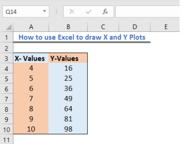 Figure 2 – Plotting in excel
- Next, we will highlight our data and go to the Insert Tab.
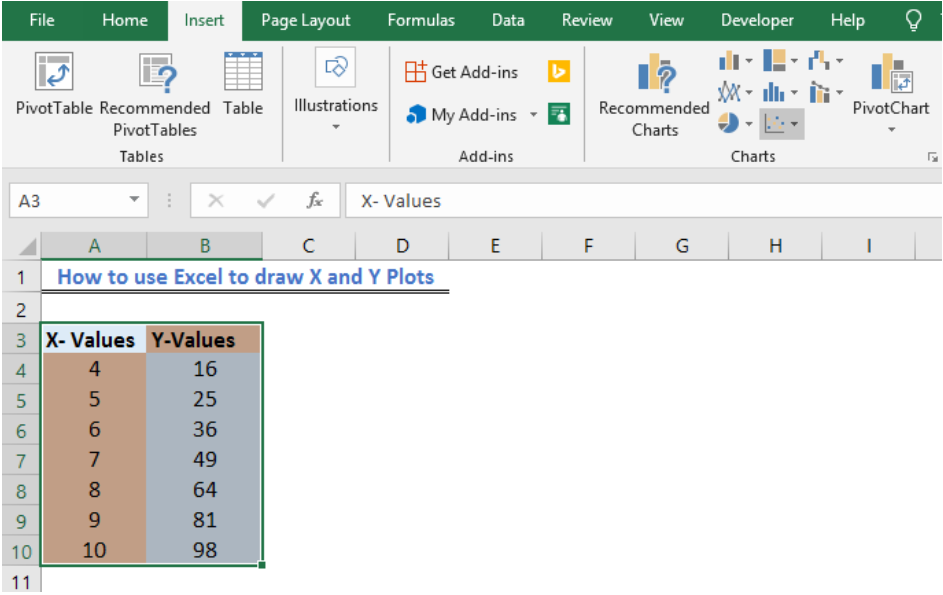 Figure 3 – X vs. Y graph in Excel
- If we are using Excel 2010 or earlier, we may look for the Scatter group under the Insert Tab
- In Excel 2013 and later, we will go to the Insert Tab; we will go to the Charts group and select the X and Y Scatter chart. In the drop-down menu, we will choose the second option.
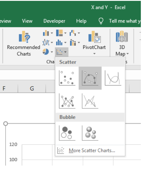 Figure 4 – How to plot points in excel
- Our Chart will look like this:
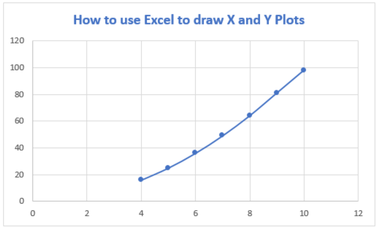 Figure 5 – How to plot x and y in Excel
Add Axis Titles to X vs Y graph in Excel
- If we wish to add other details to our graph such as titles to the horizontal axis, we can click on the Plot to activate the Chart Tools Tab. Here, we will go to Chart Elements and select Axis Title from the drop-down lists, which leads to yet another drop-down menu, where we can select the axis we want.
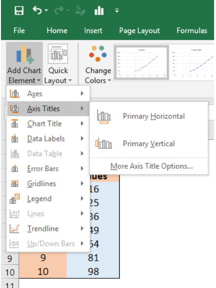 Figure 6 – Plot chart in Excel
- If we add Axis titles to the horizontal and vertical axis, we may have this
 Figure 7 – Plotting in Excel
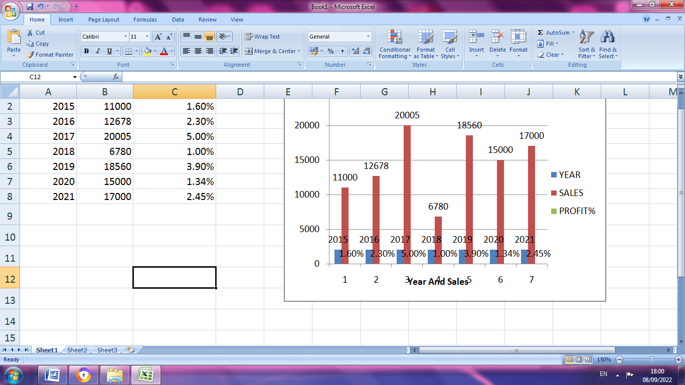
Add Data Labels to X and Y Plot
We can also add Data Labels to our plot. These data labels can give us a clear idea of each data point without having to reference our data table.
- We can click on the Plot to activate the Chart Tools Tab. We will go to Chart Elements and select Data Labels from the drop-down lists, which leads to yet another drop-down menu where we will choose More Data Table options
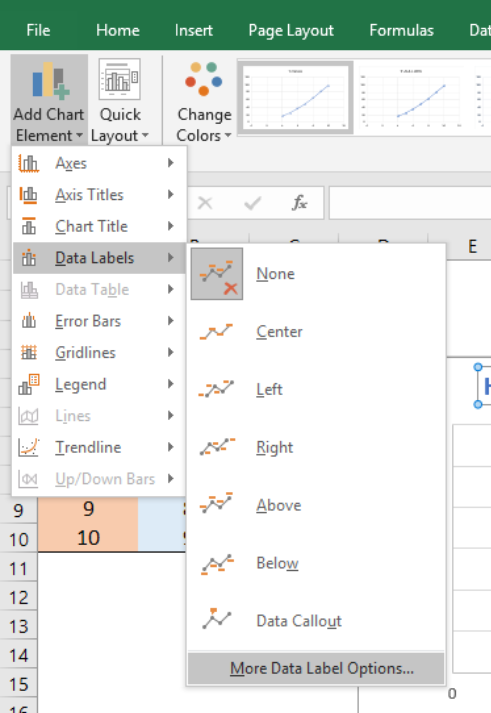 Figure 8 – How to plot points in excel
- In the Format Data Table dialog box, we will make sure that the X-Values and Y-Values are marked.
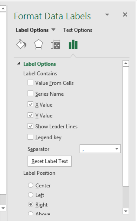 Figure 9 – How to plot x vs. graph in excel
- Our chart will look like this;
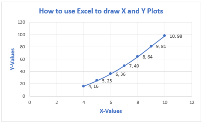 Figure 10 – Plot x vs. y in excel
- To Format Chart Axis, we can right click on the Plot and select Format Axis
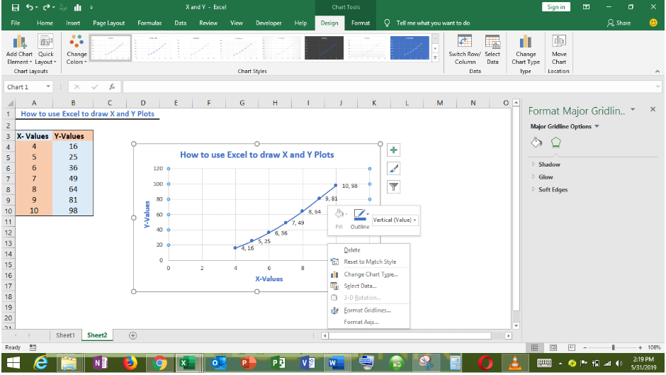 Figure 11 – Format Axis in excel x vs. y graph
- In the Format Axis dialog box, we can modify the minimum and maximum values.
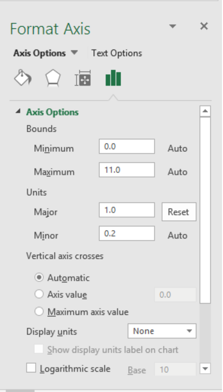 Figure 12 – How to plot x vs. y in excel
- Our chart becomes;
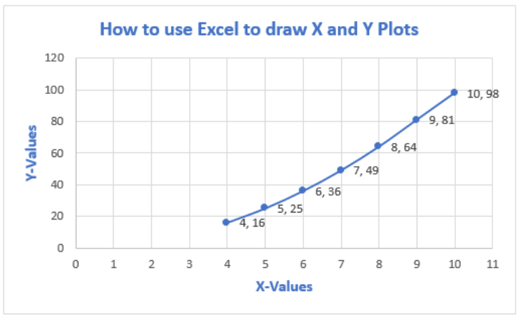 Figure 13 – How to plot data points in excel
Instant Connection to an Expert through our Excelchat Service
Most of the time, the problem you will need to solve will be more complex than a simple application of a formula or function. If you want to save hours of research and frustration, try our live Excelchat service! Our Excel Experts are available 24/7 to answer any Excel question you may have. We guarantee a connection within 30 seconds and a customized solution within 20 minutes.
Return to Charts Home
This tutorial will demonstrate how to flip the X and Y Axis in Excel & Google Sheets charts.
How to Switch (Flip) X and Y Axis in Excel
X & Y Axis Explanation
- X Axis – horizontal line of the graph. Recommended dependent variable
- Y Axis – vertical line of the graph; Recommended independent variable
Starting with Your Base Graph
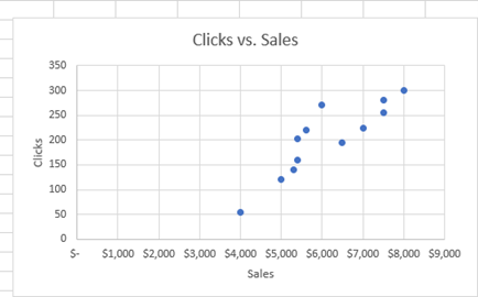
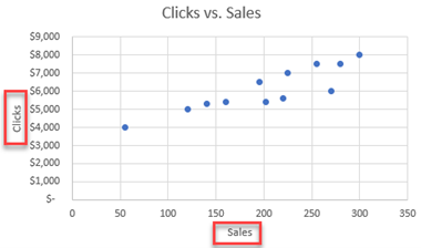
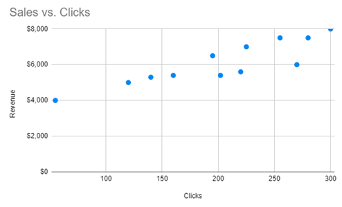
In this explanation, we’re going to use a scatterplot as the example to switch the X and Y axes. This scatterplot below shows the how the clicks and sales are related. Let’s say we want to change this graph so that the Sales will be on the Y Axis and Clicks on the X Axis.
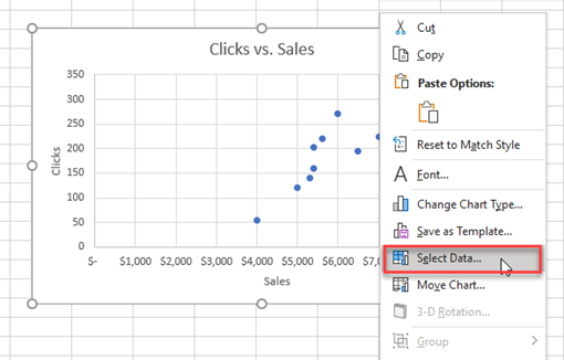
Switching your X and Y Axis
- Right Click on Your Graph > Select Data
2. Click on Edit
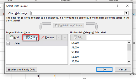
3. Switch the X and Y Axis
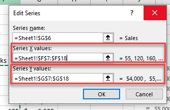
You’ll see the below table showing the current Series for the X Values and current Series for the Y Values.
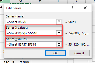
You want to swap these values. The formula for “Series X Values” should be in the “Services Y Values” and vice versa as seen below. Then click OK. In order to swap, use:
Ctrl + C to Copy
Ctrl + V to paste
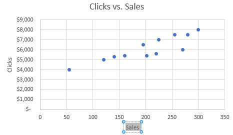
After clicking OK, you’ll see that the values of the X and Y Axis has swapped as requested. However, as you can see, we still must switch the Axis Title Names as these have not updated.
4. Updating Axis Titles
Double click on the Axis Title and change the name to the appropriate title that represents the values on that axis.
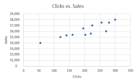
Final Graph after Swap
The final result shows the visualization in a more pleasing way where Sales are on the Y axis and Clicks are on the X Axis.
How to Switch (Flip) X and Y Axis in Google Sheets
Switching X and Y Axis
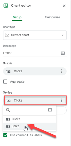
- Right Click on Graph > Select Data Range
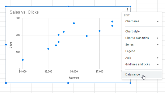
2. Click on Values under X-Axis and change. In this case, we’re switching the X-Axis “Clicks” to “Sales”.
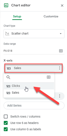
Do the same for the Y Axis where it says “Series”
Change Axis Titles
Similar to Excel, double-click the axis title to change the titles of the updated axes.
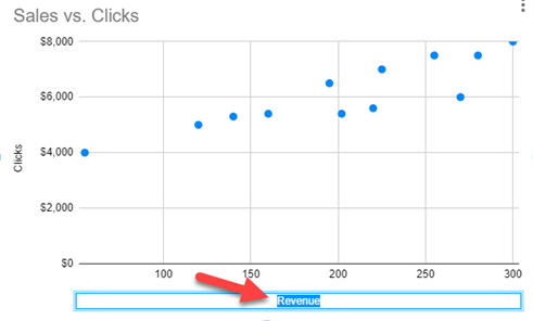
Final Graph after Swap
Finally, we have a finished product after swapping the x and y axis as shown below.
Axis Type | Axis Titles | Axis Scale
Most chart types have two axes: a horizontal axis (or x-axis) and a vertical axis (or y-axis). This example teaches you how to change the axis type, add axis titles and how to change the scale of the vertical axis.
To create a column chart, execute the following steps.
1. Select the range A1:B7.

2. On the Insert tab, in the Charts group, click the Column symbol.

3. Click Clustered Column.

Result:

Axis Type
Excel also shows the dates between 8/24/2018 and 9/1/2018. To remove these dates, change the axis type from Date axis to Text axis.
1. Right click the horizontal axis, and then click Format Axis.

The Format Axis pane appears.
2. Click Text axis.

Result:

Axis Titles
To add a vertical axis title, execute the following steps.
1. Select the chart.
2. Click the + button on the right side of the chart, click the arrow next to Axis Titles and then click the check box next to Primary Vertical.

3. Enter a vertical axis title. For example, Visitors.
Result:

Axis Scale
By default, Excel automatically determines the values on the vertical axis. To change these values, execute the following steps.
1. Right click the vertical axis, and then click Format Axis.
The Format Axis pane appears.
2. Fix the maximum bound to 10000.
3. Fix the major unit to 2000.

Result:

Tips to show, hide, and edit the three main axes in an Excel chart
Updated on January 27, 2021
What to Know
- Select a blank area of the chart to display the Chart Tools on the right side of the chart, then select Chart Elements (plus sign).
- To hide all axes, clear the Axes check box. To hide one or more axes, hover over Axes and select the arrow to see a list of axes.
- Clear the check boxes for the axes you want to hide. Select the check boxes for the axes you want to display.
This article explains how to display, hide, and edit the three main axes (X, Y, and Z) in an Excel chart. We’ll also explain more about chart axes in general. Instructions cover Excel 2019, 2016, 2013, 2010; Excel for Microsoft 365, and Excel for Mac.
Hide and Display Chart Axes
To hide one or more axes in an Excel chart:
-
Select a blank area of the chart to display the Chart Tools on the right side of the chart.
-
Select Chart Elements, the plus sign (+), to open the Chart Elements menu.
-
To hide all axes, clear the Axes check box.
-
To hide one or more axes, hover over Axes to display a right arrow.
-
Select the arrow to display a list of axes that can be displayed or hidden on the chart.
-
Clear the check box for the axes you want to hide.
-
Select the check boxes for the axes you want to display.
What Is an Axis?
An axis on a chart or graph in Excel or Google Sheets is a horizontal or vertical line containing units of measure. The axes border the plot area of column charts, bar graphs, line graphs, and other charts. An axis displays units of measure and provides a frame of reference for the data displayed in the chart. Most charts, such as column and line charts, have two axes that are used to measure and categorize data:
The vertical axis: The Y or value axis.
The horizontal axis: The X or category axis.
All chart axes are identified by an axis title that includes the units displayed in the axis. Bubble, radar, and pie charts are some chart types that do not use axes to display data.
3-D Chart Axes
In addition to horizontal and vertical axes, 3-D charts have a third axis. The z-axis, also called the secondary vertical axis or depth axis, plots data along the third dimension (the depth) of a chart.
Vertical Axis
The vertical y-axis is located along the left side of the plot area. The scale for this axis is usually based on the data values that are plotted in the chart.
Horizontal Axis
The horizontal x-axis is found at the bottom of the plot area, and contains category headings taken from the data in the worksheet.
Secondary Vertical Axis
A second vertical axis, which is found on the right side of a chart, displays two or more types of data in a single chart. It is also used to chart data values.
A climate graph or climatograph is an example of a combination chart that uses a second vertical axis to display both temperature and precipitation data versus time in a single chart.
Thanks for letting us know!
Get the Latest Tech News Delivered Every Day
Subscribe
For most chart types, you can display or hide chart axes. To make chart data easier to understand, you can also change the way they look.
Learn more about axes
Charts typically have two axes that are used to measure and categorize data: a vertical axis (also known as value axis or y axis), and a horizontal axis (also known as category axis or x axis). 3-D column, 3-D cone, or 3-D pyramid charts have a third axis, the depth axis (also known as series axis or z axis), so that data can be plotted along the depth of a chart. Radar charts do not have horizontal (category) axes, and pie and doughnut charts do not have any axes.

 Vertical (value) axis
 Horizontal (category) axis
 Depth (series) axis
The following describe how you can modify your charts to add impact and better convey information. For more info on what axes are and what you can do with them, see All about axes.
Note: The following procedure applies to Office 2013 and newer versions. Looking for Office 2010 steps?
Display or hide axes
-
Click anywhere in the chart for which you want to display or hide axes.
This displays the Chart Tools, adding the Design, and Format tabs.
-
On the Design tab, click the down arrow next to Add chart elements, and then hover over Axes in the fly-out menu .

-
Click the type of axis that you want to display or hide.

Adjust axis tick marks and labels
-
On a chart, click the axis that has the tick marks and labels that you want to adjust, or do the following to select the axis from a list of chart elements:
-
Click anywhere in the chart.
This displays the Chart Tools, adding the Design and Format tabs.
-
On the Format tab, in the Current Selection group, click the arrow in the Chart Elements box, and then click the axis that you want to select.
-
-
On the Format tab, in the Current Selection group, click Format Selection.
-
In the Axis Options panel, under Tick Marks, do one or more of the following:
-
To change the display of major tick marks, in the Major tick mark type box, click the tick mark position that you want.
-
To change the display of minor tick marks, in the Minor tick mark type drop-down list box, click the tick mark position that you want.
-
To change the position of the labels, under Labels, click the option that you want.
Tip To hide tick marks or tick-mark labels, in the Axis labels box, click None.
-


Change the number of categories between labels or tick marks
-
On a chart, click the horizontal (category) axis that you want to change, or do the following to select the axis from a list of chart elements:
-
Click anywhere in the chart.
This displays the Chart Tools, adding the Design, Layout, and Format tabs.
-
On the Format tab, in the Current Selection group, click the arrow in the Chart Elements box, and then click the axis that you want to select.
-
-
On the Format tab, in the Current Selection group, click Format Selection.
-
Under Axis Options, do one or both of the following:
-
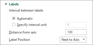
To change the interval between axis labels, under Interval between labels, click Specify interval unit, and then in the text box, type the number that you want.
Tip Type 1 to display a label for every category, 2 to display a label for every other category, 3 to display a label for every third category, and so on.
-
To change the placement of axis labels, in the Label distance from axis box, type the number that you want.
Tip Type a smaller number to place the labels closer to the axis. Type a larger number if you want more distance between the label and the axis.
-
Change the alignment and orientation of labels
You can change the alignment of axis labels on both horizontal (category) and vertical (value) axes. When you have multiple-level category labels in your chart, you can change the alignment of all levels of labels. You can also change the amount of space between levels of labels on the horizontal (category) axis.
-
On a chart, click the axis that has the labels that you want to align differently, or do the following to select the axis from a list of chart elements:
-
Click anywhere in the chart.
This displays the Chart Tools, adding the Design and Format tabs.
-
On the Format tab, in the Current Selection group, click the arrow in the Chart Elements box, and then click the axis that you want to select.
-
-
On the Format tab, in the Current Selection group, click Format Selection.
-
In the Format Axis dialog box, click Text Options.
-
Under Text Box, do one or more of the following:
-
In the Vertical alignment box, click the vertical alignment position that you want.
-
In the Text direction box, click the text orientation that you want.
-
In the Custom angle box, select the degree of rotation that you want.
-
Tip You can also change the horizontal alignment of axis labels, by clicking the axis, and then click Align Left  , Center
  , or Align Right
  on the Home toolbar.
Change text of category labels
You can change the text of category labels on the worksheet, or you can change them directly in the chart.
Change category label text on the worksheet
-
On the worksheet, click the cell that contains the name of the label that you want to change.
-
Type the new name, and then press ENTER.
Note Changes that you make on the worksheet are automatically updated in the chart.
Change the label text in the chart
-
In the chart, click the horizontal axis, or do the following to select the axis from a list of chart elements:
-
Click anywhere in the chart.
This displays the Chart Tools, adding the Design and Format tabs.
-
On the Format tab, in the Current Selection group, click the arrow in the Chart Elements box, and then click the horizontal (category) axis.
-
-
On the Design tab, in the Data group, click Select Data.
-
In the Select Data Source dialog box, under Horizontal (Categories) Axis Labels, click Edit.
-
In the Axis label range box, do one of the following:
-
Specify the worksheet range that you want to use as category axis labels.
-
Type the labels that you want to use, separated by commas — for example, Division A, Division B, Division C.
Note If you type the label text in the Axis label range box, the category axis label text is no longer linked to a worksheet cell.
-
-
Click OK.
Change how text and numbers look in labels
You can change the format of text in category axis labels or numbers on the value axis.
Format text
-
In a chart, right-click the axis that displays the labels that you want to format.
-
On the Home toolbar, click the formatting options that you want.
Tip You can also select the axis that displays the labels, and then use the formatting buttons on the Home tab in the Font group.
Format numbers
-
In a chart, click the axis that displays the numbers that you want to format, or do the following to select the axis from a list of chart elements:
-
Click anywhere in the chart.
This displays the Chart Tools, adding the Design and Format tabs.
-
On the Format tab, in the Current Selection group, click the arrow in the Chart Elements box, and then click the axis that you want to select.
-
-
On the Format tab, in the Current Selection group, click Format Selection.
-
Under Axis Options, Click Number, and then in the Category box, select the number format that you want.
Tip If the number format you select uses decimal places, you can specify them in the Decimal places box.
-
To keep numbers linked to the worksheet cells, select the Linked to source check box.

Note Before you format numbers as a percentage, make sure that the numbers on the chart have been calculated as percentages in the source data, and that they are displayed in decimal format. Percentages are calculated on the worksheet by using the equation amount / total = percentage. For example, if you calculate 10 / 100 = 0.1, and then format 0.1 as a percentage, the number will be correctly displayed as 10%.
Change the display of chart axes in Office 2010
-
Click anywhere in the chart for which you want to display or hide axes.
This displays the Chart Tools, adding the Design, Layout, and Format tabs.
-
On the Layout tab, in the Axes group, click Axes.
-
Click the type of axis that you want to display or hide, and then click the options that you want.

-
On a chart, click the axis that has the tick marks and labels that you want to adjust, or do the following to select the axis from a list of chart elements:
-
Click anywhere in the chart.
This displays the Chart Tools, adding the Design, Layout, and Format tabs.
-
On the Format tab, in the Current Selection group, click the arrow in the Chart Elements box, and then click the axis that you want to select.
-
-
On the Format tab, in the Current Selection group, click Format Selection.
-
Under Axis Options, do one or more of the following:
-
To change the display of major tick marks, in the Major tick mark type box, click the tick mark position that you want.
-
To change the display of minor tick marks, in the Minor tick mark type drop-down list box, click the tick mark position that you want.
-
To change the position of the labels, in the Axis labels box, click the option that you want.
Tip To hide tick marks or tick-mark labels, in the Axis labels box, click None.
-
-
On a chart, click the horizontal (category) axis that you want to change, or do the following to select the axis from a list of chart elements:
-
Click anywhere in the chart.
This displays the Chart Tools, adding the Design, Layout, and Format tabs.
-
On the Format tab, in the Current Selection group, click the arrow in the Chart Elements box, and then click the axis that you want to select.
-
-
On the Format tab, in the Current Selection group, click Format Selection.
-
Under Axis Options, do one or both of the following:
-
To change the interval between axis labels, under Interval between labels, click Specify interval unit, and then in the text box, type the number that you want.
Tip Type 1 to display a label for every category, 2 to display a label for every other category, 3 to display a label for every third category, and so on.
-
To change the placement of axis labels, in the Label distance from axis box, type the number that you want.
Tip Type a smaller number to place the labels closer to the axis. Type a larger number if you want more distance between the label and the axis.
-
You can change the alignment of axis labels on both horizontal (category) and vertical (value) axes. When you have multiple-level category labels in your chart, you can change the alignment of all levels of labels. You can also change the amount of space between levels of labels on the horizontal (category) axis.
-
On a chart, click the axis that has the labels that you want to align differently, or do the following to select the axis from a list of chart elements:
-
Click anywhere in the chart.
This displays the Chart Tools, adding the Design, Layout, and Format tabs.
-
On the Format tab, in the Current Selection group, click the arrow in the Chart Elements box, and then click the axis that you want to select.
-
-
On the Format tab, in the Current Selection group, click Format Selection.
-
In the Format Axis dialog box, click Alignment.
-
Under Text layout, do one or more of the following:
-
In the Vertical alignment box, click the vertical alignment position that you want.
-
In the Text direction box, click the text orientation that you want.
-
In the Custom angle box, select the degree of rotation that you want.
-
Tip You can also change the horizontal alignment of axis labels, by right-clicking the axis, and then click Align Left , Center , or Align Right on the Mini toolbar.
You can change the text of category labels on the worksheet, or you can change them directly in the chart.
Change category label text on the worksheet
-
On the worksheet, click the cell that contains the name of the label that you want to change.
-
Type the new name, and then press ENTER.
Note Changes that you make on the worksheet are automatically updated in the chart.
Change the label text in the chart
-
In the chart, click the horizontal axis, or do the following to select the axis from a list of chart elements:
-
Click anywhere in the chart.
This displays the Chart Tools, adding the Design, Layout, and Format tabs.
-
On the Format tab, in the Current Selection group, click the arrow in the Chart Elements box, and then click the horizontal (category) axis.
-
-
On the Design tab, in the Data group, click Select Data.
-
In the Select Data Source dialog box, under Horizontal (Categories) Axis Labels, click Edit.
-
In the Axis label range box, do one of the following:
-
Specify the worksheet range that you want to use as category axis labels.
Tip You can also click the Collapse Dialog Box button
, and then select the range that you want to use on the worksheet. When you are finished, click the Expand Dialog Box button. -
Type the labels that you want to use, separated by commas — for example, Division A, Division B, Division C.
Note If you type the label text in the Axis label range box, the category axis label text is no longer linked to a worksheet cell.
-
-
Click OK.
 , and then select the range that you want to use on the worksheet. When you are finished, click the Expand Dialog Box button.
You can change the format of text in category axis labels or numbers on the value axis.
Format text
-
In a chart, right-click the axis that displays the labels that you want to format.
-
On the Mini toolbar, click the formatting options that you want.
Tip You can also select the axis that displays the labels, and then use the formatting buttons on the Home tab in the Font group.
Format numbers
-
In a chart, click the axis that displays the numbers that you want to format, or do the following to select the axis from a list of chart elements:
-
Click anywhere in the chart.
This displays the Chart Tools, adding the Design, Layout, and Format tabs.
-
On the Format tab, in the Current Selection group, click the arrow in the Chart Elements box, and then click the axis that you want to select.
-
-
On the Format tab, in the Current Selection group, click Format Selection.
-
Click Number, and then in the Category box, select the number format that you want.
Tip If the number format you select uses decimal places, you can specify them in the Decimal places box.
-
To keep numbers linked to the worksheet cells, select the Linked to source check box.
Note Before you format numbers as a percentage, make sure that the numbers on the chart have been calculated as percentages in the source data, and that they are displayed in decimal format. Percentages are calculated on the worksheet by using the equation amount / total = percentage. For example, if you calculate 10 / 100 = 0.1, and then format 0.1 as a percentage, the number will be correctly displayed as 10%.
Add tick marks on an axis
An axis can be formatted to display major and minor tick marks at intervals that you choose.
-
This step applies to Word for Mac only: On the View menu, click Print Layout.
-
Click the chart, and then click the Chart Design tab.
-
Click Add Chart Element > Axes > More Axis Options.
-
On the Format Axis pane, expand Tick Marks, and then click options for major and minor tick mark types.
After you add tick marks, you can change the intervals between the tick marks by changing the value in the Interval between marks box.
All about axes
Not all chart types display axes the same way. For example, xy (scatter) charts and bubble charts show numeric values on both the horizontal axis and the vertical axis. An example might be how inches of rainfall are plotted against barometric pressure. Both of these items have numeric values, and the data points will be plotted on the x and y axes relative to their numeric values. Value axes provide a variety of options, such as setting the scale to logarithmic.
Other chart types, such as column, line, and area charts, show numeric values on the vertical (value) axis only and show textual groupings (or categories) on the horizontal axis. An example might be how inches of rainfall are plotted against geographic regions. In this example, the geographic regions are textual categories of the data that are plotted on the horizontal (category) axis. The geographic regions will be uniformly spaced because they are text instead of values that can be measured. Consider this difference when you select a chart type, because the options are different for value and category axes. On a related note, the depth (series) axis is another form of category axis.
When you create a chart, tick marks and labels are displayed by default on axes. You can adjust the way that they are displayed by using major and minor tick marks and labels. To eliminate clutter in a chart, you can display fewer axis labels or tick marks on the horizontal (category) axis by specifying the intervals at which you want categories to be labeled, or by specifying the number of categories that you want to display between tick marks.
You can also change the alignment and orientation of the labels, and change or format the text and numbers that they display, for example, to display a number as a percentage.
See Also
Add or remove a secondary axis in a chart
Change the color or style of a chart
Create a chart from start to finish
What is Excel Axes?
Axes are a horizontal or vertical line containing units of measure. There are two types of axes X and Y axes. X is a horizontal and Y is vertical one. Axes are used in chart, graph used to measure the data in a graph. For plotting 3-D cone, 3-D pyramid, 3-D column Y axis also added.
How to plot X and Y axes?
Step1: Insert the data table in Excel spreadsheet
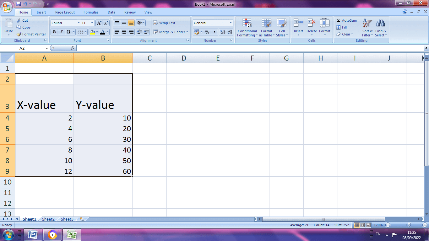
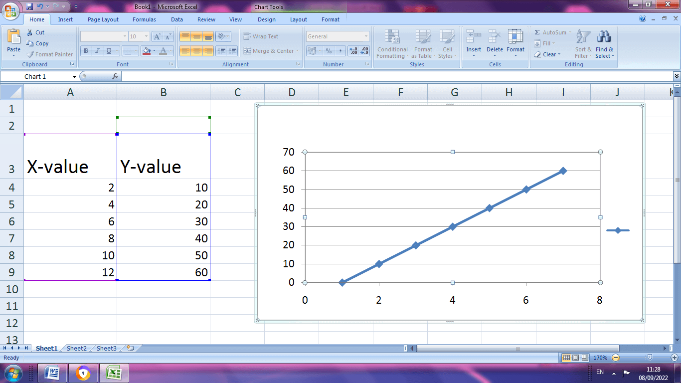
Step 2: Highlight the data table, choose Insert option .If it is 2010 Excel, the Scatter group is present in Insert tab. Select the desired chart type.
Step 3: If the Excel is 2013, choose the Chart group from Insert tab, select X and Y Scatter chart.
Step4: The data are represented in chart form as shown in the below picture.
Changing Axes to X and Y graph in Excel
To add the details in the graph like horizontal and vertical axes, the following steps should be followed.
Step 1: Click Add Chart Elements, choose Axis titles.
Step 2: There exist two options, Primary horizontal and Primary Vertical. Select the required options.
Step 3: The Horizontal and vertical axes are added to the graph.
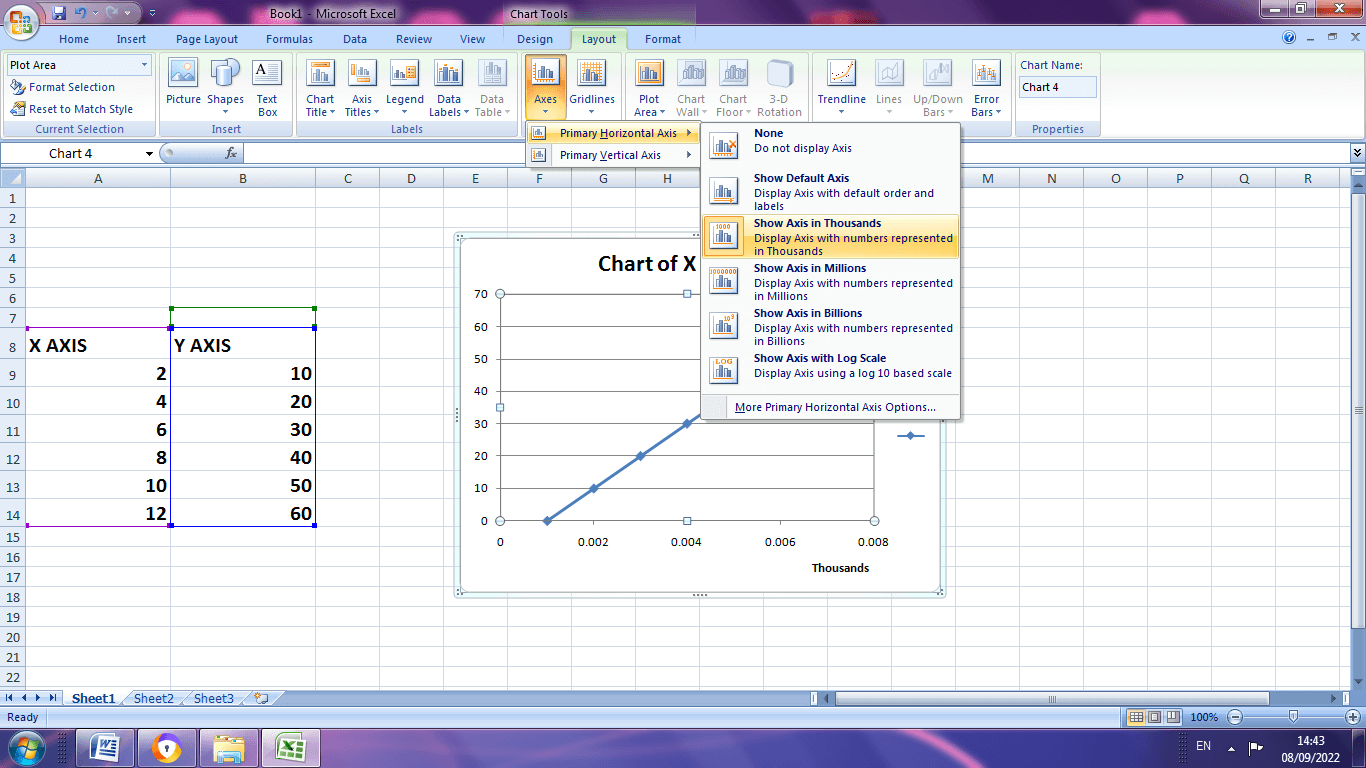
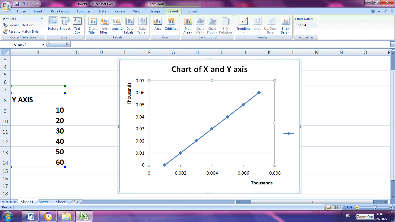
Step 4: The horizontal and vertical axes are changed in thousands which is displayed below.
Adding a Chart Title
Step 1: Click the chart
Step 2: Choose Chart title from the layout command tab and select the location
Step 3: In the chart title box type the name
Axes Classification
The axes are classified into two types,
- Value Axis
- Category Axis
The value axis indicates the numerical values, while the category axis indicates the multiple data that measured against each other by numerical values. These axes intersect by means of bars, columns, dots used to understand the data chart.
Example: How to create a chart with two Y-axes and one shared X- axis?
Step1: Select the insert tab from toolbar .In chart section select the column button and click the first chart.
STEP 2: Enter the data in the spreadsheet. Then right click the graph. A dialog box will appear, in that choose select data
Step 3: A dialog box will appear where the particular data range should be selected using comma.
Step 4: After selecting press Enter key. The graph will display as shown below.
Step 5: The final result of the graph.
Elements present in the Excel Charts
The multiple elements present in the excel helps to make the data more meaningful and effective.
Step 1: While click on the chart, three buttons appear at the upper right corner of the chart. They are as follows,
- Chart Elements
- Chart Styles and Colors
- Chart Filters
Step 2: Under the Chart Elements various subdivisions are,
- Axes
- Axis titles
- Chart Titles
- Data labels
- Data table
- Error bars
- Gridlines
- Legend
- Trend line
To check this option the users are allowed to watch the preview of each option.
Step 3: The users can select or deselect the chart elements, they decide what to display in the chart.
Setting a Multiple Axes with Excel
Step 1: Create a dataset and choose the desired graph to plot the datas as shown below.
Step 2: To add the secondary axis chooses Data>Insert>Charts>Recommended Charts
Step 3: After selecting the recommended chart option, a pop up window displays with various charts depends on dataset. The users are allowed to choose the desired chart as per the requirement.
Step 4: The title of the chart is added by choosing the Axis title from the Chart Elements menu.
Step 5: By choosing data labels from labels, the required data are set to the graph.
Date and Text Axis
One can arrange the data in the graph by means of date and text wise.
Step1: Create a data set with specified date and values
Step 2: On the insert tab, in chart group click the column symbol
Step 3: Choose the clustered column.
Step 4: To change the data from date to text format choose Format Axis from the horizontal axis.
Step 5: Choose Text Axis.
Step 6: A Final graph will be displaying the text axis from the date axis.