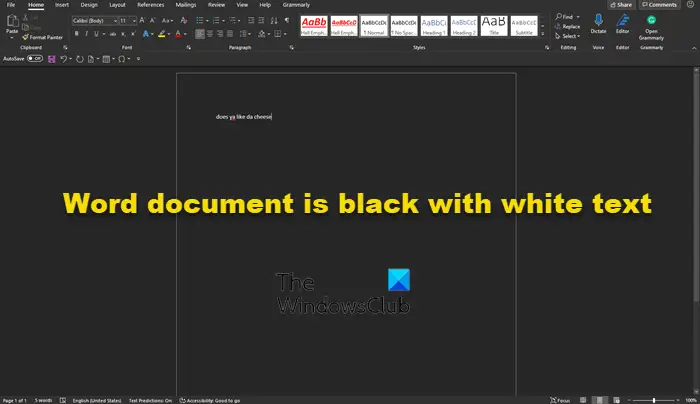
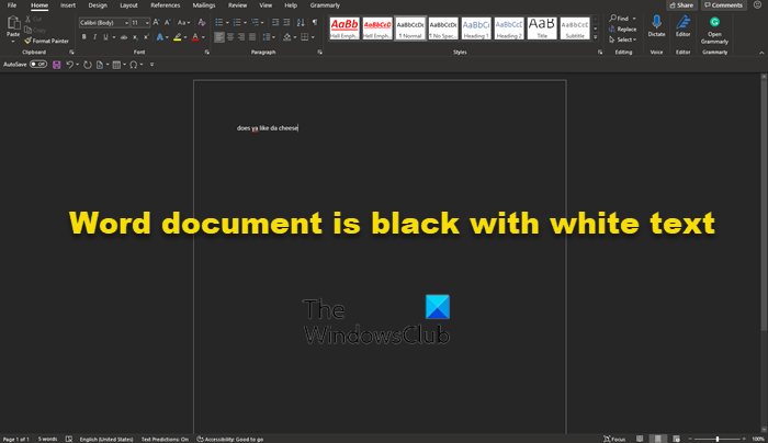
Over the past couple of days, we’ve been seeing some users complaining about their Microsoft Word document showcasing a black background with white text. What could be the cause of this? Well, we can say for certain it is not being caused by a bug.
As stated above, it has nothing to do with a bug affecting Microsoft Word. It is all due to Dark Mode. Yes, Microsoft Word supports Dark Mode, and chances are, you’ve enabled it by accident, or someone who used your computer in the past did the deed. Additionally, maybe you’ve recently chosen to use a high contrast theme. Such themes can cause a change in the look of Microsoft Word documents that might not be pleasing to the eyes. Now, we must state that another reason for the dark background with white text affecting a document, may be due to hardware graphics acceleration.
Worry not because we know how to solve this problem, so keep reading to get a better idea of what to do:
- Disable Dark Mode in Microsoft Word
- Switch from using high contrast themes
- Turn off Hardware Graphics Acceleration.
1] Disable Dark Mode in Microsoft Word
OK, so we are going to discuss how to turn off Dark Mode in Word and return it to a setting that is more appealing to you.
- Open the Microsoft Office application
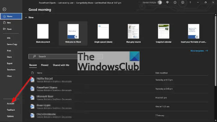
- Go to the File tab.
- Click the File tab to open the menu.
- Choose Account.
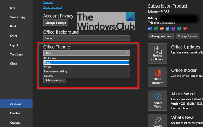
- Click Office Theme drop-down arrow.
- Choose Black to turn On the Dark Mode.
- To enable Dark mode for a single PC, Select File Tab.
- Go to Options.
- Scroll down to the Office Theme.
- Change the theme to White
Before we begin, you must ensure Microsoft Word is up and running. Do this by clicking on the shortcut on the Taskbar, Start Menu, or double-click on it if it’s located on the Desktop.
The next step, then, is to navigate to Account. You can do this by looking at the bottom left area of the main menu of Microsoft Word. If you’re in a document, then click on File, then bring the mouse cursor down to Account and select it.
From the Account area, look for the section that reads, Office Theme, and click within the box to reveal a dropdown menu. From here, you can change the theme from Black to White. Also, if your background is black due to System Settings, you can.
Once you’ve made the changes, Microsoft Word should now return to having a white background with black text, just like normal.
Read: How to get rid of black squares or boxes in Word.
2] Switch from using high contrast themes
So as we’ve stated above, using a high contrast theme for Windows 11 could be the cause of your problems, so what can we do? Well, how about we change it to a regular theme?
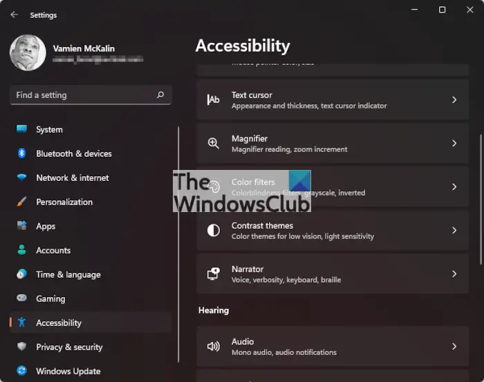
First, we must fire up the Settings app by clicking on the Windows key + I. Right away the Settings menu should appear in all of its glory.
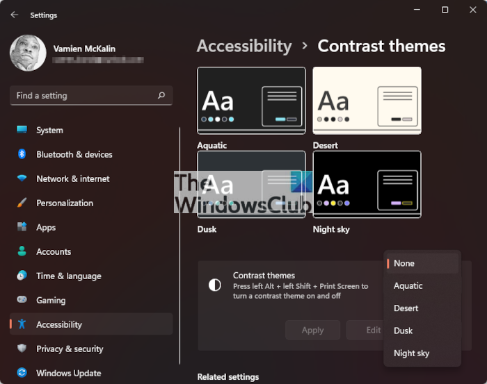
OK, so from the left-pane, we suggest clicking on Accessibility to reveal a bunch of options to the right. Scroll down if you must, then choose Contrast Themes from the list of options.
In order to turn off the current Contrast Theme, click in the box to reveal a dropdown menu. From there, select None, then hit Apply. You will see a Please Wait screen, so do what it says and in just a short moment, things should return to normal.
3] Turn off Hardware Graphics Acceleration
Turn off Hardware Graphics Acceleration and see if that helps you.
TIP: Learn how to enable Dark Mode for Teams, OneNote, and Outlook.
Does Microsoft Office have a dark mode?
Yes, the folks at Microsoft updated the Office Suite with Dark Mode a good while back, so if that is something you like, then you’ll be a happy camper as it works quite well. However, the Dark Mode function is not for everyone.
Is Dark Mode better for the eyes?
From what we can tell, Dark Mode could decrease eye strain for those who look at a computer screen quite often, at least, for some. However, we have not come across any conclusive evidence to say the benefits are factual. What we do know for sure though, is that Dark Mode extends the battery life of your device.
I am documenting some software in MS Word. I want white text on black background when viewing on the computer (it saves eyes and power), but I want black text on white background to save ink in case people print. Is this possible?
I don’t know if this helps but I will likely be saving as PDF. Currently, I have a dark background with «Automatic» font color. Shame there’s no way of defining the background to be clever like the font color.
asked Oct 27, 2011 at 15:55
You could use HTML instead of word documents.
Not only is it a standard and easily viewed, but you can actually define different stylesheet for screen and printer.
Depending on your needs, you can knit the markup by hand or customize TinyMCE for your needs.
Or, as is quite common, you could use a wiki system to write your documentation, which would also give you all the features of a wiki (versioning, linking, searching, tagging etc.).
answered Oct 27, 2011 at 18:44
For Word 2013, the easiest method that I know of is:
- Choose Design on the Ribbon
- On the far right end of the Ribbon, select Page Color. If you don’t see it, you may need to expand the Ribbon to show all commands.
- Choose your desired page color. If you choose black, Word will automatically display your text in white.
To make the color settings persistent, click Set As Default just to the left of the Page Color button.
answered Jan 7, 2014 at 23:16
davidrhdavidrh
2312 silver badges2 bronze badges
3
On the ribbon go to «Page Layout» and then «Page Color» — select black
Then on the font styles you are using, change the color to white. There’s probably a way you can set this up as a default template if you want it for every document. Not sure if it will try to print it this way or not. It’s not too hard to switch it all back before you print though. (revert the page background, and select all; change font color)
answered Feb 20, 2012 at 0:35
JChJCh
691 silver badge1 bronze badge
1
Keep your document settings for onscreen viewing as you have chosen (black background, “automatic” text color). In Word 2010, go to the File tab; select Options; select Display; go to Printing options and UNCHECK the box that says “Print background colors and images.” This will PRINT your document with black text on a white background.
answered Mar 4, 2013 at 12:34
Used to be you could activate a mode that gave you white text on a dark blue background, like in the DOS days. It affected only the viewing of the document; it still printed as expected. But they took that out in Office 2007, sorry.
You could in theory write a macro that changed the colors around when printing, and changed them back afterward, and then attach it to the Word document. A lot of work for little gain, though.
FYI, it takes less power to display a white screen on a modern LCD, so if that’s your concern, leave it the way it is.
answered Oct 27, 2011 at 17:18
kindallkindall
3112 silver badges6 bronze badges
2
IT WORKED FOR ME!!!!!!!!!!!!!
If you run win 10 and office 2016, you might need latest updates installed. For me it started working in nov. 2018.
Now all goes smooth. I hunted this thing (black background) for many, many years and, finally got this. Try this out.
Open a new document in word 2016. Go to Design ribbon and on the right click PAGE COLOR in Page background section (the most right in my case). Choose a black color. Then type some text. Now try to print. In my case on the screen I have a black background and white text, but on the paper I’ve got it inverted, just normal black text on white paper!!!!!!! All works just fine.
The only thing left is to figure it out how to make it default. Cause currently if you create a new document, it still opens with white background.
Cheers guys!!! Hope it helps.
uch.NZ
answered Nov 2, 2018 at 19:34
Guys its Damn simple but in a different way.. if on windows 10 press Windows button-> type «color filter» -> turn it on -> choose «inverted» ! It’ll be good to check the «shortcut» box so that you can use «Ctrl»+»Windows»+»C» to invert the color instantaneously.
For clear description watch here —> https://www.youtube.com/watch?v=fYFSr0uptts
answered Jul 28, 2019 at 14:01
1
Another possibility is to use Windows’ high contrast mode.
The shortcut is shift-alt-print.
It’s a not-so-pretty but fast option for many programs that don’t supply darkmodes themselves, but sometimes control elements turn invisible because of it.
In Word 2019 it seems to work fine so far, and printed pages are, similar to the color-filter solution, still white with black text.
The way it looks can be enhanced a bit in the system settings.
I would choose the high-contrast mode over the color-filter because it changes background- and font-color somewhat more intelligent, IMHO.
answered Oct 18, 2019 at 16:43
You could use a different windows theme while editing your word/excel documents.
There is a inverted contrast accessibility theme that will do just that.
answered Oct 27, 2011 at 16:04
1
I found the solution I was looking for by activating Immersive Reader in view->Immersive Reader.
I credit this find to this link
https://www.davidbosman.fr/scsaw/?p=687
answered Sep 12, 2020 at 14:38
You can do this if you use Windows Vista, Windows 7 or Windows 8.
- Go to Control Panel > Personal display setting > Change theme
- Then you scroll down until you see high contrast black.
- Select it
Now everything will go black.
This is useful if you work at night and sleep in day time. Or if you work in a dark environment to save energy or what-so-ever.
This works in any Windows apps if you have Vista, 7 or 8.
random♦
14.5k9 gold badges53 silver badges58 bronze badges
answered Nov 30, 2013 at 16:36
3
I found a way around this.
I create my text documents on Google Drive first (that could be any online resource) while using the Hacker Vision extension which inverts the screen colors to protect your eyesight.
Then you can copy it to Word and do the final arrangement 
answered Apr 6, 2014 at 19:52
- TEXT
- STYLES
- ICON
- BACKGROUND
- ANIMATION
- DOWNLOAD
Zoom:
Character spacing:
Line spacing:
Curve the text:
Rotation:
Merge styles (multiline)
Upload .textstudio
- 3D & FILLING
- OUTLINES
- SHADOWS
No results with this search yet.
No results with this search yet.
- FITTED
- SQUARE
Advanced options
Spacing around the text:
The effect to curve the text noticeably increases the file creation time.
- .PNG
- .GIF
- .TEXTSTUDIO
- .APNG
- .GIF HD
- .WEBM
- .ZIP (PNGs)
- SAVE
- COPY IMAGE
- PUT ON AN IMAGE
Some users consider dark mode a fad. Because of my deteriorating eyesight, I don’t have such a luxury: I can’t read dark text on bright/light colored background, be it on screen or on paper.
Before dark mode was a thing, I was using a high contrast accessibility theme—which is great but also way too radical for my specific needs. Dark mode has given me the best of both worlds: a more or less ‘normal’ looking setup, only with bigger fonts, less eye candy and, well, darker colors.
So, how does Microsoft Word deal with dark mode? Very well, as long as you do not limit yourself to what the majority of guides will suggest you do, that is to use Office 365 dark mode. There is more to it, as you will see.
But let’s start with the obvious: activating Office’s dark mode.
Activate dark mode in Office 365
- Open Word, go to File->Options.
- In the sidebar, click the General tab.
- Locate the Personalize your copy of Microsoft Office and set Office Theme to Black. You guessed it, this will apply to all Office 365 applications, not just Word.
Let’s have a look at a test document in Word.
As expected, the user interface is dark but the document itself, our page, remains blindingly white. Not really what we were hoping for.
Word offers two ways to go beyond that. Which one to use depends on what you want to do: keep using the traditional page display mode, or not.
Change colors using the Page Color
In the Ribbon, go to the Design tab and then click the Page Color button.
Tip: use Word’s search field to quickly access any command or button: type what you’re looking for:
Once you have opened the Page Color settings, pick a theme in the Theme Colors. You’ve just picked a background color for your entire document, and Word will automatically change its text, using a contrasting color.
“But, I don’t want my page to print in dark and my text in white!”
It won’t. This theme applies only to the screen rendering of your document. Word is clever enough to remember that in general paper is white and text should be printed in black.
Help! My text stays black!
If your document was not created directly in Word or if you have defined a custom Normal style, it’s possible your text won’t update after changing the background color. Don’t panic.
Right-click anywhere on the black text, a little pop-up should appear. Click the “Styles” button to list most used styles in your document. Then, right-click the Normal Style button and choose “Modify…”
A window opens—yeah I know, it’s not using dark mode… maybe in a next update?
This is where you modify your Styles. If you’re not familiar with Styles: every Word document uses a bunch of styles to define the look of everything on the page and on the screen. There are a lot of predefined styles that you can tweak, and you can create your own too. There are styles for headings, for foot-notes, for your paragraphs, for individual characters, and so on. Each style has many options—too much to list here. The one that we’re interesting in is the text color.
Next to the U button, the color drop-down list should be set to “Automatic”, yours is probably set to black, click the list and change it. That’s all.
Immersive Reader: turning Word into a text editor on steroids
Like all the other word processors I can think of, Word relies on the “page” metaphor—what you see on screen looks very much like what you will get once it’s printed on a sheet of paper. That is certainly useful when writing reports or stuff that will end up printed on paper, but it has nothing to do with what I write, or how I write.
I write and I read on a screen. I don’t need to turn pages or to see page borders. I scroll my text like I would in a web browser or any basic text editor. No margins, no page breaks, no headings or footers, nothing but my raw text. Except that I like to have some basic formatting too—I like being able to select the font I’m using, and a first-line indent is a must have for me, and so on. You know, personal preferences.
Word can give you both: the styling you need and the simplicity of raw text.
How? By using its Immersive Reader. Unlike what the name suggests it is not only a great reading mode, but it’s also a great editing mode. If you’re a long time Word user, think of the old Draft mode. Only much better and more polished.
This is the mode I use Word most of the time.
Go to the View tab and click the Immersive Reader button. If you don’t run the most recent Office 365 subscriber version, it may still be named Learning Tools but they share the same icon: an open book with a little loudspeaker on the right page—a loudspeaker because among other features to help students with disabilities, this mode includes a read aloud function.
Once activated, the page view is hidden: no borders or margin. you’re left with your content. One exdeption: drawing/inking won’t show up in Immerse reader, but images will be displayed, and all your styles too—a text editor on steroids.
Tip: The first time you activate the Immersive Reader/Learning Tools, your text will probably look oddly formatted. That’s because this mode was developed to help users with disabilities, and some tools are activated by default. But you can turn them off and Word will remember it the next time.
In the Immersive Reader tab, click the Text Spacing and the Syllables buttons to turn them off:
- Use the Page Color to select the black background. Very recently they added many other colors, but that doesn’t work as well as expected. I reported the bug and do not use it for the moment.
- Use the Column Width to set the width of your text on screen. It won’t change the way it is printed.
- You can zoom freely, from 10 to 500%. Zooming only changes the font on screen, not its actual size on page or printed.
- Another cool feature—even if I don’t use it—is the Line Focus that helps focus even more on the section of text you’re working on by diming all your document save 1, 3 or 5 lines around the active line:
Conclusion
The Immersive Reader is the mode I use all the time, no matter what I’m writing: a book, a blog post, a short story, research notes, and so on. It turns Word into a comfortable app that suits so well my—admittedly very specific—needs while letting me access most of Word more advanced features I also need (styles, macros, and so on).
Is Word the perfect solution? No, of course not. It’s still a huge beast that takes time and efforts to tame. Some windows and controls haven’t yet been updated to use dark mode, and a few insist on using fixed font size and therefor can’t be resized. And you’ll need to subscribe to Office 365 to access all the latest features. And so on.
But if you haven’t used Word in recent years it’s impressive to see how it has changed, and it’s so encouraging to see Microsoft constantly improving it accessibilty-wise and, I’m kidding you not, in user-friendliness.
For example, one thing I did not mention at all that I use as much as the Immersive Reader is the ability to entirely customize the Ribbon—what tabs to show, and what buttons, and in what order—and the ability to quickly show or hide it, turning it into the most useful type of menu ever created, imo. Maybe that could be something for another post? 😉
Edit: Here is a similar how-to for LibreOffice (it works bestunder Linux, but is useable too under Windows or macOS): LibreOffice Writer: Clutter Free Dark Mode .
Are there any reasons to avoid using white text on a black background?
Kit Grose
15.4k2 gold badges36 silver badges72 bronze badges
asked Aug 18, 2010 at 4:48
3
Here’s an article on it. To quote the article’s quotes:
However, most studies have shown that
dark characters on a light background
are superior to light characters on a
dark background (when the refresh rate
is fairly high). For example, Bauer
and Cavonius (1980) found that
participants were 26% more accurate in
reading text when they read it with
dark characters on a light background.
and
People with astigmatism (aproximately
50% of the population) find it harder
to read white text on black than black
text on white. Part of this has to do
with light levels: with a bright
display (white background) the iris
closes a bit more, decreasing the
effect of the «deformed» lens; with a
dark display (black background) the
iris opens to receive more light and
the deformation of the lens creates a
much fuzzier focus at the eye.
If you do want to use a dark theme, see how others use it:
Windows console
- Gray on black
- Large font
- Bold
- Semi-serif
Expression Blend
- Eggshell on gray
- Sans-serif
- ClearType (zoomed out on an LCD, the text looks yellow-white; you don’t notice the blue)
answered Aug 18, 2010 at 11:36
3
Timothy Samara in Design Elements: A Graphic Style Manual provides interpretation of the colors black and white. Samara tells us that the color black is «extreme […] the strongest color in the visible spectrum.» He further calls it dominant and also typical of the feeling of nothingness. The color white, on the other hand we know is «all» colors, that feeling of wholeness and clarity.
A dominant darker-value color region (the black field) will cause our brain to expand lighter-value colors placed within it. The effect is that lighter-value objects will tend to bleed into the void of the very dark-value region. Practically, white characters will look heavier in a dark background.
Letters require a certain amount of space between each other to be readable—they need to be close enough to look like a grouped collection (and look like a word) but not so close that the boundary between letters becomes indistinct (and makes the group look like a blob). As the letters look thicker, the apparent space between them decreases and words tend toward bright white blobs. Unless the font presentation is modified, this makes white-on-black less readable and therefore undesirable.
White-on-black can be achieved, however, with a little extra effort in the interface’s style sheets (or whatever is used to define how/what text is presented).
- First, a «thin» or «light» (not «narrow») font or font-weight will reduce the effect of the letter body bleed. Alternatively, a larger type size will provide the letter glyphs with enough surface area to successfully battle the black background for visual dominance.
- Secondly, an increase in letter spacing (more-so for the smaller font sizes) will give the glyphs the bit of extra room they need to look like letters. These two effects can mitigate the usability losses of standard fonts in white on a black background, allowing you to use said alternative color combination.
answered Aug 18, 2010 at 20:23
MattMatt
2,0481 gold badge12 silver badges14 bronze badges
5
It’s mostly about the contrast and the medium. If the contrast is too high than glowing letters on a dark background may strain the eye.
Here is an interesting conversation on the subject with lots of thoughts.
answered Aug 18, 2010 at 9:31
KostyaKostya
2,9261 gold badge16 silver badges10 bronze badges
White text on black background does have very practical uses, especially when the ambient light is dim or even zero, and the device showing the text emits a fair amount of light (like an iPad on full brightness).
answered Aug 18, 2010 at 7:09
Eye strain. But everything is appropriate in certain circumstances.
answered Aug 18, 2010 at 5:07
Glen LipkaGlen Lipka
11.7k1 gold badge33 silver badges51 bronze badges
When you are in a room with a lot of sunlight, it can be very difficult to read white text on a black background. Same problem when you have a laptop and you aren’t sitting right in front of the screen. Dark themes look awesome though.
answered Aug 18, 2010 at 6:56
neoneyeneoneye
9114 silver badges14 bronze badges
I suggest you take a look at Blackle.
It’s an inverted Google — white on black.
Take the extra click and go to the site and compare your experience to the regular Google.
(they do it to save energy, but user experience definitely suffers, at least in my opinion)
answered Aug 18, 2010 at 12:46
Dan BarakDan Barak
7,7321 gold badge27 silver badges30 bronze badges
A few points:
-
The eyes’ iris’ adjust to according to the amount of light the eyes receive.
If most of the area is black and then you have a very bright light it can strain the eyes, therefore if the screen has a strong intensity level gray on black is more recommended than white on black, however, the intensity level of screens can be adjusted so this is less of an issue. -
As Matt quoted, in our perception of the images we view, bright areas expand to darker areas, thus regular text seems more bold when the text is brighter than the background. If the text is bold to start with, the result of white on black may seem too bold, however, for regular text, I find that the text seems to «stand out» more and is easier to read.
If I am not mistaken, most text is not bold, therefore it makes more sense to optimize the viewing of regular text that that of bold text. -
If you are reading in a dark environment, then a white background will strain the eyes when ever you look away from the screen or back at it.
-
If you are reading in a bright environment, then refer to this answer.
-
If you are reading formatted text with many colors/shades (e.g. reading/writing code) or working with images then darker colors on a black background will be easier to perceive than brighter colors on a white background (see formula for contrast here).
-
It is a common (mis)conception that white backgrounds are preferable, however, those I know that have really tried working with modern screens and dark backgrounds with suitable foreground colors prefer it.
-
As Fraser pointed out, the studies quoted are outdated and not enough factors were measured (e.g. period of time in front of screen, screen type, room lighting, diversity of text shades and colors).
-
Cleartype is used on modern LCDs (new «LED» screens are really LCDs too, just with LED backlight instead of florescent) for white on black and for black on white. It is a method of anti-aliasing by using sub-pixels and has nothing to do with which is darker.
answered Feb 29, 2012 at 23:45
Danny VarodDanny Varod
7,34324 silver badges37 bronze badges
Sometimes the style dictates using white font on black background. If you must, make sure to use only a sans serif font, and preferably one that’s not too thin.
answered Aug 18, 2010 at 7:29
HishamHisham
6,8671 gold badge20 silver badges16 bronze badges
Not really an answer but:
So is an off-white on a black background better to use?
Most notable case recently would be Microsoft Expression Blend.
answered Aug 18, 2010 at 10:20
Number plates of vehicles in Indian standards follow dark on light style, which makes it more readable even at distances. So should we consider using black font on lighter back grounded screens.
answered Aug 18, 2010 at 11:15
1
За последние пару дней мы видели, как некоторые пользователи жаловались на то, что их документ Microsoft Word демонстрирует черный фон с белым текстом. Что может быть причиной этого? Ну, мы можем с уверенностью сказать, что это не вызвано ошибкой.
Как указано выше, это не имеет ничего общего с ошибкой, затрагивающей Microsoft Word. Это все из-за темного режима. Да, Microsoft Word поддерживает темный режим, и, скорее всего, вы включили его случайно или это сделал кто-то, кто использовал ваш компьютер в прошлом. Кроме того, возможно, вы недавно решили использовать высококонтрастную тему. Такие темы могут вызвать изменение внешнего вида документов Microsoft Word, которое может не радовать глаз. Теперь мы должны констатировать, что еще одна причина темного фона с белым текстом, влияющая на документ, может быть связана с аппаратным ускорением графики.
Не беспокойтесь, потому что мы знаем, как решить эту проблему, поэтому продолжайте читать, чтобы лучше понять, что делать:
- Отключить темный режим в Microsoft Word
- Отказ от использования высококонтрастных тем
- Отключите аппаратное ускорение графики.
1]Отключить темный режим в Microsoft Word
Итак, мы собираемся обсудить, как отключить темный режим в Word и вернуть его к настройке, которая вам больше нравится.
- Откройте приложение Microsoft Office
- Перейти к Файл вкладка
- Нажмите на Файл вкладку, чтобы открыть меню.
- выберите Счет.
- Щелкните стрелку раскрывающегося списка Тема Office.
- выберите Чернить чтобы включить темный режим.
- Чтобы включить темный режим для одного ПК, выберите Файл Таб.
- Идти к Опции.
- Прокрутите вниз до Офисная тема.
- Смените тему на белую
Прежде чем мы начнем, вы должны убедиться, что Microsoft Word запущен и работает. Сделайте это, щелкнув ярлык на панели задач, в меню «Пуск» или дважды щелкнув его, если он находится на рабочем столе.
Следующим шагом будет переход к учетной записи. Вы можете сделать это, посмотрев в нижнюю левую область главного меню Microsoft Word. Если вы находитесь в документе, нажмите «Файл», затем наведите курсор мыши на «Учетная запись» и выберите ее.
В области «Учетная запись» найдите раздел с надписью «Тема Office» и щелкните в поле, чтобы открыть раскрывающееся меню. Отсюда вы можете изменить тему с черной на белую. Кроме того, если ваш фон черный из-за системных настроек, вы можете.
После того, как вы внесли изменения, Microsoft Word теперь должен вернуться к белому фону с черным текстом, как обычно.
2]Переключиться с использования высококонтрастных тем
Итак, как мы уже говорили выше, использование высококонтрастной темы для Windows 11 может быть причиной ваших проблем, так что мы можем сделать? Ну, как насчет того, чтобы изменить ее на обычную тему?
Во-первых, мы должны запустить приложение «Настройки», нажав клавишу Windows + I. Сразу же меню «Настройки» должно появиться во всей красе.
Итак, на левой панели мы предлагаем нажать «Доступность», чтобы открыть множество параметров справа. Прокрутите вниз, если необходимо, затем выберите «Контрастные темы» из списка вариантов.
Чтобы отключить текущую контрастную тему, щелкните поле, чтобы открыть раскрывающееся меню. Оттуда выберите «Нет», затем нажмите «Применить». Вы увидите экран «Пожалуйста, подождите», так что делайте то, что он говорит, и через короткое время все должно вернуться в нормальное русло.
3]Отключите аппаратное ускорение графики.
Отключите аппаратное ускорение графики и посмотрите, поможет ли это вам.
СОВЕТ. Узнайте, как включить темный режим для Teams, OneNote и Outlook.
Есть ли в Microsoft Office темный режим?
Да, ребята из Microsoft некоторое время назад обновили Office Suite с темным режимом, поэтому, если вам это нравится, вы будете счастливы, потому что он работает довольно хорошо. Однако функция Dark Mode не для всех.
Темный режим лучше для глаз?
Из того, что мы можем сказать, темный режим может снизить нагрузку на глаза у тех, кто довольно часто смотрит на экран компьютера, по крайней мере, у некоторых. Тем не менее, мы не нашли убедительных доказательств того, что преимущества являются фактическими. Что мы знаем точно, так это то, что темный режим продлевает срок службы батареи вашего устройства.

Many users prefer to use “Dark Mode” in their Office applications as it reduces the amount of bright white light on screen that can get quite uncomfortable after a while. Luckily, Microsoft Office has themes that can be used to change the color appearance of Office applications like Word and Outlook to be, for example, black. In the past, the black Office theme has kept Word documents white while turning most of the user interface to the darker color. However, it seems that Word has recently started turning the documents of some users black as well.
Some users may like this as it really tones down the white light, and others may not as it can make colored elements and images look a bit off. Luckily there is a simple toggle to switch this back and forth.
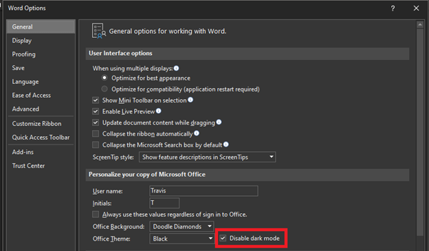
Open up the options menu by clicking File, then Options at the bottom. The Options menu starts in the General tab. In this General tab navigate to the Personalize section. Next to the Office Theme selector is a check box for Disable dark mode. Checking this box will keep the document white while using a dark Office theme. Unchecking it will change the document color.
As a note, while the document appears black with that unchecked, it wouldn’t actually print out a black document with white text, nor would pdf files created from the document be black. It is purely a cosmetic, personal-preference setting.
This similar function also exists in Microsoft Outlook. It can be accessed in essentially the exact same way as in Word: File > Options > General > Personalize. The only difference is that the check box is labeled as “Never change the message background color” rather than “Disable dark mode.”
Get started
At Syvantis, we have a plethora of experience in using the many features of Office applications and troubleshooting issues. Get in touch with one of our consultants to learn more about our Office 365 packages and support options.

