
The word-break CSS property sets whether line breaks appear wherever the text would otherwise overflow its content box.
Try it
Syntax
/* Keyword values */
word-break: normal;
word-break: break-all;
word-break: keep-all;
word-break: break-word; /* deprecated */

/* Global values */
word-break: inherit;
word-break: initial;
word-break: revert;
word-break: revert-layer;
word-break: unset;
The word-break property is specified as a single keyword chosen from the list of values below.
Values
normal-
Use the default line break rule.
break-all-
To prevent overflow, word breaks should be inserted between any two characters (excluding Chinese/Japanese/Korean text).
keep-all-
Word breaks should not be used for Chinese/Japanese/Korean (CJK) text. Non-CJK text behavior is the same as for
normal. break-word
Deprecated
-
Has the same effect as
word-break: normalandoverflow-wrap: anywhere, regardless of the actual value of theoverflow-wrapproperty.
Note: In contrast to word-break: break-word and overflow-wrap: break-word (see overflow-wrap), word-break: break-all will create a break at the exact place where text would otherwise overflow its container (even if putting an entire word on its own line would negate the need for a break).
Note: While word-break: break-word is deprecated, it has the same effect, when specified, as word-break: normal and overflow-wrap: anywhere — regardless of the actual value of the overflow-wrap property.
Formal definition
| Initial value | normal |
|---|---|
| Applies to | all elements |
| Inherited | yes |
| Computed value | as specified |
| Animation type | discrete |
Formal syntax
word-break =
  normal      |
  keep-all    |
  break-all   |
  break-word
Examples
HTML
<p>1. <code>word-break: normal</code></p>
<p class="normal narrow">
  This is a long and Honorificabilitudinitatibus califragilisticexpialidocious
  Taumatawhakatangihangakoauauotamateaturipukakapikimaungahoronukupokaiwhenuakitanatahu
  グレートブリテンおよび北アイルランド連合王国という言葉は本当に長い言葉
</p>

<p>2. <code>word-break: break-all</code></p>
<p class="breakAll narrow">
  This is a long and Honorificabilitudinitatibus califragilisticexpialidocious
  Taumatawhakatangihangakoauauotamateaturipukakapikimaungahoronukupokaiwhenuakitanatahu
  グレートブリテンおよび北アイルランド連合王国という言葉は本当に長い言葉
</p>

<p>3. <code>word-break: keep-all</code></p>
<p class="keepAll narrow">
  This is a long and Honorificabilitudinitatibus califragilisticexpialidocious
  Taumatawhakatangihangakoauauotamateaturipukakapikimaungahoronukupokaiwhenuakitanatahu
  グレートブリテンおよび北アイルランド連合王国という言葉は本当に長い言葉
</p>

<p>4. <code>word-break: break-word</code></p>
<p class="breakWord narrow">
  This is a long and Honorificabilitudinitatibus califragilisticexpialidocious
  Taumatawhakatangihangakoauauotamateaturipukakapikimaungahoronukupokaiwhenuakitanatahu
  グレートブリテンおよび北アイルランド連合王国という言葉は本当に長い言葉
</p>
CSS
.narrow {
  padding: 10px;
  border: 1px solid;
  width: 500px;
  margin: 0 auto;
  font-size: 20px;
  line-height: 1.5;
  letter-spacing: 1px;
}

.normal {
  word-break: normal;
}

.breakAll {
  word-break: break-all;
}

.keepAll {
  word-break: keep-all;
}

.breakWord {
  word-break: break-word;
}
Specifications
| Specification |
|---|
| CSS Text Module Level 3 # word-break-property |
Browser compatibility
BCD tables only load in the browser
See also
Okay, this is really confusing me. I have some content inside of a div like so:
<div style="background-color: green; width: 200px; height: 300px;">

Thisisatest.Thisisatest.Thisisatest.Thisisatest.Thisisatest.Thisisatest.

</div>
However, the content overflows the DIV (as expected) because the ‘word’ is too long.
How can I force the browser to ‘break’ the word where necessary to fit all of the content inside?
Pardeep Jain
83k37 gold badges159 silver badges215 bronze badges
asked Jun 17, 2010 at 4:26
Nathan OsmanNathan Osman
70.6k71 gold badges254 silver badges359 bronze badges
2
Use word-wrap:break-word;
It even works in IE6, which is a pleasant surprise.
word-wrap: break-word has been replaced with overflow-wrap: break-word; which works in every modern browser. IE, being a dead browser, will forever rely on the deprecated and non-standard word-wrap instead.
Existing uses of word-wrap today still work as it is an alias for overflow-wrap per the specification.
TylerH
20.6k64 gold badges76 silver badges97 bronze badges
answered Jun 17, 2010 at 5:36
5
I am not sure about the browser compatibility
word-break: break-all;
Also you can use the <wbr> tag
<wbr>(word break) means: «The browser
may insert a line break here, if it
wishes.» It the browser does not think
a line break necessary nothing
happens.
TylerH
20.6k64 gold badges76 silver badges97 bronze badges
answered Jun 17, 2010 at 4:29
rahulrahul
183k49 gold badges232 silver badges262 bronze badges
6
I was just Googling the same issue, and posted my final solution HERE. It’s relevant to this question too.
You can do this easily with a div by giving it the style word-wrap: break-word (and you may need to set its width, too).
div {
    word-wrap: break-word;         /* All browsers since IE 5.5+ */
    overflow-wrap: break-word;     /* Renamed property in CSS3 draft spec */
    width: 100%;
}
However, for tables, you also need to apply: table-layout: fixed. This means the columns widths are no longer fluid, but are defined based on the widths of the columns in the first row only (or via specified widths). Read more here.
Sample code:
table {
    table-layout: fixed;
    width: 100%;
}

table td {
    word-wrap: break-word;         /* All browsers since IE 5.5+ */
    overflow-wrap: break-word;     /* Renamed property in CSS3 draft spec */
}
TylerH
20.6k64 gold badges76 silver badges97 bronze badges
answered Nov 26, 2013 at 1:01
Simon EastSimon East
54.6k17 gold badges138 silver badges133 bronze badges
3
is the HTML entity for a unicode character called the zero-width space (ZWSP) which is an invisible character which specifies a line-break opportunity. Similarly the hyphen’s purpose is to specify a line-break opportunity within a word boundary.
answered Mar 10, 2015 at 8:25
davidcondreydavidcondrey
33.9k17 gold badges114 silver badges135 bronze badges
2
Found that using the following worked across most major browsers (Chrome, IE, Safari iOS/OSX) except Firefox (v50.0.2) when using flexbox and relying on width: auto.
.your_element {
    word-wrap: break-word;
    overflow-wrap: break-word;
    word-break: break-word;
}
Note: you may need to add browser vendor prefixes if you are not using an autoprefixer.
Another thing to watch out for is text using for spacing can cause line breaks mid-word.
TylerH
20.6k64 gold badges76 silver badges97 bronze badges
answered Dec 2, 2016 at 1:14
AndrewAndrew
5,4855 gold badges35 silver badges40 bronze badges
1
Whitespace is preserved by the browser. Text will wrap when necessary, and on line breaks
.pre-wrap {
    white-space: pre-wrap;
    word-break: break-word;
}
DEMO
td {
   word-break: break-word;
   white-space: pre-wrap;
   -moz-white-space: pre-wrap;
}

table {
    width: 100px;
    border: 1px solid black;
    display: block;
}
<table>
<tr><th>list</th>
<td>
1.longtextlongtextlongtextlongtextlongtextlongtextlongtextlongtextlongtextlongtextlongtextlongtext
2.breaklinebreaklinebreaklinebreaklinebreaklinebreaklinebreaklinebreaklinebreaklinebreaklinebreakline
</td>
</tr>
</table>
TylerH
20.6k64 gold badges76 silver badges97 bronze badges
answered Feb 26, 2019 at 8:52
Tính Ngô QuangTính Ngô Quang
4,2861 gold badge33 silver badges33 bronze badges
CSS word-wrap:break-word;, tested in FireFox 3.6.3
answered Jun 17, 2010 at 4:37
BabikerBabiker
18.1k28 gold badges77 silver badges125 bronze badges
0
Remove white-space: nowrap, if there is any.
Implement:
white-space: inherit;
word-break: break-word;
TylerH
20.6k64 gold badges76 silver badges97 bronze badges
answered Apr 24, 2018 at 14:09
1
I solved my problem with code below.
display: table-caption;
answered Jan 4, 2017 at 19:20
1
From MDN:
The
overflow-wrapCSS property specifies whether or not the browser should insert line breaks within words to prevent text from overflowing its content box.In contrast to
word-break,overflow-wrapwill only create a break if an entire word cannot be placed on its own line without overflowing.
So you can use:
overflow-wrap: break-word;
Can I use?
answered Nov 7, 2017 at 6:53
Shiva127Shiva127
2,3231 gold badge26 silver badges26 bronze badges
First you should identify the width of your element. E.g:
#sampleDiv{
  width: 80%;
  word-wrap:break-word;
}
<div id="sampleDiv">aaaaaaaaaaaaaaaaaaaaaaaaaaaaaaaaaaaaaa</div>so that when the text reaches the element width, it will be broken down into lines.
TylerH
20.6k64 gold badges76 silver badges97 bronze badges
answered Feb 20, 2014 at 10:22
As mentioned in @davidcondrey’s reply, there is not just the ZWSP, but also the SHY ­ that can be used in very long, constructed words (think German or Dutch) that have to be broken on the spot you want it to be.
Invisible, but it gives a hyphen the moment it’s needed, thus keeping both word connected and line filled to the utmost.
That way the word luchthavenpolitieagent might be noted as lucht­haven­politie­agent which gives longer parts than the syllables of the word.
Though I never read anything official about it, these soft hyphens manage to get higher priority in browsers than the official hyphens in the single words of the construct (if they have some extension for it at all).
In practice, no browser is capable of breaking such a long, constructed word by itself; on smaller screens resulting in a new line for it, or in some cases even a one-word-line (like when two of those constructed words follow up).
FYI: it’s Dutch for airport police officer
answered Nov 4, 2019 at 22:35
word-break: normal seems better to use than word-break: break-word because break-word breaks initials such as EN
word-break: normal
answered Jan 16, 2020 at 11:24
MatoeilMatoeil
6,75111 gold badges52 silver badges77 bronze badges
.word-break {
   word-break: keep-all;
   word-wrap: break-word;
}
answered May 10, 2022 at 18:46
You can use a grid system for this.
<div class="container" style="background-color: green; width: 200px; height: 300px;">
   <div class="row">Thisisatest.Thisisatest.Thisisatest.</div>
   <div class="row">Thisisatest.Thisisatest.Thisisatest.</div>
 </div>
answered Feb 16, 2022 at 6:32
Do this:
<div id="sampleDiv">aaaaaaaaaaaaaaaaaaaaaaaaaaaaaaaaaaaaaa</div>

#sampleDiv{
   overflow-wrap: break-word;
}
answered Sep 21, 2016 at 13:21
amit bendeamit bende
2663 silver badges4 bronze badges
just try this in our style
white-space: normal;
answered May 7, 2015 at 9:26
2
Improve Article
Save Article
Like Article
Improve Article
Save Article
Like Article
In this article, we will learn how to break a line of any statement using properties of CSS. You must know <br> tag that is used in HTML to break the line. But in this article, we will use only CSS to perform this task.
We use the word–break property in CSS that is used to specify how a word should be broken or split when reaching the end of a line. The word–wrap property is used to split/break long words and wrap them into the next line. The overflow–wrap CSS property is applicable to inline elements & specifies that the browser can break the line inside the selected element into multiple lines in an otherwise unbreakable place.
.word {
    width: 200px;
    overflow-wrap: break-word;
    word-wrap: break-word;
    word-break: break-word;
}
In this CSS, we need to specify a width from where the line break should start. In the above code, the line break will start after achieving a width of 200px.
Example 1: When width is 200px
HTML
<!DOCTYPE html>
<html lang="en">
<head>
<meta charset="UTF-8" />
<meta name="viewport" content=
"width=device-width, initial-scale=1.0" />
<style>
.word {
width: 200px;
overflow-wrap: break-word;
word-wrap: break-word;
word-break: break-word;
}
</style>
</head>
<body>
<p class="word">
GATE(Graduate Aptitude in Engineering)
is one the most important and in-demand
entrance exam for engineering graduates
in our country. Geeksforgeeks is here
to guide you through the GATE Computer
Science Engineering preparation.
Geeksforgeeks brings you the Complete
GATE preparation course GATE-CS Test
Series 2022, which will help the GATE
aspirants to boost their GATE score
and AIR.An extensive Online Test Series
for GATE CSE to boost your preparation.
Test series is designed considering the
pattern of previous years GATE papers
and ensures to resemble with the
standard of GATE 2022 exam.
</p>
</body>
</html>
Output: In this example, there is a line-break after 200px.

Example 2: When width is 500px
HTML
<!DOCTYPE html>
<html lang="en">
<head>
<meta charset="UTF-8" />
<meta name="viewport" content=
"width=device-width, initial-scale=1.0" />
<style>
.word {
width: 500px;
overflow-wrap: break-word;
word-wrap: break-word;
word-break: break-word;
}
</style>
</head>
<body>
<p class="word">
GATE(Graduate Aptitude in Engineering)
is one the most important and in-demand
entrance exam for engineering graduates
in our country. Geeksforgeeks is here
to guide you through the GATE Computer
Science Engineering preparation.
Geeksforgeeks brings you the Complete
GATE preparation course GATE-CS Test
Series 2022, which will help the GATE
aspirants to boost their GATE score
and AIR.An extensive Online Test Series
for GATE CSE to boost your preparation.
Test series is designed considering the
pattern of previous years GATE papers
and ensures to resemble with the
standard of GATE 2022 exam.
</p>
</body>
</html>
Output: In this example, there is a line-break after 500px.

Like Article
Save Article
When you’re writing HTML, you often need to insert line breaks. A line break is essential in addresses, poems, or when text exceeds the available browser width. If you don’t insert your own line breaks, then the text gets formatted in an odd way.
In this tutorial, I’m going to show you how to insert line breaks in your HTML code with some «with and without» examples, so you can start using it correctly and format your text better.
Basic HTML Line Break Syntax
You can insert line breaks in HTML with the <br> tag, which is equivalent to a carriage return on a keyboard.
Be aware that HTML will ignore any line break from a keyboard’s return key.
<br />
If you are wondering why there’s a forward slash in the <br> tag above, the slash was important when HTML4 was still widely used. With HTML5, you don’t need to put a slash in it anymore. But both will do the same thing.
If you are using a code formatter like prettier, it’ll always insert the slash when you save or paste even if you don’t put it in there.
How to Insert Line Breaks in Addresses
A line break is important when you’re writing an address on a letter, for example, in order to format it properly.
Here’s an example of an address without line breaks
An address without line breaks (<br> tags) looks like this:
<p>
     The White House, 1600 Pennsylvania Avenue NW Washington, DC 20500, USA.
</p>
I have added some CSS code to center everything with Flexbox and make the text a bit bigger:
body {
    display: flex;
    align-items: center;
    justify-content: center;
    height: 100vh;
    font-size: 3rem;
    max-width: 1000px;
    margin: 0 auto;
}
This is how it looks in the browser:
Here’s an address with line breaks
And this is how we can add line breaks to properly format our address:
<p>
    The White House <br />
    1600 Pennsylvania Avenue <br />
    NW Washington, DC <br />
    20500 <br />
    USA
</p>
It looks like this in the browser:
How to Add Line Breaks to Poems
Poems are conventionally written in short breaking sentences in order to create visual hierarchies and format them nicely.
So, if you want to write a poem in your HTML code, the <br> tag makes the formatting process easier for you.
A poem without line breaks
<p>
      I dabbled around a lot when I decided to learn to code
      I went from A to Z with resources
      When I decided to make my own things
      I discovered I've been in the old all while
      So I remained a novice in coding
      But then I found freeCodeCamp
      I got my hands on the platform
      I went from novice to ninja in coding
     And now I'm a camper for life
</p>
It looks like this in the browser:
You can see the poem has no visual hierarchy, it is not formatted the right way, and so it is unreadable as a poem.
A poem with line breaks
<p>
      I dabbled around a lot when I decided to learn to code <br />
      I went from A to Z with resources <br />
      When I decided to make my own things <br />
      I discovered I've been in the old all while <br />
      So I remained a novice in coding <br />
      But then I found freeCodeCamp <br />
      I got my hands on the platform <br />
      I went from novice to ninja in coding <br />
      And now I'm a camper for life <br />
</p>
I also changed the font size a bit in the CSS:
body {
   display: flex;
   align-items: center;
   justify-content: center;
   height: 100vh;
   font-size: 2.5rem;
   max-width: 1000px;
   margin: 0 auto;
}
It now looks like this in the browser:
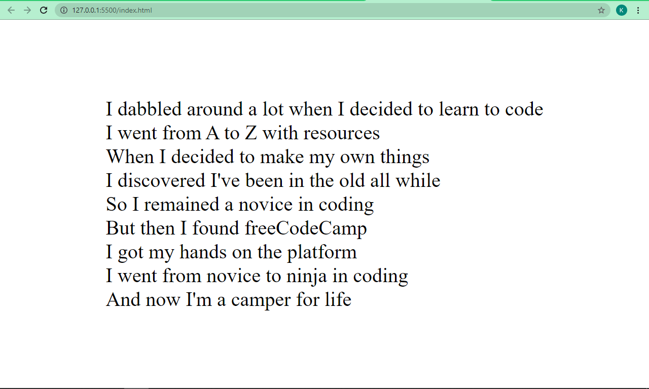
You can see that the poem is now more readable and formatted the right way.
Some valuable advice: Do not use the <br> tag to force a space between block-level elements (p, h1, h2, h3, div, etc). Instead, use the CSS margin property.
You might be wondering – since the <br> tag is an element, is it possible to style it?
Well, it is possible. But there’s no real practical need to style it since all it does is create a couple of white spaces.
Conclusion
I hope this tutorial has given you the background knowledge you need to use the <br> tag so you can make your HTML text look better.
Thank you for reading, and keep coding.
Learn to code for free. freeCodeCamp’s open source curriculum has helped more than 40,000 people get jobs as developers. Get started
Let’s talk about the various ways we can control how text wraps (or doesn’t wrap) on a web page. CSS gives us a lot of tools to make sure our text flows the way we want it to, but we’ll also cover some tricks using HTML and special characters.

Protecting Layout
Normally, text flows to the next line at “soft wrap opportunities”, which is a fancy name for spots you’d expect text to break naturally, like between words or after a hyphen. But sometimes you may find yourself with long spans of text that don’t have soft wrap opportunities, such as really long words or URLs. This can cause all sorts of layout issues. For example, the text may overflow its container, or it might force the container to become too wide and push things out of place.
It’s good defensive coding to anticipate issues from text not breaking. Fortunately, CSS gives us some tools for this.
Getting Overflowing Text to Wrap
Putting overflow-wrap: break-word on an element will allow text to break mid-word if needed. It’ll first try to keep a word unbroken by moving it to the next line, but will then break the word if there’s still not enough room.
See the Pen overflow-wrap: break-word by Will Boyd (@lonekorean) on CodePen.
There’s also overflow-wrap: anywhere, which breaks words in the same manner. The difference is in how it affects the min-content size calculation of the element it’s on. It’s pretty easy to see when width is set to min-content.
.top {
  width: min-content;
  overflow-wrap: break-word;
}.bottom {
  width: min-content;
  overflow-wrap: anywhere;
}
See the Pen overflow-wrap + min-content by Will Boyd (@lonekorean) on CodePen.
The top element with overflow-wrap: break-word calculates min-content as if no words are broken, so its width becomes the width of the longest word. The bottom element with overflow-wrap: anywhere calculates min-content with all the breaks it can create. Since a break can happen, well, anywhere, min-content ends up being the width of a single character.
Remember, this behavior only comes into play when min-content is involved. If we had set width to some rigid value, we’d see the same word-breaking result for both.
Breaking Words without Mercy
Another option for breaking words is word-break: break-all. This one won’t even try to keep words whole — it’ll just break them immediately. Take a look.
See the Pen word-break: break-all by Will Boyd (@lonekorean) on CodePen.
Notice how the long word isn’t moved to the next line, like it would have been when using overflow. Also notice how “words” is broken, even though it would have fit just fine on the next line.
word-break: break-all has no problem breaking words, but it’s still cautious around punctuation. For example, it’ll avoid starting a line with the period from the end of a sentence. If you want truly merciless breaking, even with punctuation, use line-break: anywhere.
See the Pen word-break: break-all vs line-break: anywhere by Will Boyd (@lonekorean) on CodePen.
See how word-break: break-all moves the “k” down to avoid starting the second line with “.”? Meanwhile, line-break: anywhere doesn’t care.
Excessive Punctuation
Let’s see how the CSS properties we’ve covered so far handle excessively long spans of punctuation.
See the Pen Excessive Punctuation by Will Boyd (@lonekorean) on CodePen.
overflow-wrap: break-word and line-break: anywhere are able to keep things contained, but then there’s word-break: break-all being weird with punctuation again — this time resulting in overflowing text.
It’s something to keep in mind. If you absolutely do not want text to overflow, be aware that word-break: break-all won’t stop runaway punctuation.
Specifying Where Words Can Break
For more control, you can manually insert word break opportunities into your text with <wbr>. You can also use a “zero-width space”, provided by the ​ HTML entity (yes, it must be capitalized just as you see it!).
Let’s see these in action by wrapping a long URL that normally wouldn’t wrap, but only between segments.
<!-- normal -->
<p>https://subdomain.somewhere.co.uk</p> <!-- <wbr> -->
<p>https://subdomain<wbr>.somewhere<wbr>.co<wbr>.uk</p>
<!-- ​ -->
<p>https://subdomain​.somewhere​.co​.uk</p>
See the Pen Manual Word Break Opportunities by Will Boyd (@lonekorean) on CodePen.
Automatic Hyphenation
You can tell the browser to break and hyphenate words where appropriate by using hyphens: auto. Hyphenation rules are determined by language, so you’ll need to tell the browser what language to use. This is done by specifying the lang attribute in HTML, possibly on the relevant element directly, or on <html>.
<p lang="en">This is just a bit of arbitrary text to show hyphenation in action.</p> p {
-webkit-hyphens: auto; /* for Safari */
hyphens: auto;
}See the Pen hyphens: auto by Will Boyd (@lonekorean) on CodePen.
Manual Hyphenation
You can also take matters into your own hands and insert a “soft hyphen” manually with the ­ HTML entity. It won’t be visible unless the browser decides to wrap there, in which case a hyphen will appear. Notice in the following demo how we’re using ­ twice, but we only see it once where the text wraps.
<p lang="en">Magic? Abraca­dabra? Abraca­dabra!</p>See the Pen Soft Hyphen by Will Boyd (@lonekorean) on CodePen.
hyphens must be set to either auto or manual for ­ to display properly. Conveniently, the default is hyphens: manual, so you should be good without any additional CSS (unless something has declared hyphens: none for some reason).
Preventing Text from Wrapping
Let’s switch things up. There may be times when you don’t want text to wrap freely, so that you have better control over how your content is presented. There are a couple of tools to help you with this.
First up is white-space: nowrap. Put it on an element to prevent its text from wrapping naturally.
See the Pen white-space: nowrap by Will Boyd (@lonekorean) on CodePen.
Preformatting Text
There’s also white-space: pre, which will wrap text just as you have it typed in your HTML. Be careful though, as it will also preserve spaces from your HTML, so be mindful of your formatting. You can also use a <pre> tag to get the same results (it has white-space: pre on it by default).
<!-- the formatting of this HTML results in extra whitespace! -->
<p>
What's worse, ignorance or apathy?
I don't know and I don't care.
</p><!-- tighter formatting that "hugs" the text -->
<p>What's worse, ignorance or apathy?
I don't know and I don't care.</p>
<!-- same as above, but using <pre> -->
<pre>What's worse, ignorance or apathy?
I don't know and I don't care.</pre>
p {
  white-space: pre;
}pre {
  /* <pre> sets font-family: monospace, but we can undo that */
  font-family: inherit;
}
See the Pen Preformatted Text by Will Boyd (@lonekorean) on CodePen.
A Break, Where Words Can’t Break?
For line breaks, you can use <br> inside of an element with white-space: nowrap or white-space: pre just fine. The text will wrap.
But what happens if you use <wbr> in such an element? Kind of a trick question… because browsers don’t agree. Chrome/Edge will recognize the <wbr> and potentially wrap, while Firefox/Safari won’t.
When it comes to the zero-width space (​) though, browsers are consistent. None will wrap it with white-space: nowrap or white-space: pre.
<p>Darth Vader: Nooooooooooooo<br>oooo!</p><p>Darth Vader: Nooooooooooooo<wbr>oooo!</p>
<p>Darth Vader: Nooooooooooooo​oooo!</p>
See the Pen white-space: nowrap + breaking lines by Will Boyd (@lonekorean) on CodePen.
Non-Breaking Spaces
Sometimes you may want text to wrap freely, except in very specific places. Good news! There are a few specialized HTML entities that let you do exactly this.
A “non-breaking space” ( ) is often used to keep space between words, but disallow a line break between them.
<p>Something I've noticed is designers don't seem to like orphans.</p><p>Something I've noticed is designers don't seem to like orphans.</p>
See the Pen Non-Breaking Space by Will Boyd (@lonekorean) on CodePen.
Word Joiners and Non-Breaking Hyphens
It’s possible for text to naturally wrap even without spaces, such as after a hyphen. To prevent wrapping without adding a space, you can use ⁠ (case-sensitive!) to get a “word joiner”. For hyphens specifically, you can get a “non-breaking hyphen” with ‑ (it doesn’t have a nice HTML entity name).
<p>Turn right here to get on I-85.</p> <p>Turn right here to get on I-⁠85.</p>
<p>Turn right here to get on I‑85.</p>
See the Pen Word Joiners and Non-Breaking Hyphens by Will Boyd (@lonekorean) on CodePen.
CJK Text and Breaking Words
CJK (Chinese/Japanese/Korean) text behaves differently than non-CJK text in some ways. Certain CSS properties and values can be used for additional control over the wrapping of CJK text specifically.
Default browser behavior allows words to be broken in CJK text. This means that word-break: normal (the default) and word-break: break-all will give you the same results. However, you can use word-break: keep-all to prevent CJK text from wrapping within words (non-CJK text will be unaffected).
Here’s an example in Korean. Note how the word “자랑스럽게” does or doesn’t break.
See the Pen CJK Text + word-break by Will Boyd (@lonekorean) on CodePen.
Be careful though, Chinese and Japanese don’t use spaces between words like Korean does, so word-break: keep-all can easily cause long overflowing text if not otherwise handled.
CJK Text and Line Break Rules
We talked about line-break: anywhere earlier with non-CJK text and how it has no problem breaking at punctuation. The same is true with CJK text.
Here’s an example in Japanese. Note how “。” is or isn’t allowed to start a line.
See the Pen CJK Text + line-break by Will Boyd (@lonekorean) on CodePen.
There are other values for line-break that affect how CJK text wraps: loose, normal, and strict. These values instruct the browser on which rules to use when deciding where to insert line breaks. The W3C describes several rules and it’s possible for browsers to add their own rules as well.
Worth Mentioning: Element Overflow
The overflow CSS property isn’t specific to text, but is often used to ensure text doesn’t render outside of an element that has its width or height constrained.
.top {
  white-space: nowrap;
  overflow: auto;
}.bottom {
  white-space: nowrap;
  overflow: hidden;
}
See the Pen Element Overflow by Will Boyd (@lonekorean) on CodePen.
As you can see, a value of auto allows the content to be scrolled (auto only shows scrollbars when needed, scroll shows them always). A value of hidden simply cuts off the content and leaves it at that.
overflow is actually shorthand to set both overflow-x and overflow-y, for horizontal and vertical overflow respectively. Feel free to use what suits you best.
We can build upon overflow: hidden by adding text-overflow: ellipsis. Text will still be cut off, but we’ll get some nice ellipsis as an indication.
p {
  white-space: nowrap;
  overflow: hidden;
  text-overflow: ellipsis;
}
See the Pen text-overflow: ellipsis by Will Boyd (@lonekorean) on CodePen.
Bonus Trick: Pseudo-Element Line Break
You can force a line break before and/or after an inline element, while keeping it as an inline element, with a little bit of pseudo-element trickery.
First, set the content of a ::before or ::after pseudo-element to 'A', which will give you the new line character. Then set white-space: pre to ensure the new line character is respected.
<p>Things that go <span>bump</span> in the night.</p>span {
background-color: #000;
}span::before, span::after {
content: 'A';
white-space: pre;
}
See the Pen Pseudo-Element Line Breaks by Will Boyd (@lonekorean) on CodePen.
We could have just put display: block on the <span> to get the same breaks, but then it would no longer be inline. The background-color makes it easy to see that with this method, we still have an inline element.
Bonus Notes
- There’s an older CSS property named
word-wrap. It’s non-standard and browsers now treat it as an alias foroverflow-wrap. - The
white-spaceCSS property has some other values we didn’t cover:pre-wrap,pre-line, andbreak-spaces. Unlike the ones we did cover, these don’t prevent text wrapping. - The CSS Text Module Level 4 spec describes a
text-wrapCSS property that looks interesting, but at the time of writing, no browser implements it.
Time to “Wrap” Things Up
There’s so much that goes into flowing text on a web page. Most of the time you don’t really need to think about it, since browsers handle it for you. For the times when you do need more control, it’s nice to know that you have a lot of options.
Writing this was definitely a rabbit hole for me as I kept finding more and more things to talk about. I hope I’ve shown you enough to get your text to break and flow just the way you want it.
Thanks for reading!
The word-break property specifies where the lines should be broken.
Normally, line breaks only occur in certain spaces when there is a space or a hyphen. But when the word-break property is set to the break-all value, the browser will break lines at any point.
This property is one of the CSS3 properties.
word-break: normal | break-all | keep-all | break-word | initial | inherit;Example of the word-break property:
<!DOCTYPE html>
<html>
  <head>
    <title>The title of the document</title>
    <style>
      html,
      body {
        height: 100%;
      }
      body {
        font-family: Helvetica, san serif;
        display: flex;
        justify-content: center;
        align-items: center;
        background-color: #8ebf42;
      }
      p {
        word-break: break-all;
        line-height: 1;
        text-transform: uppercase;
        text-align: center;
        font-size: 30px;
        font-weight: bold;
        color: #eee;
        width: 1em;
      }
    </style>
  </head>
  <body>
    <p>element</p>
  </body>
</html>
Result
In the following example the words break in the text.
Example of the word-break property with the «break-all» value:
<!DOCTYPE html>
<html>
  <head>
    <title>The title of the document</title>
    <style>
      body {
        font-size: 0.95em;
        line-height: 1.5;
        font-family: 'Helvetica Neue', Helvetica, Arial, sans-serif;
      }
      .container {
        margin: 50px auto;
        max-width: 700px;
      }
      .text {
        padding: 20px;
        background-color: #666;
        color: white;
        text-align: justify;
      }
      .break {
        word-break: break-all;
      }
      strong {
        background-color: #000;
      }
    </style>
  </head>
  <body>
    <h2>Word-break property example</h2>
    <div class="container">
      <h3>Text breaks inside words</h3>
      <p class="text break">
        Lorem Ipsum is simply dummy text of the printing and typesetting industry. Lorem <strong>Ipsum</strong> has been the industry's standard dummy text ever since the 1500s, when an <strong>unknown</strong> printer took a galley of type and scrambled it to make a type specimen book. It has survived not only five centuries, but also the leap into electronic typesetting, <strong>remaining</strong> essentially unchanged.
      </p>
    </div>
  </body>
</html>
DigitalOcean provides cloud products for every stage of your journey. Get started with $200 in free credit!
The word-break property in CSS can be used to change when line breaks ought to occur. Normally, line breaks in text can only occur in certain spaces, like when there is a space or a hyphen.
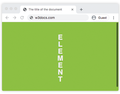
In the example below we can make the word-break between letters instead:
.element {
  word-break: break-all;
}
If we then set the width of the text to one em, the word will break by each letter:
See the Pen Setting text vertically with word-break by CSS-Tricks (@css-tricks) on CodePen.
This value is often used in places with user generated content so that long strings don’t risk breaking the layout. One very common example is a long copy and pasted URL. If that URL has no hyphens, it can extend beyond the parent box and look bad or worse, cause layout problems.
See the Pen Fixing links with word-break by CSS-Tricks (@css-tricks) on CodePen.
Values
normal: use the default rules for word breaking.break-all: any word/letter can break onto the next line.keep-all: for Chinese, Japanese and Korean text words are not broken. Otherwise this is the same asnormal.
This property is also often used in conjunction with the hyphens property so that when breaks occur a hypen is inserted, as per the standard in books.
The full usage, with needed vendor prefixes, is:
 -ms-word-break: break-all;
     word-break: break-all;

     /* Non standard for WebKit */
     word-break: break-word;

-webkit-hyphens: auto;
   -moz-hyphens: auto;
        hyphens: auto;
Using these properties on the universal selector can be useful if you have a site with a lot of user-generated content. Although fair warning, it can look weird on titles and pre-formatted text (
- overflow-wrap
- hyphens
- white-space
- Handling Long Words and URLs
Browser Support
Desktop
| Chrome | Firefox | IE | Edge | Safari |
|---|---|---|---|---|
| 23 | 49 | 11 | 18 | 6.1 |
Mobile / Tablet
| Android Chrome | Android Firefox | Android | iOS Safari |
|---|---|---|---|
| 111 | 110 | 4.4 | 7.0-7.1 |
Safari and iOS support the break-all value but not keep-all
In HTML, a paragraph always starts on a new line — but what if you want text within a paragraph to start on a new line? In that case, you’ll need to create an HTML line break.

Let’s take a closer look at this HTML element and how to use it below.
![Download Now: 50 Code Templates [Free Snippets]](https://no-cache.hubspot.com/cta/default/53/cace6948-d859-40c5-ad73-a401be3aa84e.png)
What is a line break in HTML?
In HTML, the <br> element creates a line break. You can add it wherever you want text to end on the current line and resume on the next. The HTML line break element can be used to display poems, song lyrics, or other forms of content in which the division of lines is significant to the meaning or appearance of the content.
For example, say you’re writing a blog post about how to address an envelope or package. You want to include an example of how to format the sender’s and recipient’s addresses. In that case, you could use the line break element to place the sender’s and recipient’s names, street addresses, and cities, states, and ZIP codes all on separate lines.
Below you’ll see the same address rendered in two different ways. The first uses one paragraph element and multiple line breaks. The second uses multiple paragraph elements and no line breaks. As a result, unnecessary padding and margins are added between lines.
See the Pen Paragraph vs Line Break Element by Christina Perricone (@hubspot) on CodePen.
Pro tip: When you want a section of content that’s related to appear on different lines, like a postal address or stanza of a poem, use line break elements instead of paragraph elements.
Now that we understand the ideal use case of line breaks, let’s walk through how to create them in HTML.
How to Do a Line Break in HTML
To do a line break in HTML, use the <br> tag. Simply place the tag wherever you want to force a line break. Since an HTML line break is an empty element, there’s no closing tag.
Below is an HTML file with a <p> and <br> element.
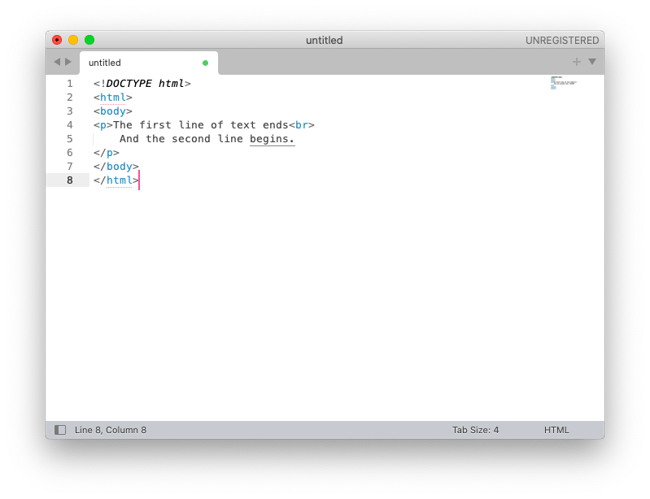
Since the <br> element is most commonly used to display poems or addresses, let’s look at an example. Say I want to display “kitchenette building” by Gwendolyn Brooks on a web page.
In that case, I’d wrap the stanzas in <p></p> tags. Then I’d place the new line HTML tag <br> wherever I want the lines to break in each stanza.
Here’s the HTML:
<h2>kitchenette building</h2>
<p>We are things of dry hours and the involuntary plan,<br>
Grayed in, and gray. “Dream” makes a giddy sound, not strong<br>
Like “rent,” “feeding a wife,” “satisfying a man.”</p>
<p>But could a dream send up through onion fumes<br>
Its white and violet, fight with fried potatoes<br>
And yesterday’s garbage ripening in the hall,<br>
Flutter, or sing an aria down these rooms</p>
<p>Even if we were willing to let it in,<br>
Had time to warm it, keep it very clean,<br>
Anticipate a message, let it begin?</p>
<p>We wonder. But not well! not for a minute!<br>
Since Number Five is out of the bathroom now,<br>
We think of lukewarm water, hope to get in it.</p><p><em>-Gwendolyn Brooks</em></p>
Here’s the result:
See the Pen Poem with line break element by Christina Perricone (@hubspot) on CodePen.
Pro tip: Place a <br> element at each point where you want the line of text to break. Meaning, the text after the <br> will begin at the start of the next line of the text block.
HTML Line Break Not Working
If the HTML line break is not working — especially if you’re working in the text editor of a CMS like WordPress — then you may be using the element incorrectly.
The most common misuse of the new line HTML tag is using it for presentation purposes. For virtually anything related to layout, you should use CSS instead.
For example, say you want to create more space between blocks of text or other items. Instead of using the <br> tag, you should use a semantic HTML element and the CSS margin or padding properties if necessary.
Why? Two reasons.
- Using the HTML line break element when a more semantic element is available makes your code less accessible, especially to readers using screen readers.
- Using the <br> tag to force a line break for purely presentation purposes might look good on your browser but not on other browsers or devices — especially if your site is responsive. A responsive site will automatically change the layout based on screen size. So it will already wrap text as needed and wrap text when it comes to a <br> tag. This will result in choppy, uneven blocks of text. Let’s look at an example.
For example, say I’d like to display an excerpt from the play Fleabag: The Scriptures. I should use the block quote element, which will automatically add margins on the left and right side of the text. If I were to use the <br> tag to mimic the indentation of the block quote element, then I’d be misusing the new line HTML tag.
Here’s the correct HTML:
<figure>
<blockquote>
<p>Love is awful! It’s awful. It’s painful. It’s frightening, it makes you doubt yourself, judge yourself, distance yourself from other people in your life. Makes you selfish. Makes you creepy. It makes you obsessed with your hair. Makes you cruel. Makes you say and do things you never thought you would do...</p>
</blockquote>
<figcaption>—PRIEST, <cite>Fleabag: The Scriptures</cite></figcaption>
</figure>
Here’s the result:
See the Pen YzZpaRG by Christina Perricone (@hubspot) on CodePen.
Pro tip: Use a semantic element, like the block quote element, instead of the line break element when applicable to make your site more accessible to readers using a screen reader.
Using the block quote element is not only better for accessibility — it’s also better for a responsive web design. If you resize your browser window, you’ll notice that the block quote element in the Pen above automatically adjusts to the screen size and has no jagged edges or uneven lines of text.
If using non-semantic elements like the figure and line break elements, they will not behave in this way.
Here’s the incorrect HTML:
<figure>
<p>Love is awful! It’s awful. It’s painful. It’s frightening, it makes you doubt yourself, judge<br>
yourself, distance yourself from other people in your life. Makes you selfish. Makes you creepy.<br>
It makes you obsessed with your hair. Makes you cruel. Makes you say and do things you never<br>
thought you would do.
<figcaption>—PRIEST, <cite>Fleabag: The Scriptures</cite></figcaption>
</figure>
Here’s the result:
See the Pen Incorrectly using <br> element to display excerpt from play by Christina Perricone (@hubspot) on CodePen.
Pro tip: To force text to appear or break in a specific way, use a semantically meaningful HTML element or CSS instead of the line break element to avoid layout issues like choppy text and jagged edges.
If you resize your browser window, you’ll notice that the paragraph element with line break elements results in jagged edges and uneven lines of text.
So not only does this code example have accessibility issues — it also has layout issues. That’s why it’s important to understand when to use the line break element, and when not to.
To learn more about making your website accessible, check out The Ultimate Guide to Web Accessibility.
Adding Line Breaks in HTML
Whether you want to display poetry, song lyrics, or mailing addresses on your web pages, you’ll need to understand the dos and don’ts of the HTML line break element. Understanding this concept will help you build on your expertise of HTML.
For more on creating web pages, check out HubSpot’s free CMS tools.
Editor’s note: This post was originally published in May 2021 and has been updated for comprehensiveness.

The word-breakCSS property sets whether line breaks appear wherever the text would otherwise overflow its content box.
Try it
Syntax
word-break: normal;
word-break: break-all;
word-break: keep-all;
word-break: break-word;


word-break: inherit;
word-break: initial;
word-break: revert;
word-break: revert-layer;
word-break: unset;
The word-break property is specified as a single keyword chosen from the list of values below.
Values
normal-
Use the default line break rule.
break-all-
To prevent overflow, word breaks should be inserted between any two characters (excluding Chinese/Japanese/Korean text).
keep-all-
Word breaks should not be used for Chinese/Japanese/Korean (CJK) text. Non-CJK text behavior is the same as for
normal. -
break-wordDeprecated -
Has the same effect as
word-break: normalandoverflow-wrap: anywhere, regardless of the actual value of theoverflow-wrapproperty.
Note: In contrast to word-break: break-word and overflow-wrap: break-word (see overflow-wrap), word-break: break-all will create a break at the exact place where text would otherwise overflow its container (even if putting an entire word on its own line would negate the need for a break).
Note: While word-break: break-word is deprecated, it has the same effect, when specified, as word-break: normal and overflow-wrap: anywhere — regardless of the actual value of the overflow-wrap property.
Formal definition
Formal syntax
word-break = normal | keep-all | break-all | break-word
Examples
HTML
<p>1. <code>word-break: normal</code></p>
<p class="normal narrow">This is a long and
 Honorificabilitudinitatibus califragilisticexpialidocious Taumatawhakatangihangakoauauotamateaturipukakapikimaungahoronukupokaiwhenuakitanatahu
 グレートブリテンおよび北アイルランド連合王国という言葉は本当に長い言葉</p>

<p>2. <code>word-break: break-all</code></p>
<p class="breakAll narrow">This is a long and
 Honorificabilitudinitatibus califragilisticexpialidocious Taumatawhakatangihangakoauauotamateaturipukakapikimaungahoronukupokaiwhenuakitanatahu
 グレートブリテンおよび北アイルランド連合王国という言葉は本当に長い言葉</p>

<p>3. <code>word-break: keep-all</code></p>
<p class="keepAll narrow">This is a long and
 Honorificabilitudinitatibus califragilisticexpialidocious Taumatawhakatangihangakoauauotamateaturipukakapikimaungahoronukupokaiwhenuakitanatahu
 グレートブリテンおよび北アイルランド連合王国という言葉は本当に長い言葉</p>

<p>4. <code>word-break: break-word</code></p>
<p class="breakWord narrow">This is a long and
  Honorificabilitudinitatibus califragilisticexpialidocious Taumatawhakatangihangakoauauotamateaturipukakapikimaungahoronukupokaiwhenuakitanatahu
 グレートブリテンおよび北アイルランド連合王国という言葉は本当に長い言葉</p>
CSS
.narrow {
  padding: 10px;
  border: 1px solid;
  width: 500px;
  margin: 0 auto;
  font-size: 20px;
  line-height: 1.5;
  letter-spacing: 1px;
}

.normal {
  word-break: normal;
}

.breakAll {
  word-break: break-all;
}

.keepAll {
  word-break: keep-all;
}

.breakWord {
  word-break: break-word;
}
Specifications
Browser compatibility
| Desktop | Mobile | |||||||||||
|---|---|---|---|---|---|---|---|---|---|---|---|---|
| Chrome | Edge | Firefox | Internet Explorer | Opera | Safari | WebView Android | Chrome Android | Firefox for Android | Opera Android | Safari on IOS | Samsung Internet | |
word-break |
1 |
12 |
15 |
8 Don’t use 5.5 No version of Internet Explorer supports the |
15 |
3 |
≤37 |
18 |
15 |
14 |
2 |
1.0 |
break-word |
1 |
79 |
67 |
No |
15 |
3 |
≤37 |
18 |
67 |
14 |
2 |
1.0 |
keep-all |
44 |
12 |
15 |
5.5 |
31 |
9 |
44 |
44 |
15 |
32 |
9 |
4.0 |
See also
overflow-wraphyphensline-break- Guide to wrapping and breaking text
CSS
-
width
The width CSS property sets an element’s The min-width and max-width properties override Defines the width as an absolute value.
-
will-change
The will-change CSS property hints to browsers how element is expected Warning: will-change is intended to be used as last resort, order try deal with
-
word-spacing
The word-spacing CSS property sets length of space between and tags.
-
writing-mode
The writing-mode CSS property sets whether lines of text are laid out horizontally vertically, as well direction which blocks progress.