

As you probably already know, Microsoft Word gives you plenty of tools for composing and formatting most any type of document. But which of these features should you use to create professional looking documents? Here are several helpful tips.
Choose the Right Font for the Job
Whether you create a business document or college paper, pick an easy-to-read font.
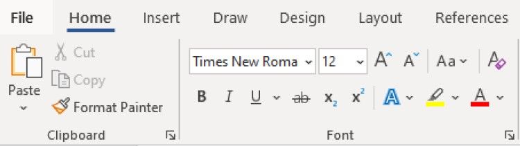
If you plan to print the document, you can choose a serif font like Times New Roman or Georgia. As the name implies, serif letters have serifs, which you might call wings or tails, that make the font look more ornate. These appear nicely on printed pieces.

For digital documents, go for a sans serif font instead like Arial or Calibri. These font styles don’t have serifs (wings or tails) which make them easier to read on computer or mobile device screens.
To change the font style, along with the size and color, head to the Home tab and Fonts section of the ribbon.
To change the default font for all documents, open the Font launcher using the small arrow in the bottom right corner.
Make your selection, pick “Set as Default,” and “OK.”
Adjust the Margins Appropriately
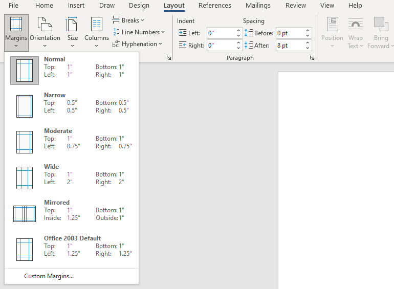
If you have a requirement for the margins, you can set them to the exact sizes you need easily. If not, the standard is one inch for all four sides. Depending on the type of document you’re creating, you may want smaller margins to accommodate tables or diagrams. In this case, you can go with the narrow margin settings at one-half inch on each side.
To adjust the margins, go to the Layout tab and open the Margins drop-down menu to make your selection.
For margins at exact sizes, choose Custom Margins at the bottom of the list. Enter the measurements at the top, including the gutter if you like, and click “OK” to save the changes.
Note that you have additional options for Custom Margins in Word. You can use specifics per the page orientation, page type, and apply the margins to the whole document, a certain section, or from a point moving forward.
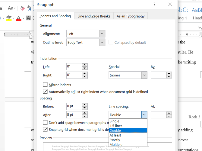
Choose the Right Line and Paragraph Spacing
Line and paragraph spacing can affect the readability of your document, so this is another formatting option to keep in mind. You may be required to double space something like a college essay but if not, the default for Word documents is 1.15 points which is appropriate for most document types.
You can adjust the spacing from the Paragraph section on the Home tab. Select all text in your document or particular text if you prefer. Then, open the Line and Paragraph Spacing drop-down menu to make your selection.
To customize your spacing, pick “Line Spacing Options” in the list. Use the Spacing section on the Indents and Spacing tab to change the points before and after paragraphs. You can then use the Line Spacing drop-down box to pick Single, Double, or another option.
As you make your changes, you can see a preview at the bottom. When you’re happy with your choices, select “OK” to apply them. You can also use the Set as Default button to keep these settings for all future documents.
RELATED: How to Print a Test Page in Windows 10
Adjust Your Indents
Again, if you have a requirement for how your indents should appear, we’ll show you how to adjust them. But many documents these days use left-aligned text. To break up the paragraphs, simply insert an extra line between them.
On the other hand, you may need to indent the first line of each paragraph with no extra spacing between paragraphs. This type of layout, called first line indent, is what you’d see in a book, for example.
Go to the Layout tab and use the Indent settings in the Paragraph section to change your current indents.
Alternatively, open the Paragraph launcher using the small arrow in the bottom right corner. You can then make your adjustments in the Indentation section of the Indents and Spacing tab. Add what you’d like for the left and right indents or pick a special option on the right like a First Line or Hanging indent.
Format Using Columns When They Fit
Columns have their places in certain types of documents like brochures and newsletters. If you’re creating this kind of document, head to the Layout tab and use the Columns drop-down menu to choose the number of columns.
For additional options, select “More Columns” at the bottom. You can then use a preset, choose the width and spacing for each column, and apply it to the whole document or only certain portions.
Just keep in mind that columns are only useful if the type of document you’re composing warrants them. This gives your document a newspaper-style appearance which usually isn’t appropriate for school papers, business proposals, or company reports.
Add Headings to Identify Sections
If you have a lengthy document or one that could benefit from different sections, you can apply headings to identify the sections. Not only does this help visually separate the document for readability but is also useful for creating a table of contents.
To apply a heading, select the text and go to the Home tab. Use the box in the Styles section to pick Heading 1 or Heading 2, depending on the size and style you want.
You can also change the color of the heading. For instance, it may display in blue and you want black. Select the heading and use the color drop-down box in the floating toolbar above the text or in the Font section on the Home tab.
Position Images Between Text and Paragraphs
Maybe you’re adding images to your document. You have many ways to adjust the appearance of your images in Word with one being how they’re positioned with the surrounding text.
For example, you may have a small decorative image that can go within the text where the words wrap around it. Or maybe you have a large explanatory image that should stand on its own between paragraphs.
Select the image and click the Layout Options button that appears on the top right (Windows only).
Alternatively, go to the Picture Format tab and use the Position and Wrap Text drop-down menus in the Arrange section of the ribbon.
You can then wrap the text around the image with different spacing options, place the text on the top and bottom of the image, or wrap the text around only the left or right side.
For even more options, select “See More” in the Layout Options pop-up window or “More Layout Options” in the Position or Wrap Text menu.
Use Alignment Tools for Images and Objects
One more tip to make your document look fantastic is to use Word’s alignment tools for things like images, shapes, or objects. You can use Alignment Guides which only display as you move the element on the page or Gridlines which appear and remain as soon as you enable them.
These two tools can help you equally space and place your items next to each other for a neat and tidy appearance.
Tip: For help moving your pictures, look at our how-to for freely moving images in Word.
Head to the Picture Format, Shape Format, or Graphics Format tab, depending on the type of item you use. Then, open the Align drop-down box to choose “Use Alignment Guides” or “View Gridlines.” Note that you can’t use both at the same time.
Hopefully these suggestions have you on your way to a professional-looking Word document.
RELATED: 7 Awesome Microsoft Word Features You Should Be Using
NOICE: For the next few DAYS dear findbuzz users will experience distortion of UI & ZigZag content experience. As we will be upgrading our backend for something really awesome Just4You!
![]()

Disable the NSFW warnings that refer to content considered inappropriate in the workplace (Not Suitable For Work).
![]()
![]()
Disable the NSFW warnings that refer to content considered inappropriate in the workplace (Not Suitable For Work).
Back to Top
Microsoft Word is packed with so many features that you can produce pretty much whatever you want with it. But these features don’t always result in the kind of beautiful, high-quality, and professional document designs that you may expect.
It’s one thing to know everything about Microsoft Word, all of its intricacies and quirks and functions—it’s something else entirely to know what makes a great document. Here, we’ll show you how to format a Word document to make it look professional.
1. Keep It Simple, Less Is More
Want to know how to make a Word document look good? Just keep it simple, and take advantage of the hidden features that Microsoft Word comes with. If you remember one thing from this article, let it be this, and you’ll be able to make the right design decisions in the future!
When writing a document, the content should be the main focus. Document formatting guidelines exist to make that content easier to read and digest.
Eliminate the temptation to introduce eye-catching elements that only serve to distract. Maximize whitespace. Keep your wording tight and revise any wordy sentences or paragraphs. Simple and minimal rules overall.
2. Choose a Context-Appropriate Typeface

Your first big design decision should be which typeface you’re going to use. Traditional knowledge says that serif fonts are easier to read in printed documents, whereas sans-serif fonts are better on the eyes when read on a digital screen.
Good examples of serif fonts include Garamond, Georgia, Hoefler Text, and Palatino, while good examples of sans-serif fonts include Arial, Gill Sans, Helvetica, and Lucida Sans.
Skip Comic Sans if you want to avoid one of the most common presentation design mistakes. And whatever you end up using, stick to the same typeface throughout to make your Word document professional. If desired, you can use a different typeface for headings.
3. Use Standard Font Size and Color
You can’t learn how to format a word document to look professional without paying attention to the look of the text. Business and academic papers generally use 12-point font sizes, which produce the most readable paragraphs when used in combination with the guidelines discussed below for page size, margins, and line spacing.
Some information-dense reports may sometimes go down to 10-point font size, but never less than that.
In general, it’s best to keep your hands off of anything related to colors, especially for printed documents. You’ll have to pay more for the color ink, and it won’t carry over if the document ever gets copied. For digital documents, reserve colored text for critical warnings and the like. Prefer to emphasize using bolded and italic text.
4. Use Standard Page Size and Margins
Nearly all office documents are formatted to the same page size as they are printed for standard 8½» x 11″ pages, known as US Letter size (also known as A4 elsewhere, which is 210mm x 297mm). This is the only size that’s guaranteed to be available regardless of which printer you use.
As for margins, most style manuals and style guides call for a 1″ margin on all sides of the page, which produces the best readability for line lengths and allows for written annotations if necessary. In Word, you can select Normal under Margins to do so. However, if the document is going to be bound in a binder, you may want to use Custom Margins to increase the side margins to 1½» to accommodate the rings.
5. Align Paragraphs to the Left
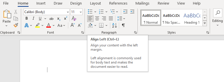
You may be tempted to use justified alignment because that’s what’s used in newspapers, novels, and some textbooks, but it’s the wrong choice for office and academic documents. Why is it important to make a document formal? Without formality, your document becomes unreadable.
What you want is left alignment for text. This produces jaggedness on the right side of paragraphs, but it keeps letter spacing as intended by whatever typeface you’re using, and that means optimal legibility.
Otherwise, you may end up with typographic rivers, which are extremely distracting and simply look ugly. This is something you certainly want to avoid when you want to make your Word document look professional.
6. Indent the First Lines of Paragraphs
Paragraphs should have no extra spacing between them, and the first lines of paragraphs should be indented to make each paragraph stand out. The only exception is for paragraphs that directly follow a section heading, which can be left unindented because the surrounding context makes it clear that it’s its own paragraph.
To make a document look professional, a general rule of thumb is to have the indent size the same as the font size. Make sure you use Word’s paragraph styling features to handle the indents rather than using the Tab key!
7. Place Images Between Paragraphs
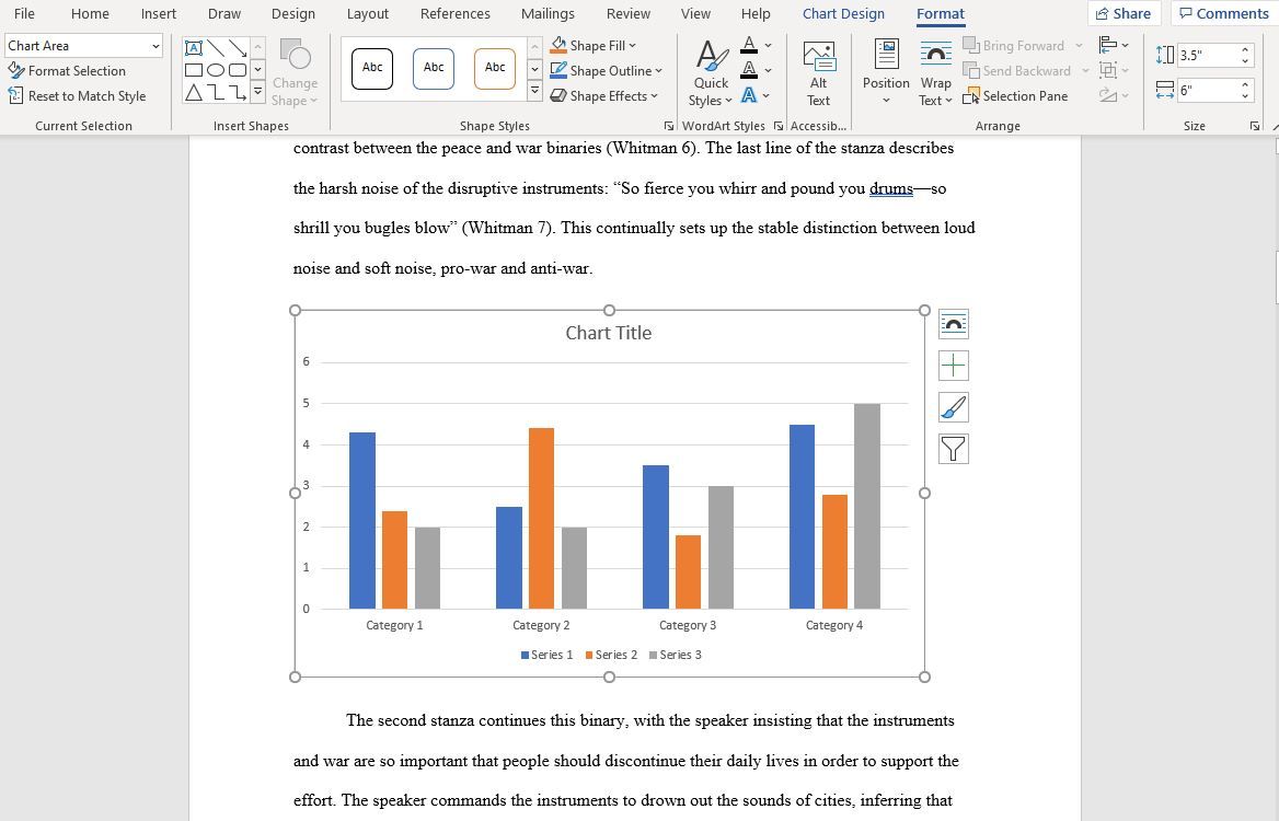
Inserting images is a part of designing your Word document. It may be okay to place images inside a paragraph and allow the surrounding text to flow around it, and if your organization follows this document formatting guideline, then go ahead and do that.
But generally speaking, it can damage readability, especially in data-driven reports. The safest option, particularly for graphs, charts, and tables, is to put images in between paragraphs and keep them center aligned. That way, your images help to make your document attractive, but they are never vying for attention with the surrounding text. It also helps captions to stand out.
8. Choose Context-Appropriate Line Spacing
To format a document to look professional, the right choice for line spacing (the whitespace that separates a line of text from the next line of text) really depends on what kind of document you’re writing.
Academic papers should first follow any academic style guides in place, then prefer double-spacing if no style guide exists. Business and office documents tend to be single-spaced to minimize the number of pages needed when printing, but digital documents may be easier to read if spaced at somewhere between 120-150 percent.
9. Break Up Text With Headings and Lists
The longer the document, the more important headings become. Would you rather read a 20-page report that’s nothing but a wall of text from end to end? Or a 30-page report that’s organized into proper sections, subsections, and headings? It’s highly likely you’ll prefer the latter.
Lists are also good for breaking up walls of text and drawing eyes to important points. In Word, use Numbering to create numbered lists when counting a set of items (e.g., «the five attributes of a successful entrepreneur») or when providing step-by-step instructions. Otherwise, use Bullets to make bulleted lists.
Just be sure to avoid overusing lists, which detracts readability from your Word document design. This is especially important when it comes to using Word to format a screenplay.
10. Separate Sections With Breaks
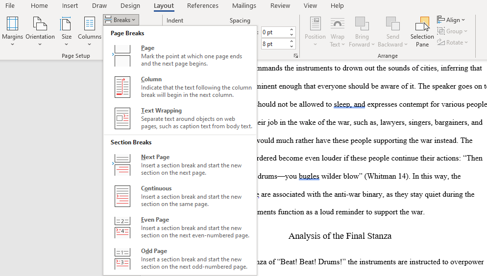
When you want to learn how to make your report look professional, you need to get acquainted with section breaks. In Microsoft Word, section breaks allow you to differentiate certain pages with changes in orientation, columns, headers, footers, page numbers, and more. Section breaks come in four forms:
- Next Page: Start the next section on the following page.
- Continuous: Start the next section on the current page.
- Even Page: Start the next section on the next even page.
- Odd Page: Start the next section on the next even page.
If your document is large enough to need chapters, this is the best way to format them in a clean way. Each chapter should be made with a Next Page section break, or the Even Page or Odd Page section breaks if you’re going to place it within a binder. We’ve shown how to remove page breaks if needed, too.
Learn How to Format a Word Document to Look Professional
Unless your organization or school requires a specific layout and format, you can skip the hard work of setting up your own template and just download one instead. This helps you quickly achieve a professional document design.
![]()
How to pronounce professional-looking?
How to say professional-looking in sign language?
Translation
Find a translation for the professional-looking synonym in other languages:
Select another language:
- — Select —
- 简体中文 (Chinese — Simplified)
- 繁體中文 (Chinese — Traditional)
- Español (Spanish)
- Esperanto (Esperanto)
- 日本語 (Japanese)
- Português (Portuguese)
- Deutsch (German)
- العربية (Arabic)
- Français (French)
- Русский (Russian)
- ಕನ್ನಡ (Kannada)
- 한국어 (Korean)
- עברית (Hebrew)
- Gaeilge (Irish)
- Українська (Ukrainian)
- اردو (Urdu)
- Magyar (Hungarian)
- मानक हिन्दी (Hindi)
- Indonesia (Indonesian)
- Italiano (Italian)
- தமிழ் (Tamil)
- Türkçe (Turkish)
- తెలుగు (Telugu)
- ภาษาไทย (Thai)
- Tiếng Việt (Vietnamese)
- Čeština (Czech)
- Polski (Polish)
- Bahasa Indonesia (Indonesian)
- Românește (Romanian)
- Nederlands (Dutch)
- Ελληνικά (Greek)
- Latinum (Latin)
- Svenska (Swedish)
- Dansk (Danish)
- Suomi (Finnish)
- فارسی (Persian)
- ייִדיש (Yiddish)
- հայերեն (Armenian)
- Norsk (Norwegian)
- English (English)
Citation
Use the citation below to add these synonyms to your bibliography:
Are we missing a good synonym for professional-looking?
Microsoft Word is packed with so many features that you can produce pretty much whatever you want with it. But these features don’t always result in the kind of beautiful, high-quality, and professional document designs that you may expect.
It’s one thing to know everything about Microsoft Word, all of its intricacies and quirks and functions—it’s something else entirely to know what makes a great document. Here, we’ll show you how to format a Word document to make it look professional.
1. Keep It Simple, Less Is More
Want to know how to make a Word document look good? Just keep it simple, and take advantage of the hidden features that Microsoft Word comes with. If you remember one thing from this article, let it be this, and you’ll be able to make the right design decisions in the future!
When writing a document, the content should be the main focus. Document formatting guidelines exist to make that content easier to read and digest.
Eliminate the temptation to introduce eye-catching elements that only serve to distract. Maximize whitespace. Keep your wording tight and revise any wordy sentences or paragraphs. Simple and minimal rules overall.
2. Choose a Context-Appropriate Typeface
Your first big design decision should be which typeface you’re going to use. Traditional knowledge says that serif fonts are easier to read in printed documents, whereas sans-serif fonts are better on the eyes when read on a digital screen.
Good examples of serif fonts include Garamond, Georgia, Hoefler Text, and Palatino, while good examples of sans-serif fonts include Arial, Gill Sans, Helvetica, and Lucida Sans.
Skip Comic Sans if you want to avoid one of the most common presentation design mistakes. And whatever you end up using, stick to the same typeface throughout to make your Word document professional. If desired, you can use a different typeface for headings.
3. Use Standard Font Size and Color
You can’t learn how to format a word document to look professional without paying attention to the look of the text. Business and academic papers generally use 12-point font sizes, which produce the most readable paragraphs when used in combination with the guidelines discussed below for page size, margins, and line spacing.
Some information-dense reports may sometimes go down to 10-point font size, but never less than that.
In general, it’s best to keep your hands off of anything related to colors, especially for printed documents. You’ll have to pay more for the color ink, and it won’t carry over if the document ever gets copied. For digital documents, reserve colored text for critical warnings and the like. Prefer to emphasize using bolded and italic text.
4. Use Standard Page Size and Margins
Nearly all office documents are formatted to the same page size as they are printed for standard 8½” x 11″ pages, known as US Letter size (also known as A4 elsewhere, which is 210mm x 297mm). This is the only size that’s guaranteed to be available regardless of which printer you use.
As for margins, most style manuals and style guides call for a 1″ margin on all sides of the page, which produces the best readability for line lengths and allows for written annotations if necessary. In Word, you can select Normal under Margins to do so. However, if the document is going to be bound in a binder, you may want to use Custom Margins to increase the side margins to 1½” to accommodate the rings.
5. Align Paragraphs to the Left
You may be tempted to use justified alignment because that’s what’s used in newspapers, novels, and some textbooks, but it’s the wrong choice for office and academic documents. Why is it important to make a document formal? Without formality, your document becomes unreadable.
What you want is left alignment for text. This produces jaggedness on the right side of paragraphs, but it keeps letter spacing as intended by whatever typeface you’re using, and that means optimal legibility.
Otherwise, you may end up with typographic rivers, which are extremely distracting and simply look ugly. This is something you certainly want to avoid when you want to make your Word document look professional.
6. Indent the First Lines of Paragraphs
Paragraphs should have no extra spacing between them, and the first lines of paragraphs should be indented to make each paragraph stand out. The only exception is for paragraphs that directly follow a section heading, which can be left unindented because the surrounding context makes it clear that it’s its own paragraph.
To make a document look professional, a general rule of thumb is to have the indent size the same as the font size. Make sure you use Word’s paragraph styling features to handle the indents rather than using the Tab key!
7. Place Images Between Paragraphs
Inserting images is a part of designing your Word document. It may be okay to place images inside a paragraph and allow the surrounding text to flow around it, and if your organization follows this document formatting guideline, then go ahead and do that.
But generally speaking, it can damage readability, especially in data-driven reports. The safest option, particularly for graphs, charts, and tables, is to put images in between paragraphs and keep them center aligned. That way, your images help to make your document attractive, but they are never vying for attention with the surrounding text. It also helps captions to stand out.
8. Choose Context-Appropriate Line Spacing
To format a document to look professional, the right choice for line spacing (the whitespace that separates a line of text from the next line of text) really depends on what kind of document you’re writing.
Academic papers should first follow any academic style guides in place, then prefer double-spacing if no style guide exists. Business and office documents tend to be single-spaced to minimize the number of pages needed when printing, but digital documents may be easier to read if spaced at somewhere between 120-150 percent.
9. Break Up Text With Headings and Lists
The longer the document, the more important headings become. Would you rather read a 20-page report that’s nothing but a wall of text from end to end? Or a 30-page report that’s organized into proper sections, subsections, and headings? It’s highly likely you’ll prefer the latter.
Lists are also good for breaking up walls of text and drawing eyes to important points. In Word, use Numbering to create numbered lists when counting a set of items (e.g., “the five attributes of a successful entrepreneur”) or when providing step-by-step instructions. Otherwise, use Bullets to make bulleted lists.
Just be sure to avoid overusing lists, which detracts readability from your Word document design. This is especially important when it comes to using Word to format a screenplay.
10. Separate Sections With Breaks
When you want to learn how to make your report look professional, you need to get acquainted with section breaks. In Microsoft Word, section breaks allow you to differentiate certain pages with changes in orientation, columns, headers, footers, page numbers, and more. Section breaks come in four forms:
- Next Page: Start the next section on the following page.
- Continuous: Start the next section on the current page.
- Even Page: Start the next section on the next even page.
- Odd Page: Start the next section on the next even page.
If your document is large enough to need chapters, this is the best way to format them in a clean way. Each chapter should be made with a Next Page section break, or the Even Page or Odd Page section breaks if you’re going to place it within a binder. We’ve shown how to remove page breaks if needed, too.
Learn How to Format a Word Document to Look Professional
Unless your organization or school requires a specific layout and format, you can skip the hard work of setting up your own template and just download one instead. This helps you quickly achieve a professional document design.
8 Essential Writing Tips for Microsoft Word
Read Next
About The Author

Emma Roth
(554 Articles Published)
Emma was formerly a Senior Writer and Junior Editor for the Creative section. She graduated with a Bachelor’s degree in English, and combines her love of technology with writing.
More
From Emma Roth
Subscribe to our newsletter
Join our newsletter for tech tips, reviews, free ebooks, and exclusive deals!
Click here to subscribe