
The focus of this section is the integration of words and images. Just as the letters of the alphabet can be combined in numerous ways to form words and convey meanings, so can visual elements be joined in innumerable ways, eith each particlar relationship generating alternative solutions. Often words carry more specific meaning than images, but images can extend and intensify the meaning of words. For this reason, words and images should act as equal partners in the forming of a message. Although a designer’s first instinct is to focus on the visual aspects of the message, a successful concept is formed within the interrelationship of words and the images.
How Can a Concept Be Communicated in Visual Terms?
A concept can be defined as a well-developed thought or idea. To successfully transmit an idea, the viewer’s attention must be gained. Visual communication depends upon order, and the viewer will look for a system or structure to help him or her understand the meaning of the message. Designers use visual heirarchy to arrange the visual elements according to their importance within the design. Each element in a design contributes to the information being presented — words carry the mesage, and the images explain or enhance the meaning. An image with no meaning is like a sentence that makes no sense; therefore images should be as carefully chosen as the words to construct a coherent sentence. If there is no apparent heirarchy in a message, the relative importance of the piece of informatoin becomes subjective and open to viewer interpretation. This creates an ambiguity in the message, making it unclear and possibly unreadable.
How Can I Make My Messages Memorable?
Here are a few strategies to consider:
-
When you think in opposites, you impose a different point of view on any idea or word. Irony is a twist of perspective or the opposite of the literal meaning of the subject.
-
The use of contrast in either your subject matter or design elements can provide an effective context for conveying meaning. The arrangement and ordering of a shape, color and form into patterns can suggest or evoke the content or message.
-
Abstract ideas can give physical characteristics to inanimate objects or ideas, bringing them to life.
-
Metaphors describe abstract concepts in concrete terms or explai something complicated in simple terms.
-
Visual puns exist within a juxtaposition of two possibilities and give funny twists to simple ideas. The purpose is to create understanding through the visual comparison or opposites. In the same way that letters are combined to create words, symbols can be put together to create messages. A pun is created when sumbols (letters are symbols as well) are used ni a context to suggest a dual meaning. A good example of this would be Milton Glaser’s promotional design for New York City, «I <3 NY»
-
Defamiliarize the familiar by distortion or by transposing the usual way we think of the subject.
-
Reducing something to its most elemental visual components makes the idea easily accessible. A pictogram is the visual essence of an object or thing. An example of a pictogram is the three arrows in a triangular shape to indicate recycling.
No matter what the assignment, a greative person can always make something unique out of what is given by following the design process. Never perceive the parameters of any assignment as a limitation to your creativity. A problem with no constraints is really not a problem, as there is nothing to solve.
Word & Image Relationship
A visual idea can be described as a pictoral response to an abstract thought or problem. By merging words (type) and images (pictures), a designer can create articulate messages to engage a viewer or convey information. This can be accomplished by skillful manipulation, interpretation, and possibly juxtaposition of words and images, literally or figuratively, to suggest or imply a specific or desired meaning.
The use of symbolism, analogy, metaphor, or pun may further expand your visual vocabulary.
Symbolism is the term used to describe the art or practice of using symbols. A symbol is a thing standing for or representing something else, especially a material thing taken to represent an immaterial or abstract concept. An example of a symbol is the American flag (a material object) that stands for a united group of people — a country (an abstract concept).
Analogy is ther term for a description derived from a process of reasoning from parallel or similar cases explaining what unlinke things share in common. An example of an analogy is to describe a hand that «feels as smooth as silk.»
Metaphor is a figure of speech in which one thing is compared to another to suggest a likeness or analogy between them. An example of a metaphor is «all the world’s a stage.» In visual terms, one image is used to suggest another, often in collaboration with words or other images. An example is Yusaku Kamekura’s magnificent Hiroshima Appeals poster (1983), depicting falling butterflies on fire to express the horrors of war.
A pun is the humorous use of a word or image to suggest alternative meanings, a play on words with more than one meaning. A visual example is an image of Donald Trump with the phrase «If he is elected, there will be hell toupee.»

figure 1: spread 1, final draft

figure 2: spread 2, final draft

figure 3: spread 3, final draft

figure 4: spread 4, final draft
View the full size pdf of the spreads above here.
Print / Image
2014
Individual Project
About the project…
The purpose of this project was to explore the interaction of word and image. Interestingly enough, our perception of an image can vary depending on the word associated with it, and conversely, our understanding of a word can change depending on the image it represents. This fascinating interaction was the focus of the following project.
I was tasked with finding pairs of words and images that could be interpreted differently given the specific pairing. The final project, as shown in < figures 1 – 4 >, consisted of four spreads, each with an image and a word. A total of three images and three words were used, repeating one word and one image. That is, one image was repeated with two different words, and one word was repeated with two different images. The layout of each spread was up to me (word then image, image then word, word overlaid on image), as was the order I chose to place the spreads in (repeated image first and then repeated word, or vice versa), which allowed me some rhetorical choices. In the end, the spreads were printed in a long strip, and then folded and glued into a booklet.
The point was to show how an image is affected by the word accompanying it, and how the meaning of a word can change given the image it represents.
About the process…
It begins with inspiration…
I began by thinking about ideas. Inspiration came in the of the short film “Words,” which depicted various interpretations of various words. I had never quite considered the many definitions of a single word before, so having that realization in the back of my mind was very helpful during the inspiration process.
…becomes about ideas…
Some of the ideas that I came up with are listed at the end of this post.

figure 5: Picture for spreads, face with symmetrical mask overlay

figure 6: spread 1, draft 1

figure 7: spread 2, draft 1
After some contemplation, I landed on the idea of symmetry/surgery defining a photo of a woman’s face marked with lines denoting symmetrical features, shown in < figure 5 >, and a photo set depicting a word along that same theme. The first pair of spreads, shown in < figures 6 – 7 > (using the picture of facial symmetry with the word symmetry and the word surgery) remained constant through the process, but the second pair of spreads gave me a bit more trouble.
…and thinking about themes…
I considered several themes, including:

beauty: symmetry

beauty: asymmetry

beautiful asymmetry in nature made symmetrical

beautiful asymmetry in nature
- To oppose the idea of created beauty, showing natural beauty, with a picture of beautiful objects in nature, something symmetrical and something asymmetrical

asymmetrical beauty by design

asymmetrical beauty by design, using nature
- To complement the idea of contrived symmetrical beauty on a body, showing designed asymmetrical beauty

sketched, inked

sketched

inked
- To counter the idea of symmetrical perfection, a picture of a tattoo that looked “sketched” and of a drawing of a person (sketched, inked)

lined

lined
- To oppose the idea of contrived beauty, or play into the adage of “age before beauty,” with a picture of an older woman’s lined face and of tree rings (lined )

faceless

faceless, sketched, inked
- To move away from the obsession of what the face looks like, a picture of someone hiding a face and a picture of a drawing of a person without a face where the focus was on the hairstyle (faceless)
As the figures show, I tried several of these ideas, but none of them were as compelling as I would have liked. There wasn’t a unified enough theme to each of the sets (when combined with the pair of symmetry/surgery spreads), so I went back to the drawing board. I was drawn to the idea of a tattoo because a tattoo is a deliberate mark on the skin meant to beautify in an unconventional way, in direct opposition to the markings put on the skin before a plastic surgery operation.
In the end, I decided on the pair that dealt with markings on the skin. In the theme of my first pair, I used a picture that was somewhat expected, in that it depicted the markings on a person’s skin to denote those places that would be operated on. The second picture was meant to be unexpected, in that it depicted markings on the skin, but in direct opposition of “standard” methods to attain artificial beauty. The markings of the tattoo are a form of self-expression and actually are quite beautiful, directly countering the idea that to be beautiful a body has to fit within certain constraints. I chose the particular picture I did because the tattoo was on the abdomen, which paired nicely with the picture of the plastic surgery markings on the abdomen.
…moves into more technical considerations…
The more technical considerations were the typeface of the words on the spreads, layout of each spread, and the order of the spreads.
For some ruminations and explorations on typographic voice, see this post.

figure 8: typefaces for spreads
The progression of typeface for this project is shown in < figure 8 >.
I wanted a modern, even, sleek, almost sterile typeface. Because the pursuit of perfection was a central focus of the spreads, I wanted a typeface that reflected the symmetry associated with facial perfection. Furthermore, I felt that a symmetric, sans serif typeface would be quiet and not detract from the meaning.
The typeface only changed twice through the course of this process, after the initial explorations of various sans serif typefaces at the very beginning (a tedious process not worth enumerating here). Although I liked Geneva (the first typeface shown in the figure), I needed a bigger typeface and Geneva worked better in a smaller size. So, I tried Abadi MT Condensed Light (the typeface of the second and third words in the figure), which fulfilled my requirements well in a larger size (I tried size 18pt, but finally chose 24pt, second and third in the figure, respectively).
I was constrained in layout choices by the sizes of my pictures. The choices I did get to make included placement of the word on the spread, the order of word and image within each spread, and the order of the spreads.
I chose to begin with the picture of facial symmetry and the word symmetry because this would set up the tone of the whole booklet. The mask overlaid on the woman’s face in the picture denoted markers of facial symmetry, so this seemed a natural and logical place to start. I put the picture first to suggest the following word simply complemented the image.
The interesting part was the contrast to the next spread, which paired that same picture with the word surgery. I made the deliberate decision to put the word first to set the viewer up to consider the picture in the context of the word. I wanted to jolt the viewer with the word and then force them to reconsider the picture they had just seen in the new context.
Following in that theme, the next spread depicts the markings on a woman’s body placed there to prep for a plastic surgery operation. Because the viewer was already in the mindset of plastic surgery (and because the markings are actually pretty self-evident), I placed the photo first, since the more interesting part of this spread was the word, marked. The word isn’t terribly surprising, as this picture shows literal marks on the skin.
However, the next spread contradicts the meaning suggested by the preceding spread. Because the viewer was in the mindset of plastic surgery and the corresponding markings, I put the word first, giving them a moment to consider other markings in the given context. The photo, then, was meant to twist the assumed meaning: The tattoo on the torso of a woman is also a literal marking on the skin, but bears no other resemblance to the markings in the preceding photo. Someone gets plastic surgery (generally) to conform to established beauty standards, whereas someone gets a tattoo sometimes to flout those very standards and sometimes just to express themselves with a deliberate marking on their skin.
So, even with the constraints, I made some very careful and very deliberate design decisions for this booklet, to ensure my intent came through.
Because the spreads all had to be black-and-white or in color, I had to make all of my photographs black-and-white (the picture of the moon tattoo was in black-and-white). Fortunately, my theme was somber enough that the removal of some of the brighter colors actually worked to the final product’s advantage.
…and ends with so many discarded ideas.
- Something to do with rain, including the words: water, scarcity, drought, resource, beauty, calamity
- Something with clouds, including words like: nimbus, software, ominous, serene, peace, isolated, away
- Something about civilization, with western (as in Western Nation or the Old West), industry, pollution
- Riot: an angry crowd, a protest, or a riot of color, of laughter
- Light: natural light or lighting a cigarette, combined with a picture that could be smoke or fog
- Cobbled: a road, or cobbled together (as a shoe), combined with a picture for a path or stones
- Leaves: the leaves on a tree, or someone leaves, combined with a picture that could be described as sparse, clear, bare, desolate
- Sing: to sing a song, an arrow “singing” by something
- Smooth: as in a smooth surface, or a smooth Scotch, or a smooth talker
- Other words I liked: tall, sacred, cathedral, hall, break, vast, space, open, closed,
(This might seem long, but I think it’s interesting to show just how many options are available. In the end, choices were limited by the pictures that were accessible.)
Sources:
[ I found the images on Pinterest, but I’ve tried to compile a list of the sites from which the pictures originated. ]
http://nyccosmeticsurg.blogspot.com/2011/05/does-phi-make-beautiful-face.html (facial symmetry)
http://media-cache-ak0.pinimg.com/originals/08/20/a0/0820a004c93c328e84c17c286317c6bf.jpg (plastic surgery markings)
http://tattooton.com/30-best-tree-tattoo-ideas-for-boys-and-girls/ (moon and tree tattoo on the torso)
http://www.imagekind.com/Calla-lily-and-purple-black-butterfly_art?imid=2e9a256e-a8bc-4497-982f-88c3a3f7853c (butterfly and calla lily)
http://www.exceptionalminerals.com/saleroom15.htm (blue rock)
http://thewondrous.com/30-best-of-nature-photography/ (reflected tree)
http://www.rosphoto.com/landscape_photography/osennie_peyzazhi-2136 (red tree)
https://www.etsy.com/listing/85905809/tangerine-orange-rose-and-turquoise (turquoise necklace with tangerine rose)
http://www.ebay.com/itm/FALL-TAPESTRY-Tuscan-Country-French-FALL-ALL-SEASON-Large-Wreath-Free-Shipping-/350588930060 (wreath)
https://www.etsy.com/listing/68111556/8×10-the-science-of-missing-you-fine-art (rough sketch of person on tangled sheets)
https://www.flickr.com/photos/97150960@N02/10168417336/ (dandelion tattoo)
http://media-cache-ak0.pinimg.com/originals/98/c5/88/98c588d625629fd9ad4d78b6bf50ceb5.jpg (back tattoo)
http://umla.tumblr.com/post/41462238088 (back of head with braid and flowers)
https://www.flickr.com/photos/ramdiboy/5223952416/ (old woman)
http://www.johnrossdesign.ca/contact-john-ross.php (tree rings)
http://media-cache-ak0.pinimg.com/originals/06/a1/4c/06a14cd93511e15c8c0bc6377033829e.jpg (person on beach with red and white umbrella)
http://www.refinery29.com/braids (faceless sketch with braid)
https://www.etsy.com/listing/166503892/print-art-ink-drawing-sketch-city-street?ref=sr_gallery_15&ga_search_query=girl+with+umbrella&ga_ship_to=US&ga_explicit_scope=1&ga_page=2&ga_search_type=handmade&ga_view_type=gallery (red umbrella)

Word allows you to do much more than simply insert or place graphics. For our fourth lesson in this series, we will focus on the graphic design functions in Word such as pictures, SmartArt, screenshots, and other items that can be found on the “Insert” tab.
These functions really breathe life into your drab black and white text documents. With a simple picture or chart, you can turn your term paper from meh to yeah! Luckily, there’s a whole range of ways you can add images to better illustrate (no pun intended) your point.
We’ll wrap the lesson by changing gears a bit and discussing how to use more than one language in Word 2013.
Images and Multimedia
You don’t have to think of Word as simply a word processing program. It has requisite tools for doing some pretty nifty page layout. While it’s not a feature-complete or robust as a professional page layout program such as Adobe InDesign. You can still get very professional looking results if you know what’s in your toolbox and how to use it.

Pictures and Online Pictures
Both “Pictures” and “Online Pictures” accomplish the same goal. The only difference is that “Pictures” means you can insert pictures locally, while “Online Pictures” allows you to insert images from an internet-based source such as clip art from Office.com, Bing, or OneDrive (formerly SkyDrive).
You can also insert pictures from your Facebook profile or Flickr although you could always just save the pictures you want to insert to your computer and then insert them from there if you don’t want to connect Office to these profiles.
Picture Tools
As always, when you want to edit a picture or any element place in a Word document, you can click on it and the appropriate tab will appear on the Ribbon.
With pictures, that tab is “Picture Tools.” Here we see you can make all kinds of corrections to the picture on-the-fly. For example, you can correct brightness and contrast, the color, add a border.
Where you position and how you wrap text will also play a large role in formatting your documents.
Here we see those controls. In our documents, we don’t worry so much about word wrapping or positioning because Word isn’t the final step toward publishing online. However, if you’re going to produce something WYSIWYG (What You See is What You Get), such as for a PDF or print publication, then these things will definitely matter.
Also, there are a couple ways you make changes to your pictures inline, such as resizing, rotating, and moving them. In the following image, you see these controls, many of which you will likely be familiar with.
When you click on an image in your document, you get a box on each corner, which will let you resize a picture. At the top, in the middle, is a circular arrow, grab this to freely rotate your picture. To move the image, hover the mouse over the image until the pointer is the four arrows, you can then click and drag the image anywhere you like.
Finally, if you click on the little “Layout Options” button, you can change your text wrapping without going to the Ribbon.
Clicking on “See more…” at the bottom of the “Layout Options” opens the full-blown “Layout” dialog.
Note, the size tab both on the Ribbon the “Layout” dialog allows you to specifically resize, rotate, and scale your pictures, rather than relying wholly on winging it:
We’d like to spend the whole day talking about formatting images in Word, but as you can see, there’s a ton of options at your disposal. Let’s move on now to other objects you can insert into your documents, starting with “Shapes.”
Shapes
Microsoft Word 2013 comes with an array of built-in shapes, which you can use to create callouts, boxes, stars, and other shapes.
When you choose a shape, you simply draw it on a blank space on the page. It doesn’t matter if you get it perfect or just the way you want it because you can adjust it to your heart’s content once it is placed in your document.
Note in the screenshot, the previously mentioned little “handles” you can use to resize and rotate your shapes.
At the bottom of the “Shapes” menu, there’s an option to create a “new drawing canvas.” This will open, what is essentially a text box for shapes. With this drawing canvas, you can create drawings using these shapes allowing you to create things like diagrams and flowcharts.
SmartArt and WordArt
SmartArt and WordArt tend to have some overlap, particularly if you create something using WordArt and then customize any of the text within it. Of course, you can use one or the other and never the twain shall meet, but we’re going to talk about them in the same section because one often leads to the other.
Think of SmartArt as premade drawing canvases that you can insert into your document and then customize as you like. Simply pick an arrangement, such as a list, process, or cycle.
As you can see, we created a graphic based on a “Continuous Block Process.” When we click on the text boxes, we can edit what is inside. There are also the usual grab handles needed to resize the image, and the “Layout Options” allowing you to wrap text to your preference.
If you use SmartArt, note that the Ribbon changes to reflect this. The “SmartArt Tools” features two tabs: “Design” and “Format.” Let’s cover each one and its features.
The right half of the “Format” tab allows you to pick from a number of “SmartArt Styles” and you can also “Change Colors.”
If you look at our previous example, you can see we applied an embossed, shiny effect and changed the colors of our text boxes and arrow.
On the left half of the “Design” tab, you can “Create Graphic” so you can add shapes, bullets, text, and move things around.
The “Layouts” section lets you change how your graphic looks on the fly. Simply hover over any of the built-in options to see how it would look utilizing a different layout. Changes to the layout are not applied unless you first click on a style.
The right side of the “Format” tab is used for affecting changes to text. These include “WordArt Styles” and other effects suchs as fill and outline. Beyond that, you can arrange multiple layers by sending them forward and backward.
The “Layout” dialog pops out if you select the little arrow in the bottom-right corner of the “size” section or you can choose more options from any of the drop-down menus including “Position”, “Align”, and “Rotate.”
On the left side of the “Format” tab you can select any of your shapes and change them to another, and also make them larger or smaller.
If you click on “Shape Styles” you will be able to choose from a selection of pre-defined shapes and colors.
Shift right just slightly and you will find controls to alter the fill. Choose from various “Theme Colors” or select your own. You an also use pictures, gradients, and textures for even more fill options.
If you want to refine the outline around your shape(s), you can choose any color, weight, or dashes.
Finally, “Shape Effects” has quite a few options for enhancing your shapes, many of which will give them a cool 3D effect that you can adjust by clicking 3D Options at the bottom of the of the menu.
Format Text Effects
Let’s take a closer look at this because it contains a pretty sizable amount of features. We’ll cover the basics so that you’re more aware of them. The pane titled, “Format Text Effects,” slides out from the right edge.
As with any other panes in Word 2013, it can be detached, which you can then stick out of the way to save screen area, or keep it nearby so it is handy. Regardless, this dialog box will allow you to quickly work with text, so you don’t have to repeatedly keep going to the ribbon to change things. Note also that the dialog is split into functions, “Text Fill and Outline” and “Text Effects.” “Text Fill and Outline” is simple enough to figure out, and is used to enhance how text appears.
Say, for instance, we want to write How-To Geek School and enhance it so that it is size 48 pt., blue with a black 1 pt. outline. We simply select the text we want, increase to the size to 48, then in the “Format Text Effects” dialog, we can change the color (we can also do this in the “Font” section of the “Home” tab. Then under “Text Outline” we choose “Solid line” and choose block and 1 pt. for the outline width.
That looks pretty good, but we really want it to pop, let’s add some more text effects, such as a shadow, a reflection, and we’ll add a bit of a 3d bezel to round the lettering out.
The result is a bit more striking and while it’s not likely to make it into any final designs, it does give you an idea of what you can do with WordArt.
Chart
Who doesn’t like charts? Charts are a great way to visually display data sets and Word 2013 comes jam packed with a large assortment of Charts to choose from, including columns, pie, bar charts and much, much more. Check out the screenshot for an idea of just how many options there are:
When you choose a style, you’ll get a spreadsheet, which will allow you to enter the data points on your x and y axes. As you enter data, the chart will change.
Manipulating and formatting charts is easy. Whenever you click on a chart in your document, you’ll get the “Chart Tools,” which, as you might have guessed, is the Ribbon tab devoted solely to charts.
Using the “Design” tab, if you don’t like the colors or style of your chart, you can instantly apply changes to it without having to generate a new one.
If you decide you don’t think the layout works for this particular type of data, change it using “Quick Layout” or add another element such as another axis, chart title, gridlines, and more.
On the right side of the “Design” tab you will find essential tools for altering your data and you can also go back and completely change the type of chart you’re using.
So, if you think a pie chart would work better, you can change to that. Note however, some data points, such as “breakfast,” “lunch,” and “dinner” aren’t represented on this chart.
The “Chart Tools” also give you a “Format” tab so you can dress things up a bit by adding shapes and then being able to change the style, fill, and outline.
Turning to the right side of the “Format” tab, you are given options for adding and changing WordArt, arranging elements, and adjusting the size of your chart (which you can also do with the grab handles).
It’s easy also to affect changes inline too. When you click on a chart in your document, formatting controls appear along the upper-right corner. From top-to-bottom, you get “Layout options” so you can set your text wrapping. You can change chart elements with the plus (+) symbol, so if you want to change chart titles, add gridlines, and stuff like that.
The paintbrush icon is for setting a style and color them, and finally, the sieve icon is for “Chart Filters,” so you can edit data points and names on your chart.
Screenshot
The “Screenshot” feature will allow you to take a screen clip, which is automatically pasted in you document.
When you use the screenshot function, it will let you choose between any currently open windows, or you can select “Screen Clipping,” which will minimize Word allowing you to take a selection or full shot of your desktop. So for example, if you want to simply insert a shot of your desktop and its icons, you would first need to minimize everything you have open.
There’s a myriad of ways you can take and add screenshots, so we’re not going to dwell on it. Just note this feature, if you’re unfamiliar with adding screenshots, and you want an easy way to do it in Word.
Online Video
You can insert “Online Video” such as Bing, YouTube, or video embed code into your document.
When you embed a video, it will appear as if it is a regular picture, complete with grab handles and text wrap controls.
Further, you can adjust how the emedded video thumbnail appears (as a picture) using the “Picture Tools” so you can make adjustments to the color, add a border, correct the contrast and brightness, and more.
So you see, we simply applied a “picture style” and add a purple border. This is only a fraction of the stuff you can do, so if you to add some really nice looking effects and create a nice looking document that really pops, you should take your time to familiarize yourself with everything.
On the other hand, if you don’t like your changes and you want to go back to the default, simply click “Reset Picture” and it will revert to normal.
Other Text Features
Here are few more text features that you might want to be aware of though you will probably rarely use them.
Text Box
Text boxes are like their own little islands in Word. What we mean is, when you add a “Text Box” to your documents, it is immune to changes you make to the rest of the document. It is like a document within a document.
This is useful if you want to present something “as is” in your work, be able to make overarching changes to the document’s formatting, but have something you’ve pasted remain unchanged.
For the most part, text boxes are something of a bane to an editor’s existence because they don’t play nice with styles (Lesson 5). You may find them extremely convenient and that’s perfectly fine, but if you want something that conforms to your document’s style and formatting, but still place it in a box or have a border around it, then we recommend simply adding a border, which we covered in Lesson 2 – Shading and Borders.
Drop Cap
Drop caps are simply that one letter at the beginning of a chapter or book that is larger than the rest:
You can either make your drop cap “Dropped” (the text below it shifts underneath it) or “In Margin.” Check out the “Drop Cap” options for more power over how your drop caps behave.
Using More than One Language
If you want to produce content in a language other than the one that comes with Word by default, you will likely need to purchase it. Open the Word “Options” and click on “Language.”
Pick the language you want to add from the dropdown list and then click the “Add” button. When you add a language, you will need to enable it, which means that you will have to turn it on in the “Control Panel.”
From here, you can write in the language, but Word won’t display in it, in other words, menus and help systems will still appear in the default language. To get the full multilingual experience, you may need to purchase a language pack from Microsoft.
To see what languages are available for purchase, and how much, click on “Not installed” and you will be whisked to the Microsoft Office website.
If you want to add proofing tools, such as spellcheck, grammar check, and/or screen tooltips, then you may be able to simply download them for free.
While it’s doubtful you’ll be using Word in full multilingual mode, it’s nice to know how you can affect those changes. Moreover, most languages are freely available to use system-wide so actually creating a document in another language is well within your reach, for free.
Coming up Next…
So that concludes this section. We know it’s been a lot to absorb but you’ll see that after a while, this stuff is a cinch!
Once you get the hang of one skill, the rest is pretty similar and comes easier. By now you should have more than enough knowledge to create awesome documents with lists, tables, pictures, video, and anything you need to create a true multimedia publication!
Don’t forget though, if you’ve missed anything in this series you can always go back and read our introduction in Lesson 1, all that stuff on paragraphs and lists in Lesson 2, and all-important tables and other formatting options in Lesson 3.
In our final lesson, Lesson 5, we will cover styles, templates, and themes. It doesn’t sound like much, but they can be a fantastic way to not only save tons of time and create consistently formatted documents, but quickly apply themes that will instantly affect the entire appearance of your documents, as well as create templates that you can later use over and over again!
READ NEXT
- › Save Hundreds on Elegoo’s New PHECDA Laser Engraver Through Kickstarter
- › Why Your Phone Charging Cable Needs a USB Condom
- › Five Types of Phone Damage That Aren’t Covered by Your Free Warranty
- › Spotify Is Shutting Down Its Free Online Game
- › This 64 GB Flash Drive From Samsung Is Just $8 Right Now
- › Android’s Nearby Share Has (Unofficially) Arrived on Mac
Designers tell a story through careful selection of word and image. The process is closer to art than science. It can be frustrating when nothing seems to be just right. Chip Kidd’s work can help find possibility instead of a dead-end.
Design Shows, and Tells

Designers must solve a problem, and also communicate with an audience effectively. The tension, or extra clarity that a combination of word and image can produce is a key tool for communication in graphic design. We often struggle to illustrate a concept just right — think of how difficult it can be to select a hero image for a website. Changing that one element alone can completely change the story a page (or, by association — the whole product or brand that page describes).
Let us look for some examples outside of our industry so that we can get better at this word & image thinking.
Never show & tell the same thing
Chip Kidd in The Cheese Monkeys defines a fundamental rule in Graphic Design by explaining that we should either write the word ‘apple’, or show an image of an apple. Doing both at the same time would insult our audience’s intelligence.
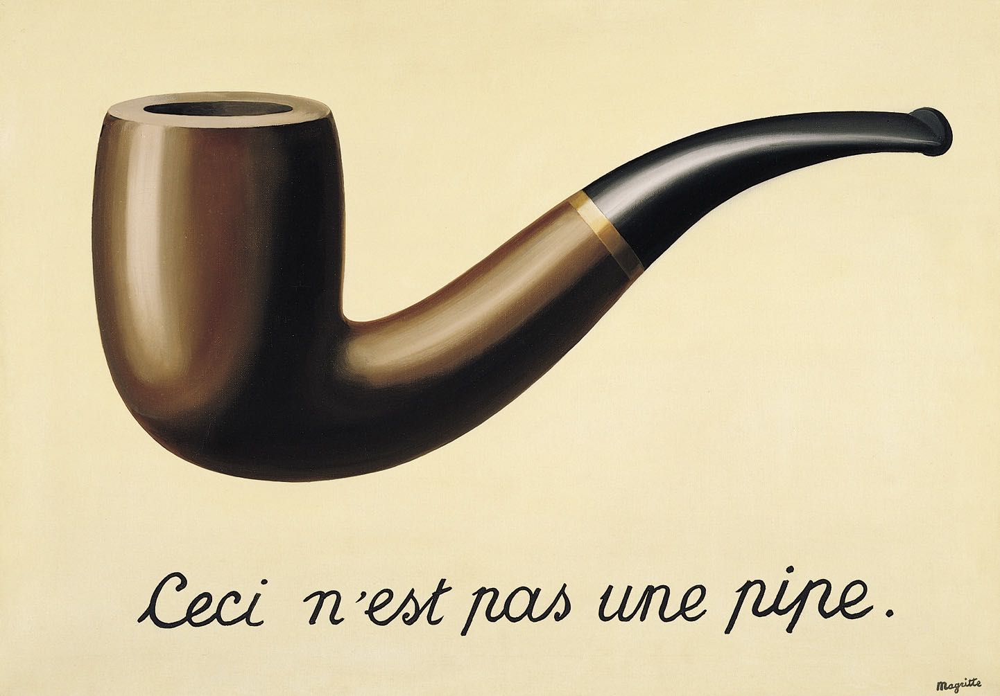
How DOES one properly illustrate this concept without doing thevery thing it tells you not to do?
Word & Image in Chip Kidd’s Work
A book jacket needs to do two things: represent a large amount of content concisely, and also attract attention among many other covers at the same time. It’s a tough job, but that’s what makes it a great example to learn from.
Chip Kidd nails both the punchy design to attract a new customer and make them consider reading it, and the nuance required to address an entire world within the book. Kidd’s covers reveal layers of meaning, which is especially important for someone like the author. Authors love Kidd’s work. The powerful potential of the play between word and image is never wasted: they never both say “apple”.

A plush bunny turned on its head represents a traumatic situation without showing too much.

Dry is about a battle with alcoholism. While this could have been any representation of the alcohol, Chip Kidd, brought the concept of «not dry» directly to the reader. With a strategic coat of clear gloss, the effect of ink running off the page was so strong that people examined the book to see what might have ruined the covers.
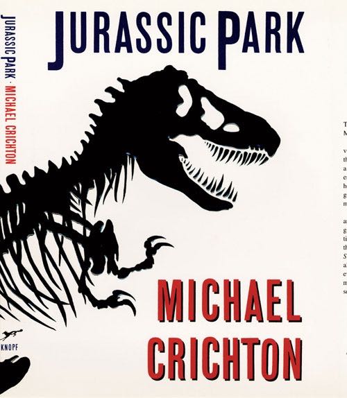
One of Chip Kidd’s most prolific pieces of design, the Jurassic Park skeleton dinosaur continued on to become an iconic poster and countless pieces of film memorabilia. Without any living dinosaurs available, Chip Kidd was still able to represent a lifelike character by giving it an in-between silhouetted look. Neither fully alive, nor a pile of bones.

The chosen photo implies nakedness without showing it. Wholesome!
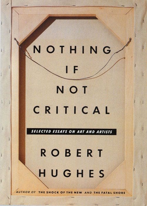
A critical look at a painting often calls for an examination of the back. Is it a fake? How old might it be? The solution of showing an unmistakable part of the process — looking at the back — is elegant and simple.
Cover images via ChipKidd.com
How to Pick Images for stories
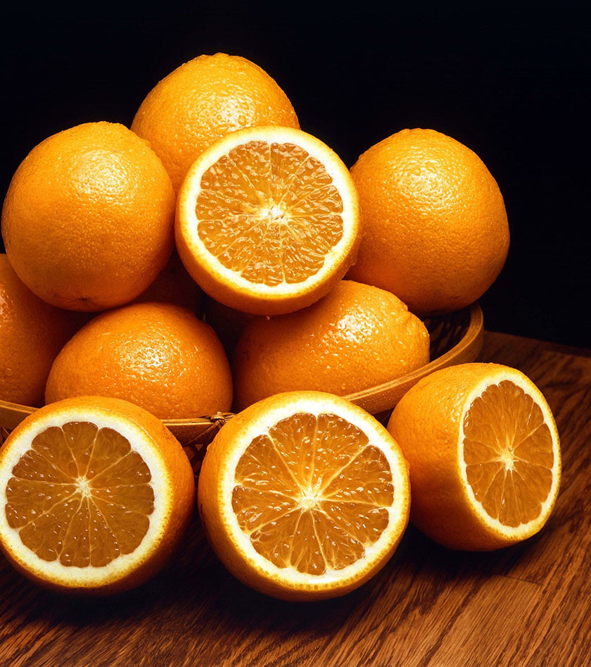
Chip Kidd’s work is an enigma: it is at the same time “obvious” and clever. And while I’d love to be able to work out metaphors on the same level every time I need to finish up an interface design and realize I’ve still got a beautiful, but placeholder image in there.

Like this one maybe? It’s a popular one by Jordan McQueen on Unsplash, and it could well stand in for a hero, working out the philosophical question of whether this image might fit or not. But by showing a person thinking, as we describe them thinking, we’re labelling the apple with “apple”.
In between a perfect image, custom-made for the story it tells, and nuanced (like Chip Kidd’s) and a banality (yes, it is possible to use this beautiful photograph in a banal way), we can find a compromise.
My compromise solution to illustrate this article was using the Creative Commonsphoto of an orange to play inside the “apple” focused wireframe.
You’ve seen 99designs and you still want another slice?

by E-T
Word designs not a good fit? Try something else:
How to create your design
If you want an amazing word design that stands out from the competition, work with a professional designer. Find and hire a designer to make your vision come to life, or host a design contest and get ideas from designers around the world.
Start a contest
Designers from around the world pitch you ideas. You provide feedback, hone your favorites and choose a winner.
Start a project
Find the perfect designer to match your style and budget. Then collaborate one-on-one to create a custom design.
What makes a good word design?
A great design shows the world what you stand for, tells a story and makes people remember your brand. Graphic design communicates all of that through color, shape and other design elements. Learn how to make your word design tell your brand’s story.
Graphic design trends
Discover stunning trends and find out what’s new in the world of graphic design… Keep reading
The 7 principles of design
Graphic design adheres to rules that work beneath the surface of any great artwork. Learn all about them here… Keep reading
Fundamentals of color theory
Color can have an immense power — if you know how to use it. Learn all about the fundamentals of color theory here… Keep reading