
 Please Note:
This article is written for users of the following Microsoft Word versions: 97, 2000, 2002, and 2003. If you are using a later version (Word 2007 or later), this tip may not work for you. For a version of this tip written specifically for later versions of Word, click here: Understanding Point Sizes.
![]()
Written by Allen Wyatt (last updated October 22, 2021)
This tip applies to Word 97, 2000, 2002, and 2003
A point is a typographical term for a unit of measure. It is roughly equivalent to 1/72 of an inch. Points are understood and used extensively by everyone in the publishing trade, particularly in design, typesetting, and printing. They are most commonly used with type specifications. Word uses point sizes to specify the height of all the fonts it uses. Thus, when you use a 12-point type, you are using one that occupies a character box approximately 12/72 (or 1/6) of an inch high. Likewise, 72-point type uses a character box that is about one inch tall.
In typesetting, points are also the measurement of choice when specifying line leading (as discussed in the next tip). It is not uncommon to specify type in the format 10/12, meaning 10-point type on 12-point line leading.
If you are familiar with points, you can use them as a standard measurement in Word. When entering a measurement in points, simply use the characters pt at the end of the measurement. Alternately, you can set your default measurement to points by choosing Options from the Tools menu, then clicking on the General tab and changing the Measurement Units selection to Points.
Remember that points, in Word, are approximate values. Whereas Word considers a point equal to 1/72 of an inch, in professional typography a point is equal to 1/72.27 of an inch. This may not sound like much of a difference, but if you are dealing with a large number of points the «error» can accumulate and make Word unsuitable for some purposes, especially exacting typesetting work.
WordTips is your source for cost-effective Microsoft Word training.
(Microsoft Word is the most popular word processing software in the world.)
This tip (161) applies to Microsoft Word 97, 2000, 2002, and 2003. You can find a version of this tip for the ribbon interface of Word (Word 2007 and later) here: Understanding Point Sizes.
Author Bio
With more than 50 non-fiction books and numerous magazine articles to his credit, Allen Wyatt is an internationally recognized author. He is president of Sharon Parq Associates, a computer and publishing services company. Learn more about Allen…
MORE FROM ALLEN
Signing a Protected Form
Tablet PCs are great for some uses, such as signing forms developed in Word. You may run into a problem with getting the …
Discover More
Viewing Two Worksheets At Once
If you need to work on two worksheets in the same workbook at the same time, Excel makes this rather easy to do. All you …
Discover More
Disappearing Ribbon Buttons
Excel allows you to configure your system, even to the point of adding macros to your ribbon area. What are you to do, …
Discover More
From Wikipedia, the free encyclopedia
«Small text» redirects here. Not to be confused with Microprinting.
| Point | |
|---|---|

A ruler showing point scale (on the bottom) and inch scale (on the top) |
|
| General information | |
| Unit system | typographic unit |
| Unit of | length |
| Conversions | |
| 1 point in … | … is equal to … |
| typographic units | 1/12 picas |
| imperial/US units | 1/72 in |
| metric (SI) units | 0.3528 mm |
In typography, the point is the smallest unit of measure. It is used for measuring font size, leading, and other items on a printed page. The size of the point has varied throughout printing’s history. Since the 18th century, the size of a point has been between 0.18 and 0.4 millimeters. Following the advent of desktop publishing in the 1980s and 1990s, digital printing has largely supplanted the letterpress printing and has established the DTP point (DeskTop Publishing point) as the de facto standard. The DTP point is defined as 1⁄72 of an international inch (1/72 × 25.4 mm ≈ 0.353 mm) and, as with earlier American point sizes, is considered to be 1⁄12 of a pica.
In metal type, the point size of the font describes the height of the metal body on which the typeface’s characters were cast. In digital type, letters of a font are designed around an imaginary space called an em square. When a point size of a font is specified, the font is scaled so that its em square has a side length of that particular length in points. Although the letters of a font usually fit within the font’s em square, there is not necessarily any size relationship between the two, so the point size does not necessarily correspond to any measurement of the size of the letters on the printed page.[1][2]
History[edit]
The point was first established by the Milanese typographer, Francesco Torniella da Novara (c. 1490 – 1589) in his 1517 alphabet, L’Alfabeto. The construction of the alphabet is the first based on logical measurement called «Punto,» which corresponds to the ninth part of the height of the letters or the thickness of the principal stroke.[3][4]
Notations[edit]
A measurement in points can be represented in three different ways. For example, 14 points (1 pica plus 2 points) can be written:
- 1P⁄2p (12 points would be just «1P⁄ «)—traditional style
- 1p2 (12 points would be just «1p»)—format for desktop
- 14pt (12 points would be «12pt» or «1pc» since it is the same as 1 pica)—format used by Cascading Style Sheets defined by the World Wide Web Consortium.[5]
Varying standards[edit]
| Name | Year | mm | inch | |
|---|---|---|---|---|
| ≈ 0.350 mm | ||||
| Fournier[6] | 1737 | ≈ 0.345 | 0.0135 | |
| American | 1886 | ≈ 0.3515 | = 0.013837 | |
| Japanese[7] | 1962 | = 0.3514 | ≈ 0.013835 | |
TeX pt
|
1982 | = 0.35145980 | ≈ 0.013837 | = 1⁄72.27 |
PostScript, CSS pt, TeX bp
|
1984 | = 0.3527 | = 0.0138 | = 1⁄72 |
| ≈ 0.375 mm | ||||
| Didot | 1783 | ≈ 0.375972 | ≈ 0.0148 | |
| Berthold | 1878 | ≈ 0.376 | ≈ 0.014801 | |
DIN actual,[8] TeX dd
|
1964 | = 0.376065 | ≈ 0.014806 | |
DIN nominal,[8] TeX nd
|
1984 | = 0.375 | ≈ 0.014764 | |
| Other | ||||
| Truchet | 1694 | ≈ 0.188 | ≈ 0.007401 | |
| L’Imprimerie Nationale nominal | 1810 | = 0.400 | ≈ 0.015748 | |
| L’Imprimerie Nationale actual | 1810 | = 0.398 77 mm | ≈ 0.0157 | |
DIN,[9] Japanese, CSS q
|
1999 | = 0.250 | ≈ 0.009842 |
There have been many definitions of a «point» since the advent of typography. Traditional continental European points at about 0.375 mm are usually a bit larger than English points at around 0.350 mm.
French points[edit]
The Truchet point, the first modern typographic point, was 1⁄144 of a French inch or 1⁄1728 of the royal foot. It was invented by the French clergyman Sébastien Truchet. During the metrication of France amid its revolution, a 1799 law declared the meter to be exactly 443.296 French lines long. This established a length to the royal foot of 9000⁄27706 m or about 325 mm, which made the Truchet point equal to 15625⁄83118 mm or about 0.187986 mm. It has also been cited as exactly 0.188 mm.
The Fournier point was established by Pierre Simon Fournier in 1737.[10][11][12]: 60–66 The system of Fournier was based on a different French foot of c. 298 mm. With the usual convention that 1 foot equals 12 inches, 1 inch (pouce) was divided into 12 lines (lignes) and 1 line was further divided into 6 typographic points (points typographiques). 1 point Fournier = 0.0135 English inches.

The Fournier scale: two inches in total, divided into four half-inches, the medium intervals are one line (
1⁄12 inch), and the smallest intervals are
1⁄36 inch; no intervals for the point is given, though
Fournier printed a reference scale of 144 points over two inches; however, it was too rough to accurately measure a single point.[11]
The Didot point, established by François-Ambroise Didot in 1783,[13] was an attempt to improve the Fournier system. He did not change the subdivisions (1 inch = 12 subdivisions = 72 points), but defined it strictly in terms of the royal foot, a legal length measure in France: the Didot point is exactly 1⁄864 of a French foot or 1⁄72 of a French inch, that is (by 1799) 15625⁄41559 mm or about 0.375972 mm. Accordingly, one Didot point is exactly two Truchet points.
However, 12 Fournier points turned out to be 11 Didot points,[11]: 142–145 giving a Fournier point of about 0.345 mm; later sources[12]: 60–61 state it as being 0.34875 mm. In Belgium the Fournier system was used until the 1970s and later. It was called the «mediaan»-system. To avoid confusion between the new and the old sizes, Didot also rejected the traditional names, thus parisienne became corps 5, nonpareille became corps 6, and so on.[11]: 143 The Didot system prevailed because the French government demanded printing in Didot measurements.[14][better source needed]
The Fournier point did not achieve lasting popularity despite being revived by the Monotype Corporation in 1927.[citation needed] It was still a standard in Belgium, in parts of Austria, and in Northern France at the beginning of the 20th century.[12]: 66
Other European points[edit]
Approximations were subsequently employed, largely owing to the Didot point’s unwieldy conversion to metric units (the divisor of its conversion ratio has the prime factorization of 3×7×1979).
In 1878, Hermann Berthold defined 798 points as being equal to 30 cm, or 2660 points equalling 1 meter: that gives around 0.376 mm to the point.[15][16][17][18] A more precise number, 0.376065 mm, sometimes is given;[16] this is used by TeX as the dd unit. This has become the standard in Germany[8] and Central and Eastern Europe.[19] This size is still mentioned in the technical regulations of the Eurasian Economic Union.[20]
Metric points[edit]
pdfTEX, but not plain TeX or LaTeX, also supports a new Didot point (nd) at 3⁄8 mm or 0.375 mm and refers to a not further specified 1978 redefinition for it.
The French National Print Office adopted a point of 2⁄5 mm or 0.400 mm in about 1810 and continues to use this measurement today (though «recalibrated» to 0.39877 mm).[21][22][23]
Japanese[24] and German[9][16][18] standardization bodies instead opted for a metric typographic base measure of exactly 1⁄4 mm or 0.250 mm, which is sometimes referred to as the quart in Japan. The symbol Q is used in Japanese after the initial letter of quarter millimeter. Due to demand by Japanese typesetters, CSS adopted Q in 2015.[25][26]
ISO 128 specifies preferred line thicknesses for technical drawings and ISO 9175 specifies respective pens. The steps between nominal sizes are based on a factor of √2 ≈ 1.414 in order to match ISO 216 paper sizes. Since the set of sizes includes thicknesses of 0.1 mm, 0.5 mm, 1 mm and 2 mm, there is also one of 0.35 mm which is almost exactly 1 pica point. In other words, 2−1.5 mm = 1⁄√8 mm approximates an English typographic point rather well.
American points[edit]
The basic unit of measurements in American typography was the pica,[12][27][28] usually approximated as one sixth of an inch, but the exact size was not standardized, and various type foundries had been using their own.[12]
After the American war of Independence Benjamin Franklin was sent as commissioner (Ambassador) for the United States to France (December 1776 to 1785).[29] While living there he had intimate contact with the Fournier family, including the father and Pierre Simon Fournier. Franklin wanted to teach his grandson Benjamin Franklin Bache about printing and typefounding, and arranged for him to be trained by Francois Ambroise Didot. Franklin then imported French typefounding equipment to Philadelphia to help Bache set up a type-foundry. Around 1790, Bache published a specimen sheet with some Fournier types.[30][31] After the death of Franklin, the matrices and the Fournier mould were acquired by Binny and Ronaldson, the first permanent type-foundry in America. Successive mergers and acquisitions in 1833, 1860 and 1897 saw the company eventually become known as MacKellar, Smith & Jordan. The Fournier cicero mould was used by them to cast pica-sized type.
Nelson Hawks proposed, like Fournier, to divide one American inch exactly into six picas, and one pica into 12 points. However, this saw an opposition because the majority of foundries had been using picas less than one sixth of an inch. So in 1886, after some examination of various picas, the Type Founders Association of the United States approved the pica of the L. Johnson & Co. foundry of Philadelphia (hence the Johnson pica) as the most established.[27] The company went on to become MacKellar, Smiths, & Jordan Co. and was finally acquired by the Type Founders Association. The official definition of one pica is 0.166044 inches (4.2175 mm), and one point is 0.013837 inches (0.3515 mm). That means 6 picas or 72 points constitute 0.99624 standard inches. A less precise definition is one pica equals 0.166 inches (4.2 mm), and one point 0.01383 inches (0.351 mm).[27][32] It was also noticed that 83 picas is nearly equal to 35 cm, so the Type Founders Association also suggested using a 35 cm metal rod for measurements, but this was not accepted by every foundry.[27]
This has become known as the American point system.[27][32] The British foundries accepted this in 1898.
In modern times this size of the point has been approximated as exactly 1⁄72.27 (0.01383700013837) of the inch[33] by Donald Knuth for the default unit of his TeX computer typesetting system and is thus sometimes known as the TeX point, which is 0.35145980 mm.
Old English points[edit]
Although the English Monotype manuals used 1 pica = .1660 inch, the manuals used on the European continent use another definition: there 1 pica = .1667 inch, the Old English pica.
As a consequence all the tables of measurements in the German, Dutch, French, Polish and all other manuals elsewhere on the European continent for the composition caster and the super-caster are different in quite some details.
The Monotype wedges used at the European continent are marked with an extra E behind the set-size: for instance: 5-12E, 1331-15E etc. When working with the E-wedges in the larger sizes the differences will increase even more.[34]
Desktop publishing point[edit]
The desktop publishing point (DTP point) or PostScript point is defined as 1⁄72 or 0.0138 of the international inch, making it equivalent to 25.4⁄72 mm = 0.3527 mm. Twelve points make up a pica, and six picas make an inch.
This specification was developed by John Warnock and Charles Geschke when they created Adobe PostScript. It was adopted by Apple Computer as the standard for the display resolution of the original Macintosh desktop computer and the print resolution for the LaserWriter printer.[35][36]
In 1996, it was adopted by W3C for Cascading Stylesheets (CSS) where it was later related at a fixed 3:4 ratio to the pixel due to a general (but wrong) assumption of 96 pixel-per-inch screens.[citation needed]
Apple point[edit]
Since the advent of high-density «Retina» screens with a much higher resolution than the original 72 dots per inch, Apple’s programming environment Xcode sizes GUI elements in points that are scaled automatically to a whole number of physical pixels in order to accommodate for screen size, pixel density and typical viewing distance. This Cocoa point is equivalent to the pixel px unit in CSS, the density-independent pixel dp on Android[37] and the effective pixel epx or ep in Windows UWP.
Font sizes[edit]
In lead typecasting, most font sizes commonly used in printing have conventional names that differ by country, language and the type of points used.
Desktop publishing software and word processors intended for office and personal use often have a list of suggested font sizes in their user interface, but they are not named and usually an arbitrary value can be entered manually. Microsoft Word, for instance, suggests every even size between 8 and 28 points and, additionally, 9, 11, 36, 48 and 72 points, i.e. the larger sizes equal 3, 4 and 6 picas. While most software nowadays defaults to DTP points, many allow other units, especially code-based systems like TeX and CSS.
See also[edit]
- Pica (typography)
- Body height (typography)
- Traditional point-size names
References[edit]
- ^ Phinney, Thomas (16 August 2012). «Point Size and the Em Square: Not What People Think». Phinney on Fonts. Retrieved 26 February 2018.
- ^ «15.7. Font size: the ‘font-size’ property», Cascading Style Sheets Level 2 Revision 2 (CSS 2.2) Specification, World Wide Web Consortium, 12 April 2016, retrieved 26 February 2018
- ^ Mardersteig, Giovanni (1971). The alphabet of Francesco Torniello da Novara [1517]: Followed by a comparison with the alphabet of Fra Luca Pacioli. Officina Bodoni.
- ^ Healey, Robin (2011). Italian Literature Before 1900 in English Translation: An Annotated Bibliography, 1929-2008. University of Toronto Press. ISBN 9781442642690.
- ^ «4.3.2. Lengths», Cascading Style Sheets, level 2 CSS2 Specification, World Wide Web Consortium, 12 April 2016, retrieved 26 February 2018
- ^ Various sources give different sizes, namely: ≈ 0.0135 in, ≈ 0.0137 in, ≈ 0.345 mm, (exactly) 0.34875 mm, ≈ 0.349 mm, ≈ 0.35 mm.
- ^ JIS Z 8305. 活字の基準寸法. Dimensions of Printing Types.
- ^ a b c DIN 16507-1:1998 and its predecessors, at least since 1964, for lead typecasting defined 2660 points to measure 1000.333 mm at 20 °C, but for public communication it later introduced a rounder value.
- ^ a b DIN 16507-2 (1984, 1999) does not specify a custom unit for electronic typography, but measures using a module.
- ^ Fournier, Pierre Simon (1764). Manuel typographique. pp. 125–138.
- ^ a b c d De Vinne, Theodore Low (1900). The practice of typography. Vol. 1. New York: Century Co. pp. 133–145.
- ^ a b c d e Legros, Lucien Alphonse; Grant, John Cameron (1916). Typographical Printing-Surfaces. London and New York: Longmann, Green, and Co. pp. 57–60. ISBN 9785872323303.
- ^ Baines, Phil; Haslam, Andrew (2005). Type & Typography. Laurence King Publishing. p. 93. ISBN 978-1-85669-437-7.
- ^ L. Ronner, Van leerling tot Zetter, 1913, N.V.De nieuwe Tijd, Amsterdam, pag 30.
- ^ Smalian, Hermann (1899). «Type Systems of To-day». The British Printer. XII (68): 130–131.
They commissioned for this purpose the well-known Berlin brass rule manufacturer, H. Berthold, who supplies brass rules not only to most of the German foundries but also to many foreign houses, and he, in conjunction with Prof. W. Fürster, the chief director of the Berlin Observatory, agreed that 2660 typographical points of the Didot system should correspond to one metre. Accordingly the Standard Gauge Commission in Berlin in 1879 arranged a standard measure of 30 centimetres = 133 nonpareil or 798 typographical points, and gave a copy to all the German foundries, and since that time disputes about the Didot depth were unknown in Germany.
- ^ a b c Brekle, Herbert E. (1994). «Typographie». Schrift und Schriftlichkeit / Writing and its Use. Walter de Gruyter. p. 210ff. ISBN 978-3-11-020323-3.
- ^ Funke, Fritz (1998). Buchkunde. De Gruyter. p. 194. ISBN 978-3-11-094929-2.
- ^ a b Blana, Hubert (1999). Die Herstellung: Ein Handbuch für die Gestaltung, Technik und Kalkulation von Buch, Zeitschrift und Zeitung. Walter de Gruyter. p. 101. ISBN 978-3-11-096787-6.
- ^ «§1.3». GOST 3489.1-71. Printing types (Russian and Roman graphic bases). Group arrangement. Indexing. Base line. Characters per 4 picas ГОСТ 3489.1-71. Шрифты типографские (на русской и латинской графических основах). Группировка. Индексация. Линия шрифта. Емкость (in Russian).
Кегль измеряется в типографских пунктах. Типографский пункт равен 0,376 мм.
- ^ (in Russian) Статья 8. Пункт 11. // ТР ТС 007/2011. Требования безопасности издательской (книжной и журнальной) продукции, школьно-письменных принадлежностей.
- ^ Mosley, James (1997). «French academicians and modern typography: designing new types in the 1690s». Typography Papers (2): 5–29.
The point in current use at the Imprimerie Nationale measures 0.39877 mm. This appears to be the result of a ‘recalibration’, for which no date can be given, of the point of 0.4 mm.
- ^ Bulletin du bibliophile. 2002. p. 73. ISBN 9782765407768.
These latter figures give the size in the ‘points millimétriques’ of about 0.4 mm that are said to have been introduced at the Imprimerie impériale by Firmin Didot and which are the basis for the ‘point IN’ used today at the Imprimerie nationale.
- ^ «Type bodies compared». Typefoundry. 30 April 2008.
- ^ JIS X 4052:2000, JIS Z 8125:2004
- ^ «CSS Values and Units Module Level 3». World Wide Web Consortium. 29 September 2016.
- ^ «CSS Values and Units Module Level 3». World Wide Web Consortium. 11 June 2015.
- ^ a b c d e De Vinne, Theodore Low (1900). The practice of typography. Vol. 1. New York: Century Co. pp. 145–156.
- ^ Hyde, Grant Milnor (1920). Newspaper Editing: A Manual for Editors, Copyreaders, and Students of Newspaper Desk Work. New York and London: D. Appleton and Company. pp. 226–227.
- ^ Benjamin Franklin papers, Kislak Center for Special Collections, Rare Books and Manuscripts, University of Pennsylvania
- ^ Updike, I, p. 257, II pp. 152-3
- ^ Allen Huet, Fournier the compleat typographer, 1972, London, Frederik Muller Ltd, page 3, 4, 62, 63
- ^ a b «The American Point System». American Printer and Lithographer. 11: 89. 1890.
- ^ Knuth, Donald E. (1990). The TeXbook (17th revised ed.). Addison-Wesley. p. 58.
- ^ Rich Hopkins, Origin of the American Point system for Printers; Type Measurement, Jill & Dale private Press, Terra Alta, West Virginia, 1976, 2e impression 1989
- ^
Tucker, H. A. (1988). «Desktop Publishing». In Ruiter, Maurice M. de (ed.). Advances in Computer Graphics III. Springer. p. 296. ISBN 3-540-18788-X. - ^
Spring, Michael B. (1991). Electronic printing and publishing: the document processing revolution. CRC Press. p. 46. ISBN 0-8247-8544-4. - ^ «Support different pixel densities». Android Developers Documentation. Retrieved 21 June 2022.
Further reading[edit]
- «Printing type». www.sizes.com. 2004.
- Ó Brógáin, Séamas (2006) [1983]. «Typographic measurement: A critique and a proposal». Professional Printer: Journal of the Institute of Printing. 27 (5): 9–14.
- Hopkins, Richard L. (1976). Origin of the American Point System for Printer’s Type Measurement. Terra Alta, WV: Hill & Dale Press.
- Catopodis, Miguel (2014). Tipometría. Las medidas en Diseño Gráfico. Valencia: Campgràfic. ISBN 978-8496657359.
- Lebedev, Artemy (2002), «§81. The life and extraordinary adventures of a typographical point», Mandership
Have you ever wondered: What is a point? Not, what is the point, — a point?
Whenever you see a reference to font size, it is specified in points, e.g. font size 10, font size 12. What is ‘point size’? How big is a point?
Again, this is a historical convention that dates back to the original printing presses of yesteryear.
There are 72 points in one inch.
Therefore, if you are using font size 12, the text size is 12/72 of an inch high when it is printed.
Put another way, 1 inch contains exactly 6 lines of size 12 text (6 x 12 = 72).
You never know when a fun fact like that might pop up in pub trivia quiz.
So now you know!
Here are some other advanced text effects you may be interested in.
I hope you found plenty of value in this post. I’d love to hear your biggest takeaway in the comments below together with any questions you may have.
Have a fantastic day.


About the author
Jason Morrell
Jason loves to simplify the hard stuff, cut the fluff and share what actually works. Things that make a difference. Things that slash hours from your daily work tasks. He runs a software training business in Queensland, Australia, lives on the Gold Coast with his wife and 4 kids and often talks about himself in the third person!
SHARE
In Word, line spacing is most commonly measured in multiples of whatever font size the paragraph is using. For example, say you’re using a 12 point font for the text in your paragraph. If you choose single line spacing, the space between lines will be 12 points.
Contents
- 1 How do you make 12 point spacing in Word?
- 2 What is meant by 12pt?
- 3 What is 10 pt spacing in Word?
- 4 What is 12 point font single spaced?
- 5 What is 12 font double spaced?
- 6 How do you change the paragraph spacing before 12pt in Word?
- 7 How many mm is 12 pt?
- 8 What is a point in Word?
- 9 What is 1.5 line spacing in Word?
- 10 What is line spacing in MS Word?
- 11 Is 1.0 single spacing?
- 12 How many words is 3 pages double spaced 12 font?
- 13 How many pages is 2500 words double spaced 12 font?
- 14 How do I double space between words in Microsoft Word?
- 15 What line spacing should I use?
- 16 How much spacing is double space?
- 17 What is 6 point spacing in Word?
- 18 How do you do 60 point spacing in Word?
- 19 What time is 12pt?
- 20 How many mm is 1pt?
How do you make 12 point spacing in Word?
Click the Line and Paragraph Spacing command in the Paragraph group on the Home tab. Select the desired spacing option from the drop-down menu. From the drop-down menu, you can also select Line Spacing Options to open the Paragraph dialog box. From here, you can adjust the line spacing with even more precision.
What is meant by 12pt?
Font sizes are measured in points; 1 point (abbreviated pt) is equal to 1/72 of an inch. The point size refers to the height of a character. Thus, a 12-pt font is 1/6 inch in height.
The default paragraph setting for Word 2007 or Word 2010 is 10 points of space after a paragraph and 1.15 line spacing within a paragraph. This is much different than the previous versions of Word. For example, in Word 2003 it was set to zero points after and single line spacing.
What is 12 point font single spaced?
For a page with 1 inch margins, 12 point Times New Roman font, and minimal spacing elements, a good rule of thumb is 500 words for a single spaced page and 250 words for a double spaced page.
What is 12 font double spaced?
Most courts adopted their line-spacing standards in the typewriter era. That’s why court rules usually call for double-spaced lines. On a typewriter, each line is the height of the font, thus double spacing means twice the font size. So if you’re required to use a 12-point font, double line spacing means 24 points.
How do you change the paragraph spacing before 12pt in Word?
Change the line spacing in a portion of the document
- Select one or more paragraphs to update.
- Go to Home > Line and Paragraph Spacing.
- Select Line Spacing Options and choose an option in the Line spacing box.
- Adjust the Before and After settings to change spacing between paragraphs.
- Select OK.
How many mm is 12 pt?
4.233 mm
The PT Sans font set to 12 pt in InDesign; the grey rectangle behind the font is 12 pt high which equals 4.233 mm and represents the body height.
What is a point in Word?
A point is a typographical term for a unit of measure. It is equivalent to 1/72 of an inch.If you are familiar with points, you can use them as a standard measurement in Word. When entering a measurement in points, simply use the characters pt at the end of the measurement.
What is 1.5 line spacing in Word?
Press Ctrl+1 for single-spacing, Ctrl+5 for 1.5 spacing, or Ctrl+2 for double-spacing. Click to view larger image.
What is line spacing in MS Word?
Line spacing is the distance between lines of text.To change the line spacing, select the lines you want to change. Then go to the Home tab and find the line spacing button in the Paragraph section.
Is 1.0 single spacing?
Line spacing is the distance between lines. In earlier versions of Word, the default line spacing distance is “1.0,” or single-spacing, which stacks lines closely together with minimal space between. The amount of that space varies depending on the font used.
How many words is 3 pages double spaced 12 font?
3 pages is 1,500 words single spaced, 750 words double spaced.
How many pages is 2500 words double spaced 12 font?
10 pages
A 2,500 word count will create about 5 pages single-spaced or 10 pages double-spaced when using normal margins (1″) and 12 pt. Arial or Times New Roman font.
How do I double space between words in Microsoft Word?
Double Spacing
- Select the text you want to be double spaced.
- Click on the Home tab.
- Look for the Paragraph options.
- Find an icon that has four horizontal lines, and two arrows pointing in opposite directions. Click the icon to expand.
- Select 2.0 to double space your text.
What line spacing should I use?
The traditional term for line spacing is leading (rhymes with bedding ), so named because traditional print shops put strips of lead between lines of type to increase vertical space. Sometimes you see this term in typesetting software. For most text, the optimal line spacing is between 120% and 145% of the point size.
How much spacing is double space?
A 2.0 value will mean double spacing. Remember that the double spacing will take place from whatever part in the text your cursor is positioned.
What is 6 point spacing in Word?
Paragraph spacing is set in points. If a document has 12-point text, then one line space equals 12-points, one-half line space equals 6-points, double-spacing equals 24-points. Paragraph Indents. An indent increases the distance between the side of a paragraph and the left or right margin.
How do you do 60 point spacing in Word?
Click Design, then Paragraph Spacing. Pick which spacing you want (the default is Open), and notice your whole document will preview as you mouse over the different settings.
What time is 12pt?
PT to EST call time
| PT | EST |
|---|---|
| 9:00 | 12:00 |
| 10:00 | 13:00 |
| 11:00 | 14:00 |
| 12:00 | 15:00 |
How many mm is 1pt?
Point to Millimeter Conversion Table
| Point | Millimeter [mm] |
|---|---|
| 1 point | 0.3527777778 mm |
| 2 point | 0.7055555556 mm |
| 3 point | 1.0583333333 mm |
| 5 point | 1.7638888889 mm |
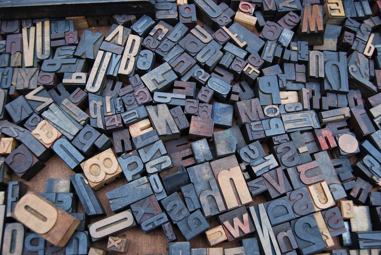
Typography is a field that deals with the written word and how letters and characters are presented.
The same letters can be styled in different ways to convey different emotions. And there are all kinds of tradeoffs around style versus readability.
In this article, we’ll look at some of the smaller — but still important — details related to typography like point size, upper vs lower case letters, em vs en dashes, kerning, and more.
The point size is a way to introduce standardization to typography. The point size is the smallest unit of measurement.
In metal type, point size refers to the height of the metal body on which a typeface’s character is cast. In digital typefaces, the metal body is replaced by an invisible box known as the em square. Each character fits inside that em square or em box. The em size of a font is equal to its point size.
html{
  font-size:16px;
}

body{
  font-size:1em;  // 1em is equal to 16px
}
The point size is also used to measure leading (line-height), line length and other elements, apart from font size.
In digital typefaces, one point is equal to 1/72 of an inch. Twelve points make one pica. Six picas make one inch. A common way of representing picas and points is as follows:
- 1 pica = 1p
- 1 point = 1 pts or p1
- 6 picas and 3 points = 6p3
- 7-point Open Sans with 9 points of leading = 7/9 Open Sans
The optimal point size for print is usually between 10-12 points while that for web, the optimal point size is between 15-25 points.
In CSS, you should set font-size in ems or rems than pixels as the former are scalable in nature. Recently, there has been much talk about fluid typography using the newly introduced units vw and vh.
Learn more about it here : Fluid Typography
Remember, different fonts set at the same point size will not appear to be of the same size due to their individual characteristics, namely—x-height, stroke modulation or contrast and character-width.
Upper and Lower Case
Uppercase (UC) is alternatively referred to as caps and capital. It is a typeface of larger characters. Lowercase (LC) is a typeface of small characters. As long as the shift key is not being pressed and the Caps lock is not active, everything typed is in lowercase. The Uppercase and Lowercase is often synonymous with Majuscule and Minuscule.
Many languages have two different written representations of their letters, upper case and lower case, also known as majuscule and minuscule forms.
Upper case and lower case letters are often mixed in the same piece of text. The use of cases is decided by grammar, but a variety of case styles also exists. Certain case styles are common in computer programming, referred to as naming conventions, like CamelCase and snake_case.
Uppercase:
A B C D E F G H I J K L M N O P Q R S T U V W X Y Z
Lowercase:
a b c d e f g h i j k l m n o p q r s t u v w x y z
Capitalization is important for the following reasons:
- Passwords: passwords are case sensitive, so capitalization add an extra level of security.
- Measurements: When dealing with computer measurement, and other measurements, capitalization is important for identifying the exact type of measurement. For example, “Mb” (short for Megabit) and “MB” (short for Megabyte) are two different types of measurements with different values.
- Commands
- File names, directories and paths.
Ems and Ens
Ems and Ens are a form of the punctuation mark called ‘dash’. Although similar in appearance to a hyphen, they serve different purposes.
Em Dash
Use an Em dash to denote a break in the sentence. Substitute it for a comma or to denote a pause in a sentence. They are also used to attribute a quote to a speaker. An Em dash is one em wide—the width of a point size of a typeface. Don’t put any spaces before and after an em dash.
For example: The noise from the neighbor’s house—it’s killing me.
- Command for an Em dash on a mac : Shift-Option-Hyphen
- Command for an Em dash on Microsoft Word : Alt + Ctrl + (minus)
- Em dash in HTML :
—or—
En Dash
Use an En dash as a replacement for the word ‘to’ or to denote a range of numbers. An En dash is half the width of an Em dash. Don’t put any spaces before and after an en dash.
For example: The first world war lasted from 1914–1918.
- Command for an En dash on a mac : Option-Hyphen
- Command for an En dash on Microsoft Word : Ctrl + (minus)
- En dash in HTML :
–or–
Kerning and Tracking
Kerning refers to the spacing between two individual characters within a word.
Tracking refers to the spacing between words.
Some typefaces are not designed to be kerned or tracked too loosely and vice versa. If one kerns or tracks too tightly or too loosely, they risk sacrificing readability and legibility.
When deciding how tight or loose to kern or track your text, it is advisable to first consider the scale at which the text will be interacted with. If it is to be printed, how far away from the printed text will the viewer be? Will they be driving by? Will it be on read on a backlit screen?
One should also consider the positive and negative ground when tracking and kerning. Tracking too tightly or too loosely can result in awkward figure/ground relations that will distract the user.
Legibility and Readability
Legibility
Legibility means being able to differentiate different characters in a text. Legible text implies it can be easily interpreted. Look at the unique characteristics of a typeface when considering legibility. Some of the considerations are as follows:
- You should use each typeface according to it’s context and intended usage. Look into it’s history and it’s best use case scenarios. For example : Garamond is best used for large bodies of text on print whereas Georgia for screen.
- Keep in mind whether the typeface is for display text or body text.
- The x-height of a typeface is the size of the lowercase ‘x’ in a typeface. A typeface with medium to high x-height results in a text legible at even small sizes.
- Conventionally, serif typefaces are more legible for body text than their sans-serif counterparts.
Readability
Readability means arranging group of words or a blocks of text in such a way to make the text more accessible. The idea is to reduce the amount of effort required to read a body of text.
Stephen Coles remarks that readability, not only begs the question of “Can you read it?” but whether ” do you want to read it?”.
Jason Santa Maria points out in his book On Web Typography that reading is not a linear activity. We read in a back and forth motion called saccades, which is our eyes hopping from one point to another. Also, text with familiar words makes it easier for us to read. Some basic points to remember when considering readability are as follows:
- Contrast refers to the change in thickness of the stroke in different parts of the letter. Higher the contrast, higher the change in stroke. Use medium to low contrast typefaces for long bodies of text.
- Line Height refers to the distance between two lines of text. You do not want to make the block of text neither too tight nor too loose. You can control line height in CSS by the property ‘line-height’. For most texts, you can set it between 1.2 to 1.5 (without any units).
- Line length (measure) refers to the average number of characters in a line of text. A large line length hampers readability by making it difficult for our eyes to scan the text. Usually about 45-75 characters per line is optimal for a body of text. If you plan on increase the line length beyond that, then also take care to increase the line height so that there is enough space between two lines of text. In CSS, you can set the width of the container, and by using the em unit, you can get close to a set number of characters, depending on the width-to-height ratio of the font. Example: width: 35em;
- Tracking refers to adjusting the space between characters in a text. Adding tracking means adding white space between characters and vice versa. At small font sizes i.e. less than 10pts, adding tracking helps in improving readability. Similarly, for large headings, use negative tracking to bring the letters closer. You can control tracking in CSS via ‘letter-spacing’ property. For example : letter-spacing: 0.05em;
- Font size refers to the size of the font used in a text. For mobile display, use sizes of at least 12px. You can control font-size in CSS via ‘font-size’ property. Example: font-size: 48px;
As you can see, you need to take into account a lot of factors to ensure optimal legibility and readability. Remember, there are no hard and fast rules for any of the above described factors. They are mere guidelines which might help you to train your typographic eye better.
Color and Tonal Value
In color theory, a tonal value is produced by adding white, grey, or black to a selected color. This does not change the hue but does alter the colorfullness, also known as saturation. When discussing tonal value, there are three main terms that must be discussed: Tint, Tone, and Shade.
Tint is the addition of white to a color. Tint can be used to highlight an area as well as begin to create the illusion of depth on an object.
Tone is the addition of grey to a color. The tonal color creates a more muted and less saturated color.
Shade is the addition of black to a color. Shade can be used to darken and area to create the illusion of depth on an object.
By altering a colors tonal value, you can create the illusion of depth in images as well as alter the saturation level to better apply color for a desired emotion or mood.
More on Typography:
- Typography: anatomy of letterforms
- 8-point grid: typography on the web
- Why typography can make or break your design
Learn to code for free. freeCodeCamp’s open source curriculum has helped more than 40,000 people get jobs as developers. Get started