
This guide explains the various ways in which overflowing text can be managed in CSS.
What is overflowing text?
In CSS, if you have an unbreakable string such as a very long word, by default it will overflow any container that is too small for it in the inline direction. We can see this happening in the example below: the long word is extending past the boundary of the box it is contained in.
CSS will display overflow in this way, because doing something else could cause data loss. In CSS data loss means that some of your content vanishes. So the initial value of overflow is visible, and we can see the overflowing text. It is generally better to be able to see overflow, even if it is messy. If things were to disappear or be cropped as would happen if overflow was set to hidden you might not spot it when previewing your site. Messy overflow is at least easy to spot, and in the worst case, your visitor will be able to see and read the content even if it looks a bit strange.
In this next example, you can see what happens if overflow is set to hidden.
Finding the min-content size
To find the minimum size of the box that will contain its contents with no overflows, set the width or inline-size property of the box to min-content.
Using min-content is therefore one possibility for overflowing boxes. If it is possible to allow the box to grow to be the minimum size required for the content, but no bigger, using this keyword will give you that size.
Breaking long words
If the box needs to be a fixed size, or you are keen to ensure that long words can’t overflow, then the overflow-wrap property can help. This property will break a word once it is too long to fit on a line by itself.
Note: The overflow-wrap property acts in the same way as the non-standard property word-wrap. The word-wrap property is now treated by browsers as an alias of the standard property.
An alternative property to try is word-break. This property will break the word at the point it overflows. It will cause a break-even if placing the word onto a new line would allow it to display without breaking.
In this next example, you can compare the difference between the two properties on the same string of text.
This might be useful if you want to prevent a large gap from appearing if there is just enough space for the string. Or, where there is another element that you would not want the break to happen immediately after.
In the example below there is a checkbox and label. Let’s say, you want the label to break should it be too long for the box. However, you don’t want it to break directly after the checkbox.
Adding hyphens
To add hyphens when words are broken, use the CSS hyphens property. Using a value of auto, the browser is free to automatically break words at appropriate hyphenation points, following whatever rules it chooses. To have some control over the process, use a value of manual, then insert a hard or soft break character into the string. A hard break (‐) will always break, even if it is not necessary to do so. A soft break (­) only breaks if breaking is needed.
You can also use the hyphenate-character property to use the string of your choice instead of the hyphen character at the end of the line (before the hyphenation line break).
This property also takes the value auto, which will select the correct value to mark a mid-word line break according to the typographic conventions of the current content language.
The <wbr> element
If you know where you want a long string to break, then it is also possible to insert the HTML <wbr> element. This can be useful in cases such as displaying a long URL on a page. You can then add the property in order to break the string in sensible places that will make it easier to read.
In the below example the text breaks in the location of the <wbr>.
See also
- The HTML
<wbr>element - The CSS
word-breakproperty - The CSS
overflow-wrapproperty - The CSS
white-spaceproperty - The CSS
hyphensproperty - Overflow and Data Loss in CSS
Editor’s note: This complete guide to word-wrap, overflow-wrap, and word-break in CSS was last updated 24 February 2023 to reflect the reflect the most recent version of CSS, include interactive code examples, and include a section on how to wrap text using CSS. To learn more about the overflow property, check out our guide to CSS overflow.
Making a site responsive so that it displays correctly on all devices is very important in this day and age. Unfortunately, despite your best efforts to do so, you may still end up with broken layouts. Broken layouts can happen when certain words are too long to fit in their container. Content overflow can occur when you are dealing with user-generated content you have no control over, such as the comments section of a post. Therefore, you need to apply styling to prevent content from overflowing their container.
Content overflow is a common problem for frontend developers. On the web, overflow occurs when your content doesn’t fit entirely within its containing element. As a result, it spills outside. In CSS, you can manage content overflow mainly using the overflow, word-wrap, overflow-wrap, and word-break CSS properties. However, our focus in this article will be on the word-wrap, overflow-wrap, and word-break CSS properties.
Jump ahead:
- Using
word-wrap,overflow-wrap, andword-breakCSS properties- How does content wrapping occur in browsers?
- What is the difference between a soft wrap break and a forced line break?
- Understanding the
Word-wrapandoverflow-wrapCSS propertiesNormalAnywhereBreak-word
- Implementing the
Word-breakCSS property- Setting
word-breaktoNormal - The
Break-allvalue - Using the
Keep-allvalue
- Setting
- What is the difference between
overflow-wrapandword-break? - How to wrap text using CSS
- Troubleshooting CSS content overflow with Chrome DevTools
Using word-wrap, overflow-wrap, and word-break CSS properties
You can use the word-wrap, overflow-wrap, or word-break CSS properties to wrap or break words that would otherwise overflow their container. This article is an in-depth tutorial on the word-wrap, overflow-wrap, and word-break CSS properties and how you can use them to prevent content overflow from ruining your nicely styled layout. Before we get started, let us understand how browsers wrap content in the next section.
How does content wrapping occur in browsers?
Browsers and other user agents perform content wrapping at allowed breakpoints, referred to as soft wrap opportunities. A browser will wrap content at a soft wrap opportunity, if one exists, to minimize content overflow. In English and other similar writing systems, soft wrap opportunities occur by default at word boundaries in the absence of hyphenation. Because words are bound by spaces and punctuation, that is where soft wraps occur.
Although soft wraps occur in space characters in English texts, the situation might be different for non-English writing systems. Some languages do not use spaces to separate words, meaning that content wrapping depends on the language or writing system. The value of the lang attribute you specify on the HTML element is mostly used to determine which language system is used.
This article will focus mainly on the English language writing system. The default wrapping at soft wrap opportunities may not be sufficient if you are dealing with long, continuous text, such as URLs or user-generated content, which you have very little or no control over. Before we go into a detailed explanation of these CSS properties, let’s look at the differences between soft wrap break and forced line break in the section below.
What is the difference between a soft wrap break and a forced line break?
Any text wrap that occurs at a soft wrap opportunity is referred to as a soft wrap break. For wrapping to occur at a soft wrap opportunity, you need to make sure you’ve enabled wrapping. For example, setting the value of white-space CSS property to nowrap will disable wrapping. Forced line breaks are caused by explicit line-breaking controls or line breaks marking the end or start of blocks of text.
Understanding the Word-wrap and overflow-wrap CSS properties
The name word-wrap is the legacy name for the overflow-wrap CSS property. Word-wrap was originally a non-prefixed Microsoft extension and was not part of the CSS standard, though most browsers implemented it with the name word-wrap. According to the draft CSS3 specification, browsers should treat word-wrap as a legacy name alias of the overflow-wrap property for compatibility.
Most recent versions of popular web browsers have implemented the overflow-wrap property. The draft CSS3 specification refers to the overflow-wrap property as:
This property specifies whether the browser may break at otherwise disallowed points within a line to prevent overflow when an otherwise-unbreakable string is too long to fit within the line box.
If you have a white-space property on an element, you need to set its value to allow wrapping for overflow-wrap to have an effect. Below are the values of the overflow-wrap property:
overflow-wrap: normal;
overflow-wrap: anywhere;
overflow-wrap: break-word;
You can also use the global values inherit, initial, revert, and unset with overflow-wrap, but we won’t cover them here. In the subsections below, we will look at the values of the overflow-wrap CSS property outlined above to understand the behavior of this property.
Normal
Applying the value normal will make the browser use the default line-breaking behavior of the system. For English and other related writing systems, line breaks will therefore occur at whitespaces and hyphens, as shown below:
.my-element{
    overflow-wrap: normal;
}
In the example below, there is a word in the text that is longer than its container. Because there is no soft wrap opportunity and the value of the overflow-wrap property is normal, the word overflows its container. It describes the default line-breaking behavior of the system:
See the Pen
overflow-wrap-normal by Joseph Mawa (@nibble0101)
on CodePen.
Anywhere
Using the value anywhere will break an otherwise unbreakable string at arbitrary points between two characters. It will not insert a hyphen character even if you apply the hyphens property on the same element.
The browser will break the word only if displaying the word on its line will cause an overflow. If the word still overflows when placed on its line, it will break the word at the point where an overflow would otherwise occur. When you use anywhere, the browser will consider the soft wrap opportunities introduced by the word break when calculating min-content intrinsic sizes:
.my-element{
   overflow-wrap: anywhere;
}
Unlike in the previous section, where we used overflow-wrap: normal, in the example below, we are using overflow-wrap: anywhere. The overflowing word that is otherwise unbreakable is broken into chunks of text using overflow-wrap: anywhere so that it fits in its container:
See the Pen
overlow-wrap-anywhere by Joseph Mawa (@nibble0101)
on CodePen.
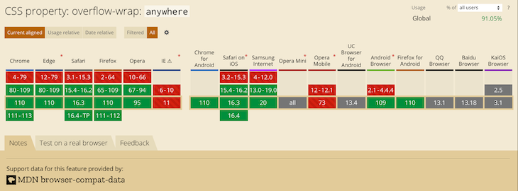
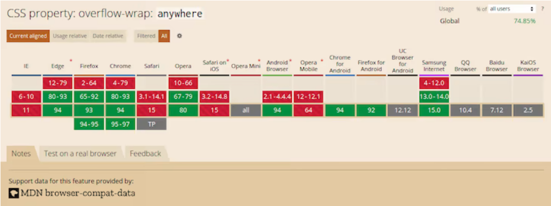
Most recent versions of desktop browsers support overflow-wrap: anywhere. However, support for some mobile browsers is either lacking or unknown. The image below shows the browser support:
Break-word
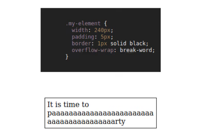
The value break-word is like anywhere in terms of functionality. If the browser can wrap the overflowing word to its line without overflowing, that is what it will do. However, if the word still overflows its container even when it is on its line, the browser will break it at the point where the overflow would otherwise occur:
.my-element{
   overflow-wrap: break-word;
}
The example below shows how the browser breaks the overflowing text when you apply overflow-wrap: break-word:
See the Pen
overflow-wrap-break-word by Joseph Mawa (@nibble0101)
on CodePen.
Notice that the text appears the same as in the last subsection. The difference between overflow-wrap: anywhere and overflow-wrap: break-word is in the min-content intrinsic sizes.
The difference between anywhere and break-word is apparent when calculating the min-content intrinsic sizes. With break-word, the browser doesn’t consider the soft wrap opportunities introduced by the word break when calculating min-content intrinsic sizes, but it does with anywhere. For more about min-content intrinsic sizes, check out our guide here.
The value break-word has decent coverage among the most recent versions of desktop browsers. Unfortunately, you cannot say the same about their mobile counterpart. It is, therefore, safer to use the legacy word-wrap: break-word instead of the more recent overflow-wrap: break-word.
The image below shows browser support for overflow-wrap: break-word:
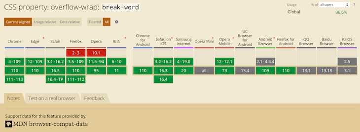
The most recent versions of desktop browsers have support, while support for some mobile browsers is unknown.
Implementing the Word-break CSS property
Word-break is another CSS property you can use to specify soft wrap opportunities between characters. You can use this property to break a word at the exact spot where an overflow would occur and wrap it onto the following line.
The draft CSS3 specification refers to the word-break CSS property as:
This property specifies soft wrap opportunities between letters, i.e., where it is “normal” and permissible to break lines of text. It controls what types of letters the browser can glom together to form unbreakable “words” — causing CJK characters to behave like non-CJK text or vice versa.
Below are the possible values of the word-break CSS property. Like overflow-wrap, you can use the global values inherit, initial, revert, and unset with word-break, but we won’t cover them here:
word-break: normal;
word-break: break-all;
word-break: keep-all;
Break-word is also a value of the word-break CSS property, though it was removed. However, browsers still support it for legacy reasons. Specifying this property has the same effect as word-break: normal and overflow-wrap: anywhere.
Now that we know the break-word CSS property and its corresponding values, let us look at them in the subsections below.
Setting word-break to Normal
Setting the value of the word-break property to normal will apply the default word breaking rules:
.my-element{
   word-break: normal;
}
The example below illustrates what happens when you apply the styling word-break: normal to a block of text that contains a word longer than its container:
See the Pen
word-break-normal by Joseph Mawa (@nibble0101)
on CodePen.
What you see is the browser’s usual word-breaking rules in effect.
The Break-all value
The value break-all will insert a line break at the exact point where the text would otherwise overflow for non-Chinese, non-Japanese, and non-Korean writing systems. It will not put the word on its own line, even if doing so will prevent the need to insert a line break:
.my-element{
   word-break: break-all;
}
In the example below, I am applying word-break: break-all styling to a p element of width 240px containing an overflowing text. The browser will insert a line break at the point where an overflow would occur and wrap the remaining text to the following line:
See the Pen
word-break-break-all by Joseph Mawa (@nibble0101)
on CodePen.
Using break-all will break a word between two characters at the exact point where an overflow would occur in English and other related language systems. However, it won’t apply the same behavior to Chinese, Japanese, and Korean (CJK) texts.
It doesn’t apply the same behavior for CJK texts because CJK writing systems have their own rules for applying breakpoints. Creating a line break between two characters arbitrarily just for the sake of avoiding overflow might significantly change the overall meaning of the text. For CJK systems, the browser will apply line breaks at the point where such breaks are allowed.
Using the Keep-all value
If you use the value keep-all, the browser will not apply word breaks to CJK texts, even if there is content overflow. The effect of applying keep-all value is the same as that of normal for non-CJK writing systems:
.my-element{
   word-break: keep-all;
}
In the example below, applying word-break: keep-all will have the same effect as word-break: normal for a non-CJK writing system such as English:
See the Pen
word-break-keep-all by Joseph Mawa (@nibble0101)
on CodePen.
The image below shows the browser support for word-break: keep-all:
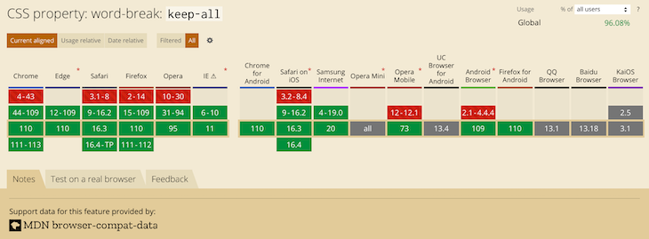
This value has support in most popular desktop browsers. Unfortunately, it is not the case for mobile browsers. Now that we have looked at the overflow-wrap and word-break CSS properties, what is the difference between the two? The section below will shed light on that.
What is the difference between overflow-wrap and word-break?
You can use the CSS properties overflow-wrap and word-break to manage content overflow. However, there are differences in the way the two properties handle it.
Using overflow-wrap will wrap the entire overflowing word to its line if it can fit in a single line without overflowing its container. The browser will break the word only if it cannot place it on a new line without overflowing. In most cases, the overflow-wrap property or its legacy name word-wrap might manage content overflow. Using word-wrap: break-word will wrap the overflowing word onto a new line and goes ahead to break it between two characters if it still overflows its container.
Word-break will ruthlessly break the overflowing word between two characters even if placing it on its line will negate the need for word break. Some writing systems, like the CJK writing systems, have strict word breaking rules the browser takes into consideration when creating line breaks using word-break.
How to wrap text using CSS
As hinted above, if you want to wrap text or break a word overflowing the confines of its box, your best bet is the overflow-wrap CSS property. You can also use its legacy name, word-wrap. Try the word-break CSS property if the overflow-wrap property doesn’t work for you. However, be aware of the differences between overflow-wrap and word-break highlighted above.
Below is an illustration of the overflow-wrap and word-wrap CSS properties. You can play with the CodePen to understand their effects:
See the Pen
how-to-wrap-text by Joseph Mawa (@nibble0101)
on CodePen.
Troubleshooting CSS content overflow with Chrome DevTools
More often than not, you might need to fix broken layouts caused by content overflow, as complex user interfaces are now commonplace in frontend development. Modern web browsers come with tools for troubleshooting such layout issues, such as Chrome DevTools.
It provides the capability to select an element in the DOM tree so that you can view, add, and remove CSS declarations and much more. It will help you track down the offending CSS style in your layout and fix it with ease.
To open the Chrome DevTools, you can use the F12 key. When open, it looks like in the image below. Selecting an element in the DOM tree will display its corresponding CSS styles. You can modify the styles and see the effect on your layout as you track down the source of the bug:
As already mentioned, if you have white-space property on an element, set its value to allow wrapping for overflow-wrap: anywhere or overflow-wrap: break-word to work.
Setting the value of overflow-wrap property to anywhere or break-word on a table content won’t break an overflowing word like in the examples above. The table will overflow its container and create a horizontal scroll if necessary. To get the table to fit within its container and overflow-wrap to work, set the value of the table-layout property to fixed and set the table width to 100% or to some fixed value.
Conclusion
As pointed out in the above sections, overflow-wrap and word-break are similar in so many ways, and you can use both of them for line-breaking controls. The name overflow-wrap is an alias of the legacy word-wrap property. Therefore, you can use the two interchangeably. However, it is worth mentioning that the browser support for the newer overflow-wrap property is still low. You are better off using word-wrap instead of overflow-wrap if you want near-universal browser support.
According to the draft CSS3 specification, browsers and user agents should continue supporting word-wrap for legacy reasons. If you are looking to manage content overflow, overflow-wrap or its legacy name word-wrap might be sufficient. You can also use word-break to break a word between two characters if the word overflows its container. Just like overflow-wrap, you need to tread with caution when using word-break because of limitations in the browser support.
Now that you know the behavior associated with the two properties, you can decide where and when to use them. Did I miss anything? Leave a comment in the comments section. I will be happy to update this article.
Is your frontend hogging your users’ CPU?
As web frontends get increasingly complex, resource-greedy features demand more and more from the browser. If you’re interested in monitoring and tracking client-side CPU usage, memory usage, and more for all of your users in production, try LogRocket. https://logrocket.com/signup/
LogRocket is like a DVR for web and mobile apps, recording everything that happens in your web app, mobile app, or website. Instead of guessing why problems happen, you can aggregate and report on key frontend performance metrics, replay user sessions along with application state, log network requests, and automatically surface all errors.
Modernize how you debug web and mobile apps — Start monitoring for free.
Example
Allow long words to be able to break and wrap onto the next line:
div {
word-wrap: break-word;
}
Try it Yourself »
Definition and Usage
The word-wrap property allows long words to be able to be broken and wrap
onto the next line.
Show demo ❯
| Default value: | normal |
|---|---|
| Inherited: | yes |
| Animatable: | no. Read about animatable |
| Version: | CSS3 |
| JavaScript syntax: | object.style.wordWrap=»break-word» Try it |
Browser Support
The numbers in the table specify the first browser version that fully supports the property.
| Property | |||||
|---|---|---|---|---|---|
| word-wrap | 4.0 | 5.5 | 3.5 | 3.1 | 10.5 |
CSS Syntax
word-wrap: normal|break-word|initial|inherit;
Property Values
| Value | Description | Demo |
|---|---|---|
| normal | Break words only at allowed break points. This is default | Demo ❯ |
| break-word | Allows unbreakable words to be broken | Demo ❯ |
| initial | Sets this property to its default value. Read about initial | |
| inherit | Inherits this property from its parent element. Read about inherit |
Related Pages
CSS tutorial: CSS Text Effects

От автора: в наши дни очень важно сделать сайт адаптивным, чтобы он правильно отображался на всех устройствах. К сожалению, несмотря на все усилия, вы все равно можете получить неработающие макеты. Иногда макеты нарушаются из-за того, что некоторые слова слишком длинные, чтобы уместиться в контейнере.
Переполнение контента может произойти, когда вы имеете дело с пользовательским контентом, который вы не можете контролировать. Типичный пример — раздел комментариев в блоге. Следовательно, вам необходимо применить соответствующий стиль, чтобы содержимое не переполняло свой контейнер.
Вы можете использовать свойства CSS word-wrap, overflow-wrap или word-break для обертывания или переноса слов, которые в противном случае переполнили бы их контейнер. Эта статья представляет собой подробное руководство по свойствам CSS word-wrap, overflow-wrap и word-break, а также о том, как вы можете использовать их, чтобы не допустить, чтобы переполнение содержимого разрушало ваш красиво оформленный макет.
Прежде чем мы начнем, давайте разберемся, как браузеры переносят контент в следующую секцию.
Как происходит перенос контента в браузерах?
Браузеры выполняют перенос содержимого в разрешенные брейкпоинты, называемый «мягкой оберткой». Браузер будет обертывать контент с использованием мягкой обертки, если таковая возможна, чтобы минимизировать переполнение контента.
В английской и большинстве подобных ей системах письма возможности мягкой обертки по умолчанию появляются на границах слов при отсутствии переносов. Поскольку слова ограничены пробелами и знаками препинания, именно здесь используются мягкие обертки.
Хотя в английских текстах для символов пробела используются мягкие обертки, для неанглийских систем письма ситуация может быть иной. Некоторые языки не используют пробелов для разделения слов. Следовательно, упаковка содержимого зависит от языка или системы письма. Значение атрибута lang, которое вы указываете в элементе html, в основном используется для определения того, какая языковая система используется. В этой статье основное внимание будет уделено системе письма на английском языке.
Переноса по умолчанию при использовании мягкой обертки может быть недостаточно, если вы имеете дело с длинным непрерывным текстом, например URL-адресами или пользовательским контентом, который у вас недостаточно или совсем не контролируется.
Прежде чем мы перейдем к подробному объяснению этих свойств CSS, давайте посмотрим на различия между мягким переносом и принудительным переносом строки в разделе ниже.
В чем разница между мягким и принудительным переносом строки?
Любой перенос текста, который происходит при использовании мягкого переноса, называется разрывом мягкого переноса. Чтобы перенос происходил при использовании мягкого обертывания, необходимо убедиться, что обертывание включено. Например, установка значения nowrap для свойства white-space отключит перенос.
С другой стороны, принудительные разрывы строк возникают из-за явного управления разрывом строк или указания конца или начала блоков текста.
CSS свойства word-wrap и overflow-wrap
Название word-wrap — это устаревшее имя свойства overflow-wrap. Word-wrap изначально было расширением Microsoft. Оно не было частью стандарта CSS, хотя большинство браузеров реализовали его под названием word-wrap. Согласно проекту спецификации CSS3, браузеры должны рассматривать word-wrap как устаревший псевдоним для свойства overflow-wrap.
В последних версиях популярных веб-браузеров реализовано свойство overflow-wrap. В проекте спецификации CSS3 указано следующее определение overflow-wrap: Это свойство указывает, может ли браузер разбивать строку на недопустимые точки переноса, чтобы предотвратить переполнение, когда неразрывная строка слишком длинна, чтобы поместиться в границах контейнера.
Если у вас есть свойство white-space для элемента, вам необходимо установить для него значение allow, чтобы разрешить эффект переноса для overflow-wrap. Ниже приведены значения свойства overflow-wrap. Вы также можете использовать глобальные значения inherit, initial, revert и unset для overflow-wrap, но здесь мы не будем их рассматривать.
|
overflow-wrap: normal; overflow-wrap: anywhere; overflow-wrap: break-word; |
Ниже мы рассмотрим значения свойства CSS overflow-wrap, чтобы понять его поведение.
Normal
Применение значения normal заставит браузер использовать поведение разрыва строки по умолчанию в системе. Поэтому для английского языка и других подобных системах письма разрывы строк будут происходить через пробелы и дефисы:
|
.my-element{ overflow-wrap: normal; } |
На изображении ниже в тексте есть слово, длина которого превышает длину контейнера. Поскольку нет возможности мягкого переноса, а значение свойства overflow-wrap равно normal, слово переполняет свой контейнер. Это является поведением системы при переносе строк по умолчанию.

Anywhere
Использование значения в аnywhere приведет к разрыву неразрывной строки в произвольных точках между двумя символами. Аnywhere не будет добавлять символ дефиса, даже если вы примените свойство hyphens к этому элементу.
Браузер разорвет слово только в том случае, если отображение слова приведет к переполнению. Если слово вызывает переполнение, оно будет разорвано в точке, где это переполнение произошло.
Когда вы используете аnywhere, браузер будет учитывать возможности мягкого переноса, предоставляемые разрывом слова, при вычислении внутренних размеров min-content:
|
.my-element{ overflow-wrap: anywhere; } |
В отличие от предыдущего примера, где мы использовали overflow-wrap: normal, на изображении ниже мы используем overflow-wrap :where. Слово-переполнение, которое невозможно разбить, разбивается на фрагменты текста с помощью overflow-wrap: anywhere, чтобы оно поместилось в своем контейнере.

Значение anywhere не поддерживается некоторыми браузерами. На изображении ниже показана поддержка браузерами по данным caniuse.com. Поэтому не рекомендуется использовать overflow-wrap: anywhere, если вы хотите иметь более высокую поддержку браузера.
Break-word
Значение break-word похоже на любое другое с точки зрения функциональности. Если браузер может перенести слово без переполнения, то он это сделает. Однако, если слово все еще переполняет контейнер, даже когда оно находится в новой строке, браузер разделит его в точке, где снова произошло бы переполнение:
|
.my-element{ overflow-wrap: break-word; } |
На изображении ниже показано, как браузер прерывает переполненный текст в предыдущем разделе, когда вы применяете overflow-wrap: break-word. Вы заметите, что изображение ниже выглядит так же, как изображение в последнем примере. Разница между overflow-wrap: anywhere и overflow-wrap: break-word заключается в вычислении внутренних размеров min-content.
Разница между anywhere и break-word очевидна при вычислении внутренних размеров min-content. С break-word браузер не учитывает возможности мягкого переноса, предоставляемые разрывом слова, при вычислении внутренних размеров min-content, но он учитывает возможности мягкого переноса при использовании anywhere.
Значение break-word имеет достойный охват среди последних версий десктопных браузеров. К сожалению, этого нельзя сказать об их мобильном аналоге. Поэтому безопаснее использовать унаследованный word-wrap: break-word вместо более нового overflow-wrap: break-word.
На изображении ниже показана поддержка браузеров overflow-wrap: break-word согласно caniuse.com. Вы заметите, что последние версии десктопных браузеров имеют поддержку, в то время как поддержка некоторых мобильных браузеров неизвестна.

Свойство Word-break
Word-break — еще одно свойство CSS, которое вы можете использовать для указания возможности мягкого переноса между символами. Вы можете использовать это свойство, чтобы разбить слово в том месте, где могло произойти переполнение, и перенести его на следующую строку.
Ниже приводится то, что говорится о свойстве CSS word-break в спецификации CSS3:
Это свойство определяет возможности мягкого переноса между буквами, то есть там, где это «нормально» и допустимо для разрывов строк текста. Word-break контролирует, какие типы букв браузер может объединять в неразрывные «слова», заставляя символы CJK вести себя как текст, не относящийся к CJK, или наоборот.
Ниже приведены возможные значения CSS-свойства word-break. Как и для overflow-wrap, вы также можете использовать глобальные значения inherit, initial, revert и unset, но мы не будем рассматривать их здесь:
|
word-break: normal; word-break: break-all; word-break: keep-all; |
Break-word также является значением для CSS-свойства word-break, хотя оно устарело. Однако, браузеры по-прежнему поддерживают его. Указание этого свойства имеет тот же эффект, что и word-break: normal и overflow-wrap :where.
Теперь, когда мы знакомы с CSS-свойством break-word и соответствующими ему значениями, давайте подробно рассмотрим их.
Normal
Установка для свойства word-break значение normal будет применять правила разбиения по словам по умолчанию:
|
.my-element{ word-break: normal; } |
На изображении ниже показано, что происходит, когда вы применяете стиль word-break: normal к блоку текста, который содержит слово длиннее, чем его контейнер. Вы видите, что в браузере действуют обычные правила разбиения на слова.

Break-all
Значение break-all вставит разрыв строки именно в том месте, где текст переполнился бы для некитайских, неяпонских и некорейских систем письма. Слово не будет помещено в отдельную строку, даже если это предотвратит необходимость вставки разрыва строки:
|
.my-element{ word-break: break-all; } |
На изображении ниже я применил стиль word-break:break-all к элементу p шириной 240 пикселей, содержащему переполненный текст. Браузер вставил разрыв строки в точке, где могло произойти переполнение, и перенес оставшийся текст в следующую строку.

Использование break-all приведет к разрыву слова между двумя символами именно в том месте, где произойдет переполнение в английском и других родственных языковых системах. Однако это не применимо к текстам на китайском, японском и корейском языках (CJK).
Он не применяет то же поведение к текстам CJK, потому что системы письма CJK имеют свои собственные правила для применения брейкпоинтов. Создание разрыва строки между двумя символами произвольно во избежание переполнения может значительно изменить общий смысл текста. Для систем CJK браузер будет применять разрывы строк в том месте, где такие разрывы разрешены.
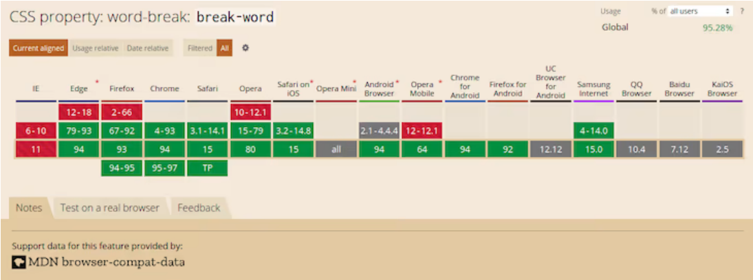
На изображении ниже показана поддержка браузером word-break: break-word согласно caniuse.com. Хотя последние версии современных веб-браузеров поддерживают это значение, поддержка среди некоторых мобильных браузеров неизвестна.
Keep-all
Если вы используете значение keep-all, браузер не будет применять разрывы слов к текстам CJK, даже если происходит переполнение содержимого. Эффект от применения значения keep-all такой же, как и у normal для систем письма, отличных от CJK:
|
.my-element{ word-break: keep-all; } |
На изображении ниже применение word-break: keep-all имеет тот же эффект, что и word-break: normal, потому что я использую систему письма, отличную от CJK (английский язык).

На изображении ниже показана поддержка браузером word-break: keep-all согласно caniuse.com. Это значение поддерживается в большинстве популярных десктопных браузеров. К сожалению, это не относится к мобильным браузерам.

Теперь, когда мы рассмотрели свойства CSS overflow-wrap и word-break, в чем разница между ними?
В чем разница между overflow-wrap и разр word-break?
Вы можете использовать CSS свойства overflow-wrap и word-break для управления переполнением содержимого. Однако существуют различия в способах обработки этих двух свойств.
Использование overflow-wrap приведет к переносу всего переполненного слова в новую строку, если оно может поместиться в одну строку, не переполняя свой контейнер. Браузер разорвет слово только в том случае, если он не сможет разместить слово в новой строке без переполнения. В большинстве случаев свойство overflow-wrap или его устаревшее название word-wrap может быть достаточным для управления переполнением содержимого.
Свойство overflow-wrap относительно новое, поэтому его поддержка браузером ограничена. Вместо этого вы можете использовать устаревшее название word-wrap, если вам нужна более высокая поддержка браузером.
С другой стороны, word-break безжалостно разорвет слово, которое выходит за границы, между двумя символами, даже если размещение его в новой строке устранит необходимость в разрыве слова. Кроме того, некоторые системы письма, такие как системы письма CJK, имеют строгие правила разбиения по словам, которые браузер принимает во внимание при создании разрывов строк с помощью word-break.
Заключение
Как указывалось в предыдущих разделах, overflow-wrap и word-break во многом схожи. Вы можете использовать оба из них для управления разрывом строки.
Название overflow-wrap является псевдонимом устаревшего свойства word-wrap. Следовательно, вы можете использовать их как взаимозаменяемые. Однако стоит отметить, что поддержка браузером нового свойства overflow-wrap по-прежнему невысока. Вам лучше использовать word-wrap вместо overflow-wrap, если вы хотите почти универсальную поддержку браузера. Согласно проекту спецификации CSS3, браузеры должны продолжать поддерживать word-wrap.
Если вы хотите управлять переполнением содержимого, вам достаточно использовать overflow-wrap или его устаревшее название word-wrap.
Вы также можете использовать word-break, чтобы разбить слово между двумя символами, если слово выходит за пределы своего контейнера. Как и при overflow-wrap, при использовании word-break нужно действовать осторожно из-за ограничений в поддержке браузера.
Теперь, когда вы знаете поведение, связанное с этими двумя свойствами, вы можете решить, где и когда их использовать.
Автор: Joseph Mawa
Источник: blog.logrocket.com
Редакция: Команда webformyself.
Читайте нас в Telegram, VK, Яндекс.Дзен
The word-wrap property breaks lines into words so as to fit in its container. This property even breaks words that are not unbreakable.
This property can have either a positive or negative value. A positive value adds additional space between words, whereas a negative value removes the space between words. When “normal” is set, the specified font will define the space between words.
The word-wrap property is one of the CSS3 properties.
It only has an effect when the white-space property allows wrapping.
In CSS3, the word-wrap property is called overflow-wrap.
word-wrap: normal | break-word | initial | inherit;Example of the word-wrap property with the «normal» value:
<!DOCTYPE html>
<html>
  <head>
    <title>Title of the document</title>
    <style>
      div {
        width: 120px;
        border: 1px solid #666;
        word-wrap: normal;
      }
    </style>
  </head>
  <body>
    <h2>Word-wrap property example</h2>
    <div>
      Lorem Ipsum is
      <strong>simplysimplysimplysimplysimplysimply</strong>
       dummy text of the printing and typesetting
      <strong>industryindustryindustryindustryindustry</strong>.
    </div>
  </body>
</html>
Result
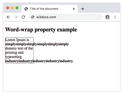
Example of the word-wrap property with the «break-word» value:
<!DOCTYPE html>
<html>
  <head>
    <title>Title of the document</title>
    <style>
      div {
        width: 120px;
        border: 1px solid #666;
        word-wrap: break-word;
      }
    </style>
  </head>
  <body>
    <h2>Word-wrap property example</h2>
    <div>
      Lorem Ipsum is
      <strong>simplysimplysimplysimplysimplysimply</strong>
      dummy text of the printing and typesetting
      <strong>industryindustryindustryindustryindustry</strong>.
    </div>
  </body>
</html>