
What is the Timeline in Excel?
Timeline in Excel is a kind of SmartArt created to display the different timings of a particular process. It is mainly used for filtering the underlying datasets by date. Such datasets are in the form of pivot tables containing the date field.
The timeline was first introduced in the 2013 version of Excel.
Table of contents
- What is the Timeline in Excel?
- How to Create Timelines in Excel? (With Example)
- Step #1 – Create table object
- Step #2 – Create a pivot table
- Step #3 – Create a pivot chart
- Step #4 – Insert a timeline in Excel
- How Does the Timeline Filter the Pivot Table?
- Top Timeline Tools in Excel
- #1 – Timeline slicer
- #2 – Scroll bar
- #3 – Time level
- #4 – Filter
- #5 – Timeline header
- #6 – Selection label
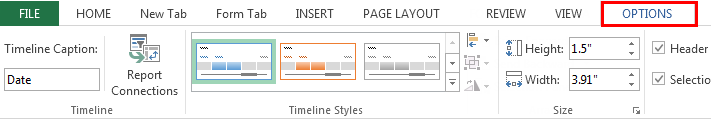
- #7 – Timeline window size
- #8 – Timeline caption
- #9 – Timeline style
- Frequently Asked Questions
- Recommended Articles
- How to Create Timelines in Excel? (With Example)
How to Create Timelines in Excel? (With Example)
You can download this Timeline Excel Template here – Timeline Excel Template
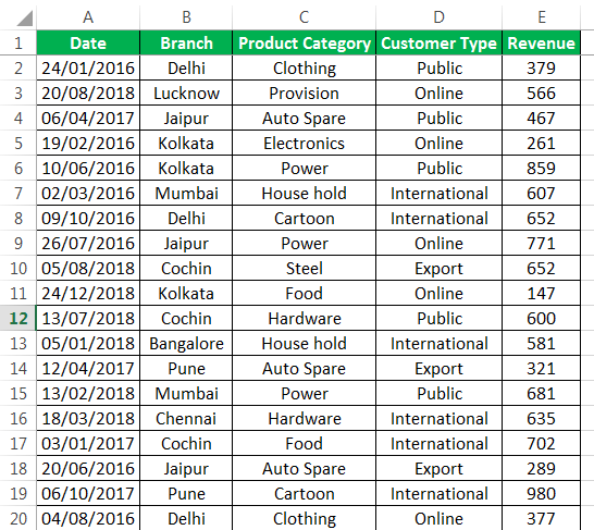
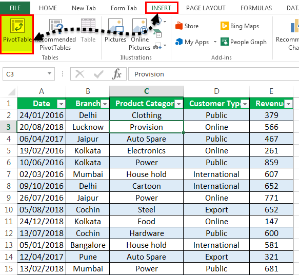
In the following table, there are five columns, namely–Date, Branch, Product Category, Customer Type, and RevenueRevenue is the amount of money that a business can earn in its normal course of business by selling its goods and services. In the case of the federal government, it refers to the total amount of income generated from taxes, which remains unfiltered from any deductions.read more.
With the help of a pivot table A Pivot Table is an Excel tool that allows you to extract data in a preferred format (dashboard/reports) from large data sets contained within a worksheet. It can summarize, sort, group, and reorganize data, as well as execute other complex calculations on it.read moreand a pivot chart, let us create a timeline in Excel. The pivot table and pivot chartIn Excel, a pivot chart is a built-in feature that allows you to summarize selected rows and columns of data in a spreadsheet. It is a visual representation of a pivot table that helps in the summarization and analysis of datasets, patterns, and trends.read more help summarize and analyze data.
Step #1 – Create table object
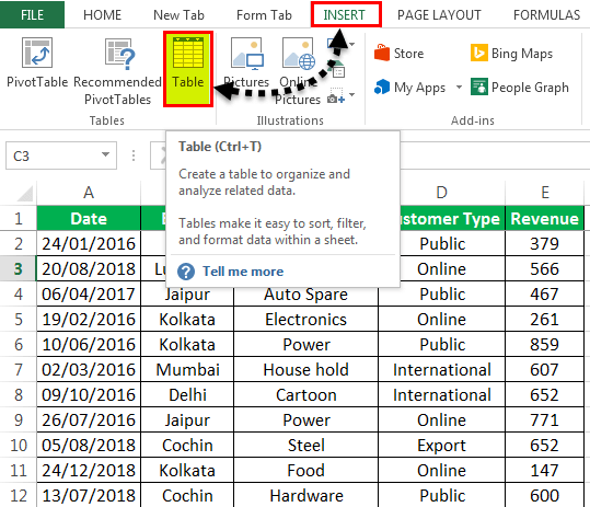
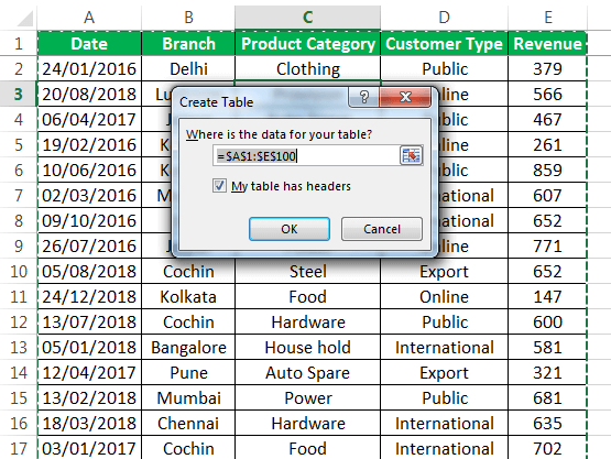
Initially, let us convert the data set into a table object with the help of the following steps:
- Click inside the data set, go to the Insert tab, and select “table”.

- The “create table” popup appears which displays the data range and a checkbox for table headers. Click “Ok.”

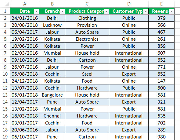
- Once the table object is created, the data appears in a tabulated form, as shown in the succeeding image.

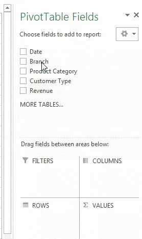
Step #2 – Create a pivot table
Since we want to summarize the revenue data across different categories of the timeline, we create a pivot table.
The steps to create a pivot table are listed as follows:
- Click on the data set within the table.
- Go to the Insert tab, select “PivotTable,” and click “Ok.”
- The “PivotTable Fields” pane appears in another sheet. Name this sheet as “PivotTable_Timeline.”
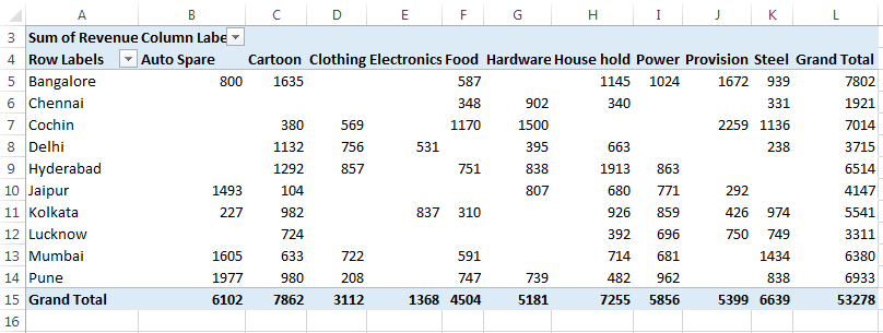
- In the “PivotTable Fields” pane, drag “branch” to the “rows” section, “product category” to the “columns” section, and “revenue” to the “values” section.
Step #3 – Create a pivot chart
We need to base a pivot chart on the pivot table that we have created. The steps to create a pivot chart are stated as follows:
- Copy the previous sheet as “PivotChart_Timeline” or create another sheet with this name.
- Click inside the pivot table on the sheet “PivotChart_Timeline.”
- In the Home tab, go to “Analyze” and select “PivotChart.”
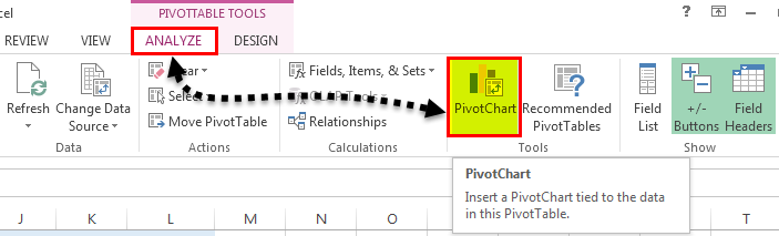
- The “insert chart” popup window appears.
- Select “stacked column chart” and click “Ok.”
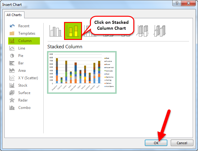
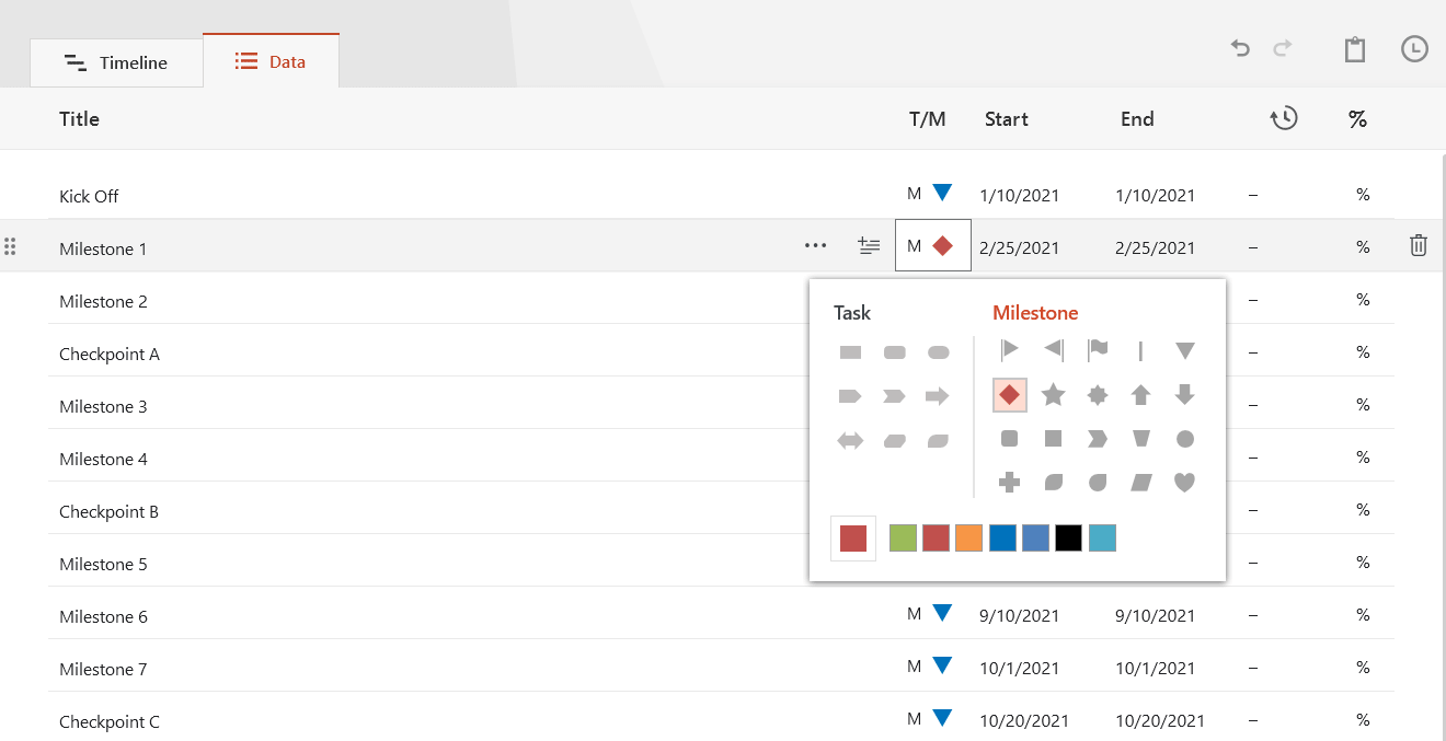
- The pivot chart appears as shown in the following image.
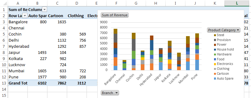
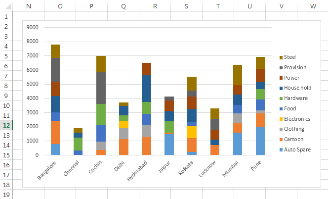
- In the pivot chart, you can hide the “product category,” “branch,” and “sum of revenue.” To do this, right-click and select “hide legend field buttons on chart,” as shown in the succeeding screenshot.

- The pivot chart appears without the legend buttons, as shown in the following image.
Step #4 – Insert a timeline in Excel
The steps to insert a timeline are mentioned as follows:
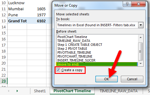
- Copy the “PivotChart_Timeline” to other sheets with the “create a copy” option. The popup window shown in the succeeding image appears.
- Right-click on the sheet name “PivotChart_Timeline” and name the sheet as “Insert_Timeline.”
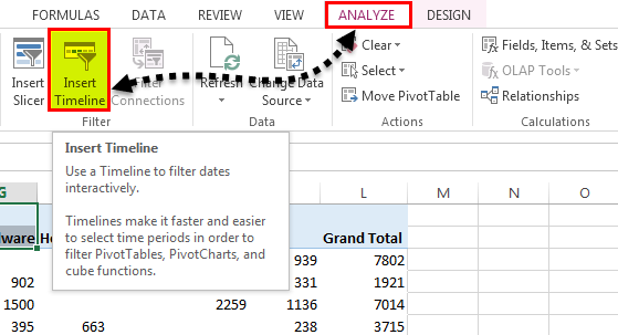
- Click anywhere on the data set of the pivot table. Select the Analyze tab on the Excel ribbonThe ribbon is an element of the UI (User Interface) which is seen as a strip that consists of buttons or tabs; it is available at the top of the excel sheet. This option was first introduced in the Microsoft Excel 2007.read more and click on the “Insert Timeline” button in the Filter group.
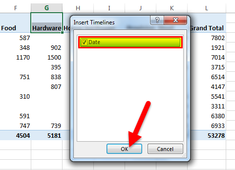
- The “insert timelines” pop-up window appears. It shows a checkbox with the date field. This is the filter of the timeline. Select the checkbox and click “Ok.”
- Now, the timeline appears.
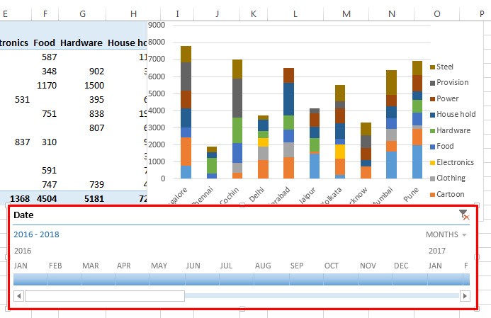
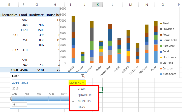
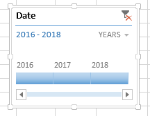
- For the timeline, you can configure or select group dates by years, quarters, months or days with the help of the drop-down list.
- We have selected “years” as shown in the following image.
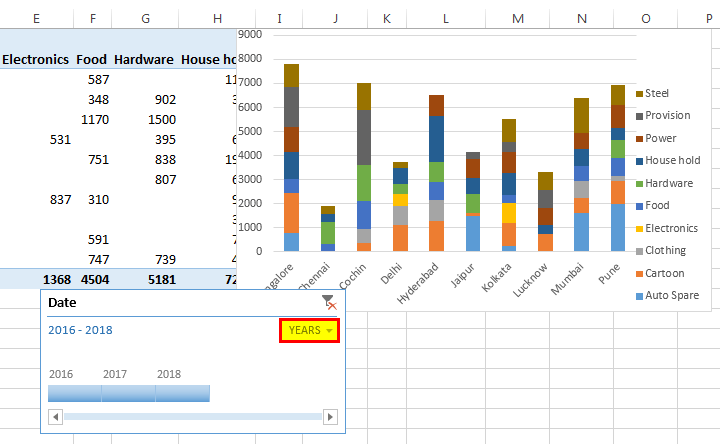
How Does the Timeline Filter the Pivot Table?
Let us consider the previous example again.
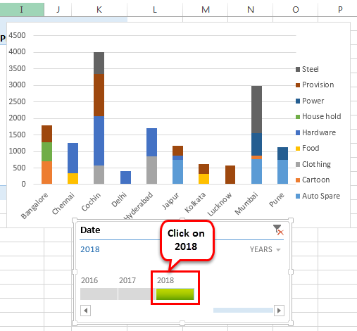
We want the timeline to filter the pivot table with results of the year 2018. To do this, click on “2018” in the timeline slicer.
The revenue for the year 2018 with reference to the branch and product category appears.
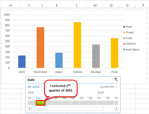
Now, let us select “quarters” from the dropdown list. If quarterly data in the timeline is not visible, drag the blue-colored box towards the end.
Let us select the 2nd quarter of 2016 to observe revenue across the different branches and product categories.
Top Timeline Tools in Excel
Timelines in Excel help filter the dates of the pivot tables. This is done with the help of various tools that assist in the working of the timeline.
The timeline tools appear to the right and the left of the Options tab, as shown in the following two images.
The major timeline tools are listed as follows:
#1 – Timeline slicer
The timeline slicer allows toggling between years, quarters, months, and days. In the dashboard, there is an option of combining the timeline with the slicer.
In comparison to the normal date filter, the timeline slicer is a more effective visual tool. This is because the latter provides a graphical representation that helps track critical milestones.

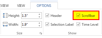
#2 – Scroll bar
It appears in the Options tab and helps select periods. It also allows scrolling through the years, quarters, months, and days.
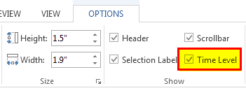
#3 – Time level
This tool allows selecting from four different time levels based on choice. The four-time levels are, namely–years, quarters, months, and days.

#4 – Filter
This button helps clear all the “time” options like years, quarters, months or days.
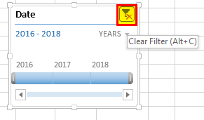
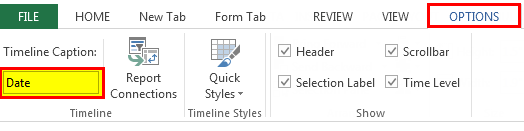
It displays the heading or the title of the timeline, as shown in the following image.
#6 – Selection label
It displays the date rangeTo create a data range in Excel, click anywhere in the table and then go to table tools>design on the ribbon>convert to range. To do so, right-click the table and select table>convert to range.read more that is included in the filter.

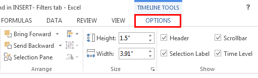
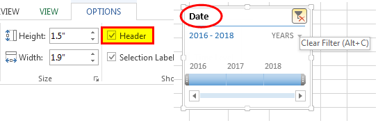
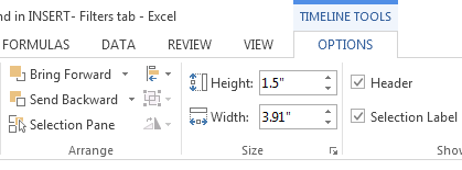
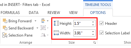
#7 – Timeline window size
The height and width of the PivotTable timeline can be adjusted according to the requirement. It is also possible to resize the timeline window by dragging it from its borders.
#8 – Timeline caption
By default, the caption box shows the column name as the caption. This is the column that was selected while inserting the timeline.
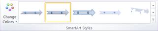
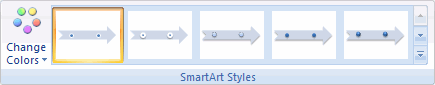
#9 – Timeline style
There are various style options in Excel for the PivotTable timeline. The following screenshot shows 12 types of theme styles.
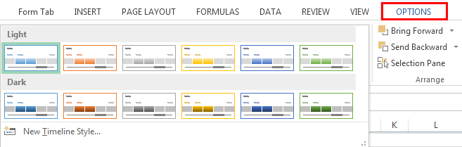
The style of the timeline can also be customized according to choice.
Frequently Asked Questions
#1 – What are slicer and timeline in Excel?
A slicer is an object that allows quick filtering of data. The slicer shows all the possible values of the column that are selected by the user. Each value appears as a button that can be used for toggling.
The slicer also displays the current filtering state, which lets the user know the exact values that are being displayed currently. A slicer can be used with a table and a pivot table.
A timeline allows the filtering of data specifically with date fields. The user can filter data by years, quarters, months, and days. The dates are displayed horizontally, beginning from the oldest to the newest, as one moves from left to right on a timeline.
A timeline can only be used with a pivot table having date fields.
#2 – How to use a timeline in Excel?
The timeline can be used with the help of the following features:
1) Timeline period–The timeline can use either a single period or multiple adjacent periods. To select a period, click on the first period and drag the cursor to the last period. Release the click to see the selected date range.
2) Date grouping–The “time level” feature allows grouping of dates in data. The dates can be grouped into years, quarters, months, and days.
3) Timeline handle or scroll bar–The scroll bar can be used to either increase or decrease the selected range of dates. This is done by dragging the scroll bar to the left or the right of the timeline range.
4) Timeline filters–Filters can be used to reset the timeline. For this, either select the filter icon or press Alt+C on the keyboard (with the timeline selected).
#3 – How to present a timeline in Excel?
The steps to present a timeline in Excel are listed as follows:
– Adjust the height and width of the timeline as per the requirement. To do this, select the timeline and go to “timeline tools,” click “options,” and select “size.”
– Enter an appropriate caption name in the “timeline caption” button.
Apply a theme to the timeline from the various “timeline styles” available.
– Link the timeline with more than one pivot table, in case of multiple PivotTables. To do this, select the timeline, right-click and select “report connections.” In the popup window, the pivot tables to be linked can be selected.
- A timeline in excel is a kind of SmartArt that displays the different timings of a particular process.
- The timeline was first introduced in Excel 2013.
- The pivot table and the pivot chart help summarize and analyze data.
- The user can select dates by years, quarters, months, or days with the help of the drop-down list of the timeline in excel.
- The timeline excel tools like scroll bar, time level, filter, selection label, window size, etc., appear on the right and the left side of the Options tab.
- The timeline slicer allows toggling between years, quarters, months, and days.
- Since the timeline slicer helps track milestones, it is a more effective visual tool than the normal date filter.
Recommended Articles
This has been a guide to Timeline in Excel. Here we discuss how to use timeline tools in Excel to create a Timeline in Excel along with practical examples and a downloadable Excel template. You may learn more about Excel from the following articles –
- Add a Border in ExcelIn Excel, a border is used to separate data tables or a specific range of cells from the rest of the text. As a result, it makes it easier to find specific information quickread more
- Add Filter in ExcelThe filter in excel helps display relevant data by eliminating the irrelevant entries temporarily from the view. The data is filtered as per the given criteria. The purpose of filtering is to focus on the crucial areas of a dataset. For example, the city-wise sales data of an organization can be filtered by the location. Hence, the user can view the sales of selected cities at a given time.
read more - Editing Drop-Down List in ExcelDropdowns in Excel assist a user in manually entering data in a cell with some specific values to choose from.read more
- VLOOKUP FalseIn excel we use the VLOOKUP false function to look for an exact match. In the vlookup function, we can use «1» as the criteria for TRUE and use «0» as the criteria for FALSE. The need for using TRUE may not arise so always stick to FALSE as the criteria for [Range Lookup].read more
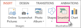
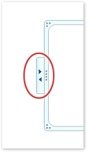
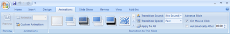
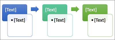
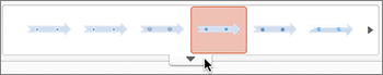
If you want to create a graphical representation of a sequence of events, such as the milestones in a project or the main events of a person’s life, you can use a SmartArt graphic timeline. After you create the timeline, you can add more dates, move dates, change layouts and colors, and apply different styles.
Create a timeline
-
On the Insert tab, click SmartArt.

-
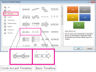
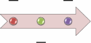
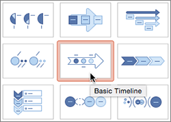
In the Choose a SmartArt Graphic gallery, click Process, and then double-click a timeline layout.
Tip: There are two timeline SmartArt graphics: Basic timeline and Circle Accent Timeline, but you can also use almost any process-related SmartArt graphic.
-
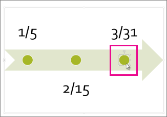
Click [Text], and then type or paste your text in the SmartArt graphic.
Note: You can also open the Text Pane and type your text there. If you do not see the Text Pane, on the SmartArt ToolsDesign tab, click Text Pane.
-
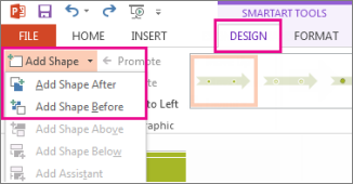
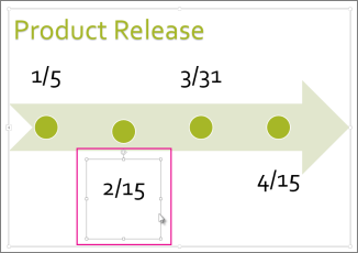
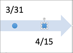
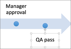
Click a shape in the timeline.
-
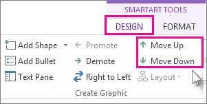
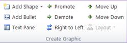
On the SmartArt ToolsDesign tab, do one of the following:
-
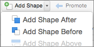
To add an earlier date, click Add Shape, and then click Add Shape Before.
-
To add a later date, click Add Shape, and then click Add Shape After.
-
-
In the new date box, type the date that you want.
-
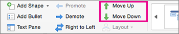
On the timeline, click the date you want to move.
-
On the SmartArt ToolsDesign tab, do one of the following:
-
To move a date sooner than the selected date, click Move Up.
-
-
To move a date later than the selected date, click Move Down.
-
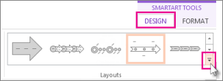
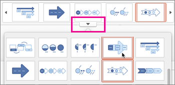
Click the SmartArt graphic timeline.
-
On the SmartArt ToolsDesign tab, in the Layouts group, click More
.Note: To view only the timeline and process-related layouts, at the bottom of the layouts list, click More Layouts, and then click Process.
-
Pick a timeline or process-related SmartArt graphic, like the following:
-
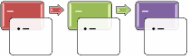
To show progression in a timeline, click Accent Process.
-
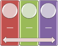
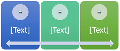
To create a timeline with pictures or photos, click Continuous Picture List. The circular shapes are designed to contain pictures.
-
 .
.
-
Click the SmartArt graphic timeline.
-
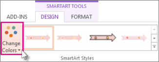
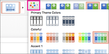
On the SmartArt ToolsDesign tab, click Change Colors.
Note: If you don’t see the SmartArt ToolsDesign tab, make sure you’ve selected the timeline.
-
Click the color combination that you want.
Tip: Place your pointer over any combination to see a preview of how the colors look in your timeline.
A SmartArt style applies a combination of effects, such as line style, bevel, or 3-D perspective, in one click, to give your timeline a professionally polished look.
-
Click the timeline.
-
On the SmartArt ToolsDesign tab, click the style you want.
Tip: For more styles, click More
, in the lower right corner of the Styles box.
See also
-
Create a timeline in Visio
-
Import and export timeline data between Visio and Project
-
Create a timeline in Project
-
Get Microsoft timeline templates
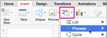
Create a timeline
-
On the Insert tab, in the Illustrations group, click SmartArt.
-
In the Choose a SmartArt Graphic gallery, click Process, and then double-click a timeline layout (such as Basic Timeline).
-
To enter your text, do one of the following:
-
Click [Text] in the Text pane, and then type your text.
-
Copy text from another location or program, click [Text] in the Text pane, and then paste your text.
Note: If the Text pane is not visible, click the control.
-
Click in an entry in the SmartArt graphic, and then type your text.
Note: For best results, use this option after you add all of the entries that you want.
-
Other timeline tasks
-
Click the SmartArt graphic that you want to add another entry to.
-
Click the existing entry that is located closest to where you want to add the new entry.
-
Under SmartArt Tools, on the Design tab, in the Create Graphic group, click the arrow next to Add Shape.
If you don’t see the SmartArt Tools or Design tabs, make sure that you’ve selected the SmartArt graphic. You might have to double-click the SmartArt graphic to open the Design tab.
-
Do one of the following:
-
To insert an entry after the selected entry, click Add Shape After.
-
To insert an entry before the selected entry, click Add Shape Before.
-
To delete an entry from your timeline, do one of the following:
-
In the SmartArt graphic, select the text for the textbox for the entry that you want to delete, and then press DELETE.
-
In the Text pane, select the all of the text for the entry that you want to delete, and then press DELETE.
Notes:
-
To add a shape from the Text pane:
-
At the shape level, place your cursor at the end of the text where you want to add a new shape.
-
Press ENTER, and then type the text that you want in your new shape.
-
-
-
In the text pane, select the entry that you want to move.
-
Do one of the following:
-
To move the entry to an earlier date, under SmartArt Tools, on the Design tab, in the Create Graphic group, click Move Up.
-
To move the entry to a later date, under SmartArt Tools, on the Design tab, in the Create Graphic group, click Move Down.
If you don’t see the SmartArt Tools or Design tabs, make sure that you’ve selected the SmartArt graphic. You might have to double-click the SmartArt graphic to open the Design tab.
-
-
Right-click the timeline that you want to change, and then click Change Layout.
-
Click Process, and then do one of the following:
-
For a simple but effective timeline, click Basic Timeline.
-
To show a progression, a timeline, or sequential steps in a task, process, or workflow, click Accent Process.
-
To illustrate a timeline with pictures or photos, click Continuous Picture List. The circular shapes are designed to contain pictures.
-
Note: You can also change the layout of your SmartArt graphic by clicking a layout option in the Layouts group on the Design tab under SmartArt Tools. When you point to a layout option, your SmartArt graphic changes to show you a preview of how it would look with that layout.
To quickly add a designer-quality look and polish to your SmartArt graphic, you can change the colors or apply a style to your timeline. You can also add effects, such as glows, soft edges, or 3-D effects. Using Microsoft PowerPoint 2010, you can also animate your timeline.
You can apply color combinations that are derived from the theme colors to the entries in your SmartArt graphic.
-
Click the SmartArt graphic whose color you want to change.
-
Under SmartArt Tools, on the Design tab, in the SmartArt Styles group, click Change Colors.
If you don’t see the SmartArt Tools or Design tabs, make sure that you’ve selected the SmartArt graphic.
-
Click the color combination that you want.
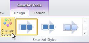
Tip: When you place your pointer over a thumbnail, you can see how the colors affect your SmartArt graphic.
-
In the SmartArt graphic, right-click the border of the entry you want to change, and then click Format Shape.
-
To change the color of the entry’s border, click Line Color, click Color
, and then click the color that you want. -
To change the style of the entry’s border, click Line Style, and then choose the line styles you want.
 , and then click the color that you want.
-
Click the SmartArt graphic you want to change.
-
Right-click the border of an entry, and then click Format Shape.
-
Click Fill, and then click Solid fill.
-
Click Color
, and then click the color that you want.
To change the background to a color that is not in the theme colors, click More Colors, and then either click the color that you want on the Standard tab, or mix your own color on the Custom tab. Custom colors and colors on the Standard tab are not updated if you later change the document theme.
To specify how much you can see through the background color, move the Transparency slider, or enter a number in the box next to the slider. You can vary the percentage of transparency from 0% (fully opaque, the default setting) to 100% (fully transparent).
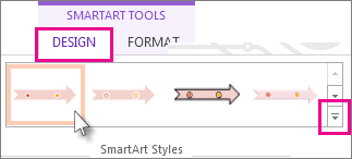
A SmartArt Style is a combination of various effects, such as line style, bevel, or 3-D perspective that you can apply to the entries in your SmartArt graphic to create a unique and professionally-designed look.
-
Click the SmartArt graphic you want to change.
-
Under SmartArt Tools, on the Design tab, in the SmartArt Styles group, click the SmartArt Style that you want.
To see more SmartArt Styles, click the More button
.
 .
.Note: When you place your pointer over a thumbnail, you can see how the SmartArt Style affects your SmartArt graphic.
See also
-
Create a timeline in Visio
-
Import and export timeline data between Visio and Project
-
Create a timeline in Project
Create a timeline
-
On the Insert tab, in the Illustrations group, click SmartArt.
-
In the Choose a SmartArt Graphic gallery, click Process, and then double-click a timeline layout (such as Basic Timeline).
-
To enter your text, do one of the following:
-
Click [Text] in the Text pane, and then type your text.
-
Copy text from another location or program, click [Text] in the Text pane, and then paste your text.
Note: If the Text pane is not visible, click the control.
-
Click in an entry in the SmartArt graphic, and then type your text.
Note: For best results, use this option after you add all of the entries that you want.
-
Other timeline tasks
-
Click the SmartArt graphic that you want to add another entry to.
-
Click the existing entry that is located closest to where you want to add the new entry.
-
Under SmartArt Tools, on the Design tab, in the Create Graphic group, click the arrow under Add Shape.
If you don’t see the SmartArt Tools or Design tabs, make sure that you’ve selected the SmartArt graphic.
-
Do one of the following:
-
To insert an entry after the selected entry, click Add Shape After.
-
To insert an entry before the selected entry, click Add Shape Before.
-
To delete an entry from your timeline, click the entry you want to delete, and then press DELETE.
Notes:
-
To add a shape from the Text pane:
-
At the shape level, place your cursor at the end of the text where you want to add a new shape.
-
Press ENTER, and then type the text that you want in your new shape.
-
To add an assistant box, press ENTER while an assistant box is selected in the Text pane.
-
-
To move an entry, click the entry, and then drag it to its new location.
-
To move an entry in very small increments, hold down CTRL while you press the arrow keys on your keyboard.
-
Right-click the timeline that you want to change, and then click Change Layout.
-
Click Process, and then do one of the following:
-
For a simple but effective timeline, click Basic Timeline.
-
To show a progression, a timeline, or sequential steps in a task, process, or workflow, click Accent Process.
-
To illustrate a timeline with pictures or photos, click Continuous Picture List. The circular shapes are designed to contain pictures.
-
Note: You can also change the layout of your SmartArt graphic by clicking a layout option in the Layouts group on the Design tab under SmartArt Tools. When you point to a layout option, your SmartArt graphic changes to show you a preview of how it would look with that layout.
To quickly add a designer-quality look and polish to your SmartArt graphic, you can change the colors or apply a SmartArt Style to your timeline. You can also add effects, such as glows, soft edges, or 3-D effects. Using PowerPoint 2007 presentations, you can animate your timeline.
You can apply color combinations that are derived from the theme colors to the entries in your SmartArt graphic.
-
Click the SmartArt graphic whose color you want to change.
-
Under SmartArt Tools, on the Design tab, in the SmartArt Styles group, click Change Colors.
If you don’t see the SmartArt Tools or Design tabs, make sure that you’ve selected the SmartArt graphic.
-
Click the color combination that you want.
Tip: When you place your pointer over a thumbnail, you can see how the colors affect your SmartArt graphic.
-
In the SmartArt graphic, right-click the border of the entry you want to change, and then click Format Shape.
-
To change the color of the entry’s border, click Line Color, click Color
, and then click the color that you want. -
To change the style of the entry’s border, click Line Style, and then choose the line styles you want.
-
Click the SmartArt graphic you want to change.
-
Right-click the border of an entry, and then click Format Shape.
-
Click Fill, and then click Solid fill.
-
Click Color
, and then click the color that you want.
To change the background to a color that is not in the theme colors, click More Colors, and then either click the color that you want on the Standard tab, or mix your own color on the Custom tab. Custom colors and colors on the Standard tab are not updated if you later change the document theme.
To specify how much you can see through the background color, move the Transparency slider, or enter a number in the box next to the slider. You can vary the percentage of transparency from 0% (fully opaque, the default setting) to 100% (fully transparent).
A SmartArt Style is a combination of various effects, such as line style, bevel, or 3-D, that you can apply to the entries in your SmartArt graphic to create a unique and professionally designed look.
-
Click the SmartArt graphic you want to change.
-
Under SmartArt Tools, on the Design tab, in the SmartArt Styles group, click the SmartArt Style that you want.
To see more SmartArt Styles, click the More button
.
-
When you place your pointer over a thumbnail, you can see how the SmartArt Style affects your SmartArt graphic.
-
You can also customize your SmartArt graphic by moving entries, resizing entries, adding a fill or effect, and adding a picture.
If you’re using PowerPoint 2007, you can animate your timeline to emphasize each entry.
-
Click the timeline that you want to animate.
-
On the Animations tab, in the Animations group, click Animate, and then click One by one.
Note: If you copy a timeline that has an animation applied to it to another slide, the animation is also copied.
See also
-
Create a timeline in Visio
Create a timeline
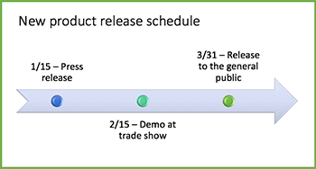
When you want to show a sequence of events, such as project milestones or events, you can use a SmartArt graphic timeline. After you create the timeline, you can add events, move events, change layouts and colors, and apply different styles.
-
On the Insert tab, click SmartArt > Process.
-
Click Basic Timeline or one of the other process-related graphics.
-
Click the [Text] placeholders and enter the details of your events.
Tip: You can also open the Text Pane and enter your text there. On the SmartArt Design tab, click Text Pane.
-
Click a shape in the timeline.
-
On the SmartArt Design tab, click Add Shape, and then click Add Shape Before or Add Shape After.
-
Enter the text you want.
-
On the timeline, click the text of the event you want to move.
-
On the SmartArt Design tab, click Move Up (left), or Move Down (right).
-
Click the timeline.
-
On the SmartArt Design tab, point to the layout panel and click the down arrow.
-
Pick a timeline or process-related SmartArt graphic, like the following:
-
To show progression in a timeline, click Accent Process.
-
To create a timeline with pictures or photos, click Continuous Picture List. The circular shapes are designed to contain pictures.
-
-
Click the timeline.
-
On the SmartArt Design tab, click Change Colors, and then click the color combination you want.
Give your timeline a professional look by using a SmartArt style to apply a combination of effects, such as line style, bevel, or 3-D perspective.
-
Click the timeline.
-
On the SmartArt Design tab, click the style you want.

![]()
Office Timeline Pro+ is here!
Align programs and projects on one slide with multi-level Swimlanes.
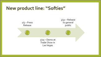
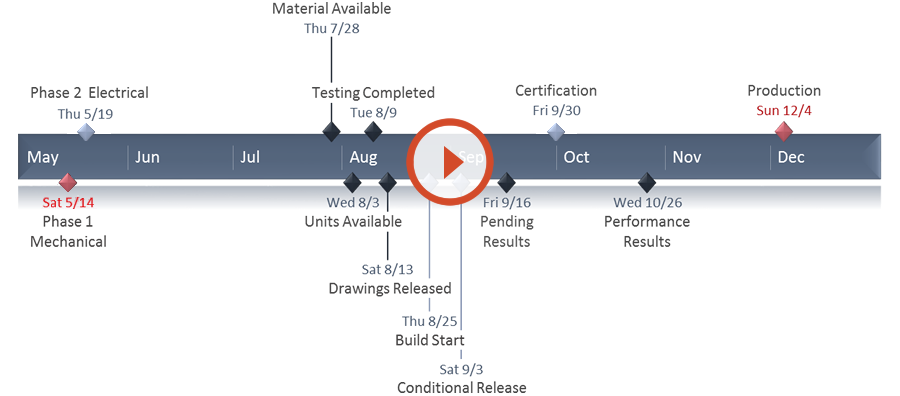
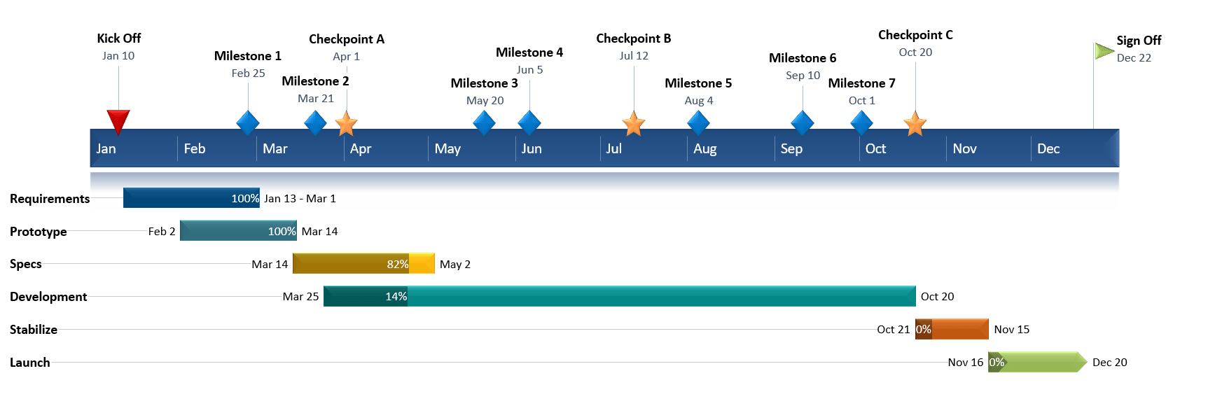
A timeline is a type of chart which visually shows a series of events in chronological order over a linear timescale. The power of a timeline is that it’s a visual representation, which makes it easy to understand critical milestones in a project and the progress of a project schedule. Timelines are particularly powerful for project scheduling or project management when paired with a Gantt chart, as shown at the end of this tutorial.
![]()
Play Video
Options for making an Excel timeline
Microsoft Excel has a Scatter chart that can be formatted to create a timeline. If you need to create and update a timeline for recurring communications with clients and executives, it would be simpler and faster to
create a PowerPoint timeline.
On this page you can see both ways to create a timeline using these popular Microsoft Office tools. We will give you step-by-step instructions for making a timeline in Excel by formatting a Scatter chart. We will also show you how to instantly create an executive timeline in PowerPoint by pasting your project data from Excel.
Which tutorial would you like to see?
![]()
30 mins
Manually create timeline in Excel
![]()
Download Excel timeline template
How to create an Excel timeline in 7 steps
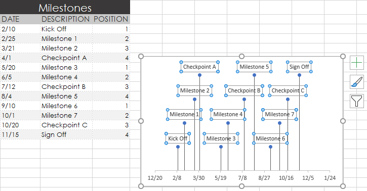
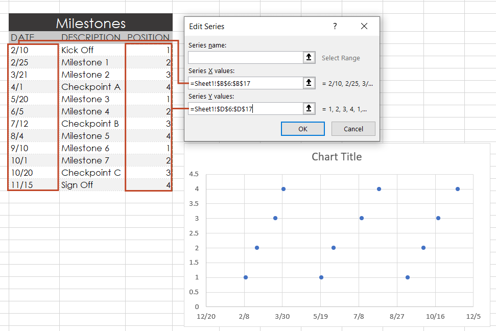
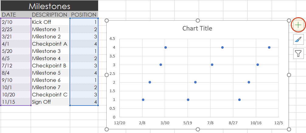
1. List your key events or dates in an Excel table.
-
List out the key events, important decision points or critical deliverables of your project. These will be called Milestones and they will be used to create a timeline.
-
Create a table out of these Milestones and next to each milestone add the due date of that particular milestone.
-
To create a timeline in Excel, you will also need to add another column to your table that includes some plotting numbers. Add the new column next to your milestone description column and list out a repetitive sequence of numbers such as 1, 2, 3, 4 or 5, 10, 15, 20 etc. Excel will use these plotting points to vary the height of each milestone when plotting them on your timeline template.
For this demonstration we’ll format the table in the image below into a Scatter chart and then into an Excel timeline. Then we’ll use it again to make a timeline in PowerPoint.
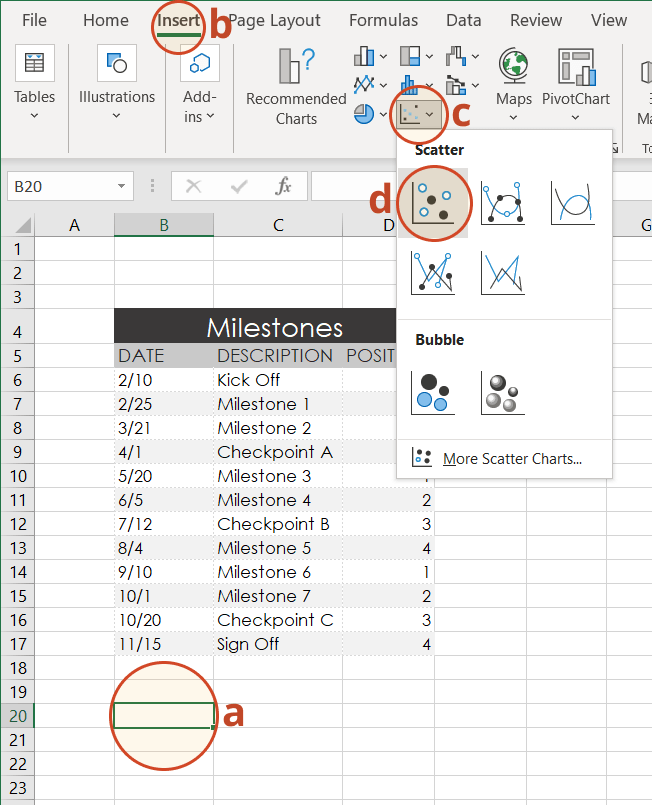
2. Make a timeline in Excel by setting it up as a Scatter chart.
-
From the timeline worksheet in Excel, click on any blank cell.
-
Then from the Excel ribbon, select the Insert tab and navigate to the Charts section of the ribbon.
-
In the Charts section of the ribbon drop down the Scatter or Bubble Chart menu.
-
Select Scatter which will insert a blank white chart space onto your Excel worksheet.
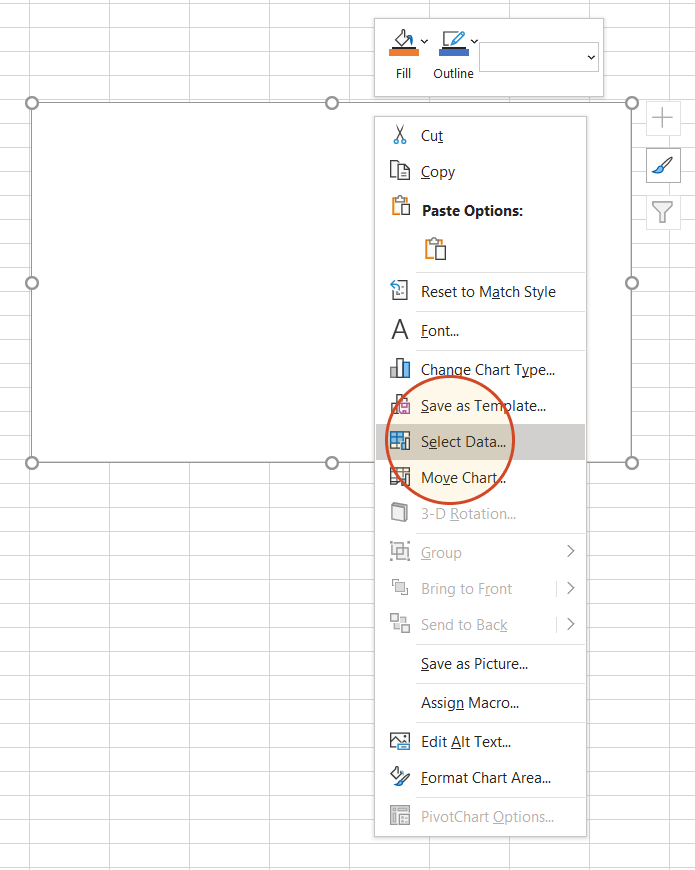
3. Add Milestone data to your timeline.
-
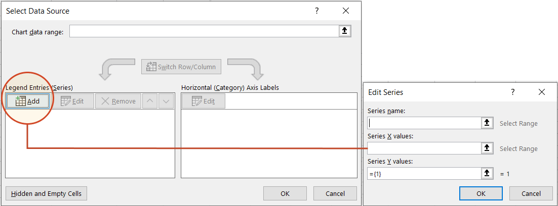
Right-click the blank white chart and click Select Data to bring up Excel’s Select Data Source window.
-
On the left side of Excel’s Data Source window, you will see a table named Legend Entries (Series). Click on the Add button to bring up the Edit Series window. Here you add the dates that will make your timeline.
-
We will enter the dates into the field named Series X values . Click in the Series X values window on the arrow button
. Then select your range by clicking the first date of your timeline (ours is 2/10) and dragging down to the last date (ours is 11/15).Following the same path, we will enter the plotting numbers series into the field named Series Y values. Click in the Series Y value window and remove the value
that Excel places in the field by default. Then select your range by clicking on the first plotting number of your timeline (ours is 1) and then dragging down to the last plotting number of your timeline (ours is 4). -
Click OK and then click OK again to create a scatter chart.
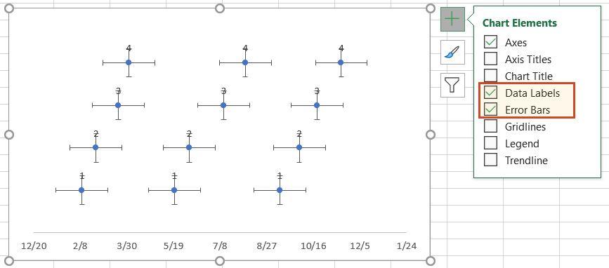
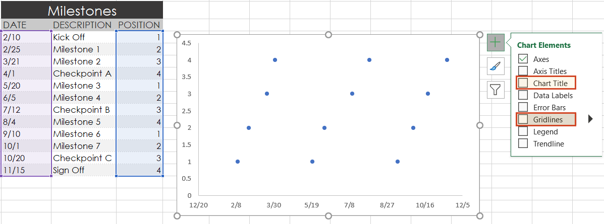
4. Turn your Scatter chart into a timeline.
-
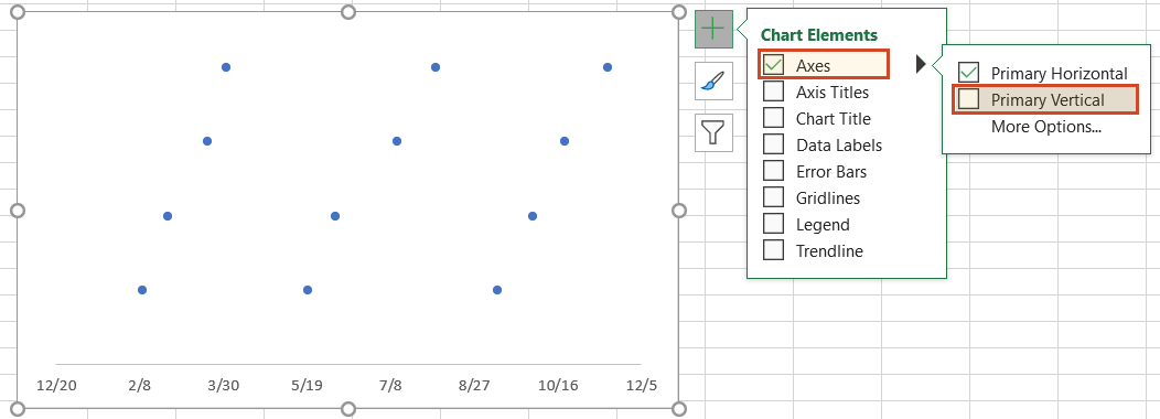
Click on your chart to bring up a set of controls which will be presented to the upper right of your timeline’s chart. Click on the Plus button (+) to open the Chart Elements menu.
-
In the timeline’s Chart Elements control box, uncheck Gridlines and Chart Title.
-
Staying in the Charts Elements control box, hover your mouse over the word Axes (but don’t uncheck it) to get an expansion arrow just to the right. Click on the expansion arrow to get additional axis options for your chart. Here you should uncheck Primary Vertical but leave Primary Horizontal checked.
-
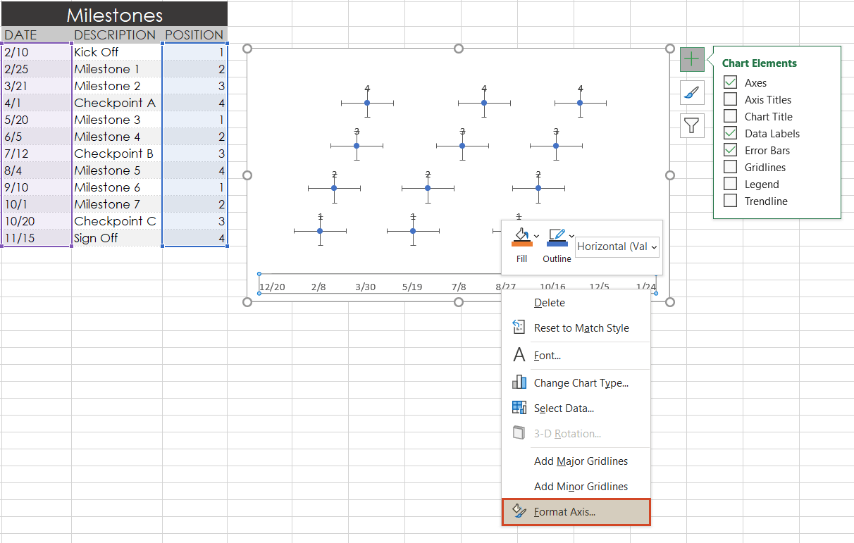
Staying in the Charts Elements control box just a little longer, add Data Labels and Error Bars.
Your timeline chart should now look something like this:
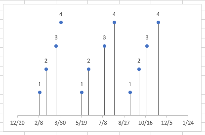
5. Format chart to look like a timeline.
-
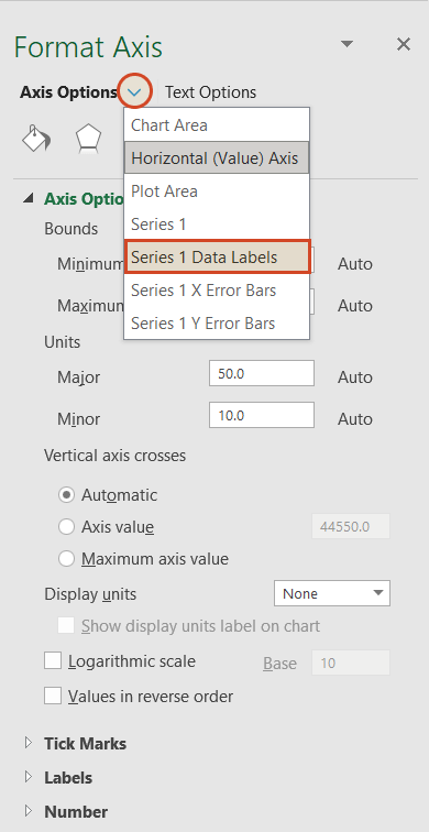
To make a timeline in Excel, we will need to format the Scatter chart by adding connectors from your milestone points. Right-click on any one of the dates at the bottom of your timeline and select Format Axis to bring up Excel’s Format Axis menu.
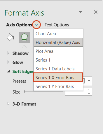
-
Drop down the arrow next to the title Axis Options and select Series 1 X Error Bars.
-
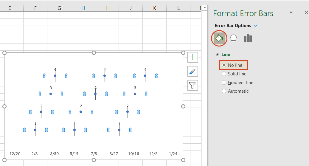
Under the Error Bar Options menu, click on the paint can icon to reveal the Fill & Line controls. Select No line, which will remove the horizontal lines around each of the plotted milestones on your timeline.
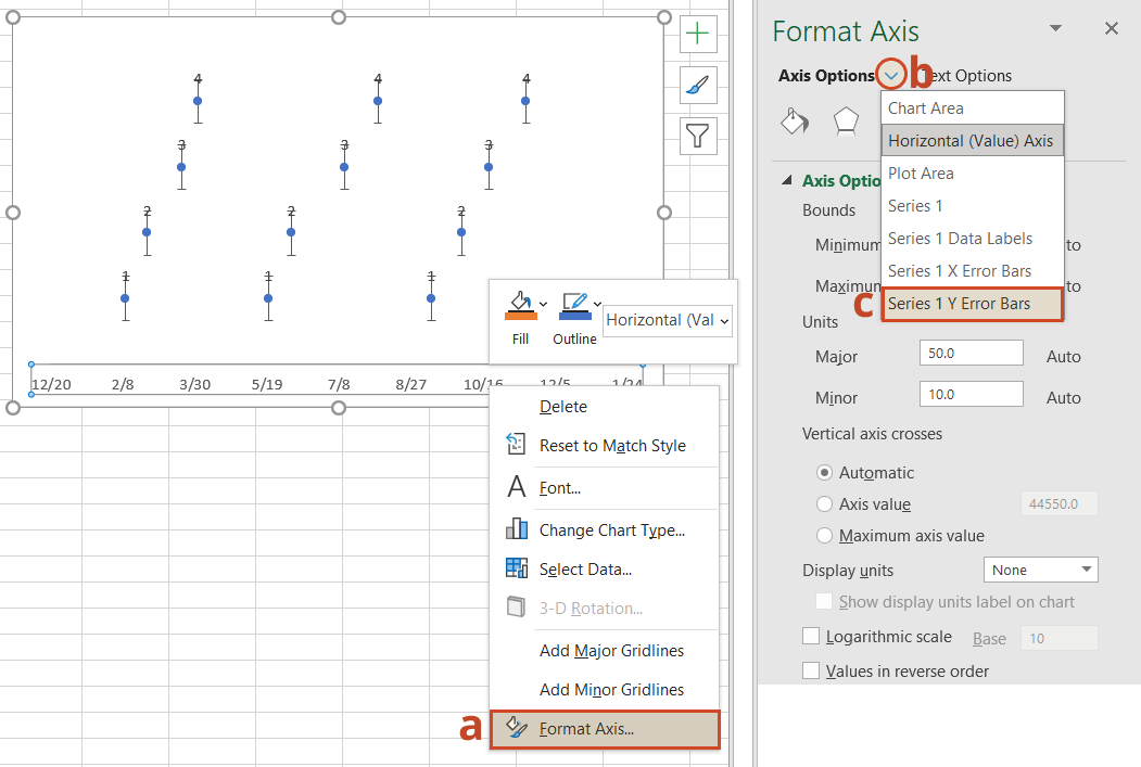
-
In a similar process, we will also adjust your timeline’s Y axis. Again, from the timeline, right-click on any one of your timeline’s dates at the bottom of the chart and select Format Axis. Drop down the arrow next to the title Axis Options and select Series 1 Y Error Bars.
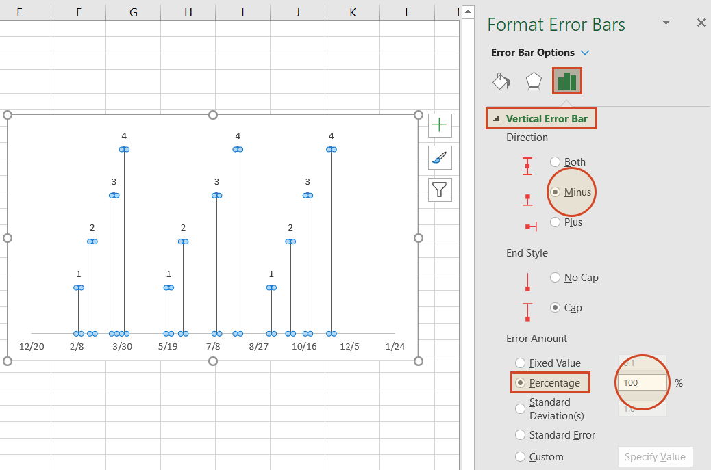
-
Right-clicking on any bar in the chart will open the Format Error Bars menu. From the Vertical Error Bar, set the direction to Minus. Then set the Error Amount to Percentage, and type in 100%. This will create connectors from your timeline’s milestones to their respective points on your timeband.
Your Excel timeline should now look something like the picture below.
6. Add titles to your timeline’s milestones.
You have built a Scatter chart as an Excel timeline. Now we will format it into a proper timeline.
-
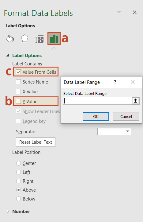
To finish making your timeline, we will add the milestone descriptions. Staying in the Format Axis menu, again drop down the menu arrow next to the title Axis Options. This time choose select Series 1 Data Labels to bring up the Format Data Labels menu.
-
Click the Label Options icon. Uncheck Y Value, and then put a check next to Value From Cells. This will bring up an Excel data entry window called Data Label Range.
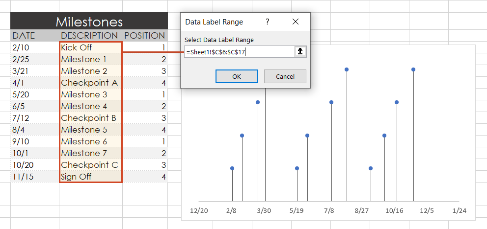
-
In the Select Data Label Range window, you will enter your timeline’s milestone descriptions from the timeline table you built in step 1. To do this simply click on the description for the first milestone in your timeline table, (ours is Kick Off), then drag down to the last milestone in your timeline (ours is Sign Off). Click OK.
Your Excel timeline template should finally look more like this now:
7. Styling options for your timeline.
Now you can apply some styling choices to improve the aspect of your timeline.
-
Coloring your timeline’s milestone markers.
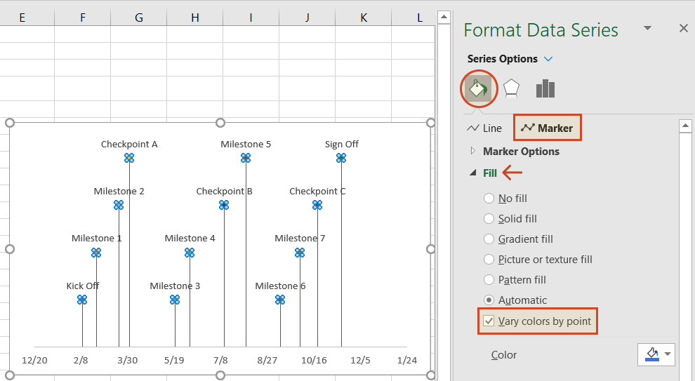
From your timeline, right-click on any of the milestone points (caps) and select Format Data Series to bring up the Series Options menu.
Select the paint can icon for Fill & Line options and, then choose the tab for Marker. You may also need to select Fill to reveal its menu. Then you can choose coloring options for your timeline’s milestone markers. In our example, we selected Vary colors by point, which lets Excel pick the milestone colors for our timeline.
-
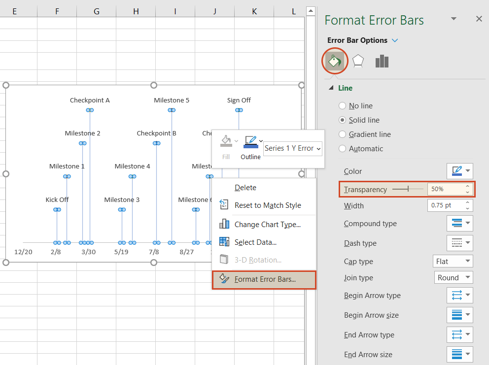
Change the vertical connector’s transparency.
On your timeline, right-click on any of the vertical connectors that connect your milestones with the timeband below. Select Format Error Bars to bring up the Vertical Error Bar menu. Again, select the paint can icon to choose Excel’s Line & Fill options. Here you can make formatting adjustments (color, size, style, etc.) to your timeline’s connector lines. In our example we set the transparency of the lines to 50%.
-
Vary the height of each milestone so their descriptions are not overlapping the neighboring milestone.
Remember the repeated sequence of numbers you added to your timeline table in step 1. Well, those set the height of each milestone on your timeline. By adjusting these numbers, you can play around with different height positions for each milestone. For example, to optimize our timeline, we used the number sequence, 1, 2, 3, 4, 1, 2, 3, 4.
Look how the descriptions would overlap if we changed the order (Don’t try this at home! 😊):
-
Trim off the empty space to the left or right of your Excel timeline by adjusting its minimum and maximum bounds.
Again right-click on any of the dates below your timeband. Select Format Axis.
Under the heading Bounds, adjusting the Minimum number upward will move your first milestone left on your timeline, closer to the vertical Axis. Likewise, adjusting the Maximum number down will move your last milestone right on your timeline, closer to the right edge of your chart.
-
Finished! Our timeline now looks like this:
To help you get started quickly, we have included a practical Excel template that you can download for free and learn how to create timelines in Excel.
![]()
Download a pre-built Excel timeline file
FAQs about timelines in Excel
Is there a timeline template in Excel?
Yes, there are several predefined timeline templates in Excel. To explore them, go to File > New, and check the templates preview list. If you cannot find what you need, use the “More templates” option and type “timeline” in the “Search for online templates” box to browse the collection of timeline templates.
If you’re not happy with the limitations that come along with the standard timeline templates in Excel, have a look at the library of professional timeline templates produced with Office Timeline and try our timeline creator.
How do you make a timeline in Word or other office tools?
There are two ways to make timelines in Word, Excel, PowerPoint and Outlook: using SmartArt and using Charts. Here’s an overview of the steps required by each option.
A. Using SmartArt. This method is mostly manual, but if you want to create a basic timeline with SmartArt, you should follow these 5 steps:
- Go to Insert > SmartArt;
- In Choose a SmartArt Graphic box, select Process on the left and then pick a layout that you like and click OK;
- In the SmartArt graphic, click [Text]. Fill in the data by typing or pasting your text;
- You can add items in the timeline: Right click on a shape, then Add Shape > Add Shape After/Before;
- You can move items around by dragging and dropping them as you like.
After you create the timeline, you can add or move dates, and you can style your timeline further, apply different styles or change layouts and colors.
See more detailed instructions on using SmartArt to make timelines in our tutorial on how to make a timeline in Word.
B. Using Charts. You have various options: Column Charts, Bar Charts or Scatter Charts. In all the Office programs, this method will work with Excel data tables, so, you’ll need to group your data in Excel. Please note you’ll need some formatting to get a usable timeline. There are three basic steps for using Charts:
- Go to Insert > Chart > Insert Column or Bar Chart > 2-D Bar/3-D Bar;
- Select Stacked Bar (not 100% Stacked Bar);
- Format and style the newly created bar chart until you get the timeline that you like.
If you need more detailed instructions check out our series or tutorials on how to make timelines with your usual office tools.
Where can I create a timeline?
You can create timelines online or using offline tools. In both cases, you can choose between automated and manual work.
1. Let’s start with the most efficient way to make a timeline: using automation. This method is time saving and offers the best results, especially with more complex projects.
-
Offline tools: Office Timeline Add-in with its professional and free timeline maker versions. Office Timeline is a PowerPoint add-in that helps you quickly make and manage professional timelines and Gantt charts. It allows using templates, making timelines from scratch and importing data from Excel, Microsoft Project, Smartsheet or Wrike.
-
Online, with Office Timeline Online – premium and free versions. Office Timeline Online is an easy-to-use timeline creator that helps you with professional PowerPoint timeline creation in minutes, but also with slides updating and online sharing.
2. There are also manual ways to make a timeline from scratch, or from templates:
-
Offline, you can make timelines in any Office application, by using templates or designing your timeline using shapes and objects.
-
Online, you can make timelines in Google Docs editor.
However, these methods are not specialized for timeline creation, so they require more time and detailed instructions, and creative solutions to make timelines from graphics. In the end, you may find that the result might not be worth all the time and effort.
What is the best program to make a timeline?
There are several options of good timeline creators – online and offline, depending on your needs. We have found several options of automated tools, specialized in timeline creation, that meet the basic criteria for a good timeline creator: professional looking timelines, complex features, ease of use and good price-quality ratio. Our top three timeline creators are: Office Timeline – with its web-based app and the desktop add-in, Tiki-Toki and Sutori – both web-based.
Visit our blog to see the complete list of 10 best timeline makers that might be worth your while.
Make a great looking timeline from Excel directly in PowerPoint
There is an easier way to put your Excel data into a good-looking timeline. PowerPoint is better suited than Excel for making impressive timelines that clients and executives want to see.
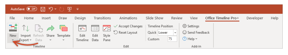
In the tutorial below, we will show you how to quickly paste the Excel table you created above in Step 1 into PowerPoint using Office Timeline, a user-friendly PowerPoint add-in that instantly makes and updates timelines from Excel. To begin, you will need to install Office Timeline, which will add a timeline creator tab to PowerPoint.
1. Open PowerPoint and paste your table into the Office Timeline wizard.
-
Inside PowerPoint, click on the Office Timeline tab, and then click the New icon.
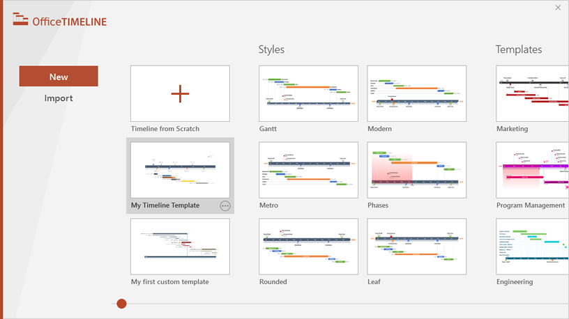
This will open a gallery where you can choose between various timeline styles, stock templates and even custom templates.
-
From the gallery, double-click the style or template you wish to use for your timeline to open its preview window and then select Use Template. (You can find more designs in our timeline templates library.) For this demonstration, we will choose the Software Development timeline template. If you prefer to import and refresh your Excel table, rather than copy-paste, click on the Import button in the preview window.
-
Copy the data from Excel
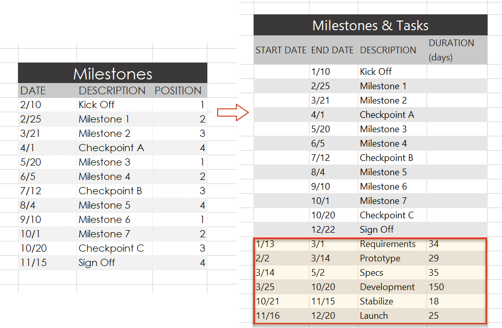
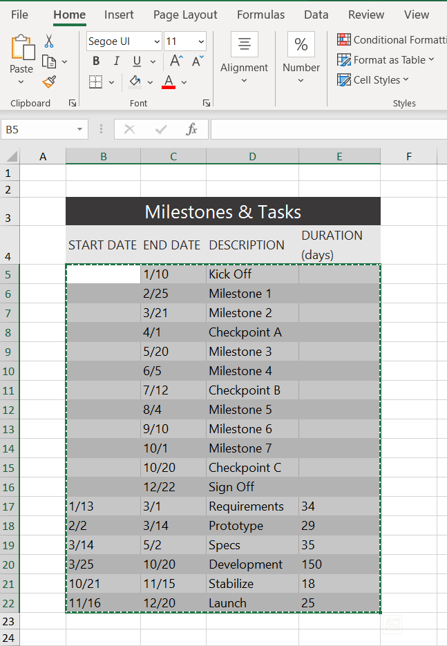
We have updated our data a bit, so that we get the timeline, but also a more detailed view of our project: we deleted the Timeline column, as we don’t need it, and added a list of tasks (with start and end dates and duration).
Copy the data from your Excel table, but make sure not to include the column headers.
-
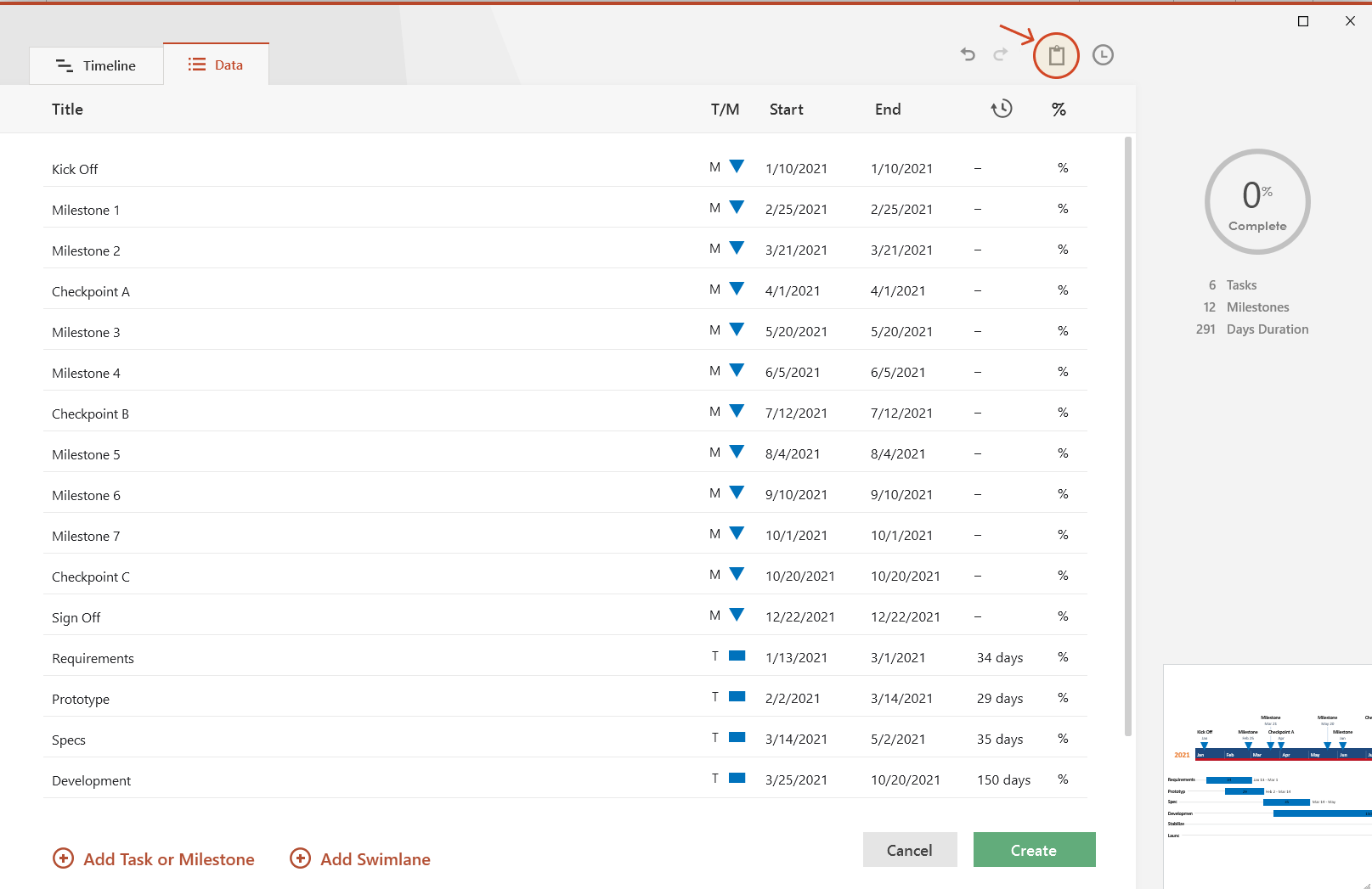
Now, simply paste the section into PowerPoint by using the Paste button in the upper-right corner of the Data Entry wizard.
Make edits if necessary (such as changing milestone shapes and colors or adding and removing items) and click the Create button.
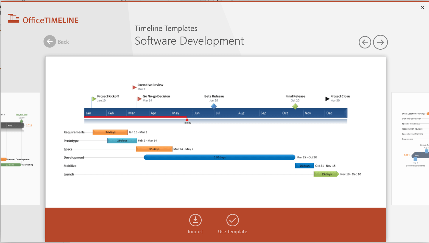
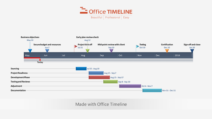
2. Instantly, you will have a new timeline slide in PowerPoint.
-
Depending on the template or style you selected from the gallery, you will have a timeline similar to this:
-
You can easily customize the timeline further using Office Timeline. In our example above, we added percent complete, removed the Today’s Date marker, changed milestones, adjusted colors, and added tasks to create a Gantt chart.
![]()
Download PowerPoint timeline template file
How to make a PowerPoint timeline from Excel in under 60 seconds:
![]()
Play Video
You can also use Office Timeline’s online timeline maker to easily build timelines and other similar visuals that you can instantly update and share with executives and teams.
See our free timeline template collection

Incident Response Plan
Free, downloadable timeline graphic using hours and minutes to give a clear overview on how an organization needs to plan its reaction to incidents so that outage be limited and activity resumed as soon as possible.

Crisis Management Plan
Professionally-designed timeline example structured in swimlanes that covers all the steps and processes one needs to follow in a crisis management process, from when the crisis occurs to response, business continuity process, recovery, and review.

Swimlane Diagram
Swimlane PowerPoint template that clearly lays out the framework of a project, from scheduling activities to task assignment and resource management.

Marketing Swimlanes Roadmap
Swimlane diagram example that provides a crisp, well-structured illustration of the tasks and milestones of your marketing campaign, according to the phase of the campaign to which they belong.

Marketing Plan
Free marketing timeline model that, once customized, effectively outlines your overall marketing strategy and serves as a solid visual aid to support marketing plan presentations.

Project Plan
Intuitive PowerPoint slide that serves as a quick yet visually effective alternative to complex project management tools to produce clear, well-laid-out plans for launching a project.

Sales Plan
Easy-to-edit sales plan sample for sales leaders, marketers or account executives to lay out objectives against a timeband in weeks; it can be customized to show campaign plans and targets in months, quarters or years.

Example Timeline
Visual template with Today’s Date indicator that helps enterprise workers get a quick start on creating timelines for project reviews, status reports, or any presentations that require a simple project schedule.

Blank Timeline
Generic timeline example that can be easily customized to quickly make an impressive, high-level summary of important events in a chronological order.
Want to learn how to create a timeline in Excel?
A project timeline is a record of all the important events and milestones in a project.
And like it or not, Microsoft Excel is still a commonly used tool for this purpose.
In this article, you’ll learn about what a project timeline is, how to create one in Excel, and a better alternative to the process!
Let’s get started!
What Is A Project Timeline?
A project timeline chart is a visualization of the chronological order of events in a project. It’s a series of tasks (assigned to individuals or teams) that need to be completed within a set time frame.
Here’s what a comprehensive project timeline chart contains:
- Tasks in various phases
- Start date and end date of tasks
- Dependencies between tasks
- Milestones
In short, it’s something your project team will refer to track what’s done and what needs to be done.
How To Create A Project Timeline In Excel?
There are two main approaches to create a timeline in Excel.
Let’s dive right in.
1. SmartArt tools graphics
SmartArt tools are the best choice for a basic, to-the-point project timeline in Excel.
Here’s how you can create an Excel timeline chart using SmartArt.
- Click on the Insert tab on the overhead task pane
- Select Insert a SmartArt Graphic tool
- Under this, choose the Process option
- Find the Basic Timeline chart type and click on it
- Edit the text in the text pane to reflect your project timeline
Add as many fields as you want in the SmartArt text box by simply hitting Enter in the text pane to open up the respective dialog box.
Excel also lets you change the SmartArt timeline layout after you’ve inserted the text.
You can change it to a:
- Line chart
- Basic bar chart
- Stacked bar chart
And of course, feel free to play around with the Excel chart color schemes in the SmartArt Design tab.

A SmartArt graphic is perfect for a high-level project timeline that displays all the important milestones. However, it may not be sufficient to display all the tasks and activities that lead up to them.
For this, your Excel dashboard will need something more complex: like a scatter plot Excel chart.
2. Scatter plot charts
Scatter plot charts display every complex data point at one glance.
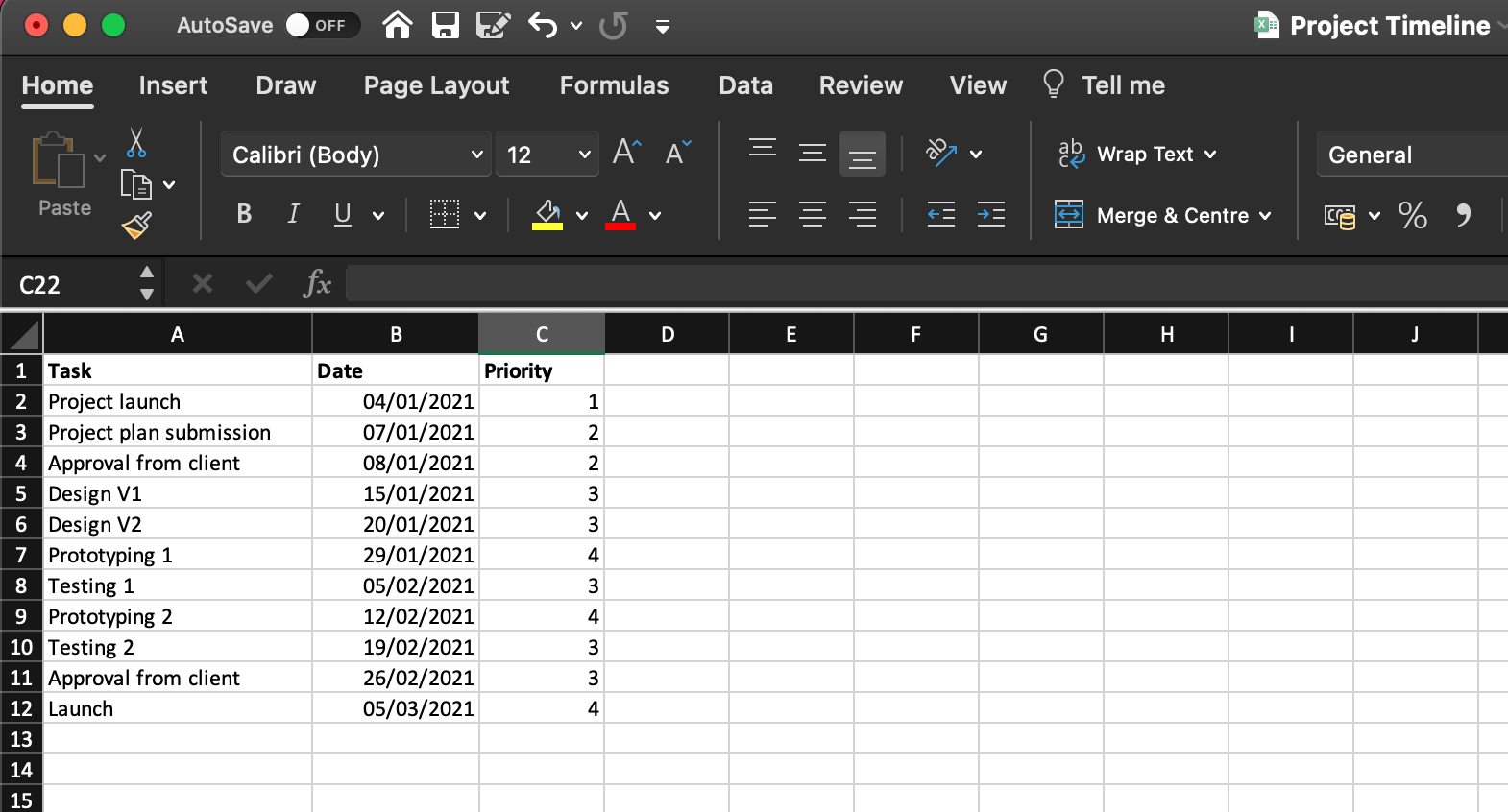
First, lay the foundation for the chart by making a data table with basic information such as:
- Task (or milestone) name
- Due date
- Priority level (1-4, in increasing order)
When you add dates, make sure your cells are formatted to reflect the correct date format. For example, DD/MM/YYYY, MM/DD/YYYY, etc.
Here’s what a sample data table looks like:
To generate a scatter plot chart from this:
- Drag and select the data table
- Click on the Insert tab in the top menu
- Click on the Scatter chart icon
- Select your preferred chart layout
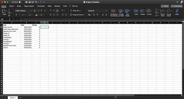
Format this basic scatter chart to show your data even more clearly:
- Select the chart
- Click on the Chart Design tab on the overhead task pane
- Click on the Add Chart Element icon in the top left corner
- Add a Data Label and Data Callout
- Edit the chart title
Keep exploring to customize the scatter plot chart further.
While scatter plot charts are slightly more complex than a SmartArt graphic, they may still not be enough for your horizontal timeline.
And let’s not forget that the purpose of a project timeline is to manage time on a project. How’s one supposed to do that while attending Excel 101 classes to create a simple chart?
The answer lies in using a project timeline template:
3 Excel Project Timeline Templates
Don’t we all know an Excel wizard?
Someone who makes us feel like we skipped a class?
Well, now you can be one of them too!
Thankfully you won’t have to read moth-eaten books and sit in ancient libraries to become an Excel expert.
Just let an Excel project timeline template do the magic.
1. Excel Gantt chart timeline template
2. Excel timeline template for milestones
3. Excel project schedule template
An Excel template should ease your project timeline worries. For some time. 👀
Meanwhile, the clock is ticking on the long-term issues of Excel project management:
3 Limitations Of Using Excel To Create A Project Timeline
Excel is like the old t-shirt that you never want to give away.
Why should you?
It fits you just right and has the coolest hashtags!
But if you want to achieve audacious goals, you’ll need to move beyond both of them. 💔
Here’s why you need to move on from Microsoft Excel for your project timeline needs.
1. No individual to-do lists
Sure, being able to access gigantic spreadsheets and data series with conditional formatting is great.
But you know what’s better?
Something that tells you what you need to do.
After all, Excel can’t help you build a functional to-do list and assign it to individual team members.
Unless your idea of a team meeting is looking into your spreadsheet’s soul with a magnifying glass, Excel won’t cut it for to-do lists.
However, let’s say you physically type out each person’s deliveries in a sheet, you still have the problem of…
2. Manual follow-ups
In the age of customized app notifications and uber-smart reminders, Excel project management depends on manual follow-ups.
What will your strategy be? Email colleagues, conduct hourly check-ins, or tap on everyone’s shoulders to ask if they’re done with their task. 🤯
Not only is it terribly inconvenient (and frankly annoying) it gives you no idea about your project’s progress.
3. Non-collaborative
Do you work in a non-hierarchical Agile environment where the whole team is involved in the decision-making process?
Well, guess what?
An Excel file can’t handle this.
Microsoft Excel (and other MS tools like Powerpoint) believe in single ownership of documents with limited support for collaboration.
And that’s hardly the complete list of why Excel can’t deliver.
Read all about why Excel project management SHOULDN’T be your go-to solution.
Luckily, we can point you in the direction of smoother workflows and efficient project management.
Check out ClickUp!
Create Effortless Project Timelines With ClickUp
Excel is a smart, handy tool that’s also occasionally clunky and very intimidating.
But what if you could have a tool that can do everything Excel does, except far better?
The answer is ClickUp!
It’s an award-winning project management tool that ensures end-to-end project management without the need to toggle between windows.
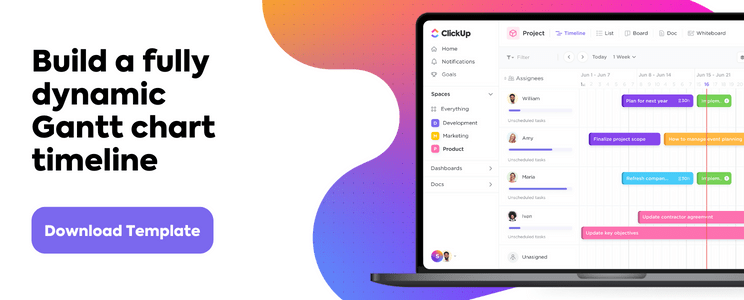
Just use the Timeline view, Gantt Chart, and Table view to get a complete picture of your project timeline on ClickUp.
1. Timeline view
ClickUp’s Timeline view is for those who want more from their timelines!
It gives you more tasks per row and more customization options than you can imagine.
2. Gantt chart view
If you’re plotting a project timeline, chances are you’re also plotting a Gantt chart.
It’s one step above a linear timeline as it lets you visualize project progress (as opposed to just the scheduled tasks) and trace dependencies clearly.
And with ClickUp on your side, it’s never been easier to create a Gantt chart!
Simple Gantt Chart Template by ClickUp

Use ClickUp’s Simple Gantt Chart Template is a great way to plan out tasks and estimate how long they will take.
Easily view the relationships between tasks in an easy-to-read timeline, so you can quickly adjust resources when needed. Plus, all changes are synchronized across teams, making it simple to stay up-to-date with everyone’s progress.
Make the most of your Gantt chart experience by managing Dependencies.
- Draw lines between tasks to schedule dependencies
- Reschedule them with drag and drop actions
- Delete them by hovering over and clicking on the dependency line and then selecting Delete
Find out the progress percentage of your project by hovering over the progress bar.
3. Table view
You may be wondering, “Hey, that all sounds good, but Microsoft Excel feels like home.”
That’s why we have the ClickUp’s Table view.

It’s a condensed look at your project timeline.
But you can also enhance it to show as much background information as you want.
Amp up your spreadsheet experience with these functions:
- Drag to copy your table and paste it into any Excel-type software
- Pin columns and change the row height for handy data analysis
- Navigate the spreadsheet with keyboard shortcuts
The Time’s Up For Excel Project Timelines!
Deadlines, coordination, reviews. Project time management is an endless struggle. And your project timeline is the one tool that helps you consistently navigate this.
Excel may seem like a simple way out, but it’s not the friendly, long-term companion it promises to be.
Try ClickUp for free today.
Related readings:
- How to create a timesheet in Excel
- How to create a form in Excel
- How to make a calendar in Excel
- How to create a Kanban board in Excel
- How to create a mind map in Excel
- How to create a KPI dashboard in Excel
- How to create a flowchart in Excel
- How to create a database in Excel
- How to Display Work Breakdown Structures in Excel
Here’s how:
- Click anywhere in a PivotTable to show the PivotTable Tools ribbon group, then click Analyze > Insert Timeline.
- In the Insert Timeline dialog box, check the date fields you want, and click OK.
Contents
- 1 How do you create a timeline in Excel?
- 2 Does Excel have timeline templates?
- 3 How do you create a timeline?
- 4 How do I create a timeline bar in Excel?
- 5 How do you create a timeline in Excel 2010?
- 6 How do I create a timeline in Excel and start and end the date?
- 7 How do I make a timeline on sheets?
- 8 What is the best program to make a timeline?
- 9 What is example of timeline?
- 10 What timeline means?
- 11 Is a timeline a graphic organizer?
- 12 What is the timeline function in Excel?
- 13 What are dashboards in Excel?
- 14 How do you add a total row?
- 15 How do I create a timeline in workflow?
- 16 What are the timeline charts?
- 17 Is there a timeline template in Google Docs?
- 18 Does Microsoft Office have a timeline template?
- 19 Can you make a timeline on Prezi?
- 20 Does Microsoft Word have a timeline template?
How do you create a timeline in Excel?
Creating a Timeline in Excel
- In the “Insert” tab on the ribbon, select “Smart Art” from the “Illustrations” section.
- In the left pane of the new window, select the “Process” option, then double-click one of the timeline options, or select an option and select “OK.”
- Your timeline will appear on the spreadsheet.
Does Excel have timeline templates?
Choose an Excel Timeline Template
Microsoft also offers a few timeline templates in Excel designed to give you a broad overview of your conference planning timeline. The Excel timelines aren’t tied to Gantt chart data, so you’ll be manually inputting your own data in the pre-defined template fields.
How do you create a timeline?
Create a timeline
- On the Insert tab, click SmartArt > Process.
- Click Basic Timeline or one of the other process-related graphics.
- Click the [Text] placeholders and enter the details of your events. Tip: You can also open the Text Pane and enter your text there. On the SmartArt Design tab, click Text Pane.
How do I create a timeline bar in Excel?
To create a Gantt chart like the one in our example that shows task progress in days:
- Select the data you want to chart.
- Click Insert > Insert Bar Chart > Stacked Bar chart.
- Next, we’ll format the stacked bar chart to appear like a Gantt chart.
- If you don’t need the legend or chart title, click it and press DELETE.
How do you create a timeline in Excel 2010?
Go to Pivot Table Tools → Analyze → Filter → Insert Timeline. Click on insert timeline and you’ll get a pop-up box. From the pop-up window, select the date columns which you have in your data. Click OK.
How do I create a timeline in Excel and start and end the date?
Here’s how you can create an Excel timeline chart using SmartArt.
- Click on the Insert tab on the overhead task pane.
- Select Insert a SmartArt Graphic tool.
- Under this, choose the Process option.
- Find the Basic Timeline chart type and click on it.
- Edit the text in the text pane to reflect your project timeline.
How do I make a timeline on sheets?
How to Make a Timeline in Google Sheets
- Create a new timeline. Open Google Sheets and select the “Project Timeline” option.
- Customize. Edit your timeline. Change any text box, add colors, and modify dates as required.
What is the best program to make a timeline?
Best Free Timeline Creation Tools
- Office Timeline. One of the most professional looking free timeline creation tools on the Internet that you can also use to produce milestones and Gannt charts.
- Sutori.
- MyHistro.
- OurStory.
- SmartDraw.
- Twitter Custom Timelines.
- Timeline JS.
- Free Timeline.
What is example of timeline?
The definition of a timeline is a list of events in the order that they happened. An example of a timeline is what a policeman will construct to figure out a crime. An example of a timeline is a listing of details regarding an important time in history. A schedule of activities or events; a timetable.
What timeline means?
1 : a table listing important events for successive years within a particular historical period. 2 usually timeline ˈtīm-ˌlīn : a schedule of events and procedures : timetable sense 2.
Is a timeline a graphic organizer?
A timeline is a type of graphic organizer that shows specific events in sequence, usually with dates, in a linear fashion. Timelines are particularly useful for studying or reviewing history, because the timeline will visually display major events over a period of time.
What is the timeline function in Excel?
Timeline in Excel is a kind of SmartArt created to display the different timings of a particular process. It is mainly used for filtering the underlying datasets by date. Such datasets are in the form of pivot tables containing the date field. The timeline was first introduced in the 2013 version of Excel.
What are dashboards in Excel?
A dashboard is a visual representation of key metrics that allow you to quickly view and analyze your data in one place. Dashboards not only provide consolidated data views, but a self-service business intelligence opportunity, where users are able to filter the data to display just what’s important to them.
How do you add a total row?
Try it!
- Select a cell in a table.
- Select Design > Total Row.
- The Total row is added to the bottom of the table.
- From the total row drop-down, you can select a function, like Average, Count, Count Numbers, Max, Min, Sum, StdDev, Var, and more.
How do I create a timeline in workflow?
Steps to creating a project timeline
- Step 1: Understand the scope of your project.
- Step 2: Split the project into milestones.
- Step 3: Estimate the time of each task.
- Step 4: Assign tasks to your team.
- Step 5: Choose your project timeline software.
- Step 6: Plot each task on your timeline.
What are the timeline charts?
A timeline chart is a visual rendition of a series of events. It can be created as a chart or a graph. Timeline charts can be created for anything that occurred over a period of time. You might see a timeline chart for World War II or major events of the 20th century.
Is there a timeline template in Google Docs?
From your Google Doc, select Add-ons > Lucidchart Diagrams > Insert Diagram to open the sidebar. Click “+” in the bottom-right corner. Select a blank document or a timeline template to customize.Modify the template or drag and drop shapes to create a timeline of events.
Does Microsoft Office have a timeline template?
Go to the Office Timeline Basic tab you’ll see on the PowerPoint ribbon and click on New. You will be taken to a gallery where you can choose from a variety of styles and templates that you can use for your timeline.
Can you make a timeline on Prezi?
to create an Interactive Timeline
Anyone can sign up for a basic, free Prezi license, which will allow you to create Prezis online and present online. You can choose to make your content private, published, or shared with select individuals.
Does Microsoft Word have a timeline template?
It allows you to quickly visualize the sequence of events in a project or event, and clearly convey the timing to team members. In this article, you’ll learn how to make a timeline in Microsoft Word. You can also download a free Microsoft Word timeline template and we’ll show you how to customize it to meet your needs.
Содержание
- Временная шкала проекта (Project Timeline)
- Шаг 1. Исходные данные
- Шаг 2. Строим основу
- Шаг 3. Добавляем названия этапов
- Шаг 4. Прячем линии и наводим блеск
- How to make a timeline in Excel
- Options for making an Excel timeline
- Which tutorial would you like to see?
- How to create an Excel timeline in 7 steps
- 1. List your key events or dates in an Excel table.
- 2. Make a timeline in Excel by setting it up as a Scatter chart.
- 3. Add Milestone data to your timeline.
- 4. Turn your Scatter chart into a timeline.
- 5. Format chart to look like a timeline.
- 6. Add titles to your timeline’s milestones.
- 7. Styling options for your timeline.
Временная шкала проекта (Project Timeline)
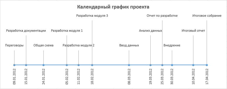
Предположим, мы работаем над долгим и сложным проектом, состоящим из нескольких этапов. Задача — наглядно показать всю хронологию работ по проекту, расположив ключевые моменты проекта (вехи, milestones) на оси времени. Примерно вот так:
В теории управления проектами подобный график обычно называют календарем или временной шкалой проекта (project timeline), хотя я также встречал еще один русскоязычный аналог -«лента времени». В любом случае, главное — не как назвать, а как построить. Поехали.
Шаг 1. Исходные данные
Для построения нам потребуется оформить исходную информацию по вехам проекта в виде следующей таблицы:
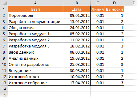
Обратите внимание на два дополнительных служебных столбца:
- Линия — столбец с одинаковой константой около нуля по всем ячейкам. Даст на графике горизонтальную линию, параллельную оси Х, на которой будут видны узлы — вехи проекта. В принципе, можно было бы использовать и полный ноль, но тогда график совпадает с осью X, что дает проблемы потом с настройкой внешнего вида диаграммы в Excel 2007-2010. Новый Excel 2013 нули воспринимает спокойно.
- Выноски — невидимые столбцы для поднятия подписей к вехам на заданную (разную) величину, чтобы подписи не накладывались. Значения 1,2,3 и т.д. задают уровень поднятия подписей над осью времени и выбираются произвольно.
Шаг 2. Строим основу
Теперь выделяем в таблице все, кроме первого столбца (т.е. диапазон B1:D13 в нашем примере) и строим обычный плоский график с маркерами на вкладке Вставка — График — График с маркерами (Insert — Chart — Line with markers) :
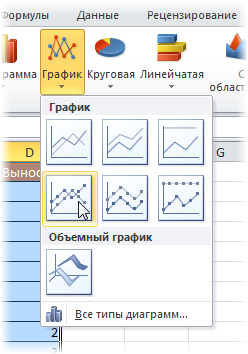
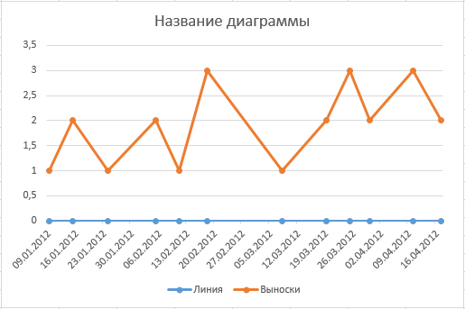
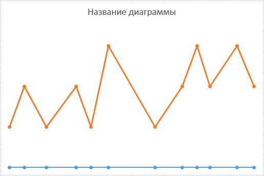
Убираем линии сетки, вертикальную и горизонтальную шкалы и легенду. Сделать это можно вручную (выделение мышью и клавиша Delete) или отключив ненужные элементы на вкладке Макет (Layout) . В итоге должно получиться следующее:
Теперь выделите ряд Выноски (т.е. ломаную оранжевую линию) и на вкладке Макет выберите команду Линии — Линии проекции (Layout — Lines — Projection Lines) :
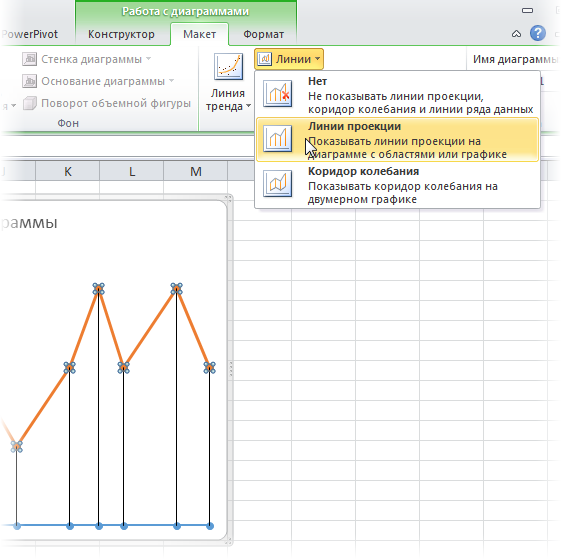
От каждой точки верхнего графика будет опущен перпендикуляр на нижний. В новом Excel 2013 эта опция находится на вкладке Конструктор — Добавить элемент диаграммы (Design — Add Chart Element) .
Шаг 3. Добавляем названия этапов
Эта часть будет простой у тех, кто уже осмелился на установку нового Excel 2013 и более сложной у тех, кто еще работает со старыми версиями.
В Excel 2013 все просто. Как я уже писал здесь, он умеет делать подписи к точкам данных просто беря текст из любого заданного пользователем диапазона. Для этого нужно выделить ряд с данными (оранжевый) и на вкладке Конструктор выбрать Добавить элемент диаграммы — Подписи — Дополнительные параметры (Design — Add Chart Element — Data Labels) , а затем в появившейся справа панели установить флажок Значения из ячеек (Values from cells) и выделить диапазон A2:A13:
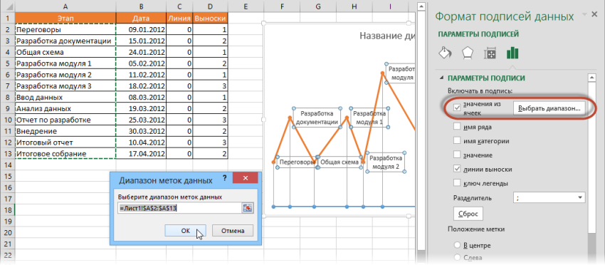
В версиях Excel 2007-2010 и старше такой возможности нет, но у вас есть два альтернативных варианта:
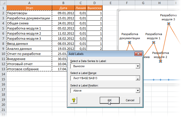
- Добавьте любые подписи к оранжевому графику (значения, например). Затем выделяйте по очереди каждую подпись, ставьте в строке формул знак «равно» и щелкайте по ячейке с названием этапа из столбца А. Текст выделенной подписи будет автоматически браться из выделенной ячейки:

При большом количестве этапов первый вариант, конечно, не радует своей «рукопашностью». Поэтому для оптовой вставки подписей из ячеек можно использовать дополнительные надстройки на VBA. В частности, надстройку XYChartLabeler (автор — Rob Bovey, Excel MVP). Скачиваете надстройку, устанавливаете и получаете на вкладке Надстройки (Add-ins) кнопку XY Chart Labeler — Add Chart Labels. После нажатия на нее появляется диалоговое окно, где и можно задать диапазон с данными для подписей на диаграмме:
Шаг 4. Прячем линии и наводим блеск
Внесем последние правки, чтобы довести нашу уже почти готовую диаграмму до полного и окончательного шедевра:
- Выделяем ряд Выноски (оранжевую линию), щелкаем по ней правой кнопкой мыши и выбираем Формат ряда данных (Format Data Series) . В открывшемся окне убираем заливку и цвет линий. Оранжевый график, фактически, исчезает из диаграммы — остаются только подписи. Что и требуется.
- Добавляем подписи-даты к синей оси времени на вкладке Макет — Подписи данных — Дополнительные параметры подписей данных — Имена категорий (Layout — Data Labels — More options — Category names) . В этом же диалоговом окне подписи можно расположить под графиком и развернуть на 90 градусов, при желании.
Источник
How to make a timeline in Excel
A timeline is a type of chart which visually shows a series of events in chronological order over a linear timescale. The power of a timeline is that it’s a visual representation, which makes it easy to understand critical milestones in a project and the progress of a project schedule. Timelines are particularly powerful for project scheduling or project management when paired with a Gantt chart, as shown at the end of this tutorial.
Options for making an Excel timeline
Microsoft Excel has a Scatter chart that can be formatted to create a timeline. If you need to create and update a timeline for recurring communications with clients and executives, it would be simpler and faster to create a PowerPoint timeline.
On this page you can see both ways to create a timeline using these popular Microsoft Office tools. We will give you step-by-step instructions for making a timeline in Excel by formatting a Scatter chart. We will also show you how to instantly create an executive timeline in PowerPoint by pasting your project data from Excel.
Which tutorial would you like to see?
How to create an Excel timeline in 7 steps
1. List your key events or dates in an Excel table.
List out the key events, important decision points or critical deliverables of your project. These will be called Milestones and they will be used to create a timeline.
Create a table out of these Milestones and next to each milestone add the due date of that particular milestone.
To create a timeline in Excel, you will also need to add another column to your table that includes some plotting numbers. Add the new column next to your milestone description column and list out a repetitive sequence of numbers such as 1, 2, 3, 4 or 5, 10, 15, 20 etc. Excel will use these plotting points to vary the height of each milestone when plotting them on your timeline template.
For this demonstration we’ll format the table in the image below into a Scatter chart and then into an Excel timeline. Then we’ll use it again to make a timeline in PowerPoint.
2. Make a timeline in Excel by setting it up as a Scatter chart.
From the timeline worksheet in Excel, click on any blank cell.
Then from the Excel ribbon, select the Insert tab and navigate to the Charts section of the ribbon.
In the Charts section of the ribbon drop down the Scatter or Bubble Chart menu.
Select Scatter which will insert a blank white chart space onto your Excel worksheet.
3. Add Milestone data to your timeline.
Right-click the blank white chart and click Select Data to bring up Excel’s Select Data Source window.
On the left side of Excel’s Data Source window, you will see a table named Legend Entries (Series). Click on the Add button to bring up the Edit Series window. Here you add the dates that will make your timeline.
We will enter the dates into the field named Series X values . Click in the Series X values window on the arrow button  . Then select your range by clicking the first date of your timeline (ours is 2/10) and dragging down to the last date (ours is 11/15).
Following the same path, we will enter the plotting numbers series into the field named Series Y values. Click in the Series Y value window and remove the value  that Excel places in the field by default. Then select your range by clicking on the first plotting number of your timeline (ours is 1) and then dragging down to the last plotting number of your timeline (ours is 4).
Click OK and then click OK again to create a scatter chart.
4. Turn your Scatter chart into a timeline.
Click on your chart to bring up a set of controls which will be presented to the upper right of your timeline’s chart. Click on the Plus button (+) to open the Chart Elements menu.
In the timeline’s Chart Elements control box, uncheck Gridlines and Chart Title.
Staying in the Charts Elements control box, hover your mouse over the word Axes (but don’t uncheck it) to get an expansion arrow just to the right. Click on the expansion arrow to get additional axis options for your chart. Here you should uncheck Primary Vertical but leave Primary Horizontal checked.
Staying in the Charts Elements control box just a little longer, add Data Labels and Error Bars.
Your timeline chart should now look something like this:
5. Format chart to look like a timeline.
To make a timeline in Excel, we will need to format the Scatter chart by adding connectors from your milestone points. Right-click on any one of the dates at the bottom of your timeline and select Format Axis to bring up Excel’s Format Axis menu.
Drop down the arrow next to the title Axis Options and select Series 1 X Error Bars.
Under the Error Bar Options menu, click on the paint can icon to reveal the Fill & Line controls. Select No line, which will remove the horizontal lines around each of the plotted milestones on your timeline.
In a similar process, we will also adjust your timeline’s Y axis. Again, from the timeline, right-click on any one of your timeline’s dates at the bottom of the chart and select Format Axis. Drop down the arrow next to the title Axis Options and select Series 1 Y Error Bars.
Right-clicking on any bar in the chart will open the Format Error Bars menu. From the Vertical Error Bar, set the direction to Minus. Then set the Error Amount to Percentage, and type in 100%. This will create connectors from your timeline’s milestones to their respective points on your timeband.
Your Excel timeline should now look something like the picture below.
6. Add titles to your timeline’s milestones.
You have built a Scatter chart as an Excel timeline. Now we will format it into a proper timeline.
To finish making your timeline, we will add the milestone descriptions. Staying in the Format Axis menu, again drop down the menu arrow next to the title Axis Options. This time choose select Series 1 Data Labels to bring up the Format Data Labels menu.
Click the Label Options icon. Uncheck Y Value, and then put a check next to Value From Cells. This will bring up an Excel data entry window called Data Label Range.
In the Select Data Label Range window, you will enter your timeline’s milestone descriptions from the timeline table you built in step 1. To do this simply click on the description for the first milestone in your timeline table, (ours is Kick Off), then drag down to the last milestone in your timeline (ours is Sign Off). Click OK.
Your Excel timeline template should finally look more like this now:
7. Styling options for your timeline.
Now you can apply some styling choices to improve the aspect of your timeline.
Coloring your timeline’s milestone markers.
From your timeline, right-click on any of the milestone points (caps) and select Format Data Series to bring up the Series Options menu.
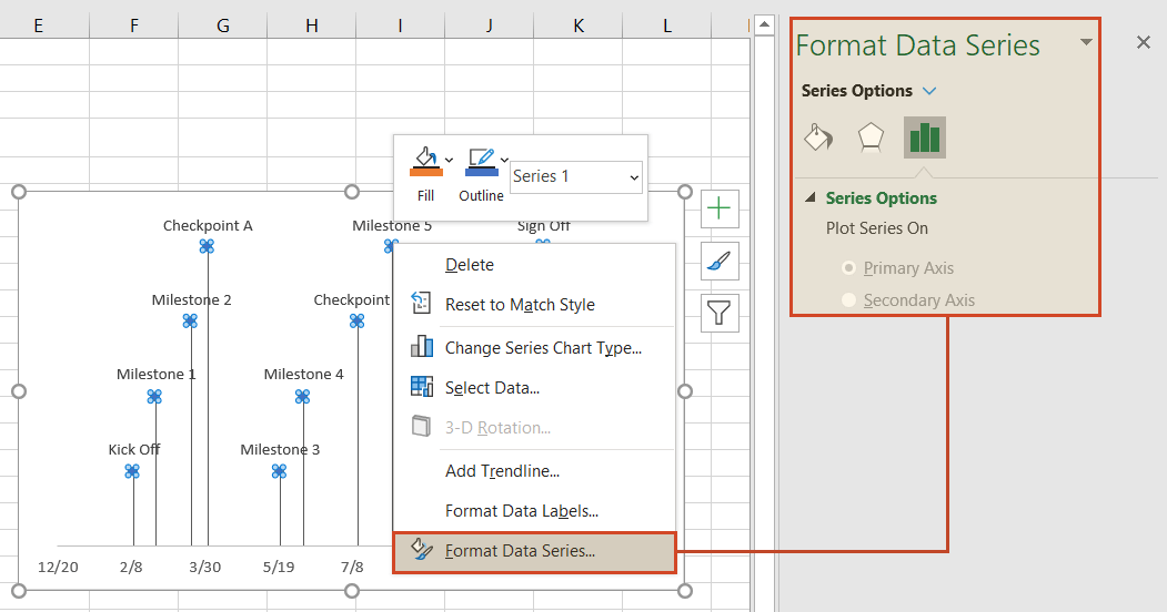
Select the paint can icon for Fill & Line options and, then choose the tab for Marker. You may also need to select Fill to reveal its menu. Then you can choose coloring options for your timeline’s milestone markers. In our example, we selected Vary colors by point, which lets Excel pick the milestone colors for our timeline.
Change the vertical connector’s transparency.
On your timeline, right-click on any of the vertical connectors that connect your milestones with the timeband below. Select Format Error Bars to bring up the Vertical Error Bar menu. Again, select the paint can icon to choose Excel’s Line & Fill options. Here you can make formatting adjustments (color, size, style, etc.) to your timeline’s connector lines. In our example we set the transparency of the lines to 50%.
![]()
Vary the height of each milestone so their descriptions are not overlapping the neighboring milestone.
Remember the repeated sequence of numbers you added to your timeline table in step 1. Well, those set the height of each milestone on your timeline. By adjusting these numbers, you can play around with different height positions for each milestone. For example, to optimize our timeline, we used the number sequence, 1, 2, 3, 4, 1, 2, 3, 4.
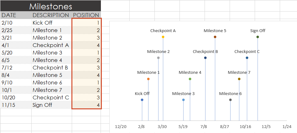
Look how the descriptions would overlap if we changed the order (Don’t try this at home! 😊):
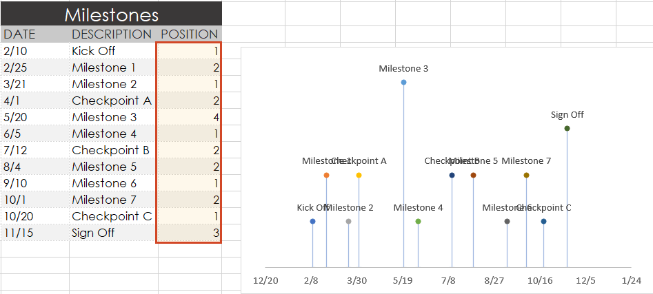
Trim off the empty space to the left or right of your Excel timeline by adjusting its minimum and maximum bounds.
Again right-click on any of the dates below your timeband. Select Format Axis.
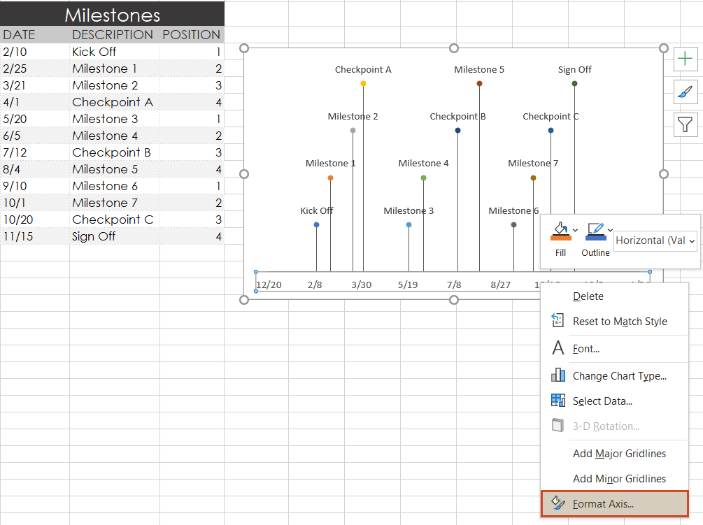
Under the heading Bounds, adjusting the Minimum number upward will move your first milestone left on your timeline, closer to the vertical Axis. Likewise, adjusting the Maximum number down will move your last milestone right on your timeline, closer to the right edge of your chart.
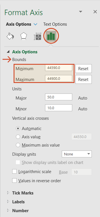
Finished! Our timeline now looks like this:
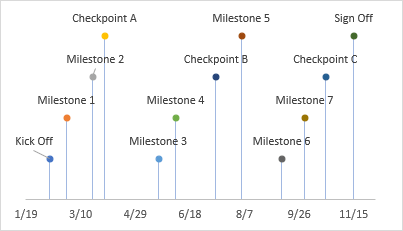
To help you get started quickly, we have included a practical Excel template that you can download for free and learn how to create timelines in Excel.
Источник
Quick Guide to Create a Timeline in Excel and Its Great Alternative
A timeline refers to the chronological order of events. It is used to record events and relevant details about an organization, institution, or person’s life. Moreover, it marks off the important dates and events along the way from the beginning to the end of a period of time. You need this type of diagram for academic and business purposes.
Timelines are a great way to visualize the milestones, assignments, accomplishments, and even goals in the future. In other words, its scope is not only the events carried out but also the assignments to fulfill in the future. You can get this done using one of your project management tools. This article will teach you how to make a timeline in Excel to cut the chase. Also, you will learn about an excellent alternative for creating a timeline. Continue reading to get the necessary information.

- Part 1. How to Make a Timeline in Excel
- Part 2. Best Alternative to Excel on Making a Timeline
- Part 3. FAQs on Creating a Timeline in Excel
Part 1. How to Make a Timeline in Excel
There is more to Excel than meets the eye. Living by its name, it excels in many ways, especially in storing, managing, and computing data. What is more, it helps in creating illustrations in presenting projects. It comes with a SmartArt feature that facilitates making various representations of data and information. More importantly, you can find timeline templates here to make an Excel timeline graph that best fits your requirements.
All you have to do is add your information to your chosen template, change the fields, and modify the diagram as necessary. Below are the step-by-step procedures you may follow to build a timeline in Excel.
1
Launch Excel and open a new spreadsheet
First of all, download and install Microsoft Excel on your computer. Launch the program and open a new spreadsheet.
2
Select a template
On the ribbon of the app, navigate to the Insert and access the SmartArt feature. Then, it will open a dialog box. From here, you will see different templates for types of diagrams. Select the Process section and choose the Basic Timeline as the recommended template. Optionally, you can explore some templates as per your need.
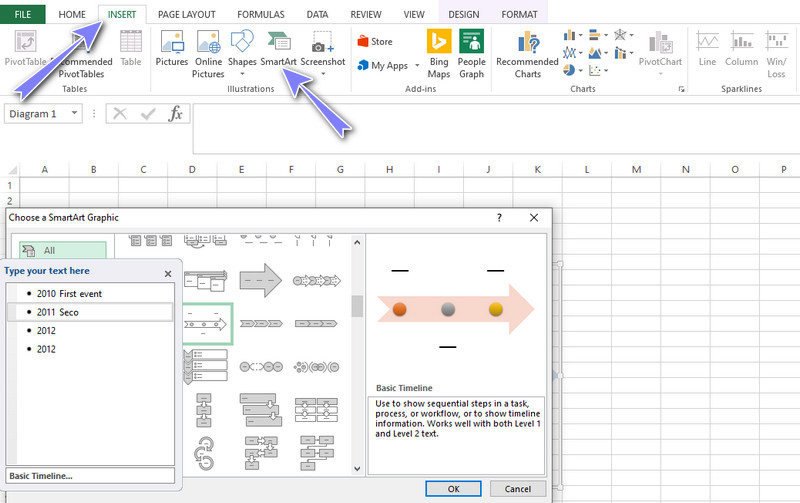
3
Add events to the timeline
After choosing a template, a Text Pane will pop up. On the Text Pane that will show up, add events and label the events by typing the name of the occurrence. Add events according to your needs and label them accordingly.
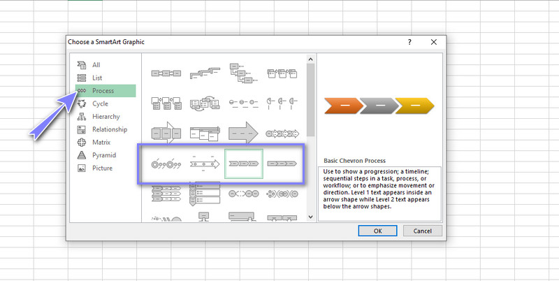
4
Modify the timeline
After inputting your information into the text pane, you can change the look or appearance of your timeline. On the SmartArt Tools, you can explore through the Design and Format tabs. From these tabs, you can modify the font style, design of the diagram, etc. Finally, save the file as you would typically do when saving an Excel file. That is just how to build a timeline in Excel easily.
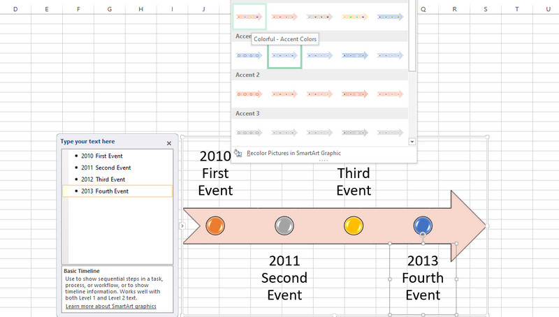
Part 2. Best Alternative to Excel on Making a Timeline
One of the most functional programs you should consider using is MindOnMap. It is a free web-based chart and diagramming program to create various infographics, including a timeline. There are a handful of themes and templates that are highly customizable, and make them your own by edit. Alternatively, you can create various kinds of diagrams from scratch without using a template.
More than that, you can export the file to formats like JPG, PNG, Word, and PDF files. By the way, you can insert a timeline in Excel by exporting the file to SVG, which is another format supported by the program. Besides, you can add icons and figures to make an eye-catching timeline. On the other hand, follow the tutorial below to learn how to create a project timeline in this Excel alternative.
1
Access the program
To get started, visit the website to access the tool immediately. Now, open a browser and type in the program’s name on the address bar. Then, enter the main page. From the main page, click the Create Your Mind Map button.

2
Select a template
After that, you will get to the template section. From here, select a layout or theme for your timeline. We will use the fishbone layout as a timeline for this specific tutorial.
3
Start creating a timeline
Add nodes by selecting the Main Node and clicking the Tab key. Insert nodes as many as you like or according to your requirements. Edit the text and label the events. You can insert icons or images according to your liking. Also, you can alter the style of the timeline.
4
Save the created timeline
To save the timeline you made, click the Export button at the top right corner of the interface. Next, select a format according to your needs or requirements, and you are done. Optionally, you may share the diagram to your colleagues and friends. Simply click the Share button and copy the link. Then, you could send it to someone.
Part 3. FAQs on Creating a Timeline in Excel
What are the types of timelines?
Timelines have a variety of kinds for different purposes. There is vertical, horizontal, roadmap, historical, biological, and a lot more to name a few. There are timeline diagrams for marketing needs, creative projects, students, project implementation, company’s needs, and career path.
What is the timeline in a business?
Timelines can help make a timetable for business. Using this diagram, you can set out milestones for your business projects. It could contain information like the number of locations, employees, revenue, sales target, and expected date to be reached.
What is the best application to make a timeline?
You can employ various kinds of timeline programs such as SmartDraw and Lucidchart. Yet, if you are just starting, you can begin with easy-to-use apps like the MindOnMap. Whether you are a student, professional, or teacher, this could be of great help.
Conclusion
As you may have read, learning how to create and how to use a timeline in Excel is not that complicated. This post will serve as your guideline. So, whenever you want to make a timetable or historical timeline of a project, you can refer to this post. On the other hand, convenience is one of the main criteria for everyone when choosing the best program for creating a timeline. That is the reason why we provided you with the best online diagram maker to your benefit. Yet, if you do not have access to the internet, you can always rely on Excel. On that note, we reviewed both Excel and an alternative — MindOnMap.
Do you want to make impressive looking and functioning Excel workbooks without too much effort?
Of course you do!
If you want to create interactive dashboards in Excel and visually explore your data, then you need to start using slicers and timelines.
They’ll really take your workbooks to the next level… and they’re easy!
In this post, we’re going to learn everything there is to know about slicers and timelines in Microsoft Excel.
There’s a lot to cover, so let’s get started.
What Is A Slicer In Excel?
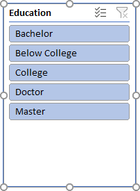
A slicer is an object in Excel that allows you to filter your data.
It displays all the possible values from a selected column of your data and each value will display as an individual button inside the slicer. The buttons can be used to toggle the active filtering of your data set.
The slicer object floats above the spreadsheet grid and will always be visible and available to use.
Slicers can be used with both Tables and PivotTables.
What Is A Timeline In Excel?
Timelines are like slicers. They allow you to filter your data using a visual interface, but they are specifically for use with date fields.
They allow you to easily filter on ranges of dates by days, months, quarters or years. The dates appear in a horizontal line going from oldest to newest as you go from left to right on the timeline.
Timelines are only available for use with date fields in PivotTables.
What Versions Of Excel Have Slicers And Timelines?
Slicers were introduced in Excel 2010.
- Excel for Office 365 or Excel 2010 and later versions will have Slicers for pivot tables.
- Excel for Office 365 or Excel 2013 and later versions will have slicers for tables.
- Excel for Office 365 or Excel 2013 and later versions will have timelines for pivot tables.
Previous versions of Excel will not have slicers or timelines.
How To Add A Slicer To A Table
Your data will need to be inside a proper Excel table. You can create an Excel table by selecting a cell inside your data ➜ going to the Insert tab ➜ Table.
Once your data is inside a table, a new contextual tab will appear. Go to the Table Design tab ➜ Insert Slicer.
This will open up the Insert Slicer menu and you’ll be able to choose fields in your data for which you want to add a slicer.
You can select one or more fields from the list to create multiple slicer objects at once. You’ll be able to use them simultaneously to filter data based on multiple fields at the same time.
Press OK, and Excel will create the slicer objects for you.
How To Add A Slicer To A PivotTable
Select the pivot table to which you want to add a slicer ➜ go to the PivotTable Analyze tab ➜ Insert Slicer.
You can then select which fields to add and press OK. Excel will then create the slicer object to control the pivot table.
How To Add A Timeline To A PivotTable
Select the pivot table to which you want to add a timeline ➜ go to the PivotTable Analyze tab ➜ Insert Timeline.
Add A Slicer Or Timeline From PivotTable Fields List
Alternatively, you can add a slicer or timeline to a pivot table from the PivotTable Fields window.
Right click on the field which you want to add a slicer for ➜ then Add as Slicer or Add as Timeline.
The result is the same as adding the slicer or timeline from the ribbon, it just might be more convenient sometimes.
Using A Slicer
Using a slicer is easy and there are a couple different ways to select items.
Select A Single Slicer Item
To select a single item in a slicer, you can click on the item. This will filter your data to only show data for that item.
Select Multiple Adjacent Slicer Items
To select multiple adjacent items in a slicer, click on the first item then drag the cursor to the last item and release the click. This will filter your data to only show the selected items.
You can also use the Shift key to select multiple adjacent items. Click on the first item then hold the Shift key and click on the last item.
Select Or Unselect Multiple Non-Adjacent Slicer Items
You can use the Ctrl key to select or unselect multiple items in a slicer. Hold the Ctrl key and click on any items you want to select or unselect.
Enable Slicer Multi-Select Mode
There is an option to enable a multi-select mode for a slicer so you don’t have to hold the Ctrl key. Click on the multi-select icon in the upper left hand corner of the slicer to enable multi-select.
This can also be toggled on or off with a keyboard shortcut. With the slicer selected, press Alt + S on your keyboard.
Clear Selected Slicer Item Filters
You may want to reset your slicer and clear out any applied filtering. This can be done using the filter icon in the top right corner of the slicer.
Clearing filters can also be done with a keyboard shortcut. With the slicer selected, press Alt + C on your keyboard.
Using A Timeline
Change The Timeline Grouping
The first thing you’ll want to do with a new timeline is change the Date Grouping option. Here you can choose to group the dates in your data into days, months, quarters or years. This will affect how the timeline groups and filters your dates.
Select A Single Timeline Period
To select a single period in a timeline, you can click on the period. This will filter your data to only show dates in that period.
Select Multiple Adjacent Timeline Periods
To select multiple adjacent periods in a timeline, click on the first period then drag the cursor to the last item and release the click. This will filter your data to only show dates in the selected range.
With timelines you can’t select non-adjacent periods.
Adjust The Selected Timeline Period
You can use the Timeline Handles to either increase or decrease a selected range of dates. Click and drag the handles on the left or right of a selected timeline range.
Clear Selected Timeline Filters
Like slicers, timelines also come with a way to reset and clear out any applied filtering. This can be done using the filter icon in the top right corner of the timeline.
The same keyboard shortcut to clear filters also works with timelines.With the timeline selected, press Alt + C on your keyboard.
Slicer And Timeline Contextual Tabs
When you select a slicer or timeline, a new tab will appear in the ribbon for that object. These are contextual tabs and only appear in the context of a selected slicer or timeline object.
The Slicer tab and Timeline tabs contain a lot of the same options but there are a few differences.
Slicer Tab
The Slicer tab will allow you to:
- Change the slicer caption or open the slicer settings.
- Open the report connections for the slicer.
- Change the slicer style.
- Arrange, align or group the slicer.
- Customize the slicer button layout.
- Adjust the size of the slicer.
Timeline Tab
The Timeline tab will allow you to:
- Change the timeline caption.
- Open the report connections for the timeline.
- Change the timeline style.
- Arrange, align or group the timeline.
- Adjust the size of the timeline.
- Show or hide various elements of the timeline.
Hide A Slicer Or Timeline
You can hide slicers and timelines from the Selection window pane.
Select any slicer or timeline ➜ go to the Slicer or Timeline tab ➜ open the Selection Pane from the Arrange section.
- You can press the Hide All button to hide all the slicers and timelines in the current sheet.
- You can hide individual slicers and timelines by pressing the Eye Icon on the right side for that object.
Change Slicer Or Timeline Caption
The caption is the bit of text that appears in the top left corner of a slicer or timeline. You can change this to anything you want and it can include space characters.
You can change the caption in either the Slicer or Timeline tab. Enter the new caption in either the Slicer Caption or Timeline Caption section and press Enter.
Don’t Print Slicers Or Timelines
It’s possible to exclude slicers and timelines when printing your Excel reports.
Select the slicer or timeline which you don’t want to print ➜ right click ➜ select Size and Properties from the menu ➜ uncheck the Print object option.
This way, you can still use your slicers and timelines to filter your reporting, but they won’t show up when the report is printed.
Customize Slicer Buttons
You can customize the layout of your slicer buttons. You can change the button height, width and number of columns they appear in.
By default buttons appear in a single column stacked in a vertical fashion. The above example has increased the columns from 1 to 5 so the buttons appear horizontally.
The example also increased the button height and decreased the button width.
To customize your slicer buttons, select the slicer ➜ go to the Slicer tab ➜ Adjust the Columns, Height and Width in the Buttons section.
Slicer And Timeline Styles
Excel allows you to customize your slicer style and set a default style for the workbook.
Unfortunately, application level defaults are not possible.
Styles can be changed in the Slicer or Timeline tab.
- Click on the down arrow in the lower right corner of the styles section to access the selection of available styles.
- Click on any style to change style of the selected slicer or timeline.
- If you right click on a style, you’ll have the option to Modify, Duplicate, Delete or Set As Default.
- You can also create your own New Slicer Style.
When creating your own custom styles, it’s a lot easier to duplicate an existing style and then modify it rather than starting a blank new slicer style. After creating a custom style, you can then set it as the default style for any new slicers or timeline in the workbook.
When creating a new slicer style or modifying an existing one, you will need to go through the various Slicer Elements then click the Format button to customize that element.
Report Connections
Report connections is how you can manage which tables or pivot tables a slicer is connected to.
You can use the report connection to connect a slicer to multiple tables or pivot tables. This means you can use one slicer to control multiple tables or pivot tables.
You can open a slicer or timeline’s Report Connection menu from two places.
- Go to the Slicer or Timeline tab and select Report Connections.
- Right click on the slicer or timeline and go to Report Connections.
In the Report Connections menu, you can then select all the pivot tables in the workbook which you want to connect to the slicer.
Note, you can’t connect a slicer to a table and pivot table.
Slicer And Timeline Move And Size With Cells
When you insert, delete or resize cells this can resize or move any slicers and timelines on the sheet.
There are some option to prevent slicers from moving with cell changes.
Select the slicer or timeline ➜ right click ➜ select Size and Properties from the menu ➜ go to the Properties section. Here you can select from 3 different options.
- Move and size with cells.
- This is the default option.
- Your slicer will move if you insert, delete or change the width of a column to its left.
- Your slicer will move if you insert, delete or change the height of a row above it.
- Your slicer will resize if you insert, delete or change the width of a column underneath the slicer.
- Your slicer will resize if you insert, delete or change the height of a row underneath the slicer.
- Move but don’t size with cells.
- Your slicer will move if you insert, delete or change the width of a column to its left.
- Your slicer will move if you insert, delete or change the height of a row above it.
- Your slicer won’t resize when changing rows or columns underneath the slicer.
- Don’t more or size with cells.
- Your slicer won’t move or resize based on any changes to the rows or columns in the sheet.
Disable Resizing And Moving Slicers Or Timelines
Slicers and timelines are great but they’re even better when you lock them in place. This way a user can use them to interact with the spreadsheet, but won’t be able to move or resize them.
Select the slicer or timeline ➜ right click ➜ select Size and Properties from the menu ➜ check the Disable resizing and moving option under the Position and Layout section.
Slicer Options
Slicer Settings are available from the ribbon or right click menu.
- Go to the Slicer tab ➜ Slicer Settings.
- Right click on the slicer ➜ Slicer Settings.
There are a couple different options worth knowing.
- You can change the caption in the Slicer Settings or you can hide the slicer’s heading completely. Uncheck the Display header option and this will hide the caption, multi-select and clear filter buttons from the slicer.
- You can sort the order of the slicer buttons in Ascending or Descending order. If none of these orders suites your needs, you can also use a custom list for the sort order.
- Various options for displaying items in a field with no data are available.
Show Or Hide Time Elements
This is one of the major differences between the Slicer and Timeline tabs. The Timeline tab allows you to show or hide a couple elements in the timeline object.
Here you can either show or hide the Header, Scrollbar, Selection Label or Time Level selector for any timeline.
Conclusions
With slicers and timelines your Excel reports are going to look spectacular!
They are also going to add some nice interactivity to your static dashboards. It’s guaranteed, your boss is going to love them.
Are you using slicers and timelines yet?
About the Author
John is a Microsoft MVP and qualified actuary with over 15 years of experience. He has worked in a variety of industries, including insurance, ad tech, and most recently Power Platform consulting. He is a keen problem solver and has a passion for using technology to make businesses more efficient.
Creating a Timeline in Excel
In the “Insert” tab on the ribbon, select “Smart Art” from the “Illustrations” section.
In the left pane of the new window, select the “Process” option, then double-click one of the timeline options, or select an option and select “OK.”
Your timeline will appear on the spreadsheet.
Therefore, Is there a timeline template in Excel?
Choose an Excel Timeline Template
Microsoft also offers a few timeline templates in Excel designed to give you a broad overview of your conference planning timeline. The Excel timelines aren’t tied to Gantt chart data, so you’ll be manually inputting your own data in the pre-defined template fields.
As well, How do I create a timeline in Excel and start and end the date?
Furthermore, How do I create a project timeline in Excel with dates? Right-click the blank white chart and click Select Data to bring up Excel’s Select Data Source window. On the left side of Excel’s Data Source window, you will see a table named Legend Entries (Series). Click on the Add button to bring up the Edit Series window. Here you add the dates that will make your timeline.
What is timeline in Excel? Timeline in Excel is a kind of SmartArt created to display the different timings of a particular process. It is mainly used for filtering the underlying datasets by date. Such datasets are in the form of pivot tables containing the date field. The timeline was first introduced in the 2013 version of Excel.
How do you make a simple timeline?
Create a timeline
- On the Insert tab, in the Illustrations group, click SmartArt.
- In the Choose a SmartArt Graphic gallery, click Process, and then double-click a timeline layout (such as Basic Timeline).
- To enter your text, do one of the following: Click [Text] in the Text pane, and then type your text.
How do I create a free timeline?
Create a timeline for free with Adobe Express.
To get started, add the first event to your timeline. Don’t worry if you’re not happy with it, as you can change it at any time. You can search thousands of images and icons to add to your design. Finally, choose the look and feel from a set of professional designs.
How do I create a timeline in Excel 2016?
What is the example of timeline?
The definition of a timeline is a list of events in the order that they happened. An example of a timeline is what a policeman will construct to figure out a crime. An example of a timeline is a listing of details regarding an important time in history. To display such a sequence graphically.
What is example of timeline?
The definition of a timeline is a list of events in the order that they happened. An example of a timeline is what a policeman will construct to figure out a crime. An example of a timeline is a listing of details regarding an important time in history. To display such a sequence graphically.
How do you write a timeline?
Put the most important dates on the timeline.
Go along the line and mark the spots where the events will go. Draw a line that is perpendicular to your main timeline to show the years in which the events occurred, and write down a short description of each one. Organize the dates sequentially.
What is the best program to create a timeline?
Best Free Timeline Creation Tools
- Office Timeline. One of the most professional looking free timeline creation tools on the Internet that you can also use to produce milestones and Gannt charts. …
- Sutori. …
- MyHistro. …
- OurStory. …
- SmartDraw. …
- Twitter Custom Timelines. …
- Timeline JS. …
- Free Timeline.
Steps to creating a project timeline
- Step 1: Understand the scope of your project. …
- Step 2: Split the project into milestones. …
- Step 3: Estimate the time of each task. …
- Step 4: Assign tasks to your team. …
- Step 5: Choose your project timeline software. …
- Step 6: Plot each task on your timeline.
Does Microsoft Word have a timeline template?
Word does not have a default timeline template, but you can insert a basic timeline in your document going to the Insert tab and selecting SmartArt. Then, in the Choose a SmartArt Graphic gallery, click Process and select one of the two timeline formats there – Basic Timeline or Circle Accent Timeline.
How do I make a timeline on sheets?
How to Make a Timeline in Google Sheets
- Create a new timeline. Open Google Sheets and select the “Project Timeline” option.
- Customize. Edit your timeline. Change any text box, add colors, and modify dates as required.
How do you create a timeline in Excel 2013?
Just follow these steps to get started.
- Click inside the pivot table to bring up the PivotTable Tools.
- Click “Analyze” at the top of the screen.
- Click “Insert Timeline” in the Ribbon.
- Select the date you wish to use and press OK.
- Adjust the timeline using the filter button.
What is a timeline in computer?
With video editing, the timeline is the portion of the video editing software interface where the sequence of video clips and sound effects is visually represented in chronological order. When clips are imported into the software, they must first be placed on the timeline before effects can be applied to them.
What are 3 types of timelines?
Here’s a list of some of the different types of timelines to use:
- Horizontal timeline. One of the most common types of timelines is a horizontal timeline, which tracks events from left to right. …
- Biographical timeline. To showcase the events of a person’s life, you can use a biographical timeline. …
- Biological timeline.
Where can I make a timeline?
Create a timeline for free with Adobe Express.
You can search thousands of images and icons to add to your design. Finally, choose the look and feel from a set of professional designs. You can save your timeline to print, share, or import into another project.
How do you make a timeline on the notebook?
There are several different ways to set up a timeline notebook:
- Print or purchase timeline pages — pages that will fit into a binder with time increments on them. …
- Use Drawing & Writing Paper to record narrations and illustrations of events. …
- Use a computer program to create and print a timeline to fit inside a notebook.
How do you make a simple timeline video?
What is Microsoft Office timeline?
Office Timeline is a free, award winning, project schedule and timeline maker for Microsoft PowerPoint. With Office Timeline you can quickly and easily create professional project timelines and Gantt charts that impress your team, management and customers.
How do you explain a timeline?
A timeline is the presentation of a chronological sequence of events along a drawn line that enables a viewer to understand temporal relationships quickly. The term is also sometimes extended to mean a chronology that is tabular, year-by-year paragraphs or purely conceptual.
What are the timeline charts?
A timeline chart is a visual rendition of a series of events. It can be created as a chart or a graph. Timeline charts can be created for anything that occurred over a period of time. You might see a timeline chart for World War II or major events of the 20th century.
Can I make a timeline in Word?
Word does not have a default timeline template, but you can insert a basic timeline in your document going to the Insert tab and selecting SmartArt. Then, in the Choose a SmartArt Graphic gallery, click Process and select one of the two timeline formats there – Basic Timeline or Circle Accent Timeline.
- Reference 1
- Reference 2
- Reference 3
- Reference 4
- Reference 5
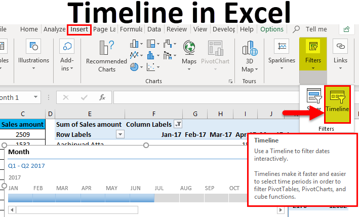
Excel Timeline (Table of Contents)
- Introduction to Timeline in Excel
- How to Create Timelines in Excel?
Introduction to Timeline in Excel
Timeline in Excel actually represents the time span from the start to end on a bar. So for this, we should have any time frame such as Dates, Months, Minutes, Hours, etc. To apply the Timeline in Excel, first, we need to create a pivot table. Then from the Insert menu ribbon, select Timeline from the filters section. Then click right on Timeline, and from the Report Connections, choose the fields which we want to connect with Timeline. Now just drag the bar right to left as per the need to filter the data with time.
How to Create a Timeline in Excel?
For adding the timeline feature in Excel, you must have a pivot table first.
Let’s understand the working of creating timelines in excel with some examples.
You can download this Timeline Excel Template here – Timeline Excel Template
Example #1
We have given a list of the number of products sold region-wise and month-wise.
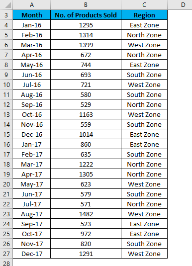
Follow the below steps to do this:
- First, create a Pivot table for the given data.
- Click on any cell in the table and go to the Insert tab.
- Click on the Pivot Table option under the Tables section.
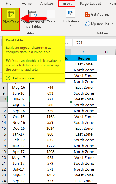
- Now the Pivot table is created, as shown in the below screenshot.
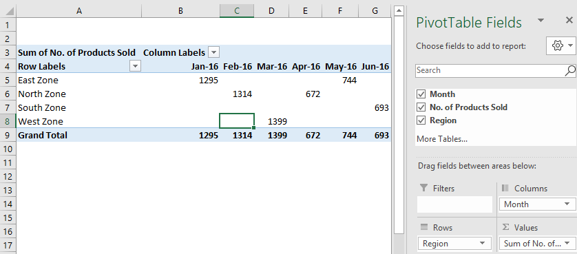
- Click anywhere in the Pivot table and go to the Insert tab.
- Click on the Timeline filter under the Filters section. Then, refer to the below screenshot.
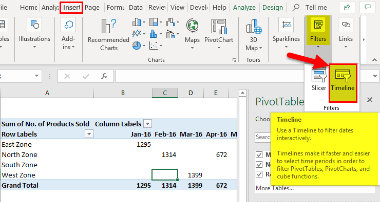
- It will open an Insert Timelines dialog box. Refer to the below screenshot.
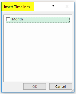
- Click on the Month checkbox inside the dialog box and click on OK.
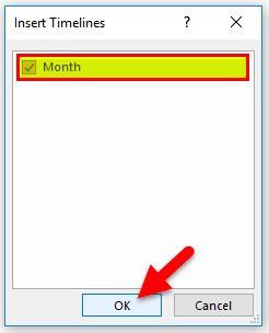
- It will show you the timeline, and by default, it’s showing the month’s data year-wise. For example, refer to the below screenshot.
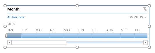
- Now with the help of this excel timeline, you can arrange the records in the Pivot table by adjusting and clicking. Refer to the below screenshot.
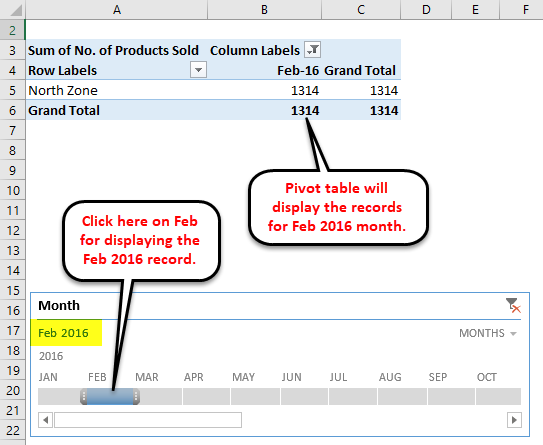
- The above screenshot shows that we have clicked on Feb month under the 2016 year; it is displaying the data accordingly in the Pivot Table.
- If you want to see the data for a continuous month, you need to drag the bar across those months like the screenshot below. For example, we have selected the data for May & June 2016 month.
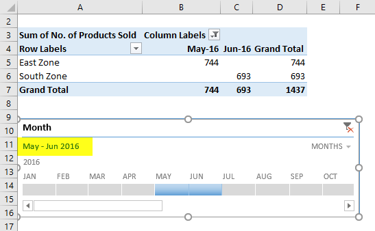
- We also can see the data day, quarter, and year-wise.
- For this, click on the drop-down arrow on the timeline box, as shown in the below screenshot.
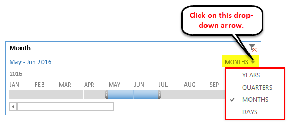
- Choose another date component like Quarters.
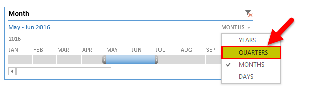
- It will show the quarter wise data like below:
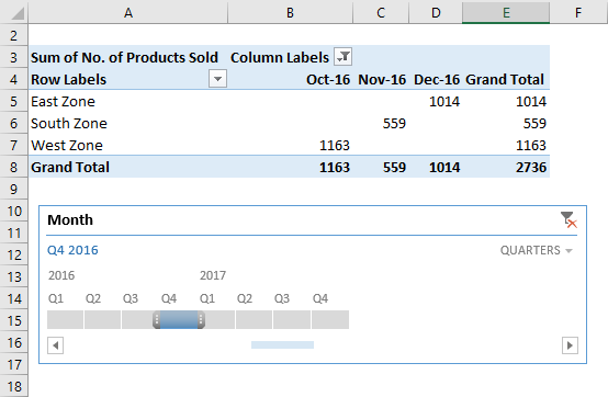
- If you want to remove the data timeline, click on the icon in the upper right corner, as shown below. You also can use the shortcut key ALT+C for this.
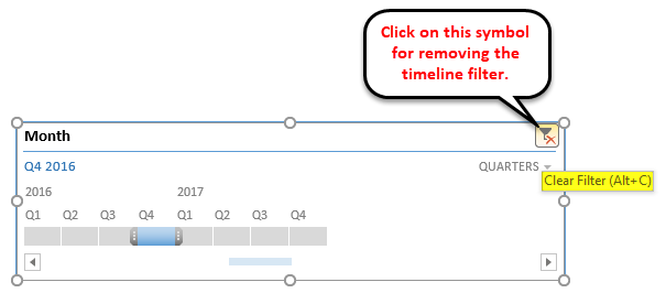
You also can customize an excel timeline according to your preference. Follow the below steps:
- Click on the Timeline window. Then, go to the Options tab.
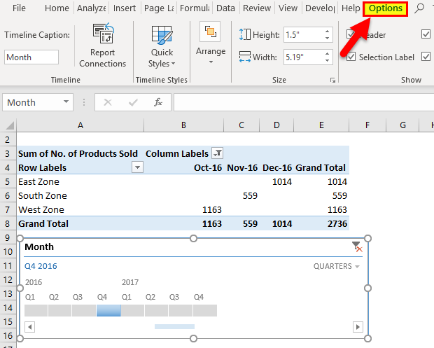
- Click on any color option under the Timeline Styles section, as shown in the below screenshot.
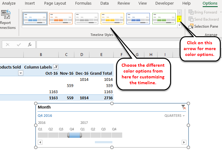
- You also can change the size of the timeline window.
- Finally, you can change the name of the timeline window by clicking on Timeline Captions under the Timeline section.
Example #2
Let’s take another example of a grocery shop.
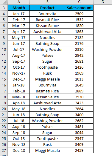
- Now we will create a table for the above data. Here, we are inserting the pivot table in the same sheet with the data set.
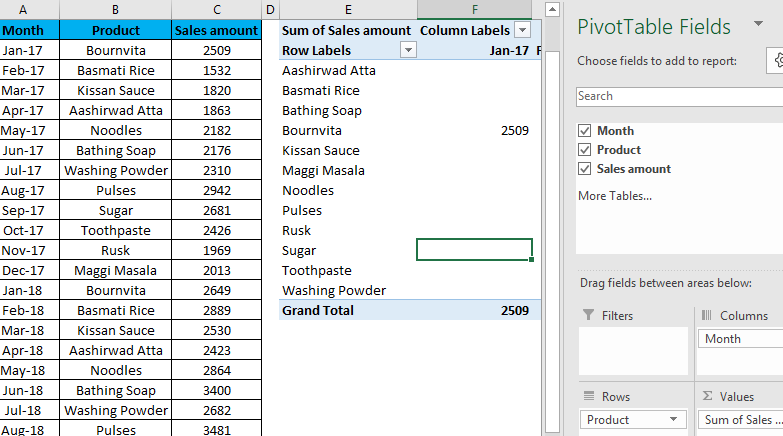
- Now repeat the same steps of example 1 for creating timelines here. It will show you the timeline.
Refer to the below screenshot:
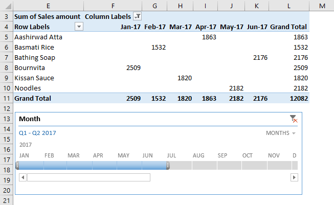
As we can see that we have clicked for 6 months result (from Jan – June) of the year 2017.
Hence, you can select the months accordingly by clicking on this timeline bar.
Things to Remember about Timeline in Excel
- If your Pivot Table doesn’t have a field formatted as a Date, Excel displays an error.
- An excel timeline is useful for filtering the data in the Pivot table very quickly.
Recommended Articles
This is a guide to Timeline in Excel. Here we discuss how to create a timeline in Excel, practical examples, and a downloadable excel template. You can also go through our other suggested articles to learn more –
- Project Timeline in Excel
- Timecard Template in Excel
- Excel Timesheet Template
- Time Function in Excel