Excel for Microsoft 365 Excel for Microsoft 365 for Mac Excel for the web Excel 2021 Excel 2019 Excel 2016 Excel 2013 Excel 2010 Excel 2007 More…Less
You can use a PivotTable to summarize, analyze, explore, and present summary data. PivotCharts complement PivotTables by adding visualizations to the summary data in a PivotTable, and allow you to easily see comparisons, patterns, and trends. Both PivotTables and PivotCharts enable you to make informed decisions about critical data in your enterprise. You can also connect to external data sources such as SQL Server tables, SQL Server Analysis Services cubes, Azure Marketplace, Office Data Connection (.odc) files, XML files, Access databases, and text files to create PivotTables, or use existing PivotTables to create new tables.
A PivotTable is an interactive way to quickly summarize large amounts of data. You can use a PivotTable to analyze numerical data in detail, and answer unanticipated questions about your data. A PivotTable is especially designed for:
-
Querying large amounts of data in many user-friendly ways.
-
Subtotaling and aggregating numeric data, summarizing data by categories and subcategories, and creating custom calculations and formulas.
-
Expanding and collapsing levels of data to focus your results, and drilling down to details from the summary data for areas of interest to you.
-
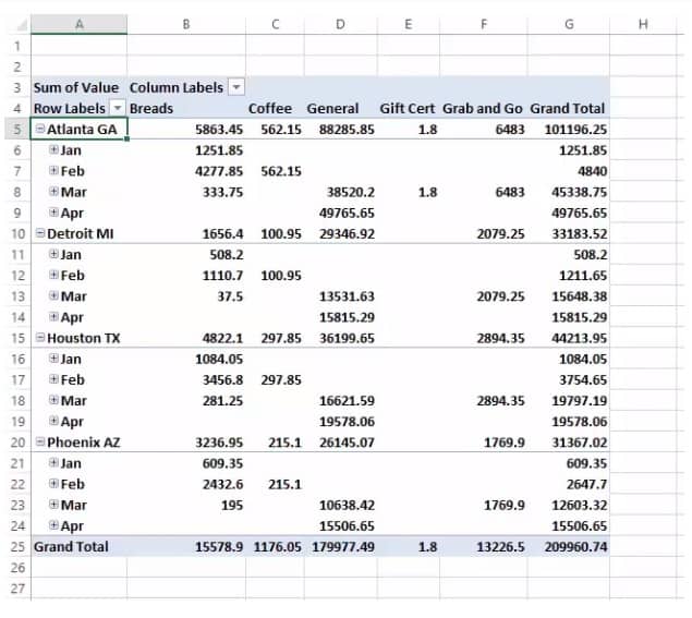
Moving rows to columns or columns to rows (or «pivoting») to see different summaries of the source data.
-
Filtering, sorting, grouping, and conditionally formatting the most useful and interesting subset of data enabling you to focus on just the information you want.
-
Presenting concise, attractive, and annotated online or printed reports.
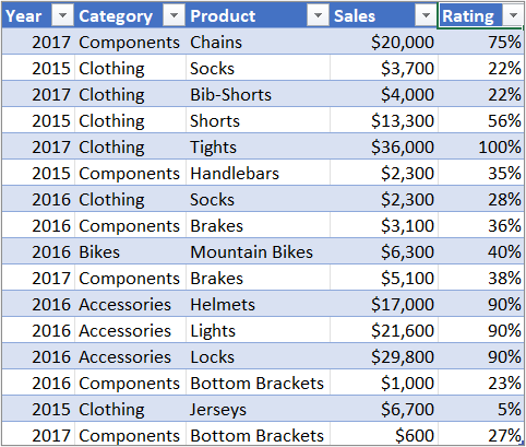
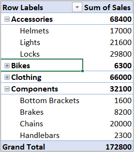
For example, here’s a simple list of household expenses on the left, and a PivotTable based on the list to the right:
|
Sales data |
Corresponding PivotTable |
|
|
|
For more information, see Create a PivotTable to analyze worksheet data.
After you create a PivotTable by selecting its data source, arranging fields in the PivotTable Field List, and choosing an initial layout, you can perform the following tasks as you work with a PivotTable:
Explore the data by doing the following:
-
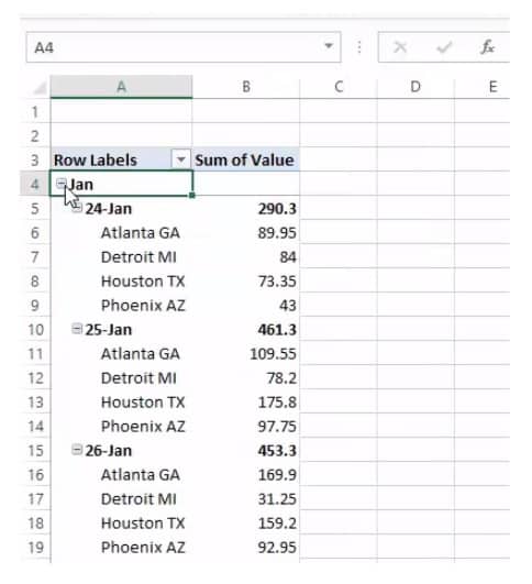
Expand and collapse data, and show the underlying details that pertain to the values.
-
Sort, filter, and group fields and items.
-
Change summary functions, and add custom calculations and formulas.
Change the form layout and field arrangement by doing the following:
-
Change the PivotTable form: Compact, Outline, or Tabular.
-
Add, rearrange, and remove fields.
-
Change the order of fields or items.
Change the layout of columns, rows, and subtotals by doing the following:
-
Turn column and row field headers on or off, or display or hide blank lines.
-
Display subtotals above or below their rows.
-
Adjust column widths on refresh.
-
Move a column field to the row area or a row field to the column area.
-
Merge or unmerge cells for outer row and column items.
Change the display of blanks and errors by doing the following:
-
Change how errors and empty cells are displayed.
-
Change how items and labels without data are shown.
-
Display or hide blank rows
Change the format by doing the following:
-
Manually and conditionally format cells and ranges.
-
Change the overall PivotTable format style.
-
Change the number format for fields.
-
Include OLAP Server formatting.
For more information, see Design the layout and format of a PivotTable.
PivotCharts provide graphical representations of the data in their associated PivotTables. PivotCharts are also interactive. When you create a PivotChart, the PivotChart Filter Pane appears. You can use this filter pane to sort and filter the PivotChart’s underlying data. Changes that you make to the layout and data in an associated PivotTable are immediately reflected in the layout and data in the PivotChart and vice versa.
PivotCharts display data series, categories, data markers, and axes just as standard charts do. You can also change the chart type and other options such as the titles, the legend placement, the data labels, the chart location, and so on.
Here’s a PivotChart based on the PivotTable example above.
For more information, see Create a PivotChart.
If you are familiar with standard charts, you will find that most operations are the same in PivotCharts. However, there are some differences:
Row/Column orientation Unlike a standard chart, you cannot switch the row/column orientation of a PivotChart by using the Select Data Source dialog box. Instead, you can pivot the Row and Column labels of the associated PivotTable to achieve the same effect.
Chart types You can change a PivotChart to any chart type except an xy (scatter), stock, or bubble chart.
Source data Standard charts are linked directly to worksheet cells, while PivotCharts are based on their associated PivotTable’s data source. Unlike a standard chart, you cannot change the chart data range in a PivotChart’s Select Data Source dialog box.
Formatting Most formatting—including chart elements that you add, layout, and style—is preserved when you refresh a PivotChart. However, trendlines, data labels, error bars, and other changes to data sets are not preserved. Standard charts do not lose this formatting once it is applied.
Although you cannot directly resize the data labels in a PivotChart, you can increase the text font size to effectively resize the labels.
You can use data from a Excel worksheet as the basis for a PivotTable or PivotChart. The data should be in list format, with column labels in the first row, which Excel will use for Field Names. Each cell in subsequent rows should contain data appropriate to its column heading, and you shouldn’t mix data types in the same column. For instance, you shouldn’t mix currency values and dates in the same column. Additionally, there shouldn’t be any blank rows or columns within the data range.
Excel tables Excel tables are already in list format and are good candidates for PivotTable source data. When you refresh the PivotTable, new and updated data from the Excel table is automatically included in the refresh operation.
Using a dynamic named range To make a PivotTable easier to update, you can create a dynamic named range, and use that name as the PivotTable’s data source. If the named range expands to include more data, refreshing the PivotTable will include the new data.
Including totals Excel automatically creates subtotals and grand totals in a PivotTable. If the source data contains automatic subtotals and grand totals that you created by using the Subtotals command in the Outline group on the Data tab, use that same command to remove the subtotals and grand totals before you create the PivotTable.
You can retrieve data from an external data source such as a database, an Online Analytical Processing (OLAP) cube, or a text file. For example, you might maintain a database of sales records you want to summarize and analyze.
Office Data Connection files If you use an Office Data Connection (ODC) file (.odc) to retrieve external data for a PivotTable, you can input the data directly into a PivotTable. We recommend that you retrieve external data for your reports by using ODC files.
OLAP source data When you retrieve source data from an OLAP database or a cube file, the data is returned to Excel only as a PivotTable or a PivotTable that has been converted to worksheet functions. For more information, see Convert PivotTable cells to worksheet formulas.
Non-OLAP source data This is the underlying data for a PivotTable or a PivotChart that comes from a source other than an OLAP database. For example, data from relational databases or text files.
For more information, see Create a PivotTable with an external data source.
The PivotTable cache Each time that you create a new PivotTable or PivotChart, Excel stores a copy of the data for the report in memory, and saves this storage area as part of the workbook file — this is called the PivotTable cache. Each new PivotTable requires additional memory and disk space. However, when you use an existing PivotTable as the source for a new one in the same workbook, both share the same cache. Because you reuse the cache, the workbook size is reduced and less data is kept in memory.
Location requirements To use one PivotTable as the source for another, both must be in the same workbook. If the source PivotTable is in a different workbook, copy the source to the workbook location where you want the new one to appear. PivotTables and PivotCharts in different workbooks are separate, each with its own copy of the data in memory and in the workbooks.
Changes affect both PivotTables When you refresh the data in the new PivotTable, Excel also updates the data in the source PivotTable, and vice versa. When you group or ungroup items, or create calculated fields or calculated items in one, both are affected. If you need to have a PivotTable that’s independent of another one, then you can create a new one based on the original data source, instead of copying the original PivotTable. Just be mindful of the potential memory implications of doing this too often.
PivotCharts You can base a new PivotTable or PivotChart on another PivotTable, but you cannot base a new PivotChart directly on another PivotChart. Changes to a PivotChart affect the associated PivotTable, and vice versa.
Changes in the source data can result in different data being available for analysis. For example, you may want to conveniently switch from a test database to a production database. You can update a PivotTable or a PivotChart with new data that is similar to the original data connection information by redefining the source data. If the data is substantially different with many new or additional fields, it may be easier to create a new PivotTable or PivotChart.
Displaying new data brought in by refresh Refreshing a PivotTable can also change the data that is available for display. For PivotTables based on worksheet data, Excel retrieves new fields within the source range or named range that you specified. For reports based on external data, Excel retrieves new data that meets the criteria for the underlying query or data that becomes available in an OLAP cube. You can view any new fields in the Field List and add the fields to the report.
Changing OLAP cubes that you create Reports based on OLAP data always have access to all of the data in the cube. If you created an offline cube that contains a subset of the data in a server cube, you can use the Offline OLAP command to modify your cube file so that it contains different data from the server.
See Also
Create a PivotTable to analyze worksheet data
Create a PivotChart
PivotTable options
Use PivotTables and other business intelligence tools to analyze your data
Need more help?
Home > Microsoft Excel > How to Create a Pivot Table in Excel? — The Easiest guide
If you ask anyone with decent experience in using Excel, about the most useful Excel feature, they will vouch for the Excel Pivot Table. It is one of the most searched Excel features on the internet, and for good reason.
Related:
Creating A Dynamic Pivot Chart Title Using Slicers
Using Getpivotdata In Excel
Dashboards In Excel Using Pivot Tables, Pivot Charts And Slicers
In this guide, let’s see what makes the Pivot table one of the most popular and powerful Excel features.
This guide covers
Table Of Contents
- What is a Pivot Table?
- What is the use of a Pivot Table in Excel?
- How does an Excel Pivot Table work?
- How to Create a Pivot Table in Excel?
- Step 1: Turn the Data Range into a Table
- Step 2: Open the Create Pivot Table Wizard
- Step 3: Select the Source Table or Range for the Pivot Table
- Step 4: Set the Location of the Pivot Table
- How to Add Data to an Excel Pivot Table?
- Four Quadrants
- Values:
- Rows:
- Columns:
- Filters:
- Value Field Settings
- Analyse data using Pivot Table
- Sales Values across Months
- Sales Values across months in Each branch.
- Sales Values across months in Each branch for each department.
- What are the Benefits of Pivot Tables?
- FAQs
- What is the use of a Pivot Table in Excel?
- What is a Pivot Table formula?
- Let’s wrap up
What is a Pivot Table?
Microsoft describes a Pivot Table in Excel (or PivotTable if you’re using the trademarked function name!) as “an interactive way to quickly summarize large amounts of data”. It’s a pretty good description.
What is the use of a Pivot Table in Excel?
The Excel Pivot Table function is an essential part of data analysis in Excel. Before the Pivot Table came along you’d need multiple functions tied together in a complicated and convoluted way to perform the same action that just takes a few clicks in a Pivot Table.
To say they revolutionised the way the average Excel user performs data analysis is an understatement. They are such a big deal that they have their own Wikipedia page.
For the end-user, Pivot Tables are remarkably simple to use and easy to learn. There are hundreds of brilliant articles on how to create your first Pivot Table as well as some excellent lessons on YouTube.
We’re going to contribute by showing you some of our highest rated videos that teach you how to create a Pivot Table in Excel.
If for any reason you don’t get it the first time, don’t worry, we’ve included multiple Pivot Table tutorials to help you master this essential skill.
If you have an hour to dedicate to a Pivot Table tutorial, then start with the video below. This is a recording of a live class we held in 2019 that takes you through everything you need to know to start analysing your data using Pivot Tables. These live classes are all free as part of a Simon Sez IT membership.
If that’s too much, scroll down and we have some other, shorter videos taken straight from our Excel courses.
How does an Excel Pivot Table work?
All Pivot Tables start life as a boring old range of data. But once you create a Pivot Table, Excel takes a quick look at the data and stores it in its cache.
This is called the Pivot cache and it is responsible for the super fast calculation of summaries that Pivot Tables are known for.
Each time you add or remove data from the Excel Pivot Table, Excel does not deal with the source data, rather it uses this Pivot Cache as a quick shortcut.
Also Read:
Introduction To Power Pivot and Power Query In Excel
Getting Started With Power Pivot: Advanced Excel
Excel Crash Course – Learn Pivot Tables In 1 Hour
How to Create a Pivot Table in Excel?
Step 1: Turn the Data Range into a Table
You can create a Pivot Table in Excel from a range but we strongly recommend that you turn your range into a table as this makes it a lot simpler to add or remove data later on.
For example:
A few golden rules about your data range or table before you create an Excel Pivot Table with it:
- Every column should have a header. If one is missing, you won’t be able to create a Pivot Table.
- There should be no empty rows. There can be the odd empty cell, but no full empty rows. This can mess up a few things.
Step 2: Open the Create Pivot Table Wizard
Once you’ve turned your range into a table (use Ctrl-T to do this quickly!) you then need to select a cell in that table, go to Insert on the ribbon and select Pivot Table on the far left.
This brings up the Create Pivot Table Wizard where you can start selecting your Pivot Table options.
Step 3: Select the Source Table or Range for the Pivot Table
The first option you’ll notice is that Excel is asking you to select the table or range. Because we have already created a table and we were clicked into that table when we chose to insert the Pivot Table, Excel has done the hard work for us and has selected that table as our range of data.
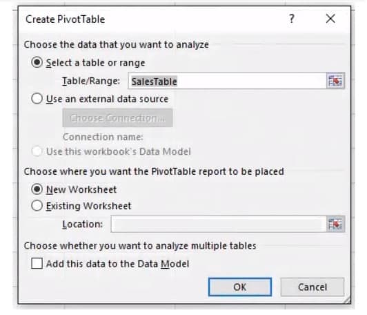
Step 4: Set the Location of the Pivot Table
Select whether you create your Pivot Table in a new or an existing worksheet. Once you hit OK, you’ve created your first Pivot Table. Hurray!
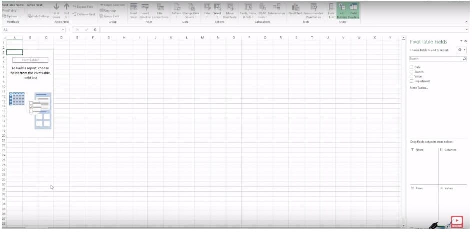
What you’ll see next is a blank table to the left with a set of options on your right. These options are the Pivot Table fields and this is where the magic starts to happen. I’ll show you how to do this in the next section.
How to Add Data to an Excel Pivot Table?
Using the Pivot Table Fields panel you can now start to manipulate your data.
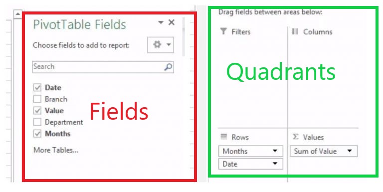
Four Quadrants
A pivot table is based on these four quadrants:
- Filters
- Columns
- Rows
- Values
We’ll see what each of these quadrants mean in a minute.
These four quadrants are the key to manipulating the data in your Pivot Table. You can now start to drag the values at the top of the Excel Pivot Table Fields section into the quadrants below.
Values:
The values quadrant is what decides the type and value of calculations that the Pivot Table should display. It is the meat of a Pivot Table so to speak.
In the following image, the area bordered in red is the Values area in a Pivot Table.
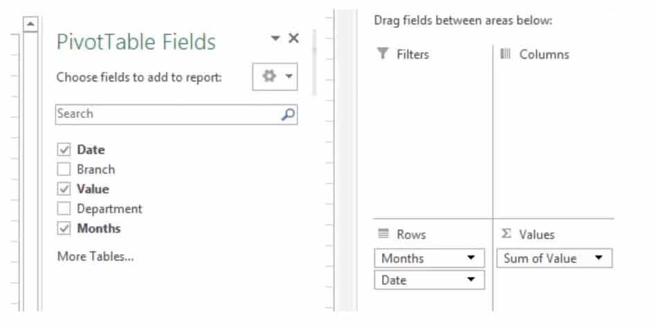
Rows:
The rows quadrant is what decides the rows that the Pivot Table should display. The Rows are used to slice the data in a suitable way that we are looking for.
For example, you want to look at the total sales that occurred in different months. For this, you need to drag Months in the Rows quadrant.
In the following image, the area bordered in green is the Rows area of a Pivot Table.
Columns:
The columns quadrant is what decides the columns that the Pivot Table should display. That is columns are used to further dice the data into a suitable format.
For example, you want to look at the total sales that occurred in different months across different departments. For this, you need to drag Months in the Rows quadrant and further drag Departments into the Columns quadrant.
In the following image, the area bordered in blue is the Columns area of a Pivot Table.

Filters:
The filters quadrant is optional and is used to further drill down your Pivot Table. For example, you may want to look only at the sales value of the Detroit Branch.
This can be done by dragging the Branch field into the filter quadrant. Now, you can select the branch you are looking for from the drop-down list and view only its data.
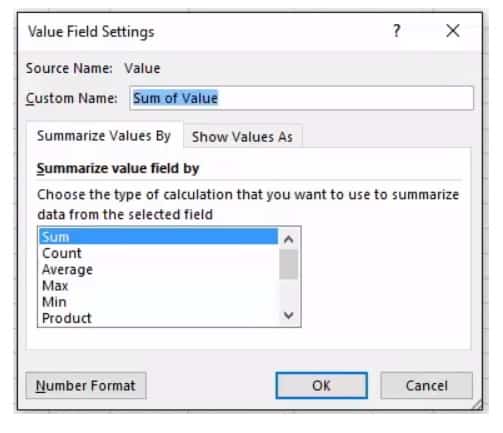
Value Field Settings
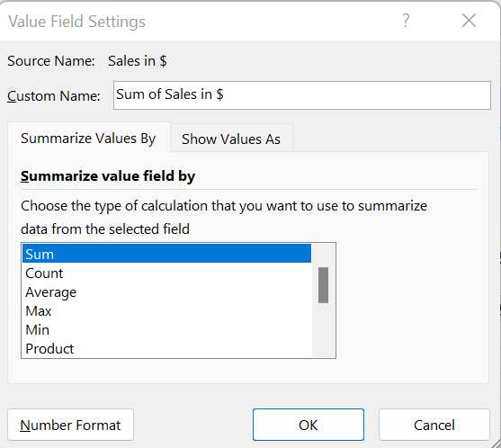
How do you change what’s happening in your value field away from displaying the sum? Simple, you need Value Field Settings.
To access these select any value in your Pivot Table, go to analyze on the ribbon and select “Field Settings”. Alternatively, click the little down arrow in the value quadrant and select “Value Field Settings”.
This brings up the options you have in relation to your values. You can average instead of sum, you can count or use Min or Max. You can then select how you show the values including adding some calculations and changing the number format.
Analyse data using Pivot Table
Depending on which quadrant you pick, the table will format differently so there are a few rules to stick to:
- Numbers nearly always go in the Values quadrant. This allows you to perform calculations, summaries, averages etc. all from within your Pivot Table.
- Dates often go in the Rows column because…
- Anything you put in the rows column will become the row headings, anything in the columns quadrant will become column headings so for ease of use put the data with more options in the Rows column (it’s easier to scroll down rather than across for ages).
- The Filters quadrant does what you’d expect, it applies a filter to the entire dataset. Super useful if you just want to show something specific.
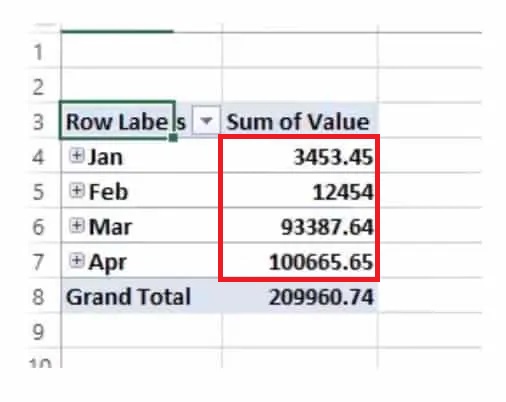
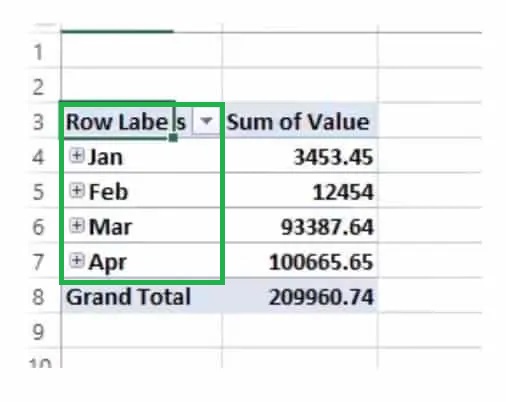
Sales Values across Months
Say you have dates in your rows quadrant and a set of corresponding values in your values quadrant. Excel will automatically do a couple of things.
- It will condense the dates into months, quarters or years (depending on the data set).
- It will sum the values in the values field.
This is the Pivot Table starting to work. From your dataset, it’s now summarising that data by month for you. All within a few clicks.
Of course, you may not want that exact data and you may not want to add it together. The amazing thing about the Excel Pivot Table function is just how flexible it is.
You can drag and drop, remove and change the data within those quadrants as much as you want and you’ll start to see just how powerful Pivot Tables are.
Sales Values across months in Each branch.
The data in our example is sales data. Above we’re seeing sales by month which is useful. But what if we wanted to see sales by branch and by date?
Easy, we just drop the branch data into the rows column, under the date and we get a breakdown of that as well:
Sales Values across months in Each branch for each department.
If we wanted to get even more detail we could then add the departments to the column data and we’d see a summary of sales by branch, by the department and by date! You can quickly see that with very little effort on our part we can now draw really meaningful insight from our dataset:
What are the Benefits of Pivot Tables?
All that an Excel Pivot table does is help you effortlessly slice and dice your data. A normal Excel sheet or table might not suffice for your data needs.
Suppose you need to quickly find out the Bread sales in January that occurred in the Detroit region, manually doing it each time using filters or formulas can be painstaking.
Or if you need to quickly look at the top 5 performing regions in the coffee department, using an Excel function is akin to taking the roundabout way to reach your destination.
An Excel Pivot Table achieves all this and more in just a few clicks.
Slicers and Filters
If you’ve grasped the basics and you’re ready to conquer some more advanced pivot table tutorials, then you need to know all about Slicers and Filters.
By filtering and slicing your data in a Pivot Table you can start to get analyse specific areas of your dataset and pull out interesting patterns. Plus, if you want to create an interactive dashboard that others can use, you’ll want to master these functions.
All this and so much more is explained in this video:
In this video our Excel expert Toby shows you everything you need to know about Slicers & Filters :
Suggested Reads:
How To Use Excel Countifs: The Best Guide
Excel Sumifs & Sumif Functions – The No.1 Complete Guide
How To Protect Cells In Excel Workbooks-the Easiest Way
FAQs
What is the use of a Pivot Table in Excel?
An Excel Pivot Table is used to summarise data in a reorganised format. While doing this, you can sort, filter, sum, count or even average your values across different fields.
What is a Pivot Table formula?
In a Pivot Table, under the value field settings, you will find summary functions to find SUM, AVERAGE, and COUNTS of values for the fields.
If they are not enough you can create your own formula to find the required value. These are called Pivot Table formulas
Let’s wrap up
That’s enough Pivot Tables for today, isn’t it? In this guide, we looked at the basics of creating and using pivot tables.
The key takeaway from this tutorial is that an Excel Pivot Table is a very versatile tool to drill down and look at your data.
There are more interesting things to do with them and we’ll deal with them in later advanced guides. If you find this guide useful, check out our Excel courses for more high-quality comprehensive guides on advanced Excel topics.
If all the above isn’t enough Pivot Table for you, then we’ve got an extended Pivot Table video here for you. It’s 40 minutes long, so get comfy.
Simon Sez IT has been teaching Excel for over ten years. For a low, monthly fee you can get access to 100+ IT training courses.
Other Excel classes you might like:
- What-If Analysis in Excel
- Designing Better Spreadsheets in Excel
- Logical Functions in Excel
Deborah Ashby

Deborah Ashby is a TAP Accredited IT Trainer, specializing in the design, delivery, and facilitation of Microsoft courses both online and in the classroom.She has over 11 years of IT Training Experience and 24 years in the IT Industry. To date, she’s trained over 10,000 people in the UK and overseas at companies such as HMRC, the Metropolitan Police, Parliament, SKY, Microsoft, Kew Gardens, Norton Rose Fulbright LLP.She’s a qualified MOS Master for 2010, 2013, and 2016 editions of Microsoft Office and is COLF and TAP Accredited and a member of The British Learning Institute.
If you are reading this tutorial, there is a big chance you have heard of (or even used) the Excel Pivot Table. It’s one of the most powerful features in Excel (no kidding).
The best part about using a Pivot Table is that even if you don’t know anything in Excel, you can still do pretty awesome things with it with a very basic understanding of it.
Let’s get started.
Click here to download the sample data and follow along.
What is a Pivot Table and Why Should You Care?
A Pivot Table is a tool in Microsoft Excel that allows you to quickly summarize huge datasets (with a few clicks).
Even if you’re absolutely new to the world of Excel, you can easily use a Pivot Table. It’s as easy as dragging and dropping rows/columns headers to create reports.
Suppose you have a dataset as shown below:
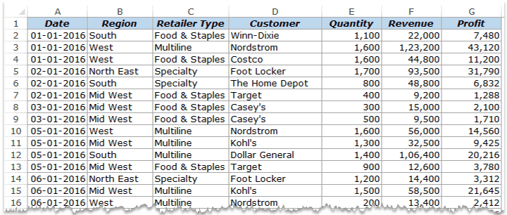
This is sales data that consists of ~1000 rows.
It has the sales data by region, retailer type, and customer.
Now your boss may want to know a few things from this data:
- What were the total sales in the South region in 2016?
- What are the top five retailers by sales?
- How did The Home Depot’s performance compare against other retailers in the South?
You can go ahead and use Excel functions to give you the answers to these questions, but what if suddenly your boss comes up with a list of five more questions.
You’ll have to go back to the data and create new formulas every time there is a change.
This is where Excel Pivot Tables comes in really handy.
Within seconds, a Pivot Table will answer all these questions (as you’ll learn below).
But the real benefit is that it can accommodate your finicky data-driven boss by answering his questions immediately.
It’s so simple, you may as well take a few minutes and show your boss how to do it himself.
Hopefully, now you have an idea of why Pivot Tables are so awesome. Let’s go ahead and create a Pivot Table using the data set (shown above).
Inserting a Pivot Table in Excel
Here are the steps to create a pivot table using the data shown above:
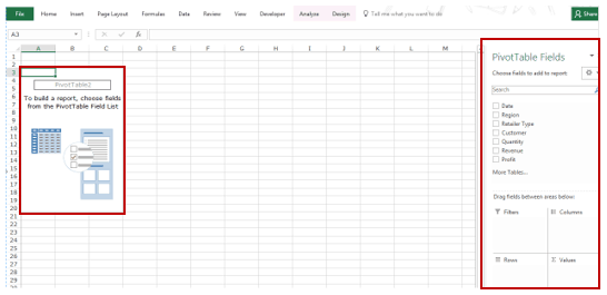
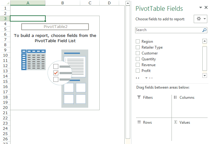
As soon as you click OK, a new worksheet is created with the Pivot Table in it.
While the Pivot Table has been created, you’d see no data in it. All you’d see is the Pivot Table name and a single line instruction on the left, and Pivot Table Fields on the right.
Now before we jump into analyzing data using this Pivot Table, let’s understand what are the nuts and bolts that make an Excel Pivot Table.
Also read: 10 Excel Pivot Table Keyboard Shortcuts
The Nuts & Bolts of an Excel Pivot Table
To use a Pivot Table efficiently, it’s important to know the components that create a pivot table.
In this section, you’ll learn about:
- Pivot Cache
- Values Area
- Rows Area
- Columns Area
- Filters Area
Pivot Cache
As soon as you create a Pivot Table using the data, something happens in the backend. Excel takes a snapshot of the data and stores it in its memory. This snapshot is called the Pivot Cache.
When you create different views using a Pivot Table, Excel does not go back to the data source, rather it uses the Pivot Cache to quickly analyze the data and give you the summary/results.
The reason a pivot cache gets generated is to optimize the pivot table functioning. Even when you have thousands of rows of data, a pivot table is super fast in summarizing the data. You can drag and drop items in the rows/columns/values/filters boxes and it will instantly update the results.
Note: One downside of pivot cache is that it increases the size of your workbook. Since it’s a replica of the source data, when you create a pivot table, a copy of that data gets stored in the Pivot Cache.
Read More: What is Pivot Cache and How to Best Use It.
Values Area
The Values Area is what holds the calculations/values.
Based on the data set shown at the beginning of the tutorial, if you quickly want to calculate total sales by region in each month, you can get a pivot table as shown below (we’ll see how to create this later in the tutorial).
The area highlighted in orange is the Values Area.
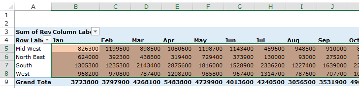
In this example, it has the total sales in each month for the four regions.
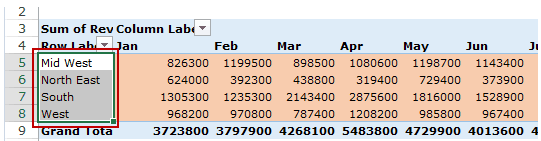
Rows Area
The headings to the left of the Values area makes the Rows area.
In the example below, the Rows area contains the regions (highlighted in red):
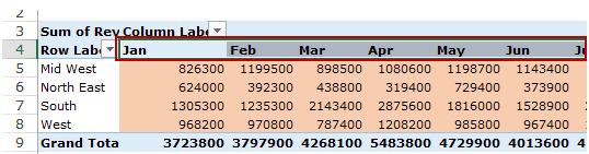
Columns Area
The headings at the top of the Values area makes the Columns area.
In the example below, Columns area contains the months (highlighted in red):
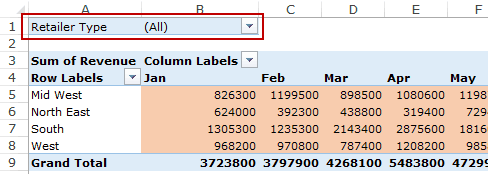
Filters Area
Filters area is an optional filter that you can use to further drill down in the data set.
For example, if you only want to see the sales for Multiline retailers, you can select that option from the drop down (highlighted in the image below), and the Pivot Table would update with the data for Multiline retailers only.
Analyzing Data Using the Pivot Table
Now, let’s try and answer the questions by using the Pivot Table we have created.
Click here to download the sample data and follow along.
To analyze data using a Pivot Table, you need to decide how you want the data summary to look in the final result. For example, you may want all the regions in the left and the total sales right next to it. Once you have this clarity in mind, you can simply drag and drop the relevant fields in the Pivot Table.
In the Pivot Tabe Fields section, you have the fields and the areas (as highlighted below):
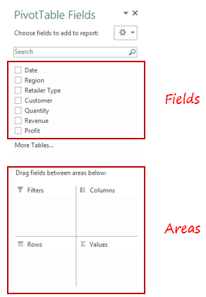
The Fields are created based on the backend data used for the Pivot Table. The Areas section is where you place the fields, and according to where a field goes, your data is updated in the Pivot Table.
It’s a simple drag and drop mechanism, where you can simply drag a field and put it in one of the four areas. As soon as you do this, it will appear in the Pivot Table in the worksheet.
Now let’s try and answer the questions your manager had using this Pivot Table.
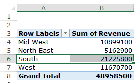
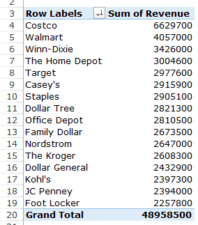
Q1: What were the total sales in the South region?
Drag the Region field in the Rows area and the Revenue field in the Values area. It would automatically update the Pivot Table in the worksheet.
Note that as soon as you drop the Revenue field in the Values area, it becomes Sum of Revenue. By default, Excel sums all the values for a given region and shows the total. If you want, you can change this to Count, Average, or other statistics metrics. In this case, the sum is what we needed.
The answer to this question would be 21225800.
Q2 What are the top five retailers by sales?
Drag the Customer field in the Row area and Revenue field in the values area. In case, there are any other fields in the area section and you want to remove it, simply select it and drag it out of it.
You’ll get a Pivot Table as shown below:
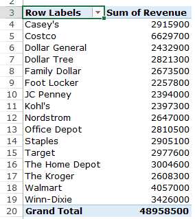
Note that by default, the items (in this case the customers) are sorted in an alphabetical order.
To get the top five retailers, you can simply sort this list and use the top five customer names. To do this:
This will give you a sorted list based on total sales.
Q3: How did The Home Depot’s performance compare against other retailers in the South?
You can do a lot of analysis for this question, but here let’s just try and compare the sales.
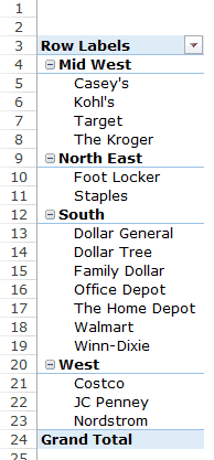
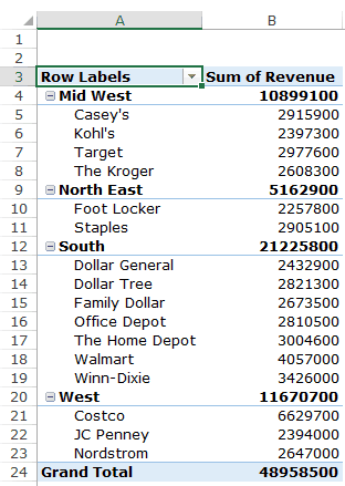
Drag the Region Field in the Rows area. Now drag the Customer field in the Rows area below the Region field. When you do this, Excel would understand that you want to categorize your data first by region and then by customers within the regions. You’ll have something as shown below:
Now drag the Revenue field in the Values area and you’ll have the sales for each customer (as well as the overall region).
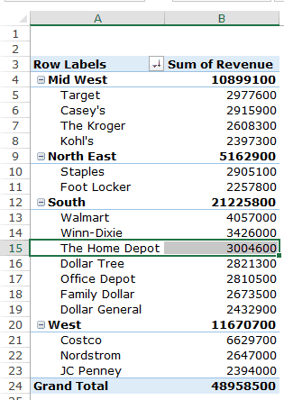
You can sort the retailers based on the sales figures by following the below steps:
- Right-click on a cell that has the sales value for any retailer.
- Go to Sort –> Sort Largest to Smallest.
This would instantly sort all the retailers by the sales value.
Now you can quickly scan through the South region and identify that The Home Depot sales were 3004600 and it did better than four retailers in the South region.
Now there are more than one ways to skin the cat. You can also put the Region in the Filter area and then only select the South Region.
Click here to download the sample data.
I hope this tutorial gives you a basic overview of Excel Pivot Tables and helps you in getting started with it.
Here are some more Pivot Table Tutorials you may like:
- Preparing Source Data For Pivot Table.
- How to Apply Conditional Formatting in a Pivot Table in Excel.
- How to Group Dates in Pivot Tables in Excel.
- How to Group Numbers in Pivot Table in Excel.
- How to Filter Data in a Pivot Table in Excel.
- Using Slicers in Excel Pivot Table.
- How to Replace Blank Cells with Zeros in Excel Pivot Tables.
- How to Add and Use an Excel Pivot Table Calculated Fields.
- How to Refresh Pivot Table in Excel.
Insert a Pivot Table | Drag fields | Sort | Filter | Change Summary Calculation | Two-dimensional Pivot Table
Pivot tables are one of Excel‘s most powerful features. A pivot table allows you to extract the significance from a large, detailed data set.
Our data set consists of 213 records and 6 fields. Order ID, Product, Category, Amount, Date and Country.

Insert a Pivot Table
To insert a pivot table, execute the following steps.
1. Click any single cell inside the data set.
2. On the Insert tab, in the Tables group, click PivotTable.

The following dialog box appears. Excel automatically selects the data for you. The default location for a new pivot table is New Worksheet.
3. Click OK.

Drag fields
The PivotTable Fields pane appears. To get the total amount exported of each product, drag the following fields to the different areas.
1. Product field to the Rows area.
2. Amount field to the Values area.
3. Country field to the Filters area.

Below you can find the pivot table. Bananas are our main export product. That’s how easy pivot tables can be!

Sort
To get Banana at the top of the list, sort the pivot table.
1. Click any cell inside the Sum of Amount column.
2. Right click and click on Sort, Sort Largest to Smallest.

Result.

Filter
Because we added the Country field to the Filters area, we can filter this pivot table by Country. For example, which products do we export the most to France?
1. Click the filter drop-down and select France.
Result. Apples are our main export product to France.

Note: you can use the standard filter (triangle next to Row Labels) to only show the amounts of specific products.
Change Summary Calculation
By default, Excel summarizes your data by either summing or counting the items. To change the type of calculation that you want to use, execute the following steps.
1. Click any cell inside the Sum of Amount column.
2. Right click and click on Value Field Settings.

3. Choose the type of calculation you want to use. For example, click Count.

4. Click OK.
Result. 16 out of the 28 orders to France were ‘Apple’ orders.

Two-dimensional Pivot Table
If you drag a field to the Rows area and Columns area, you can create a two-dimensional pivot table. First, insert a pivot table. Next, to get the total amount exported to each country, of each product, drag the following fields to the different areas.
1. Country field to the Rows area.
2. Product field to the Columns area.
3. Amount field to the Values area.
4. Category field to the Filters area.

Below you can find the two-dimensional pivot table.

To easily compare these numbers, create a pivot chart and apply a filter. Maybe this is one step too far for you at this stage, but it shows you one of the many other powerful pivot table features Excel has to offer.

Table of Contents
A pivot table in Excel is a summarization tool to automatically sort, filter, count, and perform mathematical calculations on data stored in a table. When you work with large data sets in Excel, the pivot table makes an interactive summary from many different records.
Another advantage of using pivot tables in Excel is that you can set up and change the structure of your summary table by dragging and dropping the source table’s column.
For instance, you have a table with the sales information of a product at different branches by a different salesperson. You are interested in knowing the total sales, sales of each product, and sales made by individuals. PivotTable in Excel has features that perform all these operations.
In an Excel spreadsheet, you can find the Pivot Table under the Insert tab.
You can use SUMIF and SUMIFS formulas to sum a long list of numbers using one or more conditions. However, if you are interested in comparing several facts and finding statistics regarding sales, profit, or grand total, the Pivot Table is efficient for that. The PivotTable is customizable and you can get the totals of any field (either a row-wise or a column-wise total) you want.
What Is a Pivot Table in Excel and What Is It Used For?
A Pivot Table in Excel is a tool that summarizes data and allows you to perform various mathematical calculations using the data. It is a versatile tool to help you explore, analyze, and summarize large amounts of data. It can summarize data along the row or column and return the sum, count, average, maximum, minimum, and other statistical data.
PivotTables can filter, group, sort, or conditionally format different subsets of data to display results based on your criteria. It can rotate rows with columns and vice versa. That’s the reason it is called a pivot table. You can expand or collapse the levels of data and move further deep to check the substeps of the total and grand total.
How to Create a Pivot Table in Excel
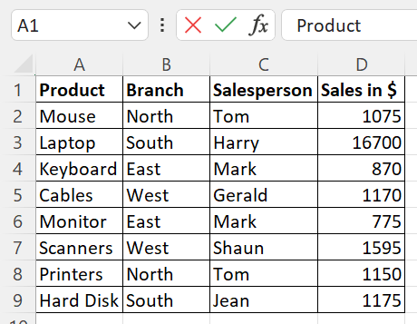
Pivot tables in Excel can be created with ease with an existing table. If you don’t know how to create a pivot table in excel, we’ll show you. Let’s take the above table as the source to create a pivot table. This screenshot shows a sales report across different branches, including various salespeople and products. A business owner or a marketer would likely be interested in learning more about the total sales in each branch by a particular salesperson, or the total sales in a quarter, i.e from January to March, of a product.
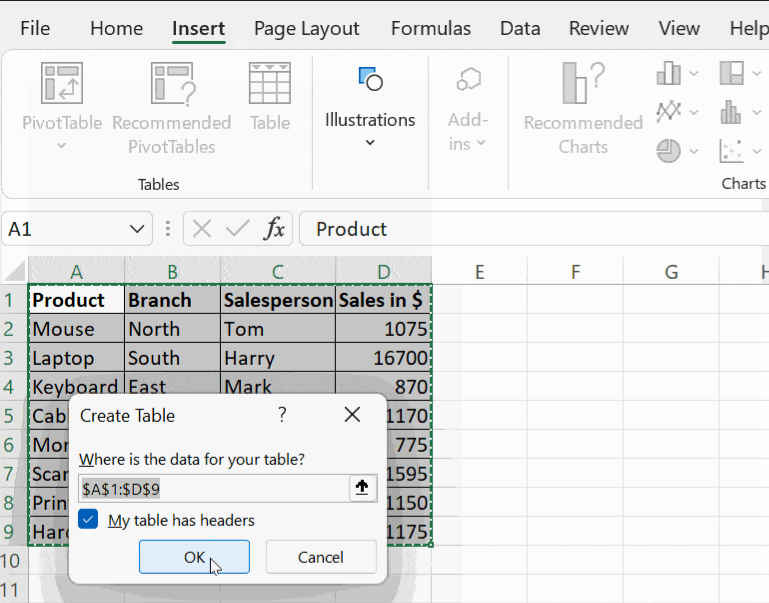
To start with, click on the Insert tab, and then click on the Table. It prompts you for the location of data in the table. By default, it takes the starting and ending cells of the table. Select the checkbox ‘My table has headers in the prompt if you require headers for each column.
Then click OK and proceed. Your table becomes dynamic. That is, you get the filter option in the column name and you can choose to sort and filter the column data with the options given in the drop-down menu.
For usability, name the columns with headings relevant to the data in the column. For example, column A contains data, such as a mouse, laptop, keyboard, and cables. It is a good practice to name the column with a relevant collective noun such as Product or Items Sold.
Creating a Pivot Table in Excel
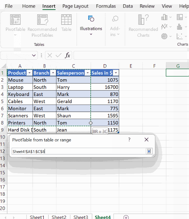
Click on the Insert tab, then click PivotTable, this opens a dialogue box PivotTable from the table or range. You will be prompted with the message Select a table or range. Here, mention your table range in the dialogue box Table/Range, and choose the location where you want the PivotTable to be placed. It can be either in a New Worksheet or in the Existing Worksheet.
If you select the option New Worksheet, the PivotTable will be placed in a new worksheet starting at cell A1. If you choose the option Existing Worksheet, it will place your table where you put your cursor on the existing worksheet.
Note: Make sure to click on a cell in the worksheet other than your source table for creating a pivot table.
Parts of the PivotTable
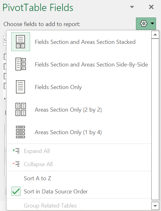
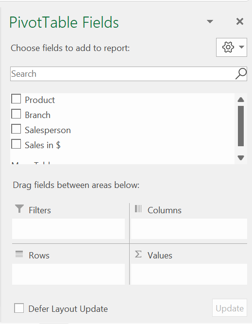
After you mention the table range (the location where you want the PivotTable to appear) and click OK, you get a small window next to your table displaying the PivotTable fields, as you can see below. You first notice the field Choose fields to add to the report. Click on the Settings option next to it, and you will find the following formats in which your PivotTable can be displayed.
- Fields Section and Areas Section Stacked.
- Fields Section and Areas Section Side-By-Side.
- Fields Section Only.
- Areas Section Only (2 by 2).
- Areas Section Only (1 by 4).
You can choose any of the formats in which your report has to appear. To start with, choose the first option, Fields Section and Areas Section Stacked, and you find that all the columns in your table appear below the field, Choose fields to add to the report, which you can drag and drop accordingly.
For the PivotTable summary, you need to mention the column based on which you intend to generate the report. For instance, if you wish to see the summary of sales in each Branch, mention the field Branch in the filter by dragging and dropping the field Branch in the Filters field. Choose the column you wish to appear in the Columns and the Rows fields.
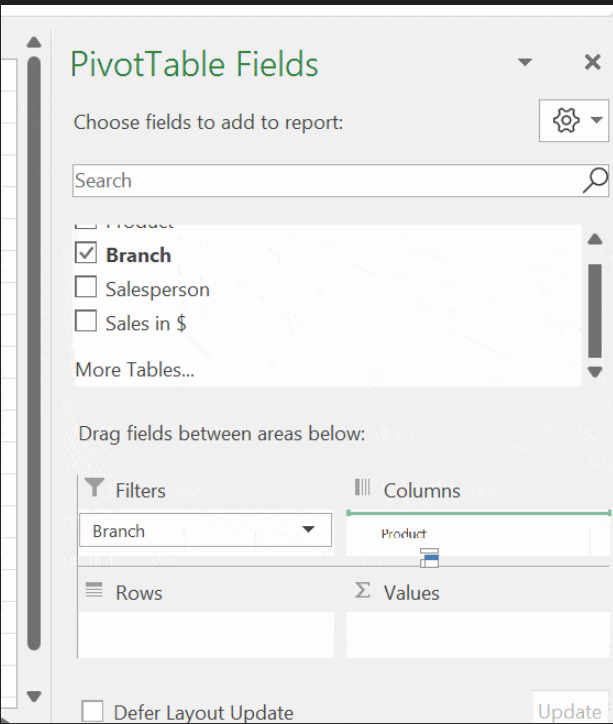
Note: Mention non-numeric columns, such as Product and Salesperson, in the Rows and Columns and numeric data in the Values field. After you are done with this step, click outside the window and you will see this report generated as shown below.
Arranging the PivotTable
The pivot table is arranged to give a detailed summary report on sales of all the products by all the salespeople across all the branches. The Row has all the salespeople’s names and the Column has the products listed. The Branch column is mentioned in the Filter field and you can generate a report based on the different branches mentioned.
For an instance, when you click on the button next to the Branch column, you get the options, (All), East, North, South, West. Click on the drop-down menu and choose the branch East. When you refer to your table, you see that, in the East Branch, Mark is the salesperson and he has sold 2 products (a keyboard and monitor).
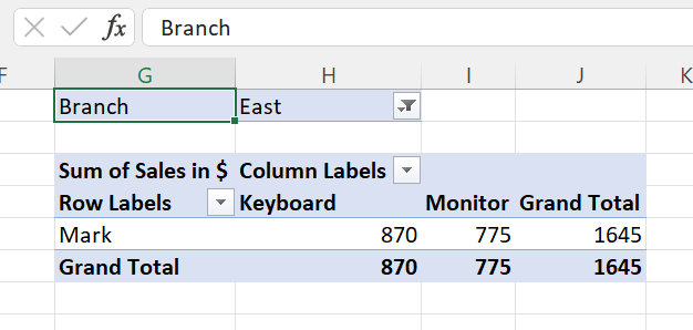
Sales of each product are mentioned individually and the total sales made by Mark are also mentioned in the report. You can also click on the row labels and the column labels and choose a particular item to display the report of that particular product or salesperson.
The report contains the total sales of the product and the total sales of the salesperson also. Such analysis helps the manager to analyze the sales that assist them to predict profit or loss in the business.
Value Field Settings
The report generation doesn’t stop with these details alone. When you click on the Values field, you get a new window Value Field Settings. There, you get options to summarize the value field by different functions, such as Sum, Count, Average, Max, Min, Product, Count Numbers, Standard Deviation, and Variance. You can apply these functions to your table. All these help managers decide and forecast inventory management and sales predictions.
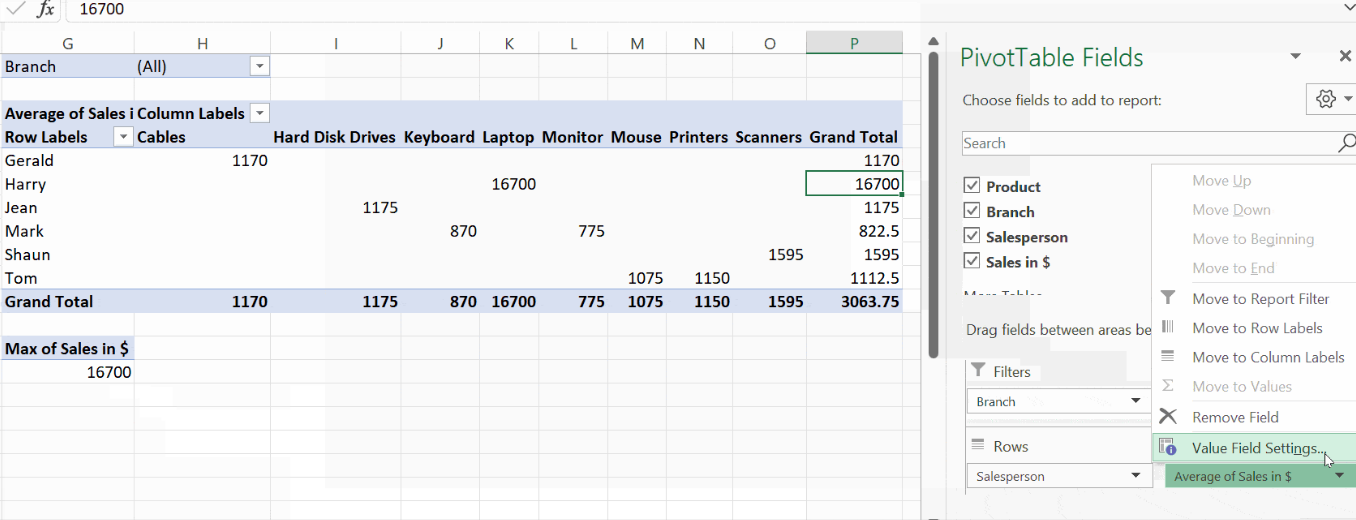
The below screenshot shows the different statistical functions that you can choose from to summarize data from the selected fields:
Analyzing Data in Your Excel Pivot Table
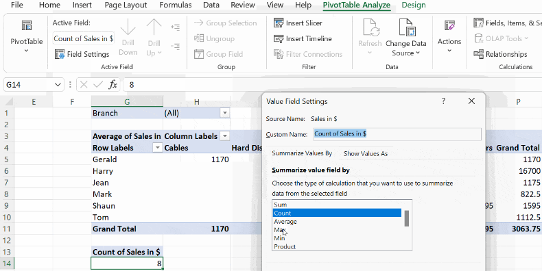
You can refine your Pivot Tables in Excel further to make effective data analysis. After you create a pivot table, you can see two more new tabs along with the already existing tabs. They are PivotTable Analyze and Design.
The PivotTable Analyze has many options, such as Active Field, Group, Filter, Data, Calculations, and Tools. When you click on Active Field→Field Settings, you find the Value Field Settings and you can choose any of the statistical functions from there.
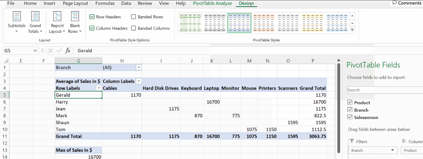
Click on the Design tab to improve the table’s design, where you will find plenty of predefined styles. You can hover and apply the style that suits you.
Pivot Charts and Advanced Pivot Tables
Pivot tables in Excel are used to aggregate data. They present an overall view of the table in order to compare, analyze, and forecast. Excel pivot tables generate reports, segregate data into summaries and groups, and create pivot charts. They are user-friendly, allowing users to exchange the rows and columns and drag the pivot table to different places in the worksheet. In this Excel pivot table tutorial, we will learn how to customize a pivot table, create a chart, and group data. We will cover various advanced uses of pivot tables.
Customizing Your Pivot Table
You can choose a different style after you create a pivot table. Including colours in the pivot table helps show banded rows or columns, highlighting important data to make it stand out.
Pivot tables in Excel can be customized to your preferred format and style. Excel offers a few in-built pivot table styles that you can’t change, but you can create your customized style and apply it to one or more pivot tables. In the below example, we will see how to add colours to the pivot table.
Click on any cell on the pivot table, and PivotTable Analyze and Design tabs appear. Click on the Design tab and use any available options in the groups.
The layout group contains the options subtotals, grand totals, report layouts, and blank rows.
- Subtotals – shows or hides subtotals.
- Grand Totals – shows or hides grand totals.
- Report Layout – the compact form optimizes for readability, while the tabular and outline forms include field headers.
- Blank Rows – it makes groups by adding a blank line between each grouped item.
How Do I Make a Pivot Chart in Excel?
An Excel pivot chart is a visual representation of a pivot table. You can create a pivot chart only if you have a pivot table, as they both are connected. A pivot chart can quickly change the portion of data displayed and making it ideal for presenting data in a report. You can quickly change the portion of data displayed, like a pivot table report.
After the pivot table is created, click on the tab PivotTable Analysis, where you can find the PivotChart. Click on that to insert a pivot chart. It opens a dialogue box named Insert Chart, where you have the list of all types of charts. You can hover your mouse over each one and see the different charts available.
For this example, I have chosen the chart type Stacked Column. A pivot chart is inserted with all the fields in the pivot table. The filter appears at the chart’s top position, and other pivot table fields appear at the legends and axis. At the bottom right corner, you find the symbols + and -. Click on the + button, and you find the grouped data expanding in the pivot table. Click on the – button to revert and collapse the columns.
Grouping Data
Grouping data in a pivot table allows you to group a subset of data to analyze. You can group dates, numbers, and text fields in a pivot table. You can group the date column in your table by year, month, and quarter. For instance, the screenshot below shows the policy holders’ names and various other details concerning their policies.
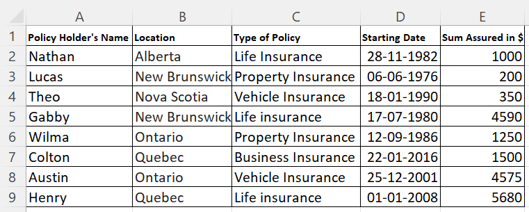
This is the example table for which the pivot chart has been created. This gives a detailed report of the date field, indicating which quarter the policy was taken. The pivot table first arranges the names alphabetically and the years in ascending order, from 1976 to 2016.
The date field stores the year alone in the pivot table. You can see a small + symbol before the year. When you click on that, it expands and displays the quarter in which the policy was started. When you click on the quarter, it displays the month when the policy was taken.
Now, you can group the dates after creating the pivot. Click on any cell that contains the date in the pivot table, then right-click on it. You get the menu, as you can see in the screenshot below. Click on Group; it will prompt you to enter the start and end dates. Based on the dates you mentioned, the values will be grouped and displayed in the pivot table.
In the pivot table, the start and end dates are mentioned as 06-06-1976 and 12-12-2000, respectively. The pivot table displays the names of the policyholders who had taken a policy during that period. At the pivot table’s end, you can see a row with the value >12-12-2000.
The pivot table also displays the names of the policy holders who had taken a policy after the date 12-12-2000 and then displays the Grand Total.
Creating Multiple Records
When you create a pivot table, you are filling the Filters based on your pivot table. This is known as a global filter. In the screenshot, the entire table is filtered by a single overall criterion, the type of policy. The pivot table shows the data of all the policies in one report.
Imagine a situation where you wish to make a separate report for each item in the global filter. If it has to be done manually, you will create a pivot table by changing the type of policy and taking multiple reports for each type.
Instead of performing the same steps iteratively, Excel pivot tables give us the option to create multiple reports in a few clicks.
Place the desired field, and type of policy, in the Filters field, then select the tab PivotTable Analyze. When the tab unfolds, you find the option PivotTable. Click on PivotTable → Options → Show Report Filter Pages.
It opens the dialogue box Show Report Filter Pages, which has the global filter you applied when you created the pivot table. Click on the field you want to apply as a filter to generate multiple reports.
Then, you get a separate report that contains the global filter. You can click on the different options and get reports for that filter. In the screenshot, you can see the filter that we applied when the pivot table was created.
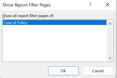
The dialogue box lists all the pivot table’s global filters.
Refreshing Pivot Cache
When working with Excel pivot tables, you must know what a pivot cache is. It is an object repository that holds a replica of the original data. Though a user cannot see it, it is a part of the workbook and is connected to the pivot table. When you make any changes in the pivot table, it does not reflect in the source data. Rather it happens in the pivot cache.
The cache enables fast processing of a pivot table. In reality, you access the pivot cache when you make changes in the pivot table and are not directly linked to the source data. This is also why you need to refresh the pivot table to reflect any changes made in the original table.
Limitations of Shared Pivot Cache
Though pivot cache improves the pivot table performance and memory usage, there are a few limitations, such as:
- It increases the size of your workbook, thereby occupying much memory space.
- When the pivot table is refreshed, all the tables linked to the same cache are also refreshed.
- Grouping is reflected in all associated pivot tables and not just the table on which the grouping function was executed.
Showing Value as a Percentage
The pivot table displays the values across the rows and columns. You can get the values as percentages concerning the grand total, roe total, or column total. Select any cell on the pivot table, and right-click on it. On the menu, choose Show Values As, and select any option mentioned there.
How to Delete Pivot Table?
You can delete the pivot table when you think it is no longer needed. The steps to delete are as follows:
- Click on any of the cells inside the pivot table.
- Click on PivotTable Analyze → Actions → Select → Entire PivotTable.
- The entire pivot table is selected.
- Press the delete button on your keyboard.
FAQs
1. What is a Pivot Table in Excel and what are its uses?
A Pivot Table calculates and summarizes data and presents you with a report to see comparisons, patterns, and trends that allow you to forecast your sales. First, you need a table populated with data to work with pivot tables in Excel. You can also use tables from existing worksheets or other sources.
It is generally used by managers, financial advisors, strategists, analysts, auditors, sales managers, HR managers, and statisticians.
2. How to delete a Pivot Table?
- If the source table is in a separate worksheet, delete the worksheet itself.
- Select the entire pivot table and press the delete button on your keyboard.
- Click on the PivotTable Analyze→ Actions group→Entire PivotTable, and then press Delete.
3. What are the features of a pivot table?
- It provides an interactive way to summarize large amounts of data.
- You can analyze numerical data and project it from various views.
- It is designed to query large amounts of data.
- It provides a user-friendly interface.
- It allows subtotalling and data grouping summarizes data in categories and subcategories and creates custom calculations and formulas.
- It drills down for details from the summary report to get the data you are interested in.
- It provides an easy way to swap rows with columns and vice versa to see the different summaries of the original table.
- It filters, sorts, groups, and conditional formats data.
- It generates concise, attractive, and annotated reports that can be shared online or printed offline.
- It presents concise, attractive, and annotated online or printed reports.
4. What is the difference between a pivot table and a pivot chart?
| Pivot table | Pivot chart |
|---|---|
| A pivot table summarizes large data in a spreadsheet. | The pivot chart provides a graphical representation of the pivot table. |
| In a pivot table, you can choose the fields appearing in the rows and columns. | You can choose from multiple layouts and chart types in a pivot chart. |
| Changes made in the pivot table will appear in the pivot chart. | For one pivot table, you can create many pivot charts. |
5. List the difference between normal charts and pivot charts.
| Chart | Pivot chart |
|---|---|
| Charts are a graphical representation of a table, but applying filters, sorts, and calculations over these types of charts requires changing the source data cell formulas or entries. | Pivot charts are also a graphical representation of a table with more access buttons on the chart. |
| Changes to the chart do not flow back to the data. | A pivot chart is linked to a pivot table. Filters applied to pivot charts are also applied to their associated pivot table. |
| The option of inserting the slicer is not possible with the normal charts. | Slicers can also be applied to pivot charts, and a single slicer can be applied to multiple pivot tables. |
Closing Thoughts
In this guide, you learnt what a PivotTable is and how to work with it. Many know how to create a pivot table but might not have worked with other functions available in it. The summary report from the source table displays data that has various interpretations.
Pivot tables and charts are one of the powerful features of Excel. Business analysts use pivot tables and charts for generating reports, forecasting, and planning. Creating a pivot table
requires a few clicks, but mastering it can be time-consuming as it depends on how you want to use your data within your pivot tables.
You can also use Lookup functions, such as VLOOKUP along with PivotTable. Check our courses in Excel and Microsoft Office Applications to learn how to work with these software tools. You will earn Micro-credentials on completion of the course.