
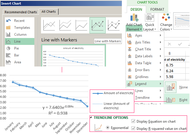
Note: These steps apply to Office 2013 and newer versions. Looking for Office 2010 steps?
Add a trendline

-
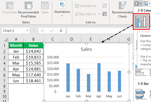
Select a chart.
-
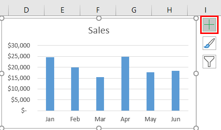
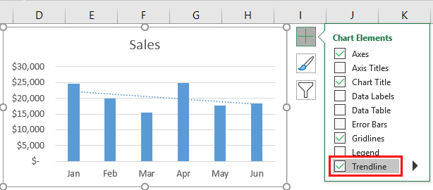
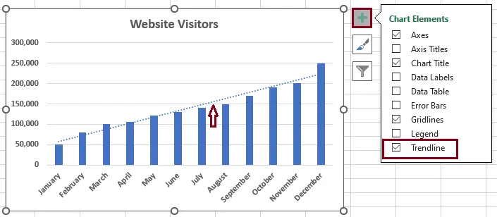
Select the + to the top right of the chart.
-
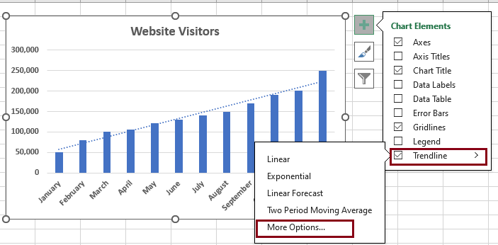
Select Trendline.
Note: Excel displays the Trendline option only if you select a chart that has more than one data series without selecting a data series.
-
In the Add Trendline dialog box, select any data series options you want, and click OK.
Format a trendline
-
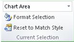
Click anywhere in the chart.
-
On the Format tab, in the Current Selection group, select the trendline option in the dropdown list.
-
Click Format Selection.
-
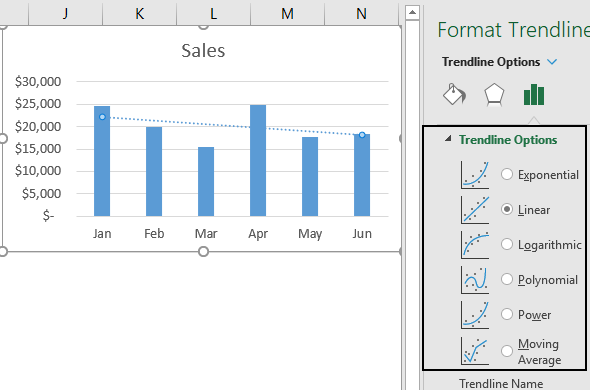
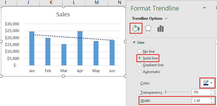
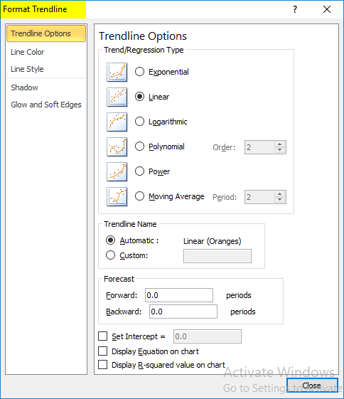
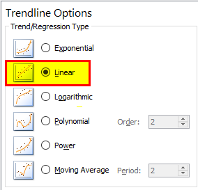
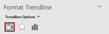
In the Format Trendline pane, select a Trendline Option to choose the trendline you want for your chart. Formatting a trendline is a statistical way to measure data:

-
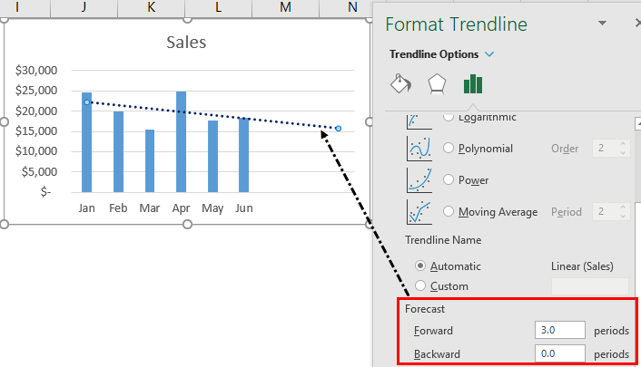
Set a value in the Forward and Backward fields to project your data into the future.
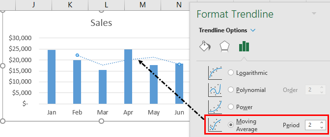
Add a moving average line
You can format your trendline to a moving average line.
-
Click anywhere in the chart.
-
On the Format tab, in the Current Selection group, select the trendline option in the dropdown list.
-
Click Format Selection.
-
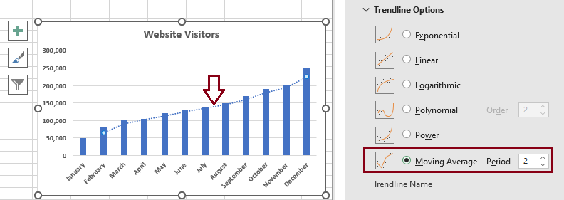
In the Format Trendline pane, under Trendline Options, select Moving Average. Specify the points if necessary.
Note: The number of points in a moving average trendline equals the total number of points in the series less the number that you specify for the period.
Add a trend or moving average line to a chart in Office 2010
-
On an unstacked, 2-D, area, bar, column, line, stock, xy (scatter), or bubble chart, click the data series to which you want to add a trendline or moving average, or do the following to select the data series from a list of chart elements:
-
Click anywhere in the chart.
This displays the Chart Tools, adding the Design, Layout, and Format tabs.
-
On the Format tab, in the Current Selection group, click the arrow next to the Chart Elements box, and then click the chart element that you want.
-
-
Note: If you select a chart that has more than one data series without selecting a data series, Excel displays the Add Trendline dialog box. In the list box, click the data series that you want, and then click OK.
-
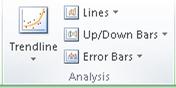
On the Layout tab, in the Analysis group, click Trendline.
-
Do one of the following:
-
Click a predefined trendline option that you want to use.
Note: This applies a trendline without enabling you to select specific options.
-
Click More Trendline Options, and then in the Trendline Options category, under Trend/Regression Type, click the type of trendline that you want to use.
Use this type
To create
Linear
A linear trendline by using the following equation to calculate the least squares fit for a line:
where m is the slope and b is the intercept.
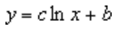
Logarithmic
A logarithmic trendline by using the following equation to calculate the least squares fit through points:
where c and b are constants, and ln is the natural logarithm function.
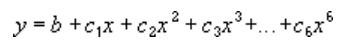
Polynomial
A polynomial or curvilinear trendline by using the following equation to calculate the least squares fit through points:
where b and
are constants.Power
A power trendline by using the following equation to calculate the least squares fit through points:
where c and b are constants.
Note: This option is not available when your data includes negative or zero values.
Exponential
An exponential trendline by using the following equation to calculate the least squares fit through points:
where c and b are constants, and e is the base of the natural logarithm.
Note: This option is not available when your data includes negative or zero values.
Moving average
A moving average trendline by using the following equation:
Note: The number of points in a moving average trendline equals the total number of points in the series less the number that you specify for the period.
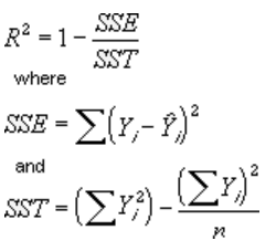
R-squared value
A trendline that displays an R-squared value on a chart by using the following equation:
This trendline option is available on the Options tab of the Add Trendline or Format Trendline dialog box.
Note: The R-squared value that you can display with a trendline is not an adjusted R-squared value. For logarithmic, power, and exponential trendlines, Excel uses a transformed regression model.
-
If you select Polynomial, type the highest power for the independent variable in the Order box.
-
If you select Moving Average, type the number of periods that you want to use to calculate the moving average in the Period box.
-
If you add a moving average to an xy (scatter) chart, the moving average is based on the order of the x values plotted in the chart. To get the result that you want, you might have to sort the x values before you add a moving average.
-
If you add a trendline to a line, column, area, or bar chart, the trendline is calculated based on the assumption that the x values are 1, 2, 3, 4, 5, 6, etc.. This assumption is made whether the x-values are numeric or text. To base a trendline on numeric x values, you should use an xy (scatter) chart.
-
Excel automatically assigns a name to the trendline, but you can change it. In the Format Trendline dialog box, in the Trendline Options category, under Trendline Name, click Custom, and then type a name in the Custom box.
-
Tips:
-
You can also create a moving average, which smoothes out fluctuations in data and shows the pattern or trend more clearly.
-
If you change a chart or data series so that it can no longer support the associated trendline — for example, by changing the chart type to a 3-D chart or by changing the view of a PivotChart report or associated PivotTable report — the trendline no longer appears on the chart.
-
For line data without a chart, you can use AutoFill or one of the statistical functions, such as GROWTH() or TREND(), to create data for best-fit linear or exponential lines.
-
On an unstacked, 2-D, area, bar, column, line, stock, xy (scatter), or bubble chart, click the trendline that you want to change, or do the following to select it from a list of chart elements.
-
Click anywhere in the chart.
This displays the Chart Tools, adding the Design, Layout, and Format tabs.
-
On the Format tab, in the Current Selection group, click the arrow next to the Chart Elements box, and then click the chart element that you want.
-
-
On the Layout tab, in the Analysis group, click Trendline, and then click More Trendline Options.
-
To change the color, style, or shadow options of the trendline, click the Line Color, Line Style, or Shadow category, and then select the options that you want.
-
On an unstacked, 2-D, area, bar, column, line, stock, xy (scatter), or bubble chart, click the trendline that you want to change, or do the following to select it from a list of chart elements.
-
Click anywhere in the chart.
This displays the Chart Tools, adding the Design, Layout, and Format tabs.
-
On the Format tab, in the Current Selection group, click the arrow next to the Chart Elements box, and then click the chart element that you want.
-
-
On the Layout tab, in the Analysis group, click Trendline, and then click More Trendline Options.
-
To specify the number of periods that you want to include in a forecast, under Forecast, click a number in the Forward periods or Backward periods box.
-
On an unstacked, 2-D, area, bar, column, line, stock, xy (scatter), or bubble chart, click the trendline that you want to change, or do the following to select it from a list of chart elements.
-
Click anywhere in the chart.
This displays the Chart Tools, adding the Design, Layout, and Format tabs.
-
On the Format tab, in the Current Selection group, click the arrow next to the Chart Elements box, and then click the chart element that you want.
-
-
On the Layout tab, in the Analysis group, click Trendline, and then click More Trendline Options.
-
Select the Set Intercept = check box, and then in the Set Intercept = box, type the value to specify the point on the vertical (value) axis where the trendline crosses the axis.
Note: You can do this only when you use an exponential, linear, or polynomial trendline.
-
On an unstacked, 2-D, area, bar, column, line, stock, xy (scatter), or bubble chart, click the trendline that you want to change, or do the following to select it from a list of chart elements.
-
Click anywhere in the chart.
This displays the Chart Tools, adding the Design, Layout, and Format tabs.
-
On the Format tab, in the Current Selection group, click the arrow next to the Chart Elements box, and then click the chart element that you want.
-
-
On the Layout tab, in the Analysis group, click Trendline, and then click More Trendline Options.
-
To display the trendline equation on the chart, select the Display Equation on chart check box.
Note: You cannot display trendline equations for a moving average.
Tip: The trendline equation is rounded to make it more readable. However, you can change the number of digits for a selected trendline label in the Decimal places box on the Number tab of the Format Trendline Label dialog box. (Format tab, Current Selection group, Format Selection button).
-
On an unstacked, 2-D, area, bar, column, line, stock, xy (scatter), or bubble chart, click the trendline for which you want to display the R-squared value, or do the following to select the trendline from a list of chart elements:
-
Click anywhere in the chart.
This displays the Chart Tools, adding the Design, Layout, and Format tabs.
-
On the Format tab, in the Current Selection group, click the arrow next to the Chart Elements box, and then click the chart element that you want.
-
-
On the Layout tab, in the Analysis group, click Trendline, and then click More Trendline Options.
-
On the Trendline Options tab, select Display R-squared value on chart.
Note: You cannot display an R-squared value for a moving average.
-
On an unstacked, 2-D, area, bar, column, line, stock, xy (scatter), or bubble chart, click the trendline that you want to remove, or do the following to select the trendline from a list of chart elements:
-
Click anywhere in the chart.
This displays the Chart Tools, adding the Design, Layout, and Format tabs.
-
On the Format tab, in the Current Selection group, click the arrow next to the Chart Elements box, and then click the chart element that you want.
-
-
Do one of the following:
-
On the Layout tab, in the Analysis group, click Trendline, and then click None.
-
Press DELETE.
-
Tip: You can also remove a trendline immediately after you add it to the chart by clicking Undo  on the Quick Access Toolbar, or by pressing CTRL+Z.
Trendline is applied for illustrating price change trends. The element of technical analysis is a geometrical representation of the mean values of the analyzed indicator.
Here’s how to add a trendline to a chart in Excel.
Adding a trendline to a chart
For example, let’s take average oil prices since 2000 from open sources. Type the analysis data in the spreadsheet:

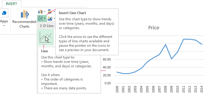
- Create a chart based on the spreadsheet. Select the range A1:P2 and click on the «Insert»-«Charts»-«Insert Line Chart»-«Line». Choose a simple graph out of the offered chart types. The horizontal direction represents year, and the vertical one shows price.
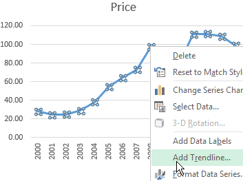
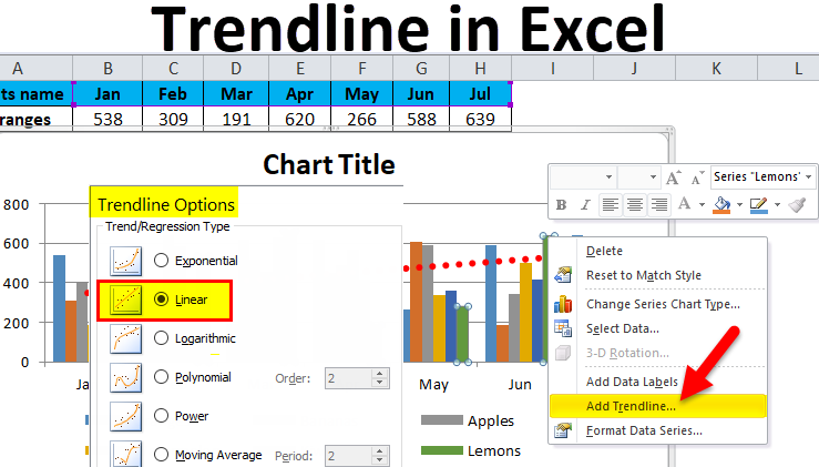
- Right-click the chart itself. Click «Add Trendline».
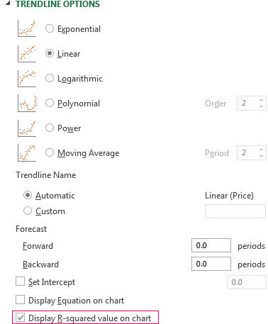
- The window for setting line parameters opens. Select the line type and enter R-squared value (the approximation accuracy value) in the chart.
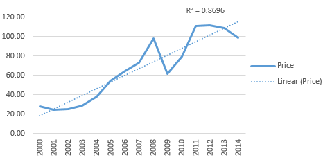
- A skew line appears on the chart.
Trendline in Excel is an approximating function chart. It is used for making predictions based on statistical data. To this end, we need to extend the line and determine its values.
If R2 = 1, the approximation error is zero. In our example, the choice of the linear approximation has given a low accuracy and poor result. The prediction will be inaccurate.
Note: that a trendline can not be added to the following types of charts and graphs:
- radar;
- circular;
- surface;
- doughnut;
- stereogram;
- stacked.
Equation of trendline in Excel
In the example above the linear approximation has been chosen only for illustrating the algorithm. The R-squared value demonstrates that the choice has not been successful.
It is necessary to choose the type of representation that will best illustrates the trend of changes in the data entered by the user. Let’s examine the options.
Linear approximation
Its geometric representation is a straight line. Hence, linear approximation is used to illustrate the indicator which increases or decreases at a constant rate.
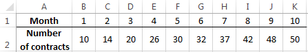
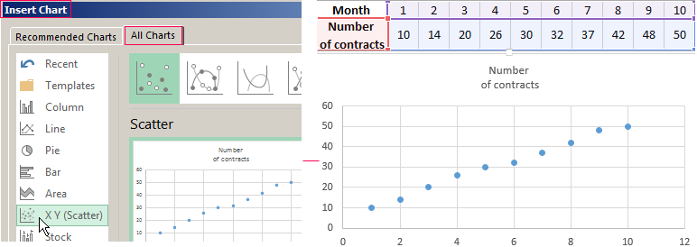
Let’s consider the conditional number of contracts concluded by a manager for 10 months:
Based on the Excel spreadsheet data make a scatter chart (it will help illustrate a linear type):
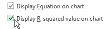
Highlight the chart, select «Add Trendline». In the settings, select the linear type. Add the R-squared value and the equation of a trendline (simply tick the box at the bottom of the «Options» window).
We get the result:
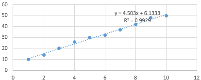
Note that in the linear approximation type data points are located very close to the line. This type uses the following equation:
y = 4,503x + 6,1333
- where 4,503 – slope indicator;
- 6,1333 — offset;
- y — sequence of values,
- x — period number.
The straight line on the graph shows a steady increase in the quality of the manager’s job. The R-squared value is equal to 0.9929, indicating a good agreement between the calculated straight line and the source data. Forecasts must be accurate.
To predict the number of concluded contracts, for example, in period 11, it is necessary to put number 11 instead of x in the equation. After calculating, we find out that in period 11 the manager will conclude 55-56 contracts.
The exponential trendline
This type is useful if the input values change with increasing speed. Exponential approximation is not applied if there are zero or negative characteristics.
Let’s create an exponential trendline in Excel. Take for example the conditional values of electric power supply in X region:
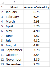
Make the chart «Line with Markers». Add the exponential line.
The equation is as follows:
y = 7,6403е^-0,084x
where:
- 7.6403 and -0.084 – constants;
- e – base of natural logarithm.
The indicator of R-squared value is 0.938, which means that the curve corresponds to the data, the error is minimal, and the forecasts will be accurate.
Logarithmic trendline and sales forecast
It is used for the following indicator changes: first, rapid growth or decrease, then — relative stability. The optimized curve adapts well to this value «behavior». The logarithmic trend is suitable for forecasting sales of a new product that has just entered the market.
The initial task of the manufacturer is to expand the customer base. When the goods have their buyer, it will be necessary to hold and serve him.
Make a chart and add a logarithmic trend line for a conditional product sales forecast:
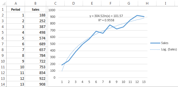
R2 is close in value to 1 (0.9558), indicating the minimum error of approximation. Let’s forecast sales volume for further periods. To do this, put period number instead of x in the equation.
For example:

To calculate forecast figures we use the formula: =304.52*LN(A18)+101.57, where A18 is period number.
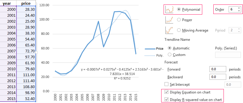
Polynomial trendline in Excel
This curve features alternate increase and decrease. The degree (by the number of minimum and maximum values) is determined for polynomials. For example, one extreme (minimum and maximum) is the second degree, two extremes make the third degree, three extremes – the fourth one.
A polynomial trend in Excel is used for the analysis of a large data set of unstable value. Let’s look at the example of the first set of values (oil prices).
Table of oil price dynamics by years:
| Year | 2000 | 2001 | 2002 | 2003 | 2004 | 2005 | 2006 | 2007 | 2008 | 2009 | 2010 | 2011 | 2012 | 2013 | 2014 | 2015 |
| Price per barrel | 28.30 | 24.40 | 25.00 | 28.90 | 38.30 | 54.40 | 65.40 | 72.70 | 97.70 | 61.90 | 79.60 | 111.00 | 111.40 | 108.80 | 98.90 | 52.40 |
Download examples of graphs with a trendline
To get this R-squared value (0.9252), we had to put the sixth degree.
However, this trend allows for making more or less accurate predictions.
Excel makes it easy to do all of this. A trendline (or line of best fit) is a straight or curved line which visualizes the general direction of the values. They’re typically used to show a trend over time. In this article, we’ll cover how to add different trendlines, format them, and extend them for future data.
Contents
- 1 What is a trendline and why is it useful?
- 2 What does a trendline tell you on a graph?
- 3 How does Excel calculate trendline?
- 4 How do you use a trendline?
- 5 What is a trend line?
- 6 How do you explain a trend?
- 7 How do you identify a trend line?
- 8 How do you know which trendline to use?
- 9 What is the difference between trend and forecast in Excel?
- 10 Is a trend line the same as a line of best fit?
- 11 How do you find the full trendline in Excel?
- 12 What happens when a trendline is broken?
- 13 Is there a downward trend?
- 14 What does the slope of a trendline mean?
- 15 How do you know if your uptrend or downtrend?
- 16 Is a trendline an average?
- 17 Is Excel trendline accurate?
- 18 What are the 3 types of trend analysis?
- 19 What is linear forecast trendline in Excel?
- 20 Why is trend line forecasting important?
What is a trendline and why is it useful?
Trendlines are easily recognizable lines that traders draw on charts to connect a series of prices together or show some data’s best fit. The resulting line is then used to give the trader a good idea of the direction in which an investment’s value might move.
What does a trendline tell you on a graph?
A trend line (also called the line of best fit) is a line we add to a graph to show the general direction in which points seem to be going. Think of a “trend” as a pattern in math. The trend line is something we add to our graph to make the pattern even clearer.
How does Excel calculate trendline?
Open the internal datasheet and add a new series, e.g., “Trendline 1”. Calculate the first value of the trendline using the TREND function: type ” =TREND( ” or use the Insert Function (fx) menu in Excel. Select all “known y” values and press F4 (e.g., “$B$3:$D$3”).
How do you use a trendline?
So here’s what you’ve learned:
- When you draw a Trend Line: 1) Focus on the major swing points 2) Connect the major swing points 3) Adjust the Trend Line and get as many touches as possible.
- The steepness of a Trend Line gives you clues about the market condition so you can adjust your trading strategy accordingly.
What is a trend line?
A trend line is a straight line that connects two or more price points and then extends into the future to act as a line of support or resistance. Many of the principles applicable to support and resistance levels can be applied to trend lines as well.
How do you explain a trend?
Adverbs used when describing trends
- sharply, rapidly, quickly, steeply.
- considerably, significantly, substantially.
- steadily, gradually, moderately.
- slightly, slowly.
How do you identify a trend line?
Summary
- trend lines are drawn at an angle and are used to determine a trend and help make trading decisions.
- in an uptrend, trend lines are drawn below the price and in a downtrend, trend lines are drawn above the price.
- to draw a trend line in an uptrend, two lows must be connected by a straight line.
How do you know which trendline to use?
Choosing the Best Trendline for Your Data
You want to choose a reliable trendline. A trendline is most reliable when its R-squared value is at or near 1. When you fit a trendline to your data, Excel automatically calculates the trendline’s R-squared value. If you want, you can display the value on your chart.
What is the difference between trend and forecast in Excel?
The difference between TREND and FORECAST in Excel is as follows: The FORECAST function can only predict future values based on the existing values. The TREND function can calculate both current and future trends.
Is a trend line the same as a line of best fit?
What is the Line of Best Fit? The line of best fit (or trendline) is an educated guess about where a linear equation might fall in a set of data plotted on a scatter plot.
How do you find the full trendline in Excel?
Display more digits
- Open the worksheet that contains the chart.
- Right-click the trendline equation or the R-squared text, and then click Format Trendline Label.
- Click Number.
- In the Category list, click Number, and then change the Decimal places setting to 30 or less.
- Click Close.
What happens when a trendline is broken?
Once a rising trendline is broken, that trendline becomes a resistance for the price. Similarly, once a falling trendline is broken, that trendline becomes a support for the price. If you don’t catch the initial breakout above or below a trendline, don’t chase the market.
Is there a downward trend?
If you refer to a downward trend, you mean that something is decreasing or that a situation is getting worse.
What does the slope of a trendline mean?
What does this number mean? The slope of a line is the change in y produced by a 1 unit increase in x. For our example, the trend line would predict that if someone was 1-year older (x increases by 1), then they would be about 5.76 cm taller (y increases by 5.76). Page 2.
How do you know if your uptrend or downtrend?
Identifying Trends
Uptrend: If you can connect a series of chart low points sloping upward, you have an uptrend. An uptrend is always characterized by higher highs and higher lows. Downtrend: If you can connect a series of chart high points sloping downward, you have a downtrend.
Is a trendline an average?
The simplest form of trendline is the moving average. It is called a moving average because you choose a window (known as the period) and for each point of your data you average the points around it to create a new, averaged value.There are obvious advantages and disadvantages to using moving averages for trendlines.
Is Excel trendline accurate?
The equation that is displayed for a trendline on an XY Scatter chart in Microsoft Excel is incorrect.Trendline equation is a formula that finds a line that best fits the data points. R-squared value measures the trendline reliability – the nearer R2 is to 1, the better the trendline fits the data.
What are the 3 types of trend analysis?
There are three main types of trends: short-, intermediate- and long-term.
What is linear forecast trendline in Excel?
The FORECAST (or FORECAST. LINEAR) function in Excel predicts a future value along a linear trend. The FORECAST. ETS function in Excel predicts a future value using Exponential Triple Smoothing, which takes into account seasonality.
Why is trend line forecasting important?
Trend forecasting is a complicated but useful way to look at past sales or market growth, determine possible trends from that data and use the information to extrapolate what could happen in the future. Marketing experts typically use trend forecasting to help determine potential future sales growth.
Содержание
- Trendline in Excel on different charts
- Adding a trendline to a chart
- Equation of trendline in Excel
- Linear approximation
- The exponential trendline
- Logarithmic trendline and sales forecast
- Polynomial trendline in Excel
- Add a trend or moving average line to a chart
- Add a trendline
- Format a trendline
- Add a moving average line
- Add a trend or moving average line to a chart in Office 2010
- Add a trendline
- Remove a trendline
- Need more help?
Trendline in Excel on different charts
Trendline is applied for illustrating price change trends. The element of technical analysis is a geometrical representation of the mean values of the analyzed indicator.
Here’s how to add a trendline to a chart in Excel.
Adding a trendline to a chart
For example, let’s take average oil prices since 2000 from open sources. Type the analysis data in the spreadsheet:
- Create a chart based on the spreadsheet. Select the range A1:P2 and click on the «Insert»-«Charts»-«Insert Line Chart»-«Line». Choose a simple graph out of the offered chart types. The horizontal direction represents year, and the vertical one shows price.
- Right-click the chart itself. Click «Add Trendline».
- The window for setting line parameters opens. Select the line type and enter R-squared value (the approximation accuracy value) in the chart.
- A skew line appears on the chart.
Trendline in Excel is an approximating function chart. It is used for making predictions based on statistical data. To this end, we need to extend the line and determine its values.
If R2 = 1, the approximation error is zero. In our example, the choice of the linear approximation has given a low accuracy and poor result. The prediction will be inaccurate.
Note: that a trendline can not be added to the following types of charts and graphs:
Equation of trendline in Excel
In the example above the linear approximation has been chosen only for illustrating the algorithm. The R-squared value demonstrates that the choice has not been successful.
It is necessary to choose the type of representation that will best illustrates the trend of changes in the data entered by the user. Let’s examine the options.
Linear approximation
Its geometric representation is a straight line. Hence, linear approximation is used to illustrate the indicator which increases or decreases at a constant rate.
Let’s consider the conditional number of contracts concluded by a manager for 10 months:
Based on the Excel spreadsheet data make a scatter chart (it will help illustrate a linear type):
Highlight the chart, select «Add Trendline». In the settings, select the linear type. Add the R-squared value and the equation of a trendline (simply tick the box at the bottom of the «Options» window).
We get the result:
Note that in the linear approximation type data points are located very close to the line. This type uses the following equation:
y = 4,503x + 6,1333
- where 4,503 – slope indicator;
- 6,1333 — offset;
- y — sequence of values,
- x — period number.
The straight line on the graph shows a steady increase in the quality of the manager’s job. The R-squared value is equal to 0.9929, indicating a good agreement between the calculated straight line and the source data. Forecasts must be accurate.
To predict the number of concluded contracts, for example, in period 11, it is necessary to put number 11 instead of x in the equation. After calculating, we find out that in period 11 the manager will conclude 55-56 contracts.
The exponential trendline
This type is useful if the input values change with increasing speed. Exponential approximation is not applied if there are zero or negative characteristics.
Let’s create an exponential trendline in Excel. Take for example the conditional values of electric power supply in X region:
Make the chart «Line with Markers». Add the exponential line.
The equation is as follows:
- 7.6403 and -0.084 – constants;
- e – base of natural logarithm.
The indicator of R-squared value is 0.938, which means that the curve corresponds to the data, the error is minimal, and the forecasts will be accurate.
Logarithmic trendline and sales forecast
It is used for the following indicator changes: first, rapid growth or decrease, then — relative stability. The optimized curve adapts well to this value «behavior». The logarithmic trend is suitable for forecasting sales of a new product that has just entered the market.
The initial task of the manufacturer is to expand the customer base. When the goods have their buyer, it will be necessary to hold and serve him.
Make a chart and add a logarithmic trend line for a conditional product sales forecast:
R2 is close in value to 1 (0.9558), indicating the minimum error of approximation. Let’s forecast sales volume for further periods. To do this, put period number instead of x in the equation.
To calculate forecast figures we use the formula: =304.52*LN(A18)+101.57, where A18 is period number.
Polynomial trendline in Excel
This curve features alternate increase and decrease. The degree (by the number of minimum and maximum values) is determined for polynomials. For example, one extreme (minimum and maximum) is the second degree, two extremes make the third degree, three extremes – the fourth one.
A polynomial trend in Excel is used for the analysis of a large data set of unstable value. Let’s look at the example of the first set of values (oil prices).
Table of oil price dynamics by years:
| Year | 2000 | 2001 | 2002 | 2003 | 2004 | 2005 | 2006 | 2007 | 2008 | 2009 | 2010 | 2011 | 2012 | 2013 | 2014 | 2015 |
| Price per barrel | 28.30 | 24.40 | 25.00 | 28.90 | 38.30 | 54.40 | 65.40 | 72.70 | 97.70 | 61.90 | 79.60 | 111.00 | 111.40 | 108.80 | 98.90 | 52.40 |
To get this R-squared value (0.9252), we had to put the sixth degree.
However, this trend allows for making more or less accurate predictions.
Источник
Add a trend or moving average line to a chart
Add a trendline to your chart to show visual data trends.
Note: These steps apply to Office 2013 and newer versions. Looking for Office 2010 steps?
Add a trendline
Select the + to the top right of the chart.
Note: Excel displays the Trendline option only if you select a chart that has more than one data series without selecting a data series.
In the Add Trendline dialog box, select any data series options you want, and click OK.
Format a trendline
Click anywhere in the chart.
On the Format tab, in the Current Selection group, select the trendline option in the dropdown list.
Click Format Selection.
In the Format Trendline pane, select a Trendline Option to choose the trendline you want for your chart. Formatting a trendline is a statistical way to measure data: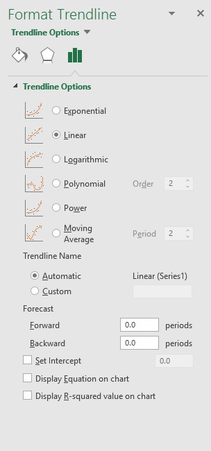
Set a value in the Forward and Backward fields to project your data into the future.
Add a moving average line
You can format your trendline to a moving average line.
Click anywhere in the chart.
On the Format tab, in the Current Selection group, select the trendline option in the dropdown list.
Click Format Selection.
In the Format Trendline pane, under Trendline Options, select Moving Average. Specify the points if necessary.
Note: The number of points in a moving average trendline equals the total number of points in the series less the number that you specify for the period.
Add a trend or moving average line to a chart in Office 2010
On an unstacked, 2-D, area, bar, column, line, stock, xy (scatter), or bubble chart, click the data series to which you want to add a trendline or moving average, or do the following to select the data series from a list of chart elements:
Click anywhere in the chart.
This displays the Chart Tools, adding the Design, Layout, and Format tabs.
On the Format tab, in the Current Selection group, click the arrow next to the Chart Elements box, and then click the chart element that you want.
Note: If you select a chart that has more than one data series without selecting a data series, Excel displays the Add Trendline dialog box. In the list box, click the data series that you want, and then click OK.
On the Layout tab, in the Analysis group, click Trendline.
Do one of the following:
Click a predefined trendline option that you want to use.
Note: This applies a trendline without enabling you to select specific options.
Click More Trendline Options, and then in the Trendline Options category, under Trend/Regression Type, click the type of trendline that you want to use.
A linear trendline by using the following equation to calculate the least squares fit for a line:
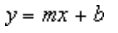
where m is the slope and b is the intercept.
A logarithmic trendline by using the following equation to calculate the least squares fit through points:
where c and b are constants, and ln is the natural logarithm function.
A polynomial or curvilinear trendline by using the following equation to calculate the least squares fit through points:
where b and  are constants.
A power trendline by using the following equation to calculate the least squares fit through points:

where c and b are constants.
Note: This option is not available when your data includes negative or zero values.
An exponential trendline by using the following equation to calculate the least squares fit through points:

where c and b are constants, and e is the base of the natural logarithm.
Note: This option is not available when your data includes negative or zero values.
A moving average trendline by using the following equation: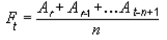
Note: The number of points in a moving average trendline equals the total number of points in the series less the number that you specify for the period.
A trendline that displays an R-squared value on a chart by using the following equation:
This trendline option is available on the Options tab of the Add Trendline or Format Trendline dialog box.
Note: The R-squared value that you can display with a trendline is not an adjusted R-squared value. For logarithmic, power, and exponential trendlines, Excel uses a transformed regression model.
If you select Polynomial, type the highest power for the independent variable in the Order box.
If you select Moving Average, type the number of periods that you want to use to calculate the moving average in the Period box.
If you add a moving average to an xy (scatter) chart, the moving average is based on the order of the x values plotted in the chart. To get the result that you want, you might have to sort the x values before you add a moving average.
If you add a trendline to a line, column, area, or bar chart, the trendline is calculated based on the assumption that the x values are 1, 2, 3, 4, 5, 6, etc.. This assumption is made whether the x-values are numeric or text. To base a trendline on numeric x values, you should use an xy (scatter) chart.
Excel automatically assigns a name to the trendline, but you can change it. In the Format Trendline dialog box, in the Trendline Options category, under Trendline Name, click Custom, and then type a name in the Custom box.
You can also create a moving average, which smoothes out fluctuations in data and shows the pattern or trend more clearly.
If you change a chart or data series so that it can no longer support the associated trendline — for example, by changing the chart type to a 3-D chart or by changing the view of a PivotChart report or associated PivotTable report — the trendline no longer appears on the chart.
For line data without a chart, you can use AutoFill or one of the statistical functions, such as GROWTH() or TREND(), to create data for best-fit linear or exponential lines.
On an unstacked, 2-D, area, bar, column, line, stock, xy (scatter), or bubble chart, click the trendline that you want to change, or do the following to select it from a list of chart elements.
Click anywhere in the chart.
This displays the Chart Tools, adding the Design, Layout, and Format tabs.
On the Format tab, in the Current Selection group, click the arrow next to the Chart Elements box, and then click the chart element that you want.
On the Layout tab, in the Analysis group, click Trendline, and then click More Trendline Options.
To change the color, style, or shadow options of the trendline, click the Line Color, Line Style, or Shadow category, and then select the options that you want.
On an unstacked, 2-D, area, bar, column, line, stock, xy (scatter), or bubble chart, click the trendline that you want to change, or do the following to select it from a list of chart elements.
Click anywhere in the chart.
This displays the Chart Tools, adding the Design, Layout, and Format tabs.
On the Format tab, in the Current Selection group, click the arrow next to the Chart Elements box, and then click the chart element that you want.
On the Layout tab, in the Analysis group, click Trendline, and then click More Trendline Options.
To specify the number of periods that you want to include in a forecast, under Forecast, click a number in the Forward periods or Backward periods box.
On an unstacked, 2-D, area, bar, column, line, stock, xy (scatter), or bubble chart, click the trendline that you want to change, or do the following to select it from a list of chart elements.
Click anywhere in the chart.
This displays the Chart Tools, adding the Design, Layout, and Format tabs.
On the Format tab, in the Current Selection group, click the arrow next to the Chart Elements box, and then click the chart element that you want.
On the Layout tab, in the Analysis group, click Trendline, and then click More Trendline Options.
Select the Set Intercept = check box, and then in the Set Intercept = box, type the value to specify the point on the vertical (value) axis where the trendline crosses the axis.
Note: You can do this only when you use an exponential, linear, or polynomial trendline.
On an unstacked, 2-D, area, bar, column, line, stock, xy (scatter), or bubble chart, click the trendline that you want to change, or do the following to select it from a list of chart elements.
Click anywhere in the chart.
This displays the Chart Tools, adding the Design, Layout, and Format tabs.
On the Format tab, in the Current Selection group, click the arrow next to the Chart Elements box, and then click the chart element that you want.
On the Layout tab, in the Analysis group, click Trendline, and then click More Trendline Options.
To display the trendline equation on the chart, select the Display Equation on chart check box.
Note: You cannot display trendline equations for a moving average.
Tip: The trendline equation is rounded to make it more readable. However, you can change the number of digits for a selected trendline label in the Decimal places box on the Number tab of the Format Trendline Label dialog box. ( Format tab, Current Selection group, Format Selection button).
On an unstacked, 2-D, area, bar, column, line, stock, xy (scatter), or bubble chart, click the trendline for which you want to display the R-squared value, or do the following to select the trendline from a list of chart elements:
Click anywhere in the chart.
This displays the Chart Tools, adding the Design, Layout, and Format tabs.
On the Format tab, in the Current Selection group, click the arrow next to the Chart Elements box, and then click the chart element that you want.
On the Layout tab, in the Analysis group, click Trendline, and then click More Trendline Options.
On the Trendline Options tab, select Display R-squared value on chart.
Note: You cannot display an R-squared value for a moving average.
On an unstacked, 2-D, area, bar, column, line, stock, xy (scatter), or bubble chart, click the trendline that you want to remove, or do the following to select the trendline from a list of chart elements:
Click anywhere in the chart.
This displays the Chart Tools, adding the Design, Layout, and Format tabs.
On the Format tab, in the Current Selection group, click the arrow next to the Chart Elements box, and then click the chart element that you want.
Do one of the following:
On the Layout tab, in the Analysis group, click Trendline, and then click None.
Tip: You can also remove a trendline immediately after you add it to the chart by clicking Undo on the Quick Access Toolbar, or by pressing CTRL+Z.
Add a trendline
On the View menu, click Print Layout.
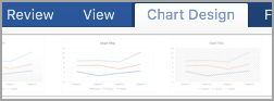
In the chart, select the data series that you want to add a trendline to, and then click the Chart Design tab.
For example, in a line chart, click one of the lines in the chart, and all the data marker of that data series become selected.
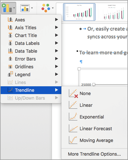
On the Chart Design tab, click Add Chart Element, and then click Trendline.
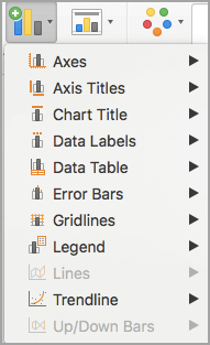
Choose a trendline option or click More Trendline Options.

You can choose from the following:
You can also give your trendline a name and choose forecasting options.
Remove a trendline
On the View menu, click Print Layout.
Click the chart with the trendline, and then click the Chart Design tab.
Click Add Chart Element, click Trendline, and then click None.
You can also click the trendline and press DELETE .
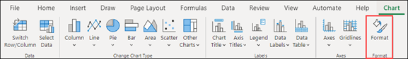
Click anywhere in the chart to show the Chart tab on the ribbon.
Click Format to open the chart formatting options.
Open the Series you want to use as the basis for your Trendline

Customize the Trendline to meet your needs.
Use the switch to show or hide the trendline.
Important: Beginning with Excel version 2005, Excel adjusted the way it calculates the R 2 value for linear trendlines on charts where the trendline intercept is set to zero (0). This adjustment corrects calculations that yielded incorrect R 2 values and aligns the R 2 calculation with the LINEST function. As a result, you may see different R 2 values displayed on charts previously created in prior Excel versions. For more information, see Changes to internal calculations of linear trendlines in a chart.
Need more help?
You can always ask an expert in the Excel Tech Community or get support in the Answers community.
Источник
A trendline, often called “the best-fit line,” is a line that shows the trend of the data. As you have seen in many charts, it shows the overall trend or pattern, or direction from the existing data points. Excel provides the option of plotting the trend line on the chart. When we add this trend line to the chart, it looks like a line chart without any ups and downs.
Table of contents
- Excel Trend Line
- How to Add and Insert Trend Line in Excel?
- How to Format the Trendline in Excel Chart?
- Things to Remember
- Recommended Articles
How to Add and Insert Trend Line in Excel?
You can download this Trend Line Excel Template here – Trend Line Excel Template
To add a trendline in Excel, we need to insert the chart for the available data. Before adding a trend line, remember the Excel charts supporting the trendline. For example, we can add a trendline to a column chart, line chart, bar chart, scattered chart or XY chart, stock chart, or In Excel, a bubble chart is a type of scatter plot that uses bubbles to display values and comparisons. Like scatter plots, bubble charts compare data on both horizontal and vertical axes.read more.
But we cannot add a trendline to 3-D or stacked charts, radar charts, Making a pie chart in excel can help you with the pictorial representation of your data and simplifies the analysis process. There are multiple kinds of pie chart options available on excel to serve the varying user needs.read more, and similar kinds of charts.
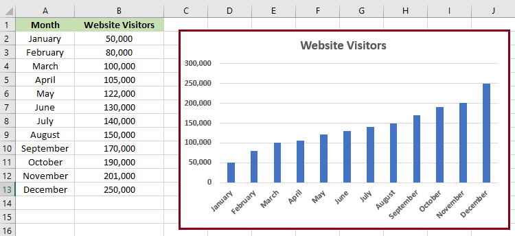
- The best example of plotting a trendline is monthly sales numbers. Below are the monthly sales numbers to create a chart.

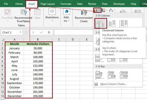
- To add a trendline, we need to create a column or line chart in Excel for the above data. Therefore, we will insert a column chart in Excel for this data.

- Once the chart is inserted, adding the trend line is easy in Excel 2013 and the above versions. Select the chart. It will show the PLUS icon on the right side.

- Click on this PLUS icon to see various options related to this chart. For example, we can see the “Trendline” option at the end of the options. Click on this to add a trend line.

- So, our trendline is added to the chart. If you have inserted the LINE CHART in place of COLUMN CHART, all the steps are the same as inserting the trendline in Excel.
We can also add trend lines in multiple ways. Another way is to select column bars and right-click on the bars to see options. From the options, choose “ADD TRENDLINE.”


It will add the default trend line of “Linear Trend Line.” The best-fit trend line shows whether the data is trending upwards or downwards.
We have several trend line types, below are the types of the trend line.
- Exponential Trendline
- Linear Trendline
- Logarithmic Trendline
- Polynomial Trendline
- Power Trendline
- Moving Average Trendline
All these trendlines are part of the statistics. One of the other popular trendlines is the “Moving Average” trendline.
The “Moving Average” trendline shows the trend of the average of a specific number of periods. For example, the quarterly trend of the data. Right-click on column bars to apply the moving average trendline and choose “Add Trendline.” It will open the “Format Trendline” window to the right end of the worksheet.
In the above window, choose the “Moving Average” option and set the period to 2. It will add the trendline for the average of every 2 periods.
How to Format the Trendline in Excel Chart?
The default trendline does not have any special effects on the trend line. Therefore, we need to format the trend line to make it more appealing.
Select the trend line and press Ctrl +1. Then, in the “Format Trendline” window, choose “FILL” and “LINE,” make the width 2 pt, and the color dark blue.
This Excel trendline can also forecast the sales numbers for the next months. To do this, go to “Trendline Options, “Forecast,” and make “Forward” to 3 periods.
As shown in the above image, we have added a forward trend for 3 periods, increasing the trend line for 3 months.

From this chart, our trendline shows a continuous decline in sales numbers.
Things to Remember
- A trendline is a built-in tool in Excel.
- The “Moving Average” trendline shows the average trend line of the mentioned periods.
- We must always format the default trendline to make it more appealing.
Recommended Articles
This article has been a guide to TrendLine in Excel. Here, we learn how to add and insert the trendline in Excel, examples, and a downloadable Excel template. You may learn more about Excel from the following articles: –
- Excel Rotate Pie Chart
- Plots in Excel
- Grouped Bar Chart in Excel
- How to Make Dot Plots in Excel?
Excel Trendline (Table of Contents)
- Trendline in Excel
- Types of Trendline in Excel
- How to Create a Trendline in Excel?
Trendline in Excel
The trendline in Excel is the part of all the Charts available in the Charts section under the Insert menu tab, which is used to see the trend in the plotted data over any chart. This helps us to see whether there is an increase or decrease in data values. This is also helpful in seeing at which point the data is going up or down. It can be used in any type of chart (Except Pie, Donut). To apply trendline, first create a chart using the option available in the Charts section, then click right on any data on the chart and select Add Trendline. We can also insert Trendlines using the Chart Elements list, which can be accessed from the plus sign at the right top corner or any chart.
Types of Trendline in Excel
There is various type of trendlines in excel:
- Exponential trendline
- Linear trendline
- Logarithmic trendline
- Polynomial trendline
- Power trendline
- Moving Average trendline
Now we will explain one by one the types of Trendline in excel.
Exponential:
This trendline is mostly used where the data rise or falls constantly. Avoid this trendline if the data contains zero or negative values.
Linear:
This trendline is useful for creating a straight line to show the increasing or decreasing of data values at a straight line.
Logarithmic:
This trendline is useful where the data suddenly increases or decreases and then becomes stable at some point. In this trendline, you can include the negative values in the dataset.
Polynomial:
This trendline is useful where you see gain or loss in the business. The degree of this trendline shows the number of fluctuations in the data.
Power:
This trendline is useful where the dataset is used to compare results that increase at a fixed rate. Avoid this trendline if your dataset contains Zero or negative values.
Moving Average:
This trendline shows the pattern clearly in the dataset, which smoothes the line. This trendline is mostly used in Forex Market.
How to Create a Trendline in Excel?
To create a Trendline in Excel is very simple and easy. Let’s understand the creation of Trendline in Excel with some examples.
You can download this Trendline Excel Template here – Trendline Excel Template
Example #1
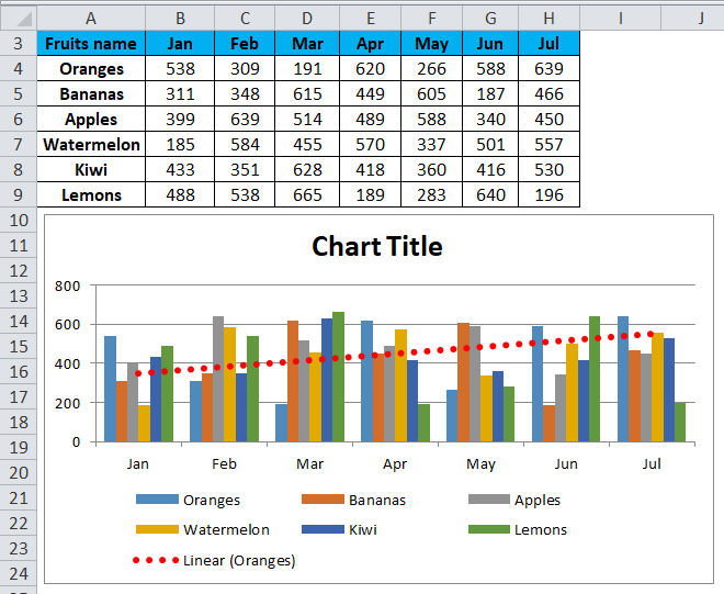
Suppose we have given the fruits name & their production number month wise.
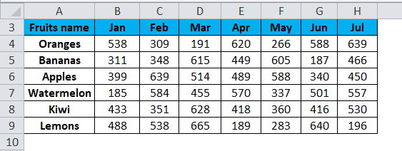
For creating a trendline in excel, follow the below steps:
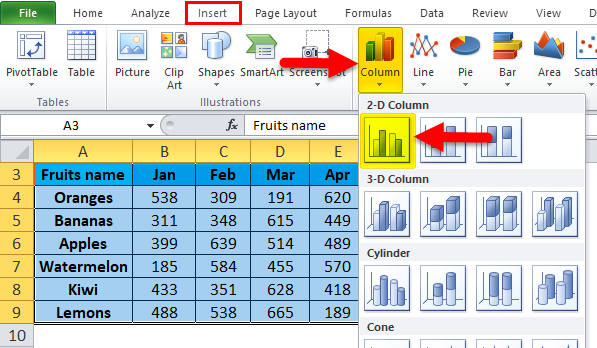
- Select the whole data, including the headings.
- Go to the INSERT tab.
- Click on Column Charts under the Charts section and then select 2-D Column Chart as shown in the below screenshot.
- It will create a Column chart on the given data as shown below.
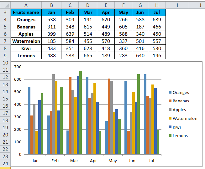
- After formatting Legend and adding the chart title, the chart will look as below:
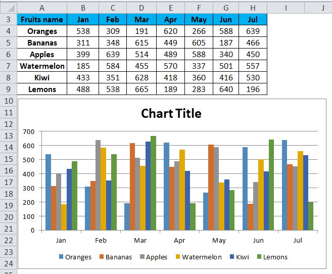
- Click on Chart Area and do a right-click. It will open a drop-down list of some options, as shown in the below screenshot.
- Click on Add Trendline option from the drop-down list.
- It will open a Format Trendline box, as shown in the below screenshot.
- Make sure that the Linear option is selected. Refer to the below screenshot.
- By using the Fill & Line option, you can format the trend line.
- It will create the linear trendline in your chart, as shown below.
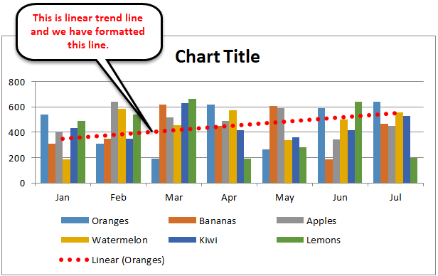
- Through this trendline, we can predict the growth of the business.
Example #2
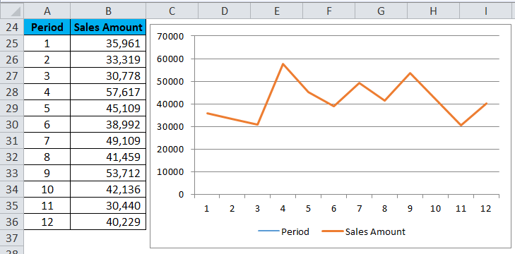
We have given the sales amount period-wise.
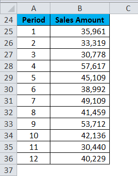
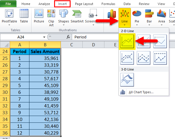
For creating a trendline in excel, follow the below steps:
- Select the whole data, including Column headings.
- Go to the Insert tab and choose the Line chart and click on OK. Refer to the below screenshot.
- The chart is shown below:
- Now do a right-click on the line of a line chart and choose the option Add Trendline. Refer to the below screenshot.
- It will open the Format Trendline window.
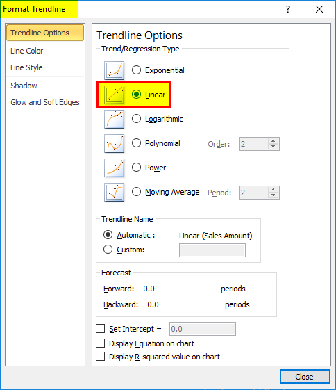
- Make sure that the Linear option is selected.
- Now close the window, and it will insert the trendline in your chart. Refer to the below screenshot.
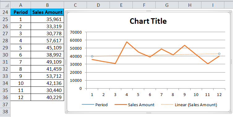
Now from the trendline, you can predict the flow of business growth.
Things to Remember About the Trendline in Excel
- To know which is the most suitable trendline for your dataset is, Check for the R-squared value.
- When R-value is at or near 1, it’s most reliable.
- When you create a trendline for your chart, it automatically calculates R squared value.
Recommended Articles
This has been a guide to Trendline in Excel. Here we discuss its types and how to create a trendline in Excel along with excel examples and a downloadable excel template. You may also look at these useful charts in excel –
- Excel Column Chart
- Excel Clustered Column Chart
- Excel Stacked Column Chart
- Excel Scatter Chart
A trendline, also known as the ‘line of best fit‘ is an important visual tool in data analytics. It is a straight (or curved) line that helps us understand data in a chart.
You can add a trendline to almost any type of chart, but it is most often used with scatter charts, bubble charts, and column charts.
In this tutorial, we will discuss how to add a trendline to an Excel chart, how to format it, extend it, add an equation to it, as well as how to delete it.
What does a Trendline Indicate in a Chart?
The trendline is often used to make sense of data points in a chart.
It gives us an idea of the overall direction of a given variable, and is often used to understand the relationship between two variables or how data moves over time.
A trendline can also be extrapolated to help you make forecasts about unplotted data points.
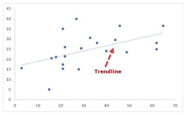
For example, when you look at the scatter chart shown below, it’s difficult to infer much just by looking at the data points.

But when you add a trendline to the chart, as shown below, you can now see the direction in which the data is moving.
Moreover, you can also clearly see which data points are probably outliers, or at least completely different from the general trend.

How is a Trendline Different from a Line Chart
Although a trendline can often be mistaken for a line chart, the two are quite different.
In a line chart, the line is used to visually connect the data points, while a trendline is used to show the general trend in the data.

Line Chart
Trendline
You can add a trendline to a scatter chart, bubble chart, or other kinds of charts, while a line chart is a type of chart in itself.
Adding a trendline to an Excel chart is really easy. For example, consider the following scatter chart:
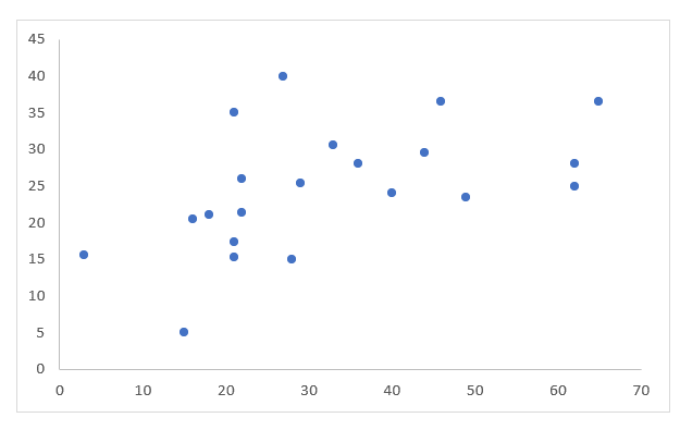
To add a trendline to this chart, simply do the following:
- Click on the chart to select it.
- Click on the ‘+’ icon to the top-right of the chart.

- You should see a list of Chart elements with checkboxes next to them.

- Check the box next to ‘Trendline’.

You should now see a trendline added to your Excel scatter chart:

Looking at the above chart, the trendline shows that the two variables have a positive relationship since the trendline shows the movement of the points in the positive direction.
This means that as the value of x increases, the value of y increases too.
Note that the trendline is shown here as a simple dotted line by default. However, you can further customize this line according to your requirement.
We will see how to do that in the next section.
Also read: How to Add Secondary Axis in Excel Charts?
How to Format the Trendline
Excel provides a number of options to customize trendlines in charts.
- You can change the color, width, and style of your trendline
- You can set different types of caps on either end of the trendline (like arrows, squares, etc.)
- You can add different effects (like drop shadow, glow, etc.)
- You can change the type of trendline (eg: linear, polynomial, moving average, etc.)
- You can add additional information on your trendline (like an equation, R2 value, etc.)
Let us first see how to format general settings for the trendline:
- Click on the chart to select it.
- Click on the ‘+’ icon.
- Hover over the ‘Trendline’ option.
- You should see a dropdown arrow next to this option. Click on this arrow.

- You should now see a list of options to format/customize your trendline.

- If the formatting option you need is in this list, you can go ahead and select it. If not, then click on ‘More Options’.

- You should now see the Format Trendline sidebar to the right of the Excel window.

- There should be three tabs in the sidebar – Fill & Line, Effects, Trendline Options.
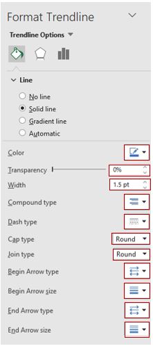
- Select the Fill & Line option to set the color, width, and style of your trendline. Click on the ‘Line’ section in this tab to show all the line formatting options. Let’s change the color to ‘Orange Accent 2’, the Dash type to ‘Solid’, and the width of the line to 2.75pt. This tab also lets you set caps on your trendline’s ends, for example, if you want the line to end with an arrow or if you want the ends rounded, etc. Let’s change the Cap type to ‘round’ and the End arrow type to ‘Open Arrow’.

- Select the Effects option to add a drop shadow, or glow or soft edge effect to your line. For our example, let’s avoid adding any effects and leave the trendline plain.

- Select the Trendline Option if you want to change the type of trendline. We will discuss this in more detail in the next few sections.

Different Kinds of Trendlines
Excel lets you add different types of trendlines to your chart using the ‘Trendline Options’ tab of the Format Trendline sidebar.
Some of the trendline type options include:
- Exponential
- Linear
- Logarithmic
- Polynomial
- Power
- Moving Average

Usually, the type of trendline you use depends on the type of data you’re representing.
The linear trendline best represents simple linear data, one that shows values increasing or decreasing at a steady rate.
An exponential trendline is a curved line that represents data that increases or decreases at higher rates. This trendline does not work with data that has 0 or negative values.
The logarithmic trendline is a curved line that best represents data that changes (increases or decreases) at a high rate initially and then levels out.
The polynomial trendline is also a curved line that usually represents data that fluctuates. The order of the polynomial represents the number of fluctuations in the data trend.
So, an order 2 polynomial usually shows a single fluctuation (hill or valley), while an order 3 polynomial shows two fluctuations, and so on.
The power trendline is a curved line that represents data that increases or decreases a constant rate. A power trendline does not work on data that has 0 or negative values.
A moving average trendline is usually used to smooth out fluctuations in the data so that you can see the trends in the data more clearly.
You can set the number of data points that you want to smooth out (or average) using the ‘period’ option.
So a period value of 2 means you want the data averaged in pairs (1st and 2nd, 3rd and 4th, etc.).
To change your trendline to any of the above types, follow the steps below:
- Click on the chart.
- Click on the ‘+’ icon to the top-right of the chart.
- Hover over the ‘Trendline’ option and click on the dropdown arrow that appears next to it.
- From the Format Trendline sidebar, select the Trendline Options tab.
- Click on the radio button next to your required type of trendline.
- If using a Polynomial trendline, enter the order of the polynomial in the input box to the right. Similarly, if using a moving average trendline, enter the period value in the input box to the right.

Note: If you’re using a moving average trendline, make sure you sort your data by the independent variable.
How to Display the Trendline Equation in a Chart
The trendline is usually based on an underlying equation that mathematically best fits the data points.
Excel uses the least-squares method to compute this equation, and each of the trendline types discussed in the above section has a different equation.
If you want to display the equation of the trendline on your chart, simply click on the checkbox next to ‘Display Equation on Chart’ in the Format Trendline sidebar (under the Trendline Options tab).


Similarly, if you want to display the R-squared value of the line, then check the box next to ‘Display R-squared value on the chart’.
The R2 value (also known as the Coefficient of Determination) indicates how well the trendline fits the data. The closer it is to 1, the better the line fits the data.

How to Extend a Trendline in Excel Charts
Trendlines don’t just help you understand the available data, they also help you get forecasts for data that is not explicitly available in the dataset.
You can predict unknown values by projecting the data trends into the past or future. This is essentially achieved by extending the trendline backward or forward.
The Forecast section of the Format Trendline sidebar (in the trendline options tab) lets you specify how many periods (of the independent variable) you want to forecast (forward and backward).
For example, in the following chart, we have specified that we want to forecast trends for the next 10 periods:

Here’s the extended part of the trendline:

How to Delete a Trendline from an Excel Chart
Finally, if you want to delete a trendline from your chart, the process is really easy. Follow the steps below:
- Right-click on the trendline of your chart.
- Select the Delete option from the context menu that appears.

Alternatively, you can click on the ‘+’ icon (Chart Elements) and uncheck the box next to the Trendline option from the list that appears.

This tutorial was all about trendlines. We explained what trendlines are, how they work, how to add them to an Excel chart, and how to format them as needed.
We hope you found this tutorial useful and easy to follow.
Other Excel tutorials you may also like:
- How to Create Win/Loss Sparklines Chart in Excel?
- How to Add Gridlines in a Chart in Excel?
- How to Add Axis Titles in Excel?
- 10 Best Excel Books (that will make you an Excel Pro)
- How to Insert Chart Title in Excel?
- How to Create Bar of Pie Chart in Excel?
- How to Add Border to a Chart in Excel
In this tutorial, we’ll hand you the key on how to add a trendline or trend line in excel. Aside from that, you’ll also learn to format the trendline in Excel with a simple and easy tutorial.
Excel is a powerful tool that is best used for data visualization and analysis.
When you want to visualize the trends in your data, adding a trendline to your chart is the best option to use. The trendline is an invaluable tool to help interpret data and add meaning to your findings.
What is a Trendline In Excel?
A trendline is an analytical tool, either a curved or straight line in a chart, that displays the general trends or overall direction of the data. Also referred to as a “line of best fit,” that is easy to use.
Furthermore, it is the visual representation of data movements over time or any time frame related between two variables. On the other hand, it can be used to forecast trends.
It indicates the direction and speed of progress, and its appearance is similar to a line chart. However, it does not connect to the actual data points as what we see in line chart.
If you don’t have a chart, you can create one. If you don’t know how to do it, follow the following step-by-step guide.
Time needed: 3 minutes.
This example will teach you how to add a trendline to a chart in Excel.
- Open your Excel.
Input your data, then highlight or select all the data you want to display in the chart.
Click the “Insert” tab. In the charts group, click “Insert column or bar graph.”
It will automatically display the result.
- Select the chart you would like to add a trendline.
Select the chart by clicking it; after that, click the “plus (+)” icon that appears to the right of the chart.

- Select the “trendline.”
In the “Chart Elements” menu that appears, click the checkbox “Trendline.” Once you check the trendline, it will appear on your chart.
The trend line will be inserted by default. If you want to change it, enter Trend line, and a submenu with several lines will appear.

- If you want to format your chart. Click the arrow next to “Trendline,” and then click “More Options.”
It will display the Format Trendline pane, where you can switch to the Trendline Options tab, where you can see all the trend line types available in Excel and choose the one you want.

- Result
The default linear trendline will be pre-selected automatically. You can select other trendline types. Make sure that if you want another type of trendline, you first uncheck the trendline in the chart elements because it will double the line of your chart.
However, if you didn’t check the trendline and then directly clicked “More Options,” it was fine.

In this example, we use a moving average rather than a linear one.
How to format a trendline in Excel
In order to make your graph even more understandable and easily interpreted, you may change the default appearance of your trendline.
1. On the Format Trendline tab, in the Current Selection group, select the Fill & Line.
2. After you select the “Fill & Line” tab, you can choose the color, width, and dash type for your trendline. For example, you can change the dashed line into a solid line and have more options.
Note: Modify your trendline so that it suits your chart.
How to insert multiple trendlines in the same chart
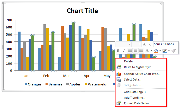
We can add multiple trendlines to a chart. Here’s how to put a trendline on a chart with two or more data series:
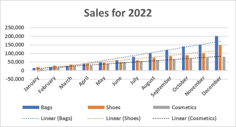
We have here an example of sales for 2022.
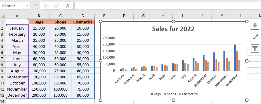
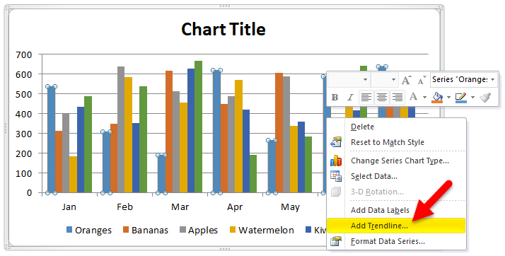
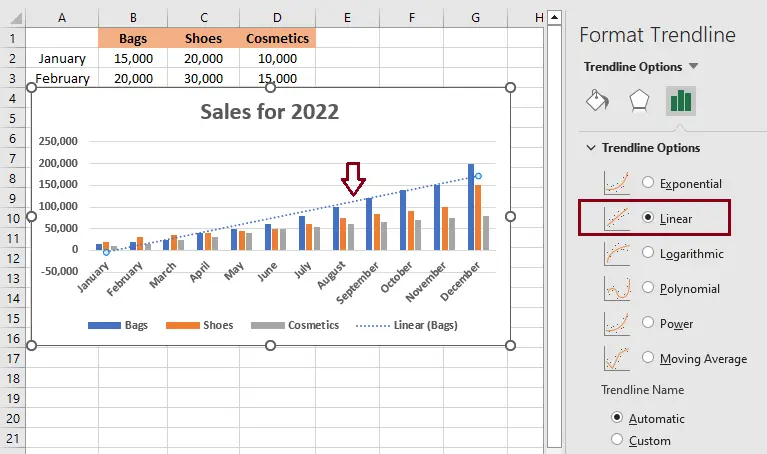
1. Right-click the data points of bags (the blue ones in this example) and click “Add Trendline” from the context menu:
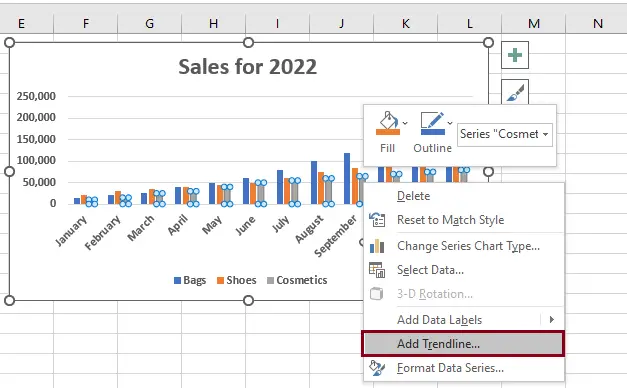
2. It will display the Trendline Options tab under Format Trendline, where you can choose your line type.
3. As a result, each data series in this example has its own trendline for its matching color, but here we just darken the color gray into dark gray in order to make it more visible.
Conclusion
With this tutorial on how to add a trendline or trend line in Excel, using Excel will be much easier, and it’s not time-consuming. Users can also create graphs and add trend lines to show the values of each data series.
Even if they don’t know how to use them, users can now identify and learn about the specific tools for adding a trend line to the chart.
Thank you very much for continuing to read until the end of this article. In case you have more questions, feel free to comment. You can also visit our website for additional information.