
When you create a chart in an Excel worksheet, a Word document, or a PowerPoint presentation, you have a lot of options. Whether you’ll use a chart that’s recommended for your data, one that you’ll pick from the list of all charts, or one from our selection of chart templates, it might help to know a little more about each type of chart.
Click here to start creating a chart.
For a description of each chart type, select an option from the following drop-down list.
Data that’s arranged in columns or rows on a worksheet can be plotted in a column chart. A column chart typically displays categories along the horizontal (category) axis and values along the vertical (value) axis, as shown in this chart:

Types of column charts
-
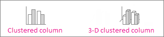
Clustered column and 3-D clustered column

A clustered column chart shows values in 2-D columns. A 3-D clustered column chart shows columns in 3-D format, but it doesn’t use a third value axis (depth axis). Use this chart when you have categories that represent:
-
Ranges of values (for example, item counts).
-
Specific scale arrangements (for example, a Likert scale with entries like Strongly agree, Agree, Neutral, Disagree, Strongly disagree).
-
Names that are not in any specific order (for example, item names, geographic names, or the names of people).
-
-
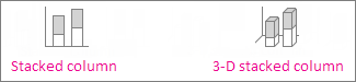
Stacked column and 3-D stacked column A stacked column chart shows values in 2-D stacked columns. A 3-D stacked column chart shows the stacked columns in 3-D format, but it doesn’t use a depth axis. Use this chart when you have multiple data series and you want to emphasize the total.
-
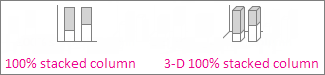
100% stacked column and 3-D 100% stacked column A 100% stacked column chart shows values in 2-D columns that are stacked to represent 100%. A 3-D 100% stacked column chart shows the columns in 3-D format, but it doesn’t use a depth axis. Use this chart when you have two or more data series and you want to emphasize the contributions to the whole, especially if the total is the same for each category.
-
3-D column 3-D column charts use three axes that you can change (a horizontal axis, a vertical axis, and a depth axis), and they compare data points along the horizontal and the depth axes. Use this chart when you want to compare data across both categories and data series.

Data that’s arranged in columns or rows on a worksheet can be plotted in a line chart. In a line chart, category data is distributed evenly along the horizontal axis, and all value data is distributed evenly along the vertical axis. Line charts can show continuous data over time on an evenly scaled axis, so they’re ideal for showing trends in data at equal intervals, like months, quarters, or fiscal years.

Types of line charts
-
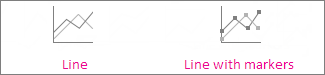
Line and line with markers Shown with or without markers to indicate individual data values, line charts can show trends over time or evenly spaced categories, especially when you have many data points and the order in which they are presented is important. If there are many categories or the values are approximate, use a line chart without markers.
-
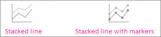
Stacked line and stacked line with markers Shown with or without markers to indicate individual data values, stacked line charts can show the trend of the contribution of each value over time or evenly spaced categories.
-
100% stacked line and 100% stacked line with markers Shown with or without markers to indicate individual data values, 100% stacked line charts can show the trend of the percentage each value contributes over time or evenly spaced categories. If there are many categories or the values are approximate, use a 100% stacked line chart without markers.
-
3-D line 3-D line charts show each row or column of data as a 3-D ribbon. A 3-D line chart has horizontal, vertical, and depth axes that you can change.
Notes:
-
Line charts work best when you have multiple data series in your chart—if you have only one data series, consider using a scatter chart instead.
-
Stacked line charts sum the data, which might not be the result you want. It might not be easy to see that the lines are stacked, so consider using a different line chart type or a stacked area chart instead.
-


Data that’s arranged in one column or row on a worksheet can be plotted in a pie chart. Pie charts show the size of items in one data series, proportional to the sum of the items. The data points in a pie chart are shown as a percentage of the whole pie.

Consider using a pie chart when:
-
You have only one data series.
-
None of the values in your data are negative.
-
Almost none of the values in your data are zero values.
-
You have no more than seven categories, all of which represent parts of the whole pie.
Types of pie charts
-
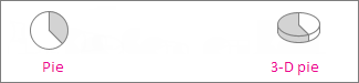
Pie and 3-D pie Pie charts show the contribution of each value to a total in a 2-D or 3-D format. You can pull out slices of a pie chart manually to emphasize the slices.
-
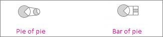
Pie of pie and bar of pie Pie of pie or bar of pie charts show pie charts with smaller values pulled out into a secondary pie or stacked bar chart, which makes them easier to distinguish.
Data that’s arranged in columns or rows only on a worksheet can be plotted in a doughnut chart. Like a pie chart, a doughnut chart shows the relationship of parts to a whole, but it can contain more than one data series.

Types of doughnut charts
-
Doughnut Doughnut charts show data in rings, where each ring represents a data series. If percentages are shown in data labels, each ring will total 100%.
Note: Doughnut charts aren’t easy to read. You may want to use a stacked column charts or Stacked bar chart instead.

Data that’s arranged in columns or rows on a worksheet can be plotted in a bar chart. Bar charts illustrate comparisons among individual items. In a bar chart, the categories are typically organized along the vertical axis, and the values along the horizontal axis.

Consider using a bar chart when:
-
The axis labels are long.
-
The values that are shown are durations.
Types of bar charts
-
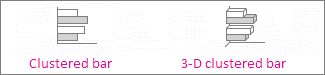
Clustered bar and 3-D clustered bar A clustered bar chart shows bars in 2-D format. A 3-D clustered bar chart shows bars in 3-D format; it doesn’t use a depth axis.
-
Stacked bar and 3-D stacked bar Stacked bar charts show the relationship of individual items to the whole in 2-D bars. A 3-D stacked bar chart shows bars in 3-D format; it doesn’t use a depth axis.
-
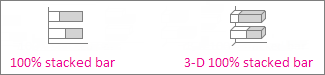
100% stacked bar and 3-D 100% stacked bar A 100% stacked bar shows 2-D bars that compare the percentage that each value contributes to a total across categories. A 3-D 100% stacked bar chart shows bars in 3-D format; it doesn’t use a depth axis.

Data that’s arranged in columns or rows on a worksheet can be plotted in an area chart. Area charts can be used to plot change over time and draw attention to the total value across a trend. By showing the sum of the plotted values, an area chart also shows the relationship of parts to a whole.

Types of area charts
-
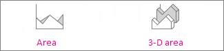
Area and 3-D area Shown in 2-D or in 3-D format, area charts show the trend of values over time or other category data. 3-D area charts use three axes (horizontal, vertical, and depth) that you can change. As a rule, consider using a line chart instead of a non-stacked area chart, because data from one series can be hidden behind data from another series.
-
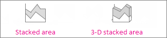
Stacked area and 3-D stacked area Stacked area charts show the trend of the contribution of each value over time or other category data in 2-D format. A 3-D stacked area chart does the same, but it shows areas in 3-D format without using a depth axis.
-
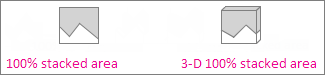
100% stacked area and 3-D 100% stacked area 100% stacked area charts show the trend of the percentage that each value contributes over time or other category data. A 3-D 100% stacked area chart does the same, but it shows areas in 3-D format without using a depth axis.
Data that’s arranged in columns and rows on a worksheet can be plotted in an xy (scatter) chart. Place the x values in one row or column, and then enter the corresponding y values in the adjacent rows or columns.
A scatter chart has two value axes: a horizontal (x) and a vertical (y) value axis. It combines x and y values into single data points and shows them in irregular intervals, or clusters. Scatter charts are typically used for showing and comparing numeric values, like scientific, statistical, and engineering data.

Consider using a scatter chart when:
-
You want to change the scale of the horizontal axis.
-
You want to make that axis a logarithmic scale.
-
Values for horizontal axis are not evenly spaced.
-
There are many data points on the horizontal axis.
-
You want to adjust the independent axis scales of a scatter chart to reveal more information about data that includes pairs or grouped sets of values.
-
You want to show similarities between large sets of data instead of differences between data points.
-
You want to compare many data points without regard to time—the more data that you include in a scatter chart, the better the comparisons you can make.
Types of scatter charts
-
Scatter This chart shows data points without connecting lines to compare pairs of values.
-
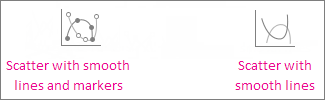
Scatter with smooth lines and markers and scatter with smooth lines This chart shows a smooth curve that connects the data points. Smooth lines can be shown with or without markers. Use a smooth line without markers if there are many data points.
-
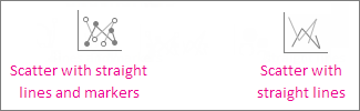
Scatter with straight lines and markers and scatter with straight lines This chart shows straight connecting lines between data points. Straight lines can be shown with or without markers.

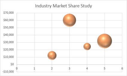
Much like a scatter chart, a bubble chart adds a third column to specify the size of the bubbles it shows to represent the data points in the data series.
Type of bubble charts
-
Bubble or bubble with 3-D effect Both of these bubble charts compare sets of three values instead of two, showing bubbles in 2-D or 3-D format (without using a depth axis). The third value specifies the size of the bubble marker.

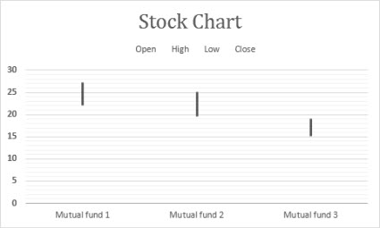
Data that’s arranged in columns or rows in a specific order on a worksheet can be plotted in a stock chart. As the name implies, stock charts can show fluctuations in stock prices. However, this chart can also show fluctuations in other data, like daily rainfall or annual temperatures. Make sure you organize your data in the right order to create a stock chart.
For example, to create a simple high-low-close stock chart, arrange your data with High, Low, and Close entered as column headings, in that order.
Types of stock charts
-
High-low-close This stock chart uses three series of values in the following order: high, low, and then close.
-
Open-high-low-close This stock chart uses four series of values in the following order: open, high, low, and then close.
-
Volume-high-low-close This stock chart uses four series of values in the following order: volume, high, low, and then close. It measures volume by using two value axes: one for the columns that measure volume, and the other for the stock prices.
-
Volume-open-high-low-close This stock chart uses five series of values in the following order: volume, open, high, low, and then close.


Data that’s arranged in columns or rows on a worksheet can be plotted in a surface chart. This chart is useful when you want to find optimum combinations between two sets of data. As in a topographic map, colors and patterns indicate areas that are in the same range of values. You can create a surface chart when both categories and data series are numeric values.
Types of surface charts
-
3-D surface This chart shows a 3-D view of the data, which can be imagined as a rubber sheet stretched over a 3-D column chart. It is typically used to show relationships between large amounts of data that may otherwise be difficult to see. Color bands in a surface chart do not represent the data series; they indicate the difference between the values.
-
Wireframe 3-D surface Shown without color on the surface, a 3-D surface chart is called a wireframe 3-D surface chart. This chart shows only the lines. A wireframe 3-D surface chart isn’t easy to read, but it can plot large data sets much faster than a 3-D surface chart.
-
Contour Contour charts are surface charts viewed from above, similar to 2-D topographic maps. In a contour chart, color bands represent specific ranges of values. The lines in a contour chart connect interpolated points of equal value.
-
Wireframe contour Wireframe contour charts are also surface charts viewed from above. Without color bands on the surface, a wireframe chart shows only the lines. Wireframe contour charts aren’t easy to read. You may want to use a 3-D surface chart instead.


Data that’s arranged in columns or rows on a worksheet can be plotted in a radar chart. Radar charts compare the aggregate values of several data series.

Type of radar charts
-
Radar and radar with markers With or without markers for individual data points, radar charts show changes in values relative to a center point.
-
Filled radar In a filled radar chart, the area covered by a data series is filled with a color.


The treemap chart provides a hierarchical view of your data and an easy way to compare different levels of categorization. The treemap chart displays categories by color and proximity and can easily show lots of data which would be difficult with other chart types. The treemap chart can be plotted when empty (blank) cells exist within the hierarchal structure and treemap charts are good for comparing proportions within the hierarchy.

Note: There are no chart sub-types for treemap charts.
The sunburst chart is ideal for displaying hierarchical data and can be plotted when empty (blank) cells exist within the hierarchal structure . Each level of the hierarchy is represented by one ring or circle with the innermost circle as the top of the hierarchy. A sunburst chart without any hierarchical data (one level of categories), looks similar to a doughnut chart. However, a sunburst chart with multiple levels of categories shows how the outer rings relate to the inner rings. The sunburst chart is most effective at showing how one ring is broken into its contributing pieces.

Note: There are no chart sub-types for sunburst charts.
Data plotted in a histogram chart shows the frequencies within a distribution. Each column of the chart is called a bin, which can be changed to further analyze your data.

Type of histogram charts
-
Histogram The histogram chart shows the distribution of your data grouped into frequency bins.
-
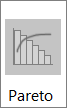
Pareto chart A pareto is a sorted histogram chart that contains both columns sorted in descending order and a line representing the cumulative total percentage.

A box and whisker chart shows distribution of data into quartiles, highlighting the mean and outliers. The boxes may have lines extending vertically called “whiskers”. These lines indicate variability outside the upper and lower quartiles, and any point outside those lines or whiskers is considered an outlier. Use this chart type when there are multiple data sets which relate to each other in some way.

Note: There are no chart sub-types for box and whisker charts.
A waterfall chart shows a running total of your financial data as values are added or subtracted. It’s useful for understanding how an initial value is affected by a series of positive and negative values. The columns are color coded so you can quickly tell positive from negative numbers.

Note: There are no chart sub-types for waterfall charts.
Funnel charts show values across multiple stages in a process.

Typically, the values decrease gradually, allowing the bars to resemble a funnel. Read more about funnel charts here.
Data that’s arranged in columns and rows can be plotted in a combo chart. Combo charts combine two or more chart types to make the data easy to understand, especially when the data is widely varied. Shown with a secondary axis, this chart is even easier to read. In this example, we used a column chart to show the number of homes sold between January and June and then used a line chart to make it easier for readers to quickly identify the average sales price by month.

Type of combo charts
-
Clustered column – line and clustered column – line on secondary axis With or without a secondary axis, this chart combines a clustered column and line chart, showing some data series as columns and others as lines in the same chart.
-
Stacked area – clustered column This chart combines a stacked area and clustered column chart, showing some data series as stacked areas and others as columns in the same chart.
-
Custom combination This chart lets you combine the charts you want to show in the same chart.


You can use a Map Chart to compare values and show categories across geographical regions. Use it when you have geographical regions in your data, like countries/regions, states, counties or postal codes.
For example, Countries by Population uses values. The values represent the total population in each country, with each portrayed using a gradient spectrum of two colors. The color for each region is dictated by where along the spectrum its value falls with respect to the others.

In the following example, Countries by Category, the categories are displayed using a standard legend to show groups or affiliations. Each data point is represented by an entirely different color.

Change a chart type
If you have already have a chart, but you just want to change its type:
-
Select the chart, click the Design tab, and click Change Chart Type.
-
Choose a new chart type in the Change Chart Type box.

Many chart types are available to help you display data in ways that are meaningful to your audience. Here are some examples of the most common chart types and how they can be used.

Data that is arranged in columns or rows on an Excel sheet can be plotted in a column chart. In column charts, categories are typically organized along the horizontal axis and values along the vertical axis.
Column charts are useful to show how data changes over time or to show comparisons among items.
Column charts have the following chart subtypes:
-
Clustered column chart Compares values across categories. A clustered column chart displays values in 2-D vertical rectangles. A clustered column in a 3-D chart displays the data by using a 3-D perspective.
-
Stacked column chart Shows the relationship of individual items to the whole, comparing the contribution of each value to a total across categories. A stacked column chart displays values in 2-D vertical stacked rectangles. A 3-D stacked column chart displays the data by using a 3-D perspective. A 3-D perspective is not a true 3-D chart because a third value axis (depth axis) is not used.
-
100% stacked column chart Compares the percentage that each value contributes to a total across categories. A 100% stacked column chart displays values in 2-D vertical 100% stacked rectangles. A 3-D 100% stacked column chart displays the data by using a 3-D perspective. A 3-D perspective is not a true 3-D chart because a third value axis (depth axis) is not used.
-
3-D column chart Uses three axes that you can change (a horizontal axis, a vertical axis, and a depth axis). They compare data points along the horizontal and the depth axes.

Data that is arranged in columns or rows on an Excel sheet can be plotted in a line chart. Line charts can display continuous data over time, set against a common scale, and are therefore ideal to show trends in data at equal intervals. In a line chart, category data is distributed evenly along the horizontal axis, and all value data is distributed evenly along the vertical axis.
Line charts work well if your category labels are text, and represent evenly spaced values such as months, quarters, or fiscal years.
Line charts have the following chart subtypes:
-
Line chart with or without markers Shows trends over time or ordered categories, especially when there are many data points and the order in which they are presented is important. If there are many categories or the values are approximate, use a line chart without markers.
-
Stacked line chart with or without markers Shows the trend of the contribution of each value over time or ordered categories. If there are many categories or the values are approximate, use a stacked line chart without markers.
-
100% stacked line chart displayed with or without markers Shows the trend of the percentage each value contributes over time or ordered categories. If there are many categories or the values are approximate, use a 100% stacked line chart without markers.
-
3-D line chart Shows each row or column of data as a 3-D ribbon. A 3-D line chart has horizontal, vertical, and depth axes that you can change.

Data that is arranged in one column or row only on an Excel sheet can be plotted in a pie chart. Pie charts show the size of items in one data series, proportional to the sum of the items. The data points in a pie chart are displayed as a percentage of the whole pie.
Consider using a pie chart when you have only one data series that you want to plot, none of the values that you want to plot are negative, almost none of the values that you want to plot are zero values, you don’t have more than seven categories, and the categories represent parts of the whole pie.
Pie charts have the following chart subtypes:
-
Pie chart Displays the contribution of each value to a total in a 2-D or 3-D format. You can pull out slices of a pie chart manually to emphasize the slices.
-
Pie of pie or bar of pie chart Displays pie charts with user-defined values that are extracted from the main pie chart and combined into a secondary pie chart or into a stacked bar chart. These chart types are useful when you want to make small slices in the main pie chart easier to distinguish.
-
Doughnut chart Like a pie chart, a doughnut chart shows the relationship of parts to a whole. However, it can contain more than one data series. Each ring of the doughnut chart represents a data series. Displays data in rings, where each ring represents a data series. If percentages are displayed in data labels, each ring will total 100%.

Data that is arranged in columns or rows on an Excel sheet can be plotted in a bar chart.
Use bar charts to show comparisons among individual items.
Bar charts have the following chart subtypes:
-
Clustered bar and 3-D Clustered bar chart Compares values across categories. In a clustered bar chart, the categories are typically organized along the vertical axis, and the values along the horizontal axis. A clustered bar in 3-D chart displays the horizontal rectangles in 3-D format. It does not display the data on three axes.
-
Stacked bar and 3-D Stacked bar chart Shows the relationship of individual items to the whole. A stacked bar in 3-D chart displays the horizontal rectangles in 3-D format. It does not display the data on three axes.
-
100% stacked bar chart and 100% stacked bar chart in 3-D Compares the percentage that each value contributes to a total across categories. A 100% stacked bar in 3-D chart displays the horizontal rectangles in 3-D format. It does not display the data on three axes.

Data that is arranged in columns and rows on an Excel sheet can be plotted in an xy (scatter) chart. A scatter chart has two value axes. It shows one set of numeric data along the horizontal axis (x-axis) and another along the vertical axis (y-axis). It combines these values into single data points and displays them in irregular intervals, or clusters.
Scatter charts show the relationships among the numeric values in several data series, or plot two groups of numbers as one series of xy coordinates. Scatter charts are typically used for displaying and comparing numeric values, such as scientific, statistical, and engineering data.
Scatter charts have the following chart subtypes:
-
Scatter chart Compares pairs of values. Use a scatter chart with data markers but without lines if you have many data points and connecting lines would make the data more difficult to read. You can also use this chart type when you do not have to show connectivity of the data points.
-
Scatter chart with smooth lines and scatter chart with smooth lines and markers Displays a smooth curve that connects the data points. Smooth lines can be displayed with or without markers. Use a smooth line without markers if there are many data points.
-
Scatter chart with straight lines and scatter chart with straight lines and markers Displays straight connecting lines between data points. Straight lines can be displayed with or without markers.
-
Bubble chart or bubble chart with 3-D effect A bubble chart is a kind of xy (scatter) chart, where the size of the bubble represents the value of a third variable. Compares sets of three values instead of two. The third value determines the size of the bubble marker. You can choose to display bubbles in 2-D format or with a 3-D effect.

Data that is arranged in columns or rows on an Excel sheet can be plotted in an area chart. By displaying the sum of the plotted values, an area chart also shows the relationship of parts to a whole.
Area charts emphasize the magnitude of change over time, and can be used to draw attention to the total value across a trend. For example, data that represents profit over time can be plotted in an area chart to emphasize the total profit.
Area charts have the following chart subtypes:
-
Area chart Displays the trend of values over time or other category data. 3-D area charts use three axes (horizontal, vertical, and depth) that you can change. Generally, consider using a line chart instead of a nonstacked area chart because data from one series can be obscured by data from another series.
-
Stacked area chart Displays the trend of the contribution of each value over time or other category data. A stacked area chart in 3-D is displayed in the same manner but uses a 3-D perspective. A 3-D perspective is not a true 3-D chart because a third value axis (depth axis) is not used.
-
100% stacked area chart Displays the trend of the percentage that each value contributes over time or other category data. A 100% stacked area chart in 3-D is displayed in the same manner but uses a 3-D perspective. A 3-D perspective is not a true 3-D chart because a third value axis (depth axis) is not used.

Data that is arranged in columns or rows in a specific order on an Excel sheet can be plotted in a stock chart.
As its name implies, a stock chart is most frequently used to show the fluctuation of stock prices. However, this chart may also be used for scientific data. For example, you could use a stock chart to indicate the fluctuation of daily or annual temperatures.
Stock charts have the following chart sub-types:
-
High-Low-Close stock chart Illustrates stock prices. It requires three series of values in the correct order: high, low, and then close.
-
Open-High-Low-Close stock chart Requires four series of values in the correct order: open, high, low, and then close.
-
Volume-High-Low-Close stock chart Requires four series of values in the correct order: volume, high, low, and then close. It measures volume by using two value axes: one for the columns that measure volume, and the other for the stock prices.
-
Volume-Open-High-Low-Close stock chart Requires five series of values in the correct order: volume, open, high, low, and then close.

Data that is arranged in columns or rows on an Excel sheet can be plotted in a surface chart. As in a topographic map, colors and patterns indicate areas that are in the same range of values.
A surface chart is useful when you want to find optimal combinations between two sets of data.
Surface charts have the following chart subtypes:
-
3-D surface chart Shows trends in values across two dimensions in a continuous curve. Color bands in a surface chart do not represent the data series. They represent the difference between the values. This chart shows a 3-D view of the data, which can be imagined as a rubber sheet stretched over a 3-D column chart. It is typically used to show relationships between large amounts of data that may otherwise be difficult to see.
-
Wireframe 3-D surface chart Shows only the lines. A wireframe 3-D surface chart is not easy to read, but this chart type is useful for faster plotting of large data sets.
-
Contour chart Surface charts viewed from above, similar to 2-D topographic maps. In a contour chart, color bands represent specific ranges of values. The lines in a contour chart connect interpolated points of equal value.
-
Wireframe contour chart Surface charts viewed from above. Without color bands on the surface, a wireframe chart shows only the lines. Wireframe contour charts are not easy to read. You may want to use a 3-D surface chart instead.

In a radar chart, each category has its own value axis radiating from the center point. Lines connect all the values in the same series.
Use radar charts to compare the aggregate values of several data series.
Radar charts have the following chart subtypes:
-
Radar chart Displays changes in values in relation to a center point.
-
Radar with markers Displays changes in values in relation to a center point with markers.
-
Filled radar chart Displays changes in values in relation to a center point, and fills the area covered by a data series with color.
You can use a Map Chart to compare values and show categories across geographical regions. Use it when you have geographical regions in your data, like countries/regions, states, counties or postal codes.
For more information, see Create a map chart.
Funnel charts show values across multiple stages in a process.
Typically, the values decrease gradually, allowing the bars to resemble a funnel. For more information, see Create a funnel chart.
The treemap chart provides a hierarchical view of your data and an easy way to compare different levels of categorization. The treemap chart displays categories by color and proximity and can easily show lots of data which would be difficult with other chart types. The treemap chart can be plotted when empty (blank) cells exist within the hierarchal structure and treemap charts are good for comparing proportions within the hierarchy.
There are no chart sub-types for treemap charts.
For more information, see Create a treemap chart.
The sunburst chart is ideal for displaying hierarchical data and can be plotted when empty (blank) cells exist within the hierarchal structure . Each level of the hierarchy is represented by one ring or circle with the innermost circle as the top of the hierarchy. A sunburst chart without any hierarchical data (one level of categories), looks similar to a doughnut chart. However, a sunburst chart with multiple levels of categories shows how the outer rings relate to the inner rings. The sunburst chart is most effective at showing how one ring is broken into its contributing pieces.
There are no chart sub-types for sunburst charts.
For more information, see Create a sunburst chart.
A waterfall chart shows a running total of your financial data as values are added or subtracted. It’s useful for understanding how an initial value is affected by a series of positive and negative values. The columns are color coded so you can quickly tell positive from negative numbers.
There are no chart sub-types for waterfall charts.
For more information, see Create a waterfall chart.
Data plotted in a histogram chart shows the frequencies within a distribution. Each column of the chart is called a bin, which can be changed to further analyze your data.
Types of histogram charts
-
Histogram The histogram chart shows the distribution of your data grouped into frequency bins.
-
Pareto chart A pareto is a sorted histogram chart that contains both columns sorted in descending order and a line representing the cumulative total percentage.
More information is available for Histogram and Pareto charts.
A box and whisker chart shows distribution of data into quartiles, highlighting the mean and outliers. The boxes may have lines extending vertically called “whiskers”. These lines indicate variability outside the upper and lower quartiles, and any point outside those lines or whiskers is considered an outlier. Use this chart type when there are multiple data sets which relate to each other in some way.
For more information, see Create a box and whisker chart.
Data that is arranged in columns or rows on an Excel sheet can be plotted in a column chart. In column charts, categories are typically organized along the horizontal axis and values along the vertical axis.
Column charts are useful to show how data changes over time or to show comparisons among items.
Column charts have the following chart subtypes:
-
Clustered column chart Compares values across categories. A clustered column chart displays values in 2-D vertical rectangles. A clustered column in a 3-D chart displays the data by using a 3-D perspective.
-
Stacked column chart Shows the relationship of individual items to the whole, comparing the contribution of each value to a total across categories. A stacked column chart displays values in 2-D vertical stacked rectangles. A 3-D stacked column chart displays the data by using a 3-D perspective. A 3-D perspective is not a true 3-D chart because a third value axis (depth axis) is not used.
-
100% stacked column chart Compares the percentage that each value contributes to a total across categories. A 100% stacked column chart displays values in 2-D vertical 100% stacked rectangles. A 3-D 100% stacked column chart displays the data by using a 3-D perspective. A 3-D perspective is not a true 3-D chart because a third value axis (depth axis) is not used.
-
3-D column chart Uses three axes that you can change (a horizontal axis, a vertical axis, and a depth axis). They compare data points along the horizontal and the depth axes.
-
Cylinder, cone, and pyramid chart Available in the same clustered, stacked, 100% stacked, and 3-D chart types that are provided for rectangular column charts. They show and compare data in the same manner. The only difference is that these chart types display cylinder, cone, and pyramid shapes instead of rectangles.
Data that is arranged in columns or rows on an Excel sheet can be plotted in a line chart. Line charts can display continuous data over time, set against a common scale, and are therefore ideal to show trends in data at equal intervals. In a line chart, category data is distributed evenly along the horizontal axis, and all value data is distributed evenly along the vertical axis.
Line charts work well if your category labels are text, and represent evenly spaced values such as months, quarters, or fiscal years.
Line charts have the following chart subtypes:
-
Line chart with or without markers Shows trends over time or ordered categories, especially when there are many data points and the order in which they are presented is important. If there are many categories or the values are approximate, use a line chart without markers.
-
Stacked line chart with or without markers Shows the trend of the contribution of each value over time or ordered categories. If there are many categories or the values are approximate, use a stacked line chart without markers.
-
100% stacked line chart displayed with or without markers Shows the trend of the percentage each value contributes over time or ordered categories. If there are many categories or the values are approximate, use a 100% stacked line chart without markers.
-
3-D line chart Shows each row or column of data as a 3-D ribbon. A 3-D line chart has horizontal, vertical, and depth axes that you can change.
Data that is arranged in one column or row only on an Excel sheet can be plotted in a pie chart. Pie charts show the size of items in one data series, proportional to the sum of the items. The data points in a pie chart are displayed as a percentage of the whole pie.
Consider using a pie chart when you have only one data series that you want to plot, none of the values that you want to plot are negative, almost none of the values that you want to plot are zero values, you don’t have more than seven categories, and the categories represent parts of the whole pie.
Pie charts have the following chart subtypes:
-
Pie chart Displays the contribution of each value to a total in a 2-D or 3-D format. You can pull out slices of a pie chart manually to emphasize the slices.
-
Pie of pie or bar of pie chart Displays pie charts with user-defined values that are extracted from the main pie chart and combined into a secondary pie chart or into a stacked bar chart. These chart types are useful when you want to make small slices in the main pie chart easier to distinguish.
-
Exploded pie chart Displays the contribution of each value to a total while emphasizing individual values. Exploded pie charts can be displayed in 3-D format. You can change the pie explosion setting for all slices and individual slices. However, you cannot move the slices of an exploded pie manually.
Data that is arranged in columns or rows on an Excel sheet can be plotted in a bar chart.
Use bar charts to show comparisons among individual items.
Bar charts have the following chart subtypes:
-
Clustered bar chart Compares values across categories. In a clustered bar chart, the categories are typically organized along the vertical axis, and the values along the horizontal axis. A clustered bar in 3-D chart displays the horizontal rectangles in 3-D format. It does not display the data on three axes.
-
Stacked bar chart Shows the relationship of individual items to the whole. A stacked bar in 3-D chart displays the horizontal rectangles in 3-D format. It does not display the data on three axes.
-
100% stacked bar chart and 100% stacked bar chart in 3-D Compares the percentage that each value contributes to a total across categories. A 100% stacked bar in 3-D chart displays the horizontal rectangles in 3-D format. It does not display the data on three axes.
-
Horizontal cylinder, cone, and pyramid chart Available in the same clustered, stacked, and 100% stacked chart types that are provided for rectangular bar charts. They show and compare data the same manner. The only difference is that these chart types display cylinder, cone, and pyramid shapes instead of horizontal rectangles.
Data that is arranged in columns or rows on an Excel sheet can be plotted in an area chart. By displaying the sum of the plotted values, an area chart also shows the relationship of parts to a whole.
Area charts emphasize the magnitude of change over time, and can be used to draw attention to the total value across a trend. For example, data that represents profit over time can be plotted in an area chart to emphasize the total profit.
Area charts have the following chart subtypes:
-
Area chart Displays the trend of values over time or other category data. 3-D area charts use three axes (horizontal, vertical, and depth) that you can change. Generally, consider using a line chart instead of a nonstacked area chart because data from one series can be obscured by data from another series.
-
Stacked area chart Displays the trend of the contribution of each value over time or other category data. A stacked area chart in 3-D is displayed in the same manner but uses a 3-D perspective. A 3-D perspective is not a true 3-D chart because a third value axis (depth axis) is not used.
-
100% stacked area chart Displays the trend of the percentage that each value contributes over time or other category data. A 100% stacked area chart in 3-D is displayed in the same manner but uses a 3-D perspective. A 3-D perspective is not a true 3-D chart because a third value axis (depth axis) is not used.
Data that is arranged in columns and rows on an Excel sheet can be plotted in an xy (scatter) chart. A scatter chart has two value axes. It shows one set of numeric data along the horizontal axis (x-axis) and another along the vertical axis (y-axis). It combines these values into single data points and displays them in irregular intervals, or clusters.
Scatter charts show the relationships among the numeric values in several data series, or plot two groups of numbers as one series of xy coordinates. Scatter charts are typically used for displaying and comparing numeric values, such as scientific, statistical, and engineering data.
Scatter charts have the following chart subtypes:
-
Scatter chart with markers only Compares pairs of values. Use a scatter chart with data markers but without lines if you have many data points and connecting lines would make the data more difficult to read. You can also use this chart type when you do not have to show connectivity of the data points.
-
Scatter chart with smooth lines and scatter chart with smooth lines and markers Displays a smooth curve that connects the data points. Smooth lines can be displayed with or without markers. Use a smooth line without markers if there are many data points.
-
Scatter chart with straight lines and scatter chart with straight lines and markers Displays straight connecting lines between data points. Straight lines can be displayed with or without markers.

A bubble chart is a kind of xy (scatter) chart, where the size of the bubble represents the value of a third variable.
Bubble charts have the following chart subtypes:
-
Bubble chart or bubble chart with 3-D effect Compares sets of three values instead of two. The third value determines the size of the bubble marker. You can choose to display bubbles in 2-D format or with a 3-D effect.
Data that is arranged in columns or rows in a specific order on an Excel sheet can be plotted in a stock chart.
As its name implies, a stock chart is most frequently used to show the fluctuation of stock prices. However, this chart may also be used for scientific data. For example, you could use a stock chart to indicate the fluctuation of daily or annual temperatures.
Stock charts have the following chart sub-types:
-
High-low-close stock chart Illustrates stock prices. It requires three series of values in the correct order: high, low, and then close.
-
Open-high-low-close stock chart Requires four series of values in the correct order: open, high, low, and then close.
-
Volume-high-low-close stock chart Requires four series of values in the correct order: volume, high, low, and then close. It measures volume by using two value axes: one for the columns that measure volume, and the other for the stock prices.
-
Volume-open-high-low-close stock chart Requires five series of values in the correct order: volume, open, high, low, and then close.
Data that is arranged in columns or rows on an Excel sheet can be plotted in a surface chart. As in a topographic map, colors and patterns indicate areas that are in the same range of values.
A surface chart is useful when you want to find optimal combinations between two sets of data.
Surface charts have the following chart subtypes:
-
3-D surface chart Shows trends in values across two dimensions in a continuous curve. Color bands in a surface chart do not represent the data series. They represent the difference between the values. This chart shows a 3-D view of the data, which can be imagined as a rubber sheet stretched over a 3-D column chart. It is typically used to show relationships between large amounts of data that may otherwise be difficult to see.
-
Wireframe 3-D surface chart Shows only the lines. A wireframe 3-D surface chart is not easy to read, but this chart type is useful for faster plotting of large data sets.
-
Contour chart Surface charts viewed from above, similar to 2-D topographic maps. In a contour chart, color bands represent specific ranges of values. The lines in a contour chart connect interpolated points of equal value.
-
Wireframe contour chart Surface charts viewed from above. Without color bands on the surface, a wireframe chart shows only the lines. Wireframe contour charts are not easy to read. You may want to use a 3-D surface chart instead.

Like a pie chart, a doughnut chart shows the relationship of parts to a whole. However, it can contain more than one data series. Each ring of the doughnut chart represents a data series.
Doughnut charts have the following chart subtypes:
-
Doughnut chart Displays data in rings, where each ring represents a data series. If percentages are displayed in data labels, each ring will total 100%.
-
Exploded doughnut chart Displays the contribution of each value to a total while emphasizing individual values. However, they can contain more than one data series.
In a radar chart, each category has its own value axis radiating from the center point. Lines connect all the values in the same series.
Use radar charts to compare the aggregate values of several data series.
Radar charts have the following chart subtypes:
-
Radar chart Displays changes in values in relation to a center point.
-
Filled radar chart Displays changes in values in relation to a center point, and fills the area covered by a data series with color.
Change a chart type
If you have already have a chart, but you just want to change its type:
-
Select the chart, click the Chart Design tab, and click Change Chart Type.
-
Select a new chart type in the gallery of available options.

See Also
Create a chart with recommended charts
What are Pie Charts in Excel?
A pie chart is a circular representation that reflects the numbers of a single row or single column of Excel. The individual numbers are called data points (or categories) and a list (row or column) of numbers is called a data series. Every pie chart consists of slices (or parts), which when added make a complete pie (or circle).
For example, the following image shows some pie charts of Excel. On the top, the 3-D pie chart is to the left and the Pie of Pie chart is to the right. At the bottom, the Bar of Pie chart is to the left and the Doughnut chart is to the right.

You are free to use this image on your website, templates, etc, Please provide us with an attribution linkArticle Link to be Hyperlinked
For eg:
Source: Pie Charts in Excel (wallstreetmojo.com)
The purpose of making a pie chart in Excel is to visualize data when there are a few data points. Moreover, all the data points should belong to a specific time period. A pie chart is not suitable when there are many data points or the data points pertain to different time periods.
Table of contents
- What are Pie Charts in Excel?
- How to Make a Pie Chart in Excel?
- 2-D Pie Chart
- Example #1
- 3-D Pie Chart
- Example #2
- Pie of Pie Chart
- Example #3
- Bar of Pie Chart
- Example #4
- Doughnut Chart
- Example #5
- Frequently Asked Questions
- Recommended Articles
- 2-D Pie Chart
How to Make a Pie Chart in Excel?
Excel has different varieties of pie charts. In this article, we will learn to make the following pie charts:
- 2-D pie chart
- 3-D pie chart
- Pie of Pie chart
- Bar of Pie chart
- Doughnut chart
Let us create each Excel pie chart one by one with the help of examples.
2-D Pie Chart
A 2-D (two-dimensional) pie chart is frequently used in Excel. It is a standard pie chart that displays one slice for each data point. The bigger the number (or data point) represented by the slice, the larger the area under it.
Example #1
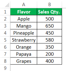
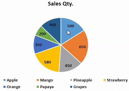
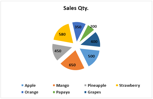
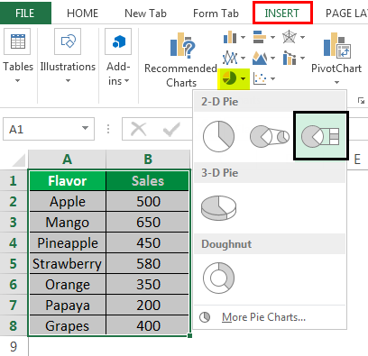
The following image shows the quantities sold (column B) of seven different flavors (column A) of a beverage. All the flavors of this beverage are manufactured by an organization. We want to perform the following tasks:
- Make a 2-D pie chart in Excel by taking into account the given dataset. Interpret the pie chart thus created.
- Add data labels and data callouts to the pie chart.
- Separate a few slices from the pie (or circle) and show how to change their color.
- Rotate the slices and increase the gap between them.
- Change the chart style and show how to apply filters to the pie chart in excel.
Note that the numbers pertain to a specific time period.
The tasks and the corresponding steps to be performed are listed as follows:
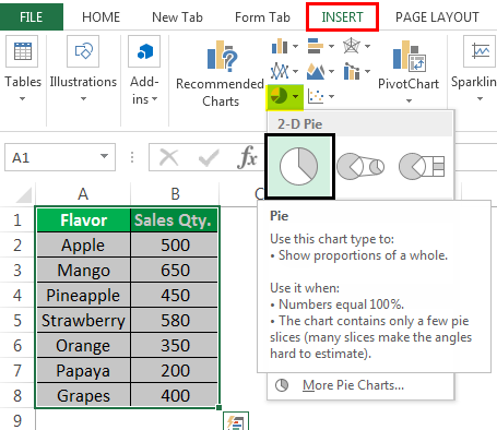
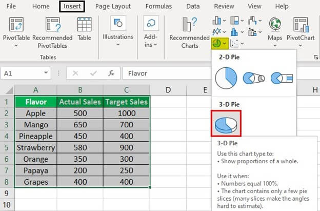
Task a: Make a 2-D pie chart and interpret it
Step 1: Select the entire dataset (A1:B8). Next, click the pie chart icon from the “charts” group of the Insert tab. Select a 2-D pie chart.
The selections are shown in the following image.
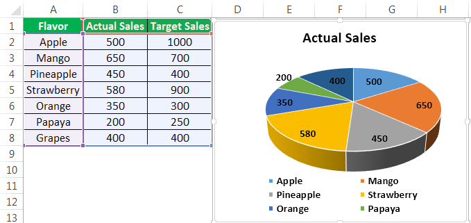
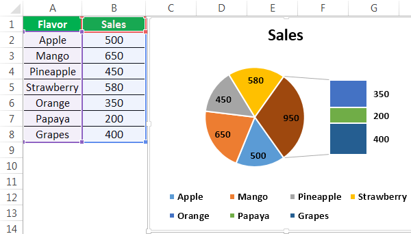
Step 2: A 2-D pie chart is inserted in Excel. This is shown in the following image.
Notice that the caption (on top) and the legend (at the bottom) are automatically added to the chart. The caption of the chart is the same as the heading of column B. The legend reflects all the flavors of column A.
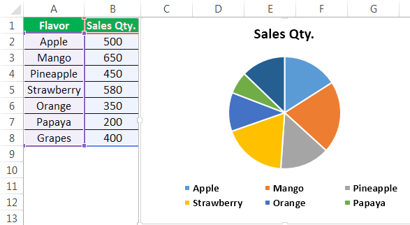
Interpretation of the 2-D pie chart: Each slice of the chart displays the number of beverages sold in a particular time period. One slice represents one flavor of the beverage. When all the slices are added, a complete pie is obtained. So, the entire pie represents the total of column B, which is 3130.
Observe that the slice of mango (orange colored) is the biggest, while that of papaya (green colored) is the smallest. This is because the sales of mango (650) are the maximum and that of papaya (200) are the least. The second highest sales are of the strawberry flavor (580).
Hence, one can interpret that the mango flavor of the beverage has the highest demand. In contrast, the papaya flavor is not much preferred by the customers of the organization.
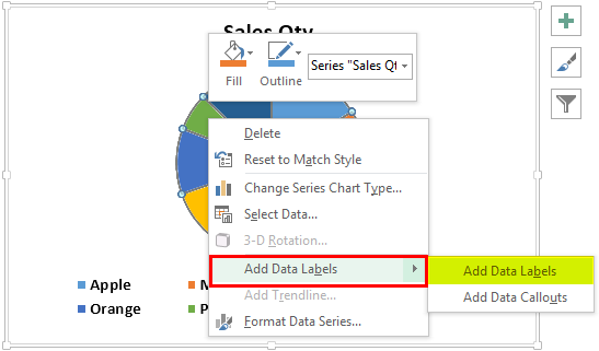
Task b: Add data labels and data callouts
Step 3: Right-click the pie chart and expand the “add data labels” option. Next, choose “add data labels” again, as shown in the following image.
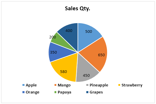
Step 4: The data labels are added to the chart, as shown in the following image. With these labels, the sales quantity of each flavor is displayed on the respective slice. Thus, data labels make it easy to read and interpret an excel pie chart.
Note: Data labels are directly linked to the data points of the source dataset. Therefore, the data labels automatically update with a change in the data points.
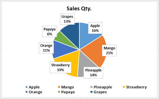
Step 5: Right-click the pie chart again. Click the arrow of “add data labels” and select “add data callouts.” The data callouts have been added in the following image.
Notice that each slice shows the name of the flavor along with its share in the entire pie. Since the share is in percentage, a glance at the pie chart can suggest the highly preferred and the less preferred flavors. The total of the pie is 100%.
Task c: Separate the slices from the pie (or circle) and show how to change their color
Step 6: Select the slice to be separated and drag it away from the pie with the help of the mouse pointer. In the following image, the slices having the maximum (orange colored) and the minimum sales (green colored) have been separated from the pie.
Note: To join the slices to the pie again, drag them back to their position. Alternatively, press the undo shortcut “Ctrl+Z.”
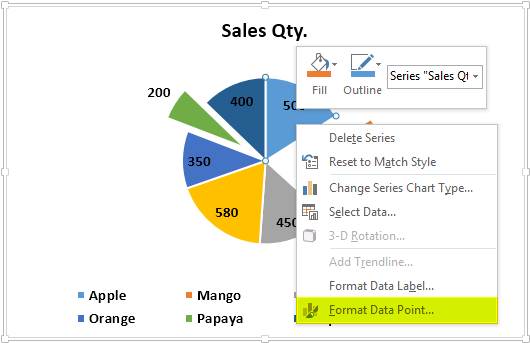
Step 7: Double-click the slice whose color is to be changed. Next, right-click it and select the option “format data point” from the context menu. This option is shown in the following image.
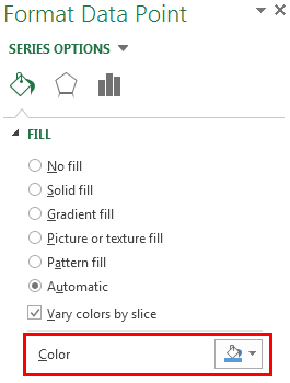
Step 8: The “format data point” pane opens, as shown in the following image. In the “fill” tab, the “automatic” and “vary colors by slice” options are selected by default.
If the “color” option is visible (shown within the red box), select the desired color from it. If the “color” option is not visible, select “solid fill” and then choose the desired color. Next, close the “format data point” pane.
The selected color will be applied to the slice that was double-clicked in the preceding step.
Note: One can highlight the important slices and assign dull colors to the remaining ones. So, the small and non-relevant slices can be filled with lighter colors. This helps focus on specific data points.
Task d: Rotate the slices and increase the gap between them
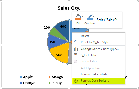
Step 9: Select the pie chart and right-click it. Choose “format data series” from the context menu. This option is shown in the following image.
Step 10: The “format data series” pane opens, as shown in the following image. In the “series options” tab, perform the following actions:
- In “angle of first slice,” enter 96◦ (96 degrees).
- In “pie explosion,” enter 18% (18 percent).
Next, close the “format data series” pane.
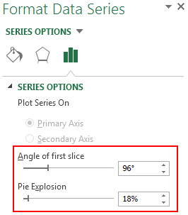
Step 11: The slices of the pie have been rotated. Moreover, the gap between them has been increased. This is shown in the following image.
Notice that the entire pie has been rotated. So, the slice that was earlier on the top-right has moved to the bottom-right. However, the colors of the slices have not been impacted.
Task e: Change the chart style and show how to apply filters to the pie chart
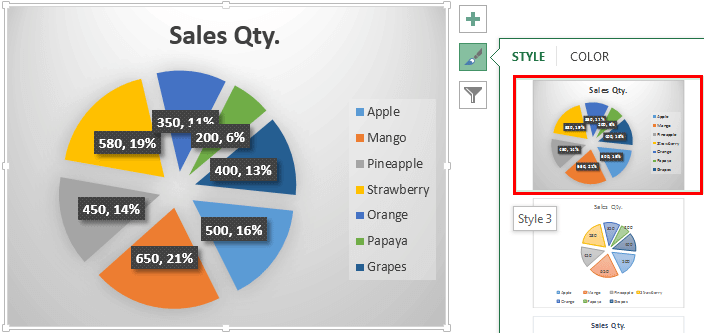
Step 12: Click the pie chart. Three icons will appear on the top-right side of the chart. Next, perform the following actions:
- Click the “chart styles” button or the paintbrush icon.
- Select the desired style from the “style” tab.
Notice the changed chart style in the following image.
When the cursor is hovered over the different chart styles, a preview is shown in Excel. So, the preview helps see the way the pie chart would look if the respective style is selected.
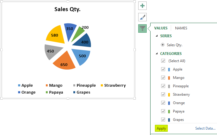
Step 13: Click the “chart filters” button (or the filter icon) displayed on the top-right side of the chart.
In the “values” tab (shown in the following image), all the flavors of the beverage are shown under “categories.” The single column (column B) used to create the excel pie chart is reflected under “series.”
Select or deselect the categories in order to show or hide them from the chart. Next, click “apply” shown at the bottom-left side of the “values” tab. The filters will be applied to the pie chart.
3-D Pie Chart
A 3-D (three-dimensional) pie chart is usually used for decorative purposes. The features of a 3-D pie chart are similar to that of a 2-D pie chart. However, a 3-D pie chart has an additional feature called 3-D rotation, which is not there in a 2-D pie chart.
It is not recommended to use a 3-D pie chart for data visualization. The reason is that the numbers represented by the chart may look larger than they actually are. So, a 3-D pie chart can be confusing and misleading due to its 3-D effect.
Example #2
Working on the dataset of example #1, we have changed the heading of column B to “actual sales.” Moreover, the sales numbers targeted by the organization have been added in column C. We want to perform the following tasks:
- Show the outcome when a 3-D pie chart is created by considering the entire dataset. In total, there should be two 3-D pie charts. They should reflect the numbers of both columns (columns B and C) one by one.
- Interpret the 3-D pie excel charts thus created.
The steps to perform the given tasks are listed as follows:
Step 1: Select the entire dataset (A1:C8) including columns B and C. From the Insert tab, click the pie chart icon (in the “charts” group) and choose a 3-D pie chart.
The selections are shown in the following image. Notice that the column headings have also been selected before inserting the excel pie chart. This is because we want the name of the column to be displayed as the title of the chart.
Step 2: A 3-D pie chart has been created, as shown in the following image. The data labels have been added to the pie chart the same way they were added in task “b” of example #1.
Notice that though we selected the entire dataset (in the preceding step), the pie chart displays only the numbers of column B. The reason is that a pie chart can show only a single series at a time. So, by default, Excel is displaying the first (column B) of the two series (columns B and C).
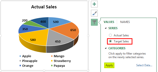
Step 3: Filter the series of the pie chart to show the numbers of column C. For filtering, perform the listed actions:
- Click the pie chart. Three icons appear on the top-right side of the chart.
- Click the “chart filters” button (or the filter icon), which is the third of the three icons.
- In the “values” tab, the “series” and “categories” are displayed. Select the series “target sales.”
- Click “apply.”
The selection of the series “target sales” is shown in the following image.
Step 4: A 3-D pie chart reflecting the numbers of column C has been created. This is shown in the following image. The data labels have been added by right-clicking the chart and choosing “add data labels.”
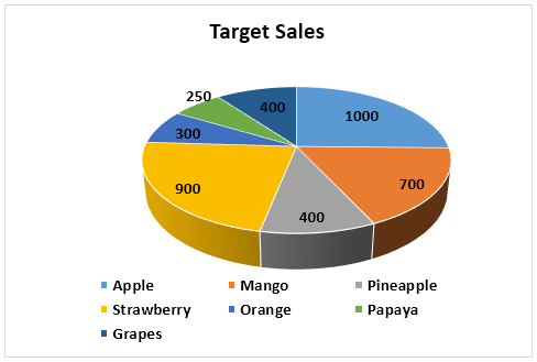
Interpretation of the two 3-D pie charts: The numbers of column B are reflected in the “actual sales” chart (in step 2), while those of column C are reflected in the “target sales” chart (in step 4). There are two charts because a pie chart can display a single data series at one time.
To facilitate comparison, one must place the two pie charts in excel next to each other. On a comparison between the two charts, one can observe that the actual sales of two flavors (pineapple and orange) have exceeded the target sales.
For the grapes flavor, the actual and target sales are the same. However, for all the remaining flavors, the targeted sales volume is more than the actual sales volume. Consequently, the organization must focus on pushing the actual numbers closer to the targeted numbers. Thus, a revision of the marketing plan may be required.
Pie of Pie Chart
A Pie of Pie chart displays an additional pie along with the main pie. This additional pie (or secondary pie) shows the breakup of one slice of the main pie. By default, Excel displays the last three data points of a series on the secondary pie. To avoid this, either of the following actions can be carried out:
- Sort the data series in a descending order. By sorting, the smallest three data points of the series are moved to the secondary pie.
- Choose the data points that will be moved to the secondary pie. For making this choice, the “format data series” panel is used.
A Pie of Pie chart enhances the readability of the main pie by moving the smaller slices to the secondary pie. As a result, the user can focus on the slices of both pies, thereby making the chart easy to interpret and analyze. Moreover, with the division of slices (of the main pie), a Pie of Pie chart can handle more data points than a regular pie chart.
Note: To know how to use the “format data series” panel in the second bullet point, refer to the following example.
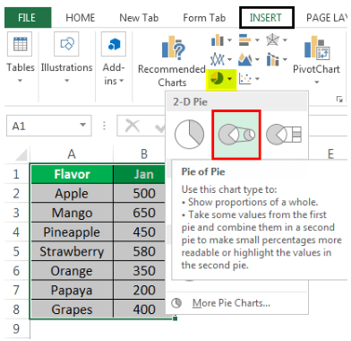
Example #3
Working on the dataset of example #1, we have changed the heading of column B to “Jan.” So, consider that the figures of this column pertain to the month of January of a certain year. Perform the following tasks:
- Make a Pie of Pie chart where the secondary pie displays the last three numbers (or data points) of the dataset. Further, interpret the Pie of Pie chart thus created.
- Show how the “format data series” panel is used to decide which data points to be displayed on the secondary pie.
The tasks and the steps to be performed are listed as follows:
Task a: Make a Pie of Pie chart and interpret it
Step 1: Select the entire dataset (A1:B8). From the Insert tab, click the pie icon appearing in the “charts” group. Choose the Pie of Pie chart from 2-D pie charts.
The selections are shown in the following image.
Step 2: The Pie of Pie chart is created, as shown in the following image. Notice that by default, Excel has moved the last three data points (350, 200, and 400) of the series to the secondary pie.
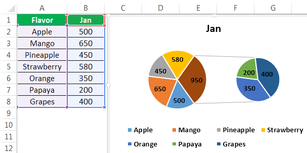
Interpretation of the Pie of Pie chart: There are 7 numbers in column B of the given dataset. The main pie shows five slices which consist of the first four data points (500, 650, 450, and 580) and the total of the last three data points (350+200+400=950).
Further, the slice showing the number 950 is the largest part of the main pie. This part is joined to the secondary pie with two grey lines. Notice that the last three data points moved to the secondary pie are smaller than the other data points. With this division of data points, one can easily focus on both pies at a given time.
So, the main pie can be studied to improve the demand for the preferred flavors (apple, mango, pineapple, and strawberry). In contrast, the secondary pie can be analyzed to identify the causes of low demand for the unpopular flavors (orange, papaya, and grapes).
Task b: Choose the data points to be displayed on the secondary pie
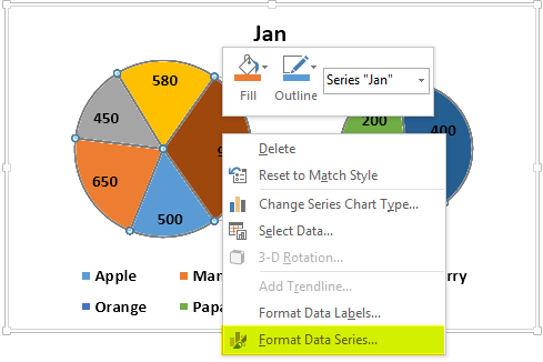
Step 3: Select the Pie of Pie chart and right-click it. Choose the option “format data series” from the context menu. This option is shown in the following image.
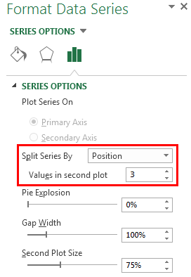
Step 4: The “format data series” pane opens, as shown in the following image. By default, the “split series by” drop-down list shows “position.” The option “position” tells Excel the number of data points to be moved to the secondary pie.
The “values in second plot” box shows 3. This implies that the last three data points will be moved to the secondary pie. This number (3) can be increased or decreased to add or reduce the number of slices of the secondary pie.
With the default selections (shown in the following image), the Pie of Pie chart looks the same as that of step 2 of this example. However, if we enter 4 in the “values in second plot” box, the slice representing the quantity 580 (fourth last data point) will also move to the secondary pie.
Note: The different options of the “split series by” drop-down list are explained as follows:
- “Value” or “percentage value”–These options allow specifying the minimum value or percentage below which the data points will be moved to the secondary pie.
- “Custom”–This option allows selecting a particular slice of the pies manually. Then, one can specify whether this slice should be displayed on the main or secondary pie.
Bar of Pie Chart
The Bar of Pie chart displays a stacked bar along with the pie. The bar shows the breakup of one of the slices of the pie. Moreover, the bar consists of segments that represent data points and are stacked one over the other.
Similar to the Pie of Pie chart, the last three data points of a series are shown on the bar by default. To move the smallest three data points to the bar, one can sort the series in a descending order.
One can also choose the slices or segments (or data points) to be shown on the pie and bar. The slices to be displayed are chosen with the help of the “format data series” pane. This pane works the same way it did for the Pie of Pie chart.
A Bar of Pie chart improves the readability of the pie and bar, thereby helping the user to focus on all the data points of a series.
Example #4
Working on the dataset of example #1, we have titled column B as “sales.” Create a Bar of Pie chart and interpret it.
The steps to create a Bar of Pie chart are listed as follows:
Step 1: Select the entire dataset (A1:B8). Click the pie icon from the “charts” group of the Insert tab. From 2-D pie charts, choose the Bar of Pie chart.
The Bar of Pie chart option is shown within a black box in the following image.
Step 2: The Bar of Pie chart is inserted, as shown in the following image. Notice that by default, the last three data points (350, 200, and 400) have been moved to the bar displayed on the right side of the pie.
Interpretation of the Bar of Pie chart: The pie represents the first four data points (500, 650, 450, and 580) of the series (of column B) along with the total of the last three data points (350+200+400=950).
The biggest slice of the pie is the brown one. It represents the number 950. This slice is connected to the bar with the help of grey lines. Notice that the bigger the number, the larger the segment of the bar. In other words, the larger the segment of the bar or the bigger the slice of the pie, the higher the quantity sold of that flavor.
Therefore, the pie shows the highly preferred flavors while the bar shows the less preferred ones. The green segment (papaya) of the bar is the least preferred as its area is the smallest. So, the organization needs to boost sales of the flavors that are not much preferred by its customers.
Doughnut Chart
A doughnut chartA doughnut chart is a type of excel chart whose visualization is similar to pie chart. The categories in this chart are parts that, when combined, represent the whole data in the chart. A doughnut chart can only be made using data in rows or columns.read more is a variant of the pie chart of Excel. However, the former is different from the latter in the sense that it can contain more than one data series. Moreover, a doughnut chart consists of rings instead of slices. Further, each ring consists of arcs. The innermost ring of the chart represents the first data series.
A doughnut chart is hollow on the inside. It is difficult to read and interpret a doughnut chart compared to a regular excel pie chart. From Excel 2016, sunburst charts have been introduced, which are more preferred than doughnut charts.
Example #5
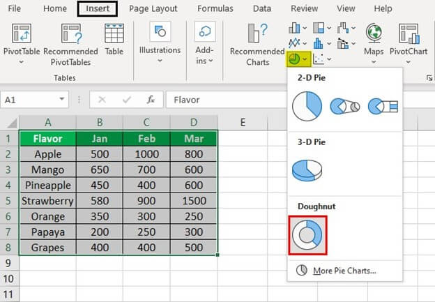
Working on the dataset of example #1, we have labeled column B as “Jan.” This column shows the sales of January. We have also added the sales of February and March to columns C and D respectively.
In total, there are three series (Jan, Feb, and Mar) in the dataset. Perform the following tasks:
- Create a doughnut chart by considering the entire dataset.
- Title the chart as “Doughnut Pie Chart.”
- Show the doughnut chart with an enlarged hole.
- Interpret the chart thus created.
The steps to perform the given tasks are listed as follows:
Step 1: Select the entire dataset (A1:D8). Click the pie icon from the Insert tab of Excel. Choose “doughnut” under the doughnut charts.
The selection is shown in the following image.
Note: In Excel 2007, click the “other charts” drop-down (in the “charts” group) from the Insert tab. Next, select “doughnut” under the doughnut charts.
Step 2: A doughnut chart is inserted in Excel, as shown in the following image. The “chart title” text box may or may not appear (by default) on top of the chart. If the “chart title” text box does not appear, perform the following actions:
- Click anywhere on the doughnut chart. The “chart tools” menu of the Excel ribbon becomes visible. It consists of the Design and Format tabs.
- Click “add chart element” from the Design tab.
- From “chart title,” select either “above chart” or “centered overlay.” A default text box consisting of “chart title” appears.
- Type the desired title within the text box.
- Click outside the text box to fix the new title to the chart.
If the “chart title” text box does appear, type “Doughnut Pie Chart” within it. Next, follow action “e” listed above.
To enlarge the hole of the doughnut chart, perform the following actions:
- Right-click any data series and choose “format data series” from the context menu. The “format data series” pane opens.
- In the “series options” tab, there is a slider under “doughnut hole size.” Move this slider to the right to increase the size of the hole. Alternatively, enter a percentage between 10 and 90 in the box. We have entered 75%.
The chart title and the enlarged hole are shown in the following image.
Note: In Excel 2007, the “chart tools” menu shows the Design, Layout, and Format tabs. To add a title to the chart, click the “chart title” drop-down (in “labels” group) from the Layout tab. Next, follow steps “c,” “d,” and “e” listed under the first set of actions.

Interpretation of the Doughnut chart: The innermost ring of the chart represents the series “Jan.” The middle and the outer rings represent the series “Feb” and “Mar” respectively.
Each data point is represented by an arc in place of a slice. So, one can say that the bigger the number (or data point), the larger the arc representing it. In each ring, there are seven arcs for the seven flavors.
Notice that the flavor papaya has a small arc (in green) in all the three rings. However, just by looking at the chart, one cannot ascertain the numbers represented by the different arcs. Further, had we added data labels to all the three rings, the chart would have become cluttered. For these reasons, a regular pie chart is preferred over a doughnut chart.
Frequently Asked Questions
1. Define a pie chart and suggest how to make it in Excel.
A pie chart shows the data points of a single data series. It is a circular chart consisting of slices. One slice represents one data point. The entire pie represents the total of the individual data points. Zeroes and negative values cannot be depicted on a pie chart.
To create a pie chart in Excel, follow the listed steps:
a. Arrange the data series in a single row or single column of Excel.
b. Select the entire dataset including the row and column headings as well as the data series.
c. Click the pie icon from the “charts” group of the Insert tab.
d. Select the required pie chart like a 2-D pie chart, 3-D pie chart, Pie of Pie chart, and so on.
The pie chart selected in step “d” is inserted in Excel.
Note: For more details on the different types of pie charts, refer to the definitions and examples given in this article.
2. How to make a pie chart showing percentages in Excel?
To create a pie chart showing percentages, follow either of the listed methods:
• Method 1–Enter the numbers (or data points) as percentages in the data series. These percentages will appear as data labels on the pie chart. For adding such data labels, right-click the pie chart and choose “add data labels” from the context menu.
• Method 2–Enter numbers as is in the series and let Excel convert them to percentages. Once converted, the numbers and percentages will appear as data labels on the pie chart. The steps to display such data labels are listed as follows:
a. Right-click any slice of the pie chart and choose “format data labels” from the context menu. The “format data labels” pane opens.
b. From the “label options” tab, select “value” and “percentage” under “label contains.”
c. Close the “format data labels” pane.
Note: In both methods, the sum of all the data points (or the total value) need not necessarily be 100%. If this sum is not 100%, the outcomes are stated as follows:
• In method 1, each slice of the pie represents a percentage of the total value. The sum of all slices (or data points) of the pie is any value other than 100%.
• In method 2, Excel automatically makes the sum of all slices of the pie 100%. So, the percentage represented by each slice is calculated from the total of 100%.
3. How to create a pie chart using multiple columns of Excel? Suggest how to resize a pie chart in Excel.
It is not possible to create a pie chart using multiple columns or multiple data series. The reason is that a regular pie chart displays the data points (or categories) of a single data series only. So, only a single row or a single column can be used as the source dataset of a pie chart.
To display the data points of multiple data series, the doughnut chart can be used as a variant of the regular pie chart.
The steps to resize an excel pie chart are listed as follows:
a. Click anywhere on the pie chart. The “chart tools” menu appears on the Excel ribbon.
b. Click the “format” tab from the “chart tools” menu.
c. Type the required size in the “height” and “width” boxes displayed in the “size” group.
d. Press the “Enter” key.
Note: Alternatively, increase or decrease the size of the pie chart by using the arrows of the “height” and “width” boxes.
Recommended Articles
This has been a guide to making Pie chart in Excel. Here we discuss how to make the top five types of pie charts, namely, 2-D, 3-D, Pie of Pie, Bar of Pie, and Doughnut chart. You may learn more about Excel from the following articles–
- Excel Rotate Pie Chart
- Create Control Charts in Excel
- Excel Stock Chart
- Create 3D Maps in Excel
Excel has a variety of in-built charts that can be used to visualize data. And creating these charts in Excel only takes a few clicks.
Among all these Excel chart types, there has been one that has been a subject of a lot of debate over time.
…the PIE chart (no points for guessing).
Pie charts may not have got as much love as it’s peers, but it definitely has a place. And if I go by what I see in management meetings or in newspapers/magazines, it’s probably way ahead of its peers.
In this tutorial, I will show you how to create a Pie chart in Excel.
But this tutorial is not just about creating the Pie chart. I will also cover the pros & cons of using Pie charts and some advanced variations of it.
Note: Often, a Pie chart is not the best chart to visualize your data. I recommend you use it only when you have a few data points and a compelling reason to use it (such as your manager’s/client’s penchant for Pie charts). In many cases, you can easily replace it with a column or bar chart.
Let’s start from the basics and understand what is a Pie Chart.
In case you find some sections of this tutorial too basic or not relevant, click on the link in the table of contents and jump to the relevant section.
What is a Pie Chart?
I will not spend a lot of time on this, assuming you already know what it is.
And no.. it has nothing to do with food (although you can definitely slice it up into pieces).
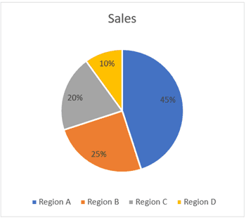
A pie chart (or a circle chart) is a circular chart, which is divided into slices. Each part (slice) represents a percentage of the whole. The length of the pie arc is proportional to the quantity it represents.
Or to put it simply, it’s something as shown below.

The entire pie chart represents the total value (which is 100% in this case) and each slice represents a part of that value (which are 45%, 25%, 20%, and 10%).
Note that I have chosen 100% as the total value. You can have any value as the total value of the chart (which becomes 100%) and all the slices will represent a percentage of the total value.
Let me first cover how to create a Pie chart in Excel (assuming that’s what you’re here for).
But I do recommend that you go on and read all the things covered later in this article as well (most importantly the Pros and Cons section).
Creating a Pie Chart in Excel
To create a Pie chart in Excel, you need to have your data structured as shown below.

The description of the pie slices should be in the left column and the data for each slice should be in the right column.
Once you have the data in place, below are the steps to create a Pie chart in Excel:
- Select the entire dataset
- Click the Insert tab.

- In the Charts group, click on the ‘Insert Pie or Doughnut Chart’ icon.

- Click on the Pie icon (within 2-D Pie icons).


The above steps would instantly add a Pie chart on your worksheet (as shown below).

While you can figure out the approximate value of each slice in the chart by looking at its size, it’s always better to add the actual values to each slice of the chart.
These are called the Data Labels
To add the data labels on each slice, right-click on any of the slices and click on ‘Add Data Labels’.

This will instantly add the values to each slice.
You can also easily format these data labels to look better on the chart (covered later in this tutorial).
Formatting the Pie Chart in Excel
There are a lot of customizations you can do with a Pie chart in Excel. Almost every element of it can be modified/formatted.
Pro Tip: It’s best to keep your Pie Charts simple. While you can use a lot of colors, keep it to a minimum (even different shades of the same color is fine). Also, if your charts are printed in black and white, you need to make sure the difference in slice colors is noticeable.
Let’s see a few of the things that you can change to make your charts better.
Changing the Style and Color
Excel already has some neat pre-made styles and color combinations that you can use to instantly format your Pie charts.
When you select the chart, it will show you the two contextual tabs – Design and Format.

These tabs only appear when you select the chart
Within the ‘Design’ tab, you can change the Pie chart style by clicking on any of the pre-made styles. As soon as you select the style that you want, it will be applied to the chart.

You can also hover your cursor over these styles and it will show you a live preview of how your Pie chart would look when that style is applied.
You can also change the color combination of the chart by clicking on the ‘Change Colors’ option and then selecting the one you want. Again, as you hover the cursor over these color combinations, it will show a live preview of the chart.

Pro Tip: Unless you want your chart to be really colorful, opt for the monochromatic options. These have shades of the same color and are relatively easy to read. Also, in case you want to highlight one specific slice, you can keep all the other slices in dull color (such as grey or light blue) and highlight that slice with a different color (preferably bright colors such as red or orange or green).
Related tutorial: How to Copy Chart (Graph) Format in Excel
Formatting the Data Labels
Adding the data labels to a Pie chart is super easy.
Right-click on any of the slices and then click on Add Data Labels.

As soon as you do this. data labels would be added to each slice of the Pie chart.
And once you have added the data labels, there is a lot of customization you can do with it.
Quick Data Label Formatting from the Design Tab
A quick level of customization of the data labels is available in the Design tab, which becomes available when you select the chart.
Here are the steps to format the data label from the Design tab:
- Select the chart. This will make the Design tab available in the ribbon.
- In the Design tab, click on the Add Chart Element (it’s in the Chart Layouts group).

- Hover the cursor on the Data Labels option.

- Select any formatting option from the list.

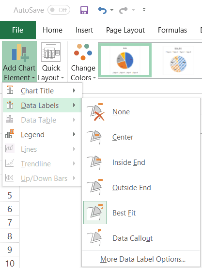
One of the options that I want to highlight is the ‘Data Callout’ option. It quickly turns your data labels into callouts as shown below.

More data label formatting options become available when you right-click on any of the data labels and click on ‘Format Data Labels.

This will open a ‘Format Data Labels’ pane on the side (or a dialog box if you’re using an older version of Excel).
In the Format Data Labels pane, there are two sets of options – Label Options and Text Options

Formatting the Label Options
You can do the following type of formatting with the label options:
- Give a border to the label(s) or fill the label(s) box with a color.
- Give effects such as Shadow, Glow, Soft Edges, and 3-D Format.
- Change the size and alignment of the data label
- Format the label values using the Label options.

I recommend keeping the default data label settings. In some cases, you may want to change the color or the font size of these labels. But in most cases, the default settings are fine.
You can, however, make some decent formatting changes using the label options.
For example, you can change the placement of the data label (which is ‘best fit’ by default) or you can add the percentage value for each slice (which shows how much percentage of the total does each slice represents).
Formatting the Text Options
Text Options formatting allows you to change the following:
- Text Fill and outline
- Text Effects
- Text box

In most cases, the default settings are good enough.
The one setting you may want to change is the data label text color. It’s best to keep a contrasting text color so it’s easy to read. For example, in the below example, while the default data label text color was black, I changed it to white to make it readable.

Also, you can change the font color and style by using the options in the ribbon. Just select the data label(s) you want to format and use the formatting options in the ribbon.
Formatting the Series Options
Again, while the default settings are enough in most cases, there are few things you can do with ‘Series Options’ formatting that can make your Pie charts better.
To format the series, right-click on any of the slices of the Pie chart and click on ‘Format Data Series’.

This will open a pane (or a dialog box) with all the series formatting options.
The following formatting options are available:
- Fill & Line
- Effects
- Series Options

Now let me show you some minor formatting that you can do to make your Pie chart look better and more useful for the reader.
Formatting the Legend
Just like any other chart in Excel, you can also format the legend of a Pie chart.
To format the legend, right-click on the legend and click in Format Legend. This will open the Format Legend pane (or a dialog box)

Within the Format Legend options, you have the following options:
- Legend Options: This will allow you to change the formatting such as fill color and line color, apply effects, and change the position of the legend (which allows you to place the legend at the top, bottom, left, right and top right).
- Text Options: These options allow you to change the text color and outline, text effects, and the text box.
In most cases, you don’t need to change any of these settings. The only time I use this is when I want to change the position of the legend (place it on the right instead of the bottom).
Pie Chart Pros and Cons
Although Pie charts are used a lot in Excel and PowerPoint, there are some drawbacks about it that you should know.
You should consider using it only when you think it allows you to represent the data in an easy to understand format and adds value for the reader/user/management.
Let’s go through the Pros and Cons of using Pie charts in Excel.
Let’s start with the good things first.
What’s Good about Pie Charts
- Easy to create: While most of the charts in Excel are easy to create, pie charts are even easier. You don’t need to worry a lot about customization as most of the times, the default settings are good enough. And if you need to customize it, there are many formatting options available.
- Easy to read: If you only have a few data points, Pie charts can be very easy to read. As soon as someone looks at a Pie chart, they can figure out what it means. Note that this works only if you have a few data points. When you have a lot of data points, the slices get smaller and become hard to figure out
- Management loves Pie Charts: In my many years of corporate career as a financial analyst, I have seen the love managers/clients have for Pie charts (which is probably only trumped by their love for coffee and PowerPoint). There have been instances, where I have been asked to convert bar/column charts into Pie charts (as people find it more intuitive).
If you’re interested, you can also read this article by Excel charting expert Jon Peltier on why we love pie charts (disclaimer: he doesn’t)
What’s Not so Good About Pie Charts
- Useful Only with fewer data points: Pie charts can become quite complex (and useless to be honest) when you have more data points. The best use of a Pie chart would be to show how one or two slices are doing as a part of the overall pie. For example, if you have a company with five divisions, you can use a Pie chart to show the revenue percent of each division. But if you have 20 divisions, it may not be the right choice. Instead, a column/bar chart would be better suited.
- Can’t show a trend: Pie charts are meant to show you the snapshot of the data in a given point in time. If you want to show a trend, better use a line chart.
- Can’t show multiple types of data points: One of the things I love about Column charts is that you can combine it with a line and create combination charts. A single combination chart packs a lot more information than a plain Pie chart. Also, you can create actual vs target charts which are a lot more useful when you want to compare data in different time periods. When it comes to a Pie chart, you can easily replace it with a line chart without losing out on any information.
- Difficult to comprehend when the difference in slices is less: It’s easier to visually see the difference in a column/bar chart as compared with a Pie chart (especially when there are a lot of data points). In some cases, you may want to avoid these as they may be a bit misleading.
- Takes more space and gives less information: If you’re using Pie charts in reports or dashboards (or in PowerPoint slides) and want to show more information in less space, you may want to replace it with other chart types such as combination charts or bullet chart.
Bottom line – Use a pie chart when you want to keep things simple and have to show data for a specific point in time (such as year-end sales or profit). In all other cases, it’s better to use other charts.
Advanced Pie Charts (Pie of Pie & Bar of Pie)
One of the major drawbacks of a Pie chart is that when you have a lot of slices (especially really small ones), it’s hard to read and analyze those (such as the ones shown below):
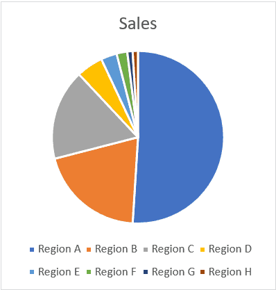
In the above chart, it might make sense to create a Pie of Pie chart or a Bar of Pie chart to present the lower values (the one shown with small slices) as a separate pie chart.
For example, if I want to specifically focus on the three lowest values, I can create a Pie of Pie chart as shown below.
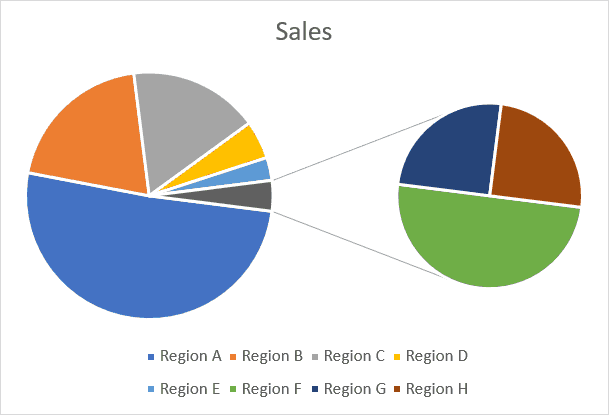
In the above chart, the three smallest slices get clubbed into one gray slice, and then the gray slice is shown as another Pie chart on the right. So instead of analyzing three small tiny slices, you get a zoomed-in version of it in the second pie.
While I think this is useful, I have never used it for any corporate presentation (but I have seen these being used). And I would agree that these allow you to tell a better story by making the visualization easy.
So let’s quickly see how to create these charts in Excel.
Creating a Pie of Pie Chart in Excel
Suppose you have a data set as shown below:

If you create a single Pie chart using this data, there would be a couple of small slices in it.
Instead, you can use the Pie of Pie chart to zoom into these small slices and show these as a separate Pie (you can also think of it as a multiple level Pie chart).
Note: By default, Excel picks up up the last three data points to plot in a separate Pie chart. In case the data is not sorted in ascending order, these last three data points may not be the smallest one. You can easily correct this by sorting the data
Here are the steps to create a Pie of Pie chart:
- Select the entire data set.
- Click the Insert tab.
- In the Charts group, click on the ‘Insert Pie or Doughnut Chart’ icon.
- Click on the ‘Pie of Pie’ chart icon (within 2-D Pie icons)


The above steps would insert the Pie of Pie chart as shown below.
The above chart automatically combines a few of the smaller slices and shows a breakup of these slices in the Pie on the right.
This chart also gives you the flexibility to adjust and show a specific number of slices in the Pie chart on the right. For example, if you want the chart on the right to show a breakup of five smallest slices, you can adjust the chart to show that.
Here is how you can adjust the number of slices to be shown in the Pie chart on the right:
- Right-click on any of the slices in the chart
- Click on Format Data Series. This will open the Format Data Series pane on the right.
- In the Series options tab, within the Split Series by options, select Position (this may be the default setting already)
- In the ‘Values in second plot’, change the number to 5.


The above steps would combine the 5 smallest slices and combine these in the first Pie chart and show a breakup of it in the second Pie chart on the right (as shown below).
In the above chart, I have specified that the five smallest slices be combined as one and be shown in a separate Pie chart on the right.
You can also use the following criteria (which can be selected from the ‘Split Series by’ drop-down):

- Value: With this option, you can specify to club all the slices that are less than the specified value. For example, in this case, if I use 0.2 as the value, it will combine all the slices where the value in less than 20% and show these in the second Pie chart.
- Percentage Value: With this option, you can specify to club all the slices that are below the specified percentage value. For example, if I specify 10% as the value here, it will combine all the slices where the value is less than 10% of the overall Pie chart and show these in the second Pie chart.
- Custom: With this option, you can move the slices in case you want some slices in the second Pie chart to be excluded or some in the first Pie chart to be included. To remove a slice from the second Pie chart (the one of the right), click on the slice which you want to remove and then select ‘First Plot’ in the ‘Point Belongs to’ drop-down. This will remove that slice from the second plot while keeping all the other slices still there. This option is useful when you want to plot all the slices that are small or below a certain percentage in the second chart, but still, want to manually remove a couple of the slices from it. Using the custom option allows you to do this.
Formatting the ‘Pie of Pie’ Chart in Excel
Apart from all the regular formatting of a Pie chart, there are a few additional formatting things you can do with the Pie of Pie chart.
Point Explosion
You can use this option to separate the combined slice in the first Pie chart, which is shown with a break up in the second chart (on the right).

To do this, right-click on any slice of the Pie chart and change the Point Explosion value in the ‘Format Data Point’ pane. The higher the value, the more distance would be between the slice and the rest of the pie chart.
Gap Width
You can use this option to increase/decrease the gap between the two Pie charts.
Just change the Gap width value in the ‘Format Data Point’ pane.
Size of the Second Pie Chart (the one of the right)
By default, the second Pie chart is smaller in size (as compared with the main chart on the left).
You can change the size of the second Pie chart by changing the ‘Second Plot Size’ value in the ‘Format Data Point’ pane. The higher the number, the larger is the size of the second chart.
Creating a Bar of Pie Chart in Excel
Just like the Pie of Pie chart, you can also create a Bar of Pie chart.
In this type, the only difference is that instead of the second Pie chart, there is a bar chart.
Here are the steps to create a Pie of Pie chart:
- Select the entire data set.
- Click the Insert tab.
- In the Charts group, click on the ‘Insert Pie or Doughnut Chart’ icon.
- Click on the ‘Bar of Pie’ chart icon (within 2-D Pie icons)
The above steps would insert a Bar of Pie chart as shown below.
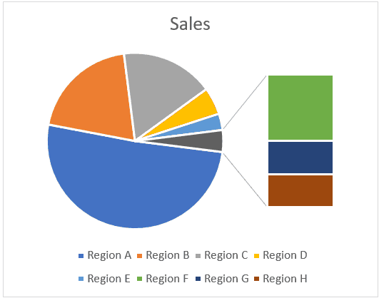
The above chart automatically combines a few of the smaller slices and shows a breakup of these slices in a Bar chart on the right.
This chart also gives you the flexibility to adjust this chart and show a specific number of slices in the Pie chart on the right in the bar chart. For example, if you want the chart on the right to show a breakup of five smallest slices in the Pie chart, you can adjust the chart to show that.
The formatting and settings of this Pie of bar chart can be done the same way we did for Pie of Pie charts.
Should You be using Pie of Pie or Bar of Pie charts?
While I am not a fan, I will not go as far as forbidding you to use these charts.
I have seen these charts being used in management meetings and one reason these are still being used is that it helps in letting you tell the story.
If you’re presenting this chart live to an audience, you can command their attention and take them through the different slices. Since you’re doing all the presentation, you also have the control to make sure things are understood the way it’s supposed to be, and there is no confusion.
For example, if you look at the chart below, someone may misunderstand that the green slice is bigger than the gray slice. In reality, the entire Pie chart on the right is equal to the gray slice only.
Adding data labels definitely helps, but the visual aspect always leaves some room for confusion.
So, if I am using this chart with a live presentation, I can still guide the attention and avoid confusion, but I wouldn’t use these in a report or dashboard where I am not there to explain it.
In such a case, I would rather use a simple bar/column chart and eliminate any chance of confusion.
3-D Pie Charts – Don’t Use these… Ever
While I am quite liberal when it comes to using different chart types, when it comes to 3-D Pie charts, it’s a complete NO.
There is no good reason for you to use a 3-D Pie chart (or any 3-D chart for that matter).
On the contrary, in some cases, these charts can cause confusions.
For example, in the below chart, can you tell me how much is the blue slice as a proportion of the overall chart.
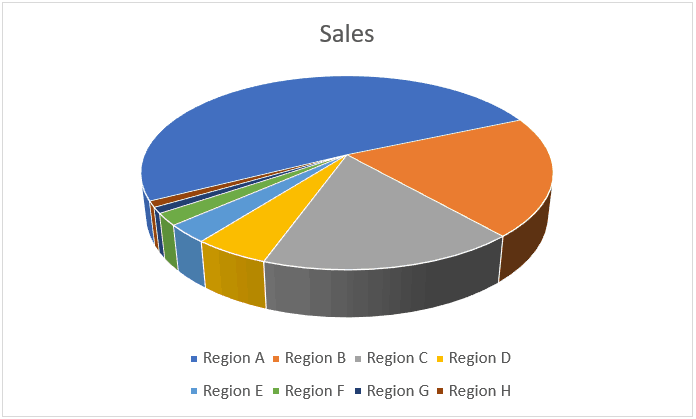
Looks like ~40%.. right?
Wrong!
It’s 51% – which means it’s more than half of the chart.
But if you look at the above chart, you can easily get tricked into thinking that it’s somewhere around 40%. This is because the rest of the part of the chart is facing towards you, and thanks to the 3-D effect of it, looks bigger.
And this is not an exception. With 3-D charts, there are tons of cases where the real value is not what it looks like. To avoid any confusion better stick to the 2-D charts only.
You can create a 3-D chart just like you create a regular 2-D chart (by selecting the 3-D chart option instead of the 2-D option).
My recommendation – avoid any kind of 3-D chart in Excel.
You May Also Like the Following Excel Charting Tutorials:
- Advanced Excel Charts
- Bell Curve in Excel
- Waffle Chart in Excel
- Gantt Chart in Excel
- Area Chart in Excel
- Excel Sparklines
- Pareto Chart in Excel
- Step Chart in Excel
- Actual Vs Target Chart in Excel
- Excel Histogram Chart
- Milestone chart in Excel
How to Make and Customize Pie Charts in Excel
Smartsheet Contributor
Diana Ramos
August 27, 2018
A pie chart is a tool to display basic statistical information, and is one of the easier charts to make in Excel. Follow these step-by-step instructions to master creating pie charts, along with tips for customizing the chart and variants you can use.
What Is a Pie Chart?
A pie chart, sometimes called a circle chart, is a useful tool for displaying basic statistical data in the shape of a circle (each section resembles a slice of pie). Unlike in bar charts or line graphs, you can only display a single data series in a pie chart, and you can’t use zero or negative values when creating one. A negative value will display as its positive equivalent, and a zero value simply won’t appear.
When creating a pie chart, the description of each section is called the category, and the number connected to the category is called the value. The categories will add up to 100 percent of whatever is being charted, and the relative size of each category is a visual representation of its relation to the whole. Categories shouldn’t overlap. For example, if one category is “Women” and another is “People Over Fifty,” there’s a pretty good chance that there will be women over 50 and therefore, they would be counted twice.
Pie charts are not effective if there are more than seven categories, but some of the variations available allow charts to display a couple more categories. Some experts don’t like pie charts because they find it difficult to accurately compare the angles, but adding labels to the data can overcome that issue.
Excel offers a number of variations on the basic pie chart. Steps for creating each are included in the instructions later in this article. The first three options displayed below are listed under the pie chart type, the last is listed under the other type.
Pie of Pie and Bar of Pie: Despite their clumsy names, these clever charts make it easier to view smaller values or subsets of the data that make up the category.
3D Chart: Add depth to a basic pie chart with the 3D option. Depending on the perspective, 3D charts may be misleading because smaller categories may appear larger than they are, so use them with care.
Doughnut Chart: This option looks just like a pie chart, but with a hole in the middle. Doughnut charts can have more than one data series.
Some Examples of Pie Chart Uses
Pie charts can be used to display a lot of different data sets, including things like factory output by shift, revenue generated by one product compared to total revenue, or water usage by type.
Some other possible examples are trash vs. recycling, types of pets in a town, price range of products sold, census results, revenues by region, or packages shipped by each carrier.
In this section, we’ll show you the steps to create a pie chart in Excel 2011 for Mac. While the images may differ, the steps will be the same for other versions of Excel, unless they are called out in the text.
- Open a blank worksheet in Excel. Enter data into the worksheet and select the data. Remember that pie charts only use a single data series. If you select the column headers, the header for the values will appear as the chart title, and you won’t be able to edit the text.
- Click Chart > Pie (hovering over the chart types will show brief info about them), and then click Pie
- The pie chart appears on the worksheet.
Other Versions of Excel: The chart types are listed under the Insert tab. This is the only difference.
If you realize there’s an error in the data, there’s no need to start over. Simply update the data on the worksheet and the chart will automatically adjust to reflect the new data. If you’ve copied the chart to another place (excluding other Microsoft Office program), you’ll need to insert the updated chart into the other program. If the chart has been copied into a Microsoft Office program on the same computer, the chart copy will automatically update.
If you only want to display a subset of a long data list, select the data you want to appear in the chart. The rows don’t even have to be contiguous. While the examples used in this article all have data in columns, you can also use data in rows.
How to Read a Pie Chart
Pie charts are easy to read so little explanation is required, but there are a couple things that will make them easier to understand. As mentioned earlier, the data in the chart will always add up to 100 percent. If there are no data labels, hovering the cursor over a category (the official name for a section or slice) will display the corresponding data.
Besides being easy to read, pie charts are useful because they show a lot of information in a small space, and they allow an immediate analysis of the relationship among each category — both to the the others and to the whole.
How Do You Make a Pie Chart in Excel 2016?
To create a pie chart in Excel 2016, add your data set to a worksheet and highlight it. Then click the Insert tab, and click the dropdown menu next to the image of a pie chart. Select the chart type you want to use and the chosen chart will appear on the worksheet with the data you selected.
While the steps are the same as shown above (unless noted), the screenshots will vary based on the Excel version you use.
How Do You Add Labels to a Pie Chart?
When you create a pie chart, a legend is automatically included. If want the category names to appear on or near the chart, right-click on the chart and click Add Data Labels….
By default, the numerical values are added.
To add other labels, such as the categorical values or the percentage of the total that each category represents, right-click on the chart, then click Format Data Labels….
Click Labels, and make your selections. Then click OK.
Add the series name (the column header for your data) followed by the character that separates each item (a new line, comma, space, colon, or semicolon), and the location where the data labels are displayed.
Click and drag data labels to move them. You can also choose to show the category color next to the label (similar to the legend), and include lines connecting the data labels if they are moved away from the chart. By selecting the other options, such as Shadow, Font, or Fill, you can tweak the appearance of the data labels. Experiment with the options until you find what works.
How to Change the Appearance of a Pie Chart
Quick Layouts, Styles, and Themes
Excel offers Quick Layout and Chart Styles options. Quick Layout is a set of options that you use to format the chart and add elements. Chart Styles are ways to format just the chart. Scroll through them to see if any meet your needs.
Excel 2016 and versions more recent than 2011 also offer themes, which are a collection of preselected fonts and colors. Changing these themes will affect the default appearance of any pie charts created after selecting the theme. To view available theme elements, click the Page Layout tab, then click Colors or Fonts.
Moving the Chart
To move the chart to another place on the same sheet, simply click on it and drag it to the new position.
To move the pie chart to another sheet in the same workbook, right-click on the chart and select Move Chart…, then either select an existing sheet, or create a new one.
Resizing the Pie Chart
To change the size of the chart area, click on a corner and drag it to see a larger or smaller version.
Note: There isn’t a way to adjust the size of the chart within the chart area — Excel automatically does that.
Rotating the Pie Chart
To rotate the pie chart (i.e., put a different slice at the top), right-click on the chart, click Format Data Series…, click Options, and enter a value into the Angle of first slice box. You’ll have to experiment to get the chart to look exactly as you envision.
If the goal is to have a particular slice at the top of the chart, it’s easier to rearrange the order of the rows of data, placing the one you want to appear at the top of the chart in the first row of the data column.
Adding Chart Titles
To add a title to the chart, click Charts in the ribbon, click Chart Layout, click Chart Title, and chose the location.
To change the appearance of a title, click Charts, click Chart Layout, click Chart Title, then click Chart Title Options…. Here you can change the font style, color, and size, as well as the background of the box and many other options.
Pie Chart Legends
As noted earlier, a legend is included by default when the chart is created. To delete the legend, right-click on the legend and then click Delete. To change the appearance of the legend, right-click on it, then click Format Legend…, and make your changes.
If you delete the legend, but want it to reappear, click on the Charts tab, click Chart Layout, click Legend, and then choose where you want to place the legend.
Colors, Fonts and Backgrounds
If the default chart appearance or available themes and quick settings don’t fit your needs, you can change the appearance of the pie slices by applying different fonts and adding a color or texture to the background.
Colors
To change the appearance of a pie slice, click on the slice and then double-click it to open the Format Data Point window. Click Fill to change the color, add a texture, or even fill the slice’s space with a picture.
Fonts
Once you’ve added data labels, you can change the size, color, and other appearance factors. Click the data label once, right-click on it, and click Format Text…. The changes made will affect all selected text (i.e. if only one slice’s label is affected, then only that slice’s label will be changed. If you want to change the text on one slice, click on it twice).
You can also perform the same action on any other text in the pie chart, such as the legend or a title.
Backgrounds
If you don’t like the default background, right-click on an empty space in the chart, and then click Format Chart Area…. Not only can you change the background color, but you can also add textures, gradients, and patterns. You can also change the thickness and color of the chart’s border, and add other effects (such as a drop shadow).
Creating Exploding Pies and Exploding Slices
The exploded pie option can be easier to read if there are a lot of values in your data set. If you want to emphasise a particular value, use the exploding slice option.
There are a couple ways to create exploding pies and exploding slices.
- Select the Exploded Pie option when creating the chart.
2. Add the exploding pie after you create the chart. To create an exploded pie, click and drag any slice, and the chart will adjust.
3. To explode a single slice, click once on the pie to select it, click on the desired slice, and then drag it out of the pie.
Note: If the two clicks are too close together, the Format Data Point window will appear.
Additional Pie Chart Formatting Options
There are a variety of ways to customize a pie chart. You can create new categories, sort how the slices appear, and add WordArt.
Resorting By Slice Size
If you want to position the slices based on size (e.g. smallest to largest), sort the original data using Excel’s sorting tool, and the chart will automatically update group the chart slices by size.
Combining Small Slices into an “Other” Category
There are two ways to combine a number of small categories into one “other” category. To do this easily, enter data into Excel but combine the desired numerical values into a single row and name the categorical value “other.”
Below is a more complicated method:
-
Enter data into Excel with the desired numerical values at the end of the list.
-
Create a Pie of Pie chart.
-
Double-click the primary chart to open the Format Data Series window.
-
Click Options and adjust the value for Second plot contains the last to match the number of categories you want in the “other” category.
-
Right-click on one section of the secondary chart, click Format Data Point…, click Fill, then click No Fill from the color drop down.
-
Repeat this for each slice of the secondary plot.
-
If you have data labels, remove them from each section of the secondary plot as well.
-
If there are lines connecting the main chart and the now-invisible secondary chart, right click a line, click Format Series Lines…, click Line, and click No Line from the color drop down.
WordArt
WordArt is a feature found in Microsoft Office applications. You can use WordArt to give text an artistic look (like the example below).
While WordArt can’t be applied to chart elements, you can create them separately and then paste it into the chart as titles or data labels.
Working with Pie Chart Variations
As noted above, there are pie chart variations you can apply when dealing with a lot of information for a category or if you want to break out specific data sets. Here are a few variations you can apply to reveal more data in a pie chart.
Pie of Pie and Bar of Pie Charts
To create a Pie of Pie or Bar of Pie chart, the steps are the same as creating a basic pie chart (with the exception of which chart subtype you choose). Editing the chart is the same as well.
When you create a Pie of Pie or Bar of Pie chart, the number of categories in the second plot (the smaller pie or the bar) are chosen by default: It’s always the final rows in the data set, and the larger amount of the initial set, the larger number of rows included in the second plot. To change the number of categories in the second plot, right-click on the chart, then click Format Data Series… and change the value in the Second plot contains the last box.
You can also change the default series by the value (e.g. numbers lower than five), percent (e.g. all values that are less than 10 percent of the total), or create a custom setting. There’s also a setting to change the size of the second plot relative to the main pie (you can even make the secondary plot larger than the main pie).
To change the distance between the two charts, right-click on the chart, then click Format Data Series… and change the value in the Gap width box.
In a pie of pie chart, the smaller pie can also have a slice or the whole chart exploded. Follow the instructions for exploding the main plot.
3D Pie Charts
Like the basic pie chart, you can rotate the 3D pie chart. Instead of rotating one axis, you can rotate the 3D chart on two axes, and also change the viewing angle.
The steps for creating a 3D pie are the same as creating a basic pie, except for what you choose as the subtype of the chart.
There’s even a 3D exploded pie option.
To rotate the 3D pie, right-click on the chart then click 3D Rotation…
-
The X axis value rotates the chart around its axis.
-
The Perspective arrows will tilt the angle of the chart.
-
The Y axis value will have an effect similar to Perspective.
-
The Height value will change the thickness of the chart (deselect Autoscale to change this value).
Doughnut Charts
Unlike the other variation mentioned above, a doughnut chart is not under the pie chart type. Instead, to create a doughnut chart, on the Charts tab, click Other, then click Doughnut.
Other Ways to Create a Pie Chart
If you’re handy with a ruler and compass, you can create a pie chart by hand, but getting proportions of the slices right requires a steady hand and a keen eye. There are other programs that you can use besides Excel, such as IBM SPS. However, the ubiquity of Excel in business environments often makes it a better choice.
You can also create pie charts in PowerPoint and Word, but once the chart is selected, those applications open Excel, so you may as well start in Excel and copy the chart into Word or PowerPoint. See the instructions above in the moving a chart section.
Make Better Decisions, Faster with Charts in Smartsheet
Empower your people to go above and beyond with a flexible platform designed to match the needs of your team — and adapt as those needs change.
The Smartsheet platform makes it easy to plan, capture, manage, and report on work from anywhere, helping your team be more effective and get more done. Report on key metrics and get real-time visibility into work as it happens with roll-up reports, dashboards, and automated workflows built to keep your team connected and informed.
When teams have clarity into the work getting done, there’s no telling how much more they can accomplish in the same amount of time. Try Smartsheet for free, today.
This time, we will introduce how to make an Excel pie chart, its types, add or remove the legend, label your pie chart, show percentages, explode or rotate a chart to sectors, and much more tricks to make it easier to see.
There are many types of graphs in Microsoft Excel, such as bar charts, line charts, Pareto charts, histograms, and much more. This time I would like to explain about pie charts.
In this guide, you will learn the following
What is the pie chart in excel?
A pie chart is a circular graph that displays data. The graph’s parts are proportional to each category’s percentage of the total. On other hand, the size of each slice of the pie is proportional to the total size of the group. The full pie represents 100% of the whole, whereas the pie slices represent sections of the whole.
Pie charts are often used when you want to see the percentage and composition of data. In this article, you will learn how to make an excel pie chart easily.
To make a pie chart in Excel is extremely easy and takes nothing more than a few clicks. Properly organize the source data in your spreadsheet and select the most appropriate type of pie chart.
The method for inserting a pie chart is as follows. It’s very easy to just insert.
Procedure
1 Select the data you want to make into a pie chart
2 Go to the “Insert” tab and then select “Pie chart” in the charts groups.
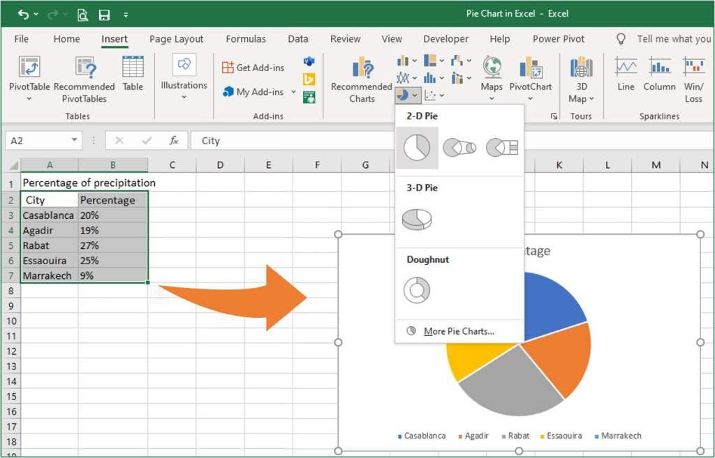
Note
Include column or row headers in the selection if you want the column/row header to automatically appear in the title of your pie chart.
Types of Excel pie charts
There are three main types of pie charts.
- 2-D circle: Most commonly used pie chart
- 3-D circle: Three-dimensional pie chart
- Doughnut: Circle graph with a hole in the middle

Besides the usual 2-D pie charts, there is a pie of pie chart and bar or pie with a circle. This is a graph used to further subdivide only certain items into the original pie chart and see the breakdown.
The 3-D pie chart is basically not recommended. Since the circle looks distorted because it is three-dimensional, the area and proportion of the graph can’t be read correctly. Unless you have a good reason, it’s best to avoid 3-D pie.
Doughnuts can double graphs and are sometimes used when comparing two data.
Basically, I think there is no problem if you can use 2-D pie charts properly. Subsidiary pie charts, 3-D pie, and doughnut pie charts are a little difficult to handle because they are inevitably complicated.

When should a pie chart be used?
Pie charts can be said to be the most common graphs, but don’t use them easily. Note that depending on the content of the data, making a pie chart may make it difficult to read the data.
Conditions when using a pie chart
1 When you want to express the ratio of data
2 When the difference in the ratio of each item is large,
3 When the number of items to be compared is small,
① is a major premise of a pie chart. A pie chart is a good graph to show the percentage of data, not the absolute value. Therefore, it is used when you want to show the composition ratio (ratio) of data.
② and ③ are also important points. Even when expressing proportions, there are cases where it is better to use a bar graph rather than a circle if there is not much difference in the numerical values of each item. Pie charts are useful when they include overwhelming proportions or extremely low items.
Pie charts are also suitable when the number of items is small (2 or 3 items), such as agree or disagree or yes or no or other.
Customize and improve Excel pie charts
If you leave the pie chart at its default, it’s unclear what you want to convey. With a little processing, the graph will be easy to see and convey. Then, introduce some tricks to refine the pie chart.
Add chart element
You can add, remove, or adjust the position of a chart title, data labels, and legend in two ways. That’s ways become available after selecting the chart.
One of the Add Chart Element is available in the Chart layouts command group under the “Chart Design” tab.
Another is a green plus (+) icon, which is available in the top right corner after selecting the chart.
Quick formatting of data labels in excel charts
The “Chart Design” tab provides a quick layer of customization of data labels, which is available when you select a chart.
1 After selecting a pie chart, select the graph tool “Chart Design” tab
2 Click “Add chart element” from the chart layouts command.
3 Hover the cursor over the “Data Label” option and select one from the list, which you want to be shown.
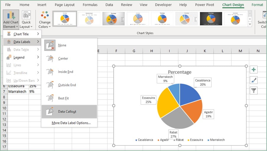
To customize other data label formatting options, after select one of the data labels then right-click on it, and then click “Format Data Labels“.
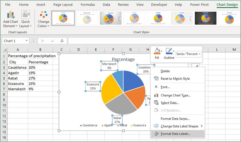
A “Format Data Labels” pane will appear on the right sidebar.
In the Format Data Labels pane, you can see two sets of options – one is Label Options, and another is Text Options.
Label options
The label options allow you to do the following types of formatting:
- Fill & Line: You can fill color to the labels & make a border to the labels.
- Effects: Apply Shadow, Glow, Soft Edges, and 3-D format.
- Size & Properties: Change the data label’s size and alignment.
- Label Options: Using the label options, format the label values.
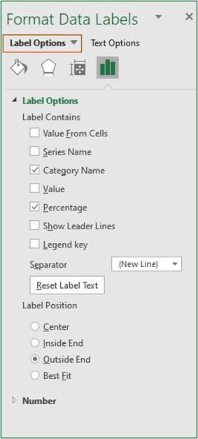
Keep the default data label settings if you want to keep things simple. You might want to alter the color or text size of these labels in some circumstances. However, the default settings are usually sufficient.
Text options
You can change the following settings in the text formatting options:
- Fill and outline text
- Text Effects
- Text zone

In the vast majority of situations, the default settings are sufficient.
Formatting the Legend
From here, you can also adjust the “Legend” position or you can also format the legend of a pie chart like any other chart in Excel.
To customize the formatting of the legend, select the chart and click on the “Chart Design” tab.
In the Design tab, click on “Add Chart Element” in the Chart Layout group.
Hover the cursor over the “Legend” option and select anyone or click “More Legend Options“.

You can see the Format Legend pane on the right sidebar.
Here you can see two options: one is Legend Options, and another is Text Options.
- Legend options: Change the fill and line colors, apply effects, and move the caption around with the legend choices, which allows you to place the caption on top, bottom, left, right, or top right.
- Text Options: Change the color and outline of the text, as well as the text effects and the text box, with these settings.

In most cases, none of these options needs to be altered.
Change the color to make the pie chart easier to see
Excel already has pre-defined styles and color combinations you can use to instantly format your pie charts.
To change the color, select the chart and go to the “Chart Design” tab. Select any one color combination from the “Change Colors” command.

Highlight a slice in the pie chart
By default, Excel pie charts are multicolored. So, let’s adjust the color and change it to a pie chart that is easy to see and conveys.
The easiest way is to use “brilliant colors (red or yellow)” only for the items you want to emphasize and gray-scale the others. This makes it clear to the viewer of the graph “where to look”.
Select one slice which you want to highlight.
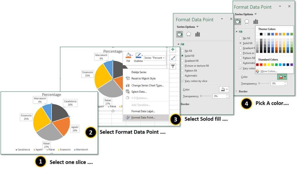
Right-click on it and click the “Format Data Point” from the context menu.
Go to Fill & Line and select solid fill and pick a color.
Note
If you want to show your other slices in one color, then uncheck “Vary colors by slice“.
Separate a slice to highlight
If you have a slice that you want to highlight and analyze, you can use the “Point Explosion” option in the Series Options tab. To separate a slice, simply select it and increase the “Point Explosion” value or dragging by clicking.

FAQ: Pie chart in Excel
How to rotate Excel pie chart
For better readability, it can sometimes be helpful to rotate or rotate the diagram.
To do this, right-click in the pie chart and select ” Format data series “.
A dialog box now opens on the right, where an adjustment is possible under ” Angle of the first segment “.
How to compare two data in a pie chart (double doughnut pie chart)
The last is how to make a double pie chart to use when comparing the composition ratios of two graphs. This is easy because you just need to select two data and insert a donut.
1. Prepare two data
2. Select two data
3. Insert a Doughnut