
Содержание
- Применение скользящей средней
- Способ 1: Пакет анализа
- Способ 2: использование функции СРЗНАЧ
- Вопросы и ответы

Метод скользящей средней – это статистический инструмент, с помощью которого можно решать различного рода задачи. В частности, он довольно часто используется при прогнозировании. В программе Excel для решения целого ряда задач также можно применять данный инструмент. Давайте разберемся, как используется скользящая средняя в Экселе.
Применение скользящей средней
Смысл данного метода состоит в том, что с его помощью происходит смена абсолютных динамических значений выбранного ряда на средние арифметические за определенный период путем сглаживания данных. Этот инструмент применяется для экономических расчетов, прогнозирования, в процессе торговли на бирже и т.д. Применять метод скользящей средней в Экселе лучше всего с помощью мощнейшего инструмента статистической обработки данных, который называется Пакетом анализа. Кроме того, в этих же целях можно использовать встроенную функцию Excel СРЗНАЧ.
Способ 1: Пакет анализа
Пакет анализа представляет собой надстройку Excel, которая по умолчанию отключена. Поэтому, прежде всего, требуется её включить.
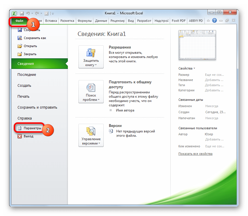
- Перемещаемся во вкладку «Файл». Делаем щелчок по пункту «Параметры».
- В запустившемся окне параметров следует перейти в раздел «Надстройки». В нижней части окна в поле «Управление» должен быть выставлен параметр «Надстройки Excel». Щелкаем по кнопке «Перейти».
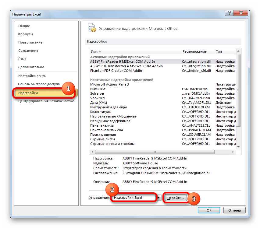
- Мы попадаем в окно надстроек. Устанавливаем галочку около пункта «Пакет анализа» и щелкаем по кнопке «OK».

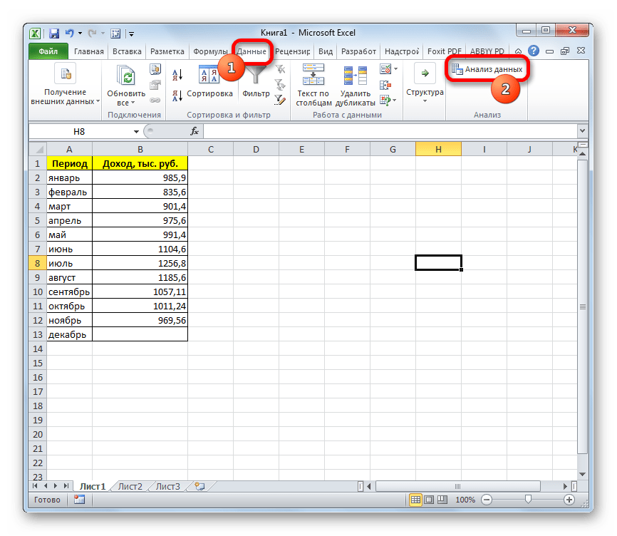
После этого действия пакет «Анализ данных» активирован, и соответствующая кнопка появилась на ленте во вкладке «Данные».
А теперь давайте рассмотрим, как непосредственно можно использовать возможности пакета Анализ данных для работы по методу скользящей средней. Давайте на основе информации о доходе фирмы за 11 предыдущих периодов составим прогноз на двенадцатый месяц. Для этого воспользуемся заполненной данными таблицей, а также инструментами Пакета анализа.
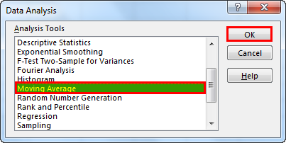
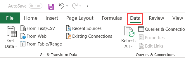
- Переходим во вкладку «Данные» и жмем на кнопку «Анализ данных», которая размещена на ленте инструментов в блоке «Анализ».
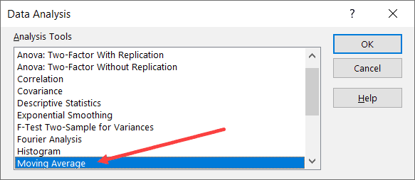
- Открывается перечень инструментов, которые доступны в Пакете анализа. Выбираем из них наименование «Скользящее среднее» и жмем на кнопку «OK».
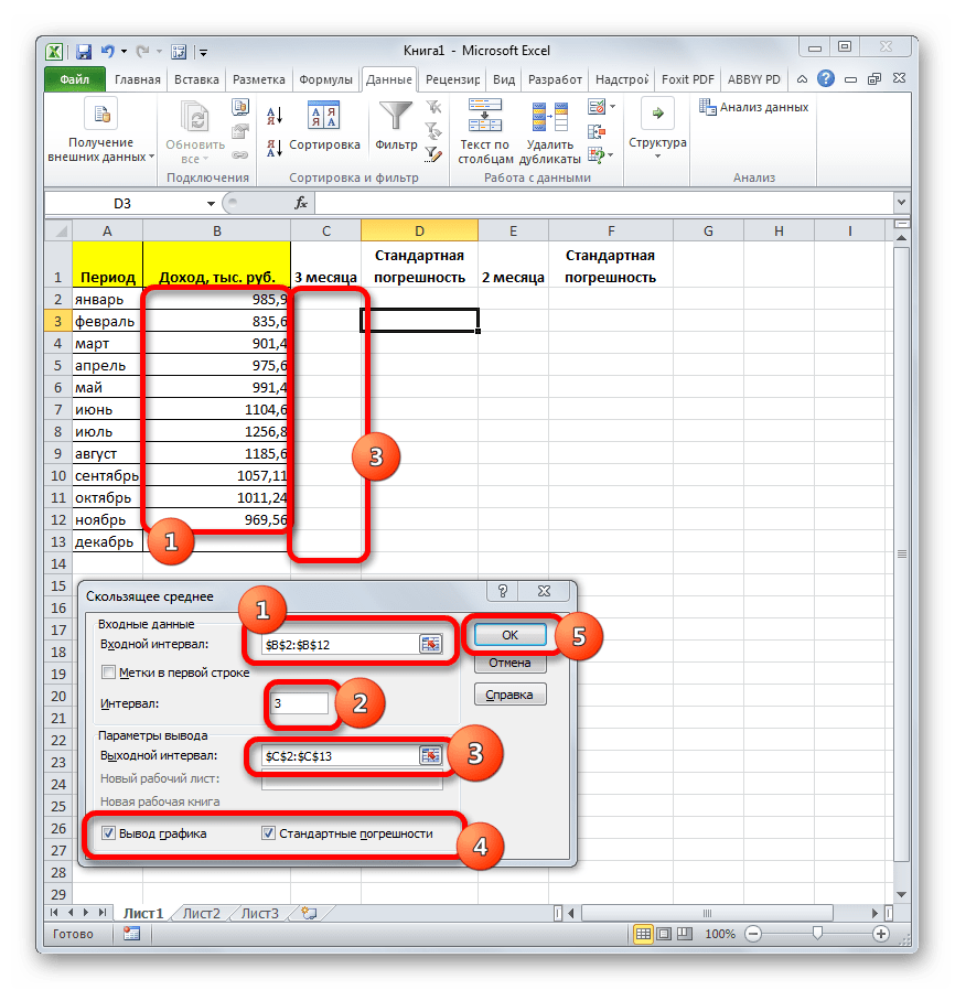
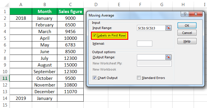
- Запускается окно ввода данных для прогнозирования методом скользящей средней.
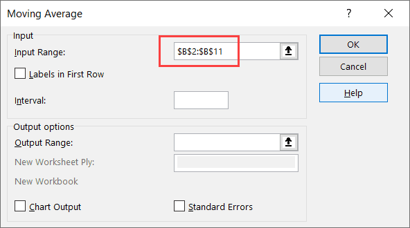
В поле «Входной интервал» указываем адрес диапазона, где расположена помесячно сумма выручки без ячейки, данные в которой следует рассчитать.
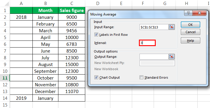
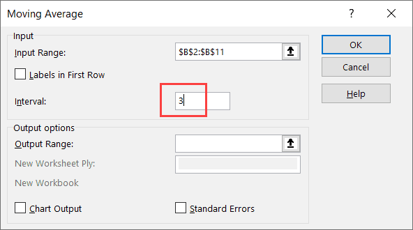
В поле «Интервал» следует указать интервал обработки значений методом сглаживания. Для начала давайте установим значение сглаживания в три месяца, а поэтому вписываем цифру «3».
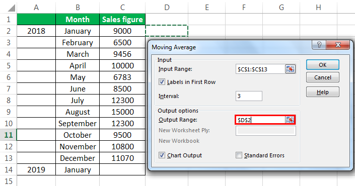
В поле «Выходной интервал» нужно указать произвольный пустой диапазон на листе, где будут выводиться данные после их обработки, который должен быть на одну ячейку больше входного интервала.
Также следует установить галочку около параметра «Стандартные погрешности».

При необходимости, можно также установить галочку около пункта «Вывод графика» для визуальной демонстрации, хотя в нашем случае это и не обязательно.
После того, как все настройки внесены, жмем на кнопку «OK».
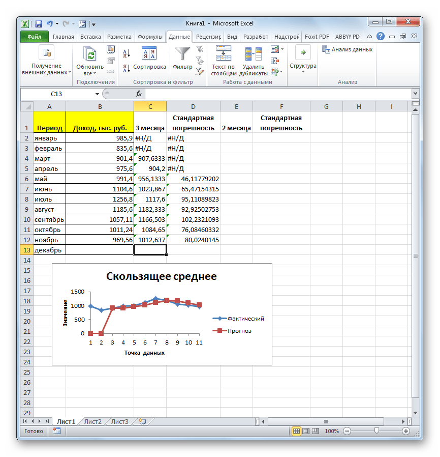
- Программа выводит результат обработки.
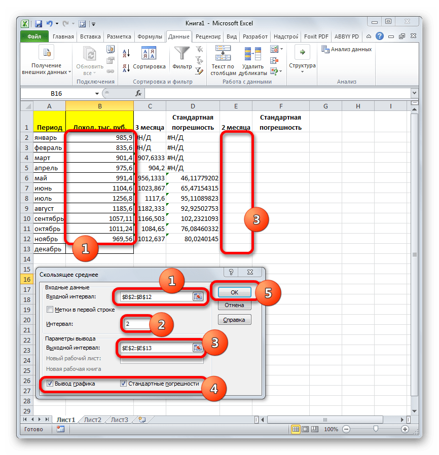
- Теперь выполним сглаживание за период в два месяца, чтобы выявить, какой результат является более корректным. Для этих целей опять запускаем инструмент «Скользящее среднее» Пакета анализа.
В поле «Входной интервал» оставляем те же значения, что и в предыдущем случае.
В поле «Интервал» ставим цифру «2».
В поле «Выходной интервал» указываем адрес нового пустого диапазона, который, опять же, должен быть на одну ячейку больше входного интервала.
Остальные настройки оставляем прежними. После этого жмем на кнопку «OK».
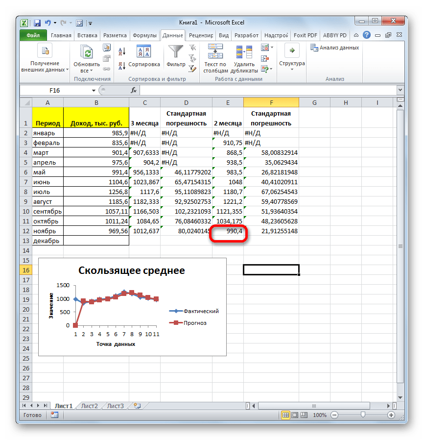
- Вслед за этим программа производит расчет и выводит результат на экран. Для того, чтобы определить, какая из двух моделей более точная, нам нужно сравнить стандартные погрешности. Чем меньше данный показатель, тем выше вероятность точности полученного результата. Как видим, по всем значениям стандартная погрешность при расчете двухмесячной скользящей меньше, чем аналогичный показатель за 3 месяца. Таким образом, прогнозируемым значением на декабрь можно считать величину, рассчитанную методом скольжения за последний период. В нашем случае это значение 990,4 тыс. рублей.


Способ 2: использование функции СРЗНАЧ
В Экселе существует ещё один способ применения метода скользящей средней. Для его использования требуется применить целый ряд стандартных функций программы, базовой из которых для нашей цели является СРЗНАЧ. Для примера мы будем использовать все ту же таблицу доходов предприятия, что и в первом случае.
Как и в прошлый раз, нам нужно будет создать сглаженные временные ряды. Но на этот раз действия будут не настолько автоматизированы. Следует рассчитать среднее значение за каждые два, а потом три месяца, чтобы иметь возможность сравнить результаты.
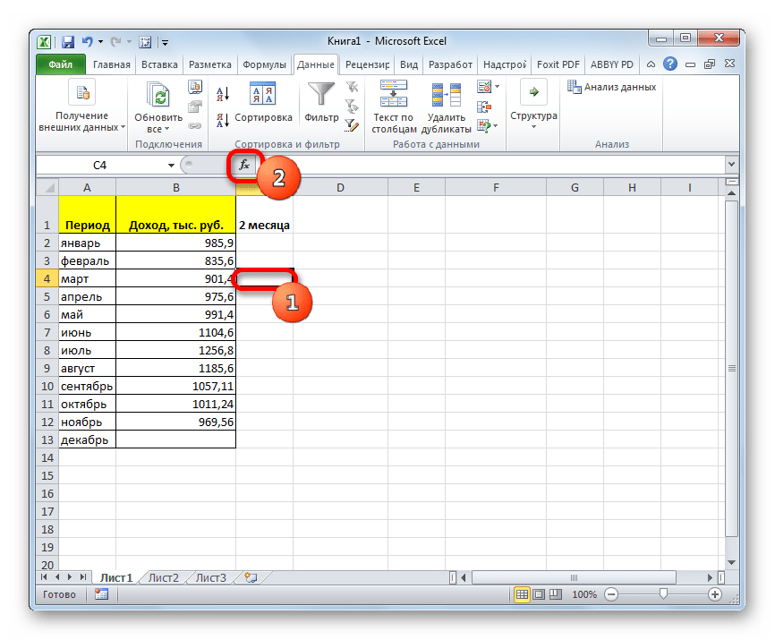
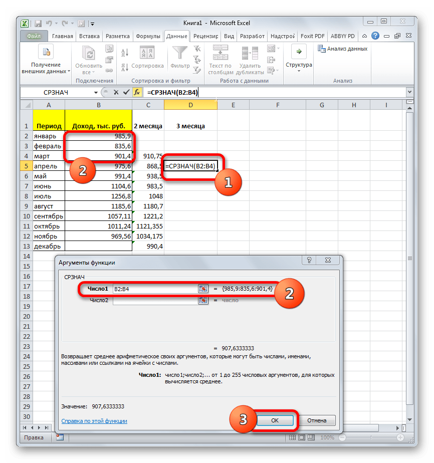
Прежде всего, рассчитаем средние значения за два предыдущих периода с помощью функции СРЗНАЧ. Сделать это мы можем, только начиная с марта, так как для более поздних дат идет обрыв значений.
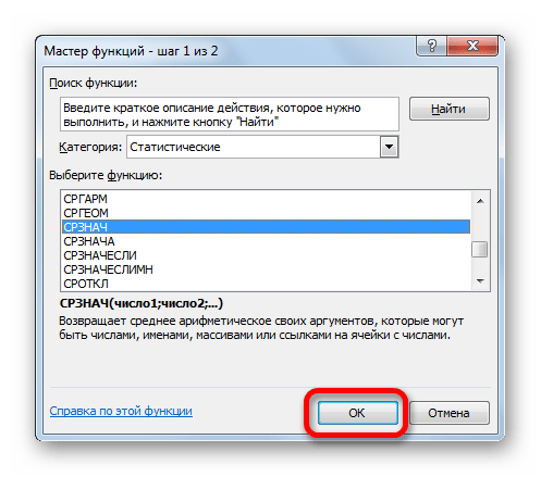
- Выделяем ячейку в пустой колонке в строке за март. Далее жмем на значок «Вставить функцию», который размещен вблизи строки формул.
- Активируется окно Мастера функций. В категории «Статистические» ищем значение «СРЗНАЧ», выделяем его и щелкаем по кнопке «OK».
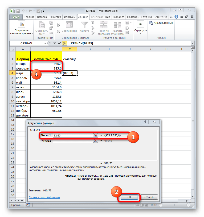
- Запускается окно аргументов оператора СРЗНАЧ. Синтаксис у него следующий:
=СРЗНАЧ(число1;число2;…)Обязательным является только один аргумент.
В нашем случае, в поле «Число1» мы должны указать ссылку на диапазон, где указан доход за два предыдущих периода (январь и февраль). Устанавливаем курсор в поле и выделяем соответствующие ячейки на листе в столбце «Доход». После этого жмем на кнопку «OK».
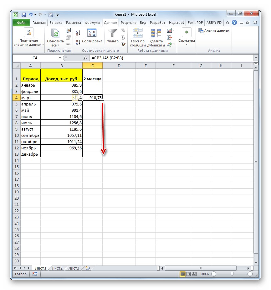
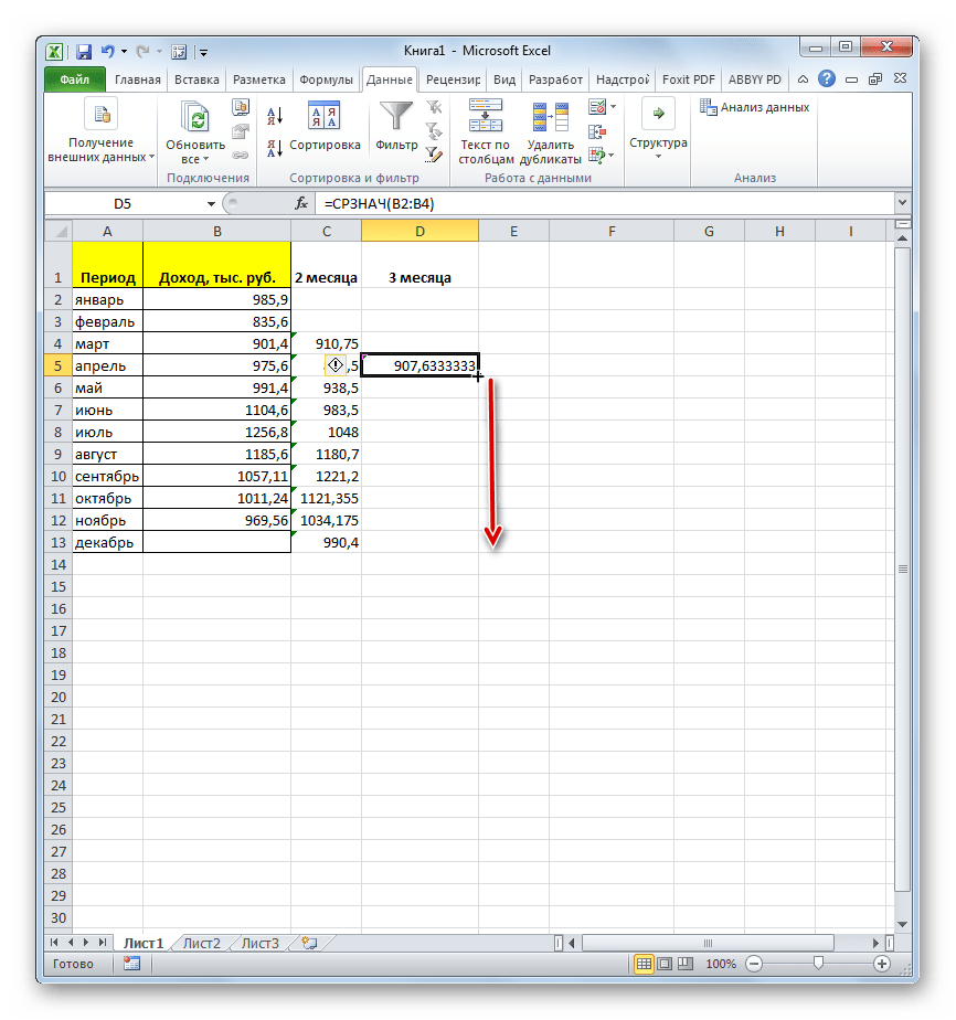
- Как видим, результат расчета среднего значения за два предыдущих периода отобразился в ячейке. Для того, чтобы выполнить подобные вычисления для всех остальных месяцев периода, нам нужно скопировать данную формулу в другие ячейки. Для этого становимся курсором в нижний правый угол ячейки, содержащей функцию. Курсор преобразуется в маркер заполнения, который имеет вид крестика. Зажимаем левую кнопку мыши и протягиваем его вниз до самого конца столбца.
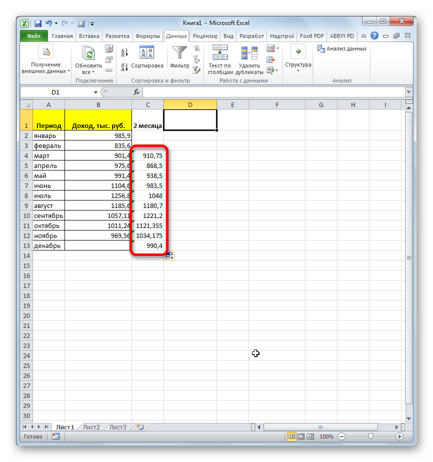
- Получаем расчет результатов среднего значения за два предыдущих месяца до конца года.
- Теперь выделяем ячейку в следующем пустом столбце в строке за апрель. Вызываем окно аргументов функции СРЗНАЧ тем же способом, который был описан ранее. В поле «Число1» вписываем координаты ячеек в столбце «Доход» с января по март. Затем жмем на кнопку «OK».
- С помощью маркера заполнения копируем формулу в ячейки таблицы, расположенные ниже.
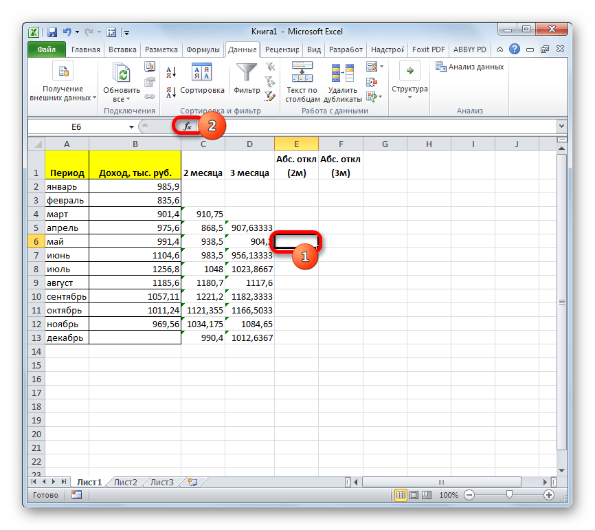
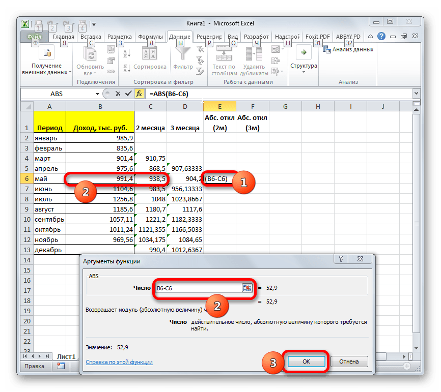
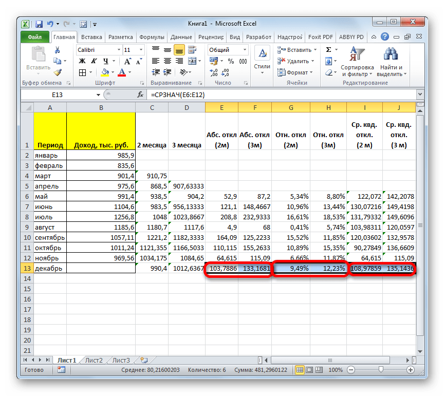
- Итак, значения мы подсчитали. Теперь, как и в предыдущий раз, нам нужно будет выяснить, какой вид анализа более качественный: со сглаживанием в 2 или в 3 месяца. Для этого следует рассчитать среднее квадратичное отклонение и некоторые другие показатели. Для начала рассчитаем абсолютное отклонение, воспользовавшись стандартной функцией Excel ABS, которая вместо положительных или отрицательных чисел возвращает их модуль. Данное значение будет равно разности между реальным показателем выручки за выбранный месяц и прогнозируемым. Устанавливаем курсор в следующий пустой столбец в строку за май. Вызываем Мастер функций.
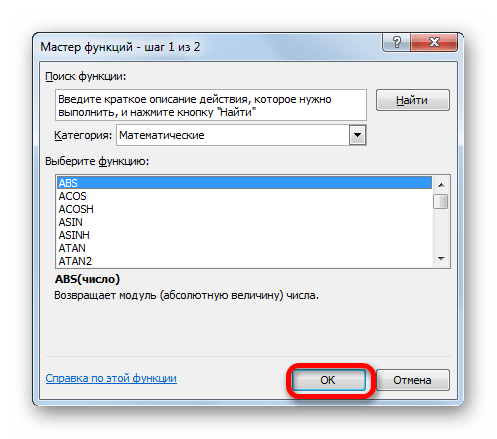
- В категории «Математические» выделяем наименование функции «ABS». Жмем на кнопку «OK».
- Запускается окно аргументов функции ABS. В единственном поле «Число» указываем разность между содержимым ячеек в столбцах «Доход» и «2 месяца» за май. Затем жмем на кнопку «OK».
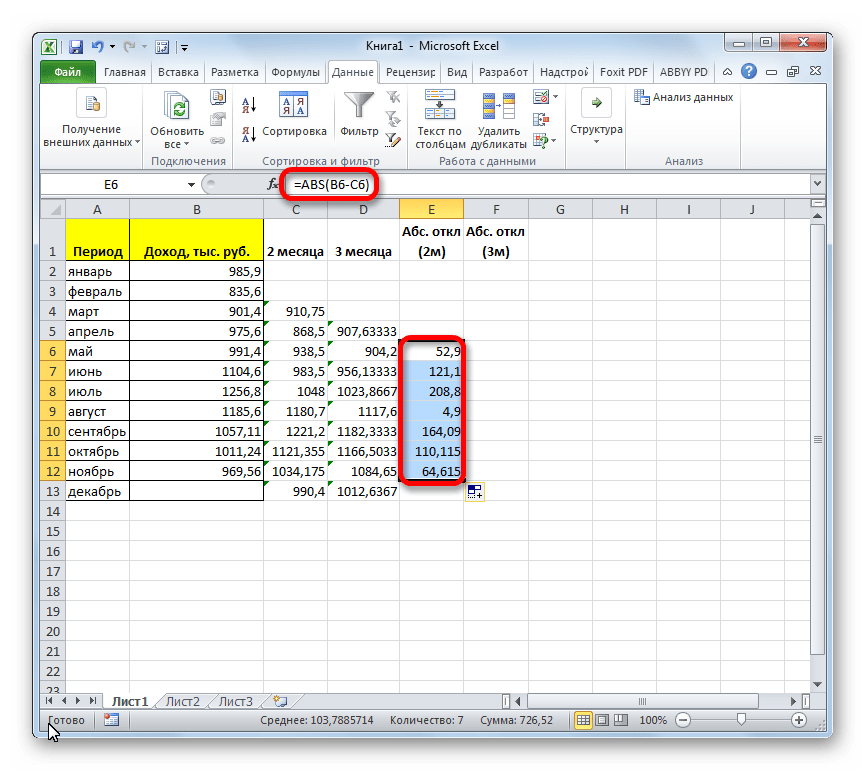
- С помощью маркера заполнений копируем данную формулу во все строки таблицы по ноябрь включительно.
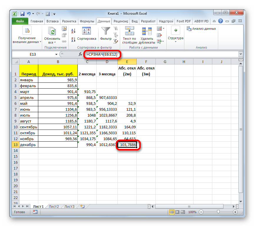
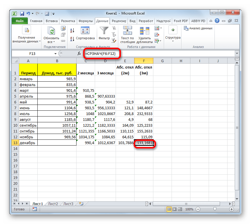
- Рассчитываем среднее значение абсолютного отклонения за весь период с помощью уже знакомой нам функции СРЗНАЧ.
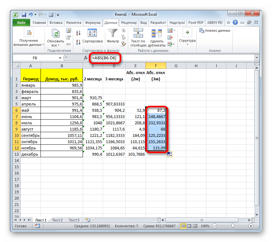
- Аналогичную процедуру выполняем и для того, чтобы подсчитать абсолютное отклонение для скользящей за 3 месяца. Сначала применяем функцию ABS. Только на этот раз считаем разницу между содержимым ячеек с фактическим доходом и плановым, рассчитанным по методу скользящей средней за 3 месяца.
- Далее рассчитываем среднее значение всех данных абсолютного отклонения с помощью функции СРЗНАЧ.
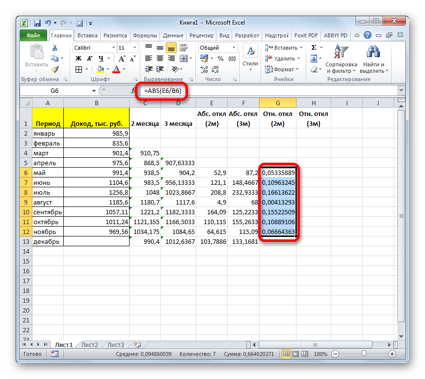
- Следующим шагом является подсчет относительного отклонения. Оно равно отношению абсолютного отклонения к фактическому показателю. Для того чтобы избежать отрицательных значений, мы опять воспользуемся теми возможностями, которые предлагает оператор ABS. На этот раз с помощью данной функции делим значение абсолютного отклонения при использовании метода скользящей средней за 2 месяца на фактический доход за выбранный месяц.
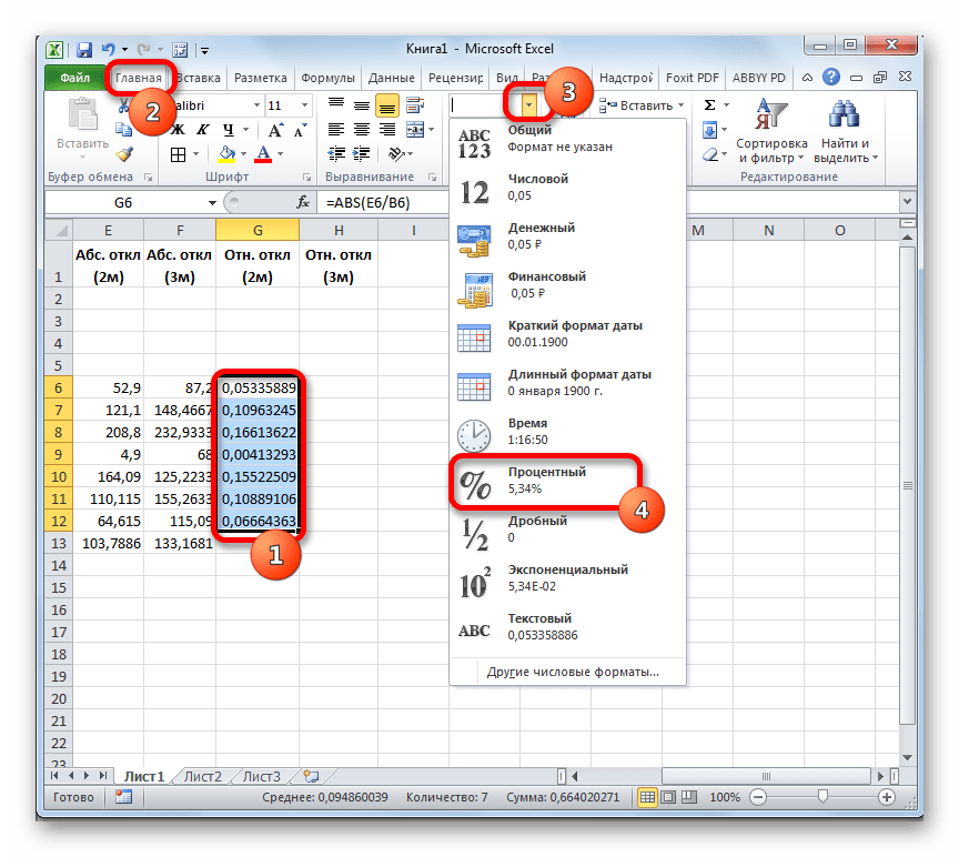
- Но относительное отклонение принято отображать в процентном виде. Поэтому выделяем соответствующий диапазон на листе, переходим во вкладку «Главная», где в блоке инструментов «Число» в специальном поле форматирования выставляем процентный формат. После этого результат подсчета относительного отклонения отображается в процентах.
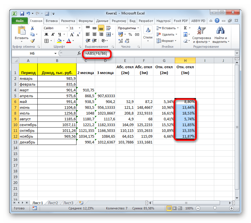
- Аналогичную операцию по подсчету относительного отклонения проделываем и с данными с применением сглаживания за 3 месяца. Только в этом случае для расчета в качестве делимого используем другой столбец таблицы, который у нас имеет название «Абс. откл (3м)». Затем переводим числовые значения в процентный вид.
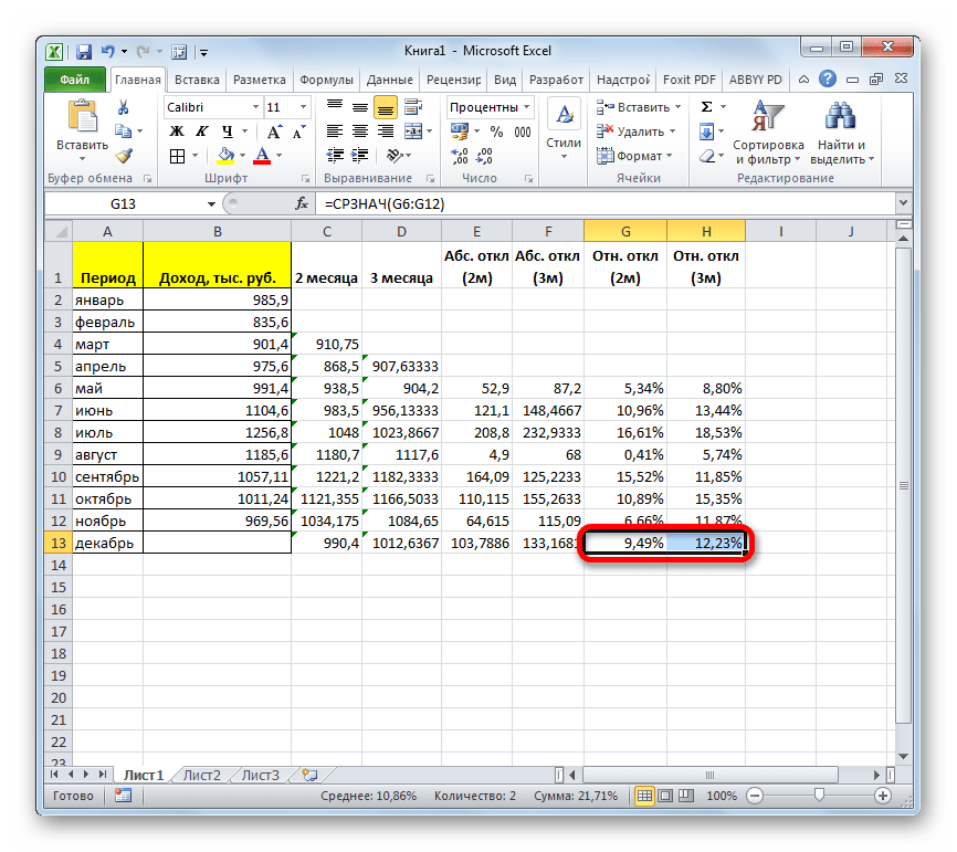
- После этого высчитываем средние значения для обеих колонок с относительным отклонением, как и ранее используя для этого функцию СРЗНАЧ. Так как для расчета в качестве аргументов функции мы берем процентные величины, то дополнительную конвертацию производить не нужно. Оператор на выходе выдает результат уже в процентном формате.
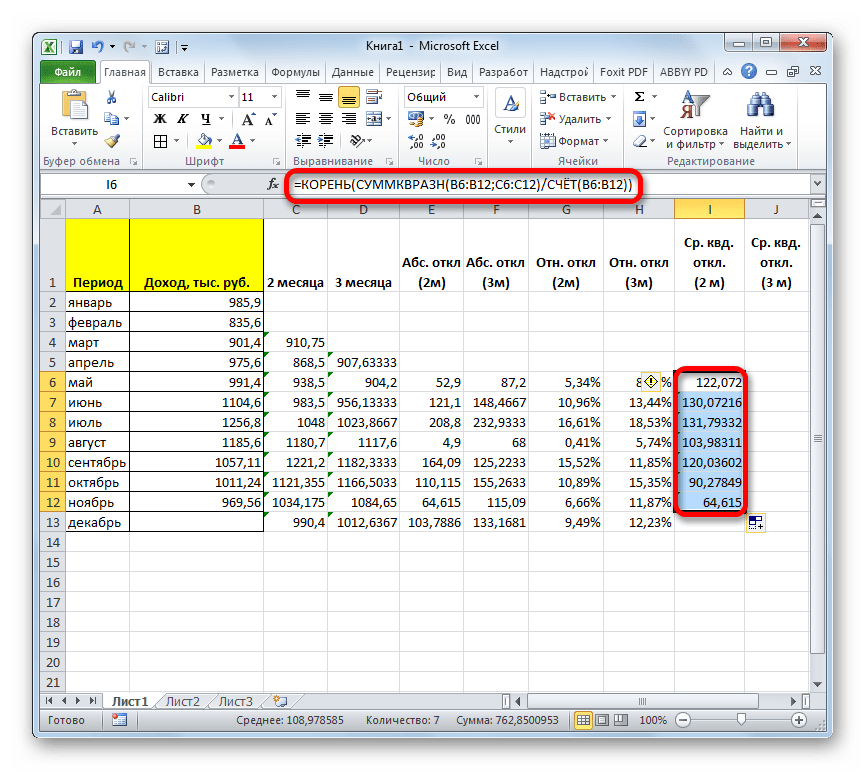
- Теперь мы подошли к расчету среднего квадратичного отклонения. Этот показатель позволит нам непосредственно сравнить качество расчета при использовании сглаживания за два и за три месяца. В нашем случае среднее квадратичное отклонение будет равно корню квадратному из суммы квадратов разностей фактической выручки и скользящей средней, деленной на количество месяцев. Для того, чтобы произвести расчет в программе, нам предстоит воспользоваться целым рядом функций, в частности КОРЕНЬ, СУММКВРАЗН и СЧЁТ. Например, для расчета среднего квадратичного отклонения при использовании линии сглаживания за два месяца в мае будет в нашем случае применяться формула следующего вида:
=КОРЕНЬ(СУММКВРАЗН(B6:B12;C6:C12)/СЧЁТ(B6:B12))Копируем её в другие ячейки столбца с расчетом среднего квадратичного отклонения посредством маркера заполнения.
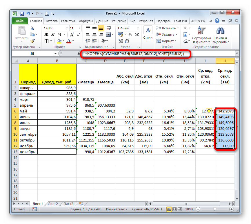
- Аналогичную операцию по расчету среднего квадратичного отклонения выполняем и для скользящей средней за 3 месяца.
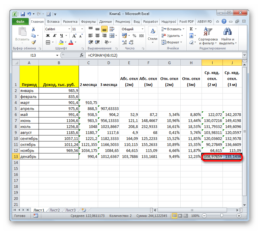
- После этого рассчитываем среднее значение за весь период для обоих этих показателей, применив функцию СРЗНАЧ.
- Произведя сравнение расчетов методом скользящей средней со сглаживанием в 2 и 3 месяца по таким показателям, как абсолютное отклонение, относительное отклонение и среднеквадратичное отклонение, можно с уверенностью сказать, что сглаживание за два месяца дает более достоверные результаты, чем применение сглаживания за три месяца. Об этом говорит то, что вышеуказанные показатели по двухмесячному скользящему среднему, меньше, чем по трехмесячному.
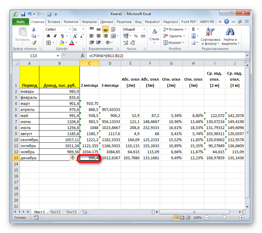
- Таким образом, прогнозируемый показатель дохода предприятия за декабрь составит 990,4 тыс. рублей. Как видим, это значение полностью совпадает с тем, которое мы получили, производя расчет с помощью инструментов Пакета анализа.
Урок: Мастер функций в Экселе
Мы произвели расчет прогноза при помощи метода скользящей средней двумя способами. Как видим, данную процедуру намного проще выполнить с помощью инструментов Пакета анализа. Тем не менее некоторые пользователи не всегда доверяют автоматическому расчету и предпочитают для вычислений использовать функцию СРЗНАЧ и сопутствующие операторы для проверки наиболее достоверного варианта. Хотя, если все сделано правильно, на выходе результат расчетов должен получиться полностью одинаковым.
Еще статьи по данной теме:
Помогла ли Вам статья?
Moving average means we calculate the average of the data set we have. In Excel, we have a built-in feature for calculating a moving average, available in the “Data Analysis” tab in the “Analysis” section. It takes an input range and output range with intervals as an output. Calculations based on mere formulas in Excel to calculate moving average is hard, but we have a built-in function in Excel to do so.
Moving average is a widely used time series analysis technique to predict the future. The moving averages in a time series are constructed by taking averages of various sequential values of another time-series data.
Excel has three moving averages: simple moving average, weighted moving average, and exponential moving average.
Table of contents
- What is Moving Average in Excel
- #1 – Simple moving average in Excel
- #2 – Weighted moving average in Excel
- #3 – Exponential moving average in Excel
- How to Calculate Moving Average in Excel?
- Example #1 – Simple Moving Average in Excel
- Example #2 – Simple Moving Average through Data Analysis Tab in Excel
- Example #3 – Weighted Moving Average in Excel
- Example #4 – Exponential Moving Average in Excel
- Things to Remember About Moving Average in Excel
- Recommended Articles
#1 – Simple moving average in Excel
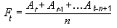
A simple moving average helps calculate the average of a data series’s last number of periods. For example, suppose prices of n period are given. Then, the simple moving average is shown as
Simple moving average= [P1+P2+………….+Pn]/n
#2 – Weighted moving average in Excel
The weighted moving average provides the weighted average of the last n periods. The weighting decreases with each data point of the previous period.
Weighted moving average = (Price * weighting factor) + (Price of previous period * weighting factor-1)
#3 – Exponential moving average in Excel
It is similar to a simple moving average that measures trends over time. However, while a simple moving average calculates an average of given data, an exponential moving average attaches more weight to the current data.
Exponential moving average =(K x (C – P)) + P
Where,
- K = Exponential smoothing constant
- C= Current price
- P= Previous periods exponential moving average (simple moving average used for first periods calculation)
How to Calculate Moving Average in Excel?
Below are the examples of a moving average in Excel.
You can download this Moving Average Excel Template here – Moving Average Excel Template
Example #1 – Simple Moving Average in Excel
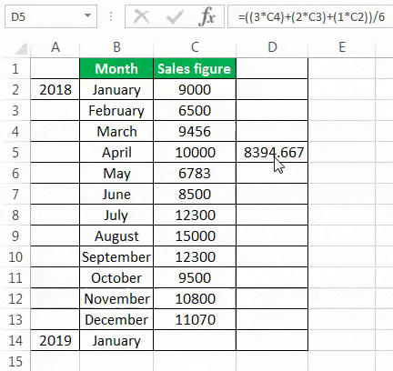
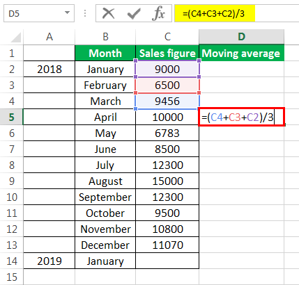
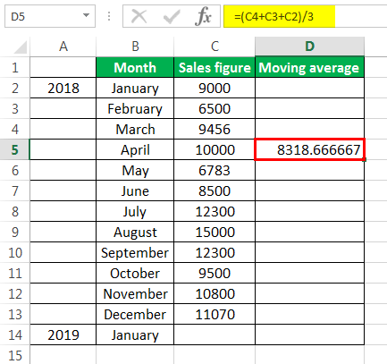
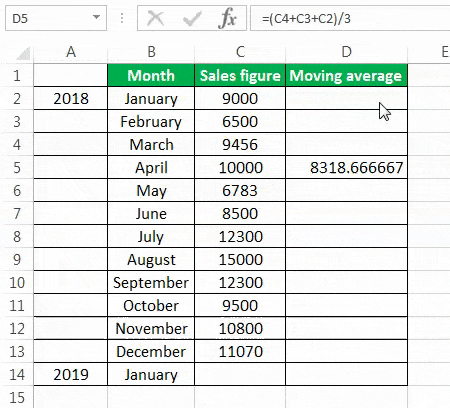
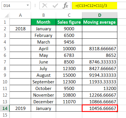
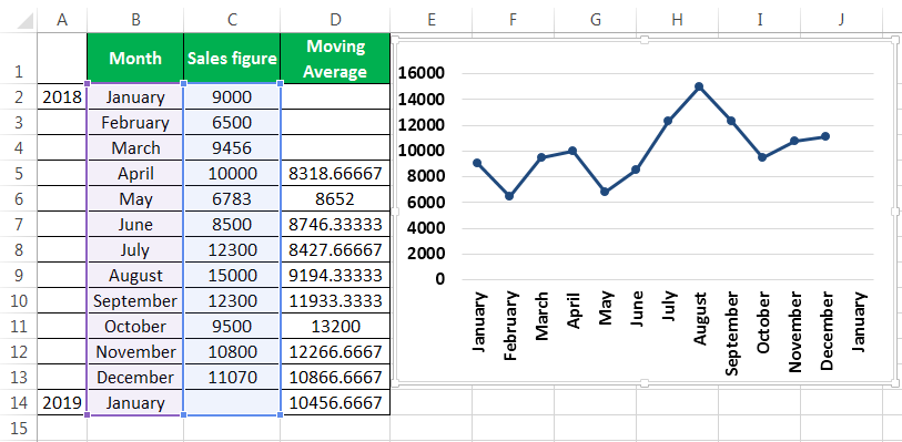
To calculate the simple moving average, we have taken a company’s sales data from January to December 2018. Our target is to smooth the data and to know the sales figure in January 2019. Therefore, we will use the three months moving average here.
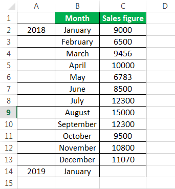
- The moving average of January, February, and March is calculated by taking the months’ sales figures and then dividing them by 3.


- Selecting at the corner of the D5 cell and then just dragging and dropping down will give the moving average for the remaining periods. It is Excel’s “Fill” tool function.

The sales prediction for January 2019 is 10456.66667.

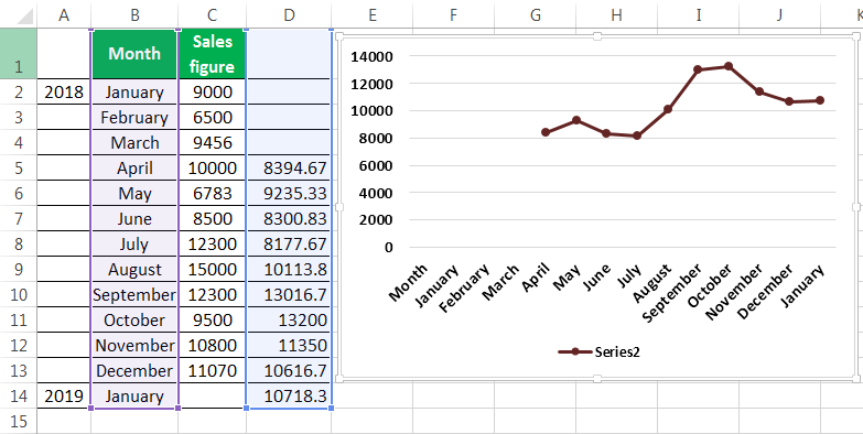
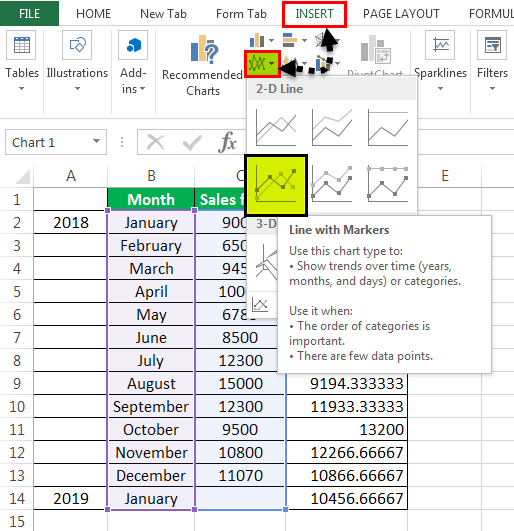
- Now, we plot the sales figure and moving average in the line graph to understand the difference in trend. We can do this from the “Insert” tab. Firstly, we have selected the data series, and then from the “Charts” section under “Insert,” we have used the “Line” graph.


After creating the graphs, it can be seen that the graph with the moving average is much more smoothed out than the original data series.

Example #2 – Simple Moving Average through Data Analysis Tab in Excel
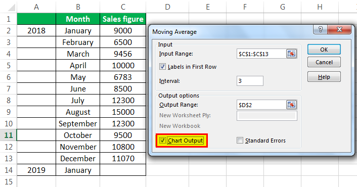
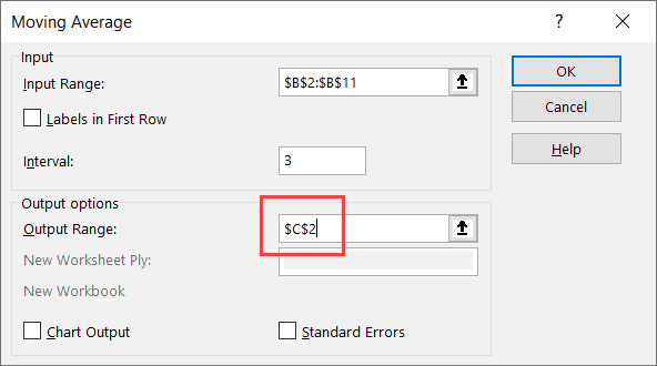
- Under the “Data” tab under the “Analysis” group, we have to click “Data Analysis.” For example, the following is the screenshot.
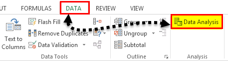
- From the “Data Analysis,” we can access the “Moving Average.”
- After clicking the “Moving Average,” we must select the sales figure as the “Input Range.”

- The “Labels in the first row” is clicked to make Excel understand that the first row has the label name.
- Interval 3 is selected because we want three years moving average.
- We have chosen the “Output Range” with adjacency to the sales figure.
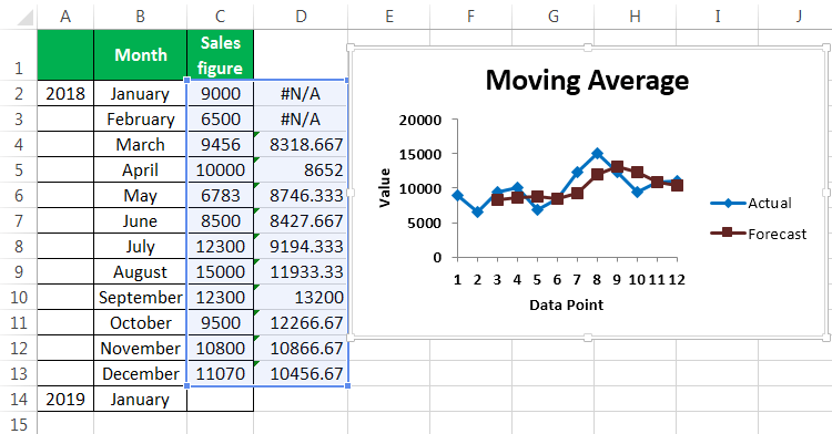
- We also want to see the “Chart Output,” wherein we can see the actual and forecasted differences.
This chart shows the difference between the actual and forecasted moving average.
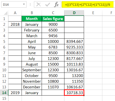
Example #3 – Weighted Moving Average in Excel

We use the three years weighted moving average, and the formula is given in the screenshot.
After using the formula, we got the moving average for a period.
We got the moving average for all other periods by dragging and dropping values in the following cells.
The forecast for January 2019 is 10718.33.
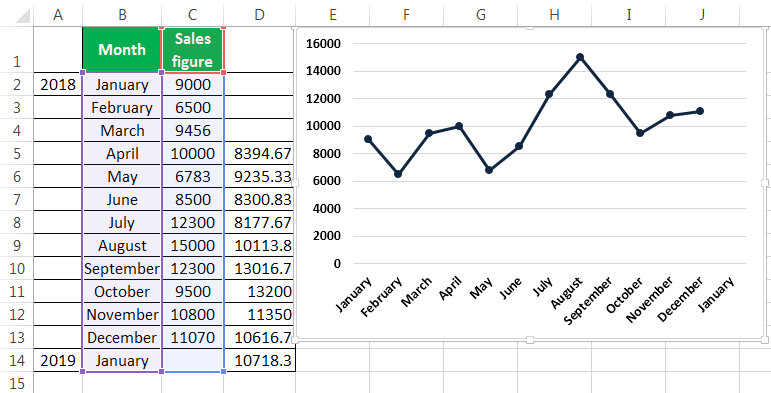
Now, we took the line graph to see the smoothing of data. For this, we have selected our month and the forecasted data, and then inserted a line graph.
Now we will compare our forecasted data with our actual data. In the screenshots below, we can easily see the difference between the actual and forecasted data. The graph on the top is the actual data, and the graph below is the moving average and forecasted data. We can see that the moving average graph has smoothened significantly compared to the graph containing the actual data.
Example #4 – Exponential Moving Average in Excel
The formula for the exponential moving average is St=α.Yt-1+(1- α)St-1……(1)
Where,
- Yt-1 = actual observation in the t-1th period
- St-1= simple moving average in the t-1th period
- α = smoothening factor, and it varies between .1 and .3. The greater the value of α closer is the chart to the actual values, and the lessen the value of the α, the more smooth the chart will be.
First, we calculate the simple moving average, as shown earlier. After that, we apply the formula given in equation (1). For fixing the α value for all the following values, we have pressed F4.

We get the values by dragging and dropping them in the following cells.
Now, we want to see the comparison between the actual values, simple moving average, and exponential moving average in excel. We have done this by doing a line chart.
The above screenshot shows the difference between Excel’s actual sales figure, simple moving average, and exponential moving average.
Things to Remember About Moving Average in Excel
- The simple moving average can be calculated using an AVERAGE function in Excel.
- Moving average helps in smoothing the data.
- Seasonal averages are often termed a seasonal index.
- The exponential moving average in Excel gives more weight to the recent data than the simple moving average. Therefore smoothening in the case of the exponential moving average in Excel is more than that of the simple moving average.
- The moving average helps the trader identify the trend more easily in businesses like the stock market.
Recommended Articles
This article is a guide to Moving Average in Excel. We discuss how to calculate three types of moving averages in Excel (simple, weighted, and exponential) along with practical examples and a downloadable Excel template. You may learn more about Excel from the following articles: –
- Line Charts in ExcelLine Graphs/Charts in Excels are visuals to track trends or show changes over a given period & they are pretty helpful for forecasting data. They may include 1 line for a single data set or multiple lines to compare different data sets. read more
- Regression vs. ANOVA DifferencesBoth the Regression and ANOVA are the statistical models which are used in order to predict the continuous outcome but in case of the regression, continuous outcome is predicted on basis of the one or more than one continuous predictor variables whereas in case of ANOVA continuous outcome is predicted on basis of the one or more than one categorical predictor variables.read more
- How to Create a Pivot Chart in Excel?In Excel, a pivot chart is a built-in feature that allows you to summarize selected rows and columns of data in a spreadsheet. It is a visual representation of a pivot table that helps in the summarization and analysis of datasets, patterns, and trends.read more
- Create a Dynamic Chart in ExcelA dynamic chart is a unique chart in Excel which updates itself when the range of the chart is updated. In static charts, the chart does not change itself when the range is updated.read more
- VLOOKUP FalseIn excel we use the VLOOKUP false function to look for an exact match. In the vlookup function, we can use «1» as the criteria for TRUE and use «0» as the criteria for FALSE. The need for using TRUE may not arise so always stick to FALSE as the criteria for [Range Lookup].read more
Like many of my Excel tutorials, this one is also inspired by one of the queries I got from a friend. She wanted to calculate the moving average in Excel, and I asked her to search for it online (or watch a YouTube video about it).
But then, I decided to write one myself (the fact that I was somewhat of a statistics nerd in college also played a minor role).
Now, before I tell you how to calculate moving average in Excel, let me quickly give you an overview of what moving average mean and what types of moving averages are there.
In case you want to jump to the part where I show how to calculate moving average in Excel, click here.
Note: I am not an expert on statistics and my intent in this tutorial is not to cover everything about moving averages. I only aim to show you how to calculate moving averages in Excel (with a brief introduction of what moving averages mean).
What is a Moving Average?
I am sure you know what’s an average value.
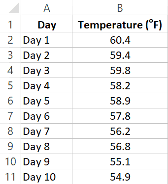
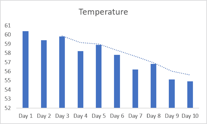
If I have three days of daily temperature data, you can easily tell me the average of the last three days (hint: you can use the AVERAGE function in Excel to do this).
A Moving Average (also called as the rolling average or running average) is when you keep the time period of the average the same, but keeps moving as new data is added.
For example, on Day 3, if I ask you the 3-day moving average temperature, you will give me the average temperature value of Day 1, 2 and 3. And if on Day 4 I ask you the 3-day moving average temperature, you will give me the average of Day 2, 3, and 4.
As new data is added, you keep the time period (3 days) the same but use the latest data to calculate the moving average.
Moving average is heavily used for technical analysis and a lot of banks and stock-market analysts use it on a daily basis (below is an example I got from the Market Realist site).
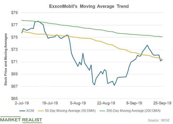
One of the benefits of using the moving averages is that gives you the trend as well as smooths out fluctuations to an extent. For example, in case there is a really hot day, the three-day moving average of the temperature would still make sure that the average value has been smoothened (instead of showing you a really high value that could be an outlier – a one-off instance).
Types of Moving Averages
There are three types of moving averages:
- Simple moving average (SMA)
- Weighted moving average (WMA)
- Exponential moving average (EMA)
Simple Moving Average (SMA)
This is the simple average of the data points in the given duration.
In our daily temperature example, when you simply take an average of the past 10 days, it gives the 10-day simple moving average.
This can be achieved by averaging the data points in the given duration. In Excel, you can do this easily using the AVERAGE function (this is covered later in this tutorial).
Weighted Moving Average (WMA)
Let’s say that the weather is getting cooler with every passing day and you are using a 10-day moving average to get the temperature trend.
Day-10 temperature is more likely to be a better indicator of the trend as compared to Day-1 (since the temperature is dropping with every passing day).
So, we are better off if we rely more on the value of Day 10.
To make this reflect in our moving average, you can give more weight to the latest data and less to past data. This way, you still get the trend, but with more influence of the latest data.
This is called the weighted moving average.
Exponential Moving Average (EMA)
The exponential moving average is a type of weighted moving average where more weight is given to the latest data and it decreases exponentially for the older data points.
It is also called the Exponential Weighted Moving Average (EWMA)
The difference between WMA and EMA is that with WMA, you can assign weights based on any criteria. For example, in a 3-point moving average, you may assign a 60% weight age to the latest data point, 30% to the middle data point and 10% to the oldest data point.
In EMA, a higher weight is given to the latest value and the weight keeps getting exponentially lower for earlier values.
Enough of statistics lecture.
Now let’s dive in and see how to calculate moving averages in Excel.
Calculating Simple Moving Average (SMA) using Data Analysis Toolpak in Excel
Microsoft Excel already has an in-built tool to calculate the simple moving averages.
It’s called the Data Analysis Toolpak.
Before you can use the Data Analysis toolpak, you first need to check whether you have it in the Excel ribbon or not. There is a good chance you need to take a few steps to first enable it.
In case you already have the Data Analysis option in the Data tab, skip the steps below and see the steps on calculating moving averages.
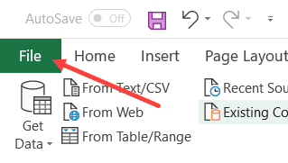
Click on the Data tab and check whether you see the Data Analysis option or not. If you don’t see it, follow the below steps to make it available in the ribbon.
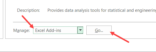
- Click the File tab

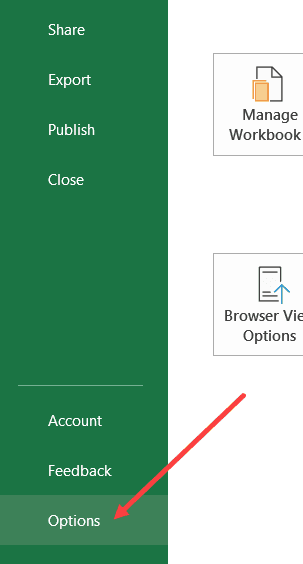
- Click on Options

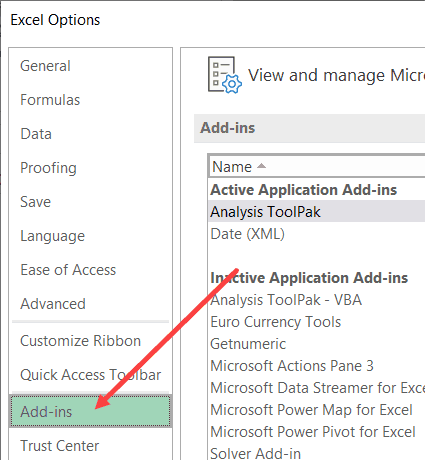
- In the Excel Options dialog box, click on Add-ins

- At the bottom of the dialog box, select Excel Add-ins in the drop-down and then click on Go.

- In the Add-ins dialog box that opens, check the Analysis Toolpak option

- Click OK.
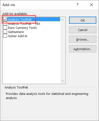
The above steps would enable the Data Analysis Toolpack and you will see this option in the Data tab now.
Suppose you have the dataset as shown below and you want to calculate the moving average of the last three intervals.
Below are the steps to use Data Analysis to calculate a simple moving average:
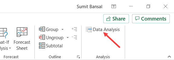
- Click the Data tab

- Click on Data Analysis option

- In the Data Analysis dialog box, click on the Moving Average option (you may have to scroll a bit to reach it).

- Click OK. This will open the ‘Moving Average’ dialog box.
- In the Input Range, select the data for which you want to calculate the moving average (B2:B11 in this example)

- In the Interval option, enter 3 (as we are calculating a three-point moving average)
- In the Output range, enter the cell where you want the results. In this example, I am using C2 as the output range
- Click OK
The above steps would give you the moving average result as shown below.
Note that the first two cells in column C have the result as #N/A error. This is because it’s a three-point moving average and needs at least three data points to give the first result. So the actual moving average values start after the third data point onwards.
You will also notice that all this Data Analysis toolpak has done is applied an AVERAGE formula to the cells. So if you want to do this manually without the Data Analysis toolpack, you can certainly do that.
There are, however, a few things that are easier to do with the data analysis toolpak. For example, if you want to get the standard error value as well as the chart of the moving average, all you need to do is check a box and it will be a part of the output.
Calculating Moving Averages (SMA, WMA, EMA) using Formulas in Excel
You can also calculate the moving averages using the AVERAGE formula.
In fact, if all you need is the moving average value (and not the standard error or chart), using a formula can be a better (and faster) option than using the Data Analysis Toolpak.
Also, Data analysis Toolpak only gives the Simple Moving Average (SMA), but if you want to calculate WMA or EMA, you need to rely on formulas only.
Calculating Simple Moving Average using Formulas
Suppose you have the dataset as shown below and you want to calculate the 3-point SMA:
In the cell C4, enter the following formula:
=AVERAGE(B2:B4)
Copy this formula for all the cells and it will give you the SMA for each day.
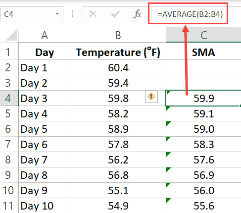
Remember: When calculating SMA using formulas, you need to make sure the references on the formula are relative. This means that the formula can be =AVERAGE(B2:B4) or =AVERAGE($B2:$B4), but it can not be =AVERAGE($B$2:$B$4) or =AVERAGE(B$2:B$4). The row number part of the reference needs to be without the dollar sign. You can read more about absolute and relative references here.
Since we are calculating a 3-point Simple Moving Average (SMA), the first two cells (for the first two days) are empty and we start using the formula from the third day onwards. If you want, you can use the first two values as is, and use the SMA value from the third one onwards.
Calculating Weighted Moving Average using Formulas
For WMA, you need to know the weights that would be assigned to the values.
For example, suppose you need to calculate the 3 point WMA for the below dataset, where 60% weight is given to the latest value, 30% to the one before it and 10% of the one before it.
To do this, enter the following formula in cell C4 and copy for all cells.
=0.6*B4+0.3*B3+0.1*B2
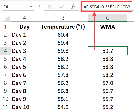
Since we are calculating a 3-point Weighted Moving Average (WMA), the first two cells (for the first two days) are empty and we start using the formula from the third day onwards. If you want, you can use the first two values as is, and use the WMA value from the third one onwards.
Calculating Exponential Moving Average using Formulas
Exponential Moving Average (EMA) gives higher weight to the latest value and the weights keep on getting lower exponentially for earlier values.
Below is the formula to calculate the EMA for a three-point moving average:
EMA = [Latest Value - Previous EMA Value] * (2 / N+1) + Previous EMA
…where N would be 3 in this example (as we are calculating a three-point EMA)
Note: For the first EMA value (when you don’t have any previous value to calculate EMA), simply take the value as is and consider it the EMA value. You can then use this value going forward.
Suppose you have the below data set and you want to calculate the three-period EMA:
In cell C2, enter the same value as in B2. This is because there is no previous value to calculate EMA.
In cell C3, enter the below formula and copy for all cells:
=(B3-C2)*(2/4)+C2
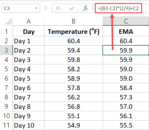
In this example, I have kept it simple and used the latest value and previous EMA value to calculate the current EMA.
Another popular way of doing this is by first calculating the Simple Moving Average and then using it instead of the actual latest value.
Adding Moving Average Trend Line to a Column Chart
If you have a dataset and you’re creating a bar chart using it, you can also add the moving average trend line with a few clicks.
Suppose you have a dataset as shown below:
Below are the steps to create a bar chart using this data and adding a three-part moving average trendline to this chart:
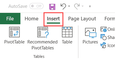
- Select the dataset (including the headers)
- Click the Insert tab

- In the Chart group, click on the ‘Insert Column or Bar chart’ icon.

- Click on the Clustered Column chart option. This will insert the chart in the worksheet.

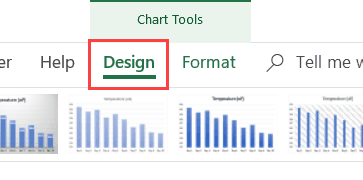
- With the chart selected, click on the Design tab (this tab only appears when the chart is selected)

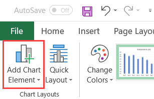
- In the Chart Layouts group, click on ‘Add Chart Element’.

- Hover the cursor on the ‘Trendline’ option and then click on ‘More Trendline Options’

- In the Format Trendline pane, select the ‘Moving Average’ option and set the number of periods.


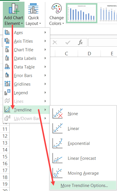
That’s it! The above steps would add a moving trendline to your column chart.
In case you want to insert more than one moving average trendline (for example one for 2 periods and one for 3 periods), repeat the steps from 5 to 8).
You can use the same steps to insert a moving average trend line to a line chart as well.
Formatting the Moving Average Trend Line
Unlike a regular line chart, a moving average trend line doesn’t allow a lot of formatting. For example, if you want to highlight a specific data point on the trend line, you won’t be able to do that.
A few things you can format in the trendline include:
- Color of the line. You can use this to highlight one of the trendlines by making everything in the chart light in color and making the trendline pop-out with a bright color
- The thickness of the line
- The transparency of the line
To format the moving average trendline, right-click on it and then select the Format Trendline option.
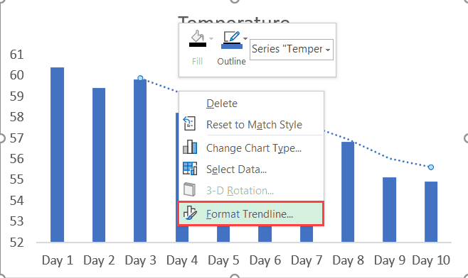
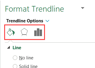
This will open the Format Trendline pane on the right. This pane as all the formatting options (in different sections – Fill & Line, Effects, and Trendline Options).
You may also like the following Excel tutorials:
- What is Standard Deviation and How to Calculate it in Excel?
- How to Calculate Square Root in Excel
- Calculating Weighted Average in Excel
- How to Calculate Compound Annual Growth Rate (CAGR) in Excel
- How to Make a Bell Curve in Excel
- How to Add a TrendLine in Excel Charts
- How to Calculate Average Annual Growth Rate (AAGR) in Excel
- 5 Easy Ways to Calculate Running Total in Excel (Cumulative Sum)
Содержание
- Moving Average in Excel
- What is Moving Average in Excel
- #1 – Simple moving average in Excel
- #2 – Weighted moving average in Excel
- #3 – Exponential moving average in Excel
- How to Calculate Moving Average in Excel?
- Example #1 – Simple Moving Average in Excel
- Example #2 – Simple Moving Average through Data Analysis Tab in Excel
- Example #3 – Weighted Moving Average in Excel
- Example #4 – Exponential Moving Average in Excel
- Things to Remember About Moving Average in Excel
- Recommended Articles
- Comments
- Calculation of the moving average in Excel and forecasting
- Use of moving average in Excel
- Using the «Data analysis package» add-in
Moving Average in Excel


What is Moving Average in Excel
Moving average means we calculate the average of the data set we have. In Excel, we have a built-in feature for calculating a moving average, available in the “Data Analysis” tab in the “Analysis” section. It takes an input range and output range with intervals as an output. Calculations based on mere formulas in Excel to calculate moving average is hard, but we have a built-in function in Excel to do so.
Moving average is a widely used time series analysis technique to predict the future. The moving averages in a time series are constructed by taking averages of various sequential values of another time-series data.
Excel has three moving averages: simple moving average, weighted moving average, and exponential moving average.
Table of contents
#1 – Simple moving average in Excel
A simple moving average helps calculate the average of a data series’s last number of periods. For example, suppose prices of n period are given. Then, the simple moving average is shown as
Simple moving average= [P1+P2+………….+Pn]/n
#2 – Weighted moving average in Excel
The weighted moving average provides the weighted average of the last n periods. The weighting decreases with each data point of the previous period.
Weighted moving average = (Price * weighting factor) + (Price of previous period * weighting factor-1)
#3 – Exponential moving average in Excel
It is similar to a simple moving average that measures trends over time. However, while a simple moving average calculates an average of given data, an exponential moving average attaches more weight to the current data.
Exponential moving average =(K x (C – P)) + P
- K = Exponential smoothing constant
- C= Current price
- P= Previous periods exponential moving average (simple moving average used for first periods calculation)
How to Calculate Moving Average in Excel?
Below are the examples of a moving average in Excel.
Example #1 – Simple Moving Average in Excel
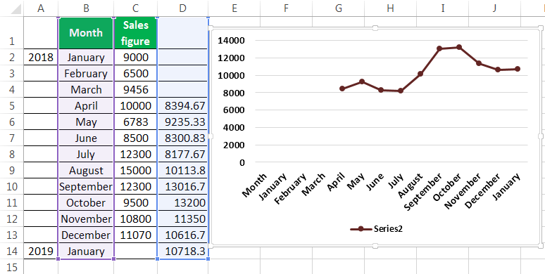
To calculate the simple moving average, we have taken a company’s sales data from January to December 2018. Our target is to smooth the data and to know the sales figure in January 2019. Therefore, we will use the three months moving average here.
- The moving average of January, February, and March is calculated by taking the months’ sales figures and then dividing them by 3.
Selecting at the corner of the D5 cell and then just dragging and dropping down will give the moving average for the remaining periods. It is Excel’s “Fill” tool function.
The sales prediction for January 2019 is 10456.66667.
Now, we plot the sales figure and moving average in the line graph to understand the difference in trend. We can do this from the “Insert” tab. Firstly, we have selected the data series, and then from the “Charts” section under “Insert,” we have used the “Line” graph.
After creating the graphs, it can be seen that the graph with the moving average is much more smoothed out than the original data series.
Example #2 – Simple Moving Average through Data Analysis Tab in Excel
- Under the “Data” tab under the “Analysis” group, we have to click “Data Analysis.” For example, the following is the screenshot.
- From the “Data Analysis,” we can access the “Moving Average.”
- After clicking the “Moving Average,” we must select the sales figure as the “Input Range.”
- The “Labels in the first row” is clicked to make Excel understand that the first row has the label name.
- Interval 3 is selected because we want three years moving average.
- We have chosen the “Output Range” with adjacency to the sales figure.
- We also want to see the “Chart Output,” wherein we can see the actual and forecasted differences.
This chart shows the difference between the actual and forecasted moving average.
Example #3 – Weighted Moving Average in Excel
We use the three years weighted moving average, and the formula is given in the screenshot.
After using the formula, we got the moving average for a period.
We got the moving average for all other periods by dragging and dropping values in the following cells.
The forecast for January 2019 is 10718.33.
Now, we took the line graph to see the smoothing of data. For this, we have selected our month and the forecasted data, and then inserted a line graph.
Now we will compare our forecasted data with our actual data. In the screenshots below, we can easily see the difference between the actual and forecasted data. The graph on the top is the actual data, and the graph below is the moving average and forecasted data. We can see that the moving average graph has smoothened significantly compared to the graph containing the actual data.
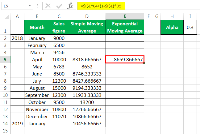
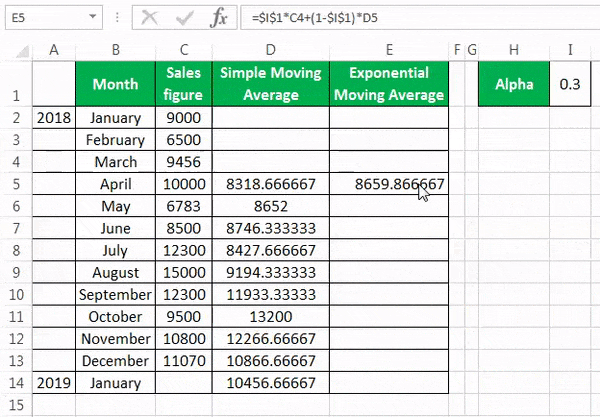
Example #4 – Exponential Moving Average in Excel
The formula for the exponential moving average is St=α.Yt-1+(1- α)St-1……(1)
- Yt-1= actual observation in the t-1th period
- St-1= simple moving average in the t-1th period
- α = smoothening factor, and it varies between .1 and .3. The greater the value of α closer is the chart to the actual values, and the lessen the value of the α, the more smooth the chart will be.
First, we calculate the simple moving average, as shown earlier. After that, we apply the formula given in equation (1). For fixing the α value for all the following values, we have pressed F4.
We get the values by dragging and dropping them in the following cells.
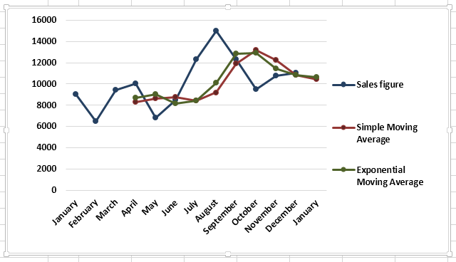
Now, we want to see the comparison between the actual values, simple moving average, and exponential moving average in excel. We have done this by doing a line chart.
The above screenshot shows the difference between Excel’s actual sales figure, simple moving average, and exponential moving average.
Things to Remember About Moving Average in Excel
- The simple moving average can be calculated using an AVERAGE function in Excel.
- Moving average helps in smoothing the data.
- Seasonal averages are often termed a seasonal index.
- The exponential moving average in Excel gives more weight to the recent data than the simple moving average. Therefore smoothening in the case of the exponential moving average in Excel is more than that of the simple moving average.
- The moving average helps the trader identify the trend more easily in businesses like the stock market.
Recommended Articles
This article is a guide to Moving Average in Excel. We discuss how to calculate three types of moving averages in Excel (simple, weighted, and exponential) along with practical examples and a downloadable Excel template. You may learn more about Excel from the following articles: –
Andrew Alexander says
THIS EXPLANATIONS ARE SIMPLY EXCELLENT
THANK YOU
Dheeraj Vaidya says
Источник
Calculation of the moving average in Excel and forecasting
Practical modeling of economic situations implies the development of forecasts. You can implement such effective forecasting methods using Excel tools like exponential smoothing, regression construction, moving average. Let’s consider the use of the moving average method in more detail.
Use of moving average in Excel
The moving average method is one of the empirical methods for smoothing and forecasting time-series. The essence: the absolute values of a time-series change to average arithmetic values at certain intervals. The choice of intervals is carried out by the slip-line method: the first levels are gradually removed, and the subsequent levels are switched on. As a result, a smoothed dynamic range of values is obtained which makes it possible to clearly trace the trend of changes in the parameter.
The time-series is a set of interconnected values of X and Y. X are time intervals and constant variable. Y is a characteristic of the occurrence under investigation (for example, a price which running in a certain period of time) and it is the dependent variable. You can identify the nature of changes in the value of Y in time and predict this parameter in the future using the moving average. The method works when the trend for the values is clearly traced in the dynamics.
For example, you need to forecast sales for November. The analyst selects the number of previous months for analysis (the optimal m number of the moving average members). The forecast for November will be the mean of the parameters for m previous months.
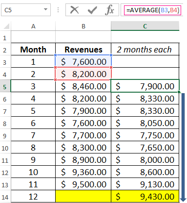
Task. Analyze the company’s revenue for 11 months and make a forecast for the twelfth month.
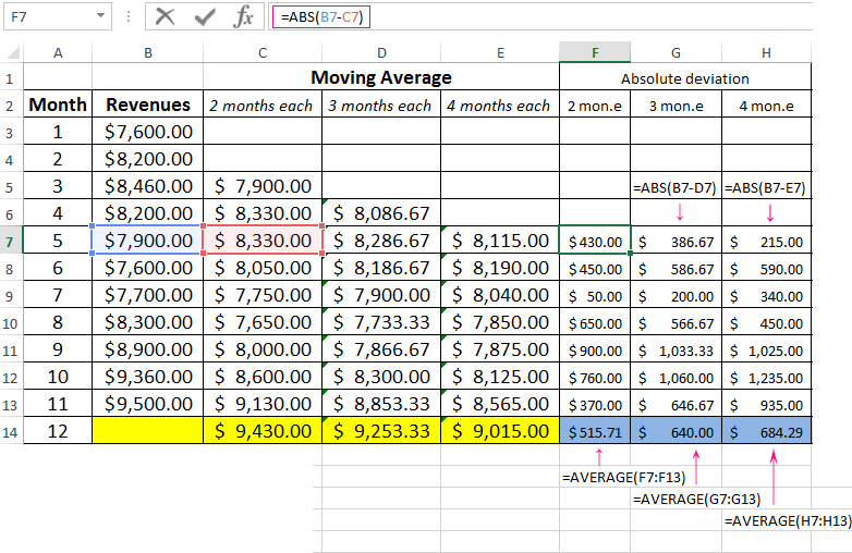
We will form the smoothed time series by the moving average method using the function AVERAGE. We find the midle deviations of the smoothed time series from the given time series.
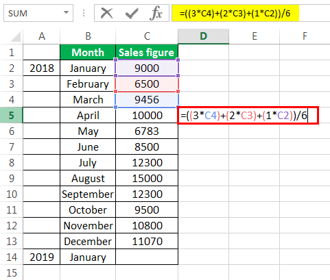
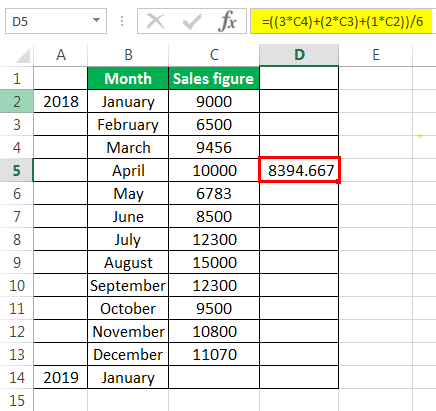
- We construct a smoothed time series using the moving average method for the previous 2 months. We based on the values of the initial time series. The moving average formula in Excel. Copy the formula to the range of cells C6:C14 using the autocomplete marker.
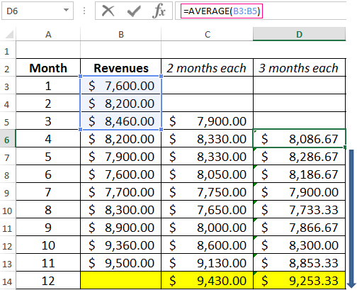
- Similarly, we build a series of values for a three-month moving average. The formula is next:
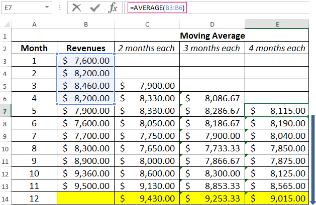
- By the same principle, we form a series of values for the four-month moving average.
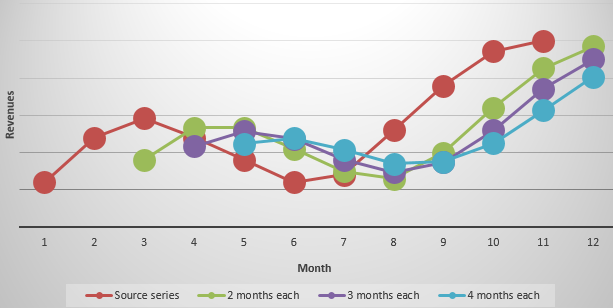
- Let’s construct the chart for the given time series and the calculated forecasts based on its values for this method. The figure shows that the trend lines of the moving average are shifted relative to the line of the original time series. This is because the calculated values of the smoothed time series are delayed compared to the corresponding values of the given series. After all, the calculations were based on the data of previous observations.
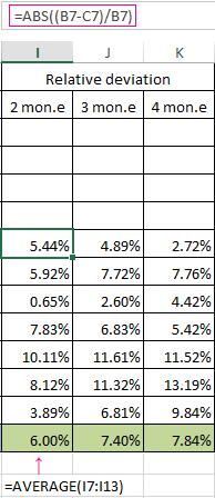
- Let’s calculate the absolute, relative and mean square deviations from the smoothed time series. Absolute deviations:
Mean square deviations:
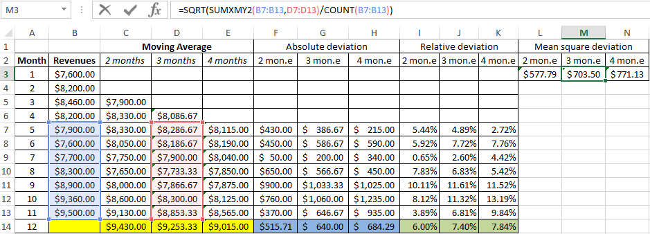
The same number of observations were taken while calculating deviations. This is necessary in order to carry out a comparative analysis of errors.
After comparing the tables with deviation it is preferable to use the model of a two-month. It’s the better way to make a forecast the trend of changing the company’s revenue using the moving average method in Excel. It has minimal errors in forecasting (in comparison with three and four-month).
The forecasted revenue for 12 months is 9 430$.
Using the «Data analysis package» add-in
Let’s take the same task for this example.
On the «DATA» tab we find the «Data Analysis» command. Select «Moving Average» in the appeared dialog:
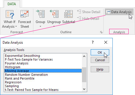
Let’s fill all the fields. Input interval is the initial values of the time series. Interval is the number of months included in the moving average calculation. Enter the number 2 in the field since we will first build a smoothed time series based on the data of the two previous months. The output interval is the range of cells for deriving the results.
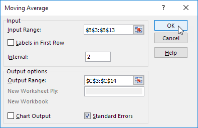
We automatically add a column to the table with a statistical error estimate by putting a check mark in the «Standard errors» box.
In the same way, we find the moving average for three months. Only the interval (3) and the output range are changed.
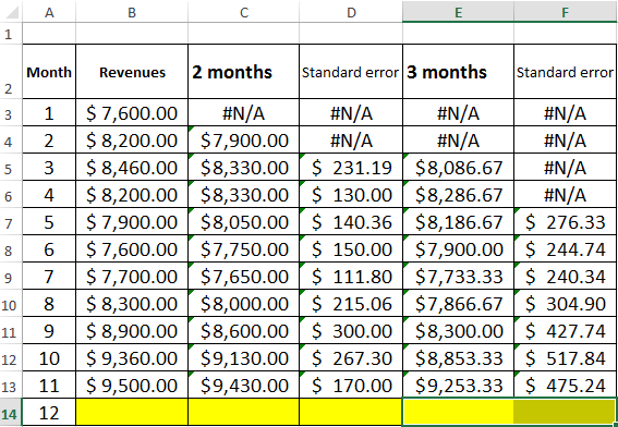
We are convinced after comparing standard errors that the model of a two-month moving average is more suitable for smoothing and forecasting. It has smaller standard errors. The forecasted revenue for 12 months is 9 430$.
Making forecasts using the moving average method is simple and effective. The tool accurately reflects changes in the main parameters of the previous period. But it is impossible to go beyond the limits of known data. Therefore, other methods are used for long-term forecasting.
Источник
Note: These steps apply to Office 2013 and newer versions. Looking for Office 2010 steps?
Add a trendline

-
Select a chart.
-
Select the + to the top right of the chart.
-
Select Trendline.
Note: Excel displays the Trendline option only if you select a chart that has more than one data series without selecting a data series.
-
In the Add Trendline dialog box, select any data series options you want, and click OK.
Format a trendline
-
Click anywhere in the chart.
-
On the Format tab, in the Current Selection group, select the trendline option in the dropdown list.
-
Click Format Selection.
-
In the Format Trendline pane, select a Trendline Option to choose the trendline you want for your chart. Formatting a trendline is a statistical way to measure data:
-
Set a value in the Forward and Backward fields to project your data into the future.
Add a moving average line
You can format your trendline to a moving average line.
-
Click anywhere in the chart.
-
On the Format tab, in the Current Selection group, select the trendline option in the dropdown list.
-
Click Format Selection.
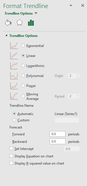
-
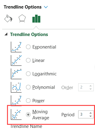
In the Format Trendline pane, under Trendline Options, select Moving Average. Specify the points if necessary.
Note: The number of points in a moving average trendline equals the total number of points in the series less the number that you specify for the period.
Add a trend or moving average line to a chart in Office 2010
-
On an unstacked, 2-D, area, bar, column, line, stock, xy (scatter), or bubble chart, click the data series to which you want to add a trendline or moving average, or do the following to select the data series from a list of chart elements:
-
Click anywhere in the chart.
This displays the Chart Tools, adding the Design, Layout, and Format tabs.
-
On the Format tab, in the Current Selection group, click the arrow next to the Chart Elements box, and then click the chart element that you want.
-
-
Note: If you select a chart that has more than one data series without selecting a data series, Excel displays the Add Trendline dialog box. In the list box, click the data series that you want, and then click OK.
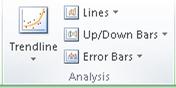
-
On the Layout tab, in the Analysis group, click Trendline.
-
Do one of the following:
-
Click a predefined trendline option that you want to use.
Note: This applies a trendline without enabling you to select specific options.
-
Click More Trendline Options, and then in the Trendline Options category, under Trend/Regression Type, click the type of trendline that you want to use.
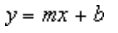
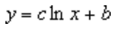
Use this type
To create
Linear
A linear trendline by using the following equation to calculate the least squares fit for a line:
where m is the slope and b is the intercept.
Logarithmic
A logarithmic trendline by using the following equation to calculate the least squares fit through points:
where c and b are constants, and ln is the natural logarithm function.
Polynomial
A polynomial or curvilinear trendline by using the following equation to calculate the least squares fit through points:
where b and
are constants.Power
A power trendline by using the following equation to calculate the least squares fit through points:
where c and b are constants.
Note: This option is not available when your data includes negative or zero values.
Exponential
An exponential trendline by using the following equation to calculate the least squares fit through points:
where c and b are constants, and e is the base of the natural logarithm.
Note: This option is not available when your data includes negative or zero values.
Moving average
A moving average trendline by using the following equation:
Note: The number of points in a moving average trendline equals the total number of points in the series less the number that you specify for the period.
R-squared value
A trendline that displays an R-squared value on a chart by using the following equation:
This trendline option is available on the Options tab of the Add Trendline or Format Trendline dialog box.
Note: The R-squared value that you can display with a trendline is not an adjusted R-squared value. For logarithmic, power, and exponential trendlines, Excel uses a transformed regression model.
-
If you select Polynomial, type the highest power for the independent variable in the Order box.
-
If you select Moving Average, type the number of periods that you want to use to calculate the moving average in the Period box.
-
If you add a moving average to an xy (scatter) chart, the moving average is based on the order of the x values plotted in the chart. To get the result that you want, you might have to sort the x values before you add a moving average.
-
If you add a trendline to a line, column, area, or bar chart, the trendline is calculated based on the assumption that the x values are 1, 2, 3, 4, 5, 6, etc.. This assumption is made whether the x-values are numeric or text. To base a trendline on numeric x values, you should use an xy (scatter) chart.
-
Excel automatically assigns a name to the trendline, but you can change it. In the Format Trendline dialog box, in the Trendline Options category, under Trendline Name, click Custom, and then type a name in the Custom box.
-
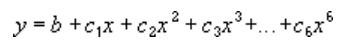
 are constants.

Tips:
-
You can also create a moving average, which smoothes out fluctuations in data and shows the pattern or trend more clearly.
-
If you change a chart or data series so that it can no longer support the associated trendline — for example, by changing the chart type to a 3-D chart or by changing the view of a PivotChart report or associated PivotTable report — the trendline no longer appears on the chart.
-
For line data without a chart, you can use AutoFill or one of the statistical functions, such as GROWTH() or TREND(), to create data for best-fit linear or exponential lines.
-
On an unstacked, 2-D, area, bar, column, line, stock, xy (scatter), or bubble chart, click the trendline that you want to change, or do the following to select it from a list of chart elements.
-
Click anywhere in the chart.
This displays the Chart Tools, adding the Design, Layout, and Format tabs.
-
On the Format tab, in the Current Selection group, click the arrow next to the Chart Elements box, and then click the chart element that you want.
-
-
On the Layout tab, in the Analysis group, click Trendline, and then click More Trendline Options.
-
To change the color, style, or shadow options of the trendline, click the Line Color, Line Style, or Shadow category, and then select the options that you want.
-
On an unstacked, 2-D, area, bar, column, line, stock, xy (scatter), or bubble chart, click the trendline that you want to change, or do the following to select it from a list of chart elements.
-
Click anywhere in the chart.
This displays the Chart Tools, adding the Design, Layout, and Format tabs.
-
On the Format tab, in the Current Selection group, click the arrow next to the Chart Elements box, and then click the chart element that you want.
-
-
On the Layout tab, in the Analysis group, click Trendline, and then click More Trendline Options.
-
To specify the number of periods that you want to include in a forecast, under Forecast, click a number in the Forward periods or Backward periods box.
-
On an unstacked, 2-D, area, bar, column, line, stock, xy (scatter), or bubble chart, click the trendline that you want to change, or do the following to select it from a list of chart elements.
-
Click anywhere in the chart.
This displays the Chart Tools, adding the Design, Layout, and Format tabs.
-
On the Format tab, in the Current Selection group, click the arrow next to the Chart Elements box, and then click the chart element that you want.
-
-
On the Layout tab, in the Analysis group, click Trendline, and then click More Trendline Options.
-
Select the Set Intercept = check box, and then in the Set Intercept = box, type the value to specify the point on the vertical (value) axis where the trendline crosses the axis.
Note: You can do this only when you use an exponential, linear, or polynomial trendline.
-
On an unstacked, 2-D, area, bar, column, line, stock, xy (scatter), or bubble chart, click the trendline that you want to change, or do the following to select it from a list of chart elements.
-
Click anywhere in the chart.
This displays the Chart Tools, adding the Design, Layout, and Format tabs.
-
On the Format tab, in the Current Selection group, click the arrow next to the Chart Elements box, and then click the chart element that you want.
-
-
On the Layout tab, in the Analysis group, click Trendline, and then click More Trendline Options.
-
To display the trendline equation on the chart, select the Display Equation on chart check box.
Note: You cannot display trendline equations for a moving average.
Tip: The trendline equation is rounded to make it more readable. However, you can change the number of digits for a selected trendline label in the Decimal places box on the Number tab of the Format Trendline Label dialog box. (Format tab, Current Selection group, Format Selection button).
-
On an unstacked, 2-D, area, bar, column, line, stock, xy (scatter), or bubble chart, click the trendline for which you want to display the R-squared value, or do the following to select the trendline from a list of chart elements:
-
Click anywhere in the chart.
This displays the Chart Tools, adding the Design, Layout, and Format tabs.
-
On the Format tab, in the Current Selection group, click the arrow next to the Chart Elements box, and then click the chart element that you want.
-
-
On the Layout tab, in the Analysis group, click Trendline, and then click More Trendline Options.
-
On the Trendline Options tab, select Display R-squared value on chart.
Note: You cannot display an R-squared value for a moving average.
-
On an unstacked, 2-D, area, bar, column, line, stock, xy (scatter), or bubble chart, click the trendline that you want to remove, or do the following to select the trendline from a list of chart elements:
-
Click anywhere in the chart.
This displays the Chart Tools, adding the Design, Layout, and Format tabs.
-
On the Format tab, in the Current Selection group, click the arrow next to the Chart Elements box, and then click the chart element that you want.
-
-
Do one of the following:
-
On the Layout tab, in the Analysis group, click Trendline, and then click None.
-
Press DELETE.
-
Tip: You can also remove a trendline immediately after you add it to the chart by clicking Undo  on the Quick Access Toolbar, or by pressing CTRL+Z.