
16 April, 2020
Introduction to Style Guides
In publishing and media companies, use of a style guide is the norm. However, style guides can also be useful for any organization that prepares documents for clients and the public. This article is for organizations outside of the publishing industry who can benefit from the introduction of a style guide.
A style guide is a reference point that sets standards for writing documents within your organization. The focus of the style guide is not usually a matter of ‘correct’ or ‘incorrect’ grammar or style but, rather, it provides guidance for instances when many possibilities exist.
Style guides offer you the chance to present your brand in a consistent way. They help to ensure that multiple authors use one tone. And they help save time and resources by providing an instant answer when questions arise about preferred style.
Build and Maintain Your Style Guide Automatically Right From Microsoft Word
We recommend PerfectIt for Word, which can help to ensure that text is consistent and style guides are codified within MS Word automatically. It has a free 14 trial you can download here. There are free user guides which show how you can customize these tools and share style sheets among colleagues so that all documents in your organization are checked the same way.
The Rest of This Article is Structured as Follows:
|
|
|
|
|
|
How Your Guide Will Be Read (aka ‘The Facts of Life’)
To write an effective style guide, it is important to keep in mind that most people in your company will barely read it. A keen new recruit may read all the way through. But for most people, the style guide is there as a resource. It is there to answer questions and settle arguments. So it’s important that the structure be clear, and a table of contents is the first thing that readers find.
“Remember that style guides are references, consulted when a question or problem arises, rather than books to be read as a training tool.” — Jean Hollis Weber, Developing a Departmental Style Guide
Making Use of Existing Style Guides
How do you decide what belongs in your style guide? Good industry-wide style guides are often hundreds of pages long. So the easiest way to write your style guide is to select one that covers your sector and then do not repeat anything that is in that guide. Instead, just note any additions or changes that apply to your organization.
How can you find out which style guide is right for your organization?
Check the list here: http://en.wikipedia.org/wiki/House_style.
By using an external guide as the point of reference, you can focus your reader on the key things to remember in your organization.
The Most Important Things for Your Reader to Remember
In many cases, the purpose of the style guide is to ensure that documents conform to corporate style and branding. For example, does your organization abbreviate its name? If so, when and how is the abbreviated term used? Getting corporate style right is not just important for your own organization; key industry terms that can be presented in more than one way should also be included in the style guide. If your clients have a preferred style for their name, then these should be included too.
After corporate style and branding, often the next most important use of the style guide is to answer internal questions about presentation. Your style guide should make clear how authors present:
- Headings (and how they are capitalized)
- Lists (whether they are capitalized and how they are punctuated)
- Numbers (when they should be spelled in full)
- Rules for chapter, figure and table headings (including numbering)
Tools like PerfectIt for Word can help to ensure that such stylistic elements are consistent. What’s more, there are free user guides which show how you can customize PerfectIt and share its style sheets among colleagues so that all documents in your organization are checked the same way.
The key to determining what goes in the style guide is to find out how usage differs in your company. The best way to do that is to bring more people into the process of building the style guide. That process is reviewed below, but first this article looks at common mistakes in the preparation of style guides.
Things Not to Do
Almost everyone who writes has a pet peeve that he/she hates to see in print. Maybe you don’t like unnecessary use of quotation marks? Perhaps you can’t understand why grown-ups still don’t know the difference between ‘it’s’ and ‘its’? You’re right. But this is not the place for that. Whatever your bugbear is, you need to put it to one side and focus on the key message.
A good style guide is no more than four pages. Of course, some organizations may need it to be longer. However, outside of publishing, bear in mind that the goal is just to focus on points of style where there is no right answer but where one usage is preferred by the organization. A style guide is not the place to teach your colleagues things that they should already know.
A style guide is also not a design guide. You should have in place templates that automate indentation, typefaces and styles within Word (if you do not have these already, email us for a recommendation at [email protected]). Graphics formats, logo presentation and other issues that relate to appearance also belong elsewhere.
If there are rules in your company about signing off on documents or procedures for checking and releasing then leave these out. Equally, instructions on using Word do not belong here. Reminding authors to use a spell check before passing on their document is not consistent with how a style guide will be read and is a sure-fire way to deter people from using it.
The Evolution of a Good Style Guide
The best way to make sure that nobody uses your style guide is to write it and then tell everyone else to obey it. The purpose of a style guide is to make sure that multiple authors write in a clear and unified way that reflects the corporate style. So it’s best to bring other authors into the process as soon as possible. Run the draft past a select group of people and ask for comments. When the final version goes out, ask for feedback. If you have a company portal, set up a forum for users to discuss the guide. Plan on making revisions in light of feedback and the style guide will become something in which all interested parties can participate.
Conclusion
The key to a good style guide is brevity. Authors use a style guide as a resource, so it should be written as one. A style guide also does not sit on its own. It should be accompanied by a guide that is specific to your industry, separate guides for design and process issues, and tools like PerfectIt to ensure that corporate style is actually adopted.
Bibliography
- Developing a Departmental Style Guide, Jean Hollis Weber
Perfect your writing with regular tips and advice by subscribing to our newsletter
Now with YouTube tutorial – just click the link at the bottom of the blog post to see me go through this on video
Using the right tools when writing is essential, and in this post, I’m going to be explaining how to use Style Sheets in Microsoft Word which can really help with your writing goals.
Now, I’m not a fan of Microsoft Word, especially for formatting. It just doesn’t give you enough control to place text where you want it to go, BUT for planning out your book, and writing out the first draft, it does the job. Plus, there is a great tool within Word, and if it’s used properly, can really help you with your writing content as you can see your whole book mapped out, which is really helpful when you’re in your draft phase.
This little-known feature in Word really can make your writing process clearer and easier to manage. It’s a super easy tool to use and it can really help you organize your book as you can drag and drop entire sections of your book (in the navigation pane) which then moves those sections for you in your Word document. It takes about 5-10 minutes to set up, but once you have, you will then have a very powerful aid that can be used in lots of writing tasks, like blog posts, or articles.
Word does come with styles already set, but I’m going to show you how to customise it and give you a clear understanding of how it works… then you can set your own headings and subheadings to fit the tone of your work.
Getting to grips with headings
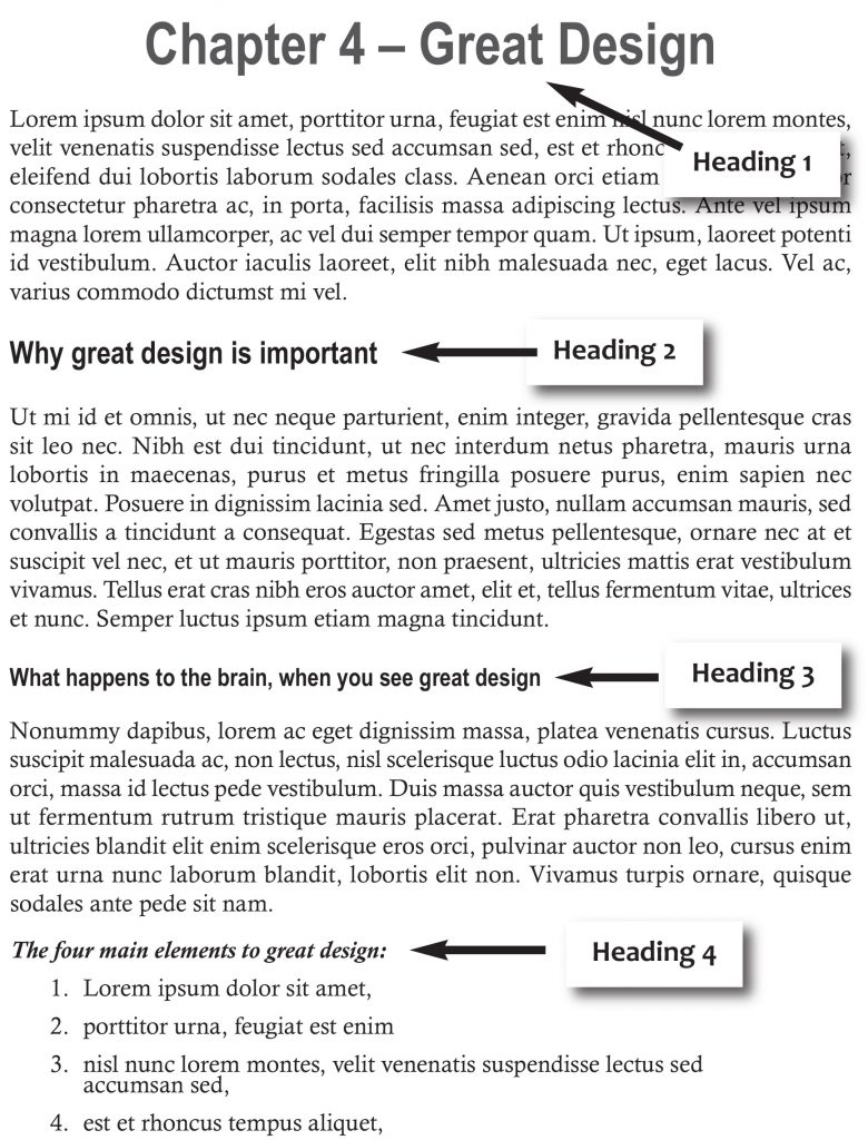
Headings explained
Before I get into the step by step instructions of style sheets, I think it’s really important to explain what I mean by heading allocation. So, what is a heading 1? This is the first major heading of your work. If you’re writing a book or something with many chapters or sections, then I would use the title style for the name of your piece. If you’re writing an article, then use the heading 1 style for your article heading.
Chapter numbers and chapter name (Or your article title) = Heading 1
First important heading within that chapter (or article) = Heading 2
A subheading of heading 2, is heading 3. And you might need a heading 4, to show a title of a checklist.
Take a look at the diagram on the right, so you can see what I mean. The text under each heading is ‘normal’ text (which I explain in step 2).
Having proper heading allocation to your piece will really help the reader understand the flow of your writing. These clearly define the right sections for your work, and if the piece is long and complex, having the text broken up with headings will help the reader. I don’t usually use more than 4 headings – so keep this in mind when you’re setting up your styles.
So now you understand heading allocation, let’s get cracking with using your style sheets.
When you open up a new Word document, you will have a list of menu options at the top of your document, like this.

Style Sheets
You’re looking for the little arrow on the right-hand corner of the styles section. I’ve circled it in red for you.

Style sheets location
Step 1. Select the styles panel
So, to get started, select the little arrow icon at the bottom of the styles menu on your blank word document. (Shown above in the style sheets location.) When you click this, you’ll get a menu of options to the right of your word document which looks like this;

Diagram 1. Normal drop down menu
You will notice that the list comprises of Headings (up to 2) – and other types of styles.
Normal? What’s normal?
Normal -> this is what your main text is, and I suggest an easy to read font like Cambria, or Times New Roman, set at 12pt. I explain below how to change the style in a bit, but its default setting is Calibri 11pt, which I think is quite hard and small to read.
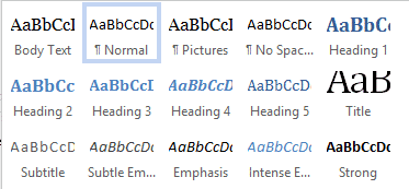
You then have other ‘styles’ options, including heading 1, heading 2, Title, Subtitle etc. For this blog post, I’m just going to talk about title, heading 1 & 2, and normal styles. (If you wish to explore the other options, Google has loads of information on all the different styles available, but unless you’re going to be designing loads of stuff for print, then I suggest just getting to grips with the ones I outline in this post will be more than enough.)
Once you’ve set up these ‘styles’, you can then simply highlight the text you want to have as that style, and apply the correct style by clicking on the corresponding choice from the menu. Voila, the highlighted text changes to the style you’ve set up.
What is really fantastic about this feature is, if you’ve written a chapter, and you realise that you’ve set up heading 1 (for example) with too big a font, or you don’t like the font you’ve chosen, you can simply change the heading 1 in the styles menu, and hey presto… all of the heading 1’s have now been updated with your new selection!
Step 2. Setting up your styles
‘Normal’ Style
First, let’s look at your normal style. As I mentioned before, I usually change this style to either Cambria or Times new Roman as it’s nice and easy to read. The default setting is Calibri (Microsoft Office 2016) at 11 point, which I find really small. So, to change the Normal style font, you simply hover your cursor over the Normal option on the style menu, and you’ll notice a down arrow at the end of the box. Like this…

Diagram 2. When hovering the mouse over normal.
(This applies to ALL the styles, so when we come to change any of the headings, we are going to do the same thing.) Hover your mouse over the normal style down arrow and click it; you should get a menu selection as shown in Diagram 3, and you’re looking for the ‘Modify…’ option.

Diagram 3. Modify box
Select this and another window will open in your document – this is where all of your choices are for font selection. I’m going to show you the basic set up, but once you get more confident, or if you do any further learning, then you’ll realise that you have lots of choices to choose from in this panel.
So, for now, we are just going to change the Formatting section (font choice and size) and the Format section (you can see this at the bottom of this box, to the left of the OK and Cancel options) for text alignment and spacing.
So, go ahead and change the font allocation to what you want (under the formatting subheading) by clicking the down arrow to the right of the font name, (It’s highlighted in this picture, and the down arrow is circled) and a list will appear of all the different fonts you can have (see Font choice menu diagram below).

Click to choose font

Font choice menu
You can now choose which font you want your normal text to be, (use the sliding bar to the right of the font list, to get more choices), and if you want to change the point size, just click the little down arrow where it says 11 and choose the font size accordingly. I like 12 myself, but you might prefer a higher or lower number. Press OK when you’re happy with your selection. This will take you back to the style menu. If you want a font size that’s not listed don’t use the down arrow, actually highlight the number itself, and change it to what you want. You can even have .5 of a point if you want.
We haven’t quite finished yet, as we are now going to alter the text alignment and paragraph spacing. Click on the Normal down arrow tab again (Diagram 1 and 2), and hit modify, and select the ‘Format’ box at the bottom of that panel, (step 1.) This will bring up a list of options, and you’ll want to choose ‘paragraph’, (step 2.) This is where we are going to set up text alignment, and spacing after paragraphs.

Format options, step 1 and 2
After selecting Paragraph… you’ll get a box looking like this…
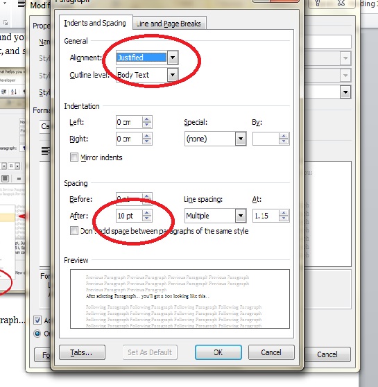
Choosing alignment and spacing
It’s from this panel that you select text alignment (how the text aligns itself on the page) and spacing after paragraphs. (I use 10pt.)
I like to use justified text, which means that the text goes all the way to the end of the margin, and creates a nice clean right-hand edge. Left alignment gives you a raggedy right edge. Centred centres the text, and right align gives you a raggedy left-hand side of the text. Simply click on the right arrow drop down option where it says ‘alignment’, (top circle) and select the alignment you want. If you’re happy with left aligned (the default setting) then don’t change anything.
The spacing after a paragraph is the space between new paragraphs – when you hit enter on your keyboard. Don’t get this confused with line spacing (this is the lines within the paragraph). If you want to adjust the line spacing, then use the up and down arrows on the ‘At’ section, which is just right of the Line spacing option. (I like to keep it at the default, but some like a bigger gap between their lines. If you want to change the spacing between the paragraphs, then click the up and down arrows in the ‘After’ section, (bottom circle) and you’ll notice the sample text will change in the preview box.
Remember to hit OK once you’ve made your selections. You’ve now set up your Normal style sheet. (Feel free to have a play around, but remember, once you choose your options, this will then become your normal template… and all future documents will have this same formatting!)
Heading Styles
Now that you’ve got to grips with changing ‘normal’ style, the same process works for your heading options.
Simply click on the down arrow* on the Heading 1 style, (select ‘modify’ – see diagram 4) and change the font, and size of your Heading 1. I always suggest using a contrasting font, like Myriad Pro, and I usually give it a size above 18 pt. There are several other little tricks I use as well, to make my headings even better…

Diagram 4. Heading 1 selection

Diagram 5. Heading selection options
If you want to have your Heading 1 centred (not ‘justified’, like we chose for normal body text) there is a quick little shortcut you can use to choose this…
As you can see in Diagram 5, I have changed the Formatting to Myriad Pro, and I’ve used the centred icon which will centre your text. (You have left aligned, right aligned, centre and justified choice.) Have a play with what works for you. You can even change the colour of your text, (the default is a blue as shown in diagram 4) but you can change this by clicking the down arrow by the bar of blue in the formatting area of the menu. I’ve chosen black… but you can, of course, have whatever colour you like.
I usually choose the bold option too (The little box with the B in it) for all my headings. You can select that, by clicking the B button in the formatting section. Remember to hit OK once you’ve made your choices.
Heading 2, 3 and 4 can all now be changed in exactly the same way make sure you choose the text size to fit your hierarchy. So, heading 2 might go down to 16 Bold, heading 3 might go to 14 Bold and heading 4 might got 12 Bold and italicised. Have a play and see how it looks. Just remember to hit OK after each selection, otherwise your changes won’t be saved.
Once you have all your styles set up, you can now either start a new document, using the style sheet pane to define what text has what style, or you can open an already written piece, and then go through and select the specific text which needs styling in the new styles. Remember, if you’ve changed the normal text, you’ll need to select all the body copy and change it to the normal style.
*A word of warning, when clicking on the styles… if you have your cursor at the beginning of a written paragraph, and you hit the heading 1 selection (and not the arrow) the whole paragraph will change to Heading 1 style. Don’t panic… just click back on normal, and the text will go back to how it was!
Step 3. Adjust your ‘before’ and ‘after’ spacing
So, you now have your style sheet set up, and your headings all nicely formatted. The next little trick will make sure that your navigation window works at its best… so bear with me while I explain the last few steps with you.
Get the spacing right!
So, you now have selected a bit of text, and applied a heading 1 style to it. Your natural response is probably to manually put in a space (by hitting the enter key) before you start typing in normal body text. STOP! That is technically wrong… so let me show you how to set up each heading which automatically puts in the spacing for you (and in doing so, will set up your navigation window correctly).
So, go back to your style sheets menu, select your style you’re going to change (Heading 1 for example) click on the down arrow, next to the heading 1 option and choose modify. Then go to the format option at the bottom left-hand corner, and select paragraphs, like we did for choosing our font. Then take a look at the spacing section; you’ll notice a ‘space before’ and a ‘space after’ option. Now, if heading 1 is only going to be used at the beginning of your document, you don’t need a space before, because your heading 1 will be at the beginning of a page, but your space after is how much space you want before you start normal text starts. I usually have this at 24pt. This gives a nice clean space between your heading 1 and text.
Now, your heading 2, 3 and 4 all need to have a space before, because this is usually is inserted within normal text, like this:

Spacing before and after a heading
So, for heading 2, I usually allocate 10pt before and after, heading 3, 10pt before and 6pt after and heading 4 the same. But you can have a go, and see what works for you. When you hit enter after you’ve written or styled your heading text, your style should automatically go back to ‘normal’ and your spacing should be set. If you use manual spacing (by entering a hard return, or by pressing enter) you will have gaps showing on your navigation pane, so it’s much better (and correct) to set up your headings with their own spaces before and after.
Step 4. Using the Navigation Pane
So, what has all of this been set up for? Well, now we’ve done the hard work, you’ll be rewarded with being able to see your project, in full, with all the relevant headings listed in its hierarchy order. Plus, if you feel a section of text is in the wrong place, you can simply drag and drop that particular section, and it moves it for you in your document as well.
Let me show you what I mean. So, for this document, when I view the navigation pane, I see this…

Navigation Pane
All my headings are catalogued, in the order they are given, so you’ll notice that ‘Normal’ Style’ is slightly indented… that’s because it’s a heading 2.
To view the navigation pane, click the View tab at the top of your Word document menu (1.), and select Navigation Pane (2.) in the show section. When you check the navigation pane, the navigation menu will appear to the left of your document (3.).
Now you can see your whole project, in one go… magic! Also, if the list is quite long, and you want to get to a particular section quickly, simply place your curser over the relevant heading title in the navigation panel, click once and you’re taken straight to it, in your document. No need to scroll with your mouse.
Step 5. Moving sections with ease
If you feel that a section is in the wrong place, you can simply drag and drop the heading which precedes the section, to where it needs to go, and the whole section will be moved in your document. No need to cut and paste – and you can see exactly where it needs to go, as you do it all in the navigation pane.
So, for example, if I wanted to move the section ‘Heading Styles’ above ‘Normal Styles’, instead of cutting and that whole section in my document, scrolling to the correct place and then pasting it, I can simply place my mouse over the ‘Heading Style’ section in the navigation pane, click and hold the left button, drag the bar and place it over the ‘Normal Style’ section. You’ll notice a thick line will appear and a shaded rectangle (my print screen doesn’t show this, so I can’t take a screen grab) let go of your left button, and voila, the section is now above the Normal Style, and you’ll notice that in your document, your text has been moved as well! Absolutely magic.
Bird’s eye view
This is a super convenient tool to use – especially if the piece is quite long, as you can clearly see the whole thing in one go. You can check that your sections are all in the correct place, and set at the right level.
Have a go at this tool and see how you get on. It’ll make your writing projects much easier to see and edit, and will help you with clarifying your book’s content.
If you want to see this as a video tutorial, just head over to this link Style Sheets explained to see it on YouTube.
I’d love to know how you get on, so please do leave a comment in the comments box below.
Here’s the basics of Styles in Word for paragraph, character or both (Linked) plus Tables and Lists. I know talking about styles in Word makes eyes glaze over but they are a really useful part of Word (plus Excel, PowerPoint and Outlook).
Today I watched an ‘experienced’ Word user reformatting a document. He laboriously worked through the document, selecting paragraphs, phrases and even individual words then clicking on the ribbon to change the look. It took 10 minutes or more. With styles it would have taken a few seconds.
Styles have been around for all of Word’s history. They have changed and expanded over the years but the fundamentals are the same.
In this article we’ll explain the different types of styles including at least one that sneaked in without many people noticing. From just one type in the early days of Word, there’s five different style types in modern Microsoft Word.
What is a Style?
A style is just a collection of formatting settings under a single name.
For example ‘Heading 1’ has these default values in Word (choose Heading 1 style, right-click and choose ‘Modify Style’.
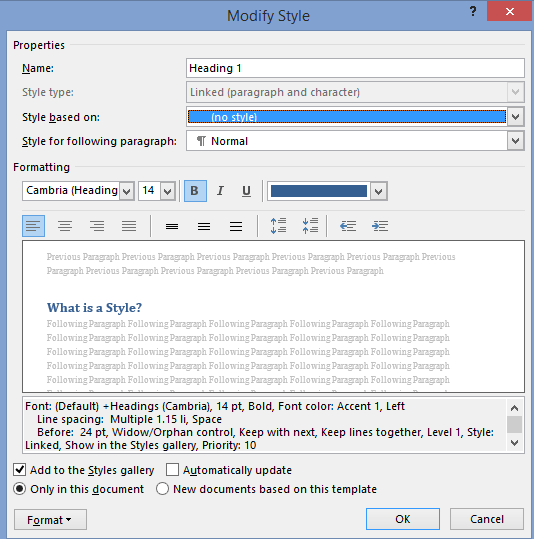
So ‘Heading 1’ means Cambria font, 14pt, Bold with a color setting, Left justified, 1.15 line spacing and 24pt line space before the text, plus other settings.
Instead of having to apply all those separate formatting options for each main heading, just apply the ‘Heading 1’ style.
Even better, if you decide to change the look of the headings, change the ‘Heading 1’ settings and all the headings with that style will be changed automatically.
Paragraph and Character styles
There are different types of style that can be applied to different parts of a document. Originally there were only Paragraph styles – styles you could apply to an entire paragraph.
That was OK but no help if you wanted consistent formatting for words in a paragraph like a product name Office-Watch.com or just emphasis.
So Microsoft added character styles. These are styles that can be applied to a word or even a single letter. A character style could be called ‘Product Name’ to ensure all references to a product or service look consistent.
Character styles have all the attributes of paragraph styles that are applicable to individual characters. Things like font, size, color, bold, italic etc are in both character and paragraph styles. Line spacing, Left/Right/Center/Justify etc. can only apply to entire paragraphs.
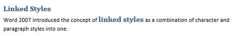
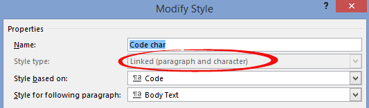
Linked styles
Adding character styles created a new problem. Microsoft discovered that users sometimes had two styles with the same name – one as a paragraph style, the other as a character style. Or people would have two styles such as ‘QuoteP’ and QuoteC’ with the same settings, one for paragraphs and another for word/characters.
So Word 2007 introduced ‘Linked Styles‘ which act as both a paragraph style and character style, depending on the situation.
A linked style acts like a paragraph style when a paragraph/s is selected and the style applied.
It acts like a character style when less than a paragraph (a character/word/phrase) is selected and the style applied.
Gone is the need for ‘twin’ styles – now you can have a single style that can applied to any text in a document.
The best example of a linked style is already in Word 2007 and later. All the Heading styles were changed to linked styles. Here’s an example of ‘Heading 1’ style used as both a paragraph and character style at the same time.
Both the paragraph and words were changed to the same style by selecting them and pressing the ‘Heading 1’ shortcut Ctrl + Alt + 1 . The Style Gallery or styles list could have been used to do the same thing.
In the Modify Style dialog you’ll see the style type just under the name.
‘Linked’ isn’t the best choice of terms for this type of style. Most styles are already ‘linked’ to others through style inheritance. ‘Merged’ or ‘Combined’ might have been clearer to most people – but we’re stuck with ‘Linked’.
Which is which?
On the styles list, the three types of style have their own markers.
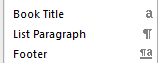
The lower case ‘a’ next to a character style.
The ‘backwards P’ or Pilcrow is used as an end of paragraph mark in Word and also serves to denote a Paragraph style.
The combined pilcrow and a is, unsurprisingly, for a linked style.
Alas, the Style Gallery on the ribbon isn’t as clear. Among various (ignored) complaints about the Style Gallery is the inconsistent marking.
Paragraph styles (e.g. Normal, Pictures etc.) have the pilcrow next to the style name.
Linked paragraphs (Heading styles etc.) have no marking next to the name.
But neither do the character styles! In the above image there’s no way to know that ‘Subtle Emphasis’ is a character style.
Inheritance
A brief mention of style inheritance.
Styles are normally based on an existing style so only changes from the inherited style need to be made. This lets you apply broader changes to a document a lot faster.
For example, here’s settings for Heading 2

Heading 2 is based on the Heading 1 style, so all the settings for Heading 1 are used for Heading 2 as a starting point.
The settings like ’13pt, Not Bold …’ etc. are only the differences between Heading 1 and what’s been changed to the look for Heading 2.
If the font for Heading 1 is changed then the font for Heading 2 will also change due to style inheritance.
In a standard Word document, styles can usually be traced back to some base Word styles like Normal and Default Paragraph Font (paragraph and character styles respectively). However you can create a style ‘from scratch’ with no inheritance. Here’s the same Heading 2 style with the ‘Style based on’ removed.

Now you can see all the formatting attributes in detail.
Unlinking styles might seem like a good idea that makes things simpler, but experienced Word users almost never do it. Style inheritance can be a nuisance at times, but its more helpful than a hindrance.
What’s going on?
Sometimes the formatting can get confusing. What’s a paragraph setting, what’s a character style and what is directly applied with no style? WordPerfect had a ‘Reveal Codes’ feature which Microsoft resisted copying but finally added to Word.
There’s two options for exposing what Word is up to. The Style Inspector (Word 2007 and later) and Reveal Formatting. Here’s both in action side-by-side.
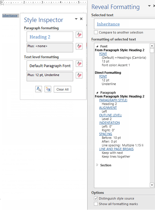
As you can see the Style Inspector is a small box that can be dragged around the screen. Open the Style Inspector from the button at the bottom of the Styles pane:

Reveal Formatting has a lot more detail and sits in the right-hand pane. There’s a button for Reveal Formatting on the Style Inspector box.
The Shift + F1 shortcut will open the Reveal Formatting pane. This shortcut has worked since Word 2002 (XP).
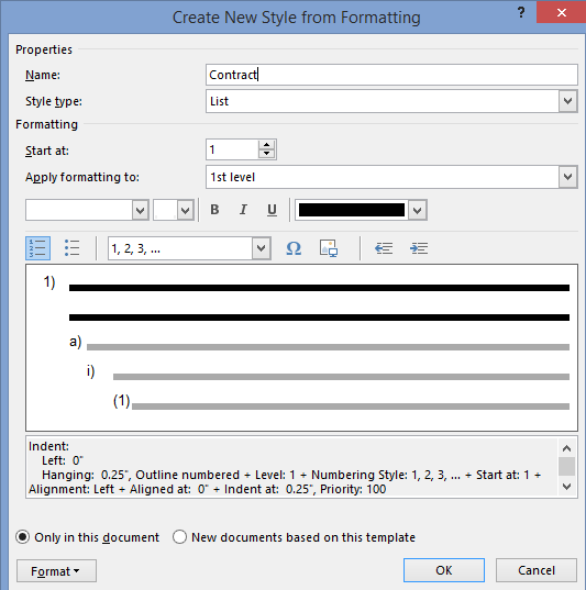
Table and List styles
Added in Word 2007 were two more styles.
Table styles, let you group together all the many formatting options for tables.
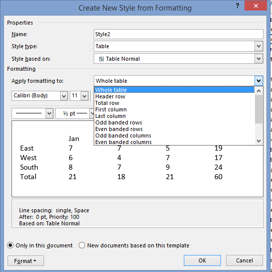
Similarly, all the options for list formatting were a nightmare until Word 2007 when List Styles were introduced. Now all the, sometimes complex, choices for lists (numbering, indenting at each level) can be more easily and consistently applied.
Fix your Word Style Gallery
Word style renaming and alias tricks
Show a Word style marked ‘Hide until used’.
What does Word style ‘Automatically update’ really mean?
Change Word style to match current paragraph
 Those of us in the writing world talk a lot (and I do mean A LOT) about style guides. But, what is a style guide? What is its purpose? And what is an in-house style guide? Let’s answer those questions.
Writing style guides (also called style manuals) are books that recommend specific ways to present written elements such as citations, numbers and currency, units of measure, time and dates, proper nouns (e.g., product and company names), and foreign phrases—just to name a few.
Style guides also cover general writing concerns including punctuation, word choice (e.g., favoring certain words over others), point of view (e.g., referring to your organization as “we” instead of XYZ Company), and voice (e.g., using active voice rather than passive voice). In addition, some style guides include preferences for fonts, line spacing, margin widths, and other formatting issues.
The four most popular style guides for American English are
- The Chicago Manual of Style,*
- The Associated Press Stylebook,
- the Publication Manual of the American Psychological Association, and
- the MLA Handbook from the Modern Language Association of America.
Visit “Alternative Style Manuals” for additional style guide options. Then, visit “Which Style Guide Is Best for You?” for advice on choosing the best guide for your writing projects.
*The student version of The Chicago Manual of Style is called A Manual for Writers of Research Papers, Theses, and Dissertations by Kate L. Turabian. It is commonly referred to as Turabian.
What Is the Purpose of a Style Guide?
The purpose of using a style guide is to maintain consistency throughout all of your written collateral (e.g., websites, blog posts, case studies, and brochures). Therefore, you should select one style guide as your primary guide and then incorporate others as needed. When you do combine styles from multiple guides, be sure to record those choices in your in-house style guide. Which brings us to…
What Is an In-House Style Guide?
An in-house style guide is a customized guide that documents preferred styles that may or may not agree with your primary style guide.
Check out “In-House Style Guides for Small Businesses, Part 1—Benefits and Preparation” and “In-House Style Guides for Small Businesses, Part 2—Selecting Topics” for information on creating your own in-house style guide.
If you’re feeling particularly defiant, come back soon for that promised discussion on ignoring your style guide—if you dare!
From Wikipedia, the free encyclopedia
This article is about guides for writing. For style guides as fashion guides, often issued within fashion magazines, see List of fashion magazines.
A style guide is a set of standards for the writing, formatting, and design of documents. A book-length style guide is often called a style manual or manual of style (MoS or MOS). (Typical examples include the Chicago Manual of Style and the AMA Manual of Style.) A short style guide, of several pages or several dozen pages, is often called a style sheet, although that term also has multiple other meanings. The standards documented in a style guide can be applied either for general use, or be required usage for an individual publication, a particular organization, or a specific field.
A style guide establishes standard style requirements to improve communication by ensuring consistency both within a document, and across multiple documents. Because practices vary, a style guide may set out standards to be used in areas such as punctuation, capitalization, citing sources, formatting of numbers and dates, table appearance and other areas. The style guide may require certain best practices in writing style, usage, language composition, visual composition, orthography, and typography. For academic and technical documents, a guide may also enforce the best practice in ethics (such as authorship, research ethics, and disclosure) and compliance (technical and regulatory). For translations, a style guide may be used to enforce consistent grammar choices such as tenses, formality levels in tones, and localization decisions such as units of measurements.
Style guides are specialized in a variety of ways, from the general use of a broad public audience, to a wide variety of specialized uses, such as for students and scholars of various academic disciplines, medicine, journalism, the law, government, business in general, and specific industries. The term house style refers to the styling defined by the style guide of a particular publisher or other organization.
Varieties[edit]
Style guides vary widely in scope and size, and writers working in most large industries or professional sectors reference a specific style guide, written for their industry or sector when writing very specialized document types. These guides are, for the most part, only relevant and useful for peer-to-peer specialist documentation or to help writers working in specific industries and/or sectors communicate highly technical information in scholarly articles or industry white papers.
Professional reference style guides from different countries give authoritative advice on their language and how to use it, such as the New Oxford Style Manual from Oxford University Press, UK and The Chicago Manual of Style from the University of Chicago Press, US; Australia and Canada both have style guides created by their governments which are available online.
Sizes[edit]
This variety in scope and length is enabled by the cascading of one style over another, in a way analogous to how styles cascade in web development and in desktop cascade over CSS styles.
A short style guide is often called a style sheet. A comprehensive guide tends to be long and is often called a style manual or manual of style (MOS or MoS). In many cases, a project such as one book, journal, or monograph series typically has a short style sheet that cascades over the somewhat larger style guide of an organization such as a publishing company, whose content is usually called house style. Most house styles, in turn, cascade over an industry-wide or profession-wide style manual that is even more comprehensive. Some examples of these industry style guides include the following:
- ACS style, AMA style, and CSE style for various hard sciences
- AP Stylebook for journalism and all types of internal and external corporate communications
- APA style and ASA style for the social sciences
- Bluebook style for law
- The Chicago Manual of Style (CMOS) and Oxford style for academic writing and publishing
- MLA style for language and literature studies, and normatively in American secondary education
- USGPO style and AGPS style for government publications
Finally, these reference works cascade over the orthographic norms of the language in use (for example, English orthography for English-language publications). This, of course, may be subject to national variety, such as the different varieties of British English, American English, Canadian English and Australian English.
Topics[edit]
Some style guides focus on specific topic areas such as graphic design, including typography. Website style guides cover a publication’s visual and technical aspects along with text.
Style guides that cover usage may suggest ways of describing people that avoid racism, sexism, and homophobia. Guides in specific scientific and technical fields cover nomenclature, which specifies names or classifying labels that are preferred because they are clear, standardized, and ontologically sound (e.g., taxonomy, chemical nomenclature, and gene nomenclature).
Updating[edit]
Most style guides are revised from time to time to accommodate changes in conventions and usage. The frequency of updating and the revision control are determined by the subject. For style manuals in reference work format, new editions typically appear every 1 to 20 years. For example, the AP Stylebook is revised annually, and, as of 2021, the Chicago, APA, and ASA manuals are in their 17th, 7th, and 4th editions, respectively. Many house styles and individual project styles change more frequently, especially for new projects.
See also[edit]
- Citation style
- Graphic charter
- Diction
- Documentation
- Disputed usage
- English writing style
- List of style guides
- Prescription and description
- Sentence spacing in language and style guides
- Spelling
- Style sheet (disambiguation)
References[edit]
External links[edit]
- But the stylebook says … – Blog post about stylebook abuse, by Bill Walsh of The Washington Post
- Handouts about writing style guides, from a conference of the American Copy Editors Society in 2007
- William G. Connolly. «How to Write a Stylebook in 10 Easy Steps» (PDF). Archived from the original (PDF) on 21 August 2010.
- Doug Kouma. «Creating an In-House Stylebook» (PDF). Meredith Special Interest Media. Archived from the original (PDF) on 21 August 2010.
- Language Log » Searching 43 stylebooks