
Fonts are a stylistic choice that’s often overlooked. Knowing which font to choose if you want to squeeze as much text as possible onto a page is an important skill. The key is to find small fonts while still being readable to most! This article will explore the best ones.
What Are The Smallest Fonts In Microsoft Word?
The best small fonts which are readable are Arial (and variations), Segoe, Helvetica, and Calibri. There are plenty of good choices, but most of them all feature the “sans serif” style (which means they don’t have extra noise or “lips” around the edges of letters).
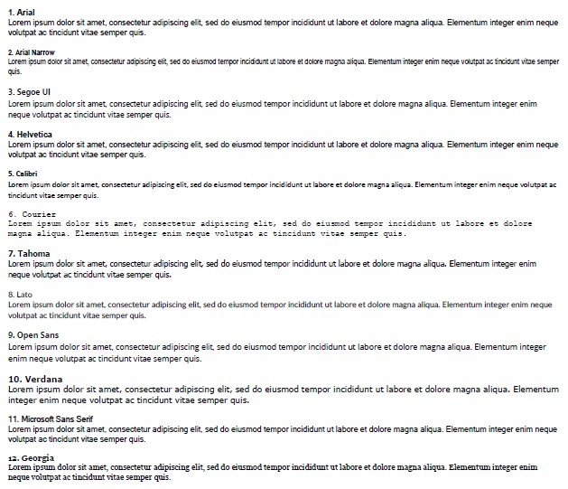
1. Arial
Let’s start with Arial. It’s one of the most well-known fonts in the world. After all, it’s been one of the mainstay defaults in Microsoft Word for as long as the software has been around.
Arial works when it is a small font. It is designed in sans serif, meaning that it only keeps the most simplistic look to each of its letters. It’s recommended as one of the best choices for both professional and informal writing, so it works well as a small font.
Of course, there are plenty of variations in sizes when it comes to using any font. It’s up to you which size you pick. Arial can easily get down to a 5px or 6px size and still be perfectly readable to many.
Being a sans serif font, it’s also nice to look at. That’s why it’s one of the most popular choices for many writers.
The only issue you might have is that it’s seen as overused by many hiring managers. Therefore, if you use it in your CV or resume, it might be scrapped based purely on the font you chose to use!
2. Arial Narrow
Arial Narrow is an extension of the previous one. We thought it would be good to touch on because it follows all the same general trends while also allowing for even more words to be included in your writing.
Naturally, the “narrow” in the title means that the words have been squeezed together more. You might think this sounds a bit cramped on a page, but it’s ideal when you’re trying to get as much information out as possible.
And, since Arial is such a good-looking font, when we use the narrow format, we can expect most of the good aesthetic side of it to stick around.
3. Segoe UI
Segoe UI is potentially more readable at smaller fonts than Arial. It’s definitely easier to read on certain monitors, which is what makes it such a great choice. The only reason we didn’t place it higher is that Arial is such a common name in the world of fonts.
Nevertheless, Segoe UI is great at both 5px and 6px (as well as any larger font). You don’t really need to make a font go much smaller than that because there’s almost no way to make a word visible below 5px.
It’s a fairly common option, but it’s not one that’s a default on Microsoft Word. You’re more likely to find it on websites because it’s such an easy read for many people.
4. Helvetica
Helvetica is known as the classic website font. It’s the font that all websites used to default to, and it’s still widely used today. It’s another sans serif choice, which means that it looks clean and easy on a page. Unfortunately, it doesn’t come standard with Microsoft Word.
If you’re willing to install Helvetica as an extra font, it’s well worth it! There are plenty of corporate logos that use it (like Jeep and Panasonic). It even works in smaller font sizes, right down to 5px and 6px (though it’s not quite as readable as the fonts above).
It’s more common for Mac users to write with Helvetica since it’s preinstalled on them. Although, it’s not difficult for PC users to find a website to get it downloaded.
5. Calibri
Calibri is the new default on Microsoft Word. It’s only been the default for a few years, so there is still plenty of room for it to grow. It’s the new Times New Roman alternative, but it’s better because it’s a sans-serif font.
Since it’s a Microsoft Word default, it’s not surprising that Calibri is one of the most used fonts in the world. It’s also a popular choice for 6px, though some argue that 5px is too small for Calibri.
Unlike Arial, Calibri is still well-regarded in business spheres. Many people will accept CVs and resumes that feature this default font in them. It’s the next best thing you can include in your writing.
6. Courier
Courier is a serif font, and it’s one of two on this list. Therefore, it’s got to bring something pretty special to the table. Luckily, it does. It’s one of the easiest serif fonts to read, which makes it one of the best smaller font options in this article.
The only thing stopping us from placing Courier higher is the fact it’s a serif font. While serif fonts are much easier to read in larger fonts (most novels are published with serif fonts), they are not as legible when the font size is halved.
Nevertheless, 6px and 7px Courier are still easy enough for many people to distinguish on a page. That’s why we think it’s worth using whenever you get the chance.
It’s also a default for many website pages, making it a solid choice that many people are familiar with.
7. Tahoma
Tahoma brings us straight back to the sans-serif look. It works well at sizes 6px and 7px, and we can use it in our writing whenever we want to load up the page with words. It’s not overwhelming either, making it a great choice for many writers.
It’s a fairly well-known option, and it’s one that you’re likely to see without even realizing it’s there. You might be vaguely familiar with the name, but you might not have tried it yet.
8. Lato
Lato is a fairly young font compared to the others on this list. It’s only about seven years old (founded in 2015), but it’s already the third-most served font on Google Fonts. Unfortunately, that means it’s not a direct font choice on Microsoft Word.
However, you can always download and install it. Once you’ve got it on Word, you’ll understand why we included it as such a strong choice for smaller fonts.
It appeals to the eye, and 6px seems to be the sweet spot for it. Again, you won’t find much need to go lower than that anyway!
9. Open Sans
Open Sans is a fairly well-known font, but it seems all too easy for people to forget about. “Sans” in the name means it’s another sans-serif font that allows us to read it much easier when it’s smaller.
It’s another great font that works well at 5px and 6px. There’s a certain level of spacing between each letter that really allows the smaller fonts to pop out on the page nicely.
However, these letter spaces can also be a bad thing since it means you’re going to be limited by the number of words you can get on each line. Many of the fonts above this don’t worry too much about spacing the letters, making the smaller fonts much easier to condense.
10. Verdana
Verdana almost looks like a shorter Open Sans. The basic principles are the same, and the letter spacing is still present. However, Verdana has the added benefit of being a few pixels shorter when it is written at 5px or 6px.
Verdana is another internet classic, and many websites historically used Verdana before moving onto some more modern font variations.
Since it’s a classic, it’s a very well-used font, and many people will be happy to do most of their writing with Verdana. Its sweet spot seems to be around the 6px mark.
11. Microsoft Sans Serif
Microsoft Sans Serif (previously known as MS Sans Serif) is another great choice that works in smaller fonts. Unfortunately, it’s probably better at 7px than anything smaller, but that’s still a remarkably small font compared to others.
It’s a little difficult to make sense of Microsoft Sans Serif when it sits at 5px or 6px. That’s why we think it’s one of the lesser fonts on this list. You can still get a lot of words out on a page, but you might want to try out one of the other options if you can.
Incidentally, since it’s a “Microsoft” name, it’s one of the fonts that’s always loaded on Microsoft Word, no matter what machine you use. Therefore, you can always have access to it, should you fail to find any of the others!
12. Georgia
We mentioned there would be two serif fonts, and Georgia is the last one we want to go through. It works well as a small font because it seems to remove the serif look when you shrink it down to 5px or 6px.
Of course, it’s still a serif font, so it’s still a little bit blurry when it’s down in the lower registers. Nevertheless, it’s still a great choice that tends to thrive at around 7px.
It’s also a very popular choice that many people will use over anything else when writing on Microsoft Word.
You may also like:
12 Best Cursive Fonts in Microsoft Word
12 Cute Fonts in Microsoft Word
12 Most Scary Fonts for Halooween in Microsoft Word

Martin holds a Master’s degree in Finance and International Business. He has six years of experience in professional communication with clients, executives, and colleagues. Furthermore, he has teaching experience from Aarhus University. Martin has been featured as an expert in communication and teaching on Forbes and Shopify. Read more about Martin here.
In Word, fonts can be sized from 1 point to 1,638 points. Point sizes smaller than 6 are generally too small for a human to read. A 1-inch-high letter is roughly 72 points.
Subsequently, What is a good small font?
So something like Sitka Small will be very readable at small text sizes. Or Verdana, which while designed for low resolution screens, works very well for readability at tiny sizes. You can also look at fonts like Bell Centennial which was designed for phone books (bad printing, bad paper, tiny size, legible).
Accordingly What is the easiest font to read in Word?
What Is the Easiest Font to Read? (10 Top Options)
- Arial. Arial is the standard font for many word processors, such as Microsoft Word and Google Docs. …
- Helvetica. Another old-school sans-serif typeface you may want to consider is Helvetica. …
- Georgia. …
- Merriweather. …
- Montserrat. …
- Futura. …
- Open Sans. …
- Lato.
Beside above, What is the highest font size? Word supports font sizes from 1 point to 1638 points, which means you can use fonts that are 1/72 of an inch all the way up to 22-3/4 inches.
Is Calibri or Arial bigger?
Which font is bigger Arial or Calibri? But, Calibri allows you to fit in more content in the limited space than Arial for the same font size. … But, Calibri allows you to fit in more content in the limited space than Arial for the same font size.
also What’s the smallest font you can read? A minimum text size of 2.5mm (x-height 1.2mm) or 7 point is the smallest size that most people (and regulators) are likely to consider readable.
What is the most readable font in Word?
1. Calibri. Having replaced Times New Roman as the default Microsoft Word font, Calibri is an excellent option for a safe, universally readable sans-serif font.
What is the easiest font for seniors to read?
For seniors, it’s important for the serif font to have a consistent stroke width, meaning not varying between thick and thin, which can cause eye confusion. Sans serif fonts (like Arial or Helvetica) are a good choice, as they are clean and easy to read, especially for short bits of information like headlines.
What is the most attractive font?
- 10 of the Most Beautiful Fonts for Web Designers. Design Tips. …
- Playfair. Some looks never go out of fashion. …
- Roboto. Roboto is a sans serif font – it’s geometric with friendly and open curves. …
- Raleway. Raleway is an elegant font with a thin weight – the unique ‘W’ really makes it stand out. …
- Pacifico. …
- Quicksand. …
- Oswald. …
- Lato.
Which font is most pleasing to the eye?
Designed for Microsoft, Georgia was actually created with low-resolution screens in mind, so it’s ideal for your desktop and mobile site visitors alike.
- Helvetica.
- PT Sans & PT Serif.
- Open Sans.
- Quicksand.
- Verdana.
- Rooney.
- Karla.
- Roboto.
What are the 4 major font types?
What are four main types of fonts?
- Serif fonts.
- Sans serif fonts.
- Script fonts.
- Display fonts.
Is 72 the largest font in Word?
When you are making certain types of documents with Microsoft Word, you might feel like your design choices are being limited by the seemingly small “maximum” font size of 72pt. However, this isn’t the actual maximum size of text that you can use in your document, it is merely the smallest listed size.
What is the largest font available in Word?
thanks for your help! The maximum font-size available in Microsoft Word 2010 from the dropdown list is 72; however the font size can be set up to 1638 by typing the size manually for the font.
What is the biggest font style on word?
When you are making certain types of documents with Microsoft Word, you might feel like your design choices are being limited by the seemingly small “maximum” font size of 72pt. However, this isn’t the actual maximum size of text that you can use in your document, it is merely the smallest listed size.
Which is easier to read Arial or Calibri?
There is an argument that serif fonts are more distinctive than sans serif fonts (without strokes, eg Arial, Calibri), and are therefore easier to read.
Who uses Calibri font?
Microsoft is switching up its default font for the first time since 2007. For almost 15 years, Calibri has reigned as the default and therefore dominant font choice for Microsoft systems.
Is size 9 font too small for a resume?
Yes, size 9 font is too small for a resume. Size 9 font is hard to read on a computer, and because you’re likely sending your application over the internet, the hiring manager will have to strain their eyes just to read your resume.
Is Arial Narrow hard to read?
Arial too is problematic because, like Helvetica, it has what typeface designers term as “ambiguous” letter shapes that make it difficult to read and comprehend when there are lots of words strung in a row. … “That feature is emphasised in a font like Arial, where the shapes are literally mirror forms.”
What is the smallest font you should use on a resume?
The smallest font to use on a resume is 10.5 points. Even 10.5 may be too small because some fonts are simply bigger than others. If your font size is too small, the hiring manager will have trouble reading your resume. Arial Narrow at 10.5 is the smallest font and font size combination that looks good on a resume.
What are 3 common font styles?
They appear in order of popularity.
- Helvetica. Helvetica remains the world’s most popular font. …
- Calibri. The runner up on our list is also a sans serif font. …
- Futura. Our next example is another classic sans serif font. …
- Garamond. Garamond is the first serif font on our list. …
- Times New Roman. …
- Arial. …
- Cambria. …
- Verdana.
What text is easiest to read?
What Is the Easiest Font to Read? (10 Top Options)
- Arial. Arial is the standard font for many word processors, such as Microsoft Word and Google Docs. …
- Helvetica. Another old-school sans-serif typeface you may want to consider is Helvetica. …
- Georgia. …
- Merriweather. …
- Montserrat. …
- Futura. …
- Open Sans. …
- Lato.
What colors can elderly see best?
Vision yellows with age. Older eyes are less able to distinguish the difference between blues and greens. Avoid using a color palette that is predominately blue, green or another “cool” color. Warm colors like red and yellow are best!
What font size is good for elderly?
Size. Choose a font that’s at least 16 pixels, or 12 points. If many of your users are older adults, consider using an even larger font size—19 pixels or 14 points. A small font size is more difficult to read, especially for users with limited literacy skills and older adults.
Are you looking for an answer to the topic “smallest font on word“? We answer all your questions at the website barkmanoil.com in category: Newly updated financial and investment news for you. You will find the answer right below.
The smallest font OFFERED by MS Word is 8 points. However, you can select the font size as small as 1 by typing 1 into the font size window.Anything smaller than 5 pt will be extremely difficult to read, unless it’s all capitalized. Even then, 4 pt font is about the smallest you can go. Keep in mind that some typefaces have thinner or lighter font weights, so just because one font is legible in 5 pt doesn’t necessarily mean another one will be.For sans-serifs similar to Arial / Helvetica, but narrower, have a look at: Myriad Pro, Open Sans, Segoe UI, Tahoma, Frutiger, Bell Gothic, Lato, Antique Olive, and Adobe’s new font Source Sans Pro.
Premium Small Fonts at Envato Elements (Unlimited Downloads)
- HAMLIN. One of the most readable small fonts, HAMLIN is a modern sans serif typeface dedicated to simplicity. …
- Fibon Sans. …
- Metrisch. …
- SIGNAL. …
- Oliver Sans Font. …
- Hurst Sans Serif Font Family Pack. …
- Albori Sans-Serif. …
- Catesque.

Which fonts are the smallest?
Premium Small Fonts at Envato Elements (Unlimited Downloads)
- HAMLIN. One of the most readable small fonts, HAMLIN is a modern sans serif typeface dedicated to simplicity. …
- Fibon Sans. …
- Metrisch. …
- SIGNAL. …
- Oliver Sans Font. …
- Hurst Sans Serif Font Family Pack. …
- Albori Sans-Serif. …
- Catesque.
What is the smallest font that is readable?
Anything smaller than 5 pt will be extremely difficult to read, unless it’s all capitalized. Even then, 4 pt font is about the smallest you can go. Keep in mind that some typefaces have thinner or lighter font weights, so just because one font is legible in 5 pt doesn’t necessarily mean another one will be.
Lect#: 28 How to Set Smallest Largest Font Size of Selected Text in Ms Word
Lect#: 28 How to Set Smallest Largest Font Size of Selected Text in Ms Word
Lect#: 28 How to Set Smallest Largest Font Size of Selected Text in Ms Word
Images related to the topicLect#: 28 How to Set Smallest Largest Font Size of Selected Text in Ms Word
What font is smaller than Arial?
For sans-serifs similar to Arial / Helvetica, but narrower, have a look at: Myriad Pro, Open Sans, Segoe UI, Tahoma, Frutiger, Bell Gothic, Lato, Antique Olive, and Adobe’s new font Source Sans Pro.
What is the smallest font in Word 2016?
In Word, fonts can be sized from 1 point to 1,638 points. Point sizes smaller than 6 are generally too small for a human to read.
What is the best font for small font size?
13 Best Small Fonts For Web From Envato Elements For 2021
- Riley – A Modern Typeface. …
- Little Hearts Font. …
- Solente – Web Font Small Size. …
- Manurewah – Web Font Small Size. …
- Rodian – Serif Web Font Small Size. …
- Runalto – Luxury Serif Font. …
- Laguna 7 Font – Small Letter Font. …
- Morjuis – Serif Font.
What is the smallest and largest font size in MS Word?
The correct answer is 8 and 72. You can access the Fonts dialog box or use the tools in the Home tab in MS Word. The list contains font size in points 8, 9, 10, 11, 12, 14, 16, 18, 20, 22, 24, 26, 28, 36, 48 and 72. Word supports font size between 1 and 1638.
Is #7 font too small?
Several typographers have opined that 9pt is the ideal text size, and it is generally accepted that captions are smaller than that (wouldn’t go below 6pt, 7 is better).
See some more details on the topic smallest font on word here:
12 Smallest Fonts In Microsoft Word – Grammarhow.com
The best small fonts which are readable are Arial (and variations), Segoe, Helvetica, and Calibri. · Arial works when it is a small font. · Arial Narrow is an …
+ Read More Here
What is the smallest font in Word? – GraphicHOW
What is the smallest font in Word? · Arial. Arial is the standard font for many word processors, such as Microsoft Word and Google Docs. …
+ View More Here
What is the smallest readable font in Word? – AnswersToAll
What is the smallest readable font in Word? … A minimum text size of 2.5mm (x-height 1.2mm) or 7 point is the smallest size that most people ( …
+ View More Here
Which font is smallest in 12 point? – SidmartinBio
What is the smallest font type? … One of the most readable small fonts, Albori Sans-Serif is a contemporary OpenType font that prides itself on …
+ Read More
Is size 10 font too small?
10.5 font is simply the smallest size you can use on a resume that’s still readable. Try a 10.5-point font if you have a lot of relevant experience, achievements, skills, and certifications to put on your resume. Be aware that some fonts look smaller than others.
Is 9 point font too small?
Size 9 font is hard to read on a computer, and because you’re likely sending your application over the internet, the hiring manager will have to strain their eyes just to read your resume. You should instead use a font size that’s at least 10.5 points to make sure your resume is immediately readable.
What is smaller font Arial or Times New Roman?
Surprisingly, Arial 11 point is overall just slightly larger than Times New Roman 12 point—unless the text is set in all caps. However, Arial’s x-height, which is to say the height of lowercase letters such as x, n, o, is almost 16% higher than that of Times New Roman!
What is the smallest font you should use on a resume?
Resume Font Size
The standard font size for resumes is 12 points in a classic and easily readable font. Larger fonts are good for emphasizing your name and section headings. If you can’t fit your content on one page you could try using a sans-serif font at 10 points, but that’s the minimum font size you should use.
How do I condense a font?
Expand or condense the space evenly between all the selected characters
- Select the text that you want to change.
- On the Home tab, click the Font Dialog Box Launcher, and then click the Advanced tab. …
- In the Spacing box, click Expanded or Condensed, and then specify how much space you want in the By box.
Minimum Maximum Font Size in MS Word
Minimum Maximum Font Size in MS Word
Minimum Maximum Font Size in MS Word
Images related to the topicMinimum Maximum Font Size in MS Word
What is 11 point font size?
Comparison table
| Point | Metric size | American system |
|---|---|---|
| American | ||
| 11 | ≈ 3.881 mm | Small Pica |
| 12 | ≈ 4.233 mm | Pica |
| 14 | ≈ 4.939 mm | English |
How do I make text size 13 in Word?
To change the font size of selected text in desktop Excel, PowerPoint, or Word:
- Select the text or cells with text you want to change. To select all text in a Word document, press Ctrl + A.
- On the Home tab, click the font size in the Font Size box. You can also type in any size you want, within the following limits:
How do I reduce the font size?
Keyboard shortcut
Hold down the Ctrl and press the + to increase the font size or – to decrease the font size. Pressing either of these keys while continuing to hold down the control key continues to increase or decrease the font until it reaches its maximum.
What font is easiest on the eyes?
Stick with sans-serif fonts – As mentioned earlier, fonts without serifs, such as Arial, are much easier on the eyes.
What is the minimum font size by default in MS Office?
When you open the program Microsoft Word, a font and font size are chosen for you. Usually, the default font is Calibri or Times New Roman, and the default font size is either 11 or 12 points.
What is largest font size in Word?
Word supports font sizes from 1 point to 1638 points, which means you can use fonts that are 1/72 of an inch all the way up to 22-3/4 inches. Don’t these sizes deceive you, however.
What is the minimum font size you can apply for any character?
Answer. While there is no official minimum font size for the web, it is generally agreed upon that 16px for body text is a good starting point. Of course, some text will be smaller, and headers will be larger, but for the main body text (like what you’re reading right now) is usually 16px.
Is 10 pt font too small for a resume?
Regular font size for resumes is 12 points, typically in Times New Roman or another classic, easy-to-read font. Larger fonts are acceptable for headings, your name, or titles of sections. If you’re having trouble fitting your content on one page, you might try making your font 10.5 points, but don’t go lower than that.
What size font is readable?
Size. Choose a font that’s at least 16 pixels, or 12 points. If many of your users are older adults, consider using an even larger font size—19 pixels or 14 points. A small font size is more difficult to read, especially for users with limited literacy skills and older adults.
What’s the smallest font on Google Docs?
You currently can manually change the point size of a font in Docs as low as 1 pt (which I don’t recommend, as the text won’t be visible).
What is the smallest font on Google Docs?
You currently can manually change the point size of a font in Docs as low as 1 pt (which I don’t recommend, as the text won’t be visible).
Cách chuyển tài liệu nhiều font chữ thành một loại font duy nhất
Cách chuyển tài liệu nhiều font chữ thành một loại font duy nhất
Cách chuyển tài liệu nhiều font chữ thành một loại font duy nhất
Images related to the topicCách chuyển tài liệu nhiều font chữ thành một loại font duy nhất

What font size is most readable?
Size. Choose a font that’s at least 16 pixels, or 12 points. If many of your users are older adults, consider using an even larger font size—19 pixels or 14 points. A small font size is more difficult to read, especially for users with limited literacy skills and older adults.
How do I make text smaller?
You can customize how text and content displays on your device, and make your screen easier to view.
…
To make your font size smaller or larger:
- Open your device’s Settings app.
- Select Accessibility. Text and display.
- Select Font size.
- Use the slider to choose your font size.
Related searches to smallest font on word
- which font has the smallest size
- what are the smallest fonts
- smallest font size on microsoft word
- how to get fonts on microsoft word
- what is the smallest font in google docs
- smallest font size in ms word 2016
- what is the smallest font in word
- smallest font generator
- why is my font so small on microsoft word
- what’s the smallest font on word
- smallest font ever
- what is the smallest font size
- smallest serif font
- what is the smallest font size on ms word
- smallest font for resume
- what is the smallest font type
- what is the smallest font style in word
- which font is the smallest in size 12
Information related to the topic smallest font on word
Here are the search results of the thread smallest font on word from Bing. You can read more if you want.
You have just come across an article on the topic smallest font on word. If you found this article useful, please share it. Thank you very much.
A minimum text size of 2.5mm (x-height 1.2mm) or 7 point is the smallest size that most people (and regulators) are likely to consider readable.
Is size 9 font too small?
Yes, size 9 font is too small for a resume. You should instead use a font size that’s at least 10.5 points to make sure your resume is immediately readable. If you go between 10.5 and 12 font, your resume should be clear enough, regardless of your chosen font.
What is the largest font size?
Word supports font sizes from 1 point to 1638 points, which means you can use fonts that are 1/72 of an inch all the way up to 22-3/4 inches. Don’t these sizes deceive you, however. You might expect that if you set a font size to 144 points, you will end up with letters two inches high.
What size font is legible?
An easily legible font size for longer body text as used in magazines and books usually ranges between 8 and 12 points.
What is the smallest font in 12 point?
Formata Condensed Font
What is the biggest font on Microsoft Word?
You are able to use larger font size up to a max of 1638 pt.
Is 72 the largest font in Word?
Type a value larger than 72 in the Font Size control in the Font group on the Home tab of the Ribbon. This can be done in any other Font Size control (e.g., in the Format/Font dialog, the Modify Style dialog, the formatting toolbar, etc. You could click the Increase Font Size control in the same ribbon group.
What is the standard font in Word?
Calibri font
How do I increase font size in Word?
To increase the font size, press Ctrl + ] . (Press and hold the Ctrl , then press the right bracket key.) To decrease the font size, press Ctrl + [ .
How do you make the font size bigger in Word?
To change the font size of selected text in desktop Excel, PowerPoint, or Word:
- Select the text or cells with text you want to change. To select all text in a Word document, press Ctrl + A.
- On the Home tab, click the font size in the Font Size box. You can also type in any size you want, within the following limits:
What is the minimum and maximum font size in Word?
Word supports font sizes from 1 point to 1638 points, which means you can use fonts that are 1/72 of an inch all the way up to 22-3/4 inches.
How do I change font size on external monitor?
Change Text Size in Windows 10
- Right click on the desktop and select Display settings.
- Slide the “Change the size of text, apps…” to the right to make text bigger.
- Click “Advanced Display Settings” at the bottom of the settings window.
- Click “Advanced sizing of text and other items” at the bottom of the window.
- 5a.
What is the shortcut to change the font size on a laptop?
Keyboard shortcut Hold down the Ctrl and press the + to increase the font size or – to decrease the font size.
Asked by: Ilene Nader II
Score: 4.2/5
(43 votes)
Calibri at 18pt is visually smaller than 18pt Arial or Verdana.
What fonts take up less space?
Myriad Pro, Open Sans, Segoe UI, Tahoma, Frutiger, Bell Gothic, Lato, Antique Olive, and Adobe’s new font Source Sans Pro. In a comparison that I did with numbers, I found Myriad Pro, Source Sans Pro, Segoe UI, and Tahoma to be the best for readability with minimum width at 9px-11px.
What’s the smallest font size for print?
For dark font on lighter backgrounds, 5 pt font is the minimum we recommend printing. Anything smaller than 5 pt will be extremely difficult to read, unless it’s all capitalized. Even then, 4 pt font is about the smallest you can go.
What is the smallest font style in Word?
In Word, fonts can be sized from 1 point to 1,638 points. Point sizes smaller than 6 are generally too small for a human to read. A 1-inch-high letter is roughly 72 points.
Which font style is smallest?
What is the smallest font type? One of the most readable small fonts, Albori Sans-Serif is a contemporary OpenType font that prides itself on its legibility at smaller sizes but retains its impact at larger sizes as well.
29 related questions found
What is the most legible small font?
Premium Small Fonts at Envato Elements (Unlimited Downloads)
- HAMLIN. One of the most readable small fonts, HAMLIN is a modern sans serif typeface dedicated to simplicity. …
- Fibon Sans. …
- Metrisch. …
- SIGNAL. …
- Oliver Sans Font. …
- Hurst Sans Serif Font Family Pack. …
- Albori Sans-Serif. …
- Catesque.
What size font is still readable?
Size. Choose a font that’s at least 16 pixels, or 12 points. If many of your users are older adults, consider using an even larger font size—19 pixels or 14 points. A small font size is more difficult to read, especially for users with limited literacy skills and older adults.
What is the most readable font?
The Most Easily Readable Fonts for Web and Print
- 1) Georgia. Source.
- 2) Helvetica. Source.
- 3) Open Sans. Source.
- 4) Verdana. Source.
- 5) Rooney. Source.
- 6) Karla. Source.
- 7) Roboto. Source.
-
 Arial. Source.
 Arial. Source.
What is the best font size for printing?
For printed materials, the optimal point size when choosing a font for print is between 10-12 points, however legibility at this size can vary greatly between different typefaces. Always print out your project at 100% size (without scaling) to determine if the font size is legible for your printed project.
Is Arial Narrow hard to read?
Arial too is problematic because, like Helvetica, it has what typeface designers term as “ambiguous” letter shapes that make it difficult to read and comprehend when there are lots of words strung in a row. … “That feature is emphasised in a font like Arial, where the shapes are literally mirror forms.”
Is Times New Roman smaller than Arial?
Surprisingly, Arial 11 point is overall just slightly larger than Times New Roman 12 point—unless the text is set in all caps. However, Arial’s x-height, which is to say the height of lowercase letters such as x, n, o, is almost 16% higher than that of Times New Roman!
What is the best font for small print?
So something like Sitka Small will be very readable at small text sizes. Or Verdana, which while designed for low resolution screens, works very well for readability at tiny sizes. You can also look at fonts like Bell Centennial which was designed for phone books (bad printing, bad paper, tiny size, legible).
How do I choose a font size?
As always, it’s best to pick a size for your body font first. Make sure it’s large enough to read easily at an arm’s length, but not too large—you don’t want it to overwhelm the page. A good rule of thumb or body font size is 10-14 pt for print, 14-18 pt for screen.
What is the best font and size for a book?
Garamond, Baskerville, and Minion are some of our favorite choices. We’d recommend a font size between 10 and 12. Nonfiction reference books and textbooks: You’ll want a sans serif font set in block paragraphs. We’d also recommend a font size between 10 and 12 for these types of titles.
Which font is most pleasing to the eye?
Designed for Microsoft, Georgia was actually created with low-resolution screens in mind, so it’s ideal for your desktop and mobile site visitors alike.
- Helvetica.
- PT Sans & PT Serif.
- Open Sans.
- Quicksand.
- Verdana.
- Rooney.
- Karla.
- Roboto.
What font is the most attractive?
- 10 of the Most Beautiful Fonts for Web Designers. Design Tips. …
- Playfair. Some looks never go out of fashion. …
- Roboto. Roboto is a sans serif font — it’s geometric with friendly and open curves. …
- Raleway. Raleway is an elegant font with a thin weight — the unique ‘W’ really makes it stand out. …
- Pacifico. …
- Quicksand. …
- Oswald. …
- Lato.
What is the cleanest font?
Arial, Times New Roman, Courier, and Helvetica are all clean typefaces with clear designs. Still, that doesn’t make them the designs for your projects. Typography design has come a long way.
What size font is large print Bible?
2. The font-size: Regular print Bibles are usually between 8-9 points text(pt). Publishers may advertise a 10-11 pt bible as a “large print” bible, but if you’re looking for something that is easier on the eyes, consider font sizes at least 13 pt. 3.
Is size 9 font too small for a resume?
Yes, size 9 font is too small for a resume. Size 9 font is hard to read on a computer, and because you’re likely sending your application over the internet, the hiring manager will have to strain their eyes just to read your resume.
Is size 10 font too small?
10pt type is generally readable provided the font is well designed and line spacing is appropriate. (Personal opinion: That san serif text is horrible. Letter spacing is horrendous and it is not a very «readable» typeface to use at a small size.
What are the 4 major font types?
What are four main types of fonts?
- Serif fonts.
- Sans serif fonts.
- Script fonts.
- Display fonts.
What is a tiny font?
Small text, also known as tiny text, is a set of Unicode characters that resemble small font. They are great additions to social media profiles, text messages, and emails to make your posts and profiles stand out from the crowds.
What is the hardest font to read?
What is the hardest font to read on Google Docs?
- Papyrus.
- Comic Sans.
- Calibri.
- Brush Script.
- Verdana. You know how I know Verdana is terrible?
- Lucida Calligraphy. “Oh yeah, THAT font.” Lucida Calligraphy is under-the-radar terrible.
- Times New Roman. Let’s get this one out of the way.
Is size 11 font too small?
No, size 11 font is not too small for a resume. In fact, size 10.5 font is even okay as long as it’s still easy for the hiring manager to read. Because some fonts are slightly smaller than others, always check that your font is readable no matter the size.
Thus, a 12-pt font is 1/6 inch in height. The default font size in Microsoft Word 2010 is 11 pts. You can easily change both the font and font sizes in your text. Avoid, however, using too many different fonts or font sizes in the same document.
Contents
- 1 Is Arial 11 or Times New Roman 12 bigger?
- 2 What is the biggest size font?
- 3 What is 12 point font size?
- 4 What font is bigger than Times New Roman?
- 5 What is the largest font on Google Docs?
- 6 How do I increase the font size more than 72?
- 7 What is double spaced 12 point font?
- 8 What is considered large print?
- 9 Is Times New Roman a 12 point font?
- 10 What are the biggest fonts?
- 11 Which font is bigger Garamond or Times New Roman?
- 12 What is the largest MLA font?
- 13 What is the largest font size available in MS Word 2016?
- 14 What is the maximum font size in PowerPoint?
- 15 What is the smallest and largest font size in MS Word?
- 16 Is Arial or Helvetica bigger?
- 17 What is the smallest professional font?
- 18 Can you change font size in Google forms?
- 19 How do I make font bigger than 96 in Powerpoint?
- 20 How do I print large font in Word?
Is Arial 11 or Times New Roman 12 bigger?
Surprisingly, Arial 11 point is overall just slightly larger than Times New Roman 12 point—unless the text is set in all caps. Arial’s caps are slightly bigger than those of Times New Roman, but if you set Times at 12 point and Arial at 11 point, Times comes out a smidgen ahead (about 0.9%, so …
What is the biggest size font?
You are able to use larger font size up to a max of 1638 pt. Step 1: Open your document in Word 2013. Step 2: Select the text for which you want to increase the font size.
1/6 inch
The point size refers to the height of a character. Thus, a 12-pt font is 1/6 inch in height. The default font size in Microsoft Word 2010 is 11 pts.
What font is bigger than Times New Roman?
9 L (1), a free and open-source font meant to mimic the size and look of the original Times New Roman typeface.” All the changes that MSCHF has made simply make the Nimbus Roman No. 9 L characters wider, leaving the vertical heights untouched.
What is the largest font on Google Docs?
The largest font size that you can use in Google Docs is 400 pt. You can change the font size of an existing block of text by selecting it, then entering a new value for the font size into the Font size field in the toolbar.
How do I increase the font size more than 72?
Make the font size larger than 72 points
- Select the text that you want to change.
- Click the Format tab under Text Box Tools, type a point size in the Font Size list. . For example, type 592.
- Press ENTER.
What is double spaced 12 point font?
Most courts adopted their line-spacing standards in the typewriter era. That’s why court rules usually call for double-spaced lines. On a typewriter, each line is the height of the font, thus double spacing means twice the font size. So if you’re required to use a 12-point font, double line spacing means 24 points.
What is considered large print?
Large print is generally 16 to 18 point size. Giant print is anything larger than this. Regular print is usually 10 or 12 point. Your local library is probably the best place to have a look at large print books and check they are right for you.
Is Times New Roman a 12 point font?
12 point font • Times New Roman or Arial • Double spaced between all texts • 1 inch margins • Align text to the left • Indent the first line of every paragraph (with the exception of the (a) abstract, (b) block quotations, (c) titles and headings, (d) table titles and notes, and (e) figure captions.
What are the biggest fonts?
If you’re looking for the biggest font style then ITC Garamond is your best bet. The letters in ITC Garamond are bigger than most other Garamonds like Adobe’s, as seen in the picture below.
Which font is bigger Garamond or Times New Roman?
Garamond’s letters are significantly smaller at the same font size than those of Times New Roman, Comic Sans, and Century Gothic.Garamond doesn’t really use less ink than Times New Roman, Comic Sans, or Century Gothic: it’s just the equivalent of a 10-point font rendered on a 12-point line.
What is the largest MLA font?
12-point Times New Roman
MLA recommends using 12-point Times New Roman, since it’s easy to read and installed on every computer. Other standard fonts such as Arial or Georgia are also acceptable.
What is the largest font size available in MS Word 2016?
In Word, fonts can be sized from 1 point to 1,638 points. Point sizes smaller than 6 are generally too small for a human to read. A 1-inch-high letter is roughly 72 points.
What is the maximum font size in PowerPoint?
You can also type in any size you want, within the following limits: Excel: between 1 and 409, between 1 and 409, in multiples of . 5 (such as 10.5 or 105.5) PowerPoint: between 1 and 3600, in multiples of .
What is the smallest and largest font size in MS Word?
Detailed Solution. The correct answer is 8 and 72. You can access the Fonts dialog box or use the tools in the Home tab in MS Word. The list contains font size in points 8, 9, 10, 11, 12, 14, 16, 18, 20, 22, 24, 26, 28, 36, 48 and 72.
Is Arial or Helvetica bigger?
The differences between Helvetica and Arial are much more noticeable in larger sizes, while they look fairly similar in smaller text. Although both Helvetica and Arial are still extremely popular, Arial tops Helvetica in usage and visibility.
What is the smallest professional font?
Arial Narrow at 10.5 is the smallest font and font size combination that looks good on a resume. This font is specially designed to appear narrower than other fonts, so you can fit more information on the page.
Can you change font size in Google forms?
You can’t change font size in Google Forms
There is no denial in the fact that Google Forms is the most preferred tool.
How do I make font bigger than 96 in Powerpoint?
Click in the font size box (not on the arrow) and type the font size you want. All the font TTF can have a size more than 96 points.
How do I print large font in Word?
Word
- Launch Word on your computer and open the document that you want to print.
- Select the text that you want to enlarge to automatically open the Font pop-up box.
- Click the “Size” drop-down box to reveal the list of available sizes.
- Select the applicable larger size.
- Click “File” and then select “Print.”
Arial can be read at small sizes and also is most commonly used at 12-point for professional letters. It’s important to select a font that is easy to read.
Besides, Is Arial 11 or Times New Roman 12 bigger?
Surprisingly, Arial 11 point is overall just slightly larger than Times New Roman 12 point—unless the text is set in all caps. However, Arial’s x-height, which is to say the height of lowercase letters such as x, n, o, is almost 16% higher than that of Times New Roman!
As well as What is the biggest font style? ITC Garamond is hideous but looks bigger than other Garamonds like Adobe’s. Since a font’s point size is measured from the descender to the ascender lines, the ratio of the x-height can vary widely.
Furthermore What font takes the least space?
It’s impossible to list all the available condensed fonts, but a few examples are:
- Futura Condensed.
- Generica Condensed.
- Helvetica Condensed.
- Soho.
- Avant Garde Gothic Condensed.
- Frutiger Condensed.
- ITC Garamond Narrow.
- Arial Narrow.
What is the smallest font in the world?
The world’s smallest readable 3×4 font with readable lowercase!
Which is better Arial or Calibri?
Both Arial and Calibri are good one, beautiful, elegant and simple. Arial is little more artistic than Calibri. So if your job requires creativity, its advisable to use Arial over Calibri. You can use Helvitica too for such purpose.
Is Times New Roman or Arial easier to read?
Times New Roman gives 7.45 % faster reading. t=0.026, i.e. a probability of 2.6 % that the conclusion is in error. Comparing 8 pt Verdana with 9 pt Arial, 40 characters/line, 100 % line distance. Arial gives 3.45 % faster reading.
What font looks like Times New Roman but is bigger?
9 L (1), a free and open-source font meant to mimic the size and look of the original Times New Roman typeface.” All the changes that MSCHF has made simply make the Nimbus Roman No. 9 L characters wider, leaving the vertical heights untouched.
What font makes your paper longer?
Change the font.
You can’t get too crazy or else your teacher will call you out, so you stick with something super similar to Times New Roman, but slightly bigger, like Bookman Old Style.
Which font takes up more space Arial or Calibri?
Both are equally good. But, Calibri allows you to fit in more content in the limited space than Arial for the same font size. This is because as a font Calibri has narrower side bearing, body (em-square) and letterspace…. Always use point size 10 for Arial and 11 or 12 for Calibri.
What is the best font for small text?
Premium Small Fonts at Envato Elements (Unlimited Downloads)
- HAMLIN. One of the most readable small fonts, HAMLIN is a modern sans serif typeface dedicated to simplicity. …
- Fibon Sans. …
- Metrisch. …
- SIGNAL. …
- Oliver Sans Font. …
- Hurst Sans Serif Font Family Pack. …
- Albori Sans-Serif. …
- Catesque.
Is Arial Narrow hard to read?
Arial too is problematic because, like Helvetica, it has what typeface designers term as “ambiguous” letter shapes that make it difficult to read and comprehend when there are lots of words strung in a row.
Which font is best for reading on screen?
Design Decoded: The Top 12 Easy to Read Fonts
- Helvetica. Along with Georgia, Helvetica is considered to be one of the most easily read fonts according to The Next Web. …
- PT Sans & PT Serif. Can’t decide whether serif or sans-serif is for you? …
- Open Sans. …
- Quicksand. …
- Verdana. …
- Rooney. …
- Karla. …
- Roboto.
What is a tiny font?
Small text, also known as tiny text, is a set of Unicode characters that resemble small font. They are great additions to social media profiles, text messages, and emails to make your posts and profiles stand out from the crowds. Play around with small text generator above to generate fun text to send to your friends!
What font is good for small print?
So something like Sitka Small will be very readable at small text sizes. Or Verdana, which while designed for low resolution screens, works very well for readability at tiny sizes. You can also look at fonts like Bell Centennial which was designed for phone books (bad printing, bad paper, tiny size, legible).
Is Calibri unprofessional?
Calibri is elementary and unprofessional and renders any document it composes (e.g. official statements, resumes, cover letters, reports, presentations) equally elementary and unprofessional.
Is Arial font outdated?
A free alternative to a slightly better model (also on this list), Arial became the go-to standard for everything from posters to billboards and for that reason alone it is now a font to be avoided.
Why Arial is a bad font?
Arial and Helvetica are the default font stack for most browsers and for most of the websites. That’s bad, really really bad. Arial and Helvetica suck on web and for paragraphs of text – they are unreadable (as compared to many other typefaces created specifically for web).
What is the most pleasing font to read?
Design Decoded: The Top 12 Easy to Read Fonts
- Helvetica. Along with Georgia, Helvetica is considered to be one of the most easily read fonts according to The Next Web. …
- PT Sans & PT Serif. Can’t decide whether serif or sans-serif is for you? …
- Open Sans. …
- Quicksand. …
- Verdana. …
- Rooney. …
- Karla. …
- Roboto.
Which is easier to read Arial or Calibri?
Which is easier to read Arial or Calibri? … There is an argument that serif fonts are more distinctive than sans serif fonts (without strokes, eg Arial, Calibri), and are therefore easier to read.
What is the easiest font for seniors to read?
“As for fonts, sans serif fonts are best,” recommends Dana. “Older adults and people with low vision have less difficulty processing type faces like Arial or Helvetica. Without the serifs, it’s easier to recognize characters. The thing you’ll hear the most from older adults, though, is to make the type larger.
What font takes up the least space?
It’s impossible to list all the available condensed fonts, but a few examples are:
- Futura Condensed.
- Generica Condensed.
- Helvetica Condensed.
- Soho.
- Avant Garde Gothic Condensed.
- Frutiger Condensed.
- ITC Garamond Narrow.
- Arial Narrow.
What is the Average Minimum Font? The average minimum font size is 6pt, but minimum font sizes can vary based on the product material and imprint process. Items made of hard plastic or metal like pens, water bottles, and USB drives can usually be printed with the minimum 6pt font and still be legible.
Join our Business, Advices & Skills Community and share you ideas today !
What would be the smallest font in Microsoft Word that when printed on an A4 size paper would still be readable?
By readable, I don’t mean comfortably readable. All I need is for the printed text to be at least visible when I strain my eyes a little.
I am using Calibri as my font type. I have tried font size 6 before, and the text are still quite readable. Now, I want to try font size 5, but I am not sure how drastic would the change be.
Would font size 5 for Calibri in Microsoft Word still readable when printed out?
PS: I know I could do a test print on my own printer. Unfortunately, it blew up just a while ago and I have no convenient access to a printer at this point of time.
![]()
e100
9,7825 gold badges44 silver badges72 bronze badges
asked Dec 3, 2012 at 15:43
![]()
4
It depends on what DPI you use for the print. With a high resolution, ie. high DPI, you can print very small sizes.
Human eyes cannot read much details beyond 300 DPI so for readability there is little point of using higher DPIs than that. Higher resolutions above 300 DPI are typically used for technical reasons such to overcome ink-bleeding (or if I may, for marketing gimmick in consumer printers).
If you still want to print very small letters a very high resolution is needed. It won’t be readable to most people, but it’s possible to do.
Just for the sake of process:
1 point of a font is defined as 1/72 of an inch. If you want to print a font in 5 points that will obviosuly be 5/72 of an inch. So to not have those raster-points merge all together you will need a resolution twice that size as a minimum, meaning 144 DPI.
Will it be readable? In the real-world probably not, ref. ink-bleeding. So here you need to double the resolution again and you end up at ~300 DPI. If your font is more than basic simple sans-serif you will again run into problems with ink and rendition of the details of the font so again you need to double the DPI to about 600 DPI. You can see where this is going.
answered Dec 3, 2012 at 17:42
3
Going on the assumption that readability has been tossed in the can and we’re focusing on «can I make that character out or not» …
Caps are more open, «plug-resistant» glyphs. That is, a capital glyph is made up of larger shapes that can be reduced more dramatically. This can make for big savings in line height (thus, vertical space). I mention line height because the average character width goes up. At the same time, your minimum font size gets smaller too so you can make up some if not all of that difference.
Bottom line: In raw «can I make it out» terms, all-caps Calibri at 5pt will be fine. The caps will also allow you to go down to 6 or 7pt leading. No one but lawyers and bored elderly folks with magnifying glasses will ever read it, but the characters will technically render.
answered Dec 3, 2012 at 20:04
![]()
plainclothesplainclothes
17.5k39 silver badges73 bronze badges
TERMINAL font
SIZE 6 (for LOWER case letters)
SIZE 5 (for UPPER case letters)
that’s most likely what everyone’s looking for…
answered Apr 30, 2015 at 20:06
![]()
1