
Excel for Microsoft 365 Excel 2021 Excel 2019 Excel 2016 Excel 2013 Excel 2010 More…Less
Power Pivot is an Excel add-in you can use to perform powerful data analysis and create sophisticated data models. With Power Pivot, you can mash up large volumes of data from various sources, perform information analysis rapidly, and share insights easily.
In both Excel and in Power Pivot, you can create a Data Model, a collection of tables with relationships. The data model you see in a workbook in Excel is the same data model you see in the Power Pivot window. Any data you import into Excel is available in Power Pivot, and vice versa.
Note: Before diving into details, you might want to take a step back and watch a video, or take our learning guide on Get & Transform and Power Pivot.
-
Import millions of rows of data from multiple data sources With Power Pivot for Excel, you can import millions of rows of data from multiple data sources into a single Excel workbook, create relationships between heterogeneous data, create calculated columns and measures using formulas, build PivotTables and PivotCharts, and then further analyze the data so that you can make timely business decisions—all without requiring IT assistance.
-
Enjoy fast calculations and analysis Process millions of rows in about the same time as thousands, and make the most of multi-core processors and gigabytes of memory for fastest processing of calculations. Overcomes existing limitations for massive data analysis on the desktop with efficient compression algorithms to load even the biggest data sets into memory.
-
Virtually Unlimited Support of Data Sources Provides the foundation to import and combine source data from any location for massive data analysis on the desktop, including relational databases, multidimensional sources, cloud services, data feeds, Excel files, text files, and data from the Web.
-
Security and Management
Power Pivot Management Dashboard enables IT administrators to monitor and manage your shared applications to ensure security, high availability, and performance. -
Data Analysis Expressions (DAX) DAX is a formula language that extends the data manipulation capabilities of Excel to enable more sophisticated and complex grouping, calculation, and analysis. The syntax of DAX formulas is very similar to that of Excel formulas.
Tasks in Power Pivot or in Excel
The basic difference between Power Pivot and Excel is that you can create a more sophisticated data model by working on it in the Power Pivot window. Let’s compare some tasks.
|
Task |
In Excel |
In Power Pivot |
|---|---|---|
|
Import data from different sources, such as large corporate databases, public data feeds, spreadsheets, and text files on your computer. |
Import all data from a data source. |
Filter data and rename columns and tables while importing. Read about Get data using the Power Pivot add-in |
|
Create tables |
Tables can be on any worksheet in the workbook. Worksheets can have more than one table. |
Tables are organized into individual tabbed pages in the Power Pivot window. |
|
Edit data in a table |
Can edit values in individual cells in a table. |
Can’t edit individual cells. |
|
Create relationships between tables |
In the Relationships dialog box. |
In Diagram view or the Create Relationships dialog box. Read about Create a relationship between two tables. |
|
Create calculations |
Use Excel formulas. |
Write advanced formulas with the Data Analysis Expressions (DAX) expression language. |
|
Create hierarchies |
Not available |
Define Hierarchies to use everywhere in a workbook, including Power View. |
|
Create key performance indicators (KPIs) |
Not available |
Create KPIs to use in PivotTables and Power View reports. |
|
Create perspectives |
Not available |
Create Perspectives to limit the number of columns and tables your workbook consumers see. |
|
Create PivotTables and PivotCharts |
Create PivotTable reports in Excel. Create a PivotChart |
Click the PivotTable button in the Power Pivot window. |
|
Enhance a model for Power View |
Create a basic data model. |
Make enhancements such as identifying default fields, images, and unique values. Read about enhancing a model for Power View. |
|
Use Visual Basic for Applications (VBA) |
Use VBA in Excel. |
VBA is not supported in the Power Pivot window. |
|
Group data |
Group in an Excel PivotTable |
Use DAX in calculated columns and calculated fields. |
How the data is stored
The data that you work on in Excel and in the Power Pivot window is stored in an analytical database inside the Excel workbook, and a powerful local engine loads, queries, and updates the data in that database. Because the data is in Excel, it is immediately available to PivotTables, PivotCharts, Power View, and other features in Excel that you use to aggregate and interact with data. All data presentation and interactivity are provided by Excel; and the data and Excel presentation objects are contained within the same workbook file. Power Pivot supports files up to 2GB in size and enables you to work with up to 4GB of data in memory.
Saving to SharePoint
Workbooks that you modify with Power Pivot can be shared with others in all of the ways that you share other files. You get more benefits, though, by publishing your workbook to a SharePoint environment that has Excel Services enabled. On the SharePoint server, Excel Services processes and renders the data in a browser window where others can analyze the data.
On SharePoint, you can add Power Pivot for SharePoint to get additional collaboration and document management support, including Power Pivot Gallery, Power Pivot management dashboard in Central Administration, scheduled data refresh, and the ability to use a published workbook as an external data source from its location in SharePoint.
Getting Help
You can learn all about Power Pivot at Power Pivot Help.
Download Power Pivot for Excel 2010
Download Power Pivot sample files for Excel 2010 & 2013
Need more help?
You can always ask an expert in the Excel Tech Community or get support in the Answers community.
Top of Page
Need more help?
Power Pivot — встроенный инструмент Excel для обработки и анализа больших объёмов данных. С помощью неё в Excel загружают данные из нескольких источников разных форматов, моделируют их в одну базу и работают с ней дальше.
В Power Pivot нет ограничений по количеству строк. Excel позволяет работать только с 1 048 000 строк, а в Power Pivot их может быть гораздо больше. При этом производительность программы не уменьшается.
Поэтому Power Pivot точно пригодится в случаях, когда стандартный Excel не справляется с количеством данных и их форматами.
В статье разберёмся:
- для чего нужна и как работает надстройка Power Pivot;
- как загрузить данные из внешних источников в Power Pivot;
- как смоделировать данные в Power Pivot и создать базу данных;
- как узнать больше о работе в Excel.
Как мы сказали выше, Power Pivot расширяет стандартные возможности Excel и позволяет обрабатывать большое количество данных из разных источников.
Power Pivot — бесплатная надстройка для Excel. Для Excel 2010 года её нужно загружать отдельно с сайта Microsoft. Для версий после 2013 года она встроена в стандартную функциональность программы. К сожалению, Power Pivot не предусмотрен для macOS-версии Excel.
Работа в Power Pivot проходит в таком порядке:
- Загружаем данные из разных источников — например, из базы данных Microsoft Access, «1C», из текстовых файлов или электронных таблиц, из интернета.
- Настраиваем связи между загруженными данными — создаём модель данных. Для этого не нужна функция ВПР или другие поисковые функции Excel — в Power Pivot свои инструменты для объединения данных.
- Проводим дополнительные вычисления — при необходимости.
- Power Pivot строит на основе моделей данных необходимые отчёты — в виде сводных таблиц или диаграмм.
В следующих разделах разберём на примере, как загружать данные из внешних источников в Power Pivot, как их моделировать. А также покажем, как на основании этих данных создать отчёт в форме сводной таблицы.
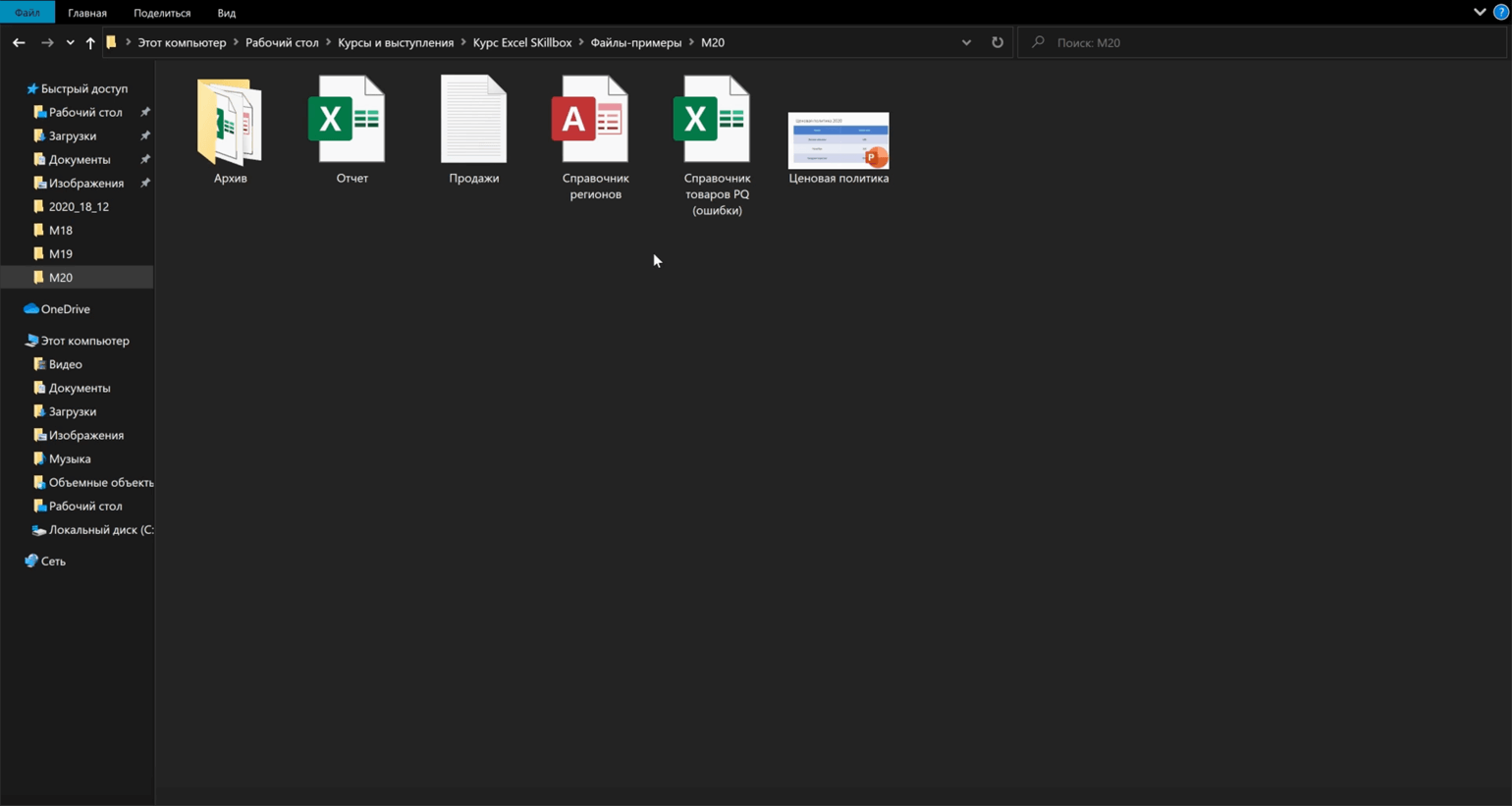
Предположим, у нас есть четыре файла разных форматов:
- данные о продажах книжного издательства → в формате TXT;
- справочник регионов → в виде базы данных в Access;
- справочник товаров → в XLS;
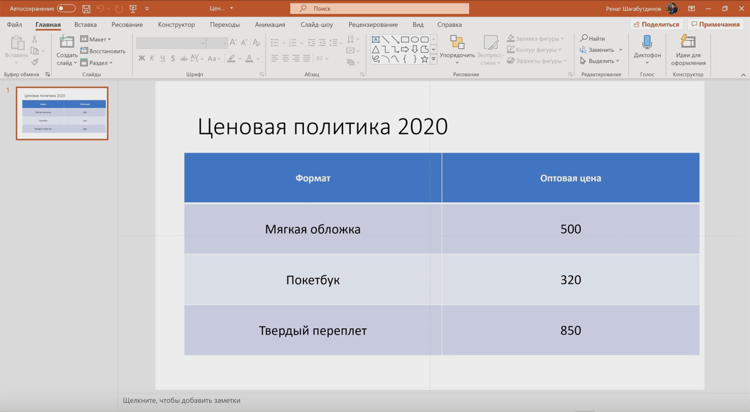
- ценовая политика → на слайде Power Point.
Скриншот: курс Skillbox «Excel + Google Таблицы с нуля до PRO»
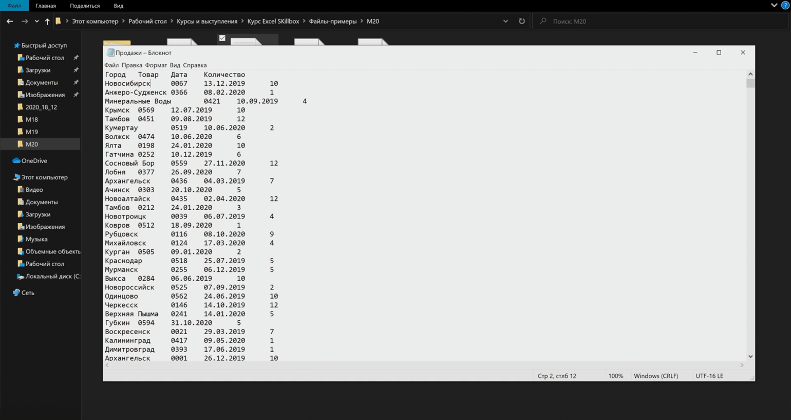
Данные о продажах. Это таблица с четырьмя столбцами — город, ID товара, дата продажи и количество проданных единиц — и более чем полутора миллионами строк.
Скриншот: курс Skillbox «Excel + Google Таблицы с нуля до PRO»
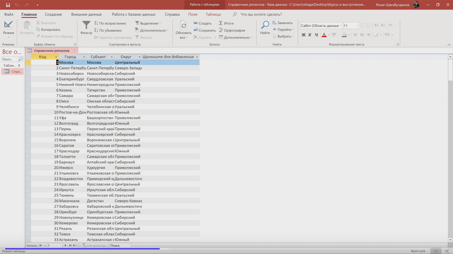
Справочник регионов. В файле одна таблица, в которой перечислены все города России, субъекты и округа.
Скриншот: курс Skillbox «Excel + Google Таблицы с нуля до PRO»
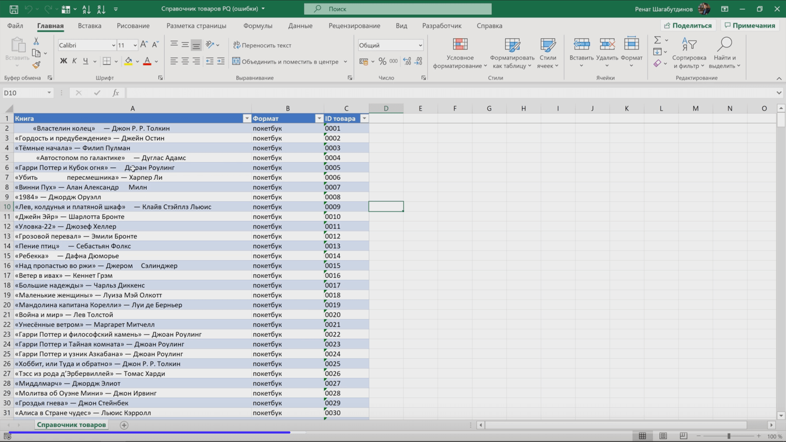
Справочник товаров. В этой таблице перечислены названия книг, их формат и ID‑номер.
Скриншот: курс Skillbox «Excel + Google Таблицы с нуля до PRO»
Ценовая политика. Это слайд, где указаны актуальные цены на книги разных форматов.
Скриншот: курс Skillbox «Excel + Google Таблицы с нуля до PRO»
Наша задача — связать данные из этих источников в одну базу. Для начала нужно загрузить эти данные в Power Pivot.
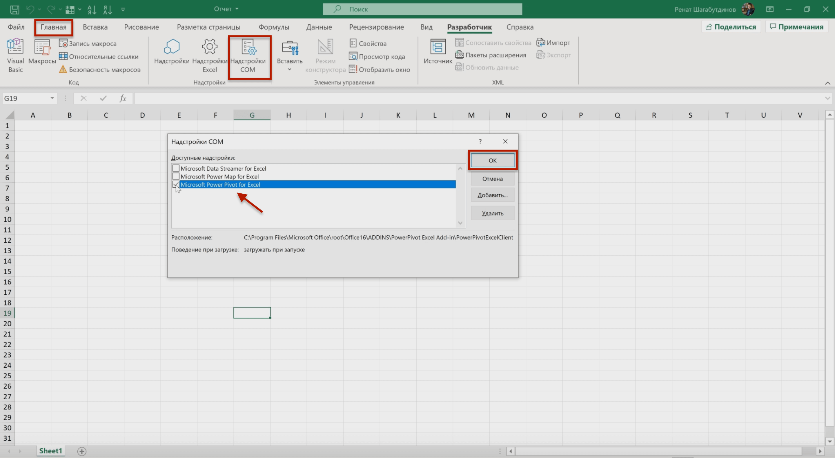
Для этого потребуется разблокировать вкладку «Разработчик». Переходим во вкладку «Файл» и выбираем пункты «Параметры» → «Настройка ленты». В открывшемся окне в разделе «Основные вкладки» находим пункт «Разработчик», отмечаем его галочкой и нажимаем кнопку «ОК» → в основном меню Excel появляется новая вкладка «Разработчик».
Теперь на этой вкладке нажимаем кнопку «Настройки COM», в появившемся окне выбираем Microsoft Power Pivot for Excel и жмём «ОК».
Скриншот: курс Skillbox «Excel + Google Таблицы с нуля до PRO»
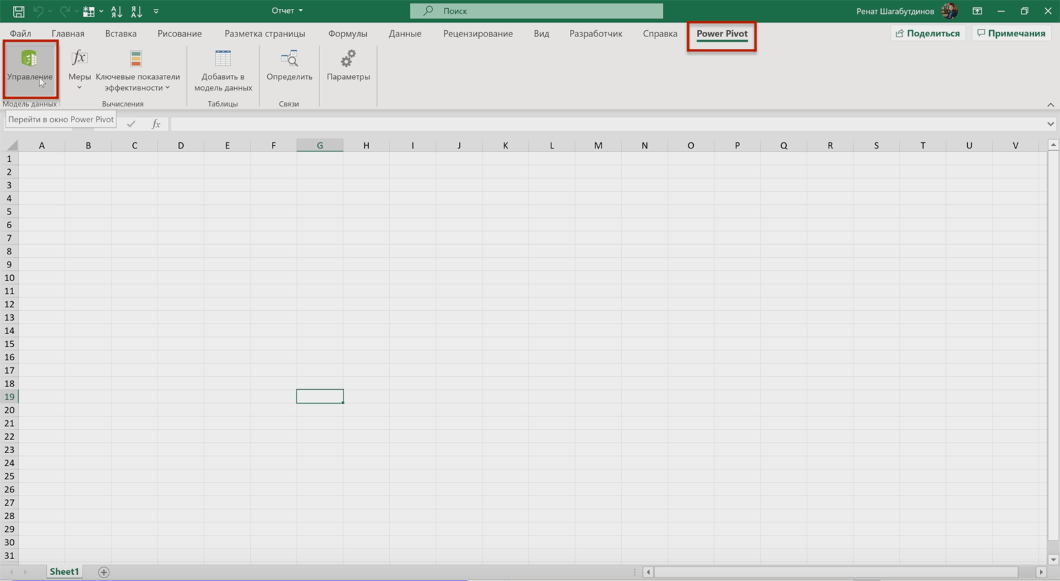
Готово — на панели появилась отдельная вкладка Power Pivot.
Для этого переходим на вкладку Power Pivot и нажимаем на кнопку «Управление».
Скриншот: курс Skillbox «Excel + Google Таблицы с нуля до PRO»
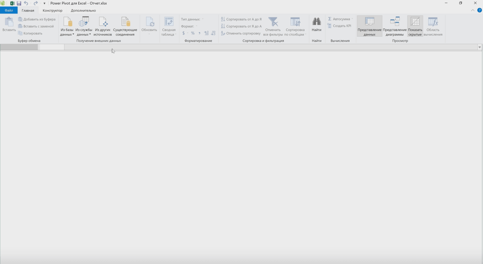
Готово — открылось окно Power Pivot. Оно относится к файлу Excel, через который мы его открыли.
Скриншот: курс Skillbox «Excel + Google Таблицы с нуля до PRO»
В этом окне нам нужно собрать данные из наших четырёх источников и настроить связи между ними.
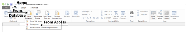
На вкладке «Главная» нажимаем кнопку «Из базы данных» и выбираем «Из Access».

Скриншот: курс Skillbox «Excel + Google Таблицы с нуля до PRO»
В появившемся окне в поле «Имя базы данных» прописываем адрес, где хранится файл Access со справочником регионов, — адрес можно найти через кнопку «Обзор».
Если база данных зашифрована, в этом же окне нужно ввести имя пользователя и пароль.
Нажимаем «Далее».
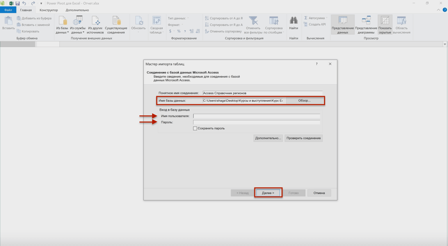
Скриншот: курс Skillbox «Excel + Google Таблицы с нуля до PRO»
В следующем окне появляется список всех таблиц, которые хранятся в выбранной базе данных.
В нашем случае она одна — «Справочник регионов». Выбираем её и нажимаем «Готово».
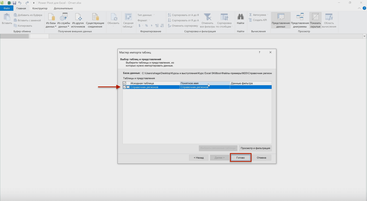
Скриншот: курс Skillbox «Excel + Google Таблицы с нуля до PRO»
Начинается импорт выбранной таблицы в Power Pivot. После этого появляется окно с результатом. Проверяем информацию и нажимаем «Закрыть».
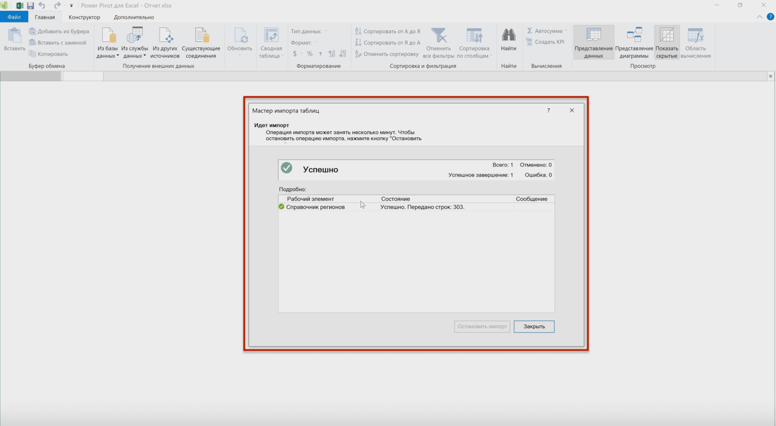
Скриншот: курс Skillbox «Excel + Google Таблицы с нуля до PRO»
Готово — первые данные загрузились в Power Pivot. В окне появился отдельный лист «Справочник регионов», на нём отражена та же таблица, что была и во внешнем источнике.
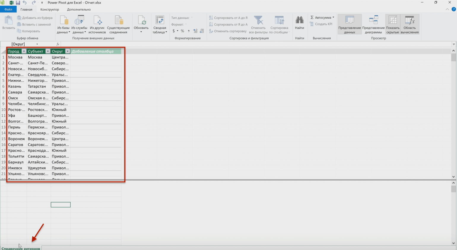
Скриншот: курс Skillbox «Excel + Google Таблицы с нуля до PRO»
На вкладке «Главная» нажимаем кнопку «Из других источников». В появившемся окне выбираем «Текстовый файл» и нажимаем «Далее».
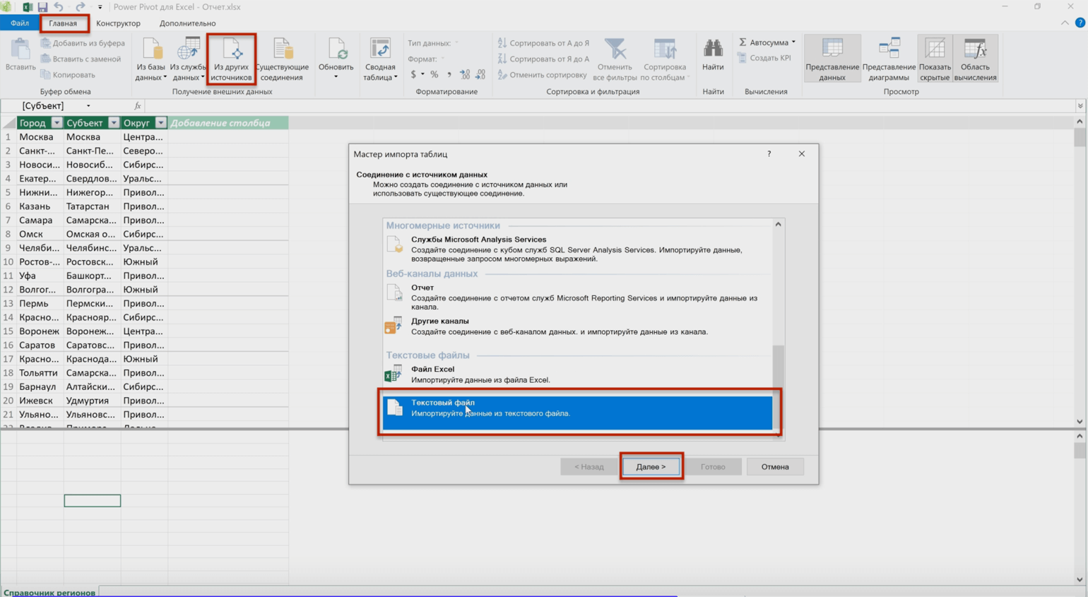
Скриншот: курс Skillbox «Excel + Google Таблицы с нуля до PRO»
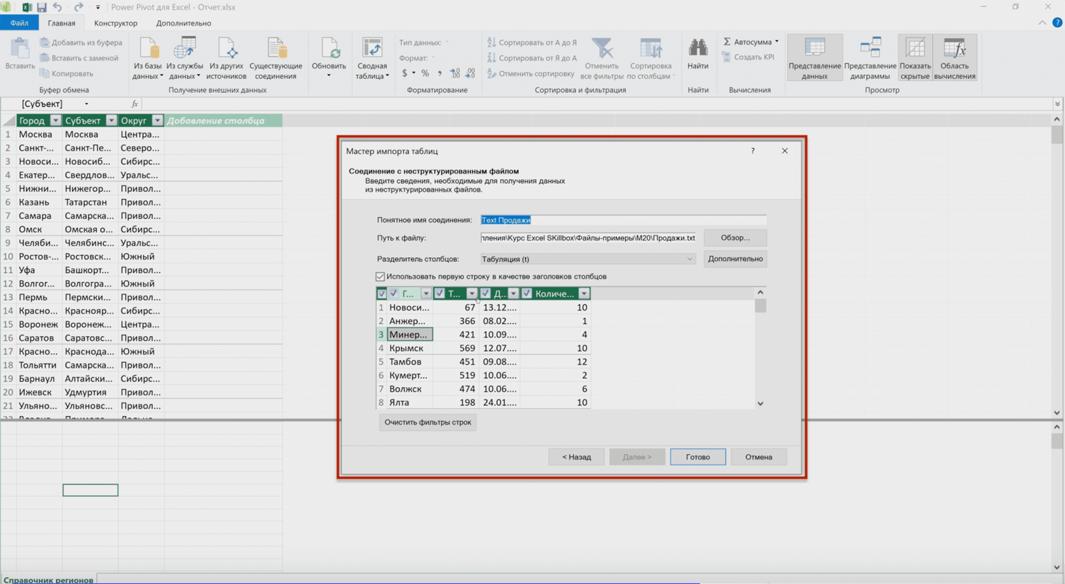
В появившемся окне в поле «Имя базы данных» прописываем адрес, где хранится текстовый файл с данными о продажах.
После этого в нижней части окна появляется предпросмотр таблицы из источника данных.
При необходимости корректируем настройки — например, меняем вид разделителя столбцов или отключаем ненужные графы таблицы. Затем нажимаем «Готово».
Скриншот: курс Skillbox «Excel + Google Таблицы с нуля до PRO»
Начинается импорт выбранной таблицы из текстового файла в Power Pivot. После этого появляется окно с результатом. Проверяем информацию и нажимаем «Закрыть».
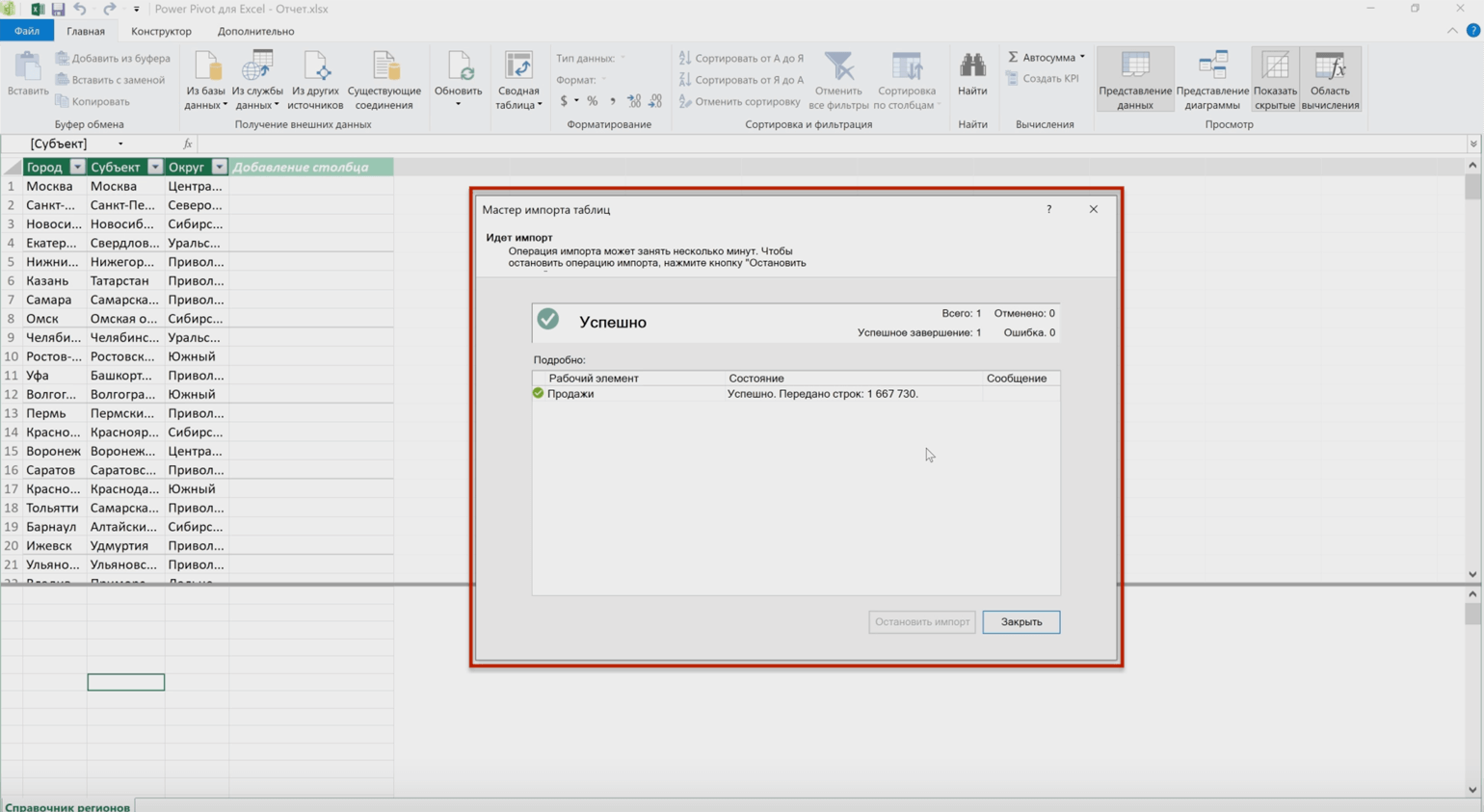
Скриншот: курс Skillbox «Excel + Google Таблицы с нуля до PRO»
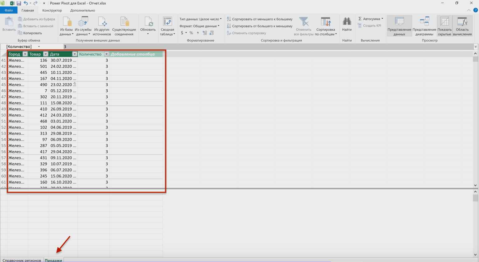
Готово — в окне Power Pivot появилась вторая вкладка «Продажи» — на ней более полутора миллионов строк. Напомним, в Excel без надстройки могло бы поместиться около миллиона.
Скриншот: курс Skillbox «Excel + Google Таблицы с нуля до PRO»
По аналогии с предыдущим шагом на вкладке «Главная» нажимаем кнопку «Из других источников». Во всплывшем окне выбираем «Файл Excel» и нажимаем «Далее».
В появившемся окне в поле «Имя базы данных» прописываем адрес, по которому хранится файл Excel со справочником товаров. Нажимаем «Далее»,
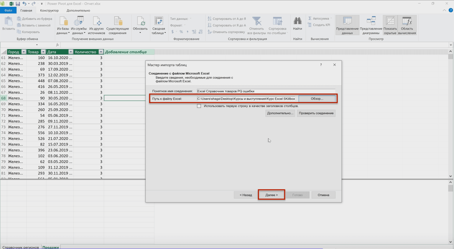
Скриншот: курс Skillbox «Excel + Google Таблицы с нуля до PRO»
В следующем окне появляется список всех таблиц, которые хранятся в выбранной базе данных.
В нашем случае она одна — «Справочник товаров». Выбираем её и нажимаем «Готово».
Снова происходит импорт и появляется окно с результатом.
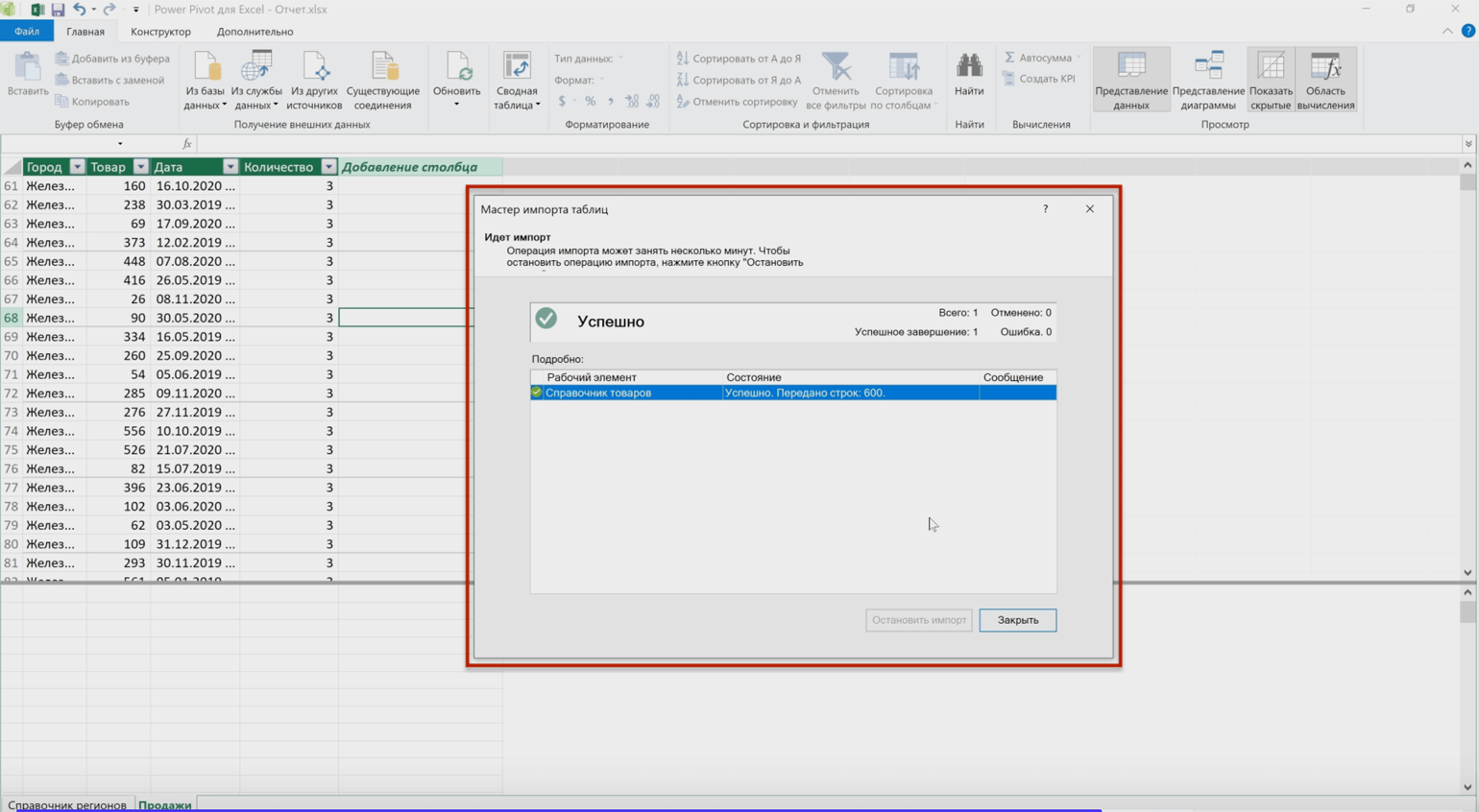
Скриншот: курс Skillbox «Excel + Google Таблицы с нуля до PRO»
В окне Power Pivot появилась третья вкладка «Справочник товаров». Также со всеми данными, которые хранились в первоисточнике — внешнем файле Excel.
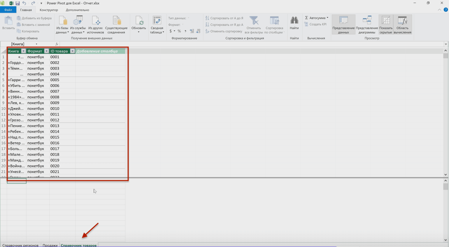
Скриншот: курс Skillbox «Excel + Google Таблицы с нуля до PRO»
В этом случае выгрузить данные можно только методом «копировать — вставить».
Открываем файл Power Point, содержащий ценовую политику. Выделяем таблицу, нажимаем правую кнопку мыши и выбираем «Скопировать».
Скриншот: курс Skillbox «Excel + Google Таблицы с нуля до PRO»
Затем возвращаемся в окно Power Pivot и на любой вкладке нажимаем кнопку «Вставить» на главной панели.
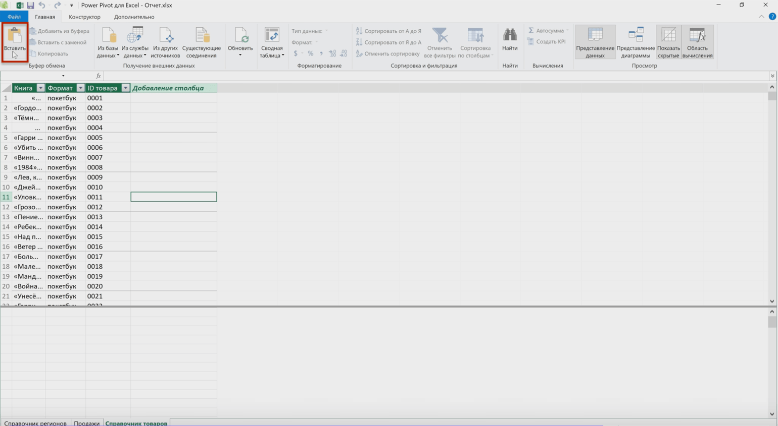
Скриншот: курс Skillbox «Excel + Google Таблицы с нуля до PRO»
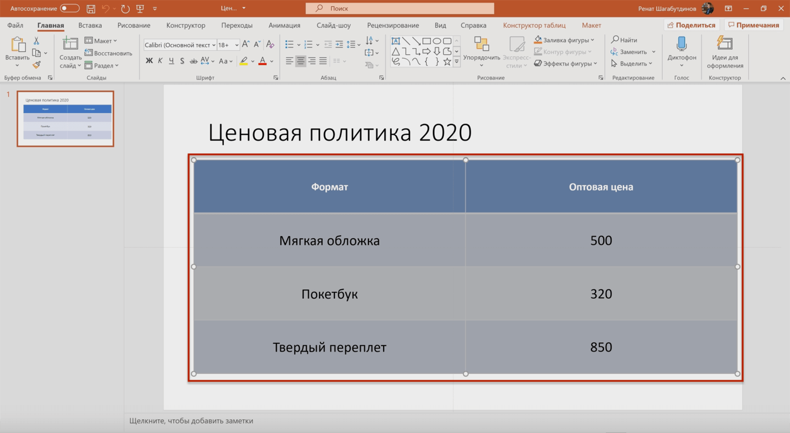
В появившемся окне вводим имя таблицы — «Цены» — и нажимаем «ОК».
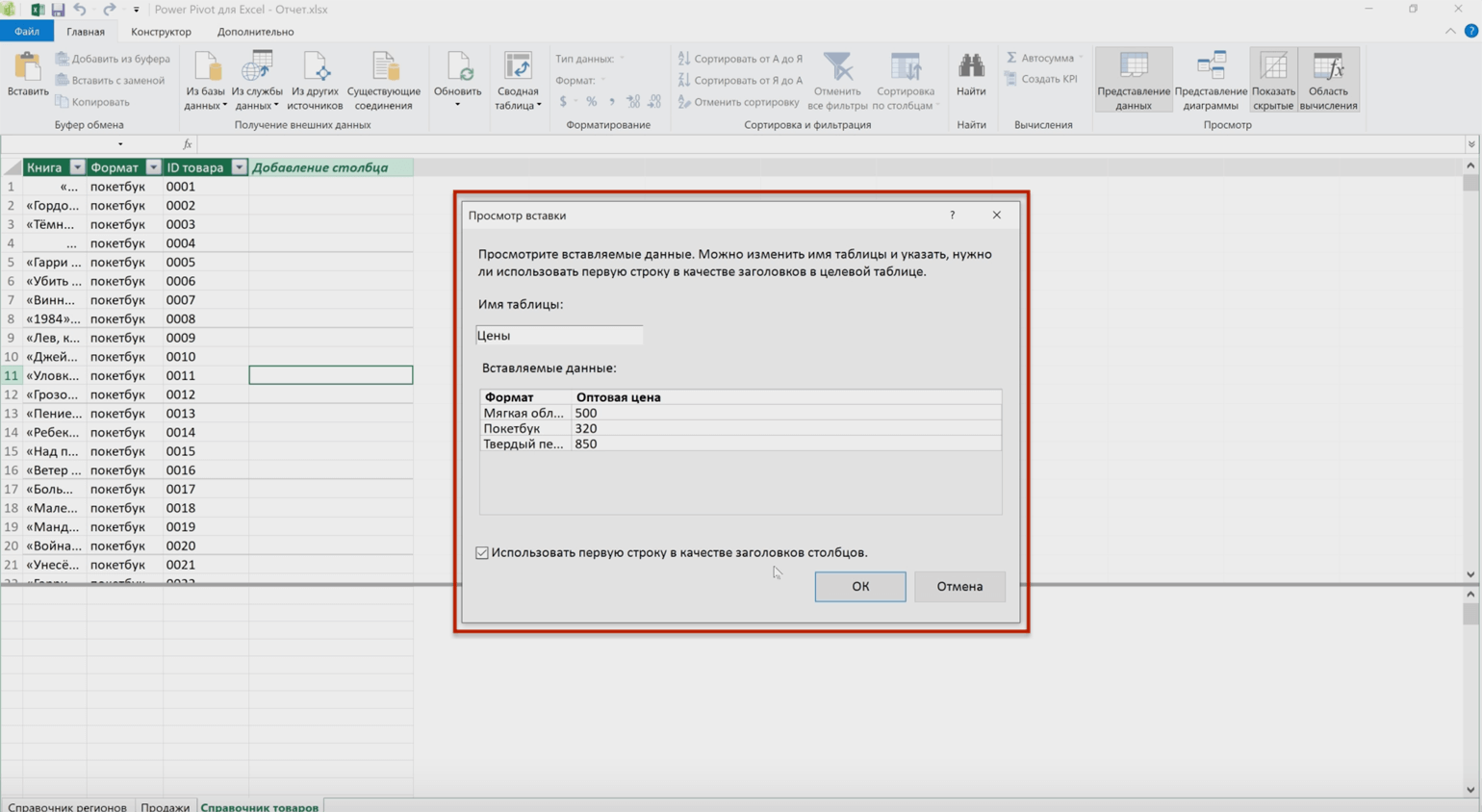
Скриншот: курс Skillbox «Excel + Google Таблицы с нуля до PRO»
Готово — в окне Power Pivot появилась четвёртая вкладка «Цены».
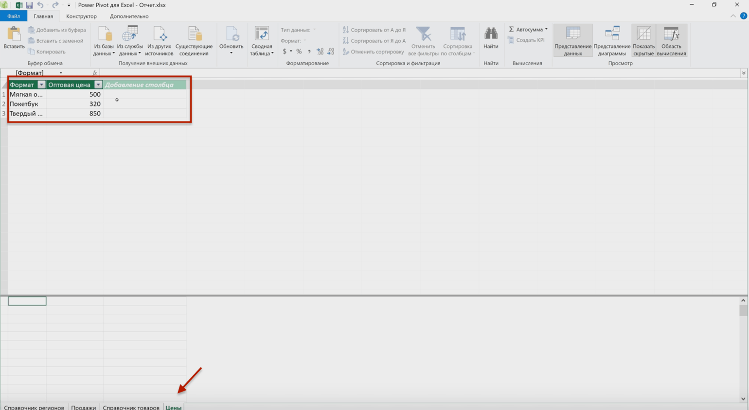
Скриншот: курс Skillbox «Excel + Google Таблицы с нуля до PRO»
Важно понимать, что при таком варианте выгрузки данных — копировании и вставке — таблица не будет обновляться, если внести изменения в исходный файл Power Point.
В предыдущих трёх вариантах — при загрузке таблиц из базы данных, текстового файла и файла Excel — в случае изменения данных в исходных файлах они также изменятся и в Power Pivot. Ниже показываем, как это сделать.
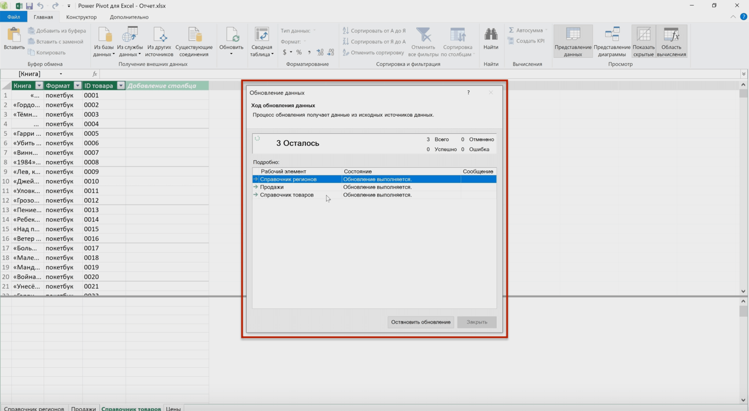
Для этого на главной панели любой вкладки нужно нажать кнопку «Обновить», затем «Обновить все».
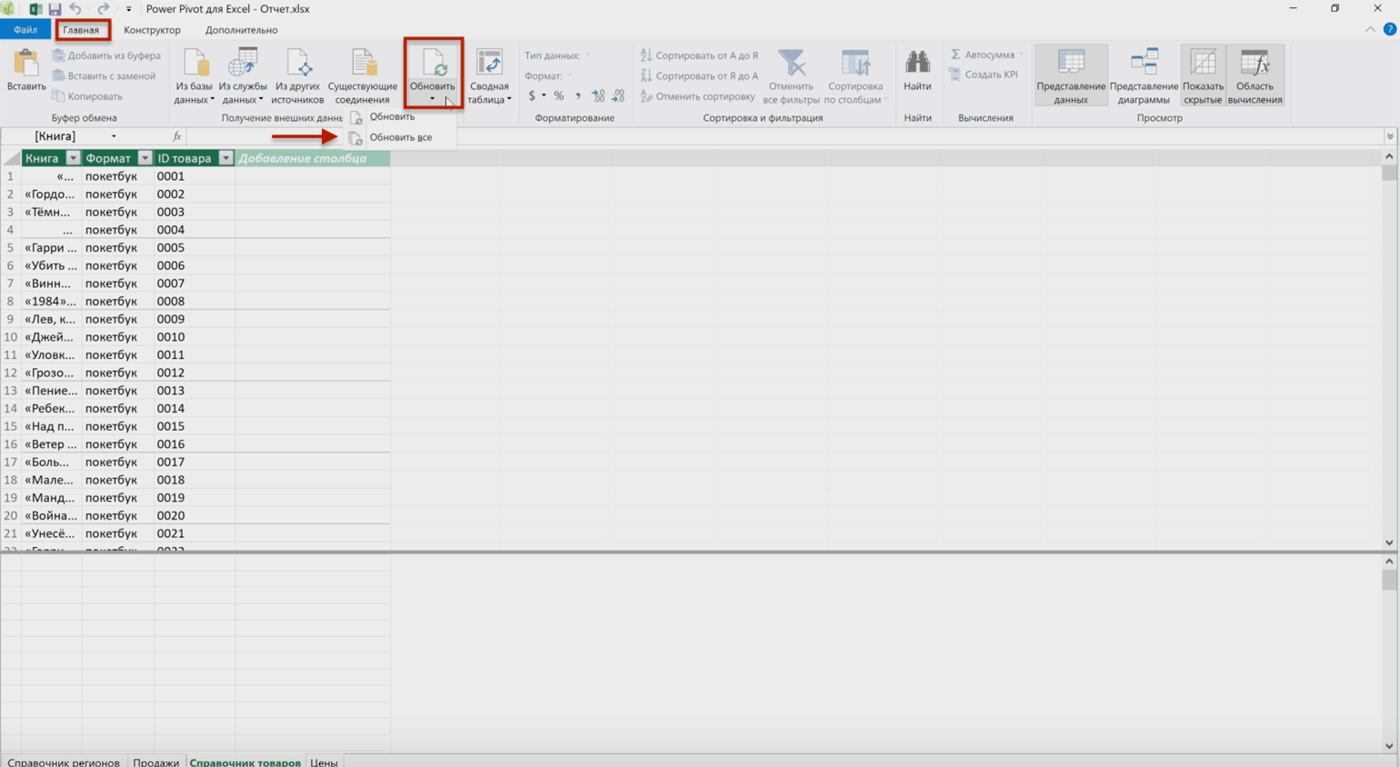
Скриншот: курс Skillbox «Excel + Google Таблицы с нуля до PRO»
Появится окно, где будет видно, какие вкладки обновляются. В нашем случае это только первые три вкладки.
Обновление проходит быстро — примерно за 10–15 секунд обновляются три вкладки, в одной из которых более полутора миллионов строк.
Файл из Power Point придётся обновлять вручную.
Скриншот: курс Skillbox «Excel + Google Таблицы с нуля до PRO»
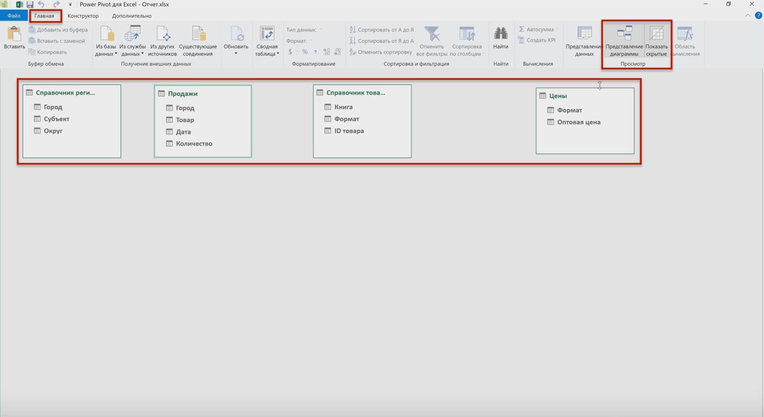
В предыдущем разделе мы загрузили данные из внешних источников в Power Pivot. Сейчас у нас есть четыре вкладки, в которых хранятся четыре таблицы: «Справочник регионов», «Продажи», «Справочник товаров», «Цены».
Задача этого этапа — связать данные всех таблиц так, чтобы можно было анализировать информацию одновременно по всем столбцам.
Для этого на главной вкладке окна Power Pivot нажмём кнопку «Представление диаграммы».
Скриншот: курс Skillbox «Excel + Google Таблицы с нуля до PRO»
В этом режиме отображения каждая таблица показана в виде прямоугольника, в котором перечислены её столбцы. Для удобства эти прямоугольники можно двигать и менять местами.
В этом же режиме отображения в Power Pivot настраивают связи между таблицами.
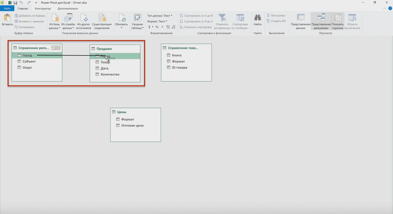
Первая связь. В таблице «Продажи» есть столбец «Город», но нет столбцов «Субъекты» и «Округ». Все эти столбцы, включая столбец «Город», есть в таблице «Справочник регионов».
Соответственно, чтобы объединить данные этих двух таблиц, нужно создать связь по столбцу «Город». Для этого нужно зажать мышкой такой столбец в одной из таблиц и перетянуть его во вторую таблицу. Между таблицами появится линия.
Скриншот: курс Skillbox «Excel + Google Таблицы с нуля до PRO»
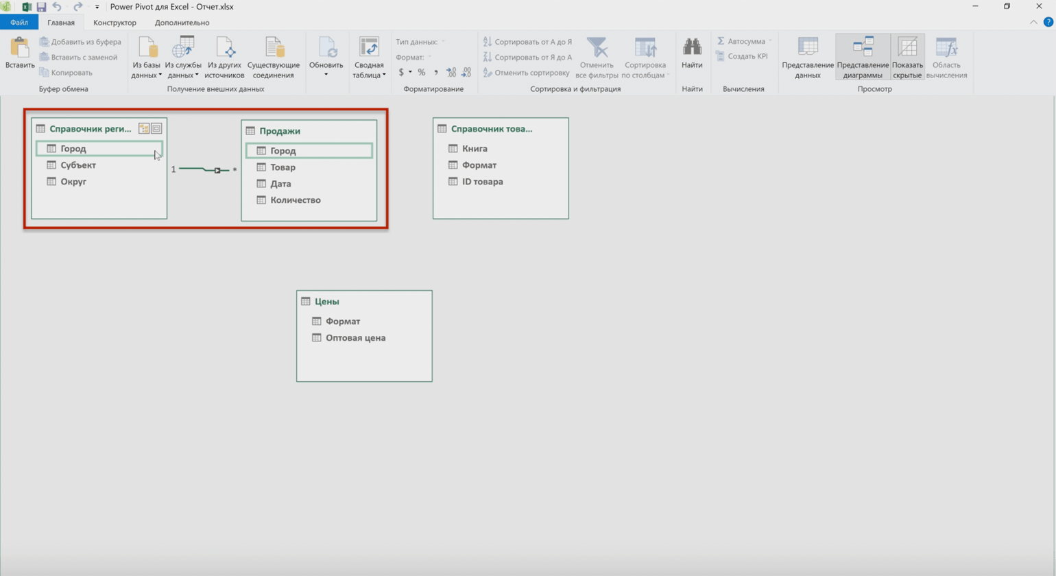
Готово — между таблицами «Справочник регионов» и «Продажи» появилась связь по столбцу «Город». Теперь у каждой строки продаж будет указан не только город, но также субъект и округ.
Скриншот: курс Skillbox «Excel + Google Таблицы с нуля до PRO»
Вторая связь. В таблице «Продажи» есть столбец «Товар», где перечислены ID‑номера книг, но нет названий книг и их форматов. Все эти данные находятся в таблице «Справочник товаров».
По аналогии с предыдущей связью построим связь между столбцом «Товар» в таблице «Продажи» и столбцом «ID товара» в таблице «Справочник товаров».
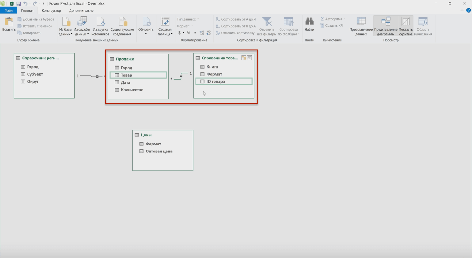
Скриншот: курс Skillbox «Excel + Google Таблицы с нуля до PRO»
Названия столбцов, по которым строят связи между таблицами, не обязательно должны быть одинаковыми. Главное, чтобы в таких столбцах хранилась аналогичная информация. В нашем случае это ID-номера книг.
При этом Power Pivot не проверяет самостоятельно, правильно ли настроена связь — совпадают ли данные столбцов двух таблиц, — поэтому проводить связи между таблицами нужно внимательно.
Третья связь. Теперь к уже объединённым данным нужно добавить цены. Они хранятся в четвёртой таблице. Настроим связь между ней и таблицей «Справочник товаров» по столбцу «Формат».
Благодаря этой связи в «Справочнике товаров» появится информация о ценах на книги.
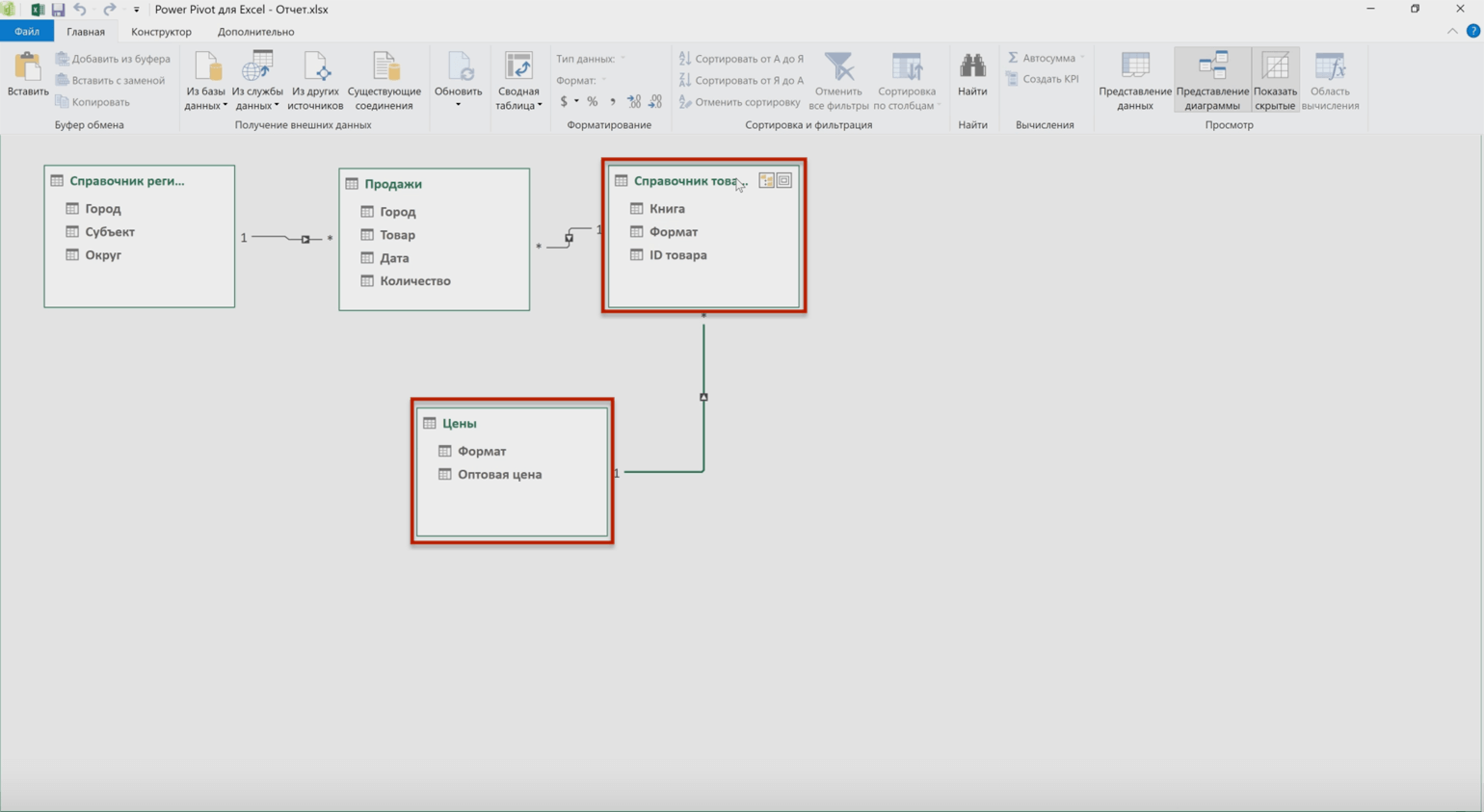
Скриншот: курс Skillbox «Excel + Google Таблицы с нуля до PRO»
Готово. Мы построили модель из четырёх таблиц из разных источников и связали данные этих таблиц по идентичным столбцам. Чтобы увидеть результат, нужно создать сводную таблицу.
На главной вкладке нажимаем кнопку «Сводная таблица».
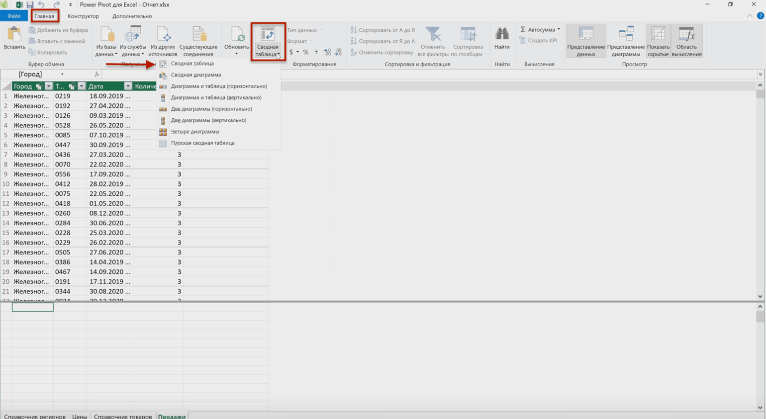
Скриншот: курс Skillbox «Excel + Google Таблицы с нуля до PRO»
Дальше выбираем, на каком листе нужно создать сводную таблицу — на новом или на существующем.
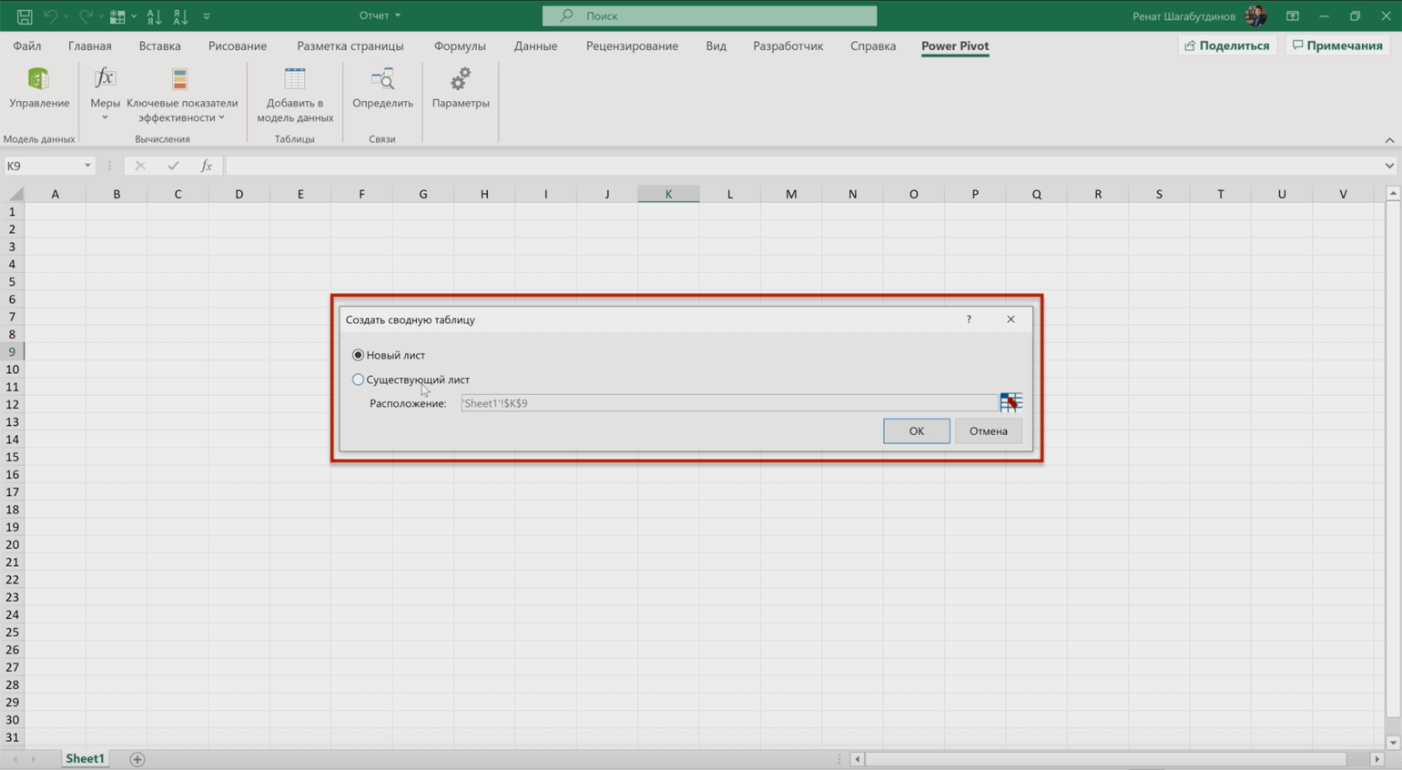
Скриншот: курс Skillbox «Excel + Google Таблицы с нуля до PRO»
Готово — появился новый лист для сводной таблицы. Слева на листе расположена область, где появится отчёт сводной таблицы после настроек. Справа — панель «Поля сводной таблицы», в которой мы будем работать с этими настройками.
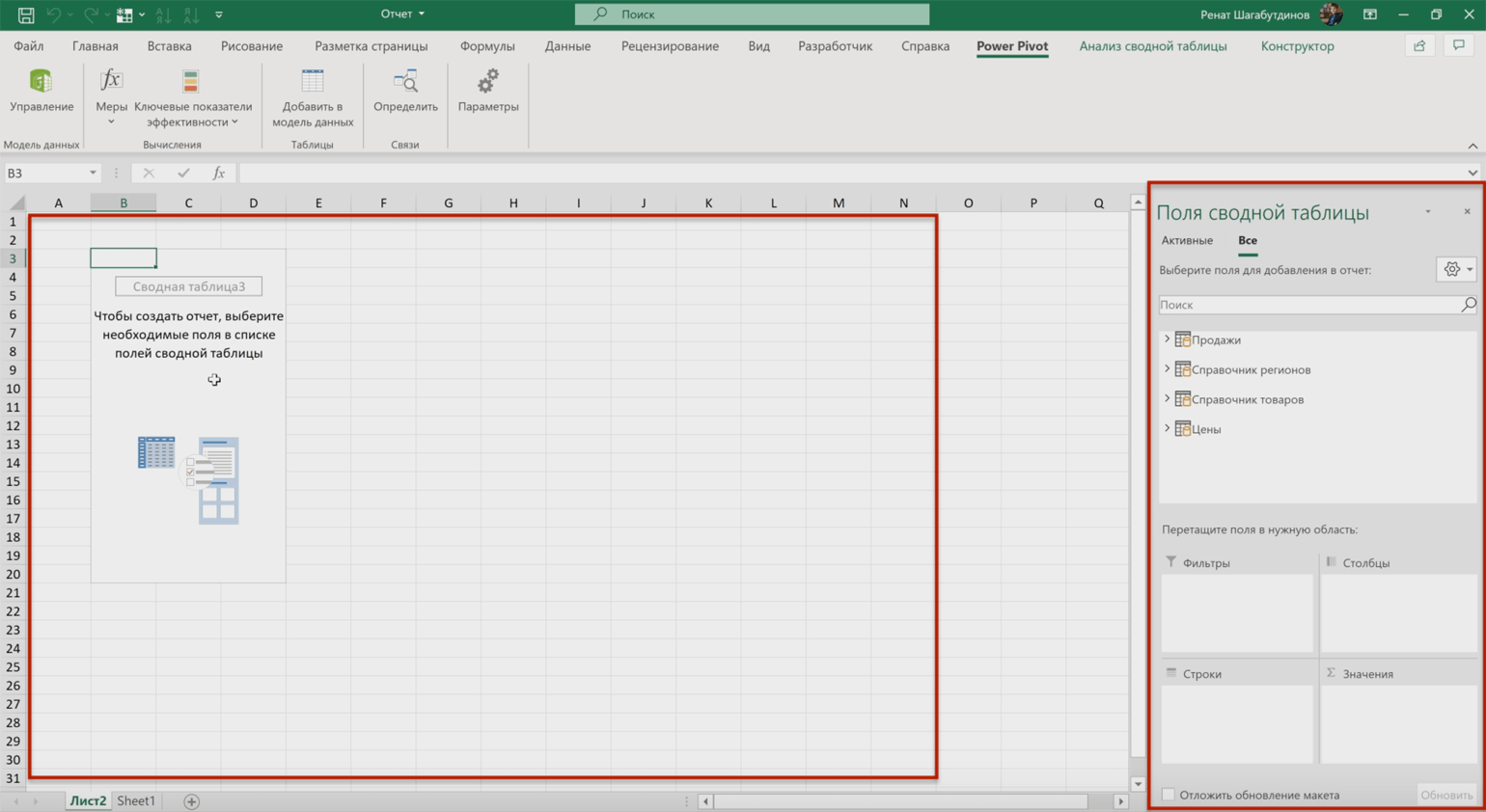
Скриншот: курс Skillbox «Excel + Google Таблицы с нуля до PRO»
Панель «Поля сводной таблицы» состоит из двух частей. В верхней части находится список полей — в нашем случае Power Pivot перенёс в список полей данные четырёх таблиц, которые мы связали между собой. В нижней части — четыре области: «Значения», «Строки», «Столбцы» и «Фильтры». У каждой области своё назначение.
Чтобы создать отчёт сводной таблицы, нужно выбрать необходимые поля из списка полей и перенести их в нужную область.
Подробнее о назначении областей, а также о том, как строить и настраивать сводные таблицы в стандартной версии Excel, говорили в этой статье Skillbox Media.
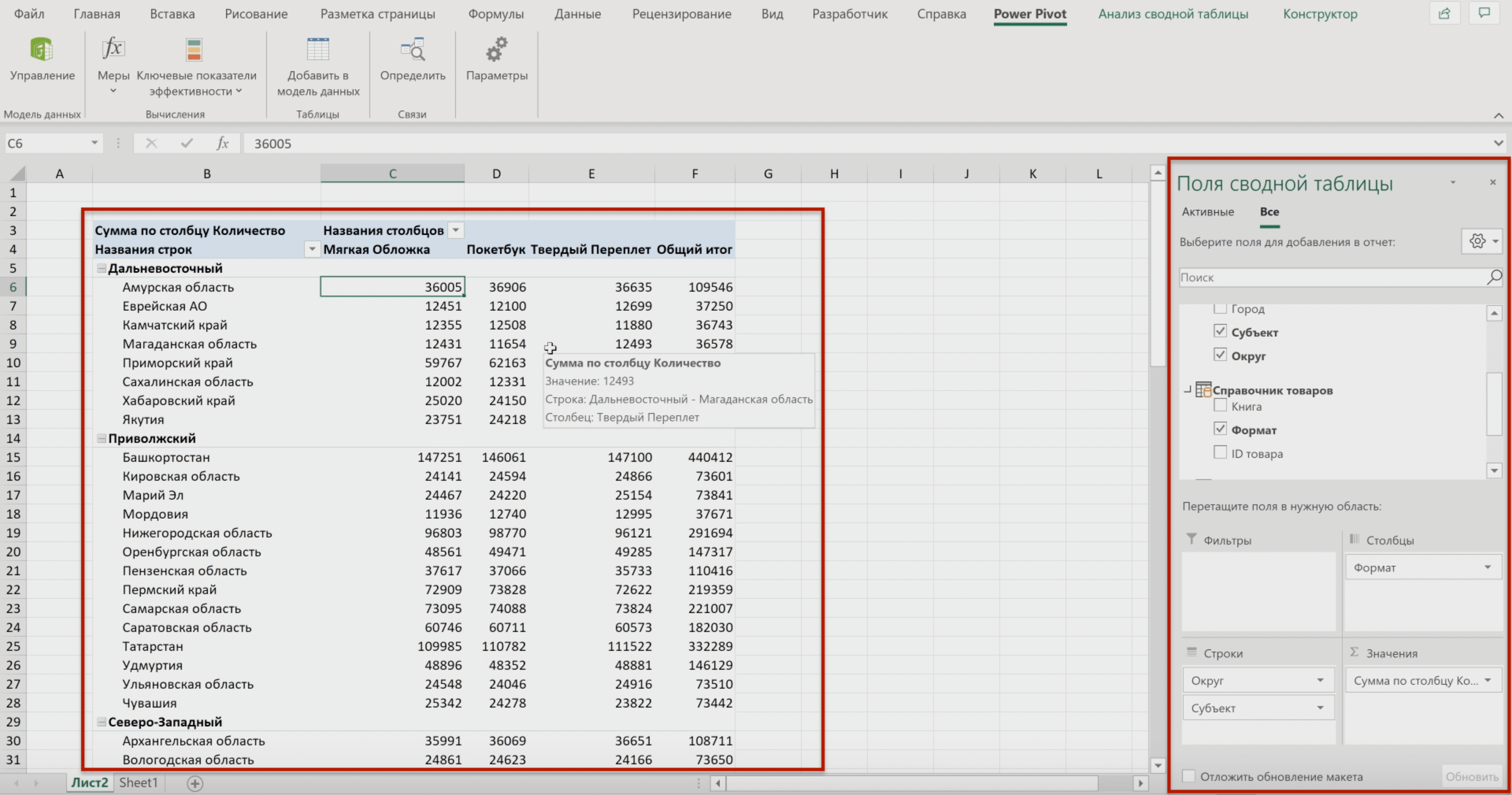
Для примера построим отчёт в форме сводной таблицы, который покажет количество продаж издательства в субъектах России с детализацией по формату книг.
Для этого в область «Строки» перенесём поля «Округ» и «Субъект» из «Справочника регионов», в область «Значения» — поле «Количество» из таблицы «Продажи», в область «Столбцы» — поле «Формат» из «Справочника товаров».
Скриншот: курс Skillbox «Excel + Google Таблицы с нуля до PRO»
Готово. Мы получили таблицу, где по вертикали расположены все субъекты и округа страны, по горизонтали — количество проданных книг с разбивкой по форматам.
По такому же принципу можно строить другие отчёты — в зависимости от того, какую информацию для анализа нужно получить. Например, в отчёте можно показать количество продаж с детализацией по названиям книг и датам их продажи.
- В этой статье Skillbox Media собрали в одном месте 15 статей и видео об инструментах Excel, которые ускорят и упростят работу с электронными таблицами.
- В Skillbox есть курс «Excel + Google Таблицы с нуля до PRO». Он подойдёт как новичкам, которые хотят научиться работать в Excel с нуля, так и уверенным пользователям, которые хотят улучшить свои навыки. На курсе учат быстро делать сложные расчёты, визуализировать данные, строить прогнозы, работать с внешними источниками данных, создавать макросы и скрипты.
- Кроме того, Skillbox даёт бесплатный доступ к записи онлайн-интенсива «Экспресс-курс по Excel: осваиваем таблицы с нуля за 3 дня». Он подходит для начинающих пользователей. На нём можно научиться создавать и оформлять листы, вводить данные, использовать формулы и функции для базовых вычислений, настраивать пользовательские форматы и создавать формулы с абсолютными и относительными ссылками.
Другие материалы Skillbox Media по Excel
I am often asked – What is Power Pivot in Excel?
And how did you get that tab on your Ribbon?
In this Excel Power Pivot introduction tutorial, we will explain what Power Pivot is. And why you will want to use it.
Table of Contents
- Watch the Video
- What is Power Pivot?
- The Excel Power Pivot introduction Scenario
- Enable the Power Pivot Add-In
- Import the Data
- Model the Data
- What is DAX?
- What are the advantages of using DAX?
- Create DAX Measures
- Measure #1
- Measure #2
- Measure #3
- Measure #4
- Measure #5
- Create PivotTables using the Power Pivot Data Model
Watch the Video
Watch this comprehensive Power Pivot introduction video taking you through the entire process from getting data through to analysing it with PivotTables.
Download the files to follow along.
Below are the written steps demonstrated in the video.
What is Power Pivot?
Power Pivot is also known as the data model in Excel and it enables us to create complex models of our data ready for analysis.
The advantages to using Power Pivot are;
We can work with large volumes of data surpassing the 1,048,576 limitations of Excel. Neither will Power Pivot be affected by using > 100,000 rows of data in the way that Excel is.
We can use the powerful DAX formula language. This rich formula language offers more powerful calculations than the worksheet formulas in Excel, and a lot more options than stand-alone PivotTables.
We can work with multiple tables or sources of data.
Classic Excel use requires data to be imported, or entered into Excel. Then combined into one table using techniques such as VLOOKUP. This is inefficient.
Now that is not to say that it is bad. That approach works fine for small volumes of data, few tables and when data is stored in Excel.
But when dealing with large volumes from many different external sources. Power Pivot is far superior.
The Excel Power Pivot Introduction Scenario
The scenario that we will work through in this article is that we run a training company and store data about our courses, training venues, and courses we have run in different places.
Download the files used in this article to follow along.
We have 4 CSV files stored in a folder that contain all the courses that we have run for the last 4 years. One for each year of transactions.
We then also have an Excel spreadsheet that contains 3 tables. A table with details of the different courses we offer, one for the venues we have and another for the calendar table.
The typical use of Excel would see users copy and paste the data from the 4 transaction files into one table. And then use lookup formulas to bring the details about the courses and venues into new columns of the transaction table.
With Power Pivot we will connect to those sources (so they update in the future) and then relate them. No data imported to a worksheet and no formulas for new columns.

This is a simple model to get an understanding of Power Pivot. However, data can be imported from any source (databases, websites, text files, etc) and they can be larger than the files used in this example.
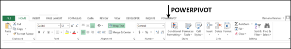
Enable the Excel Power Pivot Add-In
Power Pivot is a COM add-in. So you won’t see the tab on the Ribbon if you are new to using it.
To enable the add-in, click File > Options.
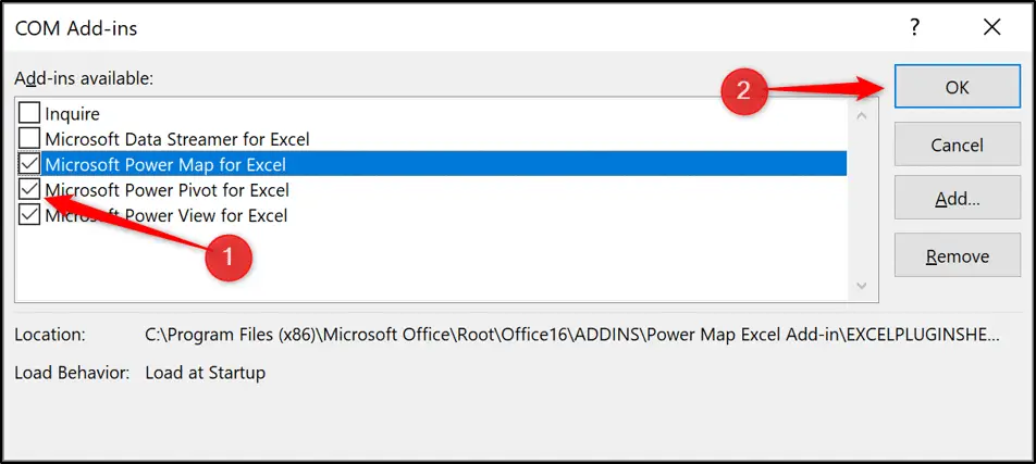
Click the Add-ins category, then select COM Add-ins from the Manage list and click Go.
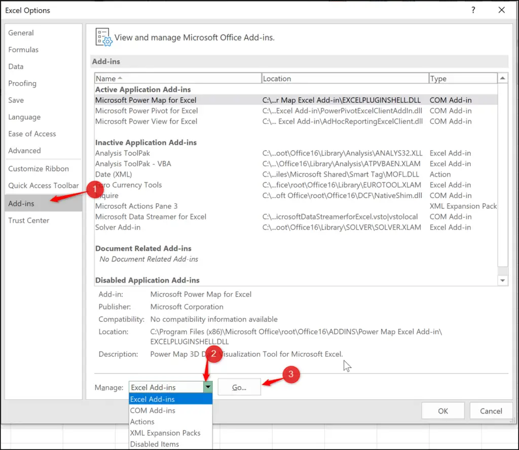
Check the box for Microsoft Power Pivot for Excel and click Ok.
The Power Pivot tab is now added to the Ribbon.
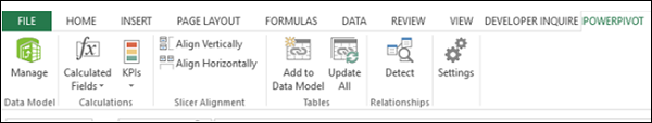
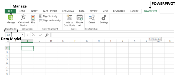
There are now two main ways to access Power Pivot. You could use the Power Pivot tab to manage the data model, create measures and more.
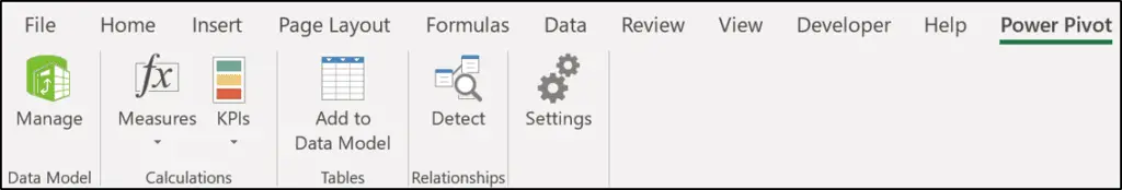
You can also click the Manage Data Model button on the Data tab to open the Power Pivot window.
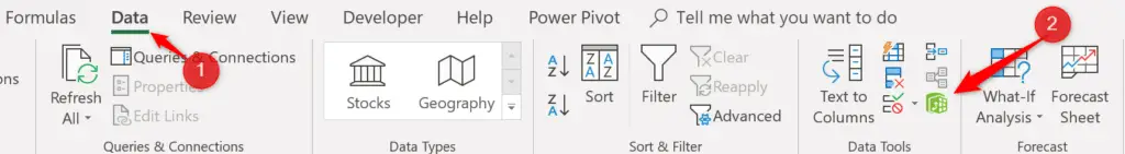
The Power Pivot window provides full functionality, while the Power Pivot tab enables you to perform actions such as create measures quicker (more on creating measures later).
Import the Data
Let’s start to import the data from those different sources into our model.
You can do this in Power Pivot, but the options you get are limited. So you are heavily encouraged to use Power Query for this task.
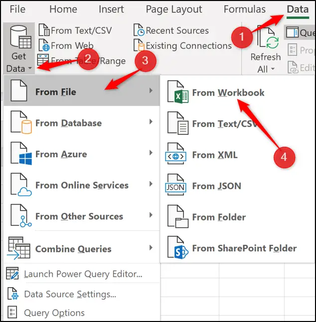
To import the 4 CSV files from the folder, click Data > Get Data > From File > From Folder.
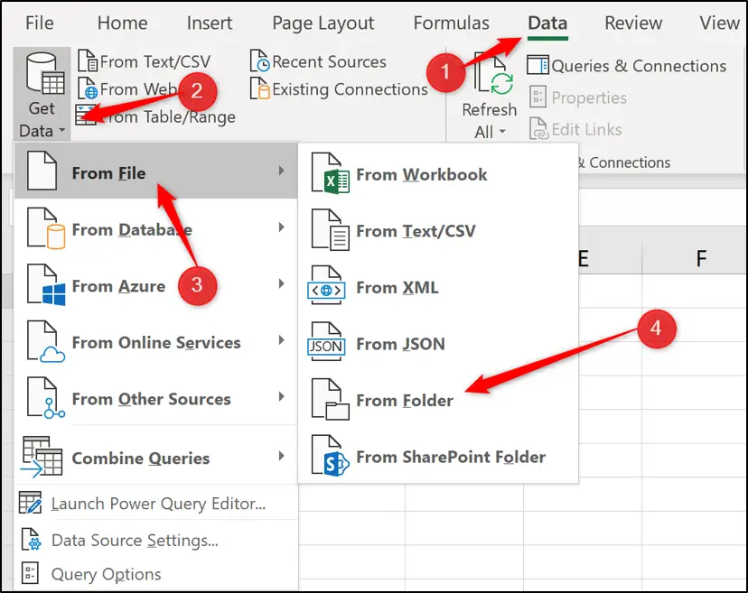
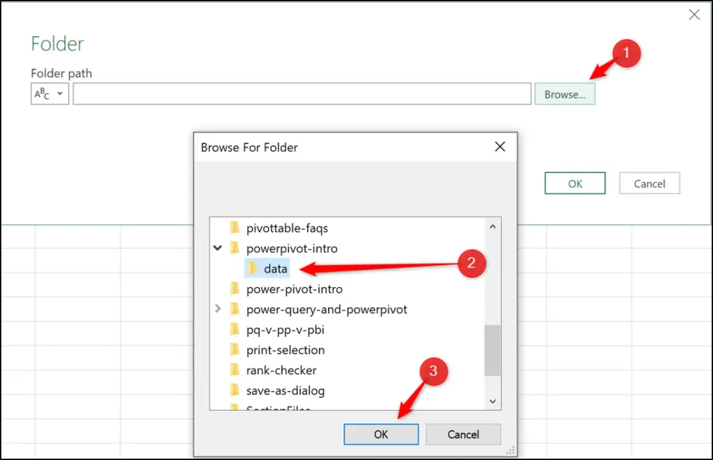
Click the Browse button in the Folder window and locate the folder containing the CSV files. Click Ok.
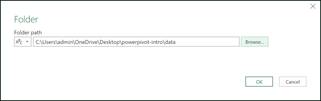
The folder path is displayed. Click Ok.
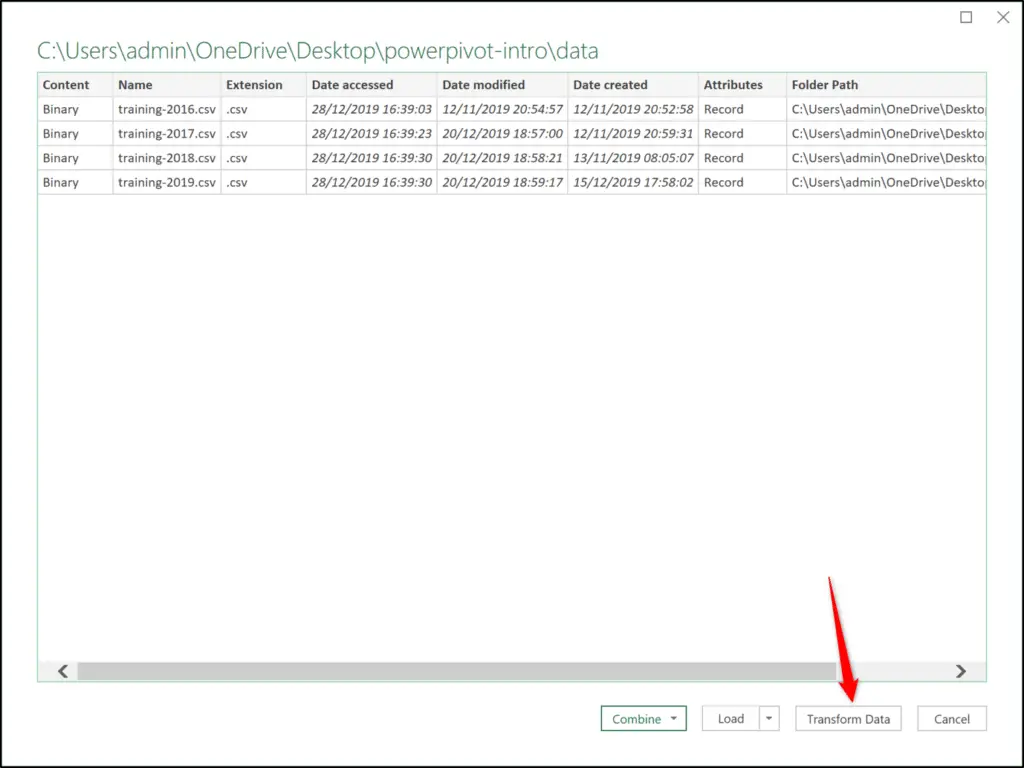
A window appears listing all of the files in that folder including information such as last modified dates and file extensions. Click Transform Data.
This opens the Power Query Editor. At this point you could filter out files you do not need and do other transformations.
However, this article is about Power Pivot, so we will connect to the files and do almost no transformations (Power Query tutorials to learn more)
Click the Combine Files button. This will stack all 4 CSV files into one table.
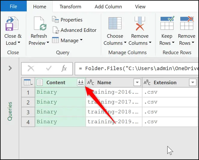
The Combine Files window provides an opportunity to preview the files. Click Ok.
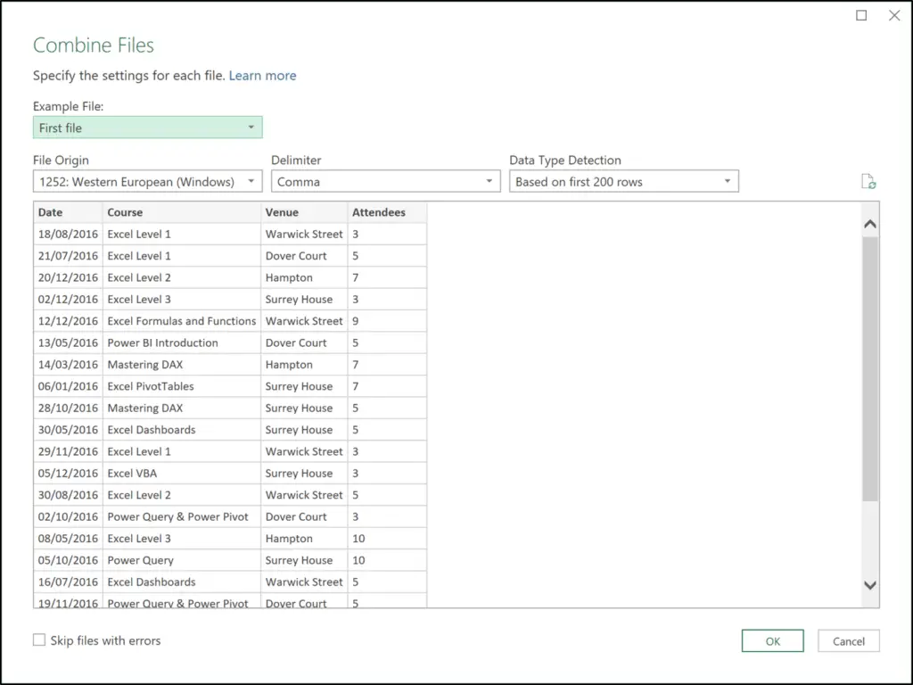
All the files are stacked (appended) into one table.
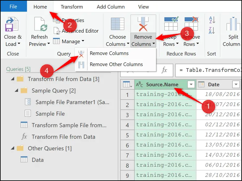
The first column with the file name is not required. Select the column, then click Home > Remove Columns list > Remove Columns.
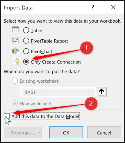
Now we will load it into the data model. Click Home > Close & Load list > Close & Load To.
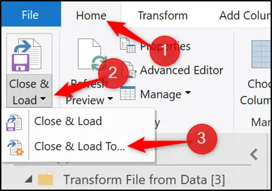
Select Only Create Connection (the data is Not loaded to the worksheet) and check the box to Add this data to the Data Model.

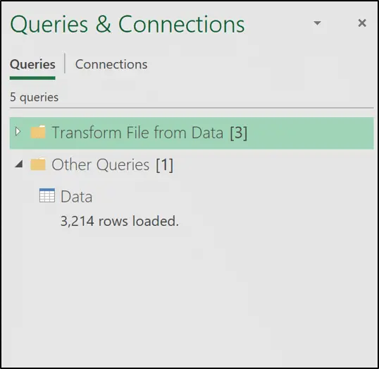
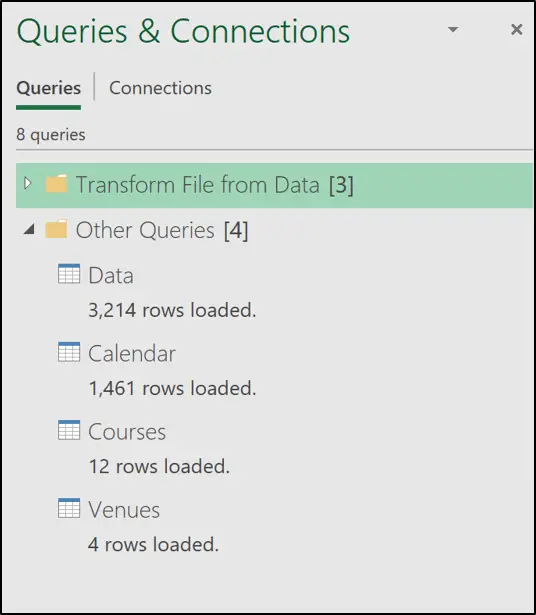
The query is loaded to the model and shown in the Queries and Connections pane on the right. Ignore the other queries, they were used by Power Pivot to extract the files and stack them.
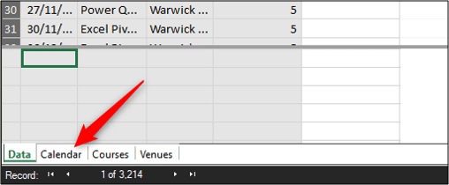
It shows 3,214 rows loaded. Remember, this is a simple model, but because it was loaded to Power Pivot and not the worksheet – this could have been millions of rows.
Let’s now import the 3 tables (courses, venue, and calendar) from the Excel workbook.
Click Data > Get Data > From File > From Workbook.
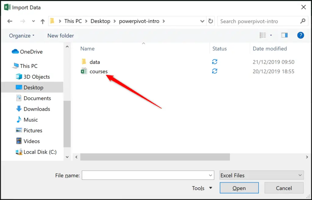
Navigate to the Excel workbook, select it and click Open.
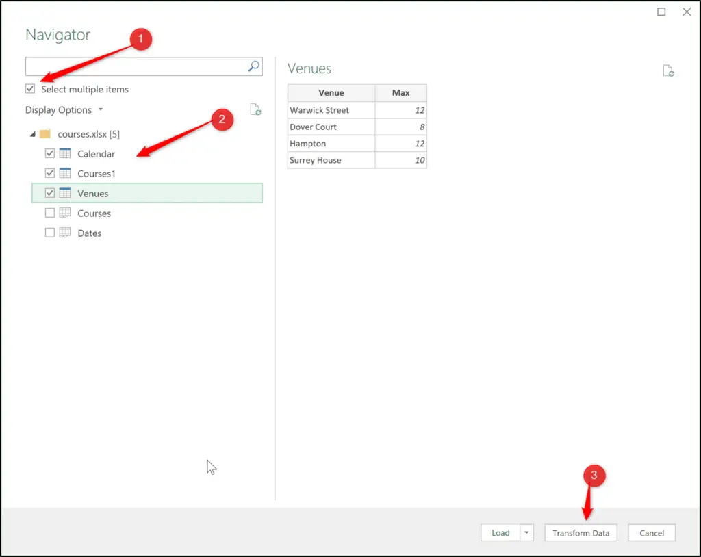
The Navigator window opens showing the tables and worksheets from the workbook. As you select the table or sheet a preview is shown on the right.
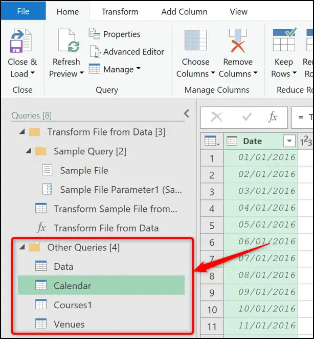
Check the Select multiple items box. Check the “Calendar”, “Courses1” and “Venues” boxes and click Transform Data.
The 3 tables/queries are loaded and shown on the left of the Power Query Editor.
As mentioned already in this tutorial, we will not be doing any transformations here. Check out other Power Query tutorials on the site to learn more about what is possible.
This data is perfect and needs no modifying, except we will edit the name of the “Courses1” query to “Courses”.
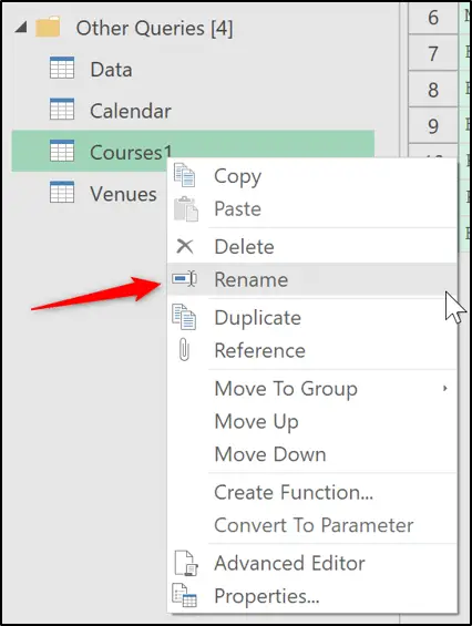
Right-click on the “Courses1” query, click Rename and edit it to “Courses”.
Then just like with the previous query, click Home > Close & Load list > Close & Load To.
Select Only Create Connection and check the box to Add this data to the Data Model.
Those three queries are loaded.
We now have the transactions table (also known as a Fact table) – “Data” and the three lookup tables (also known as dimension tables) – “Calendar”, “Courses” and “Venues”.
Model the Data
If we were to create a PivotTable from the model now to total the number of attendees for each course over these four years.
We could put the “course” field from “Courses” tables into rows and the “Attendees” field from the “Data” table into the Values area and you would see the below.
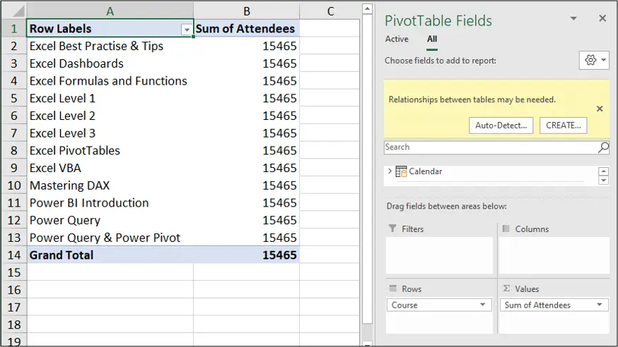
Now, this clearly is not working because we have the same value for every course in the PivotTables and the total.
We also receive a warning at the top of the field list that relationships between tables may be needed.
So at the moment, we have 4 independent tables that do not know how to communicate with each other. So we will build relationships between them – don’t worry it’s super easy.
This is instead of the classic Excel use of VLOOKUP being used to drag the course information into the “Data” table to be used.
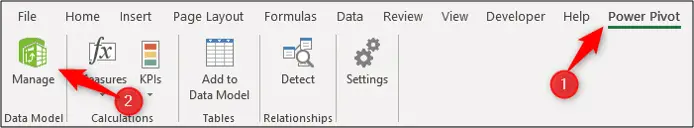
Click the Power Pivot tab and then the Manage button.
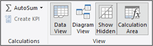
Click the Diagram View button on the Home tab.
This is the easiest view to manage your relationships because it is very visual. You can see your four tables.
You can click and drag these tables around the page to organise them better.
Normally they are organised with the transactions tale in the middle and the lookup tables scattered around it like a star.
Or as I have done below with the lookup tables above and the transactions table below. This is so the transaction table has to ‘look up’ to the lookup tables to retrieve information about venues, courses or dates.
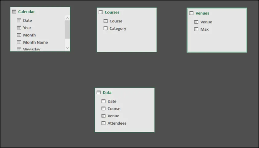
The tables can also be resized. These tables are very small, but some lookup tables can have 20+ columns of data.
To create a relationship between tables, click and drag from field in the transaction table (Data) to the related field in the lookup table (Just as you would use a lookup value into the first column of the table array with VLOOKUP).
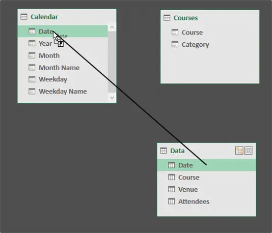
Repeat this step for all three lookup tables.
Lines are shown indicating the relationship between the tables.
You can see a * symbol at the end of the line by the transaction table, and a 1 at the end of the line by the lookup table. A many-to-one relationship (one venue can be used for many courses).
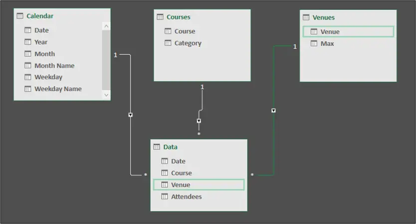
There is also an arrow showing the filter direction from the lookup tables to the transaction table. So we can filter the data in a PivotTable by course, venue, month etc.
Next, we need to make some simple improvements to the “Calendar” table.
At the moment, if we used the “Month Name” field from the “Calendar” table in the rows field of a PivotTable we would see this.
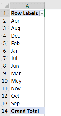
The months are sorted in A to Z order.
Excel has Custom Lists which tell it how to order names of months and names of days of the week.
Power Pivot does not have this, so we will explain to it how to sort those fields correctly.
Click on Home > Data View.
And then click on the Calendar tab at the bottom of the screen to switch to the “Calendar” table.
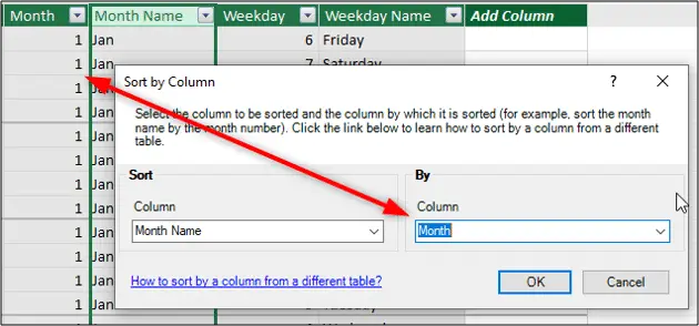
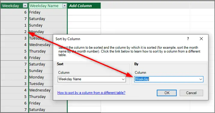
Select the “Month Name” column and click Home > Sort by Column list > Sort by Column.
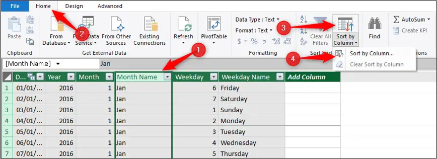
In the Sort by Column window, the “Month Name” column will already be in the first list because the column was selected before opening the window.
In the second list, select the “Month” column. So we will sort the months’ name, by the months’ number i.e. 1 for January, 2 for February etc.
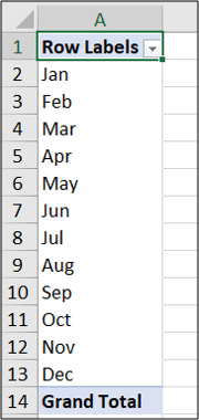
The PivotTable can now sort the month names correctly.
Now repeat the process for the “Weekday Name” column of the “Calendar” table to be sorted by the “Weekday” column.
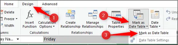
The final task for this modelling section is to mark the “Calendar” table as the date table.
This is important for effective time intelligence analytics. By telling Power Pivot which table to use for date calculations, it prevents Power Pivot from creating its own date table each time you use a date field in PivotTables.
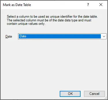
You are asked which column of the “Calendar” table contains the dates. Select the “Date” column and click Ok.
What is DAX?
DAX stands for Data Analysis Expressions and it is the formula language behind Power Pivot.
It is a very rich language, there are many formulas and it is constantly evolving. This DAX Function Reference will help keep you up to date with new and updated DAX formulas.
It can take some time for Excel users to become comfortable with DAX. And in this tutorial, we will go through some nice examples to get a feel for DAX formulas.
There are two types of DAX formula; measures and calculated columns. In this tutorial, we will only focus on measures. Calculated columns have limited use.
What Are The Advantages Of Using DAX?
DAX formulas can be re-used, but are only calculated once.
If you have a field named ‘Total’ that you drag into multiple PivotTables to create different analytics such as total by month, total by region etc – that total is summed multiple times. These are known as implicit measures.
Summing a ‘Total’ field with a DAX measure means that you can use it again and again in different PivotTables (and also other measures) but it only calculates once.
This is far more efficient, especially when dealing with large datasets.
There are hundreds of DAX functions. A standard PivotTable offers only 11 functions – sum, average, standard deviation etc.
DAX measures can be formatted when they are created. This helps ensure a consistent look in your reports, and also saves you formatting the value every time it is used.
Create DAX Measures in Excel Power Pivot
Let’s create five DAX measures to get a feel for the language in this Excel Power Pivot introduction.
We will do this from the Power Pivot tab on the Ribbon, so click the Switch to Workbook button to go back to Excel.
Measure #1
Click Power Pivot > Measures list > New Measure.
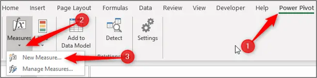
Our first measure will be to sum the total number of attendees.
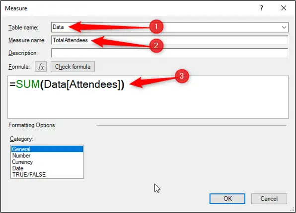
In the Measure window, we will complete the following fields;
Table name: We will store this measure in the “Data” table. All of our measures will go into this transactions table.
Measure name: “TotalAttendees”. It is a good idea to avoid spaces when naming measures and tables.
The formula we will use is shown below.
=SUM(Data[Attendees])
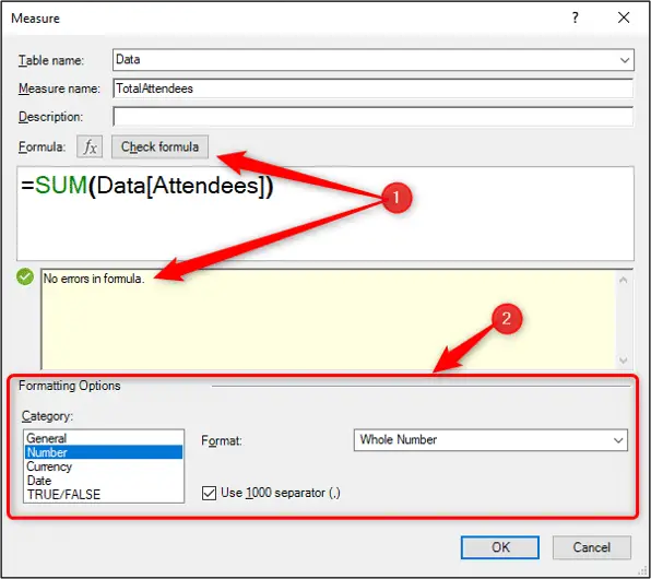
When typing into the box provided you can press the Ctrl key and scroll your mouse wheel to zoom in and out of the area making the formula easier to read.
Click the Check Formula button to confirm there are no errors.
The formatting will be set as a Number as a Whole Number format and check the box to Use 1000 Separator (,).
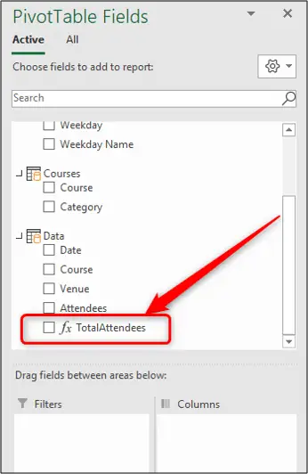
The created measure is visible in the “Data” table of the PivotTable field list.
Measure #2
We will now go through the process again to create a measure that counts how many courses we have run (number of transactions) over these 4 years of data.
Click Power Pivot > Measure list > New Measure to open the Measure window.
This measure will also be stored in the “Data” table. The measure will be named “TotalCourses”. It will be formatted as a whole number with a thousand separator and we will use the formula below.
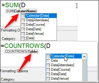
=COUNTROWS(Data)
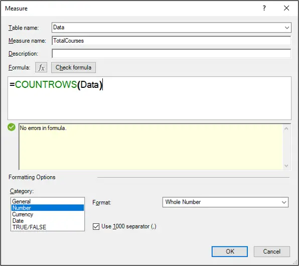
This function is interesting as Excel does not have a COUNTROWS function, but DAX does. So it is an example (not the last) of the extra functions that DAX provides.
With this function, we provided the “Data” table as the function argument. The SUM function prompts for a table column, while this function prompts for a table. Something to keep your eye out for when writing DAX.
Measure #3
Ok, for the third measure we want to calculate how many attendees we had on our courses in the previous year.
Create a measure in the “Data” table, with the name “AttendeesPrevYear” and formatted as a whole number with a thousand separator. The formula below is used.
=CALCULATE([TotalAttendees],DATEADD('Calendar'[Date],-1,YEAR))
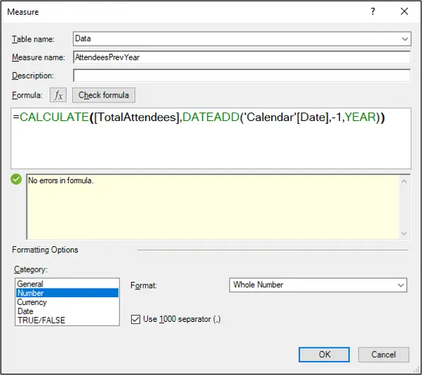
This function uses two new functions which are both only available in DAX – CALCULATE and DATEADD.
The CALCULATE function is the most important function to know in DAX. It can add and remove filters from an expression and also change the evaluation context. It is very useful.
This example also demonstrates the “TotalAttendees” measure being reused. So we didn’t have to re-write the SUM function.
Measure #4
The fourth measure is to find the difference in the total attendees to the previous year.
Create a measure in the “Data” table named “AttendeesDiffPrevYear” formatted as a whole number with a thousand separator. The formula we will use is below.
=[TotalAttendees]-[AttendeesPrevYear]
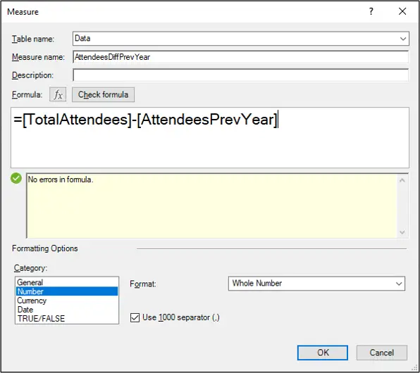
This measure uses two measures we created previously.
It is a good idea to test your measures to ensure they work before you use them in some deep analysis. And the last two measures are a good example of ones we might want to check.
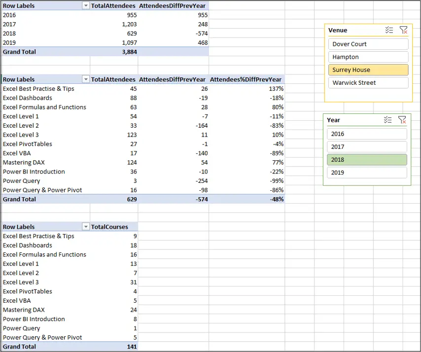
In a PivotTable, I have placed the “Year” field from the “Calendar” table into the Rows area, and in the Values area placed the “TotalAttendees”, “AttendeesPrevYear” and “AttendeesDiffPrevYear” measures.
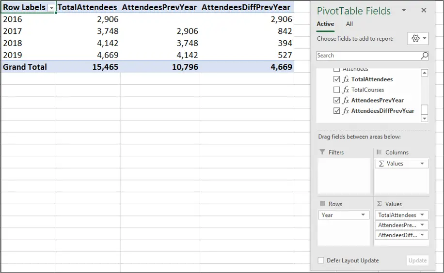
We can see three of our measures working correctly here. The “TotalAttendees” measure returns 15,465 for the total attendees in the entire data.
Then the “Year” field provides row filter context and you can see the 2016 total of 2,906 and in 2017 the previous year (2016) also as 2,906 confirming that it works.
And then you can see the “AttendeesDiffPrevYear” measure working as 2,906 + 842 = 3,748.
Now I’m not saying you should use the “AttendeesPrevYear” measure in this PivotTable because it serves no benefit. It was created to be used in the “AttendeesDiffPrevYear” calculation and possibly others.
But using it here it gives us a nice quick way of checking if it is working before we create more measures with it.
Measure #5
In our fifth measure, we want to calculate the percentage difference of total attendees compared to the previous year.
Create a measure in the “Data” table named “Attendees%DiffPrevYear” formatted as a percentage and no decimal places. The formula we will use is below.
=DIVIDE([AttendeesDiffPrevYear],[AttendeesPrevYear],0)
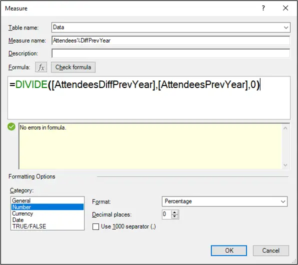
This measure uses the DIVIDE function (another that is not in Excel, and is unique to DAX). This function is a safe divide function, and the zero on the end is returned instead of a #DIV/0! error.
It also uses both of our previous two measures we created.
Note the percentage formatting has been applied. So we won’t need to do this again when it is used in PivotTables.
Create PivotTables using the Power Pivot Data Model
So we have imported data from multiple files in a folder and also from multiple tables in an Excel workbook. Then we modelled the data and created relationships. And then we wrote some DAX calculations.
The final stage is to create PivotTables using these fields and DAX measures to produce some analytics and reports.
This is not going to be an amazing fancy dashboard, but it will be a few PivotTables and Slicers to get a feel for how it all works together and what is possible with Power Pivot.
Now, this is not a tutorial on PivotTables so I won’t go into detail here, that is for another time. But let’s look at how to create a PivotTable using our data model.
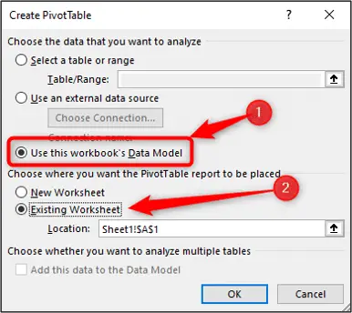
Click Insert > PivotTable.
Excel automatically picks up that you have a data model in this workbook and assumes you would like to use it for your PivotTable.
We have a blank workbook (data is all loaded to the model, nothing on the sheets) so we may as well insert the PivotTable onto the existing sheet.
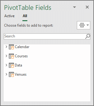
The field list for the PivotTables shows all the tables of our data model. A small icon to indicate they are from the model, and an arrow to expand them and access the fields.
The “Data” table contains all of the measures and is filtered by the lookup tables.
So use the measures in the Values area of the PivotTable, and the fields from the other tables in the Rows, Columns, Filter areas and in Slicers.
Apart from knowing that, everything else about using PivotTables is no different to when using them from a single table.
The report below has three PivotTables and two Slicers. It uses all five of the measures we created, and all four tables that we imported. So it’s a nice example of a functioning Power Pivot data model.
You watch this being created in the video at the start of this Excel Power Pivot introduction tutorial.
Power Pivot can be a very useful tool for anyone dealing with large quantities of data and needs to analyse it.
I hope that this Excel Power Pivot introduction was useful. There is a lot more you can get your teeth into on your journey to mastering Power Pivot, especially with DAX.
And if you find Power Pivot useful, you should also check out Power BI.
Excel Power Pivot — Overview
Excel Power Pivot is an efficient, powerful tool that comes with Excel as an Add-in. With Power Pivot, you can load hundreds of millions of rows of data from external sources and manage the data effectively with its powerful xVelocity engine in a highly compressed form. This makes it possible to perform the calculations, analyze the data, and arrive at a report to draw conclusions and decisions. Thus, it would be possible for a person with hands-on experience with Excel, to perform the high-end data analysis and decision making in a matter of few minutes.
This tutorial will cover the following −
Power Pivot Features
What makes Power Pivot a strong tool is the set of its features. You will learn the various Power Pivot features in the chapter − Power Pivot Features.
Power Pivot Data from Various Sources
Power Pivot can collate data from various data sources to perform the required calculations. You will learn how to get data into Power Pivot, in the chapter − Loading Data into Power Pivot.
Power Pivot Data Model
The power of Power Pivot lies in its database- Data Model. The data is stored in the form of data tables in the Data Model. You can create relationships between the data tables to combine the data from different data tables for analysis and reporting. The chapter − Understanding Data Model (Power Pivot Database) gives you the details about the Data Model.
Managing Data Model and Relationships
You need to know how you can manage the data tables in the Data Model and the relationships between them. You will get the details of these in the chapter − Managing Power Pivot Data Model.
Creating Power Pivot Tables and Power Pivot Charts
Power PivotTables and Power Pivot Charts provide you a way to analyze the data for arriving at conclusions and/or decisions.
You will learn how to create Power PivotTables in the chapters − Creating a Power PivotTable and Flattened PivotTables.
You will learn how to create Power PivotCharts in the chapter − Power PivotCharts.
DAX Basics
DAX is the language used in Power Pivot to perform calculations. The formulas in DAX are similar to Excel formulas, with one difference − while the Excel formulas are based on individual cells, DAX formulas are based on columns (fields).
You will understand the basics of DAX in the chapter − Basics of DAX.
Exploring and Reporting Power Pivot Data
You can explore the Power Pivot Data that is in the Data Model with Power PivotTables and Power Pivot Charts. You will get to learn how you can explore and report data throughout this tutorial.
Hierarchies
You can define data hierarchies in a data table so that it would be easy to handle related data fields together in Power PivotTables. You will learn the details of the creation and usage of Hierarchies in the chapter − Hierarchies in Power Pivot.
Aesthetic Reports
You can create aesthetic reports of your data analysis with Power Pivot Charts and/or Power Pivot Charts. You have several formatting options available to highlight the significant data in the reports. The reports are interactive in nature, enabling the person looking at the compact report to view any of the required details quickly and easily.
You will learn these details in the chapter − Aesthetic Reports with Power Pivot Data.
Excel Power Pivot — Installing
Power Pivot in Excel provides a Data Model connecting various different data sources based on which the data can be analyzed, visualized, and explored. The easy-to-use interface provided by Power Pivot enables a person with hands-on experience in Excel to effortlessly load data, manage the data as data tables, create relationships among the data tables, and perform the required calculations to arrive at a report.
In this chapter, you will learn, what makes Power Pivot a strong and sought after tool for analysts and decision makers.
Power Pivot on the Ribbon
The first step to proceed with Power Pivot is to ensure that the POWERPIVOT tab is available on the Ribbon. If you have Excel 2013 or later versions, the POWERPIVOT tab appears on the Ribbon.
If you have Excel 2010, POWERPIVOT tab might not appear on the Ribbon if you have not already enabled the Power Pivot add-in.
Power Pivot Add-in
Power Pivot Add-in is a COM Add-in that needs to be enabled to get the complete features of Power Pivot in Excel. Even when POWERPIVOT tab appears on the ribbon, you need to ensure that the add-in is enabled to access all the features of Power Pivot.
Step 1 − Click the FILE tab on the Ribbon.
Step 2 − Click Options in the dropdown list. The Excel Options dialog box appears.
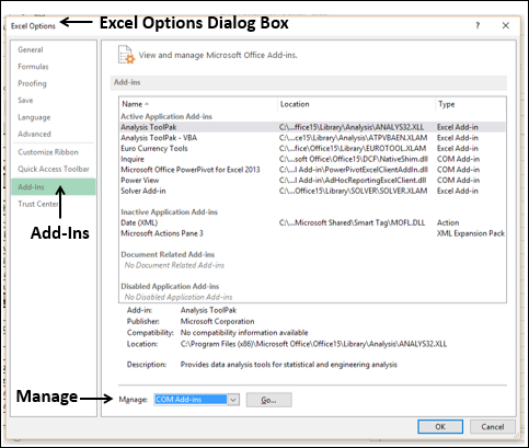
Step 3 − Follow the instructions as follows.
-
Click Add-Ins.
-
In the Manage box, select COM Add-ins from the dropdown list.
-
Click the Go button. The COM Add-Ins dialog box appears.
-
Check Power Pivot and click OK.
What is Power Pivot?
Excel Power Pivot is a tool for integrating and manipulating large volumes of data. With Power Pivot, you can easily load, sort and filter data sets that contain millions of rows and perform the required calculations. You can utilize Power Pivot as an ad hoc reporting and analytics solution.
The Power Pivot Ribbon as shown below has various commands, ranging from managing Data Model to creating reports.
The Power Pivot window will have the Ribbon as shown below −
Why is Power Pivot a Strong Tool?
When you invoke Power Pivot, Power Pivot creates data definitions and connections that get stored with your Excel file in a compressed form. When the data at the source is updated, it is refreshed automatically in your Excel file. This facilitates the usage of the data maintained elsewhere but is required for study time-to-time study and arriving at decisions. The source data can be in any form − ranging from a text file or a web page to the different relational databases.
The user-friendly interface of Power Pivot in the PowerPivot window enables you to perform data operations without the knowledge of any database query language. You can then create a report of your analysis within few seconds. The reports are versatile, dynamic and interactive and enable you to further probe into the data to get the insights and arrive at the conclusions / decisions.
The data that you work on in Excel and in the Power Pivot window is stored in an analytical database inside the Excel workbook, and a powerful local engine loads, queries, and updates the data in that database. Since the data is in Excel, it is immediately available to PivotTables, PivotCharts, Power View, and other features in Excel that you use to aggregate and interact with the data. The data presentation and interactivity is provided by Excel and the data and Excel presentation objects are contained within the same workbook file. Power Pivot supports files up to 2GB in size and enables you to work with up to 4GB of data in memory.
Power Features to Excel with Power Pivot
Power Pivot features are free with Excel. Power Pivot has enhanced the Excel performance with power features that include the following −
-
Ability to handle large data volumes, compressed into small files, with amazing speed.
-
Filter data and rename columns and tables while importing.
-
Organize tables into individual tabbed pages in the Power Pivot window as against the Excel tables distributed all over the workbook or multiple tables in the same worksheet.
-
Create relationships among the tables, so as to analyze the data in the tables collectively. Before Power Pivot, one had to rely on heavy usage of VLOOKUP function to combine the data into a single table before such analysis. This used to be laborious and error-prone.
-
Add power to the simple PivotTable with many added features.
-
Provide Data Analysis Expressions (DAX) language to write advanced formulas.
-
Add calculated fields and calculated columns to the data tables.
-
Create KPIs to use in PivotTables and Power View reports.
You will understand the Power Pivot features in detail in the next chapter.
Uses of Power Pivot
You can use Power Pivot for the following −
-
To perform powerful data analysis and create sophisticated Data Models.
-
To mash-up large volumes of data from several different sources quickly.
-
To perform information analysis and share the insights interactively.
-
To write advanced formulas with the Data Analysis Expressions (DAX) language.
-
To create Key Performance Indicators (KPIs).
Data Modelling with Power Pivot
Power Pivot provides advanced data modeling features in Excel. The data in the Power Pivot is managed in the Data Model that is also referenced as Power Pivot database. You can use Power Pivot to help you gain new insights into your data.
You can create relationships between data tables so that you can perform data analysis on the tables collectively. With DAX, you can write advanced formulas. You can create calculated fields and calculated columns in the data tables in the Data Model.
You can define Hierarchies in the data to use everywhere in the workbook, including Power View. You can create KPIs to use in PivotTables and Power View reports to show at a glance whether performance is on or off target for one or more metrics.
Business Intelligence with Power Pivot
Business intelligence (BI) is essentially the set of tools and processes that people use to gather data, turn it into meaningful information, and then make better decisions. The BI capabilities of Power Pivot in Excel enable you to gather data, visualize data, and share information with people in your organization across multiple devices.
You can share your workbook to a SharePoint environment that has Excel Services enabled. On the SharePoint server, Excel Services processes and renders the data in a browser window where others can analyze the data.
Excel Power Pivot — Features
The most important and powerful feature of Power Pivot is its database − Data Model. The next significant feature is the xVelocity in-memory analytics engine that makes it possible to work on large multiple databases in a matter of few minutes. There are some more important features that come with the PowerPivot Add-in.
In this chapter, you will get a brief overview of the features of Power Pivot, which are illustrated in detail later.
Loading Data from External Sources
You can load data into Data Model from external sources in two ways −
-
Load data into Excel and then create a Power Pivot Data Model.
-
Load data directly into Power Pivot Data Model.
The second way is more efficient because of the efficient way Power Pivot handles the data in memory.
For more details, refer to chapter − Loading Data into Power Pivot.
Excel Window and Power Pivot Window
When you start working with Power Pivot, two windows will open simultaneously − Excel window and Power Pivot window. It is through PowerPivot window that you can load data into Data Model directly, view the data in Data View and Diagram View, Create relationships between tables, manage the relationships, and create the Power PivotTable and/or PowerPivot Chart reports.
You need not have the data in Excel tables when you are importing data from external sources. If you have data as Excel tables in the workbook, you can add them to Data Model, creating data tables in Data Model that are linked to the Excel tables.
When you create a PivotTable or PivotChart from Power Pivot window, they are created in the Excel window. However, the data is still managed from Data Model.
You can always switch between the Excel window and Power Pivot window anytime, easily.
Data Model
The Data Model is the most powerful feature of Power Pivot. The data that is obtained from various data sources is maintained in Data Model as data tables. You can create relationships between the data tables so that you can combine the data in the tables for analysis and reporting.
You will learn in detail about the Data Model in the chapter − Understanding Data Model (Power Pivot Database).
Memory Optimization
Power Pivot Data Model uses xVelocity storage, which is highly compressed when data is loaded into memory that makes it possible to store hundreds of millions of rows in memory.
Thus, if you load data directly into Data Model, you will be doing it in the efficient highly compressed form.
Compact File Size
If the data is loaded directly into Data Model, when you save the Excel file, it occupies very less space on the hard disk. You can compare the Excel file sizes, the first one with loading data into Excel and then creating the Data Model and the second with loading data directly into the Data Model skipping the first step. The second one will be up to 10 times smaller than the first one.
Power PivotTables
You can create the Power PivotTables from Power Pivot window. The PivotTables so created are based on the data tables in the Data Model, making it possible to combine data from the related tables for analysis and reporting.
Power PivotCharts
You can create the Power PivotCharts from Power Pivot window. The PivotCharts so created are based on the data tables in the Data Model, making it possible to combine data from the related tables for analysis and reporting. The Power PivotCharts have all the features of Excel PivotCharts and many more such as field buttons.
You can also have combinations of Power PivotTable and Power PivotChart.
DAX Language
The strength of Power Pivot comes from the DAX Language that can be used effectively on the Data Model to perform calculations on the data in the data tables. You can have Calculated Columns and Calculated Fields defined by DAX that can be used in the Power PivotTables and Power PivotCharts.
Excel Power Pivot — Loading Data
In this chapter, we will learn to load data into Power Pivot.
You can load data into Power Pivot in two ways −
-
Load data into Excel and add it to the Data Model
-
Load data into PowerPivot directly, populating the Data Model, which is the PowerPivot database.
If you want the data for Power Pivot, do it the second way, without Excel even knowing about it. This is because you will be loading the data only once, in highly compressed format. To understand the magnitude of difference, suppose you load data into Excel by first adding it to the Data Model, the file size is say 10 MB.
If you load data into PowerPivot, and hence into Data Model skipping the extra step of Excel, your file size could be as less as 1 MB only.
Data Sources Supported by Power Pivot
You can either import data into the Power Pivot Data Model from various data sources or establish connections and/or use the existing connections. Power Pivot supports the following data sources −
-
SQL Server relational database
-
Microsoft Access database
-
SQL Server Analysis Services
-
SQL Server Reporting Services (SQL 2008 R2)
-
ATOM data feeds
-
Text files
-
Microsoft SQL Azure
-
Oracle
-
Teradata
-
Sybase
-
Informix
-
IBM DB2
-
Object Linking and Embedding Database/Open Database Connectivity
- (OLEDB/ODBC) sources
-
Microsoft Excel File
-
Text File
Loading Data Directly into PowerPivot
To load data directly into Power Pivot, perform the following −
-
Open a new workbook.
-
Click on the POWERPIVOT tab on the ribbon.
-
Click on Manage in the Data Model group.
The PowerPivot window opens. Now you have two windows − the Excel workbook window and the PowerPivot for Excel window that is connected to your workbook.
-
Click the Home tab in the PowerPivot window.
-
Click From Database in the Get External Data group.
-
Select From Access.
The Table Import Wizard appears.
-
Browse to the Access database file.
-
Provide Friendly connection name.
-
If the database is password protected, fill in those details also.
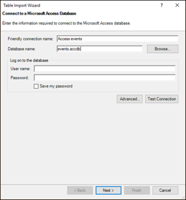
Click the Next → button. The Table Import Wizard displays the options for choosing how to import data.
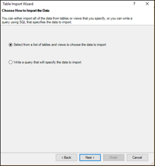
Click Select from a list of tables and views to choose the data to import.
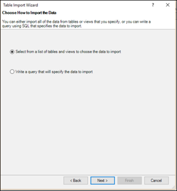
Click the Next → button. The Table Import Wizard displays the tables and views in the Access database that you have selected.
Check the box Medals.
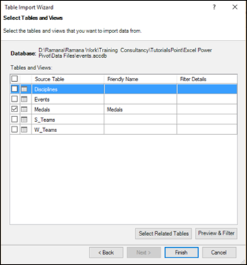
As you can observe, you can select the tables by checking the boxes, preview and filter the tables before adding to Pivot Table and/or select the related tables.
Click the Preview & Filter button.
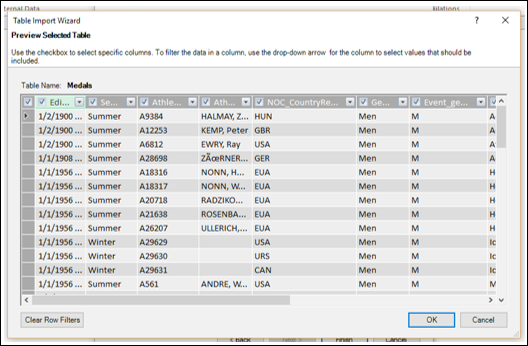
As you can see, you can select specific columns by checking the boxes in the column labels, filter the columns by clicking the dropdown arrow in the column label to select the values to be included.
-
Click OK.
-
Click the Select Related Tables button.
-
Power Pivot checks what other tables are related to the selected Medals table, if a relation exists.
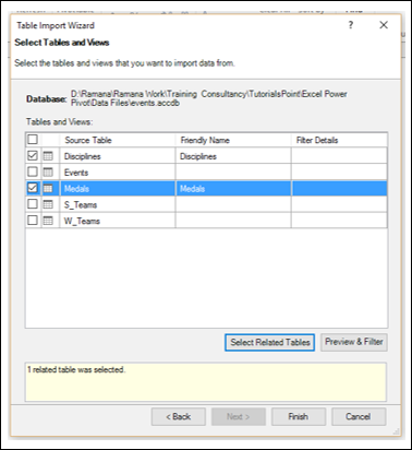
You can see that Power Pivot found that the table Disciplines are related to the table Medals and selected it. Click Finish.
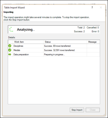
Table Import Wizard displays − Importing and shows the status of the import. This will take a few minutes and you can stop the import by clicking the Stop Import button.
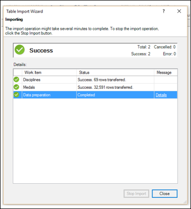
Once the data is imported, the Table Import Wizard displays – Success and shows the results of the import as shown in the screenshot below. Click Close.
Power Pivot displays the two imported tables in two tabs.
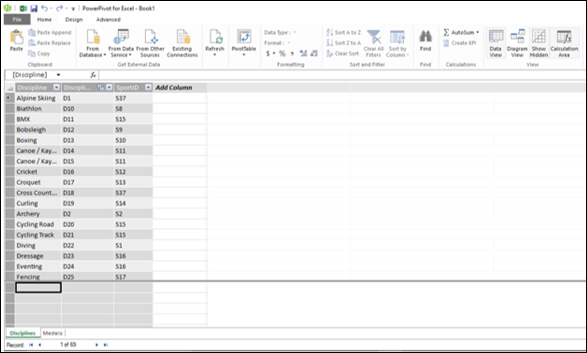
You can scroll through the records (rows of the table) using the Record arrows below the tabs.
Table Import Wizard
In the previous section, you have learnt how to import data from Access through the Table Import Wizard.
Note that the Table Import Wizard options change as per the data source that is selected to connect to. You might want to know what data sources you can choose from.
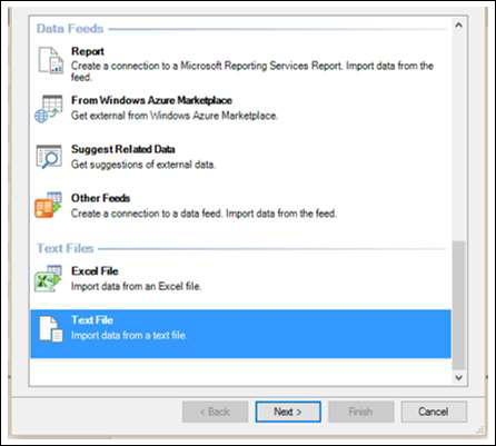
Click From Other Sources in the Power Pivot window.
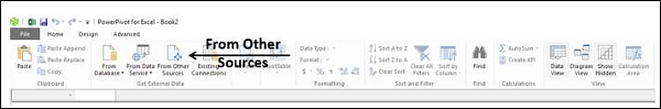
The Table Import Wizard – Connect to a Data Source appears. You can either create a connection to a data source or you can use one that already exists.
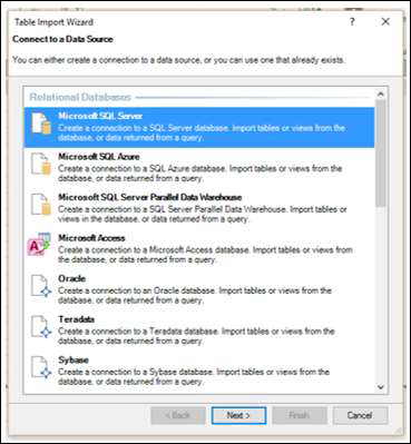
You can scroll through the list of connections in the Import Table Wizard to know the compatible data connections to Power Pivot.
-
Scroll down to the Text Files.
-
Select Excel File.
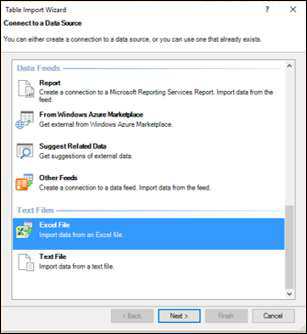
-
Click the Next → button. The Table Import Wizard displays – Connect to a Microsoft Excel File.
-
Browse to the Excel file in the Excel File Path box.
-
Check the box – Use first row as column headers.
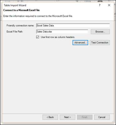
-
Click the Next → button. The Table Import Wizard displays − Select Tables and Views.
-
Check the box Product Catalog$. Click the Finish button.
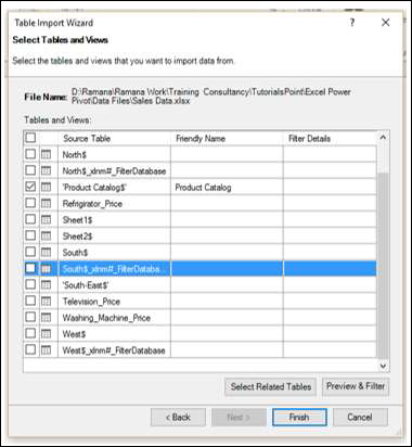
You will see the following Success message. Click Close.
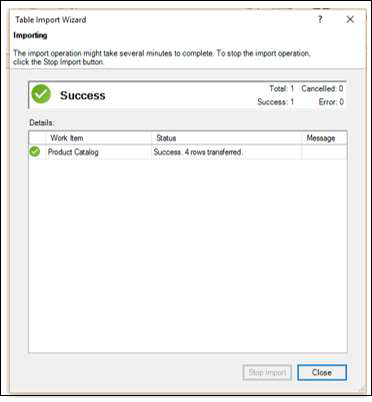
You have imported one table, and you have also, created a connection to the Excel file that contains several other tables.
Opening Existing Connections
Once you have established a connection to a data source, you can open it later.
Click Existing Connections in the PowerPivot window.
The Existing Connections dialog box appears. Select Excel Sales Data from the list.
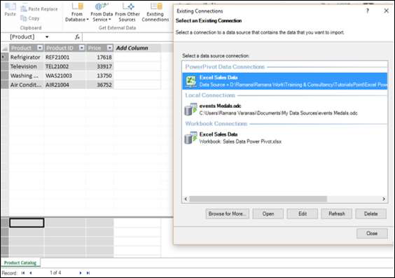
Click the Open button. The Table Import Wizard appears displaying the tables and views.
Select the tables that you want to import and click Finish.
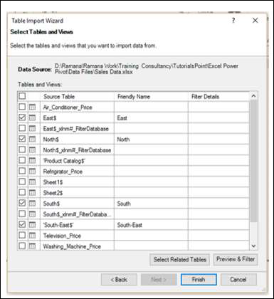
The selected five tables will be imported. Click Close.
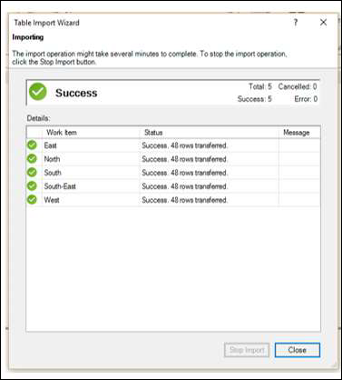
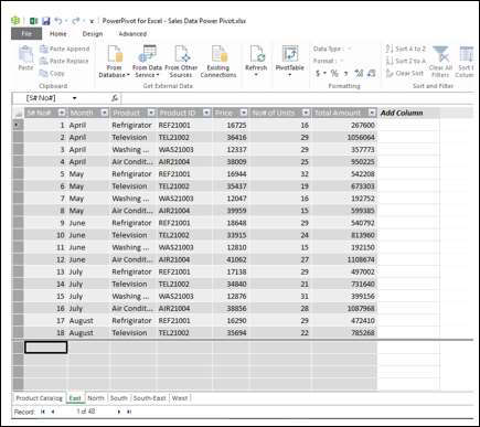
You can see that the five tables are added to the Power Pivot, each in a new tab.
Creating Linked Tables
Linked tables are a live link between the table in Excel and the table in the Data Model. Updates to the table in Excel automatically update the data in the data table in the model.
You can link the Excel table into Power Pivot in a few steps as follows −
-
Create an Excel table with the data.
-
Click the POWERPIVOT tab on the Ribbon.
-
Click Add to Data Model in the Tables group.
The Excel table is linked to the corresponding Data Table in PowerPivot.
You can see that the Table Tools with the tab — Linked Table is added to the Power Pivot window. If you click Go to Excel Table, you will switch to the Excel worksheet. If you click Manage, you will switch back to the linked table in the Power Pivot window.
You can update the linked table either automatically or manually.
Note that you can link an Excel table only if it is present in the workbook with the Power Pivot. If you have Excel tables in a separate workbook, then you have to load them as explained in the next section.
Loading from Excel Files
If you want to load the data from Excel workbooks, keep the following in mind −
-
Power Pivot considers the other Excel workbook as a database and only worksheets are imported.
-
Power Pivot loads each worksheet as a table.
-
Power Pivot cannot recognize single tables. Hence, Power Pivot cannot recognize if there are multiple tables on a worksheet.
-
Power Pivot cannot recognize any additional information other than the table on a worksheet.
Hence, keep each table in a separate worksheet.
Once your data in the workbook is ready, you can import the data as follows −
-
Click From Other Sources in the Get External Data group in the Power Pivot window.
-
Proceed as given in the section − Table Import Wizard.
The following are the differences between linked Excel tables and imported Excel tables −
-
Linked tables need to be in the same Excel workbook in which the Power Pivot database is stored. If the data already exists in other Excel workbooks, there is no point in using this feature.
-
The Excel import feature allows you to load data from different Excel workbooks.
-
Loading data from an Excel workbook does not create a link between the two files. Power Pivot creates only a copy of the data, while importing.
-
When the original Excel file is updated, data in the Power Pivot will not be refreshed. You need to either set the update mode to automatic or update the data manually, in the Linked Table tab of the Power Pivot window.
Loading from Text Files
One of the popular data representation styles is with the format known as comma separated values (csv). Each data row /record is represented by a text line, wherein the columns /fields are separated by commas. Many databases provide the option of saving to a csv format file.
If you want to load a csv file into Power Pivot, you have to use the Text File option. Suppose you have the following text file with csv format −
-
Click the PowerPivot tab.
-
Click the Home tab in the PowerPivot window.
-
Click From Other Sources in the Get External Data group. The Table Import Wizard appears.
-
Scroll down to Text Files.
-
Click Text File.
-
Click the Next → button. Table Import Wizard appears with the display − Connect to Flat File.
-
Browse to the text file in the File Path box. The csv files usually have the first line representing column headers.
-
Check the box Use first row as column headers, if the first line has headers.
-
In the Column Separator box, default is Comma (,), but in case your text file has any other operator such as Tab, Semicolon, Space, Colon or Vertical Bar, then choose that operator.
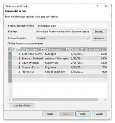
As you can observe, there is a preview of your data table. Click Finish.
Power Pivot creates the data table in the Data Model.
Loading from the Clipboard
Suppose, you have data in an application that is not recognized by Power Pivot as a data source. To load this data into Power Pivot, you have two options −
-
Copy the data to an Excel file and use the Excel file as data source for Power Pivot.
-
Copy the data, so that it will be on the clipboard, and paste it into Power Pivot.
You have already learnt the first option in an earlier section. And this is preferable to the second option, as you will find at the end of this section. However, you should know how to copy data from clipboard into Power Pivot.
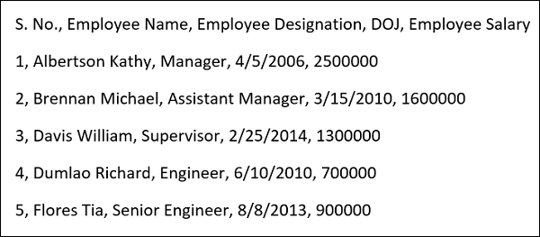
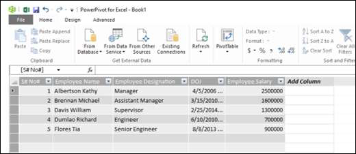
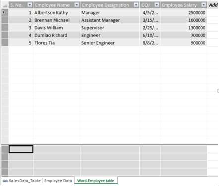
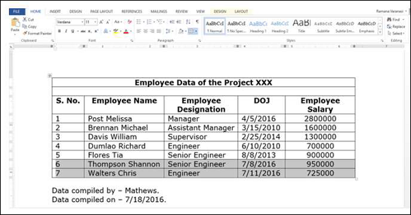
Suppose you have data in a word document as follows −
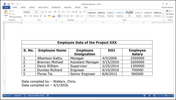
Word is not a data source for Power Pivot. Therefore, perform the following −
-
Select the table in the Word document.
-
Copy and Paste it in the PowerPivot window.
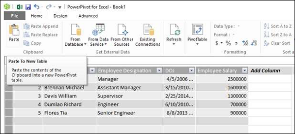
The Paste Preview dialog box appears.
-
Give the name as Word-Employee table.
-
Check the box Use first row as column headers and click OK.
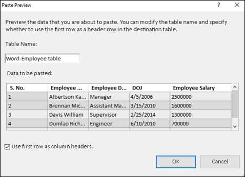
The data copied into the clipboard will be pasted into a new data table in Power Pivot, with the tab − Word-Employee table.
Suppose, you want to replace this table with new content.
-
Copy the table from Word.
-
Click Paste Replace.
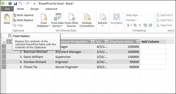
The Paste Preview dialog box appears. Verify the contents that you are using for replace.
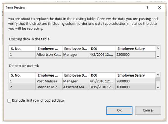
Click OK.
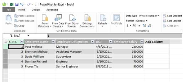
As you can observe, the contents of the data table in Power Pivot are replaced by the contents in the clipboard.
Suppose you want to add two new rows of data to a data table. In the table in the Word document, you have the two news rows.
-
Select the two new rows.
-
Click Copy.
-
Click Paste Append in the Power Pivot window. The Paste Preview dialog box appears.
-
Verify the contents that you are using to append.
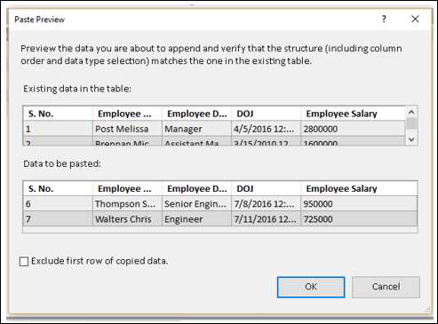
Click OK to proceed.
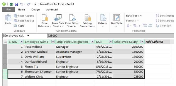
As you can observe, the contents of the data table in Power Pivot are appended with the contents in the clipboard.
In the beginning of this section, we have said that copying data to an excel file and using linked table is better than copying from clipboard.
This is because of the following reasons −
-
If you use linked table, you know the source of the data. On the other hand, you will not know the source of the data later or if it is used by a different person.
-
You have tracking information in the Word file, such as when the data is replaced and when the data is appended. However, there is no way of copying that information to Power Pivot. If you copy the data first to an excel file, you can preserve that information for later use.
-
While copying from clipboard, if you want to add some comments, you cannot do so. If you copy to Excel file first, you can insert comments in your Excel table that will be linked to the Power Pivot.
-
There is no way to refresh the data copied from clipboard. If the data is from a linked table, you can always ensure that the data is updated.
Refreshing Data in Power Pivot
You can refresh the data imported from the external data sources at any point of time.
If you want to refresh only one data table in the Power Pivot, do the following −
-
Click the tab of the data table.
-
Click Refresh.
-
Select Refresh from the dropdown list.
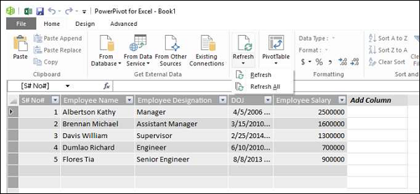
If you want to refresh all the data tables in the Power Pivot, do the following −
-
Click the Refresh button.
-
Select Refresh All from the dropdown list.
Excel Power Pivot — Data Model
A Data Model is a new approach introduced in Excel 2013 for integrating data from multiple tables, effectively building a relational data source inside an Excel workbook. Within Excel, Data Model is used transparently, providing tabular data used in PivotTables and PivotCharts. In Excel, you can access the tables and their corresponding values through the PivotTable / PivotChart Field lists that contain the table names and corresponding fields.
The main use of Data Model in Excel is its usage by Power Pivot. Data Model can be considered as the Power Pivot database, and all the power features of Power Pivot are managed with the Data Model. All data operations with Power Pivot are explicit in nature and can be visualized in the Data Model.
In this chapter, you will understand the Data Model in detail.
Excel and Data Model
There will be only one Data Model in an Excel workbook. When you work with Excel, Data Model usage is implicit. You cannot directly access the Data Model. You can only see the multiple tables in the Data Model in the Fields list of PivotTable or PivotChart and use them. Creating the Data Model and adding data is also done implicitly in Excel, while you are getting external data into Excel.
If you want to look at the Data Model, you can do so as follows −
-
Click the POWERPIVOT tab on the Ribbon.
-
Click Manage.
Data Model, if exists in the workbook, will be displayed as tables, each one with a tab.
Note − If you add an Excel table to Data Model, you will not transform the Excel table into a data table. A copy of the Excel table is added as a data table in the Data Model and a link is created between the two. Hence, if changes are done in the Excel table, the data table also is updated. However, from the storage point of view, there are two tables.
Power Pivot and Data Model
Data Model is inherently the database for Power Pivot. Even when you create the Data Model from Excel, it builds the Power Pivot database only. Creating the Data Model and/or adding data is done explicitly in Power Pivot.
In fact, you can manage the Data Model from Power Pivot window. You can add data to Data Model, import data from different data sources, view the Data Model, create relationships between the tables, create calculated fields and calculated columns, etc.
Creating a Data Model
You can either add tables to the Data Model from Excel or you can directly import data into Power Pivot, thus creating the Power Pivot Data Model tables. You can view the Data Model by clicking Manage in the Power Pivot window.
You will understand how to add tables from Excel to the Data Model in the chapter – Loading Data through Excel. You will understand how to load data into Data Model in the chapter – Loading Data into Power Pivot.
Tables in Data Model
Tables in Data Model can be defined as a set of tables holding relationships across them. The relationships enable combining related data from different tables for analysis and reporting purposes.
The tables in the Data Model are called Data Tables.
A table in the Data Model is considered as a set of records (a record is a row) made up of fields (a field is a column). You cannot edit individual items in a data table. However, you can append rows or add calculated columns to the data table.
Excel Tables and Data Tables
Excel tables are just a collection of separate tables. There can be multiple tables on a worksheet. Each table can be accessed separately, but it is not possible to access data from more than one Excel table at the same time. This is the reason that when you create a PivotTable, it is based on only one table. If you need to use the data from two Excel tables collectively, you need to first merge them into a single Excel table.
A data table on the other hand coexists with other data tables with relationships, facilitating the combination of data from multiple tables. Data tables get created when you import data into Power Pivot. You can also add Excel tables to the Data Model while you are creating a Pivot Table getting external data or from multiple tables.
The data tables in the Data Model can be viewed in two ways −
-
Data View.
-
Diagram View.
Data View of Data Model
In the data view of the Data Model, each data table exists on a separate tab. The data table rows are the records and columns represent the fields. The tabs contain the table names and the column headers are the fields in that table. You can do calculations in the data view using the Data Analysis Expressions (DAX) language.
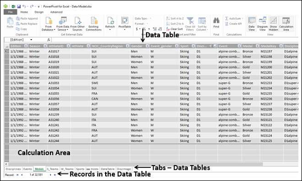
Diagram View of Data Model
In the diagram view of the Data Model, all the data tables are represented by boxes with the table names and contain the fields in the table. You can arrange the tables in the diagram view by just dragging them. You can adjust the size of a data table so that all the fields in the table are displayed.
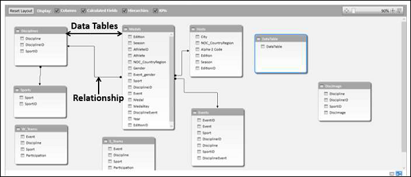
Relationships in Data Model
You can view the relationships in the diagram view. If two tables have a relationship defined between them, an arrow connecting the source table to the target table appears. If you want to know which fields are used in the relationship, just double click the arrow. The arrow and the two fields in the two tables are highlighted.
Table relationships will be created automatically if you import related tables that have primary and foreign key relationships. Excel can use the imported relationship information as the basis for table relationships in the Data Model.
You can also explicitly create relationships in either of the two views −
-
Data View − Using Create Relationship dialog box.
-
Diagram View − By clicking and dragging to connect the two tables.
Create Relationship Dialog Box
In a relationship, four entities are involved −
-
Table − The data table from which the relationship starts.
-
Column − The field in the Table that is also present in the related table.
-
Related Table − The data table where the relationship ends.
-
Related Column − The field in the related table that is same as the field represented by Column in Table. Note that the values of Related Column should be unique.
In the diagram view, you can create the relationship by clicking on the field in the table and dragging to the related table.
You will learn more about relationships in the chapter — Managing Data Tables and Relationships with Power Pivot.
Excel Power Pivot — Managing Data Model
The major use of Power Pivot is its ability to manage the data tables and the relationships among them, to facilitate analysis of the data from several tables. You can add an excel table to the Data Model while you are creating a PivotTable or directly from the PowerPivot Ribbon.
You can analyze data from across multiple tables only when relationships exist among them. With Power Pivot, you can create relationships from the Data View or Diagram View. Moreover, if you had chosen to add a table to the Power Pivot, you need to add a relationship as well.
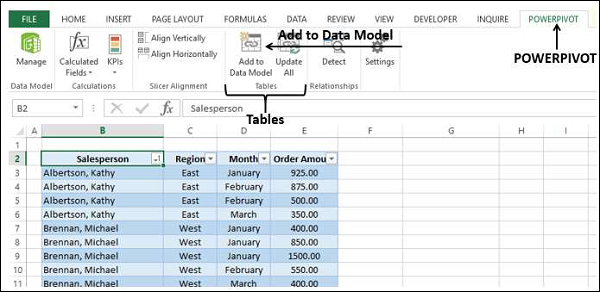
Adding Excel Tables to Data Model with PivotTable
When you create a PivotTable in Excel, it is based only on a single table / range. In case you want to add more tables to the PivotTable, you can do so with the Data Model.
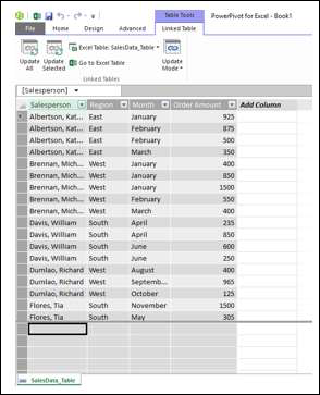
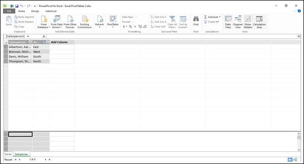
Suppose you have two worksheets in your workbook −
-
One containing the data of salespersons and the regions they represent, in a table- Salesperson.
-
Another containing the data of sales, region and month wise, in a table – Sales.

You can summarize the sales – salesperson-wise as given below.
-
Click the table – Sales.
-
Click the INSERT tab on the Ribbon.
-
Select PivotTable in the Tables group.
An empty PivotTable with the fields from the Sales table – Region, Month and Order Amount will be created. As you can observe, there is a MORE TABLES command below the PivotTable Fields list.
-
Click on MORE TABLES.
The Create a New PivotTable message box appears. The message displayed is- To use multiple tables in your analysis, a new PivotTable needs to be created using the Data Model. Click Yes
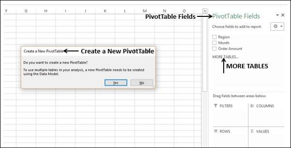
A New PivotTable will be created as shown below −
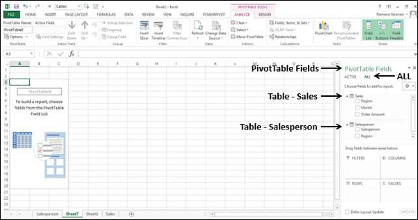
Under PivotTable Fields, you can observe that there are two tabs – ACTIVE and ALL.
-
Click the ALL tab.
-
Two tables- Sales and Salesperson, with the corresponding fields appear in the PivotTable Fields list.
-
Click the field Salesperson in the Salesperson table and drag it to ROWS area.
-
Click the field Month in the Sales table and drag it to ROWS area.
-
Click the field Order Amount in the Sales table and drag it to ∑ VALUES area.
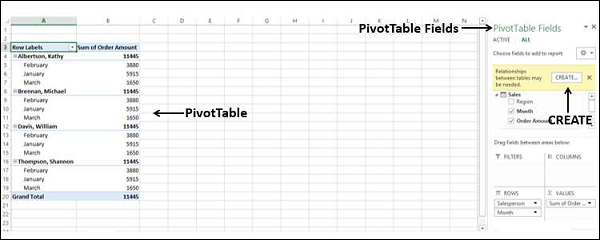
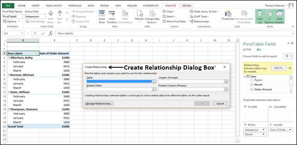
The PivotTable is created. A message appears in the PivotTable Fields – Relationships between tables may be needed.
Click the CREATE button next to the message. The Create Relationship dialog box appears.
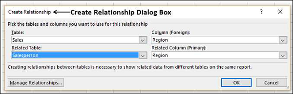
-
Under Table, select Sales.
-
Under Column (Foreign) box, select Region.
-
Under Related Table, select Salesperson.
-
Under Related Column (Primary) box, select Region.
-
Click OK.
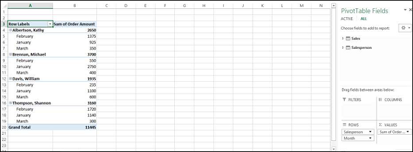
Your PivotTable from the two tables on two worksheets is ready.
Further, as Excel stated while adding the second table to the PivotTable, the PivotTable got created with Data Model. To verify, do the following −
-
Click the POWERPIVOT tab on the Ribbon.
-
Click Manage in the Data Model group. The Data View of the Power Pivot appears.
You can observe that the two Excel tables that you used in creating the PivotTable are converted to data tables in the Data Model.
Adding Excel Tables from a Different Workbook to Data Model
Suppose the two tables – Salesperson and Sales are in two different workbooks.
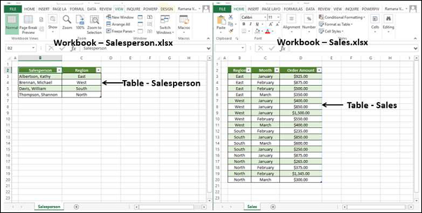
You can add the Excel table from a different workbook to the Data Model as follows −
-
Click the Sales table.
-
Click the INSERT tab.
-
Click PivotTable in the Tables group. The Create PivotTable dialog box appears.
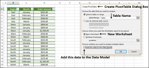
-
In the Table/Range box, type Sales.
-
Click on New Worksheet.
-
Check the box Add this data to the Data Model.
-
Click OK.
You will get an empty PivotTable on a new worksheet with only the fields corresponding to the Sales table.
You have added the Sales table data to the Data Model. Next, you have to get the Salesperson table data also into Data Model as follows −
-
Click on the worksheet containing Sales table.
-
Click the DATA tab on the Ribbon.
-
Click Existing Connections in the Get External Data group. The Existing Connections dialog box appears.
-
Click on the Tables tab.
Under This Workbook Data Model, 1 table is displayed (This is the Sales table that you added earlier). You also find the two workbooks displaying the tables in them.
-
Click Salesperson under Salesperson.xlsx.
-
Click Open. The Import Data dialog box appears.
-
Click on PivotTable Report.
-
Click on New worksheet.
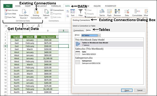
You can see that the box – Add this data to the Data Model is checked and inactive. Click OK.
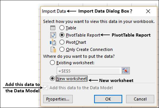
The PivotTable will be created.
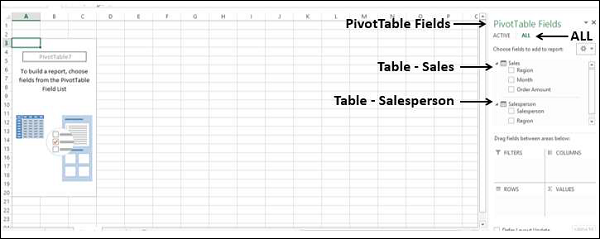
As you can observe the two tables are in the Data Model. You might have to create a relationship between the two tables as in the previous section.
Adding Excel Tables to Data Model from the PowerPivot Ribbon
Another way of adding Excel tables to Data Model is doing so from the PowerPivot Ribbon.
Suppose you have two worksheets in your workbook −
-
One containing the data of salespersons and the regions they represent, in a table – Salesperson.
-
Another containing the data of sales, region and month wise, in a table – Sales.
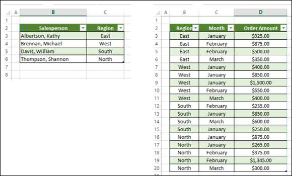
You can add these Excel tables to the Data Model first, before doing any analysis.
-
Click on the Excel table — Sales.
-
Click the POWERPIVOT tab on the Ribbon.
-
Click Add to Data Model in the Tables group.
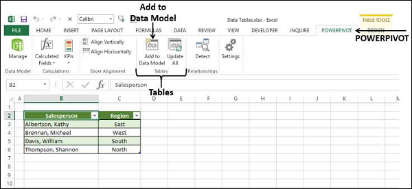
Power Pivot window appears, with the data table Salesperson added to it. Further a tab – Linked Table appears on the Ribbon in the Power Pivot window.
-
Click on the Linked Table tab on the Ribbon.
-
Click on Excel Table: Salesperson.
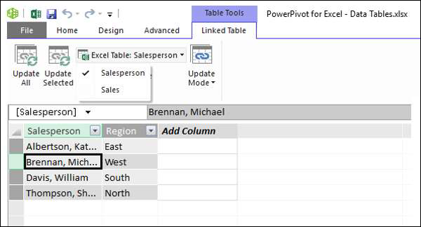
You can find that the names of the two tables present in your workbook are displayed and the name Salesperson is ticked. This means the data table Salesperson is linked to the Excel table Salesperson.
Click Go to Excel Table.
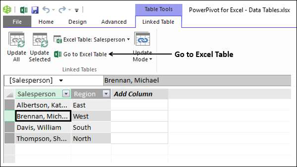
Excel window with worksheet containing Salesperson table appears.
-
Click the Sales worksheet tab.
-
Click the Sales table.
-
Click Add to Data Model in the Tables group on the Ribbon.
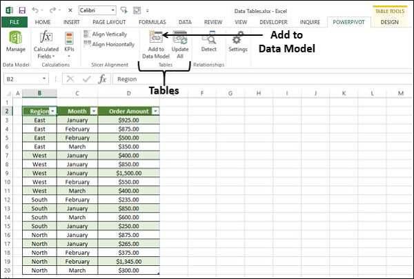
The Excel table Sales is also added to the Data Model.
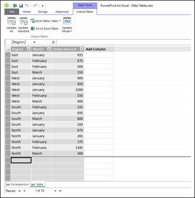
If you want to do analysis based on these two tables, as you are aware, you need to create a relationship between the two data tables. In Power Pivot, you can do this in two ways −
-
From Data View
-
From Diagram View
Creating Relationships from Data View
As you know that in Data View, you can view the data tables with records as rows and fields as columns.
-
Click on the Design tab in the Power Pivot window.
-
Click on Create Relationship in the Relationships group. The Create Relationship dialog box appears.
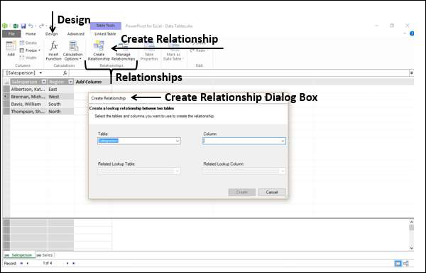
-
Click on Sales in the Table box. This is the table from where the relationship starts. As you are aware, Column should be the field that is present in the related table Salesperson that contains unique values.
-
Click on Region in the Column box.
-
Click on Salesperson in the Related Linked Table box.
The Related Linked Column gets automatically populated with Region.
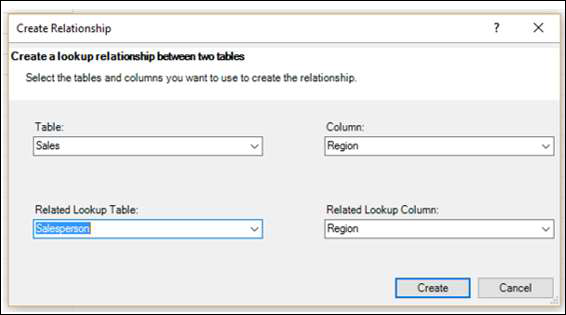
Click the Create button. The relationship is created.
Creating Relationships from Diagram View
Creating Relationships from Diagram View is relatively easier. Follow the given steps.
-
Click the Home tab in the Power Pivot window.
-
Click Diagram View in the View group.
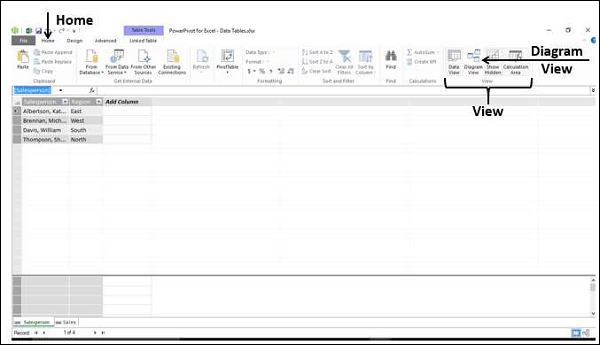
The Diagram View of the Data Model appears in the Power Pivot window.
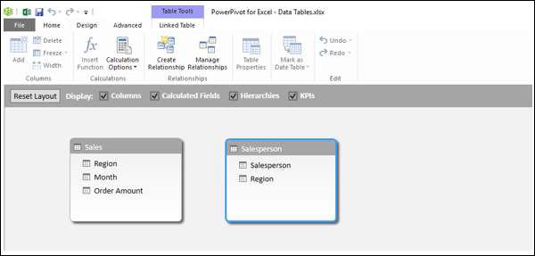
-
Click on Region in Sales table. Region in Sales table is highlighted.
-
Drag to Region in Salesperson table. Region in Salesperson table is also highlighted. A line appears in the direction you dragged.
-
A line appears from the table Sales to the table Salesperson indicating the relationship.
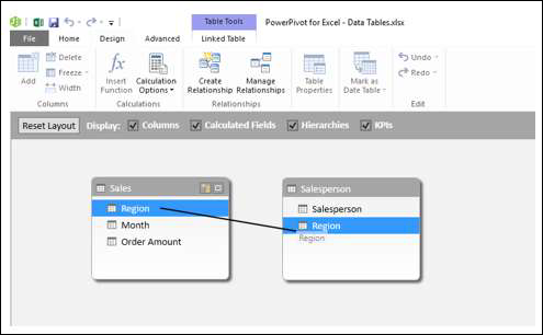
As you can see, a line appears from the Sales table to the Salesperson table, indicating the relationship and the direction.
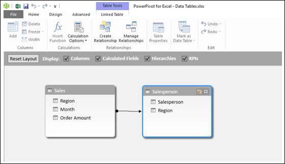
If you want to know the field that is a part of a relationship, click on the relationship line. The line and the field in both the tables are highlighted.
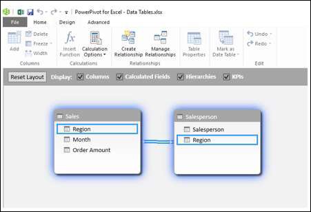
Managing Relationships
You can edit or delete an existing relationship in Data Model.
-
Click the Design tab in the Power Pivot window.
-
Click Manage Relationships in the Relationships group. The Manage Relationships dialog box appears.
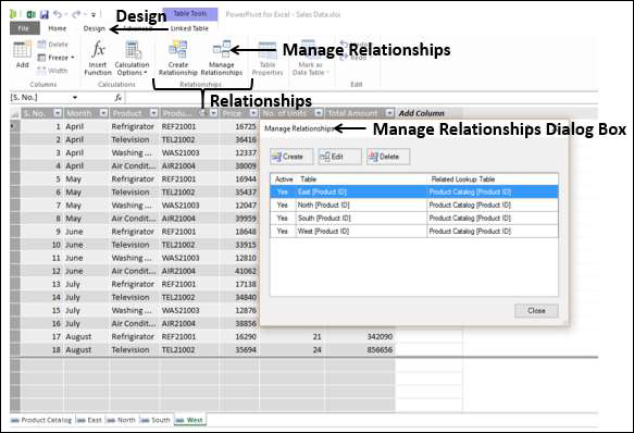
All the relationships that exist in the Data Model are displayed.
To edit a relationship
-
Click on a Relationship.
-
Click the Edit button. The Edit Relationship dialog box appears.
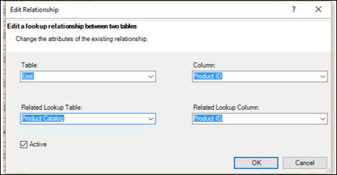
-
Make the required changes in the relationship.
-
Click OK. The changes get reflected in the relationship.
To delete a relationship
-
Click on a Relationship.
-
Click on the Delete button. A warning message appears showing how the tables that are affected by deleting the relationship would affect the reports.
-
Click OK if you are sure you want to delete. The selected relationship is deleted.
Refreshing Power Pivot Data
Suppose you modify the data in the Excel table. You can add / change / delete the data in the Excel table.
To refresh the PowerPivot data, do the following −
-
Click the Linked Table tab in the Power Pivot window.
-
Click Update All.
The data table is updated with the modifications made in the Excel table.
As you can observe, you cannot modify data in the data tables directly. Hence, it is better to maintain your data in Excel tables that are linked to the data tables when you add them to the Data Model. This facilitates updating the data in data tables as and when you update the data in Excel tables.
Excel Power PivotTable — Creation
Power PivotTable is based on the Power Pivot database, which is called the Data Model. You have already learnt the powerful features of the Data Model. The power of Power Pivot is in its ability to summarize data from the Data Model in the Power PivotTable. As you are aware, the Data Model can handle huge data spanning millions of rows and coming from diverse inputs. This enables Power PivotTable to summarize the data from anywhere in a matter of few minutes.
Power PivotTable resembles PivotTable in its layout, with the following differences −
-
PivotTable is based on Excel tables, whereas Power PivotTable is based on data tables that are part of Data Model.
-
PivotTable is based on a single Excel table or data range, whereas Power PivotTable can be based on multiple data tables, provided they are added to Data Model.
-
PivotTable is created from Excel window, whereas Power PivotTable is created from PowerPivot window.
Creating a Power PivotTable
Suppose you have two data tables − Salesperson and Sales in the Data Model. To create a PowerPivot Table from these two data tables, proceed as follows −
-
Click the Home tab on the Ribbon in PowerPivot window.
-
Click PivotTable on the Ribbon.
-
Select PivotTable from the dropdown list.
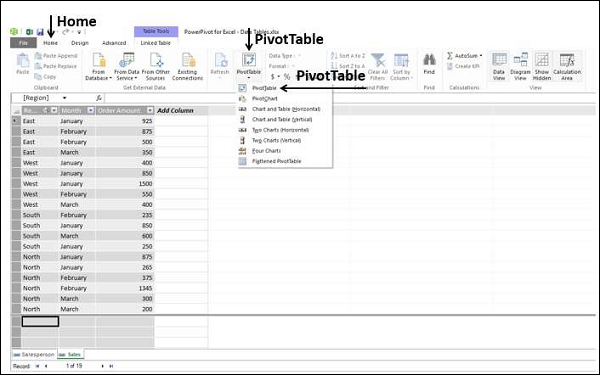
Create PivotTable dialog box appears. As you can observe, this is a simple dialog box, without any queries on data. This is because, Power PivotTable is always based on Data Model, i.e. the data tables with the relationships defined among them.
Select New Worksheet and click OK.
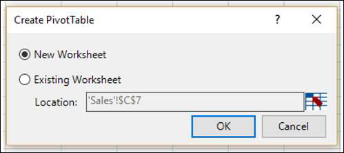
A new worksheet is created in Excel window and an empty PivotTable appears.
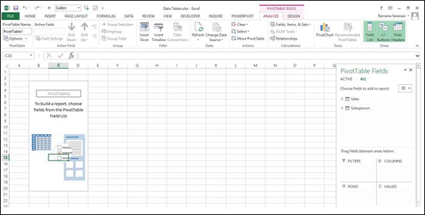
As you can observe, the layout of the Power PivotTable is similar to that of PivotTable. The PIVOTTABLE TOOLS appear on the Ribbon, with ANALYZE and DESIGN tabs, identical to PivotTable.
The PivotTable Fields List appears on the right side of the worksheet. Here, you will find some differences from PivotTable.
Power PivotTable Fields
The PivotTable Fields list has two tabs − ACTIVE and ALL that appear below the title and above the fields list. The ALL tab is highlighted.
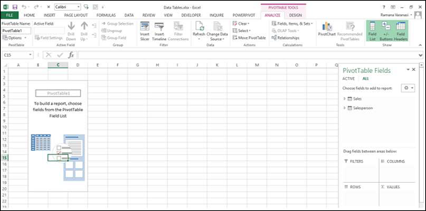
Note that the ALL tab displays all the data tables in the Data Model and ACTIVE tab displays all the data tables that are chosen for the Power PivotTable at hand. As the Power PivotTable is empty, it means that no data table is selected yet; hence by default, ALL tab is selected and the two tables that are currently in the Data Model are displayed. At this point, if you click the ACTIVE tab, the Fields list would be empty.
-
Click on the table names in the PivotTable Fields list under ALL. The corresponding fields with check boxes will appear.
-
Each table name will have the symbol
 on the left side.
 -
If you place the cursor on this symbol, the Data Source and the Model Table Name of that data table will be displayed.
 on the left side.
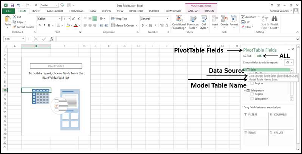
-
Drag Salesperson from Salesperson table to the ROWS area.
-
Click the ACTIVE tab.
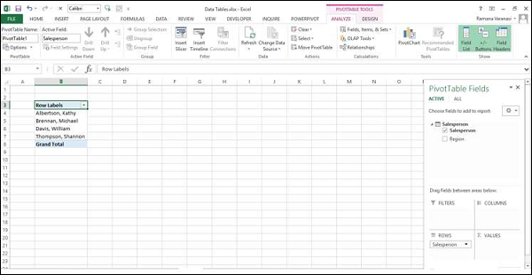
As you can observe, the field Salesperson appears in the PivotTable and the table Salesperson appears under the ACTIVE tab as expected.
-
Click the ALL tab.
-
Click on Month and Order Amount in the Sales table.
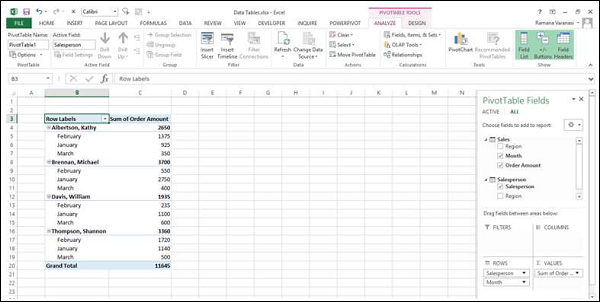
Again, click the ACTIVE tab. Both the tables − Sales and Salesperson appear under the ACTIVE tab.
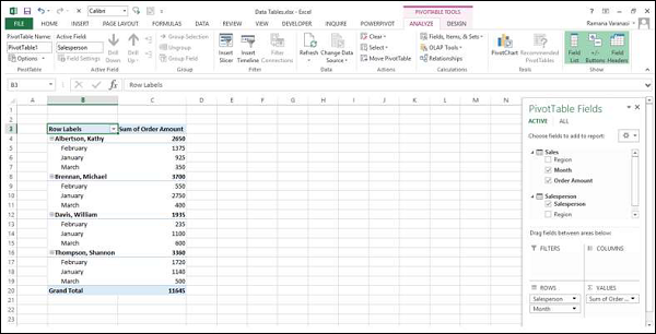
-
Drag Month to COLUMNS area.
-
Drag Region to FILTERS area.
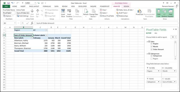
-
Click the arrow next to ALL in the Region filter box.
-
Click Select Multiple Items.
-
Select North and South and click OK.
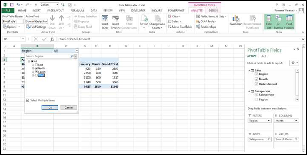
Sort the column labels in the ascending order.
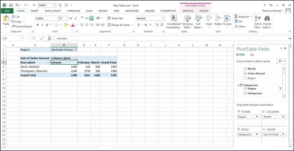
Power PivotTable can be modified dynamically explore and report data.
Excel Power Pivot — Basics of DAX
DAX (Data Analysis eXpression) language is the language of Power Pivot. DAX is used by Power Pivot for data modeling and it is convenient for you to use for self-service BI. DAX is based on data tables and columns in data tables. Note that it is not based on individual cells in the table as is the case with the formulas and functions in Excel.
You will learn the two simple calculations that exist in Data Model − Calculated Column and Calculated Field in this chapter.
Calculated Column
Calculated column is a column in the Data Model that is defined by a calculation and that extends the content of a data table. It can be visualized as a new column in an Excel table defined by a formula.
Extending the Data Model using Calculated Columns
Suppose you have sales data of products region-wise in data tables and also a Product Catalog in the Data Model.
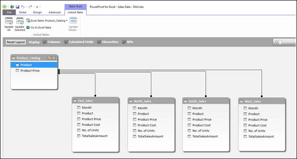
Create a Power PivotTable with this data.
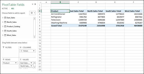
As you can observe, the Power PivotTable has summarized the sales data from all the regions. Suppose you want to know the gross profit made on each of the products. You know the price of each product, the cost at which it is sold and the number of units sold.
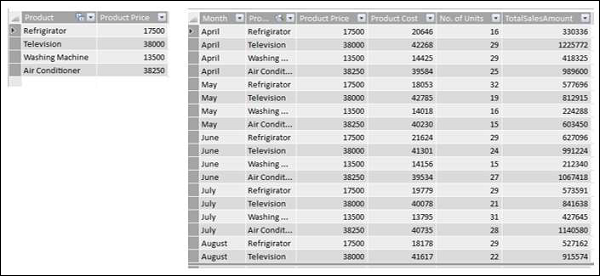
However, if you need to calculate the gross profit, you need to have two more columns in each of the data tables of the regions − Total Product Price and Gross Profit. This is because, PivotTable requires columns in data tables to summarize the results.
As you know, Total Product Price is Product Price * No. of Units and Gross Profit is Total Amount − Total Product Price.
You need to use DAX Expressions to add the Calculated Columns as follows −
-
Click the East_Sales tab in Data View of the Power Pivot window to view the East_Sales Data Table.
-
Click the Design tab on the Ribbon.
-
Click Add.
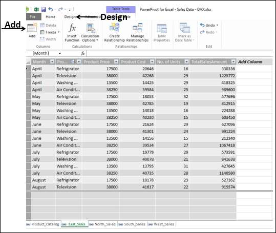
The column on the right side with the header − Add Column is highlighted.
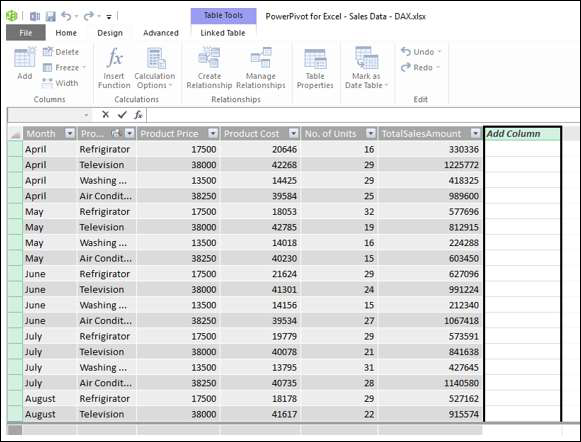
Type = [Product Price] * [No. of Units] in the formula bar and press Enter.
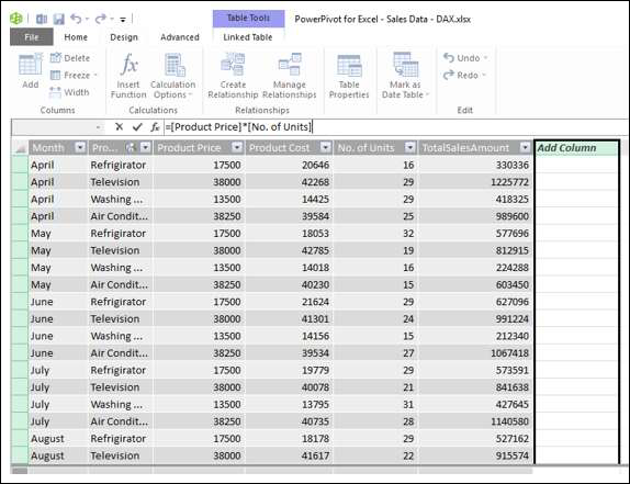
A new column with header CalculatedColumn1 is inserted with the values calculated by the formula you entered.
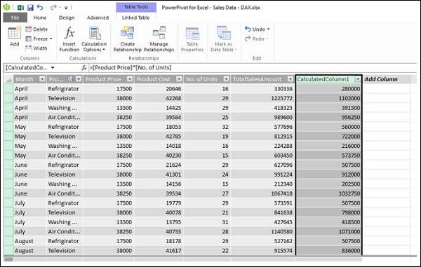
-
Double click the header of the new calculated column.
-
Rename the header as TotalProductPrice.
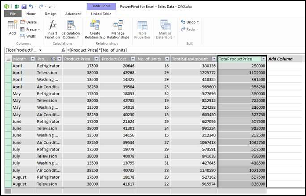
Add one more calculated column for Gross Profit as follows −
-
Click the Design tab on the Ribbon.
-
Click Add.
-
The column on the right side with the header − Add Column is highlighted.
-
Type = [TotalSalesAmount] − [TotaProductPrice] in the formula bar.
-
Press Enter.
A new column with header CalculatedColumn1 is inserted with the values calculated by the formula you entered.
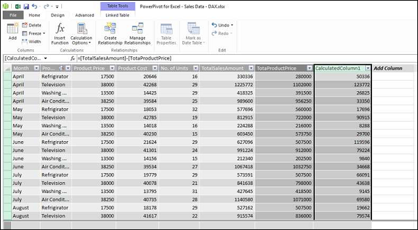
-
Double click the header of the new calculated column.
-
Rename the header as Gross Profit.
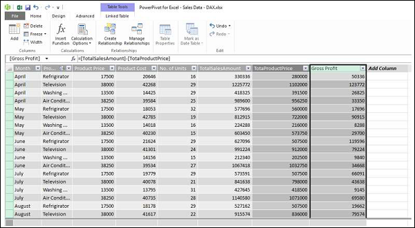
Add the Calculated Columns in the North_Sales data table in a similar way. Consolidating all the steps, proceed as follows −
-
Click the Design tab on the Ribbon.
-
Click Add. The column on the right side with the header − Add Column is highlighted.
-
Type = [Product Price] * [No. of Units] in the formula bar and press Enter.
-
A new column with header CalculatedColumn1 gets inserted with the values calculated by the formula you entered.
-
Double click the header of the new calculated column.
-
Rename the header as TotalProductPrice.
-
Click the Design tab on the Ribbon.
-
Click Add. The column on the right side with the header — Add Column is highlighted.
-
Type = [TotalSalesAmount] − [TotaProductPrice] in the formula bar and press Enter. A new column with header CalculatedColumn1 gets inserted with the values calculated by the formula you entered.
-
Double click the header of the new calculated column.
-
Rename the header as Gross Profit.
Repeat the above given steps for the South Sales data table and West Sales data table.
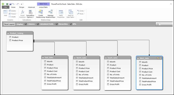
You have the necessary columns to summarize the Gross Profit. Now, create the Power PivotTable.
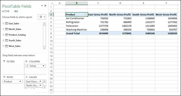
You are able to summarize the Gross Profit that became possible with the calculated columns in the Power Pivot and it all can be done just in a few steps that are error-free.
You can summarize it region wise for the products as given below also −
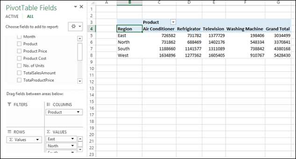
Calculated Field
Suppose you want to calculate the percentage of profit made by each region product-wise. You can do so by adding a calculated field to the Data Table.
-
Click below the column Gross Profit in the East_Sales table in Power Pivot window.
-
Type EastProfit: = SUM ([Gross Profit]) / sum ([TotalSalesAmount]) in the formula bar.
-
Press Enter.
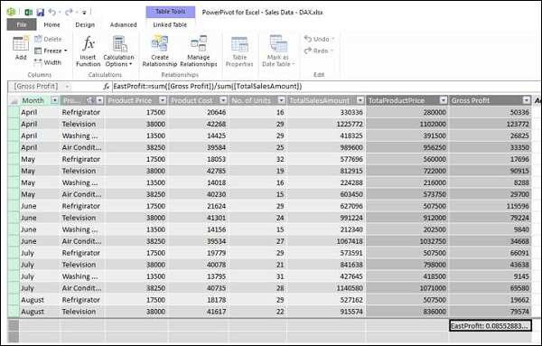
The calculated field EastProfit is inserted below the Gross Profit column.
-
Right click the calculated field − EastProfit.
-
Select Format from the dropdown list.
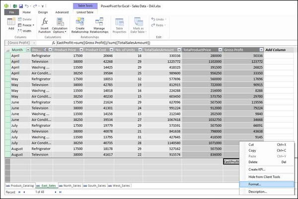
The Formatting dialog box appears.
-
Select Number under Category.
-
In the Format box, select Percentage and click OK.
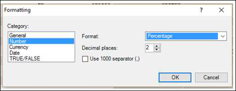
The calculated field EastProfit is formatted to percentage.
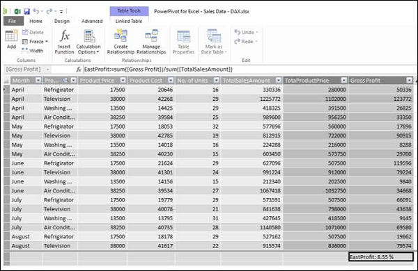
Repeat the steps to insert the following calculated fields −
-
NorthProfit in North_Sales data table.
-
SouthProfit in South_Sales data table.
-
WestProfit in West_Sales data table.
Note − You cannot define more than one calculated field with a given name.
Click on the Power PivotTable. You can see that the calculated fields appear in the tables.
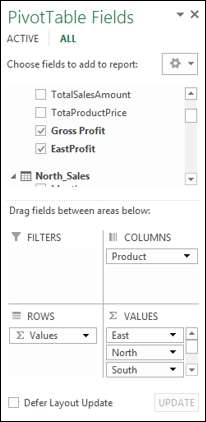
-
Select the fields − EastProfit, NorthProfit, SouthProfit and WestProfit from the tables in the PivotTable Fields list.
-
Arrange the fields such that the Gross Profit and Percentage Profit appear together. The Power PivotTable looks as follows −
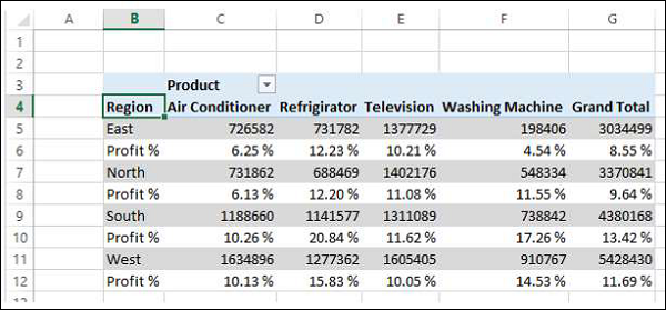
Note − The Calculate Fields were called Measures in earlier versions of Excel.
Excel Power Pivot — Exploring Data
In the previous chapter, you have learnt how to create a Power PivotTable from a normal set of data tables. In this chapter, you will learn how you can explore data with Power PivotTable, when the data tables contain thousands of rows.
For a better understanding, we will import the data from an access database, which you know is a relational database.
Loading Data from Access Database
To load data from the Access database, follow the given steps −
-
Open a new blank workbook in Excel.
-
Click Manage in the Data Model group.
-
Click the POWERPIVOT tab on the Ribbon.
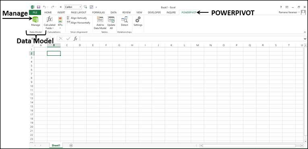
The Power Pivot window appears.
-
Click the Home tab in the Power Pivot window.
-
Click From Database in the Get External Data group.
-
Select From Access from the dropdown list.
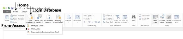
The Table Import Wizard appears.
-
Provide Friendly connection name.
-
Browse to the Access database file, Events.accdb, the Events database file.
-
Click on the Next > button.
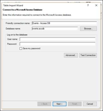
The Table Import wizard displays options for choosing how to import data.
Click Select from a list of tables and views to choose the data to import and click Next.
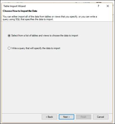
The Table Import Wizard displays all the tables in the Access database that you have selected. Check all the boxes to select all the tables and click Finish.
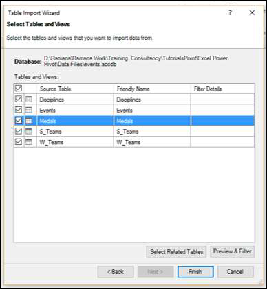
The Table Import Wizard displays – Importing and shows the status of the import. This may take a few minutes and you can stop the import by clicking the Stop Import button.
Once the data import is complete, Table Import Wizard displays – Success and shows the results of the import. Click Close.
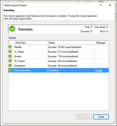
Power Pivot displays all the imported tables in different tabs in Data View.
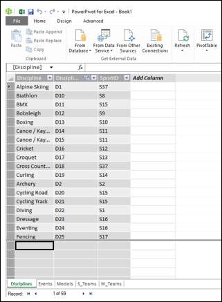
Click on the Diagram View.
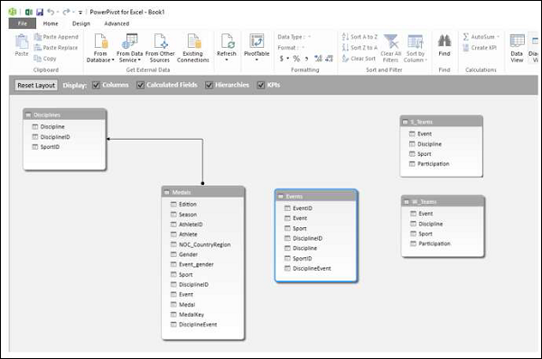
You can observe that a relationship exists between the tables – Disciplines and Medals. This is because, when you import data from a relational database such as Access, the relationships that exist in the database also are imported to the Data Model in Power Pivot.
Creating a PivotTable from the Data Model
Create a PivotTable with the tables that you have imported in the previous section as follows −
-
Click PivotTable on the Ribbon.
-
Select PivotTable from the drop down list.
-
Select New Worksheet in the Create PivotTable dialog box that appears and click OK.
An empty PivotTable is created in a new worksheet in the Excel window.
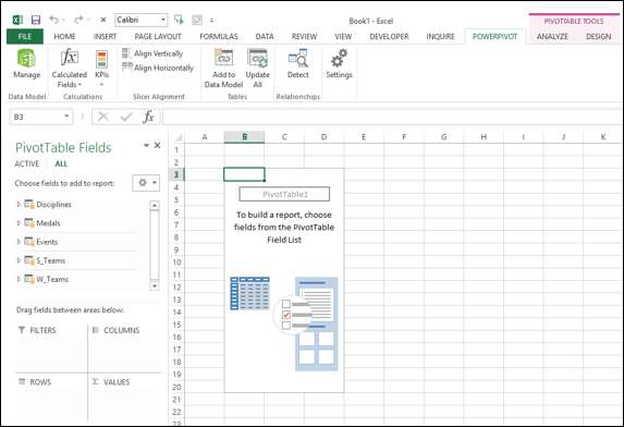
All the imported tables that are a part of Power Pivot Data Model appear in the PivotTable Fields list.
-
Drag the NOC_CountryRegion field in the Medals table to the COLUMNS area.
-
Drag Discipline from the Disciplines table to the ROWS area.
-
Filter Discipline to display only five sports: Archery, Diving, Fencing, Figure Skating, and Speed Skating. This can be done either in PivotTable Fields area, or from the Row Labels filter in the PivotTable itself.
-
Drag Medal from the Medals table to the VALUES area.
-
Select Medal from the Medals table again and drag it into the FILTERS area.
The PivotTable is populated with the added fields and in the chosen layout from the areas.
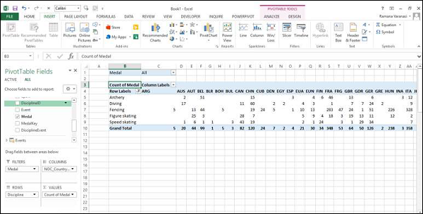
Exploring Data with PivotTable
You might want to display only those values with Medal Count > 80. To perform this, follow the given steps −
-
Click the arrow to the right of Column Labels.
-
Select Value Filters from the dropdown list.
-
Select Greater Than…. from the second dropdown list.
-
Click OK.
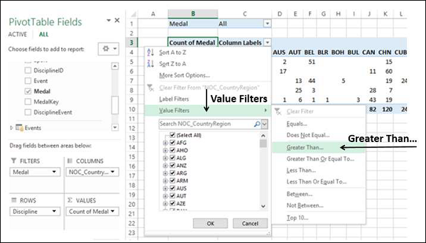
The Value Filter dialog box appears. Type 80 in the right-most box and click OK.
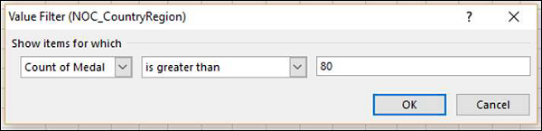
The PivotTable displays only those regions with total number of medals more than 80.
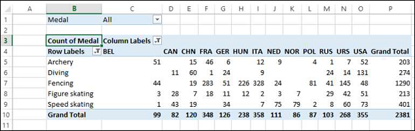
You could arrive at the specific report that you wanted from the different tables in just few steps. This became possible because of the pre-existing relationships among the tables in the Access database. As you imported all the tables from the database together at the same time, Power Pivot recreated the relationships in its Data Model.
Summarizing Data from Different Sources in Power Pivot
If you get the data tables from different sources or if you do not import the tables from a database at the same time, or if you create new Excel tables in your workbook and add them to the Data Model, you have to create the relationships among the tables that you want to use for your analysis and summarization in the PivotTable.
-
Create a new worksheet in the workbook.
-
Create an Excel table – Sports.
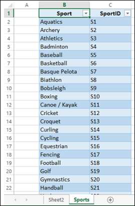
Add Sports table to Data Model.
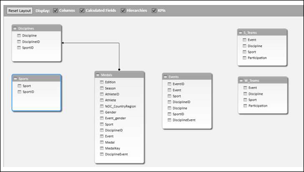
Create a relationship between the tables Disciplines and Sports with the field SportID.
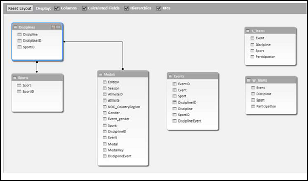
Add the field Sport to the PivotTable.
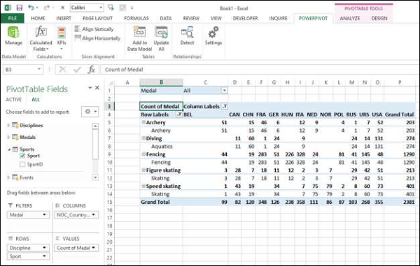
Shuffle the fields — Discipline and Sport in the ROWS area.
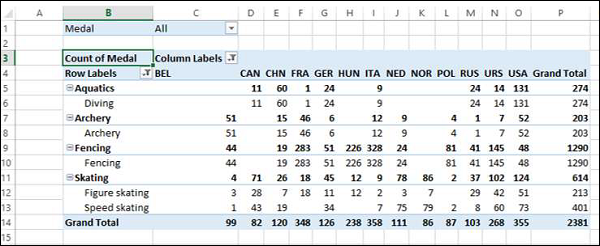
Extending Data Exploration
You can get the table Events also into further data exploration.
Create a relationship between the tables- Events and Medals with the field DisciplineEvent.
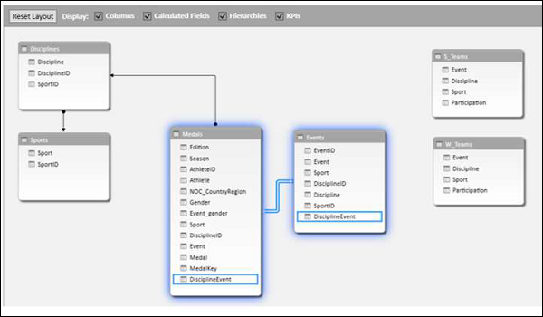
Add a table Hosts to the workbook and Data Model.
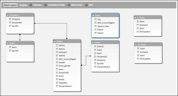
Extending the Data Model using Calculated Columns
To connect Hosts table to any of the other tables, it should have a field with values that uniquely identify each row in the Hosts table. As no such field exists in the Host table, you can create a calculated column in the Hosts table so that it contains unique values.
-
Go to the Hosts table in Data View of the PowerPivot window.
-
Click the Design tab on the Ribbon.
-
Click Add.
The right-most column with the header Add Column is highlighted.
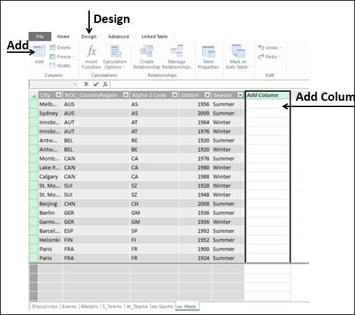
-
Type the following DAX formula in the formula bar = CONCATENATE ([Edition], [Season])
-
Press Enter.
A new column is created with the header CalculatedColumn1 and the column is filled by the values resulting from the above DAX formula.
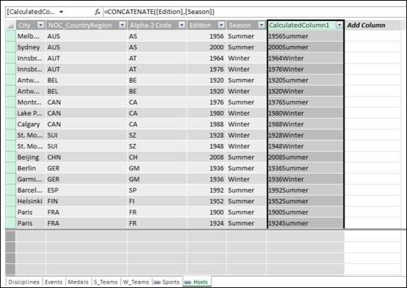
Right-click on the new column and select Rename Column from the dropdown list.
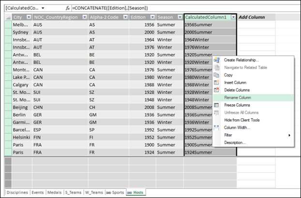
Type EditionID in the header of the new column.
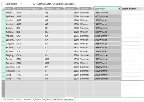
As you can see, the column EditionID has unique values in the Hosts table.
Creating a Relationship Using Calculated Columns
If you have to create a relationship between the Hosts table and the Medals table, the column EditionID should exist in the Medals table also. Create a calculated column in Medals table as follows −
-
Click on the Medals table in the Data View of Power Pivot.
-
Click the Design tab on the Ribbon.
-
Click Add.
Type the DAX formula in the formula bar = YEAR ([EDITION]) and press Enter.
Rename the new column that is created as Year and click Add.
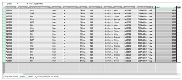
-
Type the following DAX formula in the formula bar = CONCATENATE ([Year], [Season])
-
Rename the new column that is created as EditionID.
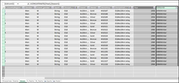
As you can observe, the EditionID column in the Medals table has identical values as the EditionID column in the Hosts table. Therefore, you can create a relationship between the tables – Medals and Sports with the EditionID field.
-
Switch to the diagram view in PowerPivot window.
-
Create a relationship between the tables- Medals and Hosts with the field that is obtained from the calculated column i.e. EditionID.
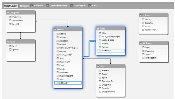
Now you can add fields from Hosts table to Power PivotTable.
Excel Power Pivot — Flattened
When the data has many levels, sometimes it becomes cumbersome to read the PivotTable report.
For example, consider the following Data Model.
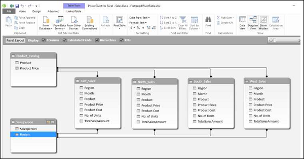
We will create a Power PivotTable and a Power Flattened PivotTable to get an understanding of the layouts.
Creating a PivotTable
You can create a Power PivotTable as follows −
-
Click the Home tab on the Ribbon in the PowerPivot window.
-
Click PivotTable.
-
Select PivotTable from the dropdown list.
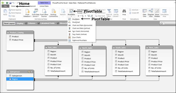
An empty PivotTable will be created.
-
Drag the fields − Salesperson, Region and Product from the PivotTable Fields list to the ROWS area.
-
Drag the field − TotalSalesAmount from the Tables − East, North, South and West to the ∑ VALUES area.
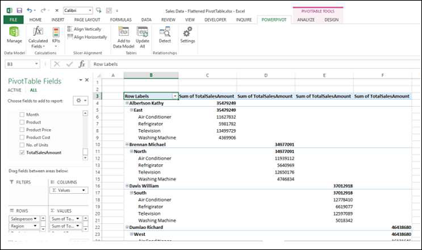
As you can see, it is a bit cumbersome read such a report. If the number of entries becomes more, the more difficult it will be.
Power Pivot provides a solution for a better representation of data with Flattened PivotTable.
Creating a Flattened PivotTable
You can create a Power Flattened PivotTable as follows −
-
Click the Home tab on the Ribbon in the PowerPivot window.
-
Click PivotTable.
-
Select Flattened PivotTable from the dropdown list.
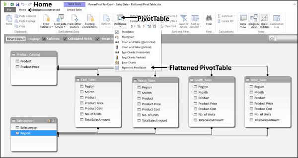
Create Flattened PivotTable dialog box appears. Select New Worksheet and click OK.
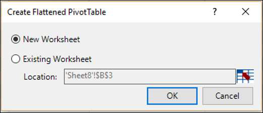
As you can observe the data is flattened out in this PivotTable.
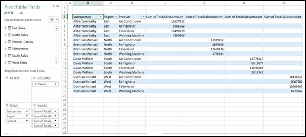
Note − In this case Salesperson, Region and Product are in ROWS area only as in the previous case. However, in the PivotTable layout, these three fields are appearing as three columns.
Exploring Data in Flattened PivotTable
Suppose you want to summarize the sales data for the product − Air Conditioner. You can do it in a simple way with the Flattened PivotTable as follows −
-
Click the arrow next to the column header − Product.
-
Check the box Air Conditioner and uncheck the other boxes. Click OK.
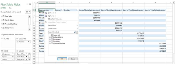
The Flattened PivotTable is filtered to the Air Conditioner sales data.
You can make it look more flattened by dragging ∑ VALUES to ROWS area from the COLUMNS area.
Rename the custom names of the summation values in the ∑ VALUES area to make them more meaningful as follows −
-
Click on a summation value, say, Sum of TotalSalesAmount for East.
-
Select Value Field Settings from the dropdown list.
-
Change the Custom Name to East TotalSalesAmount.
-
Repeat the steps for the other three summation values.
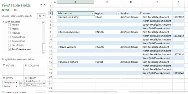
You can also summarize the number of units sold.
-
Drag No. of Units to the ∑ VALUES area from each of the tables − East_Sales, North_Sales, South_Sales and West_Sales.
-
Rename the values to East Total No. of Units, North Total No. of Units, South Total No. of Units and West Total No. of Units respectively.
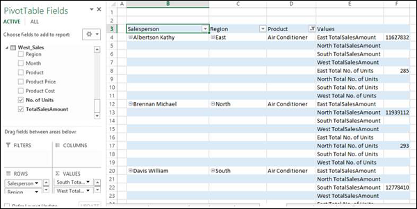
As you can observe, in both of the above tables, there are rows with empty values, as each salesperson represents a single region and each region is represented only by a single salesperson.
-
Select the rows with empty values.
-
Right click and click on Hide in the dropdown list.
All the rows with empty values will be hidden.
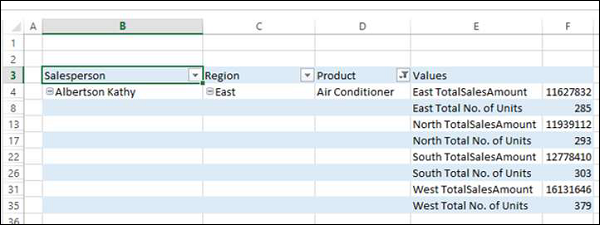
As you can observe, though the rows with empty values are not displayed, the information on the Salesperson also got hidden.
-
Click on the column header − Salesperson.
-
Click the ANALYZE tab on the Ribbon.
-
Click Field Settings. The Field Settings dialog box appears.
-
Click the Layout & Print tab.
-
Check the box — Repeat Item Labels.
-
Click OK.
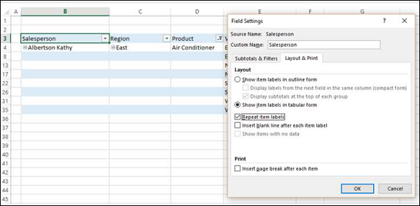
As you can observe, the Salesperson information is displayed and the rows with empty values are hidden. Further, the column Region in the report is redundant, as the values in the Values column are self-explanatory.
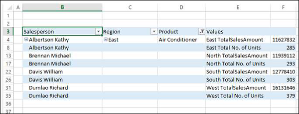
Drag the field Regions out of Area.
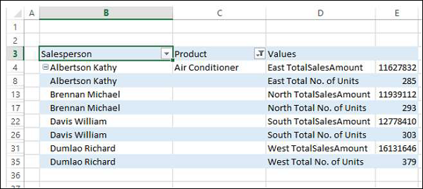
Reverse the order of the fields − Salesperson and Product in the ROWS area.
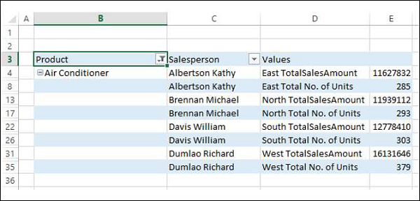
You have arrived at a concise report combining data from six tables in the Power Pivot.
Excel Power Pivot Charts — Creation
A PivotChart based on Data Model and created from the Power Pivot window is a Power PivotChart. Though it has some features similar to Excel PivotChart, there are other features that make it more powerful.
In this chapter, you will learn about Power PivotCharts. Henceforth we refer to them as PivotCharts, for simplicity.
Creating a PivotChart
Suppose you want to create a PivotChart based on the following Data Model.
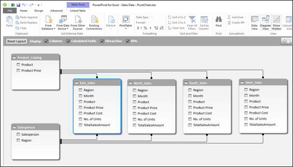
-
Click the Home tab on the Ribbon in Power Pivot window.
-
Click PivotTable.
-
Select PivotChart from the dropdown list.
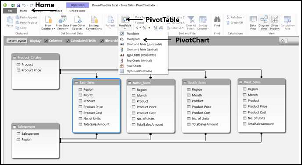
The Create PivotChart dialog box appears. Select New Worksheet and click OK.
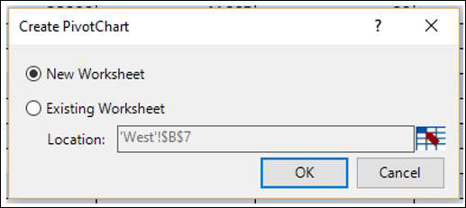
An empty PivotChart is created on a new worksheet in the Excel window.
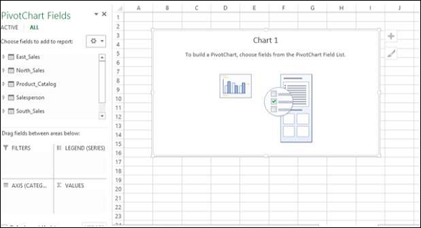
As you can observe, all the tables in the data model are displayed in the PivotChart Fields list.
-
Click on the Salesperson table in the PivotChart Fields list.
-
Drag the fields − Salesperson and Region to AXIS area.
Two field buttons for the two selected fields appear on the PivotChart. These are the Axis field buttons. The use of field buttons is to filter data that is displayed on the PivotChart.
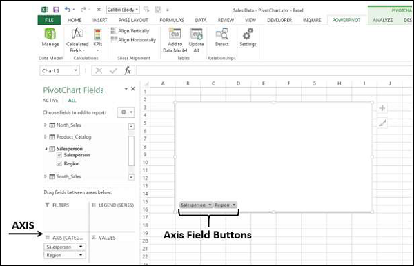
Drag TotalSalesAmount from each of the four tables– East_Sales, North_Sales, South_Sales and West_Sales to ∑ VALUES area.
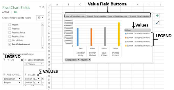
The following appear on the worksheet −
-
In the PivotChart, column chart is displayed by default.
-
In the LEGEND area, ∑ VALUES are added.
-
The Values appear in the Legend in the PivotChart, with title Values.
-
The Value Field Buttons appear on the PivotChart. You can remove the legend and the value field buttons for a tidier look of the PivotChart.
-
Click on the
button at the top right corner of the PivotChart. The Chart Elements dropdown list appears.
 button at the top right corner of the PivotChart. The Chart Elements dropdown list appears.
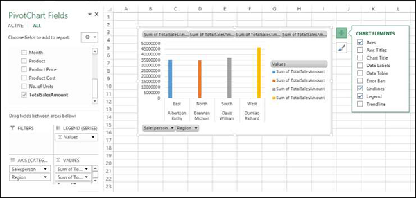
Uncheck the box Legend in the Chart Elements list. The Legend is removed from the PivotChart.
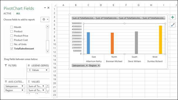
-
Right click on the value field buttons.
-
Select Hide Value Field Buttons on Chart from the dropdown list.
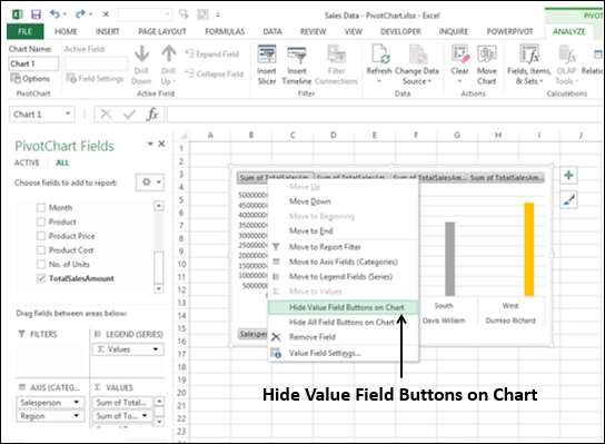
The value field buttons on the chart are removed.
Note − The display of field buttons and/or legend depends on the context of the PivotChart. You need to decide what is required to be displayed.
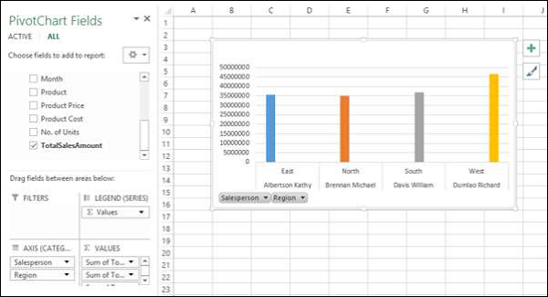
PivotChart Fields List
As in the case of Power PivotTable, Power PivotChart Fields list also contains two tabs – ACTIVE and ALL. Under the ALL tab, all the data tables in the Power Pivot Data Model are displayed. Under the ACTIVE tab, the tables from which the fields are added to PivotChart are displayed.
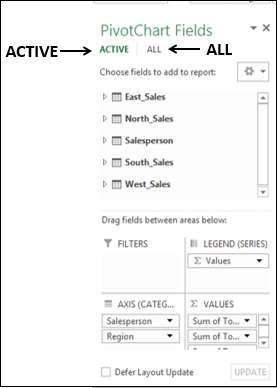
Likewise, the areas are as in the case of Excel PivotChart. There four areas are −
-
AXIS (Categories)
-
LEGEND (Series)
-
∑ VALUES
-
FILTERS
As you have seen in the previous section, Legend is populated with ∑ Values. Further, field buttons are added to the PivotChart for the ease of filtering the data that is being displayed.
Filters in PivotChart
You can use the Axis field buttons on the chart to filter the data being displayed. Click on the arrow on the Axis field button – Region.
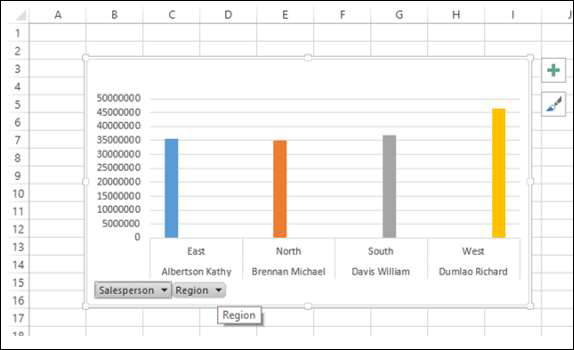
The dropdown list that appears looks as follows −
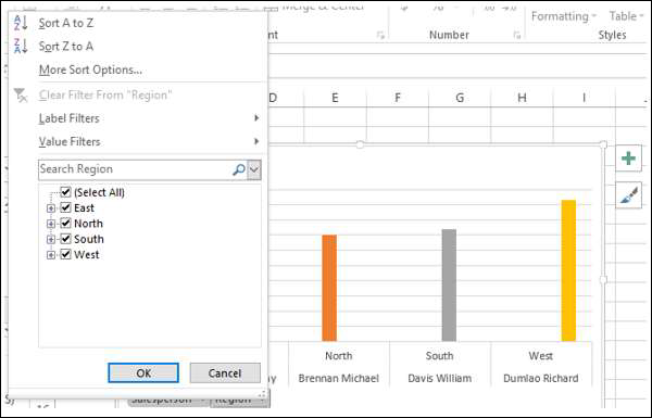
You can select the values that you want to display. Alternatively, you can place the field in FILTERS area for filtering the values.
Drag the field Region to FILTERS area. The Report Filter button — Region appears on the PivotChart.
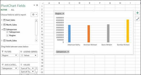
Click on the arrow on the Report Filter button − Region. The dropdown list that appears looks as follows −
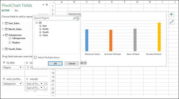
You can select the values that you want to display.
Slicers in PivotChart
Using Slicers is another option to filter data in the Power PivotChart.
-
Click the ANALYZE tab under PIVOTCHART tools on the Ribbon.
-
Click Insert Slicer in the Filter group. The Insert Slicer dialog box appears.
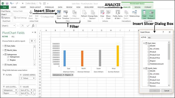
All the tables and the corresponding fields appear in the Insert Slicer dialog box.
Click the field Region in Salesperson table in the Insert Slicer dialog box.
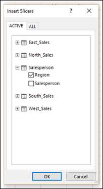
Slicer for the field Region appears on the worksheet.
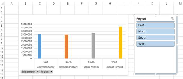
As you can observe, the Region field still exists as an Axis field. You can select the values that you want to display by clicking on the Slicer buttons.
Remember that you are able to do all these in a few minutes and also dynamically because of the Power Pivot Data Model and defined relationships.
PivotChart Tools
In Power PivotChart, the PIVOTCHART TOOLS has three tabs on the Ribbon as against two tabs in Excel PivotChart −
-
ANALYZE
-
DESIGN
-
FORMAT
The third tab − FORMAT is the additional tab in Power PivotChart.
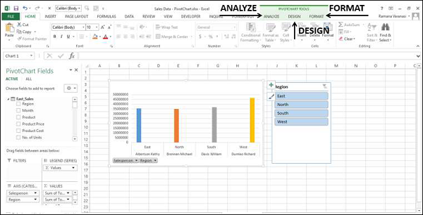
Click the FORMAT tab on the Ribbon.
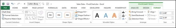
The options on the Ribbon under FORMAT tab are all for adding splendor to your PivotChart. You can use these options judiciously, without getting over bored.
Table and Chart Combinations
Power Pivot provides you with different combinations of Power PivotTable and Power PivotChart for data exploration, visualization, and reporting. You have learnt the PivotTables and PivotCharts in the previous chapters.
In this chapter, you will learn how to create the Table and Chart combinations from within the Power Pivot window.
Consider the following Data Model in Power Pivot that we will use for illustrations −
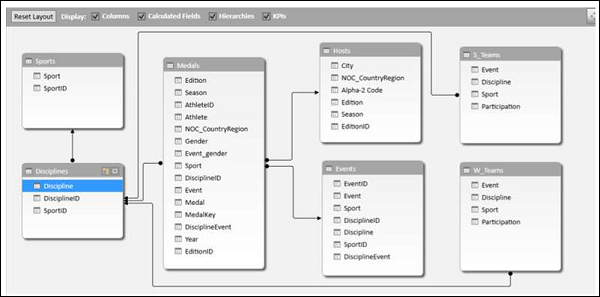
Chart and Table (Horizontal)
With this option, you can create a Power PivotChart and a Power PivotTable, one next another horizontally in the same worksheet.
-
Click the Home tab in Power Pivot window.
-
Click PivotTable.
-
Select Chart and Table (Horizontal) from the dropdown list.
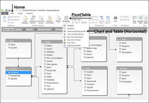
Create PivotChart and PivotTable (Horizontal) dialog box appears. Select New Worksheet and click OK.
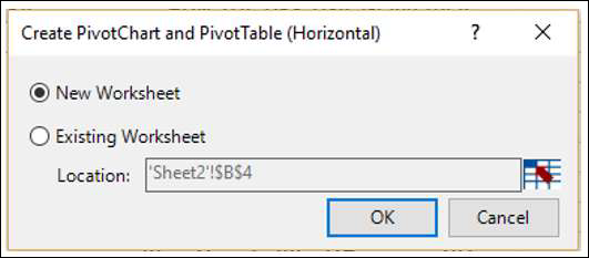
An empty PivotChart and an empty PivotTable appear on a new worksheet.
-
Click on the PivotChart.
-
Drag NOC_CountryRegion from Medals table to the AXIS area.
-
Drag Medal from Medals table to the ∑ VALUES area.
-
Right click on the Chart and select Change Chart Type from the dropdown list.
-
Select Area Chart.
-
Change the Chart Title to Total No. of Medals − Country Wise.
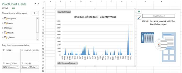
As you can see, USA has the highest number of Medals (> 4500).
-
Click on the PivotTable.
-
Drag Sport from the Sports table to the ROWS area.
-
Drag Medal from the Medals table to the ∑ VALUES area.
-
Drag NOC_CountryRegion from Medals table to FILTERS area.
-
Filter the NOC_CountryRegion field to the value USA.
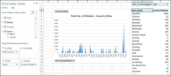
Change the PivotTable Report Layout to Outline Form.
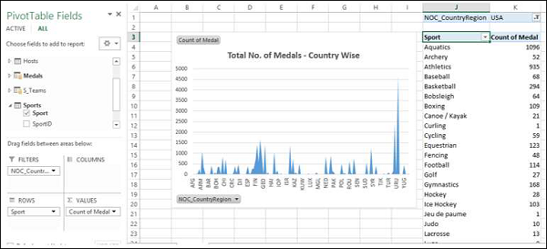
-
Deselect Sport from the Sports table.
-
Drag Gender from the Medals table to the ROWS area.
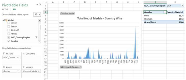
Chart and Table (Vertical)
With this option, you can create a Power PivotChart and a Power PivotTable, one below another vertically in the same worksheet.
-
Click the Home tab in Power Pivot window.
-
Click PivotTable.
-
Select Chart and Table (Vertical) from the dropdown list.
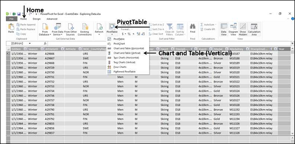
The Create PivotChart and PivotTable (Vertical) dialog box appears. Select New Worksheet and click OK.
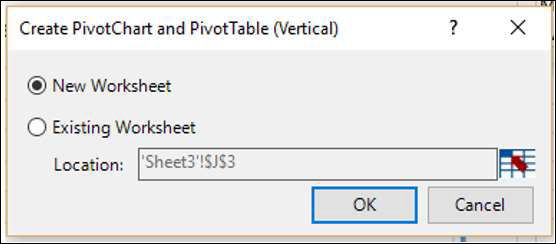
An empty PivotChart and an empty PivotTable appear vertically on a new worksheet.
-
Click on the PivotChart.
-
Drag Year from the Medals table to AXIS area.
-
Drag Medal from the Medals table to ∑ VALUES area.
-
Right click on the Chart and select Change Chart Type from the dropdown list.
-
Select Line Chart.
-
Check the box Data Labels in the Chart Elements.
-
Change the Chart Title to Total No. of Medals – Year Wise.
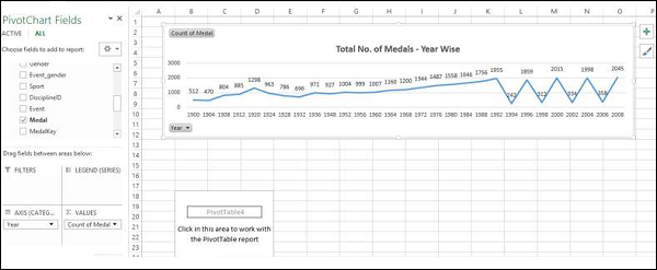
As you can observe, year 2008 has the highest number of Medals (2450).
-
Click on the PivotTable.
-
Drag Sport from the Sports table to the ROWS area.
-
Drag Gender from the Medals table to the ROWS area.
-
Drag Medal from the Medals table to the ∑ VALUES area.
-
Drag Year from the Medals table to the FILTERS area.
-
Filter the Year field to the value 2008.
-
Change the Report Layout of PivotTable to Outline Form.
-
Filter the field Sport with Value Filters to Greater than or equal to 80.
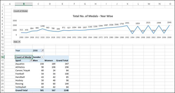
Excel Power Pivot — Hierarchies
A hierarchy in Data Model is a list of nested columns in a data table that are considered as a single item when used in a Power PivotTable. For example, if you have the columns − Country, State, City in a data table, a hierarchy can be defined to combine the three columns into one field.
In the Power PivotTable Fields list, the hierarchy appears as one field. So, you can add just one field to the PivotTable, instead of the three fields in the hierarchy. Further, it enables you to move up or down the nested levels in a meaningful way.
Consider the following Data Model for illustrations in this chapter.
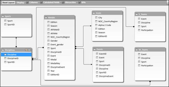
Creating a Hierarchy
You can create Hierarchies in the diagram view of the Data Model. Note that you can create a hierarchy based on a single data table only.
-
Click on the columns − Sport, DisciplineID and Event in the data table Medal in that order. Remember that the order is important to create a meaningful hierarchy.
-
Right-click on the selection.
-
Select Create Hierarchy from the dropdown list.
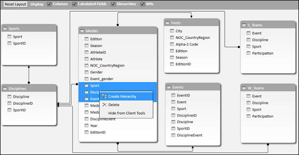
The hierarchy field with the three selected fields as the child levels gets created.
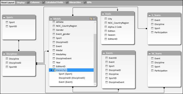
Renaming a Hierarchy
To rename the hierarchy field, do the following −
-
Right click on Hierarchy1.
-
Select Rename from the dropdown list.
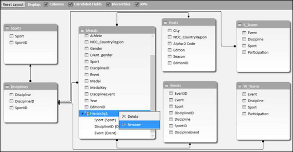
Type EventHierarchy.
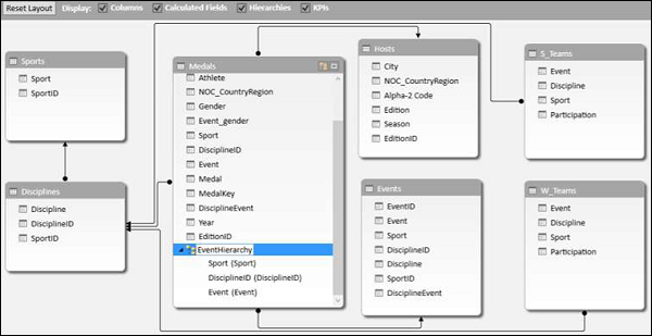
Creating a PivotTable with a Hierarchy in Data Model
You can create a Power PivotTable using the hierarchy that you created in the Data Model.
-
Click the PivotTable tab on the Ribbon in the Power Pivot window.
-
Click PivotTable on the Ribbon.
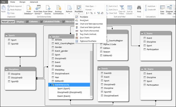
The Create PivotTable dialog box appears. Select New Worksheet and click OK.
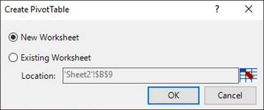
An empty PivotTable is created in a new worksheet.
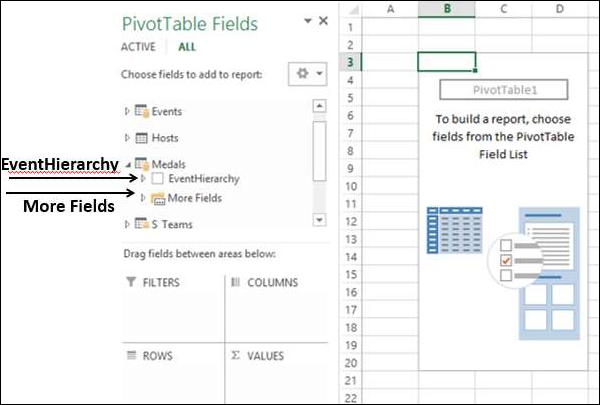
In the PivotTable Fields list, EventHierarchy appears as a field in Medals table. The other fields in the Medals table are collapsed and shown as More Fields.
-
Click on the arrow
in front of EventHierarchy. -
Click on the arrow
in front of More Fields.
The fields under EventHierarchy will be displayed. All the fields in the Medals table will be displayed under More Fields.
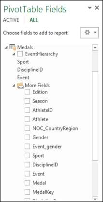
As you can observe, the three fields that you added to the hierarchy also appear under More Fields with check boxes. If you do not want them to appear in the PivotTable Fields list under More Fields, you have to hide the columns in the data table – Medals in data view in Power Pivot Window. You can always unhide them whenever you want.
Add fields to the PivotTable as follows −
-
Drag EventHierarchy to ROWS area.
-
Drag Medal to ∑ VALUES area.
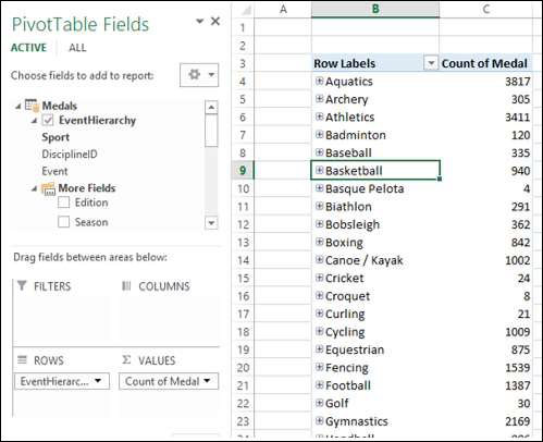
The values of Sport field appear in the PivotTable with a + sign in front of them. The medal count for each sport is displayed.
-
Click on the + sign before Aquatics. The DisciplineID field values under Aquatics will be displayed.
-
Click on the child D22 that appears. The Event field values under D22 will be displayed.
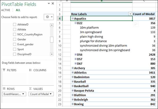
As you can observe, medal count is given for the Events, that get summed up at the parent level − DisciplineID, that get further summed up at the parent level − Sport.
Creating a Hierarchy based on Multiple Tables
Suppose you want to display the Disciplines in the PivotTable rather than DisciplineIDs to make it a more readable and understandable summarization. In order to do this, you need to have the field Discipline in Medals table that as you know is not. Discipline field is in Disciplines data table, but you cannot create a hierarchy with fields from more than one table. But, there is a way to obtain the required field from the other table.
As you are aware, the tables − Medals and Disciplines are related. You can add the field Discipline from Disciplines table to the Medals table, by creating a column using the relationship with DAX.
-
Click data view in Power Pivot window.
-
Click the Design tab on the Ribbon.
-
Click Add.
The column − Add Column on the right side of the table is highlighted.
Type = RELATED (Disciplines [Discipline]) in the formula bar. A new column − CalculatedColumn1 is created with the values as Discipline field values in the Disciplines table.
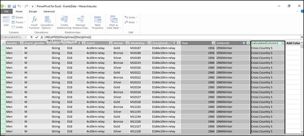
Rename the new column thus obtained in the Medals table as Discipline. Next, you have to remove DisciplineID from the Hierarchy and add Discipline, which you will learn in the following sections.
Removing a Child Level from a Hierarchy
As you can observe, the hierarchy is visible in the diagram view only, and not in the data view. Hence, you can edit a hierarchy in the diagram view only.
-
Click on the diagram view in the Power Pivot window.
-
Right click DisciplineID in EventHierarchy.
-
Select Remove from Hierarchy from the dropdown list.
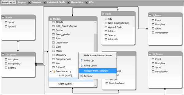
The Confirm dialog box appears. Click Remove from Hierarchy.

The field DisciplineID gets deleted from the hierarchy. Remember that you have removed the field from hierarchy, but the source field still exists in the data table.
Next, you need to add Discipline field to EventHierarchy.
Adding a Child Level to a Hierarchy
You can add the field Discipline to the existing hierarchy — EventHierarchy as follows −
-
Click on the field in Medals table.
-
Drag it to the Events field below in the EventHierarchy.
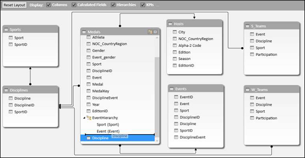
The Discipline field gets added to EventHierarchy.

As you can observe, the order of the fields in EventHierarchy is Sport–Event–Discipline. But, as you are aware it has to be Sport–Discipline-Event. Hence, you need to change the order of the fields.
Changing the Order of a Child Level in a Hierarchy
To move the field Discipline to the position after the field Sport, do the following −
-
Right click on the field Discipline in EventHierarchy.
-
Select Move Up from the dropdown list.
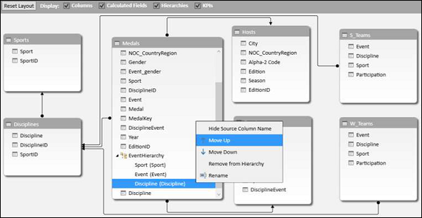
The order of the fields changes to Sport-Discipline-Event.
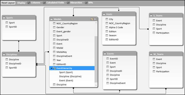
PivotTable with Changes in Hierarchy
To view the changes that you made in EventHierarchy in the PivotTable, you need not create a new PivotTable. You can view them in the existing PivotTable itself.
Click on the worksheet with the PivotTable in Excel window.
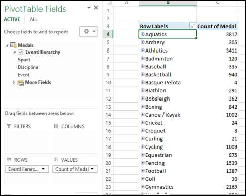
As you can observe, in the PivotTable Fields list, the child levels in the EventHierarchy reflect the changes you made in the Hierarchy in Data Model. The same changes also get reflected in the PivotTable accordingly.
Click the + sign in front of Aquatics in the PivotTable. The child levels appear as values of the field Discipline.
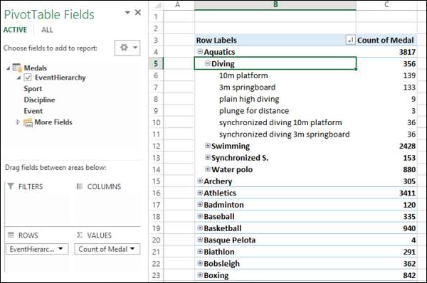
Hiding and Showing Hierarchies
You can choose to hide the Hierarchies and show them whenever you want.
-
Uncheck the box Hierarchies in the top menu of diagram view to hide the hierarchies.
-
Check the box Hierarchies to show the hierarchies.

Creating a Hierarchy in Other Ways
In addition to the way you created hierarchy in the previous sections, you can create a hierarchy in another two ways.
1. Click the Create Hierarchy button on the top right corner of the Medals data table in diagram view.
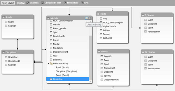
A new hierarchy gets created in the table without any fields in it.
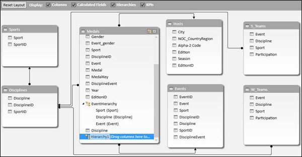
Drag the fields Year and Season, in that order to the new hierarchy. The hierarchy shows the child levels.
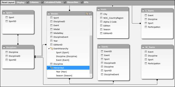
2. Another way of creating the same hierarchy is as follows −
-
Right click on the field Year in the Medals data table in diagram view.
-
Select Create Hierarchy from the dropdown list.
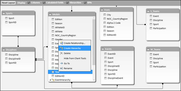
A new hierarchy is created in table with Year as a child field.
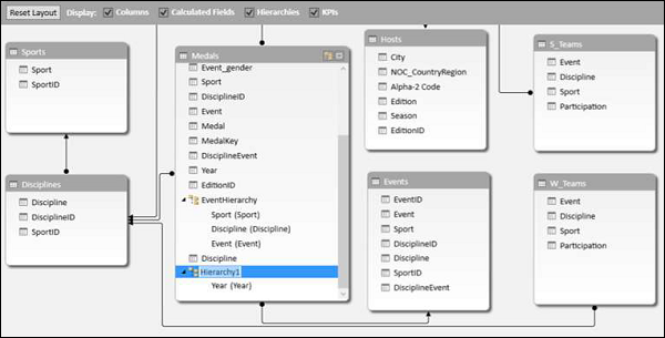
Drag the field season to the hierarchy. The hierarchy shows the child levels.

Deleting a Hierarchy
You can delete a hierarchy from the Data Model as follows −
-
Right click on the hierarchy.
-
Select Delete from the dropdown list.
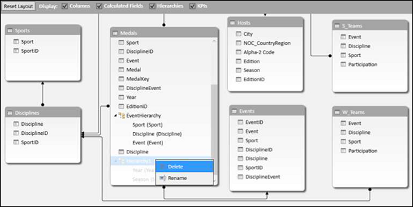
The Confirm dialog box appears. Click Delete from Model.
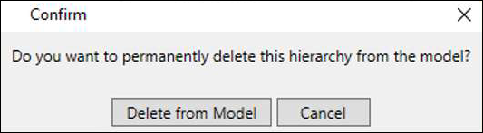
The hierarchy gets deleted.
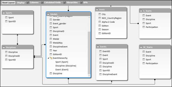
Calculations Using Hierarchy
You can create calculations using a hierarchy. In the EventsHierarchy, you can display the number of medals at a child level as a percentage of the number of medals at its parent level as follows −
-
Right click on a Count of Medal value of an Event.
-
Select Value Field Settings from the dropdown list.
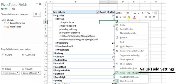
Value Field Settings dialog box appears.
-
Click the Show Values As tab.
-
Select % of Parent Row Total from the list and click OK.
The child levels are displayed as the percentage of the Parent Totals. You can verify this by summing up the percentage values of the child level of a parent. The sum would be 100%.
Drilling Up and Drilling Down a Hierarchy
You can quickly drill up and drill down across the levels in a hierarchy using Quick Explore tool.
-
Click on a value of Event field in the PivotTable.
-
Click the Quick Explore tool —
that appears at the bottom right corner of the cell containing the selected value.
The Explore box with Drill Up option appears. This is because from Event you can only drill up as there are no child levels under it.
Click Drill Up.
PivotTable data is drilled up to Discipline.
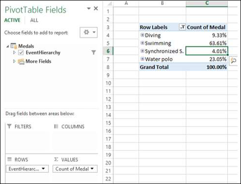
Click on the Quick Explore tool —  that appears at the bottom right corner of the cell containing a value.
Explore box appears with Drill Up and Drill Down options displayed. This is because from Discipline you can drill up to Sport or drill down to Event.
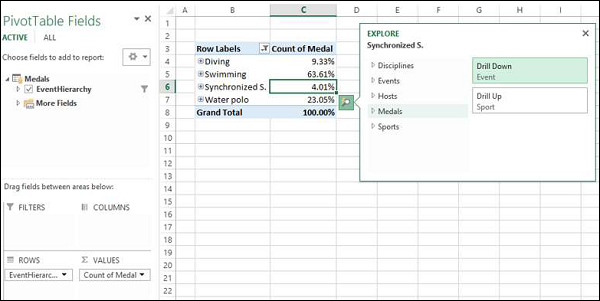
This way you can quickly move up and down the hierarchy.
Excel Power Pivot — Aesthetic Reports
You can create aesthetic reports of your data analysis with Power Pivot Data that is in Data Model.
The important features are −
-
You can use PivotCharts to produce visual reports of your data. You can use Report Layouts to structure your PivotTables to make them easily readable.
-
You can insert Slicers for filtering data in the report.
-
You can use a common Slicer for both the PivotChart and the PivotTable that are in the same report.
-
Once your final report is ready, you can choose to hide the Slicers form the display.
You will learn how to get reports with the options that are available in Power Pivot in this chapter.
Consider the following Data Model for illustrations in this chapter.
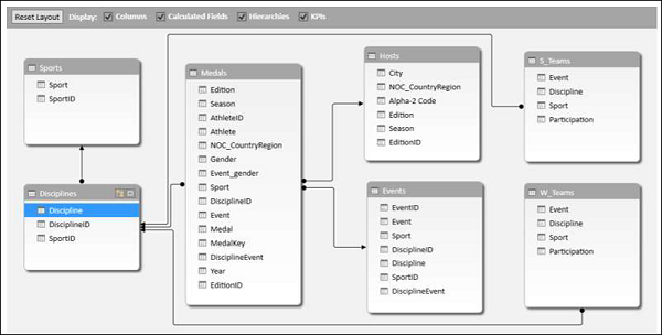
Reports based on Power PivotChart
Create a Power PivotChart as follows −
-
Click the Home tab on the Ribbon in PowerPivot window.
-
Click PivotTable.
-
Select PivotChart from the dropdown list.
-
Click New Worksheet in the Create PivotChart dialog box.
An empty PivotChart is created in a new worksheet in Excel window.
-
Drag Sport from Medals table to Axis area.
-
Drag Medal from Medals Table to ∑ VALUES area.
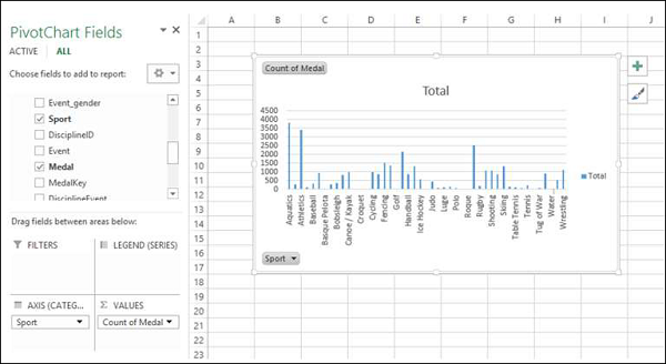
-
Click the ANALYZE tab in PIVOTTABLE TOOLS on the Ribbon.
-
Click Insert Slicer in the Filter Group. The Inset Slicers dialog box appears.
-
Click the field NOC_CountryRegion in the Medals table.
-
Click OK.
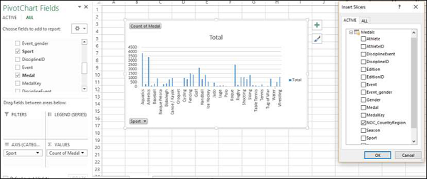
The Slicer NOC_CountryRegion appears.
-
Select USA.
-
Drag Gender from Medals table to GENDER area.
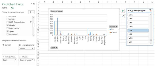
-
Right click on the PivotChart.
-
Select Change Chart Type from the dropdown list.
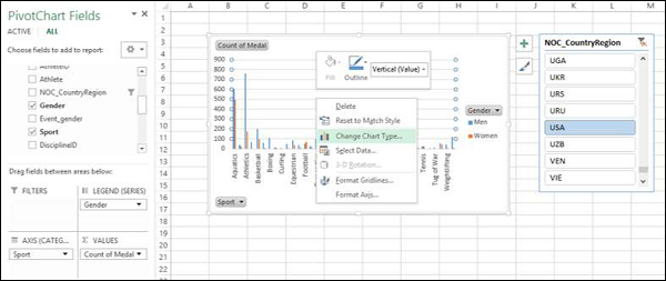
The Change Chart Type dialog box appears.
Click on Stacked Column.
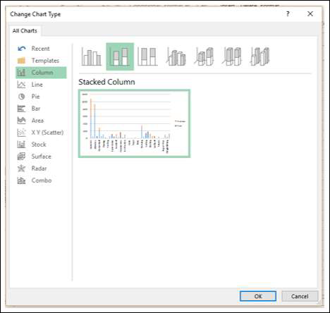
-
Insert Slicer for Sport field.
-
Drag Discipline from Disciplines table to AXIS area.
-
Remove the field Sport from AXIS area.
-
Select Aquatics in the Slicer – Sport.
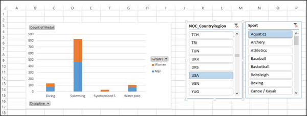
Report Layout
Create PivotTable as follows −
-
Click on Home tab on the Ribbon in PowerPivot window.
-
Click on PivotTable.
-
Click on PivotTable in the dropdown list. The Create PivotTable dialog box appears.
-
Click on New Worksheet and click Ok. An empty PivotTable gets created in a new worksheet.
-
Drag NOC_CountryRegion from Medals table to AXIS area.
-
Drag Sport from Medals table to COLUMNS area.
-
Drag Discipline from Disciplines table to COLUMNS area.
-
Drag Medal to ∑ VALUES area.
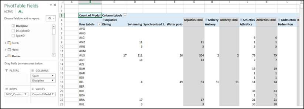
Click on the arrow button next to Column Labels and select Aquatics.
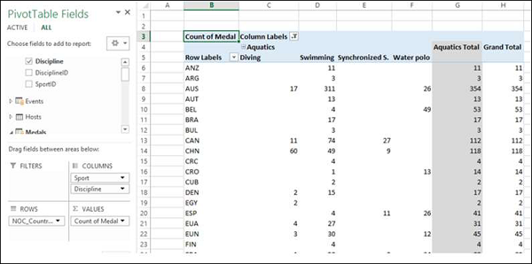
-
Click on the arrow button next to Row Labels.
-
Select Value Filters from the dropdown list.
-
Select Greater Than Or Equal To from the second dropdown list.
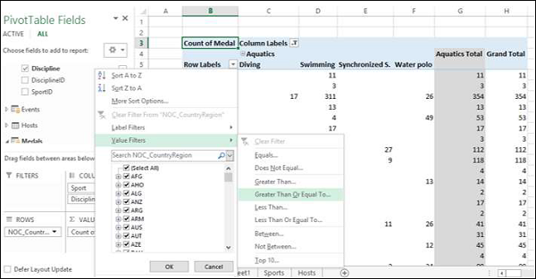
Type 80 in the box next to Count of Medal is greater than or equal to in the Value Filter dialog box.
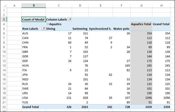
-
Click the DESIGN tab in PIVOTTABLE TOOLS on the Ribbon.
-
Click on Subtotals.
-
Select Do Not Show Subtotals fromn the dropdown list.
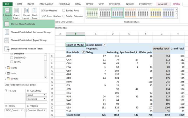
The Subtotals column – Aquatics Total gets removed.
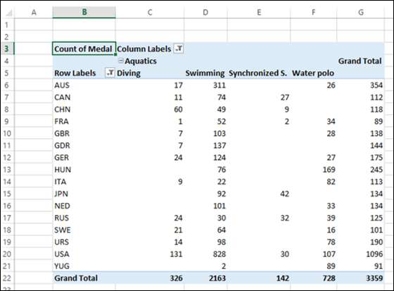
Click Report Layout and select Show in Outline Form from the dropdown list.
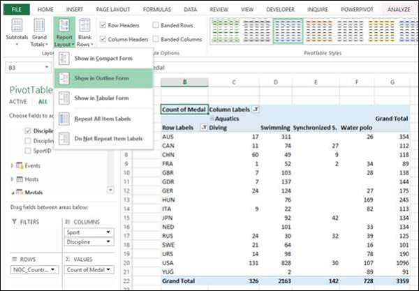
Check the box Banded Rows.
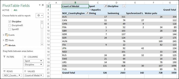
The field names appear in place of Row Labels and Column Labels and the report looks self-explanatory.
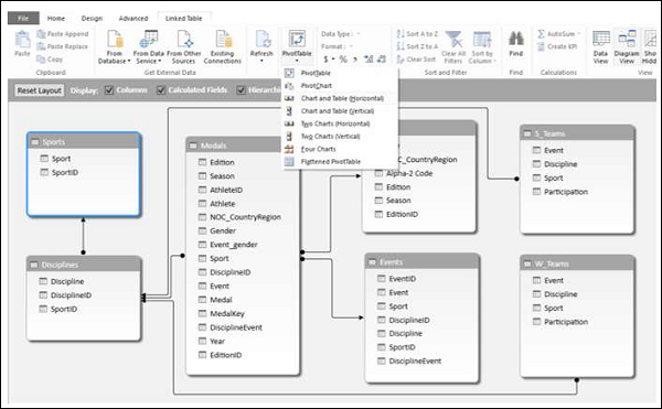
Using a Common Slicer
Create a PivotChart and PivotTable next to each other.
-
Click the Home tab on the Ribbon in PowerPivot tab.
-
Click PivotTable.
-
Select Chart and Table (Horizontal) from the dropdown list.
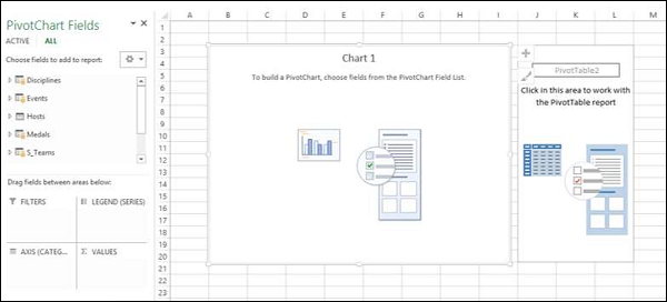
The Create PivotChart and PivotTable (Horizontal) dialog box appears.
Select New Worksheet and click OK. An Empty PivotChart and an empty PivotTable appear next to each other in a new worksheet.
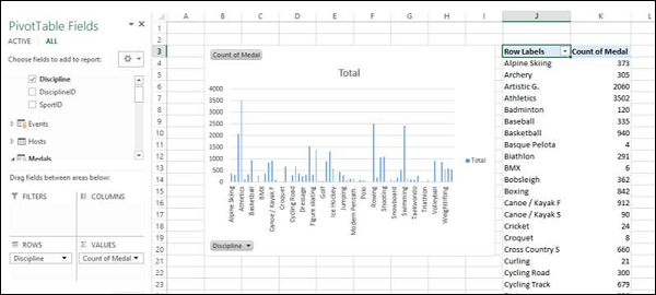
-
Click PivotChart.
-
Drag Discipline from Disciplines table to AXIS area.
-
Drag Medal from Medals table to ∑ VALUES area.
-
Click PivotTable.
-
Drag Discipline from Disciplines table to ROWS area.
-
Drag Medal from Medals table to ∑ VALUES area.
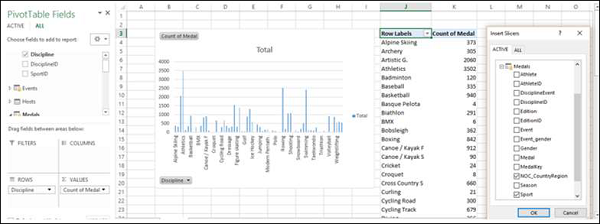
-
Click the ANALYZE tab in PIVOTTABLE TOOLS on the Ribbon.
-
Click Insert Slicer. The Insert Slicers dialog box appears.
-
Click on NOC_CountryRegion and Sport in Medals table.
-
Click OK.
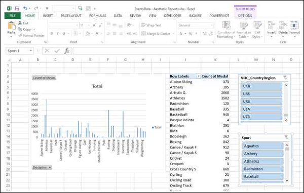
Two Slicers – NOC_CountryRegion and Sport appear. Arrange and size them to align properly next to the PivotTable.
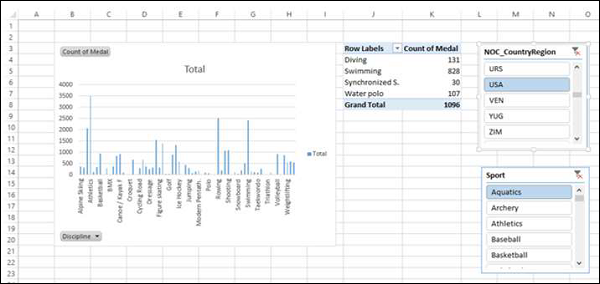
-
Select USA in the NOC_CountryRegion Slicer.
-
Select Aquatics in the Sport Slicer. The PivotTable is filtered to the selected values.
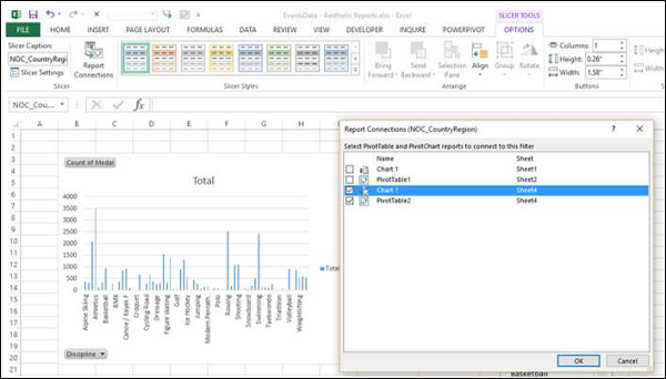
As you can observe, the PivotChart is not filtered. To filter PivotChart with the same filters, you need not insert Slicers again for PivotChart. You can use the same Slicers that you have used for the PivotTable.
-
Click on NOC_CountryRegion Slicer.
-
Click the OPTIONS tab in SLICER TOOLS on the Ribbon.
-
Click Report Connections in the Slicer group. The Report Connections dialog box appears for the NOC_CountryRegion Slicer.
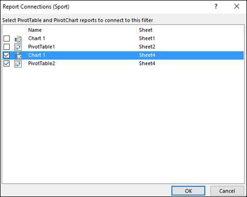
You can see that all the PivotTables and PivotCharts in the workbook are listed in the dialog box.
-
Click on the PivotChart that is in the same worksheet as the selected PivotTable and click OK.
-
Repeat for Sport Slicer.
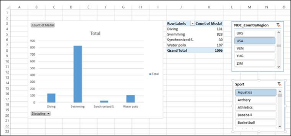
The PivotChart is also filtered to the values selected in the two Slicers.
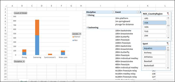
Next, you can add details to the PivotChart and PivotTable.
-
Click the PivotChart.
-
Drag Gender to LEGEND area.
-
Right click on the PivotChart.
-
Select Change Chart Type.
-
Select Stacked Column in the Change Chart Type dialog box.
-
Click on the PivotTable.
-
Drag Event to ROWS area.
-
Click the DESIGN tab in PIVOTTABLE TOOLS on the Ribbon.
-
Click Report Layout.
-
Select Outline Form from the dropdown list.
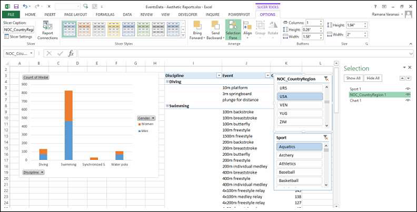
Selecting Objects for Display in the Report
You can choose not to display the Slicers on the final Report.
-
Click the OPTIONS tab in SLICER TOOLS on the Ribbon.
-
Click Selection Pane in Arrange group. The Selection Pane appears on the right side of the window.

As you can observe, the symbol  appears next to the objects in the Selection Pane. This means those objects are visible.
-
Click on
symbol next to NOC_CountryRegion. -
Click on
symbol next to Sport. The symbol is changed to for both. This means the visibility for the two Slicers is off.
 for both. This means the visibility for the two Slicers is off.
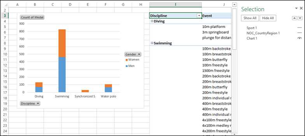
Close the Selection Pane.
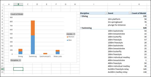
You can see that the two Slicers are not visible in the Report.
-
Excel 365
-
Excel 2021
-
Excel 2019
-
Excel 2016
-
February 12, 2022 -
2 Comments

Excel Power Pivot enables a technology called OLAP (OnLine Analytical Processing) to be used by Excel. OLAP is sometimes also referred to as Business Intelligence, but you’ll find out a lot more about what that actually means in the article below.
I’ll introduce this article with a little anecdote.
Many years ago (in the early 90’s) I was contracted to engineer a pan-European business intelligence solution for one of the world’s largest car manufacturers. At that time OLAP was a big new game-changing technology that every blue chip company just had to have.
OLAP was so new that none of the directors really understood what it was but they did appreciate the benefits. I had to travel to many countries to give presentations explaining benefits such as “this report that used to take four hours will print out in a few seconds using OLAP”. But if I was asked to explain how OLAP worked its magic it was very difficult to provide a simple explanation for such a complex technical subject (even to IT personnel).
When I first added OLAP lessons to my Expert Skills book I had to rise to this same challenge once again. Was it really possible to explain the huge number of skills needed to effectively implement OLAP in such a simple way that even non-technical users could learn to create efficient data models? I did this by creating 68 short, bite-sized lessons that absolutely anybody can understand. You’ll find links to many of the lessons in the article below.
The challenge in this article was to distil 68 lessons and 165 pages down to a short 2-minute article. If you read the article carefully, you will understand exactly what OLAP is, how it works, and what it can deliver for you.
Leave me a comment if you find the article useful.
Excel power pivot — 2 minute overview
Excel users are often confused about exactly what Power Pivot does (especially if they have been browsing the Internet which is a mine of misinformation).
I’m often asked by business analysts for a “Quick Overview” of what Excel’s new “power” tools actually do.
Multidimensional analysis using Power Pivot isn’t one of those subjects that is easy to explain in a few words but in this article you’ll discover in just two minutes what Power Pivot is, what it does and why it is useful. If you want to delve a little deeper, you can explore the hyperlinks within the text but I’d recommend that you first just read straight through the article to understand the big picture.
Excel Power Pivot is one of several «power» tools that are now included in Excel
The term “Power Pivot” is often rather confusingly used to refer to several different tools that are used to implement a technology called OLAP (OnLine Analytical Processing). OLAP isn’t new. Microsoft’s first OLAP Server (Microsoft Analytical Services) was released over 20 years ago.
The OLAP method of data analysis requires two steps:
- Create an OLAP database (Excel calls this a Data Model).
- Use reporting tools to analyse and visualize the data residing in the Data Model.
All current versions of Excel for Windows (Excel 2019, Excel 2021 and Excel 365) now include Power Pivot and are capable of performing OLAP data analysis. The OLAP enabled tools are:
Tools to create a data model:
- Get & Transform (previously named: Power Query). A tool for cleaning (transforming) source data and loading the cleaned data into Power Pivot tables. You can find an explanation of what this tool does here.
- Power Pivot. A tool used to take the data tables that Get & Transform has pre-prepared and define relationships between them to create data models (also called OLAP databases). You can find an explanation of what this tool does here.
Tools to analyze and visualize the data residing in the data model:
- 3-D Maps (previously named: Power Maps). An easy-to-learn application that provides a way to visualize geographical data contained in a data model. You can learn more about how 3-D Maps uses a data model here.
- OLAP Pivot Table. An easy-to-learn analytical tool that is able to present the summarized data contained in a data model. You can find an in-depth explanation of the differences between regular pivot tables and OLAP pivot tables here.
- Excel itself. Excel is able to directly access summarized data residing in a data model. Excel’s extensive analysis, charting and other visualization features can then be used to further refine a report or visualization. You can find an explanation of how this can be done here.
Business Intelligence (BI)
Business Intelligence is a very broad term that was first used in 1865 to describe how the banker Sir Henry Furnese prospered by receiving and acting upon information before his contemporaries.
When IT professionals talk about Business Intelligence (BI) today, they usually mean the instant analysis and presentation of data sourced from an OLAP database (data model) to support timely business decisions.
Most users do not need a lot of training to benefit from Business Intelligence
Get & Transform and Power Pivot are sophisticated tools that enable IT professionals to create data models. A good understanding of relational database theory is needed to use them.
The tools used to analyze and present data residing in a data model (3-D Maps, OLAP Pivot Tables and Excel) are designed as easy-to-learn tools that most users can quickly master.
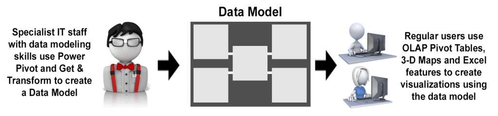
OLAP skills are extremely rare amongst IT staff (and highly valued)
It has been estimated that only 10% of Excel users are able to use regular Excel pivot tables. It likely that far less than 1% of Excel users will develop the skills needed to create correctly designed data models. Because OLAP skills are so rare they are highly valued by employers.
Excel Power Pivot has a similar «look and feel» to Excel
In the screen shot below you can see that the Power Pivot user interface has some similarities to Excel. Tables that have been imported look very much like Excel tables and a familiar tab-strip enables you to select a table as if it were located on a worksheet. But, of course, Power Pivot is an entirely different application that has an entirely different purpose. Power Pivot tables have little in common with Excel tables. You can find an explanation of the differences between Power Pivot tables and Excel tables here.
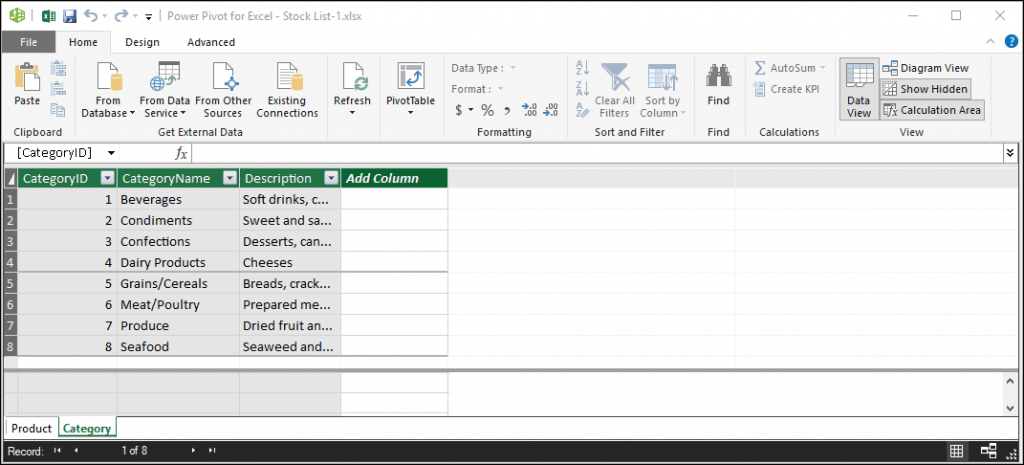
An OLAP database (or data model) is very different to a regular database
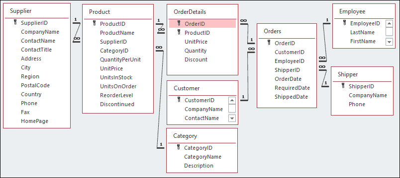
For reporting and analyzing data you need a different type of database called an OLAP database (OnLine Analytical Processing). OLAP databases are wonderful for quickly creating summary reports (even when there are millions of rows of source data). Power Pivot calls this type of database a Data Model.
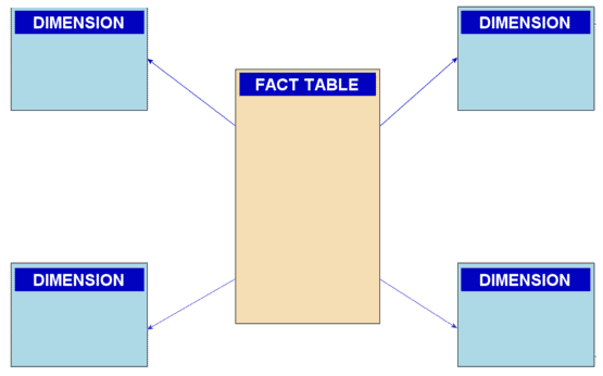
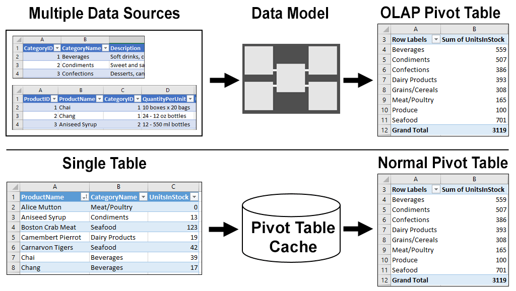
What is DAX?
DAX is an acronym for Data Analysis Expressions.
DAX is a collection of over 200 functions that can be used when creating a data model. Data models often need to have aggregate fields that are calculated from the information in the source data. This type of field (called a calculated measure) can be easily added to the data model using one or more DAX functions.
While calculated measures are really no more complex than regular Excel functions there are many DAX-related concepts that need to be mastered to use them effectively (such as row and filter context and implicit and explicit measures).
This lesson is excerpted from the above book.
This is the only up-to-date Excel book currently published and includes an entire session devoted to the new Dynamic Arrays features.
It is also the only book that will teach you absolutely every Excel skill including Power Pivot, OLAP and DAX.
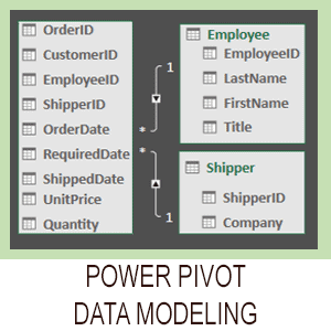
Covered in Session 12 – Power Pivot, Data Modelling, OLAP and Business Intelligence

Covered in Lesson 12-20: Use the CUBEVALUE function to query a data model.
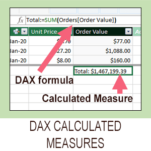
Covered in Session 13: An Introduction to DAX
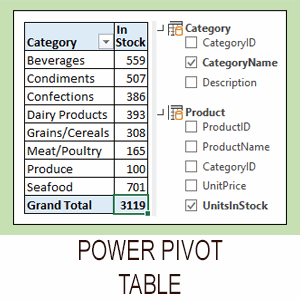
Covered in Lesson 12-6: Use an OLAP pivot table to analysze data residing in a data model.

Covered in Lesson 11-33 Create a merged query using fuzzy logic.
Covered in Session 10: 3D Maps.
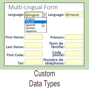
Covered in Lesson 11-7: Create and use a custom data type.
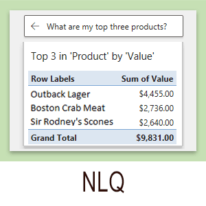
Covered in Lesson 9-2: Use Natural Language Queries.
Covered in Lesson 11-8: Use custom data types in formulas.

Covered in Lesson 9-1: Use automatic data analysis to create data insights.
Related Articles

Excel modern data analysis
This article describes a new way of working with Excel called “modern data analysis” enabled by the new Get & Transform and Power Pivot tools.
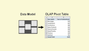
Excel OLAP pivot tables
This article explains the difference between a regular Excel pivot table and the new OLAP pivot table used by Power Pivot.

Excel Power Pivot window
This lesson discusses the Power Pivot window and how it differs from the regular Excel window. A sample file is included.

Excel Get & Transform overview
Get & Transform (or Power Query) is an advanced ETL tool. ETL is an acronym for Extract, Transform and Load. This article simply explains this amazing tool.
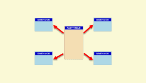
Excel data model Design
A Power Pivot data model is an OLAP database. OLAP databases can be modeled as a Snowflake or Star schema. This article explains both designs.

Understand OLTP database design
A Power Pivot data model is an OLAP database. Business databases are OLTP databases. This article discusses how OLTP databases are structured.