
A normal distribution graph in Excel represents the normal distribution phenomenon of a given data. This graph is made after calculating the mean and standard deviation for the data and then calculating the normal deviation over it. Although Excel 2013 versions, it is easy to plot the normal distribution graph as it has a built-in function to calculate the normal distribution and standard deviation. The graph is very similar to the bell curve.
A normal distribution graph is a continuous probability function. We all know what probability is; it is a technique to calculate the occurrence of a phenomenon or a variable. A probability distribution is a function used to calculate a variable’s event. There are two types of probability distributions: discrete and continuous.
The basic idea of a normal distribution is explained in the overview above. By definition, a normal distribution means how evenly the data is distributed. A continuous probability distributionProbability distribution could be defined as the table or equations showing respective probabilities of different possible outcomes of a defined event or scenario. In simple words, its calculation shows the possible outcome of an event with the relative possibility of occurrence or non-occurrence as required.read more is used to calculate real-time occurrences of any phenomenon. In Mathematics, the equation for a probability distribution is as follows:

Seems so complex, right? But Excel has made it easier for us to calculate normal distribution as it has a built-in function in Excel of the normal distribution. So in any cell, we must type the following formula:

It has three basic factors to calculate the normal distribution in excelNORMDIST or normal distribution is an inbuilt statistical function of excel that calculates the normal distribution of a data set with mean and standard deviation provided.read more:
- X: X is the specified value for which we want to calculate the normal distribution.
- Mean: Mean is whereas average of the data.
- Standard_Dev: Standard deviation is a function to find the deviation of the data. (It has to be a positive number).
The graph we plot on this data is called a normal distribution graph. It is also known as a bell curve. What is the bell curve? A bell curveBell Curve graph portrays a normal distribution which is a type of continuous probability. It gets its name from the shape of the graph which resembles to a bell. read more is a common distribution for a variable, i.e., how evenly a data is distributed. It has some. The chart we plot can be a line or scatter chart with smoothed lines.
Table of contents
- Excel Normal Distribution Graph (Bell Curve)
- How to Make a Normal Distribution Graph in Excel?
- Normal Distribution Graph Example #1
- Normal Distribution Graph Example #2
- Things to Remember About Normal Distribution Graph in Excel
- Recommended Articles
- How to Make a Normal Distribution Graph in Excel?
You are free to use this image on your website, templates, etc, Please provide us with an attribution linkArticle Link to be Hyperlinked
For eg:
Source: Normal Distribution Graph in Excel (wallstreetmojo.com)
How to Make a Normal Distribution Graph in Excel?
Below are the examples of normal distribution graphs in Excel (bell curve).
You can download this Normal Distribution Graph Excel Template here – Normal Distribution Graph Excel Template
Normal Distribution Graph Example #1
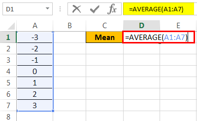
First, we will take random data. For example, in column A, let us take values from -3 to 3. Next, we need to calculate Excel’s mean and standard deviation in excelThe standard deviation shows the variability of the data values from the mean (average). In Excel, the STDEV and STDEV.S calculate sample standard deviation while STDEVP and STDEV.P calculate population standard deviation. STDEV is available in Excel 2007 and the previous versions. However, STDEV.P and STDEV.S are only available in Excel 2010 and subsequent versions.
read more
before calculating the normal distribution. Then, we can make the Excel normal distribution graph.
So, have a look at the data below.

Follow the below steps:
- First, calculate the mean of the data, i.e., an average. Then, in cell D1, we must write the following formula.

- Press the “Enter” key to get the result.

- Now, we will calculate the standard deviation for the given data. So in cell D2, we must write the following formula.

- Press the “Enter” key to get the result.

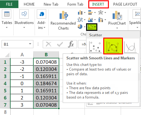
- Now in cell B2, we will calculate the normal distribution by the built-in formula for Excel. Write down the following formula in cell B2.

- The formula returns the result, as shown below:

- Now, drag the formula to cell B7.

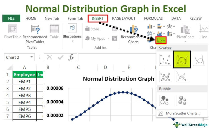
- In cell B2, we have the normal distribution for the chosen data. To make a normal distribution graph, go to the “Insert” tab, and in “Charts,” select a “Scatter” chart with smoothed lines and markers.

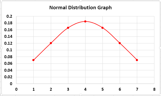
- When we insert the chart, we see that our bell curve or normal distribution graph is created.

The above chart is the normal distribution graph for the random data we took. Now we need to understand something before moving on to a real-life example of data. Standard Deviation S means Standard Deviation Sample because we have a huge chunk of data in real data analysis, and we pick a sample of data from that to analyze.
Normal Distribution Graph Example #2
Moving on to a real-life example. The more the data we have, the smoother line we will get for our bell curve or Excel normal distribution graph. To prove that, we will take an example of employees and their incentives achieved for the current month. Let us take a sample of 25 employees.
Consider the below data.

- The first step is calculating the mean, the average for the data in excelThe AVERAGE function in Excel gives the arithmetic mean of the supplied set of numeric values. This formula is categorized as a Statistical Function. The average formula is =AVERAGE(read more. Type the following formula for a mean.
The mean of the data is 13,000.

- Now, let us find the standard deviation for the data. Type the following formula.

The standard deviation for the data is 7359.801.

- As we have calculated both the mean and the standard deviation, we can now calculate the normal distribution for the data. Type the following formula.
- The normal distribution function returns the result, as shown below:

- Next, drag the formula to cell B26.

- Now, as we have calculated our normal distribution, we can go ahead and create the bell curve of the normal distribution graph of the data. But, first, click on the “Scatter” chart with smoothed lines and markers in the “Insert” tab under the “Charts” section.

- When we click “OK,” we see the following chart created:
We took 25 employees as the sample data. We can see that on the horizontal axis, the curve stops at 25.
The above chart was the normal distribution graph or bell curve for the data for employees and the incentives they achieved for the current month.
Excel normal distribution is a data analysis process requiring few functions, such as the mean and standard deviation of the data. The graph on the normal distribution is known as the normal distribution graph or the bell curve.
Things to Remember About Normal Distribution Graph in Excel
- The mean is the average of data.
- The standard deviation should be positive.
- The horizontal axis represents the sample count we picked for our data.
- The normal distribution is also known as the bell curve in Excel.
Recommended Articles
This article is a guide to the Normal Distribution Graph in Excel. We look at creating a normal distribution graph in Excel with a downloadable Excel template. You may learn more about Excel from the following articles: –
- Formula of Standard Normal DistributionThe standard normal distribution is a symmetric probability distribution about the average or the mean, depicting that the data near the average or the mean are occurring more frequently than the data far from the average or the norm. Thus, the score is termed “Z-score”.read more
- Excel Standard Deviation FormulaThe standard deviation shows the variability of the data values from the mean (average). In Excel, the STDEV and STDEV.S calculate sample standard deviation while STDEVP and STDEV.P calculate population standard deviation. STDEV is available in Excel 2007 and the previous versions. However, STDEV.P and STDEV.S are only available in Excel 2010 and subsequent versions.
read more - Binomial Distribution FormulaThe Binomial Distribution Formula calculates the probability of achieving a specific number of successes in a given number of trials. nCx represents the number of successes, while (1-p) n-x represents the number of trials.read more
- Create a Standard Deviation Graph in ExcelThe standard deviation is a metric that calculates how values change when compared to or in relation to the mean or average value. Both deviations are represented in a standard deviation graph, with one being positive on the right and the other being negative on the left.read more
Excel for Microsoft 365 Excel for Microsoft 365 for Mac Excel for the web Excel 2021 Excel 2021 for Mac Excel 2019 Excel 2019 for Mac Excel 2016 Excel 2016 for Mac Excel 2013 Excel 2010 Excel for Mac 2011 Excel Starter 2010 More…Less
Returns the normal distribution for the specified mean and standard deviation. This function has a very wide range of applications in statistics, including hypothesis testing.
Syntax
NORM.DIST(x,mean,standard_dev,cumulative)
The NORM.DIST function syntax has the following arguments:
-
X Required. The value for which you want the distribution.
-
Mean Required. The arithmetic mean of the distribution.
-
Standard_dev Required. The standard deviation of the distribution.
-
Cumulative Required. A logical value that determines the form of the function. If cumulative is TRUE, NORM.DIST returns the cumulative distribution function; if FALSE, it returns the probability density function.
Remarks
-
If mean or standard_dev is nonnumeric, NORM.DIST returns the #VALUE! error value.
-
If standard_dev ≤ 0, NORM.DIST returns the #NUM! error value.
-
If mean = 0, standard_dev = 1, and cumulative = TRUE, NORM.DIST returns the standard normal distribution, NORM.S.DIST.
-
The equation for the normal density function (cumulative = FALSE) is:

-
When cumulative = TRUE, the formula is the integral from negative infinity to x of the given formula.
Example
Copy the example data in the following table, and paste it in cell A1 of a new Excel worksheet. For formulas to show results, select them, press F2, and then press Enter. If you need to, you can adjust the column widths to see all the data.
|
Data |
Description |
|
|
42 |
Value for which you want the distribution |
|
|
40 |
Arithmetic mean of the distribution |
|
|
1.5 |
Standard deviation of the distribution |
|
|
Formula |
Description |
Result |
|
=NORM.DIST(A2,A3,A4,TRUE) |
Cumulative distribution function for the terms above |
0.9087888 |
|
=NORM.DIST(A2,A3,A4,FALSE) |
Probability mass function for the terms above |
0.10934 |
Need more help?
Want more options?
Explore subscription benefits, browse training courses, learn how to secure your device, and more.
Communities help you ask and answer questions, give feedback, and hear from experts with rich knowledge.
Содержание
- NORM.DIST function
- Syntax
- Remarks
- Example
- Need more help?
- Want more options?
- NORMDIST function
- Syntax
- Remarks
- Example
- Normal Distribution Graph in Excel
- Excel Normal Distribution Graph (Bell Curve)
- How to Make a Normal Distribution Graph in Excel?
- Normal Distribution Graph Example #1
- Normal Distribution Graph Example #2
- Things to Remember About Normal Distribution Graph in Excel
- Recommended Articles
NORM.DIST function
Returns the normal distribution for the specified mean and standard deviation. This function has a very wide range of applications in statistics, including hypothesis testing.
Syntax
The NORM.DIST function syntax has the following arguments:
X Required. The value for which you want the distribution.
Mean Required. The arithmetic mean of the distribution.
Standard_dev Required. The standard deviation of the distribution.
Cumulative Required. A logical value that determines the form of the function. If cumulative is TRUE, NORM.DIST returns the cumulative distribution function; if FALSE, it returns the probability density function.
If mean or standard_dev is nonnumeric, NORM.DIST returns the #VALUE! error value.
If standard_dev ≤ 0, NORM.DIST returns the #NUM! error value.
If mean = 0, standard_dev = 1, and cumulative = TRUE, NORM.DIST returns the standard normal distribution, NORM.S.DIST.
The equation for the normal density function (cumulative = FALSE) is:
When cumulative = TRUE, the formula is the integral from negative infinity to x of the given formula.
Example
Copy the example data in the following table, and paste it in cell A1 of a new Excel worksheet. For formulas to show results, select them, press F2, and then press Enter. If you need to, you can adjust the column widths to see all the data.
Value for which you want the distribution
Arithmetic mean of the distribution
Standard deviation of the distribution
Cumulative distribution function for the terms above
Probability mass function for the terms above


Need more help?
Want more options?
Explore subscription benefits, browse training courses, learn how to secure your device, and more.


Communities help you ask and answer questions, give feedback, and hear from experts with rich knowledge.
Источник
NORMDIST function
Returns the normal distribution for the specified mean and standard deviation. This function has a very wide range of applications in statistics, including hypothesis testing.
Important: This function has been replaced with one or more new functions that may provide improved accuracy and whose names better reflect their usage. Although this function is still available for backward compatibility, you should consider using the new functions from now on, because this function may not be available in future versions of Excel.
For more information about the new function, see NORM.DIST function.
Syntax
The NORMDIST function syntax has the following arguments:
X Required. The value for which you want the distribution.
Mean Required. The arithmetic mean of the distribution.
Standard_dev Required. The standard deviation of the distribution.
Cumulative Required. A logical value that determines the form of the function. If cumulative is TRUE, NORMDIST returns the cumulative distribution function; if FALSE, it returns the probability mass function.
If mean or standard_dev is nonnumeric, NORMDIST returns the #VALUE! error value.
If standard_dev ≤ 0, NORMDIST returns the #NUM! error value.
If mean = 0, standard_dev = 1, and cumulative = TRUE, NORMDIST returns the standard normal distribution, NORMSDIST.
The equation for the normal density function (cumulative = FALSE) is:
When cumulative = TRUE, the formula is the integral from negative infinity to x of the given formula.
Example
Copy the example data in the following table, and paste it in cell A1 of a new Excel worksheet. For formulas to show results, select them, press F2, and then press Enter. If you need to, you can adjust the column widths to see all the data.
Value for which you want the distribution
Arithmetic mean of the distribution
Standard deviation of the distribution
Cumulative distribution function for the terms above
Probability mass function for the terms above
Источник
Normal Distribution Graph in Excel


A normal distribution graph in Excel represents the normal distribution phenomenon of a given data. This graph is made after calculating the mean and standard deviation for the data and then calculating the normal deviation over it. Although Excel 2013 versions, it is easy to plot the normal distribution graph as it has a built-in function to calculate the normal distribution and standard deviation. The graph is very similar to the bell curve.
Excel Normal Distribution Graph (Bell Curve)
A normal distribution graph is a continuous probability function. We all know what probability is; it is a technique to calculate the occurrence of a phenomenon or a variable. A probability distribution is a function used to calculate a variable’s event. There are two types of probability distributions: discrete and continuous.
The basic idea of a normal distribution is explained in the overview above. By definition, a normal distribution means how evenly the data is distributed. A continuous probability distribution Probability Distribution Probability distribution could be defined as the table or equations showing respective probabilities of different possible outcomes of a defined event or scenario. In simple words, its calculation shows the possible outcome of an event with the relative possibility of occurrence or non-occurrence as required. read more is used to calculate real-time occurrences of any phenomenon. In Mathematics, the equation for a probability distribution is as follows:
Seems so complex, right? But Excel has made it easier for us to calculate normal distribution as it has a built-in function in Excel of the normal distribution. So in any cell, we must type the following formula:
- X: X is the specified value for which we want to calculate the normal distribution.
- Mean: Mean is whereas average of the data.
- Standard_Dev: Standard deviation is a function to find the deviation of the data. (It has to be a positive number).
The graph we plot on this data is called a normal distribution graph. It is also known as a bell curve. What is the bell curve? A bell curve Bell Curve Bell Curve graph portrays a normal distribution which is a type of continuous probability. It gets its name from the shape of the graph which resembles to a bell. read more is a common distribution for a variable, i.e., how evenly a data is distributed. It has some. The chart we plot can be a line or scatter chart with smoothed lines.
Table of contents
You are free to use this image on your website, templates, etc., Please provide us with an attribution link How to Provide Attribution? Article Link to be Hyperlinked
For eg:
Source: Normal Distribution Graph in Excel (wallstreetmojo.com)
How to Make a Normal Distribution Graph in Excel?
Below are the examples of normal distribution graphs in Excel (bell curve).
Normal Distribution Graph Example #1
before calculating the normal distribution. Then, we can make the Excel normal distribution graph.
So, have a look at the data below.
Follow the below steps:
- First, calculate the mean of the data, i.e., an average. Then, in cell D1, we must write the following formula.
Press the “Enter” key to get the result.

Now, we will calculate the standard deviation for the given data. So in cell D2, we must write the following formula.

Press the “Enter” key to get the result.

Now in cell B2, we will calculate the normal distribution by the built-in formula for Excel. Write down the following formula in cell B2.

The formula returns the result, as shown below:

Now, drag the formula to cell B7.

In cell B2, we have the normal distribution for the chosen data. To make a normal distribution graph, go to the “Insert” tab, and in “Charts,” select a “Scatter” chart with smoothed lines and markers.
When we insert the chart, we see that our bell curve or normal distribution graph is created.
The above chart is the normal distribution graph for the random data we took. Now we need to understand something before moving on to a real-life example of data. Standard Deviation S means Standard Deviation Sample because we have a huge chunk of data in real data analysis, and we pick a sample of data from that to analyze.
Normal Distribution Graph Example #2
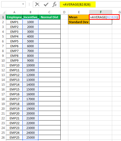
Moving on to a real-life example. The more the data we have, the smoother line we will get for our bell curve or Excel normal distribution graph. To prove that, we will take an example of employees and their incentives achieved for the current month. Let us take a sample of 25 employees.
Consider the below data.
- The first step is calculating the mean, the average for the data in excelAverage For The Data In ExcelThe AVERAGE function in Excel gives the arithmetic mean of the supplied set of numeric values. This formula is categorized as a Statistical Function. The average formula is =AVERAGE(read more . Type the following formula for a mean.
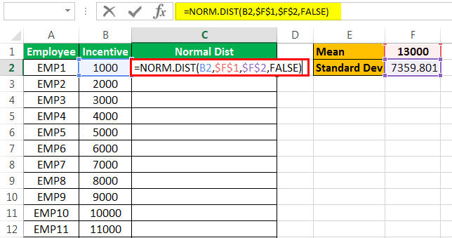
The mean of the data is 13,000.
- Now, let us find the standard deviation for the data. Type the following formula.
The standard deviation for the data is 7359.801.
- As we have calculated both the mean and the standard deviation, we can now calculate the normal distribution for the data. Type the following formula.
- The normal distribution function returns the result, as shown below:
- Next, drag the formula to cell B26.
- Now, as we have calculated our normal distribution, we can go ahead and create the bell curve of the normal distribution graph of the data. But, first, click on the “Scatter” chart with smoothed lines and markers in the “Insert” tab under the “Charts” section.
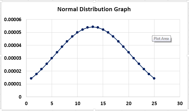
- When we click “OK,” we see the following chart created:
We took 25 employees as the sample data. We can see that on the horizontal axis, the curve stops at 25.
The above chart was the normal distribution graph or bell curve for the data for employees and the incentives they achieved for the current month.
Excel normal distribution is a data analysis process requiring few functions, such as the mean and standard deviation of the data. The graph on the normal distribution is known as the normal distribution graph or the bell curve.
Things to Remember About Normal Distribution Graph in Excel
- The mean is the average of data.
- The standard deviation should be positive.
- The horizontal axis represents the sample count we picked for our data.
- The normal distribution is also known as the bell curve in Excel.
Recommended Articles
This article is a guide to the Normal Distribution Graph in Excel. We look at creating a normal distribution graph in Excel with a downloadable Excel template. You may learn more about Excel from the following articles: –
Источник
 (Download the workbook.)
When a visitor asked me how to generate a random number from a Normal distribution she set me to thinking about doing statistics with Excel.
Many of us were introduced to statistics in school and then forgot what little we learned…often within seconds of the final exam.
Also, when we took statistics, many of us weren’t taught how to use it with Excel. This is unfortunate, because in business it’s often useful to have some grasp of that topic.
 For all these reasons, I thought it would be worthwhile to briefly explore normal—or “bell-shaped”—curves in Excel. This is a commonly used area of statistics, and one for which Excel provides several useful functions.
One interesting thing about the normal curve is that it occurs frequently in many different settings:
- The height of each gender in a population is normally distributed.
- The measure of LDL cholesterol is normally distributed in adults.
- The width of stripes on a zebra is said to be normally distributed.
- Most measurement errors are assumed to be normally distributed.
- Many Six-Sigma calculations assume normal distribution.
- Etc.
As a final example, here’s a surprising occurrence of the normal curve: Take any population, whether it’s normally distributed or not. Randomly select at least 30 members from that population, measure them for some characteristic, and then find the average of those measures. That average is one data point. Now select another random sample of the same number, and find the average of their measures. Do the same again and again. The Central Limit Theorem says that those averages tend to have a normal distribution.
Normal distributions are all around us. Therefore, as painlessly as possible, let’s take a closer look at how we work with them using Excel.
Brief Definitions

We need to get some brief definitions out of the way so that we can start to describe data using Excel functions.
From cholesterol to zebra stripes, the normal probability distribution describes the proportion of a population having a specific range of values for an attribute. Most members have amounts that are near the average; some have amounts that are farther away from the average; and some have amounts extremely distant from the average.
For example, a population could be all the stripes on all the zebras in the world. The normal curve would show the proportion of stripes that have various widths.
The standard deviation of a sample is a measure of the spread of the sample from its mean. (We’re taking about many items in a “sample,” of course, not just a single item.) In a normal distribution, about 68% of a sample is within one standard deviation of the mean. About 95% is within two standard deviations. And about 99.7% is within three standard deviations. The numbers in the figure above mark standard deviations from the mean.
The z value is the distance between a value and the mean in terms of standard deviations. In the figure above, each number is a z value.
Calculating or Estimating the Standard Deviation
Several of the following functions require a value for the standard deviation. There are at least two ways to find that value.
First, if you have a sample of the data, Excel originally offered the STDEV function. But in Excel 2010, this was replaced with the STDEV.S function:
=STDEV.S(range_of_values)
On the other hand, if you’re working with the entire population, you calculate the standard deviation with the STDEV.P function:
=STDEV.P(range_of_values)
However, if you’re working with rough estimates, you must take a different approach, because you don’t have actual data to support your estimates.
In this case, first calculate the range. This is the smallest likely value subtracted from the largest likely value. By likely, let’s use the assumption that all possible values will be within that range about 95% of the time.
Remember that about 95% of a sample is within two standard deviations on each side of the mean. (This is a total of four standard deviations, of course.) Therefore, if we divide the range by four we should have the approximate standard deviation.
Merely dividing the range by four might seem to be a slipshod approach. But consider the way this calculation often is used.
Suppose you’re forecasting sales for next year. You think sales will be about 1,000, but the number could be as high as 1,200 and as low as 800. With that information, you can put a normal curve around your estimated sales and begin to generate a variety of forecasts for profits and cash flow.
To emphasize, these numbers are only your best estimates. Therefore, using an estimated standard deviation doesn’t seem quite as sloppy as it otherwise might.
Based on these estimates, your mean sales will be about 1,000 and your standard deviation will be about (1200 – 800) / 4 = 100. With this information, you can use the following function to perform many of the calculations you will need in your analysis.
NORM.DIST(x, mean, standard_dev ,cumulative)
 The NORM.DIST function gives the probability that a number falls at or below a given value of a normal distribution.
- x — The value you want to test.
- mean — The average value of the distribution.
- standard_dev — The standard deviation of the distribution.
- cumulative — If FALSE or zero, returns the probability that x will occur; if TRUE or non-zero, returns the probability that the value will be less than or equal to x.
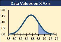
Example: The distribution of heights of American women aged 18 to 24 is approximately normally distributed with a mean of 65.5 inches (166.37 cm) and a standard deviation of 2.5 inches (6.35 cm). What percentage of these women is taller than 5′ 8″, that is, 68 inches (172.72 cm)?
The percentage of women less than or equal to 68 inches is:
=NORM.DIST(68, 65.5, 2.5, TRUE) = 84.13%
Therefore, the percentage of women taller than 68 inches is 1 – 84.13%, or approximately 15.87%. This value is represented by the shaded area in the chart above.
NORM.S.DIST(z, cumulative)
 The NORM.S.DIST function translates the number of standard deviations (z) into cumulative probabilities.
- z — The value for which you want the distribution.
- cumulative — Cumulative is a logical value that determines the form of the function. If cumulative is TRUE, NORM.S.DIST returns the cumulative distribution function; if FALSE, it returns the probability mass function.
(The probability mass function, PMF, gives the probability that a discrete — that is, non-continuous — random variable is exactly equal to some value.)
To illustrate:
=NORM.S.DIST(1, TRUE) = 84.13%
=NORM.S.DIST(-1, TRUE) = 15.87%
Therefore, the probability of a value being within one standard deviation of the mean is the difference between these values, or 68.27%. This range is represented by the shaded area of the chart.
(You can download the files for this article here.)
NORM.INV(probability, mean, standard_dev)
 The NORM.INV function is the inverse of the NORM.DIST function. It calculates the x variable given a probability.
To illustrate, consider the heights of the American women used in the illustration of the NORM.DIST function above. How tall would a woman need to be if she wanted to be among the tallest 75% of American women?
Using NORM.INV, she would learn that she needs to be at least 63.81 inches tall, as shown by this formula:
=NORM.INV(0.25, 65.5, 2.5) = 63.81 inches
The figure shows the area represented by the 25% of the American women who are shorter than this height.
NORM.S.INV(probability)
 The NORM.S.INV function is the inverse of the NORM.S.DIST function. Given the probability that a variable is within a certain distance of the mean, it finds the z value.
To illustrate, suppose you care about the half of the sample that’s closest to the mean. That is, you want the z values that mark the boundary that is 25% less than the mean and 25% more than the mean.
The following two formulas provide those boundaries of -.674 and +.674, as illustrated by the figure.
=NORM.S.INV(0.25)
=NORM.S.INV(0.75)
STANDARDIZE(x, mean, standard_dev)
 The STANDARDIZE function returns the z value for a specified value, mean, and standard deviation.
To illustrate, in the NORM.INV example above, we found that a woman would need to be at least 63.81 inches tall to avoid the bottom 25% of the population, by height. The STANDARDIZE function tells us that the z value for 63.81 inches is:
=STANDARDIZE(63.81, 65.5, 2.5) = -0.6745
We can check this number by using the NORM.S.DIST function:
=NORM.S.DIST(-0.6745, TRUE) = 25%
That is, a z value of -.6745 has a probability of 25%.
How to Calculate a Random Number from a Normal Distribution
Remember that the NORM.INV function returns a value given a probability. In Excel 2007 and above, the syntax is…
NORM.INV(probability, mean, standard_dev)
Also, remember that the RAND function returns a random number between 0 and 1. That is, RAND generates random probabilities. Therefore, you can use the NORM.INV function to calculate a random number from a normal distribution, using this formula in Excel 2007 and above…
=NORM.INV(RAND(), mean, standard_dev)
Related ExcelUser Articles
I created all of the figures for this article in Excel. If you would like to know how, see How to Create Normal Curves with Shaded Areas in Excel.
Some analyses require random numbers from a normal distribution, which you can learn about here: How to Return Random Numbers from a Normal Distribution for Your Excel Forecasts
References
Conrad Carlberg—a former Excel MVP—writes many books about using statistics with Excel. His titles within easy reach of my computer include Predictive Analytics, Statistical Analysis, More Predictive Analytics, Regression Analysis, and Decision Analysis…all for Excel.
(You can download the files for this article here.)
What is a Normal Distribution?
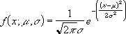
From a purely mathematical point of view, a Normal distribution (also known as a Gaussian distribution) is any distribution with the following probability density function.
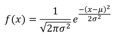
Where μ (mu) is the mean and σ (sigma) is the standard deviation.
Normal Distribution Probability Density Function in Excel
It’s also referred to as a bell curve because this probability distribution function looks like a bell if we graph it. It’s a well known property of the normal distribution that 99.7% of the area under the normal probability density curve falls within 3 standard deviations from the mean. So to graph this function in Excel we’ll need a series of x values covering (μ-3σ,μ+3σ).
This is the probability density function for the normal distribution in Excel.
=(1/SQRT(2*PI()*StdDev^2))*EXP(-1*(X-Mean)^2/(2*StdDev^2))
- X – This is any real number.
- Mean – This is the mean of the normally distributed random variable.
- StdDev – This is the standard deviation of the normally distributed random variable.
Graphing the Normal Probability Density Function
We can graph the normal probability density function in Excel by setting up a table with two columns of values.
- X – This is a series of real numbers that will appear on our X-axis which we will evaluate our normal density function on.
- f(X) – This is the result of our normal density function evaluated at X.
If we select our table then go to the Insert tab and select a Line Chart from the Charts section. We can see the result is a nice bell shaped curve centered around the mean value.
Create a Normally Distributed Set of Random Numbers in Excel
Is it possible to create a set of normally distributed values in Excel? Yes, it is, but we will need to look at the cumulative distribution function F(x)=P(X<=x) and it’s inverse function. This is the probability that a random value from the distribution is less than a given value x.
The formula involves calculus but thankfully Excel’s NORM.DIST function will do this calculation for us.
=NORM.DIST(X,Mean,StdDev,TRUE)
- X – This is any number from the distribution.
- Mean – This is the mean of the normal distribution.
- StdDev – This is the standard deviation of the normal distributed.
- TRUE – This is a predefined input for the NORM.DIST function which tells Excel to calculate the cumulative distribution.
We can also graph this in a similar manner to the probability density function and create a Line Chart from the Charts section of the Insert tab.
Note that the Y-axis of this chart goes from 0 to 1. This is a probability value and represents the probability of a random value from our normal distribution being less than or equal to a given value.
As an example F(0)=50% so there’s a 50% chance a random value from our normal distribution will be below 0.
From this graph, we can also start with a probability on the Y-axis and get a value from our normal distribution on the X-axis. This is call the inverse of a function.
If we start at 0.8 on the Y-axis and follow out horizontally until we hit the graph, then move vertically down we will arrive at the 0.788 on the X-axis. This means 0.788 is the inverse of 0.8.
Using the inverse function is how we will get our set of normally distributed random values. We will use the RAND() function to generate a random value between 0 and 1 on our Y-axis and then get the inverse of it with the NORM.INV function which will result in our random normal value on the X-axis.
=NORM.INV(RAND(),Mean,StdDev)
- Mean – This is the mean of the normal distribution.
- StdDev – This is the standard deviation of the normal distributed.
If we do this calculation 1,000 times we can graph it with a Histogram chart and we start to see a bell shape curve emerge.
With 10,000 values, the distribution becomes more clear.
In fact because of the law of large numbers, the more of these randomly generated normal values we create, the closer our graph will appear bell shaped.
Box Muller Method to Generate Random Normal Values
The Box-Muller method relies on the theorem that if U1 and U2 are independent random variables uniformly distributed in the interval (0, 1) then Z1 and Z2 will be independent random variables with a standard normal distribution (mean = 0 and standard deviation = 1).
We will easily be able to create these formulas in Excel with U1=RAND() and U2=RAND(). For our purposes though, we will only need to calculate Z1.
Since Z1 will have a mean of 0 and standard deviation of 1, we can transform Z1 to a new random variable X=Z1*σ+μ to get a normal distribution with mean μ and standard deviation σ.
=SQRT(-2*LN(RAND()))*COS(2*PI()*RAND())*StdDev+Mean
- Mean – This is the mean of the normal distribution.
- StdDev – This is the standard deviation of the normal distributed.
We can also graph this with a Histogram for a large number of calculations and see a nice well defined bell shaped curve.
About the Author
John is a Microsoft MVP and qualified actuary with over 15 years of experience. He has worked in a variety of industries, including insurance, ad tech, and most recently Power Platform consulting. He is a keen problem solver and has a passion for using technology to make businesses more efficient.