
Excel for Microsoft 365 Excel 2021 Excel 2019 Excel 2016 Excel 2013 More…Less
A dashboard is a visual representation of key metrics that allow you to quickly view and analyze your data in one place. Dashboards not only provide consolidated data views, but a self-service business intelligence opportunity, where users are able to filter the data to display just what’s important to them. In the past, Excel reporting often required you to generate multiple reports for different people or departments depending on their needs.
Overview
In this topic, we’ll discuss how to use multiple PivotTables, PivotCharts and PivotTable tools to create a dynamic dashboard. Then we’ll give users the ability to quickly filter the data the way they want with Slicers and a Timeline, which allow your PivotTables and charts to automatically expand and contract to display only the information that users want to see. In addition, you can quickly refresh your dashboard when you add or update data. This makes it very handy because you only need to create the dashboard report once.
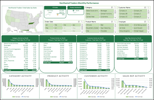
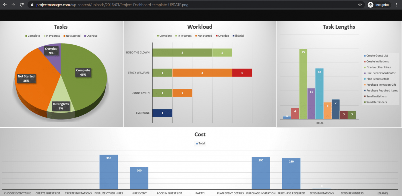
For this example, we’re going to create four PivotTables and charts from a single data source.
Once your dashboard is created, we’ll show you how to share it with people by creating a Microsoft Group. We also have an interactive Excel workbook that you can download and follow these steps on your own.
Download the Excel Dashboard tutorial workbook.
Get your data
-
You can copy and paste data directly into Excel, or you can set up a query from a data source. For this topic, we used the Sales Analysis query from the Northwind Traders template for Microsoft Access. If you want to use it, you can open Access and go to File > New > Search for «Northwind» and create the template database. Once you’ve done that you’ll be able to access any of the queries included in the template. We’ve already put this data into the Excel workbook for you, so there’s no need to worry if you don’t have Access.
-
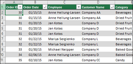
Verify your data is structured properly, with no missing rows or columns. Each row should represent an individual record or item. For help with setting up a query, or if your data needs to be manipulated, see Get & Transform in Excel.

-
If it’s not already, format your data as an Excel Table. When you import from Access, the data will automatically be imported to a table.
Create PivotTables
-
Select any cell within your data range, and go to Insert > PivotTable > New Worksheet. See Create a PivotTable to analyze worksheet data for more details.
-
Add the PivotTable fields that you want, then format as desired. This PivotTable will be the basis for others, so you should spend some time making any necessary adjustments to style, report layout and general formatting now so you don’t have to do it multiple times. For more details, see: Design the layout and format of a PivotTable.
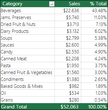
In this case, we created a top-level summary of sales by product category, and sorted by the Sales field in descending order.
See Sort data in a PivotTable or PivotChart for more details.
-
Once you’ve created your master PivotTable, select it, then copy and paste it as many times as necessary to empty areas in the worksheet. For our example, these PivotTables can change rows, but not columns so we placed them on the same row with a blank column in between each one. However, you might find that you need to place your PivotTables beneath each other if they can expand columns.
Important: PivotTables can’t overlap one another, so make sure that your design will allow enough space between them to allow for them to expand and contract as values are filtered, added or removed.
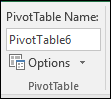
At this point you might want to give your PivotTables meaningful names, so you know what they do. Otherwise, Excel will name them PivotTable1, PivotTable2 and so on. You can select each one, then go to PivotTable Tools > Analyze > enter a new name in the PivotTable Name box. This will be important when it comes time to connect your PivotTables to Slicers and Timeline controls.
Create PivotCharts
-
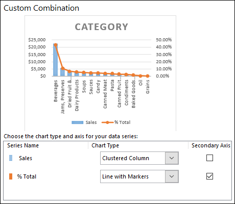
Click anywhere in the first PivotTable and go to PivotTable Tools > Analyze > PivotChart > select a chart type. We chose a Combo chart with Sales as a Clustered Column chart, and % Total as a Line chart plotted on the Secondary axis.
-
Select the chart, then size and format as desired from the PivotChart Tools tab. For more details see our series on Formatting charts.
-
Repeat for each of the remaining PivotTables.
-
Now is a good time to rename your PivotCharts too. Go to PivotChart Tools > Analyze > enter a new name in the Chart Name box.
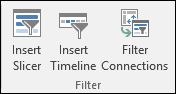
Add Slicers and a Timeline
Slicers and Timelines allow you to quickly filter your PivotTables and PivotCharts, so you can see just the information that’s meaningful to you.
-
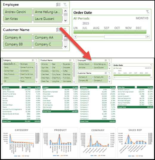
Select any PivotTable and go to PivotTable Tools > Analyze > Filter > Insert Slicer, then check each item you want to use for a slicer. For this dashboard, we selected Category, Product Name, Employee and Customer Name. When you click OK, the slicers will be added to the middle of the screen, stacked on top of each other, so you’ll need to arrange and resize them as necessary.
-
Slicer Options – If you click on any slicer, you can go to Slicer Tools > Options and select various options, like Style and how many columns are displayed. You can align multiple slicers by selecting them with Ctrl+Left-click, then use the Align tools on the Slicer Tools tab.
-
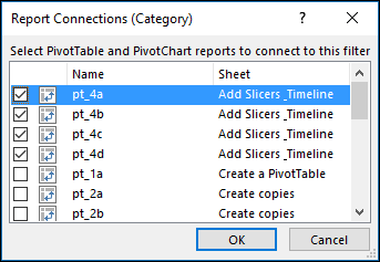
Slicer Connections — Slicers will only be connected to the PivotTable you used to create them, so you need to select each Slicer then go to Slicer Tools > Options > Report Connections and check which PivotTables you want connected to each. Slicers and Timelines can control PivotTables on any worksheet, even if the worksheet is hidden.
-
Add a Timeline – Select any PivotTable and go to PivotTable Tools > Analyze > Filter > Insert Timeline, then check each item you want to use. For this dashboard, we selected Order Date.
-
Timeline Options – Click on the Timeline, and go to Timeline Tools > Options and select options like Style, Header and Caption. Select the Report Connections option to link the timeline to the PivotTables of your choice.
Learn more about Slicers and Timeline controls.
Next steps
Your dashboard is now functionally complete, but you probably still need to arrange it the way you want and make final adjustments. For instance, you might want to add a report title, or a background. For our dashboard, we added shapes around the PivotTables and turned off Headings and Gridlines from the View tab.
Make sure to test each of your slicers and timelines to make sure that your PivotTables and PivotCharts behave appropriately. You may find situations where certain selections cause issues if one PivotTable wants to adjust and overlap another, which it can’t do and will display an error message. These issues should be corrected before you distribute your dashboard.
Once you’re done setting up your dashboard, you can click the “Share a Dashboard” tab at the top of this topic to learn how to distribute it.
Congratulations on creating your dashboard! In this step we’ll show you how to set up a Microsoft Group to share your dashboard. What we’re going to do is pin your dashboard to the top of your group’s document library in SharePoint, so your users can easily access it at any time.
Store your dashboard in the group
If you haven’t already saved your dashboard workbook in the group you’ll want to move it there. If it’s already in the group’s files library then you can skip this step.
-
Go to your group in either Outlook 2016 or Outlook on the web.
-
Click Files in the ribbon to access the group’s document library.
-
Click the Upload button on the ribbon and upload your dashboard workbook to the document library.
Add it to your group’s SharePoint Online team site
-
If you accessed the document library from Outlook 2016, click Home on the navigation pane on the left. If you accessed the document library from Outlook on the web, click More > Site from the right end of the ribbon.
-
Click Documents from the navigation pane at the left.
-
Find your dashboard workbook and click the selection circle just to the left of its name.
-
When you have the dashboard workbook selected, choose Pin to top on the ribbon.
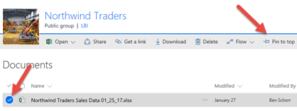
Now whenever your users come to the Documents page of your SharePoint Online team site your dashboard worksheet will be right there at the top. They can click on it and easily access the current version of the dashboard.
Tip: Your users can also access your group document library, including your dashboard workbook, via the Outlook Groups mobile app.
See also
-
What is SharePoint?
-
Learn about Microsoft 365 groups
Got questions we didn’t answer here?
Visit the Microsoft Answers Community.
We’re listening!
This article was last reviewed by Ben and Chris on March 16th, 2017 as a result of your feedback. If you found it helpful, and especially if you didn’t, please use the feedback controls below and leave us some constructive feedback, so we can continue to make it better. Thanks!
Need more help?
Want more options?
Explore subscription benefits, browse training courses, learn how to secure your device, and more.
Communities help you ask and answer questions, give feedback, and hear from experts with rich knowledge.
Looking to learn how to create a dashboard in Excel?
Gathering data is an essential process to better understand how your projects are moving. And what better way to manage all that data than spreadsheets?
However, data on its own is just a bunch of numbers. 😝
To make it accessible, you need dashboards.
In this article, we’ll learn about Excel dashboards.
We’ll go over the steps to create one and also highlight a smoother alternative to the entire process.
Let’s start.
What Is A Excel Dashboard?
A dashboard is a visual representation of KPIs, key business metrics, and other complex data in a way that’s easy to understand.
Let’s be real, raw data and numbers are essential, but they’re super boring.
That’s why you need to make that data accessible.
What you need is a Microsoft Excel dashboard.
Luckily, you can create both a static or dynamic dashboard in Excel.
What’s the difference?
Static dashboards simply highlight data from a specific timeframe. It never changes.
On the other hand, dynamic dashboards are updated daily to keep up with changes.
So what are the benefits of creating an Excel dashboard?
Similar to Google Sheets dashboards, let’s a look at some of them:
- Gives you a detailed overview of your business’ Key Performance Indicators at a glance
- Adds a sense of accountability as different people and departments can see the areas of improvement
- Provides powerful analytical capabilities and complex calculations
- Helps you make better decisions for your business
7 Steps To Create A Dashboard In Excel
Here’s a simple step-by-step guide on how to create a dashboard in Excel.
Step 1: Import the necessary data into Excel
No data. No dashboard.
So the first thing to do is to bring data into Microsoft Excel.
If your data already exists in Excel, do a victory dance 💃 because you’re lucky you can skip this step.
If that isn’t the case, we’ve got to warn you that importing data to Excel can be a bit bothersome. However, there are multiple ways to do it.
To import data, you can:
- Copy and paste it
- Use an API like Supermetrics or Open Database Connectivity (ODBC)
- Use Microsoft Power Query, an Excel add-in
The most suitable way will ultimately depend on your data file type, and you may have to research the best ways to import data into Excel.
Step 2: Set up your workbook
Now that your data is in Excel, it’s time to insert tabs to set up your workbook.
Open a new Excel workbook and add two or more worksheets (or tabs) to it.
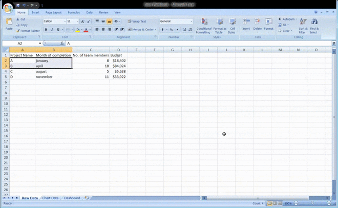
For example, let’s say we create three tabs.
Name the first worksheet as ‘Raw Data,’ the second as ‘Chart Data,’ and the third as ‘Dashboard.’
This makes it easy to compare the data in your Excel file.
Here, we’ve collected raw data of four projects: A, B, C, and D.
The data includes:
- The month of completion
- The budget for each project
- The number of team members that worked on each project
Bonus: How to create an org chart in Excel!
Step 3: Add raw data to a table
The raw data worksheet you created in your workbook must be in an Excel table format, with each data point recorded in cells.
Some people call this step “cleaning your data” because this is the time to spot any typos or in-your-face errors.
Don’t skip this, or you won’t be able to use any Excel formula later on.
Step 4: Data analysis
While this step might just tire your brain out, it’ll help create the right dashboard for your needs.
Take a good look at all the raw data you’ve gathered, study it, and determine what you want to use in the dashboard sheet.
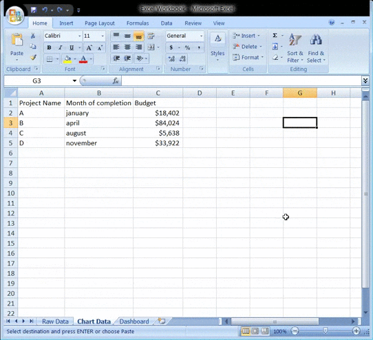
Add those data points to your ‘Chart Data’ worksheet.
For example, we want our chart to highlight the project name, the month of completion, and the budget. So we copy these three Excel data columns and paste them into the chart data tab.
Here’s a tip: Ask yourself what the purpose of the dashboard is.
In our example, we want to visualize the expenses of different projects.
Knowing the purpose should ease the job and help you filter out all the unnecessary data.
Analyzing your data will also help you understand the different tools you may want to use in your dashboard.
Some of the options include:
- Charts: to visualize data
- Excel formulas: for complex calculations and filtering
- Conditional formatting: to automate the spreadsheet’s responses to specific data points
- PivotTable: to sort, reorganize, count, group, and sum data in a table
- Power Pivot: to create data models and work with large data sets
Bonus: How to Display a Work Breakdown Structure in Excel
Step 5: Determine the visuals
What’s a dashboard without visuals, right?
The next step is to determine the visuals and the dashboard design that best represents your data.
You should mainly pay attention to the different chart types Excel gives you, like:
- Bar chart: compare values on a graph with bars
- Waterfall chart: view how an initial value increases and decreases through a series of alterations to reach an end value
- Gauge chart: represent data in a dial. Also known as a speedometer chart
- Pie chart: highlight percentages and proportional data
- Gantt chart: track project progress
- Dynamic chart: automatically update a data range
- Pivot chart: summarize your data in a table full of statistics
Step 6: Create your Excel dashboard
You now have all the data you need, and you know the purpose of the dashboard.
The only thing left to do is build the Excel dashboard.
To explain the process of creating a dashboard in Excel, we’ll use a clustered column chart.
A clustered column chart consists of clustered, horizontal columns that represent more than one data series.
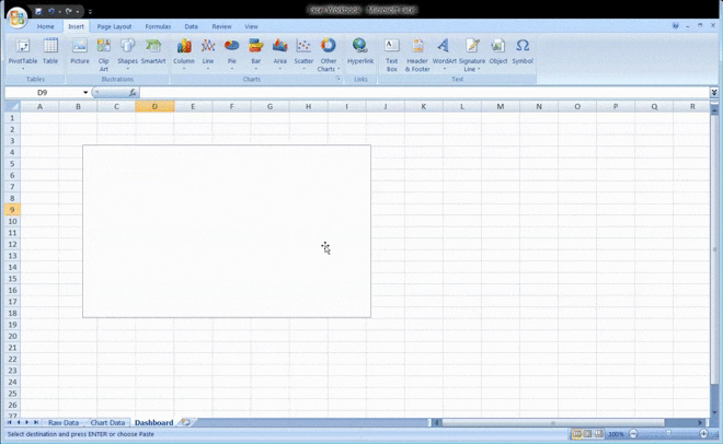
Start by clicking on the dashboard worksheet or tab that you created in your workbook.
Then click on ‘Insert’ > ‘Column’ > ‘Clustered column chart’.
See the blank box? That’s where you’ll feed your spreadsheet data.
Just right-click on the blank box and then click on ‘Select data’
Then, go to your ‘Chart Data’ tab and select the data you wish to display on your dashboard.
Make sure you don’t select the column headers while selecting the data.
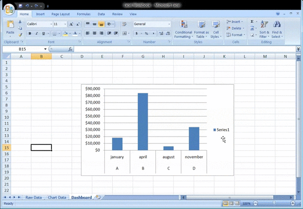
Hit enter, and voila, you’ve created a column chart dashboard.
If you notice your horizontal axis doesn’t represent what you want, you can edit it.
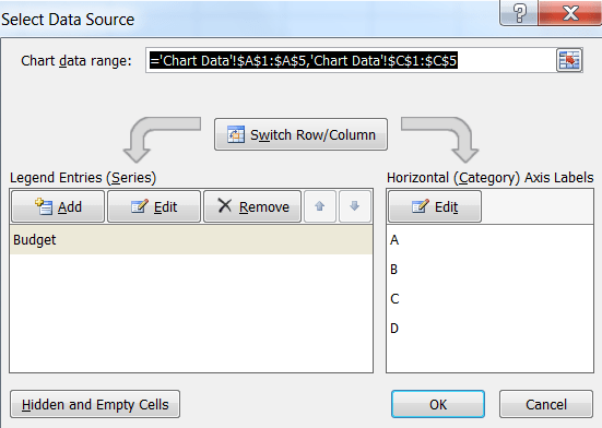
All you have to do is: select the chart again > right-click > select data.
The Select Data Source dialogue box will appear.
Here, you can click on ‘Edit’ in the ‘Horizontal (Category) Axis Labels’ and then select the data you want to show on the X-axis from the ‘Chart Data’ tab again.
Want to give a title to your chart?
Select the chart and then click on Design > chart layouts. Choose a layout that has a chart title text box.
Click on the text box to type in a new title.
Step 7: Customize your dashboard
Another step?
You can also customize the colors, fonts, typography, and layouts of your charts.
Additionally, if you wish to make an interactive dashboard, go for a dynamic chart.
A dynamic chart is a regular Excel chart where data updates automatically as you change the data source.
You can bring interactivity using Excel features like:
- Macros: automate repetitive actions (you may have to learn Excel VBA for this)
- Drop-down lists: allow quick and limited data entry
- Slicers: lets you filter data on a Pivot Table
And we’re done. Congratulations! 🙌
Now you know how to make a dashboard in Excel.
We know what you’re thinking: do I really need these steps when I could just use templates?
Bonus: Create a flowchart using Excel!
3 Excel Dashboard Templates
Excel is no beauty queen. And its scary formulas 👻 make it complicated for many.
No wonder people look for a quality advanced Excel or Excel dashboard course online.
Don’t worry.
Save yourself the trouble with these handy downloadable Microsoft Excel dashboard templates.
1. Excel KPI dashboard template
Download this Excel revenue and expense KPI dashboard template.
2. Excel Project management dashboard template
Download this Excel project dashboard template.
3. Sales dashboard template
Download this free sales Excel dashboard template.
However, note that most Excel templates available on the web aren’t reliable, and it’s difficult to spot the ones that’ll work.
Most importantly, Microsoft Excel isn’t a perfect tool for creating dashboards.
Here’s why:
3 Limitations of Using Excel Dashboards
Excel may be the go-to tool for many businesses for all kinds of data.
However, that doesn’t make it an ideal medium for creating dashboards.
Here’s why:
1. A ton of manual data feeding
You’ve probably seen some great Excel workbooks over time.
They’re so clean and organized with just data after data and several charts.
But that’s what you see. 👀
Ask the person who made the Excel sheets, and they’ll tell you how they’ve aged twice while making an Excel dashboard, and they probably hate their job because of it.
It’s just too much manual effort for feeding data.
And we live in a world where robots do surgeries on humans!
2. High possibilities of human error
As your business grows, so does your data.
And more data means opportunities for human error.
Whether it’s a typo that changed the number ‘5’ to the letter ‘T’ or an error in the formula, it’s so easy to mess up data on Excel.
If only it were that easy to create an Excel dashboard instead.
3. Limited integrations
Integrating your software with other apps allows you to multitask and expand your scope of work. It also saves you the time spent toggling between windows.
However, you can’t do this on Excel, thanks to its limited direct integration abilities.
The only option you have is to take the help of third-party apps like Zapier.
That’s like using one app to be able to use another.
Want to find out more ways in which Excel dashboards flop?
Check out our article on Excel project management and Excel alternatives.
This begs the question: why go through so much trouble to create a dashboard?
Life would be much easier if there were software that created dashboards with just a few clicks.
And no, you don’t have to find a Genie to make such wishes come true. 🧞
You have something better in the real world, ClickUp, the world’s highest-rated productivity tool!
Create Effortless Dashboards With ClickUp
ClickUp is the place to be for all things project management.
Whether you want to track projects and tasks, need a reporting tool, or manage resources, ClickUp can handle it.
Most importantly, it is THE tool for quick and easy dashboard creation.
So how easy are we talking?
As easy as three steps that are literally just mouse clicks.
ClickUp’s Dashboards are where you’ll get accurate and valuable insights and reports on projects, resources, tasks, Sprints, and more.
Once you’ve enabled the Dashboards ClickApp:
- Click on the Dashboards icon that you’ll find in your sidebar
- Click on ‘+’ to add a Dashboard
- Click ‘+ Add Widgets’ to pull in your data
Now that was super easy, right?
To power up your dashboard, here are some widgets you’ll need and love:
- Status Widgets: visualize your task statuses over time, workload, number of tasks, etc.
- Table Widgets: view reports on completed tasks, tasks worked on, and overdue tasks
- Embed Widgets: access other apps and websites right from your dashboard
- Time Tracking Widgets: view all kinds of time reports such as billable reports, timesheets, time tracked, and more
- Priority Widgets: visualize tasks on charts based on their urgencies
- Custom Widgets: whether you want to visualize your work in the form of a line chart, pie chart, calculated sums, and averages, or portfolios, you can customize it as you wish
Don’t forget the Sprint Widgets on ClickUp’s Dashboards.
Use them to gain insights on sprints, a must-have feature for your Agile and Scrum projects.
It’s an easy way to enjoy full control and a complete overview of every happening in your Agile workflow.
You can even access ClickUp Dashboards on the go, right on your mobile devices.
We will soon release Dashboard Templates as well, just to add more convenience to what’s already super easy.
You’re welcome! 😇
Need some help creating a project management dashboard?
Check out our simple guide on how to build a dashboard.
Here’s a tiny glimpse of some of our cool features:
- ClickUp Views: enjoy different task view options, including Table view, Board view, Gantt Chart view, Activity view, etc.
- Automations: automate routine tasks with Triggers and Actions
- Team Templates: project templates for all teams, including sales, real estate, and event planning
- Multiple Assignees: assign tasks to more than one person or even an entire Team
- Permissions: protect sensitive data with custom permissions for both Guests and members
- Integrations: integrate easily with your favorite apps, including Slack, Harvest, Google Drive, and more
- Offline Mode: manage agile and scrum projects even when the internet is down
Case Study: How ClickUp Dashboards Help Teams
ClickUp Dashboards are designed to bring all of your most important metrics into one place. Check out this customer story from Wake Forest University to see how they improved reporting and alignment with ClickUp Dashboards:

Whatever you need to measure, ClickUp’s Dashboard is the perfect way to get a real-time overview of your organization’s performance.
Help you Team Excel With ClickUp Dashboards
While you can use Excel to create dashboards, it’s no guarantee that your journey will be smooth, fast, or error-free.
The only place to guarantee all that is ClickUp!
It’s your all-in-one project management and dashboard reporting replacement for Excel dashboards and even MS Excel spreadsheets.
Why wait when you can create unlimited tasks, automate your work, track progress, and gain insightful reports with a single tool?
Get ClickUp for free today and create complex dashboards in the simplest of ways!
Use to display overviews of large data tracks
What are Excel Dashboards?
Excel dashboards make it easy to perform quick overviews of data reports rather than going through large volumes of data. Overviews help in making quick and urgent decisions since one can skim through a lot of information at once and within a short time.
The dashboards help in tracking Key Performance Indicators (KPIs) with ease, which helps organizations track the progress on their targets. They provide a high-level summary of key aspects of your data to keep everyone at par with the progress, hence giving the organization a timely indicator for necessary action in real-time.
Excel dashboards include various elements such as charts, tables, figures, and gauges that help in presenting the data. They can handle any type of data from different market and purposes, and the information can be used for marketing, financial, or other business projects. The dashboard is most applicable to large volumes of data since it would otherwise be hectic to go through such large volumes of data, especially with limited time. One can build their dashboard or use a template to begin using Excel dashboards.
Summary
- The Excel Dashboard is used to display overviews of large data tracks.
- Excel Dashboards use dashboard elements like tables, charts, and gauges to show the overviews.
- The dashboards ease the decision-making process by showing the vital parts of the data in the same window.
Creation of an Excel Dashboard
The following outlines the initial steps in creating an Excel dashboard:
1. Brainstorm ideas and strategize on the dashboard’s main purpose
Before investing time and money to build Excel dashboards, users should first brainstorm ideas on the type of data to add to the dashboard. Strategize on the main purpose you want the dashboard to serve. Do you want to track certain departments of the business or the performance of a specific product produced by the company?
2. identify the appropriate data source
After deciding on the purpose, the next step is to identify the appropriate source of the data that is going to be displayed on the dashboard. The data forms the basic element of the dashboard and guides the components that will be added to it.
The purpose of creating the dashboard determines, to a large extent, its appearance and features. The dashboard should encompass only the necessary aspects of the data that is relevant in making key decisions. Its appearance also depends on the recipients of the information. What are their preferences? Is the consumer a manager, external client, or a colleague? How much time do they have to study the dashboard? All the attributes should be key in designing the dashboard while keeping in mind the consumer’s preferences.
Design of an Excel Dashboard
The brainstorming stage will outline relevant dashboard elements to include in the design. You can decide to use or improve prebuilt templates to save time and money. The key elements of the template will include pivot tables, static tables, dynamic charts, auto-shape objects, gauge widgets, and other non-chart widgets.
The space occupied by each of the items also determines the appearance and readability of the dashboard. Are there too many small objects in the dashboard? Are the elements necessary, or do you need a few large objects that are easy and fast to study? Identify all the key elements that you will want to see on the dashboard so that you can categorize similar elements in the same section within the dashboard.
In addition, the Excel dashboard background color affects the readability of the data to a large extent. You can choose to color code similar objects to make it easy for the data users to read the information presented on the dashboard. The choice of colors also helps users distinguish between certain groups of elements for easier comparison. The Excel dashboard’s user interface can be enhanced by simplifying the navigation panels. One way to achieve it is to add labels to graphs, include drop-down lists, and freeze panels to limit scrolls.
How PowerPoint Eases Use of Excel Dashboards
Microsoft’s slideshow and presentation application, PowerPoint, can help in the presentation of Excel dashboards by making it more interactive for users. The option of making the dashboard interactive using Excel only can be a complex process since it would require using macros and VBA, which are complex languages to use with Excel sheets. The simpler alternative is to add the interactive elements to PowerPoint since the application comes with in-built elements.
For example, you can add charts to PowerPoint and use the interactivity elements to simplify the presentation. If you are presenting the performance data of ABC Limited for ten years, it will be difficult to present the data in Excel. When using PowerPoint, you can create ten charts for the ten years, with each chart showing the company’s performance for each year.
The charts can then be added to the Excel dashboard. Each chart can be placed on an individual slide, such that when navigating through the charts, the slides will appear as if they are in motion. It increases the interactivity and presentation of the ten-year performance data in Excel.
Additional Resources
CFI offers the Financial Modeling & Valuation Analyst (FMVA)™ certification program for those looking to take their careers to the next level. To keep learning and developing your knowledge base, please explore the additional relevant resources below:
- Basic Excel Formulas
- Excel Modeling Best Practices
- Free Excel Crash Course
- Excel Dashboards and Data Visualization Course
- See all Excel resources

- →
- →
Дашборд в Эксель с примерами: что это такое и как все сделать правильно
Успех бизнеса напрямую зависит от тщательного и своевременного контроля ключевых показателей. Для отслеживания метрик компании идеально подходят дашборды. Как приборная панель автомобиля, они позволяют увидеть самые важные результаты в одном месте. Появляется возможность следить за операционной деятельностью, находить в ней проблемные зоны и получать инсайты на основе реальных измерений. Главное, нет необходимости устанавливать дополнительные программы: в этой статье — инструкция для «чайников», как сделать дашборд в Excel.

Вся нужная информация на такой интерактивной панели подана в виде графиков и диаграмм: это помогает легко воспринимать ее и быстро получать ответы на главные вопросы бизнеса с помощью объективных показателей.
В качестве целей этого инструмента можно выделить следующие:
• объединение информации из разных источников;
• создание единой структурированной системы метрик;
• интерактивное представление результатов.
Кроме того, он позволяет более подробно изучить показатели без погружения в дебри аналитических выгрузок и не требует специальных навыков и знаний от своих пользователей. То есть, если сказать простыми словами, дашборд – это (в Эксель в том числе) продвинутый вариант отчета, который содержит ключевые данные в понятном и наглядном виде.
Как это помогает бизнесу
Создание дашборда требует определенных усилий и времени. Но они с лихвой окупаются, потому что у такого формата подачи данных есть неоспоримые достоинства.
• Пользователь получает целостную картину сразу по всем значимым показателям.
• Информацию легко и удобно анализировать — она представлена в сводном виде в одном окне. Множество таблиц просто не нужно.
• Грамотная визуализация не только упрощает восприятие, но и повышает уровень доверия к данным.
• Интерактивная панель позволяет посмотреть на данные в разных разрезах и получить бизнес-инсайты, незаметные в простом отчете.
• Обсуждение показателей внутри компании становится более конструктивным, потому что отчетность понятна и наглядна для всех.
Удобный мониторинг изменений в режиме онлайн — еще одно важное достоинство интерактивных сводок для любой компании. Своевременное создание дашборда в Эксель позволит, например, вовремя заметить падение продаж по сравнению с прошлым месяцем и оперативно принять меры. Или увидеть, по каким проектам план не выполняется, какие менеджеры лучше справляются с определенным этапом в ведении сделок и так далее. Все это становится реальным благодаря сжатию большого объема информации до одной страницы.
интерактив на базе сводных таблиц в Excel
грамотная визуализация любых данных
наглядные отчеты для вашего руководства
Интерактивные отчеты, которые понравятся директору
Кому этот инструмент нужен в работе
Такие аналитические панели полезны для всех деловых людей, стремящихся повысить «производственную» эффективность, которую можно измерить конкретными показателями.
Виды дашбордов в Эксель различаются по своим целям и аудитории: что это значит? Часто они нужны руководителям компаний и направлений, и каждый хочет увидеть то, что важно для него.
Идеальная картина предполагает систему сквозных дашбордов. Ее можно представить как пирамиду данных: от нижнего операционного уровня (продано единиц товара, потрачено рублей) до верхнего стратегического (выполнение бизнес-плана, отраслевых KPI, прибыль, расходы). Активными пользователями информационных панелей также считаются сотрудники следующих подразделений.
Отдел маркетинга
Эти специалисты должны измерять и анализировать реакцию аудитории на продукт. Например, оценивать эффективность рекламной кампании. Сотрудники, которые разобрались, что такое и как сделать интерактивные дашборды в Excel, оперативно обрабатывают результаты онлайн-анкетирования клиентов. Видя показатели по наиболее интересующим сегментам, специалисты понимают, как должен развиваться бренд и на какую аудиторию ориентироваться.
На дашборде с отчетом по маркетингу можно видеть, например, следующее:
• общий объем расходов;
• динамика и структура расходов;
• соотношение с бюджетом на рекламу;
• эффективность каналов продвижения.
Отдел продаж
Аналогично коллегам из маркетинга, эти сотрудники контролируют выполнение своих KPI. Благодаря дашбордам продажникам удается проверять статистику по ключевым показателям. Диаграммы-воронки позволяют отслеживать протекание сделок, а фактоиды и гистограммы — наблюдать за работой каждого менеджера в отдельности.
Собранные на одном экране графики помогут определить, какие показатели можно повысить быстрее всего. А если помнить про дашборды, что это такое сочетание данных в Экселе, которое можно изменять в любое время, инструмент полностью подходит для оперативной корректировки в случае необходимости.
Типичные метрики для анализа:
• общий объем продаж и выполнение плана в динамике;
• структура продаж, лидирующие и отстающие продукты;
• лучшие и худшие сотрудники;
• средние показатели (чек, объем продаж на менеджера).
Решение задач бизнеса с помощью аналитики
Кейсы и лайфхаки от практика
Excel, Power BI, PowerPoint
Обучение на реальных бизнес-задачах
Курсы по визуализации и аналитике данных
Руководители
Бегло просматривая дашборд каждым утром, глава компании или отдела держит руку на пульсе своего подразделения. Он не просто контролирует самые важные метрики, но и сразу видит, когда в организации что-то идет не так. В случае необходимости руководитель может принять решение на основе достоверных данных, поступающих в режиме реального времени.
Содержание дашборда руководителя зависит от направления деятельности компании, но некоторые типичные метрики можно обозначить так:
• выполнение бизнес-плана;
• показатели прибыли и расходов;
• эффективность инвестиций в новые проекты;
• удовлетворенность клиентов;
• текучесть персонала;
• специфические отраслевые показатели.
Кто может построить дашборд
Чаще всего это делают бизнес-аналитики, потому что очень важно обеспечить корректную исходную информацию для разработки. Но научиться могут и другие специалисты. Например, среди студентов курса «Обработка данных» много менеджеров среднего звена из компаний с разными направлениями деятельности.
Построить интерактивную сводку может любой желающий, если он будет следовать определенному алгоритму. В этой статье рассмотрим, как создать дашборд в Excel с нуля: примеры, которые мы приведем, вы сможете адаптировать под свои задачи. По мере развития навыков визуализации данных каждый новый интерактивный отчет будет даваться проще и интереснее.
Чем больше показателей, тем сложнее анализ
В любой компании и даже в отдельных подразделениях существует множество регулярных и разовых отчетов, например:
• по регистрации корреспонденции;
• по продаже товаров или услуг;
• по жалобам и обращениям
• по финансам;
• по производственным процессам (выработка, простои оборудования и прочее);
• по персоналу (подбор, увольнения, несчастные случаи на производстве и так далее);
• по мониторингу рынка;
• отчет по расходам.
Когда нужно подвести итоги периода, защитить проект или проанализировать текущие показатели, часто начинаются проблемы. Как из множества отчетов выделить KPI? Как определить их динамику и вовремя заметить сложившуюся тенденцию? А если данные отличаются по формату и методике расчета, ситуация становится критической.
Сотрудники организаций выгружают данные из CRM-систем или собирают их руками (если не повезет), делают из них отчеты. При этом многие из них даже не знают, что могут самостоятельно
освоить создание дашбордов в Excel
шаг за шагом за несколько дней.
Чем инфографика отличается от дашборда
Часто СМИ в своих публикациях используют красочные стилизованные диаграммы и графики, иллюстрирующие содержание материалов. Это усиливает аналитическую составляющую статей и добавляет им веса.
Инфографика — статичная (преимущественно) информация, которая служит именно иллюстрацией и разнообразит текст в восприятии читателей. А важное свойство дашборда — как раз интерактивность, гибкость, возможность внесения изменений. Работа с ним не ограничивается «прочтением» диаграмм и графиков, а подразумевает дальнейшее взаимодействие.
• Инфографика — про форму.
• Дашборды — про содержание.
Но разница не только в наличии интерактивных элементов (например, срезов): она есть и в объеме информации, и в задачах. Впрочем, умение обращаться с инфографикой может помочь создавать дашборд в Эксель — пример нестандартного подхода к визуализации данных в этом деле точно не будет лишним.
Темы для отображения: от показателей бизнеса до политических историй
Информационные панели имеют широкий спектр применения: от финансовой отчетности до визуализации результатов исследований и опросов. Всё зависит от целей и задач их заказчиков.
Разработчики программного обеспечения для создания профессиональных дашбордов (Tableau, Microsoft) создают целые галереи наиболее интересных, актуальных и красивых работ на разные тематики, например:
• достижения спортсменов и статистика по видам спорта;
• культурные и социальные события;
• вопросы безопасности и экологии;
• рейтинги кинофильмов и статистика популярных стриминговых платформ;
• медицина и здравоохранение.
Сейчас дашборды активно используются коммерческими предприятиями, государственными компаниями и учреждениями, научными и исследовательскими институтами, благотворительными организациями и фондами.
В общем, если у вас есть данные по любой теме, и их нужно визуализировать и проанализировать, вы можете это сделать. Наша пошаговая инструкция о том, как создать дашборд в Экселе, покажет скрытые возможности этого инструмента.
Однако важны не сами графики, а то, как они помогают достигнуть поставленной цели. Если вы умеете формулировать вопросы или предлагаете корректные гипотезы, которые подтверждаются с помощью измерений, то дашборд — это ваш союзник. В бизнесе отсутствие интерактивной сводки с результатами работы уже можно считать поводом для ее построения.
Как построить дашборд
Разработка интерактивной информационной панели предполагает поэтапную обработку данных. На каждом шаге можно решать разные задачи и выступать в новой для себя роли. Например, на начальном этапе важно проявить свои аналитические способности и установить ключевые для выбранной области показатели. В финале пригодится хороший глазомер и чувство стиля, чтобы итоговый продукт был не только информативным, но и «цеплял» своей картинкой.
Схематично построение дашбордов в Excel можно разбить на несколько этапов:
• определение целей дашборда;
• сбор первичных данных;
• создание сводных таблиц и диаграмм;
• сборка дашборда, настройка интерактивных срезов.
Это творческий процесс, требует нестандартного взгляда и мышления. Визуализация данных заставляет по-другому посмотреть на имеющуюся информацию и привести к неочевидным выводам (инсайтам). Довольно увлекательное путешествие в мир аналитики.
Переходим к процессу проектирования. Разобравшись в предлагаемом алгоритме построения, вы поймете, что финальная версия дашборда — это только вершина айсберга. Пришло время узнать, что лежит в его основании.
Создаем дашборд в Excel по шагам
Продажи – двигатель и ключевой источник прибыли многих компаний. Поэтому представим, что делаем дашборд для руководителя соответствующего отдела. В качестве «подопытного» образца выступает выгрузка данных по продажам строительной компании (все названия и фамилии вымышленные, совпадения случайны).
Все этапы работы разделим на шаги:
• постановка целей и создание макета;
• работа с данными;
• создание сводных таблиц;
• выбор диаграмм и их перенос на лист с отчетом;
• добавление срезов для интерактивности;
• настройка условного форматирования (если нужно);
• Profit!
На примере разберем пошагово механизм создания и сборки интерактивной информационной панели, тем более что с тем, что такое дашборд в Excel и как построить его самостоятельно, мы уже немного разобрались.
Определяем цели, выбираем макет
Чтобы по ходу использования изменений было меньше, на старте стоит сформулировать задачи для интерактивной панели. Мы будем собирать ее для руководителя продаж строительной компании, определим такой список целей:
• получить наглядные данные о выполнении плана;
• увидеть показатели продаж в динамике;
• узнать, какие проекты наиболее прибыльные;
• выяснить, какие объекты недвижимости лучше продаются;
• оценить успешность работы менеджеров.
Определив, что мы хотим увидеть в дашборде, приступаем к разработке макета. Это можно сделать просто рисунком от руки на листе бумаге. Чем проще, тем лучше, так как на данном этапе важнее содержание, а не оформление.
Структура дашборда, который помог бы нам получить ответы на эти вопросы, схематично может выглядеть так:

Вверху — карточки с ключевыми показателями эффективности (KPI), в центре и внизу — диаграммы и таблицы, слева — срезы, которые оживят данные, сделают dashboard Excel интерактивным.
Собираем данные
В выгрузке должна быть информация, которая ответит на ключевые вопросы конечного пользователя, подсветит возможные проблемы и взаимосвязи. Дашборд на основе такой выгрузки покажет, например:
• наиболее прибыльные проекты;
• успешных и отстающих менеджеров;
• какие типы недвижимости продаются лучше;
• кто из сотрудников не справляется;
• где и почему не выполняется план продаж.

В данном случае выгрузка содержит следующий набор данных:
• названия проектов;
• фамилии менеджеров по продажам;
• периоды совершения сделок;
• виды объектов недвижимости;
• фактические и плановые данные по продажам;
• фактические и плановые данные по оплатам;
• число фактических сделок;
• сроки сделок от начала и до конца.
Дополнительно сразу рассчитано выполнение плана по продажам и оплатам: фактические показатели разделить на плановые.
Важный момент. При подготовке данные должны быть приведены в так называемый «плоский» вид: информация — в отдельных строках, а в столбцах — только однородные данные. Иначе будет сложно собрать даже простую сводную таблицу, не что дашборд. Подробнее о популярных «косяках» в этом процессе можно прочитать в моей
статье про топ-8 проблем с данными
.
Формулы и функции, которые упростят жизнь
Грамотная работа с моделью данных
Обработка данных в несколько кликов
Навыки для простой и быстрой работы с данными
Основы DAX и Power Query в Excel
Строим сводные таблицы
Перед тем как сделать дашборд в Экселе, на основе имеющейся выгрузки построим несколько сводных таблиц по продажам. Для этого ставим курсор на любую ячейку и переходим к пункту меню «Вставка» → «Сводная таблица». В появившемся окне выбираем «Новый лист».

Лист со сводными таблицами для удобства можно так и назвать — «Таблицы». Вкладку Excel с исходными данными обозначим как «Данные» и сразу сделаем еще один лист «Отчет» для будущего дашборда.

На листе «Таблицы» создаем сводную таблицу. Она формируется на основе данных, которые мы выберем из предложенного списка и расположения в соответствующих областях.
В первую таблицу включим данные о фактических продажах и показатель выполнения плана в процентах (рассчитан делением фактических значений продаж в рублях на плановые). Это поможет нам получить график выполнения плана продаж в динамике.
Важный нюанс: при подсчете показателей по периодам Excel автоматически добавляет кварталы. Так как мы будем смотреть данные помесячно, они нам не понадобятся. Поэтому в сводной таблице в графе «Кварталы» нужно убрать галочку.

Еще один лайфхак, который упростит работу. В разделе «Параметры сводной таблицы» (вызывается правой кнопкой мыши), следует убрать галочку в поле «Автоматически изменить ширину столбцов при обновлении». Это позволит зафиксировать ширину сводной таблицы и упростить создание следующих сводных таблиц, на базе которых мы будем добавлять новые визуальные элементы.
Отдельная сводная таблица понадобится для каждого графика или диаграммы, а также для настройки карточек KPI, которые мы расположим в верхней части дашборда.
На картинках ниже — как будут выглядеть данные для визуализации конкретных метрик: продажи по проектам, по типам недвижимости, показатели эффективности сотрудников и информация для карточек KPI.
Для визуализации с информацией по продажам в разрезе проектов
Для графика с данными о продажах по типам недвижимости
Для отчета по эффективности работы менеджеров
Для карточек с ключевыми показателями (KPI)
Этот навык стоит освоить «от и до»: сложностей в нем нет, и инструкция поможет разобраться. Если же что-то не получается, лучше пройти краткий
курс по созданию дашбордов в Excel
, потому что это — необходимая база. Буквально за 5 дней вы научитесь без ошибок совершать нужные действия, просто следуя инструкциям в видео.
Создаем диаграммы на основе сводных таблиц
Переходим к визуализации. Для каждого «сводника» нужна своя диаграмма, но делать ее для отчета по менеджерам и карточкам KPI мы не будем. Отчет по менеджерам можно будет просто скопировать и преобразить с помощью функций условного форматирования. Для KPI сделаем отдельные карточки, которые расположим вверху дашборда.
На этом этапе особой красоты не требуется (потом займемся), достаточно корректно выбрать тип диаграммы: это делаем через пункт меню «Конструктор» → «Изменить тип диаграммы». В появившемся окне выбираем нужное. На первой и второй картинках — комбинированные диаграммы, на третьей — линейчатая.
Комбинированная диаграмма для визуализации плана-факта продаж
Комбинированная диаграмма для сравнения числа сделок и поступивших оплат
Линейчатая диаграмма для сравнения продаж по типам помещений
Добавляем карточки ключевых показателей (KPI)
Начинаем сборку дашборда! Для этого в Excel-файле мы уже заготовили вкладку «Отчет».
Карточки KPI располагаются в верхней части дашборда и быстро информируют о главных показателях. Чтобы их создать, переходим в пункт меню «Вставка» → «Иллюстрации» → «Фигуры» → «Прямоугольник».
Название добавляем с помощью пункта «Надпись» в меню. Дополнительные показатели (например, чтобы сравнивать KPI с плановым значением) можно добавить аналогичным способом — это те же карточки, только внутри более крупных.

Переносим диаграммы на отдельный лист
Все их нужно переместить на созданный для этого лист «Отчет» — располагаем согласно макету и наводим красоту:
• скрыть кнопки;
• переместить легенды наверх;
• убрать линии на графиках и контуры.
Это освободит место, поможет легко считывать легенды диаграмм и добавит стиля нашему будущему интерактивному отчету.
Создание дашборда в Эксель предполагает четкое и понятное обозначение визуализаций: каждой диаграмме нужно добавить соответствующее название. Желательно краткое и информативное, чтобы пользователь не тратил время на осознание того, что он видит.
Для этого в Excel есть готовый набор шрифтов, находятся они в пункте меню «Главная» → «Стили ячеек».
Для названия нашего отчета выберем «Заголовок 1», для названия диаграмм — «Заголовок 2»: разный размер шрифта поможет выделить структуру текста и данных.

Добавляем срезы на сводных таблицах
Дашборд должен быть интерактивным! Поэтому на листе Excel, где расположена наша таблица, выбираем пункт меню «Вставка» → «Срез».
Отмечаем галочками те данные, которые помогут взглянуть на показатели под разным углом зрения. В нашем случае важно видеть значения по проектам, по периодам, по объектам недвижимости, по менеджерам.

Переносим срезы на лист с отчетом
Это просто: «Вырезать» → «Вставить» на лист с отчетом → расположить так, как задумано в макете.

Важный нюанс: чтобы срезы работали корректно, нужно для каждого из них проверить и настроить подключение к сводным таблицам через пункт меню «Подключение к отчетам».

Добавляем условное форматирование
Это потребуется делать не всегда и не всем, но в нашем случае нужно. Остался последний штрих: копируем на лист «Отчет» сводную таблицу по менеджерам и преображаем ее с помощью пункта «Условное форматирование» в меню (вкладка «Главная»), где доступны разнообразные значки и гистограммы.
Это сделает обычную сводную таблицу полезным информационным ресурсом, который не просто показывает данные по эффективности менеджеров, но и «подсвечивает» тех, кто не выполняет план. Это помогает считать смысл мгновенно.
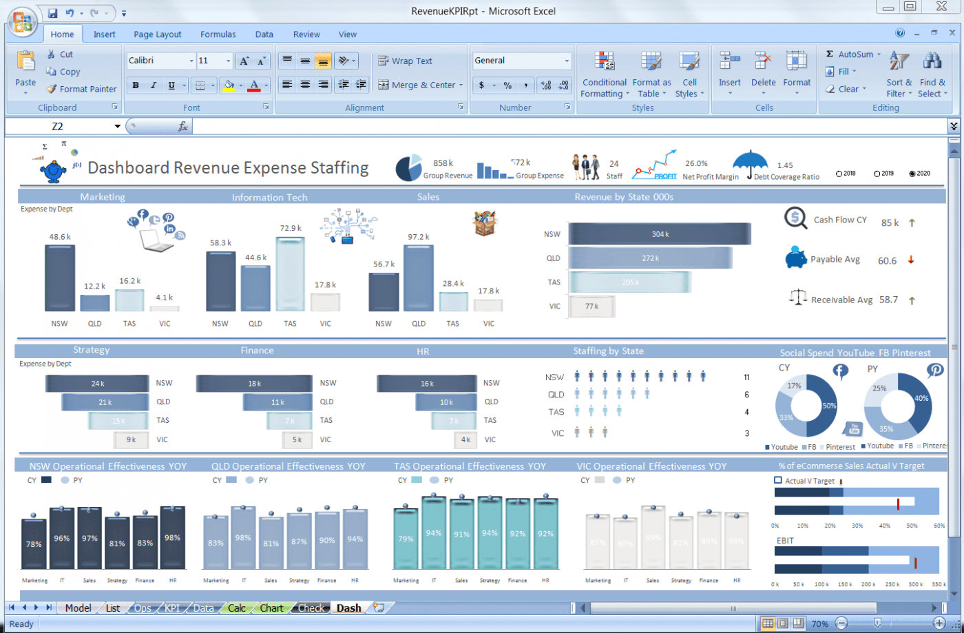
Пользуемся интерактивным дашбордом в Excel
Результат всех пройденных шагов — на картинке ниже. В одном окне мы видим все важные данные, а при необходимости можем фильтровать их и просмотреть детализацию. Например, выбрав проект «Пальмира» в срезах слева, мы получим данные именно по нему: можно сравнивать с другими, видеть, как обстоят дела по всем показателям и так далее.

Конечно, это лишь один вариант того, как можно представить данные в виде интерактивного отчета. Многое зависит от конечного пользователя, его предпочтений, набора имеющейся информации, компетенции и вовлеченности авторов дашборда.
Подведем итоги
Надеемся, вы получили понятную инструкцию про создание дашбордов в Excel шаг за шагом, а шаблоны, которые можно сделать по нашему примеру, помогут ее повторить. Теперь вы знаете, что интерактивный дашборд можно разработать и создать без дорогих профессиональных программ и в отсутствие специальных познаний.
Вам понравилась статья?

![]()
Подпишись на рассылку и получи в подарок «Каталог лучших отраслевых дашбордов»!
Хочешь получать актуальные статьи о визуализации данных?


Excel dashboard is a useful decision-making tool that contains graphs, charts, tables, and other visually enhanced features using KPIs. In addition, dashboards provide interactive form controls, dynamic charts, and widgets to summarize data and show key performance indicators in real-time.
Today’s tutorial is an in-depth guide: we are happy if you read on. But if you are in a hurry, download our templates. You will learn how to create a dashboard in Excel from the ground up. In addition, you’ll get Excel Dashboard tools and a complete dashboard framework.
Above all, it’s time to learn how to build a dynamic, interactive Excel Dashboard step by step.
Table of contents:
- What is an Excel dashboard? Differences from Reports
- Before building an Excel Dashboard: Questions and Guidelines
- How to create an Excel Dashboard
- Create a layout for your dashboard
- Get your Data into Excel
- Clean raw data
- Use an Excel Table and filter the data
- Analyze, Organize, Validate and Audit your Data
- Choose the right chart type for your Excel dashboard
- Select Data and build your chart
- Create a Dashboard Scorecard
- Best practices for creating visually effective Excel Dashboards
- Excel Dashboards Do’s and Don’ts
- Excel Dashboard Examples
What is an Excel Dashboard? Differences from Reports
It is time to clear up the differences between dashboards and reports.
- The report can be a more pages layout of the task that makes it necessary. In summary, the report comprised background data. Above all, a report is a text or table-based tool. It supports the work of employees within an organization or a company. It seldom contains visual parts. Usually, you share them by regular scheduling (daily, weekly, or monthly).
- Dashboards are the opposite of reports. Its main goal is to display the key performance indicators on one page crucial for making important decisions. It does not show details by default, but you use the drill-down method sometimes. All dashboards should answer a question.
The ideal case is when you have a dashboard showing only the essentials. Reports are yours if you want to get into the details and look behind the scenes. We can decide now on an Excel dashboard while the report supplies the background information.
The biggest mistake you can make is to use reports and dashboards as synonyms of each other! No, they are not at all alike.
Which one should I choose? If you want to know where the data comes from, you can find out from the reports. The correctly chosen KPI is easily decidable whether things are on the right course.
We recommend creating and publishing them in pairs if you want to utilize both. Then, whoever wants to see the essence looks at the dashboard, and if one wants to know the source of the data, they can read through the longer reports.
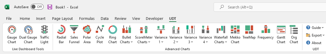
Here is our solution to create advanced charts and widgets. Learn more about the add-in.
Before building an Excel Dashboard: Questions and Guidelines
Before you take a deep dive, wait a moment! Spend time on the planning and researching phase.
Let’s see a few questions to ask yourself before you start building your dashboard.

What is the purpose of using an Excel dashboard?
A dashboard summarizes business events in an easy-to-understand format, and visuals provide real-time results. In addition, it helps us to aggregate and extract the collected values using KPIs. So you will see what you are doing right and where you need to improve.
What are the types of dashboards?
The operational dashboard shows you what is happening now. Strategic dashboards track KPIs. With the help of analytical dashboards, we can quickly identify trends.
How many KPIs does an Excel dashboard have?
Focus on business goals and use less than 10 KPIs. Show KPIs only that represent values. It’s not the place for less useful metrics; get rid of them.
What is the dashboard used for?
A co-worker, a manager, or a stakeholder has different information needs. The result must be helpful for all levels. Let us think this through carefully.
Before creating a dashboard in Excel, keep in mind your main objective.
This tutorial will help you create an Excel dashboard to track HR activities. Your goal is to show the monthly data on your main charts. Then, build a scorecard to compare the selected and past months.
The core of every Excel dashboard is a one-page layout. Why? Keep it in mind: a CEO doesn’t always interested in the details.
#1. Create a layout for your Excel Dashboard
Create a proper draft! You can use paper and pencil, but we prefer Microsoft Excel to create mockups. We have used simple, grouped shapes.
Tip: Let us review the effect of the Excel Dashboard UI mockup. In the figure below, we are showing a layout. First, select the type of grid dashboard layout that you will use. Then pick a color scheme and font type and assign it to the report. Finally, make a wireframe that contains the following style, color codes, and font types. You can prevent most issues using structured data and data tables. Read more about palettes and color combinations.
How can you create a logical workbook structure? What is this mean? Open an Excel workbook and create three sheets.
The parts of the workbook structure: Mostly, you use three worksheets for an Excel dashboard.
- Data: you can store the raw data tables here
- Dashboard Tab: the main dashboard Worksheet
- Calculation: make the calculations on this Worksheet
Your wireframe and structure are ready. Let’s start creating a dashboard in Excel!
#2. Get your data into Excel
To create an Excel Dashboard, you need to choose data sources. If the data is present in Excel, you are lucky and can jump to the next step. If not, you have to use external data sources.
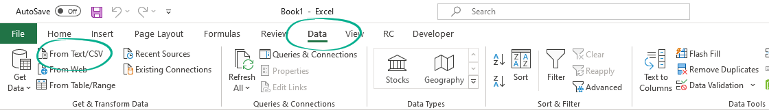
Go to the Data tab and pick one of the import options. It’s easy to import data into an Excel workbook. In the example, you are using a CSV file to create the initial dataset for our dashboard.
#3. Clean Raw Data
Our raw data is in Excel. Now you can start the data cleansing process. There are many tricks to clean and consolidate data.
- Sort data to see extremes and peaks
- Remove duplicates to avoid errors
- Change the text to lower, upper or proper case
- Remove leading and trailing spaces
How do we remove leading and trailing spaces from raw data? First, go to the Formula bar and apply the TRIM function. Now copy the formula down. Finally, use data cleansing add-ins to avoid issues and clean your data faster and easier.
Tip: Apply simple sorting in Excel to find errors! Using sorted data, you’ll find the peaks in a range (highest and lowest). Right-click on the first cell and select the ‘Sort Largest to Smallest’ option from the context menu.
#4. Use an Excel Table and Filter Data
You don’t have cleaned input in this phase, but you already have data on a worksheet. What will be the next step?
First, you must check if the required information is in a tabular format. The tabular format means that every data point lives in one cell, for example, the city’s name, address, or phone number. If it is in a tabular format, you should convert it into an Excel table and select the data range.
Choose a table or use the insert table shortcut, Ctrl + T, on the Insert Tab.
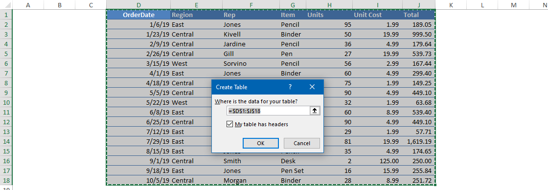
In this case, we don’t have headers. Excel will automatically insert headers into the first row. If you need more data, you can only expand the table and not lose the formulas.
#5. Analyze, Organize, Validate and Audit your Data
You took you through the method that converts raw data into a structure capable of creating a dashboard.
Ask yourself:
- Do you have to display all the data at once?
- Is it necessary to remove some data?
You can use Excel formulas and various methods to help us move forward. However, it would help if you had creativity rather than knowing all the formulas to make a useful dashboard.
So you’ll use these functions and tools to build the Excel Dashboard in Excel: XLOOKUP, IF, SUMIF, COUNTIF, ROW, NAME MANAGER.
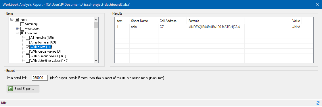
Excel grants great auditing tools to help you find and fix Workbook or Worksheet issues.
Use Microsoft Excel Inquiry to visualize which cells in your Worksheet contribute to a formula error. This step should cut down the time spent on the usual validation procedures.
So, before we start creating a chart, you have to validate the data.
If you want to analyze your data quickly, use the Quick Analysis Tool.
#6. Choose the right chart type for your Excel dashboard
Now you have an organized, cleaned, and error-free data set, it’s time to choose the proper chart.
Data is useless without the ability to visualize it. Strike a balance between great looking Excel Dashboard and its function. First, you can choose what graphs are best for different goals.
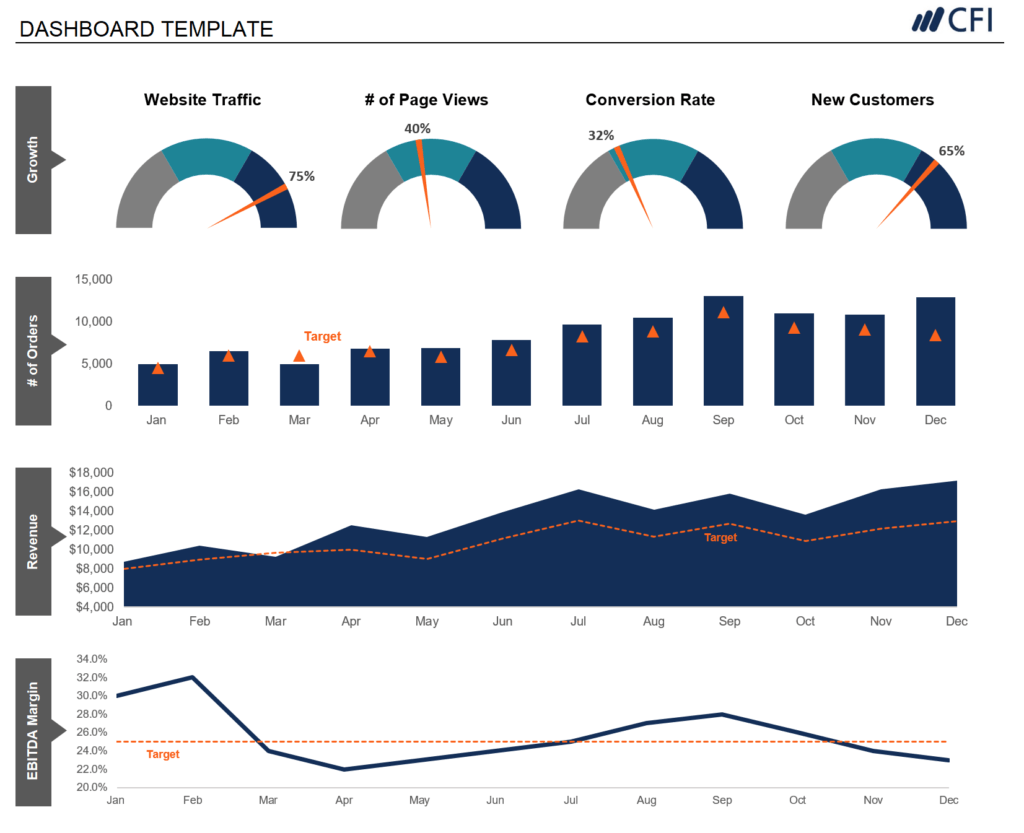
- Compare Values: Their characteristic is that they merely show high or low values. Recommended types for charting are a Column, Mekko, Bar, Line, Panel Chart, and Bullet chart. Don’t forget to check how the radial bar chart work.
- Composition: How can you display different sales results in different regions? Pie, Stacked Bar, Mekko, Stacked Column, Area, and Waterfall are the most fitting charts. We prefer geographical maps also.
- Analyzing Trends: To analyze the result of a data set in a given period, use the following charts: Line, Dual-Axis Line, and Column charts. Check this example if you want to create a quick forecast in Excel.
- Show the differences between budget and actual values: use variance charts.
- Performance measurement: Use gauge charts to see how far you are from reaching a goal. It displays a single value.
- Sparklines are tiny graphs in a worksheet cell visually representing your data set. Use sparklines to show trends in a series of values. Another helpful thing: you can highlight maximum and minimum values easily. So, the most significant impact of sparklines: you can position the chart near its data source.
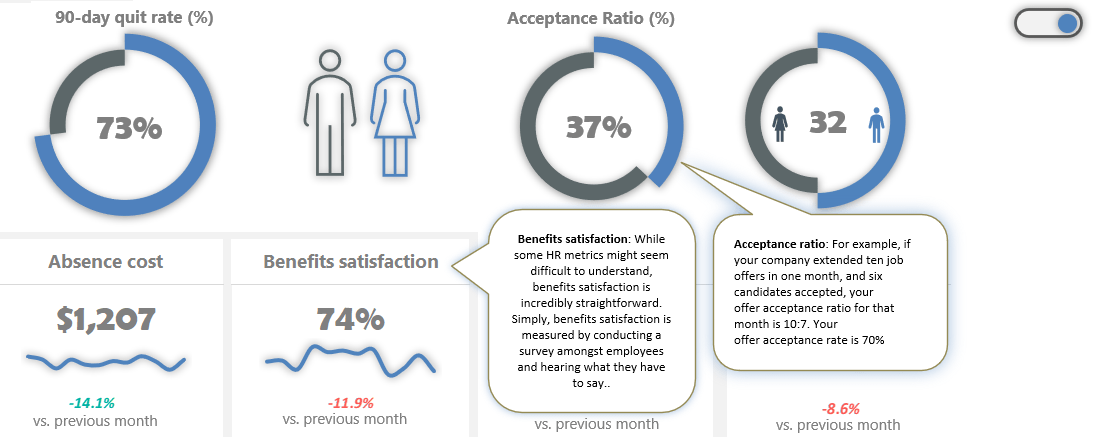
- Dynamic charts are essential if we want to create interactive charts to refresh the chart based on the user’s choice.
Your goal is to show the % of job seekers who accepted a job offer each month on a chart. In this tutorial, you’ll use custom combination charts using doughnut charts – progress circle charts – for displaying key performance indicators.
Tip: Just a few words about the pie charts. Pie charts are the most overused graphs in Excel. It’s one of the worst ways to present data. In other words, if you want to create a better dashboard, get rid of the pie charts!
#7. Select the data and build your chart
We have cleaned and grouped data in this phase and just picked the chart or graph for the data. It’s time to select the data! As you learned, the combo chart requires two doughnut charts and a simple formula.
Select the ‘Calculation‘ tab (which contains filtered data and calculated fields). Highlight the range of what you want to display. In the example, you use two values to show the Acceptance Ratio.
The actual value comes from the Data tab. After that, then calculate the reminder value using this simple formula. In this case, 75%. Next, select the ‘Calculation’ tab. Cell E23 will show the actual value. The second cell, E24, contains a simple formula and displays the remainder value as 100%.
Make sure that the value in the source cell is in percentage format! Okay, now we select the ‘Actual Value’ and ‘Reminder Value’ data. Next, open the ‘Insert Chart’ dialog to create a custom combo chart to preview and choose different chart types. Furthermore, you can move the data series to the secondary axis.
Select the inserted chart and press Control + C to duplicate the chart.
#8. Improve your charts
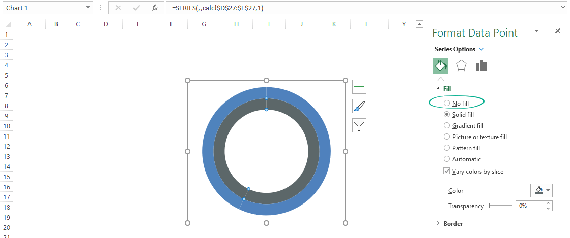
Now you have a chart that’s fit your data. It looks great, but you can improve your Excel dashboard to the next level! First, clean up the chart to remove the background, title, and borders from the chart area. Next, select the reminder value section of the outer ring.

Right-click, then choose Format Data Point. Use the ‘No fill’ option. Let’s see the inner ring, select the actual value section, and apply the ‘No fill’ option. Adjust the doughnut hole size if you want. Insert a Text Box and remove the background and border.
Link the actual value to the text box.
To do that, select Text Box. Next, go to the formula bar and press “=.” Next, select the actual value and click enter. Once the Text Box is linked with the actual value, format the text box.
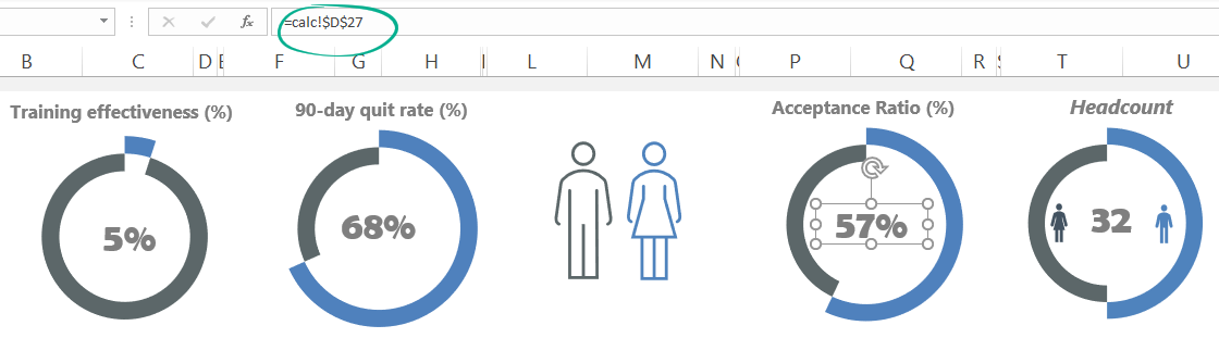
Repeat the process for the other data! For example, a typical Excel dashboard contains various charts to display data. Next, repeat the chart insertion and data validation steps for other essential metrics, like the quit rate.
Keep your source data in the Data tab and do not remove or hide it. If further calculations are necessary, use the Calculation Worksheet. If you want to replace the source data, use the Calculation sheet, not the Data Worksheet.
Tip: If you are uncertain about which charts are good for you, don’t hesitate to choose ‘Recommended Charts.‘ In this case, you will get a custom set that Excel thinks will fit best with your data.
#9. Create a Dashboard Scorecard
Your Excel dashboard is almost ready. You need only a few components to create a scorecard:
- Label,
- Actual value,
- Annual trendline,
- Variance (between the selected and the last month)
Because you need a little bit more space, merge the cells. Select the cells to place the components and click on the ‘merge cells’ button. Now, link the label name from the ‘Data’ sheet. If you change the name of the value on the ‘Data’ sheet, the widget label will reflect it. Now link the data from the ‘Data’ sheet to a ‘Dashboard’ sheet.
Go to the formula tab, enter an equal sign, and select the ‘Data’ sheet value. Next, use yearly Data on the ‘Data’ sheet and insert a line chart to create a trendline. To highlight the variance, use a little trick. Go to the ‘Calculation’ sheet and create a helper table.
Create three new conditional formatting rules.
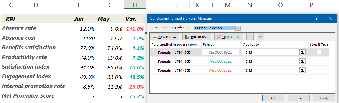
Select the cell which contains variance and copy it. Then, navigate to the ‘Dashboard’ sheet and apply the ‘Paste Special’ option. Next, choose the ‘Paste as linked Picture’ option. Working with linked pictures is easy.
Check the steps in the picture below:

We want to add dynamic text to the main sheet to indicate the changes in key metrics. You link a text to the object inserted into the main Excel dashboard. Then, if you change the value on the source sheet, the target cell will show the refreshed value. What a nice feature! You can apply this trick to textboxes or charts, like sparklines.
Best practices for creating visually effective Excel Dashboards
- A drop-down list is a space-saving solution of great value when you create one-page dashboards. You can use data validation to control the type of data or the values that users type into a cell. To build the list of options is to type them on a worksheet. You can do this method on the sheet with the drop-down menus or a different worksheet.
- Conditional formatting is the right choice to highlight cells based on any condition or rule. But, of course, you can use other methods besides colors. For example, you can achieve splendid results using icons, bars, shapes, color scales, indicators, and ratings.
- Named ranges: You can call selected cells with any given name. First, highlight a range that contains data. Then, in the name box, write the chosen name: ‘sales.’ From this point, you can save time working with cells or ranges.
- Use a scroll bar to save space on your Excel dashboard.
- Data Validation: Restrict what users can write in a single cell. Just imagine that ten users in 10 Excel workbooks write phone numbers. If you do not restrict the format of the phone numbers with the help of data validation when summing up the spreadsheets, there might be mistakes.
- Data Entry using userform and VBA: A manual data input data always carry errors. Instead, use the userform and write a short macro for it. You can create a user-friendly form that is easy to customize. Active report parts like form controls or pivot table slicers suggest playing with the chart.
- Excel Pivot Tables are the most potent weapon in Excel when working with large data sets. It is easy to use with only a few clicks; we can summarize data and drill it into any chosen structure down.
Improve your Excel Dashboard
Here are two great tips for dashboard designers: To create interactive screen tips, visit our guide! Then, by clicking on the toggle button, you can show or hide the text.
Discover how to create a ribbon navigation menu for your Excel dashboard:
A simple interactive settings menu lets you interact with your Worksheets using buttons or icons.
Frequently Asked Questions about Dashboards
- May I use a multi-page Excel dashboard? Yes, in this case, you should create easy navigation. Insert shape-based buttons and links to keep the structure.
- What kind of data connections shall you use? In the planning phase, you must know what tool you’ll use to import data into the dashboard. If you work in Excel, the solution is the Power Query and Power Bl. These tools are great for handling millions of rows in a blink of an eye. However, you can use the ODBC link or SQL DB.
- Are there compatibility issues within the company? IT pros must ensure that everyone uses the same version of Excel. If you build this into the planning phase, you can avoid problems later.
- In what format do you publish the dashboard? Do you send flat Excel tables to the users, or maybe you put the result on SharePoint? Perhaps you need to embed some charts into a PowerPoint slide? You have to review access issues also. Accessibility levels are different for a manager and the owner.
- How often does your Excel dashboard need to be updated? Should you make decisions based on real-time information? Is it enough in the regular daily, weekly, monthly, quarterly, or yearly breakdown? Outline a dashboard structure!
Excel Dashboards Do’s and Don’ts
First, take a look at some of the best practices! Then, there are several ways to boost your Excel dashboard.
You need to know the user’s requirements. Under these conditions, these conditions will only be the dashboard useful.

- How are things going?
- How will you explain to your boss the causes of increased profit?
A well-structured dashboard will give answers to these questions and much more! In addition, it can decrease the timeframe and the costs of development.
- Once you’ve defined the purpose, it’s important to identify which metrics to include. Focus on the metrics which directly align with key business goals and consider the level of detail most appropriate for your audience. This is critical; you may not get it right the first time, so keep it in mind as you build your dashboard.
- Start with users, not the data; try to understand end-users goals. If you can realize this, you will create a most useful dashboard. What is this all mean in practice? Try to understand the user’s scope. Build an Excel dashboard that is not in constant need of updates. So you can cut development costs.
- Don’t flood the user with unwanted information. Instead, you should seek that the dashboard is useful for them. Then, create custom views, filter data, and display the relevant information.
- Provide an overview and allow users to check the details. A well-planned dashboard should be like a quality newspaper. The front page provides a clear overview of the key information and leading news. However, if one wants to look at the data in detail must know where to navigate.
- Use visualization and create a clean dashboard. Charting prospects are endless. That’s where data visualization comes into play.
- Improve Dashboard UI and UX: Build a menu and control your Excel dashboard from the ribbon. Add tooltips to improve user experience.
- Use grids and consistent color schemes.
To-do list if you are using large data tables:
- Freeze Top Row: Keep the first row of the table visible while you scroll down! Use the Freeze Panes feature to keep the information on top — like table headers with column names.
- Enable Horizontal Scroll: Use this function if you have large data sets and have the main data in the first column. Go to the View Tab and choose the ‘Freeze first column.’
- Apply row styles: Frequently, we lose focus when browsing large tables. Use table-style formatting to keep our eyes on the main content.
- Use the GROUP and UNGROUP functions to drill down into details.
Common Pitfalls with Excel Dashboards
Now let’s see the most common mistakes.
- Using too many colors: I don’t tell you often enough about the importance of colors. Do you know the game “Where is Waldo?” It’s an excellent game for kids! But please don’t follow this method to create a stunning dashboard. Try to minimize the number of applied colors and use flat color schemes. Keep the visual content as simple as possible.
- You are cluttering the screen with a useless design: Hey, what do you want to see? A clean dashboard or a traffic jam? Get rid of borders and frames!
- You are using pie charts. Remember that nothing stands out when all charts are in the spotlight. All of the data displayed on a dashboard is important, but not all data are equally important.
Excel Dashboard Templates
You can create various types of dashboards for all purposes. So save your time and use these Excel dashboard examples.
Above all, let’s take a look at the most used dashboard types in Excel:
Human Resource Excel Dashboard
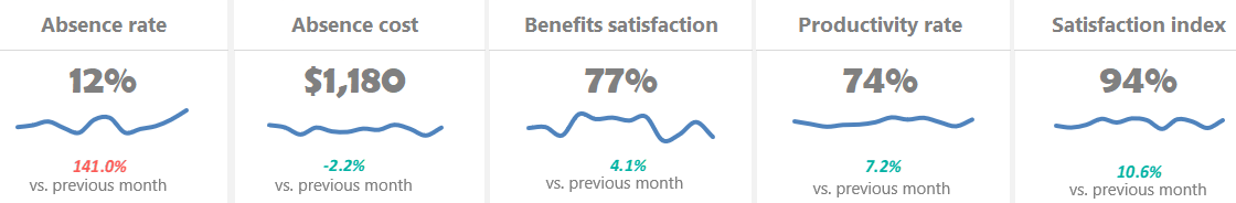
Measure the company’s activities using an HR Dashboard: set metrics that show whether given goals have been met, like turnover, recruiting, and retention. You can check all activities using a one-page dashboard.
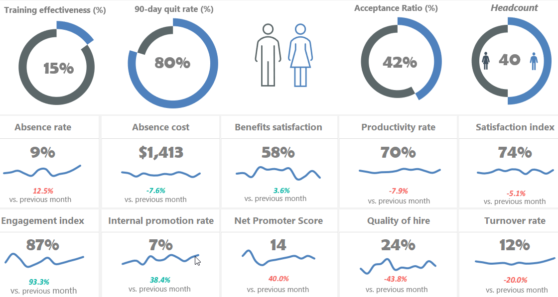
Read more and download the practice file.
Using a social dashboard, get a quick overview of your social media channel’s performance. You can include metrics like unique views, Engagement, Watch Time, and Subscribers. It’s easy to control your strategy using real-time analytics.
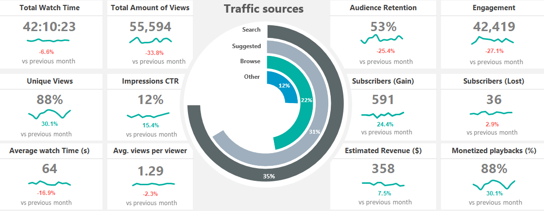
You need only a few steps to use this dashboard. First, pull your data to the Data Worksheet and select or insert your key metrics. After that, change the formatting rules on the Calc Worksheet if you want. Finally, select the given month from a list. Learn more about it and download the practice file.
Financial Dashboard (Profit and Loss)
In financial modeling, keep your eyes on the most vital metrics! First, create a sketch. After that, pull the data from different data sources. Finally, build a great Excel dashboard to view data on a single Worksheet. It is easy to use and tells the data-driven story of a company based on the update of a drop-down list.
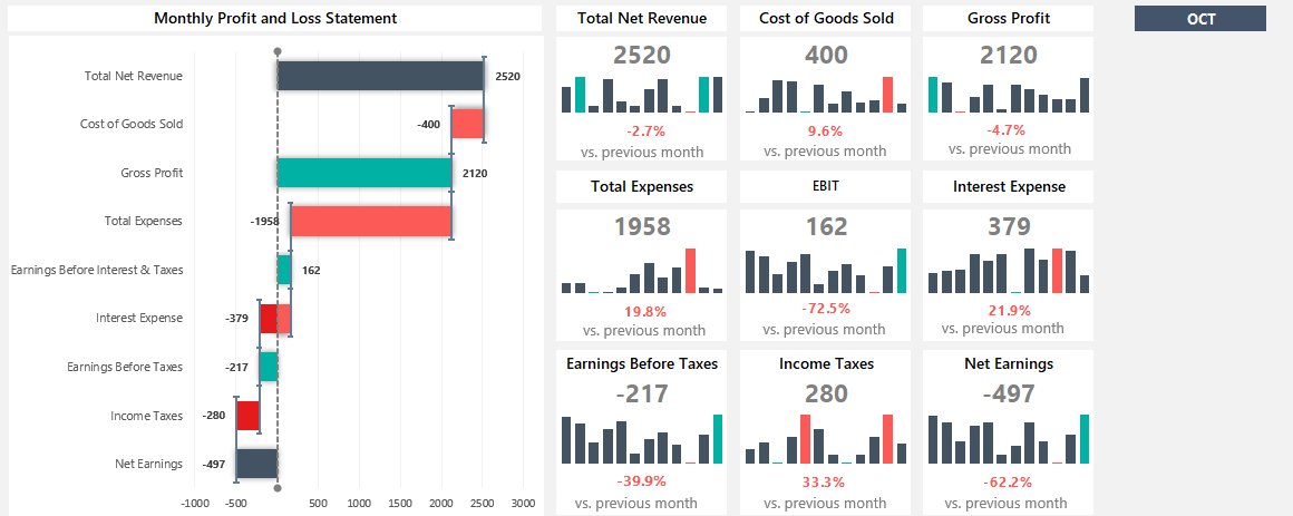
Read more
Traffic Light Dashboard
Please take a closer look at our free Excel Dashboard Widgets! We have an excellent toolkit for managing multiple projects on a single screen.
First, enable the Developer tab and install the add-in. After that, you’ll be able to create advanced dashboard elements in seconds!
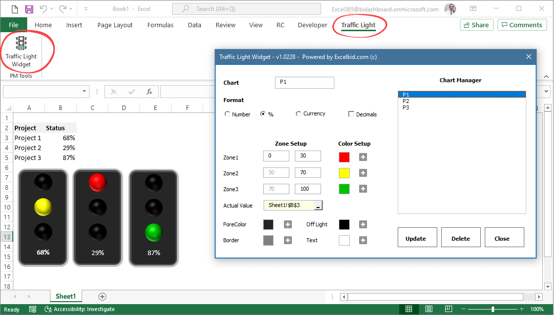
Learn more about traffic lights!
Sales tracking dashboard
Turn activities into actionable and easily editable reports to refine your sales process. For example, the sales tracking dashboard reviews sales activities to spot trends during an exact time frame. In addition, you can compare actual versus targeted results.
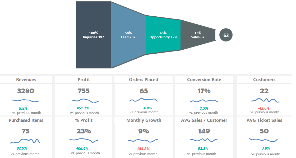
Are you tired of boring graphs in Excel? Learn the basics about the sales funnel and download the free spreadsheet!
Product Metrics Dashboard
Track sales revenue with a product metrics dashboard. This spreadsheet offers a clean layout for viewing metrics on multiple products. Show the key metrics, like Net sales and Profit Breakdown by Country, or use them for creating reports for shareholders.
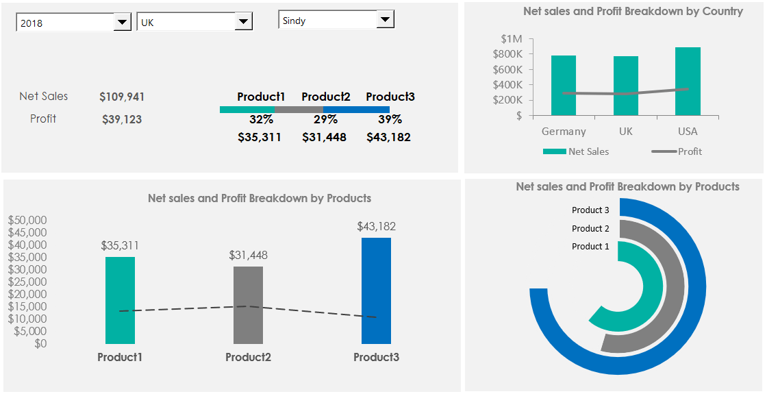
Download the practice file.
Customer Service Dashboard
This Excel dashboard will cover the main business questions we expect to find in the call center activity. First, measure the agent’s efficiency against our KPIs! Moreover, you will track the following metrics: calls, trends, call duration, and resolved calls. Last but not least, you’ll get feedback about customer satisfaction. You can read more about call center measurements here.
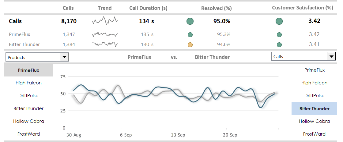
Read more
Business intelligence dashboard: BI dashboards help track core performance metrics in real-time. You can use PowerBI and Microsoft Excel for this purpose!
Web Analytics Dashboard
The web analytics dashboard tracks your site performance in real-time. First, define your key metrics like unique visitors, visits, page views, bounce rate, or average time on site. Then, compare the traffic by sources and track the referring sites, direct traffic, and other sources. Finally, discover the trend using sparklines! This Excel dashboard shows a summary based on 120 days.
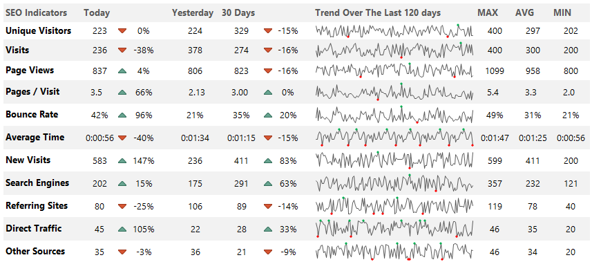
Download the example.
Wrapping things up:
Everyone wants Excel Dashboard! The truth is that creating a dashboard in Excel is more than these ten steps. If you feel comfortable with the basics of Microsoft Excel Dashboards, then have a go at it.
In conclusion:
- Use clearly defined goals.
- Learn all about Excel formulas.
- Build custom charts and be a power user.
This guide gives you a lot of stuff you can do on your dashboards. Go step by step, and success will follow. We hope that you enjoyed our article! Good luck, and stay tuned.
Each interactive Excel dashboard is compatible with Excel 2010, Excel 2013, Excel 2016 to Microsoft 365.
Additional resources and downloads:
- Free Project Management Templates
- Key Performance Indicators
- Knowledge base on Wikipedia