What Is Linear Regression?
Linear regression is a type of data analysis that considers the linear relationship between a dependent variable and one or more independent variables. It is typically used to visually show the strength of the relationship or correlation between various factors and the dispersion of results – all for the purpose of explaining the behavior of the dependent variable. The goal of a linear regression model is to estimate the magnitude of a relationship between variables and whether or not it is statistically significant.
Say we wanted to test the strength of the relationship between the amount of ice cream eaten and obesity. We would take the independent variable, the amount of ice cream, and relate it to the dependent variable, obesity, to see if there was a relationship. Given a regression is a graphical display of this relationship, the lower the variability in the data, the stronger the relationship and the tighter the fit to the regression line.
In finance, linear regression is used to determine relationships between asset prices and economic data across a range of applications. For instance, it is used to determine the factor weights in the Fama-French Model and is the basis for determining the Beta of a stock in the capital asset pricing model (CAPM).
Here, we look at how to use data imported into Microsoft Excel to perform a linear regression and how to interpret the results.
Key Takeaways
- Linear regression models the relationship between a dependent and independent variable(s).
- Also known as ordinary least squares (OLS), a linear regression essentially estimates a line of best fit among all variables in the model.
- Regression analysis can be considered robust if the variables are independent, there is no heteroscedasticity, and the error terms of variables are not correlated.
- Modeling linear regression in Excel is easier with the Data Analysis ToolPak.
- Regression output can be interpreted for both the size and strength of a correlation among one or more variables on the dependent variable.
Important Considerations
There are a few critical assumptions about your data set that must be true to proceed with a regression analysis. Otherwise, the results will be interpreted incorrectly or they will exhibit bias:
- The variables must be truly independent (using a Chi-square test).
- The data must not have different error variances (this is called heteroskedasticity (also spelled heteroscedasticity)).
- The error terms of each variable must be uncorrelated. If not, it means the variables are serially correlated.
If those three points sound complicated, they can be. But the effect of one of those considerations not being true is a biased estimate. Essentially, you would misstate the relationship you are measuring.
Outputting a Regression in Excel
The first step in running regression analysis in Excel is to double-check that the free Excel plugin Data Analysis ToolPak is installed. This plugin makes calculating a range of statistics very easy. It is not required to chart a linear regression line, but it makes creating statistics tables simpler. To verify if installed, select «Data» from the toolbar. If «Data Analysis» is an option, the feature is installed and ready to use. If not installed, you can request this option by clicking on the Office button and selecting «Excel options».
Using the Data Analysis ToolPak, creating a regression output is just a few clicks.
The independent variable in Excel goes in the X range.
Given the S&P 500 returns, say we want to know if we can estimate the strength and relationship of Visa (V) stock returns. The Visa (V) stock returns data populates column 1 as the dependent variable. S&P 500 returns data populates column 2 as the independent variable.
- Select «Data» from the toolbar. The «Data» menu displays.
- Select «Data Analysis». The Data Analysis — Analysis Tools dialog box displays.
- From the menu, select «Regression» and click «OK».
- In the Regression dialog box, click the «Input Y Range» box and select the dependent variable data (Visa (V) stock returns).
- Click the «Input X Range» box and select the independent variable data (S&P 500 returns).
- Click «OK» to run the results.
[Note: If the table seems small, right-click the image and open in new tab for higher resolution.]
Interpret the Results
Using that data (the same from our R-squared article), we get the following table:
The R2 value, also known as the coefficient of determination, measures the proportion of variation in the dependent variable explained by the independent variable or how well the regression model fits the data. The R2 value ranges from 0 to 1, and a higher value indicates a better fit. The p-value, or probability value, also ranges from 0 to 1 and indicates if the test is significant. In contrast to the R2 value, a smaller p-value is favorable as it indicates a correlation between the dependent and independent variables.
Interpreting the Results
The bottom line here is that changes in Visa stock seem to be highly correlated with the S&P 500.
- In the regression output above, we can see that for every 1-point change in Visa, there is a corresponding 1.36-point change in the S&P 500.
- We can also see that the p-value is very small (0.000036), which also corresponds to a very large T-test. This indicates that this finding is highly statistically significant, so the odds that this result was caused by chance are exceedingly low.
- From the R-squared, we can see that the V price alone can explain more than 62% of the observed fluctuations in the S&P 500 index.
However, an analyst at this point may heed a bit of caution for the following reasons:
- With only one variable in the model, it is unclear whether V affects the S&P 500 prices, if the S&P 500 affects V prices, or if some unobserved third variable affects both prices.
- Visa is a component of the S&P 500, so there could be a co-correlation between the variables here.
- There are only 20 observations, which may not be enough to make a good inference.
- The data is a time series, so there could also be autocorrelation.
- The time period under study may not be representative of other time periods.
Charting a Regression in Excel
We can chart a regression in Excel by highlighting the data and charting it as a scatter plot. To add a regression line, choose «Add Chart Element» from the «Chart Design» menu. In the dialog box, select «Trendline» and then «Linear Trendline». To add the R2 value, select «More Trendline Options» from the «Trendline menu. Lastly, select «Display R-squared value on chart». The visual result sums up the strength of the relationship, albeit at the expense of not providing as much detail as the table above.
How Do You Interpret a Linear Regression?
The output of a regression model will produce various numerical results. The coefficients (or betas) tell you the association between an independent variable and the dependent variable, holding everything else constant. If the coefficient is, say, +0.12, it tells you that every 1-point change in that variable corresponds with a 0.12 change in the dependent variable in the same direction. If it were instead -3.00, it would mean a 1-point change in the explanatory variable results in a 3x change in the dependent variable, in the opposite direction.
How Do You Know If a Regression Is Significant?
In addition to producing beta coefficients, a regression output will also indicate tests of statistical significance based on the standard error of each coefficient (such as the p-value and confidence intervals). Often, analysts use a p-value of 0.05 or less to indicate significance; if the p-value is greater, then you cannot rule out chance or randomness for the resultant beta coefficient. Other tests of significance in a regression model can be t-tests for each variable, as well as an F-statistic or chi-square for the joint significance of all variables in the model together.
How Do You Interpret the R-Squared of a Linear Regression?
R2 (R-squared) is a statistical measure of the goodness of fit of a linear regression model (from 0.00 to 1.00), also known as the coefficient of determination. In general, the higher the R2, the better the model’s fit. The R-squared can also be interpreted as how much of the variation in the dependent variable is explained by the independent (explanatory) variables in the model. Thus, an R-square of 0.50 suggests that half of all of the variation observed in the dependent variable can be explained by the dependent variable(s).
Linear regression is a statistical tool in Excel used as a predictive analysis model to check the relationship between two sets of data or variables. We can estimate the relationship between two or more variables using this analysis. For example, we can see two variables: dependent and independent variables.
- The dependent variable is the factor we are trying to estimate.
- The independent variable is the factor that influences the dependent variable.
So, using Excel linear regression, we can see how the dependent variable goes through changes when the independent variable changes and helps us to decide which variable has a real impact mathematically.
Table of contents
- Excel Linear Regression
- How to Add Linear Regression Data Analysis Tool in Excel?
- Examples
- Things to Remember
- Recommended Articles
You are free to use this image on your website, templates, etc, Please provide us with an attribution linkArticle Link to be Hyperlinked
For eg:
Source: Linear Regression in Excel (wallstreetmojo.com)
How to Add Linear Regression Data Analysis Tool in Excel?
Linear Regression in excel is available under analysis toolpakExcel’s data analysis toolpak can be used by users to perform data analysis and other important calculations. It can be manually enabled from the addins section of the files tab by clicking on manage addins, and then checking analysis toolpak.read more, a hidden tool in Excel. We can find this under the “Data” tab.
You can download this Linear Regression Excel Template here – Linear Regression Excel Template
This tool is not visible until the user enables this. To enable this, follow the below steps.
- We must first go to the FILES >>Options.
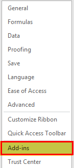
- Then, click on “Add-ins” under “Excel Options.”
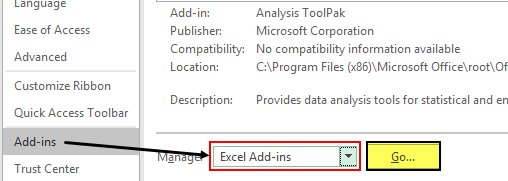
- Select “Excel Add-ins” under the “Manage” dropdown list in Excel and click on “Go.”
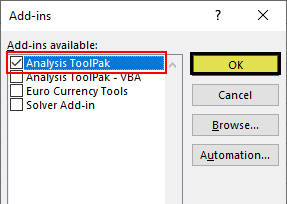
- Check the box “Analysis ToolPak” in the “Add-Ins.”
- Now, we should see the ” Data Analysis” option under the “Data” tab.
With this option, we can conduct many “Data Analysis” options. Let us see some of the examples now.
Examples
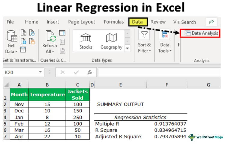
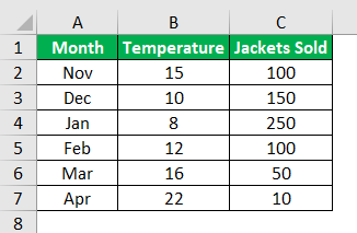
As we told you, linear regression Excel consists of two things: dependent and independent variables. For this example, we will use the below data of winter season jacket sold data with temperature in each month.
We have each month’s average temperature and jacket sold data. Here, we need to know which independent and dependent variables are.
Here “Temperature” is the independent variable because one cannot control the temperature, so this is the independent variable.
“Jackets Sold” is the dependent variable because the temperature increases and decreases in jacket sales.
Now, we will do the Excel linear regression analysis for this data.
- Step 1: We must click on the “Data” tab and “Data Analysis.”
- Step 2: Once we click on “Data Analysis,” we will see the below window. Scroll down and select “Regression” in excel.
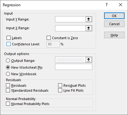
- Step 3: Select the “Regression” option and click on “OK” to open the window below.
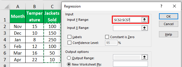
- Step 4: Here, the “Input Y Range” is the dependent variable, so in this case, our dependent variable is “Jackets Sold” data.
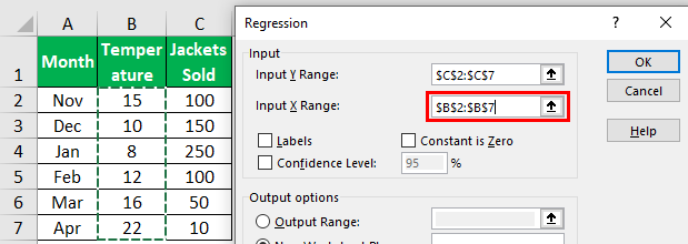
- Step 5: The “Input X Range” is the independent variable, so in this case, our independent variable is “Temperature” data.
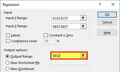
- Step 6: Select the output range as one of the cells.
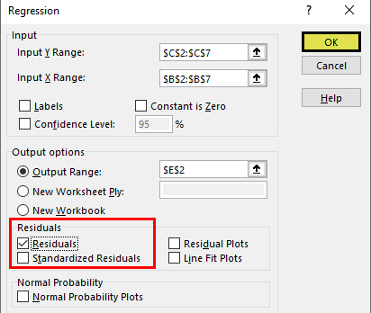
- Step 7: To get the difference between the predicted and actual values, check the “Residuals” box.
- Step 8: Click on the “OK.” We will have the below analysis.
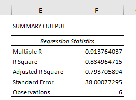
The first part of the analysis is “Regression Statistics.”
Multiple R: This calculation refers to the correlation coefficient, which measures the strength of a linear relationshipA linear relationship describes the relation between two distinct variables — x and y — in the form of a straight line on a graph. When presenting a linear relationship through an equation, the value of y is derived through the value of x, reflecting their correlation.read more between two variables. The Correlation Coefficient is the value between -1 and 1.
- 1 Indicates a strong positive relationship.
- -1 indicates a strong negative relationship.
- 0 indicates no relationship.
R Square: It is the coefficient of determinationCoefficient of determination, also known as R Squared determines the extent of the variance of the dependent variable which can be explained by the independent variable. Therefore, the higher the coefficient, the better the regression equation is, as it implies that the independent variable is chosen wisely.read more used to indicate the goodness of fit.
Adjusted R Square: This is the adjusted value for R SquareAdjusted R Squared refers to the statistical tool which helps the investors in measuring the extent of the variance of the variable which is dependent that can be explained with the independent variable and it considers the impact of only those independent variables which have an impact on the variation of the dependent variable.read more based on the number of independent variables in the data set.
Things to Remember
- We can also use the LINEST function in excelThe built-in LINEST Function in Excel calculates statistics for a line by the least-squares regression method & returns an array that defines the line proving to be well-suited for the given data. read more.
- We need to have a strong knowledge of statistics to interpret the data.
- If the data analysis is not visible under the “Data” tab, we need to enable this option under the “Add-ins” option.
Recommended Articles
This article is a guide to Linear Regression in Excel. We discuss linear regression data analysis in Excel, examples, and a downloadable Excel template. You may also look at these useful functions in Excel: –
- Formula of Coefficient of Determination
- Non-Linear Regression in Excel
- Regression vs. ANOVA
- Formula of Multiple Regression
Linear Regression in Excel (Table of Contents)
- Introduction to Linear Regression in Excel
- Methods for Using Linear Regression in Excel
Introduction to Linear Regression in Excel
Linear regression is a statistical technique/method used to study the relationship between two continuous quantitative variables. In this technique, independent variables are used to predict the value of a dependent variable. If there is only one independent variable, then it is a simple linear regression, and if a number of independent variables are more than one, then it is multiple linear regression. Linear Regression models have a relationship between dependent and independent variables by fitting a linear equation to the observed data. Linear refers to the fact that we use a line to fit our data. The dependent variables used in regression analysis are also called the response or predicted variables, and independent variables are also called explanatory variables or predictors.
A linear regression line has an equation of the kind: Y= a + bX;
Where:
- X is the explanatory variable,
- Y is the dependent variable,
- b is the slope of the line,
- a is the y-intercept (i.e. the value of y when x=0).
The least-squares method is generally used in linear regression that calculates the best fit line for observed data by minimizing the sum of squares of deviation of data points from the line.
Methods for Using Linear Regression in Excel
This example teaches you the methods to perform Linear Regression Analysis in Excel. Let’s look at a few methods.
You can download this Linear Regression Excel Template here – Linear Regression Excel Template
Method #1 – Scatter Chart with a Trendline
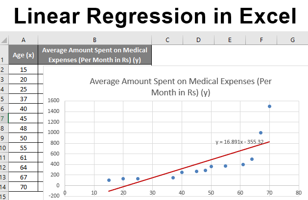
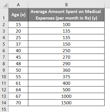
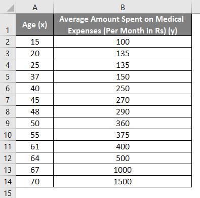
Let us say we have a dataset of some individuals with their age, bio-mass index (BMI), and the amount spent by them on medical expenses in a month. Now with an insight into the individuals’ characteristics like age and BMI, we wish to find how these variables affect the medical expenses, and hence use these to carry out regression and estimate/predict the average medical expenses for some specific individuals. Let us first see how only age affects medical expenses. Let us see the dataset:
Amount on medical expenses= b*age + a
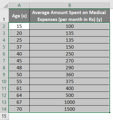
- Select the two columns of the dataset (x and y), including headers.
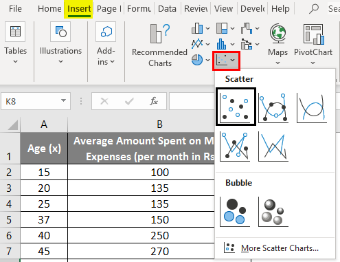
- Click on ‘Insert’ and expand the dropdown for ‘Scatter Chart’ and select ‘Scatter’ thumbnail (first one)
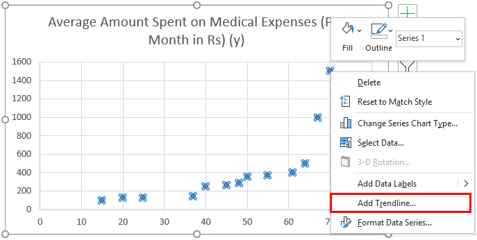
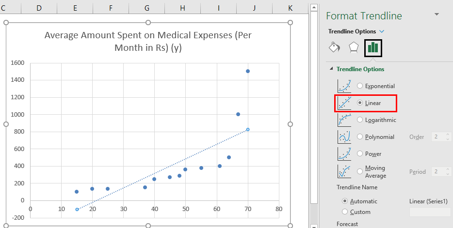
- Now a scatter plot will appear, and we would draw the regression line on this. To do this, right-click on any data point and select ‘Add Trendline.’
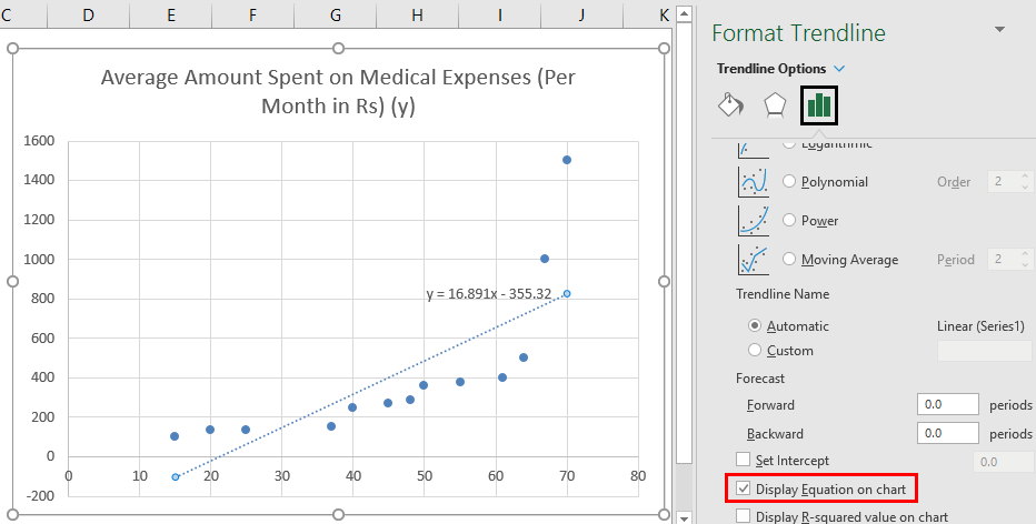
- Now in the ‘Format Trendline’ pane on the right, select ‘Linear Trendline’ and ‘Display Equation on Chart’.
- Select ‘Display Equation on Chart’.
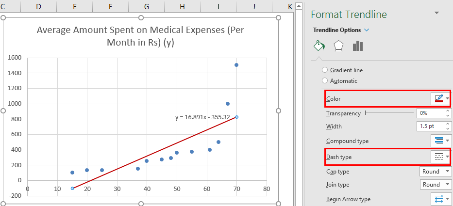
We can improvise the chart as per our requirements, like adding axes titles, changing the scale, color and line type.
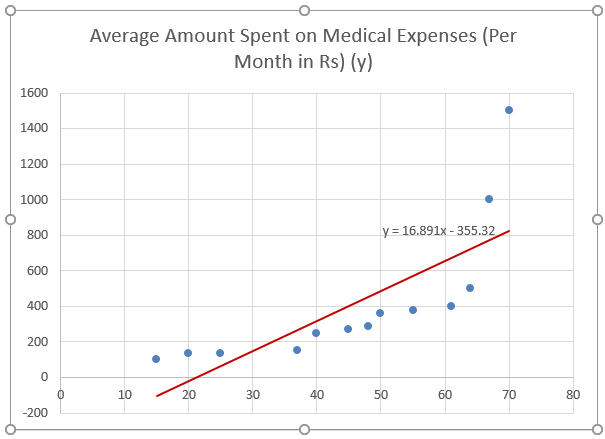
After Improvising the chart, this is the output we get.
Note: In this type of regression graph, the dependent variable should always be on the y-axis and independent on the x-axis. If the graph gets plotted in reverse order, then either switch the axes in a chart or swap the columns in the dataset.
Method #2 – Analysis ToolPak Add-In Method
Analysis ToolPak is sometimes not enabled by default, and we need to do it manually. To do so:
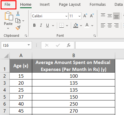
- Click on the ‘File’ menu.
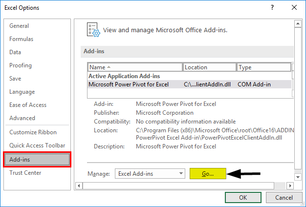
After that, click on ‘Options’.
- Select ‘Excel Add-Ins’ in the ‘Manage’ box, and click on ‘Go.’
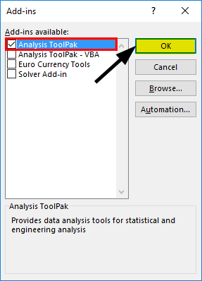
- Select ‘Analysis ToolPak’ -> ‘OK’
This will add ‘Data Analysis’ tools to the ‘Data’ tab. Now we run the regression analysis:
- Click on ‘Data Analysis’ in the ‘Data’ tab
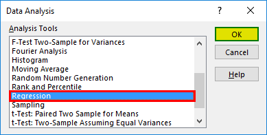
- Select ‘Regression’ -> ‘OK’
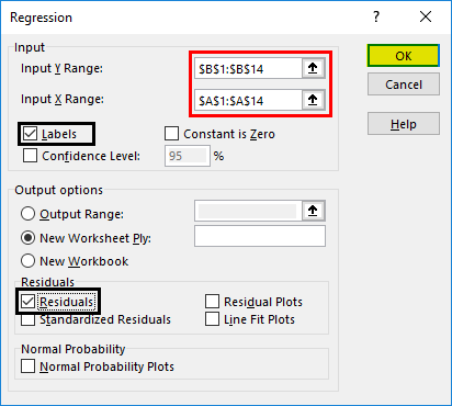
- A regression dialog box will appear. Select the Input Y range and Input X range (medical expenses and age, respectively). In the case of multiple linear regression, we can select more columns of independent variables (like if we wish to see the impact of BMI as well on medical expenses).
- Check the ‘Labels’ box to include headers.
- Choose the desired ‘output’ option.
- Select the ‘residuals’ checkbox and click ‘OK.
Now our regression analysis output will be created in a new worksheet, stating the Regression Statistics, ANOVA, residuals and coefficients.
Output Interpretation:
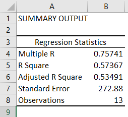
- Regression Statistics tells how well the regression equation fits the data:
- Multiple R is the correlation coefficient that measures the strength of a linear relationship between two variables. It lies between -1 and 1, and its absolute value depicts the relationship strength with a large value indicating a stronger relationship, a low value indicating negative and zero value indicating no relationship.
- R Square is the Coefficient of Determination used as an indicator of goodness of fit. It lies between 0 and 1, with a value close to 1 indicating that the model is a good fit. In this case, 0.57=57% of y-values are explained by the x-values.
- Adjusted R Square is R Square adjusted for a number of predictors in the case of multiple linear regression.
- Standard Error depicts the precision of regression analysis.
- Observations depict the number of model observations.
- Anova tells the level of variability within the regression model.
This is generally not used for simple linear regression. However, the ‘Significance F values’ indicate how reliable our results are, with a value greater than 0.05 suggesting to choose another predictor.
- Coefficients are the most important part used to build regression equation.
So, our regression equation would be: y= 16.891 x – 355.32. This is the same as that done by method 1 (scatter chart with a trendline).
Now, if we wish to predict average medical expenses when age is 72:
So y= 16.891 * 72 -355.32 = 860.832
So this way, we can predict values of y for any other values of x.
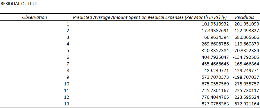
- Residuals indicate the difference between actual and predicted values.
The last method for regression is not so commonly used and requires statistical functions like slope (), intercept (), correl (), etc., to carry out regression analysis.
Things to Remember About Linear Regression in Excel
- Regression analysis is generally used to see if there is a statistically significant relationship between two sets of variables.
- It is used to predict the value of the dependent variable based on the values of one or more independent variables.
- Whenever we wish to fit a linear regression model to a group of data, then the range of data should be carefully observed. If we use a regression equation to predict any value outside this range (extrapolation), it may lead to wrong results.
Recommended Articles
This is a guide to Linear Regression in Excel. Here we discuss how to do Linear Regression in Excel along with practical examples and a downloadable excel template. You can also go through our other suggested articles –
- Excel Regression Analysis
- Linear Programming in Excel
- Linear Interpolation in Excel
- Statistics in Excel
In this tutorial, you’ll learn how to perform Linear Regression in Excel. Linear regression is an approach to linear modeling the relationship between a dependent and an independent variable. Simple linear regression uses an independent variable to predict the outcome of the dependent variable.
The equation for linear regression is given by: y = a + bx, where x is the independent variable, y is the dependent variable and the coefficients are given by:
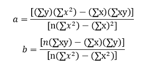
Our aim is to find coefficients a which is the intercept and b which is the slope to obtain the equation of the straight line which best fits our data by the least square method. There are two ways in Excel in which we can find the linear regression line which is discussed below for the following data set:
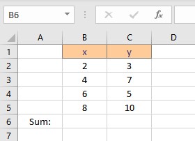
Calculate Linear Regression in Excel Using Its Formula
First, we need to calculate the parameters in the formula for coefficients a and b. The parameters are Σx, Σy, Σxy and Σx2 . To calculate Σx follow these steps:
- Select the cell where you want to calculate and display the summation of x.
- Type =SUM(, select the cells containing the numbers and complete the formula with ).
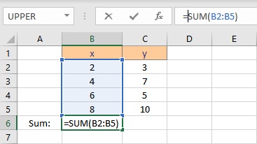
- Press the Enter key to display the result.
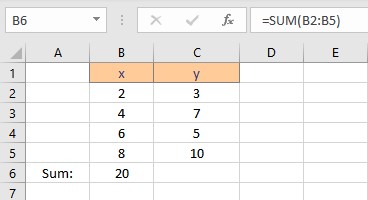
To calculate Σy follow these steps:
- Select the cell where you want to calculate and display the summation of y.
- Type =SUM(, select the cells containing the numbers and complete the formula with ).
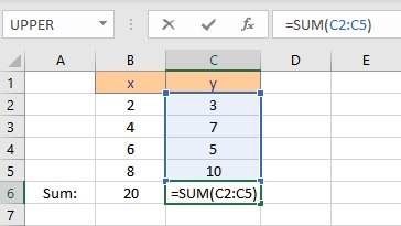
- Press the Enter key to display the result.
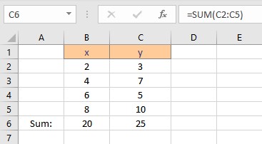
To calculate Σxy follow these steps:
- Select the cell where you want to calculate and display the product of a pair of x and y values.
- Type =B2*C2, as the first x and y values are in cells B2 and C2 respectively.
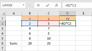
- Press the Enter key to display the result.
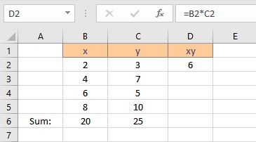
- Copy the formula for the calculation of product xy for the entire list by dragging down the fill handle.
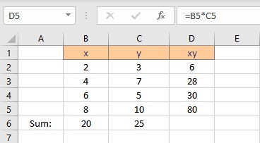
- Select the cell where you want to calculate and display the summation of xy.
- Type =SUM(, select the cells containing the numbers and complete the formula with ).
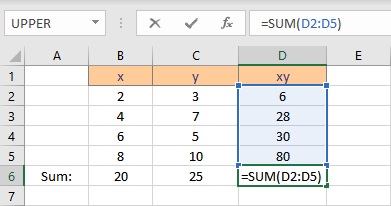
- Press the Enter key to display the result.
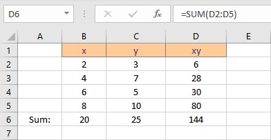
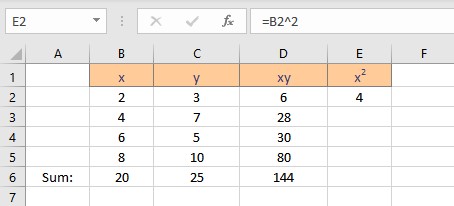
To calculate Σx2 follow these steps:
- Select the cell where you want to calculate and display the square of the first x value.
- Type =B2^2, as the first x value, is in cell B2. The caret operator raises the number to the power written next to it.
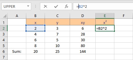
- Press the Enter key to display the result.
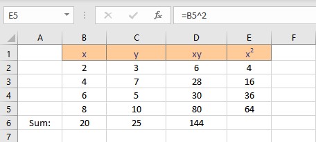
- Copy the formula for the calculation of squares of x for the entire list by dragging down the fill handle.
- Select the cell where you want to calculate and display the summation of x2.
- Type =SUM(, select the cells containing the numbers and complete the formula with ).
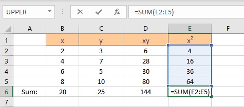
- Press the Enter key to display the result.
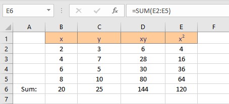
We now have the parameters essential for the calculation of coefficients intercept a and slope b. Follow the steps to calculate the intercept a:
- Select the cell where you want to display the value of the intercept.
- Type =(C6*E6-B6*D6)/(4*E6-B6^2), where C6 contains the value of Σy, E6 contains the value of Σx2, B6 contains the value of Σx, D6 contains the value of Σxy and 4 is the number of data points in the data set.
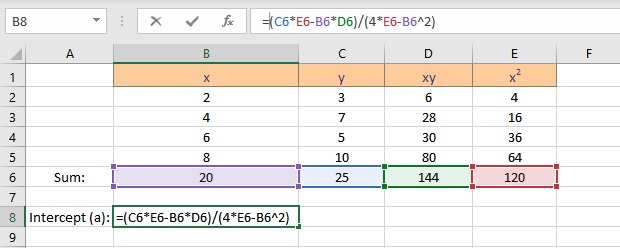
- Press the Enter key to display the result.
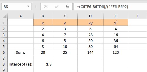
Follow the steps to calculate the slope b:
- Select the cell where you want to display the value of the slope.
- Type =(4*D6-B6*C6)/(4*E6-B6^2), where C6 contains the value of Σy, E6 contains the value of Σx2, B6 contains the value of Σx, D6 contains the value of Σxy and 4 is the number of data points in the data set.
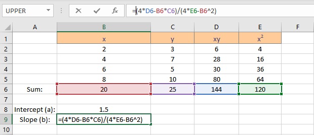
- Press the Enter key to display the result.
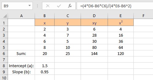
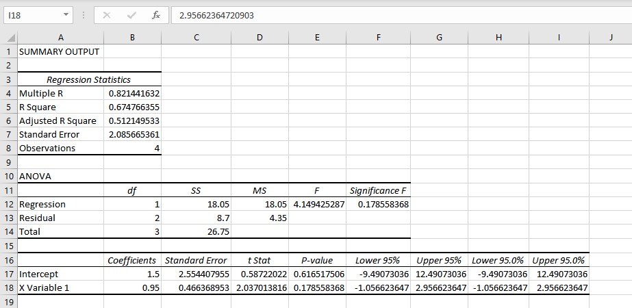
We have the values for the slope and intercept, the equation for the linear regression can be written as y = 1.5 + 0.95x. This equation can now be used to predict values of y for different values of x.
Linear Regression in Excel Using Data Analysis
To use the Data Analysis feature, you need to enable Analysis Toolpak in Excel. Follow these steps to manually enable the feature:
- Click on the File option present at the top left corner of the Excel window.
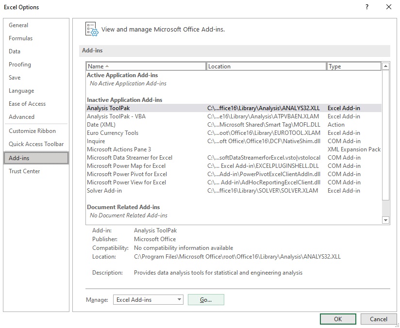
- From the menu that appears, click on Options to launch the Excel Options dialog box.
- Select the Add-ins option at the left side of the Excel Options dialog box.
- Select Excel Add-ins in the Manage box, and click Go.
- In the Add-ins dialog box, check the Analysis Toolpak checkbox, and then click OK.
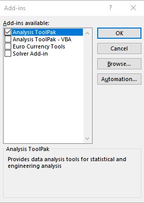
- The Data Analysis option now appears in the Analysis group on the Data tab.

Follow these steps to perform linear regression using Data Analysis:
- Click on Data Analysis present in the Analysis group on the Data tab.
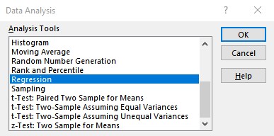
- From the Data Analysis dialog box that appears, select Regression under the Analysis Tools and click on OK.
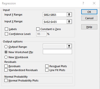
- Enter the cell ranges containing y values in the Input Y Range: text box and x values in the Input X Range: text box in the Regression dialog box and click OK.
- The results are displayed in a new worksheet. You can copy the intercept and slope coefficients to obtain an equation for the linear regression: y = 1.5 + 0.95x.
Conclusion
In this tutorial, we learned how to perform linear regression both using the formulas and Excel Add-ins.
References
- Load the Analysis ToolPak in Excel – Office Support (microsoft.com)
How to do Linear Regression in Excel: Full Guide (2023)
Linear regression is an easy way of evaluating the relationship between two variables.
Previously, performing linear regression in Excel was nothing less than a complex task. But with advanced Excel data analysis tools, it is now only a matter of a few clicks.
The guide below will not only teach you how to perform linear regression in Excel but also how you may analyze a linear regression graph in Excel.
So, without further ado, let’s dive right in 👇
Download our free sample workbook here as you continue reading.
Linear regression equation
Simple linear regression draws the relationship between a dependent and an independent variable.
👉 The dependent variable is the variable that needs to be predicted (or whose value is to be found).
👉 The independent variable explains (or causes) the change in the dependent variable.
Simply put, the dependent variable depends upon the independent variable. And as the independent variable changes, the dependent variable changes too.
Mathematically, the linear relationship between these two variables is explained as follows:
Y= a + bx
Where,
Y = dependent variable
a = regression intercept term
b = regression slope coefficient
x = independent variable
“a” and “b” are also called regression coefficients. And Excel returns the predicted values of these regression coefficients too.
How to do linear regression through a graph
Imagine a company that sells sweaters in a cold region. And the sale of sweaters is directly linked to the temperatures in that region.
The colder it is (low temperatures 🥶), the higher the sales of sweaters 🧣 go. This means sales (the dependent variable) depend upon the temperature (the independent variable).
Now, to predict the company’s sales for the future, you must analyze the sales trend in the past. This can be done by drawing a trendline.
Drawing this trendline between a dependent variable Y (the sales) and an independent variable X (the temperature) is called running linear regression.
So let’s do it!

The image above contains the historical data for both variables (temperatures and sales) for a few months.
To explain the relationship between these variables, we need to make a scatter plot.
To plot the above data in a scatter plot in Excel:
- Select the data.
- Go to the Insert Tab > Charts Group

- Click on the scatterplot part icon.
- Choose a scatter plot type from the drop-down menu.

Excel plots the data in a scatter plot.

Note that each dot in the scatter plot above is formed at the intersection of Variable X and Y.
For example, the first dot is plotted at the point where Y = 625 and X = 2.
Next, we must draw a trend line out of this scatter plot. To do so:
- Click anywhere on the chart to select it.
- Click on the “+” icon on the top right of the chart.

- Hover your cursor over the option “Trendline”📈
A drop-down menu appears.

- Select More Options. This will take you to the Format Trendline Pane.
- Choose the linear trendline option to draw a trendline between the scatter points.

And there you go! Excel draws a linear trendline on the scatterplot.

The above image shows a downward regression line which represents a negative trend. But why is that?
To understand that, you must know how to analyze the results of a linear regression graph. And don’t worry – it’s only a section ahead.
Adding the equation and R-squared
We also want Excel to show the equation and R-squared for this graph. For that:
- Scroll down the Task pane.
- Check the option for “Equation” and “R-squared” on the graph.

And Excel will display the following regression statistics on the graph:
Equation: y= -19.622x + 612.77
R-squared= 0.7456

What are these? And what do they tell? We will discuss this shortly.
Pro Tip!
How to quickly interpret the relationship between two variables? By checking the sign of the x variable 💡
A positive sign means a positive relationship. And a negative sign means a negative relationship between the two variables.
Since our equation shows a “-19.622x”, the relation between our variables is negative.
Formatting the trendline
Do you also find the trendline a little overshadowed? Not to worry – You can always format it in Excel.
For example, to change the color of the trendline:
- Select the trendline and right-click on it to launch the context menu.
- Go to Format Trendline.
- Under the Format Trendline pane, select “Fill & Line”.
- To change the color of the trendline, choose a color as shown below.

Guess we will go with red for now 🚩 What do you think about it?

Trendline Style
Not only the color, but you can also change the style of the trendline.
Say, we want to change our dotted trendline to a solid one. To do so:
- Select the trendline and right-click on it to launch the context menu.
- Click on Format Trendline to launch the Format Trendline Pane.
- Go to “Dash type” from the fill & line menu.
- Select a solid line type.

This will change the style of the trendline from a dotted line to a perfectly solid line.

Chart Title
To enhance the readability of the graph, you may add graph titles and axes titles to it as follows:
- Select the graph.
- Go to Chart Elements > Chart Title > above chart.

- Type in a Graph/Chart title as desired.

Axis titles
How about adding the Axis titles too?
To add a vertical title (for the Y-axis) to your chart:
- Click Chart Elements > Axis Titles > Primary Vertical.

- Type in a suitable title for the subject axis.
We have set the title for the Y-axis to “Sale of Sweaters”.

To add a horizontal Axis Title (for the X-axis):
- Go to Chart elements > Axis Titles > Primary Horizontal.

- Type in a suitable title for the subject axis.
We have set the title for the X-axis to “Avg. Temperature”

And that’s it. We’ve successfully run linear regression in Excel 🥳
How to analyze the linear regression graph
Good job with running linear regression in Excel.
Now is the time that we analyze the linear regression trendline formed above.
A linear trendline in Excel can take the following three shapes:
Positive trendline (upward facing)
If your trendline is upward facing (it elevates as it goes from left to right), it denotes a positive trend.
This means that there exists a positive relationship between both variables. An increase in the independent variable causes the dependent variable to increase.
This is how your graph will look with a positive trendline to it.

Negative trendline (downward sloping)
If your trendline is downward sloping (it slopes down as it goes from left to right), it denotes a negative trend.
A negative trendline means a negative relationship between both variables.
When there is a negative relationship between two variables, an increase in the independent variable causes the dependent variable to decrease.
This is how your graph will look with a negative trendline to it.

Jog down your memory lane to remember the trendline type in our example above. It was also a downward-sloping (negative) trendline.
That’s because there exists a negative relationship between sales and temperature. As the temperature falls, sales increase.
No trend
The two variables can also be independent of each other. In this case, movement in both variables is random with no relation to each other.
As there exists no relationship between them (neither positive nor negative), there is no particular slope for the trendline between them (neither upward facing nor downward sloping).
Such a trendline might look like this.

The trendline above is not exactly horizontal but very close to that. This is because there is no relation between the variables.
The slope of the graph
What if we want to know the percentage of change in Y caused by a change in X?
For example, for every 1% decrease in temperature, sales increase by what percentage?
The slope of the graph is an answer to this. Remember the linear regression equation?
Y = a + bx
In the above equation, the slope is represented by “b”. And the linear regression equation for our example turned out as follows:
Y= 612.77 – 19.622x
Here, the value for b is -19.622 and so is our slope. This means that a 1% change in the X variable (the temperature) causes a -19.622% change in the Y variable (the sales).
Also, as the sign with the value for b is a minus sign, this means that a 1% decrease in Variable X (temperature) causes a 19.622% increase in Variable Y (Sales).

Pro Tip!
An easy way to remember the slope is to remember Rise over Run. Rise means vertical axis. Run means horizontal axis. So the slope defines the change in variable Y caused by a change in variable X.
R-Squared
Another important output of our scatterplot is the R-squared value 👀
It tells us how much variation of the dependent variable comes from the change in the independent variable.

The R-squared for our example is 0.7456.
This tells that only 74.56% variation of Variable Y can be explained by Variable X.
Another statistical measure relevant to the linear regression model is the p value. However, it is totally opposite to the concept of R-squared.
That’s it – Now what?
The above guide explains how to perform a linear regression analysis in Excel. And then, how to analyze the linear regression trendline and other relevant statistics.
👉 In addition to that, it also explains how you may format a trendline in Excel in different ways.
Performing linear regression in Excel through a scatter plot is super smart. But this is only one feature of Excel.
And there are many more smart functions in Excel. Like the VLOOKUP, SUMF, and IF functions.
Want to learn them already? Enroll in my 30-minute free email course that teaches you these and many more functions of Excel.
Other resources
Linear regression can be challenging to understand. But once you get a hold of it, you can run it for any possible dataset with sheer ease.
In addition to linear regression, Excel offers other forecasting functions too. Like the data analysis tools in Excel and the Excel FORECAST function.
Kasper Langmann2023-02-23T14:55:48+00:00
Page load link

