
Updated on September 11, 2020
In a chart or graph in a spreadsheet program such as Microsoft Excel, the legend is often located on the right-hand side of the chart or graph and is sometimes surrounded by a border. The legend is linked to the data being graphically displayed in the plot area of the chart. Each specific entry in the legend includes a legend key for referencing the data.
The information in this article applies to Excel 2019, 2016, 2013, Excel for Mac, and Excel Online.
What Are Legend Keys?
To add to the confusion between legends and keys, Microsoft refers to each individual element in a legend as a legend key. A legend key is a single colored or patterned marker in the legend. To the right of each legend key is a name identifying the data represented by the specific key.
Depending on the type of chart, the legend keys represent different groups of data in the accompanying worksheet:
- Line Graph, Bar Graph, or Column Chart: Each legend key represents a single data series. For example, in a column chart, there might be a blue legend key that reads Favorite Snacks Votes next to it. The blue colors in the chart refer to the votes for each entry in the Snacks series.
- Pie Chart or Circle Graph: Each legend key represents only a portion of one data series. To use the same example from above, but for a pie chart, every cut of the pie is a different color that represents each «Snacks» entry. Every portion of the pie is a different size of the whole circle to represent the vote differences taken from the «Votes» series.
Editing Legends and Legend Keys
In Excel, legend keys are linked to the data in the plot area, so changing the color of a legend key will also change the color of the data in the plot area. You can right-click or tap-and-hold on a legend key, and choose Format Legend, to change the color, pattern, or image used to represent the data.
To change options related to the whole legend and not just a specific entry, right-click or tap-and-hold to find the Format Legend option. This is how you change the text fill, text outline, text effect, and text box.
How to Show the Legend in Excel
After making a chart in Excel, it’s possible that the legend doesn’t automatically show. You can enable the legend by simply toggling it on. Here’s how:
-
Select your existing chart.
-
Select Design.
-
Select Add Chart Element.
-
Select Legend.
-
Choose where the legend should be placed — right, top, left, or bottom. There’s also a More Legend Options > Top Right if you prefer.
If the option to add a legend is grayed out, it just means that you need to select data first. Right-click the new, empty chart and choose Select Data, and then follow the on-screen instructions to choose the data that the chart should represent.
Thanks for letting us know!
Get the Latest Tech News Delivered Every Day
Subscribe
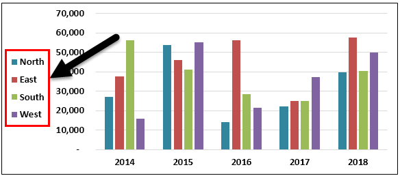
Legends in excel chartExcel chart legends depict description of significant elements and provides easy access to any chart. These legends are represented with the help of colours or symbols and distinguish data for better understanding.read more are a representation of data itself. It is used to avoid confusion when the data has the same values in all the categories. In addition, it is used to differentiate the classes, which helps the user or viewer to understand the data more properly. It is located on the right-hand side of the given Excel chart.
Add Legends to Excel Charts
Legends are a small visual representation of the chart’s data series to understand each without confusion. Legends are directly linked to the chart data range and change accordingly. In simple terms, if the data includes many colored visuals, legends show what each visual label means.
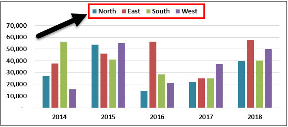
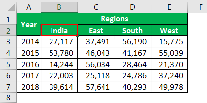
If you look at the below image of the graph, the graph represents each year’s region-wise sales summary. So in a year, we have four zones: each year, the red color represents the North zone, the orange color represents the East zone, the green color represents the South zone, and light blue represents the West zone.
In this way, legends are useful in identifying the same set of data series in different categories.
Regarding legends, we cover all the things you need to know about the excel chart legends; follow this article to know the ins and outs of legends.
Table of contents
- Add Legends to Excel Charts
- How to Add Legends to Chart in Excel?
- Example #1 – Work with Default Legends in Excel Charts
- Example #2 – Positioning of Legends in Excel Charts
- Example #3 – Excel Legends are Dynamic in Nature
- Example #4 – Overlapping of Legends in Excel Chart
- Things to Remember While Adding Legends in Excel
- Recommended Articles
- How to Add Legends to Chart in Excel?

You are free to use this image on your website, templates, etc, Please provide us with an attribution linkArticle Link to be Hyperlinked
For eg:
Source: Legends in Excel Chart (wallstreetmojo.com)
How to Add Legends to a Chart in Excel?
Below are a few examples of adding legends in Excel.
You can download this Add Legends to Chart Excel Template here – Add Legends to Chart Excel Template
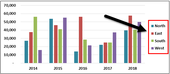
When you create a chart in excelIn Excel, a graph or chart lets us visualize information we’ve gathered from our data. It allows us to visualize data in easy-to-understand pictorial ways. The following components are required to create charts or graphs in Excel: 1 — Numerical Data, 2 — Data Headings, and 3 — Data in Proper Order.read more, we see legends at the bottom of the chart below the X-axis.
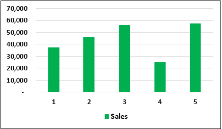
The above chart is a single legend, i.e., in each category, we have only one set of data, so there is no need for legends here. But, in the case of multiple items in each category, we have to display legends to understand the scheme of things.
For example, look at the below image.
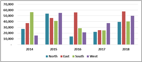
Here 2014, 2015, 2016, 2017, and 2018 are the main categories. Under these categories, we have sub-categories that are common for all the years, i.e., North, East, South, and West.
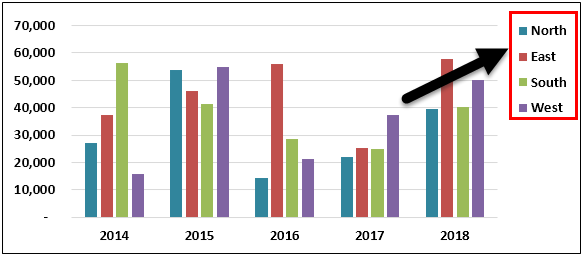
Example #2 – Positioning of Legends in Excel Charts
As we have seen, by default, we get legends at the bottom of every chart. But that is not the end; we can adjust it to the left, right, top, right, and bottom.
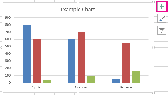
For changing the positioning of the legends in Excel 2013 and later versions, there is a small PLUS button on the right-hand side of the chart.
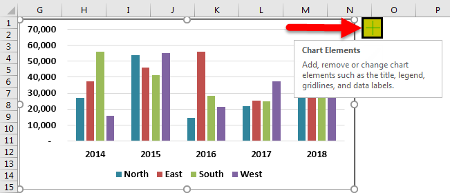
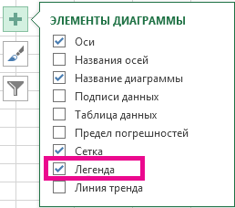
If we click on that PLUS icon, we will see all the chart elements.
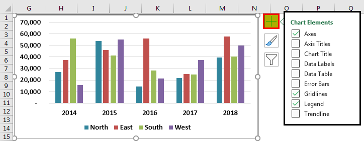
Here we can change, enable, and disable all the chart elements. Now, go to Legend and place a cursor on the legend; we will see Legend options.
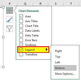
It is showing as Bottom, i.e., legends are showing at the bottom of the chart. You can change the position of the legend as per your wish.
The below images will display the different positioning of the legend.
Legend at Right Side
Click on the “Right” option in “Legend.”
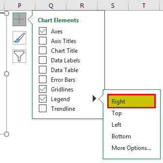
We will see the legends on the right-hand side of the graph.
Legends at the top of the chart
Select the “Top” option from the “Legend,” and we may see the legends at the chart’s top.
Legends at the Left Side of the chart
Select the “Left” option from the “Legend,’ and we may see the legends on the left side of the chart.
Legends at the Top Right Side of the Chart
Go to “More Options,” select the “Top Right” option, and see the following result.
If you are using Excel 2007 and 2010, the positioning of the legend will not be available, as shown in the above image. Instead, select the chart and go to “Design.”
Under Design, we have the Add Chart Element.
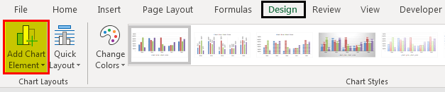
Click on the drop-down list of Add Chart Element > Legends > Legend Options.

In the above tool, we need to change the legend positioning.
Legends are dynamic in Excel as formulas. Since the legends are directly related to the data series, any changes made to the data range will affect legends directly.
For example, look at the chart and legends.

We will change the “North” zone’s color to “red” and see the impact on legends.
Legends’ indication color has also changed to red color automatically.
We will change the North zone to India in the Excel cell for experiment purposes.
Now see what the legend name is.

It automatically updated the legend name from North to INDIA. These legends are dynamic if directly referred to as the data series range.
Example #4 – Overlapping of Legends in Excel Chart
By default, legends will not overlap other chart elements, but if space is too constrained, they will overlap on other chart elements. Below is an example of the same.
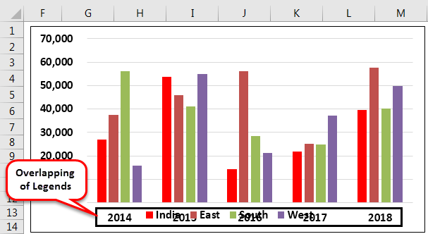
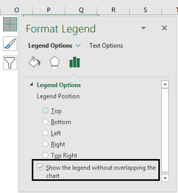
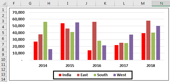
In the above image, legends are overlapped on the X-axis. To make it proper, go to legends and check the option “Show the legend without overlapping the chart.”
It will separate the legends from other chart elements and show them differently.
Below are a few things to remember.
- By default, we get legends at the bottom.
- Legends are dynamic and change as per the change in color and text.
- We can change the positioning of the legend as per our wish but cannot place it outside the chart area.
Recommended Articles
This article is a guide to Legends in Excel Chart. We discuss adding legends in Excel with examples and downloadable Excel templates. You may also look at these useful functions in Excel: –
- Chart Templates in Excel
- Excel Chart Wizard
- Create a Line Chart in Excel
- Histogram Excel Chart
Excel for Microsoft 365 Excel 2021 Excel 2019 Excel 2016 Excel 2013 More…Less
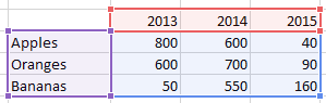
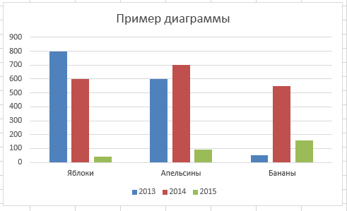
Most charts use some kind of a legend to help readers understand the charted data. Whenever you create a chart in Excel, a legend for the chart is automatically generated at the same time. A chart can be missing a legend if it has been manually removed from the chart, but you can retrieve the missing legend.
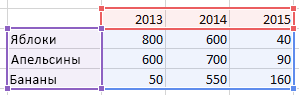
This example chart shows a legend explaining the colors for the years 2013, 2014, 2015.
In this article
-
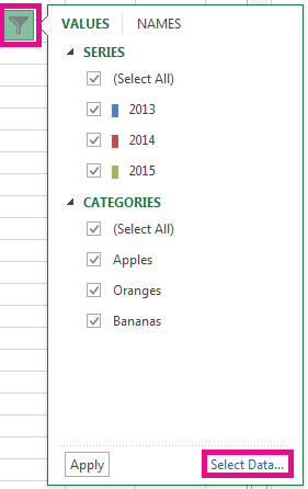
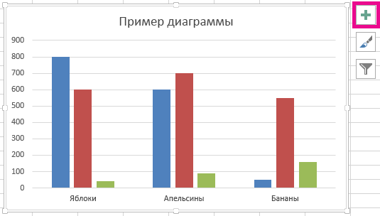
Add a chart legend
-
Edit legend texts

Add a chart legend
-
Click the chart.
-
Click Chart Elements
 next to the table.
 -
Select the Legend check box.
The chart now has a visible legend.
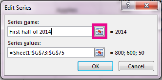
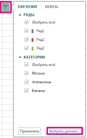
Edit legend texts
If the legend names in the chart are incorrect, you can rename the legend entries.
-
Click the chart.
-
Click Chart Filters
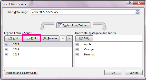
next to the chart, and click Select Data. -
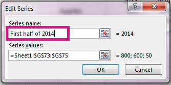
Select an entry in the Legend Entries (Series) list, and click Edit.
-
In the Series Name field, type a new legend entry.
Tip: You can also select a cell from which the text is retrieved. Click the Identify Cell icon
, and select a cell. -
Click OK.
Related Topics
Create a chart from start to finish
Get Microsoft chart templates
Need more help?
Creating an Excel Chart Legend To create a legend in Excel, start by clicking on the chart or graph. You’ll see a plus sign on the right. Click on this, and a Chart Elements menu pops up. Check the box next to “Legend.” A chart or graph legend will immediately appear.
Contents
- 1 How do I add a legend in Excel without charts?
- 2 What is a legend in Excel?
- 3 How do you show the legend in Excel chart?
- 4 Where is the legend command in Excel?
- 5 How do you add two legends in Excel?
- 6 How do you write a legend?
- 7 How do I insert a color coded legend in Excel?
- 8 How do you make a legend on a map?
- 9 How do you add a legend to a chart in Excel Mac?
- 10 How do you display data labels in Excel?
- 11 What are figure legends?
- 12 How do I superscript axis labels in Excel?
- 13 How do you type in a subscript?
- 14 What is legend and its example?
- 15 How do you change the legend on Excel?
- 16 How do you write a figure legend in a table?
- 17 How do I create a unique key in Excel?
- 18 How do you show the legend value in Excel pie chart?
- 19 What is legend or key on map?
- 20 Where is the legend located on a map?
How do I add a legend in Excel without charts?
Hiding the legend from Chart 1 is simple and can be accomplished as follows:
- Single click on the chart.
- Select Chart | Chart Options. Excel displays the Chart Options dialog box.
- Click on the Legends tab.
- Clear the Show Legend check box.
- Click OK.
What is a legend in Excel?
Legends are a small visual representation of the chart’s data series to understand each data series without any sort of confusion. Legends are directly linked to the chart data range and change accordingly. In simple terms, if the data includes many colored visuals, legends show what each visual label means.
How do you show the legend in Excel chart?
Show a chart legend
- Select a chart and then select the plus sign to the top right.
- Point to Legend and select the arrow next to it.
- Choose where you want the legend to appear in your chart.
Where is the legend command in Excel?
How to Show the Legend in Excel
- Select your existing chart.
- Select Design.
- Select Add Chart Element.
- Select Legend.
- Choose where the legend should be placed — right, top, left, or bottom. There’s also a More Legend Options > Top Right if you prefer.
Click on the legend table. Click “Control” and “C,” followed by “Control” and “V.” A second legend will appear in your graph.
How do you write a legend?
How to Write a Legend: Step-by-Step
- Set the story in today’s world.
- Change or add plot details.
- Change a few main events.
- Change the gender of the hero or heroine.
- Change the point of view (example: Tell the legend of St.
- Write a sequel.
- Write a prequel.
- Develop an existing legend into a readers’ theatre script.
How do I insert a color coded legend in Excel?
Color Your Legend
Open Excel’s Format Legend pane by right-clicking the legend in a chart and selecting “Format Legend.” Click the window’s Fill and Line icon, shaped like a paint bucket, followed by “Fill.” Click the “Color” drop-down menu to view a list of colors.
How do you make a legend on a map?
To add a legend, complete the following steps:
- Open a layout with at least one map frame.
- Select the map frame in the Contents pane.
- Optionally, expand the map in the Contents pane to select a subset of layers.
- On the Insert tab, in the Map Surrounds group, click Legend .
- Format the legend.
How do you add a legend to a chart in Excel Mac?
Add a legend
- Click the chart, then in the Format sidebar, click the Chart tab.
- In the Chart Options section, select the Legend checkbox.
- In your spreadsheet, click the legend to select it, then do any of the following:
- Drag the legend to where you want it.
How do you display data labels in Excel?
Click the chart, and then click the Chart Design tab. Click Add Chart Element and select Data Labels, and then select a location for the data label option. Note: The options will differ depending on your chart type. If you want to show your data label inside a text bubble shape, click Data Callout.
Essentially the figure legend is the text accompanying a figure and is typically displayed underneath it in papers and reports.Example figure legend from this paper. The purpose of a figure legend is to enable the reader to understand a figure without having to refer to the main text of your manuscript.
How do I superscript axis labels in Excel?
Right-click on the highlighted text and go to “Format axis title”. 5. Select the “Font” tab. To make characters into superscripts or subscripts, check the appropriate box in the lower left portion of the dialogue box.
How do you type in a subscript?
To make text appear slightly above (superscript) or below (subscript) your regular text, you can use keyboard shortcuts.
- Select the character that you want to format.
- For superscript, press Ctrl, Shift, and the Plus sign (+) at the same time. For subscript, press Ctrl and the Minus sign (-) at the same time.
What is legend and its example?
Legends (derived from Latin, Legenda)’ are stories in oral tradition and a narrative of human actions. They are usually old but are believed to have taken place within human history.Examples of legends are Ali Baba, the Fountain of Youth, Paul Bunyan, Kraken, Atlantis, the Loch Ness Monster, and Bigfoot ,Yeti.
How do you change the legend on Excel?
- Select your chart in Excel, and click Design > Select Data.
- Click on the legend name you want to change in the Select Data Source dialog box, and click Edit.
- Type a legend name into the Series name text box, and click OK.
How do you write a figure legend in a table?
Figure and Table Legends
- Place captions above the table and align to the left (typically).
- Do not forget to end the name of the figure with a period.
- Place captions below the figure.
- Use titles for both figures and graphs in oral presentation slides and posters.
How do I create a unique key in Excel?
Copy (Ctrl+C) the same first cell of the range (A2). Paste (Ctrl+V) into all cells in the range (A2:A10). Observe each cell now has the formula that generates a unique ID and its own unique ID value. Copy (Ctrl+C) all the same cells in the range (A2:A10).
How do you show the legend value in Excel pie chart?
To display percentage values in the legend of a pie chart
- On the design surface, right-click on the pie chart and select Series Properties. The Series Properties dialog box displays.
- In Legend, type #PERCENT for the Custom legend text property.
What is legend or key on map?
Definition: A key or legend is a list of symbols that appear on the map. For example, a church on the map may appear as a cross, a cross attached to a circle, a cross attached to a square.The symbol Sch means School. Symbols and colours can also represent different things like roads, rivers and land height.
Where is the legend located on a map?
Legends usually appear near the bottom of a map or around the outer edges, outside of or within the map. If you’re placing the legend within the map, set it apart with a distinctive border, and take care not to obscure important areas of the map.
Содержание
- Add a legend to a chart
- Add a chart legend
- Edit legend texts
- Добавление легенды на диаграмму
- Добавление условных обозначений диаграммы
- Изменение текста легенды
- How To Make A Legend In Excel?
- How do I add a legend in Excel without charts?
- What is a legend in Excel?
- How do you show the legend in Excel chart?
- Where is the legend command in Excel?
- How do you add two legends in Excel?
- How do you write a legend?
- How do I insert a color coded legend in Excel?
- How do you make a legend on a map?
- How do you add a legend to a chart in Excel Mac?
- How do you display data labels in Excel?
- What are figure legends?
- How do I superscript axis labels in Excel?
- How do you type in a subscript?
- What is legend and its example?
- How do you change the legend on Excel?
- How do you write a figure legend in a table?
- How do I create a unique key in Excel?
- How do you show the legend value in Excel pie chart?
- What is legend or key on map?
- Where is the legend located on a map?
- Understand the Legend and Legend Key in Excel Spreadsheets
- What Are Legend Keys?
- Editing Legends and Legend Keys
- How to Show the Legend in Excel
Add a legend to a chart
Most charts use some kind of a legend to help readers understand the charted data. Whenever you create a chart in Excel, a legend for the chart is automatically generated at the same time. A chart can be missing a legend if it has been manually removed from the chart, but you can retrieve the missing legend.
This example chart shows a legend explaining the colors for the years 2013, 2014, 2015.
In this article
Add a chart legend
Click the chart.
Click Chart Elements  next to the table.
Select the Legend check box.
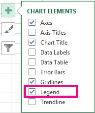
The chart now has a visible legend.
Edit legend texts
If the legend names in the chart are incorrect, you can rename the legend entries.
Click the chart.
Click Chart Filters  next to the chart, and click Select Data.
Select an entry in the Legend Entries (Series) list, and click Edit.
In the Series Name field, type a new legend entry.
Tip: You can also select a cell from which the text is retrieved. Click the Identify Cell icon  , and select a cell.
Источник
Добавление легенды на диаграмму
В большинстве диаграмм используются легенды, которые помогают читателям понять данные на диаграммах. При создании диаграммы Excel, легенда для диаграммы создается автоматически. Если легенда была удалена из диаграммы вручную, то ее можно удалить, но ее можно восстановить.
В описанном ниже примере разными цветами обозначаются показатели для разных годов: 2013-го, 2014-го и 2015-го.
Добавление условных обозначений диаграммы
Нажмите кнопку Элементы диаграммы  рядом с таблицей.
Установите флажок Легенда.
Теперь на диаграмме отображается легенда.
Изменение текста легенды
Если в легенде диаграммы есть ошибки, вы можете их исправить.
Нажмите кнопку Фильтры диаграммы  рядом с диаграммой, а затем щелкните Выбрать данные.
Выберите обозначение в списке Элементы легенды (ряды) и нажмите кнопку Изменить.
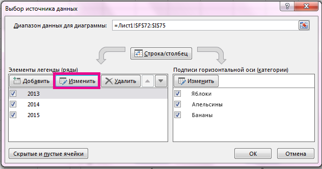
В поле Имя ряда введите новое название элемента легенды.
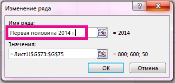
Совет: Вы также можете выбрать ячейку, текст которой будет использоваться для легенды. Нажмите кнопку Определение ячейки  и выберите необходимую ячейку.
Источник
How To Make A Legend In Excel?
Creating an Excel Chart Legend To create a legend in Excel, start by clicking on the chart or graph. You’ll see a plus sign on the right. Click on this, and a Chart Elements menu pops up. Check the box next to “Legend.” A chart or graph legend will immediately appear.
How do I add a legend in Excel without charts?
Hiding the legend from Chart 1 is simple and can be accomplished as follows:
- Single click on the chart.
- Select Chart | Chart Options. Excel displays the Chart Options dialog box.
- Click on the Legends tab.
- Clear the Show Legend check box.
- Click OK.
What is a legend in Excel?
Legends are a small visual representation of the chart’s data series to understand each data series without any sort of confusion. Legends are directly linked to the chart data range and change accordingly. In simple terms, if the data includes many colored visuals, legends show what each visual label means.
How do you show the legend in Excel chart?
Show a chart legend
- Select a chart and then select the plus sign to the top right.
- Point to Legend and select the arrow next to it.
- Choose where you want the legend to appear in your chart.
Where is the legend command in Excel?
How to Show the Legend in Excel
- Select your existing chart.
- Select Design.
- Select Add Chart Element.
- Select Legend.
- Choose where the legend should be placed — right, top, left, or bottom. There’s also a More Legend Options > Top Right if you prefer.
Click on the legend table. Click “Control” and “C,” followed by “Control” and “V.” A second legend will appear in your graph.
How do you write a legend?
How to Write a Legend: Step-by-Step
- Set the story in today’s world.
- Change or add plot details.
- Change a few main events.
- Change the gender of the hero or heroine.
- Change the point of view (example: Tell the legend of St.
- Write a sequel.
- Write a prequel.
- Develop an existing legend into a readers’ theatre script.
How do I insert a color coded legend in Excel?
Color Your Legend
Open Excel’s Format Legend pane by right-clicking the legend in a chart and selecting “Format Legend.” Click the window’s Fill and Line icon, shaped like a paint bucket, followed by “Fill.” Click the “Color” drop-down menu to view a list of colors.
How do you make a legend on a map?
To add a legend, complete the following steps:
- Open a layout with at least one map frame.
- Select the map frame in the Contents pane.
- Optionally, expand the map in the Contents pane to select a subset of layers.
- On the Insert tab, in the Map Surrounds group, click Legend .
- Format the legend.
How do you add a legend to a chart in Excel Mac?
Add a legend
- Click the chart, then in the Format sidebar, click the Chart tab.
- In the Chart Options section, select the Legend checkbox.
- In your spreadsheet, click the legend to select it, then do any of the following:
- Drag the legend to where you want it.
How do you display data labels in Excel?
Click the chart, and then click the Chart Design tab. Click Add Chart Element and select Data Labels, and then select a location for the data label option. Note: The options will differ depending on your chart type. If you want to show your data label inside a text bubble shape, click Data Callout.
Essentially the figure legend is the text accompanying a figure and is typically displayed underneath it in papers and reports.Example figure legend from this paper. The purpose of a figure legend is to enable the reader to understand a figure without having to refer to the main text of your manuscript.
How do I superscript axis labels in Excel?
Right-click on the highlighted text and go to “Format axis title”. 5. Select the “Font” tab. To make characters into superscripts or subscripts, check the appropriate box in the lower left portion of the dialogue box.
How do you type in a subscript?
To make text appear slightly above (superscript) or below (subscript) your regular text, you can use keyboard shortcuts.
- Select the character that you want to format.
- For superscript, press Ctrl, Shift, and the Plus sign (+) at the same time. For subscript, press Ctrl and the Minus sign (-) at the same time.
What is legend and its example?
Legends (derived from Latin, Legenda)’ are stories in oral tradition and a narrative of human actions. They are usually old but are believed to have taken place within human history.Examples of legends are Ali Baba, the Fountain of Youth, Paul Bunyan, Kraken, Atlantis, the Loch Ness Monster, and Bigfoot ,Yeti.
How do you change the legend on Excel?
- Select your chart in Excel, and click Design > Select Data.
- Click on the legend name you want to change in the Select Data Source dialog box, and click Edit.
- Type a legend name into the Series name text box, and click OK.
How do you write a figure legend in a table?
Figure and Table Legends
- Place captions above the table and align to the left (typically).
- Do not forget to end the name of the figure with a period.
- Place captions below the figure.
- Use titles for both figures and graphs in oral presentation slides and posters.
How do I create a unique key in Excel?
Copy (Ctrl+C) the same first cell of the range (A2). Paste (Ctrl+V) into all cells in the range (A2:A10). Observe each cell now has the formula that generates a unique ID and its own unique ID value. Copy (Ctrl+C) all the same cells in the range (A2:A10).
How do you show the legend value in Excel pie chart?
To display percentage values in the legend of a pie chart
- On the design surface, right-click on the pie chart and select Series Properties. The Series Properties dialog box displays.
- In Legend, type #PERCENT for the Custom legend text property.
What is legend or key on map?
Definition: A key or legend is a list of symbols that appear on the map. For example, a church on the map may appear as a cross, a cross attached to a circle, a cross attached to a square.The symbol Sch means School. Symbols and colours can also represent different things like roads, rivers and land height.
Where is the legend located on a map?
Legends usually appear near the bottom of a map or around the outer edges, outside of or within the map. If you’re placing the legend within the map, set it apart with a distinctive border, and take care not to obscure important areas of the map.
Источник
Understand the Legend and Legend Key in Excel Spreadsheets
:max_bytes(150000):strip_icc()/Lisa_Mildon-1500x1500-4f77d70e45154ae7ada946d2c35ec60d.jpg)
- Southern New Hampshire University
In a chart or graph in a spreadsheet program such as Microsoft Excel, the legend is often located on the right-hand side of the chart or graph and is sometimes surrounded by a border. The legend is linked to the data being graphically displayed in the plot area of the chart. Each specific entry in the legend includes a legend key for referencing the data.
The information in this article applies to Excel 2019, 2016, 2013, Excel for Mac, and Excel Online.
What Are Legend Keys?
To add to the confusion between legends and keys, Microsoft refers to each individual element in a legend as a legend key. A legend key is a single colored or patterned marker in the legend. To the right of each legend key is a name identifying the data represented by the specific key.
:max_bytes(150000):strip_icc()/LegendGraph-5bd8ca40c9e77c00516ceec0.jpg)
Depending on the type of chart, the legend keys represent different groups of data in the accompanying worksheet:
- Line Graph, Bar Graph, or Column Chart: Each legend key represents a single data series. For example, in a column chart, there might be a blue legend key that reads Favorite Snacks Votes next to it. The blue colors in the chart refer to the votes for each entry in the Snacks series.
- Pie Chart or Circle Graph: Each legend key represents only a portion of one data series. To use the same example from above, but for a pie chart, every cut of the pie is a different color that represents each «Snacks» entry. Every portion of the pie is a different size of the whole circle to represent the vote differences taken from the «Votes» series.
Editing Legends and Legend Keys
In Excel, legend keys are linked to the data in the plot area, so changing the color of a legend key will also change the color of the data in the plot area. You can right-click or tap-and-hold on a legend key, and choose Format Legend, to change the color, pattern, or image used to represent the data.
:max_bytes(150000):strip_icc()/InsertLabel-5bd8ca55c9e77c0051b9eb60.jpg)
To change options related to the whole legend and not just a specific entry, right-click or tap-and-hold to find the Format Legend option. This is how you change the text fill, text outline, text effect, and text box.
How to Show the Legend in Excel
After making a chart in Excel, it’s possible that the legend doesn’t automatically show. You can enable the legend by simply toggling it on. Here’s how:
Select your existing chart.
Select Design.
Select Add Chart Element.
Select Legend.
Choose where the legend should be placed — right, top, left, or bottom. There’s also a More Legend Options > Top Right if you prefer.
If the option to add a legend is grayed out, it just means that you need to select data first. Right-click the new, empty chart and choose Select Data, and then follow the on-screen instructions to choose the data that the chart should represent.
Источник