
Excel for Microsoft 365 Excel 2021 Excel 2019 Excel 2016 More…Less
If you have historical time-based data, you can use it to create a forecast. When you create a forecast, Excel creates a new worksheet that contains both a table of the historical and predicted values and a chart that expresses this data. A forecast can help you predict things like future sales, inventory requirements, or consumer trends.
Information about how the forecast is calculated and options you can change can be found at the bottom of this article.
Create a forecast
-
In a worksheet, enter two data series that correspond to each other:
-
A series with date or time entries for the timeline
-
A series with corresponding values
These values will be predicted for future dates.
Note: The timeline requires consistent intervals between its data points. For example, monthly intervals with values on the 1st of every month, yearly intervals, or numerical intervals. It’s okay if your timeline series is missing up to 30% of the data points, or has several numbers with the same time stamp. The forecast will still be accurate. However, summarizing data before you create the forecast will produce more accurate forecast results.
-
-
Select both data series.
Tip: If you select a cell in one of your series, Excel automatically selects the rest of the data.
-
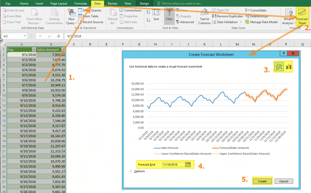
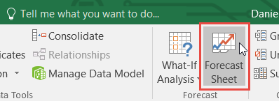
On the Data tab, in the Forecast group, click Forecast Sheet.

-
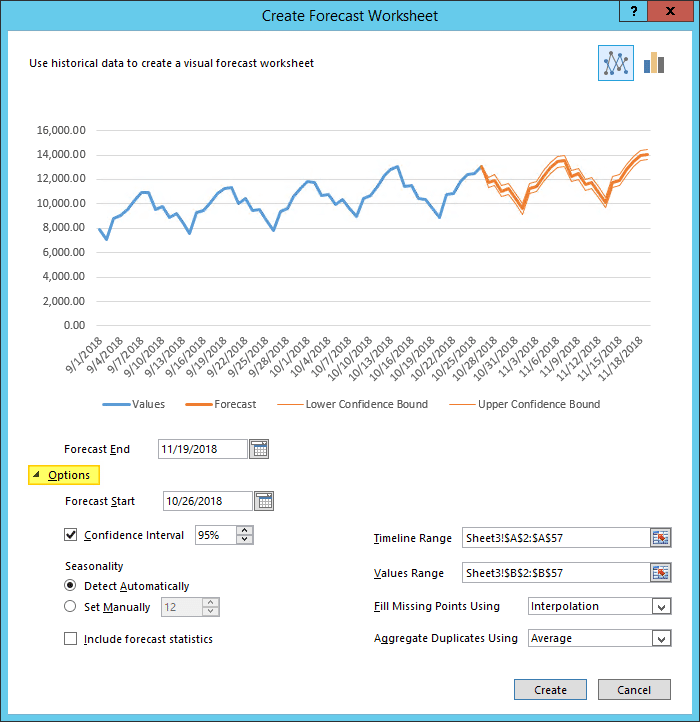
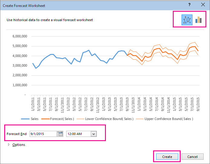
In the Create Forecast Worksheet box, pick either a line chart or a column chart for the visual representation of the forecast.
-
In the Forecast End box, pick an end date, and then click Create.
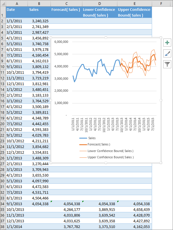
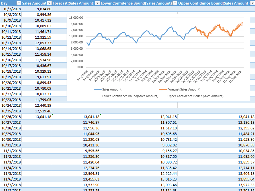
Excel creates a new worksheet that contains both a table of the historical and predicted values and a chart that expresses this data.
You’ll find the new worksheet just to the left («in front of») the sheet where you entered the data series.
Customize your forecast
If you want to change any advanced settings for your forecast, click Options.
You’ll find information about each of the options in the following table.
|
Forecast Options |
Description |
|
Forecast Start |
Pick the date for the forecast to begin. When you pick a date before the end of the historical data, only data prior to the start date are used in the prediction (this is sometimes referred to as «hindcasting»). Tips:
|
|
Confidence Interval |
Check or uncheck Confidence Interval to show or hide it. The confidence interval is the range surrounding each predicted value, in which 95% of future points are expected to fall, based on the forecast (with normal distribution). Confidence interval can help you figure out the accuracy of the prediction. A smaller interval implies more confidence in the prediction for the specific point. The default level of 95% confidence can be changed using the up or down arrows. |
|
Seasonality |
Seasonality is a number for the length (number of points) of the seasonal pattern and is automatically detected. For example, in a yearly sales cycle, with each point representing a month, the seasonality is 12. You can override the automatic detection by choosing Set Manually and then picking a number. Note: When setting seasonality manually, avoid a value for less than 2 cycles of historical data. With less than 2 cycles, Excel cannot identify the seasonal components. And when the seasonality is not significant enough for the algorithm to detect, the prediction will revert to a linear trend. |
|
Timeline Range |
Change the range used for your timeline here. This range needs to match the Values Range. |
|
Values Range |
Change the range used for your value series here. This range needs to be identical to the Timeline Range. |
|
Fill Missing Points Using |
To handle missing points, Excel uses interpolation, meaning that a missing point will be completed as the weighted average of its neighboring points as long as fewer than 30% of the points are missing. To treat the missing points as zeros instead, click Zeros in the list. |
|
Aggregate Duplicates Using |
When your data contains multiple values with the same timestamp, Excel will average the values. To use another calculation method, such as Median or Count, pick the calculation you want from the list. |
|
Include Forecast Statistics |
Check this box if you want additional statistical information on the forecast included in a new worksheet. Doing this adds a table of statistics generated using the FORECAST.ETS.STAT function and includes measures, such as the smoothing coefficients (Alpha, Beta, Gamma), and error metrics (MASE, SMAPE, MAE, RMSE). |
Formulas used in forecasting data
When you use a formula to create a forecast, it returns a table with the historical and predicted data, and a chart. The forecast predicts future values using your existing time-based data and the AAA version of the Exponential Smoothing (ETS) algorithm.
The table can contain the following columns, three of which are calculated columns:
-
Historical time column (your time-based data series)
-
Historical values column (your corresponding values data series)
-
Forecasted values column (calculated using FORECAST.ETS)
-
Two columns representing the confidence interval (calculated using FORECAST.ETS.CONFINT). These columns appear only when the Confidence Interval is checked in the Options section of the box..
Download a sample workbook
Click this link to download a workbook with Excel FORECAST.ETS function examples
Need more help?
You can always ask an expert in the Excel Tech Community or get support in the Answers community.
Related Topics
Forecasting functions
Need more help?
Follow the steps below to use this feature.
- Select the data that contains timeline series and values.
- Go to Data > Forecast > Forecast Sheet.
- Choose a chart type (we recommend using a line or column chart).
- Pick an end date for forecasting.
- Click the Create.
Contents
- 1 How do you calculate a forecast?
- 2 Is Excel forecast accurate?
- 3 What is Forecasting in Excel?
- 4 How do you forecast growth rate in Excel?
- 5 How do you calculate accuracy in Excel?
- 6 How do you forecast using CAGR?
- 7 What is the formula for forecast accuracy?
- 8 What is the formula for precision?
- 9 How do you calculate mean forecast error in Excel?
- 10 Can’t see forecast sheet Excel?
- 11 What is CAGR formula in Excel?
- 12 How do I do CAGR in Excel?
- 13 What are the three types of forecasting?
- 14 How do you calculate demand forecasting?
- 15 Is Precision same as specificity?
- 16 Is F1 Score same as accuracy?
How do you calculate a forecast?
The formula is: sales forecast = estimated amount of customers x average value of customer purchases.
Is Excel forecast accurate?
The results are never a finite number, it’s always +/-7% or +/-30%, or whatever percent. If you don’t know the accuracy of your forecast, you can’t rely on it. The world is an uncertain place. There is no easy way to measure sales forecasting accuracy in Excel, at least no simple way that wouldn’t take years to draft.
What is Forecasting in Excel?
The Excel FORECAST function predicts a value based on existing values along a linear trend. FORECAST calculates future value predictions using linear regression, and can be used to predict numeric values like sales, inventory, expenses, measurements, etc.LINEAR function.
How do you forecast growth rate in Excel?
To calculate the Average Annual Growth Rate in excel, normally we have to calculate the annual growth rates of every year with the formula = (Ending Value – Beginning Value) / Beginning Value, and then average these annual growth rates.
How do you calculate accuracy in Excel?
Calculating accuracy within excel
- try: =IF(C1<0,»-«,»»)&(B1/A1)*100&»%»
- what value do you expect when you have a prediction of 24 and a result of 48, also 50%?
- @K_B In that case, yes, the accuracy should also be 50% but the Difference cell value would be 12 rather than -12.
How do you forecast using CAGR?
Forecasting future values based on the CAGR of a data series (you find future values by multiplying the last datum of the series by (1 + CAGR) as many times as years required). As with every forecasting method, this method has a calculation error associated.
What is the formula for forecast accuracy?
There are many standards and some not-so-standard, formulas companies use to determine the forecast accuracy and/or error.Mean Absolute Percent Error (MAPE) = 100 * (ABS (Actual – Forecast)/Actual) Bias (This will be discussed in a future post: Updated Links for bias: 1, 2)
What is the formula for precision?
Consider a model that predicts 150 examples for the positive class, 95 are correct (true positives), meaning five were missed (false negatives) and 55 are incorrect (false positives). We can calculate the precision as follows: Precision = TruePositives / (TruePositives + FalsePositives) Precision = 95 / (95 + 55)
How do you calculate mean forecast error in Excel?
How to Calculate MSE in Excel
- Step 1: Enter the actual values and forecasted values in two separate columns. What is this?
- Step 2: Calculate the squared error for each row. Recall that the squared error is calculated as: (actual – forecast)2.
- Step 3: Calculate the mean squared error.
Can’t see forecast sheet Excel?
Click the File tab. Click Options, and then click the Add-Ins category. Near the bottom of the Excel Options dialog box, make sure that Excel Add-ins is selected in the Manage box, and then click Go. In the Add-Ins dialog box, select the check boxes for Analysis ToolPak and Solver Add-in, and then click OK.
What is CAGR formula in Excel?
There’s no CAGR function in Excel. However, simply use the RRI function in Excel to calculate the compound annual growth rate (CAGR) of an investment over a period of years. Note: again, number of years or n = 5, start = 100, end = 147, CAGR = 8%.
read more the method for finding the CAGR value in your excel spreadsheet. The formula will be “=POWER (Ending Value/Beginning Value, 1/9)-1”. You can see that the POWER function replaces the ˆ, which was used in the traditional CAGR formula in excel.
What are the three types of forecasting?
Explanation : The three types of forecasts are Economic, employee market, company’s sales expansion.
How do you calculate demand forecasting?
Average demand is calculated as: forecast demand (prev. period) + Smoothing Factor for Demand Forecast (curr. period) * actual usage (prev. period) – forecast demand (prev.
To calculate demand forecast for each period
- Expected annual issue.
- Safety stock.
- Reorder point.
- Forecast demand.
Is Precision same as specificity?
Precision — Out of all the examples that predicted as positive, how many are really positive? Recall — Out of all the positive examples, how many are predicted as positive? Specificity — Out of all the people that do not have the disease, how many got negative results?
Is F1 Score same as accuracy?
Accuracy is used when the True Positives and True negatives are more important while F1-score is used when the False Negatives and False Positives are crucial.In most real-life classification problems, imbalanced class distribution exists and thus F1-score is a better metric to evaluate our model on.
What is Forecasting?
Forecasting is a technique to establish relationships and trends which can be projected into the future, based on historical data and certain assumptions. This method can be utilized to better understand and make an educated guess on how to adjust budgets, anticipate future expenses or sales, or other similar decisions. A disclaimer here: Forecasting doesn’t tell you the future or gives you a definitive way to proceed with a decision — it only shows you probabilities and what might be the best course of action. You should always double check your results before deciding.
Why use Excel?
Excel offers many tools for forecasting and has the ability to store, calculate, and visualize data. Even if you don’t keep your data in Excel, you can import files or connect to external databases to use its built-in tools and formulas for forecasting. The visualization of the data is a simple process thanks to Excel Charts and formatting features.
Forecasting Methods and Forecasting in Excel
There are several of forecasting methods for forecasting in Excel, and each rely on various techniques. Obviously, none will give you definitive answers without the ability to see the future. These results are best used to make educated guesses. In our article, we focus on 3 commonly used quantitative methods that can be easily used in Excel.
- Moving Averages
- Exponential Smoothing (ETS)
- Linear Regression
You can download our sample workbook below.
Moving Averages
Moving averages is a method used to smooth out the trend in data (i.e. time series). The idea is to filter out the micro deviations in a sample time range, to see the longer-term trend that might affect future results.
The simplest form of a moving average is calculated by taking the arithmetic mean of a given set of values. For example, let’s assume that you want to smooth out the daily changes of sales in a week. To calculate the weekly moving average, we must first find the average of 7 days, starting from the first day. Next, calculate the average of 7 days from day 2nd to day 8th and use this data. To do this, you can use the AVERAGE function with relative references.
=AVERAGE(B5:B11) formula in our example calculates the average of values between the 4th and 10th days.

For more information about finding the mean of a data set, please see How to calculate mean in Excel.
There is an alternative way to add moving averages that also inserts the data into a chart. Start by creating a chart with the past data. You will see a plus icon to the right of the chart. You can add or remove elements from this menu.
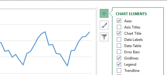
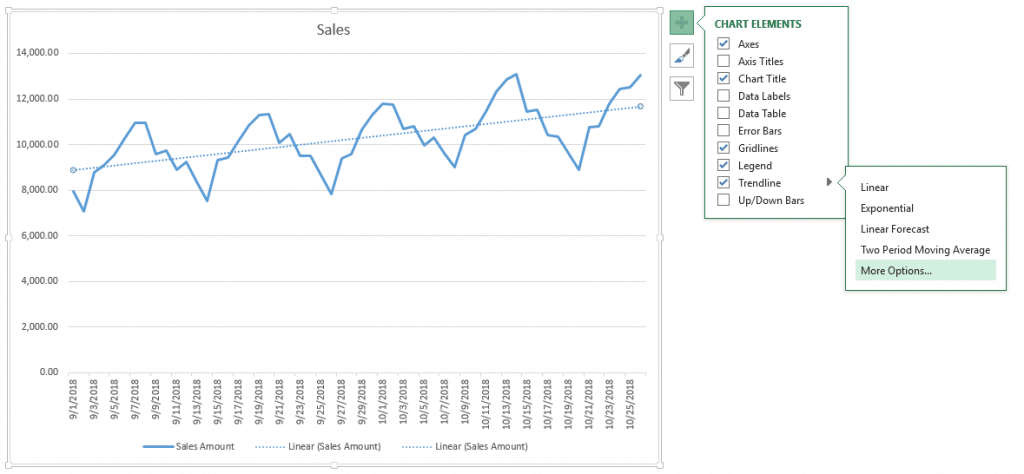
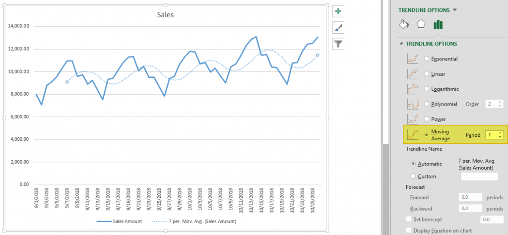
Click on the plus icon and move your mouse over the Trendline item. Click the right arrow and select the More Options… item from the dropdown menu. TRENDLINE OPTIONS panel will pop up at the right side of the Excel window.
Select Moving Average and set the Period based on your data. You will see the same moving average line on your chart.
Exponential Smoothing (ETS)
Another method for forecasting in Excel is Exponential Smoothing. Exponential Smoothing, like Moving Averages, is based on smoothing past data trends. However, this algorithm performs smoothing by detecting seasonality patterns and confidence intervals. This feature is available in Excel 2016 or later. You can use your own formulas, or have Excel automatically do this with its Forecast Sheet feature. Excel’s Forecast Sheet feature automatically adds formulas and creates a chart in a new sheet. Follow the steps below to use this feature.
- Select the data that contains timeline series and values.
- Go to Data > Forecast > Forecast Sheet
- Choose a chart type (we recommend using a line or column chart).
- Pick an end date for forecasting.
- Click the Create
Your actual data will be moved into a new sheet with the addition of a few columns, and the chart of your selection that matches what you’ve seen in the preview will be placed on this page.
These 3 new columns are for the forecast and boundary values for the confidence interval. The confidence interval is the range where future points are expected to fall. For example, 95% means that 95% percent of the future values will be in the specified range. The range is calculated using normal distribution.
If you click on the values in the new columns, you can see the formulas being used. The FORECAST.ETS function is used to find the forecast values and the FORECAST.ETS.CONFINT function returns the interval value. Arguments of the formulas are populated based on the inputs in Options section.
Customizing
Advanced options can be found under the Options section in the Create Forecast Sheet dialog. Click the Options label to go to this menu.
| Forecast Start | The timeline value where the forecast starts. If your timeline values are dates, you can select a date from the date picker.
Excel can automatically detect where your data ends and pick the next timeline value. Alternatively, previous timeline points can be selected to see how the forecasting algorithm works. |
| Confidence Interval | Check or uncheck the input to show or hide the Confidence Interval calculations. The default level of confidence is 95%. |
| Seasonality | The length of the seasonal pattern. Excel can automatically detect this pattern. Alternatively, you can change the value to better fit your needs. |
| Timeline Range | Reference that contains the timeline values. This range needs to match the Values Range. |
| Values Range | Reference that contains the actual values. This range needs to match the Timeline Range. |
| Fill Missing Points Using | Excel can fill in the missing points based on the weighted average of neighboring points. This approach is called Interpolation. Alternatively, Zeroes can be selected to show the missing points as zeroes. |
| Duplicate Aggregates Using | An option for how Excel behaves when there are multiple values with the same timeline value. Calculating the average is the default option. |
| Include Forecast Statistics | If you are familiar with statistics, check this input to display smoothing coefficients (Alpha, Beta, Gamma), and error metrics (MASE, SMAPE, MAE, RMSE).
These values are calculated by the FORECAST.ETS.STAT function. |
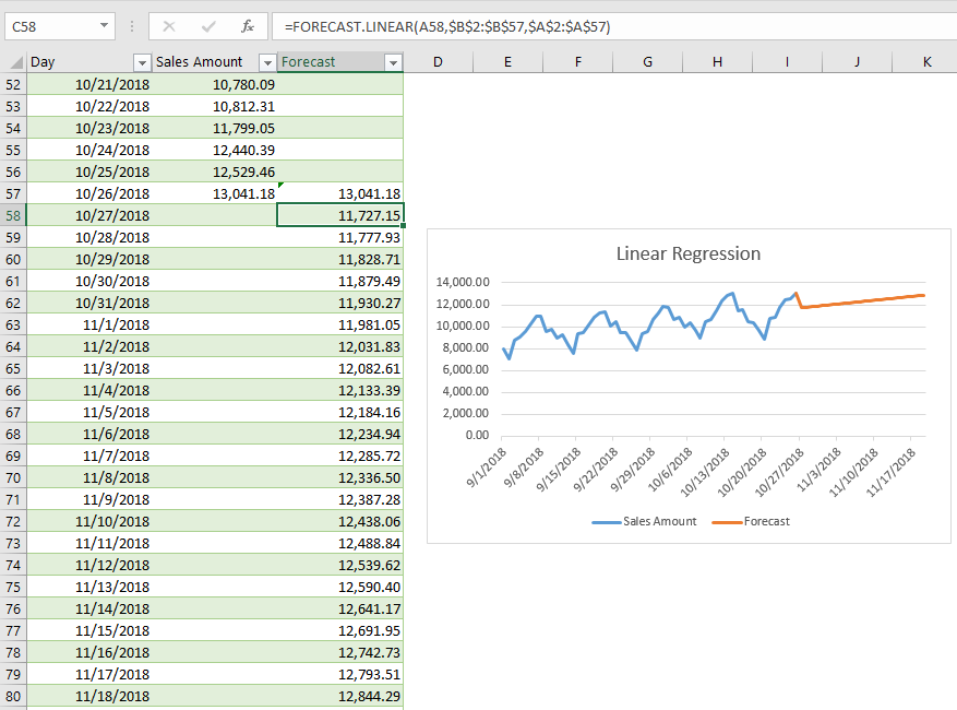
Linear Regression
Forecasting in Excel can be done using various formulas. One of the most commonly used formulas is the FORECAST.LINEAR for Excel 2016, and FORECAST for earlier versions. Although Excel still supports the FORECAST function, if you have 2016 or later, we recommend updating your formulas to prevent any issues in case of a function deprecation. If you do not have Excel 2016 or newer, you should use the FORECAST function. We will continue to refer the function as FORECAST in the rest of this article.
Unlike the ETS algorithm, the FORECAST function predicts future values using linear regression. Linear regression determines the linear relation between timeline series and values series. This linear approach makes it unsuitable for data with seasonality or other cycles, as well as non-linearity. On the other hand, linear regression is useful for causal models due to its simplicity.
Since Excel doesn’t have a wizard for the traditional FORECAST function, you will need to do some of the required steps manually.
- Add new timeline points to your data table for the values to use in the forecast. For example, from 10/27 to 11/19.
- Select the cell where the first forecast value is to be calculated. (e.g. C58)
- Start a formula with the FORECAST function by these arguments:
- Select the first timeline value to use in forecast. Leave the reference as relative. (e.g. A58)
- Select the range that contains the actual values. Make the range absolute. (e.g. $B$2:$B$57)
- Select the range that contains the timeline values. Make the range absolute. (e.g. $A$2:$A$57)
- Copy the formula down for the rest of the column.
Sample formula for the first forecast point: =FORECAST.LINEAR(A58,$B$2:$B$57,$A$2:$A$57)
To progress in Supply Chain, mastering Excel is essential. Forecasting with Excel will allow you to automate and simplify your work.
In this article, I will tell you how to make forecasts in Excel automatically and simply. I advise you to download the Excel template to follow this tutorial step by step.
Forecasting in Excel: Visualizing a Trend
For our first example, we’re looking at COVID-19 cases around the world. You will find the data needed to follow this example in this Excel forecast template.

The purpose of the exercise is to use Excel to forecast and estimate future COVID cases using a trend, which we will add to the graph. To create a trend line on a graph (here in red), right-click directly on the graph and select add a trend line.

The forecast menu will appear, allowing you to select the desired trend line.

What is interesting about this forecast menu is that you can easily make new forecasts by adding future calculation periods of COVID cases. Just add forecast periods (in days) in the lower part of the menu.

This will generate a new graph, with a new curve, which will show future predictions.
Forecasting: How to make an Automatic Forecast?
For this exercise, we will select new data in our table. Here, we want the world data (World cases) and the number of days (Day).

When the columns are selected, click on Data, then Forecast Sheet in the top menu. You will get the following forecast sheet:
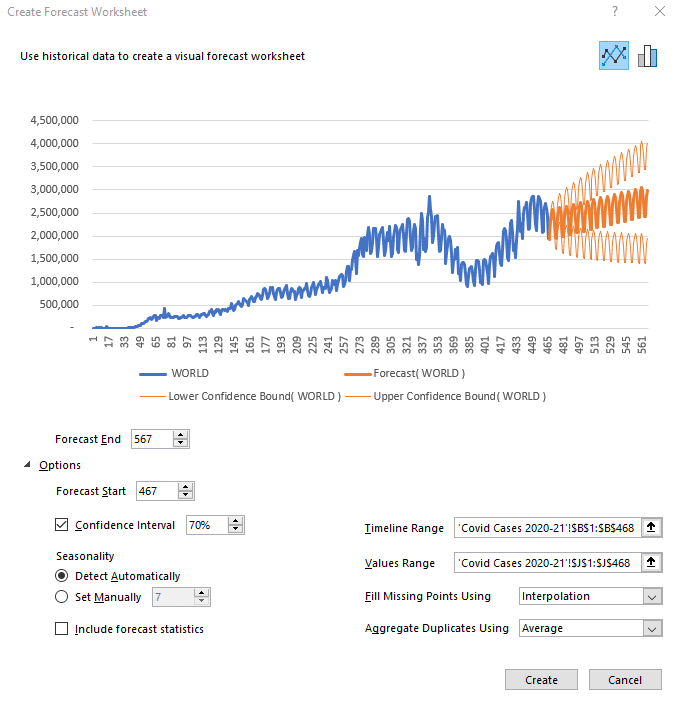
It is possible to change the number of days of predictions by clicking on Options below the graph. Simply add or remove the desired number of days in the Start and End boxes of the forecast.
The other interesting option you can play with is the confidence interval. What is the confidence interval? It is simply the probability of the forecast. The orange part of the graph shows a high forecast hypothesis and a low forecast hypothesis. If your confidence interval is 70, then there is a 70% chance that the prediction is between the high and low assumptions.
The last option to look at is Seasonality, which means the seasonality of your forecast. Excel detects patterns of change in the data and includes them in its forecast. For example, in our COVID cases, there is a drop in test results on Sundays and Mondays because the number of tests performed drops at the weekend. This change is taken into account when Excel makes its future forecast.
Once you have selected the desired parameters, click Create to see the forecast data calculated by Excel in a table format. The Day column shows the days, the World column shows the COVID cases in the world up to day 467, where our data ends. The Forecast column is the beginning of your future forecast, the Lower Confidence Bound column represents the low hypothesis, and finally, the Upper Confidence Bound column indicates the high hypothesis.
Forecast sheet: the Case of India
For the rest of our tutorial, let’s look at the case of India. By selecting the specific case column for India in our original data table, as well as the number of days, we obtain this forecast:

However, the forecast looks strange compared to historical data. Why is that?
The selected period is too long and Excel can’t detect a seasonal pattern. We can therefore define it manually (7 days). Also, we must ask ourselves: does the past period reflect what will happen in the future? Here, unfortunately, it will not, so we will focus on the second peak instead of the first.
To select the period of interest, click on Cancel. Click on the COVID CASES 2021 tab at the bottom of the spreadsheet, then select the Day and India columns again.

Then, click on Data and generate a new Forecast Sheet.

Manually redefine the end of the forecast and the seasonality and you will get something that looks much more like reality. It is always important to visualize the low and high hypotheses (companies don’t do this enough) as they correspond to the Best-Case and Worst-Case scenarios, which can be critical information for your performance.
Here’s how to make a forecast in Excel in just a few clicks. In the next part of our tutorial, we will try to forecast car sales in the USA for the next few months.
Sales Forecasts (U.S. Car Since 1976)

This is the database to work with on this forecast. It’s interesting to see this curve, which shows a slight increase right now and helps us visualize the different crises that have hit the US since 1976 (the oil crisis, the 2008 crisis, and finally the COVID crisis).
Once again, to see the forecast, select the sales per month and the total sales (the last 2 columns).

To have a more coherent forecast, let’s revise the end of the prediction downwards and put a confidence interval of 50%. We can see that Excel has detected a seasonality in this graph. Thanks to the data, we can see that there is a crisis about every 181 months. You can change this as you wish. Here I have changed the seasonality to show a change every 12 months.

And so here is the new forecast. Of course, these predictions are not perfect. You can always add new trends, new mathematical models, market research, competitive research into your analysis. All of which will impact your forecast.
But the important thing in this exercise is to understand how to do make your own automatic forecasts in Excel, to see how simple it is to master this tool. Indeed, mastering the art of forecasting is the best way to develop the profitability of a company, to improve performance and customer satisfaction.
Would you like to go further?
If you want to boost your career and develop your Excel skills in the long term, registration is open for our SCM Excel Expert training.

This program is for you if you want to …
- Gain efficiency in Excel to focus on the essentials
- Automate your Excel tasks, reporting and improve the performance of your company
- Generate files automatically in 1 click thanks to macros and Power Query / Pivot (without knowing how to code)
- –Improve your performance and boost your career in Supply Chain & Logistics

Founder of AbcSupplyChain | Supply Chain Expert | 15 years experience in 6 different countries –> Follow me on LinkedIn
Introduction
Every business wants to be able to see into the future. But while we haven’t perfected the crystal ball (even if we can sometimes forecast new products), we can use other tools to make educated decisions.
For example, Microsoft Excel can be used for forecasting—using algorithms and drawing on data from the past to forecast values and make the right choices in the future.
However, Excel is a basic forecasting tool. It’s good for businesses as a starting point, but it’s still very manual compared to inventory planning software, such as Inventory Planner.
We’re going to explore how forecasting data in Excel predicts demand by looking at the various tools Excel offers. We’ll also show you the upsides and downsides of using forecast worksheets in Excel.
Why use Excel in basic forecasting?
Before considering the advantages of Excel to forecast statistics, it may be worth considering the value of forecasting in the first place. In simple terms, forecasting predicts trends and opportunities that your business can exploit going forward. This is an activity undertaken by both old and new companies and shapes business decisions like budgeting, hiring, and broader business policies.
Excel is used in forecasting because it has a range of relevant tools at its disposal. Data can be easily stored and calculated in an Excel workbook. However, it still requires manual data sync and updates, so may not be the right solution for scale-up businesses.
Crucially, Excel can also visualize data in a variety of ways, which is essential to making forecasts more easily. There are a variety of formulas that can be used in an Excel workbook to help you calculate predicted values.
Once you have your data set entered into an Excel workbook, Excel can help you find a variety of things, including:
- Values range
- Aggregate values, like the sum and average of your values
- Duplicates
If you’re new to using Excel for forecasting purposes, search online for a tutorial that demonstrates features like how to:
- Fill missing points using a formula applied to the forecast sheet
- Calculate time series using the stat function
- Create a line chart for your forecast by completing steps like entering an end date in the forecast end box
If you have files or databases outside of Excel, it’s often easy enough to connect them to Excel and import the relevant data as well.
Up-to-date forecasting without manual data entry
Get a free demo of Inventory Planner
Get a Free Demo
Pros of Inventory Forecasting in Excel
Inventory forecasting in Excel (as opposed to other tools) has the following advantages:
1. Saves money
Since forecasting’s long-term goal is to make you more money, the fact that it helps you save it is similarly attractive. Excel can be used as part of varying business plan subscriptions, which can be priced in single digits. This means that despite the initial costs, purchasing Excel for forecasting might be one of the best buying choices you ever make, especially if you compare Excel’s pricing to other tools you might consider.
The idea of saving money with Excel can manifest in other, subtler ways. Cloud sync features mean that your employees can work together on a single file, even if they’re located in different places. This kind of time-saving allows your team to work more efficiently and complete tasks more quickly, allowing you to get more done in the process.
Inventory Planner’s own inventory planning software can also save you money by helping you use your purchasing budget more thoughtfully.
2. Customizable
Another advantage of Excel is that the software can be customized in a variety of ways. When you’re creating a visual forecast, for example, you can tweak various aspects of it.
Obvious areas of customization include where the timeline you’re using to forecast starts from and how wide the timeline range is. You can also see information on the forecast’s confidence interval, which tells you how likely you are to get the same result upon repeating the forecast.
If you need to, you can also fill in missing points during the forecast process. If you have a good understanding of statistics, you can even take advantage of other features like displaying smoothing coefficients and error metrics.
3. Different forecast functions
Excel supports several different functions, which allow you to actually put the software to practical use. Understanding these is the key to getting the most out of Excel.
The forecast.linear() function allows you to calculate a value by drawing upon ones that already exist, i.e., known_x values and known_y values. It’s a good choice if you can see a linear trend in the data in front of you.
Naturally, there are other functions you can draw upon in Excel. The forecast.ets function uses both existing values and the triple exponential smoothing method for more advanced forecasting techniques.
The forecasting.ets.seasonality() function, meanwhile, tells you how many seasonal patterns are in the relevant timeline.
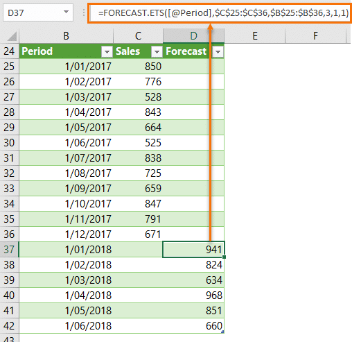
Image Source
There’s even a function to return a confidence interval for a specific part of your forecast. Whatever your requirements, Excel probably has what you’re looking for, provided you’re willing to invest the time to understand it.
Of course, we at Inventory Planner have our own forecasting methods. These help you replenish your stock at the right time and centralize all of your sales channels as well.
Cons of Inventory Forecasting in Excel
1. Time consuming
With Excel, you need to sync data and update data manually and you might need one dedicated headcount when forecasting at scale. So it might be cost-effective as the subscription fee may be lower, but the labor cost may be higher.
2. Prone to error
Using Excel for forecasting can result in errors if the data import is done incorrectly or the formula breaks. Unlike automated inventory planning tools, human error is a risk when inputting data into Excel. This could skew your results.
3. Learning curve could be long
When using Excel for forecasting, you need to learn how different formulas work and how to build the right forecasting model that fits the business needs.
4. Not scalable
Excel may be slow at processing data when data is large. While spreadsheets can be a good starting point, as business grows using spreadsheets is not scalable when it comes to inventory planning.
5. Not real-time
As data entry is done manually in Excel, the data that’s used for forecasting is not real-time data.
Forecasting methods in Excel
Forecasting in Excel can be approached from a variety of different angles. Understanding these will allow you to make more accurate predictions about your future course of action.
1. Moving average method
This forecast method lets you “smooth out” data, look at its underlying patterns, and estimate future values. You typically do this for three-month or five-month timespans, both of which can be explored in a single spreadsheet.
Start by creating three columns in Excel: one with your revenues from the last year and two more for three-month and five-month moving average predictions. To work out your three-month moving average, take the average revenue you’ve earned from your current month and the two preceding it. Then apply the formula =AVERAGE(Data Range) to it to get the information you need.
Calculating the five-month moving average works in a similar fashion. However, you take average revenue from five months rather than three and apply the same formula to it.
2. Straight line method
The straight line method is ideal for forecasting beginners and allows you to predict future revenue growth. To do this, however, you need to have a good idea of what your business’s sales growth rate (expressed as a percentage) will be. You can work this out by looking at your business’s historical performance.
When you’ve your growth rate to hand, set up several columns in Excel. Label each one with a year, labeling them consecutively as you do so. Then, starting from this year, take last year’s revenue figure and multiply it by your growth rate. By highlighting subsequent cells and using the Ctrl + R shortcut, you can apply this calculation to future years.
3. Simple linear regression method
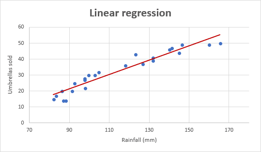
Image Source
Linear regression is a type of analysis called regression analysis, which examines the relationship between two different variables. For example, we might want to see the relationship between the money we spent on advertising and the revenue we earned within a given time period.
To better visualize the impact (good or bad) our spending had, we need to create three columns. Fill one with each of the 12 months, and then put (in this instance) the corresponding amount of adverts run and revenue earned.
Next, highlight the two columns containing data, and insert a scatter chart into the spreadsheet. Then, add a linear trendline to the data points; while you can play around with the chart’s visuals, this should give you a good idea of your actions’ impacts.
4. Multiple linear regression method
This forecasting method works in a similar fashion to simple linear regression. The difference is that you examine the relationship between several different variables. You might want to compare two different advertising methods to your revenues, for example. The advertising methods here are referred to as the explanatory variables, and the revenue is known as the response variable.
Set up your data in a similar manner to the simple linear regression method discussed earlier. Once this is in place, we can use the Regression command in the Data tab (click on Data Analysis to find it) and put data in the Input Y and Input X ranges. In this scenario, the data for the advertising methods goes in the Input X Range, and the revenues go in the Input Y Range.
Once the data is entered here and you’ve picked an output range (i.e., a cell where the output of your calculations is displayed), hit OK. You’ll see a group of output tables, which you can then interpret.
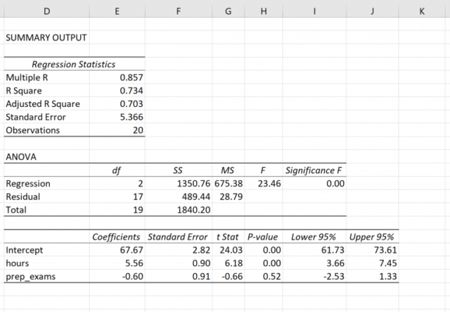
Image Source
In case it wasn’t already clear, linear regression requires some understanding of statistics in order to be used effectively. As such, they may not be the best option for beginners in this particular field.
Choosing the right forecasting models in Excel
As you can see, choosing the right forecast model in Microsoft Excel is shaped (at least partially) by your business demands. If you’re looking to better understand your recent business activity (and what it means for your business going forward), then the moving average method might be your best option. Similarly, if you’re keen to understand what revenue you can expect in the months ahead, the straight line method is a solid option.
Linear regression is ideal if you’re looking to make more sophisticated connections between different aspects of your business. That said, while assembling the data is relatively simple, you will need some specialist knowledge in order to interpret it.
How to build a forecasting model in Excel
The best way to build a useful, intuitive forecasting practice within your business may be to use some kind of template. Choosing a template automates some of the calculations you need to perform and can prove very intuitive.
A template can also help you clarify what you want to achieve with your sales forecast, like expected revenue in general or from a specific product. Once chosen, a good forecast template can assist you with tasks like introducing a new product or making radical changes to an existing product line.
Fortunately, there are several different templates available for you to draw upon when attempting to forecast your business success with Excel. Forecast templates work similarly to Excel balance sheets, but you’re using the data in them as a reference for your future financial status.
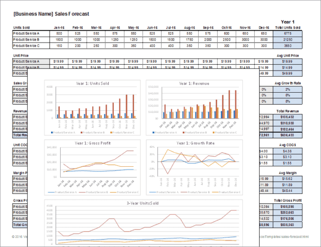
Image Source
Forecast templates require you to consider all your revenue sources in order for them to be useful (e.g., total sales, stock value, interest on deposits, etc.). You must also have a good idea of expected increases in revenue and a comprehensive list of your expenditures (like wages, debts, loans, taxes, advertising, etc.).
Templates for forecasting models in Excel
While there are many different forecast templates to choose from, we’ve picked out three kinds that we think are particularly useful. Excel forecast templates are used by a variety of businesses (and sizes of businesses). However, the accountants within them will probably be the ones who understand them best—and put them to the most practical use.
Automate your Excel forecasting with Inventory Planner
See how Inventory Planner can reduce errors and effectively plan inventory.
Get a Free Demo
To choose the best forecasting template in Excel, read on:
1. Monthly sales forecast models template
A monthly sales forecast models template breaks down your projected sales activity at a suitably granular level. However, this doesn’t mean that the amount of information is compromised. Several years of projections can be displayed within a single document, allowing you to take in a broad swathe of information very easily.
When choosing a template like this, look out for one that can accommodate a product name, unit numbers, selling price, total sales, and the percentage of the total. Some templates can also combine raw numbers with a more intuitive presentation, like bar charts. They’re a great way of visualizing a key part of your business’s operation.
2. Annual budget expense forecast template
This template allows you to plan your future business operations in a more complex manner. You can, for example, look more closely at expenditure on salaries, supplies, and equipment across multiple sites simultaneously. You can also look ahead a short distance to see how your expenditure will be affected.
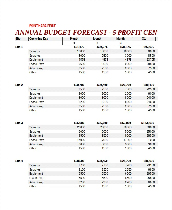
Image Source
Templates like these are ideal for larger businesses with several different premises and expenses to think about. As such, they may be of less use to smaller enterprises.
If you’re worried about your expenditure, you can assemble a cash flow forecast to put your mind at ease.
3. Demand planning forecasting template
This template allows you to predict your company’s financial status by analyzing various different factors and build demand forecasting models in Excel. You might want to better understand your gross revenue (on a recurring or non-recurring basis) and break down your revenues from individual products. If you sell a range of products you want to track, this template is probably what you need.
We at Inventory Planner have produced our own sales forecasting Excel template for Shopify merchants.
Is your Shopify, Amazon, or other store growing?
Do you want to have better control over your inventory?
Do you want to forecast how much inventory you’ll need?
All of the above? Let us help.
We’ve created a free demand forecasting Excel template for Shopify you can use to see:
- Forecasted sales and sales velocity
- How long your current stock will last
- How much you should order based on your lead time and days of stock
What to do:
- Follow the instructions on the “Overview” tab to copy over information from your e-commerce store file(s).
- Use the calculated replenishment recommendations to plan your inventory more effectively!
Inventory Planner Forecasting
2 Ways of forecasting sales in Excel
Another way of acquiring future sales data is by using Excel’s Exponential Smoothing feature. This works in a similar way to moving averages, but it smooths out data by looking for seasonality patterns and confidence intervals instead.
1. Using built-in exponential smoothing tool
In newer versions of Excel (i.e., Excel 2016 onwards), go to the Data menu and select Forecast Sheet. Then pick a suitable chart (line charts and column charts are best) and pick an end forecast date. Finally, click Create to generate a worksheet with your sales forecast.
2. Using the exponential smoothing formula manually
You can make some tweaks to the exponential smoothing process after you’ve created the aforementioned worksheet. Besides changing when the forecast starts, you can change the length of a season pattern, fill in missing points, or (if you’re familiar with statistics) view smoothing coefficients.
Why choose forecasting tools over Excel in this age?
While Excel has extensive forecasting capabilities, there may be other tools that are more suited to the task nowadays. This is for the following reasons:
1. Fewer errors
Excel’s complexity means that it’s very easy to make mistakes in it. If, for instance, you paste values into the wrong cells, you can quickly break any forecasting framework you’ve constructed. More troublingly, you may not discover the error until long after it’s been made. This can put your business on a course it shouldn’t be on, with disastrous consequences.
As such, it’s important that you thoroughly understand Excel’s inner workings before you come to use it. But doing so for the purposes of forecasting may be pointless, considering the suitability of other tools.
2. Better decision-making
Another problem is that Excel only uses historical data and past trends, and you need to give it up-to-date information in order to give you a forecast to shape future actions. The long, arduous method of inputting data to Excel (or collecting it from other people) means that data can literally become outdated as you’re entering it.
Moreover, Excel is unable to track and adapt to real-time changes that you may wish to deploy. This means you may struggle to make an accurate forecast.
3. Streamline structures and processes
The more data you add to an Excel spreadsheet, the more difficult it will be to use it. Piling more and more data into one place can lead to the spreadsheet becoming slow or buggy. This then makes it difficult to interpret its information or retrieve records contained in it. Using a more specialized tool makes these key tasks easier to carry out—like reporting, which Inventory Planner excels at.
Why should I sign up for Inventory Planner when Excel offers free templates?
Inventory Planner integrates directly with over 30 e-commerce stores and Inventory Management Systems as a tool for demand forecasting, replenishment analysis, KPI reporting, and the creation of new stock orders through Purchase Orders, Warehouse Transfers, and Assembly Orders (for production). This means no manual data entry that is prone to errors, more sophisticated forecasting and more streamlined purchasing.
With Inventory Planner, you can;
- Customize forecasts based on seasonality, recent trends, category trends, bundle and assembly relationships, and much more
- Customize replenishment recommendations and alerts by warehouse, by SKU to order what’s needed at the right time.
- Customize reports using over 200 metrics and attributes.
Start a 14-day free trial to see what we have to offer.
How to Use the Excel FORECAST function Step-by-Step (2023)
Forecasting makes a crucial element of every business. Accurate business forecasting can help your business progress much faster than ever.
But forecasting is usually not that simple. You’d need to have specialists (statisticians mostly) on board. Or you’d need to buy specialized forecasting software. Both of which can cost you thousands of dollars. 💰
Good News! Microsoft Excel offers many tools and functions that will make forecasting easier and cheaper for you.
Let’s jump into the guide below and learn them all. Download our free sample workbook here to tag along with the guide.
What is forecasting?
Forecasting is the technique to estimate future trends based on historical data.
For example, Company A made sales worth $5000 in 2020 and $5500 in 2021. How many sales will it achieve in 2022?
The historical data of sales shows a 10% increase ($5000 to $5500) in sales over the year.
Given the historical trend of increase, we can forecast sales of $6050 in 2022. (Sales of $5500 increased by 10%).
That’s the simplest version of forecasting, and it only gets more complex.
Forecasting is only based on probabilities and estimates – which can change anytime. And the actual results may vary from the forecasted stats.
Forecasting in Excel
Microsoft Excel offers many tools, graphs, trendlines, and built-in functions for forecasting.
You can use these tools to build cash flow forecasts, profit forecasts, budgets, KPIs, and whatnot.
The three main (and relatively simpler) forecasting tools of Excel include the following.
- Moving Averages
- Exponential smoothing
- Linear Regression
Let’s not wait anymore and dive right into each of these smart techniques.
Moving Averages
Moving Averages are used to see a wider picture of how the numbers have been changing over periods. See here.

The image above shows the sales made over the past 12 months.
Create a simple line chart out of it to see the trend of sales over the last year.

Seems like a series of mountains 😉
The graph of sales shows steep rises and falls in sales throughout the year. It’s hard to study the trend of sales over the year, let alone forecast it for future years.
Let’s make the moving average of these sales to analyze the trend of sales better. The moving average for every two months’ sales.
There are three ways how you can apply the moving average method to forecast numbers.
1. Manually using the AVERAGE function
We are making a two-months moving average so the first average would be calculated at the end of month 2.
1. So, activate a cell in a new column parallel to February (2nd month of our data):

2. Write the AVERAGE function as below:
= AVERAGE (B2:B3)
3. Excel calculates the average for the first months.

4. Drag and Drop this formula to the whole list.

What has Excel done? As the cell references were not absolute but only relative, the cell references change for each next average.
And so, we get the moving average for the next two months (like February and March) in the example above.

5. Turn both these series (sales and moving average of sales) into a line graph to study the trend.
6. Select the whole data set.

7. Go to Insert tab > Charts > 2D Line Chart Icon.

8. Choose any 2D line chart, as desired.

Excel plots both series on the line chart (each with a different color).

Note how the blue line has sharp highs and lows. Whereas the orange line is smoothed out. This makes it easier to study the trends over a given period.
Based on this orange trend line, you can study the historical trend of sales over the year. Assuming sales would seek the same trend in the future, you can forecast future sales.
2. Using Data Analysis
Excel offers an in-built tool to calculate moving averages in Excel.
1. Go to Data Tab > Analysis > Data Analysis.

Pro Tip!
Can’t find the Data Analysis tool? Load it into Excel by going to:
File > Options > Add-ins > Analysis ToolPak > Okay
2. The Data Analysis dialog box opens up.
3. Select Moving averages.

4. In the moving averages dialog box:
- Refer to the cell range containing sales as input values.
- We are calculating the 2-month moving average, so set the interval to “2”.
- Specify any range where you want the moving averages to appear as the output range.

5. Click Okay, and there you have the moving averages calculated.

Why do we have N/A against January 2022? Because we need at least two months of data to calculate 2-months moving average.
6. Select the data and convert it into a chart by going to the Insert tab > Charts > 2D Line Chart Icon.
7. Here’s what the chart looks like.

3. Moving Average Trendline
Not only calculate moving averages, but Excel can also automatically plot them in a chart. How? See here.
1. Select the dataset (including months and sales).

2. Go to Insert tab > Charts > 2D Line Chart Icon.

3. Choose any 2D line chart, as desired.

The chart to be plotted will still have a single trend line only (though it’s a 2D chart). This is because the data only consists of sales to be plotted.
4. Once the chart is plotted in Excel, select the chart.

5. Go to the plus (+) icon that appears to the right of the chart.
6. Hover your cursor over ‘Trendline’ to enable the drop-down menu.

7. Choose a Two-period Moving Average (because we are calculating a 2-months moving average).
8. A smoother, orange line follows the blue line in the chart. This line represents the trend of the 2-month moving averages for sales.

This method is faster than other methods of plotting moving averages in Excel. However, this only gives you a trend line for moving averages and not the numbers for moving averages.
Exponential Smoothing
There’s another technique how you can forecast data for the future – through the Exponential smoothing tool of Excel.
Let’s continue with the same sample data as above.
1. Select the data (or any cell from your data, and Excel would recognize the range itself).

Pro Tip!
To predict future values using the Exponential Smoothing forecasting model, make sure your data:
- Has two series (like time series and the numeric value for each).
- Time series has equal intervals (like monthly, quarterly, and annual values).
2. Go to Data Tab > Forecast > Forecast Sheet.

3. This takes you to the ‘Create Forecast Window’.

It gives a chart preview and many options to set the variables as desired.
To the top right of this window, there are two kinds of charts that you can make (a line chart or a bar chart).

You can also choose to create the forecast in the shape of a bar chart as follows.

4. To the bottom, there is an option to set the forecast end date. For how long do you want to forecast the sales?
5. We have set it for 6 upcoming months (until July 2023).

6. You can also change the date from when the forecast begins.

For example, let’s set it to 01 September 2022. As we change the date from 01 January 2023 to 1 September 2022, the orange line takes September as the starting point.

Pro Tip!
But we don’t need the forecasted values for the months from September 2022 to December 2022 – we have the actual sales figures for these months.
You can still set the forecast start date to a few months earlier to enable comparison. We can compare the forecasted and actual sales figures for these months.
This helps you to gauge the accuracy level of the forecasted sales.
7. Confidence Interval depicts the accuracy of the forecasts. You can set it to any number. A smaller confidence interval means more confidence in your predicted value.
We have set it to 70%.

8. Set other options as needed, and once done, click ‘Create’.

9. The Forecast Sheet also provides a data range (Sales forecasts) for the specified months (Sept 2022 to June 2023).

This includes the future values for sales, and lower and upper confidence intervals.
That is how you can forecast statistics (for any period) using the exponential smoothing tool of Excel.
Linear Regression
Here comes the last forecasting model of this guide – linear regression.
Remember the liner line equation from our early childhood academics:
Y = a + bx
This equation extrapolates the historical trends to the future. It takes the assumption that the future trend would follow a straight line.
For data without seasonality, linear regression is the best and simplest forecasting technique.
1. Here is the sales data for one year. And we want to forecast the sales for the year to come.

2. To do so, we need to apply FORECAST.LINEAR function as shown below.
= FORECAST.LINEAR (
3. The first argument of the Forecast Linear function specifies the target date. (The first future date from where the forecast must begin).
= FORECAST.LINEAR (D2,

We have set it to D2 (that contains the first date i.e. 01 Jan 2023 for which we need the forecast sales).
4. The second and third arguments are known x value and known y values.

In our example:
- “Variable x” is the sales range. As the second argument, we have referred to the cell range $B$2:$B$13.
- “Variable y” is the time series. We have referred to the cell range $A$2:$A$13 as the third argument.
Did you notice we have turned the range reference to absolute? This is because we need to drag and drop this formula to the remaining cells. But we want to keep the range reference the same as we drag and drop it.
5. Hit Enter and we the forecasted sales for 01 Jan 2023.

6. Drag and drop the same to all the forecast months.

That’s how you can forecast numbers using the linear regression tool.
If you want to see these numbers plotted on a graph:
7. Merge the months (actual and forecast months) as below.

8. Copy / Paste the actual sales of the last month (December) to the column for forecast sales.

Doing so would create an uninterrupted trend line.
9. Select the dataset (time series, sales data, and forecast sales).

10. Go to Insert > Charts > Recommended Charts.

11. Click on Line Charts.

12. Excel creates a line chart to plot the data points for actual and forecast sales.
Excel draws an orange linear trendline for the forecast sales.

Excel forecasting using the linear regression method is always fun, isn’t it?
That’s it – Now what?
We have seen a bunch of techniques to perform forecasting in Excel. Starting from moving averages to exponential smoothing to linear regression. You must be feeling like a statistician by now.
Surprisingly, all of these smart tools/functions are only a small part of the very versatile function library of Excel.🤷♂️
Some other mind-blowing functions of Excel include the VLOOKUP, SUMIF, and IF functions.
To learn more about these functions, sign up for my 30-minute free email course now.
Conclusion
Enjoyed the guide above? This is not all. There’s so much more to Excel that you’d love to explore.
So don’t stop here and check out our blog post on the 15 most common functions of Excel.
Kasper Langmann2023-02-23T12:12:31+00:00
Page load link
Содержание
- Create a forecast in Excel for Windows
- Create a forecast
- Customize your forecast
- Formulas used in forecasting data
- Download a sample workbook
- Need more help?
- Create a forecast in Excel for Windows
- Create a forecast
- Customize your forecast
- Formulas used in forecasting data
- Download a sample workbook
- Need more help?
- Forecasting in Excel
- What is Forecasting?
- Why use Excel?
- Forecasting Methods and Forecasting in Excel
- Moving Averages
- Exponential Smoothing (ETS)
- Customizing
- Linear Regression
Create a forecast in Excel for Windows
If you have historical time-based data, you can use it to create a forecast. When you create a forecast, Excel creates a new worksheet that contains both a table of the historical and predicted values and a chart that expresses this data. A forecast can help you predict things like future sales, inventory requirements, or consumer trends.
Information about how the forecast is calculated and options you can change can be found at the bottom of this article.
Create a forecast
In a worksheet, enter two data series that correspond to each other:
A series with date or time entries for the timeline
A series with corresponding values
These values will be predicted for future dates.
Note: The timeline requires consistent intervals between its data points. For example, monthly intervals with values on the 1st of every month, yearly intervals, or numerical intervals. It’s okay if your timeline series is missing up to 30% of the data points, or has several numbers with the same time stamp. The forecast will still be accurate. However, summarizing data before you create the forecast will produce more accurate forecast results.
Select both data series.
Tip: If you select a cell in one of your series, Excel automatically selects the rest of the data.
On the Data tab, in the Forecast group, click Forecast Sheet.
In the Create Forecast Worksheet box, pick either a line chart or a column chart for the visual representation of the forecast.
In the Forecast End box, pick an end date, and then click Create.
Excel creates a new worksheet that contains both a table of the historical and predicted values and a chart that expresses this data.
You’ll find the new worksheet just to the left («in front of») the sheet where you entered the data series.
Customize your forecast
If you want to change any advanced settings for your forecast, click Options.
You’ll find information about each of the options in the following table.
Pick the date for the forecast to begin. When you pick a date before the end of the historical data, only data prior to the start date are used in the prediction (this is sometimes referred to as «hindcasting»).
Starting your forecast before the last historical point gives you a sense of the prediction accuracy as you can compare the forecasted series to the actual data. However, if you start the forecast too early, the forecast generated won’t necessarily represent the forecast you’ll get using all the historical data. Using all of your historical data gives you a more accurate prediction.
If your data is seasonal, then starting a forecast before the last historical point is recommended.
Check or uncheck Confidence Interval to show or hide it. The confidence interval is the range surrounding each predicted value, in which 95% of future points are expected to fall, based on the forecast (with normal distribution). Confidence interval can help you figure out the accuracy of the prediction. A smaller interval implies more confidence in the prediction for the specific point. The default level of 95% confidence can be changed using the up or down arrows.
Seasonality is a number for the length (number of points) of the seasonal pattern and is automatically detected. For example, in a yearly sales cycle, with each point representing a month, the seasonality is 12. You can override the automatic detection by choosing Set Manually and then picking a number.
Note: When setting seasonality manually, avoid a value for less than 2 cycles of historical data. With less than 2 cycles, Excel cannot identify the seasonal components. And when the seasonality is not significant enough for the algorithm to detect, the prediction will revert to a linear trend.
Change the range used for your timeline here. This range needs to match the Values Range.
Change the range used for your value series here. This range needs to be identical to the Timeline Range.
Fill Missing Points Using
To handle missing points, Excel uses interpolation, meaning that a missing point will be completed as the weighted average of its neighboring points as long as fewer than 30% of the points are missing. To treat the missing points as zeros instead, click Zeros in the list.
Aggregate Duplicates Using
When your data contains multiple values with the same timestamp, Excel will average the values. To use another calculation method, such as Median or Count, pick the calculation you want from the list.
Include Forecast Statistics
Check this box if you want additional statistical information on the forecast included in a new worksheet. Doing this adds a table of statistics generated using the FORECAST.ETS.STAT function and includes measures, such as the smoothing coefficients (Alpha, Beta, Gamma), and error metrics (MASE, SMAPE, MAE, RMSE).
Formulas used in forecasting data
When you use a formula to create a forecast, it returns a table with the historical and predicted data, and a chart. The forecast predicts future values using your existing time-based data and the AAA version of the Exponential Smoothing (ETS) algorithm.
The table can contain the following columns, three of which are calculated columns:
Historical time column (your time-based data series)
Historical values column (your corresponding values data series)
Forecasted values column (calculated using FORECAST.ETS)
Two columns representing the confidence interval (calculated using FORECAST.ETS.CONFINT). These columns appear only when the Confidence Interval is checked in the Options section of the box..
Download a sample workbook
Need more help?
You can always ask an expert in the Excel Tech Community or get support in the Answers community.
Источник
Forecasting in Excel
by Adam | Oct 15, 2018 | Blog

What is Forecasting?
Forecasting is a technique to establish relationships and trends which can be projected into the future, based on historical data and certain assumptions. This method can be utilized to better understand and make an educated guess on how to adjust budgets, anticipate future expenses or sales, or other similar decisions. A disclaimer here: Forecasting doesn’t tell you the future or gives you a definitive way to proceed with a decision — it only shows you probabilities and what might be the best course of action. You should always double check your results before deciding.
Why use Excel?
Excel offers many tools for forecasting and has the ability to store, calculate, and visualize data. Even if you don’t keep your data in Excel, you can import files or connect to external databases to use its built-in tools and formulas for forecasting. The visualization of the data is a simple process thanks to Excel Charts and formatting features.
Forecasting Methods and Forecasting in Excel
There are several of forecasting methods for forecasting in Excel, and each rely on various techniques. Obviously, none will give you definitive answers without the ability to see the future. These results are best used to make educated guesses. In our article, we focus on 3 commonly used quantitative methods that can be easily used in Excel.
- Moving Averages
- Exponential Smoothing (ETS)
- Linear Regression
You can download our sample workbook below.
Moving Averages
Moving averages is a method used to smooth out the trend in data (i.e. time series). The idea is to filter out the micro deviations in a sample time range, to see the longer-term trend that might affect future results.
The simplest form of a moving average is calculated by taking the arithmetic mean of a given set of values. For example, let’s assume that you want to smooth out the daily changes of sales in a week. To calculate the weekly moving average, we must first find the average of 7 days, starting from the first day. Next, calculate the average of 7 days from day 2 nd to day 8 th and use this data. To do this, you can use the AVERAGE function with relative references.
=AVERAGE(B5:B11) formula in our example calculates the average of values between the 4 th and 10 th days.
For more information about finding the mean of a data set, please see How to calculate mean in Excel.
There is an alternative way to add moving averages that also inserts the data into a chart. Start by creating a chart with the past data. You will see a plus icon to the right of the chart. You can add or remove elements from this menu.
Click on the plus icon and move your mouse over the Trendline item. Click the right arrow and select the More Options… item from the dropdown menu. TRENDLINE OPTIONS panel will pop up at the right side of the Excel window.
Select Moving Average and set the Period based on your data. You will see the same moving average line on your chart.
Exponential Smoothing (ETS)
Another method for forecasting in Excel is Exponential Smoothing. Exponential Smoothing, like Moving Averages, is based on smoothing past data trends. However, this algorithm performs smoothing by detecting seasonality patterns and confidence intervals. This feature is available in Excel 2016 or later. You can use your own formulas, or have Excel automatically do this with its Forecast Sheet feature. Excel’s Forecast Sheet feature automatically adds formulas and creates a chart in a new sheet. Follow the steps below to use this feature.
- Select the data that contains timeline series and values.
- Go to Data > Forecast > Forecast Sheet
- Choose a chart type (we recommend using a line or column chart).
- Pick an end date for forecasting.
- Click the Create
Your actual data will be moved into a new sheet with the addition of a few columns, and the chart of your selection that matches what you’ve seen in the preview will be placed on this page.
These 3 new columns are for the forecast and boundary values for the confidence interval. The confidence interval is the range where future points are expected to fall. For example, 95% means that 95% percent of the future values will be in the specified range. The range is calculated using normal distribution.
If you click on the values in the new columns, you can see the formulas being used. The FORECAST.ETS function is used to find the forecast values and the FORECAST.ETS.CONFINT function returns the interval value. Arguments of the formulas are populated based on the inputs in Options section.
Customizing
Advanced options can be found under the Options section in the Create Forecast Sheet dialog. Click the Options label to go to this menu.
| Forecast Start | The timeline value where the forecast starts. If your timeline values are dates, you can select a date from the date picker.
Excel can automatically detect where your data ends and pick the next timeline value. Alternatively, previous timeline points can be selected to see how the forecasting algorithm works. |
| Confidence Interval | Check or uncheck the input to show or hide the Confidence Interval calculations. The default level of confidence is 95%. |
| Seasonality | The length of the seasonal pattern. Excel can automatically detect this pattern. Alternatively, you can change the value to better fit your needs. |
| Timeline Range | Reference that contains the timeline values. This range needs to match the Values Range. |
| Values Range | Reference that contains the actual values. This range needs to match the Timeline Range. |
| Fill Missing Points Using | Excel can fill in the missing points based on the weighted average of neighboring points. This approach is called Interpolation. Alternatively, Zeroes can be selected to show the missing points as zeroes. |
| Duplicate Aggregates Using | An option for how Excel behaves when there are multiple values with the same timeline value. Calculating the average is the default option. |
| Include Forecast Statistics | If you are familiar with statistics, check this input to display smoothing coefficients (Alpha, Beta, Gamma), and error metrics (MASE, SMAPE, MAE, RMSE).
These values are calculated by the FORECAST.ETS.STAT function. |
Linear Regression
Forecasting in Excel can be done using various formulas. One of the most commonly used formulas is the FORECAST.LINEAR for Excel 2016, and FORECAST for earlier versions. Although Excel still supports the FORECAST function, if you have 2016 or later, we recommend updating your formulas to prevent any issues in case of a function deprecation. If you do not have Excel 2016 or newer, you should use the FORECAST function. We will continue to refer the function as FORECAST in the rest of this article.
Unlike the ETS algorithm, the FORECAST function predicts future values using linear regression. Linear regression determines the linear relation between timeline series and values series. This linear approach makes it unsuitable for data with seasonality or other cycles, as well as non-linearity. On the other hand, linear regression is useful for causal models due to its simplicity.
Since Excel doesn’t have a wizard for the traditional FORECAST function, you will need to do some of the required steps manually.
Источник
Содержание
- Процедура прогнозирования
- Способ 1: линия тренда
- Способ 2: оператор ПРЕДСКАЗ
- Способ 3: оператор ТЕНДЕНЦИЯ
- Способ 4: оператор РОСТ
- Способ 5: оператор ЛИНЕЙН
- Способ 6: оператор ЛГРФПРИБЛ
- Вопросы и ответы

Прогнозирование – это очень важный элемент практически любой сферы деятельности, начиная от экономики и заканчивая инженерией. Существует большое количество программного обеспечения, специализирующегося именно на этом направлении. К сожалению, далеко не все пользователи знают, что обычный табличный процессор Excel имеет в своем арсенале инструменты для выполнения прогнозирования, которые по своей эффективности мало чем уступают профессиональным программам. Давайте выясним, что это за инструменты, и как сделать прогноз на практике.
Процедура прогнозирования
Целью любого прогнозирования является выявление текущей тенденции, и определение предполагаемого результата в отношении изучаемого объекта на определенный момент времени в будущем.
Способ 1: линия тренда
Одним из самых популярных видов графического прогнозирования в Экселе является экстраполяция выполненная построением линии тренда.
Попробуем предсказать сумму прибыли предприятия через 3 года на основе данных по этому показателю за предыдущие 12 лет.
- Строим график зависимости на основе табличных данных, состоящих из аргументов и значений функции. Для этого выделяем табличную область, а затем, находясь во вкладке «Вставка», кликаем по значку нужного вида диаграммы, который находится в блоке «Диаграммы». Затем выбираем подходящий для конкретной ситуации тип. Лучше всего выбрать точечную диаграмму. Можно выбрать и другой вид, но тогда, чтобы данные отображались корректно, придется выполнить редактирование, в частности убрать линию аргумента и выбрать другую шкалу горизонтальной оси.
- Теперь нам нужно построить линию тренда. Делаем щелчок правой кнопкой мыши по любой из точек диаграммы. В активировавшемся контекстном меню останавливаем выбор на пункте «Добавить линию тренда».
- Открывается окно форматирования линии тренда. В нем можно выбрать один из шести видов аппроксимации:
- Линейная;
- Логарифмическая;
- Экспоненциальная;
- Степенная;
- Полиномиальная;
- Линейная фильтрация.
Давайте для начала выберем линейную аппроксимацию.
В блоке настроек «Прогноз» в поле «Вперед на» устанавливаем число «3,0», так как нам нужно составить прогноз на три года вперед. Кроме того, можно установить галочки около настроек «Показывать уравнение на диаграмме» и «Поместить на диаграмме величину достоверности аппроксимации (R^2)». Последний показатель отображает качество линии тренда. После того, как настройки произведены, жмем на кнопку «Закрыть».
- Линия тренда построена и по ней мы можем определить примерную величину прибыли через три года. Как видим, к тому времени она должна перевалить за 4500 тыс. рублей. Коэффициент R2, как уже было сказано выше, отображает качество линии тренда. В нашем случае величина R2 составляет 0,89. Чем выше коэффициент, тем выше достоверность линии. Максимальная величина его может быть равной 1. Принято считать, что при коэффициенте свыше 0,85 линия тренда является достоверной.
- Если же вас не устраивает уровень достоверности, то можно вернуться в окно формата линии тренда и выбрать любой другой тип аппроксимации. Можно перепробовать все доступные варианты, чтобы найти наиболее точный.

Нужно заметить, что эффективным прогноз с помощью экстраполяции через линию тренда может быть, если период прогнозирования не превышает 30% от анализируемой базы периодов. То есть, при анализе периода в 12 лет мы не можем составить эффективный прогноз более чем на 3-4 года. Но даже в этом случае он будет относительно достоверным, если за это время не будет никаких форс-мажоров или наоборот чрезвычайно благоприятных обстоятельств, которых не было в предыдущих периодах.
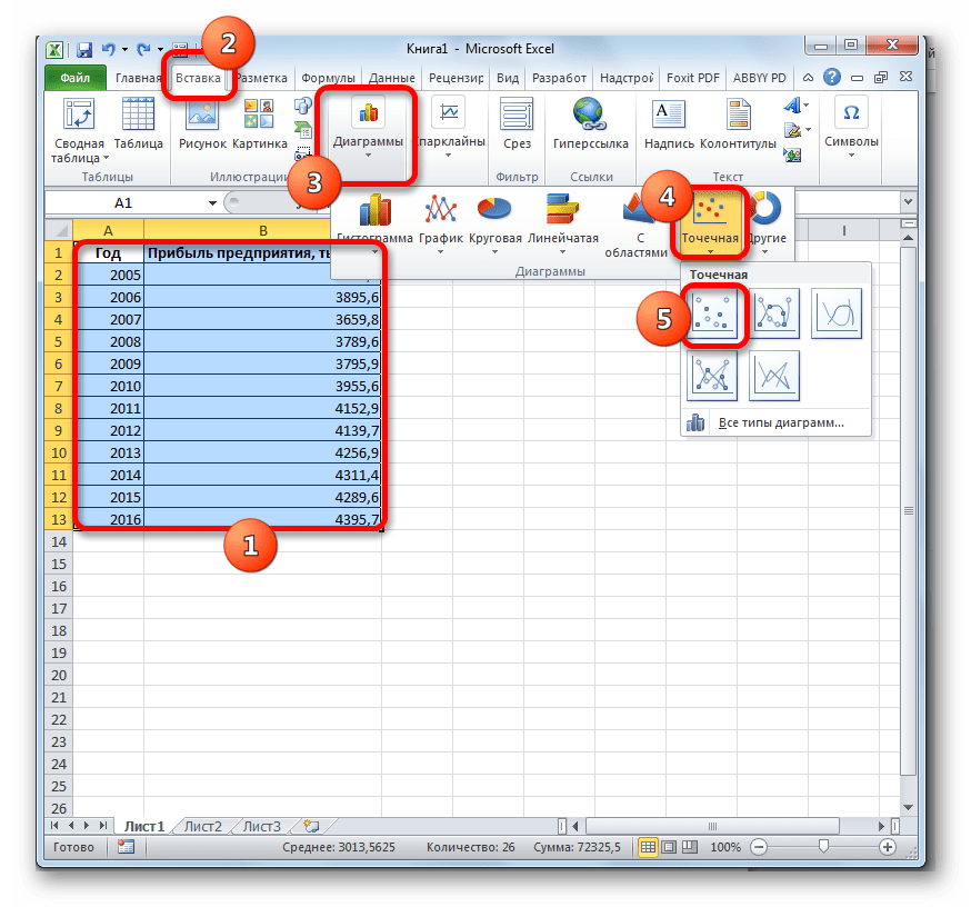
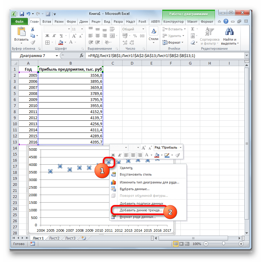
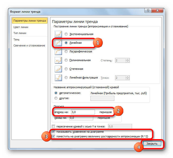
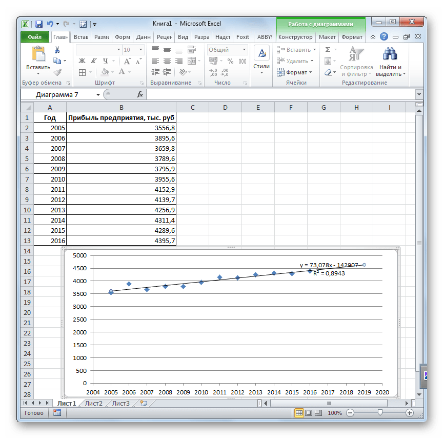
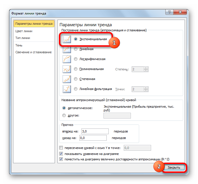
Урок: Как построить линию тренда в Excel
Способ 2: оператор ПРЕДСКАЗ
Экстраполяцию для табличных данных можно произвести через стандартную функцию Эксель ПРЕДСКАЗ. Этот аргумент относится к категории статистических инструментов и имеет следующий синтаксис:
=ПРЕДСКАЗ(X;известные_значения_y;известные значения_x)
«X» – это аргумент, значение функции для которого нужно определить. В нашем случае в качестве аргумента будет выступать год, на который следует произвести прогнозирование.

«Известные значения y» — база известных значений функции. В нашем случае в её роли выступает величина прибыли за предыдущие периоды.
«Известные значения x» — это аргументы, которым соответствуют известные значения функции. В их роли у нас выступает нумерация годов, за которые была собрана информация о прибыли предыдущих лет.
Естественно, что в качестве аргумента не обязательно должен выступать временной отрезок. Например, им может являться температура, а значением функции может выступать уровень расширения воды при нагревании.
При вычислении данным способом используется метод линейной регрессии.
Давайте разберем нюансы применения оператора ПРЕДСКАЗ на конкретном примере. Возьмем всю ту же таблицу. Нам нужно будет узнать прогноз прибыли на 2018 год.
- Выделяем незаполненную ячейку на листе, куда планируется выводить результат обработки. Жмем на кнопку «Вставить функцию».
- Открывается Мастер функций. В категории «Статистические» выделяем наименование «ПРЕДСКАЗ», а затем щелкаем по кнопке «OK».
- Запускается окно аргументов. В поле «X» указываем величину аргумента, к которому нужно отыскать значение функции. В нашем случаем это 2018 год. Поэтому вносим запись «2018». Но лучше указать этот показатель в ячейке на листе, а в поле «X» просто дать ссылку на него. Это позволит в будущем автоматизировать вычисления и при надобности легко изменять год.
В поле «Известные значения y» указываем координаты столбца «Прибыль предприятия». Это можно сделать, установив курсор в поле, а затем, зажав левую кнопку мыши и выделив соответствующий столбец на листе.
Аналогичным образом в поле «Известные значения x» вносим адрес столбца «Год» с данными за прошедший период.
После того, как вся информация внесена, жмем на кнопку «OK».
- Оператор производит расчет на основании введенных данных и выводит результат на экран. На 2018 год планируется прибыль в районе 4564,7 тыс. рублей. На основе полученной таблицы мы можем построить график при помощи инструментов создания диаграммы, о которых шла речь выше.
- Если поменять год в ячейке, которая использовалась для ввода аргумента, то соответственно изменится результат, а также автоматически обновится график. Например, по прогнозам в 2019 году сумма прибыли составит 4637,8 тыс. рублей.
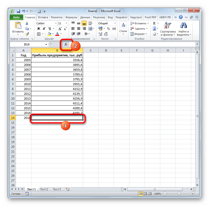
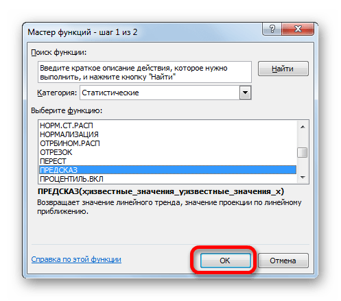
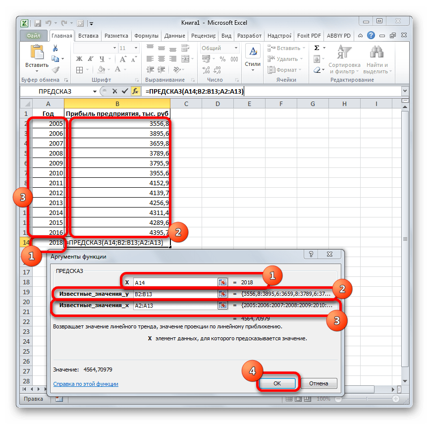
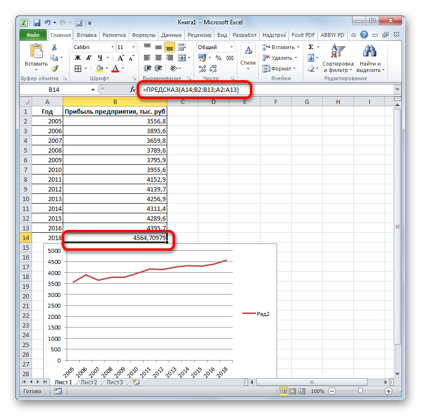
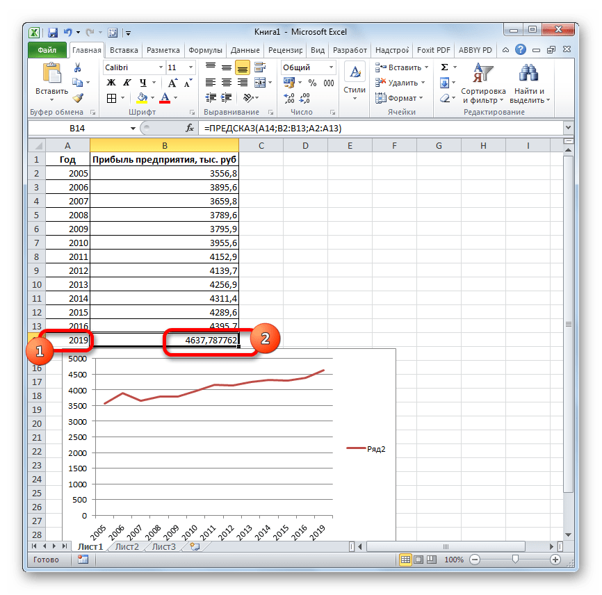
Но не стоит забывать, что, как и при построении линии тренда, отрезок времени до прогнозируемого периода не должен превышать 30% от всего срока, за который накапливалась база данных.
Урок: Экстраполяция в Excel
Способ 3: оператор ТЕНДЕНЦИЯ
Для прогнозирования можно использовать ещё одну функцию – ТЕНДЕНЦИЯ. Она также относится к категории статистических операторов. Её синтаксис во многом напоминает синтаксис инструмента ПРЕДСКАЗ и выглядит следующим образом:
=ТЕНДЕНЦИЯ(Известные значения_y;известные значения_x; новые_значения_x;[конст])
Как видим, аргументы «Известные значения y» и «Известные значения x» полностью соответствуют аналогичным элементам оператора ПРЕДСКАЗ, а аргумент «Новые значения x» соответствует аргументу «X» предыдущего инструмента. Кроме того, у ТЕНДЕНЦИЯ имеется дополнительный аргумент «Константа», но он не является обязательным и используется только при наличии постоянных факторов.
Данный оператор наиболее эффективно используется при наличии линейной зависимости функции.
Посмотрим, как этот инструмент будет работать все с тем же массивом данных. Чтобы сравнить полученные результаты, точкой прогнозирования определим 2019 год.
- Производим обозначение ячейки для вывода результата и запускаем Мастер функций обычным способом. В категории «Статистические» находим и выделяем наименование «ТЕНДЕНЦИЯ». Жмем на кнопку «OK».
- Открывается окно аргументов оператора ТЕНДЕНЦИЯ. В поле «Известные значения y» уже описанным выше способом заносим координаты колонки «Прибыль предприятия». В поле «Известные значения x» вводим адрес столбца «Год». В поле «Новые значения x» заносим ссылку на ячейку, где находится номер года, на который нужно указать прогноз. В нашем случае это 2019 год. Поле «Константа» оставляем пустым. Щелкаем по кнопке «OK».
- Оператор обрабатывает данные и выводит результат на экран. Как видим, сумма прогнозируемой прибыли на 2019 год, рассчитанная методом линейной зависимости, составит, как и при предыдущем методе расчета, 4637,8 тыс. рублей.
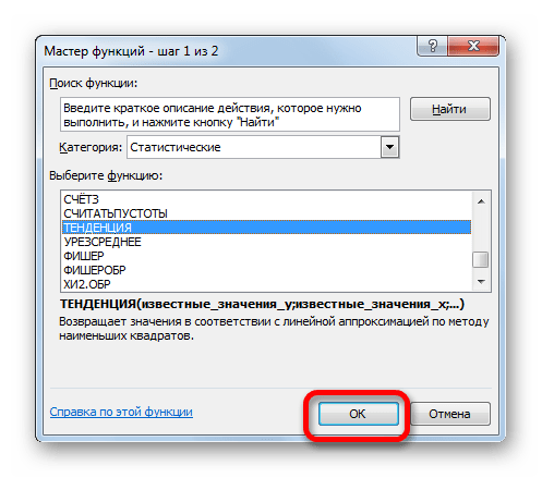
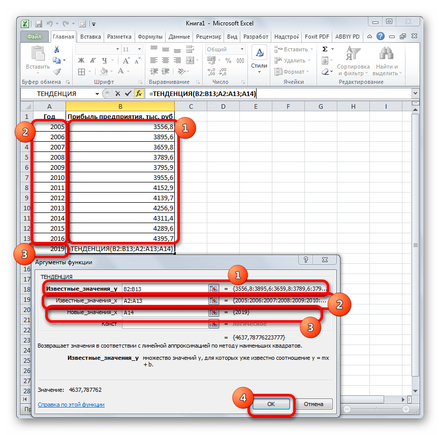
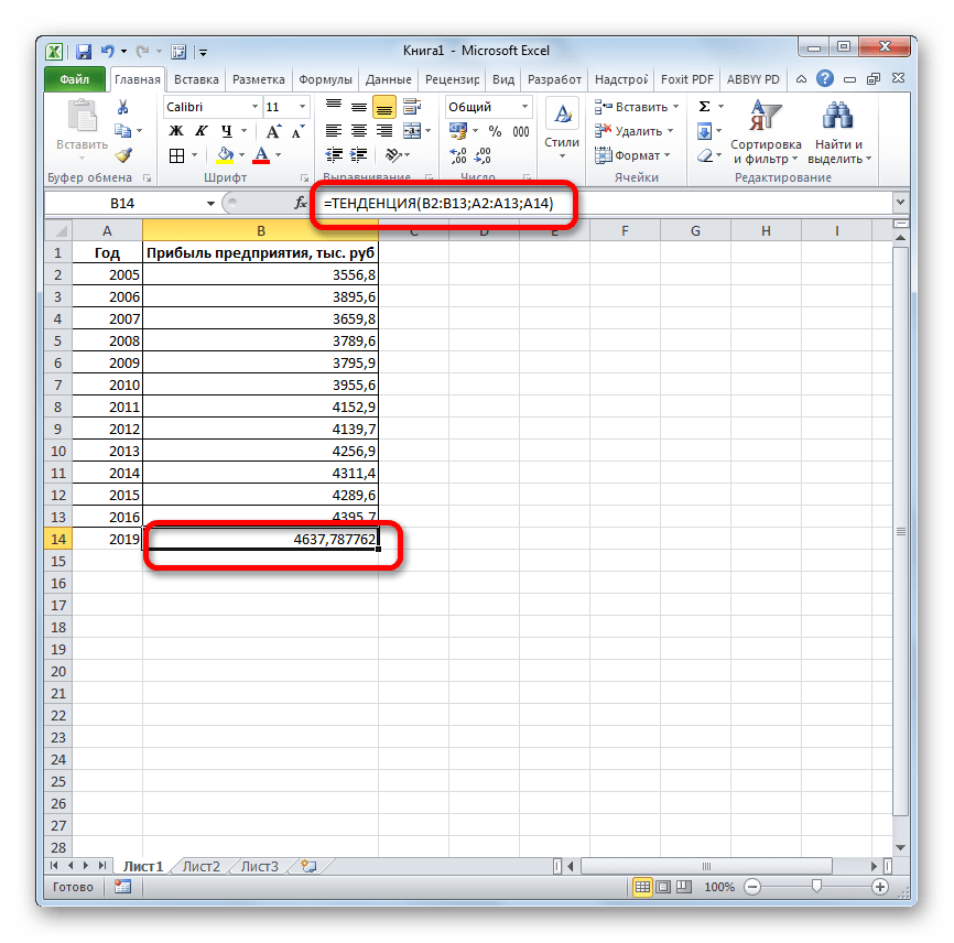
Способ 4: оператор РОСТ
Ещё одной функцией, с помощью которой можно производить прогнозирование в Экселе, является оператор РОСТ. Он тоже относится к статистической группе инструментов, но, в отличие от предыдущих, при расчете применяет не метод линейной зависимости, а экспоненциальной. Синтаксис этого инструмента выглядит таким образом:
=РОСТ(Известные значения_y;известные значения_x; новые_значения_x;[конст])
Как видим, аргументы у данной функции в точности повторяют аргументы оператора ТЕНДЕНЦИЯ, так что второй раз на их описании останавливаться не будем, а сразу перейдем к применению этого инструмента на практике.
- Выделяем ячейку вывода результата и уже привычным путем вызываем Мастер функций. В списке статистических операторов ищем пункт «РОСТ», выделяем его и щелкаем по кнопке «OK».
- Происходит активация окна аргументов указанной выше функции. Вводим в поля этого окна данные полностью аналогично тому, как мы их вводили в окне аргументов оператора ТЕНДЕНЦИЯ. После того, как информация внесена, жмем на кнопку «OK».
- Результат обработки данных выводится на монитор в указанной ранее ячейке. Как видим, на этот раз результат составляет 4682,1 тыс. рублей. Отличия от результатов обработки данных оператором ТЕНДЕНЦИЯ незначительны, но они имеются. Это связано с тем, что данные инструменты применяют разные методы расчета: метод линейной зависимости и метод экспоненциальной зависимости.
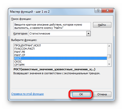
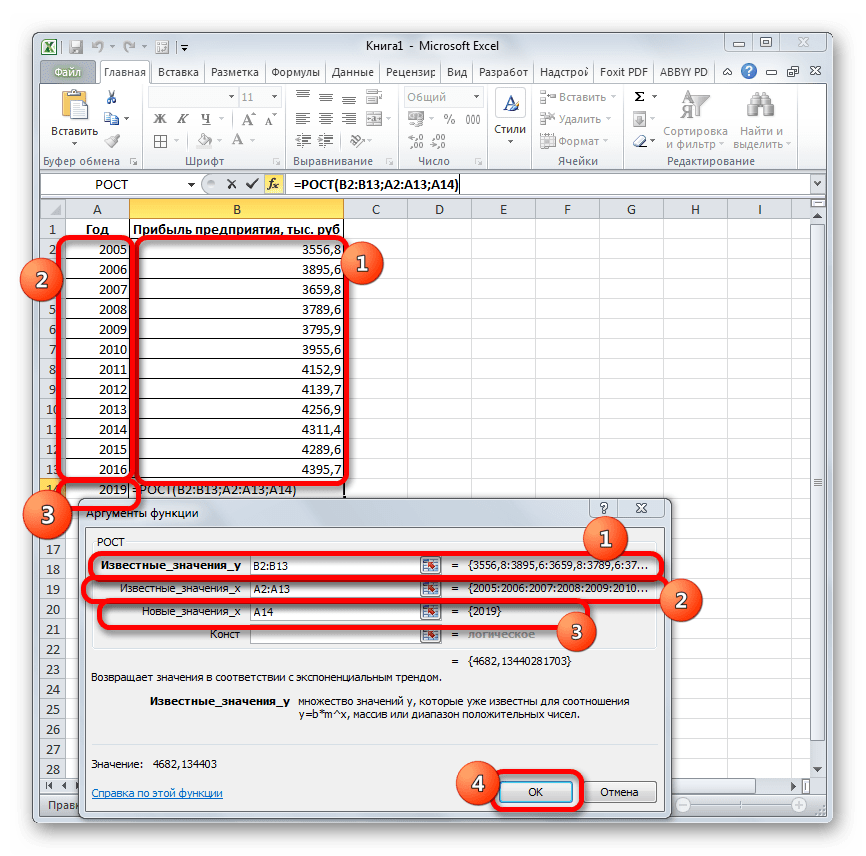
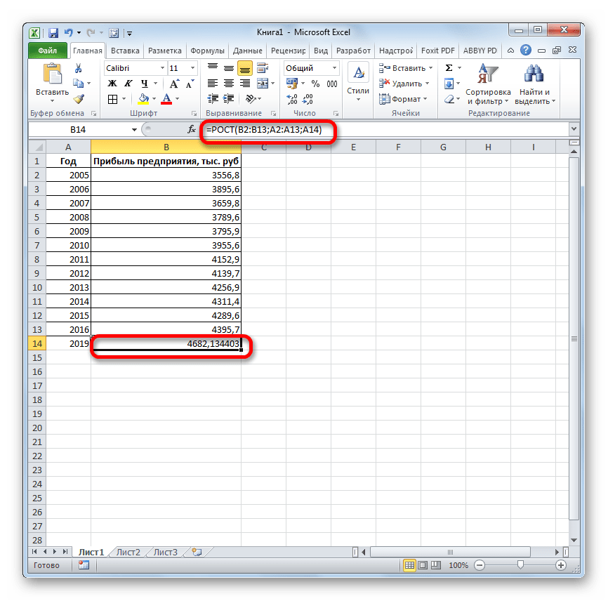
Способ 5: оператор ЛИНЕЙН
Оператор ЛИНЕЙН при вычислении использует метод линейного приближения. Его не стоит путать с методом линейной зависимости, используемым инструментом ТЕНДЕНЦИЯ. Его синтаксис имеет такой вид:
=ЛИНЕЙН(Известные значения_y;известные значения_x; новые_значения_x;[конст];[статистика])
Последние два аргумента являются необязательными. С первыми же двумя мы знакомы по предыдущим способам. Но вы, наверное, заметили, что в этой функции отсутствует аргумент, указывающий на новые значения. Дело в том, что данный инструмент определяет только изменение величины выручки за единицу периода, который в нашем случае равен одному году, а вот общий итог нам предстоит подсчитать отдельно, прибавив к последнему фактическому значению прибыли результат вычисления оператора ЛИНЕЙН, умноженный на количество лет.
- Производим выделение ячейки, в которой будет производиться вычисление и запускаем Мастер функций. Выделяем наименование «ЛИНЕЙН» в категории «Статистические» и жмем на кнопку «OK».
- В поле «Известные значения y», открывшегося окна аргументов, вводим координаты столбца «Прибыль предприятия». В поле «Известные значения x» вносим адрес колонки «Год». Остальные поля оставляем пустыми. Затем жмем на кнопку «OK».
- Программа рассчитывает и выводит в выбранную ячейку значение линейного тренда.
- Теперь нам предстоит выяснить величину прогнозируемой прибыли на 2019 год. Устанавливаем знак «=» в любую пустую ячейку на листе. Кликаем по ячейке, в которой содержится фактическая величина прибыли за последний изучаемый год (2016 г.). Ставим знак «+». Далее кликаем по ячейке, в которой содержится рассчитанный ранее линейный тренд. Ставим знак «*». Так как между последним годом изучаемого периода (2016 г.) и годом на который нужно сделать прогноз (2019 г.) лежит срок в три года, то устанавливаем в ячейке число «3». Чтобы произвести расчет кликаем по кнопке Enter.
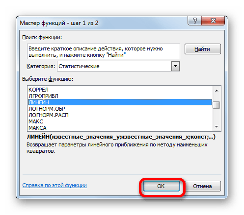
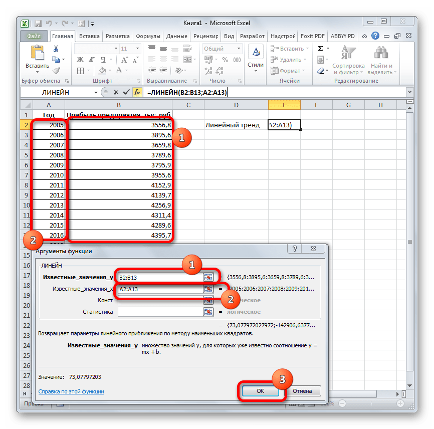
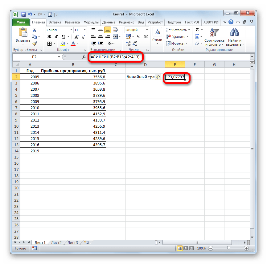
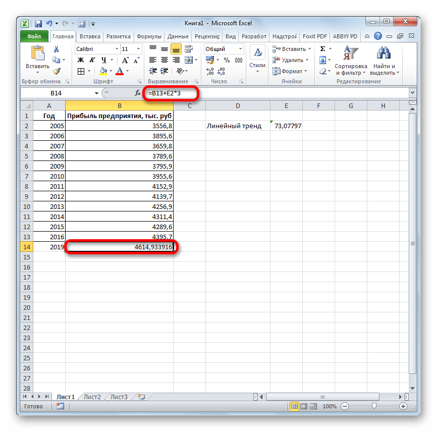
Как видим, прогнозируемая величина прибыли, рассчитанная методом линейного приближения, в 2019 году составит 4614,9 тыс. рублей.
Способ 6: оператор ЛГРФПРИБЛ
Последний инструмент, который мы рассмотрим, будет ЛГРФПРИБЛ. Этот оператор производит расчеты на основе метода экспоненциального приближения. Его синтаксис имеет следующую структуру:
= ЛГРФПРИБЛ (Известные значения_y;известные значения_x; новые_значения_x;[конст];[статистика])
Как видим, все аргументы полностью повторяют соответствующие элементы предыдущей функции. Алгоритм расчета прогноза немного изменится. Функция рассчитает экспоненциальный тренд, который покажет, во сколько раз поменяется сумма выручки за один период, то есть, за год. Нам нужно будет найти разницу в прибыли между последним фактическим периодом и первым плановым, умножить её на число плановых периодов (3) и прибавить к результату сумму последнего фактического периода.
- В списке операторов Мастера функций выделяем наименование «ЛГРФПРИБЛ». Делаем щелчок по кнопке «OK».
- Запускается окно аргументов. В нем вносим данные точно так, как это делали, применяя функцию ЛИНЕЙН. Щелкаем по кнопке «OK».
- Результат экспоненциального тренда подсчитан и выведен в обозначенную ячейку.
- Ставим знак «=» в пустую ячейку. Открываем скобки и выделяем ячейку, которая содержит значение выручки за последний фактический период. Ставим знак «*» и выделяем ячейку, содержащую экспоненциальный тренд. Ставим знак минус и снова кликаем по элементу, в котором находится величина выручки за последний период. Закрываем скобку и вбиваем символы «*3+» без кавычек. Снова кликаем по той же ячейке, которую выделяли в последний раз. Для проведения расчета жмем на кнопку Enter.
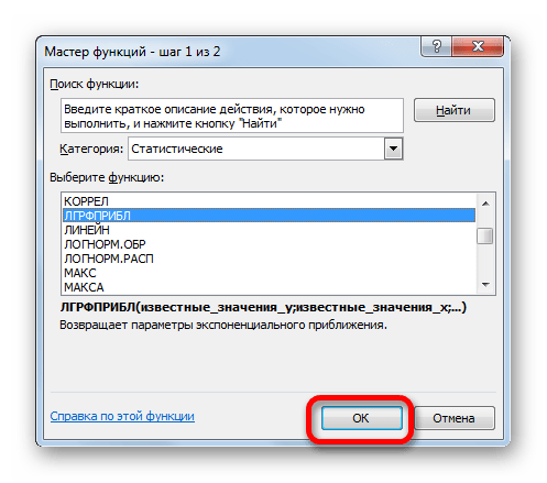
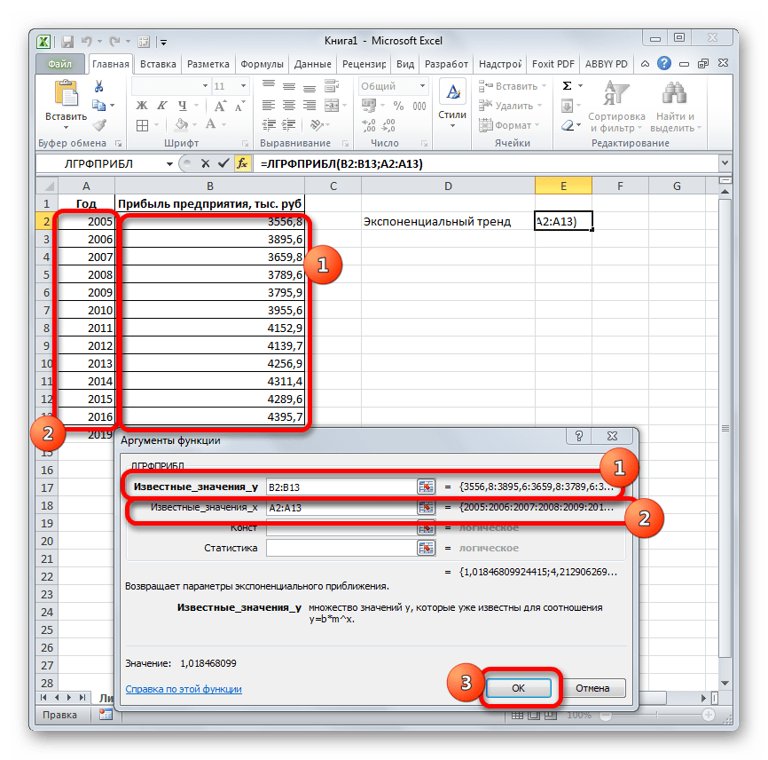
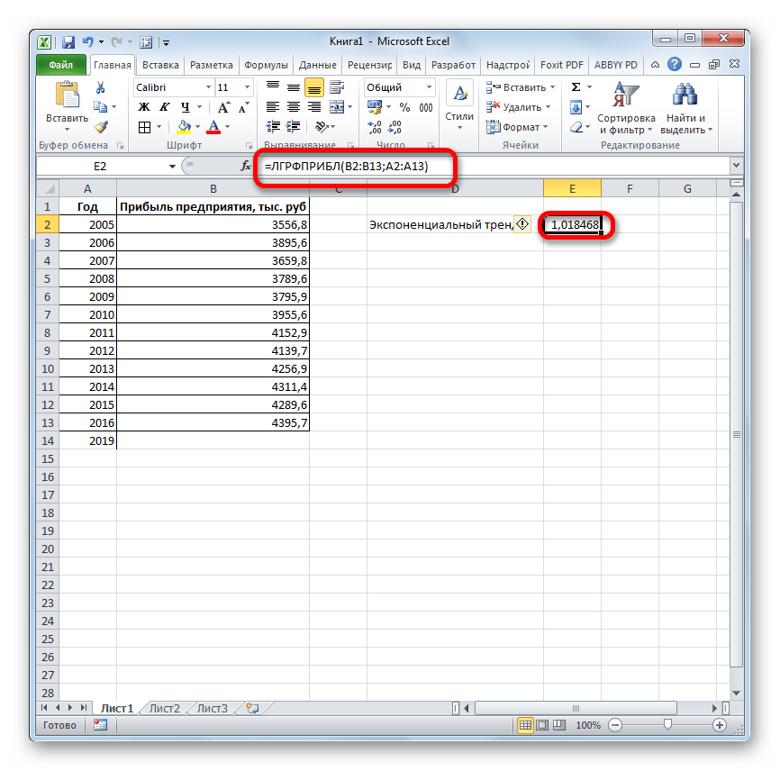
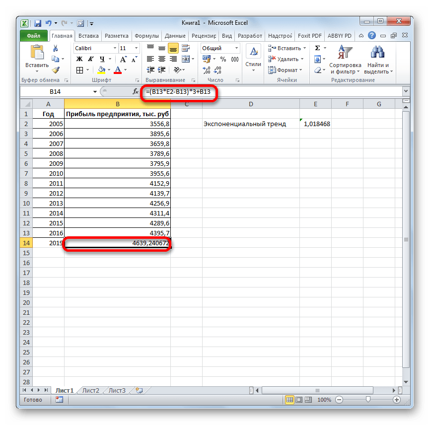
Прогнозируемая сумма прибыли в 2019 году, которая была рассчитана методом экспоненциального приближения, составит 4639,2 тыс. рублей, что опять не сильно отличается от результатов, полученных при вычислении предыдущими способами.
Урок: Другие статистические функции в Excel
Мы выяснили, какими способами можно произвести прогнозирование в программе Эксель. Графическим путем это можно сделать через применение линии тренда, а аналитическим – используя целый ряд встроенных статистических функций. В результате обработки идентичных данных этими операторами может получиться разный итог. Но это не удивительно, так как все они используют разные методы расчета. Если колебание небольшое, то все эти варианты, применимые к конкретному случаю, можно считать относительно достоверными.
FORECAST.LINEAR | FORECAST.ETS | Forecast Sheet
The FORECAST (or FORECAST.LINEAR) function in Excel predicts a future value along a linear trend. The FORECAST.ETS function in Excel predicts a future value using Exponential Triple Smoothing, which takes into account seasonality.
Note: the FORECAST function is an old function. Microsoft Excel recommends using the new FORECAST.LINEAR function which produces the exact same result.
FORECAST.LINEAR
1. The FORECAST.LINEAR function below predicts a future value along a linear trend.

Explanation: when we drag the FORECAST.LINEAR function down, the absolute references ($B$2:$B$11 and $A$2:$A$11) stay the same, while the relative reference (A12) changes to A13 and A14.
2. Enter the value 89 into cell C11, select the range A1:C14 and insert a scatter plot with straight lines and markers.

Note: when you add a trendline to an Excel chart, Excel can display the equation in a chart. This equation predicts the same future values.
FORECAST.ETS
The FORECAST.ETS function in Excel 2016 or later is a great function which can detect a seasonal pattern.
1. The FORECAST.ETS function below predicts a future value using Exponential Triple Smoothing.

Note: the last 3 arguments are optional. The fourth argument indicates the length of the seasonal pattern. The default value of 1 indicates seasonality is detected automatically.
2. Enter the value 49 into cell C13, select the range A1:C17 and insert a scatter plot with straight lines and markers.

3. You can use the FORECAST.ETS.SEASONALITY function to find the length of the seasonal pattern. After seeing the chart, you probably already know the answer.

Conclusion: in this example, when using the FORECAST.ETS function, you can also use the value 4 for the fourth argument.
Forecast Sheet
Use the Forecast Sheet tool in Excel 2016 or later to automatically create a visual forecast worksheet.
1. Select the range A1:B13 shown above.
2. On the Data tab, in the Forecast group, click Forecast Sheet.

Excel launches the dialog box shown below.
3. Specify when the forecast ends, set a confidence interval (95% by default), detect seasonality automatically or manually set the length of the seasonal pattern, etc.

4. Click Create.
This tool uses the FORECAST.ETS function and calculates the same future values. The lower and upper confidence bounds are a nice bonus.

Explanation: in period 13, we can be 95% confident that the number of visitors will be between 86 and 94.