
Excel for Microsoft 365 Excel 2021 Excel 2019 Excel 2016 More…Less
If you have historical time-based data, you can use it to create a forecast. When you create a forecast, Excel creates a new worksheet that contains both a table of the historical and predicted values and a chart that expresses this data. A forecast can help you predict things like future sales, inventory requirements, or consumer trends.
Information about how the forecast is calculated and options you can change can be found at the bottom of this article.
Create a forecast
-
In a worksheet, enter two data series that correspond to each other:
-
A series with date or time entries for the timeline
-
A series with corresponding values
These values will be predicted for future dates.
Note: The timeline requires consistent intervals between its data points. For example, monthly intervals with values on the 1st of every month, yearly intervals, or numerical intervals. It’s okay if your timeline series is missing up to 30% of the data points, or has several numbers with the same time stamp. The forecast will still be accurate. However, summarizing data before you create the forecast will produce more accurate forecast results.
-
-
Select both data series.
Tip: If you select a cell in one of your series, Excel automatically selects the rest of the data.
-
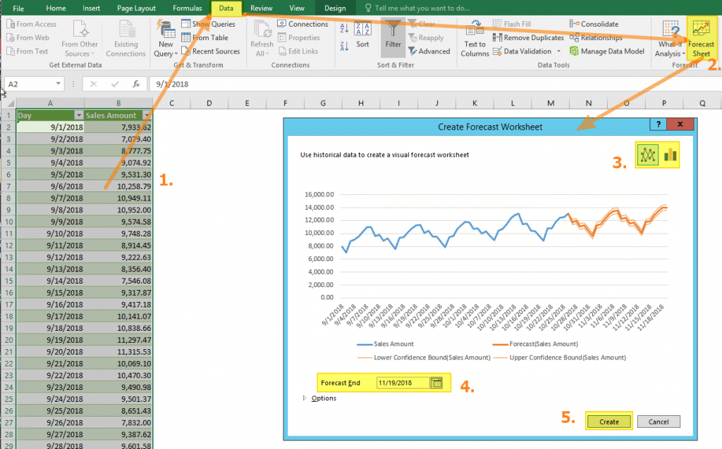
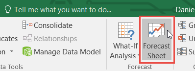
On the Data tab, in the Forecast group, click Forecast Sheet.

-
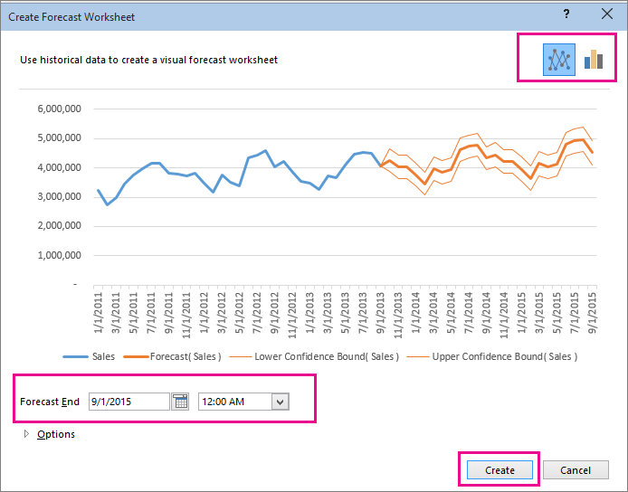
In the Create Forecast Worksheet box, pick either a line chart or a column chart for the visual representation of the forecast.
-
In the Forecast End box, pick an end date, and then click Create.
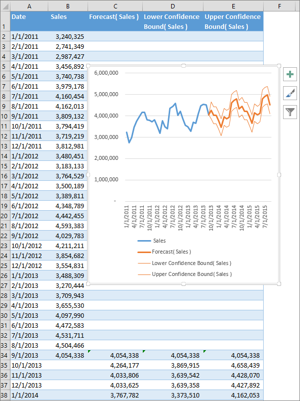
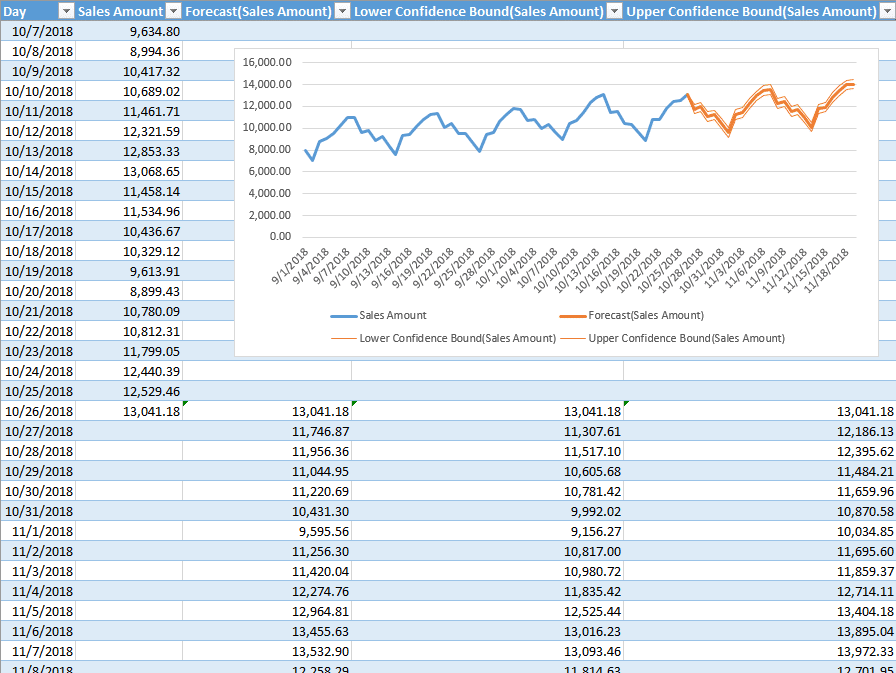
Excel creates a new worksheet that contains both a table of the historical and predicted values and a chart that expresses this data.
You’ll find the new worksheet just to the left («in front of») the sheet where you entered the data series.
Customize your forecast
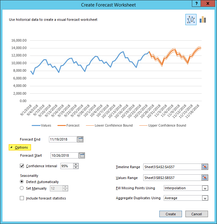
If you want to change any advanced settings for your forecast, click Options.
You’ll find information about each of the options in the following table.
|
Forecast Options |
Description |
|
Forecast Start |
Pick the date for the forecast to begin. When you pick a date before the end of the historical data, only data prior to the start date are used in the prediction (this is sometimes referred to as «hindcasting»). Tips:
|
|
Confidence Interval |
Check or uncheck Confidence Interval to show or hide it. The confidence interval is the range surrounding each predicted value, in which 95% of future points are expected to fall, based on the forecast (with normal distribution). Confidence interval can help you figure out the accuracy of the prediction. A smaller interval implies more confidence in the prediction for the specific point. The default level of 95% confidence can be changed using the up or down arrows. |
|
Seasonality |
Seasonality is a number for the length (number of points) of the seasonal pattern and is automatically detected. For example, in a yearly sales cycle, with each point representing a month, the seasonality is 12. You can override the automatic detection by choosing Set Manually and then picking a number. Note: When setting seasonality manually, avoid a value for less than 2 cycles of historical data. With less than 2 cycles, Excel cannot identify the seasonal components. And when the seasonality is not significant enough for the algorithm to detect, the prediction will revert to a linear trend. |
|
Timeline Range |
Change the range used for your timeline here. This range needs to match the Values Range. |
|
Values Range |
Change the range used for your value series here. This range needs to be identical to the Timeline Range. |
|
Fill Missing Points Using |
To handle missing points, Excel uses interpolation, meaning that a missing point will be completed as the weighted average of its neighboring points as long as fewer than 30% of the points are missing. To treat the missing points as zeros instead, click Zeros in the list. |
|
Aggregate Duplicates Using |
When your data contains multiple values with the same timestamp, Excel will average the values. To use another calculation method, such as Median or Count, pick the calculation you want from the list. |
|
Include Forecast Statistics |
Check this box if you want additional statistical information on the forecast included in a new worksheet. Doing this adds a table of statistics generated using the FORECAST.ETS.STAT function and includes measures, such as the smoothing coefficients (Alpha, Beta, Gamma), and error metrics (MASE, SMAPE, MAE, RMSE). |
Formulas used in forecasting data
When you use a formula to create a forecast, it returns a table with the historical and predicted data, and a chart. The forecast predicts future values using your existing time-based data and the AAA version of the Exponential Smoothing (ETS) algorithm.
The table can contain the following columns, three of which are calculated columns:
-
Historical time column (your time-based data series)
-
Historical values column (your corresponding values data series)
-
Forecasted values column (calculated using FORECAST.ETS)
-
Two columns representing the confidence interval (calculated using FORECAST.ETS.CONFINT). These columns appear only when the Confidence Interval is checked in the Options section of the box..
Download a sample workbook
Click this link to download a workbook with Excel FORECAST.ETS function examples
Need more help?
You can always ask an expert in the Excel Tech Community or get support in the Answers community.
Related Topics
Forecasting functions
Need more help?
Want more options?
Explore subscription benefits, browse training courses, learn how to secure your device, and more.
Communities help you ask and answer questions, give feedback, and hear from experts with rich knowledge.
Calculates a future value using existing values
What is the FORECAST Function?
The FORECAST Function[1] is categorized under Excel Statistical functions. It will calculate or predict a future value using existing values.
In financial modeling, the FORECAST function can be useful in calculating the statistical value of a forecast made. For example, if we know the past earnings and expenses, we can forecast the future amounts using the function.
Formula
=FORECAST(x, known_y’s, known_x’s)
The FORECAST function uses the following arguments:
- X (required argument) – This is a numeric x-value for which we want to forecast a new y-value.
- Known_y’s (required argument) – The dependent array or range of data.
- Known_x’s (required argument) – This is the independent array or range of data that is known to us.
How to use the FORECAST Function in Excel?
As a worksheet function, FORECAST can be entered as part of a formula in a cell of a worksheet. To understand the uses of the function, let’s consider an example:
Example
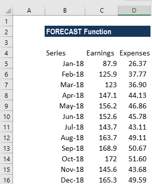
Suppose we are given earnings data, which are the known x’s, and expenses, which are the known y’s. We can use the FORECAST function to predict an additional point along the straight line of best fit through a set of known x- and y-values. Using the data below:
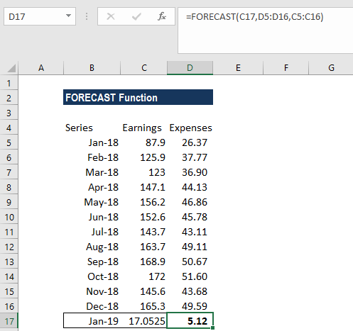
Using earnings data for January 2019, we can predict the expenses for the same month using the FORECAST function.
The formula to use is:
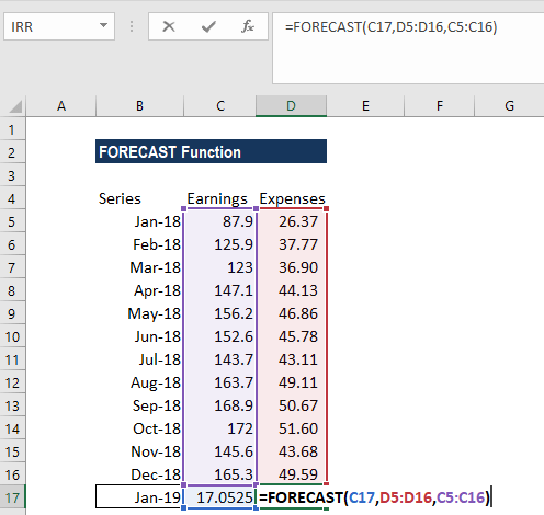
We get the results below:
The FORECAST function will calculate a new y-value using the simple straight-line equation:
![]()
Where:
![]()
and:
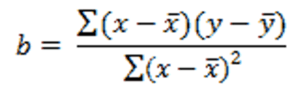
The values of x and y are the sample means (the averages) of the known x- and the known y-values.
A few notes about the function:
- The length of the known_x’s array should be the same length as the known_y’s, and the variance of the known_x’s must not be zero.
- #N/A! error – Occurs if:
- The supplied values known_x’s and the supplied known_y’s arrays have different lengths.
- One or both of the known_x’s or the known_y’s arrays are empty.
- #DIV/0! error – Occurs if the variance of the supplied known_x’s is equal to zero.
- #VALUE! error – Occurs if the given future value of x is non-numeric.
Click here to download the sample Excel file
Additional Resources
Thanks for reading CFI’s guide to this important Excel function. By taking the time to learn and master these functions, you’ll significantly speed up your financial modeling and valuation analysis. To learn more, check out these additional CFI resources:
- Advanced Excel Course
- Financial Modeling Courses
- Budgeting and Forecasting Course
- Financial Analyst Certification
- See all Excel resources
What is Forecasting?
Forecasting is a technique to establish relationships and trends which can be projected into the future, based on historical data and certain assumptions. This method can be utilized to better understand and make an educated guess on how to adjust budgets, anticipate future expenses or sales, or other similar decisions. A disclaimer here: Forecasting doesn’t tell you the future or gives you a definitive way to proceed with a decision — it only shows you probabilities and what might be the best course of action. You should always double check your results before deciding.
Why use Excel?
Excel offers many tools for forecasting and has the ability to store, calculate, and visualize data. Even if you don’t keep your data in Excel, you can import files or connect to external databases to use its built-in tools and formulas for forecasting. The visualization of the data is a simple process thanks to Excel Charts and formatting features.
Forecasting Methods and Forecasting in Excel
There are several of forecasting methods for forecasting in Excel, and each rely on various techniques. Obviously, none will give you definitive answers without the ability to see the future. These results are best used to make educated guesses. In our article, we focus on 3 commonly used quantitative methods that can be easily used in Excel.
- Moving Averages
- Exponential Smoothing (ETS)
- Linear Regression
You can download our sample workbook below.
Moving Averages
Moving averages is a method used to smooth out the trend in data (i.e. time series). The idea is to filter out the micro deviations in a sample time range, to see the longer-term trend that might affect future results.
The simplest form of a moving average is calculated by taking the arithmetic mean of a given set of values. For example, let’s assume that you want to smooth out the daily changes of sales in a week. To calculate the weekly moving average, we must first find the average of 7 days, starting from the first day. Next, calculate the average of 7 days from day 2nd to day 8th and use this data. To do this, you can use the AVERAGE function with relative references.
=AVERAGE(B5:B11) formula in our example calculates the average of values between the 4th and 10th days.

For more information about finding the mean of a data set, please see How to calculate mean in Excel.
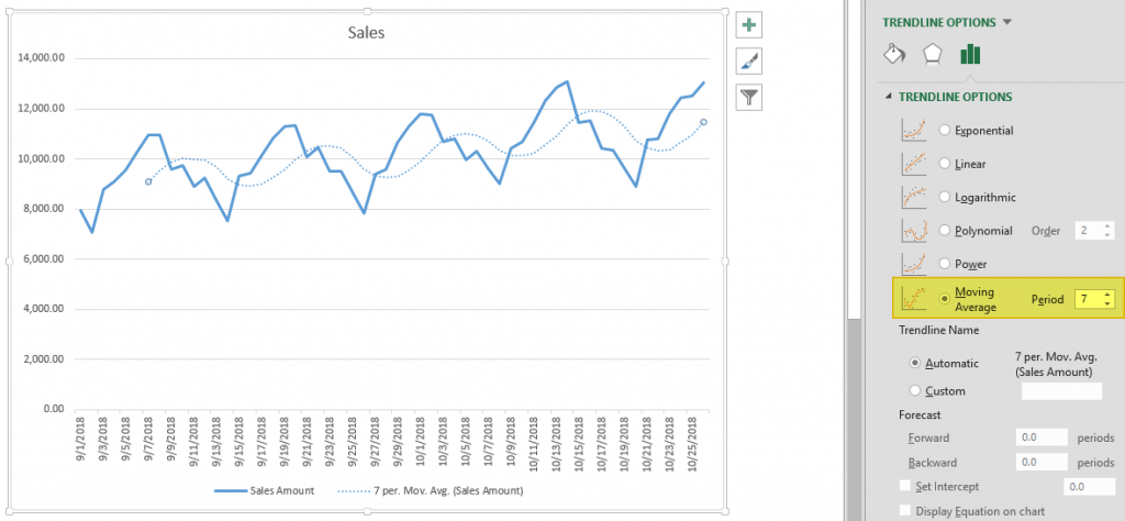
There is an alternative way to add moving averages that also inserts the data into a chart. Start by creating a chart with the past data. You will see a plus icon to the right of the chart. You can add or remove elements from this menu.
Click on the plus icon and move your mouse over the Trendline item. Click the right arrow and select the More Options… item from the dropdown menu. TRENDLINE OPTIONS panel will pop up at the right side of the Excel window.
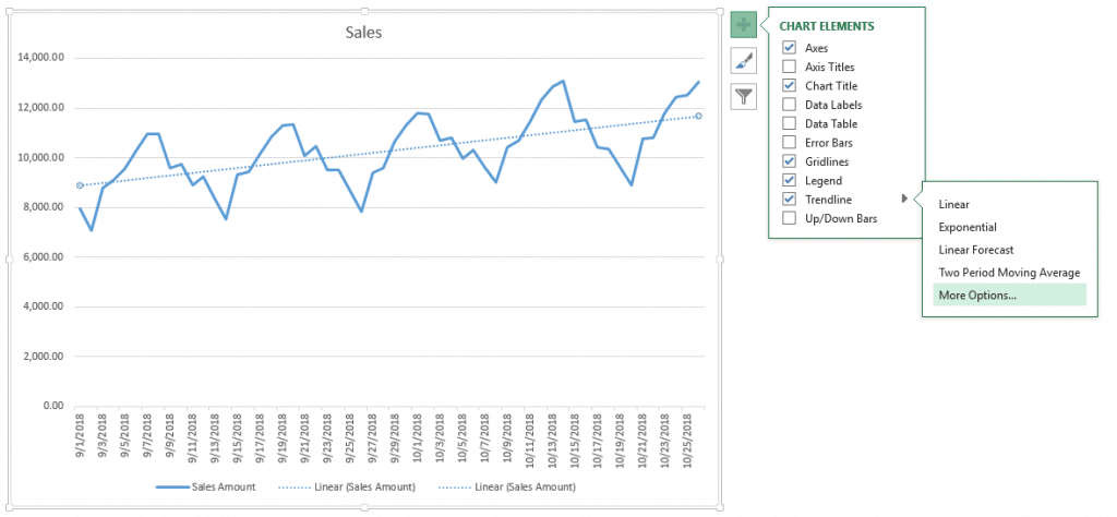
Select Moving Average and set the Period based on your data. You will see the same moving average line on your chart.
Exponential Smoothing (ETS)
Another method for forecasting in Excel is Exponential Smoothing. Exponential Smoothing, like Moving Averages, is based on smoothing past data trends. However, this algorithm performs smoothing by detecting seasonality patterns and confidence intervals. This feature is available in Excel 2016 or later. You can use your own formulas, or have Excel automatically do this with its Forecast Sheet feature. Excel’s Forecast Sheet feature automatically adds formulas and creates a chart in a new sheet. Follow the steps below to use this feature.
- Select the data that contains timeline series and values.
- Go to Data > Forecast > Forecast Sheet
- Choose a chart type (we recommend using a line or column chart).
- Pick an end date for forecasting.
- Click the Create
Your actual data will be moved into a new sheet with the addition of a few columns, and the chart of your selection that matches what you’ve seen in the preview will be placed on this page.
These 3 new columns are for the forecast and boundary values for the confidence interval. The confidence interval is the range where future points are expected to fall. For example, 95% means that 95% percent of the future values will be in the specified range. The range is calculated using normal distribution.
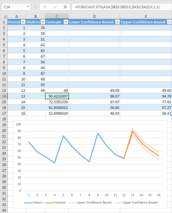
If you click on the values in the new columns, you can see the formulas being used. The FORECAST.ETS function is used to find the forecast values and the FORECAST.ETS.CONFINT function returns the interval value. Arguments of the formulas are populated based on the inputs in Options section.
Customizing
Advanced options can be found under the Options section in the Create Forecast Sheet dialog. Click the Options label to go to this menu.
| Forecast Start | The timeline value where the forecast starts. If your timeline values are dates, you can select a date from the date picker.
Excel can automatically detect where your data ends and pick the next timeline value. Alternatively, previous timeline points can be selected to see how the forecasting algorithm works. |
| Confidence Interval | Check or uncheck the input to show or hide the Confidence Interval calculations. The default level of confidence is 95%. |
| Seasonality | The length of the seasonal pattern. Excel can automatically detect this pattern. Alternatively, you can change the value to better fit your needs. |
| Timeline Range | Reference that contains the timeline values. This range needs to match the Values Range. |
| Values Range | Reference that contains the actual values. This range needs to match the Timeline Range. |
| Fill Missing Points Using | Excel can fill in the missing points based on the weighted average of neighboring points. This approach is called Interpolation. Alternatively, Zeroes can be selected to show the missing points as zeroes. |
| Duplicate Aggregates Using | An option for how Excel behaves when there are multiple values with the same timeline value. Calculating the average is the default option. |
| Include Forecast Statistics | If you are familiar with statistics, check this input to display smoothing coefficients (Alpha, Beta, Gamma), and error metrics (MASE, SMAPE, MAE, RMSE).
These values are calculated by the FORECAST.ETS.STAT function. |
Linear Regression
Forecasting in Excel can be done using various formulas. One of the most commonly used formulas is the FORECAST.LINEAR for Excel 2016, and FORECAST for earlier versions. Although Excel still supports the FORECAST function, if you have 2016 or later, we recommend updating your formulas to prevent any issues in case of a function deprecation. If you do not have Excel 2016 or newer, you should use the FORECAST function. We will continue to refer the function as FORECAST in the rest of this article.
Unlike the ETS algorithm, the FORECAST function predicts future values using linear regression. Linear regression determines the linear relation between timeline series and values series. This linear approach makes it unsuitable for data with seasonality or other cycles, as well as non-linearity. On the other hand, linear regression is useful for causal models due to its simplicity.
Since Excel doesn’t have a wizard for the traditional FORECAST function, you will need to do some of the required steps manually.
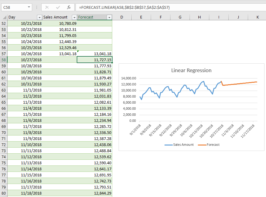
- Add new timeline points to your data table for the values to use in the forecast. For example, from 10/27 to 11/19.
- Select the cell where the first forecast value is to be calculated. (e.g. C58)
- Start a formula with the FORECAST function by these arguments:
- Select the first timeline value to use in forecast. Leave the reference as relative. (e.g. A58)
- Select the range that contains the actual values. Make the range absolute. (e.g. $B$2:$B$57)
- Select the range that contains the timeline values. Make the range absolute. (e.g. $A$2:$A$57)
- Copy the formula down for the rest of the column.
Sample formula for the first forecast point: =FORECAST.LINEAR(A58,$B$2:$B$57,$A$2:$A$57)
Содержание
- Create a forecast in Excel for Windows
- Create a forecast
- Customize your forecast
- Formulas used in forecasting data
- Download a sample workbook
- Need more help?
- Create a forecast in Excel for Windows
- Create a forecast
- Customize your forecast
- Formulas used in forecasting data
- Download a sample workbook
- Need more help?
- FORECAST
- FORECAST.LINEAR
- FORECAST.ETS
- Forecast Sheet
Create a forecast in Excel for Windows
If you have historical time-based data, you can use it to create a forecast. When you create a forecast, Excel creates a new worksheet that contains both a table of the historical and predicted values and a chart that expresses this data. A forecast can help you predict things like future sales, inventory requirements, or consumer trends.
Information about how the forecast is calculated and options you can change can be found at the bottom of this article.
Create a forecast
In a worksheet, enter two data series that correspond to each other:
A series with date or time entries for the timeline
A series with corresponding values
These values will be predicted for future dates.
Note: The timeline requires consistent intervals between its data points. For example, monthly intervals with values on the 1st of every month, yearly intervals, or numerical intervals. It’s okay if your timeline series is missing up to 30% of the data points, or has several numbers with the same time stamp. The forecast will still be accurate. However, summarizing data before you create the forecast will produce more accurate forecast results.
Select both data series.
Tip: If you select a cell in one of your series, Excel automatically selects the rest of the data.
On the Data tab, in the Forecast group, click Forecast Sheet.
In the Create Forecast Worksheet box, pick either a line chart or a column chart for the visual representation of the forecast.
In the Forecast End box, pick an end date, and then click Create.
Excel creates a new worksheet that contains both a table of the historical and predicted values and a chart that expresses this data.
You’ll find the new worksheet just to the left («in front of») the sheet where you entered the data series.
Customize your forecast
If you want to change any advanced settings for your forecast, click Options.
You’ll find information about each of the options in the following table.
Pick the date for the forecast to begin. When you pick a date before the end of the historical data, only data prior to the start date are used in the prediction (this is sometimes referred to as «hindcasting»).
Starting your forecast before the last historical point gives you a sense of the prediction accuracy as you can compare the forecasted series to the actual data. However, if you start the forecast too early, the forecast generated won’t necessarily represent the forecast you’ll get using all the historical data. Using all of your historical data gives you a more accurate prediction.
If your data is seasonal, then starting a forecast before the last historical point is recommended.
Check or uncheck Confidence Interval to show or hide it. The confidence interval is the range surrounding each predicted value, in which 95% of future points are expected to fall, based on the forecast (with normal distribution). Confidence interval can help you figure out the accuracy of the prediction. A smaller interval implies more confidence in the prediction for the specific point. The default level of 95% confidence can be changed using the up or down arrows.
Seasonality is a number for the length (number of points) of the seasonal pattern and is automatically detected. For example, in a yearly sales cycle, with each point representing a month, the seasonality is 12. You can override the automatic detection by choosing Set Manually and then picking a number.
Note: When setting seasonality manually, avoid a value for less than 2 cycles of historical data. With less than 2 cycles, Excel cannot identify the seasonal components. And when the seasonality is not significant enough for the algorithm to detect, the prediction will revert to a linear trend.
Change the range used for your timeline here. This range needs to match the Values Range.
Change the range used for your value series here. This range needs to be identical to the Timeline Range.
Fill Missing Points Using
To handle missing points, Excel uses interpolation, meaning that a missing point will be completed as the weighted average of its neighboring points as long as fewer than 30% of the points are missing. To treat the missing points as zeros instead, click Zeros in the list.
Aggregate Duplicates Using
When your data contains multiple values with the same timestamp, Excel will average the values. To use another calculation method, such as Median or Count, pick the calculation you want from the list.
Include Forecast Statistics
Check this box if you want additional statistical information on the forecast included in a new worksheet. Doing this adds a table of statistics generated using the FORECAST.ETS.STAT function and includes measures, such as the smoothing coefficients (Alpha, Beta, Gamma), and error metrics (MASE, SMAPE, MAE, RMSE).
Formulas used in forecasting data
When you use a formula to create a forecast, it returns a table with the historical and predicted data, and a chart. The forecast predicts future values using your existing time-based data and the AAA version of the Exponential Smoothing (ETS) algorithm.
The table can contain the following columns, three of which are calculated columns:
Historical time column (your time-based data series)
Historical values column (your corresponding values data series)
Forecasted values column (calculated using FORECAST.ETS)
Two columns representing the confidence interval (calculated using FORECAST.ETS.CONFINT). These columns appear only when the Confidence Interval is checked in the Options section of the box..
Download a sample workbook
Need more help?
You can always ask an expert in the Excel Tech Community or get support in the Answers community.
Источник
FORECAST
The FORECAST (or FORECAST.LINEAR) function in Excel predicts a future value along a linear trend. The FORECAST.ETS function in Excel predicts a future value using Exponential Triple Smoothing, which takes into account seasonality.
Note: the FORECAST function is an old function. Microsoft Excel recommends using the new FORECAST.LINEAR function which produces the exact same result.
FORECAST.LINEAR
1. The FORECAST.LINEAR function below predicts a future value along a linear trend.
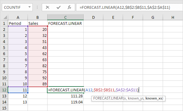
Explanation: when we drag the FORECAST.LINEAR function down, the absolute references ($B$2:$B$11 and $A$2:$A$11) stay the same, while the relative reference (A12) changes to A13 and A14.
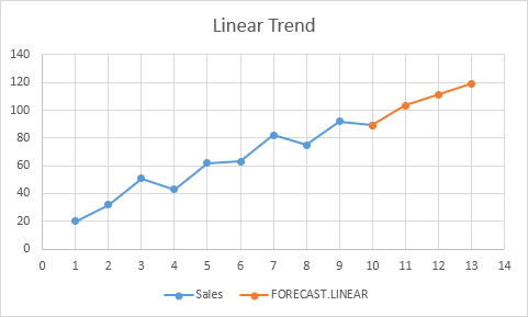
2. Enter the value 89 into cell C11, select the range A1:C14 and insert a scatter plot with straight lines and markers.
Note: when you add a trendline to an Excel chart, Excel can display the equation in a chart. This equation predicts the same future values.
FORECAST.ETS
The FORECAST.ETS function in Excel 2016 or later is a great function which can detect a seasonal pattern.
1. The FORECAST.ETS function below predicts a future value using Exponential Triple Smoothing.
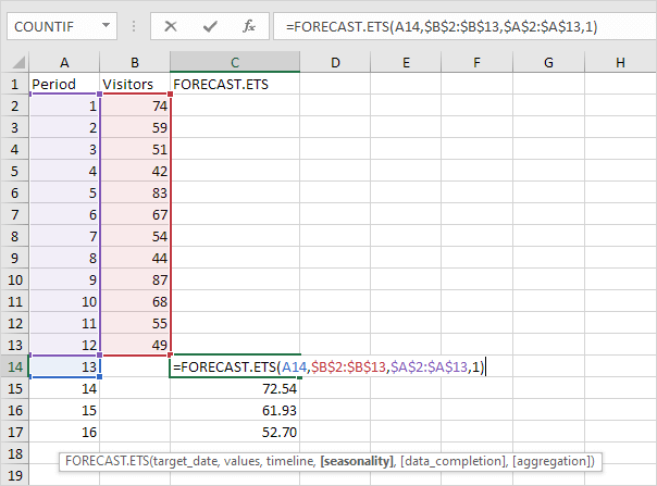
Note: the last 3 arguments are optional. The fourth argument indicates the length of the seasonal pattern. The default value of 1 indicates seasonality is detected automatically.
2. Enter the value 49 into cell C13, select the range A1:C17 and insert a scatter plot with straight lines and markers.
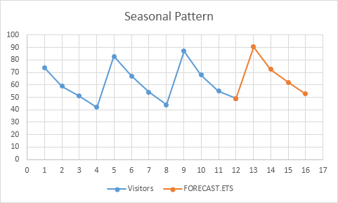
3. You can use the FORECAST.ETS.SEASONALITY function to find the length of the seasonal pattern. After seeing the chart, you probably already know the answer.
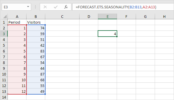
Conclusion: in this example, when using the FORECAST.ETS function, you can also use the value 4 for the fourth argument.
Forecast Sheet
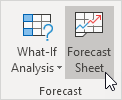
Use the Forecast Sheet tool in Excel 2016 or later to automatically create a visual forecast worksheet.
1. Select the range A1:B13 shown above.
2. On the Data tab, in the Forecast group, click Forecast Sheet.
Excel launches the dialog box shown below.
3. Specify when the forecast ends, set a confidence interval (95% by default), detect seasonality automatically or manually set the length of the seasonal pattern, etc.
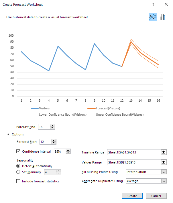
This tool uses the FORECAST.ETS function and calculates the same future values. The lower and upper confidence bounds are a nice bonus.
Explanation: in period 13, we can be 95% confident that the number of visitors will be between 86 and 94.
Источник
How to Use the Excel FORECAST function Step-by-Step (2023)
Forecasting makes a crucial element of every business. Accurate business forecasting can help your business progress much faster than ever.
But forecasting is usually not that simple. You’d need to have specialists (statisticians mostly) on board. Or you’d need to buy specialized forecasting software. Both of which can cost you thousands of dollars. 💰
Good News! Microsoft Excel offers many tools and functions that will make forecasting easier and cheaper for you.
Let’s jump into the guide below and learn them all. Download our free sample workbook here to tag along with the guide.
What is forecasting?
Forecasting is the technique to estimate future trends based on historical data.
For example, Company A made sales worth $5000 in 2020 and $5500 in 2021. How many sales will it achieve in 2022?
The historical data of sales shows a 10% increase ($5000 to $5500) in sales over the year.
Given the historical trend of increase, we can forecast sales of $6050 in 2022. (Sales of $5500 increased by 10%).
That’s the simplest version of forecasting, and it only gets more complex.
Forecasting is only based on probabilities and estimates – which can change anytime. And the actual results may vary from the forecasted stats.
Forecasting in Excel
Microsoft Excel offers many tools, graphs, trendlines, and built-in functions for forecasting.
You can use these tools to build cash flow forecasts, profit forecasts, budgets, KPIs, and whatnot.
The three main (and relatively simpler) forecasting tools of Excel include the following.
- Moving Averages
- Exponential smoothing
- Linear Regression
Let’s not wait anymore and dive right into each of these smart techniques.
Moving Averages
Moving Averages are used to see a wider picture of how the numbers have been changing over periods. See here.

The image above shows the sales made over the past 12 months.
Create a simple line chart out of it to see the trend of sales over the last year.

Seems like a series of mountains 😉
The graph of sales shows steep rises and falls in sales throughout the year. It’s hard to study the trend of sales over the year, let alone forecast it for future years.
Let’s make the moving average of these sales to analyze the trend of sales better. The moving average for every two months’ sales.
There are three ways how you can apply the moving average method to forecast numbers.
1. Manually using the AVERAGE function
We are making a two-months moving average so the first average would be calculated at the end of month 2.
1. So, activate a cell in a new column parallel to February (2nd month of our data):

2. Write the AVERAGE function as below:
= AVERAGE (B2:B3)
3. Excel calculates the average for the first months.

4. Drag and Drop this formula to the whole list.

What has Excel done? As the cell references were not absolute but only relative, the cell references change for each next average.
And so, we get the moving average for the next two months (like February and March) in the example above.

5. Turn both these series (sales and moving average of sales) into a line graph to study the trend.
6. Select the whole data set.

7. Go to Insert tab > Charts > 2D Line Chart Icon.

8. Choose any 2D line chart, as desired.

Excel plots both series on the line chart (each with a different color).

Note how the blue line has sharp highs and lows. Whereas the orange line is smoothed out. This makes it easier to study the trends over a given period.
Based on this orange trend line, you can study the historical trend of sales over the year. Assuming sales would seek the same trend in the future, you can forecast future sales.
2. Using Data Analysis
Excel offers an in-built tool to calculate moving averages in Excel.
1. Go to Data Tab > Analysis > Data Analysis.

Pro Tip!
Can’t find the Data Analysis tool? Load it into Excel by going to:
File > Options > Add-ins > Analysis ToolPak > Okay
2. The Data Analysis dialog box opens up.
3. Select Moving averages.

4. In the moving averages dialog box:
- Refer to the cell range containing sales as input values.
- We are calculating the 2-month moving average, so set the interval to “2”.
- Specify any range where you want the moving averages to appear as the output range.

5. Click Okay, and there you have the moving averages calculated.

Why do we have N/A against January 2022? Because we need at least two months of data to calculate 2-months moving average.
6. Select the data and convert it into a chart by going to the Insert tab > Charts > 2D Line Chart Icon.
7. Here’s what the chart looks like.

3. Moving Average Trendline
Not only calculate moving averages, but Excel can also automatically plot them in a chart. How? See here.
1. Select the dataset (including months and sales).

2. Go to Insert tab > Charts > 2D Line Chart Icon.

3. Choose any 2D line chart, as desired.

The chart to be plotted will still have a single trend line only (though it’s a 2D chart). This is because the data only consists of sales to be plotted.
4. Once the chart is plotted in Excel, select the chart.

5. Go to the plus (+) icon that appears to the right of the chart.
6. Hover your cursor over ‘Trendline’ to enable the drop-down menu.

7. Choose a Two-period Moving Average (because we are calculating a 2-months moving average).
8. A smoother, orange line follows the blue line in the chart. This line represents the trend of the 2-month moving averages for sales.

This method is faster than other methods of plotting moving averages in Excel. However, this only gives you a trend line for moving averages and not the numbers for moving averages.
Exponential Smoothing
There’s another technique how you can forecast data for the future – through the Exponential smoothing tool of Excel.
Let’s continue with the same sample data as above.
1. Select the data (or any cell from your data, and Excel would recognize the range itself).

Pro Tip!
To predict future values using the Exponential Smoothing forecasting model, make sure your data:
- Has two series (like time series and the numeric value for each).
- Time series has equal intervals (like monthly, quarterly, and annual values).
2. Go to Data Tab > Forecast > Forecast Sheet.

3. This takes you to the ‘Create Forecast Window’.

It gives a chart preview and many options to set the variables as desired.
To the top right of this window, there are two kinds of charts that you can make (a line chart or a bar chart).

You can also choose to create the forecast in the shape of a bar chart as follows.

4. To the bottom, there is an option to set the forecast end date. For how long do you want to forecast the sales?
5. We have set it for 6 upcoming months (until July 2023).

6. You can also change the date from when the forecast begins.

For example, let’s set it to 01 September 2022. As we change the date from 01 January 2023 to 1 September 2022, the orange line takes September as the starting point.

Pro Tip!
But we don’t need the forecasted values for the months from September 2022 to December 2022 – we have the actual sales figures for these months.
You can still set the forecast start date to a few months earlier to enable comparison. We can compare the forecasted and actual sales figures for these months.
This helps you to gauge the accuracy level of the forecasted sales.
7. Confidence Interval depicts the accuracy of the forecasts. You can set it to any number. A smaller confidence interval means more confidence in your predicted value.
We have set it to 70%.

8. Set other options as needed, and once done, click ‘Create’.

9. The Forecast Sheet also provides a data range (Sales forecasts) for the specified months (Sept 2022 to June 2023).

This includes the future values for sales, and lower and upper confidence intervals.
That is how you can forecast statistics (for any period) using the exponential smoothing tool of Excel.
Linear Regression
Here comes the last forecasting model of this guide – linear regression.
Remember the liner line equation from our early childhood academics:
Y = a + bx
This equation extrapolates the historical trends to the future. It takes the assumption that the future trend would follow a straight line.
For data without seasonality, linear regression is the best and simplest forecasting technique.
1. Here is the sales data for one year. And we want to forecast the sales for the year to come.

2. To do so, we need to apply FORECAST.LINEAR function as shown below.
= FORECAST.LINEAR (
3. The first argument of the Forecast Linear function specifies the target date. (The first future date from where the forecast must begin).
= FORECAST.LINEAR (D2,

We have set it to D2 (that contains the first date i.e. 01 Jan 2023 for which we need the forecast sales).
4. The second and third arguments are known x value and known y values.

In our example:
- “Variable x” is the sales range. As the second argument, we have referred to the cell range $B$2:$B$13.
- “Variable y” is the time series. We have referred to the cell range $A$2:$A$13 as the third argument.
Did you notice we have turned the range reference to absolute? This is because we need to drag and drop this formula to the remaining cells. But we want to keep the range reference the same as we drag and drop it.
5. Hit Enter and we the forecasted sales for 01 Jan 2023.

6. Drag and drop the same to all the forecast months.

That’s how you can forecast numbers using the linear regression tool.
If you want to see these numbers plotted on a graph:
7. Merge the months (actual and forecast months) as below.

8. Copy / Paste the actual sales of the last month (December) to the column for forecast sales.

Doing so would create an uninterrupted trend line.
9. Select the dataset (time series, sales data, and forecast sales).

10. Go to Insert > Charts > Recommended Charts.

11. Click on Line Charts.

12. Excel creates a line chart to plot the data points for actual and forecast sales.
Excel draws an orange linear trendline for the forecast sales.

Excel forecasting using the linear regression method is always fun, isn’t it?
That’s it – Now what?
We have seen a bunch of techniques to perform forecasting in Excel. Starting from moving averages to exponential smoothing to linear regression. You must be feeling like a statistician by now.
Surprisingly, all of these smart tools/functions are only a small part of the very versatile function library of Excel.🤷♂️
Some other mind-blowing functions of Excel include the VLOOKUP, SUMIF, and IF functions.
To learn more about these functions, sign up for my 30-minute free email course now.
Conclusion
Enjoyed the guide above? This is not all. There’s so much more to Excel that you’d love to explore.
So don’t stop here and check out our blog post on the 15 most common functions of Excel.
Kasper Langmann2023-02-23T12:12:31+00:00
Page load link
Follow the steps below to use this feature.
- Select the data that contains timeline series and values.
- Go to Data > Forecast > Forecast Sheet.
- Choose a chart type (we recommend using a line or column chart).
- Pick an end date for forecasting.
- Click the Create.
Contents
- 1 How do you calculate a forecast?
- 2 How do I calculate monthly forecast in Excel?
- 3 Does Excel have a forecast function?
- 4 How accurate is Excel forecast function?
- 5 How do you calculate demand forecast?
- 6 What is forecast ETS in Excel?
- 7 How do you calculate forecast order quantity?
- 8 What are the three types of forecasting?
- 9 Can Excel do time series analysis?
- 10 What is the difference between forecast and forecast ETS?
- 11 What is forecast ETS Confint?
- 12 What is ETS model in R?
- 13 How do you accurately forecast inventory?
- 14 What is quantitative forecast?
- 15 How do you forecast sales?
- 16 Which algorithm is best for forecasting?
- 17 Can I do Arima in Excel?
How do you calculate a forecast?
The formula is: sales forecast = estimated amount of customers x average value of customer purchases.
How do I calculate monthly forecast in Excel?
Excel’s Forecast function is available by clicking the “Function” button in the Excel toolbar, or by typing “=FUNCTION(x,known_y’s,known_x’s)” in a cell. In a sales forecast, the y data are sales from previous time periods and the x data are a factor influencing sales in each time period.
Does Excel have a forecast function?
The Microsoft Excel FORECAST function returns a prediction of a future value based on existing values provided.As a worksheet function, the FORECAST function can be entered as part of a formula in a cell of a worksheet.
How accurate is Excel forecast function?
Most of the time, 95 percent is the standard value for the confidence interval. This means that Excel is 95 percent confident that the predicted value will fall between those two lines.
How do you calculate demand forecast?
Trend factor is calculated as: trend factor (prev. period) + Smoothing Factor for Demand Forecast (curr. period) * [average demand (curr. period) – average demand (prev.
To calculate demand forecast for each period
- Expected annual issue.
- Safety stock.
- Reorder point.
- Forecast demand.
What is forecast ETS in Excel?
The Excel FORECAST. ETS function predicts a value based on existing values that follow a seasonal trend. FORECAST. ETS can be used to predict numeric values like sales, inventory, expenses, etc.
How do you calculate forecast order quantity?
The ROP should be variable based on forecasted sales trends and should be adjusted during every sales season. ROP = (average daily sales x lead time) + safety stock. The ROP is calculated by multiplying your average daily sales with lead time and adding the result with safety stock.
What are the three types of forecasting?
Explanation : The three types of forecasts are Economic, employee market, company’s sales expansion.
Can Excel do time series analysis?
Often we use Excel to analyze time-based series data—like sales, server utilization or inventory data—to find recurring seasonality patterns and trends. In Excel 2016, new forecasting sheet functions and one-click forecasting helps you to explain the data and understand future trends.
What is the difference between forecast and forecast ETS?
Although the timeline requires a constant step between data points, FORECAST. ETS supports up to 30% missing data, and will automatically adjust for it.Although the timeline requires a constant step between data points, FORECAST. ETS will aggregate multiple points which have the same time stamp.
What is forecast ETS Confint?
ETS. CONFINT function. Returns a confidence interval for the forecast value at the specified target date.A confidence interval of 95% means that 95% of future points are expected to fall within this radius from the result FORECAST.
What is ETS model in R?
ETS (Error, Trend, Seasonal) ETS (Error, Trend, Seasonal) method is an approach method for forecasting time series univariate. This ETS model focuses on trend and seasonal components [7]. The flexibility of the ETS model lies. in its ability to trend and seasonal components of different traits.
How do you accurately forecast inventory?
Essential data elements required for accurate inventory forecasting include: current inventory levels, outstanding purchase orders, historical trendlines, forecasting period requirements, expected demand and seasonality, maximum possible stock levels, sales trends and velocity and customer response to specific products
What is quantitative forecast?
Used to develop a future forecast using past data. Math and statistics are applied to the historical data to generate forecasts. Models used in such forecasting are time series (such as moving averages and exponential smoothing) and causal (such as regression and econometrics).
How do you forecast sales?
How to create a sales forecast
- List out the goods and services you sell.
- Estimate how much of each you expect to sell.
- Define the unit price or dollar value of each good or service sold.
- Multiply the number sold by the price.
- Determine how much it will cost to produce and sell each good or service.
Which algorithm is best for forecasting?
Top 10 algorithms
- Autoregressive (AR)
- Autoregressive Integrated Moving Average (ARIMA)
- Seasonal Autoregressive Integrated Moving Average (SARIMA)
- Exponential Smoothing (ES)
- XGBoost.
- Prophet.
- LSTM (Deep Learning)
- DeepAR.
Can I do Arima in Excel?
How to Access ARIMA Settings in Excel. Launch Excel. In the toolbar, click XLMINER PLATFORM. In the ribbon, click ARIMA.
FORECAST.LINEAR | FORECAST.ETS | Forecast Sheet
The FORECAST (or FORECAST.LINEAR) function in Excel predicts a future value along a linear trend. The FORECAST.ETS function in Excel predicts a future value using Exponential Triple Smoothing, which takes into account seasonality.
Note: the FORECAST function is an old function. Microsoft Excel recommends using the new FORECAST.LINEAR function which produces the exact same result.
FORECAST.LINEAR
1. The FORECAST.LINEAR function below predicts a future value along a linear trend.
Explanation: when we drag the FORECAST.LINEAR function down, the absolute references ($B$2:$B$11 and $A$2:$A$11) stay the same, while the relative reference (A12) changes to A13 and A14.
2. Enter the value 89 into cell C11, select the range A1:C14 and insert a scatter plot with straight lines and markers.
Note: when you add a trendline to an Excel chart, Excel can display the equation in a chart. This equation predicts the same future values.
FORECAST.ETS
The FORECAST.ETS function in Excel 2016 or later is a great function which can detect a seasonal pattern.
1. The FORECAST.ETS function below predicts a future value using Exponential Triple Smoothing.
Note: the last 3 arguments are optional. The fourth argument indicates the length of the seasonal pattern. The default value of 1 indicates seasonality is detected automatically.
2. Enter the value 49 into cell C13, select the range A1:C17 and insert a scatter plot with straight lines and markers.
3. You can use the FORECAST.ETS.SEASONALITY function to find the length of the seasonal pattern. After seeing the chart, you probably already know the answer.
Conclusion: in this example, when using the FORECAST.ETS function, you can also use the value 4 for the fourth argument.
Forecast Sheet
Use the Forecast Sheet tool in Excel 2016 or later to automatically create a visual forecast worksheet.
1. Select the range A1:B13 shown above.
2. On the Data tab, in the Forecast group, click Forecast Sheet.
Excel launches the dialog box shown below.
3. Specify when the forecast ends, set a confidence interval (95% by default), detect seasonality automatically or manually set the length of the seasonal pattern, etc.
4. Click Create.
This tool uses the FORECAST.ETS function and calculates the same future values. The lower and upper confidence bounds are a nice bonus.
Explanation: in period 13, we can be 95% confident that the number of visitors will be between 86 and 94.
To progress in Supply Chain, mastering Excel is essential. Forecasting with Excel will allow you to automate and simplify your work.
In this article, I will tell you how to make forecasts in Excel automatically and simply. I advise you to download the Excel template to follow this tutorial step by step.
Forecasting in Excel: Visualizing a Trend
For our first example, we’re looking at COVID-19 cases around the world. You will find the data needed to follow this example in this Excel forecast template.

The purpose of the exercise is to use Excel to forecast and estimate future COVID cases using a trend, which we will add to the graph. To create a trend line on a graph (here in red), right-click directly on the graph and select add a trend line.

The forecast menu will appear, allowing you to select the desired trend line.

What is interesting about this forecast menu is that you can easily make new forecasts by adding future calculation periods of COVID cases. Just add forecast periods (in days) in the lower part of the menu.

This will generate a new graph, with a new curve, which will show future predictions.
Forecasting: How to make an Automatic Forecast?
For this exercise, we will select new data in our table. Here, we want the world data (World cases) and the number of days (Day).

When the columns are selected, click on Data, then Forecast Sheet in the top menu. You will get the following forecast sheet:
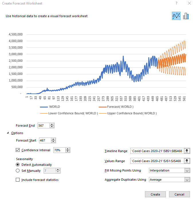
It is possible to change the number of days of predictions by clicking on Options below the graph. Simply add or remove the desired number of days in the Start and End boxes of the forecast.
The other interesting option you can play with is the confidence interval. What is the confidence interval? It is simply the probability of the forecast. The orange part of the graph shows a high forecast hypothesis and a low forecast hypothesis. If your confidence interval is 70, then there is a 70% chance that the prediction is between the high and low assumptions.
The last option to look at is Seasonality, which means the seasonality of your forecast. Excel detects patterns of change in the data and includes them in its forecast. For example, in our COVID cases, there is a drop in test results on Sundays and Mondays because the number of tests performed drops at the weekend. This change is taken into account when Excel makes its future forecast.
Once you have selected the desired parameters, click Create to see the forecast data calculated by Excel in a table format. The Day column shows the days, the World column shows the COVID cases in the world up to day 467, where our data ends. The Forecast column is the beginning of your future forecast, the Lower Confidence Bound column represents the low hypothesis, and finally, the Upper Confidence Bound column indicates the high hypothesis.
Forecast sheet: the Case of India
For the rest of our tutorial, let’s look at the case of India. By selecting the specific case column for India in our original data table, as well as the number of days, we obtain this forecast:

However, the forecast looks strange compared to historical data. Why is that?
The selected period is too long and Excel can’t detect a seasonal pattern. We can therefore define it manually (7 days). Also, we must ask ourselves: does the past period reflect what will happen in the future? Here, unfortunately, it will not, so we will focus on the second peak instead of the first.
To select the period of interest, click on Cancel. Click on the COVID CASES 2021 tab at the bottom of the spreadsheet, then select the Day and India columns again.

Then, click on Data and generate a new Forecast Sheet.

Manually redefine the end of the forecast and the seasonality and you will get something that looks much more like reality. It is always important to visualize the low and high hypotheses (companies don’t do this enough) as they correspond to the Best-Case and Worst-Case scenarios, which can be critical information for your performance.
Here’s how to make a forecast in Excel in just a few clicks. In the next part of our tutorial, we will try to forecast car sales in the USA for the next few months.
Sales Forecasts (U.S. Car Since 1976)

This is the database to work with on this forecast. It’s interesting to see this curve, which shows a slight increase right now and helps us visualize the different crises that have hit the US since 1976 (the oil crisis, the 2008 crisis, and finally the COVID crisis).
Once again, to see the forecast, select the sales per month and the total sales (the last 2 columns).

To have a more coherent forecast, let’s revise the end of the prediction downwards and put a confidence interval of 50%. We can see that Excel has detected a seasonality in this graph. Thanks to the data, we can see that there is a crisis about every 181 months. You can change this as you wish. Here I have changed the seasonality to show a change every 12 months.

And so here is the new forecast. Of course, these predictions are not perfect. You can always add new trends, new mathematical models, market research, competitive research into your analysis. All of which will impact your forecast.
But the important thing in this exercise is to understand how to do make your own automatic forecasts in Excel, to see how simple it is to master this tool. Indeed, mastering the art of forecasting is the best way to develop the profitability of a company, to improve performance and customer satisfaction.
Would you like to go further?
If you want to boost your career and develop your Excel skills in the long term, registration is open for our SCM Excel Expert training.

This program is for you if you want to …
- Gain efficiency in Excel to focus on the essentials
- Automate your Excel tasks, reporting and improve the performance of your company
- Generate files automatically in 1 click thanks to macros and Power Query / Pivot (without knowing how to code)
- –Improve your performance and boost your career in Supply Chain & Logistics

Founder of AbcSupplyChain | Supply Chain Expert | 15 years experience in 6 different countries –> Follow me on LinkedIn
Purpose
Predict value along a linear trend
Usage notes
The FORECAST function predicts a value based on existing values along a linear trend. FORECAST calculates future value predictions using linear regression, and can be used to predict numeric values like sales, inventory, test scores, expenses, measurements, etc.
Note: Starting with Excel 2016, the FORECAST function was replaced with the FORECAST.LINEAR function. Microsoft recommends replacing FORECAST with FORECAST.LINEAR, since FORECAST will eventually be deprecated.
In statistics, linear regression is an approach for modeling the relationship between a dependent variable (y values) and an independent variable (x values). FORECAST uses this approach to calculate a y value for a given x value based on existing x and y values. In other words, for a given value x, FORECAST returns a predicted value based on the linear regression relationship between x values and y values.
Example
In the example shown above, the formula in cell D13 is:
=FORECAST(B13,sales,periods)
where sales (C5:C12) and periods (B5:B12) are named ranges. With these inputs, the FORECAST function returns 1505.36 in cell D13. As the formula is copied down the table, FORECAST returns predicted values in D13:D16, using values in column B for x.
The chart to the right shows this data plotted in a scatter plot.
Notes
- If x is not numeric, FORECAST returns a #VALUE! error.
- If known_ys and known_xs are not the same size, FORECAST will return an #N/A error.
- If the variance of known_x values is zero, FORECAST will return a #DIV/0! error.