
If you’re doing statistical analysis, you may want to create a standard box plot to show distribution of a set of data. In a box plot, numerical data is divided into quartiles, and a box is drawn between the first and third quartiles, with an additional line drawn along the second quartile to mark the median. In some box plots, the minimums and maximums outside the first and third quartiles are depicted with lines, which are often called whiskers.

While Excel 2013 doesn’t have a chart template for box plot, you can create box plots by doing the following steps:
-
Calculate quartile values from the source data set.
-
Calculate quartile differences.
-
Create a stacked column chart type from the quartile ranges.
-
Convert the stacked column chart to the box plot style.
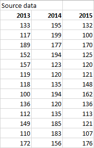
In our example, the source data set contains three columns. Each column has 30 entries from the following ranges:
-
Column 1 (2013): 100–200
-
Column 2 (2014): 120–200
-
Column 3 (2015): 100–180
In this article
-
Step 1: Calculate the quartile values
-
Step 2: Calculate quartile differences
-
Step 3: Create a stacked column chart
-
Step 4: Convert the stacked column chart to the box plot style
-
Hide the bottom data series
-
Create whiskers for the box plot
-
Color the middle areas
-
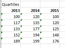
Step 1: Calculate the quartile values
First you need to calculate the minimum, maximum and median values, as well as the first and third quartiles, from the data set.
-
To do this, create a second table, and populate it with the following formulas:
Value
Formula
Minimum value
MIN(cell range)
First quartile
QUARTILE.INC(cell range, 1)
Median value
QUARTILE.INC(cell range, 2)
Third quartile
QUARTILE.INC(cell range, 3)
Maximum value
MAX(cell range)
-
As a result, you should get a table containing the correct values. The following quartiles are calculated from the example data set:

Top of Page
Step 2: Calculate quartile differences
Next, calculate the differences between each phase. In effect, you have to calculate the differentials between the following:
-
First quartile and minimum value
-
Median and first quartile
-
Third quartile and median
-
Maximum value and third quartile
-
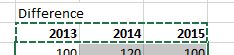
To begin, create a third table, and copy the minimum values from the last table there directly.
-
Calculate the quartile differences with the Excel subtraction formula (cell1 – cell2), and populate the third table with the differentials.
For the example data set, the third table looks like the following:
Top of Page
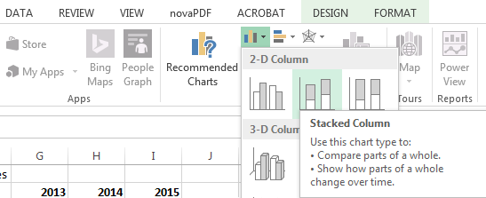
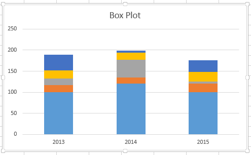
Step 3: Create a stacked column chart
The data in the third table is well suited for a box plot, and we’ll start by creating a stacked column chart which we’ll then modify.
-
Select all the data from the third table, and click Insert > Insert Column Chart > Stacked Column.
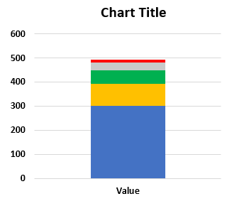
At first, the chart doesn’t yet resemble a box plot, as Excel draws stacked columns by default from horizontal and not vertical data sets.
-
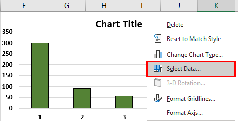
To reverse the chart axes, right-click on the chart, and click Select Data.
-
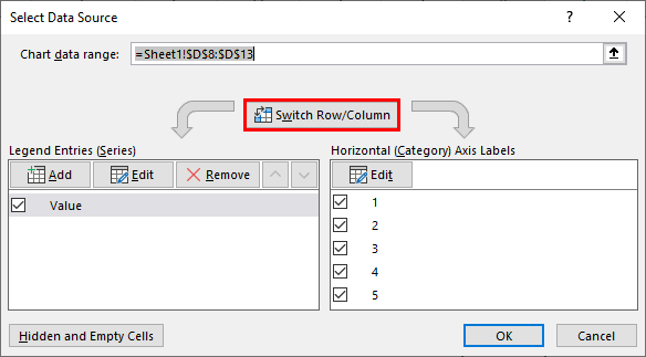
Click Switch Row/Column.
Tips:
-
To rename your columns, on the Horizontal (Category) axis labels side, click Edit, select the cell range in your third table with the category names you want, and click OK.
-
To rename your legend entries, on the Legend Entries (Series) side, click Edit, and type in the entry you want.
-
-
Click OK.
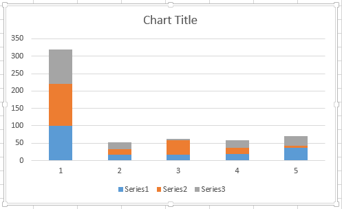
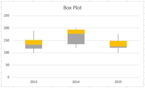
The graph should now look like the one below. In this example, the chart title has also been edited, and the legend is hidden at this point.
Top of Page
Step 4: Convert the stacked column chart to the box plot style
Hide the bottom data series
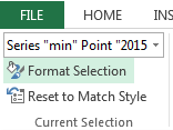
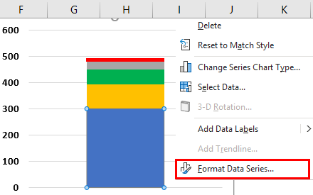
To convert the stacked column graph to a box plot, start by hiding the bottom data series:
-
Select the bottom part of the columns.
Note: When you click on a single column, all instances of the same series are selected.
-
Click Format > Current Selection > Format Selection. The Format panel opens on the right.
-
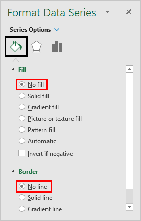
On the Fill tab, in the Formal panel, select No Fill.
The bottom data series are hidden from sight in the chart.
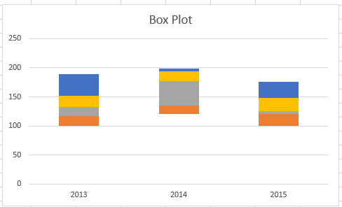
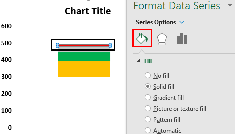
Create whiskers for the box plot
The next step is to replace the topmost and second-from-bottom (the deep blue and orange areas in the image) data series with lines, or whiskers.
-
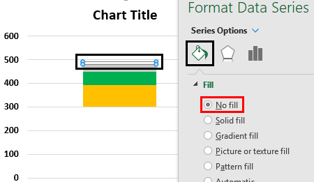
Select the topmost data series.
-
On the Fill tab, in the Formal panel, select No Fill.
-
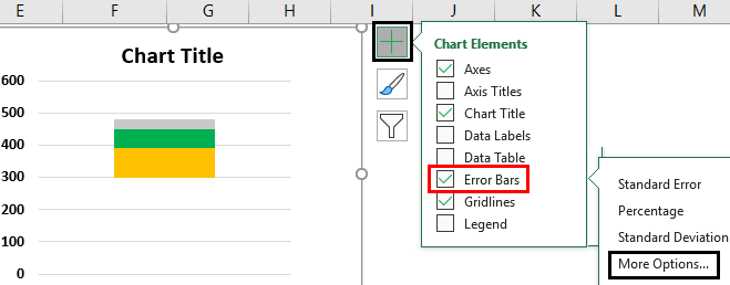
From the ribbon, click Design > Add Chart Element > Error Bars > Standard Deviation.
-
Click one of the drawn error bars.
-
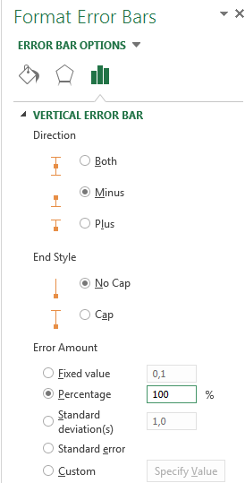
Open the Error Bar Options tab, in the Format panel, and set the following:
-
Set Direction to Minus.
-
Set End Style to No Cap.
-
For Error Amount, set Percentage to 100.
-
-
Repeat the previous steps for the second-from-bottom data series.
The stacked column chart should now start to resemble a box plot.

Color the middle areas
Box plots are usually drawn in one fill color, with a slight outline border. The following steps describe how to finish the layout.
-
Select the top area of your box plot.
-
On the Fill & Line tab in Format panel click Solid fill.
-
Select a fill color.
-
Click Solid line on the same tab.
-
Select an outline color and a stroke Width.
-
Set the same values for other areas of your box plot.
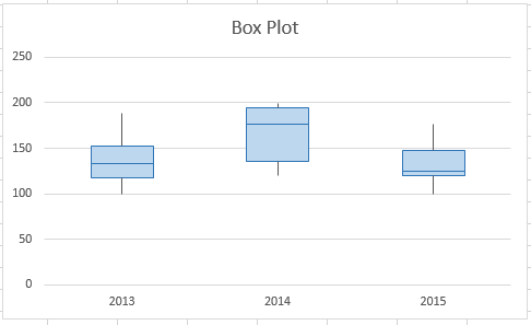
The end result should look like a box plot.
Top of Page
See Also
Available chart types in Office
Charts and other visualizations in Power View
Excel Box Plot (Table of Contents)
- What is a Box Plot?
- How to Create Box Plot in Excel?
Introduction to Box Plot in Excel
If you are a statistic geek, you often might come up with a situation where you need to represent all the 5 important descriptive statistics which can be helpful in getting an idea about the spread of the data (namely minimum value, first quartile, median, third quartile and maximum) in a single pictorial representation or in a single chart which is called as Box and Whisker Plot. For example, the first quartile, median, and third quartile will be represented under a box, and whiskers give you minimum and maximum values for the given set of data. Box and Whisker Plot is an added graph option in Excel 2016 and above. However, previous versions of Excel do not have it built-in. In this article, we are about to see how a Box-Whisker plot can be formatted under Excel 2016.
What is a Box Plot?
In statistics, a five-number summary of Minimum Value, First Quartile, Median, Last Quartile, and Maximum value is something we want to know in order to have a better idea about the spread of the data given. This five value summary is visually plotted to make the spread of data more visible to the users. The graph on which statistician plot these values is called a Box and Whisker plot. The box consists of First Quartile, Median and Third Quartile values, whereas the Whiskers are for Minimum and Maximum values on both sides of the box respectively. This Chart was invented by John Tuckey in the 1970s and has recently been included in all the Excel versions of 2016 and above.
We will see how a box plot can be configured under Excel.
How to Create Box Plot in Excel?
Box Plot in Excel is very simple and easy. Let’s understand how to create the Box Plot in Excel with some examples.
You can download this Box Plot Excel Template here – Box Plot Excel Template
Example #1 – Box Plot in Excel
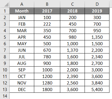
Suppose we have data as shown below, which specifies the number of units we sold of a product month-wise for years 2017, 2018 and 2019, respectively.
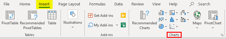
Step 1: Select the data and navigate to the Insert option in the Excel ribbon. You will have several graphical options under the Charts section.
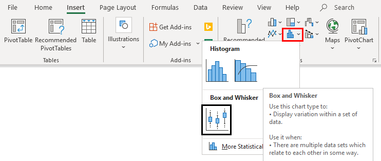
Step 2: Select the Box and Whisker option, which specifies the Box and Whisker plot.
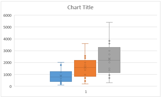
Right-click on the chart, select the Format Data Series option, then select the Show inner points option. You can see a Box and Whisker plot as shown below.
Example #2 – Box and Whisker Plot in Excel
In this example, we will plot the Box and Whisker plot using the five-number summary that we have discussed earlier.
Step 1: Compute the Minimum Maximum and Quarter values. MIN function allows you to give your Minimum value; MEDIAN will provide you the median Quarter.INC allows us to compute the quarter values, and MAX allows us to calculate the maximum value for the given data. See the screenshot below for five-number summary statistics.
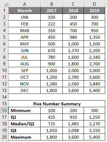
Step 2: Now, since we are about to use the stack chart and modify it into a box and whisker plot, we need each statistic as a difference from its subsequent statistic. Therefore, we use the differences between Q1 – Minimum and Maximum – Q3 as Whiskers. Q1, Q2-Q1, Q3-Q2 (Interquartile ranges) as Box. And combine together, it will form a Box-Whisker Plot.
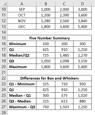
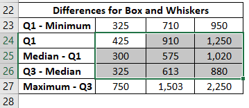
Step 3: Now, we are about to add the boxes as the first part of this plot. Select the data from B24:D26 for boxes (remember Q1 – Minimum and Maximum – Q3 are for the Whiskers?)
Step 4: Go to the Insert tab on the excel ribbon and navigate to Recommended Charts under the Charts section.
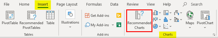
Step 5: Inside Insert Chart window > All Charts > navigate to Column Charts and select the second option, which specifies the Stack Column Chart and click OK.
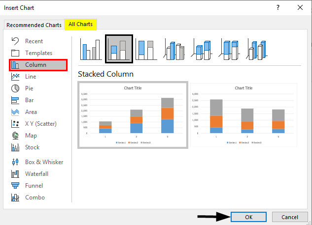
This is how it looks.
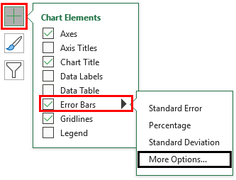
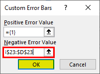
Step 6: Now, we need to add whiskers. I will start with the lower whisker first. Select the stack chart portion, which represents the Q1 (Blue bar) > Click on Plus Sign > Select Error Bars > Navigate to More Options… dropdown under Error Bars.
Step 7: As soon as you click on More Options… Format Error Bars menu will appear > Error Bar Options > Direction : Minus Radio Button (since we are adding the lower whisker) > End Style : Cap radio button > Error Amount : Custom > Select Specify Value.
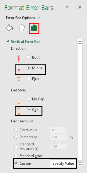
It opens up a window within which specifies the lower whisker values (Q1 – Minimum B23:D23) under Negative Error Value and Click OK.
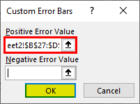
Step 8: Do the same for the upper Whiskers. Select the gray bar (Q3-Median bar); instead of selecting Direction as Minus, use Plus and add the values of Maximum – Q3, i.e. B27:D27, under the Positive Error Values box.
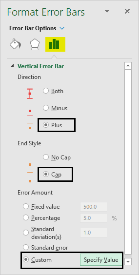
It opens up a window within which specifies the lower whisker values (Q3 – Maximum B27:D27) under Positive Error Value and Click OK.
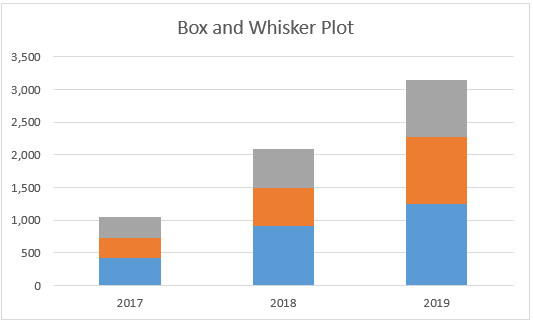
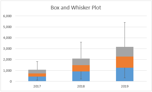
The Graph now should look like the screenshot below:
Step 9: Remove the bars associated with Q1 – Minimum. Select the Bars > Format Data Series > Fill & Line > No Fill. This will remove the lower part as it is not useful in the Box-Whisker plot and just added initially because we want to plot the stack bar chart as a first step.
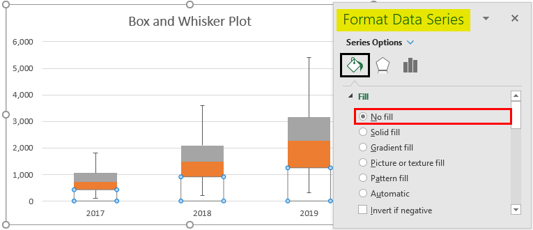
Step 10: Select the Orange bar (Median – Q1) > Format Data Series > Fill & Line > No fill under Fill section > Solid line under Border section > Color > Black. This will remove the colors from the bars and represent them just as outline boxes.
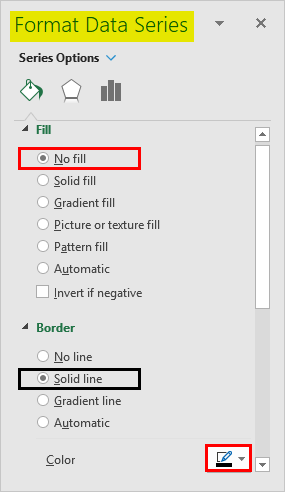
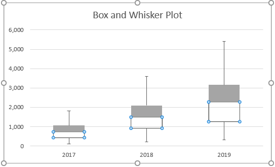
Follow the same procedure for the gray bar (Maximum – Q3) to remove the color from it and represent it as a solid line bar. The plot should look like the one in the screenshot below:
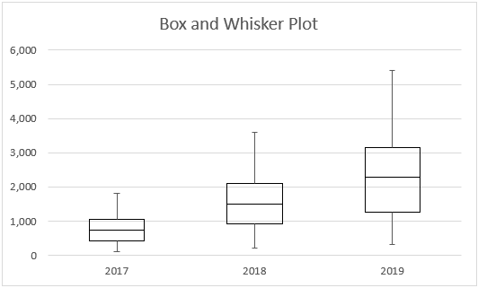
This is how we can create Box-Whisker Plot under any version of Excel. If you have Excel 2016 and above, you anyway have the direct chart option for the Box-Whisker plot. Let’s end this article with some points to be remembered.
Things to Remember
- Box plot gives an idea about the spread/distribution of the dataset with the help of a five-number statistical summary which consists of Minimum, First Quarter, Median/Second Quarter, Third Quarter, Maximum.
- Whiskers are nothing but the boundaries, which are distances of minimum and maximum from first and third quarters, respectively.
- Whiskers are useful to detect outliers. Anything point lying outside the whiskers is considered an outlier.
Recommended Articles
This is a guide to Box Plot in Excel. Here we discuss how to create a Box Plot in Excel along with practical examples and a downloadable excel template. You can also go through our other suggested articles –
- Plots in Excel
- Box and Whisker Plot in Excel
- Dot Plots in Excel
- 3D Scatter Plot in Excel
What is Box Plot in Excel?
A Box Plot in Excel is a graphical representation of the numerical values of a dataset. It shows a five-number summary of the data, which consists of the minimum, maximum, first quartile, second quartile (median), and third quartile. From these, the median is a measure of the center while the remaining are measures of dispersion. So, a box plot shows the center (or middle) and the extent of spread (dispersion or variability) from the center of a dataset.
For example, the sales managers of a bank have to sell current accounts to start-ups across the country. In an Excel worksheet, the number of current accounts (column B) opened by the five managers (column A) is given. Ignore the double quotation marks of the following entries:
Column A
- Cell A1 contains “manager A.”
- Cell A2 contains “manager B.”
- Cell A3 contains “manager C.”
- Cell A4 contains “manager D.”
- Cell A5 contains “manager E.”
Column B
- Cell B1 contains 20.
- Cell B2 contains 5.
- Cell B3 contains 10.
- Cell B4 contains 35.
- Cell B5 contains 15.
Further, in column D, we apply some formulas to this data. The formulas and the output are stated as follows:
- In cell D1, “=MIN(B1:B5)” returns 5.
- In cell D2, “=QUARTILE(B1:B5,1)” returns 10.
- In cell D3, “=MEDIAN(B1:B5)” returns 15.
- In cell D4, “=QUARTILE(B1:B5,3)” returns 20.
- In cell D5, “=MAX(B1:B5)” returns 35.
Thereafter, we calculate the cell differences, D2-D1, D3-D2, D4-D3, and D5-D4. Next, we plot the outputs obtained and the minimum value (of cell D1) on a stacked column chartA stacked column chart in Excel is a column chart where multiple series of the data representation of various categories are stacked over each other. The stacked series are vertical.read more. This is followed by the creation of a box plot in Excel. This box plot provides an overview of the performance of the five sales managers. Consequently, one can make decisions based on this performance.
An excel box plot is also known as a box and whisker plotBox & whisker plot in excel is an exploratory chart to show statistical highlights and distribution of the data set. This chart shows a five-number summary of the data. These five-number summaries are minimum value, first quartile value, median value, third quartile value, and maximum value.read more. It is an efficient tool that helps determine the way numbers are distributed in a dataset. Box plots indicate the shape, the central value, and the variability of a distribution. The variability suggests how spread out the data points are from the center of the distribution.
The purpose of creating multiple box plots is to compare the different samples and analyze the results obtained.
Box plots can be drawn horizontally or vertically. This article focuses on creating and interpreting vertical box plots of Excel. Further, a vertical box plot with a lower whisker (explained under the next heading) is shown on the right side of the following image.
Table of contents
- What is Box Plot in Excel?
- Box Plot’s Five-Number Explained
- How to Create a Box Plot in Excel? (With an Example)
- How to Interpret Box Plot in Excel?
- Frequently Asked Questions
- Recommended Articles
You are free to use this image on your website, templates, etc, Please provide us with an attribution linkArticle Link to be Hyperlinked
For eg:
Source: Box Plot in Excel (wallstreetmojo.com)
Box Plot’s Five-Number Explained
A box plot in excel (horizontal and vertical) shows the five values (minimum, first quartile, median, third quartile, and maximum) as a pictorial representation. The box of the vertical box plot begins from the third quartile (at the top) and extends to the first quartile (at the bottom).
Likewise, the box of the horizontal box plot begins from the first quartile (at the left) and extends to the third quartile (at the right). So, the length of the box (horizontal and vertical) is the third quartile minus the first quartile, which is known as the interquartile range (IQR) of the dataset.
Further, the horizontal or vertical line within the vertical or horizontal box, respectively, is the second quartile.
In a vertical box plot, vertical lines are drawn from the upper and lower boundaries of the box. In a horizontal box plot, horizontal lines are drawn from the left and right boundaries of the box. Such extended lines (horizontal and vertical) are known as whiskers. The two whiskers of a box plot may be of the same or varying lengths.
The values depicted by a vertical box plot in Excel are explained as follows:
- Minimum: This is the smallest or the least value of the dataset. It is shown by the bottom-most point of the lower whisker.
- First quartile: This is represented by the boundary at the bottom of the box. It is also known as the lower quartile or the 25th percentile. The first quartile is the middle of the minimum value and the median of the dataset.
- Second quartile: The second quartile is also called the medianThe median formula in statistics is used to determine the middle number in a data set that is arranged in ascending order. Median ={(n+1)/2}thread more or the 50th percentile. It is the middle value of a dataset, which is calculated after arranging the data points in an ascending or descending order. The median divides the entire dataset into two equal parts. In other words, half (50%) of the data points lie below the median and the other half (50%) lie above the median. In a vertical box plot, the median is the horizontal line drawn within the box. In a horizontal box plot, the median is shown by a vertical line within the box.
- Third quartile: This is represented by the boundary at the top of the box. It is also known as the upper quartile or the 75th percentile. The third quartile is the middle of the median and the maximum value of the dataset.
- Maximum: This is the largest or the maximum value of the dataset. It is shown by the topmost point of the upper whisker.
How to Create a Box Plot in Excel? (With an Example)
You can download this Box Plot Excel Template here – Box Plot Excel Template
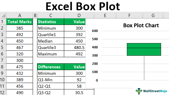
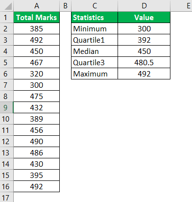
The following image shows the total marks obtained in five subjects by 15 students of a school. For each subject, the maximum marks are 100.
We want to create a box plot in excel for the given dataset.

The steps to create a box plot in Excel are listed as follows:
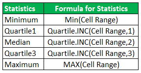
Step 1: Calculate the minimum, first quartile, median, third quartile, and the maximum for the given dataset. The formulas for all these measures are given in the following image.
In the following pointers (step 1a to step 1b), the calculations of the minimum value and the first quartile are discussed.
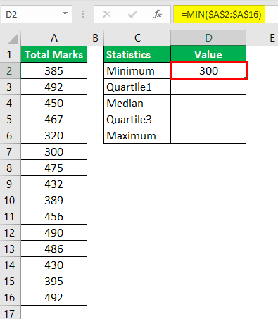
Step 1a: To calculate the minimum value, use the following formula:
“=MIN($A$2:$A$16)”
Press the “Enter” key. The output is shown in cell D2 of the following image.
Note: Alternatively, the formula “=QUARTILE.INC($A$2:$A$16,0)” could have been used to calculate the minimum value in Excel 2013. For more details about the QUARTILE.INC function, refer to the note of the next step (step 1b).
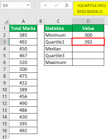
Step 1b: To calculate the first quartile, use the following formula:
“=QUARTILE.INC($A$2:$A$16,1)”
Press the “Enter” key. The output is shown in cell D3 of the succeeding image.
Note: The QUARTILE.INC function was introduced in Excel 2010. It replaced the QUARTILE functionQuartile functions are used to find the various quartiles of a data set and are part of Excel’s statistical functions. There are three quartiles; the first quartile (Q1) is the middle number between the smallest value and the median value of a data set. The second quartile (Q2) is the median of the data. The third quartile (Q3) is the middle value between the median of the data set and the highest value.read more of the earlier versions of Excel. The QUARTILE.INC function accepts the following mandatory arguments:
- Array: This is the range on which quartiles are to be calculated.
- Quart: This tells the function the kind of quartile to be calculated. For “quart” equal to 0, 1, 2, 3 or 4, the minimum, first quartile, median, third quartile, or maximum, respectively, is calculated.
Step 2: The five outputs are shown in the following image.
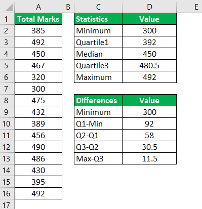
Step 3: Based on the five measures calculated, compute the following differences:
- Q1 (first quartile)-Min (minimum)
- Q2 (second quartile or median)-Q1
- Q3 (third quartile)-Q2
- Max (maximum)-Q3
The outputs are shown in the range D10:D13 of the following image. The output in cell D9 is the minimum, which has been simply copied from cell D2.
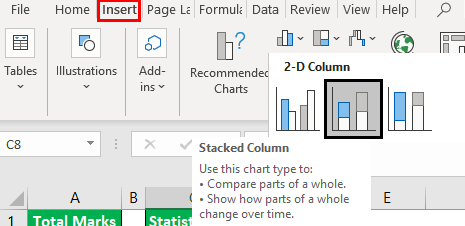
Step 4: Create a stacked column chartA stacked column chart in Excel is a column chart where multiple series of the data representation of various categories are stacked over each other. The stacked series are vertical.read more for the outputs obtained in the preceding step (step 3). For this, select the range D8:D13.
From the Insert tabIn excel “INSERT” tab plays an important role in analyzing the data. Like all the other tabs in the ribbon INSERT tab offers its own features and tools. Under Insert Tab we have several other groups including tables, illustration, add-ins, charts, Power map, sparklines, filters, etc.read more, click “insert column chart.” Next, select the “stacked column chart,” as shown in the following image.
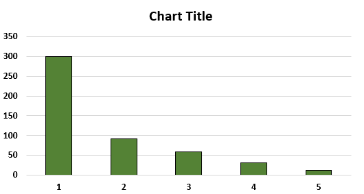
Step 5: A stacked column chart appears, as shown in the following image. This chart is different from a box plot.
By default, Excel has plotted the numbers of the range D9:D13 horizontally. Moreover, though the bars are vertical, they are not stacked over each other. For creating a box plot, it is essential for the bars to be one on top of the other.
In the following pointers (step 5a to step 5b), the stacking of bars (one on top of the other) has been discussed.
Step 5a: To stack the bars over each other, we need to reverse the axes of the chart. For this, right-click the chart and choose “select data.” The same is shown in the following image.
Step 5b: The “select data source” window opens, as shown in the following image. At present, the “legend entries (series)” is showing “value” and the “horizontal (category) axis labels” is showing the numbers 1 to 5. Click the button “switch row/column.”
Once the “switch row/column” button is clicked, the entries under “legend entries (series)” will interchange with the entries under “horizontal (category) axis labels.”
Next, click “Ok” to accept the changes.
Step 6: The stacked column chart appears the way it is shown in the following image. The bars are now stacked one on top of the other.
Note: The legend of the chartExcel chart legends depict description of significant elements and provides easy access to any chart. These legends are represented with the help of colours or symbols and distinguish data for better understanding.read more (shown on the right side, by default) has been deleted. For deleting the legend, select it and press the “delete” key from the keyboard.
Step 7: Convert the stacked column chart to a box plot. For this, select the bottom-most segment (blue bar) of the chart. Right-click this selection and choose “format data series.”
The same is shown in the following image.
Step 8: The “format data series” panel opens. Expand the “fill” option and select “no fill.” Likewise, expand the “border” option and select “no line.” This is shown in the following image.
Close the “format data series” panel.
Step 9: The box plot chart appears, as shown in the following image. The bottom-most segment (shown in the image of step 7), which was blue in color, has been hidden.
Moreover, the text “value” that is currently shown on the x-axis, has been deleted for all the future images. For deleting, select the box containing “value” and press the “delete” key from the keyboard.

Step 10: Create whiskers for the box plot. The whiskers are simply the error barsThe error bars in Excel are the graphical representation that helps visualize the variability of data given on a two-dimensional framework. It helps indicate the estimated error or uncertainty to give a general sense of how accurate a measurement is.read more of Excel. So, adding an error bar adds whiskers to the box plot chart.
For creating whiskers, replace the current topmost (red) and the bottom-most (orange) segments with the top and the bottom whiskers respectively. These segments have been shown in the image of the preceding step (step 9).
Note: An error bar shows the variability of a data point. In other words, an error bar indicates the variation between the reported and the actual values of a dataset.
In the following pointers (step 10a to step 10e), the creation of the top whisker has been discussed.
Step 10a: For creating the top whisker, it is important to hide the topmost segment. To hide, select the topmost segment shown in red in the following image. Right-click the selection and choose “format data series.” The “format data series” panel opens.
Step 10b: Expand the “fill” option and select “no fill.” This will hide the selected segment.
Note: One can hide a segment (or bar) either before creating the error bar or after it has been created. In the former case (segment is hidden before creating the error bar), keep the hidden segment selected to add an error bar or whisker.
Step 10c: Keep the topmost segment selected and click the plus (+) icon displayed at the upper-right side of the box plot chart. Select “error bars” and click “more options,” as shown in the following image.
Step 10d: The “format error bars” panel opens, as shown in the following image. Next, perform the following tasks:
- Under “direction,” select the option “minus.”
- Under “end style,” choose the option “cap.”
- Under “error amount,” set the percentage at “100.”
Close the “format error bars” panel.

Step 10e: The top whisker appears, as shown in the following image. The bottom of the top whisker touches the grey segment with a small horizontal line (cap). This cap is displayed because it was selected as the “end style” in the preceding step (step 10d).
Note: The color of the bottom-most segment in the subsequent images may appear to be slightly different from that of the preceding images. It may be due to the different versions of Excel being used while creating the images.

In the following pointers (step 10f to step 10h), the creation of the lower whisker has been discussed.
Step 10f: For creating the lower whisker, perform the following tasks:
- Select the current bottom-most segment, which is shown in orange.
- Click the drop-down of “add chart element” from the Chart Design tab.
- From the option “error bars,” select “more error bars options.”
The “more error bars options” is shown in the following image.

Step 10g: The “format error bars” panel opens. Further, make the following selections in the “vertical error bar” tab of this panel:
- Select the option “minus” under “direction.”
- Select “cap” under “end style.”
- Set the percentage under “error amount” to 100.
Close the “format error bars” panel. The selection of the “minus” option in the “format error bars” panel is shown in the following image.

Step 10h: The lower whisker appears, as shown in the following image. The bottom of the lower whisker touches the base of the orange segment with a small horizontal line (cap).
Step 11: Hide the bottom-most segment (refer to steps 10a and 10b) shown in orange in the preceding image. Next, color the entire box of the box plot in the same color. This is because box plots usually have the same color throughout the box.
For coloring the box, perform the following tasks:
- Select the two individual segments one by one.
- Right-click the selection and choose “format data series.” The “format data series” panel opens.
- From the “fill” option, select “solid fill.” Select the desired color.
- Close the “format data series” panel.
One can also add borders by selecting “solid line” from the “border” option (of the “format data series” panel).
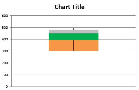
The single-colored excel box plot with the upper and lower whiskers is shown in the following image. It must be observed that the cap of the upper whisker has been hidden by the topmost, horizontal border of the box plot.
Note: The preceding steps (step 1 to step 11) can also be applied to multiple data series. Multiple series are represented by multiple box plots which are parallel to each other.
While creating vertical box plots for multiple series, one must ensure that the entire dataset (consisting of all series) is selected prior to creating the stacked column chart. Moreover, the upper and lower whiskers have to be created for each series one by one.

Interpretation of the box plot: The excel box plot shown in the preceding image is interpreted as follows:
- The topmost point of the upper whisker is somewhere below 500. This point corresponds with the maximum value of the dataset, which is 492. So, the topmost point of the whisker shows the value 492.
- The bottom-most point (shown by the center of the cap) of the lower whisker depicts the minimum value, which is 300.
- The topmost horizontal line of the box plot represents the third quartile of the dataset. The value of the third quartile is 480.5.
- The horizontal line shown within the box depicts the median (second quartile) of the dataset. This value is 450. It can be observed that the median is not in the center of the green box. This implies that the distribution is skewedSkewness is the deviation or degree of asymmetry shown by a bell curve or the normal distribution within a given data set. If the curve shifts to the right, it is considered positive skewness, while a curve shifted to the left represents negative skewness.read more.
- The bottom-most horizontal line of the box plot represents the first quartile of the dataset. So, this line shows the value 392.
Hence, since the five-number summary is correctly displayed by the box plot (in the preceding image), one can say that the box plot created is accurate.
Further, it can be said that 25% of the students have scored below 392 (first quartile), while 75% have scored below 480.5 (third quartile). Moreover, 50% of the students have scored between 392 and 480.5.
Since the median lies closer to the third quartile, one can say that the distribution is negatively skewed. In addition, one can notice that the upper whisker is shorter than the lower whisker. Besides, the mean (430.6) is less than the median (450).
How to Interpret Box Plot in Excel?
From a box plot in excel, one can interpret whether a distribution is symmetric or skewed. This is inferred as follows:
- If the distribution is symmetric, the median lies exactly in the center of the box. In such a case, the distance between the first and second quartiles and the second and third quartiles is the same. Further, for a symmetric distribution, the upper and the lower (or left and right) whiskers are of the same length.
- If the distribution is skewed, the median is not in the center of the box. Rather, the median is on one side (up or down) of the vertical box or one side (left or right) of the horizontal box. The distribution can be either positively or negatively skewed.
- If the distribution is positively skewed (or skewed right), the median lies closer to the first quartile. Moreover, in such a case, the lower whisker is shorter than the upper whisker. For a positively skewed distributionA positively skewed distribution is one in which the mean, median, and mode are all positive rather than negative or zero. The data distribution is more concentrated on one side of the scale, with a long tail on the right.read more, the mean (average) is greater than the median.
- If the distribution is negatively skewedThe negatively skewed distribution is one in which the tail of the distribution is longer on the left side and more values are plotted on the right side of the graph. Due to the negative distribution of data, the mean is lower than the median and mode.read more (or skewed left), the median lies closer to the third quartile. Moreover, in such a case, the upper whisker is shorter than the lower whisker. For a negatively skewed distribution, the mean (average) is less than the median.
Note 1: Quartiles divide a dataset, arranged in an ascending order, into four groups. These groups are separated from each other by certain points, which are known as the first quartile (Q1), the second quartile (Q2), and the third quartile (Q3). Given that the dataset is arranged in an ascending order, the groups are explained as follows:
- The first group begins from the minimum value and extends till the first quartile. 25% of the data points are less than the first quartile.
- The second group begins from the first quartile and extends till the median. 25% of the data points lie between the first and the second quartile (median).
- The third group begins from the median and extends till the third quartile. 25% of the data points lie between the second and the third quartile.
- The fourth group begins from the third quartile and extends till the maximum value of the dataset. 25% of the data points are greater than the third quartile.
In other words, 25% of data points are present under the first quartile, while 75% of data points are present under the third quartile.
Note 2: Any point outside the whiskers is known as an outlier. Outliers are extreme values (very high or very low) that lie far from the other values of a dataset. The outliers are shown by small dots placed beyond the whiskers.
Frequently Asked Questions
1. Define the box plot in Excel.
A box plot of Excel shows the five-number summary of a dataset. This comprises of the minimum, three quartiles, and the maximum of the dataset. From a box plot, one can view an overview of these statistics and compare them across multiple samples.
Box plots suggest whether a distribution is symmetric or skewed. They also show the extent of dispersion of the data points from the median of the distribution.
Since box plots occupy less space compared to histograms and density plots, they are useful in comparing several groups of data. Further, box plots also help detect the outliers (extreme values) of a dataset.
2. How to create a box and whisker plot in Excel 2016?
The steps to create a box and whisker plot in Excel 2016 are listed as follows:
a. Select the dataset which has to be represented as a box plot. One can select either single series or multiple series, depending on the number of box plots to be created.
b. From the “charts” group of the Insert tab, click the drop-down arrow of “insert statistic chart.” Select the “box and whisker” chart.
The box and whisker plot is created in Excel. To make changes to this box plot, right-click the required box and select “format data series” from the context menu. Under “series options,” make the desired changes and close the “format data series” panel.
The box plot updates to reflect these changes. One can also use the Chart Design (or Design) and Format tabs to customize the appearance of the box plot chart.
3. How to create a horizontal box plot in Excel 2013?
The steps to create a horizontal box plot in Excel 2013 are listed as follows:
a. Calculate the five statistics, namely, the minimum (min), first quartile (Q1), median (Q2), third quartile (Q3), and the maximum (max) of the dataset.
b. Calculate the differences, namely, Q1-min, Q2-Q1, Q3-Q2, and max-Q3.
c. Select the dataset and create a stacked bar chart.
d. Right-click the chart and choose “select data.” From the “select data source” window, click “switch row/column.” Click “Ok.”
e. Hide the leftmost segment. For this, select this segment and right-click it. Choose “format data series” and a panel opens. Under “fill,” select “no fill.” Under “border,” select “no line.” Close the “format data series” panel.
f. Create the right whisker. For this, select the rightmost segment and click the plus (+) icon appearing at the top-right corner of the chart. Select “error bars” and click “more options.”
g. The “format error bars” panel opens. In this, select “minus” under “direction” and “cap” under “end style.” Set the “percentage” under “error amount” at 100. Close the “format error bars” panel.
h. Create the left whisker. For this, select the leftmost segment and apply the steps “f” and “g.”
i. Hide the rightmost and the leftmost segments once the whiskers have been created. Color the remaining box in a single color.
The horizontal box plot chart is created.
Note: The preceding steps “a” to “i” can be used to create single and multiple box plots horizontally. In the latter case, ensure that all the series are selected before creating a stacked bar chart in step “c.” Further, the left and right whiskers need to be created for each series one by one.
Recommended Articles
This has been a guide to the box plot in Excel. Here we discuss how to create (make) a box plot in Excel along with a step-by-step example and interpretations. You may learn more about Excel from the following articles–
- Dot Plots in Excel
- Make Funnel Chart in Excel
- Secondary Axis in Excel
- Create a Speedometer Chart In Excel
Содержание
- Create a box and whisker chart
- Create a box and whisker chart
- Change box and whisker chart options
- Create a box and whisker chart
- Change box and whisker chart options
- Creating Box Plots in Excel
- Formula to calculate parameters associated with the box plot:
- Диаграмма «ящик с усами» (boxplot) в Excel 2016
- Настройки диаграммы «ящик с усами»
Create a box and whisker chart
A box and whisker chart shows distribution of data into quartiles, highlighting the mean and outliers. The boxes may have lines extending vertically called “whiskers”. These lines indicate variability outside the upper and lower quartiles, and any point outside those lines or whiskers is considered an outlier.
Box and whisker charts are most commonly used in statistical analysis. For example, you could use a box and whisker chart to compare medical trial results or teachers’ test scores.

Create a box and whisker chart
Select your data—either a single data series, or multiple data series.
(The data shown in the following illustration is a portion of the data used to create the sample chart shown above.)
In Excel, click Insert > Insert Statistic Chart > Box and Whisker as shown in the following illustration.
Important: In Word, Outlook, and PowerPoint, this step works a little differently:
On the Insert tab, in the Illustrations group, click Chart.
In the Insert Chart dialog box, on the All Charts tab, click Box & Whisker.

Use the Design and Format tabs to customize the look of your chart.

If you don’t see these tabs, click anywhere in the box and whisker chart to add the Chart Tools to the ribbon.
Change box and whisker chart options
Right-click one of the boxes on the chart to select that box and then, on the shortcut menu, click Format Data Series.
In the Format Data Series pane, with Series Options selected, make the changes that you want.
(The information in the chart following the illustration can help you make your choices.)
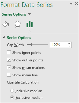
Controls the gap between the categories.
Show inner points
Displays the data points that lie between the lower whisker line and the upper whisker line.
Show outlier points
Displays the outlier points that lie either below the lower whisker line or above the upper whisker line.
Show mean markers
Displays the mean marker of the selected series.
Displays the line connecting the means of the boxes in the selected series.
Choose a method for median calculation:
Inclusive median The median is included in the calculation if N (the number of values in the data) is odd.
Exclusive median The median is excluded from the calculation if N (the number of values in the data) is odd.
Tip: To read more about the box and whisker chart and how it helps you visualize statistical data, see this blog post on the histogram, Pareto, and box and whisker chart by the Excel team. You may also be interested learning more about the other new chart types described in this blog post.
Create a box and whisker chart
Select your data—either a single data series, or multiple data series.
(The data shown in the following illustration is a portion of the data used to create the sample chart shown above.)
On the ribbon, click the Insert tab, and then click  (the Statistical chart icon), and select Box and Whisker.
Use the Chart Design and Format tabs to customize the look of your chart.
If you don’t see the Chart Design and Format tabs, click anywhere in the box and whisker chart to add them to the ribbon.
Change box and whisker chart options
Click one of the boxes on the chart to select that box and then in the ribbon click Format.
Use the tools in the Format ribbon tab to make the changes that you want.
Источник
Creating Box Plots in Excel
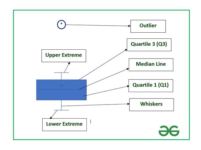
Box plot is a statistical plot that helps in data visualization. It is used to show the distribution of numerical data using various quartiles. They are as follows :
- Lower Extreme: It is the minimum value in the data set which is at the end of the whisker.
- First Quartile: It is also known as lower quartile where 25% of the scores fall below it.
- Median: It is basically the mid-point which divides the box into two equal halves. It is also known as Second Quartile.
- Third Quartile: It is also known as the Upper quartile in which 25% of the data is above it and the rest 75% falls below it.
- Interquartile Range: It is showing the middle part of the box plot which is 50% of the scores. It is abbreviated as IQR.
- Upper Extreme: It is the maximum value in the dataset which is at the end of the whisker.
- Whisker: The two whiskers at upper and lower basically denote the value outside the IQR range or 50% of the scores.
- Outliers: The points in the box plot which lie outside the whiskers.
Some important links to get more insights about box plots :
Structure of Box Plot
In this article, we are going to see how to create box plots and also how to find the important parameters associated with box plots in Excel using a suitable example.
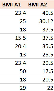
Example: Consider the BMI of ten students from section A-1 and that of section A-2. BMI stands for Body Mass Index which is an important parameter to judge the body fat and health of a person on the basis of height and weight of a person.
The steps to create a box plot :
- Insert the data in the cells as shown above.
- Select the data and go to the Insert tab at the top of the Excel window.
- Now click on the Statistical Chart menu. A drop-down will occur.
- Now select Box and Whisker chart.
Box Plot
The box plot by default will be exclusive of the mean value. In order to make it inclusive of mean :
- Select the box plot.
- Right-Click and select Format Data Series.
- In the Format Data Series dialog box check “Inclusive Mean” in Quartile Calculation.
To format a box plot use the + symbol in the top right corner of the chart as shown below :
Check the Data Labels option to add data labels in the box plots and make the plot more insightful.
You can examine the data labels values using the following section where we are going to discuss how to calculate these parameters using Excel formulas.
Formula to calculate parameters associated with the box plot:
In order to calculate the different quartile values use the formula :
- Cell range: Range of cells. In our case, it is A2 to A11 for section A-1 and B2 to B11 for section A-2
- integer : [0,4]
| Quartile Values | Formula |
|---|---|
| Lower Extreme | =QUARTILE.INC(Cell_Range, 0) |
| Q1 | =QUARTILE.INC(Cell_Range, 1) |
| Median | =QUARTILE.INC(Cell_Range, 2) |
| Q3 | =QUARTILE.INC(Cell_Range, 3) |
| Upper Extreme | =QUARTILE.INC(Cell_Range, 4) |
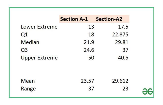
Make a helper table in Excel to calculate the above formulas. The helper table can be used to interpret our box plot and the values.
Lower Limit Calculation
Quartile 1 calculation
Similarly, you can calculate all the other parameters for both sections. The final table will look like this:
Some other important parameters in a box plot are (1) Mean (2) Range. The formulas are :
Helper Table
Another important parameter in a box plot is an outlier which depends on the value of Interquartile Range (IQR). The formula for IQR is :
In our example, the value of IQR is 6.6 which you can calculate from the helper table. Now, a point is an outlier if the value is :
In the given example for section A-1 we have an outlier at value 50 which is the maximum value of BMI. After calculation the value will be :
Similarly, you can calculate the above parameters for the second box plot, and you can observe that all the five parameters are within the range and hence there are no outliers.
In order to remove the outlier in Box plot-1, you have to modify the maximum value from 50 to any value less or equal to 34.5.
Источник
Диаграмма «ящик с усами» (boxplot) в Excel 2016
Excel 2016, как известно, обогатился новыми типами диаграмм. Одна такая, которая диаграмма Парето, уже была показана. В этот раз рассмотрим другую, чисто статистическую. Называется «ящик с усами» или «коробчатая диаграмма» (box-and-whiskers plot или boxplot).
Раньше я такие видел только в специализированных ПО, типа STATISTICA, и для того, чтобы нарисовать подобную диаграмму в Excel, нужно было изрядно потрудиться. Теперь она есть в стандартном наборе Excel.

Зачем нужна такая диаграмма? Допустим, есть выборка для анализа. А еще лучше несколько выборок, которые нужно сравнить. Для этого рассчитывают различные показатели. Однако к любому расчету всегда хочется добавить наглядности, чтобы мозг перешел в режим образного представления, а не довольствовался сухими цифрами и формулами. Поэтому основные характеристики ловко изображают на рисунке. Отличным вариантом будет как раз диаграмма «ящик с усами».

На рисунке показан формат по умолчанию. Как видно, сравниваются две выборки путем изображения двух «ящиков с усами».
Что здесь что обозначает?
Крестик посередине – это среднее арифметическое по выборке.
Линия чуть выше или ниже крестика – медиана.
Нижняя и верхняя грань прямоугольника (типа ящика) соответствует первому и третьему квартилю (значениям, отделяющим ¼ и ¾ выборки). Расстояние между 1-м и 3-м квартилем – это межквартильный размах (или расстояние).
Горизонтальные черточки на конце «усов» – максимальное и минимальное значение (без учета выбросов, см. ниже).
Отдельные точки – это выбросы, которые показываются по умолчанию. Если значение выходит за пределы 1,5 межквартильных размаха от ближайшего квартиля, то оно считается аномальным. Их можно скрыть (см. ниже настройки).
Во всей красе «ящик с усами» проявляется при сравнении выборок, в которых данные делятся на категории. Допустим, провели некоторый эксперимент среди мужчин и женщин. Есть данные до и после эксперимента по обоим полам. Для анализа потребуется вычислить различные показатели. А если к этому добавить диаграмму «ящик с усами», то результат будет весьма наглядным.

Отлично видно, что после проведения эксперимента данные по мужчинам в целом уменьшились, а данные среди женщин наоборот, увеличились. Это не значит, что выборки больше не нужно анализировать (сравнивать, проверять гипотезы и т.д.). Но наглядность сильно улучшает понимание. Перейдем к настройкам.
Настройки диаграммы «ящик с усами»
Общий вид диаграммы настраивается стандартно. Можно менять цвет, добавлять подписи и т.д. Для этого есть две контекстные вкладки на ленте (Конструктор и Формат). Но есть настройки, предназначенные специально для этой диаграммы.
Выбираем какой-либо ряд и жмем Ctrl+1. Либо два раза кликаем по какому-нибудь «ящику». Можно через правую кнопку Формат ряда данных…. Справа вылазит панель настроек.

Рассмотрим по порядку.
Боковой зазор – регулирует ширину ящиков и расстояние между ними.
Показывать внутренние точки. Если поставить галочку, то на оси, где расположены «усы», точками будут показаны все значения. Так хорошо видно распределение внутри групп.

Показывать точки выбросов – отражать экстремальные значения.
Выбросы – это точки, выходящие за пределы 1,5 межквартильных размаха.
Показать средние метки – среднее арифметическое (крестики). Стоят по умолчанию, но можно скрыть.
Показать среднюю линию – только для различных категорий. Показывает изменения по категориям.

Если добавить линии, то изменения после эксперимента станут видны еще лучше. В справке написано, что соединяются медианы, но на графике почему-то соединяются средние. Чудеса.
Инклюзивная медиана или эксклюзивная медиана. Инклюзивная медиана включает в «ящик» квартильные значения , а эксклюзивная медиана не включает. При выборе «эксклюзивной медианы» верх и низ «ящика» соответствует средней между квартильным и следующим (от центра) значением. По умолчанию стоит «эксклюзивная». Пусть стоит дальше. Причем тут медиана, вообще не понял, – речь ведь про квартиль. Думал, криво перевели, но в английской версии те же названия. В общем, здесь лучше ничего не менять.
Своевременное использование диаграммы «ящик-усы» может дать весьма ценную и наглядную информацию. Аналитику, который использует специализированные программы или трудоемкие настройки Excel, будет очень приятно иметь такую диаграмму под рукой.
Как показано в ролике ниже, все делается очень быстро и просто.
Источник
A Box and Whisker Chart is one of the graphs you can use to display data distribution in quartiles while highlighting mean and outlier attributes.
The graph is a simple and clear design, which eases interpretation.


Excel lacks Box and Whisker Charts. The only viable options are using other pricey data visualization tools or plotting the Chart manually. So, if your goal is to display data attributes, such as mean, outliers, and quartiles in your data, think beyond Excel.
We’re not advocating you do away with Excel.
The tested and proven option is downloading and installing a particular add-in into your Excel to access ready-to-go Box and Whisker Charts.
In this blog, you’ll learn:
Table of Content:
- What is the Box Plot Chart in Excel?
- Why use Box and Whisker Chart?
- What does a Box and Whisker Chart Look Like?
- How to Create a Box and Whisker Chart in Excel?
- How to Edit the Box and Whisker Chart in Excel?
- When to Use Box and Whisker Chart?
- Significant Elements in a Box and Whisker Chart
- Advantages of a Box and Whisker Chart in Excel
- Wrap up
Before delving right into the how-to guide, let’s address the following question:
What is the Box Plot Chart in Excel?
Definition: A Box Plot is a visualization design that uses box plots to display insights into data.
The chart simplifies bulky and complex data sets into quartiles and averages. Also, you can use the chart to pinpoint outliers in your data. The Box Plot segments key variables in quarters or (quartiles).
The chart displays your data’s shape, variability, and center (or median) information. Also, you can leverage the chart to determine the skewness of data points.
Why use Box and Whisker Chart?
The Box and Whisker Chart Excel simplifies bulky and complex data sets into quartiles and averages. Also, you can use the chart to pinpoint outliers in your data. The Box Plot segments key variables in quarters or (quartiles).
For instance, you can draw boxes to connect the first quartile to the third quartile. In this case, the boxes will represent the average values of key data points.
Whiskers are lines that identify values outside of the average data points. The highest and lowest variables in your data can be outliers, depending on their magnitude and frequency of occurrence.
What does a Box and Whisker Chart Look Like?
A Box and Whisker Plot (also known as Box Plot) is a visualization design that uses Japanese candle shapes to display insights into data.
Use the chart if your goal is to display high-level insights, such as mean, quartiles, standard deviation, and median.
Take a look at the table below.
Can you provide reliable insights into the table below?
| Subjects | Male | Female |
| Chemistry | 54 | 2 |
| Physics | 45 | 5 |
| Mathematics | 35 | 15 |
| Computer | 36 | 14 |
| Chemistry | 38 | 20 |
| Physics | 52 | 15 |
| Mathematics | 28 | 20 |
| Computer | 58 | 15 |
| Chemistry | 47 | 12 |
| Physics | 30 | 20 |
| Mathematics | 41 | 21 |
| Computer | 52 | 18 |
| Chemistry | 48 | 12 |
| Physics | 35 | 15 |
| Mathematics | 62 | 8 |
| Computer | 56 | 29 |
| Chemistry | 27 | 13 |
| Physics | 79 | 21 |
| Mathematics | 75 | 15 |
| Computer | 55 | 25 |
Note the difference after visualizing the data.
For Male Data:

For Female data:

You can display data using horizontally or vertically oriented Box and Whisker Chart Excel.
- Horizontally-Oriented Box and Whisker Chart

- Vertically- Oriented Box and Whisker Chart

How to create a Box and Whisker Chart should never be a stressful affair. Keep reading to discover more.
How to create a Box and Whisker chart in Excel should never consume your valuable time. Keep reading to learn more.
How to Create a Box and Whisker Chart in Excel?
Excel is one of the go-to data visualization tools for many readers.
However, the data visualization tool does not natively support Box and Whisker Charts. In other words, you’ll never find this visualization design in Excel.
Well, you don’t have to do away with the spreadsheet app.
You can turn Excel into a reliable data visualization tool loaded with advanced charts by installing third-party apps, such as ChartExpo.
ChartExpo is an add-in you can easily install in your Excel.
With many ready-made and visually stunning visualizations, ChartExpo turns your complex, raw data into compelling easy-to-digest, visual renderings that tell the story of your data.
The cutting-edge application produces simple, ready-made, and visually stunning charts in excel with just a few clicks. Yes, ChartExpo generates ready-made Box and Whisker Chart Excel that’s amazingly easy to interpret.


In the coming section, you’ll get to see ChartExpo in action as a Box and Whisker Chart generator. You don’t want to miss this.
Example:
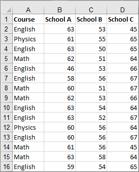
Let’s learn how to create a Box and Whisker Plot with the help of an example in Excel.
| Subjects | Male | Female |
| Chemistry | 54 | 2 |
| Physics | 45 | 5 |
| Mathematics | 35 | 15 |
| Computer | 36 | 14 |
| Chemistry | 38 | 20 |
| Physics | 52 | 15 |
| Mathematics | 28 | 20 |
| Computer | 58 | 15 |
| Chemistry | 47 | 12 |
| Physics | 30 | 20 |
| Mathematics | 41 | 21 |
| Computer | 52 | 18 |
| Chemistry | 48 | 12 |
| Physics | 35 | 15 |
| Mathematics | 62 | 8 |
| Computer | 56 | 29 |
| Chemistry | 27 | 13 |
| Physics | 79 | 21 |
| Mathematics | 75 | 15 |
| Computer | 55 | 25 |
Click here to install ChartExpo into your Excel. Once you’re done, follow the easy steps below.
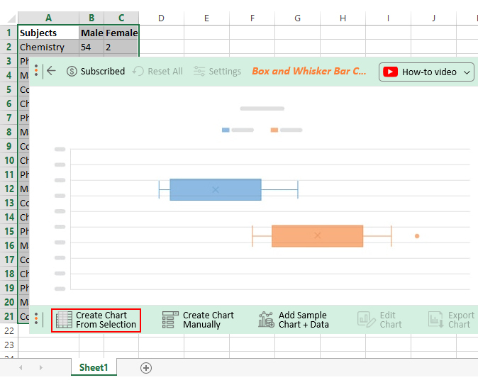
- Open your Excel and paste the table above.
- Open the worksheet and click the Insert Menu button.
- Click the My Apps button.

- Select ChartExpo and click the Insert button to get started with ChartExpo.

- Once ChartExpo is loaded, you will see a list of charts.

- Once the Chart pops up, click on Box and Whisker Bar Chart icon to get started, as shown below.

- Select the sheet holding your data and click the Create Chart From Selection button, as shown below.
How to Edit the Box and Whisker Chart in Excel?
To add additional details, such as the title in your chart, follow the steps below:
- Click the Edit button and then click the pencil-like marker near the title section.

- Once the Chart Header Top Properties window pops up, click the Line 1 button and fill in the title.

- Save your new changes by clicking the Apply button.
- To change the color of the Box and Whisker Charts, click the Edit
- Once the Legend Properties window shows, click on the Color box and select your preferred color, as shown below.

- Click the Apply button to preserve your changes.
- To display First Quartile, Second Quartile, Third Quartile, and Mean, toggle the buttons to the right side.

- Save your new changes by clicking the Apply button.
- Check out the final chart below.

Now you have learned how to create a box and whisker chart in excel. It’s time for you to learn some uses of this chart.


When to Use Box and Whisker Chart?
Use Box and Whisker Chart Excel if you have multiple data sets from independent sources related to each other. Other practical uses of a Box and Whisker Chart Excel are highlighted below.
- Test scores between schools or classrooms
- Data from before and after a process change
- Similar features on one part, such as camshaft lobes
- Data from duplicate machines manufacturing the same products
Significant Elements in a Box and Whisker Chart

-
Mean
Mean is the usual average.
The formula to calculate the mean is:
ΣXi /N
N is the total number of elements in a set of data. And X is the data points present in the set of data. i is the position of the values.
-
Median
Arrange your data in ascending order (from the smallest to the greatest number) to find the median. The element that resides in the center-most position is the median.
You can also use the following formula (N+1)/2 to find the position, where N is the number of elements in the data. If your data consists of an even number of elements, get two middle positions. The average of the two numbers is the median.
-
Lower Quartile (Q1)
The median divides the Box and Whisker Chart into a lower half and an upper half.
The lower quartile is the middle value of the lower half, i.e., the element between the minimum number and the median.
Use the following formula to derive the lower quartile (N+1)/4.
-
Upper Quartile (Q3)
The upper quartile is the middle value between the maximum number and the median.
The formula for deriving the upper quartile is (3N+3)/4. An even number of elements is 3N/4.
-
Maximum and Minimum Range
The maximum range is the highest value of a key variable in your data. On the other hand, the minimum range is the lowest value of a key data point.
Advantages of a Box and Whisker Chart in Excel
Check out the advantages of the chart below:
- A Box and Whisker Graph can help you to visualize large datasets.
- You can easily detect the symmetry of the data at a glance by using the chart.
- Unlike other data visualization techniques, the Box Plot displays outliers.
FAQs:
How do you analyze a Box and Whisker Plot?
If the median is in the middle of a Box and Whisker Chart Excel, and the whiskers are about the same, then the distribution is symmetric.
Conversely, if the median is closer to the bottom of the box and the whisker is shorter, then the distribution is positively skewed to the right.
How can you use a Box and Whisker Chart practically?
Box Plots are commonly used within the business, research, and data analysis settings for data storytelling.
The visualization design is incredibly handy, especially if your goal is to display skew level, mean, outliers, and quartile insights. The chart is amazingly easy to read and interpret.
Which type of data is best displayed in a Box Plot?
A Box and Whisker Chart Excel can provide you with high-level insights regarding the shape, variability, and center (or median) of your data.
Also known as Box and Whisker Charts, Box Plots are particularly useful for displaying data skewness.
Wrap Up
A Box and Whisker Chart is a visualization design that displays data distribution in quartiles while highlighting mean and outlier attributes.
Besides, the Box and Whisker Chart Excel is straightforward to read and interpret due to its minimalist design.
Excel lacks Box and Whisker Charts. The only viable options are using other pricey data visualization tools or plotting the Chart manually.
Think beyond the spreadsheet application if you intend to display attributes, such as mean, outliers, and quartiles in your data.
So, what’s the solution?
We recommend installing third-party apps, such as ChartExpo, into your Excel to access ready-made Box and Whisker Charts.
ChartExpo is an add-in you can easily download and install in your Excel app. Besides, this tool comes loaded with insightful and easy-to-interpret Box Plots. You don’t need programming or coding skills to visualize your data using ChartExpo.
Sign up for a 7-day free trial today to access easy-to-interpret and ready-made Box and Whisker Charts.