
Sensitivity analysis in excel helps us study the uncertainty in the model’s output with the changes in the input variables. It primarily does stress testing of our modeled assumptions and leads to value-added insights.
In the context of DCF valuation, Sensitivity Analysis in excel is especially useful in finance for modeling share price or valuation sensitivity to assumptions like growth rates or cost of capital.
In this article, we look professionally at the following Sensitivity Analysis in Excel for DCF Modeling.
You can download this Sensitivity Analysis in Excel Template here – Sensitivity Analysis in Excel Template
Table of contents
- What is Sensitivity Analysis in Excel?
- #1 – One-Variable Data Table Sensitivity Analysis in Excel
- #2 – Two-Variable Data Table Sensitivity Analysis in Excel
- #3 – Goal Seek for Sensitivity Analysis in Excel
- Conclusion
- What Next?
- Recommended Articles
#1 – One-Variable Data Table Sensitivity Analysis in Excel
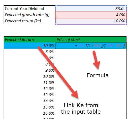
Let us take the Finance example (Dividend discount modelThe Dividend Discount Model (DDM) is a method of calculating the stock price based on the likely dividends that will be paid and discounting them at the expected yearly rate. In other words, it is used to value stocks based on the future dividends’ net present value.read more) below to understand this in detail.
Constant growth DDM gives us the Fair value of a stock as a present value of an infinite stream of dividends growing at a constant rate.
Gordon Growth formulaGordon Growth Model derives a company’s intrinsic value if an investor keeps on receiving dividends with constant growth forever. The formula for Gordon growth model:
P = D1/r-g (P = stock price, g = constant growth rate, r = rate of return, D1 = value of next year’s dividend)
read more is as per below –
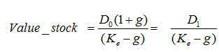
Where:
- D1 = Value of dividend to be received next year
- D0 = Value of dividend received this year
- g = Growth rate of dividend
- Ke = Discount rate
Now, let’s assume that we want to understand how sensitive the stock price is concerning the Expected Return (ke). There are two ways of doing this –
- Donkey way

- What if Analysis

#1 – Donkey Way
Sensitivity Analysis in Excel using Donkey’s way is very straightforward but hard to implement when many variables are involved.
Do you want to continue making this given 1000 assumptions? Not!
Learn the following sensitivity analysis in excel technique to save yourselves from trouble.
#2 – Using One Variable Data Table
The best way to do sensitivity in excel is to use Data Tables. Data tables provide a shortcut for calculating multiple versions in one operation and a way to view and compare the results of all variations on your worksheet.
Below are the steps that you can follow to implement a one-dimensional sensitivity analysis in excel.
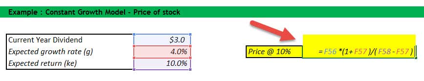
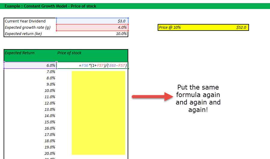
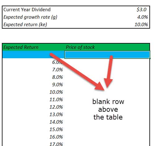
- Create the table in a standard format.
In the first column, you have the input assumptions. In our example, inputs are the expected rate of return (ke). Also, please note a blank row (colored in blue in this exercise) below the table heading. This blank row serves an important purpose for this one-dimensional data table, which you will see in Step 2.

- Link the reference Input and Output as given the snapshot below.
The space provided by the blank row is now used to provide input (expected return Ke) and the output formula. Why is it done like this? We will use What if Analysis; this is a way to instruct Excel that for the Input (ke), the corresponding formula provided on the right-hand side should be used to recalculate all the other input.
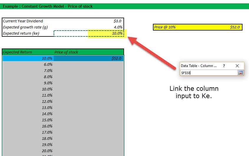
- Select the What-if Analysis tool to perform Sensitivity Analysis in Excel.
It is important to note that this is sub-divided into two steps.
1. Select the table range starting from the left-hand side, starting from 10% until the lower right-hand corner of the table.
2. Click Data – What if Analysis – Data Tables
- Data Table Dialog Box Opens Up.
The dialog box seeks two inputs – Row Input and Column Input. Since there is only one input ,Ke, is under consideration, we will provide a single column input.

- Link the Column Input
In our case, all input is provided in a column, and hence, we will link to the column input. Column input is linked to the Expected return (Ke). Please note that the input should be linked from the source and Not from the one inside the table.
- Enjoy the Output


#2 – Two-Variable Data Table Sensitivity Analysis in Excel
Data tables are very useful for Sensitivity analysis in excel, especially in the case of DCF. Once a base case is established, DCF analysis should always be tested under various sensitivity scenarios. Testing involves examining the cumulative effect of changes in assumptions (cost of capital, terminal growth rates, lower revenue growth, higher capital requirements, etc.) on the fair value of the stock.
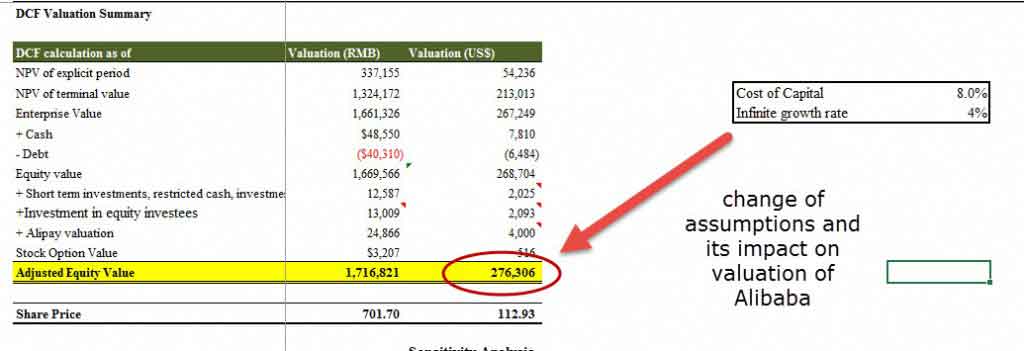
Let us take the sensitivity analysis in excel with a finance example of Alibaba Discounted Cash Flow Analysis.
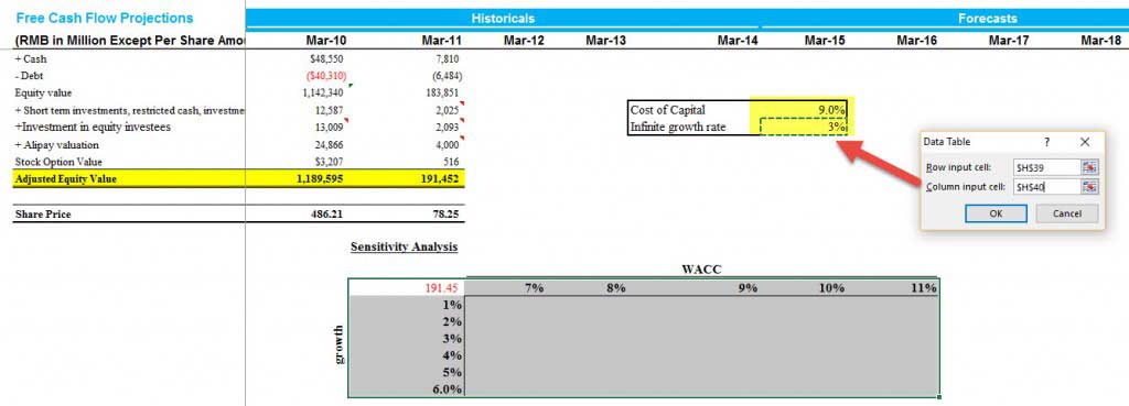
With the base assumptions of the Cost of Capital as 9% and constant growth rate of 3%, we arrived at the fair valuation of $191.45 billion.

Let us assume that you do not fully agree with the Cost of Capital Assumptions or the growth rate assumptions I have taken in Alibaba IPO Valuation. You may want to change the assumptions and assess the impact on valuations.
One way is to change the assumptions and check each change’s results manually. (codeword – Donkey method!)
However, we are here to discuss a much better and more efficient way to calculate valuation using sensitivity analysis in excel that saves time and provides us with a way to visualize all the output details in an effective format.
If we perform the What-if analysis in excelWhat-If Analysis in Excel is a tool for creating various models, scenarios, and data tables. It enables one to examine how a change in values influences the outcomes in the sheet. The three components of What-If analysis are Scenario Manager, Goal Seek in Excel, and Data Table in Excel.read more professionally on the above data, then we get the following output.

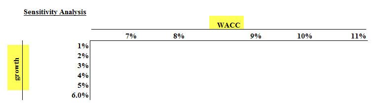
- Here, row inputs consist of changes in Cost of capital or WACCThe weighted average cost of capital (WACC) is the average rate of return a company is expected to pay to all shareholders, including debt holders, equity shareholders, and preferred equity shareholders. WACC Formula = [Cost of Equity * % of Equity] + [Cost of Debt * % of Debt * (1-Tax Rate)]read more (7% to 11%)
- Column inputs consist of changes in growth rates (1% to 6%)
- The point of intersection is Alibaba Valuation. E.g. using our base case of 9% WACC and 3% growth rates, we get the valuation as $191.45 billion.
With this background, let us now look at how we can prepare such a sensitivity analysis in excel using two-dimensional data tables.
Step 1 – Create the Table Structure as given below
- Since we have two sets of assumptions – Cost of Capital (WACC) and Growth Rates (g), you need to prepare a table given below.
- You are free to switch the row and column inputs. Instead of WACC, you may have growth rates and vice-versa.
Step 2 – Link the Point of Intersection to the Output Cell.
The point of intersection of the two inputs should be used to link the desired output. In this case, we want to see the effect of these two variables (WACC and growth rate) on Equity valueEquity Value, also known as market capitalization, is the sum-total of the values the shareholders have made available for the business and can be calculated by multiplying the market value per share by the total number of shares outstanding.read more. Hence, we have linked the intersecting cell to the output.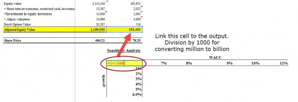
Step 3 – Open Two Dimensional Data Table
- Select the table that you have created
- Then click on Data -> What if Analysis -> Data Tables

Step 4 – Provide the row inputs and column inputs.
- Row input is the Cost of Capital or Ke.
- The column input is the growth rate.
- Please remember to link these inputs from the original assumption source and not from inside the table.
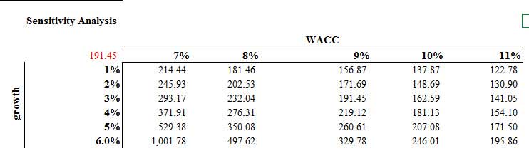
Step 5 – Enjoy the output.
- Most pessimistic output values lie in the right-hand top corner, where the Cost of Capital is 11%, and the growth rate is only 1%
- The most optimistic Alibaba IPO Value is when Ke is 7%, and g is 6%
- The base case we calculated for 9% ke and 3% growth rates lies in the middle.
- This two-dimensional sensitivity analysis in the excel tableIn excel, tables are a range with data in rows and columns, and they expand when new data is inserted in the range in any new row or column in the table. To use a table, click on the table and select the data range.read more provides the clients with an easy scenario analysis that saves a lot of time.
#3 – Goal Seek for Sensitivity Analysis in Excel
- The Goal Seek command is used to bring one formula to a specific value
- It does this by changing one of the cells that is referenced by the formula
- Goal Seek asks for a cell referenceCell reference in excel is referring the other cells to a cell to use its values or properties. For instance, if we have data in cell A2 and want to use that in cell A1, use =A2 in cell A1, and this will copy the A2 value in A1.read more that contains a formula (the Set cell). It also asks for a value, which is the figure you want the cell to be equal
- Finally, Goal Seek asks for a cell to alter to take the Set cell to the required value
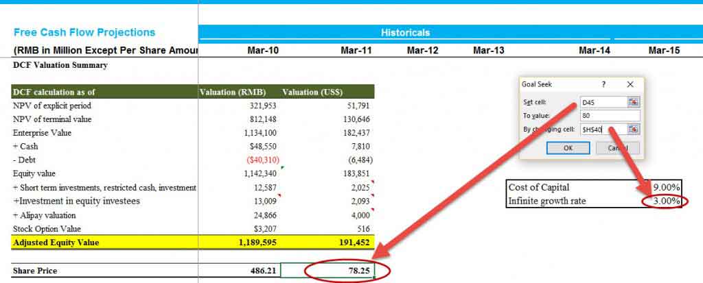
Let us have a look at the DCF of Alibaba IPO ValuationAlibaba is the most profitable Chinese e-commerce company and its IPO is a big deal due to its size. With its huge size and network, Alibaba IPO may look at international expansion beyond China and may lead to price wars and intensive competition in the US.read more.
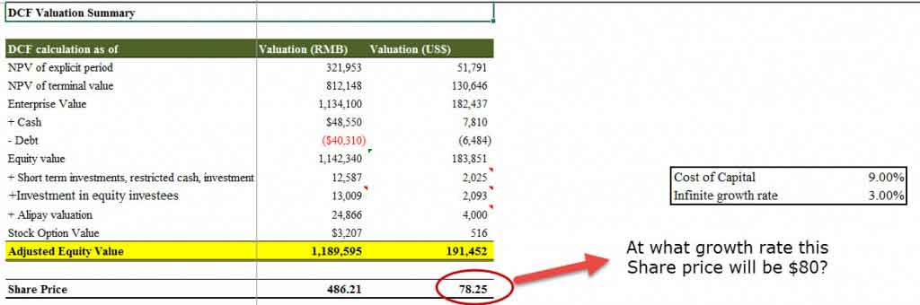
As we know from DCFDiscounted cash flow analysis is a method of analyzing the present value of a company, investment, or cash flow by adjusting future cash flows to the time value of money. This analysis assesses the present fair value of assets, projects, or companies by taking into account many factors such as inflation, risk, and cost of capital, as well as analyzing the company’s future performance.read more that growth rates and valuation are directly related. Increasing growth rates increase the share price of the stock.
Let’s assume that we want to check at what growth rate will the stock price touches $80.
As always, we can do this manually by changing the growth rates to continue to see the impact on the share price. This will, again, be a tedious process. In our case, we may have to input growth rates many times to ensure that the stock price matches $80.
However, we can use a function like Goal Seek in excelThe Goal Seek in excel is a “what-if-analysis” tool that calculates the value of the input cell (variable) with respect to the desired outcome. In other words, the tool helps answer the question, “what should be the value of the input in order to attain the given output?”
read more to solve this in easy steps.
Step 1 – Click on the cell whose value you wish to set. (The Set cell must contain a formula)
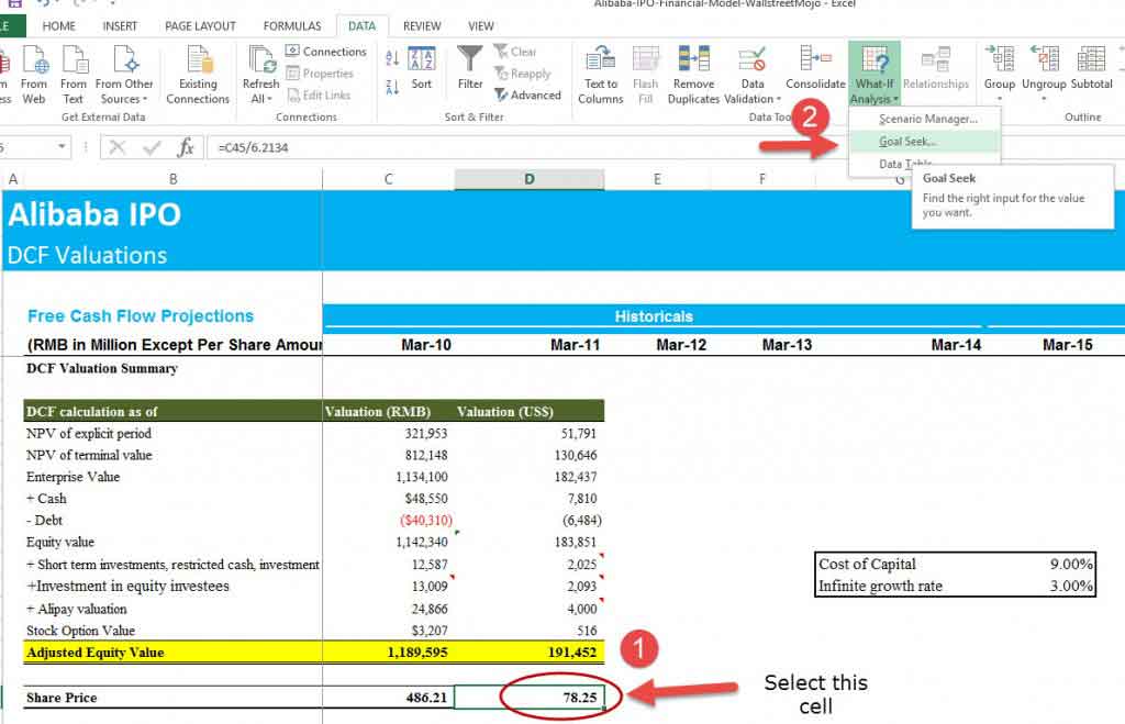
Step 2 – Choose Tools, Goal Seek from the menu, and the following dialog box appears:
- The Goal Seek command automatically suggests the active cell as the Set cell.
- This can be over-typed with a new cell reference, or you may click on the appropriate cell on the spreadsheet.
- Now enter the desired value this formula should reach.
- Click inside the “To Value” box and type in the value you want your selected formula to equal.
- Finally, click inside the “By Changing Cell” box and either type or click on the cell whose value can be changed to achieve the desired result.
- Click the OK button, and the spreadsheet will alter the cell to a value sufficient for the formula to reach your goal.
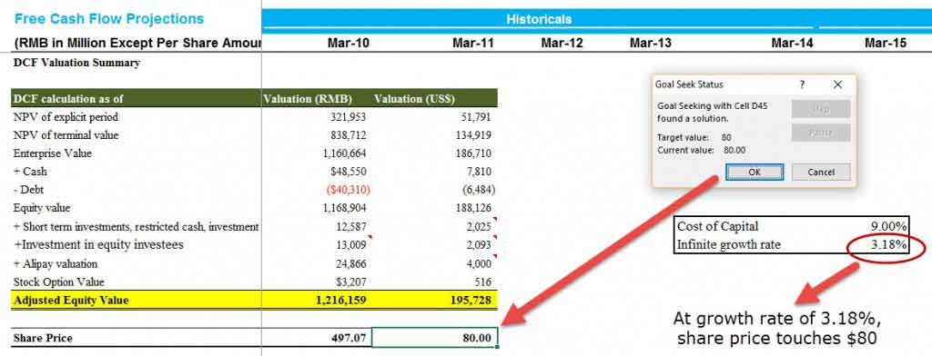
Step 3 – Enjoy the output.
Goal Seek also informs you that the goal was achieved.
Conclusion
Sensitivity analysis in excel increases your understanding of the financial and operating behavior of the business. We learned from the three approaches – One Dimensional Data Tables, Two Dimensional Data Tables, and Goal Seek- that sensitivity analysis is extremely useful in finance, especially in the context of valuations – DCF or DDM.
You can develop cases to reflect valuation sensitivity to changes in interest rates, recession, inflation, GDP, etc., on the valuation. However, you can also get a macro-level understanding of the company and industry. Thought and common sense should be employed in developing reasonable and useful sensitivity cases.
What Next?
If you learned something about Sensitivity Analysis in Excel, please leave a comment below. Let me know what you think. Many thanks, and take care. Happy Learning!
Recommended Articles
You may also have a look at these articles below to learn more about Valuations and Corporate Finance –
- Formula for Price Sensitivity
- Risk Analysis – Methods
- Excel Break-Even Analysis
- Excel Pareto Analysis
Sensitivity Analysis: “What if” Analysis
A financial model is a great way to assess the performance of a business on both a historical and projected basis. It provides a way for the analyst to organize a business’s operations and analyze the results in both a “time-series” format (measuring the company’s performance against itself over time) and a “cross-sectional” format (measuring the company’s performance against industry peers).
Typically, once an analyst inputs both historical financial results and assumptions about future performance, he/she can then calculate and interpret various ratio analyses, and other operational performance metrics such as profit margins, inventory turnover, cash collections, leverage and interest coverage ratios, among others.
General Rule of Thumb in Sensitivity Analysis
A scenario manager allows the analyst to “stress-test” the financial results because the reality is that expectations can and usually do change over time.
In previous articles, we discussed the fact that these forward-looking assumptions may not always hold true, and that the use of a scenario manager is a great way to incorporate several performance possibilities into your financial model. This allows the analyst to “stress-test” the financial results because the reality is that expectations can and often do change over time. Because the future cannot be predicted with any certainty, it’s never a good idea to take your financial model’s results and claim, either to your boss or to your client, that the results are final.
So what can you do if the financial model’s results are not the final results? Isn’t that why you build a model in the first place — to get some clarity or answer as to the future performance of the business? Yes and no. The purpose of the financial model is to provide some insight into future performance, but there is no one correct answer. Clients and managing directors like to see a range of possible outcomes, and this is where the sensitivity analysis, or “what-if” analysis comes into play.
The Wharton Online
and Wall Street Prep Private Equity Certificate Program
Level up your career with the world’s most recognized private equity investing program. Enrollment is open for the May 1 — Jun 25 cohort.
Enroll Today
Data Table Format: Endless Possibilities in Analysis
It’s not unusual for a client to never even look at a financial model and opt to see the results presented in a data table format.
A sensitivity analysis, otherwise known as a “what-if” analysis or a data table, is another in a long line of powerful Excel tools that allows a user to see what the desired result of the financial model would be under different circumstances. It allows the user to select two variables, or assumptions, in the model and see how a desired output, such as earnings per share (a common metric used) would change based on the new assumptions. It is the perfect complement to a scenario manager, adding even more flexibility to one’s financial and valuation models when it comes to analysis and presentation.
In fact, it’s not unusual for a client to never even look at a financial model and opt to see the results presented in a data table format along with select financial data. This is why it’s important for the analyst to understand the mechanics of creating the data table and be able to interpret its results to make sure the analysis is working properly. We shall go over the mechanics of the data table next.
Sensitivity Analysis Data Table – Excel Template
Use the form below to download our sample Data Table:
Building the Data Table: Initial Set-Up
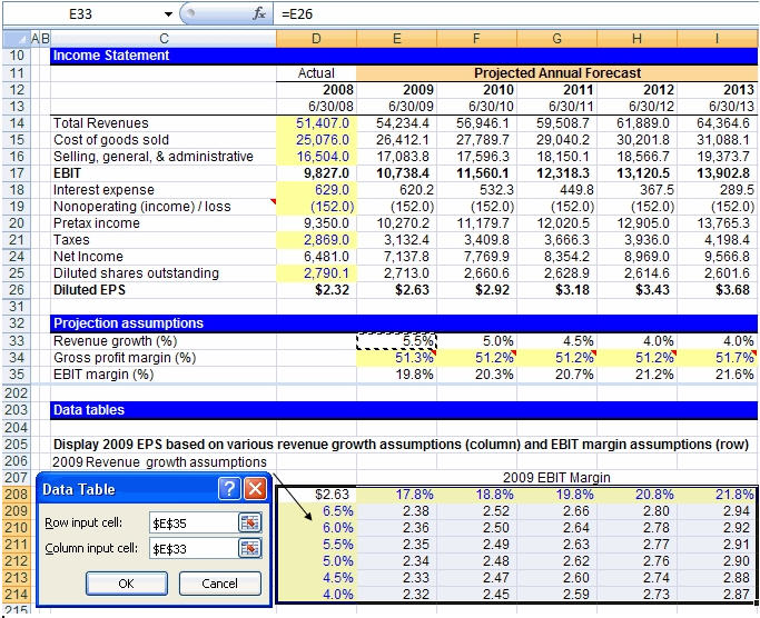
Let’s say, for example, that you have built a dynamic financial statement model in order to predict future earnings per share (EPS) for your business. Your model is flawlessly constructed and gives you an EPS result of $2.63 for the year 2009. Now, instead of presenting to your client that the answer to the question “What will EPS be in 2009?” is unquestionably going to be $2.63, it makes more sense to present a range of possibilities for 2009 EPS that depend on sensitizing certain assumptions in the model. Let’s look at an actual example below to illustrate our point:

Constructing the Matrix in Excel
- In a cell on the worksheet, reference the formula that refers to the two input cells that we would like to sensitize. In cell D208, we have referenced our EPS for 2009.
- Type one list of input values in the same column, below the formula. In the example, we have input a range of revenue growth assumptions.
- Type the second list in the same row, to the right of the formula. In the example, we have input a range of EBIT margin assumptions.
- Select the range of cells that contains the formula and both the row and column of values. In the example below, you would select the range D208:I214.
- Hit the keys Alt-D-T on your keyboard. This will pull up the “Data Table” box as shown to the right of the data table, below. Note: This “shortcut” works in both Excel 2003 and 2007, although an alternative would be to hit Alt-A-W-T for the 2007 version, which will direct you to the data table box through the “What-If Analysis” menu.
- In the Row input cell box, enter the reference to the input cell for the input values in the row. In the example below, you would type cell E35 in the Row input cell box.
- In the Column input cell box, enter the reference to the input cell for the input values in the column. In the example below, you would type E33 in the Column input cell box.
- Click OK!
Sensitivity Analysis: Functioning Data Table Results
We will finally get our various diluted EPS results as seen in cells E209 through I214 in the data table. The only thing left to do now is to sanity check the results. As revenue growth increases, we should see an increase in diluted EPS, and we do. We should also see diluted EPS increase as EBIT margin improves, and we do. It looks as though we have constructed a well-functioning data table!
Aside from our data table matrix, another method to perform a sanity check on a forecasted figure like revenue is the compound annual growth rate (CAGR). The annualized growth rate metric can be determined to confirm it is reasonable, which is based on the company’s historical growth rate and the industry average among comparable companies.
One thing to know is that sometimes Excel is set to calculate automatically, except for data tables. If it looks as though your data table is not working, try hitting “F9” to recalculate the entire worksheet. You can also adjust how Excel is set up by hitting Alt-T-O and then going to the “Calculations” tab in Excel 2003 or the “Formulas” section in Excel 2007. You can also hit Alt-M-X in Excel 2007 to make your selection.
In conclusion, performing sensitivity analysis via a data table is an effective and easy way to present valuable financial information to a boss or client. It provides a range of possible outcomes for a particular piece of information and can highlight the margin of safety that might exist before something goes terribly wrong. For example, how low can revenue growth or EBIT margins get before EPS becomes negative? Once you have constructed several data tables, you’ll realize that it takes no time at all and that there is no excuse for not incorporating them into your financial modeling arsenal.

Step-by-Step Online Course
Everything You Need To Master Financial Modeling
Enroll in The Premium Package: Learn Financial Statement Modeling, DCF, M&A, LBO and Comps. The same training program used at top investment banks.
Enroll Today
Содержание
- Sensitivity Analysis
- What is Sensitivity Analysis?
- Sensitivity Analysis Formula
- Calculation of the Sensitivity Analysis (Step by Step)
- Examples
- Example #1
- Example #2
- Relevance and Uses
- Recommended Articles
- How to Perform Sensitivity Analysis on Excel?
- 1. How Does a Sensitivity Analysis Work?
- 2. How to Construct the Matrix?
- 3. How to Perform Sensitivity Analysis on your DCF Model?
- How to Do DCF Valuation Using Sensitivity Analysis in Excel
- What Is Sensitivity Analysis in Excel?
- So How Do We Do It?
- Data Tables
- 1. One-Variable Data Table
- 2. Two-Variable Data Table
- Goal Seek
- Takeaway
Sensitivity Analysis


What is Sensitivity Analysis?
Sensitivity analysis is an analysis technique that works on the basis of what-if analysis like how independent factors can affect the dependent factor and is used to predict the outcome when analysis is performed under certain conditions. It is commonly used by investors who takes into consideration the conditions that affect their potential investment to test, predict and evaluate result.
Table of contents
Sensitivity Analysis Formula
The formula for sensitivity analysis is basically a financial model in excel where the analyst is required to identify the key variables for the output formula and then assess the output based on different combinations of the independent variables.
Mathematically, the dependent output formula is represented as,

You are free to use this image on your website, templates, etc., Please provide us with an attribution link How to Provide Attribution? Article Link to be Hyperlinked
For eg:
Source: Sensitivity Analysis (wallstreetmojo.com)
Calculation of the Sensitivity Analysis (Step by Step)
- Firstly, the analyst is required to design the basic formula, which will act as the output formula. For instance, say NPV formula can be taken as the output formula.
Next, the analyst needs to identify which are the variables that are required to be sensitized as they are key to the output formula. In the NPV formula in excel, the cost of capital and the initial investment can be the independent variables.
Next, determine the probable range of the independent variables.
Next, open an excel sheet and then put the range of one of the independent variable along the rows and the other set along with the columns.
- Range of 1 st independent variable
- Range of 2 nd independent variable
Examples
Example #1
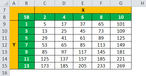
Let us take the example of a simple output formula, which is stated as the summation of the square of two independent variables X and Y.
In this case, let us assume the range of X as 2, 4, 6, 8, and 10, while that of Y as 1, 3, 5, 7, 9, 11, and 13. Based on the above-mentioned technique, all the combinations of the two independent variables will be calculated to assess the sensitivity of the output.
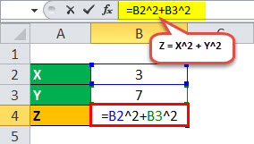
For instance, if X = 3 (Cell B2) and Y = 7 (Cell B3), then Z = 3 2 + 7 2 = 58 (Cell B4)
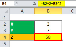
Z = 58
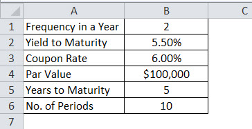
Example #2
Let us take another example of bond pricing where the analyst has identified the coupon rate and the yield to maturity as the independent variables, and the dependent output formula is the bond price. The coupon is paid half-yearly with a par value of $1,000, and the bond is expected to mature in five years. Determine the sensitivity of the bond price for different values of coupon rate and yield to maturity Yield To Maturity The yield to maturity refers to the expected returns an investor anticipates after keeping the bond intact till the maturity date. In other words, a bond’s returns are scheduled after making all the payments on time throughout the life of a bond. Unlike current yield, which measures the present value of the bond, the yield to maturity measures the value of the bond at the end of the term of a bond. read more .
Therefore, the calculation of Bond Price is as follows.
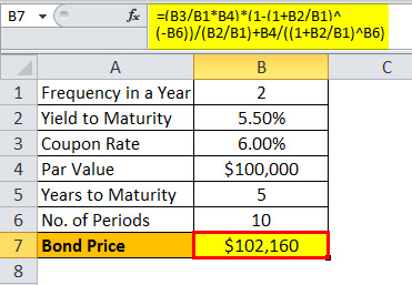
Bond Price =$102,160
For the calculation of Sensitivity Analysis, go to the Data tab in excel and then select What if analysis option.

Relevance and Uses
A sensitivity analysis is a technique which uses data table Uses Data Table A data table in excel is a type of what-if analysis tool that allows you to compare variables and see how they impact the result and overall data. It can be found under the data tab in the what-if analysis section. read more and is one of the powerful excel tools which lets a financial user understand the result of the financial model under various conditions. It can also be seen as the perfect complement to another excel tool, which is known as the scenario manager Scenario Manager Scenario Manager is a what-if analysis tool that works with many scenarios that are supplied to it. It uses a set of ranges that have an effect on a certain output and can be used to generate different scenarios such as bad and medium depending on the values. read more , and as such, it adds more flexibility to the valuation model during the process of analysis and, finally, in case of the presentation.
As such, it is very important for an analyst to appreciate the method of creation of a data table and then interpret its results to ensure that the analysis is heading in the desired direction. Further, a data table can be an effective and efficient way for presentation to the boss or client when it comes to expected financial performance under different circumstances.
Recommended Articles
This has been a guide to what is Sensitivity Analysis and its definition. Here we discuss how to perform Sensitivity Analysis using What if Analysis along with examples and a downloadable excel template. You can learn more about financial modeling from the following articles –
Источник
How to Perform Sensitivity Analysis on Excel?
Comprehensive Guide to Perform the Analysis on Excel
Performing sensitivity analysis on Excel is a very important task if you work in finance. When working with models on Excel, analysts often have to factor in both historical and projected financial inputs. In addition, they have to formulate a lot of assumptions regarding operational performance metrics. With a lot of assumptions and projections, being able to test out different possibilities really helps diversify the risks, and that is when the sensitivity table comes into play. Sensitivity analysis is often performed on Excel, at the end of every financial model. Let’s first see what a sensitivity analysis on Excel looks like!
1. How Does a Sensitivity Analysis Work?
Sensitivity (or What-if) analysis in Excel helps us to deal with the uncertainty coming from having to predict, project, and assume different input variables. It allows users to observe different output possibilities given 1 to 2 variables or assumptions.
A simplified model below will help you better understand how it works.

The model’s output is to estimate the net profit after tax in 2021 (C7) based on the profit in 2020 (C3), the profit growth rate (C4), and the effective tax rate (C5). Next, the sensitivity table tests different scenarios of the output, which is net profit after tax in 2021 in this case, with a range of growth rate (10% – 30%) and a range of tax rate (3.4% – 5.8%).
2. How to Construct the Matrix?

Reference the formula that produces the output cell at the top left corner of the matrix. Call this cell the “focus cell”

Type a list of input values in the same column under the focus cell. In this example, we have a list of values for growth rates.
Type a list of input values in the same row right next to the focus cell. In this example, we have a list of values of effective tax rates.
Select the range of cells that contain the focus cell and the two lists of input values. In this example, we would select the range D11:I18.
Go to Data -> What-if Analysis -> Data Table. A data table box would pop up like this:

For the row input cell, put in the reference cell for the input values you put in the row (C5). Likewise, for the column input cell, put in the reference cell for the input values you put in the column (C4) and click OK. Now you have a fully developed sensitivity table.
Note: Sometimes Excel might be slow or it might be set in the mode that does not automatically calculate data tables. In this case, hit F9 to recalculate the entire worksheet.

3. How to Perform Sensitivity Analysis on your DCF Model?
Please refer to this article to understand the fundamentals behind the DCF valuation method. For this example, we will just work on the finished model and will not explain any concepts.
For this example, we will use the DCF model for Kellogg’s, a multinational food-manufacturing company based in the United States. We will walk you through how to test out different scenarios of implied equity value per share under both the perpetuity approach and the exit multiple approach.
Let’s say, you have built a finished DCF model to arrive at the equity value per share for Kellogg’s of $83.86 under the perpetuity approach and $72.49 under the exit multiple approach.

Now, for an analyst, your clients will be less interested in a definite answer. It is safer for you to give them a range of possible values because, as a matter of fact, your model is built on a lot of assumptions, and at least one of them might not be possibly 100% accurate. To mitigate the risk, your job as an analyst is to sensitize certain assumptions in the model. For a DCF model specifically, your assumptions are most uncertain on WACC, long-term growth rate, and EBITDA multiple.

In this example, we make assumptions on the long-term growth rate based on information we found on macroeconomic factors, the industry, the company’s internal strengths in sustaining growth. For the EBITDA multiple, we take the median multiple from comparable companies analysis. Both of these approaches are highly risky and subjective. We cannot be sure if the numbers we input are correct or not. Therefore, sensitivity analysis is the crucial surefire next step for our model.
Following the five steps above, when we put WACC on the column and long-term growth rate on the row, we get the first sensitivity table:

Similarly, for the EBITDA multiple approach, we put WACC on the column and the exit multiple on the row. We have another sensitivity table:

In financial modelling, there is no definite answer to anything. Sensitivity analysis is therefore used to present a range of possibilities that you might not be able to arrive at concretely. In addition, clients would be very much more interested in having a broader view of all possible options rather than be restricted to one. We hope that you are able to construct a sensitivity table now that you are done reading the article. We believe that the process is relatively easy and you should not hesitate to include this analysis in any of your models it can possibly be included in.
Источник
How to Do DCF Valuation Using Sensitivity Analysis in Excel
In this post, we are going to see Sensitivity Analysis in Excel.
Discounted Cash flow is probably the commonest way of valuation of a company.
This method involves amongst other things analyzing the impact of factors like cost of equity or change in risk-free rate on the price of a company’s share.
It is but obvious that any company operates in a dynamic environment and hence for investors it is imperative that the model so built gives the investor a range of price movement so that they are prepared with respect to the possible price fluctuations that they might have to encounter if they decide to stay invested in the company.
Investors can gauge the sensitivity of price to various inputs using a technique called “sensitivity analysis”.
Sensitivity analysis is especially useful in cases where investors are evaluating proposals for the same industry or in cases where proposals are from multiple industries but driven by similar factors
What Is Sensitivity Analysis in Excel?
As the words suggest, in sensitivity analysis, we try and ascertain the impact of a change in outcome for changes in inputs.
In other words, it is also a function of the effect of various analysis data inputs to the outcome and also the impact that each input has.
The most common tool available for us to do sensitivity analysis is Microsoft Excel.
So How Do We Do It?
In Excel, sensitivity analysis comes under “What-if” analysis functions. The following are used most often
1. One-Variable Data Table
2. Two-Variable Data Table
Data Tables
1. One-Variable Data Table
Let us assume that we would like to know the impact that any change in the cost of equity on the discounting factor which would be used to calculate the discounting factor.
Our model currently shows that the discounting factor at 15.1% cost of equity is approximately 0.97.
Now if we need to analyze the impact of change in the cost of equity on discounting factor, then we could do the following:

Steps:
a) Type the list of values that you want to evaluate in the input cell either down one column or across one row.
b) Leave a few empty rows and columns on either side of the values.
c) If the data table is column-oriented (your variable values are in a column), type the formula in the cell in a manner similar to how we have done in cell P9.
d) Select the range of cells that contains the formulas and values that you want to substitute. For us, this range is O9:P22.
e) The results i.e. incremental changes in discounting factor would automatically appear in cells P9:P22.
2. Two-Variable Data Table
Let us take another example wherein we need to analyze the impact of change in not only cost of equity but also risk-free rate on the Value per Share.
If we need to factor in both these variables, then we would be using a two-variable data table for sensitivity analysis in Excel.

The following are the additional steps that we need to do to include the two variables:
a) Since the Excel data table has both columns and rows, hence the formula cell shifts exactly above the column variable and right beside the row variable, which for us is cell E18.
b) Select the range of cells that contains the formulas and values that you want to substitute. For us, this range is E18:L24.
c) On the Data tab, click What-If Analysis, followed by“Data Table”. Type the cell reference
- For the “Column input” cell box, for us, it’s O13.
- For the Row input cell box, for us, it’s O20.
d) The results i.e. the possible variations in would automatically appear in cells E19:L25.
Goal Seek
This function is used to find the missing input for the desired result.
Let’s take the example of the model that we have used for Data Tables. Here let’s say we know the cost of equity.
However, we are not sure what would be the market risk premium. In this scenario “Goal Seek” is an excellent function for sensitivity analysis in Excel.

The methodology of using “Goal Seek” is as follows.
a) On the Data tab, click What-If Analysis and then click “Goal Seek”.
b) In the Set cell box, enter O20, the cell with the formula you want
in our case it’s the average cost of equity.
c) In the To value box, type the target value i.e. 15.1%.
d) In the By changing cell box, enter O14, the reference to the cell that contains the value that you want to adjust.
e) Click OK and the result would come up as 12.3% after rounding off.
I have also created a video to help you understand how to use sensitivity analysis for DCF valuation.
Thus to conclude, we can state that Excel allows us to use various tools to make our lives easier.
In financial modeling, one of the key components to efficiently perform requirements related to interpreting sensitivity is by using “What-If Analysis” with various steps as mentioned above.
Using Data tables and goal seek function we can save ourselves from a lot of time and error wastage that may occur in case you decide to do the calculations by hand.
In all probability, learning effective use of sensitivity analysis in Excel would make us better prepared to understand the impact of inputs on the value of investments and hence keep us better prepared for fluctuations once we commit our investments.
The use of Sensitivity Analysis using Excel in financial modeling is unarguable.
Takeaway
I am sure this guide added value to you in doing Sensitivity Analysis in Excel. If you have any queries, please leave a comment below.
- Download BIWS Course sample videos here.
- Read Students’ Testimonials here.
All FinanceWalk readers will get FREE $397 Bonus – FinanceWalk’s Prime Membership.
If you want to build a long-term career in Financial Modeling, Investment Banking, Equity Research, and Private Equity, I’m confident these are the only courses you’ll need. Because Brian (BIWS) has created world-class online financial modeling training programs that will be with you FOREVER.
If you purchase BIWS courses through FinanceWalk links, I’ll give you a FREE Bonus of FinanceWalk’s Prime Membership ($397 Value).
I see FinanceWalk’s Prime Membership as a pretty perfect compliment to BIWS courses – BIWS helps you build financial modeling and investment banking skills and then I will help you build equity research and report writing skills.
To get the FREE $397 Bonus, please purchase ANY BIWS Course from the following link.
To get your FREE Bonus, you must:
- Purchase the course through FinanceWalk links.
- Send me an email along with your full name and best email address to [email protected] so I can send you the course login details.
Hi, I’m Avadhut, Founder of FinanceWalk. We help you make a rewarding career in any field based on your Inner GPS 🙂.
Источник
In this post, we are going to see Sensitivity Analysis in Excel.
Discounted Cash flow is probably the commonest way of valuation of a company.
This method involves amongst other things analyzing the impact of factors like cost of equity or change in risk-free rate on the price of a company’s share.
It is but obvious that any company operates in a dynamic environment and hence for investors it is imperative that the model so built gives the investor a range of price movement so that they are prepared with respect to the possible price fluctuations that they might have to encounter if they decide to stay invested in the company.
Investors can gauge the sensitivity of price to various inputs using a technique called “sensitivity analysis”.
Sensitivity analysis is especially useful in cases where investors are evaluating proposals for the same industry or in cases where proposals are from multiple industries but driven by similar factors
As the words suggest, in sensitivity analysis, we try and ascertain the impact of a change in outcome for changes in inputs.
In other words, it is also a function of the effect of various analysis data inputs to the outcome and also the impact that each input has.
The most common tool available for us to do sensitivity analysis is Microsoft Excel.
So How Do We Do It?
In Excel, sensitivity analysis comes under “What-if” analysis functions. The following are used most often
(1) Data Table
1. One-Variable Data Table
2. Two-Variable Data Table
(2) Goal Seek
Data Tables
1. One-Variable Data Table
Let us assume that we would like to know the impact that any change in the cost of equity on the discounting factor which would be used to calculate the discounting factor.
Our model currently shows that the discounting factor at 15.1% cost of equity is approximately 0.97.
Now if we need to analyze the impact of change in the cost of equity on discounting factor, then we could do the following:
Steps:
a) Type the list of values that you want to evaluate in the input cell either down one column or across one row.
b) Leave a few empty rows and columns on either side of the values.
c) If the data table is column-oriented (your variable values are in a column), type the formula in the cell in a manner similar to how we have done in cell P9.
d) Select the range of cells that contains the formulas and values that you want to substitute. For us, this range is O9:P22.
e) The results i.e. incremental changes in discounting factor would automatically appear in cells P9:P22.
2. Two-Variable Data Table
Let us take another example wherein we need to analyze the impact of change in not only cost of equity but also risk-free rate on the Value per Share.
If we need to factor in both these variables, then we would be using a two-variable data table for sensitivity analysis in Excel.
The following are the additional steps that we need to do to include the two variables:
a) Since the Excel data table has both columns and rows, hence the formula cell shifts exactly above the column variable and right beside the row variable, which for us is cell E18.
b) Select the range of cells that contains the formulas and values that you want to substitute. For us, this range is E18:L24.
c) On the Data tab, click What-If Analysis, followed by“Data Table”. Type the cell reference
- For the “Column input” cell box, for us, it’s O13.
- For the Row input cell box, for us, it’s O20.
d) The results i.e. the possible variations in would automatically appear in cells E19:L25.
Goal Seek
This function is used to find the missing input for the desired result.
Let’s take the example of the model that we have used for Data Tables. Here let’s say we know the cost of equity.
However, we are not sure what would be the market risk premium. In this scenario “Goal Seek” is an excellent function for sensitivity analysis in Excel.
The methodology of using “Goal Seek” is as follows.
a) On the Data tab, click What-If Analysis and then click “Goal Seek”.
b) In the Set cell box, enter O20, the cell with the formula you want
in our case it’s the average cost of equity.
c) In the To value box, type the target value i.e. 15.1%.
d) In the By changing cell box, enter O14, the reference to the cell that contains the value that you want to adjust.
e) Click OK and the result would come up as 12.3% after rounding off.
I have also created a video to help you understand how to use sensitivity analysis for DCF valuation.
Thus to conclude, we can state that Excel allows us to use various tools to make our lives easier.
In financial modeling, one of the key components to efficiently perform requirements related to interpreting sensitivity is by using “What-If Analysis” with various steps as mentioned above.
Learn more about financial modeling careers.
Using Data tables and goal seek function we can save ourselves from a lot of time and error wastage that may occur in case you decide to do the calculations by hand.
In all probability, learning effective use of sensitivity analysis in Excel would make us better prepared to understand the impact of inputs on the value of investments and hence keep us better prepared for fluctuations once we commit our investments.
The use of Sensitivity Analysis using Excel in financial modeling is unarguable.
Takeaway
I am sure this guide added value to you in doing Sensitivity Analysis in Excel. If you have any queries, please leave a comment below.
- Download BIWS Course sample videos here.
- Read Students’ Testimonials here.
Special Offer from FinanceWalk on BIWS Financial Modeling and Investment Banking Courses
All FinanceWalk readers will get FREE $397 Bonus – FinanceWalk’s Prime Membership.
If you want to build a long-term career in Financial Modeling, Investment Banking, Equity Research, and Private Equity, I’m confident these are the only courses you’ll need. Because Brian (BIWS) has created world-class online financial modeling training programs that will be with you FOREVER.
If you purchase BIWS courses through FinanceWalk links, I’ll give you a FREE Bonus of FinanceWalk’s Prime Membership ($397 Value).
I see FinanceWalk’s Prime Membership as a pretty perfect compliment to BIWS courses – BIWS helps you build financial modeling and investment banking skills and then I will help you build equity research and report writing skills.
To get the FREE $397 Bonus, please purchase ANY BIWS Course from the following link.
Breaking Into Wall Street Courses – Boost Your Financial Modeling and Investment Banking Career
To get your FREE Bonus, you must:
- Purchase the course through FinanceWalk links.
- Send me an email along with your full name and best email address to [email protected] so I can send you the course login details.
Click Here to Check All BIWS Programs – Free $397 Bonus

Hi, I’m Avadhut, Founder of FinanceWalk. We help you make a rewarding career in any field based on your Inner GPS 🙂.
Contact us for Career Coaching.
Sensitivity analysis entails probing the influence of independent variables on the dependent ones in data.
You can use the technique to easily predict outcomes when an analysis is performed under certain conditions. As an investor, you can easily evaluate all the factors that may negatively affect the growth of your investments using this methodology.
So, how can you establish the relationship between dependent and independent factors in your data?
This is where sensitivity analysis-based charts, such as Tornado Graph, come in.
The charts are incredibly easy to read and interpret. Besides, you can easily integrate them into your data storytelling to cement credibility.
Excel does not support sensitivity analysis-based charts.
You actually don’t have to do away with the Excel spreadsheet. Supercharge its usability by installing a particular third-party application into your spreadsheet to access ready-to-use and visually appealing Tornado Charts.
In this blog, you’ll learn the following:
- How to do sensitivity analysis in Excel?
- We’ll address the following questions:
- What is sensitivity analysis?
- When should you use sensitivity analysis?
- Advantages of sensitivity analysis.
- Also, we’ll suggest the best add-in to install in your Excel to access ready-made sensitivity analysis charts.


How to Do Sensitivity Analysis in Excel?
Before jumping right into the how-to guide, we’ll address the following question: what is sensitivity analysis?
What is Sensitivity Analysis?
Sensitivity analysis determines how different values of an independent variable affect a particular dependent variable under a given set of assumptions.
In other words, sensitivity analysis study how various sources of uncertainty in a mathematical model contribute to the model’s overall uncertainty. This technique is used within specific boundaries that depend on one or more input variables.
Sensitivity analysis is used in the business world and in the field of economics. Also, it’s commonly used by financial analysts and economists and is also known as a what-if analysis.
Sensitivity analysis entails probing the relationship between key variables in data
Use sensitivity analysis-based charts to extract relationship insights you cannot see using tables and visualization designs, such as Bar Chart.
Seasoned visualization experts use sensitivity analysis mainly to test hypotheses. And this occurs during the initial stages of data visualization. If you want to extract micro insights in your bulky data, give this chart a try.
The financial model determines how key metrics are affected based on changes in other factors known as input variables. This model is also referred to as what-if or simulation analysis. It is a way to predict the outcome of a decision given a certain range of variables.
By creating a given set of variables, an analyst can determine how changes in one variable affect the outcome.
Both the target and input—or independent and dependent—variables are fully analyzed when sensitivity analysis is conducted. The person doing the analysis looks at how the variables move as well as how the target is affected by the input variable.
How to do sensitivity analysis in Excel should never be an Achilles heel for you. Keep reading to discover more.
Sometimes, there’re relationships between critical metrics in your data. And understanding these relationships can help you uncover actionable insights.
For instance, if you’re a human resource professional, the relationship between training hours and employee productivity is one of the issues you keep track of closely.
The relationship between the number of people working in a shift and the average answer time is a significant point of interest for many call center managers.
In the coming section, we’ll address the following question: when should you use sensitivity analysis charts?
When Should You Use Sensitivity Analysis Charts?
-
Identification of correlations and associations
You can use this insightful chart to uncover hidden correlational relationships that exist in your raw business data.
Interpreting sensitivity analysis charts is incredibly easy.
The key to interpreting this chart is to always remember the following: independent variables (metrics) are found on the horizontal axis (x-axis). And, the dependent variables are situated on the vertical axis (y-axis) in a Cartesian plane.
-
Identification of data patterns and trends
Use a sensitivity analysis chart to identify the general trend of your key variables in your raw data.
Data points in this chart are grouped together based on how close their values are, which makes it easier to identify outliers. You don’t want to base your business decisions on outliers because they can be misleading.
Interestingly, the nature of the correlations can also be estimated based on a specified confidence level.
-
Display the relationship between two variables
Sensitivity analysis charts are widely used by seasoned data visualization experts to display the causal relationships between two variables.
The relationship between variables can be positive or negative.
-
Make reliable forecasts
Sensitivity analysis can be used to help make predictions about the share prices of public companies.
Some of the variables that affect stock prices include:
- Company earnings
- Number of shares outstanding
- Debt-to-equity ratios (D/E)
- Number of competitors in the industry
The analysis can be refined about future stock prices by making different assumptions or adding different variables.
This model can also be used to determine the effect that changes in interest rates have on bond prices. In this case, the interest rates are the independent variable, while bond prices are the dependent variable.
How to do sensitivity analysis in Excel should never be time-consuming for you. In the coming section, we’ll address the advantages of sensitivity analysis charts.
Advantages of Sensitivity Analysis
- Better decision making: Sensitivity analysis presents decision-makers with a range of outcomes to help them make reliable and data-backed decisions.
- More reliable predictions: The methodology can help you forecast the performance of the metrics of care most about.
- Highlights areas for improvement: Sensitivity analysis can help you identify key areas to make improvements for more profits.
- Increases credibility: The analysis strategy adds credibility to financial models by testing them across a wide set of key data points.
Weaknesses of Sensitive Analysis
- The methodology assumes that key metrics change independently. For instance, material prices change independently of other variables.
- It only identifies how far a variable can change. So, it doesn’t look at the probability of such a change.
- It provides information on the basis for making decisions. But the methodology does not point to the correct decision directly.
- Sensitivity analysis considers each variable individually and determines the outcome.
In the real world, all variables are related to each other.
For example, both inflation and market interest rates affect bond prices. Sensitivity analysis will consider how much a change in inflation will affect the bond price. And how a change in market interest rate will affect bond prices.
But it won’t consider how a change in inflation will affect the market interest rate or vice versa. This is actually an incomplete analysis.
We’re now in the heart of the blog: How to do sensitivity analysis in Excel. You don’t want to miss this.
How to Do Sensitivity Analysis in Excel?
Excel is a trusted data visualization tool because it’s familiar and has been there for decades.
But the spreadsheet application lacks ready-made sensitivity analysis-based charts, such as Tornado Graph.
We understand switching tools is not an easy task.
This is why we’re not advocating you ditch Excel in favor of other expensive data visualization tools.
There’s an easy-to-use and amazingly affordable visualization tool that comes as an add-in for excel which you can easily install in your app to access ready-made sensitivity analysis-based charts, such as Tornado Graph. The tool is called ChartExpo.
How to do sensitivity analysis in Excel should never overwhelm you. Keep reading to discover more.
So, what is ChartExpo?
ChartExpo is an incredibly intuitive add-in you can easily install in your Excel.
With many ready-to-go visualizations, the sensitivity analysis charts generator turns your complex, raw data into compelling, easy-to-digest, visual renderings that tell the performance review stories in real-time.
- ChartExpo is cloud-hosted, which makes it extremely light. You have a 100% guarantee that your Excel won’t be slowed down.
- You can export your insightful, easy-to-read, and intuitive charts in JPEG, PDF, SVG, and PNG formats.
- ChartExpo add-in is only $10 a month after the end of the trial period.
- The app has an in-built library with over a lot easy-to-customize and ready-made charts for your data stories.
In the coming section, we’ll take you through how to do sensitivity analysis in Excel using the ChartExpo add-in.
You don’t want to miss this!


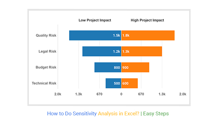
Example
This section will use a Tornado Chart (one of the tested and recommended charts for sensitivity analysis).
| Risk | Low Project Impact |
High Project Impact |
| Quality Risk | 1742 | 2000 |
| Legal Risk | 1300 | 1700 |
| Technical Risk | 1468 | 80 |
| Budget Risk | 1426 | 1402 |
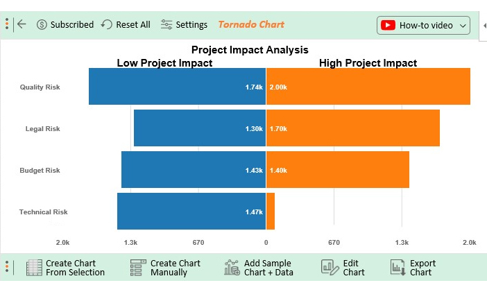
- To install ChartExpo into your Excel, click this link.
- Open the worksheet and click the Insert button to access the My Apps option.

- Click the My Apps button and then See All button to view ChartExpo, among other add-ins.

- Select ChartExpo add-in and click the Insert button.
- Once the interface below loads, click the Search box and type your preferred chart.

- In this case, type “Tornado Chart” in the Search Box as shown.

- Select the sheet holding your data and click the Create Chart from Selection button, as shown above.
- Check out the final chart below.
FAQs:
What is the sensitivity analysis formula?
Mathematically, the sensitivity analysis formula that represents the dependent output can be written as follows: f(x) = y.
X is the independent variable (input). Y is the dependent variable (output). And it determines how different values of an independent variable affect a particular dependent variable under a given set of assumptions
What is a sensitivity analysis example?
Sue is a sales manager who wants to understand the impact of customer traffic on total sales. The price of a widget is $1,000, and Sue sold 100 last year for total sales of $100,000.
The data above is sufficient for her to build a sensitivity analysis. It can tell her what happens to sales if customer traffic increases by 10%, 50%, or 100%.
What is a Tornado Chart Sensitivity Analysis?
Tornado Chart sensitivity analysis determines how key variables are affected based on changes in other variables known as input variables.
This model is also referred to as what-if or simulation analysis. It is a way to predict the outcome of a decision given a certain range of variables.
What is the most widely used method of sensitivity analysis?
Derivative-based approaches are the most common sensitivity analysis method.
To compute the derivative, the model inputs are varied within a small range around a nominal value. Use the methodology to understand the impact a range of variables has on a given outcome.


Wrap Up
Sensitivity analysis entails probing the influence of independent factors on dependent factors in data. You can use the technique to easily predict outcomes when the analysis is performed under certain conditions.
So, how can you establish the relationship between dependent and independent factors in your data?
This is where sensitivity analysis-based charts, such as Tornado Graph, come in.
The charts are incredibly easy to read and interpret. Besides, you can easily integrate them into your data storytelling to cement credibility.
Excel does not support sensitivity analysis-based charts. You actually don’t have to do away with the Excel spreadsheet.
So, what’s the solution?
We recommend you install third-party apps, such as ChartExpo, to access ready-to-use sensitivity analysis-based charts.
ChartExpo is an add-in for Excel that’s loaded with insightful and ready-to-go sensitivity analysis-based charts, such as Tornado Graph. You don’t need programming or coding skills to use ChartExpo.
How to do sensitivity analysis in Excel should never stress you.
Sign up for a 7-day free trial today to access ready-made sensitivity analysis-based charts that are easy to interpret and visually appealing to your target audience.