
What is Line Graphs / Chart in Excel?
A line chart in Excel is created to display trend graphs from time to time. In simple words, a line graph is used to show changes over time to time. By creating a line chart in Excel, we can represent the most typical data.
In Excel, charts and graphs represent data in graphical format. There are so many types of charts in excelExcel offers a variety of chart types based on your requirements. Column Charts, Line Charts, Pie Charts, Bar Charts, Area Charts, Scatter Charts, Stock Chart, and Radar Charts are the different types of charts.read more. The line chart in Excel is the most popular and used.
Table of contents
- What is Line Graphs / Chart in Excel?
- Types of Line Charts / Graphs in Excel
- #1 – 2D Line Graph in Excel
- Stacked Line Graph in Excel
- 100% Stacked Line Graph in Excel
- Line with Markers in Excel
- Stacked Line with Markers
- 100% Stacked Line with Markers
- #2 – 3D Line Graph in Excel
- How to Make a Line Graph in Excel?
- Line Chart in Excel Example #1
- Line Chart in Excel Example #2
- Relevance and Uses of Line Graph in Excel
- Customize Line Chart in Excel
- Things to Remember
- Recommended Articles
- Types of Line Charts / Graphs in Excel
Types of Line Charts / Graphs in Excel
There are different categories of line charts that we can create in Excel.
- 2D Line Charts
- 3D Line Charts
These types of Line graphs in Excel are still divided into different graphs.
You can download this Line Chart Excel Template here – Line Chart Excel Template
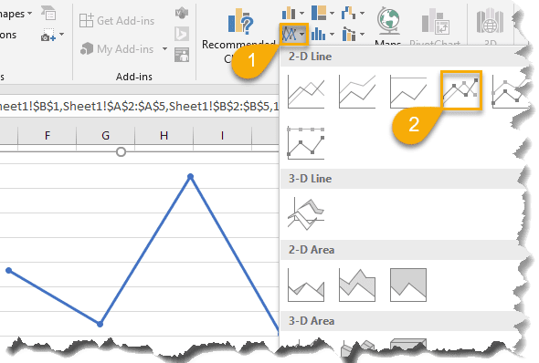
#1 – 2D Line Graph in Excel
The 2D line graph in Excel is basic. We can take this graph for a single data set. Below is the image for that.
These are again divided as follows:
Stacked Line Graph in Excel
This stacked line chart in Excel shows how it will change the data over time.
We can show this in the below diagram.
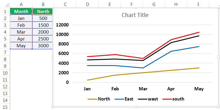
In the graph, all the 4 data sets are represented using 4 line charts in one graph using two axes.
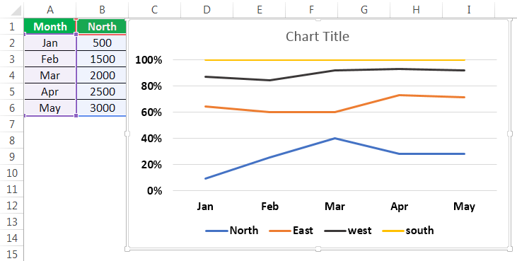
100% Stacked Line Graph in Excel
This graph is similar to the stacked line graph in Excel. The only difference is that this Y-axis shows % values rather than normal values. Also, this graph contains a top line. It is the 100% line. It will run across the top of the chart.
We can show this in the below figure.
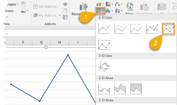
Line with Markers in Excel
This type of line graph in Excel will contain pointers at each data point. So, we can use this to represent data for every important point.

The point marks represent the data points where they are present. When hovering the mouse on the point, the values corresponding to that data point are known.
Stacked Line with Markers

100% Stacked Line with Markers

#2 – 3D Line Graph in Excel
This line graph in excel is shown in 3D format.
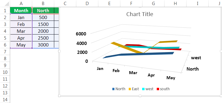
The below line graph is the 3D line graph. All the lines are represented in 3D format.
All these graphs are types of line charts in Excel. The representation is different from chart to chart. As per the requirement, you can create the line chart in Excel.
How to Make a Line Graph in Excel?
Below are examples to create a Line chartThe line chart is a graphical representation of data that contains a series of data points with a line. read more in Excel.
Line Chart in Excel Example #1
We can use the line graph in multiple data sets also. Here is an example of creating a line chart in Excel.
In the above graph, we have multiple datasets to represent that data. Also, we have used a line graph.

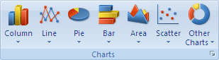
Select all the data and go to the “Insert” tab. Next, select the “Line” graph from “Charts.” It will display the required chart.

Then, the line chart in Excel created looks like as given below:
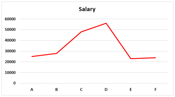
Line Chart in Excel Example #2
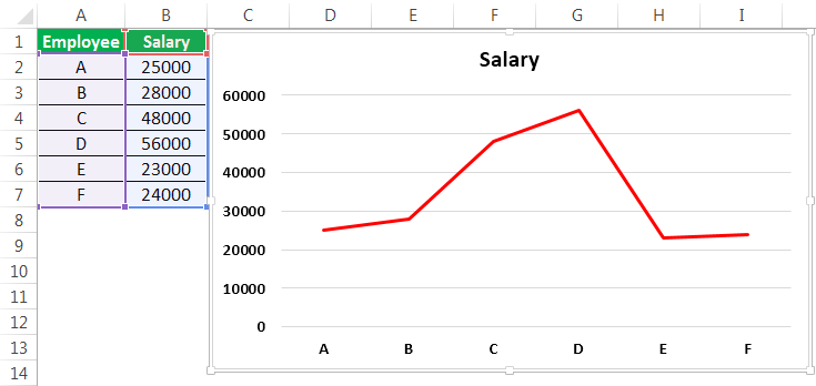
There are two columns in the table: Employee and Salary. Those two columns are represented in a line chart using a basic line chart in Excel. The employee names are taken on X-axis, and salary is taken on Y-axis. From those columns, that data is represented in Pictorial form using a line graph.
- Go to the “Insert” menu -> “Charts” Tab -> Select “Line” charts symbol. We can select the customized line chart as per the requirement.

- Then, the chart may look like as given below.


It is the basic process of using a line graph in our representation.
To represent a line graph in Excel, we need two necessary components. They are the horizontal axis and vertical axis.
The horizontal axis is called X-axis, and the vertical axis is called Y-axis.
There is one more component called “legend.” It is the line in which the graph is represented.
One more component is “plot area.” It is the area where it will plot the graph. Hence, it is called the plot area.
We can represent the above explanation in the below diagram.
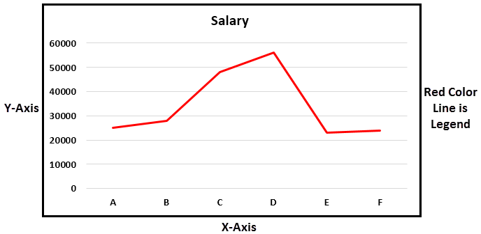
The X-axis and Y-axis are used to represent the scale of the graph. Next, the legend is the blue line in which the graph is represented. It is more useful when the graph contains more than one line to define. Next is the plot area. It is the area where we can plot the graph.
In the line graph, if there are multiple datasets to represent the data, and if the axes are different for all the columns, we can change the scale of the axes and represent the data.
From this line graph, we can easily represent timeline graphs. If the data contains years of data related to time, it can be presented better than other graphs. We can also represent a line graph with points for easy understanding.
For example, sales of a company during a period, salary of an employee over a period, etc.
Relevance and Uses of Line Graph in Excel
We can use the line graph for:
- Single dataset.
The data having a single data set can be represented in Excel using a line graph over a period. It can be illustrated with an example.
- Multiple Datasets
We can also represent the line graph for multiple datasets.

The different data set is represented using another color legend. In the above example, revenue is represented by a blue line. We can represent customer purchase % by using an orange color line, Sales by grey line, and the last one profit% by using a yellow line.
We can customize the graph after inserting the line graph, such as formatting grid lines, changing the chart title to a user-defined name, and changing the axis’s scales. It can be done by right click on the chart.
Formatting the grid lines: Gridlines can be removed or changed as per our requirement by using an option called formatting grid lines. It can be done by,
Right-click on Chart-> Format Gridlines.

We can select the types of gridlines as per the requirement or remove the grid lines completely.
The three options on the top right side of the graph are the graph options to customize them.

The “+” symbol will have the checkboxes of what options to select in the graph to exist.
The “paint” symbol is used to select the style of the chart to be used and the color of the line.
The “filter” symbol indicates what we should represent as part of the data on the graph.
Customize Line Chart in Excel
These are some default customizations made to a line chart in Excel.
#1 – Changing the Line Chart Title:

We can change the chart title as per the user requirement for better understanding or the same as the table’s name for a better experience. For example, we can show that as below.

We should place the cursor in the “Chart Title” area, and we can write a user-defined name in place of the chart title.
#2 – Changing the Color of Legend
The color of the legend can also be changed, as shown in the below screenshot.

#3 – Changing the Scale of the Axis
The scale of the axis can be changed if there is a requirement. For example, If there are more datasets with different scales, we can change the scale of the axis.
A given process can do this.
Right-click on any of the lines. Now, select “Format Data Series.” It will show a window on the right side and select the secondary axisThe secondary axis is the other axis that is used to denote different data sets that cannot be displayed on a single axis. The primary axis, for example, depicts time, whereas the secondary axis displays production.read more. Now, click “OK,” as shown in the below figure.

#4 – Formatting the Gridlines
We can format Gridline in excelGridlines are little lines made of dots to divide cells from each other in a worksheet. The gridlines have slight faint invisibility; you can find it in the page layout tab. This option has a checkbox; for activating the gridlines, you can tick on it and untick if you wish to deactivate gridlines.read more. In addition, they can be changed or removed completely. We can do this as per the requirement.
We can show this in the below figure.

After right-clicking on the gridlines, select “Format Gridlines” from the options, and then it will open a dialog box. In that, we can choose the type of gridlines as per choice.

#5 – Changing the Chart Styles and Color
We can change the chart’s color and style by using the “+” button on the top right corner. For example, we can show this in the below figure.

Things to Remember
- We can format a line graph with points in the graph where there is a data point and can also be formatted as per the user requirement.
- We can also change the color of the line as per the requirement.
- While creating a line chart in Excel, the very important point is that we cannot use these line graphs for categorical data.
Recommended Articles
This article is a guide to Line Graphs and Charts in Excel. We discuss creating a line chart/graph in Excel, practical examples, and a downloadable Excel template. You may also learn more about Excel from the following articles: –
- Examples of 3D Maps in Excel3D map is a new feature provided by Excel in its latest versions of 2016. It introduces map elements in the Excel graph axis in three dimensions. It is an extremely useful tool provided by Excel, like an actual functional mapread more
- How to Create a 3D Plot in Excel?3D plots is also known as surface plots in excel which is used to represent three dimensional data. To represent a three dimensional plot, three dimensional range of data which can be used from the insert tab in excel.read more
- Dynamic Charts in Excel
- Stacked Chart in ExcelIn stacked charts data series are stacked over one another for a particular axes, in stacked column chart the series are stacked vertically while in bar the series are stacked horizontally.read more
Excel for Microsoft 365 Excel for Microsoft 365 for Mac Excel 2021 Excel 2021 for Mac Excel 2019 Excel 2019 for Mac Excel 2016 Excel 2016 for Mac Excel 2013 Excel 2010 More…Less
Scatter charts and line charts look very similar, especially when a scatter chart is displayed with connecting lines. However, the way each of these chart types plots data along the horizontal axis (also known as the x-axis) and the vertical axis (also known as the y-axis) is very different.
Before you choose either of these chart types, you might want to learn more about the differences and find out when it’s better to use a scatter chart instead of a line chart, or the other way around.
The main difference between scatter and line charts is the way they plot data on the horizontal axis. For example, when you use the following worksheet data to create a scatter chart and a line chart, you can see that the data is distributed differently.
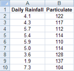
In a scatter chart, the daily rainfall values from column A are displayed as x values on the horizontal (x) axis, and the particulate values from column B are displayed as values on the vertical (y) axis. Often referred to as an xy chart, a scatter chart never displays categories on the horizontal axis.

A scatter chart always has two value axes to show one set of numerical data along a horizontal (value) axis and another set of numerical values along a vertical (value) axis. The chart displays points at the intersection of an x and y numerical value, combining these values into single data points. These data points may be distributed evenly or unevenly across the horizontal axis, depending on the data.
The first data point to appear in the scatter chart represents both a y value of 137 (particulate) and an x value of 1.9 (daily rainfall). These numbers represent the values in cell A9 and B9 on the worksheet.
In a line chart, however, the same daily rainfall and particulate values are displayed as two separate data points, which are evenly distributed along the horizontal axis. This is because a line chart only has one value axis (the vertical axis). The horizontal axis of a line chart only shows evenly spaced groupings (categories) of data. Because categories were not provided in the data, they were automatically generated, for example, 1, 2, 3, and so on.
This is a good example of when not to use a line chart.

A line chart distributes category data evenly along a horizontal (category) axis , and distributes all numerical value data along a vertical (value) axis.
The particulate y value of 137 (cell B9) and the daily rainfall x value of 1.9 (cell A9) are displayed as separate data points in the line chart. Neither of these data points is the first data point displayed in the chart — instead, the first data point for each data series refers to the values in the first data row on the worksheet (cell A2 and B2).
Axis type and scaling differences
Because the horizontal axis of a scatter chart is always a value axis, it can display numeric values or date values (such as days or hours) that are represented as numerical values. To display the numeric values along the horizontal axis with greater flexibility, you can change the scaling options on this axis the same way that you can change the scaling options of a vertical axis.
Because the horizontal axis of a line chart is a category axis, it can be only a text axis or a date axis. A text axis displays text only (non-numerical data or numerical categories that are not values) at evenly spaced intervals. A date axis displays dates in chronological order at specific intervals or base units, such as the number of days, months, or years, even if the dates on the worksheet are not in order or in the same base units.
The scaling options of a category axis are limited compared with the scaling options of a value axis. The available scaling options also depend on the type of axis that you use.
Scatter charts are commonly used for displaying and comparing numeric values, such as scientific, statistical, and engineering data. These charts are useful to show the relationships among the numeric values in several data series, and they can plot two groups of numbers as one series of xy coordinates.
Line charts can display continuous data over time, set against a common scale, and are therefore ideal for showing trends in data at equal intervals or over time. In a line chart, category data is distributed evenly along the horizontal axis, and all value data is distributed evenly along the vertical axis. As a general rule, use a line chart if your data has non-numeric x values — for numeric x values, it is usually better to use a scatter chart.
Consider using a scatter chart instead of a line chart if you want to:
-
Change the scale of the horizontal axis Because the horizontal axis of a scatter chart is a value axis, more scaling options are available.
-
Use a logarithmic scale on the horizontal axis You can turn the horizontal axis into a logarithmic scale.
-
Display worksheet data that includes pairs or grouped sets of values In a scatter chart, you can adjust the independent scales of the axes to reveal more information about the grouped values.
-
Show patterns in large sets of data Scatter charts are useful for illustrating the patterns in the data, for example by showing linear or non-linear trends, clusters, and outliers.
-
Compare large numbers of data points without regard to time The more data that you include in a scatter chart, the better the comparisons that you can make.
Consider using a line chart instead of a scatter chart if you want to:
-
Use text labels along the horizontal axis These text labels can represent evenly spaced values such as months, quarters, or fiscal years.
-
Use a small number of numerical labels along the horizontal axis If you use a few, evenly spaced numerical labels that represent a time interval, such as years, you can use a line chart.
-
Use a time scale along the horizontal axis If you want to display dates in chronological order at specific intervals or base units, such as the number of days, months, or years, even if the dates on the worksheet are not in order or in the same base units, use a line chart.
Note: The following procedure applies to Office 2013 and newer versions. Office 2010 steps?
Create a scatter chart

So, how did we create this scatter chart? The following procedure will help you create a scatter chart with similar results. For this chart, we used the example worksheet data. You can copy this data to your worksheet, or you can use your own data.
-
Copy the example worksheet data into a blank worksheet, or open the worksheet that contains the data you want to plot in a scatter chart.
1
2
3
4
5
6
7
8
9
10
11
A
B
Daily Rainfall
Particulate
4.1
122
4.3
117
5.7
112
5.4
114
5.9
110
5.0
114
3.6
128
1.9
137
7.3
104
-
Select the data you want to plot in the scatter chart.
-
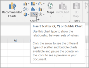
Click the Insert tab, and then click Insert Scatter (X, Y) or Bubble Chart.

-
Click Scatter.
Tip: You can rest the mouse on any chart type to see its name.
-
Click the chart area of the chart to display the Design and Format tabs.
-
Click the Design tab, and then click the chart style you want to use.
-
Click the chart title and type the text you want.
-
To change the font size of the chart title, right-click the title, click Font, and then enter the size that you want in the Size box. Click OK.
-
Click the chart area of the chart.
-
On the Design tab, click Add Chart Element > Axis Titles, and then do the following:
-
To add a horizontal axis title, click Primary Horizontal.
-
To add a vertical axis title, click Primary Vertical.
-
Click each title, type the text that you want, and then press Enter.
-
For more title formatting options, on the Format tab, in the Chart Elements box, select the title from the list, and then click Format Selection. A Format Title pane will appear. Click Size & Properties
, and then you can choose Vertical alignment, Text direction, or Custom angle.
-
-
Click the plot area of the chart, or on the Format tab, in the Chart Elements box, select Plot Area from the list of chart elements.
-
On the Format tab, in the Shape Styles group, click the More button
, and then click the effect that you want to use. -
Click the chart area of the chart, or on the Format tab, in the Chart Elements box, select Chart Area from the list of chart elements.
-
On the Format tab, in the Shape Styles group, click the More button
, and then click the effect that you want to use. -
If you want to use theme colors that are different from the default theme that is applied to your workbook, do the following:
-
On the Page Layout tab, in the Themes group, click Themes.
-
Under Office, click the theme that you want to use.
-
 , and then you can choose Vertical alignment, Text direction, or Custom angle.
 , and then click the effect that you want to use.
Create a line chart

So, how did we create this line chart? The following procedure will help you create a line chart with similar results. For this chart, we used the example worksheet data. You can copy this data to your worksheet, or you can use your own data.
-
Copy the example worksheet data into a blank worksheet, or open the worksheet that contains the data that you want to plot into a line chart.
1
2
3
4
5
6
7
8
9
10
11
A
B
C
Date
Daily Rainfall
Particulate
1/1/07
4.1
122
1/2/07
4.3
117
1/3/07
5.7
112
1/4/07
5.4
114
1/5/07
5.9
110
1/6/07
5.0
114
1/7/07
3.6
128
1/8/07
1.9
137
1/9/07
7.3
104
-
Select the data that you want to plot in the line chart.
-
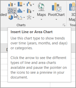
Click the Insert tab, and then click Insert Line or Area Chart.
-
Click Line with Markers.
-
Click the chart area of the chart to display the Design and Format tabs.
-
Click the Design tab, and then click the chart style you want to use.
-
Click the chart title and type the text you want.
-
To change the font size of the chart title, right-click the title, click Font, and then enter the size that you want in the Size box. Click OK.
-
Click the chart area of the chart.
-
On the chart, click the legend, or add it from a list of chart elements (on the Design tab, click Add Chart Element > Legend, and then select a location for the legend).
-
To plot one of the data series along a secondary vertical axis, click the data series, or select it from a list of chart elements (on the Format tab, in the Current Selection group, click Chart Elements).
-
On the Format tab, in the Current Selection group, click Format Selection. The Format Data Series task pane appears.
-
Under Series Options, select Secondary Axis, and then click Close.
-
On the Design tab, in the Chart Layouts group, click Add Chart Element, and then do the following:
-
To add a primary vertical axis title, click Axis Title >Primary Vertical. and then on the Format Axis Title pane, click Size & Properties
to configure the type of vertical axis title that you want. -
To add a secondary vertical axis title, click Axis Title > Secondary Vertical, and then on the Format Axis Title pane, click Size & Properties
to configure the type of vertical axis title that you want. -
Click each title, type the text that you want, and then press Enter
-
-
Click the plot area of the chart, or select it from a list of chart elements (Format tab, Current Selection group, Chart Elements box).
-
On the Format tab, in the Shape Styles group, click the More button
, and then click the effect that you want to use.
-
Click the chart area of the chart.
-
On the Format tab, in the Shape Styles group, click the More button
, and then click the effect that you want to use. -
If you want to use theme colors that are different from the default theme that is applied to your workbook, do the following:
-
On the Page Layout tab, in the Themes group, click Themes.
-
Under Office, click the theme that you want to use.
-
Create a scatter or line chart in Office 2010
So, how did we create this scatter chart? The following procedure will help you create a scatter chart with similar results. For this chart, we used the example worksheet data. You can copy this data to your worksheet, or you can use your own data.
-
Copy the example worksheet data into a blank worksheet, or open the worksheet that contains the data that you want to plot into a scatter chart.
1
2
3
4
5
6
7
8
9
10
11
A
B
Daily Rainfall
Particulate
4.1
122
4.3
117
5.7
112
5.4
114
5.9
110
5.0
114
3.6
128
1.9
137
7.3
104
-
Select the data that you want to plot in the scatter chart.
-
On the Insert tab, in the Charts group, click Scatter.
-
Click Scatter with only Markers.
Tip: You can rest the mouse on any chart type to see its name.
-
Click the chart area of the chart.
This displays the Chart Tools, adding the Design, Layout, and Format tabs.
-
On the Design tab, in the Chart Styles group, click the chart style that you want to use.
For our scatter chart, we used Style 26.
-
On the Layout tab, click Chart Title and then select a location for the title from the drop-down list.
We chose Above Chart.
-
Click the chart title, and then type the text that you want.
For our scatter chart, we typed Particulate Levels in Rainfall.
-
To reduce the size of the chart title, right-click the title, and then enter the size that you want in the Font Size box on the shortcut menu.
For our scatter chart, we used 14.
-
Click the chart area of the chart.
-
On the Layout tab, in the Labels group, click Axis Titles, and then do the following:
-
To add a horizontal axis title, click Primary Horizontal Axis Title, and then click Title Below Axis.
-
To add a vertical axis title, click Primary Vertical Axis Title, and then click the type of vertical axis title that you want.
For our scatter chart, we used Rotated Title.
-
Click each title, type the text that you want, and then press Enter.
For our scatter chart, we typed Daily Rainfall in the horizontal axis title, and Particulate level in the vertical axis title.
-
-
Click the plot area of the chart, or select Plot Area from a list of chart elements (Layout tab, Current Selection group, Chart Elements box).
-
On the Format tab, in the Shape Styles group, click the More button
, and then click the effect that you want to use.For our scatter chart, we used the Subtle Effect — Accent 3.
-
Click the chart area of the chart.
-
On the Format tab, in the Shape Styles group, click the More button
, and then click the effect that you want to use.For our scatter chart, we used the Subtle Effect — Accent 1.
-
If you want to use theme colors that are different from the default theme that is applied to your workbook, do the following:
-
On the Page Layout tab, in the Themes group, click Themes.
-
Under Built-in, click the theme that you want to use.
For our line chart, we used the Office theme.
-

So, how did we create this line chart? The following procedure will help you create a line chart with similar results. For this chart, we used the example worksheet data. You can copy this data to your worksheet, or you can use your own data.
-
Copy the example worksheet data into a blank worksheet, or open the worksheet that contains the data that you want to plot into a line chart.
1
2
3
4
5
6
7
8
9
10
11
A
B
C
Date
Daily Rainfall
Particulate
1/1/07
4.1
122
1/2/07
4.3
117
1/3/07
5.7
112
1/4/07
5.4
114
1/5/07
5.9
110
1/6/07
5.0
114
1/7/07
3.6
128
1/8/07
1.9
137
1/9/07
7.3
104
-
Select the data that you want to plot in the line chart.
-
On the Insert tab, in the Charts group, click Line.
-
Click Line with Markers.
-
Click the chart area of the chart.
This displays the Chart Tools, adding the Design, Layout, and Format tabs.
-
On the Design tab, in the Chart Styles group, click the chart style that you want to use.
For our line chart, we used Style 2.
-
On the Layout tab, in the Labels group, click Chart Title, and then click Above Chart.
-
Click the chart title, and then type the text that you want.
For our line chart, we typed Particulate Levels in Rainfall.
-
To reduce the size of the chart title, right-click the title, and then enter the size that you want in the Size box on the shortcut menu.
For our line chart, we used 14.
-
On the chart, click the legend, or select it from a list of chart elements (Layout tab, Current Selection group, Chart Elements box).
-
On the Layout tab, in the Labels group, click Legend, and then click the position that you want.
For our line chart, we used Show Legend at Top.
-
To plot one of the data series along a secondary vertical axis, click the data series for Rainfall, or select it from a list of chart elements (Layout tab, Current Selection group, Chart Elements box).
-
On the Layout tab, in the Current Selection group, click Format Selection.
-
Under Series Options, select Secondary Axis, and then click Close.
-
On the Layout tab, in the Labels group, click Axis Titles, and then do the following:
-
To add a primary vertical axis title, click Primary Vertical Axis Title, and then click the type of vertical axis title that you want.
For our line chart, we used Rotated Title.
-
To add a secondary vertical axis title, click Secondary Vertical Axis Title, and then click the type of vertical axis title that you want.
For our line chart, we used Rotated Title.
-
Click each title, type the text that you want, and then press ENTER.
For our line chart, we typed Particulate level in the primary vertical axis title, and Daily Rainfall in the secondary vertical axis title.
-
-
Click the plot area of the chart, or select it from a list of chart elements (Layout tab, Current Selection group, Chart Elements box).
-
On the Format tab, in the Shape Styles group, click the More button
, and then click the effect that you want to use.For our line chart, we used the Subtle Effect — Dark 1.
-
Click the chart area of the chart.
-
On the Format tab, in the Shape Styles group, click the More button
, and then click the effect that you want to use.For our line chart, we used the Subtle Effect — Accent 3.
-
If you want to use theme colors that are different from the default theme that is applied to your workbook, do the following:
-
On the Page Layout tab, in the Themes group, click Themes.
-
Under Built-in, click the theme that you want to use.
For our line chart, we used the Office theme.
-
Create a scatter chart
-
Select the data you want to plot in the chart.
-
Click the Insert tab, and then click X Y Scatter, and under Scatter, pick a chart.
-
With the chart selected, click the Chart Design tab to do any of the following:
-
Click Add Chart Element to modify details like the title, labels, and the legend.
-
Click Quick Layout to choose from predefined sets of chart elements.
-
Click one of the previews in the style gallery to change the layout or style.
-
Click Switch Row/Column or Select Data to change the data view.
-
-
With the chart selected, click the Design tab to optionally change the shape fill, outline, or effects of chart elements.
Create a line chart
-
Select the data you want to plot in the chart.
-
Click the Insert tab, and then click Line, and pick an option from the available line chart styles .
-
With the chart selected, click the Chart Design tab to do any of the following:
-
Click Add Chart Element to modify details like the title, labels, and the legend.
-
Click Quick Layout to choose from predefined sets of chart elements.
-
Click one of the previews in the style gallery to change the layout or style.
-
Click Switch Row/Column or Select Data to change the data view.
-
-
With the chart selected, click the Design tab to optionally change the shape fill, outline, or effects of chart elements.
See Also
Save a custom chart as a template
Need more help?
Want more options?
Explore subscription benefits, browse training courses, learn how to secure your device, and more.
Communities help you ask and answer questions, give feedback, and hear from experts with rich knowledge.
In the following tutorial, we’ll show you how to create a single line graph in Excel 2011 for Mac. When the steps differ for other versions of Excel, they will be called out after each step.
Creating a single line graph in Excel is a straightforward process. Excel offers a number of different variations of the line graph.
-
Line: If there is more than one data series, each is plotted individually.
-
Stacked Line: This option requires more than one data set. Each additional set is added to the first, so the top line is the total of the ones below it. Therefore, the lines will never cross.
-
100% Stacked Line: This graph is similar to a stacked line graph, but the Y axis depicts percentages rather than an absolute values. The top line will always appear straight across the top of the graph and a period’s total will be 100 percent.
-
Marked Line Graph: The marked versions of each 2-D graph add indicators at each data point.
-
3D Line: Similar to the basic line graph, but represented in a 3D format.

Step-by-Step Instructions to Build a Line Graph in Excel
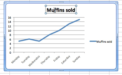
Once you collect the data you want to chart, the first step is to enter it into Excel. The first column will be the time segments (hour, day, month, etc.), and the second will be the data collected (muffins sold, etc.).
Highlight both columns of data and click Charts > Line > and make your selection. We chose Line for this example, since we are only working with one data set.
Excel creates the line graph and displays it in your worksheet.
Other Versions of Excel: Click the Insert tab > Line Chart > Line. In 2016 versions, hover your cursor over the options to display a sample image of the graph.
Customizing a Line Graph
To change parts of the graph, right-click on the part and then click Format. The following options are available for most of the graph elements. Changes specific to each element are discussed below:
-
Font: Change the text color, style, and font.
-
Fill: Add a background color or pattern.
-
Shadow, Glow & Soft Edges and 3-D Format: Make an object stand out.
Line Graph Titles
If Excel doesn’t automatically create a title, select the graph, then click Chart > Chart Layout > Chart Title.
Other Versions of Excel: Click the Chart Tools tab > Layout > Chart Title, and click your option.
To change the text of title, just click on it and type.
To change the appearance of the title, right-click on it, then click Format Chart Title….
The Line option adds a border around the text. See the beginning of this section for the other options.
Other Versions of Excel: Click the Page Layout tab > Chart Title, and click your option.
Using Legends in Line Graphs
To change the legend, right-click on it and click Format Legend….
Click the Placement option to move the location in relation to the plot area.
Axes
To change the scale of an axis, right-click on one and click Format Axis… > Scale.
Entering values into the Minimum and Maximum boxes will change the top and bottom values of the vertical axis.
You can add more lines to the plot area to show more granularity. Right-click an axis (the new lines will appear perpendicular to the axis selected), and click Add Minor Gridlines or Add Major Gridlines (if available).
Other versions of Excel: Click the Chart Tools tab, click Layout, and choose the option. Depending on your version, you can also click Add Chart Element in ribbon on the Chart Design tab.
To adjust the spacing between gridlines, right-click and then click Format Major Gridlines or Format Minor Gridlines.
Other Versions of Excel: Click the Insert tab > Line Chart > Line. In 2016 versions, hover your cursor over the options to display a sample of how the graph will appear.
Changing The Line
To change the appearance of the graph’s line, right-click on the line, click Format Data Series… > Line. If you want to change the color of the line, select from the Color selection box.
Moving the Line Graph
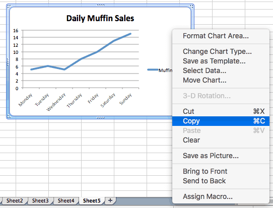
If you need to relocate the graph to a different place on the same worksheet, click on a blank area in the chart and drag the graph.
To move the line graph to another worksheet, right-click the graph, click Move…, and then choose an existing worksheet or create a new one.
To add the graph to another program such as Microsoft Word or PowerPoint, right-click on the chart and click Cut or Copy, then paste it into the desired program.
Analyzing large amounts of data, at times, can become an ordeal, especially for newbies.
And that’s where a line graph comes into play to save the day, helping visualize a sea of data to empower decision-making.
Stick around to learn how to make a line graph in Excel in just a few clicks.
Prepare & Format Your Data
In order to create a line graph in Excel, you need at least one column of data. However, a good rule of thumb is to use two or more columns of similar data to compare them between each other.
To show you the process from A to Z, we’re going to use a simple two-column data table as a running example:
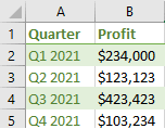
Here’s a quick overview of the columns to help you follow our footsteps:
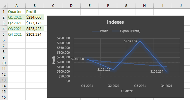
- Column A (Quarter): This column contains the categories that define your data set. The values will be charted on the x-axis.
- Column B (Profit): The second column typically contains your actual values that are going to be mapped on the y-axis.
After a quick setup, you can get down to creating a line graph.
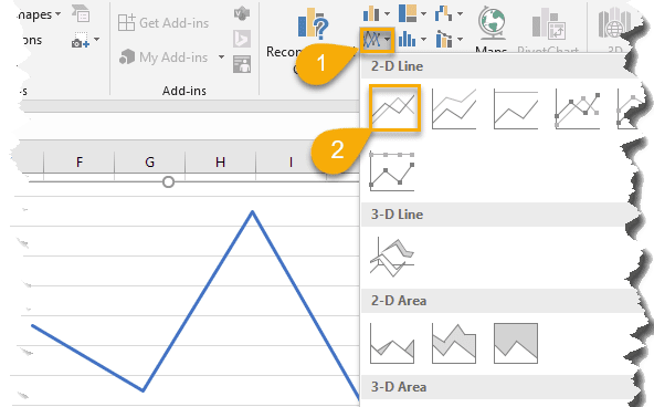
How to Make a Line Graph in Excel in 4 Easy Steps
The entire process of making a line chart in Excel is pretty straightforward and entails only four laughably simple steps:
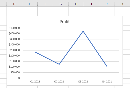
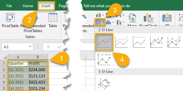
1. Select the data you want to visualize (A1:B5).
2. Next, navigate to the Insert tab.
3. Navigate to the “Insert Line or Area chart” menu.
4. In the Charts group, under “2-D Line,” click the line chart icon.
As a result, you get your data point visualized with the help of a simple line graph in just four clicks.
How to Customize Your Excel Line Graph
Your line graph is ready. But what if you go the extra mile and spruce it up a bit to improve its look and feel?
With some built-in Excel customization tools, you can give it a more attractive look.
How to Change the Chart Title to Your Line Graph in Excel
Any great graph starts with a catchy and descriptive chart title. Here are some easy-peasy steps to help gain full control over this chart element.
1. Сlick on your line graph.
2. Open the Design tab.
3. Choose “Add Chart Element.”
4. Click “Chart Title.”
5. Pick either “Above Chart” or “Centered Overlay” to set the position of the chart title.
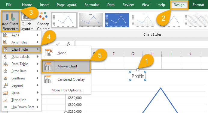
6. Enter your title.
7. Select the Home tab.
8. Change the color, size, font, and formatting of your chart title however you like.
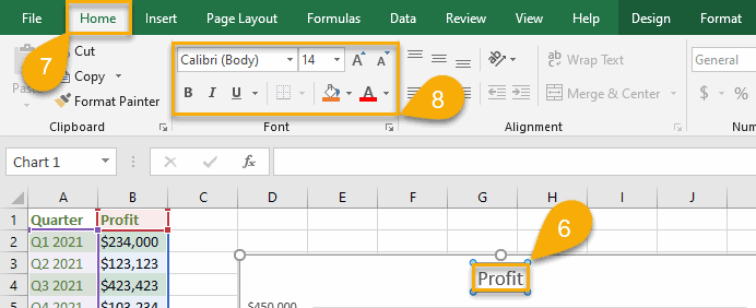
After such simple steps, your title will look neat and presentable.
How to Add a Legend to Your Line Graph in Excel
A legend helps make your line graph more descriptive, so it’s a good idea to set it up using these simple steps:
1. Click on the chart plot.
2. Select “Design.”
3. Choose “Add Chart Element.”
4. Click “Legend.”
5. Сhoose “Right,” “Top,” “Left,” or “Bottom” to position your chart legend based on your needs.
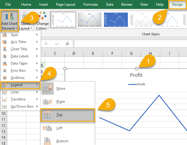
IIt’s a piece of cake, isn’t it? Check out our advances guide covering how to add a chart legend in Excel to spruce it up even more!
How to Add Data Labels to Your Line Graph in Excel
Data labels provide more context by displaying your actual values on the chart plot. Here are the steps you need to take to add data labels to your line graph in Excel:
1. Click once on your line graph.
2. Pull up the Design tab.
3. Hit the “Add Chart Element” button.
4. Open the “Data Labels” menu.
5. Сhoose “Center,” “Left,” “Right,” “Above,” “Below,” or “Data Callout” to specify the position of the data labels relative to the data points charted on the plot.
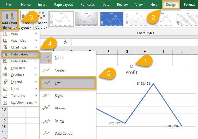
Once you have followed these instructions, your line graph is more informative and aesthetically pleasing.
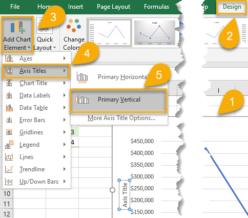
How to Add Axis Labels to Your Line Graph in Excel
Axis titles are a great way to clearly convey what your line graph is all about without causing any confusion.
And how do you add axis titles to the vertical axis or horizontal axis without hardship? Let’s see!
1. Click on your line graph.
2. Select “Design.”
3. Pick out “Add Chart Element.”
4. Click “Axis Titles.”
5. Choose “Primary Horizontal” to create an axis title for the x-axis or “Primary Vertical” to add an axis title to the y-axis.
Pro tip: use this process to add, customize, or remove grid lines and modify other chart elements.
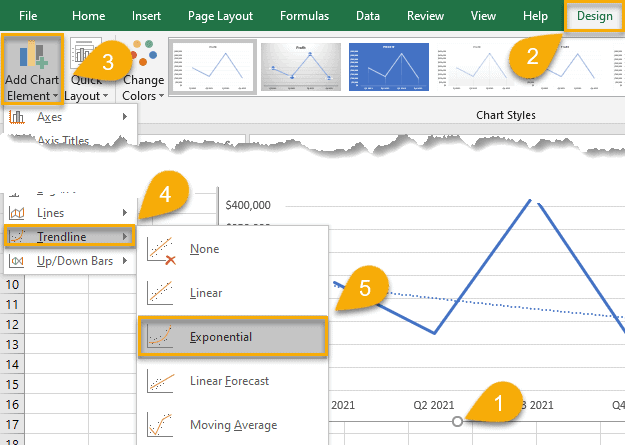
How to Add a Trendline to Your Line Graph in Excel
Using a trendline helps identify patterns and trends in your data set. And with Excel, you can easily add it to your line chart for more data insights.
1. Click on the chart plot.
2. Select the “Design” tab.
3. Choose “Add Chart Element.”
4. Click “Trendline.”
5. Choose “Linear,” “Exponential,” “Linear Forecast,” or “Moving Average” to build a specific trendline based on your unique charting needs.
How to Apply a Different Chart Style to Your Line Graph in Excel
The aesthetic appearance of a line graph is no less important than the actual data. To take your line graphs to the next level, Excel offers a wide range of chart styles to accommodate your needs.
1. Click on the plot of your line graph.
2. Select “Design.”
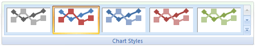
3. Click the small arrow in the lower-right corner of the Chart Styles group to pull up all built-in chart templates.
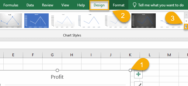
4. Select the chart style that you like the most.
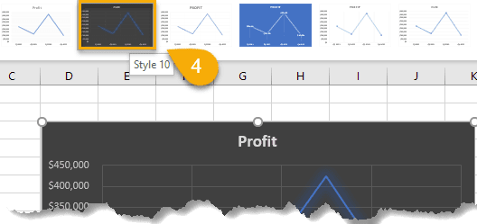
That’s it! Your enhanced line graph is good to go.
Excel Line Graph – Free Template
If you’re short on time, grab this free Excel line graph template and replace the placeholder values with your data. Click the link below to download the file:
Excel Line Graph Template
The Breakdown of The Types of Line Graphs in Excel
Apart from a basic line graph, Excel offers you multiple subtypes of line graphs to up your data visualization game.
Line Graph is used to depict trends over time and will help you highlight important values.
Stacked Line Graph – as the previous type of charts – depicts values by mapping them out on the chart plot and connecting them with multiple lines. The difference lies in the fact that the values stack on top of each other and do not intersect.
100% Stacked Line Graph depicts the relative changes in your actual values over a given period of time.
Line Graph with Markers uses data markers to single out the values charted on the plot.
Stacked Line Graph with Markers, by the same token, uses data markers to highlight data points.
100% Stacked Line Graph with Markers, again, enhances the chart plot with dots that highlight the actual values.
FAQs
What is a Line Graph in Excel?
A line graph is a graphical representation of data that changes over time. Line graphs can be used to show how something changes over time or to compare items.
The line chart is a versatile and powerful tool for analyzing data. It can show one or multiple data series to illustrate trends that may be compared in order to make informed business decisions. Each line on a line graph represents a different data series.
Some people even use line charts for project management! Still, it’s an inferior option to Gantt charts, timeline charts, or Excel Kanban boards.
What Is the Difference Between a Line Graph and a Linear Graph?
A line graph is a graphical representation of data that plots points connected by straight lines, also called a line chart. The purpose of a line graph is to track trends over time.
On the other hand, a linear graph and its variations, such as a linear calibration curve, are used to analyze the linear relationship between two variables in mathematics and science. In particular, it can be used to find out how one variable changes when another variable is changed in a fixed manner.
What Are the Advantages of Using Line Graphs in Excel?
There are a few key advantages to using line graphs in Excel:
- They allow you to track changes in data over time. This is especially useful for illustrating trends or patterns.
- They can be used to compare different data sets. For example, you can use a line graph to visualize how two different companies are performing relative to each other.
- They are easy to create and customize. You can change the colors, lines, and labels to make your graph look exactly the way you want it to.
What Are the Limitations of Excel Line Graphs?
One potential limitation of using line graphs in Excel is that they can become very cluttered and difficult to read when you have a lot of data points. It may also be difficult to identify individual values on the graph if there are too many lines or data markers. In these cases, it may be better to use a different type of chart instead, including panel charts and clustered column charts.
Another limitation is that line graphs do not work well for non-linear data. For example, if you want to compare changes in sales over time but those changes are not consistent across all dates, a line graph will only show you the overall trend and hide important details about how your sales might change at certain times throughout the year or between different regions.
As you can see, there are many different types of line graphs that you can use in Excel, depending on your data and what you want to communicate with your graph.
Line graphs are a versatile tool that can be used in a variety of situations, so make sure to experiment with different types to find the perfect one for your data set.
Excel Line Chart (Tables of Contents)
- Line Chart in Excel
- How to Create a Line Chart in Excel?
Line Chart in Excel
Line Chart is a graph that shows a series of point trends connected by the straight line in excel. Line Chart is the graphical presentation format in excel. By Line Chart, we can plot the graph to see the trend, growth of any product, etc.
Line Chart can be accessed from the Insert menu under the Chart section in excel.
How to Create a Line Chart in Excel?
It is very simple and easy to create. Let us now see how to create a Line Chart in Excel with the help of some examples.
You can download this Line Chart Excel Template here – Line Chart Excel Template
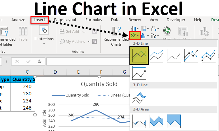
Example #1
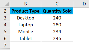
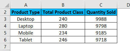
Here we have sales data of some products sold in a random month. Product Type is mentioned in column B, and their sales data are shown in subsequent column C, as shown in the below screenshot.
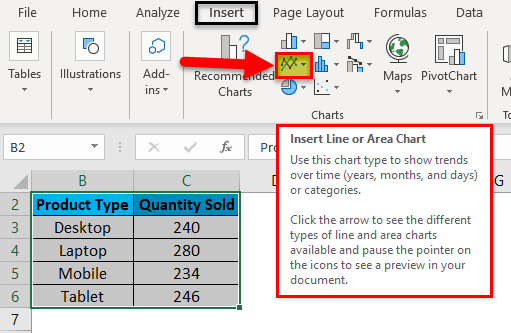
Let’s create a line chart in the above-shown data. For this, first, select the data table and then go to the Insert menu; under Charts, select Insert Line Chart as shown below.
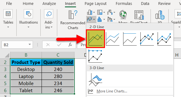
Once we click on the Insert Line Chart icon as shown in the above screenshot, we will get the drop-down menu of different line chart menu available under it. As we can see below, it has 2D, 3D and more line charts. For learning, choose the first basic line chart as shown in the below screenshot.
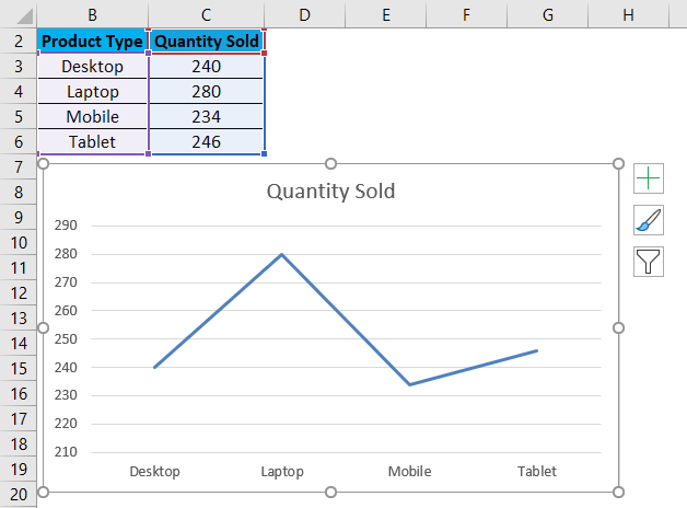
Once we click on the basic Line chart as shown in the above screenshot, we will get the line chart of Quantity sold, drawn as below.
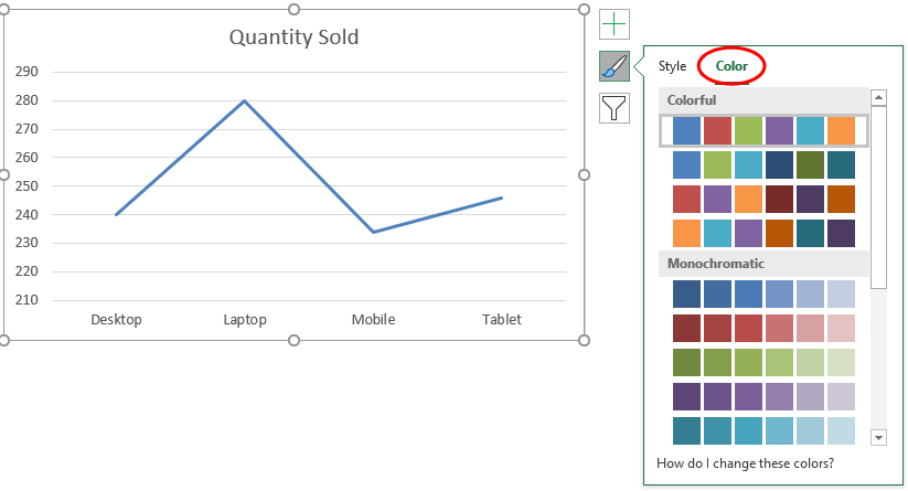
As we can see, there are some more options available at the right top corner of the Excel Line Chart, by which we can do some more modifications. Let’s see all the available options one by one.
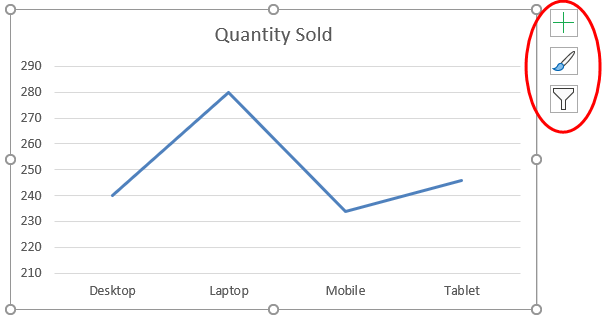
First, click on a cross sign to see more options.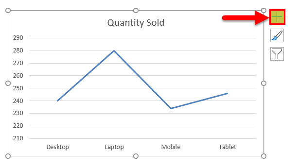
Once we do that, we will get Chart Elements, as shown below. Here, we have already checked some of the elements for an explanation.
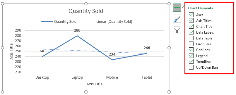
- Axes: These are numbers shown in Y-axis. It represents the range under which data may fall in.
- Axis Title: Axis Title as it is mentioned beside Axes and bottom of product types in the line chart. We can choose/write any text in this title box. It represents the data type.
- Chart Title: Chart title is the heading of the whole Chart. Here, it is mentioned as “Quantity Sold.”
- Data Labels: These are the datum points in the graph, where the line chart points are pointed. Connecting data labels creates line charts in excel. Here, these are 240, 280, 234, and 246.
- Data Table: Data Table is the table that has data used in creating a line chart.
- Error Bars: This shows the kind of error and amount of error the data has. These are Standard Error, Standard Deviation, and Percentage mainly.
- Gridlines: Horizontal thin lines shown in the above chart are Gridlines. Primary Minor Vertical/Horizontal, Primary Major Vertical/Horizontal is the types of gridlines.
- Legends: Different color lines, different types of the line present different data. These are call Legends.
- Trendline: This shows the data trend. Here it is shown by a dotted line.
Now, let’s see the Chart Style, which has the icon as shown in the below screenshot. Once we click on it, we will get different styles listed and supported for that selected data and the Line Chart. These styles may change if we choose some other chart type.
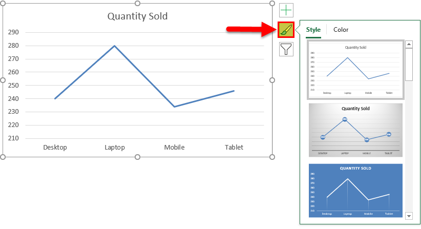
If we click on the Color tab circled in the below screenshot, we will see the different color patterns used to have more one-line data to show. This makes the chart more attractive.
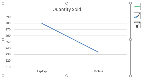
Then we have Chart Filters. This is used to filter the data in the chart itself. We can choose one or more categories to get the data trend. As we can select in below, we have chosen laptops and Mobile in the product to get the data trend.
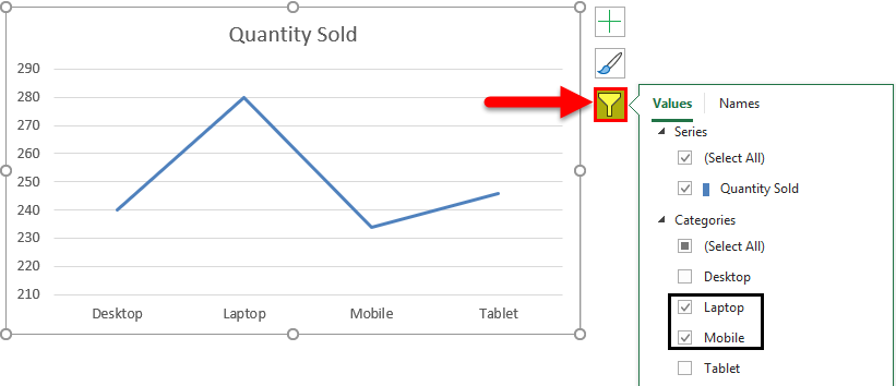
And the same is getting reflected in Line Chart as well.
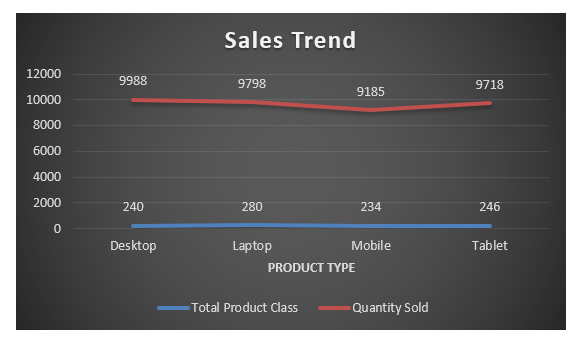
Example #2
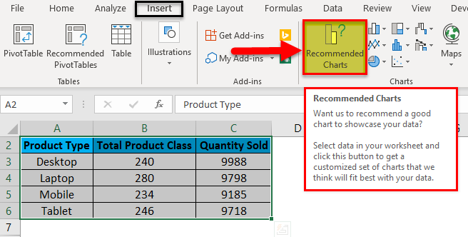
Let’s see one more example of the Line Charts. Now consider the two data sets of a table as shown below.
First, select the data table and go to the Insert menu and click on Recommended Charts as shown below. This is another method of creating Line Charts in excel.
Once we click on it, we will get the possible charts that the present selected data can make. If the recommended chart does not have the Line Chart, click the All Charts tab below.
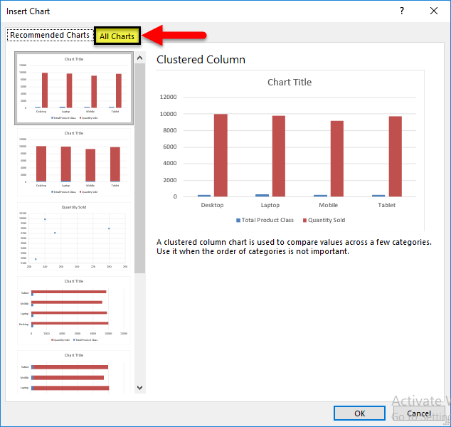
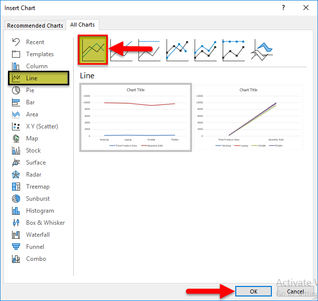
Now, from the All Chart tab, select Line Chart. Here also, we will get the possible type of line chart that may be created by the current data set in excel. Select one type and click on OK, as shown below.
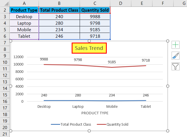
After that, we will get the Line Chart as shown below, which we name as Sales Trend.
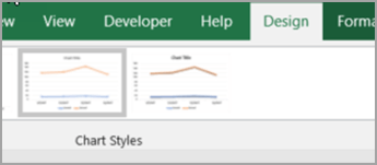
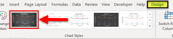
We can decorate the data as discussed in the first example. Also, there is more way of selecting different designs and styles. For this, select the chart first. After selection, Design and Format menu tab becomes active, as shown below. From those, select the Design menu and select under that select and suitable style of chart. Here, we have selected a black color slide to have a classier look.
Pros of Line Chart in Excel
- It gives a great trend projection.
- We can see the error percentage as well, by which the accuracy of data can be determined.
Cons of Line Chart in Excel
- It can be used only for trend projection, pulse data projections only.
Things to Remember about Line Chart in Excel
- Line Chart with a combination of Column Chart gives the best view in excel.
- Always enable the data labels so that the counts can be seen easily. This helps in the presentation a lot.
Recommended Articles
This has been a guide to Line Chart in Excel. Here we discuss how to create a Line Chart in Excel along with excel examples and a downloadable excel template. You may also look at these suggested articles –
- Excel Bubble Chart
- Interactive Chart in Excel
- Pie Chart in Excel
- Line Break in Excel