
Using Microsoft Excel, you can quickly turn your data into a doughnut chart, and then use the new formatting features to make that doughnut chart easier to read. For example, by adding a legend, data labels, and text boxes that point out what each ring of a doughnut chart represents, you can quickly understand the data that is plotted in the chart.
After you create a doughnut chart, you can rotate the slices for different perspectives, focus on specific slices by pulling out slices of the doughnut chart, or change the hole size of the doughnut chart to enlarge or reduce the size of the slices.
Note: Beginning with Office 2016, doughnut charts are discontinued in favor of starburst charts.
What do you want to do?
-
Learn more about plotting data in a doughnut chart
-
Create an elaborate doughnut chart
-
Rotate the slices in a doughnut chart
-
Pull out slices of a doughnut chart
-
Change the hole size in a doughnut chart
-
Save a chart as a template
Learn more about plotting data in a doughnut chart
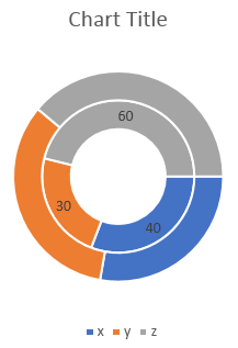
Data that is arranged in columns or rows only on a worksheet can be plotted in a doughnut chart. Just like a pie chart, a doughnut chart shows the relationship of parts to a whole, but a doughnut chart can contain more than one data series. Each data series that you plot in a doughnut chart adds a ring to the chart. The first data series is displayed in the center of the chart.
Because of their circular nature, doughnut charts are not easy to read, especially when they display multiple data series. The proportions of outer rings and inner rings do not represent the size of the data accurately — data points on outer rings may appear larger than data points on inner rings while their actual values may be smaller. Displaying values or percentages in data labels is very useful in a doughnut chart, but if you want to compare the data points side by side, you should use a stacked column or stacked bar chart instead.
Consider using a doughnut chart when:
-
You have one or more data series that you want to plot.
-
None of the values that you want to plot is negative.
-
None of the values that you want to plot is a zero (0) value.
-
You don’t have more than seven categories per data series.
-
The categories represent parts of whole in each ring of the doughnut chart.
When you create a doughnut chart, you can choose one of the following doughnut chart subtypes:
-
Doughnut Doughnut charts display data in rings, where each ring represents a data series. If percentages are displayed in data labels, each ring will total 100%.

-
Exploded Doughnut Much like exploded pie charts, exploded doughnut charts display the contribution of each value to a total while emphasizing individual values, but they can contain more than one data series.
Doughnut charts and exploded doughnut charts are not available in 3-D, but you can use 3-D formatting to give these charts a 3-D-like appearance.
Top of Page
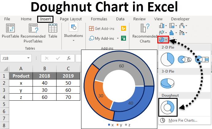
Create an elaborate doughnut chart
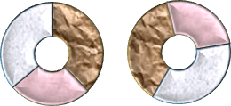
So, how did we create this doughnut chart? The following procedure will help you create a doughnut chart with similar results. For this chart, we used the example worksheet data. You can copy this data to your worksheet, or you can use your own data.
-
Open the worksheet that contains the data that you want to plot into a doughnut chart, or copy the example worksheet data into a blank worksheet.
How to copy the example worksheet data
-
Create a blank workbook or worksheet.
-
Select the example in the Help topic.
Note: Do not select the row or column headers.
-
Press CTRL+C.
-
In the worksheet, select cell A1, and press CTRL+V.
1
2
3
4
A
B
C
2005
2006
Europe
$12,704,714.00
$17,987,034.00
Asia
$8,774,099.00
$12,214,447.00
United States
$12,094,215.00
$10,873,099.00
-
-
Select the data that you want to plot in the doughnut chart.
-
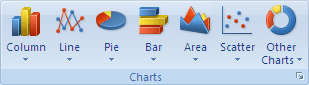
On the Insert tab, in the Charts group, click Other Charts.
-
Under Doughnut, click Doughnut.
-
Click the plot area of the doughnut chart.
This displays the Chart Tools, adding the Design, Layout, and Format tabs.
-
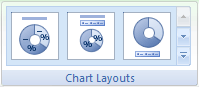
On the Design tab, in the Chart Layouts group, select the layout that you want to use.
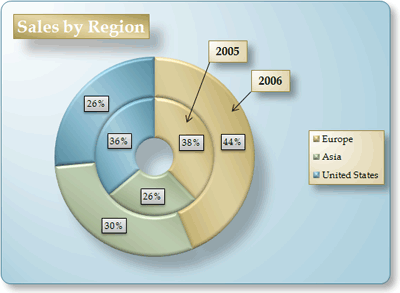
For our doughnut chart, we used Layout 6.
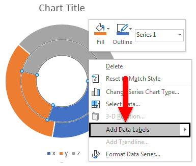
Layout 6 displays a legend. If your chart has too many legend entries or if the legend entries are not easy to distinguish, you may want to add data labels to the data points of the doughnut chart instead of displaying a legend (Layout tab, Labels group, Data Labels button).
-
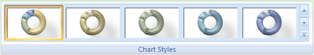
On the Design tab, in the Chart Styles group, click the chart style that you want to use.
For our doughnut chart, we used Style 26.
-
To change the size of the chart, do the following:
-
Click the chart.
-
On the Format tab, in the Size group, enter the size that you want in the Shape Height and Shape Width box.
For our doughnut chart, we set the shape height to 4″ and the shape width to 5.5″.
-
-
To change the size of the doughnut hole, do the following:
-
Click a data series, or select it from a list of chart elements (Format tab, Current Selection group, Chart Elements box).
-
On the Format tab, in the Current Selection group, click Format Selection.
-
Click Series Options, and then under Doughnut Hole Size, drag the slider to the size that you want, or type a percentage value between 10 and 90 in the Percentage box.
For our doughnut chart, we used 20%.
-
-
To make the data labels stand out better, do the following:
-
Click a data label once to select the data labels for an entire data series, or select them from a list of chart elements (Format tab, Current Selection group, Chart Elements box).
-
On the Format tab, in the Shape Styles group, click More
, and then click a shape style.
For our doughnut chart, we used Subtle Effect — Dark 1.
-
Repeat these steps to format the data labels of all data series in your doughnut chart.
-
-
To change and format the chart title, do the following:
-
Click the chart title, or select it from a list of chart elements (Format tab, Current Selection group, Chart Elements box).
-
Type the title that you want to use, and then press ENTER.
-
On the Format tab, in the Shape Styles group, click More
, and then click a shape style.For our doughnut chart, we used Moderate Effect — Accent 1.
-
If you want to change the placement of the title, drag it to the location that you want.
-
-
To change the format of the legend, click the legend, and then select the style that you want in the Shape Styles box (Format tab, in the Shape Styles group, More
button). -
To add text labels with arrows that point to the doughnut rings, do the following:
-
On the Layout tab, in the Insert group, click Text Box.
-
Click on the chart where you want to place the text box, type the text that you want, and then press ENTER.
-
Select the text box, and then on the Format tab, in the Shape Styles group, click the Dialog Box Launcher
. -
Click Text Box, and then under Autofit, select the Resize shape to fit text check box, and click OK.
-
In the Shape Styles group, select the style that you want to use.
-
On the Layout tab, in the Insert group, click Shapes.
-
Under Lines, click Arrow.
-
On the chart, draw the arrow from the corner of the text box to the doughnut ring that you want it to point to.
-
To change the format of text boxes, click a text box, and then select the style that you want in the Shape Styles group (Format tab, Shape Styles group).
Repeat these steps for all doughnut rings in your chart.
-
-
To change the background of the chart, do the following:
-
Click the chart area, or select it from a list of chart elements (Format tab, Current Selection group, Chart Elements box).
-
On the Format tab, in the Shape Styles group, click More
, and then click a shape style.For our doughnut chart, we used Subtle Effect — Accent 3.
-
-
To round the corners of the chart background, do the following:
-
On the Format tab, in the Shape Styles group, click the Dialog Box Launcher
. -
Click Border Styles, and then select the Rounded corners check box.
-
-
If you want to use theme colors that are different from the default theme that is applied to your workbook, do the following:
-
On the Page Layout tab, in the Themes group, click Themes.
-
Under Built-in, click the theme that you want to use.
For our doughnut chart, we used the Apex theme.
-
 , and then click a shape style.
 .
.
Top of Page
Rotate the slices in a doughnut chart
The order in which data series in doughnut charts are plotted in Office Excel 2007 is determined by the order of the data on the worksheet. For a different perspective, you can rotate the doughnut chart slices within the 360 degrees of the circle of the doughnut chart.
-
In a doughnut chart, click the data series or a data point, or do the following to select it from a list of chart elements.
-
Click the chart.
This displays the Chart Tools, adding the Design, Layout, and Format tabs.
-
On the Format tab, in the Current Selection group, click the arrow next to the Chart Elements box, and then click the data series or data point that you want.
-
-
On the Format tab, in the Current Selection group, click Format Selection.
-
Under Angle of first slice box, drag the slider to the degree of rotation that you want, or type a value between 0 (zero) and 360 to specify the angle at which you want the first slice to appear.
Top of Page
Pull out slices of a doughnut chart
To emphasize the individual slices of a doughnut chart, you can use the exploded doughnut chart type when you create the chart. Exploded doughnut charts display the contribution of each value to a total while emphasizing individual values. You can change the doughnut explosion setting for all slices or individual slices.

You can also pull out the slices manually.

Change the settings of slices in an exploded doughnut chart
-
In the exploded doughnut chart, click a data series or a data point, or do the following to select a data series from a list of chart elements:
-
Click the chart.
This displays the Chart Tools, adding the Design, Layout, and Format tabs.
-
On the Format tab, in the Current Selection group, click the arrow next to the Chart Elements box, and then click a data series.
-
-
On the Format tab, in the Current Selection group, click Format Selection.
-
Under Doughnut Explosion, drag the slider to increase or decrease the percentage of separation, or type the percentage of separation that you want in the Percentage box.
Pull out slices of a doughnut chart manually
Click the doughnut chart, and then do one of the following:
-
To pull out all of the slices of the doughnut chart, drag away from the center of the chart.
-
To pull out individual slices of the doughnut chart, click the slice that you want to pull out, and then drag that slice away from the center of the chart.
Top of Page
Change the hole size in a doughnut chart
By enlarging or reducing the hole size in a doughnut chart, you reduce or enlarge the width of the slices. For example, you may want to display wider slices to better accommodate data labels that contain long series or category names, or a combination of names, values and percentages.
-
In a doughnut chart, click a data series, or do the following to select it from a list of chart elements.
-
Click the chart.
This displays the Chart Tools, adding the Design, Layout, and Format tabs.
-
On the Format tab, in the Current Selection group, click the arrow next to the Chart Elements box, and then click a data series.
-
-
On the Format tab, in the Current Selection group, click Format Selection.
-
Under Doughnut Hole Size, drag the slider to the size that you want, or type a percentage value between 10 and 90 in the Percentage box.
Top of Page
Save a chart as a template
If you want to create another chart like the one that you just created, you can save the chart as a template that you can use as the basis for other similar charts.
-
Click the chart that you want to save as a template.
-
On the Design tab, in the Type group, click Save as Template.
-
In the File name box, type a name for the template.
Tip: Unless you specify a different folder, the template file (.crtx) will be saved in the Charts folder, and the template becomes available under Templates in both the Insert Chart dialog box (Insert tab, Charts group, Dialog Box Launcher
) and the Change Chart Type dialog box (Design tab, Type group, Change Chart Type).For more information about how to apply a chart template, see Save a custom chart as a template.
Note: A chart template contains chart formatting and stores the colors that are in use when you save the chart as a template. When you use a chart template to create a chart in another workbook, the new chart uses the colors of the chart template — not the colors of the document theme that is currently applied to the workbook. To use the document theme colors instead of the chart template colors, right-click the chart area, and then click Reset to Match Style on the shortcut menu.
Top of Page
What is Doughnut Chart Excel?
A doughnut chart is a chart in Excel whose visualization function is similar to pie charts. The categories represented in this chart are parts, and together they express the whole data in the chart. We can only use the data in rows or columns in creating a doughnut chart in Excel. However, it is advised to use this chart when we have less number of categories of data.
Doughnut Chart is a part of a Pie chart in excelMaking a pie chart in excel can help you with the pictorial representation of your data and simplifies the analysis process. There are multiple kinds of pie chart options available on excel to serve the varying user needs.read more. A pie occupies the entire chart, but it will cut out the center of the slices in the doughnut chart, and it will be empty. Moreover, it can contain more than one data series at a time. For example, in the pie chart, we need to create two pie charts for two data series to compare one against the other, but doughnut makes life easy for us by creating more than one data series.
In this article, we will show you creating a doughnut chart. Download the workbook to follow me.
Note: We are using Excel 2013 for this article.
Table of contents
- What is Doughnut Chart Excel?
- How to Create a Doughnut Chart in Excel?
- Example #1 – Doughnut Chart in Excel with Single Data Series
- Example #2 – Doughnut Chart in Excel with Two Data Series
- Things to Remember About Doughnut Chart in Excel
- Recommended Articles
- How to Create a Doughnut Chart in Excel?
How to Create a Doughnut Chart in Excel?
Below are examples of the doughnut chart in Excel.
You can download this Doughnut Chart Excel Template here – Doughnut Chart Excel Template
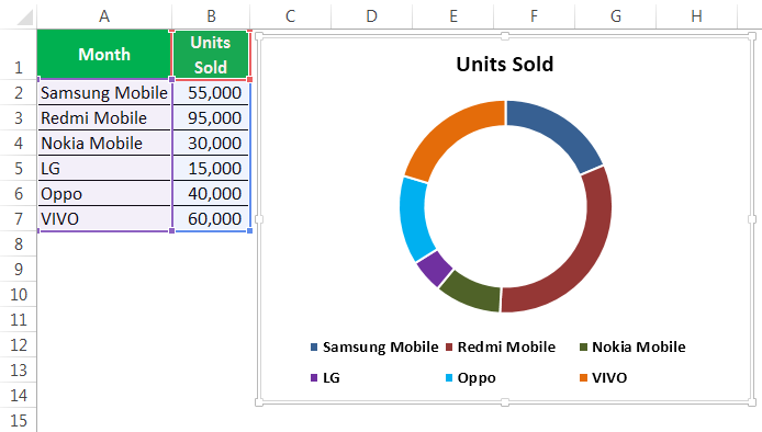
Example #1 – Doughnut Chart in Excel with Single Data Series
We have simple data that shows the mobile device sales for the year.
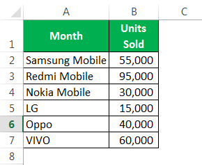
We will show these numbers graphically using a doughnut chart in Excel.
The following are the steps for the creation of a doughnut chart in Excel using single data series:
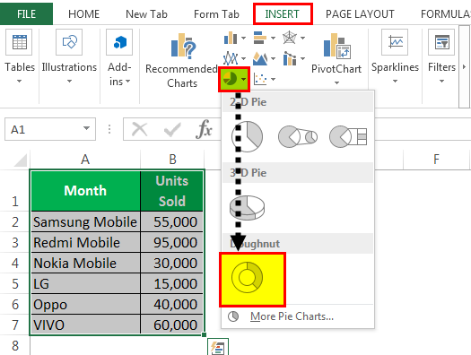
- We must first select the full data range.

- We need to go to “Insert,” “Pie Chart,” and select “Doughnut.”

- Now, we have the default doughnut chart ready.

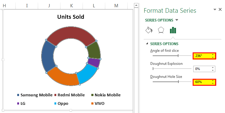
- We need to modify this doughnut chart to make it beautiful. Select all the slices and press “Ctrl + 1.” It will show us the “Format Data Series” on the right-hand side.

- Make the “Angle of the first slice” 236 degrees and the “Doughnut Hole Size” 60%.

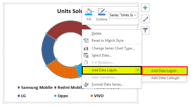
- After that, right-click on the slice and select “Add Data Labels.”


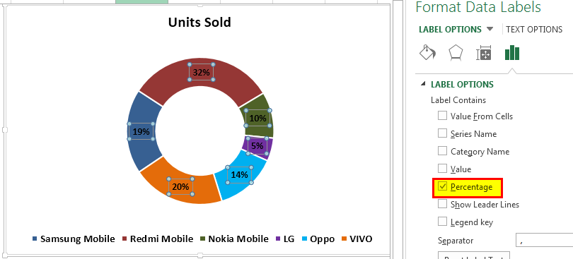
- Now, we must select the newly inserted data labels and press “Ctrl + 1.” On the right-hand side, we may see “Format Data Labels.” Uncheck everything and choose the only “Percentage.”


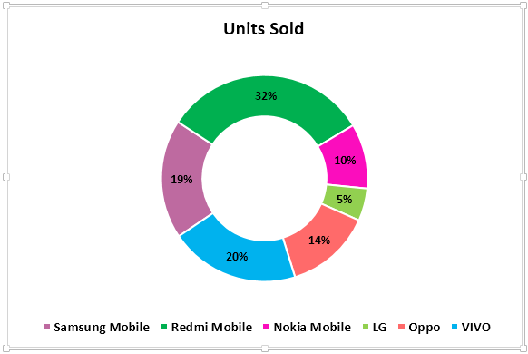
- Now, change the color of each slice to a nice color. We have changed according to interest, and the chart looks like the one below.

- We must “Add Legends” to the left-hand side and make the “Mobile Sales Presentation” chart title.

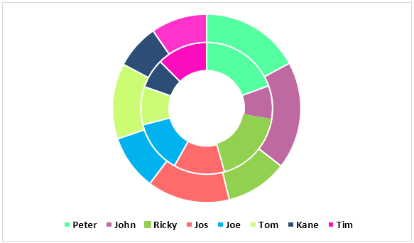
Example #2 – Doughnut Chart in Excel with Two Data Series
We have seen how cool the Excel doughnut chart is compared to the pie chart. Now, we will see how we create doughnuts for two data series values. First, we have the employee efficiency level for the last two quarters.

Let us show you the first graphical representation in the pie chart.

By using a pie chart, I was forced to create two identical pie charts because pie can accept only one data series to its data range. Therefore, if we want to see employee Q1 & Q2 efficiency level percentages, we need to look at two different charts and draw conclusions. It is an arduous task to do so.
We can fit these two data series into an Excel doughnut chart only. Follow the below steps to create a doughnut chart in Excel, including more than one data series.
Step 1: We should not select any data but insert a blank doughnut chart.
Step 2: We need to right-click on the blank chart and choose”Select Data.”

Step 3: Now, click on “Add.”

Step 4: Insert “Series name” as “cell B1” and “Series values” as of “Q1 Efficiency” levels..

Step 5: Click on “OK” and click “Add.”

Step 6: Now, we must select second quarter values like we selected Q1 values.

Step 7: After that, click on “OK.” On the right-hand side, select “Edit.”

Step 8: Here, we must select “Employee Name.”

Step 9: Then, click on the “OK.” Now, we have our default doughnut chart ready.

Step 10: Select the slice and make the “Doughnut Hole Size” as 40%. As a result, it will expand the slices.


Step 11: We can change each slice’s color to a nice color. We need to apply the same color for Q1 & Q2.
Step 12: Make the chart “Employees Q1 & Q2 Performance.”

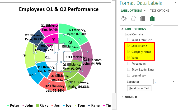
Step 13: Next, we must right-click and select “Add Data Labels.”
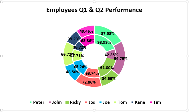
Step 14: Select the “Data Label” and add “Series Name” and “Category Name.” Note: adjust the size of the data labels manually to make them appear cleanly.
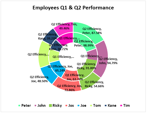
Step 15: Select the slice under “Format” and change the shape of the slice to Bevel > Convex. We need to do this for Q1 & Q2 both.

Step 16: We can make changes according to our preferences. Finally, our doughnut chart is ready.

Things to Remember About Doughnut Chart in Excel
- The pie charts can take only one data set; they cannot accept more than one data series.
- We can limit our categories to 5 or 8. Too much is too bad for your chart.
- It is easy to compare one season’s performance against another or one to many comparisons in a single chart.
- We must not add any category list. It will mess up our chart’s beauty.
- We must always show the data label as a percentage so it can best file within the doughnut slice.
- We can use the empty center space of the doughnut to display many other values or calculations.
Recommended Articles
This article has been a guide to Doughnut Chart in Excel. We discuss creating a doughnut chart in Excel with a single data series and two data series, practical examples, and a downloadable Excel template. You may learn more about Excel from the following articles: –
- Types of Charts in Excel
- Create a Gantt Chart in Excel
- Waterfall Chart in Excel
- Dynamic Chart in Excel
- Excel Reverse Order
Содержание
- Doughnut Chart in Excel
- Inserting Charts in Excel:
- Types of doughnut chart:
- Inserting Doughnut chart with Single data series:
- Inserting doughnut chart with two data series):
- Doughnut Chart in Excel
- What is Doughnut Chart Excel?
- How to Create a Doughnut Chart in Excel?
- Example #1 – Doughnut Chart in Excel with Single Data Series
- Example #2 – Doughnut Chart in Excel with Two Data Series
- Things to Remember About Doughnut Chart in Excel
- Recommended Articles
- Present your data in a doughnut chart
- What do you want to do?
- Learn more about plotting data in a doughnut chart
- Create an elaborate doughnut chart
Doughnut Chart in Excel
Charts in MS Excel are the visual representation of the data (stored in an Excel sheet. It helps to determine the trends of the data(s) easily and compare between them, especially when you have a large volume of datasets. There are various charts available in Excel like Bar charts, Pie charts, Column charts, Line charts, X Y (Scatter) charts, etc.
Inserting Charts in Excel:
To insert a chart in Excel follow the below steps:
- Insert the data in the spreadsheet. We will take an example of data showing the sales between January – June.
- Select the data(A2:A7, B2: B7).
- Click on the Insert tab on the ribbon.
- Select your desired chart under the Charts. We are inserting the Bar chart.
- Select your desired chart type.
- The chart will be inserted into the worksheet.

A doughnut chart is the same as a pie chart, i.e., it represents the data as part of a whole, where the sum of parts is equal to 100%. The difference between a Doughnut chart and a Pie chart is that multiple datasets can be represented in a doughnut chart but only one dataset can be represented in a pie chart. You can find the doughnut chart under Insert tab》Other charts.
A doughnut chart can be used only when:
- We want to represent multiple datasets on a single chart.
- Each dataset has a maximum of 6-7 data, otherwise, the chart becomes very dense.
- None of the values in the dataset is either zero or negative.
Types of doughnut chart:
- Doughnut: In this chart, the slices are attached together and are not pulled apart.
- Exploded Doughnut: In this, the slices of charts are pulled apart.
Inserting Doughnut chart with Single data series:
Follow the below steps to insert a doughnut chart with single data series:
- Insert the data in the spreadsheet. We will take the example of data showing the sales of apple between January – August.
- Select the data(A2:A9, B2:B9).
- Select your desired Doughnut chart(Doughnut, Exploded doughnut), under the Other charts.
- Your desired chart will be inserted into the spreadsheet.
- Doughnut chart for the above example.
- Exploded Doughnut chart for the above example.
Inserting doughnut chart with two data series):
Follow the below steps to insert a doughnut chart with two data series:
- Insert the data in the spreadsheet. We will take the example of data showing the sales of apple and orange between January – August.
- Select the data(A2:A9, B2:B9, C2:C9).
- Select your desired Doughnut chart(Doughnut, Exploded doughnut), under the Other charts.
- Your desired chart will be inserted into the spreadsheet.
- Doughnut chart for the above example.
- Exploded Doughnut chart for the above example.
Источник
Doughnut Chart in Excel


What is Doughnut Chart Excel?
A doughnut chart is a chart in Excel whose visualization function is similar to pie charts. The categories represented in this chart are parts, and together they express the whole data in the chart. We can only use the data in rows or columns in creating a doughnut chart in Excel. However, it is advised to use this chart when we have less number of categories of data.
Doughnut Chart is a part of a Pie chart in excel Pie Chart In Excel Making a pie chart in excel can help you with the pictorial representation of your data and simplifies the analysis process. There are multiple kinds of pie chart options available on excel to serve the varying user needs. read more . A pie occupies the entire chart, but it will cut out the center of the slices in the doughnut chart, and it will be empty. Moreover, it can contain more than one data series at a time. For example, in the pie chart, we need to create two pie charts for two data series to compare one against the other, but doughnut makes life easy for us by creating more than one data series.
In this article, we will show you creating a doughnut chart. Download the workbook to follow me.
Note: We are using Excel 2013 for this article.
Table of contents
How to Create a Doughnut Chart in Excel?
Below are examples of the doughnut chart in Excel.
Example #1 – Doughnut Chart in Excel with Single Data Series
We have simple data that shows the mobile device sales for the year.
We will show these numbers graphically using a doughnut chart in Excel.
The following are the steps for the creation of a doughnut chart in Excel using single data series:
- We must first select the full data range.

We need to go to “Insert,” “Pie Chart,” and select “Doughnut.”
Now, we have the default doughnut chart ready.
We need to modify this doughnut chart to make it beautiful. Select all the slices and press “Ctrl + 1.” It will show us the “Format Data Series” on the right-hand side.

Make the “Angle of the first slice” 236 degrees and the “Doughnut Hole Size” 60%.
After that, right-click on the slice and select “Add Data Labels.”

Now, we must select the newly inserted data labels and press “Ctrl + 1.” On the right-hand side, we may see “Format Data Labels.” Uncheck everything and choose the only “Percentage.”

Now, change the color of each slice to a nice color. We have changed according to interest, and the chart looks like the one below.
We must “Add Legends” to the left-hand side and make the “Mobile Sales Presentation” chart title.

Example #2 – Doughnut Chart in Excel with Two Data Series
We have seen how cool the Excel doughnut chart is compared to the pie chart. Now, we will see how we create doughnuts for two data series values. First, we have the employee efficiency level for the last two quarters.
Let us show you the first graphical representation in the pie chart.
By using a pie chart, I was forced to create two identical pie charts because pie can accept only one data series to its data range. Therefore, if we want to see employee Q1 & Q2 efficiency level percentages, we need to look at two different charts and draw conclusions. It is an arduous task to do so.
We can fit these two data series into an Excel doughnut chart only. Follow the below steps to create a doughnut chart in Excel, including more than one data series.
Step 1: We should not select any data but insert a blank doughnut chart.
Step 2: We need to right-click on the blank chart and choose”Select Data.”
Step 3: Now, click on “Add.”
Step 4: Insert “Series name” as “cell B1” and “Series values” as of “Q1 Efficiency” levels..
Step 5: Click on “OK” and click “Add.”
Step 6: Now, we must select second quarter values like we selected Q1 values.
Step 7: After that, click on “OK.” On the right-hand side, select “Edit.”
Step 8: Here, we must select “Employee Name.”
Step 9: Then, click on the “OK.” Now, we have our default doughnut chart ready.
Step 10: Select the slice and make the “Doughnut Hole Size” as 40%. As a result, it will expand the slices.
Step 11: We can change each slice’s color to a nice color. We need to apply the same color for Q1 & Q2.
Step 12: Make the chart “Employees Q1 & Q2 Performance.”
Step 13: Next, we must right-click and select “Add Data Labels.”
Step 14: Select the “Data Label” and add “Series Name” and “Category Name.” Note: adjust the size of the data labels manually to make them appear cleanly.
Step 15: Select the slice under “Format” and change the shape of the slice to Bevel > Convex. We need to do this for Q1 & Q2 both.
Step 16: We can make changes according to our preferences. Finally, our doughnut chart is ready.
Things to Remember About Doughnut Chart in Excel
- The pie charts can take only one data set; they cannot accept more than one data series.
- We can limit our categories to 5 or 8. Too much is too bad for your chart.
- It is easy to compare one season’s performance against another or one to many comparisons in a single chart.
- We must not add any category list. It will mess up our chart’s beauty.
- We must always show the data label as a percentage so it can best file within the doughnut slice.
- We can use the empty center space of the doughnut to display many other values or calculations.
Recommended Articles
This article has been a guide to Doughnut Chart in Excel. We discuss creating a doughnut chart in Excel with a single data series and two data series, practical examples, and a downloadable Excel template. You may learn more about Excel from the following articles: –
Источник
Present your data in a doughnut chart
Using Microsoft Excel, you can quickly turn your data into a doughnut chart, and then use the new formatting features to make that doughnut chart easier to read. For example, by adding a legend, data labels, and text boxes that point out what each ring of a doughnut chart represents, you can quickly understand the data that is plotted in the chart.
After you create a doughnut chart, you can rotate the slices for different perspectives, focus on specific slices by pulling out slices of the doughnut chart, or change the hole size of the doughnut chart to enlarge or reduce the size of the slices.
Note: Beginning with Office 2016, doughnut charts are discontinued in favor of starburst charts.
What do you want to do?
Learn more about plotting data in a doughnut chart
Data that is arranged in columns or rows only on a worksheet can be plotted in a doughnut chart. Just like a pie chart, a doughnut chart shows the relationship of parts to a whole, but a doughnut chart can contain more than one data series. Each data series that you plot in a doughnut chart adds a ring to the chart. The first data series is displayed in the center of the chart.
Because of their circular nature, doughnut charts are not easy to read, especially when they display multiple data series. The proportions of outer rings and inner rings do not represent the size of the data accurately — data points on outer rings may appear larger than data points on inner rings while their actual values may be smaller. Displaying values or percentages in data labels is very useful in a doughnut chart, but if you want to compare the data points side by side, you should use a stacked column or stacked bar chart instead.
Consider using a doughnut chart when:
You have one or more data series that you want to plot.
None of the values that you want to plot is negative.
None of the values that you want to plot is a zero (0) value.
You don’t have more than seven categories per data series.
The categories represent parts of whole in each ring of the doughnut chart.
When you create a doughnut chart, you can choose one of the following doughnut chart subtypes:
Doughnut Doughnut charts display data in rings, where each ring represents a data series. If percentages are displayed in data labels, each ring will total 100%.
Exploded Doughnut Much like exploded pie charts, exploded doughnut charts display the contribution of each value to a total while emphasizing individual values, but they can contain more than one data series.

Doughnut charts and exploded doughnut charts are not available in 3-D, but you can use 3-D formatting to give these charts a 3-D-like appearance.
Create an elaborate doughnut chart
So, how did we create this doughnut chart? The following procedure will help you create a doughnut chart with similar results. For this chart, we used the example worksheet data. You can copy this data to your worksheet, or you can use your own data.
Open the worksheet that contains the data that you want to plot into a doughnut chart, or copy the example worksheet data into a blank worksheet.
How to copy the example worksheet data
Create a blank workbook or worksheet.
Select the example in the Help topic.
Note: Do not select the row or column headers.

In the worksheet, select cell A1, and press CTRL+V.
Источник
Improve Article
Save Article
Like Article
Improve Article
Save Article
Like Article
Charts in MS Excel are the visual representation of the data (stored in an Excel sheet. It helps to determine the trends of the data(s) easily and compare between them, especially when you have a large volume of datasets. There are various charts available in Excel like Bar charts, Pie charts, Column charts, Line charts, X Y (Scatter) charts, etc.
Inserting Charts in Excel:
To insert a chart in Excel follow the below steps:
- Insert the data in the spreadsheet. We will take an example of data showing the sales between January – June.
- Select the data(A2:A7, B2: B7).

- Click on the Insert tab on the ribbon.

- Select your desired chart under the Charts. We are inserting the Bar chart.

- Select your desired chart type.

- The chart will be inserted into the worksheet.

A doughnut chart is the same as a pie chart, i.e., it represents the data as part of a whole, where the sum of parts is equal to 100%. The difference between a Doughnut chart and a Pie chart is that multiple datasets can be represented in a doughnut chart but only one dataset can be represented in a pie chart. You can find the doughnut chart under Insert tab》Other charts.
A doughnut chart can be used only when:
- We want to represent multiple datasets on a single chart.
- Each dataset has a maximum of 6-7 data, otherwise, the chart becomes very dense.
- None of the values in the dataset is either zero or negative.
Types of doughnut chart:
- Doughnut: In this chart, the slices are attached together and are not pulled apart.
- Exploded Doughnut: In this, the slices of charts are pulled apart.
Inserting Doughnut chart with Single data series:
Follow the below steps to insert a doughnut chart with single data series:
- Insert the data in the spreadsheet. We will take the example of data showing the sales of apple between January – August.
- Select the data(A2:A9, B2:B9).

- Click on Insert Tab.

- Select your desired Doughnut chart(Doughnut, Exploded doughnut), under the Other charts.

- Your desired chart will be inserted into the spreadsheet.
- Doughnut chart for the above example.

- Exploded Doughnut chart for the above example.

Inserting doughnut chart with two data series):
Follow the below steps to insert a doughnut chart with two data series:
- Insert the data in the spreadsheet. We will take the example of data showing the sales of apple and orange between January – August.
- Select the data(A2:A9, B2:B9, C2:C9).

- Click on Insert Tab.
- Select your desired Doughnut chart(Doughnut, Exploded doughnut), under the Other charts.

- Your desired chart will be inserted into the spreadsheet.
- Doughnut chart for the above example.

- Exploded Doughnut chart for the above example.

Like Article
Save Article
Excel Doughnut chart (Table of Contents)
- Doughnut Chart in Excel
- How to Create Doughnut Charts in Excel?
Doughnut Chart in Excel
Doughnut chart is a built-in feature in excel. It is used to represent the proportion of data where the total should be 100%. It looks a little similar to a pie chart with a hole.
How to Create Doughnut Charts in Excel?
Now we will see How to Create Doughnut Charts in Excel. We will see How to create different types of Doughnut Charts in Excel, like Doughnut Chart with Single data series, Double Doughnut Chart and Doughnut Chart with Multiple data series and how to modify them with some examples.
You can download this Doughnut Chart Excel Template here – Doughnut Chart Excel Template
Doughnut Chart in Excel – Example #1
Following is an example of a single doughnut in excel:
Single Doughnut Charts in Excel
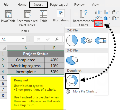
Consider a project which has three stages like completed, work InProgress, Incomplete. We will create a doughnut chart to represent the project status percentage-wise.
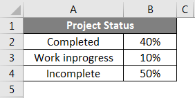
Consider the example of the above status of the project and will create a doughnut chart for that. Select the data table and click on the Insert menu. Under charts, select the Doughnut chart.
The chart will look like below.
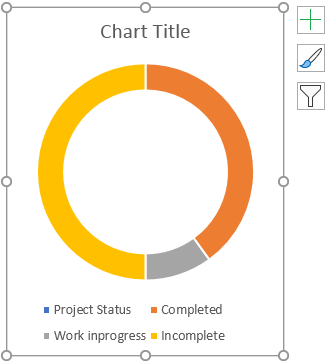
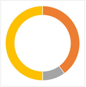
Now click on the + symbol that appears top right of the chart, which will open the popup. Untick the Chart Title and Legend to remove the text in the chart.
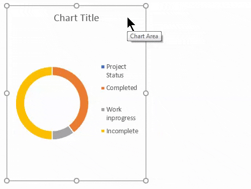
Once you do that, the chart will look like below.
Now we will format the chart. Select the chart and right-click a pop-up menu that will appear from that, select the Format Data Series.

When clicking on the Format Data series, a format menu appears on the right side.
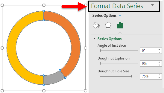
The “Format Data Series” menu reduces the Doughnut Hole Size. Currently, it is 75% now reduce to 50%.
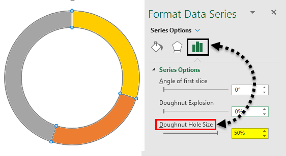
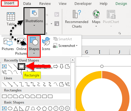
Now to input, the percentage text selects the Doughnut Then click on Shapes under Illustrations option from Insert menu and select Rectangle box.
Now click on the inserted rectangle shape and select the Text box, shown in the picture below.
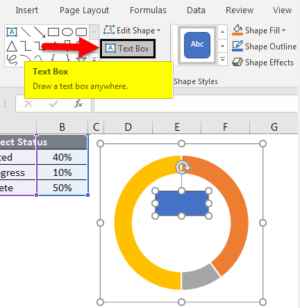
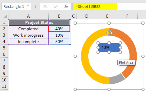
Now give the formula to represent the status of the project. For that input = (equal sign) in the text box and select the cell which shows the value of completed status that is B2.
Now we should format that text. Right-click on the text and select the format. Select the Fill and select No Fill, then the blue color will disappear.
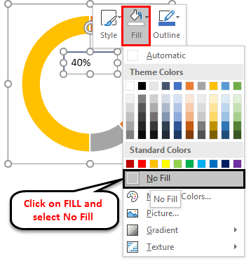
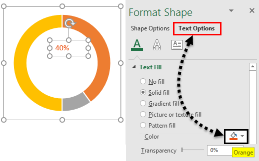
Now apply a format to the text as per your doughnut color for that particular field. Now it is showing in Orange color; hence we will set the text color also in “Orange”.
Select the text and right-click from the pop-up, select the formatting data series, and a menu will appear on the right side. From the right-side menu, select “Text options” and change the color to “Orange”.
Similarly, input the text for incomplete and work inprogess.

Now change the percentages and see how the chart changes.
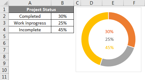
We can observe the changes in the chart and text if we input the formula in “Incomplete” like 100%-completed-Work InProgress. So that Incomplete will pick automatically.
Doughnut Chart in Excel – Example #2
Following is an example of a doughnut chart in excel:
Double Doughnut Chart in Excel
With the help of a double doughnut chart, we can show the two matrices in our chart. Let’s take an example of sales of a company.
Here we are considering two years sales as shown below for the products X, Y, and Z.
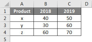
Now we will create a doughnut chart as similar to the previous single doughnut chart. Select the data alone without headers, as shown in the below image. Click on the Insert menu. Go to charts select the PIE chart drop-down menu. From Dropdown, select the doughnut symbol.
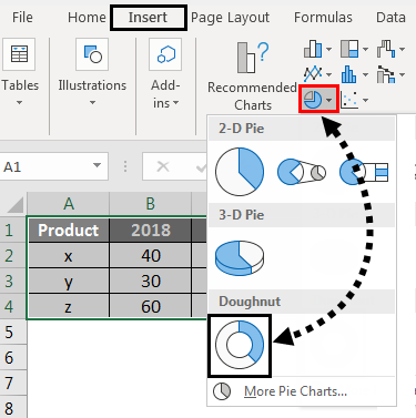
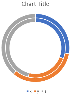
Then the below chart will appear on the screen with two doughnut rings.
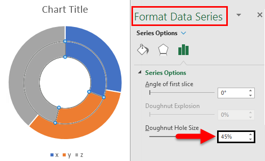
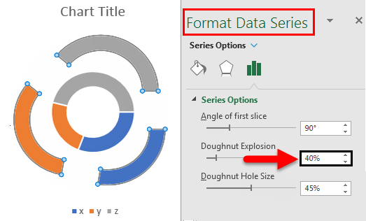
To reduce the doughnuts hole size, select the doughnuts and right-click and then select Format data series. Now we can find the option Doughnut Hole Size at the bottom where you drag the percentage to reduce.
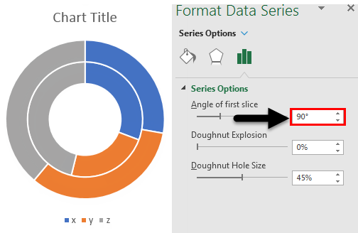
If we want to change the angle of the doughnut, change the settings of “Angle of the first slice”. We can observe the difference between 0 degrees and 90 degrees.
If we want to increase the gap between the rings, adjust the Doughnut Explosion. Observe the below image for reference.
If we want to add the shadow, select the middle option, which is highlighted. select the required Shadow option.
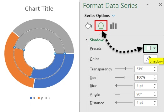
After applying the shadow, we can adjust the shadow related options like Color, Transparency, size etc.
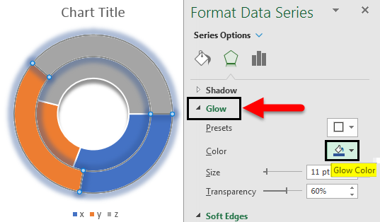
If we want to apply the color shadow, use the menu Glow at the bottom of the “shadow” menu. As per the selected color, the shadow will appear.
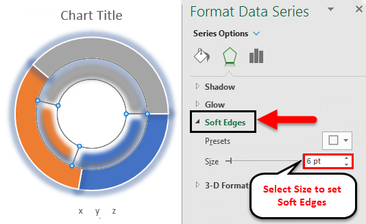
If we want to increase the softness of the edges, change the settings of softness by selecting Soft Edges at the bottom of the Glow menu.
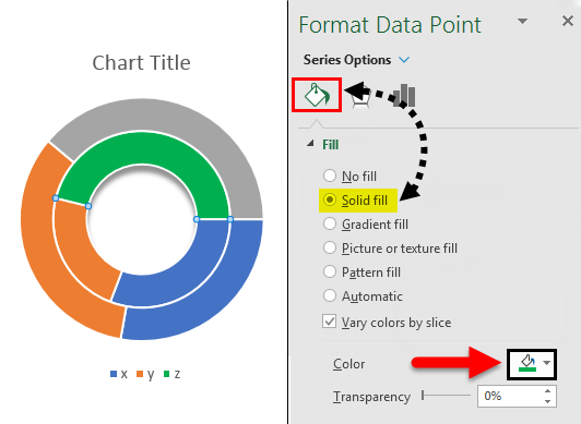
If we want a different color, select the particular ring we want to change the color. To identify which ring you selected to observe the data (Data will highlight as per your ring selection). Observe the below image; only the year 2018 is highlighted.
Select the particular part of the selected ring and change the color as per your requirement. Please find the color box which is highlighted.
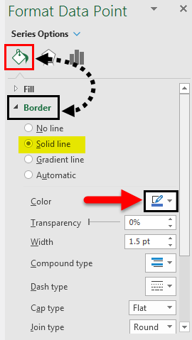
If we want to add the border to the ring, select the ring or part of the ring in which you want to add a border. Go to option Fill and line. Select the solid line and then change the required color for the border.
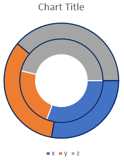
After applying the border to the selected rings, the results will look as shown below.
We can adjust the Width, Transparency, Dash type etc., as per your requirements.
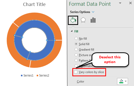
If we want to fill a single color for the entire ring, then deselect the option which is highlighted.
If we want the data figures on the ring then, select the ring and right-click select the option Add Data Labels.
Then the data labels will appear on the ring, as shown below.
Doughnut Chart in Excel – Example #3
Following is an example of multiple doughnuts in excel:
Multiple Doughnut Charts in Excel
Multiple doughnut charts are also created in a similar way; the only thing required to create multiple doughnuts is multiple matrices. For example, in the double doughnut, we have two years of data; if we have 3 or 4 years of data, then we can create multiple doughnut charts.
Things to Remember
- Doughnut charts are similar to Pie charts which has a hole in the center.
- Doughnut charts help to create a visualization with single matrices, double and multiple matrices.
- It mostly helps to create a chart for a total of 100 percent matrices.
- It is possible to create single doughnut, double doughnut, and multiple doughnut charts.
Recommended Articles
This has been a guide to Doughnut Chart in Excel. Here we discussed How to Create Doughnut Chart in Excel and Types of Doughnut Charts in Excel, along with practical examples and a downloadable excel template. You can also go through our other suggested articles –
- Pie Chart in Excel
- Excel Data Bars
- Excel Line Chart
- Marimekko Chart Excel
Bottom line: Learn how to create a progress doughnut chart or circle chart in Excel. This chart displays a progress bar with the percentage of completion on a single metric. We will apply conditional formatting so that the color of the circle changes as the progress changes. This technique just uses a doughnut chart and formulas. It is pretty easy to implement.
Skill level: Intermediate
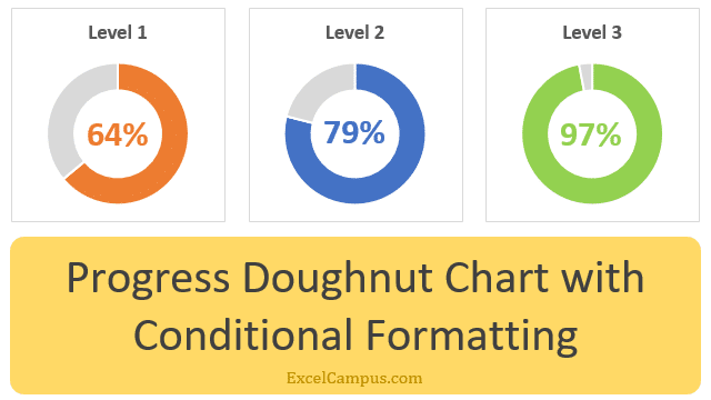
Progress doughnut charts have become very popular. We see them on mobile apps, television broadcasts, sporting events, and financial reports. The progress doughnut (circle) chart is a simple visualization that typically just displays one metric.
This makes it a great addition to any dashboard because the chart (graph) is easy to understand. The reader can quickly see the percentage of completion towards a goal.
We can add the progress doughnut charts to our reports and dashboards in Excel too. In this post, we’ll take a look at how to create the chart, and also apply conditional formatting so the color of the progress bar (circle) changes as the percentage of completion changes.
Required Ingredients
The setup is pretty simple and just requires an Excel doughnut chart and a few formulas. This technique will work in all versions of Excel including both Windows and Mac Editions.
Download the Excel File
Download the Excel file to follow along with the videos.
Video #1 – How to Create the Progress Doughnut Chart
Video #2 – How to Add Conditional Formatting to the Progress Doughnut Chart
When to Use the Progress Chart
The progress doughnut chart displays the percentage of completion on a single metric. It can be used for measuring the performance of any goal or target.
The chart is a great addition to any dashboard because it is very easy to understand. The reader can quickly see the progress of metrics that they are familiar with.
The conditional formatting makes it even easier to read because the changes in color alert the reader that a metric might need additional attention if it is not performing well.
How to Create the Progress Doughnut Chart in Excel
The first step is to create the Doughnut Chart. This is a default chart type in Excel, and it’s very easy to create. We just need to get the data range set up properly for the percentage of completion (progress).
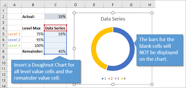
Step 1 – Set Up the Data Range
For the data range, we need two cells with values that add up to 100%.
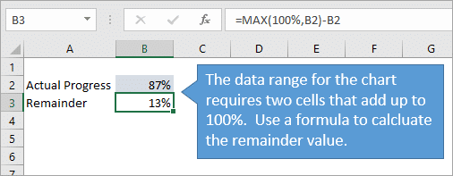
- The first cell is the value of the percentage complete (progress achieved).
- The second cell is the remainder value. 100% minus the percentage complete.
This will create two bars or sections of the circle. One for the percentage complete and one for the remainder. We can fill these bars with different colors to display the progress complete in a bold color, and the remainder in a lighter tone or gray.
Both cell values are formatted as percents.
We can use the following formula to calculate the remainder value.
=100%-B2
If the maximum percentage complete value can go over 100%, then it’s best to use the following formula for the remainder value.
=MAX(100%,B2)-B2
This will change the remainder value to zero if the progress is greater than 100%. The entire chart will be shaded with the progress complete color, and we can display the progress percentage in the label to show that it is greater than 100%.
Step 2 – Insert the Doughnut Chart
With the data range set up, we can now insert the doughnut chart from the Insert tab on the Ribbon. The Doughnut Chart is in the Pie Chart drop-down menu.
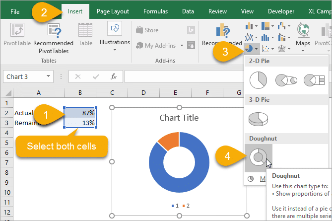
- Select both the percentage complete and remainder cells.
- Go to the Insert tab and select Doughnut Chart from the Pie Chart drop-down menu.
- The doughnut chart will be inserted on the sheet.
Step 3 – Format the Doughnut Chart
Now we need to modify the formatting of the chart to highlight the progress bar. The default chart will look something like the following. Here are the steps to clean it up.
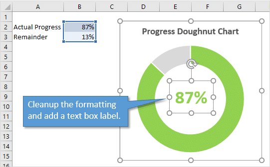
- Remove the legend. Select the legend and press the delete key.
- Change the colors of the progress and remainder bars.
- Left-click on the progress bar twice to select it.
- Go to the Format tab in the ribbon and change the fill color to a bold color.
- Repeat steps 1 & 2 for the remainder bar, and select a light color or gray.
The doughnut chart should now look like more like a progress chart. The last step is to add a label with percentage complete value.
I like to add a Text Box shape to the chart that displays the number in the middle of the circle.
- Select the chart.
- Go to the Insert tab on the ribbon and select the text box shape from the Insert Shapes menu.
- Draw the text box inside the chart. This will add the shape to the chart, and the shape will move and size with the chart.
- Select the outside border of the text box.
- In the formula bar, type the equal sign =, then select the cell that contains the progress value. Press Enter. This links the text box value to the cell value. When the cell value changes, the text box value will automatically be updated to reflect the change.
- Finally, change the formatting of the text box so the text color matches the progress bar color.
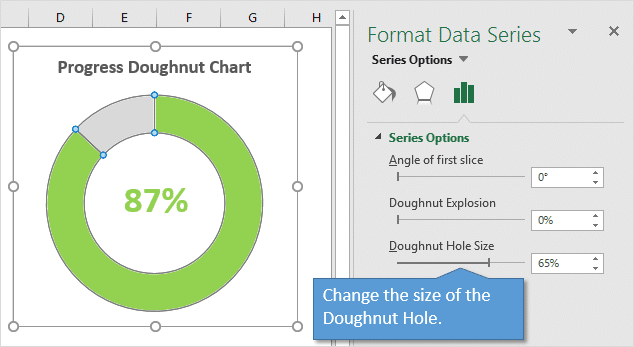
The width of the doughnut circle can also be changed by right-clicking the bar and selecting Format Data Series… Then modify the Doughnut Hole Size property.
We should now have a progress doughnut chart that displays the percentage complete for a single metric. This is great for actual vs budget, target, and goal oriented metrics.
Getting hungry yet? 🙂
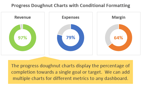
Now we might want to spiff up our chart with different colors to indicate each level of progress achieved. This is called conditional formatting, and it makes it even easier for the reader to quickly see what level of performance has been achieved.
Here are the levels and colors we’ll use for this example.
- Less than or equal to 75% is Orange.
- 76% to 95% is Blue.
- Greater than 95% is Green.
You can add as many levels as you’d like, and also change the percentages for each level. I prefer to use three levels to keep the rules simple for the readers.
Step 1 – Set Up the Data Range for Multiple Levels
The first step is to create a cell that contains the progress value for each level. In this example we have 3 levels, so we will create 3 rows of cells for the progress levels and 1 cell for the remainder value.
We use an IF formula to display the progress value in the row for its corresponding level/tier. If the progress value is in the tier, then a number will be displayed. If not, then the IF formula will return a blank.
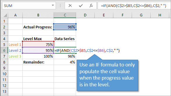
This creates a separate bar for each level. However, the bar will only be displayed if the progress level is within the tier. Otherwise, a blank cell will be returned and the bar will not be displayed in the donut chart.
Step 2 – Insert the Doughnut Chart for All Levels
The next step is to extend the data series to include all the cells in the Data Series column. This includes the 3 cells that contain the IF formulas and the remainder cell.
The doughnut chart will only display bars for cells that contain a value. If the cell is blank, then a bar will NOT be displayed on the chart.
This is the trick to creating the conditional formatting. When the actual value changes, the IF formulas will recalculate and show the value in the cell of the corresponding level. The chart will also update to display that bar. The Remainder bar will always be displayed on the chart, since the two visible values in the range add up to 100%.
Now we just need to change the color of each bar in each level. Check out the part 2 video above for instructions on how to color each bar.
Step 3 – Apply the Formatting & Data Labels
Finally, we need to clean up the formatting. This is the same basic process as step 3 above. The only difference is that we create three separate text boxes, one for each level. This allows us to change the color of each textbox to match the bar color.
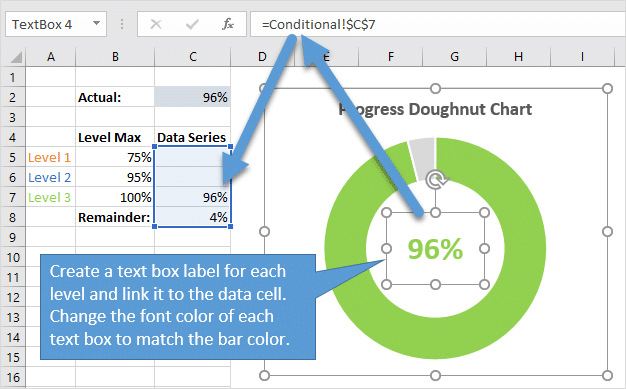
The text boxes are linked to each cell in the data range for the chart.
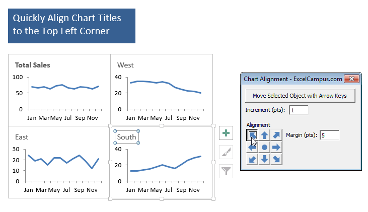
Free Chart Alignment Add-in
My FREE Chart Alignment Add-in allows you to move the chart elements (titles, labels, legend) with the arrow keys and alignment buttons. This can be very helpful and save time when building dashboards where we want the titles and labels to lineup perfectly between charts.
Are Your Dashboards Hungry for Doughnuts?
The progress doughnut chart makes a great addition to any dashboard or infographic. It provides a simple summary of progress towards a goal. We can then add other chart types to help identify trends and further analysis around these metrics.
What type of metrics will you use this chart for? Please leave a comment below with suggestions or questions. Thank you! 🙂
The pie and donut (in Excel, doughnut) charts are widely used to present multiple parts of something whole. Using any of these chart types in Excel, you can demonstrate each part in one chart keeping their proportions. You can also represent the changes in those parts using a doughnut chart:

For example:
- If you have several companies that operate in the same industry, you can represent a portion of each company in that industry:
- After the mergers and acquisitions, some companies have taken over other parts:


To create one chart of this data, follow these steps:
Create a simple donut chart
1. Select the first data range (in this example, B3:C9).
2. On the Insert tab, in the Charts group, click the
Insert Pie or Doughnut Chart button:

From the Insert Pie or Doughnut Chart dropdown list, choose the Doughnut chart:

Add the second data series
3. Select the chart and do one of the following:
- On the Chart Design tab, in the Data group, choose Select Data:

- Right-click on the chart data series and choose Select Data… in the popup menu:


4. In the Select Data Source dialog box, under Legend Entries (Series), click the Add button:

5. In the Edit Series dialog box, select the second data range (in this example, C13:C20):

After adding the new data series, the doughnut chart might look like this:

Add the data labels
6. To add the data labels, right-click on the data series and choose Add Data Labels -> Add Data Labels in the popup menu:

Format data series
Make data series thinker
7. To make the data series (or rings of the donut chart) thicker, right-click on any data series and choose Format Data Series… in the popup menu:

On the Format Data Series pane, in the Series Options group, in the Series Options section, type or choose the appropriate value in the Doughnut Hole Size field.
In this example, 25%:

The chart will look more presentable:

Apply 3D effects
8. To add the 3D effect to the chart parts, on the Format Data Series pane (see step 7 how to open it), in the Effects group, in the 3-D Format section:
- In the Top bevel list, select the preferred bevel type,
- Optionally, type or select the values you need in the Width and Height fields.
For this example:

You can then make any other adjustments to get the look you desire.
See also this tip in French:
Utiliser le graphique en secteurs ou en anneau dans Excel.
The Doughnut Chart is a built-in chart type in Excel. Doughnut charts are meant to express a «part-to-whole» relationship, where all pieces together represent 100%. Doughnut charts work best to display data with a small number of categories (2-5). For example, you could use a doughnut chart to plot survey questions with a small number of answers, data split by gender, Windows vs. Mac users, or other data where categories are limited.
Doughnut charts should be avoided when there are many categories, or when categories do not sum to 100%.
Pros
- Simple, compact presentation
- Can be read «at a glance»
- Excel will calculate percentages automatically
Cons
- Difficult to compare relative size of slices
- Become cluttered and dense as categories are added
- Limited to part-to-whole data
- Poor at showing change over time
Tips
- Limit categories
- Consider other charts to show change over time