
Data labels make a chart easier to understand because they show details about a data series or its individual data points. For example, in the pie chart below, without the data labels it would be difficult to tell that coffee was 38% of total sales. Depending on what you want to highlight on a chart, you can add labels to one series, all the series (the whole chart), or one data point.

Note: The following procedures apply to Office 2013 and newer versions. Looking for Office 2010 steps?
Add data labels to a chart
-
Click the data series or chart. To label one data point, after clicking the series, click that data point.
-
In the upper right corner, next to the chart, click Add Chart Element
 > Data Labels.
 -
To change the location, click the arrow, and choose an option.
-
If you want to show your data label inside a text bubble shape, click Data Callout.
To make data labels easier to read, you can move them inside the data points or even outside of the chart. To move a data label, drag it to the location you want.
If you decide the labels make your chart look too cluttered, you can remove any or all of them by clicking the data labels and then pressing Delete.
Tip: If the text inside the data labels is too hard to read, resize the data labels by clicking them, and then dragging them to the size you want.
Change the look of the data labels
-
Right-click the data series or data label to display more data for, and then click Format Data Labels.
-
Click Label Options and under Label Contains, pick the options you want.
Use cell values as data labels
You can use cell values as data labels for your chart.
-
Right-click the data series or data label to display more data for, and then click Format Data Labels.
-
Click Label Options and under Label Contains, select the Values From Cells checkbox.
-
When the Data Label Range dialog box appears, go back to the spreadsheet and select the range for which you want the cell values to display as data labels. When you do that, the selected range will appear in the Data Label Range dialog box. Then click OK.
The cell values will now display as data labels in your chart.
Change the text displayed in the data labels
-
Click the data label with the text to change and then click it again, so that it’s the only data label selected.
-
Select the existing text and then type the replacement text.
-
Click anywhere outside the data label.
Tip: If you want to add a comment about your chart or have only one data label, you can use a textbox.
Remove data labels from a chart
-
Click the chart from which you want to remove data labels.
This displays the Chart Tools, adding the Design, and Format tabs.
-
Do one of the following:
-
On the Design tab, in the Chart Layouts group, click Add Chart Element, choose Data Labels, and then click None.
-
Click a data label one time to select all data labels in a data series or two times to select just one data label that you want to delete, and then press DELETE.
-
Right-click a data label, and then click Delete.
Note: This removes all data labels from a data series.
-
-
You can also remove data labels immediately after you add them by clicking Undo
on the Quick Access Toolbar, or by pressing CTRL+Z.
Add or remove data labels in a chart in Office 2010
-
On a chart, do one of the following:
-
To add a data label to all data points of all data series, click the chart area.
-
To add a data label to all data points of a data series, click one time to select the data series that you want to label.
-
To add a data label to a single data point in a data series, click the data series that contains the data point that you want to label, and then click the data point again.
This displays the Chart Tools, adding the Design, Layout, and Format tabs.
-
-
On the Layout tab, in the Labels group, click Data Labels, and then click the display option that you want.
Depending on the chart type that you used, different data label options will be available.
-
On a chart, do one of the following:
-
To display additional label entries for all data points of a series, click a data label one time to select all data labels of the data series.
-
To display additional label entries for a single data point, click the data label in the data point that you want to change, and then click the data label again.
This displays the Chart Tools, adding the Design, Layout, and Format tabs.
-
-
On the Format tab, in the Current Selection group, click Format Selection.
You can also right-click the selected label or labels on the chart, and then click Format Data Label or Format Data Labels.
-
Click Label Options if it’s not selected, and then under Label Contains, select the check box for the label entries that you want to add.
The label options that are available depend on the chart type of your chart. For example, in a pie chart, data labels can contain percentages and leader lines.
-
To change the separator between the data label entries, select the separator that you want to use or type a custom separator in the Separator box.
-
To adjust the label position to better present the additional text, select the option that you want under Label Position.
If you have entered custom label text but want to display the data label entries that are linked to worksheet values again, you can click Reset Label Text.
-
On a chart, click the data label in the data point that you want to change, and then click the data label again to select just that label.
-
Click inside the data label box to start edit mode.
-
Do one of the following:
-
To enter new text, drag to select the text that you want to change, and then type the text that you want.
-
To link a data label to text or values on the worksheet, drag to select the text that you want to change, and then do the following:
-
On the worksheet, click in the formula bar, and then type an equal sign (=).
-
Select the worksheet cell that contains the data or text that you want to display in your chart.
You can also type the reference to the worksheet cell in the formula bar. Include an equal sign, the sheet name, followed by an exclamation point; for example, =Sheet1!F2
-
Press ENTER.
Tip: You can use either method to enter percentages — manually if you know what they are, or by linking to percentages on the worksheet. Percentages are not calculated in the chart, but you can calculate percentages on the worksheet by using the equation amount / total = percentage. For example, if you calculate 10 / 100 = 0.1, and then format 0.1 as a percentage, the number will be correctly displayed as 10%. For more information about how to calculate percentages, see Calculate percentages.
-
-
The size of the data label box adjusts to the size of the text. You cannot resize the data label box, and the text may become truncated if it does not fit in the maximum size. To accommodate more text, you may want to use a text box instead. For more information, see Add a text box to a chart.
You can change the position of a single data label by dragging it. You can also place data labels in a standard position relative to their data markers. Depending on the chart type, you can choose from a variety of positioning options.
-
On a chart, do one of the following:
-
To reposition all data labels for a whole data series, click a data label one time to select the data series.
-
To reposition a specific data label, click that data label two times to select it.
This displays the Chart Tools, adding the Design, Layout, and Format tabs.
-
-
On the Layout tab, in the Labels group, click Data Labels, and then click the option that you want.
For additional data label options, click More Data Label Options, click Label Options if it’s not selected, and then select the options that you want.
-
Click the chart from which you want to remove data labels.
This displays the Chart Tools, adding the Design, Layout, and Format tabs.
-
Do one of the following:
-
On the Layout tab, in the Labels group, click Data Labels, and then click None.
-
Click a data label one time to select all data labels in a data series or two times to select just one data label that you want to delete, and then press DELETE.
-
Right-click a data label, and then click Delete.
Note: This removes all data labels from a data series.
-
-
You can also remove data labels immediately after you add them by clicking Undo
on the Quick Access Toolbar, or by pressing CTRL+Z.
Data labels make a chart easier to understand because they show details about a data series or its individual data points. For example, in the pie chart below, without the data labels it would be difficult to tell that coffee was 38% of total sales. Depending on what you want to highlight on a chart, you can add labels to one series, all the series (the whole chart), or one data point.
Add data labels
You can add data labels to show the data point values from the Excel sheet in the chart.
-
This step applies to Word for Mac only: On the View menu, click Print Layout.
-
Click the chart, and then click the Chart Design tab.
-
Click Add Chart Element and select Data Labels, and then select a location for the data label option.
Note: The options will differ depending on your chart type.
-
If you want to show your data label inside a text bubble shape, click Data Callout.
To make data labels easier to read, you can move them inside the data points or even outside of the chart. To move a data label, drag it to the location you want.
Note: If the text inside the data labels is too hard to read, resize the data labels by clicking them, and then dragging them to the size you want.
Click More Data Label Options to change the look of the data labels.
Change the look of your data labels
-
Right-click on any data label and select Format Data Labels.
-
Click Label Options and under Label Contains, pick the options you want.
Change the text displayed in the data labels
-
Click the data label with the text to change and then click it again, so that it’s the only data label selected.
-
Select the existing text and then type the replacement text.
-
Click anywhere outside the data label.
Tip: If you want to add a comment about your chart or have only one data label, you can use a textbox.
Remove data labels
If you decide the labels make your chart look too cluttered, you can remove any or all of them by clicking the data labels and then pressing Delete.
Note: This removes all data labels from a data series.
Use cell values as data labels
You can use cell values as data labels for your chart.
-
Right-click the data series or data label to display more data for, and then click Format Data Labels.
-
Click Label Options and under Label Contains, select the Values From Cells checkbox.
-
When the Data Label Range dialog box appears, go back to the spreadsheet and select the range for which you want the cell values to display as data labels. When you do that, the selected range will appear in the Data Label Range dialog box. Then click OK.
The cell values will now display as data labels in your chart.
To format data labels, select your chart, and then in the Chart Design tab, click Add Chart Element > Data Labels > More Data Label Options. Click Label Options and under Label Contains, pick the options you want. To make data labels easier to read, you can move them inside the data points or even outside of the chart.
Contents
- 1 How do I format the data series in Excel?
- 2 How do you edit data labels in Excel?
- 3 How do I change the font size of all data labels in Excel?
- 4 How do I access format data labels?
- 5 How do I rename data labels in Excel?
- 6 What are data labels in Excel?
- 7 How do I change data labels to millions in Excel?
- 8 How do I create a data label percentage in Excel?
- 9 How do I change the format in Excel?
- 10 How do I put data into a pie chart in Excel?
- 11 How do I edit the legend text in Excel?
- 12 How do I change the legend color in Excel?
- 13 What is legend in Excel?
- 14 What is data label?
- 15 How do you ensure data labels don’t overlap?
- 16 How do you abbreviate data labels in Excel?
- 17 How do I show data labels in thousands in Excel?
- 18 How do I format axis labels in Excel?
How do I format the data series in Excel?
Right click on one of the data series bars in the chart. Excel displays a Context menu. Choose Format Data Series from the Context menu. Excel displays the Format Data Series task pane at the right side of the chart.
How do you edit data labels in Excel?
Edit the contents of a title or data label that is linked to data on the worksheet
- In the worksheet, click the cell that contains the title or data label text that you want to change.
- Edit the existing contents, or type the new text or value, and then press ENTER. The changes you made automatically appear on the chart.
How do I change the font size of all data labels in Excel?
Change the chart text font
- Right click the chart title and click Font.
- Click the Font tab, and enter the new size in the Size box.
How do I access format data labels?
You can access the option to show data labels in one of the following ways:
- Ribbon: On the Series tab, in the Properties group, click Data Labels, and from the drop-down menu, click More Data Label Options.
- Shortcut Menu: Right-click a series on the chart, point to Data Labels, and then click Show.
How do I rename data labels in Excel?
Rename a data series
- Right-click the chart with the data series you want to rename, and click Select Data.
- In the Select Data Source dialog box, under Legend Entries (Series), select the data series, and click Edit.
- In the Series name box, type the name you want to use.
What are data labels in Excel?
Data labels are used to display source data in a chart directly.When first enabled, data labels will show only values, but the Label Options area in the format task pane offers many other settings. You can set data labels to show the category name, the series name, and even values from cells.
How do I change data labels to millions in Excel?
Follow These Steps
- Select the cell you’d like to format. ( A1 in the example)
- Click the ribbon Home, right-click on the cell, then expand the default to show “Format Cells” dialog.
- In the Format Cells dialog box, on the Number tab, select Custom, then enter #,, “Million” where it says General.
How do I create a data label percentage in Excel?
Select the decimal number cells, and then click Home > % to change the decimal numbers to percentage format. 7. Then go to the stacked column, and select the label you want to show as percentage, then type = in the formula bar and select percentage cell, and press Enter key.
How do I change the format in Excel?
Formatting text and numbers
- Select the cells(s) you want to modify. Selecting a cell range.
- Click the drop-down arrow next to the Number Format command on the Home tab. The Number Formatting drop-down menu will appear.
- Select the desired formatting option.
- The selected cells will change to the new formatting style.
How do I put data into a pie chart in Excel?
Excel
- In your spreadsheet, select the data to use for your pie chart.
- Click Insert > Insert Pie or Doughnut Chart, and then pick the chart you want.
- Click the chart and then click the icons next to the chart to add finishing touches:
How do I edit the legend text in Excel?
On the Design tab, in the Data group, click Select Data. In the Select Data Source dialog box, in the Legend Entries (Series) box, select the legend entry that you want to change. Click Edit. Tip: To add a new legend entry, click Add, or to remove a legend entry, click Remove.
How do I change the legend color in Excel?
If you’d like to change your legend’s border color to make it more noticeable, click the Format Legend’s “Border” button and then click “Color” to display a list of colors. Click a color to apply it to the legend’s border. If nothing happens when you click a color, click the “Solid Line” radio button to select it.
What is legend in Excel?
Legend is the space located on the plotted area of the chart in excel. It has Legend keys that are connected to the data source. Legend will appear automatically when we insert a chart in excel.
What is data label?
A data label is a static part of a chart, report or other dynamic layout. The label defines the information in the line item. Labels are an integral part of reporting and application development.
How do you ensure data labels don’t overlap?
Keep your Chart Area Marginally bigger than the Plot Area.
- Choose your worst dashboard (longest axis labels)
- Click the Plot Area.
- Reduce the size of your Plot area from bottom so that you have extra space at the bottom. (
- Now click your horizontal axis labels.
- Click Reduce Font (Or Increase Font) button.
How do you abbreviate data labels in Excel?
Select the numbers you need to abbreviate, and right click to select Format Cells from the context menu. 3. Click OK to close dialog, now the large numbers are abbreviated. Tip: If you just need to abbreviate the large number as thousand “K” or million “M”, you can type #,”K” or #,,”M” into the textbox.
How do I show data labels in thousands in Excel?
1. Right click at the axis you want to format its labels as thousands/millions, select Format Axis in the context menu. 3. Close dialog, now you can see the axis labels are formatted as thousands or millions.
How do I format axis labels in Excel?
Change the format of numbers on the value axis
- Right-click the value axis labels you want to format, and then select Format Axis.
- In the Format Axis pane, select Number.
- Choose the number format options you want.
- To keep numbers linked to the worksheet cells, select the Linked to source check box.
Содержание
- What Is A Label In Excel?
- Where is labels in Excel?
- What are labels and values in Excel?
- What is label explain?
- What is label in spreadsheet package?
- What is a label cell?
- How do I make labels?
- How do I label a cell in Excel?
- What are data labels?
- How do I label something in Excel?
- What is label give the example?
- What is label product?
- What is an example of labeling?
- What is difference between label and value?
- What are the different types of labeling?
- What are mailing labels?
- How do you label a cell?
- How do you edit data labels in Excel?
- How do you put data labels inside a bar?
- What is draw and label?
- What is the function of a label?
- Add or remove data labels in a chart
- Add data labels to a chart
- Change the look of the data labels
- Use cell values as data labels
- Change the text displayed in the data labels
- Remove data labels from a chart
- Add or remove data labels in a chart in Office 2010
- Add data labels
- Change the look of your data labels
- Change the text displayed in the data labels
- Remove data labels
- Use cell values as data labels
- Need more help?
What Is A Label In Excel?
In a spreadsheet program, such as Microsoft Excel, a label is text in a cell, usually describing data in the rows or columns surrounding it.When referring to a chart, a label is any text over a section of a chart that gives additional information about the charts value.
Where is labels in Excel?
Select Mailings > Write & Insert Fields > Update Labels. Once you have the Excel spreadsheet and the Word document set up, you can merge the information and print your labels. Click Finish & Merge in the Finish group on the Mailings tab. Click Edit Individual Documents to preview how your printed labels will appear.
What are labels and values in Excel?
Entering data into a spreadsheet is just like typing in a word processing program, but you have to first click the cell in which you want the data to be placed before typing the data. All words describing the values (numbers) are called labels. The numbers, which can later be used in formulas, are called values.
What is label explain?
A label (as distinct from signage) is a piece of paper, plastic film, cloth, metal, or other material affixed to a container or product, on which is written or printed information or symbols about the product or item. Information printed directly on a container or article can also be considered labelling.
What is label in spreadsheet package?
Labels: Labels refer to text that is typed into the cells of a spreadsheet. Labels have no numeric value and cannot be used in a formula or function..
What is a label cell?
In a spreadsheet program, such as Microsoft Excel, a label is text in a cell, usually describing data in the rows or columns surrounding it.
How do I make labels?
Create and print labels
- Go to Mailings > Labels.
- Select Options and choose a label vendor and product to use.
- Type an address or other information in the Address box (text only).
- To change the formatting, select the text, right-click, and make changes with Font or Paragraph.
- Select OK.
How do I label a cell in Excel?
Name a cell
- Select a cell.
- In the Name Box, type a name.
- Press Enter.
What are data labels?
Data labels are text elements that describe individual data points. Displaying data labels. You may display data labels for all data points in the chart, for all data points in a particular series, or for individual data points. For information, see Displaying Data Labels. Data label text.
How do I label something in Excel?
Click the chart, and then click the Chart Design tab. Click Add Chart Element and select Data Labels, and then select a location for the data label option. Note: The options will differ depending on your chart type. If you want to show your data label inside a text bubble shape, click Data Callout.
What is label give the example?
The term ‘label’ may refer to a small piece of fabric, paper, or plastic that is attached to a product. It has information about that product. For example, clothes companies attached labels to garments. The labels have information about the garments’ materials, size, and the company that made them.
What is label product?
Product labeling is the act of writing and displaying information about a product’s packaging.Product packaging covers the brand colors, logo, material, and shape of the package, while labeling is focused on the product’s informational or written part.
What is an example of labeling?
Labelling, or labeling, is defined as the process of attaching a descriptive word or phrase to someone or something. An example of labelling is the process of putting signs on jars that say what is inside. An example of labelling is calling everyone from Oklahoma an “Oakie.”
What is difference between label and value?
All words describing the values (numbers) are called labels. The numbers, which can later be used in formulas, are called values.
What are the different types of labeling?
Types Of Labels
- Brand label. If only brand is used on package of a product, this is called brand label.
- Grade label. Some products have given grade label.
- Descriptive label. Descriptive label give information about the feature, using instruction, handling, security etc.
- Informative label.
What are mailing labels?
Mailing labels are usually pieces of paper with adhesive on the back that can be affixed to packages or envelopes to identify the name and address of an addressee. They may also indicate the name and address of the person sending the mail.Mailing labels are used on letters sent through the postal service.
How do you label a cell?
To name cells, or ranges, based on worksheet labels:
- Select the labels and the cells that are to be named.
- On the Ribbon, click the Formulas tab, then click Create from Selection.
- In the Create Names From Selection window, add a check mark for the location of the labels, then click OK.
- Click on a cell to see its name.
How do you edit data labels in Excel?
Edit the contents of a title or data label that is linked to data on the worksheet
- In the worksheet, click the cell that contains the title or data label text that you want to change.
- Edit the existing contents, or type the new text or value, and then press ENTER. The changes you made automatically appear on the chart.
How do you put data labels inside a bar?
Displaying labels inside bars
Click the plus sign button under Labels. A Data Label Settings item is added. Click this to edit its properties. In the Data Label Settings, set the Placement to Inside and enter the name of the measure in square brackets in the Text property.
What is draw and label?
This activity, where students draw and label a key scene in a text, works well as a pre-writing activity, and also as a reading comprehension activity. It helps students to develop a detailed visualization of a setting, and to attach words to the image.
What is the function of a label?
A label provides complete information regarding the product. It mainly includes ingredients of the product, its usage, and caution in use, cares to be taken while using it, date of manufacturing, batch number, etc.
Источник
Add or remove data labels in a chart
To quickly identify a data series in a chart, you can add data labels to the data points of the chart. By default, the data labels are linked to values on the worksheet, and they update automatically when changes are made to these values.
Data labels make a chart easier to understand because they show details about a data series or its individual data points. For example, in the pie chart below, without the data labels it would be difficult to tell that coffee was 38% of total sales. Depending on what you want to highlight on a chart, you can add labels to one series, all the series (the whole chart), or one data point.
Note: The following procedures apply to Office 2013 and newer versions. Looking for Office 2010 steps?
Add data labels to a chart
Click the data series or chart. To label one data point, after clicking the series, click that data point.
In the upper right corner, next to the chart, click Add Chart Element  > Data Labels.
 Data Labels > label choices» loading=»lazy»>
To change the location, click the arrow, and choose an option.
If you want to show your data label inside a text bubble shape, click Data Callout.

To make data labels easier to read, you can move them inside the data points or even outside of the chart. To move a data label, drag it to the location you want.
If you decide the labels make your chart look too cluttered, you can remove any or all of them by clicking the data labels and then pressing Delete.
Tip: If the text inside the data labels is too hard to read, resize the data labels by clicking them, and then dragging them to the size you want.
Change the look of the data labels
Right-click the data series or data label to display more data for, and then click Format Data Labels.
Click Label Options and under Label Contains, pick the options you want.

Use cell values as data labels
You can use cell values as data labels for your chart.
Right-click the data series or data label to display more data for, and then click Format Data Labels.
Click Label Options and under Label Contains, select the Values From Cells checkbox.
When the Data Label Range dialog box appears, go back to the spreadsheet and select the range for which you want the cell values to display as data labels. When you do that, the selected range will appear in the Data Label Range dialog box. Then click OK.

The cell values will now display as data labels in your chart.
Change the text displayed in the data labels
Click the data label with the text to change and then click it again, so that it’s the only data label selected.
Select the existing text and then type the replacement text.
Click anywhere outside the data label.
Tip: If you want to add a comment about your chart or have only one data label, you can use a textbox.
Remove data labels from a chart
Click the chart from which you want to remove data labels.
This displays the Chart Tools, adding the Design, and Format tabs.
Do one of the following:
On the Design tab, in the Chart Layouts group, click Add Chart Element, choose Data Labels, and then click None.
Click a data label one time to select all data labels in a data series or two times to select just one data label that you want to delete, and then press DELETE.
Right-click a data label, and then click Delete.
Note: This removes all data labels from a data series.
You can also remove data labels immediately after you add them by clicking Undo  on the Quick Access Toolbar, or by pressing CTRL+Z.
Add or remove data labels in a chart in Office 2010
On a chart, do one of the following:
To add a data label to all data points of all data series, click the chart area.
To add a data label to all data points of a data series, click one time to select the data series that you want to label.
To add a data label to a single data point in a data series, click the data series that contains the data point that you want to label, and then click the data point again.
This displays the Chart Tools, adding the Design, Layout, and Format tabs.
On the Layout tab, in the Labels group, click Data Labels, and then click the display option that you want.

Depending on the chart type that you used, different data label options will be available.
On a chart, do one of the following:
To display additional label entries for all data points of a series, click a data label one time to select all data labels of the data series.
To display additional label entries for a single data point, click the data label in the data point that you want to change, and then click the data label again.
This displays the Chart Tools, adding the Design, Layout, and Format tabs.
On the Format tab, in the Current Selection group, click Format Selection.
You can also right-click the selected label or labels on the chart, and then click Format Data Label or Format Data Labels.
Click Label Options if it’s not selected, and then under Label Contains, select the check box for the label entries that you want to add.
The label options that are available depend on the chart type of your chart. For example, in a pie chart, data labels can contain percentages and leader lines.
To change the separator between the data label entries, select the separator that you want to use or type a custom separator in the Separator box.
To adjust the label position to better present the additional text, select the option that you want under Label Position.
If you have entered custom label text but want to display the data label entries that are linked to worksheet values again, you can click Reset Label Text.
On a chart, click the data label in the data point that you want to change, and then click the data label again to select just that label.
Click inside the data label box to start edit mode.
Do one of the following:
To enter new text, drag to select the text that you want to change, and then type the text that you want.
To link a data label to text or values on the worksheet, drag to select the text that you want to change, and then do the following:
On the worksheet, click in the formula bar, and then type an equal sign (=).
Select the worksheet cell that contains the data or text that you want to display in your chart.
You can also type the reference to the worksheet cell in the formula bar. Include an equal sign, the sheet name, followed by an exclamation point; for example, =Sheet1!F2
Tip: You can use either method to enter percentages — manually if you know what they are, or by linking to percentages on the worksheet. Percentages are not calculated in the chart, but you can calculate percentages on the worksheet by using the equation amount / total = percentage. For example, if you calculate 10 / 100 = 0.1, and then format 0.1 as a percentage, the number will be correctly displayed as 10%. For more information about how to calculate percentages, see Calculate percentages.
The size of the data label box adjusts to the size of the text. You cannot resize the data label box, and the text may become truncated if it does not fit in the maximum size. To accommodate more text, you may want to use a text box instead. For more information, see Add a text box to a chart.
You can change the position of a single data label by dragging it. You can also place data labels in a standard position relative to their data markers. Depending on the chart type, you can choose from a variety of positioning options.
On a chart, do one of the following:
To reposition all data labels for a whole data series, click a data label one time to select the data series.
To reposition a specific data label, click that data label two times to select it.
This displays the Chart Tools, adding the Design, Layout, and Format tabs.
On the Layout tab, in the Labels group, click Data Labels, and then click the option that you want.
For additional data label options, click More Data Label Options, click Label Options if it’s not selected, and then select the options that you want.
Click the chart from which you want to remove data labels.
This displays the Chart Tools, adding the Design, Layout, and Format tabs.
Do one of the following:
On the Layout tab, in the Labels group, click Data Labels, and then click None.
Click a data label one time to select all data labels in a data series or two times to select just one data label that you want to delete, and then press DELETE.
Right-click a data label, and then click Delete.
Note: This removes all data labels from a data series.
You can also remove data labels immediately after you add them by clicking Undo on the Quick Access Toolbar, or by pressing CTRL+Z.
Data labels make a chart easier to understand because they show details about a data series or its individual data points. For example, in the pie chart below, without the data labels it would be difficult to tell that coffee was 38% of total sales. Depending on what you want to highlight on a chart, you can add labels to one series, all the series (the whole chart), or one data point.
Add data labels
You can add data labels to show the data point values from the Excel sheet in the chart.
This step applies to Word for Mac only: On the View menu, click Print Layout.
Click the chart, and then click the Chart Design tab.
Click Add Chart Element and select Data Labels, and then select a location for the data label option.
Note: The options will differ depending on your chart type.
If you want to show your data label inside a text bubble shape, click Data Callout.
To make data labels easier to read, you can move them inside the data points or even outside of the chart. To move a data label, drag it to the location you want.
Note: If the text inside the data labels is too hard to read, resize the data labels by clicking them, and then dragging them to the size you want.
Click More Data Label Options to change the look of the data labels.
Change the look of your data labels
Right-click on any data label and select Format Data Labels.
Click Label Options and under Label Contains, pick the options you want.
Change the text displayed in the data labels
Click the data label with the text to change and then click it again, so that it’s the only data label selected.
Select the existing text and then type the replacement text.
Click anywhere outside the data label.
Tip: If you want to add a comment about your chart or have only one data label, you can use a textbox.
Remove data labels
If you decide the labels make your chart look too cluttered, you can remove any or all of them by clicking the data labels and then pressing Delete.
Note: This removes all data labels from a data series.
Use cell values as data labels
You can use cell values as data labels for your chart.
Right-click the data series or data label to display more data for, and then click Format Data Labels.
Click Label Options and under Label Contains, select the Values From Cells checkbox.
When the Data Label Range dialog box appears, go back to the spreadsheet and select the range for which you want the cell values to display as data labels. When you do that, the selected range will appear in the Data Label Range dialog box. Then click OK.
The cell values will now display as data labels in your chart.
Need more help?
You can always ask an expert in the Excel Tech Community or get support in the Answers community.
Источник
Understanding Excel Chart Data Series, Data Points, and Data Labels
Better understand charts in Excel and Google Sheets
Updated on September 19, 2020
Charts and graphs in Excel and Google Sheets use data points, data markers, and data labels to visualize data and convey information. If you want to create powerful charts, learn how each of these elements works and how to use them properly.
Data Point: A single value located in a worksheet cell plotted in a chart or graph.
Data Marker: A column, dot, pie slice, or another symbol in the chart representing a data value. For example, in a line graph, each point on the line is a data marker representing a single data value located in a worksheet cell.
Data Label: Provides information about individual data markers, such as the value being graphed either as a number or as a percent. Commonly used data labels in spreadsheet programs include:
- Numeric Values: Taken from individual data points in the worksheet.
- Series Names: Identifies the columns or rows of chart data in the worksheet. Series names are commonly used for column charts, bar charts, and line graphs.
- Category Names: Identifies the individual data points in a single series of data. These are commonly used for pie charts.
- Percentage Labels: Calculated by dividing the individual fields in a series by the total value of the series. Percentage labels are commonly used for pie charts.
Data Series: A group of related data points or markers that are plotted in charts and graphs. Examples of a data series include individual lines in a line graph or columns in a column chart. When multiple data series are plotted in one chart, each data series is identified by a unique color or shading pattern.
Not all graphs include groups of related data or data series.
In column or bar charts, if multiple columns or bars are the same color or have the same picture (in the case of a pictograph), they comprise a single data series.
Pie charts are typically restricted to a single data series per chart. The individual slices of the pie are data markers and not a series of data.
Modify Individual Data Markers
When you want to call attention to a specific data marker, make it look different from the rest of the group. All you need to do is change the formatting of the data marker.
Change the Color of a Single Column
The color of a single column in a column chart or a single point in a line graph can be changed without affecting the other points in the series. A data marker that is a different color than the rest of the group will pop out on the chart.
-
Select a data series in a column chart. All columns of the same color are highlighted. Each column is surrounded by a border that includes small dots on the corners.
-
Select the column in the chart to be modified. Only that column is highlighted.
-
Select the Format tab.
When a chart is selected, the Chart Tools appears in the ribbon and contains two tabs. The Format tab and the Design tab.
-
Select Shape Fill to open the Fill Colors menu.
-
In the Standard Colors section, choose the color you wish to apply.
Highlight Data with an Exploding Pie Chart
Individual slices of a pie chart are usually different colors. So, emphasizing a single portion or data point needs a different approach from columns and line charts. You can highlight pie charts by exploding out a single slice of pie from the graph.
Add Emphasis With a Combo Chart
Another option for emphasizing different types of information in a chart is to display two or more chart types in a single chart, such as a column chart and a line graph. You could use this approach when the graphed values vary widely or when graphing different types of data.
A typical example is a climograph or climate graph, which combines precipitation and temperature data for a single location on one chart. Additionally, combination or combo charts are created by plotting one or more data series on a secondary vertical or Y-axis.
Thanks for letting us know!
Get the Latest Tech News Delivered Every Day
Subscribe
how to do it in Excel: adding data labels
Today’s post is a tactical one for folks creating visuals in Excel: how to embed labels for your data series in your graphs, instead of relying on default Excel legends.
To illustrate, let’s look at an example from storytelling with data: Let’s Practice!. The graph below shows demand and capacity (in project hours) over time.

There are a few different techniques we could use to create labels that look like this.
Option 1: The “brute force” technique
The data labels for the two lines are not, technically, “data labels” at all. A text box was added to this graph, and then the numbers and category labels were simply typed in manually. This is what we affectionately refer to as “brute-forcing” your tool to make it look the way you want it to, regardless of its defaults. Remember: your audience only sees the end result of your work, even if the behind-the-scenes steps aren’t exactly elegant.

One benefit of this approach is that I have greater control over the formatting: size, position, and color of the labels. I can easily make them appear how I want them to appear by simply adjusting the formatting, which is much easier to do with a text box than with a genuine data label. The downside is that this method may not scale easily with many graphs, or those that will be frequently updated with new data—as the data changes, the text labels won’t move with them.
Option 2: Embedding labels directly
Let’s look now at an alternative approach: embedding the labels directly. You can download the corresponding Excel file to follow along with these steps:
Right-click on a point and choose Add Data Label. You can choose any point to add a label—I’m strategically choosing the endpoint because that’s where a label would best align with my design.

Excel defaults to labeling the numeric value, as shown below.
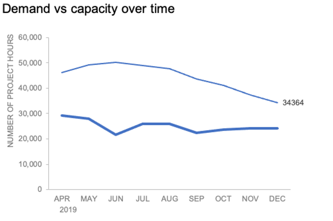
Now let’s adjust the formatting. Click the label (not the data point, but the label itself) twice, so that these white boxes appear around it:
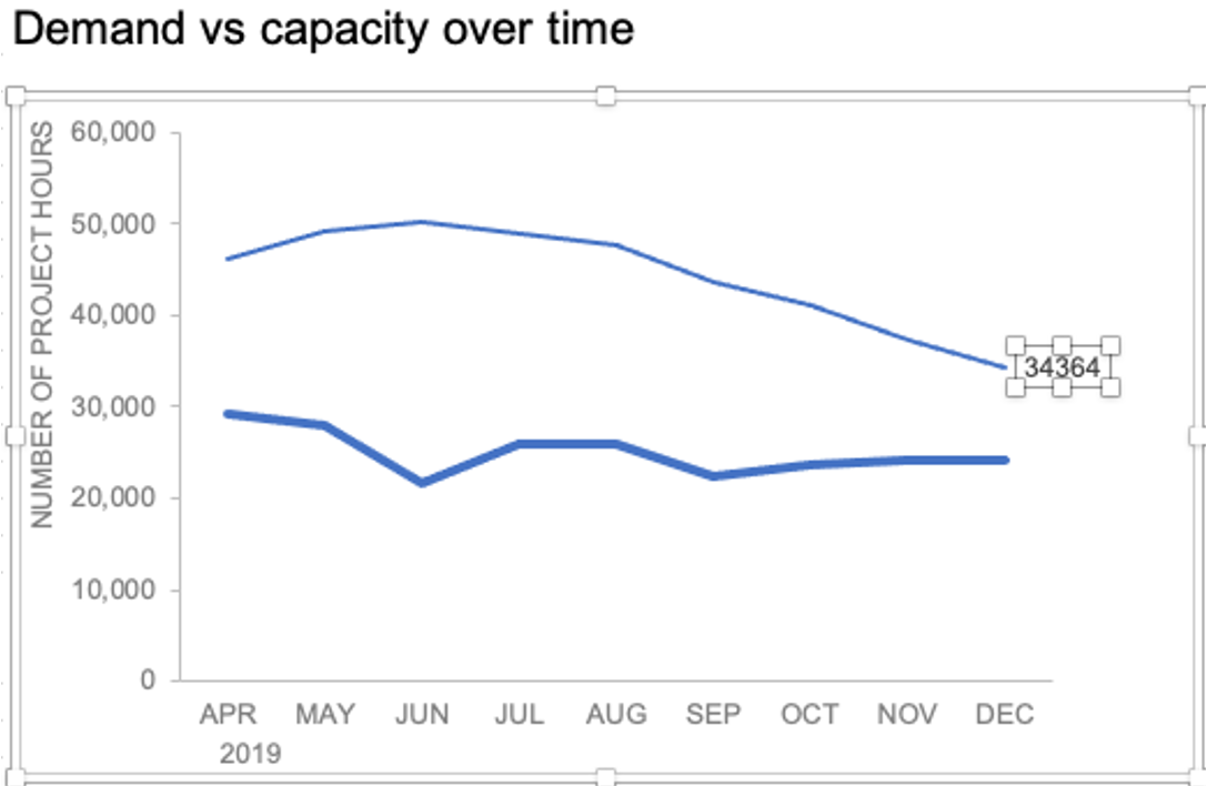
Right-click and choose Format Data Label:
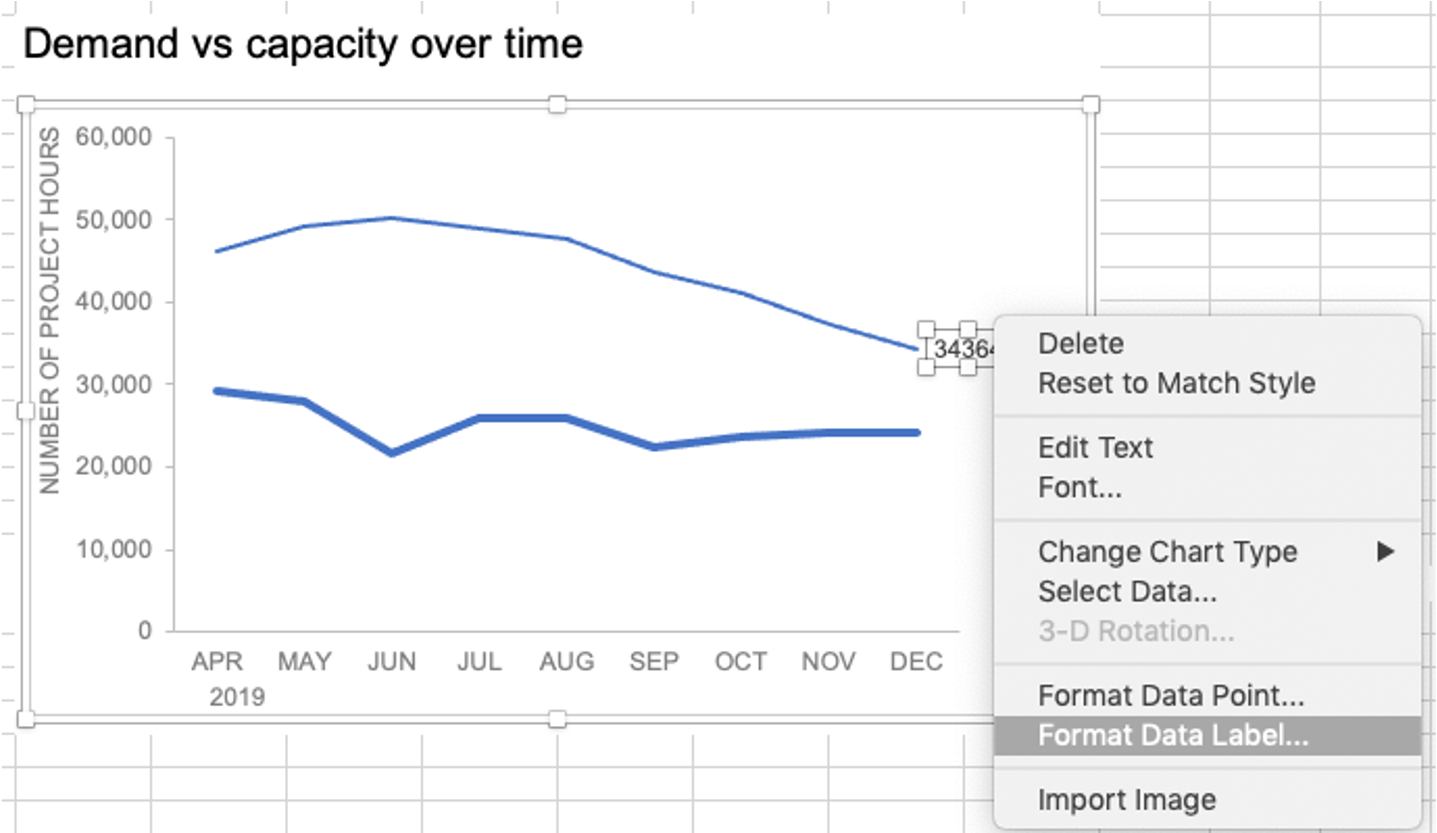
In the Label Options menu that appears, you can choose to add or remove fields by checking (or unchecking) the corresponding box under Label Contains. To add the word “Demand”, I’ll check the Series Name box.

The label appeared in all-caps (“DEMAND”) because it’s referencing the underlying data—I could adjust the header in Column M to “Demand” if I didn’t want the entire word capitalized (this is a stylistic choice).

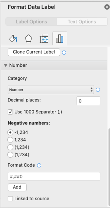
To adjust the number formatting, navigate back to the Format Data Label menu and scroll to the Number section at the bottom. I’ll choose Number in the Category drop-down and change Decimal places to 0 (side note: checking the Linked to source box is a good option if you want the labels to reformat when the formatting of the underlying source data changes).
My resulting visual looks like this:

From here, I can manually adjust the label alignment by highlighting the graph and making the Plot area smaller so that the label doesn’t overlap the line:
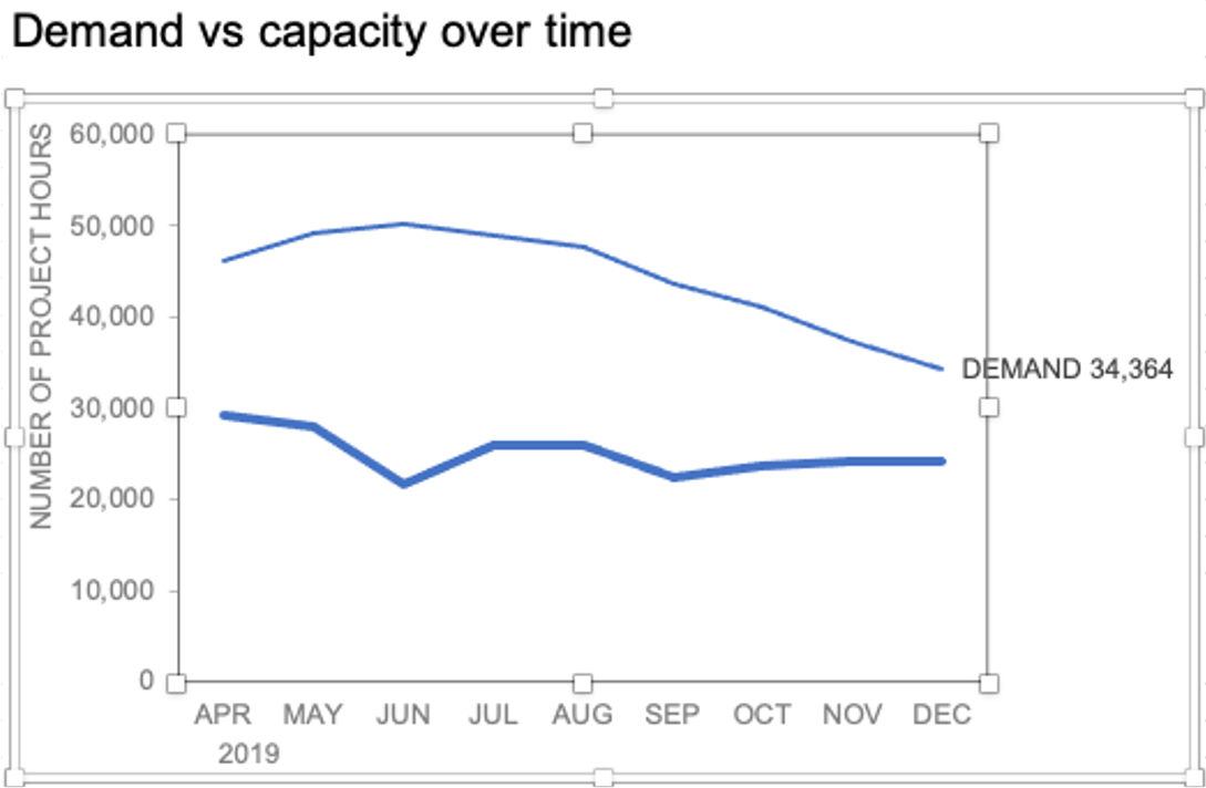
I’ll repeat the same steps to add the Capacity label:

The final thing I’ll do is clean up the formatting of those labels—move the numbers in front of the words, change the number format to be rounded to the thousands place, switch the colors of the labels to match the lines they refer to, and make the font for “24K Capacity” bold.

This post was inspired by a recent conversation during our bi-weekly office hour sessions. Do you ever need quick input on a graph or slide, or wish you could pick the SWD team’s brain on a project? Subscribe to premium membership for personalized support and get your questions answered. Our team has enjoyed getting to know many of you during these fun and interactive sessions!