
What are Control Charts in Excel?
The control chart is a type of chart used to analyze how the data changes from time to time. It is also known as a behavioral chart or Shewhart chart in Excel. It is used in statistics in business, which helps the users or the viewers analyze how any process changes. Its components are the control line and upper and lower control line, and the means of making it is with the help of calculations of average and standard deviation of the data.
For example, packing boxes with a certain number of products. In such cases, this chart can help analyze whether our process is performing within our calculated parameters.
The control chart is the visual graph to analyze the process change over time. We need to arrange the data in chronological order with current data sets to plot this Excel graph. To create a control chart in Excel, we need to have the average of the data, the upper control limit of the data, and the lower control limit of the data.
All these lines are drawn by using historical data sets. We compare the current data set with average, upper limit, and lower limit lines in the graph to determine whether the process variation is consistent or inconsistent and whether the data is unpredictable. If all the data points come within the control limit lines (averageAverage is the value that is used to represent the set of values of data as is the average calculated from whole data and this formula is calculated by adding all the values of the set given, denoted by summation of X and dividing it by the number of values given in set denoted by N.read more, upper, lower), then variations may be due to general cause and process said to be in control. Similarly, if the data points are plotting above or below the limit line, variations may be due to special cases and processes “out of control.”
Table of contents
- What are Control Charts in Excel?
- Types of Control Charts in Excel
- Type #1 – High – Low – Close Control Chart
- Type #2 – Open – High – Low – Close Control Chart
- Type #3 – Volume – High – Low – Close Control Chart
- Type #4 – Volume – Open – High – Low – Close
- Recommended Articles
- Types of Control Charts in Excel
You are free to use this image on your website, templates, etc, Please provide us with an attribution linkArticle Link to be Hyperlinked
For eg:
Source: Control Charts in Excel (wallstreetmojo.com)
Types of Control Charts in Excel
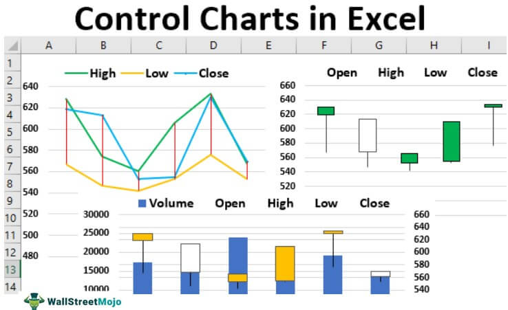
We have four kinds of control charts with Excel. Below are the types of control charts with Excel.
- High – Low – Close
- Open – High – Low – Close
- Volume- High – Low – Close
- Volume – Open – High – Low – Close
Each chart requires a specific set of data. So first, let us look at how each type of control chart is created.
You can download this Control Chart Types Excel Template here – Control Chart Types Excel Template
Type #1 – High – Low – Close Control Chart
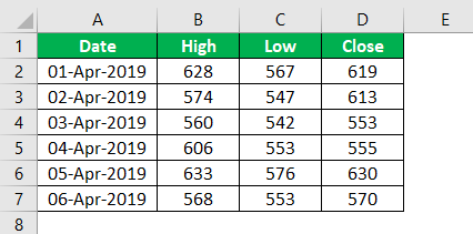
To create this type of control chart, we need to have three sets of data, i.e., what is the high price in the day or high-value point, what is the low-value point, and the actual closing number.
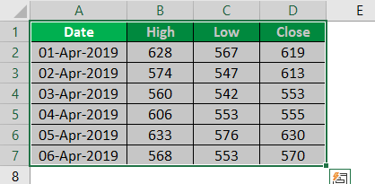
- First, we must copy and paste the below data sets to our worksheet.

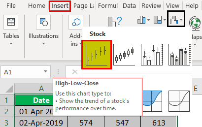
- We must select the data and go to the Insert tab once we have copied the data to the worksheet.

- In the Insert tab, we must go to the charts area Stock Chart High-Low-Close Chart.

- We will have a chart as shown below.

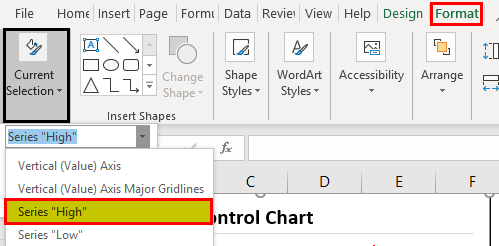
- We cannot identify anything with this chart, so we need to color each line in our way. By selecting the chart, we must go to Format Current Selection and from the drop-down, select Series High.

- As a result, it would select the high line from the chart. So, now again, under FORMAT, we must choose Shape Outline and choose the color as per choice.

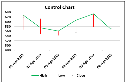
- Now, we can see the High line is colored with a green color.

- Now we need to repeat the same task for the other two lines, i.e., Low and Close.

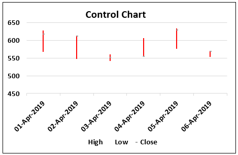

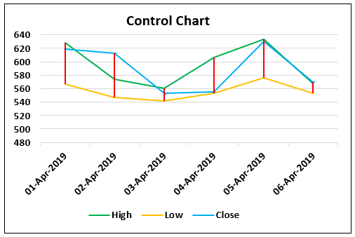
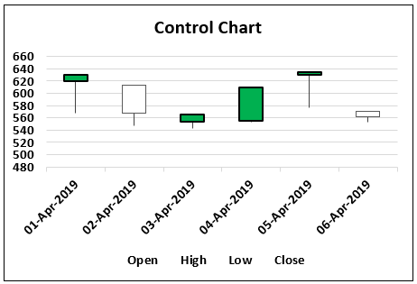
So, this shows how “High, Low, and Close” points fared on each day.
Type #2 – Open – High – Low – Close Control Chart
To create this, we need a copy table to the worksheet.

We will insert the Open – High – Low – Close chart this time.
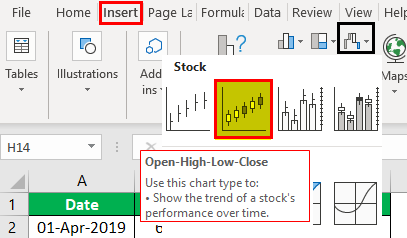
Now we will have the below chart.
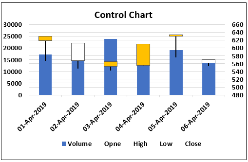
Type #3 – Volume – High – Low – Close Control Chart
To create this, we need to have one additional data point, i.e., “Volume” data.
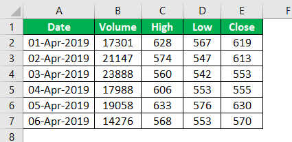
We must copy the above table to the worksheet; insert the Volume – High – Low – Close chart.
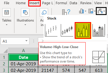
Now we will have the below chart.

Type #4 – Volume – Open – High – Low – Close
It is the final type of control chart. For this, we need one more additional data, i.e., the opening value of the data point.

Then, we must copy the above table to the worksheet. This time, insert the Volume-Open-High-Low-Close chart.

So, now we will have the designed chart below.
We can do all the settings, formatting, and many other things as per our choice.
Recommended Articles
This article is a guide to Control Charts in Excel. Here, we discuss the top 4 types of control charts in Excel and how they are created with practical examples and a downloadable Excel template. You can learn more about Excel functions from the following articles: –
- Animate Excel Chart
- 3D Scatter Plot in Excel
- Excel Marimekko Chart
- Create an Excel Template of Family Tree
- Excel Shortcut for Merge and Center
Excel Control Charts (Table of Contents)
- Definition of Control Chart
- Example of Control Chart in Excel
Introduction to Control Charts in Excel
Control charts are statistical visual measures to monitor how your process is running over a given period of time. Whether it is running as expected or there are some issues with it. There are important tool under Statistical Process Control (SPC) which measures the performance of any system/processes whether they are running smooth or not. If there are any disturbances, the processes can be reset. Control charts are most of the times used under manufacturing processes in order to check whether the manufacturing processes are under control or not.
Definition of Control Chart
A control chart is nothing but a line chart. It can be generated when we have upper and lower control limits present for the data, and we wanted to check whether the control points are lying between the actual upper and lower limits or going out of those. If the control points are lying well within limits, then the process is controlled. If some of the points are lying outside of the control limits, the process is said to be not in control. Though there are different Statistical Process Control (SPC) software available to create the control charts, Microsoft Excel does not lack in creating such charts and allows you to create those with more ease. In this article, we are about to see how control charts can be created under Microsoft Excel.
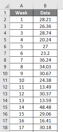
Example of Control Chart in Excel
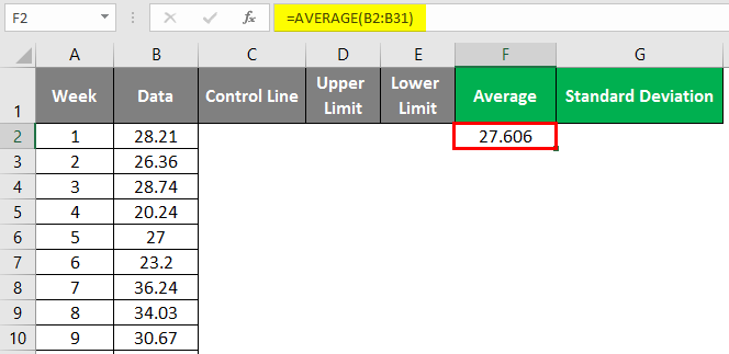
Suppose we have data of 30 observations from a manufacturing company as below. We want to see whether the process is well within the control limits or not. We will draw a Control chart to see whether the process is in control or not. See the screenshot of the partial data given below.
You can download this Control Chart Excel Template here – Control Chart Excel Template
Step 1: In the cell, F1 apply the formula for “AVERAGE(B2:B31)”, where the function computes the average of 30 weeks.
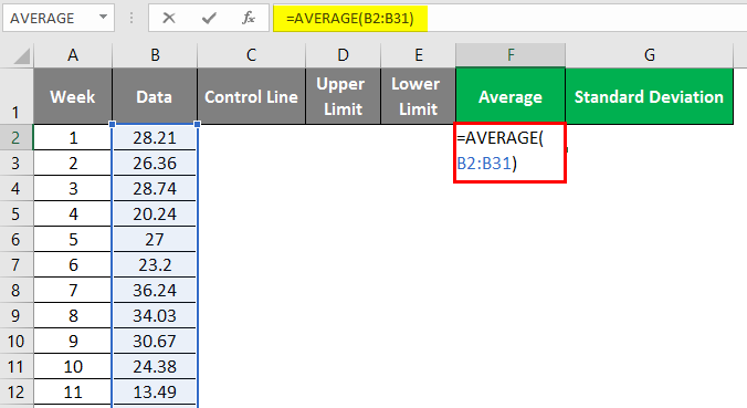
After applying the above formula, the answer is shown below.
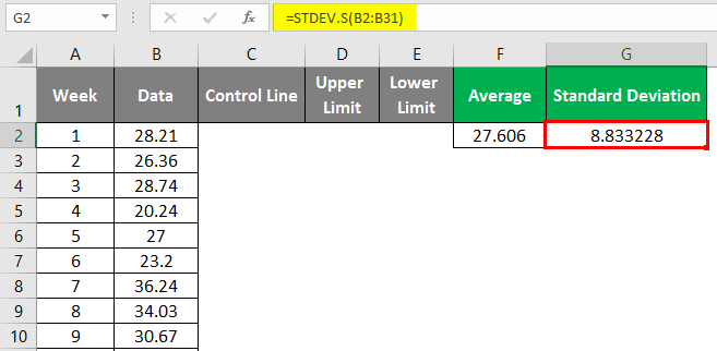
Step 2: In cell G2, apply the “STDEV.S(B2:B31)” formula to calculate the sample standard deviation for the given data. This formula calculates the sample standard deviation. We have a different formula in order to calculate the population standard deviation in excel.
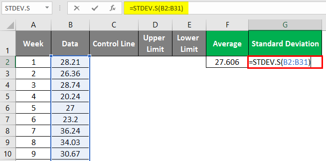
After applying the above formula, the answer is shown below.
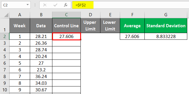
Step 3: In column C called Control Line, go to cell C2 and input the formula as =$F$1. The $ sign used in this formula is to make the rows and columns as constants. It means when you drag and fill the remaining rows for column C; all cells will be having the same formula as the one imputed in cell C2. Drag and fill the remaining cells of column C. You’ll be able to see the output as below.
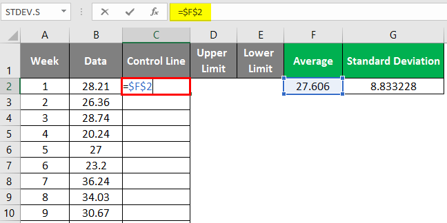
After applying the above formula, the answer is shown below.
Drag and fill the remaining cell of column C.
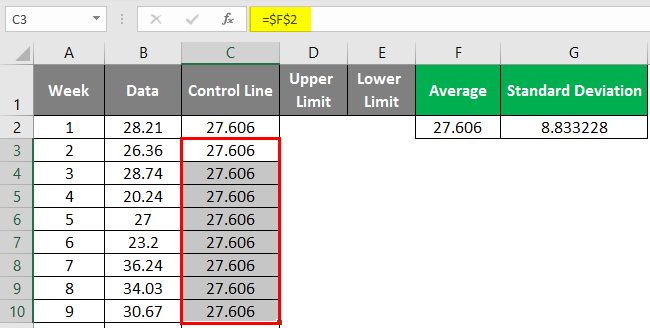
Because the Control Line is nothing but the line of the center for the control chart, which does not change over observations, we are taking Average as a value for Control Line.
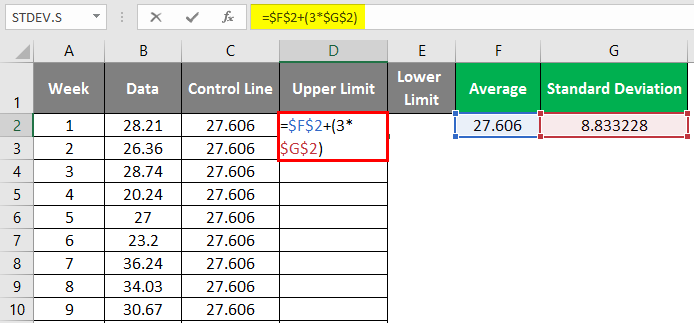
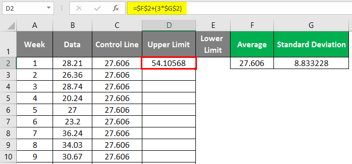
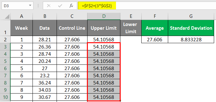
Step 4: For Upper Limit, the formula is. Therefore, in cell D2, put the formula as =$F$2+(3*$G$2). Again, the upper limit is fixed for all the week observations. Therefore we have used the $ sign to make rows and columns constant. Drag and fill the remaining cell of column D, and you’ll be able to see the output as below.
After applying the above formula, the answer is shown below.
Drag and fill the remaining cell of column D.
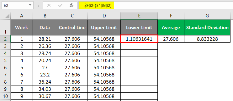
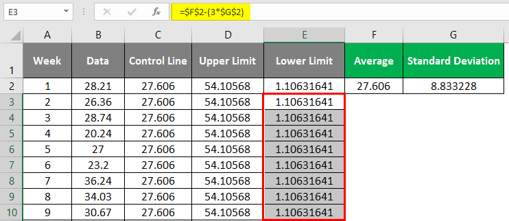
Step 5: Lower Limit for control chart can be formulated as in cell E2, put the formula as =$G$1-(3*$G$2). This formula calculates the lower limit, which is fixed for all weekly observations; the $ sign achieves that in this formula. Drag and fill the remaining cells with a formula, and you’ll be able to see the output as below.
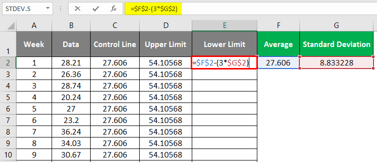
After applying the above formula, the answer is shown below.
Drag and fill the remaining cell of column E.
Explanation:
The Upper Limit, Lower Limit, and Central/Control Line are the control chart parameters. We calculate these terms because we have a theory base for that. In Statistical Process Control (SPC), we say that the processes are going normal if 99.73% observations are scattered around the Central/Control Line within 3 standard deviations above and below the same (that’s why we calculate the upper limit as 3 standard deviation above from average which is a central line and lower limit as 3 standard deviations below of the average). If it happens, then and only then we can say that the process is following the normal pattern. Otherwise, the process is said to be behaving abnormally, and we need to make the adjustments among the machineries.
We are done with the required information, which is needed to plot the control chart in excel. Now we will head towards adding a one in excel.
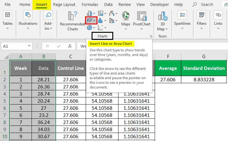
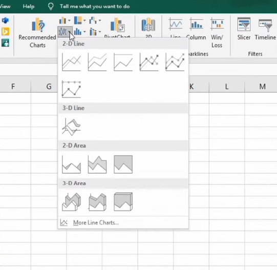
Step 6: Select the data from column A and B (spread across A1:B31) from your excel sheet and go to the Insert tab present at the excel ribbon. Under the Charts section, navigate towards Insert Line and Area Chart button.
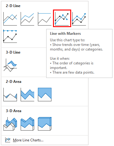
Step 7: Press the Insert Line or Area Chart dropdown button; you’ll be able to see a handful of line and area chart options available under excel. Out of those all, under 2 – D Line section, select Line with Markers and Press the Enter key.
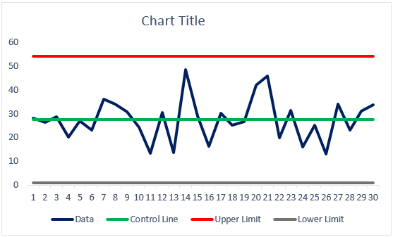
Your graph will look like below after removing weeks data from the line chart.
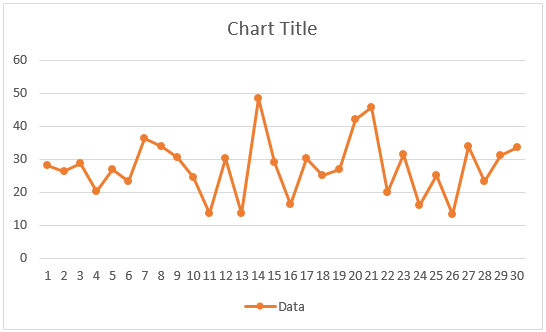
Now, we would like to add the central/control, lower and upper limit lines to this chart so that we can see how the weekly data is moving.
Step 8: Right-click on the Graph and click on the “Select Data” option.
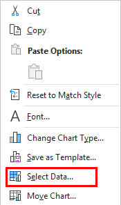
A “Select Data Source” dialog box will open up, and click on the “Add” button.
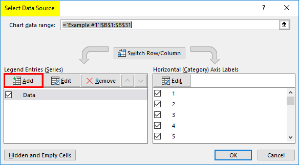
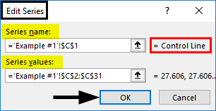
Step 9: Inside Legend Entries (Series), after clicking on the “Add” button and input Control Line as a “Series name” and corresponding control line values as a “Series values” under the “Edit Series” dialog box. Click on the “OK” button once done.
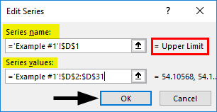
Step 10: After clicking on the “Add” button and input Upper Limit as a “Series name” and corresponding Upper Limit values as a “Series values” under the “Edit Series” dialog box, click the “OK” button after done with it.
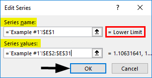
After clicking on the “Add” button and input Lower Limit as a “Series name” and corresponding Lower Limit values as a “Series values” under the “Edit Series” dialog box, click the “OK” button after done with it.
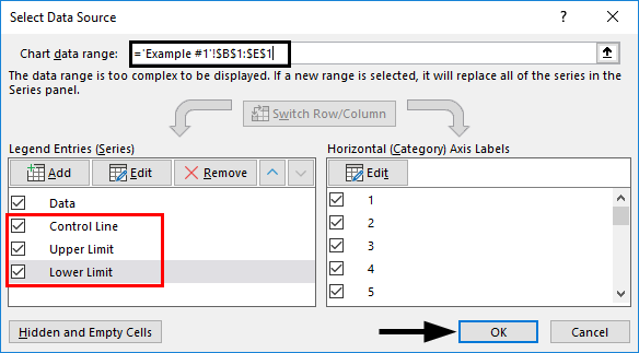
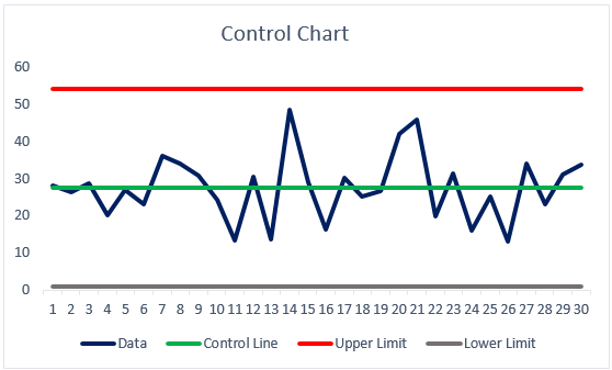
You’ll be able to see the control chart ready as below.
Step 11: Give the title as “Control Chart” for this graph, and you are done with it.
This is how we can create a control chart under Excel. This is from this article. Let’s wrap things up with some points to be remembered.
Things to Remember
- Control charts are plotted to see whether the process is within the control or not.
- It is mandatory to calculate and plot Central/Control Limit, Upper Limit, and Lower Limit in order to check whether the process lies between them.
Recommended Articles
This is a guide to Control Charts in Excel. Here we discuss How to create Control Charts in Excel along with practical examples and a downloadable excel template. You can also go through our other suggested articles –
- Radar Chart in Excel
- Combo Chart in Excel
- Marimekko Chart Excel
- Interactive Chart in Excel
Control charts in Excel are crucial for monitoring and improving processes in various industries, including manufacturing, healthcare, and finance. They help identify data trends, patterns, and outliers, allowing decision-makers to take corrective action and improve overall performance. In this article, we will explore the concept of control charts in Excel and show you how to create them step-by-step.
How to Control Charts in Excel
What are Control Charts?
A control chart is a statistical tool that graphically displays data over time and helps detect any changes or variations in a process. It is based on the principle that all processes have inherent variability, which can be classified into common cause variation and special cause variation.
Common cause variation is inherent in the process and results from natural factors such as temperature, humidity, or machine wear and tear. It is considered normal within certain limits, and the process is said to be in control when the variation is within these limits.
Special cause variation, on the other hand, is caused by external factors such as human error, equipment malfunction, or a change in the process. It is considered abnormal and can cause the process to go out of control.
Select 2D Excel Charts
Types of Control Charts in Excel
Control charts are graphical representations that help track the progress of a process over time. Consequently, they serve as useful tools for detecting variations that may suggest that a process is not performing as expected. In Excel, several control charts are available, which can be utilized for various purposes.
There are four main types of control charts available in Excel. Firstly, the High-Low-Close Control Chart displays the high, low, and close values of a process over time. This chart is useful for identifying trends and patterns in data. Secondly, the Open-High-Low-Close Control Chart shows the open, high, low, and close values of a process over time.
This chart is useful for identifying variations in data that may indicate changes in the process. Thirdly, the Volume-High-Low-Close Control Chart displays the volume, high, low, and close values of a process over time. It is useful for identifying changes in process volume that may affect performance. Finally, the Volume-Open-High-Low-Close Control Chart shows the volume, open, high, low, and close values of a process over time. It is useful for identifying changes in process volume and how they influence performance.
Overall, control charts in Excel are powerful tools for supervising process performance and identifying variations that may indicate issues. In addition, they are simple to create and can be customized to suit different users’ requirements.
Creating Control Charts in Excel:
Excel is a powerful tool for creating control charts and analyzing data. Here’s how you can create a control chart in Excel:
Step 1: Collect Data
The first step is to collect data on the process you want to monitor. This could be anything from the number of defects in a manufacturing process to the time it takes to complete a task.
Step 2: Calculate Mean and Standard Deviation
The next step is to calculate the mean and standard deviation of the data. The mean is the average of the data, and the standard deviation is a measure of how spread out the data is. You can calculate these values using the AVERAGE and STDEV functions in Excel.
Step 3: Create Control Chart
Once you have calculated the mean and standard deviation, you can create the control chart. There are two types of control charts: the X-bar chart and the R chart. The X-bar chart shows the average of the data over time, while the R chart shows the range of the data over time.
To create a control chart in Excel, you need to:
- Select the data you want to use
- Click on the Insert tab
- Click on the Line chart icon
- Select the Line chart with Markers option
- Right-click on the chart and select Select Data
- Click on Add under Legend Entries (Series)
- Enter a name for the series and select the data for the series
- Click OK
- Right-click on the new series and select Change Series Chart Type
- Select the Line chart with Markers option
- Click OK
Step 4: Add Control Limits
The next step is to add control limits to the chart. Control limits are calculated based on the mean and standard deviation of the data and represent the upper and lower limits within which the process is expected to operate. You can use the following formulas to calculate control limits:
Upper Control Limit (UCL) = Mean + 3 x Standard Deviation Lower Control Limit (LCL) = Mean – 3 x Standard Deviation
To add control limits to the chart, you need to:
- Right-click on the chart and select Select Data
- Click on Add under Legend Entries (Series)
- Enter a name for the series and select the UCL data for the series
- Click OK
- Right-click on the new series and select Change Series Chart Type
- Select the Line chart option
- Click OK
- Repeat steps 2-6 for the LCL
Step 5: Interpret the Chart
Once you have created the control chart, you can interpret the data and identify any patterns or trends in the ‘we’ form:
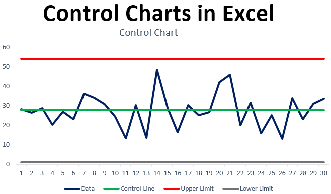
We can use the statistical process control chart in Excel to study how processes or data changes occur over time. The Control chart has four lines including; a straight-line representing average, the data and a lower control limit (LCL) and an upper control limit (UCL). In this tutorial, we will learn how to create a control chart for analyzing data.
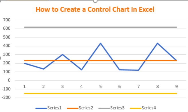 Figure 1 – How to make a statistical process control chart in excel
Creating Control Charts
- We will begin by setting up our data as shown in Figure 2
- Column A will contain the Date (will not be used in creating control chart)
- Column B contains our Sample Data
- Column C will contain the Control Line ( Mean or Average)
- Column D will contain the UCL (Upper Control Limit)
- Column E will contain the LCL (Lower Control Limit)
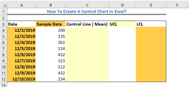 Figure 2 – Data to create a control chart
- Below our Table, we will set up a mini table. In Cells A14 and Cell A15, we will enter Mean and Std. Dev (standard deviation) respectively.
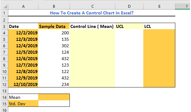 Figure 3 – How to create a control chart
- We will click on Cell B14. We will go to the Formula Tab and select the small Arrow beside the Autosum to view the drop-down menu
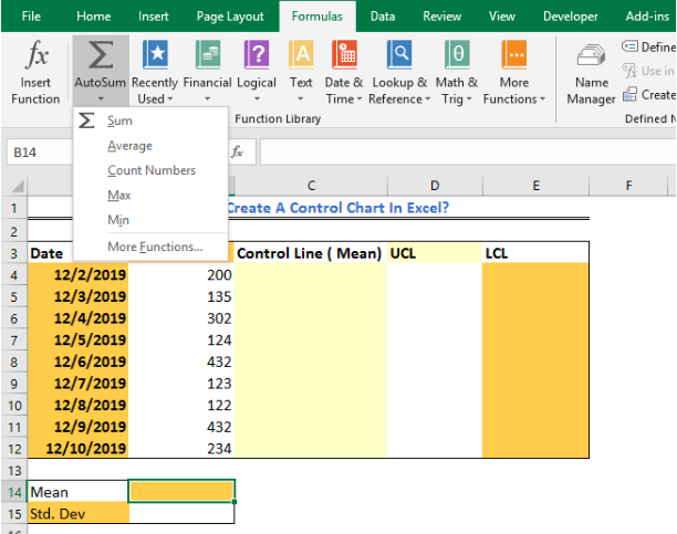 Figure 4 – How to create a control chart
- In the drop-down menu, we will select Average and highlight Cells B4:B12
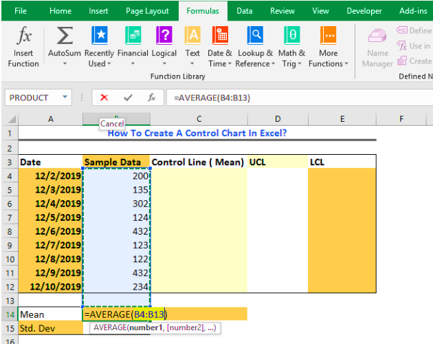 Figure 5 – How to create a control chart
- We will press Enter
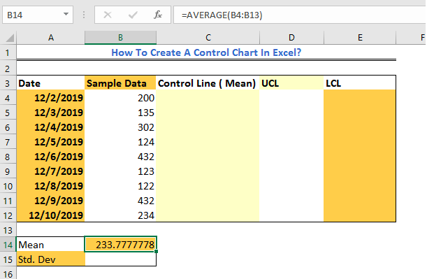 Figure 6 – How to make a control chart
- We will click again, this time in Cell B15, go the Formula Tab again, and click the small Arrow next to the Autosum. In the drop-down menu, we will select More Functions
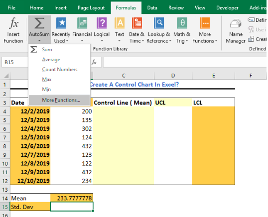 Figure 7 – How to control charts in excel
- In the Insert Function dialog Window, we will select STDEV and click OK
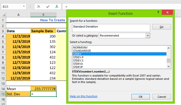 Figure 8 – Creating control charts
- Again, we will highlight the Cells B4:B12 containing the data
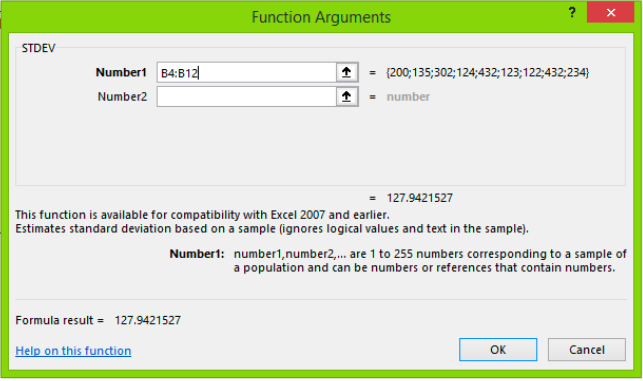 Figure 9 – Making control charts
- We will press Enter
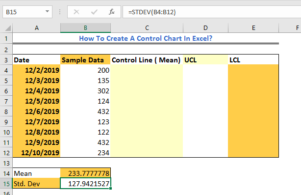 Figure 10 – How to create control chart
- In Cell C4, we will enter the cell reference for the Cell contain the average, i.e. we will enter =B$14.
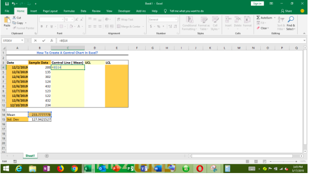 Figure 11 – Making control charts in Excel
- We will press Enter. We will double-click the fill handle tool (the small box at the bottom-right as shown in Cell C5 of the figure below) and drag down the column
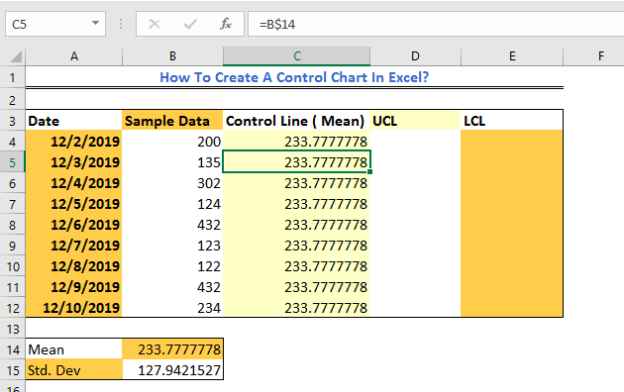 Figure 12 – How to create a control chart
- In Cell D4, we will add Average to STDEV multiplied by 3, which means we will have the formula below:
=B$14+(B$15*3)
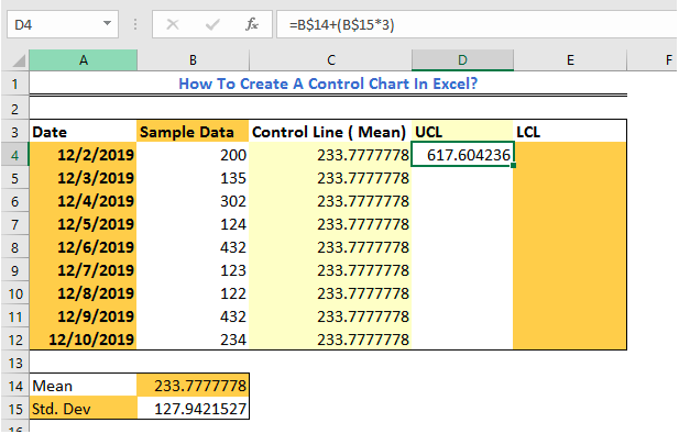 Figure 13 – Making a control chart
- We will use the Fill handle tool to fill the result down the column
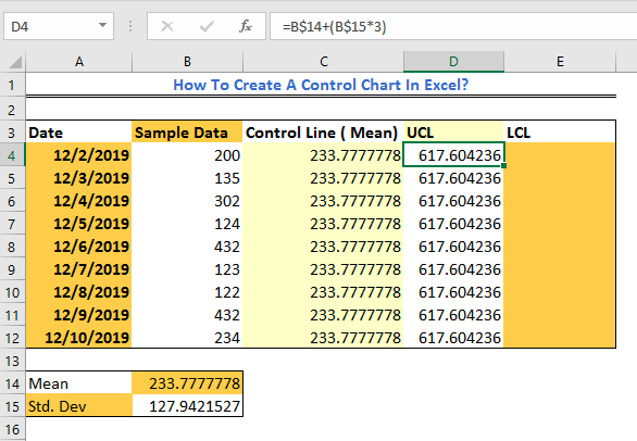 Figure 14 – Control charts in Excel
- In Cell E4, we will enter the formula below:
=B$14-(B$15*3)
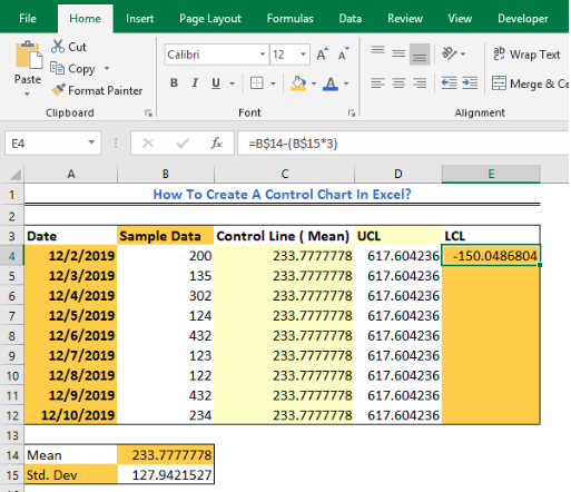 Figure 15 – Statistical process control
- We will use the fill handle tool to enter the result down Column E
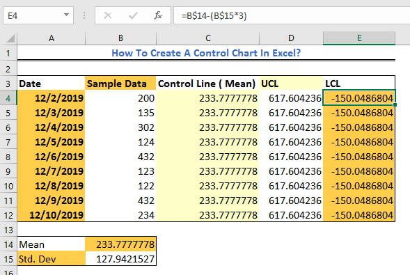 Figure 16 – Process control chart in excel
- We will highlight range B4:E12
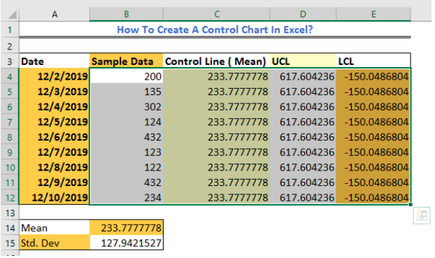 Figure 17 – Create a control chart in Excel
- Next, we will go to the Insert Tab and select the Line chart from the Chart Group
 Figure 18 – Control chart in Excel
- In the drop-down menu, we will select the first Line Chart
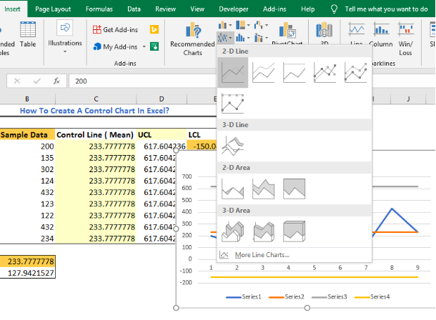 Figure 19 – Control chart in Excel
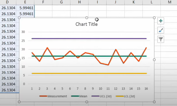
- We can now add a chart title, change or modify our Control chart as desired
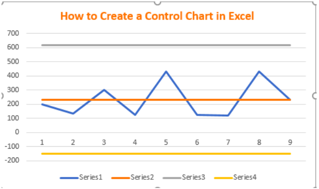 Figure 20 – Excel Control Chart
Instant Connection to an Excel Expert
Most of the time, the problem you will need to solve will be more complex than a simple application of a formula or function. If you want to save hours of research and frustration, try our live Excelchat service! Our Excel Experts are available 24/7 to answer any Excel question you may have. We guarantee a connection within 30 seconds and a customized solution within 20 minutes.
This is a complete guide to learning about control charts.
If you really want to learn detailed control charts in an easy way, you will enjoy and learn in this post.
The purpose of this post is to get the concept knowledge of the control chart & types of control charts. It is very helpful in statistical process control (SPC).
Let’s started in…

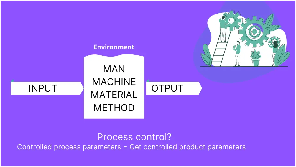
We are daily fighting with the process to achieve defect-free product outcomes.
so for that, we need to control the production process parameters.
In this post, we will learn the quality methods used during the control stage of the process.
The only tool to read the process is control charts. These are the major tools used to control the parameters in production.

What is mean by process control?
During manufacturing, process control is the quality effort.
Therefore the aim is to achieve the manufacturing objective proactively.
So to avoid the production of defects in the process.

The process is run using the terms such as time, speed, pressure, and temperature. These terms we called process parameters.
These process parameters are set by using the experiments during the initial project development i.e APQP stage.
So that we get the product output within specification level.
similarly, changes in process parameters will affect the product quality.
Therefore these parameters are maintained or controlled consistently, to produce the OK product.
So to monitor the product and process parameters, for controlled consistency we use the control charts.
And finally, the process of controlling the product and process parameter is process control.
Nowadays manufacturing industry is facing a lot due to process variation which leads to producing defects and facing huge costs.
Let’s dive into the topics which we will learn in this post…
Today I’m going to explore the concept of control charts with detail SCOPE,
You will also see what are the types of control charts in the process control approach.

What is a control chart?
Dr. Walter Shewhart invents the control charts in the 1920s.
Therefore the control charts are also called Shewhart’s charts.
The control chart procedure is proposed during the working for Bell lab.
According to Shewhart, the source of variation is present in the process in two ways.
Variation due to common cause and special cause variation.
Therefore control chart is the differentiating between two sources of variation.
You can read common cause and special cause variations explained in SPC.
Purpose of control chart
As we set there is a lot of variation in process parameters leading to producing defects.
Therefore the primary purpose of the control charts is to predict the expected product outcome.
It is a statistical analysis tool. This tool shows whether the process is in control or not.
Also, this is one of the important tools of the 7 QC tools. To learn more about the 7QC tools Click here.
So the primary purpose of control charts is to take samples from the process and detect the possibility of the process being in control or out of control.
How does it work?
First, we need to define limits, such as Upper limit, lower limit, and medium value (Centerline).
Then draw a chart with these limits.
Gather values from the process and draw them into the chart.
The figure shows the sample control chart for the data collected for 10 samples.
There is Center Line at 10,
The upper specification limit is 10.5
and Lower specification Limit with 9.5.
Let’s add and draw the data points on the chart.
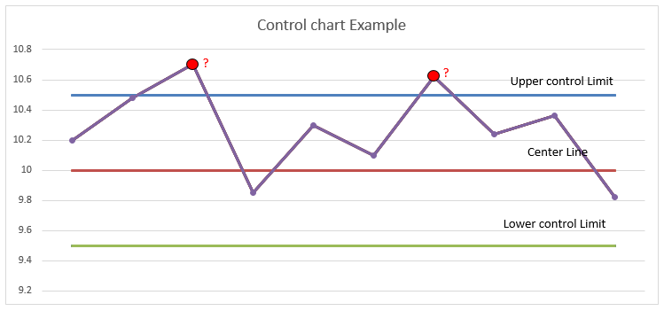
And the chart shows the two data points which are not in specification / not in control condition.
What it means? what happen in the process?
So at these two point, there is chance of common cause or special cause occurrence in the process, leads to produce the output which is not in control.
Next we will see the types of control charts and how the control limits are set.
Benefits of control chart
- Predict process out of control and out of specification limits
- Distinguish between specific, identifiable causes of variation
- Can be used for statistical process control
- Improved worker morale because of the satisfaction they get from seeing
the results of their work
Types of control chart
Next, we will touch on the types of charts,
Selection of control charts
And details of each type of chart
Let’s dive in..

The selection of the type of chart is based on the data you capture.
So we will touch on all chart selection criteria and their use.
Also, we will see the structure for the selection of control charts.
7 Types of control charts
- Xbar-R chart
- Xbar-S chart
- I-MR chart
- P chart
- np chart
- U chart
- C chart
Selection of control charts
The selection of type of chart is base on the what data you capture?
Therefore in the below chart, you will see what type of control chart is used and where it is applicable.
So in this chart you see, the chart is categorized based on data type, Subgroup size & defect/defective type.
You can learn what is subgroup? by click here.

What is Data types?
The data is the basics for the control chart.
Therefore in statistical techniques there is the analysis of samples and the data.
This data is collected by measurement of sample quantity.
So all processes are generating the data and this data is categorized as ‘Continuous data’ and Attribute Data.
1. CONTINUOUS DATA:
Also called variable data.
Continuous data is obtained by measurement using the measuring instrument. Example: Diameter of rod, Width of block, Temperature, weight, etc.

2. ATTRIBUTE DATA:
Also called discrete data.
This type of data is categorized by level or it is countable data. Example: Count of students at each division, good – bad, Ok – Not ok, etc.

1# Xbar-R chart
You will learn step by step guide of each type of control chart.
What is an Xbar-R chart?
The Xbar-R chart is the tool to monitor the process.
From this chart we can take action on any outside points (on special cause) to bring our process in control.
In the Xbar-R chart, you need to collect data by measuring samples from the process.
This data is measured at equal intervals of time.
So that you get the average of each interval and Range from measure data.
Xbar = Sample Average ( X̅ )
R = Sample Range (R)
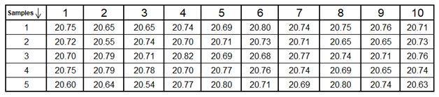
How to collect data for the Xbar-R chart?
Collect data by measuring samples from the process.
You need to select the sample size (Subgroup), and according to that collect the data by measurement of samples at regular interval of time.
So as per the selection criteria, we are using the Xbar-R chart when the subgroup size is 8 or less.
Let’s say I am checking the diameter of the rod, as 5 samples per production shift.
You can define the time interval by your choice as per day, after every 4 hour,s etc.
This data is measured at equal intervals of time.
Therefore I have gathered the data for 10 days in the below table
How to draw an Xbar-R chart?
Now we don’t have any control limits define.
Therefore we need to draw only the average chart at the initial data collection stage.
So calculate the Average (Xbar) of the data, I have calculated the same in the below table.
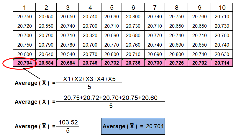
Similarly, calculate the Range (R) of the data,
The range is shown in the below table.

Now after collecting the data for define time period, the next step is to define/set the control limits for the control chart.
We will see the control limit for the Xbar-R chart.
The Centerline is the Average of all Data points
Xbar chart CL = Average of all data points = 20.72
R chart CL = Average of Range (Rbar) = 0.15
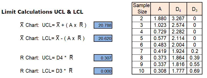
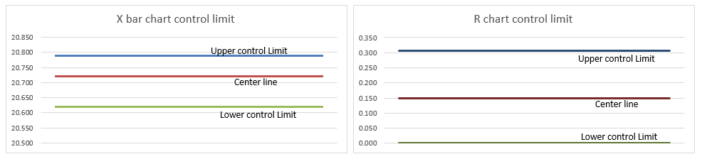
Finally after calculating the control limit,
Draw the chart as shown below.
Now its time to monitor the process,
We have set our control limits for the process.
So do the regular measurement of the parameter and put this reading in the chart so that you can monitor the behaviors of the process.
For example, here I have plotted the same reading of above into the chart and we get the output as the Xbar-R control chart.
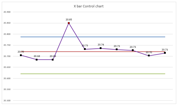

How to read/predict a control chart?
Many of us can draw the control chart but are not able to analyze the chart.
From the chart we need to find out the special cause present in the process.
So that we can take action on that causes and bring our process within control limit.
Common cause criteria:
The variation present in the process is due to common causes.
Therefore you observe that each data point fluctuates with a small amount of variation, for this, we can say common cause variation in the chart.
Special cause criteria:
In the AIAG manual for Statistical process control (SPC), we found the criteria for identifying the special cause present in the process.
- If you found one point above the upper or below the lower control limit, it means of special cause occurred at this time in the process.
- 7 points were found consistently above or below the center line then also there is a special cause phenomenon present in the process.
- Similarly, continuous 6 points in increasing or decreasing order can say special cause present.
- 14 points in a row alternatively up & down condition.
- 2 out of 3 points > 2 standard deviations from the center line (same side).
- 4 out of 5 points > 1 standard deviation from center line (same side).
- 15 points in a row within 1 standard deviation from the center line (either side).
- 8 points in a row > 1 standard deviation from the center line (either side).
2# Xbar-S chart
For the Xbar-S chart, a similar process is to be followed as on the Xbar-R chart,
The only difference is instead of calculating the Range in R-chart,
Here Standard deviation (S) is calculated for the S chart and plotted the same in the graph.
So that you get the average of each interval and standard deviation from measure data.
Xbar = Sample Average ( X̅ )
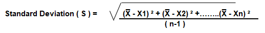
S = Standard deviation (S) – You can calculate standard deviation in excel by formulae [=STDEV(number 1, number 2…number n)]
below are the formulae for Standard deviation (S)
Now after collecting the data for the defined time period, the next step is to define/set the control limits for the control chart.
We will see the control limit for the Xbar-S chart.
The Centerline is the Average of all Data points
Xbar chart CL = Average of all data points
S chart CL = Average of Standard deviations

3# I-MR chart
What is an I-MR chart?
I = Individual chart
MR= Moving range chart
I-Chart: Individual chart use for monitoring the individual points measure in the process. In this chart we can monitor the mean of our process at each interval of the reading measure. we can identify common & special causes from this chart and monitor the same.
MR Chart : In the moving range chart we are measure the difference between each individual measurement and plot it on the chart. Therefore this will help us to identify the process variation present in the system.
how to collect data for the I-MR chart?
The data is collected at regular intervals of time,
As there is no subgroup-wise data is required for the I-MR chart,
Now after collecting the data for the defined time period, the next step is to define/set the control limits for the control chart.
Below are the data measure for the diameter of the rod,

how to draw an I-MR chart?
Now from the data calculate the moving range,
So moving range is the difference between current data and last-measure data.
In the table, we have calculated the moving range.

Now calculate the control limit for individual and moving range chart from the data we have,
Formulae of control limits for I-MR chart,
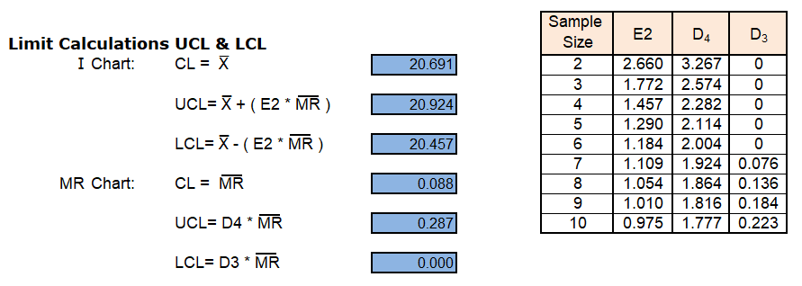
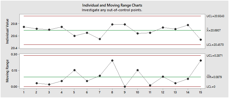
You can draw the chart in excel as the same method for drawing the Xbar-R chart.
Attribute data type control charts
As we saw in the above paragraph what is the attribute / Deseret data type?
And these charts are categorized by defect / defective and sample size fix/variable.
Now we just touch on the term what is defective and defects?
WHAT IS DEFECTIVE?
When we inspect the sample of 20 parts and found that 5 parts as NOK, then we have 5 defective parts out of 20.
WHAT IS A DEFECT?
Now let’s go through the example, we have 10 mobile phones for inspection.
It is found that the phones have non-conformity such as scratches, cracks, and dents, therefore after an inspection found that 10 scratches, 2 cracks, and 8 dents among the 10 phones.
Let’s conclude that the defects are the non-conformity observed in the part due to the same part getting defective.
Finally, the defective part may have many defects.
Now in this attribute data type, there are 4 types of control charts.
p-chart: For defective and subgroups data or the sample size is the same or may vary.
np-chart: For defective and Sample size is fixed.
u-chart: Use for defect and subgroup or the sample size is same or may vary.
c-chart: use for defect and Sample size is fixed.
4# P Chart
What is a P chart?
P chart is an attribute data type control chart.
Therefore the data should be in attribute form, we saw above that what is attribute data.
P-chart is the percentage of defective units non-confirming / Defective.
In this chart subgroup size may vary.
how to collect data for the P chart?
The attribute data is collected at regular intervals of time,
It may or may not require subgroup-wise data for the p-chart.
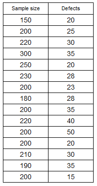
Now the data has been collected such as I have measured the 200 parts and found 20 defective,
So we have 20 defectives from a sample size of 200, in the next sample size of 220 parts found 10 defective.
therefore the sample size may vary in p-chart.

how to draw a P chart?
Now from the data, we will calculate the control limit first,
The sample size is not constant, therefore the control limits for each point vary in the chart plotted,
In the table, we have calculated the moving range.
Now calculate the control limit for the p chart from the data we have,
Formulae of control limits for p chart as below,

Now draw the chart using the control limits and the data points in that,
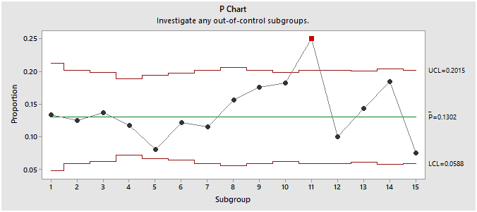
You can draw the chart in excel, if you have a constant sample size then the control limit lines should be straight lines.
You can use a p chart for both variable sample size or fix sample size.
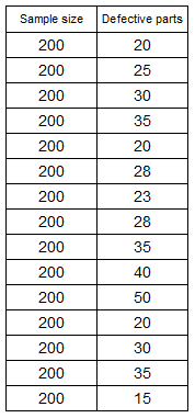
5# np Chart
What is the np chart?
np chart is an attribute data type control chart.
np-chart is the percentage of defective unit non-confirming / Defective with a fixed sample size.
In this chart, the subgroup size is fixed.
how to collect data for np chart?
The attribute data is collected at regular intervals of time,
It requires collecting data subgroup-wise with fixed sample size.
Now the data is collected such as, I have measured the 200 parts at defined time intervals and recorded data for how many defective parts were found in the sampling frequency of 200 parts.
So we have below data for defective from a sample size of 200 per shift,
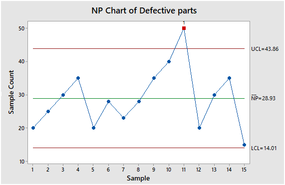
how to draw an np chart?
Now calculate the control limit for the np chart from the data we have,
Formulae of control limits for np chart as below,
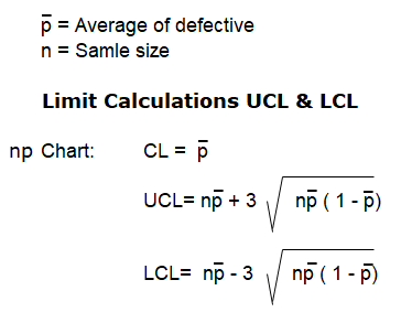
From the data calculate the above terms in formulae and draw the chart,
Following are the chart drawn in Minitab, you can draw in excel as we draw for the Xbar-R chart.
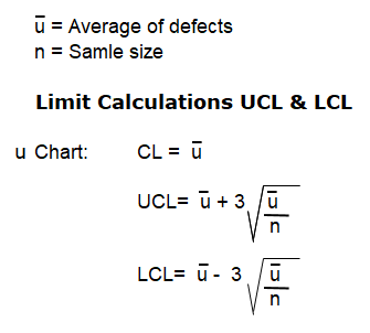
6# u chart
What is u chart?
u chart is an attribute data type control chart.
Therefore the data should be in attribute form, we saw above that what is attribute data?
u-chart is the percentage of defect of unit non-confirming.
In this chart subgroup size may or may not vary.
how to collect data for u chart?
The attribute data is collected at regular intervals of time,
It may or may not require subgroup wise data for the u-chart.
Now the data is collected such as, I have measured the 200 parts and found 20 defects,
So we have 20 defects from a sample size of 200, in the next sample size of 220 parts found 10 defects.
therefore the sample size may vary in u-chart.
how to draw u chart?
Now from the data, we will calculate the control limit first,
The sample size is not constant, therefore the control limits for each point vary in the chart plotted,
Now calculate the control limit for u chart from the data we have,
Formulae of control limits for u chart as below,
Now draw the chart using calculating the control limits and analysing the data in the chart,

You can draw the chart in excel, if you have a constant sample size then the control limit lines will be straight lines.
You can use a u chart for both variable sample sizes or fix sample sizes.
7# c chart
What is a c chart?
c chart is an attribute data type control chart.
In this chart subgroup size is fixed.
how to collect data for the c chart?
The attribute data is collected at regular intervals of time,
It requires collecting data subgroup-wise with fixed sample size.
Now the data is collected such as, I have inspected the 200 parts at defined time intervals and recorded data for how many defects were found in the sampling frequency of 200 parts.
So we have below data for defects from a sample size of 200 per shift,

how to draw a c chart?
Now calculate the control limit for the c chart from the data we have,
Formulae of control limits for c chart as below,
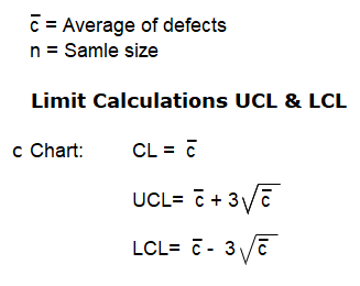
From the data calculate the above terms in formulae and draw the chart,
Following are the chart draw in Minitab, you can draw in excel as we draw for the Xbar-R chart.

Here we complete the control charts and types of control chart topics, which is important tool for monitoring the parameters in manufacturing.
One of the tools among 7 QC tools.