
You can split fonts into two main styles. There are serif fonts (with lines flicking out of each letter) and sans-serif fonts (without the lines). Serif fonts tend to be easier to read, but they look more formal. This article will show you some of the best ones in Word.
The best serif fonts in Microsoft Word are Times New Roman, Garamond, and Palatino Linotype. They all work well to show a more formal look in your writing. They’re also very easy to read, making them solid choices if you’re looking to write an essay or academic paper.
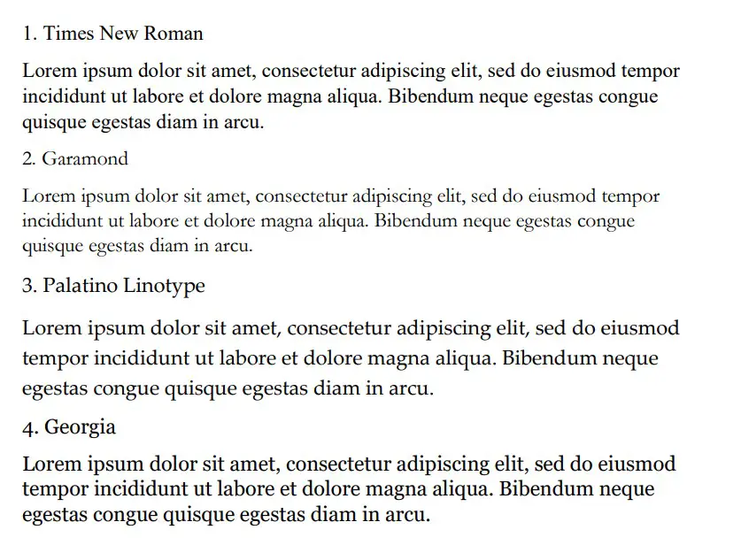
Times New Roman
Times New Roman is the default Microsoft Word font. You really can’t go wrong with it. Everyone knows what it looks like, and everyone uses it as the default serif font in Word. If you don’t actively change your font, it’s likely that you’re writing in Times New Roman.
It is a very professional font that has been proven to be one of the easiest to read on paper. It also makes your writing look more trustworthy, which works wonders when you use it for something like an academic or scientific paper.
You will find that Times New Roman is one of the most popular fonts in the world. It’s such a good choice because of how popular it is, and it can fit in just about anywhere in your writing. It works well for titles and in the main body of the text.
Garamond
Garamond is another great serif font that works really well. It comes in at a close second to Times New Roman, which is saying a lot considering how popular Times New Roman is. Garamond is fairly easy to read, and it even comes in slightly smaller in size.
Garamond is a great font that makes your writing much more concise. The smaller size of this font allows you to fit more words onto your page without feeling like you’re writing an essay full of gibberish and waffle.
If people decided to choose a different serif font in place of Times New Roman, it’s likely that Garamond would rank quite highly as their next favorite pick.
Palatino Linotype
Palatino Linotype is a great font choice that a lot of people enjoy using. It feels a bit fresher than some of the other serif fonts, and the size of the letters makes it a little more appealing when you are writing it for more informal purposes.
You will find that Palatino Linotype looks good wherever you put it. It can be both in a heading or in the main text body. As long as you like the look of the font, you’ll find a great place to put it to make sure it fits in.
The letters on Palatino Linotype feel a little more “open” than those of Times New Roman and Garamond. That’s what makes it a better choice if you’re looking for something that’s a little bit easier to read or comes across with more informal energy.
Georgia
Georgia is a very popular choice that a lot of essay writers are recommended to use. Many academics also vouch for Georgia, making it a really good choice if you’re looking to capture a more formal and trustworthy look.
People say that Georgia works really well as a heading. While this is definitely true, there is nothing wrong with using it as part of the main body of your text either. It can work in just about any situation, which makes it a great serif font choice.
While it’s not as popular as Times New Roman, it’s definitely up there in terms of how many people use it. It’s a fairly generic serif font, so there aren’t any specific style choices that stand it out from some of the rest.
Cambria
Cambria is another great serif font that is a default choice in Microsoft Word. While it isn’t automatically set as a font choice, it is automatic if you use the specific Word style that allows you to write headings and sub-headings.
Cambria is one of the best choices to introduce new ideas with headings and sub-headings. Of course, you don’t have to be limited to including it as a heading. If you want it as the text body, too, that’s fine.
You’ll find that this ranks highly in popularity compared to many of the other fonts. It looks really good on the page because of the more “square” feel that the letters have.
Bodoni MT
Bodoni MT is a classical serif font that works well. People like to use this font for novels, which shows that it must be an easy-to-read choice. The purpose of novels is to have thousands of words page after page, so having an easy-to-read font is always going to be ideal.
Bodoni MT is one of the thicker fonts on this list. It almost looks like it is written in bold, which really helps it to stand out from some of the other options. It works really well when it’s used to write multiple words at the same time.
The serif style looks very similar to some of the best fonts on this list, too. While this doesn’t allow Bodoni MT to be unique, it does allow it to have a familiar look and feel to it.
Bookman Old Style
Bookman Old Style is another great font that is common for novels. Again, if it works well in novels, you can bet that it works well in any situation when you might need someone to read through what you’re writing carefully.
Bookman Old Style is a large font. It allows the letters to appear more free and open compared to many of the other choices. This makes it a great font that’s worth trying out.
Lucida Bright
Lucida Bright is a good font choice. It’s part of the famous Lucida font family, and it works really well to show a large serif style. Lucida Bright is one of the larger fonts on this list, making it a great choice if you’re trying to make your writing really easy to read.
Some people would argue that Lucida Bright is too large for most formal documents. It does mean that you’ll take up a few extra pages because of your larger font choice, but this isn’t always a problem. Sometimes, it’s refreshing to include a larger font.
Modern No. 20
Modern No. 20 is an interesting serif font that doesn’t often get used. It’s a great choice nonetheless, and it applies to situations where some of the other serif fonts might feel a bit too pretentious or samey.
Modern No. 20 has very sharp serifs on its letters. While all of the fonts discussed so far have decent serif accents, Modern No. 20 seems to have some of the largest serifs that really help it to bring a unique style to your writing.
It’s much smaller than most of the other options too. It makes for a great choice if you’re trying to include a lot of information in one area without feeling like you have to fill up a lot of pages to get it to work.
Rockwell
Rockwell is a great option that many people like to use. It comes from the Rockwell family, which has made its name with more obvious and impactful fonts like ExtraBold and Condensed. Rockwell on its own is a great option for your serif-font needs.
It fits a similar style to most of the other serif fonts. There is nothing particularly unique that makes it stand out, which is usually a good thing. People don’t like their serif fonts to look out of place in their writing, and Rockwell will fit in no matter where you put it.
Poor Richard
Poor Richard is a great font in Microsoft Word that deserves more attention. It’s a very attractive font that comes with small lower-case letters. The capital letters tend to dwarf the lower-case ones, making it an interesting font style that the other serif fonts don’t have.
This font style is both a blessing and a curse, depending on how you look at it. It’s a blessing because it means that Poor Richard has a unique personality that allows it to stand out from the rest of the serif crowd.
It’s a curse because the uniqueness and size of the font in its style mean it doesn’t work very well formally. You’ll find that Poor Richard is a much better serif font for your informal writing.
Perpetua
Perpetua follows the same general idea as Poor Richard. It’s not all that popular, but it deserves to be. It’s a great font with an interesting style (most of which comes from the way some of the letters go below the written line, like the “p’s” and “q’s”).
Perpetua works really well in formal and informal contexts. It’s worth trying to use it yourself to see whether you can get along with it. A lot of people think it’s an attractive font, but it doesn’t often get used because it’s not a very well-known name.
You may also like:
12 Smallest Fonts In Microsoft Word
12 Best Cursive Fonts in Microsoft Word
12 Most Scary Fonts for Halooween in Microsoft Word

Martin holds a Master’s degree in Finance and International Business. He has six years of experience in professional communication with clients, executives, and colleagues. Furthermore, he has teaching experience from Aarhus University. Martin has been featured as an expert in communication and teaching on Forbes and Shopify. Read more about Martin here.
Last Update: Jan 03, 2023
This is a question our experts keep getting from time to time. Now, we have got the complete detailed explanation and answer for everyone, who is interested!
Asked by: Jennyfer Schumm
Score: 4.2/5
(71 votes)
Serif font (red serifs) In typography, a serif (/ˈsɛrɪf/) is a small line or stroke regularly attached to the end of a larger stroke in a letter or symbol within a particular font or family of fonts.
What is a serif in Word?
A serif font contains serifs—tiny projections or “tails” at the ends of the strokes in a letter. A typical example is Times New Roman. A font like Arial, which does not have serifs, is called a sans serif font (from the French word sans, meaning “without”).
What’s a serif font examples?
Some popular examples of serif typefaces are Times New Roman, Garamond, and Georgia. Some popular sans-serif fonts are Arial, Futura, and Helvetica. The mood: Serif fonts are sometimes considered more classic or formal, and sans-serif fonts are often considered more minimalist or casual.
Does Word have serif?
The first of the letter Es is the very popular serif font «Times New Roman«. … With Microsoft Word 2007 and later, the font you get if you don’t make any changes is called Calibri. Calibri is a sans serif font that looks very similar to Arial.
What does sans font look like?
In typography and lettering, a sans-serif, sans serif, gothic, or simply sans letterform is one that does not have extending features called «serifs» at the end of strokes. Sans-serif typefaces tend to have less stroke width variation than serif typefaces.
34 related questions found
What does Sans mean in a font?
The answer is simply in the name. A serif is a decorative stroke that finishes off the end of a letters stem (sometimes also called the “feet” of the letters). In turn, a serif font is a font that has serifs, while a sans serif is a font that does not (hence the “sans”).
What is sans serif in Word?
A category of typefaces that do not use serifs, small lines at the ends of characters. … Popular sans serif fonts include Helvetica, Avant Garde, Arial, and Geneva. Serif fonts include Times Roman, Courier, New Century Schoolbook, and Palatino.
Is Helvetica on Microsoft Word?
We recently told you about the Helvetica font in Windows and Microsoft Office – or rather it’s noticeable absence. … Now open the same document in Word 2013 for Windows (or any Word for Windows) and check out the capital R – they are the same even though there’s two different fonts.
What is the best serif font?
The most popular serif fonts are Times New Roman, Arial, Georgia, Garamond, and Didot (to name a few). These fonts are often pre-installed in computers, making them an easy default choice.
Is Arial a serif font?
A neutral sans serif typeface originally based on Monotype Grotesque, Arial has firmly established itself as the de-facto stand in for Helvetica, much to the chagrin of the design community at large.
How do you get a sans serif font in Word?
Open up the Control Panel. Enter the “Appearance and Personalization” category and then select Fonts. Drag and drop your new font into this window, and it’ll be available in Word now.
What is the most common sans serif font?
1. Helvetica now. As far as sans serifs go, Helvetica might be the GOAT. Popular, powerful, pleasing to the eye, there is a reason brands from Microsoft to Jeep have used Helvetica, or some variant of it, in their logo and branding for years.
What’s the best serif type style for Web?
Beautiful Internet: 10 of the Best Fonts for the Web
- Alternate Gothic.
- Open Sans. …
- Alegreya. …
- Titillium Sans and Dosis. …
- Merriweather. …
- Yellowtail. …
- Playfair Display. Playfair is a unique font, created by Claus Eggers Sørensen. …
- Arvo. Arvo is a very good slab serif font family, created by Anton Koovit. …
Is serif a French word?
In typography, a serif is a small line trailing from the edges of letters and symbols, such as when handwriting is separated into distinct units for a typewriter or typsetter. … A typeface without serifs is called sans serif or sans-serif, from the French sans, meaning “without”.
Why do serifs exist?
hysically, serifs originated in the flourishes of the calligrapher’s wrist. In calligraphy, the art of hand-drawn lettering, serifs serve two purposes. They help a writer gain control over mark-making momentum, the arm shifting pressure and angles to form curves and modify the thickness of strokes.
What is a modern serif font?
This category contains typefaces in the modern or didone serif classification. They first appeared in the late 18th century and are characterized by extreme contrast between thick and thin lines.
What is the most classy font?
The following serif fonts will undoubtedly give an elegant appeal to your works, and best of all, you can download them free of charge.
- EB Garamond. …
- Playfair Display. …
- Crimson Text. …
- Old Standard. …
- Cormorant. …
- Libre Baskerville. …
- Caudex. …
- Spectral.
What is the most modern serif font?
To help you do just that, I prepared a list of the top 10 serif fonts to use when designing a an elegant and sophisticated logo.
- Blacker Pro. …
- FF Meta Serif. …
- Freight Display Pro. …
- Mirador. …
- Bookmania. …
- Span. …
- Gabriela Stencil. …
- Mixta.
What is a professional serif font?
Palatino. Fonts.com. A widely used serif font for both body text and display type, Palatino was designed by Hermann Zapf. Part of its widespread use may stem from its inclusion—along with Helvetica and Times—with macOS. Palatino is an old-style serif font.
Is Arial same as Helvetica?
Arial is a more rounded design than Helvetica, with softer, fuller curves, and more open counters. … But Helvetica still rules among graphic designers for print work, with its multiple weights and versions, as well as the rerelease of Linotype’s reworked, and very popular version, the Neue Helvetica® typeface.
What is the closest font to Helvetica in Microsoft Word?
Helvetica is a Macintosh system font, but not a Windows system font. Arial is the nearest equivalent.
Why is Helvetica so popular?
Why Helvetica is the world’s most popular font ??
Helvetica is named after the Latin name for Switzerland and is popular among designers for its clean, bold, and modern look. … It has very clear lines and characters, it looks like a very serious typeface.»
Is Arial or Times New Roman easier to read?
1. Because of readability, Times New Roman fits better in the long articles, such as newspapers and books. Contrastively, Arial is better used in advertisement owing to its clearance and relative big characters.
What font is used on Windows 95?
MS Sans Serif is the default system font on Windows 3.1, Windows 95, Windows NT 4.0, Windows 98, and Windows ME.
What is sans serif in CSS?
Serif includes small lines, Sans Serif (sans means without) doesn’t include them. They are «system fonts», the browser will have a default font to use for each type in the system. You don’t have control over them but they are good fallbacks if the font you want isn’t on the users system.
Some of the most commonly used serif fonts include Times New Roman, Garamond, Baskerville, Georgia, and Courier New. Some of the most popular sans serif fonts on the black include Arial, Helvetica, Proxima Nova, Futura, and Calibri.
Furthermore, What are the fonts in Word?
They appear in order of popularity.
- Helvetica. Helvetica remains the world’s most popular font. …
- Calibri. The runner up on our list is also a sans serif font. …
- Futura. Our next example is another classic sans serif font. …
- Garamond. Garamond is the first serif font on our list. …
- Times New Roman. …
- Arial. …
- Cambria. …
- Verdana.
Simply so How many fonts are there in Microsoft Word?
While there are more than 700 font options in Word, Microsoft has commissioned five new custom fonts for Office, in a move away from the Calibri font that has been the default in Microsoft Office for nearly 15 years.
Also, What are the standard Microsoft fonts? Calibri has been the default font for all things Microsoft since 2007, when it stepped in to replace Times New Roman across Microsoft Office.
What is font size in Microsoft Word?
Font sizes are measured in points; 1 point (abbreviated pt) is equal to 1/72 of an inch. The point size refers to the height of a character. Thus, a 12-pt font is 1/6 inch in height. The default font size in Microsoft Word 2010 is 11 pts.
How do I use fonts in Microsoft Word? Add a font
- Download the font files. …
- If the font files are zipped, unzip them by right-clicking the .zip folder and then clicking Extract. …
- Right-click the fonts you want, and click Install.
- If you’re prompted to allow the program to make changes to your computer, and if you trust the source of the font, click Yes.
While there are more than 700 font options in Word, Microsoft has commissioned five new custom fonts for Office, in a move away from the Calibri font that has been the default in Microsoft Office for nearly 15 years.
How many font styles are there in Microsoft Word?
The most common font styles are Regular, Italic, Bold, and BoldItalic. This is not the limit, however, and not every font will include these four. Indeed, the styles available for a particular font are entirely up to the font designer. WordTips is your source for cost-effective Microsoft Word training.
How do I organize fonts in Word?
There is a standard tool in the control panel which shows and previews the installed fonts. For accessing this you can simply type ‘Control Panel’ in the search bar and then click on ‘Appearance and Personalization’. Under this you will find the ‘Font’ section where you can organize it accordingly.
What is considered a standard font?
The most common font used is black Times New Roman at 12 points in size. Other serif fonts, those that have tails, that work well include Cambria, Georgia, Garamond, Book Antiqua, and Didot. Sans serif fonts, those without tails, that work well include Calibri, Helvetica, Verdana, Trebuchet MS and Lato.
How do I download new fonts to Microsoft Word?
Add a font
- Download the font files. …
- If the font files are zipped, unzip them by right-clicking the .zip folder and then clicking Extract. …
- Right-click the fonts you want, and click Install.
- If you’re prompted to allow the program to make changes to your computer, and if you trust the source of the font, click Yes.
What is the most beautiful font?
- 10 of the Most Beautiful Fonts for Web Designers. Design Tips. …
- Playfair. Some looks never go out of fashion. …
- Roboto. Roboto is a sans serif font – it’s geometric with friendly and open curves. …
- Raleway. Raleway is an elegant font with a thin weight – the unique ‘W’ really makes it stand out. …
- Pacifico. …
- Quicksand. …
- Oswald. …
- Lato.
How do I change font size and writing style in Word?
To change the font size of selected text in desktop Excel, PowerPoint, or Word:
- Select the text or cells with text you want to change. To select all text in a Word document, press Ctrl + A.
- On the Home tab, click the font size in the Font Size box. You can also type in any size you want, within the following limits:
What is the minimum font size in MS Word?
In Word, fonts can be sized from 1 point to 1,638 points. Point sizes smaller than 6 are generally too small for a human to read.
What is the biggest font size in Word?
Word supports font sizes from 1 point to 1638 points, which means you can use fonts that are 1/72 of an inch all the way up to 22-3/4 inches. Don’t these sizes deceive you, however. You might expect that if you set a font size to 144 points, you will end up with letters two inches high. You won’t.
How can I add a font to Microsoft Word for Mac?
How to Add New Fonts to Microsoft Word on a Mac
- Open Finder on your Mac.
- Navigate to the location where your new font file is. …
- Double-click the font file you want to install.
- The font preview window opens. …
- This will install the font and open the Font Book. …
- Restart your computer for the changes to take effect.
What is Microsoft logo font?
Segoe (/ˈsiːɡoʊ/ SEE-goh) is a typeface, or family of fonts, that is best known for its use by Microsoft. The company uses Segoe in its online and printed marketing materials, including recent logos for a number of products.
How do I add a Calligraphr font to Word?
To use your font in external programs like MS Word or Adobe Illustrator you have to install it on your computer. In the result dialog of “Build font” there is a download link for a . ttf file. Download this font file to your computer and install it.
Is Helvetica on Microsoft Word?
We recently told you about the Helvetica font in Windows and Microsoft Office – or rather it’s noticeable absence. … Now open the same document in Word 2013 for Windows (or any Word for Windows) and check out the capital R – they are the same even though there’s two different fonts.
What is font face in MS Word?
Microsoft Office 2007, Word comes with the default font face set to Calibri, a Microsoft specific font face. Changing the default to a more common font face, Arial for example, will ensure that your document displays properly for everyone who views it.
Why do my fonts change in Word?
If a document uses a font that is on your system, and then that document is opened on a system that doesn’t have the same font, Word will substitute a different font for the missing one. This can affect the appearance of the document, even when you subsequently open it back on your original system.
Where is the font style in Microsoft Word?
Go to Format > Font > Font. + D to open the Font dialog box. Select the font and size you want to use.
Which is not a font style in MS Word?
Superscript is not related to the font style. It is a letter, character number or symbol that is set slightly for the normal line of type. It is generally smaller than the body of the text and detailed occurs at the baseline.
What are the four types of fonts?
What are four main types of fonts?
- Serif fonts.
- Sans serif fonts.
- Script fonts.
- Display fonts.
Table of Contents
- What fonts are sans serif in Microsoft Word?
- Is Arial sans-serif font?
- What is the cleanest sans-serif font?
- Is Comic Sans a sans serif font?
- What is the best font to use on word?
- What are some good, large serif fonts?
- What fonts are in the serif family?
- When to use sans serif?
Pronounced SAN-SERR-if. A category of typefaces that do not use serifs, small lines at the ends of characters. Popular sans serif fonts include Helvetica, Avant Garde, Arial, and Geneva. Serif fonts include Times Roman, Courier, New Century Schoolbook, and Palatino.
Pronounced SAN-SERR-if. A category of typefaces that do not use serifs, small lines at the ends of characters. Popular sans serif fonts include Helvetica, Avant Garde, Arial, and Geneva. Serif fonts include Times Roman, Courier, New Century Schoolbook, and Palatino.
Is Arial sans-serif font?
Typefaces that have serifs are referred to as serif typefaces, while sans-serif typefaces do not have those decorative strokes. Some popular examples of serif typefaces are Times New Roman, Garamond, and Georgia. Some popular sans-serif fonts are Arial, Futura, and Helvetica.
What is the cleanest sans-serif font?
The Best Sans Serif Fonts for Modern, Clean Designs
- Zetafonts. Florence, Italy is the home of Zetafonts, a foundry that has spent the last decade incorporating Italian design principles into their sleek fonts.
- Neufile Grotesk.
- Ariana Pro.
- Fibra.
- TT Interphases.
- Gelion.
- Industrial Sans.
- Sofia Pro.
Is Comic Sans a sans serif font?
Comic Sans MS is a sans-serif casual script typeface designed by Vincent Connare and released in 1994 by Microsoft Corporation.
What is the best font to use on word?
1) Download the font files. These often come compressed in . In one .zip folder, you might find several variations on the same font, such as “light” and “heavy.” A .zip folder usually looks like this: 2) If the font files are zipped, unzip them by right-clicking the .zip folder and then clicking Extract . Now you’ll see the available TrueType and OpenType font files: 3) Right-click the fonts you want, and click Install . 4) If you’re prompted to allow the program to make changes to your computer, See More…
What are some good, large serif fonts?
Droid Serif Pro. This font is beautiful serif font collection specifically design for clear and comfortable on-screen reading.
What fonts are in the serif family?
Times New Roman. Talking about the best font,how can we forget to mention the classic “Times New Roman”.
When to use sans serif?
Sans serif fonts work well for short sections of text, such as credits and captions. When a project calls for very small type sizes, sans serif type is easier to read.

Microsoft Word is the global standard for word processing. At the same time, it’s one of the most maddening applications to master, which is why this Geek School series is all about learning how to format documents in Word.
Word 2013 and a Little Perspective
Microsoft is far more than a typical staid word processor. Word is one of the most affordable and closest things you can get to your very own printing press. In fact, it is for all With Word, you can write textbooks, create full magazine and newspaper layouts with graphics, write a novel with indices, and much, much more. You can do in mere hours, what twenty years ago might have taken an entire editorial team days or even weeks.
Microsoft Word completely eliminates the aggravation of typos (in theory at least). There is no need to retype whole chapters in order to add or rearrange content. Instead you can add, move, or even remove complete sentence, paragraphs, and chapters in mere seconds!
Of course, we take this power for granted but we can tell you, it really beats using a typewriter (let alone movable type) – making a mistake using a typewriter meant stopping what you were doing, rolling the platen up to better expose your typo, and then either using an eraser to remove the offending characters, or carefully dabbing on White-Out and patiently blowing it dry. Then, of course, you’d have to roll the platen back to the line you were typing on, taking further care to make sure it all lined up perfectly.
If you can imagine how many daily typing errors you make then you can probably get an idea of how long it took to produce even simple documents. Needless-to-say, it paid to be accurate, and unless you were a really good typist, typing an essay or book report, could be a long arduous process. And forget about adding pictures into your document. Doing that kind of stuff at home was nearly impossible. Oh sure, you could include your illustrations and photos and then refer to them, but it wasn’t as simple and elegant as cut-copy-paste we’ve become so accustomed to.
Nevertheless, all this power and control does arrive with a fairly steep learning curve. It can be a pain to get the hang of and be fluent in effectively formatting eye-catching documents. Luckily, that’s where we come in – with How-To Geek School’s Formatting Documents with Microsoft Word 2013.
What We Will Cover
This series aims to introduce you to a large swath of Word 2013’s document formatting features through five lessons.
In this lesson, we first cover some Word basics like the Ribbon and page structure like tabs, margins, and indents. Additionally, we show you how to manipulate formatting marks or simply turn them on/off. Our first lesson concludes with an exploration of fonts, and finally templates.
Lesson 2 begins with paragraphs, specifically alignment, indentation, and line spacing. After that we move on to shading and borders, and then lists (bulleted, numbered, and multilevel). We’ll also briefly touch upon AutoCorrect options.
After that, Lesson 3 begins with a lengthy exploration of tables (inserting, drawing, formatting, etc.) and then we dive into other formatting options, including links, headers, footers, equations, and symbols.
Lesson 4’s primary focus will be illustrations and multimedia such as pictures, shapes, WordArt, and more. We move on from there to briefly cover working with more than one language.
Finally, in Lesson 5, we wrap up with styles and themes, covering the gamut, new styles, inspecting styles, managing and modifying, and lastly themes.
Before we do all that however, let’s take some time to orient ourselves with Word’s anatomy and layout.
The Ribbon
As you may be familiar, Microsoft employs a “Ribbon” interface throughout their products. These ribbons are prominent in Office and Windows 8 (File Explorer and WordPad).
Here we see the Ribbon in Word 2013, the application we’ll be using for all our work.

The Ribbon is further subdivided into tabs (Home, Insert, Design, etc.) and each tab is further broken down into sections (Clipboard, Font, Paragraph, etc.).
Each of these sections can be expanded by clicking the small arrow in the lower-right corner.
Here, if we click on the arrow on the “Font” section, it opens to the trusty “Font” dialog:
While some menus may open to dialogs, others may spawn panes that slide out from one side of the screen. Also, if you use a computer with a lower resolution screen and need more screen real estate, you can click the small arrow to the very far lower-right corner of the ribbon.
This will cause the Ribbon to collapse, giving you more vertical space to work with. To get the Ribbon back, simply click on a tab and it will spring back into view (you can pin it if you want it to stay open).
Alternatively, you can quickly hide/unhide the Ribbon by typing “CTRL + F1.”
Home is Where Word’s Heart is
We’ll take some time before diving into actual document formatting, to talk about the “Home” tab. Even if you never touch another part of Word for the rest of your life (fairly impossible but still), the Home tab contains its most essential functions and is vital to formatting your documents consistently well.
See here how the “Home” tab has a total of five sections: “Clipboard,” “Font,” “Paragraph,” “Styles,” and “Editing.”
Clipboard
“Clipboard” functions are pretty rudimentary; you should know them by now: cut, copy, paste. Most likely you use right-click menus to do many of your cut-copy-paste functions, or keyboard shortcuts: “CTRL + X”, “CTRL + C”, “CTRL + V,” respectively.
Opening the “Clipboard” pane however, reveals a goldmine of functionality that can actually prove quiet useful when formatting documents. The Word clipboard collects everything you cut or copy for later use. This is particularly useful if you need to paste several distinct passages of text and/or images throughout your document. You can simply place your pointer at the correct insertion point, open the “Clipboard” viewer and select the piece you want to paste.
Font
The “Font” section and applicable dialog should be pretty familiar to the majority of Word users. Even if you’re not a Word pro, you’ve used the font functions in Word every time you create a document. Each time you bold or italicize something, you’re employing font functions. So knowing your way around the “Font” section and dialog is an excellent approach to mastering Word’s formatting bells and whistles.
We’ll go further into depth on fonts and typefaces in this lesson, for now, take a little time to familiarize yourself with its various functions.
Paragraph
Important also is the “Paragraph” section, which lets you set critical formatting features such as indenting, line spacing, and page breaks. Further, adjusting paragraph controls lets you play with borders, shading, and turn paragraph marks on or off. We’ll talk more about this in Lesson 2.
Styles
Styles are a great way to manage the way your entire document’s headers, titles, and text quickly and easily. Rather than going through a document and adding or changing headers one by one, you can simply apply a style, and then make changes to it using the “Styles” section. We’ll go into styles a great deal more in our final lesson of this series.
The Page
Your page is where all the magic happens, it’s where you compose your masterpieces and as such, knowing your way around is essential. Let’s dive in by turning on the “Ruler” and then explain how to set tabs and margins.
To turn on the ruler, we’ll first click the “View” tab and in the “Show” section, check the box next to “Ruler.” Note the horizontal and vertical rulers that appear along the page edges.
If you want to work according to another measurement system, you can change it from “File” -> “Options” -> “Advanced.”
Tabs
With the ruler on, we can cover how to use tabs and set margins. The ruler is used to show to show the positions of tab stops and margins.
Tabs are used to position text by using the “Tab” key. This works better than spacing everything manually, and with most fonts, tabs are the surest way to make sure everything lines up properly.
Microsoft Word sets tabs by default to ½-inch intervals. When you hit “Tab,” the insertion point will automatically jump right (½-inch per tab).
You set tabs by clicking on the ruler to indicate where you want to place them. You’ll see a vertical dotted line allowing your more precise control over where they go.
You can set tabs in any section of the document, meaning the top of the page can have different tabs than the middle or the bottom. Basically, you can a different tabbing scheme on each and every line of your document if you need or desire.
Types of Tabs
There are several different kinds of tabs you can use. To pick the type, click the tab selector located at the far left-hand side of the screen as shown below.
Here we see a left tab, note all the text is aligned to the left.
And similarly, a right tab:
A center tab:
A decimal tab allow you to create columns of numbers and easily line them up by decimal point:
A vertical bar tab, which doesn’t act like a tab, allows you to demarcate text. It looks the same as if you typed | however the advantage is that you can grab the “bar tab” in the ruler and move them together.
You can exert more control over tabs by double-clicking on any one to bring up the tabs dialog window. Note here you can have more precise control over tab stop positions, alignment, and clearing them.
Margins
You can see your margins by making sure Word is viewed in “Print Layout.”
Here in this example, we see our left margin is set at two inches and our left is set at four inches, giving us two inches of horizontal printable area. The margin indicators are the bottom arrows, while top arrow is a hanging indent, which we’ll cover in the very next section.
On a normal document, the left and right margins default to one-inch and 6 ½ inches. This means on a regular 8.5 x 11 sheet of paper, you will have one-inch margins where print will not appear, giving you 6.5 inches of horizontal printable area.
To move margins and the hanging indent, hover over each one with the mouse pointer until it changes to arrows and then drag them to the size you desire.
If you simply grab the left margin, it will leave the hanging indent behind.
And on that note, let’s briefly discuss indents in a bit more detail.
Indents
Indents are used to position the paragraph with margins or within the columns in a table.
You can tweak your margins further depending on what you’re writing. For example, you can create a “first line indent.” This is more of an old school style wherein the first line of each paragraph will be indented.
This is a more traditional way of formatting paragraphs, allowing you to denote where new paragraphs begin in a single-spaced document. Today, text is usually formatted in a block style with a double space between paragraphs.
A second line, or “hanging indent,” will automatically indent every line after the first one. One confusing part with indents is you can move them outside of the margin, which is counterintuitive unless you consider that a printer can print outside the margins, and is limited only by the width of the paper.
There’s not a whole lot to master when it comes to tabs, margins, and indents. That said, it pays to understand how they work so you can get more precise results in your documents. And it gives you a better understanding of why a documents looks the way it does or more importantly, why it may not look the way you want it to look.
Formatting marks
Before we proceed any further, we should point out that you might be noticing now that in some of our screenshots, there are formatting marks that show paragraphs, spaces, tabs, and others. To see the tabs and other text-formatting marks in the document select the ¶ (paragraph) symbol here on the “Paragraph” section on the “Home” tab.
To choose which formatting marks are seen, you can select them in Word “Options.” To open the options dialog, first click on the “File” tab and then choose “Options.” Finally, under “Display” you will see that you can select formatting options that always appear.
For example, if you want to turn off all the formatting marks except paragraphs and spaces, you would select only those two. Then you can turn off all or individual formatting marks in the “Paragraph” section.
Formatting marks are very important for creating clean, consistently formatted documents and they don’t show up in the final, printed document, plus you can turn them on or off as needed, so learn to use them to your advantage.
Fonts vs. Typefaces
Typefaces and fonts will be a routine part of your daily document formatting unless you’re happy with one single font for every document you write. Good font use is very important as it can allow you to better express yourself and get your point across. For that reason, you want to at least understand the very basics of how they work and what font is appropriate where and why.
For the sake of clarification, a “typeface” is basically the way a collection of letters, numbers, and symbols looks across its entirety. Here we see the Times New Roman typeface, which will have the same characteristics no matter which font you use. In other words, Times looks like Time, whether it is bolded, italicized, or whatever formatting you apply to it.
A font may be understood as the entire collection of typefaces. For example, Times New Roman and all its various forms (bold, italic, bold italic) is a “font family.” Each of the variations (regular, bold, italic, and bold italic) within the family is a font:
For the sake of simplicity, rather than split hairs and confuse you with talk of typefaces and fonts, we’ll just refer to everything type-related as a font.
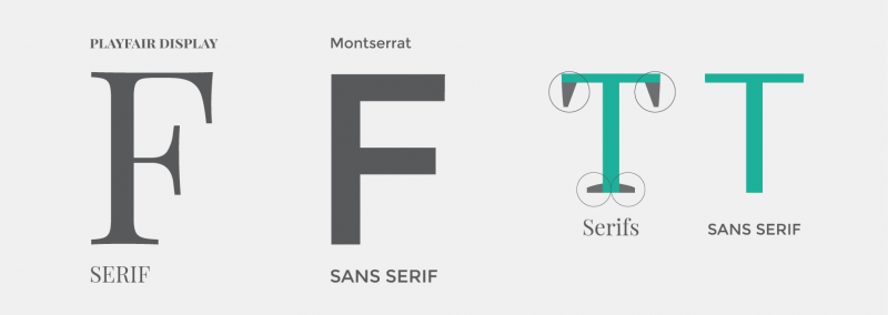
Serif fonts
There are two types of fonts you should understand.
First, there are so-called serif fonts; serifs are those little bits that stick out from a letter as in the example below.
In many cases, a serif font will look best in formal of official documents. One of those most immediately identifiable and iconic examples of a serif font is seen on the New York Times masthead:
Sans serif
Conversely, a sans serif font will obviously not have serifs, hence the “sans” part. Here you see the Arial font, which is one of Windows’ default fonts.
Sans serif fonts are widely used in advertising and logos because they often tend to look new and modern. Without a doubt the most notable sans serif font is Helvetica, upon which Arial is obviously based. You can find dozens of examples of Helvetica-derived fonts in modern culture. Check out Microsoft, Target, and Panasonic for just a few examples.
You can add different fonts to Windows, and by extension Word, by downloading them from the web.
If you want to read up more about typefaces and fonts, Microsoft provides more information its typography homepage.
Point size
Point size relates to the size of the font, leading, and other page items. It is not connected to any established unit of measurement. In typography, a point is the smallest whole unit of measurement.
For most fonts in Word, the smallest point size is 8 points tall. The smallest lines and other graphic objects can have is a point size of 1. Here are some example of various point sizes:
Font Styles and Effects
You can apply various font styles and effects from the “Font” tab on the “Home” ribbon.
You can access further font effects from the full font dialog accessible by clicking the arrow in the bottom right corner.
You have a whole range of effects, including colors and different underline styles you can apply.
Before we end this lesson, we should take a moment to briefly acquaint you with templates, since they can often make short work of complex layouts.
Templates are pre-configured documents, like a resume or business cards that you can use to speed creating forms. There are templates for pretty much anything you can think of.
The goal of Microsoft Word is twofold: (1) provide sets of themes and styles so that the Word user can create professional-looking documents and (2) give the user the ability to create documents of graphic-designer quality by providing tools and pre-configured set of objects from which the user can select.
When you open Microsoft Word or click on the “New” from the “File” tab, the first screen it shows you are the templates available to you, either already included with the program, or available for quick download. If you don’t immediately see what you want, try “suggested searches” or use the search box.
Right-click on any template and you can “Preview” or “Create” the template. You can also pin a preferred template so it is always available at the top of the list.
Creating a template will cause it to open if it is stored locally on your computer, or it will download if it isn’t. Note that some these templates, such as the gift certificate pictured below are offered by third-party sites, so they may not all be free.
If you decide you want to purchase a third-party template, you will be provided with further instructions on how to do so.
After you pick a template, it will open as a new document, and you can fill it in and tweak it to your liking. We see here the template for the “Basic Resume.”
Note how Word will automatically fill in your name and the template provides instructions on how to use it. In reality, this template is really nothing more than a table (discussed in Lesson 3) with a Theme (discussed in Lesson 5) applied to it.
When you are done filling out the template, you can then save it as a new document. You can also take a template, make changes to it, and then save it as a new template. Let’s say for example, that you wanted to apply a different style to our “Basic Resume.” You’d simply need to open the template, affect the changes you want, and then save it as a new template.
There’s a whole lot to discover with templates. Best of all, you don’t have to worry about creating every single document on your own. Need a quick business card or invitations to your retirement party? Word templates make quick work of a lot of formatting headaches, leaving you time to actually design something you’ll be happy with!
Coming up Next…
That concludes our lesson for today, you should now have a fairly firm grasp on Word’s layout, tabs, margins, indents, fonts, and templates.
Tomorrow we’ll go over how to change the appearance and behavior of paragraphs on your pages, shading and borders, as well as introduce you to lists and all their various parts!
READ NEXT
- › Spotify Is Shutting Down Its Free Online Game
- › Microsoft Outlook Is Adding a Splash of Personalization
- › How to Install Unsupported Versions of macOS on Your Mac
- › This 64 GB Flash Drive From Samsung Is Just $8 Right Now
- › Why Your Phone Charging Cable Needs a USB Condom
- › The Best Steam Deck Docks of 2023
While there are more than 700 font options in Word, Microsoft has commissioned five new custom fonts for Office, in a move away from the Calibri font that has been the default in Microsoft Office for nearly 15 years.
Contents
- 1 What fonts are available in Microsoft Word?
- 2 How many fonts are there?
- 3 How many fonts can Windows 10 install?
- 4 What is the font in Windows 10?
- 5 How many fonts is too many?
- 6 What are the 5 main types of fonts?
- 7 What are the 5 font families?
- 8 Do fonts take up RAM?
- 9 Is Arial a font?
- 10 Where are Microsoft Word fonts stored?
- 11 What font does Apple use?
- 12 Will there be a Windows 11?
- 13 What font does Windows 11 use?
- 14 Is it okay to use 3 fonts?
- 15 Do fonts slow down computer?
- 16 How many font families are there?
- 17 What are 3 common font styles?
- 18 What are fonts called?
- 19 What are 6 common font styles?
- 20 What are the four types of fonts?
What fonts are available in Microsoft Word?
List of typefaces included with Microsoft Windows
| Typeface | Weights/Styles | Included with |
|---|---|---|
| Century Gothic | Regular, Bold, Italic, Bold Italic | 98 |
| Comic Sans MS | Regular, Bold, Italic, Bold Italic | 95 (sR1), 8 (Italic) |
| Consolas | Regular, Bold, Italic, Bold Italic | Vista |
| Constantia | Regular, Bold, Italic, Bold Italic | Vista |
What Font Is, a free font finder uses a catalogue of 550,000+ fonts which leads me to believe there are at least half a million fonts in existance. A quick search in MyFonts, the largest distributor of commercial fonts, shows them housing over 130,000 fonts which fall into: Font familes: 36,000+
How many fonts can Windows 10 install?
add-fonts-windows-10.
Even a plain-vanilla Windows 10 installation includes more than 100 fonts that can be used to change the display of text on the screen and in documents. Third-party programs, including Microsoft Office and some members of the Adobe family, can add hundreds more.
What is the font in Windows 10?
Segoe UI
Windows 10’s default system font, Segoe UI, looks pretty nice. However, if you have something better to replace it with, you can change the default system font on your Windows 10 PC. We’ll show you how to do this.
How many fonts is too many?
How Many Fonts Are Too Many? When you can no longer install more fonts you definitely have too many. As a general rule of thumb, you can expect to run into installation problems with 800-1000 or more installed fonts. In practice, you’ll probably encounter system slowdowns with fewer fonts.
What are the 5 main types of fonts?
There are five basic classifications of typefaces: serif, sans serif, script, monospaced, and display. As a general rule, serif and sans serif typefaces are used for either body copy or headlines (including titles, logos, etc.), while script and display typefaces are only used for headlines.
What are the 5 font families?
Font families
You list the font that you want first, then any fonts that might fill in for the first if it is unavailable, and you should end the list with a generic font, of which there are five: serif, sans-serif, monospace, cursive and fantasy.
Do fonts take up RAM?
Fonts won’t just slow down your PC in general, though. Having too many fonts might slow the boot process down a bit as those fonts are loaded into memory, sure. But you’ll notice too many fonts in other situations. For example, applications like word processors might take an unusually long time to start up.
Is Arial a font?
Arial is an extremely versatile family of typefaces which can be used with equal success for text setting in reports, presentations, magazines etc, and for display use in newspapers, advertising and promotions.
Where are Microsoft Word fonts stored?
C:WindowsFonts folder
All fonts are stored in the C:WindowsFonts folder. You can also add fonts by simply dragging font files from the extracted files folder into this folder. Windows will automatically install them. If you want to see what a font looks like, open the Fonts folder, right-click the font file, and then click Preview.
What font does Apple use?
San Francisco
San Francisco (SF) is the system font on all Apple platforms; the SF Pro variant is the system font in macOS. Using the system font gives your text legibility, clarity, and consistency with apps across Apple platforms. Download the San Francisco family of fonts here.
Will there be a Windows 11?
Starting today, October 5th, Microsoft is rolling out the new Windows 11 to eligible devices. Earlier this year, Microsoft announced the new flagship update to its operating system: Windows 11.
What font does Windows 11 use?
On Windows 11, an operating system announced by Microsoft a few months ago, the default system font is Segoe UI Variable. It is a new version of the classic Segoe and uses variable font technology.
Is it okay to use 3 fonts?
Using more than 3 different fonts makes a website look unstructured and unprofessional. Keep in mind that too many type sizes and styles at once can also wreck any layout.If you do use more than one font, ensure the font families complement each other based on their character width.
Do fonts slow down computer?
In essence, no it shouldn’t slow down the system. you should copy your font files and paste them in the Fonts folder located within Control Panel.
How many font families are there?
Font Families: Serif, Sans-serif, and others
In CSS (and in typography in general) there are five basic types, or families, of fonts: serif, sans serif, cursive, fantasy, and monospace.
What are 3 common font styles?
They appear in order of popularity.
- Helvetica. Helvetica remains the world’s most popular font.
- Calibri. The runner up on our list is also a sans serif font.
- Futura. Our next example is another classic sans serif font.
- Garamond. Garamond is the first serif font on our list.
- Times New Roman.
- Arial.
- Cambria.
- Verdana.
What are fonts called?
A typeface is the design of lettering that can include variations in size, weight (e.g. bold), slope (e.g. italic), width (e.g. condensed), and so on. Each of these variations of the typeface is a font. There are thousands of different typefaces in existence, with new ones being developed constantly.
What are 6 common font styles?
The 6 Types of Fonts
- Serif Fonts. Serif fonts have their origins in the Latin alphabet.
- Slab Serif Fonts. These are the bolder and chunkier versions of the serif fonts.
- Sans serif fonts.
- Script Fonts.
- Decorative Fonts.
- Handwritten Fonts.
What are the four types of fonts?
What are four main types of fonts?
- Serif fonts.
- Sans serif fonts.
- Script fonts.
- Display fonts.
You’ve undoubtedly heard the terms Serif and Sans-Serif Fonts when it comes to design – but what’s the difference? This post breaks down the key differences between Serif and Sans-Serif fonts and how they came to be. We also look at how you can use them most effectively in your designs and promotions.
In the complex world of typography, it can be hard to know how to use different fonts, let alone what type of “Serif” they are. If you’re a designer, you will understand all of this, but it can be a little confusing for those who haven’t studied or worked in design.
Let’s change that!
While you read this article’s guide to using Serif and Sans-serif fonts – remember that both families of fonts exist within Easil. Our team of Easil Graphic Designers has carefully chosen fonts for you. You can see them in our professionally designed templates and text graphics. So, your job has been made that much easier.
So, now you can get started straight away, playing with different kinds of fonts for your designs!
What is the Difference between Serif and Sans-Serif Fonts?
When creating your own text, one of the first decisions to be made is whether to select a font that is Serif or Sans Serif. But what are they, and how do they differ, exactly?
In a nutshell, it’s all about the small features on the ends of strokes in some fonts. Those fonts that have them are called “Serifs” or “Serif fonts.” Those that don’t are called “Sans-Serifs” or “San-Serif Fonts.” Here’s an image showing the difference between Serif and Sans Serif fonts:
Choosing between Serif and Sans Serif Fonts should be based on several considerations pertaining to the project in hand – and the style of design.
The origin of serifs
Serifs were believed to have originated in the Latin Alphabet with words carved into stone in Roman Antiquity. The Roman letter outlines were first painted onto stone, and the stone carvers followed the brush marks, which flared at stroke ends and corners, creating serifs.
Serif fonts are usually used in lengthy text, such as books, newspapers, and most magazines and are the most commonly used printed typestyle due to perceived readability. After all, when you strive to create something beautiful and remarkable to look at, the main goal is to have your message clear and readable!
Some common Serif typefaces are Times New Roman, Georgia, Palatino, and Garamond – however, there are thousands more.
The origin of Sans-serif fonts
Sans-serif letters began to appear in printed media as early as 1805. They were popular due to their clarity and legibility in advertising and display use when printed very large or very small.
Sans-serif fonts have become the most prevalent for displaying text on computer screens, partly because screens tend to struggle to show fine serif details in small type.
Some commonly used Sans-serif typefaces are Arial, Helvetica, and Tahoma, but there are thousands more.
Hot Tip: For other shorter text settings – such as titles, credits, column headings, as well as text in infographics – a Sans-serif typeface is a good choice. Its simplified letterforms are unencumbered by Serifs, which can impede the readability of characters at very small sizes.
6 Tips for Using Serif and Sans Serif Fonts Together
- Be Guided by Designers and use Templates – If you’re not a designer, you don’t have to learn how to be one! This means you don’t have to learn how to be the perfect font-pairing master for Serif and Sans Serif fonts. Instead, use font combinations that exist, designed by designers. All you have to do is take advantage of someone else doing all the hard work. For example, use the templates in Easil to find great font combinations that feature Serif and Sans-Serif fonts together.
- Get inspired with Free Fonts. Check out our complete guide to using Free Fonts to find Serif and Sans-Serif Fonts.
- Use our mega Font Pairing Guide. It is perfect for discovering combinations of fonts (including Serif and Sans-Serif fonts) that work together.
- Don’t add too many fonts. Restrict your design to 2 x fonts if possible so that your ratio of Serif vs Sans-Serif fonts can be balanced. One of each should be enough for most designs.
- Consider the “mood” of your fonts. There is a key difference in “mood” between Serif and Sans Serif fonts. Serif fonts tend to be classic or formal. Some might even say they are elegant! Sans Serif fonts are usually described as modern, friendly, and minimal. They are stylishly simplistic in the absence of decorative strokes.
- Determine the font that best suits you. When looking at Serif and Sans Serif fonts, how you use them will vary depending on a number of factors. It depends on the type of project and the mood you want to convey. Things like color and the types of images that you are designing are also worth considering. When it comes to Sans and Sans-Serif fonts, there will always be a difference – but both types of font can be used in a wide number of projects and applications.
Myths about Serif and Sans-Serif Fonts
Although there are guidelines on how to use Serif and Sans-Serif fonts, there are always exceptions to the rule. As such, there are a few myths we should debunk:
- Serif Fonts are More Formal than Sans-Serif – although the “mood” of Serif Fonts can be formal or classic, it’s not clear cut. It’s possible for Sans-Serif fonts also to have the classic feel of yesteryear! When you pair the right type of Serif font with a Sans-Serif, both can be classic!
- Sans Serif Fonts are more suitable for Heading Text – yes, they do suit headings, but there are so many factors that come into play when it comes to “attention-grabbing” fonts. A Serif font can also command attention. Think about traditional newspapers! They often have bold Serif fonts as headings.
- Serifs are for traditional print, and Sans Serifs are for the web – it’s not that black and white. Some Serif typefaces can look beautiful online, and you’ll see many Sans-Serif fonts used effectively in printed material, books, and magazines. Screen resolution has changed, and the way we consume material has changed. It’s all about choosing the right font for the project, so don’t be afraid to debunk a few myths.
Other Related Fonts
Without confusing the issue, many other fonts are used and available in Easil. There are Slab fonts, Handwritten fonts, and Display fonts, the list goes on.
Display fonts are quite ‘unique’ or ‘fancy’ by appearance and are used primarily in large headings and minimal application – you’ll see many of these font families in our post about free fonts here and our post about font pairing here.
In Conclusion
You’ll be spoiled with a number of type styles and font families to choose from in Easil and in our Easil templates. Take advantage of it and use this post to help you determine the most effective use of a Serif or Sans-serif font… or both.
Generally – your message needs to be clear and concise. A Sans-serif font is a good choice for headings and small text where clarity and readability are paramount. A Serif font is good to use on larger blocks of printed text like on a flyer.
But remember to consider the whole context rather than just relying on a set of rules when you make your design choices. Try different font combinations and be creative!
Over to You
Are you all schooled up now in the difference between Sans and Sans Serif Fonts? Ready to rock your designs with fonts?
In typography, a serif () is a small line or stroke regularly attached to the end of a larger stroke in a letter or symbol within a particular font or family of fonts. A typeface or «font family» making use of serifs is called a serif typeface (or serifed typeface), and a typeface that does not include them is sans-serif. Some typography sources refer to sans-serif typefaces as «grotesque» (in German, grotesk) or «Gothic»,[1] and serif typefaces as «roman».
Origins and etymology[edit]
Serifs originated from the first official Greek writings on stone and in Latin alphabet with inscriptional lettering—words carved into stone in Roman antiquity. The explanation proposed by Father Edward Catich in his 1968 book The Origin of the Serif is now broadly but not universally accepted: the Roman letter outlines were first painted onto stone, and the stone carvers followed the brush marks, which flared at stroke ends and corners, creating serifs. Another theory is that serifs were devised to neaten the ends of lines as they were chiselled into stone.[2][3][4]
The origin of the word ‘serif’ is obscure, but apparently is almost as recent as the type style. The book The British Standard of the Capital Letters contained in the Roman Alphabet, forming a complete code of systematic rules for a mathematical construction and accurate formation of the same (1813) by William Hollins, defined ‘surripses’, usually pronounced «surriphs», as «projections which appear at the tops and bottoms of some letters, the O and Q excepted, at the beginning or end, and sometimes at each, of all». The standard also proposed that ‘surripsis’ may be a Greek word derived from σῠν- (‘syn-‘, «together») and ῥῖψῐς (‘rhîpsis’, «projection»).
In 1827, Greek scholar Julian Hibbert printed with his own experimental uncial Greek types, remarking that the types of Giambattista Bodoni’s Callimachus were «ornamented (or rather disfigured) by additions of what [he] believe[s] type-founders call syrifs or cerefs». The printer Thomas Curson Hansard referred to them as «ceriphs» in 1825.[5] The oldest citations in the Oxford English Dictionary (OED) are 1830 for ‘serif’ and 1841 for ‘sans serif’. The OED speculates that ‘serif’ was a back-formation from ‘sanserif’.
Webster’s Third New International Dictionary traces ‘serif’ to the Dutch noun schreef, meaning «line, stroke of the pen», related to the verb schrappen, «to delete, strike through» (‘schreef’ now also means «serif» in Dutch). Yet, schreef is the past tense of schrijven (to write). The relation between schreef and schrappen is documented by Van Veen and Van der Sijs.[6] In her book Chronologisch Woordenboek,[7] Van der Sijs lists words by first known publication in the language area that is the Netherlands today:
- schrijven, 1100;
- schreef, 1350;
- schrappen, 1406 (i.e. schreef is from schrijven (to write), not from schrappen (to scratch, eliminate by strike-through)).
The OED‘s earliest citation for «grotesque» in this sense is 1875, giving ‘stone-letter’ as a synonym. It would seem to mean «out of the ordinary» in this usage, as in art ‘grotesque’ usually means «elaborately decorated». Other synonyms include «Doric» and «Gothic», commonly used for Japanese Gothic typefaces.[8]
Classification[edit]
Serif fonts can be broadly classified into one of four subgroups: old style, transitional, Didone and slab serif, in order of first appearance.
Old-style[edit]

Old-style typefaces date back to 1465, shortly after Johannes Gutenberg’s adoption of the movable type printing press. Early printers in Italy created types that broke with Gutenberg’s blackletter printing, creating upright and later italic styles inspired by Renaissance calligraphy.[9][10] Old-style serif fonts have remained popular for setting body text because of their organic appearance and excellent readability on rough book paper. The increasing interest in early printing during the late 19th and early 20th centuries saw a return to the designs of Renaissance printers and type-founders, many of whose names and designs are still used today.[11][12][13]
Old-style type is characterized by a lack of large differences between thick and thin lines (low line contrast) and generally, but less often, by a diagonal stress (the thinnest parts of letters are at an angle rather than at the top and bottom). An old-style font normally has a left-inclining curve axis with weight stress at about 8 and 2 o’clock; serifs are almost always bracketed (they have curves connecting the serif to the stroke); head serifs are often angled.[14]
Old-style faces evolved over time, showing increasing abstraction from what would now be considered handwriting and blackletter characteristics, and often increased delicacy or contrast as printing technique improved.[10][15][16] Old-style faces have often sub-divided into ‘Venetian’ (or ‘humanist’) and ‘Garalde’ (or ‘Aldine’), a division made on the Vox-ATypI classification system.[17] Nonetheless, some have argued that the difference is excessively abstract, hard to spot except to specialists and implies a clearer separation between styles than originally appeared.[18][b] Modern typefaces such as Arno and Trinité may fuse both styles.[21]
Early «humanist» roman types were introduced in Italy. Modelled on the script of the period, they tend to feature an «e» in which the cross stroke is angled, not horizontal; an «M» with two-way serifs; and often a relatively dark colour on the page.[9][10] In modern times, that of Nicolas Jenson has been the most admired, with many revivals.[22][9] Garaldes, which tend to feature a level cross-stroke on the «e», descend from an influential 1495 font cut by engraver Francesco Griffo for printer Aldus Manutius, which became the inspiration for many typefaces cut in France from the 1530s onwards.[23][24] Often lighter on the page and made in larger sizes than had been used for roman type before, French Garalde faces rapidly spread throughout Europe from the 1530s to become an international standard.[19][23][25]
Also during this period, italic type evolved from a quite separate genre of type, intended for informal uses such as poetry, into taking a secondary role for emphasis. Italics moved from being conceived as separate designs and proportions to being able to be fitted into the same line as roman type with a design complementary to it.[26][27][28][c]
A new genre of serif type developed around the 17th century in the Netherlands and Germany that came to be called the «Dutch taste» («goût Hollandois» in French).[30] It was a tendency towards denser, more solid typefaces, often with a high x-height (tall lower-case letters) and a sharp contrast between thick and thin strokes, perhaps influenced by blackletter faces.[31][32][30][33][34]
Examples of contemporary Garalde old-style typefaces are Bembo, Garamond, Galliard, Granjon, Goudy Old Style, Minion, Palatino, Renard, Sabon, and Scala. Contemporary typefaces with Venetian old style characteristics include Cloister, Adobe Jenson, the Golden Type, Hightower Text, Centaur, Goudy’s Italian Old Style and Berkeley Old Style and ITC Legacy. Several of these blend in Garalde influences to fit modern expectations, especially placing single-sided serifs on the «M»; Cloister is an exception.[35] Artists in the «Dutch taste» style include Hendrik van den Keere, Nicolaas Briot, Christoffel van Dijck, Miklós Tótfalusi Kis and the Janson and Ehrhardt types based on his work and Caslon, especially the larger sizes.[33]
Transitional[edit]

Transitional, or baroque, serif typefaces first became common around the mid-18th century until the start of the 19th.[36] They are in between «old style» and «modern» fonts, thus the name «transitional». Differences between thick and thin lines are more pronounced than they are in old style, but less dramatic than they are in the Didone fonts that followed. Stress is more likely to be vertical, and often the «R» has a curled tail. The ends of many strokes are marked not by blunt or angled serifs but by ball terminals. Transitional faces often have an italic ‘h’ that opens outwards at bottom right.[37] Because the genre bridges styles, it is difficult to define where the genre starts and ends. Many of the most popular transitional designs are later creations in the same style.
Fonts from the original period of transitional typefaces include early on the «romain du roi» in France, then the work of Pierre Simon Fournier in France, Fleischman and Rosart in the Low Countries,[38] Pradell in Spain and John Baskerville and Bulmer in England.[39][40] Among more recent designs, Times New Roman (1932), Perpetua, Plantin, Mrs. Eaves, Freight Text, and the earlier «modernised old styles» have been described as transitional in design.[d]
Later 18th-century transitional typefaces in Britain begin to show influences of Didone typefaces from Europe, described below, and the two genres blur, especially in type intended for body text; Bell is an example of this.[42][43][e]
Didone[edit]

Bodoni, an example of a modern serif
Didone, or modern, serif typefaces, which first emerged in the late 18th century, are characterized by extreme contrast between thick and thin lines.[f] These typefaces have a vertical stress and thin serifs with a constant width, with minimal bracketing (constant width). Serifs tend to be very thin, and vertical lines very heavy. Didone fonts are often considered to be less readable than transitional or old-style serif typefaces. Period examples include Bodoni, Didot, and Walbaum. Computer Modern is a popular contemporary example. The very popular Century is a softened version of the same basic design, with reduced contrast.[46] Didone typefaces achieved dominance of printing in the early 19th-century printing before declining in popularity in the second half of the century and especially in the 20th as new designs and revivals of old-style faces emerged.[47][48][49]
In print, Didone fonts are often used on high-gloss magazine paper for magazines such as Harper’s Bazaar, where the paper retains the detail of their high contrast well, and for whose image a crisp, «European» design of type may be considered appropriate.[50][51] They are used more often for general-purpose body text, such as book printing, in Europe.[51][52] They remain popular in the printing of Greek, as the Didot family were among the first to establish a printing press in newly independent Greece.[53][54] The period of Didone types’ greatest popularity coincided with the rapid spread of printed posters and commercial ephemera and the arrival of bold type.[55][56] As a result, many Didone typefaces are among the earliest designed for «display» use, with an ultra-bold «fat face» style becoming a common sub-genre.[57][58][59]
Slab serif[edit]

Rockwell, an example of a more geometric slab serif

Clarendon, an example of a less geometric slab serif
Slab serif typefaces date to about 1817.[g][60] Originally intended as attention-grabbing designs for posters, they have very thick serifs, which tend to be as thick as the vertical lines themselves. Slab serif fonts vary considerably: some such as Rockwell have a geometric design with minimal variation in stroke width—they are sometimes described as sans-serif fonts with added serifs. Others such as those of the «Clarendon» model have a structure more like most other serif fonts, though with larger and more obvious serifs.[61][62] These designs may have bracketed serifs that increase width along their length.
Because of the clear, bold nature of the large serifs, slab serif designs are often used for posters and in small print. Many monospace fonts, on which all characters occupy the same amount of horizontal space as in a typewriter, are slab-serif designs. While not always purely slab-serif designs, many fonts intended for newspaper use have large slab-like serifs for clearer reading on poor-quality paper. Many early slab-serif types, being intended for posters, only come in bold styles with the key differentiation being width, and often have no lower-case letters at all.
Examples of slab-serif typefaces include Clarendon, Rockwell, Archer, Courier, Excelsior, TheSerif, and Zilla Slab. FF Meta Serif and Guardian Egyptian are examples of newspaper and small print-oriented typefaces with some slab-serif characteristics, often most visible in the bold weights. In the late 20th century, the term «humanist slab-serif» has been applied to typefaces such as Chaparral, Caecilia and Tisa, with strong serifs but an outline structure with some influence of old-style serif typefaces.[63][64][65]
Other styles[edit]
During the 19th century, genres of serif type besides conventional body text faces proliferated.[66][67] These included «Tuscan» faces, with ornamental, decorative ends to the strokes rather than serifs, and «Latin» or «wedge-serif» faces, with pointed serifs, which were particularly popular in France and other parts of Europe including for signage applications such as business cards or shop fronts.[68]
Well-known typefaces in the «Latin» style include Wide Latin, Copperplate Gothic, Johnston Delf Smith and the more restrained Méridien.
Readability and legibility[edit]
Serifed fonts are widely used for body text because they are considered easier to read than sans-serif fonts in print.[69] Colin Wheildon, who conducted scientific studies from 1982 to 1990, found that sans serif fonts created various difficulties for readers that impaired their comprehension.[70] According to Kathleen Tinkel, studies suggest that «most sans serif typefaces may be slightly less legible than most serif faces, but … the difference can be offset by careful setting».[71]
Sans-serif are considered to be more legible on computer screens. According to Alex Poole,[72] «we should accept that most reasonably designed typefaces in mainstream use will be equally legible». A study suggested that serif fonts are more legible on a screen but are not generally preferred to sans serif fonts.[73] Another study indicated that comprehension times for individual words are slightly faster when written in a sans serif font versus a serif font.[74]
When size of an individual glyph is 9–20 pixels, proportional serifs and some lines of most glyphs of common vector fonts are smaller than individual pixels. Hinting, spatial anti-aliasing, and subpixel rendering allow to render distinguishable serifs even in this case, but their proportions and appearance are off and thickness is close to many lines of the main glyph, strongly altering appearance of the glyph. Consequently, it is sometimes advised to use sans-serif fonts for content meant to be displayed on screens, as they scale better for low resolutions. Indeed, most web pages employ sans-serif type.[75] Recent introduction of desktop displays with 300+ dpi resolution might eventually make this recommendation obsolete.
As serifs originated in inscription, they are generally not used in handwriting. A common exception is the printed capital I, where the addition of serifs distinguishes the character from lowercase L. The printed capital J and the numeral 1 are also often handwritten with serifs.
Gallery[edit]
Below are some images of serif letterforms across history:
-

Title page printed by Robert Estienne
-

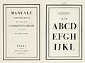
Great Primer type (c. 18 pt) by Claude Garamond
-

Gros Canon type by Garamond
-

-

Condensed, high x-height types in the «Dutch taste» style, c. 1720
-

Didone type in a book printed by the company of Firmin Didot, 1804
-

Bodoni’s posthumous Manuale Tipografico, 1818
-

Inline modern face
-

Display type with pattern inside
-

«Fat face» ultra-bold Didone type
-

The original Clarendon typeface
-

Display-size slab-serifs
-
William Morris’s Golden Type in the style of Jenson and other typefaces of his Kelmscott Press
-

ATF’s «Garamond» type, an example of historicist printing


East Asian analogues[edit]

From left to right: a serif typeface with serifs in red, a serif typeface, and a sans-serif typeface
In the Chinese and Japanese writing systems, there are common type styles based on the regular script for Chinese characters akin to serif and sans serif fonts in the West. In Mainland China, the most popular category of serifed-like typefaces for body text is called Song (宋体, Songti); in Japan, the most popular serif style is called Minchō (明朝); and in Taiwan and Hong Kong, it is called Ming (明體, Mingti). The names of these lettering styles come from the Song and Ming dynasties, when block printing flourished in China. Because the wood grain on printing blocks ran horizontally, it was fairly easy to carve horizontal lines with the grain. However, carving vertical or slanted patterns was difficult because those patterns intersect with the grain and break easily. This resulted in a typeface that has thin horizontal strokes and thick vertical strokes[citation needed]. In accordance with Chinese calligraphy (kaiti style in particular), where each horizontal stroke is ended with a dipping motion of the brush, the ending of horizontal strokes are also thickened[citation needed]. These design forces resulted in the current Song typeface characterized by thick vertical strokes contrasted with thin horizontal strokes, triangular ornaments at the end of single horizontal strokes, and overall geometrical regularity.
In Japanese typography, the equivalent of serifs on kanji and kana characters are called uroko—»fish scales». In Chinese, the serifs are called either yǒujiǎotǐ (有脚体, lit. «forms with legs»)[citation needed] or yǒuchènxiàntǐ (有衬线体, lit. «forms with ornamental lines»).
The other common East Asian style of type is called black (黑体/體, Hēitǐ) in Chinese and Gothic (ゴシック体, Goshikku-tai) in Japanese. This group is characterized by lines of even thickness for each stroke, the equivalent of «sans serif». This style, first introduced on newspaper headlines, is commonly used on headings, websites, signs and billboards.
See also[edit]
![]()
Look up serif in Wiktionary, the free dictionary.
- Homoglyph
- Ming (typeface), a similar style in Asian typefaces
- The analogs of serifs, known as 鱗, literally «fish scales», in Japanese.
- San Serriffe, an elaborate typographic joke
- Serif typefaces, a list of Serif typefaces
Lists of serif typefaces[edit]
- Old-style
- Transitional
- Didone
Notes[edit]
- ^ Note that this image includes ‘Th’ ligatures, common in Adobe typefaces but not found in the 16th century.
- ^ Specifically, Manutius’s type, the first type now classified as «Garalde», was not so different from other typefaces around at the time.[9] However, the waves of «Garalde» faces coming out of France from the 1530s onwards did tend to cleanly displace earlier typefaces, and became an international standard.[19][20]
- ^ Early italics were intended to exist on their own on the page, and so often had very long ascenders and descenders, especially the «chancery italics» of printers such as Arrighi.[29] Jan van Krimpen’s Cancelleresca Bastarda typeface, intended to complement his serif family Romulus, was nonetheless cast on a larger body to allow it to have an appropriately expansive feel.
- ^ Monotype executive Stanley Morison, who commissioned Times New Roman, noted that he hoped that it «has the merit of not looking as if it had been designed by somebody in particular».[41]
- ^ It should be realised that «Transitional» is a somewhat nebulous classification, almost always including Baskerville and other typefaces around this period but also sometimes including 19th and 20th-century reimaginations of old-style faces, such as Bookman and Plantin, and sometimes some of the later «old-style» faces such as the work of Caslon and his imitators. In addition, of course Baskerville and others of this period would not have seen their work as «transitional» but as an end in itself. Eliason (2015) provides a leading modern critique and assessment of the classification, but even in 1930 A.F. Johnson called the term «vague and unsatisfactory.»[42][44]
- ^ Additional subgenres of Didone type include «fat faces» (ultra-bold designs for posters) and «Scotch Modern» designs (used in the English-speaking world for book and newspaper printing).[45]
- ^ Early slab-serif types were given a variety of names for branding purposes, such as ‘Egyptian’, ‘Italian’, ‘Ionic’, ‘Doric’, ‘French-Clarendon’ and ‘Antique’, which generally have little or no connection to their actual history. Nonetheless, the names have persisted in use.
Citations[edit]
- ^ Phinney, Thomas. «Sans Serif: Gothic and Grotesque». TA. Showker Graphic Arts & Design. Showker. Archived from the original on 19 October 2012. Retrieved 1 February 2013.
- ^ Samara, Timothy (2004). Typography workbook: a real-world guide to using type in graphic design. Rockport Publishers. p. 240. ISBN 978-1-59253-081-6.
- ^ Goldberg, Rob (2000). Digital Typography: Practical Advice for Getting the Type You Want When You Want It. Windsor Professional Information. p. 264. ISBN 978-1-893190-05-4.
- ^ The Linotype Bulletin. January–February 1921. p. 265. Retrieved 26 October 2011.
- ^ Hansard, Thomas Curson (1825). Typographia, an Historical Sketch of the Origin and Progress of the Art of Printing. p. 370. Retrieved 12 August 2015.
- ^ Etymologisch Woordenboek (Van Dale, 1997).
- ^ (Veen, 2001).
- ^ Berry, John. «A Neo-Grotesque Heritage». Adobe Systems. Retrieved 15 October 2015.
- ^ a b c d Boardley, John (18 April 2016). «The first roman fonts». ilovetypography. Retrieved 21 September 2017.
- ^ a b c Olocco, Riccardo. «The Venetian origins of roman type». Medium. C-A-S-T. Retrieved 27 January 2018.
- ^ Mosley, James (2006). «Garamond, Griffo and Others: The Price of Celebrity». Bibiologia. Retrieved 3 December 2015.
- ^ Coles, Stephen. «Top Ten Typefaces Used by Book Design Winners». FontFeed (archived). Archived from the original on 2012-02-28. Retrieved 2 July 2015.
- ^ Johnson, A.F. (1931). «Old-Face Types in the Victorian Age» (PDF). Monotype Recorder. 30 (242): 5–15. Retrieved 14 October 2016.
- ^ «Old Style Serif».
- ^ Boardley, John (7 February 2014). «Unusual fifteenth-century fonts: part 1». i love typography. Retrieved 22 September 2017.
- ^ Boardley, John (July 2015). «Unusual fifteenth-century fonts: part 2». i love typography. Retrieved 22 September 2017.
- ^ «Type anatomy: Family Classifications of Type». SFCC Graphic Design department. Spokane Falls Community College. Archived from the original on 7 August 2015. Retrieved 14 August 2015.
- ^ Dixon, Catherine (2002), «Twentieth Century Graphic Communication: Technology, Society and Culture», Typeface classification, Friends of St Bride
- ^ a b Amert, Kay (April 2008). «Stanley Morison’s Aldine Hypothesis Revisited». Design Issues. 24 (2): 53–71. doi:10.1162/desi.2008.24.2.53. S2CID 57566512.
- ^ The Aldine Press: catalogue of the Ahmanson-Murphy collection of books by or relating to the press in the Library of the University of California, Los Angeles : incorporating works recorded elsewhere. Berkeley [u.a.]: Univ. of California Press. 2001. pp. 22–25. ISBN 978-0-520-22993-8.
[On the Aldine Press in Venice changing over to types from France]: the press followed precedent; popular in France, [these] types rapidly spread over western Europe.
- ^ Twardoch, Slimbach, Sousa, Slye (2007). Arno Pro (PDF). San Jose: Adobe Systems. Archived from the original (PDF) on 30 August 2014. Retrieved 14 August 2015.
{{cite book}}: CS1 maint: multiple names: authors list (link) - ^ Olocco, Riccardo. «Nicolas Jenson and the success of his roman type». Medium. C-A-S-T. Retrieved 21 September 2017.
- ^ a b Vervliet, Hendrik D.L. (2008). The palaeotypography of the French Renaissance. Selected papers on sixteenth-century typefaces. 2 vols. Leiden: Koninklijke Brill NV. pp. 90–91, etc. ISBN 978-90-04-16982-1.
[On Robert Estienne’s typefaces of the 1530s]: Its outstanding design became standard for Roman type in the two centuries to follow…From the 1540s onwards French Romans and Italics had begun to infiltrate, probably by way of Lyons, the typography of the neighbouring countries. In Italy, major printers replaced the older, noble but worn Italian characters and their imitations from Basle.
- ^ Carter, Harry (1969). A View of Early Typography up to about 1600 (Second edition (2002) ed.). London: Hyphen Press. pp. 72–4. ISBN 0-907259-21-9.
De Aetna was decisive in shaping the printers’ alphabet. The small letters are very well made to conform with the genuinely antique capitals by emphasis on long straight strokes and fine serifs and to harmonise in curvature with them. The strokes are thinner than those of Jenson and his school…the letters look narrower than Jenson’s, but are in fact a little wider because the short ones are bigger, and the effect of narrowness makes the face suitable for octavo pages…this Roman of Aldus is distinguishable from other faces of the time by the level cross-stroke in ‘e’ and the absence of top serifs from the insides of the vertical strokes of ‘M’, following the model of Feliciano. We have come to regard his small ‘e’ as an improvement on previous practice.
- ^ Bergsland, David (29 August 2012). «Aldine: the intellectuals begin their assault on font design». The Skilled Workman. Retrieved 14 August 2015.
- ^ Boardley, John (25 November 2014). «Brief notes on the first italic». i love typography. Retrieved 21 September 2017.
- ^ Vervliet, Hendrik D. L. (2008). The Palaeotypography of the French Renaissance: Selected Papers on Sixteenth-century Typefaces. BRILL. pp. 287–289. ISBN 978-90-04-16982-1.
- ^ Lane, John (1983). «The Types of Nicholas Kis». Journal of the Printing Historical Society: 47–75.
Kis’s Amsterdam specimen of c. 1688 is an important example of the increasing tendency to regard a range of roman and italic types as a coherent family, and this may well have been a conscious innovation. But italics were romanised to a greater degree in many earlier handwritten examples and occasional earlier types, and Jean Jannon displayed a full range of matching roman and italic of his own cutting in his 1621 specimen…[In appendix] [György] Haiman notes that this trend is foreshadowed in the specimens of Guyot in the mid-sixteenth century and Berner in 1592.
- ^ Vervliet, Hendrik D. L. (2008). The Palaeotypography of the French Renaissance: Selected Papers on Sixteenth-century Typefaces. BRILL. pp. 287–319. ISBN 978-90-04-16982-1.
- ^ a b Johnson, A. F. (1939). «The ‘Goût Hollandois’«. The Library. s4-XX (2): 180–196. doi:10.1093/library/s4-XX.2.180.
- ^ Updike, Daniel Berkeley (1922). «Chapter 15: Types of the Netherlands, 1500-1800». Printing Types: Their History, Forms and Uses: Volume 2. Harvard University Press. pp. 6–7. Retrieved 18 December 2015.
- ^ «Type History 1». Typofonderie Gazette. Retrieved 23 December 2015.
- ^ a b Mosley, James. «Type and its Uses, 1455-1830» (PDF). Institute of English Studies. Archived from the original (PDF) on 9 October 2016. Retrieved 7 October 2016.
Although types on the ‘Aldine’ model were widely used in the 17th and 18th centuries, a new variant that was often slightly more condensed in its proportions, and darker and larger on its body, became sufficiently widespread, at least in Northern Europe, to be worth defining as a distinct style and examining separately. Adopting a term used by Fournier le jeune, the style is sometimes called the ‘Dutch taste’, and sometimes, especially in Germany, ‘baroque’. Some names associated with the style are those of Van den Keere, Granjon, Briot, Van Dijck, Kis (maker of the so-called ‘Janson’ types), and Caslon.
- ^ de Jong, Feike; Lane, John A. «The Briot project. Part I». PampaType. TYPO, republished by PampaType. Retrieved 10 June 2018.
- ^ Shen, Juliet. «Searching for Morris Fuller Benton». Type Culture. Retrieved 11 April 2017.
- ^ Paul Shaw (18 April 2017). Revival Type: Digital Typefaces Inspired by the Past. Yale University Press. pp. 85–98. ISBN 978-0-300-21929-6.
- ^ Morison, Stanley (1937). «Type Designs of the Past and Present, Part 3». PM: 17–81. Retrieved 4 June 2017.
- ^ Jan Middendorp (2004). Dutch Type. 010 Publishers. pp. 27–29. ISBN 978-90-6450-460-0.
- ^ Corbeto, A. (25 September 2009). «Eighteenth Century Spanish Type Design». The Library. 10 (3): 272–297. doi:10.1093/library/10.3.272. S2CID 161371751.
- ^ Unger, Gerard (1 January 2001). «The types of François-Ambroise Didot and Pierre-Louis Vafflard. A further investigation into the origins of the Didones». Quaerendo. 31 (3): 165–191. doi:10.1163/157006901X00047.
- ^ Alas, Joel. «The history of the Times New Roman typeface». Financial Times. Archived from the original on 2022-12-10. Retrieved 16 January 2016.
- ^ a b Johnson, Alfred F. (1930). «The Evolution of the Modern-Face Roman». The Library. s4-XI (3): 353–377. doi:10.1093/library/s4-XI.3.353.
- ^ Johnston, Alastair (2014). Transitional Faces: The Lives & Work of Richard Austin, type-cutter, and Richard Turner Austin, wood-engraver. Berkeley: Poltroon Press. ISBN 978-0918395320. Retrieved 8 February 2017.
- ^ Eliason, Craig (October 2015). ««Transitional» Typefaces: The History of a Typefounding Classification». Design Issues. 31 (4): 30–43. doi:10.1162/DESI_a_00349. S2CID 57569313.
- ^ Shinn, Nick. «Modern Suite» (PDF). Shinntype. Archived from the original (PDF) on 25 February 2021. Retrieved 11 August 2015.
- ^ Shaw, Paul (10 February 2011). «Overlooked Typefaces». Print magazine. Retrieved 2 July 2015.
- ^ Ovink, G.W. (1971). «Nineteenth-century reactions against the didone type model — I». Quaerendo. 1 (2): 18–31. doi:10.1163/157006971×00301.
- ^ Ovink, G.W. (1971). «Nineteenth-century reactions against the didone type model — II». Quaerendo. 1 (4): 282–301. doi:10.1163/157006971×00239.
- ^ Ovink, G.W. (1 January 1972). «Nineteenth-century reactions against the didone type model-III». Quaerendo. 2 (2): 122–128. doi:10.1163/157006972X00229.
- ^ Frazier, J.L. (1925). Type Lore. Chicago. p. 14. Retrieved 24 August 2015.
- ^ a b «HFJ Didot introduction». Hoefler & Frere-Jones. Retrieved 10 August 2015.
- ^ «HFJ Didot». Hoefler & Frere-Jones. Retrieved 10 August 2015.
- ^ Leonidas, Gerry. «A primer on Greek type design». Gerry Leonidas/University of Reading. Archived from the original on 4 January 2017. Retrieved 14 May 2017.
- ^ «GFS Didot». Greek Font Society. Retrieved 10 August 2015.
- ^ Eskilson, Stephen J. (2007). Graphic design : a new history. New Haven: Yale University Press. p. 25. ISBN 9780300120110.
- ^ Pané-Farré, Pierre. «Affichen-Schriften». Forgotten-Shapes. Retrieved 10 June 2018.
- ^ Johnson, Alfred F. (1970). «Fat Faces: Their History, Forms and Use». Selected Essays on Books and Printing. pp. 409–415.
- ^ Phinney, Thomas. «Fat faces». Graphic Design and Publishing Centre. Archived from the original on 9 October 2015. Retrieved 10 August 2015.
- ^ Kennard, Jennifer (3 January 2014). «The Story of Our Friend, the Fat Face». Fonts in Use. Retrieved 11 August 2015.
- ^ Miklavčič, Mitja (2006). Three chapters in the development of clarendon/ionic typefaces (PDF) (MA Thesis). University of Reading. Archived from the original (PDF) on November 25, 2011. Retrieved 14 August 2015.
- ^ «Sentinel: historical background». Hoefler & Frere-Jones. Retrieved 15 July 2015.
- ^ Challand, Skylar. «Know your type: Clarendon». IDSGN. Retrieved 13 August 2015.
- ^ Phinney, Thomas. «Most Overlooked: Chaparral». Typekit Blog. Adobe Systems. Retrieved 7 March 2019.
- ^ Lupton, Ellen (12 August 2014). Type on Screen: A Critical Guide for Designers, Writers, Developers, and Students. Princeton Architectural Press. p. 16. ISBN 978-1-61689-346-0.
- ^ Bringhurst, Robert (2002). The Elements of Typographic Style (2nd ed.). Hartley & Marks. pp. 218, 330. ISBN 9780881791327.
- ^ Gray, Nicolete (1976). Nineteenth-century Ornamented Typefaces.
- ^ Lupton, Ellen (15 April 2014). Thinking with Type. p. 23. ISBN 9781616890452.
- ^ Frutiger, Adrian (8 May 2014). Typefaces – the complete works. pp. 26–35. ISBN 9783038212607.
- ^ Merriam-Webster’s Manual for Writers and Editors, (Springfield, 1998) p. 329.
- ^ Wheildon, Colin (1995). Type and Layout: How Typography and Design Can Get your Message Across – Or Get in the Way. Berkeley: Strathmoor Press. pp. 57, 59–60. ISBN 0-9624891-5-8.
- ^ Kathleen Tinkel, «Taking it in: What makes type easy to read», adobe.com Archived 2012-10-19 at the Wayback Machine Accessed 28 December 2010. p. 3.
- ^ Literature Review Which Are More Legible: Serif or Sans Serif Typefaces? alexpoole.info Archived 2010-03-06 at the Wayback Machine.
- ^ Effects of Font Type on the Legibility The Effects of Font Type and Size on the Legibility and Reading Time of Online Text by Older Adults. psychology.wichita.edu Archived 2009-10-07 at the Wayback Machine.
- ^ Moret-Tatay, C., & Perea, M. (2011). Do serifs provide an advantage in the recognition of written words? Journal of Cognitive Psychology 23, 5, 619-24.. valencia.edu.
- ^ The Principles of Beautiful Web Design, (2007) p. 113.
Bibliography[edit]
- Robert Bringhurst, The Elements of Typographic Style, version 4.0 (Vancouver, BC, Canada: Hartley & Marks Publishers, 2012), ISBN 0-88179-211-X.
- Harry Carter, A View of Early Typography: Up to about 1600 (London: Hyphen Press, 2002).
- Father Edward Catich, The Origin of the Serif: Brush Writing and Roman Letters, 2nd ed., edited by Mary W. Gilroy (Davenport, Iowa: Catich Gallery, St. Ambrose University, 1991), ISBN 9780962974021.
- Nicolete Gray, Nineteenth Century Ornamented Typefaces, 2nd ed. (Faber, 1976), ISBN 9780571102174.
- Alfred F. Johnson, Type Designs: Their History and Development (Grafton, 1959).
- Stan Knight, Historical Types: From Gutenberg to Ashendene (Oak Knoll Press, 2012), ISBN 9781584562986.
- Ellen Lupton, Thinking with Type: A Critical Guide for Designers, Writers, Editors, & Students, 2nd ed. (New York: Princeton Architectural Press, 2010), ISBN 9781568989693, <www.thinkingwithtype.com>.
- Indra Kupferschmid, «Some Type Genres Explained,» Type, kupferschrift.de (2016-01-15).
- Stanley Morison, A Tally of Types, edited by Brooke Crutchley et al., 2nd ed. (London: Cambridge University Press, 1973), ISBN 978-0-521-09786-4. (on revivals of historical typefaces created by the British company Monotype)
- ———, “Type Designs of the Past and Present,” was serialized in 4 parts in 1937 in PM Magazine (the last 2 are available online):
- “Part 1,” PM Magazine, 4, 1 (1937-09);
- “Part 2,” PM Magazine, 4, 2 (1937-12);
- “Part 3,” PM Magazine, 4, 3 (1937-11): 17–32;
- “Part 4,” PM Magazine, 4, 4 (1937-12): 61–81.
- Sébastien Morlighem, The ‘modern face’ in France and Great Britain, 1781-1825: typography as an ideal of progress (thesis, University of Reading, 2014), download link
- Sébastien Morlighem, Robert Thorne and the Introduction of the ‘modern’ fat face, 2020, Poem, and presentation
- James Mosley, Ornamented types: twenty-three alphabets from the foundry of Louis John Poucheé, I.M. Imprimit, 1993
- Paul Shaw, Revival Type: Digital Typefaces Inspired by the Past (Brighton: Quid Publishing, 2017), ISBN 978-0-300-21929-6.
- Walter Tracy, Letters of Credit: A View of Type Design, 2nd ed. (David R. Godine, 2003), ISBN 9781567922400.
- Daniel Berkeley Updike, Printing Types, their History, Forms, and Use: A Study in Survivals, 2 vols. (Cambridge: Harvard University Press, 1922), volume 1 and volume 2—now outdated and known for a strong, not always accurate dislike of Dutch and modern-face printing, but extremely comprehensive in scope.
- H. D. L. Vervliet, The Palaeotypography of the French Renaissance: Selected Papers on Sixteenth-Century Typefaces, 2 vols., Library of the Written Word series, No. 6, The Handpress World subseries, No. 4 (Leiden: Koninklijke Brill NV, 2008-11-27), ISBN 978-90-04-16982-1.
- ———, Sixteenth Century Printing Types of the Low Countries, Annotated catalogue (Leiden: Koninklijke Brill NV, 1968-01-01), ISBN 978-90-6194-859-9.
- ———, French Renaissance Printing Types: A Conspectus (Oak Knoll Press, 2010).
- ———, Liber librorum: 5000 ans d’art du livre (Arcade, 1972).
- Translation: Fernand Baudin, The Book Through Five Thousand Years: A Survey, edited by Hendrik D. L. Vervliet (London: Phaidon, 1972).
- James Mosley’s reading lists: «Type and its Uses, 1455–1830», 1830-2000
Not many people consider the importance of choosing and using the right font to project professionalism on your on-screen documents or printed materials. If you’re a business owner, student, or anyone who wants to add some professionalism to your materials, resume, research papers, or office materials, then you’ve come to the right place. We curated a list of fonts that are all easily accessible and can be for professional use.
Microsoft Word
Microsoft Word is a great tool that you can use to create a diversity of professional documents. We decided to create our list of professional fonts around Microsoft Word since most people are accustomed to this software, as it is very convenient, straightforward, and easy to use. It also houses a lot of great fonts featuring different styles such as handwriting fonts, cursive fonts, and decorative fonts. that you can choose from.
Baskerville
John Baskerville designed this Typeface in the 750s. The Typeface exhibits evenly spaced clean serif characters that shows a significant variance of thick and think strokes. Baskerville is a considerable font to use in resumes, presentations, and documents.
Constantia
John Hudson designed this Typeface for both paper publishing and electronic text use. The font features outspread serif characters for an easy-to-read look and feel.
Cambria
This familiar font is often used as the font has been designed for printed materials and on-screen documents. You can never go wrong using Cambria as it is one of those easily accessible professional fonts in word.
Centaur
This font by Bruce Rogers was initially designed to be used by the Metropolitan Museum for titles. Eventually, Centaur was worked on to use in-text and remains to have that unique characteristic of the font being legible in both large and small text sizes.
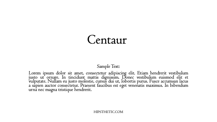
Bembo
Initially, they used the Bembo typeface for Pietro Bembo’s Book called “De Aetna.” Hence, where the font got its name. The Bembo font gives that roman serif typeface that we are vastly familiar with today.
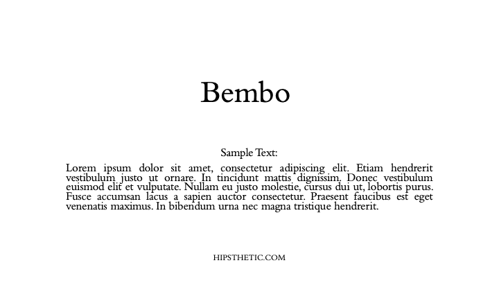
Walbum Display
Justus Erich Walbum initially made the Walbum font family in Germany during the 1800s. This modern serif font creates a nice soft blend of characters that fit in any printed material type. This font is accessible to the eyes and comfortable to read from large printed documents to small on-screen texts.
Bell MT
Richard Austin made the Bell MT font for John Bell around 1788. In its first version, the font did not appear to have bold weight on its characters. The Bell Mt that we are familiar with today stemmed from a revision in 1992 to its new TrueType form. This font is one of those professional fonts in word that you can use in long articles, books, and magazines.
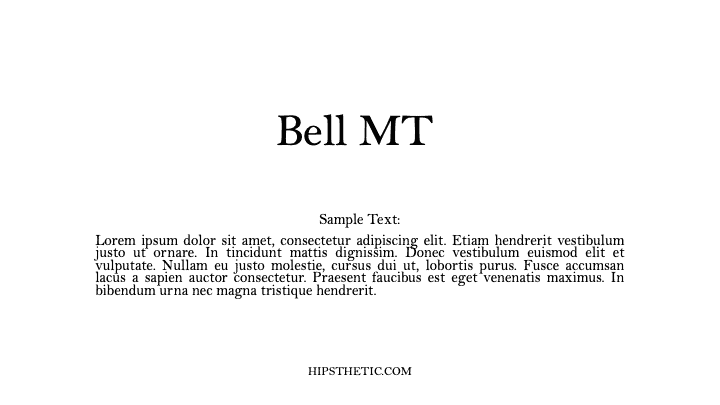
Times New Roman
This font is a classic, widely popular professional font in word that is definitely always dependable to use in any professional document or text. If you’re looking for something easy and familiar to use, for both legal and non-legal documents, Times New Roman is the way to go.
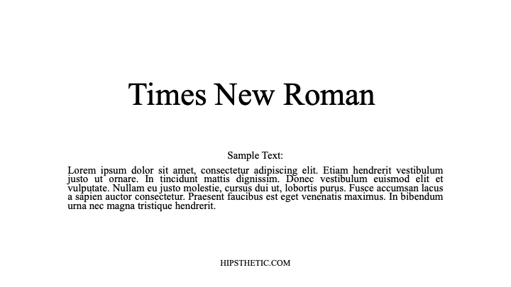
Sans Serif Professional Fonts in Word
Corbel
The Corbel font projects a crisp, clean appearance on screen and paper. The font’s characters project soft fluid curves that add to its legibility and function in all sizes.
Lucida Sans
A notable characteristic of the Lucida Sans is its considerable height making it very easy to read and pleasing to the eye. This font is widely used in professional documents such as manuals, memos, directories, and more.
Calibri
Calibri is no doubt a very familiar font for most. This modern sans serif typeface has that subtle round corners on its characters that give that affable but appropriate look on your printed text or on-screen documents.
Abadi
The Abadi typeface showcases a subtle humanistic character with an array of different weights to choose from. The font was first introduced in 1988 as a versatile sans serif typeface used in newspapers, advertising, magazines, and more.
Professional Fonts
We hope you enjoyed our list of the best professional fonts in Word. If you’re looking for more fonts to add to your list, check out our post on Professional Looking Fonts on Word, Canva, & Google Docs.