
Excel for Microsoft 365 Excel for Microsoft 365 for Mac Excel for the web Excel 2021 Excel 2019 Excel 2016 Excel 2013 Excel 2010 Excel 2007 More…Less
You can use a PivotTable to summarize, analyze, explore, and present summary data. PivotCharts complement PivotTables by adding visualizations to the summary data in a PivotTable, and allow you to easily see comparisons, patterns, and trends. Both PivotTables and PivotCharts enable you to make informed decisions about critical data in your enterprise. You can also connect to external data sources such as SQL Server tables, SQL Server Analysis Services cubes, Azure Marketplace, Office Data Connection (.odc) files, XML files, Access databases, and text files to create PivotTables, or use existing PivotTables to create new tables.
A PivotTable is an interactive way to quickly summarize large amounts of data. You can use a PivotTable to analyze numerical data in detail, and answer unanticipated questions about your data. A PivotTable is especially designed for:
-
Querying large amounts of data in many user-friendly ways.
-
Subtotaling and aggregating numeric data, summarizing data by categories and subcategories, and creating custom calculations and formulas.
-
Expanding and collapsing levels of data to focus your results, and drilling down to details from the summary data for areas of interest to you.
-
Moving rows to columns or columns to rows (or «pivoting») to see different summaries of the source data.
-
Filtering, sorting, grouping, and conditionally formatting the most useful and interesting subset of data enabling you to focus on just the information you want.
-
Presenting concise, attractive, and annotated online or printed reports.
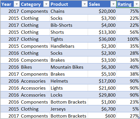
For example, here’s a simple list of household expenses on the left, and a PivotTable based on the list to the right:
|
Sales data |
Corresponding PivotTable |
|
|
|
For more information, see Create a PivotTable to analyze worksheet data.
After you create a PivotTable by selecting its data source, arranging fields in the PivotTable Field List, and choosing an initial layout, you can perform the following tasks as you work with a PivotTable:
Explore the data by doing the following:
-
Expand and collapse data, and show the underlying details that pertain to the values.
-
Sort, filter, and group fields and items.
-
Change summary functions, and add custom calculations and formulas.
Change the form layout and field arrangement by doing the following:
-
Change the PivotTable form: Compact, Outline, or Tabular.
-
Add, rearrange, and remove fields.
-
Change the order of fields or items.
Change the layout of columns, rows, and subtotals by doing the following:
-
Turn column and row field headers on or off, or display or hide blank lines.
-
Display subtotals above or below their rows.
-
Adjust column widths on refresh.
-
Move a column field to the row area or a row field to the column area.
-
Merge or unmerge cells for outer row and column items.
Change the display of blanks and errors by doing the following:
-
Change how errors and empty cells are displayed.
-
Change how items and labels without data are shown.
-
Display or hide blank rows
Change the format by doing the following:
-
Manually and conditionally format cells and ranges.
-
Change the overall PivotTable format style.
-
Change the number format for fields.
-
Include OLAP Server formatting.
For more information, see Design the layout and format of a PivotTable.
PivotCharts provide graphical representations of the data in their associated PivotTables. PivotCharts are also interactive. When you create a PivotChart, the PivotChart Filter Pane appears. You can use this filter pane to sort and filter the PivotChart’s underlying data. Changes that you make to the layout and data in an associated PivotTable are immediately reflected in the layout and data in the PivotChart and vice versa.
PivotCharts display data series, categories, data markers, and axes just as standard charts do. You can also change the chart type and other options such as the titles, the legend placement, the data labels, the chart location, and so on.
Here’s a PivotChart based on the PivotTable example above.
For more information, see Create a PivotChart.
If you are familiar with standard charts, you will find that most operations are the same in PivotCharts. However, there are some differences:
Row/Column orientation Unlike a standard chart, you cannot switch the row/column orientation of a PivotChart by using the Select Data Source dialog box. Instead, you can pivot the Row and Column labels of the associated PivotTable to achieve the same effect.
Chart types You can change a PivotChart to any chart type except an xy (scatter), stock, or bubble chart.
Source data Standard charts are linked directly to worksheet cells, while PivotCharts are based on their associated PivotTable’s data source. Unlike a standard chart, you cannot change the chart data range in a PivotChart’s Select Data Source dialog box.
Formatting Most formatting—including chart elements that you add, layout, and style—is preserved when you refresh a PivotChart. However, trendlines, data labels, error bars, and other changes to data sets are not preserved. Standard charts do not lose this formatting once it is applied.
Although you cannot directly resize the data labels in a PivotChart, you can increase the text font size to effectively resize the labels.
You can use data from a Excel worksheet as the basis for a PivotTable or PivotChart. The data should be in list format, with column labels in the first row, which Excel will use for Field Names. Each cell in subsequent rows should contain data appropriate to its column heading, and you shouldn’t mix data types in the same column. For instance, you shouldn’t mix currency values and dates in the same column. Additionally, there shouldn’t be any blank rows or columns within the data range.
Excel tables Excel tables are already in list format and are good candidates for PivotTable source data. When you refresh the PivotTable, new and updated data from the Excel table is automatically included in the refresh operation.
Using a dynamic named range To make a PivotTable easier to update, you can create a dynamic named range, and use that name as the PivotTable’s data source. If the named range expands to include more data, refreshing the PivotTable will include the new data.
Including totals Excel automatically creates subtotals and grand totals in a PivotTable. If the source data contains automatic subtotals and grand totals that you created by using the Subtotals command in the Outline group on the Data tab, use that same command to remove the subtotals and grand totals before you create the PivotTable.
You can retrieve data from an external data source such as a database, an Online Analytical Processing (OLAP) cube, or a text file. For example, you might maintain a database of sales records you want to summarize and analyze.
Office Data Connection files If you use an Office Data Connection (ODC) file (.odc) to retrieve external data for a PivotTable, you can input the data directly into a PivotTable. We recommend that you retrieve external data for your reports by using ODC files.
OLAP source data When you retrieve source data from an OLAP database or a cube file, the data is returned to Excel only as a PivotTable or a PivotTable that has been converted to worksheet functions. For more information, see Convert PivotTable cells to worksheet formulas.
Non-OLAP source data This is the underlying data for a PivotTable or a PivotChart that comes from a source other than an OLAP database. For example, data from relational databases or text files.
For more information, see Create a PivotTable with an external data source.
The PivotTable cache Each time that you create a new PivotTable or PivotChart, Excel stores a copy of the data for the report in memory, and saves this storage area as part of the workbook file — this is called the PivotTable cache. Each new PivotTable requires additional memory and disk space. However, when you use an existing PivotTable as the source for a new one in the same workbook, both share the same cache. Because you reuse the cache, the workbook size is reduced and less data is kept in memory.
Location requirements To use one PivotTable as the source for another, both must be in the same workbook. If the source PivotTable is in a different workbook, copy the source to the workbook location where you want the new one to appear. PivotTables and PivotCharts in different workbooks are separate, each with its own copy of the data in memory and in the workbooks.
Changes affect both PivotTables When you refresh the data in the new PivotTable, Excel also updates the data in the source PivotTable, and vice versa. When you group or ungroup items, or create calculated fields or calculated items in one, both are affected. If you need to have a PivotTable that’s independent of another one, then you can create a new one based on the original data source, instead of copying the original PivotTable. Just be mindful of the potential memory implications of doing this too often.
PivotCharts You can base a new PivotTable or PivotChart on another PivotTable, but you cannot base a new PivotChart directly on another PivotChart. Changes to a PivotChart affect the associated PivotTable, and vice versa.
Changes in the source data can result in different data being available for analysis. For example, you may want to conveniently switch from a test database to a production database. You can update a PivotTable or a PivotChart with new data that is similar to the original data connection information by redefining the source data. If the data is substantially different with many new or additional fields, it may be easier to create a new PivotTable or PivotChart.
Displaying new data brought in by refresh Refreshing a PivotTable can also change the data that is available for display. For PivotTables based on worksheet data, Excel retrieves new fields within the source range or named range that you specified. For reports based on external data, Excel retrieves new data that meets the criteria for the underlying query or data that becomes available in an OLAP cube. You can view any new fields in the Field List and add the fields to the report.
Changing OLAP cubes that you create Reports based on OLAP data always have access to all of the data in the cube. If you created an offline cube that contains a subset of the data in a server cube, you can use the Offline OLAP command to modify your cube file so that it contains different data from the server.
See Also
Create a PivotTable to analyze worksheet data
Create a PivotChart
PivotTable options
Use PivotTables and other business intelligence tools to analyze your data
Need more help?
Insert a Pivot Table | Drag fields | Sort | Filter | Change Summary Calculation | Two-dimensional Pivot Table
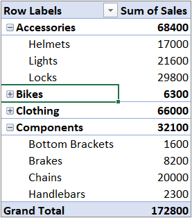
Pivot tables are one of Excel‘s most powerful features. A pivot table allows you to extract the significance from a large, detailed data set.
Our data set consists of 213 records and 6 fields. Order ID, Product, Category, Amount, Date and Country.

Insert a Pivot Table
To insert a pivot table, execute the following steps.
1. Click any single cell inside the data set.
2. On the Insert tab, in the Tables group, click PivotTable.

The following dialog box appears. Excel automatically selects the data for you. The default location for a new pivot table is New Worksheet.
3. Click OK.

Drag fields
The PivotTable Fields pane appears. To get the total amount exported of each product, drag the following fields to the different areas.
1. Product field to the Rows area.
2. Amount field to the Values area.
3. Country field to the Filters area.

Below you can find the pivot table. Bananas are our main export product. That’s how easy pivot tables can be!

Sort
To get Banana at the top of the list, sort the pivot table.
1. Click any cell inside the Sum of Amount column.
2. Right click and click on Sort, Sort Largest to Smallest.

Result.

Filter
Because we added the Country field to the Filters area, we can filter this pivot table by Country. For example, which products do we export the most to France?
1. Click the filter drop-down and select France.
Result. Apples are our main export product to France.

Note: you can use the standard filter (triangle next to Row Labels) to only show the amounts of specific products.
Change Summary Calculation
By default, Excel summarizes your data by either summing or counting the items. To change the type of calculation that you want to use, execute the following steps.
1. Click any cell inside the Sum of Amount column.
2. Right click and click on Value Field Settings.

3. Choose the type of calculation you want to use. For example, click Count.

4. Click OK.
Result. 16 out of the 28 orders to France were ‘Apple’ orders.

Two-dimensional Pivot Table
If you drag a field to the Rows area and Columns area, you can create a two-dimensional pivot table. First, insert a pivot table. Next, to get the total amount exported to each country, of each product, drag the following fields to the different areas.
1. Country field to the Rows area.
2. Product field to the Columns area.
3. Amount field to the Values area.
4. Category field to the Filters area.

Below you can find the two-dimensional pivot table.

To easily compare these numbers, create a pivot chart and apply a filter. Maybe this is one step too far for you at this stage, but it shows you one of the many other powerful pivot table features Excel has to offer.

The pivot table is one of Microsoft Excel’s most powerful — and intimidating — functions. Pivot tables can help you summarize and make sense of large data sets. However, they also have a reputation for being complicated.

The good news is that learning how to create a pivot table in Excel is much easier than you may believe.
We’re going to walk you through the process of creating a pivot table and show you just how simple it is. First, though, let’s take a step back and make sure you understand exactly what a pivot table is, and why you might need to use one.
What is a pivot table?
What are pivot tables used for?
How to Create a Pivot Table
Pivot Table Examples
![Download 10 Excel Templates for Marketers [Free Kit]](https://no-cache.hubspot.com/cta/default/53/9ff7a4fe-5293-496c-acca-566bc6e73f42.png)
What is a pivot table?
A pivot table is a summary of your data, packaged in a chart that lets you report on and explore trends based on your information. Pivot tables are particularly useful if you have long rows or columns that hold values you need to track the sums of and easily compare to one another.
In other words, pivot tables extract meaning from that seemingly endless jumble of numbers on your screen. And more specifically, it lets you group your data in different ways so you can draw helpful conclusions more easily.
The «pivot» part of a pivot table stems from the fact that you can rotate (or pivot) the data in the table to view it from a different perspective. To be clear, you’re not adding to, subtracting from, or otherwise changing your data when you make a pivot. Instead, you’re simply reorganizing the data so you can reveal useful information.
What are pivot tables used for?
If you’re still feeling a bit confused about what pivot tables actually do, don’t worry. This is one of those technologies that are much easier to understand once you’ve seen it in action.
The purpose of pivot tables is to offer user-friendly ways to quickly summarize large amounts of data. They can be used to better understand, display, and analyze numerical data in detail.
With this information, you can help identify and answer unanticipated questions surrounding the data.
Here are seven hypothetical scenarios where a pivot table could be helpful.
1. Comparing Sales Totals of Different Products
Let’s say you have a worksheet that contains monthly sales data for three different products — product 1, product 2, and product 3. You want to figure out which of the three has been generating the most revenue.
One way would be to look through the worksheet and manually add the corresponding sales figure to a running total every time product 1 appears. The same process can then be done for product 2, and product 3 until you have totals for all of them. Piece of cake, right?
Imagine, now, that your monthly sales worksheet has thousands upon thousands of rows. Manually sorting through each necessary piece of data could literally take a lifetime.
With pivot tables, you can automatically aggregate all of the sales figures for product 1, product 2, and product 3 — and calculate their respective sums — in less than a minute.
 Image source
2. Showing Product Sales as Percentages of Total Sales
Pivot tables inherently show the totals of each row or column when created. That’s not the only figure you can automatically produce, however.
Let’s say you entered quarterly sales numbers for three separate products into an Excel sheet and turned this data into a pivot table. The pivot table automatically gives you three totals at the bottom of each column — having added up each product’s quarterly sales.
But what if you wanted to find the percentage these product sales contributed to all company sales, rather than just those products’ sales totals?
With a pivot table, instead of just the column total, you can configure each column to give you the column’s percentage of all three column totals.
Let’s say three products totaled $200,000 in sales. The first product made $45,000, you can edit a pivot table to instead say this product contributed 22.5% of all company sales.
To show product sales as percentages of total sales in a pivot table, simply right-click the cell carrying a sales total and select Show Values As > % of Grand Total.
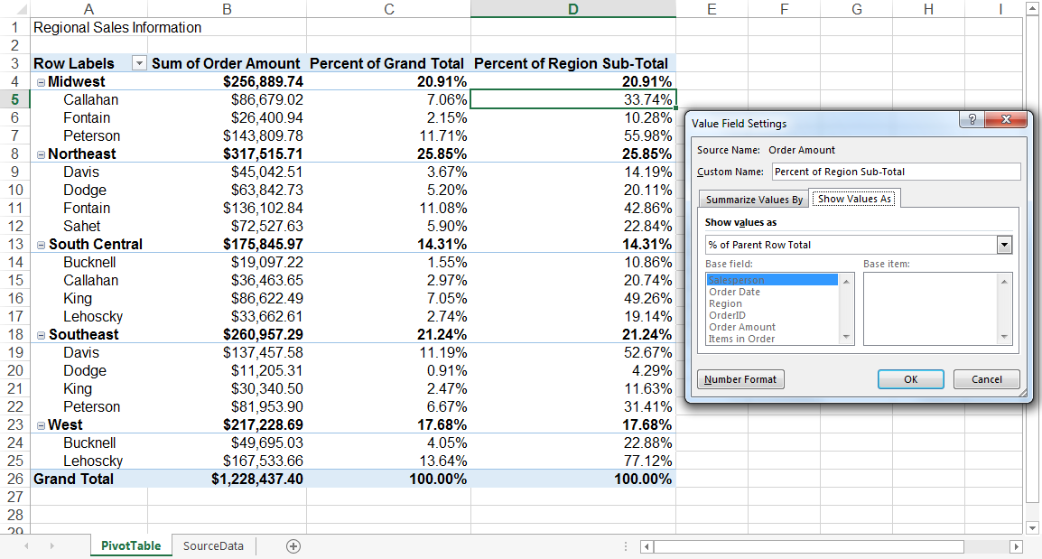 Image source
3. Combining Duplicate Data
In this scenario, you’ve just completed a blog redesign and had to update many URLs. Unfortunately, your blog reporting software didn’t handle the change well and split the «view» metrics for single posts between two different URLs.
In your spreadsheet, you now have two separate instances of each individual blog post. To get accurate data, you need to combine the view totals for each of these duplicates.
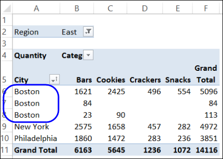 Image source
Instead of having to manually search for and combine all the metrics from the duplicates, you can summarize your data (via pivot table) by blog post title.
Voilà, the view metrics from those duplicate posts will be aggregated automatically.
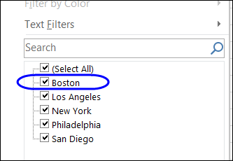 Image source
4. Getting an Employee Headcount for Separate Departments
Pivot tables are helpful for automatically calculating things that you can’t easily find in a basic Excel table. One of those things is counting rows that all have something in common.
For instance, let’s say you have a list of employees in an Excel sheet. Next to the employees’ names are the respective departments they belong to. You can create a pivot table from this data that shows you each department’s name and the number of employees that belong to those departments.
The pivot table’s automated functions effectively eliminate your task of sorting the Excel sheet by department name and counting each row manually.
5. Adding Default Values to Empty Cells
Not every dataset you enter into Excel will populate every cell. If you’re waiting for new data to come in, you might have lots of empty cells that look confusing or need further explanation.
That’s where pivot tables come in.
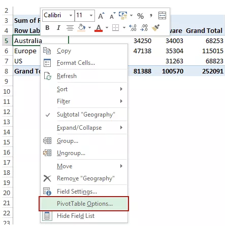 Image source
You can easily customize a pivot table to fill empty cells with a default value, such as $0, or TBD (for «to be determined»). For large data tables, being able to tag these cells quickly is a valuable feature when many people are reviewing the same sheet.
To automatically format the empty cells of your pivot table, right-click your table and click PivotTable Options.
In the window that appears, check the box labeled Empty Cells As and enter what you’d like displayed when a cell has no other value.
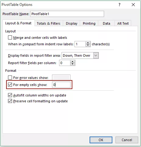 Image source
- Enter your data into a range of rows and columns.
- Sort your data by a specific attribute.
- Highlight your cells to create your pivot table.
- Drag and drop a field into the «Row Labels» area.
- Drag and drop a field into the «Values» area.
- Fine-tune your calculations.
Now that you have a better sense of what pivot tables can be used for, let’s get into the nitty-gritty of how to actually create one.
Step 1. Enter your data into a range of rows and columns.
Every pivot table in Excel starts with a basic Excel table, where all your data is housed. To create this table, simply enter your values into a specific set of rows and columns. Use the topmost row or the topmost column to categorize your values by what they represent.
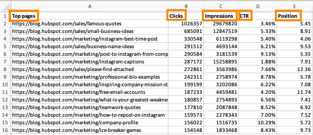
For example, to create an Excel table of blog post performance data, you might have:
- A column listing each «Top Pages.»
- A column listing each URL’s «Clicks.»
- A column listing each post’s «Impressions.»
We’ll be using that example in the steps that follow.
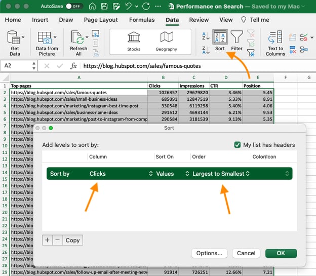
Step 2. Sort your data by a specific attribute.
Once you’ve entered all your data into your Excel sheet, you’ll want to sort your data by attribute. This will make your information easier to manage once it becomes a pivot table.
To sort your data, click the Data tab in the top navigation bar and select the Sort icon underneath it. In the window that appears, you can sort your data by any column you want and in any order.
For example, to sort your Excel sheet by «Views to Date,» select this column title under Column and then select whether you want to order your posts from smallest to largest, or from largest to smallest.
Select OK on the bottom-right of the Sort window.
Now, you’ve successfully reordered each row of your Excel sheet by the number of views each blog post has received.
Step 3. Highlight your cells to create your pivot table.
Once you’ve entered and sorted your data, highlight the cells you’d like to summarize in a pivot table. Click Insert along the top navigation, and select the PivotTable icon.
You can also click anywhere in your worksheet, select «PivotTable,» and manually enter the range of cells you’d like included in the PivotTable.
This opens an options box. Here you can select whether or not to launch this pivot table in a new worksheet or keep it in the existing worksheet, in addition to setting your cell range.
If you open a new sheet, you can navigate to and away from it at the bottom of your Excel workbook. Once you’ve chosen, click OK.
Alternatively, you can highlight your cells, select Recommended PivotTables to the right of the PivotTable icon, and open a pivot table with pre-set suggestions for how to organize each row and column.
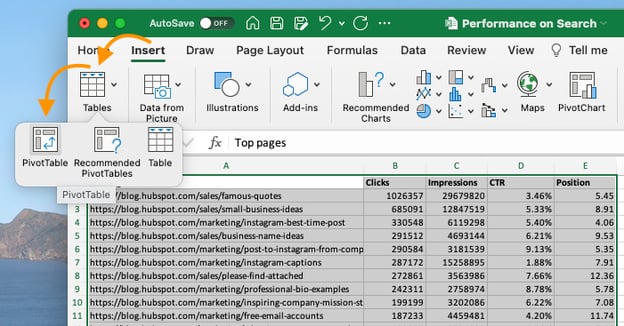
Note: If using an earlier version of Excel, «PivotTables» may be under Tables or Data along the top navigation, rather than «Insert.» In Google Sheets, you can create pivot tables from the Data dropdown along the top navigation.
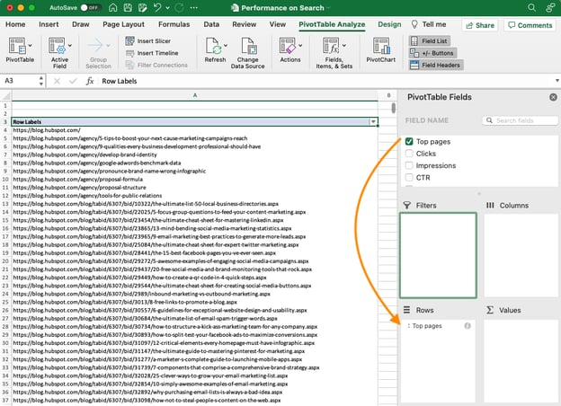
Step 4. Drag and drop a field into the «Row Labels» area.
After you’ve completed Step 3, Excel will create a blank pivot table for you.
Your next step is to drag and drop a field — labeled according to the names of the columns in your spreadsheet — into the Row Labels area. This will determine what unique identifier the pivot table will organize your data by.
For example, let’s say you want to organize a bunch of blogging data by post title. To do that, you’d simply click and drag the “Top pages” field to the «Row Labels» area.
Note: Your pivot table may look different depending on which version of Excel you’re working with. However, the general principles remain the same.
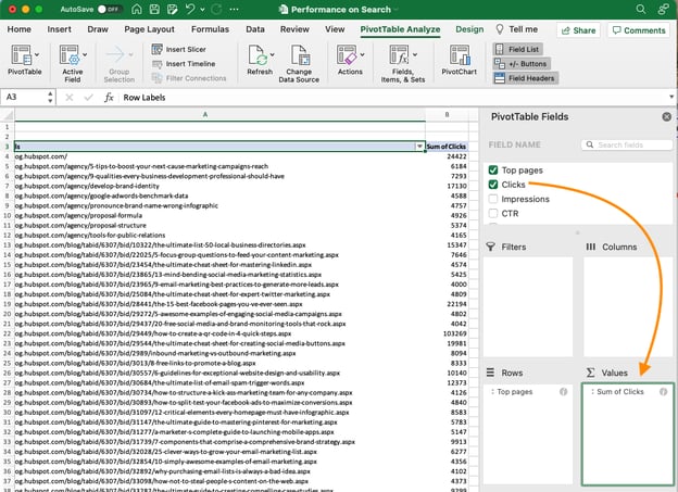
Step 5. Drag and drop a field into the «Values» area.
Once you’ve established how you’re going to organize your data, your next step is to add in some values by dragging a field into the Values area.
Sticking with the blogging data example, let’s say you want to summarize blog post views by title. To do this, you’d simply drag the «Views» field into the Values area.
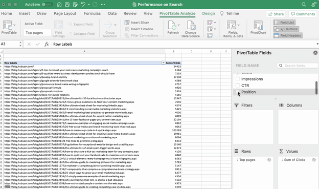
Step 6. Fine-tune your calculations.
The sum of a particular value will be calculated by default, but you can easily change this to something like average, maximum, or minimum depending on what you want to calculate.
On a Mac, you can do this by clicking on the small i next to a value in the «Values» area, selecting the option you want, and clicking «OK.» Once you’ve made your selection, your pivot table will be updated accordingly.
If you’re using a PC, you’ll need to click on the small upside-down triangle next to your value and select Value Field Settings to access the menu.
When you’ve categorized your data to your liking, save your work and use it as you please.
Pivot Table Examples
From managing money to keeping tabs on your marketing effort, pivot tables can help you keep track of important data. The possibilities are endless!
See three pivot table examples below to keep you inspired.
1. Creating a PTO Summary and Tracker
 Image source
If you’re in HR, running a business, or leading a small team, managing employees’ vacations is essential. This pivot allows you to seamlessly track this data.
All you need to do is import your employee’s identification data along with the following data:
- Sick time.
- Hours of PTO.
- Company holidays.
- Overtime hours.
- Employee’s regular number of hours.
From there, you can sort your pivot table by any of these categories.
2. Building a Budget
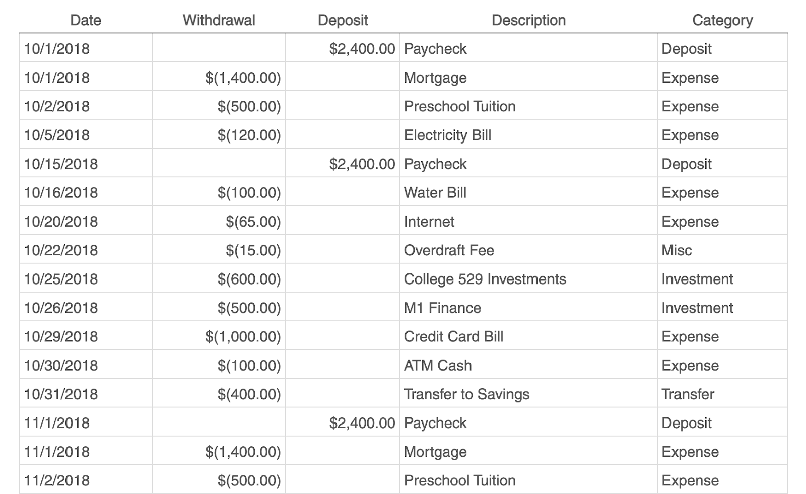 Image source
Whether you’re running a project or just managing your own money, pivot tables are an excellent tool for tracking spend.
The simplest budget just requires the following categories:
- Date of transaction
- Withdrawal/Expenses
- Deposit/Income
- Description
- Any overarching categories (like paid ads or contractor fees)
With this information, you can see your biggest expenses and brainstorm ways to save.
3. Tracking Your Campaign Performance
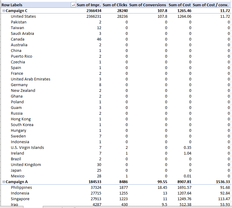 Image source
Pivot tables can help your team assess the performance of your marketing campaigns.
In this example, campaign performance is split by region. You can easily which country had the highest conversions during different campaigns.
This can help you identify tactics that perform well in each region and where advertisements need to be changed.
Digging Deeper With Pivot Tables
You’ve now learned the basics of pivot table creation in Excel. With this understanding, you can figure out what you need from your pivot table and find the solutions you’re looking for.
For example, you may notice that the data in your pivot table isn’t sorted the way you’d like. If this is the case, Excel’s Sort function can help you out. Alternatively, you may need to incorporate data from another source into your reporting, in which case the VLOOKUP function could come in handy.
Editor’s note: This post was originally published in December 2018 and has been updated for comprehensiveness.

Table of Contents
A pivot table in Excel is a summarization tool to automatically sort, filter, count, and perform mathematical calculations on data stored in a table. When you work with large data sets in Excel, the pivot table makes an interactive summary from many different records.
Another advantage of using pivot tables in Excel is that you can set up and change the structure of your summary table by dragging and dropping the source table’s column.
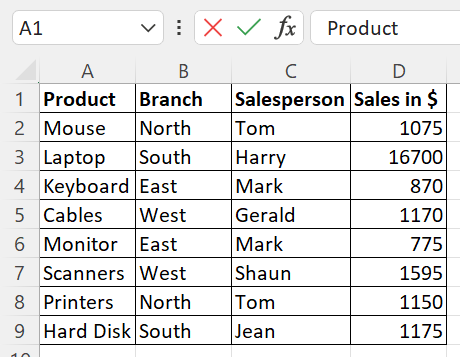
For instance, you have a table with the sales information of a product at different branches by a different salesperson. You are interested in knowing the total sales, sales of each product, and sales made by individuals. PivotTable in Excel has features that perform all these operations.
In an Excel spreadsheet, you can find the Pivot Table under the Insert tab.
You can use SUMIF and SUMIFS formulas to sum a long list of numbers using one or more conditions. However, if you are interested in comparing several facts and finding statistics regarding sales, profit, or grand total, the Pivot Table is efficient for that. The PivotTable is customizable and you can get the totals of any field (either a row-wise or a column-wise total) you want.
What Is a Pivot Table in Excel and What Is It Used For?
A Pivot Table in Excel is a tool that summarizes data and allows you to perform various mathematical calculations using the data. It is a versatile tool to help you explore, analyze, and summarize large amounts of data. It can summarize data along the row or column and return the sum, count, average, maximum, minimum, and other statistical data.
PivotTables can filter, group, sort, or conditionally format different subsets of data to display results based on your criteria. It can rotate rows with columns and vice versa. That’s the reason it is called a pivot table. You can expand or collapse the levels of data and move further deep to check the substeps of the total and grand total.
How to Create a Pivot Table in Excel
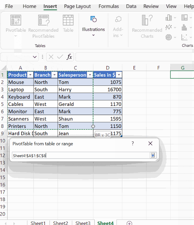
Pivot tables in Excel can be created with ease with an existing table. If you don’t know how to create a pivot table in excel, we’ll show you. Let’s take the above table as the source to create a pivot table. This screenshot shows a sales report across different branches, including various salespeople and products. A business owner or a marketer would likely be interested in learning more about the total sales in each branch by a particular salesperson, or the total sales in a quarter, i.e from January to March, of a product.
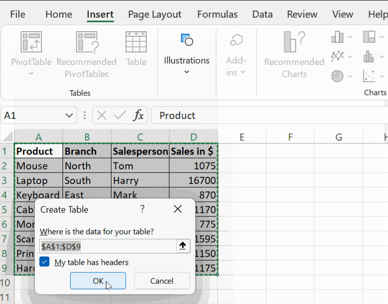
To start with, click on the Insert tab, and then click on the Table. It prompts you for the location of data in the table. By default, it takes the starting and ending cells of the table. Select the checkbox ‘My table has headers in the prompt if you require headers for each column.
Then click OK and proceed. Your table becomes dynamic. That is, you get the filter option in the column name and you can choose to sort and filter the column data with the options given in the drop-down menu.
For usability, name the columns with headings relevant to the data in the column. For example, column A contains data, such as a mouse, laptop, keyboard, and cables. It is a good practice to name the column with a relevant collective noun such as Product or Items Sold.
Creating a Pivot Table in Excel
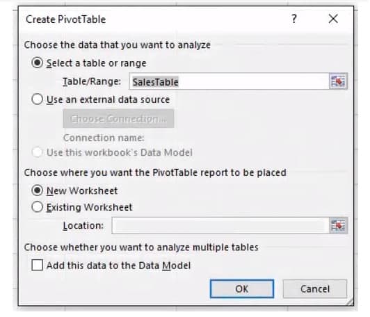
Click on the Insert tab, then click PivotTable, this opens a dialogue box PivotTable from the table or range. You will be prompted with the message Select a table or range. Here, mention your table range in the dialogue box Table/Range, and choose the location where you want the PivotTable to be placed. It can be either in a New Worksheet or in the Existing Worksheet.
If you select the option New Worksheet, the PivotTable will be placed in a new worksheet starting at cell A1. If you choose the option Existing Worksheet, it will place your table where you put your cursor on the existing worksheet.
Note: Make sure to click on a cell in the worksheet other than your source table for creating a pivot table.
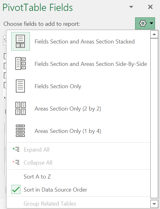
Parts of the PivotTable
After you mention the table range (the location where you want the PivotTable to appear) and click OK, you get a small window next to your table displaying the PivotTable fields, as you can see below. You first notice the field Choose fields to add to the report. Click on the Settings option next to it, and you will find the following formats in which your PivotTable can be displayed.
- Fields Section and Areas Section Stacked.
- Fields Section and Areas Section Side-By-Side.
- Fields Section Only.
- Areas Section Only (2 by 2).
- Areas Section Only (1 by 4).
You can choose any of the formats in which your report has to appear. To start with, choose the first option, Fields Section and Areas Section Stacked, and you find that all the columns in your table appear below the field, Choose fields to add to the report, which you can drag and drop accordingly.
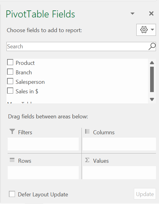
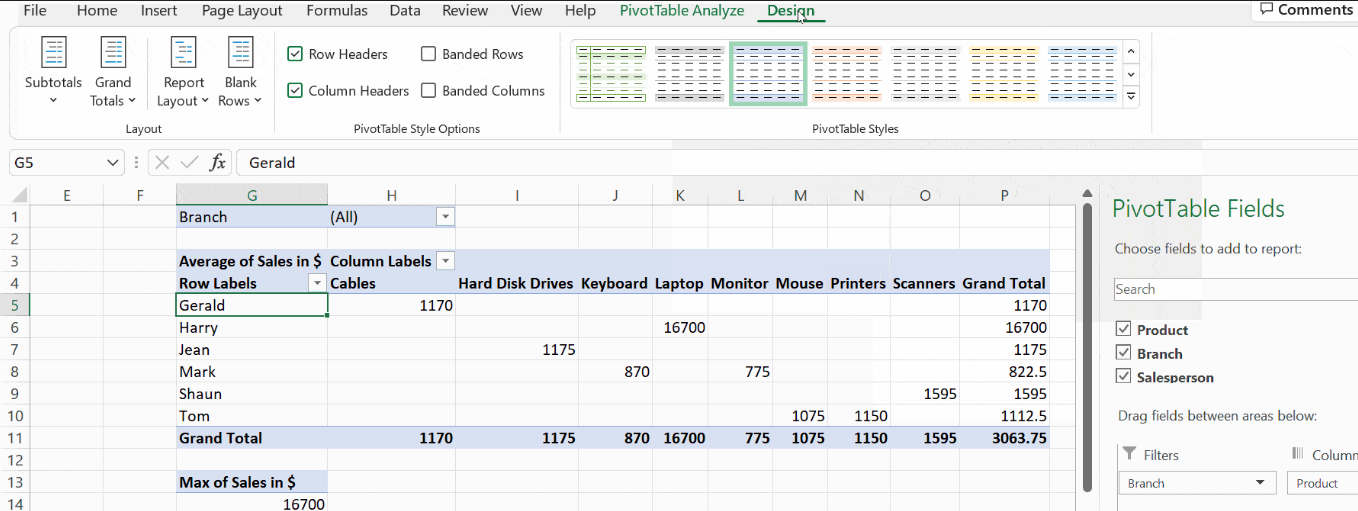
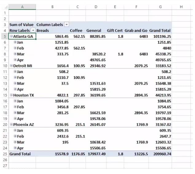
For the PivotTable summary, you need to mention the column based on which you intend to generate the report. For instance, if you wish to see the summary of sales in each Branch, mention the field Branch in the filter by dragging and dropping the field Branch in the Filters field. Choose the column you wish to appear in the Columns and the Rows fields.
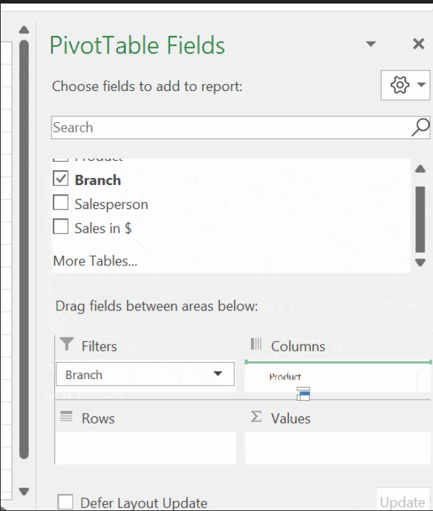
Note: Mention non-numeric columns, such as Product and Salesperson, in the Rows and Columns and numeric data in the Values field. After you are done with this step, click outside the window and you will see this report generated as shown below.
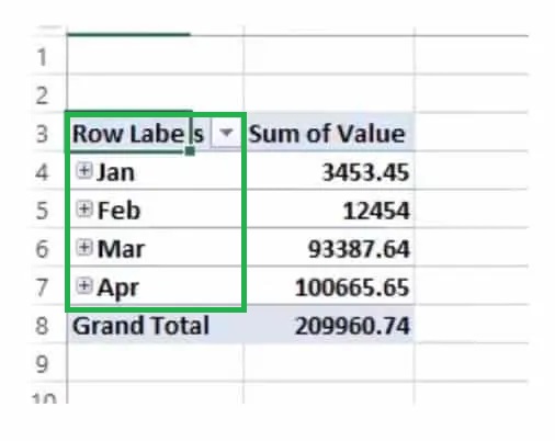
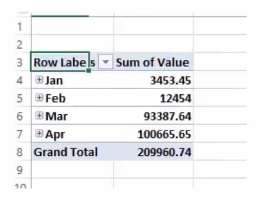
Arranging the PivotTable
The pivot table is arranged to give a detailed summary report on sales of all the products by all the salespeople across all the branches. The Row has all the salespeople’s names and the Column has the products listed. The Branch column is mentioned in the Filter field and you can generate a report based on the different branches mentioned.
For an instance, when you click on the button next to the Branch column, you get the options, (All), East, North, South, West. Click on the drop-down menu and choose the branch East. When you refer to your table, you see that, in the East Branch, Mark is the salesperson and he has sold 2 products (a keyboard and monitor).
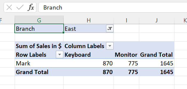
Sales of each product are mentioned individually and the total sales made by Mark are also mentioned in the report. You can also click on the row labels and the column labels and choose a particular item to display the report of that particular product or salesperson.
The report contains the total sales of the product and the total sales of the salesperson also. Such analysis helps the manager to analyze the sales that assist them to predict profit or loss in the business.
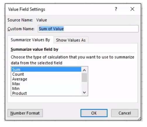
Value Field Settings
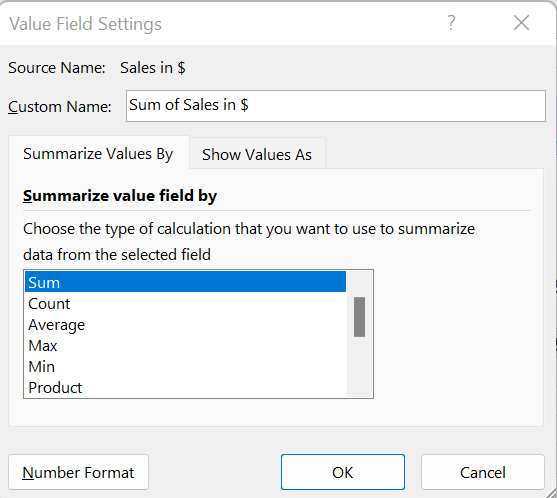
The report generation doesn’t stop with these details alone. When you click on the Values field, you get a new window Value Field Settings. There, you get options to summarize the value field by different functions, such as Sum, Count, Average, Max, Min, Product, Count Numbers, Standard Deviation, and Variance. You can apply these functions to your table. All these help managers decide and forecast inventory management and sales predictions.
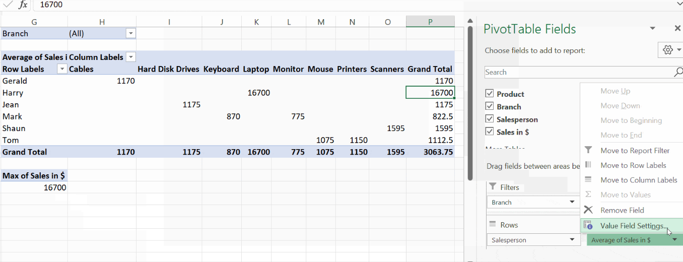
The below screenshot shows the different statistical functions that you can choose from to summarize data from the selected fields:
Analyzing Data in Your Excel Pivot Table
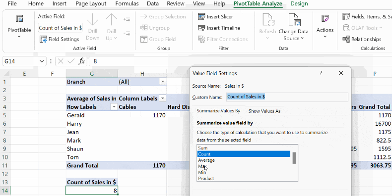
You can refine your Pivot Tables in Excel further to make effective data analysis. After you create a pivot table, you can see two more new tabs along with the already existing tabs. They are PivotTable Analyze and Design.
The PivotTable Analyze has many options, such as Active Field, Group, Filter, Data, Calculations, and Tools. When you click on Active Field→Field Settings, you find the Value Field Settings and you can choose any of the statistical functions from there.
Click on the Design tab to improve the table’s design, where you will find plenty of predefined styles. You can hover and apply the style that suits you.
Pivot Charts and Advanced Pivot Tables
Pivot tables in Excel are used to aggregate data. They present an overall view of the table in order to compare, analyze, and forecast. Excel pivot tables generate reports, segregate data into summaries and groups, and create pivot charts. They are user-friendly, allowing users to exchange the rows and columns and drag the pivot table to different places in the worksheet. In this Excel pivot table tutorial, we will learn how to customize a pivot table, create a chart, and group data. We will cover various advanced uses of pivot tables.
Customizing Your Pivot Table
You can choose a different style after you create a pivot table. Including colours in the pivot table helps show banded rows or columns, highlighting important data to make it stand out.
Pivot tables in Excel can be customized to your preferred format and style. Excel offers a few in-built pivot table styles that you can’t change, but you can create your customized style and apply it to one or more pivot tables. In the below example, we will see how to add colours to the pivot table.
Click on any cell on the pivot table, and PivotTable Analyze and Design tabs appear. Click on the Design tab and use any available options in the groups.
The layout group contains the options subtotals, grand totals, report layouts, and blank rows.
- Subtotals – shows or hides subtotals.
- Grand Totals – shows or hides grand totals.
- Report Layout – the compact form optimizes for readability, while the tabular and outline forms include field headers.
- Blank Rows – it makes groups by adding a blank line between each grouped item.
How Do I Make a Pivot Chart in Excel?
An Excel pivot chart is a visual representation of a pivot table. You can create a pivot chart only if you have a pivot table, as they both are connected. A pivot chart can quickly change the portion of data displayed and making it ideal for presenting data in a report. You can quickly change the portion of data displayed, like a pivot table report.
After the pivot table is created, click on the tab PivotTable Analysis, where you can find the PivotChart. Click on that to insert a pivot chart. It opens a dialogue box named Insert Chart, where you have the list of all types of charts. You can hover your mouse over each one and see the different charts available.
For this example, I have chosen the chart type Stacked Column. A pivot chart is inserted with all the fields in the pivot table. The filter appears at the chart’s top position, and other pivot table fields appear at the legends and axis. At the bottom right corner, you find the symbols + and -. Click on the + button, and you find the grouped data expanding in the pivot table. Click on the – button to revert and collapse the columns.
Grouping Data
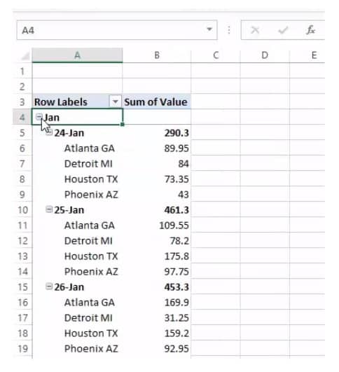
Grouping data in a pivot table allows you to group a subset of data to analyze. You can group dates, numbers, and text fields in a pivot table. You can group the date column in your table by year, month, and quarter. For instance, the screenshot below shows the policy holders’ names and various other details concerning their policies.
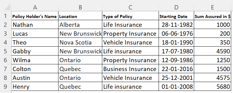
This is the example table for which the pivot chart has been created. This gives a detailed report of the date field, indicating which quarter the policy was taken. The pivot table first arranges the names alphabetically and the years in ascending order, from 1976 to 2016.
The date field stores the year alone in the pivot table. You can see a small + symbol before the year. When you click on that, it expands and displays the quarter in which the policy was started. When you click on the quarter, it displays the month when the policy was taken.
Now, you can group the dates after creating the pivot. Click on any cell that contains the date in the pivot table, then right-click on it. You get the menu, as you can see in the screenshot below. Click on Group; it will prompt you to enter the start and end dates. Based on the dates you mentioned, the values will be grouped and displayed in the pivot table.
In the pivot table, the start and end dates are mentioned as 06-06-1976 and 12-12-2000, respectively. The pivot table displays the names of the policyholders who had taken a policy during that period. At the pivot table’s end, you can see a row with the value >12-12-2000.
The pivot table also displays the names of the policy holders who had taken a policy after the date 12-12-2000 and then displays the Grand Total.
Creating Multiple Records
When you create a pivot table, you are filling the Filters based on your pivot table. This is known as a global filter. In the screenshot, the entire table is filtered by a single overall criterion, the type of policy. The pivot table shows the data of all the policies in one report.
Imagine a situation where you wish to make a separate report for each item in the global filter. If it has to be done manually, you will create a pivot table by changing the type of policy and taking multiple reports for each type.
Instead of performing the same steps iteratively, Excel pivot tables give us the option to create multiple reports in a few clicks.
Place the desired field, and type of policy, in the Filters field, then select the tab PivotTable Analyze. When the tab unfolds, you find the option PivotTable. Click on PivotTable → Options → Show Report Filter Pages.
It opens the dialogue box Show Report Filter Pages, which has the global filter you applied when you created the pivot table. Click on the field you want to apply as a filter to generate multiple reports.
Then, you get a separate report that contains the global filter. You can click on the different options and get reports for that filter. In the screenshot, you can see the filter that we applied when the pivot table was created.
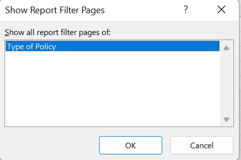
The dialogue box lists all the pivot table’s global filters.
Refreshing Pivot Cache
When working with Excel pivot tables, you must know what a pivot cache is. It is an object repository that holds a replica of the original data. Though a user cannot see it, it is a part of the workbook and is connected to the pivot table. When you make any changes in the pivot table, it does not reflect in the source data. Rather it happens in the pivot cache.
The cache enables fast processing of a pivot table. In reality, you access the pivot cache when you make changes in the pivot table and are not directly linked to the source data. This is also why you need to refresh the pivot table to reflect any changes made in the original table.
Limitations of Shared Pivot Cache
Though pivot cache improves the pivot table performance and memory usage, there are a few limitations, such as:
- It increases the size of your workbook, thereby occupying much memory space.
- When the pivot table is refreshed, all the tables linked to the same cache are also refreshed.
- Grouping is reflected in all associated pivot tables and not just the table on which the grouping function was executed.
Showing Value as a Percentage
The pivot table displays the values across the rows and columns. You can get the values as percentages concerning the grand total, roe total, or column total. Select any cell on the pivot table, and right-click on it. On the menu, choose Show Values As, and select any option mentioned there.
How to Delete Pivot Table?
You can delete the pivot table when you think it is no longer needed. The steps to delete are as follows:
- Click on any of the cells inside the pivot table.
- Click on PivotTable Analyze → Actions → Select → Entire PivotTable.
- The entire pivot table is selected.
- Press the delete button on your keyboard.
FAQs
1. What is a Pivot Table in Excel and what are its uses?
A Pivot Table calculates and summarizes data and presents you with a report to see comparisons, patterns, and trends that allow you to forecast your sales. First, you need a table populated with data to work with pivot tables in Excel. You can also use tables from existing worksheets or other sources.
It is generally used by managers, financial advisors, strategists, analysts, auditors, sales managers, HR managers, and statisticians.
2. How to delete a Pivot Table?
- If the source table is in a separate worksheet, delete the worksheet itself.
- Select the entire pivot table and press the delete button on your keyboard.
- Click on the PivotTable Analyze→ Actions group→Entire PivotTable, and then press Delete.
3. What are the features of a pivot table?
- It provides an interactive way to summarize large amounts of data.
- You can analyze numerical data and project it from various views.
- It is designed to query large amounts of data.
- It provides a user-friendly interface.
- It allows subtotalling and data grouping summarizes data in categories and subcategories and creates custom calculations and formulas.
- It drills down for details from the summary report to get the data you are interested in.
- It provides an easy way to swap rows with columns and vice versa to see the different summaries of the original table.
- It filters, sorts, groups, and conditional formats data.
- It generates concise, attractive, and annotated reports that can be shared online or printed offline.
- It presents concise, attractive, and annotated online or printed reports.
4. What is the difference between a pivot table and a pivot chart?
| Pivot table | Pivot chart |
|---|---|
| A pivot table summarizes large data in a spreadsheet. | The pivot chart provides a graphical representation of the pivot table. |
| In a pivot table, you can choose the fields appearing in the rows and columns. | You can choose from multiple layouts and chart types in a pivot chart. |
| Changes made in the pivot table will appear in the pivot chart. | For one pivot table, you can create many pivot charts. |
5. List the difference between normal charts and pivot charts.
| Chart | Pivot chart |
|---|---|
| Charts are a graphical representation of a table, but applying filters, sorts, and calculations over these types of charts requires changing the source data cell formulas or entries. | Pivot charts are also a graphical representation of a table with more access buttons on the chart. |
| Changes to the chart do not flow back to the data. | A pivot chart is linked to a pivot table. Filters applied to pivot charts are also applied to their associated pivot table. |
| The option of inserting the slicer is not possible with the normal charts. | Slicers can also be applied to pivot charts, and a single slicer can be applied to multiple pivot tables. |
Closing Thoughts
In this guide, you learnt what a PivotTable is and how to work with it. Many know how to create a pivot table but might not have worked with other functions available in it. The summary report from the source table displays data that has various interpretations.
Pivot tables and charts are one of the powerful features of Excel. Business analysts use pivot tables and charts for generating reports, forecasting, and planning. Creating a pivot table
requires a few clicks, but mastering it can be time-consuming as it depends on how you want to use your data within your pivot tables.
You can also use Lookup functions, such as VLOOKUP along with PivotTable. Check our courses in Excel and Microsoft Office Applications to learn how to work with these software tools. You will earn Micro-credentials on completion of the course.

Home > Microsoft Excel > How to Create a Pivot Table in Excel? — The Easiest guide
If you ask anyone with decent experience in using Excel, about the most useful Excel feature, they will vouch for the Excel Pivot Table. It is one of the most searched Excel features on the internet, and for good reason.
Related:
Creating A Dynamic Pivot Chart Title Using Slicers
Using Getpivotdata In Excel
Dashboards In Excel Using Pivot Tables, Pivot Charts And Slicers
In this guide, let’s see what makes the Pivot table one of the most popular and powerful Excel features.
This guide covers
Table Of Contents
- What is a Pivot Table?
- What is the use of a Pivot Table in Excel?
- How does an Excel Pivot Table work?
- How to Create a Pivot Table in Excel?
- Step 1: Turn the Data Range into a Table
- Step 2: Open the Create Pivot Table Wizard
- Step 3: Select the Source Table or Range for the Pivot Table
- Step 4: Set the Location of the Pivot Table
- How to Add Data to an Excel Pivot Table?
- Four Quadrants
- Values:
- Rows:
- Columns:
- Filters:
- Value Field Settings
- Analyse data using Pivot Table
- Sales Values across Months
- Sales Values across months in Each branch.
- Sales Values across months in Each branch for each department.
- What are the Benefits of Pivot Tables?
- FAQs
- What is the use of a Pivot Table in Excel?
- What is a Pivot Table formula?
- Let’s wrap up
What is a Pivot Table?
Microsoft describes a Pivot Table in Excel (or PivotTable if you’re using the trademarked function name!) as “an interactive way to quickly summarize large amounts of data”. It’s a pretty good description.
What is the use of a Pivot Table in Excel?
The Excel Pivot Table function is an essential part of data analysis in Excel. Before the Pivot Table came along you’d need multiple functions tied together in a complicated and convoluted way to perform the same action that just takes a few clicks in a Pivot Table.
To say they revolutionised the way the average Excel user performs data analysis is an understatement. They are such a big deal that they have their own Wikipedia page.
For the end-user, Pivot Tables are remarkably simple to use and easy to learn. There are hundreds of brilliant articles on how to create your first Pivot Table as well as some excellent lessons on YouTube.
We’re going to contribute by showing you some of our highest rated videos that teach you how to create a Pivot Table in Excel.
If for any reason you don’t get it the first time, don’t worry, we’ve included multiple Pivot Table tutorials to help you master this essential skill.
If you have an hour to dedicate to a Pivot Table tutorial, then start with the video below. This is a recording of a live class we held in 2019 that takes you through everything you need to know to start analysing your data using Pivot Tables. These live classes are all free as part of a Simon Sez IT membership.
If that’s too much, scroll down and we have some other, shorter videos taken straight from our Excel courses.
How does an Excel Pivot Table work?
All Pivot Tables start life as a boring old range of data. But once you create a Pivot Table, Excel takes a quick look at the data and stores it in its cache.
This is called the Pivot cache and it is responsible for the super fast calculation of summaries that Pivot Tables are known for.
Each time you add or remove data from the Excel Pivot Table, Excel does not deal with the source data, rather it uses this Pivot Cache as a quick shortcut.
Also Read:
Introduction To Power Pivot and Power Query In Excel
Getting Started With Power Pivot: Advanced Excel
Excel Crash Course – Learn Pivot Tables In 1 Hour
How to Create a Pivot Table in Excel?
Step 1: Turn the Data Range into a Table
You can create a Pivot Table in Excel from a range but we strongly recommend that you turn your range into a table as this makes it a lot simpler to add or remove data later on.
For example:
A few golden rules about your data range or table before you create an Excel Pivot Table with it:
- Every column should have a header. If one is missing, you won’t be able to create a Pivot Table.
- There should be no empty rows. There can be the odd empty cell, but no full empty rows. This can mess up a few things.
Step 2: Open the Create Pivot Table Wizard
Once you’ve turned your range into a table (use Ctrl-T to do this quickly!) you then need to select a cell in that table, go to Insert on the ribbon and select Pivot Table on the far left.
This brings up the Create Pivot Table Wizard where you can start selecting your Pivot Table options.
Step 3: Select the Source Table or Range for the Pivot Table
The first option you’ll notice is that Excel is asking you to select the table or range. Because we have already created a table and we were clicked into that table when we chose to insert the Pivot Table, Excel has done the hard work for us and has selected that table as our range of data.
Step 4: Set the Location of the Pivot Table
Select whether you create your Pivot Table in a new or an existing worksheet. Once you hit OK, you’ve created your first Pivot Table. Hurray!
What you’ll see next is a blank table to the left with a set of options on your right. These options are the Pivot Table fields and this is where the magic starts to happen. I’ll show you how to do this in the next section.
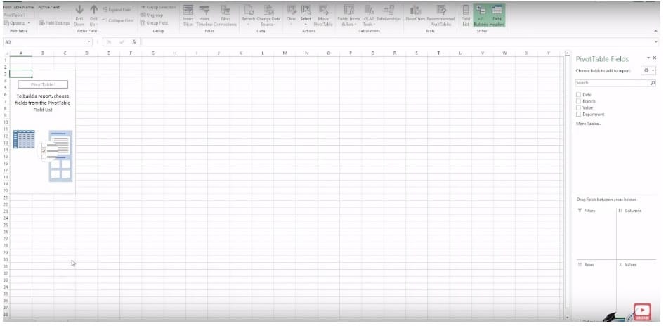
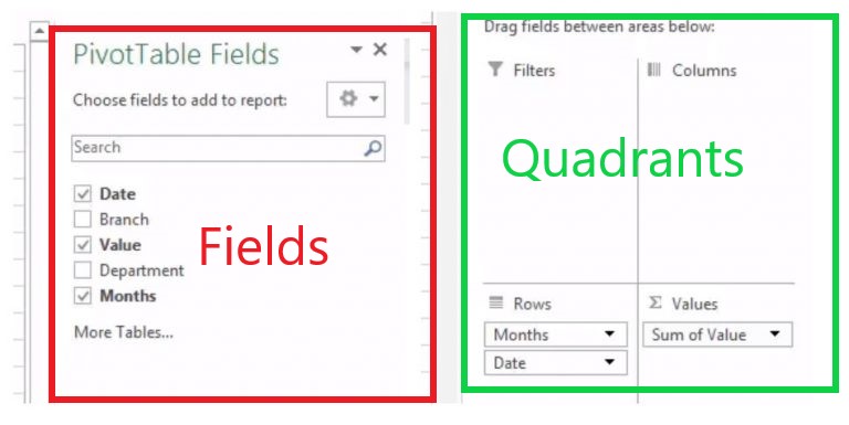
How to Add Data to an Excel Pivot Table?
Using the Pivot Table Fields panel you can now start to manipulate your data.
Four Quadrants
A pivot table is based on these four quadrants:
- Filters
- Columns
- Rows
- Values
We’ll see what each of these quadrants mean in a minute.
These four quadrants are the key to manipulating the data in your Pivot Table. You can now start to drag the values at the top of the Excel Pivot Table Fields section into the quadrants below.
Values:
The values quadrant is what decides the type and value of calculations that the Pivot Table should display. It is the meat of a Pivot Table so to speak.
In the following image, the area bordered in red is the Values area in a Pivot Table.
Rows:
The rows quadrant is what decides the rows that the Pivot Table should display. The Rows are used to slice the data in a suitable way that we are looking for.
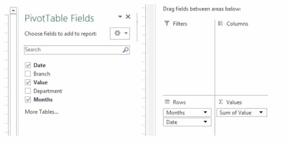
For example, you want to look at the total sales that occurred in different months. For this, you need to drag Months in the Rows quadrant.
In the following image, the area bordered in green is the Rows area of a Pivot Table.
Columns:
The columns quadrant is what decides the columns that the Pivot Table should display. That is columns are used to further dice the data into a suitable format.
For example, you want to look at the total sales that occurred in different months across different departments. For this, you need to drag Months in the Rows quadrant and further drag Departments into the Columns quadrant.
In the following image, the area bordered in blue is the Columns area of a Pivot Table.

Filters:
The filters quadrant is optional and is used to further drill down your Pivot Table. For example, you may want to look only at the sales value of the Detroit Branch.
This can be done by dragging the Branch field into the filter quadrant. Now, you can select the branch you are looking for from the drop-down list and view only its data.
Value Field Settings
How do you change what’s happening in your value field away from displaying the sum? Simple, you need Value Field Settings.
To access these select any value in your Pivot Table, go to analyze on the ribbon and select “Field Settings”. Alternatively, click the little down arrow in the value quadrant and select “Value Field Settings”.
This brings up the options you have in relation to your values. You can average instead of sum, you can count or use Min or Max. You can then select how you show the values including adding some calculations and changing the number format.
Analyse data using Pivot Table
Depending on which quadrant you pick, the table will format differently so there are a few rules to stick to:
- Numbers nearly always go in the Values quadrant. This allows you to perform calculations, summaries, averages etc. all from within your Pivot Table.
- Dates often go in the Rows column because…
- Anything you put in the rows column will become the row headings, anything in the columns quadrant will become column headings so for ease of use put the data with more options in the Rows column (it’s easier to scroll down rather than across for ages).
- The Filters quadrant does what you’d expect, it applies a filter to the entire dataset. Super useful if you just want to show something specific.
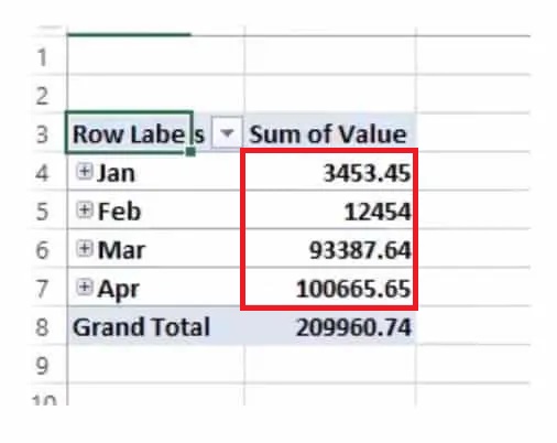
Sales Values across Months
Say you have dates in your rows quadrant and a set of corresponding values in your values quadrant. Excel will automatically do a couple of things.
- It will condense the dates into months, quarters or years (depending on the data set).
- It will sum the values in the values field.
This is the Pivot Table starting to work. From your dataset, it’s now summarising that data by month for you. All within a few clicks.
Of course, you may not want that exact data and you may not want to add it together. The amazing thing about the Excel Pivot Table function is just how flexible it is.
You can drag and drop, remove and change the data within those quadrants as much as you want and you’ll start to see just how powerful Pivot Tables are.
Sales Values across months in Each branch.
The data in our example is sales data. Above we’re seeing sales by month which is useful. But what if we wanted to see sales by branch and by date?
Easy, we just drop the branch data into the rows column, under the date and we get a breakdown of that as well:
Sales Values across months in Each branch for each department.
If we wanted to get even more detail we could then add the departments to the column data and we’d see a summary of sales by branch, by the department and by date! You can quickly see that with very little effort on our part we can now draw really meaningful insight from our dataset:
What are the Benefits of Pivot Tables?
All that an Excel Pivot table does is help you effortlessly slice and dice your data. A normal Excel sheet or table might not suffice for your data needs.
Suppose you need to quickly find out the Bread sales in January that occurred in the Detroit region, manually doing it each time using filters or formulas can be painstaking.
Or if you need to quickly look at the top 5 performing regions in the coffee department, using an Excel function is akin to taking the roundabout way to reach your destination.
An Excel Pivot Table achieves all this and more in just a few clicks.
Slicers and Filters
If you’ve grasped the basics and you’re ready to conquer some more advanced pivot table tutorials, then you need to know all about Slicers and Filters.
By filtering and slicing your data in a Pivot Table you can start to get analyse specific areas of your dataset and pull out interesting patterns. Plus, if you want to create an interactive dashboard that others can use, you’ll want to master these functions.
All this and so much more is explained in this video:
In this video our Excel expert Toby shows you everything you need to know about Slicers & Filters :
Suggested Reads:
How To Use Excel Countifs: The Best Guide
Excel Sumifs & Sumif Functions – The No.1 Complete Guide
How To Protect Cells In Excel Workbooks-the Easiest Way
FAQs
What is the use of a Pivot Table in Excel?
An Excel Pivot Table is used to summarise data in a reorganised format. While doing this, you can sort, filter, sum, count or even average your values across different fields.
What is a Pivot Table formula?
In a Pivot Table, under the value field settings, you will find summary functions to find SUM, AVERAGE, and COUNTS of values for the fields.
If they are not enough you can create your own formula to find the required value. These are called Pivot Table formulas
Let’s wrap up
That’s enough Pivot Tables for today, isn’t it? In this guide, we looked at the basics of creating and using pivot tables.
The key takeaway from this tutorial is that an Excel Pivot Table is a very versatile tool to drill down and look at your data.
There are more interesting things to do with them and we’ll deal with them in later advanced guides. If you find this guide useful, check out our Excel courses for more high-quality comprehensive guides on advanced Excel topics.
If all the above isn’t enough Pivot Table for you, then we’ve got an extended Pivot Table video here for you. It’s 40 minutes long, so get comfy.
Simon Sez IT has been teaching Excel for over ten years. For a low, monthly fee you can get access to 100+ IT training courses.
Other Excel classes you might like:
- What-If Analysis in Excel
- Designing Better Spreadsheets in Excel
- Logical Functions in Excel
Deborah Ashby

Deborah Ashby is a TAP Accredited IT Trainer, specializing in the design, delivery, and facilitation of Microsoft courses both online and in the classroom.She has over 11 years of IT Training Experience and 24 years in the IT Industry. To date, she’s trained over 10,000 people in the UK and overseas at companies such as HMRC, the Metropolitan Police, Parliament, SKY, Microsoft, Kew Gardens, Norton Rose Fulbright LLP.She’s a qualified MOS Master for 2010, 2013, and 2016 editions of Microsoft Office and is COLF and TAP Accredited and a member of The British Learning Institute.
How to Create a Pivot Table in Excel: Step-by-Step (2023)
If you have a huge dataset that’s spread across your entire sheet, and now you want to create a summary out of it – you need a Pivot Table 💪
Pivot Tables make one of the most powerful and resourceful tools of Excel. Using them, you can create a summary out of any kind of data (no matter how voluminous it is).
You can sort your data, calculate sums, totals, and averages and even create summary tables out of it. If you are new to the concept of Pivot Tables, you’d be jaw-dropped by the end of this article.
So you’re ready? Let’s go.
Aa aah! Have you downloaded our free sample workbook for this guide? Get your hands on it right now to practice along with the guide below 🤟
What is a pivot table?
An Excel pivot table is meant to sort and summarize large (very large sets of data).
Once summarized, you can analyze them, make interactive summary reports out of them and even manipulate them 📝
Let’s cut down on the talking and see what a pivot table looks like. Here’s the image of some data in Excel.

The data is about the sales of many products made throughout the year 📆
Yes, it’s super huge and it goes across many columns and rows. But it’s hard to understand the data this way. How about we create a summary of the same?

Wow! That’s what we call a Pivot Table.
It summarizes the sales for each product for each type of customer 💁♀️
You can change fields to summarize this data in any way you like. Like summarizing the sales for any particular product, period, type, etc.
Pro Tip!
Pivot Tables can help you do the following 👇
- Cleanly summarize huge datasets.
- Categorize your data into multiple categories and sub-categories.
- Extract a certain portion of your data (if need be) by selecting the relevant fields only.
- Get any part of your data as a row or as a column (called ‘pivoting’).
- Get totals, and subtotals, or drill down any of them to see their details.
How to create a pivot table in Excel
If the images above made you feel like it would be a science to create a Pivot Table in Excel – that’s just not true.
Pivot Tables are super easy to create. Let me show you how we created the one above 👀

So here’s the data for sales of different products made throughout the year.
Pro Tip!
Before we go on making a Pivot Table, here are some tips for you to follow to make your Pivot Table better 😎
- Turn your source data into an Excel table before making a Pivot Table out of it. This way, whenever you make any changes to the source data (adding or deleting rows or columns), your Pivot Table will reflect the same.
- Delete any empty rows or columns from the source data.
- Name each column as desired to have the same header as a field title in the Pivot Table.
- Ensure your source data doesn’t have any subtotals or totals.
Let’s concise them into a Pivot Table here.
- Go to the Insert tab > Pivot Tables.

You’ll see the Insert PivotTables dialog box on your screen as follows:

- Create a reference to the cells containing the relevant data.
We will navigate to the sheet ‘Data’ in our workbook and select the cells that contain data.

We have converted our data into an Excel table so Excel automatically recognizes it as Table1.
Do not forget to include the headers in the selection.
- Choose the option for New Worksheet or Existing Worksheet.
We will choose New Worksheet to have the Pivot table created on a new sheet.

- Click Okay.
There comes the Pivot Table pane to the right of your sheet 💭

It has two parts. The first part (as above) has all the fields (columns) of your source data listed.
And here’s the second part.

This part includes four boxes where you can specify how each field is to be shown in the Pivot Table. You can choose to have any field organized as a row or as a column, as a filter, or as a value 🎯
- Drag the filed Products from the list of fields to the box for Rows.


Excel organized all the products as rows.
- Drag the field Amount from the list of fields to the box for Values.

And this is what happens:

Excel adds a column for Values. The column Amount in our source data contained the sales amount of each transaction.
By adding it as values, Excel has summarized the sales of each product and listed them against each of the products 💰
But what if you don’t need the sum of sales of each product, but their count?
- Right-click on any number from the column Sum of Amounts.
- From the context menu, select Summarize Values By.
- Click on any operation that you want to be performed. For example, we want the Count of sales so we are selecting Count 🔢

The results change as follows:

The column Sum of Amounts becomes Count of Amounts. For each product, we now have the Count of sales transactions.
No, it doesn’t stop here.
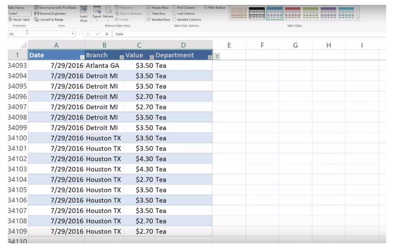
- Drag the field for Customer Type to the box for columns.

And this is what happens:

Excel adds columns for each Customer Type. And the sales of each product are now split into customer types 📊
Let’s add another field to see how you can further drill down into details using a Pivot Table.
- Drag and drop the field for Months to the box for Rows.

Excel adds a breakup of months under each product.

So now you can see a summary of sales of each product, for each month and by each customer type. Too convenient and clean ✔
You can make so many more variations to your Pivot Table by pivoting between rows and columns. No matter how vast your data is, Pivot Tables know how to knit it all together.
That’s it – Now what?
I am sure you loved the idea of Pivot Tables explained in the Pivot Table tutorial above. Excel Pivot Tables are a blessing for the people who get to deal with huge, messy data now and again.
But that’s just one tool of Excel. And Excel is a whole package of mind-boggling tools, features, and functions. We yet have so much more to explore 🚀
To begin exploring this giant spreadsheet software, I suggest you go with the VLOOKUP, SUMIF, and IF functions of Excel.
Want to learn them already? Enroll in my 30-minute free email course here that will teach you these (and many more) Excel functions in the most fun way.
Frequently asked questions
Pivot Tables are used to sort and summarize large datasets in Microsoft Excel. They allow changing pivot table fields so you can readily decide which part of your dataset is to be summarized.
By changing fields, you can create interactive summaries that will bring together massive sets of data in the cleanest manner.
To add a Pivot Table to your spreadsheet, go to the sheet (the first cell) where you want the Pivot Table summary inserted.
- Go to the Insert Tab > Pivot Table (Or press the Alt Key > N > V) to launch the insert Pivot Table dialog box.
- Refer to the cells containing the data.
- Check the option for a ‘New Worksheet’.
- Click Okay.
Kasper Langmann2023-02-07T07:03:03+00:00
Page load link
Pivot Tables in Excel are one of the most powerful features within Microsoft Excel.
An Excel Pivot Table allows you to analyze more than 1 million rows of data with just a few mouse clicks, show the results in an easy to read table, “pivot”/change the report layout with the ease of dragging fields around, highlight key information to management and include Charts & Slicers for your monthly presentations.
We have compiled an interactive tutorial on the 50 different things you can do with an Excel Pivot Table.
You can also join our FREE Excel Pivot Table webinar training where I will teach you the MUST KNOW Excel Pivot Table tips & tricks that will make you an Excel analytical PRO within 1 HOUR….
[icon name=”table” class=”” unprefixed_class=””] Topic 1: Tables
[icon name=”plus” class=”” unprefixed_class=””] Topic 2: Inserting a Pivot Table
[icon name=”angle-double-down” class=”” unprefixed_class=””] Topic 3: Drill down to audit
[icon name=”recycle” class=”” unprefixed_class=””] Topic 4: Refresh
[icon name=”bars” class=”” unprefixed_class=””] Topic 5: Subtotals
[icon name=”desktop” class=”” unprefixed_class=””] Topic 6: Report Layouts
[icon name=”plus-circle” class=”” unprefixed_class=””] Topic 7: Change Count of to Sum of
[icon name=”wpforms” class=”” unprefixed_class=””] Topic 8: Number formatting
[icon name=”exclamation-triangle” class=”” unprefixed_class=””] Topic 9: Format error values
[icon name=”bitbucket” class=”” unprefixed_class=””] Topic 10: Format empty cells
[icon name=”columns” class=”” unprefixed_class=””] Topic 11: Keep column widths upon refresh
[icon name=”archive” class=”” unprefixed_class=””] Topic 12: Show report filter on multiple pages
[icon name=”plus-square” class=”” unprefixed_class=””] Topic 13: Average
[icon name=”lightbulb-o” class=”” unprefixed_class=””] Topic 14: Show a unique count
[icon name=”percent” class=”” unprefixed_class=””] Topic 15: % of Grand Total
[icon name=”percent” class=”” unprefixed_class=””] Topic 16: % of Column Total
[icon name=”percent” class=”” unprefixed_class=””] Topic 17: % of Row Total
[icon name=”minus-circle” class=”” unprefixed_class=””] Topic 18: Difference From
[icon name=”plus-square-o” class=”” unprefixed_class=””] Topic 19: Running Total in
[icon name=”calendar” class=”” unprefixed_class=””] Topic 20: Group by Date
[icon name=”calendar-check-o” class=”” unprefixed_class=””] Topic 21: Group by Quarters & Years
[icon name=”sort-numeric-desc” class=”” unprefixed_class=””] Topic 22: Sorting by Largest or Smallest
[icon name=”sort-alpha-asc” class=”” unprefixed_class=””] Topic 23: Sort using a Custom List
[icon name=”filter” class=”” unprefixed_class=””] Topic 24: Filter by Dates
[icon name=”filter” class=”” unprefixed_class=””] Topic 25: Filter by Values – Top 5 Items
[icon name=”bars” class=”” unprefixed_class=””] Topic 26: Insert a Slicer
[icon name=”delicious” class=”” unprefixed_class=””] Topic 27: Slicer Styles
[icon name=”database” class=”” unprefixed_class=””] Topic 28: Slicer Connections for multiple pivot tables
[icon name=”filter” class=”” unprefixed_class=””] Topic 29: Different ways to filter a Slicer
[icon name=”calculator” class=”” unprefixed_class=””] Topic 30: Creating a Calculated Field
[icon name=”plus-circle” class=”” unprefixed_class=””] Topic 31: Creating a Calculated Item
[icon name=”line-chart” class=”” unprefixed_class=””] Topic 32: Insert a Pivot Chart
[icon name=”bar-chart” class=”” unprefixed_class=””] Topic 33: Pivot Chart & Slicers
[icon name=”buysellads” class=”” unprefixed_class=””] Topic 34: Highlight Cell Rules based on values
[icon name=”arrow-circle-up” class=”” unprefixed_class=””] Topic 35: Directional Icons
[icon name=”bar-chart” class=”” unprefixed_class=””] Topic 36: Data Bars, Color Scales & Icon Sets
[icon name=”wpforms” class=”” unprefixed_class=””] Topic 37: Intro to GETPIVOTDATA
[icon name=”lightbulb-o” class=”” unprefixed_class=””] Topic 38: Refresh All
[icon name=”wpforms” class=”” unprefixed_class=””] Topic 39: Move a Pivot Table
[icon name=”plus-circle” class=”” unprefixed_class=””] Topic 40: Show/Hide Field List
[icon name=”delicious” class=”” unprefixed_class=””] Topic 41: Pivot Table Styles
[icon name=”sort-numeric-desc” class=”” unprefixed_class=””] Topic 42: Sort manually
[icon name=”table” class=”” unprefixed_class=””] Topic 43: Use an External Data Source
[icon name=”delicious” class=”” unprefixed_class=””] Topic 44: Clear and Delete Old Items
[icon name=”plus-circle” class=”” unprefixed_class=””] Topic 45: Count VS Sum
[icon name=”sort-numeric-desc” class=”” unprefixed_class=””] Topic 46: Automatically Refresh
[icon name=”bars” class=”” unprefixed_class=””] Topic 47: Frequency Distribution
[icon name=”filter” class=”” unprefixed_class=””] Topic 48: Slicer Connection Greyed Out
[icon name=”lightbulb-o” class=”” unprefixed_class=””] Topic 49: Filter by Values (Soon)
[icon name=”filter” class=”” unprefixed_class=””] Topic 50: Filter by Text wildcards * and ? (Soon)
[icon name=”desktop” class=”” unprefixed_class=””] BONUS: FREE EXCEL PIVOT TABLE WEBINAR
Want to know how to use Excel Pivot Tables, Slicers, Charts and Dashboards?
1. Tables [icon name=”arrow-up” class=”” unprefixed_class=””]
Excel Tables are very powerful and have many advantages when using them. You should start using them asap regardless of the size of your data set, as their benefits are HUUUGE:
1. Structured referencing;
2. Many different built-in Table Styles with color formatting;
3. Use of a Total Row which uses built-in functions to calculate the contents of a particular column;
4. Dropdown lists that allow you to Sort & Filter;
5. When you scroll down from the Table, its Headers replace the Column Letters in the worksheet;
6. Remove Duplicate Rows automatically;
7. Summarize the Table with a Pivot Table;
8. Supports calculated Columns so you can create dynamic formulas outside the Table;
STEP 1: Select a cell in your table

STEP 2: Let us insert our table! To do that press Ctrl + T or go to Insert > Table:

STEP 3: Click OK.

Your cool table is now ready!

2. Inserting a Pivot Table [icon name=”arrow-up” class=”” unprefixed_class=””]
Pivot Tables in Excel allow you to analyze thousands of rows of data with just a few mouse clicks. It is the most powerful tool within Excel due to its speed and output and I will show you just how easy it is to create one.
If you are using a table or data set to analyze your information, then you should always use a Pivot Table which will enhance your analytical capabilities as well as save you heaps of time off your daily routine.
They are used by Project Managers, Finance Analysts, Auditors, Cost Controllers, Sales Analysts, Financial Controllers, Human Resources, Doctors, and Statisticians just to name a few. Heck, I even created an in-depth online course on Pivot Tables, that’s how in demand this Excel tool is in right at this moment!
DOWNLOAD EXCEL WORKBOOK
Now that you are familiar with What is a Pivot Table? Let’s understand how to insert one.
STEP 1: Click in your dataset.

STEP 2: Go to Insert > Pivot Table

STEP 3: Place the Pivot Table in a New or Existing Worksheet

STEP 4: Drag and Drop the fields

You now have your Table ready!


3. Drill down to audit [icon name=”arrow-up” class=”” unprefixed_class=””]
When you are using a Pivot Table in Excel and want to know what data makes up a certain value, all you have to do is double click on that cell.
This will open up a brand new Sheet with all the rows of data that make up that value.
NB. This is an extraction of your data source, so if you edit the information and Refresh your Pivot Table then nothing will happen. Any changes need to be made in your main data source.
If you want to get rid of this sample data, all you have to do is press CTRL+Z and press DELETE in the popup box.
So go ahead and double click on any values (including SubTotals and GrandTotals) within your Table to view the data that makes up your selected value.
STEP 1: Double click on any value cell within the Pivot Table

This opens up a new sheet with the data that makes up the selected cell.
Note: You can change the data that is in this new sheet but that will not affect the Table or your original data source.

4. Refresh [icon name=”arrow-up” class=”” unprefixed_class=””]
When the information in your data set gets updated you need to Refresh your Pivot Table in Excel to see those changes in your Pivot Table. There are three ways to do this. First click on your Table and:
1. From the Ribbon choose: PivotTable Tools > Options > Refresh
2. Press ALT+F5
3. Right-click in your Table and choose Refresh (see this option below)
STEP 1: Change the information in your data set.

STEP 2: Click on the Pivot table.

STEP 3: Right-click and select Refresh.

Your values in the table are now updated!

5. Subtotals [icon name=”arrow-up” class=”” unprefixed_class=””]
When you create a Pivot Table in Excel that has multiple fields in the Row Labels, Excel will automatically add a Subtotal to the top of the Group.
Understanding What is a Pivot Table is the first step? What about if you want to change the Subtotals to show at the bottom of the Group or take the Subtotals out altogether?
Well, you have that flexibility when you are dealing with Subtotals, here is how:
STEP 1: Enter at least two Fields in the Row Labels

STEP 2: Click in your Pivot Table and go to PivotTable Tools > Design > Subtotals
STEP 3: You can choose either of the three options:


Now that you know what is a Pivot Table, let’s become even more proficient in this.
6. Report Layouts [icon name=”arrow-up” class=”” unprefixed_class=””]
Pivot Tables have three different layouts that you can choose from: Compact, Outline, and Tabular Form.
You can choose from each layout by clicking in the Table and going to PivotTable Tools > Design > Report Layouts
They each have their advantages and disadvantages and I will show you what each one of them provide below:
COMPACT LAYOUT (New in Excel 2010)
Advantages: Optimizes for readability; Keeps related data in one column
Disadvantages: If you copy and paste the data into a new worksheet it will be harder to do further analysis
![]()

OUTLINE LAYOUT
Advantages: Includes Field headers in each column; Can Repeat All Item Labels; Can reuse the data of the Pivot Table to a new location for further analysis; Classic Pivot Table style
Disadvantages: Takes too much horizontal space
![]()

TABULAR LAYOUT
Advantages: Includes Field headers in each column; Can Repeat All Item Labels; See all data in a traditional table format used in Tables since their invention; Can reuse the data of the Pivot Table to a new location for further analysis
Disadvantages: Takes too much horizontal space; Subtotals can never appear at the top of the group
what ![]()

7. Change Count of to Sum of [icon name=”arrow-up” class=”” unprefixed_class=””]
The no1 complaint that I get is “Why do my values show as a Count of rather than a Sumof ?”
Well, there are three reasons why this is the case.
1. There are blank cells in your values column within your data set; or
2. There are “text” cells in your values column within your data set; or
3. A Values field is Grouped within your Table.
1. BLANK CELL(S):
So if you have at least one blank cell in a Values column, Excel automatically thinks that the whole column is text-based. Pretty stupid but that’s the way it thinks.

2. TEXT CELL(S):
Also if you have a cell that is formatted as Text within your Values column, then it will also cause it to Count rather than Sum. This usually happens when you download data from your ERP or external system and it throws in numbers that are formatted as text e.g. 382821P

We get the annoying Count of Sales below:

Have a look at the following tutorials that show you how to locate blank cells.
Find Blank Cells In Excel With A Color
EXCEL FIX:
STEP 1: You will need to enter a value or a zero within this blank or text formatted cell(s)
STEP 2: Go over to your Pivot Table, click on the Count of…. and drag it out of the Values area
STEP 3: Refresh your Pivot Table
STEP 4: Drop in the Values field (SALES) in the Values area once again

3. GROUPED VALUES:
Let’s say that you put a Values field (e.g. Sales) in the Row/Column Labels and then you Group it.
When you drop in the same Values field in the Values area, you will also get a Count of…

EXCEL FIX:
STEP 1: Right Click on the Grouped values in the Pivot Table and choose Ungroup:

STEP 2: Drag the Count of SALES out of the Values area and let go to remove it
STEP 3: Drop in the SALES field in the Values area once again
It will now show a Sum of SALES!

N.B. Sometimes you will need to locate the Table that has the Grouped values. The SALES field may not be evident that it is Grouped, especially if it is not selected in the Row/Column labels.
You may need to drag and drop this field from the PivotTable Fields and into the Row/Column Labels area to confirm that it is Grouped.
8. Number formatting [icon name=”arrow-up” class=”” unprefixed_class=””]
You can easily format the values simply by Right-Clicking on a value and choosing Number Format. Then you can choose from the many different formats, like Number, Currency, Percentage, or Custom.
STEP 1: Right-click in the Pivot Table and choose Number Format

STEP 2: Choose your desired format

The Pivot table is now updated with your number formatting!

9. Format error values [icon name=”arrow-up” class=”” unprefixed_class=””]
Whenever you do a calculation in an Excel Pivot Table you may get an error value like a #DIV/0!
This looks ugly when you are presenting important information. Luckily you can override this with a custom value or text.
To activate this you need to Right Click in any Value in your Excel Pivot Table and choose PivotTable Options and “Check” the box that says: For error values show
This activates the box and you can now enter any value or text that you want to show whenever your calculation has an error.
STEP 1: We have an error in the calculation.

STEP 2: Right-click on any value and Go to Pivot Table Options.

STEP 3: Check the Box: For Error Values Show

STEP 4: Enter any text or value

Now your error values are properly formatted!

10. Format empty cells [icon name=”arrow-up” class=”” unprefixed_class=””]
I am sure that you have come across a Pivot Table which has empty cell values and thought “What the hell is happening here?”
This is because your data source has blank cells for certain items, which happens from time to time.
This can be fixed in your Table and you can enter a value or text in place of that horrible looking and lonely blank cell.
You need to click in your Pivot Table > PivotTable Tools > Options > Options > Layout & Format > Format > For empty cells show: enter a value or text in this box.
Read the tutorial below to see how this is achieved…
DOWNLOAD EXCEL WORKBOOK
STEP 1: Our pivot value for North is blank, let us change this!

STEP 2: Go to Pivot Table Tools > Options > Options

STEP 3: Set For empty cells show with your preferred value

All of your blank values are now replaced!

11. Keep column widths upon refresh [icon name=”arrow-up” class=”” unprefixed_class=””]
Each time you Refresh a Pivot Table you will most likely get annoyed at the fact that the column widths that you worked so hard to align – will return back to normal 🙁
Do not fear, Pivot Table Options is here!
All you need to do is Right Click in the Table and choose PivotTable Options and then under the Layout & Format tab you need to “uncheck” the box that says: Autofit column widths on update
Next time you update your data and Refresh your Table, the column width will never change 🙂
STEP 1: Right-click in the Table and select Pivot Table Options

STEP 2: Uncheck Autofit Column Widths on Update

STEP 3: Update your data

STEP 4: Refresh your table

Our Pivot Table column widths do not change anymore!

12. Show report filter on multiple pages [icon name=”arrow-up” class=”” unprefixed_class=””]
When you are using an Excel Pivot Table you can show the items within the Report Filter on separate sheets inside your workbook.
Say that you have created an awesome Pivot Table which shows total sales and number of transactions per region.
You can drop in your Customer field in the Report Filter and replicate the Pivot Table for each of your customers in a separate Sheet.
All you need to do is click inside your Table and in the menu ribbon under PivotTable Tools choose the Options tab and then select the Options drop-down and choose Show Report Filter Pages.
Each of your customers will have their unique Pivot Table in a separate Sheet with their individual sales and transactional metrics.
Here is our pivot table:

STEP 1: Drop the Customer Field in the report filter.

STEP 2: Go to Options > Options Drop Down > Show Report Filter Pages

STEP 3: Press OK.

Each customer’s table will show in a unique sheet!

![]()
13. Average [icon name=”arrow-up” class=”” unprefixed_class=””]
A Pivot Table is the most powerful feature within Excel as it allows you to analyze your data in many different ways, all with a press of a button.
The Summarize Values By option allows you to choose a type of calculation (Sum, Count, Average, Max, Min, Count Numbers Product, StdDev, StdDevp, Var, Varp) to summarize data from the selected field.
As a default when you drop in a values field in the Values area of the Pivot Table it will Sum it for you and give yo a Sum of Values.
You can change this calculation to an Average very easily, which will show you the Average values for your data.
STEP 1: Click in your data and go to Insert > Pivot Table

STEP 2: This will bring up the Create Pivot Table dialogue box and it will automatically select your data`s range or table.
In the Choose where you want the PivotTable report to be placed, you can either choose a New Worksheet or an Existing Worksheet.
If you choose a New Worksheet it will place the Pivot Table in a brand new worksheet (e.g. Sheet2).
If you decide to put the Pivot Table in an Existing Worksheet, you will need to select the location by pressing the red arrow, choosing the cell where you want your Pivot Table to be placed, and then pressing the ENTER key twice to confirm.

STEP 3: You will now need to drag and drop the Fields in the different areas of your Pivot Table

STEP 4: Now that your Pivot Table is set up, you need to Right Click in any of the Table values and choose Summarize Values By > Average

STEP 5: Now you have your Pivot Table report showing the Average Sales values per Region for each year:

14. Show a unique count [icon name=”arrow-up” class=”” unprefixed_class=””]
Excel 2013 added some new features to its arsenal and one that has been well overdue was the distinct or unique count.
Previously when we created a Pivot Table and dropped a customer field in the Row Labels and then again in the Values area we got the “total number of transactions” for each customer.
But what about if we want to show the total unique customers?
In Excel 2013 we can, by using the newly created Pivot Table Data Model:
STEP 1: Click in your data source and go to Insert > Pivot Table
STEP 2: The important step here is to “check” the Add this to the Data Model box and press OK

STEP 3: This will create a Pivot Table. Now drop the Customers field in the Row and Values areas which will give you the “total transactions” for each customer
STEP 4: To get a Distinct Count, you need to click on the Values drop-down for the Count of Customers and select the Value Field Settings
STEP 5: Under Summarize Values By tab, select the last option, Distinct Count and press OK

15. % of Grand Total [icon name=”arrow-up” class=”” unprefixed_class=””]
Excel Pivot Tables have a lot of useful calculations under the SHOW VALUES AS option and one that can help you a lot is the PERCENT OF GRAND TOTAL calculation.
This option will immediately calculate the percentages for you from a table filled with numbers such as sales data, expenses, attendance, or anything that can be quantified.
In the example below I show you how to get the Percent of Grand Total:
STEP 1: Insert a new Pivot table by clicking on your data and going to Insert > Pivot Table > New Worksheet or Existing Worksheet

STEP 2: In the ROWS section put in the Sales Month field, in the COLUMNS put in the Financial Year field and in the VALUES area you need to put in the Sales field twice, I explain why below:

STEP 3: Click the second Sales field’s (Sum of SALES2) drop down and choose Value Field Settings

STEP 4: Select the Show Values As tab and from the drop down choose % of Grand Total.
Also change the Custom Name into Percent of Grand Total to make it more presentable. Click OK.

STEP 5: Notice that the Percent of Grand Total data is in a decimal format that is hard to read:

To format the Percent of Grand Total column, click the second Sales field’s (Percent of Grand Total) drop down and choose Value Field Settings.
The goal here is for us to transform numbers from a decimal format (i.e. 0.23), into a percentage format that is more readable (i.e. 23%).

STEP 6: Click the Number Format button.

STEP 7: Inside the Format Cells dialog box, make your formatting changes within here and press OK twice.
In this example, we used the Percentage category to make our Percent of Grand Total numbers become more readable.

You now have your Table, showing the Percentage of Grand Total for the sales data of the years 2012, 2013, and 2014.
All of the sales numbers are now represented as a Percentage of the Grand Total of $32,064,332.00, which you can see on the lower right corner is represented as 100% in totality:

16. % of Column Total [icon name=”arrow-up” class=”” unprefixed_class=””]
Excel Pivot Tables have a lot of useful calculations under the SHOW VALUES AS option and one that can help you a lot is the PERCENT OF COLUMN TOTAL calculation.
This option will immediately calculate the percentages for you from a table filled with numbers such as sales data, expenses, attendance, or anything that can be quantified.
In the example below I show you how to get the Percent of Column Total:
STEP 1: Insert a new Pivot table by clicking on your data and going to Insert > Pivot Table > New Worksheet or Existing Worksheet

STEP 2: In the ROWS section put in the Sales Month field, in the COLUMNS put in the Financial Year field and in the VALUES area you need to put in the Sales field twice, I explain why below:

STEP 3: Click the second Sales field’s (Sum of SALES2) drop down and choose Value Field Settings

STEP 4: Select the Show Values As tab and from the drop-down choose % of Column Total.
Also, change the Custom Name into Percent of Column Total to make it more presentable. Click OK.

STEP 5: Notice that the Percent of Column Total data is in a decimal format that is hard to read:

To format the Percent of Column Total column, click the second Sales field’s (Percent of Column Total) drop down and choose Value Field Settings.
The goal here is for us to transform numbers from a decimal format (i.e. 0.23), into a percentage format that is more readable (i.e. 23%).

STEP 6: Click the Number Format button.

STEP 7: Inside the Format Cells dialog box, make your formatting changes within here and press OK twice.
In this example, we used the Percentage category to make our Percent of Column Total numbers become more readable.

You now have your Pivot Table, showing the Percent of Column Total for the sales data of years 2012, 2013, and 2014.
All of the sales numbers are now represented as a Percentage of each column (Years 2012, 2013 and 2014), which you can see on each column is represented as 100% in totality:

17. % of Row Total [icon name=”arrow-up” class=”” unprefixed_class=””]
Excel Pivot Tables have a lot of useful calculations under the SHOW VALUES AS option and one that can help you a lot is the PERCENT OF ROW TOTAL calculation.
This option will immediately calculate the percentages for you from a table filled with numbers such as sales data, expenses, attendance, or anything that can be quantified.
In the example below I show you how to get the Percent of Row Total:
STEP 1: Insert a new Pivot table by clicking on your data and going to Insert > Pivot Table > New Worksheet or Existing Worksheet

STEP 2: In the ROWS section put in the Sales Person field, in the COLUMNS put in the Financial Year field and in the VALUES area you need to put in the Sales field twice, I explain why below:

STEP 3: Click the second Sales field’s (Sum of SALES2) drop down and choose Value Field Settings

STEP 4: Select the Show Values As tab and from the drop-down choose % of Row Total.
Also, change the Custom Name into Percent of Row Total to make it more presentable. Click OK.

STEP 5: Notice that the Percent of Row Total data is in a decimal format that is hard to read:

To format the Percent of Row Total column, click the second Sales field’s (Percent of Row Total) drop down and choose Value Field Settings.
The goal here is for us to transform numbers from a decimal format (i.e. 0.23), into a percentage format that is more readable (i.e. 23%).

STEP 6: Click the Number Format button.

STEP 7: Inside the Format Cells dialog box, make your formatting changes within here and press OK twice.
In this example, we used the Percentage category to make our Percent of Row Total numbers become more readable.

You now have your Table, showing the Percent of Row Total for the sales data of years 2012, 2013, and 2014.
All of the sales numbers are now represented as a Percentage of each row (Years 2012, 2013, and 2014), which you can see on each row is represented as 100% in totality.
Particularly the yellow highlighted ones would total to 100% for the first row:

18. Difference From [icon name=”arrow-up” class=”” unprefixed_class=””]
Excel Pivot Tables have heaps of calculations under the SHOW VALUES AS option and one that gets the most use is the DIFFERENCE FROM calculation.
You can show the values as the Difference From previous months, years, day etc. This is just great when your boss asks you how you are tracking to the previous months, years, days…
In the example below I show you how to show the Difference From the previous YEAR:
STEP 1: Insert a Pivot Table by clicking on your data and going to Insert > Pivot Table > New Worksheet or Existing Worksheet

STEP 2: In the ROWS you have to put the Months field, in the COLUMNS the Years field and in the VALUES area the Sales field twice, I explain why below:

STEP 3: Now click on the second Sales field’s (Sum of SALES2) drop down and choose Value Field Settings

STEP 4: Now you need to select the Show Values As tab and from the drop-down choose the Difference From

STEP 5: You need to select the Base Item: (previous) and Base Field: Financial Year and press OK. So it will read the “Difference from the previous Financial Year”

STEP 6: To format the values you need to select the Table and go to Pivot Table Tools > Analyze/Options > Select > Entire Pivot Table.

Then you need to once again go to Pivot Table Tools > Analyze/Options > Select but this time select the Values

Now press CTRL+1 to bring up the Format Cells dialogue box and make your formatting changes within here and press OK.
NB: This will fix the number format permanently and any new field that gets added into the Pivot Table will have this format. Coll hey!

STEP 7: To change the Sum of SALES2 name within the Pivot Table, you need to click on a cell in the Pivot Table which contains the Sum of SALES2 and manually make the change and press Enter

STEP 8: You need to select the whole column that contains the empty values and Right Click and select Hide

You now have your Table, all formatted and showing the Difference from the previous Year:

19. Running Total in [icon name=”arrow-up” class=”” unprefixed_class=””]
A Running Total In is the accumulation of values over a certain period, like days, months, or years. It is sometimes referred to as the Year to Date analysis.
A Running Total In takes one period’s values, then adds a second period, then a third period…and so on, to give the accumulated values up to a certain period.
This can be shown in dollar form or in percentage form.
With an Excel Pivot Table, we can easily include this calculation without the need to use any formulas. Here is how:
STEP 1: Insert a Pivot Table by clicking in your data and going to Insert > Pivot Table and choose to insert it in a New or Existing Worksheet


STEP 2: You will need to put the Months Field in the ROW area, the Year Field in the COLUMN area and then put the Sales Field in the VALUES area two times!

STEP 3: Right Click on a Totals cell and choose Remove Grand Total

STEP 4: Right Click on a Sum of SALES2 value and select Show Values As > % Running Total In > Base Field: Month


STEP 5: You can manually change the name of the Sum of SALES2 Field by clicking in the cell’s title within the Pivot Table:

STEP 6: We can insert a Pivot Chart by clicking in our Pivot Table and going to PivotTable Tools > Analyze/Options > Pivot Chart

STEP 7: From the Insert Chart dialogue box you need to choose the Combo chart and “check”the Secondary Axis box for the YTD% Series and press OK

You now have your % Running Total In values on a Pivot Table and also shown graphically on a Pivot Chart:


20. Group by Date [icon name=”arrow-up” class=”” unprefixed_class=””]
Grouping Dates is very easy with a Pivot Table. All you have to do is Right Click on your Date values (which are either in the Row or Column Labels of your Table), then choose the Group option. From the dialogue box, you can choose to Group by Days, Months, Quarters, or Years.
STEP 1: Right-click on your Date values and choose Group.

STEP 2: Select the combination of grouping you prefer. Click OK.

Your pivot table is now grouped by dates!

21. Group by Quarters & Years [icon name=”arrow-up” class=”” unprefixed_class=””]
Ever encountered needing a quick report of total sales numbers by each quarter, of each year?
I was faced with this same scenario and looking at my data on hand, I only had sales numbers for each individual day.
Grouping these would take a ton of effort & complex formulas!
Thankfully there is the Pivot Table way, which is quick, easy, and reduces the risks of making any errors….and it makes updating the report easily with any new additional data!
In the example below I show you how to get the Sales Grouped by Quarters and Years:
STEP 1: Insert a new Pivot table by clicking on your data and going to Insert > Pivot Table > New Worksheet or Existing Worksheet

STEP 2: In the ROWS section put in the Order Date field.
Notice that in Excel 2016 (the version that I am using) it will automatically Group the Order Date into Years & Quarters:

STEP 3: If you do not have Excel 2016, right click on any Row value in your Pivot Table and select Group

STEP 4: In the Grouping dialogue box, Excel was able to determine our date range (minimum date and maximum date).
Make sure only Quarters and Years are selected (which will be highlighted in blue).
This will group our dates by the Quarters and Years. Click OK.

Notice that a Years field has been automatically added into our PivotTable Fields List. This is cool, as we can use this field for further Pivot Table analysis:

STEP 5: In the VALUES area put in the Sales field. This will get the total of the Sales for each Quarter-Year date range:

Now we have our sales numbers grouped by Years & Quarters!
Notice that we can improve the formatting:

STEP 6: Click the Sum of SALES and select Value Field Settings

STEP 7: Select Number Format

STEP 8: Select Currency. Click OK.

You now have your total sales for each quarterly period!

22. Sorting by Largest or Smallest [icon name=”arrow-up” class=”” unprefixed_class=””]
There are countless times when I had my Pivot Table all setup, but I was not really happy with how the data was sorted. The cool thing with Excel Pivot Tables, is it allows me to sort virtually anywhere!
Let us start off with this Excel Pivot Table showing the Sum of SALES for each Year and Quarter. Make sure to download the Excel Workbook below so that we will have the same starting point.
In the example below I show you how to Sort a Pivot Table by Largest or Smallest:

STEP 1: Right-click on a Year cell within the Pivot Table.
Go to Sort > Sort Newest to Oldest

This will sort our Years by descending order. Notice that 2014 was sorted first.

STEP 2: Now let us try to sort by Quarters.
Right click any Quarter name within the Pivot Table.
Go to Sort > Sort Newest to Oldest

This will sort our Quarters by descending order. Notice that Quarter 4 was sorted first.

STEP 3: Now let us try for the Sum of SALES.
Right-click on a sum value within the Pivot Table.
Go to Sort > Sort Largest to Smallest

This will sort our sum of Sales by descending order, regardless of the Quarter.

It’s pretty cool on how Pivot Tables Excel allow you to sort on any area that you want to!
23. Sort using a Custom List [icon name=”arrow-up” class=”” unprefixed_class=””]
A Custom List in Excel is very handy to fill a range of cells with your own personal list. It could be a list of your team members at work, countries, regions, phone numbers or customers.
The main goal of a custom list is to remove repetitive work and manual errors in inputting.
To demonstrate the power of Excel’s Custom Lists, we’ll explore what’s currently in Excel’s memory as a default list:
STEP 1: Type February in the first cell

STEP 2: From that first cell, click the lower right corner and drag it to the next 5 cells to the right

STEP 3: Release and you will see it get auto-populated to July (The succeeding months after February)

At first, it might seem like magic on how Excel does this!
Let us go straight into the Options in Excel to view how it’s being done, and how you can create your own Custom List:
STEP 4: Select the File tab

STEP 5: Click Options

STEP 6: Select the Advanced option

STEP 7: Scroll all the way down and under the General section, click Edit Custom Lists

Here you can see the built-in default Excel lists of the calendar months and the days.
If you click on a Custom List, you will see under List entries that it is greyed out and you cannot make any changes. This indicated that it is a default Excel Custom List.

STEP 8: You can create & add your own Custom List under the List entries section.
Click on NEW LIST under the Custom Lists area and then manually enter your list, entering one entry per line:

After typing the values, click Add.
In our screenshot below, we added the values of the Greek alphabet (alpha, beta, gamma, and so on)
Click OK once done.

STEP 9: Click OK again

STEP 10: Now let’s go back into our Excel workbook to see our new Custom List in action. Type alpha on a cell

STEP 11: From that cell, click the lower right corner and drag it to the next 5 cells to the right

STEP 12: Release and you will see it get auto-populated to zeta, which is based on our Custom List created in Step 8

24. Filter by Dates [icon name=”arrow-up” class=”” unprefixed_class=””]
There are an array of different Date filters in a Pivot Table. You can filter by a particular date range, for example: by this week, next month, next quarter, next year, last year, year to date and the list goes on and on. This is useful if you want to see what invoices are due to be paid this month or what sales transactions were included in a particular quarter.
Below I show you a few quick Pivot Table filter examples.
STEP 1: Go to Row Labels and select Date Filters > Between

STEP 2: Place a date range. Click OK.

Your pivot table is now filtered by the dates!

STEP 3: Let us try another one. Go to Row Labels and select Date Filters > Next Quarter

Your pivot table is now filtered by the next quarter!

25. Filter by Values – Top 5 Items [icon name=”arrow-up” class=”” unprefixed_class=””]
You can easily filter your Pivot Table to show your Top X customers. There are lots of different Value Filters to choose from and one of my favorites is the Top 10 Filter.
Here is our pivot table:

STEP 1: Go to Row Labels > Value Filters > Top 10

STEP 2: Set it to the Top 5 Items. Click OK.

Your pivot table is now filtered!

26. Insert a Slicer [icon name=”arrow-up” class=”” unprefixed_class=””]
Slicers in Excel are visual filters or interactive buttons that allow you to see what items have been chosen within a Pivot Table.
They are a new feature from Excel 2010 onward and Mac for Excel 2016 and a must for anyone wanting to wow their boss by adding interactivity in their reports! I show you how to insert a Pivot Table Slicer below:
STEP 1: Select your Pivot Table by clicking anywhere inside it.

STEP 2: Go to Options(Excel 2010)/Analyze(Excel 2013&2016) > Insert Slicer
Select the Month and Year Fields.
Click OK.

Your slicer is now ready! Go crazy clicking, slicing and dicing your data!
TIP: Hold down the CTRL key to select multiple items in your Slicer.

27. Slicer Styles [icon name=”arrow-up” class=”” unprefixed_class=””]
There are several different Slicer Styles available for you when you click on an Excel Slicer.
These Slicer Styles add color to your Excel workbook to gives it some much needed life!
You can also add columns to a Slicer and you can also find more Slicer options by Right Clicking on a Slicer.
I will show you how easy it is to choose the different Pivot Table Slicer Styles:
STEP 1: Select your Slicer.

STEP 2: Go to Slicer Tools > Options > Slicer Styles
Select a style you prefer by clicking on it with your mouse.
If you do not like the chosen Style, just follow the process above and choose another color!

Your Pivot Table Slicer now has come to life!

28. Slicer Connections for multiple pivot tables [icon name=”arrow-up” class=”” unprefixed_class=””]
Normally when you insert an Excel Slicer it is only connected to the Pivot Table that you are inserting it from.
What about if you had multiple Pivot Tables from the same data set and wanted to connect a Slicer to all of the Pivot Tables, so when you press a button all the Pivot Tables change?
Well this is possible with the Report Connections (Excel 2013 & 2016) / PivotTable Connections (Excel 2010) option within the Slicer. This is how it is achieved:
STEP 1: Create 2 Pivot Tables by clicking in your data set and selecting Insert > Pivot Table > New Worksheet/Existing Worksheet
Setup Pivot Table #1:

ROWS: Region
VALUES: Sum of Sales

Setup Pivot Table #2:

ROWS: Customer
VALUES: Sum of Sales

STEP 2: Click in Pivot Table #1 and insert a MONTH Slicer by going to PivotTable Tools > Analyze/Options > Insert Slicer > Month > OK


STEP 3: Click in Pivot Table #2 and insert a YEAR Slicer by going to PivotTable Tools > Analyze/Options > Insert Slicer > Year > OK


STEP 4: Right Click on Slicer #1 and go to Report Connections(Excel 2013 & 2016)/PivotTable Connections (Excel 2010) > “check” the PivotTable2 box and press OK


STEP 5: Right Click on Slicer #2 and go to Report Connections(Excel 2013)/PivotTable Connections (Excel 2010) > “check” the PivotTable1 box and press OK


Now as you select each Slicer’s items, both Pivot Tables Excel will change!
Have a look at the following image and the tutorial below that to see how this is achieved using Excel 2013:

29. Different ways to filter a Slicer [icon name=”arrow-up” class=”” unprefixed_class=””]
Excel Slicers are the best thing since sliced bread!
They are a new feature from Excel 2010 onward and Mac for Excel 2016 and are visual buttons that shows you what items have been filtered or selected in a Pivot Table.
There are several ways that you can filter an Excel Slicer. Download our workbook so you can practice:
LEFT MOUSE CLICK:
You can select items from the Slicer by using your left mouse button;
DRAG LEFT MOUSE BUTTON:
You can select an array of items by clicking the left mouse button and doing a dragging motion downwards/upwards within the Slicer;

CTRL KEYBOARD:
You can select multiple items by holding down the CTRL key on your keyboard and selecting the Slicer items with your left mouse button;

SHIFT KEYBOARD:
Select a Slicer item, hold down the SHIFT key on your keyboard and then select another Slicer item. This will select a range of items!

30. Creating a Calculated Field [icon name=”arrow-up” class=”” unprefixed_class=””]
Pivot Table Calculated Fields allow you to do mathematical calculations with your Field List. You can use any of the Excel mathematical equations, like /*+-%.
The only limitation is that you cannot reference any cells. Pivot Table Calculated Fields can be used to calculate percentage increases on Sales, margin calculations, or Cost of Goods sold, as I show below.
Here is our Pivot Table:

STEP 1: Click on the Pivot Table and Go to Options > Fields, Items, & Sets > Calculated Field

STEP 2: Set the Name to Cost of Goods Sold

STEP 3: Set the Formula to COSTS/SALES. This is the formula to be used for our calculated field.

STEP 4: The formatting is still not correct. Right click on the new column and select Number Format.

STEP 5: Select Percentage and click OK.

Your new calculated is now ready in percentage format!

31. Creating a Calculated Item [icon name=”arrow-up” class=”” unprefixed_class=””]
Pivot Table Calculated Items allow you to do mathematical calculations with your Item List. You can use any of the Excel mathematical equations, like /*+-%.
The only limitation is that you cannot reference any cells. Pivot Table Calculated Items can be used to calculate changes between each other, like a month´s or year’s value, averages or summation.
To activate the Calculated Item you have to make sure that you click on the chosen Item in the Pivot Table, then go to the PivotTable Tools tab in the Ribbon and go to Options > Fields, Items & Sets > Calculated Item.
STEP 1: Click on the item that you want to calculate.

STEP 2: Click on the Pivot Table and Go to Options > Fields, Items, & Sets > Calculated Item

STEP 3: Set the Name to Year on Year Variance

STEP 4: Set the Formula to use the Years: ‘2015’-‘2014’. Click OK.

Your Calculated Item is now ready!

32. Insert a Pivot Chart [icon name=”arrow-up” class=”” unprefixed_class=””]
Pivot Charts in Excel are an extension of a Pivot Table and they show its values in a graphical representation. So when you filter a Pivot Table, the Pivot Chart updates accordingly.
To insert a Pivot Chart you need to click in your Pivot Table, go to the PivotTable Tools tab in the Ribbon and choose Pivot Chart. Below I show you how easy this can be achieved and in a few clicks you can turn dull information in to colorful insight!
Here is our Pivot Table:

STEP 1: Click on your Pivot Table and go to Options > PivotChart

STEP 2: Select a Chart type and click OK.

You now have your cool Pivot Chart!

33. Pivot Chart & Slicers [icon name=”arrow-up” class=”” unprefixed_class=””]
Now we will take this concept once step further and insert a Slicer. The cool thing about this is that the Slicer will control both the Pivot Table and the Pivot Chart.
See how you can start creating some awesome interactive analytical reports in just a couple of steps.
Here we have our Pivot Table and Pivot Chart ready:

STEP 1: Click in your Pivot Table and go to Options > Insert Slicer

STEP 2: Select Region and Year. Click OK

You now have your Slicer and you can play around with it! It will affect both the Pivot Table and Pivot Chart!

34. Highlight Cell Rules based on values [icon name=”arrow-up” class=”” unprefixed_class=””]
A great way to highlight values within your data set, Excel Table or Pivot Table is to use Conditional Formatting rules.
Formatting cells that contain a specific criteria, for example, greater than X or less than X, is a good way to visualize your results.
When your criteria references a cell, then you can make this conditional format interactive. So as you manually change the referenced cell´s value, the conditional format gets updated and you can see the live results, as shown below….
STEP 1: Select a cell in your Pivot Table.

STEP 2: Go to Home > Conditional Formatting > New Rule

STEP 3: Set Apply Rule to the third option: All cells showing “Sum of SALES” values for “MONTH” and “YEAR”

STEP 4: Select a rule type: Format Only Cells That Contain

STEP 5: Edit the Rule Description. Go to Cell Value > Greater Than > Select The Cell


STEP 6: Select the cell format. Click Format and select a color. Click OK.

Try it out now! The highlight now happens dynamically when you update the value.

35. Directional Icons [icon name=”arrow-up” class=”” unprefixed_class=””]
Using a Pivot Table you can show the variance from your previous month’s sales very easily…

Now that we have the Pivot Table report above, we can show the variances per month using an up/down or directional icon suing Conditional Formatting.
STEP 1: Click on any variance value in the Pivot Table and go to Home > Conditional Formatting > Icon Sets > Directional
![]()
STEP 2: This will bring up the Apply Formatting Rule to dialogue box. Choose the 3rd option as this will apply the conditional format on all the values except the Subtotals

Your Pivot Table will look like this:

STEP 3: Now we need to make some edits in the Conditional Formatting Rule in order to get the Icons right.
Go to Home > Conditional Formatting > Manage Rules > Edit Rule
STEP 4: Inside the Edit Formatting Rule box you need to make the following changes:
Value = 0
Type = Number
“Check” the Show Icon Only box and press OK to confirm the changes:

STEP 5: In the next screen you will get the Conditional Formatting Rules Manager. Hit Apply to see the changes and OK to confirm them:

Now you have your Pivot Table showing the differences from the previous months with directional icons only!!!

36. Data Bars, Color Scales & Icon Sets [icon name=”arrow-up” class=”” unprefixed_class=””]
Conditional Formatting has improved in Excel 2010 with the introduction of Data Bars, Color Scales & Icon Sets.
Data Bars: Includes graphic bars in a cell, proportional to the cell’s value – Good for Financial Analysis
Color Scales: Includes a background color, proportional to the cell’s value – Good for Heat Maps
Icon Sets: Shows icons in a cell. The icons depend on the cell’s value – Good for Project Management reports
STEP 1: Select the range that you want to apply the conditional formatting on.

STEP 2: Go to Home > Conditional Formatting

STEP 3: It’s time to have fun! Select a Data Bar, Color Scale, or Icon Set and see what happens!


37. Intro to GETPIVOTDATA [icon name=”arrow-up” class=”” unprefixed_class=””]
What does it do?
A formula that extracts data stored in a Pivot Table
Formula breakdown:
=GETPIVOTDATA(data_field, pivot_table, [field1, item1], [field2,item2],…)
What it means:
=GETPIVOTDATA(return me this value from the Values Area, any cell within the Pivot Table, [and return me the value that pertains to this Field name, and this Field item],…)
The GETPIVOTDATA function in Excel returns data stored in a Pivot Table. So essentially it extracts the Pivot Table data to enable a user to create customized reports.
Think of the Pivot Table like your data source, so anything you see in the Pivot Table report can be extracted with the GETPIVOTDATA function and put into a cell within your worksheet.
The GETPIVOTDATA function becomes powerful when you reference cells to create shell reports, which you can see from the tutorial below.
NB. Only the Fields and Items that are included in the Pivot Table report (Row/Column Labels and Values area) can be used to extract their values.
STEP 1: We need to enter the GETPIVOTDATA function:
=GETPIVOTDATA(

STEP 2: The GETPIVOTDATA arguments:
data_field
What is the value that we want to return?
Type in SALES as we want to return the sales value:
=GETPIVOTDATA(“SALES”,

pivot_table
From which pivot table?
Just reference a cell in the pivot table, let’s type in $A$1
=GETPIVOTDATA(“SALES”, $A$1,


[field1, item1]
What are the fields that would serve as our filtering criteria?
To get our target sales figure, we will need: Sales Region, Financial Year, and Sales Quarter. To do this we will need 3 field-item pairs:
=GETPIVOTDATA(“SALES”, $A$1, “SALES REGION”, $A27, “FINANCIAL YEAR”, B$25, “SALES QTR”, B$26)


STEP 3: Do the same for the rest of the cells by copying the GETPIVOTDATA formula to the rest of the cells.

Now your new set of data is ready!

38. Refresh All for Pivot Tables [icon name=”arrow-up” class=”” unprefixed_class=””]
When the information in your data source gets updated or changed, you need to Refresh your Pivot Table to see those changes in your Pivot Table.
How about if you have multiple Pivot Tables from the same data source in the same workbook? Or;
Pivot Tables that are created from two different data sources in the same workbook?
In these scenarios, you can simply select Data > Refresh All and all your Pivot Tables will be updated automatically!
STEP 1: Change the information in your data set.

STEP 2: This is our Pivot Table. Take note of the cell that we expect to be updated:

Go to Data > Refresh All

The Pivot Table values are now updated with just a click!

39. Move an Excel Pivot Table [icon name=”arrow-up” class=”” unprefixed_class=””]
You have your Pivot Table ready, but it’s not in the best location. How can you move this?
In these scenario, you can simply select Move PivotTable and you can move an Excel Pivot Table easily!
For our example, let’s move this lovely Pivot Table upwards!

STEP 1: Make sure you have selected your Pivot Table. Go to Analyze > Actions > Move PivotTable

STEP 2: Select the new location where you want to move it. In our example, we selected cell A4. Click OK.

Voila! You have successfully moved your Pivot Table!

40. Show/Hide Field List of Excel Pivot Table [icon name=”arrow-up” class=”” unprefixed_class=””]
You have your Pivot Table ready, however all of a sudden your Field List is not showing up!
In these scenarios, you can simply Show / Hide Field List of Excel Pivot Table and you can bring back your Field List easily!
For our example, this is our Pivot Table:

STEP 1: To show the field list, right-click on your Pivot Table and select Show Field List.

Your Field List is now showing! Let us show in the next step how to hide this.

STEP 2: To hide the field list, right-click on your Pivot Table and select Hide Field List.

Your Field List is now hidden!

How to Show / Hide Field List in Excel
41. Pivot Table Styles [icon name=”arrow-up” class=”” unprefixed_class=””]
The default Pivot Table style in Excel is very bland and boring, stemming from a lack of creativity from the nerds over at Microsoft!
You can give some life to your Excel Pivot Table by simply changing the Pivot Table Style!
For our example, this is our Pivot Table:

STEP 1: Make sure you have your Pivot Table selected. Go to PivotTable Tools > Design > PivotTable Styles

STEP 2: Expand the styles list and have fun selecting your preferred style! You can see I selected the orange style below, as today is a hot day 🙂

You now have your Excel Pivot Table with your new warm style!

How to Change Pivot Table Styles in Excel
42. Sort manually [icon name=”arrow-up” class=”” unprefixed_class=””]
You have your Pivot Table ready, all sorted nicely both from a row and column perspective. However, you just need that one minor sorting tweak or two.
Well, Excel seemingly has a lot of tricks and you can even sort an Excel Pivot Table manually!
For our example, let’s see this Pivot Table below. It is sorted by years (2012-2014), and months (Jan-Dec).
But what if we want to move July to the top, and the year 2014 as the first column year?

STEP 1: To manually sort a row, click on the cell you want to move. Hover over the border of that cell until you see the four arrows:

Left mouse click, hold and drag it to the position you want (i.e. upwards to the first row)

We dragged it to the top so it’s now the first row!

STEP 2: To manually sort a column, click on the cell you want to move. Hover over the border of that cell until you see the four arrows.
Left mouse click, hold and drag it to the position you want (i.e. all the way to the left)

Voila! You have successfully manually sorted your Pivot Table!

EXTRA TIP: You can click inside a cell e.g. January, and start typing in another month, like August. This will also manually sort your Pivot Table items.
43. Use an External Data Source [icon name=”arrow-up” class=”” unprefixed_class=””]
When creating an Excel Pivot Table, what happens if your data source is in another location?
Would you have to copy your data into the same spreadsheet?
Well, NO! You can simply use the External Data Sources feature in your Pivot Table and Excel will magically import the data for you!
You can import data into your Pivot Table from the following data sources:
- Excel workbook
- Microsoft Access database
- SQL Server
- Analysis Services
- Windows Azure Marketplace
- OData Data Feed
For our example, we will import data using two data sources, an Excel workbook, and an Access file.
Import from another Excel Workbook:

Import From Microsoft Access and into Excel:

Wondering how this is even possible? Read on!
DOWNLOAD FILES
Import from another Excel Workbook:
STEP 1: Go to Insert > Tables > PivotTable

STEP 2: Select Use an external data source and click Choose Connection.

STEP 3: Select Browse for More.

STEP 4: Select the Excel file with your data. Click Open.

STEP 5: Select the first option and click OK.

STEP 6: Click OK.

STEP 7: In the VALUES area put in the Sales field, for the COLUMNS area put in the Financial Year field, and for the ROWS area put in the Sales Month field
Your Pivot Table is ready from the Excel data source!

Import From Microsoft Access and into Excel:
STEP 1: Now let us try for an Access data source!
Go to Data > Get External Data > From Access

STEP 2: Select the Access Database Source file in your desktop or company file path. Click Open.

STEP 3: Select PivotTable Report and click OK.

STEP 4: In the VALUES area put in the Sales field, for the COLUMNS area put in the Financial Year field, and for the ROWS area put in the Sales Month field
Your Pivot Table is ready from the Access data source!

More Ways to Import External Data into an Excel Pivot Table:
You can also use this functionality to get data from other source types: SQL Server, Analysis Services, Windows Azure, and oData Data Feed

How to Use an External Data Source with Excel Pivot Tables
44. Clear and Delete Old Items [icon name=”arrow-up” class=”” unprefixed_class=””]
Have you ever cleared, deleted, or replaced your Pivot Table data/items but they still show inside your Pivot Table filters?
What gives??
Well, you can easily clear your Pivot Table’s old items from your Pivot Table’s memory or cache.
In our example below we have our Pivot Table with the Years showing in the Column area (2014, 2012, 2013):

STEP 1: Below is our data source and we want to replace the year 2012 with 2013, effectively only showing the years 2014 & 2013.
Go to Home > Find & Select > Replace

Let us replace the year 2012 with the year 2013. Click Replace All.

STEP 2: Go back to your Pivot Table. Right click and select Refresh.

We have technically deleted the year 2012 records, so they should be gone from our Pivot Table, right?
Hmm.. Looking good, the year 2012 is now gone from our Pivot Table!

BUT WAIT!
Clicking on the Column Labels drop-down list, the Year 2012 is still there! Bloody hell!

STEP 3: Let us fix this! Go back to your Pivot Table > Right-click and select PivotTable Options.

STEP 4: Go to Data > Number of items to retain per field.
Select None then OK. This will stop Excel from retaining deleted data!

STEP 5: Go back to your Pivot Table. Right-click and select Refresh.

Click the Column Labels drop-down list, and the Year 2012 is now gone! Problem fixed!

How To Clear & Delete Old Pivot Table Items
45. Count VS Sum [icon name=”arrow-up” class=”” unprefixed_class=””]
The #1 complaint that I get from Pivot Tables is “Why do my values show as a Count of rather than a Sumof ?”
Well, there are three reasons why this is the case:
1. There are blank cells in your values column within your data set; or
2. There are “text” cells in your values column within your data set; or
3. A Values field is Grouped within your Pivot Table.
1. BLANK CELL(S):
So if you have at least one blank cell in a Values column, Excel automatically thinks that the whole column is text-based. Pretty stupid but that’s the way it thinks.
2. TEXT CELL(S):
Also if you have a cell that is formatted as Text within your Values column, then it will also cause it to Count rather than Sum. This usually happens when you download data from your ERP or external system and it throws in numbers that are formatted as text e.g. 382821P
We get the annoying Count of Sales below:
Have a look at the following tutorials that show you how to locate blank cells: Find Blank Cells In Excel With A Color
EXCEL FIX:
STEP 1: You will need to enter a value or a zero within this blank or text formatted cell(s)
STEP 2: Go over to your Pivot Table, click on the Count of…. and drag it out of the Values area
STEP 3: Refresh your Pivot Table
STEP 4: Drop in the Values field (SALES) in the Values area once again
3. GROUPED VALUES:
Let’s say that you put a Values field (e.g. Sales) in the Row/Column Labels and then you Group it.
When you drop in the same Values field in the Values area, you will also get a Count of…
EXCEL FIX:
STEP 1: Right Click on the Grouped values in the Pivot Table and choose Ungroup:
STEP 2: Drag the Count of SALES out of the Values area and let go to remove it
STEP 3: Drop in the SALES field in the Values area once again
It will now show a Sum of SALES!
N.B. Sometimes you will need to locate the Pivot Table that has the Grouped values. The SALES field may not be evident that it is Grouped, especially if it is not selected in the Row/Column labels.
You may need to drag and drop this field from the PivotTable Fields and into the Row/Column Labels area to confirm that it is Grouped.
46. Automatically Refresh [icon name=”arrow-up” class=”” unprefixed_class=””]
Have you had challenges with constantly Refreshing a Pivot Table?
People forget that each time your data source gets updated that you will also need to manually Refresh your Pivot Table in order for it to get updated and show the changes made.
A lot of people ask if there is a way to automatically Refresh a Pivot Table, which I totally get. Automation is why we use Excel, right!
Here I show you a couple of ways that you can automatically Refresh a Pivot Table.
1. REFRESH PIVOT TABLE UPON OPENING:
This is a great feature and one that most people don’t know about.
It allows you to Refresh your Pivot Tables as soon as you open up your Excel workbook.
This is great if your Pivot Table’s data is linked to another workbook that gets updates by your colleagues and you only get to see the Pivot Table report.
STEP 1: Right Click in your Pivot Table and choose Pivot Table Options:

STEP 2: Select the Data tab and check the “Refresh data when opening the file” checkbox and OK

Now each morning that you open up your Excel workbook, you can be sure that the Pivot Table is refreshed!
2. AUTOMATIC REFRESH EVERY X MINUTES:
If you have your data set linked in an external data source, you can auto-refresh every x minutes.
Your data can be stored in an external data source such as Access, a Website, SQL Server, Azure Marketplace, etc.

STEP 1: If your data is stored externally, you will need to click in your Pivot Table and go to Properties (this will only be enabled for selection if you have an external data source)

STEP 2: This will open up the Connection Properties and you will need to select the Refresh every checkbox and manually set the time & press OK.

You can now sit back and enjoy a cup of coffee whilst your Pivot Table gets updated every few minutes:)
Automatically Refresh a Pivot Table
47. Frequency Distribution [icon name=”arrow-up” class=”” unprefixed_class=””]
With Excel Pivot Tables you can do a lot of stuff with your data! But did you know that you can even create a Frequency Distribution Table?
Let’s have some fun below! I’ll show you how easy it is to create your own Frequency Distribution Chart!
We will create a chart based on this table with Sales values:

STEP 1: Let us insert a new Pivot Table. Select your data and Go to Insert > Tables > PivotTable

Select Existing Worksheet and pick an empty space to place your Pivot Table. Click OK.

STEP 2: Drag SALES into VALUES and ROWS and you’ll see your Pivot Table get updated:

Click on Sum of SALES and select Value Field Settings.

Select Count and click OK.

STEP 3: We are almost there! Right click on your Pivot Table and select Group.

Accept the suggested values. It will group our values by ranges of 10,000. Click OK.

Now it’s grouped together!

STEP 4: Go to Analyze > Tools > PivotChart

Ensure Clustered Column is selected. Click OK.

Your awesome Frequency Distribution is now ready!

How to Create a Frequency Distribution
48. Slicer Connection Greyed Out [icon name=”arrow-up” class=”” unprefixed_class=””]
Sometimes when you create a Pivot Table and want to insert a Slicer you are unable to do this as the Slicer button is greyed.
You try to click on the Slicer button but nothing happens.
What gives??

There are two things that can cause your Slicer connection to be greyed out!
ONE: Your file format is in an older/incompatible format (e.g. a .xls file extension)
TWO: You can see the text [Compatibility Mode] right beside the name of your excel file:

Let me show you quickly how you can resolve this problem in just a few steps!
STEP 1: Go to File > Convert


STEP 2: This will convert your Excel file into a more updated version.
Click OK.

Click Yes to reload your workbook.

Voila! You can now insert your slicer!
NB: You can also Save As your current file as an .XLSX file format. Then close this file and open it again and you will be able to use the Slicer button again!

HOW TO ENABLE THE GREYED OUT SLIDER CONNECTION
Conclusion
In this tutorial, you have learned What is a Pivot Table in Excel and 50 different things you can do with an Excel Pivot Table.
Make sure to download our FREE PDF on the 333 Excel keyboard Shortcuts here:

*BONUS* FREE EXCEL PIVOT TABLE WEBINAR [icon name=”arrow-up” class=”” unprefixed_class=””]

Our aim is to provide you with the simplest introduction and the easiest explanation of what is a Pivot Table that you can find.
After reading this article, you will understand the principles of pivot tables. You will know how they work under the hood. You will also learn how to analyse your business data.
If you have never created a pivot table, or you can create them but it feels like magic to you, this is the right article for you.
Even if you are an everyday user of the pivot tables, you can gain a deeper knowledge of their inner workings.
Pivot Tables Cheatsheet

We are very proud to present you a Pivot Tables Cheatsheet that will help you with your pivot tables […] Continue Reading
What is a Pivot Table and how does it work?
A Pivot Table is one of the basic data analysis tools. Pivot Tables can quickly answer many important business questions.
One of the reasons we build Pivot Tables is to pass information. We would like to support our story with data that is easy to understand, easy to see.
Although Pivot Tables are only tables and thus missing real visuals, they can still be considered as a mean of Visual Storytelling.
Want to Try Pivot Tables First?
For you to get a better understanding of what we discuss, feel free to play with the pivot tables first. Then you can continue reading.
Hint: More examples can be accessed by using the link < Home.
How to master Pivot Tables?
Pivot tables’ mastery might seem rather hard. However, with a few basic principles, you can understand it very well. You can easily get up to speed with your colleagues who are more advanced in this area.
And of course you will bring your value on the job market a bit higher.
How does a Pivot Table work? The rest of this guide will explain that to you step by step using concepts that are familiar to you…
Why do we need pivot?
What is the use of a Pivot Table?
A Pivot Table is used to summarise, sort, reorganise, group, count, total or average data stored in a table. It allows us to transform columns into rows and rows into columns. It allows grouping by any field (column), and using advanced calculations on them.
You can find some more technical detail in various articles on the web like https://www.kohezion.com/blog/what-is-a-pivot-table-examples-and-uses/.
However, such an explanation might raise more questions than answers.
There are more prosaic reasons.
What are the practical examples of a Pivot Table?
Use a pivot table to build a list of unique values. Because pivot tables summarize data, they can be used to find unique values in a table column. This is a good way to quickly see all the values that appear in a field and also find typos, and other inconsistencies. [https://exceljet.net/pivot-table-tips]
More simple explanation is that a pivot table can:
- group items/records/rows into categories
- count the number of items in each category,
- sum the items value
- or compute average, find minimal or maximal value etc.
In a few easy steps, we will see how pivot tables work. Then, no pivot table creating will seem hard anymore.
Let’s start with an example. We will use something we all know very well…
The Standard deck of 52-cards
🂡🂢🂣🂤🂥🂦🂧🂨🂩🂪🂫🂭🂮
🂱🂲🂳🂴🂵🂶🂷🂸🂹🂺🂻🂽🂾
🃁🃂🃃🃄🃅🃆🃇🃈🃉🃊🃋🃍🃎
🃑🃒🃓🃔🃕🃖🃗🃘🃙🃚🃛🃝🃞
Each of the cards has a symbol (clubs ♣, diamonds ♦, hearts ♥, spades ♠), value (A, 1 through 10, J, Q K) and a color (black or red).
Let’s group the deck by colour:
| black | 🂡🂢🂣🂤🂥🂦🂧🂨🂩🂪🂫🂭🂮 🃑🃒🃓🃔🃕🃖🃗🃘🃙🃚🃛🃝🃞 |
| red | 🂱🂲🂳🂴🂵🂶🂷🂸🂹🂺🂻🂽🂾 🃁🃂🃃🃄🃅🃆🃇🃈🃉🃊🃋🃍🃎 |
We have put the cards into two categories, or into two new decks if you will.
What information can we get out of this table? We can count the cards in each of the categories for example.
Instead of counting all the cards in a specific table cell, the computer can do the counting for us. As a result, we only see the number.
| black | 26 |
| red | 26 |
Now we know that there is an equal number of black and red cards in the standard deck of 52.
In the first column, we can see the labels black and red. These are called Row Labels.
Isn’t it a bit confusing? Row Labels in a column? Yes, because every row needs its label at the beginning. This renders the labels to be one below another, hence form a column. Don’t get confused by that.
A Row Label starts the row.
What if we turned the table 90 degrees clockwise?
| black | red |
| 26 | 26 |
Not much has changed, right? It provides us the same information. It is just up to our preference which form we like more.
One difference is that we no longer have Row Labels. Instead, we have Column Labels.
Column Labels still refer to the colors red and black. It is just the fact that they now label each of the columns.
As with Row labels, Column Labels are placed at the beginning of the columns and they happen to be one next to each other – thus forming a row.
For an easy understanding, you can have a look at the Pivot Table areas diagram at Excel Campus.
Adding another dimension
Except for colors, what other categories are there for the standard deck of 52?
There are, for example symbols (clubs ♣, diamonds ♦, hearts ♥, spades ♠). So we can sort into groups according to the symbol.
| clubs ♣ | 🃑🃒🃓🃔🃕🃖🃗🃘🃙🃚🃛🃝🃞 |
| diamonds ♦ | 🃁🃂🃃🃄🃅🃆🃇🃈🃉🃊🃋🃍🃎 |
| hearts ♥ | 🂱🂲🂳🂴🂵🂶🂷🂸🂹🂺🂻🂽🂾 |
| spades ♠ | 🂡🂢🂣🂤🂥🂦🂧🂨🂩🂪🂫🂭🂮 |
Again, we can ask the computer to count the cards for us.
| clubs ♣ | 13 |
| diamonds ♦ | 13 |
| hearts ♥ | 13 |
| spades ♠ | 13 |
What if we wanted to divide the cards into more categories using more of their properties (i.e. attributes)? Let’s combine the previous two ways. We will add another dimension that represents the color.
The card symbols now represent Row Labels. We will add the color as Column Labels.
| red | black | |
| clubs ♣ | 🃑🃒🃓🃔🃕🃖🃗🃘🃙🃚🃛🃝🃞 | |
| diamonds ♦ | 🃁🃂🃃🃄🃅🃆🃇🃈🃉🃊🃋🃍🃎 | |
| hearts ♥ | 🂱🂲🂳🂴🂵🂶🂷🂸🂹🂺🂻🂽🂾 | |
| spades ♠ | 🂡🂢🂣🂤🂥🂦🂧🂨🂩🂪🂫🂭🂮 |
Read the results
As you can see, there are categories where there are no cards. This already reveals some useful information.
If it wasn’t for cards that we are all very familiar with, the table tells us that there are no red clubs, no black diamonds, no black hearts and no red spades.
In other words, diamonds and hearts are always red and clubs and spades are always black.
This is our first practical use of the pivot table.
Rotation, juggling and more…
Let’s turn the cards into their counts again.
| red | black | |
| clubs ♣ | 13 | |
| diamonds ♦ | 13 | |
| hearts ♥ | 13 | |
| spades ♠ | 13 |
Let’s see different rotations and variants of using the Row and Column Labels.
Again, it provides the same value, the same information. It just depends on what best represents the story we want to communicate.
- Rotation
| clubs ♣ | diamonds ♦ | hearts ♥ | spades ♠ | |
| black | 13 | 13 | ||
| red | 13 | 13 |
- Multi-level Row Labels
| black | clubs ♣ | 13 |
| diamonds ♦ | ||
| hearts ♥ | ||
| spades ♠ | 13 | |
| red | clubs ♣ | |
| diamonds ♦ | 13 | |
| hearts ♥ | 13 | |
| spades ♠ |
- Multi-level Column Labels
| red | black | ||||||
| clubs ♣ | diamonds ♦ | hearts ♥ | spades ♠ | clubs ♣ | diamonds ♦ | hearts ♥ | spades ♠ |
| 13 | 13 | 13 | 13 |
The second and third cases might seem a bit complicated at first sight. Just imagine that we first divide the cards into the categories according to their color. Next we divide the cards into 4 and 4 categories according to the symbol.
We can also switch the order of Column and Row Labels. For example:
| clubs ♣ | diamonds ♦ | hearts ♥ | spades ♠ | ||||
| red | black | red | black | red | black | red | black |
| 13 | 13 | 13 | 13 |
In the case of the standard deck of 52, such a division in the categories is not very practical. It makes a lot of table cells to remain empty.
For simplicity, most of the tools simply skip the empty cells. Skipping the cells provides a more compressed result that is easier to read.
| black | clubs ♣ | 13 |
| spades ♠ | 13 | |
| red | diamonds ♦ | 13 |
| hearts ♥ | 13 |
Sums and percentages
Count of the totals in rows and columns can sometimes reveal another important information. Probably not in the case of the cards. Although, just have a look…
| red | black | Row Total | |
| clubs ♣ | 13 | 13 | |
| diamonds ♦ | 13 | 13 | |
| hearts ♥ | 13 | 13 | |
| spades ♠ | 13 | 13 | |
| Column Total | 26 | 26 | 52 |
We can see that there are 26 red cards in total, 26 black cards in total and 13 cards with each of the symbols.
It is important to notice that Column Totals count all the cards (52) as well as Row Totals (52).
This is because columns and rows represent different types of categories.
Have you noticed how beautiful the pivot table is?
All the cards are divided in the cells of the pivot table. Every single card is represented exactly once.
This resembles the real world – you cannot put a single card into two decks at the same time.
We might be interested more in the relative values. That means how big a piece of the total number does each column or row represents.
| red | black | Row Total | |
| clubs ♣ | 13 | 25% | |
| diamonds ♦ | 13 | 25% | |
| hearts ♥ | 13 | 25% | |
| spades ♠ | 13 | 25% | |
| Column Total | 50% | 50% | 100% |
As we can see, half of the cards are red, half of them are black. The individual symbols are always represented by a quarter of all the cards.
Let’s pivot and get some pizza
We now know how to put the cards into categories and how we can organise them in a pivot table.
Let’s have a look at a slightly more complex example. We have a receipt from our favorite restaurant.

This is a bit similar to a card. Except for the fact that it has more properties.
A receipt does not have symbols and color (assuming bills are mostly blue or black and it does not play any role).
However, there are plenty of new properties on a receipt. The value (i.e. total) remained, although with a different meaning.
What are some other interesting properties on a receipt? These are:
- Employee serving the table
- date and time of the transaction
- goods sold (e.g. pizza Margherita)
- price, tax, total…
There are many more properties on the receipt like restaurant‘s address and phone, station no., guest no., table no. etc…
However we will skip those additional properties for now as they are not important for our examples.
Also, for the sake of simplicity, we will now assume that there is always only one item sold on each receipt.
Tabularize the world
For the computer to efficiently work with information, they need to have some structured form of data.
This is why we put the descriptions of the world around us into tables. Most typically, a single row in a table describes one thing in the real world.
These can be recipe ingredients, car models, tasks to be accomplished etc.
If we wanted to tabularize our standard deck of 52 we would end up with a table of 52 rows. Each row represents a single card. Something like:
| Value | Symbol | Color |
| A | ♥ | red |
| 1 | ♥ | red |
| 2 | ♥ | red |
| … | … | … |
Let’s put the pizza receipt into a table. We will track only the properties highlighted in red.

The resulting table carries four attributes, each in a separate column:
| Employee | Date and Time | Pizza | Total |
| Melissa | 2019/05/26 01:17PM | Margherita | $6.03 |
Every single receipt forms a line of the table. Sometimes also called a record.
Let’s track some more receipts:
| Employee | Date and Time | Pizza | Total |
| Melissa | 2019/05/26 01:17PM | Margherita | $6.03 |
| Sylvia | 2019/05/27 01:19PM | Quattro Stagioni | $6.74 |
| Juliette | 2019/05/28 02:23PM | Salami | $6.38 |
| Melissa | 2019/05/29 02:36PM | Tuna | $6.91 |
| Sylvia | 2019/06/01 02:41PM | Margherita | $6.03 |
| Juliette | 2019/06/10 02:49PM | Quattro Stagioni | $6.74 |
| Melissa | 2019/06/11 02:57PM | Salami | $6.38 |
| Sylvia | 2019/06/12 03:01PM | Tuna | $6.91 |
| Juliette | 2019/06/26 03:02PM | Margherita | $6.03 |
| Sylvia | 2019/07/16 03:11PM | Quattro Stagioni | $6.74 |
| Juliette | 2019/07/17 03:26PM | Salami | $6.38 |
| Melissa | 2019/07/18 03:28PM | Tuna | $6.91 |
| Sylvia | 2019/07/19 03:31PM | Quattro Stagioni | $6.74 |
The receipts are chosen completely randomly.
The more data (i.e. receipts) we had, the more meaningful results we could get by using a pivot table. In our case, the results won’t be too useful. However, the results are sufficient to demonstrate the idea.
Questions to answer
Do you have an idea what questions we could ask about our pizza receipts? What useful information we could get?
- Who sold how many pizzas?
- Which type of pizza was sold how many times?
- Who generated what revenue (total value of pizzas sold)?
- What pizza generated what revenue?
Answers to such questions can help us decide what pizza flavours to drop and what flavours we could try to promote more.
Or it can help us to set employee bonuses.
There are even more advanced questions to answer:
- What type of pizzas are sold most in the given month or season?
- What type of pizzas are better sold in the morning and in the afternoon?
Pizza Pivots
Let’s try to answer the questions one by one.
Before that, we should get familiar with one more term – Summation Values.
Summation Values are those values from our original table that are used to calculate the resulting value in the Pivot Table.
For example, in the case of the standard deck of 52, we could use any property of the cards as we were simply counting them. Counting the number of records is a very basic operation.
We could also count unique values. Or we could compute sum, average, minimum, maximum, median… Almost anything.
Such computations mostly work only on numeric fields with a few exceptions like count.
Who sold how many pizzas?
The Row Label is Employee. The Summation Value can be anything like the Pizza name.
| Employee | Pizzas Count |
| Melissa | 4 |
| Sylvia | 5 |
| Juliette | 4 |
For us to easily understand the examples, we use a small amount of records (i.e. receipts = pizzas sold). Therefore, the results are not very surprising.
Which type of pizza was sold how many times?
The Row Label is Pizza. The Summation Value can be anything like the Pizza name.
| Pizza | Pizzas Count |
| Margherita | 3 |
| Quattro Stagioni | 4 |
| Salami | 3 |
| Tuna | 3 |
Who generated what revenue (total value of pizzas sold)?
The Row Label is Employee. The Summation Value is now important and it is the sum of the Total column. As you can notice, we not only specify the column name for summation but also the calculation type (i.e. sum).
| Employee | Sum of Total |
| Melissa | $26.23 |
| Sylvia | $33.16 |
| Juliette | $25.53 |
This is getting more interesting.
Sometimes, such a Pivot Table is referred to as a Pivot Table with Subtotal.
What pizza generated what revenue?
The Row Label is Pizza. The Summation Value is still the sum of the Total column. We can also add a column summary.
| Pizza | Sum of Total |
| Margherita | $18.09 |
| Quattro Stagioni | $26.96 |
| Salami | $19.14 |
| Tuna | $20.73 |
| Grand Total | $84.92 |
We can now see that for the limited number of receipts we sold pizzas worth $84.92. The pizza which generates the biggest revenue is Quattro Stagioni.
Let’s see the same using relative values (i.e. percentages).
| Pizza | % of Total |
| Margherita | 21.30% |
| Quattro Stagioni | 31.75% |
| Salami | 22.54% |
| Tuna | 24.41% |
| Grand Total | 100% |
Advanced Pizza Pivots
You are getting pro! Congratulations!
Now we will be answering the advanced questions about our pizza receipts.
We humans can work with time quite naturally. When we see a date, we can tell what year or month it is. This is not the case for all software tools.
There are tools that can easily understand date and time in a natural way (like Lumeer: Visual and easy project & team management) or tools that need a bit of help (like Microsoft Excel or Google Sheets).
If you have a tool that needs a bit of help, you simply create a new column with a function extracting the month from the Date column (e.g. take 2019/05/26 01:17PM and extract the month number 05 from it).
What type of pizzas are sold most in the given month?
This time we set both the Row Label (Pizza) and the Column Label (month from the Date and Time column).
| Pizza / Month | May | June | July |
| Margherita | 1 | 2 | 0 |
| Quattro Stagioni | 1 | 1 | 2 |
| Salami | 1 | 1 | 1 |
| Tuna | 1 | 1 | 1 |
What type of pizzas are better sold in the morning and in the afternoon?
| Pizza / Time | 1PM | 2PM | 3PM |
| Margherita | 1 | 1 | 1 |
| Quattro Stagioni | 1 | 1 | 2 |
| Salami | 0 | 2 | 1 |
| Tuna | 0 | 1 | 2 |
Well, we only have data for afternoon sales but we can at least observe sales by the hour of the day.
For the most complex case, we will add one more layer of Row Labels. Let’s have a look at who sold which pizzas in every month.
The first Row Label is Employee, the second Row Label is Pizza, the Column Label is Month (form the Date and Time column) and the Summation Values are counts.
| Employee | Pizza / Month | May | June | July |
| Melissa | Margherita | 1 | 0 | 0 |
| Quattro Stagioni | 0 | 0 | 0 | |
| Salami | 0 | 1 | 0 | |
| Tuna | 1 | 0 | 1 | |
| Sylvia | Margherita | 0 | 1 | 0 |
| Quattro Stagioni | 1 | 0 | 2 | |
| Salami | 0 | 0 | 0 | |
| Tuna | 0 | 1 | 0 | |
| Juliette | Margherita | 0 | 1 | 0 |
| Quattro Stagioni | 0 | 1 | 0 | |
| Salami | 1 | 0 | 1 | |
| Tuna | 0 | 0 | 0 |
With our sparse data set, we cannot tell much from the result. Maybe one last thing that we did not inspect – is there anyone who is an expert at selling a specific pizza?
How would you answer such a question using a Pivot Table?
Let’s try Employees as the Row Label and Pizza as the Column Label.
| Employee / Pizza | Margherita | Quattro Stagioni | Salami | Tuna |
| Melissa | 1 | 0 | 1 | 2 |
| Sylvia | 1 | 3 | 0 | 1 |
| Juliette | 1 | 1 | 2 | 0 |
We can definitely call Sylvia our Quattro Stagioni expert!
However, we can have a look on what value does it bring to us.
| Employee / Pizza | Margherita | Quattro Stagioni | Salami | Tuna | Grand Total |
| Melissa | $6.03 | 0 | $6.38 | $13.82 | $26.23 |
| Sylvia | $6.03 | $20.22 | 0 | $6.91 | $33.16 |
| Juliette | $6.03 | $6.74 | $12.76 | 0 | $25.53 |
| Grand Total | $18.09 | $26.96 | $19.14 | $20.73 | $84.92 |
We can now tell that Sylvia is not only the expert in selling Quattro Stagioni but also in bringing the biggest revenue to the company.
Ordering, sorting, A-Z…
It is definitely useful to search for extreme values in the resulting Pivot Table.
Manually searching through the table especially when the table is large, can be time demanding, error prone and does not communicate your story very well.
Fortunately, the computer can help us with sorting the columns and rows.
We can sort the rows and the columns. According to what we sort them?
We can sort the rows and columns according to their Labels (Row Labels and Column Labels). This can be an alphabetical order, time order (e.g. when we use months as a label), or simply value order.
| Employee / Pizza | Margherita | Quattro Stagioni | Salami | Tuna | Grand Total |
| Juliette | $6.03 | $6.74 | $12.76 | 0 | $25.53 |
| Melissa | $6.03 | 0 | $6.38 | $13.82 | $26.23 |
| Sylvia | $6.03 | $20.22 | 0 | $6.91 | $33.16 |
| Grand Total | $18.09 | $26.96 | $19.14 | $20.73 | $84.92 |
Next, we can sort the rows by values in some of the columns, or the columns by values in some of the rows. We can sort the columns by values in some of the rows.
| Employee / Pizza | Quattro Stagioni | Margherita | Salami | Tuna | Grand Total |
| Sylvia | $20.22 | $6.03 | 0 | $6.91 | $33.16 |
| Melissa | 0 | $6.03 | $6.38 | $13.82 | $26.23 |
| Juliette | $6.74 | $6.03 | $12.76 | 0 | $25.53 |
| Grand Total | $26.96 | $18.09 | $19.14 | $20.73 | $84.92 |
We can also sort the rows and columns according to the Grand Total column and row.
This basically limits us to one sort order in each direction (vertically and horizontally).
We can sometimes set sub-orders in the case some of the sorting values were equal.
Let’s have a look at an example. We’ll take the previous Pivot Table and sort it horizontally (←→) by the Grand Total row and vertically by the Grand Total column (↑↓).
| Employee / Pizza | Margherita | Salami | Tuna | Quattro Stagioni | Grand Total |
| Juliette | $6.03 | $12.76 | 0 | $6.74 | $25.53 |
| Melissa | $6.03 | $6.38 | $13.82 | 0 | $26.23 |
| Sylvia | $6.03 | 0 | $6.91 | $20.22 | $33.16 |
| Grand Total | $18.09 | $19.14 | $20.73 | $26.96 | $84.92 |
We can easily see that the values in both the Grand Total row and the Grand Total column are sorted.
We can also see that our best selling pizza is Quattro Stagioni and that the employee who generated the biggest revenue is Sylvia.
In the case of Pivot Tables we often use reversed sorting order, so that we have the biggest values first.
| Employee / Pizza | Quattro Stagioni | Tuna | Salami | Margherita | Grand Total |
| Sylvia | $20.22 | $6.91 | 0 | $6.03 | $33.16 |
| Melissa | 0 | $13.82 | $6.38 | $6.03 | $26.23 |
| Juliette | $6.74 | 0 | $12.76 | $6.03 | $25.53 |
| Grand Total | $26.96 | $20.73 | $19.14 | $18.09 | $84.92 |
We could also sort by the employee name for example. But for this specific example, any other sorting would break the sorting we set previously.
Is there a possibility to use more sorting orders?
Yes, it is! When we have multiple Row or Column Labels.
| Employee | Pizza / Month | May | June | July |
| Melissa | Margherita | 1 | 0 | 0 |
| Quattro Stagioni | 0 | 0 | 0 | |
| Salami | 0 | 1 | 0 | |
| Tuna | 1 | 0 | 1 | |
| Sylvia | Margherita | 0 | 1 | 0 |
| Quattro Stagioni | 1 | 0 | 2 | |
| Salami | 0 | 0 | 0 | |
| Tuna | 0 | 1 | 0 | |
| Juliette | Margherita | 0 | 1 | 0 |
| Quattro Stagioni | 0 | 1 | 0 | |
| Salami | 1 | 0 | 1 | |
| Tuna | 0 | 0 | 0 |
In the case of multiple Row Labels, we can look at it as having multiple separate tables.
Melissa:
| Pizza / Month | May | June | July |
| Margherita | 1 | 0 | 0 |
| Quattro Stagioni | 0 | 0 | 0 |
| Salami | 0 | 1 | 0 |
| Tuna | 1 | 0 | 1 |
Sylvia:
| Pizza / Month | May | June | July |
| Margherita | 0 | 1 | 0 |
| Quattro Stagioni | 1 | 0 | 2 |
| Salami | 0 | 0 | 0 |
| Tuna | 0 | 1 | 0 |
Juliette:
| Pizza / Month | May | June | July |
| Margherita | 0 | 1 | 0 |
| Quattro Stagioni | 0 | 1 | 0 |
| Salami | 1 | 0 | 1 |
| Tuna | 0 | 0 | 0 |
We can sort the “inner” tables as we have described above. Moreover, we can sort the overall order of those tables.
We can sort them by the employee name for example.
| Employee | Pizza / Month | May | June | July |
| Juliette | Margherita | 0 | 1 | 0 |
| Quattro Stagioni | 0 | 1 | 0 | |
| Salami | 1 | 0 | 1 | |
| Tuna | 0 | 0 | 0 | |
| Melissa | Margherita | 1 | 0 | 0 |
| Quattro Stagioni | 0 | 0 | 0 | |
| Salami | 0 | 1 | 0 | |
| Tuna | 1 | 0 | 1 | |
| Sylvia | Margherita | 0 | 1 | 0 |
| Quattro Stagioni | 1 | 0 | 2 | |
| Salami | 0 | 0 | 0 | |
| Tuna | 0 | 1 | 0 |
This Pivot Table is sorted by Employee, Pizza and Month.
Is there anything else that could determine the order of inner tables (except for the Employee name)?
Sure it is! Let’s add total counts to every inner table.
| Employee | Pizza / Month | May | June | July | Grand Total |
| Juliette | Margherita | 0 | 1 | 0 | 1 |
| Quattro Stagioni | 0 | 1 | 0 | 1 | |
| Salami | 1 | 0 | 1 | 2 | |
| Tuna | 0 | 0 | 0 | 0 | |
| Total | 1 | 2 | 1 | 4 | |
| Melissa | Margherita | 1 | 0 | 0 | 1 |
| Quattro Stagioni | 0 | 0 | 0 | 0 | |
| Salami | 0 | 1 | 0 | 1 | |
| Tuna | 1 | 0 | 1 | 2 | |
| Total | 2 | 1 | 1 | 4 | |
| Sylvia | Margherita | 0 | 1 | 0 | 1 |
| Quattro Stagioni | 1 | 0 | 2 | 3 | |
| Salami | 0 | 0 | 0 | 0 | |
| Tuna | 0 | 1 | 0 | 1 | |
| Total | 1 | 2 | 2 | 5 | |
| Grand Total | 4 | 5 | 4 | 13 |
Except for keeping the inner tables order (Pizza name and Month), we have the following options to sort their order:
- Employee name (as we already did, marked in light blue)
- May, June, or July Total sales (value from the Total row in each of the inner tables, marked in light yellow)
- Total sales per each inner table (values from the Total rows and Grand Total column, marked in light green)
We can of course apply the same principle for multiple Column Labels.
Filtering
The last missing piece of the puzzle you often run across when talking about Pivot Tables is filtering.
Filtering is nothing more than just getting rid of some of the data rows (records) from the source table.
Only the values that can pass filters are left in the resulting Pivot Table.
The filters typically compare values against some constant (e.g. Receipt Total < $6.50), or check the value presence in a range or in a list.
It is a bit surprising as filtering actually works with the source data and only changes the input for the Pivot Table. Filters do not change the Pivot Table itself.
It works like this:
Source table rows -> Filters -> Source table values that passed filters -> Pivot Table
So far we were speaking in very general terms with no specific tool in mind. You can use your new knowledge in any tool your company works with – Microsoft Office, Libre Office, Open Office, Google Sheets and many many more…
Let’s have a look at what the Pivot Table settings looks like in the most popular tools so that you are familiar with it and ready to use the tools straight away!
For all the tools, we used the same data about pizza sales as in previous examples.
Our goal is to recreate the complex Pivot Table with pizza sales by Employee, Pizza and Month. This means that the first Row Label is Employee, the second Row Label is Pizza, the Column Label is Month (from the Date and Time column) and the Summation Values are counts.
How do you create a Pivot Table?
In most tools you simply highlight the sheet region and click a function (mostly in Data menu) to create a Pivot Table. You can have a look at an example with Microsoft Office.
In Microsoft Office, there is a function called Ideas that can even suggest some basic Pivot Tables based on what is found on the current sheet. This can be a good start to work with.
Microsoft Office 365
As Excel does not know how to handle date and time naturally, we had to introduce an extra column with the month number.
A function to calculate the month number from the date is not trivial and we are not going to describe the details here.
The result is not very “eye pleasing”, however, it was sufficient to lookup the Pivot Table in the Ideas section and add additional fields.
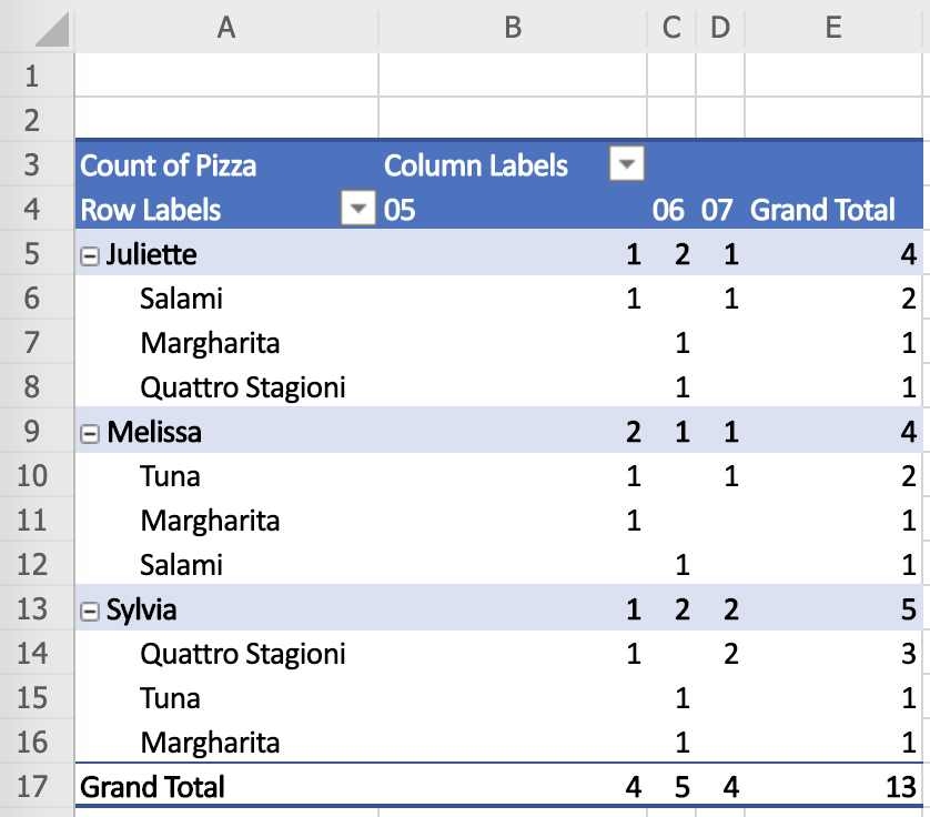

The terminology is pretty much standard – Row Labels are under Rows, Column Labels are under Columns and Summation Values are under Values. The column names are referred to as Fields.
Additional settings like sorting, display values, usage of grand totals etc. are accessible through context menus next to each of the fields.
Other Office versions are mostly the same and use very similar user interfaces (if not exactly the same).
Google Sheets
Google Sheets also cannot parse the date naturally and an additional table column with the Month value was necessary.
However, the output is a bit nicer.

The settings uses the same terms as Microsoft Excel. Row Labels are Rows, Column Labels are Columns and Summation Values are Values.
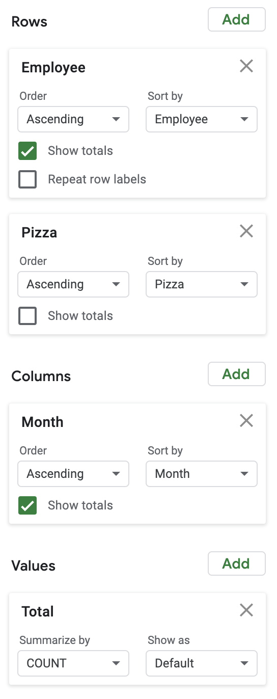
A very nice feature of Google Sheets are predefined themes that can be switched by a click of a button and the whole Pivot Table can get a different look’n’feel.
LibreOffice Calc
LibreOffice does not understand the date and time field on its own and we again had to create a separate Month column. This is not a big surprise.
The result is very rough. It needs some more manual tweaking to give it some nice look.

The settings of Pivot Table in LibreOffice is the most confusing we have seen and the terminology is definitely different to other tools.

Row Labels are called Row Fields, Column Labels are Column Fields and Summation Values are Data Fields.
More settings of individual fields is sort of hidden — by double clicking on individual fields another dialog is opened with even more settings.
Apple Numbers
Although Apple Numbers is a spreadsheet editor, it does not have any Pivot Table function. There are workarounds to simulate simple Pivot Tables but this cannot be considered a full-fledged table calculator.
Lumeer
Lumeer is the only tool that naturally understands date and time. This is the first time, we did not need to add a custom Month column.
In Lumeer, every table has its own icon and color and the output look’n’feel respects that configuration.

The terminology used in settings is a standard one — Row Labels are Rows, Column Labels are Columns and Summation Values are Values.
All settings values are immediately visible and easily accessible.

Overall Tool Comparison
In case you were starting with Pivot Tables and you are just looking for the best tool, we added a small comparison. Also because we love data!
| MS Office 365 | Google Sheets | Libre Office | Apple Numbers | Lumeer | |
| Supports all necessary functions | |||||
| Natural understanding of date and time |
|||||
| Standardized settings terminology | |||||
| The settings is easily accessible | |||||
| Nice output look’n’feel |
Where to go next?
If you are an Excel fan, you might want to check some interesting articles on Pivot Tables in Excel:
- My Excel Online
- What is a Pivot Table?
- Excel Pivot Tables
Debra Dalgleish (an owner of Contextures) who is also a Microsoft Most Valuable Professional published a lot of articles on Pivot Tables at her web sites like:
- Pivot Table Dynamic Data Source
- Excel Pivot Tables
- Excel Theatre
Wen Hsiu Liu leads the Excel! Taiwan group.
Leila Gharani publishes articles on how to use Excel for data analysis and visualisations.
If you are a french native speaker, you might find the site Le CFO masqué by Sophie Marchand useful.
You can also check some online courses at Udemy:
- Data Analysis Essentials for Business
- Be an Excel Pivot Tables Pro
Most of the principles introduced for Excel are valid in other spreadsheet editors.
For Google Sheets, there is a comprehensive Pivot Tables in Google Sheets Beginners Guide by Ben L. Collins.
However, it is important to note that the trends for the future are directed towards self evolving enterprise systems. Such systems demand less and less human intervention and manual work.
From such a point of view, Excel as a data analysis tool might soon be replaced by tools with artificial intelligence that actually understand the data meaning and can shift the way we work.
For more details, you can refer to the Accenture’s Future Ready Enterprise Systems report.
Glossary and Frequently Asked Questions
Here, we address the questions that we frequently face when explaining Pivot Tables in our workshops as well as the basic terms.
How do I create a pivot table from another pivot table? Can you do a pivot of a pivot?
Although most tools allow us to use an existing Pivot Table as a source of data for another Pivot Table, we strongly discourage you from this approach.
It is a typical sign of bad data organisation, or bad data structures being used. Or a need to use a tool that can naturally connect multiple tables like Lumeer or a database system with some Business Intelligence tool on top of it.
Are Pivot Tables dynamic?
Yes, all Pivot Tables are refreshed when the source data is changed.
Sometimes we want to make a snapshot — sort of freeze our Pivot Table in time. In such a case, the easiest way to do that is to copy’n’paste the values to another place (sheet, table etc.).
Can I combine two Pivot Tables?
In most tools, comparing two Pivot Tables or merging them together requires a rather manual approach. There are exceptions like Lumeer that can layover multiple Pivot Tables with the same structure.
What is a Row Label?
A Row Label (in a Pivot Table) determines a table column that is used to group individual table rows (i.e. records) by the unique values in that specific column. It is called a Row Label as the unique values are listed at the beginning of each row (in the first column) of the resulting Pivot Table.
For example, selecting a Sales Person Name as a Row Label will list all Sales Persons in the first column and next we can group their total sales.
What is a Column Label?
A Column Label (in a Pivot Table) determines a table column that is used to group individual table rows (i.e. records) by the unique values in that specific column. It is called a Column Label as the unique values are listed at the beginning of each column (in the first row) of the resulting Pivot Table.
For example, selecting a Month of Sale as a Column Label will list all Months in the first row and next we can group the total sales.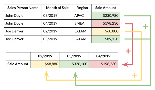
What are Summation Values?
Summation Values are those values from our original table that are used to calculate the resulting value in the Pivot Table.
In addition to the table column that is used to calculate the summation, we must specify a summation function that can combine the values together. It can be a sum, average, minimum, maximum, median etc.
For example, selecting a Sale Amount and sum function will calculate the overall sales for the given Sales Person.
Pivot tables are one of the most powerful and useful features in Excel. With very little effort, you can use a pivot table to build good-looking reports for large data sets. If you need to be convinced that Pivot Tables are worth your time, watch this short video.
Grab the sample data and give it a try. Learning Pivot Tables is a skill that will pay you back again and again. Pivot tables can dramatically increase your efficiency in Excel.
What is a pivot table?
You can think of a pivot table as a report. However, unlike a static report, a pivot table provides an interactive view of your data. With very little effort (and no formulas) you can look at the same data from many different perspectives. You can group data into categories, break down data into years and months, filter data to include or exclude categories, and even build charts.
The beauty of pivot tables is they allow you to interactively explore your data in different ways.
Contents
- Sample data
- Insert Pivot table
- Add fields
- Sort by value
- Refresh data
- Second value field
- Apply number formatting
- Group by date
- Add percent of total
- Benefits summary
- More resources
Step by step tutorial
To understand pivot tables, you need to work with them yourself. In this section, we’ll build several pivot tables step-by-step from a set of sample data. With experience, the pivot tables below can be built in about 5 minutes.
Sample data
The sample data contains 452 records with 5 fields of information: Date, Color, Units, Sales, and Region. This data is perfect for a pivot table.

Data in a proper Excel Table named «Table1». Excel Tables are a great way to build pivot tables, because they automatically adjust as data is added or removed.
Note: I know this data is very generic. But generic data is good for understanding pivot tables – you don’t want to get tripped up on a detail when learning the fun parts.
Insert Pivot Table
1. To start off, select any cell in the data and click Pivot Table on the Insert tab of the ribbon:

Excel will display the Create Pivot Table window. Notice the data range is already filled in. The default location for a new pivot table is New Worksheet.
2. Override the default location and enter H4 to place the pivot table on the current worksheet:

3. Click OK, and Excel builds an empty pivot table starting in cell H4.

Note: there are good reasons to place a pivot table on a different worksheet. However, when learning pivot tables, it’s helpful to see both the source data and the pivot table at the same time.
Excel also displays the PivotTable Fields pane, which is empty at this point. Note all five fields are listed, but unused:

To build a pivot table, drag fields into one of the Columns, Rows, or Values area. The Filters area is used to apply global filters to a pivot table.
Note: the pivot table fields pane shows how fields were used to create a pivot table. Learning to «read» the fields pane takes a bit of practice. See below and also here for more examples.
Add fields
1. Drag the Sales field to the Values area.
Excel calculates a grand total, 26356. This is the sum of all sales values in the entire data set:

2. Drag the Color field to the Rows area.
Excel breaks out sales by Color. You can see Blue is the top seller, while Red comes in last:

Notice the Grand Total remains 26356. This makes sense, because we are still reporting on the full set of data.
Let’s take a look at the fields pane at this point. You can see Color is a Row field, and Sales is a Value field:

Number formatting
Pivot Tables can apply and maintain number formatting automatically to numeric fields. This is a big time-saver when data changes frequently.
1. Right-click any Sales number and choose Number Format:

2. Apply Currency formatting with zero decimal places, then click OK:

In the resulting pivot table, all sales values have Currency format applied:

Currency format will continue to be applied to Sales values, even when the pivot table is reconfigured, or new data is added.
Sorting by value
1. Right-click any Sales value and choose Sort > Largest to Smallest.

Excel now lists top-selling colors first. This sort order will be maintained when data changes, or when the pivot table is reconfigured.

Refresh data
Pivot table data needs to be «refreshed» in order to bring in updates. To reinforce how this works, we’ll make a big change to the source data and watch it flow into the pivot table.
1. Select cell F5 and change $11.00 to $2000.
2. Right-click anywhere in the pivot table and select «Refresh».

Notice «Red» is now the top selling color, and automatically moves to the top:

3. Change F5 back to $11.00 and refresh the pivot again.
Note: changing F5 to $2000 is not realistic, but it’s a good way to force a change you can easily see in the pivot table. Try changing an existing color to something new, like «Gold» or «Black». When you refresh, you’ll see the new color appear. You can use undo to go back to original data and pivot.
Second value field
You can add more than one field as a Value field.
1. Drag Units to the Value area to see Sales and Units together:

Percent of total
There are different ways to display values. One option is to show values as a percent of total. If you want to display the same field in different ways, add the field twice.
1. Remove the Units from the Values area
2. Add the Sales field (again) to the Values area.
3. Right-click the second instance and choose «% of grand total»:

The result is a breakdown by color along with a percent of total:

Note: the number format for percentage has also been adjusted to show 1 decimal.
Here is the Fields pane at this point:

Group by date
Pivot tables have a special feature to group dates into units like years, months, and quarters. This grouping can be customized.
1. Remove the second Sales field (Sales2).
2. Drag the Date field to the Columns area.
3. Right-click a date in the header area and choose «Group»:

4. When the Group window appears, group by Years only (deselect Months and Quarters):

We now have a pivot table that groups sales by color and year:

Notice there are no sales of Silver in 2016 and 2017. We can guess that Silver was introduced as a new color in 2018. Pivot tables often reveal patterns in data that are difficult to see otherwise.
Here is the Fields pane at this point:

Two-way Pivot
Pivot tables can plot data in various two-dimensional arrangements.
1. Drag the Date field out of the columns area
2. Drag Region into the Columns area.
Excel builds a two-way pivot table that breaks down sales by color and region:

3. Swap Region and Color (i.e. drag Region to the Rows area and Color to the Columns area).
Excel builds another two-dimensional pivot table:

Again notice total sales ($26,356) is the same in all pivot tables above. Each table presents a different view of the same data, so they all sum to the same total.
The above example shows how quickly you can build different pivot tables from the same data. You can create many other kinds of pivot tables, using all kinds of data.
Key Pivot Table benefits
Simplicity. Basic pivot tables are very simple to set up and customize. There is no need to learn complicated formulas.
Speed. You can create a good-looking, useful report with a pivot table in minutes. Even if you are very good with formulas, pivot tables are faster to set up and require much less effort.
Flexibility. Unlike formulas, pivot tables don’t lock you into a particular view of your data. You can quickly rearrage the pivot table to suit your needs. You can even clone a pivot table and build a separate view.
Accuracy. As long as a pivot table is set up correctly, you can rest assured results are accurate. In fact, a pivot table will often highlight problems in the data faster than any other tool.
Formatting. A Pivot table can apply automatically apply consistent number and style formatting, even as data changes.
Updates. Pivot tables are designed for on-going updates. If you base a pivot table on an Excel Table, the table resizes as needed with new data. All you need to do is click Refresh, and your pivot table will show you the latest.
Filtering. Pivot tables contain several tools for filtering data. Need to look at North America and Asia, but exclude Europe? A pivot table makes it simple.
Charts. Once you have a pivot table, you can easily create a pivot chart.
More pivot table resources
- Pivot table examples
- Pivot table tips
- Pivot tables versus formulas
- Pivot table training