
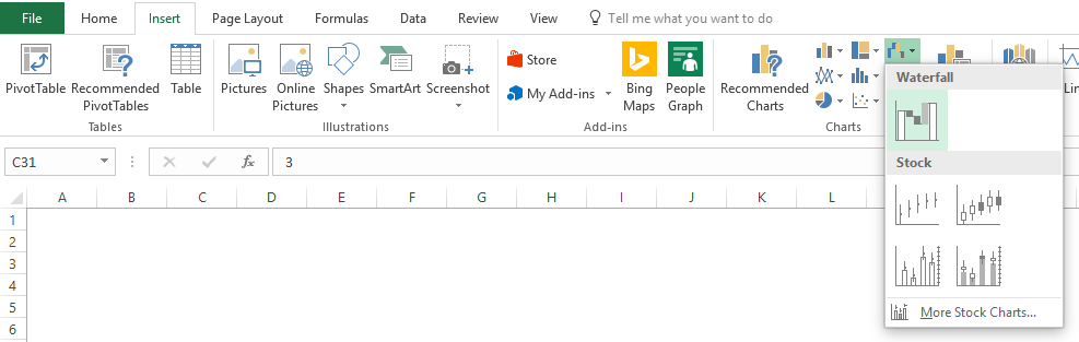
Create a waterfall chart
-
Select your data.

-
Click Insert > Insert Waterfall or Stock chart > Waterfall.
You can also use the All Charts tab in Recommended Charts to create a waterfall chart.
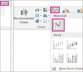
Tip: Use the Design and Format tabs to customize the look of your chart. If you don’t see these tabs, click anywhere in the waterfall chart to add the Chart Tools to the ribbon.

Start subtotals or totals from the horizontal axis
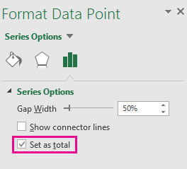
If your data includes values that are considered Subtotals or Totals, such as Net Income, you can set those values so they start on the horizontal axis at zero and don’t «float».
-
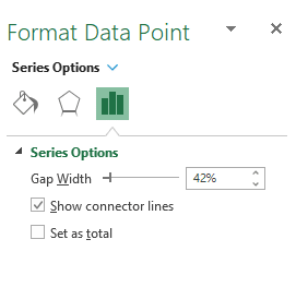
Double-click a data point to open the Format Data Point task pane, and check the Set as total box.
Note: If you single-click the column, you’ll select the data series and not the data point.
To make the column «float» again, uncheck the Set as total box.
Tip: You can also set totals by right-clicking on a data point and picking Set as Total from the shortcut menu.
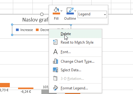
Show or hide connector lines
Connector lines connect the end of each column to the beginning of the next column, helping show the flow of the data in the chart.
-
To hide the connector lines, right-click a data series to open the Format Data Series task pane, and uncheck the Show connector lines box.
To show the lines again, check the Show connector lines box.
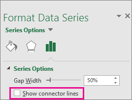
Tip: The chart legend groups the different types of data points in the chart: Increase, Decrease, and Total. Clicking a legend entry highlights all the columns that make up that group on the chart.
Here’s how you create a waterfall chart in Excel for Mac:
-
Select your data.
-
On the Insert tab on the ribbon, click
(Waterfall icon) and select Waterfall.Note: Use the Chart Design and Format tabs to customize the look of your chart. If you don’t see these tabs, click anywhere in the Waterfall chart to display them on the ribbon.
 (Waterfall icon) and select Waterfall.
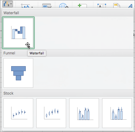
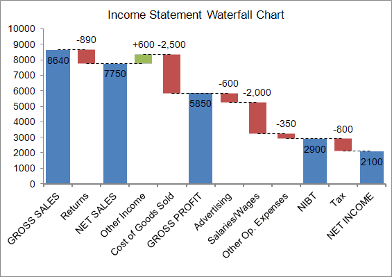
Все чаще и чаще встречаю в отчетности разных компаний и слышу просьбы от слушателей на тренингах объяснить как строится каскадная диаграмма отклонений — она же «водопад», она же «waterfall», она же «мост», она же «bridge» и т.д. Выглядит она примерно так:
")
Издали действительно похожа на каскад водопадов на горной реке или навесной мост — кто что видит 
Особенность такой диаграммы том, что:
- Мы наглядно видим начальное и конечное значение параметра (первый и последний столбцы).
- Положительные изменения (рост) отображаются одним цветом (обычно зеленым), а отрицательные (спад) — другим (обычно красным).
- Иногда в диаграмме могут присутствовать ещё и столбцы промежуточных итогов (серые, приземленные на ось Х столбцы).
В повседневной жизни такие диаграммы используются обычно в следующих случаях:
- Наглядное отображение динамики какого-либо процесса во времени: потока наличности (cash-flow), инвестиций (вкладываем деньги в проект и получаем от него прибыль).
- Визуализация выполнения плана (крайний левый столбик в диаграмме — факт, крайний правый — план, вся диаграмма отображает наш процесс движения к желаемому результату)
- Когда нужно наглядно показать факторы, влияющие на наш параметр (факторный анализ прибыли — из чего она складывается).
Есть несколько способов построения такой диаграммы — всё зависит от вашей версии Microsoft Excel.
Способ 1. Самый простой: встроенный тип в Excel 2016 и новее
Если у вас Excel 2016, 2019 или новее (или Office 365), то построение такой диаграммы не составит труда — в этих версиях Excel такой тип уже встроен по умолчанию. Нужно будет лишь выделить таблицу с данными и выбрать на вкладке Вставка (Insert) команду Каскадная (Waterfall):

В результате мы получим практически готовую уже диаграмму:

Сразу же можно настроить желаемые цвета заливки для положительных и отрицательных столбцов. Удобнее всего это сделать, выделив соответствующие ряды Увеличение и Уменьшение прямо в легенде и, щёлкнув по ним правой кнопкой мыши, выбрать команду Заливка (Fill):

Если нужно добавить в диаграмму столбцы с промежуточными итогами или финальный столбец-итог, то удобнее всего это сделать с помощью функций ПРОМЕЖУТОЧНЫЕ.ИТОГИ (SUBTOTALS) или АГРЕГАТ (AGGREGATE). Они посчитает накопленную с начала таблицы сумму, исключив при этом из нее выше расположенные аналогичные итоги:

В данном случае, первый аргумент (9) — это код математической операции суммирования, а второй (0) заставляет функцию не учитывать в результатах уже вычисленные итоги за предыдущие кварталы.
После добавления строк с итогами останется выделить на диаграмме появившиеся итоговые колонки (сделать два последовательных одиночных щелчка по столбцу) и, щёлкнув правой кнопкой мыши, выбрать команду Установить в качестве итога (Set as total):

Выбранный столбец «приземлится» на ось Х и автоматически поменяет цвет на серый.
Вот, собственно, и всё — диаграмма-водопад готова:

Способ 2. Универсальный: невидимые столбцы
Если у вас Excel 2013 или более древние версии (2010, 2007 и т.д.), то описанный выше способ вам не подойдёт. Придется идти обходным путем и выпиливать недостающую каскадную диаграмму из обычной гистограммы с накоплением (суммированием столбиков друг на друга).
Хитрость тут заключается в использовании прозрачных столбцов-подпорок, приподнимающих наши красные и зеленые ряды данных на нужную высоту:

Для построения такой диаграммы нам потребуется добавить к исходным данным еще несколько вспомогательных колонок с формулами:

- Во-первых, нужно разделить наш исходный столбец, выделив положительные и отрицательные значения в разные колонки с помощью функции ЕСЛИ (IF).
- Во-вторых, нужно будет добавить перед сделанными столбцами колонку Пустышки, где первое значение будет 0, а начиная со второй ячейки формулой будет вычисляться высота тех самых прозрачных подпирающих столбцов.
После этого останется выделить всю таблицу кроме исходного столбца Поток и создать обычную гистограмму с накоплением через Вставка — Гистограмма (Insert — Column Chart):

Если теперь выделить синие столбцы и сделать их невидимыми (по ним правой кнопкой мыши — Формат ряда — Заливка — Нет заливки), то мы как раз и получим то, что требуется.
В плюсах подобного способа — простота. В минусах — необходимость считать вспомогательные колонки.
Способ 3. Если уходим в минус — всё сложнее
К сожалению, предыдущий способ адекватно работает только для положительных значений. Если хотя бы на каком-то участке наш водопад уходит в отрицательную область, то сложность задачи возрастает в разы. В этом случае необходимо будет формулами просчитать каждый ряд (пустышки, зеленые и красные) отдельно для отрицательной и положительной частей:

Чтобы не сильно мучиться и не изобретать велосипед, готовый шаблон для такого случая можно скачать в заголовке этой статьи.
Способ 4. Экзотический: полосы повышения-понижения
Этот способ основан на использовании специального малоизвестного элемента плоских диаграмм (гистограмм и графиков) — Полос повышения-понижения (Up-Down Bars). Эти полосы попарно соединяют точки двух графиков, чтобы наглядно показать какая из двух точек выше-ниже, что активно используется при визуализации план-факта:

Легко сообразить, что если убрать линии графиков и оставить на диаграмме только полосы повышения-понижения, то мы получим все тот же «водопад».
Для такого построения нам потребуется добавить к нашей таблице еще два дополнительных столбца с простыми формулами, которые расчитают положение двух требуемых невидимых графиков:

Для создания «водопада» нужно выделить столбец с месяцами (для подписей по оси Х) и два дополнительных столбца График 1 и График 2 и построить для начала обычный график через Вставка — График (Insert — Line Сhart):

Теперь добавим к нашей диаграмме полосы повышения-понижения:
- В Excel 2013 и новее для этого необходимо выбрать на вкладке Конструктор команду Добавить элемент диаграммы — Полосы повышения-понижения (Design — Add Chart Element — Up-Down Bars)
- В Excel 2007-2010 — перейти на вкладку Макет — Полосы повышения-понижения (Layout — Up-Down Bars)
Диаграмма после этого начнёт выглядеть примерно так:

Осталось выделить графики и сделать их прозрачными, щелкнув по ним по очереди правой кнопкой мыши и выбрав команду Формат ряда данных (Format series). Аналогичным образом можно изменить и стандартные, весьма убого выглядящие, чёрно-белые цвета полос на зелёные и красные, чтобы получить в итоге более приятную картинку:

В последних версиях Microsoft Excel ширину полос можно изменить, щёлкнув по одному из прозрачных графиков (не по полосам!) правой кнопкой мыши и выбрав команду Формат ряда данных — Боковой зазор (Format series — Gap width).
В старых версиях Excel для такого исправления приходилось использовать команду на Visual Basic:
- Выделите построенную диаграмму
- Нажмите сочетание клавиш Alt+F11, чтобы попасть в редактор Visual Basic
- Нажмите сочтетание клавиш Ctrl+G, чтобы открыть панель прямого ввода команд и отладки Immediate (обычно она расположена внизу).
- Скопируйте и вставьте туда вот такую команду: ActiveChart.ChartGroups(1).GapWidth = 30 и нажмите Enter:

При желании можно, конечно, поиграться со значением параметра GapWidth, чтобы добиться нужной величины зазора:

Ссылки по теме
- Как в Excel построить диаграмму-шкалу (bullet chart) для визуализации KPI
- Новые возможности диаграмм в Excel 2013
- Как в Excel создать интерактивную «живую» диаграмму
Waterfall charts are a powerful tool for visualizing changes in data over time. From analyzing financial statements to tracking project progress, waterfall charts can provide valuable insights into complex datasets. Excel is a popular solution for creating waterfall charts, but many users struggle to create charts that are both visually appealing and easy to understand.
In this step-by-step guide, you’ll learn how to create an impressive waterfall chart in Excel that will help you communicate your data effectively. Whether you’re a beginner or an experienced Excel user, our guide provides all the necessary tips and tricks to create a stunning waterfall chart that will impress your audience. So let’s dive in and learn how to create an eye-catching waterfall chart in Excel!
Waterfall charts 101
A waterfall chart (also known as a cascade chart or a bridge chart) is a special kind of chart that illustrates how positive or negative values in a data series contribute to the total. In other words, it’s an ideal way to visualize a starting value, the positive and negative changes made to that value, and the resulting end value. In a waterfall chart, the first column is the starting value and the last column is the end value. The floating columns between them are the contributing positive or negative values.
Note: Other fun names for waterfall charts include Mario chart and flying bricks chart, because individual chart elements resemble an old arcade game.
Some people like to connect the lines between the contributions to make the chart look like a bridge (giving us the bridge chart name), while others leave the columns floating.
Uses of waterfall charts
Waterfall charts are popular in the corporate and financial environment because they are very useful for a visualization of the positive and negative movements within a measured quantity or KPI, such as your Monthly Net Profit or Cash Flow.
Other examples of quantitative analyses, where waterfall charts are used, include:
- Visualizing profit and loss statements
- Comparing product earnings
- Highlighting budget changes on a project
- Analyzing inventory or sales over a period of time
- Showing product value over a period of time
- Creating executive dashboards
In a nutshell, use a waterfall chart whenever you want to show how a starting value increases or decreases through a series of positive or negative changes.
Tip: While the most typical waterfall chart is the one with a starting and ending value, you can also create subtotals as visual milestones in the series. These show up as full columns. For example, you might want to use Net revenue and Gross Income as two checkpoints between Gross Revenue and Net income starting and ending values.
How to create a waterfall chart in Excel
Before Office 2016, creating waterfall charts in Excel was a notoriously difficult process. Note that I used the word «creating» and not «inserting». That’s right — you did not insert a waterfall chart, you created it.
Let’s start with the process of creating a waterfall chart👇
The easiest way:
This is what your waterfall chart could look like in just a couple of clicks:
Amazing, right?
If you don’t have time to tweak the default Excel waterfall charts, as explained further in the guide, and would like to add those advanced features to your waterfall charts fast, Zebra BI for Office is just what you need. See just how easy creating a waterfall chart can be:
Compared to the other methods explained, this looks so easy it’s scary! By the way, you can do this in Office 2019 and 2021, Office 365, and Office for Mac! It’s also possible to do the same thing in PowerPoint, too.
Zebra BI for Office is already available in Excel. Download the sample file and follow the instructions that will help you get started.
Get started
download
And now, let’s check how to do it with the native Excel charts👇
Excel 2016 way:
Microsoft decided to listen to user feedback and introduced 6 highly requested charts in Excel 2016, including a built-in Excel waterfall chart.
No more templates, additional series, formulas, or tinkering with the charts. Just 2 clicks and your awesome waterfall chart is inserted.
Or is it? 🤨
While the addition of waterfall charts in Excel 2016 is a great step forward, the current functionality still leaves much to be desired.
10 steps to a perfect Excel waterfall chart
Here are some ways that can help you create better Excel waterfall charts and some things that are still missing. If you change your mind and want to do it easier, just download our free template and save your time for some better things.
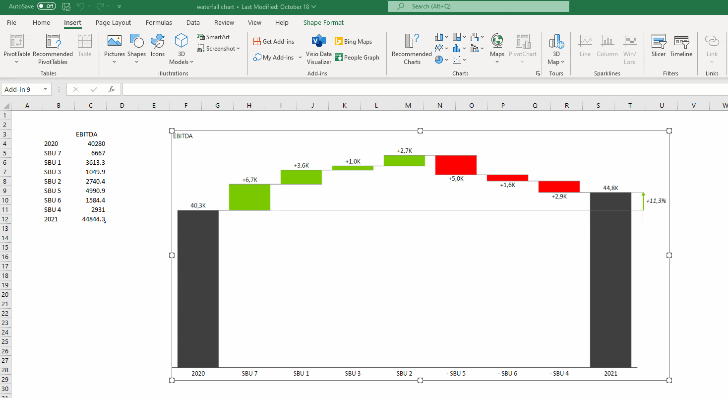
1. Remember to set the totals
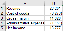
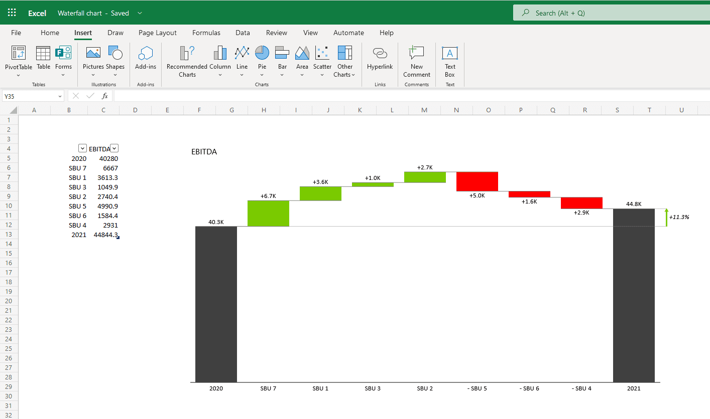
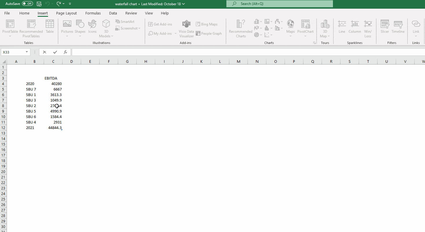
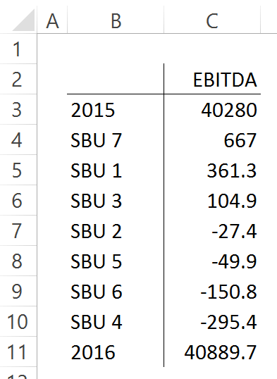
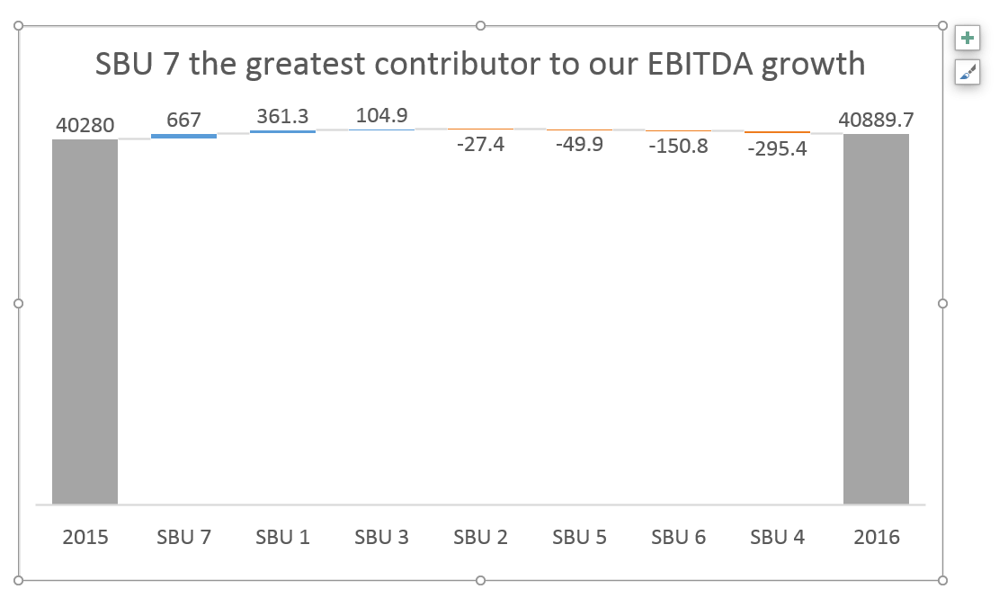
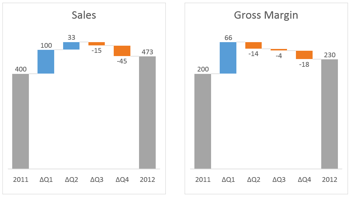
Let’s say we want to have this data table visualized with a waterfall chart: EBITDA of our fictional company for the years 2015, and 2016 and the individual contributions of 7 small business units to the change from 2015 to 2016.
This shouldn’t be too hard. Click inside the data table, go to the «Insert» tab and click «Insert Waterfall Chart» and then click on the chart. Voila:
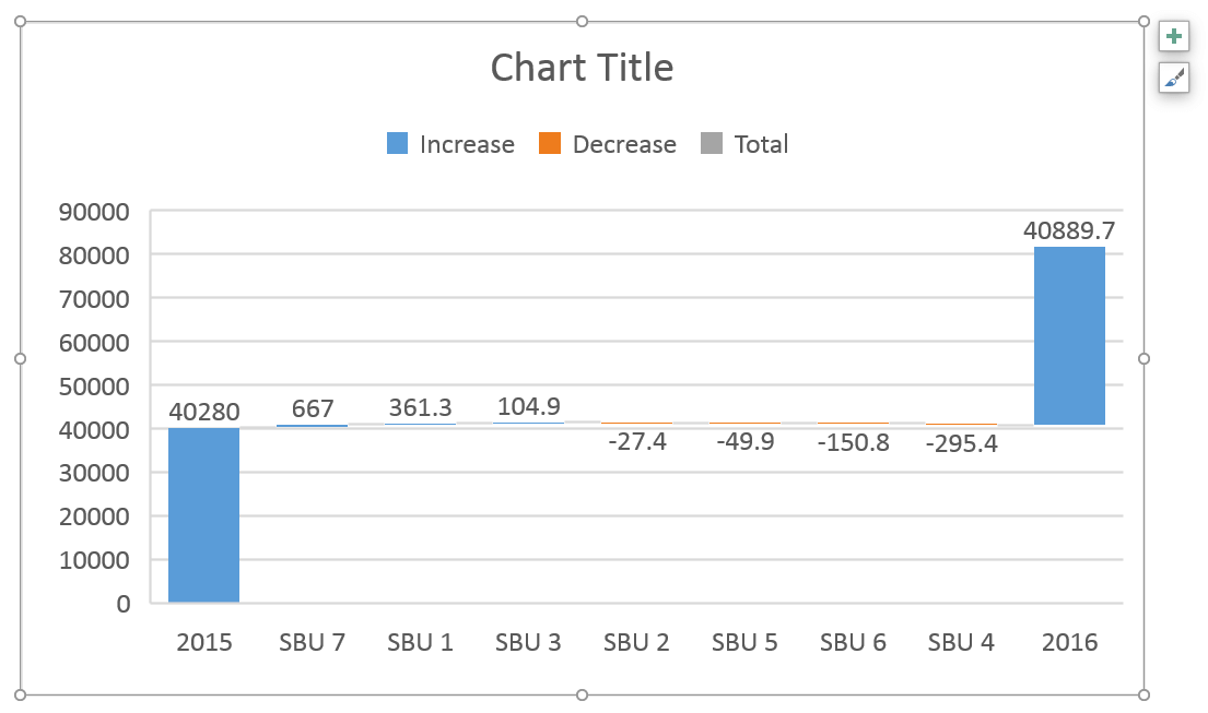
OK, technically this is a waterfall chart, but it’s not exactly what we hoped for. In the legend we see Excel 2016 has 3 types of columns in a waterfall chart:
- Increase
- Decrease
- Total
This is correct, but in the chart, there are no Total columns, only Increase and Decrease. The first and last columns should be Total (start on the horizontal axis) and to set them as such, we have to double-click on each of them to open the Format Data Point task pane and check the Set as total box.

You can also right-click the data point and select Set as Total from the list of menu options.
Or, you can skip all this and use Zebra BI for Office to do the hard work for you.
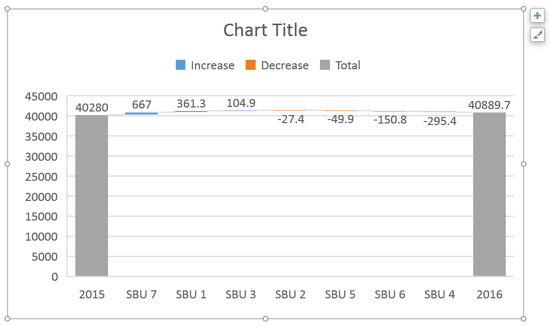
Finally, we have our waterfall chart:
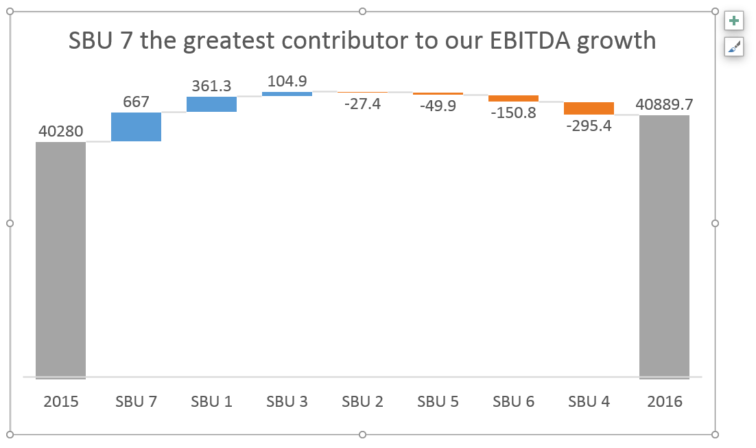
2. Ditch the clutter on your visualization
Data visualization best practice is to remove ALL elements from the visualization that is not absolutely necessary (if you’re interested, you can learn more about this in our free webinar: Data visualization in depth).
Similar to other Excel charts, the default Excel waterfall chart also suffers from having too much clutter. The legend, the vertical axis, and labels, the horizontal grid lines — none of them contribute to the reader’s better understanding of the data. If anything, they are a distraction.
So, let’s remove all unnecessary elements and write our key message to the title. It’s a shame that the chart title cannot be inserted automatically from a cell.
Tip: To remove the distracting chart elements, right-click on each of them and then click «Delete«.
Great, this is much better. But it required additional work that would not be required if Excel defaults were better. We’ll show you how to do it better in Zebra BI for Office.
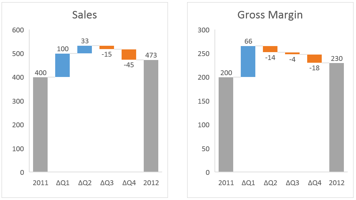
3. Break the axis to highlight contributions
This limitation is especially noticeable in waterfall charts because waterfall charts have essentially two different types of data:
- Totals: usually the first and last column in a series.
- Contributions: the floating bricks make up the “bridge” between the two totals.
A common problem is that contributions are often very small compared to totals. This is also apparent in our example (see the image above).
First, a point of order: this chart correctly visualizes the situation as the contributions really ARE that small compared to totals. Our 2016 result is essentially the same as our 2015 result.
This visualization is also completely in line with IBCS Standards.
However, users (and their bosses) are sometimes more interested in contributions than in totals and the relationship between the two.
In this case, the only viable option would be to break the vertical axis and have the totals start at some value larger than 0. Let’s say 35,000. This highlights individual contributions, but risks guiding unaware readers to false conclusions about the data.
You can again resort to using tutorials:
- http://peltiertech.com/broken-y-axis-in-excel-chart/
- http://www.tushar-mehta.com/excel/newsgroups/broken_y_axis/tutorial/index.html
Another, somewhat simpler option is to do the following:
- Click on the chart to select it
- Re-add vertical axis: Go to Design >> Add Chart Element >> Axes >> Primary Vertical
- «Break» vertical axis: right click on the vertical axis and click «Format Axis…«, then under Axis Options write «35000» under Bounds >> Minimum.
- Remove the vertical axis: right click on the vertical axis and click «Delete«
This is the chart we end up with:
Now the contributions are much more prominent, but there’s no obvious indication that the vertical axis does not start at zero which is really bad because the user does not draw the correct conclusion from the visualization.
4. Add relative contributions in percentages
When analyzing contributions you’re sometimes more interested in relative contributions (in percentages of the total) than in absolute contributions.
Unfortunately, if you want to do that in a default Excel waterfall chart, you’re out of luck — you’re stuck with displaying absolute contributions only.
✔️ Look to the end of the article to see how easy this is to do in Zebra BI for Office.
5. Highlight differences between totals
Another thing that you’re not able to do in an Excel waterfall chart is to display the total difference between 2015 and 2016 in our example.
Sure, you can see in the chart that the 2016 column is higher than the 2015 column (especially now that we cut the vertical axis). But by how much? Unless you can do complex subtractions in your head, you don’t know the exact number. There’s also no way to display the relative difference in percentage.
Since this difference between totals is rather important, it’s definitely a major feature that’s missing in Excel waterfall charts.
✔️ Of course, it’s much easier to highlight the differences in Zebra BI for Office.
6. Use vertical waterfall charts
We know from the How to Choose the Right Business Chart article that horizontal charts (i.e. the charts that have a horizontal category axis) are used to display time-related data. For everything else, we should use vertical charts instead.
Waterfall charts are no exception. Strangely, in Excel 2016, there is no way to insert a vertical waterfall chart. While this feature has been requested, there’s no indication of whether it will be implemented and when.
✔️ We prepared a demonstration in Zebra BI for Office, so you can see how to create an income statement with vertical waterfall charts.
7. Add (some) subtotals
Since we’re on the subject of visualizing income statements — in a typical income statement, there are some categories that are actually sums of several other categories.
For example, you can choose to calculate a sum of all Operating Expenses (OpEx). This better visualizes the relationship between «Revenue» and «Earnings before interest and taxes» (EBIT). EBIT = Revenue — OpEx.
In a table, this is easy to do — just write a formula and you’re done.
When you create a waterfall chart in Excel? Not so much. It’s apparently so hard to do it manually that there’s not a single tutorial or template available on the internet.
You can, however, enter subtotals and designate them as such in your waterfall chart. However, you need to calculate them yourself to make sure they are correct.
✔️ You can see how Zebra BI for Office automatically creates subtotals in this handy animated gif at the end of this article.
8. Customize your chart with colors
The default color scheme in Excel could be better. Visit the Chart Design tab and open the Change Colors gallery.

Here, you can select a color palette. You can also choose a different theme on the Page Layout tab. To adjust how the colors are used, click the Colors button and select Customize Colors at the bottom of the list.

You can set it up to display positive values in green and negative values in red, which is a common approach in financial reporting.
9. Turn connector lines on or off
Connector lines connect columns to show the movements in values in the chart. You can turn them on or off by right-clicking a data series to open the Format Data Series pane, and checking/unchecking the Show connector lines box.
10. Scale your charts
Finally, we arrive at one major feature that’s missing in Excel from the very beginning: scaling multiple charts.
While this problem is not limited to waterfall charts, it’s too important not to mention it here.
Making sure that all related charts in a report or dashboard are on the same scale is one of the most important concepts in data visualization.
If you don’t synchronize scales, don’t even insert the charts
All too often you see two Excel charts side by side with completely different scales. While each of them is an adequate data visualization on its own, you must make sure they are scaled once you put them side by side! Otherwise don’t even insert the charts and just leave the data in a table — or risk misleading/incorrect interpretation.
So, how do you synchronize scales of Excel charts? While the procedure is not particularly hard, it is time-consuming. It’s a similar procedure that we used to break the axis.
Say we have these two default Excel waterfall charts and we need to scale them:
The first step is to re-add Vertical Axis on both charts.
- Click on the first chart to select it
- Re-add vertical axis: Go to Design >> Add Chart Element >> Axes >> Primary Vertical
- Repeat for the second chart
This is what we have so far:
Now we have to adjust the scale of the right chart to be the same as the left. Right-click on the vertical axis and click «Format Axis…», then under Axis Options write «600» under Bounds >> Minimum.
Remove the vertical axis from both charts (right-click on the vertical axis and click «Delete«) and we have our correct visualization:
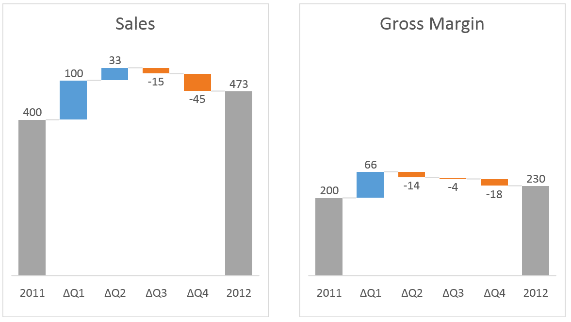
OK, that wasn’t too bad. Now, what if you have a monthly report with 6 waterfall charts on it? Would you do this procedure for 6 charts every month when the data changes? I guess not.
Of course, you can automate this, but you have to use VBA to do it. If you don’t want to use VBA, maybe this article from 2012 by Jon Peltier will help you.
Some more advanced things you can do much easier
You got it so far: everything is much easier if you use Zebra BI for Office instead of native Excel charts. See what else can be done 👇
Adding variances and difference highlights
The default Excel waterfall charts do not show a very important feature that is crucial for the understanding of your performance: variances (absolute & relative) and difference highlights. In Zebra BI for Office, both features are applied automatically.
You can also control whether an increase is a positive or a negative event. We know that in some cases, like when it comes to costs, an increase is a negative development. You can simply right-click on the category where data should be inverted and select a custom calculation «Invert». This will automatically adapt the visualization to display the right context.
Another useful feature we added is the difference highlights between starting and ending values. The difference highlight is added automatically and is on by default. By going to the settings in the global toolbar, you can also switch it off.
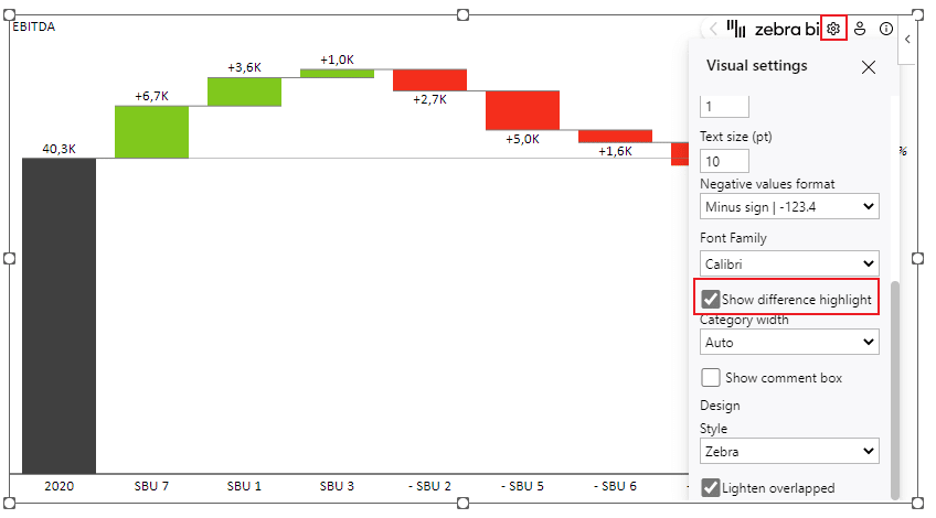
In the previous example, you can see that the increase between EBITDA in 2020 and 2021 was 4.6k or 11.3%.
Creating an income statement with vertical waterfall charts
How about inserting a waterfall chart into an income statement? With the Zebra BI Tables for Office add-in, this is just a few clicks away.
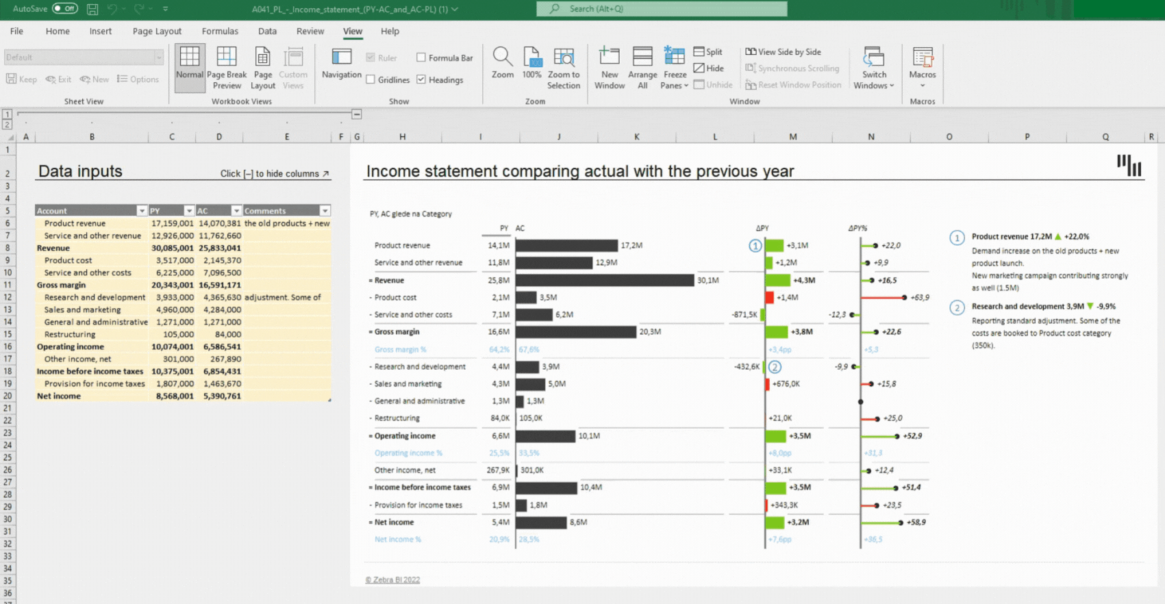
The cool thing about this is that by glancing at the waterfall chart, you can already see how you’re performing. The calculations like «Result» and «Invert» are reflected in the waterfall chart and all categories get subtracted so that you can clearly see the contribution of each to the final result.
Small multiples with waterfall charts
How about creating up to 200 waterfall charts at once?
Here are 6 waterfall charts in a few clicks:
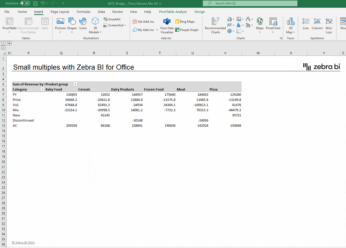
You only need to select a single cell in your data and insert the Zebra BI Charts for Office add-in. Use the chart slider to get to the waterfall chart, use the custom calculation «Result» on the first and last entry, and Zebra BI will do the rest.
You will see the automatically calculated variances and highlighted differences. But, most importantly, no matter how many charts you have, they are all inserted within the same visual and also automatically scaled between each other which immediately puts the data into the right perspective.
Check this short video to see how easy is to create Waterfall charts with Zebra BI for Office:
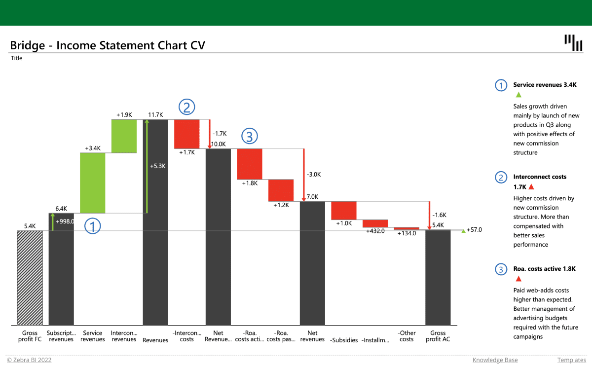
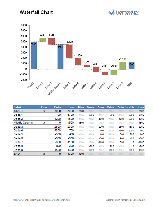
A Waterfall Chart or Bridge Chart can be a great way to visualize adjustments made to an initial value, such as the breakdown of expenses in an income statement leading to a final net income value. The initial and final values are shown as columns with the individual negative and positive adjustments depicted as floating steps. The connecting lines between the columns make the chart look like a bridge with two or more pillars. When analyzing net profit for a product starting from a sale price, where all the adjustments are negative, the chart often resembles a waterfall.
Sample bridge chart created using the Waterfall Chart Template
If you search on Google, you can find many tutorials and articles that explain how to construct a waterfall chart in Excel using stacked columns or bars. Some tutorials also explain ways to create the connecting lines [1], or how to handle negative values [2].
Update 7/2/15: A Waterfall chart is one of the new built-in chart types in Excel 2016! (Read about it).
Advertisement
For the sake of being different, the waterfall chart template I created uses error bars instead of (or in addition to) stacked columns or bars. Error bars are used to create the connecting lines and the stepped values, and they simplify handling negative values (though perhaps not as simple as the technique of using up-down bars explained by Jon Peltier). Invisible stacked columns are used for positioning and displaying the data labels. But, you do not need to know how to create the chart from scratch in order to use the template.
⤓ Download
For: Excel 2010 or later
File: waterfall-chart.xlsx
Template Details
License: Private Use
(not for distribution or resale)
«No installation, no macros — just a simple spreadsheet» — by
Description
This template contains two separate worksheets for creating either a horizontal or vertical waterfall chart. After creating your chart, you can simply copy and paste it into a presentation or report as a picture.
Summary of Features
- Allows negative values
- Includes dashed horizontal connecting lines
- Includes data labels formatted to show + and — adjustments
- Define intermediate values by placing an «x» in the Pillars column.
- Add new values by inserting rows and copying formulas down
- No macros
Using the Chart in Another Workbook
If you want to use this chart in an income statement or some other workbook that you are using for your own private use, you can copy the entire waterfall worksheet into your other workbook and use cell references to link values in the data table to values in your statement.
Using the Waterfall Chart Template
Easy Stuff
All you need to do is edit the Labels, the Delta values, and place an «x» in the Pillars column if you want to display an intermediate value.
Inserting/Deleting Rows
To insert new rows, just right-click on a row number and select Insert Row. Then immediately press Ctrl+D to copy all the formulas from the previous row.
The first and last rows use unique formulas, so you should not delete those rows, and when you insert a row, insert new rows somewhere between the 2nd row and above the last.
Editing Column Widths
The pillars are created using a Column Chart series (or a Bar Chart series in the vertical chart). So, you can edit the width by adjusting the gap percentage (Format Data Series > Series Options).
The positive and negative adjustments are error bars. You change change the width by editing the line width for the Base+ and Base- error bars (Format Error Bars > Line Color and Line Style > Width).
Editing Label Positions
The data labels are displayed using invisible stacked columns. If the data labels don’t end up where you want them, you can manually change the location of each individual data label by dragging them with your mouse.
Formatting Data Labels
The data labels for the negative adjustments use a custom number format of «-#,##0;-#,##0» to force the values to show the negative sign «-» even though the actual values in the data table are positive (in the Delta- column). Why? To get the data labels positioned conveniently, the values for the stacked columns are positive, so we force the labels to include a negative sign.
Selecting Error Bars and Data Labels
The image below shows the easy way to select individual chart series and error bars. Select the chart, then go to the Layout tab under the contextual Chart Tools menu. Select the chart element from the drop-down box and then click on the Format Selection button.
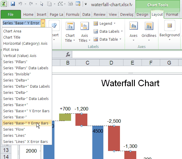
This screenshot shows the drop-down box for selecting different chart elements via the Chart Tools ribbon.
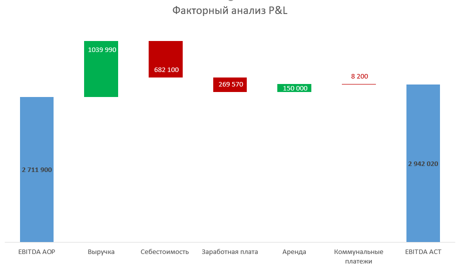
Диаграмма Водопад в Excel часто используется для план-факторного анализа. Более того, этот тип диаграммы наиболее наглядно показывает влияние различных факторов на изменение величины выбранного показателя.
Вот так выглядит диаграмма Водопад (Waterfall).
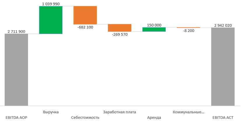
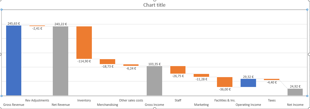
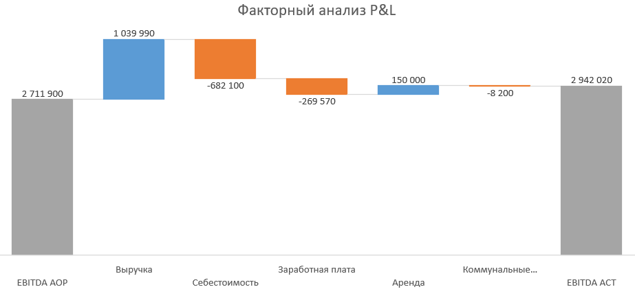
В этой статье мы рассмотрим построение диаграммы Водопад в Excel на примере факторного анализа показателей отчета P&L.
P&L расшифровывается как Profit and Loses — отчет о прибылях и убытках, или отчет о финансовых результатах. Это форма отчетности, которая используется для планирования, контроля и анализа результатов работы компании.
Кратко структура P&L выглядит следующим образом:
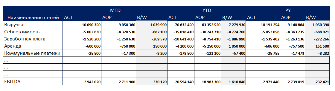
ACT — это факт, АОР — план, B/W — отклонение факта от плана.
MTD — показатели за отчетный месяц, YTD — с начала года накопительным итогом, PY — аналогичный период прошлого года.
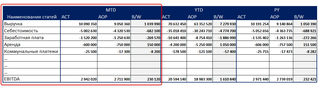
В данном примере мы сделаем анализ отклонения фактических данных за месяц (MTD) от плановых по показателю EBITDA (один из видов прибыли).
Для этого будем использовать только часть таблицы, выделенную рамкой.
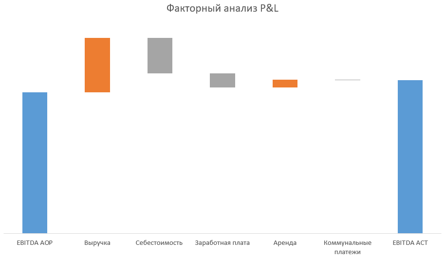
Способ 1. Диаграмма Водопад в Excel c помощью встроенного типа диаграммы Каскадная
В версиях Excel от 2016 и новее есть встроенный тип диаграммы Каскадная, который позволяет строить диаграмму Водопад без дополнительных ухищрений.
Подготовим дополнительную таблицу для построения графика Каскад. Для этого перенесем значения из основной таблицы P&L во дополнительную, как показано на картинке.
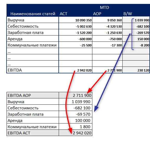
Переносить можно как скопировав вручную, так и формулами ВПР или СУММЕСЛИ.
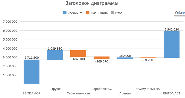
Теперь нужно выделить дополнительную таблицу целиком, далее вкладка Вставка — блок Диаграммы — Каскадная.
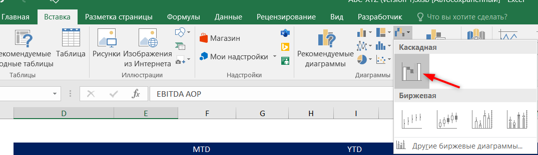
Получаем диаграмму, но ее еще предстоит немного доработать.
Смысл диаграммы Водопад в том, что она показывает, какие факторы повлияли на разницу между двумя значениями (в нашем случае, между планом и фактом).
Поэтому эти два значения, стартовое и финишное (план и факт) должны быть зафиксированы по краям, как на картинке.
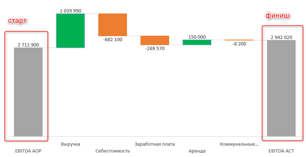
По умолчанию же в диаграмме Каскад стартовое и финишное значения не зафиксированы. Это происходит потому, что excel не знает, какие значения вы выберите за итоговые (они могут быть и посередине диаграммы, не только по краям).
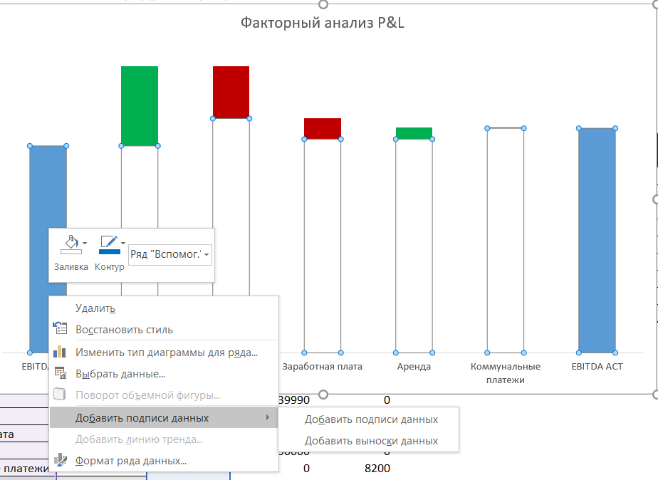
Доработаем диаграмму. Для этого дважды щелкам левой кнопкой мыши на первом столбике диаграммы (он должен быть ярко выделен, а остальные столбики становятся полупрозрачными), а затем правая кнопка мыши и выбираем пункт Установить как итоговое значение.
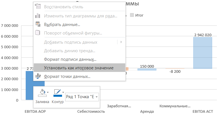
Столбик перекрасился в серый цвет. Это означает, что он стал итоговым значением (стартовым). Если не нравится цвет, его можно изменить.
Точно так же поступаем с последним столбиком. Всё, наша диаграмма Каскад, или Водопад в Excel, приобрела осмысленный вид.
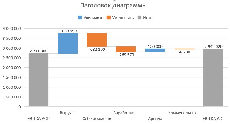
Осталось немного подправить внешний вид. Лучше удалить легенду, потому что она не несет смысловой нагрузки в данном случае. Также неплохо бы убрать горизонтальную сетку, потому что она мешает видеть дополнительные линии-перемычки между столбиками.
Еще я обычно убираю ось значений, т.к. здесь она тоже не имеет большого смысла (цифры и так выведены возле столбиков). Ну и конечно же надо изменить заголовок диаграммы.
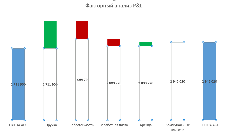
Способ 2. Построение диаграммы Водопад при помощи вспомогательных столбцов
Для тех, кто не является счастливым обладателем новых версий excel, существует обходной путь построения такого каскада. Но придется немного поработать с формулами.
Создадим такую же дополнительную таблицу, как в первом способе.
Добавим еще 3 вспомогательных столбца и пропишем в них формулы, как на картинке. В столбце Отклонения+ будут выводиться положительные значения отклонений, в Отклонения-, соответственно, отрицательные. А столбец Вспомог. нужен для того, чтобы “поднимать” столбик гистограммы на определенную высоту.
Важно, чтобы столбец Вспомог. находился перед столбцами с отклонениями.
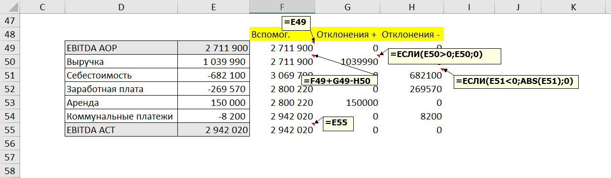
Обратите внимание, что для отрицательных значений используется формула ABS, эта формула выводит число по модулю, т.е.отрицательное становится положительным. В данном случае это нужно для правильного построения, чтобы столбик не ушел в отрицательное поле.
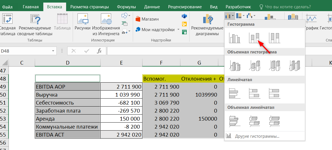
Выделим вспомогательные столбцы и столбец с названиями категорий и перейдем во вкладку Вставка — Диаграммы — Гистограмма с накоплением.
Получилась “сырая” диаграмма, которую мы будем дорабатывать, чтобы получить диаграмму Водопад. Необходимо убрать заливку у всех синих столбиков, кроме крайних. Для этого нужно дважды щелкнуть на каждом столбике — откроется окно Формат точки данных — указать Нет заливки.
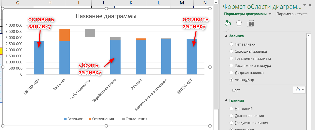
Если окно с форматом не открылось по двойному щелчку, можно вывести его по правой кнопке мыши.
Так же, как и в предыдущем способе, уберем линии сетки, легенду и ось (но это не обязательно) и переименуем диаграмму.
Диаграмма почти готова.
Осталось только по необходимости изменить цвет столбцов и вывести числовые данные в диаграмму.
Щелкнем правой кнопкой мыши на синем столбике, и выберем Добавить подписи данных.
После этого появятся числовые значения, но они появятся для всего ряда, в том числе и для вспомогательных столбцов без заливки.
Их придется удалить вручную, дважды щелкнув на каждом из них и нажав Delete.
Теперь сделаем то же самое для столбиков с положительными значениями. Как видно, для других столбиков также появились лишние нули, которые также нужно удалить.
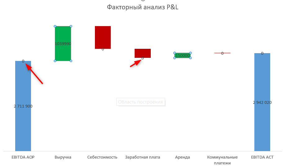
И третий раз повторим все действия для столбиков с отрицательными значениями.
Осталось только выровнять цифры в столбиках.
Диаграмма Водопад в Excel, построенная таким способом, с использованием вспомогательных столбцов, получилась очень похожей на диаграмму из первого способа. За исключением дополнительных перемычек между столбиками.
Это достаточно распространенный обходной путь построения диаграммы Водопад для факторного анализа в Excel.
Единственный минус, что при изменении данных иногда придется повторно дорабатывать диаграмму. Например, если положительные значения стали отрицательными, то придется заново добавить подписи данных, потому что иначе они не появятся возле столбиков.
![]() Сообщество Excel Analytics | обучение Excel
Сообщество Excel Analytics | обучение Excel
![]() Канал на Яндекс.Дзен
Канал на Яндекс.Дзен
Вам может быть интересно: