Data Visualization is the representation of data in a graphical format. It makes the data easier to understand. Data Visualization can be done using tools like Tableau, Google charts, DataWrapper, and many more. Excel is a spreadsheet that is used for data organization and data visualization as well. In this article, let’s understand Data Visualization in Excel.
Excel provides various types of charts like Column charts, Bar charts, Pie charts, Linecharts, Area charts, Scatter charts, Surface charts, and much more.
Steps for visualizing data in Excel:
- Open the Excel Spreadsheet and enter the data or select the data you want to visualize.
- Click on the Insert tab and select the chart from the list of charts available or the shortcut key for creating chart is by simply selecting a cell in the Excel data and press the F11 function key.
- A chart with the data entered in the excel sheet is obtained.
- You can design and style your chart with different types of styles and colors by selecting the design tab.
- In Excel 2010, the design tab option is visible by clicking on the chart.
Example 1:
The Excel data is as follows:
The column chart obtained for the data by following the above steps:
Example 2:
When excel data contains multiple columns and if you want to make a chart for only a few columns, then select the columns required for making the chart and press the ‘F11’ function key or click on the Insert tab and select the chart from the list of charts available.
We can also select the required data columns by doing right-click on the chart and click on the ‘select data‘ option. Now, data can be added or removed for making the chart.
For swapping rows and columns in the chart, use the ‘Switch Row/Column‘ option available in the design tab.
We can also make different types of charts for the same spreadsheet data by clicking on the ‘Change Chart Type’ option in the Design tab.
To make your chart more clear, use the ‘Layout’ tab. In this tab, you can more changes to your chart like editing the chart title, adding labels to your chart, adding a legend, and adding horizontal or vertical grid lines.
Example 3: Formatting Chart Area
To format the chart area, right-click on the chart and select the option ‘Format chart Area‘.
The format chart area provides various options for formatting the chart like Filling the chart with patterns and solid colors, Border colors, Styles for borders, the shadow effect for your chart, and many more. Formatting makes the chart look more attractive and colorful.
Example 4: Creating Sparklines
Sparklines in Excel are small charts that fit in the data cells of the excel sheets.
Steps for Creating Spark Lines:
- Select the Excel data range for sparklines as shown in the below figure.
- Click on Sparklines in the Insert tab and select any one of the three sparklines.
- Add the Location Range and Data Range for the creation of sparklines and click ok.
Finally, the F, G, H columns are displayed with the line, column, and Win/loss sparklines.
We can also color these sparklines by the Design tab as shown below:
We can Mark data points and also change Sparkline Color.
One of the most valuable and abundant resources businesses have at their disposal is data. With vast amounts of data being generated every minute of every day, the insights gleaned can inform virtually every business decision—often resulting in favorable outcomes.
There are many data visualization tools on the market designed for creating illustrations for business purposes. Fortunately, one of the most popular and easy-to-use options is likely already installed on your computer: Microsoft Excel.
If you don’t have access to Microsoft Excel, consider using free options like Google Sheets for a similar, albeit more limited, experience.
While Excel isn’t visualization software, it’s a versatile, powerful tool for professionals of all levels who want to analyze and illustrate datasets. Here are the types of data visualizations you can create in Excel and the steps involved in doing so, along with some tips to help you along the way.
Free E-Book: A Beginner’s Guide to Data & Analytics
Access your free e-book today.
Types of Data Visualizations in Excel
There are different data visualization techniques you can employ in Excel, depending on the data available to you and the goal you’re trying to achieve, including:
- Pie charts
- Bar charts
- Histograms
- Area charts
- Scatter plots
Other visualization techniques can be used to illustrate large or complex data sets. These include:
- Timelines
- Gantt charts
- Heat maps
- Highlight tables
- Bullet graphs
More advanced visualizations, such as those that include graphic elements like geographical heat maps, may not be possible to create in Excel or require additional tools.
Related: 6 Data Visualization Examples to Inspire Your Own
How to Create Data Visualizations in Excel
The steps involved in creating data visualizations in Excel depend on the type of graph or chart you choose. For basic visualizations, the process is largely the same. More complex datasets and illustrations may require additional steps.
To craft a data visualization in Excel, start by creating an organized spreadsheet. This should include labels and your final dataset.
Then, highlight the data you wish to include in your visual, including the labels. Select “insert” from the main menu and choose the type of chart or graph you’d like to create. Once you’ve made your selection, the visualization will automatically appear in your spreadsheet.
Right-click on the chart or graph to edit details, such as the title, axes labels, and colors. Doing so will open a pop-up or side panel that includes options to add a legend, adjust the scale, and change font styles and sizes.
Your browser cannot play the provided video file.
Tips for Creating Visualizations in Excel
1. Choose the Right Type of Visualization
To create an effective data visualization, it’s critical to choose the right type of chart or graph. Consider the type of data you’re using, the size of your dataset, and your intended audience.
A mismatch between the type of data being leveraged and the visual used to present it can be detrimental to viewers’ understanding of the information. Whether you’re working with qualitative or quantitative data, for example, impacts how you should display the information.
Your intended audience also influences how simplified or complex your illustration should be. For instance, when presenting to a large audience or high-level stakeholders, it’s helpful to distill your presentation to highlight key trends and insights rather than individual data points.

2. Remove Irrelevant or Inaccurate Data
Ultimately, your visualization’s quality is only as good as that of the data you use. For this reason, it’s important to clean data after it’s been collected to remove any irrelevant or inaccurate information. This process is often referred to as data wrangling or data cleaning.
Failure to thoroughly clean data prior to using it can be detrimental to its integrity and lead to inaccurate or misleading data visualizations.
Related: What Is Data Integrity & Why Does It Matter?
3. Provide Context For the Visualization
If necessary, include a key or legend and additional context to help viewers make sense of your illustration.
For example, consider a heatmap that shows the frequency of COVID-19 infections in a location over a specific period. To form a clear understanding of the information being presented, viewers need to know details such as the period being examined, the data source, and what each color means.
This context is important because it helps viewers interpret the information being displayed. Without a key clearly defining the coloring system, for instance, it would be virtually impossible to know what each color indicates, rendering the heatmap useless.
4. Tell A Story
Finally, the key to crafting a compelling visualization is to use data to tell a story. If the data illustrates a trend or supports a hypothesis, your visualization should make that clear. After all, the purpose of visualizations is to present findings in a way that’s easy for viewers to digest and understand.
Telling a story not only makes your visualization more interesting and engaging but also aids in data-driven decision-making. In addition, it helps stakeholders understand the essence of your findings and, in turn, informs their decision-making processes.

Making Data-Backed Business Decisions
Data visualization is a powerful tool when it comes to addressing business questions and making informed decisions. Learning how to create effective illustrations can empower you to share findings with key stakeholders and other audiences in a manner that’s engaging and easy to understand.
You don’t have to be in an analytics or data science role to take advantage of data visualizations. Professionals of all levels and backgrounds can develop data skills to more effectively communicate within their organizations and make informed decisions.
Are you interested in improving your analytical skills? Learn more about Business Analytics—one of the three courses that comprise CORe—which teaches you how to apply analytical techniques in Excel to solve real business problems.
Содержание
- Tutorial: Visualize Streaming Data in Excel
- Prerequisites
- Visualize the Current Value for Connected Sensors
- Visualize Values Over Time for Connected Sensors
- Data Visualization in Excel
- Steps for visualizing data in Excel:
- Steps for Creating Spark Lines:
- About the Data Visualizer add-in for Excel
- Can I use the Data Visualizer add-in?
- Where do I find the Data Visualizer add-in?
- The Add-ins button in Excel is grayed out
- Centralized deployment of the Data Visualizer add-in
- Is the data in my diagram kept private?
- Why do I have to sign in to use the add-in?
- The add-in asks me to sign in, but when I try to it doesn’t work
- Delete the add-in from a worksheet
- Please enable cookies in your browser
- What’s the best way to share a diagram made with the add-in?
- Where should I edit the diagram? In the desktop app or the web app?
- Create a Visio file, if you like
- I created a diagram, but now when I go back to the Excel file, it’s not there
- Create a diagram in Excel with the Visio Data Visualizer add-in
- Start with the Visio Data Visualizer add-in
- Modify the data-linked table to customize your diagram
- Tips for modifying the data table
- View, print, or share your Visio diagram
- Edit the diagram with a Visio subscription
- Do basic editing with Visio for the web
- Do advanced editing with the Visio app
- How the data table interacts with the Data Visualizer diagram
Tutorial: Visualize Streaming Data in Excel
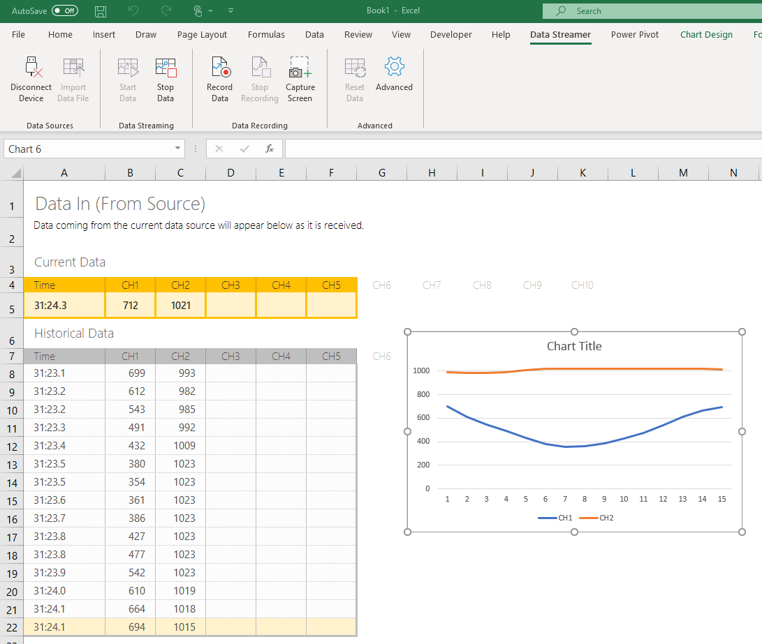
Creating a chart from streaming data helps maximize the visual impact of your data for your audience. Learn below how to create dynamic charts from your streaming data.
In this tutorial, you learn how to:
- Visualize the current value for connected sensors
- Visualize values over time for connected sensors
Prerequisites
- Data Streamer Enabled
- Sensor data streaming into Data In page of Excel
Visualize the Current Value for Connected Sensors
- Go to the Data In worksheet in your workbook.
- Select the current data for the channels you wish to visualize, as found in Row 5.
- Select Insert > Recommended Charts.
- Select a desired chart from either this recommended list or from the All Charts tab. By default, try a column chart.
- Select OK to add the selected chart to your Excel sheet.
- Select Data Streamer > Stop Data to halt streaming data, to allow axis edits.
- Select the value axis and set the bounds for this axis.
Now, when Data Streamer > Start Data has been selected, this chart visualizes the latest sensor values.
Visualize Values Over Time for Connected Sensors
- Select the full range of historical data for the channels you wish to visualize.
- Select Insert > Recommended Charts.
- Go to All Charts and select a Line or Scatter chart for your visualization.
- The selected chart should shows the same number of unique Series as selected Channels.
- Select OK to add the selected chart to your Excel sheet.
- Select Data Streamer > Stop Data to halt streaming data, to allow axis edits.
- Select the value axis and set the bounds for this axis.
Now, when Data Streamer > Start Data has been selected, this chart visualizes the change in values over time for your sensors.
Источник
Data Visualization in Excel
Data Visualization is the representation of data in a graphical format. It makes the data easier to understand. Data Visualization can be done using tools like Tableau, Google charts, DataWrapper, and many more. Excel is a spreadsheet that is used for data organization and data visualization as well. In this article, let’s understand Data Visualization in Excel.
Excel provides various types of charts like Column charts, Bar charts, Pie charts, Linecharts, Area charts, Scatter charts, Surface charts, and much more.
Steps for visualizing data in Excel:
- Open the Excel Spreadsheet and enter the data or select the data you want to visualize.
- Click on the Insert tab and select the chart from the list of charts available or the shortcut key for creating chart is by simply selecting a cell in the Excel data and press the F11 function key.
- A chart with the data entered in the excel sheet is obtained.
- You can design and style your chart with different types of styles and colors by selecting the design tab.
- In Excel 2010, the design tab option is visible by clicking on the chart.
Example 1:
The Excel data is as follows:
The column chart obtained for the data by following the above steps:
Example 2:
When excel data contains multiple columns and if you want to make a chart for only a few columns, then select the columns required for making the chart and press the ‘F11’ function key or click on the Insert tab and select the chart from the list of charts available.
We can also select the required data columns by doing right-click on the chart and click on the ‘select data‘ option. Now, data can be added or removed for making the chart.
For swapping rows and columns in the chart, use the ‘Switch Row/Column‘ option available in the design tab.
We can also make different types of charts for the same spreadsheet data by clicking on the ‘Change Chart Type’ option in the Design tab.
To make your chart more clear, use the ‘Layout’ tab. In this tab, you can more changes to your chart like editing the chart title, adding labels to your chart, adding a legend, and adding horizontal or vertical grid lines.
Example 3: Formatting Chart Area
To format the chart area, right-click on the chart and select the option ‘Format chart Area‘.
The format chart area provides various options for formatting the chart like Filling the chart with patterns and solid colors, Border colors, Styles for borders, the shadow effect for your chart, and many more. Formatting makes the chart look more attractive and colorful.
Example 4: Creating Sparklines
Sparklines in Excel are small charts that fit in the data cells of the excel sheets.
Steps for Creating Spark Lines:
- Select the Excel data range for sparklines as shown in the below figure.
- Click on Sparklines in the Insert tab and select any one of the three sparklines.
- Add the Location Range and Data Range for the creation of sparklines and click ok.
Finally, the F, G, H columns are displayed with the line, column, and Win/loss sparklines.
We can also color these sparklines by the Design tab as shown below:
We can Mark data points and also change Sparkline Color.
Источник
About the Data Visualizer add-in for Excel
Have a question about using Data Visualizer add-in with Excel? Here are some important things to know.
Can I use the Data Visualizer add-in?
This table gives a general description of which features are available depending on which license you have.
Microsoft 365 1
Create a diagram with the add-in for Excel
Refresh the diagram from the latest data
View, print and share diagram with Visio for the web
Basic diagram editing with Visio for the web
Advanced features in Visio Desktop app 2
1 The add-in requires you to sign in with your Microsoft 365 work or school account to use the features described in the table above. If you choose not to sign in, you can still create the diagram with the add-in. But the View, Print, Share, and Edit abilities are only available when you’re signed in.
2 See Create a diagram for details about custom editing or advanced features.
Where do I find the Data Visualizer add-in?
It’s an add-in for Excel that allows you to create a Visio diagram from Excel data without having to install Visio.
In Excel for Microsoft 365 or Excel for Microsoft 365 for Mac, on the Insert tab of the ribbon, select Get Add-ins or Add-ins. Then search for Visio Data Visualizer .
In Excel for the web, on the Insert tab of the ribbon, select Office Add-ins. Then search for Visio Data Visualizer .
See Create a diagram for full details.
The Add-ins button in Excel is grayed out
Some organizations choose to disable add-ins to have greater control over what users install on their systems. This is done by an Microsoft 365 administrator. Often when an admin has disabled add-ins, an alternative «centralized deployment» system for add-ins can or will be set up. You can ask your administrator to do this. Your administrator can get help from the two links below.
Centralized deployment of the Data Visualizer add-in
Is the data in my diagram kept private?
Yes. The Data Visualizer add-in uses an online service to generate your diagrams. The data you enter in the add-in is sent via a secure protocol to the service in the Microsoft cloud, a diagram is generated by the service, then the diagram is sent back to your computer. None of your data is saved in the Microsoft cloud. So you need to be connected to the internet to generate your diagram, but Microsoft doesn’t save that data. If you end up saving the diagram in your OneDrive, that diagram is privately controlled by you.
Why do I have to sign in to use the add-in?
Without signing in, you can use the add-in to create a diagram in Excel and save the workbook. But if you want to share the diagram as a Visio file or edit the diagram in Visio, you’ll have to sign in with the work or school account associated with your Microsoft 365 subscription.
The Data Visualizer add-in doesn’t support personal Microsoft 365 accounts (hotmail, outlook.com, etc.). See The Data Visualizer add-in is designed for Microsoft 365 work and school accounts for details.
The add-in asks me to sign in, but when I try to it doesn’t work
In some versions of Microsoft Edge, the sign-in process for using the add-in is currently not working. You can get around this problem by upgrading to a new version of Microsoft Edge or using a different supported browser (such as Google Chrome or Mozilla Firefox).
Delete the add-in from a worksheet
To delete an instance of the add-in that you no longer need or want:
Point at the outermost border of the add-in. When you do so, the mouse pointer turns into a four-headed arrow:
Click to select.
With the frame of the add-in selected, press the Delete key.
Please enable cookies in your browser
We use cookies in the Data Visualizer add-in to make note of the preferences you select when you sign in. Therefore, cookies must be enabled in your browser for you to use the add-in.
To enable cookies in your web browser, open the browser’s Settings and look for a Privacy category. That’s where you can enable cookies, which may also be known as Trackers in some browsers.
With the Data Visualizer add-in, you don’t need Visio to create a diagram. The same is true for sharing the diagram with others:
Select Open in Web from the ellipses (. ) in the add-in header. This will open in the diagram in Visio for the web. Select the Share button to create a link or to enter the email addresses of those you want to share with. All Microsoft 365 users will be able to view the diagram in their favorite browser.
Alternatively, if you want to share both the data and the diagram, share the Excel workbook that contains the diagram with others. To share it, attach the workbook to an email message, or save it in OneDrive and then use the Share button to send a link. See Share OneDrive files for more details.
Where should I edit the diagram? In the desktop app or the web app?
Visio for the web lets you quickly make basic edits to a diagram right in a web browser. If you want to augment the diagram in advanced ways, such as using custom shapes in the diagram, using two-way synchronization between the data and the diagram, or applying data graphics to your diagram, then you’ll need to use the Visio desktop app.
Create a Visio file, if you like
The add-in allows you to create a Visio diagram without ever opening Visio. You use a table of a data in Excel to describe what the diagram should look like, then the diagram is drawn for you right on your Excel worksheet.
You can share the diagram by sending the Excel workbook to other people.
But if you have a subscription to Visio or if you own the Visio desktop app, you may also work further with the diagram in Visio. To do that, simply select Edit on the toolbar at the top of the add-in drawing canvas. At that point, a Visio .vsdx file containing the diagram will be saved to your OneDrive account, and the file will be opened in Visio. After that, you can do basic editing and share the file with others (in Visio for the web), or you can do full editing plus sharing with others (in the Visio desktop app).
I created a diagram, but now when I go back to the Excel file, it’s not there
When you are using the following versions of Windows 10 and Excel together, the Data Visualizer add-in doesn’t work properly:
Windows version 1903 (May Update 19H1)
Excel version 16.0.11629.20246
The result is that after you create a diagram in Excel, close the file, and then return to it later, the diagram won’t be there in the file.
The specific version of Excel that has this problem is from the Microsoft 365 Current Channel release in June 2019. Newer versions are available. To work around this problem, update to a newer release. See Install Office updates for details on how to do that.
Источник
Create a diagram in Excel with the Visio Data Visualizer add-in
Create stunning, high-quality diagrams with the Visio Data Visualizer add-in for Excel with a Microsoft 365 work or school account.
You can create basic flowcharts , cross-functional flowcharts , and organizational charts . The diagrams are drawn automatically from data in an Excel workbook. If you then edit the diagram in Visio, your changes are synced back to Excel.
This means you don’t need a Visio subscription to make stunning diagrams in Excel. View, print, or share your diagrams with others for free in the web version of Visio. For additional editing capabilities, you need either a Visio Plan 1 or Visio Plan 2 subscription.
Note: The Visio Data Visualizer add-in is supported in all the languages supported by Visio for the web. A complete list of the languages is shown at the end of this article.
Start with the Visio Data Visualizer add-in
The Data Visualizer add-in is available for Excel on PC, Mac, and the browser with a Microsoft 365 work or school account.
(If the only Microsoft account you have is a personal one—that is, hotmail.com, live.com, outlook.com, or msn.com—you can still try out parts of the Data Visualizer add-in without signing in. It just means that the features available to you are somewhat limited. Read The Data Visualizer add-in is designed for Microsoft 365 work and school accounts for more details.)
Open Excel and create a new Blank workbook.
Save the workbook to a OneDrive or SharePoint location for seamless sharing and the optimal experience. You can also save your file locally to your computer.
Ensure that an empty cell is selected in the workbook.
Select Insert > Get Add-ins or Add-ins. In the Office Add-ins Store, search for “Data Visualizer», and then select Add. If you see a security message regarding the add-in, select Trust this add-in.
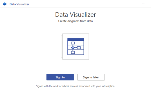
Sign in with the account associated with your Microsoft 365 work or school subscription, or select Sign in later.
In the add-in, we no longer support manual sign-in («ADAL»). But we automatically detect your identity and sign you in. If we can’t sign you in, it means your version of Excel doesn’t work with the add-in. You can fix this by using Excel for the web or upgrading to Excel for Microsoft 365.
Note: When you’re signed in, you unlock capabilities in Visio for the web such as printing, sharing, and viewing in the browser. You don’t need a Visio subscription to use this add-in, but if you have one, you’ll also be able to make edits to your diagram.
If you see a permissions prompt, select Allow.
As an alternative to the procedure above, you can download our add-in ready templates to get started in Excel:
Modify the data-linked table to customize your diagram
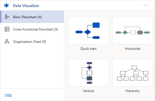
Choose a diagram type and then select the template you’d like to work with. This will insert a sample diagram and its data-linked table. That process may take a minute. The templates come with different layout and theme options that can be further customized in Visio.
If you’re signed in, the diagram is saved as a Visio file in your OneDrive or SharePoint location. If you’re not signed in, then the diagram is part of your Excel workbook instead. You can always choose to create a Visio file by signing in.
To create your own diagram, modify the values in the data table. For example, you can change the shape text that will appear, the shape types, and more by changing the values in the data table.
For more information, see the section How the data table interacts with the Data Visualizer diagram below and select the tab for your type of diagram.
Add or remove shapes for steps or people by adding or removing rows in the data table.
Connect shapes to design the logic of your diagram by entering the IDs of the connected shapes in the corresponding table column for your diagram type.
After you’ve finished modifying the data table, select Refresh in the diagram area to update your visualization.
Note: If there is an issue with the source data table, the Data Checker will appear with instructions on how to fix the issue. After you modify the table, select Retry in the Data Checker to confirm the issue is resolved. Then you’ll see the updated diagram.
Tips for modifying the data table
Save the Excel workbook (if you’re working in the Visio client) and Refresh frequently.
Consider sketching out the logic of your diagram on paper first. This may make it easier to translate into the data table.
You can open the Data Visualizer flowchart in Visio for the web to view, print, or share your diagram with others. Learn how:
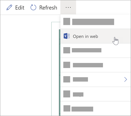
To view the diagram outside of Visio for the web, select the ellipses ( . . .) in the diagram area and select Open in web.
Note: If you’re not signed in yet, you’ll be prompted to sign in with your Microsoft 365 work or school account.* Select Sign in and then Allow or Accept on any permission prompts.
After the Visio file is created, select Open file.
In Visio for the web, select the ellipses ( . . .) > Print to print your diagram.
To share your diagram, select the Share button to create a link or to enter the email addresses of those you want to share with.
Edit the diagram with a Visio subscription
If you have a subscription to Visio, you can do more with the diagram. Add text or images, apply design themes, and make other modifications to customize the diagram.
Do basic editing with Visio for the web
Use Visio for the web for basic editing in the browser, such as changing themes, modifying layouts, formatting shapes, adding text boxes, etc.
In the diagram area in Excel, select Edit 
Note: If you’re not signed in yet, you’ll be prompted to sign in with your Microsoft 365 or Microsoft 365 work or school account. Select Sign in and then Allow or Accept on any permission prompts.
Make your changes to the diagram in Visio for the web.
Add and format text
Home > Font options:
Change the theme
Design > Themes
Design > Theme Colors
Change the diagram’s layout
Design > Layout
If you want to add or modify a shape while still keeping the source data in sync, then edit the diagram with the Visio desktop app. Such changes made in Visio for the web can’t by synced back to the Excel source file.
When you’re done editing the diagram, go back to the Excel file and select Refresh 
Do advanced editing with the Visio app
Use the Visio desktop app for advanced edits, such as adding new shapes, modifying connections, and other changes to the structure of the diagram. The Visio app supports two-way sync, so any changes you make can be synced back to your Excel workbook where you can see your diagram changes after refreshing.
Note: To edit in the Visio app, you need a Visio Plan 2 subscription.
In the diagram area in Excel, select Edit.
Save and close your Excel file.
To edit in the Visio app and successfully sync changes, the Excel file with the data table and diagram must be closed.
In Visio for the web select Edit in Desktop App in the ribbon.
Select Open to confirm. If you receive a security warning asking if this Visio file is a trusted document, select Yes.
Make your changes to the diagram in the Visio app.
When you’re done, select the diagram container to see the Data Tools Design tab in the ribbon, and then select Update Source Data.
Note: If you try to update the source data and the link to the Visio data is broken, Visio prompts you to relink. Select the diagram area in Visio, and under the Data Tools Design tab select Relink Source Data. Browse to the Visio workbook with the source table, select Relink, then Update Source Data again.
Now that your data has synced back to your Excel workbook, save your Visio file—preferably in the same location as your Excel file.) Close the Visio file.
Open the Excel file and select Refresh in the diagram area to see your changes.
Note: If you run into a Refresh Conflict, you can refresh the diagram. You’ll lose any edits you’ve made, but any formatting changes to the shapes or connectors inside the container are preserved.
Microsoft 365 subscribers who have Visio Plan 2 can use Data Visualizer templates to get more advanced diagramming features, such as those listed below. See Create a Data Visualizer diagram for more details:
Create a diagram using custom stencils
Bring your diagram to life with data graphics
Have two-way synchronization between the data and the diagram
How the data table interacts with the Data Visualizer diagram
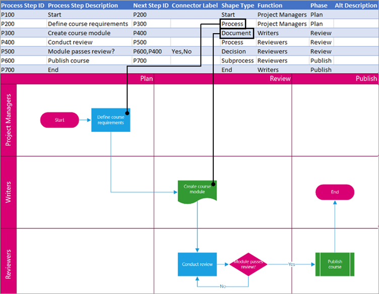
Each column of the table uniquely identifies an important aspect of the flowchart that you see. See the reference information below to learn more about each column and how it applies and affects the flowchart.
A number or name that identifies each shape in the diagram. This column is required, and each value in the Excel table must be unique and not be blank. This value does not appear on the flowchart.
This is the shape text that is visible in the diagram. Describe what occurs in this step of the process. Consider also adding a similar or more descriptive text to the Alt text column.
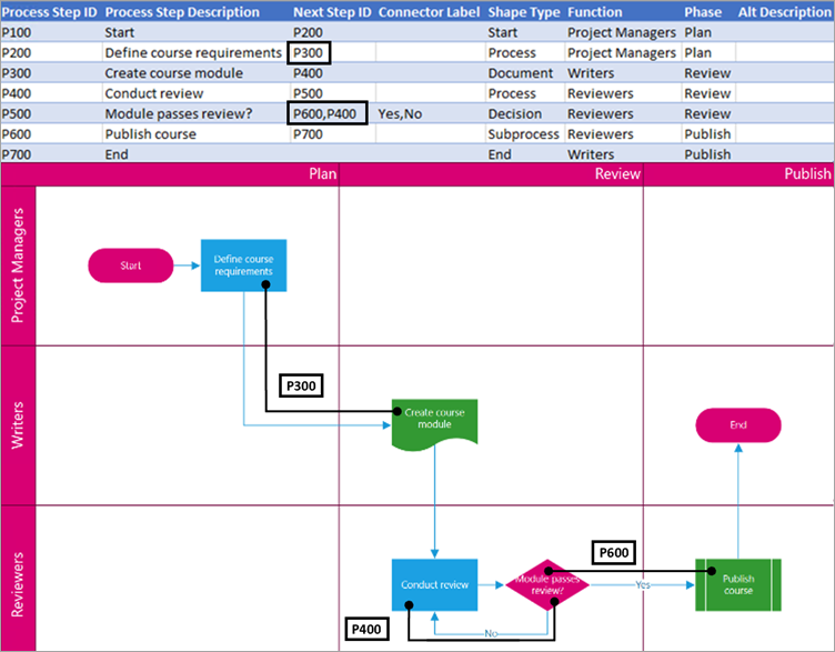
The Process Step ID of the next shape in the sequence. A branching shape has two next steps and is represented by comma-separated numbers such as P600,P400. You can have more than two next steps.
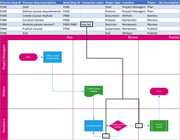
For branching shapes, connector labels are represented as text separated by a comma, such as Yes,No. Yes corresponds to P600 and No corresponds to P400 in the example. Connector labels are not required.
The type of shape you want to represent in the Visio diagram, such as Process or Decision. Select a cell in the column and choose from the list of Shape Types.
For more information on flow charts and their shapes, see Create a basic flowchart and Create a cross-functional flowchart.
The function (or swimlane) that each shape belongs to. Use the Function and Phase columns to help you organize different stakeholders in your flowchart. This column only applies to a Cross-Functional Flowchart and isn’t included as part of the Basic Flowchart diagram.
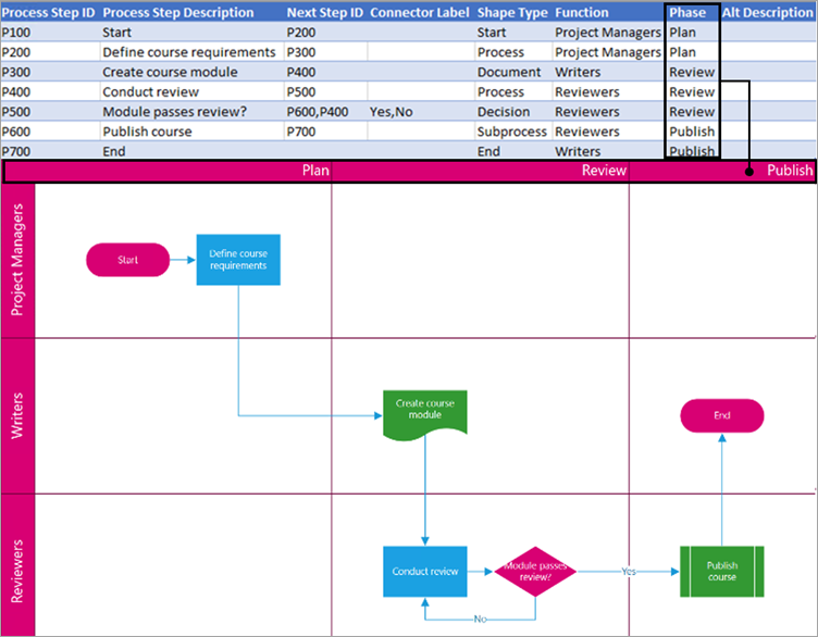
The phase (or timeline) that each shape belongs to. Use the Function and Phase columns to help you organize different stakeholders in your flowchart. This column only applies to a Cross-Functional Flowchart and isn’t included as part of the Basic Flowchart diagram.
Alt text is used by screen readers to assist those with visual impairments. You can view alt text you’ve entered as part of the Shape Info of a shape. Entering descriptive alt text is not required, but recommended.
Each column of the table uniquely identifies an important aspect of the organization chart that you see. See the reference information below to learn more about each column and how it applies and affects the diagram.
A number that identifies each employee in your organization chart. This column is required, and each value in the Excel table must be unique and not blank. This value doesn’t appear in the diagram.
Enter the full name of the employee you want to associate with the employee ID number. This text displays in the diagram as shape text.
Provide additional details for the employee by entering the job title or role. This text displays in the diagram shapes underneath the employee’s name.
To create the structure of the organization chart, use this column to identify the manager of each employee. You can leave it blank for those who don’t report to anyone. You’ll enter the corresponding employee ID from the first column. You can also separate multiple managers using a comma.
Organization charts in the add-in come with different role types for you to choose from. Select a field under the Role Type column to choose a role that best describes the employee. This will change the color of the shape in the diagram.
Источник
Create stunning, high-quality diagrams with the Visio Data Visualizer add-in for Excel with a Microsoft 365 work or school account.
You can create basic flowcharts, cross-functional flowcharts, and organizational charts. The diagrams are drawn automatically from data in an Excel workbook. If you then edit the diagram in Visio, your changes are synced back to Excel.
This means you don’t need a Visio subscription to make stunning diagrams in Excel. View, print, or share your diagrams with others for free in the web version of Visio. For additional editing capabilities, you need either a Visio Plan 1 or Visio Plan 2 subscription.
Note: The Visio Data Visualizer add-in is supported in all the languages supported by Visio for the web. A complete list of the languages is shown at the end of this article.
Start with the Visio Data Visualizer add-in
The Data Visualizer add-in is available for Excel on PC, Mac, and the browser with a Microsoft 365 work or school account.
(If the only Microsoft account you have is a personal one—that is, hotmail.com, live.com, outlook.com, or msn.com—you can still try out parts of the Data Visualizer add-in without signing in. It just means that the features available to you are somewhat limited. Read The Data Visualizer add-in is designed for Microsoft 365 work and school accounts for more details.)
-
Open Excel and create a new Blank workbook.
-
Save the workbook to a OneDrive or SharePoint location for seamless sharing and the optimal experience. You can also save your file locally to your computer.
-
Ensure that an empty cell is selected in the workbook.
-
Select Insert > Get Add-ins or Add-ins. In the Office Add-ins Store, search for “Data Visualizer», and then select Add. If you see a security message regarding the add-in, select Trust this add-in.
-
Sign in with the account associated with your Microsoft 365 work or school subscription, or select Sign in later.
In the add-in, we no longer support manual sign-in («ADAL»). But we automatically detect your identity and sign you in. If we can’t sign you in, it means your version of Excel doesn’t work with the add-in. You can fix this by using Excel for the web or upgrading to Excel for Microsoft 365.
Note: When you’re signed in, you unlock capabilities in Visio for the web such as printing, sharing, and viewing in the browser. You don’t need a Visio subscription to use this add-in, but if you have one, you’ll also be able to make edits to your diagram.
If you see a permissions prompt, select Allow.
As an alternative to the procedure above, you can download our add-in ready templates to get started in Excel:
Modify the data-linked table to customize your diagram
-
Choose a diagram type and then select the template you’d like to work with. This will insert a sample diagram and its data-linked table. That process may take a minute. The templates come with different layout and theme options that can be further customized in Visio.
-
If you’re signed in, the diagram is saved as a Visio file in your OneDrive or SharePoint location. If you’re not signed in, then the diagram is part of your Excel workbook instead. You can always choose to create a Visio file by signing in.
-
To create your own diagram, modify the values in the data table. For example, you can change the shape text that will appear, the shape types, and more by changing the values in the data table.
For more information, see the section How the data table interacts with the Data Visualizer diagram below and select the tab for your type of diagram.
-
Add or remove shapes for steps or people by adding or removing rows in the data table.
-
Connect shapes to design the logic of your diagram by entering the IDs of the connected shapes in the corresponding table column for your diagram type.
-
After you’ve finished modifying the data table, select Refresh in the diagram area to update your visualization.
Note: If there is an issue with the source data table, the Data Checker will appear with instructions on how to fix the issue. After you modify the table, select Retry in the Data Checker to confirm the issue is resolved. Then you’ll see the updated diagram.
Tips for modifying the data table
-
Save the Excel workbook (if you’re working in the Visio client) and Refresh frequently.
-
Consider sketching out the logic of your diagram on paper first. This may make it easier to translate into the data table.
View, print, or share your Visio diagram
You can open the Data Visualizer flowchart in Visio for the web to view, print, or share your diagram with others. Learn how:
-
To view the diagram outside of Visio for the web, select the ellipses (. . .) in the diagram area and select Open in web.
Note: If you’re not signed in yet, you’ll be prompted to sign in with your Microsoft 365 work or school account.* Select Sign in and then Allow or Accept on any permission prompts.
-
After the Visio file is created, select Open file.
-
In Visio for the web, select the ellipses (. . .) > Print to print your diagram.
-
To share your diagram, select the Share button to create a link or to enter the email addresses of those you want to share with.
Edit the diagram with a Visio subscription
If you have a subscription to Visio, you can do more with the diagram. Add text or images, apply design themes, and make other modifications to customize the diagram.
Do basic editing with Visio for the web
Use Visio for the web for basic editing in the browser, such as changing themes, modifying layouts, formatting shapes, adding text boxes, etc.
-
In the diagram area in Excel, select Edit
.
Note: If you’re not signed in yet, you’ll be prompted to sign in with your Microsoft 365 or Microsoft 365 work or school account. Select Sign in and then Allow or Accept on any permission prompts.
-
Make your changes to the diagram in Visio for the web.
To do this
Use
Add and format text
Home > Font options:
For more details, see Add and format text.
Change the theme
Design > Themes
Design > Theme Colors
For more details, see Apply a theme or theme color.
Change the diagram’s layout
Design > Layout
For more details, see Re-layout a diagram.
If you want to add or modify a shape while still keeping the source data in sync, then edit the diagram with the Visio desktop app. Such changes made in Visio for the web can’t by synced back to the Excel source file.
-
When you’re done editing the diagram, go back to the Excel file and select Refresh
to see your changes.
Do advanced editing with the Visio app
Use the Visio desktop app for advanced edits, such as adding new shapes, modifying connections, and other changes to the structure of the diagram. The Visio app supports two-way sync, so any changes you make can be synced back to your Excel workbook where you can see your diagram changes after refreshing.
Note: To edit in the Visio app, you need a Visio Plan 2 subscription.
-
In the diagram area in Excel, select Edit.
-
Save and close your Excel file.
To edit in the Visio app and successfully sync changes, the Excel file with the data table and diagram must be closed.
-
In Visio for the web select Edit in Desktop App in the ribbon.
-
Select Open to confirm. If you receive a security warning asking if this Visio file is a trusted document, select Yes.
-
Make your changes to the diagram in the Visio app.
-
When you’re done, select the diagram container to see the Data Tools Design tab in the ribbon, and then select Update Source Data.
Note: If you try to update the source data and the link to the Visio data is broken, Visio prompts you to relink. Select the diagram area in Visio, and under the Data Tools Design tab select Relink Source Data. Browse to the Visio workbook with the source table, select Relink, then Update Source Data again.
-
Now that your data has synced back to your Excel workbook, save your Visio file—preferably in the same location as your Excel file.) Close the Visio file.
-
Open the Excel file and select Refresh in the diagram area to see your changes.
Note: If you run into a Refresh Conflict, you can refresh the diagram. You’ll lose any edits you’ve made, but any formatting changes to the shapes or connectors inside the container are preserved.
Microsoft 365 subscribers who have Visio Plan 2 can use Data Visualizer templates to get more advanced diagramming features, such as those listed below. See Create a Data Visualizer diagram for more details:
-
Create a diagram using custom stencils
-
Create sub-processes
-
Bring your diagram to life with data graphics
-
Have two-way synchronization between the data and the diagram
How the data table interacts with the Data Visualizer diagram
Each column of the table uniquely identifies an important aspect of the flowchart that you see. See the reference information below to learn more about each column and how it applies and affects the flowchart.
A number or name that identifies each shape in the diagram. This column is required, and each value in the Excel table must be unique and not be blank. This value does not appear on the flowchart.

This is the shape text that is visible in the diagram. Describe what occurs in this step of the process. Consider also adding a similar or more descriptive text to the Alt text column.

The Process Step ID of the next shape in the sequence. A branching shape has two next steps and is represented by comma-separated numbers such as P600,P400. You can have more than two next steps.
For branching shapes, connector labels are represented as text separated by a comma, such as Yes,No. Yes corresponds to P600 and No corresponds to P400 in the example. Connector labels are not required.
The function (or swimlane) that each shape belongs to. Use the Function and Phase columns to help you organize different stakeholders in your flowchart. This column only applies to a Cross-Functional Flowchart and isn’t included as part of the Basic Flowchart diagram.

The phase (or timeline) that each shape belongs to. Use the Function and Phase columns to help you organize different stakeholders in your flowchart. This column only applies to a Cross-Functional Flowchart and isn’t included as part of the Basic Flowchart diagram.
Alt text is used by screen readers to assist those with visual impairments. You can view alt text you’ve entered as part of the Shape Info of a shape. Entering descriptive alt text is not required, but recommended.
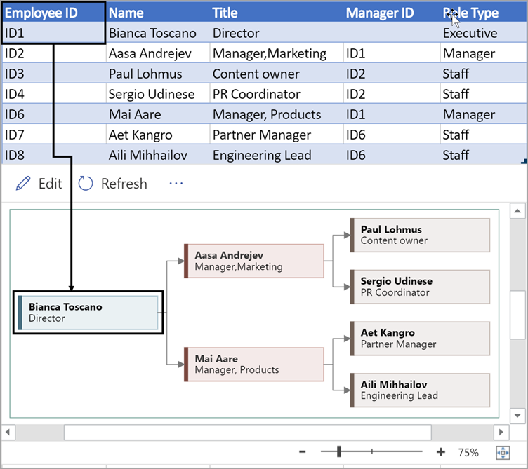
Each column of the table uniquely identifies an important aspect of the organization chart that you see. See the reference information below to learn more about each column and how it applies and affects the diagram.
A number that identifies each employee in your organization chart. This column is required, and each value in the Excel table must be unique and not blank. This value doesn’t appear in the diagram.
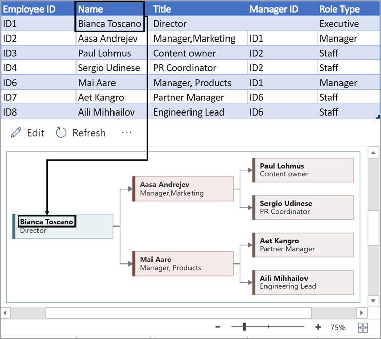
Enter the full name of the employee you want to associate with the employee ID number. This text displays in the diagram as shape text.
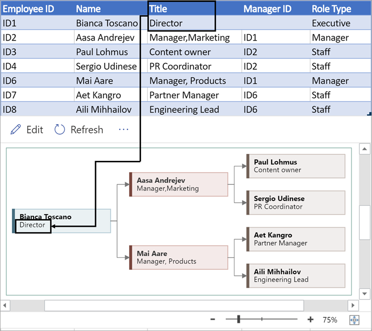
Provide additional details for the employee by entering the job title or role. This text displays in the diagram shapes underneath the employee’s name.
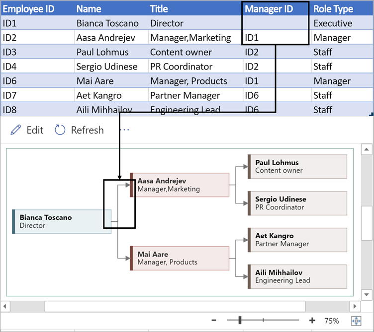
To create the structure of the organization chart, use this column to identify the manager of each employee. You can leave it blank for those who don’t report to anyone. You’ll enter the corresponding employee ID from the first column. You can also separate multiple managers using a comma.
Organization charts in the add-in come with different role types for you to choose from. Select a field under the Role Type column to choose a role that best describes the employee. This will change the color of the shape in the diagram.

Supported languages for the Data Visualizer add-in
Click the subheading to open the list:
-
Chinese (Simplified)
-
Chinese (Traditional)
-
Czech
-
Danish
-
Dutch
-
German
-
Greek
-
English
-
Finnish
-
French
-
Hungarian
-
Italian
-
Japanese
-
Norwegian
-
Polish
-
Portuguese (Brazil)
-
Portuguese (Portugal)
-
Romanian
-
Russian
-
Slovenian
-
Spanish
-
Swedish
-
Turkish
-
Ukrainian
See Also
About the Data Visualizer add-in for Excel
In today’s world, data is the new currency. Data is everywhere, and hence visualizing data is the first step in making sense out of data. If you ever wanted to do quick data visualization without the need of having a separate (license-based) tool, then this blog is just for you. In this series of blogs, we will discuss how to do Data Visualization using MS Excel. This doesn’t just bring about a whole new means of visualizing data but also form a crucial part of any Excel Certification Program.
In this article, you will get an insight into the ease of using MS Excel for data visualization. We shall discuss the following topics:
- Why Data Visualization for MS Excel?
- How to import data in excel?
- Visual Filtering using Slicer
- Bring life to your data using Conditional Formatting
Now the first question which comes to mind is,
There are many reasons why using Excel is an ideal choice for Data Visualization including but not limited to the following;
-
No need to pay separate license cost for other tools (as it is safe to assume that most of us have MS Excel installed on their computers)
-
Easy to use since there is no need to learn a separate tool
-
Easy to share the visualization (for example dashboard) with others as the receivers also don’t need a separate visualization tool.
Initial Data Visualization using Excel: Importing data in Excel
Many of the data files are directly in the .xlsx format so we can directly work with them. However, for other formats like CSV, etc Excel provides an easy to import them.
-
Open a new instance of MS Excel and on the top ribbon, click on the icon of Data. After clicking on it, you will get the following screen.
-
Excel provides an easy way to import the data from various formats like CSV, XML, JSON etc.
-
Click on the relevant data source. Choose the correct import options (for ex the delimiter in a CSV file), and the data will get imported into excel.For example: after importing a CSV file into excel, the data looks like this:
-
The next important step after loading the data is to convert it into a table.
-
To convert the data into a table, go to the Home icon and then click on the Format as Table option. Select the desired format and then select the entire data as the range. The data looks like this after converting into table format.
-
After converting to the table format, the data looks much more readable. Moreover, Excel recognizes it as Table which means that a lot of functions can be applied directly on the data like a filter, sort etc.
Initial Data Visualization using Excel: Visual filters using Slicer
One of the common operations which need to be performed on data is to apply data filters. Although filters can be applied by clicking on each attribute name, there is a better and more visual way of doing it i.e. the Slicer.
-
Click on the Insert icon and then click on the Slicer icon.
-
After clicking the Slicer, a dialog box called Insert Slicer will appear with all the attributes and a checkbox against them.
-
Click on the desired attribute name and press Ok. Please note that multiple attributes can also be selected. In this example, select Location and then press Ok.
-
After pressing Ok, a new dialog box with the name as Location gets opened. All the various Locations which are present in the data set can now be seen in the dialog box. Just click on any of the values to filter the data by that value.
-
To select multiple values, click on the icon on the top right (with three lines and checkbox).
Initial Data Visualization using Excel: Bringing life to your data using Conditional formatting
Conditional formatting helps in visually exploring and analyzing data, detecting issues, and identifying trends and patterns. Using Conditional formatting, it is very easy to highlight interesting cells or ranges of cells and visualize data by using data bars, color scales, and icon sets.
1. Data Bars
A data bar helps to analyze the value of a cell in comparison to other cells. The length of the data bar is directly proportional to the value in the cell. A longer bar represents a higher value, and a shorter bar represents a lower value. Data bars are useful in spotting higher and lower values, especially with large volumes of data.
-
Select all the values for any column whose values you can explore using the data bar. After selecting the values, click on Conditional Formatting Icon under the Home Menu. Once the drop-down appears, click on Data Bars option and select the desired color.
-
After selecting the desired color, the data in Total Revenue column will look like the below snapshot. Please observe that now just by eyeballing the data, it is very easy to make out the patterns in Total Revenue attribute.
2. Color Scales
Color scales are visual guides that helps in understanding data distribution and variation. A three-color scale helps in comparing a range of cells using a gradation of three colors. The shade of the color represents the higher, middle, or lower values. Similarly, in two-color scale, the shade of the color represents higher or lower values.
-
Select all the values for any column whose values you can explore using color scales. After selecting the values, click on Conditional Formatting Icon under the Home Menu. Once the drop-down appears, click on Color Scales option and select the desired color style.
-
After selecting the desired color style, the data in Temperature column like the below snapshot. Please observe that Excel displays the cooler temperatures in green, the hotter temperatures in red and the middle-temperature ranges in yellow.
3. Icon Sets
You can use Icon sets to classify data into various categories separated by a threshold value. Each icon represents a range of values.
-
Select all the values for any column whose values you can explore as icon sets. After selecting the values, click on Conditional Formatting Icon under the Home Menu. Once the drop-down appears, click on Icon Sets option and select the desired style.
-
After selecting the desired icon style of your choice, the data in Pamphlets columns will look like the snapshot below. Please observe that the star is filled as per the number of pamphlets distributed.
4. Top/Bottom Rules
You basically use Top/Bottom rules to quickly find and highlight top values, bottom values, average values etc.
-
Select all the values for any column wherein the Top or bottom values have to be highlighted. After selecting the values, click on Conditional Formatting Icon under the Home Menu. Once the drop-down appears, click on Top/Bottom Rules option and then multiple options can be seen.
-
After selecting the Top 10% option, select the desired color style. The data in Total Sales column will look like the below snapshot. In the illustration below, the top 10% values (2 values out of 22 values) are highlighted.
-
We can apply multiple rules in the same attribute. For example, the below illustration shows the top 10% values in red and bottom 10% values in yellow.
As illustrated in this blog, MS Excel is a powerful tool which provides many useful data visualization options like Slicer, Data Bars, Color Scales, Icon sets, Top/Bottom Rules etc. Using these options, one can quickly analyze data patterns and visually explore the data.
Hence, next time you are given some data, try using these options to make more sense out of your data. In the next blog, advanced data visualization techniques using MS Excel will be presented which will help in detailed data analysis.
Microsoft Excel is one of the simplest and powerful software applications available out there. The Advanced Excel Training Programme at Edureka helps you learn quantitative analysis, statistical analysis using the intuitive interface of MS Excel for data manipulation. The usage of MS Excel spans across different domains and professional requirements. There’s no better time than now to begin your journey!


