
Data Visualization is the representation of data in a graphical format. It makes the data easier to understand. Data Visualization can be done using tools like Tableau, Google charts, DataWrapper, and many more. Excel is a spreadsheet that is used for data organization and data visualization as well. In this article, let’s understand Data Visualization in Excel.
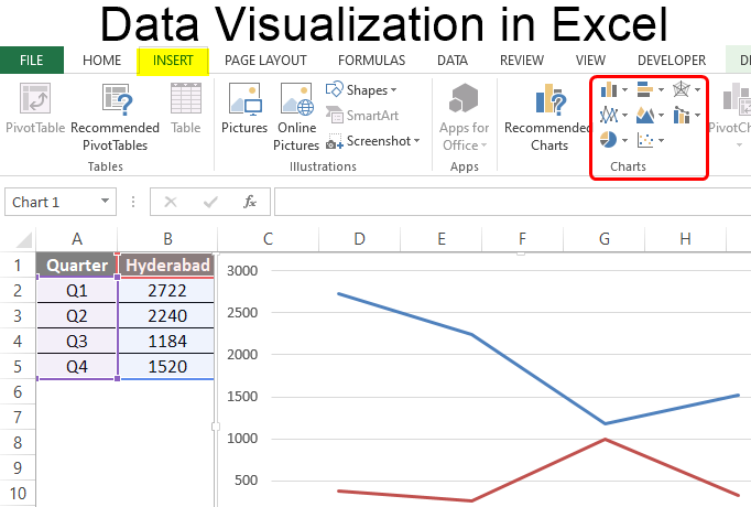
Excel provides various types of charts like Column charts, Bar charts, Pie charts, Linecharts, Area charts, Scatter charts, Surface charts, and much more.
Steps for visualizing data in Excel:
- Open the Excel Spreadsheet and enter the data or select the data you want to visualize.
- Click on the Insert tab and select the chart from the list of charts available or the shortcut key for creating chart is by simply selecting a cell in the Excel data and press the F11 function key.

- A chart with the data entered in the excel sheet is obtained.
- You can design and style your chart with different types of styles and colors by selecting the design tab.
- In Excel 2010, the design tab option is visible by clicking on the chart.

Example 1:
The Excel data is as follows:

The column chart obtained for the data by following the above steps:

Example 2:
When excel data contains multiple columns and if you want to make a chart for only a few columns, then select the columns required for making the chart and press the ‘F11’ function key or click on the Insert tab and select the chart from the list of charts available.


We can also select the required data columns by doing right-click on the chart and click on the ‘select data‘ option. Now, data can be added or removed for making the chart.

For swapping rows and columns in the chart, use the ‘Switch Row/Column‘ option available in the design tab.
We can also make different types of charts for the same spreadsheet data by clicking on the ‘Change Chart Type’ option in the Design tab.
To make your chart more clear, use the ‘Layout’ tab. In this tab, you can more changes to your chart like editing the chart title, adding labels to your chart, adding a legend, and adding horizontal or vertical grid lines.

Example 3: Formatting Chart Area
To format the chart area, right-click on the chart and select the option ‘Format chart Area‘.

The format chart area provides various options for formatting the chart like Filling the chart with patterns and solid colors, Border colors, Styles for borders, the shadow effect for your chart, and many more. Formatting makes the chart look more attractive and colorful.
Example 4: Creating Sparklines
Sparklines in Excel are small charts that fit in the data cells of the excel sheets.

Steps for Creating Spark Lines:
- Select the Excel data range for sparklines as shown in the below figure.
- Click on Sparklines in the Insert tab and select any one of the three sparklines.

- Add the Location Range and Data Range for the creation of sparklines and click ok.
Finally, the F, G, H columns are displayed with the line, column, and Win/loss sparklines.

We can also color these sparklines by the Design tab as shown below:

We can Mark data points and also change Sparkline Color.

One of the most valuable and abundant resources businesses have at their disposal is data. With vast amounts of data being generated every minute of every day, the insights gleaned can inform virtually every business decision—often resulting in favorable outcomes.
There are many data visualization tools on the market designed for creating illustrations for business purposes. Fortunately, one of the most popular and easy-to-use options is likely already installed on your computer: Microsoft Excel.
If you don’t have access to Microsoft Excel, consider using free options like Google Sheets for a similar, albeit more limited, experience.
While Excel isn’t visualization software, it’s a versatile, powerful tool for professionals of all levels who want to analyze and illustrate datasets. Here are the types of data visualizations you can create in Excel and the steps involved in doing so, along with some tips to help you along the way.
Free E-Book: A Beginner’s Guide to Data & Analytics
Access your free e-book today.
Types of Data Visualizations in Excel
There are different data visualization techniques you can employ in Excel, depending on the data available to you and the goal you’re trying to achieve, including:
- Pie charts
- Bar charts
- Histograms
- Area charts
- Scatter plots
Other visualization techniques can be used to illustrate large or complex data sets. These include:
- Timelines
- Gantt charts
- Heat maps
- Highlight tables
- Bullet graphs
More advanced visualizations, such as those that include graphic elements like geographical heat maps, may not be possible to create in Excel or require additional tools.
Related: 6 Data Visualization Examples to Inspire Your Own
How to Create Data Visualizations in Excel
The steps involved in creating data visualizations in Excel depend on the type of graph or chart you choose. For basic visualizations, the process is largely the same. More complex datasets and illustrations may require additional steps.
To craft a data visualization in Excel, start by creating an organized spreadsheet. This should include labels and your final dataset.
Then, highlight the data you wish to include in your visual, including the labels. Select “insert” from the main menu and choose the type of chart or graph you’d like to create. Once you’ve made your selection, the visualization will automatically appear in your spreadsheet.
Right-click on the chart or graph to edit details, such as the title, axes labels, and colors. Doing so will open a pop-up or side panel that includes options to add a legend, adjust the scale, and change font styles and sizes.
Your browser cannot play the provided video file.
Tips for Creating Visualizations in Excel
1. Choose the Right Type of Visualization
To create an effective data visualization, it’s critical to choose the right type of chart or graph. Consider the type of data you’re using, the size of your dataset, and your intended audience.
A mismatch between the type of data being leveraged and the visual used to present it can be detrimental to viewers’ understanding of the information. Whether you’re working with qualitative or quantitative data, for example, impacts how you should display the information.
Your intended audience also influences how simplified or complex your illustration should be. For instance, when presenting to a large audience or high-level stakeholders, it’s helpful to distill your presentation to highlight key trends and insights rather than individual data points.

2. Remove Irrelevant or Inaccurate Data
Ultimately, your visualization’s quality is only as good as that of the data you use. For this reason, it’s important to clean data after it’s been collected to remove any irrelevant or inaccurate information. This process is often referred to as data wrangling or data cleaning.
Failure to thoroughly clean data prior to using it can be detrimental to its integrity and lead to inaccurate or misleading data visualizations.
Related: What Is Data Integrity & Why Does It Matter?
3. Provide Context For the Visualization
If necessary, include a key or legend and additional context to help viewers make sense of your illustration.
For example, consider a heatmap that shows the frequency of COVID-19 infections in a location over a specific period. To form a clear understanding of the information being presented, viewers need to know details such as the period being examined, the data source, and what each color means.
This context is important because it helps viewers interpret the information being displayed. Without a key clearly defining the coloring system, for instance, it would be virtually impossible to know what each color indicates, rendering the heatmap useless.
4. Tell A Story
Finally, the key to crafting a compelling visualization is to use data to tell a story. If the data illustrates a trend or supports a hypothesis, your visualization should make that clear. After all, the purpose of visualizations is to present findings in a way that’s easy for viewers to digest and understand.
Telling a story not only makes your visualization more interesting and engaging but also aids in data-driven decision-making. In addition, it helps stakeholders understand the essence of your findings and, in turn, informs their decision-making processes.

Making Data-Backed Business Decisions
Data visualization is a powerful tool when it comes to addressing business questions and making informed decisions. Learning how to create effective illustrations can empower you to share findings with key stakeholders and other audiences in a manner that’s engaging and easy to understand.
You don’t have to be in an analytics or data science role to take advantage of data visualizations. Professionals of all levels and backgrounds can develop data skills to more effectively communicate within their organizations and make informed decisions.
Are you interested in improving your analytical skills? Learn more about Business Analytics—one of the three courses that comprise CORe—which teaches you how to apply analytical techniques in Excel to solve real business problems.
Excel Data Visualization (Table of Contents)
- Introduction to Excel Data Visualization
- Various Types of Visualizations in Excel
Introduction to Excel Data Visualization
Excel is widely used for data analysis owing to the excellent data visualization features that it offers. The data visualization capability of Excel allows building insightful visualizations. Every chart in Excel has its own significance. Excel provides a good number of built-in charts, which can be beautifully leveraged so as to make the right use of data.
Various Types of Visualizations in Excel
To understand the data visualization capability of Excel, we will demonstrate the applications of various charts. This will familiarize us with the procedure to build these visualizations in Excel and use them for deriving insights from data.
You can download this Data Visualization Excel Template here – Data Visualization Excel Template
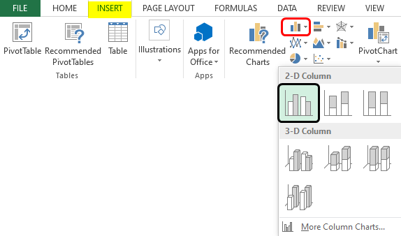
1. Column Chart
It is a very simple chart type that presents data in the form of vertical bars. First, to build a column chart, select the data, and then select the required option from the Column chart option, as can be seen below. As we can see, various options are there in the Column chart, and the requisite one should be selected.
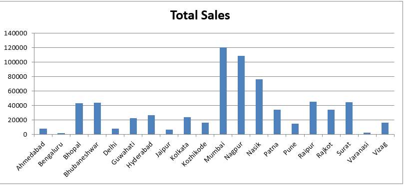
When we follow the above procedure, a column chart is created, as shown in the below screenshot. It is a very simple column chart that gives us region-wise total sales. The chart can be formatted as needed.
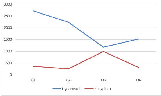
2. Line Chart
This chart is useful for observing trends. E.g. in this case, we have quarter wise data for two cities, and we shall compare the sales trend over the quarters for these two cities. First, to build a line chart, select the data, and then select the requisite line chart option as shown below.
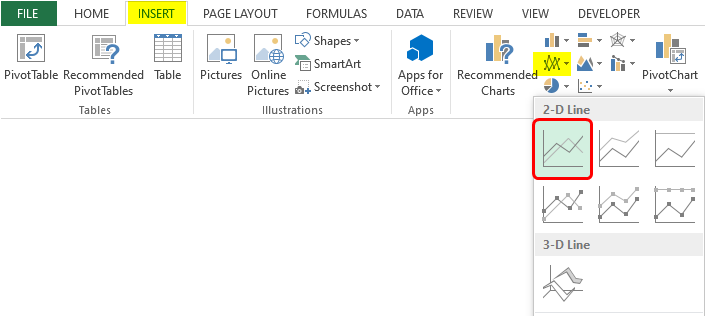
Following the above procedure leads to the creation of a line chart, as shown in the below screenshot.
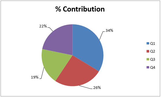
3. Pie Chart
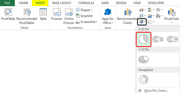
Pie Chart gives the contribution of a category, e.g., we shall build a pie chart to determine each quarter’s percentage contribution in total sales. To create a pie chart, select the requisite columns, and click on the required pie chart option from the Pie option as shown below.
As a result of following the above procedure, a pie chart is created, which can be seen below. The pie chart gives us a quick insight into the percentage contribution.
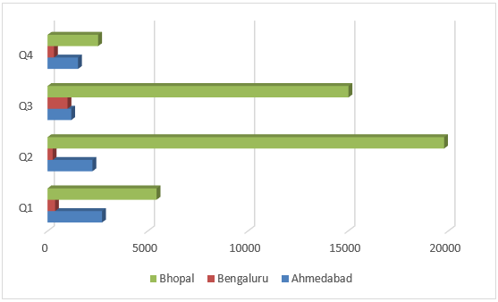
4. Bar Chart
This chart type is no different than a column chart, only that here we have horizontal bars. In order to build a horizontal bar, select the requisite bar chart option from the Bar option as shown in the following screenshot.
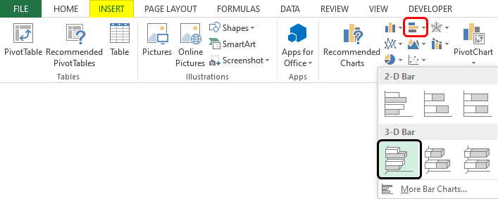
As we can see in the above screenshot, we selected clustered bar in 3-D, which gave us a clustered 3-D bar graph, as shown in the following screenshot. Using this visualization, we can compare sales for three cities for four quarters.
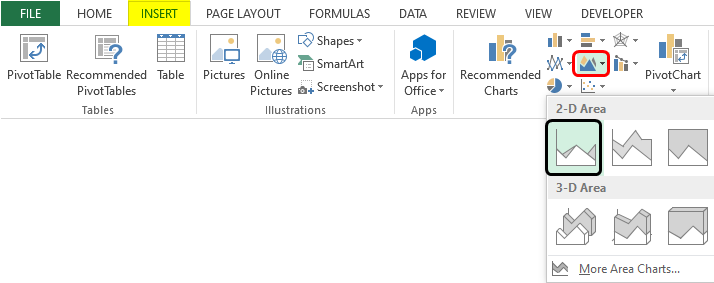
5. Area Chart
This chart represents the trend of a measure for various categories over a period of time. The chart makes use of areas to present the data. In order to generate an area chart, we shall follow the steps as mentioned in the below screenshot.
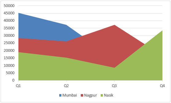
As we can see above, we selected the requisite range, and then from the Area option, selected the requisite Area chart option. As a result, we got the following chart, as shown by the following screenshot. The area chart gives us a quick insight into the sales trend over the quarters for the three cities.
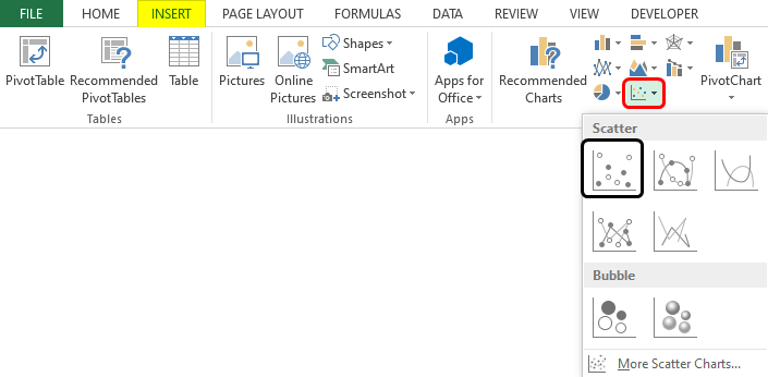
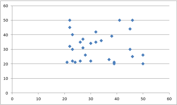
6. Scatter Chart
This chart helps in determining the relation between two variables. It is also referred to as the X-Y chart. The chart requires two series and takes individual corresponding values as x and y coordinates. In order to build a scatter plot, first, select the data and then select the requisite scatter plot option, as can be seen in the following screenshot.
Following the above procedure leads to the creation of a scatter plot. As we can see, the pattern formed by the scatter plot allows us to derive insights based on the context.
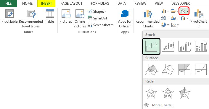
7. Stock Chart
These are special types of charts that are used for stock price analysis. In order to build a stock chart, select the data and select the requisite stock chart option, as shown in the following screenshot.
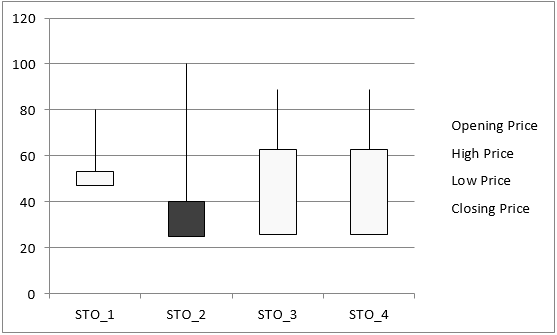
As can be seen in the above screenshot, Open-High-Low-Close stock chart. This chart requires that the Opening Price, High Price, Low Price, and Closing Price of stocks must be defined in the order. Each of the chart options in the Stock chart requires a different set of inputs. When the chart is built, it looks like as shown below.
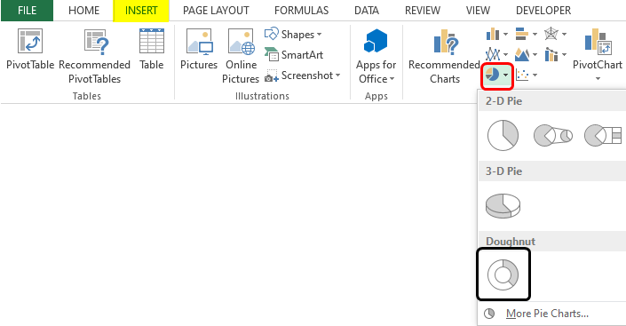
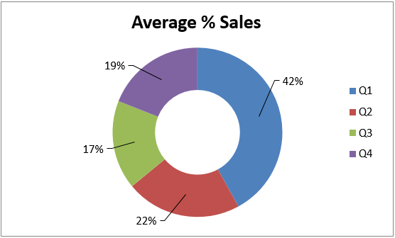
8. Doughnut Chart
This chart is a type of pie chart, only that it is represented in the shape of a doughnut. Building this chart is quite simple. Select the data over which the chart needs to be built, and then from the other chart option, select the required option from the two doughnut options. This is as shown in the below screenshot.
The above procedure leads to the creation of the doughnut chart, which is as shown below. The doughnut chart gives us an idea of the average % contribution in total sales. The middle space in the doughnut chart can be used to write a meaningful text that conveys some insight.
9. Bubble Chart
Bubble charts, though complex, can be beautifully used to derive insights from data. This chart takes into consideration three values. Two of the three dimensions are used for representing X-axis and Y-axis, respectively, and the third value determines the size of the bubble. We shall build a bubble chart using the method as illustrated below.
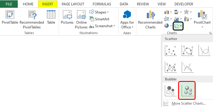
As can be seen in the above screenshot, we selected a bubble chart with a 3-D effect. Note that we selected numeric data only from the table for building the bubble chart, which can be seen in the screenshot. When we follow the above method, we get a bubble chart, as shown below.

Things to Remember About Excel Data Visualization
- For a particular problem, multiple visualizations can be used. However, a visualization in Excel should be selected prior to its application for the problem.
- Visualization and its features must be studied in detail before using it. An incomplete understanding of the visualization might give incorrect results.
Recommended Articles
This is a guide to Excel Data Visualization. Here we discuss various types of Excel Data Visualization along with practical examples and a downloadable excel template. You can also go through our other suggested articles –
- Excel Data Validation
- Excel Data Filter
- Surface Chart in Excel
- Grouped Bar Chart
Create stunning, high-quality diagrams with the Visio Data Visualizer add-in for Excel with a Microsoft 365 work or school account.
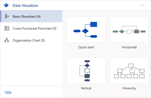
You can create basic flowcharts, cross-functional flowcharts, and organizational charts. The diagrams are drawn automatically from data in an Excel workbook. If you then edit the diagram in Visio, your changes are synced back to Excel.
This means you don’t need a Visio subscription to make stunning diagrams in Excel. View, print, or share your diagrams with others for free in the web version of Visio. For additional editing capabilities, you need either a Visio Plan 1 or Visio Plan 2 subscription.
Note: The Visio Data Visualizer add-in is supported in all the languages supported by Visio for the web. A complete list of the languages is shown at the end of this article.
Start with the Visio Data Visualizer add-in
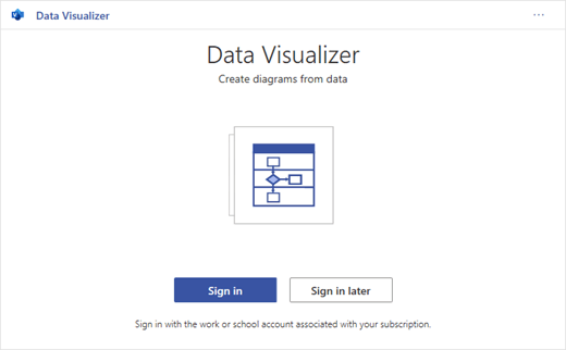
The Data Visualizer add-in is available for Excel on PC, Mac, and the browser with a Microsoft 365 work or school account.
(If the only Microsoft account you have is a personal one—that is, hotmail.com, live.com, outlook.com, or msn.com—you can still try out parts of the Data Visualizer add-in without signing in. It just means that the features available to you are somewhat limited. Read The Data Visualizer add-in is designed for Microsoft 365 work and school accounts for more details.)
-
Open Excel and create a new Blank workbook.
-
Save the workbook to a OneDrive or SharePoint location for seamless sharing and the optimal experience. You can also save your file locally to your computer.
-
Ensure that an empty cell is selected in the workbook.
-
Select Insert > Get Add-ins or Add-ins. In the Office Add-ins Store, search for “Data Visualizer», and then select Add. If you see a security message regarding the add-in, select Trust this add-in.
-
Sign in with the account associated with your Microsoft 365 work or school subscription, or select Sign in later.
In the add-in, we no longer support manual sign-in («ADAL»). But we automatically detect your identity and sign you in. If we can’t sign you in, it means your version of Excel doesn’t work with the add-in. You can fix this by using Excel for the web or upgrading to Excel for Microsoft 365.
Note: When you’re signed in, you unlock capabilities in Visio for the web such as printing, sharing, and viewing in the browser. You don’t need a Visio subscription to use this add-in, but if you have one, you’ll also be able to make edits to your diagram.
If you see a permissions prompt, select Allow.

As an alternative to the procedure above, you can download our add-in ready templates to get started in Excel:
Modify the data-linked table to customize your diagram
-
Choose a diagram type and then select the template you’d like to work with. This will insert a sample diagram and its data-linked table. That process may take a minute. The templates come with different layout and theme options that can be further customized in Visio.
-
If you’re signed in, the diagram is saved as a Visio file in your OneDrive or SharePoint location. If you’re not signed in, then the diagram is part of your Excel workbook instead. You can always choose to create a Visio file by signing in.
-
To create your own diagram, modify the values in the data table. For example, you can change the shape text that will appear, the shape types, and more by changing the values in the data table.
For more information, see the section How the data table interacts with the Data Visualizer diagram below and select the tab for your type of diagram.
-
Add or remove shapes for steps or people by adding or removing rows in the data table.
-
Connect shapes to design the logic of your diagram by entering the IDs of the connected shapes in the corresponding table column for your diagram type.
-
After you’ve finished modifying the data table, select Refresh in the diagram area to update your visualization.
Note: If there is an issue with the source data table, the Data Checker will appear with instructions on how to fix the issue. After you modify the table, select Retry in the Data Checker to confirm the issue is resolved. Then you’ll see the updated diagram.
Tips for modifying the data table
-
Save the Excel workbook (if you’re working in the Visio client) and Refresh frequently.
-
Consider sketching out the logic of your diagram on paper first. This may make it easier to translate into the data table.
View, print, or share your Visio diagram
You can open the Data Visualizer flowchart in Visio for the web to view, print, or share your diagram with others. Learn how:
-
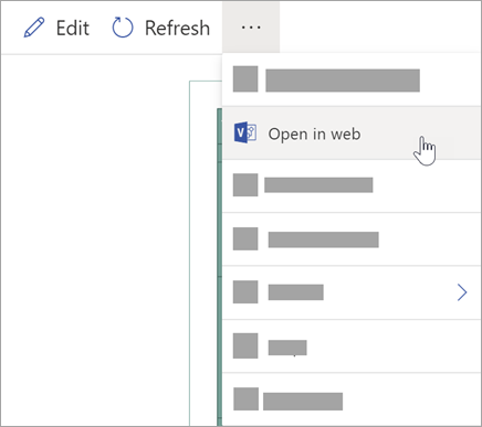
To view the diagram outside of Visio for the web, select the ellipses (. . .) in the diagram area and select Open in web.
Note: If you’re not signed in yet, you’ll be prompted to sign in with your Microsoft 365 work or school account.* Select Sign in and then Allow or Accept on any permission prompts.
-
After the Visio file is created, select Open file.
-
In Visio for the web, select the ellipses (. . .) > Print to print your diagram.
-
To share your diagram, select the Share button to create a link or to enter the email addresses of those you want to share with.
Edit the diagram with a Visio subscription
If you have a subscription to Visio, you can do more with the diagram. Add text or images, apply design themes, and make other modifications to customize the diagram.
Do basic editing with Visio for the web
Use Visio for the web for basic editing in the browser, such as changing themes, modifying layouts, formatting shapes, adding text boxes, etc.
-
In the diagram area in Excel, select Edit
.Note: If you’re not signed in yet, you’ll be prompted to sign in with your Microsoft 365 or Microsoft 365 work or school account. Select Sign in and then Allow or Accept on any permission prompts.
-
Make your changes to the diagram in Visio for the web.
To do this
Use
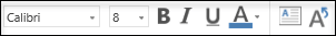
Add and format text
Home > Font options:
For more details, see Add and format text.
Change the theme
Design > Themes
Design > Theme Colors
For more details, see Apply a theme or theme color.
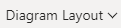
Change the diagram’s layout
Design > Layout
For more details, see Re-layout a diagram.
If you want to add or modify a shape while still keeping the source data in sync, then edit the diagram with the Visio desktop app. Such changes made in Visio for the web can’t by synced back to the Excel source file.
-
When you’re done editing the diagram, go back to the Excel file and select Refresh
to see your changes.
 .
.


 to see your changes.
Do advanced editing with the Visio app
Use the Visio desktop app for advanced edits, such as adding new shapes, modifying connections, and other changes to the structure of the diagram. The Visio app supports two-way sync, so any changes you make can be synced back to your Excel workbook where you can see your diagram changes after refreshing.
Note: To edit in the Visio app, you need a Visio Plan 2 subscription.
-
In the diagram area in Excel, select Edit.
-
Save and close your Excel file.
To edit in the Visio app and successfully sync changes, the Excel file with the data table and diagram must be closed.
-
In Visio for the web select Edit in Desktop App in the ribbon.
-
Select Open to confirm. If you receive a security warning asking if this Visio file is a trusted document, select Yes.
-
Make your changes to the diagram in the Visio app.
-
When you’re done, select the diagram container to see the Data Tools Design tab in the ribbon, and then select Update Source Data.
Note: If you try to update the source data and the link to the Visio data is broken, Visio prompts you to relink. Select the diagram area in Visio, and under the Data Tools Design tab select Relink Source Data. Browse to the Visio workbook with the source table, select Relink, then Update Source Data again.
-
Now that your data has synced back to your Excel workbook, save your Visio file—preferably in the same location as your Excel file.) Close the Visio file.
-
Open the Excel file and select Refresh in the diagram area to see your changes.
Note: If you run into a Refresh Conflict, you can refresh the diagram. You’ll lose any edits you’ve made, but any formatting changes to the shapes or connectors inside the container are preserved.

Microsoft 365 subscribers who have Visio Plan 2 can use Data Visualizer templates to get more advanced diagramming features, such as those listed below. See Create a Data Visualizer diagram for more details:
-
Create a diagram using custom stencils
-
Create sub-processes
-
Bring your diagram to life with data graphics
-
Have two-way synchronization between the data and the diagram
How the data table interacts with the Data Visualizer diagram
Each column of the table uniquely identifies an important aspect of the flowchart that you see. See the reference information below to learn more about each column and how it applies and affects the flowchart.
A number or name that identifies each shape in the diagram. This column is required, and each value in the Excel table must be unique and not be blank. This value does not appear on the flowchart.

This is the shape text that is visible in the diagram. Describe what occurs in this step of the process. Consider also adding a similar or more descriptive text to the Alt text column.

The Process Step ID of the next shape in the sequence. A branching shape has two next steps and is represented by comma-separated numbers such as P600,P400. You can have more than two next steps.
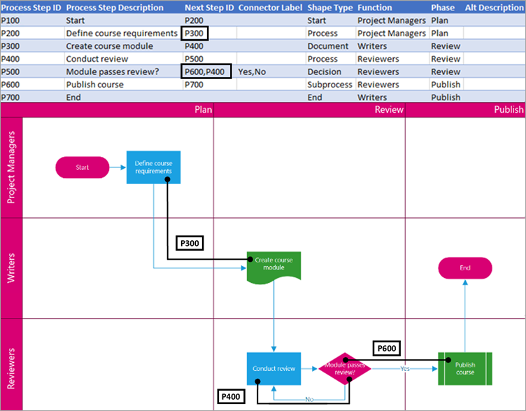
For branching shapes, connector labels are represented as text separated by a comma, such as Yes,No. Yes corresponds to P600 and No corresponds to P400 in the example. Connector labels are not required.
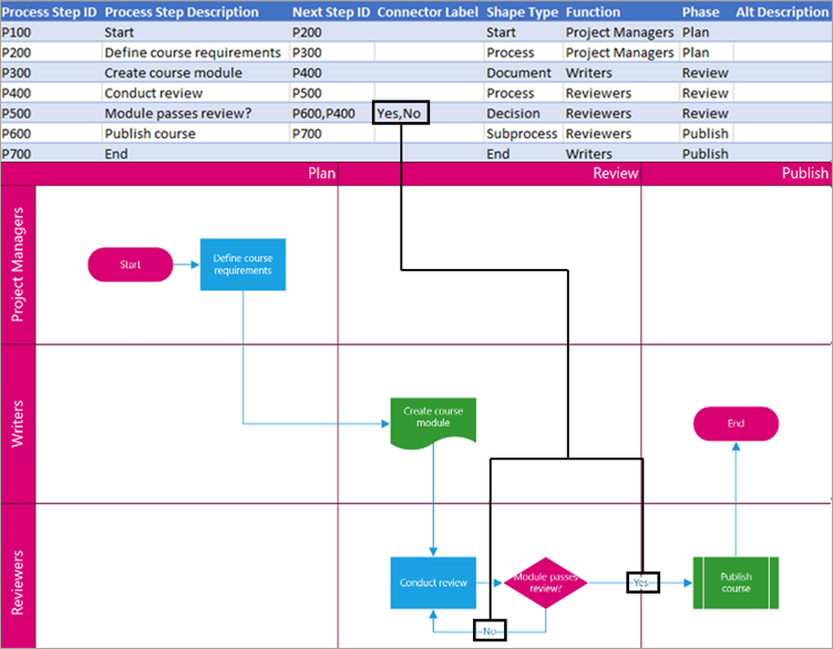
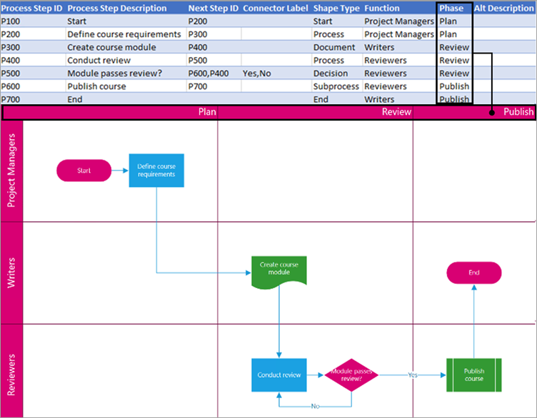
The function (or swimlane) that each shape belongs to. Use the Function and Phase columns to help you organize different stakeholders in your flowchart. This column only applies to a Cross-Functional Flowchart and isn’t included as part of the Basic Flowchart diagram.

The phase (or timeline) that each shape belongs to. Use the Function and Phase columns to help you organize different stakeholders in your flowchart. This column only applies to a Cross-Functional Flowchart and isn’t included as part of the Basic Flowchart diagram.
Alt text is used by screen readers to assist those with visual impairments. You can view alt text you’ve entered as part of the Shape Info of a shape. Entering descriptive alt text is not required, but recommended.
Each column of the table uniquely identifies an important aspect of the organization chart that you see. See the reference information below to learn more about each column and how it applies and affects the diagram.
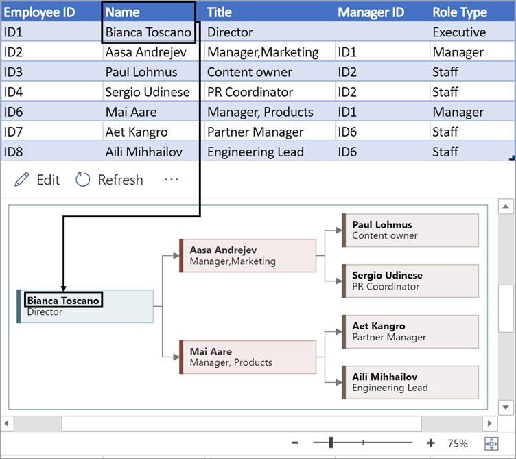
A number that identifies each employee in your organization chart. This column is required, and each value in the Excel table must be unique and not blank. This value doesn’t appear in the diagram.
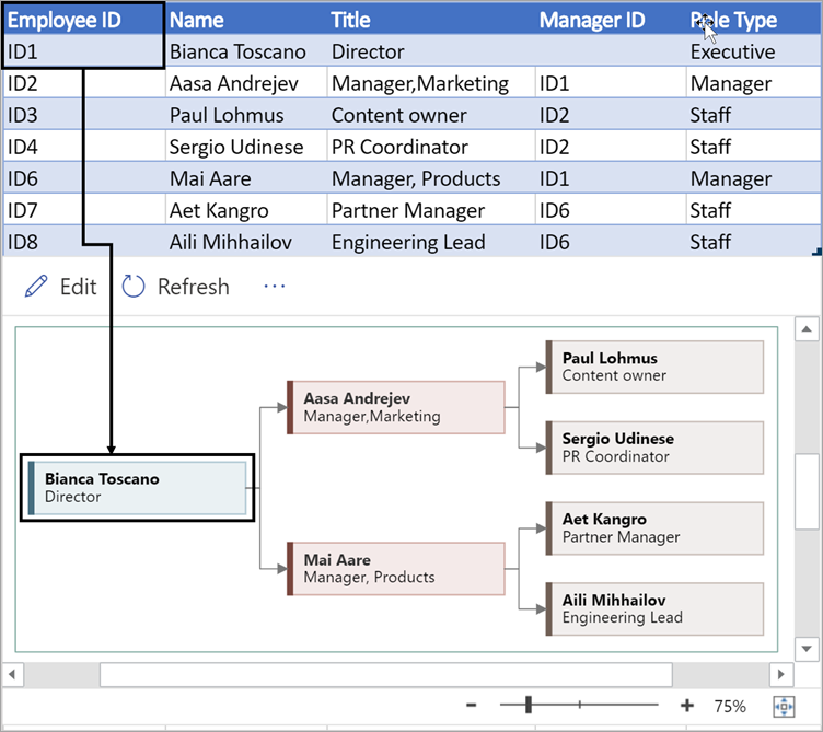
Enter the full name of the employee you want to associate with the employee ID number. This text displays in the diagram as shape text.
Provide additional details for the employee by entering the job title or role. This text displays in the diagram shapes underneath the employee’s name.
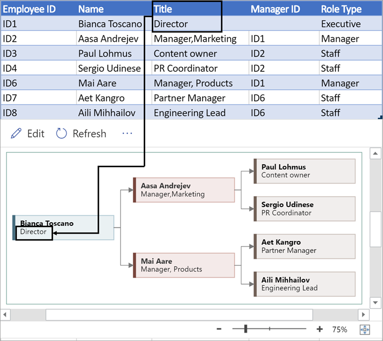
To create the structure of the organization chart, use this column to identify the manager of each employee. You can leave it blank for those who don’t report to anyone. You’ll enter the corresponding employee ID from the first column. You can also separate multiple managers using a comma.
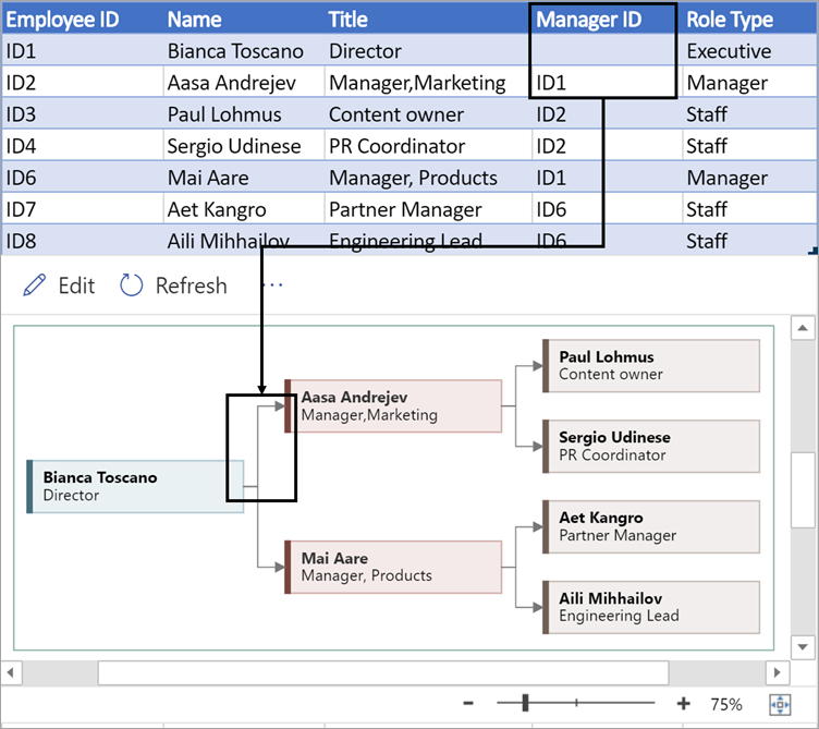
Organization charts in the add-in come with different role types for you to choose from. Select a field under the Role Type column to choose a role that best describes the employee. This will change the color of the shape in the diagram.

Supported languages for the Data Visualizer add-in
Click the subheading to open the list:
-
Chinese (Simplified)
-
Chinese (Traditional)
-
Czech
-
Danish
-
Dutch
-
German
-
Greek
-
English
-
Finnish
-
French
-
Hungarian
-
Italian
-
Japanese
-
Norwegian
-
Polish
-
Portuguese (Brazil)
-
Portuguese (Portugal)
-
Romanian
-
Russian
-
Slovenian
-
Spanish
-
Swedish
-
Turkish
-
Ukrainian
See Also
About the Data Visualizer add-in for Excel
Как сделать правильное графическое представления большого объема данных для комфортного проведения визуального анализа в Excel? Используя средства программы Excel создадим собственные инструменты для выборочного масштабирования данных и визуальной навигации по данным в истории продаж за большой период.
Подготовка больших данных к графическому представлению и визуализации
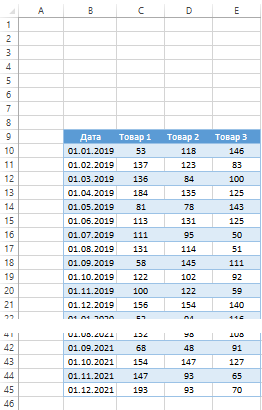
Перед тем как приступить к графическому представлению для визуализации больших данных на динамическом графике в Excel, сначала смоделируем ситуацию. На пример, у нас есть статистический отчет ежемесячных продаж по трем видам товаров на протяжении 3-х лет (2019-2021 год). Расположите исходную таблицу отчета в диапазоне ячеек B9:F45, как показано ниже на рисунке:
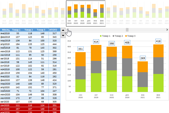
Необходимо построить гистограмму с накоплением для одновременного отображения показателей количественных продаж по трем группам товаров и их итогового суммарного значения.
Но сначала подготовим исходные данные таблицы. По оси X на графике лучше будут читаться названия месяцев вместо дат. Поэтому между первым «Дата» (B) и втором «Товар 1» (C) столбцом таблицы вставим дополнительный столбец с названием «Месяц» который в своих ячейках будет содержать формулу:
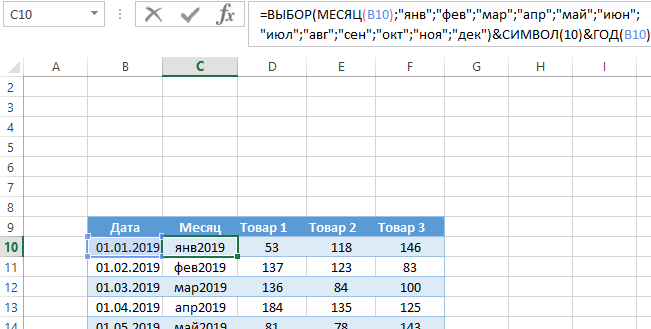
Данная формула состоит из 4-х функций и 3-х частей:
- Формула функций ВЫБОР и МЕСЯЦ позволяет нам преобразовать дату в название месяцев сокращенное до трех букв.
- Функция СИМВОЛ с числом 10 в ее аргументе позволяет нам добавить к текстовому значению символ обрыва строки для переноса текста подписей значений на осе X, который должен уместится под каждым столбцом гистограммы.
- Функция ГОД извлекает из исходных дат значения годов которые будут добавлены к месяцам в подписях оси X, чтобы не путаться к которому году относится тот или иной месяц.
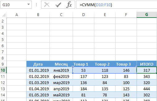
Кроме оформления подписей оси X нам еще необходимо добавить на график подписи итоговых значений. Поэтому нужно добавить еще один столбец «ИТОГО» к исходной таблицы с формулой суммирования показателей всех 3-х видов товаров по каждому месяцу:
Теперь непосредственно переходим к самому построению графика для графического представления и визуализации данных отчета.
Создание визуальной навигации по большим данным в Excel
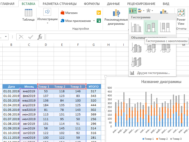
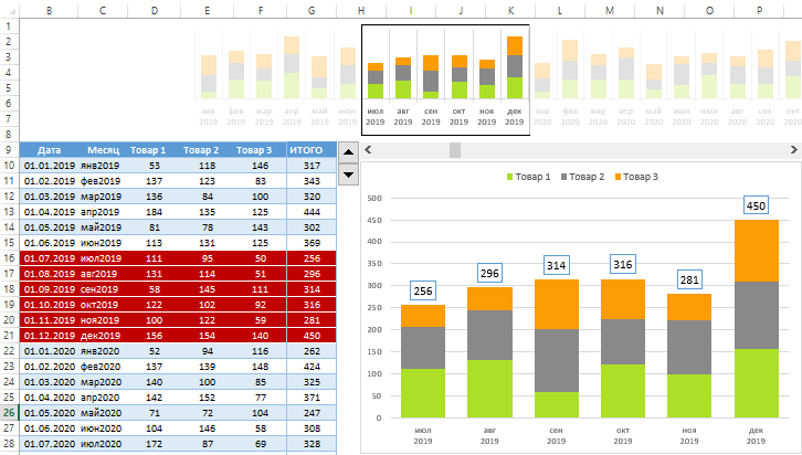
Для создания отчета в графическом виде выделите не все значения таблицы, а только лишь начиная со второго и по пятый столбец (диапазон ячеек C9:F45) и выберите инструмент «ВСТАВКА»-«Диаграммы»-«Гистограмма с накоплением»:
Как видно выше на рисунке такой способ графического представления данных большого объема не лучшее решение для визуализации. При том что для примера мы было взято показатели за 3 года. А если нужно за 10 лет и с показателями ежедневных продаж? В таком случае нужно сделать отдельный график с возможностью отображения за указанные период времени. Сделаем все удобно и красиво максимально используя все возможности программы Excel.
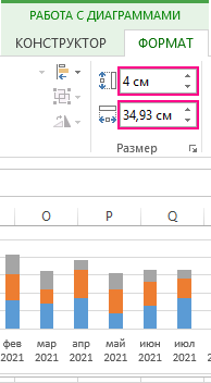
Несмотря на то что созданный нами график не совсем нам подходит мы будем иго использовать в качестве временной шкалы для удобства. Укажите ему новые размеры в дополнительном меню: «РАБОТА С ДИАГРАММАМИ»-«ФОРМАТ»-«Размер» высота – 4см и ширина – 34,93 см (такая ширина соответствует 1320 пикселям). А затем просто разместите его над исходной таблицей:
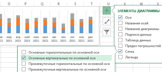
Далее продолжаем настраивать внешний вид шкалы-графика. Удалите все лишние элементы нажав на кнопку плюс «+» с правой стороны графика где в выпадающем меню «ЭЛЕМЕНТЫ ДИАГРАММЫ» следует снять все лишние галочки и отметить необходимые согласно рисунку:
Далее, чтобы настроить внешний вид отображаемых столбцов гистограммы, щелкните правой кнопокой мышки по люому ряду и из появившегося контекстного меню выберите опцию «Формат ряда данных». Затем переходим в «ПАРАМЕТРЫ РЯДА» и измеянем значение в опции «Боковой зазор» на 80%. Там же щелкаем на кнопку «Заливка» и указываем желаемый цвет:
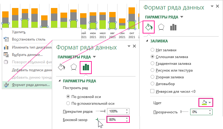
Цвета заливки изменяем отдельно для каждого ряда.
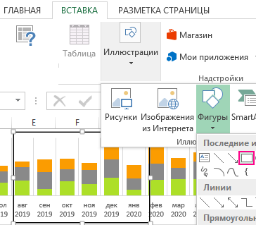
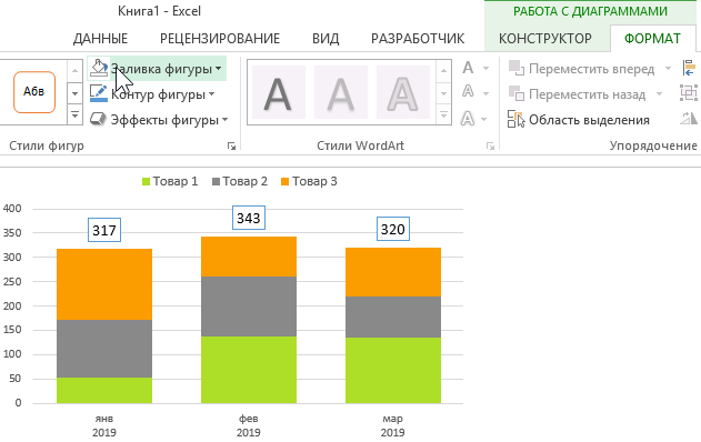
С помощью фигуры прямоугольника создадим курсор для временной шкалы-графика. Выберите инструмент «ВСТАВКА»-«Иллюстрации»-«Фигуры»-«Прямоугольник»:
Убираем заливку и устанавливаем черный цвет контура с толщиной 2 пункта для фигуры прямоугольника используя инструмент из ее дополнительного меню «СРЕДСТВА РИСОВАНИЯ»-«ФОРМАТ»-«Стили фигур»-«Заливка фигуры» и здесь же «Контур фигуры».
Сначала с правой, а потом с левой стороны курсора создадим еще 2 белых полупрозрачных прямоугольника которые будут закрывать остальную часть шкалы. Это позволит экспонировать значения графика в пределах курсора для навигации по данным:
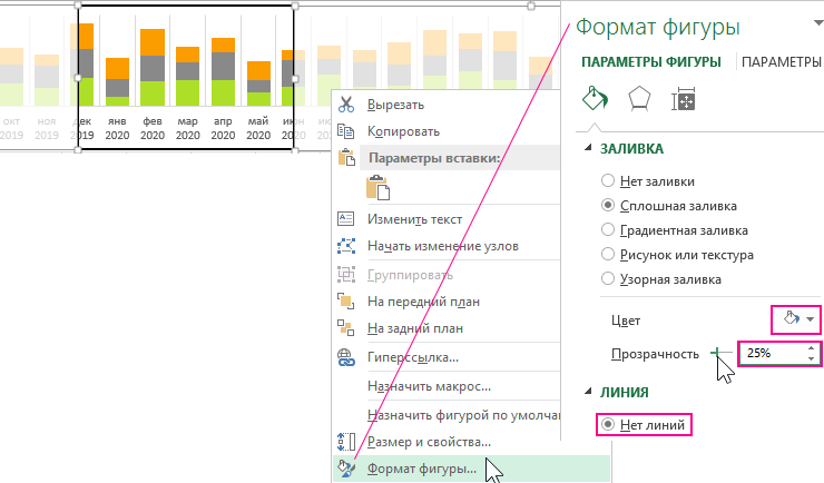
Кликнув правой кнопкой мышки по новому прямоугольнику выбираем из контекстного меню опцию «Формат фигуры». В появившемся окне настройки параметров фигуры изменяем цвет заливки на белый и здесь же устанавливаем «Прозрачность» — 25%. В разделе опций «ЛИНИЯ» отмечаем «Нет линий».
Элементы управления графическим представлением и визуализацией данных
Навигационный курсор для шкалы – создан, теперь создаем элементы управления. Описание технического задания для функционирования курсора навигации:
- Данный курсор будет уметь изменять свою ширину вмещая в себя показатели за минимум 3 и максимум 12 месяцев. Поэтому следует создать элемент управления для изменения размера курсора.
- Сам курсор не будет перемещаться по шкале, а вместо этого будет смещаться сама шкала относительно курсора. Создадим еще один элемент для перемещения шкалы под курсором.
Выберите инструмент: «РАЗРАБОТЧИК»-«Элементы управления»-«Вставить»-«Счетчик» и возле таблицы разместите его:
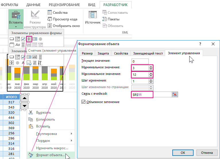
Из контекстного меню счетчика выбираем опцию «Формат объекта» где на вкладке «Элемент управления» изменяем следующие 3 параметра:
Минимальное значение: 3 – это минимальное количество столбов месяцев на гистограмме-шкале, которые сможет охватывать курсор на шкале, чтобы передать их на большой график.
Максимальное значение: 12 – максимум столбцов месяцев, которые будет охватывать курсор.
Связь с ячейкой: $R$11 – ссылка на ячейку, в которую будет передавать элемент управления счетчик свои текущие числовые значения 3-12.
Аналогичным образом создаем второй элемент управления шкалой выбрав инструмент: «РАЗРАБОТЧИК»-«Элементы управления»-«Вставить»-«Полоса прокрутки». Разместите второй элемент — полосу прокрутки графика возле счетчика под шкалой:
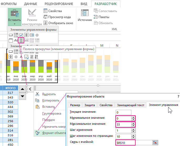
И снова из контекстного меню полосы прокрутки выбираем опцию «Формат объекта» где на вкладке «Элемент управления» изменяем следующие 3 параметра:
Минимальное значение: 0 – это конечная позиция положения временной шкалы, то есть крайнее левое положение.
Максимальное значение: 33 – это число для перемещения курсора при минимальном его размере с охватом в 3 месяца (столбца) для общего количества столбцов (месяцев) на протяжении 3-х лет. То есть: 36-3=33.
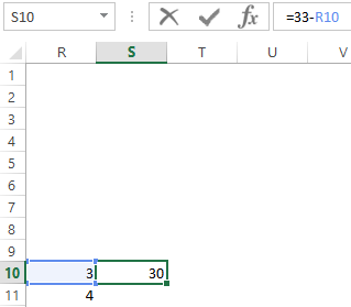
Связь с ячейкой: $R$10 – ссылка на ячейку, в которую будет передавать полоса прокрутки свои текущие числовые значения 0-33.
Внимание! Рядом с этой же ячейкой R10 вписываем формулу =33-R10 в ячейке S10. Значения данной ячейки будут использоваться в коде написанных VBA-макросов для оживления шкалы с помощью элементов управления:
Элементы управления шкалой и курсором – созданы. Осталось написать программу макрос для функционирования данной конструкции.
VBA-макрос для интерактивного графического представления с визуализацией данных
Чтобы оживить нашу временную шкалу вместе с курсором создаем макрос. Выберите инструмент: «РАЗРАБОТЧИК»-«Код»-«Visual Basic» (или нажмите комбинацию клавиш Alt+F11), чтобы прейти в редактор макросов. Там в первую очередь следует создать модуль, в который следует поместить следующий код двух макросов:
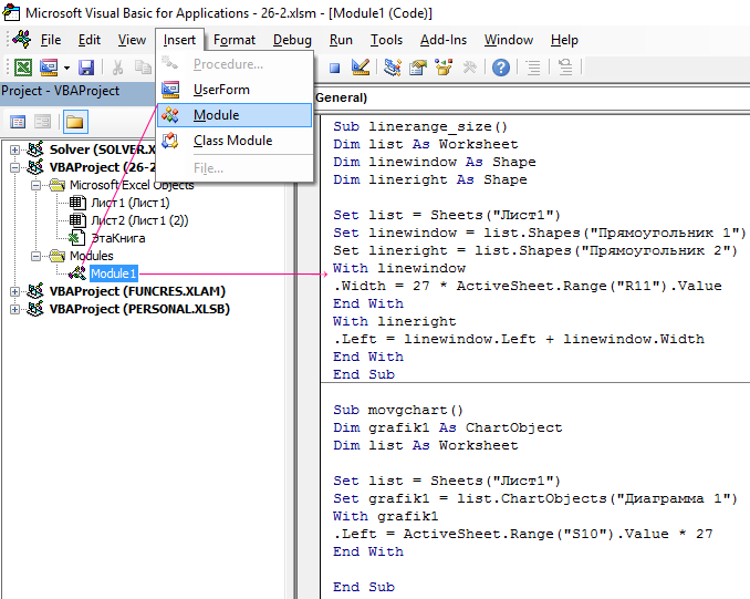
Код макроса можно скопировать из блока ниже:
Sub linerange_size()
Dim list As Worksheet
Dim linewindow As Shape
Dim lineright As ShapeSet list = Sheets(«Лист1»)
Set linewindow = list.Shapes(«Прямоугольник 1»)
Set lineright = list.Shapes(«Прямоугольник 2»)
With linewindow
.Width = 27 * ActiveSheet.Range(«R11»).Value
End With
With lineright
.Left = linewindow.Left + linewindow.Width
End With
End SubSub movgchart()
Dim grafik1 As ChartObject
Dim list As WorksheetSet list = Sheets(«Лист1»)
Set grafik1 = list.ChartObjects(«Диаграмма 1»)
With grafik1
.Left = ActiveSheet.Range(«S10»).Value * 27
End WithEnd Sub
Теперь осталось лишь назначить макросы элементам. Кликаем по каждому элементу правой кнопкой мышки и из контекстного меню выбираем опцию «Назначить макрос» для счетчика – linerange_size, а для полосы прокрутки – movgchart.
Перед тем как использовать элементы управления следует подогнать размер доступного пространства для смещения шкалы влево с помощью изменением ширины первого столбца A на рабочем листе Excel:
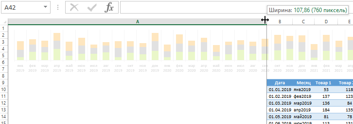
Только после этого можно воспользоваться элементами управления шкалой и ее курсором.
Масштабирование в графическом представлении с визуализацией в Excel
Теперь наша задача передать в увеличенном формате (как бы приближенно) только ту информацию, которую охватывает курсор на временной шкале гистограммы. Для этого мы будем создавать новую динамическую гистограмму с большим размером столбцов. Но, как и для всех динамических диаграмм, сначала нужно создать имена (именные диапазоны Excel) с формулами, которые послужат динамически изменяемым источником данных для гистограммы.
Для создания именных диапазонов с формулами выберите инструмент: «ФОРМУЛЫ»-«Определенные имена»-«Диспетчер имен». В нем с помощью кнопки создать создаем сразу 4 имени с разными формулами для разных источников данных будущей второй большой гистограммы:
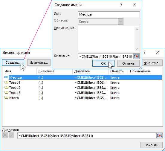
Каждое из 4-х имен является ссылкой на динамически изменяемый формулой диапазон ряда данных гистограммы:
- Месяцы – значения оси X, формула:
- Товар1 – значения для нижнего (зеленого) ряда данных, формула:
- Товар2 – значения среднего (серого) ряда, формула:
- Товар3 – значения для верхнего (оранжевого) рада, формула:
- Итого – значения для подписей столбцов гистограммы, формула:
Теперь переходим непосредственно к процессу построения второй большой гистограммы, которая будет выводить данные курсора в увеличенном виде.
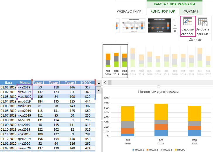
Выделите диапазон ячеек таблицы C9:G12 (2-6 столбцы и несколько строк) и выберите инструмент: «ВСТАВКА»-«Диаграммы»-«Гистограмма с накоплением». А затем в дополнительном меню «РАБОТА С ДИАГРАММАМИ»-«КОНСТРУКТОР»-«Данные» жмем на кнопку «Строка/столбец» чтобы получилось так:
Теперь необходимо добавить подписи данных. Для этого необходимо одним кликом выделить только верхний четвертый ряд «ИТОГО». А дальше нажать на кнопку плюс «+» возле графика (справа) и в выпадающем меню «ЭЛЕМЕНТЫ ДИАГРАММЫ» отметить опцию «Подписи данных»:
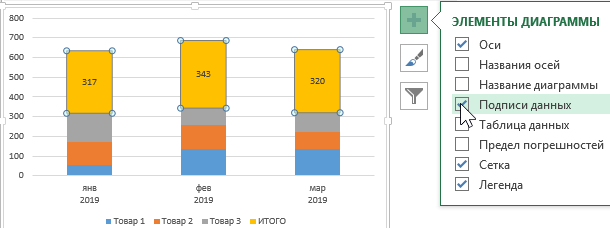
Не снимая выделения с верхнего ряда выбираем инструмент «РАБОТА С ДИАГРАММАМИ»-«ФОРМАТ»-«Стили фигур»-«Заливка»-«Нет заливки» и где, чтобы скрыть его с виду. А остальные ряды закрашиваем цветами заливки так же, как и первый график, в том же стиле:
Далее переходим к самой главной части этого большого графика. Выберите инструмент: «РАБОТА С ДИАГРАММАМИ»-«КОНСТРУКТОР»-«Выбрать данные»:
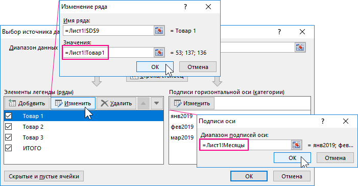
Сначала в правом разделе «Подписи горизонтальной оси (категории)» нажимаем на кнопку «Изменить» и изменяем значение в поле ввода «Диапазон подписей оси:» на ссылку именного диапазона (обязательно указываем как внешнюю по правилу работы с источниками данных для диаграммам) =Лист1!Месяцы.
Затем в левом разделе «Элементы легенды (ряды)» кликаем по каждому ряду и для каждого нажимаем на кнопку «Изменить», чтобы изменять второе поле ввода «Значения:» на ссылки имен соответственные названиям рядов. Так же указываем как внешние ссылки на имена, например: =Лист1!Товар1.
После всех изменений жмем на кнопку ОК и наслаждаемся динамическими изменениями второго большого графика в соответствии с изменениями в области курсора.
Визуальная навигация по данным таблицы Excel
И на конец для полной читабельности и визуального представления данных создадим еще курсор для таблицы. Этот курсор будет также соответствовать значениям, отображаемым на графике. Он будет иметь возможность изменять свой размер (диапазон) охвата и перемещаться при использовании тех же самых элементов управления.
Для решения данной задачи воспользуемся условным форматированием и логической формулой. Выделите диапазон табличной части исходных данных =B10:G45 и выберите инструмент: «ГЛАВНАЯ»-«Условное форматирование»-«Создать правило». В появившемся окне «Создание правила форматирования» отмечаем опцию «Использование формул для определения форматируемых ячеек» и в поле ввода вводим формулу:
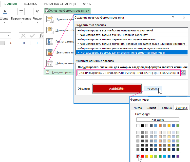
Затем жмем на кнопку «Формат» и задаем желаемый формат оформления цвета ячеек и текста. После нажатия на кнопку ОК на всех открытых окнах наслаждаемся готовым результатом:
 Скачать графическое представление больших данных в Excel
Теперь можно комфортно проводить визуальный анализ большого объема данных в Excel. Вы масштабируете размер периода, отображаемого на главном графике с помощью курсора управления. А малый график служит для Вас визуальной картой для навигации по истории продаж на протяжении целого отчета за весь довольно продолжительный период.