
Создавайте потрясающие высококачественные схемы с помощью надстройки Визуализатора данных Visio для Excel с помощьюРабочей или учебной учетной записи Microsoft 365.
Вы можете создавать базовые блок-схемы, кроссфункциональные блок-схемы и организационные диаграммы. Диаграммы создаются автоматически из данных в книге Excel. Если вы измените схему в Visio, изменения синхронизируются обратно с Excel.
Это означает, что вам не нужна подписка на Visio для создания потрясающих схем в Excel. Просматривайте, печатайте схемы и делитесь ими с другими пользователями бесплатно в веб-версии Visio. Для дополнительных возможностей редактирования требуется подписка на Visio (план 1) или Visio, план 2.
Примечание: Надстройка Визуализатора данных Visio поддерживается на всех языках, поддерживаемых Веб-приложение Visio. Полный список языков показан в конце этой статьи.
Начните с надстройки Визуализатора данных Visio
Надстройка «Визуализатор данных» доступна для Excel на ПК, Mac и в браузере сMicrosoft 365 #x2 .
(Если у вас есть только личнаяучетная запись Майкрософт, то есть hotmail.com, live.com, outlook.com или msn.com, вы по-прежнему можете опробовать части надстройки Визуализатора данных без входа. Это просто означает, что доступные вам функции несколько ограничены. Дополнительные сведения см. в статье Надстройка визуализатора данных предназначена для Майкрософт 365 рабочих и учебных учетных записей.)
-
Откройте Excel и создайте пустую книгу.
-
Сохраните книгу в OneDrive или SharePoint расположении для удобного общего доступа и оптимального взаимодействия. Вы также можете сохранить файл локально на компьютере.
-
Убедитесь, что в книге выбрана пустая ячейка.
-
Выберите Вставить > получить надстройки или надстройки. В хранилище надстроек Office найдите «Визуализатор данных», а затем нажмите кнопку Добавить. Если появится сообщение безопасности, касающееся надстройки, выберите Доверять этой надстройке.
-
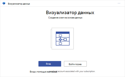
Войдите с учетной записью, связанной с рабочей или учебной подпиской Microsoft 365, или нажмите кнопку Войти позже.
В надстройке больше не поддерживается вход вручную («ADAL»). Но мы автоматически обнаруживаем вашу личность и войдите в систему. Если нам не удается войти в систему, это означает, что ваша версия Excel не работает с надстройкой. Это можно исправить с помощьюExcel в Интернете или обновления до Excel для Microsoft 365.
Примечание: Когда вы вошли в систему, вы открываете возможности в Веб-приложение Visio, такие как печать, общий доступ и просмотр в браузере. Для использования этой надстройки не требуется подписка Visio, но если она у вас есть, вы также сможете вносить изменения в схему.
Если появится запрос на разрешения, выберите Разрешить.

В качестве альтернативы описанной выше процедуре вы можете скачать готовые шаблоны надстроек, чтобы приступить к работе в Excel:
Изменение связанной с данными таблицы для настройки схемы
-
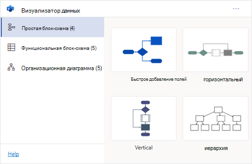
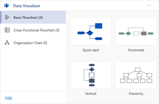
Выберите тип схемы, а затем выберите шаблон, с которым вы хотите работать. При этом вставляется пример схемы и связанная с данными таблица. Этот процесс может занять минуту. Шаблоны поставляются с различными вариантами макета и темы, которые можно дополнительно настроить в Visio.
-
Если вы вошли в систему, схема сохраняется в виде Visio файла в расположении OneDrive или SharePoint. Если вы не вошли в систему, схема является частью книгиExcel. Вы всегда можете создать файл Visio, выполнив вход.
-
Чтобы создать собственную схему, измените значения в таблице данных. Например, можно изменить отображаемый текст фигуры, типы фигур и многое другое, изменив значения в таблице данных.
Дополнительные сведения см. в разделе Взаимодействие таблицы данных со схемой визуализатора данных ниже и выберите вкладку для своего типа схемы.
-
Добавление или удаление фигур для шагов или людей путем добавления или удаления строк в таблице данных.
-
Соединяйте фигуры, чтобы спроектировать логику схемы, введя идентификаторы соединенных фигур в соответствующем столбце таблицы для типа схемы.
-
После изменения таблицы данных выберите Обновить в области схемы, чтобы обновить визуализацию.
Примечание: Если возникла проблема с исходной таблицей данных, появится средство проверки данных с инструкциями по ее устранению. После изменения таблицы выберите Повторить в средство проверки данных, чтобы убедиться, что проблема устранена. Затем вы увидите обновленную схему.
Советы по изменению таблицы данных
-
Сохраните книгу Excel (если вы работаете в клиенте Visio ) и регулярно обновляйте .
-
Сначала рассмотрите возможность набросать логику схемы на бумаге. Это может упростить преобразование в таблицу данных.
Просмотр, печать и предоставление общего доступа к схеме Visio
Вы можете открыть блок-схему Визуализатора данных в Веб-приложение Visio для просмотра, печати или совместного использования схемы с другими пользователями. Инструкции:
-
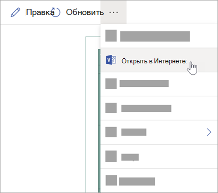
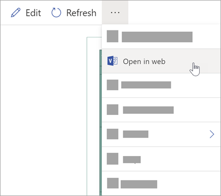
Чтобы просмотреть схему за пределами Веб-приложение Visio, выберите многоточие (. .) в области схемы и выберите Открыть в Интернете.
Примечание: Если вы еще не вошли в систему, вам будет предложено войти с помощьюMicrosoft 365 #x1 .* Выберите Войти , а затем Выберите Разрешить или Принять в любых запросах на разрешение.
-
После создания файла Visio выберите Открыть файл.
-
В Веб-приложение Visio выберите многоточие (. . .) > печать для печати схемы.
-
Чтобы предоставить общий доступ к схеме, нажмите кнопку Поделиться , чтобы создать ссылку или ввести адреса электронной почты пользователей, которым вы хотите поделиться.
Изменение схемы с помощью подписки Visio
Если у вас есть подписка на Visio, вы можете сделать больше с помощью схемы. Добавьте текст или изображения, примените темы оформления и внесите другие изменения для настройки схемы.
Простое редактирование с помощью Веб-приложение Visio
Используйте Веб-приложение Visio для базового редактирования в браузере, например для изменения тем, изменения макетов, форматирования фигур, добавления текстовых полей и т. д.
-
В области схемы в Excel выберите Изменить
.Примечание: Если вы еще не вошли в систему, вам будет предложено войти с помощью Майкрософт 365 или Microsoft 365 рабочей или учебной учетной записи. Выберите Войти , а затем — Разрешить или Принять в запросах на разрешение.
-
Внесите изменения в схему в Веб-приложение Visio.
Действие
Использование
Добавление и форматирование текста
Параметры шрифтадомашней >:
Дополнительные сведения см. в разделе Добавление и форматирование текста.
Изменение темы
Проектирование > тем
цвета темы
«Дизайн >»Дополнительные сведения см. в разделе Применение темы или цвета темы.
Изменение макета схемы
Макет
>
Дополнительные сведения см. в разделе Изменение макета схемы.
Если вы хотите добавить или изменить фигуру, сохраняя синхронизацию исходных данных, измените схему с помощью классического приложения Visio. Такие изменения, внесенные в Веб-приложение Visio, не могут быть синхронизированы с исходным файломExcel.
-
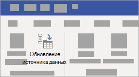
Завершив редактирование схемы, вернитесь к файлуExcel и выберите Обновить
, чтобы просмотреть изменения.
 .
.


 , чтобы просмотреть изменения.
Расширенное редактирование с помощью приложения Visio
Используйте классическое приложение Visio для расширенных изменений, таких как добавление новых фигур, изменение соединений и другие изменения структуры схемы. Приложение Visio поддерживает двусторонную синхронизацию, поэтому все внесенные изменения можно синхронизировать обратно с книгой Excel, где можно увидеть изменения схемы после обновления.
Примечание: Для редактирования в приложении Visio требуется Visio, план 2 подписка.
-
В области схемы в Excel выберите Изменить.
-
Сохраните и закройте файл Excel.
Для редактирования в приложении Visio и успешной синхронизации изменений необходимо закрыть файл Excel с таблицей данных и схемой.
-
В Веб-приложение Visio выберите Изменить в классическом приложении на ленте.
-
Нажмите кнопку Открыть , чтобы подтвердить. Если появится предупреждение системы безопасности с вопросом, является ли этот файл Visio доверенным документом, выберите Да.
-
Внесите изменения в схему в приложении Visio.
-
По завершении выберите контейнер схемы, чтобы открыть вкладку Конструктор средств данных на ленте, а затем выберите Обновить исходные данные.
Примечание: Если вы попытаетесь обновить исходные данные и связь с данными Visio будет нарушена, Visio предложит выполнить повторное связывание. Выберите область схемы в Visio и на вкладке Конструктор средств обработки данных выберите Повторное связывание исходных данных. Перейдите к книге Visio с исходной таблицей, выберите Повторное связывание, а затем снова обновить исходные данные .
-
Теперь, когда данные синхронизированы с книгой Excel, сохраните файл Visio, желательно в том же расположении, что и файл Excel.) Закройте файл Visio.
-
Откройте файл Excel и нажмите кнопку Обновить в области схемы, чтобы просмотреть изменения.
Примечание: При возникновении конфликта обновления можно обновить схему. Вы потеряете внесенные изменения, но все изменения форматирования фигур или соединителей внутри контейнера сохраняются.
Microsoft 365 подписчики, у которых есть Visio, план 2, могут использовать шаблоны визуализатора данных для получения более сложных функций построения диаграмм, например перечисленных ниже. Дополнительные сведения см. в статье Создание схемы визуализатора данных :
-
Создание схемы с помощью пользовательских наборов элементов
-
Создание подпроцессов
-
Оживите схему с помощью графики данных
-
Двусторонняя синхронизация между данными и схемой
Взаимодействие таблицы данных со схемой визуализатора данных
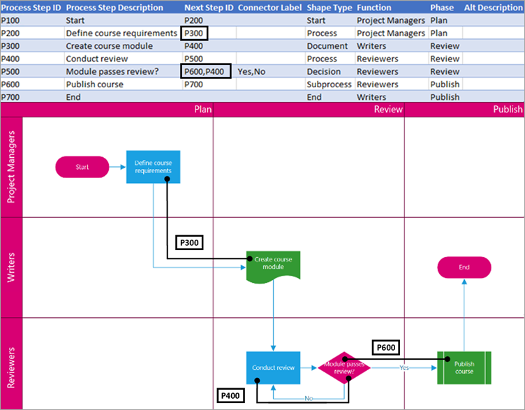
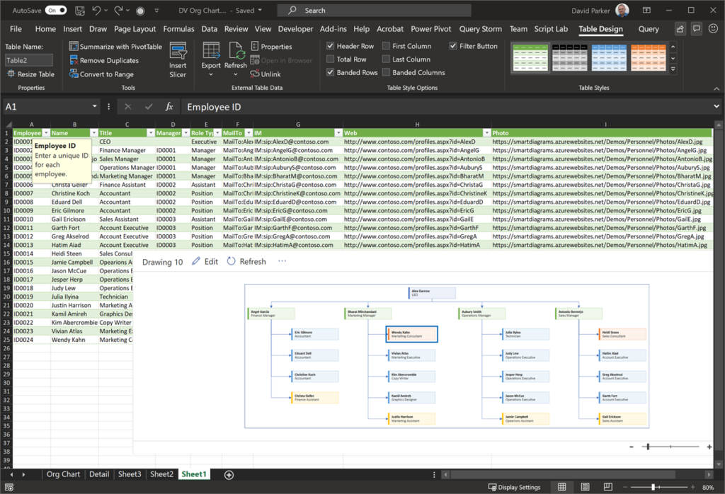
Каждый столбец таблицы однозначно определяет важный аспект блок-схемы, который вы видите. Ознакомьтесь со справочными сведениями ниже, чтобы узнать больше о каждом столбце, а также о том, как он применяется и влияет на блок-схему.
Число или имя, идентифицирующее каждую фигуру на схеме. Этот столбец является обязательным, и каждое его значение в таблице Excel должно быть уникальным и не пустым. Это значение не отображается на блок-схеме.

Это текст фигуры, видимый на схеме. Описывать, что происходит на этом этапе процесса. Также рекомендуется добавить аналогичный или более описательный текст в столбец Замещающий текст.

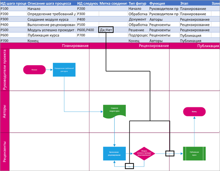
Это идентификатор шага процесса, соответствующий следующей фигуре в последовательности. Фигура ветвления имеет два следующих шага и представлена числами, разделенными запятыми, например P600,P400. Следующих шагов может быть и больше двух.
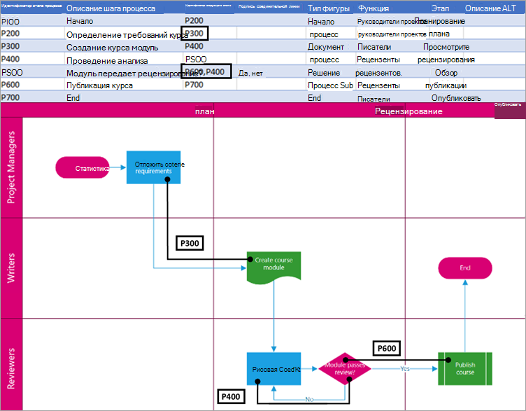
Для фигур ветвления метки соединителя представляются в виде текста, разделенного запятой, например Да, Нет. Да соответствует P600 и No соответствует P400 в примере. Метки соединителя не требуются.
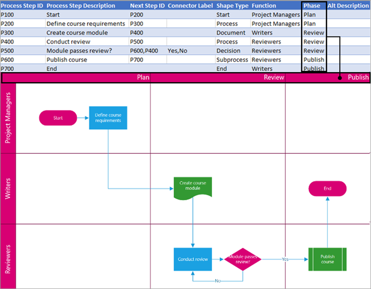
Функция (или дорожка), к которой принадлежит каждая фигура. Используйте столбцы Функция и Этап для организации различных заинтересованных лиц в блок-схеме. Этот столбец относится только к кросс-функциональной блок-схеме и не включен в схему блок-схемы «Базовый».
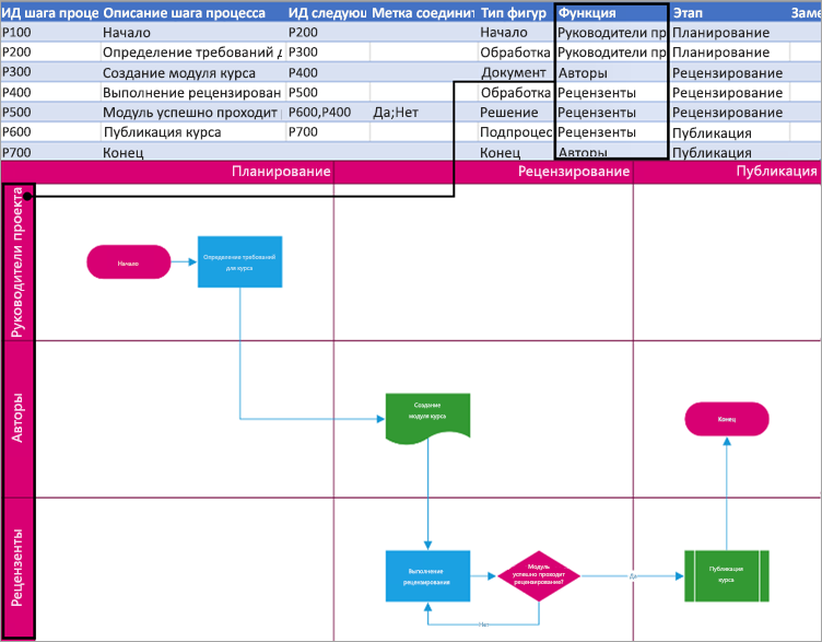
Этап (или временная шкала), к которому принадлежит каждая фигура. Используйте столбцы Функция и Этап для организации различных заинтересованных лиц в блок-схеме. Этот столбец относится только к кросс-функциональной блок-схеме и не включен в схему блок-схемы «Базовый».
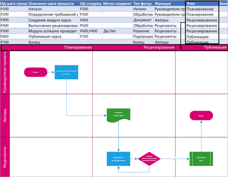
Замещающий текст используется средствами чтения с экрана, чтобы помочь лицам с нарушениями зрения. Вы можете просмотреть замещающий текст, введенный как часть сведений о фигуре. Ввод описательного замещающего текста не требуется, но рекомендуется.
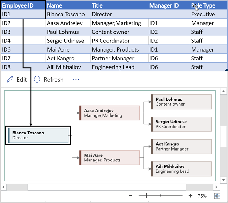
Каждый столбец таблицы однозначно определяет важный аспект организационной диаграммы, который вы видите. Ознакомьтесь со справочными сведениями ниже, чтобы узнать больше о каждом столбце, а также о том, как он применяется и влияет на схему.
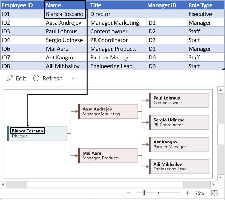
Число, определяющее каждого сотрудника в организационной диаграмме. Этот столбец является обязательным, и каждое значение в таблице Excel должно быть уникальным и не пустым. Это значение не отображается на схеме.
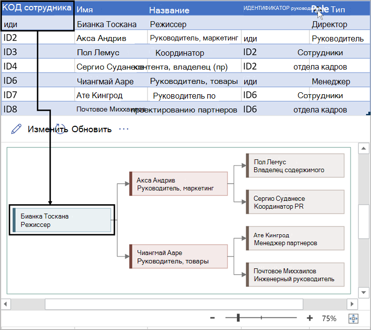
Введите полное имя сотрудника, которого вы хотите связать с идентификатором сотрудника. Этот текст отображается на схеме в виде текста фигуры.
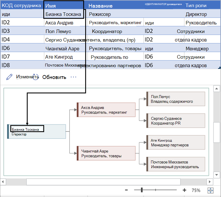
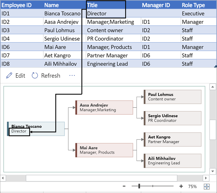
Укажите дополнительные сведения для сотрудника, введя должность или роль. Этот текст отображается в фигурах схемы под именем сотрудника.
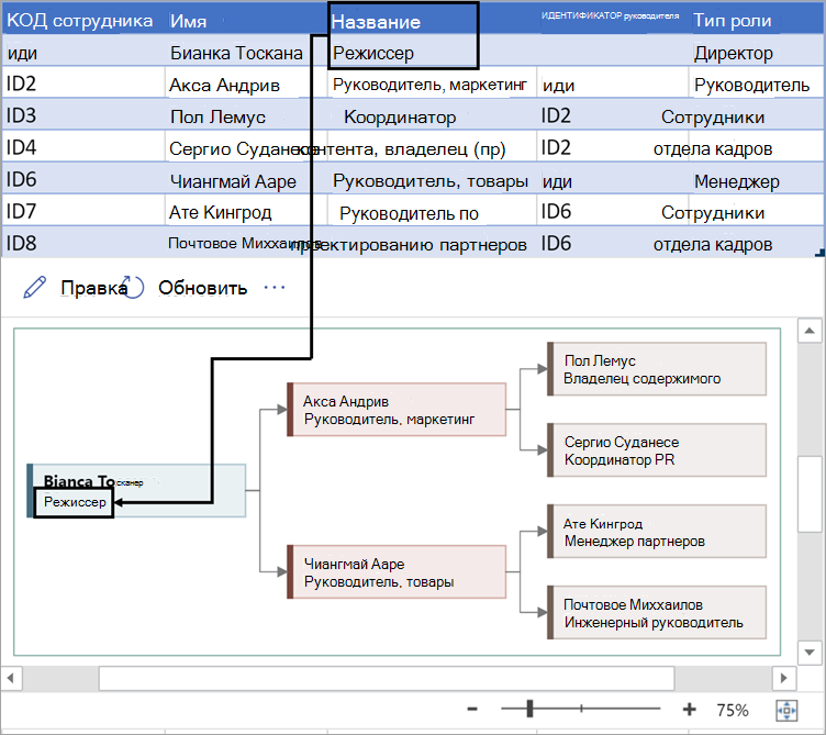
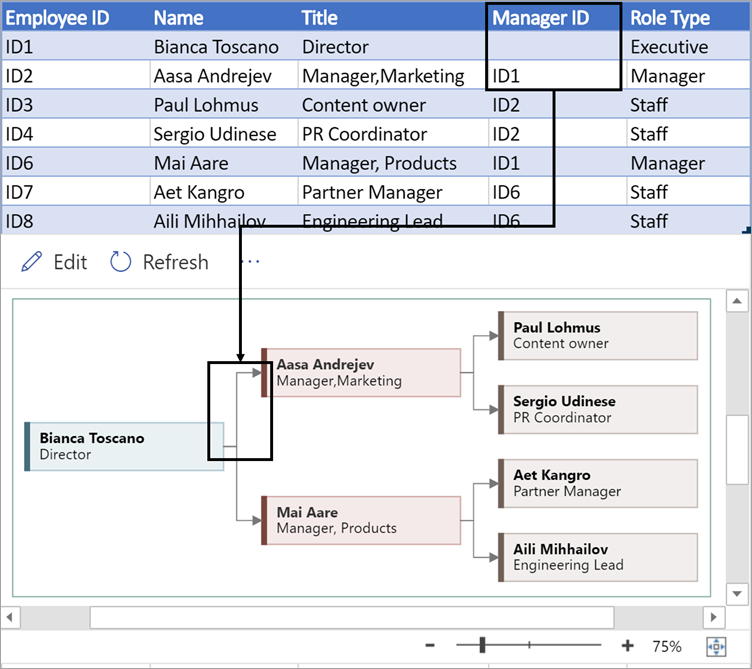
Чтобы создать структуру организационной диаграммы, используйте этот столбец для идентификации руководителя каждого сотрудника. Вы можете оставить его пустым для тех, кто никому не отчитывается. Вы введете соответствующий идентификатор сотрудника из первого столбца. Вы также можете разделить несколько менеджеров с помощью запятой.
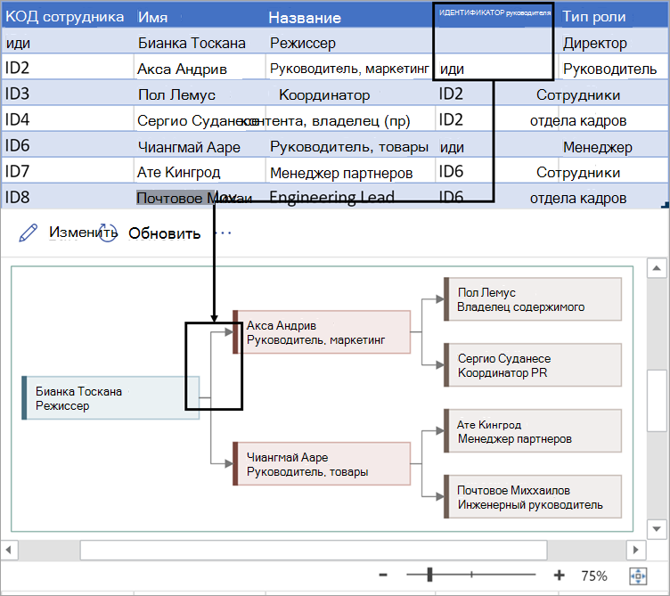
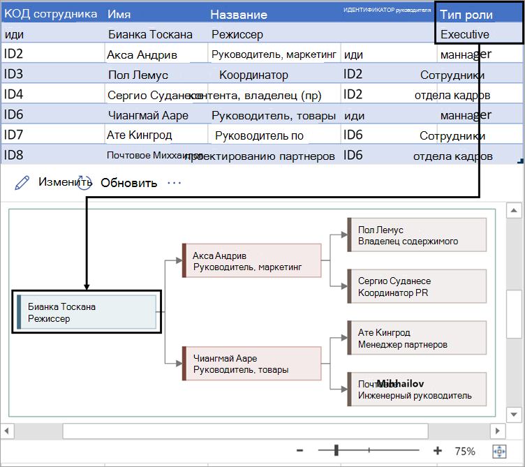
Организационные диаграммы в надстройке поставляются с разными типами ролей. Выберите поле в столбце Тип роли, чтобы выбрать роль, которая лучше всего описывает сотрудника. Это приведет к изменению цвета фигуры на схеме.
Поддерживаемые языки для надстройки Визуализатора данных
Щелкните подзаголовок, чтобы открыть список:
-
Китайский (упрощенное письмо)
-
китайский (традиционное письмо);
-
чешский;
-
Датский
-
Нидерландский
-
Немецкий
-
Греческий
-
английский;
-
финский;
-
Французский
-
Венгерский
-
Итальянский
-
Японский
-
Норвежский
-
Польский
-
Португальский (Бразилия)
-
Португальский (Португалия)
-
Румынский
-
Русский
-
Словенский
-
Испанский
-
Шведский
-
Турецкий
-
Украинский
См. также
Сведения о надстройке Визуализатора данных для Excel
Create stunning, high-quality diagrams with the Visio Data Visualizer add-in for Excel with a Microsoft 365 work or school account.
You can create basic flowcharts, cross-functional flowcharts, and organizational charts. The diagrams are drawn automatically from data in an Excel workbook. If you then edit the diagram in Visio, your changes are synced back to Excel.
This means you don’t need a Visio subscription to make stunning diagrams in Excel. View, print, or share your diagrams with others for free in the web version of Visio. For additional editing capabilities, you need either a Visio Plan 1 or Visio Plan 2 subscription.
Note: The Visio Data Visualizer add-in is supported in all the languages supported by Visio for the web. A complete list of the languages is shown at the end of this article.
Start with the Visio Data Visualizer add-in
The Data Visualizer add-in is available for Excel on PC, Mac, and the browser with a Microsoft 365 work or school account.
(If the only Microsoft account you have is a personal one—that is, hotmail.com, live.com, outlook.com, or msn.com—you can still try out parts of the Data Visualizer add-in without signing in. It just means that the features available to you are somewhat limited. Read The Data Visualizer add-in is designed for Microsoft 365 work and school accounts for more details.)
-
Open Excel and create a new Blank workbook.
-
Save the workbook to a OneDrive or SharePoint location for seamless sharing and the optimal experience. You can also save your file locally to your computer.
-
Ensure that an empty cell is selected in the workbook.
-
Select Insert > Get Add-ins or Add-ins. In the Office Add-ins Store, search for “Data Visualizer», and then select Add. If you see a security message regarding the add-in, select Trust this add-in.
-
Sign in with the account associated with your Microsoft 365 work or school subscription, or select Sign in later.
In the add-in, we no longer support manual sign-in («ADAL»). But we automatically detect your identity and sign you in. If we can’t sign you in, it means your version of Excel doesn’t work with the add-in. You can fix this by using Excel for the web or upgrading to Excel for Microsoft 365.
Note: When you’re signed in, you unlock capabilities in Visio for the web such as printing, sharing, and viewing in the browser. You don’t need a Visio subscription to use this add-in, but if you have one, you’ll also be able to make edits to your diagram.
If you see a permissions prompt, select Allow.
As an alternative to the procedure above, you can download our add-in ready templates to get started in Excel:
Modify the data-linked table to customize your diagram
-
Choose a diagram type and then select the template you’d like to work with. This will insert a sample diagram and its data-linked table. That process may take a minute. The templates come with different layout and theme options that can be further customized in Visio.
-
If you’re signed in, the diagram is saved as a Visio file in your OneDrive or SharePoint location. If you’re not signed in, then the diagram is part of your Excel workbook instead. You can always choose to create a Visio file by signing in.
-
To create your own diagram, modify the values in the data table. For example, you can change the shape text that will appear, the shape types, and more by changing the values in the data table.
For more information, see the section How the data table interacts with the Data Visualizer diagram below and select the tab for your type of diagram.
-
Add or remove shapes for steps or people by adding or removing rows in the data table.
-
Connect shapes to design the logic of your diagram by entering the IDs of the connected shapes in the corresponding table column for your diagram type.
-
After you’ve finished modifying the data table, select Refresh in the diagram area to update your visualization.
Note: If there is an issue with the source data table, the Data Checker will appear with instructions on how to fix the issue. After you modify the table, select Retry in the Data Checker to confirm the issue is resolved. Then you’ll see the updated diagram.
Tips for modifying the data table
-
Save the Excel workbook (if you’re working in the Visio client) and Refresh frequently.
-
Consider sketching out the logic of your diagram on paper first. This may make it easier to translate into the data table.
View, print, or share your Visio diagram
You can open the Data Visualizer flowchart in Visio for the web to view, print, or share your diagram with others. Learn how:
-
To view the diagram outside of Visio for the web, select the ellipses (. . .) in the diagram area and select Open in web.
Note: If you’re not signed in yet, you’ll be prompted to sign in with your Microsoft 365 work or school account.* Select Sign in and then Allow or Accept on any permission prompts.
-
After the Visio file is created, select Open file.
-
In Visio for the web, select the ellipses (. . .) > Print to print your diagram.
-
To share your diagram, select the Share button to create a link or to enter the email addresses of those you want to share with.
Edit the diagram with a Visio subscription
If you have a subscription to Visio, you can do more with the diagram. Add text or images, apply design themes, and make other modifications to customize the diagram.
Do basic editing with Visio for the web
Use Visio for the web for basic editing in the browser, such as changing themes, modifying layouts, formatting shapes, adding text boxes, etc.
-
In the diagram area in Excel, select Edit
.Note: If you’re not signed in yet, you’ll be prompted to sign in with your Microsoft 365 or Microsoft 365 work or school account. Select Sign in and then Allow or Accept on any permission prompts.
-
Make your changes to the diagram in Visio for the web.
To do this
Use
Add and format text
Home > Font options:
For more details, see Add and format text.
Change the theme
Design > Themes
Design > Theme Colors
For more details, see Apply a theme or theme color.
Change the diagram’s layout
Design > Layout
For more details, see Re-layout a diagram.
If you want to add or modify a shape while still keeping the source data in sync, then edit the diagram with the Visio desktop app. Such changes made in Visio for the web can’t by synced back to the Excel source file.
-
When you’re done editing the diagram, go back to the Excel file and select Refresh
to see your changes.
 .
.


 to see your changes.
Do advanced editing with the Visio app
Use the Visio desktop app for advanced edits, such as adding new shapes, modifying connections, and other changes to the structure of the diagram. The Visio app supports two-way sync, so any changes you make can be synced back to your Excel workbook where you can see your diagram changes after refreshing.
Note: To edit in the Visio app, you need a Visio Plan 2 subscription.
-
In the diagram area in Excel, select Edit.
-
Save and close your Excel file.
To edit in the Visio app and successfully sync changes, the Excel file with the data table and diagram must be closed.
-
In Visio for the web select Edit in Desktop App in the ribbon.
-
Select Open to confirm. If you receive a security warning asking if this Visio file is a trusted document, select Yes.
-
Make your changes to the diagram in the Visio app.
-
When you’re done, select the diagram container to see the Data Tools Design tab in the ribbon, and then select Update Source Data.
Note: If you try to update the source data and the link to the Visio data is broken, Visio prompts you to relink. Select the diagram area in Visio, and under the Data Tools Design tab select Relink Source Data. Browse to the Visio workbook with the source table, select Relink, then Update Source Data again.
-
Now that your data has synced back to your Excel workbook, save your Visio file—preferably in the same location as your Excel file.) Close the Visio file.
-
Open the Excel file and select Refresh in the diagram area to see your changes.
Note: If you run into a Refresh Conflict, you can refresh the diagram. You’ll lose any edits you’ve made, but any formatting changes to the shapes or connectors inside the container are preserved.

Microsoft 365 subscribers who have Visio Plan 2 can use Data Visualizer templates to get more advanced diagramming features, such as those listed below. See Create a Data Visualizer diagram for more details:
-
Create a diagram using custom stencils
-
Create sub-processes
-
Bring your diagram to life with data graphics
-
Have two-way synchronization between the data and the diagram
How the data table interacts with the Data Visualizer diagram
Each column of the table uniquely identifies an important aspect of the flowchart that you see. See the reference information below to learn more about each column and how it applies and affects the flowchart.
A number or name that identifies each shape in the diagram. This column is required, and each value in the Excel table must be unique and not be blank. This value does not appear on the flowchart.

This is the shape text that is visible in the diagram. Describe what occurs in this step of the process. Consider also adding a similar or more descriptive text to the Alt text column.

The Process Step ID of the next shape in the sequence. A branching shape has two next steps and is represented by comma-separated numbers such as P600,P400. You can have more than two next steps.
For branching shapes, connector labels are represented as text separated by a comma, such as Yes,No. Yes corresponds to P600 and No corresponds to P400 in the example. Connector labels are not required.

The function (or swimlane) that each shape belongs to. Use the Function and Phase columns to help you organize different stakeholders in your flowchart. This column only applies to a Cross-Functional Flowchart and isn’t included as part of the Basic Flowchart diagram.

The phase (or timeline) that each shape belongs to. Use the Function and Phase columns to help you organize different stakeholders in your flowchart. This column only applies to a Cross-Functional Flowchart and isn’t included as part of the Basic Flowchart diagram.
Alt text is used by screen readers to assist those with visual impairments. You can view alt text you’ve entered as part of the Shape Info of a shape. Entering descriptive alt text is not required, but recommended.
Each column of the table uniquely identifies an important aspect of the organization chart that you see. See the reference information below to learn more about each column and how it applies and affects the diagram.
A number that identifies each employee in your organization chart. This column is required, and each value in the Excel table must be unique and not blank. This value doesn’t appear in the diagram.
Enter the full name of the employee you want to associate with the employee ID number. This text displays in the diagram as shape text.
Provide additional details for the employee by entering the job title or role. This text displays in the diagram shapes underneath the employee’s name.
To create the structure of the organization chart, use this column to identify the manager of each employee. You can leave it blank for those who don’t report to anyone. You’ll enter the corresponding employee ID from the first column. You can also separate multiple managers using a comma.
Organization charts in the add-in come with different role types for you to choose from. Select a field under the Role Type column to choose a role that best describes the employee. This will change the color of the shape in the diagram.

Supported languages for the Data Visualizer add-in
Click the subheading to open the list:
-
Chinese (Simplified)
-
Chinese (Traditional)
-
Czech
-
Danish
-
Dutch
-
German
-
Greek
-
English
-
Finnish
-
French
-
Hungarian
-
Italian
-
Japanese
-
Norwegian
-
Polish
-
Portuguese (Brazil)
-
Portuguese (Portugal)
-
Romanian
-
Russian
-
Slovenian
-
Spanish
-
Swedish
-
Turkish
-
Ukrainian
See Also
About the Data Visualizer add-in for Excel
Microsoft have recently released a preview of the Microsoft Visio Data Visualizer for Excel, and if you have not yet tried it … you should! I am sure that it is far more powerful than one might expect because you can create some very useful Visio diagrams without a Visio license! Sure, you do need a Visio license to edit the diagram, but, if you keep your source table updated, then the diagram will automatically update itself. You can now create, update and share process flow diagrams and organisation charts from Excel and add them to Power BI reports!
Reviewing the original Data Visualizer functionality
Until now, the integration of Visio and Excel with the two Process Map templates in Excel or three Excel templates in Visio have been limited to basic and cross-functional flow charts. In both cases, it is necessary to have licences for both Excel and Visio to create and maintain the diagrams.
This feature does include two-way updates, so the user can either update the source table in Excel or the target diagram in Visio, and then refresh the other. Although this capability exists, it is not always necessary to have bi-directional updating and refreshing, and indeed I wrote an article a while ago about using a database as a read-only source for Data Visualizer for Visio Pro for Office 365 – Part 2. By the way, Visio Pro for Office 365 was the original name for Visio Plan 2.
The key feature is that flow charts can be easily created from Excel tables with some specific requirements, such as a column with a unique identifier, and a column that specifies the predecessor or successor unique identifiers. There is a column to specify the shape type (master name) to be used, the text to be applied, and, in the case of cross-functional flowcharts, the swimlane or stage to place the shapes in.
It was always the intention of Microsoft to increase the
diagram types beyond flow charts, and so organization charts became the next
offering in this new add-in for Excel.
The Visio Data Visualizer includes Basic and Cross-Functional Flowcharts, but has added Organization Charts to the list! Simply go to the Microsoft store with the Insert / Add-Ins / Get Add-Ins button, and enter Visualizer as a search string. Then Add the Microsoft Visio Data Visualizer add-in to your Excel environment, trusting it if prompted. You can use the add-in on any blank worksheet tab, but it is advised to first save the Excel workbook to a OneDrive for Business or a SharePoint Online folder before using it because the add-in will automatically save the new Visio document there. You will be prompted with three types of Visio diagrams to create.
- Learn more about using the add-in : Create a diagram in Excel with the Visio Data Visualizer add-in
- Learn more about the add-in capabilities : About the Data Visualizer add-in for Excel
Creating an Organization Chart
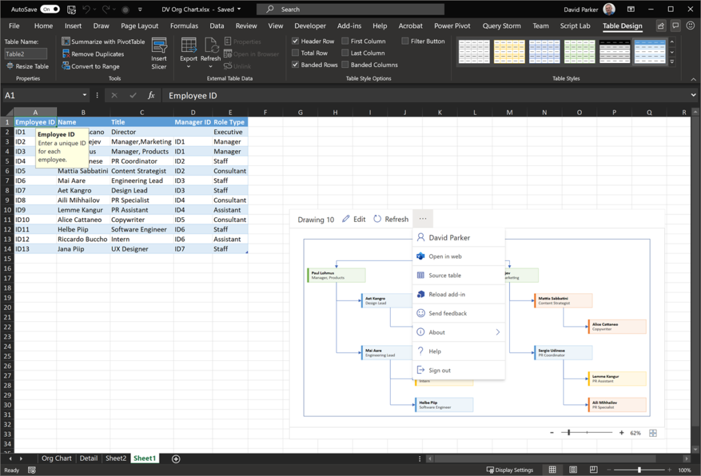
Microsoft Visio has had an organizational chart feature for over 20 years, and is used by many companies, and it has a few issues, including not being able to update any hierarchy changes without having to completely re-draw. This new Visio Data Visualizer add-in for Excel, however, can automatically change the structure of the diagram to match the data. This applies to all of the diagram types, not just Org Charts. When a diagram type is selected, a Visio control is added to the Excel worksheet along with a sample source table that is used to generate the diagram.
There are five required columns for an Organization Chart:
- Employee ID Must be unique
- Name The
name is displayed as the first line of text, in a bold font. - Title The
title is displayed as the second line of text - Manager ID The ID of the manager, which must exist in the Employee ID column
- Role Type The
role type is used to colour the shapes by value
You can add extra columns to the table, and they will be added as data rows to each shape, but they will not be displayed on the shapes, unless the Visio document is edited in Visio for Desktop or opened with the Visio for Web in reading view.
The Visio control displays the Visio file name, an Edit button, a Refresh button, and a Show more commands (…) button.
Replacing the sample data with your own
The Source table option selects the current source of the data, which can then be manipulated, if desired. For example, the above organization chart is based on the Table2 table. This can, of course, be edited be adding extra columns or rows. It can also be replaced with a PowerQuery that comes from another data source, and, if the name, eg Table2, is re-applied before the Refresh command is pressed, then the Visio diagram will be updated with the new data.
If you do have a Visio Plan 2 license, then you can edit
the Visio document in Visio for Desktop to update the masters of
the shapes to provide more text and hyperlinks, for example.
I have always thought that using Excel as a data source for Data Visualizer to be a tremendous feature because it allows the Visio developers to spend more time on visualising the data better. In addition, the PowerQuery skills are directly transferable to Power BI. Just one look at the number of data sources available, in Data / Get Data, to generate Visio diagrams from is staggering. These would be read-only diagrams, but if they are automatically updated, then their usefulness is boundless.
- Learn more about PowerQuery : Getting Started with Get & Transform in Excel
Sharing the Visio Diagram with others
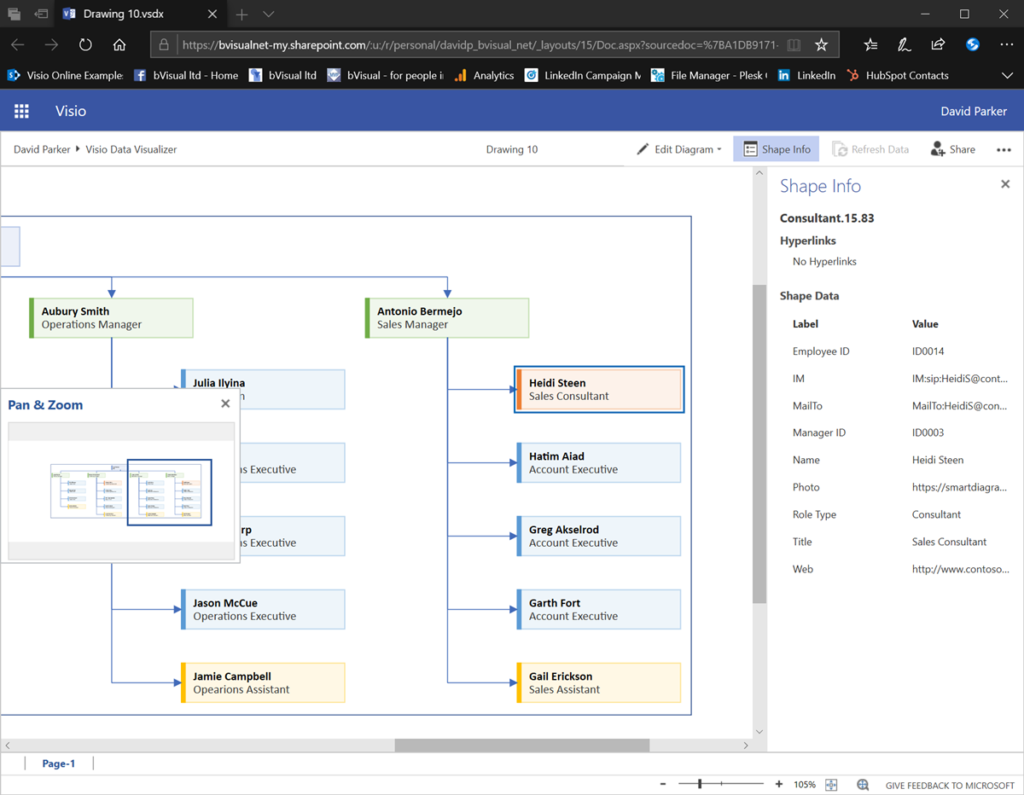
One of the Show more commands is to Open in web, which will open a new browser window with the Visio document in reading view. This does have the advantage that any data, and hyperlinks, on a shape can be viewed in the Shape Info window.
There are multiple options in this Show more commands (…) button in the top right corner. One of these options is to view and edit Comments, but notice the many other options that may be available, depending upon permissions, such as Find, Print, Download, Download as PDF and Embed.
- Learn more about Comments and co-working in this article : Work together on Visio drawings.
- Learn more about Print and Download as PDF in this article : Print a Visio diagram on the web.
- Learn more about Embed in this article : Display a Visio Diagram on a Web Page.
The Visio document is given a unique default name, Drawing xx, and is created in the same folder as the Excel workbook. This file name can be edited by users that have a Visio license, and this should be done within Visio for Web before electing to edit in Visio for Desktop.
Integrating with Power BI
One of the really cool consequences of this new add-in is that it is possible to create a Visio document and embed it within a Power BI report without a Visio license. You will only need a Power BI licence to collaborate with others ( see powerbi.com ).
First, create a new Power BI report and get the data
from the Excel table, or from the source of the query that forms the Excel table. This data is then available in Power BI, and normal visuals such
as the Chiclet Slicer, Table and PowerApps visuals can be
utilised, as shown below.
Then simply retrieve the shareable link of the Visio document from the Open in Web option above and paste it into the Visio Visual with the unique identifier field of the query selected. The records will then be automatically mapped to the correct shape in the Visio Visual, and then the shapes can have extra text added to them, or they can be coloured by a numeric value.
Notice how the Power BI visuals, in this case PowerApps, provides the ability to include images, something that the Visio Data Visualizer add-in is not yet capable of providing.
- Watch a short video of the above : https://youtu.be/9SD5eBEn4rY
- Learn more about Visio and Power BI, including a free guide at : Visio Power BI articles
The future of Data Visualizer
This add-in is currently a preview, so I encourage you all to try it and provide feedback in User Voice to impress the Microsoft development team to focus on the features that are important to you.
This add-in is a truly encouraging direction for Microsoft to take, and I hope will expand to include other diagram types, such as network infrastructure, roadmaps, project plans, and more. There are many refinements that I would also make to the add-in before release, but the future of instantly updateable diagrams is looking extremely encouraging.
My last post was about some of the lessons learnt when trying to push Data Visualizer to its limits, but this one has some ways of overcoming these limitations. The main lesson learnt is that DV binds the shapes within the DV container shape, CFF Data Visualizer, and controls some of the ShapeSheet cells that…
Regular readers of my blog will know that I like to use the Data Visualizer (DV) in Visio Plan 2, but I recently tried to help a user who really decided to push it to the limits. In this scenario, there were multiple connections, but with different labels, being created between the same flowchart shapes,…
I am delighted to share the link to my recent demonstration and conversation with fellow MVP Peter Ward about Visio in Teams. We discussed more than just Visio … and I look a bit like Max Headroom! (more…)
I re-vamped some of my content about the Visio Data Visualizer add-in for Excel in my last post, so I thought I should expand a bit more on the Data Visualizer feature in Visio for Desktop (Visio Plan 2) and Excel for Desktop. I have described it in detail in previous posts, but I never…
I have previously described how to use the Visio Data Visualizer add-in in Excel, but I didn’t make it clear how you can edit the diagram created if you have a Visio license. So, I have recorded three short videos to briefly explain this. (more…)
The Microsoft Visio product team have released a great video introduction to the Visio Data Visualizer, but even that does not reveal all of its power. So, here are some tips about using the Microsoft Visio Data Visualizer add-in in Excel. Firstly, the add-in currently offers three different types of diagram, and each have a…
Microsoft Excel отлично подходит для чисел, конечно, он отлично справляется с этой задачей. Но если вы хотите представить свои данные в привлекательной форме, позволяющей легко визуализировать и анализировать их, то в этом удивительном продукте могут отсутствовать некоторые функции. Это требует некоторой поддержки — попробуйте надстройку визуализатора данных для Excel.
Надстройка визуализатора данных для Excel — это новая рука в Excel, которая может преобразовывать рабочий лист Excel 365 в диаграмму Visio. Эта надстройка позволяет пользователям автоматически создавать высококачественные блок-схемы, многофункциональные блок-схемы и организационные диаграммы — все формы, соединения и связывание данных — из данных в таблицах Excel. Пользователям не нужно покупать Visio, чтобы использовать визуализатор данных Microsoft Visio в его простой форме, просто Excel 365 для Windows / Mac или в Интернете. Это интересный инструмент, и его стоит попробовать, если вы часто делаете блок-схемы или диаграммы.
Все, что вам нужно для начала, — это подписка на Office 365 — дополнительная подписка на Visio НЕ требуется.
Визуализатор данных использует лучшее из Excel и Visio; вы вводите данные в книгу Excel, и Visio автоматически создает схему. Любой, у кого есть подписка на Office 365, может использовать надстройку визуализатора данных для создания схем Visio; использовать базовые данные Excel для изменения диаграмм; а также просматривать, распечатывать и публиковать диаграммы.
Этот инструмент является альтернативой уже имеющимся в Office параметрам диаграмм, который предлагает ограниченные возможности и может сильно раздражать.
Создавайте блок-схемы и организационные диаграммы в Excel
Надстройка визуализатора данных для Excel доступна для:
- Excel в Windows
- Excelon Mac и
- Excel в Интернете с рабочей или учебной учетной записью
Чтобы установить визуализатор данных на любой из вышеперечисленных, вам нужно будет выполнить следующие действия:
1]Откройте «Excel» и создайте новую «Пустую» книгу.
2]Нажмите «Вставить», а затем «Получить надстройки».
3]В Магазине надстроек Office найдите «Визуализатор данных Visio» и нажмите кнопку «Добавить».
4]Теперь «Войдите», используя свою учетную запись, связанную с вашей подпиской на Office 365 / рабочей / учебной учетной записью Microsoft 365.
Примечание. Для использования надстройки подписка на Visio не требуется. Однако, если у вас есть соответствующая лицензия Visio, выберите «Войти» или «Войти позже». В этом случае будет немного функций, которые будут разблокированы только после входа в систему.
Создавайте диаграммы / блок-схемы из данных в Excel
Надстройка визуализатора данных для Excel оснащена множеством редактируемых примеров таблиц данных в Excel. В настоящее время визуализатор данных предлагает три типа вариантов диаграмм, включая базовую блок-схему, многофункциональную блок-схему и организационную диаграмму. Эти примеры отлично подходят для начала работы, они позволяют пользователям:
- Добавить этапы процесса
- Изменить соединители
- Создать зависимости
- Вставить владельцев
- И многое другое
Этот образец рабочего листа — только отправная точка. Вы можете добавить больше строк, изменить типы фигур и переключать их. Есть еще много вариантов.
Вы даже можете расширить этот рабочий лист, добавив больше столбцов. Эти столбцы не изменяют основную схему Visio, но позволяют вам использовать лист в более широком анализе.
Пользователи могут легко заменить образцы данных своими собственными, и после этого просто нажмите «Обновить диаграмму», чтобы увидеть, как изменения синхронизируются с диаграммой, связанной с данными, точно на листе Excel.
Просматривайте, распечатывайте и делитесь своими схемами / блок-схемами
Поскольку ваши схемы Visio создаются в Интернете (по умолчанию сохраняются в OneDrive или SharePoint), просмотр, печать и совместное использование с другими пользователями Office 365 становится невообразимо простым. Если вы хотите открыть схему в Visio в Интернете, выберите «Открыть в Интернете» из многоточия (•••) в строке меню надстройки.
Примечание: Если вы еще не вошли в систему, вам будет предложено войти в свою рабочую или учебную учетную запись Microsoft 365 или Office 365. Выберите «Войти», а затем «Разрешить» или «Принять любые запросы разрешений».
После создания файла Visio выберите «Открыть файл». Отсюда:
- Чтобы распечатать — в Visio в Интернете выберите многоточие (…)> Печать, чтобы распечатать схему.
- Чтобы поделиться — нажмите кнопку «Поделиться», чтобы создать ссылку или ввести адреса электронной почты тех, с кем вы хотите поделиться.
Настраивать и редактировать диаграммы / блок-схемы с помощью надстройки визуализатора данных
Кнопка «Изменить» не работает для тех, у кого нет отдельной полной лицензии Visio. Без лицензии Visio вы застрянете с исходной цветовой схемой, и настройки будут ограничены.
С лицензией Visio Online (план 1) или Visio Online (план 2) пользователи могут многое сделать со своими диаграммами визуализатора данных и сделать свои презентации более интересными. Они могут добавлять текст или изображения, применять темы дизайна и вносить другие изменения для настройки схем в Visio или Visio Online.
Суть — Единственные возможные изменения схемы — из исходного листа, если у вас нет доступа к полной версии Visio.
Помощь и поддержка
Пользователи могут получить дополнительную поддержку и отправить свой отзыв непосредственно в Microsoft из надстройки, щелкнув многоточие и нажав «Справка» или «Отправить отзыв».
Надстройка Data Visualizer для Excel стоит попробовать!
Вам следует попробовать надстройку визуализатора данных Visio для Excel. Откройте образец рабочего листа и поиграйте с блок-схемами, чтобы увидеть, как все работает.
Источник: Microsoft.com.
.
В конце прошлого года Microsoft анонсировала умные диаграммы в Visio, когда диаграмма строилась на основе данных из листа Excel. Похоже сегодня данная возможность приобрела черты финального проекта и официальное название – Data Visualizer, поскольку доступна не только участникам программы Office Insider.
Data Visualizer – это новая возможность Visio, которая автоматически конвертирует карту процесса из Excel в диаграмму Visio. Финансовые аналитики смогут быстро визуализировать шаги и связать данные таблиц Excel и диаграмм Visio.
Для такого преобразования необходимо использовать специальный шаблон Excel, но можно конвертировать и существующую таблицу собственного дизайна. В предопределенном шаблоне есть одна таблица для построения базовой диаграммы и одна для функциональной блок-схемы. При создании собственного шаблона можно самостоятельно предусмотреть необходимые данные.

Дополнительно аналитики могут сохранить диаграмму Visio и данные листа Excel, как один набор, используя команду «Export as a Template Package». Заполняя лист новыми данными можно будет получать шаблонные диаграммы, отвечающие нуждам организации.
Воспользоваться таким преобразованием смогут пользователи Visio Pro для Office 365, а на странице поддержки, можно получить пошаговую инструкцию для создания такого преобразования.