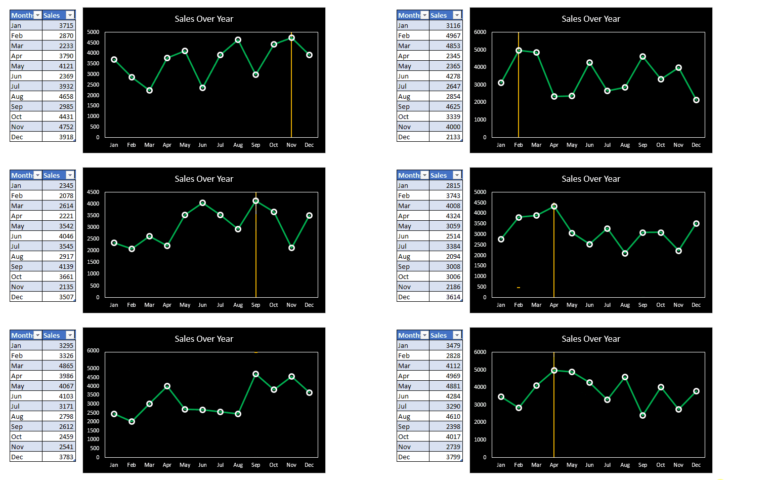
The line charts are fantastic tools in Excel to visualize records over time. And while working with line charts, we get the need to add a vertical line to mark something (let’s say a data point).
We can draw a vertical line on the chart manually but that’s just not smart. We would like to add vertical lines dynamically to mark a certain data point, say the max value. And in this article, we will learn how to insert a dynamic vertical line in the chart that changes its location. Believe me, it is easier than you think.
So, let’s start:
Example: Add A Vertical Line to a Line Chart to Mark Max Value
Here I have a record of sales in different months of a year. The data is stored in an Excel Table so that our chart can be dynamic.
I want to have a line chart that shows the sales in different months on the timeline and mark the maximum value by adding a vertical line.
Follow the steps below:
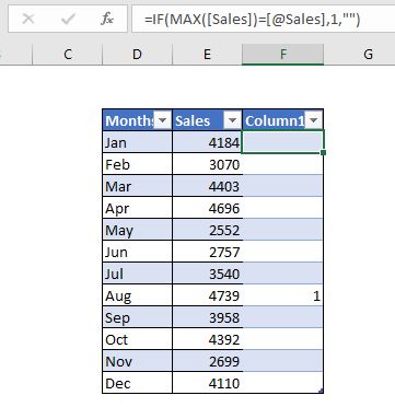
1: Add a support column to Identify the max number. To insert a vertical line on the max point, we need a supporting column that identifies the max value. Insert a column in the table. And insert this formula to identify the max value.
=IF(MAX([Sales])=[@Sales],1,»»)
Since I have used the Excel Tables, I get structured data to use in the formula. This formula will enter 1 in the cell of the supporting column when it finds the max value in the Sales column.
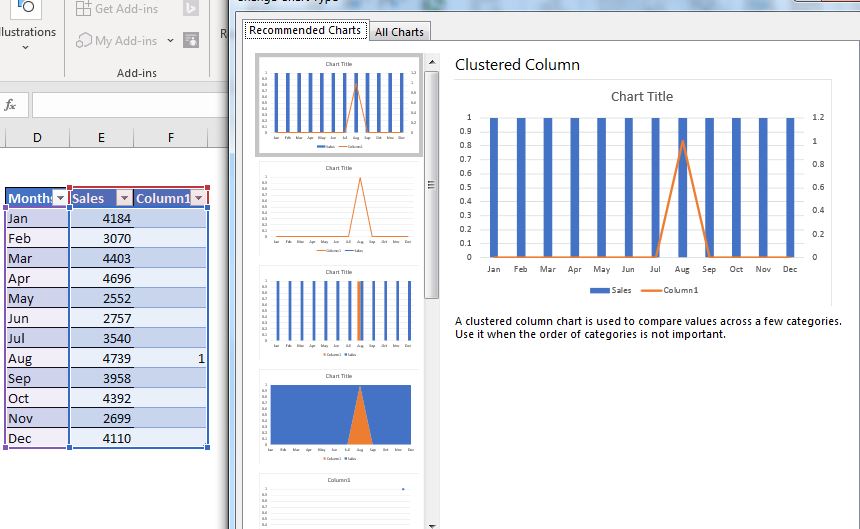
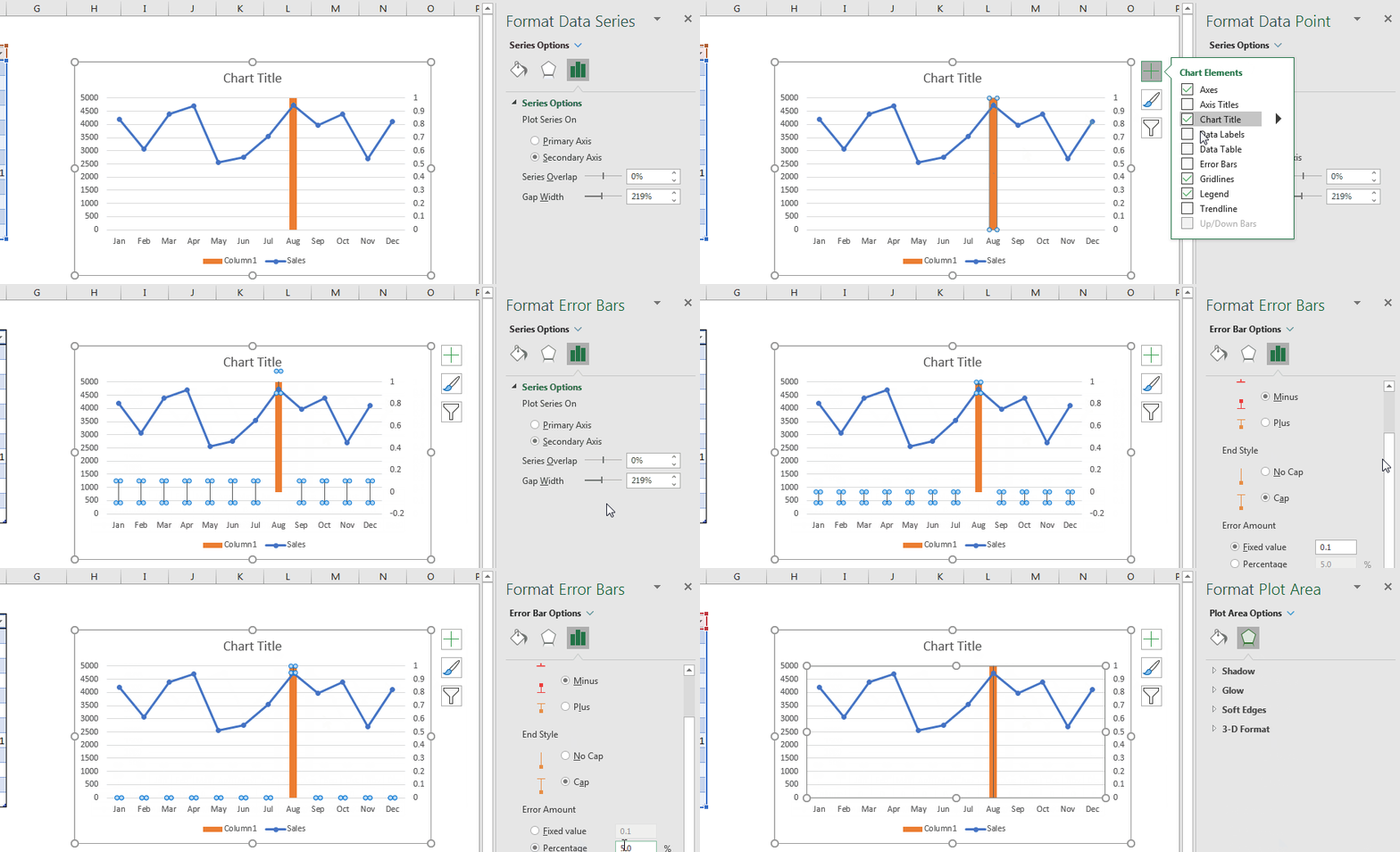
2: Select the table and insert a Combo Chart: Select the entire table, including the supporting column and insert a combo chart. Goto—> Insert—>Recommended Charts. In the recommended charts, click on chart with line bars.
3: Change Sales series to the line and supporting column to column: Right-click on the chart and go to change chart type. Change the sales series to the line and supporting column to a column chart. Now it has started to look like what we want it to be.
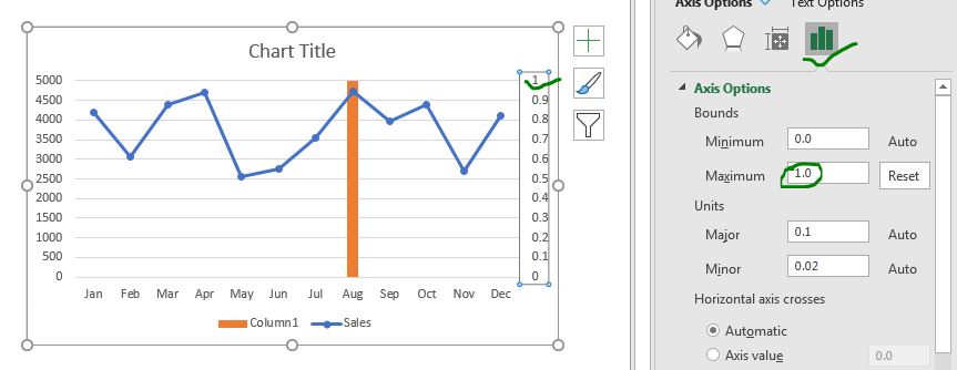
4: Fix the secondary axis’s maximum value to 1: Right-click on the secondary axis and click on the format axis option. In the axis option, set it to 1 from 1.2. Now the bar touches the ceiling of the chart. this is what we wanted.
5: Add error bars to column chart: While having selected the column chart, click on the plus sign—>Error Bars—> more error bars option. Here, in direction select minus and make error amount 100%. And here we go. We have a verticla line inserted in a line chart. (If you want you can just have the column chart but I wanted a thin line.)
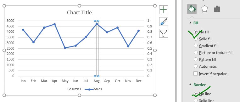
6. Make Column Invisible: Select the column chart and go to formatting. In border and fill option, select no fill and no border.
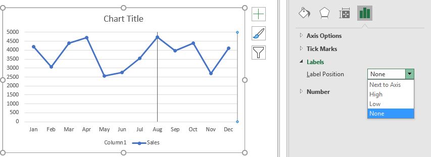
7: Finally, Make Secondary Axis Invisible: Since we don’t need to see the secondary axis, let’s make it invisible (don’t delete it). Select the secondary axis— go to formatting option—> under Labels —> select None.
That’s it. You have added a vertical line to the line chart. Now you only need to beautify it.
Beautify the Chart with Vertical line
Select the different components of the graph that you want to format.
In the chart below, I have made the markers of line chart larger with no fill and borders with white color.
The background fill is black. I colored the sales line green and vertical marker line orange. I removed legends as we don’t need them here.
And that’s it. We have inserted a vertical line to a chart that changes its position to the maximum value.
Finally, hide the supporting column as you don’t need it to be shown. Don’t hide it, just make it thin enough so that it doesn’t show.
You can download the template for the above chart below:
So yeah guys, this is how we can insert a thin vertical line in an excel chart that changes its position dynamically. I tried to be explanatory. Let me know if it helped you, in the comments section below.
If you have any doubts regarding excel charts, formulas, function or VBA topics, ask that too in the comment section below.
Related Articles:
How to Highlight Maximum and Minimum Data Points in Excel Chart | It is always a good idea to highlight the key values on the graph so that the max and min values can easily be spotted visually.
How to Create Milestone Chart in Excel | A milestone chart shows the date or time when a milestone is achieved in a graphical way. This graph must be easy to read, explanatory, and visually attractive.
Pareto Chart and Analysis | The Pareto analysis states that your 80% problem is caused by 20% of factors. Or we may say that by working on only 20% of cases you can solve your 80% of problems. Fascinating, right? The method is also famous for the 80/20 rule
Waterfall Chart |This chart is also known as the flying bricks chart or as the bridge chart. It’s used for understanding how an initial value is affected by a series of intermediate positive or negative values.
Excel Sparklines: The Tiny Charts in Cell | The Sparklines are the small charts that reside in a single cell. Sparklines are used to show trends, improvement, and win-loss over the period. The sparklines are charts but they have limited functionalities as compared to regular charts.
Creative Column Chart that Includes Totals | To include the total of the clustered column in the chart and compare them with another group of the columns on the chart is not easy. Here, I have explained how to smartly include totals in the clustered column chart.
4 Creative Target Vs Achievement Charts in Excel |Target vs Achievement charts is a very basic requirement of any excel dashboard. In monthly and yearly reports, Target Vs Achievement charts are the first charts the management refers too and a good target vs Achievement chart will surely grab the attention of management.
Popular Articles:
50 Excel Shortcuts to Increase Your Productivity | Get faster at your task. These 50 shortcuts will make you work even faster on Excel.
The VLOOKUP Function in Excel | This is one of the most used and popular functions of excel that is used to lookup value from different ranges and sheets.
COUNTIF in Excel 2016 | Count values with conditions using this amazing function. You don’t need to filter your data to count specific value. Countif function is essential to prepare your dashboard.
How to Use SUMIF Function in Excel | This is another dashboard essential function. This helps you sum up values on specific conditions.
Home / Excel Charts / How to Add a Vertical Line in a Chart in Excel
Sometimes while presenting data with an Excel chart we need to highlight a specific point to get the user’s attention there. And the best way for this is to add a vertical line to a chart.
Yes, you heard it right. You can highlight a specific point on a chart with a vertical line. Just look at the below line chart with 12-months of data.

Now, you know the benefit of inserting a vertical line in a chart. But the point is, which is the best method? Well, out of all the methods, I’ve found this method (which I have mentioned here) simple and easy.
Without any further ado here are the steps and please download this sample file from here to follow along.
Steps to Insert a [Static] Vertical Line a Chart
Here you have a data table with monthly sales quantity and you need to create a line chart and insert a vertical line in it. Please follow these steps.
- Enter a new column beside your quantity column and name it “Ver Line”.
- Now enter a value “100” for Jan in “Ver Line” column.
- Select the entire table and insert a line chart with markers.
- You’ll get a chart like this.
- Now select the chart and open the “Chnage Chart Type” options from Design Tab.
- After that change chart type to secondary axis and chart type to “Column Chart”
- Now next thing is to adjust axis values for your column bar.
- Double click on your secondary axis to open formatting options.
- Change the maximum value to 100, as we have entered the same value in Ver Line column.
- In same axis options, move down to label position and select none (This will hide secondary axis, yup we don’t need it).
- Last but not least, we have to make our column bar little thin so that it will look like a line.
- Click on the data bar, go to series option and increase your “Gap Width” to 500%.
Congratulations! You have successfully added a vertical line to your chart. You can download this sample file from here to learn more about this.

Quick Tip: Just enter 100 in the cell where you want to add a vertical line. If you want to add a vertical line in Feb instead of May, just enter the value in Feb.
Steps to Add a [Dynamic] Vertical Line in a Chart
Now it’s time to level up your chart and make a dynamic vertical name. Please follow these simple steps for this.
- First of all, you need to insert a scroll bar. Go to developer tab ➜ Insert ➜ Scroll bar.
- Right-click on your scroll bar and select format control.
- Link your scroll bar to cell C10 and enter 12 for maximum value.
- In the end, click OK.
- After that go to your data table and insert this formula [=IF(MATCH($A2,$A$2:$A$13,0)=$D$1,100,””)] to cell C2 (Formula Bar) and drag down up to the last cell of the table.
- Now you can use the scroll bar to navigate your vertical line in your chart. You can download this sample file from here to learn more about this.
Conclusion
As I said, adding a vertical line in a chart is useful when you want to highlight a specific data point in your chart. There are also some other ways to add a vertical line but I found this method quick and easy. I hope this charting tip will help you to get better at Excel.
Have you ever tried to do this before with your chart?
Please share your views in the comment section I would love to hear from you and please don’t forget to share this tip with your friends.
More Charting Tips and Tutorials
- How to Add a Horizontal Line in a Chart in Excel
- How to Create a Bullet Chart in Excel
- How to Create a Dynamic Chart Range in Excel
- How to Create a Dynamic Chart Title in Excel
- How to Create Interactive Charts In Excel
- How to Create a Sales Funnel Chart in Excel
- How to Create a HEAT MAP in Excel
- How to Create a HISTOGRAM in Excel
- How to Create a Pictograph in Excel
- How to Create a Milestone Chart in Excel
- How to Insert a People Graph in Excel
- How to Create PIVOT CHART in Excel
- How to Create a Population Pyramid Chart in Excel
- How to Create a SPEEDOMETER Chart [Gauge] in Excel
- How to Create a Step Chart in Excel
- How to Create a Thermometer Chart in Excel
- How to Create a Tornado Chart in Excel
- How to Create Waffle Chart in Excel
17 авг. 2022 г.
читать 2 мин
Иногда вам может понадобиться добавить вертикальную линию на диаграмму в Excel в определенном месте.
В этом руководстве представлен пошаговый пример того, как добавить вертикальную линию к следующей линейной диаграмме в Excel:
Давайте прыгать!
Шаг 1: введите данные
Предположим, мы хотим создать линейную диаграмму, используя следующий набор данных в Excel:
Шаг 2: Добавьте данные для вертикальной линии
Теперь предположим, что мы хотим добавить вертикальную линию, расположенную в точке x = 6 на графике.
Мы можем добавить в набор данных следующие искусственные координаты (x, y):
Шаг 3: Создайте линейную диаграмму с вертикальной линией
Наконец, мы можем выделить ячейки в диапазоне A2:C14 , затем щелкнуть вкладку « Вставка » на верхней ленте, а затем нажать « Разброс с плавными линиями» в группе « Диаграммы »:
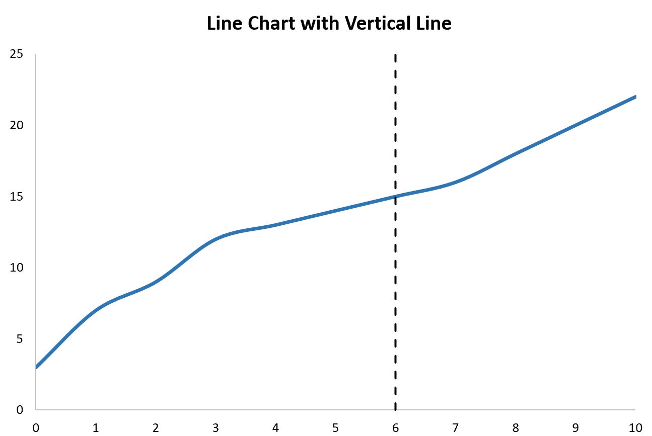
Будет создана следующая линейная диаграмма:
Обратите внимание, что вертикальная линия расположена в точке x = 6 , которую мы указали в конце нашего исходного набора данных.
Вертикальная линия находится в диапазоне от y = 0 до y = 25 , что мы также указали в нашем исходном наборе данных.
Чтобы изменить высоту линии, просто измените значения y, чтобы использовать любую начальную и конечную точки, которые вы хотите.
Шаг 4. Настройте диаграмму (необязательно)
Наконец, не стесняйтесь изменять диапазон каждой оси вместе со стилем вертикальной линии, чтобы сделать его более эстетичным:
Дополнительные ресурсы
В следующих руководствах объясняется, как выполнять другие распространенные задачи в Excel:
Как добавить среднюю линию в гистограмму в Excel
Как добавить горизонтальную линию на диаграмму рассеяния в Excel
Написано

Замечательно! Вы успешно подписались.
Добро пожаловать обратно! Вы успешно вошли
Вы успешно подписались на кодкамп.
Срок действия вашей ссылки истек.
Ура! Проверьте свою электронную почту на наличие волшебной ссылки для входа.
Успех! Ваша платежная информация обновлена.
Ваша платежная информация не была обновлена.
There are a few creative ways to add a vertical line to your chart bouncing around the internet. If you have landed on this article, I assume you are looking for an automated solution so you don’t have to manually drag the line(s) you drew on your spreadsheet every month.
Well, you have come to the right place!
In this article, you will learn the best way to add a dynamic vertical line to your bar or line chart. This technique is fairly easy to implement but took a lot of creative thinking to develop (I definitely did not create this technique but it’s been well known among Excel chartists for decades).
In this article, we’ll cover 3 topics:
-
Embedding Vertical Line Shapes Into A Chart (Simple Method)
-
Creating A Dynamic Vertical Line In Your Chart (Advanced Method)
-
Adding Text Labels Above Your Vertical Line
I do have an example Excel file available to download near the end of this article in case you get stuck on a particular step.
Embedding A Vertical Line Shape Into A Chart
This first method is the quick and dirty way to get a vertical line into your chart. I only recommend this method if this is a single-use chart and you will not have to be moving the vertical line around in the future. You’ll learn a more dynamic methodology in the next section of this article.
Create Your Line
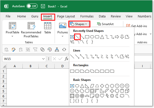
First, you will need to draw a line shape on your spreadsheet. You can do this by navigating to the Insert tab and opening the Shapes menu button.
Select the line button and your cursor should change to be in Draw Mode.
Hold down your SHIFT key on the keyboard and click where you want your line to begin and drag downward to add length to your line.
If your line looks a little slanted, you can ensure the width of the line = 0 to force it to be zero (in the Shape Format tab). If you want to change the length of your line, you can hold the SHIFT key down while you adjust to ensure it remains perfectly vertical.
Format Your Line
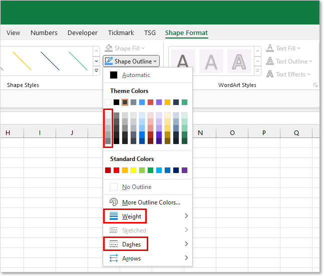
You’ll likely want to modify the formatting of your line from the default look. There are many formatting options available to you in the Shape Format tab. This contextual Ribbon tab appears when you have the line shape selected.
For chart lines, I typically modify the following line properties:
-
Line Weight: 2.25 — 3.00 pts
-
Dashes: Rounded Dots
-
Shape Outline Color: Medium/Light Grey
Embed Your Line Into The Chart
Now that you have your vertical line looking the way your want, it’s time to add it to your chart.
Many people will just reposition the line on top of the chart and call it a day. This is really poor practice since the line will not reposition if you happen to move or resize your chart. You will also have to remember to select both the chart and the line objects before copying, to capture the entire chart graphic.
You really should embed the vertical line inside your chart so it becomes part of the chart object. This can be done by:
-
Copy the vertical line shape (CTRL + C)
-
Select the Chart Object
-
Paste (Ctrl + V)
Copy/Paste the Vertical Line into the Chart itself to embed it
Reposition Your Line
After you paste the line into your selected Chart object, you should see the line appear inside the chart. You can then proceed to reposition the line with your mouse. Unfortunately, you cannot use the arrow keys on your keyboard to reposition a shape or textbox embedded in a chart object.
For vertical lines, I recommend making the line start on the X-axis and end at the very top of the Plot Area. The Plot Area is the box that gets outlined in your Chart when you click on the white space between your bars.
To update the position of the vertical line in the future, you just need to remember to move the line inside the chart. We’ll discuss a more advanced technique in the next section which will allow you to automate moving the line across your chart.
Creating A Dynamic Vertical Line In Your Chart
If you are looking for a more automated/long-term solution for incorporating a vertical line into your chart, this is going to be the solution for you.
The technique we’ll be using incorporates a single-pointed Scatter Plot (x,y) in combination with your current chart. The single point charted on the Scatter Plot will control the location of the vertical line.
We will then turn on vertical Error Bars (margin of error indicators), repurposing them to visually display a vertical line on the chart.
Now if that explanation went way over your head, don’t worry! I will walk you through each step and show you it’s really not that difficult to set this up.
Chart Starting Point
I’m going to assume you already have your chart created and you are looking to add the vertical line to the pre-existing chart. With this assumption in mind, I’ll forgo walking you through how to create a chart in Excel.
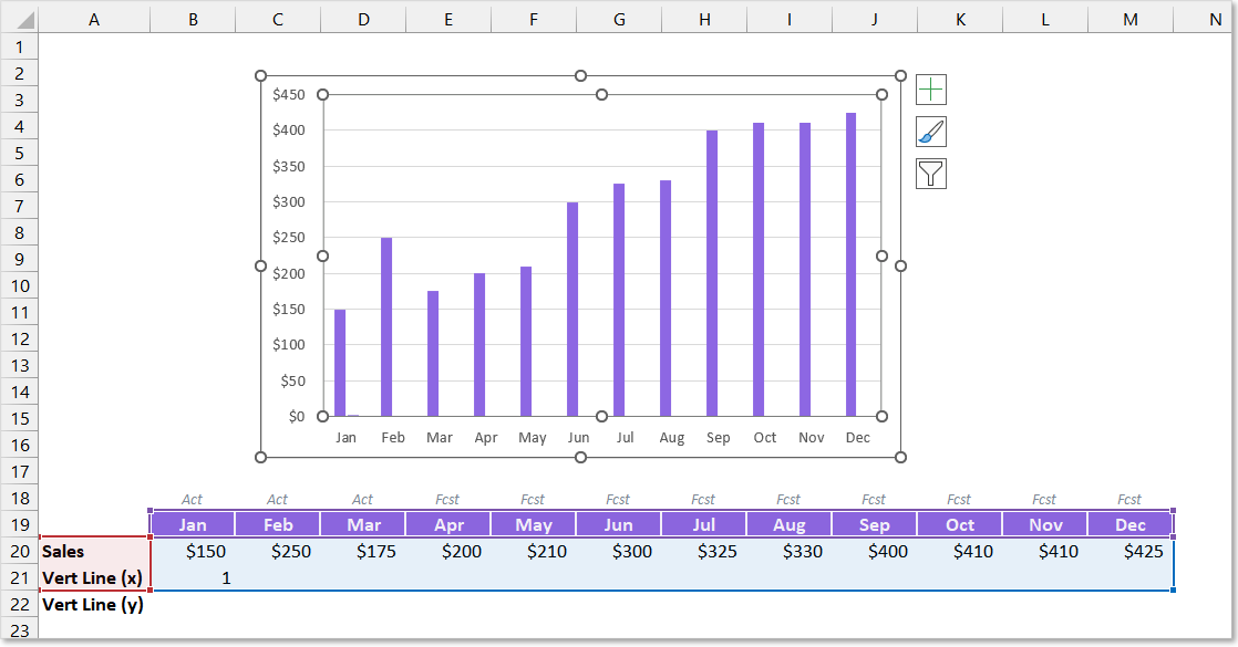
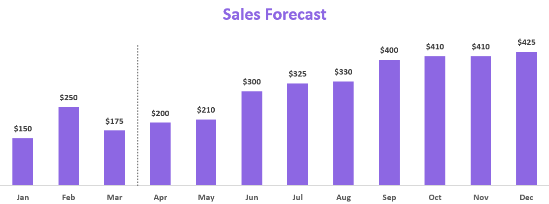
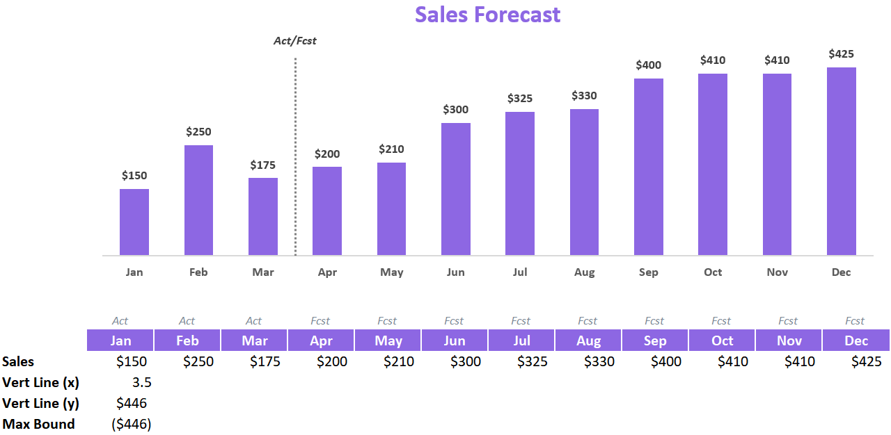
For this example, we’ll use the below chart to start with and we will work to insert a vertical line to separate the Actual months from the Forecast months.
Create A Combo Chart
The vertical line will need to be plotted using a Scatter Plot chart. Chances are you are working with either a Bar Chart or a Line Chart, so we will need to turn your chart into a Combo Chart. Combo Charts can accommodate different charting types within a single Chart object.
Before you can set up a Combo Chart, your chart will need to have an additional chart series that we can plot to. You can add an additional row of temporary data to your chart data and ensure a new chart series is connected to it (through the Select Chart Data dialog box).
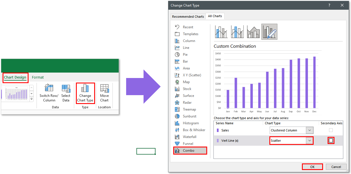
Once your chart has the additional chart series added, select the entire chart and navigate to the Chart Design tab in the Excel Ribbon.
Select the Change Chart Type button to launch the Change Chart Type dialog box. Once the dialog box appears, click on the Combo menu item in the left-side pane.
Look for the series you set up to chart the vertical line and ensure its Chart Type designation is changed to Scatter. Also, make sure the Secondary Axis checkbox remains unchecked.
Once you have made your changes, you can click the OK button to finish converting your chart to a Combo Chart.
Create the Scatter Plot Series
Once you have added Scatter Plot capabilities to your chart, you can then begin to set up your x and y coordinates for your vertical line.
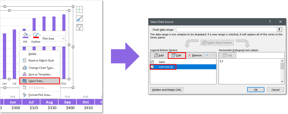
Right-click on your chart and go to Select Data.
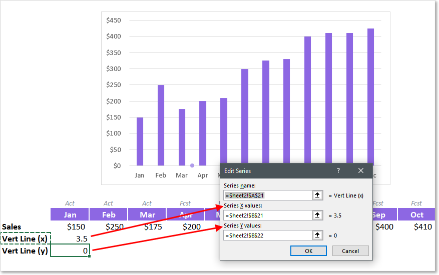
Ensure the Series Name you designated as a Scatter Plot series is selected and click the Edit button.
You can then begin to link your X and Y coordinates for your series. In this case, you will want the Y value = 0 and your X value to be halfway between the two bars you wish the vertical line to reside. In this example, since our first forecast month is April, the X value will equal 3.5.
You can hardcode your Y value to zero if you’d like (no cell reference) or link it up to a cell reference to visually show the full coordinates in the spreadsheet.
Adding Vertical Error Bars
So how do we turn a single dot on a Scatter Plot into a vertical bar with no dot? Now is time for the creative part!
What we will be adding to the plotted dot is an Error Bar. What is an Error Bar you might be thinking? It is used in statistics to indicate the margin of error for a given value. This allows someone to chart a value but show the audience that the value might be within a range of numbers that are either greater or less than that value.
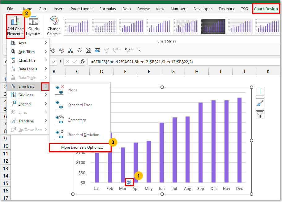
We can use this margin indicator line to our advantage and setup up the spreadsheet to allow us to draw a vertical line right on the chart. To add an Error Bar you will need to follow the below steps.
-
Select the Scatter Plot series
-
Navigate to the Chart Design Ribbon tab
-
Open the Add Chart Element menu
-
Open the Error Bars menu
-
Select More Error Bars Options…
The Format Error Bars Pane should appear on the right-hand side of your Excel application window.
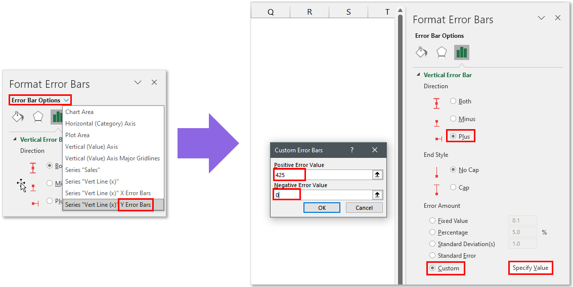
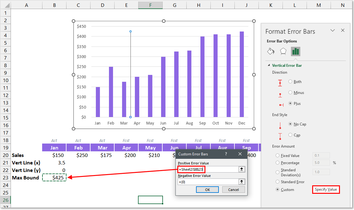
Open the Error Bar Options drop-down menu and ensure the Y Error Bars for your Series is selected.
Change the Direction = Plus and End Style = No Cap.
For the Error Amount, choose Custom and click the Specify Value button. This will open a dialog box where you will need to designate a Positive and Negative value for your Error margin. Since our plotline is already at zero, we only want our margin to be positive. For this reason, you can set the Negative value to 0.
The positive value will determine the length of your line. You will typically want this to be equal to or greater than the largest value in your bar/line chart.
For an even more dynamic solution, I recommend setting up a cell that reads the values from your chart and determines the maximum value. In this example, the cell used has the formula:
=MAX(B20:M20)
If you want to ensure your line ends a little bit higher than your max value, you can add a percentage increase to your formula. Typically adding 5% does the trick for me. This will change your formula to look something like this:
=MAX(B20:M20) * 105%
After you have set up your Custom Error Bar, you should see the line plotted on your chart.
Formatting The Vertical Line
Once your vertical line is created, the last step will be to format your line to your desired look. Here are the format settings I will typically use:
-
Line Weight: 1.5 pts
-
Dashes: Rounded Dots
-
Shape Outline Color: Medium/Light Grey
-
Marker Fill Color: None
-
Marker Border Color: None
After some further format changes to the chart itself, you can have a very professional-looking chart with a vertical line plot directly inside it.
Automating The Vertical Line’s Movement
You may choose to manually update the vertical lines’ X Value every time, but you may also be able to utilize a formula to handle the movement for you.
Let’s look at the article example. The vertical line represents the separation of Actual vs. Forecast Sales results.
Looking at the data table, we can incorporate a simple COUNTIFS function to count how many months are designated as “Actuals”. This way, as the year progresses, the vertical line in the chart will move along as more and more months become “Actuals”.
Depending on your situation, you may be able to come up with a similar sort of formula to automate your vertical line movement as time progresses.
Adding Text Labels Above Your Vertical Line
Now let’s say you want to add a label to your vertical line to give your audience clarity on what it is defining. We can tweak the setup of the vertical line to incorporate the use of a data label.
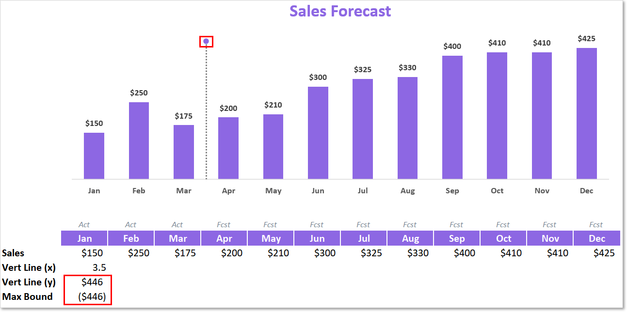
In order to position a data label at the top of the vertical line, we’ll need to move our plotted dot to the very top of the line.
To do this, you simply need to turn your Max Bound value negative and ensure your Y value has a formula equating to a positive version of your Max Bound value (just multiply by -1).
This will move your plotted dot up to the top and carry your line length down southbound (negative) to end at zero.
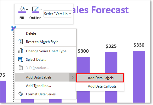
After you’ve re-jiggered your vertical line setup, you can then proceed to add a data label. Simply select your plotted dot and right-click on it. Then open the Add Data Labels menu and click Add Data Labels.
You should then see a data label appear next to your vertical line.
Next, you’ll likely want to reposition your data label to be directly over your vertical line. To do this, select and right-click on your data label. Click the Format Data Point menu option and the Format Data Label pane should open up.
In the Label Position section of the Label Options, select Above.
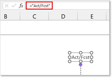
Finally, you’ll want to customize the text that is stored in the label. After selecting the Data Label, you can write a text formula (similar to the screenshot above) or you can link the Data Label to a spreadsheet cell with your desired text value.
The final result should look something like this:
Download Examples In Excel
If you would like to instantly download an Excel file I put together with exact chart examples used in this article along with a few other examples, feel free to click the below download button. No strings attached 
I Hope This Helped!
Hopefully, I was able to explain how you can add a vertical line to your Excel Charts. If you have any questions about this technique or suggestions on how to improve it, please let me know in the comments section below.
About The Author
Hey there! I’m Chris and I run TheSpreadsheetGuru website in my spare time. By day, I’m actually a finance professional who relies on Microsoft Excel quite heavily in the corporate world. I love taking the things I learn in the “real world” and sharing them with everyone here on this site so that you too can become a spreadsheet guru at your company.
Through my years in the corporate world, I’ve been able to pick up on opportunities to make working with Excel better and have built a variety of Excel add-ins, from inserting tickmark symbols to automating copy/pasting from Excel to PowerPoint. If you’d like to keep up to date with the latest Excel news and directly get emailed the most meaningful Excel tips I’ve learned over the years, you can sign up for my free newsletters. I hope I was able to provide you some value today and hope to see you back here soon! — Chris
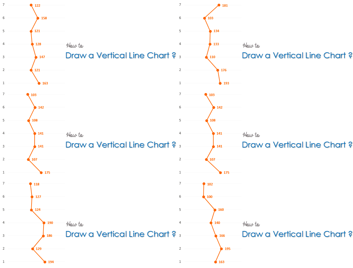
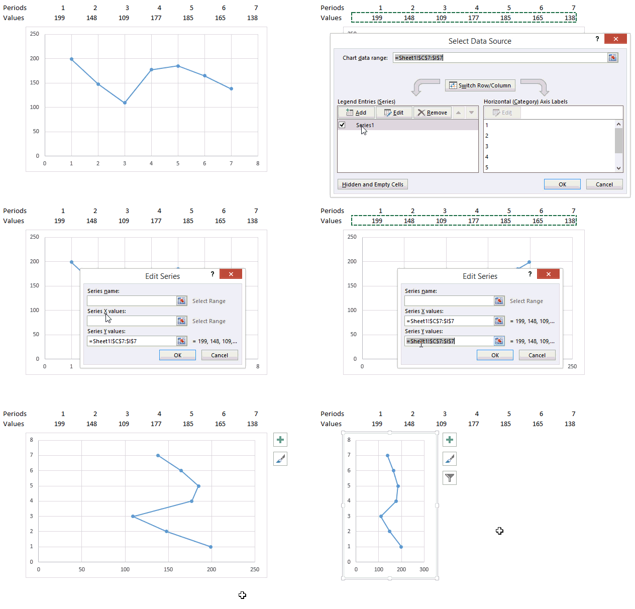
The Horizontal Line Chart is pretty standard stuff! Why don’t we try making a Vertical Line Chart? Well there isn’t a standard vertical line chart in Excel so we’ll tweak some other type of chart to get this done!
Let’s get started..
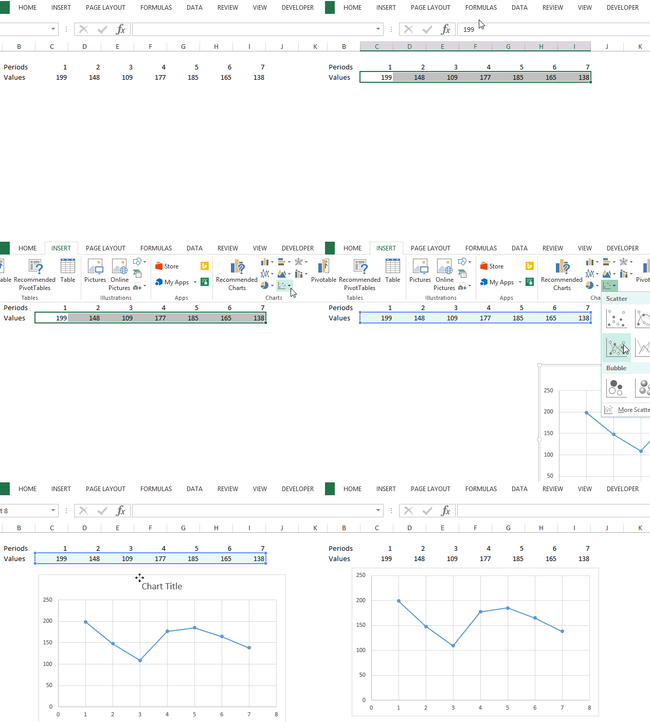
Assume this Data
We have 7 periods and some values against them. Instead of a horizontal line chart we want a vertical line chart and to do that we would use a scatter chart with lines and markers
Use Scatter Chart with Lines and Markers
- In the Insert Menu select Scatter Chart
- Then pick up Scatter Chart with Line and Markers
Although this is a line chart but horizontal, let’s make some changes to our chart to make it vertical
Some Changes in our Chart
To convert the chart into a vertical line chart, let’s make the following changes
- Click on Select Data (appears in the right click menu)
- Edit the series
- Select the values (from sheet) for the X Axis Values
- Select the periods (from sheet) for the Y Axis Values
- The chart will start to appear as a vertical line chart. Squeeze it a bit
DOWNLOAD THE VERTICAL LINE CHART
With a bit more formatting you are good to go. If you need help regarding basics of charting please refer these 3 charting starters
- Charting Basics 1
- Charting Basics 2
- Charting Basics 3
More Interesting Charts
- Adding Direct Legends to your Chart
- World’s Largest Economies – A revised chart !
- Check button Chart
Topics that I write about…

