
You can create a SmartArt graphic that uses a Venn diagram layout in Excel, Outlook, PowerPoint, and Word. Venn diagrams are ideal for illustrating the similarities and differences between several different groups or concepts.
Overview of Venn diagrams
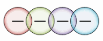
A Venn diagram uses overlapping circles to illustrate the similarities, differences, and relationships between concepts, ideas, categories, or groups. Similarities between groups are represented in the overlapping portions of the circles, while differences are represented in the non-overlapping portions of the circles.

1 Each large group is represented by one of the circles.
2 Each overlapping area represents similarities between two large groups or smaller groups that belong to the two larger groups.
What do you want to do?
-
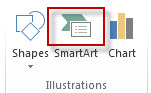
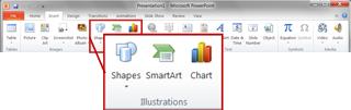
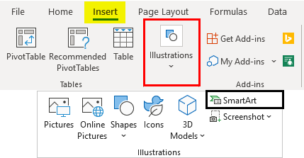
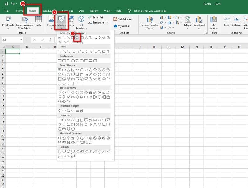
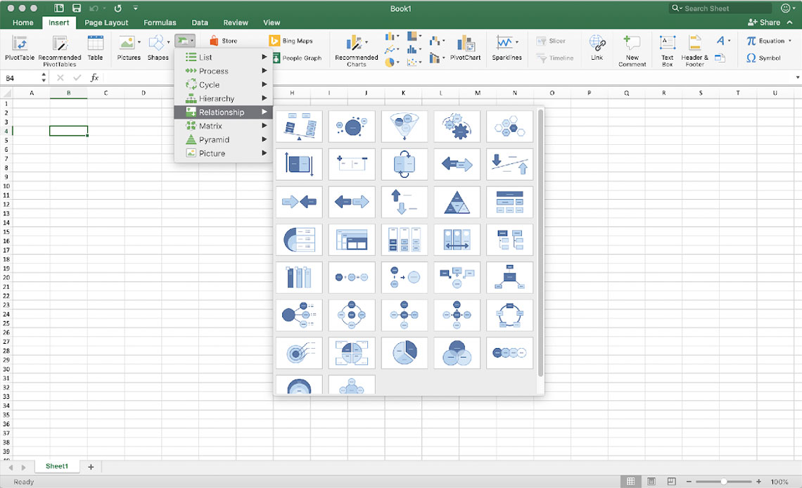
On the Insert tab, in the Illustrations group, click SmartArt.

An example of the Illustrations group on the Insert tab in PowerPoint 2013
-
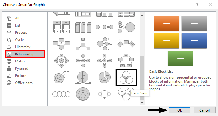
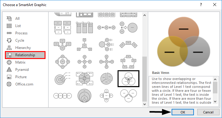
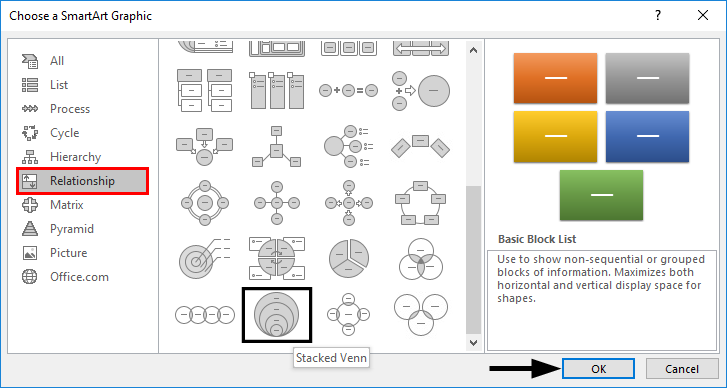
In the Choose a SmartArt Graphic gallery, click Relationship, click a Venn diagram layout (such as Basic Venn), and then click OK.

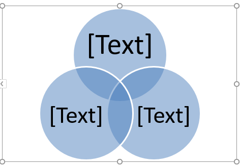
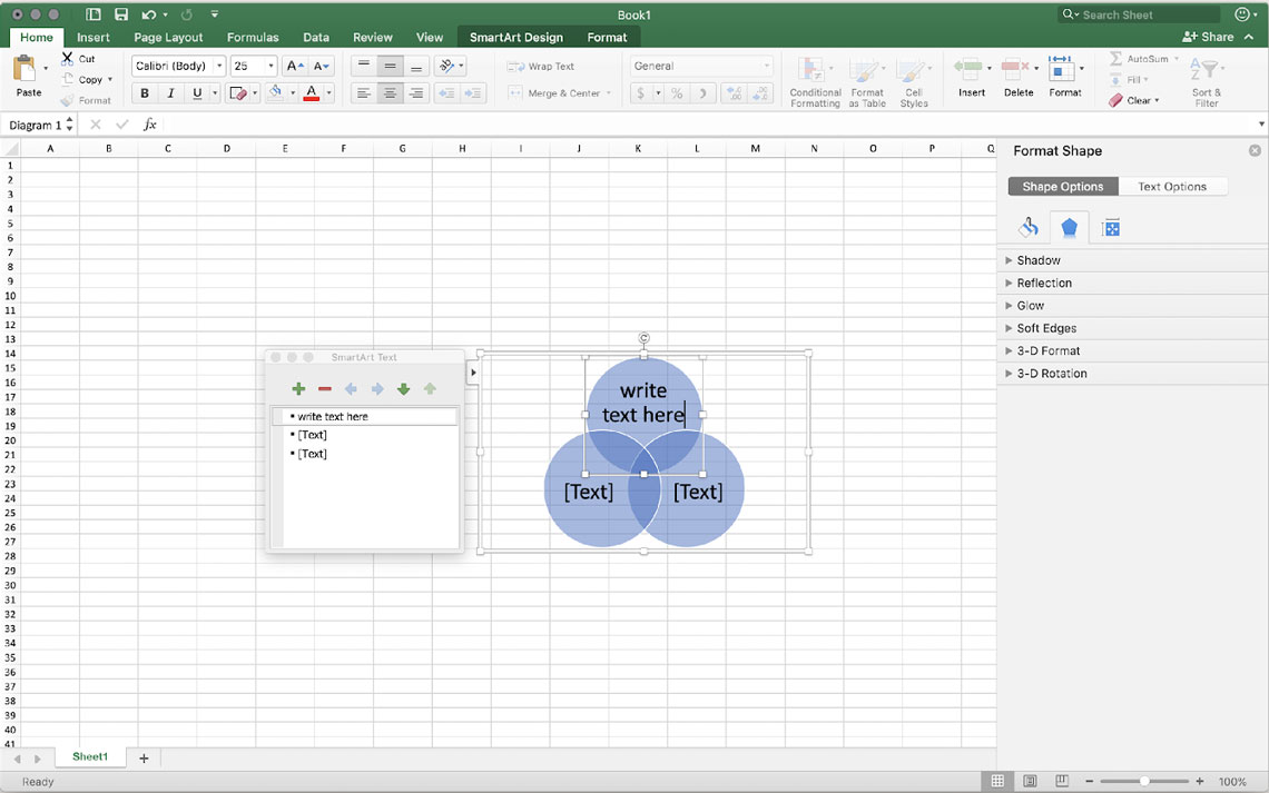
Add text to the main circles
-
Select a shape in the SmartArt graphic.
-
Do one of the following:
-
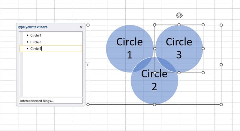
In the Text pane, click [Text] in the pane, and then type your text (or select a bullet and type your text).
-
Copy text from another location or program, click [Text] in the Text pane, and then paste your text.
-
Click a circle in the SmartArt graphic, and then type your text.
Note: If you do not see the Text pane, you can open it by clicking the control on the left side of the SmartArt graphic.
-
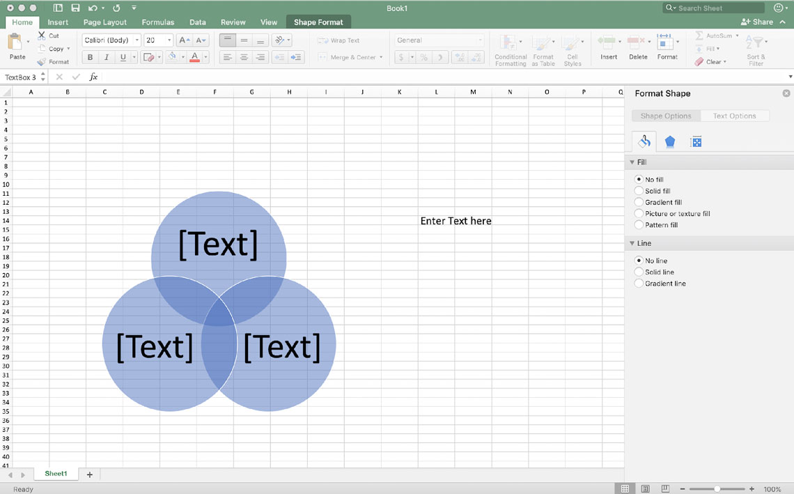
Add text to the overlapping portions of the circles
You cannot add text to the overlapping portions of a Venn diagram from the Text pane. Instead, you can insert text boxes and position them over the overlapping areas.
In Excel, Outlook, and Word:
-
On the Insert tab, in the Text group:
-
In Excel click Text Box.
-
In Outlook, click Text Box, and then click Draw Text Box.
-
In Word, click Text Box, and then at the bottom of the gallery, click Draw Text Box.
-
-
Then do the following:
-
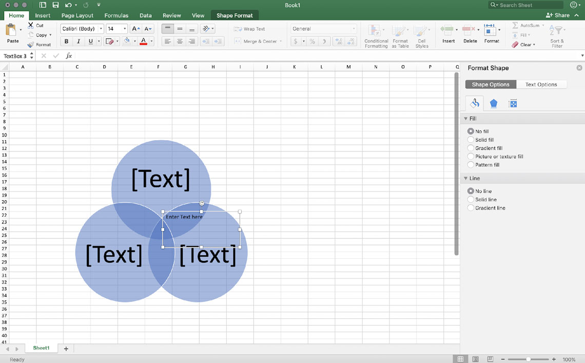
Click and drag in an overlapping circle. Draw the text box the size you want.
-
To add text, click inside the box and type.
-
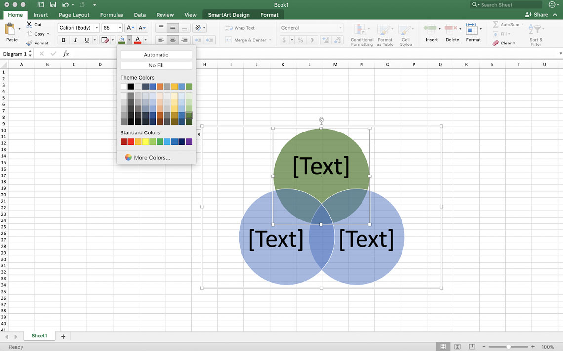
To change the background color from white to the color of the overlapping circle, right-click the text box, and then select Format Shape.
-
In the Format Shape pane, under Fill, select No fill.
-
To delete the lines around the text box, with the text box still selected, click Line in the Format Shape pane, and then select No line.
Notes:
-
To position the text box, click it, and then when the pointer becomes crossed arrows (
), drag the text box to where you want it. -
To format text in the text box, select the text, and then use the formatting options in the Font group on the Home tab.
-
-
 ), drag the text box to where you want it.
In PowerPoint:
-
On the Insert tab, in the Text group, click Text Box.
-
Click and drag in an overlapping circle. Draw the text box the size you want.
-
To add text, click inside the box and type.
-
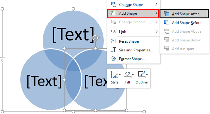
Click the existing circle that is located closest to where you want to add the new circle.
-
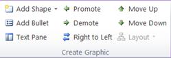
Under SmartArt Tools, on the Design tab, in the Create Graphic group, click the arrow next to Add Shape.
If you don’t see the SmartArt Tools or Design tabs, make sure that you’ve selected the SmartArt graphic. You may need to double-click the SmartArt graphic in order to open the Design tab.
-
Do one of the following:
-
To insert a circle after the selected circle, that will overlap the selected circle, click Add Shape After.
-
To insert a circle before the selected circle, that will overlap the selected circle, click Add Shape Before.
-
Notes:
-
When you want to add a circle to your Venn diagram, experiment with adding the shape before or after the selected circle to get the placement you want for the new circle.
-
To add a circle from the Text pane, click an existing circle, move your pointer before or after the text where you want to add the circle, and then press Enter.
-
To delete a circle from your Venn diagram, click the circle you want to delete, and then press Delete.
-
To move a circle, click the circle, and then drag it to its new location.
-
To move a circle in very small increments, hold down CTRL while you press the arrow keys on your keyboard.
-
Right-click the Venn diagram that you want to change
-
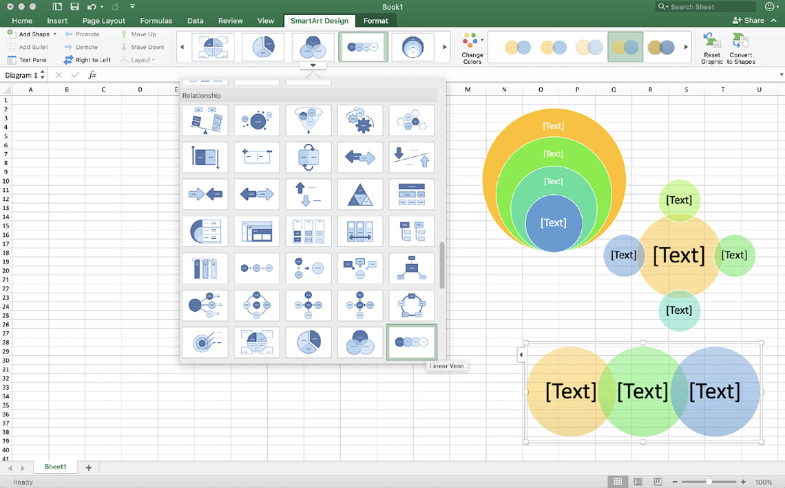
Click a layout option in the Layouts group on the Design tab under SmartArt Tools. When you point to a layout option, your SmartArt graphic changes to show you a preview of how it would look with that layout. Choose the layout that you want.
-
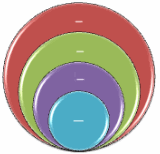
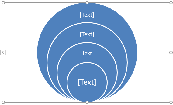
To show overlapping relationships in a sequence, click Linear Venn.
-
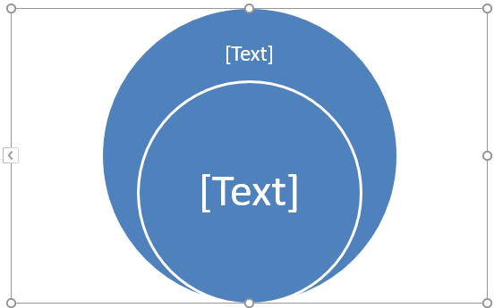
To show overlapping relationships with an emphasis on growth or gradation, click Stacked Venn.
-
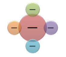
To show overlapping relationships and the relationship to a central idea, click Radial Venn.
-
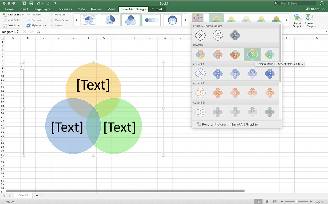
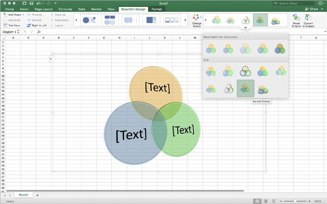
To quickly add a designer-quality look and polish to your SmartArt graphic, you can change the colors of your Venn diagram. You can also add effects, such as glows, soft edges, or 3-D effects.
You can apply color combinations that are derived from the theme colors to the circles in your SmartArt graphic.
Click the SmartArt graphic whose color that you want to change.
-
Under SmartArt Tools, on the Design tab, in the SmartArt Styles group, click Change Colors.
If you don’t see the SmartArt Tools or Design tabs, make sure that you’ve selected the SmartArt graphic.
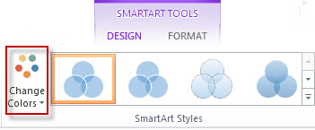
Tip: When you position your pointer over a thumbnail, you can see how the colors affect your SmartArt graphic.
Change the line color or style of a circle’s border
-
In the SmartArt graphic, right-click the border of the circle you want to change, and then click Format Shape.
-
In the Format Shape pane, if necessary, click the arrow next to Line to expose all the options, and then do one of the following:
-
To change the color of the circle’s border, click Color
, and then click the color that you want. -
To change the line style of the circle’s border, select the line styles that you want, such as Transparency, Width, or Dash Type.
-
 , and then click the color that you want.
Change the background color of a circle in your Venn diagram
Click the SmartArt graphic that you want to change.
-
Right-click the border of a circle, and then click Format Shape.
-
In the Format Shape pane, under Fill, click Solid fill.
-
Click Color
, and then click the color that you want.-
To change the background to a color that is not in the theme colors, click More Colors, and then either click the color that you want on the Standard tab or mix your own color on the Custom tab. Custom colors and colors on the Standard tab are not updated if you later change the document theme.
-
To increase the transparency of the shapes in the diagram, move the Transparency slider or enter a number in the box next to the slider. You can vary the percentage of transparency from 0% (fully opaque, the default setting) to 100% (fully transparent).
-
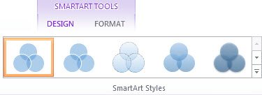
A SmartArt Style is a combination of various effects, such as line style, bevel, or 3-D rotation that you can apply to the circles in your SmartArt graphic to create a unique look.
Click the SmartArt graphic that you want to change.
-
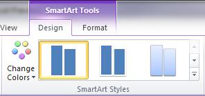
Under SmartArt Tools, on the Design tab, in the SmartArt Styles group, click the SmartArt Style that you want.
To see more SmartArt Styles, click the More button
.
 .
.Note: When you position your pointer over a thumbnail, you can see how the SmartArt Style affects your SmartArt graphic.
Tip: If you’re using PowerPoint 2013 or PowerPoint 2016, you can animate your Venn diagram to emphasize each circle. For more information, see Animate a SmartArt graphic.
See Also
Choose a SmartArt graphic
Learn more about SmartArt Graphics
Add shapes
What do you want to do?
-
On the Insert tab, in the Illustrations group, click SmartArt.
-
In the Choose a SmartArt Graphic gallery, click Relationship, click a Venn diagram layout (such as Basic Venn), and then click OK.
Add text to the main circles
-
Select the SmartArt graphic.
-
Under SmartArt Tools, on the Design tab, in the Create Graphic group, click Text Pane.
If you do not see SmartArt Tools or the Design tab, make sure that you have selected a SmartArt graphic. You may need to double-click the SmartArt graphic to open the Design tab. -
Do one of the following:
-
Click [Text] in the Text pane, and then type your text.
-
Copy text from another location or program, click [Text] in the Text pane, and then paste your text.
-
Click a circle in the SmartArt graphic, and then type your text.
-
In the Text pane, under Type your text here, select a bullet and type your text.
Note: You can also open the Text pane by clicking the control.
Add text to the overlapping portions of the circles
You cannot add text to the overlapping portions of a Venn diagram from the Text pane. Instead, you can insert text boxes and position them over the overlapping areas.
To insert a text box, do the following:
-
On the Insert tab, in the Text group, click Text Box.
-
Drag to draw a text box.
-
Select the text box and type your text.
-
Position the text box over the overlapping area of the circles.
-
Click the SmartArt graphic that you want to add another circle to.
-
Click the existing circle that is located closest to where you want to add the new circle.
-
Under SmartArt Tools, on the Design tab, in the Create Graphic group, click the arrow next to Add Shape.
If you don’t see the SmartArt Tools or Design tabs, make sure that you’ve selected the SmartArt graphic. You may need to double-click the SmartArt graphic in order to open the Design tab.
-
Do one of the following:
-
To insert a circle after the selected circle, that will overlap the selected circle, click Add Shape After.
-
To insert a circle before the selected circle, that will overlap the selected circle, click Add Shape Before.
-
-
When you want to add a circle to your Venn diagram, experiment with adding the shape before or after the selected circle to get the placement you want for the new circle.
-
To add a circle from the Text pane, click an existing circle, move your pointer before or after the text where you want to add the circle, and then press ENTER.
-
To delete a circle from your Venn diagram, click the circle you want to delete, and then press DELETE.
-
To move a circle, click the circle, and then drag it to its new location.
-
To move a circle in very small increments, hold down CTRL while you press the arrow keys on your keyboard.
-
Right-click the Venn diagram that you want to change, and then click Change Layout.
-
In the Choose a SmartArt Graphic dialog box, click Relationship in the left pane, and in the right pane do one of the following:
-
To show overlapping relationships in a sequence, click Linear Venn.
-
To show overlapping relationships with an emphasis on growth or gradation, click Stacked Venn.
-
To show overlapping relationships and the relationship to a central idea, click Radial Venn.
-
Note: You can also change the layout of your SmartArt graphic by clicking a layout option in the Layouts group on the Design tab under SmartArt Tools. When you point to a layout option, your SmartArt graphic changes to show you a preview of how it would look with that layout.
To quickly add a designer-quality look and polish to your SmartArt graphic, you can change the colors of your Venn diagram. You can also add effects, such as glows, soft edges, or 3-D effects.
You can apply color combinations that are derived from the theme colors to the circles in your SmartArt graphic.
Click the SmartArt graphic whose color that you want to change.
-
Under SmartArt Tools, on the Design tab, in the SmartArt Styles group, click Change Colors.
If you don’t see the SmartArt Tools or Design tabs, make sure that you’ve selected the SmartArt graphic.
Tip: When you position your pointer over a thumbnail, you can see how the colors affect your SmartArt graphic.
Change the line color or style of a circle’s border
-
In the SmartArt graphic, right-click the border of the circle you want to change, and then click Format Shape.
-
In the Format Shape dialog box, do one of the following:
-
To change the color of the circle’s border, click Line Color in the left pane, in the Line Color pane, click Color
, and then click the color that you want. -
To change the line style of the circle’s border, click Line Style in the left pane, in the Line Style pane, and then select the line styles that you want.
-
Change the background color of a circle in your Venn diagram
Click the SmartArt graphic that you want to change.
-
Right-click the border of a circle, and then click Format Shape.
-
In the Format Shape dialog box, in the left pane click Fill, and then in the Fill pane click Solid fill.
-
Click Color
, and then click the color that you want.-
To change the background to a color that is not in the theme colors, click More Colors, and then either click the color that you want on the Standard tab or mix your own color on the Custom tab. Custom colors and colors on the Standard tab are not updated if you later change the document theme.
-
To increase the transparency of the shapes in the diagram, move the Transparency slider or enter a number in the box next to the slider. You can vary the percentage of transparency from 0% (fully opaque, the default setting) to 100% (fully transparent).
-
A SmartArt Style is a combination of various effects, such as line style, bevel, or 3-D rotation that you can apply to the circles in your SmartArt graphic to create a unique look.
Click the SmartArt graphic that you want to change.
-
Under SmartArt Tools, on the Design tab, in the SmartArt Styles group, click the SmartArt Style that you want.
To see more SmartArt Styles, click the More button
.
-
When you position your pointer over a thumbnail, you can see how the SmartArt Style affects your SmartArt graphic.
If you’re using PowerPoint 2010, you can animate your Venn diagram to emphasize each circle. For more information about how to animate a SmartArt graphic, see Animate your SmartArt graphic.
-
Click the Venn diagram that you want to animate.
-
On the Animations tab, in the Animation group, click the More button
, and then click the animation that you want. -
To make each circle in the Venn diagram enter in sequence, on the Animations tab, in the Animation group, click Effect Options, and then click One by One.
Note: If you copy a Venn diagram that has an animation applied to it to another slide, the animation is also copied.
See Also
Choose a SmartArt graphic
This tutorial will demonstrate how to create a Venn diagram in all versions of Excel: 2007, 2010, 2013, 2016, and 2019.
Venn Diagram – Free Template Download
Download our free Venn Diagram Template for Excel.
Download Now
In this Article
- Venn Diagram – Free Template Download
- Getting Started
- Prep Chart Data
- Step #1: Find the number of elements belonging exclusively to one set.
- Step #2: Compute the chart values for the intersection areas of two circles.
- Step #3: Copy the number linked to the intersection area of three sets into column Chart Value.
- Step #4: Outline the x- and y-axis values for the Venn diagram circles.
- Step #5: Find the Circle Size values illustrating the relative shares (optional).
- Step #6: Create custom data labels.
- Step #7: Create an empty XY scatter plot.
- Step #8: Add the chart data.
- Step #9: Change the horizontal and vertical axis scale ranges.
- Step #10: Remove the axes and the gridlines.
- Step #11: Enlarge the data markers.
- Step #12: Draw the circles.
- Step #13: Change the x- and y-axis coordinates to adjust the overlapping areas (optional).
- Step #14: Add data labels.
- Step #15: Customize data labels.
- Step #16: Add text boxes linked to the intersection values.
- Step #17: Hide the data markers.
- Step #18: Add the chart title.
- Download Venn Diagram Template
A Venn diagram is a chart that compares two or more sets (collections of data) and illustrates the differences and commonalities between them with overlapping circles. Here’s how it works: the circle represents all the elements in a given set while the areas of intersection characterize the elements that simultaneously belong to multiple sets.
The diagram helps demonstrate all the possible relationships between the sets, providing a bottomless well of analytical data—which is why it has been widely used across many industries.
Unfortunately, this chart type is not supported in Excel, so you will have to build it from scratch on your own. Also, don’t forget to check out our Chart Creator Add-in, a tool for building stunning advanced Excel charts while barely lifting a finger.
By the end of this step-by-step tutorial, you will learn how build a dynamic Venn diagram with two or three categories in Excel completely from the ground up.
Getting Started
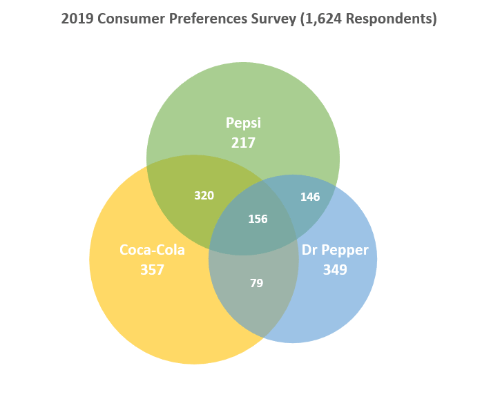
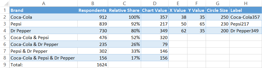
First, we need some raw data to work with. To show you the ropes, as you may have guessed from the example diagram above, we are going to analyze the results of a fictitious survey gauging the brand preferences of 1,624 respondents who drink cola on a daily basis. The brands in question are Coca-Cola, Pepsi, and Dr Pepper.
From all these soft drink lovers, some turned out to be brand evangelists who stuck exclusively to one brand while others opted for two or three brands at once.
With all that said, consider the following table containing the survey results:
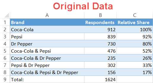 Here’s a quick overview of the table elements:
- Brand – This column defines the sets in the survey as well as all possible combinations of the sets.
- Respondents – This column represents the corresponding values for each set in general and each combination in particular.
- Relative Share (optional) – You may want to compare your data in other ways, such as determining the relative share of each set in relation to the largest set. This column exists for such a purpose. Since Coke is the biggest kid on the block, cell B2 will be our reference value (100%).
So, without further ado, let’s get to work.
Prep Chart Data
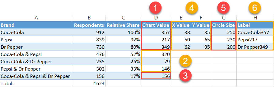
Before you can plot your Venn diagram, you need to compute all the necessary chart data. The first six steps extensively cover how to determine the pieces of the puzzle. By the end of Step #6, your data should look like this:
 For those of you who want to skip the theoretical part and spring right into action, here is the algorithm for you to follow:
- Step #1 – Calculate Chart Values:
- Type “=B2-B5-B6+B8” into cell D2.
- Type “=B3-B5-B7+B8” into cell D3.
- Type “=B4-B6-B7+B8” into cell D4.
- Step #2 – Calculate Chart Values cont.:
- Enter “=B5-$B$8” into D5 and copy the formula down into D6 and D7.
- Step #3 – Calculate Chart Values cont.:
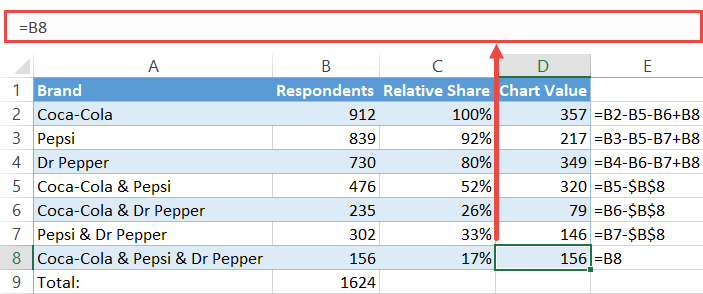
- Set cell D8 equal to B8 by typing “=B8” into D8.
- Step #4 – Position the Bubbles:
- Add the constant values for X and Y to your worksheet just the way you can see on the screenshot above (E2:F4).
- Step #5 – Calculate the Circle Sizes:
- Enter “=250*C2” into G2 and copy it down into the next two cells (G3:G4).
- Step #6 – Create the Diagram Labels:
- Copy “=A2&CHAR(10)&TEXT(D2, “#,##”)” into H2 and copy the formula into the next two cells (H3:H4).
Now let’s break down each step into more detail.
Step #1: Find the number of elements belonging exclusively to one set.
Unfortunately, you can’t simply take the numbers from the original data table and run with them. If you were to do so, you would actually count some of the survey answers multiple times, effectively skewing the data.
Why is that the case? Well, since a Venn diagram is made up of intersecting areas closely related to one another, any given set can be a part of multiple other sets at once, resulting in duplicate values.
For example, the set “Coca-Cola” (B2) includes all the respondents who voted for the brand, pulling answers from four different categories:
- Cola-Cola & Pepsi
- Coca-Cola & Dr Pepper
- Coca-Cola & Pepsi & Dr Pepper
- Only Coca-Cola
That’s why you need to separate the wheat from the chaff and find a corresponding chart value for each survey option from the original table.
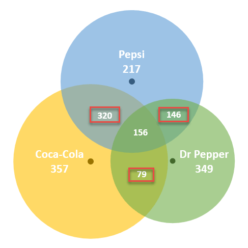
That being said, our first step is to differentiate the respondents who chose solely one cola brand from everybody else. These folks are characterized by the following numbers on the diagram:
- 357 for Coca-Cola
- 217 for Pepsi
- 349 for Dr Pepper
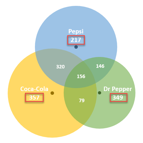
Pick a corresponding value from your actual data (B5) and subtract from it the value representing the area where all the three circles overlap (B8).
Let’s find out how many respondents actually answered “Coca-Cola & Pepsi” by entering this formula into cell D5:
=B5-$B$8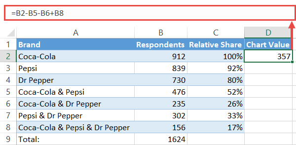
By the same token, use these formulas to find the chart values for categories “Pepsi” (A3) and “Dr Pepper” (A4):
- For “Pepsi,” enter “=B3-B5-B7+B8” in D3.
- For “Dr Pepper,” type “=B4-B6-B7+B8” in D4.
Step #2: Compute the chart values for the intersection areas of two circles.
When computing the numbers representing the intersection of two sets—where the values within a given intersection area simultaneously belong to two sets—the same issue of duplicate values arises.
Fortunately for us, it should only take a moment to work around the problem. Again, these are the numbers we are looking for:
Pick a corresponding value from your actual data (B5) and subtract from it the value representing the area where all the three circles overlap (B8).
Let’s find out how many respondents actually answered “Coca-Cola & Pepsi” by entering this formula into cell D5:
=B5-$B$8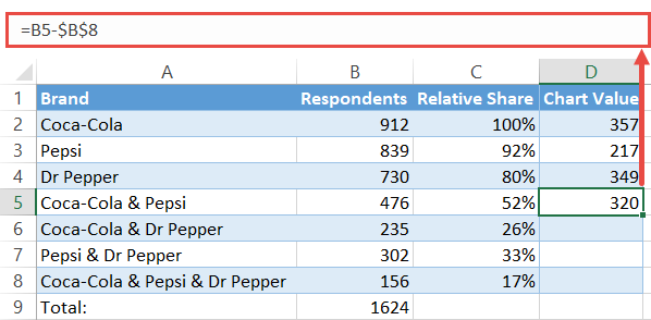
Copy the formula into cells D6 and D7 by dragging down the fill handle.
Step #3: Copy the number linked to the intersection area of three sets into column Chart Value.
The only value that you can take from your original data is the one right in the middle of the diagram.
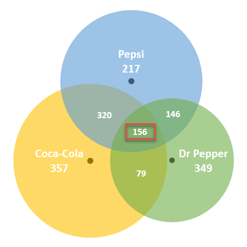
Complete the column of chart values by copying the number of respondents who chose all the three brands into the adjacent cell (D8). Simply type “=B8” into D8.
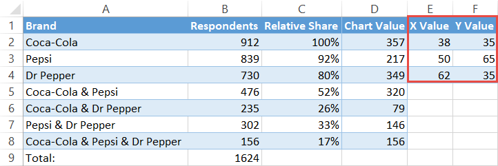
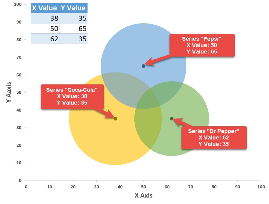
Step #4: Outline the x- and y-axis values for the Venn diagram circles.
In a blank cell near the table with your data, map out the x- and y-axis coordinates which will be used as the centers of the circles.
The following values are constants that will determine the position of Venn diagram circles on the chart plot, giving you full control over how far away from each other the circles will end up being placed.
In Step #13, you will learn how to change the size of the overlapping areas by modifying these values.
For now, all you have to do is copy them into your spreadsheet:
| X Value | Y Value |
| 38 | 35 |
| 50 | 65 |
| 62 | 35 |
For Venn diagrams with only two categories, use these coordinates:
| X Value | Y Value |
| 39 | 50 |
| 66 | 50 |
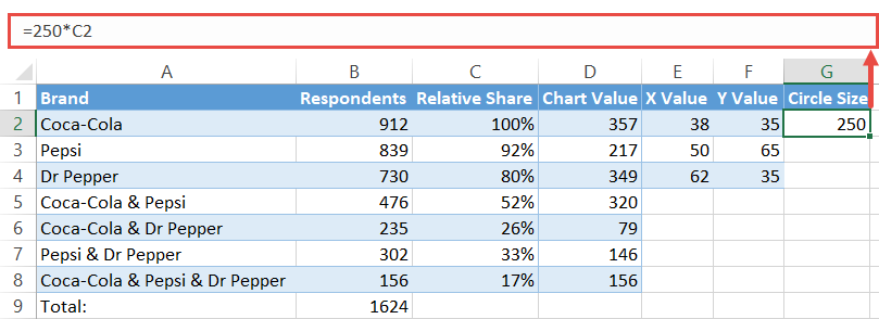
Step #5: Find the Circle Size values illustrating the relative shares (optional).
If you don’t need this data, move on to Step #7.
To make the circles proportional to the reference value (C2), set up a column labeled “Circle Size” and copy this formula into G2.
=250*C2For the record, the number “250” is a constant value based on the coordinates to help the circles overlap.
Execute the formula for the remaining two cells (G3:G4) which signify the other two circles of the diagram by dragging the fill handle.
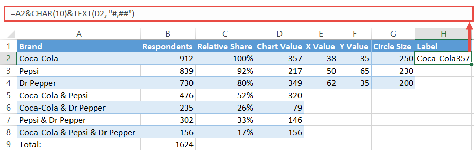
Step #6: Create custom data labels.
Before we can finally proceed to building the diagram, let’s quickly design custom data labels that will contain the name of a given set along with the corresponding value that counts the number of respondents who chose solely one cola brand.
Set up another dummy column (column H) and enter the following formula into H2:
=A2&CHAR(10)&TEXT(D2, "#,##")Execute the formula for the remaining cells (H3:H4).
Once you have followed all the steps outlined above, your data should look like this:
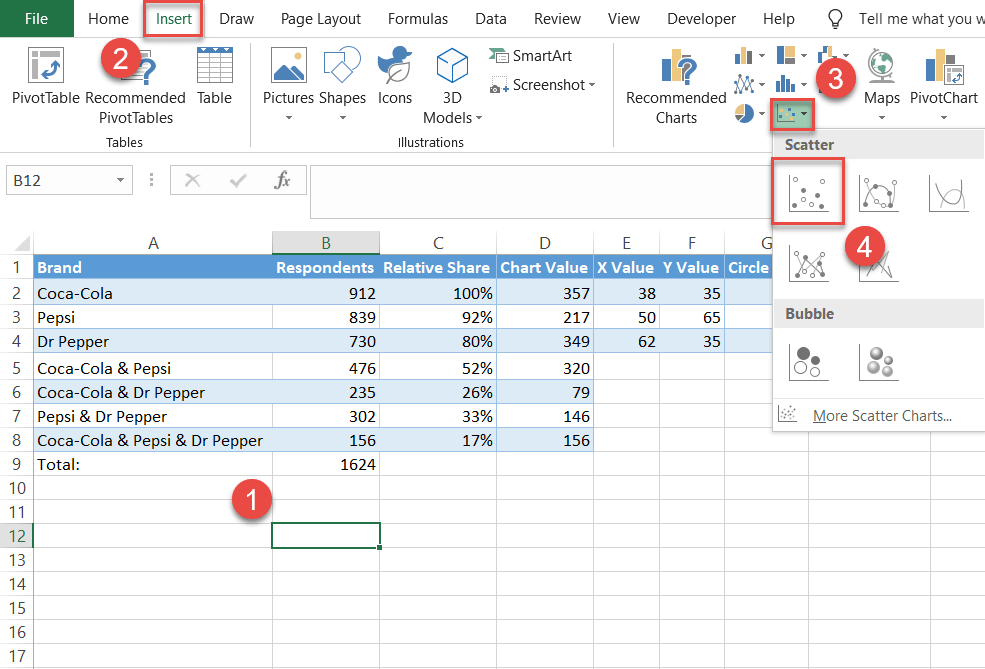
Step #7: Create an empty XY scatter plot.
At last, you have all the chart data to build a stunning Venn diagram. As a jumping-off point, set up an empty scatter plot.
- Select any empty cell.
- Go to the Insert tab.
- Click the “Insert Scatter (X,Y) or Bubble Chart” icon.
- Choose “Scatter.”
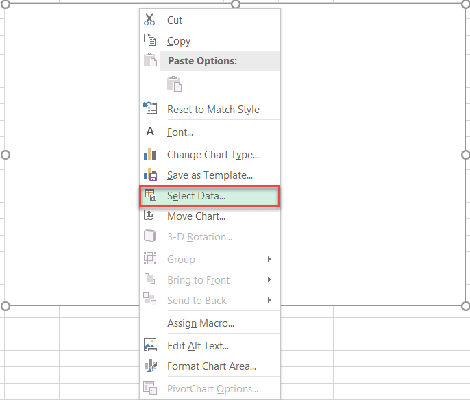
Step #8: Add the chart data.
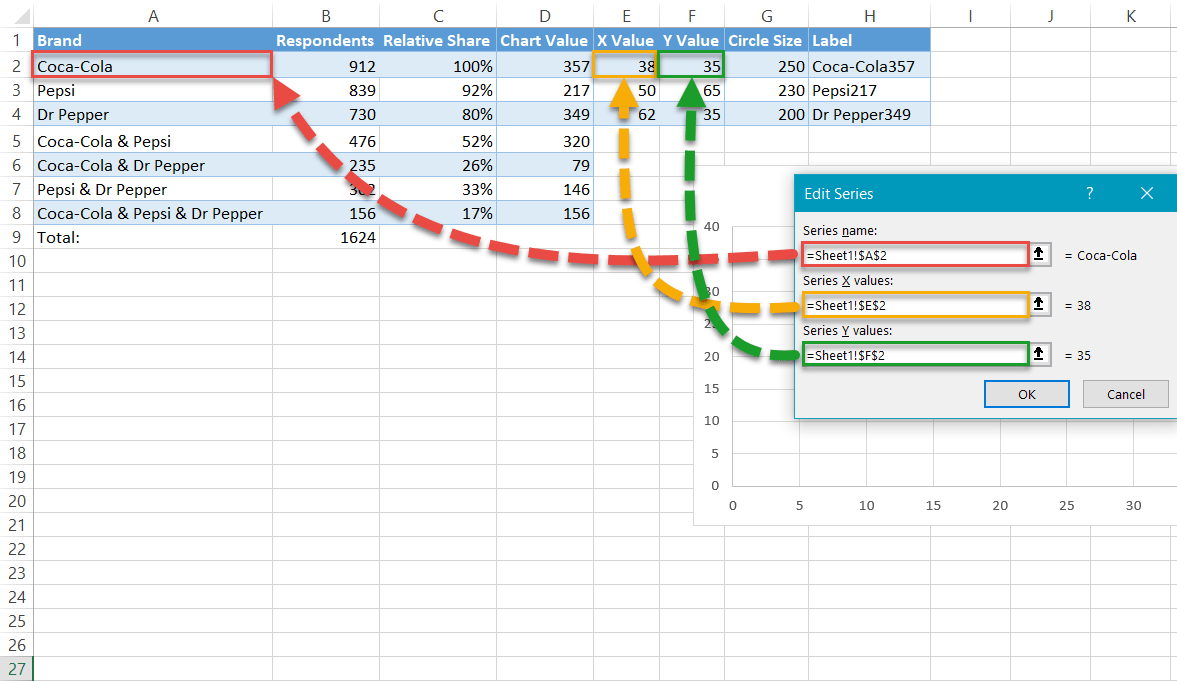
Add the x- and y-axis values to outline the position of the circles. Right-click on the chart plot and pick “Select Data” from the menu that appears.
In the Select Data Source dialog box, choose “Add.”
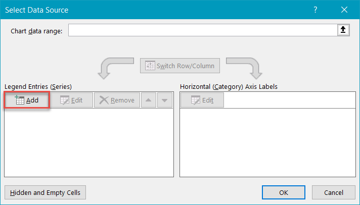
Once there, add a new data series named “Coca-Cola:”
- For “Series name,” highlight cell B2.
- For “Series X values,” select cell E2.
- For “Series Y values,” select cell F2.
Use this method to create Series “Pepsi” (B3, E3, F3) and Series “Dr Pepper” (B4, E4, F4).
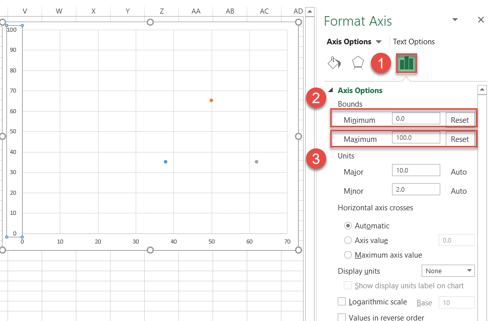
Step #9: Change the horizontal and vertical axis scale ranges.
Rescale the axes to start at 0 and end at 100 to center the data markers near the middle of the chart area.
Right-click on the vertical axis and select “Format Axis.”
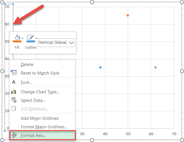
In the Format Axis task pane, do the following:
- Navigate to the Axis Options tab.
- Set the Minimum Bounds to “0.”
- Set the Maximum Bounds to “100.”
Jump to the horizontal axis and repeat the same process.
Step #10: Remove the axes and the gridlines.
Clean up the chart by erasing the axes and gridlines. Right-click each element and select “Delete.”
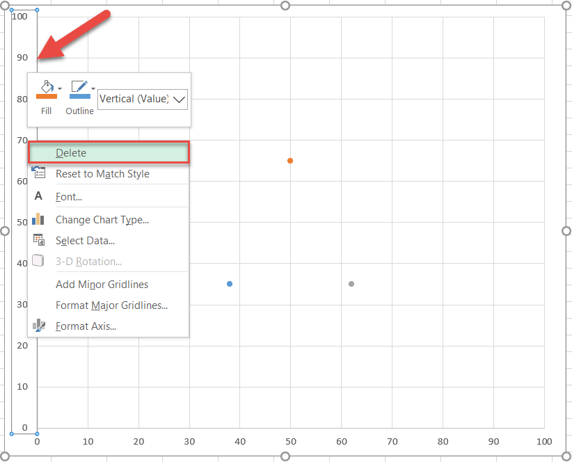
Now would be a good time to make your chart larger so you can better see your new fancy Venn diagram. Select the chart and drag the handles to enlarge it.
Here is what you should have at this point—minimalism at its finest:
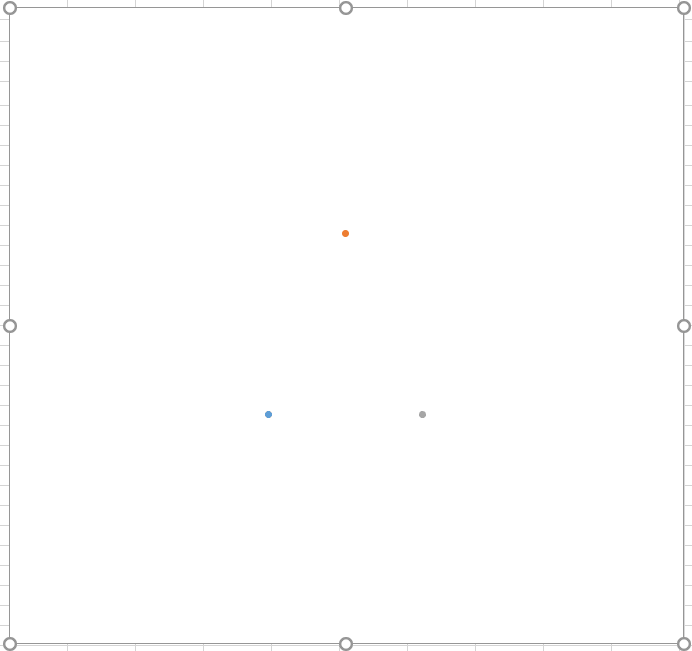
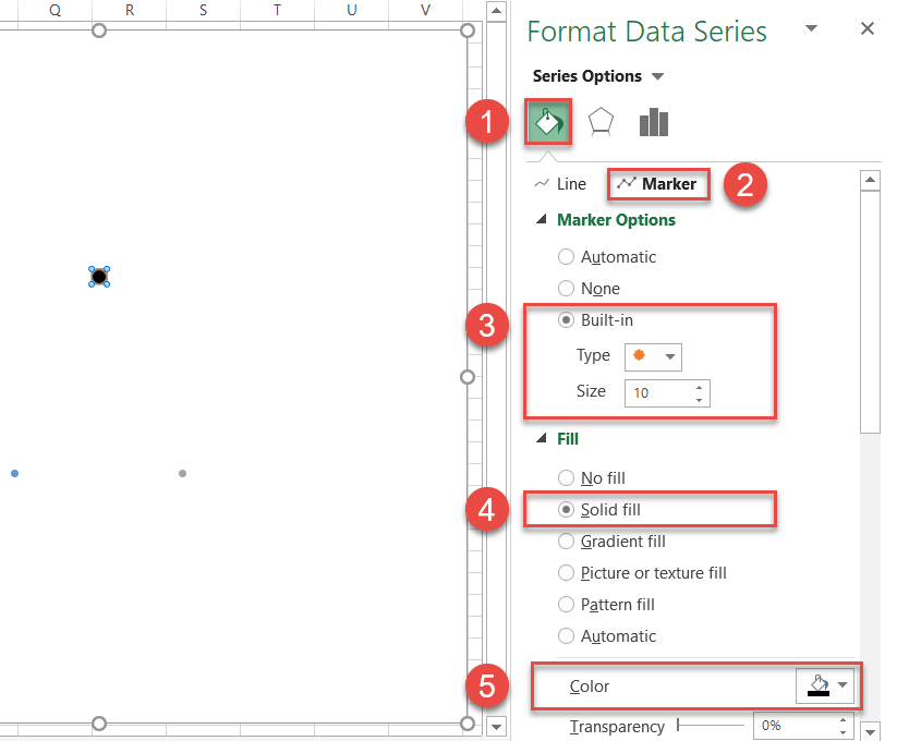
Step #11: Enlarge the data markers.
To streamline the process, make the markers larger or they will get buried beneath the circles further down the road.
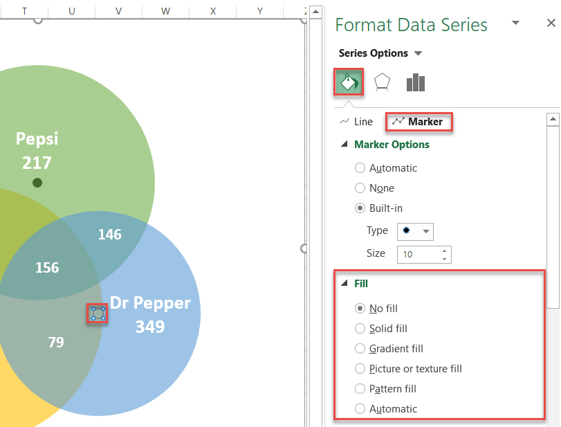
Right-click on any of the three data markers and choose “Format Data Series.”
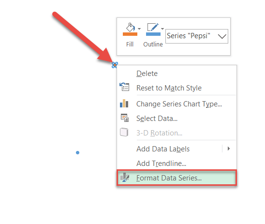
In the task pane, follow these simple steps:
- Click the “Fill & Line” icon.
- Switch to the Marker tab.
- Under “Marker Options,” check the “Built-in” radio button and set the Size value to “10.”
- Under “Fill,” select “Solid Fill.”
- Click the “Fill Color” icon to open the color palette and choose black.
Rinse and repeat for each data series.
Step #12: Draw the circles.
Without closing the tab, scroll down to the Border section and create the circles for the Venn diagram by following these instructions:
- Click “Solid line.”
- Open the color palette and choose different colors for each data marker:
- For Series “Coca-Cola,” pick gold.
- For Series “Pepsi,” select green.
- For Series “Dr Pepper,” choose blue.
- Change “Transparency” to “40%.”
- Change “Width” for each data series to the corresponding values in column Circle Size (column G):
- For Series “Coca-Cola,” enter “250” (G2).
- For Series “Pepsi,” type in “230” (G3).
- For Series “Dr Pepper,” set the value to “200” (G4).
NOTE: If you want the circles to be the same, simply set the Width value to “250” for each.
Step #13: Change the x- and y-axis coordinates to adjust the overlapping areas (optional).
Normally, you should leave the X and Y coordinates determining the position of circles unaltered. However, for those looking to customize the way the circles should overlap, here is how you do it.
To refresh your memory, take a look at the coordinates underlying the Venn diagram used in the tutorial.
| X Value | Y Value |
| 38 | 35 |
| 50 | 65 |
| 62 | 35 |
These are the x- and y-axis values positioning the first (Series “Coca-Cola”), second (Series “Pepsi”), and third (Series “Dr Pepper”) circle respectively. Here is how it works:
As you may have guessed, you can effortlessly change how much the circles overlap by modifying the coordinates—which allows you to move the circles left and right (x-axis values) and up and down (y-axis values) however you see fit.
For instance, let’s push the circle representing Series “Coca-Cola” a bit upward—thereby increasing the overlapping area between Series “Coca-Cola” and Series “Pepsi”—since we have a comparatively large number of respondents drinking only these two brands.
To pull off the trick, simply alter the corresponding y-axis value.
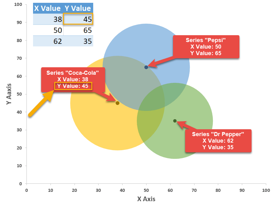
Using this method will take your Venn diagrams to a whole new level, making them unbelievably versatile.
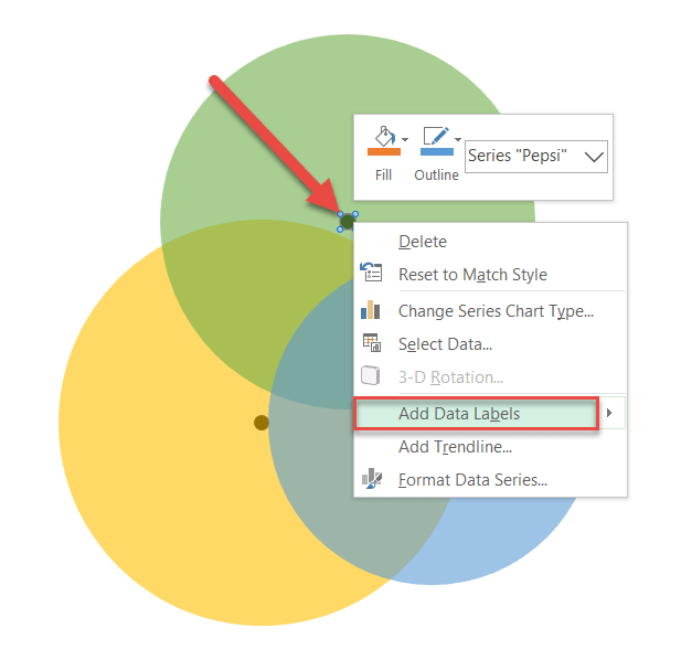
Step #14: Add data labels.
The rest of the steps will be dedicated to making the diagram more informative.
Repeat the process outlined in steps 14 and 15 for each data series.
First, let’s add data labels. Right-click on the data marker representing Series “Pepsi” and choose “Add Data Labels.”
Step #15: Customize data labels.
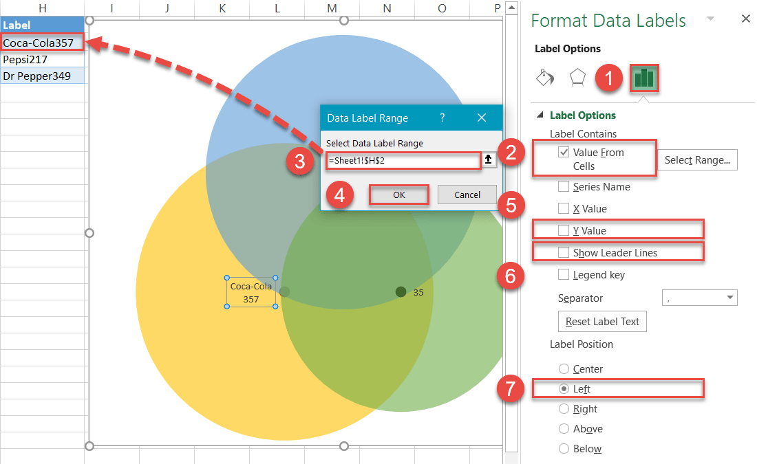
Replace the default values with the custom labels you previously designed. Right-click on any data label and choose “Format Data Labels.”
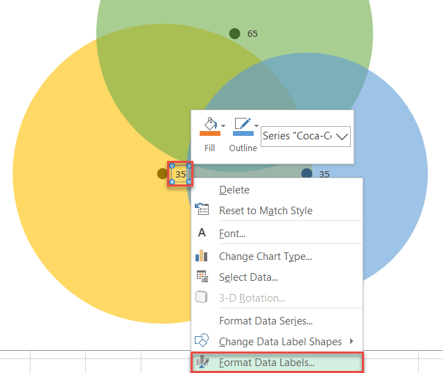
Once the task pane pops up, do the following:
- Go to the Label Options tab.
- Click “Value From Cells.”
- Highlight the corresponding cell from column Label (H2 for Coca-Cola, H3 for Pepsi, and H4 for Dr Pepper).
- Click “OK.”
- Uncheck the “Y Value” box.
- Uncheck the “Show Leader Lines” box.
- Under “Label Position,” choose the following:
- For Series “Pepsi,” click “Above.”
- For Series “Coca-Cola,” select “Left.”
- For Series “Dr Pepper,” pick “Right.”
- Adjust font size/boldness/color under Home > Font.
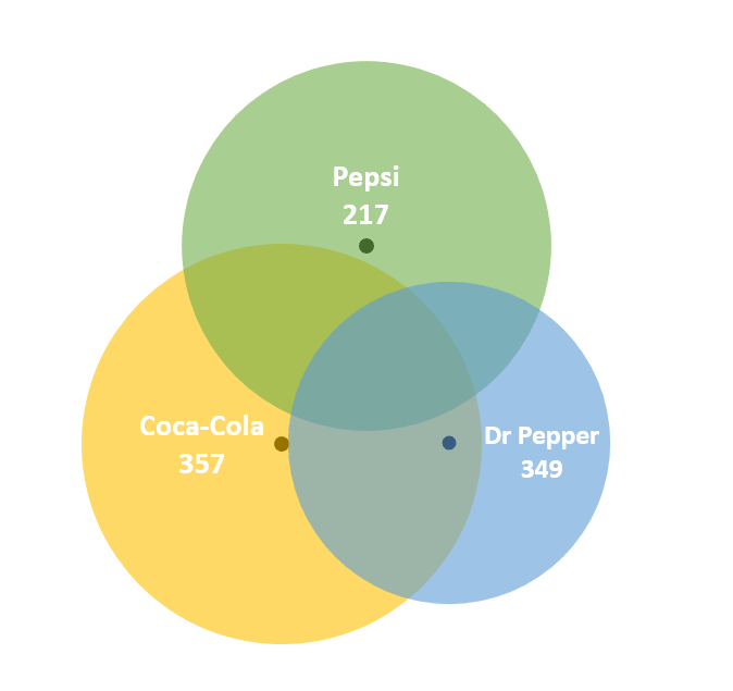
When you have finished this step, your diagram should look like this:
Step #16: Add text boxes linked to the intersection values.
Insert four text boxes for each overlapping part of the diagram to display the corresponding number of people who opted for multiple brands at once.
- Select the plot area.
- Go to the Insert tab.
- Click the “Text Box” button.
- Create a text box.
- Type “=” into the Formula Bar.
- Highlight the corresponding cell from column Chart Value (column D).
- Adjust font size/boldness/color to match the other labels under Home > Font.
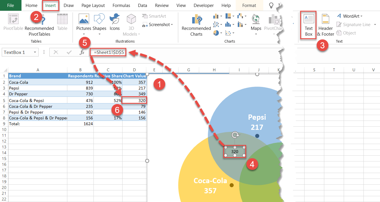
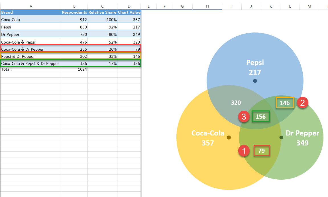
In the same way, add the rest of the overlap values to the chart. Here is another screenshot to help you navigate through the process.
Step #17: Hide the data markers.
You no longer need the data markers supporting the diagram, so let’s make them invisible. Right-click on any data marker, open the Format Data Series tab, and do the following:
- Click the “Fill & Line” icon.
- Switch to the Marker tab.
- Under “Fill,” choose “No fill.”
Repeat the process for each data marker.
Step #18: Add the chart title.
Finally, add the chart title:
- Select the plot area.
- Click the “Chart Elements” icon.
- Check the “Chart Title” box.
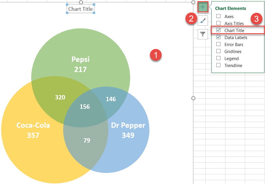
Change the chart title to fit your data, and your stellar Venn diagram is ready!
Download Venn Diagram Template
Download our free Venn Diagram Template for Excel.
Download Now
Excel Venn Diagram (Table of Contents)
- Introduction to Venn Diagrams in Excel
- How to Create Venn Diagram in Excel?
Introduction to Venn Diagrams in Excel
A Venn diagram is a diagram or illustration of the relationships between and among sets (different groups of objects). It is a pictorial representation of logical or mathematical sets that are drawn in an enclosing rectangle (rectangle representing the universal set) as circles.
Each circle represents a set, and the points inside the circle represent the elements of the set. The interior of the circle represents elements that are not in the set. Common elements of the sets are represented as intersections of the circles. Venn diagrams are called so as John Venn invented them.
How to Create Venn Diagram in Excel?
Let’s understand how to Create Venn Diagram in Excel with a few examples.
You can download this Venn Diagram Excel Template here – Venn Diagram Excel Template
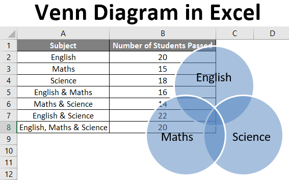
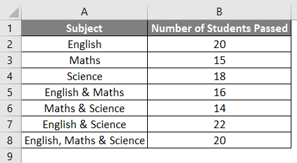
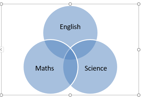
Example #1
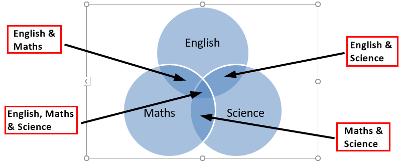
Let’s say we wish to draw a Venn diagram for the number of students who passed (out of 25) in the subjects: Maths, English, and Science. We have the following students’ data in an Excel sheet.
Now the following steps can be used to create a Venn diagram for the same in Excel.
- Click on the ‘Insert’ tab and then click on ‘SmartArt’ in the ‘Illustrations’ group as follows:
- Now click on ‘Relationship’ in the new window and then select a Venn diagram layout (Basic Venn) and click ‘OK.
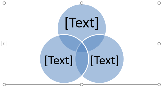
- This will display a Venn diagram layout as follows:
- Now the text on the circles can be changed by clicking on [Text] in the Text pane in circles and then renaming it so as to depict what the circles represent.
- We can add text in overlapping portions of the circles by inserting a text box.
Example #2
Let’s say there are two sets A & B defined as A= {1, 2}, and B= {2, 3}, and we wish to find A U B (A union B). A union is defined as something that is present in either of the groups or sets.
So A U B means the elements or numbers from either A or B.
- A U B= {1, 2} U {2, 3}
- A U B= {1, 2, 3}
So let’s see how this can be represented in a Venn diagram.
- Click on the ‘Insert’ tab and then click on ‘SmartArt’ in the ‘Illustrations’ group as follows.
- Now click on ‘Relationship’ in the new window and then select a Venn diagram layout (Basic Venn) and click ‘OK.
- This will display a Venn diagram layout as follows.
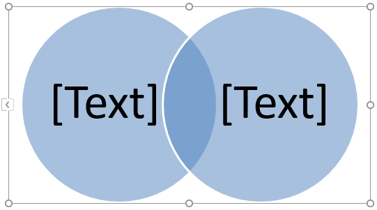
We can also choose ‘Linear Venn’ instead of the ‘Basic Venn’ layout and then delete some circles. Now since there are only two sets (A & B) in this case, we delete one of the circles from the Venn diagram as follows.
- Click one of the circle and press the ‘Delete’ button. This will lead us to a Venn diagram below:
- Now the text on the circles can be changed by clicking on [Text] in the Text pane in circles and then renaming it so as to depict what the circles represent.
Just like Union, there is another term generally used for sets which are ‘Intersection’ which means something that is present in all of the groups or sets.
So, in this case, An intersection B (A ∩ B) would be numbers or elements that are present in both A & B.
- A ∩ B= {2}
Just like deletion, we can even add circles to the Venn diagram by following the below steps.
- Right-click the existing circle, which is closest to where the new circle is to be added. Now click on ‘Add Shape’, and then click on ‘Add Shape After’ or ‘Add Shape Before’.
After adding the shape, the output is shown below.
Example #3
Let’s say there are two sets A & B defined as A= {1, 3, 5} and B= {1, 2, 3, 4, 5, 6}, and we wish to find A U B (A union B). So as seen in the above example, A U B means the elements or numbers from either A or B.
- A U B= {1, 3, 5} U {1, 2, 3, 4, 5, 6}
- A U B= {1, 2, 3, 4, 5, 6}
So let’s see how this can be represented in a Venn diagram.
- Click on the ‘Insert’ tab and then click on ‘SmartArt’ in the ‘Illustrations’ group as follows.
- Now click on ‘Relationship’ in the new window and then select a Venn diagram layout (Stacked Venn) and click ‘OK.
- This will display a Venn diagram layout as follows.
Now since there are only two sets (A & B) in this case, so we delete the extra circles from the Venn diagram by right-clicking on them and pressing ‘Delete’. This will lead us to a Venn diagram as below.
A is a subset of B, so if B represents the outer circle, A will represent the inner circle. Also, since all the elements of A are also present in B, so we can reposition the inner circle by dragging it.
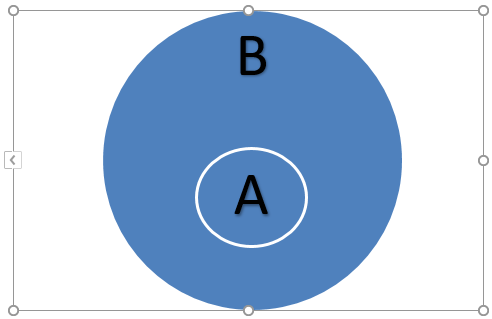
In this case, A U B will be equal to B as A is a subset of B. Also, A U B will be equal to A.
Things to Remember About Venn Diagram in Excel
- Venn diagrams illustrate simple set relationships. They are generally used in probability, statistics, computer science, and physics.
- Overlapping circles are used in Venn diagrams to show the similarities, differences, and relationships between different group of objects. The overlapping portions represent the similarities between groups, and the non-overlapping portions represent the differences.
- Venn diagrams enable us to organize information visually so as to see relationships between two or more set of items. Venn diagram can also be created via drawing tools available in Excel.
- We can even apply a SmartArtStyle to the Venn diagram. To do this, click on the ‘Design’ tab in the “SmartArt Tools and then click on the layout that is desired :
- We can even apply color combinations to the circles in the Venn diagram and change their colors as desired. Also, we can add soft edges, glows, and 3D effects. To do this, click on the ‘Design’ tab in the “SmartArt Tools and then click on ‘Change Colors’ and select the desired color theme:
Recommended Articles
This is a guide to Venn Diagram in Excel. Here we discuss creating Venn Diagrams in Excel and practical examples, and a downloadable excel template. You can also go through our other suggested articles –
- Dot Plots in Excel
- Family Tree in Excel
- Marimekko Chart Excel
- Interactive Chart in Excel
Simple Steps on How to Make a Venn Diagram on Excel
“Can I use Microsoft Excel to make a Venn Diagram?” — Yes, you can!Microsoft Excel is the leading spreadsheet software program that Microsoft develops. This application is also the most popular data visualization tool and has become the industry standard. And did you know Microsoft Excel has a feature where you can create a Venn Diagram? Yes, you read that right. This tool allows you to make a Venn Diagram using its SmartArt Graphics. So, if you want to compare specific ideas, you can use Microsoft Excel to create a Venn Diagram. Continually read this guidepost to learn how to make a Venn Diagram in Excel easily.

- Part 1. Bonus: Free Online Diagram Maker
- Part 2. Steps to Make a Venn Diagram in Excel
- Part 3. Pros and Cons of Using Excel to Make a Venn Diagram
- Part 4. FAQs about How to Make a Venn Diagram in Excel
Part 1. Bonus: Free Online Diagram Maker
Venn Diagram is a helpful tool for comparing ideas, topics, or objects. It is commonly used for educational and organizational purposes. Creating a Venn Diagram is easy. However, finding a perfect tool to create one is quite challenging. So, we searched for the best Venn Diagram maker that you can easily use.
MindOnMap is the best Venn Diagram maker that you can use online. It is completely free and safe to use. This online application enables you to create a Venn Diagram using the Flowchart option. Moreover, beginners can use this tool because it has an intuitive user interface. This mind map designer can help you process easier, quicker, and more professionally. What’s impressive about creating a Venn Diagram using MindOnMap is that it has ready-made themes that you can use for diagramming.
Furthermore, you can use shapes, arrows, clipart, flowcharts, and more to help you produce a professionally made output. Also, you can export your diagrams or maps in different formats, including PNG, JPEG, SVG, and PDF. And you can share your project with others, allowing them to access the project you are making. It is also the best alternative to create a Venn Diagram in Excel.
How to create a Venn Diagram using MindOnMap
1
Open your browser on your desktop and search MindOnMap.com in your search box. Click this link to be directed to the official page of MindOnMap.
2
Then, log in or sign up for your account. But if you have already logged in to your account, click the Create Your Mind Map button.

3
After that, click the New button at the top left side of the interface. And on the following interface, choose the Flowchart option to create your Venn Diagram.

4
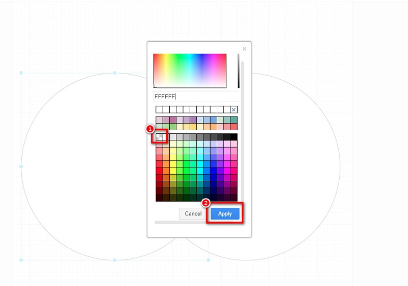
And then, you will see a blank canvas where you will make your Venn Diagram. But first, on the General panel, select the Circle shape to create the circles we need for making the Venn Diagram. Then, add the circle to the blank canvas; copy-paste the circle so that the second circle will have the same shape as the first one. Then, select both circles and hit CTRL + G on your keyboard to group them.
5
Remove the fill of the circles by selecting them. Click the Fill Color icon, and click the None option. Hit the Apply button to remove the shape’s color fill. You can change the Line color of your circles based on your preference.
6
Next, input the text you want to include by clicking the Text icon on the General panel.
7
Finally, press Save to save your output. Hit the Export button if you like to save your output and save it in a different format.
Part 2. Steps to Make a Venn Diagram in Excel
Venn Diagrams are ideal graphic diagrams illustrating similarities and differences between different concepts. There are various types of Venn diagrams, like two-circle, three-circle, and four-circle diagrams. And using Microsoft Excel, you can create a fantastic Venn Diagram. By clicking the SmartArt graphic option, you can see the list of diagram templates that you can use to create a Venn Diagram. However, Excel can only create a three-circle diagram.
Nonetheless, it’s still an excellent app for making a Venn diagram. You can easily add text to the circles using the text box. And with its easy-to-use interface, you can easily create a Venn diagram. You can download Microsoft Excel for free so if you want to create a Venn Diagram with this application, follow the instructions below.
How to make a Venn Diagram on Excel
1
Download Microsoft Excel on your computer if it is not installed yet. Run the app once it is downloaded.
2
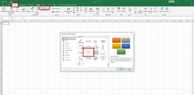
Go to the Insert tab on a new worksheet, then on the Illustrations panel, click the SmartArt button to open the SmartArt Graphic window. And under the Relationship category, select the Basic Venn diagram and click the OK button.
3
After clicking the button, you can immediately insert the text you want to include in your diagram.
4
You can change the color of your Venn Diagram by clicking the Change colors button. You can also change the style of your circles in the SmartArt Styles.
There is another method on how to make a Venn Diagram in Excel, which is by using the Regular Shapes. You can use this method if you do not have access to SmartArt Graphics.
1
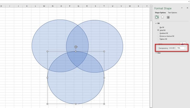
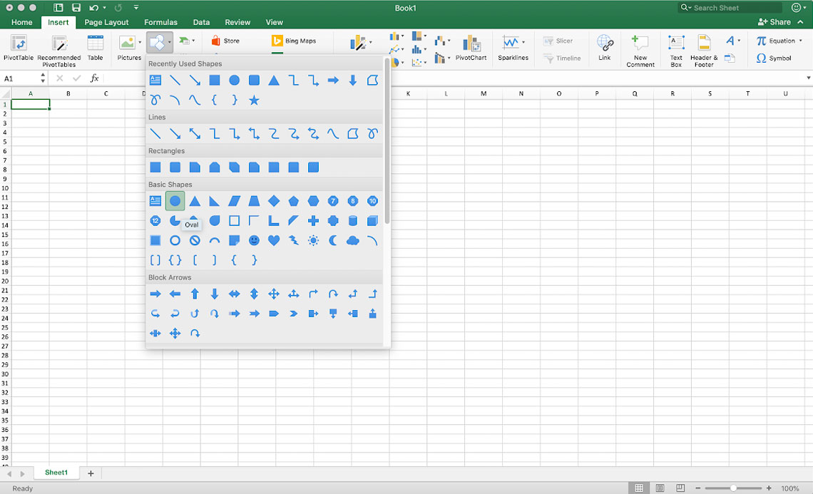
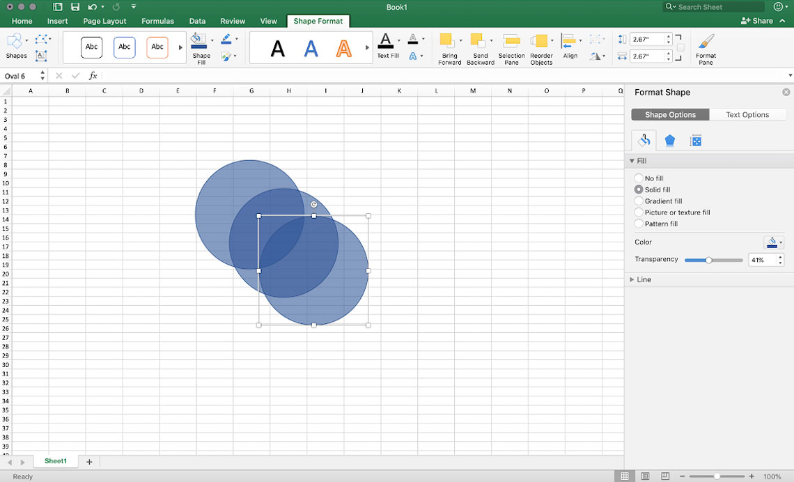
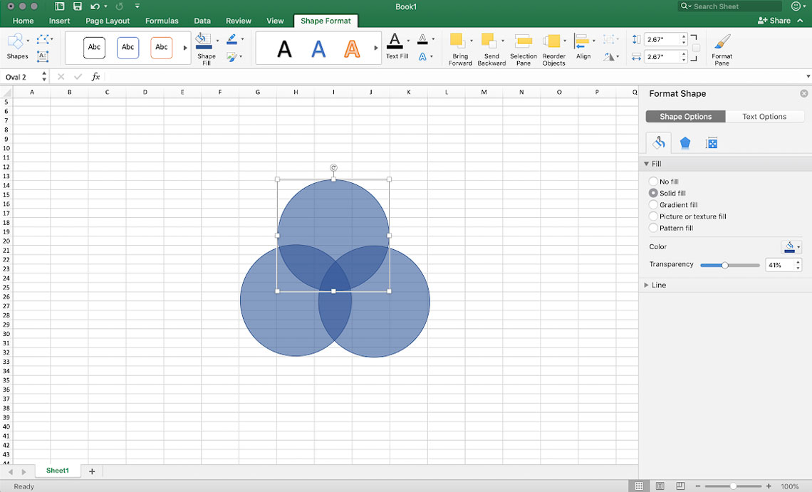
Like the SmartArt Graphics, go to the Insert tab and click the Shape button. Select the Oval shape, then draw the circles on your blank sheet.
2
And then, increase the fill transparency of each circle in the Format Shape pane. Take note that if you do not increase the fill transparency of the circles, it will not appear like they are overlapping.
And that’s it! Those are the steps on how to do a Venn Diagram in Excel. Follow those simple steps to create a Venn Diagram.
Part 3. Pros and Cons of Using Excel to Make a Venn Diagram
PROS
- You can download Excel on all platforms, like Windows, Mac, and Linux.
- It allows you to create a Venn Diagram with its simple user interface easily.
- It has ready-made Venn Diagram templates that you can use.
CONS
- You can only create a three-circle Venn Diagram.
- Does not contain many icons, clipart, or stickers.
Part 4. FAQs about How to Make a Venn Diagram in Excel
Is Excel the best tool to create a Venn Diagram?
No. Although Microsoft Excel is an excellent tool for creating a Venn Diagram, it is not the best choice. Some of the best Venn Diagram maker tools are GitMind, MindOnMap, Canva, and Lucidchart.
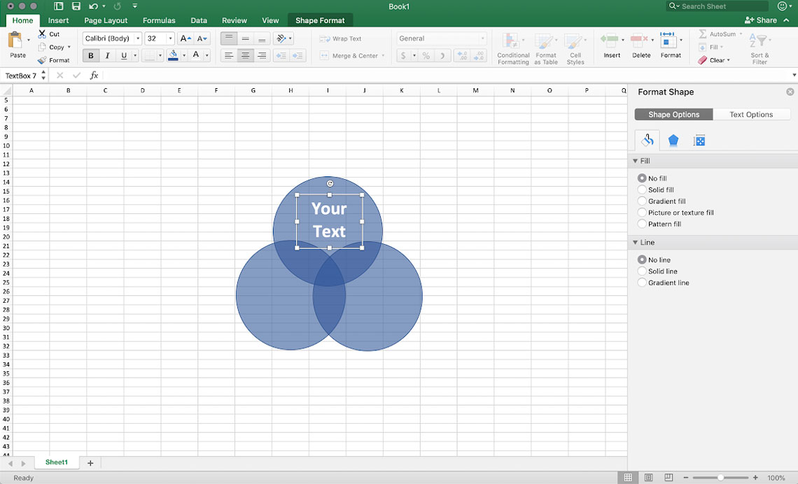
How do I put text in the middle of my Venn Diagram in Excel?
To begin, rotate the oval to have the same overlapping portions of the circles. And then, move the oval to place your text over the overlapping portions of the shapes. Next, right-click the oval, click Add text then type in your text.
Can I make a Venn Diagram in Microsoft Word?
Yes, you can. Microsoft Word is a word processor application that is popular. It also has a feature where you can create a Venn Diagram. 1. Go to the Insert tab. 2. In the Illustration group, select the SmartArt option. 3. Go to Relationship and select the Venn Diagram layout. 4. Click OK to create one.
Conclusion
This article has taught you how to draw a Venn Diagram in Excel. After reading this guidepost, you will learn the necessary steps for creating a Venn Diagram. Excel is an offline tool. So, if you want to save space on your device and use an online tool, use MindOnMap.
Those of you looking for a quicker, easier and more beautiful way to create your Venn diagrams should check the short video below explaining the Vizzlo method. Everyone who wants slower, more difficult and markedly less beautiful Venn diagrams, keep scrolling for the step-by-step guide to Excel.
Getting Started
gi
On the top of the page, select the «Insert» tab, in the «Illustrations» group, click «SmartArt.»
In the «Choose a SmartArt Graphic» gallery, click «Relationship,» and choose a Venn diagram layout (for example «Basic Venn»), and click OK.
Adding Labels
To add text, either click on the text panel of the desired circle, or select one of the text fields in the «Text» pane that pops up next to your diagram and enter your desired text.
Tip: If you don’t see the text pane, you can open it by clicking on «Text Pane» on the upper left hand corner of your top bar.
Note: There is no option to add text to the overlapping portions of your diagram currently in Excel, so we will work around it using text boxes. If you don’t feel like going through all that check out our Venn diagram creator!
-
In the «Insert» tab, select «Text Box» on the right side
-
Click and drag to create a text box
-
To change the background color, right-click your text box, select «Format» and, on the side pane that pops up, go to format shape and under fill select «No fill»
-
To delete the lines around the text box, select line in the format pane, and then select «No line»
-
You can now drag the text box to the desired position in the overlapping portions of your Venn diagram. (Click your text box and, when your cursor transforms into a four-headed arrow, drag the box where you want it).
To change the format of your text (font, size, etc.) simply select your text and use the normal formatting options on the home tab.
Think this is a bit convoluted? So do we! Vizzlo’s free Venn diagram creator lets you add labels with a simple click!
Change Color and Design
To change the color, you can use SmartArt presets by clicking on your diagram, selecting the «SmartArt Design» tab and selecting «Change Color.»
You can also change the colors of individual circles by selecting one and using the regular fill tool in the menu bar.
Tip: When changing color manually, keep the opacity in mind so overlapping areas stay visible.
However, if you want pre-made, designer-grade color schemes, check out our free Venn diagram creator!
SmartArt Style
A SmartArt Style is a preset combination of different effects, such as line style, bevel, or 3-D rotation that you can apply to your Venn diagram.
Click your diagram and, under the «Design» tab, use the «Styles»group located on the right, to preview and chose a style.
Change Between Different Venn Diagram Layouts
Right-click the Venn diagram that you want to change. Choose a layout in the «Layouts» group on the «Design» tab.
When you hover a layout option, your SmartArt graphic changes to preview the new layout.
Selecting the Right Layout
If you want to show overlapping relationships in a sequence, select «Linear Venn.»
For overlapping relationships with an emphasis on growth or gradation, select «Stacked Venn.»
For a diagram focusing on relationships to a central factor, click «Radial Venn.»
Without SmartArt
If you have no access to SmartArt, there is always the option to create your Venn diagram manually. If you create your Venn this way, keep in mind that there is no way to make your circles correlate to any numbers you might have in your sheet.
-
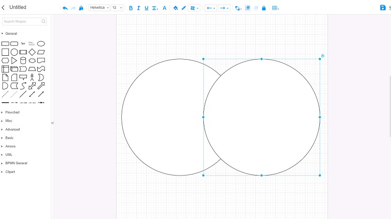
Create a circle with the «Insert Shape» function by selecting the «Oval» option. By clicking and dragging your mouse, if you hold down shift, the shape preserve its proportions, i.e., doesn’t go into an oval from and always stays a circle.
-
Format the circle to your liking by right-clicking and selecting «Format Shape.» Here, you can change color, keep in mind to turn down the transparency and «Solid Fill» to make the overlapping areas visible. Once you are happy with your format, copy & paste the circle to create multiple identical circles.
-
Arrange the circles in the way you want to convey your relationships by clicking and dragging them to the right position.
-
To add labels, create text boxes without fill or borders («Format Shape» > «No fill» & «No line»), style the text like you usually would and drag the boxes to your desired positions.
Instead of going through all this trouble, check out Vizzlo’s free Venn diagram creator and make your own stunning diagrams within seconds!
Start designing your own charts and business graphics.
Try Vizzlo for free