
Charts and graphs are one of the best features of Excel; they are very flexible and can be used to make some very advanced visualization. However, this flexibility means there are hundreds of different options. We can create exactly the visualization we want but it can be time-consuming to apply. When we want to apply those hundreds of settings to lots of charts, it can take hours and hours of frustrating clicking. This post is a guide to using VBA for Charts and Graphs in Excel.
The code examples below demonstrate some of the most common chart options with VBA. Hopefully you can put these to good use and automate your chart creation and modifications.
While it might be tempting to skip straight to the section you need, I recommend you read the first section in full. Understanding the Document Object Model (DOM) is essential to understand how VBA can be used with charts and graphs in Excel.
In Excel 2013, many changes were introduced to the charting engine and Document Object Model. For example, the AddChart2 method replaced the AddChart method. As a result, some of the code presented in this post may not work with versions before Excel 2013.
Adapting the code to your requirements
It is not feasible to provide code for every scenario you might come across; there are just too many. But, by applying the principles and methods in this post, you will be able to do almost anything you want with charts in Excel using VBA.
Understanding the Document Object Model
The Document Object Model (DOM) is a term that describes how things are structured in Excel. For example:
- A Workbook contains Sheets
- A Sheet contains Ranges
- A Range contains an Interior
- An Interior contains a color setting
Therefore, to change a cell color to red, we would reference this as follows:
ActiveWorkbook.Sheets("Sheet1").Range("A1").Interior.Color = RGB(255, 0, 0)Charts are also part of the DOM and follow similar hierarchical principles. To change the height of Chart 1, on Sheet1, we could use the following.
ActiveWorkbook.Sheets("Sheet1").ChartObjects("Chart 1").Height = 300Each item in the object hierarchy must be listed and separated by a period ( . ).
Knowing the document object model is the key to success with VBA charts. Therefore, we need to know the correct order inside the object model. While the following code may look acceptable, it will not work.
ActiveWorkbook.ChartObjects("Chart 1").Height = 300In the DOM, the ActiveWorkbook does not contain ChartObjects, so Excel cannot find Chart 1. The parent of a ChartObject is a Sheet, and the Parent of a Sheet is a Workbook. We must include the Sheet in the hierarchy for Excel to know what you want to do.
ActiveWorkbook.Sheets("Sheet1").ChartObjects("Chart 1").Height = 300With this knowledge, we can refer to any element of any chart using Excel’s DOM.
Chart Objects vs. Charts vs. Chart Sheets
One of the things which makes the DOM for charts complicated is that many things exist in many places. For example, a chart can be an embedded chart on the face of a worksheet, or as a separate chart sheet.
- On the worksheet itself, we find ChartObjects. Within each ChartObject is a Chart. Effectively a ChartObject is a container that holds a Chart.
- A Chart is also a stand-alone sheet that does not have a ChartObject around it.
This may seem confusing initially, but there are good reasons for this.
To change the chart title text, we would reference the two types of chart differently:
- Chart on a worksheet:
Sheets(“Sheet1”).ChartObjects(“Chart 1”).Chart.ChartTitle.Text = “My Chart Title” - Chart sheet:
Sheets(“Chart 1”).ChartTitle.Text = “My Chart Title”
The sections in bold are exactly the same. This shows that once we have got inside the Chart, the DOM is the same.
Writing code to work on either chart type
We want to write code that will work on any chart; we do this by creating a variable that holds the reference to a Chart.
Create a variable to refer to a Chart inside a ChartObject:
Dim cht As Chart
Set cht = Sheets("Sheet1").ChartObjects("Chart 1").Chart
Create a variable to refer to a Chart which is a sheet:
Dim cht As Chart
Set cht = Sheets("Chart 1")
Now we can write VBA code for a Chart sheet or a chart inside a ChartObject by referring to the Chart using cht:
cht.ChartTitle.Text = "My Chart Title"OK, so now we’ve established how to reference charts and briefly covered how the DOM works. It is time to look at lots of code examples.
Inserting charts
In this first section, we create charts. Please note that some of the individual lines of code are included below in their relevant sections.
Create a chart from a blank chart
Sub CreateChart()

'Declare variables
Dim rng As Range
Dim cht As Object

'Create a blank chart
  Set cht = ActiveSheet.Shapes.AddChart2

'Declare the data range for the chart
  Set rng = ActiveSheet.Range("A2:B9")

'Add the data to the chart
  cht.Chart.SetSourceData Source:=rng

'Set the chart type
  cht.Chart.ChartType = xlColumnClustered

End Sub
Reference charts on a worksheet
In this section, we look at the methods used to reference a chart contained on a worksheet.
Active Chart
Create a Chart variable to hold the ActiveChart:
Dim cht As Chart
Set cht = ActiveChart
Chart Object by name
Create a Chart variable to hold a specific chart by name.
Dim cht As Chart
Set cht = Sheets("Sheet1").ChartObjects("Chart 1").Chart
Chart object by number
If there are multiple charts on a worksheet, they can be referenced by their number:
- 1 = the first chart created
- 2 = the second chart created
- etc, etc.
Dim cht As Chart
Set cht = Sheets("Sheet1").ChartObjects(1).Chart
Loop through all Chart Objects
If there are multiple ChartObjects on a worksheet, we can loop through each:
Dim chtObj As ChartObject

For Each chtObj In Sheets("Sheet1").ChartObjects

    'Include the code to be applied to each ChartObjects
    'refer to the Chart using chtObj.cht.

Next chtObj
Loop through all selected Chart Objects
If we only want to loop through the selected ChartObjects we can use the following code.
This code is tricky to apply as Excel operates differently when one chart is selected, compared to multiple charts. Therefore, as a way to apply the Chart settings, without the need to repeat a lot of code, I recommend calling another macro and passing the Chart as an argument to that macro.
Dim obj As Object

'Check if any charts have been selected
If Not ActiveChart Is Nothing Then

    Call AnotherMacro(ActiveChart)

Else
    For Each obj In Selection

    'If more than one chart selected
    If TypeName(obj) = "ChartObject" Then

        Call AnotherMacro(obj.Chart)

    End If
Next

End If
Reference chart sheets
Now let’s move on to look at the methods used to reference a separate chart sheet.
Active Chart
Set up a Chart variable to hold the ActiveChart:
Dim cht As Chart
Set cht = ActiveChart
Note: this is the same code as when referencing the active chart on the worksheet.
Chart sheet by name
Set up a Chart variable to hold a specific chart sheet
Dim cht As Chart
Set cht = Sheets("Chart 1")
Loop through all chart sheets in a workbook
The following code will loop through all the chart sheets in the active workbook.
Dim cht As Chart

For Each cht In ActiveWorkbook.Charts

    Call AnotherMacro(cht)

Next cht
Basic chart settings
This section contains basic chart settings.
All codes start with cht., as they assume a chart has been referenced using the codes above.
Change chart type
'Change chart type - these are common examples, others do exist.
cht.ChartType = xlArea
cht.ChartType = xlLine
cht.ChartType = xlPie
cht.ChartType = xlColumnClustered
cht.ChartType = xlColumnStacked
cht.ChartType = xlColumnStacked100
cht.ChartType = xlArea
cht.ChartType = xlAreaStacked
cht.ChartType = xlBarClustered
cht.ChartType = xlBarStacked
cht.ChartType = xlBarStacked100
Create an empty ChartObject on a worksheet
'Create an empty chart embedded on a worksheet.
Set cht = Sheets("Sheet1").Shapes.AddChart2.Chart
Select the source for a chart
'Select source for a chart
Dim rng As Range
Set rng = Sheets("Sheet1").Range("A1:B4")
cht.SetSourceData Source:=rng
Delete a chart object or chart sheet
'Delete a ChartObject or Chart sheet
If TypeName(cht.Parent) = "ChartObject" Then

    cht.Parent.Delete

ElseIf TypeName(cht.Parent) = "Workbook" Then

    cht.Delete

End If
Change the size or position of a chart
'Set the size/position of a ChartObject - method 1
cht.Parent.Height = 200
cht.Parent.Width = 300
cht.Parent.Left = 20
cht.Parent.Top = 20

'Set the size/position of a ChartObject - method 2
chtObj.Height = 200
chtObj.Width = 300
chtObj.Left = 20
chtObj.Top = 20
Change the visible cells setting
'Change the setting to show only visible cells
cht.PlotVisibleOnly = False
Change the space between columns/bars (gap width)
'Change the gap space between bars
cht.ChartGroups(1).GapWidth = 50
Change the overlap of columns/bars
'Change the overlap setting of bars
cht.ChartGroups(1).Overlap = 75
Remove outside border from chart object
'Remove the outside border from a chart
cht.ChartArea.Format.Line.Visible = msoFalse
Change color of chart background
'Set the fill color of the chart area
cht.ChartArea.Format.Fill.ForeColor.RGB = RGB(255, 0, 0)

'Set chart with no background color
cht.ChartArea.Format.Fill.Visible = msoFalse
Chart Axis
Charts have four axis:
- xlValue
- xlValue, xlSecondary
- xlCategory
- xlCategory, xlSecondary
These are used interchangeably in the examples below. To adapt the code to your specific requirements, you need to change the chart axis which is referenced in the brackets.
All codes start with cht., as they assume a chart has been referenced using the codes earlier in this post.
Set min and max of chart axis
'Set chart axis min and max
cht.Axes(xlValue).MaximumScale = 25
cht.Axes(xlValue).MinimumScale = 10
cht.Axes(xlValue).MaximumScaleIsAuto = True
cht.Axes(xlValue).MinimumScaleIsAuto = True
Display or hide chart axis
'Display axis
cht.HasAxis(xlCategory) = True

'Hide axis
cht.HasAxis(xlValue, xlSecondary) = False
Display or hide chart title
'Display axis title
cht.Axes(xlCategory, xlSecondary).HasTitle = True

'Hide axis title
cht.Axes(xlValue).HasTitle = False
Change chart axis title text
'Change axis title text
cht.Axes(xlCategory).AxisTitle.Text = "My Axis Title"
Reverse the order of a category axis
'Reverse the order of a catetory axis
cht.Axes(xlCategory).ReversePlotOrder = True

'Set category axis to default order
cht.Axes(xlCategory).ReversePlotOrder = False
Gridlines
Gridlines help a user to see the relative position of an item compared to the axis.
Add or delete gridlines
'Add gridlines
cht.SetElement (msoElementPrimaryValueGridLinesMajor)
cht.SetElement (msoElementPrimaryCategoryGridLinesMajor)
cht.SetElement (msoElementPrimaryValueGridLinesMinorMajor)
cht.SetElement (msoElementPrimaryCategoryGridLinesMinorMajor)

'Delete gridlines
cht.Axes(xlValue).MajorGridlines.Delete
cht.Axes(xlValue).MinorGridlines.Delete
cht.Axes(xlCategory).MajorGridlines.Delete
cht.Axes(xlCategory).MinorGridlines.Delete
Change color of gridlines
'Change colour of gridlines
cht.Axes(xlValue).MajorGridlines.Format.Line.ForeColor.RGB = RGB(255, 0, 0)
Change transparency of gridlines
'Change transparency of gridlines
cht.Axes(xlValue).MajorGridlines.Format.Line.Transparency = 0.5
Chart Title
The chart title is the text at the top of the chart.
All codes start with cht., as they assume a chart has been referenced using the codes earlier in this post.
Display or hide chart title
'Display chart title
cht.HasTitle = True

'Hide chart title
cht.HasTitle = False
Change chart title text
'Change chart title text
cht.ChartTitle.Text = "My Chart Title"
Position the chart title
'Position the chart title
cht.ChartTitle.Left = 10
cht.ChartTitle.Top = 10
Format the chart title
'Format the chart title
cht.ChartTitle.TextFrame2.TextRange.Font.Name = "Calibri"
cht.ChartTitle.TextFrame2.TextRange.Font.Size = 16
cht.ChartTitle.TextFrame2.TextRange.Font.Bold = msoTrue
cht.ChartTitle.TextFrame2.TextRange.Font.Bold = msoFalse
cht.ChartTitle.TextFrame2.TextRange.Font.Italic = msoTrue
cht.ChartTitle.TextFrame2.TextRange.Font.Italic = msoFalse
Chart Legend
The chart legend provides a color key to identify each series in the chart.
Display or hide the chart legend
'Display the legend
cht.HasLegend = True

'Hide the legend
cht.HasLegend = False
Position the legend
'Position the legend
cht.Legend.Position = xlLegendPositionTop
cht.Legend.Position = xlLegendPositionRight
cht.Legend.Position = xlLegendPositionLeft
cht.Legend.Position = xlLegendPositionCorner
cht.Legend.Position = xlLegendPositionBottom

'Allow legend to overlap the chart.
'False = allow overlap, True = due not overlap
cht.Legend.IncludeInLayout = False
cht.Legend.IncludeInLayout = True

'Move legend to a specific point
cht.Legend.Left = 20
cht.Legend.Top = 200
cht.Legend.Width = 100
cht.Legend.Height = 25
Plot Area
The Plot Area is the main body of the chart which contains the lines, bars, areas, bubbles, etc.
All codes start with cht., as they assume a chart has been referenced using the codes earlier in this post.
Background color of Plot Area
'Set background color of the plot area
cht.PlotArea.Format.Fill.ForeColor.RGB = RGB(255, 0, 0)


'Set plot area to no background color
cht.PlotArea.Format.Fill.Visible = msoFalse
Set position of Plot Area
'Set the size and position of the PlotArea. Top and Left are relative to the Chart Area.
cht.PlotArea.Left = 20
cht.PlotArea.Top = 20
cht.PlotArea.Width = 200
cht.PlotArea.Height = 150
Chart series
Chart series are the individual lines, bars, areas for each category.
All codes starting with srs. assume a chart’s series has been assigned to a variable.
Add a new chart series
'Add a new chart series
Set srs = cht.SeriesCollection.NewSeries
srs.Values = "=Sheet1!$C$2:$C$6"
srs.Name = "=""New Series"""

'Set the values for the X axis when using XY Scatter
srs.XValues = "=Sheet1!$D$2:$D$6"
Reference a chart series
Set up a Series variable to hold a chart series:
- 1 = First chart series
- 2 = Second chart series
- etc, etc.
Dim srs As Series
Set srs = cht.SeriesCollection(1)
Referencing a chart series by name
Dim srs As Series
Set srs = cht.SeriesCollection("Series Name")
Delete a chart series
'Delete chart series
srs.Delete
Loop through each chart series
Dim srs As Series
For Each srs In cht.SeriesCollection

    'Do something to each series
    'See the codes below starting with "srs."

Next srs
Change series data
'Change series source data and name
srs.Values = "=Sheet1!$C$2:$C$6"
srs.Name = "=""Change Series Name"""
Changing fill or line colors
'Change fill colour
srs.Format.Fill.ForeColor.RGB = RGB(255, 0, 0)

'Change line colour
srs.Format.Line.ForeColor.RGB = RGB(255, 0, 0)
Changing visibility
'Change visibility of line
srs.Format.Line.Visible = msoTrue
Changing line weight
'Change line weight
srs.Format.Line.Weight = 10
Changing line style
'Change line style
srs.Format.Line.DashStyle = msoLineDash
srs.Format.Line.DashStyle = msoLineSolid
srs.Format.Line.DashStyle = msoLineSysDot
srs.Format.Line.DashStyle = msoLineSysDash
srs.Format.Line.DashStyle = msoLineDashDot
srs.Format.Line.DashStyle = msoLineLongDash
srs.Format.Line.DashStyle = msoLineLongDashDot
srs.Format.Line.DashStyle = msoLineLongDashDotDot
Formatting markers
'Changer marker type
srs.MarkerStyle = xlMarkerStyleAutomatic
srs.MarkerStyle = xlMarkerStyleCircle
srs.MarkerStyle = xlMarkerStyleDash
srs.MarkerStyle = xlMarkerStyleDiamond
srs.MarkerStyle = xlMarkerStyleDot
srs.MarkerStyle = xlMarkerStyleNone

'Change marker border color
srs.MarkerForegroundColor = RGB(255, 0, 0)

'Change marker fill color
srs.MarkerBackgroundColor = RGB(255, 0, 0)

'Change marker size
srs.MarkerSize = 8
Data labels
Data labels display additional information (such as the value, or series name) to a data point in a chart series.
All codes starting with srs. assume a chart’s series has been assigned to a variable.
Display or hide data labels
'Display data labels on all points in the series
srs.HasDataLabels = True

'Hide data labels on all points in the series
srs.HasDataLabels = False
Change the position of data labels
'Position data labels
'The label position must be a valid option for the chart type.
srs.DataLabels.Position = xlLabelPositionAbove
srs.DataLabels.Position = xlLabelPositionBelow
srs.DataLabels.Position = xlLabelPositionLeft
srs.DataLabels.Position = xlLabelPositionRight
srs.DataLabels.Position = xlLabelPositionCenter
srs.DataLabels.Position = xlLabelPositionInsideEnd
srs.DataLabels.Position = xlLabelPositionInsideBase
srs.DataLabels.Position = xlLabelPositionOutsideEnd
Error Bars
Error bars were originally intended to show variation (e.g. min/max values) in a value. However, they also commonly used in advanced chart techniques to create additional visual elements.
All codes starting with srs. assume a chart’s series has been assigned to a variable.
Turn error bars on/off
'Turn error bars on/off
srs.HasErrorBars = True
srs.HasErrorBars = False
Error bar end cap style
'Change end style of error bar
srs.ErrorBars.EndStyle = xlNoCap
srs.ErrorBars.EndStyle = xlCap
Error bar color
'Change color of error bars
srs.ErrorBars.Format.Line.ForeColor.RGB = RGB(255, 0, 0)
Error bar thickness
'Change thickness of error bars
srs.ErrorBars.Format.Line.Weight = 5
Error bar direction settings
'Error bar settings
srs.ErrorBar Direction:=xlY, _
    Include:=xlPlusValues, _
    Type:=xlFixedValue, _
    Amount:=100
'Alternatives options for the error bar settings are
'Direction:=xlX
'Include:=xlMinusValues
'Include:=xlPlusValues
'Include:=xlBoth
'Type:=xlFixedValue
'Type:=xlPercent
'Type:=xlStDev
'Type:=xlStError
'Type:=xlCustom

'Applying custom values to error bars
srs.ErrorBar Direction:=xlY, _
    Include:=xlPlusValues, _
    Type:=xlCustom, _
    Amount:="=Sheet1!$A$2:$A$7", _
    MinusValues:="=Sheet1!$A$2:$A$7"
Data points
Each data point on a chart series is known as a Point.
Reference a specific point
The following code will reference the first Point.
1 = First chart series
2 = Second chart series
etc, etc.
Dim srs As Series
Dim pnt As Point

Set srs = cht.SeriesCollection(1)
Set pnt = srs.Points(1)
Loop through all points
Dim srs As Series
Dim pnt As Point

Set srs = cht.SeriesCollection(1)

For Each pnt In srs.Points

    'Do something to each point, using "pnt."

Next pnt
Point example VBA codes
Points have similar properties to Series, but the properties are applied to a single data point in the series rather than the whole series. See a few examples below, just to give you the idea.
Turn on data label for a point
'Turn on data label
pnt.HasDataLabel = True
Set the data label position for a point
'Set the position of a data label
pnt.DataLabel.Position = xlLabelPositionCenter
Other useful chart macros
In this section, I’ve included other useful chart macros which are not covered by the example codes above.
Make chart cover cell range
The following code changes the location and size of the active chart to fit directly over the range G4:N20
Sub FitChartToRange()

'Declare variables
Dim cht As Chart
Dim rng As Range

'Assign objects to variables
Set cht = ActiveChart
Set rng = ActiveSheet.Range("G4:N20")

'Move and resize chart
cht.Parent.Left = rng.Left
cht.Parent.Top = rng.Top
cht.Parent.Width = rng.Width
cht.Parent.Height = rng.Height

End Sub
Export the chart as an image
The following code saves the active chart to an image in the predefined location
Sub ExportSingleChartAsImage()

'Create a variable to hold the path and name of image
Dim imagePath As String
Dim cht As Chart

imagePath = "C:UsersmarksDocumentsmyImage.png"
Set cht = ActiveChart

'Export the chart
cht.Export (imagePath)

End Sub
Resize all charts to the same size as the active chart
The following code resizes all charts on the Active Sheet to be the same size as the active chart.
Sub ResizeAllCharts()

'Create variables to hold chart dimensions
Dim chtHeight As Long
Dim chtWidth As Long

'Create variable to loop through chart objects
Dim chtObj As ChartObject

'Get the size of the first selected chart
chtHeight = ActiveChart.Parent.Height
chtWidth = ActiveChart.Parent.Width

For Each chtObj In ActiveSheet.ChartObjects

    chtObj.Height = chtHeight
    chtObj.Width = chtWidth

Next chtObj

End Sub
Bringing it all together
Just to prove how we can use these code snippets, I have created a macro to build bullet charts.
This isn’t necessarily the most efficient way to write the code, but it is to demonstrate that by understanding the code above we can create a lot of charts.
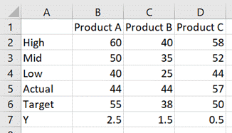
The data looks like this:
The chart looks like this:
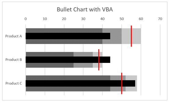
The code which achieves this is as follows:
Sub CreateBulletChart()

Dim cht As Chart
Dim srs As Series
Dim rng As Range

'Create an empty chart
Set cht = Sheets("Sheet3").Shapes.AddChart2.Chart

'Change chart title text
cht.ChartTitle.Text = "Bullet Chart with VBA"

'Hide the legend
cht.HasLegend = False

'Change chart type
cht.ChartType = xlBarClustered

'Select source for a chart
Set rng = Sheets("Sheet3").Range("A1:D4")
cht.SetSourceData Source:=rng

'Reverse the order of a catetory axis
cht.Axes(xlCategory).ReversePlotOrder = True

'Change the overlap setting of bars
cht.ChartGroups(1).Overlap = 100

'Change the gap space between bars
cht.ChartGroups(1).GapWidth = 50

'Change fill colour
Set srs = cht.SeriesCollection(1)
srs.Format.Fill.ForeColor.RGB = RGB(200, 200, 200)

Set srs = cht.SeriesCollection(2)
srs.Format.Fill.ForeColor.RGB = RGB(150, 150, 150)

Set srs = cht.SeriesCollection(3)
srs.Format.Fill.ForeColor.RGB = RGB(100, 100, 100)

'Add a new chart series
Set srs = cht.SeriesCollection.NewSeries
srs.Values = "=Sheet3!$B$7:$D$7"
srs.XValues = "=Sheet3!$B$5:$D$5"
srs.Name = "=""Actual"""

'Change chart type
srs.ChartType = xlXYScatter

'Turn error bars on/off
srs.HasErrorBars = True

'Change end style of error bar
srs.ErrorBars.EndStyle = xlNoCap

'Set the error bars
srs.ErrorBar Direction:=xlY, _
    Include:=xlNone, _
    Type:=xlErrorBarTypeCustom

srs.ErrorBar Direction:=xlX, _
    Include:=xlMinusValues, _
    Type:=xlPercent, _
    Amount:=100

'Change color of error bars
srs.ErrorBars.Format.Line.ForeColor.RGB = RGB(0, 0, 0)

'Change thickness of error bars
srs.ErrorBars.Format.Line.Weight = 14

'Change marker type
srs.MarkerStyle = xlMarkerStyleNone

'Add a new chart series
Set srs = cht.SeriesCollection.NewSeries
srs.Values = "=Sheet3!$B$7:$D$7"
srs.XValues = "=Sheet3!$B$6:$D$6"
srs.Name = "=""Target"""

'Change chart type
srs.ChartType = xlXYScatter

'Turn error bars on/off
srs.HasErrorBars = True

'Change end style of error bar
srs.ErrorBars.EndStyle = xlNoCap

srs.ErrorBar Direction:=xlX, _
    Include:=xlNone, _
    Type:=xlErrorBarTypeCustom

srs.ErrorBar Direction:=xlY, _
    Include:=xlBoth, _
    Type:=xlFixedValue, _
    Amount:=0.45

'Change color of error bars
srs.ErrorBars.Format.Line.ForeColor.RGB = RGB(255, 0, 0)

'Change thickness of error bars
srs.ErrorBars.Format.Line.Weight = 2

'Changer marker type
srs.MarkerStyle = xlMarkerStyleNone

'Set chart axis min and max
cht.Axes(xlValue, xlSecondary).MaximumScale = cht.SeriesCollection(1).Points.Count
cht.Axes(xlValue, xlSecondary).MinimumScale = 0

'Hide axis
cht.HasAxis(xlValue, xlSecondary) = False

End Sub
Using the Macro Recorder for VBA for charts and graphs
The Macro Recorder is one of the most useful tools for writing VBA for Excel charts. The DOM is so vast that it can be challenging to know how to refer to a specific object, property or method. Studying the code produced by the Macro Recorder will provide the parts of the DOM which you don’t know.
As a note, the Macro Recorder creates poorly constructed code; it selects each object before manipulating it (this is what you did with the mouse after all). But this is OK for us. Once we understand the DOM, we can take just the parts of the code we need and ensure we put them into the right part of the hierarchy.
Conclusion
As you’ve seen in this post, the Document Object Model for charts and graphs in Excel is vast (and we’ve only scratched the surface.
I hope that through all the examples in this post you have a better understanding of VBA for charts and graphs in Excel. With this knowledge, I’m sure you will be able to automate your chart creation and modification.
Have I missed any useful codes? If so, put them in the comments.
Looking for other detailed VBA guides? Check out these posts:
- VBA for Tables & List Objects
- VBA for PivotTables
- VBA to insert, move, delete and control pictures

About the author
Hey, I’m Mark, and I run Excel Off The Grid.
My parents tell me that at the age of 7 I declared I was going to become a qualified accountant. I was either psychic or had no imagination, as that is exactly what happened. However, it wasn’t until I was 35 that my journey really began.
In 2015, I started a new job, for which I was regularly working after 10pm. As a result, I rarely saw my children during the week. So, I started searching for the secrets to automating Excel. I discovered that by building a small number of simple tools, I could combine them together in different ways to automate nearly all my regular tasks. This meant I could work less hours (and I got pay raises!). Today, I teach these techniques to other professionals in our training program so they too can spend less time at work (and more time with their children and doing the things they love).
Do you need help adapting this post to your needs?
I’m guessing the examples in this post don’t exactly match your situation. We all use Excel differently, so it’s impossible to write a post that will meet everybody’s needs. By taking the time to understand the techniques and principles in this post (and elsewhere on this site), you should be able to adapt it to your needs.
But, if you’re still struggling you should:
- Read other blogs, or watch YouTube videos on the same topic. You will benefit much more by discovering your own solutions.
- Ask the ‘Excel Ninja’ in your office. It’s amazing what things other people know.
- Ask a question in a forum like Mr Excel, or the Microsoft Answers Community. Remember, the people on these forums are generally giving their time for free. So take care to craft your question, make sure it’s clear and concise. List all the things you’ve tried, and provide screenshots, code segments and example workbooks.
- Use Excel Rescue, who are my consultancy partner. They help by providing solutions to smaller Excel problems.
What next?
Don’t go yet, there is plenty more to learn on Excel Off The Grid. Check out the latest posts:
Charts, Charts, & More Charts!
Graphical visualizations are arguably the pinnacle of how an analyst shares his/her results and possessing the ability to manipulate them is key to the field. Since we as data analysts spend some much time creating graphs, it is more valuable than ever to understand how to automate them.
What if you have 20 graphs on a spreadsheet and they all need to have their legends in the exact same spot? What if you create a bunch of charts and your manager needs the series colors changed at the last minute? Do you want to do this all manually?
Below will be your cheat sheet for manipulating Excel charts & graphs with VBA code. Please let me know via the comments section if there are areas missing from this guide so I can expand on them. Enjoy!
VBA Chart Guide Contents
-
Create/Insert Chart
-
Looping Through Charts/Series
-
Chart Title (Adding/Modifying)
-
Chart Legend (Adding/Modifying)
-
Adding Various Chart Attributes
-
Modifying Various Chart Attributes
-
Removing Various Chart Attributes
-
Change Chart Colors
-
Chart Excel Add-ins
Inserting A Chart
Method 1:
Sub CreateChart()
‘PURPOSE: Create a chart (chart dimensions are not required)
Dim rng As Range
Dim cht As Object
‘Your data range for the chart
Set rng = ActiveSheet.Range(«A24:M27»)
‘Create a chart
Set cht = ActiveSheet.Shapes.AddChart2
‘Give chart some data
cht.Chart.SetSourceData Source:=rng
‘Determine the chart type
cht.Chart.ChartType = xlXYScatterLines
End Sub
Sub CreateChart()
‘PURPOSE: Create a chart (chart dimensions are required)
Dim rng As Range
Dim cht As ChartObject
‘Your data range for the chart
Set rng = ActiveSheet.Range(«A24:M27»)
‘Create a chart
Set cht = ActiveSheet.ChartObjects.Add( _
Left:=ActiveCell.Left, _
Width:=450, _
Top:=ActiveCell.Top, _
Height:=250)
‘Give chart some data
cht.Chart.SetSourceData Source:=rng
‘Determine the chart type
cht.Chart.ChartType = xlXYScatterLines
End Sub
Looping Through Charts & Series
Sub LoopThroughCharts()
‘PURPOSE: How to cycle through charts and chart series
Dim cht As ChartObject
Dim ser As Series
‘Loop Through all charts on ActiveSheet
For Each cht In ActiveSheet.ChartObjects
Next cht
‘Loop through all series in a chart
For Each ser In grph.Chart.SeriesCollection
Next ser
‘Loop Through all series on Activesheet
For Each cht In ActiveSheet.ChartObjects
For Each ser In grph.Chart.SeriesCollection
Next ser
Next cht
End Sub
Adding & Modifying A Chart Title
Add Chart Title
Sub AddChartTitle()
‘PURPOSE: Add a title to a specific chart
Dim cht As ChartObject
Set cht = ActiveSheet.ChartObjects(«Chart 1»)
‘Ensure chart has a title
cht.Chart.HasTitle = True
‘Change chart’s title
cht.Chart.ChartTitle.Text = «My Graph»
End Sub
Move/Reposition Chart Title
Sub RepositionChartTitle()
‘PURPOSE: Reposition a chart’s title
Dim cht As ChartObject
Set cht = ActiveSheet.ChartObjects(«Chart 1»)
‘Reposition title
With cht.Chart.ChartTitle
.Left = 100
.Top = 50
End With
End Sub
Adding & Modifying A Graph Legend
Insert/Create Chart Legend
Sub InsertChartLegend()
Dim cht As Chart
Set cht = ActiveSheet.ChartObjects(«Chart 1»).Chart
‘Add Legend to the Right
cht.SetElement (msoElementLegendRight)
‘Add Legend to the Left
cht.SetElement (msoElementLegendLeft)
‘Add Legend to the Bottom
cht.SetElement (msoElementLegendBottom)
‘Add Legend to the Top
cht.SetElement (msoElementLegendTop)
‘Add Overlaying Legend to the Left
cht.SetElement (msoElementLegendLeftOverlay)
‘Add Overlaying Legend to the Right
cht.SetElement (msoElementLegendRightOverlay)
End Sub
Resize/Move Chart Legend
Sub DimensionChartLegend()
Dim lgd As Legend
Set lgd = ActiveSheet.ChartObjects(«Chart 1»).Chart.Legend
lgd.Left = 240.23
lgd.Top = 6.962
lgd.Width = 103.769
lgd.Height = 25.165
End Sub
Adding Various Chart Attributes
Sub AddStuffToChart()
Dim cht As Chart
Set cht = ActiveSheet.ChartObjects(«Chart 1»).Chart
‘Add X-axis
cht.HasAxis(xlCategory, xlPrimary) = True ‘[Method #1]
cht.SetElement (msoElementPrimaryCategoryAxisShow) ‘[Method #2]
‘Add X-axis title
cht.Axes(xlCategory, xlPrimary).HasTitle = True ‘[Method #1]
cht.SetElement (msoElementPrimaryCategoryAxisTitleAdjacentToAxis) ‘[Method #2]
‘Add y-axis
cht.HasAxis(xlValue, xlPrimary) = True ‘[Method #1]
cht.SetElement (msoElementPrimaryValueAxisShow) ‘[Method #2]
‘Add y-axis title
cht.Axes(xlValue, xlPrimary).HasTitle = True ‘[Method #1]
cht.SetElement (msoElementPrimaryValueAxisTitleAdjacentToAxis) ‘[Method #2]
‘Add Data Labels (Centered)
cht.SetElement (msoElementDataLabelCenter)
‘Add Major Gridlines
cht.SetElement (msoElementPrimaryValueGridLinesMajor)
‘Add Linear Trend Line
cht.SeriesCollection(1).Trendlines.Add Type:=xlLinear
End Sub
Modifying Various Chart Attributes
Sub ChangeChartFormatting()
Dim cht As Chart
Set cht = ActiveSheet.ChartObjects(«Chart 1»).Chart
‘Adjust y-axis Scale
cht.Axes(xlValue).MinimumScale = 40
cht.Axes(xlValue).MaximumScale = 100
‘Adjust x-axis Scale
cht.Axes(xlCategory).MinimumScale = 1
cht.Axes(xlCategory).MaximumScale = 10
‘Adjust Bar Gap
cht.ChartGroups(1).GapWidth = 60
‘Format Font Size
cht.ChartArea.Format.TextFrame2.TextRange.Font.Size = 12
‘Format Font Type
cht.ChartArea.Format.TextFrame2.TextRange.Font.Name = «Arial»
‘Make Font Bold
cht.ChartArea.Format.TextFrame2.TextRange.Font.Bold = msoTrue
‘Make Font Italicized
cht.ChartArea.Format.TextFrame2.TextRange.Font.Italic = msoTrue
End Sub
Removing Various Chart Attributes
Sub RemoveChartFormatting()
Dim cht As Chart
Set cht = ActiveSheet.ChartObjects(«Chart 1»).Chart
‘Remove Chart Series
cht.SeriesCollection(2).Delete
‘Remove Gridlines
cht.Axes(xlValue).MajorGridlines.Delete
cht.Axes(xlValue).MinorGridlines.Delete
‘Remove X-axis
cht.Axes(xlCategory).Delete
‘Remove Y-axis
cht.Axes(xlValue).Delete
‘Remove Legend
cht.Legend.Delete
‘Remove Title
cht.ChartTitle.Delete
‘Remove ChartArea border
cht.ChartArea.Border.LineStyle = xlNone
‘No background color fill
cht.ChartArea.Format.Fill.Visible = msoFalse
cht.PlotArea.Format.Fill.Visible = msoFalse
End Sub
Change Chart Colors
Sub ChangeChartColors()
Dim cht As Chart
Set cht = ActiveSheet.ChartObjects(«Chart 1»).Chart
‘Change first bar chart series fill color
cht.SeriesCollection(1).Format.Fill.ForeColor.RGB = RGB(91, 155, 213)
‘Change X-axis label color
cht.Axes(xlCategory).TickLabels.Font.Color = RGB(91, 155, 213)
‘Change Y-axis label color
cht.Axes(xlValue).TickLabels.Font.Color = RGB(91, 155, 213)
‘Change Plot Area border color
cht.PlotArea.Format.Line.ForeColor.RGB = RGB(91, 155, 213)
‘Change Major gridline color
cht.Axes(xlValue).MajorGridlines.Format.Line.ForeColor.RGB = RGB(91, 155, 213)
‘Change Chart Title font color
cht.ChartTitle.Format.TextFrame2.TextRange.Font.Fill.ForeColor.RGB = RGB(91, 155, 213)
‘No background color fill
cht.ChartArea.Format.Fill.Visible = msoFalse
cht.PlotArea.Format.Fill.Visible = msoFalse
End Sub
Chart Excel Add-ins
-
Waterfall Chart Excel Add-in — Automatically create editable Waterfall Charts directly in your spreadsheet.
-
AutoChart Excel Add-in — This add-in will allow you to create, manipulate series ranges, and format all your charts at once. Making adjustments has never been easier!
-
myBrand Excel Add-in — Stores your favorite colors to the Excel Ribbon and allows you to color cells, shapes, and charts.
-
Peltier Tech Charts for Excel — A chart-building toolkit with the automated creation of difficult chart builds such as Histograms, Pareto, Marimekko, and many more.
Anything You Would Like To See?
There are a ton of things you can do with VBA and Excel charts. I attempted through this guide to tackle the most general ones, but please don’t hesitate to leave a comment if there is something that you would like to see added to the code in this VBA guide. Hopefully, you were able to find what you were looking for!

About The Author
Hey there! I’m Chris and I run TheSpreadsheetGuru website in my spare time. By day, I’m actually a finance professional who relies on Microsoft Excel quite heavily in the corporate world. I love taking the things I learn in the “real world” and sharing them with everyone here on this site so that you too can become a spreadsheet guru at your company.
Through my years in the corporate world, I’ve been able to pick up on opportunities to make working with Excel better and have built a variety of Excel add-ins, from inserting tickmark symbols to automating copy/pasting from Excel to PowerPoint. If you’d like to keep up to date with the latest Excel news and directly get emailed the most meaningful Excel tips I’ve learned over the years, you can sign up for my free newsletters. I hope I was able to provide you with some value today and I hope to see you back here soon!
— Chris
Founder, TheSpreadsheetGuru.com
Excel Chart VBA Examples and Tutorials
Excel charts are one of the awesome tools available to represent the data in rich visualized graphs. Here are the most frequently used Excel Chart VBA Examples and Tutorials. You can access chart objects, properties and dealing with the methods.
Here are the top most Excel Chart VBA Examples and Tutorials, show you how to deal with chart axis, chart titles, background colors,chart data source, chart types, series and many other chart objects.
Excel Chart VBA Examples and Tutorials – Learning Path
- Example tutorials on Creating Charts using Excel VBA:
- Example tutorials on Chart Type using Excel VBA:
- Example Tutorials on Formatting Chart Objects using Excel VBA:
- Example Tutorials on Chart Collection in Excel VBA:
- Other useful Examples and tutorials on Excel VBA Charting:
- Excel VBA Charting Constants and Enumerations:
- Example File for Free Download:
Creating Charts using Excel VBA
We can create the chart using different methods in Excel VBA, following are the various Excel Chart VBA Examples and Tutorials to show you creating charts in Excel using VBA.
1. Adding New Chart for Selected Data using Sapes.AddChart Method in Excel VBA
The following Excel Chart VBA Examples works similarly when we select some data and click on charts from Insert Menu and to create a new chart. This will create basic chart in an existing worksheet.
Sub ExAddingNewChartforSelectedData_Sapes_AddChart_Method()
Range("C5:D7").Select
ActiveSheet.Shapes.AddChart.Select
End Sub
2. Adding New Chart for Selected Data using Charts.Add Method : Creating Chart Sheet in Excel VBA
The following Excel Chart VBA Examples method will add new chart into new worksheet by default. You can specify a location to embedded in a particular worksheet.
'Here is the other method to add charts using Chart Object. It will add a new chart for the selected data as new chart sheet.
Sub ExAddingNewChartforSelectedData_Charts_Add_Method_SheetChart()
Range("C5:D7").Select
Charts.Add
End Sub
3. Adding New Chart for Selected Data using Charts.Add Method : In Existing Sheet using Excel VBA
We can use the Charts.Add method to create a chart in existing worksheet. We can specify the position and location as shown below. This will create a new chart in a specific worksheet.
Sub ExAddingNewChartforSelectedData_Charts_Add_Method_InSheet()

Range("C5:D7").Select
Charts.Add
ActiveChart.Location Where:=xlLocationAsObject, Name:="Sheet1"

End Sub
4. Difference between embedded Chart and Chart Sheet in Excel:
Both are similar except event handlers, Chart Sheets will have the event handlers,we can write event programming for Chart Sheets. And the other type embedded charts can not support the event handlers. We can write classes to handle the events for the embedded chart, but not recommended.
We have seen multiple methods to create charts, but we cant set the chart at particular position using the above codes. You can use the ChartObjects.Add method to specify the position of the chart.
5. Adding New Chart for Selected Data using ChartObjects.Add Method in Excel VBA
ChartObjects.Add method is the best method as it is very easy to play with the chart objects to change the settings.
Sub ExAddingNewChartforSelectedData_ChartObjects_Add_Method()
With ActiveSheet.ChartObjects.Add(Left:=300, Width:=300, Top:=10, Height:=300)
.Chart.SetSourceData Source:=Sheets("Temp").Range("C5:D7")
End With
End Sub
6. Assigning Charts to an Object in Excel VBA
Here is another Excel Chart VBA Examples with ChartObjects, here we will assign to an Object and play with that.
Sub ExAddingNewChartforSelectedData_ChartObjects_Object()
Dim cht As Object
Set cht = ActiveSheet.ChartObjects.Add(Left:=300, Width:=300, Top:=10, Height:=300)
cht.Chart.SetSourceData Source:=Sheets("Temp").Range("C5:D7")
End Sub
7. Changing the Chart Position in Excel VBA
The following VBA example will show you how to change the chart position.
Sub ExAddingNewChartforSelectedData_Object_Position()
Dim cht As Object
Set cht = ActiveSheet.ChartObjects.Add(Left:=300, Width:=300, Top:=10, Height:=300)
cht.Chart.SetSourceData Source:=Sheets("Temp").Range("C5:D7")
cht.Left = 350
cht.Width = 400
cht.Top = 30
cht.Height = 200
End Sub
8. Align Chart Object at a Particular Range or Cell in Excel VBA
You can set the top,left, height and width properties of a chart object to align in a particular position.
Sub AlignChartAtParticularRange()
' Chart Align

With ActiveSheet.ChartObjects(1)
.Left = Range("A6").Left
.Top = Range("A7").Top
.Width = Range("D6").Left
.Height = Range("D16").Top - Range("D6").Top
End With

End Sub
9. Use with statement while dealing with Charts and avoid the accessing the same object repeatedly in Excel VBA
If you are dealing with the same object, it is better to use with statement. It will make the program more clear to understand and executes faster.
Sub ExChartPostion_Object_Position()
Dim cht As Object
Set cht = ActiveSheet.ChartObjects.Add(Left:=300, Width:=300, Top:=10, Height:=300)
With cht
.Chart.SetSourceData Source:=Sheets("Temp").Range("C5:D7")
.Left = 350
.Width = 400
.Top = 30
.Height = 200
End With
End Sub
10. You can use ActiveChart Object to access the active chart in Excel VBA
Active chart is the chart which is currently selected or activated in your active sheet.
Sub ExChartPostion_ActiveChart()
ActiveSheet.ChartObjects.Add(Left:=300, Width:=300, Top:=10, Height:=300).Activate
With ActiveChart
.SetSourceData Source:=Sheets("Temp").Range("C5:D7")
.Parent.Left = 350
.Parent.Width = 400
.Parent.Top = 30
.Parent.Height = 200
End With
End Sub
Top
Setting Chart Types using Excel VBA
We have verity of chart in Excel, we can use VBA to change and set the suitable chart type based on the data which we want to present. Below are the Excel Chart VBA Examples and Tutorials to change the chart type.
We can use Chart.Type property to set the chart type, here we can pass Excel chart constants or chart enumerations to set the chart type. Please refer the following table to understand the excel constants and enumerations.
11. Example to Change Chart type using Excel Chart Enumerations in Excel VBA
This Excel Chart VBA Example will use 1 as excel enumeration to plot the Aria Chart. Please check here list of enumerations available for Excel VBA Charting
Sub Ex_ChartType_Enumeration()
Dim cht As Object
Set cht = ActiveSheet.ChartObjects.Add(Left:=300, Width:=300, Top:=10, Height:=300)
With cht
.Chart.SetSourceData Source:=Sheets("Temp").Range("C5:D7")
.Chart.Type = 1 ' for aria chart
End With
End Sub
12. Example to Change Chart type using Excel Chart Constants in VBA
This Excel Chart VBA Example will use xlArea as excel constant to plot the Aria Chart. Please check here for list of enumerations available in Excel VBA Charting
Sub Ex_ChartType_xlConstant()
Dim cht As Object
Set cht = ActiveSheet.ChartObjects.Add(Left:=300, Width:=300, Top:=10, Height:=300)
With cht
.Chart.SetSourceData Source:=Sheets("Temp").Range("C5:D7")
.Chart.Type = xlArea
End With
End Sub
xlConstants is recommended than Excel Enumeration, as it is easy to understand and remember. Following are frequently used chart type examples:
13. Example to set the type as a Pie Chart in Excel VBA
The following VBA code using xlPie constant to plot the Pie chart. Please check here for list of enumerations available in Excel VBA Charting
Sub Ex_ChartType_Pie_Chart()
Dim cht As Object
Set cht = ActiveSheet.ChartObjects.Add(Left:=300, Width:=300, Top:=10, Height:=300)
With cht
.Chart.SetSourceData Source:=Sheets("Temp").Range("C5:D7")
.Chart.Type = xlPie
End With
End Sub
14. Example to set the chart type as a Line Chart in Excel VBA
The following VBA code using xlLine constant to plot the Pie chart. Please check here for list of enumerations available in Excel VBA Charting
Sub Ex_ChartType_Line_Chart()
Dim cht As Object
Set cht = ActiveSheet.ChartObjects.Add(Left:=300, Width:=300, Top:=10, Height:=300)
With cht
.Chart.SetSourceData Source:=Sheets("Temp").Range("C5:D7")
.Chart.Type = xlLine
End With
End Sub
15. Example to set the chart type as a Bar Chart in Excel VBA
The following VBA code using xlBar constant to plot the Pie chart. Please check here for list of enumerations available in Excel VBA Charting
Sub Ex_ChartType_Bar_Chart()
Dim cht As Object
Set cht = ActiveSheet.ChartObjects.Add(Left:=300, Width:=300, Top:=10, Height:=300)
With cht
.Chart.SetSourceData Source:=Sheets("Temp").Range("C5:D7")
.Chart.Type = xlBar
End With
End Sub
16. Example to set the chart type as a XYScatter Chart in Excel VBA
The following code using xlXYScatter constant to plot the Pie chart. Please check here for list of enumerations available in Excel VBA Charting
Sub Ex_ChartType_XYScatter_Chart()
Dim cht As Object
Set cht = ActiveSheet.ChartObjects.Add(Left:=300, Width:=300, Top:=10, Height:=300)
With cht
.Chart.SetSourceData Source:=Sheets("Temp").Range("C5:D7")
.Chart.Type = xlXYScatter
End With
End Sub
Here is the complete list of Excel Chart Types, Chart Enumerations and Chart Constants:
Top
Formatting Chart Objects using Excel VBA
Below are Excel Chart VBA Examples to show you how to change background colors of charts, series and changing the different properties of charts like Chart Legends, Line Styles, Number Formatting. You can also find the examples on Chart Axis and Chart Axes Setting and Number Formats.
17. Changing Chart Background Color – Chart Aria Interior Color in Excel VBA
The following VBA code will change the background color of the Excel Chart.
Sub Ex_ChartAriaInteriorColor()
Dim cht As Object
Set cht = ActiveSheet.ChartObjects.Add(Left:=300, Width:=300, Top:=10, Height:=300)
With cht
.Chart.SetSourceData Source:=Sheets("Temp").Range("C5:D7")
.Chart.ChartArea.Interior.ColorIndex = 3
End With
End Sub
18. Changing PlotAria Background Color – PlotAria Interior Color in Excel VBA
The following code will change the background color of Plot Area in Excel VBA.
Sub Ex_PlotAriaInteriorColor()
Dim cht As Object
Set cht = ActiveSheet.ChartObjects.Add(Left:=300, Width:=300, Top:=10, Height:=300)
With cht
.Chart.SetSourceData Source:=Sheets("Temp").Range("C5:D7")
.Chart.PlotArea.Interior.ColorIndex = 5
End With
End Sub
19.Changing Chart Series Background Color – Series Interior Color in Excel VBA
The following code is for changing the background color of a series using Excel VBA.
Sub Ex_SeriesInteriorColor()
Dim cht As Object
Set cht = ActiveSheet.ChartObjects.Add(Left:=300, Width:=300, Top:=10, Height:=300)
With cht
.Chart.SetSourceData Source:=Sheets("Temp").Range("C5:D7")
.Chart.SeriesCollection(1).Format.Fill.ForeColor.RGB = rgbRed
.Chart.SeriesCollection(2).Interior.ColorIndex = 5

End With
End Sub
20. Changing Chart Series Marker Style in Excel VBA
Here is the code to change the series marker style using Excel VBA, you can change to circle, diamond, square,etc. Check the excel constants and enumerations for more options available in excel vba.
Sub Ex_ChangingMarkerStyle()
Dim cht As Object
Set cht = ActiveSheet.ChartObjects.Add(Left:=300, Width:=300, Top:=10, Height:=300)
With cht
.Chart.SetSourceData Source:=Sheets("Temp").Range("C5:D7")
.Chart.Type = xlLine
.Chart.SeriesCollection(1).MarkerStyle = 7
End With
End Sub
21. Changing Chart Series Line Style in Excel VBA
Here is the code to change the line color using Excel VBA, it will change the line style from solid to dash. Check the excel constants for more options.
Sub Ex_ChangingLineStyle()
Dim cht As Object
Set cht = ActiveSheet.ChartObjects.Add(Left:=300, Width:=300, Top:=10, Height:=300)
With cht
.Chart.SetSourceData Source:=Sheets("Temp").Range("C5:D7")
.Chart.Type = xlLine
.Chart.SeriesCollection(1).Border.LineStyle = xlDash
End With
End Sub
22. Changing Chart Series Border Color in Excel VBA
Here is the code for changing series borders in Excel VBA.
Sub Ex_ChangingBorderColor()
Dim cht As Object
Set cht = ActiveSheet.ChartObjects.Add(Left:=300, Width:=300, Top:=10, Height:=300)
With cht
.Chart.SetSourceData Source:=Sheets("Temp").Range("C5:D7")
.Chart.Type = xlBar
.Chart.SeriesCollection(1).Border.ColorIndex = 3
End With
End Sub
23. Change Chart Axis NumberFormat in Excel VBA
This code will change the chart axis number format using excel vba.
Sub Ex_ChangeAxisNumberFormat()
Dim cht As Object
Set cht = ActiveSheet.ChartObjects.Add(Left:=300, Width:=300, Top:=10, Height:=300)
With cht
.Chart.SetSourceData Source:=Sheets("Temp").Range("C5:D7")
.Chart.Type = xlLine
.Chart.Axes(xlValue).TickLabels.NumberFormat = "0.00"
End With
End Sub
24. Formatting Axis Labels: Changing Axis Font to Bold using Excel VBA
The following example is for formating Axis labels using Excel VBA.
Sub Ex_ChangeAxisFormatFontBold()
Dim cht As Object
Set cht = ActiveSheet.ChartObjects.Add(Left:=300, Width:=300, Top:=10, Height:=300)
With cht
.Chart.SetSourceData Source:=Sheets("Temp").Range("C5:D7")
.Chart.Type = xlLine
.Chart.Axes(xlCategory).TickLabels.Font.FontStyle = "Bold"
End With
End Sub
25. Two Y-axes Left and Right of Charts(Primary Axis and Secondary Axis) using Excel VBA
This code will set the series 2 into secondary Axis using Excel VBA.
Sub Ex_ChangeAxistoSecondary()
Dim cht As Object
Set cht = ActiveSheet.ChartObjects.Add(Left:=300, Width:=300, Top:=10, Height:=300)
With cht
.Chart.SetSourceData Source:=Sheets("Temp").Range("C5:D7")
.Chart.Type = xlLine
.Chart.SeriesCollection(2).AxisGroup = 2
End With
End Sub
Top
Chart Collection in Excel VBA
You can use ChartObject Collection to loop through the all charts in worksheet or workbook using Excel VBA. And do whatever you want to do with that particular chart. Here are Excel Chart VBA Examples to deal with Charts using VBA.
26. Set equal widths and heights for all charts available in a Worksheet using Excel VBA
Following is the Excel VBA code to change the chart width and height.
Sub Ex_ChartCollections_Change_widths_heights()
Dim cht As Object
For Each cht In ActiveSheet.ChartObjects
cht.Width = 400
cht.Height = 200
Next

End Sub
27. Delete All Charts in a Worksheet using Excel VBA
Following is the Excel VBA example to delete all charts in worksheet.
Sub Ex_DeleteAllCharts()
Dim cht As Object
For Each cht In ActiveSheet.ChartObjects
cht.Delete
Next

End Sub
Top
Other useful Examples and tutorials on Excel VBA Charting
28. Set Chart Data Source using Excel VBA
Below is the Excel Chart VBA Example to set the chart data source. You can set it by using .SetSourceData Source property of a chart
Sub Ex_ChartDataSource()

Dim cht As Chart

'Add new chart
ActiveSheet.Shapes.AddChart.Select
With ActiveChart
'Specify source data and orientation
.SetSourceData Source:=Sheet1.Range("A1:C5")
End With

End Sub
29. Swap or Switch Rows and Columns in Excel Charts using VBA
Here is the excel VBA code to swap the Rows to Columns.
Sub Ex_SwitchRowsColumns()

Dim cht As Chart

'Add new chart
ActiveSheet.Shapes.AddChart.Select
With ActiveChart
'Specify source data and orientation
.SetSourceData Source:=Sheets("Temp").Range("C5:D7"), PlotBy:=xlRows ' you can use xlColumns to swith it
End With

End Sub
30. Set Chart Data Labels and Legends using Excel VBA
You can set Chart Data Labels and Legends by using SetElement property in Excl VBA
Sub Ex_AddDataLabels()

Dim cht As Chart

'Add new chart
ActiveSheet.Shapes.AddChart.Select
With ActiveChart
'Specify source data and orientation
.SetSourceData Source:=Sheet1.Range("A1:B5"), PlotBy:=xlColumns
'Set Chart type
.ChartType = xlPie
'set data label at center
.SetElement (msoElementDataLabelCenter)
'set legend at bottom
.SetElement (msoElementLegendBottom)
End With
End Sub
31. Changing Axis Titles of a Chart in Excel VBA
Following is the code to change the chart Axis titles using Excel VBA..
Sub Ex_ChangeAxisTitles()
activechart.chartobjects(1).activate
ActiveChart.Axes(xlCategory).HasTitle = True
ActiveChart.Axes(xlCategory).AxisTitle.Text = "Quarter"

ActiveChart.Axes(xlValue).HasTitle = True
ActiveChart.Axes(xlValue).AxisTitle.Text = "Sales"

End Sub
32. Change Titles of a Chart using Excel VBA
Following is the code to change the chart titles using Excel VBA..
Sub Ex_ChangeChartTitles()
ActiveSheet.ChartObjects(1).Activate
ActiveChart.HasTitle = True
ActiveChart.ChartTitle.Text = "Overal Summary"

End Sub
33. Send an Excel Chart to an Outlook email using VBA
Download Example File:
ANALYSIS TABS – SendExcelChartToOutLook.xlsm
Following is the code to Send an Excel Chart to an Outlook email using VBA.
Sub SendChartThroughMail()
'Add refernce to Microsoft Outlook object Library

Dim olMail As MailItem
Dim objOL As Object
Dim sImgPath As String

Dim sHi As String
Dim sBody As String
Dim sThanks As String

' Saving chart as image
sImgPath = ThisWorkbook.Path & "Temp_" & Format(Now(), "DD_MM_YY_HH_MM_SS") & ".bmp"
Sheets("Sheet1").ChartObjects(1).Chart.Export sImgPath

'creating html body with image
sHi = "<font size='3' color='black'>" & "Hi," & "<br> <br>" & "Here is the required solution: " & "<br> <br> </font>"

sBody = "<p align='Left'><img src=""cid:" & Mid(sImgPath, InStrRev(sImgPath, "") + 1) & """ width=400 height=300 > <br> <br>"

sThanks = "<font size='3'>" & "Many thanks - ANALYSISTABS.COM <br>The Complete Reference For Analyst <br> website:<A HREF=""https://www.analysistabs.com""> analysistabs.com</A>" & "<br> <br> </font>"

'sending the email

Set objOL = CreateObject("Outlook.Application")
Set olMail = objOL.CreateItem(olMailItem)

With olMail
.To = "youremail@orgdomain.com"
.Subject = "ANALYSISTABS.COM: Test Mail with chart"
.Attachments.Add sImgPath
.HTMLBody = sHi & sBody & sThanks
.Display
End With

'Delete the saved chart
Kill sImgPath

'Free-up the objects
Set olMail = Nothing
Set olApp = Nothing

End Sub
Top
Excel VBA Chart Constants and Enumerations
Chart Types, Constants and Enumerations
| CHART TYPE | VBA CONSTANT | VALUE |
|
AREA Charts |
||
| AREA | xlArea | 1 |
| STACKED AREA | xlAreaStacked | 76 |
| 100% STACKED AREA | xlAreaStacked100 | 77 |
| 3D AREA | xl3DArea | -4098 |
| 3D STACKED AREA | xl3DAreaStacked | 78 |
| 3D 100% STACKED AREA | xl3DAreaStacked100 | 79 |
|
BAR Charts |
||
| 3D CLUSTERED BAR | xl3DBarClustered | 60 |
| 3D STACKED BAR | xl3DBarStacked | 61 |
| 3D 100% STACKED BAR | xl3DBarStacked100 | 62 |
| CLUSTERED BAR | xlBarClustered | 57 |
| STACKED BAR | xlBarStacked | 58 |
| 100% STACKED BAR | xlBarStacked100 | 59 |
| CLUSTERED CONE BAR | xlConeBarClustered | 102 |
| STACKED CONE BAR | xlConeBarStacked | 103 |
| 100% STACKED CONE BAR | xlConeBarStacked100 | 104 |
| CLUSTERED CYLINDER BAR | xlCylinderBarClustered | 95 |
| STACKED CYLINDER BAR | xlCylinderBarStacked | 96 |
| 100% STACKED CYLINDER BAR | xlCylinderBarStacked100 | 97 |
| CLUSTERED PYRAMID BAR | xlPyramidBarClustered | 109 |
| STACKED PYRAMID BAR | xlPyramidBarStacked | 110 |
| 100% STACKED PYRAMID BAR | xlPyramidBarStacked100 | 111 |
| BUBBLE Charts | ||
| 3D BUBBLE, BUBBLE WITH 3D EFFECTS | xlBubble3DEffect | 87 |
| BUBBLE | xlBubble | 15 |
|
COLUMN Charts |
||
| 3D CLUSTERED COLUMN | xl3DColumnClustered | 54 |
| 3D COLUMN | xl3DColumn | -4100 |
| 3D CONE COLUMN | xlConeCol | 105 |
| 3D CYLINDER COLUMN | xlCylinderCol | 98 |
| 3D PYRAMID COLUMN | xlPyramidCol | 112 |
| 3D STACKED COLUMN | xl3DColumnStacked | 55 |
| 3D 100% STACKED COLUMN | xl3DColumnStacked100 | 56 |
| CLUSTERED COLUMN | xlColumnClustered | 51 |
| STACKED COLUMN | xlColumnStacked | 52 |
| 100% STACKED COLUMN | xlColumnStacked100 | 53 |
| CLUSTERED CONE COLUMN | xlConeColClustered | 99 |
| STACKED CONE COLUMN | xlConeColStacked | 100 |
| 100% STACKED CONE COLUMN | xlConeColStacked100 | 101 |
| CLUSTERED CYLINDER COLUMN | xlCylinderColClustered | 92 |
| STACKED CYLINDER COLUMN | xlCylinderColStacked | 93 |
| 100% STACKED CYLINDER COLUMN | xlCylinderColStacked100 | 94 |
| CLUSTERED PYRAMID COLUMN | xlPyramidColClustered | 106 |
| STACKED PYRAMID COLUMN | xlPyramidColStacked | 107 |
| 100% STACKED PYRAMID COLUMN | xlPyramidColStacked100 | 108 |
|
DOUGHNUT Charts |
||
| DOUGHNUT | xlDoughnut | -4120 |
| EXPLODED DOUGHNUT | xlDoughnutExploded | 80 |
|
LINE Charts |
||
| 3D LINE | xl3DLine | -4101 |
| LINE | xlLine | 4 |
| LINE WITH MARKERS | xlLineMarkers | 65 |
| STACKED LINE | xlLineStacked | 63 |
| 100% STACKED LINE | xlLineStacked100 | 64 |
| STACKED LINE WITH MARKERS | xlLineMarkersStacked | 66 |
| 100% STACKED LINE WITH MARKERS | xlLineMarkersStacked100 | 67 |
|
PIE Charts |
||
| 3D PIE | xl3DPie | -4102 |
| 3D EXPLODED PIE | xl3DPieExploded | 70 |
| BAR OF PIE | xlBarOfPie | 71 |
| EXPLODED PIE | xlPieExploded | 69 |
| PIE | xlPie | 5 |
| PIE OF PIE | xlPieOfPie | 68 |
|
RADAR Charts |
||
| RADAR | xlRadar | -4151 |
| FILLED RADAR | xlRadarFilled | 82 |
| RADAR WITH DATA MARKERS | xlRadarMarkers | 81 |
|
SCATTER Charts |
||
| SCATTER | xlXYScatter | -4169 |
| SCATTER WITH LINES | xlXYScatterLines | 74 |
| SCATTER WITH LINES AND NO DATA MARKERS | xlXYScatterLinesNoMarkers | 75 |
| SCATTER WITH SMOOTH LINES | xlXYScatterSmooth | 72 |
| SCATTER WITH SMOOTH LINES AND NO DATA MARKERS | xlXYScatterSmoothNoMarkers | 73 |
|
STOCK Charts |
||
| STOCK HLC (HIGH-LOW-CLOSE) | xlStockHLC | 88 |
| STOCK OHLC (OPEN-HIGH-LOW-CLOSE) | xlStockOHLC | 89 |
| STOCK VHLC (VOLUME-HIGH-LOW-CLOSE) | xlStockVHLC | 90 |
| STOCK VOHLC (VOLUME-OPEN-HIGH-LOW-CLOSE) | xlStockVOHLC | 91 |
|
SURFACE Charts |
||
| 3D SURFACE | xlSurface | 83 |
| 3D SURFACE WIREFRAME | xlSurfaceWireframe | 84 |
| SURFACE TOP VIEW | xlSurfaceTopView | 85 |
| SURFACE TOP VIEW WIREFRAME | xlSurfaceTopViewWireframe | 86 |
Marker Styles, Constants and Enumerations
| Marker Styles | Name | Value |
| Automatic markers | xlMarkerStyleAutomatic | -4105 |
| Circular markers | xlMarkerStyleCircle | 8 |
| Long bar markers | xlMarkerStyleDash | -4115 |
| Diamond-shaped markers | xlMarkerStyleDiamond | 2 |
| Short bar markers | xlMarkerStyleDot | -4118 |
| No markers | xlMarkerStyleNone | -4142 |
| Picture markers | xlMarkerStylePicture | -4147 |
| Square markers with a plus sign | xlMarkerStylePlus | 9 |
| Square markers | xlMarkerStyleSquare | 1 |
| Square markers with an asterisk | xlMarkerStyleStar | 5 |
| Triangular markers | xlMarkerStyleTriangle | 3 |
| Square markers with an X | xlMarkerStyleX | -4168 |
Line Styles, Constants and Enumerations
| Line Style | Value |
| xlContinuous | 1 |
| xlDash | -4115 |
| xlDashDot | 4 |
| xlDashDotDot | 5 |
| xlDot | -4118 |
| xlDouble | -4119 |
| xlLineStyleNone | -4142 |
| xlSlantDashDot | 13 |
Example file to Download
You can download the example file and have a look into the working codes.
ANALYSISTABS- Chart VBA Examples
Reference:
MSDN
A Powerful & Multi-purpose Templates for project management. Now seamlessly manage your projects, tasks, meetings, presentations, teams, customers, stakeholders and time. This page describes all the amazing new features and options that come with our premium templates.
Save Up to 85% LIMITED TIME OFFER

All-in-One Pack
120+ Project Management Templates
Essential Pack
50+ Project Management Templates
Excel Pack
50+ Excel PM Templates
PowerPoint Pack
50+ Excel PM Templates
MS Word Pack
25+ Word PM Templates
Ultimate Project Management Template
Ultimate Resource Management Template
Project Portfolio Management Templates
Related Posts
-
- Excel Chart VBA Examples and Tutorials – Learning Path
- Creating Charts using Excel VBA
- 1. Adding New Chart for Selected Data using Sapes.AddChart Method in Excel VBA
- 2. Adding New Chart for Selected Data using Charts.Add Method : Creating Chart Sheet in Excel VBA
- 3. Adding New Chart for Selected Data using Charts.Add Method : In Existing Sheet using Excel VBA
- 4. Difference between embedded Chart and Chart Sheet in Excel:
- 5. Adding New Chart for Selected Data using ChartObjects.Add Method in Excel VBA
- 6. Assigning Charts to an Object in Excel VBA
- 7. Changing the Chart Position in Excel VBA
- 8. Align Chart Object at a Particular Range or Cell in Excel VBA
- 9. Use with statement while dealing with Charts and avoid the accessing the same object repeatedly in Excel VBA
- 10. You can use ActiveChart Object to access the active chart in Excel VBA
- Setting Chart Types using Excel VBA
- 11. Example to Change Chart type using Excel Chart Enumerations in Excel VBA
- 12. Example to Change Chart type using Excel Chart Constants in VBA
- 13. Example to set the type as a Pie Chart in Excel VBA
- 14. Example to set the chart type as a Line Chart in Excel VBA
- 15. Example to set the chart type as a Bar Chart in Excel VBA
- 16. Example to set the chart type as a XYScatter Chart in Excel VBA
- Formatting Chart Objects using Excel VBA
- 17. Changing Chart Background Color – Chart Aria Interior Color in Excel VBA
- 18. Changing PlotAria Background Color – PlotAria Interior Color in Excel VBA
- 19.Changing Chart Series Background Color – Series Interior Color in Excel VBA
- 20. Changing Chart Series Marker Style in Excel VBA
- 21. Changing Chart Series Line Style in Excel VBA
- 22. Changing Chart Series Border Color in Excel VBA
- 23. Change Chart Axis NumberFormat in Excel VBA
- 24. Formatting Axis Labels: Changing Axis Font to Bold using Excel VBA
- 25. Two Y-axes Left and Right of Charts(Primary Axis and Secondary Axis) using Excel VBA
- Chart Collection in Excel VBA
- 26. Set equal widths and heights for all charts available in a Worksheet using Excel VBA
- 27. Delete All Charts in a Worksheet using Excel VBA
- Other useful Examples and tutorials on Excel VBA Charting
- 28. Set Chart Data Source using Excel VBA
- 29. Swap or Switch Rows and Columns in Excel Charts using VBA
- 30. Set Chart Data Labels and Legends using Excel VBA
- 31. Changing Axis Titles of a Chart in Excel VBA
- 32. Change Titles of a Chart using Excel VBA
- 33. Send an Excel Chart to an Outlook email using VBA
- Excel VBA Chart Constants and Enumerations
- Chart Types, Constants and Enumerations
- Marker Styles, Constants and Enumerations
- Line Styles, Constants and Enumerations
- Example file to Download
VBA Reference
Effortlessly
Manage Your Projects
120+ Project Management Templates
Seamlessly manage your projects with our powerful & multi-purpose templates for project management.
120+ PM Templates Includes:
30 Comments
-
Tim
December 18, 2013 at 11:33 PM — ReplyHI there PNRao,
This is a really great reference – in the past, I’ve beat around the object browser as well. I use MS Graph in an MS Access application (currently A2007 in process of being upgraded from A2003). I have numerous controls to do some of the tasks you’ve identified here and others as well. I also have a button for the very few advanced users UI have to be able to actually open MS Graph in a separate window and do formatting there. What I’m trying to figure out how to do is enumerate through ALL properties of a chart and save them as an array or tab delimited string in a database (Oracle in this case) field.
Is there anyway to do this? I’ve done lots of the sorts of enumeration that you show show excellently here. What I would very much like to do is to be able to enumerate all formatting properties of a chart to be able to store it (above) and retrieve.
Do you have any ideas? Thanks in advance,
—
Tim -
PNRao
December 19, 2013 at 11:30 AM — ReplyHi Tim,
It is good idea to store all properties as enumerations in a field and draw the charts based on the requirement. You can consider the following things to save in the data base.
1. Chart Type
2. Data Source
3. Axes (Primary/Secondary)
4. Border
5. Number Format
6. Legend Alignment
7. Data Labels
8. Chart titleYou can make all the above properties as dynamic and the other things like Colors and minimum and maximum axis should be automatic.
And you can provide UI to format the charts using drop-down lists and Text boxes. For example, you can show different chart types in drop-down and chart type can be changed based on the user selection. You can provide text box to enter the chart title, it should save in your database for chart titles enumeration to reflect on your chart.
Hope this helps, let me know if you need any help on this.
Thanks
PNRao! -
kamran
February 28, 2014 at 3:44 PM — ReplyOne of the best Tutorial for VBA macro.
-
Antoni
April 23, 2014 at 9:02 PM — ReplyHi,
My boss has asked me to do many graphics chars, i love the example and explanations that have left at this web, I would like to do what our friend says PNRao, please have you any example of how to do it?
Thank you very much.
Antoni. -
PNRao
April 24, 2014 at 8:48 PM — ReplyHi Antoni,
We can automate charting using VBA. We have provided some examples in download page. You can download and see the examples, let us know if you need any help.
Thanks-PNRao!
-
Antoni
April 25, 2014 at 8:15 PM — ReplyHi PNRao,
I can’t found examples in the Download section, can you help me please?, or can you send me a links?
Thank you.
-
PNRao
April 26, 2014 at 12:08 AM — ReplyHi Antoni,
I have added the example file at end of the post. Please download and see the code.Thanks-PNRao!
-
Sam
May 4, 2014 at 9:32 AM — ReplyHi,
I am having a task, in which i need to copy chart from one excel sheet to another excel sheet.
So can you please help me in this.
Thanks,
Sam -
PNRao
May 4, 2014 at 11:40 AM — ReplyHi Sam,
You can use the Copy method as shown below:
[vb]
Sub sbVBA_Chart_Copy()
Sheet1.ChartObjects(«Chart 1»).Copy ‘Sheet name and Chart Object name to be copied
Sheet2.Activate ‘Activate your destination Sheet
Range(«G1»).Select ‘Select your destination cell
ActiveSheet.Paste ‘Now Paste
End Sub
[/vb]Thanks-PNRao!
-
Ross
December 29, 2014 at 9:02 PM — ReplyHi PNRao,
Thanks for the above it’s really helpful, although I’m still stuck!
Is there a way to so that when making a graph it has a certain destination within the sheet so it’s not pasted over my data?
Thank you!!
-
เสื้อคู่
May 25, 2015 at 3:43 PM — ReplyHi, this weekend is pleasant in favor of me, since this moment i am reading
this great informative post here at my residence. -
Nkhoma Kenneth
October 4, 2015 at 1:27 PM — ReplyThanks very much for the tutorial, it is a great one indeed and very helpful.
Thanks to you, i have learn’t something.
-
Richard
December 1, 2015 at 4:59 PM — ReplyHi Guys
Great info – ThanksI’m trying to automate some graph formatting, and whilst I’ve worked out how to change the range for a xlTimeScale based graph, I want an easy way for the user to define which graphs need to be scaled to current month rather than all year.
I thought of putting a text string into the Alt Text Description box (found under / but how do I read that field from a macro?
If it were a shape I could use something like shapeDesc = sheet(1).Shapes(1).AlternativeText but that doesn’t work for ChartObjects.
Any ideas?
Thanks
RichardAlways learning …

-
Richard
December 1, 2015 at 7:44 PM — ReplyHah! Got it guys.
I’ve decided to scroll through each sheet. In each sheet scroll through each Shape. If the Shape.Type = msoChart Then I can pick up the Alternative Text and act accordingly.Code extract:
For lShtCtr = 1 To ThisWorkbook.Sheets.Count
Debug.Print “Checking worksheet ” & lShtCtr & ” ” & Sheets(lShtCtr).Name & “. Detected ” & ThisWorkbook.Sheets(lShtCtr).Shapes.Count & ” shapes.”
For lShapeCtr = 1 To ThisWorkbook.Sheets(lShtCtr).Shapes.Count
If ThisWorkbook.Sheets(lShtCtr).Shapes(lShapeCtr).Type = msoChart Then
myText = ThisWorkbook.Sheets(lShtCtr).Shapes(lShapeCtr).AlternativeText
Debug.Print “Alt Text in ” & ThisWorkbook.Sheets(lShtCtr).Shapes(lShapeCtr).Name & ” =:” & myText
If InStr(1, myText, “#AutoScale”, vbTextCompare) > 0 Then
Debug.Print “Scaling axes on ” & ThisWorkbook.Sheets(lShtCtr).Shapes(lShapeCtr).Name
Call ScaleAxes(ThisWorkbook.Sheets(lShtCtr), ThisWorkbook.Sheets(lShtCtr).Shapes(lShapeCtr).Name)
End If ‘myText contains #AutoScale
End If ‘Shape.Type = msoChart
Next lShapeCtr
Next lShtCtrThe debug.print allow you to see what is going on. I’ve used the magic key phrase ‘#AutoScale’ as my command
Thanks
RichardAlways learning
-
Krishnaprasad Menon
January 2, 2016 at 10:45 AM — ReplyVery nice tutorial.. Chart creating example file is not available on download… Kindly make it available
-
PNRao
January 2, 2016 at 11:38 PM — ReplyThanks for your valuable feedback and reporting an issue, we have fixed it.
Thanks-PNRao!
-
HS
March 19, 2016 at 5:12 PM — ReplyVery quickly this site will be famous amid all blogging and site-building
users, due to it’s good posts -
chris
May 9, 2016 at 1:05 AM — Replyi want to explode on a pie chart the piece with the max value. How can i do this? Also what if I have on a pie two pieces with the same max value? Thank you.
-
Nagaraju
July 1, 2016 at 12:17 PM — ReplyHi All,
I’m trying to open website through Vba code….It was done…I need small information that if need code how to search search any information in google and display.
Regards,
Nagu -
Salty
August 25, 2016 at 11:12 PM — ReplyHi
This comment relates to your Example 13, above, but may apply to all of the Chart.Type examples.
Using Excel 2016 on Windows 8, I had to change one line as follows:
From > Chart.Type = xlPie
To > Chart.Chart.Type = xlPie -
Salty
August 29, 2016 at 9:01 AM — ReplyHi
Sorry, I sent you a typo in my August 25 2016 comment. It should have said:
It should have said
To > Chart.ChartType = xlPie -
Raspreet Singh Jaggi
October 21, 2016 at 3:22 PM — ReplyYour codes are very much helpful Mr.PNRao.
-
Dwayne
November 29, 2016 at 10:01 AM — ReplyHi all,
That was quite a read! I’ve come away with many ideas for future spreadsheets..I do have one quick query, I’m using the following script to change the data range for a chart I’m using;
Sub RECPLINE()
ActiveSheet.ChartObjects(“Chart 1”).Activate
ActiveChart.SeriesCollection(1).Select
ActiveChart.SetSourceData Source:=Range(“=Data!$AR$3:$AW$31”)
End SubInstead of having 6 charts crammed into one screen, I aim to have one chart and 6 buttons to change the data range in the chart.
Everything works fine, but I have formatted the visual aspects of the chart to be more appealing. After saving and re-opening the spreadsheet, the first chart has kept the formatting, but all the other charts adopt the standard formatting when the data range is changed..Is there any way I can force the existing visual changes, or will I have to code the changes into the VBA script each time I change the data range?
Any help would be greatly appreciated!
Cheers,
Dwayne. -
Rommel Pastidio
January 29, 2018 at 1:47 PM — ReplyHi PNrao,
The codes here is very useful, for now I am creating excel with VBA for charting. can you help me with below inquiry?
1. if I plot a chart using VBA how can I add comment on the point (if out of specs)? -
anil reddy
March 28, 2019 at 5:47 PM — Replyhi PNrao
how to do data validation using vba
-
paulus
May 20, 2019 at 12:21 PM — Replyhow can i specify range for x-axis and for y-axis when coding for a line graph, and all my data in rows. for example row 1 is my x-axis and row 2 is my y-axis?
-
amol
June 3, 2019 at 4:29 PM — ReplysBody = ” ”
Can you please explain above code…
-
amol
June 3, 2019 at 4:30 PM — ReplyMid(sImgPath, InStrRev(sImgPath, “) + 1)
kindly explain the above code…
-
PNRao
July 4, 2019 at 6:10 PM — Reply
Sub ttt()'Let us say, you have the file path and name asigned to the variable
sImgPath = "C:MainFolderSubFolderYourFileName.xlsm"'You can extract the filename using the given code
Filename = Mid(sImgPath, InStrRev(sImgPath, ") + 1)'Explaination
'InStrRev function checks find the fist finding posing of the given string (") in the sImgPath from the right
'i.e; InStrRev(sImgPath, ") expression results the value 24 in the above code
'And the mid function will return the substing from the given starting positions
'.ie;Mid(sImgPath,24+1) returns the substing of sImgPath from the 25th position
'="YourFileName.xlsm"End Sub
-
PNRao
July 4, 2019 at 6:12 PM — ReplyThis will assign blank space to the sBody variable.

Effectively Manage Your
Projects and Resources
ANALYSISTABS.COM provides free and premium project management tools, templates and dashboards for effectively managing the projects and analyzing the data.
We’re a crew of professionals expertise in Excel VBA, Business Analysis, Project Management. We’re Sharing our map to Project success with innovative tools, templates, tutorials and tips.
Project Management
Excel VBA
Download Free Excel 2007, 2010, 2013 Add-in for Creating Innovative Dashboards, Tools for Data Mining, Analysis, Visualization. Learn VBA for MS Excel, Word, PowerPoint, Access, Outlook to develop applications for retail, insurance, banking, finance, telecom, healthcare domains.
Page load link

3 Realtime VBA Projects
with Source Code!
Go to Top
In this Article
- Creating an Embedded Chart Using VBA
- Specifying a Chart Type Using VBA
- Adding a Chart Title Using VBA
- Changing the Chart Background Color Using VBA
- Changing the Chart Plot Area Color Using VBA
- Adding a Legend Using VBA
- Adding Data Labels Using VBA
- Adding an X-axis and Title in VBA
- Adding a Y-axis and Title in VBA
- Changing the Number Format of An Axis
- Changing the Formatting of the Font in a Chart
- Deleting a Chart Using VBA
- Referring to the ChartObjects Collection
- Inserting a Chart on Its Own Chart Sheet
Excel charts and graphs are used to visually display data. In this tutorial, we are going to cover how to use VBA to create and manipulate charts and chart elements.
You can create embedded charts in a worksheet or charts on their own chart sheets.
Creating an Embedded Chart Using VBA
We have the range A1:B4 which contains the source data, shown below:
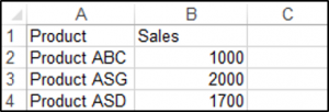
You can create a chart using the ChartObjects.Add method. The following code will create an embedded chart on the worksheet:
Sub CreateEmbeddedChartUsingChartObject()

Dim embeddedchart As ChartObject

Set embeddedchart = Sheets("Sheet1").ChartObjects.Add(Left:=180, Width:=300, Top:=7, Height:=200)
embeddedchart.Chart.SetSourceData Source:=Sheets("Sheet1").Range("A1:B4")

End Sub
The result is:
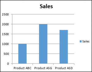
You can also create a chart using the Shapes.AddChart method. The following code will create an embedded chart on the worksheet:
Sub CreateEmbeddedChartUsingShapesAddChart()

Dim embeddedchart As Shape

Set embeddedchart = Sheets("Sheet1").Shapes.AddChart
embeddedchart.Chart.SetSourceData Source:=Sheets("Sheet1").Range("A1:B4")

End Sub
Specifying a Chart Type Using VBA
We have the range A1:B5 which contains the source data, shown below:
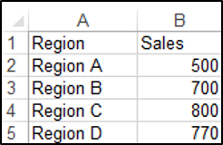
You can specify a chart type using the ChartType Property. The following code will create a pie chart on the worksheet since the ChartType Property has been set to xlPie:
Sub SpecifyAChartType()

Dim chrt As ChartObject

Set chrt = Sheets("Sheet1").ChartObjects.Add(Left:=180, Width:=270, Top:=7, Height:=210)
chrt.Chart.SetSourceData Source:=Sheets("Sheet1").Range("A1:B5")
chrt.Chart.ChartType = xlPie

End Sub
The result is:
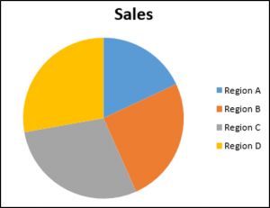
These are some of the popular chart types that are usually specified, although there are others:
- xlArea
- xlPie
- xlLine
- xlRadar
- xlXYScatter
- xlSurface
- xlBubble
- xlBarClustered
- xlColumnClustered
Adding a Chart Title Using VBA
We have a chart selected in the worksheet as shown below:
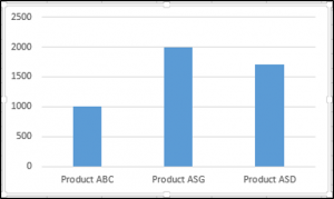
You have to add a chart title first using the Chart.SetElement method and then specify the text of the chart title by setting the ChartTitle.Text property.
The following code shows you how to add a chart title and specify the text of the title of the Active Chart:
Sub AddingAndSettingAChartTitle()

ActiveChart.SetElement (msoElementChartTitleAboveChart)
    ActiveChart.ChartTitle.Text = "The Sales of the Product"

End Sub
The result is:
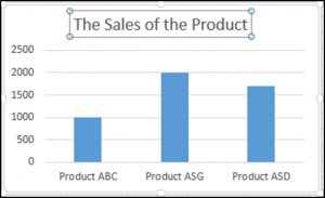
Note: You must select the chart first to make it the Active Chart to be able to use the ActiveChart object in your code.
Changing the Chart Background Color Using VBA
We have a chart selected in the worksheet as shown below:
You can change the background color of the entire chart by setting the RGB property of the FillFormat object of the ChartArea object. The following code will give the chart a light orange background color:
Sub AddingABackgroundColorToTheChartArea()

ActiveChart.ChartArea.Format.Fill.ForeColor.RGB = RGB(253, 242, 227)

End Sub
The result is:
You can also change the background color of the entire chart by setting the ColorIndex property of the Interior object of the ChartArea object. The following code will give the chart an orange background color:
Sub AddingABackgroundColorToTheChartArea()

ActiveChart.ChartArea.Interior.ColorIndex = 40

End Sub
The result is:
Note: The ColorIndex property allows you to specify a color based on a value from 1 to 56, drawn from the preset palette, to see which values represent the different colors, click here.
Changing the Chart Plot Area Color Using VBA
We have a chart selected in the worksheet as shown below:
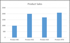
You can change the background color of just the plot area of the chart, by setting the RGB property of the FillFormat object of the PlotArea object. The following code will give the plot area of the chart a light green background color:
Sub AddingABackgroundColorToThePlotArea()

ActiveChart.PlotArea.Format.Fill.ForeColor.RGB = RGB(208, 254, 202)

End Sub
The result is:
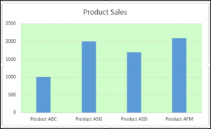
Adding a Legend Using VBA
We have a chart selected in the worksheet, as shown below:
You can add a legend using the Chart.SetElement method. The following code adds a legend to the left of the chart:
Sub AddingALegend()

ActiveChart.SetElement (msoElementLegendLeft)

End Sub
The result is:
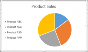
You can specify the position of the legend in the following ways:
- msoElementLegendLeft – displays the legend on the left side of the chart.
- msoElementLegendLeftOverlay – overlays the legend on the left side of the chart.
- msoElementLegendRight – displays the legend on the right side of the chart.
- msoElementLegendRightOverlay – overlays the legend on the right side of the chart.
- msoElementLegendBottom – displays the legend at the bottom of the chart.
- msoElementLegendTop – displays the legend at the top of the chart.
VBA Coding Made Easy
Stop searching for VBA code online. Learn more about AutoMacro — A VBA Code Builder that allows beginners to code procedures from scratch with minimal coding knowledge and with many time-saving features for all users!
Learn More
Adding Data Labels Using VBA
We have a chart selected in the worksheet, as shown below:
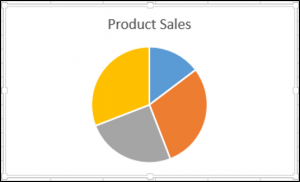
You can add data labels using the Chart.SetElement method. The following code adds data labels to the inside end of the chart:
Sub AddingADataLabels()

ActiveChart.SetElement msoElementDataLabelInsideEnd

End Sub
The result is:

You can specify how the data labels are positioned in the following ways:
- msoElementDataLabelShow – display data labels.
- msoElementDataLabelRight – displays data labels on the right of the chart.
- msoElementDataLabelLeft – displays data labels on the left of the chart.
- msoElementDataLabelTop – displays data labels at the top of the chart.
- msoElementDataLabelBestFit – determines the best fit.
- msoElementDataLabelBottom – displays data labels at the bottom of the chart.
- msoElementDataLabelCallout – displays data labels as a callout.
- msoElementDataLabelCenter – displays data labels on the center.
- msoElementDataLabelInsideBase – displays data labels on the inside base.
- msoElementDataLabelOutSideEnd – displays data labels on the outside end of the chart.
- msoElementDataLabelInsideEnd – displays data labels on the inside end of the chart.
Adding an X-axis and Title in VBA
We have a chart selected in the worksheet, as shown below:
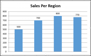
You can add an X-axis and X-axis title using the Chart.SetElement method. The following code adds an X-axis and X-axis title to the chart:
Sub AddingAnXAxisandXTitle()

With ActiveChart
.SetElement msoElementPrimaryCategoryAxisShow
.SetElement msoElementPrimaryCategoryAxisTitleHorizontal
End With


End Sub
The result is:
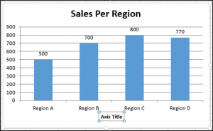
Adding a Y-axis and Title in VBA
We have a chart selected in the worksheet, as shown below:
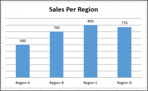
You can add a Y-axis and Y-axis title using the Chart.SetElement method. The following code adds an Y-axis and Y-axis title to the chart:
Sub AddingAYAxisandYTitle()

With ActiveChart
.SetElement msoElementPrimaryValueAxisShow
.SetElement msoElementPrimaryValueAxisTitleHorizontal
End With
End Sub
The result is:
VBA Programming | Code Generator does work for you!
Changing the Number Format of An Axis
We have a chart selected in the worksheet, as shown below:
You can change the number format of an axis. The following code changes the number format of the y-axis to currency:
Sub ChangingTheNumberFormat()

ActiveChart.Axes(xlValue).TickLabels.NumberFormat = "$#,##0.00"

End Sub
The result is:
Changing the Formatting of the Font in a Chart
We have the following chart selected in the worksheet as shown below:

You can change the formatting of the entire chart font, by referring to the font object and changing its name, font weight, and size. The following code changes the type, weight and size of the font of the entire chart.
Sub ChangingTheFontFormatting()

With ActiveChart


.ChartArea.Format.TextFrame2.TextRange.Font.Name = "Times New Roman"
.ChartArea.Format.TextFrame2.TextRange.Font.Bold = True
.ChartArea.Format.TextFrame2.TextRange.Font.Size = 14

End With
The result is:
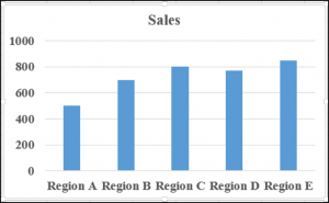
Deleting a Chart Using VBA
We have a chart selected in the worksheet, as shown below:
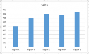
We can use the following code in order to delete this chart:
Sub DeletingTheChart()

ActiveChart.Parent.Delete

End Sub
Referring to the ChartObjects Collection
You can access all the embedded charts in your worksheet or workbook by referring to the ChartObjects collection. We have two charts on the same sheet shown below:
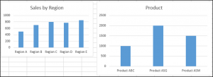
We will refer to the ChartObjects collection in order to give both charts on the worksheet the same height, width, delete the gridlines, make the background color the same, give the charts the same plot area color and make the plot area line color the same color:
Sub ReferringToAllTheChartsOnASheet()

Dim cht As ChartObject

For Each cht In ActiveSheet.ChartObjects
cht.Height = 144.85
cht.Width = 246.61

cht.Chart.Axes(xlValue).MajorGridlines.Delete
cht.Chart.PlotArea.Format.Fill.ForeColor.RGB = RGB(242, 242, 242)
cht.Chart.ChartArea.Format.Fill.ForeColor.RGB = RGB(234, 234, 234)
cht.Chart.PlotArea.Format.Line.ForeColor.RGB = RGB(18, 97, 172)

Next cht

End Sub
The result is:
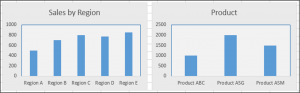
Inserting a Chart on Its Own Chart Sheet
We have the range A1:B6 which contains the source data, shown below:
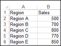
You can create a chart using the Charts.Add method. The following code will create a chart on its own chart sheet:
Sub InsertingAChartOnItsOwnChartSheet()

Sheets("Sheet1").Range("A1:B6").Select
Charts.Add

End Sub
The result is:
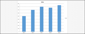
See some of our other charting tutorials:
Charts in Excel
Create a Bar Chart in VBA
Excel VBA Charts
We can term charts as objects in VBA. Similar to the worksheet, we can also insert charts in VBA. First, we select the data and chart type we want for our data. Now, there are two different types of charts we provide. One is the embed chart, where the chart is in the same sheet of data. Another is known as the chart sheet, where the chart is in a separate data sheet.
In data analysis, visual effects are the key performance indicators of the person who has done the analysis. Visuals are the best way an analyst can convey their message. Since we are all Excel users, we usually spend considerable time analyzing the data and drawing conclusions with numbers and charts. Creating a chart is an art to master. We hope you have good knowledge of creating charts with excelIn Excel, a graph or chart lets us visualize information we’ve gathered from our data. It allows us to visualize data in easy-to-understand pictorial ways. The following components are required to create charts or graphs in Excel: 1 — Numerical Data, 2 — Data Headings, and 3 — Data in Proper Order.read more. This article will show you how to create charts using VBA coding.
Table of contents
- Excel VBA Charts
- How to Add Charts using VBA Code in Excel?
- #1 – Create Chart using VBA Coding
- #2 – Create a Chart with the Same Excel Sheet as Shape
- #3 – Code to Loop through the Charts
- #4 – Alternative Method to Create Chart
- Recommended Articles
- How to Add Charts using VBA Code in Excel?

You are free to use this image on your website, templates, etc, Please provide us with an attribution linkArticle Link to be Hyperlinked
For eg:
Source: VBA Charts (wallstreetmojo.com)
How to Add Charts using VBA Code in Excel?
You can download this VBA Charts Excel Template here – VBA Charts Excel Template
#1 – Create Chart using VBA Coding
To create any chart, we should have some numerical data. For this example, we are going to use the below sample data.
First, let us jump to the VBA editorThe Visual Basic for Applications Editor is a scripting interface. These scripts are primarily responsible for the creation and execution of macros in Microsoft software.read more.
Step 1: Start Sub Procedure.
Code:
Sub Charts_Example1()

End Sub

Step 2: Define the variable as Chart.
Code:
Sub Charts_Example1()

  Dim MyChart As Chart

End Sub

Step 3: Since the chart is an object variable, we need to Set it.
Code:
Sub Charts_Example1()

  Dim MyChart As Chart
  Set MyChart = Charts.Add

End Sub

The above code will add a new sheet as a chart sheet, not a worksheet.

Step 4: Now, we need to design the chart. Open With Statement.
Code:
Sub Charts_Example1()

  Dim MyChart As Chart
  Set MyChart = Charts.Add

  With MyChart

  End With

End Sub
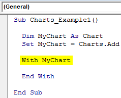
Step 5: The first thing we need to do with the chart is to Set the source range by selecting the “Set Source Data” method.
Code:
Sub Charts_Example1()

  Dim MyChart As Chart
  Set MyChart = Charts.Add

  With MyChart
  .SetSourceData

  End With

End Sub

Step 6: We need to mention the source range. In this case, my source range is in the sheet named “Sheet1,” and the range is “A1 to B7”.
Code:
Sub Charts_Example1()

  Dim MyChart As Chart
  Set MyChart = Charts.Add

  With MyChart
  .SetSourceData Sheets("Sheet1").Range("A1:B7")
  End With

End Sub
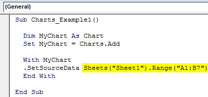
Step 7: Next up, we need to select the kind of chart we are going to create. For this, we need to select the Chart Type property.
Code:
Sub Charts_Example1()

  Dim MyChart As Chart
  Set MyChart = Charts.Add

  With MyChart
  .SetSourceData Sheets("Sheet1").Range("A1:B7")
  .ChartType =
  End With

End Sub
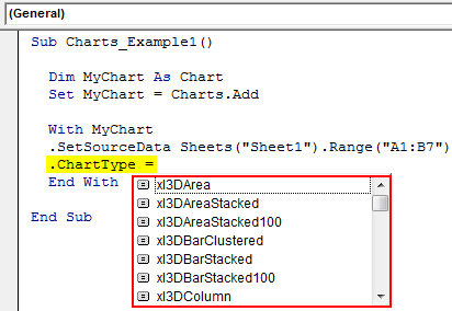
Step 8: Here, we have a variety of charts. I am going to select the “xlColumnClustered” chart.
Code:
Sub Charts_Example1()

  Dim MyChart As Chart
  Set MyChart = Charts.Add

  With MyChart
  .SetSourceData Sheets("Sheet1").Range("A1:B7")
  .ChartType = xlColumnClustered
  End With

End Sub
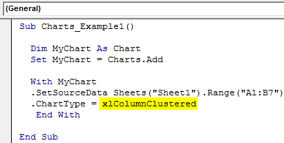
Now let’s run the code using the F5 key or manually and see how the chart looks.

Step 9: Now, change other properties of the chart. To change the chart title, below is the code.

Like this, we have many properties and methods with charts. Use each one of them to see the impact and learn.
Sub Charts_Example1()

  Dim MyChart As Chart
  Set MyChart = Charts.Add

  With MyChart
  .SetSourceData Sheets("Sheet1").Range("A1:B7")
  .ChartType = xlColumnClustered
  .ChartTitle.Text = "Sales Performance"
  End With

End Sub
#2 – Create a Chart with the Same Excel Sheet as Shape
We need to use a different technique to create the chart with the same worksheet (datasheet) as the shape.
Step 1: First, declare three object variables.
Code:
Sub Charts_Example2()

  Dim Ws As Worksheet
  Dim Rng As Range
  Dim MyChart As Object

End Sub

Step 2: Then, set the worksheet reference.
Code:
Sub Charts_Example2()

  Dim Ws As Worksheet
  Dim Rng As Range
  Dim MyChart As Object

  Set Ws = Worksheets("Sheet1")

End Sub
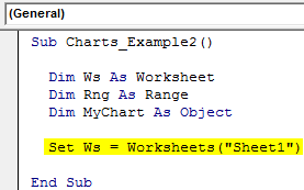
Step 3: Now, set the range object in VBARange is a property in VBA that helps specify a particular cell, a range of cells, a row, a column, or a three-dimensional range. In the context of the Excel worksheet, the VBA range object includes a single cell or multiple cells spread across various rows and columns.read more
Code:
Sub Charts_Example2()

  Dim Ws As Worksheet
  Dim Rng As Range
  Dim MyChart As Object

  Set Ws = Worksheets("Sheet1")
  Set Rng = Ws.Range("A1:B7")

End Sub
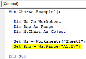
Step 4: Now, set the chart object.
Code:
Sub Charts_Example2()

  Dim Ws As Worksheet
  Dim Rng As Range
  Dim MyChart As Object

  Set Ws = Worksheets("Sheet1")
  Set Rng = Ws.Range("A1:B7")
  Set MyChart = Ws.Shapes.AddChart2

End Sub
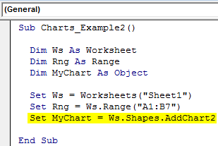
Step 5: Now, as usual, we can design the chart using the “With” statement.

Code:
Sub Charts_Example2()

Dim Ws As Worksheet 'To Hold Worksheet Reference
Dim Rng As Range 'To Hold Range Reference in the Worksheet
Dim MyChart As Object

Set Ws = Worksheets("Sheet1") 'Now variable "Ws" is equal to the sheet "Sheet1"
Set Rng = Ws.Range("A1:B7") 'Now variable "Rng" holds the range A1 to B7 in the sheet "Sheet1"
Set MyChart = Ws.Shapes.AddChart2 'Chart will be added as Shape in the same worksheet

With MyChart.Chart
.SetSourceData Rng 'Since we already set the range of cells to be used for chart we have use RNG object here
.ChartType = xlColumnClustered
.ChartTitle.Text = "Sales Performance"
End With

End Sub
It will add the chart below.

#3 – Code to Loop through the Charts
Like how we look through sheets to change the name, insert values, and hide and unhide them. Similarly, we need to use the ChartObject property to loop through the charts.
The below code will loop through all the charts in the worksheet.
Code:
Sub Chart_Loop()

  Dim MyChart As ChartObject

  For Each MyChart In ActiveSheet.ChartObjects
  'Enter the code here
  Next MyChart

End Sub
#4 – Alternative Method to Create Chart
We can use the below alternative method to create charts. We can use the ChartObject. Add method to create the chart below is the example code.
It will also create a chart like the previous method.
Code:
Sub Charts_Example3()

  Dim Ws As Worksheet
  Dim Rng As Range
  Dim MyChart As ChartObject

  Set Ws = Worksheets("Sheet1")
  Set Rng = Ws.Range("A1:B7")
  Set MyChart = Ws.ChartObjects.Add(Left:=ActiveCell.Left, Width:=400, Top:=ActiveCell.Top, Height:=200)
  MyChart.Chart.SetSourceData Source:=Rng
  MyChart.Chart.ChartType = xlColumnStacked
  MyChart.Chart.ChartTitle.Text = "Sales Performance"

End Sub
Recommended Articles
This article has been a guide to VBA Charts. Here, we learn how to create a chart using VBA code, practical examples, and a downloadable template. Below you can find some useful Excel VBA articles: –
- Excel VBA Pivot Table
- What are Control Charts in Excel?
- Top 8 Types of Charts in Excel
- Graphs vs. Charts – Compare
Программное создание графика (диаграммы) в VBA Excel с помощью метода Charts.Add на основе данных из диапазона ячеек на рабочем листе. Примеры.
Метод Charts.Add
В настоящее время на сайте разработчиков описывается метод Charts.Add2, который, очевидно, заменил метод Charts.Add. Тесты показали, что Charts.Add продолжает работать в новых версиях VBA Excel, поэтому в примерах используется именно он.
Синтаксис
|
Charts.Add ([Before], [After], [Count]) |
|
Charts.Add2 ([Before], [After], [Count], [NewLayout]) |
Параметры
Параметры методов Charts.Add и Charts.Add2:
| Параметр | Описание |
|---|---|
| Before | Имя листа, перед которым добавляется новый лист с диаграммой. Необязательный параметр. |
| After | Имя листа, после которого добавляется новый лист с диаграммой. Необязательный параметр. |
| Count | Количество добавляемых листов с диаграммой. Значение по умолчанию – 1. Необязательный параметр. |
| NewLayout | Если NewLayout имеет значение True, диаграмма вставляется с использованием новых правил динамического форматирования (заголовок имеет значение «включено», а условные обозначения – только при наличии нескольких рядов). Необязательный параметр. |
Если параметры Before и After опущены, новый лист с диаграммой вставляется перед активным листом.
Примеры
Таблицы
В качестве источников данных для примеров используются следующие таблицы:

Пример 1
Программное создание объекта Chart с типом графика по умолчанию и по исходным данным из диапазона «A2:B26»:
|
Sub Primer1() Dim myChart As Chart ‘создаем объект Chart с расположением нового листа по умолчанию Set myChart = ThisWorkbook.Charts.Add With myChart ‘назначаем объекту Chart источник данных .SetSourceData (Sheets(«Лист1»).Range(«A2:B26»)) ‘переносим диаграмму на «Лист1» (отдельный лист диаграммы удаляется) .Location xlLocationAsObject, «Лист1» End With End Sub |
Результат работы кода VBA Excel из первого примера:

Пример 2
Программное создание объекта Chart с двумя линейными графиками по исходным данным из диапазона «A2:C26»:
|
Sub Primer2() Dim myChart As Chart Set myChart = ThisWorkbook.Charts.Add With myChart .SetSourceData (Sheets(«Лист1»).Range(«A2:C26»)) ‘задаем тип диаграммы (линейный график с маркерами) .ChartType = xlLineMarkers .Location xlLocationAsObject, «Лист1» End With End Sub |
Результат работы кода VBA Excel из второго примера:

Пример 3
Программное создание объекта Chart с круговой диаграммой, разделенной на сектора, по исходным данным из диапазона «E2:F7»:
|
Sub Primer3() Dim myChart As Chart Set myChart = ThisWorkbook.Charts.Add With myChart .SetSourceData (Sheets(«Лист1»).Range(«E2:F7»)) ‘задаем тип диаграммы (пирог — круг, разделенный на сектора) .ChartType = xlPie ‘задаем стиль диаграммы (с отображением процентов) .ChartStyle = 261 .Location xlLocationAsObject, «Лист1» End With End Sub |
Результат работы кода VBA Excel из третьего примера:

Примечание
В примерах использовались следующие методы и свойства объекта Chart:
| Компонент | Описание |
|---|---|
| Метод SetSourceData | Задает диапазон исходных данных для диаграммы. |
| Метод Location | Перемещает диаграмму в заданное расположение (новый лист, существующий лист, элемент управления). |
| Свойство ChartType | Возвращает или задает тип диаграммы. Смотрите константы. |
| Свойство ChartStyle | Возвращает или задает стиль диаграммы. Значение нужного стиля можно узнать, записав макрос. |
Chart Elements in Excel VBA (Part 1) — Chart Title, Chart Area, Plot Area, Chart Axes, Chart Series, Data Labels, Chart Legend
Contents:
Chart Title
Chart Area
Plot Area
Chart Axis
This chapter discusses some important chart elements contained on a chart, which include: chart area (ChartArea object); chart title (ChartTitle object); plot area (PlotArea object); chart series (Series object — single series in a chart, SeriesCollection object — a collection of all the Series objects in a chart, Error Bars, Leader Lines, Trendlines, Point object — single points, Points object — collection of all Point objects in a series); chart axis (Axis Object — a single axis, Axes Object — collection of all the Axis objects in a chart, Gridlines object — major & minor gridlines, TickLabels Object — tick marks on an axis); chart Legend (Legend object, LegendEntry object — a single legend entry, LegendEntries object — a collection of legend entries, LegendKey object); data labels (DataLabel object — a single data label, DataLabels object — all data labels in a chart or series).
Individual chart elements can be formatted & manipulated in vba code, such as: Chart Area (A 2-D chart’s chart area contains: the axes, the chart title, the axis titles & the legend. A 3-D chart’s chart area contains the chart title & the legend, without including the plot area); Plot Area (area where chart data is plotted — the Plot Area is surrounded by the Chart Area. A 2-D chart’s plot area contains: the data markers, gridlines, data labels, trendlines & optional chart items placed in the chart area. A 3-D chart’s plot area additionally contains: the walls, floor, axes, axis titles & tick-mark labels in the chart.); Data Series (chart series are related data points plotted in a chart, each series having a distinct color or pattern and is represented in the chart legend); Chart Axis (the plot area is bordered by a line that is used as a frame of reference for measurement — axis which displays categories is referred as the x-axis, axis which displays values is referred as y-axis, for 3-D charts the z-axis represents depth of the chart); Chart or Axis Title (descriptive text displaying title for chart or axis, by default centered at the chart top or aligned to an axis); Tick Marks (small lines of measurement which intersect an axis, equated to divisions on a ruler); Gridlines (tick marks are extended by Gridlines from horizontal or vertical axis across the chart’s plot area which enables easier display & readability of chart data); Data Labels (applied to a chart series, a label provides additional information about a data marker or a point in a series — you can apply data labels to each or all points of a data series to display the series name / category names / data values / percentages / bubble size), Chart Legend (a graphic visually linking a legend entry with its associated series or trendline so that any formatting change in one automatically changes the other’s formatting).
This Chapter illustrates Chart Title, Chart Area, Plot Area & Chart Axes. Chart Elements — Chart Series, Data Labels & Chart Legend — are illustrated in Part 2.
Chart Title
Use the ChartTitle Property of the Chart object to return a ChartTitle object which represents the chart title — Syntax: objChart.ChartTitle. The chart title is accessed & manipulated through the properties & methods of the ChartTitle object, some of which are detailed below. The ChartTitle object exists and can be used only if the HasTitle property (of the Chart object) is True — Set (or return) to True for the chart title to be visible viz. objChart.HasTitle = True.
|
Commonly used Properties of the ChartTitle object: |
||
| Property | Syntax | Description |
| AutoScaleFont Property | objChartTitle.AutoScaleFont | Set (or returns) True where the chart title’s text font size will change whenever the chart size changes. False setting will keep the chart title font at the same size even when there is a change in chart size. |
|
Sheets(«Sheet1»).Activate |
||
| Caption Property | objChartTitle.Caption | Sets or returns the text for the chart title, as a string value. |
| Text Property | objChartTitle.Text | Sets or returns the text for the chart title, as a string value. |
| Characters Property | objChartTitle.Characters(Start, Length) | Use the Characters property which returns a Characters object representing a range of characters within the text string of chart title, and this will enable formatting these specific characters. Both arguments are optional — the Start argument specifies the first character for the range of characters where 1 is the default value which means that omitting the argument will start the range of characters returned from the first character. The Length argument specifies the number of characters & omitting it will return all characters after the character specified in the Start argument. |
|
With Sheets(«Sheet1»).ChartObjects(1).Chart.ChartTitle ‘set the text for chart title ‘format characters within a text string — starting at 4th character & a length of 3 characters — representing the word «Qtr» .Font.Italic = True End With End With |
||
| Format Property | objChartTitle.Format | Returns a ChartFormat object which contains the line, fill & effect formatting for a chart element. The ChartFormat object provides access to the new Office Art formatting options that are available in Excel 2007 so that by using this object you can apply many new graphics to chart elements using vba formatting. |
| Left Property | objChartTitle.Left | Sets or returns the distance, in points, from the chart title’s left edge to the left edge of the chart area |
| Top Property | objPlotArea.Top | Sets or returns the distance, in points, from the chart title’s top edge to the top edge of the chart area. |
| HorizontalAlignment Property | objChartTitle.HorizontalAlignment | Sets or returns a value (xlCenter, xlDistributed, xlJustify, xlLeft or xlRight) for the horizontal alignment of the chart title. |
| VerticalAlignment Property | objChartTitle.VerticalAlignment | Sets or returns a value (xlBottom, xlCenter, xlDistributed, xlJustify or xlTop) for the vertical alignment of the chart title. |
| Shadow Property | objChartTitle.Shadow |
Sets or returns a Boolean value determining if the chart title has a shadow or not . Use True to add a shadow: Sheets(«Sheet1»).ChartObjects(1).Chart.ChartTitle.Shadow = True |
| Orientation Property | objChartTitle.Orientation | Sets or returns a value [xlDownward (-4170), xlHorizontal (-4128), xlUpward (-4171), xlVertical (-4166), or an integer value from -90 to 90 degrees] that determines the text orientation. The constants indicate whether Text runs downward / Horizontal / Upward / Downward & is Centered in the cell, respectively. |
| Name Property | objChartTitle.Name | returns the name of the ChartTitle object, as a string value. |
| Parent Property | objChartTitle.Parent |
returns the parent object for the chart title viz. returns the chart name: MsgBox Sheets(«Sheet1»).ChartObjects(1).Chart.ChartTitle.Parent.Name |
| Position Property | objChartTitle.Position | Sets or returns the chart title’s position on the chart, wherein the constant xlChartElementPositionCustom (-4114) specifies a specific position for the chart title & the constant xlChartElementPositionAutomatic (-4105) automatically sets the chart title’s position. |
|
Commonly used Methods of the ChartTitle object: |
||
| Method | Syntax | Description |
| Delete Method | objChartTitle.Delete | deletes the ChartTitle object |
| Select Method | objChartTitle.Select | selects the ChartTitle object |
Child Objects for the ChartTitle Object: Above we have discussed: the ChartFormat object — use the Format Property — objChartTitle.Format — to return the ChartFormat object which contains the line, fill & effect formatting for the chart title; the Characters Object — use the Characters property — objChartTitle.Characters(Start, Length) — to return a Characters object representing a range of characters within the text string of chart title, and this will enable formatting these specific characters. Some other child objects which are often used with the ChartTitle Object include: ChartFillFormat Object — use the Fill Property — objChartTitle.Fill — to return a ChartFillFormat object (valid only for charts), to manipulate fill formatting for chart elements; Interior Object — use the Interior property — objChartTitle.Interior — to return the Interior object, to manipulate the chart element’s interior (inside area); Border Object — use the Border Property — objChartTitle.Border — to return a Border object, to manipulate a chart element’s border; Font Object — use the Font Property — objChartTitle.Font — to return a Font object, to manipulate the font attributes viz. font name, font size, font color, … The difference between ChartFillFormat object & the Interior object may be somewhat blurred, but seemingly the ChartFillFormat object emphasises gradient & texture fills, whereas the Interior object emphasises solid fills & pattern fills (though ChartFillFormat object also has a Pattern property).
Example: Part 2 of 8 — Manipulate Chart Title — refer Image 1.2

Sub EmbChart_ChartTitle_2()
‘manipulate Chart Title — refer Image 1.2
Dim wsChart As Worksheet
‘declare a ChartObject object
Dim oChObj As ChartObject
Set wsChart = Sheets(«Sheet19»)
‘set ChartObject object by index number
Set oChObj = wsChart.ChartObjects(1)
‘using the Chart Property of the ChartObject returns a Chart object which refers to a chart
With oChObj.Chart
‘the ChartTitle object represents the chart title
With .ChartTitle
‘set the text for the chart title, using the Text Property of the ChartTitle object
.Text = «Sales-Profit-Mktg Exp«
‘set the font to Bold Arial 12 point
.Font.Name = «Arial«
.Font.Size = 12
.Font.Bold = True
‘dark blue
.Font.Color = RGB(0, 30, 90)
‘Format property of the ChartTitle returns returns the ChartFormat object — using the Fill Property of the ChartFormat object to return a FillFormat object (which contains fill formatting properties), to set the foreground fill color &
gradient for the ChartTitle
.Format.Fill.ForeColor.RGB = RGB(228, 109, 10)
‘the OneColorGradient Method of the FillFormat object, sets a one-color gradient for the specified fill — specifying the style for a gradient fill with the MsoGradientStyle Enumeration ‘msoGradientHorizontal’ for a Gradient running
horizontally across the shape.
‘gradient variant of 2 & gradient degree of 1 (lightest)
.Format.Fill.OneColorGradient msoGradientHorizontal, 2, 1
‘use the Border property to return a Border object — use the LineStyle Property of the Border object to set a line style for the border — use the XlLineStyle Enumeration of xlDot to set a dotted line
.Border.LineStyle = xlDot
‘use the Weight Property of the Border object to set the border weight — use the XlBorderWeight Enumeration of xlThin for specifying the weight of the border as Thin
.Border.Weight = xlThin
‘set border color with Color Property of the Border object
.Border.Color = RGB(0, 30, 90)
End With
End With
End Sub
Chart Area
The area where chart data is plotted is the Plot Area — the Plot Area is surrounded by the Chart Area. A 2-D chart’s chart area contains: the axes, the chart title, the axis titles & the legend. A 3-D chart’s chart area contains the chart title & the legend, without including the area where the data is plotted within the chart area (ie. the plot area). The ChartArea object is used to format the chart area. You will use the chart area fill separately, which is distinct from the fill for plot area.
Use the ChartArea Property of the Chart object to return a ChartArea object which refers to the chart area in a chart. Syntax: objChart.ChartArea.
|
Commonly used Properties of the ChartArea object: |
||
| Property | Syntax | Description |
| Format Property | objChartArea.Format | Returns a ChartFormat object which contains the line, fill & effect formatting for a chart element. The ChartFormat object provides access to the new Office Art formatting options that are available in Excel 2007 so that by using this object you can apply many new graphics to chart elements using vba formatting. |
| Height Property | objChartArea.Height | Sets or returns the height, in points, of the chart area |
| Width Property | objChartArea.Width | Sets or returns the width, in points, of the chart area |
| Left Property | objChartArea.Left | Returns the distance, in points, from the left edge of the chart area to the left edge of the chart. To set the distance, in points, from the left edge of the embedded chart to the left edge of column A on a worksheet use the Left property of the ChartObject object viz objChartObject.Left. |
| Top Property | objChartArea.Top | Returns the distance, in points, from the top edge of the chart area to the top of the chart. To set the distance, in points, from the top edge of the embedded chart to the top of row 1 on a worksheet, use the Top property of the ChartObject object viz objChartObject.Top. |
| Name Property | objChartArea.Name | returns the name of the ChartArea object, as a string value. |
| Parent Property | objChartArea.Parent | returns the parent object for the chart area |
| RoundedCorners Property | objChartArea.RoundedCorners | sets or returns a Boolean value determining if the chart area has rounded corners or not — True indicates rounded corners. |
| Shadow Property | objChartArea.Shadow | sets or returns a Boolean value determining if the chart area has a shadow or not |
|
Commonly used Methods of the ChartArea object: |
||
| Method | Syntax | Description |
| ClearContents Method | objChartArea.ClearContents | clears all data from the chart area but does not clear the formatting which remains intact. |
| ClearFormats Method | objChartArea.ClearFormats | clears all formatting from the chart area |
| Clear Method | objChartArea.Clear | clears the Chart Area — clears all, including data and the formatting. |
| Select Method | objChartArea.Select | selects the chart area |
| Copy Method | objChartArea.Copy | copies chart area to clipboard |
Child Objects for the ChartArea Object: Above we have discussed: the ChartFormat object — use the Format Property — objChartArea.Format — to return the ChartFormat object which contains the line, fill & effect formatting for the chart area. Some other child objects which are often used with the ChartArea Object include: ChartFillFormat Object — use the Fill Property — objChartArea.Fill — to return a ChartFillFormat object (valid only for charts), to manipulate fill formatting for chart elements; Interior Object — use the Interior property — objChartArea.Interior — to return the Interior object, to manipulate the chart element’s interior (inside area); Border Object — use the Border Property — objChartArea.Border — to return a Border object, to manipulate a chart element’s border; Font Object — use the Font Property — objChartArea.Font — to return a Font object, to manipulate the font attributes viz. font name, font size, font color, … The difference between ChartFillFormat object & the Interior object may be somewhat blurred, but seemingly the ChartFillFormat object emphasises gradient & texture fills, whereas the Interior object emphasises solid fills & pattern fills (though ChartFillFormat object also has a Pattern property).
Example: Part 3 of 8 — Manipulate Chart Area — refer Image 1.3

Sub EmbChart_ChartArea_3()
‘manipulate Chart Area — refer Image 1.3
Dim wsChart As Worksheet
‘declare a ChartObject object
Dim oChObj As ChartObject
Set wsChart = Sheets(«Sheet19»)
‘set ChartObject object by name
Set oChObj = wsChart.ChartObjects(«QtrlySalesProfitChart»)
‘using the Chart Property of the ChartObject returns a Chart object which refers to a chart
With oChObj.Chart
‘using the ChartArea Property of the Chart object returns the ChartArea object which represents the chart area
With .ChartArea
‘the Format Property of the ChartArea object returns the ChartFormat object, and the Line Property of the ChartFormat object returns a LineFormat object that contains line formatting properties for the specified Chart Area — for a chart with a border, the LineFormat object represents the border
‘turn on the border for the chart area
.Format.Line.Visible = True
‘using the Weight Property of the LineFormat object, to set the weight for the border
.Format.Line.Weight = 2
‘using the Fill Property of the ChartFormat object returns a FillFormat object, that contains fill formatting properties for the for the ChartArea object. Then use the ForeColor Property to return a ColorFormat object to specify the
foreground fill or solid color to green
.Format.Fill.ForeColor.RGB = RGB(0, 255, 0)
‘use the ColorIndex Property of the Border object to set the border color: to set no line color use ColorIndex = xlNone, or use ColorIndex 3 for red, 5 for blue, 4 for green, 6 for yellow, and so on.
.Border.ColorIndex = 3
‘use the LineStyle Property of the Border object to set a line style for the Border — continuous line
.Border.LineStyle = xlContinuous
End With
End With
End Sub
Plot Area
The area where chart data is plotted is the Plot Area — the Plot Area is surrounded by the Chart Area. A 2-D chart’s plot area contains: the data markers, gridlines, data labels, trendlines & optional chart items placed in the chart area. A 3-D chart’s plot area additionally contains: the walls, floor, axes, axis titles & tick-mark labels in the chart. You will use the chart area fill separately, which is distinct from the fill for plot area. The PlotArea Object is used to format the plot area.
Use the PlotArea property of the Chart object to return a PlotArea object which refers to the plot area of a chart. Syntax: objChart.PlotArea.
|
Commonly used Properties of the PlotArea object: |
||
| Property | Syntax | Description |
| Format Property | objPlotArea.Format | Returns a ChartFormat object which contains the line, fill & effect formatting for a chart element. The ChartFormat object provides access to the new Office Art formatting options that are available in Excel 2007 so that by using this object you can apply many new graphics to chart elements using vba formatting. |
| Height Property | objPlotArea.Height | Sets or returns the height, in points, of the plot area — the axis labels are included within the bounding rectangle for determining the height. |
| InsideHeight Property | objPlotArea.InsideHeight | Sets or returns the inside height, in points, of the plot area without including the axis labels. |
| Width Property | objPlotArea.Width | Sets or returns the width, in points, of the plot area — the axis labels are included within the bounding rectangle for determining the width. |
| InsideWidth Property | objPlotArea.InsideWidth | Sets or returns the inside width, in points, of the plot area without including the axis labels. |
| Left Property | objPlotArea.Left | Sets or returns the distance, in points, from the left edge of the chart area to the left edge of the plot area — the axis labels are included within the bounding rectangle for determining the distance. |
| InsideLeft Property | objPlotArea.InsideLeft | Sets or returns the distance, in points, from the left edge of the chart area to the inside left edge of the plot area without including the axis labels. |
| Top Property | objPlotArea.Top | Sets or returns the distance, in points, from the top edge of the chart area to the top edge of the plot area — the axis labels are included within the bounding rectangle for determining the distance. |
| InsideTop Property | objPlotArea.InsideTop | Sets or returns the distance, in points, from the top edge of the chart area to the inside top edge of the plot area without including the axis labels. |
| Name Property | objPlotArea.Name | returns the name of the PlotArea object, as a string value. |
| Parent Property | objPlotArea.Parent |
returns the parent object for the plot area viz. returns the chart name: MsgBox Sheets(«Sheet1»).ChartObjects(1).Chart.PlotArea.Parent.Name |
| Position Property | objPlotArea.Position | Sets or returns the plot area’s position on the chart, wherein the constant xlChartElementPositionCustom (-4114) specifies a specific position for the plot area & the constant xlChartElementPositionAutomatic (-4105) automatically sets the plot area’s position. |
|
Commonly used Methods of the PlotArea object: |
||
| Method | Syntax | Description |
| ClearFormats Method | objPlotArea.ClearFormats | clears all formatting from the plot area |
| Select Method | objPlotArea.Select | selects the plot area |
|
Sheets(«Sheet1»).ChartObjects(1).Chart.PlotArea.Select |
Child Objects for the PlotArea Object: Above we have discussed: the ChartFormat object — use the Format Property — objPlotArea.Format — to return the ChartFormat object which contains the line, fill & effect formatting for the plot area. Some other child objects which are often used with the PlotArea Object include: ChartFillFormat Object — use the Fill Property — objPlotArea.Fill — to return a ChartFillFormat object (valid only for charts), to manipulate fill formatting for chart elements; Interior Object — use the Interior property — objPlotArea.Interior — to return the Interior object, to manipulate the chart element’s interior (inside area); Border Object — use the Border Property — objPlotArea.Border — to return a Border object, to manipulate a chart element’s border. The difference between ChartFillFormat object & the Interior object may be somewhat blurred, but seemingly the ChartFillFormat object emphasises gradient & texture fills, whereas the Interior object emphasises solid fills & pattern fills (though ChartFillFormat object also has a Pattern property).
Example: Illustrating the chart’s plot area / inside plot area — using Left / InsideLeft, Top / InsideTop, Width / InsideWidth, Height / InsideHeight properties — refer Image 1

Sub BoundingRectangle_PlotArea_InsidePlotArea()
‘illustrating the inside of chart’s plot area / the chart’s plot area, within bounding rectangles — refer Image 1
‘create a text box representing the inside of chart’s plot area without including the axis labels within the bounding rectangle (red lines of round dots)
With Sheets(«Sheet1»).ChartObjects(1).Chart
With .Shapes.AddTextbox(msoTextOrientationDownward, .PlotArea.InsideLeft, .PlotArea.InsideTop, .PlotArea.InsideWidth, .PlotArea.InsideHeight)
.Line.Weight = 4
.Line.DashStyle = msoLineRoundDot
.Line.ForeColor.RGB = RGB(255, 0, 0)
End With
‘create a text box representing the chart’s plot area by including the axis labels within the bounding rectangle (green lines of long dashes)
With .Shapes.AddTextbox(msoTextOrientationDownward, .PlotArea.Left, .PlotArea.Top, .PlotArea.Width, .PlotArea.Height)
.Line.Weight = 2
.Line.DashStyle = msoLineLongDash
.Line.ForeColor.RGB = RGB(0, 255, 0)
End With
End With
End Sub
Example: PlotArea Alignment with VBA — Centering a PlotArea
Sub PlotArea_Center()
‘center Plot Area within the Chart
Dim wsChart As Worksheet
Dim objChartObj As ChartObject
Dim sChartTitleWidth As Single
Set wsChart = Sheets(«Sheet1»)
Set objChartObj = wsChart.ChartObjects(1)
‘center PlotArea within the Chart Area
With objChartObj.Chart
‘center vertically
.PlotArea.Top = (.ChartArea.Height — .PlotArea.Height) / 2
‘center horizontally
.PlotArea.Left = (.ChartArea.Width — .PlotArea.Width) / 2
End With
End Sub
Example: ChartTitle Alignment with VBA — Centering a ChartTitle Horizontally
Sub ChartTitle_HorizontalCenterInChart()
‘horizontally center the chart title in a chart
‘the ChartTitle does not have a Width property so that you cannot determine its width, which would have made horizontal centering easier
Dim wsChart As Worksheet
Dim objChartObj As ChartObject
Dim sChartTitleWidth As Single
Set wsChart = Sheets(«Sheet1»)
Set objChartObj = wsChart.ChartObjects(1)
‘—————————
‘OPTION 1 — default position of ChartTitle aligns it top-center in the chart
With objChartObj.Chart
‘if the ChartTitle is presently not centered because its position has been changed, you can first remove & then show because the default position of ChartTitle aligns it top-center in the chart
.HasTitle = False
.HasTitle = True
End With
‘—————————
‘OPTION 2 — center ChartTitle, within the chart area
With objChartObj.Chart
If .HasTitle Then
‘move the chart title to the extreme right of the chart area — the title will touch the right edge of the chart
.ChartTitle.Left = .ChartArea.Width
‘center the ChartTitle, within the chart area
.ChartTitle.Left = .ChartTitle.Left / 2
End If
End With
‘—————————
‘OPTION 3 — center ChartTitle, within the chart area
With objChartObj.Chart
If .HasTitle Then
‘move the chart title to the extreme right of the chart area — the title will touch the right edge of the chart
.ChartTitle.Left = .ChartArea.Width
‘calculate the ChartTitle width
sChartTitleWidth = .ChartArea.Width — .ChartTitle.Left
‘center the ChartTitle, within the chart area
.ChartTitle.Left = (.ChartArea.Width — sChartTitleWidth) / 2
End If
End With
End Sub
Example: ChartTitle Alignment with VBA — Center ChartTitle, both horizontally & vertically, wrt Plot Area.
Sub ChartTitle_CenterInPlotArea()
‘center ChartTitle, both horizontally & vertically, wrt plot area
‘note that the ChartTitle does not have a Width or Height property
Dim wsChart As Worksheet
Dim objChartObj As ChartObject
Dim sChartTitleWidth As Single, sChartTitleHeight As Single
Set wsChart = Sheets(«Sheet1»)
Set objChartObj = wsChart.ChartObjects(1)
‘center ChartTitle, both horizontally & vertically, wrt plot area
With objChartObj.Chart
‘move the chart title to the extreme right of the chart area — the title will touch the right edge of the chart
.ChartTitle.Left = .ChartArea.Width
‘calculate the ChartTitle width
sChartTitleWidth = .ChartArea.Width — .ChartTitle.Left
‘horizontally center the ChartTitle, within the plot area’s inside
.ChartTitle.Left = .PlotArea.InsideLeft + (.PlotArea.InsideWidth — sChartTitleWidth) / 2
‘move the chart title to the extreme bottom of the chart area — the title will touch the bottom edge of the chart
.ChartTitle.Top = .ChartArea.Height
‘calculate the ChartTitle height
sChartTitleHeight = .ChartArea.Height — .ChartTitle.Top
‘vertically center the ChartTitle, in the top area ‘within Plot Area Top’ & ‘Chart Area Top’
.ChartTitle.Top = (.PlotArea.Top — sChartTitleHeight) / 2
‘to vertically center the ChartTitle in top area within ‘Plot Area Inside Top’ & ‘Chart Area Top’, use:
‘.ChartTitle.Top = (.PlotArea.InsideTop — sChartTitleHeight) / 2
End With
End Sub
Example: AxisTitle Alignment with VBA — horizontally / vertically center the Axis Title with re to Plot Area
Sub AxisTitle_Center()
‘center the axis title in a chart
Dim wsChart As Worksheet
Dim objChartObj As ChartObject
Dim sChartTitleWidth As Single, sAxisTitleHeight As Single
Set wsChart = Sheets(«Sheet1»)
Set objChartObj = wsChart.ChartObjects(1)
‘horizontally center the primary category axis title with re to plot area
With objChartObj.Chart
‘move the axis title to the extreme right of the chart area
.Axes(xlCategory, xlPrimary).AxisTitle.Left = .ChartArea.Width
‘determine width of axis title
sAxisTitleWidth = .ChartArea.Width — .Axes(xlCategory, xlPrimary).AxisTitle.Left
‘horizontally center axis title between plot area
.Axes(xlCategory, xlPrimary).AxisTitle.Left = .PlotArea.InsideLeft + (.PlotArea.InsideWidth — sAxisTitleWidth) / 2
End With
‘vertically center the primary value axis title with re to plot area
With objChartObj.Chart
‘move the axis title to the bottom edge of the chart area
.Axes(xlValue, xlPrimary).AxisTitle.Top = .ChartArea.Height
‘determine height of axis title
sAxisTitleHeight = .ChartArea.Height — .Axes(xlValue, xlPrimary).AxisTitle.Top
‘vertically center axis title between plot area
.Axes(xlValue, xlPrimary).AxisTitle.Top = .PlotArea.InsideTop + (.PlotArea.InsideHeight — sAxisTitleHeight) / 2
End With
End Sub
Example: Legend Alignment with VBA — position the legend to align in the bottom left corner within the plot area
Sub Legend_Position_BottomLeftCorner()
‘position the legend — align the chart legend in the bottom left corner within the plot area
Dim wsChart As Worksheet
Dim objChartObj As ChartObject
Set wsChart = Sheets(«Sheet1»)
Set objChartObj = wsChart.ChartObjects(1)
‘—————————
‘ignoring border / line thickness for legend placement
‘position the legend — align the chart legend in the bottom left corner within the plot area, without considering borders’ thickness or axis’ line thickness
With objChartObj.Chart
If .HasLegend = True Then
‘aligns the legend’s left edge to the inside left of the plot area
.Legend.Left = .PlotArea.InsideLeft
‘aligns the legend’s top to the inside top of the plot area by ADDING (i) plot area’s inside top & (ii) plot area’s inside height & then DEDUCTING (i) legend’s height
.Legend.Top = .PlotArea.InsideTop + .PlotArea.InsideHeight — .Legend.Height
End If
End With
‘—————————
‘border / line thickness can affect the legend placement, if the thickness is significant
‘position the legend — align the chart legend in the bottom left corner within the plot area, taking into account the legend’s border thickness & plot area border’s thickness & primary value axis’ line thickness & category axis’ line thickness
With objChartObj.Chart
If .HasLegend = True And .Legend.Border.LineStyle <> xlLineStyleNone And .PlotArea.Border.LineStyle <> xlLineStyleNone And .Axes(xlValue, xlPrimary).Border.LineStyle <> xlLineStyleNone Then
‘aligns the legend’s left edge to the inside left of the plot area by ADDING (i) plot area’s inside left & (ii) half of legend’s border thickness & (iii) half of the — maximum of (a) Value Axis line thickness & (b) plot area border’s thickness
.Legend.Left = .PlotArea.InsideLeft + .Legend.Format.Line.Weight / 2 + WorksheetFunction.Max(.PlotArea.Format.Line.Weight, .Axes(xlValue, xlPrimary).Format.Line.Weight) / 2
‘aligns the legend’s top to the inside top of the plot area by ADDING (i) plot area’s inside top & (ii) plot area’s inside height & (iii) half of legend’s border thickness & then DEDUCTING (i) legend’s height & (ii) half of the — maximum of
(a) Category Axis line thickness & (b) plot area border’s thickness
.Legend.Top = .PlotArea.InsideTop + .PlotArea.InsideHeight — .Legend.Format.Line.Weight / 2 — .Legend.Height — WorksheetFunction.Max(.PlotArea.Format.Line.Weight, .Axes(xlCategory, xlPrimary).Format.Line.Weight) / 2
End If
End With
End Sub
Example: Legend Alignment with VBA — position the legend to align in the top right corner within the plot area, taking into account borders / lines thickness
Sub Legend_Position_TopRightPlotArea()
‘align the chart Legend in the top right corner within the plot area
‘this code takes into account the legend’s border thickness & plot area border’s thickness & the secondary value axis’ line thickness, which might affect the legend placement if the thickness is significant
‘this code also takes into account whether, legend’s border or plot area’s border or the secondary value axis, exist or not
Dim wsChart As Worksheet
Dim objChartObj As ChartObject
Set wsChart = Sheets(«Sheet8»)
Set objChartObj = wsChart.ChartObjects(1)
‘position the Legend — align the chart Legend in the top right corner within the plot area — you dont know if chart elements have a border / line or not, & if yes then what is their thickness
With objChartObj.Chart
If .HasLegend = False Then
MsgBox «Legend does not exist, exit sub»
Exit Sub
Else
‘if secondary value axis exists
If .HasAxis(xlValue, xlSecondary) = True Then
‘legend border & plot area border & axis border exist
If .Legend.Border.LineStyle <> xlLineStyleNone And .PlotArea.Border.LineStyle <> xlLineStyleNone And .Axes(xlValue, xlSecondary).Border.LineStyle <> xlLineStyleNone Then
.Legend.Left = .PlotArea.InsideLeft + .PlotArea.InsideWidth — .Legend.Width — .Legend.Format.Line.Weight / 2 — WorksheetFunction.Max(.PlotArea.Format.Line.Weight, .Axes(xlValue, xlSecondary).Format.Line.Weight) / 2
.Legend.Top = .PlotArea.InsideTop + .Legend.Format.Line.Weight / 2 + .PlotArea.Format.Line.Weight / 2
‘only plot area border & axis border exist
ElseIf .Legend.Border.LineStyle = xlLineStyleNone And .PlotArea.Border.LineStyle <> xlLineStyleNone And .Axes(xlValue, xlSecondary).Border.LineStyle <> xlLineStyleNone Then
.Legend.Left = .PlotArea.InsideLeft + .PlotArea.InsideWidth — .Legend.Width — WorksheetFunction.Max(.PlotArea.Format.Line.Weight, .Axes(xlValue, xlSecondary).Format.Line.Weight) / 2
.Legend.Top = .PlotArea.InsideTop + .PlotArea.Format.Line.Weight / 2
‘only legend border & axis border exist
ElseIf .Legend.Border.LineStyle <> xlLineStyleNone And .PlotArea.Border.LineStyle = xlLineStyleNone And .Axes(xlValue, xlSecondary).Border.LineStyle <> xlLineStyleNone Then
.Legend.Left = .PlotArea.InsideLeft + .PlotArea.InsideWidth — .Legend.Width — .Legend.Format.Line.Weight / 2 — .Axes(xlValue, xlSecondary).Format.Line.Weight / 2
.Legend.Top = .PlotArea.InsideTop + .Legend.Format.Line.Weight / 2
‘only legend border & plot area border exist
ElseIf .Legend.Border.LineStyle <> xlLineStyleNone And .PlotArea.Border.LineStyle <> xlLineStyleNone And .Axes(xlValue, xlSecondary).Border.LineStyle = xlLineStyleNone Then
.Legend.Left = .PlotArea.InsideLeft + .PlotArea.InsideWidth — .Legend.Width — .Legend.Format.Line.Weight / 2 — .PlotArea.Format.Line.Weight / 2
.Legend.Top = .PlotArea.InsideTop + .Legend.Format.Line.Weight / 2 + .PlotArea.Format.Line.Weight / 2
‘only axis border exists
ElseIf .Legend.Border.LineStyle = xlLineStyleNone And .PlotArea.Border.LineStyle = xlLineStyleNone And .Axes(xlValue, xlSecondary).Border.LineStyle <> xlLineStyleNone Then
.Legend.Left = .PlotArea.InsideLeft + .PlotArea.InsideWidth — .Legend.Width — .Axes(xlValue, xlSecondary).Format.Line.Weight / 2
.Legend.Top = .PlotArea.InsideTop
‘only plot area border exists
ElseIf .Legend.Border.LineStyle = xlLineStyleNone And .PlotArea.Border.LineStyle <> xlLineStyleNone And .Axes(xlValue, xlSecondary).Border.LineStyle = xlLineStyleNone Then
.Legend.Left = .PlotArea.InsideLeft + .PlotArea.InsideWidth — .Legend.Width — .PlotArea.Format.Line.Weight / 2
.Legend.Top = .PlotArea.InsideTop + .PlotArea.Format.Line.Weight / 2
‘only legend border exists
ElseIf .Legend.Border.LineStyle <> xlLineStyleNone And .PlotArea.Border.LineStyle = xlLineStyleNone And .Axes(xlValue, xlSecondary).Border.LineStyle = xlLineStyleNone Then
.Legend.Left = .PlotArea.InsideLeft + .PlotArea.InsideWidth — .Legend.Width — .Legend.Format.Line.Weight / 2
.Legend.Top = .PlotArea.InsideTop + .Legend.Format.Line.Weight / 2
‘NO legend border OR plot area border OR axis border — none exist
ElseIf .Legend.Border.LineStyle = xlLineStyleNone And .PlotArea.Border.LineStyle = xlLineStyleNone And .Axes(xlValue, xlSecondary).Border.LineStyle = xlLineStyleNone Then
.Legend.Left = .PlotArea.InsideLeft + .PlotArea.InsideWidth — .Legend.Width
.Legend.Top = .PlotArea.InsideTop
End If
‘if secondary value axis does NOT exist
Else
‘only legend border & plot area border exist
If .Legend.Border.LineStyle <> xlLineStyleNone And .PlotArea.Border.LineStyle <> xlLineStyleNone Then
.Legend.Left = .PlotArea.InsideLeft + .PlotArea.InsideWidth — .Legend.Width — .Legend.Format.Line.Weight / 2 — .PlotArea.Format.Line.Weight / 2
.Legend.Top = .PlotArea.InsideTop + .Legend.Format.Line.Weight / 2 + .PlotArea.Format.Line.Weight / 2
‘only plot area border exists
ElseIf .Legend.Border.LineStyle = xlLineStyleNone And .PlotArea.Border.LineStyle <> xlLineStyleNone Then
.Legend.Left = .PlotArea.InsideLeft + .PlotArea.InsideWidth — .Legend.Width — .PlotArea.Format.Line.Weight / 2
.Legend.Top = .PlotArea.InsideTop + .PlotArea.Format.Line.Weight / 2
‘only legend border exists
ElseIf .Legend.Border.LineStyle <> xlLineStyleNone And .PlotArea.Border.LineStyle = xlLineStyleNone Then
.Legend.Left = .PlotArea.InsideLeft + .PlotArea.InsideWidth — .Legend.Width — .Legend.Format.Line.Weight / 2
.Legend.Top = .PlotArea.InsideTop + .Legend.Format.Line.Weight / 2
‘NO legend border OR plot area border OR axis border — none exist
ElseIf .Legend.Border.LineStyle = xlLineStyleNone And .PlotArea.Border.LineStyle = xlLineStyleNone Then
.Legend.Left = .PlotArea.InsideLeft + .PlotArea.InsideWidth — .Legend.Width
.Legend.Top = .PlotArea.InsideTop
End If
End If
End If
End With
End Sub
Example: Part 6 of 8 — Manipulate Plot Area — refer Image 1.6

Sub EmbChart_PlotArea_6()
‘manipulate Plot Area — refer Image 1.6
Dim wsChart As Worksheet
‘declare a ChartObject object
Dim oChObj As ChartObject
Set wsChart = Sheets(«Sheet19»)
‘an embedded chart is active if selected or if the ChartObject object (in which it is contained) is activated using the Activate method
wsChart.ChartObjects(1).Activate
‘use the ActiveChart property to refer to a chart which is the active object
With ActiveChart
‘using the PlotArea Property of the Chart object returns the PlotArea object which represents the plot area
With .PlotArea
‘for InsideLeft (or InsideWidth / InsideHeight) property, the plot area excludes the axis labels, whereas using the Left (or Width / Height) property uses the bounding rectangle which includes the axis labels.
‘set the distance from the chart edge to the left edge of the plot area, in points
.Left = 30
‘set plot area width
.Width = ActiveChart.ChartArea.Width — .Left — ActiveChart.Legend.Width — 10
‘set plot area height
.Height = ActiveChart.ChartArea.Height — 55
‘remove fill color from Plot Area
.Fill.Visible = False
‘add fill color to Plot Area — set the interior color for the plot area to Yellow
.Fill.Visible = True
.Interior.Color = vbYellow
‘alternatively:
‘.Interior.ColorIndex = 6
‘Format property of the PlotArea returns returns the ChartFormat object — using the Fill Property of the ChartFormat object to return a FillFormat object (which contains fill formatting properties), to set the foreground fill color &
gradient for the plot area
‘the OneColorGradient Method of the FillFormat object, sets a one-color gradient for the specified fill — specifying the style for a gradient fill with the MsoGradientStyle Enumeration ‘msoGradientDiagonalUp’ for a Diagonal gradient
moving from a bottom corner up to the opposite corner, gradient variant of 4 & gradient degree of 1 (lightest)
.Format.Fill.OneColorGradient msoGradientDiagonalUp, 4, 1
‘use the Border property to return a Border object — use the ColorIndex Property of the Border object to set the border color: to set no line color use ColorIndex = xlNone, or use ColorIndex 3 for red, 5 for blue, 4 for green, 6 for
yellow, and so on.
.Border.ColorIndex = 5
‘set border width to 2 points
.Border.Weight = xlMedium
End With
End With
End Sub
Example: Part 7 of 8 — Align chart elements — display unit label, value axis title, secondary value axis title, category axis title, chart title & chart legend — refer Image 1.7
To download Excel file with live code, click here.

Sub EmbChart_Align_7()
‘align chart elements — display unit label, value axis title, secondary value axis title, category axis title, chart title & chart legend — refer Image 1.7
Dim wsChart As Worksheet
‘declare a ChartObject object
Dim oChObj As ChartObject
Set wsChart = Sheets(«Sheet19»)
‘set ChartObject object by name
Set oChObj = wsChart.ChartObjects(«QtrlySalesProfitChart»)
‘using the Chart Property of the ChartObject object returns a Chart object which refers to a chart
With oChObj.Chart
‘top align display unit label, of primary value axis, with the axis top
.Axes(xlValue, xlPrimary).DisplayUnitLabel.Top = .PlotArea.Top
‘left alignment of display unit label (of primary value axis)
Dim sDisplayUnitLabelWidth As Single
‘move the display unit label to the extreme right of the chart area
.Axes(xlValue, xlPrimary).DisplayUnitLabel.Left = .ChartArea.Width
‘calculate width of display unit label
sDisplayUnitLabelWidth = .ChartArea.Width — .Axes(xlValue, xlPrimary).DisplayUnitLabel.Left
‘left align display unit label next to the primary value axis
.Axes(xlValue, xlPrimary).DisplayUnitLabel.Left = .PlotArea.Left — sDisplayUnitLabelWidth
‘horizontal / left alignment of axis title, of primary value axis
Dim sPrimaryAxisTitleWidth As Single
‘move the axis title to the extreme right of the chart area
.Axes(xlValue, xlPrimary).AxisTitle.Left = .ChartArea.Width
‘calculate width of axis title
sPrimaryAxisTitleWidth = .ChartArea.Width — .Axes(xlValue, xlPrimary).AxisTitle.Left
‘align axis title — horizontally center between plot area left & chart area left edge
.Axes(xlValue, xlPrimary).AxisTitle.Left = (.PlotArea.Left — sPrimaryAxisTitleWidth) / 2
‘distance between secondary axis title left edge & plot area right edge equated with distance between primary axis title left edge & chart area left edge
.Axes(xlValue, xlSecondary).AxisTitle.Left = .PlotArea.Left + .PlotArea.Width + .Axes(xlValue, xlPrimary).AxisTitle.Left
‘vertical alignment of primary value axis title
Dim sPrimaryAxisTitleHeight As Single
‘move the axis title to the bottom edge of the chart area
.Axes(xlValue, xlPrimary).AxisTitle.Top = .ChartArea.Height
‘calculate height of axis title
sPrimaryAxisTitleHeight = .ChartArea.Height — .Axes(xlValue, xlPrimary).AxisTitle.Top
‘vertically center axis title between plot area
.Axes(xlValue, xlPrimary).AxisTitle.Top = .PlotArea.InsideTop + (.PlotArea.InsideHeight — sPrimaryAxisTitleHeight) / 2
‘vertical alignment of secondary value axis title
Dim sSecAxisTitleHeight As Single
‘move the axis title to the bottom edge of the chart area
.Axes(xlValue, xlSecondary).AxisTitle.Top = .ChartArea.Height
‘calculate height of axis title
sSecAxisTitleHeight = .ChartArea.Height — .Axes(xlValue, xlSecondary).AxisTitle.Top
‘vertically center axis title between plot area
.Axes(xlValue, xlSecondary).AxisTitle.Top = .PlotArea.InsideTop + (.PlotArea.InsideHeight — sSecAxisTitleHeight) / 2
‘vertical alignment of category primary axis title
Dim sCategoryAxisTitleHeight As Single
‘move the axis title to the bottom edge of the chart area
.Axes(xlCategory, xlPrimary).AxisTitle.Top = .ChartArea.Height
‘calculate height of axis title
sCategoryAxisTitleHeight = .ChartArea.Height — .Axes(xlCategory, xlPrimary).AxisTitle.Top
‘vertically center axis title between plot area bottom & chart area bottom
.Axes(xlCategory, xlPrimary).AxisTitle.Top = .PlotArea.Top + .PlotArea.Height + (.ChartArea.Height — .PlotArea.Top — .PlotArea.Height — sCategoryAxisTitleHeight) / 2
‘horizontally center the category primary axis title
Dim sCatAxisTitleWidth As Single
‘move the axis title to the extreme right of the chart area
.Axes(xlCategory, xlPrimary).AxisTitle.Left = .ChartArea.Width
‘calculate width of axis title
sCatAxisTitleWidth = .ChartArea.Width — .Axes(xlCategory, xlPrimary).AxisTitle.Left
‘horizontally center axis title between plot area
.Axes(xlCategory, xlPrimary).AxisTitle.Left = .PlotArea.InsideLeft + (.PlotArea.InsideWidth — sCatAxisTitleWidth) / 2
‘horizontally center the chart title, within the plot area
Dim sChartTitleWidth As Single
‘move the chart title to the extreme right of the chart area — the title will touch the right edge of the chart
.ChartTitle.Left = .ChartArea.Width
‘calculate the ChartTitle width
sChartTitleWidth = .ChartArea.Width — .ChartTitle.Left
‘horizontally center the ChartTitle, within the plot area
.ChartTitle.Left = .PlotArea.InsideLeft + (.PlotArea.InsideWidth — sChartTitleWidth) / 2
‘vertically center the chart title, in the top area
Dim sChartTitleHeight As Single
‘move the chart title to the extreme bottom of the chart area — the title will touch the bottom edge of the chart
.ChartTitle.Top = .ChartArea.Height
‘calculate the ChartTitle height
sChartTitleHeight = .ChartArea.Height — .ChartTitle.Top
‘vertically center the ChartTitle, in the top area ‘within Plot Area Top’ & ‘Chart Area Top’
.ChartTitle.Top = (.PlotArea.Top — sChartTitleHeight) / 2
‘vertical alignment of chart legend
.Legend.Position = xlLegendPositionRight
‘move the legend to the bottom edge of the chart area
.Legend.Top = .ChartArea.Height
‘raise legend 50 points from the bottom
.Legend.Top = .Legend.Top — 50
End With
End Sub
Chart Axis
Axes Object (Axes collection) refers to a collection of all the Axis objects in a chart. Axis Object refers to a single axis & is a member of of the Axes collection.
Chart.Axes Method. Use the Axes Method of the Chart object to return a single Axis or Axes collection (collection of all Axis objects) in a chart. Syntax: objChart.Axes(Type, AxisGroup). Both arguments are optional to specify. Specify the axis to be returned in the Type argument — you can use any of the 3 constants for this argument: xlCategory (value 1) — Axis displays categories, also referred as the x-axis; xlValue (value 2) — Axis displays values, also referred as y-axis; xlSeriesAxis (value 3) — Axis displays data series for 3-D charts, also referred as the z-axis representing depth of the chart. Specify the axis group in the AxisGroup argument — xlPrimary (value 1) — primary axis (default axis); xlSecondary (value 2) — secondary axis. The axis group can either be xlPrimary which is the default, or it can be xlSecondary where the chart has multiple series. 3-D charts cannot have secondary axis.
Axes.Item Method. To refer to a single Axis (ie. Axis object) from Axes collection, use the the Item Method of the Axes object. Syntax: objAxes.Item(Type, AxisGroup), where the Type argument is necessary to specify. To return a primary category axis: ActiveChart.Axes(1,1) or ActiveChart.Axes(1) or ActiveChart.Axes(xlCategory, xlPrimary) or ActiveChart.Axes(xlCategory) or ActiveChart.Axes.Item(xlCategory). To return a secondary value axis: ActiveChart.Axes(xlValue, xlSecondary) or ActiveChart.Axes(2, 2). Use the Count Property of the Axes object to return the number of Axis objects in an Axes collection viz. MsgBox Sheets(«Sheet1»).ChartObjects(1).Chart.Axes.Count.
Sub AxesCollectionObj_AxisObj()
‘axes collection & axis object
Dim objAxis As Axis
’embedded chart
With Sheets(«Sheet1»).ChartObjects(1).Chart
‘refer single axis (axis object) — primary category axis — you can alternatively use: With .Axes(xlCategory)
With .Axes.Item(xlCategory)
‘set the axis title to be visible
.HasTitle = True
‘set text for axis title
.AxisTitle.Caption = «Dates«
End With
‘refer axes collection using the Chart.Axes method- each axis object in the axes collection
For Each objAxis In .Axes
‘if axis object has title
If objAxis.HasTitle = True Then
‘return axis title for a an axis object which has a title
MsgBox objAxis.AxisTitle.Caption
End If
Next objAxis
‘returns the number of Axis objects in the Axes Collection
MsgBox .Axes.Count
End With
End Sub
HasAxis Property. Syntax: objChart.HasAxis(Index1, Index2). This property sets (or returns) the axes which will be displayed for a chart. Atleast one argument is required to be specified. The Index1 argument specifies the axis Type as defined in the XlAxisType Enumeration: xlCategory (value 1), xlValue (value 2), or xlSeriesAxis (value 3). The Index2 argument specifies the Axis Group as defined in the XlAxisGroup Enumeration: xlPrimary (value 1), or xlSecondary (value 2). To turn on the primary x-axis for a chart: Sheets(«Sheet1»).ChartObjects(1).Chart.HasAxis(xlCategory) = True.
Tick Marks & Gridlines. Tick marks are small lines of measurement which intersect an axis (equated to divisions on a ruler), and these tick marks are extended by Gridlines from horizontal or vertical axis across the chart’s plot area which enables easier display & readability of chart data. Using the Gridlines object, you can manipulate / format all gridlines together (not single gridline at a time) and turn on or off either all or none, and these gridlines can exist only for the primary axis group.
|
Commonly used Properties of the Axis object: |
||
| Property | Syntax | Description |
| AxisGroup Property | objAxis.AxisGroup | Returns a value per XlAxisGroup Enumeration (value 1 for xlPrimary, or value 2 for xlSecondary), specifying the AxisGroup for the Axis object. |
| Type Property | objAxis.Type | Returns a value per XlAxisType Enumeration (value 1 for xlCategory, value 2 for xlValue, or value 3 for xlSeriesAxis), specifying the Axis Type for the Axis object. Note that for the horizontal axis of scatter charts, Axis Type returned will be xlCategory. |
| HasTitle Property | objAxis.HasTitle |
This property uses a Boolean value — the AxisTitle object exists and can be used only if the HasTitle property (of the Axis object) is True viz. set to True for the axis title to be visible: objAxis.HasTitle = True. To add an axis label to the secondary value axis of a chart: Sheets(«Sheet1»).ChartObjects(1).Chart.Axes(xlValue, xlSecondary).HasTitle = True. |
| AxisTitle Property | objAxis.AxisTitle | Returns a AxisTitle object which represents the axis title. The title for a specified chart axis is accessed & manipulated through the properties & methods of the AxisTitle object. The AxisTitle object exists and can be used only if the HasTitle property (of the Axis object) is True viz. set to True for the axis title to be visible: objAxis.HasTitle = True. Refer below for summarized Properties & Methods of the AxisTitle object. |
| Format Property | objAxis.Format | Returns a ChartFormat object which contains the line, fill & effect formatting for a chart element. The ChartFormat object provides access to the new Office Art formatting options that are available in Excel 2007 so that by using this object you can apply many new graphics to chart elements using vba formatting. |
| Border Property | objAxis.Border | Returns a Border object, to manipulate a chart element’s border (ie. Axis border). |
| Left Property | objAxis.Left | Returns the distance (Read-only), in points, from the left edge of the chart area to the left edge of the Axis. |
| Top Property | objAxis.Top | Returns the distance (Read-only), in points, from the top edge of the Axis to the top edge of the chart area. |
| Height Property | objAxis.Height | Returns the height (Read-only), in points, of the Axis object. |
| Width Property | objAxis.Width | Returns the width (Read-only), in points, of the Axis object. |
| Parent Property | objAxis.Parent |
returns the parent object for the Axis viz. returns the chart name: MsgBox Sheets(«Sheet1»).ChartObjects(1).Chart.Axes(xlValue, xlPrimary).Parent.Name |
| CategoryNames Property | objAxis.CategoryNames | Using this property the category names for a category axis, are set or returned as a text array. You can set the category names for a chart to the values contained in a range of cells (ie. Range object) or to a text array containing category names. |
| TickLabels Property | objAxis.TickLabels | Returns a TickLabels Object representing the tick-mark labels associated with tick marks on an axis, and with this object you can manipulate / format all tick-mark labels together as a unit (not single tick-mark label at a time). Refer below for summarized Properties & Methods of the TickLabels object. |
| TickLabelPosition Property | objAxis.TickLabelPosition | Sets or returns the tick-mark labels position on a chart axis, where the position is specified using XlTickLabelPosition constants — xlTickLabelPositionNone (value -4142) indicates no tick marks; xlTickLabelPositionLow (value -4134) indicates tick marks position at bottom or left side of the chart; xlTickLabelPositionHigh (value -4127) indicates tick marks position at top or right side of the chart; xlTickLabelPositionNextToAxis (value 4) indicates tick marks position at next to axis when axis is not at either side of the chart. |
| TickLabelSpacing Property | objAxis.TickLabelSpacing | For the category & series axes, this property sets or returns the interval between tick-mark lables (ie. the number of categories or series between tick-mark labels), using a long value between 1 & 31999. For the value axis, Excel automatically calculates the tick-mark label spacing. |
| TickLabelSpacingIsAuto Property | objAxis.TickLabelSpacingIsAuto | Sets or returns a Boolean value for this property where a True value (Default) enables Excel to automatically set the tick label spacing (Read-write). To return the current setting for tick label spacing & if it is automatic or not, use the the TickLabelSpacing property. |
|
Sub AxisTickLabels() With Sheets(«Sheet1»).ChartObjects(1).Chart.Axes(xlCategory) ‘REFER IMAGE 1a ‘REFER IMAGE 1b End With End Sub |
||
| HasDisplayUnitLabel Property | objAxis.HasDisplayUnitLabel | This property uses a Boolean value — True (Default) indicates that a unit label for the axis (a DisplayUnitLabel object) is displayed. For a value axis whose DisplayUnit property has been set, & unless the HasDisplayUnitLabel property is set to False, the DisplayUnitLabel (or DisplayUnitCustom) property returns the DisplayUnitLabel object with whose properties & methods you can manipulate the unit label. |
| DisplayUnit Property | objAxis.DisplayUnit | For the value axis, this property sets or returns a numeric scale used for axis values, as per constants defined in XlDisplayUnit Enumeration — xlNone (Default); xlHundreds (value -2); xlThousands (value -3); xlTenThousands (value -4); xlHundredThousands (value -5); xlMillions (value -6); xlTenMillions (value -7); xlHundredMillions (value -8); xlThousandMillions (value -9); xlMillionMillions (value -10); xlCustom. When you set this property, a DisplayUnitLabel object is added which represents a unit label for that axis. Using numeric scaling makes tick mark labels for value axis more readable because smaller numeric values will be used instead of large numbers at all tick marks on the axis. Example. objAxis.DisplayUnit = xlThousands sets the units displayed on a value axis to thousands — this numerically scales axis values to thousands so that a value of 50,000 will display as 50 (Refer Image 2b). |
| DisplayUnitLabel Property | objAxis.DisplayUnitLabel | For a value axis whose DisplayUnit property has been set, & unless the HasDisplayUnitLabel property is set to False, this property returns the DisplayUnitLabel object which represents a unit label on the specified axis, & using the object’s properties & methods you can manipulate the unit label. |
|
‘refer Image 2b ‘using the DisplayUnit Property of the Axis object, to set the unit label for the primary value axis ‘using the DisplayUnitLabel property of the Axis object, to return the DisplayUnitLabel object which represents a unit label on the specified axis ‘set the label caption to «‘000» for the primary value axis End With End With |
||
| DisplayUnitCustom Property | objAxis.DisplayUnitCustom | Use the DisplayUnitCustom property to set or return the unit for the numeric scale wherein DisplayUnit property of a value axis is set to xlCustom. You can set the unit value as Double data type, between 0 to 1e+308. Example. to set the units displayed on the value axis to a scale of 5000 & in this case a value of 50,000 will be scaled & displayed as 10 (refer Image 2c). |
|
‘refer Image 2c .DisplayUnit = xlCustom .Caption = «‘5000« End With End With |
||
| AxisBetweenCategories Property | objAxis.AxisBetweenCategories | Uses a Boolean value — True setting will have the value axis to cross the category axis between categories. This property is valid only for category axes, & does not apply to value axis or to 3-D charts. |
| Crosses Property | objAxis.Crosses | Sets or returns the point on an axis (category or value axes) where the other axis crosses, as per specified XlAxisCrosses constants — xlMinimum (value 4: other axis crosses at the minimum value, & for category axis the value axis — which is the other axis — crosses at the first category); xlMaximum (value 2: other axis crosses at the maximum value, & for category axis the other value axis crosses at the last category); xlAxisCrossesCustom (value -4114: the axis crossing point is specified by CrossesAt property); xlAxisCrossesAutomatic (value -4105: the axis crossing point is set by Excel). We have noticed that using xlMinimum for value axis may not always be reliable in determining the crossing point at the minimum axis value — refer below example. This property is not valid for for radar charts, & is applicable only to a value axis in 3-D charts, wherein it refers to where the plane (defined by the category axes) crosses the value axis. |
| CrossesAt Property | objAxis.CrossesAt | For a value axis, this property sets or returns the point (Double value) where the category axis crosses. When this property is set, the Crosses property automatically gets set to xlAxisCrossesCustom. This property is not valid for for radar charts, & is applicable only to a value axis in 3-D charts, wherein it refers to where the plane (defined by the category axes) crosses the value axis. |
|
Sub AxisCrosses() With Sheets(«Sheet1»).ChartObjects(1).Chart ‘sets the value axis to cross the category axis where the axis crossing point is set by Excel — refer Image 3a ‘format value axis border — medium thickness & green color ‘sets the value axis to cross the category axis at the last category — refer Image 3b ‘sets the value axis to cross the category axis at the first category — refer Image 3a ‘sets the category axis to cross where the value axis’ value is minimum — using xlMinimum for value axis may not always be reliable, & here the category axis crosses at 0 even though value axis has negative numbers — refer Image 3a ‘when «Crosses At» property is set, the Crosses property automatically gets set to xlAxisCrossesCustom End With End Sub |
||
| MajorTickMark Property / MinorTickMark Property | objAxis.MajorTickMark / objAxis.MinorTickMark | Sets or returns the type of major / minor tick mark used for an axis, per defined XlTickMark constants — xlTickMarkNone (value -4142: no tickmark), xlTickMarkInside (value 2: tickmark is inside the axis), xlTickMarkOutside (value 3: tickmark is outside the axis), xlTickMarkCross (value 4: tickmark crosses the axis). |
| MajorGridlines Property / MinorGridlines Property | objAxis.MajorGridlines / objAxis.MinorGridlines | Use the MajorGridlines Property to return a Gridlines object representing the major gridlines for an axis, whereas the MinorGridlines property returns a GridLines object representing the minor gridlines. Using the Gridlines object, you can manipulate / format all gridlines together (not a single gridline at a time) and turn on or off either all or none, and these gridlines can exist only for the primary axis group. |
| HasMajorGridlines Property | objAxis.HasMajorGridlines | This property uses a Boolean value — True displays the major gridlines for an axis (Read-write). Note that gridlines can exist only for the primary axis group. |
| HasMinorGridlines Property | objAxis.HasMinorGridlines | This property uses a Boolean value — True displays the minor gridlines for an axis (Read-write). Note that gridlines can exist only for the primary axis group. |
|
Sub Axis_TickMarks_Gridlines() ‘Embedded Chart ‘Value Axis ‘display MajorGridlines for value axis ‘turn off MinorGridlines ‘major tickmark is outside the value axis End With ‘Category Axis ‘display MajorGridlines for category axis ‘display MinorGridlines for category axis ‘major tickmark crosses the category axis End With End With End Sub |
||
| CategoryType Property | objAxis.CategoryType | Sets or returns the type of category axis (not valid for value axis), per XlCategoryType Enumeration: xlCategoryScale (value 2) — data is grouped in Axis by an arbitrary set of categories; xlTimeScale (value 3) — data is grouped in Axis on a time scale; xlAutomaticScale (value -4105) — axis type is controlled by Excel. |
| BaseUnit Property | objAxis.BaseUnit | Use this property to set or return a category axis’ base unit of time, except when category axis type is specified as xlCategoryScale. Use the XlTimeUnit Enumeration to specify base unit of time: xlDays (value 0) to set unit of time to Days, xlMonths (value 1) to set unit of time to Months, xlYears (value 2) to set Years as the base unit of time. |
| BaseUnitIsAuto Property | objAxis.BaseUnitIsAuto | This property uses a Boolean value — a True value (Default) enables Excel to automatically choose a base unit of time for a category axis. |
| TickMarkSpacing Property | objAxis.TickMarkSpacing | For the category & series axes, this property sets or returns the interval between tick marks (ie. the number of categories or series between tick marks), using a long value between 1 & 31999. To set the interval between tick marks for the value axis, use the MajorUnit Property & MinorUnit Property. |
| MajorUnit Property | objAxis.MajorUnit | Sets or returns the major units, which is the interval between tick marks, for the value axis. The MajorUnitIsAuto property is automatically set to False when you set the MajorUnit property. Use the TickMarkSpacing Property to set the interval (ie. the number of categories) between tick marks on the category axis. |
| MajorUnitScale Property | objAxis.MajorUnitScale | When the CategoryType property is set to xlTimeScale, use this property to set or return the category axis’ major unit scale value (ie. the interval between tick marks), as per the XlTimeUnit constants — xlDays, xlMonths, xlYears. |
| MajorUnitIsAuto Property | objAxis.MajorUnitIsAuto | A True value (Default) enables Excel to automatically calculate the major units for the value axis. This property is automatically set to False when you set the MajorUnit property. |
| MinorUnit Property | objAxis.MinorUnit | Sets or returns the minor units, which is the interval between minor tick marks, for the value axis. The MinorUnitIsAuto property is automatically set to False when you set the MinorUnit property. Use the TickMarkSpacing Property to set the interval (ie. the number of categories) between tick marks on the category axis. |
| MinorUnitScale Property | objAxis.MinorUnitScale | When the CategoryType property is set to xlTimeScale, use this property to set or return the category axis’ minor unit scale value (ie. the interval between tick marks), as per the XlTimeUnit constants — xlDays, xlMonths, xlYears. |
| MinorUnitIsAuto Property | objAxis.MinorUnitIsAuto | This property uses a Boolean value — a True value (Default) enables Excel to automatically calculate the minor units for the value axis. This property is automatically set to False when you set the MinorUnit property. |
| MaximumScale Property / MinimumScale Property | objAxis.MaximumScale / objAxis.MinimumScale | Sets or returns the maximum / minimum value (Double data type), for the value axis. The MaximumScaleIsAuto Property / MinimumScaleIsAuto Property, is automatically set to False when you set the maximum / minimum value. |
| MaximumScaleIsAuto Property / MinimumScaleIsAuto Property | objAxis.MaximumScaleIsAuto / objAxis.MinimumScaleIsAuto | A True value (Default) enables Excel to automatically calculate the maximum / minimum value for the value axis. This property is automatically set to False when you set the MaximumScale / MinimumScale Property. |
|
Sub CategoryAxis_TimeScale() ‘Embedded Chart ‘sets the category axes to display ‘primary category axis ‘set the axis title to be visible End With ‘secondary value axis ‘set the minimum and maximum values for the value axis End With End With End Sub |
||
|
Sub CategoryAxis_AutomaticScale_ValueAxis() ‘Embedded Chart ‘sets the category axes to display ‘set the category names for a category axis, to a text array ‘use the TickLabels property to return a TickLabels Object representing the tick-mark labels, and with this object you can format all tick-mark labels together as a unit ‘set the text orientation for tick lables End With ‘set the interval between tick marks ie. the number of categories or series between tick marks End With ‘secondary value axis ‘set the minimum and maximum values for the secondary value axis End With End With End Sub |
||
|
Commonly used Methods of the Axis object: |
||
| Method | Syntax | Description |
| Delete Method | objAxis.Delete | deletes the axis object |
| Select Method | objAxis.Select | selects the axis object |


Properties & Methods of the AxisTitle object, summarized: Caption Property — objAxisTitle.Caption — sets or returns the axis title text; Text Property — objAxisTitle.Text — sets or returns the axis title text; Characters Property — objAxisTitle.Characters(Start, Length) — represents a range of characters within the text string of axis title & enables formatting these specific characters by specifying the first (Start) character & the number of characters (Length); Format Property — objAxisTitle.Format — returns a ChartFormat object which contains the line, fill & effect formatting for a chart element; HorizontalAlignment Property — objAxisTitle.HorizontalAlignment — sets or returns the horizontal alignment of axis title using constants xlLeft, xlRight, xlCenter, xlJustify, xlDistributed; VerticalAlignment Property — objAxisTitle.VerticalAlignment — sets or returns the vertical alignment of axis title using constants xlTop, xlBottom, xlCenter, xlJustify, xlDistributed; ReadingOrder Property — objAxisTitle.ReadingOrder — sets or returns the reading order per the constants — xlRTL (right-to-left), xlLTR (left-to-right), or xlContext; IncludeInLayout Property — objAxisTitle.IncludeInLayout — use a Boolean value to determine whether a layout space is occupied by axis title during a chart layout wherein True is the default value; Left Property — objAxisTitle.Left — sets or returns the distance, in points, from the left edge of the chart area to the left edge of the Axis Title; Top Property — objAxisTitle.Top — sets or returns the distance, in points, from the top edge of the chart area to the top edge of the Axis Title; Orientation Property — objAxisTitle.Orientation — sets or returns the axis title’s text orientation as an integer value from -90 to 90 degrees or per the constants xlDownward, xlUpward, xlHorizontal, xlVertical. Position Property — objAxisTitle.Position — sets or returns the position of the axis title on the chart as per constants xlChartElementPositionAutomatic (-4105), xlChartElementPositionCustom (-4114). Shadow Property — objAxisTitle.Shadow — sets or returns a Boolean value determining a shadow for the axis title. The AxisTitle has 2 methods: Delete Method — objAxisTitle.Delete — deletes the axis title; Select Method — objAxisTitle.Select — selects the axis title.
Properties & Methods of the TickLabels object, summarized: Alignment Property — objTickLabels.Alignment — sets or returns (long value) the alignment for tick-mark labels; Depth Property — objTickLabels.Depth — returns the number of levels of category tick labels; MultiLevel Property — objTickLabels.MultiLevel — use a boolean value to set an axis as multilevel; Font Property — objTickLabels.Font — returns a Font object, to manipulate tick labels’ font attributes viz. font name, font size, font color, …; Format Property — objTickLabels.Format — returns a ChartFormat object which contains the line, fill & effect formatting for a chart element; NumberFormat Property — objTickLabels.NumberFormat — sets or returns the format code (similar to the Format Codes option in the Format Cells dialog box) using a String value; NumberFormatLinked Property — objTickLabels.NumberFormatLinked — Boolean, read-write, use the True setting to link the number format to the cells so that the number format in the labels changes when changes are made in the cells; NumberFormatLocal Property — objTickLabels.NumberFormatLocal — sets or returns the format code as a String in the language of the user; Offset Property — objTickLabels.Offset — sets or returns the distance as a long value (between 0 to 1000 percent, relative to the axis label’s font size) between the levels of axis’ labels, and the distance between the axis line & the first level — the default distance between the axis labels & the axis line is 100 percent; ReadingOrder Property — objTickLabels.ReadingOrder — sets or returns the reading order per the constants — xlRTL (right-to-left), xlLTR (left-to-right), or xlContext; Orientation Property — objTickLabels.Orientation — sets or returns the tick-mark labels’ text orientation as an integer value from -90 to 90 degrees or per the constants xlTickLabelOrientationAutomatic, xlTickLabelOrientationDownward, xlTickLabelOrientationUpward, xlTickLabelOrientationHorizontal, xlTickLabelOrientationVertical. The TickLabels object has 2 methods: Delete Method — objTickLabels.Delete — deletes the tick-mark labels; Select Method — objTickLabels.Select — selects the tick-mark labels.
Child Objects for the Axis Object: Above we have discussed: the ChartFormat object — use the Format Property — objAxis.Format — to return the ChartFormat object which contains the line, fill & effect formatting for the chart axis. Some other child objects discussed above are: AxisTitle Object; DisplayUnitLabel Object; Gridlines Object; TickLabels Object. Other child objects often used with chart axis include the Border Object — use the Border Property — objAxis.Border — to return a Border object, to manipulate a chart element’s border.
Example: refer to & manipulate chart axis, create new series & axis — refer Images 6a (source data range), 6b (existing chart before running code) & 6c (chart after running this code)


Sub ChartAxis_1()
‘refer to & manipulate chart axis, create new series & axis
‘refer Images 6a (source data range), 6b (existing chart before running code) & 6c (chart after running this code)
With Sheets(«Sheet2»).ChartObjects(1).Chart
‘refers to primary value axis
If .HasAxis(2) Then
MsgBox .Axes(2).AxisTitle.Text
End If
‘use the NewSeries Method of the SeriesCollection object, to create a new series and add to the chart as a member of its SeriesCollection
With .SeriesCollection.NewSeries
‘set the axis group (Secondary axis group) for the specified series using the Series.AxisGroup Property
‘the Secondary Value axis is displayed without using the HasAxis property of the Chart object
.AxisGroup = xlSecondary
‘name the series
.Name = Sheets(«Sheet1»).Range(«E1»)
‘using the Values property of the Series object, set Y values for new series
.Values = Sheets(«Sheet1»).Range(«E2:E9»)
End With
‘refer the Axis object — Value axis in the Secondary axis group — Axis object is a member of the Axes collection
With .Axes(xlValue, xlSecondary)
‘set the minimum and maximum values for the value axis
.MinimumScale = 40000
.MaximumScale = 80000
.MajorUnit = 5000
‘the AxisTitle object exists and can be used only if the HasTitle property (of the Axis object) is True
.HasTitle = True
‘the AxisTitle Object represents an axis title for the chart — set the text for axis title
.AxisTitle.Caption = «Profit«
End With
‘refers to primary category axis
If .HasAxis(1) Then
MsgBox .Axes(1).AxisTitle.Text
Else
MsgBox «primary category axis does not exist»
‘turn on / display category axis
.HasAxis(xlCategory, xlPrimary) = True
With .Axes(xlCategory, xlPrimary)
.CategoryNames = Sheets(«Sheet1»).Range(«A2:B9»)
.TickLabels.Font.Bold = True
‘the AxisTitle object exists and can be used only if the HasTitle property (of the Axis object) is True
.HasTitle = True
‘the AxisTitle Object represents an axis title for the chart — set the text for axis title, set the font to Bold Arial 10 point & red color
With .AxisTitle
.Caption = «Yr-Qtr«
.Font.Name = «Arial«
.Font.Size = 10
.Font.Bold = True
.Font.Color = RGB(255, 0, 0)
End With
End With
End If
‘refers to secondary category axis
If .HasAxis(1, 2) Then
MsgBox .Axes(1, 2).AxisTitle.Text
‘turn off the secondary category axis ie. the category axis will no exist / display
.HasAxis(xlCategory, xlSecondary) = False
MsgBox «secondary category axis turned off»
Else
MsgBox «secondary category axis does not exist»
End If
End With
End Sub
Example: Custom NumberFormat for Chart Axis Tick Lables, Data Labels — refer Image 7

Sub ChartAxis_CustomNumberFormat()
‘Custom NumberFormat for Chart Axis Tick Lables, Data Labels — refer Image 7
With Sheets(«Sheet1»).ChartObjects(1).Chart
‘primary value axis
With .Axes(xlValue)
.TickLabels.NumberFormat = «[Cyan][<=60000]Low #,##0;[Magenta][>100000]High #,##0;Avg #,##0;«
.TickLabels.Font.Bold = True
End With
‘secondary value axis
With .Axes(xlValue, xlSecondary)
.TickLabels.Font.Bold = True
.TickLabels.NumberFormat = «[Red][<2000]$#,##0;[Green][>=2000]$#,##0«
End With
‘category axis
With .Axes(xlCategory)
.TickLabels.Font.Color = vbBlue
.TickLabels.Font.Bold = True
.TickLabels.Font.Italic = True
End With
‘data labels for series no 2
With .SeriesCollection(2)
.DataLabels.Font.Bold = True
.DataLabels.NumberFormat = «[Red][<2000]$#,##0;[Green][>=2000]$#,##0«
End With
End With
End Sub
Example: Part 4 of 8 — Manipulate Chart Axis & Axis Title — refer Image 1.4
Sub EmbChart_ChartAxis_AxisTitle_4()
‘manipulate Chart Axis & Axis Title — refer Image 1.4
Dim wsData As Worksheet, wsChart As Worksheet
‘declare a ChartObject object
Dim oChObj As ChartObject
Set wsData = Sheets(«Sheet18»)
Set wsChart = Sheets(«Sheet19»)
‘set ChartObject object by index number
Set oChObj = wsChart.ChartObjects(1)
‘using the Chart Property of the ChartObject returns a Chart object which refers to a chart
With oChObj.Chart
‘—————————————
‘VERTICAL Y-AXIS, PRIMARY:
‘refer the Axis object — Value axis in the Primary axis group — Axis object is a member of the Axes collection
With .Axes(xlValue, xlPrimary)
‘set the minimum and maximum values for the value axis
.MaximumScale = WorksheetFunction.RoundUp(WorksheetFunction.Max(wsData.Range(«C2:C9»)) * 1, -5)
.MinimumScale = WorksheetFunction.RoundDown(WorksheetFunction.Min(wsData.Range(«E2:E9»)) * 1, -5)
‘set the major units, which is the interval between tick marks, for the value axis
.MajorUnit = 100000
‘set a numeric scale used for axis values — using unit labels for charting large values will make tick mark labels more readable by using a single unit label smaller numeric values will be used instead of large numbers at the tick marks
‘using the DisplayUnit Property of the Axis object, to set the unit label for the primary value axis — set the units displayed on the primary value axis to thousands
.DisplayUnit = xlThousands
.HasDisplayUnitLabel = True
‘using the DisplayUnitLabel property of the Axis object, to return the DisplayUnitLabel object which represents a unit label on the specified axis
‘set the label caption to «‘000s» for the primary value axis, & turn off automatic font scaling
With .DisplayUnitLabel
.Caption = «‘000s«
.AutoScaleFont = False
‘set font color to red
.Font.Color = RGB(255, 0, 0)
End With
‘the AxisTitle object exists and can be used only if the HasTitle property (of the Axis object) is True
.HasTitle = True
‘the AxisTitle Object represents an axis title for the chart
With .AxisTitle
‘set the text for axis title, set the font to Bold Arial 10 Point
.Caption = «Sales-Mktg«
.Font.Name = «Arial«
.Font.Size = 10
.Font.Bold = True
‘Format property of the ChartTitle returns returns the ChartFormat object — using the Fill Property of the ChartFormat object to return a FillFormat object (which contains fill formatting properties), to set the foreground fill color &
gradient for the axis title
.Format.Fill.ForeColor.RGB = RGB(255, 0, 0)
‘the OneColorGradient Method of the FillFormat object, sets a one-color gradient for the specified fill — specifying the style for a gradient fill with the MsoGradientStyle Enumeration ‘msoGradientFromCenter’ for a Gradient running
from the center out to the corners, gradient variant of 2 & gradient degree of 1 (lightest)
.Format.Fill.OneColorGradient msoGradientFromCenter, 2, 1
‘set Shadow Property to True which determines a shadow for the AxisTitle object
.Shadow = True
End With
‘set the HasMajorGridlines property (of the Axis object) to True, to display the major gridlines for an axis (primary axis group)
.HasMajorGridlines = True
‘using the MajorGridlines Property of the Axis object returns the Gridlines object which represents the major gridlines for that axis — either all gridlines for an axis can be turned on or all of them be turned off, but not a single gridline
at a time
With .MajorGridlines
‘set gridlines color to dark red
.Border.ColorIndex = 9
‘set gridlines line style — XlLineStyle Enumeration: xlContinuous (Continuos Line), xlDash (Dashed line), …
.Border.LineStyle = xlContinuous
End With
‘the TickLabels property returns a TickLabels Object representing the tick-mark labels associated with tick marks on an axis, and with this object you can manipulate / format all tick-mark labels together as a unit (not single tick-mark
label at a time).
With .TickLabels
.Font.Bold = True
.Font.Color = RGB(255, 0, 0)
End With
End With
‘—————————————
‘VERTICAL Y-AXIS, SECONDARY:
‘refer the Axis object — Value axis in the Secondary axis group — Axis object is a member of the Axes collection
With .Axes(xlValue, xlSecondary)
‘set the minimum and maximum values for the value axis
.MaximumScale = 0.095
.MinimumScale = 0.065
‘set the major units, which is the interval between tick marks, for the value axis
.MajorUnit = 0.005
‘set the minor units, which is the interval between minor tick marks, for the value axis
.MinorUnit = 0.001
.HasTitle = True
With .AxisTitle
.Caption = «Profit«
.Font.Name = «Arial«
.Font.Size = 10
.Font.Bold = True
.Format.Fill.ForeColor.RGB = RGB(0, 0, 255)
.Format.Fill.OneColorGradient msoGradientFromCenter, 2, 1
.Shadow = True
End With
With .TickLabels
.Font.Bold = True
.Font.Color = RGB(0, 0, 255)
‘set number format for tick-mark labels
.NumberFormat = «0.0%«
End With
End With
‘—————————————
‘HORIZONTAL X-AXIS, PRIMARY:
‘refer the Axis object — category axis
With .Axes(xlCategory, xlPrimary)
‘use the CategoryNames property for setting the category names for a category axis, as a text array, to the values contained in a range of cells (ie. Range object) or to a text array containing category names.
.CategoryNames = wsData.Range(«A2:B9»)
‘using the Offset Property of the TickLabels object to set the distance between the levels of axis labels, and the distance between the axis line & the first level — the default distance between the axis labels & the axis line is 100
percent
.TickLabels.Offset = 10
.TickLabels.Font.Bold = True
.HasTitle = True
With .AxisTitle
.Caption = «Yr-Qtr«
.Font.Name = «Arial«
.Font.Size = 10
.Font.Bold = True
‘format the word «Qtr» as italic — format characters within a text string, starting at 4th character & a length of 3 characters, representing the word «Qtr»
.Characters(4, 3).Font.Italic = True
.Format.Fill.OneColorGradient msoGradientHorizontal, 1, 1
.Shadow = False
End With
‘set the HasMinorGridlines property (of the Axis object) to True, to display the minor gridlines for an axis (primary axis group)
.HasMinorGridlines = True
‘using the MinorGridlines Property of the Axis object returns the Gridlines object which represents the minor gridlines for that axis — either all gridlines for an axis can be turned on or all of them be turned off, but not a single gridline
at a time
With .MinorGridlines
‘set gridlines color to dark red
.Border.ColorIndex = 9
‘set gridlines line style — XlLineStyle Enumeration: xlContinuous (Continuos Line), xlDash (Dashed line), …
.Border.LineStyle = xlContinuous
End With
End With
End With
End Sub
VBA stands for Visual Basic for Applications and it is developed by Microsoft. MS Excel and many other Microsoft applications like word, access, etc have this language integrated into them using which one can do various things. VBA can be used in MS Excel through the code editor in its developer tab through which one can generate various types of charts and user-defined functions, connect to windows APIs, and much more.
Enabling the Developer Tab in Excel
To use VBA in excel first of all we will need to make the developer tab visible as it is not visible as default when it is installed. We can do this by following the steps below:
Step 1: Click on the file option in the top left corner.

Step 2: Click on the options tab in the bottom left corner which will take you to excel options.

Step 3: Then click on the customize ribbon option and check the developer tab in the options available.

Table of Data for Charts
The table of data that I used for generating the chart is a small table containing the marks of students in different subjects. The table is shown below:

Programming Charts in Excel VBA
To produce charts from the data table present in our sheet first we need to create a command button by clicking which we will generate the desired chart that we programmed in the VBA. To do so just select the developer tab and then select insert then from ActiveX Controls choose the command button then place it anywhere in the sheet.

After placing the button in the sheet double click the button, if it doesn’t work then click the design mode option in the developer tab and then double-click on the button. It will take you to the VBA Editor where it will open starting with the function that handles the click function of the button you just created.

To increase the font size in the VBA Editor go to the tools tab and then the options tab and then to the editor format tab and increase the font size to your desired size. After we got our button and adjusted the font size its time to write some programs to create charts using those buttons and data tables in the sheet. Below is a VBA Code that runs when the user clicks the command Button. Remember to change to design mode to go to the editor when you click the button and turn off the design mode when you want to see the click function in action.
Private Sub CommandButton1_Click()
Dim bar_graph As ChartObject
Set bar_graph = ActiveSheet.ChartObjects.Add(Top:=Range(“E4”).Top, Left:=Range(“E4”).Left, Width:=400, Height:=300)
bar_graph.Chart.SetSourceData Worksheets(“Sheet1”).Range(“A2:C8”)
bar_graph.Chart.ChartType = xl3DColumn // Here you can choose from a variety of chart types
Worksheets(“Sheet1”).Cells(1, 1).Select // Optional
End Sub
Let’s Understand the code written above in Excel VBA:
- In the above code Lines from Private Sub CommandButton1_Click to End Sub defines the Click function on the button.
- Dim refers to Dimension and it is used to declare variables in Excel VBA.
- Above we used variable bar_graph as type ChartObject. ChartObject contains all the sheets in the workbook (i.e, both chart sheets and worksheets).
- We then set the ActiveSheet where the chart will be drawn such that its left and top corner is the E4 cell just to make sure the chart appears as close to the button and data table as possible.
- The width and Height define the width and height of the chart that will be generated.
- The chart is the function that helps create and change the type of chart in the ActiveSheet.
- We set the source data for the chart with the help of SetSourceData and give it the data from Range A2 to C8 from Sheet1.
- Using the ChartType function we can choose any kind of chart that we want to generate from the number of charts available in the list. The list of charts pops up automatically when one writes “Chart.ChartType =” in the VBA Editor.
- The last line of code is optional and selects the A1 cell after completing the function which is just the Title of the table.
There are many other ways to write the same code in Excel VBA and I have shown just a single way. With the help of variables for every function and using the keyword to change their attributes can be learned easily if one learns how to write VBA in a better way.

Output of Chart Function
When the command button is pressed outside the design mode, the chosen chart is displayed in the cell range mentioned in the code above like the picture shown below.
