
Программное создание графика (диаграммы) в VBA Excel с помощью метода Charts.Add на основе данных из диапазона ячеек на рабочем листе. Примеры.
Метод Charts.Add
В настоящее время на сайте разработчиков описывается метод Charts.Add2, который, очевидно, заменил метод Charts.Add. Тесты показали, что Charts.Add продолжает работать в новых версиях VBA Excel, поэтому в примерах используется именно он.
Синтаксис
|
Charts.Add ([Before], [After], [Count]) |
|
Charts.Add2 ([Before], [After], [Count], [NewLayout]) |
Параметры
Параметры методов Charts.Add и Charts.Add2:
| Параметр | Описание |
|---|---|
| Before | Имя листа, перед которым добавляется новый лист с диаграммой. Необязательный параметр. |
| After | Имя листа, после которого добавляется новый лист с диаграммой. Необязательный параметр. |
| Count | Количество добавляемых листов с диаграммой. Значение по умолчанию – 1. Необязательный параметр. |
| NewLayout | Если NewLayout имеет значение True, диаграмма вставляется с использованием новых правил динамического форматирования (заголовок имеет значение «включено», а условные обозначения – только при наличии нескольких рядов). Необязательный параметр. |
Если параметры Before и After опущены, новый лист с диаграммой вставляется перед активным листом.
Примеры
Таблицы
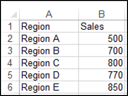
В качестве источников данных для примеров используются следующие таблицы:

Пример 1
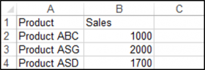
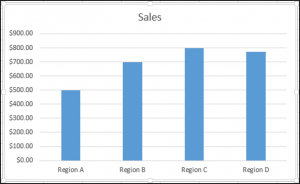
Программное создание объекта Chart с типом графика по умолчанию и по исходным данным из диапазона «A2:B26»:
|
Sub Primer1() Dim myChart As Chart ‘создаем объект Chart с расположением нового листа по умолчанию Set myChart = ThisWorkbook.Charts.Add With myChart ‘назначаем объекту Chart источник данных .SetSourceData (Sheets(«Лист1»).Range(«A2:B26»)) ‘переносим диаграмму на «Лист1» (отдельный лист диаграммы удаляется) .Location xlLocationAsObject, «Лист1» End With End Sub |
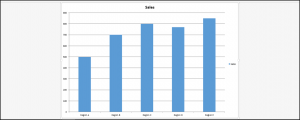
Результат работы кода VBA Excel из первого примера:

Пример 2
Программное создание объекта Chart с двумя линейными графиками по исходным данным из диапазона «A2:C26»:
|
Sub Primer2() Dim myChart As Chart Set myChart = ThisWorkbook.Charts.Add With myChart .SetSourceData (Sheets(«Лист1»).Range(«A2:C26»)) ‘задаем тип диаграммы (линейный график с маркерами) .ChartType = xlLineMarkers .Location xlLocationAsObject, «Лист1» End With End Sub |
Результат работы кода VBA Excel из второго примера:

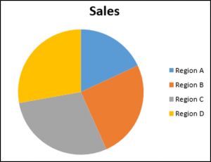
Пример 3
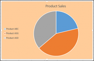
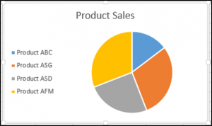
Программное создание объекта Chart с круговой диаграммой, разделенной на сектора, по исходным данным из диапазона «E2:F7»:
|
Sub Primer3() Dim myChart As Chart Set myChart = ThisWorkbook.Charts.Add With myChart .SetSourceData (Sheets(«Лист1»).Range(«E2:F7»)) ‘задаем тип диаграммы (пирог — круг, разделенный на сектора) .ChartType = xlPie ‘задаем стиль диаграммы (с отображением процентов) .ChartStyle = 261 .Location xlLocationAsObject, «Лист1» End With End Sub |
Результат работы кода VBA Excel из третьего примера:

Примечание
В примерах использовались следующие методы и свойства объекта Chart:
| Компонент | Описание |
|---|---|
| Метод SetSourceData | Задает диапазон исходных данных для диаграммы. |
| Метод Location | Перемещает диаграмму в заданное расположение (новый лист, существующий лист, элемент управления). |
| Свойство ChartType | Возвращает или задает тип диаграммы. Смотрите константы. |
| Свойство ChartStyle | Возвращает или задает стиль диаграммы. Значение нужного стиля можно узнать, записав макрос. |
In this Article
- Creating an Embedded Chart Using VBA
- Specifying a Chart Type Using VBA
- Adding a Chart Title Using VBA
- Changing the Chart Background Color Using VBA
- Changing the Chart Plot Area Color Using VBA
- Adding a Legend Using VBA
- Adding Data Labels Using VBA
- Adding an X-axis and Title in VBA
- Adding a Y-axis and Title in VBA
- Changing the Number Format of An Axis
- Changing the Formatting of the Font in a Chart
- Deleting a Chart Using VBA
- Referring to the ChartObjects Collection
- Inserting a Chart on Its Own Chart Sheet
Excel charts and graphs are used to visually display data. In this tutorial, we are going to cover how to use VBA to create and manipulate charts and chart elements.
You can create embedded charts in a worksheet or charts on their own chart sheets.
Creating an Embedded Chart Using VBA
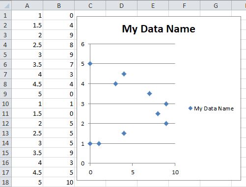
We have the range A1:B4 which contains the source data, shown below:
You can create a chart using the ChartObjects.Add method. The following code will create an embedded chart on the worksheet:
Sub CreateEmbeddedChartUsingChartObject()

Dim embeddedchart As ChartObject

Set embeddedchart = Sheets("Sheet1").ChartObjects.Add(Left:=180, Width:=300, Top:=7, Height:=200)
embeddedchart.Chart.SetSourceData Source:=Sheets("Sheet1").Range("A1:B4")

End Sub
The result is:
You can also create a chart using the Shapes.AddChart method. The following code will create an embedded chart on the worksheet:
Sub CreateEmbeddedChartUsingShapesAddChart()

Dim embeddedchart As Shape

Set embeddedchart = Sheets("Sheet1").Shapes.AddChart
embeddedchart.Chart.SetSourceData Source:=Sheets("Sheet1").Range("A1:B4")

End Sub
Specifying a Chart Type Using VBA
We have the range A1:B5 which contains the source data, shown below:
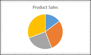
You can specify a chart type using the ChartType Property. The following code will create a pie chart on the worksheet since the ChartType Property has been set to xlPie:
Sub SpecifyAChartType()

Dim chrt As ChartObject

Set chrt = Sheets("Sheet1").ChartObjects.Add(Left:=180, Width:=270, Top:=7, Height:=210)
chrt.Chart.SetSourceData Source:=Sheets("Sheet1").Range("A1:B5")
chrt.Chart.ChartType = xlPie

End Sub
The result is:
These are some of the popular chart types that are usually specified, although there are others:
- xlArea
- xlPie
- xlLine
- xlRadar
- xlXYScatter
- xlSurface
- xlBubble
- xlBarClustered
- xlColumnClustered
Adding a Chart Title Using VBA
We have a chart selected in the worksheet as shown below:
You have to add a chart title first using the Chart.SetElement method and then specify the text of the chart title by setting the ChartTitle.Text property.
The following code shows you how to add a chart title and specify the text of the title of the Active Chart:
Sub AddingAndSettingAChartTitle()

ActiveChart.SetElement (msoElementChartTitleAboveChart)
    ActiveChart.ChartTitle.Text = "The Sales of the Product"

End Sub
The result is:
Note: You must select the chart first to make it the Active Chart to be able to use the ActiveChart object in your code.
Changing the Chart Background Color Using VBA
We have a chart selected in the worksheet as shown below:
You can change the background color of the entire chart by setting the RGB property of the FillFormat object of the ChartArea object. The following code will give the chart a light orange background color:
Sub AddingABackgroundColorToTheChartArea()

ActiveChart.ChartArea.Format.Fill.ForeColor.RGB = RGB(253, 242, 227)

End Sub
The result is:
You can also change the background color of the entire chart by setting the ColorIndex property of the Interior object of the ChartArea object. The following code will give the chart an orange background color:
Sub AddingABackgroundColorToTheChartArea()

ActiveChart.ChartArea.Interior.ColorIndex = 40

End Sub
The result is:
Note: The ColorIndex property allows you to specify a color based on a value from 1 to 56, drawn from the preset palette, to see which values represent the different colors, click here.
Changing the Chart Plot Area Color Using VBA
We have a chart selected in the worksheet as shown below:
You can change the background color of just the plot area of the chart, by setting the RGB property of the FillFormat object of the PlotArea object. The following code will give the plot area of the chart a light green background color:
Sub AddingABackgroundColorToThePlotArea()

ActiveChart.PlotArea.Format.Fill.ForeColor.RGB = RGB(208, 254, 202)

End Sub
The result is:
Adding a Legend Using VBA
We have a chart selected in the worksheet, as shown below:
You can add a legend using the Chart.SetElement method. The following code adds a legend to the left of the chart:
Sub AddingALegend()

ActiveChart.SetElement (msoElementLegendLeft)

End Sub
The result is:
You can specify the position of the legend in the following ways:
- msoElementLegendLeft – displays the legend on the left side of the chart.
- msoElementLegendLeftOverlay – overlays the legend on the left side of the chart.
- msoElementLegendRight – displays the legend on the right side of the chart.
- msoElementLegendRightOverlay – overlays the legend on the right side of the chart.
- msoElementLegendBottom – displays the legend at the bottom of the chart.
- msoElementLegendTop – displays the legend at the top of the chart.
VBA Coding Made Easy
Stop searching for VBA code online. Learn more about AutoMacro — A VBA Code Builder that allows beginners to code procedures from scratch with minimal coding knowledge and with many time-saving features for all users!
Learn More
Adding Data Labels Using VBA
We have a chart selected in the worksheet, as shown below:
You can add data labels using the Chart.SetElement method. The following code adds data labels to the inside end of the chart:
Sub AddingADataLabels()

ActiveChart.SetElement msoElementDataLabelInsideEnd

End Sub
The result is:

You can specify how the data labels are positioned in the following ways:
- msoElementDataLabelShow – display data labels.
- msoElementDataLabelRight – displays data labels on the right of the chart.
- msoElementDataLabelLeft – displays data labels on the left of the chart.
- msoElementDataLabelTop – displays data labels at the top of the chart.
- msoElementDataLabelBestFit – determines the best fit.
- msoElementDataLabelBottom – displays data labels at the bottom of the chart.
- msoElementDataLabelCallout – displays data labels as a callout.
- msoElementDataLabelCenter – displays data labels on the center.
- msoElementDataLabelInsideBase – displays data labels on the inside base.
- msoElementDataLabelOutSideEnd – displays data labels on the outside end of the chart.
- msoElementDataLabelInsideEnd – displays data labels on the inside end of the chart.
Adding an X-axis and Title in VBA
We have a chart selected in the worksheet, as shown below:
You can add an X-axis and X-axis title using the Chart.SetElement method. The following code adds an X-axis and X-axis title to the chart:
Sub AddingAnXAxisandXTitle()

With ActiveChart
.SetElement msoElementPrimaryCategoryAxisShow
.SetElement msoElementPrimaryCategoryAxisTitleHorizontal
End With


End Sub
The result is:
Adding a Y-axis and Title in VBA
We have a chart selected in the worksheet, as shown below:
You can add a Y-axis and Y-axis title using the Chart.SetElement method. The following code adds an Y-axis and Y-axis title to the chart:
Sub AddingAYAxisandYTitle()

With ActiveChart
.SetElement msoElementPrimaryValueAxisShow
.SetElement msoElementPrimaryValueAxisTitleHorizontal
End With
End Sub
The result is:
VBA Programming | Code Generator does work for you!
Changing the Number Format of An Axis
We have a chart selected in the worksheet, as shown below:
You can change the number format of an axis. The following code changes the number format of the y-axis to currency:
Sub ChangingTheNumberFormat()

ActiveChart.Axes(xlValue).TickLabels.NumberFormat = "$#,##0.00"

End Sub
The result is:
Changing the Formatting of the Font in a Chart
We have the following chart selected in the worksheet as shown below:

You can change the formatting of the entire chart font, by referring to the font object and changing its name, font weight, and size. The following code changes the type, weight and size of the font of the entire chart.
Sub ChangingTheFontFormatting()

With ActiveChart


.ChartArea.Format.TextFrame2.TextRange.Font.Name = "Times New Roman"
.ChartArea.Format.TextFrame2.TextRange.Font.Bold = True
.ChartArea.Format.TextFrame2.TextRange.Font.Size = 14

End With
The result is:
Deleting a Chart Using VBA
We have a chart selected in the worksheet, as shown below:
We can use the following code in order to delete this chart:
Sub DeletingTheChart()

ActiveChart.Parent.Delete

End Sub
Referring to the ChartObjects Collection
You can access all the embedded charts in your worksheet or workbook by referring to the ChartObjects collection. We have two charts on the same sheet shown below:
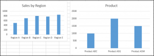
We will refer to the ChartObjects collection in order to give both charts on the worksheet the same height, width, delete the gridlines, make the background color the same, give the charts the same plot area color and make the plot area line color the same color:
Sub ReferringToAllTheChartsOnASheet()

Dim cht As ChartObject

For Each cht In ActiveSheet.ChartObjects
cht.Height = 144.85
cht.Width = 246.61

cht.Chart.Axes(xlValue).MajorGridlines.Delete
cht.Chart.PlotArea.Format.Fill.ForeColor.RGB = RGB(242, 242, 242)
cht.Chart.ChartArea.Format.Fill.ForeColor.RGB = RGB(234, 234, 234)
cht.Chart.PlotArea.Format.Line.ForeColor.RGB = RGB(18, 97, 172)

Next cht

End Sub
The result is:
Inserting a Chart on Its Own Chart Sheet
We have the range A1:B6 which contains the source data, shown below:
You can create a chart using the Charts.Add method. The following code will create a chart on its own chart sheet:
Sub InsertingAChartOnItsOwnChartSheet()

Sheets("Sheet1").Range("A1:B6").Select
Charts.Add

End Sub
The result is:
See some of our other charting tutorials:
Charts in Excel
Create a Bar Chart in VBA
Charts and graphs are one of the best features of Excel; they are very flexible and can be used to make some very advanced visualization. However, this flexibility means there are hundreds of different options. We can create exactly the visualization we want but it can be time-consuming to apply. When we want to apply those hundreds of settings to lots of charts, it can take hours and hours of frustrating clicking. This post is a guide to using VBA for Charts and Graphs in Excel.
The code examples below demonstrate some of the most common chart options with VBA. Hopefully you can put these to good use and automate your chart creation and modifications.
While it might be tempting to skip straight to the section you need, I recommend you read the first section in full. Understanding the Document Object Model (DOM) is essential to understand how VBA can be used with charts and graphs in Excel.
In Excel 2013, many changes were introduced to the charting engine and Document Object Model. For example, the AddChart2 method replaced the AddChart method. As a result, some of the code presented in this post may not work with versions before Excel 2013.
Adapting the code to your requirements
It is not feasible to provide code for every scenario you might come across; there are just too many. But, by applying the principles and methods in this post, you will be able to do almost anything you want with charts in Excel using VBA.
Understanding the Document Object Model
The Document Object Model (DOM) is a term that describes how things are structured in Excel. For example:
- A Workbook contains Sheets
- A Sheet contains Ranges
- A Range contains an Interior
- An Interior contains a color setting
Therefore, to change a cell color to red, we would reference this as follows:
ActiveWorkbook.Sheets("Sheet1").Range("A1").Interior.Color = RGB(255, 0, 0)Charts are also part of the DOM and follow similar hierarchical principles. To change the height of Chart 1, on Sheet1, we could use the following.
ActiveWorkbook.Sheets("Sheet1").ChartObjects("Chart 1").Height = 300Each item in the object hierarchy must be listed and separated by a period ( . ).
Knowing the document object model is the key to success with VBA charts. Therefore, we need to know the correct order inside the object model. While the following code may look acceptable, it will not work.
ActiveWorkbook.ChartObjects("Chart 1").Height = 300In the DOM, the ActiveWorkbook does not contain ChartObjects, so Excel cannot find Chart 1. The parent of a ChartObject is a Sheet, and the Parent of a Sheet is a Workbook. We must include the Sheet in the hierarchy for Excel to know what you want to do.
ActiveWorkbook.Sheets("Sheet1").ChartObjects("Chart 1").Height = 300With this knowledge, we can refer to any element of any chart using Excel’s DOM.
Chart Objects vs. Charts vs. Chart Sheets
One of the things which makes the DOM for charts complicated is that many things exist in many places. For example, a chart can be an embedded chart on the face of a worksheet, or as a separate chart sheet.
- On the worksheet itself, we find ChartObjects. Within each ChartObject is a Chart. Effectively a ChartObject is a container that holds a Chart.
- A Chart is also a stand-alone sheet that does not have a ChartObject around it.
This may seem confusing initially, but there are good reasons for this.
To change the chart title text, we would reference the two types of chart differently:
- Chart on a worksheet:
Sheets(“Sheet1”).ChartObjects(“Chart 1”).Chart.ChartTitle.Text = “My Chart Title” - Chart sheet:
Sheets(“Chart 1”).ChartTitle.Text = “My Chart Title”
The sections in bold are exactly the same. This shows that once we have got inside the Chart, the DOM is the same.
Writing code to work on either chart type
We want to write code that will work on any chart; we do this by creating a variable that holds the reference to a Chart.
Create a variable to refer to a Chart inside a ChartObject:
Dim cht As Chart
Set cht = Sheets("Sheet1").ChartObjects("Chart 1").Chart
Create a variable to refer to a Chart which is a sheet:
Dim cht As Chart
Set cht = Sheets("Chart 1")
Now we can write VBA code for a Chart sheet or a chart inside a ChartObject by referring to the Chart using cht:
cht.ChartTitle.Text = "My Chart Title"OK, so now we’ve established how to reference charts and briefly covered how the DOM works. It is time to look at lots of code examples.
Inserting charts
In this first section, we create charts. Please note that some of the individual lines of code are included below in their relevant sections.
Create a chart from a blank chart
Sub CreateChart()

'Declare variables
Dim rng As Range
Dim cht As Object

'Create a blank chart
  Set cht = ActiveSheet.Shapes.AddChart2

'Declare the data range for the chart
  Set rng = ActiveSheet.Range("A2:B9")

'Add the data to the chart
  cht.Chart.SetSourceData Source:=rng

'Set the chart type
  cht.Chart.ChartType = xlColumnClustered

End Sub
Reference charts on a worksheet
In this section, we look at the methods used to reference a chart contained on a worksheet.
Active Chart
Create a Chart variable to hold the ActiveChart:
Dim cht As Chart
Set cht = ActiveChart
Chart Object by name
Create a Chart variable to hold a specific chart by name.
Dim cht As Chart
Set cht = Sheets("Sheet1").ChartObjects("Chart 1").Chart
Chart object by number
If there are multiple charts on a worksheet, they can be referenced by their number:
- 1 = the first chart created
- 2 = the second chart created
- etc, etc.
Dim cht As Chart
Set cht = Sheets("Sheet1").ChartObjects(1).Chart
Loop through all Chart Objects
If there are multiple ChartObjects on a worksheet, we can loop through each:
Dim chtObj As ChartObject

For Each chtObj In Sheets("Sheet1").ChartObjects

    'Include the code to be applied to each ChartObjects
    'refer to the Chart using chtObj.cht.

Next chtObj
Loop through all selected Chart Objects
If we only want to loop through the selected ChartObjects we can use the following code.
This code is tricky to apply as Excel operates differently when one chart is selected, compared to multiple charts. Therefore, as a way to apply the Chart settings, without the need to repeat a lot of code, I recommend calling another macro and passing the Chart as an argument to that macro.
Dim obj As Object

'Check if any charts have been selected
If Not ActiveChart Is Nothing Then

    Call AnotherMacro(ActiveChart)

Else
    For Each obj In Selection

    'If more than one chart selected
    If TypeName(obj) = "ChartObject" Then

        Call AnotherMacro(obj.Chart)

    End If
Next

End If
Reference chart sheets
Now let’s move on to look at the methods used to reference a separate chart sheet.
Active Chart
Set up a Chart variable to hold the ActiveChart:
Dim cht As Chart
Set cht = ActiveChart
Note: this is the same code as when referencing the active chart on the worksheet.
Chart sheet by name
Set up a Chart variable to hold a specific chart sheet
Dim cht As Chart
Set cht = Sheets("Chart 1")
Loop through all chart sheets in a workbook
The following code will loop through all the chart sheets in the active workbook.
Dim cht As Chart

For Each cht In ActiveWorkbook.Charts

    Call AnotherMacro(cht)

Next cht
Basic chart settings
This section contains basic chart settings.
All codes start with cht., as they assume a chart has been referenced using the codes above.
Change chart type
'Change chart type - these are common examples, others do exist.
cht.ChartType = xlArea
cht.ChartType = xlLine
cht.ChartType = xlPie
cht.ChartType = xlColumnClustered
cht.ChartType = xlColumnStacked
cht.ChartType = xlColumnStacked100
cht.ChartType = xlArea
cht.ChartType = xlAreaStacked
cht.ChartType = xlBarClustered
cht.ChartType = xlBarStacked
cht.ChartType = xlBarStacked100
Create an empty ChartObject on a worksheet
'Create an empty chart embedded on a worksheet.
Set cht = Sheets("Sheet1").Shapes.AddChart2.Chart
Select the source for a chart
'Select source for a chart
Dim rng As Range
Set rng = Sheets("Sheet1").Range("A1:B4")
cht.SetSourceData Source:=rng
Delete a chart object or chart sheet
'Delete a ChartObject or Chart sheet
If TypeName(cht.Parent) = "ChartObject" Then

    cht.Parent.Delete

ElseIf TypeName(cht.Parent) = "Workbook" Then

    cht.Delete

End If
Change the size or position of a chart
'Set the size/position of a ChartObject - method 1
cht.Parent.Height = 200
cht.Parent.Width = 300
cht.Parent.Left = 20
cht.Parent.Top = 20

'Set the size/position of a ChartObject - method 2
chtObj.Height = 200
chtObj.Width = 300
chtObj.Left = 20
chtObj.Top = 20
Change the visible cells setting
'Change the setting to show only visible cells
cht.PlotVisibleOnly = False
Change the space between columns/bars (gap width)
'Change the gap space between bars
cht.ChartGroups(1).GapWidth = 50
Change the overlap of columns/bars
'Change the overlap setting of bars
cht.ChartGroups(1).Overlap = 75
Remove outside border from chart object
'Remove the outside border from a chart
cht.ChartArea.Format.Line.Visible = msoFalse
Change color of chart background
'Set the fill color of the chart area
cht.ChartArea.Format.Fill.ForeColor.RGB = RGB(255, 0, 0)

'Set chart with no background color
cht.ChartArea.Format.Fill.Visible = msoFalse
Chart Axis
Charts have four axis:
- xlValue
- xlValue, xlSecondary
- xlCategory
- xlCategory, xlSecondary
These are used interchangeably in the examples below. To adapt the code to your specific requirements, you need to change the chart axis which is referenced in the brackets.
All codes start with cht., as they assume a chart has been referenced using the codes earlier in this post.
Set min and max of chart axis
'Set chart axis min and max
cht.Axes(xlValue).MaximumScale = 25
cht.Axes(xlValue).MinimumScale = 10
cht.Axes(xlValue).MaximumScaleIsAuto = True
cht.Axes(xlValue).MinimumScaleIsAuto = True
Display or hide chart axis
'Display axis
cht.HasAxis(xlCategory) = True

'Hide axis
cht.HasAxis(xlValue, xlSecondary) = False
Display or hide chart title
'Display axis title
cht.Axes(xlCategory, xlSecondary).HasTitle = True

'Hide axis title
cht.Axes(xlValue).HasTitle = False
Change chart axis title text
'Change axis title text
cht.Axes(xlCategory).AxisTitle.Text = "My Axis Title"
Reverse the order of a category axis
'Reverse the order of a catetory axis
cht.Axes(xlCategory).ReversePlotOrder = True

'Set category axis to default order
cht.Axes(xlCategory).ReversePlotOrder = False
Gridlines
Gridlines help a user to see the relative position of an item compared to the axis.
Add or delete gridlines
'Add gridlines
cht.SetElement (msoElementPrimaryValueGridLinesMajor)
cht.SetElement (msoElementPrimaryCategoryGridLinesMajor)
cht.SetElement (msoElementPrimaryValueGridLinesMinorMajor)
cht.SetElement (msoElementPrimaryCategoryGridLinesMinorMajor)

'Delete gridlines
cht.Axes(xlValue).MajorGridlines.Delete
cht.Axes(xlValue).MinorGridlines.Delete
cht.Axes(xlCategory).MajorGridlines.Delete
cht.Axes(xlCategory).MinorGridlines.Delete
Change color of gridlines
'Change colour of gridlines
cht.Axes(xlValue).MajorGridlines.Format.Line.ForeColor.RGB = RGB(255, 0, 0)
Change transparency of gridlines
'Change transparency of gridlines
cht.Axes(xlValue).MajorGridlines.Format.Line.Transparency = 0.5
Chart Title
The chart title is the text at the top of the chart.
All codes start with cht., as they assume a chart has been referenced using the codes earlier in this post.
Display or hide chart title
'Display chart title
cht.HasTitle = True

'Hide chart title
cht.HasTitle = False
Change chart title text
'Change chart title text
cht.ChartTitle.Text = "My Chart Title"
Position the chart title
'Position the chart title
cht.ChartTitle.Left = 10
cht.ChartTitle.Top = 10
Format the chart title
'Format the chart title
cht.ChartTitle.TextFrame2.TextRange.Font.Name = "Calibri"
cht.ChartTitle.TextFrame2.TextRange.Font.Size = 16
cht.ChartTitle.TextFrame2.TextRange.Font.Bold = msoTrue
cht.ChartTitle.TextFrame2.TextRange.Font.Bold = msoFalse
cht.ChartTitle.TextFrame2.TextRange.Font.Italic = msoTrue
cht.ChartTitle.TextFrame2.TextRange.Font.Italic = msoFalse
Chart Legend
The chart legend provides a color key to identify each series in the chart.
Display or hide the chart legend
'Display the legend
cht.HasLegend = True

'Hide the legend
cht.HasLegend = False
Position the legend
'Position the legend
cht.Legend.Position = xlLegendPositionTop
cht.Legend.Position = xlLegendPositionRight
cht.Legend.Position = xlLegendPositionLeft
cht.Legend.Position = xlLegendPositionCorner
cht.Legend.Position = xlLegendPositionBottom

'Allow legend to overlap the chart.
'False = allow overlap, True = due not overlap
cht.Legend.IncludeInLayout = False
cht.Legend.IncludeInLayout = True

'Move legend to a specific point
cht.Legend.Left = 20
cht.Legend.Top = 200
cht.Legend.Width = 100
cht.Legend.Height = 25
Plot Area
The Plot Area is the main body of the chart which contains the lines, bars, areas, bubbles, etc.
All codes start with cht., as they assume a chart has been referenced using the codes earlier in this post.
Background color of Plot Area
'Set background color of the plot area
cht.PlotArea.Format.Fill.ForeColor.RGB = RGB(255, 0, 0)


'Set plot area to no background color
cht.PlotArea.Format.Fill.Visible = msoFalse
Set position of Plot Area
'Set the size and position of the PlotArea. Top and Left are relative to the Chart Area.
cht.PlotArea.Left = 20
cht.PlotArea.Top = 20
cht.PlotArea.Width = 200
cht.PlotArea.Height = 150
Chart series
Chart series are the individual lines, bars, areas for each category.
All codes starting with srs. assume a chart’s series has been assigned to a variable.
Add a new chart series
'Add a new chart series
Set srs = cht.SeriesCollection.NewSeries
srs.Values = "=Sheet1!$C$2:$C$6"
srs.Name = "=""New Series"""

'Set the values for the X axis when using XY Scatter
srs.XValues = "=Sheet1!$D$2:$D$6"
Reference a chart series
Set up a Series variable to hold a chart series:
- 1 = First chart series
- 2 = Second chart series
- etc, etc.
Dim srs As Series
Set srs = cht.SeriesCollection(1)
Referencing a chart series by name
Dim srs As Series
Set srs = cht.SeriesCollection("Series Name")
Delete a chart series
'Delete chart series
srs.Delete
Loop through each chart series
Dim srs As Series
For Each srs In cht.SeriesCollection

    'Do something to each series
    'See the codes below starting with "srs."

Next srs
Change series data
'Change series source data and name
srs.Values = "=Sheet1!$C$2:$C$6"
srs.Name = "=""Change Series Name"""
Changing fill or line colors
'Change fill colour
srs.Format.Fill.ForeColor.RGB = RGB(255, 0, 0)

'Change line colour
srs.Format.Line.ForeColor.RGB = RGB(255, 0, 0)
Changing visibility
'Change visibility of line
srs.Format.Line.Visible = msoTrue
Changing line weight
'Change line weight
srs.Format.Line.Weight = 10
Changing line style
'Change line style
srs.Format.Line.DashStyle = msoLineDash
srs.Format.Line.DashStyle = msoLineSolid
srs.Format.Line.DashStyle = msoLineSysDot
srs.Format.Line.DashStyle = msoLineSysDash
srs.Format.Line.DashStyle = msoLineDashDot
srs.Format.Line.DashStyle = msoLineLongDash
srs.Format.Line.DashStyle = msoLineLongDashDot
srs.Format.Line.DashStyle = msoLineLongDashDotDot
Formatting markers
'Changer marker type
srs.MarkerStyle = xlMarkerStyleAutomatic
srs.MarkerStyle = xlMarkerStyleCircle
srs.MarkerStyle = xlMarkerStyleDash
srs.MarkerStyle = xlMarkerStyleDiamond
srs.MarkerStyle = xlMarkerStyleDot
srs.MarkerStyle = xlMarkerStyleNone

'Change marker border color
srs.MarkerForegroundColor = RGB(255, 0, 0)

'Change marker fill color
srs.MarkerBackgroundColor = RGB(255, 0, 0)

'Change marker size
srs.MarkerSize = 8
Data labels
Data labels display additional information (such as the value, or series name) to a data point in a chart series.
All codes starting with srs. assume a chart’s series has been assigned to a variable.
Display or hide data labels
'Display data labels on all points in the series
srs.HasDataLabels = True

'Hide data labels on all points in the series
srs.HasDataLabels = False
Change the position of data labels
'Position data labels
'The label position must be a valid option for the chart type.
srs.DataLabels.Position = xlLabelPositionAbove
srs.DataLabels.Position = xlLabelPositionBelow
srs.DataLabels.Position = xlLabelPositionLeft
srs.DataLabels.Position = xlLabelPositionRight
srs.DataLabels.Position = xlLabelPositionCenter
srs.DataLabels.Position = xlLabelPositionInsideEnd
srs.DataLabels.Position = xlLabelPositionInsideBase
srs.DataLabels.Position = xlLabelPositionOutsideEnd
Error Bars
Error bars were originally intended to show variation (e.g. min/max values) in a value. However, they also commonly used in advanced chart techniques to create additional visual elements.
All codes starting with srs. assume a chart’s series has been assigned to a variable.
Turn error bars on/off
'Turn error bars on/off
srs.HasErrorBars = True
srs.HasErrorBars = False
Error bar end cap style
'Change end style of error bar
srs.ErrorBars.EndStyle = xlNoCap
srs.ErrorBars.EndStyle = xlCap
Error bar color
'Change color of error bars
srs.ErrorBars.Format.Line.ForeColor.RGB = RGB(255, 0, 0)
Error bar thickness
'Change thickness of error bars
srs.ErrorBars.Format.Line.Weight = 5
Error bar direction settings
'Error bar settings
srs.ErrorBar Direction:=xlY, _
    Include:=xlPlusValues, _
    Type:=xlFixedValue, _
    Amount:=100
'Alternatives options for the error bar settings are
'Direction:=xlX
'Include:=xlMinusValues
'Include:=xlPlusValues
'Include:=xlBoth
'Type:=xlFixedValue
'Type:=xlPercent
'Type:=xlStDev
'Type:=xlStError
'Type:=xlCustom

'Applying custom values to error bars
srs.ErrorBar Direction:=xlY, _
    Include:=xlPlusValues, _
    Type:=xlCustom, _
    Amount:="=Sheet1!$A$2:$A$7", _
    MinusValues:="=Sheet1!$A$2:$A$7"
Data points
Each data point on a chart series is known as a Point.
Reference a specific point
The following code will reference the first Point.
1 = First chart series
2 = Second chart series
etc, etc.
Dim srs As Series
Dim pnt As Point

Set srs = cht.SeriesCollection(1)
Set pnt = srs.Points(1)
Loop through all points
Dim srs As Series
Dim pnt As Point

Set srs = cht.SeriesCollection(1)

For Each pnt In srs.Points

    'Do something to each point, using "pnt."

Next pnt
Point example VBA codes
Points have similar properties to Series, but the properties are applied to a single data point in the series rather than the whole series. See a few examples below, just to give you the idea.
Turn on data label for a point
'Turn on data label
pnt.HasDataLabel = True
Set the data label position for a point
'Set the position of a data label
pnt.DataLabel.Position = xlLabelPositionCenter
Other useful chart macros
In this section, I’ve included other useful chart macros which are not covered by the example codes above.
Make chart cover cell range
The following code changes the location and size of the active chart to fit directly over the range G4:N20
Sub FitChartToRange()

'Declare variables
Dim cht As Chart
Dim rng As Range

'Assign objects to variables
Set cht = ActiveChart
Set rng = ActiveSheet.Range("G4:N20")

'Move and resize chart
cht.Parent.Left = rng.Left
cht.Parent.Top = rng.Top
cht.Parent.Width = rng.Width
cht.Parent.Height = rng.Height

End Sub
Export the chart as an image
The following code saves the active chart to an image in the predefined location
Sub ExportSingleChartAsImage()

'Create a variable to hold the path and name of image
Dim imagePath As String
Dim cht As Chart

imagePath = "C:UsersmarksDocumentsmyImage.png"
Set cht = ActiveChart

'Export the chart
cht.Export (imagePath)

End Sub
Resize all charts to the same size as the active chart
The following code resizes all charts on the Active Sheet to be the same size as the active chart.
Sub ResizeAllCharts()

'Create variables to hold chart dimensions
Dim chtHeight As Long
Dim chtWidth As Long

'Create variable to loop through chart objects
Dim chtObj As ChartObject

'Get the size of the first selected chart
chtHeight = ActiveChart.Parent.Height
chtWidth = ActiveChart.Parent.Width

For Each chtObj In ActiveSheet.ChartObjects

    chtObj.Height = chtHeight
    chtObj.Width = chtWidth

Next chtObj

End Sub
Bringing it all together
Just to prove how we can use these code snippets, I have created a macro to build bullet charts.
This isn’t necessarily the most efficient way to write the code, but it is to demonstrate that by understanding the code above we can create a lot of charts.
The data looks like this:
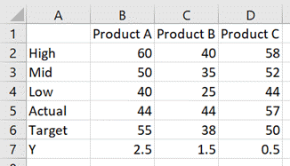
The chart looks like this:
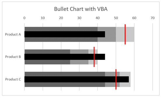
The code which achieves this is as follows:
Sub CreateBulletChart()

Dim cht As Chart
Dim srs As Series
Dim rng As Range

'Create an empty chart
Set cht = Sheets("Sheet3").Shapes.AddChart2.Chart

'Change chart title text
cht.ChartTitle.Text = "Bullet Chart with VBA"

'Hide the legend
cht.HasLegend = False

'Change chart type
cht.ChartType = xlBarClustered

'Select source for a chart
Set rng = Sheets("Sheet3").Range("A1:D4")
cht.SetSourceData Source:=rng

'Reverse the order of a catetory axis
cht.Axes(xlCategory).ReversePlotOrder = True

'Change the overlap setting of bars
cht.ChartGroups(1).Overlap = 100

'Change the gap space between bars
cht.ChartGroups(1).GapWidth = 50

'Change fill colour
Set srs = cht.SeriesCollection(1)
srs.Format.Fill.ForeColor.RGB = RGB(200, 200, 200)

Set srs = cht.SeriesCollection(2)
srs.Format.Fill.ForeColor.RGB = RGB(150, 150, 150)

Set srs = cht.SeriesCollection(3)
srs.Format.Fill.ForeColor.RGB = RGB(100, 100, 100)

'Add a new chart series
Set srs = cht.SeriesCollection.NewSeries
srs.Values = "=Sheet3!$B$7:$D$7"
srs.XValues = "=Sheet3!$B$5:$D$5"
srs.Name = "=""Actual"""

'Change chart type
srs.ChartType = xlXYScatter

'Turn error bars on/off
srs.HasErrorBars = True

'Change end style of error bar
srs.ErrorBars.EndStyle = xlNoCap

'Set the error bars
srs.ErrorBar Direction:=xlY, _
    Include:=xlNone, _
    Type:=xlErrorBarTypeCustom

srs.ErrorBar Direction:=xlX, _
    Include:=xlMinusValues, _
    Type:=xlPercent, _
    Amount:=100

'Change color of error bars
srs.ErrorBars.Format.Line.ForeColor.RGB = RGB(0, 0, 0)

'Change thickness of error bars
srs.ErrorBars.Format.Line.Weight = 14

'Change marker type
srs.MarkerStyle = xlMarkerStyleNone

'Add a new chart series
Set srs = cht.SeriesCollection.NewSeries
srs.Values = "=Sheet3!$B$7:$D$7"
srs.XValues = "=Sheet3!$B$6:$D$6"
srs.Name = "=""Target"""

'Change chart type
srs.ChartType = xlXYScatter

'Turn error bars on/off
srs.HasErrorBars = True

'Change end style of error bar
srs.ErrorBars.EndStyle = xlNoCap

srs.ErrorBar Direction:=xlX, _
    Include:=xlNone, _
    Type:=xlErrorBarTypeCustom

srs.ErrorBar Direction:=xlY, _
    Include:=xlBoth, _
    Type:=xlFixedValue, _
    Amount:=0.45

'Change color of error bars
srs.ErrorBars.Format.Line.ForeColor.RGB = RGB(255, 0, 0)

'Change thickness of error bars
srs.ErrorBars.Format.Line.Weight = 2

'Changer marker type
srs.MarkerStyle = xlMarkerStyleNone

'Set chart axis min and max
cht.Axes(xlValue, xlSecondary).MaximumScale = cht.SeriesCollection(1).Points.Count
cht.Axes(xlValue, xlSecondary).MinimumScale = 0

'Hide axis
cht.HasAxis(xlValue, xlSecondary) = False

End Sub
Using the Macro Recorder for VBA for charts and graphs
The Macro Recorder is one of the most useful tools for writing VBA for Excel charts. The DOM is so vast that it can be challenging to know how to refer to a specific object, property or method. Studying the code produced by the Macro Recorder will provide the parts of the DOM which you don’t know.
As a note, the Macro Recorder creates poorly constructed code; it selects each object before manipulating it (this is what you did with the mouse after all). But this is OK for us. Once we understand the DOM, we can take just the parts of the code we need and ensure we put them into the right part of the hierarchy.
Conclusion
As you’ve seen in this post, the Document Object Model for charts and graphs in Excel is vast (and we’ve only scratched the surface.
I hope that through all the examples in this post you have a better understanding of VBA for charts and graphs in Excel. With this knowledge, I’m sure you will be able to automate your chart creation and modification.
Have I missed any useful codes? If so, put them in the comments.
Looking for other detailed VBA guides? Check out these posts:
- VBA for Tables & List Objects
- VBA for PivotTables
- VBA to insert, move, delete and control pictures

About the author
Hey, I’m Mark, and I run Excel Off The Grid.
My parents tell me that at the age of 7 I declared I was going to become a qualified accountant. I was either psychic or had no imagination, as that is exactly what happened. However, it wasn’t until I was 35 that my journey really began.
In 2015, I started a new job, for which I was regularly working after 10pm. As a result, I rarely saw my children during the week. So, I started searching for the secrets to automating Excel. I discovered that by building a small number of simple tools, I could combine them together in different ways to automate nearly all my regular tasks. This meant I could work less hours (and I got pay raises!). Today, I teach these techniques to other professionals in our training program so they too can spend less time at work (and more time with their children and doing the things they love).
Do you need help adapting this post to your needs?
I’m guessing the examples in this post don’t exactly match your situation. We all use Excel differently, so it’s impossible to write a post that will meet everybody’s needs. By taking the time to understand the techniques and principles in this post (and elsewhere on this site), you should be able to adapt it to your needs.
But, if you’re still struggling you should:
- Read other blogs, or watch YouTube videos on the same topic. You will benefit much more by discovering your own solutions.
- Ask the ‘Excel Ninja’ in your office. It’s amazing what things other people know.
- Ask a question in a forum like Mr Excel, or the Microsoft Answers Community. Remember, the people on these forums are generally giving their time for free. So take care to craft your question, make sure it’s clear and concise. List all the things you’ve tried, and provide screenshots, code segments and example workbooks.
- Use Excel Rescue, who are my consultancy partner. They help by providing solutions to smaller Excel problems.
What next?
Don’t go yet, there is plenty more to learn on Excel Off The Grid. Check out the latest posts:
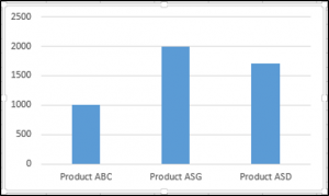
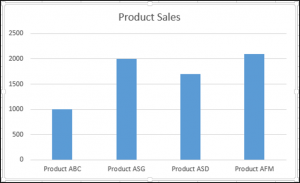
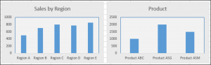
Excel VBA Charts
We can term charts as objects in VBA. Similar to the worksheet, we can also insert charts in VBA. First, we select the data and chart type we want for our data. Now, there are two different types of charts we provide. One is the embed chart, where the chart is in the same sheet of data. Another is known as the chart sheet, where the chart is in a separate data sheet.
In data analysis, visual effects are the key performance indicators of the person who has done the analysis. Visuals are the best way an analyst can convey their message. Since we are all Excel users, we usually spend considerable time analyzing the data and drawing conclusions with numbers and charts. Creating a chart is an art to master. We hope you have good knowledge of creating charts with excelIn Excel, a graph or chart lets us visualize information we’ve gathered from our data. It allows us to visualize data in easy-to-understand pictorial ways. The following components are required to create charts or graphs in Excel: 1 — Numerical Data, 2 — Data Headings, and 3 — Data in Proper Order.read more. This article will show you how to create charts using VBA coding.
Table of contents
- Excel VBA Charts
- How to Add Charts using VBA Code in Excel?
- #1 – Create Chart using VBA Coding
- #2 – Create a Chart with the Same Excel Sheet as Shape
- #3 – Code to Loop through the Charts
- #4 – Alternative Method to Create Chart
- Recommended Articles
- How to Add Charts using VBA Code in Excel?

You are free to use this image on your website, templates, etc, Please provide us with an attribution linkArticle Link to be Hyperlinked
For eg:
Source: VBA Charts (wallstreetmojo.com)
How to Add Charts using VBA Code in Excel?
You can download this VBA Charts Excel Template here – VBA Charts Excel Template
#1 – Create Chart using VBA Coding
To create any chart, we should have some numerical data. For this example, we are going to use the below sample data.
First, let us jump to the VBA editorThe Visual Basic for Applications Editor is a scripting interface. These scripts are primarily responsible for the creation and execution of macros in Microsoft software.read more.
Step 1: Start Sub Procedure.
Code:
Sub Charts_Example1()

End Sub

Step 2: Define the variable as Chart.
Code:
Sub Charts_Example1()

  Dim MyChart As Chart

End Sub

Step 3: Since the chart is an object variable, we need to Set it.
Code:
Sub Charts_Example1()

  Dim MyChart As Chart
  Set MyChart = Charts.Add

End Sub

The above code will add a new sheet as a chart sheet, not a worksheet.

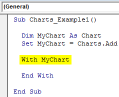
Step 4: Now, we need to design the chart. Open With Statement.
Code:
Sub Charts_Example1()

  Dim MyChart As Chart
  Set MyChart = Charts.Add

  With MyChart

  End With

End Sub
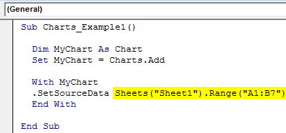
Step 5: The first thing we need to do with the chart is to Set the source range by selecting the “Set Source Data” method.
Code:
Sub Charts_Example1()

  Dim MyChart As Chart
  Set MyChart = Charts.Add

  With MyChart
  .SetSourceData

  End With

End Sub

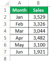
Step 6: We need to mention the source range. In this case, my source range is in the sheet named “Sheet1,” and the range is “A1 to B7”.
Code:
Sub Charts_Example1()

  Dim MyChart As Chart
  Set MyChart = Charts.Add

  With MyChart
  .SetSourceData Sheets("Sheet1").Range("A1:B7")
  End With

End Sub
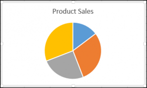
Step 7: Next up, we need to select the kind of chart we are going to create. For this, we need to select the Chart Type property.
Code:
Sub Charts_Example1()

  Dim MyChart As Chart
  Set MyChart = Charts.Add

  With MyChart
  .SetSourceData Sheets("Sheet1").Range("A1:B7")
  .ChartType =
  End With

End Sub
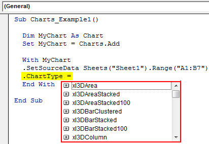
Step 8: Here, we have a variety of charts. I am going to select the “xlColumnClustered” chart.
Code:
Sub Charts_Example1()

  Dim MyChart As Chart
  Set MyChart = Charts.Add

  With MyChart
  .SetSourceData Sheets("Sheet1").Range("A1:B7")
  .ChartType = xlColumnClustered
  End With

End Sub
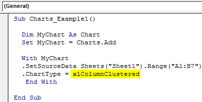
Now let’s run the code using the F5 key or manually and see how the chart looks.

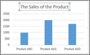
Step 9: Now, change other properties of the chart. To change the chart title, below is the code.

Like this, we have many properties and methods with charts. Use each one of them to see the impact and learn.
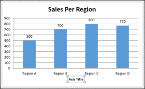
Sub Charts_Example1()

  Dim MyChart As Chart
  Set MyChart = Charts.Add

  With MyChart
  .SetSourceData Sheets("Sheet1").Range("A1:B7")
  .ChartType = xlColumnClustered
  .ChartTitle.Text = "Sales Performance"
  End With

End Sub
#2 – Create a Chart with the Same Excel Sheet as Shape
We need to use a different technique to create the chart with the same worksheet (datasheet) as the shape.
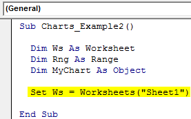
Step 1: First, declare three object variables.
Code:
Sub Charts_Example2()

  Dim Ws As Worksheet
  Dim Rng As Range
  Dim MyChart As Object

End Sub

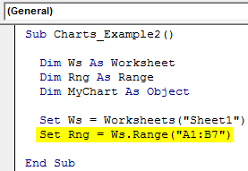
Step 2: Then, set the worksheet reference.
Code:
Sub Charts_Example2()

  Dim Ws As Worksheet
  Dim Rng As Range
  Dim MyChart As Object

  Set Ws = Worksheets("Sheet1")

End Sub
Step 3: Now, set the range object in VBARange is a property in VBA that helps specify a particular cell, a range of cells, a row, a column, or a three-dimensional range. In the context of the Excel worksheet, the VBA range object includes a single cell or multiple cells spread across various rows and columns.read more
Code:
Sub Charts_Example2()

  Dim Ws As Worksheet
  Dim Rng As Range
  Dim MyChart As Object

  Set Ws = Worksheets("Sheet1")
  Set Rng = Ws.Range("A1:B7")

End Sub
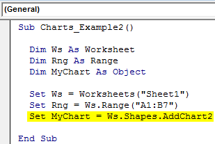
Step 4: Now, set the chart object.
Code:
Sub Charts_Example2()

  Dim Ws As Worksheet
  Dim Rng As Range
  Dim MyChart As Object

  Set Ws = Worksheets("Sheet1")
  Set Rng = Ws.Range("A1:B7")
  Set MyChart = Ws.Shapes.AddChart2

End Sub
Step 5: Now, as usual, we can design the chart using the “With” statement.

Code:
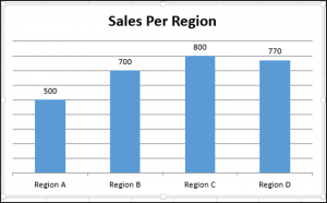
Sub Charts_Example2()

Dim Ws As Worksheet 'To Hold Worksheet Reference
Dim Rng As Range 'To Hold Range Reference in the Worksheet
Dim MyChart As Object

Set Ws = Worksheets("Sheet1") 'Now variable "Ws" is equal to the sheet "Sheet1"
Set Rng = Ws.Range("A1:B7") 'Now variable "Rng" holds the range A1 to B7 in the sheet "Sheet1"
Set MyChart = Ws.Shapes.AddChart2 'Chart will be added as Shape in the same worksheet

With MyChart.Chart
.SetSourceData Rng 'Since we already set the range of cells to be used for chart we have use RNG object here
.ChartType = xlColumnClustered
.ChartTitle.Text = "Sales Performance"
End With

End Sub
It will add the chart below.

#3 – Code to Loop through the Charts
Like how we look through sheets to change the name, insert values, and hide and unhide them. Similarly, we need to use the ChartObject property to loop through the charts.
The below code will loop through all the charts in the worksheet.
Code:
Sub Chart_Loop()

  Dim MyChart As ChartObject

  For Each MyChart In ActiveSheet.ChartObjects
  'Enter the code here
  Next MyChart

End Sub
#4 – Alternative Method to Create Chart
We can use the below alternative method to create charts. We can use the ChartObject. Add method to create the chart below is the example code.
It will also create a chart like the previous method.
Code:
Sub Charts_Example3()

  Dim Ws As Worksheet
  Dim Rng As Range
  Dim MyChart As ChartObject

  Set Ws = Worksheets("Sheet1")
  Set Rng = Ws.Range("A1:B7")
  Set MyChart = Ws.ChartObjects.Add(Left:=ActiveCell.Left, Width:=400, Top:=ActiveCell.Top, Height:=200)
  MyChart.Chart.SetSourceData Source:=Rng
  MyChart.Chart.ChartType = xlColumnStacked
  MyChart.Chart.ChartTitle.Text = "Sales Performance"

End Sub
Recommended Articles
This article has been a guide to VBA Charts. Here, we learn how to create a chart using VBA code, practical examples, and a downloadable template. Below you can find some useful Excel VBA articles: –
- Excel VBA Pivot Table
- What are Control Charts in Excel?
- Top 8 Types of Charts in Excel
- Graphs vs. Charts – Compare
Содержание
- VBA Guide For Charts and Graphs
- Creating an Embedded Chart Using VBA
- Specifying a Chart Type Using VBA
- Adding a Chart Title Using VBA
- Changing the Chart Background Color Using VBA
- Changing the Chart Plot Area Color Using VBA
- Adding a Legend Using VBA
- VBA Coding Made Easy
- Adding Data Labels Using VBA
- Adding an X-axis and Title in VBA
- Adding a Y-axis and Title in VBA
- Changing the Number Format of An Axis
- Changing the Formatting of the Font in a Chart
- Deleting a Chart Using VBA
- Referring to the ChartObjects Collection
- Inserting a Chart on Its Own Chart Sheet
- VBA Code Examples Add-in
- Объект Chart (Excel)
- Примечания
- События
- Методы
- Свойства
- См. также
- Поддержка и обратная связь
- Automatically Create Excel Charts with VBA
- The VBA Tutorials Blog
- Creating the Chart
- The ChartObject Container
- Adding Data
- Adding Data to Scatter Plots
- Accessing the Charts
- Chart Sheet Style
- Embedded Chart Style
- Manipulating Charts
- Changing the Chart Type
- Has Properties
- Titles
- Legends
- Use of xlValue and xlCategory
- Practicality
VBA Guide For Charts and Graphs
In this Article
Excel charts and graphs are used to visually display data. In this tutorial, we are going to cover how to use VBA to create and manipulate charts and chart elements.
You can create embedded charts in a worksheet or charts on their own chart sheets.
Creating an Embedded Chart Using VBA
We have the range A1:B4 which contains the source data, shown below:
You can create a chart using the ChartObjects.Add method. The following code will create an embedded chart on the worksheet:
You can also create a chart using the Shapes.AddChart method. The following code will create an embedded chart on the worksheet:
Specifying a Chart Type Using VBA
We have the range A1:B5 which contains the source data, shown below:
You can specify a chart type using the ChartType Property. The following code will create a pie chart on the worksheet since the ChartType Property has been set to xlPie:
The result is:
These are some of the popular chart types that are usually specified, although there are others:
- xlArea
- xlPie
- xlLine
- xlRadar
- xlXYScatter
- xlSurface
- xlBubble
- xlBarClustered
- xlColumnClustered
Adding a Chart Title Using VBA
We have a chart selected in the worksheet as shown below:
You have to add a chart title first using the Chart.SetElement method and then specify the text of the chart title by setting the ChartTitle.Text property.
The following code shows you how to add a chart title and specify the text of the title of the Active Chart:
Note: You must select the chart first to make it the Active Chart to be able to use the ActiveChart object in your code.
Changing the Chart Background Color Using VBA
We have a chart selected in the worksheet as shown below:
You can change the background color of the entire chart by setting the RGB property of the FillFormat object of the ChartArea object. The following code will give the chart a light orange background color:
You can also change the background color of the entire chart by setting the ColorIndex property of the Interior object of the ChartArea object. The following code will give the chart an orange background color:
The result is:
Note: The ColorIndex property allows you to specify a color based on a value from 1 to 56, drawn from the preset palette, to see which values represent the different colors, click here.
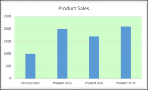
Changing the Chart Plot Area Color Using VBA
We have a chart selected in the worksheet as shown below:
You can change the background color of just the plot area of the chart, by setting the RGB property of the FillFormat object of the PlotArea object. The following code will give the plot area of the chart a light green background color:
The result is:
Adding a Legend Using VBA
We have a chart selected in the worksheet, as shown below:
You can add a legend using the Chart.SetElement method. The following code adds a legend to the left of the chart:
The result is:
You can specify the position of the legend in the following ways:
- msoElementLegendLeft – displays the legend on the left side of the chart.
- msoElementLegendLeftOverlay – overlays the legend on the left side of the chart.
- msoElementLegendRight – displays the legend on the right side of the chart.
- msoElementLegendRightOverlay – overlays the legend on the right side of the chart.
- msoElementLegendBottom – displays the legend at the bottom of the chart.
- msoElementLegendTop – displays the legend at the top of the chart.
VBA Coding Made Easy
Stop searching for VBA code online. Learn more about AutoMacro — A VBA Code Builder that allows beginners to code procedures from scratch with minimal coding knowledge and with many time-saving features for all users!
Adding Data Labels Using VBA
We have a chart selected in the worksheet, as shown below:
You can add data labels using the Chart.SetElement method. The following code adds data labels to the inside end of the chart:
You can specify how the data labels are positioned in the following ways:
- msoElementDataLabelShow – display data labels.
- msoElementDataLabelRight – displays data labels on the right of the chart.
- msoElementDataLabelLeft – displays data labels on the left of the chart.
- msoElementDataLabelTop – displays data labels at the top of the chart.
- msoElementDataLabelBestFit – determines the best fit.
- msoElementDataLabelBottom – displays data labels at the bottom of the chart.
- msoElementDataLabelCallout – displays data labels as a callout.
- msoElementDataLabelCenter – displays data labels on the center.
- msoElementDataLabelInsideBase – displays data labels on the inside base.
- msoElementDataLabelOutSideEnd – displays data labels on the outside end of the chart.
- msoElementDataLabelInsideEnd – displays data labels on the inside end of the chart.
Adding an X-axis and Title in VBA
We have a chart selected in the worksheet, as shown below:
You can add an X-axis and X-axis title using the Chart.SetElement method. The following code adds an X-axis and X-axis title to the chart:
Adding a Y-axis and Title in VBA
We have a chart selected in the worksheet, as shown below:
You can add a Y-axis and Y-axis title using the Chart.SetElement method. The following code adds an Y-axis and Y-axis title to the chart:
Changing the Number Format of An Axis
We have a chart selected in the worksheet, as shown below:
You can change the number format of an axis. The following code changes the number format of the y-axis to currency:
Changing the Formatting of the Font in a Chart
We have the following chart selected in the worksheet as shown below:
You can change the formatting of the entire chart font, by referring to the font object and changing its name, font weight, and size. The following code changes the type, weight and size of the font of the entire chart.
Deleting a Chart Using VBA
We have a chart selected in the worksheet, as shown below:
We can use the following code in order to delete this chart:
Referring to the ChartObjects Collection
You can access all the embedded charts in your worksheet or workbook by referring to the ChartObjects collection. We have two charts on the same sheet shown below:
We will refer to the ChartObjects collection in order to give both charts on the worksheet the same height, width, delete the gridlines, make the background color the same, give the charts the same plot area color and make the plot area line color the same color:
Inserting a Chart on Its Own Chart Sheet
We have the range A1:B6 which contains the source data, shown below:
You can create a chart using the Charts.Add method. The following code will create a chart on its own chart sheet:
The result is:
See some of our other charting tutorials:
VBA Code Examples Add-in
Easily access all of the code examples found on our site.
Simply navigate to the menu, click, and the code will be inserted directly into your module. .xlam add-in.
Источник
Объект Chart (Excel)
Представляет диаграмму в книге.
Примечания
Диаграмма может представлять собой внедренную диаграмму (содержащуюся в объекте ChartObject) или отдельный лист диаграммы.
Коллекция Charts содержит объект Chart для каждого листа диаграммы в книге. Чтобы вернуть один объект Chart, используйте синтаксис Charts (индекс), где индекс — это номер индекса или имя листа диаграммы.
Номер индекса диаграммы представляет положение листа диаграммы на панели вкладок книги. Charts(1) — это первая (крайняя левая) диаграмма в книге; Charts(Charts.Count) — последняя (самая правая).
Все листы диаграмм включаются в число индексов, даже если они скрыты. Имя листа диаграммы отображается на вкладке книги для диаграммы. Используйте свойство Name объекта ChartObject, чтобы задать или возвратить имя диаграммы.
В следующем примере изменяется цвет ряда 1 на листе диаграммы 1.
В следующем примере диаграмма Sales (Продажи) перемещается в конец активной книги.
Объект Chart также является элементом коллекции Sheets, который содержит все листы книги (рабочие листы и листы диаграммы). Чтобы вернуть один лист, используйте синтаксис Sheets (индекс), где индекс — это номер индекса или имя листа.
Если диаграмма является активным объектом, для ссылки на нее можно использовать свойство ActiveChart. Лист диаграммы активен, если пользователь выбрал его или он активирован с помощью метода Activate объекта Chart или метода Activate объекта ChartObject.
В следующем примере активируется лист диаграммы 1, а затем задается тип и заголовок диаграммы.
Внедренная диаграмма активна, если пользователь выбрал ее или объект ChartObject, в котором она находится, активирован с помощью метода Activate.
В следующем примере активируется внедренная диаграмма 1 на листе 1, а затем задается тип и название диаграммы. Обратите внимание, что после активации внедренной диаграммы код в этом примере совпадает с предыдущим примером. С помощью свойства ActiveChart можно написать код на языке Visual Basic, который может ссылаться на внедренную диаграмму или на лист диаграммы (в зависимости от активного объекта).
Если лист диаграммы является активным листом, для ссылки на него можно использовать свойство ActiveSheet. В следующем примере используется метод Activate для активации листа диаграммы Chart1, а затем задается синий цвет для ряда 1 на диаграмме.
События
Методы
Свойства
См. также
Поддержка и обратная связь
Есть вопросы или отзывы, касающиеся Office VBA или этой статьи? Руководство по другим способам получения поддержки и отправки отзывов см. в статье Поддержка Office VBA и обратная связь.
Источник
Automatically Create Excel Charts with VBA
The VBA Tutorials Blog
The visual cortex of our brain is highly optimized to make sense of visual data. For that reason, people tend to like charts and visualizations, since they can communicate significant amounts of information at a glance. For anyone who wants to translate numerical information into easily-understood forms, charts are an indispensable tool.
Excel has plenty of great charting features, and VBA allows us to automatically generate these charts. This can be useful for creating visualizations from new data or updating existing visualizations that come from another source (like a coworker who doesn’t want to do all the formatting…).
This tutorial will walk you through everything you need to know to get started automatically creating and editing Excel charts using VBA. For the downstream macros to make sense, I encourage you to start from the top of this tutorial. That’s where we’ll first make our charts using VBA. However, if you’re looking for help on a specific topic, just click the link you want in our table of contents:
Creating the Chart
If you’re using VBA to make an Excel chart from scratch, you first need to add the chart to your workbook. There are actually two types of charts in Excel:
An embedded chart is a chart that appears on a parent worksheet, while a “chart sheet” is a single chart that resides on its own sheet. The chart sheet doesn’t have any cells or data on the sheet; it just sits there on its own tab. We talked about these two chart types when learning how to print all the charts in an Excel file using VBA
The code for creating the two chart types are slightly different, but once they’re created, much of the chart manipulation code is the same.
You can run one of these two blocks of code to add your own charts:
Make powerful macros with our free VBA Developer Kit
This is actually pretty neat. If you have trouble understanding or remembering it, our free VBA Developer Kit can help. It’s loaded with VBA shortcuts to help you make your own macros like this one — we’ll send a copy, along with our Big Book of Excel VBA Macros, to your email address below.
By running these macros, you’ll end up with one of these two Excel chart layouts:
![]()
The Embedded Chart version
![]()
The Standalone Chart Sheet Type
(note the absence of cells on this sheet)
The ChartObject Container
In the embedded chart style we used above, we needed to declare our object as a ChartObject and use the ChartObjects collection. So what exactly is a “ChartObject”?
ChartObject is simply a container, or wrapper, for the chart. Since the chart will live on another object (the worksheet), Excel needs a way to separate the chart from the underlying worksheet. If the VBA engine didn’t do this, the two would bleed into each other and we wouldn’t know what was a chart and what was a worksheet. Can you imagine how painful the programming would be if that were the case? The plural, ChartObjects, is just the collection of all embedded charts available in the specified worksheet.
See how we used ActiveSheet.ChartObjects when adding our embedded chart? It’s very important to specify a parent worksheet (ActiveSheet, or a sheet name like “GDP Data”) where the new chart can live. If you don’t, you will get an error when trying to create an embedded chart with VBA since it won’t know where to embed the chart.
With that said, there are two points to consider when making an embedded chart using the ChartObject.Add method:
- Four arguments are required so Excel knows where and how big the embedded chart should be, and
- There needs to be a parent sheet on which the chart will live.
In our example, we defined ActiveSheet as our parent sheet, which places the chart on our current sheet. Regarding the 4 required arguments, the units of the dimensions are in points, where each point is 1/72nd of one inch. If you’re wondering, this is where font sizes, like 12-point and 10-point, come from. You’ll likely want to make your embedded chart much bigger than we did in our sample macro.
The ChartObject object contains a Chart object within it. How many times can we fit the words Chart and Object in one sentence!? It’ll make more sense going forward since that’s what we will be working with from now on.
Adding Data
Now that we have our chart, we need to add some data to it. Let’s use some GDP figures from Wikipedia as our data source.
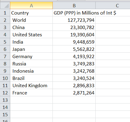
The Top 10 Countries by GDP (PPP) in 2017, according to the World Bank
If you’ve been following the wellsrPRO Training Program, you’ll recognize we’ve been interacting with Wikipedia a lot lately as part of our VBA webscraping tutorials.
To add this data to our charts, we simply use the SetSourceData method of the chart object we created earlier. In this example, we’re assuming our data is stored on a worksheet named GDP Data . You can change the name to match the sheet associated with your data.
Remember, oChartObj is a ChartObject, which is not the same as the chart itself. Thus we need to access the chart embedded in the ChartObject object to set the data. That’s why you see the .Chart. in the middle of the dot notation for the Embedded Chart. On the other hand, oChartSheet is itself a Chart object, so we don’t need to drill down to define it.
Once we’re done adding the data to our two Excel chart types, we end up with these two figures:
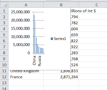
The (rather small) embedded chart
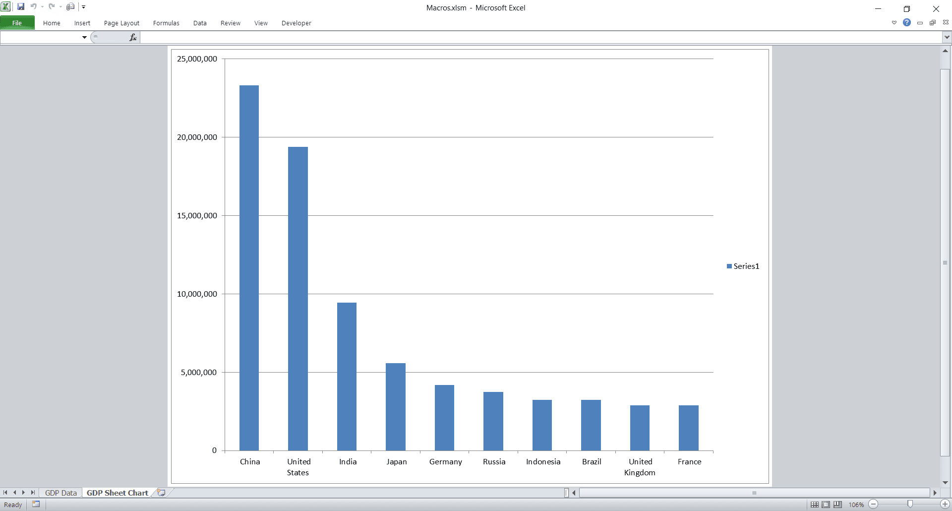
The Chart Sheet version of the GDP Data
Adding Data to Scatter Plots
Adding data to scatter plots is a bit different. Since scatter plots have a defined X-axis and Y-axis, you have to add each new series individually and then modify their corresponding X and Y values. We have a dedicated tutorial for controlling scatter plots with VBA, but we’ll show you the basics here.
The example above doesn’t use the same GDP data we assumed above. We just made up a set of data with numbers for the X-axis and the Y-axis.
Notice how much the syntax for adding data to a scatter plot differs from adding data to a bar chart. To add data to a scatter plot using VBA, you must complete all these steps:
- Change the chart type to xlXYScatter
- Add a new series to the scatter plot using the SeriesCollection.NewSeries method
- Set the X-axis data for the newly added series using the .XValues property
- Set the Y-axis data for the newly added series using the .Values property
Because we only added one series to our data, we’re able to access the data using the SeriesCollection(1) collection. If we wanted to add a second series, we would have to call the .SeriesCollection.NewSeries method twice and then change the 1 to a 2 in the other lines.
Accessing the Charts
Before we continue, we should learn how to properly access our charts using VBA. If you’ve been following along and have had to rerun macros, you’ve probably created a bunch of charts already. We only want one, so let’s look at accessing the charts we already created so we don’t have to keep creating new ones every time we run a subroutine.
Chart Sheet Style
Accessing a chart sheet is as simple as setting the chart to your object without the Add method:
If you look at the screenshots above, you can see I’ve changed the name of the chart sheet to GDP Sheet Chart . You would change that string to whatever you named your chart sheet tab in Excel. You could also refer to your chart sheet using an item number, but I find it very confusing to identify my charts via numbers, especially as you start to add multiple charts.
The variable oChartsht now gives us direct access to the chart on its own sheet. Any time we need to manipulate that particular chart, we just reference the oChartsht variable.
Embedded Chart Style
Since embedded charts live on worksheets, we can only find them via the parent worksheet. Unfortunately, embedded charts are not constituents of the Charts collection. That collection only holds sheet-style charts.
Now oChart allows us to directly access the chart of the first item of the ChartObjects collection (on the GDP Data sheet). Notice how the chart numbering starts at 1. This is one of the few areas in VBA where the number doesn’t start at 0, so keep this in mind when programming with charts.
As long as we only have one chart on our sheet, the macro we used will grant access to the correct chart. If there are more charts, you will need to find the right number in the collection. If all your charts are unnamed, you can typically find the correct number by selecting your chart and viewing the name in the upper left of Excel.
Manipulating Charts
There are plenty of properties and methods for controlling charts in VBA. We’ll look at the ones necessary to make your charts look nice. If you’ve declared your variables, I encourage you to use Intellisense to play around with the other methods and properties.
Changing the Chart Type
Maybe you don’t like the default bar chart for GDP figures and you’d rather a pie chart. Excel certainly offers pie charts, and you can easily change your chart style in VBA. Note that oChart is now directly accessing the chart, regardless of whether it is living in a container or living on its own sheet. That means the code below will work for both embedded charts and chart sheets, as long as the variable oChart is how you told VBA to access your charts. If you’ve been following the snippets in this tutorial, your chart sheet name is probably oChartsht , so you’d just replace oChart with oChartsht .
There are tons of different chart types in Excel. You can easily scroll through them with Intellisense, since their names accurately describe the chart types. You can use the Enumeration number associated with the chart types directly in your code if you want to irritate future coders, but I suggest using the human-recognizable names (like xlPie).
Here are a few of the most common VBA chart types:
| xlChartType Name | Corresponding Value | Description |
|---|---|---|
| xlColumnClustered | 51 | Clustered Column. |
| xlColumnStacked | 52 | Stacked Column. |
| xlColumnStacked100 | 53 | 100% Stacked Column. |
| xlBarClustered | 57 | Clustered Bar. |
| xlBarStacked | 58 | Stacked Bar. |
| xlBarStacked100 | 59 | 100% Stacked Bar. |
| xlLine | 4 | Line. |
| xlLineStacked | 63 | Stacked Line. |
| xlLineStacked100 | 64 | 100% Stacked Line. |
| xlLineMarkers | 65 | Line with Markers. |
| xlLineMarkersStacked | 66 | Stacked Line with Markers. |
| xlLineMarkersStacked100 | 67 | 100% Stacked Line with Markers. |
| xlPie | 5 | Pie. |
| xlPieOfPie | 68 | Pie of Pie. |
| xlPieExploded | 69 | Exploded Pie. |
| xlXYScatter | -4169 | Scatter. |
| xlXYScatterSmooth | 72 | Scatter with Smoothed Lines. |
| xlXYScatterSmoothNoMarkers | 73 | Scatter with Smoothed Lines and No Data Markers. |
| xlXYScatterLines | 74 | Scatter with Lines. |
| xlXYScatterLinesNoMarkers | 75 | Scatter with Lines and No Data Markers. |
Has Properties
There are four “has” properties. “Has” properties are boolean properties that simply show or hide certain elements. These four properties are:
If you set these to true, you can then manipulate each element (each of which has several properties itself). For example, you can change the title like this:
Titles
The ChartTitle property actually has properties and methods of its own, so you can manipulate things like the titles height, position, and the color of the title.
Another example of objects within objects within objects is the Legend. You could use this code to change the sizes of the legend entries:
and you end up with this output:
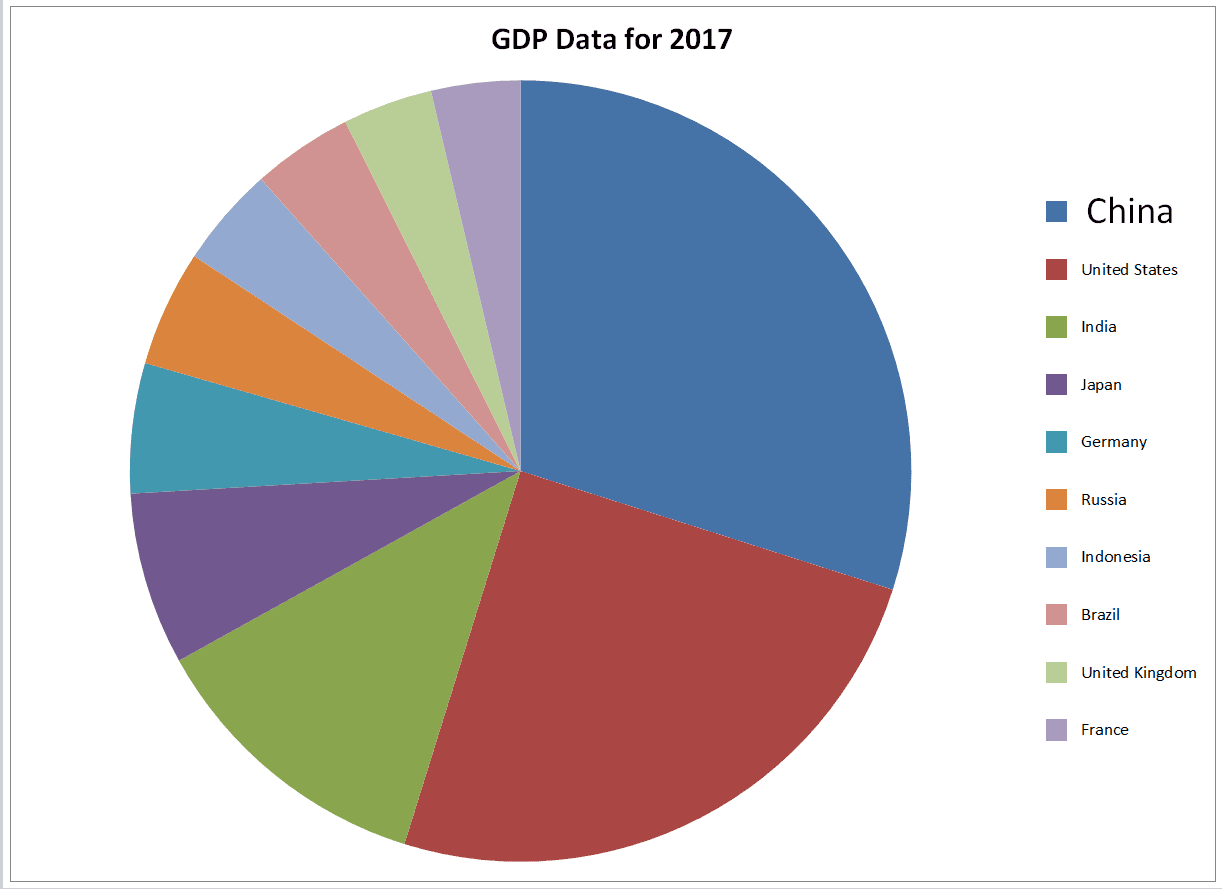
Notice how the first legend entry, China, has a bigger font than the other legend entries.
You can manipulate the axes through the Axes() method, as well. To modify the axes, you must specify which axis you want to change (category, series, or value), then you can change their properties.
For example, you might want to add labels like this:
This macro adds titles to our chart and then changes the title on the category axis to Country and the title on the value axis to GDP (PPP) in Millions of Int $ . These strings represent the values of cells A1 and B1 on our GDP worksheet.
Use of xlValue and xlCategory
The reason we use xlValue and xlCategory is due to their representations on the visible charts. From math classes, many of us probably remember the x-axis as the horizontal axis and the y-axis as the vertical one.
However, consider how a xlBarStacked chart differs from an xlColumnStacked chart. In our GDP example, these two chart types swap the x and y axes, but the “values” and “categories” remain static. To see this in action, we can use our handy immediate window. Enter the following line of code in your immediate window and press Enter:
This line of debug code is a bit long, but it’s useful. It switches between the two chart types and prints out the text of the “values” axis title. If we had an x/y scheme (with the typical horizontal/vertical orientation), we would have different values (“dollars” and “country”). But if you run this in the immediate window, you’ll end up with GDP (PPP) in Millions of Int $ twice.
The two charts look like this:
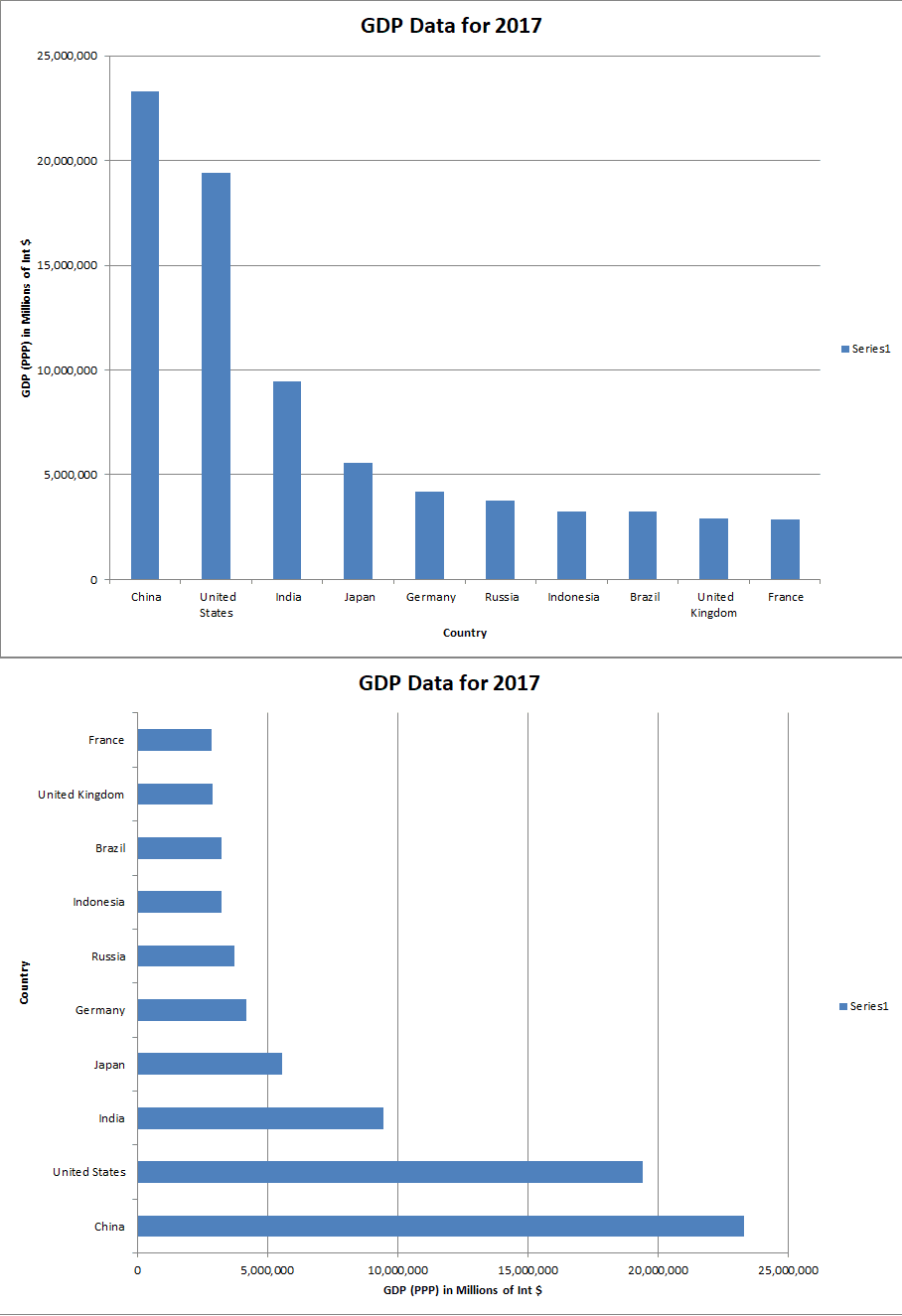
Column on the Top and Bar on the Bottom
Note the change in orientation and axis location
The key takeaway is the xlvalue axis title is the same, even though the two chart orientations differ.
The label “x-axis” is not a magical one, and it might be better to think of axis labels in terms of mapping. The category variable will map (go to) the value variable (category –> value). In other words, we start with the category variable and end up with the value variable. The orientation is irrelevant.
What about scatterplots, which explicitly reference X and Y axes? Well, there is not really a “mapping” relationship and the mapping concept we just introduced won’t really work. For instance, in height versus weight data, we cannot simply use one or the other as the independent, original variable.
For scatter plots, a bit of memorization will suffice: just access the horizontal axis (x) with xlCategory and the vertical axis (y) with xlValue . Thus if you have height data on the horizontal axis, you can use oChart.Axes(xlCategory).AxisTitle.Text = «Height» to label the horizontal axis «Height» . Remember to make sure the HasTitle property is set to true first!
Practicality
We’ve really only scratched the surface of chart manipulation in VBA. So far it has been somewhat tedious to write code to do things that could easily be done manually — and perhaps more easily — through the GUI.
So why make charts programmatically at all? Well, using the legends section, one example could be to calculate each entry’s share of the group’s GDP, read off the colors used by Excel in the graph itself, and then color and size the legend entries accordingly. This would take a lot of work to do by hand, but a VBA macro can do this for you in a few milliseconds. Once you spend the time writing the code the first time, you’ll be able to recycle it for future chart manipulations.
If you build up a lot of code with a variety of formats, you could consistently generate presentation-level material very easily each time you had a new set of data. This is particularly useful if your coworker sends you 10 hideous charts and you have an important sales presentation with a client in 30 minutes…
Another possible reason to use VBA for chart generation is if you have large numbers of frequently-changing charts. Imagine a part of your job is to scrape websites for data that change every day, create charts based on the data, then send them off via email. VBA could automate the entire process for you, so you can step away and enjoy your coffee break.
One of the coolest reasons for making charts with Excel VBA is the prospect of making interactive charts. For example, you could pair a chart manipulation macro with a form control listbox macro to change the source data based on a dropdown menu. The possibilities are endless when you start stacking VBA skills like this.
That’s all for this tutorial. When you’re ready to take your VBA to the next level, subscribe using the form below.
Ready to do more with VBA?
We put together a giant PDF with over 300 pre-built macros and we want you to have it for free. Enter your email address below and we’ll send you a copy along with our VBA Developer Kit, loaded with VBA tips, tricks and shortcuts.
Before we go, I want to let you know we designed a suite of VBA Cheat Sheets to make it easier for you to write better macros. We included over 200 tips and 140 macro examples so they have everything you need to know to become a better VBA programmer.
This article was written by Cory Sarver, a contributing writer for The VBA Tutorials Blog. Visit him on LinkedIn and his personal page.
Источник