
Содержание
- Свойство caption (Microsoft Forms)
- Синтаксис
- Settings
- Замечания
- См. также
- Поддержка и обратная связь
- VBA Excel. Элемент управления Label (метка, надпись)
- Элемент управления Label
- Свойства элемента Метка
- Примеры кода VBA с Label
- UserForm and its Properties Excel VBA
- Name Property
- Accelerator Property:
- BackStyle Property:
- BorderColor Property:
- ControlSource Property:
- ControlTipText Property:
- MouseIcon Property:
Свойство caption (Microsoft Forms)
Описательный текст, появляющийся на объекте, чтобы определить или описать его.
Синтаксис
object. Заголовок [= строка ]
Синтаксис свойства Caption состоит из следующих частей:
| Part | Описание |
|---|---|
| object | Обязательно. Допустимый объект. |
| String | Необязательный параметр. Строковое выражение, оцениваемое как текст, отображаемый в качестве заголовка. |
Settings
Параметром по умолчанию для элемента управления является уникальное имя, основанное на типе элемента управления. Например, CommandButton1 — это заголовок по умолчанию для первой кнопки команды в форме.
Замечания
Этот текст идентифицирует или описывает объект, с которым он связан. Для кнопок и меток свойство Caption определяет текст, появляющийся в элементе управления. Для объектов Page и Tab это свойство определяет текст, появляющийся на вкладке.
Если заголовок элемента управления оказывается слишком длинным, заголовок усекается. Если заголовок формы оказывается слишком длинным для строки заголовка, заголовок отображается с многоточием.
Свойство ForeColor элемента управления определяет цвет текста заголовка.
Если у элемента управления есть свойства Caption и AutoSize, задание для свойства AutoSize значения True автоматически настраивает размер элемента управления так, чтобы в нем помещался весь заголовок.
См. также
Поддержка и обратная связь
Есть вопросы или отзывы, касающиеся Office VBA или этой статьи? Руководство по другим способам получения поддержки и отправки отзывов см. в статье Поддержка Office VBA и обратная связь.
Источник
VBA Excel. Элемент управления Label (метка, надпись)
Элемент управления пользовательской формы Label, применяемый в VBA Excel для отображения надписей, меток, информационного текста. Свойства Label, примеры кода.
Элемент управления Label
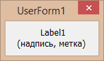
Элемент управления Label, как и другие элементы управления, реагирует на нажатия мышью, то есть его можно использовать для запуска подпрограмм, изменения собственных свойств, свойств пользовательской формы и других элементов управления.
Свойства элемента Метка
| Свойство | Описание |
|---|---|
| AutoSize | Автоподбор размера надписи. True – размер автоматически подстраивается под длину набираемой строки. False – размер элемента управления определяется свойствами Width и Height. |
| Caption | Текст надписи (заголовок). |
| ControlTipText | Текст всплывающей подсказки при наведении курсора на метку. |
| Enabled | Возможность взаимодействия пользователя с элементом управления Label. True – взаимодействие включено, False – отключено (цвет текста становится серым). |
| Font | Шрифт, начертание и размер текста надписи. |
| Height | Высота элемента управления. |
| Left | Расстояние от левого края внутренней границы пользовательской формы до левого края элемента управления. |
| Picture | Добавление изображения вместо текста метки или дополнительно к нему. |
| PicturePosition | Выравнивание изображения и текста в поле надписи. |
| TabIndex | Определяет позицию элемента управления в очереди на получение фокуса при табуляции, вызываемой нажатием клавиш «Tab», «Enter». Отсчет начинается с 0. |
| TextAlign* | Выравнивание текста надписи: 1 (fmTextAlignLeft) – по левому краю, 2 (fmTextAlignCenter) – по центру, 3 (fmTextAlignRight) – по правому краю. |
| Top | Расстояние от верхнего края внутренней границы пользовательской формы до верхнего края элемента управления. |
| Visible | Видимость элемента управления Label. True – элемент отображается на пользовательской форме, False – скрыт. |
| Width | Ширина элемента управления. |
| WordWrap | Перенос текста надписи на новую строку при достижении ее границы. True – перенос включен, False – перенос выключен. |
* При загруженной в надпись картинке свойство TextAlign не работает, следует использовать свойство PicturePosition.
Свойство по умолчанию для элемента Label – Caption, основное событие – Click.
В таблице перечислены только основные, часто используемые свойства надписи. Все доступные свойства отображены в окне Properties элемента управления Label.
Примеры кода VBA с Label
Пример 1
Загрузка элемента управления Label на пользовательскую форму с параметрами, заданными в коде VBA Excel:
Источник
UserForm and its Properties Excel VBA
UserForm and its Properties
Userform has certain properties that can be viewed as category wise (based on appearance, behavior, font) or in an alphabetic manner. The property window is used to set or edit the features as per the user’s needs and requirements. To change or modify, click on the property and amend it in its right column.
Name Property
This property is used to set the name of the control as per the user’s ease and understanding. The Name Property of a userform can only be specified at the design time (not in the run time), whereas the Name property for controls can be specified for both at design-time or run-time. Once the control name is set at design time, it can’t be altered at the run time. But, if the user is introducing the control at design-time, he can’t change the name at run-time. The default name for the controls are «UserForm1», “CheckBox1”, “OptionButton1”, “TextBox1”, and so on.
The name can be changed by clicking on the name property and setting the name in its right column. Though there are certain rules to specify the name which are as follows:
- The name should start with a letter.
- It can have a combination of alphabets, underscores, and numbers.
- You can’t use Spacing or Symbols to define the name
- The name can have a maximum length of 40 characters.
- For easier readability, the characters next to the prefix can begin with a capital letter.
Caption Property
This property is used to define the UserForm’s or Control’s user visibility name in text format. The name property is used internally in the VBA programming, whereas the caption property the name is displayed to the user on the userform. It can accept any letter, numbers, spaces, underscores, and symbols. You can edit the caption by clicking on Caption Property in the properties window and can amend the caption name in its right column. You can re-write the Caption for Userform, Label, CommandButton & ToggleButton control, Tab, Page, etc,. The Caption property can be specified at the design time (in the Properties window) or at run time (through VBA code). The syntax is as follows:
Syntax for VBA code
obj.Caption = CaptionName.
Height, Width Properties
This property is used to set the height and width of the userform and its controls. You can customize the size by manually entering it in the height, width property in the properties window. For height and width property, the values are set in points. It can’t accept negative values. Hence, the entered values should be greater or equal to zero. The height width can also be resized by using size handles. Select the control, the point will automatically change to an arrow. You can drag or minimize the arrow as per your requirement, and once done later you can release the mouse. This property is applicable to all the controls including the userform.
This property can be specified either at design time (through property window) or at run time (with VBA code).
Syntax for VBA code:
obj.Height = NumValue;
obj.Width = NumValue.
Left, Top Properties
The Left Property determines the measurement of the left edge of the control with respect to the Userform container. In contrast, the Top Property determines the measurement of the top edge of the control and with respect to the userform container. The Left, Top values is set in pixels in the property window. If any of the values (either for left or for Top) are set to zero, the control will appear at the left edge or top edge of the userform that contains it. The left or top can also be resized by using size handles. Select the control, the point will automatically change to an arrow. You can drag or minimize the arrow as per your requirement, and once done later, you can release the mouse. This property is applicable to all the controls, including the userform.
This property can be specified either at design time (through property window) or at run time (with VBA code).
Syntax for VBA code:
obj.Left = NumValue;
obj.Top = NumValue.
Value Property
This property evaluates the selection position of control and displays its content. Value property has different values with respect to various controls. For the controls CheckBox, OptionButton, and ToggleButton, the integer value of -1 represents True (the control is selected), integer 0 value means False (the control is cleared) and the Null value will be displayed as shaded as it neither represents selection nor the control clear. For ScrollBar and SpinButton, this property will take integer values set in Max and Min property. This property applies to the userform and all controls except Frame, Label, and Image.
This property can be specified either at design time (through property window) or at run time (with VBA code).
Syntax for VBA code:
Accelerator Property:
Accelerator property is used to set the key to access a specified control. It is also known as an accelerator key or access key. To use the accelerator key, a single character is pressed in combination with the Alt key. Accelerator property focuses on control and initiates the Click event. For example, you can use the ‘enter command’ by setting the accelerator key to ‘E ‘and pressing it along with ALT (ALT + E). It is not case-sensitive as the same key is pressed for capital and small. This property is only applicable to the Label, CheckBox, OptionButton, CommandButton, ToggleButton, and MultiPage controls.
Alignment Property:
This property is used to set the placement of the caption with respect to the control. Two alignments are available:
- fmAlignmentLeft – It represents value 0 where the caption is aligned to the left of the control.
- (ii) fmAlignmentRight (default value) — It represents value 1 where the caption is aligned to the right of the control.
Thisproperty is applicable to OptionButton, CheckBox, and ToggleButton.
AutoSize Property:
This parameter specifies whether the control displaying the entire content should be resized automatically or not. If this property is set a to Boolean value TRUE, it will automatically resize the given control as per the content’s size else for Boolean FALSE (Default option) it will keep the size of the control as it is. Thisproperty is applicable to the TextBox, Label, CommandButton, ComboBox, CheckBox, ToggleButton, OptionButton, Image, and RefEdit.
BackColor Property:
This property is used to set the background color for controls of the UserForm. To implement the BackColour property you must make sure that the BackStyle property’s background style is set to opaque background (fmBackStyleOpaque). This property is applicable to all controls.
BackStyle Property:
This parameter is used to set the background of Controls with Opaque or Transparent parameters. It can be set for the following background style for an object:
- fmBackStyleTransparent: It represents value 0 wherein the background style is transparent, and everything is visible behind the control on a UserForm.
- fmBackStyleOpaque (default value): It represents value 1 where the background style is opaque, and nothing is visible at the back of the control on a UserForm. To implement the BackColour property you must make sure that the BackStyle property’s background style is set to opaque background (fmBackStyleOpaque).
This property is applicable to the Label, CommandButton, TextBox, ComboBox, CheckBox, ToggleButton, OptionButton, Image, and RefEdit.
BorderColor Property:
As the name specifies, this property is used to set the border color for UserForm and its controls. To implement the border colour property the BorderStyle property should be set to a non-zero value (fmBorderStyleNone), for any other this property will have no effect. This property is applicable to Label, ComboBox, TextBox, ListBox, Image, Frame, and RefEdit.
BorderStyle Property:
This property is used to specify the type of border for control or the userform. It has two settings:
- fmBorderStyleNone: It represents value 0 and have no border
- fmBorderStyleSingle (default value): It represents value 1 and have a single-line border. The BorderStyle specifies its border colors using the BorderColor Property. To define the border colour over any control or form the BorderStyle property should be set to a value greter or small than 0 (fmBorderStyleNone) . The SpecialEffect property is used to specify the border for a control.
This property is applicable to TextBox, ListBox, Label, ComboBox, Image, Frame, and RefEdit.
ControlSource Property:
This property is used to set or store the Value property of a control in the Userform and mentions a cell or field. Any change in the control’s value will update its linked cell, and similarly, a change in linked cells will automatically update its control value.
This property is applicable to ComboBox, TextBox, ListBox, OptionButton, CheckBox, ToggleButton, SpinButton, and ScrollBar.
ControlTipText Property:
This property is used to display the text whenever the user points and hovers over a control. This property is helpful in educating the users by giving tips or explanations on using the control. The default value is set to an empty string (no text will be displayed). This property is applicable to the Userform and all its controls.
Enabled Property:
This parameter is used to check whether a control can be edited through a VBA code and thus can react to customized events. If this parameter is set to the Boolean value TRUE (default value), the user can interact and edit the controls through VBA else for Boolean FALSE, all the controls get disabled, and they can’t be accessed through VBA.
This property is applicable to all controls and UserForm.
Locked Property:
This parameter is used to check whether the control could be edited or not. If it is set to a Boolean value TRUE, it signifies that the control is locked and is no more editable else for a Boolean False the control can be edited.
This property applies to the controls TextBox, ListBox, ComboBox, CheckBox, OptionButton, CommandButton, ToggleButton, and RefEdit.
Font Object:
This property defines the kind of font used in userform or in controls. You can easily play around with the font by specifying its font name, font style, font size. The fonts set for a UserForm is applicable to all its controls unless you separately mention the font for the specific control. This property is applicable to all controls except SpinButton, ScrollBar, and Image.
ForeColor Property:
This property controls the foreground color to be displayed in the text. It specifies the text, arrows (only for ScrollBar and SpinButton), and caption’s color for controls and userform. This property is applicable to UserForm, and its all controls except the image.
MouseIcon Property:
This property sets an image to control, which gets displayed whenever the mouse pointer is mover across the control. The assigned image is specified by the actual path and filename for the selected file. This property can only be used if the MousePointer property is set to value 99 (fmMousePointerCustom). This property applies to UserForm and all its controls, except the MultiPage property.
MousePointer Property:
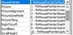
This property determines the sort of mouse pointer that would be displayed when the user moves the mouse over a control. There are 15 settings:
- fmMousePointerDefault (default value) – It is the standard default pointer set by value 0
- fmMousePointerArrow – It represents an arrow and is set by value 1.
- fmMousePointerCross – It is a cross-hair pointer and is set by 2.
- fmMousePointerIBeam – It represents I-Beam set by value 3.
- fmMousePointerSizeNESW – It represents a two-headed arrow indicating towards the northeast and southwest direction. It is set by value 6.
- fmMousePointerSizeNS – It represents a two-headed arrow indicating towards the north and south direction. It is set by 7.
- fmMousePointerSizeNWSE – It is a two-headed arrow indicating towards northwest and southeast direction and is set by value 8.
- fmMousePointerSizeWE – It is a two-headed arrow indicating towards west and east direction. It is set by value 9.
- fmMousePointerUpArrow (value 10) – It represents an up arrow and is set by value 10.
- fmMousePointerHourglass – It represents hourglass and is set by value 11.
- fmMousePointerNoDrop – It represents a circle with a diagonal line and is set by value 12.
- fmMousePointerAppStarting – It represents an arrow and hourglass. It will set by value 13.
- fmMousePointerHelp – It represents an arrow and question mark and is set by value 14.
- fmMousePointerSizeAll – It represents a four-headed arrow, indicating towards north, south, east, and west direction. It is set by value 15.
- fmMousePointerCustom – It represents an image by the MouseIcon property. It is set by value 99.
This property applies to UserForm and all its controls, except for the MultiPage property.
Picture Property:
The picture property determines the picture to be displayed on the control where the picture is assigned by specifying the path and filename of the file it is in. To remove any picture, press the DELETE button instead of pressing the BACKSPACE button (it will not remove). This property applies CheckBox, Label, OptionButton, ToggleButton, CommandButton, MultiPage, Frame, and Image.
PictureAlignment Property:
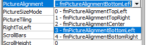
This property is used to determine the alignment of the picture with its caption. This property will be disabled and have no effect if no picture to be displayed is not specified. There are few settings for this property which specifies the position of the caption with respect to the image:
- fmPictureAlignmentTopLeft (value 0)
- fmPictureAlignmentTopRight (value 1)
- fmPictureAlignmentCenter (value 2)
- fmPictureAlignmentBottomLeft (value 3)
- fmPictureAlignmentBottomRight (value 4)
This property applies to CheckBox, Label, ToggleButton, OptionButton, and CommandButton.
SpecialEffect Property:
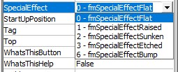
This property defines visual appearance (Flat, Raised, Hollow, Bump, Etched) of a control. This property sets the border colors by using system colors. The SpecialEffect property can’t be used with Borderstyle property. If a non-zero value is set for either one of the properties, the other would be automatically set to zero. It has the following settings:
- fmButtonEffectFlat; It is used for optionbutton, checkbox, and togglebutton and is set by value 0.
- fmButtonEffectSunken (Default value) — It is used for optionbutton, checkbox, and togglebutton and is set by value 1.
- fmSpecialEffectFlat (default) – This setting is used for UserForm and the controls Image and Labe and is set by value 0.
- fmSpecialEffectRaised — This setting is used for UserForm and the controls Image and Labe and is set by value 1.
- fmSpecialEffectSunken – This is used for controls TextBox, ComboBox, and ListBox, and is set by value 2.
- fmSpecialEffectEtched (default value) – This is used for Frame and is set to value 3.
- fmSpecialEffectBump — This is used for Frame and is set to value 6.
This property applies to only Label, ComboBox, TextBox, ListBox, CheckBox, ToggleButton, Frame, OptionButton, Image, and RefEdit.
TabStop Property:
This property determines the selection criteria for control with the tab key. If it is set with a Boolean value TRUE (default value), the control will be act as tab stops else for Boolean False; the control will be ignored and its position in the tab order stays intact.
This applies to all controls except for the Label and Image control.
Visible Property:
This property specifies the visibility for control in the form. If it is set to the Boolean value TRUE (default value), and the control is visible else for Boolean False, the control will be hidden. This property can be used to display a hidden control only if any condition is satisfied else the control would remain hidden. This property is applicable to all controls and userform.
WordWrap Property:
This property wraps the text of the control to the next line. WordWrap property will perform the action if it is set to Boolean TRUE, else for Boolean FALSE, it is disabled. Also, if the UserForm’s MultiLine property is set to False, WordWrap will be automatically disabled. This property applies to the controls TextBox, Label, CheckBox, ToggleButton, CommandButton, OptionButton, and RefEdit.
Источник
UserForm and its Properties
Userform has certain properties that can be
viewed as category wise (based on appearance, behavior, font) or in an
alphabetic manner. The property window is used to set or edit the features as
per the user’s needs and requirements. To change or modify, click on the
property and amend it in its right column.
Name Property
This property is used to set the name of the control as per the
user’s ease and understanding. The Name Property of a userform can only be
specified at the design time (not in the run time), whereas the Name property for controls can be specified for
both at design-time or run-time. Once the control name is set at design time,
it can’t be altered at the run time. But,
if the user is introducing the control at design-time, he can’t change the name
at run-time. The default name for the controls are «UserForm1»,
“CheckBox1”, “OptionButton1”, “TextBox1”, and so on.
The name can be changed by clicking on the name property and setting
the name in its right column. Though there are certain rules to specify the
name which are as follows:
- The name should start with a letter.
- It can have a combination of alphabets, underscores,
and numbers. - You can’t use Spacing or Symbols to define the name
- The name can have a maximum length of 40 characters.
- For easier readability, the characters next to the prefix
can begin with a capital letter.
Caption Property
This property is used to define the UserForm’s or Control’s user visibility name in text format. The
name property is used internally in the VBA programming, whereas the caption
property the name is displayed to the user on the userform. It can accept any
letter, numbers, spaces, underscores, and symbols. You can edit the caption by
clicking on Caption Property in the properties window
and can amend the caption name in its right column. You can re-write the Caption for Userform, Label, CommandButton &
ToggleButton control, Tab, Page, etc,. The Caption property can be specified at
the design time (in the Properties window) or at run time (through VBA code).
The syntax is as follows:
Syntax for VBA code
obj.Caption = CaptionName.
Height, Width Properties
This property is used to set the height and width of the userform
and its controls. You can customize the size by manually entering it in the
height, width property in the properties window. For height and width property,
the values are set in points. It can’t accept negative values. Hence, the
entered values should be greater or equal to zero. The height width can also be
resized by using size handles. Select the control, the point will automatically
change to an arrow. You can drag or minimize the arrow as per your requirement,
and once done later you can release the mouse. This property is applicable to
all the controls including the userform.
This property can be specified either at design time (through
property window) or at run time (with VBA code).
Syntax for VBA code:
obj.Height = NumValue;
obj.Width = NumValue.
Left, Top Properties
The Left Property
determines the measurement of the left edge of the control with respect to the
Userform container. In contrast, the Top Property determines the
measurement of the top edge of the control and with respect to the userform container.
The Left, Top values is set in pixels in the property window. If any of the values (either for left or for
Top) are set to zero, the control will appear at the left edge or top edge of
the userform that contains it. The left or top can also be resized by using
size handles. Select the control, the point will automatically change to an
arrow. You can drag or minimize the arrow as per your requirement, and once
done later, you can release the mouse. This property is applicable to all the
controls, including the userform.
This property can be specified either at design time (through
property window) or at run time (with VBA code).
Syntax for VBA code:
obj.Left = NumValue;
obj.Top = NumValue.
Value Property
This property evaluates the selection position of control and
displays its content. Value property has different values with respect to various
controls. For the controls CheckBox, OptionButton, and ToggleButton, the
integer value of -1 represents True (the control is selected), integer 0 value
means False (the control is cleared) and the Null value will be displayed as
shaded as it neither represents selection nor the control clear. For ScrollBar
and SpinButton, this property will take integer values set in Max and Min
property. This property applies to the userform
and all controls except Frame, Label, and Image.
This property can be specified either at design time (through
property window) or at run time (with VBA code).
Syntax for VBA code:
obj.Value = VariantValue.
Accelerator Property:
Accelerator property is used to set the key to access a specified
control. It is also known as an accelerator
key or access key. To use the accelerator key, a single character is pressed in
combination with the Alt key. Accelerator property focuses on control and
initiates the Click event. For example, you can use the ‘enter command’ by
setting the accelerator key to ‘E ‘and pressing it along with ALT (ALT + E). It
is not case-sensitive as the same key is pressed for capital and small. This property
is only applicable to the Label, CheckBox, OptionButton, CommandButton, ToggleButton,
and MultiPage controls.
Alignment Property:
This
property is used to set the placement of the caption with respect to the
control. Two alignments are available:
- fmAlignmentLeft
– It represents value 0 where the caption is aligned to the left of the control. - (ii)
fmAlignmentRight (default value) — It represents value 1 where the caption is
aligned to the right of the control.
Thisproperty is applicable to OptionButton, CheckBox, and ToggleButton.
AutoSize Property:
This
parameter specifies whether the control displaying the entire content should be
resized automatically or not. If this property is set a to Boolean value TRUE,
it will automatically resize the given control as per the content’s size else
for Boolean FALSE (Default option) it will keep the size of the control as it
is. Thisproperty is applicable to the TextBox, Label, CommandButton, ComboBox,
CheckBox, ToggleButton, OptionButton, Image, and RefEdit.
BackColor Property:
This
property is used to set the background color for controls of the UserForm. To
implement the BackColour property you must make sure that the BackStyle property’s
background style is set to opaque background (fmBackStyleOpaque). This property
is applicable to all controls.
BackStyle Property:
This parameter is used to set the background of Controls with
Opaque or Transparent parameters. It can be set for the following background
style for an object:
- fmBackStyleTransparent: It represents value 0 wherein
the background style is transparent, and everything is visible behind the
control on a UserForm. - fmBackStyleOpaque (default value): It represents value
1 where the background style is opaque, and nothing is visible at the back of
the control on a UserForm. To implement the BackColour property you must make
sure that the BackStyle property’s background style is set to opaque
background (fmBackStyleOpaque).
This property is applicable to the Label, CommandButton, TextBox,
ComboBox, CheckBox, ToggleButton, OptionButton, Image, and RefEdit.
BorderColor Property:
As the name specifies, this property is used to set the border
color for UserForm and its controls. To implement the border colour property
the BorderStyle property
should be set to a non-zero value (fmBorderStyleNone), for any other this property
will have no effect. This property is applicable to Label, ComboBox, TextBox,
ListBox, Image, Frame, and RefEdit.
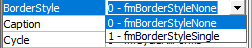
BorderStyle Property:
This property is used to specify the type of border for control or
the userform. It has two settings:
- fmBorderStyleNone: It represents value 0 and have no
border - fmBorderStyleSingle (default value): It represents value
1 and have a single-line border. The BorderStyle specifies its border colors using
the BorderColor Property. To
define the border colour over any control or form the BorderStyle property
should be set to a value greter or small than 0 (fmBorderStyleNone) . The SpecialEffect property
is used to specify the border for a control.
This property is applicable to TextBox,
ListBox, Label, ComboBox, Image, Frame, and RefEdit.
ControlSource Property:
This property is used to set or store the Value property of a
control in the Userform and mentions a cell or field. Any change in the
control’s value will update its linked cell, and similarly, a change in linked
cells will automatically update its control value.
This property is applicable to ComboBox, TextBox, ListBox, OptionButton,
CheckBox, ToggleButton, SpinButton, and ScrollBar.
ControlTipText Property:
This property is used to display the text whenever the user points
and hovers over a control. This property is helpful in educating the users by
giving tips or explanations on using the control. The default value is set to
an empty string (no text will be displayed). This property
is applicable to the Userform and all its controls.
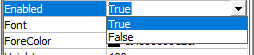
Enabled Property:
This parameter is used to check whether a control can be edited through
a VBA code and thus can react to customized events. If this parameter is set to
the Boolean value TRUE (default value), the user can interact and edit the
controls through VBA else for Boolean FALSE, all the controls get disabled, and
they can’t be accessed through VBA.
This property is applicable to all controls and UserForm.
Locked Property:
This parameter is used to check whether the control could be
edited or not. If it is set to a Boolean value TRUE, it signifies that the
control is locked and is no more editable else for a Boolean False the control
can be edited.
This property applies to the controls TextBox, ListBox, ComboBox,
CheckBox, OptionButton, CommandButton, ToggleButton, and RefEdit.
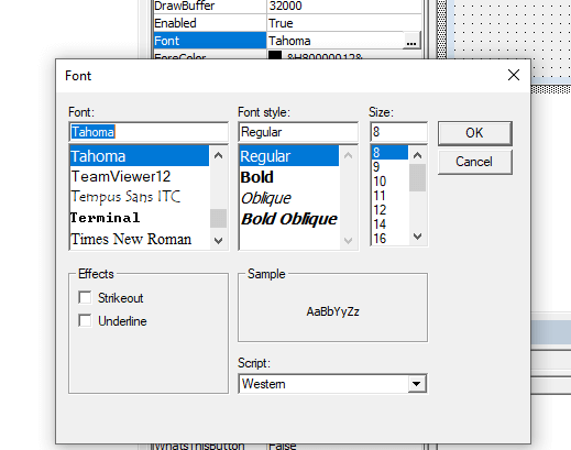
Font Object:
This property defines the kind of font used in userform or in
controls. You can easily play around with the font by specifying its font name,
font style, font size. The fonts set for a UserForm is applicable to all its
controls unless you separately mention the font for the specific control. This property is applicable to all
controls except SpinButton, ScrollBar, and Image.
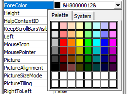
ForeColor Property:
This
property controls the foreground color to be displayed in the text. It
specifies the text, arrows (only for ScrollBar and SpinButton), and caption’s
color for controls and userform. This property is applicable to UserForm, and its
all controls except the image.
MouseIcon Property:
This
property sets an image to control, which gets displayed whenever the mouse pointer
is mover across the control. The assigned image is specified by the actual path
and filename for the selected file. This property can only be used if the MousePointer
property is set to value 99 (fmMousePointerCustom). This property applies
to UserForm and all its controls, except the MultiPage property.
MousePointer Property:
This
property determines the sort of mouse pointer that would be displayed when the
user moves the mouse over a control. There are 15 settings:
- fmMousePointerDefault
(default value) – It is the standard default pointer set by value 0 - fmMousePointerArrow
– It represents an arrow and is set by value 1. - fmMousePointerCross
– It is a cross-hair pointer and is set by 2. - fmMousePointerIBeam
– It represents I-Beam set by value 3. - fmMousePointerSizeNESW
– It represents a two-headed arrow indicating towards the northeast and
southwest direction. It is set by value 6. - fmMousePointerSizeNS
– It represents a two-headed arrow indicating towards the north and south
direction. It is set by 7. - fmMousePointerSizeNWSE
– It is a two-headed arrow indicating towards northwest and southeast direction
and is set by value 8. - fmMousePointerSizeWE
– It is a two-headed arrow indicating towards west and east direction. It is
set by value 9. - fmMousePointerUpArrow
(value 10) – It represents an up arrow and is set by value 10. - fmMousePointerHourglass
– It represents hourglass and is set by value 11. - fmMousePointerNoDrop
– It represents a circle with a diagonal line and is set by value 12. - fmMousePointerAppStarting
– It represents an arrow and hourglass. It will set by value 13. - fmMousePointerHelp
– It represents an arrow and question mark and is set by value 14. - fmMousePointerSizeAll
– It represents a four-headed arrow, indicating towards north, south, east, and
west direction. It is set by value 15. - fmMousePointerCustom
– It represents an image by the MouseIcon property. It is set
by value 99.
This property applies to UserForm and
all its controls, except for the MultiPage property.
Picture
Property:
The
picture property determines the picture to be displayed on the control where
the picture is assigned by specifying the path and filename of the file it is
in. To remove any picture, press the DELETE button instead of pressing the BACKSPACE
button (it will not remove). This property applies CheckBox, Label,
OptionButton, ToggleButton, CommandButton, MultiPage, Frame, and Image.
PictureAlignment Property:
This
property is used to determine the alignment of the picture with its caption. This
property will be disabled and have no effect if no picture to be displayed is
not specified. There are few settings for this property which specifies the
position of the caption with respect to the image:
- fmPictureAlignmentTopLeft (value
0) - fmPictureAlignmentTopRight (value
1) - fmPictureAlignmentCenter (value 2)
- fmPictureAlignmentBottomLeft
(value 3) - fmPictureAlignmentBottomRight
(value 4)
This
property applies to CheckBox, Label, ToggleButton, OptionButton, and
CommandButton.
SpecialEffect Property:
This
property defines visual appearance (Flat, Raised, Hollow, Bump, Etched) of a
control. This property sets the border colors by using system colors. The
SpecialEffect property can’t be used with Borderstyle property. If a non-zero value
is set for either one of the properties, the other would be automatically set
to zero. It has the following settings:
- fmButtonEffectFlat;
It is used for optionbutton, checkbox, and togglebutton and is set by value 0. - fmButtonEffectSunken
(Default value) — It is used for optionbutton, checkbox, and togglebutton and
is set by value 1. - fmSpecialEffectFlat
(default) – This setting is used for UserForm and the controls Image and Labe
and is set by value 0. - fmSpecialEffectRaised
— This setting is used for UserForm and the controls Image and Labe and is set
by value 1. - fmSpecialEffectSunken
– This is used for controls TextBox, ComboBox, and ListBox, and is set by value
2. - fmSpecialEffectEtched
(default value) – This is used for Frame and is set to value 3. - fmSpecialEffectBump
— This is used for Frame and is set to value 6.
This property
applies to only Label, ComboBox, TextBox, ListBox, CheckBox, ToggleButton, Frame,
OptionButton, Image, and RefEdit.
TabStop Property:
This
property determines the selection criteria for control with the tab key. If it
is set with a Boolean value TRUE (default value), the control will be act as
tab stops else for Boolean False; the control will be ignored and its position
in the tab order stays intact.
This
applies to all controls except for the Label and Image control.
Visible Property:
This
property specifies the visibility for control in the form. If it is set to the Boolean
value TRUE (default value), and the control is visible else for Boolean False,
the control will be hidden. This property can be used to display a hidden
control only if any condition is satisfied else the control would remain
hidden. This property is applicable to all controls and userform.
WordWrap Property:
This
property wraps the text of the control to the next line. WordWrap property will
perform the action if it is set to Boolean TRUE, else for Boolean FALSE, it is
disabled. Also, if the UserForm’s MultiLine property is set to False, WordWrap
will be automatically disabled. This property applies to the controls TextBox, Label,
CheckBox, ToggleButton, CommandButton, OptionButton, and RefEdit.
UserForm and Controls — Properties
———————————————————————-
Contents:
UserForm and Controls
Basic Properties common to the UserForm and most Controls
Other Properties common to the UserForm and most Controls
Specifying Color in Properties Window
Applicability of Properties to UserForm and its Controls — A SnapShot
———————————————————————-
UserForm acts as a container in which you add multiple ActiveX controls, each of which has a specific use and associated properties. By itself, a UserForm will not be of much use unless ActiveX controls are added to it which are the actual user-interactive objects. ActiveX controls can be used with VBA code or without, either directly on worksheets, while some can be used only on VBA UserForms. Using ActiveX Controls on a Worksheet have been illustrated in detail, in the separate section of «Excel VBA: ActiveX Controls, Form Controls & AutoShapes on a Worksheet».
Properties can be viewed in an alphabetical order or category wise by clicking the «Alphabetic» or «Categorized» options in the Properties Window, after selecting the respective Userform or Control. To set/edit, click on that property and make the change in its right column. For help on a Userform or Control property, in the Properties Window select the right column of that property and press F1.
Design-Time, Run-time and Break-time:
The time when an application is being developed in VBE (Visual Basic Environment) is termed as design-time. This is the time when you create a UserForm, add controls and set their properties. Run-time is the time when your code is being executed or the application is running. During this time the developer interacts with the application just like a user and the code cannot be edited then. Break-time is the time when an Application encounters any processing error that prevents the code from continuing or being executed further. Design-time manipulations are not permanent, while run-time are not. For ex, if you add a CheckBox in your code using the Add Method [Set ctrl = Controls.Add(«Forms.CheckBox.1»)], it will appear when the UserForm shows but when you return to VBE, the CheckBox will not be present. Similarly, if you set the Caption of an OptionButton in your code, the new set Caption will appear when the UserForm is displayed but will revert to its original in VBE. The ControlTipText property is set during design-time but is visible on the control during run-time only.
UserForm or Control properties can be set either at design-time or at run-time. Typically, a property which is dynamic is set at run-time and the more static ones at design-time. Name property of a UserForm can be set only at design-time and cannot be set at run-time. Though you can add, name and set properties of controls at run-time, these are mostly done at design-time itself, as these usually remain static while running a procedure. You might face some complications in adding controls and setting properties at run-time, hence only occasionally do you need to set properties at run-time to appropriately cope with a situation.
Setting control properties with vba:
If the code is in a procedure in the Code Module of the UserForm, use the vba syntax: Controlname.Property = Setting/Value
If the code is in a Standard Module or in the Code Module of a different UserForm, use vba syntax: UserFormName.Controlname.Property = Setting/Value
Examples of VBA Syntax:
Label1.Font.Name = «Arial»; Label1.ForeColor = RGB(255, 255, 0); OptionButton1.BackColor = 255; CheckBox1.Value = False; CheckBox1.Alignment = fmAlignmentLeft; TextBox1.MultiLine = True; TextBox1.WordWrap = True; TextBox1.ScrollBars = 2; OptionButton1.AutoSize = True; Me.TextBox1.Enabled = False; TextBox1.TextAlign = fmTextAlignLeft; TextBox1.Text = «Hello»; CommandButton1.Left = 50; TextBox1.MaxLength = 5; Note: Label1, TextBox1, CheckBox1, OptionButton1 & CommandButton1 are the Control names.
_______________________________________________________________________________
Basic Properties common to the UserForm and most Controls
Name Property
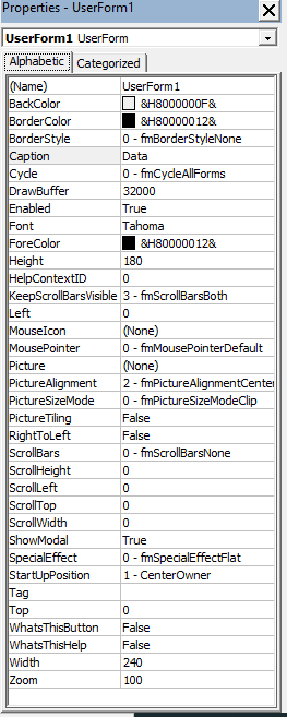
Use the Name property to specify a name for a control or to specify the font name (used in the text portion of a control). Name property of a UserForm can be set only at design-time and cannot be set at run-time. Name property for controls can be set either at design-time or at run-time, BUT if a control is added at design-time, its name cannot be changed at run-time. Typically, the default name of the first CheckBox created is CheckBox1, the default name of the second CheckBox will be CheckBox2, and so on, and similalry for other controls too. The default name of the first Userform you have created will be «UserForm1» (Image 1).
By clicking on «Name» in the Properties Window, you can edit the name. The name should begin with a letter, can have any combination of letters, numbers or underscores, cannot have spaces or symbols and can have a maximum length of 40 characters. It might be a good idea to have a 3-letter prefix in lower case, for each name, to identify and associate with its respective control. The characters following the prefix can start with a capital, for easier readibility. Typically, prefix used for different controls are: frm for UserForm; lbl for Label; txt for TextBox; cmb for ComboBox; lst for ListBox; chk for CheckBox; opt for OptionButton; fra for Frame; cmd for CommandButton; tbs for TabStrip; rfe for RefEdit; and so on.
Syntax for Font: Font.Name = String
Syntax for all other controls and objects: object.Name = String
The Name Property is applicable to the UserForm and to all controls.
—————————————————————————————————————
Caption Property
Caption is the text which describes and identifies a UserForm or Control. Typically, the default name and Caption of the first CheckBox created at design-time is CheckBox1, the default name and Caption of the second CheckBox will be CheckBox2, …; default name and caption of the first OptionButton is OptionButton1, …; default name and caption of the first CommandButton is CommandButton, …; and so on. The default caption of the first Userform you have created will be «UserForm1» (Image 1). By clicking on Caption in the Properties Window, you can edit the same, in its right column. The Caption will display in the header of the Userform; in re of Label, CommandButton & ToggleButton controls, Caption is the text which appears on the control; in re. of Tab and Page objects Caption is the text that appears on the tab; in re. of CheckBox & OptionButton Caption appears to the side (right or left, as determined by its Alignment property) of the control; in re. of a Frame control Caption appears on the top-left border of the control. Setting the AutoSize property to True (in a control which has both Caption & AutoSize properties), automatically adjusts the control to display the entire caption. Caption can be set in the Properties window or with vba code. Syntax: object.Caption = String.
Caption property is applicable to the UserForm and controls Label, CheckBox, OptionButton, ToggleButton, Frame, CommandButton, Tab (Tabstrip) and Page (MultiPage).
————————————————————————————————————-
Size and Position of a Control
Height, Width Properties:
Sets the the height or width, measured in points. You can manually enter the Height and Width in the Properties Window, or when you size a control, the Height and Width properties get updated automatically. For these properties, VBA only accepts values which are greater than or equal to zero. These properties can be set in the Properties window or with vba code. Syntax: object.Height = Number; object.Width = Number. You can also resize a control with a mouse in the following manner: select the control -> the mouse pointer will change to a two-headed arrow when positioned over the control’s handles (adjustment handles) which are in the middle or corner of its side borders -> adjust the horizontal or vertical size by using the appropriate side handles and to change both the horizontal & vertical size simultaneously use the corner handle -> click and drag handle to the required size and then release mouse button.
The Height and Width Properties are applicable to the UserForm and to all controls.
Left, Top Properties:
Left Property sets the distance between the left edge of the control and the left edge of the form that contains it. Top Property sets the distance between the top edge of the control and the top edge of the form that contains it. For a UserForm, the distance set is between the form and the left or top edge of the window that contains it. For both Left and Top properties, distance is set in pixels. You can manually enter the Left and Top properties in the Properties Window or when you move or size a control, the Left and Top properties get updated automatically. If the value of the Left or Top properties is set to zero, the control will appear at the left edge or top edge of the form that contains it, and specifying a value of less than zero in either of these properties will chop a portion of the control which will not remain visible on the form. These properties can be set in the Properties window or with vba code. Syntax: object.Left = Number; object.Top = Number. You can also move a control with a mouse in the following manner: select the control -> the mouse pointer will change to a four-headed arrow when positioned over the control’s border (avoiding the handles used to resize) -> click and drag the control to the required position and then release mouse button.
The Left and Top Properties are applicable to the UserForm and to all controls.
———————————————————————————————————————
Value Property
Determines the selection status of a control or specifies the control’s content. With respect to the controls CheckBox, OptionButton and ToggleButton: an Integer value of -1 means True and indicates that the control is selected; 0 value means False and indicates that the control is cleared; and the Null value indicates that the control is neither selected nor cleared, and will appear shaded in this case. For the controls ScrollBar and SpinButton, it indicates their current value, which is an integer between maximum and minimum values specified in the Max and Min properties. For the controls ComboBox and ListBox (value cannot be used with a multi-select ListBox), it is the value in the BoundColumn of the currently selected row (BoundColumn property specifies the column from which value is to be stored in a multicolumn ComboBox or ListBox, when a row is selected by the user). For a CommandButton, it is a Boolean value which indicates whether the control has been chosen — default setting is False and setting it to True (can be done only with vba code) will invoke the button’s Click event. For a MultiPage, the Value property is set (can be done only with vba code) with an Integer which indicates the current (active) page, and pages are numbered starting from zero (0) which is the first page so that the maximum value is one less than the number of pages. For a TextBox, it refers to the text in the text box. Value property can be set in the Properties window (except for CommandButton and MultiPage controls) or with vba code. Syntax: object.Value = Variant.
The Value property is applicable to all controls except Label, Frame and Image.
____________________________________________________________________________
Other Properties common to the UserForm and most Controls
These properties can be set in the Properties window or with vba code, unless specified otherwise.
Accelerator Property:
Sets the key to access a control — it is referred to as the accelerator key or access key. This key is a single character, pressed in combination with and after the Alt key. It is used as a short-cut and gives focus to a control and initiates the Click event. In case multiple characters are entered as its value, the first character becomes the value of Accelerator. To click the ‘Enter’ command button in a form, the accelerator key can be set as letter «E» and used by pressing Alt+E. In case the accelerator is set for a Label, then the control which follows Label next in the tab order receives focus (but not initiation of the Click event) instead of the Label itself. Note: The character used as the value of accelerator is key-sensitive, meaning that setting the accelerator key as letter P is the same as letter p or the character + is the same as = because they are entered by pressing the same key.
Accelerator property is applicable to the controls Label, CheckBox, OptionButton, ToggleButton, CommandButton and MultiPage.
————————————————————————————————————
Alignment Property:
Specifies how a caption will appear relative to the control. There are 2 settings: (i) fmAlignmentLeft (value 0) — caption appears to the left of the control; and (ii) fmAlignmentRight (value 1) — this is the default setting wherein the caption appears to the right of the control. Note 1: Though ToggleButton has Alignment as one of its properties, it is disabled and Alignment cannot be specified for the ToggleButton. Note 2: The caption text is always left-aligned.
Alignment property is applicable to the controls CheckBox, OptionButton and ToggleButton.
————————————————————————————————————
AutoSize Property:
A Boolean value (True/False) which specifies if or not the control resizes automatically for its entire contents to be displayed. Setting AutoSize to TRUE automatically resizes the control while setting AutoSize to FALSE (Default option) keeps the size of the control constant wherein content exceeding the control’s area get cut. For the controls TextBox and ComboBox, AutoSize applies to displayed text; for the Image control, AutoSize applies to the displayed image; while for other controls AutoSize applies to the caption. Settings for TextBox: (i) if the TextBox is single-line, AutoSize resizes width of TextBox to the length of the text; (ii) if the TextBox is MultiLine with no text, AutoSize resizes width to display single letter (of widest width of that font size) and resizes height to display the entire text; and (iii) if the TextBox is MultiLine with text present, AutoSize does not change the width of the TextBox and resizes height to display the entire text.
AutoSize property is applicable to the controls Label, TextBox, ComboBox, CheckBox, OptionButton, ToggleButton, CommandButton, Image and RefEdit.
————————————————————————————————————
BackColor Property:
Sets the background color for UserForm and controls. The BackStyle property (in re of controls) should be set to fmBackStyleOpaque for the BackColor to have any effect.
BackColor Property applies to all controls (for MultiPage the property can be set only with vba code) and UserForm.
———————————————————————————————————
BackStyle Property:
Determines whether the background of Controls will be Opaque or Transparent. Sets the background style for an object. It has two settings: (i) fmBackStyleTransparent (value 0) for transparent background, wherein everything behind the control on a form is visible; (ii) fmBackStyleOpaque (value 1) for opaque background, wherein nothing is visible behind the control on a form, and this is also the default. The BackStyle property (for controls) should be set to fmBackStyleOpaque for the BackColor to have any effect.
BackStyle is applicable to the controls Label, TextBox, ComboBox, CheckBox, OptionButton, ToggleButton, CommandButton, Image and RefEdit.
—————————————————————————————————————
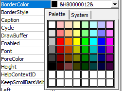
BorderColor Property:
Sets the border color for UserForm and Controls. Unless the BorderStyle Property sets a border (ie. it should be a non-zero value, which means other than fmBorderStyleNone), this property will have no effect. BorderStyle defines the border colors using the BorderColor Property while the SpecialEffect property exclusively uses system colors (which are part of the Control Panel for Windows OS) to define its border colors.
BorderColor is applicable to UserForm and the controls Label, TextBox, ComboBox, ListBox, Frame, Image and RefEdit.
—————————————————————————————————————
BorderStyle Property:
Specifies the type of border for an object (control or a form). It has two settings: (i) fmBorderStyleNone (value 0) for no border; (ii) fmBorderStyleSingle (value 1) for a single-line border. UserForm, Label, TextBox, ComboBox, ListBox and Frame have the default value of 0 whereas the default value for an Image is 1. BorderStyle defines its border colors using the BorderColor Property. Note: You cannot simultaneously use both the BorderStyle and SpecialEffect properties to specify the border for a control — specifying a non-zero property for either one will automatically set the other property to zero. And, if the SpecialEffect property for a Frame is set to zero (ie. Flat), the BorderStyle property is ignored.
BorderStyle is applicable to UserForm and the controls Label, TextBox, ComboBox, ListBox, Frame, Image and RefEdit.
————————————————————————————————————-
ControlSource Property:
Mentions a cell or field (viz. worksheet range in Excel) which is used to set or store the Value property of a control. Changing the value of the control will automatically update the linked cell and a change in the linked cell will update the value of the control. Where A1 is entered in a ControlSource property of a CheckBox, and if cell A1 in ActiveSheet contains TRUE, the CheckBox will appear selected on activating the form and if you deselect the CheckBox, cell A1 will change to FALSE. In a ListBox where the ControlSource mentions Sheet3!D2, the value in the BoundColumn of the selected row will get stored in cell D2, Sheet3. In a TextBox where the ControlSource mentions Sheet3!F2, the text or value in the TextBox will get stored in the worksheet cell Sheet3!F2 and if the cell Sheet3!F2 contains any text, this will appear in the TextBox on activation of UserForm. The default value is an empty string which indicates that no ControlSource Property has been set. Note: To set ControlSource property in Properties window, enter without inverted commas: =Sheet3!F2, and to set with vba code: .ControlSource = «=Sheet3!F2» or .ControlSource = «Sheet3!F2».
ControlSource property is applicable to the controls TextBox, ComboBox, ListBox, CheckBox, OptionButton, ToggleButton, ScrollBar and SpinButton.
————————————————————————————————————
ControlTipText Property:
Specifies the text displayed when the user holds the mouse over a control. It is useful in giving tips or clarifications to the user on using the control. The default value is an empty string which indicates that no text will be displayed.
ControlTipText Property is applicable to all controls.
————————————————————————————————————
Enabled Property:
A Boolean value (True/False) which specifies whether the control can be accessed through a vba code and can respond to user-generated events (ie. the user can interact with the control by using mouse, keystrokes, accelerators, or hotkeys). Default value is True, which indicates that the control can be accessed whereas a False value indicates that the user cannot interact with the control. The control is usually accessible through a code even in the case the value is set to False. If Enabled is set to False, the control appears dimmed (except for Image). If Enabled is set to False for a UserForm or a Frame, all controls they contain also get disabled. Enabled Property of a TextBox is particularly useful where you do not want to allow the user to type directly into the TextBox but should be filled only per the user-selected option, say from a ListBox.
Enabled Property applies to all controls and UserForm.
———————————————————————————————————-
Locked Property:
A Boolean value (True/False) which specifies whether the control is editable or not. True value indicates uneditable, while the default value is False wherein the control can be edited.
Locked property is applicable to the controls TextBox, ComboBox, ListBox, CheckBox, OptionButton, ToggleButton, CommandButton and RefEdit.
Using the Enabled and Locked Properties in conjunction:
1. Enabled is True and Locked is False: the control responds to user-generated events and appears normally; data can be copied and edited in the control.
2. Enabled is True and Locked is True: the control responds to user-generated events and appears normally; data can be copied but not edited in the control.
3. Enabled is False (irrespective of Locked value): the control cannot respond to user-generated events and also appears dimmed; data can neither be copied nor edited in the control.
————————————————————————————————————
Font Object:
Determines the type of font used in a control or form. You can specify the font name, set the font style (Regular, Italic, Bold, …), underline or strikeout text, and adjust the font size. For the controls TextBox, ComboBox and ListBox, the font of displayed text is set, while for other controls the caption font is set. Note: Setting Font of a UserForm will automatically set the Font of all controls if entered post the UserForm setting but will not change the Font of these controls if they were already present for which you will need to reset Font of each individual control separately. Font property for a MultiPage control can be used only with vba code.
Font applies to UserForm and all controls except ScrollBar, SpinButton and Image.
——————————————————————————————————
ForeColor Property:
Specifies the foreground color ie. color of displayed text. In respect of Font controls, ForeColor determines the text color; in a Frame, ForeColor determines its caption color; in a ScrollBar or SpinButton, ForeColor determines the color of the arrows. Note: Setting ForeColor of a UserForm will automatically set the ForeColor of controls Label, CheckBox, OptionButton, Frame, MultiPage and TabStrip if entered post the UserForm setting and but will not change the ForeColor of these controls if they were already present for which you will need to reset ForeColor of each individual control separately. ForeColor property for a MultiPage control can be used only with vba code.
ForeColor Property applies to UserForm and all controls except Image.
——————————————————————————————————
MouseIcon Property:
Assigns an image to a control which gets displayed when the user moves the mouse across that control. Image is assigned by specifying the path and filename of the file it is in. To use the MouseIcon property it is required that the MousePointer property is set to fmMousePointerCustom (value 99).
MouseIcon property is applicable to UserForm and all controls, except MultiPage.
——————————————————————————————————-
MousePointer Property:
Specifies what type of mouse pointer will be visible when the user moves the mouse over a control. There are 15 settings: (i) fmMousePointerDefault (value 0) — standard pointer, and default value; (ii) fmMousePointerArrow (value 1) — arrow; (iii) fmMousePointerCross (value 2) — Cross-hair pointer; (iv) fmMousePointerIBeam (value 3) — I-Beam; (v) fmMousePointerSizeNESW (value 6) — two-headed arrow pointing northeast and southwest; (vi) fmMousePointerSizeNS (value 7) — two-headed arrow pointing north and south; (vii) fmMousePointerSizeNWSE (value  — two-headed arrow pointing northwest and southeast; (viii) fmMousePointerSizeWE (value 9) — two-headed arrow pointing west and east; (ix) fmMousePointerUpArrow (value 10) — up arrow; (x) fmMousePointerHourglass (value 11) — hourglass; (xi) fmMousePointerNoDrop (value 12) — circle with a diagonal line, appearing as a «Not» symbol indicating an invalid control; (xii) fmMousePointerAppStarting (value 13) — arrow and hourglass; (xiii) fmMousePointerHelp (value 14) — arrow and question mark; (xiv) fmMousePointerSizeAll (value 15) — four-headed arrow, pointing north, south, east, and west; and (xv) fmMousePointerCustom (value 99) — image specified by the MouseIcon property.
MousePointer property is applicable to UserForm and all controls, except MultiPage.
——————————————————————————————————-
Picture Property:
Specifies the picture to be displayed on a control. Picture is assigned by specifying the path and filename of the file it is in. To remove the picture, press DELETE on the value of the property (pressing BACKSPACE will not remove). For controls with captions, you can specify the location of the picture by using the PicturePosition property. For other controls and UserForm, use PictureAlignment Property to specify the location (identifies the control corner to display or at the center) of the picture and use PictureSizeMode Property to specify how (size, scale, strech or enlarge mode) to display the picture.
Picture property is applicable to UserForm and the controls Label, CheckBox, OptionButton, ToggleButton, Frame, CommandButton, MultiPage and Image.
——————————————————————————————————
PicturePosition Property:
Specifies where the picture appears in the control vis-a-vis its caption. The alignment of the picture with its caption is determined by this property. There are 13 settings in a format where the string fmPicturePosition is followed by the location of the picture relative to its caption and next is the alignment of the caption relative to the picture, viz. fmPicturePositionLeftTop — the picture appears to the left of the caption and the caption is aligned with the top of the picture; and so on. The last setting is fmPicturePositionCenter — both the picture and caption are centered in the control and the caption is on top of the picture. Default is fmPicturePositionAboveCenter (value 7) — the picture appears above the caption and the caption is centered below the picture. In the absence of a caption, the picture’s location is relative to the center of the control. If no picture is specified to be displayed, the PicturePosition property will have no effect.
PicturePosition property is applicable to the controls Label, CheckBox, OptionButton, ToggleButton and CommandButton.
——————————————————————————————————
SpecialEffect Property:
Determines how the control visually appears. For a CheckBox, OptionButton, or ToggleButton, the two settings are: (i) fmButtonEffectFlat (value 0); and (ii) fmButtonEffectSunken (value 2) — Default for CheckBox and OptionButton. For other applicable controls the five settings are: (i) fmSpecialEffectFlat (value 0) — Default for UserForm and the controls Image and Label; (ii) fmSpecialEffectRaised (value 1); (iii) fmSpecialEffectSunken (value 2) — Default for controls TextBox, ComboBox and ListBox; (iv) fmSpecialEffectEtched (value 3) — Default for Frame; and (v) fmSpecialEffectBump (value 6). The visual appearance of each setting is self-explanatory viz. visual effect can be Flat, Raised, Sunken, Etched and Bump. Note 1: Though ToggleButton has SpecialEffect as one of its properties, it is disabled and SpecialEffect cannot be specified for the ToggleButton. Note 2: You cannot simultaneously use both the BorderStyle and SpecialEffect properties to specify the border for a control — specifying a non-zero property for either one will automatically set the other property to zero. And, if the SpecialEffect property for a Frame is set to zero (ie. Flat), the BorderStyle property is ignored. Note 3: SpecialEffect property exclusively uses system colors (which are part of the Control Panel for Windows OS) to define its border colors.
SpecialEffect property is applicable to UserForm and the controls Label, TextBox, ComboBox, ListBox, CheckBox, OptionButton, ToggleButton, Frame, Image and RefEdit.
——————————————————————————————————
TabIndex Property:
TabIndex is the position of the control in a UserForm’s tab order (when the user presses the Tab key). The Index value is expressed as an Integer, with 0 being the first position in the tab order and the highest possible Index value will be one less than the number of controls in the form, to which the TabIndex property is applicable. Entering an Index value less than zero will give an error, a value greater than the highest possible will reset it to the highest value, and each control will have a unique Index value. TabIndex property for a MultiPage control can be used only with vba code.
TabIndex is applicable to all controls except Image.
——————————————————————————————————
TabStop Property:
A Boolean value (True/False) which specifies whether the control can be selected with the tab key. The True value is the default, and sets the control as a tab stop. The False value ignores the control during user tabs but its position in the tab order (as specified in the TabIndex property) remains intact. TabStop property for a MultiPage control can be used only with vba code.
TabStop is applicable to all controls except Label and Image.
——————————————————————————————————-
Visible Property:
A Boolean value (True/False) which is set to make a control visible or hidden. Default value is True, wherein control is visible. This property is particularly useful wherein on satisfaction of a condition you can activate a hidden control which otherwise you might not want to appear in the UserForm viz. show or hide a message dependent on total marks received in a test.
Visible Property applies to all controls.
——————————————————————————————————-
WordWrap Property:
A Boolean value (True/False) which specifies whether the text of a control will wrap to the next line. Default value is True, wherein the text wraps. If MultiLine property of a control is set to False, WordWrap is ignored (in controls which support both these properties viz. TextBox).
WordWrap property is applicable to the controls Label, TextBox, CheckBox, OptionButton, ToggleButton, CommandButton and RefEdit.
____________________________________________________________________
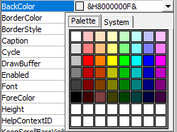
Specifying Color in Properties Window
To enter or change color, in the property’s right column (in Properties Window) click the «Palette» tab and select a new color, or select a predefined color from the «System» tab. It can also be entered as a Long Integer which represents a valid color (this is the decimal format). Alternatively, the color can be entered in hexadecimal notation. The Properties Window displays values in Hexadecimal format, even if the color is entered in decimal format.
Long Integer as Color: Excel color can be represented as a Long Integer, the integer value being derived from the vba RGB function viz. «RGB(Red, Green, Blue)». In the RGB function, the value of each color component of Red, Green & Blue is in the range of 0 to 255. A Long Integer can be derived from the RGB function as shown below:
| RGB Function | Deriving Integer Value | Long Integer | Web/HTML Hexa-decimal (RRG GBB) | VBA Hexa-decimal (BBG GRR) | Color |
| RGB(1,0 ,0) | =1*1+ 0*256+ 0*65536 | 1 | 010000 | 000001 | Black (vari-ation) |
| RGB(0,1 ,0) | =0*1+ 1*256+ 0*65536 | 256 | 000100 | 000100 | Black (vari-ation) |
| RGB(0,0 ,1) | =0*1+ 0*256+ 1*65536 | 65536 | 000001 | 010000 | Black (vari-ation) |
| RGB(255, 0,0) | =255*1+ 0*256 + 0*65536 | 255 | FF0000 | 0000FF | Red |
| RGB(0, 255,0) | =0*1+ 255*256 + 0*65536 | 65280 | 00FF00 | 00FF00 | Green |
| RGB(255, 255, 255) | =255*1+ 255*256+ 255* 65536 | 16777215 | FFFFFF | FFFFFF | White |
| RGB(0,0 ,0) | =0*1+ 0*256 + 0*65536 | 0 | 000000 | 000000 | Black |
| RGB(255, 255,0) | =255*1+ 255*256 + 0*65536 | 65535 | FFFF00 | 00FFFF | Yellow |
| RGB(255, 0,255) | =255*1+ 0*256 + 255* 65536 | 16711935 | FF00FF | FF00FF | Magenta |
| RGB(0,0, 255) | =0*1+ 0*256+ 255* 65536 | 16711680 | 0000FF | FF0000 | Blue |
| RGB(10, 255,255) | =10*1+ 255*256 + 2255* 65536 | 16776970 | 0AFFFF | FFFF0A | Aqua (vari-ation) |
Hexadecimal notation for Color:
In hexadecimal format numbers are expressed in base-16 notation. There are 16 hexadecimal digits. The first 10 are the same as decimal digits viz. 0 to 9, and then the six letters A to F in place of decimals 10 to 15. Hence, 16 different values can be represented by a single hexadecimal digit whereas these would be 10 for a decimal digit, making it more compact because values can be represented in fewer digits. Colors are derived from 3 color components of Red, Green & Blue and each component can take a value from 0 to 255 and the corresponding hexadecimal representation is from 00 to FF. FF is the largest hex number, equating to the decimal value of 255. In hexadecimal, color is represented by six characters. In web and HTML programming, hex notation is in the format of RRGGBB (coded as #RRGGBB viz. RRGGBB prefixed with #), wherein the first two characters represent Red, the next two represent Green and the last two represent Blue viz. RRGGBB. The red color represented by RGB function of RGB(255,0,0) equates to integer value of 255 and to hexadecimal notation of FF for the red color and 00 for green and 00 for blue ie. «FF0000». New colors can be derived by mixing the basic 3 color values viz. get yellow from mixing red and green (255,255,0) which equates to integer value 65535 and to hexadecimal notation of «FFFF00». Get Magenta color by mixing red and blue (255,0,255) which equates to integer value 16711935 and to hexadecimal notation «FF00FF». Color tone can be changed wherein «FF77FF» (increasing intensity of green) will be a lighter magenta and «FF00FF» (decreasing intensity of green) will be a darker shade of magenta.
The VBA Hex function «Hex(number)» returns a string representing the hexadecimal value of a number. Hex function converts a decimal format to a hex notation. Converting a number to hex format with the Hex function viz. Hex(255), will return «FF», representing the color Red. It should be prefixed with &H and then («&HFF») entered in the Properties Window (right column), wherein it will appear as «&H000000FF&». Hex notation is always prefixed with &H, which indicates it is being used. The trailing ampersand (&) tells vba it’s a Long value/data type (4 byte) and not a 2-byte Integer data type, and has nothing to do with hexadecimal notation. Note: Instead of the RRGGBB notation (used in web and HTML programming) VBA uses BBGGRR notation, or &H00BBGGRR&. The Hex function also returns in BBGGRR notation. This explains why the color red appears as &H000000FF& in the Properties window whereas its html hexadecimal notation is FF0000 viz. RGB(255,0,0) using the RGB function. Using another example for color blue represented by RGB(0,0,255): this equates to integer value of 16711680 (=0*1+0*256+255*65536), and using the Hex function, Hex(16711680) returns FF0000 whereas the web/html hexadecimal notation of color blue RGB(0,0,255) is 0000FF. The hex notation displayed in the Properties Window (VB editor) is in BBGGRR format: &H00FF0000&.
Four ways to specify color in Properties Window — (i) in the property’s right column (in Properties Window) click the «Palette» tab and select a new color; (ii) select a predefined color from the «System» tab; (iii) enter a Long Integer which represents a valid color; or (iv) enter the hexadecimal notation in BBGGRR format preceded by &H. The hex notation displayed will be in BBGGRR format, viz. &H00FFFF0A& for aqua (variation of aqua) color.
_____________________________________________________________________
Applicability of Properties to UserForm and its Controls — A SnapShot:

Asked
7 years, 4 months ago
Viewed
7k times
I have created 2 forms in excel, userform1 and userform2. How do I set the caption of userform2 so that it displays whatever is in textbox1 of userform1 and updates itself when the value of textbox1 changes?
asked Dec 3, 2015 at 13:51
5
As Rory mentioned here just add it to the UserForm1 TextBox1 Change Sub.
Paste the script below into the code part of UserForm1.
Private Sub TextBox1_Change()

    'Assign the TextBox Text to a variant
    SomeText = TextBox1.Text
    'Set the UserForm2 Caption to the variant
    UserForm2.Caption = SomeText

End Sub
To paste the script into the code part of your UserForm, double click the Userform in the left side Window of VBA called «Projects Window» then press F7 button on your key board to access the code part of the UserForm then paste the code into the bottom of the page.
answered Dec 3, 2015 at 14:13
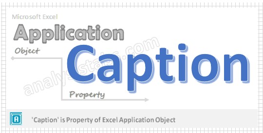
Caption Property of Application Object VBA
Caption Application Property in VBA represents the name of the title bar that appears in the main Excel widow. If you don’t mention title bar, it displays as “Microsoft Excel”.
- VBA Caption Application Property – Syntax
- VBA Caption Application Property: Example 1
- VBA Caption Application Property- Instructions
VBA Caption Application Property – Syntax
Here syntax for Caption Property of application object in VBA.
Application. Caption
Where Caption as String.
In the above syntax Application represents object and Caption is the Property of Application object.
VBA Caption Application Property: Example 1
Please find the below example for Caption Property of application object in excel VBA. The below macro displays the caption in the title bar.
Sub Appl_StatusBar()
‘It represents the caption message
 Application.Caption = "Demo of Analysistabs"
End Sub
VBA Caption Application Property – Instructions
Please follow the below steps to execute the VBA code to save the excel file.
Step 1: Open any existing Excel Application.
Step 2: Press Alt+F11 – This will open the VBA Editor.
Step 3: Insert a code module from then insert menu.
Step 4: Copy the above code and paste in the code module which have inserted in the above step.
Step 5: Now press F5 to execute the code and find the caption in the title bar window.
A Powerful & Multi-purpose Templates for project management. Now seamlessly manage your projects, tasks, meetings, presentations, teams, customers, stakeholders and time. This page describes all the amazing new features and options that come with our premium templates.
Save Up to 85% LIMITED TIME OFFER

All-in-One Pack
120+ Project Management Templates
Essential Pack
50+ Project Management Templates
Excel Pack
50+ Excel PM Templates
PowerPoint Pack
50+ Excel PM Templates
MS Word Pack
25+ Word PM Templates
Ultimate Project Management Template
Ultimate Resource Management Template
Project Portfolio Management Templates
-
-
- In this topic:
-
- VBA Caption Application Property – Syntax
- VBA Caption Application Property: Example 1
- VBA Caption Application Property – Instructions
VBA Reference
Effortlessly
Manage Your Projects
120+ Project Management Templates
Seamlessly manage your projects with our powerful & multi-purpose templates for project management.
120+ PM Templates Includes:
Effectively Manage Your
Projects and Resources
ANALYSISTABS.COM provides free and premium project management tools, templates and dashboards for effectively managing the projects and analyzing the data.
We’re a crew of professionals expertise in Excel VBA, Business Analysis, Project Management. We’re Sharing our map to Project success with innovative tools, templates, tutorials and tips.
Project Management
Excel VBA
Download Free Excel 2007, 2010, 2013 Add-in for Creating Innovative Dashboards, Tools for Data Mining, Analysis, Visualization. Learn VBA for MS Excel, Word, PowerPoint, Access, Outlook to develop applications for retail, insurance, banking, finance, telecom, healthcare domains.
Page load link

3 Realtime VBA Projects
with Source Code!
Go to Top