
In PivotTables, you can use summary functions in value fields to combine values from the underlying source data. If summary functions and custom calculations do not provide the results that you want, you can create your own formulas in calculated fields and calculated items. For example, you could add a calculated item with the formula for the sales commission, which could be different for each region. The PivotTable would then automatically include the commission in the subtotals and grand totals.
Another way to calculate is to use Measures in Power Pivot, which you create using a Data Analysis Expressions (DAX) formula. For more information, see Create a Measure in Power Pivot.
PivotTables provide ways to calculate data. Learn about the calculation methods that are available, how calculations are affected by the type of source data, and how to use formulas in PivotTables and PivotCharts.
To calculate values in a PivotTable, you can use any or all of the following types of calculation methods:
-
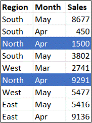
Summary functions in value fields The data in the values area summarize the underlying source data in the PivotTable. For example, the following source data:

-
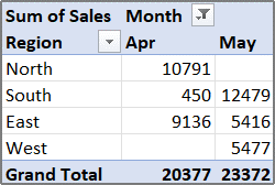
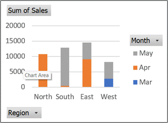
Produces the following PivotTables and PivotCharts. If you create a PivotChart from the data in a PivotTable, the values in that PivotChart reflect the calculations in the associated PivotTable report.
-
In the PivotTable, the Month column field provides the items March and April. The Region row field provides the items North, South, East, and West. The value at the intersection of the April column and the North row is the total sales revenue from the records in the source data that have Month values of April and Region values of North.
-
In a PivotChart, the Region field might be a category field that shows North, South, East, and West as categories. The Month field could be a series field that shows the items March, April, and May as series represented in the legend. A Values field named Sum of Sales could contain data markers that represent the total revenue in each region for each month. For example, one data marker would represent, by its position on the vertical (value) axis, the total sales for April in the North region.
-
To calculate the value fields, the following summary functions are available for all types of source data except Online Analytical Processing (OLAP) source data.
Function
Summarizes
Sum
The sum of the values. This is the default function for numeric data.
Count
The number of data values. The Count summary function works the same as the COUNTA function. Count is the default function for data other than numbers.
Average
The average of the values.
Max
The largest value.
Min
The smallest value.
Product
The product of the values.
Count Nums
The number of data values that are numbers. The Count Nums summary function works the same as the COUNT function.
StDev
An estimate of the standard deviation of a population, where the sample is a subset of the entire population.
StDevp
The standard deviation of a population, where the population is all of the data to be summarized.
Var
An estimate of the variance of a population, where the sample is a subset of the entire population.
Varp
The variance of a population, where the population is all of the data to be summarized.
-
Custom calculations A custom calculation shows values based on other items or cells in the data area. For example, you could display values in the Sum of Sales data field as a percentage of March sales, or as a running total of the items in the Month field.
The following functions are available for custom calculations in value fields.
Function
Result
No Calculation
Displays the value that is entered in the field.
% of Grand Total
Displays values as a percentage of the grand total of all of the values or data points in the report.
% of Column Total
Displays all of the values in each column or series as a percentage of the total for the column or series.
% of Row Total
Displays the value in each row or category as a percentage of the total for the row or category.
% Of
Displays values as a percentage of the value of the Base item in the Base field.
% of Parent Row Total
Calculates values as follows:
(value for the item) / (value for the parent item on rows)
% of Parent Column Total
Calculates values as follows:
(value for the item) / (value for the parent item on columns)
% of Parent Total
Calculates values as follows:
(value for the item) / (value for the parent item of the selected Base field)
Difference From
Displays values as the difference from the value of the Base item in the Base field.
% Difference From
Displays values as the percentage difference from the value of the Base item in the Base field.
Running Total in
Displays the value for successive items in the Base field as a running total.
% Running Total in
Calculates the value for successive items in the Base field that are displayed as a running total as a percentage.
Rank Smallest to Largest
Displays the rank of selected values in a specific field, listing the smallest item in the field as 1, and each larger value will have a higher rank value.
Rank Largest to Smallest
Displays the rank of selected values in a specific field, listing the largest item in the field as 1, and each smaller value will have a higher rank value.
Index
Calculates values as follows:
((value in cell) x (Grand Total of Grand Totals)) / ((Grand Row Total) x (Grand Column Total))
-
Formulas If summary functions and custom calculations do not provide the results that you want, you can create your own formulas in calculated fields and calculated items. For example, you could add a calculated item with the formula for the sales commission, which could be different for each region. The report would then automatically include the commission in the subtotals and grand totals.
Calculations and options that are available in a report depend on whether the source data came from an OLAP database or a non-OLAP data source.
-
Calculations based on OLAP source data For PivotTables that are created from OLAP cubes, the summarized values are precalculated on the OLAP server before Excel displays the results. You cannot change how these precalculated values are calculated in the PivotTable. For example, you cannot change the summary function that is used to calculate data fields or subtotals, or add calculated fields or calculated items.
Also, if the OLAP server provides calculated fields, known as calculated members, you will see these fields in the PivotTable Field List. You will also see any calculated fields and calculated items that are created by macros that were written in Visual Basic for Applications (VBA) and stored in your workbook, but you won’t be able to change these fields or items. If you need additional types of calculations, contact your OLAP database administrator.
For OLAP source data, you can include or exclude the values for hidden items when calculating subtotals and grand totals.
-
Calculations based on non-OLAP source data In PivotTables that are based on other types of external data or on worksheet data, Excel uses the Sum summary function to calculate value fields that contain numeric data, and the Count summary function to calculate data fields that contain text. You can choose a different summary function, such as, Average, Max, or Min, to further analyze and customize your data. You can also create your own formulas that use elements of the report or other worksheet data by creating a calculated field or a calculated item within a field.
You can create formulas only in reports that are based on a non-OLAP source data. You cannot use formulas in reports that are based on an OLAP database. When you use formulas in PivotTables, you should know about the following formula syntax rules and formula behavior:
-
PivotTable formula elements In formulas that you create for calculated fields and calculated items, you can use operators and expressions as you do in other worksheet formulas. You can use constants and refer to data from the report, but you cannot use cell references or defined names. You cannot use worksheet functions that require cell references or defined names as arguments, and you cannot use array functions.
-
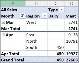
Field and item names Excel uses field and item names to identify those elements of a report in your formulas. In the following example, the data in range C3:C9 is using the field name Dairy. A calculated item in the Type field that estimates sales for a new product based on Dairy sales could use a formula such as =Dairy * 115%.
Note: In a PivotChart, the field names are displayed in the PivotTable field list, and item names can be seen in each field drop-down list. Don’t confuse these names with those you see in chart tips, which reflect series and data point names instead.
-
Formulas operate on sum totals, not individual records Formulas for calculated fields operate on the sum of the underlying data for any fields in the formula. For example, the calculated field formula =Sales * 1.2 multiplies the sum of the sales for each type and region by 1.2; it does not multiply each individual sale by 1.2 and then sum the multiplied amounts.
Formulas for calculated items operate on the individual records. For example, the calculated item formula =Dairy *115% multiplies each individual sale of Dairy times 115%, after which the multiplied amounts are summarized together in the Values area.
-
Spaces, numbers, and symbols in names In a name that includes more than one field, the fields can be in any order. In the example above, cells C6:D6 can be ‘April North’ or ‘North April’. Use single quotation marks around names that are more than one word or that include numbers or symbols.
-
Totals Formulas cannot refer to totals (such as, March Total, April Total, and Grand Total in the example).
-
Field names in item references You can include the field name in a reference to an item. The item name must be in square brackets — for example, Region[North]. Use this format to avoid #NAME? errors when two items in two different fields in a report have the same name. For example, if a report has an item named Meat in the Type field and another item named Meat in the Category field, you can prevent #NAME? errors by referring to the items as Type[Meat] and Category[Meat].
-
Referring to items by position You can refer to an item by its position in the report as currently sorted and displayed. Type[1] is Dairy, and Type[2] is Seafood. The item referred to in this way can change whenever the positions of items change or different items are displayed or hidden. Hidden items are not counted in this index.
You can use relative positions to refer to items. The positions are determined relative to the calculated item that contains the formula. If South is the current region, Region[-1] is North; if North is the current region, Region[+1] is South. For example, a calculated item could use the formula =Region[-1] * 3%. If the position that you give is before the first item or after the last item in the field, the formula results in a #REF! error.
To use formulas in a PivotChart, you create the formulas in the associated PivotTable, where you can see the individual values that make up your data, and then you can view the results graphically in the PivotChart.
For example, the following PivotChart shows sales for each salesperson per region:
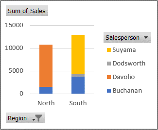
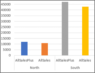
To see what sales would look like if they were increased by 10 percent, you could create a calculated field in the associated PivotTable that uses a formula such as =Sales * 110%.
The result immediately appears in the PivotChart, as shown in the following chart:
To see a separate data marker for sales in the North region minus a transportation cost of 8 percent, you could create a calculated item in the Region field with a formula such as =North – (North * 8%).
The resulting chart would look like this:
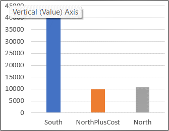
However, a calculated item that is created in the Salesperson field would appear as a series represented in the legend and appear in the chart as a data point in each category.
Important: You cannot create formulas in a PivotTable that is connected to an Online Analytical Processing (OLAP) data source.
Before you start, decide whether you want a calculated field or a calculated item within a field. Use a calculated field when you want to use the data from another field in your formula. Use a calculated item when you want your formula to use data from one or more specific items within a field.
For calculated items, you can enter different formulas cell by cell. For example, if a calculated item named OrangeCounty has a formula of =Oranges * .25 across all months, you can change the formula to =Oranges *.5 for June, July, and August.
If you have multiple calculated items or formulas, you can adjust the order of calculation.
Add a calculated field
-
Click the PivotTable.
This displays the PivotTable Tools, adding the Analyze and Design tabs.
-
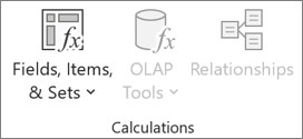
On the Analyze tab, in the Calculations group, click Fields, Items, & Sets, and then click Calculated Field.
-
In the Name box, type a name for the field.
-
In the Formula box, enter the formula for the field.
To use the data from another field in the formula, click the field in the Fields box, and then click Insert Field. For example, to calculate a 15% commission on each value in the Sales field, you could enter = Sales * 15%.
-
Click Add.
Add a calculated item to a field
-
Click the PivotTable.
This displays the PivotTable Tools, adding the Analyze and Design tabs.
-
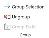
If items in the field are grouped, on the Analyze tab, in the Group group, click Ungroup.
-
Click the field where you want to add the calculated item.
-
On the Analyze tab, in the Calculations group, click Fields, Items, & Sets, and then click Calculated Item.
-
In the Name box, type a name for the calculated item.
-
In the Formula box, enter the formula for the item.
To use the data from an item in the formula, click the item in the Items list, and then click Insert Item (the item must be from the same field as the calculated item).
-
Click Add.
Enter different formulas cell by cell for calculated items
-
Click a cell for which you want to change the formula.
To change the formula for several cells, hold down CTRL and click the additional cells.
-
In the formula bar, type the changes to the formula.
Adjust the order of calculation for multiple calculated items or formulas
-
Click the PivotTable.
This displays the PivotTable Tools, adding the Analyze and Design tabs.
-
On the Analyze tab, in the Calculations group, click Fields, Items, & Sets, and then click Solve Order.
-
Click a formula, and then click Move Up or Move Down.
-
Continue until the formulas are in the order that you want them to be calculated.
You can display a list of all the formulas that are used in the current PivotTable.
-
Click the PivotTable.
This displays the PivotTable Tools, adding the Analyze and Design tabs.
-
On theAnalyze tab, in the Calculations group, click Fields, Items, & Sets, and then click List Formulas.
Before you edit a formula, determine whether that formula is in a calculated field or a calculated item. If the formula is in a calculated item, also determine whether the formula is the only one for the calculated item.
For calculated items, you can edit individual formulas for specific cells of a calculated item. For example, if a calculated item named OrangeCalc has a formula of =Oranges * .25 across all months, you can change the formula to =Oranges *.5 for June, July, and August.
Determine whether a formula is in a calculated field or a calculated item
-
Click the PivotTable.
This displays the PivotTable Tools, adding the Analyze and Design tabs.
-
On the Analyze tab, in the Calculations group, click Fields, Items, & Sets, and then click List Formulas.
-
In the list of formulas, find the formula that you want to change listed under Calculated Field or Calculated Item.
When there are multiple formulas for a calculated item, the default formula that was entered when the item was created has the calculated item name in column B. For additional formulas for a calculated item, column B contains both the calculated item name and the names of intersecting items.
For example, you might have a default formula for a calculated item named MyItem, and another formula for this item identified as MyItem January Sales. In the PivotTable, you would find this formula in the Sales cell for the MyItem row and January column.
-
Continue by using one of the following editing methods.
Edit a calculated field formula
-
Click the PivotTable.
This displays the PivotTable Tools, adding the Analyze and Design tabs.
-
On the Analyze tab, in the Calculations group, click Fields, Items, & Sets, and then click Calculated Field.
-
In the Name box, select the calculated field for which you want to change the formula.
-
In the Formula box, edit the formula.
-
Click Modify.
Edit a single formula for a calculated item
-
Click the field that contains the calculated item.
-
On the Analyze tab, in the Calculations group, click Fields, Items, & Sets, and then click Calculated Item.
-
In the Name box, select the calculated item.
-
In the Formula box, edit the formula.
-
Click Modify.
Edit an individual formula for a specific cell of a calculated item
-
Click a cell for which you want to change the formula.
To change the formula for several cells, hold down CTRL and click the additional cells.
-
In the formula bar, type the changes to the formula.
Tip: If you have multiple calculated items or formulas, you can adjust the order of calculation. For more information, see Adjust the order of calculation for multiple calculated items or formulas.
Note: Deleting a PivotTable formula removes it permanently. If you do not want to remove a formula permanently, you can hide the field or item instead by dragging it out of the PivotTable.
-
Determine whether the formula is in a calculated field or a calculated item.
Calculated fields appear in the PivotTable Field List. Calculated items appear as items within other fields.
-
Do one of the following:
-
To delete a calculated field, click anywhere in the PivotTable.
-
To delete a calculated item, in the PivotTable, click the field that contains the item that you want to delete.
This displays the PivotTable Tools, adding the Analyze and Design tabs.
-
-
On the Analyze tab, in the Calculations group, click Fields, Items, & Sets, and then click Calculated Field or Calculated Item.
-
In the Name box, select the field or item that you want to delete.
-
Click Delete.
To summarize values in a PivotTable in Excel for the web, you can use summary functions like Sum, Count, and Average. The Sum function is used by default for numeric values in value fields. You can view and edit a PivotTable based on an OLAP data source, but you can’t create one in Excel for the web.
Here’s how to choose a different summary function:
-
Click anywhere on the PivotTable, and then select PivotTable > Field List. You can also right-click the PivotTable and then select Show Field List.
-
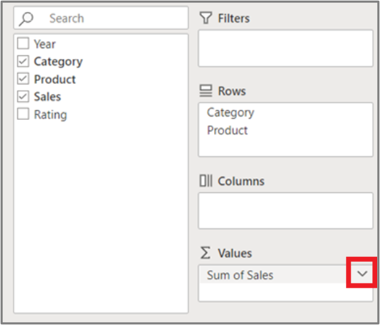
In the PivotTable Fields list, under Values, click the arrow next to the value field.
-
Click Value Field Settings.
-
Pick the summary function you want and then click OK.
Note: Summary functions aren’t available in PivotTables that are based on Online Analytical Processing (OLAP) source data.
Use this summary function
To calculate
Sum
The sum of the values. It’s used by default for value fields that have numeric values.
Count
The number of nonempty values. The Count summary function works the same as the COUNTA function. Count is used by default for value fields that have nonnumeric values or blanks.
Average
The average of the values.
Max
The largest value.
Min
The smallest value.
Product
The product of the values.
Count Numbers
The number of values that contain numbers (not the same as Count, which includes nonempty values).
StDev
An estimate of the standard deviation of a population, where the sample is a subset of the entire population.
StDevp
The standard deviation of a population, where the population is all of the data to be summarized.
Var
An estimate of the variance of a population, where the sample is a subset of the entire population.
Varp
The variance of a population, where the population is all of the data to be summarized.
Need more help?
You can always ask an expert in the Excel Tech Community or get support in the Answers community.
Excel Pivot Tables are amazing (I know I mention this every time I write about Pivot Tables, but it’s true).
With a basic understanding and a little drag and drop, you can get a bucket-load of work done in a few seconds.
While a lot can be done with a few clicks in Pivot Tables, there are some things that would need a few extra steps or a little bit of work around.
And one such thing is to count distinct values in a Pivot Table.
In this tutorial, I will show you how to count distinct values as well as Unique Values in an Excel Pivot table.
But before I jump into how to count distinct values, it’s important to understand the difference between ‘distinct count’ and ‘unique count’
Distinct Count Vs Unique Count
While these may seem like the same thing, it’s not.
Below is an example where there is a dataset of names and I have listed unique and distinct names separately.
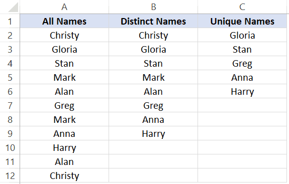
Unique values/names are those that only occur once. This means that all the names that repeat and have duplicates are not unique. Unique names are listed in column C in the above dataset
Distinct values/names are those that occur at least once in the dataset. So if a name appears three times, it’s still counted as one distinct name. This can be achieved by removing the duplicate values/names and keeping all the distinct ones. Distinct names are listed in column B in the above data set.
Based on what I have seen, most of the times when people say that they want to get the unique count in a Pivot Table, they actually mean distinct count, which is what I am covering in this tutorial.
Count Distinct Values in Excel Pivot Table
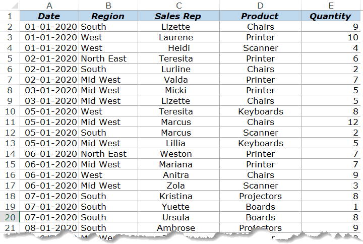
Suppose you have the sales data as shown below:
Click here to download the example file and follow along
With the above dataset, let’s say that you want to find the answer to the following questions:
- How many sales rep are there in each region (which is nothing but the distinct count of sales reps in each region)?
- How many sales rep sold the printer in 2020?
While Pivot Tables can instantly summarize the data with a few clicks, to get the count of distinct values, you will need to take a few more steps.
If you’re using Excel 2013 or versions after that, there is an inbuilt functionality in Pivot Table that quickly gives you the distinct count. And if you’re using Excel 2010 or versions before that, you will have to modify the source data by adding a helper column.
The following two methods are covered in this tutorial:
- Adding a helper column in the original data set to count unique values (works in all versions).
- Adding the data to a data model and using Distinct Count option (available in Excel 2013 and versions after that).
There is a third method which Roger shows in this article (which he calls the Pivot the Pivot Table method).
Let’s get started!
Adding a Helper Column in the Dataset
Note: If you’re using Excel 2013 and higher versions, skip this method and move to the next one (as it uses an inbuilt Pivot Table functionality – Distinct Count).
This is an easy way to count distinct values in the Pivot Table as you only need to add a helper column to the source data. Once you have added a helper column, you can then use this new data set to calculate the distinct count.
While this is an easy workaround, there are some drawbacks to this method (covered later in this tutorial).
Let me first show you how to add a helper column and get a distinct count.
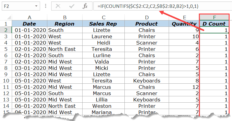
Suppose I have the data set as shown below:
Add the following formula in Column F and apply it for all the cells that have data in the adjacent columns.
=IF(COUNTIFS($C$2:C2,C2,$B$2:B2,B2)>1,0,1)
The above formula uses the COUNTIFS function to count the number of times a name appears in the given region. Also, note that the criteria range is $C$2:C2 and $B$2:B2. This means that it keeps expanding as you go down the column.
For example, in cell E2, the criteria ranges are $C$2:C2 and $B$2:B2 and in cell E3 these ranges expand to $C$2:C3 and $B$2:B3.
This ensures that the COUNTIFS function counts the first instance of a name as 1, the second instance of the name as 2, and so on.
Since we only want to get the distinct names, the IF function is used which returns 1 when a name appears for a region the first time and returns 0 when it appears again. This makes sure that only distinct names are counted and not the repeats.
Below is how your dataset would look like when you have added the helper column.
Now that we have modified the source data, we can use this to create a Pivot Table and use the helper column to get the distinct count of the sales rep in each region.
Below are the steps to do this:
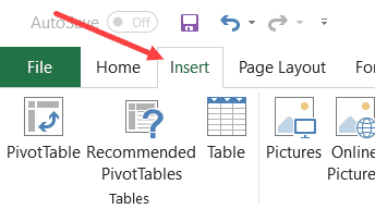
- Select any cell in the dataset.
- Click the Insert Tab.

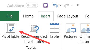
- Click on Pivot Table (or use the keyboard shortcut – ALT + N + V)
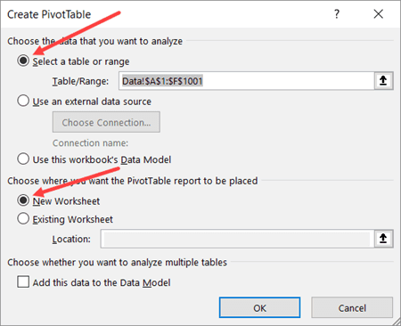
- In the Create Pivot Table dialog box, make sure that the Table/Range is correct (and includes the helper column) and’New Worksheet’ in selected.

- Click OK.
The above steps would insert a new sheet which has the Pivot Table.
Drag the ‘Region’ field in the Rows area and ‘D Count’ field in the Values area.
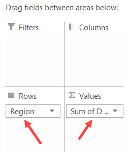
You will get a Pivot Table as shown below:
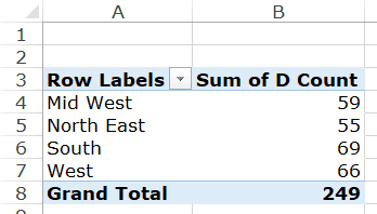
Now you can change the column header from ‘Sum of D count’ to ‘Sales Rep’.
Drawbacks of Using a Helper Column:
While this method is pretty straight forward, I must highlight a few drawbacks that come with modifying the source data in a Pivot Table:
- The data source with the helper column is not as dynamic as a Pivot Table. While you can slice and dice the data any way you want with a Pivot Table, when you use a helper column, you lose a part of that ability. Let’s say that you add a helper column to get the count of a distinct sales rep in each region. Now, what if you also want to get the distinct count of sales rep selling printers. You will have to go back to the source data and modify the helper column formula (or add a new helper column).
- Since you’re adding more data to the Pivot Table source (which also gets added to the Pivot Cache), this can lead to a higher size of Excel file.
- Since we are using an Excel formula, it may make your Excel Workbook slow in case you have thousands of rows of data.
Add Data to Data Model and Summarize Using Distinct Count
Pivot Table added new functionality in Excel 2013 that allows you to get the distinct count while summarizing the data set.
In case you’re using a previous version, you’ll not be able to use this method (as should try adding the helper column as shown in the method above this one).
Suppose you have a dataset as shown below and you want to get the count of the unique sales rep in each region.
Below are the steps to get a distinct count value in the Pivot Table:
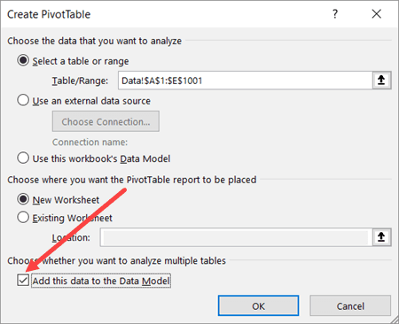
- Select any cell in the dataset.
- Click the Insert Tab.
- Click on Pivot Table (or use the keyboard shortcut – ALT + N + V)
- In the Create Pivot Table dialog box, make sure that the Table/Range is correct and New Worksheet in Selected.
- Check the box which says – “Add this data to the Data Model”
- Click OK.
The above steps would insert a new sheet which has the new Pivot Table.
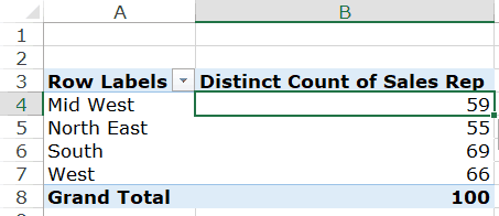
Drag the Region in the Rows area and Sales Rep in the Values area. You will get a Pivot Table as shown below:
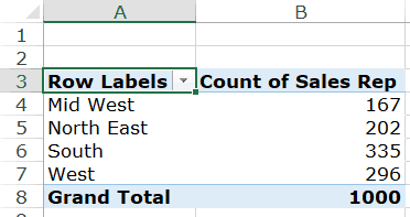
The above Pivot Table gives the total count of the Sales rep in each region (and not the distinct count).
To get the distinct count in the Pivot Table, follow the below steps:
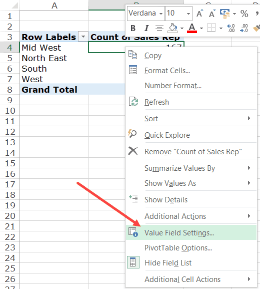
- Right-click on any cell in the ‘Count of Sales Rep’ column.
- Click on Value Field Settings

- In the Value Field Settings dialog box, select ‘Distinct Count’ as the type of calculation (you may have to scroll down the list to find it).

- Click OK.
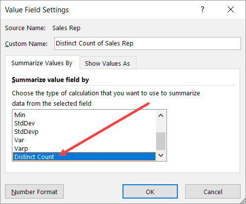
You will notice that the name of the column changes from ‘Count of Sales Rep’ to ‘Distinct Count of Sales Rep’. You can change it to whatever you want.
Some things you know when you add your data to the Data Model:
- If you save your data in the data model and then open in an older version of Excel, it will show you a warning – ‘Some pivot table functions will not be saved’. You may not see the distinct count (and the data model) when opened in an older version that doesn’t support it.
- When you add your data to a Data Model and make a Pivot Table, it will not show the options to add calculated fields and calculated columns.
Click here to download the example file
What If You Want to Count Unique Values (and not distinct values)?
If you want to count unique values, you don’t have any inbuilt functionality in the Pivot Table and will have to rely on helper columns only.
Remember – Unique values and distinct values are not the same. Click here to know the difference.
One example could be when you have the below data set and you want to find out how many sales rep are unique to each region. This means that they operate in one specific region only and not the others.
In such cases, you need to create one of more than one helper columns.
For this case, the below formula does the trick:
=IF(IF(COUNTIFS($C$2:$C$1001,C2,$B$2:$B$1001,B2)/COUNTIF($C$2:$C$1001,C2)<1,0,1),IF(COUNTIF($C2:C$22,C2)>1,0,1),0)
The above formula checks whether a sales rep name occurs in one region only or in more than one region. It does that by counting the number of occurrence of a name in a region and dividing it by the total number of occurrences of the name. If the value is less than 1, it indicates that the name occurs in two or more than two regions.
In case the name occurs in more than one region, it returns a 0 else it returns a one.
The formula also checks whether the name is repeated in the same region or not. If the name is repeated, only the first instance of the name returns the value 1, and all other instances return 0.
This may seem a bit complex, but it again depends on what you’re trying to achieve.
So, if you want to count unique values in a Pivot Table, use helper columns and if you want to count distinct values, you can use the inbuilt functionality (in Excel 2013 and above) or can use a helper column.
Click here to download the example file
You May Also Like the Following Pivot Table Tutorials:
- How to Filter Data in a Pivot Table in Excel
- How to Group Dates in Pivot Tables in Excel
- How to Group Numbers in Pivot Table in Excel
- How to Apply Conditional Formatting in a Pivot Table in Excel
- Slicers in Excel Pivot Table
- How to Refresh Pivot Table in Excel
- Delete a Pivot Table in Excel
Pivot Tables are one of the Intermediate Excel Skills and this is an Advanced Pivot Table Tutorial that shows you the top 100 tips and tricks to master this skill. The thing is: when it comes to data analysis, quick and effective reporting, or presenting summarized data nothing can beat a pivot table.
It is dynamic and flexible. Even if you compare formulas and pivot tables, you will find that pivot tables are easy to use and manage. If you want to take your pivot table skills the best way is to have a list of tips and tricks which you can learn.
In this entire list, I’ve used the words “Analyze Tab” and “Design Tab”. To get both of these tabs on the Excel ribbon you need to select a pivot table first. Apart from this make sure to download this sample file from here to use to try these tips.
Before You Create a Pivot Table it is Important To…
Before you create a pivot table you need to spend a few minutes working on the data source that you are going to use to check if there is any correction that needs to be done.
1. No Blank Column and Row in the Source Data
One of the things you need to keep in check in the source data is that there shouldn’t be any blank rows or columns.
While creating a pivot table if you have a blank row or a column in it, Excel will only take data up to that row or column.

2. No Blank Cell in the Value Column
Apart from the blank row and column, you must not have a blank cell in the column where you have values.

The biggest reason to keep a check on this is that if you have a blank cell in the values field column: Excel will apply count in the pivot instead of the SUM of the values.
3. Data should be in the Right Format
When you using source data for a pivot table then it must be in the right format.
Let’s suppose, you have dates in a column and that column is formatted as text. In that case, it wouldn’t be possible to group dates in the pivot table that you have created.

4. Use a Table for Source Data
Before you create a pivot table, you should convert your source data into a table.

A table expands itself whenever you add new data to it and it makes changing the pivot table data source easy (almost automatic).
Here are the steps:
- Select your entire data or any of the cells.
- Press the shortcut key Ctrl + T.
- Click OK.
5. Remove Totals from the Data
Last but not least, make sure to delete the total from the data source.

If you have source data with grand totals, Excel will take those totals as values and the values in the pivot table will be increased by doubles.
Tip: If you have applied a table on the data source, Excel won’t include that total while creating a pivot table.
Tips to help you while creating a Pivot Table
Now, these tips you can use when the data is prepared and you are all set to create a pivot table with it.
1. Recommended Pivot Tables
There is an option in the “Insert Tab” to check for the recommended pivot tables. When you click on the “Recommended Pivot Tables”, it shows you a set of the pivot tables that can be possible with the data you have.

This option is quite useful when you want to see all the possibilities you have with the available data.
2. Creating a Pivot Table from Quick Analysis
There is a tool in Excel called “Quick Analysis” which is like a quick toolbar that appears whenever you select the data range.
And from this tool, you can create a pivot table as well.
Quick Analysis Tool ➜ Tables ➜ Blank Pivot Table.

3. External Workbook as a Source for the Pivot Table
This is one of the most useful pivot table tips from this list which I want you to start using for now onward.
Let’s say, you want to create a pivot from a workbook that is in a different folder and you don’t want to add data from that workbook into your current sheet.
You can link that file as a source without adding data into the current file, here are the steps.
- In the create pivot table dialog box, select “Use an external data source”.

- After that, go to the Connections tab and click on “Browse for more”.

- Locate the file that you want to use and select it.
- Click OK.
- Now select the sheet in which you have data.

- Click OK (Twice).

Now you can create a pivot table with all the field options from the external source file.
4. The Classic Pivot Table and Pivot Chart Wizard
Instead of creating a pivot table from the Insert tab, you can use “Classic Pivot Table and Pivot Chart Wizard” as well.
The one thing which I love about classic wizard is there is an option to pull data from multiple worksheets before creating a pivot table.

A simple way to open this wizard is by using the keyboard shortcut: Alt + D + P.
5. Search for Fields
In the pivot table field settings, there is an option for searching for the fields. You can search for the field where you have large with hundreds of columns.

When you start typing in the search box it starts filtering columns.
6. Change Pivot Table Field Window Style
There is an option that you can use to change the style of the “Pivot table Field Window”. Click on the gear icon on the top right side and select the style you want to apply.

7. Sort Order of your Field List
If you have large data set then you can sort the field list using A to Z order to make it easy for you to find the required fields.
Click on the gear icon on the top right side and select the “Sort A to Z”. By default, fields are sorted as per source data.

8. Open/Show Field List
It happens with me that when I create a pivot table and again when I click on it shows “Field List” at the right side and this happens every time I click on a pivot table.
But you can turn it OFF and for this, you just need to click on the “Feild List Button” in the “PivotTable Analyze” tab.

9. Naming a Pivot Table
Once you create a pivot table the next thing which I think you need to do is to name a pivot table.
And for this, you can go to Analyze Tab ➜ Pivot Table ➜ Pivot Table Options and then enter the new name.

10. Create a Pivot Table in Excel Online Version
Recently, the option to create a pivot table is added into the Excel’s online App (Limited Options).
It’s as simple as creating a pivot in Excel’s Web App:
In the Insert Tab, click on the “Pivot Table” button from the table group…

…and then select the source data range…

…and the worksheet where you want to insert it…
…and, in the end, click OK.
11. VBA Code to Create Pivot Table in Excel
If you want to automate your pivot table creation process, you can use the VBA code for this.
In this guide, I’ve mentioned a simple step by step process to create a pivot table using macro code.
Formatting a Pivot Table like a PRO
As you can use a Pivot Table as a report, it’s important to make some changes in the default formatting.
1. Changing Pivot Table Style or Creating a New Style
There are several pre-defined styles in Excel for a pivot table that you can apply with a single click.
In the designed tab, you can find “Pivot Table Style” and when you click on the “More” you can simply select a style which you like.
You can also create a new style, a customized one, you can do this by using the “New PivotTable Style” option.

Once you have done with your customized style you can simply save it to use it next time, it will be there always.
2. Preserve Cell Formatting when you Update a Pivot Table
Go to the pivot table options (right-click on the pivot table and go to pivot table options) and tick mark the “Preserve cell formatting on update”.
The benefit of this option is whenever you update your pivot table you won’t lose the formatting you have.

3. Disable Auto Width Update when you Update a Pivot Table
Apart from formatting one which you also need to preserve and that’s “Column Width”.
For this, go to “Pivot Table Options” and untick the “Autofit column width on update” and click OK after that.

4. Repeat Item Labels
When you use more than one item in a pivot table you can simply repeat labels for the top items. It makes it easy to understand the structure of the pivot table.
- Select the pivot table and go to the “Design tab”.
- In the design tab, go to Layout ➜ Report Layout ➜ Repeat All Item Labels.

5. Formatting Values
In most of the cases, you need to format values after you create a pivot table.
For example, if you want to change the number of decimals from the numbers. All you need to do is select the values column and open the “Format Cell” option.

And from this option, you can change the number decimals. From the “Format” option, you can even change other options as well.
6. Change Font Style for Pivot Tables
One of my favorite thing with formatting is changing “Font Style” for a pivot table.
You can use the format option but the easiest way is to do it from the Home Tab. Select the entire pivot table and then select the font style.

7. Hide/Unhide Subtotals
When you add a pivot table with more than one item field you will get subtotals for the main field.
But sometimes there is no need to show subtotals. In that situation, you can hide them using the following steps:
- Click on the pivot table and go to the Analyze tab.
- In the Analyze tab, go to Layout ➜ Subtotals ➜ Do not show subtotals.

8. Hide/Unhide Grand Total
Just like subtotals you can also hide and unhide grand totals and below are the simple steps to do that.
- Click on the pivot table and go to the Analyze tab.
- In the Analyze tab, go to Layout ➜ Grand Total ➜ Off for Rows and Columns.

9. Two Number format in a Pivot Table
In a normal pivot table, we have a single format of values in the values column.
But, there are some (few) situations when you need to have different formats in a single pivot table, just like below. For this, you need to use custom formatting.
10. Applying a Theme to Pivot Table
In Excel, there are predefined color themes that you can use. These themes can be applied to pivot tables as well. Go to the “Page Layout” tab, and click on the “Themes” dropdown.

There are more than 32 themes that you can apply with a single click or you can save your current formatting style as a theme.
11. Changing the Layout of a Pivot Table
For every pivot table, you can choose a layout.
In Excel (if you are using 2007 or greater versions) you can have three different layouts. In the design tab, go to the Layout Report ➜ Layout, and select the layout which you want to apply.

12. Banded Columns and Rows
One of the first things that I do when I create a pivot table is applying “Branded Row and Column”.
You can apply it from the design tab and tick mark the “Banded Column” and “Banded Rows”.

Filter Data in a Pivot Table
The thing which makes the pivot table one of the most powerful data analysis tools is “Filters”.
1. Turn Off/On Filters
Just like a normal filter, you can turn on/off filters in a pivot table. In the “Analyze Tab”, you can click the “Field Header” button to turn On or OFF the filters.

2. Current Selection to the Filter
You have selected a cell(s) in a pivot table and you want to filter only those cells, here’s the option that you can use.
After selecting the cells right click and go to “Filter” and after that select “Keep Only Selected Items”.

3. Hide Selection
Just like filtering the selected cells you can also hide them. For this, go to “Filter” and after that select “Hide Selected Items”.

4. Value and Label Filter
Apart from normal filters, you use label filters and values filters to filter with a specific value or criteria.
Label Filter:

Value Filter:

5. Use Label & Value Filter Together
As I said in the above tip that you can have the Label and Value field, but, you need to activate an option to use both of these filter options altogether.
- First of all, open the “PivotTable options” and go to the “Total & Filter” tab.
- In “Total & Filter” Tab, tick mark the “Allow multiple filters per field”.
- After that, click OK.

6. Filter Top 10 Values
One of my favorite options in filters is to filter “Top 10 Values”. This filter option is useful while creating an instant report.
For this, you need to go to the “Value Filter” and click on the “Top 10” and then click OK.

7. Filter Fields from the PivotTable Fields Window
If you want to filter while creating a pivot table, you can do this from the “Pivot Field” window.
To filter values from a column, you can click on the down arrow from the right side and filter the values as you need.

8. Add a Slicer
One of the best things which I have found to filter data in a pivot table is using a “Slicer”.
To insert a slicer all you need to do is go to “Analyze Tab” and in the “Filter” group click on the “Insert Slicer” button, after that select the field for which you want to insert a slicer and then click OK.

Related: Excel SLICER – A Complete Guide on how to Filter Data with it
9. Format a Slicer and Other Options
Once you insert a slicer you can change its style and format.
- Select the slicer and go to the Options tab.
- From the “Slicer Styles” click on the drop-down and select the style you want to apply.

Apart from the styles, you can change the setting from the settings window: Click on the “Slicer Settings” button to open the settings window.

10. Single Slicer for all the Pivot Tables
Sometimes when you have multiple pivot tables, it’s hard to control all of them. But if you connect a single slicer with multiple pivot tables, you can control all the pivots with no efforts.
- First of all, insert a slicer.
- And, after that, right-click on the slicer and select “Report Connections”.

- From the dialog box, select all the pivots and click OK.

Now you can simply filter all the pivot tables with a single slicer.
11. Add a Timeline
Unlike a slicer, a timeline is a specific filter tool to filter dates and it’s way more powerful than the normal filter.
To insert a slicer all you need to do is go to “Analyze Tab” and in the “Filter” group click on the “Insert Timeline” button and after that select the date column and click OK.

12. Format a Timeline Filter and Other Options
Once you insert a timeline you can change its style and format.
- Select the timeline and go to the Options tab.
- From “Timeline Styles” click on the drop-down and select the style you want to apply.

Apart from the styles, you can change settings as well.

13. Filter using Wildcards
You can use Excel Wildcard Characters in all the filter options where you need to enter the value to filter. Look at the below examples where I have used an asterisk to filter values starting letter A.
14. Clear All Filters
If you have applied filters on multiple fields, you can remove all those filters from Analyze Tab ➜ Actions ➜ Clear ➜ Clear Filter.

Tips to make best out of pivot tables
Working with a pivot table can be easier if you know the tips which I have mentioned ahead.
These tips will help you to save more than 2 hours every week.
1. Refresh a Pivot Table Manually
Pivot tables are dynamic, so when you add new data or update values into the source data you need to refresh it so that the pivot table gets all the new add values from the source. Refreshing a pivot table is simple:
- One, right-click on a pivot and select the “Refresh”.
- Second, go to the “Analyze” tab and click on the “refresh” button.

2. Refresh a Pivot Table while Opening a File
There’s a simple option in Excel which you can activate and make a pivot table get refreshed automatically every time you open the workbook. For this here are the simple steps:
- First of all, right-click on a pivot table and go to “Pivot Table Options”.
- After that, go to the “Data” tab and tick mark the “Refresh the data when opening the file”.

- In the end, click OK.
Now every time you open the workbook this pivot table will get updated instantly.
3. Refresh Data After a Specific Time Interval
If you want to update your pivot table automatically after a specific interval then this tip is for you.
…here’s how to do it.
- First of all, while creating a pivot table, in the “Create Pivot Table” window, tick mark “Add this data to the data model”.

- After that, once you create a pivot table, select any of the cells, and go to “Analyze Tab”.
- In Analyze Tab, Data ➜ Change Data Source ➜ Connection Properties.

- Now in “Connection Properties”, in the usage tab, tick mark “Refresh Every” and enter minutes.

- In the end, click OK.
Now after that specific period which you entered your pivot will automatically be refreshed.
4. Replace Error Values
Sometimes, when you have errors in your source data they reflect in the same way in the pivot and this is not a good thing at all.
The better way is to replace those errors with a meaningful value.
Below are the steps to follow:
- First of all, right click on your pivot table and open pivot table options.
- Now in “Layout & Format”, tick mark “For error value show” and enter the value in the input box.

- In the end, click OK.
Now for all the errors, you will have the value you have specified.
5. Replace Blank Cells
Let’s say you have a pivot for sales data and there are some cells that are blank.
For a person who is not aware of why these cells are blank can question you about this. So, it’s better to replace it with a meaningful word.
…simple steps you need to follow for this.
- First of all, “right click” on your pivot table and open pivot table options.
- Now in “Layout & Format”, tick mark “For empty cells show” and enter the value in the input box.

- In the end, click OK.
Now for all the blank cells, you will have the value you have specified.
6. Define a Number Format
Let’s say you have a pivot for sales data and there are some cells that are blank.
For a person who is not aware of why these cells are blank can question you about this. So, it’s better to replace it with a meaningful word.
…simple steps you need to follow for this.
- First of all, “right click” on your pivot table and open pivot table options.
- Now in “Layout & Format”, tick mark “For empty cells show” and enter the value in the input box.
- In the end, click OK.
Now for all the blank cells, you will have the value you have specified.
7. Add a Blank Row after Each Item
Now let’s say you have a large pivot table with multiple items.
Here you can insert a blank row after each item so that there would be no clutter in the pivot.

Check out these steps to follow:
- Select the pivot table and go to the Design tab.
- In the design tab, go to Layout ➜ Blank Rows ➜ Insert Blank Line after Each Item.

The best thing about this option is it gives a clearer view of your report.
8. Drag and Drop Items in a Pivot Table
When you have a long list of items in your pivot you can arrange all those items in a custom order by just drag and drop.
9. Creating many Pivot Tables from One
Suppose you have created a pivot table from month wise sales data and you have used products as a report filter.
With the”Show Report Filter Pages” option, you can create multiple worksheets with a pivot table for each product.
Let’s say if you have 10 products in a pivot filter you can create 10 different worksheets with a single click.
Use these steps:
- Select your pivot and go to the analyze tab.
- In the analyze tab, go to pivot table ➜ Options ➜ Show Report Filter Pages.

Now you have four pivot tables in four separate worksheets.

10. Value Calculation Option
When you add value column into the value field it shows SUM or COUNT (sometimes), but, there few other things which you can calculate here:
To open “Value Settings” options select a cell from the value column and right-click.

And from the right-click menu, open “Value Field Settings” and then click on
From the “Summarize value field by” select the type of the calculation which you want to show in the pivot.
11. Running Total Column in a Pivot Table
Let’s say you have a pivot table month wise sale.
Now, you want to insert a running total in your pivot table to show a complete growth of sales in the entire month.
Here are the steps:
- Right click on it & click “Value Field Setting”.
- From “Show Values As” drop-down list, select “Running Total In”.

- In the end, click OK.

Learn more about adding a running total in a pivot table.
12. Add Ranks in a Pivot Table
Ranking gives you a better way to compare things with each other…
…and to insert a rank column in a pivot table you can use the following steps:
- First of all, insert the same data field twice in the pivot.
- After that for the second field, right click on it and open “Value Field Settings”.
- Go to “Show Values as” tab and select “Rank Largest To Smallest”.

- In the end, click OK.
…click here to learn more about ranking in a pivot table.
Imagine you have a pivot table for product wise sale.
And now, you want to calculate the percentage share of all products in the total sales.
Steps to use:
- First of all, insert the same data field twice in the pivot.
- After that for the second field, right-click on it and open “Value Field Settings”.
- Go to “Show Values as” tab and select “% of Grand Total”.

- In the end, click OK.

This also a perfect option to create a quick report.
14. Move a Pivot table to a New Worksheet
When you create a pivot table, Excel asks you to add a new worksheet for the pivot table…
…but it also has an option to move an existing pivot table to a new worksheet.
- For this, go to “Analyze Tab” ➜ Actions ➜ Move Pivot Tables.

15. Turn OFF GetPivotData
There is a situation where you need to refer to a cell in a pivot.
But, there could be a problem because when you refer to a cell in a pivot Excel automatically uses GetPivotData function for reference.
The best thing is, you can disable it and here are the steps:
- Go to File Tab ➜ Options.
- In options, go to Formulas ➜ Working with Formulas ➜ untick “Use GetPivotData functions for PivotTable reference”.

You can also use a VBA code for this as well:
Sub deactivateGetPivotData()
Application.GenerateGetPivotData = False
End Sub
Check out these ➜ Top 100 Useful Excel VBA Codes + PDF File
16. Group Dates in a Pivot Table
Just imagine, you want to create a month wise pivot table but you have dates in your data.
In this situation, you need to add an extra column for months.
But the best way is to create using grouping dates methods in the pivot table using this method you don’t need to add a helper column.
Use the below steps:
- First of all, you need to insert the date as a row item in your pivot table.

- Right click on the pivot table, and select “Group…”.

- Select “Month” from by section and click OK.

It will group all the dates into months and if you want to learn more about this option here’s the complete guide.
17. Group Numeric Data in a Pivot Table
Just like dates, you can group numeric values as well.
The steps are simple.
- Right click on the pivot table, and select “Group…”.
- Enter the value to create a range of groups in the “by” and click OK.

…click here to learn how pivot table’s grouping option can help you create a histogram in Excel.
18. Groups Columns
To group columns just like rows, you can use the same steps as rows. But you need to select a column header before that.
19. Ungroup Rows and Columns
When you don’t need groups in your pivot table you can simply ungroup it by right-click and select the “Ungroup”.
20. Using Calculation in a Pivot Table
To become an advanced pivot table user you should learn to create a calculated field and item in a pivot table.
Let’s say in the below pivot table, you need to create new data by field multiplying the present data field with 10.

In this situation, instead of creating a separate column in a pivot table you can insert a calculated item.
➜ a complete guide to creating a calculated item and field in a pivot table
21. List of Formulas Used
Once you add a calculation in a pivot table or you have got a pivot table with a calculated field or item, you can see the list of formulas used in it.
For this, just go to “Analyze Tab” ➜ Calculation ➜ Fields, Items & Sets ➜ List Formulas.

You’ll instantly get a new worksheet with a list of formulas used in the pivot table.
22. Get a List of Unique Values
If you have duplicate values in your date then you can use a pivot table to get a list of unique values.
- First of all, you need to insert a pivot table and then add the column where you have duplicate values as a row field.
- After that, copy that row field from the pivot and paste it as values.
- Now, the list you have as values is a list of unique values.
The thing which I love about using a pivot table for using to check unique values is it’s a one time setup.
You don’t need to create it again and again.
23. Show Items with No Data
Let say you have entries in your source data where there are no values or zero values.
You can activate from the field option to “Show items with no data”.
- First of all, right-click on the field and open the “Field Settings”.
- Now, go to “Layout & Print” and tick mark “Show items with no data” and click OK.

Boom! all the items where you have no data will show in the pivot table.
24. Difference from the Previous Value
This is one of my favorite pivot table options.
With this, you can create a column where it shows the difference of current values from the previous value.
Let say you have a pivot with month values,…
…then, with this option…
…you can add a column of difference value from the previous month, just like below.
Here are the steps:
- First of all, you need to add the column where you have values, twice in the value field.

- After that, for the second field, open the “Value Setting” and “Show Value As”.
- Now, from the “Show values as” drop-down select “Difference From” and select “Month” and “(Previous)” from the “Base Item”.
- In the end, click OK.

This will instantly convert the values column into a column with a difference from the previous.

25. Disable Show Details
When you double-click on a value cell in a pivot table it shows the data behind that value.

It’s a good thing but not all the time you need this to happen and that’s why you can disable it when required.
All you need to do is open the pivot table options and go to “Data Tab” and untick “Enable show details”.
And then click OK.
26. Pivot Table to PowerPoint
These are the simple steps to paste a pivot chart into a PowerPoint slide.
- First of all, select a pivot table and copy it.
- After that, go to the PowerPoint slide and open the paste special options.

- Now from the paste special dialog box, select “Microsoft Excel Chart Object” and click OK.
Insert Image
To make changes to the pivot table you need to double click on the chart.
27. Add Pivot Table to Word Document
To add a pivot table into Microsoft Word you need to follow the same steps you did in PowerPoint.
28. Expand Or Collapse Field Headings
If you have more than one dimension field in a row or column you can expand or collapse the outer fields.
You need to click on the + button to expand and – button to collapse…

…and to expand or collapse all the groups in one go, you can right-click and choose the option.
29. Hide-Unhide Expand Or Collapse Buttons
If you have more than one dimension field in a row or column you can expand or collapse the outer fields.

30. Only Count Numbers in Values
There is an option in a pivot table where you can count the number of the cell with the numeric value.

For this, all you need to do is open the “Value Option” and select “Count Number” from the “Summary value field by” and then click OK.
31. Sort Items According to a Corresponding Value
Yes, you can sort according to the corresponding values.
- All you need to do is open the filter and select the “More Sort Option”.

- Then select the “Accessing (A to Z) by:” and select the column for sorting and then click OK.

Note:
If you have multiple value columns, you can only use one column for sorting order.
32. Custom Sort Order
Yes, you can use a custom sorting order for your pivot table.
- For this, when you open “More Sorting Options”, click on “More Options” and untick the “Sort automatically every time the report is updated”.
- After that select the sorting order and click OK in the end.
You need to create a new custom sorting order then you can create it from File Tab ➜ Options ➜ Advanced ➜ General ➜ Edit Custom List.
33. Deferred Layout
If you enable the “Deferred Layout Update” and drag and move fields between areas after that.

Your pivot table will not update unless you click on the Update button below at the corner of the PivotTable Fields.
It makes it easier for you to check the pivot table and then.
34. Changing Field Name
When you insert a value field, the name you get for the field comes something like this “Sum of the Amount” or “Count of Units”.
But sometimes (well, all the time) you need to change this name to the name without “Sum of” or “Count of”.
For this, all you need to do is to remove “Count of” or “Sum of” from the cell and add a space at the end of the name.
Yes, that’s it.
35. Select the Entire Pivot Table
If you want to select an entire pivot table in one go:
Select any of the cells from the pivot table and use the keyboard shortcut Control + A.
Or…
Go to Analyze tab ➜ Select ➜ Entire Pivot Table.

36. Convert to Values
If you want to convert a pivot table in values, all you need to do is select the entire pivot table and then:
Use Control + C to copy it and then Paste Special ➜ Values.
37. Use Pivot Table in a Protected Worksheet
When you’re protecting a worksheet where you have a pivot table, make sure to tick mark:
“Use PivotTable & PivotChart”
from the “Allow all the users of this worksheet to:”.
38. Double Click to Open Value Field Settings
If you want to open the “Value Settings” for a particular value column…
…then…

…the best way is to double click on the header of the column.
Make your pivot tables a little more perfect
Pivot tables are one of the most effective and easiest ways to create reports. And we need to share reports with others all the time. Ahead I have shared some of the useful tips which can help you to share a pivot table easily.
1. Reduces the Size of a Pivot Table Report
If you think like this: when you create a pivot table from scratch, Excel creates a pivot cache.
So, more pivot tables you create from scratch more pivot cache Excel will create and your file will need to store more data.
So what’s the point?
Make sure all pivot tables which are from data sources must have the same cache.
But Puneet how could I do this?
Simple, whenever you need to create a second, third, or fourth… just copy and paste the first one and make changes in it.
2. Delete the Source Data and the Pivot Table still Works Fine
One more thing which you can do before sending a pivot table to someone is deleting the source data.
Your pivot table will still work fine.
And, if someone needs to have the source data can get it by clicking the grand total of the pivot table.
3. Save a Pivot Table as a Web Page [HTML]
One more way you can use to share a pivot table with someone is to create a webpage.
Yes, a simple HTML file with a pivot table.
- For this, all you need to do is to save the workbook as a web page [html].

- In the Publish as Web Page, select the pivot table and click “Publish”.

Now you can send this HTML web-page to anyone and he/she can view the pivot table (not editable) even on their mobile phone.

4. Creating a Pivot Table Through a Workbook from a Web Address
Let’s say you have a web link for an Excel file, just like the below:
https://excelchamps.com/book1.xlsx
In this workbook, you have the data and with that data, you need to create a pivot table.
For this, the POWER QUERY is the key.
Check this out: Power Query Examples + Tips and Tricks
- First of all, go to the Data Tab ➜ Get & Transform Data ➜ From Web.

- Now, in the “From Web” dialog box, enter the web address of the workbook and click OK.

- After that, select the worksheet and click “Load To”.

- Next, select the PivotTable Report and click OK.

At this point, you have a blank pivot table that is connected to the workbook from the web address you have entered.
Now you can create a pivot table as you want.
Things you can do in a Pivot Table with CF
For me, conditional formatting is smart formatting. I’m sure you agree with this. Well, when it comes to pivot table CF works like a charm.
1. Applying General CF Options
There are all the CF options available to use with a pivot table.
➜ here is the guide which can help you to learn all the different ways to use CF in pivot tables.
2. Highlight Top 10 Values
Instead of filtering, you can highlight the top 10 values from a pivot table.
For this, you need to use conditional formatting.
Steps are below:
- Select any of the cells from the value column from your pivot table.
- Go to Home tab ➜ Styles ➜ Conditional Formatting.
- Now in conditional formatting, go to Top/Bottom Rules ➜ Top 10 Items.

- Select the color from the window you have.

- And in the end, click OK.
This option is quite useful while creating quick reports with a pivot table and once you.
3. Remove CF from a Pivot Table
You can simply remove conditional formatting from a pivot table using the below steps:
- First of all, select any of the cells from the pivot table.
- After that, go to Home Tab ➜ Styles ➜ Conditional Formatting ➜ Clear Rules ➜ “Clear rules from This Pivot Table”.

If you have more than one pivot table then you need to remove CF one by one.
Using Pivot Charts with Pivot Tables to Visualize your Reports
I’m a big fan of the pivot chart.
If you know how to use a pivot chart properly you can make the best out of one of the best Excel tools.
Here are some of the tips which you can use to be pivot chart PRO in no time and if you want to learn all the stuff about a pivot chart you can learn from this guide.
1. Inserting a Pivot Chart
I’ve shared a simple keyboard shortcut to insert a pivot chart but you also use below steps as well:
- Select a cell from the pivot table and go to “Analyze tab”.
- In the “Analyze Tab”, click on the “Pivot Chart”.

It will instantly create a pivot chart from the pivot table you have.
2. Creating a Histogram using Pivot Chart and Pivot Table
A Pivot table and a Pivot Chart is my favorite way to create a histogram in Excel.

Here’s a step by step guide for this.
3. Turn off the Buttons from a Pivot Chart
When you insert a new pivot chart it comes with some buttons to filter it which sometimes are not really useful.
And if you think like this, you can hide all of them or some of them.

Right-click on the button and select “Hide value Field Button on the Chart” to hide the selected button or click on “Hide all the field button of the Chart” to hide all the buttons.

When you hide all the buttons from a pivot chart it also hides the filter button from the bottom of the chart but, you can still filter it using the pivot table filter, slicer, or a timeline.
4. Add Pivot Chart to PowerPoint
Here are the simple steps to paste a pivot chart into a PowerPoint slide.
- First of all, select a pivot chart and copy it.
- After that, go to the PowerPoint slide and open the paste special options.

- Now from the paste special dialog box, select “Microsoft Excel Chart Object” and click OK.

To make changes to the pivot chart you need to double click on it.
Keyboard shortcuts to skyrocket your pivot table work
We all love keyboard shortcuts. Right? Here I’ve listed some of the common but useful keyboard shortcuts which you can use to speed up your pivot table work.
1. Create a Pivot Table
Alt + N + V
To use this shortcut key make sure you have selected the source data or the active cell is from the source data.
2. Group Selected Pivot Table Items
Alt + Shift + Right Arrow
Let say you have a pivot table with months and you want to group the first six or last six months.
All you need to do it select those six cells and use this shortcut key simply.
3. Ungroup Selected Pivot Table Items
Alt + Shift + Left Arrow
Just like you can create a group of items, this shortcut helps you ungroup those items from the group.
4. Hide Selected Item or Field
Ctrl + –
This shortcut key will simply hide the selected cell or cells.
Actually, it doesn’t hide the cell but filters them which you can clear after that from the filters options.
5. Open Calculated Field Window
Ctrl + –
To use this shortcut key you need to select a cell from the value field column.
And when you press this shortcut key, it opens the “Calculated Field” window.
Open Old Pivot Table Wizard
Alt + D and P
In this keyboard shortcut, you need to press the keys subsequently.
7. Open Field List for the Active Cell
Alt + Down Arrow
This key opens the field list.
8. Insert a Pivot Chart from a Pivot Table
Alt + F1
To use this keyboard shortcut, you need to select a cell from the pivot table. This key inserts a pivot chart into the existing sheet.
F11
And, if you want to inserts a pivot into a new worksheet then you need to use the above key only.
- Excel Keyboard Shortcuts Cheat Sheet
In the End
As I said pivot tables are one of those tools which can help you get better in creating reports and analyzing data in no time.
And with these tips and tricks, you can even save more time. If you ask me, I want you to start using at least 10 tips first and then go for the next 10 and so on.
But you need to tell me one thing now: What’s your favorite pivot table tip?
Don’t Miss to Read These
- Add-Remove Grand Total in a Pivot Table
- Add Running Total in a Pivot Table
- Automatically Update a Pivot Table
- Formulas in a Pivot Table
- Change Data Source for Pivot Table
- Count Unique Values in a Pivot Table
- Delete a Pivot Table
- Filter a Pivot Table
- Add Ranks in Pivot Table
- Conditional Formatting to a Pivot Table
- Pivot Table using Multiple Files in Excel
- Group Dates in a Pivot Table
- Link Slicer with Multiple Pivot Tables
- Move a Pivot Table
- Pivot Table Formatting
- Pivot Table Timeline
- Refresh All Pivot Tables
- Sort a Pivot Table
- Pivot Chart
Pivot tables are one of the most powerful and useful features in Excel. With very little effort, you can use a pivot table to build good-looking reports for large data sets. If you need to be convinced that Pivot Tables are worth your time, watch this short video.
Grab the sample data and give it a try. Learning Pivot Tables is a skill that will pay you back again and again. Pivot tables can dramatically increase your efficiency in Excel.
What is a pivot table?
You can think of a pivot table as a report. However, unlike a static report, a pivot table provides an interactive view of your data. With very little effort (and no formulas) you can look at the same data from many different perspectives. You can group data into categories, break down data into years and months, filter data to include or exclude categories, and even build charts.
The beauty of pivot tables is they allow you to interactively explore your data in different ways.
Contents
- Sample data
- Insert Pivot table
- Add fields
- Sort by value
- Refresh data
- Second value field
- Apply number formatting
- Group by date
- Add percent of total
- Benefits summary
- More resources
Step by step tutorial
To understand pivot tables, you need to work with them yourself. In this section, we’ll build several pivot tables step-by-step from a set of sample data. With experience, the pivot tables below can be built in about 5 minutes.
Sample data
The sample data contains 452 records with 5 fields of information: Date, Color, Units, Sales, and Region. This data is perfect for a pivot table.

Data in a proper Excel Table named «Table1». Excel Tables are a great way to build pivot tables, because they automatically adjust as data is added or removed.
Note: I know this data is very generic. But generic data is good for understanding pivot tables – you don’t want to get tripped up on a detail when learning the fun parts.
Insert Pivot Table
1. To start off, select any cell in the data and click Pivot Table on the Insert tab of the ribbon:

Excel will display the Create Pivot Table window. Notice the data range is already filled in. The default location for a new pivot table is New Worksheet.
2. Override the default location and enter H4 to place the pivot table on the current worksheet:

3. Click OK, and Excel builds an empty pivot table starting in cell H4.

Note: there are good reasons to place a pivot table on a different worksheet. However, when learning pivot tables, it’s helpful to see both the source data and the pivot table at the same time.
Excel also displays the PivotTable Fields pane, which is empty at this point. Note all five fields are listed, but unused:

To build a pivot table, drag fields into one of the Columns, Rows, or Values area. The Filters area is used to apply global filters to a pivot table.
Note: the pivot table fields pane shows how fields were used to create a pivot table. Learning to «read» the fields pane takes a bit of practice. See below and also here for more examples.
Add fields
1. Drag the Sales field to the Values area.
Excel calculates a grand total, 26356. This is the sum of all sales values in the entire data set:

2. Drag the Color field to the Rows area.
Excel breaks out sales by Color. You can see Blue is the top seller, while Red comes in last:

Notice the Grand Total remains 26356. This makes sense, because we are still reporting on the full set of data.
Let’s take a look at the fields pane at this point. You can see Color is a Row field, and Sales is a Value field:

Number formatting
Pivot Tables can apply and maintain number formatting automatically to numeric fields. This is a big time-saver when data changes frequently.
1. Right-click any Sales number and choose Number Format:

2. Apply Currency formatting with zero decimal places, then click OK:

In the resulting pivot table, all sales values have Currency format applied:

Currency format will continue to be applied to Sales values, even when the pivot table is reconfigured, or new data is added.
Sorting by value
1. Right-click any Sales value and choose Sort > Largest to Smallest.

Excel now lists top-selling colors first. This sort order will be maintained when data changes, or when the pivot table is reconfigured.

Refresh data
Pivot table data needs to be «refreshed» in order to bring in updates. To reinforce how this works, we’ll make a big change to the source data and watch it flow into the pivot table.
1. Select cell F5 and change $11.00 to $2000.
2. Right-click anywhere in the pivot table and select «Refresh».

Notice «Red» is now the top selling color, and automatically moves to the top:

3. Change F5 back to $11.00 and refresh the pivot again.
Note: changing F5 to $2000 is not realistic, but it’s a good way to force a change you can easily see in the pivot table. Try changing an existing color to something new, like «Gold» or «Black». When you refresh, you’ll see the new color appear. You can use undo to go back to original data and pivot.
Second value field
You can add more than one field as a Value field.
1. Drag Units to the Value area to see Sales and Units together:

Percent of total
There are different ways to display values. One option is to show values as a percent of total. If you want to display the same field in different ways, add the field twice.
1. Remove the Units from the Values area
2. Add the Sales field (again) to the Values area.
3. Right-click the second instance and choose «% of grand total»:

The result is a breakdown by color along with a percent of total:

Note: the number format for percentage has also been adjusted to show 1 decimal.
Here is the Fields pane at this point:

Group by date
Pivot tables have a special feature to group dates into units like years, months, and quarters. This grouping can be customized.
1. Remove the second Sales field (Sales2).
2. Drag the Date field to the Columns area.
3. Right-click a date in the header area and choose «Group»:

4. When the Group window appears, group by Years only (deselect Months and Quarters):

We now have a pivot table that groups sales by color and year:

Notice there are no sales of Silver in 2016 and 2017. We can guess that Silver was introduced as a new color in 2018. Pivot tables often reveal patterns in data that are difficult to see otherwise.
Here is the Fields pane at this point:

Two-way Pivot
Pivot tables can plot data in various two-dimensional arrangements.
1. Drag the Date field out of the columns area
2. Drag Region into the Columns area.
Excel builds a two-way pivot table that breaks down sales by color and region:

3. Swap Region and Color (i.e. drag Region to the Rows area and Color to the Columns area).
Excel builds another two-dimensional pivot table:

Again notice total sales ($26,356) is the same in all pivot tables above. Each table presents a different view of the same data, so they all sum to the same total.
The above example shows how quickly you can build different pivot tables from the same data. You can create many other kinds of pivot tables, using all kinds of data.
Key Pivot Table benefits
Simplicity. Basic pivot tables are very simple to set up and customize. There is no need to learn complicated formulas.
Speed. You can create a good-looking, useful report with a pivot table in minutes. Even if you are very good with formulas, pivot tables are faster to set up and require much less effort.
Flexibility. Unlike formulas, pivot tables don’t lock you into a particular view of your data. You can quickly rearrage the pivot table to suit your needs. You can even clone a pivot table and build a separate view.
Accuracy. As long as a pivot table is set up correctly, you can rest assured results are accurate. In fact, a pivot table will often highlight problems in the data faster than any other tool.
Formatting. A Pivot table can apply automatically apply consistent number and style formatting, even as data changes.
Updates. Pivot tables are designed for on-going updates. If you base a pivot table on an Excel Table, the table resizes as needed with new data. All you need to do is click Refresh, and your pivot table will show you the latest.
Filtering. Pivot tables contain several tools for filtering data. Need to look at North America and Asia, but exclude Europe? A pivot table makes it simple.
Charts. Once you have a pivot table, you can easily create a pivot chart.
More pivot table resources
- Pivot table examples
- Pivot table tips
- Pivot tables versus formulas
- Pivot table training
A Pivot Table is an Excel tool that allows you to extract data in a preferred format (dashboard/reports) from large data sets contained within a worksheet. It can summarize, sort, group, and reorganize data, as well as execute other complex calculations on it.
It is available in the “Tables” section of the “Insert” tab. The keyboard shortcut to insert Pivot Table in excel is – “ALT+D+P.” The content of Pivot Table changes whenever there is a change in the data source.
Table of contents
- Pivot Table in Excel
- How to Create a Pivot Table in Excel?
- Method #1
- Method #2
- Pivot Table Uses
- #1 – “Max” of Science marks by Maths marks
- #2 – Average of Maths Marks Column
- Frequently Asked Questions (FAQs)
- Recommended Articles
- How to Create a Pivot Table in Excel?
How to Create a Pivot Table in Excel?
The Pivot Table is created by using the following methods:
Method #1
Pivot Table in excel can be created using the following steps
- Click a cell in the data worksheet.
- In the “Tables” section of the “Insert” tab, click “Pivot Table.”

- A “Create Pivot Table” window appears (as shown below).

- Now under the option “Choose the data that you want to analyze,” Excel automatically selects the data range.
- The data range is displayed in the “Table/Range” box under the “Select a table or range.”
- In the “Table/Range” option, we can verify the selected cell range (shown in the below image).
- The next step is to choose the location of the Pivot Table report. The worksheet can either be the existing or a new one.
- In this example of Excel Pivot Table, cell D1 is selected. Under the option “Choose where you want the Pivot Table report to be placed,” select “Existing Worksheet” (shown in the below image).
Note: Select “New Worksheet” if we prefer to insert a Pivot Table on the new worksheet (as shown in the below image).
- To analyze multiple tables, go to the option “Choose whether you want to analyze multiple tables” and click the below checkbox “Add this data to the Data Model.”
- Click “OK” to insert the Pivot Table in the worksheet, depending on the location selected.
If we select “New Worksheet,” the “Pivot Table 1” is placed on the new empty worksheet.
The succeeding image shows a column named “Pivot Table Fields” on the right-hand side. This shows a list of fields or columns to be added to the Pivot Table report.
Now, the Pivot Table is created on the Column range A (“Maths”) and Column B (“Science”), respectively. The same is displayed in the “Fields” list (shown in the below image).

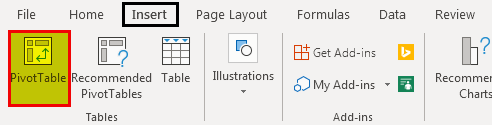
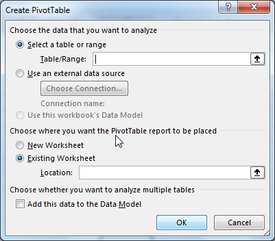

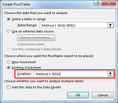


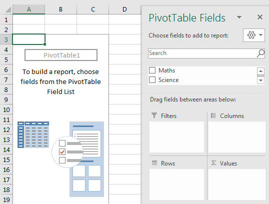
Method #2
- At first, select the data range. It is an input to the Pivot Table.
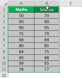
- Go to the “Insert” tab and select “Recommended Pivot Tables.” This option provides the recommended ways of creating Pivot Tables. The user can select and choose one among the given recommendations.
- The below image shows the two recommendations given by Excel. One is the “Sum of Maths by Science,” and the other is “Sum of Science by Maths.”
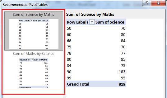
- When you click one of the options, the actual Pivot Table along with the values, opens in the right-hand-side panel.

- Here, the “Group by” option provides the following ways of grouping:
- “Add Science column marks group by Maths column marks”
- “Add Maths column marks group by Science column marks”
- The user can select either of the two ways of grouping. The grouped data is displayed in ascending order (for both the ways of grouping).
- The other option is “Blank Pivot Table.” To create a new Pivot Table, click “Blank Pivot Table” box. It is displayed at the bottom (left-hand side) of the “Recommended Pivot Tables” window as shown in the succeeding image.
- This step will follow the “Method 1” (mentioned in the previous section) of creating a new Pivot Table.
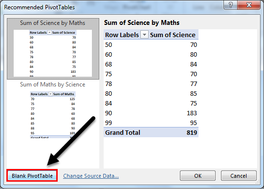
Pivot Table Uses
You can download this Pivot Table Excel Template here – Pivot Table Excel Template
Let us understand the uses of the Pivot Table with the help of the below-mentioned case studies:
#1 – “Max” of Science marks by Maths marks
The table below provides the marks of the subjects Maths and Science in Column A and Column B, respectively. The given data is selected to create the Pivot Table in excel.
Now generate the Pivot Table report to find the maximum number which is present in the “Science marks column” by “Maths marks column” values.
Let us follow the steps shown in previous sections – “Method 1” or “Method 2” to generate the Pivot Table.
- Now, drag “Maths” marks to the “Rows” field and “Science” marks to the “Values” field.

- Right-click on the Pivot Table and select “Value Field Settings.”
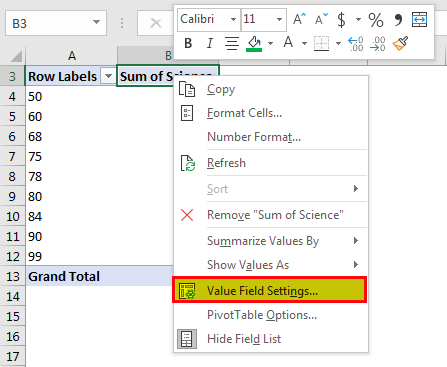
- Now select the “Max” option from the “Summarize value field by” option in the window.

- The “Max” option returns the maximum number present in the Science marks (represented in Column B of the table below).

#2 – Average of Maths Marks Column
A list of Maths and Science marks is provided in Column A and Column B of the table below. Generate the Pivot Table report on the average number of the Maths marks (Column A).

Select the data in Column A (Maths marks) to create the Pivot Table.
Let us follow the below steps to find the “Average” of the Maths marks in Column A.
- Create a Pivot Table and drag “Maths” in the “Rows” field.

- Right-click on the Pivot Table and select “Field Settings.”
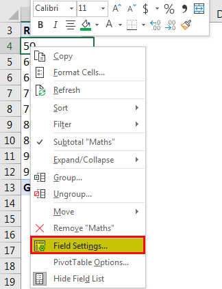
- In the “Field Settings” window, select the “Custom” button under the tab “Subtotals & Filters.”
- Below this tab, choose the “Average” function.
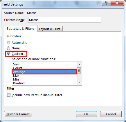
- Now drag “Sum of Maths” in the “Values” field.

- Right-click on the Pivot Table and select “Value Field Settings.”
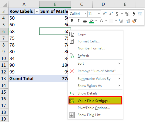
- In the “Value Field Settings” window, go to the “Summarize value field by” tab. Then select the “Average” option.
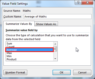
- The Value Field is selected as “Average,” which returns the average value of 77.4 as a result in the Pivot Table Report.

Similarly, other numeric operations can be performed on the given dataset. The dataset can also be filtered to fit the ranges as per the requirement.
Frequently Asked Questions (FAQs)
1. What are Pivot Tables used for?
A Pivot Table is used to summarise, sort, group, reorganize, and count the data in a Worksheet. It calculates the total and average of the data provided in a table. It allows the transformation of data from columns into rows and rows into columns, respectively. It also permits the grouping of data by any field or column. It also performs many advanced calculations on the data.
2. What is a Pivot Chart in Excel?
A Pivot Table is a built-in feature of Excel. It helps organize, visualize, and summarize the selected columns and rows in a spreadsheet. It helps to obtain a desired report on the given data.
3. What is the difference between Pivot Table and Pivot Chart?
Pivot Tables allow us to view the data summarized in a grid of horizontal and vertical columns. It is also used to extract information from a large dataset.
Pivot Charts are the visual representation of the Pivot Table data. It helps to summarize and analyze the datasets and patterns.
- Pivot Table is a data processing technique in Excel.
- Pivot Table is used to summarize data and extract information from a large dataset.
- Pivot Table assists in making dashboards and reports based on a data source.
- To create Pivot Table, click the “Tables” section under the “Insert” tab. The keyboard shortcut is – Press “ALT+D+P.”
- Pivot Chart is a visual representation of Pivot Table, which allows us to summarize and analyze the datasets and patterns.
Recommended Articles
This has been a guide to Pivot Table in Excel. Here we discuss how to create a Pivot Table in Excel using the two methods along with examples and downloadable templates. You may also look at the below useful functions in Excel –
- Pivot Table From Multiple SheetsPivot Table is a basic data analysis tool that calculates, summarizes, & analyses the data of a more extensive table. To create a Pivot Table from Multiple Sheets, you can use a few shortcuts & features as per the specified conditions. read more
- Examples of Pivot TablePivot Table represents various statistical figures such as mean, median or mode. For example, data of any real estate project with different fields like type of flats, block names, area of the individual flats could be easily presented using pivot table.read more
- Insert Pivot Table SlicerPivot Table Slicer is a tool in MS Excel to filter the data present in a pivot table. The data can be presented based on various categories as it offers a way to apply the pivot table filters that dynamically change the view of the pivot table data.read more
- Filter Data using Pivot TableBy right-clicking on the pivot table, we can access the pivot table filter option. Another approach is to use the filter options available in the pivot table fields.read more
Reader Interactions