
IMPORTANT: Ideas in Excel is now Analyze Data
To better represent how Ideas makes data analysis simpler, faster and more intuitive, the feature has been renamed to Analyze Data. The experience and functionality is the same and still aligns to the same privacy and licensing regulations. If you’re on Semi-Annual Enterprise Channel, you may still see «Ideas» until Excel has been updated.

Analyze Data in Excel empowers you to understand your data through natural language queries that allow you to ask questions about your data without having to write complicated formulas. In addition, Analyze Data provides high-level visual summaries, trends, and patterns.
Have a question? We can answer it!
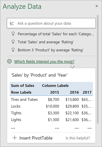
Simply select a cell in a data range > select the Analyze Data button on the Home tab. Analyze Data in Excel will analyze your data, and return interesting visuals about it in a task pane.
If you’re interested in more specific information, you can enter a question in the query box at the top of the pane, and press Enter. Analyze Data will provide answers with visuals such as tables, charts or PivotTables that can then be inserted into the workbook.
If you are interested in exploring your data, or just want to know what is possible, Analyze Data also provides personalized suggested questions which you can access by selecting on the query box.
Try Suggested Questions
Just ask your question
Select the text box at the top of the Analyze Data pane, and you’ll see a list of suggestions based on your data.

You can also enter a specific question about your data.

Notes:
-
Analyze Data is available to Microsoft 365 subscribers in English, French, Spanish, German, Simplified Chinese, and Japanese. If you are a Microsoft 365 subscriber, make sure you have the latest version of Office. To learn more about the different update channels for Office, see: Overview of update channels for Microsoft 365 apps.
-
The Natural Language Queries functionality in Analyze Data is being made available to customers on a gradual basis. It may not be available in all countries or regions at this time.
Get specific with Analyze Data
If you do not have a question in mind, in addition to Natural Language, Analyze Data analyzes and provides high-level visual summaries, trends, and patterns.
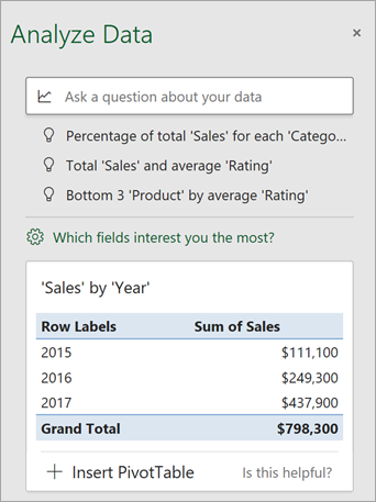
You can save time and get a more focused analysis by selecting only the fields you want to see. When you choose fields and how to summarize them, Analyze Data excludes other available data — speeding up the process and presenting fewer, more targeted suggestions. For example, you might only want to see the sum of sales by year. Or you could ask Analyze Data to display average sales by year.
Select Which fields interest you the most?
Select the fields and how to summarize their data.
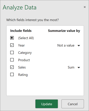
Analyze Data offers fewer, more targeted suggestions.
Note: The Not a value option in the field list refers to fields that are not normally summed or averaged. For example, you wouldn’t sum the years displayed, but you might sum the values of the years displayed. If used with another field that is summed or averaged, Not a value works like a row label, but if used by itself, Not a value counts unique values of the selected field.
Analyze Data works best with clean, tabular data.
Here are some tips for getting the most out of Analyze Data:
-
Analyze Data works best with data that’s formatted as an Excel table. To create an Excel table, click anywhere in your data and then press Ctrl+T.
-
Make sure you have good headers for the columns. Headers should be a single row of unique, non-blank labels for each column. Avoid double rows of headers, merged cells, etc.
-
If you have complicated, or nested data, you can use Power Query to convert tables with cross-tabs, or multiple rows of headers.
Didn’t get Analyze Data? It’s probably us, not you.
Here are some reasons why Analyze Data may not work on your data:
-
Analyze Data doesn’t currently support analyzing datasets over 1.5 million cells. There is currently no workaround for this. In the meantime, you can filter your data, then copy it to another location to run Analyze Data on it.
-
String dates like «2017-01-01» will be analyzed as if they are text strings. As a workaround, create a new column that uses the DATE or DATEVALUE functions, and format it as a date.
-
Analyze Data won’t work when Excel is in compatibility mode (i.e. when the file is in .xls format). In the meantime, save your file as an .xlsx, .xlsm, or .xlsb file.
-
Merged cells can also be hard to understand. If you’re trying to center data, like a report header, then as a workaround, remove all merged cells, then format the cells using Center Across Selection. Press Ctrl+1, then go to Alignment > Horizontal > Center Across Selection.
Analyze Data works best with clean, tabular data.
Here are some tips for getting the most out of Analyze Data:
-
Analyze Data works best with data that’s formatted as an Excel table. To create an Excel table, click anywhere in your data and then press
 +T.
+T. -
Make sure you have good headers for the columns. Headers should be a single row of unique, non-blank labels for each column. Avoid double rows of headers, merged cells, etc.
 +T.
+T.Didn’t get Analyze Data? It’s probably us, not you.
Here are some reasons why Analyze Data may not work on your data:
-
Analyze Data doesn’t currently support analyzing datasets over 1.5 million cells. There is currently no workaround for this. In the meantime, you can filter your data, then copy it to another location to run Analyze Data on it.
-
String dates like «2017-01-01» will be analyzed as if they are text strings. As a workaround, create a new column that uses the DATE or DATEVALUE functions, and format it as a date.
-
Analyze Data can’t analyze data when Excel is in compatibility mode (i.e. when the file is in .xls format). In the meantime, save your file as an .xlsx, .xlsm, or xslb file.
-
Merged cells can also be hard to understand. If you’re trying to center data, like a report header, then as a workaround, remove all merged cells, then format the cells using Center Across Selection. Press Ctrl+1, then go to Alignment > Horizontal > Center Across Selection.
Analyze Data works best with clean, tabular data.
Here are some tips for getting the most out of Analyze Data:
-
Analyze Data works best with data that’s formatted as an Excel table. To create an Excel table, click anywhere in your data and then click Home > Tables > Format as Table.
-
Make sure you have good headers for the columns. Headers should be a single row of unique, non-blank labels for each column. Avoid double rows of headers, merged cells, etc.
Didn’t get Analyze Data? It’s probably us, not you.
Here are some reasons why Analyze Data may not work on your data:
-
Analyze Data doesn’t currently support analyzing datasets over 1.5 million cells. There is currently no workaround for this. In the meantime, you can filter your data, then copy it to another location to run Analyze Data on it.
-
String dates like «2017-01-01» will be analyzed as if they are text strings. As a workaround, create a new column that uses the DATE or DATEVALUE functions, and format it as a date.
We’re always improving Analyze Data
Even if you don’t have any of the above conditions, we may not find a recommendation. That’s because we are looking for a specific set of insight classes, and the service doesn’t always find something. We are continually working to expand the analysis types that the service supports.
Here is the current list that is available:
-
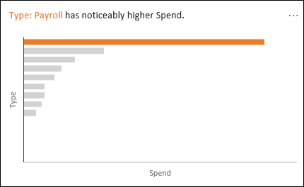
Rank: Ranks and highlights the item that is significantly larger than the rest of the items.
-
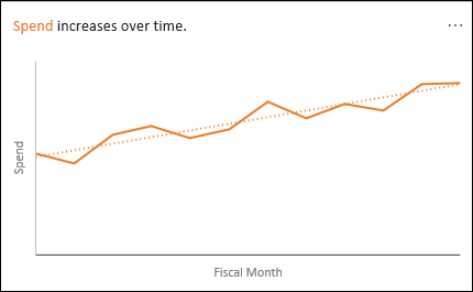
Trend: Highlights when there is a steady trend pattern over a time series of data.
-
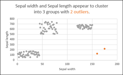
Outlier: Highlights outliers in time series.
-
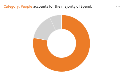
Majority: Finds cases where a majority of a total value can be attributed to a single factor.
If you don’t get any results, please send us feedback by going to File > Feedback.
Because Analyze Data analyzes your data with artificial intelligence services, you might be concerned about your data security. You can read the Microsoft privacy statement for more details.
Need more help?
You can always ask an expert in the Excel Tech Community or get support in the Answers community.
Table of Contents
- Overview of Excel
- What is data analysis?
- Why Excel for data analysis?
- How to carry out data analysis with Excel
- Data collection
- Data cleaning
- Data exploration (using Pivot Table)
- Data visualization
- Advanced Tools for Data Analysis
- PowerPivot
- ToolPak
- End Note
Overview of Excel
Excel is basically a spreadsheet that Microsoft developed for the different operating systems such as Windows, macOS, Android and iOS. It comes equipped with diverse functionalities such as calculation, graphing tools, pivot tables and a macro programming language called Visual Basic for Applications. It forms a part of Microsoft Office.
In the actual application, the world of business has embraced Excel as it is smooth, effective and flexible in the way it can be used. Nearly all major businesses make use of Excel in one way or the other. It suits any and every kind of business processes whether it’s sales, marketing or anything else. It’s such an integral part of businesses because it can be customized and it can produce effective results quite quickly without any specific technical expertise.
Since data is imported into Excel most of the times, it’s interesting how Excel itself can be used to carry out data analysis.
But before we go to data analysis, let’s understand what it entails…
What is data analysis?
While data is of vital importance and the world has become data-driven, data in the raw form is not quite useful. In order to use data to derive actionable intelligence, it needs to be inspected, cleansed and transformed. This kind of a process is what is called Data Analysis.
There is no single way to accomplish this. There are a variety of ways to carry out data analysis. These diverse ways of data analysis are used in different fields such as business, science and even social sciences. In fact, data analysis is something that contemporary business world thrives on. Data analysis is leveraged in order to glean business intelligence to drive business growth.
Data mining is also an exercise of data analysis but it focuses on discovering new knowledge for predictive rather than descriptive purposes. As far as statistical applications are concerned, data analysis can be bifurcated into descriptive statistics, exploratory data analysis (EDA) and confirmatory data analysis (CDA).
While EDA is all about identifying new features in the data, CDA endeavours to confirm or prove the existing hypotheses wrong.
Predictive analytics is an exercise of applying statistical models for predictive forecasting or classification. In order to extract and classify information from textual sources, text analytics, on the other hand, makes use of statistical, linguistic and structural techniques.
These are all variations of data analysis. Data integration is something that is needed prior to data analysis. Data analysis is also connected with data visualization and data dissemination. Sometime, people use the terms data analysis and data modeling interchangeably.
Why Excel for data analysis?
You know how navigating through data could be a nightmare in itself.
It’s quite tricky to explore and process data when you are looking at large chunks of data. Analyzing it could very well be a unique challenge. However, Excel can come to your rescue.
Excel contains functions that can process a large amount of data quite effectively and easily. While different tasks of data analysis could be tricky, Excel functions are quite easy and anybody can use them and analyze the data.
It’s not necessary either to remember all the functions. You can simply Google it and find out the function you need for data analysis tasks.
For the sheer speed, simplicity and accuracy of it, Excel is not just useful but imperative for data analysis. It can save your valuable time and effectively enable the data analysis without any hassle as well.
How to carry out data analysis with Excel?
You might wonder how data analysis actually works. Here’s an overview of the step-wise process of data analysis for you:
Specifying Data Requirements
In order to carry out effective data analysis, it is imperative to specify the data requirements right at the outset. Let’s say that the data pertains to population. If that be so, the specific variables such as age, income etc., need to be specified and obtained. The data obtained could be in the form of numbers or categories.
Data Collection
Once the variables are specified, the information regarding the variables needs to be collected. It can be collected from various sources and made available for further process. This data may not contain any insights in the present form. Therefore, it needs to be processed and cleaned.
Data Processing
The data that is collected needs to be organized for further analysis. This would entail structuring the data in a particular way so that it becomes compatible for various analysis tools. For instance, you may need to place the data in rows and columns in a table for further analysis either in a Spreadsheet or Statistical Application. You may even need to create a data model as well.
Data Cleaning
While the data may get organized, it may, however, be incomplete. It could still contain duplicate items. A few errors may also creep in. Data Cleaning is the way to correct these errors and make the data accurate. There are different ways to clean the data. Suppose it contains financial data, it will surely have totals. These totals can then be compared against authentic published data or some other parameters. In this way, the data can be cleaned.
Data Analysis
Once data passes through various phases such as processing and cleaning, it would be ready for data analysis. There are numerous techniques available for data analysis. Data visualization can also be used in order to project the data in a graphic format. Correlation or Regression Analysis which are well-known statistical models can also be used for data analysis.
Communication
While data analysis may seem like the last step of the process, the findings of data analysis need to be communicated in a structured way to the end users. The end users may want the findings in a particular format. This is where some of the techniques of data visualization such as table and charts can prove quite useful as they can communicate the message quite succinctly. Colour coding and other tools can help you simplify it and enable you to communicate the findings more effectively.
Process of Data Analysis with Excel:
When it comes to data analysis with Excel, here’s how you go about it:
- Data collection
- Data Cleaning
- Data Exploration (using Pivot Table)
- Data Visualization
Let’s get started…
Data Collection:
- In order to get started with data analysis, the first step is to collect information on the variables in a systematic way. This kind of a process will help us find answers to the important questions and assess the results.
- Data collection part is vital because it ensures the accuracy of the data so that decisions related to the data turn out to be valid.
- Data collection is also useful because you have a baseline with which you can measure and you also get a target where you aim at reaching.
- As regards Excel, it is possible for you to collect and import data from a diversity of data sources. Your data sources could be:
- Web Page
- Microsoft Access database
- Let’s look at the practical example as mentioned below to see how we can collect data from various sources:
1. Extracting Data from Web Page
- It is possible that you would need the data that is refreshed on a website.
- For doing so, you can effectively use different Excel features. For instance, you can import data from a table on a website into Excel using a feature called Excel Web Query.
Step-by-Step Process to Extract Data From Web Pages:
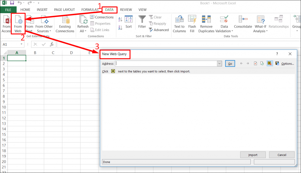
Step 1: Open a workbook with a blank worksheet in Excel.
Now, go to DATA tab on the Ribbon -> Click on From Web. You would be returned to the New Web Query dialog box as illustrated in screenshot given below.
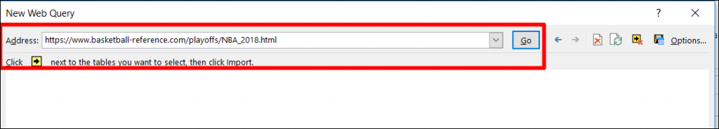
Step 2: Enter the URL of the website from where you want to import data, in the box next to Address and click Go.
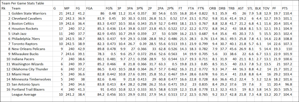
In this example, we will extract data from the URL given below:
https://www.basketball-reference.com/playoffs/NBA_2018.html
Step 3: Click the yellow icons to select the data you want to import. Having done that, click the Import button after you have selected what you want.
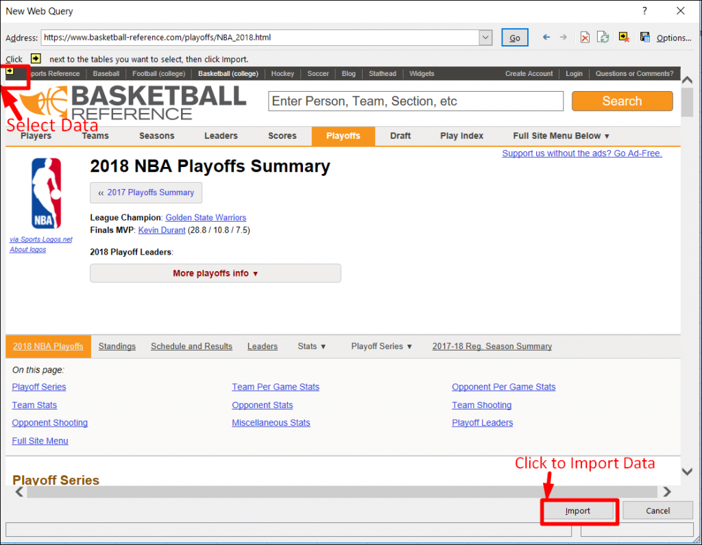
Step 4: Click Import data, specify where you want to put the data and click Ok. Arrange the data for further analysis and/or presentation.
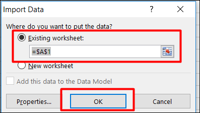
Output:
You can also collect data from other sources such as the following:
- From Microsoft Access Database
- From Files like csv, txt and xml
- From SQL server
Data Cleaning
- Data cleaning is all about finding out and correcting the errors in the dataset. It also includes replacing the incomplete or inaccurate parts with the correct ones.
- In Excel, you can clean data by using the techniques given below:
- Removing duplicate values
- Removing spaces
- Merging and splitting columns
- Reconciling table data by joining or matching
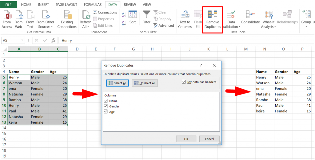
1. Removing duplicate rows:
- When you have large chunks of data, it is possible to have some duplicate rows. It would be advisable to filter for unique values first in order to confirm that the results are what you want before you remove duplicate values.
- Fortunately, Excel comes with an in-built feature to remove duplicate values from a table. With it, you can remove the duplicate values from a given table based on selected columns.
Let’s understand by an example:
Step 1:
Follow these steps to remove duplicate values: Select data –> Go to Data ribbon –> Remove Duplicates
2. Removing Spaces:
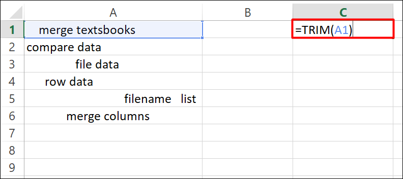
- It is possible that the data you have in Excel may contain leading, trailing, or multiple embedded space characters. These characters can sometimes cause unexpected results when you sort, filter, or search.
- However, you can use the Trim function in Microsoft Excel in order to remove all spaces from text except for single spaces between words.
Step 1:
Enter the formula =TRIM (A1) in the adjacent cell C1 and press the Enter key.
Step 2:
Select cell C1 and drag the fill handle down to the range cell that you want to remove the leading space. Then you can see all cell contents are extracted with all leading spaces removed. Please see the screenshot:
3. Merging and Splitting columns
- In Excel, it is common to merge or split two or more columns into one or split one column into two or more columns.
- For example, you may want to split a column that contains an address field into separate street, city, region, and postal code columns.
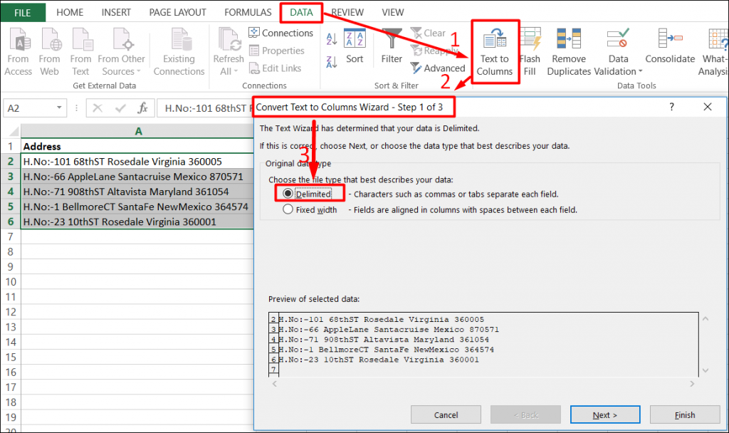
- For this task, we will make use of Table To Column Function.
Step 1:
Go to Data tab, in Sort & Filter Group. Click on the Text to Columns.
Then choose radio button: Delimited (to split the address) and click on next button like the screenshot given below:
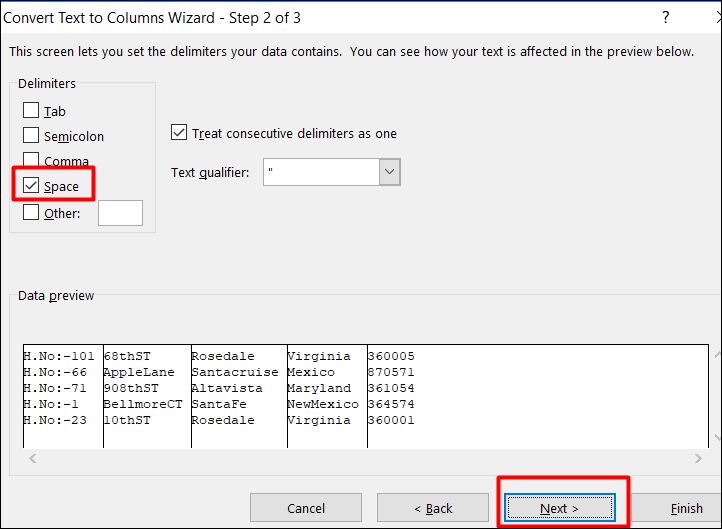
Step 2:
Click and put a tick on the “Space” check box because our data delimiter is “Space”. When you click on it, you will be able to see the data being separated in the data preview box.
Then Click on the Next button.
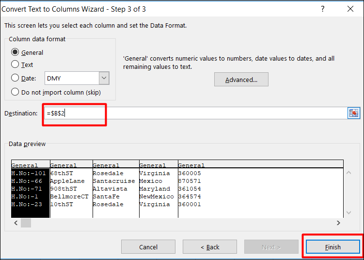
Step 3:
Click on destination to choose the location where you want to split the text and Click on the “Finish” button.
Step 4:
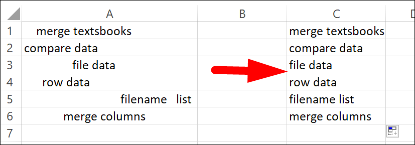
You can see that the text from one cell in column A has been split into the column B:F as shown below.
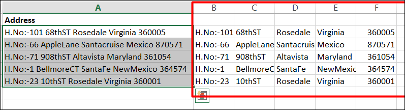
You can also use this feature for additional common values that may require merging into one column or splitting into multiple columns include product codes, file paths, and Internet Protocol (IP) addresses.
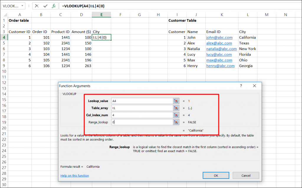
4. Reconciling table data by joining or matching
- Excel can also be used for finding and correcting matching errors when two or more tables are joined. This may entail reconciling two tables from different worksheets.
- For example, you can use it to see all records in both tables or to compare tables and find rows that don’t match.
- Here, function vlookup() would help to perform this task.
- Vlookup(): It searches for a value in the first column of a table array and returns a value in the same row from another column in the table array.
- Let’s look at the table below (order and Customer). In Order table, we want to map city name from the customer tables based on common key “Customer ID”.
- Here, function vlookup() will enable us to perform this task.
- Go to Formula tab -> in Function Library click on Lookup & Reference -> click on Vlookup.
- Now, We´ll use the VLOOKUP function and type this formula into E3.
- Vlookup Syntax:
- Lookup_value : Key to lookup
- Table_array : Source_table
- Col_index_num : column of source table
- Range_lookup : are you ok with relative match?
- For our example:
- Lookup_value – A4
- Table_array – I : L
- Col_index_num – 4
- Range_lookup – 0
- This will return the city name for all the Customer id 1 and post that copy this formula for all Customer ids. Please see the screenshot given below:
Data Exploration Using Pivot Table
- Data Exploring is the vital process of performing initial investigations on data in order to find out patterns, to spot anomalies, to test hypothesis and to check assumptions with the help of summary statistics and graphical representations.
- Why it matters so much is that you can make use of exploring data and make sense of the data you have. You can then figure out what questions you want to ask and how to frame them, as well as how best to manipulate your available data sources to get the answers you need.
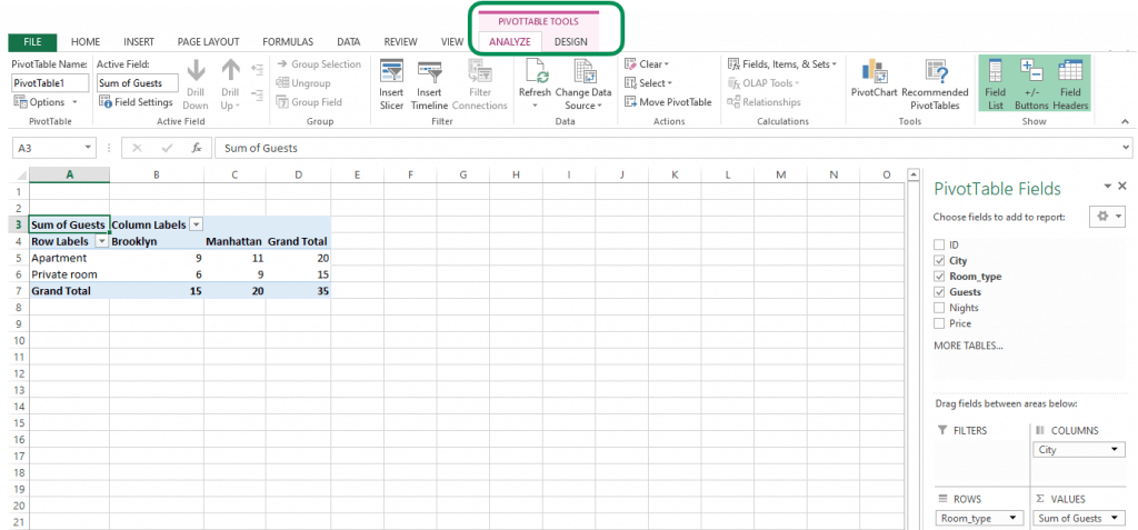
Pivot Table:
- Excel’s Pivot Table is a summary table that lets you count, average, sum, and perform other calculations according to the reference feature you have selected.
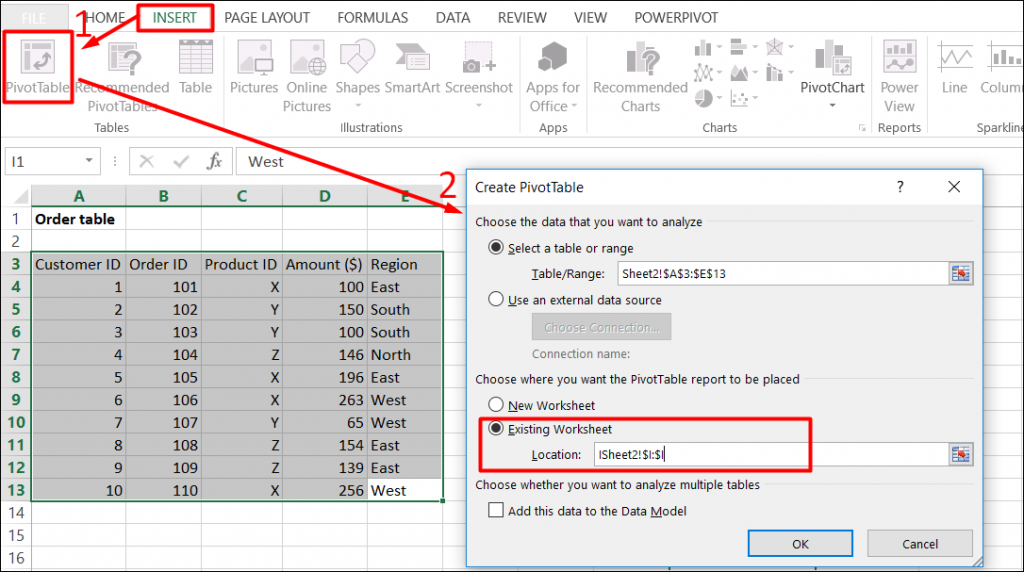
- Let’s Create Pivot Table for the table given below:
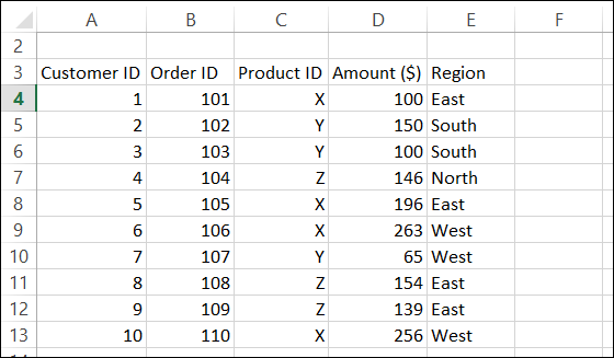
Step 1:
To show Region and Product wise sum of premium, we will create a pivot table as follows:
Select table (A3:E13) -> Go to Insert tab, in the tables group, Click on Pivot Table.
Then select Existing worksheet Location where you want the Pivot Table.
Step 2:
Now, you can see the Pivot Table Field List panel, which contains the fields from your list. All you need to do is to arrange them in the boxes at the foot of the panel. Once you have done that, the diagram on the left becomes your Pivot Table.
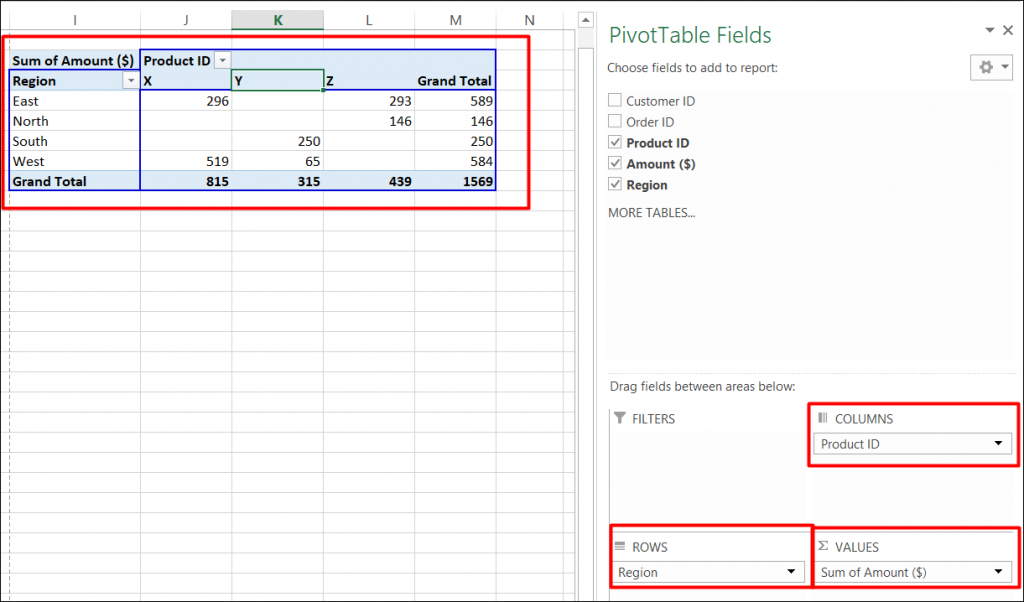
As shown in the screenshot, you can see that we have arranged “Region” in row, “Product id” in column and sum of “Premium” is taken as value. Now you are ready with pivot table which shows Region and Product wise sum of premium. You can also use count, average, min, max and other summary metric.
Data Visualization:
- As exploring data is quite important, data visualization as a technique through which we can explore data also becomes vital for us.
- Data visualization is the presentation of data in a pictorial or graphical format. The reason why such a graphical format matters is that it becomes easier for decision makers to see analytics presented visually. In other words, they can grasp difficult concepts or identify new patterns far more easily.
- In Excel, there are 2 features (Charts and Pivot Charts) which are most popular for data visualization.
Charts:
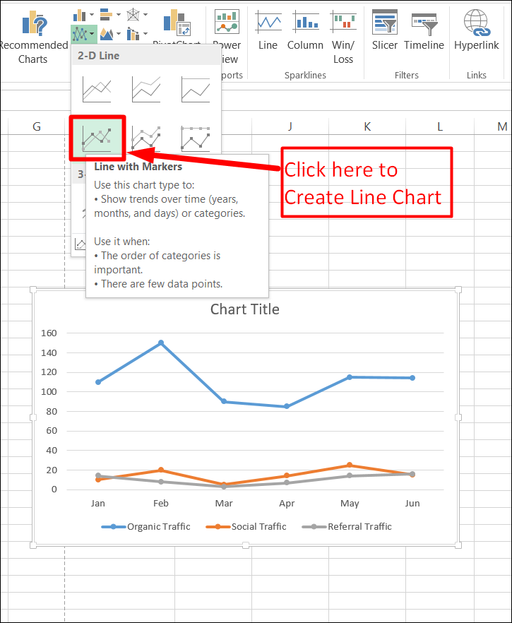
A simple chart in Excel can say a lot more than a sheet full of numbers. As you’ll see, creating charts is quite easy.
Let’s create Simple Line Chart by executing following steps:
Step 1:
Select the range A1:C11 -> On the Insert tab, in the Charts group, click the Line symbol.
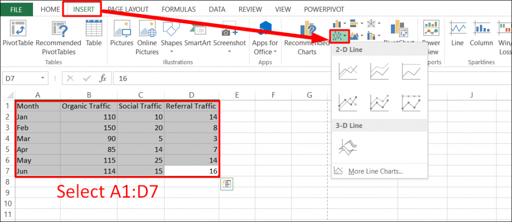
Step 2:
Now, to create Line Chart, click Line with Markers as shown in the screenshot.
Pivot chart:
A pivot chart is the visual representation of a pivot table in Excel. Pivot charts and pivot tables are connected with each other.
Go back to Pivot Tables to learn how to create this pivot table.
Let’s create a Pivot Chart:
Step 1:
Click any cell inside the pivot table -> On the Insert tab, in the Charts group, click Pivot Chart.
Then the Insert Chart dialog box appears. Click OK to create pivot Chart.
In the screenshot given below, you can find the pivot chart.
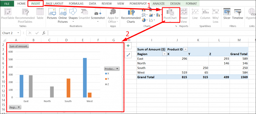
Once you have created the pivot chart, you can customize it to your particular needs to communicate your desired message by filtering chart attributes and changing chart types.
1. PowerPivot
Excel has limitations of 1048576 Rows which means you cannot analyze more than 1048576 rows of data.
And this is where Powerpivot comes in…
Power Pivot is an Excel Add-on that was first introduced in Excel 2010, and gives you a chance to import, merge and prepare data from more data sources at once.
You can import many tables from many different sources (SQL, Azure, Oracle, Excel, Access,…) into Power Pivot and then you can relate all this data to one another.
It means that you can build a Data Model containing multiple data sets from multiple different sources and by connecting them acquiring the ability to analyze them all in one Pivot Table.
Learn More about Power Pivot :
https://support.office.com/en-us/article/power-pivot-powerful-data-analysis-and-data-modeling-in-excel-a9c2c6e2-cc49-4976-a7d7-40896795d045
2. ToolPak
While developing complex statistical or engineering analyses, you can save steps and time by using the Analysis ToolPak.
All you need to do is to provide the data and parameters for each analysis, and the tool uses the appropriate statistical or engineering macro functions to calculate and display the results in an output table. Some tools generate charts in addition to output tables.
ToolPak Provides 19 various features (like Correlation, Covariance, Histogram, Regression and many more…) for data analysis.
Learn More about ToolPak:
https://support.office.com/en-us/article/use-the-analysis-toolpak-to-perform-complex-data-analysis-6c67ccf0-f4a9-487c-8dec-bdb5a2cefab6
End Note
It’s common knowledge how Excel is imperative for businesses in their day-to-day operations. However, not many businesses are aware of the potential of Excel for data analysis.
Since data analysis is crucial for businesses, it’s paramount that businesses leverage the power of Excel for data analysis. The more effectively you can use Excel, the more insights you can gain out of data analysis which you can utilize in enhancing your business.
There are other options such as Python, R Language or rapidminer that you can capitalize upon for data analysis as well. There are many tools that you can use for data analysis. However, each one will require a particular kind of expertise that you may or may not have. Therefore, data analysis with Excel is the simplest and yet one of the most effective data analysis solutions.
Do share your valuable feedback and comments regarding this blog.
Data Analysis with Excel is a detailed lesson that gives readers a clear understanding of the newest and most sophisticated functions offered by Microsoft Excel. It describes in detail how to use MS-capabilities Excel to carry out various data analysis tasks. The guide includes a good amount of screenshots that step-by-step demonstrate how to use various features. One of the most used programs for data analysis is Microsoft Excel. You can simply import, browse, clean, analyze, and display your data using this all-in-one data management tool.
Types of Data Analysis
Charts
Any set of information may be graphically represented in a chart. A chart is a graphic representation of data that employs symbols to represent the data, such as bars in a bar chart or lines in a line chart. Excel has several different chart types available for you to choose from, or you can use the Excel Recommended Charts option to look at charts specifically made for your data and choose one of those.
Step 1: Select a table. After that go to the Insert tab on the top of the ribbon then in the charts group select any chart. Here we are going to select a 3-D column chart.
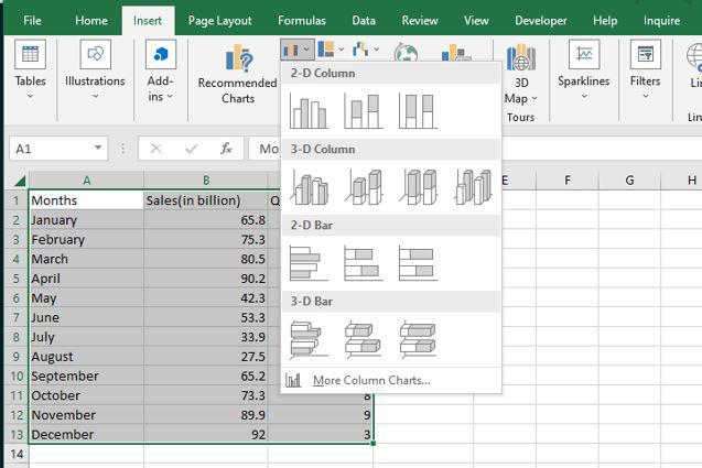
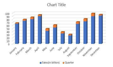
Step 2: As you can see, the excel table has been converted to a 3-D column chart.
Conditional Formatting
Patterns and trends in your data may be highlighted with the help of conditional formatting. To use it, write rules that determine the format of cells based on their values. In Excel for Windows, conditional formatting can be applied to a set of cells, an Excel table, and even a PivotTable report. To execute conditional formatting, adhere to the instructions listed below.
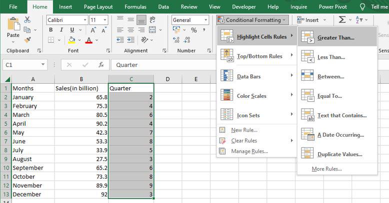
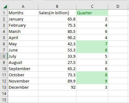
Step 1: Select any column from the table. Here we are going to select a Quarter column. After that go to the home tab on the top of the ribbon and then in the styles group select conditional formatting and then in the highlight cells rule select Greater than an option.
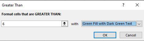
Step 2: Then a greater than dialog box appears. Here first write the quarter value and then select the color.
Step 3: As you can see in the excel table Quarter column change the color of the values that are greater than 6.
Sorting
Data analysis requires sorting the data. A list of names may be arranged alphabetically, a list of sales numbers can be arranged from highest to lowest, or rows can be sorted by colors or icons. Sorting data makes it easier to immediately view and comprehend your data, organize and locate the facts you need, and ultimately help you make better decisions. Both columns and rows can be used to sort. You’ll utilize column sorts for the majority of your sorting. By text, numbers, dates, and times, a custom list, format, including cell color, font color, or icon set, you may sort data in one or more columns.
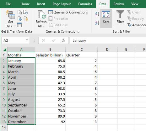
Step 1: Select any column from the table. Here we are going to select a Months column. After that go to the data tab on the top of the ribbon and then in the sort and filters group select sort.
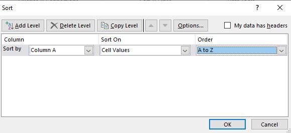
Step 2: Then a sort dialog box appears. Here first select the column, then select sort on, and then Order. After that click OK.
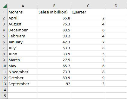
Step 3: Now as you can see the months column is now arranged alphabetically.
Filter
You may use filtering to pull information from a given Range or table that satisfies the specified criteria. This is a fast method of just showing the data you require. Data in a Range, table, or PivotTable may be filtered. You may use Selected Values to filter data. You may adjust your filtering options in the Custom AutoFilter dialogue box that displays when you click a Filter option or the Custom Filter link that is located at the end of the list of Filter options.
Step 1: Select any column from the table. Here we are going to select a Sales column. After that go to the data tab on the top of the ribbon and then in the sort and filters group select filter.
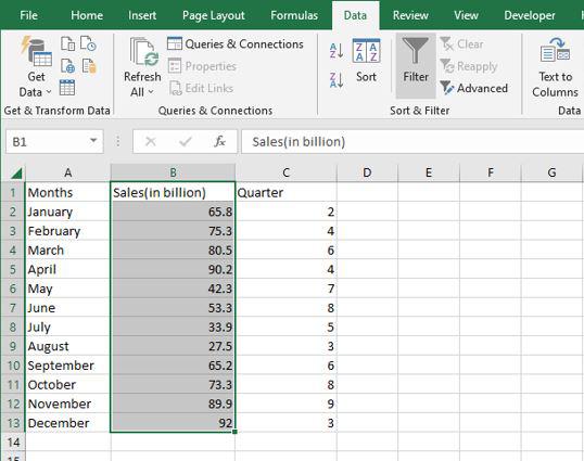
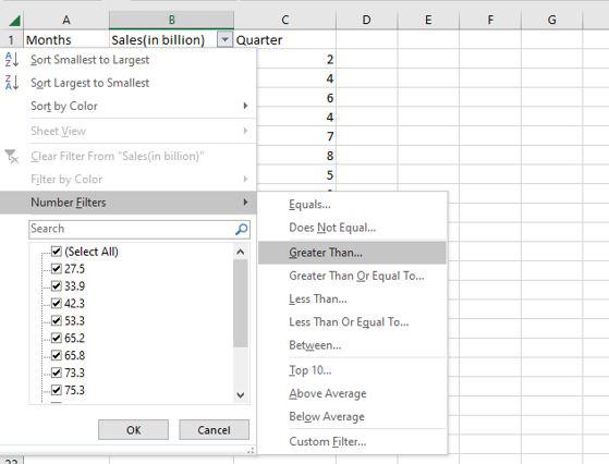
Step 2: The values in the sales column are then shown in a drop-down box. Here we are going to select a number of filters and then greater than.
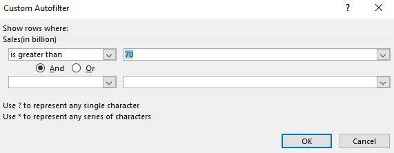
Step 3: Then a custom auto filler dialog box appears. Here we are going to apply sales greater than 70 and then click OK.
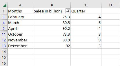
Step 4: Now as you can see only the rows greater than 70 are shown.
Method of Data Analysis
LEN
=LEN quickly returns the character count in a given cell. The =LEN formula may be used to calculate the number of characters needed in a cell to distinguish between two different kinds of product Stock Keeping Units, as seen in the example above. When trying to discern between different Unique Identifiers, which might occasionally be lengthy and out of order, LEN is very crucial.
=LEN(Select Cell)
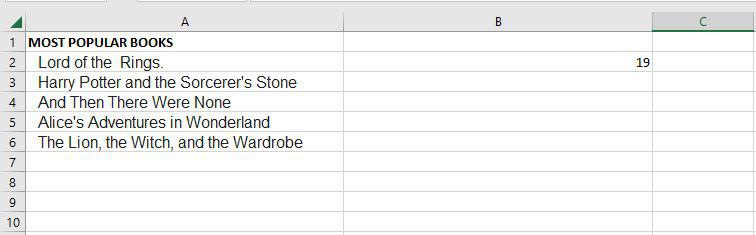
Step 1: If we want to see the length of cell A2, for that we need to write the function of length.
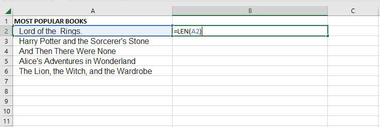
Step 2: Now as you can see it shows the length of the cell A2.
TRIM
=TRIM function will remove all spaces from a cell, with the exception of single spaces between words. The most frequent application of this function is to get rid of trailing spaces. When content is copied verbatim from another source or when users insert spaces at the end of the text, this is normal.
=TRIM(Select Cell)
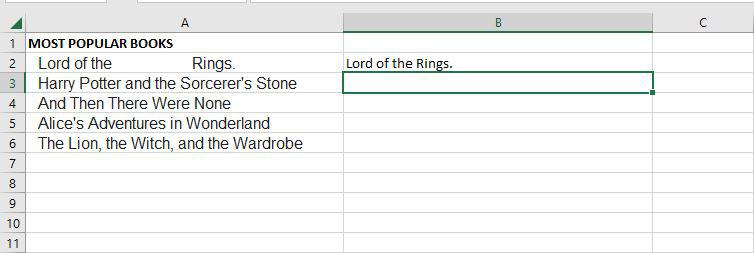
Step 1: If we want to remove all spaces from cell A2, for that we need to write the function of trim.
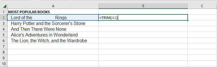
Step 2: Now as you can see after using the trim function, it removes all spaces.
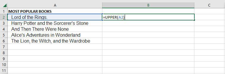
UPPER
The Excel Text function “UPPER Function” will change the text to all capital letters (UPPERCASE). As a result, the function changes all of the characters in a text string input to upper case.
=UPPER(Text)
Text (mandatory parameter): This is the text that we wish to change to uppercase. Text can relate to a cell or be a text string.
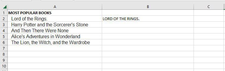
Step 1: If we want to convert the A2 cell to upper text, for that we need to write the upper function.
Step 2: Now as you can see after using the upper function, the text is changed to the upper text.
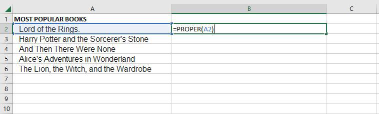
PROPER
Under Excel Text functions, the PROPER Function is listed. Any subsequent letters of text that come after a character other than a letter will also be capitalized by PROPER.
=PROPER(Text)
Text (mandatory parameter): A formula that returns text, a cell reference, or text in quote marks must surround the text you wish to partly capitalize.
Step 1: If we want to convert the A2 cell to proper text, for that we need to write the proper function.
Step 2: Now as you can see after using the proper function, the text is changed to the proper form.
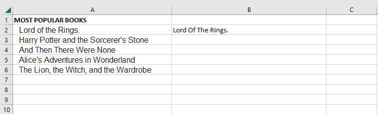
The PROPER function changes the initial letter of every word, letters that follow digits, and other punctuation to uppercase. It could be where we least expect it. The characters for numbers and punctuation remain unaffected.
COUNTIF
Excel has a built-in function called COUNTIF that counts the given cells. The COUNTIF function can be used in both straightforward and sophisticated applications. The fundamental application of counting particular numbers and words is covered in this.
=COUNTIF(range,criteria)
- Range: The size of the cell range to count.
- Criteria: The standards by which cells are selected for counting.
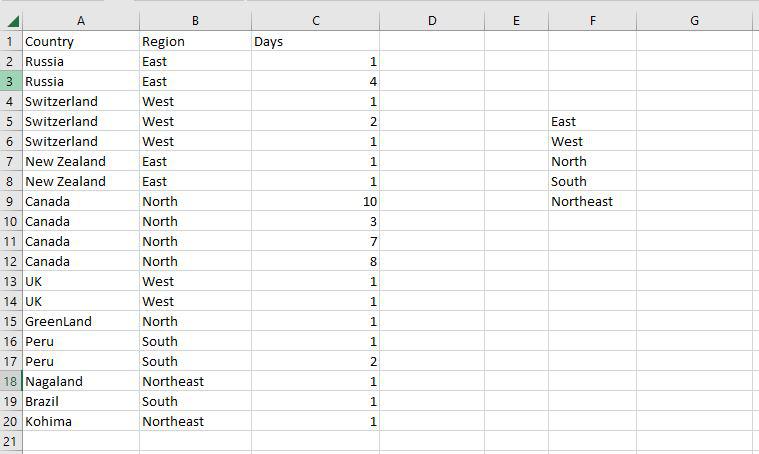
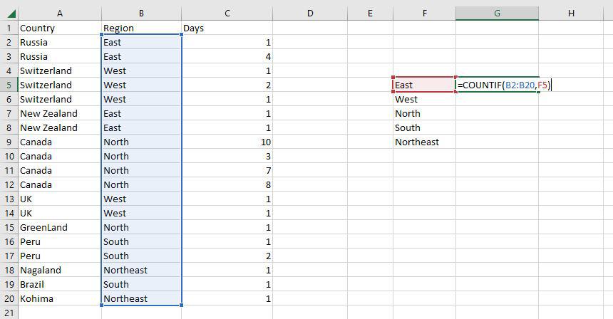
Step 1: Use the COUNTIF function on the range B2:B20 to get the number of regions we have of each type.
Step 2: The COUNTIF function will now be used to count the different sorts of Regions in the range F5:F9.
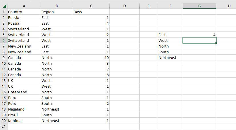
Step 3: Now as you can see the 4 East Region has been correctly enumerated using the COUNTIF function.
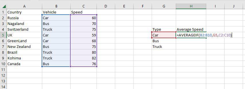
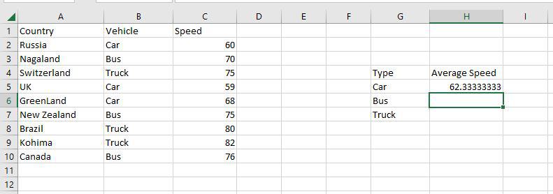
AVERAGEIF
An Excel built-in function called AVERAGEIF determines the average of a range depending on a true or false condition.
=AVERAGEIF(range, criteria, [average_range])
- Range: The size of the cell range to count.
- Criteria: The standards by which cells are selected for counting.
- Average Range: The range in which the function computes the average is known as the average range. But the average range is not required.
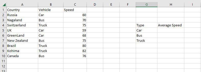
Step 1: Use the AVERAGEIF function on the range B2:B10 to get the average speed of vehicles.
Step 2: The AVERAGEIF function will now be used to find the average of Vehicles in the range H4:H7.
Step 3: Now as you can see the 62.333 Car average has been correctly enumerated using the AVERAGEIF function.
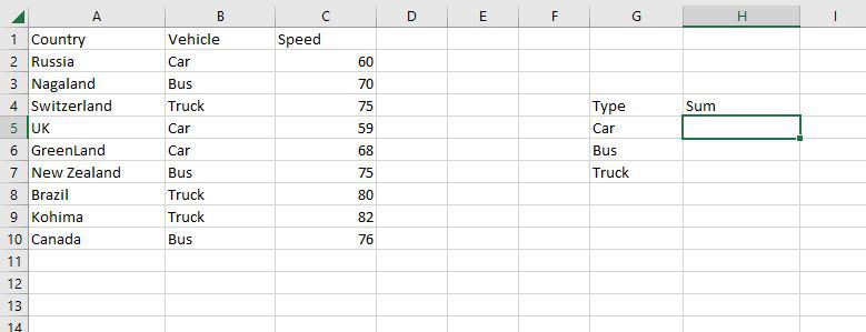
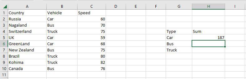
SUMIF
A built-in Excel function called SUMIF determines if a condition is true or false before adding the values in a range.
=SUMIF(range, criteria, [sum_range])
- Range: The size of the cell range to count.
- Criteria: The standards by which cells are selected for counting.
- Sum Range: The range that the function uses to calculate the total is known as the sum range.
Step 1: Use the SUMIF function on the range B2:B10 to get the sum of the vehicle’s speed.
Step 2: The SUMIF function will now be used to find the sum of Vehicles’ speed in the range H4:H7.
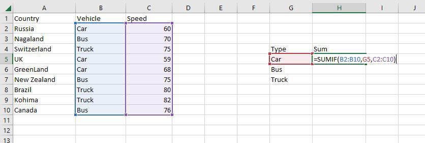
Step 3: Now as you can see the 187 Car sum has been correctly enumerated using the SUMIF function.
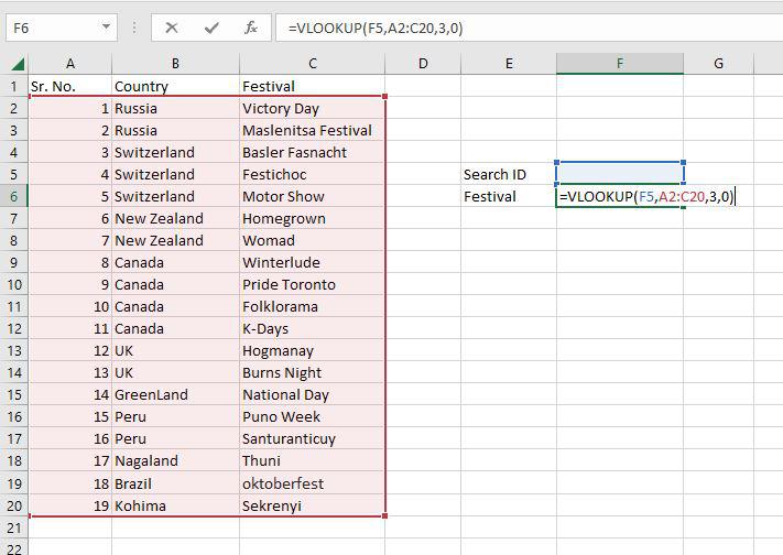
VLOOKUP
VLOOKUP is a built-in Excel function that permits searching across several columns.
=VLOOKUP(lookup_value, table_array, col_index_num, [range_lookup])
- Lookup_value: Choose the cell that will be used to input the search criteria.
- Table_array: The whole table range, which includes each and every cell.
- Col_index_num: The information being searched for. The column’s number, starting from the left, is the input.
- Range_lookup: FALSE if text (0), TRUE if numbers (1).
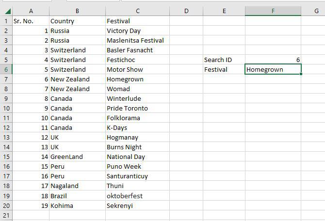
Step 1: To locate the Festival names depending on their search ID, use the VLOOKUP function. The Festival names in this instance are determined by their search ID.
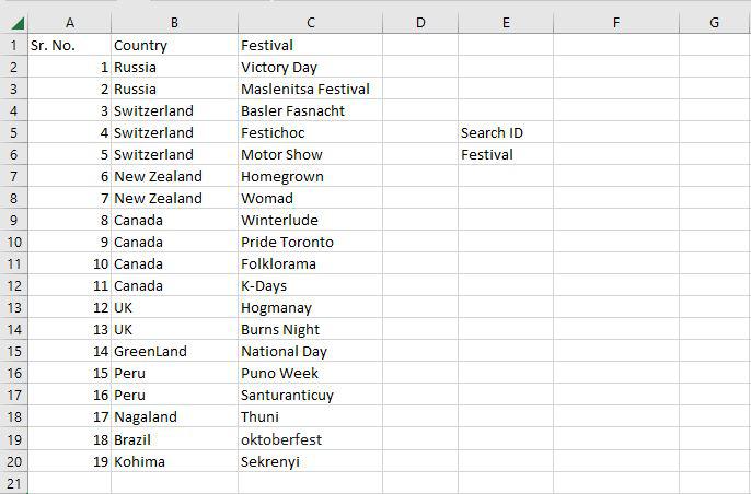
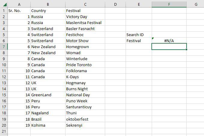
Step 2: F5 was chosen as the lookup value. The search query is typed in this cell. Table array, in this case, A2:C20, is designated as the table’s range. The col index number is set to 3, which is entered. The information being searched is in the third column from the left. Range lookup is entered as 0 (False).
Step 3: The #N/A value is what the function returns. This is the result of the Search ID F5 having no value entered.
Step 4: The Homegrown Festival, which has Search ID 6, has been located through the VLOOKUP tool.
PIVOT TABLE
In order to create the required report, a pivot table is a statistics tool that condenses and reorganizes specific columns and rows of data in a spreadsheet or database table. The utility simply “pivots” or rotates the data to examine it from various angles rather than altering the spreadsheet or database itself.
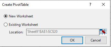
Step 1: Select any cell and then go to the home tab and then select Pivot table.
Step 2: Create Pivot table dialog box appears here select the new worksheet and then click OK.
Step 3: Now you can see it creates a pivot table.
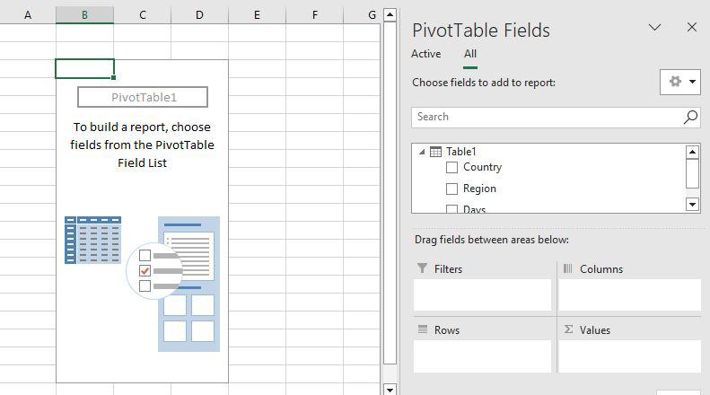
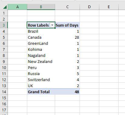
Step 4: Just drag the Country field to the row area and the Days field to the value area.
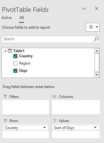
Step 5: Now you can see the proper pivot table with Country and days fields.
Data Analytics has demonstrated its potential in various sectors by boosting its growth and demand. Using Data Analytics, companies have begun effective utilization of their data since it has become a differentiating factor for corporate success.
Today, data is increasingly being viewed as a source of competitive benefits for companies of all kinds. Hence, Data Analytics is a game-changer for organizations’ Digital Transformation efforts since it enables quicker intelligent decision-making and delivers real-time insights based on organizational data.
Data Analysts behind Data Analytics procedures will need tools and software that will guarantee optimum results in the most efficient and fastest way possible. Many software and tools in the market allow Data Analysts to maximize the value of their analytical work. While advanced analytics tools such as Hadoop, Apache Storm, and DataCleaner are commonly used by Data Analysts, Microsoft Excel for Data Analysts is one such software that frequently goes overlooked.
Microsoft Excel for Data Analysts is one of the top tools and its built-in Pivot Table is unarguably one of the best and most popular analytical tools one could ask for. Data Analysts can use Microsoft Excel to create flexible Data Aggregation, represent data visually, calculate margins and other common ratios, etc.
This article will introduce you to Data Analysis and the importance of Microsoft Excel for Data Analysts. It will also teach you about various important features of Microsoft Excel for Data Analysts and their uniqueness.
Table of Contents
- What is Data Analysis?
- What is Microsoft Excel?
- Importance of Microsoft Excel for Data Analysts
- Key Features of Microsoft Excel for Data Analysts
- Pivot Table
- Conditional Formatting
- LOOKUP
- What-If Analysis
- Data Visualization
- Functions
- Analysis ToolPak
- ANOVA
- T-Test
- Random Number Generator
- Descriptive Statistics
- Pros & Cons of Excel in Data Analysis
- Conclusion
What is Data Analysis?
Data Analysis is the process of Collecting, Cleaning, Analyzing, and Mining Data, Interpreting Results, and Reporting the findings. It helps in the uncovering of patterns in data as well as correlations between various Data Points. Using these patterns and correlations, Data Analysts can generate insights and conclusions from the raw data.
Data Analysis also provides a means for responding to questions that can help organizations in improving business decisions for future actions by understanding past behavior and interactions.
Data Analysis allows businesses to sketch their action plan before committing to it. In addition, Data Analysis enables companies to develop products and services that appeal to their customers and help them identify new opportunities for revenue generation.
For more information on Data Analysis, click here.
What is Microsoft Excel?
Microsoft Excel has been around since it was initially released for the Apple Mac in 1984. When Microsoft finally launched its own computer and Operating System in 1987, it was re-engineered for a new platform and dubbed Microsoft Excel 2.0.
Microsoft Excel was launched to compete with VisiCalc, a Spreadsheet capable of 5 columns and 20 rows, which though seems primitive by current standards but was a revolutionary software in the 70s.
Drawing Capabilities, Toolbars, Add-in Support, Outlining, 3D Charts, and many other features were incorporated into the run-time version of Windows in 1990. The PDF format had not yet been established when Microsoft Excel was implemented, and it was not invented until 1993.
Fast forward to Microsoft Excel versions since the 2010s and beyond, today, the software has chart updates, recommendations for users to choose between Pivot Tables, and more, all aimed to improve Microsoft Excel for Data Analysts.
For more information on Microsoft Excel, click here.
Hevo Data is a No-code Data Pipeline that offers a fully managed solution to set up data integration from 100+ Data Sources (40+ Free Data Sources) to numerous Business Intelligence tools, Data Warehouses, or a destination of choice.
It will automate your data flow in minutes without writing any line of code. Hevo’s fault-tolerant architecture makes sure that your data is secure and consistent. Hevo provides you with a truly efficient and fully automated solution to manage data in real-time and always have analysis-ready data.
Let’s look at some salient features of Hevo:
- Secure: Hevo has a fault-tolerant architecture that ensures that the data is handled in a secure, consistent manner with zero data loss.
- Schema Management: Hevo takes away the tedious task of schema management & automatically detects the schema of incoming data and maps it to the destination schema.
- Minimal Learning: Hevo, with its simple and interactive UI, is extremely simple for new customers to work on and perform operations.
- Hevo Is Built To Scale: As the number of sources and the volume of your data grows, Hevo scales horizontally, handling millions of records per minute with very little latency.
- Incremental Data Load: Hevo allows the transfer of data that has been modified in real-time. This ensures efficient utilization of bandwidth on both ends.
- Live Support: The Hevo team is available round the clock to extend exceptional support to its customers through chat, email, and support calls.
- Live Monitoring: Hevo allows you to monitor the data flow and check where your data is at a particular point in time.
Explore more about Hevo by signing up for the 14-day trial today!
Importance of Microsoft Excel for Data Analysts
Microsoft Excel quickly rose to prominence as the most extensively used Spreadsheet software and became the industry standard for Spreadsheets. When it comes to analyzing and visualizing data, Microsoft Excel has long been the go-to tool for business professionals.
Not only do businesses use this software to do simple Mathematical Computations but also perform complex Data Analyses. The fundamental goal of any Data Analyst is to consolidate discrete Data Points and use them to create a cohesive narrative. Microsoft Excel can accomplish it at affordable prices.
Today, organizations are equipped with more advanced analytics tools than Microsoft Excel, however, it remains a part of a larger Data Ecosystem. The main reason behind this is the simplicity of Microsoft Excel for Data Analysts, its key features, and user familiarity with it. A Microsoft Excel Spreadsheet organizes data into a legible format, making it easier for Data Analysts to extract insights.
Microsoft Excel allows users to modify fields and functions that perform computations when working with more complex data. Additionally, it facilitates easy collaboration and works with multiple users together. In recent years Microsoft has added several additional features to Microsoft Excel for Data Analysts that can further the Analytical Applications of this Spreadsheet software.
Today, Microsoft Excel can serve as an excellent stepping stone for individuals new to Business Analytics as it can assist them in understanding the significance of numerous analytical activities before moving on to other tools such as Python and R. Its extensive set of Functions, Graphs, and Arrays enable Data Analysts to quickly grasp the basics of drawing insights from data that might otherwise be difficult to perceive.
Listed below are the key features of Microsoft Excel for Data Analysts:
- Pivot Table
- Conditional Formatting
- LOOKUP
- What-If Analysis
- Data Visualization
- Functions
- Analysis ToolPak
- ANOVA
- T-Test
- Random Number Generator
- Descriptive Statistics
1) Pivot Table
A Pivot Table is one of the most popular features of Microsoft Excel for Data Analysts. It is a summary table that lets users Count, Average, Sum, and Execute other calculations based on the reference feature that has been chosen. This helps in converting a data table into an Inference Table that aids Data Analysts in concluding.
Recognizing patterns in a small dataset is relatively easy, but the complexity of the larger datasets typically necessitates extra effort to find the patterns. A Pivot Table can be a tremendous help in these situations because it only takes a few minutes to summarise groups of data into one Pivot Table that highlights information required by Data Analysts. Once the Pivot Table is ready, it can be used to create a suitable Pivot Chart for visual analysis of the data by clicking on the PivotChart option.
Pivot Table is suitable for dealing with queries like, “What was the average number of customers for product A?” or “Which office branch made the highest quarterly sale on printers?”. It is a crucial part of Data Exploration in Microsoft Excel for Data Analysts.
2) Conditional Formatting
![]()
Conditional Formatting in Microsoft Excel for Data Analysts allows them to highlight cells in a specific color based on the value of the cell and the criteria set by them. It’s a great technique to graphically highlight information or detect outliers and trends in data.
For instance, this technique can be used to provide a Color Gradient to Employee scores to identify top performers with scores of 70 and above. This is what makes Conditional Formatting one of the important features of Microsoft Excel for Data Analysts.
3) LOOKUP
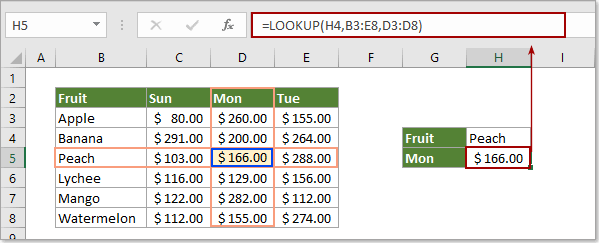
It is one of the most famous features of Microsoft Excel for Data Analysts, which enables matching data from a table with an input (LOOKUP) value. There are 2 ways of using this feature in Microsoft Excel for Data Analysts:
- Vector Form: The Vector Form of LOOKUP searches 1 row (HLOOKUP) or 1 column (VLOOKUP) for a value. It is used to specify the range containing the values that the Data Analyst wants to match. The V in VLOOKUP stands for Vertical Search (in a single column), while the H in HLOOKUP stands for Horizontal Search (within a single row).
- Array Form: The Array Form of LOOKUP looks for the given value in the first row or column of an Array and returns a value from the same position in the Array’s last row or column. If values to be matched are in the array’s first row or column, the Array Form of LOOKUP is helpful.
4) What-If Analysis
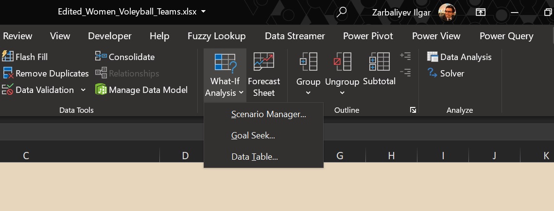
What-If Analysis allows Data Analysts to create different scenarios and easily compare results. This is accomplished by manipulating cell values to see how they impact the results of formulae on the Worksheet. Microsoft Excel for Data Analysts offers 3 What-If Analysis tools that can be used based on user requirements. These are:
- Data Tables: It is a collection of cells in Microsoft Excel for Data Analysts to modify the values in some of the cells and to get multiple solutions to a problem. It only works with 1 or 2 variables, but those variables might have a wide range of values.
- Scenario Manager: It takes into account more than 2 variables and generates scenarios for each combination of input values for the variables in question.
- Goal Seek: It involves a formula that utilizes a single variable input value to get the desired outcome. Goal Seek then tries to find a solution for the input value by changing the input value in the formula.
Goal Seek is used when users know the result of the formula, but the input information for this result is unknown. Data Tables and Scenario Manager, on the other hand, use a set of known input values and project them ahead to identify probable outcomes.
5) Data Visualization
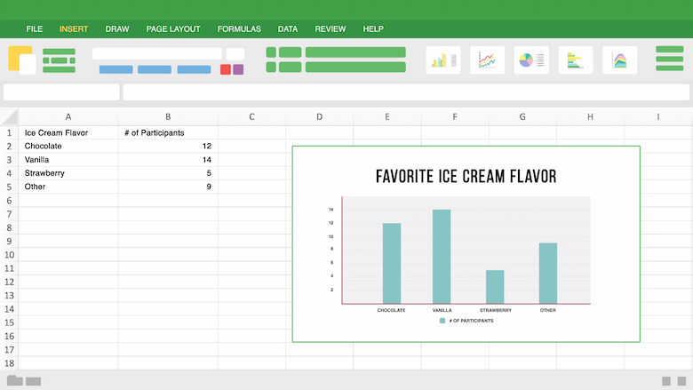
Microsoft Excel for Data Analysts offers 2 tools for Data Visualization, i.e. Charts and Pivot Charts. Microsoft Excel Charts help in understanding Data Analysis conclusions through Color, Simple Presentation, and Adaptability. There are different types of Charts available in Microsoft Excel, like
- Column Charts: Used for comparative Data Analysis,
- Pie Charts: Used for depicting Proportional Data,
- Linear Charts: Used for analyzing trends over a time period.
A Pivot Chart is the visual representation of a Pivot Table in Microsoft Excel for Data Analysts.
6) Functions
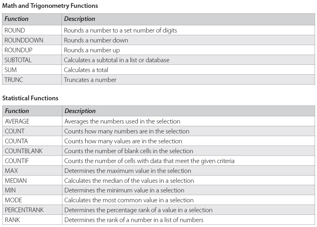
Microsoft Excel has around 400 Functions that help in Data Cleaning, Sorting, Filtering, and more. Each Function has its own unique application. Some common examples are:
- LEN: Used in Data Analysis to display the number of characters in any given cell.
- CONCATENATE: Combines the values of several cells into one.
- SORT: Arranges a list as per given parameters.
- SUMIFS: Sums values that meet specified criteria.
- COUNTIFS: Counts the number of times a value appears based on a single criterion.
- MEDIAN: Finds the middle number in a given array of numbers.
- TRIM: Removes unwanted spaces or characters from text.
7) Analysis ToolPak
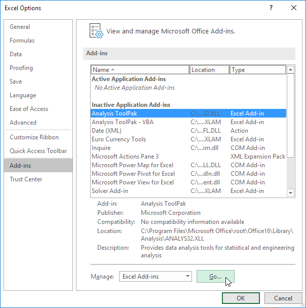
It is an add-in package in Microsoft Excel for Data Analysts that includes Financial, Statistical, and Engineering Data Analysis tools. Here, Data Analysts only need to provide input data and specific parameters, and the selected tool automatically performs the required calculations. Some of the tools are:
- ANOVA
- T-Test
- Random Number Generator
- Descriptive Statistics
1) ANOVA
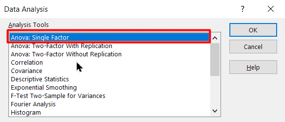
In Microsoft Excel, ANOVA (Analysis of Variance) is a statistical approach for comparing the differences between 2 or more Means. This allows the calculation of how much a particular variable affects the final result. Microsoft Excel offers 3 ANOVA features:
- Single Factor: Classifies data with only 1 nominal variable, which can have multiple values (categories) that may not be in order.
- Two-Factor with Replication: Classifies data along with 2 different variables. Here the total number of samples for either variable is uniform.
- Two-Factor without Replication: Classifies data along with 2 different variables. However, here there is only 1 observation for each combination of nominal variables.
2) T-Test

It is used for testing the probability value when comparing 2 sample Data Points, e.g., sales before and after running a promotional campaign. Microsoft Excel for Data Analysts offers 3 variants of the T-Test:
- Paired 2 Sample for Means: It is used when measurements or observations were paired naturally in a sample. For instance, insulin levels before and after receiving an insulin pump.
- Two-Sample Assuming Equal Variances: It is used when measurements are independent i.e., they were done on 2 different subject groups. For example, checking responses to biological stimuli in different age groups.
- Two-Sample Assuming Unequal Variances: It is also used when measurements are independent but when Variances are unequal.
3) Random Number Generator
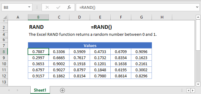
It fills a range with independent Random Numbers taken from one of several distributions. This is done using either the PRNG method, which utilizes mathematical formulae to generate sequences of Random Numbers, or by measuring a physical process that occurs outside of the computer.
The former generates fictitious Random Numbers, whereas the latter generates true Random Numbers. These Random Numbers are necessary during encryption or to populate a dataset with more values.
4) Descriptive Statistics

The Descriptive Statistics Analysis tool is one of the most basic and intuitive tools of Microsoft Excel for Data Analysts that is used to produce Univariate Statistics Reports for data in the input range. It provides information on Mean, Median, Mode, and Range Statistics, as well as Variance and Standard Deviation.
Pros & Cons of Excel in Data Analysis
Pros
- Microsoft Excel is best for arranging large sets of data into organized tables. The level of organization makes it easier to digest and analyze data.
- You can plug in your data to create Data Visualizations like graphs and present & discuss your data better with C-Suite.
- Excel streamlines your calculations. This way, you don’t have to worry about your output parameters when your input has changed. The software is intelligent enough to rework the calculations.
- Excel is available on all leading platforms: Windows, Mac, Android, and iOS; on the web, and offline both.
- Excel comes with a range of in-built functions that make accounting, math, statistics, logic, and database calculations easy.
Cons
- Microsoft Excel isn’t designed to be scalable. Scalable applications are dynamic and have the flexibility to meet complex business needs in changing scenes. Excel workbooks are static, and they crawl when asked to compute on thousands of rows.
- Excel also imposes limitations on file size.
- It does not have support for quick autofill features, which can be frustrating for someone without advanced knowledge.
- If you aren’t careful enough, there are bound to be errors in your calculations. Decimals or percentages may get misplaced, data types may be misunderstood, and currency or date formats may get interchanged: plenty to point to.
- No automation features.
Conclusion
Microsoft Excel for Data Analysts helps in categorizing Datasets, Building Data Models, Importing Data, and many more. While it cannot compete with the versatility of stand-alone Business Intelligence (BI) tools nor handle large amounts of data like Apache Spark or any other Unified Data Analytics Engines, it will continue to be a key part of the Data Analysis Ecosystem. Microsoft Excel is still the go-to solution for simple analysis for users who lack the strong technical ability to code as it does not require extensive training.
This article introduced you to Data Analytics and Microsoft Excel for Data Analysts. It also provided the usefulness of Microsoft Excel for Data Analysts. By the means of this article, you also gained knowledge on the 7 key features of Microsoft Excel for Data Analysts.
Your work with Microsoft Excel will involve regular data transfers for analytical purposes. Hevo Data helps you directly transfer data from a source of your choice to a Data Warehouse or desired destination in a fully automated and secure manner without having to write any code or export data repeatedly.
It will make your life easier and make Data Migration hassle–free allowing you to focus on Data Analysis. It is User-Friendly, Reliable, and Secure.
Give Hevo a try by signing up for the 14-day free trial today!
Share your experience of understanding Microsoft Excel for Data Analysts in the comments below!