
When you create a chart in an Excel worksheet, a Word document, or a PowerPoint presentation, you have a lot of options. Whether you’ll use a chart that’s recommended for your data, one that you’ll pick from the list of all charts, or one from our selection of chart templates, it might help to know a little more about each type of chart.
Click here to start creating a chart.
For a description of each chart type, select an option from the following drop-down list.
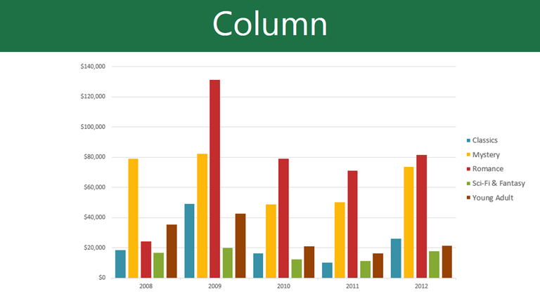
Data that’s arranged in columns or rows on a worksheet can be plotted in a column chart. A column chart typically displays categories along the horizontal (category) axis and values along the vertical (value) axis, as shown in this chart:

Types of column charts
-
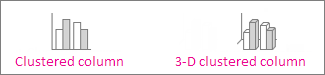
Clustered column and 3-D clustered column

A clustered column chart shows values in 2-D columns. A 3-D clustered column chart shows columns in 3-D format, but it doesn’t use a third value axis (depth axis). Use this chart when you have categories that represent:
-
Ranges of values (for example, item counts).
-
Specific scale arrangements (for example, a Likert scale with entries like Strongly agree, Agree, Neutral, Disagree, Strongly disagree).
-
Names that are not in any specific order (for example, item names, geographic names, or the names of people).
-
-
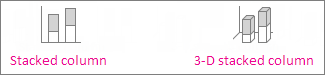
Stacked column and 3-D stacked column A stacked column chart shows values in 2-D stacked columns. A 3-D stacked column chart shows the stacked columns in 3-D format, but it doesn’t use a depth axis. Use this chart when you have multiple data series and you want to emphasize the total.
-
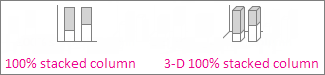
100% stacked column and 3-D 100% stacked column A 100% stacked column chart shows values in 2-D columns that are stacked to represent 100%. A 3-D 100% stacked column chart shows the columns in 3-D format, but it doesn’t use a depth axis. Use this chart when you have two or more data series and you want to emphasize the contributions to the whole, especially if the total is the same for each category.
-
3-D column 3-D column charts use three axes that you can change (a horizontal axis, a vertical axis, and a depth axis), and they compare data points along the horizontal and the depth axes. Use this chart when you want to compare data across both categories and data series.

Data that’s arranged in columns or rows on a worksheet can be plotted in a line chart. In a line chart, category data is distributed evenly along the horizontal axis, and all value data is distributed evenly along the vertical axis. Line charts can show continuous data over time on an evenly scaled axis, so they’re ideal for showing trends in data at equal intervals, like months, quarters, or fiscal years.

Types of line charts
-
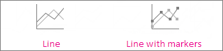
Line and line with markers Shown with or without markers to indicate individual data values, line charts can show trends over time or evenly spaced categories, especially when you have many data points and the order in which they are presented is important. If there are many categories or the values are approximate, use a line chart without markers.
-
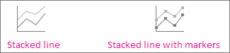
Stacked line and stacked line with markers Shown with or without markers to indicate individual data values, stacked line charts can show the trend of the contribution of each value over time or evenly spaced categories.
-
100% stacked line and 100% stacked line with markers Shown with or without markers to indicate individual data values, 100% stacked line charts can show the trend of the percentage each value contributes over time or evenly spaced categories. If there are many categories or the values are approximate, use a 100% stacked line chart without markers.
-
3-D line 3-D line charts show each row or column of data as a 3-D ribbon. A 3-D line chart has horizontal, vertical, and depth axes that you can change.
Notes:
-
Line charts work best when you have multiple data series in your chart—if you have only one data series, consider using a scatter chart instead.
-
Stacked line charts sum the data, which might not be the result you want. It might not be easy to see that the lines are stacked, so consider using a different line chart type or a stacked area chart instead.
-


Data that’s arranged in one column or row on a worksheet can be plotted in a pie chart. Pie charts show the size of items in one data series, proportional to the sum of the items. The data points in a pie chart are shown as a percentage of the whole pie.

Consider using a pie chart when:
-
You have only one data series.
-
None of the values in your data are negative.
-
Almost none of the values in your data are zero values.
-
You have no more than seven categories, all of which represent parts of the whole pie.
Types of pie charts
-
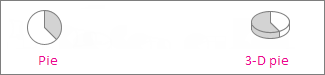
Pie and 3-D pie Pie charts show the contribution of each value to a total in a 2-D or 3-D format. You can pull out slices of a pie chart manually to emphasize the slices.
-
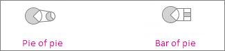
Pie of pie and bar of pie Pie of pie or bar of pie charts show pie charts with smaller values pulled out into a secondary pie or stacked bar chart, which makes them easier to distinguish.
Data that’s arranged in columns or rows only on a worksheet can be plotted in a doughnut chart. Like a pie chart, a doughnut chart shows the relationship of parts to a whole, but it can contain more than one data series.

Types of doughnut charts
-
Doughnut Doughnut charts show data in rings, where each ring represents a data series. If percentages are shown in data labels, each ring will total 100%.
Note: Doughnut charts aren’t easy to read. You may want to use a stacked column charts or Stacked bar chart instead.

Data that’s arranged in columns or rows on a worksheet can be plotted in a bar chart. Bar charts illustrate comparisons among individual items. In a bar chart, the categories are typically organized along the vertical axis, and the values along the horizontal axis.

Consider using a bar chart when:
-
The axis labels are long.
-
The values that are shown are durations.
Types of bar charts
-
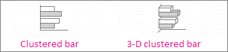
Clustered bar and 3-D clustered bar A clustered bar chart shows bars in 2-D format. A 3-D clustered bar chart shows bars in 3-D format; it doesn’t use a depth axis.
-
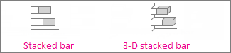
Stacked bar and 3-D stacked bar Stacked bar charts show the relationship of individual items to the whole in 2-D bars. A 3-D stacked bar chart shows bars in 3-D format; it doesn’t use a depth axis.
-
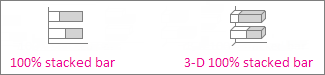
100% stacked bar and 3-D 100% stacked bar A 100% stacked bar shows 2-D bars that compare the percentage that each value contributes to a total across categories. A 3-D 100% stacked bar chart shows bars in 3-D format; it doesn’t use a depth axis.
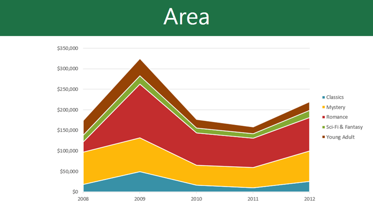
Data that’s arranged in columns or rows on a worksheet can be plotted in an area chart. Area charts can be used to plot change over time and draw attention to the total value across a trend. By showing the sum of the plotted values, an area chart also shows the relationship of parts to a whole.

Types of area charts
-
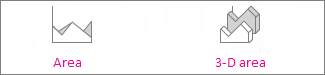
Area and 3-D area Shown in 2-D or in 3-D format, area charts show the trend of values over time or other category data. 3-D area charts use three axes (horizontal, vertical, and depth) that you can change. As a rule, consider using a line chart instead of a non-stacked area chart, because data from one series can be hidden behind data from another series.
-
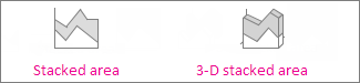
Stacked area and 3-D stacked area Stacked area charts show the trend of the contribution of each value over time or other category data in 2-D format. A 3-D stacked area chart does the same, but it shows areas in 3-D format without using a depth axis.
-
100% stacked area and 3-D 100% stacked area 100% stacked area charts show the trend of the percentage that each value contributes over time or other category data. A 3-D 100% stacked area chart does the same, but it shows areas in 3-D format without using a depth axis.
Data that’s arranged in columns and rows on a worksheet can be plotted in an xy (scatter) chart. Place the x values in one row or column, and then enter the corresponding y values in the adjacent rows or columns.
A scatter chart has two value axes: a horizontal (x) and a vertical (y) value axis. It combines x and y values into single data points and shows them in irregular intervals, or clusters. Scatter charts are typically used for showing and comparing numeric values, like scientific, statistical, and engineering data.

Consider using a scatter chart when:
-
You want to change the scale of the horizontal axis.
-
You want to make that axis a logarithmic scale.
-
Values for horizontal axis are not evenly spaced.
-
There are many data points on the horizontal axis.
-
You want to adjust the independent axis scales of a scatter chart to reveal more information about data that includes pairs or grouped sets of values.
-
You want to show similarities between large sets of data instead of differences between data points.
-
You want to compare many data points without regard to time—the more data that you include in a scatter chart, the better the comparisons you can make.
Types of scatter charts
-
Scatter This chart shows data points without connecting lines to compare pairs of values.
-
Scatter with smooth lines and markers and scatter with smooth lines This chart shows a smooth curve that connects the data points. Smooth lines can be shown with or without markers. Use a smooth line without markers if there are many data points.
-
Scatter with straight lines and markers and scatter with straight lines This chart shows straight connecting lines between data points. Straight lines can be shown with or without markers.

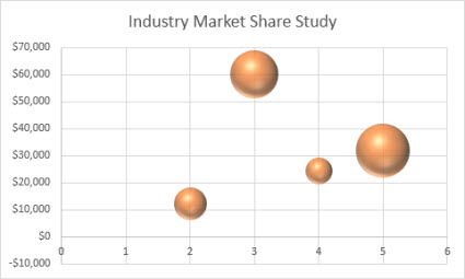
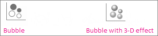
Much like a scatter chart, a bubble chart adds a third column to specify the size of the bubbles it shows to represent the data points in the data series.
Type of bubble charts
-
Bubble or bubble with 3-D effect Both of these bubble charts compare sets of three values instead of two, showing bubbles in 2-D or 3-D format (without using a depth axis). The third value specifies the size of the bubble marker.
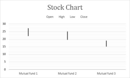
Data that’s arranged in columns or rows in a specific order on a worksheet can be plotted in a stock chart. As the name implies, stock charts can show fluctuations in stock prices. However, this chart can also show fluctuations in other data, like daily rainfall or annual temperatures. Make sure you organize your data in the right order to create a stock chart.
For example, to create a simple high-low-close stock chart, arrange your data with High, Low, and Close entered as column headings, in that order.
Types of stock charts
-
High-low-close This stock chart uses three series of values in the following order: high, low, and then close.
-
Open-high-low-close This stock chart uses four series of values in the following order: open, high, low, and then close.
-
Volume-high-low-close This stock chart uses four series of values in the following order: volume, high, low, and then close. It measures volume by using two value axes: one for the columns that measure volume, and the other for the stock prices.
-
Volume-open-high-low-close This stock chart uses five series of values in the following order: volume, open, high, low, and then close.


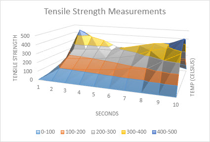
Data that’s arranged in columns or rows on a worksheet can be plotted in a surface chart. This chart is useful when you want to find optimum combinations between two sets of data. As in a topographic map, colors and patterns indicate areas that are in the same range of values. You can create a surface chart when both categories and data series are numeric values.
Types of surface charts
-
3-D surface This chart shows a 3-D view of the data, which can be imagined as a rubber sheet stretched over a 3-D column chart. It is typically used to show relationships between large amounts of data that may otherwise be difficult to see. Color bands in a surface chart do not represent the data series; they indicate the difference between the values.
-
Wireframe 3-D surface Shown without color on the surface, a 3-D surface chart is called a wireframe 3-D surface chart. This chart shows only the lines. A wireframe 3-D surface chart isn’t easy to read, but it can plot large data sets much faster than a 3-D surface chart.
-
Contour Contour charts are surface charts viewed from above, similar to 2-D topographic maps. In a contour chart, color bands represent specific ranges of values. The lines in a contour chart connect interpolated points of equal value.
-
Wireframe contour Wireframe contour charts are also surface charts viewed from above. Without color bands on the surface, a wireframe chart shows only the lines. Wireframe contour charts aren’t easy to read. You may want to use a 3-D surface chart instead.


Data that’s arranged in columns or rows on a worksheet can be plotted in a radar chart. Radar charts compare the aggregate values of several data series.

Type of radar charts
-
Radar and radar with markers With or without markers for individual data points, radar charts show changes in values relative to a center point.
-
Filled radar In a filled radar chart, the area covered by a data series is filled with a color.


The treemap chart provides a hierarchical view of your data and an easy way to compare different levels of categorization. The treemap chart displays categories by color and proximity and can easily show lots of data which would be difficult with other chart types. The treemap chart can be plotted when empty (blank) cells exist within the hierarchal structure and treemap charts are good for comparing proportions within the hierarchy.

Note: There are no chart sub-types for treemap charts.
The sunburst chart is ideal for displaying hierarchical data and can be plotted when empty (blank) cells exist within the hierarchal structure . Each level of the hierarchy is represented by one ring or circle with the innermost circle as the top of the hierarchy. A sunburst chart without any hierarchical data (one level of categories), looks similar to a doughnut chart. However, a sunburst chart with multiple levels of categories shows how the outer rings relate to the inner rings. The sunburst chart is most effective at showing how one ring is broken into its contributing pieces.

Note: There are no chart sub-types for sunburst charts.
Data plotted in a histogram chart shows the frequencies within a distribution. Each column of the chart is called a bin, which can be changed to further analyze your data.

Type of histogram charts
-
Histogram The histogram chart shows the distribution of your data grouped into frequency bins.
-
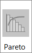
Pareto chart A pareto is a sorted histogram chart that contains both columns sorted in descending order and a line representing the cumulative total percentage.

A box and whisker chart shows distribution of data into quartiles, highlighting the mean and outliers. The boxes may have lines extending vertically called “whiskers”. These lines indicate variability outside the upper and lower quartiles, and any point outside those lines or whiskers is considered an outlier. Use this chart type when there are multiple data sets which relate to each other in some way.

Note: There are no chart sub-types for box and whisker charts.
A waterfall chart shows a running total of your financial data as values are added or subtracted. It’s useful for understanding how an initial value is affected by a series of positive and negative values. The columns are color coded so you can quickly tell positive from negative numbers.

Note: There are no chart sub-types for waterfall charts.
Funnel charts show values across multiple stages in a process.

Typically, the values decrease gradually, allowing the bars to resemble a funnel. Read more about funnel charts here.
Data that’s arranged in columns and rows can be plotted in a combo chart. Combo charts combine two or more chart types to make the data easy to understand, especially when the data is widely varied. Shown with a secondary axis, this chart is even easier to read. In this example, we used a column chart to show the number of homes sold between January and June and then used a line chart to make it easier for readers to quickly identify the average sales price by month.

Type of combo charts
-
Clustered column – line and clustered column – line on secondary axis With or without a secondary axis, this chart combines a clustered column and line chart, showing some data series as columns and others as lines in the same chart.
-
Stacked area – clustered column This chart combines a stacked area and clustered column chart, showing some data series as stacked areas and others as columns in the same chart.
-
Custom combination This chart lets you combine the charts you want to show in the same chart.


You can use a Map Chart to compare values and show categories across geographical regions. Use it when you have geographical regions in your data, like countries/regions, states, counties or postal codes.
For example, Countries by Population uses values. The values represent the total population in each country, with each portrayed using a gradient spectrum of two colors. The color for each region is dictated by where along the spectrum its value falls with respect to the others.

In the following example, Countries by Category, the categories are displayed using a standard legend to show groups or affiliations. Each data point is represented by an entirely different color.

Change a chart type
If you have already have a chart, but you just want to change its type:
-
Select the chart, click the Design tab, and click Change Chart Type.
-
Choose a new chart type in the Change Chart Type box.

Many chart types are available to help you display data in ways that are meaningful to your audience. Here are some examples of the most common chart types and how they can be used.

Data that is arranged in columns or rows on an Excel sheet can be plotted in a column chart. In column charts, categories are typically organized along the horizontal axis and values along the vertical axis.
Column charts are useful to show how data changes over time or to show comparisons among items.
Column charts have the following chart subtypes:
-
Clustered column chart Compares values across categories. A clustered column chart displays values in 2-D vertical rectangles. A clustered column in a 3-D chart displays the data by using a 3-D perspective.
-
Stacked column chart Shows the relationship of individual items to the whole, comparing the contribution of each value to a total across categories. A stacked column chart displays values in 2-D vertical stacked rectangles. A 3-D stacked column chart displays the data by using a 3-D perspective. A 3-D perspective is not a true 3-D chart because a third value axis (depth axis) is not used.
-
100% stacked column chart Compares the percentage that each value contributes to a total across categories. A 100% stacked column chart displays values in 2-D vertical 100% stacked rectangles. A 3-D 100% stacked column chart displays the data by using a 3-D perspective. A 3-D perspective is not a true 3-D chart because a third value axis (depth axis) is not used.
-
3-D column chart Uses three axes that you can change (a horizontal axis, a vertical axis, and a depth axis). They compare data points along the horizontal and the depth axes.

Data that is arranged in columns or rows on an Excel sheet can be plotted in a line chart. Line charts can display continuous data over time, set against a common scale, and are therefore ideal to show trends in data at equal intervals. In a line chart, category data is distributed evenly along the horizontal axis, and all value data is distributed evenly along the vertical axis.
Line charts work well if your category labels are text, and represent evenly spaced values such as months, quarters, or fiscal years.
Line charts have the following chart subtypes:
-
Line chart with or without markers Shows trends over time or ordered categories, especially when there are many data points and the order in which they are presented is important. If there are many categories or the values are approximate, use a line chart without markers.
-
Stacked line chart with or without markers Shows the trend of the contribution of each value over time or ordered categories. If there are many categories or the values are approximate, use a stacked line chart without markers.
-
100% stacked line chart displayed with or without markers Shows the trend of the percentage each value contributes over time or ordered categories. If there are many categories or the values are approximate, use a 100% stacked line chart without markers.
-
3-D line chart Shows each row or column of data as a 3-D ribbon. A 3-D line chart has horizontal, vertical, and depth axes that you can change.

Data that is arranged in one column or row only on an Excel sheet can be plotted in a pie chart. Pie charts show the size of items in one data series, proportional to the sum of the items. The data points in a pie chart are displayed as a percentage of the whole pie.
Consider using a pie chart when you have only one data series that you want to plot, none of the values that you want to plot are negative, almost none of the values that you want to plot are zero values, you don’t have more than seven categories, and the categories represent parts of the whole pie.
Pie charts have the following chart subtypes:
-
Pie chart Displays the contribution of each value to a total in a 2-D or 3-D format. You can pull out slices of a pie chart manually to emphasize the slices.
-
Pie of pie or bar of pie chart Displays pie charts with user-defined values that are extracted from the main pie chart and combined into a secondary pie chart or into a stacked bar chart. These chart types are useful when you want to make small slices in the main pie chart easier to distinguish.
-
Doughnut chart Like a pie chart, a doughnut chart shows the relationship of parts to a whole. However, it can contain more than one data series. Each ring of the doughnut chart represents a data series. Displays data in rings, where each ring represents a data series. If percentages are displayed in data labels, each ring will total 100%.

Data that is arranged in columns or rows on an Excel sheet can be plotted in a bar chart.
Use bar charts to show comparisons among individual items.
Bar charts have the following chart subtypes:
-
Clustered bar and 3-D Clustered bar chart Compares values across categories. In a clustered bar chart, the categories are typically organized along the vertical axis, and the values along the horizontal axis. A clustered bar in 3-D chart displays the horizontal rectangles in 3-D format. It does not display the data on three axes.
-
Stacked bar and 3-D Stacked bar chart Shows the relationship of individual items to the whole. A stacked bar in 3-D chart displays the horizontal rectangles in 3-D format. It does not display the data on three axes.
-
100% stacked bar chart and 100% stacked bar chart in 3-D Compares the percentage that each value contributes to a total across categories. A 100% stacked bar in 3-D chart displays the horizontal rectangles in 3-D format. It does not display the data on three axes.

Data that is arranged in columns and rows on an Excel sheet can be plotted in an xy (scatter) chart. A scatter chart has two value axes. It shows one set of numeric data along the horizontal axis (x-axis) and another along the vertical axis (y-axis). It combines these values into single data points and displays them in irregular intervals, or clusters.
Scatter charts show the relationships among the numeric values in several data series, or plot two groups of numbers as one series of xy coordinates. Scatter charts are typically used for displaying and comparing numeric values, such as scientific, statistical, and engineering data.
Scatter charts have the following chart subtypes:
-
Scatter chart Compares pairs of values. Use a scatter chart with data markers but without lines if you have many data points and connecting lines would make the data more difficult to read. You can also use this chart type when you do not have to show connectivity of the data points.
-
Scatter chart with smooth lines and scatter chart with smooth lines and markers Displays a smooth curve that connects the data points. Smooth lines can be displayed with or without markers. Use a smooth line without markers if there are many data points.
-
Scatter chart with straight lines and scatter chart with straight lines and markers Displays straight connecting lines between data points. Straight lines can be displayed with or without markers.
-
Bubble chart or bubble chart with 3-D effect A bubble chart is a kind of xy (scatter) chart, where the size of the bubble represents the value of a third variable. Compares sets of three values instead of two. The third value determines the size of the bubble marker. You can choose to display bubbles in 2-D format or with a 3-D effect.

Data that is arranged in columns or rows on an Excel sheet can be plotted in an area chart. By displaying the sum of the plotted values, an area chart also shows the relationship of parts to a whole.
Area charts emphasize the magnitude of change over time, and can be used to draw attention to the total value across a trend. For example, data that represents profit over time can be plotted in an area chart to emphasize the total profit.
Area charts have the following chart subtypes:
-
Area chart Displays the trend of values over time or other category data. 3-D area charts use three axes (horizontal, vertical, and depth) that you can change. Generally, consider using a line chart instead of a nonstacked area chart because data from one series can be obscured by data from another series.
-
Stacked area chart Displays the trend of the contribution of each value over time or other category data. A stacked area chart in 3-D is displayed in the same manner but uses a 3-D perspective. A 3-D perspective is not a true 3-D chart because a third value axis (depth axis) is not used.
-
100% stacked area chart Displays the trend of the percentage that each value contributes over time or other category data. A 100% stacked area chart in 3-D is displayed in the same manner but uses a 3-D perspective. A 3-D perspective is not a true 3-D chart because a third value axis (depth axis) is not used.

Data that is arranged in columns or rows in a specific order on an Excel sheet can be plotted in a stock chart.
As its name implies, a stock chart is most frequently used to show the fluctuation of stock prices. However, this chart may also be used for scientific data. For example, you could use a stock chart to indicate the fluctuation of daily or annual temperatures.
Stock charts have the following chart sub-types:
-
High-Low-Close stock chart Illustrates stock prices. It requires three series of values in the correct order: high, low, and then close.
-
Open-High-Low-Close stock chart Requires four series of values in the correct order: open, high, low, and then close.
-
Volume-High-Low-Close stock chart Requires four series of values in the correct order: volume, high, low, and then close. It measures volume by using two value axes: one for the columns that measure volume, and the other for the stock prices.
-
Volume-Open-High-Low-Close stock chart Requires five series of values in the correct order: volume, open, high, low, and then close.

Data that is arranged in columns or rows on an Excel sheet can be plotted in a surface chart. As in a topographic map, colors and patterns indicate areas that are in the same range of values.
A surface chart is useful when you want to find optimal combinations between two sets of data.
Surface charts have the following chart subtypes:
-
3-D surface chart Shows trends in values across two dimensions in a continuous curve. Color bands in a surface chart do not represent the data series. They represent the difference between the values. This chart shows a 3-D view of the data, which can be imagined as a rubber sheet stretched over a 3-D column chart. It is typically used to show relationships between large amounts of data that may otherwise be difficult to see.
-
Wireframe 3-D surface chart Shows only the lines. A wireframe 3-D surface chart is not easy to read, but this chart type is useful for faster plotting of large data sets.
-
Contour chart Surface charts viewed from above, similar to 2-D topographic maps. In a contour chart, color bands represent specific ranges of values. The lines in a contour chart connect interpolated points of equal value.
-
Wireframe contour chart Surface charts viewed from above. Without color bands on the surface, a wireframe chart shows only the lines. Wireframe contour charts are not easy to read. You may want to use a 3-D surface chart instead.

In a radar chart, each category has its own value axis radiating from the center point. Lines connect all the values in the same series.
Use radar charts to compare the aggregate values of several data series.
Radar charts have the following chart subtypes:
-
Radar chart Displays changes in values in relation to a center point.
-
Radar with markers Displays changes in values in relation to a center point with markers.
-
Filled radar chart Displays changes in values in relation to a center point, and fills the area covered by a data series with color.
You can use a Map Chart to compare values and show categories across geographical regions. Use it when you have geographical regions in your data, like countries/regions, states, counties or postal codes.
For more information, see Create a map chart.
Funnel charts show values across multiple stages in a process.
Typically, the values decrease gradually, allowing the bars to resemble a funnel. For more information, see Create a funnel chart.
The treemap chart provides a hierarchical view of your data and an easy way to compare different levels of categorization. The treemap chart displays categories by color and proximity and can easily show lots of data which would be difficult with other chart types. The treemap chart can be plotted when empty (blank) cells exist within the hierarchal structure and treemap charts are good for comparing proportions within the hierarchy.
There are no chart sub-types for treemap charts.
For more information, see Create a treemap chart.
The sunburst chart is ideal for displaying hierarchical data and can be plotted when empty (blank) cells exist within the hierarchal structure . Each level of the hierarchy is represented by one ring or circle with the innermost circle as the top of the hierarchy. A sunburst chart without any hierarchical data (one level of categories), looks similar to a doughnut chart. However, a sunburst chart with multiple levels of categories shows how the outer rings relate to the inner rings. The sunburst chart is most effective at showing how one ring is broken into its contributing pieces.
There are no chart sub-types for sunburst charts.
For more information, see Create a sunburst chart.
A waterfall chart shows a running total of your financial data as values are added or subtracted. It’s useful for understanding how an initial value is affected by a series of positive and negative values. The columns are color coded so you can quickly tell positive from negative numbers.
There are no chart sub-types for waterfall charts.
For more information, see Create a waterfall chart.
Data plotted in a histogram chart shows the frequencies within a distribution. Each column of the chart is called a bin, which can be changed to further analyze your data.
Types of histogram charts
-
Histogram The histogram chart shows the distribution of your data grouped into frequency bins.
-
Pareto chart A pareto is a sorted histogram chart that contains both columns sorted in descending order and a line representing the cumulative total percentage.
More information is available for Histogram and Pareto charts.
A box and whisker chart shows distribution of data into quartiles, highlighting the mean and outliers. The boxes may have lines extending vertically called “whiskers”. These lines indicate variability outside the upper and lower quartiles, and any point outside those lines or whiskers is considered an outlier. Use this chart type when there are multiple data sets which relate to each other in some way.
For more information, see Create a box and whisker chart.
Data that is arranged in columns or rows on an Excel sheet can be plotted in a column chart. In column charts, categories are typically organized along the horizontal axis and values along the vertical axis.
Column charts are useful to show how data changes over time or to show comparisons among items.
Column charts have the following chart subtypes:
-
Clustered column chart Compares values across categories. A clustered column chart displays values in 2-D vertical rectangles. A clustered column in a 3-D chart displays the data by using a 3-D perspective.
-
Stacked column chart Shows the relationship of individual items to the whole, comparing the contribution of each value to a total across categories. A stacked column chart displays values in 2-D vertical stacked rectangles. A 3-D stacked column chart displays the data by using a 3-D perspective. A 3-D perspective is not a true 3-D chart because a third value axis (depth axis) is not used.
-
100% stacked column chart Compares the percentage that each value contributes to a total across categories. A 100% stacked column chart displays values in 2-D vertical 100% stacked rectangles. A 3-D 100% stacked column chart displays the data by using a 3-D perspective. A 3-D perspective is not a true 3-D chart because a third value axis (depth axis) is not used.
-
3-D column chart Uses three axes that you can change (a horizontal axis, a vertical axis, and a depth axis). They compare data points along the horizontal and the depth axes.
-
Cylinder, cone, and pyramid chart Available in the same clustered, stacked, 100% stacked, and 3-D chart types that are provided for rectangular column charts. They show and compare data in the same manner. The only difference is that these chart types display cylinder, cone, and pyramid shapes instead of rectangles.
Data that is arranged in columns or rows on an Excel sheet can be plotted in a line chart. Line charts can display continuous data over time, set against a common scale, and are therefore ideal to show trends in data at equal intervals. In a line chart, category data is distributed evenly along the horizontal axis, and all value data is distributed evenly along the vertical axis.
Line charts work well if your category labels are text, and represent evenly spaced values such as months, quarters, or fiscal years.
Line charts have the following chart subtypes:
-
Line chart with or without markers Shows trends over time or ordered categories, especially when there are many data points and the order in which they are presented is important. If there are many categories or the values are approximate, use a line chart without markers.
-
Stacked line chart with or without markers Shows the trend of the contribution of each value over time or ordered categories. If there are many categories or the values are approximate, use a stacked line chart without markers.
-
100% stacked line chart displayed with or without markers Shows the trend of the percentage each value contributes over time or ordered categories. If there are many categories or the values are approximate, use a 100% stacked line chart without markers.
-
3-D line chart Shows each row or column of data as a 3-D ribbon. A 3-D line chart has horizontal, vertical, and depth axes that you can change.
Data that is arranged in one column or row only on an Excel sheet can be plotted in a pie chart. Pie charts show the size of items in one data series, proportional to the sum of the items. The data points in a pie chart are displayed as a percentage of the whole pie.
Consider using a pie chart when you have only one data series that you want to plot, none of the values that you want to plot are negative, almost none of the values that you want to plot are zero values, you don’t have more than seven categories, and the categories represent parts of the whole pie.
Pie charts have the following chart subtypes:
-
Pie chart Displays the contribution of each value to a total in a 2-D or 3-D format. You can pull out slices of a pie chart manually to emphasize the slices.
-
Pie of pie or bar of pie chart Displays pie charts with user-defined values that are extracted from the main pie chart and combined into a secondary pie chart or into a stacked bar chart. These chart types are useful when you want to make small slices in the main pie chart easier to distinguish.
-
Exploded pie chart Displays the contribution of each value to a total while emphasizing individual values. Exploded pie charts can be displayed in 3-D format. You can change the pie explosion setting for all slices and individual slices. However, you cannot move the slices of an exploded pie manually.
Data that is arranged in columns or rows on an Excel sheet can be plotted in a bar chart.
Use bar charts to show comparisons among individual items.
Bar charts have the following chart subtypes:
-
Clustered bar chart Compares values across categories. In a clustered bar chart, the categories are typically organized along the vertical axis, and the values along the horizontal axis. A clustered bar in 3-D chart displays the horizontal rectangles in 3-D format. It does not display the data on three axes.
-
Stacked bar chart Shows the relationship of individual items to the whole. A stacked bar in 3-D chart displays the horizontal rectangles in 3-D format. It does not display the data on three axes.
-
100% stacked bar chart and 100% stacked bar chart in 3-D Compares the percentage that each value contributes to a total across categories. A 100% stacked bar in 3-D chart displays the horizontal rectangles in 3-D format. It does not display the data on three axes.
-
Horizontal cylinder, cone, and pyramid chart Available in the same clustered, stacked, and 100% stacked chart types that are provided for rectangular bar charts. They show and compare data the same manner. The only difference is that these chart types display cylinder, cone, and pyramid shapes instead of horizontal rectangles.
Data that is arranged in columns or rows on an Excel sheet can be plotted in an area chart. By displaying the sum of the plotted values, an area chart also shows the relationship of parts to a whole.
Area charts emphasize the magnitude of change over time, and can be used to draw attention to the total value across a trend. For example, data that represents profit over time can be plotted in an area chart to emphasize the total profit.
Area charts have the following chart subtypes:
-
Area chart Displays the trend of values over time or other category data. 3-D area charts use three axes (horizontal, vertical, and depth) that you can change. Generally, consider using a line chart instead of a nonstacked area chart because data from one series can be obscured by data from another series.
-
Stacked area chart Displays the trend of the contribution of each value over time or other category data. A stacked area chart in 3-D is displayed in the same manner but uses a 3-D perspective. A 3-D perspective is not a true 3-D chart because a third value axis (depth axis) is not used.
-
100% stacked area chart Displays the trend of the percentage that each value contributes over time or other category data. A 100% stacked area chart in 3-D is displayed in the same manner but uses a 3-D perspective. A 3-D perspective is not a true 3-D chart because a third value axis (depth axis) is not used.
Data that is arranged in columns and rows on an Excel sheet can be plotted in an xy (scatter) chart. A scatter chart has two value axes. It shows one set of numeric data along the horizontal axis (x-axis) and another along the vertical axis (y-axis). It combines these values into single data points and displays them in irregular intervals, or clusters.
Scatter charts show the relationships among the numeric values in several data series, or plot two groups of numbers as one series of xy coordinates. Scatter charts are typically used for displaying and comparing numeric values, such as scientific, statistical, and engineering data.
Scatter charts have the following chart subtypes:
-
Scatter chart with markers only Compares pairs of values. Use a scatter chart with data markers but without lines if you have many data points and connecting lines would make the data more difficult to read. You can also use this chart type when you do not have to show connectivity of the data points.
-
Scatter chart with smooth lines and scatter chart with smooth lines and markers Displays a smooth curve that connects the data points. Smooth lines can be displayed with or without markers. Use a smooth line without markers if there are many data points.
-
Scatter chart with straight lines and scatter chart with straight lines and markers Displays straight connecting lines between data points. Straight lines can be displayed with or without markers.

A bubble chart is a kind of xy (scatter) chart, where the size of the bubble represents the value of a third variable.
Bubble charts have the following chart subtypes:
-
Bubble chart or bubble chart with 3-D effect Compares sets of three values instead of two. The third value determines the size of the bubble marker. You can choose to display bubbles in 2-D format or with a 3-D effect.
Data that is arranged in columns or rows in a specific order on an Excel sheet can be plotted in a stock chart.
As its name implies, a stock chart is most frequently used to show the fluctuation of stock prices. However, this chart may also be used for scientific data. For example, you could use a stock chart to indicate the fluctuation of daily or annual temperatures.
Stock charts have the following chart sub-types:
-
High-low-close stock chart Illustrates stock prices. It requires three series of values in the correct order: high, low, and then close.
-
Open-high-low-close stock chart Requires four series of values in the correct order: open, high, low, and then close.
-
Volume-high-low-close stock chart Requires four series of values in the correct order: volume, high, low, and then close. It measures volume by using two value axes: one for the columns that measure volume, and the other for the stock prices.
-
Volume-open-high-low-close stock chart Requires five series of values in the correct order: volume, open, high, low, and then close.
Data that is arranged in columns or rows on an Excel sheet can be plotted in a surface chart. As in a topographic map, colors and patterns indicate areas that are in the same range of values.
A surface chart is useful when you want to find optimal combinations between two sets of data.
Surface charts have the following chart subtypes:
-
3-D surface chart Shows trends in values across two dimensions in a continuous curve. Color bands in a surface chart do not represent the data series. They represent the difference between the values. This chart shows a 3-D view of the data, which can be imagined as a rubber sheet stretched over a 3-D column chart. It is typically used to show relationships between large amounts of data that may otherwise be difficult to see.
-
Wireframe 3-D surface chart Shows only the lines. A wireframe 3-D surface chart is not easy to read, but this chart type is useful for faster plotting of large data sets.
-
Contour chart Surface charts viewed from above, similar to 2-D topographic maps. In a contour chart, color bands represent specific ranges of values. The lines in a contour chart connect interpolated points of equal value.
-
Wireframe contour chart Surface charts viewed from above. Without color bands on the surface, a wireframe chart shows only the lines. Wireframe contour charts are not easy to read. You may want to use a 3-D surface chart instead.

Like a pie chart, a doughnut chart shows the relationship of parts to a whole. However, it can contain more than one data series. Each ring of the doughnut chart represents a data series.
Doughnut charts have the following chart subtypes:
-
Doughnut chart Displays data in rings, where each ring represents a data series. If percentages are displayed in data labels, each ring will total 100%.
-
Exploded doughnut chart Displays the contribution of each value to a total while emphasizing individual values. However, they can contain more than one data series.
In a radar chart, each category has its own value axis radiating from the center point. Lines connect all the values in the same series.
Use radar charts to compare the aggregate values of several data series.
Radar charts have the following chart subtypes:
-
Radar chart Displays changes in values in relation to a center point.
-
Filled radar chart Displays changes in values in relation to a center point, and fills the area covered by a data series with color.
Change a chart type
If you have already have a chart, but you just want to change its type:
-
Select the chart, click the Chart Design tab, and click Change Chart Type.
-
Select a new chart type in the gallery of available options.

See Also
Create a chart with recommended charts
Lesson 24: Charts
/en/word/tables/content/
Introduction
A chart is a tool you can use to communicate information graphically. Including a chart in your document can help you illustrate numerical data like comparisons and trends so it’s easier for the reader to understand.
Optional: Download our practice document.
Watch the video below to learn more about creating charts.
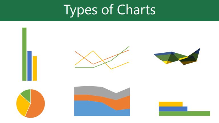
Types of charts
There are several types of charts to choose from. To use charts effectively, you’ll need to understand what makes each one unique.
Click the arrows in the slideshow below to learn more about the types of charts in Word.

Word has a variety of chart types, each with its own advantages. Click the arrows to see some of the different types of charts available in Word.
-
Column charts use vertical bars to represent data. They can work with many different types of data, but they’re most frequently used for comparing information.
-
Line charts are ideal for showing trends. The data points are connected with lines, making it easy to see whether values are increasing or decreasing over time.
-
Pie charts make it easy to compare proportions. Each value is shown as a slice of the pie, so it’s easy to see which values make up the percentage of a whole.
-
Bar charts work just like column charts, but they use horizontal rather than vertical bars.
-
Area charts are similar to line charts, except the areas under the lines are filled in.
-
Surface charts allow you to display data across a 3D landscape. They work best with large data sets, allowing you to see a variety of information at the same time.


Identifying the parts of a chart
In addition to chart types, you’ll need to understand how to read a chart. Charts contain several different elements—or parts—that can help you interpret data.
Click the buttons in the interactive below to learn about the different parts of a chart.
Inserting charts
Word utilizes a separate spreadsheet window for entering and editing chart data, much like a spreadsheet in Excel. The process of entering data is fairly simple, but if you’re unfamiliar with Excel, you might want to review our Cell Basics lesson.
To insert a chart:
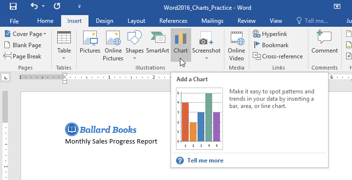
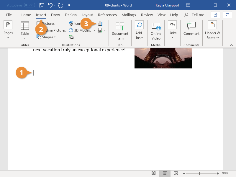
- Place the insertion point where you want the chart to appear.
- Navigate to the Insert tab, then click the Chart command in the Illustrations group.
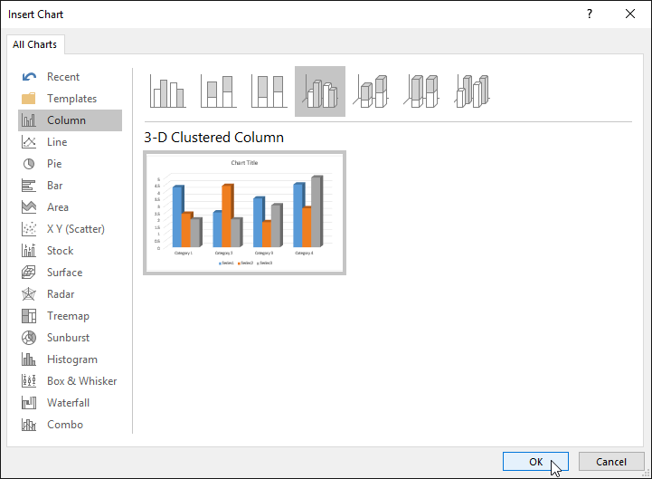
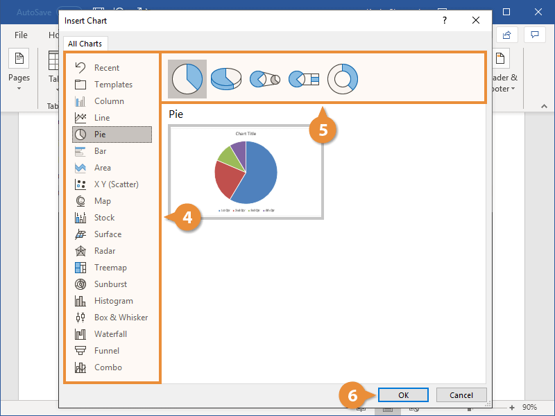
- A dialog box will appear. To view your options, choose a chart type from the left pane, then browse the charts on the right.
- Select the desired chart, then click OK.
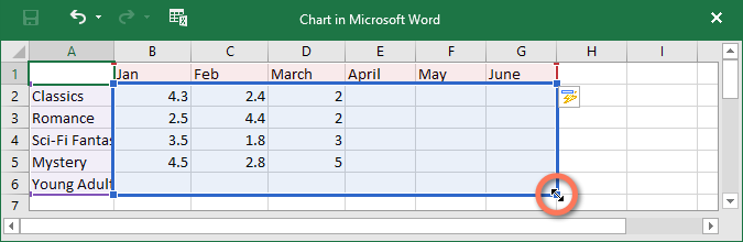
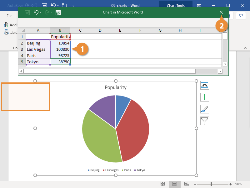
- A chart and spreadsheet window will appear. The text in the spreadsheet is merely a placeholder that you’ll need to replace with your own source data. The source data is what Word will use to create the chart.
- Enter your source data into the spreadsheet.
- Only the data enclosed in the blue box will appear in the chart. If necessary, click and drag the lower-right corner of the blue box to manually increase or decrease the data range.
- When you’re done, click X to close the spreadsheet window.
- The chart will be complete.
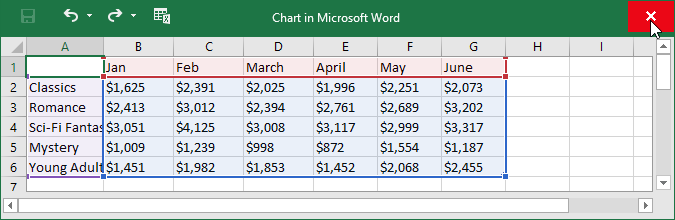

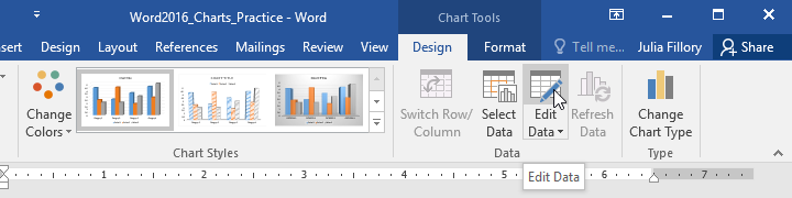
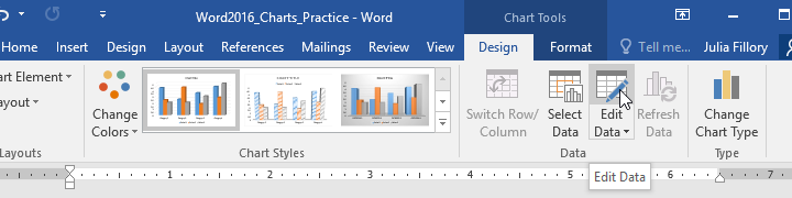
To edit your chart again, simply select it, then click the Edit Data command on the Design tab. The spreadsheet window will reappear.
Creating charts with existing Excel data
If you already have data in an existing Excel file that you’d like to use in Word, you can copy and paste it instead of entering it by hand. Just open the spreadsheet in Excel, copy the data, then paste it as the source data in Word.
You can also embed an existing Excel chart into your Word document. This is useful if you know you’re going to be updating your Excel file later; the chart in Word will update automatically any time a change is made.
Read our guide on Embedding an Excel Chart for more information.
Modifying charts with chart tools
There are many ways to customize and organize your chart in Word. For example, you can quickly change the chart type, rearrange the data, and even change the chart’s appearance.
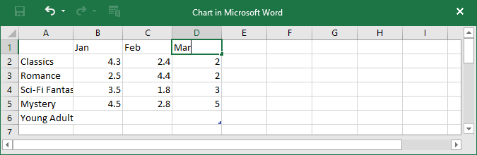
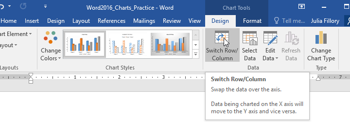
To switch row and column data:
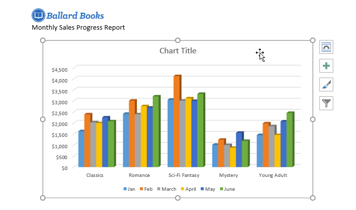
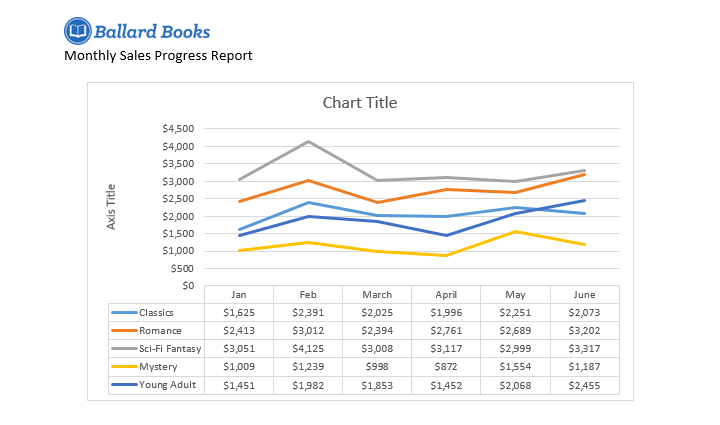
Sometimes you may want to change the way your chart data is grouped. For example, in the chart below the data is grouped by genre, with columns for each month. If we switched the rows and columns, the data would be grouped by month instead. In both cases, the chart contains the same data—it’s just presented in a different way.
- Select the chart you want to modify. The Design tab will appear on the right side of the Ribbon.
- From the Design tab, click the Edit Data command in the Data group.
- Click the chart again to reselect it, then click the Switch Row/Column command.
- The rows and columns will be switched. In our example, the data is now grouped by month, with columns for each genre.
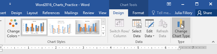
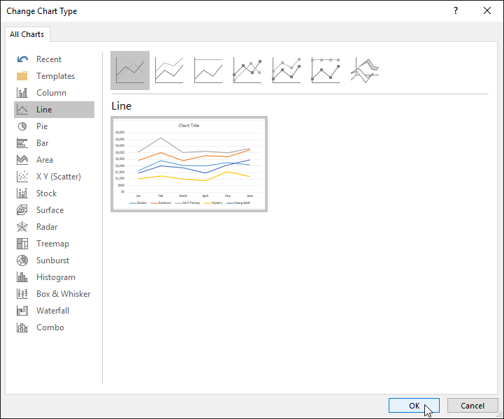
To change the chart type:
If you find that your chosen chart type isn’t suited to your data, you can change it to a different one. In our example, we’ll change the chart type from a column chart to a line chart.
- Select the chart you want to change. The Design tab will appear.
- From the Design tab, click the Change Chart Type command.
- A dialog box will appear. Select the desired chart, then click OK.
- The new chart type will be applied. In our example, the line chart makes it easier to see trends over time.
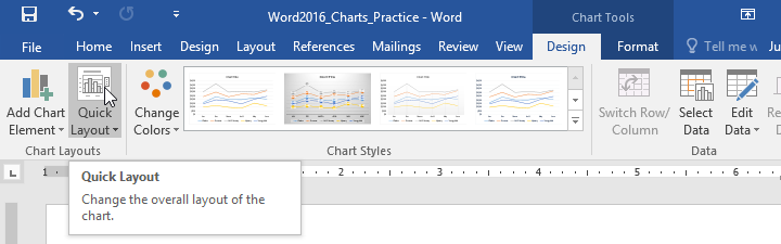
To change the chart layout:
To change the arrangement of your chart, try choosing a different layout. Layout can affect several elements, including the chart title and data labels.
- Select the chart you want to modify. The Design tab will appear.
- From the Design tab, click the Quick Layout command.
- Choose the desired layout from the drop-down menu.
- The chart will update to reflect the new layout.
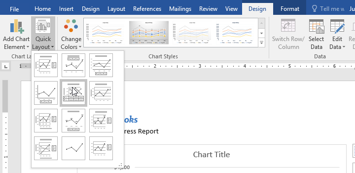
If you don’t see a chart layout that has exactly what you need, you can click the Add Chart Element command on the Design tab to add axis titles, gridlines, and other chart elements.
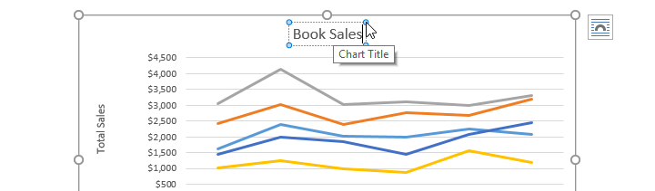
To fill in a placeholder (such as the chart title or axis title), click the element and enter your text.
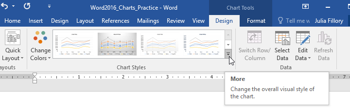
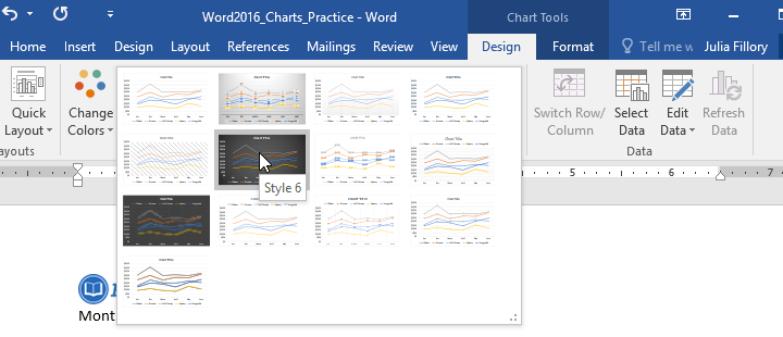
To change the chart style:
Word’s chart styles give you an easy way to change your chart’s design, including the color, style, and certain layout elements.
- Select the chart you want to modify. The Design tab will appear.
- From the Design tab, click the More drop-down arrow in the Chart Styles group.
- A drop-down menu of styles will appear. Select the style you want.
- The chart style will be applied.
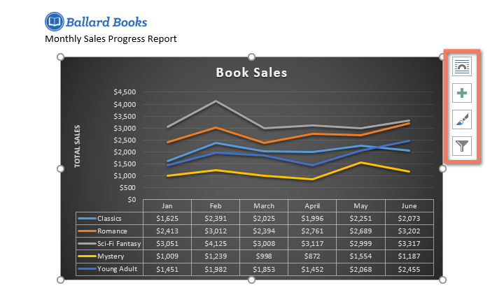
For even faster customization, use the formatting shortcuts to the right of your chart. These allow you to adjust the chart style, chart elements, and even add filters to your data.
Challenge!
- Open our practice document. You will also need to download our practice workbook.
- Insert a Line chart into our practice Word document.
- Open our practice workbook in Excel. Copy the data and paste it into the chart’s spreadsheet.
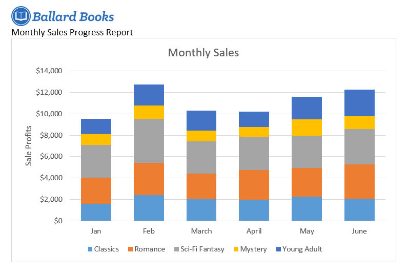
- Change the chart title to Monthly Sales.
- Change the chart type to Stacked Column.
- Use the Quick Layout drop-down menu to change to Layout 3.
- Use the Add Chart Element drop-down menu to add a Primary Vertical Axis Title.
- Double-click the axis title, then rename it Sale Profits.
- Switch the Row/Column data.
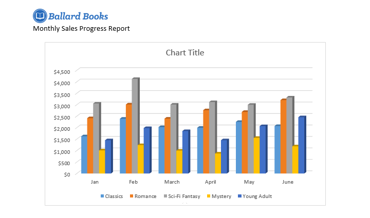
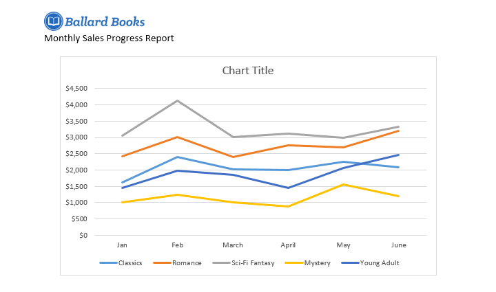
- When you’re finished, your chart should look something like this:

/en/word/checking-spelling-and-grammar/content/

Charts offer a concise and visually appealing way to present numeric information. This tutorial explains the basics of creating and customizing charts in Microsoft Word. We’ll cover five topics:
- How to insert a chart
- How to update existing data in a chart
- How to resize a chart
- How to reposition a chart
- How to change chart colors
These steps apply to all seventeen of Word’s prebuilt chart types:
| Column | Area | Surface | Histogram | Combo |
| Line | X Y (Scatter) | Radar | Box & Whisker | |
| Pie | Map | Treemap | Waterfall | |
| Bar | Stock | Sunburst | Funnel |
Important Note: Word provides many ways to customize charts—many more than can reasonably be covered in one tutorial. So, this tutorial presents the basic methods I believe will be most useful for the majority of users.
Before we begin…
What about Figures and Graphs?
In the writing world, charts and graphs fall under the umbrella term figures, which also includes photos, drawings, maps, and musical scores.
Graphs are generally considered a type of chart. Therefore, the term chart is used throughout this tutorial. However, all the steps shown here also apply to visuals typically considered to be graphs, such as line graphs.
This tutorial is also available as a YouTube video showing all the steps in real time.
Watch more than 150 other writing-related software tutorials on my YouTube channel.
The images below are from Word for Microsoft 365. The steps are the same in Word 2021, Word 2019, Word 2016, and Word 2013. However, your interface may look slightly different in those older versions of the software.
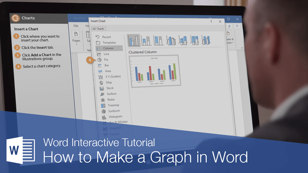
How to Insert a Chart
- Place your cursor where you want to insert the chart.
- Select the Insert tab in the ribbon.

- Select the Chart button in the Illustrations group.

- Select a chart type from the left side of the Insert Chart dialog box.

Pro Tip: Hover your pointer over the example image in the center of the Insert Chart dialog box to see a larger example of the chosen chart type.
- Select a subtype of the selected chart.
The available subtypes will depend on the selected chart. Common charts such as pie charts and bar charts offer attractive 3-D options.

- Select the OK button to close the Insert Chart dialog box and insert the chart.

- Enter labels and numbers into the spreadsheet by typing over the example data. Add additional labels and numbers or delete the example data as necessary.

- Select the X to close the spreadsheet.

- (Optional Step) Select the Chart Elements button to the right of the chart if you want to add or remove the title, data labels, or the legend. (Click inside the border to select the chart if the right-side buttons are not visible.)

How to Update Existing Data in a Chart
- Right-click the chart.
- Select Edit Data from the shortcut menu.

Pro Tip: Select the arrow next to Edit Data and select Edit Data in Excel if you want to update your chart in Excel rather than Word’s spreadsheet.
- Edit your data in the spreadsheet (see figure 6).
- Select the X to close the spreadsheet and apply your changes (see figure 7).
How to Resize a Chart
Charts can be resized by dragging the border or by using exact dimensions (e.g., 3” x 4”).
Basic Method: Resize a Chart by Dragging the Border
- Click inside the border to reveal the resizing handles.

- Click and hold one of the handles as you drag the chart to the appropriate size.
-
- The corner handles provide movement in all directions.
- The side handles provide horizontal movement.
- The top and bottom handles provide vertical movement.
Advanced Method: Resize a Chart to Exact Dimensions
- Click inside the border to select the chart.
- Select the Layout Options button to the right of the chart.

- Select See more from the Layout Options menu.

- Select the Size tab in the Layout dialog box.

- (Optional Step) Select Lock aspect ratio if you want to maintain the current shape.

- Enter the dimensions in the Height and Width boxes. If you selected Lock aspect ratio, you only have to enter one of these numbers.

- Select the OK button to close the Layout dialog box and apply your new dimensions.

How to Reposition a Chart
You can customize your chart’s placement on the page by changing its alignment and text wrapping. Text wrapping determines how charts and other figures are positioned in relation to the surrounding text.
- Select the Home tab in the ribbon.

- Click inside the border to select the chart.
- Select the Align Left, Center, or Align Right button in the Paragraph group.

- (Optional Step) Select the Layout Options button to the right of the chart for text wrapping options.

Your position changes will be applied immediately.
How to Change Chart Colors
You can choose a prebuilt color palette for your whole chart or select custom colors for individual elements.
See the bonus section below for information about using RGB, HSL, and Hex color codes.
Basic Method: Choose a Prebuilt Color Palette
- Click inside the border to select the chart.
- Select the Chart Styles button to the right of the chart.

- Select the Color tab in the shortcut menu.

- Select a color palette.

Your new color palette will be applied immediately.
Advanced Method: Choose Custom Colors
- Select and then right-click the individual chart element you want to change.
- Select the Fill button in the shortcut menu.

- Select a color from the drop-down menu or choose More Fill Colors for additional options.

Your new color will be applied immediately.
Bonus Section: How to Use RGB, HSL, and Hex Color Codes in a Chart
Word lets you use RGB (Red, Green, Blue) and HSL (Hue, Saturation, Lightness) color codes in your charts. In addition, you can use Hex color codes if you are using an updated version of Word for Microsoft 365 (formerly Office 365).
- Select and then right-click the individual chart element you want to change.
- Select the Fill button in the shortcut menu (see figure 23).
- Select More Fill Colors from the drop-down menu.

- Select the Custom tab in the Colors dialog box.

- Select RGB or HSL from the Color model menu or enter a code in the Hex box.

- Enter your RGB or HSL code into the appropriate boxes. (Skip this step if you are using a Hex code.)

- Select the OK button to close the Colors dialog box and apply your color change.

Related Resources
Three Ways to Insert Tables in Microsoft Word
How to Save Tables and Figures as Images in Microsoft Word (PC & Mac)
How to Update Table and Figure Numbers in Microsoft Word
How to Change the Style of Table Titles and Figure Captions in Microsoft Word
How to Create and Update a List of Tables or Figures in Microsoft Word
How to Write Figure Captions for Graphs, Charts, Photos, Drawings, and Maps
How to Write Table Titles
How to Reference Tables and Figures in Text
Updated November 27, 2022
You can add charts to your documents to help present information graphically. Using them instead of, or in addition to, tables of data can make it easier for readers to understand.
Insert a Chart
- Click where you want to insert the chart.
- Click the Insert tab.
- Click the Chart button in the Illustrations group.

- Column and Bar charts work well to compare different sets of data against each other.
- Line and Area charts are great for showing trends over time.
- Pie charts show different categories as parts of a whole.
- Select a chart type.
- Select a chart style.
- Click OK.
The Insert Chart dialog box lets you choose from a variety of chart types. Some chart types will be better at displaying certain data than others.
The most common types of charts are Column, Line, and Pie.
Each chart type has a few styles to choose from, presenting the data differently.
A blank chart is inserted, along with a spreadsheet full of placeholder data.
Add Chart Data
When a chart is inserted, its spreadsheet will be full of placeholder data that you can replace with your own content.
- Enter your chart data.
- Click the spreadsheet window’s Close button when you’re done.
As you add rows and columns, the row headers, column headers, and data are highlighted by borders.
To add or remove sections of the data, click and drag any of the selection handles in the spreadsheet and what’s included in the chart will change.
To reopen the spreadsheet, select the chart, click the Design tab in the Chart Tools ribbon group, and click the Edit Databutton.
Change the Layout
You can quickly adjust a chart’s layout at any point after you’ve inserted it. Layouts will affect the position of chart elements like the title, legend, and data labels.
- With the chart selected, click the Design tab in the Chart Tools ribbon group.
- Click the Quick Layout button.
- Select a layout.
A gallery of available layouts appears, based on the chart’s type.
The layout is applied.
If you want to change the color or style, use the options in the Chart Styles group.
Modify Chart Elements
Another way to change the chart layout is to use the chart tool shortcuts to edit the active chart elements.
- With the chart selected, click the Chart Elements button.
- Click the check box next to the element you want to toggle on or off.
- Click the list arrow next to a chart element and select an option.
Different chart types contain different chart elements. Depending on the chart type, you may be able to adjust gridlines, titles, legends, and data or axis labels.
Each element can also be customized further. You can set the position of elements such as the title or legend, or toggle subsets of specific elements, such as horizontal or vertical gridlines.
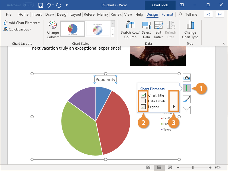
You can continue to set up chart elements in this way until the chart appears exactly how you want it.
You can also insert or modify chart elements by clicking the Design tab in the Chart Tools ribbon group, then clicking Add Chart Element.

FREE Quick Reference
Click to Download
Free to distribute with our compliments; we hope you will consider our paid training.
Today, the word processor most famous and representative in the world, without a doubt, is Word. Since, it consists of a truly complete program at the time of create, edit and manage any digital writing for quality results.
Thus, one of the most used functions in Word, are the graphics. Since these illustrations are handled in different environments to present a set of interrelated data, with the aim of facilitate their understanding and analysis.
However, many users they don’t know how they can add a graph in a text document in Word. Therefore, we proceed to explain everything regarding these very useful illustrations.
What are all the types of charts that can be inserted in Word?

As we pointed out before, the graphs serve to organize a set of data and in this way, simplify the interpretation of the displayed information, as well as its visual comparison and analysis. Therefore, they are essential elements and widely used in research projects, demography, statistics and many more fields.
Therefore, various types of graphs are handled, according to their uses and the information to be studied, in order to provide optimal data collection, analysis and presentation. Consequently, Word offers the possibility of inserting different kinds of these illustrations.
Next, we mention what each of them are:
column chart
In this type of graph, the information that is organized through columns or rows in tables or in a spreadsheet, can be displayed in the form of columns. A) Yes, categories will be displayed on the horizontal axis and values along the vertical axis.
A) Yes, There are several models of these graphs and they are: Stacked Columns and 3D Stacked Columns, Stacked Columns and 3D Stacked Columns, 100% Stacked Columns and 100% Stacked 3D Columns and 3D Columns.
line chart
It consists of a graph through which the category data are evenly distributed along the horizontal axiswhile on the vertical axis are established all data values equivalently.
Therefore, linear graphs should be used to display continuous data over time on a regularly scaled axis, that is, trends in data at equal intervals (months, quarters, or fiscal years, for example). In this case, their types are as follows: Line and line with markers, stacked line and stacked line with markers, 100% stacked line and 100% stacked line with markers, as well as 3D lines.
pie charts
Basically, the data organized in a table or spreadsheet is plotted in a round graph. This will display the size of the elements of a series of figures proportional to the sum of said elements exposed. Taking into account that, all will be displayed as a percentage.
Now, regarding the fonts of pie charts and donut charts in Word, There are only two and they are: Pie and pie in 3D, pie with pie subchart and pie with bar subchart.
donut charts
They are graphs similar to circular graphs and are characterized, mainly, by representing the data organized in rows or columns of a table, inside a circular illustration with a hole in its center. In this way, it displays the relationship of each of the existing parts to total 100% of the information and there, each ring will symbolize a series of data.
However, the vast majority of people conclude that donut charts they are not easy to read and/or interpret; unlike what happens with the circular type illustrations.
Bar graphic
These are one of the most used graphs to organize data, since is responsible for showing comparisons between individual elements. Therefore, in this case, the existing categories are typically sliced on the vertical axis and the values can be observed on the horizontal axis.
On the other hand, they should be used more than anything, when the values that are exhibited they have to do with durations and the axis labels are long. As to its fontswe have the following: 3D stacked bar and 3D stacked bar, 3D stacked bar and stacked bar, 100% stacked bars and 3D 100% stacked bars.
area graph
Mainly, they are graphics used to plot change over time around data and focus attention on the full value of a trend; that way, the data is displayed arranged in rows or columns. Taking into account that, they allow to see the relationship of the parts with a whole in that way.
Now, the kinds of area charts that are in Microsoft Word, we proceed to mention them here: Areas and 3D Areas, Stacked Areas and 3D Stacked Areas, 100% Stacked Areas, and 100% Stacked 3D Areas.
XY Plot (scatter)
In this type of graph, the “X” values must be placed in a row or column and after that, the corresponding “Y” data must be entered in the adjacent rows or columns. That is, It has two value axes. (a horizontal “X” axis and a vertical “Y” axis). Thus, generally are used to compare purely numerical information (statistical, scientific or engineering).
In this sense, there are several fonts of XY graphs that are: Scatter, scatter with smooth lines, scatter with smooth lines and markers, scatter with straight lines, and scatter with straight lines and markers.
However, The main uses of scatter plots are the following:: To change the scale of the horizontal axis, when there is a lot of data on the horizontal axis, to convert the horizontal axis to a logarithmic scale, when the data is not uniform, and to compare a lot of data without estimating time.
bubble chart
This is a similar plot to the scatter plot, with the distinguishing factor that adds a third column to specify the size of the bubble it showsthrough which represents the data points in the corresponding series.
Therefore, the bubble chart only handles two types, which are: Normal bubbles or bubbles with 3D effects. In both cases, a depth axis is not used.
stock chart
They are those graphs that represent fluctuations in stock prices, just as its very name indicates. In addition, it has the ability to show changes in other data, such as annual temperatures or daily rainfall. But in any case, the data should be organized in Highs, Lows and Closing.
Next, we mention their types: Normal, opening, volume and opening with volume. Basically, they all use highs, lows, and closes.
surface graph
If you need find and obtain optimal combinations between two data sets, this graph in Word is very useful for you. Which is characterized by indicating areas that are in the same range of values through patterns and colors, just like on a topographic map. Thus, essentially, they can be created while the data series be numeric values.
The types of surface charts available in Word are: 3D surface, 3D surface hatch, boundary, and wireframe boundary.
radial charts
Basically, they are illustrations that facilitate comparison of the aggregate values of various data series. Therefore, only in this way can information that is organized in rows or columns of a table or spreadsheet be represented.
As well as the vast majority of other graphics, it also has several fonts available in Word and they are the following: radial, marker radial, and filled radial.
Treemap
It consists of a graph provides a hierarchical view of each and every valuewith the purpose of simplify comparisons of the same at different levels of categorization. Which basically can be used to analyze and relate all proportions within a range.
In addition to that, they are elements that are characterized by displaying all categories by means of a color and its proximity, in order to facilitate the visualization of a large flow of data that is difficult to see in other types of graphs. Nevertheless, are only available in Office 2016 and later versions.
Solar projection chart
It is one of the most innovative graphics in Word and the entire Microsoft office suite, which is ideal for displaying hierarchical data in a readable way and can also be rendered when there are blank cells within the range structure. Whereas, each level of the hierarchy is represented by a ring or circle.
In this sense, a solar projection chart is effective for show how a ring is divided into its constituent parts, basically. It should be noted that it does not have subtypes and is available in Microsoft Word 2016 or later.
histogram graph
They are those graphs that show the frequencies within a distribution. Therefore, each column in the illustration is called “class” and allows it to be modified, in order to facilitate its analysis with better detail.
In this case, there are two subtypes: common histogram and Pareto chart. The latter is found in a computer and contains columns arranged in descending order, as well as a line that shows the total accumulated percentage.
Box-and-Whisker Plots
Only are available in Word 2016 or later versions and it is a type of illustration that shows the distribution of values in quartiles. With which, only highlights the mean and outliers of the investigation.
In addition, it contains “whiskers” which are lines that extend vertically and indicate fluctuation outside the upper and lower quartiles. Therefore, which value is out of said whiskers, will be called “outlier”. Generally, they are graphs that are used to relate multiple linked datasets to each other.
waterfall charts
It is a type of graph that allows view a running total of financial data obtained by subtracting or adding certain values. Consequently, it has columns that are color coded, so that positive numbers can be quickly differentiated from negative ones.
Thus, it is considered a fundamental illustration for interpret and understand how an initial value can be affected by a series of associated positive and negative values. It is important to note that, it does not have subtypes and is available from Word 2016 onwards.
funnel charts
They have been listed as one of the simplest charts in Microsoft Word, as they simply display values through various phases of a given process. Taking into account that, in general, displayed values gradually decrease.
In that sense, funnel charts are ideal for understand any linear process with certain sequential steps that remain interconnected with each other. Which is also available in Office 2016 or newer versions.
Combination charts
It’s all about graphics available from Office 2013 onwards and, basically, they are those illustrations that combine or relate two or more types of graphs into onewith the aim of making the values easier for the user to understand, especially when they vary greatly.
Among its most notable peculiarities, we find that it manages to organize columns and rows that can be established in such a graph, they do not have subtypes and, in general, are used to present qualitative information.
Steps to insert a graph in a Microsoft Word document quickly and easily

Now, to make use of any of the graphics available in Word mentioned in the previous part, it is essential to follow a series of steps correctly to add them to any document easily and quickly.
Therefore, for you to be able to do it satisfactorily, here we proceed to detail each of the necessary steps to execute:
- To start, you have to search and access the word document in which you need to insert a graph to facilitate the presentation of any data flow.
- Next, go to the options bar of the main window and proceed to Click on the “Insert” tab.
- After that, look for the Illustrations group and there, select the option that indicates “Graphic”.
- Once you do the above, it’s time to choose the type of graph you need to use in your text, browsing the available typologies on the left side of the box that they show you and selecting the desired subtype. For later, double click on the specific graph and you’re done.
- Finally, within the spreadsheet that appears, you must change the defaults to enter yoursclose the spreadsheet and proceed to use Design Options in order to organize and personalize the illustration in question.
Is it better to add a chart from Word or create it in an external program and upload it as an image?

Despite the fact that Microsoft Word provides a remarkable amount of available graphics that can be adjusted to different uses, the truth is that many users prefer to go to some additional tools to create their charts and then add them to the digital documents created in this word processor. But, Is it recommended to do it?
Well, before this doubt, we emphasize that, everything will depend on the type of graphic illustration that you should add to your writing. Since, if the graphic you need to include is not available in Word, you will of course have to create it in an external program and upload it as an image. But otherwise it is more effective to insert it directly from Wordsince the process for it It is very practical and they will be elements with a lower weight, compared to some image.
In short, everything will depend on your preferences and/or requirements. Taking into account that, if the document has many illustrative elements, it is valuable that you avoid saturating it and so, you choose to create the chart in Word. But, if you need another type of graphs or want to customize them at a higher level, the best thing to do would be to resort to a program for it and insert it as an image once it is edited.