
The analysis of time series allows studying the indicators in time. Time series are numerical values of a statistical indicator arranged in chronological order.
Such data are widespread in the most diverse spheres of human activity: daily stock prices, exchange rates, quarterly, annual sales, production, etc. A typical time series in meteorology, for example, is monthly rainfall.
Time series in Excel
If you capture the values of some process at certain intervals, you get the elements of the time series. Their variability is divided into regular and random components. As a rule, regular changes in the members of the series are predictable.
We will analyze time series in Excel. Example: a sales network analyzes data on sales of goods by stores located in cities with a population of fewer than 50,000 people. The period is for 2012-2015. The task is to identify the main development trend.
Enter the sales data in the Excel spreadsheet:
On the «DATA» tab click the «Data Analysis» button. Go to the menu if it is not visible. «Excel Options» – «Add-Ins». Click at the bottom «Go» to «Add-Ins Excel» and select « Data Analysis ».
The connection of the « Data Analysis » add-in is described here in detail.
The button we need appears on the band.
Select «Exponential Smoothing» from the proposed list of tools for statistical analysis. This alignment method is suitable for our dynamic series, the values of which fluctuate strongly.
We fill the dialog box. The input interval is the range of sales values. The damping factor is the coefficient of exponential smoothing (default is 0.3). Output interval –is a reference to the upper left cell of the output range. The program will place the smoothed levels here and the will define size independently. We tick the «Chart Output», «Standard Errors».
Close the dialog box by clicking OK. Results of the analysis:
Excel uses next formula to calculate the standard errors: = SQRT(SUMXMY2(‘Actual value range’; ‘range of forecast values’) / ‘size of the smoothing window’). For example, = SQRT(SUMXMY2:(C3:C5;D3:D5)/3).
Forecasting the time series in Excel
We will compose the forecast of sales using the data from the previous example.
We will add a trend line (the right button on the chart — «Add Trend line») on the chart which shows the actual product sales volume.
Configure the parameters of the trend line:
We choose a polynomial trend that minimizes the error of the forecast model.
R2 = 0.9567 which means that this ratio explains 95.67% of changes in sales in process of time.
The trend equation is a model of the formula for calculating the forecast values.
Most authors recommend using a linear trend line for forecasting sales. You need to set the number of periods in the parameters to see the forecast on the chart.
We get a fairly optimistic result:
After all, there is the exponential dependence in our example. Therefore, there are more errors and inaccuracies when building a linear trend.
You can also use the function GROWTH to predict the exponential dependence in Excel.
For linear dependence, use the TREND function.
You cannot use any one method when making forecasts: the probability of large deviations and inaccuracies is large.
To create a time series plot in Excel, first select the time (DateTime in this case) Column and then the data series (streamflow in this case) column. Next, click on the Insert ribbon, and then select Scatter. From scatter plot options, select Scatter with Smooth Lines as shown below.
Contents
- 1 How do you plot real time data in Excel?
- 2 How do you plot two time series in Excel?
- 3 How do I do a time series Forecast in Excel?
- 4 Can Excel be real-time?
- 5 How do I graph time in Excel multiple days?
- 6 How do you graph multiple sets of data in Excel?
- 7 How do you forecast a time series?
- 8 How do you do a time series analysis?
- 9 What is a time series excel?
- 10 How do you plot hours and minutes in Excel?
- 11 How do you make a cycle time graph on Excel?
- 12 What does PLT ion () do?
- 13 What is the function that is used to plot bar charts?
- 14 How do I plot a csv file in matplotlib?
- 15 How do you edit real time in Excel?
- 16 How do I plot monthly data in Excel?
- 17 How do you plot multiple time series in one plot in Python?
- 18 How do I add a secondary axis in Excel?
- 19 What is a time series plot?
- 20 How do you graph multiple sets of data?
How do you plot real time data in Excel?
Charting Real Time Data in Excel
- Install Python and PyXLL.
- Write a Python function to get the real time data and put it into an Excel sheet.
- Write VBA event code to process that data into a table.
- Write an array formula to fetch the latest 30 data points.
- Create a chart to plot the data from 4.
How do you plot two time series in Excel?
2 Answers
- Create a chart with the data from the first set of data, above.
- Right click on the chart, and edit the “Select Data”. In there, add in the second set of data (series 2), under series 1.
- Right click on the series 2 graph in the spreadsheet, and click “Format graph”.
How do I do a time series Forecast in Excel?
To create a forecast sheet, first make sure you have your time-based series data set ready (it should have a time series and values series). Next, under the Data tab, click the Forecast sheet button. This launches the forecast dialog that walks you through the process.
Can Excel be real-time?
With Office for the web, you get simple and free online versions of your favorite Office apps like Word, Excel, PowerPoint, and more. Create a file, share it with friends and family, and collaborate in real-time.
How do I graph time in Excel multiple days?
You can add a date and a time together by adding a simple formula in a new column: =A1 + A2 (date + time). Then use this value to make your charts. Just make sure your date and time columns are in proper excel format (eg.
How do you graph multiple sets of data in Excel?
Below are steps you can use to help add two sets of data to a graph in Excel:
- Enter data in the Excel spreadsheet you want on the graph.
- Select the data you want on the graph.
- Click the “Insert” tab and then look at the “Recommended Charts” in the charts group.
- Choose “All Charts” and click “Combo” as the chart type.
How do you forecast a time series?
Basics of Time-Series Forecasting
- 1) Seasonality.
- 2) Trend.
- 3) Unexpected Events.
- step-1) Load the data first.
- Step-2) Moving Average method.
- Step-3) Simple Exponential Smoothing.
- Step-4) Holt method for exponential smoothing.
- Step-1) Load dataset.
How do you do a time series analysis?
Nevertheless, the same has been delineated briefly below:
- Step 1: Visualize the Time Series. It is essential to analyze the trends prior to building any kind of time series model.
- Step 2: Stationarize the Series.
- Step 3: Find Optimal Parameters.
- Step 4: Build ARIMA Model.
- Step 5: Make Predictions.
What is a time series excel?
The analysis of time series allows studying the indicators in time. Time series are numerical values of a statistical indicator arranged in chronological order.
How do you plot hours and minutes in Excel?
Display Times as Hours/Minutes in Excel
- Select one or more cells that contain a decimal-based time value.
- Launch the Format Cells dialog box. A keyboard shortcut for doing so is Ctrl-1.
- On the Number tab choose Custom. Scroll down the list of custom formats and choose h:mm, and then click OK.
How do you make a cycle time graph on Excel?
How to Create a Cycle Time Scatter Plot in Excel
- Step 1: In Excel, create a new spreadsheet with the following columns:
- Step 2: Enter your data for Task Name, Start Date, and End Date.
- Step 3: Enter the formula to calculate cycle time.
- Step 4: Copy the cycle time formula for all of your tasks.
What does PLT ion () do?
ion() is used to turn on interactive mode. To check the status of interactive mode one can run the below commands, Attention geek!
What is the function that is used to plot bar charts?
R uses the function barplot() to create bar charts. R can draw both vertical and Horizontal bars in the bar chart. In bar chart each of the bars can be given different colors.
How do I plot a csv file in matplotlib?
The approach of the program:
- Import required libraries, matplotlib library for visualizing, and CSV library for reading CSV data.
- Open the file using open( ) function with ‘r’ mode (read-only) from CSV library and read the file using csv.
- Read each line in the file using for loop.
- Append required columns into a list.
How do you edit real time in Excel?
To collaborate, they have to click a tiny “Edit Workbook” button at the top-right of the screen and choose either “Edit in Excel” or “Edit in Browser.” If they are Office 365 subscribers who have the new collaboration-enabled version of Excel, they can choose “Edit in Excel” and they’ll be able to collaborate in real
How do I plot monthly data in Excel?
How to Make a Graph With Months in Excel
- Enter the dates in column A and the data in column B.
- Click the top left data point, hold the “Shift” key and click the bottom right data point to select all data.
- Click the “Insert” tab, select “Insert Column Chart” from the Chart group and choose your preferred format.
How do you plot multiple time series in one plot in Python?
Plot multiple time-series DataFrames into a single plot using Pandas (Matplotlib)
- Set the figure size and adjust the padding between and around the subplots.
- Create a Pandas data frame with time series.
- Set the time series index for plot.
- Plot rupees and dollor on the plot.
- To display the figure, use show() method.
How do I add a secondary axis in Excel?
Add or remove a secondary axis in a chart in Excel
- Select a chart to open Chart Tools.
- Select Design > Change Chart Type.
- Select Combo > Cluster Column – Line on Secondary Axis.
- Select Secondary Axis for the data series you want to show.
- Select the drop-down arrow and choose Line.
- Select OK.
What is a time series plot?
The time-series plot is a univariate plot: it shows only one variable. It is a 2-dimensional plot in which one axis, the time-axis, shows graduations at an appropriate scale (seconds, minutes, weeks, quarters, years), while the other axis shows the numeric values.
How do you graph multiple sets of data?
To create a combo chart, select the data you want displayed, then click the dialog launcher in the corner of the Charts group on the Insert tab to open the Insert Chart dialog box. Select combo from the All Charts tab. Select the chart type you want for each data series from the dropdown options.
This tutorial provides a step-by-step example of how to plot the following time series in Excel:

Let’s jump in!
Step 1: Enter the Time Series Data
First, let’s enter the following values for a time series dataset in Excel:

Step 2: Plot the Time Series

Next, highlight the values in the range A2:B20:

Then click the Insert tab along the top ribbon, then click the icon called Scatter with Smooth Lines and Markers within the Charts group:

The following chart will automatically appear:

The x-axis shows the date and the y-axis shows the sales.
Step 3: Customize the Time Series Plot
Lastly, we can customize the plot to make it easier to read.
Double click any of the values on the x-axis. In the Format Axis panel that appears, click the icon called Size & Properties and type -45 in the box titled Custom angle:

The x-axis labels will be rotated at a 45 degree angle to make them easier to read:

Lastly, click on the Chart Title and change it to whatever you’d like.
Then click the labels on each axis and make them bold:
The time series plot is now complete.
Additional Resources
The following tutorials explain how to perform other common tasks in Excel:
How to Add Labels to Scatterplot Points in Excel
How to Change Axis Scales in Excel Plots
How to Add a Vertical Line to Charts in Excel
Содержание
- Time series analysis and forecasting in Excel with examples
- Time series in Excel
- Forecasting the time series in Excel
- Time Series Forecast with Excel
- The Underlying Function: FORECAST.ETS
- Generating Forecast with Forecast Sheet
- Components of Forecast Worksheet
- The output of the Forecast Sheet
- Time Series Analysis
- Topics
- References
- 68 thoughts on “Time Series Analysis”
Time series analysis and forecasting in Excel with examples
The analysis of time series allows studying the indicators in time. Time series are numerical values of a statistical indicator arranged in chronological order.
Such data are widespread in the most diverse spheres of human activity: daily stock prices, exchange rates, quarterly, annual sales, production, etc. A typical time series in meteorology, for example, is monthly rainfall.
Time series in Excel
If you capture the values of some process at certain intervals, you get the elements of the time series. Their variability is divided into regular and random components. As a rule, regular changes in the members of the series are predictable.
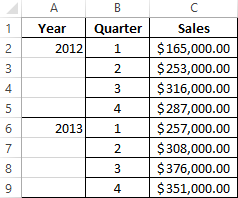
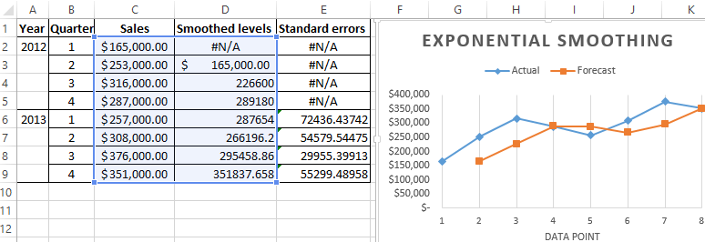
We will analyze time series in Excel. Example: a sales network analyzes data on sales of goods by stores located in cities with a population of fewer than 50,000 people. The period is for 2012-2015. The task is to identify the main development trend.
Enter the sales data in the Excel spreadsheet:
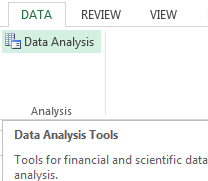
On the «DATA» tab click the «Data Analysis» button. Go to the menu if it is not visible. «Excel Options» – «Add-Ins». Click at the bottom «Go» to «Add-Ins Excel» and select « Data Analysis ».
The connection of the « Data Analysis » add-in is described here in detail.
The button we need appears on the band.
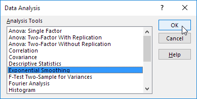
Select «Exponential Smoothing» from the proposed list of tools for statistical analysis. This alignment method is suitable for our dynamic series, the values of which fluctuate strongly.
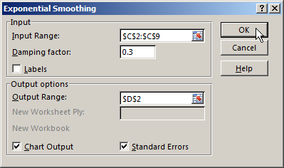
We fill the dialog box. The input interval is the range of sales values. The damping factor is the coefficient of exponential smoothing (default is 0.3). Output interval –is a reference to the upper left cell of the output range. The program will place the smoothed levels here and the will define size independently. We tick the «Chart Output», «Standard Errors».
Close the dialog box by clicking OK. Results of the analysis:
Excel uses next formula to calculate the standard errors: = SQRT(SUMXMY2(‘Actual value range’; ‘range of forecast values’) / ‘size of the smoothing window’). For example, = SQRT(SUMXMY2:(C3:C5;D3:D5)/3).
Forecasting the time series in Excel
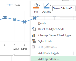
We will compose the forecast of sales using the data from the previous example.
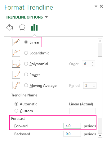
We will add a trend line (the right button on the chart — «Add Trend line») on the chart which shows the actual product sales volume.
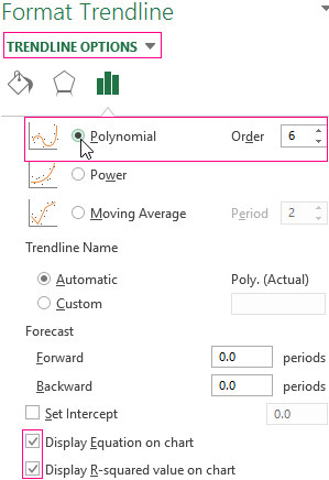
Configure the parameters of the trend line:
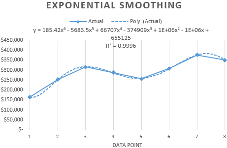
We choose a polynomial trend that minimizes the error of the forecast model.
R2 = 0.9567 which means that this ratio explains 95.67% of changes in sales in process of time.
The trend equation is a model of the formula for calculating the forecast values.
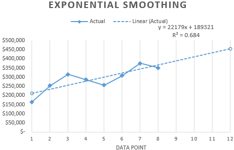
Most authors recommend using a linear trend line for forecasting sales. You need to set the number of periods in the parameters to see the forecast on the chart.
We get a fairly optimistic result:
After all, there is the exponential dependence in our example. Therefore, there are more errors and inaccuracies when building a linear trend.
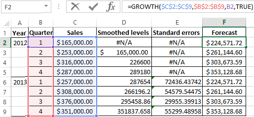
You can also use the function GROWTH to predict the exponential dependence in Excel.
For linear dependence, use the TREND function.
You cannot use any one method when making forecasts: the probability of large deviations and inaccuracies is large.
Источник
Time Series Forecast with Excel
In the year 2006, I had moved to the MIS team. We were the data-keepers of the organization. Even Excel (version 2003) was new and fascinating for me. Then we got introduced to forecast techniques. A team of Six Sigma professionals was adept in generating yearly, monthly & weekly forecasts. They used Minitab for generating forecasts using time series techniques as Excel had limited capabilities. I could hardly understand the time series then. For me, it was quite a fascinating subject: predicting the future using historical data!
With time, both Excel and I developed analytical capabilities. And prediction modeling has become a regular feature for both of us. This article explains the steps involved in generating forecasts using the Forecast sheet.
Introduced with Excel 2016 (for windows only), Forecast Sheet made forecast generation a two-step process.
You can find the feature under the Data ribbon:
The Underlying Function: FORECAST.ETS
The Forecast Sheet predicts using the Exponential Smoothing seasonal algorithm (ETS AAA) using an inbuilt function FORECAST.ETS . It models the time series using an equation that accounts for additive error, additive trend, and additive seasonality. This algorithm is also popularly known as the Holt-Winters algorithm. It is widely used in predicting and planning demand in businesses.
In other words, the Forecast sheet is useful for prediction when the time series data has a trend and seasonality present.
Generating Forecast with Forecast Sheet
Primarily it requires two columns:
1. The value to be forecasted (forecast variable)
2. A column with a continuous time-period (it can be the 1st of every month, a yearly timeline, or a serial number assign to each period)
For a time series, a consistent period is a must. It can be monthly intervals with values on the 1st of every month, yearly intervals, or numerical intervals.
The data set may have blank records for values, but these records constitute 30% or less of the total records. The Forecast sheet also handles multiple records for the same timestamp or period. However, summarizing the dataset is recommend (to ensure unique records for the same timestamp)
Select the two columns > Data > Forecast Sheet
Data > Forecast Sheet
It opens a Forecast Worksheet window:
Components of Forecast Worksheet
· Forecast End: Defines the number of forecast periods (denoted by the orange color in the graph). Excel creates a table with historical data along with the forecast values.
· Forecast Start: Defines the start point for the forecast. You can pick a period before the end of the historical data. When you do that, the Forecast worksheet ignores all values beyond that period. In this example, if we change the Forecast Start from 16 to 11, Forecast Worksheet consider points 1 to 10 for forecast generation.
Starting your forecast before the last historical point gives you a sense of the prediction accuracy as you can compare the forecasted series to the actual data.
However, if you start the forecast too early, the estimates generated will not necessarily represent the forecast it generates using all the historical data.
Using all your historical data gives you a more accurate prediction.
· Confidence Interval: Check or uncheck Confidence Interval to show or hide it. A confidence interval is a range around the predicted value. A confidence interval of 95% signifies that 95% of the predicted value expected to fall within this range.
· Seasonality: It is the number of time steps that it takes for a full data cycle, after which the cycle repeats throughout the time series. By default, it autodetects the seasonality of the data set. You could use the formula FORECAST.ETS.SEASONALITY to calculate the seasonality in the dataset.
· Fill Missing Points Using: Useful when you have missing data points in your dataset for values.
- If selected Zero, then it treats missing values as 0 and calculates forecast (not recommended, requires business judgment)
- If selected Interpolation, it uses the weighted average of neighboring data points around the missing values. It works when missing values are less than 30% of the total records.
· Aggregate Duplicates Using: If the dataset has multiple records for the same period, by default, Excel uses the average of those values for forecasting. For example, for the period 10, if we have two records with values 5 & 6, then Forecast sheet uses 5.5 (average of 5 & 6) as value for period 10.
We can change the default calculation depending on the data and expected forecast values:
· Include Forecast Statistics: Check this option to get the following statistical information:
The output of the Forecast Sheet
The values in Column C are the forecast for future periods. Column D & E represent the lower and upper bound of the estimates, respectively. So, for the period 17, the mean forecast is 7.3, and it may vary between 6.9 to 7.8 (with 95% confidence).
Источник
Time Series Analysis
We explore various methods for forecasting (i.e. predicting) the next value(s) in a time series. A time series is a sequence of observations y1, …, yn. We usually think of the subscripts as representing evenly spaced time intervals (seconds, minutes, months, seasons, years, etc.).
Topics
References
Wooldridge, J. M. (2009) Introductory econometrics, a modern approach. 5th Ed. South-Western, Cegage Learning
https://cbpbu.ac.in/userfiles/file/2020/STUDY_MAT/ECO/2.pdf
68 thoughts on “Time Series Analysis”
At present, I am working on QSR restaurant forecasting. So basically I have to forecast the quantity of each product required in each store.
Can you please help me with this
Hi Chetan,
I am happy to answer questions that you have to help you create such a forecast.
Charles
Hello Charles, I stumbled across your website while I was searching for methodology on time-series analysis. In fact I have 3 years worth of electric power consumption data that I wish to use Statistical models to perform forecasting. I have a basic statistics background and no “machine learning” background. Will you be able to recommend me on how to best consume your material and I would like to attempt to apply the methods / models onto the sample data. Thank you very much,
Anson
Hello Anson,
I suggest that you start by graphing the 3 years worth of data. Look for any patterns: seasonality, increasing/decreasing trends, randomness, etc. Based on what you observe, you then need to choose a model (ARIMA, Holt-Winters, etc.).
Charles
Hello Charles, Thank you for the reply. The time-series data I have in hand is a power consumption data taken from a commercial building consisting of 2 measurements: the accumulated Energy Consumption (Watt Hours), and the Power Consumption (Watts) at the timestamp of the reading
The sample data looks like below:
Timestamp | Total Accumulated Energy (Watt Hours)| Total Power Consumed (Watts) |
Jan 01, 2019 01:02:00 AM | 415,457,280 | 32,683 |
Jan 02, 2019 01:04:00 AM | 415,629,888 | 25,982 |
…
Jan 31, 2019 01:02:00 AM | 424,123,538 | 31,857 |
Jan 31, 2019 01:04:00 AM | 424,345,242 | 28,735 |
====================================================
When I plot the time-series of the total accumulated energy over the period of 3 years – it is showing a linear upward trend. When I plot the time-series of the energy consumed on fixed units (i.e. days) it shows a seasonality of high energy consumption Monday thru Friday then a lower energy consumption over Saturday and Sunday. Also the energy consumption is low on Public Holidays. The same pattern exhibits over the plotting of Total Power Consumed.
====================================================
My questions are:
1. Given the specimens are taken un-evenly (i.e. sometimes per 2 minute, sometimes per 5 minutes, so on). Do I normalize the dataset to a common unit (i.e. Day), if the objective is to forecast the next day’s energy consumption?
2. Do I need to further roll-up and normalize the data to Months if I were to forecast the energy consumption in next month?
3. What do I have to do to enable a forecast of more days / weeks / months ahead?
4. How do I take into the considerations of public holidays / Weekdays / Weekend (i.e. low energy consumption). Would it imply a different handling if I were to forecast the next “Day”, “Week”, Month”?
Thank you very much,
Anson
Also Charles, I would like to ask if I wanted to forecast in the unit of days, but yet wanted to take into the account of seasonality over a year, what should I be following to deal with the leap year issue? Thanks, Anson
Thank you Charles, I am able to find a solution to construct my dataset (3 years) in the unit of Hours. May I know what I’d need to do to make forecast in the units of a larger unit such as Days, Weeks, or even month?
Hello Anson,
I would add 24 forecasted hours to make one day, and similarly for weeks and months. I don’t know whether this is the recommended approach, but it makes sense to me.
Charles
I have seen your website for long, thanks for your works on these. I found it very useful. I have question, I don’t know if it could be consider as time series analyses, because most of the discussion are on the financial part and forecast.
I have a random data, see below ( the data is every 0.1s and a wave data ), If I want to calculate the height of the wave on the raise and on the fall, and also the duration between the peaks, what techniques I should use ?
See the data below
10.0 -0.031
10.1 -0.151
10.2 -0.266
10.3 -0.371
10.4 -0.464
10.5 -0.546
10.6 -0.620
10.7 -0.689
10.8 -0.758
10.9 -0.832
11.0 -0.912
11.1 -0.999
11.2 -1.091
11.3 -1.182
11.4 -1.267
11.5 -1.338
11.6 -1.391
11.7 -1.421
11.8 -1.425
11.9 -1.404
12.0 -1.359
12.1 -1.296
12.2 -1.219
12.3 -1.133
12.4 -1.042
12.5 -0.949
12.6 -0.855
12.7 -0.761
12.8 -0.665
12.9 -0.566
13.0 -0.464
13.1 -0.358
13.2 -0.250
13.3 -0.140
13.4 -0.034
13.5 0.068
13.6 0.162
13.7 0.246
13.8 0.322
13.9 0.388
14.0 0.449
14.1 0.506
14.2 0.562
14.3 0.618
14.4 0.675
14.5 0.732
14.6 0.785
14.7 0.832
14.8 0.869
14.9 0.893
15.0 0.902
15.1 0.896
15.2 0.878
15.3 0.852
15.4 0.821
15.5 0.792
15.6 0.767
15.7 0.748
15.8 0.737
15.9 0.730
16.0 0.722
16.1 0.708
16.2 0.682
16.3 0.638
16.4 0.575
16.5 0.491
16.6 0.391
16.7 0.279
16.8 0.164
16.9 0.054
17.0 -0.042
17.1 -0.117
17.2 -0.169
17.3 -0.195
17.4 -0.198
17.5 -0.183
17.6 -0.154
17.7 -0.120
17.8 -0.085
17.9 -0.055
18.0 -0.031
18.1 -0.015
18.2 -0.004
18.3 0.003
18.4 0.010
18.5 0.020
18.6 0.034
18.7 0.054
18.8 0.077
18.9 0.104
19.0 0.131
19.1 0.156
19.2 0.178
19.3 0.195
19.4 0.207
19.5 0.213
19.6 0.213
19.7 0.208
19.8 0.196
19.9 0.175
20.0 0.142
20.1 0.094
20.2 0.029
20.3 -0.055
20.4 -0.158
20.5 -0.278
20.6 -0.411
20.7 -0.550
20.8 -0.687
20.9 -0.816
21.0 -0.929
21.1 -1.020
21.2 -1.088
21.3 -1.132
21.4 -1.155
21.5 -1.164
21.6 -1.163
21.7 -1.159
21.8 -1.158
21.9 -1.160
22.0 -1.166
22.1 -1.172
22.2 -1.173
22.3 -1.161
22.4 -1.129
22.5 -1.072
22.6 -0.986
22.7 -0.870
22.8 -0.726
22.9 -0.561
23.0 -0.383
23.1 -0.198
23.2 -0.017
23.3 0.155
23.4 0.312
23.5 0.452
23.6 0.575
23.7 0.683
23.8 0.778
23.9 0.864
24.0 0.944
24.1 1.020
24.2 1.092
24.3 1.160
24.4 1.222
24.5 1.276
24.6 1.320
24.7 1.354
24.8 1.376
24.9 1.386
25.0 1.385
25.1 1.372
25.2 1.347
25.3 1.309
25.4 1.256
25.5 1.187
25.6 1.100
25.7 0.994
25.8 0.870
25.9 0.730
26.0 0.578
26.1 0.422
26.2 0.270
26.3 0.130
26.4 0.011
26.5 -0.083
26.6 -0.146
26.7 -0.181
26.8 -0.190
26.9 -0.179
27.0 -0.157
Hello Gunawan,
I am not sure that this is a statistics problem, but the first thing that I would recommend is that you graph your data. This can be done in Excel by using a Scatter Plot. See https://www.real-statistics.com/excel-environment/excel-charts/.
When I have done this, I see at least 3 upward peaks and 3 downward peaks. They seem to have different heights and different separation distances.
Charles
Thanks Charles, Yes, it is random wave elevation, and the data is quite massive and i need to get the height upward and height downward. on the data, It could be thousand of them, so I taught, I could do it with a time series analyses. Thanks for your times.
I am very new to statistics. I wanted to do a multiple regression analysis to predict what drives crop expansion but I only have data for 12 years which is not a sufficient number of observations. Is there an alternative approach I can take to test the drivers?
Michelle,
Perhaps 12 years of observations is not the best, but if it is all that you have then I would go with that. You can also look at the prediction interval that will give you some idea of the accuracy of the forecasts obtained.
Charles
All your work has been so helpful.
I am trying to make a Markov Regime Switching model about the stock market in excel.
Currently, I am using korean stock market index and trying to apply EM for parameters.
But I am already stuck in there.
Is there any advice for me?
I am a beginner and got no clue how to start it.
I know this is very excuse. But, I got no one to ask.
Thank you. Have a great day.
Sorry Taewoo, but I am not familiar with Markov Regime Switching.
Charles
Источник
You have data you’ve been tracking over time. And you’re tasked to explain its trend and also provide a forecast.
What’s the chart to go for?
Yes, you guessed right. It’s the Time Series Chart. The chart is suitable in this scenario because time and dates are continuous, categorical data.


If you want to craft a compelling data story that provides actionable insights into trends, outliers, and other shifts, use Time Series charts. And this is because they’re straightforward to read and understand.
Remember, simplicity is always at the core of every persuasive narrative.
There’s no doubt that people don’t like to be subjected to cognitive overload. So, the simpler the message, the more compelling it becomes.
Excel lacks ready-to-use Time series Charts.
You actually don’t have to do away with the Excel spreadsheet. Supercharge its usability by installing a particular third-party application into your spreadsheet to access a ready-to-use and visually appealing Time Series Graph.
In this blog, you’ll learn the following:
Table of Content:
- What is a Time Series Chart?
- Types of Time Series Chart in Excel
- How to Create a Time Series Chart in Excel?
- Components of a Time Series Chart in Excel
- Why Should You Use the Time Series Chart?
- Wrap Up
Before delving into the how-to guide, we’ll address the following question: what is a Time Series Chart?
What is a Time Series Chart?
Definition: A Time Series Chart (also called a Time Series Graph) is a visualization design that illustrates data points at successive intervals of time.
Each point in a Time Series Chart in Excel corresponds to a time and variable under study. The horizontal axis of the chart or graph plots time increments while the vertical displays the key data point understudy.
Types of Time Series Chart in Excel
There’re 4 types of Time Series Chart in Excel, namely:
- Dual Axis Line Chart
- Multi-Axis Line Chart
- Sentiment Trend Chart
- Area Line Chart
Let’s discuss these charts in detail.
-
Dual Axis Line Chart
A Dual Axis Line Graph is one of the best Time Series Graph example for comparing two data sets for a presentation.

The visualization design uses two axes to easily illustrate the relationships between two variables with different magnitudes and scales of measurement.
The relationship between two variables is referred to as correlation. The Dual Axis Line Chart illustrates plenty of information using limited space, so you can discover trends you may have otherwise missed.
-
Multi-Axis Line Chart
Plotting multiple metrics in one graph is possible if you use a Multi-Axis Line Chart.

This chart visualizes trends and relationships in various datasets. And it’s made up of various data points connected using line segments, where each point represents a single value. Use this chart to visualize continuous data like prices over time.
-
Sentiment Trend Chart
A Sentiment Trend Chart is one of the Time Series Chart in Excel you can use to display the target market’s opinion of your offerings.
The chart is a must-have, especially if your goal is to show the growth and decline of key variables. The line curve in the chart shows the overall pattern and trend of a key variable over a specified period.
-
Area Line Chart
An Area Line Chart is a visualization design that uses a line graph and a filled area to display patterns and trend insights into key data points in a specified period.

The visualization design is ideal if your goal is to display trends. Besides, it’s one of the best charts for tracking performance in a specified period.
The visualization design is amazingly easy to read and interpret. Furthermore, its minimalist design ensures no insight is obscured.
In the coming section, we’ll take you through how to create a Time Series Chart in Excel?
You don’t want to miss this.
How to Create a Time Series Chart in Excel for Better Analysis?
Excel is a trusted data visualization tool because it’s familiar and has been there for decades.
But the spreadsheet application lacks ready-made Time Series Charts, such as Dual Axis Line Graph.
We understand switching tools is not an easy task.
This is why we’re not advocating you ditch Excel in favor of other expensive data visualization tools.
There’s an easy-to-use and amazingly affordable visualization tool that comes as an add-in you can easily install in your app to access a ready-made Time Series Chart in Excel. The tool is called ChartExpo.
So, what is ChartExpo?
ChartExpo is an incredibly intuitive add-in for Excel which you can easily install in your Excel without watching hours of YouTube tutorials.
With many ready-to-go visualizations, the Time Series Chart Excel generator turns your complex, raw data into compelling, easy-to-digest, visual renderings that tell the performance review stories in real-time.
- ChartExpo is cloud-hosted, which makes it extremely light. You have a 100% guarantee that your Excel won’t be slowed down.
- You can export your insightful, easy-to-read, and intuitive charts in JPEG, PDF, SVG, and PNG formats.
- ChartExpo add-in is only $10 a month after the end of the trial period.
- The app has an in-built library with a lot of easy-to-customize and ready-made charts in excel for your data stories.
- ChartExpo also let you edit and customize the charts in excel.
In the coming section, we’ll take you through how to use ChartExpo in your Excel?


You don’t want to miss this!
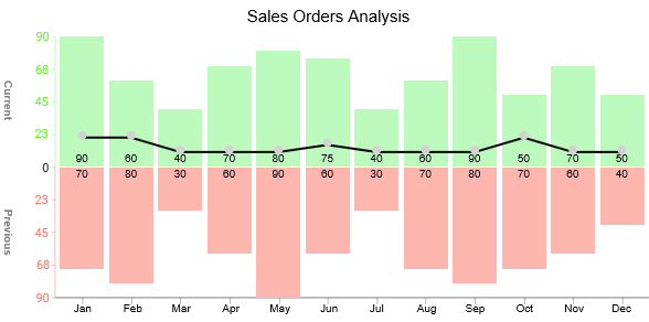
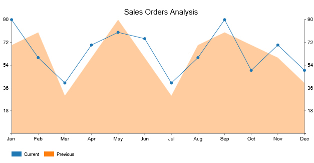
Example
This section will use the Area Line Graph (one of the Time Series Chart variants) to display insights into the table below.
| Months | Current | Previous |
| Jan | 90 | 70 |
| Feb | 60 | 80 |
| Mar | 40 | 30 |
| Apr | 70 | 60 |
| May | 80 | 90 |
| Jun | 75 | 60 |
| Jul | 40 | 30 |
| Aug | 60 | 70 |
| Sep | 90 | 80 |
| Oct | 50 | 70 |
| Nov | 70 | 60 |
| Dec | 50 | 40 |
- To install ChartExpo into your Excel, click this link.
- Open the worksheet and click the Insert button to access the My Apps.

- Select ChartExpo add-in and click the Insert.

- Look for “Area Line Chart” in the list of charts.

- Select the sheet holding your data and click the Create Chart From Selection button, as shown below.

- To make changes to the Area Line Chart, click the Edit Chart.

- Once the Chart Header Properties window pops up, click the Line 1 box and fill in your title.
- Toggle the small button on the bottom right of the Line 2 box to the right side.
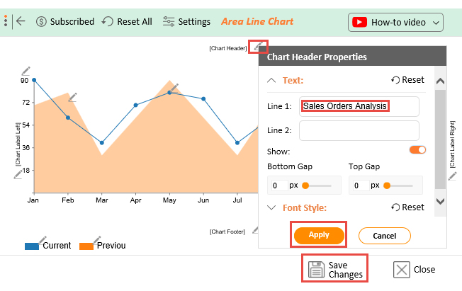
- Click the Apply button to save the changes.
- Click the Save Changes button to finish the editing task.
- Check out the final Time Series Chart in Excel below.
In the coming section, we’ll address the components of a Time Series Chart in Excel.


Components of a Time Series Chart in Excel
-
Trend component
Analyzing trends is critical in predicting future movements.
The trend shows an increase or decrease of a key variable over a certain period. Not all increases or decreases occur simultaneously.
-
Seasonal Component
This is the variation in a particular variable due to some predetermined patterns over time.
You can use Time Series Chart in Excel to display insights into the commodity price quotes, interest rates, exchange rates, stock prices, and so on.
In the coming section, we’ll address the following question: why should you use the Time Series Chart?
Why Should You Use the Time Series Chart?
Use Time Series Chart in Excel to display changes in metrics (plotted on the vertical axis) and continuous values, such as time (plotted on the horizontal).
To get the insights, check for line segments moving consistently from left to right and evaluate their respective slopes (rate of change).
On the horizontal axis, use a variable that depicts continuous attributes at regular intervals of measurement. And this variable should be a temporal one, generating an observation every minute, hour, day, week, or month.
Use a variable in each of the intervals defined by the horizontal-axis variable on the vertical axis. Often, this can be a statistical summary, such as:
- Count
- Average
FAQs:
What chart is best for displaying time series?
There’re 4 key charts you can use to display time series insights. And they include:
- Area Line Chart
- Dual Axis Line Chart
- Multi-Axis Line Chart
- Sentiment Trend Chart
The charts mentioned above are incredibly easy to read and interpret. Besides, they’re easy to plot if you use third-party add-ins, such as ChartExpo.
When should you use a Time Series Chart?
Use Time Series Chart in Excel to display changes in key variables (plotted on the vertical axis) and continuous data points, such as months (plotted on the horizontal).
To get the insights, check for line segments moving consistently from left to right and evaluate their respective slopes (rate of change).
Wrap Up
You have data you’ve been tracking over time.
And you’re tasked to explain its trend and, most importantly, provide a forecast.
What’s the go-to chart?
Yes, you guessed right. It’s the Time Series Chart. The chart is suitable in this scenario because time and dates are continuous, categorical data.
If you want to craft a compelling data story that provides actionable insights into trends, outliers, and other shifts, use Time Series charts. And this is because they’re straightforward to read and understand. Remember, simplicity is always at the core of every persuasive narrative.
There’s no doubt that a majority of us don’t like to be subjected to cognitive overload. So, the simpler the message, the more compelling it becomes.
Excel lacks ready-to-use Time Series Charts.
So, what’s the solution?
We recommend you install third-party apps, such as ChartExpo, to access the ready-to-use Time Series Chart in Excel.
ChartExpo is an add-in for Excel that’s loaded with insightful and ready-to-go Time Series Graphs, such as Area Line Chart. You don’t need programming or coding skills to use ChartExpo.
Sign up for a 7-day free trial today to access ready-made Time Series Charts that are easy to interpret and visually appealing to your target audience.