
A project timeline can be created in Excel using charts linked to data tables, so that the chart updates when you edit the data table. The first template on this page uses a stacked bar chart technique and also includes up to 4 milestones as vertical lines. This template is a cross between my project schedule and task list templates. I’ve populated the template with some generic product development terminology, but it is designed for you to enter your own tasks and dates. The second template uses a scatter chart with data labels and leader lines to create a more traditional type of timeline.
Advertisement
⤓ Download
For: Excel 2013 or later
«No installation, no macros — just a simple spreadsheet» — by
License: Private Use
(not for distribution or resale)
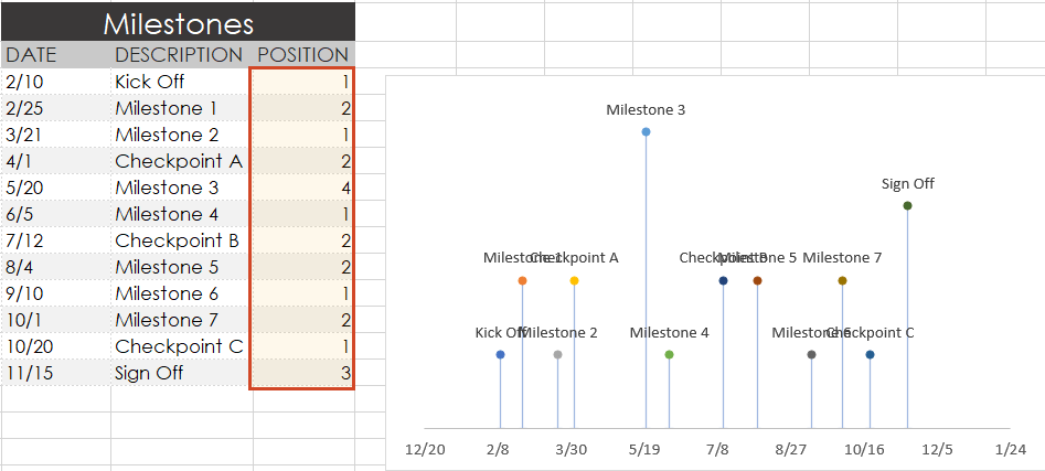
Using the Project Timeline Template
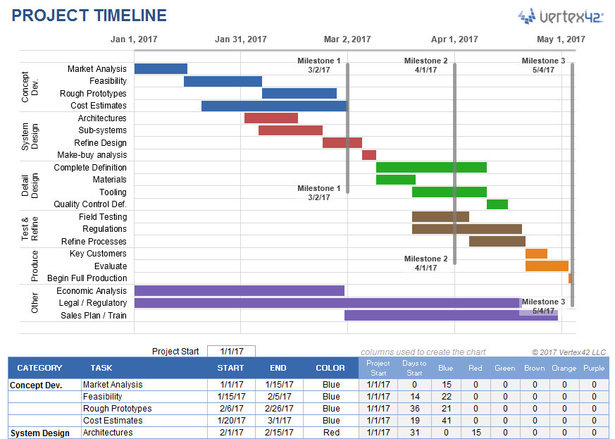
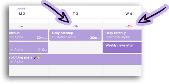
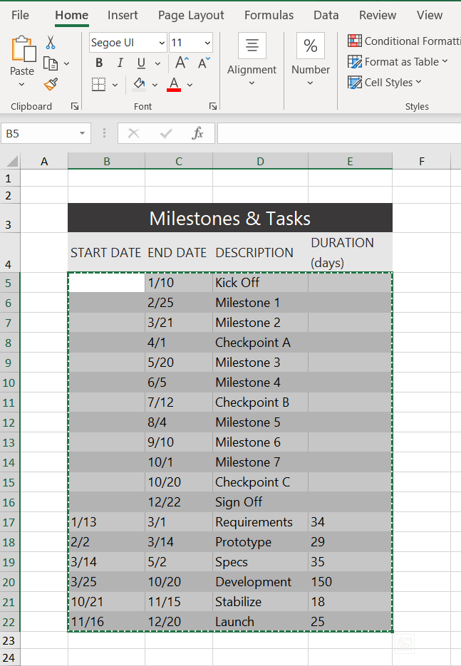
Grouping Tasks Using Different Colors: One of the key features of this template is the ability to choose a different color for the bars in the timeline via a drop-down box in the Color column. This makes it easy to identify the different phases or categories of tasks. You can insert and delete tasks by just inserting or deleting rows in the spreadsheet’s data table.
The example above shows some of the steps in a product development cycle (Concept Development, System Design, Detail Design, Testing and Refining, Production, etc.), with different colors representing different phases of the cycle. However, there are other ways to use this type of timeline. Another common way to group tasks within a project timeline is by key organization function, such as Marketing, Design, Testing, Manufacturing, Finance, Sales, Quality Assurance, Legal, etc.
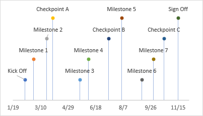
Milestones: With any project timeline, you will most likely want to define at least a couple key milestones. In the above example you will see 3 milestones as vertical lines. You can edit the milestone labels and dates via the data table. The template lets you show up to 4 milestones. Adding more is possible but would require you to create the new data series yourself (you can’t just insert rows for more milestones like you can with the tasks).
Can I Add More Colors? This project timeline is set up to allow up to 6 different color choices. Adding more colors is possible, but that would require more Excel experience. Some general steps to follow to attempt adding more colors:
- Add a new column to the right of the current data table.
- Copy the formulas in the previous column into the new column.
- Select the timeline and drag the range marker to the right to include the new column.
- Add some data to see what color the new column uses and then update the column label.
- Update the list used for the data validation drop-down box in the Color column to include the new label.
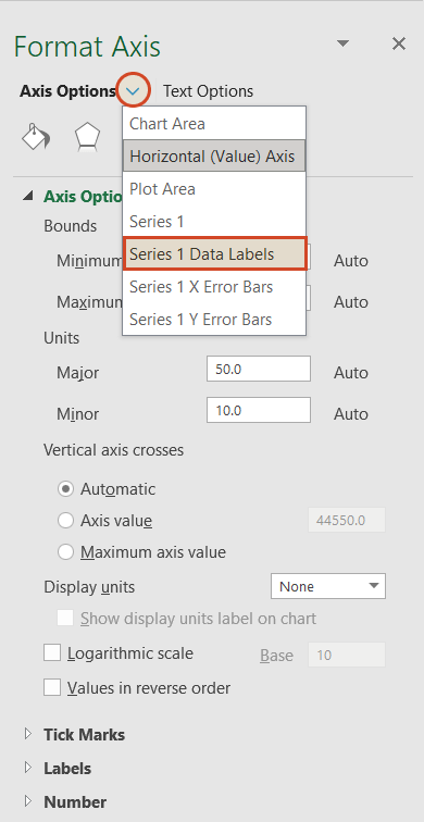
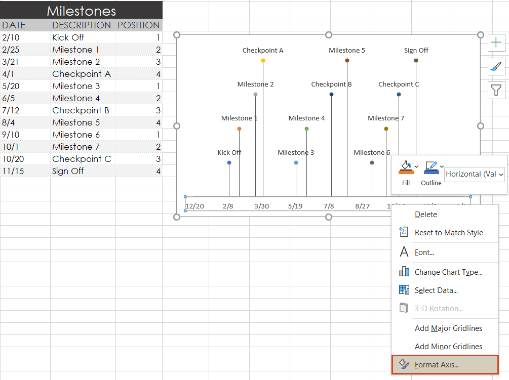
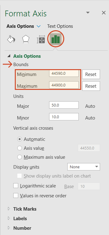
Dates Not Changing in the Chart? To edit the range of dates shown in the chart, you need to edit the Minimum and Maximum bounds of the horizontal axis. Right-click on the axis and select Format Axis.
Want More Flexibility / Ease of Use? If you don’t care about automation and just want a simple way to create a high-level project timeline, you might want to try the Project Schedule Template. Colors are modified by just changing the background colors of the cells in the spreadsheet.
Project Timeline Chart
for Excel
Description
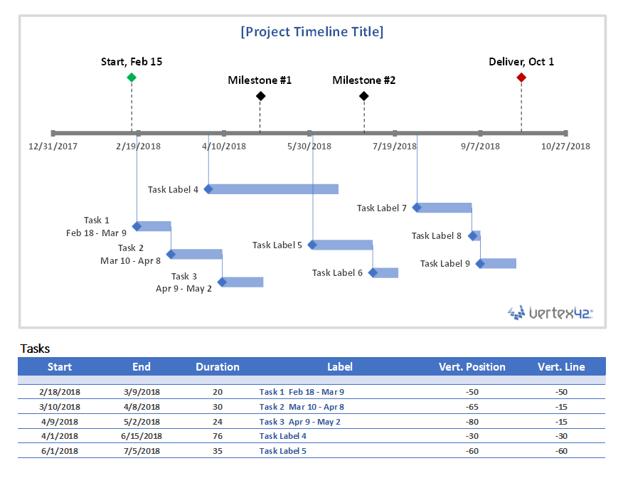
This project timeline uses two different scatter chart series to display milestones above the timeline and tasks with durations below the timeline. The durations are created using X Error bars. The length of the leaderlines for the tasks can be defined by the user to show task dependencies.
The vertical positions of the tasks and milestones are adjusted by the user. This may work great for some timelines, but if you have more than 20 tasks to show, you may be better of using a Gantt Chart.
This template is based on the original Vertex42 Excel Timeline Template, which was one of the first timeline templates developed for Excel using the technique of leaderlines and error bars for durations. This new project timeline works only in the more recent versions of Excel (2013 or later) because of the new feature in Excel that allows you to specify a range of cells for Data Labels.
To learn how to create a timeline using a scatter chart, see the video demos for the Bubble Chart Timeline and Vertical Timeline templates.
Use a Graphic as a Data Point Marker in a Project Timeline
You can add graphics to a project timeline to make it more interesting or visually appealing. For example, you may want to mark the final milestone with a finish-line flag, as shown in the image below. To do this, you will first need to create a graphic using your favorite image editing app, or download one. The diamond ![]() and flag
and flag ![]() that I use in my project timelines were created from screenshots of common unicode characters.
that I use in my project timelines were created from screenshots of common unicode characters.
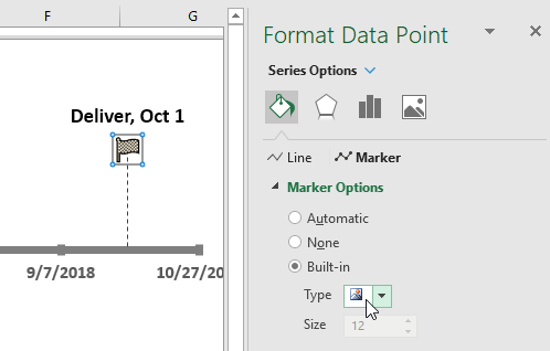
Steps for using a graphic as a data point marker:
- Select a single data point by clicking on it and then clicking on it again.
- Right-click on the selected data point to open the Format Data Point task pane.
- Click on the Bucket > Marker > Marker Options > Built-in, then select the picture icon from the Type drop-down.
- Select the image from your computer.
To see other examples of using graphics in a timeline, see my original Timeline Template.
More Project Timelines
Project Planner Template
Create a project plan using a gantt chart that shows the planned schedule vs. the actual schedule.
Gantt Chart Template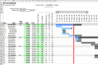
The Gantt Chart template (and especially the Pro version) is great for project scheduling and detailed task scheduling.
We, humans, are visual animals.
In other words, the human brain will find it a lot easier to digest information that’s clearly communicated and displayed. For this reason, the visual component is essential when planning complex projects with many moving pieces.
Well, you’re in the right place to learn precisely how to do just that.
In this blog post, you’ll get a step-by-step process to create a timeline in Excel in three different ways to visually communicate your project’s schedule and create a powerful visual timeline to plan without getting a headache.
- Create a timeline in Excel using SmartArt Graphics
- Create a timeline in Excel using Scatter Charts
- Create a timeline in Excel using Timeline Templates
- The pros & cons of Excel timelines
- The alternative
How to create a timeline in Excel using SmartArt? (and for what purpose)
For starters, what are SmartArt graphics?
SmartArt Graphics Timeline In Excel: for what purpose?
Microsoft Excel’s Smart Art feature makes it reasonably straightforward to create a project timeline.
Now, while SmartArt timelines can be a valuable tool to communicate a project’s roadmap to stakeholders, they are also limited; you can only create simplistic timelines to visualize the milestones of a project.
In short: SmartArt timelines are okay for simple reporting purposes, not to work with.
Create your SmartArt timeline
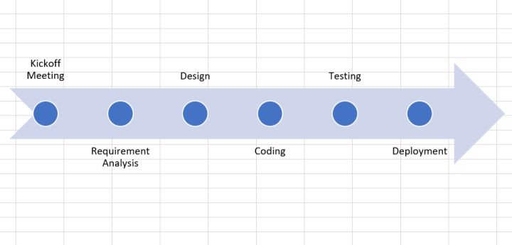
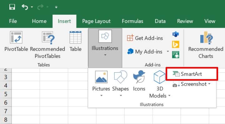
- Open a blank Excel document. Click Insert > SmartArt > Process.
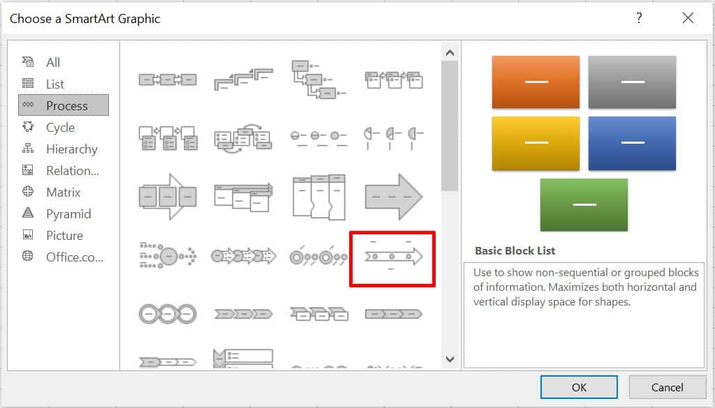
- Then select Basic Timeline from the Graphic options. You may also choose other graphics templates that suit your needs.
- Enter Timeline data either in the provided text box or directly on the timeline.
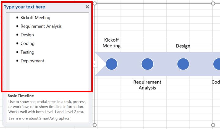
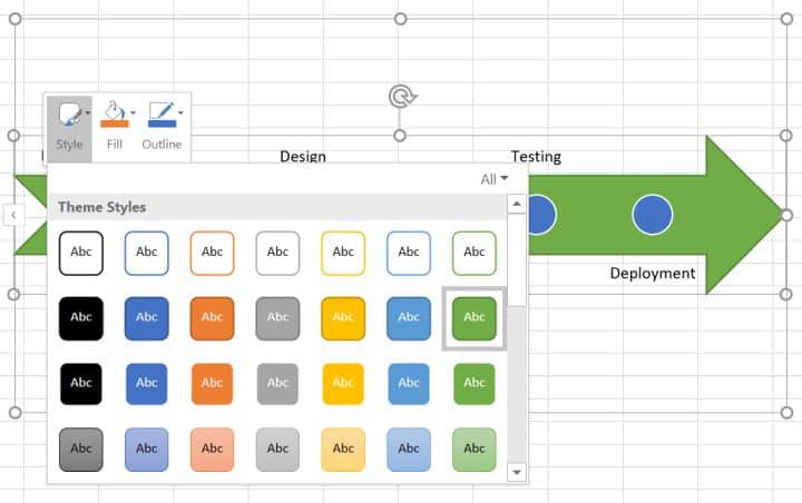
- Excel also allows you to change the style of a timeline. To do so, simply right-click to change the theme style, fill color, and outline styles.
And you’re all set. Your simplistic Excel SmartArt timeline should be ready!
If you’re after something more usable than SmartArt, you may be interested in building a scatter chart.
How to Create an Excel Timeline Using a Scatter Chart? (and for what purpose)
Scatter chart timelines in Excel: for what purpose?
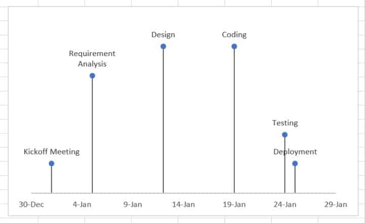
Scatter charts provide a simple way to visualize various data entries over a specific period.
For instance, you could use a scatter chart to visualize the due date for all milestones of a project along with the necessary resources to complete them.
This is something that a basic SmartArt timeline couldn’t deliver.
Here again, you can choose from and edit the many charts available in Microsoft Excel to represent a simple project timeline that will suit your needs.
In short: Scatter chart timelines are a viable option to plan elementary projects that don’t require much resourcing.
Create your scatter chart timeline in Excel
This guide is a bit longer, but stick to our steps, and you’ll be fine! — alternatively, feel free to leave a comment below if you’re stuck!
- First, open a blank Excel document.
- Then, prepare your chart data.
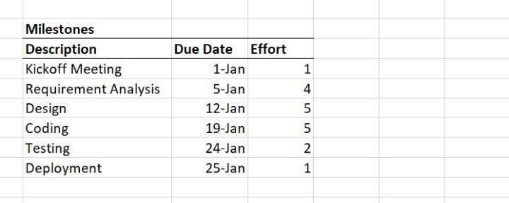
For this chart, we’ll create milestones for a website design project and attribute a due date and an estimated effort for each.
- Next, insert a scatter chart from Insert > Charts. Then select the Scatter option.
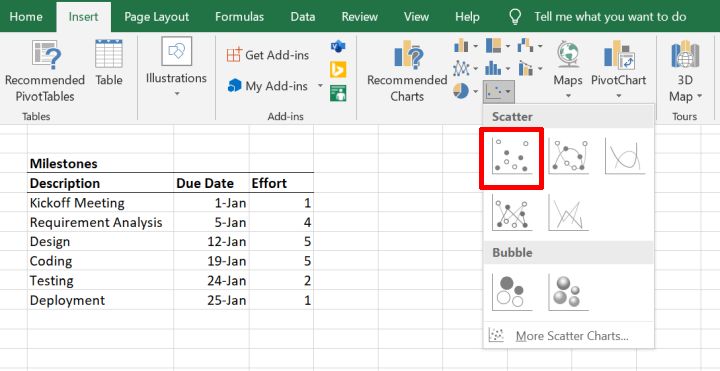
Now, we need to map our prepared data to the chart.
- Right-click on the scatter chart. Then click the Select Data option.
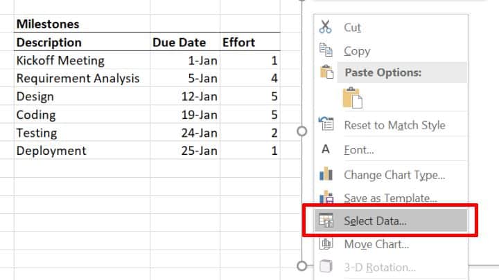
- In the dialog that pops up, click on the Add button in the Legend Entries section.
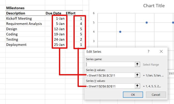
- Set the Due Dates range as Series X values, and the Efforts range as the Series Y values.
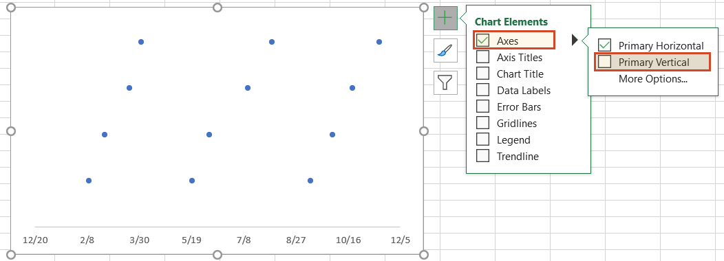
- Next, make our chart look like a timeline, disable the Primary Vertical Axis, Chart Title, and Gridlines chart elements.
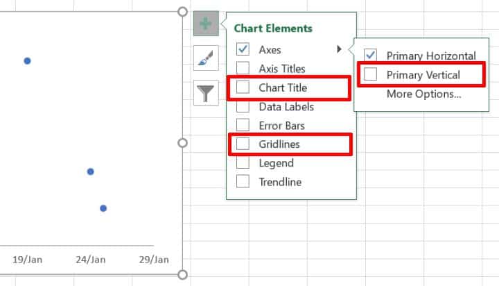
- To display the timeline markers, check the Error Bars option in Chart Elements.
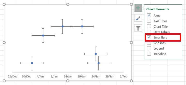
- Then to format the error bars, click on Chart Elements > Error bars > More Options.
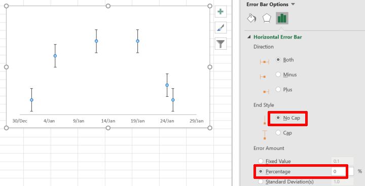
- For horizontal error bars, set the End Style to No Cap and the Error Amount > Percentage to 0%.
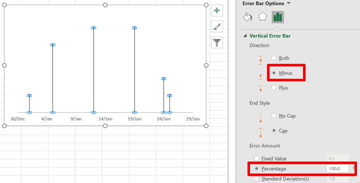
- For vertical error bars, set the Direction to Minus and the Error Amount > Percentage to 100%.
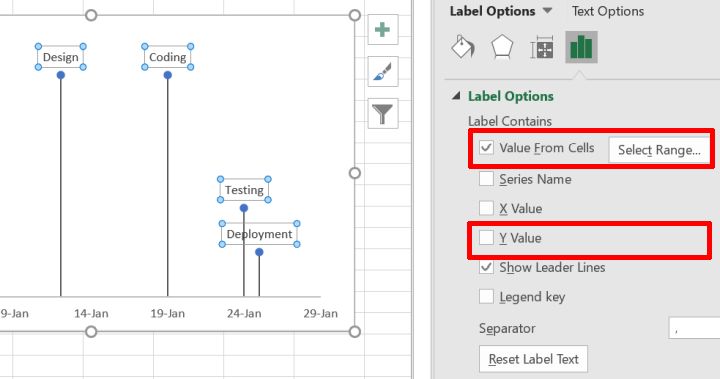
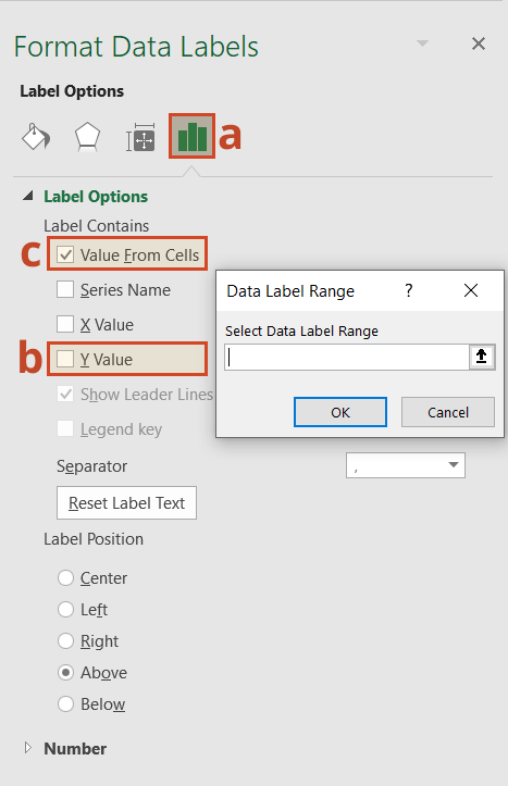
- To display the milestone labels, enable Data Labels from Chart Elements > Data Labels. Then click on Data Labels > More Options.
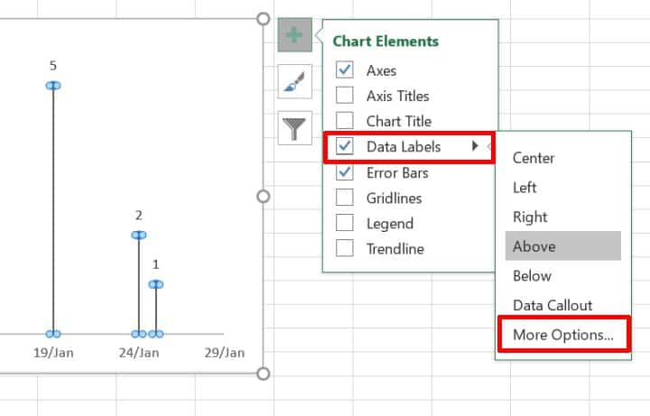
- Enable the Value From Cells option and select the range of milestones names from our prepared data. Uncheck the Y Value option.
Hats off to you! You made it! Your Excel timeline using a scatter chart is ready.
Now, if you don’t want to bother creating your own Excel timeline charts from scratch (I can’t blame you there), an alternative is to make your timelines using Excel templates.
Excel timeline templates are readily available in Microsoft Office’s Template Library.
Note that some of these templates will only be available once you purchase a Microsoft Office 365 subscription. However, the vast majority is available free of charge.
In short: use ready Excel templates to create simple project plans to avoid building them yourself.
Let’s look at how to create a timeline in Excel using a template.
Create your timelines with Excel Templates
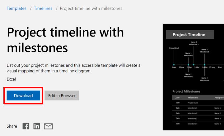
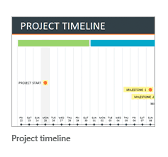
- Download the free “Project timeline with milestones” template from the Office template library.
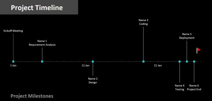
- Open the downloaded template in Excel and update your milestone data in the Project Milestones section. Set the milestone due date, milestone description, the person responsible, and the milestone label position.
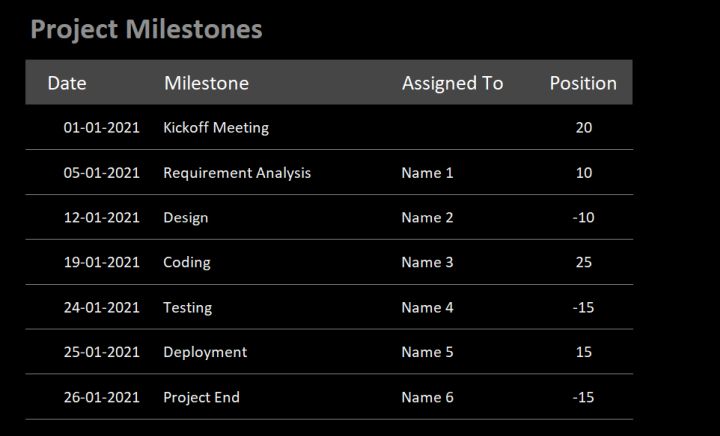
As you update your project milestone data, the milestone chart above automatically gets updated.
This is most likely the fastest way to build a decent timeline on Excel, especially if you don’t want to bother creating one from scratch on your own.
Now, you’ve probably noticed that while Excel makes it possible to create project timelines, it’s not cut for it.
Pros & Cons Of Excel Timelines
As mentioned earlier, a timeline is a powerful visual tool for project managers.
In the early stages of a project, it helps to communicate a project’s roadmap. And in the later stages, it allows project managers to plan and track project schedules and allocate resources.
What makes Excel an interesting project timeline maker…
The most significant advantage of using Microsoft Excel to create a timeline is that it’s easily available:
- Anyone with a computer, a smartphone, or a tablet can use Excel. It’s relatively affordable and doesn’t require a beast of a computer to run properly.
- You probably already have access to it. If you already have access to the MS Office Suite, you won’t need to spend anything extra.
- Your team is most likely Excel literate (up to a certain degree). If your team members are already comfortable using Excel, you won’t need to spend time training and onboarding them on the tool.
- You can find a ton of free Excel templates online. Using these templates, it’s reasonably easy to create a timeline in Excel.
… and why you might need something that’s built for project planning and work management
Don’t get me wrong; I love Excel (there’s a reason why I’ve decided to write this step-by-step blog post). And if you are seriously considering using Excel as your project timeline maker, know that I’ve been in your position, and I’d rather tell you why it might drive you crazy.
- Excel lacks collaborative features. You cannot work with another team member on a project’s schedule unless you both sit right next to each other. As a result, it is tough for distributed teams to plan together.
- You can’t ensure data integrity. It’s (way too) easy for anyone to wrongly update or delete data from an Excel document, making it hard to keep track of who did what, where, and when.
- Version soup: “Oh shoot, I thought we were working from the Team Planning V12_new.xls?” Team members will eventually work on different versions of Excel spreadsheets. From experience, I know that combining data from these versions can quickly become chaotic.
To sum up, Excel is OK for small and simple projects. You will need something else for anything bigger because Excel timeline templates are too basic and aren’t really teamwork-friendly.
So, what then? What’s the alternative?
To create project timelines for larger projects, you may want to consider using a project planning tool like Toggl Plan.
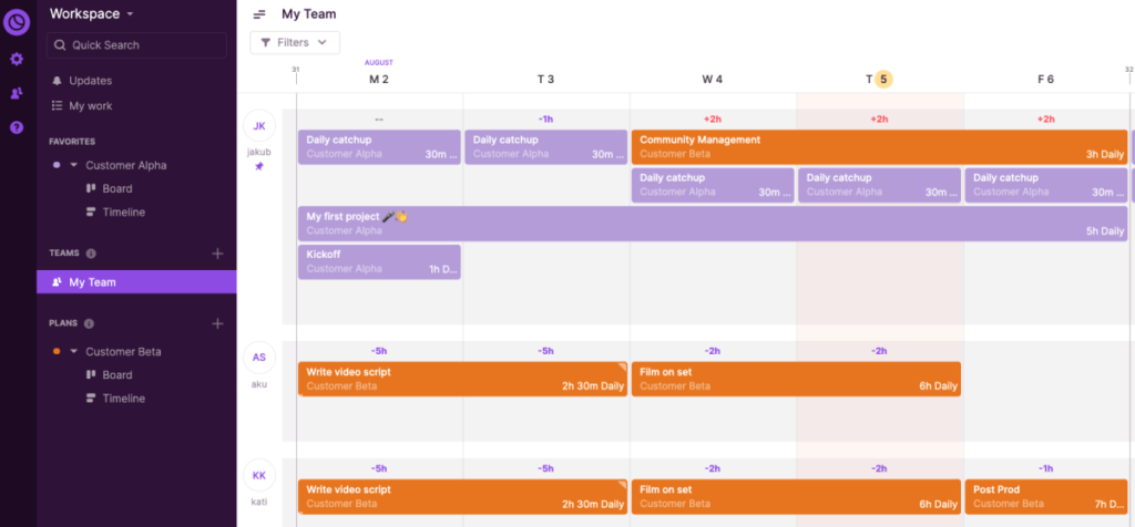
Meet Toggl Plan. The best way to create visual project timelines.
Toggl Plan is an easy-to-use SaaS with a drag-and-drop interface that helps those in charge of delivering projects to be on top of their work and capacity planning by providing a clear overview of who’s doing what and when, well ahead of time.
Consequently, teams can work at capacity and deliver projects on time, without stressing about it.
Create beautiful timelines for complex projects
Excel’s timelines can be helpful – But they are too simplistic and can be darn hard to read. We built Toggl Plan’s timeline to become the only tool you need to plan and visualize your projects.
Don’t overwork yourself, or your team.
One of the advantages of planning well ahead of time is to anticipate how much work you and your team can take.
In Toggl Plan, you’ll be able to see how busy everyone is in the blink of an eye, thus making it more convenient to move tasks around and make sure that no one in your team works silly hours.
Collaborate with your teammates
While you can benefit from it as a single user, we actually built Toggl Plan for teams. When working together, you can leave comments, create and assign tasks, move tasks around, adjust how long it took to complete a project, etc.
In other words, Toggl Plan enables teamwork.
Drag and drop your projects
While Excel is most likely the most comprehensive software out there, it’s not user-friendly. One of the things that I dislike the most about it is the impossibility to drag-and-drop items.
In Toggl Plan, you can simply drag and drop your tasks.
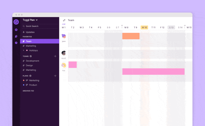
Painless. Fast. Easy.
Long story short, Toggl Plan makes project planning and work management bliss. Now, hold your horse because the best is yet to come. If you’re an individual user, Toggl Plan is free forever. And if you work with a team, you can sign up for a 14-day free trial.

Jitesh is an SEO and content specialist. He manages content projects at Toggl and loves sharing actionable tips to deliver projects profitably.

![]()
Office Timeline Pro+ is here!
Align programs and projects on one slide with multi-level Swimlanes.
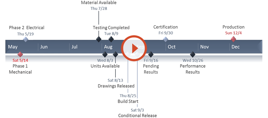
A timeline is a type of chart which visually shows a series of events in chronological order over a linear timescale. The power of a timeline is that it’s a visual representation, which makes it easy to understand critical milestones in a project and the progress of a project schedule. Timelines are particularly powerful for project scheduling or project management when paired with a Gantt chart, as shown at the end of this tutorial.
![]()
Play Video
Options for making an Excel timeline
Microsoft Excel has a Scatter chart that can be formatted to create a timeline. If you need to create and update a timeline for recurring communications with clients and executives, it would be simpler and faster to
create a PowerPoint timeline.
On this page you can see both ways to create a timeline using these popular Microsoft Office tools. We will give you step-by-step instructions for making a timeline in Excel by formatting a Scatter chart. We will also show you how to instantly create an executive timeline in PowerPoint by pasting your project data from Excel.
Which tutorial would you like to see?
![]()
30 mins
Manually create timeline in Excel
![]()
Download Excel timeline template
How to create an Excel timeline in 7 steps
1. List your key events or dates in an Excel table.
-
List out the key events, important decision points or critical deliverables of your project. These will be called Milestones and they will be used to create a timeline.
-
Create a table out of these Milestones and next to each milestone add the due date of that particular milestone.
-
To create a timeline in Excel, you will also need to add another column to your table that includes some plotting numbers. Add the new column next to your milestone description column and list out a repetitive sequence of numbers such as 1, 2, 3, 4 or 5, 10, 15, 20 etc. Excel will use these plotting points to vary the height of each milestone when plotting them on your timeline template.
For this demonstration we’ll format the table in the image below into a Scatter chart and then into an Excel timeline. Then we’ll use it again to make a timeline in PowerPoint.
2. Make a timeline in Excel by setting it up as a Scatter chart.
-
From the timeline worksheet in Excel, click on any blank cell.
-
Then from the Excel ribbon, select the Insert tab and navigate to the Charts section of the ribbon.
-
In the Charts section of the ribbon drop down the Scatter or Bubble Chart menu.
-
Select Scatter which will insert a blank white chart space onto your Excel worksheet.

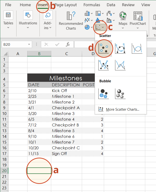
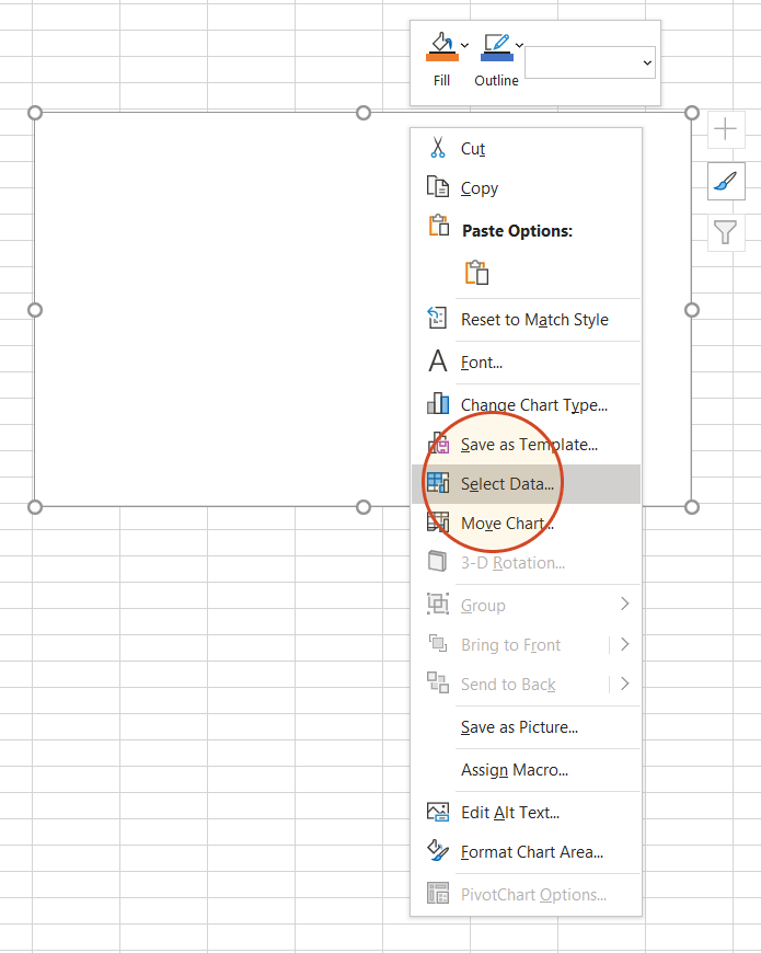
3. Add Milestone data to your timeline.
-
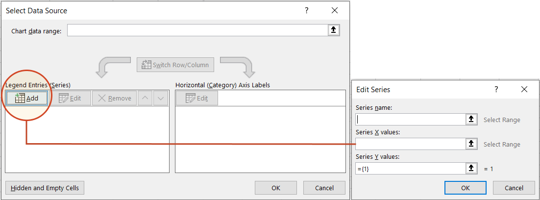
Right-click the blank white chart and click Select Data to bring up Excel’s Select Data Source window.
-
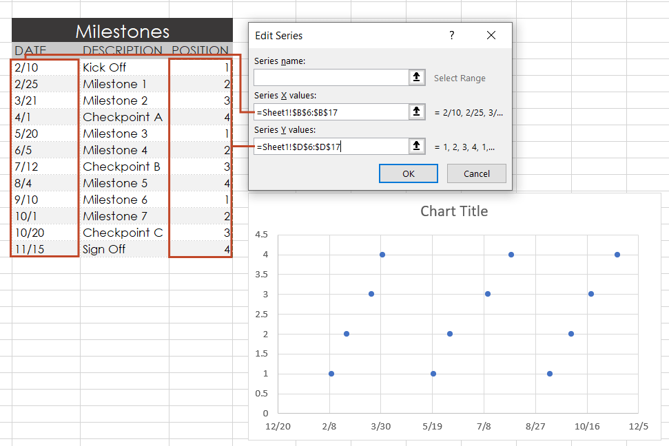
On the left side of Excel’s Data Source window, you will see a table named Legend Entries (Series). Click on the Add button to bring up the Edit Series window. Here you add the dates that will make your timeline.
-
We will enter the dates into the field named Series X values . Click in the Series X values window on the arrow button
. Then select your range by clicking the first date of your timeline (ours is 2/10) and dragging down to the last date (ours is 11/15).Following the same path, we will enter the plotting numbers series into the field named Series Y values. Click in the Series Y value window and remove the value
that Excel places in the field by default. Then select your range by clicking on the first plotting number of your timeline (ours is 1) and then dragging down to the last plotting number of your timeline (ours is 4). -
Click OK and then click OK again to create a scatter chart.
4. Turn your Scatter chart into a timeline.
-
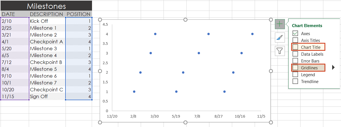
Click on your chart to bring up a set of controls which will be presented to the upper right of your timeline’s chart. Click on the Plus button (+) to open the Chart Elements menu.
-
In the timeline’s Chart Elements control box, uncheck Gridlines and Chart Title.
-
Staying in the Charts Elements control box, hover your mouse over the word Axes (but don’t uncheck it) to get an expansion arrow just to the right. Click on the expansion arrow to get additional axis options for your chart. Here you should uncheck Primary Vertical but leave Primary Horizontal checked.
-
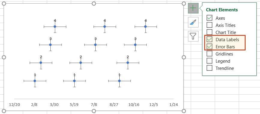
Staying in the Charts Elements control box just a little longer, add Data Labels and Error Bars.
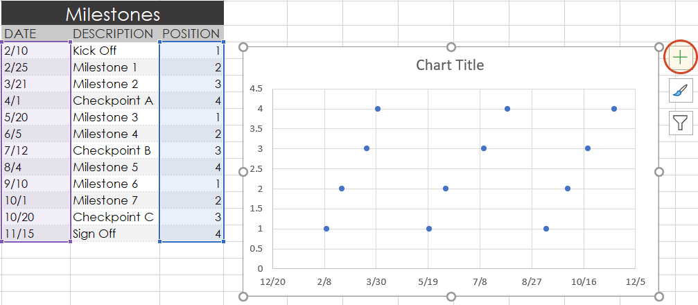
Your timeline chart should now look something like this:
5. Format chart to look like a timeline.
-
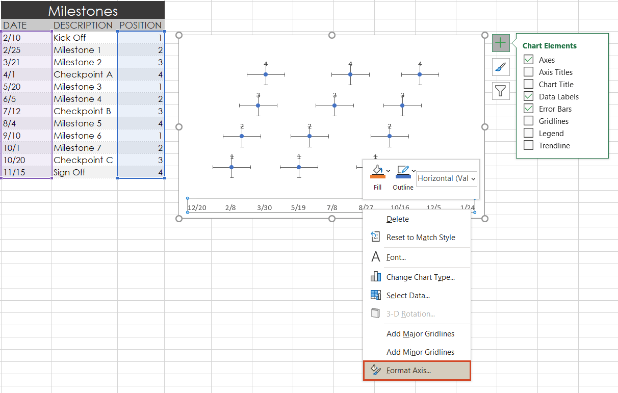
To make a timeline in Excel, we will need to format the Scatter chart by adding connectors from your milestone points. Right-click on any one of the dates at the bottom of your timeline and select Format Axis to bring up Excel’s Format Axis menu.
-
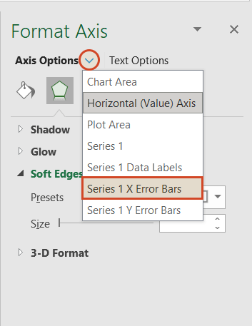
Drop down the arrow next to the title Axis Options and select Series 1 X Error Bars.
-
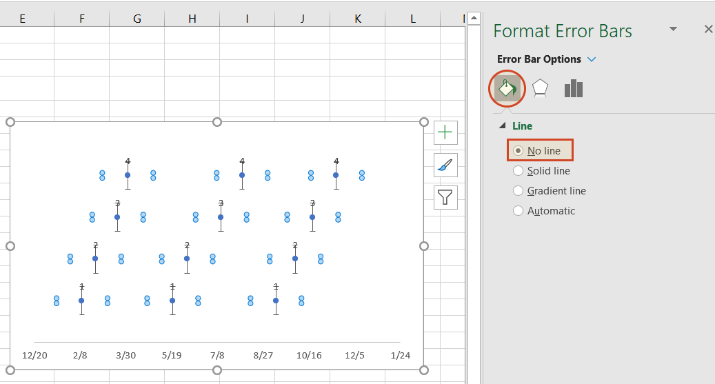
Under the Error Bar Options menu, click on the paint can icon to reveal the Fill & Line controls. Select No line, which will remove the horizontal lines around each of the plotted milestones on your timeline.
-
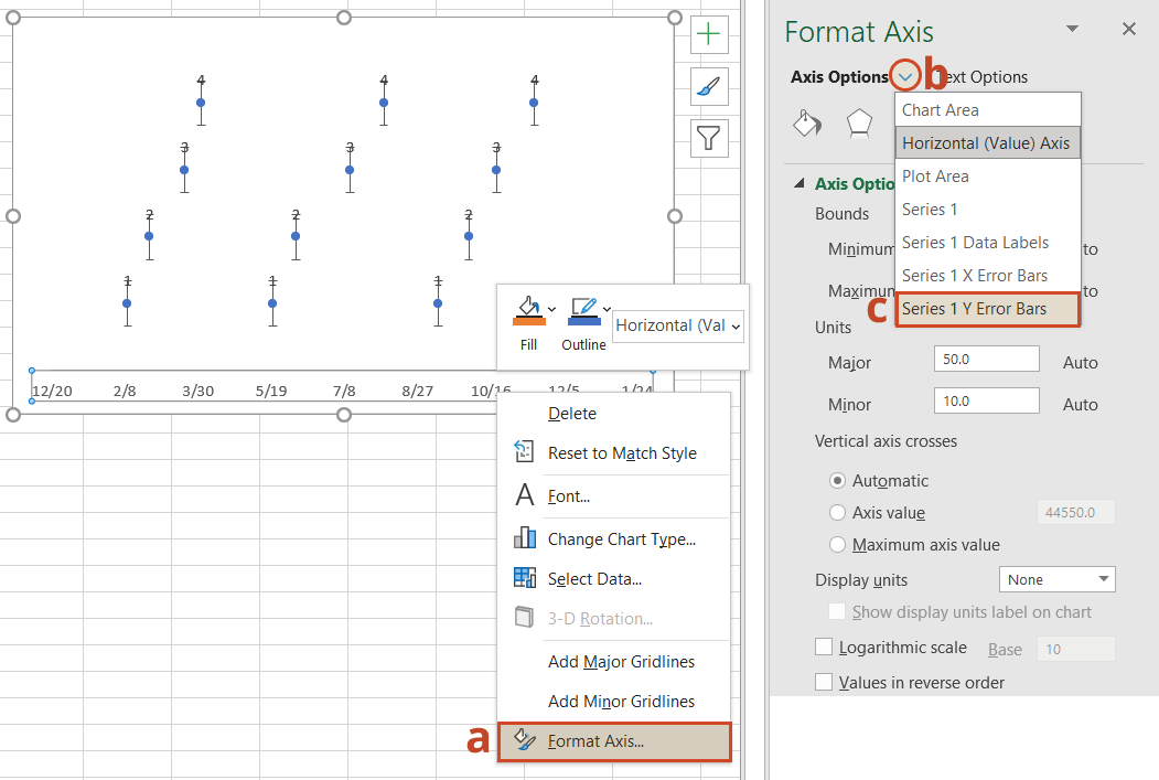
In a similar process, we will also adjust your timeline’s Y axis. Again, from the timeline, right-click on any one of your timeline’s dates at the bottom of the chart and select Format Axis. Drop down the arrow next to the title Axis Options and select Series 1 Y Error Bars.
-
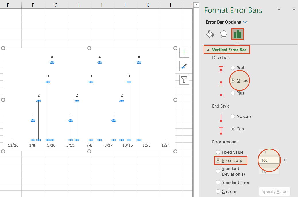
Right-clicking on any bar in the chart will open the Format Error Bars menu. From the Vertical Error Bar, set the direction to Minus. Then set the Error Amount to Percentage, and type in 100%. This will create connectors from your timeline’s milestones to their respective points on your timeband.
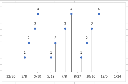
Your Excel timeline should now look something like the picture below.
6. Add titles to your timeline’s milestones.
You have built a Scatter chart as an Excel timeline. Now we will format it into a proper timeline.
-
To finish making your timeline, we will add the milestone descriptions. Staying in the Format Axis menu, again drop down the menu arrow next to the title Axis Options. This time choose select Series 1 Data Labels to bring up the Format Data Labels menu.
-
Click the Label Options icon. Uncheck Y Value, and then put a check next to Value From Cells. This will bring up an Excel data entry window called Data Label Range.
-
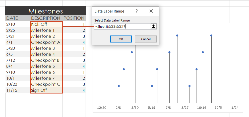
In the Select Data Label Range window, you will enter your timeline’s milestone descriptions from the timeline table you built in step 1. To do this simply click on the description for the first milestone in your timeline table, (ours is Kick Off), then drag down to the last milestone in your timeline (ours is Sign Off). Click OK.
Your Excel timeline template should finally look more like this now:
7. Styling options for your timeline.
Now you can apply some styling choices to improve the aspect of your timeline.
-
Coloring your timeline’s milestone markers.
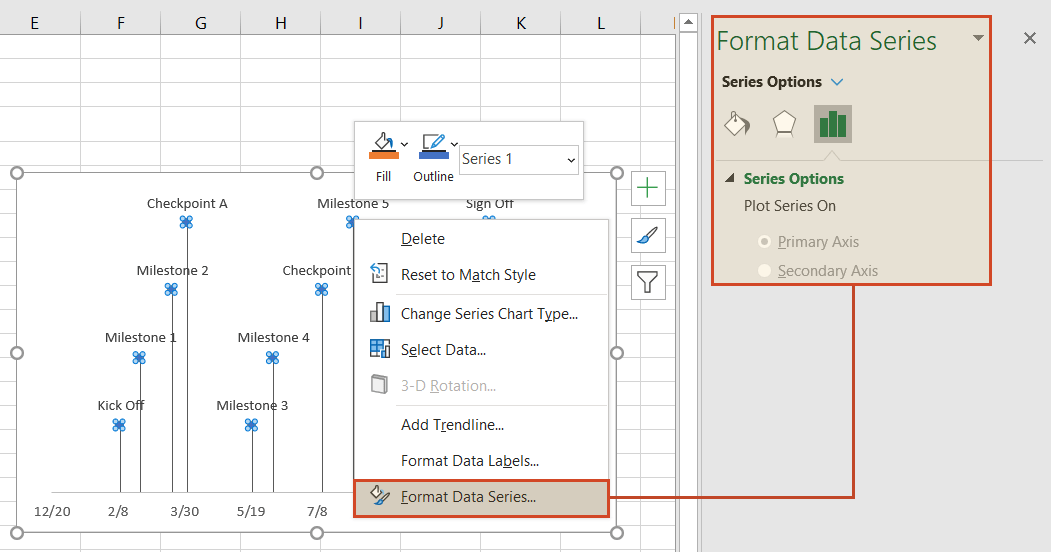
From your timeline, right-click on any of the milestone points (caps) and select Format Data Series to bring up the Series Options menu.
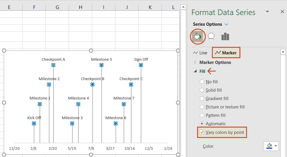
Select the paint can icon for Fill & Line options and, then choose the tab for Marker. You may also need to select Fill to reveal its menu. Then you can choose coloring options for your timeline’s milestone markers. In our example, we selected Vary colors by point, which lets Excel pick the milestone colors for our timeline.
-
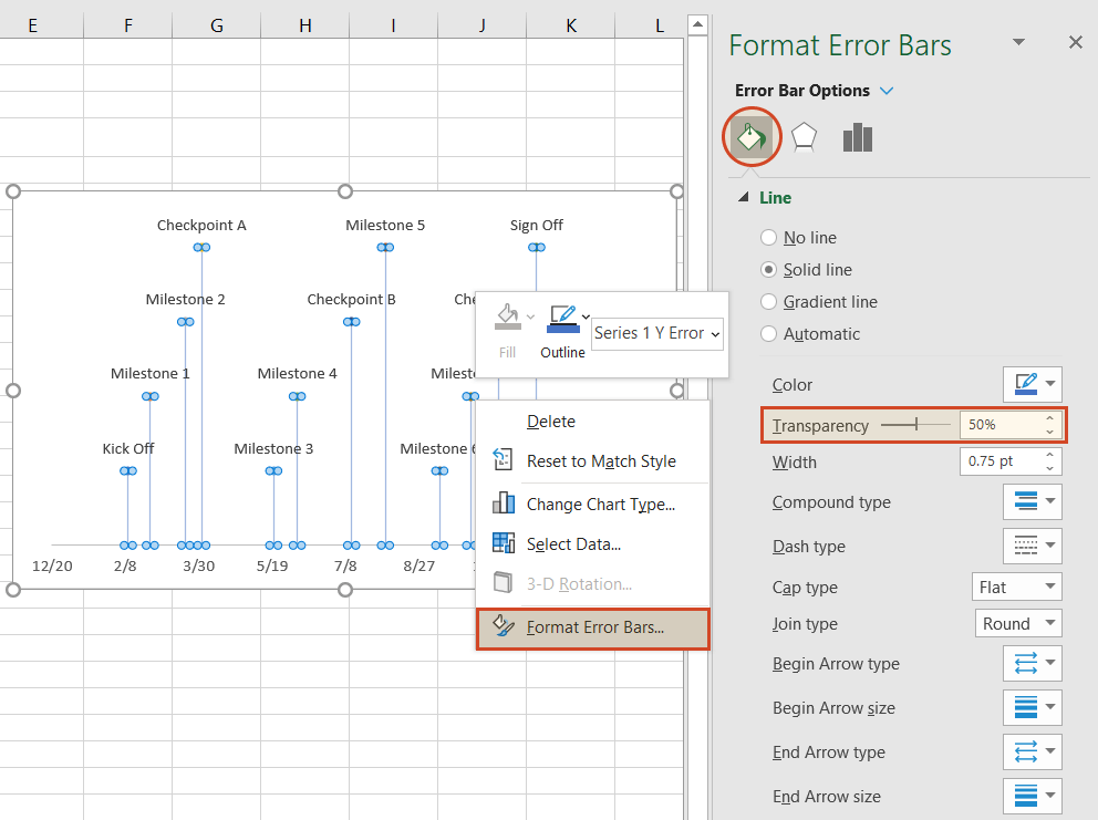
Change the vertical connector’s transparency.
On your timeline, right-click on any of the vertical connectors that connect your milestones with the timeband below. Select Format Error Bars to bring up the Vertical Error Bar menu. Again, select the paint can icon to choose Excel’s Line & Fill options. Here you can make formatting adjustments (color, size, style, etc.) to your timeline’s connector lines. In our example we set the transparency of the lines to 50%.
-
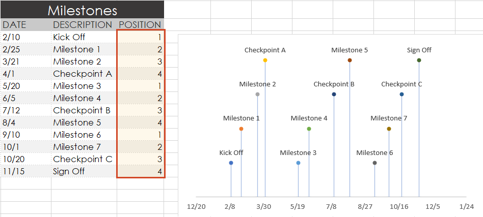
Vary the height of each milestone so their descriptions are not overlapping the neighboring milestone.
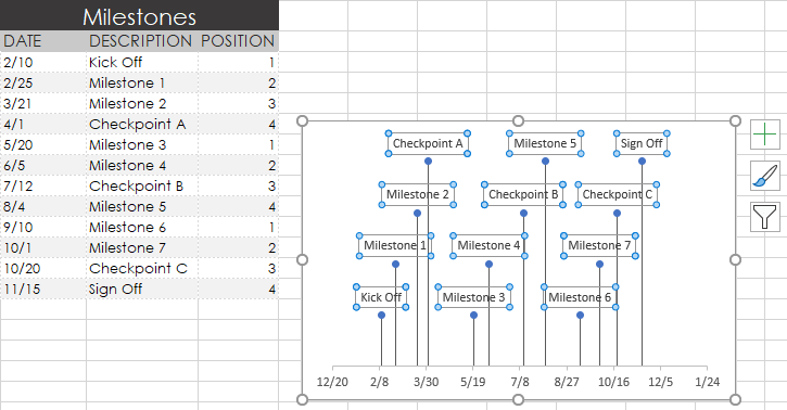
Remember the repeated sequence of numbers you added to your timeline table in step 1. Well, those set the height of each milestone on your timeline. By adjusting these numbers, you can play around with different height positions for each milestone. For example, to optimize our timeline, we used the number sequence, 1, 2, 3, 4, 1, 2, 3, 4.
Look how the descriptions would overlap if we changed the order (Don’t try this at home! 😊):
-
Trim off the empty space to the left or right of your Excel timeline by adjusting its minimum and maximum bounds.
Again right-click on any of the dates below your timeband. Select Format Axis.
Under the heading Bounds, adjusting the Minimum number upward will move your first milestone left on your timeline, closer to the vertical Axis. Likewise, adjusting the Maximum number down will move your last milestone right on your timeline, closer to the right edge of your chart.
-
Finished! Our timeline now looks like this:
To help you get started quickly, we have included a practical Excel template that you can download for free and learn how to create timelines in Excel.
![]()
Download a pre-built Excel timeline file
FAQs about timelines in Excel
Is there a timeline template in Excel?
Yes, there are several predefined timeline templates in Excel. To explore them, go to File > New, and check the templates preview list. If you cannot find what you need, use the “More templates” option and type “timeline” in the “Search for online templates” box to browse the collection of timeline templates.
If you’re not happy with the limitations that come along with the standard timeline templates in Excel, have a look at the library of professional timeline templates produced with Office Timeline and try our timeline creator.
How do you make a timeline in Word or other office tools?
There are two ways to make timelines in Word, Excel, PowerPoint and Outlook: using SmartArt and using Charts. Here’s an overview of the steps required by each option.
A. Using SmartArt. This method is mostly manual, but if you want to create a basic timeline with SmartArt, you should follow these 5 steps:
- Go to Insert > SmartArt;
- In Choose a SmartArt Graphic box, select Process on the left and then pick a layout that you like and click OK;
- In the SmartArt graphic, click [Text]. Fill in the data by typing or pasting your text;
- You can add items in the timeline: Right click on a shape, then Add Shape > Add Shape After/Before;
- You can move items around by dragging and dropping them as you like.
After you create the timeline, you can add or move dates, and you can style your timeline further, apply different styles or change layouts and colors.
See more detailed instructions on using SmartArt to make timelines in our tutorial on how to make a timeline in Word.
B. Using Charts. You have various options: Column Charts, Bar Charts or Scatter Charts. In all the Office programs, this method will work with Excel data tables, so, you’ll need to group your data in Excel. Please note you’ll need some formatting to get a usable timeline. There are three basic steps for using Charts:
- Go to Insert > Chart > Insert Column or Bar Chart > 2-D Bar/3-D Bar;
- Select Stacked Bar (not 100% Stacked Bar);
- Format and style the newly created bar chart until you get the timeline that you like.
If you need more detailed instructions check out our series or tutorials on how to make timelines with your usual office tools.
Where can I create a timeline?
You can create timelines online or using offline tools. In both cases, you can choose between automated and manual work.
1. Let’s start with the most efficient way to make a timeline: using automation. This method is time saving and offers the best results, especially with more complex projects.
-
Offline tools: Office Timeline Add-in with its professional and free timeline maker versions. Office Timeline is a PowerPoint add-in that helps you quickly make and manage professional timelines and Gantt charts. It allows using templates, making timelines from scratch and importing data from Excel, Microsoft Project, Smartsheet or Wrike.
-
Online, with Office Timeline Online – premium and free versions. Office Timeline Online is an easy-to-use timeline creator that helps you with professional PowerPoint timeline creation in minutes, but also with slides updating and online sharing.
2. There are also manual ways to make a timeline from scratch, or from templates:
-
Offline, you can make timelines in any Office application, by using templates or designing your timeline using shapes and objects.
-
Online, you can make timelines in Google Docs editor.
However, these methods are not specialized for timeline creation, so they require more time and detailed instructions, and creative solutions to make timelines from graphics. In the end, you may find that the result might not be worth all the time and effort.
What is the best program to make a timeline?
There are several options of good timeline creators – online and offline, depending on your needs. We have found several options of automated tools, specialized in timeline creation, that meet the basic criteria for a good timeline creator: professional looking timelines, complex features, ease of use and good price-quality ratio. Our top three timeline creators are: Office Timeline – with its web-based app and the desktop add-in, Tiki-Toki and Sutori – both web-based.
Visit our blog to see the complete list of 10 best timeline makers that might be worth your while.
Make a great looking timeline from Excel directly in PowerPoint
There is an easier way to put your Excel data into a good-looking timeline. PowerPoint is better suited than Excel for making impressive timelines that clients and executives want to see.
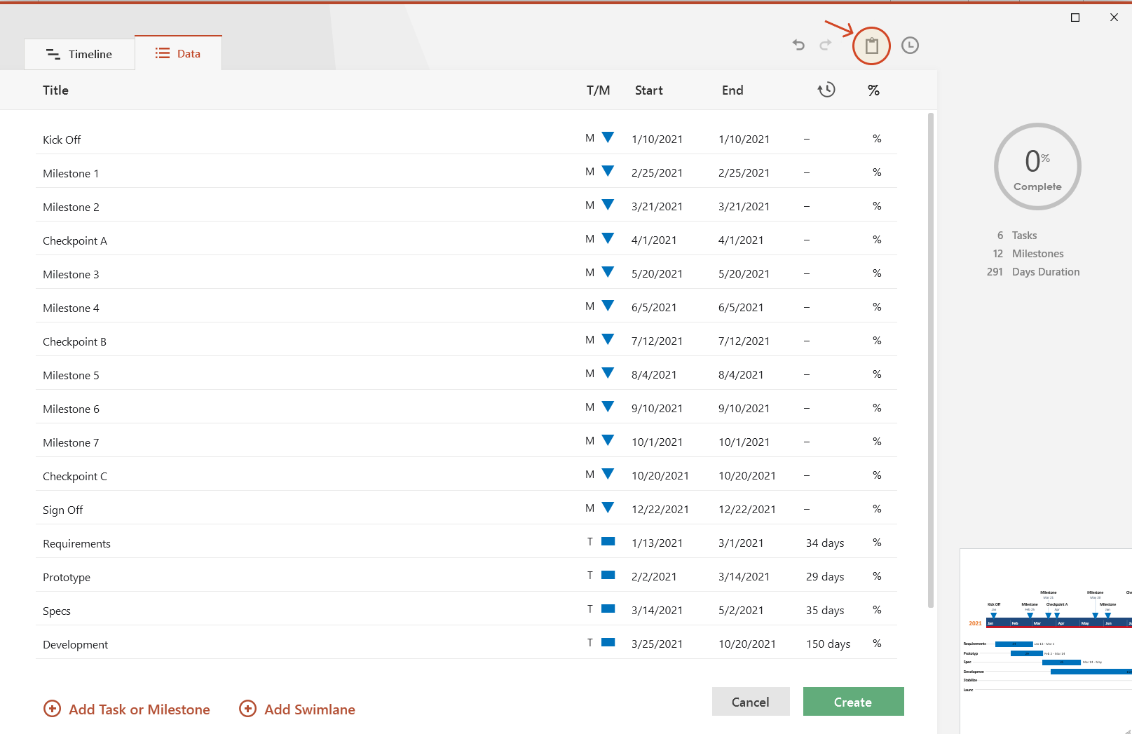
In the tutorial below, we will show you how to quickly paste the Excel table you created above in Step 1 into PowerPoint using Office Timeline, a user-friendly PowerPoint add-in that instantly makes and updates timelines from Excel. To begin, you will need to install Office Timeline, which will add a timeline creator tab to PowerPoint.
1. Open PowerPoint and paste your table into the Office Timeline wizard.
-
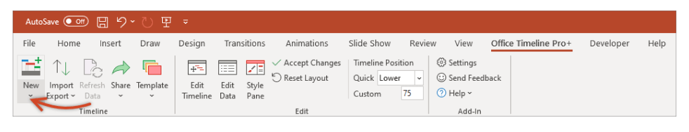
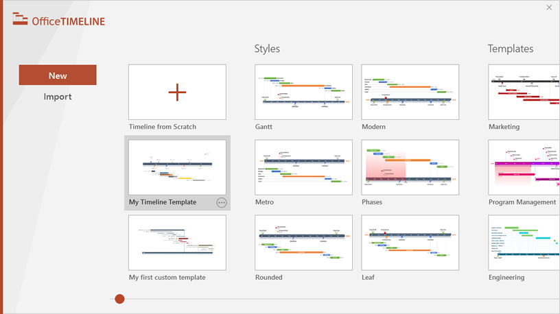
Inside PowerPoint, click on the Office Timeline tab, and then click the New icon.
This will open a gallery where you can choose between various timeline styles, stock templates and even custom templates.
-
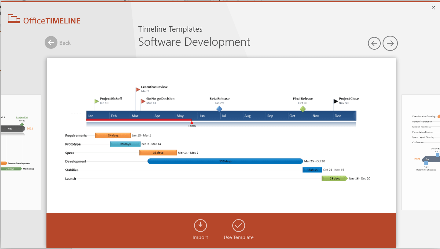
From the gallery, double-click the style or template you wish to use for your timeline to open its preview window and then select Use Template. (You can find more designs in our timeline templates library.) For this demonstration, we will choose the Software Development timeline template. If you prefer to import and refresh your Excel table, rather than copy-paste, click on the Import button in the preview window.
-
Copy the data from Excel
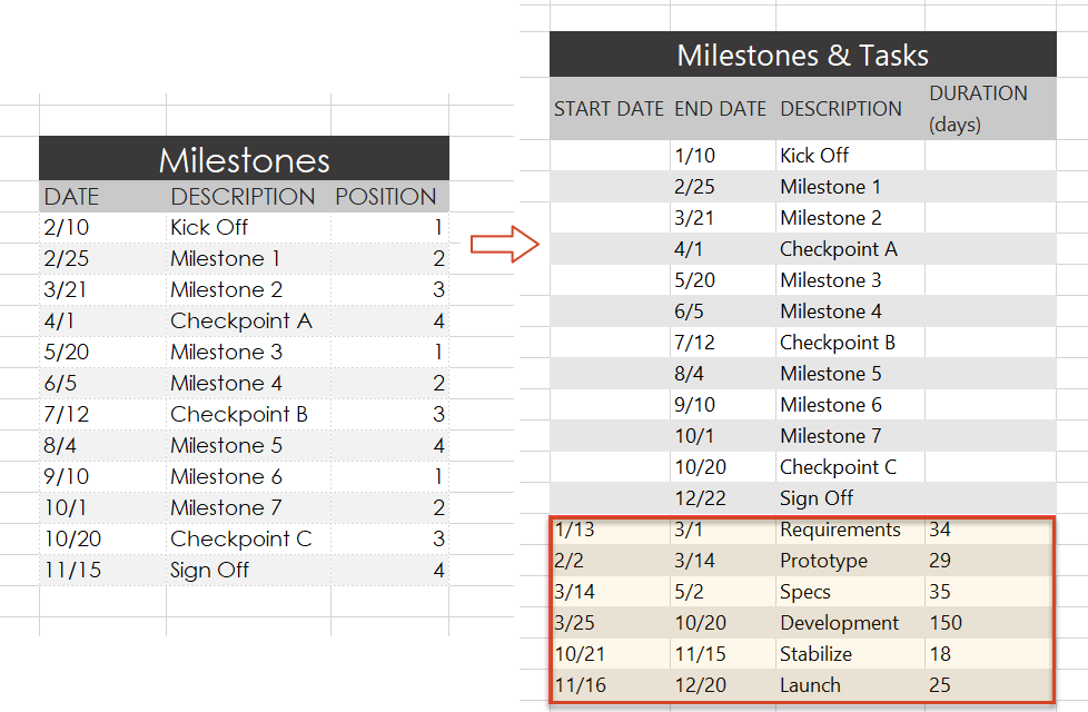
We have updated our data a bit, so that we get the timeline, but also a more detailed view of our project: we deleted the Timeline column, as we don’t need it, and added a list of tasks (with start and end dates and duration).
Copy the data from your Excel table, but make sure not to include the column headers.
-
Now, simply paste the section into PowerPoint by using the Paste button in the upper-right corner of the Data Entry wizard.
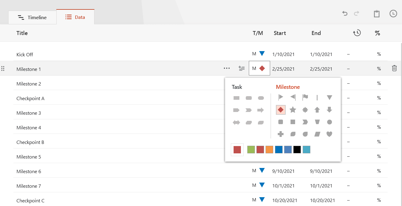
Make edits if necessary (such as changing milestone shapes and colors or adding and removing items) and click the Create button.
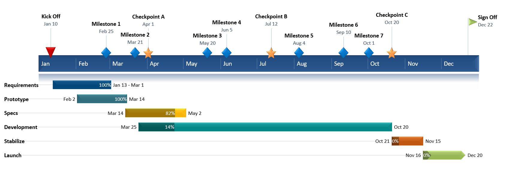
2. Instantly, you will have a new timeline slide in PowerPoint.
-
Depending on the template or style you selected from the gallery, you will have a timeline similar to this:
-
You can easily customize the timeline further using Office Timeline. In our example above, we added percent complete, removed the Today’s Date marker, changed milestones, adjusted colors, and added tasks to create a Gantt chart.
![]()
Download PowerPoint timeline template file
How to make a PowerPoint timeline from Excel in under 60 seconds:
![]()
Play Video
You can also use Office Timeline’s online timeline maker to easily build timelines and other similar visuals that you can instantly update and share with executives and teams.
See our free timeline template collection

Incident Response Plan
Free, downloadable timeline graphic using hours and minutes to give a clear overview on how an organization needs to plan its reaction to incidents so that outage be limited and activity resumed as soon as possible.

Crisis Management Plan
Professionally-designed timeline example structured in swimlanes that covers all the steps and processes one needs to follow in a crisis management process, from when the crisis occurs to response, business continuity process, recovery, and review.

Swimlane Diagram
Swimlane PowerPoint template that clearly lays out the framework of a project, from scheduling activities to task assignment and resource management.

Marketing Swimlanes Roadmap
Swimlane diagram example that provides a crisp, well-structured illustration of the tasks and milestones of your marketing campaign, according to the phase of the campaign to which they belong.

Marketing Plan
Free marketing timeline model that, once customized, effectively outlines your overall marketing strategy and serves as a solid visual aid to support marketing plan presentations.

Project Plan
Intuitive PowerPoint slide that serves as a quick yet visually effective alternative to complex project management tools to produce clear, well-laid-out plans for launching a project.

Sales Plan
Easy-to-edit sales plan sample for sales leaders, marketers or account executives to lay out objectives against a timeband in weeks; it can be customized to show campaign plans and targets in months, quarters or years.

Example Timeline
Visual template with Today’s Date indicator that helps enterprise workers get a quick start on creating timelines for project reviews, status reports, or any presentations that require a simple project schedule.

Blank Timeline
Generic timeline example that can be easily customized to quickly make an impressive, high-level summary of important events in a chronological order.
Smartsheet Contributor
Kate Eby
August 3, 2017
In this article, you’ll learn how to create a timeline in Excel with step-by-step instructions. We’ve also provided a pre-built timeline template in Excel to save you time.
Included on this page, you’ll find a free timeline template for Excel, how to make a timeline in Excel, and how to customize the Excel timeline.
How would you like to create your timeline?
Use a pre-built timeline template in Smartsheet
Time to complete: 3 minutes
— or —
Manually create a timeline in Excel
Time to complete: 30 minutes
Download A Free Excel Timeline Template

Smartshee
Download Timeline Template for Excel
The easiest way to make a timeline in Excel is to use a pre-made template. A Microsoft Excel template is especially useful if you don’t have a lot of experience making a project timeline. All you need to do is enter your project information and dates into a table and the Excel timeline will automatically reflect the changes.
When you add your own dates to the table, the Gantt chart will automatically adjust, but the spacing will be off. There may be a lot of extra white space at the beginning of your chart, with dates that you did not enter. The solution is to adjust the spacing between the dates display at the top of your chart.
- Click on a date at the top of your Gantt chart. A box should appear around all the dates.
- Right-click and select Format Axis.
- In the pop-up box, on the left, select Scale.
- Adjust the number in the box labeled Minimum. You will have to add numbers incrementally to the box to adjust the spacing and get it to look the way you would like.
Create Your Timeline
This article will show you how to create a timeline in Excel, using a template in the context of planning a business conference. Hosting a successful business conference can take months of planning and it’s the type of project where a timeline is essential. It involves plenty of moving parts and usually has quite a few stakeholders.
In this scenario, an event planner would start by making a list of tasks. These tasks may include managing a budget, scouting and securing a conference site, hosting speakers, hotel arrangements, conference schedule, and more. With all this information, you can either look at a timeline template in Excel or find a more robust solution to first make a Gantt chart and use that to create a timeline. This tutorial will show you how to do both.
How to Make a Timeline in Excel
First, make a task list to figure out what you want the timeline to show. Maybe you want it to show milestones that are currently in a Gantt chart — if that’s the case, look for an Excel timeline template that only requires inputting milestone data.
Perhaps you want to show how different parts of a particular project appear on a timeline. Then, look for an Excel project timeline template. This will have more fields for you to customize and displays more information on the timeline, like how long it will take for a certain task to get done.
Choose an Excel Timeline Template
Microsoft also offers a few timeline templates in Excel designed to give you a broad overview of your conference planning timeline. The Excel timelines aren’t tied to Gantt chart data, so you’ll be manually inputting your own data in the pre-defined template fields. These aren’t set in stone; you can change names and add fields as needed.
- To find an Excel timeline template from Microsoft, open Microsoft Excel and type “Timeline” in the search box and click Enter. Note: this template was found using the latest version of Excel on Windows 8.
- Double-click on the Excel Project Timeline template to open the spreadsheet.
Add Your Information to the Timeline in Excel
When the template opens, you will see a pre-formatted Excel spreadsheet with information already filled out in the fields. This content is just a placeholder. At the top of the template is a timeline. Scroll down to see the preformatted chart where you can add conference planning details and due dates. One of the benefits of using an Excel project timeline template is that the formatting is already complete, and all you need to do is customize it.
- Click the Project Timeline field (1C) at the top of the spreadsheet and enter your conference name.
- Scroll down in the spreadsheet and enter a start date.
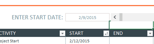
Since you’re planning a conference, you’ll want to choose the planning kick-off date. Note: There’s already a formula that picks the start date as the day you started using the event planning template. If you don’t want to use that date, click the cell, delete the formula and add your date. You’ll notice that the preformatted dates for Start and End will change.
- Enter the first major task to complete. Add tasks to the Activity column by double-clicking on the field that reads Milestone.
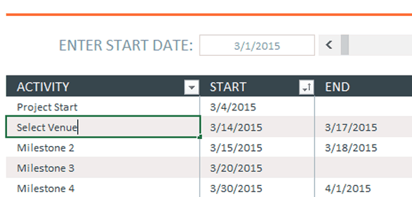
- Click the Tab key to navigate to the corresponding Start field and type in the date that you’ll start researching possible conference venues. Click the Tab key again to enter a date in the End field. This should be the date that you’ll want to have picked the venue.
- Repeat steps 3 and 4 to complete the remainder of the chart.
Customize the Excel Timeline
Once you have entered all the conference milestones in the chart, you can easily change the look of the timeline. You can change the display of the timeline data and make it more colorful.
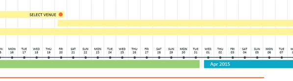
If the conference planning timeline extends past a month (and it probably will), you can see more data on the timeline by clicking the arrows in the gray bar next to the Start date box. When you do this, you will scroll through the Excel timeline.
- To change the overall chart presentation, click on the chart and gthen click on the box with a paintbrush icon.
- A pop-up box will appear displaying different timeline chart styles. Mouse over the formats to see it appear on the timeline. If you see one you like, click it. The timeline will be updated to reflect that style.
Change the Color Palette of the Excel Timeline
- Click on the chart.
- Click on the paintbrush icon and click Color at the top of the pop-up box.
- Mouse over the timeline color to see it appear on the timeline. If you see one you like, click it and the timeline will be updated to reflect that style.
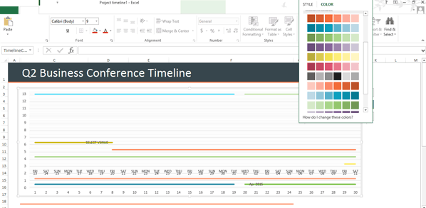
This timeline template only displays the most basic information. It’s great to share with stakeholders and executives to give them a high-level view of tasks required to put on a conference. However, it doesn’t include things like a budget, nor does it display tasks that are being completed on time or who is responsible for each task. If you want to create a more detailed conference planning timeline, consider creating a Gantt chart in Excel.
Use a Smartsheet Template to Create a Robust Timeline
There are a lot of details that go into planning a conference. It’s essential to find a place to keep all that information in one place, where multiple stakeholders can access it.
Smartsheet has quite a few event timeline templates that can help you get started. You can view your data as a task list or as a Gantt chart, giving you a quick view of progress made. You can also add attachments, import contact data, assign tasks, automatically schedule update requests, and collaborate wherever you are, on any device. There’s even a template for an Event Registration Web Form that can help streamline the registration process.
Create Your Timeline in Smartsheet
Select a Project Planning Template in Smartsheet
- To get started with Smartsheet, login to your account and navigate to the ‘+’ tab on the left side navigation bar, or sign up for a free 30-day trial.
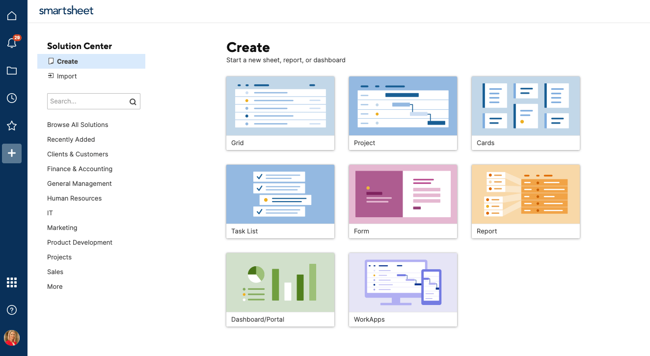
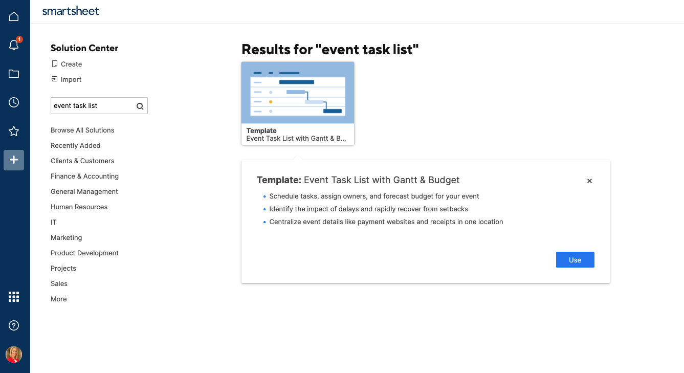
- Type “Event Task List” in the Search box and click the magnifying glass icon. You’ll see a few options, but for this example, click on Event Task List with Gantt & Budget and then click the «Use» button in the pop-up window.
- Next, name the template, choose where to save it, and click the OK button.
Add Your Information to the Template
A pre-formatted template will open, complete with sections, sub-tasks, sample attachments, progress tracking, and budget formulas. There will also be some sample content for reference.
- To delete the yellow box at the top of the template, click on the box, right-click, and select Delete Row.
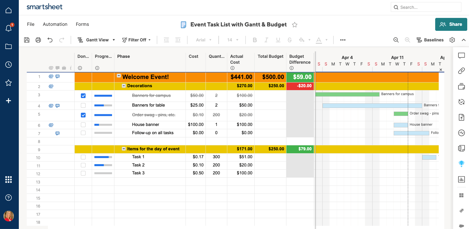
- Double-click the ‘Welcome Event’ cell highlight the existing content, and type in your information.
- Double-click the yellow Decorations text, highlight the existing content, and type in your information. This title should be one of the main categories for planning your conference (“Select Venue,” “Recruit Sponsors,” “Registration,” etc).
- Click on a blank cell in the Phase column and type in another category. Highlight the entire row, from the Done column through the Started column, click the paint bucket icon, and click yellow. Repeat for as many category rows needed.
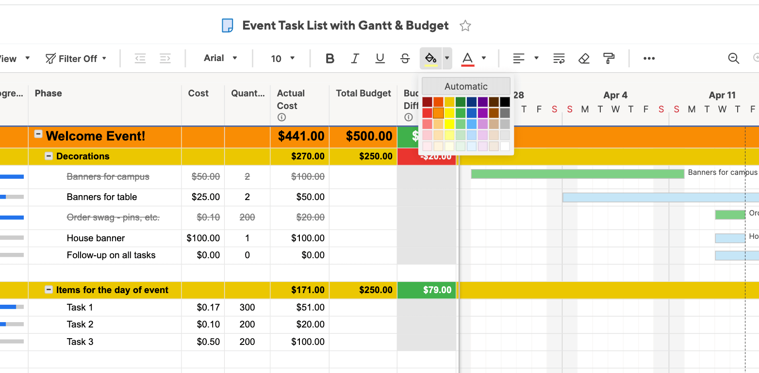
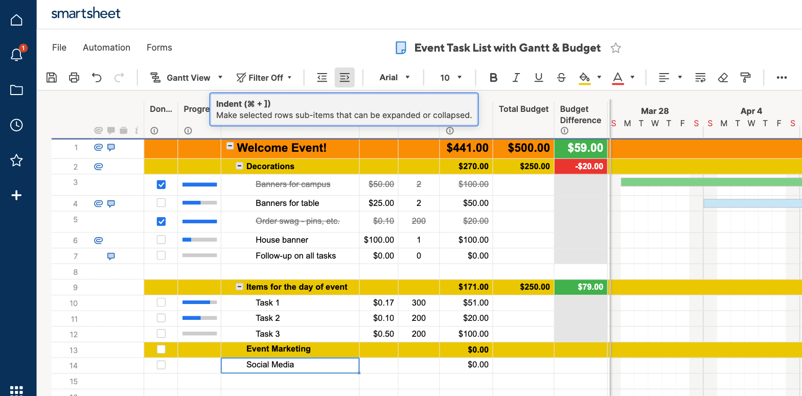
- Click on the cell under the new category created (in this example, it’s “Event Marketing”) and add a sub-sub-task, such as “Social Media.” Next, click the Indent button in the toolbar to turn the new categories you just created into sub-tasks. Repeat for all new categories.
- The Total Budget column will automatically calculate, based on the costs you input into the corresponding columns.
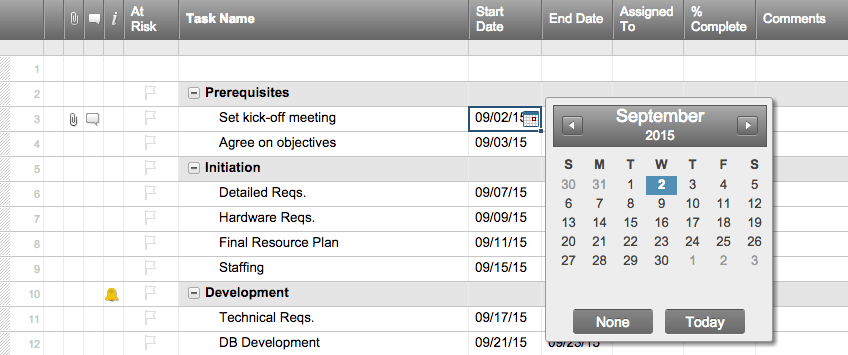
- Enter start and due dates for each task in the Due and Started columns. When a part of the project is completed, double-click on the date cell and click the letter strikethrough button on the left-hand toolbar (the button with the “S” with a line through it).
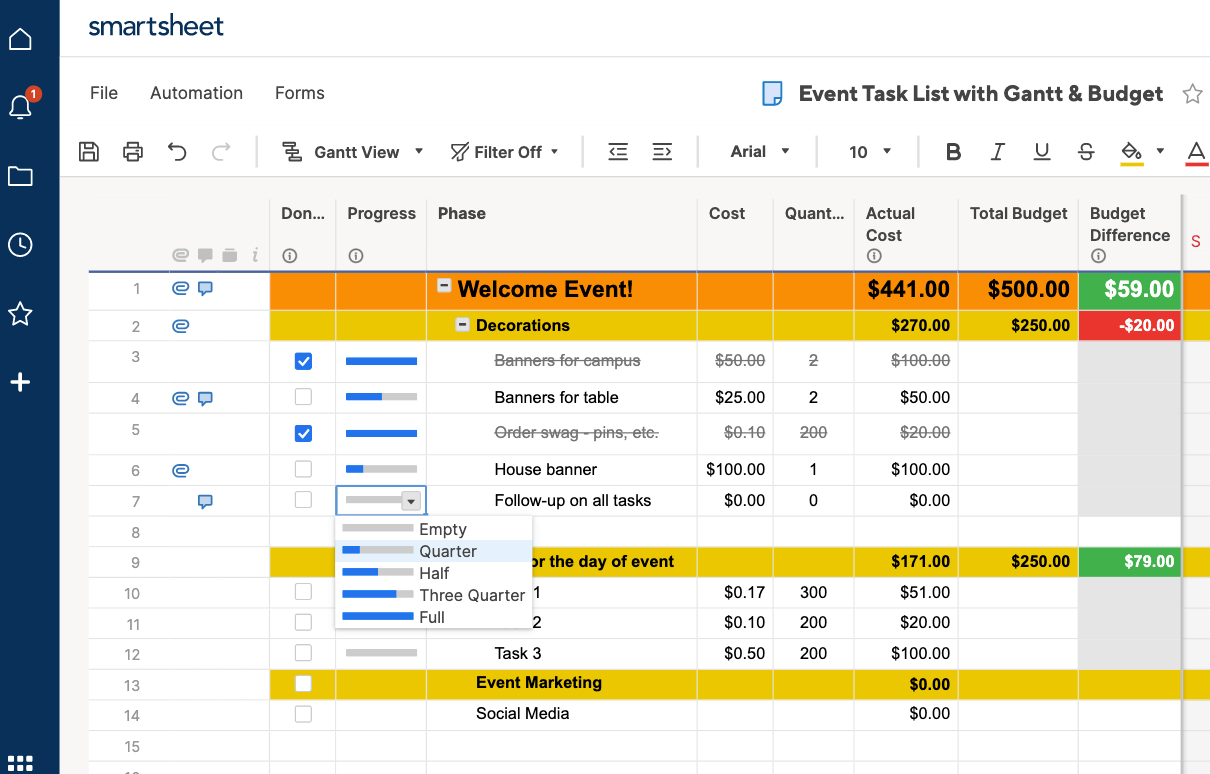
- For each row, under the Status column, click the cell and choose a symbol that matches the progress in the drop-down menu. This can be a green check, a yellow exclamation point, or a red ‘X’ mark. This will let you easily view how much of a specific task has been accomplished, or if it is on hold.
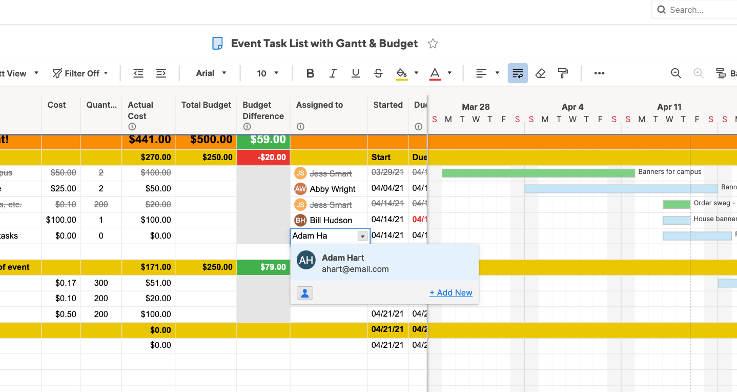
- Under the Assigned To column, click a cell and select the assignee from the pop-up menu. You can even add contacts who don’t work for the company.
When you assign tasks to people in Smartsheet, their contact information is automatically linked.
- To view the data you just entered as a Gantt chart, click on the Gantt View button in the toolbar.
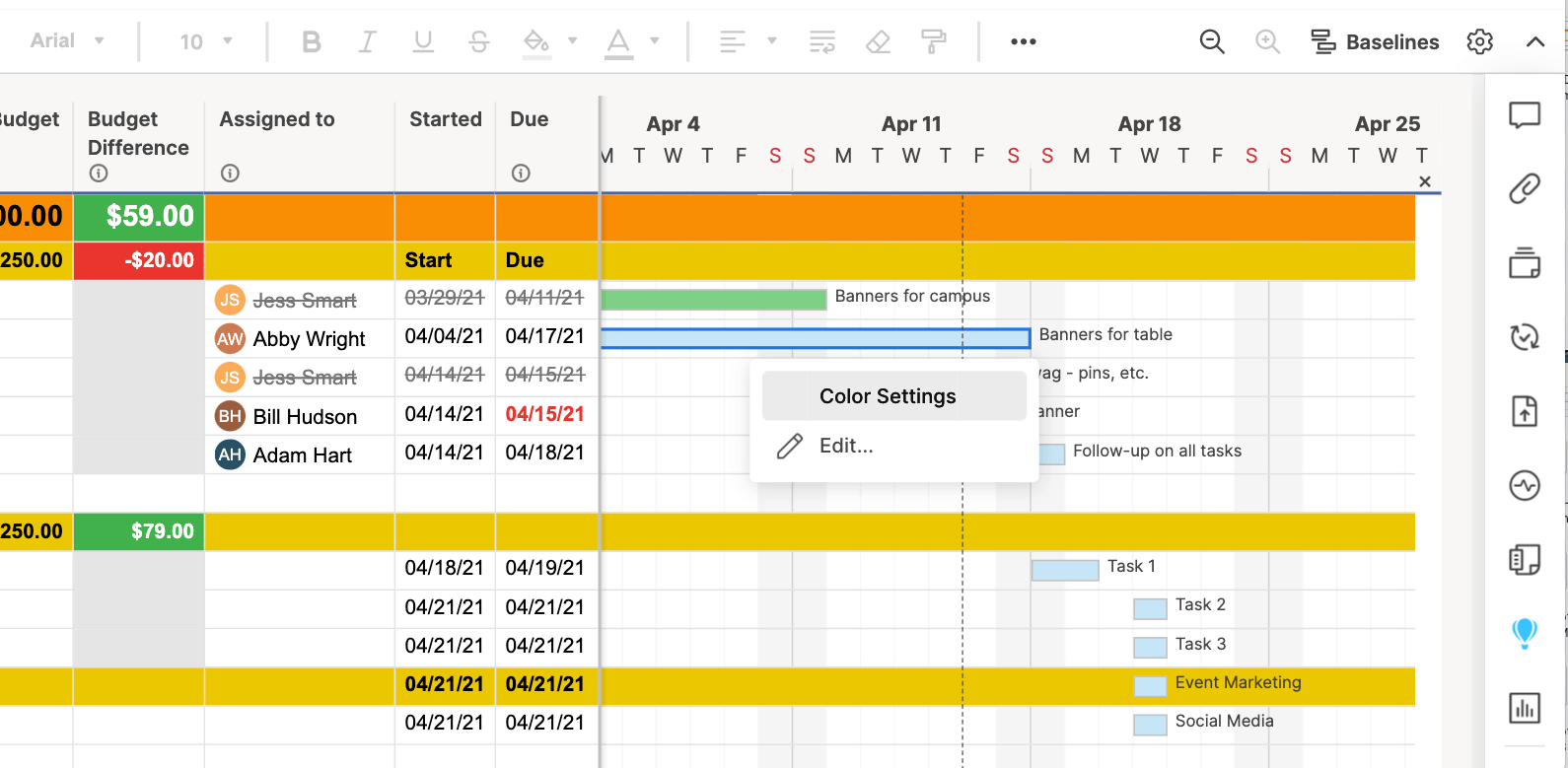
You can customize the appearance of your Gantt chart with just a couple clicks. To change the colors of the task bars:
- Right-click on a task bar and select Color Settings.
- A color palette will appear, letting you change the color of the bar.
- If you want to apply the same color to multiple task bars, click the task bars while holding down the Shift button. This will select all the bars. Then, release the Shift button, right-click on any of the selected bars, and click Color Settings.
Turn a Smartsheet Template into a Project Timeline
You’ve already inputted all your information in Smartsheet and with just a couple clicks, you can create a beautiful timeline to highlight your event planning progress.
Smartsheet is integrated with Office Timeline, a graphical add-on tool for PowerPoint, which allows you to create a professional, attractive visual representation of your project plan.
If you don’t have Office Timeline installed in your PowerPoint app, simply download it for a free trial, install, and restart PowerPoint.
- Open PowerPoint and create a new slide.
- Click on the Office Timeline Free tab (Note: if you purchased Office Timeline, it will say Office Timeline) and select the drop-down arrow under the New button in the ribbon bar. Highlight Import Data and then click Import from Smartsheet.
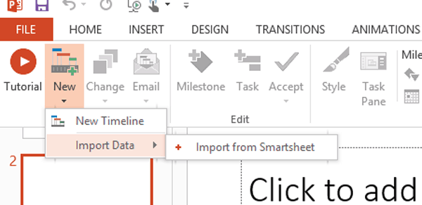
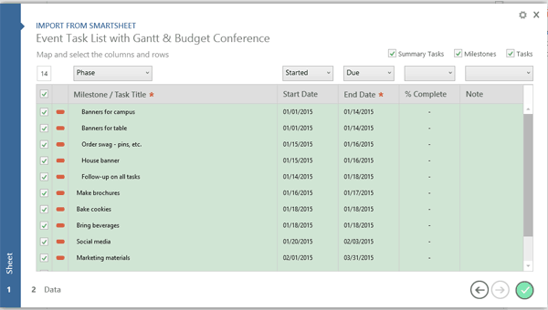
- Follow the prompts to login to your Smartsheet account. Click on the box next to the Smartsheet project you want to import and click the green circle with a checkmark in it.
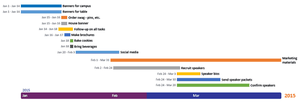
Once your project timeline is created, you can customize it even further. You can choose which events you want displayed in the timeline, color-code tasks assigned to specific stakeholders, and add your branding and colors to the layout.
Gain Real-Time Visibility into Timelines and Planning Efforts with Smartsheet
From simple task management and project planning to complex resource and portfolio management, Smartsheet helps you improve collaboration and increase work velocity — empowering you to get more done.
The Smartsheet platform makes it easy to plan, capture, manage, and report on work from anywhere, helping your team be more effective and get more done. Report on key metrics and get real-time visibility into work as it happens with roll-up reports, dashboards, and automated workflows built to keep your team connected and informed.
When teams have clarity into the work getting done, there’s no telling how much more they can accomplish in the same amount of time. Try Smartsheet for free, today.
Предположим, мы работаем над долгим и сложным проектом, состоящим из нескольких этапов. Задача — наглядно показать всю хронологию работ по проекту, расположив ключевые моменты проекта (вехи, milestones) на оси времени. Примерно вот так:

В теории управления проектами подобный график обычно называют календарем или временной шкалой проекта (project timeline), хотя я также встречал еще один русскоязычный аналог -«лента времени». В любом случае, главное — не как назвать, а как построить. Поехали…
Шаг 1. Исходные данные
Для построения нам потребуется оформить исходную информацию по вехам проекта в виде следующей таблицы:

Обратите внимание на два дополнительных служебных столбца:
- Линия — столбец с одинаковой константой около нуля по всем ячейкам. Даст на графике горизонтальную линию, параллельную оси Х, на которой будут видны узлы — вехи проекта. В принципе, можно было бы использовать и полный ноль, но тогда график совпадает с осью X, что дает проблемы потом с настройкой внешнего вида диаграммы в Excel 2007-2010. Новый Excel 2013 нули воспринимает спокойно.
- Выноски — невидимые столбцы для поднятия подписей к вехам на заданную (разную) величину, чтобы подписи не накладывались. Значения 1,2,3 и т.д. задают уровень поднятия подписей над осью времени и выбираются произвольно.
Шаг 2. Строим основу
Теперь выделяем в таблице все, кроме первого столбца (т.е. диапазон B1:D13 в нашем примере) и строим обычный плоский график с маркерами на вкладке Вставка — График — График с маркерами (Insert — Chart — Line with markers):


Убираем линии сетки, вертикальную и горизонтальную шкалы и легенду. Сделать это можно вручную (выделение мышью и клавиша Delete) или отключив ненужные элементы на вкладке Макет (Layout). В итоге должно получиться следующее:

Теперь выделите ряд Выноски (т.е. ломаную оранжевую линию) и на вкладке Макет выберите команду Линии — Линии проекции (Layout — Lines — Projection Lines):

От каждой точки верхнего графика будет опущен перпендикуляр на нижний. В новом Excel 2013 эта опция находится на вкладке Конструктор — Добавить элемент диаграммы (Design — Add Chart Element).
Шаг 3. Добавляем названия этапов
Эта часть будет простой у тех, кто уже осмелился на установку нового Excel 2013 и более сложной у тех, кто еще работает со старыми версиями.
В Excel 2013 все просто. Как я уже писал здесь, он умеет делать подписи к точкам данных просто беря текст из любого заданного пользователем диапазона. Для этого нужно выделить ряд с данными (оранжевый) и на вкладке Конструктор выбрать Добавить элемент диаграммы — Подписи — Дополнительные параметры (Design — Add Chart Element — Data Labels), а затем в появившейся справа панели установить флажок Значения из ячеек (Values from cells) и выделить диапазон A2:A13:

В версиях Excel 2007-2010 и старше такой возможности нет, но у вас есть два альтернативных варианта:
- Добавьте любые подписи к оранжевому графику (значения, например). Затем выделяйте по очереди каждую подпись, ставьте в строке формул знак «равно» и щелкайте по ячейке с названием этапа из столбца А. Текст выделенной подписи будет автоматически браться из выделенной ячейки:

- При большом количестве этапов первый вариант, конечно, не радует своей «рукопашностью». Поэтому для оптовой вставки подписей из ячеек можно использовать дополнительные надстройки на VBA. В частности, надстройку XYChartLabeler (автор — Rob Bovey, Excel MVP). Скачиваете надстройку, устанавливаете и получаете на вкладке Надстройки (Add-ins) кнопку XY Chart Labeler — Add Chart Labels. После нажатия на нее появляется диалоговое окно, где и можно задать диапазон с данными для подписей на диаграмме:


Шаг 4. Прячем линии и наводим блеск
Внесем последние правки, чтобы довести нашу уже почти готовую диаграмму до полного и окончательного шедевра:
- Выделяем ряд Выноски (оранжевую линию), щелкаем по ней правой кнопкой мыши и выбираем Формат ряда данных (Format Data Series). В открывшемся окне убираем заливку и цвет линий. Оранжевый график, фактически, исчезает из диаграммы — остаются только подписи. Что и требуется.
- Добавляем подписи-даты к синей оси времени на вкладке Макет — Подписи данных — Дополнительные параметры подписей данных — Имена категорий (Layout — Data Labels — More options — Category names). В этом же диалоговом окне подписи можно расположить под графиком и развернуть на 90 градусов, при желании.
Ссылки по теме
- График проекта (диаграмма Ганта) в Excel с помощью условного форматирования
- Видеоурок по созданию графика проекта (диаграммы Ганта) в Excel 2010
- Новые возможности диаграмм в Microsoft Excel 2013