
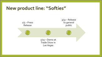
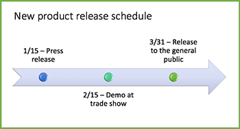
If you want to create a graphical representation of a sequence of events, such as the milestones in a project or the main events of a person’s life, you can use a SmartArt graphic timeline. After you create the timeline, you can add more dates, move dates, change layouts and colors, and apply different styles.
Create a timeline
-
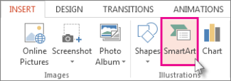
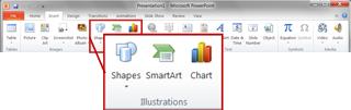
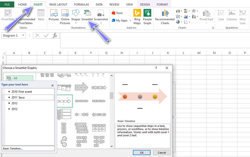
On the Insert tab, click SmartArt.

-
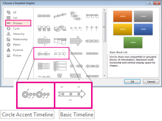
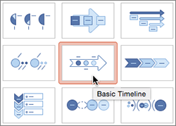
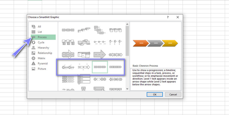
In the Choose a SmartArt Graphic gallery, click Process, and then double-click a timeline layout.
Tip: There are two timeline SmartArt graphics: Basic timeline and Circle Accent Timeline, but you can also use almost any process-related SmartArt graphic.
-
Click [Text], and then type or paste your text in the SmartArt graphic.
Note: You can also open the Text Pane and type your text there. If you do not see the Text Pane, on the SmartArt ToolsDesign tab, click Text Pane.
-
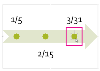
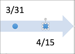
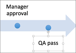
Click a shape in the timeline.
-
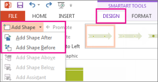
On the SmartArt ToolsDesign tab, do one of the following:
-
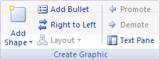
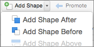
To add an earlier date, click Add Shape, and then click Add Shape Before.
-
To add a later date, click Add Shape, and then click Add Shape After.
-
-
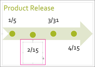
In the new date box, type the date that you want.
-
On the timeline, click the date you want to move.
-
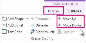
On the SmartArt ToolsDesign tab, do one of the following:
-
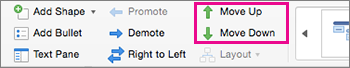
To move a date sooner than the selected date, click Move Up.
-
-
To move a date later than the selected date, click Move Down.
-
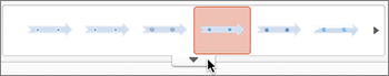
Click the SmartArt graphic timeline.
-
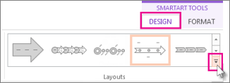
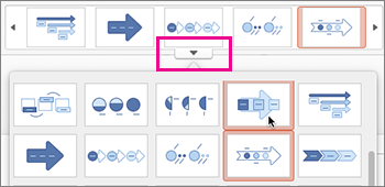
On the SmartArt ToolsDesign tab, in the Layouts group, click More
.Note: To view only the timeline and process-related layouts, at the bottom of the layouts list, click More Layouts, and then click Process.
-
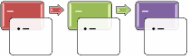
Pick a timeline or process-related SmartArt graphic, like the following:
-
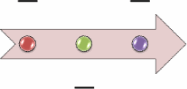
To show progression in a timeline, click Accent Process.
-
To create a timeline with pictures or photos, click Continuous Picture List. The circular shapes are designed to contain pictures.
-
 .
.
-
Click the SmartArt graphic timeline.
-
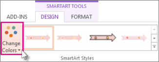
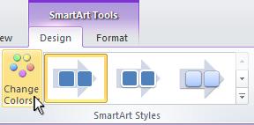
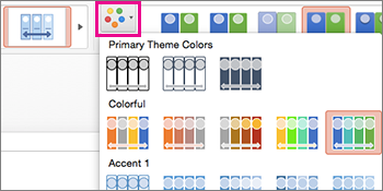
On the SmartArt ToolsDesign tab, click Change Colors.
Note: If you don’t see the SmartArt ToolsDesign tab, make sure you’ve selected the timeline.
-
Click the color combination that you want.
Tip: Place your pointer over any combination to see a preview of how the colors look in your timeline.
A SmartArt style applies a combination of effects, such as line style, bevel, or 3-D perspective, in one click, to give your timeline a professionally polished look.
-
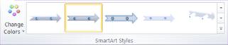
Click the timeline.
-
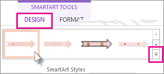
On the SmartArt ToolsDesign tab, click the style you want.
Tip: For more styles, click More
, in the lower right corner of the Styles box.
See also
-
Create a timeline in Visio
-
Import and export timeline data between Visio and Project
-
Create a timeline in Project
-
Get Microsoft timeline templates
Create a timeline
-
On the Insert tab, in the Illustrations group, click SmartArt.
-
In the Choose a SmartArt Graphic gallery, click Process, and then double-click a timeline layout (such as Basic Timeline).
-
To enter your text, do one of the following:
-
Click [Text] in the Text pane, and then type your text.
-
Copy text from another location or program, click [Text] in the Text pane, and then paste your text.
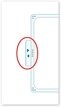
Note: If the Text pane is not visible, click the control.
-
Click in an entry in the SmartArt graphic, and then type your text.
Note: For best results, use this option after you add all of the entries that you want.
-
Other timeline tasks
-
Click the SmartArt graphic that you want to add another entry to.
-
Click the existing entry that is located closest to where you want to add the new entry.
-
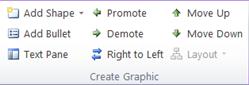
Under SmartArt Tools, on the Design tab, in the Create Graphic group, click the arrow next to Add Shape.
If you don’t see the SmartArt Tools or Design tabs, make sure that you’ve selected the SmartArt graphic. You might have to double-click the SmartArt graphic to open the Design tab.
-
Do one of the following:
-
To insert an entry after the selected entry, click Add Shape After.
-
To insert an entry before the selected entry, click Add Shape Before.
-
To delete an entry from your timeline, do one of the following:
-
In the SmartArt graphic, select the text for the textbox for the entry that you want to delete, and then press DELETE.
-
In the Text pane, select the all of the text for the entry that you want to delete, and then press DELETE.
Notes:
-
To add a shape from the Text pane:
-
At the shape level, place your cursor at the end of the text where you want to add a new shape.
-
Press ENTER, and then type the text that you want in your new shape.
-
-
-
In the text pane, select the entry that you want to move.
-
Do one of the following:
-
To move the entry to an earlier date, under SmartArt Tools, on the Design tab, in the Create Graphic group, click Move Up.
-
To move the entry to a later date, under SmartArt Tools, on the Design tab, in the Create Graphic group, click Move Down.
If you don’t see the SmartArt Tools or Design tabs, make sure that you’ve selected the SmartArt graphic. You might have to double-click the SmartArt graphic to open the Design tab.
-
-
Right-click the timeline that you want to change, and then click Change Layout.
-
Click Process, and then do one of the following:
-
For a simple but effective timeline, click Basic Timeline.
-
To show a progression, a timeline, or sequential steps in a task, process, or workflow, click Accent Process.
-
To illustrate a timeline with pictures or photos, click Continuous Picture List. The circular shapes are designed to contain pictures.
-
Note: You can also change the layout of your SmartArt graphic by clicking a layout option in the Layouts group on the Design tab under SmartArt Tools. When you point to a layout option, your SmartArt graphic changes to show you a preview of how it would look with that layout.
To quickly add a designer-quality look and polish to your SmartArt graphic, you can change the colors or apply a style to your timeline. You can also add effects, such as glows, soft edges, or 3-D effects. Using Microsoft PowerPoint 2010, you can also animate your timeline.
You can apply color combinations that are derived from the theme colors to the entries in your SmartArt graphic.
-
Click the SmartArt graphic whose color you want to change.
-
Under SmartArt Tools, on the Design tab, in the SmartArt Styles group, click Change Colors.
If you don’t see the SmartArt Tools or Design tabs, make sure that you’ve selected the SmartArt graphic.
-
Click the color combination that you want.
Tip: When you place your pointer over a thumbnail, you can see how the colors affect your SmartArt graphic.
-
In the SmartArt graphic, right-click the border of the entry you want to change, and then click Format Shape.
-
To change the color of the entry’s border, click Line Color, click Color
, and then click the color that you want. -
To change the style of the entry’s border, click Line Style, and then choose the line styles you want.
 , and then click the color that you want.
-
Click the SmartArt graphic you want to change.
-
Right-click the border of an entry, and then click Format Shape.
-
Click Fill, and then click Solid fill.
-
Click Color
, and then click the color that you want.
To change the background to a color that is not in the theme colors, click More Colors, and then either click the color that you want on the Standard tab, or mix your own color on the Custom tab. Custom colors and colors on the Standard tab are not updated if you later change the document theme.
To specify how much you can see through the background color, move the Transparency slider, or enter a number in the box next to the slider. You can vary the percentage of transparency from 0% (fully opaque, the default setting) to 100% (fully transparent).
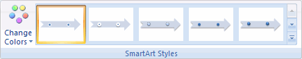
A SmartArt Style is a combination of various effects, such as line style, bevel, or 3-D perspective that you can apply to the entries in your SmartArt graphic to create a unique and professionally-designed look.
-
Click the SmartArt graphic you want to change.
-
Under SmartArt Tools, on the Design tab, in the SmartArt Styles group, click the SmartArt Style that you want.
To see more SmartArt Styles, click the More button
.
 .
.Note: When you place your pointer over a thumbnail, you can see how the SmartArt Style affects your SmartArt graphic.
See also
-
Create a timeline in Visio
-
Import and export timeline data between Visio and Project
-
Create a timeline in Project
Create a timeline
-
On the Insert tab, in the Illustrations group, click SmartArt.
-
In the Choose a SmartArt Graphic gallery, click Process, and then double-click a timeline layout (such as Basic Timeline).
-
To enter your text, do one of the following:
-
Click [Text] in the Text pane, and then type your text.
-
Copy text from another location or program, click [Text] in the Text pane, and then paste your text.
Note: If the Text pane is not visible, click the control.
-
Click in an entry in the SmartArt graphic, and then type your text.
Note: For best results, use this option after you add all of the entries that you want.
-
Other timeline tasks
-
Click the SmartArt graphic that you want to add another entry to.
-
Click the existing entry that is located closest to where you want to add the new entry.
-
Under SmartArt Tools, on the Design tab, in the Create Graphic group, click the arrow under Add Shape.
If you don’t see the SmartArt Tools or Design tabs, make sure that you’ve selected the SmartArt graphic.
-
Do one of the following:
-
To insert an entry after the selected entry, click Add Shape After.
-
To insert an entry before the selected entry, click Add Shape Before.
-
To delete an entry from your timeline, click the entry you want to delete, and then press DELETE.
Notes:
-
To add a shape from the Text pane:
-
At the shape level, place your cursor at the end of the text where you want to add a new shape.
-
Press ENTER, and then type the text that you want in your new shape.
-
To add an assistant box, press ENTER while an assistant box is selected in the Text pane.
-
-
To move an entry, click the entry, and then drag it to its new location.
-
To move an entry in very small increments, hold down CTRL while you press the arrow keys on your keyboard.
-
Right-click the timeline that you want to change, and then click Change Layout.
-
Click Process, and then do one of the following:
-
For a simple but effective timeline, click Basic Timeline.
-
To show a progression, a timeline, or sequential steps in a task, process, or workflow, click Accent Process.
-
To illustrate a timeline with pictures or photos, click Continuous Picture List. The circular shapes are designed to contain pictures.
-
Note: You can also change the layout of your SmartArt graphic by clicking a layout option in the Layouts group on the Design tab under SmartArt Tools. When you point to a layout option, your SmartArt graphic changes to show you a preview of how it would look with that layout.
To quickly add a designer-quality look and polish to your SmartArt graphic, you can change the colors or apply a SmartArt Style to your timeline. You can also add effects, such as glows, soft edges, or 3-D effects. Using PowerPoint 2007 presentations, you can animate your timeline.
You can apply color combinations that are derived from the theme colors to the entries in your SmartArt graphic.
-
Click the SmartArt graphic whose color you want to change.
-
Under SmartArt Tools, on the Design tab, in the SmartArt Styles group, click Change Colors.
If you don’t see the SmartArt Tools or Design tabs, make sure that you’ve selected the SmartArt graphic.
-
Click the color combination that you want.
Tip: When you place your pointer over a thumbnail, you can see how the colors affect your SmartArt graphic.
-
In the SmartArt graphic, right-click the border of the entry you want to change, and then click Format Shape.
-
To change the color of the entry’s border, click Line Color, click Color
, and then click the color that you want. -
To change the style of the entry’s border, click Line Style, and then choose the line styles you want.
-
Click the SmartArt graphic you want to change.
-
Right-click the border of an entry, and then click Format Shape.
-
Click Fill, and then click Solid fill.
-
Click Color
, and then click the color that you want.
To change the background to a color that is not in the theme colors, click More Colors, and then either click the color that you want on the Standard tab, or mix your own color on the Custom tab. Custom colors and colors on the Standard tab are not updated if you later change the document theme.
To specify how much you can see through the background color, move the Transparency slider, or enter a number in the box next to the slider. You can vary the percentage of transparency from 0% (fully opaque, the default setting) to 100% (fully transparent).
A SmartArt Style is a combination of various effects, such as line style, bevel, or 3-D, that you can apply to the entries in your SmartArt graphic to create a unique and professionally designed look.
-
Click the SmartArt graphic you want to change.
-
Under SmartArt Tools, on the Design tab, in the SmartArt Styles group, click the SmartArt Style that you want.
To see more SmartArt Styles, click the More button
.
-
When you place your pointer over a thumbnail, you can see how the SmartArt Style affects your SmartArt graphic.
-
You can also customize your SmartArt graphic by moving entries, resizing entries, adding a fill or effect, and adding a picture.
If you’re using PowerPoint 2007, you can animate your timeline to emphasize each entry.
-
Click the timeline that you want to animate.
-
On the Animations tab, in the Animations group, click Animate, and then click One by one.
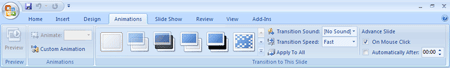
Note: If you copy a timeline that has an animation applied to it to another slide, the animation is also copied.
See also
-
Create a timeline in Visio
Create a timeline
When you want to show a sequence of events, such as project milestones or events, you can use a SmartArt graphic timeline. After you create the timeline, you can add events, move events, change layouts and colors, and apply different styles.
-
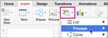
On the Insert tab, click SmartArt > Process.
-
Click Basic Timeline or one of the other process-related graphics.
-
Click the [Text] placeholders and enter the details of your events.
Tip: You can also open the Text Pane and enter your text there. On the SmartArt Design tab, click Text Pane.
-
Click a shape in the timeline.
-
On the SmartArt Design tab, click Add Shape, and then click Add Shape Before or Add Shape After.
-
Enter the text you want.
-
On the timeline, click the text of the event you want to move.
-
On the SmartArt Design tab, click Move Up (left), or Move Down (right).
-
Click the timeline.
-
On the SmartArt Design tab, point to the layout panel and click the down arrow.
-
Pick a timeline or process-related SmartArt graphic, like the following:
-
To show progression in a timeline, click Accent Process.
-
To create a timeline with pictures or photos, click Continuous Picture List. The circular shapes are designed to contain pictures.
-
-
Click the timeline.
-
On the SmartArt Design tab, click Change Colors, and then click the color combination you want.
Give your timeline a professional look by using a SmartArt style to apply a combination of effects, such as line style, bevel, or 3-D perspective.
-
Click the timeline.
-
On the SmartArt Design tab, click the style you want.
Краткое руководство по созданию временной шкалы в Excel и ее отличной альтернативе
Хронология относится к хронологическому порядку событий. Он используется для записи событий и соответствующих подробностей об организации, учреждении или жизни человека. Более того, он отмечает важные даты и события на пути от начала до конца периода времени. Вам нужен этот тип диаграммы для академических и деловых целей.
Временные шкалы — отличный способ визуализировать вехи, задания, достижения и даже цели на будущее. Иными словами, его объем — это не только проведенные мероприятия, но и задачи, которые предстоит выполнить в будущем. Вы можете сделать это, используя один из ваших инструментов управления проектами. Эта статья научит вас как сделать временную шкалу в экселе прервать погоню. Также вы узнаете об отличной альтернативе для создания таймлайна. Продолжайте читать, чтобы получить необходимую информацию.

- Часть 1. Как сделать временную шкалу в Excel
- Часть 2. Лучшая альтернатива Excel для создания временной шкалы
- Часть 3. Часто задаваемые вопросы о создании временной шкалы в Excel
Часть 1. Как сделать временную шкалу в Excel
В Excel есть больше, чем кажется на первый взгляд. Согласно своему названию, он превосходен во многих отношениях, особенно в хранении, управлении и обработке данных. Более того, это помогает в создании иллюстраций при представлении проектов. Он поставляется с функцией SmartArt, которая облегчает создание различных представлений данных и информации. Что еще более важно, вы можете найти здесь шаблоны временной шкалы, чтобы построить график временной шкалы Excel, который наилучшим образом соответствует вашим требованиям.
Все, что вам нужно сделать, это добавить свою информацию в выбранный вами шаблон, изменить поля и изменить диаграмму по мере необходимости. Ниже приведены пошаговые процедуры, которым вы можете следовать, чтобы построить временную шкалу в Excel.
1
Запустите Excel и откройте новую таблицу
Прежде всего, скачайте и установите Microsoft Excel на свой компьютер. Запустите программу и откройте новую таблицу.
2
Выберите шаблон
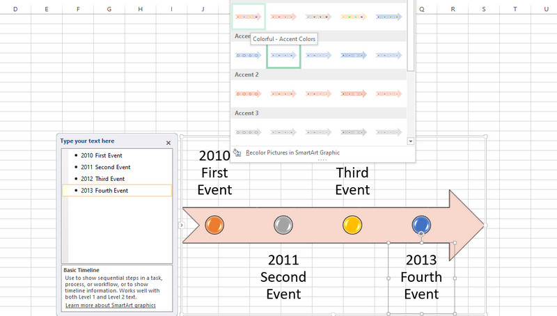
На ленте приложения перейдите к Вставлять и получить доступ к функции SmartArt. Затем откроется диалоговое окно. Отсюда вы увидите различные шаблоны для типов диаграмм. Выберите Процесс и выберите Базовую временную шкалу в качестве рекомендуемого шаблона. При желании вы можете изучить некоторые шаблоны в соответствии с вашими потребностями.
3
Добавляйте события на временную шкалу
После выбора шаблона Текстовая панель появится. На появившейся текстовой панели добавьте события и пометьте события, введя имя события. Добавьте события в соответствии с вашими потребностями и пометьте их соответствующим образом.
4
Изменить временную шкалу
После ввода информации в текстовую область вы можете изменить внешний вид своей временной шкалы. В инструментах SmartArt вы можете просматривать вкладки «Дизайн» и «Формат». На этих вкладках вы можете изменить стиль шрифта, дизайн диаграммы и т. д. Наконец, сохраните файл, как вы обычно делаете при сохранении файла Excel. Вот как легко построить временную шкалу в Excel.
Часть 2. Лучшая альтернатива Excel для создания временной шкалы
Одна из самых функциональных программ, которую вы должны использовать, это MindOnMap. Это бесплатная веб-программа для создания диаграмм и диаграмм для создания различной инфографики, включая временную шкалу. Существует несколько тем и шаблонов, которые легко настраиваются, и вы можете сделать их своими, отредактировав. Кроме того, вы можете создавать различные виды диаграмм с нуля, не используя шаблон.
Более того, вы можете экспортировать файл в такие форматы, как файлы JPG, PNG, Word и PDF. Кстати, вы можете вставить временную шкалу в Excel, экспортировав файл в SVG, который является еще одним форматом, поддерживаемым программой. Кроме того, вы можете добавлять значки и рисунки, чтобы сделать временную шкалу привлекательной. С другой стороны, следуйте приведенному ниже руководству, чтобы узнать, как создать временную шкалу проекта в этой альтернативе Excel.
1
Доступ к программе
Чтобы начать работу, посетите веб-сайт, чтобы сразу получить доступ к инструменту. Теперь откройте браузер и введите название программы в адресной строке. Затем войдите на главную страницу. На главной странице нажмите кнопку Создайте свою ментальную карту кнопка.

2
Выберите шаблон
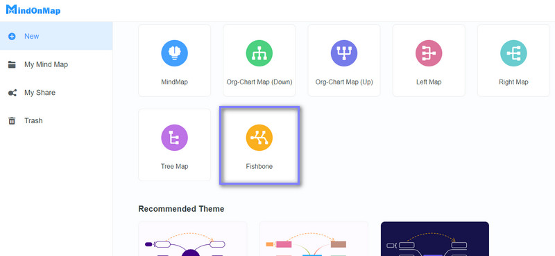
После этого вы попадете в раздел шаблонов. Отсюда выберите макет или тему для своей временной шкалы. Мы будем использовать макет «рыбья кость» в качестве временной шкалы для этого конкретного урока.
3
Начните создавать временную шкалу
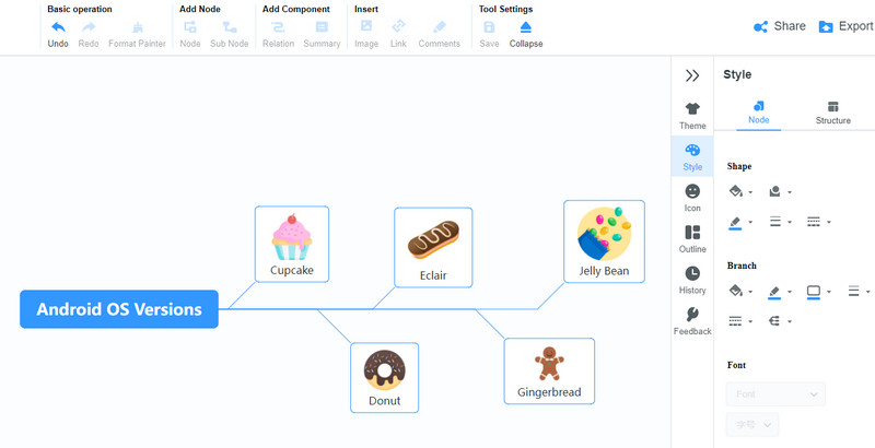
Добавьте узлы, выбрав Главный узел и нажав на Вкладка ключ. Вставляйте узлы столько, сколько хотите или в соответствии с вашими требованиями. Отредактируйте текст и назовите события. Вы можете вставлять значки или изображения по своему вкусу. Кроме того, вы можете изменить стиль временной шкалы.
4
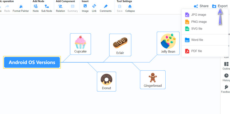
Сохраните созданную временную шкалу
Чтобы сохранить созданную временную шкалу, нажмите кнопку Экспорт Кнопка в правом верхнем углу интерфейса. Затем выберите формат в соответствии с вашими потребностями или требованиями, и все готово. При желании вы можете поделиться диаграммой со своими коллегами и друзьями. Просто нажмите на Делиться кнопку и скопируйте ссылку. Тогда вы можете отправить его кому-нибудь.
Часть 3. Часто задаваемые вопросы о создании временной шкалы в Excel
Какие бывают виды таймлайнов?
Временные шкалы бывают разных видов для разных целей. Есть вертикальные, горизонтальные, дорожные карты, исторические, биологические и многие другие. Есть временные диаграммы для потребностей маркетинга, творческих проектов, студентов, реализации проектов, потребностей компании и карьерного роста.
Что такое временная шкала в бизнесе?
Графики могут помочь составить расписание для бизнеса. Используя эту диаграмму, вы можете установить вехи для своих бизнес-проектов. Он может содержать такую информацию, как количество мест, сотрудников, доход, план продаж и ожидаемая дата достижения.
Какое приложение лучше всего подходит для создания таймлайна?
Вы можете использовать различные виды программ временной шкалы, такие как SmartDraw и Lucidchart. Тем не менее, если вы только начинаете, вы можете начать с простых в использовании приложений, таких как MindOnMap. Независимо от того, являетесь ли вы студентом, профессионалом или учителем, это может быть очень полезно.
Вывод
Как вы, возможно, читали, изучение того, как создавать и как использовать временную шкалу в Excel не так уж сложно. Этот пост будет вашим ориентиром. Итак, если вы хотите составить расписание или историческую хронологию проекта, вы можете обратиться к этому сообщению. С другой стороны, удобство — один из главных критериев для всех при выборе лучшей программы для создания таймлайна. Вот почему мы предоставили вам лучший онлайн-конструктор диаграмм. Тем не менее, если у вас нет доступа к Интернету, вы всегда можете положиться на Excel. В связи с этим мы рассмотрели как Excel, так и альтернативу — MindOnMap.
What is the Timeline in Excel?
Timeline in Excel is a kind of SmartArt created to display the different timings of a particular process. It is mainly used for filtering the underlying datasets by date. Such datasets are in the form of pivot tables containing the date field.
The timeline was first introduced in the 2013 version of Excel.
Table of contents
- What is the Timeline in Excel?
- How to Create Timelines in Excel? (With Example)
- Step #1 – Create table object
- Step #2 – Create a pivot table
- Step #3 – Create a pivot chart
- Step #4 – Insert a timeline in Excel
- How Does the Timeline Filter the Pivot Table?
- Top Timeline Tools in Excel
- #1 – Timeline slicer
- #2 – Scroll bar
- #3 – Time level
- #4 – Filter
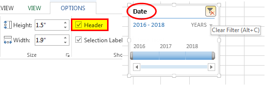
- #5 – Timeline header
- #6 – Selection label
- #7 – Timeline window size
- #8 – Timeline caption
- #9 – Timeline style
- Frequently Asked Questions
- Recommended Articles
- How to Create Timelines in Excel? (With Example)
How to Create Timelines in Excel? (With Example)
You can download this Timeline Excel Template here – Timeline Excel Template
In the following table, there are five columns, namely–Date, Branch, Product Category, Customer Type, and RevenueRevenue is the amount of money that a business can earn in its normal course of business by selling its goods and services. In the case of the federal government, it refers to the total amount of income generated from taxes, which remains unfiltered from any deductions.read more.
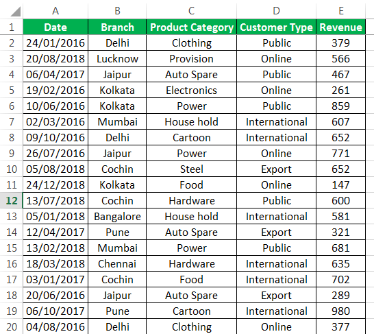
With the help of a pivot table A Pivot Table is an Excel tool that allows you to extract data in a preferred format (dashboard/reports) from large data sets contained within a worksheet. It can summarize, sort, group, and reorganize data, as well as execute other complex calculations on it.read moreand a pivot chart, let us create a timeline in Excel. The pivot table and pivot chartIn Excel, a pivot chart is a built-in feature that allows you to summarize selected rows and columns of data in a spreadsheet. It is a visual representation of a pivot table that helps in the summarization and analysis of datasets, patterns, and trends.read more help summarize and analyze data.
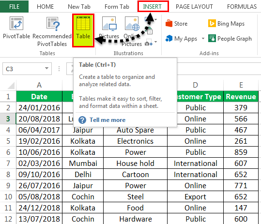
Step #1 – Create table object
Initially, let us convert the data set into a table object with the help of the following steps:
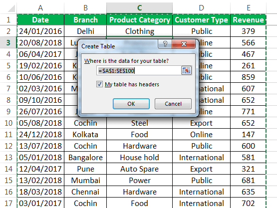
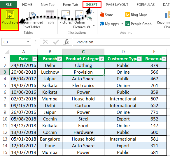
- Click inside the data set, go to the Insert tab, and select “table”.

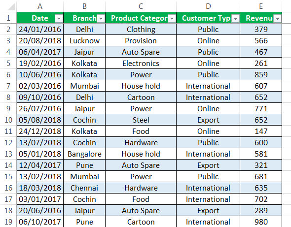
- The “create table” popup appears which displays the data range and a checkbox for table headers. Click “Ok.”

- Once the table object is created, the data appears in a tabulated form, as shown in the succeeding image.

Step #2 – Create a pivot table
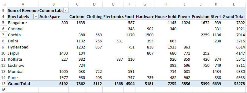
Since we want to summarize the revenue data across different categories of the timeline, we create a pivot table.
The steps to create a pivot table are listed as follows:
- Click on the data set within the table.
- Go to the Insert tab, select “PivotTable,” and click “Ok.”
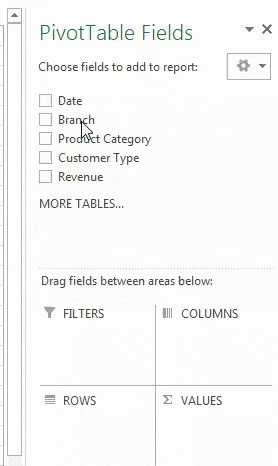
- The “PivotTable Fields” pane appears in another sheet. Name this sheet as “PivotTable_Timeline.”
- In the “PivotTable Fields” pane, drag “branch” to the “rows” section, “product category” to the “columns” section, and “revenue” to the “values” section.
Step #3 – Create a pivot chart
We need to base a pivot chart on the pivot table that we have created. The steps to create a pivot chart are stated as follows:
- Copy the previous sheet as “PivotChart_Timeline” or create another sheet with this name.
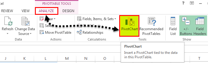
- Click inside the pivot table on the sheet “PivotChart_Timeline.”
- In the Home tab, go to “Analyze” and select “PivotChart.”
- The “insert chart” popup window appears.
- Select “stacked column chart” and click “Ok.”
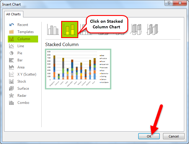
- The pivot chart appears as shown in the following image.
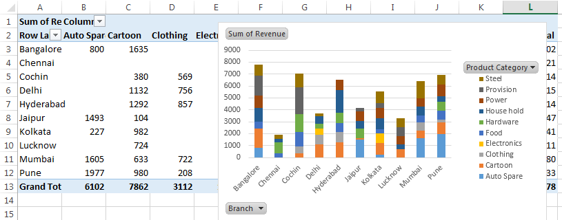
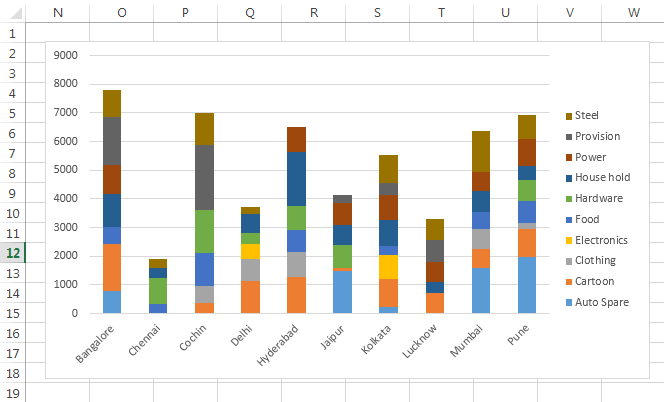
- In the pivot chart, you can hide the “product category,” “branch,” and “sum of revenue.” To do this, right-click and select “hide legend field buttons on chart,” as shown in the succeeding screenshot.

- The pivot chart appears without the legend buttons, as shown in the following image.
Step #4 – Insert a timeline in Excel
The steps to insert a timeline are mentioned as follows:
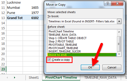
- Copy the “PivotChart_Timeline” to other sheets with the “create a copy” option. The popup window shown in the succeeding image appears.
- Right-click on the sheet name “PivotChart_Timeline” and name the sheet as “Insert_Timeline.”
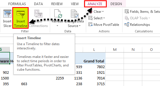
- Click anywhere on the data set of the pivot table. Select the Analyze tab on the Excel ribbonThe ribbon is an element of the UI (User Interface) which is seen as a strip that consists of buttons or tabs; it is available at the top of the excel sheet. This option was first introduced in the Microsoft Excel 2007.read more and click on the “Insert Timeline” button in the Filter group.
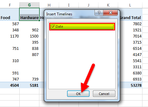
- The “insert timelines” pop-up window appears. It shows a checkbox with the date field. This is the filter of the timeline. Select the checkbox and click “Ok.”
- Now, the timeline appears.
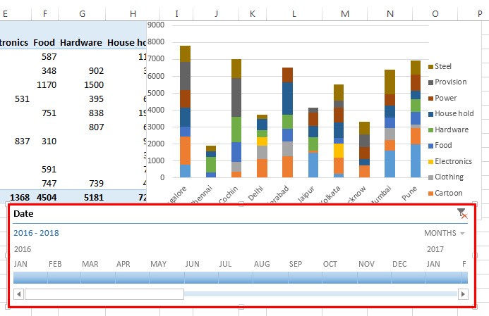
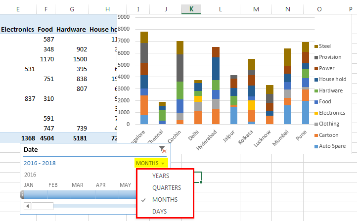
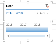
- For the timeline, you can configure or select group dates by years, quarters, months or days with the help of the drop-down list.
- We have selected “years” as shown in the following image.
How Does the Timeline Filter the Pivot Table?
Let us consider the previous example again.
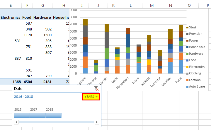
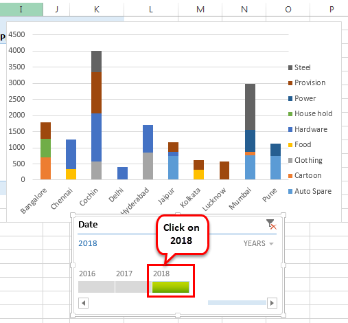
We want the timeline to filter the pivot table with results of the year 2018. To do this, click on “2018” in the timeline slicer.
The revenue for the year 2018 with reference to the branch and product category appears.
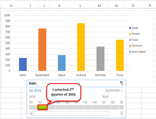
Now, let us select “quarters” from the dropdown list. If quarterly data in the timeline is not visible, drag the blue-colored box towards the end.
Let us select the 2nd quarter of 2016 to observe revenue across the different branches and product categories.
Top Timeline Tools in Excel
Timelines in Excel help filter the dates of the pivot tables. This is done with the help of various tools that assist in the working of the timeline.
The timeline tools appear to the right and the left of the Options tab, as shown in the following two images.
The major timeline tools are listed as follows:
#1 – Timeline slicer
The timeline slicer allows toggling between years, quarters, months, and days. In the dashboard, there is an option of combining the timeline with the slicer.
In comparison to the normal date filter, the timeline slicer is a more effective visual tool. This is because the latter provides a graphical representation that helps track critical milestones.

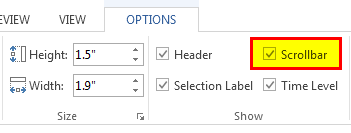
#2 – Scroll bar
It appears in the Options tab and helps select periods. It also allows scrolling through the years, quarters, months, and days.
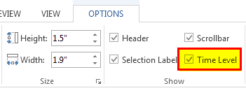
#3 – Time level
This tool allows selecting from four different time levels based on choice. The four-time levels are, namely–years, quarters, months, and days.

#4 – Filter
This button helps clear all the “time” options like years, quarters, months or days.
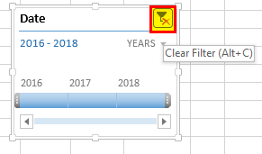
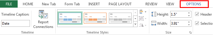
It displays the heading or the title of the timeline, as shown in the following image.
#6 – Selection label
It displays the date rangeTo create a data range in Excel, click anywhere in the table and then go to table tools>design on the ribbon>convert to range. To do so, right-click the table and select table>convert to range.read more that is included in the filter.

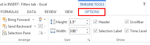
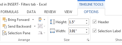
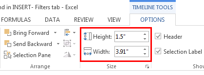
#7 – Timeline window size
The height and width of the PivotTable timeline can be adjusted according to the requirement. It is also possible to resize the timeline window by dragging it from its borders.
#8 – Timeline caption
By default, the caption box shows the column name as the caption. This is the column that was selected while inserting the timeline.
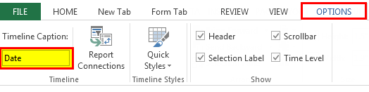
#9 – Timeline style
There are various style options in Excel for the PivotTable timeline. The following screenshot shows 12 types of theme styles.
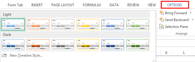
The style of the timeline can also be customized according to choice.
Frequently Asked Questions
#1 – What are slicer and timeline in Excel?
A slicer is an object that allows quick filtering of data. The slicer shows all the possible values of the column that are selected by the user. Each value appears as a button that can be used for toggling.
The slicer also displays the current filtering state, which lets the user know the exact values that are being displayed currently. A slicer can be used with a table and a pivot table.
A timeline allows the filtering of data specifically with date fields. The user can filter data by years, quarters, months, and days. The dates are displayed horizontally, beginning from the oldest to the newest, as one moves from left to right on a timeline.
A timeline can only be used with a pivot table having date fields.
#2 – How to use a timeline in Excel?
The timeline can be used with the help of the following features:
1) Timeline period–The timeline can use either a single period or multiple adjacent periods. To select a period, click on the first period and drag the cursor to the last period. Release the click to see the selected date range.
2) Date grouping–The “time level” feature allows grouping of dates in data. The dates can be grouped into years, quarters, months, and days.
3) Timeline handle or scroll bar–The scroll bar can be used to either increase or decrease the selected range of dates. This is done by dragging the scroll bar to the left or the right of the timeline range.
4) Timeline filters–Filters can be used to reset the timeline. For this, either select the filter icon or press Alt+C on the keyboard (with the timeline selected).
#3 – How to present a timeline in Excel?
The steps to present a timeline in Excel are listed as follows:
– Adjust the height and width of the timeline as per the requirement. To do this, select the timeline and go to “timeline tools,” click “options,” and select “size.”
– Enter an appropriate caption name in the “timeline caption” button.
Apply a theme to the timeline from the various “timeline styles” available.
– Link the timeline with more than one pivot table, in case of multiple PivotTables. To do this, select the timeline, right-click and select “report connections.” In the popup window, the pivot tables to be linked can be selected.
- A timeline in excel is a kind of SmartArt that displays the different timings of a particular process.
- The timeline was first introduced in Excel 2013.
- The pivot table and the pivot chart help summarize and analyze data.
- The user can select dates by years, quarters, months, or days with the help of the drop-down list of the timeline in excel.
- The timeline excel tools like scroll bar, time level, filter, selection label, window size, etc., appear on the right and the left side of the Options tab.
- The timeline slicer allows toggling between years, quarters, months, and days.
- Since the timeline slicer helps track milestones, it is a more effective visual tool than the normal date filter.
Recommended Articles
This has been a guide to Timeline in Excel. Here we discuss how to use timeline tools in Excel to create a Timeline in Excel along with practical examples and a downloadable Excel template. You may learn more about Excel from the following articles –
- Add a Border in ExcelIn Excel, a border is used to separate data tables or a specific range of cells from the rest of the text. As a result, it makes it easier to find specific information quickread more
- Add Filter in ExcelThe filter in excel helps display relevant data by eliminating the irrelevant entries temporarily from the view. The data is filtered as per the given criteria. The purpose of filtering is to focus on the crucial areas of a dataset. For example, the city-wise sales data of an organization can be filtered by the location. Hence, the user can view the sales of selected cities at a given time.
read more - Editing Drop-Down List in ExcelDropdowns in Excel assist a user in manually entering data in a cell with some specific values to choose from.read more
- VLOOKUP FalseIn excel we use the VLOOKUP false function to look for an exact match. In the vlookup function, we can use «1» as the criteria for TRUE and use «0» as the criteria for FALSE. The need for using TRUE may not arise so always stick to FALSE as the criteria for [Range Lookup].read more
![]()
Загрузить PDF
![]()
Загрузить PDF
В Excel не так уж много графических элементов, тем не менее есть несколько способов создать временную шкалу. Если у вас Excel 2013 года или новее, то временную шкалу можно даже создать автоматически из сводной таблицы. В более ранних версиях придется положиться на SmartArt, шаблоны или просто на расстановку ячеек на листе.
-
1
Создайте новый лист. SmartArt позволяет создать новый графический элемент для ввода данных. При этом изменений в существующих данных не происходит, так что создайте для своей временной шкалы новый пустой лист.
-
2
Откройте меню SmartArt. В зависимости от версии программы, вам придется либо нажать на вкладку SmartArt на ленте, либо перейти на вкладку Вставка, а затем нажать на кнопку SmartArt. Эта опция доступна в Excel 2007 и выше.
-
3
Выберите временную шкалу из подменю «Процессы». Когда на экране появится окно «Выбор графического элемента Excel 2007», нажмите на Процессы в ленте меню слева. В появившемся выпадающем меню выберите «Простая временная шкала» (стрелка направо).
- В качестве временной шкалы можно адаптировать множество других графических процессов. Чтобы отобразить название каждого графического элемента, наведите курсор на его иконку и подождите, пока не появится текст.
-
4
Добавьте больше событий. Изначально будет всего несколько событий. Чтобы добавить больше событий, выберите временную шкалу. Слева от графического элемента появится текстовая панель «Введите текст». Нажмите на кнопку + вверху панели, чтобы добавить новое событие на временную шкалу.
- Чтобы увеличить временную шкалу, не добавляя при этом больше событий, нажмите на нее, чтобы отобразить очертание. Перетащите правую или левую часть в сторону.
-
5
Измените временную шкалу. Введите данные в окно «Введите текст». Или скопируйте и вставьте данные во временную шкалу, дав Excel распределить их. Каждое событие на временной шкале должно отобразиться в виде отдельного столбца данных.
Реклама


-
1
Откройте лист со сводной таблицей. Чтобы автоматически сгенерировать временную шкалу, ваши данные должны находиться в сводной таблице. Вам также понадобится вкладка «Анализ», появившаяся в Excel 2013.[1]
-
2
Нажмите на любое место внутри сводной таблицы. После этого на верхней ленте появится меню «Работа со сводными таблицами».
-
3
Нажмите на «Анализ». После этого появится лента с опциями для изменения данных в таблице.
-
4
Нажмите на «Вставить временную шкалу». На экране появится диалоговое окно, в котором вы увидите поля, соответствующие формату «дата». Учтите, что дата, введенная в виде текста, распознаваться не будет.
-
5
Выберите нужные поля и нажмите «OK». На экране появится новое поле, позволяющее перемещаться по временной шкале.
-
6
Выберите способ, с помощью которого будет производиться фильтрация данных. В зависимости от имеющейся информации, можно выбрать, как будет происходить фильтрация данных (по месяцам, годам или кварталам).
-
7
Просмотрите месячные данные. Когда вы нажмете на нужный месяц в контрольном поле временной шкалы, сводная таблица отобразит данные, соответствующие только этому месяцу.
-
8
Расширьте свой выбор. Чтобы расширить выбор, нажмите и переместите ползунок.
Реклама


-
1
Подумайте о том, чтобы скачать шаблон. Хотя в этом нет необходимости, шаблон сэкономит время, подготовив нужную структуру для временной шкалы. Чтобы проверить, есть ли у вас уже готовый шаблон временной шкалы, нажмите на команды Файл → Создать или Файл → Создать из шаблона. В противном случае найдите пользовательские шаблоны временных шкал в интернете. Если не хотите использовать шаблон, перейдите к следующему шагу.
- Если ваша временная шкала отслеживает прогресс проекта с многочисленными ответвлениями, тогда вам стоит найти шаблон «Диаграмма Ганта».[2]
- Если ваша временная шкала отслеживает прогресс проекта с многочисленными ответвлениями, тогда вам стоит найти шаблон «Диаграмма Ганта».[2]
-
2
Создайте свою временную шкалу из обычных ячеек. Самую простую временную шкалу можно создать на пустом листе. Введите в одном ряду даты временной шкалы, разделяя их пустыми ячейками, пропорционально времени между ними.
-
3
Добавьте вводные данные. В ячейку над и под каждой датой необходимо ввести описание события, которое произошло в этот день. Не переживайте, если это будет выглядеть неряшливо.
- Смена описаний над и под датой облегчит чтение временной шкалы.
-
4
Измените угол описаний. Выделите ряд с описаниями. Нажмите на вкладку «Главная», а затем найдите кнопку «Ориентация» в группе «Выравнивание». (В некоторых версиях, кнопка «Ориентация» похожа на буквы abc. Нажмите на эту кнопку и выберите одну из опций. Наклон текста приведет к тому, что описание поместится на временной шкале.
- Если вы работаете в Excel 2003 или более ранней версии, нажмите на ячейки правой кнопкой мыши. Выберите Формат ячеек, а затем перейдите на вкладку Выравнивание. Введите угол, под которым вы хотите наклонить текст, и нажмите OK.[3]
Реклама
- Если вы работаете в Excel 2003 или более ранней версии, нажмите на ячейки правой кнопкой мыши. Выберите Формат ячеек, а затем перейдите на вкладку Выравнивание. Введите угол, под которым вы хотите наклонить текст, и нажмите OK.[3]


Советы
- Если вы остались недовольны этими способами, попробуйте PowerPoint. В этой программе намного больше опций по созданию графических элементов.[4]
Реклама
Об этой статье
Эту страницу просматривали 21 122 раза.
Была ли эта статья полезной?

![]()
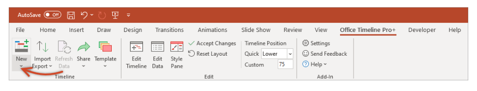
Office Timeline Pro+ is here!
Align programs and projects on one slide with multi-level Swimlanes.
A timeline is a type of chart which visually shows a series of events in chronological order over a linear timescale. The power of a timeline is that it’s a visual representation, which makes it easy to understand critical milestones in a project and the progress of a project schedule. Timelines are particularly powerful for project scheduling or project management when paired with a Gantt chart, as shown at the end of this tutorial.
![]()
Play Video
Options for making an Excel timeline
Microsoft Excel has a Scatter chart that can be formatted to create a timeline. If you need to create and update a timeline for recurring communications with clients and executives, it would be simpler and faster to
create a PowerPoint timeline.
On this page you can see both ways to create a timeline using these popular Microsoft Office tools. We will give you step-by-step instructions for making a timeline in Excel by formatting a Scatter chart. We will also show you how to instantly create an executive timeline in PowerPoint by pasting your project data from Excel.
Which tutorial would you like to see?
![]()
30 mins
Manually create timeline in Excel
![]()
Download Excel timeline template
How to create an Excel timeline in 7 steps
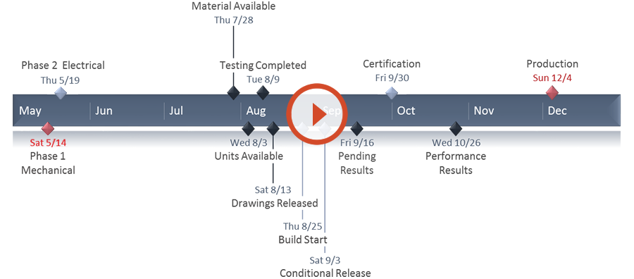
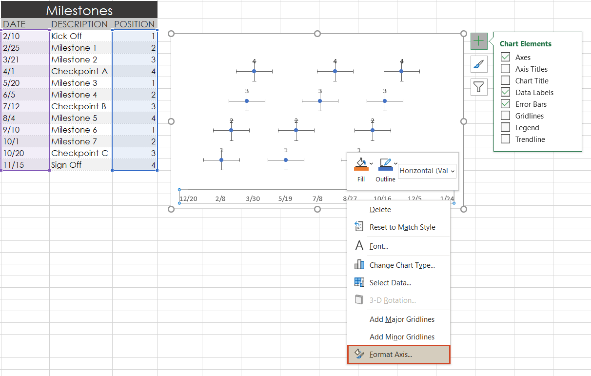
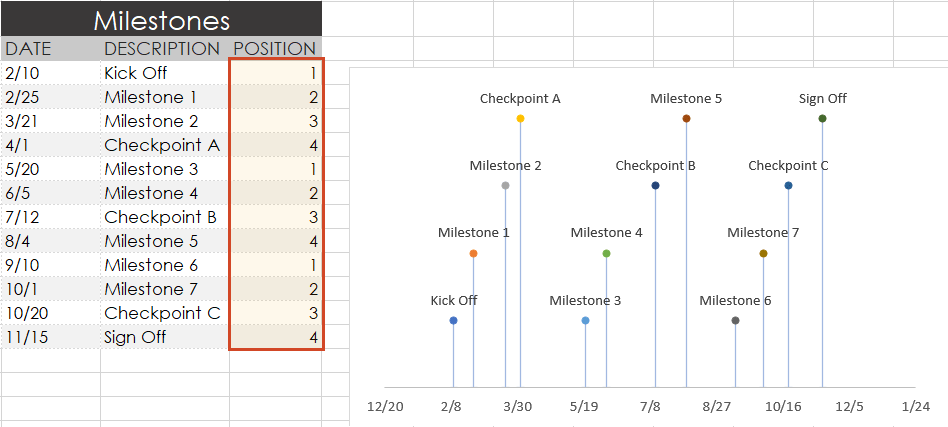
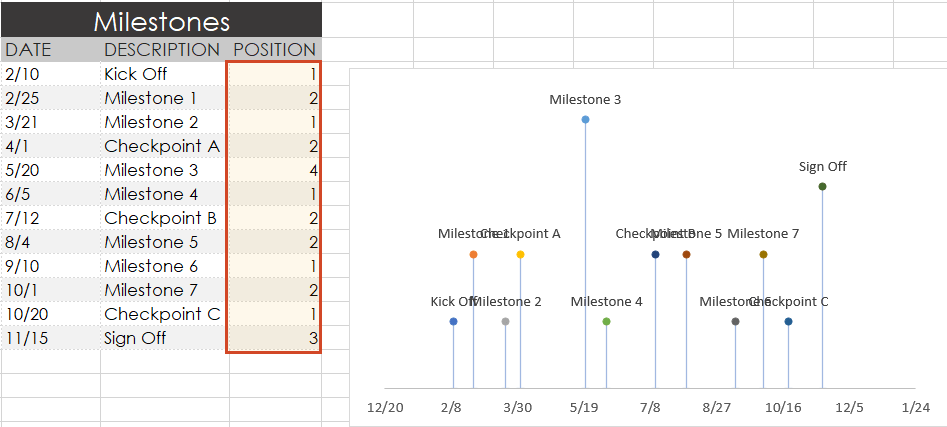
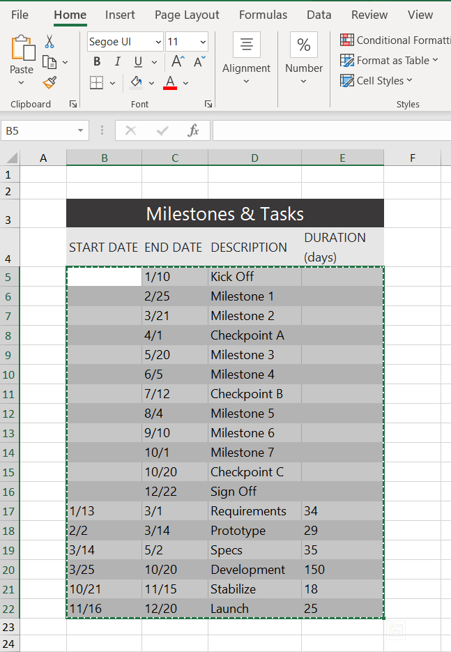
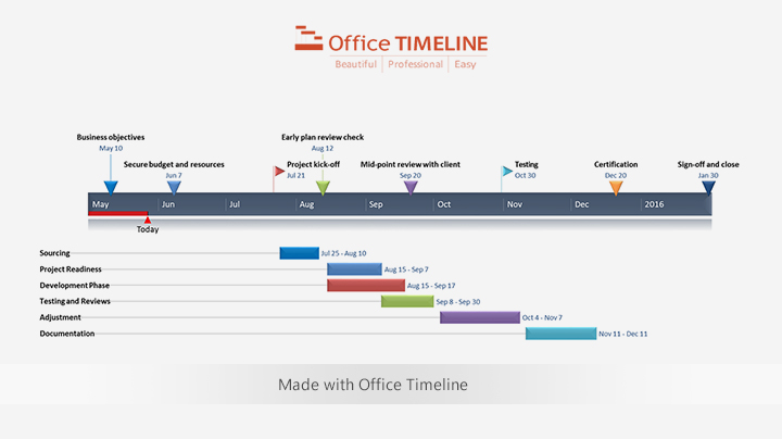
1. List your key events or dates in an Excel table.
-
List out the key events, important decision points or critical deliverables of your project. These will be called Milestones and they will be used to create a timeline.
-
Create a table out of these Milestones and next to each milestone add the due date of that particular milestone.
-
To create a timeline in Excel, you will also need to add another column to your table that includes some plotting numbers. Add the new column next to your milestone description column and list out a repetitive sequence of numbers such as 1, 2, 3, 4 or 5, 10, 15, 20 etc. Excel will use these plotting points to vary the height of each milestone when plotting them on your timeline template.
For this demonstration we’ll format the table in the image below into a Scatter chart and then into an Excel timeline. Then we’ll use it again to make a timeline in PowerPoint.
2. Make a timeline in Excel by setting it up as a Scatter chart.
-
From the timeline worksheet in Excel, click on any blank cell.
-
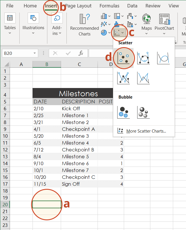
Then from the Excel ribbon, select the Insert tab and navigate to the Charts section of the ribbon.
-
In the Charts section of the ribbon drop down the Scatter or Bubble Chart menu.
-
Select Scatter which will insert a blank white chart space onto your Excel worksheet.
3. Add Milestone data to your timeline.
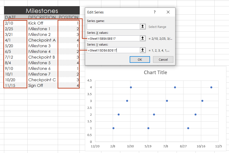
-
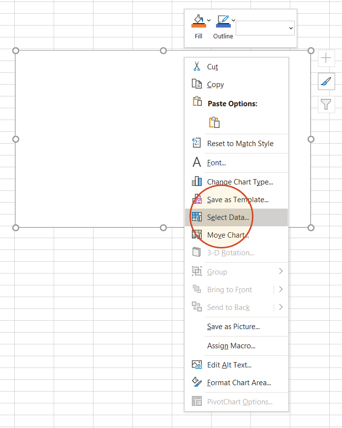
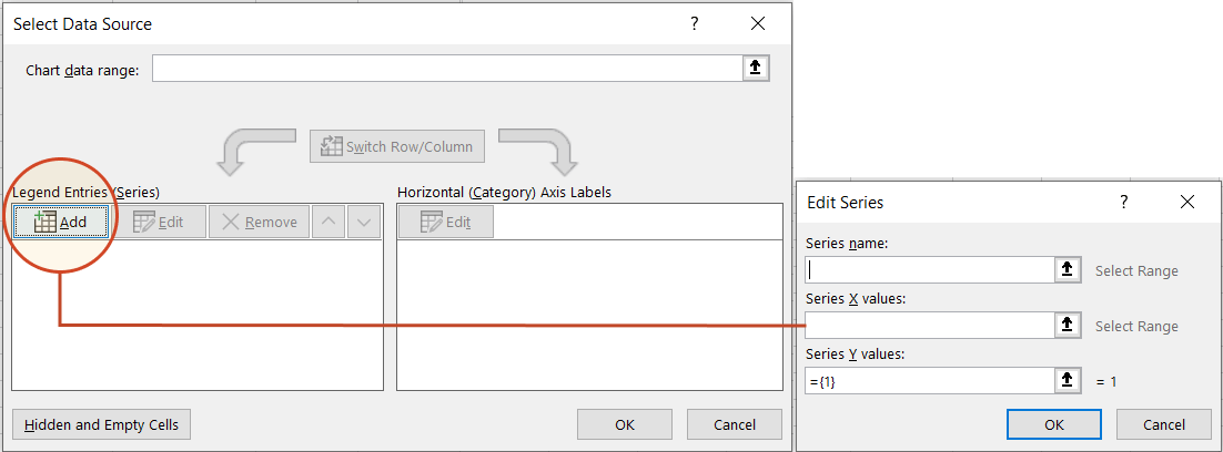
Right-click the blank white chart and click Select Data to bring up Excel’s Select Data Source window.
-
On the left side of Excel’s Data Source window, you will see a table named Legend Entries (Series). Click on the Add button to bring up the Edit Series window. Here you add the dates that will make your timeline.
-
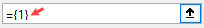
We will enter the dates into the field named Series X values . Click in the Series X values window on the arrow button
. Then select your range by clicking the first date of your timeline (ours is 2/10) and dragging down to the last date (ours is 11/15).Following the same path, we will enter the plotting numbers series into the field named Series Y values. Click in the Series Y value window and remove the value
that Excel places in the field by default. Then select your range by clicking on the first plotting number of your timeline (ours is 1) and then dragging down to the last plotting number of your timeline (ours is 4). -
Click OK and then click OK again to create a scatter chart.
4. Turn your Scatter chart into a timeline.
-
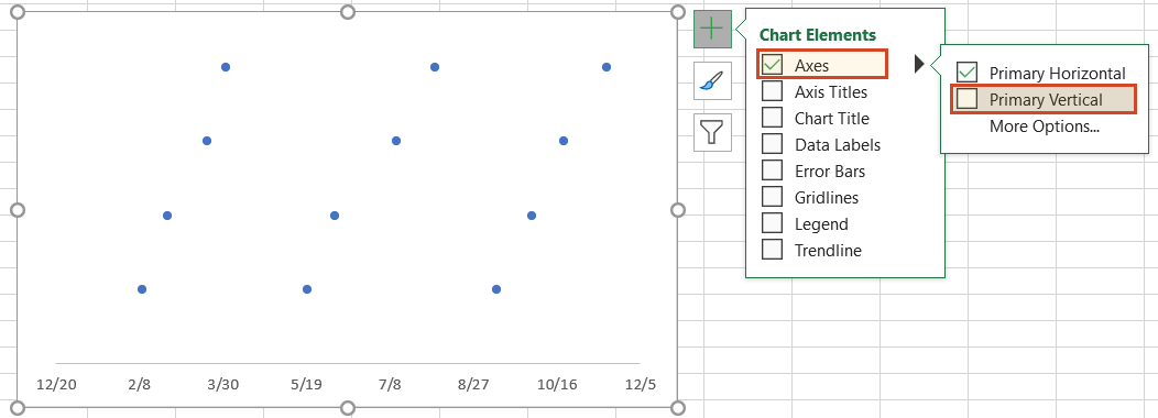
Click on your chart to bring up a set of controls which will be presented to the upper right of your timeline’s chart. Click on the Plus button (+) to open the Chart Elements menu.
-
In the timeline’s Chart Elements control box, uncheck Gridlines and Chart Title.
-
Staying in the Charts Elements control box, hover your mouse over the word Axes (but don’t uncheck it) to get an expansion arrow just to the right. Click on the expansion arrow to get additional axis options for your chart. Here you should uncheck Primary Vertical but leave Primary Horizontal checked.
-
Staying in the Charts Elements control box just a little longer, add Data Labels and Error Bars.
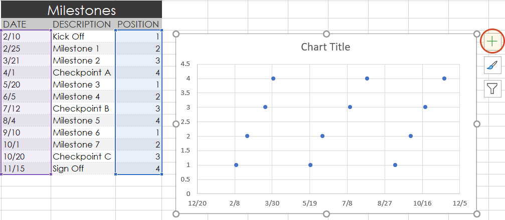
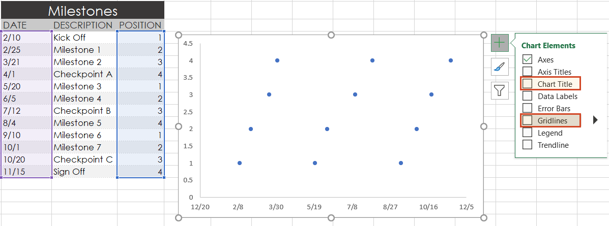
Your timeline chart should now look something like this:
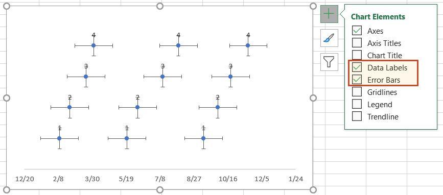
5. Format chart to look like a timeline.
-
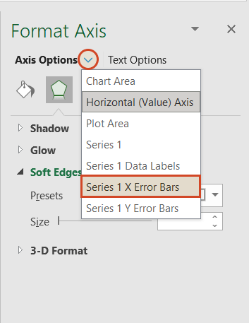
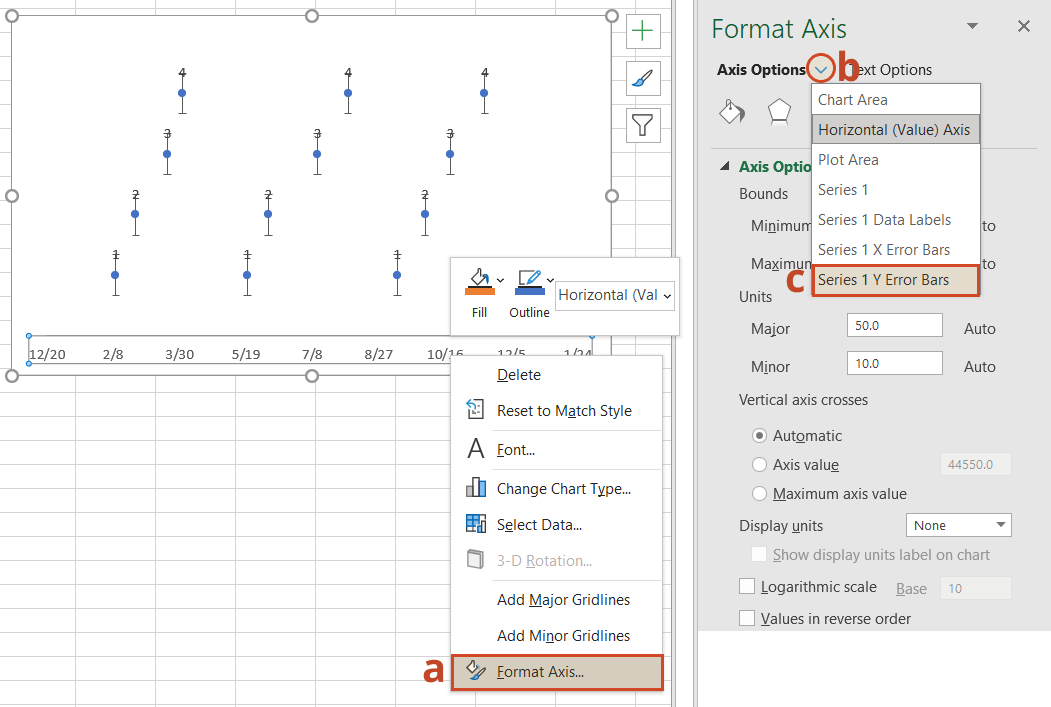
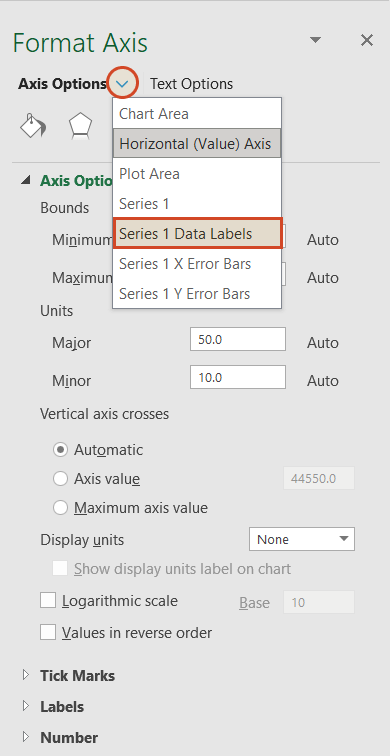
To make a timeline in Excel, we will need to format the Scatter chart by adding connectors from your milestone points. Right-click on any one of the dates at the bottom of your timeline and select Format Axis to bring up Excel’s Format Axis menu.
-
Drop down the arrow next to the title Axis Options and select Series 1 X Error Bars.
-
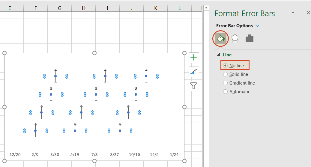
Under the Error Bar Options menu, click on the paint can icon to reveal the Fill & Line controls. Select No line, which will remove the horizontal lines around each of the plotted milestones on your timeline.
-
In a similar process, we will also adjust your timeline’s Y axis. Again, from the timeline, right-click on any one of your timeline’s dates at the bottom of the chart and select Format Axis. Drop down the arrow next to the title Axis Options and select Series 1 Y Error Bars.
-
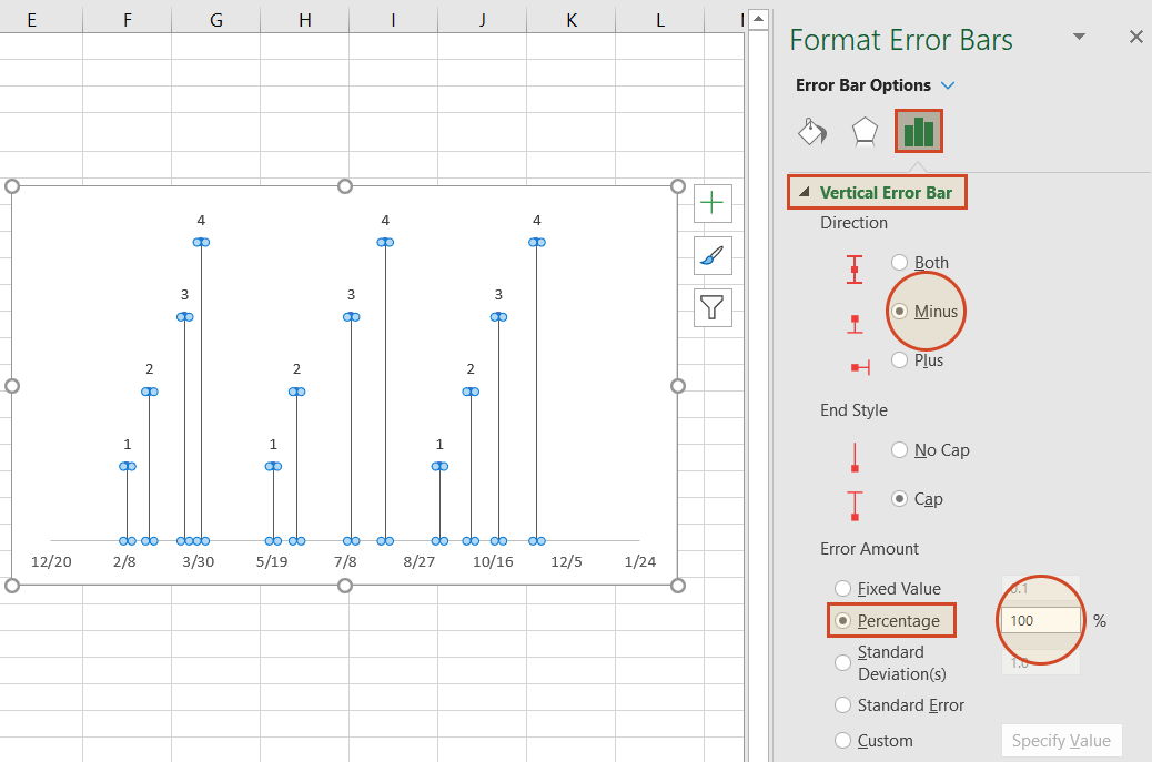
Right-clicking on any bar in the chart will open the Format Error Bars menu. From the Vertical Error Bar, set the direction to Minus. Then set the Error Amount to Percentage, and type in 100%. This will create connectors from your timeline’s milestones to their respective points on your timeband.
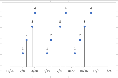
Your Excel timeline should now look something like the picture below.
6. Add titles to your timeline’s milestones.
You have built a Scatter chart as an Excel timeline. Now we will format it into a proper timeline.
-
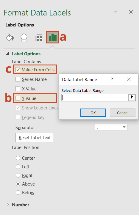
To finish making your timeline, we will add the milestone descriptions. Staying in the Format Axis menu, again drop down the menu arrow next to the title Axis Options. This time choose select Series 1 Data Labels to bring up the Format Data Labels menu.
-
Click the Label Options icon. Uncheck Y Value, and then put a check next to Value From Cells. This will bring up an Excel data entry window called Data Label Range.
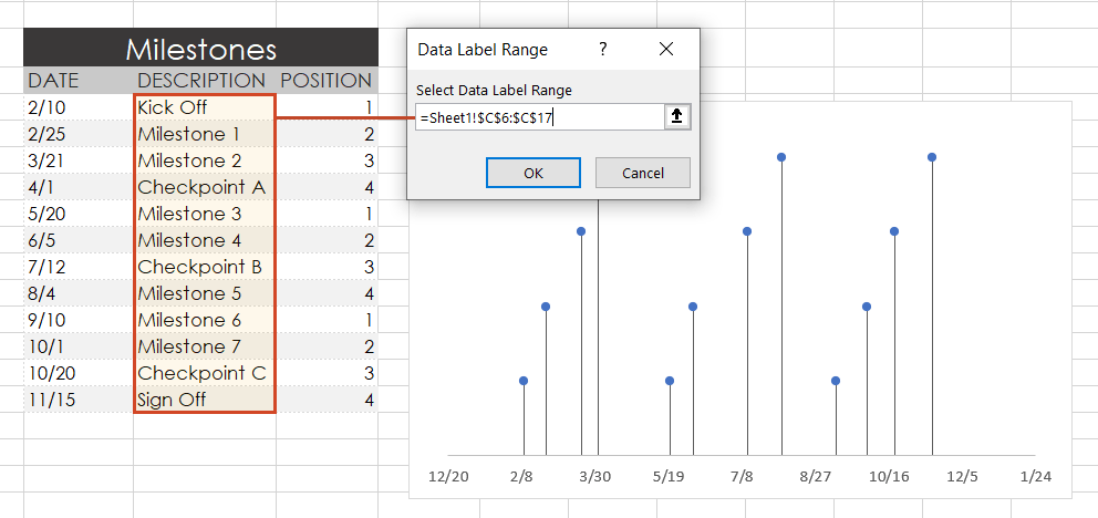
-
In the Select Data Label Range window, you will enter your timeline’s milestone descriptions from the timeline table you built in step 1. To do this simply click on the description for the first milestone in your timeline table, (ours is Kick Off), then drag down to the last milestone in your timeline (ours is Sign Off). Click OK.
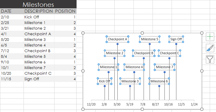
Your Excel timeline template should finally look more like this now:
7. Styling options for your timeline.
Now you can apply some styling choices to improve the aspect of your timeline.
-
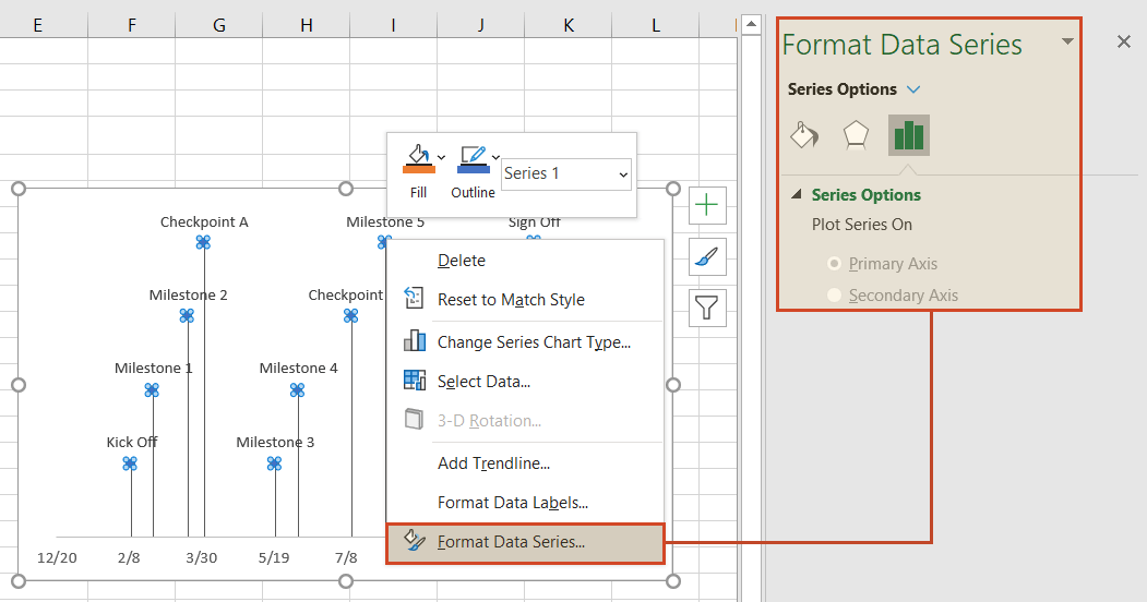
Coloring your timeline’s milestone markers.
From your timeline, right-click on any of the milestone points (caps) and select Format Data Series to bring up the Series Options menu.
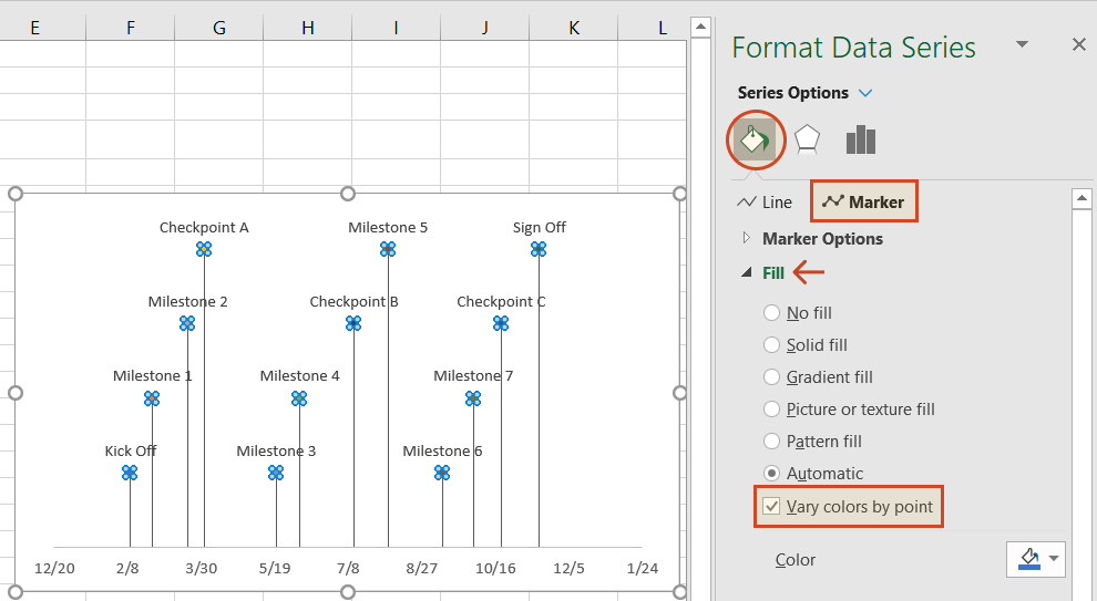
Select the paint can icon for Fill & Line options and, then choose the tab for Marker. You may also need to select Fill to reveal its menu. Then you can choose coloring options for your timeline’s milestone markers. In our example, we selected Vary colors by point, which lets Excel pick the milestone colors for our timeline.
-
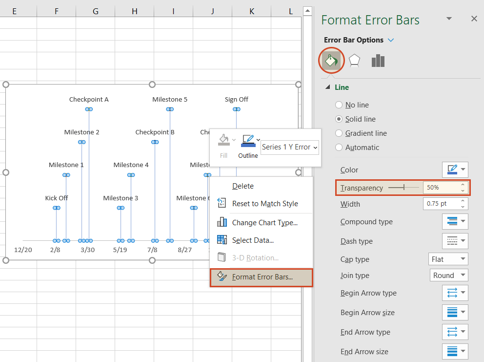
Change the vertical connector’s transparency.
On your timeline, right-click on any of the vertical connectors that connect your milestones with the timeband below. Select Format Error Bars to bring up the Vertical Error Bar menu. Again, select the paint can icon to choose Excel’s Line & Fill options. Here you can make formatting adjustments (color, size, style, etc.) to your timeline’s connector lines. In our example we set the transparency of the lines to 50%.
-
Vary the height of each milestone so their descriptions are not overlapping the neighboring milestone.
Remember the repeated sequence of numbers you added to your timeline table in step 1. Well, those set the height of each milestone on your timeline. By adjusting these numbers, you can play around with different height positions for each milestone. For example, to optimize our timeline, we used the number sequence, 1, 2, 3, 4, 1, 2, 3, 4.
Look how the descriptions would overlap if we changed the order (Don’t try this at home! 😊):
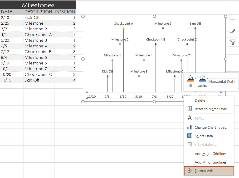
-
Trim off the empty space to the left or right of your Excel timeline by adjusting its minimum and maximum bounds.
Again right-click on any of the dates below your timeband. Select Format Axis.
Under the heading Bounds, adjusting the Minimum number upward will move your first milestone left on your timeline, closer to the vertical Axis. Likewise, adjusting the Maximum number down will move your last milestone right on your timeline, closer to the right edge of your chart.
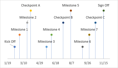
-
Finished! Our timeline now looks like this:
To help you get started quickly, we have included a practical Excel template that you can download for free and learn how to create timelines in Excel.
![]()
Download a pre-built Excel timeline file
FAQs about timelines in Excel
Is there a timeline template in Excel?
Yes, there are several predefined timeline templates in Excel. To explore them, go to File > New, and check the templates preview list. If you cannot find what you need, use the “More templates” option and type “timeline” in the “Search for online templates” box to browse the collection of timeline templates.
If you’re not happy with the limitations that come along with the standard timeline templates in Excel, have a look at the library of professional timeline templates produced with Office Timeline and try our timeline creator.
How do you make a timeline in Word or other office tools?
There are two ways to make timelines in Word, Excel, PowerPoint and Outlook: using SmartArt and using Charts. Here’s an overview of the steps required by each option.
A. Using SmartArt. This method is mostly manual, but if you want to create a basic timeline with SmartArt, you should follow these 5 steps:
- Go to Insert > SmartArt;
- In Choose a SmartArt Graphic box, select Process on the left and then pick a layout that you like and click OK;
- In the SmartArt graphic, click [Text]. Fill in the data by typing or pasting your text;
- You can add items in the timeline: Right click on a shape, then Add Shape > Add Shape After/Before;
- You can move items around by dragging and dropping them as you like.
After you create the timeline, you can add or move dates, and you can style your timeline further, apply different styles or change layouts and colors.
See more detailed instructions on using SmartArt to make timelines in our tutorial on how to make a timeline in Word.
B. Using Charts. You have various options: Column Charts, Bar Charts or Scatter Charts. In all the Office programs, this method will work with Excel data tables, so, you’ll need to group your data in Excel. Please note you’ll need some formatting to get a usable timeline. There are three basic steps for using Charts:
- Go to Insert > Chart > Insert Column or Bar Chart > 2-D Bar/3-D Bar;
- Select Stacked Bar (not 100% Stacked Bar);
- Format and style the newly created bar chart until you get the timeline that you like.
If you need more detailed instructions check out our series or tutorials on how to make timelines with your usual office tools.
Where can I create a timeline?
You can create timelines online or using offline tools. In both cases, you can choose between automated and manual work.
1. Let’s start with the most efficient way to make a timeline: using automation. This method is time saving and offers the best results, especially with more complex projects.
-
Offline tools: Office Timeline Add-in with its professional and free timeline maker versions. Office Timeline is a PowerPoint add-in that helps you quickly make and manage professional timelines and Gantt charts. It allows using templates, making timelines from scratch and importing data from Excel, Microsoft Project, Smartsheet or Wrike.
-
Online, with Office Timeline Online – premium and free versions. Office Timeline Online is an easy-to-use timeline creator that helps you with professional PowerPoint timeline creation in minutes, but also with slides updating and online sharing.
2. There are also manual ways to make a timeline from scratch, or from templates:
-
Offline, you can make timelines in any Office application, by using templates or designing your timeline using shapes and objects.
-
Online, you can make timelines in Google Docs editor.
However, these methods are not specialized for timeline creation, so they require more time and detailed instructions, and creative solutions to make timelines from graphics. In the end, you may find that the result might not be worth all the time and effort.
What is the best program to make a timeline?
There are several options of good timeline creators – online and offline, depending on your needs. We have found several options of automated tools, specialized in timeline creation, that meet the basic criteria for a good timeline creator: professional looking timelines, complex features, ease of use and good price-quality ratio. Our top three timeline creators are: Office Timeline – with its web-based app and the desktop add-in, Tiki-Toki and Sutori – both web-based.
Visit our blog to see the complete list of 10 best timeline makers that might be worth your while.
Make a great looking timeline from Excel directly in PowerPoint
There is an easier way to put your Excel data into a good-looking timeline. PowerPoint is better suited than Excel for making impressive timelines that clients and executives want to see.
In the tutorial below, we will show you how to quickly paste the Excel table you created above in Step 1 into PowerPoint using Office Timeline, a user-friendly PowerPoint add-in that instantly makes and updates timelines from Excel. To begin, you will need to install Office Timeline, which will add a timeline creator tab to PowerPoint.
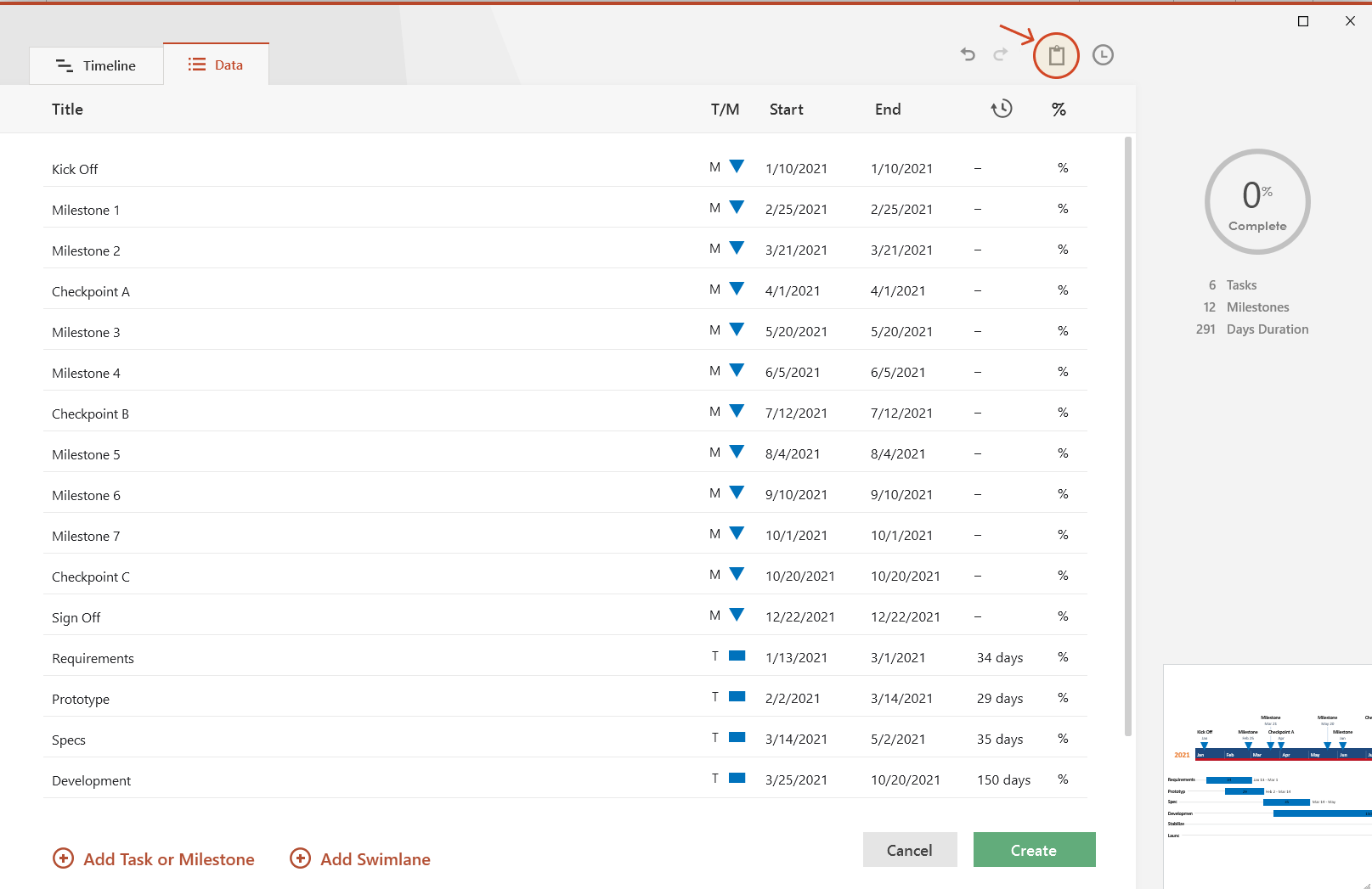
1. Open PowerPoint and paste your table into the Office Timeline wizard.
-
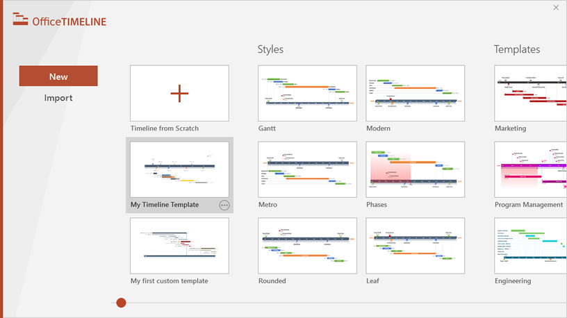
Inside PowerPoint, click on the Office Timeline tab, and then click the New icon.
This will open a gallery where you can choose between various timeline styles, stock templates and even custom templates.
-
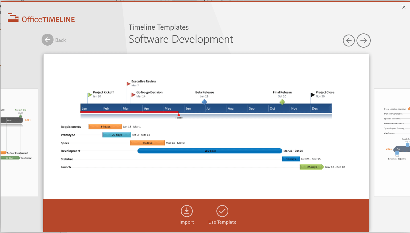
From the gallery, double-click the style or template you wish to use for your timeline to open its preview window and then select Use Template. (You can find more designs in our timeline templates library.) For this demonstration, we will choose the Software Development timeline template. If you prefer to import and refresh your Excel table, rather than copy-paste, click on the Import button in the preview window.
-
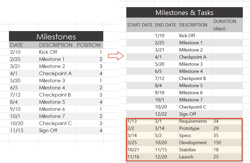
Copy the data from Excel
We have updated our data a bit, so that we get the timeline, but also a more detailed view of our project: we deleted the Timeline column, as we don’t need it, and added a list of tasks (with start and end dates and duration).
Copy the data from your Excel table, but make sure not to include the column headers.
-
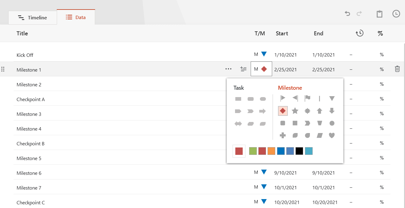
Now, simply paste the section into PowerPoint by using the Paste button in the upper-right corner of the Data Entry wizard.
Make edits if necessary (such as changing milestone shapes and colors or adding and removing items) and click the Create button.
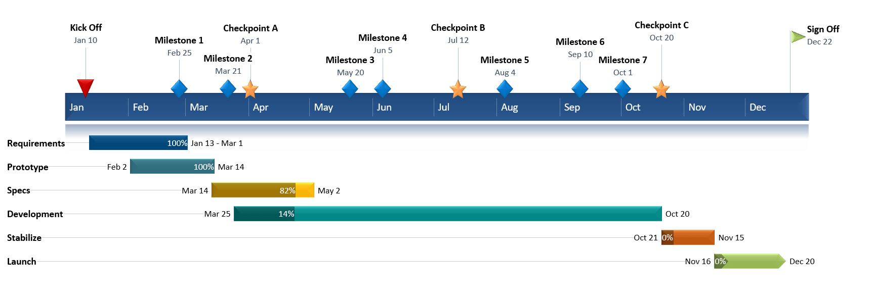
2. Instantly, you will have a new timeline slide in PowerPoint.
-
Depending on the template or style you selected from the gallery, you will have a timeline similar to this:
-
You can easily customize the timeline further using Office Timeline. In our example above, we added percent complete, removed the Today’s Date marker, changed milestones, adjusted colors, and added tasks to create a Gantt chart.
![]()
Download PowerPoint timeline template file
How to make a PowerPoint timeline from Excel in under 60 seconds:
![]()
Play Video
You can also use Office Timeline’s online timeline maker to easily build timelines and other similar visuals that you can instantly update and share with executives and teams.
See our free timeline template collection

Incident Response Plan
Free, downloadable timeline graphic using hours and minutes to give a clear overview on how an organization needs to plan its reaction to incidents so that outage be limited and activity resumed as soon as possible.

Crisis Management Plan
Professionally-designed timeline example structured in swimlanes that covers all the steps and processes one needs to follow in a crisis management process, from when the crisis occurs to response, business continuity process, recovery, and review.

Swimlane Diagram
Swimlane PowerPoint template that clearly lays out the framework of a project, from scheduling activities to task assignment and resource management.

Marketing Swimlanes Roadmap
Swimlane diagram example that provides a crisp, well-structured illustration of the tasks and milestones of your marketing campaign, according to the phase of the campaign to which they belong.

Marketing Plan
Free marketing timeline model that, once customized, effectively outlines your overall marketing strategy and serves as a solid visual aid to support marketing plan presentations.

Project Plan
Intuitive PowerPoint slide that serves as a quick yet visually effective alternative to complex project management tools to produce clear, well-laid-out plans for launching a project.

Sales Plan
Easy-to-edit sales plan sample for sales leaders, marketers or account executives to lay out objectives against a timeband in weeks; it can be customized to show campaign plans and targets in months, quarters or years.

Example Timeline
Visual template with Today’s Date indicator that helps enterprise workers get a quick start on creating timelines for project reviews, status reports, or any presentations that require a simple project schedule.

Blank Timeline
Generic timeline example that can be easily customized to quickly make an impressive, high-level summary of important events in a chronological order.