
When you create a chart in an Excel worksheet, a Word document, or a PowerPoint presentation, you have a lot of options. Whether you’ll use a chart that’s recommended for your data, one that you’ll pick from the list of all charts, or one from our selection of chart templates, it might help to know a little more about each type of chart.
Click here to start creating a chart.
For a description of each chart type, select an option from the following drop-down list.
Data that’s arranged in columns or rows on a worksheet can be plotted in a column chart. A column chart typically displays categories along the horizontal (category) axis and values along the vertical (value) axis, as shown in this chart:

Types of column charts
-
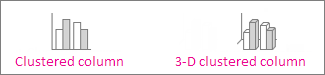
Clustered column and 3-D clustered column

A clustered column chart shows values in 2-D columns. A 3-D clustered column chart shows columns in 3-D format, but it doesn’t use a third value axis (depth axis). Use this chart when you have categories that represent:
-
Ranges of values (for example, item counts).
-
Specific scale arrangements (for example, a Likert scale with entries like Strongly agree, Agree, Neutral, Disagree, Strongly disagree).
-
Names that are not in any specific order (for example, item names, geographic names, or the names of people).
-
-
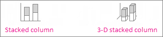
Stacked column and 3-D stacked column A stacked column chart shows values in 2-D stacked columns. A 3-D stacked column chart shows the stacked columns in 3-D format, but it doesn’t use a depth axis. Use this chart when you have multiple data series and you want to emphasize the total.
-
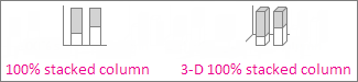
100% stacked column and 3-D 100% stacked column A 100% stacked column chart shows values in 2-D columns that are stacked to represent 100%. A 3-D 100% stacked column chart shows the columns in 3-D format, but it doesn’t use a depth axis. Use this chart when you have two or more data series and you want to emphasize the contributions to the whole, especially if the total is the same for each category.
-
3-D column 3-D column charts use three axes that you can change (a horizontal axis, a vertical axis, and a depth axis), and they compare data points along the horizontal and the depth axes. Use this chart when you want to compare data across both categories and data series.

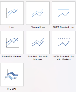
Data that’s arranged in columns or rows on a worksheet can be plotted in a line chart. In a line chart, category data is distributed evenly along the horizontal axis, and all value data is distributed evenly along the vertical axis. Line charts can show continuous data over time on an evenly scaled axis, so they’re ideal for showing trends in data at equal intervals, like months, quarters, or fiscal years.

Types of line charts
-
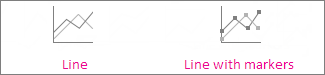
Line and line with markers Shown with or without markers to indicate individual data values, line charts can show trends over time or evenly spaced categories, especially when you have many data points and the order in which they are presented is important. If there are many categories or the values are approximate, use a line chart without markers.
-
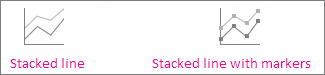
Stacked line and stacked line with markers Shown with or without markers to indicate individual data values, stacked line charts can show the trend of the contribution of each value over time or evenly spaced categories.
-
100% stacked line and 100% stacked line with markers Shown with or without markers to indicate individual data values, 100% stacked line charts can show the trend of the percentage each value contributes over time or evenly spaced categories. If there are many categories or the values are approximate, use a 100% stacked line chart without markers.
-
3-D line 3-D line charts show each row or column of data as a 3-D ribbon. A 3-D line chart has horizontal, vertical, and depth axes that you can change.
Notes:
-
Line charts work best when you have multiple data series in your chart—if you have only one data series, consider using a scatter chart instead.
-
Stacked line charts sum the data, which might not be the result you want. It might not be easy to see that the lines are stacked, so consider using a different line chart type or a stacked area chart instead.
-


Data that’s arranged in one column or row on a worksheet can be plotted in a pie chart. Pie charts show the size of items in one data series, proportional to the sum of the items. The data points in a pie chart are shown as a percentage of the whole pie.

Consider using a pie chart when:
-
You have only one data series.
-
None of the values in your data are negative.
-
Almost none of the values in your data are zero values.
-
You have no more than seven categories, all of which represent parts of the whole pie.
Types of pie charts
-
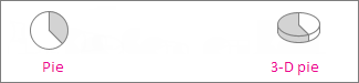
Pie and 3-D pie Pie charts show the contribution of each value to a total in a 2-D or 3-D format. You can pull out slices of a pie chart manually to emphasize the slices.
-
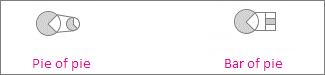
Pie of pie and bar of pie Pie of pie or bar of pie charts show pie charts with smaller values pulled out into a secondary pie or stacked bar chart, which makes them easier to distinguish.
Data that’s arranged in columns or rows only on a worksheet can be plotted in a doughnut chart. Like a pie chart, a doughnut chart shows the relationship of parts to a whole, but it can contain more than one data series.

Types of doughnut charts
-
Doughnut Doughnut charts show data in rings, where each ring represents a data series. If percentages are shown in data labels, each ring will total 100%.
Note: Doughnut charts aren’t easy to read. You may want to use a stacked column charts or Stacked bar chart instead.

Data that’s arranged in columns or rows on a worksheet can be plotted in a bar chart. Bar charts illustrate comparisons among individual items. In a bar chart, the categories are typically organized along the vertical axis, and the values along the horizontal axis.

Consider using a bar chart when:
-
The axis labels are long.
-
The values that are shown are durations.
Types of bar charts
-
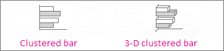
Clustered bar and 3-D clustered bar A clustered bar chart shows bars in 2-D format. A 3-D clustered bar chart shows bars in 3-D format; it doesn’t use a depth axis.
-
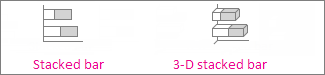
Stacked bar and 3-D stacked bar Stacked bar charts show the relationship of individual items to the whole in 2-D bars. A 3-D stacked bar chart shows bars in 3-D format; it doesn’t use a depth axis.
-
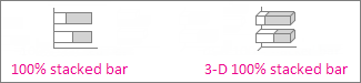
100% stacked bar and 3-D 100% stacked bar A 100% stacked bar shows 2-D bars that compare the percentage that each value contributes to a total across categories. A 3-D 100% stacked bar chart shows bars in 3-D format; it doesn’t use a depth axis.
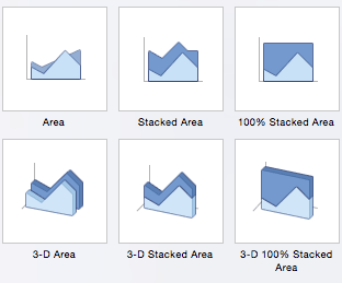
Data that’s arranged in columns or rows on a worksheet can be plotted in an area chart. Area charts can be used to plot change over time and draw attention to the total value across a trend. By showing the sum of the plotted values, an area chart also shows the relationship of parts to a whole.

Types of area charts
-
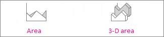
Area and 3-D area Shown in 2-D or in 3-D format, area charts show the trend of values over time or other category data. 3-D area charts use three axes (horizontal, vertical, and depth) that you can change. As a rule, consider using a line chart instead of a non-stacked area chart, because data from one series can be hidden behind data from another series.
-
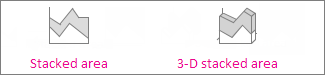
Stacked area and 3-D stacked area Stacked area charts show the trend of the contribution of each value over time or other category data in 2-D format. A 3-D stacked area chart does the same, but it shows areas in 3-D format without using a depth axis.
-
100% stacked area and 3-D 100% stacked area 100% stacked area charts show the trend of the percentage that each value contributes over time or other category data. A 3-D 100% stacked area chart does the same, but it shows areas in 3-D format without using a depth axis.
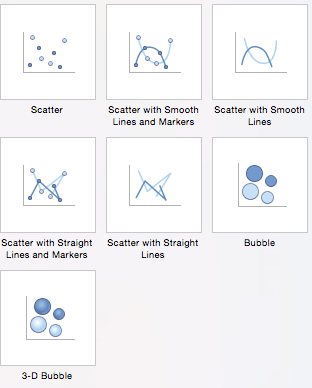
Data that’s arranged in columns and rows on a worksheet can be plotted in an xy (scatter) chart. Place the x values in one row or column, and then enter the corresponding y values in the adjacent rows or columns.
A scatter chart has two value axes: a horizontal (x) and a vertical (y) value axis. It combines x and y values into single data points and shows them in irregular intervals, or clusters. Scatter charts are typically used for showing and comparing numeric values, like scientific, statistical, and engineering data.

Consider using a scatter chart when:
-
You want to change the scale of the horizontal axis.
-
You want to make that axis a logarithmic scale.
-
Values for horizontal axis are not evenly spaced.
-
There are many data points on the horizontal axis.
-
You want to adjust the independent axis scales of a scatter chart to reveal more information about data that includes pairs or grouped sets of values.
-
You want to show similarities between large sets of data instead of differences between data points.
-
You want to compare many data points without regard to time—the more data that you include in a scatter chart, the better the comparisons you can make.
Types of scatter charts
-
Scatter This chart shows data points without connecting lines to compare pairs of values.
-
Scatter with smooth lines and markers and scatter with smooth lines This chart shows a smooth curve that connects the data points. Smooth lines can be shown with or without markers. Use a smooth line without markers if there are many data points.
-
Scatter with straight lines and markers and scatter with straight lines This chart shows straight connecting lines between data points. Straight lines can be shown with or without markers.

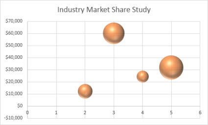
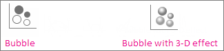
Much like a scatter chart, a bubble chart adds a third column to specify the size of the bubbles it shows to represent the data points in the data series.
Type of bubble charts
-
Bubble or bubble with 3-D effect Both of these bubble charts compare sets of three values instead of two, showing bubbles in 2-D or 3-D format (without using a depth axis). The third value specifies the size of the bubble marker.
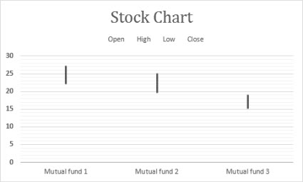
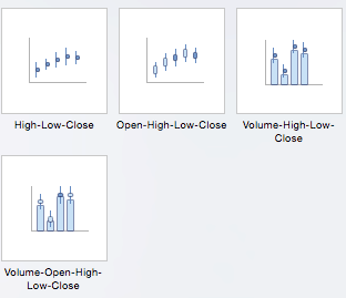
Data that’s arranged in columns or rows in a specific order on a worksheet can be plotted in a stock chart. As the name implies, stock charts can show fluctuations in stock prices. However, this chart can also show fluctuations in other data, like daily rainfall or annual temperatures. Make sure you organize your data in the right order to create a stock chart.
For example, to create a simple high-low-close stock chart, arrange your data with High, Low, and Close entered as column headings, in that order.
Types of stock charts
-
High-low-close This stock chart uses three series of values in the following order: high, low, and then close.
-
Open-high-low-close This stock chart uses four series of values in the following order: open, high, low, and then close.
-
Volume-high-low-close This stock chart uses four series of values in the following order: volume, high, low, and then close. It measures volume by using two value axes: one for the columns that measure volume, and the other for the stock prices.
-
Volume-open-high-low-close This stock chart uses five series of values in the following order: volume, open, high, low, and then close.


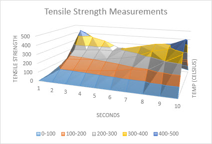
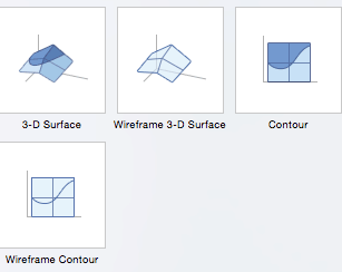
Data that’s arranged in columns or rows on a worksheet can be plotted in a surface chart. This chart is useful when you want to find optimum combinations between two sets of data. As in a topographic map, colors and patterns indicate areas that are in the same range of values. You can create a surface chart when both categories and data series are numeric values.
Types of surface charts
-
3-D surface This chart shows a 3-D view of the data, which can be imagined as a rubber sheet stretched over a 3-D column chart. It is typically used to show relationships between large amounts of data that may otherwise be difficult to see. Color bands in a surface chart do not represent the data series; they indicate the difference between the values.
-
Wireframe 3-D surface Shown without color on the surface, a 3-D surface chart is called a wireframe 3-D surface chart. This chart shows only the lines. A wireframe 3-D surface chart isn’t easy to read, but it can plot large data sets much faster than a 3-D surface chart.
-
Contour Contour charts are surface charts viewed from above, similar to 2-D topographic maps. In a contour chart, color bands represent specific ranges of values. The lines in a contour chart connect interpolated points of equal value.
-
Wireframe contour Wireframe contour charts are also surface charts viewed from above. Without color bands on the surface, a wireframe chart shows only the lines. Wireframe contour charts aren’t easy to read. You may want to use a 3-D surface chart instead.


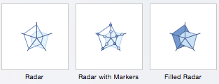
Data that’s arranged in columns or rows on a worksheet can be plotted in a radar chart. Radar charts compare the aggregate values of several data series.

Type of radar charts
-
Radar and radar with markers With or without markers for individual data points, radar charts show changes in values relative to a center point.
-
Filled radar In a filled radar chart, the area covered by a data series is filled with a color.


The treemap chart provides a hierarchical view of your data and an easy way to compare different levels of categorization. The treemap chart displays categories by color and proximity and can easily show lots of data which would be difficult with other chart types. The treemap chart can be plotted when empty (blank) cells exist within the hierarchal structure and treemap charts are good for comparing proportions within the hierarchy.

Note: There are no chart sub-types for treemap charts.
The sunburst chart is ideal for displaying hierarchical data and can be plotted when empty (blank) cells exist within the hierarchal structure . Each level of the hierarchy is represented by one ring or circle with the innermost circle as the top of the hierarchy. A sunburst chart without any hierarchical data (one level of categories), looks similar to a doughnut chart. However, a sunburst chart with multiple levels of categories shows how the outer rings relate to the inner rings. The sunburst chart is most effective at showing how one ring is broken into its contributing pieces.

Note: There are no chart sub-types for sunburst charts.
Data plotted in a histogram chart shows the frequencies within a distribution. Each column of the chart is called a bin, which can be changed to further analyze your data.

Type of histogram charts
-
Histogram The histogram chart shows the distribution of your data grouped into frequency bins.
-
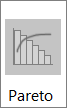
Pareto chart A pareto is a sorted histogram chart that contains both columns sorted in descending order and a line representing the cumulative total percentage.

A box and whisker chart shows distribution of data into quartiles, highlighting the mean and outliers. The boxes may have lines extending vertically called “whiskers”. These lines indicate variability outside the upper and lower quartiles, and any point outside those lines or whiskers is considered an outlier. Use this chart type when there are multiple data sets which relate to each other in some way.

Note: There are no chart sub-types for box and whisker charts.
A waterfall chart shows a running total of your financial data as values are added or subtracted. It’s useful for understanding how an initial value is affected by a series of positive and negative values. The columns are color coded so you can quickly tell positive from negative numbers.

Note: There are no chart sub-types for waterfall charts.
Funnel charts show values across multiple stages in a process.

Typically, the values decrease gradually, allowing the bars to resemble a funnel. Read more about funnel charts here.
Data that’s arranged in columns and rows can be plotted in a combo chart. Combo charts combine two or more chart types to make the data easy to understand, especially when the data is widely varied. Shown with a secondary axis, this chart is even easier to read. In this example, we used a column chart to show the number of homes sold between January and June and then used a line chart to make it easier for readers to quickly identify the average sales price by month.

Type of combo charts
-
Clustered column – line and clustered column – line on secondary axis With or without a secondary axis, this chart combines a clustered column and line chart, showing some data series as columns and others as lines in the same chart.
-
Stacked area – clustered column This chart combines a stacked area and clustered column chart, showing some data series as stacked areas and others as columns in the same chart.
-
Custom combination This chart lets you combine the charts you want to show in the same chart.


You can use a Map Chart to compare values and show categories across geographical regions. Use it when you have geographical regions in your data, like countries/regions, states, counties or postal codes.
For example, Countries by Population uses values. The values represent the total population in each country, with each portrayed using a gradient spectrum of two colors. The color for each region is dictated by where along the spectrum its value falls with respect to the others.

In the following example, Countries by Category, the categories are displayed using a standard legend to show groups or affiliations. Each data point is represented by an entirely different color.

Change a chart type
If you have already have a chart, but you just want to change its type:
-
Select the chart, click the Design tab, and click Change Chart Type.
-
Choose a new chart type in the Change Chart Type box.

Many chart types are available to help you display data in ways that are meaningful to your audience. Here are some examples of the most common chart types and how they can be used.

Data that is arranged in columns or rows on an Excel sheet can be plotted in a column chart. In column charts, categories are typically organized along the horizontal axis and values along the vertical axis.
Column charts are useful to show how data changes over time or to show comparisons among items.
Column charts have the following chart subtypes:
-
Clustered column chart Compares values across categories. A clustered column chart displays values in 2-D vertical rectangles. A clustered column in a 3-D chart displays the data by using a 3-D perspective.
-
Stacked column chart Shows the relationship of individual items to the whole, comparing the contribution of each value to a total across categories. A stacked column chart displays values in 2-D vertical stacked rectangles. A 3-D stacked column chart displays the data by using a 3-D perspective. A 3-D perspective is not a true 3-D chart because a third value axis (depth axis) is not used.
-
100% stacked column chart Compares the percentage that each value contributes to a total across categories. A 100% stacked column chart displays values in 2-D vertical 100% stacked rectangles. A 3-D 100% stacked column chart displays the data by using a 3-D perspective. A 3-D perspective is not a true 3-D chart because a third value axis (depth axis) is not used.
-
3-D column chart Uses three axes that you can change (a horizontal axis, a vertical axis, and a depth axis). They compare data points along the horizontal and the depth axes.

Data that is arranged in columns or rows on an Excel sheet can be plotted in a line chart. Line charts can display continuous data over time, set against a common scale, and are therefore ideal to show trends in data at equal intervals. In a line chart, category data is distributed evenly along the horizontal axis, and all value data is distributed evenly along the vertical axis.
Line charts work well if your category labels are text, and represent evenly spaced values such as months, quarters, or fiscal years.
Line charts have the following chart subtypes:
-
Line chart with or without markers Shows trends over time or ordered categories, especially when there are many data points and the order in which they are presented is important. If there are many categories or the values are approximate, use a line chart without markers.
-
Stacked line chart with or without markers Shows the trend of the contribution of each value over time or ordered categories. If there are many categories or the values are approximate, use a stacked line chart without markers.
-
100% stacked line chart displayed with or without markers Shows the trend of the percentage each value contributes over time or ordered categories. If there are many categories or the values are approximate, use a 100% stacked line chart without markers.
-
3-D line chart Shows each row or column of data as a 3-D ribbon. A 3-D line chart has horizontal, vertical, and depth axes that you can change.

Data that is arranged in one column or row only on an Excel sheet can be plotted in a pie chart. Pie charts show the size of items in one data series, proportional to the sum of the items. The data points in a pie chart are displayed as a percentage of the whole pie.
Consider using a pie chart when you have only one data series that you want to plot, none of the values that you want to plot are negative, almost none of the values that you want to plot are zero values, you don’t have more than seven categories, and the categories represent parts of the whole pie.
Pie charts have the following chart subtypes:
-
Pie chart Displays the contribution of each value to a total in a 2-D or 3-D format. You can pull out slices of a pie chart manually to emphasize the slices.
-
Pie of pie or bar of pie chart Displays pie charts with user-defined values that are extracted from the main pie chart and combined into a secondary pie chart or into a stacked bar chart. These chart types are useful when you want to make small slices in the main pie chart easier to distinguish.
-
Doughnut chart Like a pie chart, a doughnut chart shows the relationship of parts to a whole. However, it can contain more than one data series. Each ring of the doughnut chart represents a data series. Displays data in rings, where each ring represents a data series. If percentages are displayed in data labels, each ring will total 100%.

Data that is arranged in columns or rows on an Excel sheet can be plotted in a bar chart.
Use bar charts to show comparisons among individual items.
Bar charts have the following chart subtypes:
-
Clustered bar and 3-D Clustered bar chart Compares values across categories. In a clustered bar chart, the categories are typically organized along the vertical axis, and the values along the horizontal axis. A clustered bar in 3-D chart displays the horizontal rectangles in 3-D format. It does not display the data on three axes.
-
Stacked bar and 3-D Stacked bar chart Shows the relationship of individual items to the whole. A stacked bar in 3-D chart displays the horizontal rectangles in 3-D format. It does not display the data on three axes.
-
100% stacked bar chart and 100% stacked bar chart in 3-D Compares the percentage that each value contributes to a total across categories. A 100% stacked bar in 3-D chart displays the horizontal rectangles in 3-D format. It does not display the data on three axes.

Data that is arranged in columns and rows on an Excel sheet can be plotted in an xy (scatter) chart. A scatter chart has two value axes. It shows one set of numeric data along the horizontal axis (x-axis) and another along the vertical axis (y-axis). It combines these values into single data points and displays them in irregular intervals, or clusters.
Scatter charts show the relationships among the numeric values in several data series, or plot two groups of numbers as one series of xy coordinates. Scatter charts are typically used for displaying and comparing numeric values, such as scientific, statistical, and engineering data.
Scatter charts have the following chart subtypes:
-
Scatter chart Compares pairs of values. Use a scatter chart with data markers but without lines if you have many data points and connecting lines would make the data more difficult to read. You can also use this chart type when you do not have to show connectivity of the data points.
-
Scatter chart with smooth lines and scatter chart with smooth lines and markers Displays a smooth curve that connects the data points. Smooth lines can be displayed with or without markers. Use a smooth line without markers if there are many data points.
-
Scatter chart with straight lines and scatter chart with straight lines and markers Displays straight connecting lines between data points. Straight lines can be displayed with or without markers.
-
Bubble chart or bubble chart with 3-D effect A bubble chart is a kind of xy (scatter) chart, where the size of the bubble represents the value of a third variable. Compares sets of three values instead of two. The third value determines the size of the bubble marker. You can choose to display bubbles in 2-D format or with a 3-D effect.

Data that is arranged in columns or rows on an Excel sheet can be plotted in an area chart. By displaying the sum of the plotted values, an area chart also shows the relationship of parts to a whole.
Area charts emphasize the magnitude of change over time, and can be used to draw attention to the total value across a trend. For example, data that represents profit over time can be plotted in an area chart to emphasize the total profit.
Area charts have the following chart subtypes:
-
Area chart Displays the trend of values over time or other category data. 3-D area charts use three axes (horizontal, vertical, and depth) that you can change. Generally, consider using a line chart instead of a nonstacked area chart because data from one series can be obscured by data from another series.
-
Stacked area chart Displays the trend of the contribution of each value over time or other category data. A stacked area chart in 3-D is displayed in the same manner but uses a 3-D perspective. A 3-D perspective is not a true 3-D chart because a third value axis (depth axis) is not used.
-
100% stacked area chart Displays the trend of the percentage that each value contributes over time or other category data. A 100% stacked area chart in 3-D is displayed in the same manner but uses a 3-D perspective. A 3-D perspective is not a true 3-D chart because a third value axis (depth axis) is not used.

Data that is arranged in columns or rows in a specific order on an Excel sheet can be plotted in a stock chart.
As its name implies, a stock chart is most frequently used to show the fluctuation of stock prices. However, this chart may also be used for scientific data. For example, you could use a stock chart to indicate the fluctuation of daily or annual temperatures.
Stock charts have the following chart sub-types:
-
High-Low-Close stock chart Illustrates stock prices. It requires three series of values in the correct order: high, low, and then close.
-
Open-High-Low-Close stock chart Requires four series of values in the correct order: open, high, low, and then close.
-
Volume-High-Low-Close stock chart Requires four series of values in the correct order: volume, high, low, and then close. It measures volume by using two value axes: one for the columns that measure volume, and the other for the stock prices.
-
Volume-Open-High-Low-Close stock chart Requires five series of values in the correct order: volume, open, high, low, and then close.

Data that is arranged in columns or rows on an Excel sheet can be plotted in a surface chart. As in a topographic map, colors and patterns indicate areas that are in the same range of values.
A surface chart is useful when you want to find optimal combinations between two sets of data.
Surface charts have the following chart subtypes:
-
3-D surface chart Shows trends in values across two dimensions in a continuous curve. Color bands in a surface chart do not represent the data series. They represent the difference between the values. This chart shows a 3-D view of the data, which can be imagined as a rubber sheet stretched over a 3-D column chart. It is typically used to show relationships between large amounts of data that may otherwise be difficult to see.
-
Wireframe 3-D surface chart Shows only the lines. A wireframe 3-D surface chart is not easy to read, but this chart type is useful for faster plotting of large data sets.
-
Contour chart Surface charts viewed from above, similar to 2-D topographic maps. In a contour chart, color bands represent specific ranges of values. The lines in a contour chart connect interpolated points of equal value.
-
Wireframe contour chart Surface charts viewed from above. Without color bands on the surface, a wireframe chart shows only the lines. Wireframe contour charts are not easy to read. You may want to use a 3-D surface chart instead.

In a radar chart, each category has its own value axis radiating from the center point. Lines connect all the values in the same series.
Use radar charts to compare the aggregate values of several data series.
Radar charts have the following chart subtypes:
-
Radar chart Displays changes in values in relation to a center point.
-
Radar with markers Displays changes in values in relation to a center point with markers.
-
Filled radar chart Displays changes in values in relation to a center point, and fills the area covered by a data series with color.
You can use a Map Chart to compare values and show categories across geographical regions. Use it when you have geographical regions in your data, like countries/regions, states, counties or postal codes.
For more information, see Create a map chart.
Funnel charts show values across multiple stages in a process.
Typically, the values decrease gradually, allowing the bars to resemble a funnel. For more information, see Create a funnel chart.
The treemap chart provides a hierarchical view of your data and an easy way to compare different levels of categorization. The treemap chart displays categories by color and proximity and can easily show lots of data which would be difficult with other chart types. The treemap chart can be plotted when empty (blank) cells exist within the hierarchal structure and treemap charts are good for comparing proportions within the hierarchy.
There are no chart sub-types for treemap charts.
For more information, see Create a treemap chart.
The sunburst chart is ideal for displaying hierarchical data and can be plotted when empty (blank) cells exist within the hierarchal structure . Each level of the hierarchy is represented by one ring or circle with the innermost circle as the top of the hierarchy. A sunburst chart without any hierarchical data (one level of categories), looks similar to a doughnut chart. However, a sunburst chart with multiple levels of categories shows how the outer rings relate to the inner rings. The sunburst chart is most effective at showing how one ring is broken into its contributing pieces.
There are no chart sub-types for sunburst charts.
For more information, see Create a sunburst chart.
A waterfall chart shows a running total of your financial data as values are added or subtracted. It’s useful for understanding how an initial value is affected by a series of positive and negative values. The columns are color coded so you can quickly tell positive from negative numbers.
There are no chart sub-types for waterfall charts.
For more information, see Create a waterfall chart.
Data plotted in a histogram chart shows the frequencies within a distribution. Each column of the chart is called a bin, which can be changed to further analyze your data.
Types of histogram charts
-
Histogram The histogram chart shows the distribution of your data grouped into frequency bins.
-
Pareto chart A pareto is a sorted histogram chart that contains both columns sorted in descending order and a line representing the cumulative total percentage.
More information is available for Histogram and Pareto charts.
A box and whisker chart shows distribution of data into quartiles, highlighting the mean and outliers. The boxes may have lines extending vertically called “whiskers”. These lines indicate variability outside the upper and lower quartiles, and any point outside those lines or whiskers is considered an outlier. Use this chart type when there are multiple data sets which relate to each other in some way.
For more information, see Create a box and whisker chart.
Data that is arranged in columns or rows on an Excel sheet can be plotted in a column chart. In column charts, categories are typically organized along the horizontal axis and values along the vertical axis.
Column charts are useful to show how data changes over time or to show comparisons among items.
Column charts have the following chart subtypes:
-
Clustered column chart Compares values across categories. A clustered column chart displays values in 2-D vertical rectangles. A clustered column in a 3-D chart displays the data by using a 3-D perspective.
-
Stacked column chart Shows the relationship of individual items to the whole, comparing the contribution of each value to a total across categories. A stacked column chart displays values in 2-D vertical stacked rectangles. A 3-D stacked column chart displays the data by using a 3-D perspective. A 3-D perspective is not a true 3-D chart because a third value axis (depth axis) is not used.
-
100% stacked column chart Compares the percentage that each value contributes to a total across categories. A 100% stacked column chart displays values in 2-D vertical 100% stacked rectangles. A 3-D 100% stacked column chart displays the data by using a 3-D perspective. A 3-D perspective is not a true 3-D chart because a third value axis (depth axis) is not used.
-
3-D column chart Uses three axes that you can change (a horizontal axis, a vertical axis, and a depth axis). They compare data points along the horizontal and the depth axes.
-
Cylinder, cone, and pyramid chart Available in the same clustered, stacked, 100% stacked, and 3-D chart types that are provided for rectangular column charts. They show and compare data in the same manner. The only difference is that these chart types display cylinder, cone, and pyramid shapes instead of rectangles.
Data that is arranged in columns or rows on an Excel sheet can be plotted in a line chart. Line charts can display continuous data over time, set against a common scale, and are therefore ideal to show trends in data at equal intervals. In a line chart, category data is distributed evenly along the horizontal axis, and all value data is distributed evenly along the vertical axis.
Line charts work well if your category labels are text, and represent evenly spaced values such as months, quarters, or fiscal years.
Line charts have the following chart subtypes:
-
Line chart with or without markers Shows trends over time or ordered categories, especially when there are many data points and the order in which they are presented is important. If there are many categories or the values are approximate, use a line chart without markers.
-
Stacked line chart with or without markers Shows the trend of the contribution of each value over time or ordered categories. If there are many categories or the values are approximate, use a stacked line chart without markers.
-
100% stacked line chart displayed with or without markers Shows the trend of the percentage each value contributes over time or ordered categories. If there are many categories or the values are approximate, use a 100% stacked line chart without markers.
-
3-D line chart Shows each row or column of data as a 3-D ribbon. A 3-D line chart has horizontal, vertical, and depth axes that you can change.
Data that is arranged in one column or row only on an Excel sheet can be plotted in a pie chart. Pie charts show the size of items in one data series, proportional to the sum of the items. The data points in a pie chart are displayed as a percentage of the whole pie.
Consider using a pie chart when you have only one data series that you want to plot, none of the values that you want to plot are negative, almost none of the values that you want to plot are zero values, you don’t have more than seven categories, and the categories represent parts of the whole pie.
Pie charts have the following chart subtypes:
-
Pie chart Displays the contribution of each value to a total in a 2-D or 3-D format. You can pull out slices of a pie chart manually to emphasize the slices.
-
Pie of pie or bar of pie chart Displays pie charts with user-defined values that are extracted from the main pie chart and combined into a secondary pie chart or into a stacked bar chart. These chart types are useful when you want to make small slices in the main pie chart easier to distinguish.
-
Exploded pie chart Displays the contribution of each value to a total while emphasizing individual values. Exploded pie charts can be displayed in 3-D format. You can change the pie explosion setting for all slices and individual slices. However, you cannot move the slices of an exploded pie manually.
Data that is arranged in columns or rows on an Excel sheet can be plotted in a bar chart.
Use bar charts to show comparisons among individual items.
Bar charts have the following chart subtypes:
-
Clustered bar chart Compares values across categories. In a clustered bar chart, the categories are typically organized along the vertical axis, and the values along the horizontal axis. A clustered bar in 3-D chart displays the horizontal rectangles in 3-D format. It does not display the data on three axes.
-
Stacked bar chart Shows the relationship of individual items to the whole. A stacked bar in 3-D chart displays the horizontal rectangles in 3-D format. It does not display the data on three axes.
-
100% stacked bar chart and 100% stacked bar chart in 3-D Compares the percentage that each value contributes to a total across categories. A 100% stacked bar in 3-D chart displays the horizontal rectangles in 3-D format. It does not display the data on three axes.
-
Horizontal cylinder, cone, and pyramid chart Available in the same clustered, stacked, and 100% stacked chart types that are provided for rectangular bar charts. They show and compare data the same manner. The only difference is that these chart types display cylinder, cone, and pyramid shapes instead of horizontal rectangles.
Data that is arranged in columns or rows on an Excel sheet can be plotted in an area chart. By displaying the sum of the plotted values, an area chart also shows the relationship of parts to a whole.
Area charts emphasize the magnitude of change over time, and can be used to draw attention to the total value across a trend. For example, data that represents profit over time can be plotted in an area chart to emphasize the total profit.
Area charts have the following chart subtypes:
-
Area chart Displays the trend of values over time or other category data. 3-D area charts use three axes (horizontal, vertical, and depth) that you can change. Generally, consider using a line chart instead of a nonstacked area chart because data from one series can be obscured by data from another series.
-
Stacked area chart Displays the trend of the contribution of each value over time or other category data. A stacked area chart in 3-D is displayed in the same manner but uses a 3-D perspective. A 3-D perspective is not a true 3-D chart because a third value axis (depth axis) is not used.
-
100% stacked area chart Displays the trend of the percentage that each value contributes over time or other category data. A 100% stacked area chart in 3-D is displayed in the same manner but uses a 3-D perspective. A 3-D perspective is not a true 3-D chart because a third value axis (depth axis) is not used.
Data that is arranged in columns and rows on an Excel sheet can be plotted in an xy (scatter) chart. A scatter chart has two value axes. It shows one set of numeric data along the horizontal axis (x-axis) and another along the vertical axis (y-axis). It combines these values into single data points and displays them in irregular intervals, or clusters.
Scatter charts show the relationships among the numeric values in several data series, or plot two groups of numbers as one series of xy coordinates. Scatter charts are typically used for displaying and comparing numeric values, such as scientific, statistical, and engineering data.
Scatter charts have the following chart subtypes:
-
Scatter chart with markers only Compares pairs of values. Use a scatter chart with data markers but without lines if you have many data points and connecting lines would make the data more difficult to read. You can also use this chart type when you do not have to show connectivity of the data points.
-
Scatter chart with smooth lines and scatter chart with smooth lines and markers Displays a smooth curve that connects the data points. Smooth lines can be displayed with or without markers. Use a smooth line without markers if there are many data points.
-
Scatter chart with straight lines and scatter chart with straight lines and markers Displays straight connecting lines between data points. Straight lines can be displayed with or without markers.

A bubble chart is a kind of xy (scatter) chart, where the size of the bubble represents the value of a third variable.
Bubble charts have the following chart subtypes:
-
Bubble chart or bubble chart with 3-D effect Compares sets of three values instead of two. The third value determines the size of the bubble marker. You can choose to display bubbles in 2-D format or with a 3-D effect.
Data that is arranged in columns or rows in a specific order on an Excel sheet can be plotted in a stock chart.
As its name implies, a stock chart is most frequently used to show the fluctuation of stock prices. However, this chart may also be used for scientific data. For example, you could use a stock chart to indicate the fluctuation of daily or annual temperatures.
Stock charts have the following chart sub-types:
-
High-low-close stock chart Illustrates stock prices. It requires three series of values in the correct order: high, low, and then close.
-
Open-high-low-close stock chart Requires four series of values in the correct order: open, high, low, and then close.
-
Volume-high-low-close stock chart Requires four series of values in the correct order: volume, high, low, and then close. It measures volume by using two value axes: one for the columns that measure volume, and the other for the stock prices.
-
Volume-open-high-low-close stock chart Requires five series of values in the correct order: volume, open, high, low, and then close.
Data that is arranged in columns or rows on an Excel sheet can be plotted in a surface chart. As in a topographic map, colors and patterns indicate areas that are in the same range of values.
A surface chart is useful when you want to find optimal combinations between two sets of data.
Surface charts have the following chart subtypes:
-
3-D surface chart Shows trends in values across two dimensions in a continuous curve. Color bands in a surface chart do not represent the data series. They represent the difference between the values. This chart shows a 3-D view of the data, which can be imagined as a rubber sheet stretched over a 3-D column chart. It is typically used to show relationships between large amounts of data that may otherwise be difficult to see.
-
Wireframe 3-D surface chart Shows only the lines. A wireframe 3-D surface chart is not easy to read, but this chart type is useful for faster plotting of large data sets.
-
Contour chart Surface charts viewed from above, similar to 2-D topographic maps. In a contour chart, color bands represent specific ranges of values. The lines in a contour chart connect interpolated points of equal value.
-
Wireframe contour chart Surface charts viewed from above. Without color bands on the surface, a wireframe chart shows only the lines. Wireframe contour charts are not easy to read. You may want to use a 3-D surface chart instead.

Like a pie chart, a doughnut chart shows the relationship of parts to a whole. However, it can contain more than one data series. Each ring of the doughnut chart represents a data series.
Doughnut charts have the following chart subtypes:
-
Doughnut chart Displays data in rings, where each ring represents a data series. If percentages are displayed in data labels, each ring will total 100%.
-
Exploded doughnut chart Displays the contribution of each value to a total while emphasizing individual values. However, they can contain more than one data series.
In a radar chart, each category has its own value axis radiating from the center point. Lines connect all the values in the same series.
Use radar charts to compare the aggregate values of several data series.
Radar charts have the following chart subtypes:
-
Radar chart Displays changes in values in relation to a center point.
-
Filled radar chart Displays changes in values in relation to a center point, and fills the area covered by a data series with color.
Change a chart type
If you have already have a chart, but you just want to change its type:
-
Select the chart, click the Chart Design tab, and click Change Chart Type.
-
Select a new chart type in the gallery of available options.

See Also
Create a chart with recommended charts
Содержание
- How to Create Charts in Excel: Types & Step by Step Examples
- What is a chart?
- Types of Charts in MS Excel
- The importance of charts
- Step by step example of creating charts in Excel
- Tutorial Exercise
- Summary
- Types of Charts in Excel
- List of Top 8 Types of Charts in MS Excel
- Chart #1 – Column Chart
- Chart #2 – Line Chart
- Chart #3 – Pie Chart
- Chart #4 – Bar Chart
- Chart #5 – Area Chart
- Chart #6 – Scatter Chart
- Chart #7 – Stock Chart
- Chart #8 – Radar Chart
- Things to Remember
- Recommended Articles
- Excel Charting Basics: How to Make a Chart and Graph
- What Are Graphs and Charts in Excel?
- Tired of static spreadsheets? We were, too.
- When to Use Each Chart and Graph Type in Excel
- Top 5 Excel Chart and Graph Best Practices
- How to Chart Data in Excel
- Step 1: Enter Data into a Worksheet
- Step 2: Select Range to Create Chart or Graph from Workbook Data
- How to Make a Chart in Excel
- Step 1: Select Chart Type
- Step 2: Create Your Chart
- Step 3: Add Chart Elements
- Step 4: Adjust Quick Layout
- Step 5: Change Colors
- Step 6: Change Style
- Step 7: Switch Row/Column
- Step 8: Select Data
- Step 9: Change Chart Type
- Step 10: Move Chart
- Step 11: Change Formatting
- Step 12: Delete a Chart
- How to Make a Graph in Excel
- How to Create a Table in Excel
- Related Excel Functionality
- Make Better Decisions, Faster with Charts in Smartsheet
How to Create Charts in Excel: Types & Step by Step Examples
Updated February 25, 2023
A picture is worth of thousand words; a chart is worth of thousand sets of data. In this tutorial, we are going to learn how we can use graph in Excel to visualize our data.
What is a chart?
A chart is a visual representative of data in both columns and rows. Charts are usually used to analyse trends and patterns in data sets. Let’s say you have been recording the sales figures in Excel for the past three years. Using charts, you can easily tell which year had the most sales and which year had the least. You can also draw charts to compare set targets against actual achievements.
We will use the following data for this tutorial.
Note: we will be using Excel 2013. If you have a lower version, then some of the more advanced features may not be available to you.
| Item | 2012 | 2013 | 2014 | 2015 |
|---|---|---|---|---|
| Desktop Computers | 20 | 12 | 13 | 12 |
| Laptops | 34 | 45 | 40 | 39 |
| Monitors | 12 | 10 | 17 | 15 |
| Printers | 78 | 13 | 90 | 14 |
Types of Charts in MS Excel
Different scenarios require different types of charts. Towards this end, Excel provides a number of chart types that you can work with. The type of chart that you choose depends on the type of data that you want to visualize. To help simplify things for the users, Excel 2013 and above has an option that analyses your data and makes a recommendation of the chart type that you should use.
The following table shows some of the most commonly used Excel charts and when you should consider using them.


The importance of charts
- Allows you to visualize data graphically
- It’s easier to analyse trends and patterns using charts in MS Excel
- Easy to interpret compared to data in cells
Step by step example of creating charts in Excel
In this tutorial, we are going to plot a simple column chart in Excel that will display the sold quantities against the sales year. Below are the steps to create chart in MS Excel:
- Open Excel
- Enter the data from the sample data table above
- Your workbook should now look as follows

To get the desired chart you have to follow the following steps
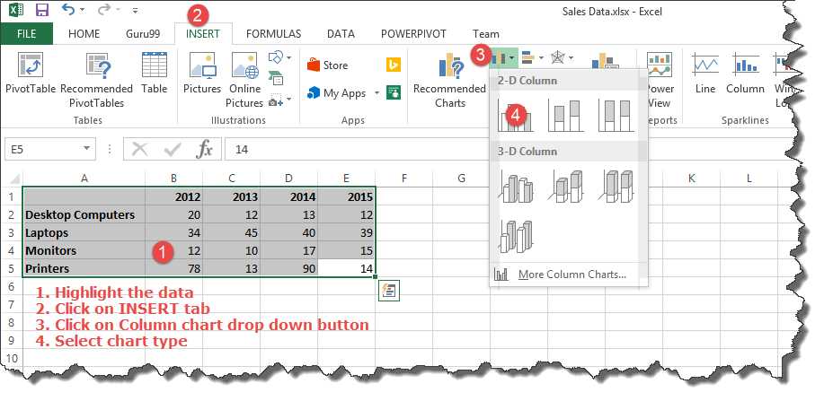
- Select the data you want to represent in graph
- Click on INSERT tab from the ribbon
- Click on the Column chart drop down button
- Select the chart type you want
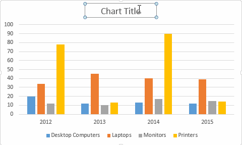
You should be able to see the following chart
Tutorial Exercise
When you select the chart, the ribbon activates the following tab

Try to apply the different chart styles, and other options presented in your chart.
Summary
Charts are a powerful way of graphically visualizing your data. Excel has many types of charts that you can use depending on your needs.
Conditional formatting is also another power formatting feature of Excel that helps us easily see the data that meets a specified condition
Источник
Types of Charts in Excel


List of Top 8 Types of Charts in MS Excel
- Column Charts in Excel
- Line Chart in Excel
- Pie Chart in Excel
- Bar Chart in ExcelBar Chart In ExcelBar charts in excel are helpful in the representation of the single data on the horizontal bar, with categories displayed on the Y-axis and values on the X-axis. To create a bar chart, we need at least two independent and dependent variables.read more
- Area Chart in ExcelArea Chart In ExcelThe area chart in Excel is a line chart that shows the impact and changes in various data series over time by separating them with lines and presenting them in different colors. The line chart is used to create this graph.read more
- Scatter Chart in Excel
- Stock Chart in ExcelStock Chart In ExcelStock chart in excel is also known as high low close chart in excel because it used to represent the conditions of data in markets such as stocks, the data is the changes in the prices of the stocks, we can insert it from insert tab and also there are actually four types of stock charts, high low close is the most used one as it has three series of price high end and low, we can use up to six series of prices in stock charts.read more
- Radar Chart in Excel
Let us discuss each of them in detail: –
Table of contents
Chart #1 – Column Chart
A column chart is a bar-shaped chart that has a bar placed on the X-axis. This type of chart in Excel is called a column chart because the bars are placed on the columns. Such charts are very useful in case we want to make a comparison.
Below are the steps for preparing a column chart in Excel:
- First, select the data and the “Insert” tab, then select the “Column” chart.
Then, the column chart looks like as given below:
Chart #2 – Line Chart
Line charts are used if we need to show the trend in data. They are more likely used in analysis rather than showing data visually.
In this chart, a line represents the data movement from one point to another.
- Select the data and “Insert” tab, then select the “Line” chart.
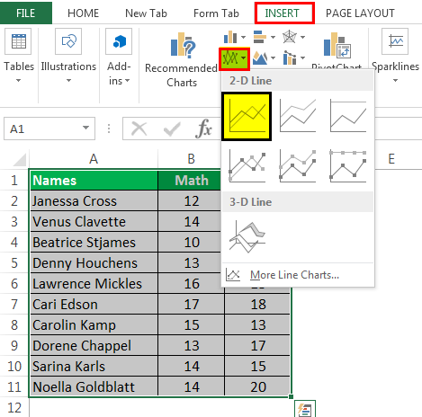
- Then, the line chart looks like as given below:

Chart #3 – Pie Chart
A pie chart is a circle-shaped chart capable of representing only one series of data. A pie chart has various variants that are 3-D charts and doughnut charts.
A circle-shaped chart divides itself into various portions to show the quantitative value.
- Select the data, go to the “Insert” tab, and select the “Pie” chart.
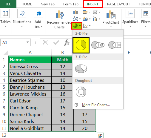
- Then, the pie chart looks like as given below:
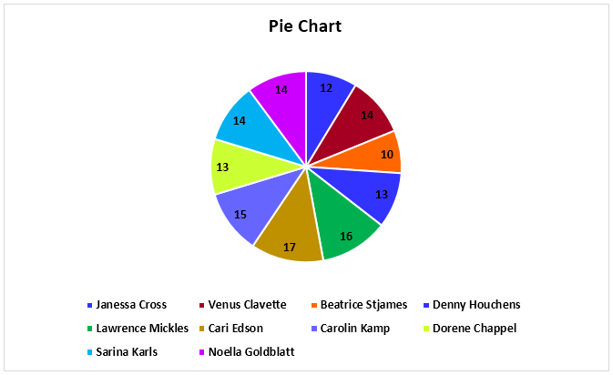
Chart #4 – Bar Chart
In the bar chart, the data is plotted on the Y-axis. That is why this is called a bar chart. Compared to the column chart, these charts use the Y-axis as the primary axis.
This chart is plotted in rows. That is why this is called a row chart.
- Select the data, go to the “Insert” tab, and then select the “Bar” chart.
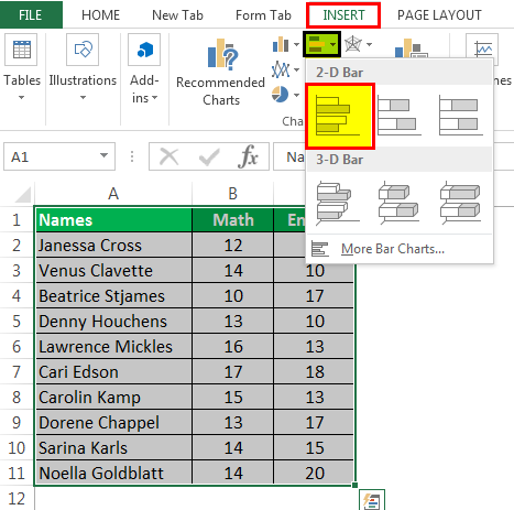
- Then, the bar chart looks like as given below:

Chart #5 – Area Chart
The area chart and the line charts are the same, but the difference that makes a line chart an area chart is that the space between the axis and the plotted value is colored and is not blank.
Using the stacked area chart, this becomes difficult to understand the data as space is colored with the same color for the magnitude that is the same for various datasets.
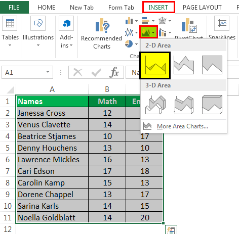
- Select the data, go to the “Insert” tab, and select the “Area” chart.
- Then, the area chart looks like as given below:
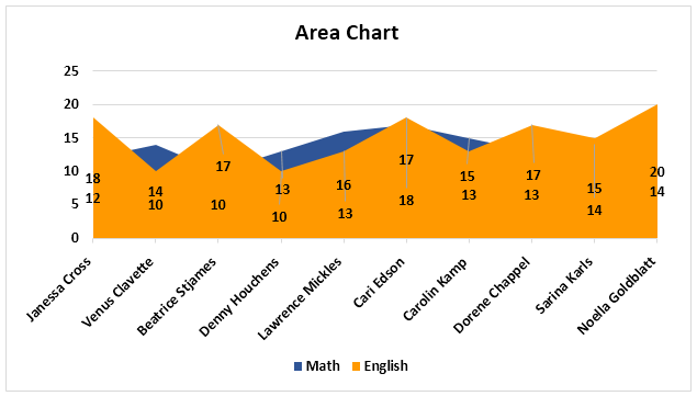
Chart #6 – Scatter Chart
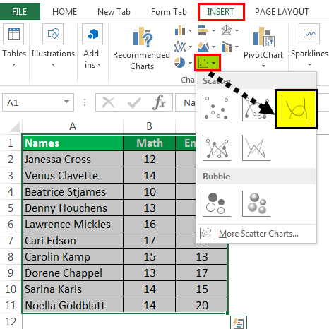
- Select the Data and go to Insert Tab, then select the Scatter Chart.
- Then, the scatter chart looks like as given below:
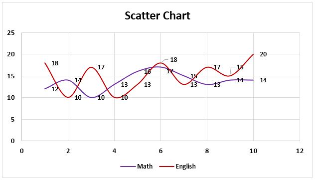
Chart #7 – Stock Chart
- Select the data, go to the “Insert” tab, and then select the “Stock” chart.
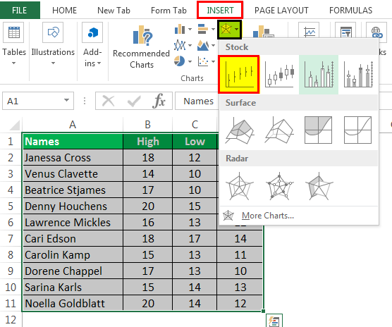
- Then, the stock chart looks like as given below:
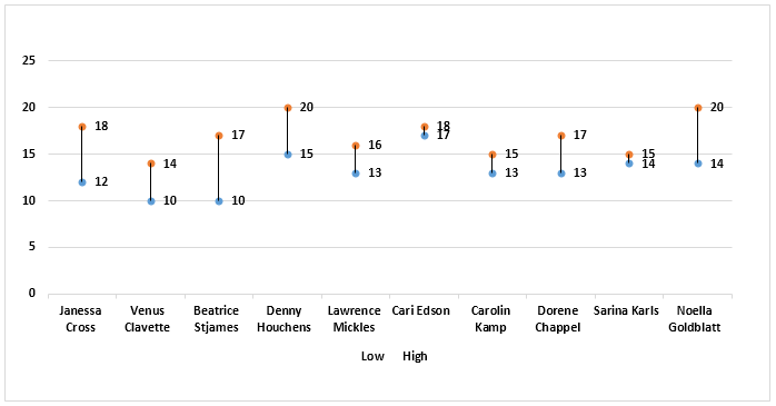
Chart #8 – Radar Chart
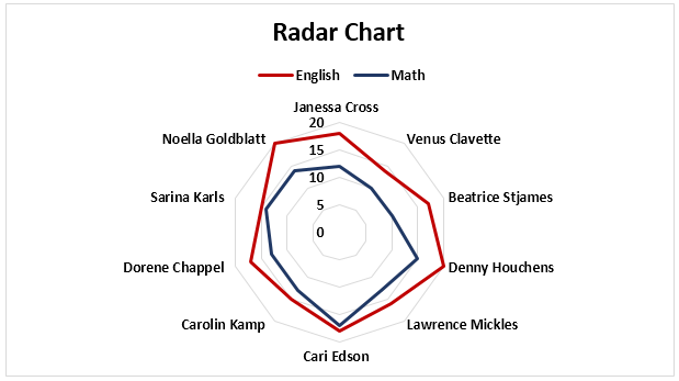
- Select the data and go to “Insert Tab.” Then, under the “Stock” chart, select the “Radar” chart.
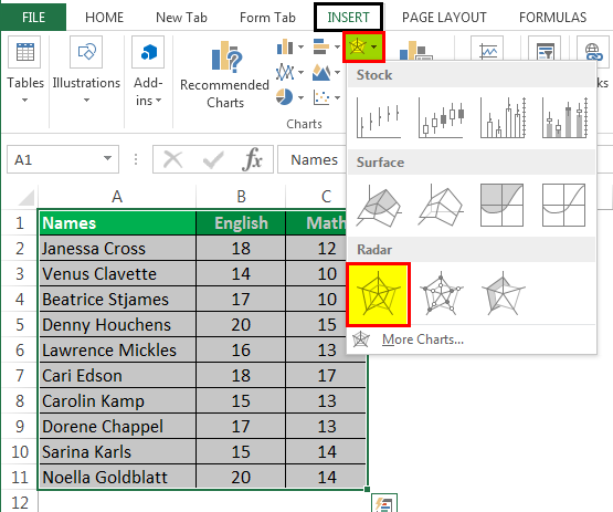
- Then, the radar chart looks like as given below:
Things to Remember
- If we copy a chart from one location to another, the data source will remain the same. However, it means that if we make any changes to the data set, both the charts will change, the primary and the copied.
- For the stock chart, there must be at least two data sets.
- We can only use a pie chart to represent one series of data. They cannot handle two data series.
- To keep the chart easy to understand, we should restrict the data series to two or three. Else, the chart will not be understandable.
- We must add data labels if we have decimals values to represent. If we do not add them, then we cannot understand the chart with accurate precision.
Recommended Articles
This article is a guide to Types of Charts in Excel. Here, we discuss the top 8 types of graphs in Excel, including column charts, line charts, scatter charts, radar charts, etc., along with practical examples and a downloadable Excel template. You may learn more about Excel from the following articles: –
Источник
Excel Charting Basics: How to Make a Chart and Graph
January 22, 2018 (updated May 3, 2022)
Organizations of all sizes and across all industries use Excel to store data. While spreadsheets are crucial for data management, they are often cumbersome and don’t provide team members with an easy-to-read view into data trends and relationships. Excel can help to transform your spreadsheet data into charts and graphs to create an intuitive overview of your data and make smart business decisions.
In this article, we’ll give you a step-by-step guide to creating a chart or graph in Excel 2016. Additionally, we’ll provide a comparison of the available chart and graph presets and when to use them, and explain related Excel functionality that you can use to build on to these simple data visualizations.
What Are Graphs and Charts in Excel?
Charts and graphs in Microsoft Excel provide a method to visualize numeric data. While both graphs and charts display sets of data points in relation to one another, charts tend to be more complex, varied, and dynamic.
People often use charts and graphs in presentations to give management, client, or team members a quick snapshot into progress or results. You can create a chart or graph to represent nearly any kind of quantitative data — doing so will save you the time and frustration of poring through spreadsheets to find relationships and trends.
It’s easy to create charts and graphs in Excel, especially since you can also store your data directly in an Excel Workbook, rather than importing data from another program. Excel also has a variety of preset chart and graph types so you can select one that best represents the data relationship(s) you want to highlight.
Tired of static spreadsheets? We were, too.
Although Microsoft Excel is familiar, you were never meant to manage work with it. See how Excel and Smartsheet compare across five factors: work management, collaboration, visibility, accessibility, and integrations.
When to Use Each Chart and Graph Type in Excel
Excel offers a large library of charts and graphs types to display your data. While multiple chart types might work for a given data set, you should select the chart that best fits the story that the data is telling.
In Excel 2016, there are five main categories of charts or graphs:
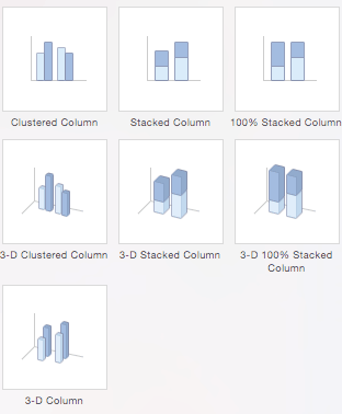
- Column Charts: Some of the most commonly used charts, column charts, are best used to compare information or if you have multiple categories of one variable (for example, multiple products or genres). Excel offers seven different column chart types: clustered, stacked, 100% stacked, 3-D clustered, 3-D stacked, 3-D 100% stacked, and 3-D, pictured below. Pick the visualization that will best tell your data’s story.
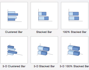
- Bar Charts: The main difference between bar charts and column charts are that the bars are horizontal instead of vertical. You can often use bar charts interchangeably with column charts, although some prefer column charts when working with negative values because it is easier to visualize negatives vertically, on a y-axis.
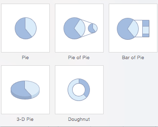
- Pie Charts: Use pie charts to compare percentages of a whole (“whole” is the total of the values in your data). Each value is represented as a piece of the pie so you can identify the proportions. There are five pie chart types: pie, pie of pie (this breaks out one piece of the pie into another pie to show its sub-category proportions), bar of pie, 3-D pie, and doughnut.
- Line Charts: A line chart is most useful for showing trends over time, rather than static data points. The lines connect each data point so that you can see how the value(s) increased or decreased over a period of time. The seven line chart options are line, stacked line, 100% stacked line, line with markers, stacked line with markers, 100% stacked line with markers, and 3-D line.
- Scatter Charts: Similar to line graphs, because they are useful for showing change in variables over time, scatter charts are used specifically to show how one variable affects another. (This is called correlation.) Note that bubble charts, a popular chart type, is categorized under scatter. There are seven scatter chart options: scatter, scatter with smooth lines and markers, scatter with smooth lines, scatter with straight lines and markers, scatter with straight lines, bubble, and 3-D bubble.
There are also four minor categories. These charts are more use case-specific:
- Area: Like line charts, area charts show changes in values over time. However, because the area beneath each line is solid, area charts are useful to call attention to the differences in change among multiple variables. There are six area charts: area, stacked area, 100% stacked area, 3-D area, 3-D stacked area, and 3-D 100% stacked area.
- Stock: Traditionally used to display the high, low, and closing price of stock, this type of chart is used in financial analysis and by investors. However, you can use them for any scenario if you want to display the range of a value (or the range of its predicted value) and its exact value. Choose from high-low-close, open-high-low-close, volume-high-low-close, and volume-open-high-low-close stock chart options.
- Surface: Use a surface chart to represent data across a 3-D landscape. This additional plane makes them ideal for large data sets, those with more than two variables, or those with categories within a single variable. However, surface charts can be difficult to read, so make sure your audience is familiar with them. You can choose from 3-D surface, wireframe 3-D surface, contour, and wireframe contour.
- Radar: When you want to display data from multiple variables in relation to each other use a radar chart. All variables begin from the central point. The key with radar charts is that you are comparing all individual variables in relation to each other — they are often used for comparing strengths and weaknesses of different products or employees. There are three radar chart types: radar, radar with markers, and filled radar.
Another popular chart is a waterfall chart, which is essentially a series of column graphs that show positive and negative changes over time. There is no Excel preset for a waterfall chart, but you can download a template to help make the process easier. For a full walkthrough, read How to Create a Waterfall Chart in Excel.

Top 5 Excel Chart and Graph Best Practices
Although Excel provides several layout and formatting presets to enhance the readability of your charts, you can maximize their effectiveness with other methods. Below are the top five best practices to make your charts and graphs as useful as possible:
Make It Clean: Cluttered graphs — those with excessive colors or texts — can be difficult to read and aren’t eye catching. Remove any unnecessary information so your audience can focus on the point you’re trying to get across.
Choose Appropriate Themes: Consider your audience, the topic, and the main point of your chart when selecting a theme. While it can be fun to experiment with different styles, choose the theme that best fits your purpose.
Use Text Wisely: While charts and graphs are primarily visual tools, you will likely include some text (such as titles or axis labels). Be concise but use descriptive language, and be intentional about the orientation of any text (for example, it’s irritating to turn your head to read text written sideways on the x-axis).
Place Elements Intelligently: Pay attention to where you place titles, legends, symbols, and any other graphical elements. They should enhance your chart, not detract from it.
Sort Data Prior to Creating the Chart: People often forget to sort data or remove duplicates before creating the chart, which makes the visual unintuitive and can result in errors.
How to Chart Data in Excel
To generate a chart or graph in Excel, you must first provide the program with the data you want to display. Follow the steps below to learn how to chart data in Excel 2016.
Step 1: Enter Data into a Worksheet
- Open Excel and select New Workbook.
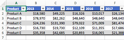
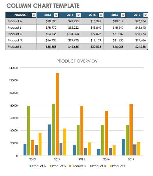
- Enter the data you want to use to create a graph or chart. In this example, we’re comparing the profit of five different products from 2013 to 2017. Be sure to include labels for your columns and rows. Doing so enables you to translate the data into a chart or graph with clear axis labels. You can download this sample data below.
Step 2: Select Range to Create Chart or Graph from Workbook Data
- Highlight the cells that contain the data you want to use in your graph by clicking and dragging your mouse across the cells.
- Your cell range will now be highlighted in gray and you can select a chart type.
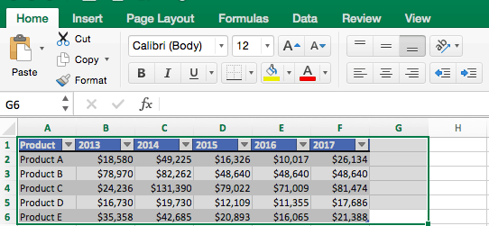
In the following section, we’ll walk you through the specifics of creating a clustered column chart in Excel 2016.
How to Make a Chart in Excel
After you input your data and select the cell range, you’re ready to choose the chart type. In this example, we’ll create a clustered column chart from the data we used in the previous section.
Step 1: Select Chart Type
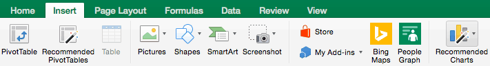
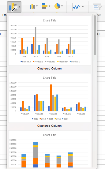
Once your data is highlighted in the Workbook, click the Insert tab on the top banner. About halfway across the toolbar is a section with several chart options. Excel provides Recommended Charts based on popularity, but you can click any of the dropdown menus to select a different template.

Step 2: Create Your Chart
- From the Insert tab, click the column chart icon and select Clustered Column.

- Excel will automatically create a clustered chart column from your selected data. The chart will appear in the center of your workbook.
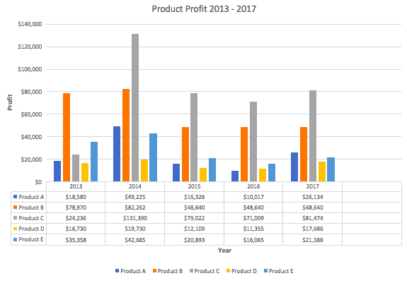
- To name your chart, double click the Chart Title text in the chart and type a title. We’ll call this chart “Product Profit 2013 — 2017.”

We’ll use this chart for the rest of the walkthrough. You can download this same chart to follow along.
There are two tabs on the toolbar that you will use to make adjustments to your chart: Chart Design and Format. Excel automatically applies design, layout, and format presets to charts and graphs, but you can add customization by exploring the tabs. Next, we’ll walk you through all the available adjustments in Chart Design.

Step 3: Add Chart Elements
Adding chart elements to your chart or graph will enhance it by clarifying data or providing additional context. You can select a chart element by clicking on the Add Chart Element dropdown menu in the top left-hand corner (beneath the Home tab).

To Display or Hide Axes:
- Select Axes. Excel will automatically pull the column and row headers from your selected cell range to display both horizontal and vertical axes on your chart (Under Axes, there is a check mark next to Primary Horizontal and Primary Vertical.)


To Add Axis Titles:
- Click Add Chart Element and click Axis Titles from the dropdown menu. Excel will not automatically add axis titles to your chart; therefore, both Primary Horizontal and Primary Vertical will be unchecked.


To Remove or Move Chart Title:
- Click Add Chart Element and click Chart Title. You will see four options: None, Above Chart, Centered Overlay, and More Title Options.


To Add Data Labels:
- Click Add Chart Element and click Data Labels. There are six options for data labels: None (default), Center, Inside End, Inside Base, Outside End, and More Data Label Title Options.


To Add a Data Table:
- Click Add Chart Element and click Data Table. There are three pre-formatted options along with an extended menu that can be found by clicking More Data Table Options:

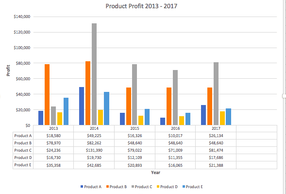
Note: If you choose to include a data table, you’ll probably want to make your chart larger to accommodate the table. Simply click the corner of your chart and use drag-and-drop to resize your chart.
To Add Error Bars:
- Click Add Chart Element and click Error Bars. In addition to More Error Bars Options, there are four options: None (default), Standard Error, 5% (Percentage), and Standard Deviation. Adding error bars provide a visual representation of the potential error in the shown data, based on different standard equations for isolating error.


To Add Gridlines:
- Click Add Chart Element and click Gridlines. In addition to More Grid Line Options, there are four options: Primary Major Horizontal, Primary Major Vertical, Primary Minor Horizontal, and Primary Minor Vertical. For a column chart, Excel will add Primary Major Horizontal gridlines by default.

To Add a Legend:
- Click Add Chart Element and click Legend. In addition to More Legend Options, there are five options for legend placement: None, Right, Top, Left, and Bottom.


To Add Lines: Lines are not available for clustered column charts. However, in other chart types where you only compare two variables, you can add lines (e.g. target, average, reference, etc.) to your chart by checking the appropriate option.
To Add a Trendline:
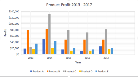
- Click Add Chart Element and click Trendline. In addition to More Trendline Options, there are five options: None (default), Linear, Exponential, Linear Forecast, and Moving Average. Check the appropriate option for your data set. In this example, we will click Linear.


Note: You can create separate trendlines for as many variables in your chart as you like. For example, here is our chart with trendlines for Product A and Product C.

To Add Up/Down Bars: Up/Down Bars are not available for a column chart, but you can use them in a line chart to show increases and decreases among data points.
Step 4: Adjust Quick Layout
- The second dropdown menu on the toolbar is Quick Layout, which allows you to quickly change the layout of elements in your chart (titles, legend, clusters etc.).


Step 5: Change Colors
The next dropdown menu in the toolbar is Change Colors. Click the icon and choose the color palette that fits your needs (these needs could be aesthetic, or to match your brand’s colors and style).

Step 6: Change Style
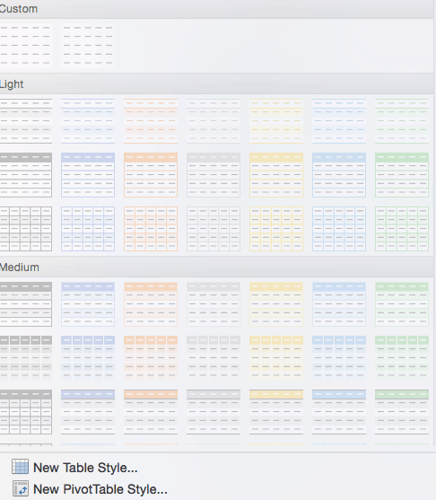
For cluster column charts, there are 14 chart styles available. Excel will default to Style 1, but you can select any of the other styles to change the chart appearance. Use the arrow on the right of the image bar to view other options.

Step 7: Switch Row/Column
- Click the Switch Row/Column on the toolbar to flip the axes. Note: It is not always intuitive to flip axes for every chart, for example, if you have more than two variables.

In this example, switching the row and column swaps the product and year (profit remains on the y-axis). The chart is now clustered by product (not year), and the color-coded legend refers to the year (not product). To avoid confusion here, click on the legend and change the titles from Series to Years.

Step 8: Select Data
- Click the Select Data icon on the toolbar to change the range of your data.


Step 9: Change Chart Type
- Click the Change Chart Type dropdown menu.


You can also save your chart as a template by clicking Save as Template…
A dialogue box will open where you can name your template. Excel will automatically create a folder for your templates for easy organization. Click the blue Save button.

Step 10: Move Chart
- Click the Move Chart icon on the far right of the toolbar.


Step 11: Change Formatting
- The Format tab allows you to change formatting of all elements and text in the chart, including colors, size, shape, fill, and alignment, and the ability to insert shapes. Click the Format tab and use the shortcuts available to create a chart that reflects your organization’s brand (colors, images, etc.).


Step 12: Delete a Chart
To delete a chart, simply click on it and click the Delete key on your keyboard.
How to Make a Graph in Excel
Because graphs and charts serve similar functions, Excel groups all graphs under the “chart” category. To create a graph in Excel, follow the steps below.
Select Range to Create a Graph from Workbook Data
- Highlight the cells that contain the data you want to use in your graph by clicking and dragging your mouse across the cells.
- Your cell range will now be highlighted in gray.
Now you have a graph. To customize your graph, you can follow the same steps explained in the previous section. All functionality for creating a chart remains the same when creating a graph.
How to Create a Table in Excel
If you don’t need to visualize your data, you can create a table in Excel instead. There are two ways to format a data set as a table: manually, or with the Format as a Table button.
- Manually: In this example, we manually added data and formatted as a table by including column and row names (products and years).
- Use Excel’s Format as Table Preset: You can also input raw data (numbers without any column and row names).
- To format data as a table, click and drag your mouse across the cells with the data range, click the Home tab, and click the Format as Table drop-down menu on the toolbar.
Excel is one of the most widely-used tools across all industries and types of organizations. Charts and graphs are great tools to visualize your work, but there are many ways to elevate your data in Excel.
We’ve created a list of additional features that allow you to do more with your data:
- Pivot Tables: A pivot table allows you to extract certain columns or rows from a data set and reorganize or summarize that subset in a report. This is useful tool if you only want to view a particular segment of a large data set, or if you want to view data from a new perspective.
- Conditional Formatting: A powerful feature that allows you to apply specific formatting to certain cells in your spreadsheet. You can use conditional formatting to highlight key pieces of information, track changes, see deadlines, and perform many other data organization functions.
- Dashboards: A powerful, visual reporting feature that pulls data from one or several datasets to display key performance indicators (KPIs), project or task status, and several other metrics. This gives the audience (team members, executives, clients, etc.) a snapshot view into project progress without surfacing private information.
- Collaborative Charts: To avoid version control issues and allow multiple team members to edit a chart simultaneously, you’ll want to use a collaborative chart tool. The desktop versions of Excel do not support this, but you can use Excel for Office 365, Microsoft’s cloud-based web application, or several other online chart tools.
- Data Series: A data series is any row or column stored in your workbook that you’ve plotted into a chart or graph. Once you’ve created your chart, you can add additional data series to it: Simply highlight the additional data you want to add and the chart will automatically update.
Make Better Decisions, Faster with Charts in Smartsheet
Empower your people to go above and beyond with a flexible platform designed to match the needs of your team — and adapt as those needs change.
The Smartsheet platform makes it easy to plan, capture, manage, and report on work from anywhere, helping your team be more effective and get more done. Report on key metrics and get real-time visibility into work as it happens with roll-up reports, dashboards, and automated workflows built to keep your team connected and informed.
When teams have clarity into the work getting done, there’s no telling how much more they can accomplish in the same amount of time. Try Smartsheet for free, today.
Источник
Adblock
detector

| S/N | CHART TYPE | WHEN SHOULD I USE IT? | EXAMPLE |
|---|---|---|---|
| 1 | Pie Chart | When you want to quantify items and show them as percentages. | |
| 2 | Bar Chart | When you want to compare values across a few categories. The values run horizontally | |
| 3 | Column chart | When you want to compare values across a few categories. The values run vertically | |
| 4 | Line chart | When you want to visualize trends over a period of time i.e. months, days, years, etc. | |
| 5 | Combo Chart | When you want to highlight different types of information |
List of Top 8 Types of Charts in MS Excel
- Column Charts in Excel
- Line Chart in Excel
- Pie Chart in Excel
- Bar Chart in ExcelBar charts in excel are helpful in the representation of the single data on the horizontal bar, with categories displayed on the Y-axis and values on the X-axis. To create a bar chart, we need at least two independent and dependent variables.read more
- Area Chart in ExcelThe area chart in Excel is a line chart that shows the impact and changes in various data series over time by separating them with lines and presenting them in different colors. The line chart is used to create this graph.read more
- Scatter Chart in Excel
- Stock Chart in ExcelStock chart in excel is also known as high low close chart in excel because it used to represent the conditions of data in markets such as stocks, the data is the changes in the prices of the stocks, we can insert it from insert tab and also there are actually four types of stock charts, high low close is the most used one as it has three series of price high end and low, we can use up to six series of prices in stock charts.read more
- Radar Chart in Excel
Let us discuss each of them in detail: –
Table of contents
- List of Top 8 Types of Charts in MS Excel
- Chart #1 – Column Chart
- Chart #2 – Line Chart
- Chart #3 – Pie Chart
- Chart #4 – Bar Chart
- Chart #5 – Area Chart
- Chart #6 – Scatter Chart
- Chart #7 – Stock Chart
- Chart #8 – Radar Chart
- Things to Remember
- Recommended Articles
You can download this Types of Charts Excel Template here – Types of Charts Excel Template
Chart #1 – Column Chart
In this type of chart, the data is plotted in columns. Therefore, it is called a column chartColumn chart is used to represent data in vertical columns. The height of the column represents the value for the specific data series in a chart, the column chart represents the comparison in the form of column from left to right.read more.
A column chart is a bar-shaped chart that has a bar placed on the X-axis. This type of chart in Excel is called a column chart because the bars are placed on the columns. Such charts are very useful in case we want to make a comparison.
Below are the steps for preparing a column chart in Excel:
- First, select the data and the “Insert” tab, then select the “Column” chart.

- Then, the column chart looks like as given below:

Chart #2 – Line Chart
Line charts are used if we need to show the trend in data. They are more likely used in analysis rather than showing data visually.
In this chart, a line represents the data movement from one point to another.
- Select the data and “Insert” tab, then select the “Line” chart.
- Then, the line chart looks like as given below:
Chart #3 – Pie Chart
A pie chart is a circle-shaped chart capable of representing only one series of data. A pie chart has various variants that are 3-D charts and doughnut charts.
A circle-shaped chart divides itself into various portions to show the quantitative value.
- Select the data, go to the “Insert” tab, and select the “Pie” chart.
- Then, the pie chart looks like as given below:
Chart #4 – Bar Chart
In the bar chart, the data is plotted on the Y-axis. That is why this is called a bar chart. Compared to the column chart, these charts use the Y-axis as the primary axis.
This chart is plotted in rows. That is why this is called a row chart.
- Select the data, go to the “Insert” tab, and then select the “Bar” chart.
- Then, the bar chart looks like as given below:
Chart #5 – Area Chart
The area chart and the line charts are the same, but the difference that makes a line chart an area chart is that the space between the axis and the plotted value is colored and is not blank.
Using the stacked area chart, this becomes difficult to understand the data as space is colored with the same color for the magnitude that is the same for various datasets.
- Select the data, go to the “Insert” tab, and select the “Area” chart.
- Then, the area chart looks like as given below:
Chart #6 – Scatter Chart
The scatter chart in excelScatter plot in excel is a two dimensional type of chart to represent data, it has various names such XY chart or Scatter diagram in excel, in this chart we have two sets of data on X and Y axis who are co-related to each other, this chart is mostly used in co-relation studies and regression studies of data.read more plots the data on the coordinates.
- Select the Data and go to Insert Tab, then select the Scatter Chart.
- Then, the scatter chart looks like as given below:
Chart #7 – Stock Chart
Such charts are used in stock exchangesStock exchange refers to a market that facilitates the buying and selling of listed securities such as public company stocks, exchange-traded funds, debt instruments, options, etc., as per the standard regulations and guidelines—for instance, NYSE and NASDAQ.read more or to represent the change in the price of shares.
- Select the data, go to the “Insert” tab, and then select the “Stock” chart.
- Then, the stock chart looks like as given below:
Chart #8 – Radar Chart
The radar chartRadar chart in excel is also known as the spider chart in excel or Web or polar chart in excel, it is used to demonstrate data in two dimensional for two or more than two data series, the axes start on the same point in radar chart, this chart is used to do comparison between more than one or two variables, there are three different types of radar charts available to use in excel.read more is similar to the spider web, often called a web chat.
- Select the data and go to “Insert Tab.” Then, under the “Stock” chart, select the “Radar” chart.
- Then, the radar chart looks like as given below:
Things to Remember
- If we copy a chart from one location to another, the data source will remain the same. However, it means that if we make any changes to the data set, both the charts will change, the primary and the copied.
- For the stock chart, there must be at least two data sets.
- We can only use a pie chart to represent one series of data. They cannot handle two data series.
- To keep the chart easy to understand, we should restrict the data series to two or three. Else, the chart will not be understandable.
- We must add data labels if we have decimals values to represent. If we do not add them, then we cannot understand the chart with accurate precision.
Recommended Articles
This article is a guide to Types of Charts in Excel. Here, we discuss the top 8 types of graphs in Excel, including column charts, line charts, scatter charts, radar charts, etc., along with practical examples and a downloadable Excel template. You may learn more about Excel from the following articles: –
- Create Grouped Bar Chart in ExcelGrouped Bar Chart is a Bar Chart type that blends & compares various categories of 2 or more data sets. It is also known as Multi-Series Bar Chart & helps in the efficient interpretation of differences. read more
- Chart Wizard in ExcelThe Chart Wizard in Excel is a type of wizard that walks users through the process of inserting a chart into an Excel spreadsheet in a step-by-step manner.read more
- How to make Graphs/Charts in Excel?In Excel, a graph or chart lets us visualize information we’ve gathered from our data. It allows us to visualize data in easy-to-understand pictorial ways. The following components are required to create charts or graphs in Excel: 1 — Numerical Data, 2 — Data Headings, and 3 — Data in Proper Order.read more
- Doughnut Excel ChartA doughnut chart is a type of excel chart whose visualization is similar to pie chart. The categories in this chart are parts that, when combined, represent the whole data in the chart. A doughnut chart can only be made using data in rows or columns.read more
A picture is worth of thousand words; a chart is worth of thousand sets of data. In this tutorial, we are going to learn how we can use graph in Excel to visualize our data.
What is a chart?
A chart is a visual representative of data in both columns and rows. Charts are usually used to analyse trends and patterns in data sets. Let’s say you have been recording the sales figures in Excel for the past three years. Using charts, you can easily tell which year had the most sales and which year had the least. You can also draw charts to compare set targets against actual achievements.
We will use the following data for this tutorial.
Note: we will be using Excel 2013. If you have a lower version, then some of the more advanced features may not be available to you.
| Item | 2012 | 2013 | 2014 | 2015 |
|---|---|---|---|---|
| Desktop Computers | 20 | 12 | 13 | 12 |
| Laptops | 34 | 45 | 40 | 39 |
| Monitors | 12 | 10 | 17 | 15 |
| Printers | 78 | 13 | 90 | 14 |
Different scenarios require different types of charts. Towards this end, Excel provides a number of chart types that you can work with. The type of chart that you choose depends on the type of data that you want to visualize. To help simplify things for the users, Excel 2013 and above has an option that analyses your data and makes a recommendation of the chart type that you should use.
The following table shows some of the most commonly used Excel charts and when you should consider using them.
| S/N | CHART TYPE | WHEN SHOULD I USE IT? | EXAMPLE |
|---|---|---|---|
| 1 | Pie Chart | When you want to quantify items and show them as percentages. |
|
| 2 | Bar Chart | When you want to compare values across a few categories. The values run horizontally |
|
| 3 | Column chart | When you want to compare values across a few categories. The values run vertically |
|
| 4 | Line chart | When you want to visualize trends over a period of time i.e. months, days, years, etc. |
|
| 5 | Combo Chart | When you want to highlight different types of information |
|
The importance of charts
- Allows you to visualize data graphically
- It’s easier to analyse trends and patterns using charts in MS Excel
- Easy to interpret compared to data in cells
Step by step example of creating charts in Excel
In this tutorial, we are going to plot a simple column chart in Excel that will display the sold quantities against the sales year. Below are the steps to create chart in MS Excel:
- Open Excel
- Enter the data from the sample data table above
- Your workbook should now look as follows
To get the desired chart you have to follow the following steps
- Select the data you want to represent in graph
- Click on INSERT tab from the ribbon
- Click on the Column chart drop down button
- Select the chart type you want
You should be able to see the following chart
Tutorial Exercise
When you select the chart, the ribbon activates the following tab
Try to apply the different chart styles, and other options presented in your chart.
Download the above Excel Template
Summary
Charts are a powerful way of graphically visualizing your data. Excel has many types of charts that you can use depending on your needs.
Conditional formatting is also another power formatting feature of Excel that helps us easily see the data that meets a specified condition

In Microsoft Excel, a chart is often called a graph. It is a visual representation of data from a worksheet that can bring more understanding to the data than just looking at the numbers.
A chart is a powerful tool that allows you to visually display data in a variety of different chart formats such as Bar, Column, Pie, Line, Area, Doughnut, Scatter, Surface, or Radar charts. With Excel, it is easy to create a chart.
Here are some of the types of charts that you can create in Excel.
Bar Chart

- How to create a bar chart in Excel 2016 | 2010 | 2007
Column Chart
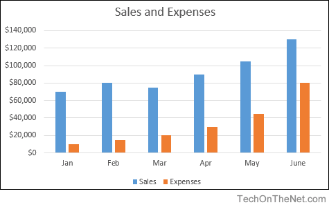
- How to create a column chart in Excel 2016 | 2010 | 2007
Pie Chart
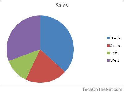
- How to create a pie chart in Excel 2016 | Excel 2007
Line Chart
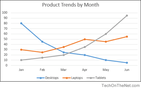
- How to create a line chart in Excel 2016 | Excel 2007
Advanced Charting
- Create a column/line chart with 8 columns and 1 line in Excel 2003
- Create a chart with two Y-axes and one shared X-axis in Excel 2007
After you input your data and select the cell range, you’re ready to choose the chart type. In this example, we’ll create a clustered column chart from the data we used in the previous section.
Step 1: Select Chart Type
Once your data is highlighted in the Workbook, click the Insert tab on the top banner. About halfway across the toolbar is a section with several chart options. Excel provides Recommended Charts based on popularity, but you can click any of the dropdown menus to select a different template.
Step 2: Create Your Chart
- From the Insert tab, click the column chart icon and select Clustered Column.
- Excel will automatically create a clustered chart column from your selected data. The chart will appear in the center of your workbook.
- To name your chart, double click the Chart Title text in the chart and type a title. We’ll call this chart “Product Profit 2013 — 2017.”
We’ll use this chart for the rest of the walkthrough. You can download this same chart to follow along.
Download Sample Column Chart Template
There are two tabs on the toolbar that you will use to make adjustments to your chart: Chart Design and Format. Excel automatically applies design, layout, and format presets to charts and graphs, but you can add customization by exploring the tabs. Next, we’ll walk you through all the available adjustments in Chart Design.
Step 3: Add Chart Elements
Adding chart elements to your chart or graph will enhance it by clarifying data or providing additional context. You can select a chart element by clicking on the Add Chart Element dropdown menu in the top left-hand corner (beneath the Home tab).
To Display or Hide Axes:
- Select Axes. Excel will automatically pull the column and row headers from your selected cell range to display both horizontal and vertical axes on your chart (Under Axes, there is a check mark next to Primary Horizontal and Primary Vertical.)

- Uncheck these options to remove the display axis on your chart. In this example, clicking Primary Horizontal will remove the year labels on the horizontal axis of your chart.

- Click More Axis Options… from the Axes dropdown menu to open a window with additional formatting and text options such as adding tick marks, labels, or numbers, or to change text color and size.

To Add Axis Titles:
- Click Add Chart Element and click Axis Titles from the dropdown menu. Excel will not automatically add axis titles to your chart; therefore, both Primary Horizontal and Primary Vertical will be unchecked.
- To create axis titles, click Primary Horizontal or Primary Vertical and a text box will appear on the chart. We clicked both in this example. Type your axis titles. In this example, the we added the titles “Year” (horizontal) and “Profit” (vertical).

To Remove or Move Chart Title:
- Click Add Chart Element and click Chart Title. You will see four options: None, Above Chart, Centered Overlay, and More Title Options.

- Click None to remove chart title.
- Click Above Chart to place the title above the chart. If you create a chart title, Excel will automatically place it above the chart.
- Click Centered Overlay to place the title within the gridlines of the chart. Be careful with this option: you don’t want the title to cover any of your data or clutter your graph (as in the example below).
To Add Data Labels:
- Click Add Chart Element and click Data Labels. There are six options for data labels: None (default), Center, Inside End, Inside Base, Outside End, and More Data Label Title Options.

- The four placement options will add specific labels to each data point measured in your chart. Click the option you want. This customization can be helpful if you have a small amount of precise data, or if you have a lot of extra space in your chart. For a clustered column chart, however, adding data labels will likely look too cluttered. For example, here is what selecting Center data labels looks like:

To Add a Data Table:
- Click Add Chart Element and click Data Table. There are three pre-formatted options along with an extended menu that can be found by clicking More Data Table Options:

Note: If you choose to include a data table, you’ll probably want to make your chart larger to accommodate the table. Simply click the corner of your chart and use drag-and-drop to resize your chart.
To Add Error Bars:
- Click Add Chart Element and click Error Bars. In addition to More Error Bars Options, there are four options: None (default), Standard Error, 5% (Percentage), and Standard Deviation. Adding error bars provide a visual representation of the potential error in the shown data, based on different standard equations for isolating error.

- For example, when we click Standard Error from the options we get a chart that looks like the image below.

To Add Gridlines:
- Click Add Chart Element and click Gridlines. In addition to More Grid Line Options, there are four options: Primary Major Horizontal, Primary Major Vertical, Primary Minor Horizontal, and Primary Minor Vertical. For a column chart, Excel will add Primary Major Horizontal gridlines by default.

- You can select as many different gridlines as you want by clicking the options. For example, here is what our chart looks like when we click all four gridline options.
To Add a Legend:
- Click Add Chart Element and click Legend. In addition to More Legend Options, there are five options for legend placement: None, Right, Top, Left, and Bottom.

- Legend placement will depend on the style and format of your chart. Check the option that looks best on your chart. Here is our chart when we click the Right legend placement.

To Add Lines: Lines are not available for clustered column charts. However, in other chart types where you only compare two variables, you can add lines (e.g. target, average, reference, etc.) to your chart by checking the appropriate option.
To Add a Trendline:
- Click Add Chart Element and click Trendline. In addition to More Trendline Options, there are five options: None (default), Linear, Exponential, Linear Forecast, and Moving Average. Check the appropriate option for your data set. In this example, we will click Linear.

- Because we are comparing five different products over time, Excel creates a trendline for each individual product. To create a linear trendline for Product A, click Product A and click the blue OK button.

- The chart will now display a dotted trendline to represent the linear progression of Product A. Note that Excel has also added Linear (Product A) to the legend.

- To display the trendline equation on your chart, double click the trendline. A Format Trendline window will open on the right side of your screen. Click the box next to Display equation on chart at the bottom of the window. The equation now appears on your chart.

Note: You can create separate trendlines for as many variables in your chart as you like. For example, here is our chart with trendlines for Product A and Product C.
To Add Up/Down Bars: Up/Down Bars are not available for a column chart, but you can use them in a line chart to show increases and decreases among data points.
Step 4: Adjust Quick Layout
- The second dropdown menu on the toolbar is Quick Layout, which allows you to quickly change the layout of elements in your chart (titles, legend, clusters etc.).

- There are 11 quick layout options. Hover your cursor over the different options for an explanation and click the one you want to apply.

Step 5: Change Colors
The next dropdown menu in the toolbar is Change Colors. Click the icon and choose the color palette that fits your needs (these needs could be aesthetic, or to match your brand’s colors and style).
Step 6: Change Style
For cluster column charts, there are 14 chart styles available. Excel will default to Style 1, but you can select any of the other styles to change the chart appearance. Use the arrow on the right of the image bar to view other options.
Step 7: Switch Row/Column
- Click the Switch Row/Column on the toolbar to flip the axes. Note: It is not always intuitive to flip axes for every chart, for example, if you have more than two variables.

In this example, switching the row and column swaps the product and year (profit remains on the y-axis). The chart is now clustered by product (not year), and the color-coded legend refers to the year (not product). To avoid confusion here, click on the legend and change the titles from Series to Years.
Step 8: Select Data
- Click the Select Data icon on the toolbar to change the range of your data.
- A window will open. Type the cell range you want and click the OK button. The chart will automatically update to reflect this new data range.

Step 9: Change Chart Type
- Click the Change Chart Type dropdown menu.

- Here you can change your chart type to any of the nine chart categories that Excel offers. Of course, make sure that your data is appropriate for the chart type you choose.

-
You can also save your chart as a template by clicking Save as Template…
- A dialogue box will open where you can name your template. Excel will automatically create a folder for your templates for easy organization. Click the blue Save button.

Step 10: Move Chart
- Click the Move Chart icon on the far right of the toolbar.
- A dialogue box appears where you can choose where to place your chart. You can either create a new sheet with this chart (New sheet) or place this chart as an object in another sheet (Object in). Click the blue OK button.

Step 11: Change Formatting
- The Format tab allows you to change formatting of all elements and text in the chart, including colors, size, shape, fill, and alignment, and the ability to insert shapes. Click the Format tab and use the shortcuts available to create a chart that reflects your organization’s brand (colors, images, etc.).

- Click the dropdown menu on the top left side of the toolbar and click the chart element you are editing.
Step 12: Delete a Chart
To delete a chart, simply click on it and click the Delete key on your keyboard.
List of All Excel Charts & How to Use Them (2023 Tutorial)
One of the big reasons that make Microsoft Excel a great spreadsheet software is the charts that it has to offer 📊
Yes, people, you heard that right! Charts.
Microsoft Excel has a huge variety of charts to offer. You cannot only use Excel to store data but also to represent your data – in many shapes and forms.
What are the charts offered by Excel? And how and when can you use them? I will walk you through that in the guide below. Stay tuned.
To practice making a chart along with the guide download our free sample workbook here 📩
How to create a chart in Excel
Excel has simplified creating charts like something. To create a chart in Excel, you must have your data organized in rows or columns, and that’s it.
For example, here we have a dataset that tells the preferences for different brands among people 🛒

To turn this dataset into a chart:
- Select the data (don’t mind including the headers.)

- Go to the Insert tab > Recommended charts.

- Go to All Charts.
- Select any desired chart (from the list on the left side). We are making a pie chart out of it 🥧

Hover your cursor on any chart to see a preview of how your data would look when presented in that chart type.
- Click Okay and there comes your chart.

Alt-text:
It is only that easy to create a chart in Excel. Try creating different charts similarly in Excel.
But! Must know that different chart types suit different data types. The right chart for your data will depend upon your needs and your dataset 🤔
Change chart layout and design
When you create a chart in Excel, you’ll see it coming in the default chart style.
But you don’t have to go with those colors, styles, and layouts. You can instantly change them using the (so many) editing options offered by Excel 🎨
However, changing the colors, elements (and so much more) individually across the entire chart might cost you hours.
To your good, Excel has many layouts and styles for you to instantly change how your chart looks. And honestly speaking, it is only about a click🖱
Changing the Chart Layout
As the name suggests, chart layout changes the overall layout of your chart. It will reposition the elements, change how they look, add some, or even delete some of them under different layouts 😍
To change the layout of your chart:
- Select your chart (taking the same one from our example above).
Once you have selected the chart, you’d see two new tabs appearing on the Ribbon. The Chart Design tab and the Format tab.
- Go to the Chart Design tab > Quick Layouts button.

- Hover your cursor over the Quick Layouts button. And you’d see a menu of layouts 👁

- Hover the cursor over any layout to preview how it looks.
- Choose the layout you like by clicking on it.

Like we have chosen layout 7 here 7️⃣

Changing the Chart Design
Now that we have seen how to change the layout of any chart in Excel, let me tell you – changing chart designs in Excel is equally easy 🎭
You can try applying a wide variety of designs to your charts in Excel by following the steps below:
- Select the Chart.
- Go to the Chart Design Tab > Chart Styles Group.

You see that large drawer of designs. Those are not all.
- Click on the drop-down menu icon to the right of these styles to see more of them 🙈

- Hover your cursor over different chart styles to have a quick preview of each of them.
- Click on the one you like to have applied to your chart.
Like we tried Style 8 here 💡

List of all Excel chart types
We are off on a rollercoaster ride that won’t be ending anytime soon. Coming next is a long (very long) list of charts offered by Excel 💁♀️
So fasten your seat belts and here we go.
Bar Chart
A bar chart represents data in the form of bars (can be horizontal or vertical) 📊
To make a bar chart out of your dataset, it must be organized in the form of rows or columns.
Here is what a bar chart looks like.

All of these charts can be made in both, 2-D and 3-D styles 🕶
Column Chart
If you have your data plotted in columns (or even rows), you can plot a column chart out of it.
Like a bar chart representing each category of data in the form of horizontal bars, a column chart does the same in the form of vertical bars. Here is what it looks like 🧐

A column chart can take different shapes like stacked column charts where columns are stacked over one another.
Or a 100% stacked column chart where data is plotted in percentages. For all these charts, you can choose a simple 2D or 3D chart type 😍
Learn more about making Column Charts in Excel here.
XY Scatter Charts
If you have two-dimensional data in Excel, there’s a high chance a scatter plot will visualize it the best. Simply arrange your data into rows or columns with the data for any one axis in one row (or column) and the data for the other axis in the corresponding row (or column).
Excel will mark dots on each intersecting point of the X and Y axis values and return a scatter plot that looks like below 🕊

With large datasets, scatter plots make comparisons a lot easier. To learn how to make a scatter plot in Excel, hop on here.
Line Chart
If your data talks about time – a line chart is the best to visualize it like a trend over time.
In a line chart, categories are distributed across the y-axis. And time is spread across the y-axis. A line chart will show the distribution of data over time in the form of a continuous line.
This way line charts are ideal for showing trends over time 🏹
Here is what a line chart looks like:

You can make a line chart with markers where each data point is highlighted with markers (prominent dots).
Pro Tip!
A line chart works best with multiple datasets. If you have only a single dataset (trend) to show, a scatter plot may also work 👩🏭
However, for multiple datasets, a line chart is better. This is because it helps make a comparison between different trends displayed together.
Line charts are of the following types:
- Stacked Line charts
- 3-D Line charts
- 100% Stacked Line charts
Doughnut/Pie Chart
A doughnut chart is called such because it looks like a doughnut. No jokes – it does. 🍩
Check it out here.

And a Pie chart looks just like a round pie with slices 🍕

Both these charts represent data in the form of slices. And so, they are used to show the proportion of different categories in the whole dataset.
Bigger the category, the bigger the slice, and vice versa.
This helps data visualization as you can take a look into the chart to readily tell which item makes the biggest (or the smallest) part of the dataset 🔎
How to make a pie chart/doughnut chart in Excel? Learn here.
A pie chart only suits a dataset with 7 categories (at most). If your data has too many categories to present, the doughnut/pie chart may become a mess with too many slices to it.
Such a tightly packed pie chart makes it hard to visualize the data ❌
Bubble Chart
A bubble is a chart with bubbles – yes, here’s what it looks like.

A bubble chart is an enhanced version of a scatter plot. Just like a scatter plot, all data points are presented as scatter points on the graph.
However, here’s the difference: a bubble chart has bubbles that are of variable sizes. The size of each bubble is proportionate to the size of the value it represents. So if your data has three columns (three sets to compare), a bubble chart is your best choice💭
You can make various types of bubble charts in Excel like simple and 3D bubble charts.
Adding chart elements (like data labels) to the bubbles can enhance the readability of your Bubble Chart.
Stock Charts
Just like the name suggests, a stock chart shows fluctuations in data. The idea of a stock chart originates from the idea of a chart showing fluctuations in stock prices 🏪
However, by no means is a stock chart only limited to showing stock prices. You can use it to show any fluctuating data – could be annual performance scores, GDP, temperatures, or anything.
Here is what a stock chart looks like:

To make the perfect stock chart, arrange your data in the right order. There are different types of stock charts, like the ones listed below:
- High-Low-Close
- Open-High-Low-Close
- Volume-High-Low-Close
- Volume-Open-High-Low-Close
Histogram Charts
A Histogram makes a unique chart when it comes to data presentation. It displays data frequencies. Each column of the chart shows a bin (bin is a range, like 5 to 50) 🌂

You can change the size of the bins as desired. The length of each column shows the proportion of data relating to that bin (or range).
A Pareto chart is also a histogram, but with a line that shows the cumulative total percentage. See here:

Learn more about histogram charts in Excel here.
Sun Burst Chart
The sunburst chart is a hierarchal chart based on the idea of the sun with a broad radius of its rays 🌞
To make a sunburst chart, replace these rays with different hierarchies of the data that you want to be plotted.
If your data has different hierarchies, for example, if you want to show the sale of cars > ABC Brand & XYZ Brand > Sedan, hatchback, and SUV.

A sunburst chart will make one ring outside the chart for each of these hierarchies. The first hierarchy will make the innermost ring, and every next hierarchy will come next as another outer ring 💍
Treemap Chart
If you call this chart more of a set of hieratically arranged boxes – you are right.
A Treemap chart looks no different than that 💁♀️

It offers a helicopter view of a dataset with multiple categories. Each category has a different color that makes it easy to comprehend data.
Box & Whisker Charts
A box and a whisker chart in Excel looks like the one below:

It distributes data into different quartiles and shows together their mean and outliers. You’d see lines extending out of each box. What are those?
These lines are used to show the potential variability in data across their upper and lower quartiles 🚁
Learn more about Box & Whisker Plots in our blog here.
Area Chart
An area chart plots data by showing the area covered by it on the chart. See here.

Area charts are the best when it comes to comparing different streams of data together. Or when you want to show changes in data over a given period.
You can also plot the sum of your data on an Area chart to show much each category of the data contributes towards the whole 💪
Area charts can take different forms like the ones listed here:
- Stacked Area Chart
- 100% Stacked Area Chart
- 3-D Area Chart
Funnel Charts
Funnel charts are one of my top favorite charts in Excel. They are simple, easy to make, and represent the data in a fine, readable way 📖
You can use it to show values across multiple stages. For example, if you want to map the movement of a company’s revenue to its net profit, a funnel chart can help you with that.
It will show how much the revenue shrinks down after each expense. As the revenue keeps thinning down, the chart takes the shape of an inverted triangle (a funnel) 🔻
Here is what a funnel chart looks like:

Map Chart
When it comes to visuals, nothing beats the map chart. Needless to mention, a map chart looks like a map 🌐

It represents different categories of data and their sizes in the form of geographical regions on a map. It is best to use a map chart when you are showing geographical data that involves different regions, states, etc.
Each category in a map chart is shown using a different color that is defined through legends.
Frequently asked questions
More than 50. To mention a few, the bar chart, line chart, pie chart, column chart, and many more.
This number includes several varieties of each chart type. Like the clustered column chart, stacked column chart, etc. under the Column Chart type.
Kasper Langmann2023-02-02T18:44:11+00:00
Page load link
In Excel 2016, charts and diagrams can show trends, averages, high and low points, and more. Not only do they make your worksheets more visually appealing, they also serve a definite function. They make it easier for your intended audience to sort out and understand the information you are presenting to them. This is especially true when dealing with data.
There are many different kinds of charts available in MS Excel—pie charts, bar charts, line charts, even organizational charts. What’s more, MS Excel provides you with several tools to help you create them. You’ll find those tools under the Insert tab in the Chart group:
Throughout this lesson, we’re going to discuss how to create charts for your worksheets and workbooks. Even if you don’t have any idea how to work with charts right now, sit back and relax. By the end of this lesson, it will all be easy.
Chart Recommendations
In prior versions of Excel, you had the Chart Wizard to help you create charts. That was a great tool and a great help, but Excel 2016 offers you something even better: Recommended Charts tool. This is under the Insert tab on the Ribbon in the Charts group (as pictured above).
To create a chart this way, first select the data that you want to put into a chart. Include labels and data.
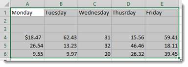
When you click on the Recommended Charts button, a dialogue box opens like the one pictured below.
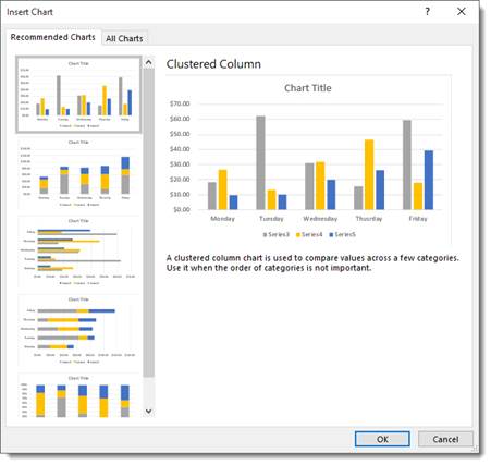
Based on your data, Excel recommends a chart for you to use.
On the left side of this dialogue box is all the chart recommendations.
On the right is a preview of what the chart will look like with your data.
Choose the chart that you want to use, then click OK.
The chart is embedded in your worksheet for you:
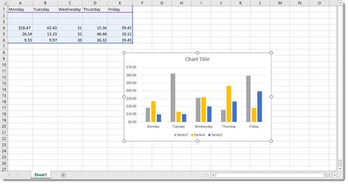
You’ll also notice that the Chart Tools Format tab opens in the Ribbon:
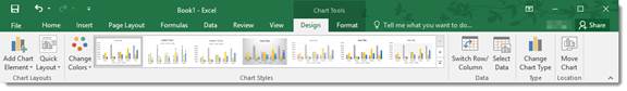
The tools shown above will help you customize your charts. We’ll discuss all of these options later in this lesson.
Types of Charts
To the right of the Recommended Charts button on the ribbon, you’ll see this:
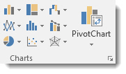
You can use these buttons and their dropdown menus to create these types and styles of charts. We’re going to go from left to right, starting at the top left, and cover all the buttons above.
Insert Column or Bar Chart. This is the first button, located in the top left corner. With this, you can preview data as a 2-D or 3-D vertical column chart or as a 2-D or 3-D horizontal bar chart.
Insert Hierarchy Chart. Use this chart to compare a part to a whole or to show the hierarchy of several columns or categories.
Insert Waterfall or Stock Chart. The waterfall chart is used to show how a starting value is affected by a series of positive and negative values, while the stock chart is used to show the trend of a stock’s value over time.
Insert Line or Area Chart. This lets you preview data as a 2-D or 3-D line or area chart.
Insert Statistic Chart. Use these charts to show a statistical analysis of your data. Chart types include Histogram, Pareto, and Box and Whisker charts.
Insert Combo Chart. These charts are best when you have mixed data or want to emphasize different types of information. You can preview your data as a 2-D combo clustered column and line chart – or clustered column and stacked area chart.
Insert Pie or Doughnut Chart. You can preview data as a 2-D or 3-D pie or 2-D doughnut chart.
Insert Scatter (X,Y) or Bubble Chart. Preview data as a 2-D scatter or bubble chart.
Insert Surface, or Radar Chart. With this, you can preview data as a 2-D stock chart that uses typical stock symbols, a 2-D or 3-D surface chart, or even a 3-D radar chart.
New Chart Types in Excel 2016
Word 2016 brings with it some new chart types to help you better illustrate data that you include in your worksheets.
These chart types include:
- Treemap. A treemap chart displays hierarchically structured data. The data appears as rectangles that contain other rectangles. A set of rectangles on the save level in the hierarchy equal a column or an expression. Individual rectangles on the same level equal a category in a column. For example, a rectangle that represents a state may contain other rectangles that represent cities in that state.
- Waterfall. As explained by Microsoft, «Waterfall charts are ideal for showing how you have arrived at a net value, by breaking down the cumulative effect of positive and negative contributions. This is very helpful for many different scenarios, from visualizing financial statements to navigating data about population, births and deaths».
- Pareto. A Pareto chart contains both bars and a line graph. Individual values are represented by bars. The cumulative total is represented by the line.
- Histogram. A histogram chart displays numerical data in bins. The bins are represented by bars. It’s used for continuous data.
- Box and Whisker. A Box and Whisker chart, as explained by Microsoft, is «A box and whisker chart shows distribution of data into quartiles, highlighting the mean and outliers. The boxes may have lines extending vertically called ‘whiskers’. These lines indicate variability outside the upper and lower quartiles, and any point outside those lines or whiskers is considered an outlier.»
- Sunburst. A sunburst chart is a pie chart that shows relational datasets. The inner rings of the chart relate to the outer rings. It’s a hierarchal chart with the inner rings at the top of the hierarchy.
Creating Charts Using the Ribbon
By using the chart options we discussed in the last section, we can quickly and easily create a chart, then embed it into our worksheet.
Let’s insert a bar chart into our worksheet below.
Start out by selecting the data you want to use in the chart.
Now click the Insert Column or Bar Chart button on the Ribbon.
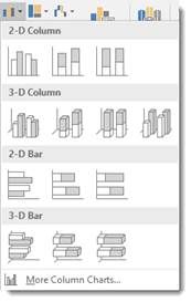
Choose the bar chart you want to use, or click More Column Charts.
If you click More Column Charts, this is what you’ll see:
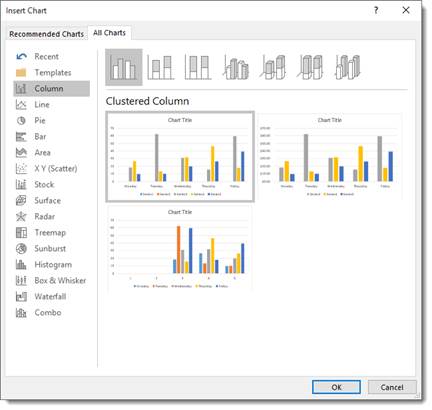
On the right side of the window, you will see a list of different chart types. Click Bar.
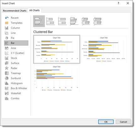
At the top, you’ll see bar charts illustrated in gray. These are different styles of bar charts. You can click on any of the styles and see a preview of your data in that style of chart (in color) in the box below.
Select the type of chart you want, then click OK.
Excel embeds the chart in your worksheet for you:
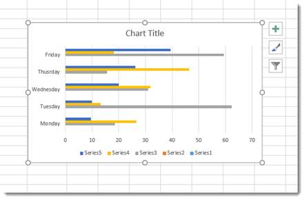
Creating a Chart from Scratch
So far in this lesson, we’ve taught you how to create charts by selecting your data first. However, you don’t have to do it that way (although it’s the easiest). In other words, you can start to create your chart without selecting data first.
Let’s learn how.
Click the Insert Column or Bar Chart button on the Ribbon again. However, this time, don’t select any data before you do it.
Select the type of bar chart that you want to use.
You’ll see a blank area on your worksheet where your chart will be embedded, and you’ll also notice the Chart Design and the Chart Format tabs open on the Ribbon.
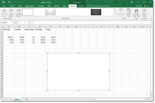
Click the Select Data button under the Design tab.
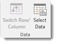
The Select Data Source dialog window will open.
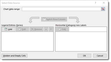
The data range refers to the number of cells you’d like to use. For instance, «=Sheet1!$A$1:$G$8» refers to cells A1 through G8 on worksheet one.
It’s actually much easier to select the data range by dragging your mouse over it. To do that, click the Data Range button  next to the text box.
You’ll see another box that looks like this:
This window is simply asking you to define the data range, and you can do it easily by clicking on a cell, holding the mouse button, and dragging it over all of the cells you’d like to add. MS Excel automatically enters the selected cell coordinates into the data range window. When you are finished, you can either click the button on the right  or push Enter.
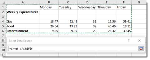
When you hit Enter, the chart appears in your worksheet:
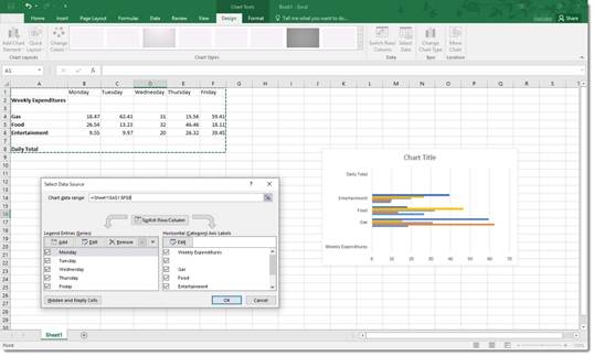
Now you can use the Select Data Source dialogue box to add legend entries – or edit and remove them.
You can also edit your axis labels.
Note that your axis labels were your row labels. These appear as colors representing each day of the week.
Your legend entries were your column labels. These appear on the left, vertically.
Your data appears as the bars.
If you want, you can switch rows and columns so that the days of the week appear on the left and your axis labels become legend entries.
Uncheck any entries that you don’t want to appear in the chart.
Click OK when you’re finished.
Creating Charts Using the Quick Analysis Tool
To use the Quick Analysis tool for creating charts, select that data that you want to include in chart. Click on the Quick Analysis tool button at the bottom right of the selected data (circled in red below):
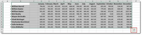
Click Charts (circled in red):
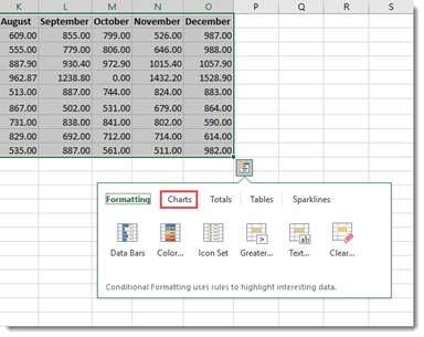
Select the type of chart you want.
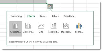
We’re going to choose a clustered chart.
The chart is embedded in your spreadsheet:
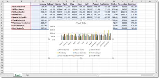
Modifying and Moving a Chart
There are a number of ways to modify a chart after it’s made.
You can right click on the plot area as we’ve done below.
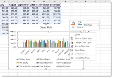
From the menu, you can delete the chart, reset, change the chart type, save the chart as a template, or select data to include in the chart. You can also format the chart area.
You can also click on the chart’s title to change or format it.
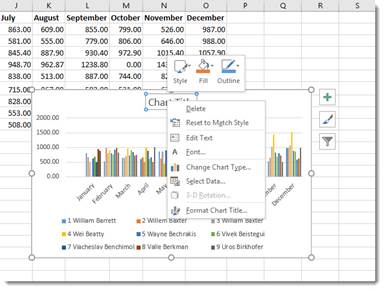
You can also right click on the legend or any other aspect of the chart to move it around and make changes. We’re going to talk about modifying chart elements in another section.
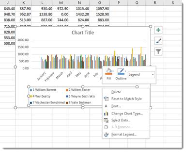
If you want to move a chart, simply click and drag any of its bounding box borders:
You can use the handles on the bounding box (the little circles indicated by the arrows above) to resize your chart. Drag it in to make it smaller, out to make it larger.
Chart Sheets
If you want a chart to appear on its own sheet in the workbook, simply click somewhere in the plot of the chart or select the data in your spreadsheet. Hit F11 on your keyboard.
The chart is moved to its own sheet as a clustered column chart.
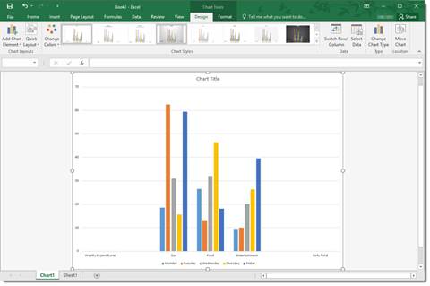
Note that the sheet is named Chart1 by default. You can change that name the same way that you change any other worksheet name.
The Design Tab and Customizing Charts
The tools on the Design tab help you to customize your charts so that you achieve the look, feel, and purpose that you want.
The Design tab is pictured below. You can mouse over any tools to learn their names.

We’re going to cover all the aspects of the Design tab, starting with groups and breaking them down into tools.
Chart Layouts is the first group on the left. It contains the Add Chart Element tool and the Quick Layout tool. The Add Chart Element tool allows you to modify some elements, such as titles, data labels, legend, etc. The Quick Layout tool allows you to select a new layout for your chart.
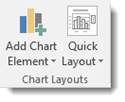
Chart Styles gives you different styles of charts to choose from. You can also change the colors used in your charts using the Change Colors tool.
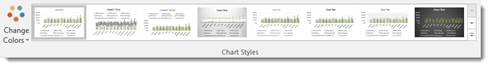
The Data group allows you to reverse rows and columns in your chart. We also talked about doing this earlier in the lesson. It also gives you the Select Data tool, which we used in a prior section.
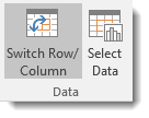
The Type group contains Change Chart Type. You can change the type of chart by using this tool.
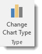
The Location group has the Move Chart tool that allows you to move the chart to a different place within your worksheet – or to another worksheet.
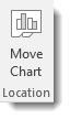
Customizing Chart Elements with the Chart Elements Button
The Chart Elements button appears as a plus sign whenever your chart is selected.
In the snapshot below, you can see it to the right of our chart.
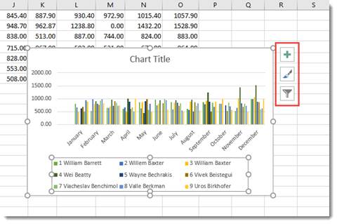
When you click it, you’ll see a list of chart elements that you can add to your chart.
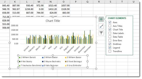
The elements that are in your chart have checkmarks beside them. You can uncheck them to remove the elements. To add an element, simply put a checkmark in the box beside it.
If you want to remove or add just a part of an element, or specify its layout as with Data Labels, you’ll use the Chart Elements continuation menu.
Here’s how to do this.
Start by putting a checkmark beside Data Labels (as an example).
You’ll see an arrow appear to the right of the word Data Labels (indicated in red below.)
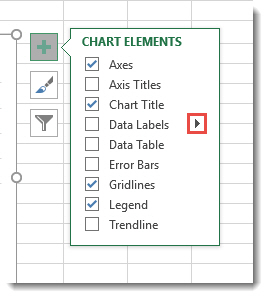
Click the arrow and you’ll see the continuation menu.
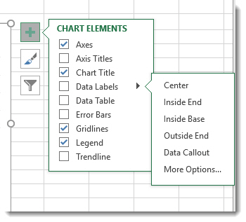
Select a layout option.
We’re going to choose Data Callout.
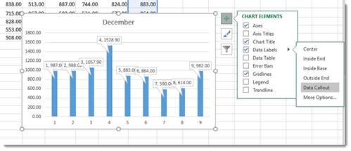
Formatting a Chart
To format a chart, you can double click in the plot area or the chart area. If you double click in the chart area, it opens the Format Chart Area pane on the right side of your window. If you double click in the plot area, it opens the Format Plot area on the right side of your screen, as shown below.
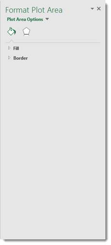
At the top of the pane, are the options.

Fill & Line looks like a bucket pouring green paint and allows you to format the fill and lines of your chart.
The Effects button is the one on the right, which allows you to add special effects to your chart to customize the look.
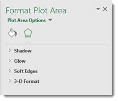
Take time to play around with the different formatting options for your charts. It’s a lot of fun to do, and you will discover interesting combinations of effects that will produce charts you’ll love.
Organizational Charts or Diagrams with SmartArt
While an ordinary chart simply represents data, diagrams and organizational charts explain the causal relationship between elements. The following organizational chart, for instance, explains the relationship between managers and subordinates.
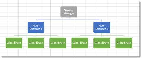
The simplest way to create an organizational chart is to click the Insert tab, then SmartArt. The SmartArt icon has been scaled down in Excel 2016, so we’ve circled it in red below.
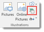
The SmartArt dialogue box appears:
Choose the type of organizational chart or diagram you want on the left. You can choose a style from the middle section called List.
Once you choose your chart or diagram, click OK.
It appears in your spreadsheet:
Click on the areas marked text to add your own.
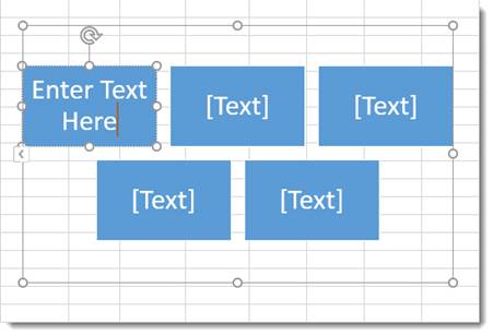
In the Ribbon, the SmartArt Design and Format tabs appear.
You can use these tools to change the layout, apply a style, change the colors, and other formatting elements.
View Animation in Charts
One of the debated new features in Excel 2016 is the animation added to charts.
Here’s how the animation works.
After you create a chart, then change the data for the chart in the spreadsheet, you can watch your chart and see it change too – in full animation.
In other words, if you have a bar chart, and you change the data so that a bar will be shorter, you can watch the bar slowly become shorter right after you change the data.
Sparklines
A sparkline is simply a small chart that’s aligned with a row of your data. It typically shows trend information.
Let’s learn how to add one in the spreadsheet below:
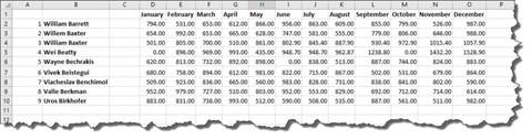
To insert a sparkline, go to the Ribbon, click the Insert tab, then the Sparklines group.
Choose the type of sparkline you want to add.
We’re going to choose Line.
You’ll see this dialogue box.
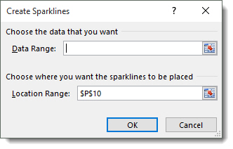
Select the cells in your spreadsheet that you want to use for your sparkline. Just drag your mouse to select the cells.
Next, enter the absolute reference for the cell where you want the sparkline to appear.
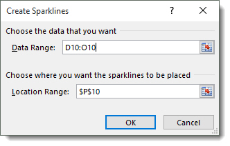
Click OK.
The sparkline now appears in the location you specified.
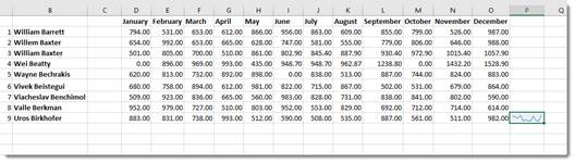
You can also format your sparkline using the Sparkline Tools Design tab that opens in the Ribbon.
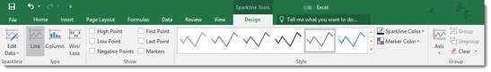
Taxes are better calculated on the basis of information from the tables. And for the presentation of the company’s achievements it is better to use charts and diagrams.
The graphs are well suited for analyzing of relative data. For example, the forecast of sales growth dynamics or the assessment of the overall trend of growth in the capacity of the enterprise.
How to build a chart in Excel?
The fastest way to build a chart in Excel – is to create graphs by template:
- The range of the cells A1:C4. You need to fill it with values as shown in the figure:
- Select the range A1:C4 and choose the tool on the «INSERT» tab – «Insert Column Chart» – «Clustered Column».
- Click on the graph to activate it and call the additional menu «CHART TOOLS». There are also three tool tabs available: «DESIGN» and «FORMAT».
- To change the axes in the graph, select to the «Constructor» tab, and on it the «Switch Row/Column» tool. Thus, you change the values in the graph: rows per columns.
- Click on any cell to deselect the chart and thus to deactivate its setting mode.
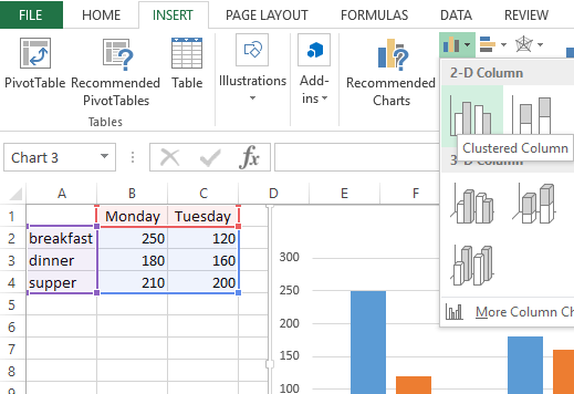
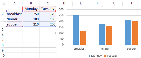
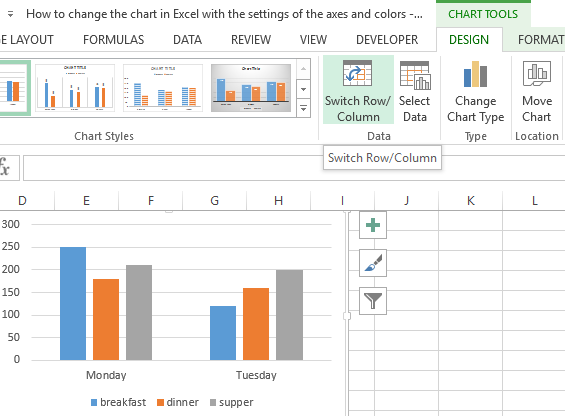
Now you can work in the normal mode.
How to build a chart on the table in Excel?
Now we are constructing the diagram according to the data of the Excel table, which must be signed with the title:
- Select the A1:B4 range in the source table.
- Select «INSERT» – «Insert Pie or Doughnut». From the group of different chart types, select the «Doughnut».
- Sign the title of your chart. To do this, make a double-click on the title with the left mouse button and enter the text as shown in the picture:
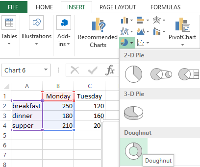
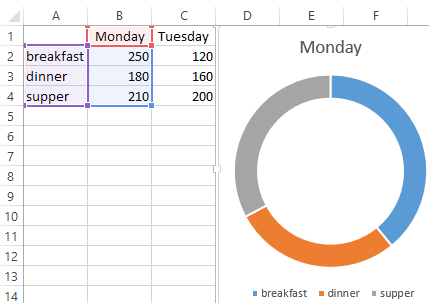
After you sign a new title, click on any cell to deactivate the chart settings and go to normal mode.
Diagrams and charts in Excel
How not to create a table, its data will be less readable than the graphical representation in diagrams and charts. For example, pay attention to the picture:
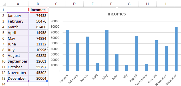
According to the table, you do not immediately to notice in what month the company’s revenues were the highest, and in what the smallest ones. You can, of course, use the «Sorting» tool, but then the general idea of the seasonality of the firm’s activity is lost.
Pay attention to the chart, which is built according to the same table. Here you do not have to blame your eyes to notice the months with the smallest and the largest indicator of the company’s profitability. And the general presentation of the schedule allows you to track the seasonality of activity of sales, which bring more or less profit in certain periods of the year. The data recorded in the table, is perfectly suitable for detailed calculations and calculations. But the charts and the diagrams provide us with its indisputable advantages:
- improve to the readability of data;
- simplify the general orientation of large amounts of the data;
- allow you to create high-quality presentations of reports.
When it comes to analysis and decision-making from the data in any business or company, numerical data in any form would make it difficult. Excel solves this problem with the use of visual representation for the numerical values using Charts in Excel. Most people think that excel is all about crunching rows and columns in the form of data but No! There is so much more to do with the data when it comes to its visual representation.
What are Charts in Excel
A chart is a visual representation of data in the form of bars, lines, pies and so much more. Displaying the data in an organized way helps the team to come up with business decisions faster. Charts help us to summarize a relationship between the numerical values, business patterns, trends that might go unnoticed if there were just numerical values used to represent them.
Table of Contents
- What are Charts in Excel
- Amazing Points About Charts in Excel
- Starting with Charts
- Components of Charts in Excel
- Inserting a Chart in Excel
- Changing Chart Type
- Formatting Charts in Excel
- Yoast SEO Premium
- Google preview
- SEO analysisGoodCharts in Excel
- Add related keyphrase
- Cornerstone content
- Insights
- Blog2Social: Social Media Content Calendar
- Status & visibility
- Template
- Yoast SEO
- Permalink
- View Post
- Categories
- Tags
- Featured image
- Excerpt
- Discussion
- Sections
- Webpushr Notification
- Blog2Social: Autoposter
- Custom Sharing & Scheduling Info
- The Autoposter is activated Info
- Append a Ninja Form
Amazing Points About Charts in Excel
One should know the following points in Excel to get a deeper knowledge about charts.
- Charts are dynamic in nature. They represent the data series of numbers in visual form. Any change in the data series will be reflected in the chart.
- When we create a chart, it can reside in the two locations in a workbook. It can either be an embedded chart or on a chart sheet.
- The embedded chart floats as a layer on the worksheet. It inserts near the data so you can see both data and chart at the same time.
- A chart sheet is a new sheet created only to represent the chart. It can be created by selecting the data and then pressing the F11 function key and getting the default chart type.
- A chart act as an object in Excel like other objects including shapes or text box. We can add a chart title, legends. gridlines to the chart.
- We can format a chart, resize it, add effects, customize it and do a lot more things to be done with a chart.
- When we click on a chart and select it, there are two more tabs on the ribbon. Design tab and Format Tab.
Starting with Charts
Let us start working with charts.
Components of Charts in Excel
A chart is so much more than a representation. We can do a lot of things with a chart but for that, we must understand its components first.
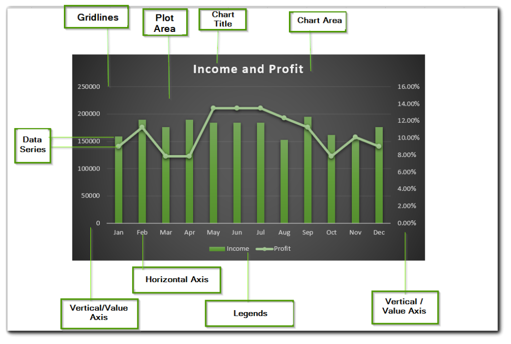
A chart has many useful elements yet they are not mandatory to be mentioned. We can make an empty chart that has no chart elements. Excel allows it but it has no use. Below are the points explaining chart elements.
- Vertical/Value Axis – It has the data series representing values. There are two vertical axes in the above graph i.e. one for income and the other for profit percentage. This is so because if we tried plotting the profit and income on one axis, the profit line might not even be visible.
- Horizontal/Category Axis – This represents the category for each data entry. In above example, it is month.
- Legends – A chart with two data series ( profit % and income ) is appropriate but for that excel assigns a different color scheme to both of them that are called legends.
- Chart title – The name can be used to imply to the worker that what type of information the chart displays
Inserting a Chart in Excel
In this section of the blog, we will be knowing the steps to insert a chart in excel. Here we go
- Let us say we have a set of data representing the monthly website visits of a company.
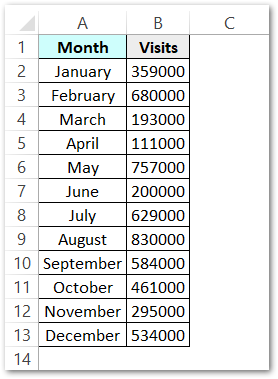
- Select this data and Go to Insert Tab. Go to Charts group and then select the Clustered Column Chart.
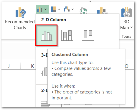
- As a result, Excel would now create a chart in the same worksheet representing the website visitors.
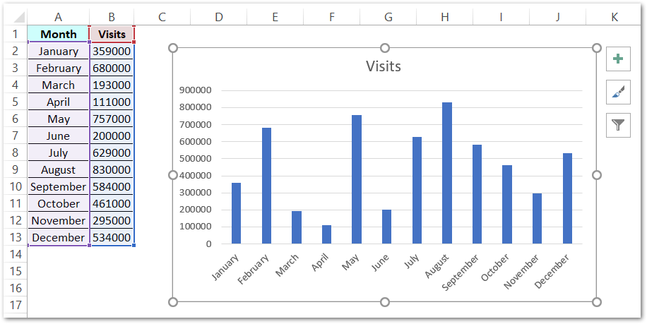
Changing Chart Type
As we have now created a clustered column chart for the website visits. We can now easily change the chart types. Although clustered column chart has perfectly represented the information nothing goes in checking some other chart types.
Select the chart and a new Chart Design tab will appear on the ribbon.
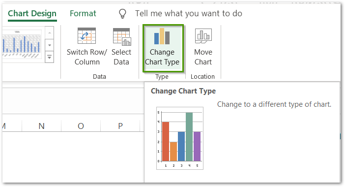
From there, go to Type group and click on the change chart type button.
The Change Chart Type dialog box appears.
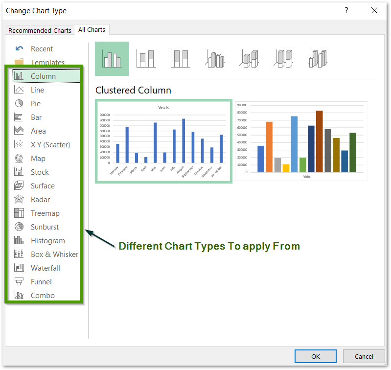
From here you can change the chart type in Excel. You can try on The Line Chart, Pie Chart, or any other of them.
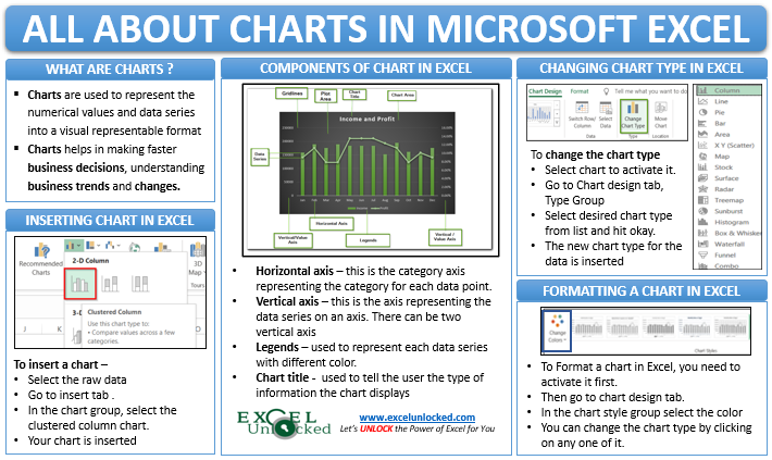
Formatting Charts in Excel
Let us take a data source that has the actual sales and target sales for each month of a company. Below is the data.
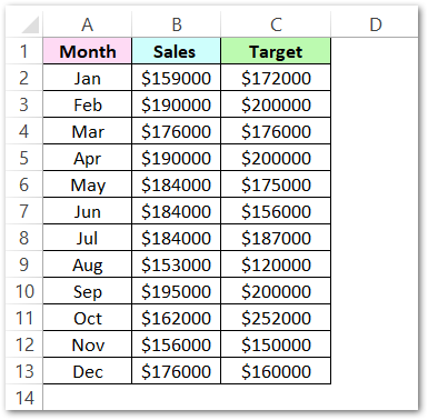
We will insert a combo chart this time. In a combo chart, we use different chart types for different data series. In the above data, there are two data series named sales and target. Steps to do this are
- Select the data. Go to insert tab > charts group > combo chart button. Refer to the image below.
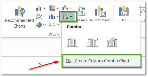
- Click on Create Custom Combo Chart Button to open the Insert Chart Dialog Box
- In the Insert Chart Dialog Box, Refer to the instructions in the below figure and click ok once you are done.
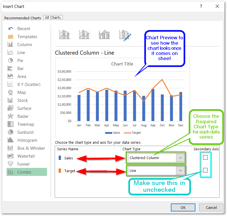
Once you click ok, the chart shown in preview inserts on the current worksheet. By default, excel inserts the chart title on the top of the chart. We can change it by double-clicking on it.
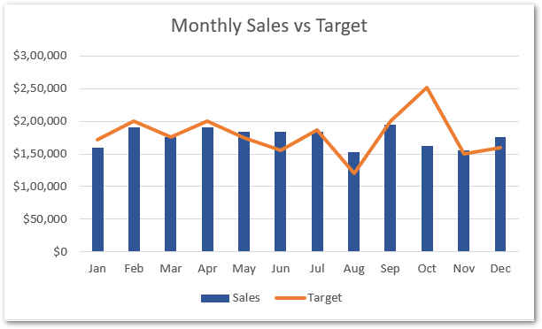
We can format our chart to make it look even better to match the theme of the project. Following are the steps:-
- Click on the chart to activate it.
- Two tabs named Chart Design and Format will pop up on the ribbon. Click on Chart Design Tab.
- In the chart styles group, click on the change colors button and choose the desired color for your chart.
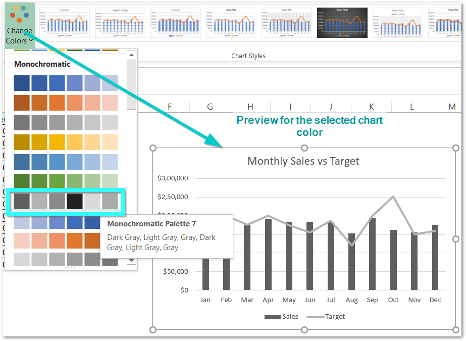
We can also change the chart style from the chart style group. There are many chart styles as you can see.
This brings us to the end of the blog. Thank you for reading 😉
Yoast SEO Premium
Toggle panel: Yoast SEO Premium
- SEO
- Readability
- Social
Focus keyphraseHelp on choosing the perfect focus keyphrase(Opens in a new browser tab)Get related keyphrases(Opens in a new browser window)
Google preview
Preview as:Mobile resultDesktop resultUrl preview:![]() excelunlocked.com › introduction-to-charts-excelSEO title preview:Introduction to Charts – uses, Inserting, formatting, combo – Excel UnlockedMeta description preview:
excelunlocked.com › introduction-to-charts-excelSEO title preview:Introduction to Charts – uses, Inserting, formatting, combo – Excel UnlockedMeta description preview:
Nov 8, 2021 - Charts in excel summarize a relationship between the numerical values, business patterns, trends that would go unnoticed with numerical valuesSEO titleInsert variableIntroduction to Charts – uses, Inserting, formatting, combo Page Separator Site title Site titleTitlePrimary categorySeparatorSlugMeta descriptionInsert variableCharts in excel summarize a relationship between the numerical values, business patterns, trends that would go unnoticed with numerical valuesSite titleTitlePrimary categorySeparator
SEO analysisGoodCharts in Excel
Cornerstone content
Insights
Toggle panel: Sections
Blog2Social: Social Media Content Calendar
Toggle panel: Blog2Social: Social Media Content Calendar
- Post
- Block
Status & visibility
VisibilityPublicPublishNovember 8, 2021 7:11 pmPost FormatAsideImageLinkQuoteStandardStatusVideoStick to the top of the blogAuthoradminAmitesh GuptaChetna DuaDhrunil BhattNitin BothraOffice BoradSanskar BaidEnable AMPMove to trash
Template
Yoast SEO
Readability analysis: Good SEO analysis: Good
22 Revisions
Permalink
URL Slug
The last part of the URL. Read about permalinks(opens in a new tab)
View Post
https://excelunlocked.com/introduction-to-charts-excel(opens in a new tab)
Categories
FunctionsTemplatesTips and TricksUncategorizedAdd New Category
Featured image
The featured image should have a size of at least 1200 by 675 pixels.about:blank Replace ImageRemove featured image
Excerpt
Discussion
Sections
Toggle panel: Sections Use Sections
Webpushr Notification
Toggle panel: Webpushr Notification Send Web Push Notification
See notification stats
Total Active Subscribers: 98+ Show additional settings
Toggle panel: Blog2Social: Autoposter
Custom Sharing & Scheduling Info
Customize & Schedule Social Media Posts
The Autoposter is activated Info
Shared: 9 timesLast shared: 2021/11/09 5:30 pmAdvanced settings
Append a Ninja Form
Toggle panel: Append a Ninja Form — None Contact Me Feedback Open publish panel
- Document
NotificationsThe featured image should have a size of at least 1200 by 675 pixels.1✕Here are some notifications you missed:All About Chart Elements of a Chart in Microsoft ExcelJust nowSubscribe to receive push notifications on latest updatesSUBSCRIBE⚡ by WebpushrX
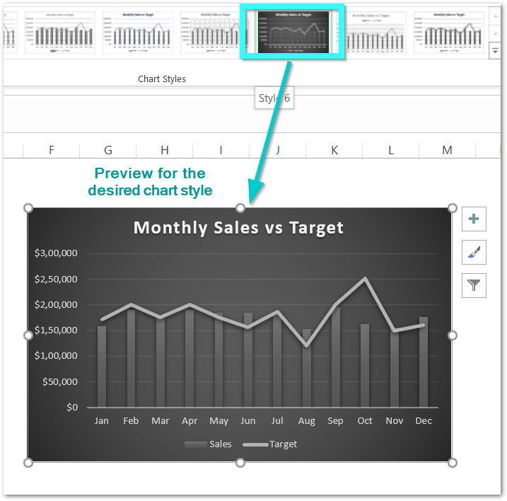
This brings us to the end of the blog. Thank you for reading 😉
RELATED POSTS
-
All About Chart Elements of a Chart in Microsoft Excel
-
Tutorial – Record and Run a Macro – Real Life Example
-
Trendlines in Excel – Types and Usage
-
Pie Chart in Excel – Inserting, Formatting, Filters, Data Labels
-
Volume High Low Close Stock Chart in Excel – Insert, Format, Reading
-
Stacked Column Chart in Excel – Usage, Examples, Format, Special Gridlines