
Элемент управления пользовательской формы TextBox в VBA Excel. Использование текстового поля для ввода и вывода информации, основные свойства, примеры. Привязка текстового поля к ячейке.
UserForm.TextBox – это элемент управления пользовательской формы, предназначенный для ввода, редактирования и вывода информации в текстовом формате.

Текстовое поле незаменимо, когда необходимо заполнить пользовательскую форму новой информацией. Например, это может быть ФИО нового сотрудника и его паспортные данные, сумма выручки за день, новый электронный адрес и многое-многое другое.
Если с помощью текстового поля требуется вводить заранее известную информацию, элементы которой можно сгруппировать в список, то в этом случае удобнее вместо элемента управления TextBox использовать ListBox или ComboBox.
Вводить информацию в TextBox на открытой форме можно не только с помощью клавиатуры, но и вставкой текста из буфера обмена. Когда текстовое поле применяется для ввода пароля, есть возможность отобразить все его знаки замещающим символом, например, звездочкой.
Иногда, если на пользовательской форме используется только одно текстовое поле и кнопка «OK» (или кнопки «OK» и «Отмена»), для ввода информации такую форму можно заменить функцией InputBox, а для вывода информации, когда не требуется редактирование отображаемого текста, – функцией MsgBox.
Свойства текстового поля
| Свойство | Описание |
|---|---|
| AutoSize* | Автоподбор размера текстового поля. True – размер автоматически подстраивается под длину размещаемой строки. False – размер элемента управления определяется свойствами Width и Height. |
| AutoTab | Включение автоматической табуляции – передачи фокуса следующему элементу управления при достижении максимального числа символов при значениях свойства MaxLenght > 0. True – автоматическая табуляция включена, False – выключена. |
| ControlSource | Ссылка на источник данных для поля TextBox. |
| ControlTipText | Текст всплывающей подсказки при наведении курсора на TextBox. |
| Enabled | Возможность ввода, редактирования, копирования, вставки, удаления текста. True – все перечисленные опции включены, False – выключены (цвет текста в поле становится серым). |
| Font | Шрифт, начертание и размер текста в поле. |
| Height | Высота текстового поля. |
| Left | Расстояние от левого края внутренней границы пользовательской формы до левого края текстового поля. |
| Locked | Запрет ввода, редактирования, удаления текста. True – перечисленные опции запрещены (разрешено выделение и копирование текста), False – перечисленные опции разрешены. |
| MaxLenght | Максимальная длина строки. По умолчанию – 0, что означает – ограничений нет. |
| Multiline | Устанавливает многострочный (True) или однострочный (False) режим ввода-вывода текста. |
| PasswordChar | Задает символ, который будет отображаться при вводе знаков пароля. |
| TabIndex | Определяет позицию элемента управления в очереди на получение фокуса при табуляции, вызываемой свойством AutoTab или нажатием клавиш «Tab», «Enter». Отсчет начинается с 0. |
| Text** | Текстовое содержимое (значение) поля (=Value). |
| TextAlign | Выравнивание текста: 1 (fmTextAlignLeft) – по левому краю, 2 (fmTextAlignCenter) – по центру, 3 (fmTextAlignRight) – по правому краю. |
| Top | Расстояние от верхнего края внутренней границы пользовательской формы до верхнего края текстового поля. |
| Value** | Текстовое содержимое (значение) поля (=Text). |
| Visible | Видимость текстового поля. True – TextBox отображается на пользовательской форме, False – TextBox скрыт. |
| Width | Ширина текстового поля. |
| WordWrap | Актуально при Multiline = True. Переход на новую строку при достижении границы текстового поля. True – переход включен, False – переход выключен. |
* При использовании свойства AutoSize в значении True следует учитывать, что автоматическое изменение размеров поля при вводе текста может нарушить дизайн пользовательской формы.
** Text и Value — это два обозначения одного и того же свойства. Если в окне Properties элемента управления TextBox в поле свойства Text начать ввод строки, в поле Value ввод будет дублироваться. И наоборот, при вводе текста в поле свойства Value, дублирование произойдет в поле Text.
В таблице перечислены только основные, часто используемые свойства текстового поля. Все доступные свойства отображены в окне Properties элемента управления TextBox.
Свойства BackColor, BackStyle, BorderColor, BorderStyle отвечают за внешнее оформление текстового поля и его границ. Попробуйте выбирать доступные значения этих свойств в окне Properties, наблюдая за изменениями внешнего вида элемента управления TextBox на проекте пользовательской формы.
Привязка текстового поля к ячейке
Привязать элемент управления TextBox к ячейке на рабочем листе можно двумя способами.
1. В окне Properties элемента управления TextBox в поле свойства ControlSource необходимо указать адрес ячейки:

2. Присвоить свойству ControlSource адрес ячейки в коде VBA Excel:
|
UserForm1.TextBox1.ControlSource = «C5» |
Теперь ячейка C5 активного листа будет привязана к элементу управления TextBox1. При открытии формы текстовое поле будет заполнено значением ячейки C5.
Чтобы наглядно ознакомиться с взаимозависимостью значения ячейки C5 и содержимого текстового поля, разместите на пользовательской форме еще какой-нибудь элемент управления и откройте ее в немодальном* окне:
|
Sub Test() UserForm1.TextBox1.ControlSource = «C5» UserForm1.Show 0 End Sub |
Измените значение ячейки C5 и нажмите клавишу «Tab» или «Enter» – изменения будут продублированы в текстовом поле на форме. Измените содержимое поля TextBox1, нажмите клавишу «Tab» или «Enter», передав фокус другому элементу управления, – изменения продублируются в ячейке C5.
Чтобы привязать текстовое поле к ячейке неактивного листа, необходимо в адресе указать имя листа по ярлыку с разделителем «!»:
|
UserForm1.TextBox1.ControlSource = «Лист2!A3» |
Если имя листа содержит пробел, заключите его в одинарные кавычки:
|
UserForm1.TextBox1.ControlSource = «‘Мой лист’!B6» |
Точно также адрес ячейки конкретного листа можно указать непосредственно в окне Properties элемента управления TextBox в поле свойства ControlSource (без парных кавычек).
* Отображение пользовательской формы в немодальном окне позволяет редактировать ячейки на рабочем листе Excel, не закрывая форму.
Примеры использования TextBox
Пример 1
Обмен содержимым между текстовым полем, переменной и ячейкой на рабочем листе:
|
‘Присвоение текстовому полю значения ‘ячейки A2 и переменной a1 UserForm1.TextBox1.Text = Range(«A2») UserForm1.TextBox1.Text = a1 ‘Присвоение ячейке B3 и переменной a2 ‘значения текстового поля Cells(3, 2) = UserForm1.TextBox1.Text a2 = UserForm1.TextBox1.Value ‘Свойства Text и Value элемента ‘управления TextBox равнозначны |
Пример 2
Программное создание элемента управления TextBox, размещение его по центру пользовательской формы, добавление всплывающей подсказки и текста по умолчанию.
Предположим, что текстовое поле предназначено для ввода даты, поэтому добавляем соответствующую подсказку, а в качестве текста по умолчанию – текущую дату.
Создаем новую пользовательскую форму с именем UserForm2. Если у вас другое имя формы, это не имеет значения, так как обращаться к ней будем с помощью ключевого слова «Me». Открываем модуль созданной формы и вставляем в него следующий код VBA Excel:
|
1 2 3 4 5 6 7 8 9 10 11 12 13 14 15 16 17 18 19 20 21 22 23 24 25 |
Private Sub UserForm_Initialize() Dim myTextBox As Control ‘Создаем новый TextBox и присваиваем его переменной Set myTextBox = Me.Controls.Add(«Forms.TextBox.1») ‘Задаем размеры и заголовок пользовательской формы With Me .Height = 100 .Width = 220 .Caption = «Форма №2» End With ‘Присваиваем значения свойствам текстового поля With myTextBox .Width = 100 .Height = 20 ‘Left и Top рассчитаны для Excel 2016* .Left = 60 — 5 .Top = 40 — 15 ‘Добавляем всплывающую подсказку .ControlTipText = «Введите дату подписания договора» ‘Вставляем в поле текущую дату .Text = Format(Now, «DD.MM.YYYY») ‘Выравниваем текст по центру .TextAlign = 2 End With End Sub |
В результате выполнения кода откроется следующая форма с всплывающей подсказкой при наведении на TextBox курсора:

* Значения свойств Left и Top рассчитаны для Excel 2016. Вычитаемые числа зависят от толщины границ пользовательской формы, которые в других версиях Excel могут отличаться.
Содержание
- Свойство TextBox.ControlSource (Access)
- Синтаксис
- Замечания
- Пример
- Поддержка и обратная связь
- TextBox.ControlSource property (Access)
- Syntax
- Remarks
- Example
- Support and feedback
- ControlSource Property
- Applies to
- Setting
- Remarks
- Example
- ControlSource property
- Syntax
- Remarks
- See also
- Support and feedback
- Связь формы с ячейками рабочего листа
- Элемент TextBox
- Элемент ListBox
- Приложение 2
- Конструирование форм
Свойство TextBox.ControlSource (Access)
Используйте свойство ControlSource, чтобы указать, какие данные отображаются в элементе управления. Вы можете отображать и изменять данные, привязанные к полю в таблице, запросе или инструкции SQL. Вы также можете отобразить результат выражения. Для чтения и записи, String.
Синтаксис
expression. ControlSource
Выражение Переменная, представляющая объект TextBox .
Замечания
Свойство ControlSource использует следующие параметры.
| Setting | Описание |
|---|---|
| Имя поля | Элемент управления привязан к полю в таблице, запросе или инструкции SQL. Данные из поля отображаются в элементе управления . Изменения данных внутри элемента управления изменяют соответствующие данные в поле . (Чтобы сделать элемент управления только для чтения, задайте для свойства Locked значение Да.)
При выборе элемента управления, привязанного к полю с типом данных Гиперссылка, вы перейдете к назначению, указанному в адресе гиперссылки. |
| Выражение | Элемент управления отображает данные, созданные выражением. Эти данные могут быть изменены пользователем, но не сохраняются в базе данных. |
Можно также задать свойство ControlSource для текстового поля, введя имя поля или выражение непосредственно в текстовом поле в форме конструктора или представления отчета.
Для отчетов свойство ControlSource применяется только к уровням группы отчетов.
Формы и отчеты выступают в качестве «окон» в вашей базе данных. Вы можете указать основной источник данных для формы или отчета, задав для свойства RecordSource таблицу, запрос или инструкцию SQL. Затем можно задать для свойства ControlSource поле в источнике данных или выражение.
Если параметр свойства ControlSource является выражением, отображаемое значение доступно только для чтения и не сохраняется в базе данных. Например, можно использовать следующие параметры.
| Пример параметра | Описание |
|---|---|
| LastName | Для элемента управления в элементе управления отображаются данные из поля LastName . На уровне группы отчетов Microsoft Access группировать данные по фамилии. |
| =Date( ) + 7 | Для элемента управления это выражение отображает в элементе управления дату через семь дней с сегодняшнего дня. |
| =DatePart(«q»,ShippedDate) | Для элемента управления это выражение отображает четверть даты отправки. На уровне группы отчетов Access группируют данные за квартал даты отправки. |
Пример
В следующем примере свойство ControlSource для текстового поля с именем AddressPart задается в поле City.
В следующем примере свойство ControlSource для текстового поля с именем Expected задается для выражения =Date() + 7 .
Поддержка и обратная связь
Есть вопросы или отзывы, касающиеся Office VBA или этой статьи? Руководство по другим способам получения поддержки и отправки отзывов см. в статье Поддержка Office VBA и обратная связь.
Источник
TextBox.ControlSource property (Access)
Use the ControlSource property to specify what data appears in a control. You can display and edit data bound to a field in a table, query, or SQL statement. You can also display the result of an expression. Read/write String.
Syntax
expression.ControlSource
expression A variable that represents a TextBox object.
The ControlSource property uses the following settings.
| Setting | Description |
|---|---|
| A field name | The control is bound to a field in a table, query, or SQL statement. Data from the field is displayed in the control. Changes to the data inside the control change the corresponding data in the field. (To make the control read-only, set the Locked property to Yes.)
If you choose a control bound to a field that has a Hyperlink data type, you jump to the destination specified in the hyperlink address. |
| An expression | The control displays data generated by an expression. This data can be changed by the user but isn’t saved in the database. |
You can also set the ControlSource property for a text box by typing a field name or expression directly in the text box in form Design view or report Design view.
For reports, the ControlSource property applies only to report group levels.
Forms and reports act as «windows» into your database. You specify the primary source of data for a form or report by setting its RecordSource property to a table, query, or SQL statement. You can then set the ControlSource property to a field in the source of data or to an expression.
If the ControlSource property setting is an expression, the value displayed is read-only and not saved in the database. For example, you can use the following settings.
| Sample setting | Description |
|---|---|
| LastName | For a control, data from the LastName field is displayed in the control. For a report group level, Microsoft Access groups the data on last name. |
| =Date( ) + 7 | For a control, this expression displays a date seven days from today in the control. |
| =DatePart(«q»,ShippedDate) | For a control, this expression displays the quarter of the shipped date. For a report group level, Access groups the data on the quarter of the shipped date. |
Example
The following example sets the ControlSource property for a text box named AddressPart to a field named City.
The following example sets the ControlSource property for a text box named Expected to the expression =Date() + 7 .
Support and feedback
Have questions or feedback about Office VBA or this documentation? Please see Office VBA support and feedback for guidance about the ways you can receive support and provide feedback.
Источник
ControlSource Property
Applies to
You can use the ControlSource property to specify what data appears in a control. You can display and edit data bound to a field in a table, query, or SQL statement. You can also display the result of an expression. Read/write String.
expressio n. ControlSource
expression Required. An expression that returns one of the objects in the Applies To list.
Setting
The ControlSource property uses the following settings.
The control is bound to a field in a table, query, or SQL statement. Data from the field is displayed in the control. Changes to the data inside the control change the corresponding data in the field. (To make the control read-only, set the Locked property to Yes.) If you click a control bound to a field that has a Hyperlink data type, you jump to the destination specified in the hyperlink address.
The control displays data generated by an expression. This data can be changed by the user but isn’t saved in the database.
You can set the ControlSource property for a control by using the control’s property sheet, a macro, or Visual Basic for Applications (VBA) code.
You can also set the ControlSource property for a text box by typing a field name or expression directly in the text box in form Design view or report Design view.
For a report, you can set this property by selecting a field or typing an expression in the Field/Expression pop-up window in the Group, Sort and Total pane.
In VBA, use a string expression to set the value of this property.
For a report group level, the ControlSource property determines the field or expression to group on.
Note: The ControlSource property doesn’t apply to check box, option button, or toggle button controls in an option group. It applies only to the option group itself.
For reports, the ControlSource property applies only to report group levels.
Forms and reports act as «windows» into your database. You specify the primary source of data for a form or report by setting its RecordSource property to a table, query, or SQL statement. You can then set the ControlSource property to a field in the source of data or to an expression. If the ControlSource property setting is an expression, the value displayed is read-only and not saved in the database. For example, you can use the following settings.
Sam ple setting
For a control, data from the LastName field is displayed in the control. For a report group level, Microsoft Office Access 2007 groups the data on last name.
For a control, this expression displays a date seven days from today in the control.
For a control, this expression displays the quarter of the shipped date. For a report group level, Access groups the data on the quarter of the shipped date.
Example
The following example sets the ControlSource property for a text box named AddressPart to a field named City:
The next example sets the ControlSource property for a text box named Expected to the expression =Date() + 7 .
Источник
ControlSource property
Identifies the data location used to set or store the Value property of a control. The ControlSource property accepts worksheet ranges from Microsoft Excel.
Syntax
object.ControlSource [= String ]
The ControlSource property syntax has these parts:
| Part | Description |
|---|---|
| object | Required. A valid object. |
| String | Optional. Specifies the worksheet cell linked to the Value property of a control. |
The ControlSource property identifies a cell or field; it does not contain the data stored in the cell or field. If you change the Value of the control, the change is automatically reflected in the linked cell or field. Similarly, if you change the value of the linked cell or field, the change is automatically reflected in the Value of the control.
You cannot specify another control for the ControlSource. Doing so causes an error.
The default value for ControlSource is an empty string. If ControlSource contains a value other than an empty string, it identifies a linked cell or field. The contents of that cell or field are automatically copied to the Value property when the control is loaded.
If the Value property is Null, no value appears in the location identified by ControlSource.
See also
Support and feedback
Have questions or feedback about Office VBA or this documentation? Please see Office VBA support and feedback for guidance about the ways you can receive support and provide feedback.
Источник
Связь формы с ячейками рабочего листа
Элементы управления могут быть связаны с объектом Range, представляющим интервал ячеек рабочего листа.
Элемент TextBox
Свойство ControlSource элемента TextBox указывает на ячейку рабочего листа, связывая этот элемент формы с объектом Range, таким образом, что в режиме выполнения формы содержимое заданной ячейки высветится в элементе TextBox и, наоборот, текст, введенный в TextBox, автоматически попадает в связанную с ним ячейку.
Свойство ControlSource задается как ссылка на ячейку, например, B2. В таком виде ссылка указывает на ячейку активного рабочего листа. Для ссылки на ячейку произвольного листа адрес ячейки указывается после имени листа, разделитель – восклицательный знак, например, MySheet!B2.
Оператор установки свойства ControlSource объекта Inp_Box рассмотренного выше примера может выглядеть так: Inp_Box.ControlSource=»MySheet!B2″, если анализируемый текст расположен в ячейке B2 рабочего листа MySheet.
Элемент ListBox
Свойство RowSource объекта ListBox связывает список с ячейками рабочего листа. Интервал ячеек задается ссылкой на адрес ячейки левого верхнего угла и адрес ячейки нижнего правого угла, разделенные двоеточием. Если интервал ячеек расположен на конкретном листе, то имя листа предшествует границам интервала с восклицательным знаком в качестве разделителя, например, MySheet!A15:C43.
В событийной процедуре инициализации формы рассмотрен третий способ создания списка, связывающий значения списка с ячейками рабочего листа.
Private Sub UserForm_Initialize()
‘значения списка из ячеек рабочего листа
Dim wSheets As Integer
Dim i As Integer
For i = 1 To wSheets
Cells(i, 1) = WorkSheets(i).Name
lst_Sheet.RowSource = ActiveSheet.Name & «!A1:A» & wSheets
Подсчитывается количество рабочих листов, список очищается и активизируется последний рабочий лист. Перечень имен рабочих листов создается в последовательных ячейках столбца A, начиная с первой. В свойстве RowSource устанавливается ссылка на созданный перечень листов, связывая таким образом элемент ListBox формы Act_Sheet с ячейками последнего рабочего листа.
Приложение 2
Форма имитирует электронные часы, которые посекундно отсчитывают время.
Пользователь вводит количество секунд, в течение которых будут высвечиваться электронные часы. Возможен отсчет вперед от текущего времени или назад от предполагаемого времени останова до времени запуска формы.
Конструирование форм
Для приложения спроектируем две формы (см. рис. 7.15).
Первая форма (начальная) будет выполнять настройки пользователя. Пользователь может выбрать из списка цвет фона электронных часов. При выборе опции CountUp устанавливается прямой отсчет времени, а при выборе опции CountDown устанавливается обратный отсчет времени. При выборе любой из этих двух опций загружается следующая форма. Нажатие на командную кнопку Exit закрывает форму и завершает приложение.
Bторая форма будет запускать электронные часы. Пользователь может установить количество секунд, в течение которых будет высвечиваться время. Нажатие командной кнопки Start или щелчок на свободное пространство формы запускает электронные часы. Кнопки со стрелками инициируют отсчет времени назад (левая кнопка) или отсчет времени вперед (правая кнопка) без возвращения в основную форму. Командная кнопка New_select позволяет вернуться в основную форму и сделать новые настройки.
Вставьте две новые формы, расположите на них элементы управления и установите их свойства в соответствии с рисунками и таблицей.
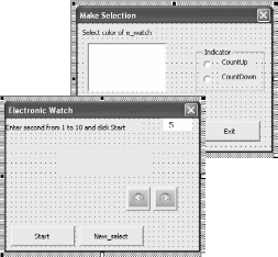
Рис. 7.15. (a) -форма для пользовательских настроек;
(b) — форма для запуска электронных часов
Источник
UserForm and Controls — Properties
———————————————————————-
Contents:
UserForm and Controls
Basic Properties common to the UserForm and most Controls
Other Properties common to the UserForm and most Controls
Specifying Color in Properties Window
Applicability of Properties to UserForm and its Controls — A SnapShot
———————————————————————-
UserForm acts as a container in which you add multiple ActiveX controls, each of which has a specific use and associated properties. By itself, a UserForm will not be of much use unless ActiveX controls are added to it which are the actual user-interactive objects. ActiveX controls can be used with VBA code or without, either directly on worksheets, while some can be used only on VBA UserForms. Using ActiveX Controls on a Worksheet have been illustrated in detail, in the separate section of «Excel VBA: ActiveX Controls, Form Controls & AutoShapes on a Worksheet».
Properties can be viewed in an alphabetical order or category wise by clicking the «Alphabetic» or «Categorized» options in the Properties Window, after selecting the respective Userform or Control. To set/edit, click on that property and make the change in its right column. For help on a Userform or Control property, in the Properties Window select the right column of that property and press F1.
Design-Time, Run-time and Break-time:
The time when an application is being developed in VBE (Visual Basic Environment) is termed as design-time. This is the time when you create a UserForm, add controls and set their properties. Run-time is the time when your code is being executed or the application is running. During this time the developer interacts with the application just like a user and the code cannot be edited then. Break-time is the time when an Application encounters any processing error that prevents the code from continuing or being executed further. Design-time manipulations are not permanent, while run-time are not. For ex, if you add a CheckBox in your code using the Add Method [Set ctrl = Controls.Add(«Forms.CheckBox.1»)], it will appear when the UserForm shows but when you return to VBE, the CheckBox will not be present. Similarly, if you set the Caption of an OptionButton in your code, the new set Caption will appear when the UserForm is displayed but will revert to its original in VBE. The ControlTipText property is set during design-time but is visible on the control during run-time only.
UserForm or Control properties can be set either at design-time or at run-time. Typically, a property which is dynamic is set at run-time and the more static ones at design-time. Name property of a UserForm can be set only at design-time and cannot be set at run-time. Though you can add, name and set properties of controls at run-time, these are mostly done at design-time itself, as these usually remain static while running a procedure. You might face some complications in adding controls and setting properties at run-time, hence only occasionally do you need to set properties at run-time to appropriately cope with a situation.
Setting control properties with vba:
If the code is in a procedure in the Code Module of the UserForm, use the vba syntax: Controlname.Property = Setting/Value
If the code is in a Standard Module or in the Code Module of a different UserForm, use vba syntax: UserFormName.Controlname.Property = Setting/Value
Examples of VBA Syntax:
Label1.Font.Name = «Arial»; Label1.ForeColor = RGB(255, 255, 0); OptionButton1.BackColor = 255; CheckBox1.Value = False; CheckBox1.Alignment = fmAlignmentLeft; TextBox1.MultiLine = True; TextBox1.WordWrap = True; TextBox1.ScrollBars = 2; OptionButton1.AutoSize = True; Me.TextBox1.Enabled = False; TextBox1.TextAlign = fmTextAlignLeft; TextBox1.Text = «Hello»; CommandButton1.Left = 50; TextBox1.MaxLength = 5; Note: Label1, TextBox1, CheckBox1, OptionButton1 & CommandButton1 are the Control names.
_______________________________________________________________________________
Basic Properties common to the UserForm and most Controls
Name Property
Use the Name property to specify a name for a control or to specify the font name (used in the text portion of a control). Name property of a UserForm can be set only at design-time and cannot be set at run-time. Name property for controls can be set either at design-time or at run-time, BUT if a control is added at design-time, its name cannot be changed at run-time. Typically, the default name of the first CheckBox created is CheckBox1, the default name of the second CheckBox will be CheckBox2, and so on, and similalry for other controls too. The default name of the first Userform you have created will be «UserForm1» (Image 1).
By clicking on «Name» in the Properties Window, you can edit the name. The name should begin with a letter, can have any combination of letters, numbers or underscores, cannot have spaces or symbols and can have a maximum length of 40 characters. It might be a good idea to have a 3-letter prefix in lower case, for each name, to identify and associate with its respective control. The characters following the prefix can start with a capital, for easier readibility. Typically, prefix used for different controls are: frm for UserForm; lbl for Label; txt for TextBox; cmb for ComboBox; lst for ListBox; chk for CheckBox; opt for OptionButton; fra for Frame; cmd for CommandButton; tbs for TabStrip; rfe for RefEdit; and so on.
Syntax for Font: Font.Name = String
Syntax for all other controls and objects: object.Name = String
The Name Property is applicable to the UserForm and to all controls.
—————————————————————————————————————
Caption Property
Caption is the text which describes and identifies a UserForm or Control. Typically, the default name and Caption of the first CheckBox created at design-time is CheckBox1, the default name and Caption of the second CheckBox will be CheckBox2, …; default name and caption of the first OptionButton is OptionButton1, …; default name and caption of the first CommandButton is CommandButton, …; and so on. The default caption of the first Userform you have created will be «UserForm1» (Image 1). By clicking on Caption in the Properties Window, you can edit the same, in its right column. The Caption will display in the header of the Userform; in re of Label, CommandButton & ToggleButton controls, Caption is the text which appears on the control; in re. of Tab and Page objects Caption is the text that appears on the tab; in re. of CheckBox & OptionButton Caption appears to the side (right or left, as determined by its Alignment property) of the control; in re. of a Frame control Caption appears on the top-left border of the control. Setting the AutoSize property to True (in a control which has both Caption & AutoSize properties), automatically adjusts the control to display the entire caption. Caption can be set in the Properties window or with vba code. Syntax: object.Caption = String.
Caption property is applicable to the UserForm and controls Label, CheckBox, OptionButton, ToggleButton, Frame, CommandButton, Tab (Tabstrip) and Page (MultiPage).
————————————————————————————————————-
Size and Position of a Control
Height, Width Properties:
Sets the the height or width, measured in points. You can manually enter the Height and Width in the Properties Window, or when you size a control, the Height and Width properties get updated automatically. For these properties, VBA only accepts values which are greater than or equal to zero. These properties can be set in the Properties window or with vba code. Syntax: object.Height = Number; object.Width = Number. You can also resize a control with a mouse in the following manner: select the control -> the mouse pointer will change to a two-headed arrow when positioned over the control’s handles (adjustment handles) which are in the middle or corner of its side borders -> adjust the horizontal or vertical size by using the appropriate side handles and to change both the horizontal & vertical size simultaneously use the corner handle -> click and drag handle to the required size and then release mouse button.
The Height and Width Properties are applicable to the UserForm and to all controls.
Left, Top Properties:
Left Property sets the distance between the left edge of the control and the left edge of the form that contains it. Top Property sets the distance between the top edge of the control and the top edge of the form that contains it. For a UserForm, the distance set is between the form and the left or top edge of the window that contains it. For both Left and Top properties, distance is set in pixels. You can manually enter the Left and Top properties in the Properties Window or when you move or size a control, the Left and Top properties get updated automatically. If the value of the Left or Top properties is set to zero, the control will appear at the left edge or top edge of the form that contains it, and specifying a value of less than zero in either of these properties will chop a portion of the control which will not remain visible on the form. These properties can be set in the Properties window or with vba code. Syntax: object.Left = Number; object.Top = Number. You can also move a control with a mouse in the following manner: select the control -> the mouse pointer will change to a four-headed arrow when positioned over the control’s border (avoiding the handles used to resize) -> click and drag the control to the required position and then release mouse button.
The Left and Top Properties are applicable to the UserForm and to all controls.
———————————————————————————————————————
Value Property
Determines the selection status of a control or specifies the control’s content. With respect to the controls CheckBox, OptionButton and ToggleButton: an Integer value of -1 means True and indicates that the control is selected; 0 value means False and indicates that the control is cleared; and the Null value indicates that the control is neither selected nor cleared, and will appear shaded in this case. For the controls ScrollBar and SpinButton, it indicates their current value, which is an integer between maximum and minimum values specified in the Max and Min properties. For the controls ComboBox and ListBox (value cannot be used with a multi-select ListBox), it is the value in the BoundColumn of the currently selected row (BoundColumn property specifies the column from which value is to be stored in a multicolumn ComboBox or ListBox, when a row is selected by the user). For a CommandButton, it is a Boolean value which indicates whether the control has been chosen — default setting is False and setting it to True (can be done only with vba code) will invoke the button’s Click event. For a MultiPage, the Value property is set (can be done only with vba code) with an Integer which indicates the current (active) page, and pages are numbered starting from zero (0) which is the first page so that the maximum value is one less than the number of pages. For a TextBox, it refers to the text in the text box. Value property can be set in the Properties window (except for CommandButton and MultiPage controls) or with vba code. Syntax: object.Value = Variant.
The Value property is applicable to all controls except Label, Frame and Image.
____________________________________________________________________________
Other Properties common to the UserForm and most Controls
These properties can be set in the Properties window or with vba code, unless specified otherwise.
Accelerator Property:
Sets the key to access a control — it is referred to as the accelerator key or access key. This key is a single character, pressed in combination with and after the Alt key. It is used as a short-cut and gives focus to a control and initiates the Click event. In case multiple characters are entered as its value, the first character becomes the value of Accelerator. To click the ‘Enter’ command button in a form, the accelerator key can be set as letter «E» and used by pressing Alt+E. In case the accelerator is set for a Label, then the control which follows Label next in the tab order receives focus (but not initiation of the Click event) instead of the Label itself. Note: The character used as the value of accelerator is key-sensitive, meaning that setting the accelerator key as letter P is the same as letter p or the character + is the same as = because they are entered by pressing the same key.
Accelerator property is applicable to the controls Label, CheckBox, OptionButton, ToggleButton, CommandButton and MultiPage.
————————————————————————————————————
Alignment Property:
Specifies how a caption will appear relative to the control. There are 2 settings: (i) fmAlignmentLeft (value 0) — caption appears to the left of the control; and (ii) fmAlignmentRight (value 1) — this is the default setting wherein the caption appears to the right of the control. Note 1: Though ToggleButton has Alignment as one of its properties, it is disabled and Alignment cannot be specified for the ToggleButton. Note 2: The caption text is always left-aligned.
Alignment property is applicable to the controls CheckBox, OptionButton and ToggleButton.
————————————————————————————————————
AutoSize Property:
A Boolean value (True/False) which specifies if or not the control resizes automatically for its entire contents to be displayed. Setting AutoSize to TRUE automatically resizes the control while setting AutoSize to FALSE (Default option) keeps the size of the control constant wherein content exceeding the control’s area get cut. For the controls TextBox and ComboBox, AutoSize applies to displayed text; for the Image control, AutoSize applies to the displayed image; while for other controls AutoSize applies to the caption. Settings for TextBox: (i) if the TextBox is single-line, AutoSize resizes width of TextBox to the length of the text; (ii) if the TextBox is MultiLine with no text, AutoSize resizes width to display single letter (of widest width of that font size) and resizes height to display the entire text; and (iii) if the TextBox is MultiLine with text present, AutoSize does not change the width of the TextBox and resizes height to display the entire text.
AutoSize property is applicable to the controls Label, TextBox, ComboBox, CheckBox, OptionButton, ToggleButton, CommandButton, Image and RefEdit.
————————————————————————————————————
BackColor Property:
Sets the background color for UserForm and controls. The BackStyle property (in re of controls) should be set to fmBackStyleOpaque for the BackColor to have any effect.
BackColor Property applies to all controls (for MultiPage the property can be set only with vba code) and UserForm.
———————————————————————————————————
BackStyle Property:
Determines whether the background of Controls will be Opaque or Transparent. Sets the background style for an object. It has two settings: (i) fmBackStyleTransparent (value 0) for transparent background, wherein everything behind the control on a form is visible; (ii) fmBackStyleOpaque (value 1) for opaque background, wherein nothing is visible behind the control on a form, and this is also the default. The BackStyle property (for controls) should be set to fmBackStyleOpaque for the BackColor to have any effect.
BackStyle is applicable to the controls Label, TextBox, ComboBox, CheckBox, OptionButton, ToggleButton, CommandButton, Image and RefEdit.
—————————————————————————————————————
BorderColor Property:
Sets the border color for UserForm and Controls. Unless the BorderStyle Property sets a border (ie. it should be a non-zero value, which means other than fmBorderStyleNone), this property will have no effect. BorderStyle defines the border colors using the BorderColor Property while the SpecialEffect property exclusively uses system colors (which are part of the Control Panel for Windows OS) to define its border colors.
BorderColor is applicable to UserForm and the controls Label, TextBox, ComboBox, ListBox, Frame, Image and RefEdit.
—————————————————————————————————————
BorderStyle Property:
Specifies the type of border for an object (control or a form). It has two settings: (i) fmBorderStyleNone (value 0) for no border; (ii) fmBorderStyleSingle (value 1) for a single-line border. UserForm, Label, TextBox, ComboBox, ListBox and Frame have the default value of 0 whereas the default value for an Image is 1. BorderStyle defines its border colors using the BorderColor Property. Note: You cannot simultaneously use both the BorderStyle and SpecialEffect properties to specify the border for a control — specifying a non-zero property for either one will automatically set the other property to zero. And, if the SpecialEffect property for a Frame is set to zero (ie. Flat), the BorderStyle property is ignored.
BorderStyle is applicable to UserForm and the controls Label, TextBox, ComboBox, ListBox, Frame, Image and RefEdit.
————————————————————————————————————-
ControlSource Property:
Mentions a cell or field (viz. worksheet range in Excel) which is used to set or store the Value property of a control. Changing the value of the control will automatically update the linked cell and a change in the linked cell will update the value of the control. Where A1 is entered in a ControlSource property of a CheckBox, and if cell A1 in ActiveSheet contains TRUE, the CheckBox will appear selected on activating the form and if you deselect the CheckBox, cell A1 will change to FALSE. In a ListBox where the ControlSource mentions Sheet3!D2, the value in the BoundColumn of the selected row will get stored in cell D2, Sheet3. In a TextBox where the ControlSource mentions Sheet3!F2, the text or value in the TextBox will get stored in the worksheet cell Sheet3!F2 and if the cell Sheet3!F2 contains any text, this will appear in the TextBox on activation of UserForm. The default value is an empty string which indicates that no ControlSource Property has been set. Note: To set ControlSource property in Properties window, enter without inverted commas: =Sheet3!F2, and to set with vba code: .ControlSource = «=Sheet3!F2» or .ControlSource = «Sheet3!F2».
ControlSource property is applicable to the controls TextBox, ComboBox, ListBox, CheckBox, OptionButton, ToggleButton, ScrollBar and SpinButton.
————————————————————————————————————
ControlTipText Property:
Specifies the text displayed when the user holds the mouse over a control. It is useful in giving tips or clarifications to the user on using the control. The default value is an empty string which indicates that no text will be displayed.
ControlTipText Property is applicable to all controls.
————————————————————————————————————
Enabled Property:
A Boolean value (True/False) which specifies whether the control can be accessed through a vba code and can respond to user-generated events (ie. the user can interact with the control by using mouse, keystrokes, accelerators, or hotkeys). Default value is True, which indicates that the control can be accessed whereas a False value indicates that the user cannot interact with the control. The control is usually accessible through a code even in the case the value is set to False. If Enabled is set to False, the control appears dimmed (except for Image). If Enabled is set to False for a UserForm or a Frame, all controls they contain also get disabled. Enabled Property of a TextBox is particularly useful where you do not want to allow the user to type directly into the TextBox but should be filled only per the user-selected option, say from a ListBox.
Enabled Property applies to all controls and UserForm.
———————————————————————————————————-
Locked Property:
A Boolean value (True/False) which specifies whether the control is editable or not. True value indicates uneditable, while the default value is False wherein the control can be edited.
Locked property is applicable to the controls TextBox, ComboBox, ListBox, CheckBox, OptionButton, ToggleButton, CommandButton and RefEdit.
Using the Enabled and Locked Properties in conjunction:
1. Enabled is True and Locked is False: the control responds to user-generated events and appears normally; data can be copied and edited in the control.
2. Enabled is True and Locked is True: the control responds to user-generated events and appears normally; data can be copied but not edited in the control.
3. Enabled is False (irrespective of Locked value): the control cannot respond to user-generated events and also appears dimmed; data can neither be copied nor edited in the control.
————————————————————————————————————
Font Object:
Determines the type of font used in a control or form. You can specify the font name, set the font style (Regular, Italic, Bold, …), underline or strikeout text, and adjust the font size. For the controls TextBox, ComboBox and ListBox, the font of displayed text is set, while for other controls the caption font is set. Note: Setting Font of a UserForm will automatically set the Font of all controls if entered post the UserForm setting but will not change the Font of these controls if they were already present for which you will need to reset Font of each individual control separately. Font property for a MultiPage control can be used only with vba code.
Font applies to UserForm and all controls except ScrollBar, SpinButton and Image.
——————————————————————————————————
ForeColor Property:
Specifies the foreground color ie. color of displayed text. In respect of Font controls, ForeColor determines the text color; in a Frame, ForeColor determines its caption color; in a ScrollBar or SpinButton, ForeColor determines the color of the arrows. Note: Setting ForeColor of a UserForm will automatically set the ForeColor of controls Label, CheckBox, OptionButton, Frame, MultiPage and TabStrip if entered post the UserForm setting and but will not change the ForeColor of these controls if they were already present for which you will need to reset ForeColor of each individual control separately. ForeColor property for a MultiPage control can be used only with vba code.
ForeColor Property applies to UserForm and all controls except Image.
——————————————————————————————————
MouseIcon Property:
Assigns an image to a control which gets displayed when the user moves the mouse across that control. Image is assigned by specifying the path and filename of the file it is in. To use the MouseIcon property it is required that the MousePointer property is set to fmMousePointerCustom (value 99).
MouseIcon property is applicable to UserForm and all controls, except MultiPage.
——————————————————————————————————-
MousePointer Property:
Specifies what type of mouse pointer will be visible when the user moves the mouse over a control. There are 15 settings: (i) fmMousePointerDefault (value 0) — standard pointer, and default value; (ii) fmMousePointerArrow (value 1) — arrow; (iii) fmMousePointerCross (value 2) — Cross-hair pointer; (iv) fmMousePointerIBeam (value 3) — I-Beam; (v) fmMousePointerSizeNESW (value 6) — two-headed arrow pointing northeast and southwest; (vi) fmMousePointerSizeNS (value 7) — two-headed arrow pointing north and south; (vii) fmMousePointerSizeNWSE (value  — two-headed arrow pointing northwest and southeast; (viii) fmMousePointerSizeWE (value 9) — two-headed arrow pointing west and east; (ix) fmMousePointerUpArrow (value 10) — up arrow; (x) fmMousePointerHourglass (value 11) — hourglass; (xi) fmMousePointerNoDrop (value 12) — circle with a diagonal line, appearing as a «Not» symbol indicating an invalid control; (xii) fmMousePointerAppStarting (value 13) — arrow and hourglass; (xiii) fmMousePointerHelp (value 14) — arrow and question mark; (xiv) fmMousePointerSizeAll (value 15) — four-headed arrow, pointing north, south, east, and west; and (xv) fmMousePointerCustom (value 99) — image specified by the MouseIcon property.
MousePointer property is applicable to UserForm and all controls, except MultiPage.
——————————————————————————————————-
Picture Property:
Specifies the picture to be displayed on a control. Picture is assigned by specifying the path and filename of the file it is in. To remove the picture, press DELETE on the value of the property (pressing BACKSPACE will not remove). For controls with captions, you can specify the location of the picture by using the PicturePosition property. For other controls and UserForm, use PictureAlignment Property to specify the location (identifies the control corner to display or at the center) of the picture and use PictureSizeMode Property to specify how (size, scale, strech or enlarge mode) to display the picture.
Picture property is applicable to UserForm and the controls Label, CheckBox, OptionButton, ToggleButton, Frame, CommandButton, MultiPage and Image.
——————————————————————————————————
PicturePosition Property:
Specifies where the picture appears in the control vis-a-vis its caption. The alignment of the picture with its caption is determined by this property. There are 13 settings in a format where the string fmPicturePosition is followed by the location of the picture relative to its caption and next is the alignment of the caption relative to the picture, viz. fmPicturePositionLeftTop — the picture appears to the left of the caption and the caption is aligned with the top of the picture; and so on. The last setting is fmPicturePositionCenter — both the picture and caption are centered in the control and the caption is on top of the picture. Default is fmPicturePositionAboveCenter (value 7) — the picture appears above the caption and the caption is centered below the picture. In the absence of a caption, the picture’s location is relative to the center of the control. If no picture is specified to be displayed, the PicturePosition property will have no effect.
PicturePosition property is applicable to the controls Label, CheckBox, OptionButton, ToggleButton and CommandButton.
——————————————————————————————————
SpecialEffect Property:
Determines how the control visually appears. For a CheckBox, OptionButton, or ToggleButton, the two settings are: (i) fmButtonEffectFlat (value 0); and (ii) fmButtonEffectSunken (value 2) — Default for CheckBox and OptionButton. For other applicable controls the five settings are: (i) fmSpecialEffectFlat (value 0) — Default for UserForm and the controls Image and Label; (ii) fmSpecialEffectRaised (value 1); (iii) fmSpecialEffectSunken (value 2) — Default for controls TextBox, ComboBox and ListBox; (iv) fmSpecialEffectEtched (value 3) — Default for Frame; and (v) fmSpecialEffectBump (value 6). The visual appearance of each setting is self-explanatory viz. visual effect can be Flat, Raised, Sunken, Etched and Bump. Note 1: Though ToggleButton has SpecialEffect as one of its properties, it is disabled and SpecialEffect cannot be specified for the ToggleButton. Note 2: You cannot simultaneously use both the BorderStyle and SpecialEffect properties to specify the border for a control — specifying a non-zero property for either one will automatically set the other property to zero. And, if the SpecialEffect property for a Frame is set to zero (ie. Flat), the BorderStyle property is ignored. Note 3: SpecialEffect property exclusively uses system colors (which are part of the Control Panel for Windows OS) to define its border colors.
SpecialEffect property is applicable to UserForm and the controls Label, TextBox, ComboBox, ListBox, CheckBox, OptionButton, ToggleButton, Frame, Image and RefEdit.
——————————————————————————————————
TabIndex Property:
TabIndex is the position of the control in a UserForm’s tab order (when the user presses the Tab key). The Index value is expressed as an Integer, with 0 being the first position in the tab order and the highest possible Index value will be one less than the number of controls in the form, to which the TabIndex property is applicable. Entering an Index value less than zero will give an error, a value greater than the highest possible will reset it to the highest value, and each control will have a unique Index value. TabIndex property for a MultiPage control can be used only with vba code.
TabIndex is applicable to all controls except Image.
——————————————————————————————————
TabStop Property:
A Boolean value (True/False) which specifies whether the control can be selected with the tab key. The True value is the default, and sets the control as a tab stop. The False value ignores the control during user tabs but its position in the tab order (as specified in the TabIndex property) remains intact. TabStop property for a MultiPage control can be used only with vba code.
TabStop is applicable to all controls except Label and Image.
——————————————————————————————————-
Visible Property:
A Boolean value (True/False) which is set to make a control visible or hidden. Default value is True, wherein control is visible. This property is particularly useful wherein on satisfaction of a condition you can activate a hidden control which otherwise you might not want to appear in the UserForm viz. show or hide a message dependent on total marks received in a test.
Visible Property applies to all controls.
——————————————————————————————————-
WordWrap Property:
A Boolean value (True/False) which specifies whether the text of a control will wrap to the next line. Default value is True, wherein the text wraps. If MultiLine property of a control is set to False, WordWrap is ignored (in controls which support both these properties viz. TextBox).
WordWrap property is applicable to the controls Label, TextBox, CheckBox, OptionButton, ToggleButton, CommandButton and RefEdit.
____________________________________________________________________
Specifying Color in Properties Window
To enter or change color, in the property’s right column (in Properties Window) click the «Palette» tab and select a new color, or select a predefined color from the «System» tab. It can also be entered as a Long Integer which represents a valid color (this is the decimal format). Alternatively, the color can be entered in hexadecimal notation. The Properties Window displays values in Hexadecimal format, even if the color is entered in decimal format.
Long Integer as Color: Excel color can be represented as a Long Integer, the integer value being derived from the vba RGB function viz. «RGB(Red, Green, Blue)». In the RGB function, the value of each color component of Red, Green & Blue is in the range of 0 to 255. A Long Integer can be derived from the RGB function as shown below:
| RGB Function | Deriving Integer Value | Long Integer | Web/HTML Hexa-decimal (RRG GBB) | VBA Hexa-decimal (BBG GRR) | Color |
| RGB(1,0 ,0) | =1*1+ 0*256+ 0*65536 | 1 | 010000 | 000001 | Black (vari-ation) |
| RGB(0,1 ,0) | =0*1+ 1*256+ 0*65536 | 256 | 000100 | 000100 | Black (vari-ation) |
| RGB(0,0 ,1) | =0*1+ 0*256+ 1*65536 | 65536 | 000001 | 010000 | Black (vari-ation) |
| RGB(255, 0,0) | =255*1+ 0*256 + 0*65536 | 255 | FF0000 | 0000FF | Red |
| RGB(0, 255,0) | =0*1+ 255*256 + 0*65536 | 65280 | 00FF00 | 00FF00 | Green |
| RGB(255, 255, 255) | =255*1+ 255*256+ 255* 65536 | 16777215 | FFFFFF | FFFFFF | White |
| RGB(0,0 ,0) | =0*1+ 0*256 + 0*65536 | 0 | 000000 | 000000 | Black |
| RGB(255, 255,0) | =255*1+ 255*256 + 0*65536 | 65535 | FFFF00 | 00FFFF | Yellow |
| RGB(255, 0,255) | =255*1+ 0*256 + 255* 65536 | 16711935 | FF00FF | FF00FF | Magenta |
| RGB(0,0, 255) | =0*1+ 0*256+ 255* 65536 | 16711680 | 0000FF | FF0000 | Blue |
| RGB(10, 255,255) | =10*1+ 255*256 + 2255* 65536 | 16776970 | 0AFFFF | FFFF0A | Aqua (vari-ation) |
Hexadecimal notation for Color:
In hexadecimal format numbers are expressed in base-16 notation. There are 16 hexadecimal digits. The first 10 are the same as decimal digits viz. 0 to 9, and then the six letters A to F in place of decimals 10 to 15. Hence, 16 different values can be represented by a single hexadecimal digit whereas these would be 10 for a decimal digit, making it more compact because values can be represented in fewer digits. Colors are derived from 3 color components of Red, Green & Blue and each component can take a value from 0 to 255 and the corresponding hexadecimal representation is from 00 to FF. FF is the largest hex number, equating to the decimal value of 255. In hexadecimal, color is represented by six characters. In web and HTML programming, hex notation is in the format of RRGGBB (coded as #RRGGBB viz. RRGGBB prefixed with #), wherein the first two characters represent Red, the next two represent Green and the last two represent Blue viz. RRGGBB. The red color represented by RGB function of RGB(255,0,0) equates to integer value of 255 and to hexadecimal notation of FF for the red color and 00 for green and 00 for blue ie. «FF0000». New colors can be derived by mixing the basic 3 color values viz. get yellow from mixing red and green (255,255,0) which equates to integer value 65535 and to hexadecimal notation of «FFFF00». Get Magenta color by mixing red and blue (255,0,255) which equates to integer value 16711935 and to hexadecimal notation «FF00FF». Color tone can be changed wherein «FF77FF» (increasing intensity of green) will be a lighter magenta and «FF00FF» (decreasing intensity of green) will be a darker shade of magenta.
The VBA Hex function «Hex(number)» returns a string representing the hexadecimal value of a number. Hex function converts a decimal format to a hex notation. Converting a number to hex format with the Hex function viz. Hex(255), will return «FF», representing the color Red. It should be prefixed with &H and then («&HFF») entered in the Properties Window (right column), wherein it will appear as «&H000000FF&». Hex notation is always prefixed with &H, which indicates it is being used. The trailing ampersand (&) tells vba it’s a Long value/data type (4 byte) and not a 2-byte Integer data type, and has nothing to do with hexadecimal notation. Note: Instead of the RRGGBB notation (used in web and HTML programming) VBA uses BBGGRR notation, or &H00BBGGRR&. The Hex function also returns in BBGGRR notation. This explains why the color red appears as &H000000FF& in the Properties window whereas its html hexadecimal notation is FF0000 viz. RGB(255,0,0) using the RGB function. Using another example for color blue represented by RGB(0,0,255): this equates to integer value of 16711680 (=0*1+0*256+255*65536), and using the Hex function, Hex(16711680) returns FF0000 whereas the web/html hexadecimal notation of color blue RGB(0,0,255) is 0000FF. The hex notation displayed in the Properties Window (VB editor) is in BBGGRR format: &H00FF0000&.
Four ways to specify color in Properties Window — (i) in the property’s right column (in Properties Window) click the «Palette» tab and select a new color; (ii) select a predefined color from the «System» tab; (iii) enter a Long Integer which represents a valid color; or (iv) enter the hexadecimal notation in BBGGRR format preceded by &H. The hex notation displayed will be in BBGGRR format, viz. &H00FFFF0A& for aqua (variation of aqua) color.
_____________________________________________________________________
Applicability of Properties to UserForm and its Controls — A SnapShot:

|
189 / 8 / 3 Регистрация: 20.01.2015 Сообщений: 172 |
|
|
1 |
|
|
29.05.2015, 22:52. Показов 9969. Ответов 6
Доброго времени! Забегаю несколько вперед в своем обучении VBA, вчитываясь в уже пройденный материал нашел вот, что. Есть такое свойство ControlSource практически у всех элементов управления форм, которое применяется для сохранения данных. Цитирую из книги: ControlSource — ссылка на источник текстовых данных для поля. Может В связи с этим есть несколько вопросов. Допустим есть TextBox1, в форме вводим в это поле значение. С помощью свойства ControlSource нужно создать ссылку на источник текстовых данных. 1. Как создавать такие ссылки и на какие объекты? (источник Excel не предлагать.) 2. Что такое объект Recordset, как его создать на примере документа Word? 3. Ну соответственно как свойству ControlSource сделать ссылку на Recordset?
0 |

|
aleks_des 189 / 8 / 3 Регистрация: 20.01.2015 Сообщений: 172 |
||||
|
04.06.2015, 19:50 [ТС] |
2 |
|||
|
Почему не работает?
0 |
|
6076 / 1320 / 195 Регистрация: 12.12.2012 Сообщений: 1,023 |
|
|
04.06.2015, 21:24 |
3 |
|
Как создавать такие ссылки и на какие объекты? Ссылки создаются путем присвоения свойству ControlSource имени источника данных. Для Excel именем источника данных является адрес диапазона, для Access именем источника данных является название поля.
Что такое объект Recordset Объект Recordset представляет собой набор записей в таблице базы данных.
как его создать на примере документа Word Никак. Word не может выступать в качестве базы данных. В качестве базы данных используются такие приложения, как Access и Excel.
соответственно как свойству ControlSource сделать ссылку на Recordset? Если быть точнее — на поле из Recordset… Сделал пример, который прилагется к данному сообщению. В нем через событие формы Form_Load осуществляется связывание источника данных с элементом управления (в данном случае — с текстовым полем). С уважением,
2 |

|
189 / 8 / 3 Регистрация: 20.01.2015 Сообщений: 172 |
|
|
04.06.2015, 22:15 [ТС] |
4 |
|
В таком случае как использовать ControlSource в Word? Добавлено через 18 минут
0 |
|
6076 / 1320 / 195 Регистрация: 12.12.2012 Сообщений: 1,023 |
|
|
04.06.2015, 23:34 |
5 |
По поводу последнего вопроса смотрите ответ на третью цитату в посте выше. С уважением,
2 |
|
39 / 39 / 11 Регистрация: 24.07.2016 Сообщений: 87 |
|
|
25.07.2016, 22:50 |
6 |
|
Спасибо!
0 |
|
0 / 0 / 0 Регистрация: 12.11.2020 Сообщений: 13 |
|
|
06.05.2022, 11:07 |
7 |
|
Спасибо!
0 |
- Remove From My Forums
-
Question
-
using ms project 2007 and 2010
is it possible to set the controlsource for a userform textbox to a cell in Excel?
example: tbMyvalue is a textbox in my user form. I want to assign its value to cell B1 in sheet1 from an Excel file.
seems like the controlsource should be something like: C:mydata.xls, sheet1, B2
That doesn’t work, but I can’t seem to find anything meaningful regarding how to effectively use the controlsource property in a user form.
GMAN1941
-
Moved by
Monday, April 23, 2012 2:12 PM
(From:Project Standard and Professional General Questions and Answers)
-
Moved by
Answers
-
John,
Thanks for the input. I wanted to know how to properly enter the necessary string into the Controlsource field of the textbox in the user form. but maybe i don’t need that. maybe i simply set the excel object and then the textbox:
tbMyvalue = s.range(«b2»)
GMAN1941
-
Marked as answer by
GMAN1941
Tuesday, April 24, 2012 2:19 PM
-
Marked as answer by
-
John’s right, you can’t set a source. You could link to a custom field for a task, but that is risky. DDE Links are notorious for corrupting files. For John’s code to work you need to add a reference in teh Editor to Excel, or use:
Dim xl as Object

Set xl = GetObject(,"Excel.Application")
s.Range("B2") = xl.ActiveWorksheet.Range("B1").value

set xl=nothing
For both versions the workbook needs to be open before the code is run, but you can change the code to open the file first provided the file’s location is known.
Rod Gill
The one and only Project VBA Book
Rod Gill Project Management-
Marked as answer by
GMAN1941
Tuesday, April 24, 2012 2:19 PM
-
Marked as answer by