
This guide explains the various ways in which overflowing text can be managed in CSS.
What is overflowing text?
In CSS, if you have an unbreakable string such as a very long word, by default it will overflow any container that is too small for it in the inline direction. We can see this happening in the example below: the long word is extending past the boundary of the box it is contained in.
CSS will display overflow in this way, because doing something else could cause data loss. In CSS data loss means that some of your content vanishes. So the initial value of overflow is visible, and we can see the overflowing text. It is generally better to be able to see overflow, even if it is messy. If things were to disappear or be cropped as would happen if overflow was set to hidden you might not spot it when previewing your site. Messy overflow is at least easy to spot, and in the worst case, your visitor will be able to see and read the content even if it looks a bit strange.
In this next example, you can see what happens if overflow is set to hidden.
Finding the min-content size
To find the minimum size of the box that will contain its contents with no overflows, set the width or inline-size property of the box to min-content.
Using min-content is therefore one possibility for overflowing boxes. If it is possible to allow the box to grow to be the minimum size required for the content, but no bigger, using this keyword will give you that size.
Breaking long words
If the box needs to be a fixed size, or you are keen to ensure that long words can’t overflow, then the overflow-wrap property can help. This property will break a word once it is too long to fit on a line by itself.
Note: The overflow-wrap property acts in the same way as the non-standard property word-wrap. The word-wrap property is now treated by browsers as an alias of the standard property.
An alternative property to try is word-break. This property will break the word at the point it overflows. It will cause a break-even if placing the word onto a new line would allow it to display without breaking.
In this next example, you can compare the difference between the two properties on the same string of text.
This might be useful if you want to prevent a large gap from appearing if there is just enough space for the string. Or, where there is another element that you would not want the break to happen immediately after.
In the example below there is a checkbox and label. Let’s say, you want the label to break should it be too long for the box. However, you don’t want it to break directly after the checkbox.
Adding hyphens
To add hyphens when words are broken, use the CSS hyphens property. Using a value of auto, the browser is free to automatically break words at appropriate hyphenation points, following whatever rules it chooses. To have some control over the process, use a value of manual, then insert a hard or soft break character into the string. A hard break (‐) will always break, even if it is not necessary to do so. A soft break (­) only breaks if breaking is needed.
You can also use the hyphenate-character property to use the string of your choice instead of the hyphen character at the end of the line (before the hyphenation line break).
This property also takes the value auto, which will select the correct value to mark a mid-word line break according to the typographic conventions of the current content language.
The <wbr> element
If you know where you want a long string to break, then it is also possible to insert the HTML <wbr> element. This can be useful in cases such as displaying a long URL on a page. You can then add the property in order to break the string in sensible places that will make it easier to read.
In the below example the text breaks in the location of the <wbr>.
See also
- The HTML
<wbr>element - The CSS
word-breakproperty - The CSS
overflow-wrapproperty - The CSS
white-spaceproperty - The CSS
hyphensproperty - Overflow and Data Loss in CSS
Editor’s note: This complete guide to word-wrap, overflow-wrap, and word-break in CSS was last updated 24 February 2023 to reflect the reflect the most recent version of CSS, include interactive code examples, and include a section on how to wrap text using CSS. To learn more about the overflow property, check out our guide to CSS overflow.
Making a site responsive so that it displays correctly on all devices is very important in this day and age. Unfortunately, despite your best efforts to do so, you may still end up with broken layouts. Broken layouts can happen when certain words are too long to fit in their container. Content overflow can occur when you are dealing with user-generated content you have no control over, such as the comments section of a post. Therefore, you need to apply styling to prevent content from overflowing their container.
Content overflow is a common problem for frontend developers. On the web, overflow occurs when your content doesn’t fit entirely within its containing element. As a result, it spills outside. In CSS, you can manage content overflow mainly using the overflow, word-wrap, overflow-wrap, and word-break CSS properties. However, our focus in this article will be on the word-wrap, overflow-wrap, and word-break CSS properties.
Jump ahead:
- Using
word-wrap,overflow-wrap, andword-breakCSS properties- How does content wrapping occur in browsers?
- What is the difference between a soft wrap break and a forced line break?
- Understanding the
Word-wrapandoverflow-wrapCSS propertiesNormalAnywhereBreak-word
- Implementing the
Word-breakCSS property- Setting
word-breaktoNormal - The
Break-allvalue - Using the
Keep-allvalue
- Setting
- What is the difference between
overflow-wrapandword-break? - How to wrap text using CSS
- Troubleshooting CSS content overflow with Chrome DevTools
Using word-wrap, overflow-wrap, and word-break CSS properties
You can use the word-wrap, overflow-wrap, or word-break CSS properties to wrap or break words that would otherwise overflow their container. This article is an in-depth tutorial on the word-wrap, overflow-wrap, and word-break CSS properties and how you can use them to prevent content overflow from ruining your nicely styled layout. Before we get started, let us understand how browsers wrap content in the next section.
How does content wrapping occur in browsers?
Browsers and other user agents perform content wrapping at allowed breakpoints, referred to as soft wrap opportunities. A browser will wrap content at a soft wrap opportunity, if one exists, to minimize content overflow. In English and other similar writing systems, soft wrap opportunities occur by default at word boundaries in the absence of hyphenation. Because words are bound by spaces and punctuation, that is where soft wraps occur.
Although soft wraps occur in space characters in English texts, the situation might be different for non-English writing systems. Some languages do not use spaces to separate words, meaning that content wrapping depends on the language or writing system. The value of the lang attribute you specify on the HTML element is mostly used to determine which language system is used.
This article will focus mainly on the English language writing system. The default wrapping at soft wrap opportunities may not be sufficient if you are dealing with long, continuous text, such as URLs or user-generated content, which you have very little or no control over. Before we go into a detailed explanation of these CSS properties, let’s look at the differences between soft wrap break and forced line break in the section below.
What is the difference between a soft wrap break and a forced line break?
Any text wrap that occurs at a soft wrap opportunity is referred to as a soft wrap break. For wrapping to occur at a soft wrap opportunity, you need to make sure you’ve enabled wrapping. For example, setting the value of white-space CSS property to nowrap will disable wrapping. Forced line breaks are caused by explicit line-breaking controls or line breaks marking the end or start of blocks of text.
Understanding the Word-wrap and overflow-wrap CSS properties
The name word-wrap is the legacy name for the overflow-wrap CSS property. Word-wrap was originally a non-prefixed Microsoft extension and was not part of the CSS standard, though most browsers implemented it with the name word-wrap. According to the draft CSS3 specification, browsers should treat word-wrap as a legacy name alias of the overflow-wrap property for compatibility.
Most recent versions of popular web browsers have implemented the overflow-wrap property. The draft CSS3 specification refers to the overflow-wrap property as:
This property specifies whether the browser may break at otherwise disallowed points within a line to prevent overflow when an otherwise-unbreakable string is too long to fit within the line box.
If you have a white-space property on an element, you need to set its value to allow wrapping for overflow-wrap to have an effect. Below are the values of the overflow-wrap property:
overflow-wrap: normal;
overflow-wrap: anywhere;
overflow-wrap: break-word;
You can also use the global values inherit, initial, revert, and unset with overflow-wrap, but we won’t cover them here. In the subsections below, we will look at the values of the overflow-wrap CSS property outlined above to understand the behavior of this property.
Normal
Applying the value normal will make the browser use the default line-breaking behavior of the system. For English and other related writing systems, line breaks will therefore occur at whitespaces and hyphens, as shown below:
.my-element{
    overflow-wrap: normal;
}
In the example below, there is a word in the text that is longer than its container. Because there is no soft wrap opportunity and the value of the overflow-wrap property is normal, the word overflows its container. It describes the default line-breaking behavior of the system:
See the Pen
overflow-wrap-normal by Joseph Mawa (@nibble0101)
on CodePen.
Anywhere
Using the value anywhere will break an otherwise unbreakable string at arbitrary points between two characters. It will not insert a hyphen character even if you apply the hyphens property on the same element.
The browser will break the word only if displaying the word on its line will cause an overflow. If the word still overflows when placed on its line, it will break the word at the point where an overflow would otherwise occur. When you use anywhere, the browser will consider the soft wrap opportunities introduced by the word break when calculating min-content intrinsic sizes:
.my-element{
   overflow-wrap: anywhere;
}
Unlike in the previous section, where we used overflow-wrap: normal, in the example below, we are using overflow-wrap: anywhere. The overflowing word that is otherwise unbreakable is broken into chunks of text using overflow-wrap: anywhere so that it fits in its container:
See the Pen
overlow-wrap-anywhere by Joseph Mawa (@nibble0101)
on CodePen.
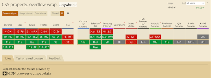
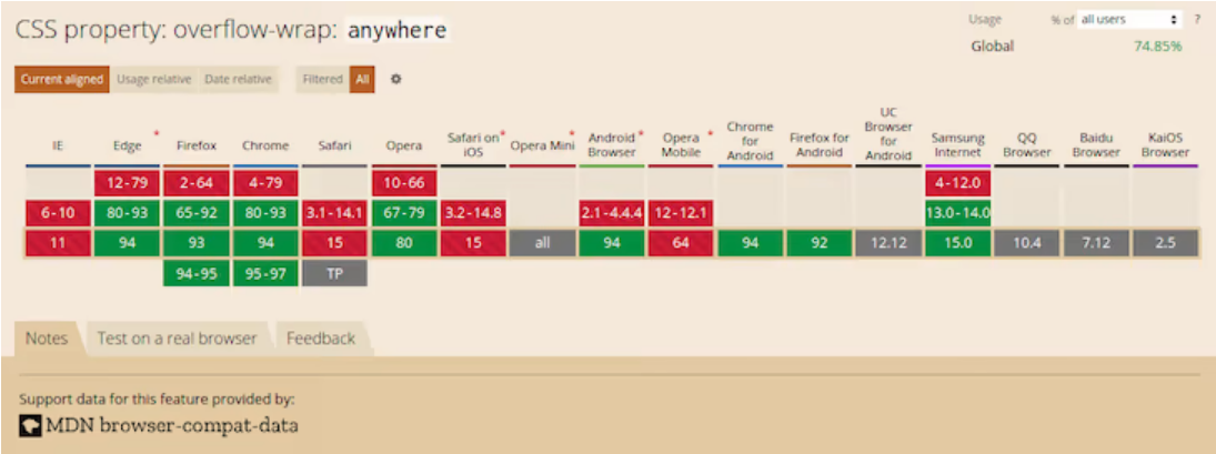
Most recent versions of desktop browsers support overflow-wrap: anywhere. However, support for some mobile browsers is either lacking or unknown. The image below shows the browser support:
Break-word
The value break-word is like anywhere in terms of functionality. If the browser can wrap the overflowing word to its line without overflowing, that is what it will do. However, if the word still overflows its container even when it is on its line, the browser will break it at the point where the overflow would otherwise occur:
.my-element{
   overflow-wrap: break-word;
}
The example below shows how the browser breaks the overflowing text when you apply overflow-wrap: break-word:
See the Pen
overflow-wrap-break-word by Joseph Mawa (@nibble0101)
on CodePen.
Notice that the text appears the same as in the last subsection. The difference between overflow-wrap: anywhere and overflow-wrap: break-word is in the min-content intrinsic sizes.
The difference between anywhere and break-word is apparent when calculating the min-content intrinsic sizes. With break-word, the browser doesn’t consider the soft wrap opportunities introduced by the word break when calculating min-content intrinsic sizes, but it does with anywhere. For more about min-content intrinsic sizes, check out our guide here.
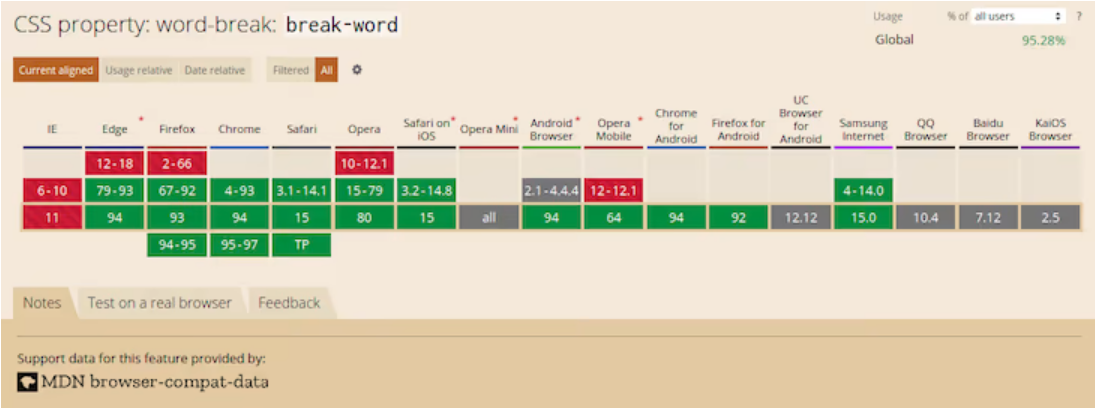
The value break-word has decent coverage among the most recent versions of desktop browsers. Unfortunately, you cannot say the same about their mobile counterpart. It is, therefore, safer to use the legacy word-wrap: break-word instead of the more recent overflow-wrap: break-word.
The image below shows browser support for overflow-wrap: break-word:
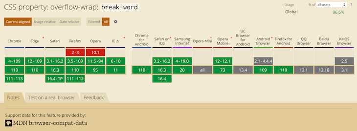
The most recent versions of desktop browsers have support, while support for some mobile browsers is unknown.
Implementing the Word-break CSS property
Word-break is another CSS property you can use to specify soft wrap opportunities between characters. You can use this property to break a word at the exact spot where an overflow would occur and wrap it onto the following line.
The draft CSS3 specification refers to the word-break CSS property as:
This property specifies soft wrap opportunities between letters, i.e., where it is “normal” and permissible to break lines of text. It controls what types of letters the browser can glom together to form unbreakable “words” — causing CJK characters to behave like non-CJK text or vice versa.
Below are the possible values of the word-break CSS property. Like overflow-wrap, you can use the global values inherit, initial, revert, and unset with word-break, but we won’t cover them here:
word-break: normal;
word-break: break-all;
word-break: keep-all;
Break-word is also a value of the word-break CSS property, though it was removed. However, browsers still support it for legacy reasons. Specifying this property has the same effect as word-break: normal and overflow-wrap: anywhere.
Now that we know the break-word CSS property and its corresponding values, let us look at them in the subsections below.
Setting word-break to Normal
Setting the value of the word-break property to normal will apply the default word breaking rules:
.my-element{
   word-break: normal;
}
The example below illustrates what happens when you apply the styling word-break: normal to a block of text that contains a word longer than its container:
See the Pen
word-break-normal by Joseph Mawa (@nibble0101)
on CodePen.
What you see is the browser’s usual word-breaking rules in effect.
The Break-all value
The value break-all will insert a line break at the exact point where the text would otherwise overflow for non-Chinese, non-Japanese, and non-Korean writing systems. It will not put the word on its own line, even if doing so will prevent the need to insert a line break:
.my-element{
   word-break: break-all;
}
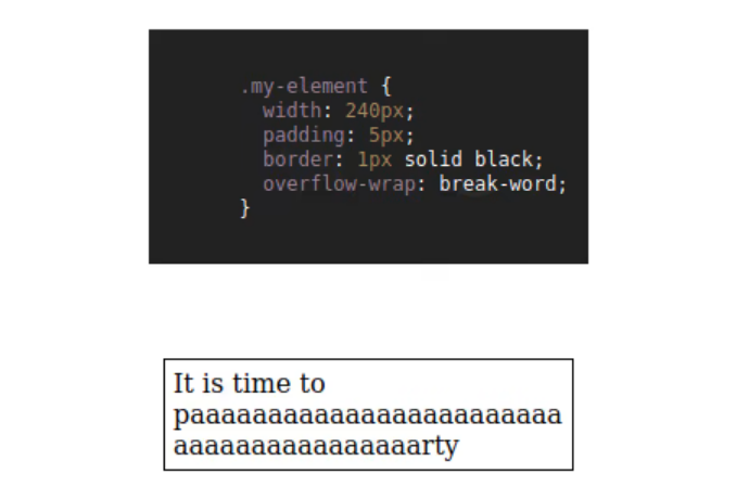
In the example below, I am applying word-break: break-all styling to a p element of width 240px containing an overflowing text. The browser will insert a line break at the point where an overflow would occur and wrap the remaining text to the following line:
See the Pen
word-break-break-all by Joseph Mawa (@nibble0101)
on CodePen.
Using break-all will break a word between two characters at the exact point where an overflow would occur in English and other related language systems. However, it won’t apply the same behavior to Chinese, Japanese, and Korean (CJK) texts.
It doesn’t apply the same behavior for CJK texts because CJK writing systems have their own rules for applying breakpoints. Creating a line break between two characters arbitrarily just for the sake of avoiding overflow might significantly change the overall meaning of the text. For CJK systems, the browser will apply line breaks at the point where such breaks are allowed.
Using the Keep-all value
If you use the value keep-all, the browser will not apply word breaks to CJK texts, even if there is content overflow. The effect of applying keep-all value is the same as that of normal for non-CJK writing systems:
.my-element{
   word-break: keep-all;
}
In the example below, applying word-break: keep-all will have the same effect as word-break: normal for a non-CJK writing system such as English:
See the Pen
word-break-keep-all by Joseph Mawa (@nibble0101)
on CodePen.
The image below shows the browser support for word-break: keep-all:
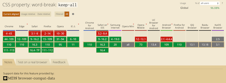
This value has support in most popular desktop browsers. Unfortunately, it is not the case for mobile browsers. Now that we have looked at the overflow-wrap and word-break CSS properties, what is the difference between the two? The section below will shed light on that.
What is the difference between overflow-wrap and word-break?
You can use the CSS properties overflow-wrap and word-break to manage content overflow. However, there are differences in the way the two properties handle it.
Using overflow-wrap will wrap the entire overflowing word to its line if it can fit in a single line without overflowing its container. The browser will break the word only if it cannot place it on a new line without overflowing. In most cases, the overflow-wrap property or its legacy name word-wrap might manage content overflow. Using word-wrap: break-word will wrap the overflowing word onto a new line and goes ahead to break it between two characters if it still overflows its container.
Word-break will ruthlessly break the overflowing word between two characters even if placing it on its line will negate the need for word break. Some writing systems, like the CJK writing systems, have strict word breaking rules the browser takes into consideration when creating line breaks using word-break.
How to wrap text using CSS
As hinted above, if you want to wrap text or break a word overflowing the confines of its box, your best bet is the overflow-wrap CSS property. You can also use its legacy name, word-wrap. Try the word-break CSS property if the overflow-wrap property doesn’t work for you. However, be aware of the differences between overflow-wrap and word-break highlighted above.
Below is an illustration of the overflow-wrap and word-wrap CSS properties. You can play with the CodePen to understand their effects:
See the Pen
how-to-wrap-text by Joseph Mawa (@nibble0101)
on CodePen.
Troubleshooting CSS content overflow with Chrome DevTools
More often than not, you might need to fix broken layouts caused by content overflow, as complex user interfaces are now commonplace in frontend development. Modern web browsers come with tools for troubleshooting such layout issues, such as Chrome DevTools.
It provides the capability to select an element in the DOM tree so that you can view, add, and remove CSS declarations and much more. It will help you track down the offending CSS style in your layout and fix it with ease.
To open the Chrome DevTools, you can use the F12 key. When open, it looks like in the image below. Selecting an element in the DOM tree will display its corresponding CSS styles. You can modify the styles and see the effect on your layout as you track down the source of the bug:
As already mentioned, if you have white-space property on an element, set its value to allow wrapping for overflow-wrap: anywhere or overflow-wrap: break-word to work.
Setting the value of overflow-wrap property to anywhere or break-word on a table content won’t break an overflowing word like in the examples above. The table will overflow its container and create a horizontal scroll if necessary. To get the table to fit within its container and overflow-wrap to work, set the value of the table-layout property to fixed and set the table width to 100% or to some fixed value.
Conclusion
As pointed out in the above sections, overflow-wrap and word-break are similar in so many ways, and you can use both of them for line-breaking controls. The name overflow-wrap is an alias of the legacy word-wrap property. Therefore, you can use the two interchangeably. However, it is worth mentioning that the browser support for the newer overflow-wrap property is still low. You are better off using word-wrap instead of overflow-wrap if you want near-universal browser support.
According to the draft CSS3 specification, browsers and user agents should continue supporting word-wrap for legacy reasons. If you are looking to manage content overflow, overflow-wrap or its legacy name word-wrap might be sufficient. You can also use word-break to break a word between two characters if the word overflows its container. Just like overflow-wrap, you need to tread with caution when using word-break because of limitations in the browser support.
Now that you know the behavior associated with the two properties, you can decide where and when to use them. Did I miss anything? Leave a comment in the comments section. I will be happy to update this article.
Is your frontend hogging your users’ CPU?
As web frontends get increasingly complex, resource-greedy features demand more and more from the browser. If you’re interested in monitoring and tracking client-side CPU usage, memory usage, and more for all of your users in production, try LogRocket. https://logrocket.com/signup/
LogRocket is like a DVR for web and mobile apps, recording everything that happens in your web app, mobile app, or website. Instead of guessing why problems happen, you can aggregate and report on key frontend performance metrics, replay user sessions along with application state, log network requests, and automatically surface all errors.
Modernize how you debug web and mobile apps — Start monitoring for free.

От автора: в наши дни очень важно сделать сайт адаптивным, чтобы он правильно отображался на всех устройствах. К сожалению, несмотря на все усилия, вы все равно можете получить неработающие макеты. Иногда макеты нарушаются из-за того, что некоторые слова слишком длинные, чтобы уместиться в контейнере.
Переполнение контента может произойти, когда вы имеете дело с пользовательским контентом, который вы не можете контролировать. Типичный пример — раздел комментариев в блоге. Следовательно, вам необходимо применить соответствующий стиль, чтобы содержимое не переполняло свой контейнер.
Вы можете использовать свойства CSS word-wrap, overflow-wrap или word-break для обертывания или переноса слов, которые в противном случае переполнили бы их контейнер. Эта статья представляет собой подробное руководство по свойствам CSS word-wrap, overflow-wrap и word-break, а также о том, как вы можете использовать их, чтобы не допустить, чтобы переполнение содержимого разрушало ваш красиво оформленный макет.
Прежде чем мы начнем, давайте разберемся, как браузеры переносят контент в следующую секцию.
Как происходит перенос контента в браузерах?
Браузеры выполняют перенос содержимого в разрешенные брейкпоинты, называемый «мягкой оберткой». Браузер будет обертывать контент с использованием мягкой обертки, если таковая возможна, чтобы минимизировать переполнение контента.

Практический курс по верстке адаптивного сайта с нуля!
Изучите курс и узнайте, как верстать современные сайты на HTML5 и CSS3
Узнать подробнее
В английской и большинстве подобных ей системах письма возможности мягкой обертки по умолчанию появляются на границах слов при отсутствии переносов. Поскольку слова ограничены пробелами и знаками препинания, именно здесь используются мягкие обертки.
Хотя в английских текстах для символов пробела используются мягкие обертки, для неанглийских систем письма ситуация может быть иной. Некоторые языки не используют пробелов для разделения слов. Следовательно, упаковка содержимого зависит от языка или системы письма. Значение атрибута lang, которое вы указываете в элементе html, в основном используется для определения того, какая языковая система используется. В этой статье основное внимание будет уделено системе письма на английском языке.
Переноса по умолчанию при использовании мягкой обертки может быть недостаточно, если вы имеете дело с длинным непрерывным текстом, например URL-адресами или пользовательским контентом, который у вас недостаточно или совсем не контролируется.
Прежде чем мы перейдем к подробному объяснению этих свойств CSS, давайте посмотрим на различия между мягким переносом и принудительным переносом строки в разделе ниже.
В чем разница между мягким и принудительным переносом строки?
Любой перенос текста, который происходит при использовании мягкого переноса, называется разрывом мягкого переноса. Чтобы перенос происходил при использовании мягкого обертывания, необходимо убедиться, что обертывание включено. Например, установка значения nowrap для свойства white-space отключит перенос.
С другой стороны, принудительные разрывы строк возникают из-за явного управления разрывом строк или указания конца или начала блоков текста.
CSS свойства word-wrap и overflow-wrap
Название word-wrap — это устаревшее имя свойства overflow-wrap. Word-wrap изначально было расширением Microsoft. Оно не было частью стандарта CSS, хотя большинство браузеров реализовали его под названием word-wrap. Согласно проекту спецификации CSS3, браузеры должны рассматривать word-wrap как устаревший псевдоним для свойства overflow-wrap.
В последних версиях популярных веб-браузеров реализовано свойство overflow-wrap. В проекте спецификации CSS3 указано следующее определение overflow-wrap: Это свойство указывает, может ли браузер разбивать строку на недопустимые точки переноса, чтобы предотвратить переполнение, когда неразрывная строка слишком длинна, чтобы поместиться в границах контейнера.
Если у вас есть свойство white-space для элемента, вам необходимо установить для него значение allow, чтобы разрешить эффект переноса для overflow-wrap. Ниже приведены значения свойства overflow-wrap. Вы также можете использовать глобальные значения inherit, initial, revert и unset для overflow-wrap, но здесь мы не будем их рассматривать.
|
overflow-wrap: normal; overflow-wrap: anywhere; overflow-wrap: break-word; |
Ниже мы рассмотрим значения свойства CSS overflow-wrap, чтобы понять его поведение.
Normal
Применение значения normal заставит браузер использовать поведение разрыва строки по умолчанию в системе. Поэтому для английского языка и других подобных системах письма разрывы строк будут происходить через пробелы и дефисы:
|
.my-element{ overflow-wrap: normal; } |
На изображении ниже в тексте есть слово, длина которого превышает длину контейнера. Поскольку нет возможности мягкого переноса, а значение свойства overflow-wrap равно normal, слово переполняет свой контейнер. Это является поведением системы при переносе строк по умолчанию.

Anywhere
Использование значения в аnywhere приведет к разрыву неразрывной строки в произвольных точках между двумя символами. Аnywhere не будет добавлять символ дефиса, даже если вы примените свойство hyphens к этому элементу.
Браузер разорвет слово только в том случае, если отображение слова приведет к переполнению. Если слово вызывает переполнение, оно будет разорвано в точке, где это переполнение произошло.
Когда вы используете аnywhere, браузер будет учитывать возможности мягкого переноса, предоставляемые разрывом слова, при вычислении внутренних размеров min-content:
|
.my-element{ overflow-wrap: anywhere; } |
В отличие от предыдущего примера, где мы использовали overflow-wrap: normal, на изображении ниже мы используем overflow-wrap :where. Слово-переполнение, которое невозможно разбить, разбивается на фрагменты текста с помощью overflow-wrap: anywhere, чтобы оно поместилось в своем контейнере.

Значение anywhere не поддерживается некоторыми браузерами. На изображении ниже показана поддержка браузерами по данным caniuse.com. Поэтому не рекомендуется использовать overflow-wrap: anywhere, если вы хотите иметь более высокую поддержку браузера.
Break-word
Значение break-word похоже на любое другое с точки зрения функциональности. Если браузер может перенести слово без переполнения, то он это сделает. Однако, если слово все еще переполняет контейнер, даже когда оно находится в новой строке, браузер разделит его в точке, где снова произошло бы переполнение:
|
.my-element{ overflow-wrap: break-word; } |
На изображении ниже показано, как браузер прерывает переполненный текст в предыдущем разделе, когда вы применяете overflow-wrap: break-word. Вы заметите, что изображение ниже выглядит так же, как изображение в последнем примере. Разница между overflow-wrap: anywhere и overflow-wrap: break-word заключается в вычислении внутренних размеров min-content.
Разница между anywhere и break-word очевидна при вычислении внутренних размеров min-content. С break-word браузер не учитывает возможности мягкого переноса, предоставляемые разрывом слова, при вычислении внутренних размеров min-content, но он учитывает возможности мягкого переноса при использовании anywhere.
Значение break-word имеет достойный охват среди последних версий десктопных браузеров. К сожалению, этого нельзя сказать об их мобильном аналоге. Поэтому безопаснее использовать унаследованный word-wrap: break-word вместо более нового overflow-wrap: break-word.
На изображении ниже показана поддержка браузеров overflow-wrap: break-word согласно caniuse.com. Вы заметите, что последние версии десктопных браузеров имеют поддержку, в то время как поддержка некоторых мобильных браузеров неизвестна.

Свойство Word-break
Word-break — еще одно свойство CSS, которое вы можете использовать для указания возможности мягкого переноса между символами. Вы можете использовать это свойство, чтобы разбить слово в том месте, где могло произойти переполнение, и перенести его на следующую строку.
Ниже приводится то, что говорится о свойстве CSS word-break в спецификации CSS3:
Практический курс по верстке адаптивного сайта с нуля!
Изучите курс и узнайте, как верстать современные сайты на HTML5 и CSS3
Узнать подробнее
Это свойство определяет возможности мягкого переноса между буквами, то есть там, где это «нормально» и допустимо для разрывов строк текста. Word-break контролирует, какие типы букв браузер может объединять в неразрывные «слова», заставляя символы CJK вести себя как текст, не относящийся к CJK, или наоборот.
Ниже приведены возможные значения CSS-свойства word-break. Как и для overflow-wrap, вы также можете использовать глобальные значения inherit, initial, revert и unset, но мы не будем рассматривать их здесь:
|
word-break: normal; word-break: break-all; word-break: keep-all; |
Break-word также является значением для CSS-свойства word-break, хотя оно устарело. Однако, браузеры по-прежнему поддерживают его. Указание этого свойства имеет тот же эффект, что и word-break: normal и overflow-wrap :where.
Теперь, когда мы знакомы с CSS-свойством break-word и соответствующими ему значениями, давайте подробно рассмотрим их.
Normal
Установка для свойства word-break значение normal будет применять правила разбиения по словам по умолчанию:
|
.my-element{ word-break: normal; } |
На изображении ниже показано, что происходит, когда вы применяете стиль word-break: normal к блоку текста, который содержит слово длиннее, чем его контейнер. Вы видите, что в браузере действуют обычные правила разбиения на слова.

Break-all
Значение break-all вставит разрыв строки именно в том месте, где текст переполнился бы для некитайских, неяпонских и некорейских систем письма. Слово не будет помещено в отдельную строку, даже если это предотвратит необходимость вставки разрыва строки:
|
.my-element{ word-break: break-all; } |
На изображении ниже я применил стиль word-break:break-all к элементу p шириной 240 пикселей, содержащему переполненный текст. Браузер вставил разрыв строки в точке, где могло произойти переполнение, и перенес оставшийся текст в следующую строку.

Использование break-all приведет к разрыву слова между двумя символами именно в том месте, где произойдет переполнение в английском и других родственных языковых системах. Однако это не применимо к текстам на китайском, японском и корейском языках (CJK).
Он не применяет то же поведение к текстам CJK, потому что системы письма CJK имеют свои собственные правила для применения брейкпоинтов. Создание разрыва строки между двумя символами произвольно во избежание переполнения может значительно изменить общий смысл текста. Для систем CJK браузер будет применять разрывы строк в том месте, где такие разрывы разрешены.
На изображении ниже показана поддержка браузером word-break: break-word согласно caniuse.com. Хотя последние версии современных веб-браузеров поддерживают это значение, поддержка среди некоторых мобильных браузеров неизвестна.
Keep-all
Если вы используете значение keep-all, браузер не будет применять разрывы слов к текстам CJK, даже если происходит переполнение содержимого. Эффект от применения значения keep-all такой же, как и у normal для систем письма, отличных от CJK:
|
.my-element{ word-break: keep-all; } |
На изображении ниже применение word-break: keep-all имеет тот же эффект, что и word-break: normal, потому что я использую систему письма, отличную от CJK (английский язык).

На изображении ниже показана поддержка браузером word-break: keep-all согласно caniuse.com. Это значение поддерживается в большинстве популярных десктопных браузеров. К сожалению, это не относится к мобильным браузерам.

Теперь, когда мы рассмотрели свойства CSS overflow-wrap и word-break, в чем разница между ними?
В чем разница между overflow-wrap и разр word-break?
Вы можете использовать CSS свойства overflow-wrap и word-break для управления переполнением содержимого. Однако существуют различия в способах обработки этих двух свойств.
Использование overflow-wrap приведет к переносу всего переполненного слова в новую строку, если оно может поместиться в одну строку, не переполняя свой контейнер. Браузер разорвет слово только в том случае, если он не сможет разместить слово в новой строке без переполнения. В большинстве случаев свойство overflow-wrap или его устаревшее название word-wrap может быть достаточным для управления переполнением содержимого.
Свойство overflow-wrap относительно новое, поэтому его поддержка браузером ограничена. Вместо этого вы можете использовать устаревшее название word-wrap, если вам нужна более высокая поддержка браузером.
С другой стороны, word-break безжалостно разорвет слово, которое выходит за границы, между двумя символами, даже если размещение его в новой строке устранит необходимость в разрыве слова. Кроме того, некоторые системы письма, такие как системы письма CJK, имеют строгие правила разбиения по словам, которые браузер принимает во внимание при создании разрывов строк с помощью word-break.
Заключение
Как указывалось в предыдущих разделах, overflow-wrap и word-break во многом схожи. Вы можете использовать оба из них для управления разрывом строки.
Название overflow-wrap является псевдонимом устаревшего свойства word-wrap. Следовательно, вы можете использовать их как взаимозаменяемые. Однако стоит отметить, что поддержка браузером нового свойства overflow-wrap по-прежнему невысока. Вам лучше использовать word-wrap вместо overflow-wrap, если вы хотите почти универсальную поддержку браузера. Согласно проекту спецификации CSS3, браузеры должны продолжать поддерживать word-wrap.
Если вы хотите управлять переполнением содержимого, вам достаточно использовать overflow-wrap или его устаревшее название word-wrap.
Вы также можете использовать word-break, чтобы разбить слово между двумя символами, если слово выходит за пределы своего контейнера. Как и при overflow-wrap, при использовании word-break нужно действовать осторожно из-за ограничений в поддержке браузера.
Теперь, когда вы знаете поведение, связанное с этими двумя свойствами, вы можете решить, где и когда их использовать.
Автор: Joseph Mawa
Источник: blog.logrocket.com
Редакция: Команда webformyself.
Читайте нас в Telegram, VK, Яндекс.Дзен
Практический курс по верстке адаптивного сайта с нуля!
Изучите курс и узнайте, как верстать современные сайты на HTML5 и CSS3
Узнать подробнее

PSD to HTML
Практика верстки сайта на CSS Grid с нуля
Смотреть
Note: This article is focused on the semantics of the English Language as the Writing System. Other systems, especially CJK (Chinese Japanese Korean) have conventions and overflow requirements that vary from English and are out of the scope of this article.
Text Wrapping
In CSS, overflow is the scenario when the content inside a fixed-width container, is wider than the container’s width. The default behavior of CSS is to render the content flowing out of the container. This may look ugly but this helps the developer see the issue and fix it — instead of the issue getting hidden which can cause potential missing information for the user. For example, a form submission button overflowing and becoming inaccessible. So to avoid such issues, CSS by default prevents Data Loss.
Content overflowwwwwwwwwww
CSS offers multiple capabilities to fix this issue.
Property: overflow-wrap (alias word-wrap)
This property applies to inline elements. It determines whether the browser should break an otherwise unbreakable string to avoid it from overflowing its parent’s width.
It has the following possible keyword values.
- normal
- Anywhere
- break-word
overflow-wrap: normal
When set to normal, the browser will break the string on default/natural opportunities, such as a blank space or a hyphen (‘-’) character. It will also leverage soft-hyphen entity ­ to break.
This is the initial value of the overflow-wrap property. So by default, every string will be broken at soft wrap opportunities, if any, on overflow.
This is how ‘ContentOverflowing’ and ‘Content-Overflowing’ will be handled.
ContentOverflowing
Content-Overflowing
overflow-wrap: anywhere;
This value allows the browser to break the string anywhere to avoid overflow.
Consider the following scenario with the default overflow-wrap: normal; value for a fixed-width container.
ContentOverflow
There is no blank space, a hyphen, or any other soft wrap opportunity in the string. Therefore, it overflows. If we apply overflow: anywhere;, we get the following, wrapped result.
ContentOverflow
overflow-wrap: break-word;
It behaves the same as overflow-wrap: anywhere;. The difference is that the former does not consider soft-wrap opportunities when calculating min-content intrinsic sizes. In case you have not explored extrinsic vs intrinsic sizing, Ahmed Shadeed provides a great resource. It breaks only those words which have a width smaller than the available width.
Content is Overflowing
Property: word-break
CSS offers another property, word-break for handling the same issue — overflows.
It has the following keyword values
- normal
- break-all
- keep-all
- break-word
word-break: normal;
Words will break at the default rules — such as a blank space, a hyphen, etc.
This is how ‘ContentOverflow’ and ‘Content-Overflow’ will be handled.
ContentOverflow
Content-Overflow
word-break: break-all;
Break the word at the point it overflows. It does not take into account if placing the overflowing word onto the next line will eliminate the overflow in the first place or not. This doesn’t apply to CJK writing systems.
ContentOverflow
word-break: keep-all;
For Non-CJK systems, the behavior is the same as word-break: normal.
ContentOverflow
word-break: break-word;
It has the same effect that word-break: normal; and overflow-wrap: anywhere; has. But unlike word-break: break-all; , it takes into account if placing the overflowing word onto the next line will eliminate the overflow.
For example, let’s see how word-break: break-word; handles the following scenario:
Content is Overflowing Again
We observe that the whole word ‘Overflowing’ was moved onto the next line instead of breaking as it can fit the available width without overflowing. If we apply word-break: break-all; to it, this is what we get:
Content is Overflowing Again
The word ‘Overflowing’ was broken at exactly the point where it otherwise caused the overflow. And it was not considered if moving it onto the next line eliminated the overflow or not.
overflow-wrap vs word-break
At a high level, both properties solve the same issue. But, a key difference lies in how both the properties approach the issue and the subtle aesthetic variation in their outcomes.
To visualize, consider a fixed and short-width container for the test “A Very LongWordThatHasNoBreakingPossibilities”.
A Very LongWordThatHasNoBreakingPossibilities
Let’s solve the overflow with overflow-wrap: break-word;.
A Very LongWordThatHasNoBreakingPossibilities
Now, let’s solve it with word-break: break-all;.
A Very LongWordThatHasNoBreakingPossibilities
Notice the difference? word-break: break-all; breaks the word even if placing the word on the next line would eliminate the need for breaking. This prevents large gaps before the breaks — and produces visually better results. The difference is more clearly visible in the overflow-wrap: anywhere; vs word-break: break-all; case. A case of the apparently twin properties. Consider you have a very short space to squeeze in a checkbox and a text which can not fit on the same line without overflowing. This is how the outcome looks like with overflow-wrap: anywhere;:
Photosynthesis
We observe that a lot of real estate beside the checkbox has been left unutilized. A better fix is provided by word-break: break-all;:
Photosynthesis
As observed, word-break discards the possibility of the word fitting the next line and prefers optimizing the usage of available real estate — this is often the better adjustment visually.
The above example receives its inspiration from MDN’s resource on text wrapping.
Summary
| Property | Value | Behavior | When To Use | Example |
|---|---|---|---|---|
overflow-wrap |
|
Break at natural line breakpoints such as blank space, a hyphen | When overflow is determined to not be a possibility |
Content |
anywhere |
Break between any 2 characters where the overflow occurs and consider soft wrap opportunities when calculating the min-content intrinsic sizes | When overflow should be handled by breaking long words. As discussed, the alternative option of word-break: break-all; produces visually better results |
ContentOverflow |
|
break-word |
Break between any 2 characters but do not consider soft wrap opportunities when calculating the min-content intrinsic sizes | When overflow should be handled by breaking only those words which have a width smaller than the available width |
Content is Overflowing |
|
word-break |
normal |
Break at default rules | When overflow is determined to not be a possibility |
Content |
break-all |
Break exactly where the content overflows | When overflow should be handled by breaking text exactly at the point of overflow — even if placing the word on a new line eliminates the overflow |
Content is Overflowing Again |
|
break-word |
Same as word-break: normal; and overflow-wrap: anywhere; — Break can create gaps unlike word-break: break-all; |
When placing the overflowing word onto the next line eliminates overflow. This can cause gaps. |
Content is Overflowing Again |
Examples
Here are examples from the above summary in a codepen to help demonstrate what the CSS code should look like:
<section class="centered">
  <h2>Without Handling Overflow</h2>
<div>Content with aVeryVeryVeryLongWord</div>
<!---->

<h2>Handling Overflow with overflow-wrap</h2>

<h3>overflow-wrap: normal;</h3>
<div class="ow-normal">Content with aVeryVeryVeryLongWord</div>

<h3>overflow-wrap: anywhere;</h3>
<div class="ow-anywhere">Content with aVeryLongWordThatDoesNotFit</div>

<h3>overflow-wrap: break-word;</h3>
<div class="ow-break-word">Content with aVeryLongWordThatDoesNotFit</div>
<!---->

<h2>Handling Overflow with word-break</h2>


<h3>word-break: normal;</h3>
<div class="wb-normal">Content with aVeryVeryVeryLongWord</div>

<h3>word-break: break-all;</h3>
<div class="wb-break-all">Content with aVeryLongWordThatDoesNotFit</div>

<h3>word-break: break-word;</h3>
<div class="wb-break-word">Content with aVeryLongWordThatDoesNotFit</div>
</section>
* { font-family: sans-serif; }

section.centered { text-align: center; }

div {
  display: inline-block;
  width: 130px;
  border: 3px solid #48abe0;
  text-align: left;
}

.ow-normal {
  overflow-wrap: normal;
}

.ow-anywhere {
  overflow-wrap: anywhere;
}

.ow-break-word {
  overflow-wrap: break-word;
}

.wb-normal {
  word-break: normal;
}

.wb-break-all {
  word-break: break-all;
}

.wb-break-word {
  word-break: break-word;
}

h3 {
  font-weight: normal;
  font-style: italic;
  border-top: 1px solid #b5b5b5;
  width: 30%;
  margin-left: auto;
  margin-right: auto;
  margin-top: 20px;
  padding-top: 20px;
}
Conclusion
This article has scratched the surface of text-wrapping. Wrapping in itself is a deeper topic as it is tightly coupled to the semantics of the target language. Moreover, it is becoming common to offer web content in multiple languages — aka Internatiolaisation/ Localisation — which makes learning it more important than before for the developers.
Let’s talk about the various ways we can control how text wraps (or doesn’t wrap) on a web page. CSS gives us a lot of tools to make sure our text flows the way we want it to, but we’ll also cover some tricks using HTML and special characters.

Protecting Layout
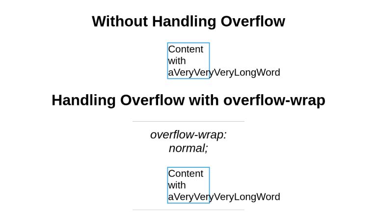
Normally, text flows to the next line at “soft wrap opportunities”, which is a fancy name for spots you’d expect text to break naturally, like between words or after a hyphen. But sometimes you may find yourself with long spans of text that don’t have soft wrap opportunities, such as really long words or URLs. This can cause all sorts of layout issues. For example, the text may overflow its container, or it might force the container to become too wide and push things out of place.
It’s good defensive coding to anticipate issues from text not breaking. Fortunately, CSS gives us some tools for this.
Getting Overflowing Text to Wrap
Putting overflow-wrap: break-word on an element will allow text to break mid-word if needed. It’ll first try to keep a word unbroken by moving it to the next line, but will then break the word if there’s still not enough room.
See the Pen overflow-wrap: break-word by Will Boyd (@lonekorean) on CodePen.
There’s also overflow-wrap: anywhere, which breaks words in the same manner. The difference is in how it affects the min-content size calculation of the element it’s on. It’s pretty easy to see when width is set to min-content.
.top {
  width: min-content;
  overflow-wrap: break-word;
}.bottom {
  width: min-content;
  overflow-wrap: anywhere;
}
See the Pen overflow-wrap + min-content by Will Boyd (@lonekorean) on CodePen.
The top element with overflow-wrap: break-word calculates min-content as if no words are broken, so its width becomes the width of the longest word. The bottom element with overflow-wrap: anywhere calculates min-content with all the breaks it can create. Since a break can happen, well, anywhere, min-content ends up being the width of a single character.
Remember, this behavior only comes into play when min-content is involved. If we had set width to some rigid value, we’d see the same word-breaking result for both.
Breaking Words without Mercy
Another option for breaking words is word-break: break-all. This one won’t even try to keep words whole — it’ll just break them immediately. Take a look.
See the Pen word-break: break-all by Will Boyd (@lonekorean) on CodePen.
Notice how the long word isn’t moved to the next line, like it would have been when using overflow. Also notice how “words” is broken, even though it would have fit just fine on the next line.
word-break: break-all has no problem breaking words, but it’s still cautious around punctuation. For example, it’ll avoid starting a line with the period from the end of a sentence. If you want truly merciless breaking, even with punctuation, use line-break: anywhere.
See the Pen word-break: break-all vs line-break: anywhere by Will Boyd (@lonekorean) on CodePen.
See how word-break: break-all moves the “k” down to avoid starting the second line with “.”? Meanwhile, line-break: anywhere doesn’t care.
Excessive Punctuation
Let’s see how the CSS properties we’ve covered so far handle excessively long spans of punctuation.
See the Pen Excessive Punctuation by Will Boyd (@lonekorean) on CodePen.
overflow-wrap: break-word and line-break: anywhere are able to keep things contained, but then there’s word-break: break-all being weird with punctuation again — this time resulting in overflowing text.
It’s something to keep in mind. If you absolutely do not want text to overflow, be aware that word-break: break-all won’t stop runaway punctuation.
Specifying Where Words Can Break
For more control, you can manually insert word break opportunities into your text with <wbr>. You can also use a “zero-width space”, provided by the ​ HTML entity (yes, it must be capitalized just as you see it!).
Let’s see these in action by wrapping a long URL that normally wouldn’t wrap, but only between segments.
<!-- normal -->
<p>https://subdomain.somewhere.co.uk</p> <!-- <wbr> -->
<p>https://subdomain<wbr>.somewhere<wbr>.co<wbr>.uk</p>
<!-- ​ -->
<p>https://subdomain​.somewhere​.co​.uk</p>
See the Pen Manual Word Break Opportunities by Will Boyd (@lonekorean) on CodePen.
Automatic Hyphenation
You can tell the browser to break and hyphenate words where appropriate by using hyphens: auto. Hyphenation rules are determined by language, so you’ll need to tell the browser what language to use. This is done by specifying the lang attribute in HTML, possibly on the relevant element directly, or on <html>.
<p lang="en">This is just a bit of arbitrary text to show hyphenation in action.</p> p {
-webkit-hyphens: auto; /* for Safari */
hyphens: auto;
}See the Pen hyphens: auto by Will Boyd (@lonekorean) on CodePen.
Manual Hyphenation
You can also take matters into your own hands and insert a “soft hyphen” manually with the ­ HTML entity. It won’t be visible unless the browser decides to wrap there, in which case a hyphen will appear. Notice in the following demo how we’re using ­ twice, but we only see it once where the text wraps.
<p lang="en">Magic? Abraca­dabra? Abraca­dabra!</p>See the Pen Soft Hyphen by Will Boyd (@lonekorean) on CodePen.
hyphens must be set to either auto or manual for ­ to display properly. Conveniently, the default is hyphens: manual, so you should be good without any additional CSS (unless something has declared hyphens: none for some reason).
Preventing Text from Wrapping
Let’s switch things up. There may be times when you don’t want text to wrap freely, so that you have better control over how your content is presented. There are a couple of tools to help you with this.
First up is white-space: nowrap. Put it on an element to prevent its text from wrapping naturally.
See the Pen white-space: nowrap by Will Boyd (@lonekorean) on CodePen.
Preformatting Text
There’s also white-space: pre, which will wrap text just as you have it typed in your HTML. Be careful though, as it will also preserve spaces from your HTML, so be mindful of your formatting. You can also use a <pre> tag to get the same results (it has white-space: pre on it by default).
<!-- the formatting of this HTML results in extra whitespace! -->
<p>
What's worse, ignorance or apathy?
I don't know and I don't care.
</p><!-- tighter formatting that "hugs" the text -->
<p>What's worse, ignorance or apathy?
I don't know and I don't care.</p>
<!-- same as above, but using <pre> -->
<pre>What's worse, ignorance or apathy?
I don't know and I don't care.</pre>
p {
  white-space: pre;
}pre {
  /* <pre> sets font-family: monospace, but we can undo that */
  font-family: inherit;
}
See the Pen Preformatted Text by Will Boyd (@lonekorean) on CodePen.
A Break, Where Words Can’t Break?
For line breaks, you can use <br> inside of an element with white-space: nowrap or white-space: pre just fine. The text will wrap.
But what happens if you use <wbr> in such an element? Kind of a trick question… because browsers don’t agree. Chrome/Edge will recognize the <wbr> and potentially wrap, while Firefox/Safari won’t.
When it comes to the zero-width space (​) though, browsers are consistent. None will wrap it with white-space: nowrap or white-space: pre.
<p>Darth Vader: Nooooooooooooo<br>oooo!</p><p>Darth Vader: Nooooooooooooo<wbr>oooo!</p>
<p>Darth Vader: Nooooooooooooo​oooo!</p>
See the Pen white-space: nowrap + breaking lines by Will Boyd (@lonekorean) on CodePen.
Non-Breaking Spaces
Sometimes you may want text to wrap freely, except in very specific places. Good news! There are a few specialized HTML entities that let you do exactly this.
A “non-breaking space” ( ) is often used to keep space between words, but disallow a line break between them.
<p>Something I've noticed is designers don't seem to like orphans.</p><p>Something I've noticed is designers don't seem to like orphans.</p>
See the Pen Non-Breaking Space by Will Boyd (@lonekorean) on CodePen.
Word Joiners and Non-Breaking Hyphens
It’s possible for text to naturally wrap even without spaces, such as after a hyphen. To prevent wrapping without adding a space, you can use ⁠ (case-sensitive!) to get a “word joiner”. For hyphens specifically, you can get a “non-breaking hyphen” with ‑ (it doesn’t have a nice HTML entity name).
<p>Turn right here to get on I-85.</p> <p>Turn right here to get on I-⁠85.</p>
<p>Turn right here to get on I‑85.</p>
See the Pen Word Joiners and Non-Breaking Hyphens by Will Boyd (@lonekorean) on CodePen.
CJK Text and Breaking Words
CJK (Chinese/Japanese/Korean) text behaves differently than non-CJK text in some ways. Certain CSS properties and values can be used for additional control over the wrapping of CJK text specifically.
Default browser behavior allows words to be broken in CJK text. This means that word-break: normal (the default) and word-break: break-all will give you the same results. However, you can use word-break: keep-all to prevent CJK text from wrapping within words (non-CJK text will be unaffected).
Here’s an example in Korean. Note how the word “자랑스럽게” does or doesn’t break.
See the Pen CJK Text + word-break by Will Boyd (@lonekorean) on CodePen.
Be careful though, Chinese and Japanese don’t use spaces between words like Korean does, so word-break: keep-all can easily cause long overflowing text if not otherwise handled.
CJK Text and Line Break Rules
We talked about line-break: anywhere earlier with non-CJK text and how it has no problem breaking at punctuation. The same is true with CJK text.
Here’s an example in Japanese. Note how “。” is or isn’t allowed to start a line.
See the Pen CJK Text + line-break by Will Boyd (@lonekorean) on CodePen.
There are other values for line-break that affect how CJK text wraps: loose, normal, and strict. These values instruct the browser on which rules to use when deciding where to insert line breaks. The W3C describes several rules and it’s possible for browsers to add their own rules as well.
Worth Mentioning: Element Overflow
The overflow CSS property isn’t specific to text, but is often used to ensure text doesn’t render outside of an element that has its width or height constrained.
.top {
  white-space: nowrap;
  overflow: auto;
}.bottom {
  white-space: nowrap;
  overflow: hidden;
}
See the Pen Element Overflow by Will Boyd (@lonekorean) on CodePen.
As you can see, a value of auto allows the content to be scrolled (auto only shows scrollbars when needed, scroll shows them always). A value of hidden simply cuts off the content and leaves it at that.
overflow is actually shorthand to set both overflow-x and overflow-y, for horizontal and vertical overflow respectively. Feel free to use what suits you best.
We can build upon overflow: hidden by adding text-overflow: ellipsis. Text will still be cut off, but we’ll get some nice ellipsis as an indication.
p {
  white-space: nowrap;
  overflow: hidden;
  text-overflow: ellipsis;
}
See the Pen text-overflow: ellipsis by Will Boyd (@lonekorean) on CodePen.
Bonus Trick: Pseudo-Element Line Break
You can force a line break before and/or after an inline element, while keeping it as an inline element, with a little bit of pseudo-element trickery.
First, set the content of a ::before or ::after pseudo-element to 'A', which will give you the new line character. Then set white-space: pre to ensure the new line character is respected.
<p>Things that go <span>bump</span> in the night.</p>span {
background-color: #000;
}span::before, span::after {
content: 'A';
white-space: pre;
}
See the Pen Pseudo-Element Line Breaks by Will Boyd (@lonekorean) on CodePen.
We could have just put display: block on the <span> to get the same breaks, but then it would no longer be inline. The background-color makes it easy to see that with this method, we still have an inline element.
Bonus Notes
- There’s an older CSS property named
word-wrap. It’s non-standard and browsers now treat it as an alias foroverflow-wrap. - The
white-spaceCSS property has some other values we didn’t cover:pre-wrap,pre-line, andbreak-spaces. Unlike the ones we did cover, these don’t prevent text wrapping. - The CSS Text Module Level 4 spec describes a
text-wrapCSS property that looks interesting, but at the time of writing, no browser implements it.
Time to “Wrap” Things Up
There’s so much that goes into flowing text on a web page. Most of the time you don’t really need to think about it, since browsers handle it for you. For the times when you do need more control, it’s nice to know that you have a lot of options.
Writing this was definitely a rabbit hole for me as I kept finding more and more things to talk about. I hope I’ve shown you enough to get your text to break and flow just the way you want it.
Thanks for reading!
1. Introduction
This module describes the typesetting controls of CSS;
that is, the features of CSS that control the translation of
source text to formatted, line-wrapped text.
Various CSS properties provide control over case transformation, white space collapsing, text wrapping, line breaking rules and hyphenation, alignment and justification, spacing,
and indentation.
Further information about the typesetting requirements
of various languages and writing systems around the world
can be found in the Internationalization Working Group’s Language Enablement Index. [TYPOGRAPHY]
1.1. Module Interactions
This module, together with the CSS Text Decoration Module,
replaces and extends the text-level features defined in Cascading Style Sheets Level 2 chapter 16. [CSS-TEXT-DECOR-3] [CSS2]
In addition to the terms defined below,
other terminology and concepts used in this specification are defined
in Cascading Style Sheets Level 2 and the CSS Writing Modes Module. [CSS2] and [CSS-WRITING-MODES-4].
1.2. Value Definitions
This specification follows the CSS property definition conventions from [CSS2] using the value definition syntax from [CSS-VALUES-3].
Value types not defined in this specification are defined in CSS Values & Units [CSS-VALUES-3].
Combination with other CSS modules may expand the definitions of these value types.
In addition to the property-specific values listed in their definitions,
all properties defined in this specification
also accept the CSS-wide keywords as their property value.
For readability they have not been repeated explicitly.
1.3. Languages and Typesetting
Authors should accurately language-tag their content
for the best typographic behavior.
Many typographic effects vary by linguistic context.
Language and writing system conventions can affect
line breaking, hyphenation, justification, glyph selection,
and many other typographic effects. In CSS, language-specific typographic tailorings
are only applied when the content language is known (declared). Therefore,
higher quality typography requires authors to communicate to the UA
the correct linguistic context of the text in the document.
The content language of an element is the (human) language
the element is declared to be in, according to the rules of the document language.
Note that it is possible for the content language of an element
to be unknown—e.g. untagged content,
or content in a document language that does not have a language-tagging facility,
is considered to have an unknown content language.
Note: Authors can declare the content language using the global lang attribute in HTML
or the universal xml:lang attribute in XML.
See the rules for determining the content language of an HTML element in HTML,
and the rules for determining the content language of an XML element in XML 1.0. [HTML] [XML10]
The content language an element is declared to be in
also identifies the specific written form of that language used in that element,
known as the content writing system.
Depending on the document language’s facilities for identifying the content language,
this information can be explicit or implied.
See the normative Appendix F:
Identifying the Content Writing System.
Note: Some languages have more than one writing system tradition;
in other cases a language can be transliterated into a foreign writing system.
Authors should subtag such cases
so that the UA can adapt appropriately.
For example, Korean (ko) can be written in
Hangul (-Hang),
Hanja (-Hani),
or a combination (-Kore).
Historical documents written solely in Hanja
do not use word spaces and
are formatted more like modern Chinese than modern Korean.
In other words, for typographic purposes ko-Hani behaves more like zh-Hant than ko (ko-Kore).
As another example Japanese (ja) is typically written
in a combination (-Japn) of Hiragana (-Hira),
Katakana (-Kana), and Kanji (-Hani).
However, it can also be ”romanized” into Latin (-Latn)
for special purposes like language-learning textbooks,
in which case it should be formatted more like English than Japanese.
As a third example contemporary Mongolian is written in two scripts:
Cyrillic (-Cyrl, officially used in Mongolia)
and Mongolian (-Mong, more common in Inner Mongolia, part of China).
These have very different formatting requirements,
with Cyrillic behaving similar to Latin and Greek,
and Mongolian deriving from both Arabic and Chinese writing conventions.
1.4. Characters and Letters
The basic unit of typesetting is the character.
However, because writing systems are not always as simple as the basic English alphabet,
what a character actually is depends on the context in which the term is used.
For example, in Hangul (the Korean writing system),
each square representation of a syllable
(e.g. 한=Han)
can be considered a character.
However, the square symbol is really composed of multiple letters each representing a phoneme
(e.g. ㅎ=h, ㅏ=a, ㄴ=n)
and these also could each be considered a character.
A basic unit of computer text encoding, for any given encoding,
is also called a character,
and depending on the encoding,
a single encoding character might correspond
to the entire pre-composed syllabic character (e.g. 한),
to the individual phonemic character (e.g. ㅎ),
or to smaller units such as
a base letterform (e.g. ㅇ)
and any combining marks that vary it (e.g. extra strokes that represent aspiration).
In turn, a single encoding character can be represented in the data stream as one or more bytes;
and in programming environments one byte is sometimes also called a character.
Therefore the term character is fairly ambiguous where technical precision is required.
For text layout, we will refer to the typographic character unit as the basic unit of text.
Even within the realm of text layout,
the relevant character unit depends on the operation.
For example, line-breaking and letter-spacing will segment
a sequence of Thai characters that include U+0E33 ำ THAI CHARACTER SARA AM differently;
or the behavior of a conjunct consonant in a script such as Devanagari
may depend on the font in use.
So the typographic character represents a unit of the writing system—such as a Latin alphabetic letter (including its diacritics),
Hangul syllable,
Chinese ideographic character,
Myanmar syllable cluster—that is indivisible with respect to a particular typographic operation
(line-breaking, first-letter effects, tracking, justification, vertical arrangement, etc.).
Unicode Standard Annex #29: Text Segmentation defines a unit called the grapheme cluster which approximates the typographic character. [UAX29] A UA must use the extended grapheme cluster (not legacy grapheme cluster), as defined in UAX29,
as the basis for its typographic character unit.
However, the UA should tailor the definitions
as required by typographic tradition
since the default rules are not always appropriate or ideal—and is expected to tailor them differently
depending on the operation as needed.
Note: The rules for such tailorings are out of scope for CSS.
The following are some examples of typographic character unit tailorings
required by standard typesetting practice:
- In some scripts such as Myanmar or Devanagari,
the typographic character unit for both justification and line-breaking
is an entire syllable,
which can include more than one Unicode grapheme cluster. [UAX29] -
In other scripts such as Thai or Lao,
even though for line-breaking the typographic character matches Unicode’s default grapheme clusters,
for letter-spacing the relevant unit
is less than a Unicode grapheme cluster,
and may require decomposition or other substitutions
before spacing can be inserted. [UAX29]For instance,
to properly letter-space the Thai word คำ (U+0E04 + U+0E33),
the U+0E33 needs to be decomposed into U+0E4D + U+0E32,
and then the extra letter-space inserted before the U+0E32: คํ า.A slightly more complex example is น้ำ (U+0E19 + U+0E49 + U+0E33).
In this case, normal Thai shaping will first decompose the U+0E33 into U+0E4D + U+0E32
and then swap the U+0E4D with the U+0E49, giving U+0E19 + U+0E4D + U+0E49 + U+0E32.
As before the extra letter-space is then inserted before the U+0E32: นํ้ า. - Vertical typesetting can also require tailoring.
For example, when typesetting upright text,
Tibetan tsek and shad marks are kept with the preceding grapheme cluster,
rather than treated as an independent typographic character unit. [CSS-WRITING-MODES-4]
A typographic letter unit (or letter for the purpose of this specification)
is a typographic character unit belonging to one of the Letter or Number general categories.
See Appendix E:
Characters and Properties for how to determine the Unicode properties of a typographic character unit.
The rendering characteristics of a typographic character unit divided
by an element boundary is undefined.
Ideally each component should be rendered
according to the formatting requirements of its respective element’s properties
while maintaining correct shaping and positioning
of the typographic character unit as a whole.
However, depending on the nature of the formatting differences between its parts
and the capabilities of the font technology in use,
this is not always possible.
Therefore such a typographic character unit may be rendered as belonging to either side of the boundary,
or as some approximation of belonging to both.
Authors are forewarned that dividing grapheme clusters or ligatures
by element boundaries may give inconsistent or undesired results.
1.5. Text Processing
CSS is built on Unicode. [UNICODE] UAs that support Unicode must adhere to all normative requirements
of the Unicode Core Standard,
except where explicitly overridden by CSS.
UAs implemented on the basis of a non-Unicode text encoding model are still
expected to fulfill the same text handling requirements
by assuming an appropriate mapping and analogous behavior.
For the purpose of determining adjacency for text processing
(such as white space processing, text transformation, line-breaking, etc.),
and thus in general within this specification,
intervening inline box boundaries and out-of-flow elements
must be ignored.
With respect to text shaping, however, see § 7.3 Shaping Across Element Boundaries.
2. Transforming Text
2.1. Case Transforms: the text-transform property
| Name: | text-transform |
|---|---|
| Value: | none | [capitalize | uppercase | lowercase ] || full-width || full-size-kana |
| Initial: | none |
| Applies to: | text |
| Inherited: | yes |
| Percentages: | n/a |
| Computed value: | specified keyword |
| Canonical order: | n/a |
| Animation type: | discrete |
This property transforms text for styling purposes.
It has no effect on the underlying content,
and must not affect the content of a plain text copy & paste operation.
Authors must not rely on text-transform for semantic purposes;
rather the correct casing and semantics should be encoded
in the source document text and markup.
Values have the following meanings:
- none
- No effects.
- capitalize
- Puts the first typographic letter unit of each word, if lowercase, in titlecase;
other characters are unaffected. - uppercase
- Puts all letters in uppercase.
- lowercase
- Puts all letters in lowercase.
- full-width
- Puts all typographic character units in full-width form.
If a character does not have a corresponding full-width form,
it is left as is.
This value is typically used to typeset Latin letters and digits
as if they were ideographic characters. - full-size-kana
- Converts all small Kana characters to the equivalent full-size Kana.
This value is typically used for ruby annotation text,
where authors may want all small Kana to be drawn as large Kana
to compensate for legibility issues at the small font sizes typically used in ruby.
The following example converts the ASCII characters
used in abbreviations in Japanese text to their full-width variants
so that they lay out and line break like ideographs:
abbr:lang(ja) { text-transform: full-width; }
Note: The purpose of text-transform is
to allow for presentational casing transformations
without affecting the semantics of the document.
Note in particular that text-transform casing operations are lossy,
and can distort the meaning of a text.
While accessibility interfaces may wish to convey
the apparent casing of the rendered text to the user,
the transformed text cannot be relied on to accurately represent
the underlying meaning of the document.
In this example,
the first line of text is capitalized as a visual effect.
section > p:first-of-type::first-line {
  text-transform: uppercase;
}
This effect cannot be written into the source document
because the position of the line break depends on layout.
But also, the capitalization is not reflecting a semantic distinction
and is not intended to affect the paragraph’s reading;
therefore it belongs in the presentation layer.
In this example,
the ruby annotations,
which are half the size of the main paragraph text,
are transformed to use regular-size kana
in place of small kana.
rt { font-size: 50%; text-transform: full-size-kana; }
:is(h1, h2, h3, h4) rt { text-transform: none; /* unset for large text*/ }
Note that while this makes such letters easier to see at small type sizes,
the transformation distorts the text:
the reader needs to mentally substitute small kana in the appropriate places—not unlike reading a Latin inscription
where all “U”s look like “V”s.
For example, if text-transform: full-size-kana were applied to the following source,
the annotation would read “じゆう” (jiyū), which means “liberty”,
instead of “じゅう” (jū), which means “ten”,
the correct reading and meaning for the annotated “十”.
<ruby>十<rt>じゅう</ruby>
2.1.1. Mapping Rules
For capitalize, what constitutes a “word“ is UA-dependent; [UAX29] is suggested (but not required)
for determining such word boundaries.
Out-of-flow elements and inline element boundaries
must not introduce a text-transform word boundary
and must be ignored when determining such word boundaries.
Note: Authors cannot depend on capitalize to follow
language-specific titlecasing conventions
(such as skipping articles in English).
The UA must use the full case mappings for Unicode characters,
including any conditional casing rules,
as defined in the Default Case Algorithms section of The Unicode Standard. [UNICODE] If (and only if) the content language of the element is,
according to the rules of the document language,
known,
then any appropriate language-specific rules must be applied as well.
These minimally include,
but are not limited to,
the language-specific rules in Unicode’s SpecialCasing.txt.
For example, in Turkish there are two “i”s,
one with a dot—“İ” and “i”—and one without—“I” and “ı”.
Thus the usual case mappings between “I” and “i”
are replaced with a different set of mappings
to their respective dotless/dotted counterparts,
which do not exist in English.
This mapping must only take effect
if the content language is Turkish
written in its modern Latin-based writing system (or another Turkic language that uses Turkish casing rules);
in other languages,
the usual mapping of “I” and “i” is required.
This rule is thus conditionally defined in Unicode’s SpecialCasing.txt file.
The definition of full-width and half-width forms
can be found in Unicode Standard Annex #11: East Asian Width. [UAX11] The mapping to full-width form is defined
by taking code points with the <wide> or the <narrow> tag
in their Decomposition_Mapping in Unicode Standard Annex #44: Unicode Character Database. [UAX44] For the <narrow> tag,
the mapping is from the code point to the decomposition
(minus <narrow> tag),
and for the <wide> tag,
the mapping is from the decomposition
(minus the <wide> tag)
back to the original code point.
The mappings for small Kana to full-size Kana are defined in Appendix G:
Small Kana Mappings.
2.1.2. Order of Operations
When multiple values are specified
and therefore multiple transformations need to be applied,
they are applied in the following order:
- capitalize, uppercase, and lowercase
- full-width
- full-size-kana
Text transformation happens after § 4.1.1 Phase I: Collapsing and Transformation but before § 4.1.2 Phase II: Trimming and Positioning.
This means that full-width only transforms
spaces (U+0020) to U+3000 IDEOGRAPHIC SPACE within preserved white space.
Note: As defined in Appendix A:
Text Processing Order of Operations,
transforming text affects line-breaking and other formatting operations.
3. White Space and Wrapping: the white-space property
| Name: | white-space |
|---|---|
| Value: | normal | pre | nowrap | pre-wrap | break-spaces | pre-line |
| Initial: | normal |
| Applies to: | text |
| Inherited: | yes |
| Percentages: | n/a |
| Computed value: | specified keyword |
| Canonical order: | n/a |
| Animation type: | discrete |
This property specifies two things:
- whether and how white space is collapsed
- whether lines may wrap at unforced soft wrap opportunities
Values have the following meanings,
which must be interpreted according to
the White Space Processing and Line Breaking rules:
- normal
- This value directs user agents to collapse sequences of white space into a single character
(or in some cases, no character).
Lines may wrap at allowed soft wrap opportunities,
as determined by the line-breaking rules in effect,
in order to minimize inline-axis overflow. - pre
- This value prevents user agents from collapsing sequences of white space. Segment breaks such as line feeds
are preserved as forced line breaks.
Lines only break at forced line breaks;
content that does not fit within the block container overflows it. - nowrap
- Like normal,
this value collapses white space;
but like pre, it does not allow wrapping. - pre-wrap
- Like pre,
this value preserves white space;
but like normal,
it allows wrapping. - break-spaces
-
The behavior is identical to that of pre-wrap,
except that:- Any sequence of preserved white space or other space separators always takes up space,
including at the end of the line. - A line breaking opportunity exists
after every preserved white space character
and after every other space separator (including between adjacent spaces).
Note: This value does not guarantee
that there will never be any overflow due to white space:
for example, if the line length is so short
that even a single white space character does not fit,
overflow is unavoidable. - Any sequence of preserved white space or other space separators always takes up space,
- pre-line
- Like normal,
this value collapses consecutive white space characters and allows wrapping,
but it preserves segment breaks in the source as forced line breaks.
White space that was not removed or collapsed due to white space processing
is called preserved white space.
Note: In some cases, preserved white space and other space separators can hang when at the end of the line;
this can affect whether they are measured for intrinsic sizing.
The following informative table summarizes the behavior
of various white-space values:
| New Lines | Spaces and Tabs | Text Wrapping | End-of-line spaces | End-of-line other space separators | |
|---|---|---|---|---|---|
| normal | Collapse | Collapse | Wrap | Remove | Hang |
| pre | Preserve | Preserve | No wrap | Preserve | No wrap |
| nowrap | Collapse | Collapse | No wrap | Remove | Hang |
| pre-wrap | Preserve | Preserve | Wrap | Hang | Hang |
| break-spaces | Preserve | Preserve | Wrap | Wrap | Wrap |
| pre-line | Preserve | Collapse | Wrap | Remove | Hang |
See White Space Processing Rules for details on how white space collapses.
See Line Breaking for details on wrapping behavior.
4. White Space Processing & Control Characters
The source text of a document often contains formatting
that is not relevant to the final rendering:
for example, breaking the source into segments (lines) for ease of editing
or adding white space characters such as tabs and spaces to indent the source code.
CSS white space processing allows the author
to control interpretation of such formatting:
to preserve or collapse it away when rendering the document.
White space processing in CSS
(which is controlled with the white-space property)
interprets white space characters only for rendering:
it has no effect on the underlying document data.
Note: Depending on the document language,
segments can be separated by a particular newline sequence
(such as a line feed or CRLF pair),
or delimited by some other mechanism,
such as the SGML RECORD-START and RECORD-END tokens.
For CSS processing,
each document language–defined “segment break” or “newline sequence”—or if none are defined, each line feed (U+000A)—in the text is treated as a segment break,
which is then interpreted for rendering as specified by the white-space property.
In the case of HTML,
each newline sequence is normalized to a single line feed (U+000A)
for representation in the DOM,
so when an HTML document is represented as a DOM tree
each line feed (U+000A)
is treated as a segment break. [HTML] [DOM]
Note: In most common CSS implementations,
HTML does not get styled directly.
Instead, it is processed into a DOM tree,
which is then styled.
Unlike HTML,
the DOM does not give any particular meaning to carriage returns (U+000D),
so they are not treated as segment breaks.
If carriage returns (U+000D) are inserted into the DOM
by means other than HTML parsing,
they then get treated as defined below.
Note: A document parser might
not only normalize any segment breaks,
but also collapse other space characters or
otherwise process white space according to markup rules.
Because CSS processing occurs after the parsing stage,
it is not possible to restore these characters for styling.
Therefore, some of the behavior specified below
can be affected by these limitations and
may be user agent dependent.
Note: Anonymous blocks consisting entirely of collapsible white space are removed from the rendering tree.
Thus any such white space surrounding a block-level element is collapsed away.
See Cascading Style Sheets Level 2 Revision 1 (CSS 2.1) Specification § visuren#anonymous. [CSS2]
Control characters (Unicode category Cc)—other than tabs (U+0009),
line feeds (U+000A),
carriage returns (U+000D)
and sequences that form a segment break—must be rendered as a visible glyph
which the UA must synthesize if the glyphs found in the font are not visible,
and must be otherwise treated as any other character
of the Other Symbols (So) general category and Common script.
The UA may use a glyph provided by a font specifically for the control character,
substitute the glyphs provided for the corresponding symbol in the Control Pictures block,
generate a visual representation of its code point value,
or use some other method to provide an appropriate visible glyph.
As required by Unicode,
unsupported Default_ignorable characters
must be ignored for text rendering. [UNICODE]
Carriage returns (U+000D) are treated identically to spaces (U+0020) in all respects.
Note: For HTML documents,
carriage returns present in the source code
are converted to line feeds at the parsing stage
(see HTML § 13.2.3.5 Preprocessing the input stream and the definition of normalize newlines in Infra and therefore do no appear as U+000D CARRIAGE RETURN to CSS. [HTML] [INFRA])
However, the character is preserved—and the above rule observable—when encoded using an escape sequence (
).
4.1. The White Space Processing Rules
Except where specified otherwise,
white space processing in CSS affects only
the document white space characters: spaces (U+0020), tabs (U+0009), and segment breaks.
Note: The set of characters considered document white space (part of the document content)
and those considered syntactic white space
(part of the CSS syntax)
are not necessarily identical.
However, since both include spaces (U+0020), tabs (U+0009), and line feeds (U+000A)
most authors won’t notice any differences.
Besides space (U+0020)
and no-break space (U+00A0),
Unicode defines a number of additional space separator characters. [UNICODE] In this specification
all characters in the Unicode general category Zs
except space (U+0020)
and no-break space (U+00A0)
are collectively referred to as other space separators.
4.1.1. Phase I: Collapsing and Transformation
For each inline
(including anonymous inlines;
see Cascading Style Sheets Level 2 Revision 1 (CSS 2.1) Specification § visuren#anonymous [CSS2])
within an inline formatting context, white space characters are processed as follows
prior to line breaking and bidi reordering,
ignoring bidi formatting characters (characters with the Bidi_Control property [UAX9])
as if they were not there:
-
If white-space is set to normal, nowrap, or pre-line, white space characters are considered collapsible and are processed by performing the following steps:
- Any sequence of collapsible spaces and tabs immediately preceding or following a segment break is removed.
- Collapsible segment breaks are transformed for rendering
according to the segment break transformation rules. - Every collapsible tab is converted to a collapsible space (U+0020).
- Any collapsible space immediately following another collapsible space—even one outside the boundary of the inline containing that space,
provided both spaces are within the same inline formatting context—is collapsed to have zero advance width.
(It is invisible,
but retains its soft wrap opportunity,
if any.)
- If white-space is set to pre, pre-wrap, or break-spaces,
any sequence of spaces is treated as a sequence of non-breaking spaces.
However, for pre-wrap,
a soft wrap opportunity exists at the end of a sequence of spaces and/or tabs,
while for break-spaces,
a soft wrap opportunity exists after every space and every tab.
The following example illustrates
the interaction of white-space collapsing and bidirectionality.
Consider the following markup fragment, taking special note of spaces (with varied backgrounds and borders for emphasis and identification):
<ltr>A <rtl> B </rtl> C</ltr>where the <ltr> element represents a left-to-right embedding
and the <rtl> element represents a right-to-left embedding.
If the white-space property is set to normal,
the white-space processing model will result in the following:
- The space before the B ( )
will collapse with the space after the A ( ). - The space before the C ( )
will collapse with the space after the B ( ).
This will leave two spaces,
one after the A in the left-to-right embedding level,
and one after the B in the right-to-left embedding level.
The text will then be ordered according to the Unicode bidirectional algorithm,
with the end result being:
A BC
Note that there will be two spaces between A and B,
and none between B and C.
This is best avoided by putting spaces outside the element
instead of just inside the opening and closing tags
and, where practical,
by relying on implicit bidirectionality instead of explicit embedding levels.
4.1.2. Phase II: Trimming and Positioning
Then, the entire block is rendered.
Inlines are laid out,
taking bidi reordering into account,
and wrapping as specified by the white-space property.
As each line is laid out,
- A sequence of collapsible spaces at the beginning of a line
is removed. -
If the tab size is zero, preserved tabs are not rendered.
Otherwise, each preserved tab is rendered
as a horizontal shift that lines up
the start edge of the next glyph with the next tab stop.
If this distance is less than 0.5ch,
then the subsequent tab stop is used instead. Tab stops occur at points
that are multiples of the tab size from the starting content edge
of the preserved tab’s nearest block container ancestor.
The tab size is given by the tab-size property.Note: See the Unicode rules on how tabulation (U+0009) interacts with bidi. [UAX9]
-
A sequence of collapsible spaces at the end of a line is removed,
as well as any trailing U+1680 OGHAM SPACE MARK
whose white-space property is normal, nowrap, or pre-line.Note: Due to Unicode Bidirectional Algorithm rule L1,
a sequence of collapsible spaces located at the end of the line
prior to bidi reordering will also be at the end of the line after reordering. [UAX9] [CSS-WRITING-MODES-4] -
If there remains any sequence of white space, other space separators,
and/or preserved tabs at the end of a line
(after bidi reordering [CSS-WRITING-MODES-4]):- If white-space is set to normal, nowrap,
or pre-line,
the UA must hang this sequence (unconditionally). -
If white-space is set to pre-wrap,
the UA must (unconditionally) hang this sequence,
unless the sequence is followed by a forced line break,
in which case it must conditionally hang the sequence instead.
It may also visually collapse the character advance widths
of any that would otherwise overflow.Note: Hanging the white space rather than collapsing it
allows users to see the space when selecting or editing text. -
If white-space is set to break-spaces, spaces, tabs, and other space separators are treated the same as other visible characters:
they cannot hang nor have their advance width collapsed.Note: Such characters therefore take up space,
and depending on the available space
and applicable line breaking controls
will either overflow or cause the line to wrap.
- If white-space is set to normal, nowrap,
This example shows that conditionally hanging white space
at the end of lines with forced breaks
provides symmetry with the start of the line.
An underline is added to help visualize the spaces.
p {
  white-space: pre-wrap;
  width: 5ch;
  border: solid 1px;
  font-family: monospace;
  text-align: center;
}
<p> 0 </p>
The sample above would be rendered as follows:
0
Since the final space is before a forced line break
and does not overflow,
it does not hang,
and centering works as expected.
This example illustrates the difference
between hanging spaces at the end of lines without forced breaks,
and conditionally hanging them at the end of lines with forced breaks.
An underline is added to help visualize the spaces.
p {
  white-space: pre-wrap;
  width: 3ch;
  border: solid 1px;
  font-family: monospace;
}
<p> 0 0 0 0 </p>
The sample above would be rendered as follows:
0
0 0
0
If p { text-align: right; } was added,
the result would be as follows:
0
0 0
0
As the preserved spaces at the end of lines without a forced break must hang,
they are not considered when placing the rest of the line during text alignment.
When aligning towards the end,
this means any such spaces will overflow,
and will not prevent the rest of the line’s content from being flush with the edge of the line.
On the other hand,
preserved spaces at the end of a line with a forced break conditionally hang.
Since the space at the end of the last line would not overflow in this example,
it does not hang and therefore is considered during text alignment.
In the following example,
there is not enough room on any line to fit the end-of-line spaces,
so they hang on all lines:
the one on the line without a forced break because it must,
as well as the one on the line with a forced break,
because it conditionally hangs and overflows.
An underline is added to help visualize the spaces.
p {
  white-space: pre-wrap;
  width: 3ch;
  border: solid 1px;
  font-family: monospace;
}
<p>0 0 0 0 </p>
0 0
0 0
The last line is not wrapped before the last 0 because characters that conditionally hang are not considered
when measuring the line’s contents for fit.
4.1.3. Segment Break Transformation Rules
When white-space is pre, pre-wrap, break-spaces, or pre-line, segment breaks are not collapsible and are instead transformed into a preserved line feed (U+000A).
For other values of white-space, segment breaks are collapsible,
and are collapsed as follows:
- First, any collapsible segment break immediately following another collapsible segment break is removed.
-
Then any remaining segment break is either transformed into a space (U+0020)
or removed
depending on the context before and after the break.
The rules for this operation are UA-defined in this level.Note: The white space processing rules have already
removed any tabs and spaces around the segment break before this context is evaluated.
The purpose of the segment break transformation rules
(and white space collapsing in general)
is to “unbreak” text that has been broken into segments to make the document source code easier to work with.
In languages that use word separators, such as English and Korean,
“unbreaking” a line requires joining the two lines with a space.
Here is an English paragraph
that is broken into multiple lines
in the source code so that it can
be more easily read and edited
in a text editor.
Here is an English paragraph that is broken into multiple lines in the source code so that it can be more easily read and edited in a text editor.
requires maintaining a space in its place.
In languages that have no word separators, such as Chinese,
“unbreaking” a line requires joining the two lines with no intervening space.
這個段落是那麼長,
在一行寫不行。最好
用三行寫。
這個段落是那麼長,在一行寫不行。最好用三行寫。
requires eliminating any intervening white space.
The segment break transformation rules can use adjacent context
to either transform the segment break into a space
or eliminate it entirely.
Note: Historically, HTML and CSS have unconditionally converted segment breaks to spaces,
which has prevented content authored in languages such as Chinese
from being able to break lines within the source.
Thus UA heuristics need to be conservative about where they discard segment breaks even as they strive to improve support for such languages.
4.2. Tab Character Size: the tab-size property
| Name: | tab-size |
|---|---|
| Value: | <number> | <length> |
| Initial: | 8 |
| Applies to: | text |
| Inherited: | yes |
| Percentages: | n/a |
| Computed value: | the specified number or absolute length |
| Canonical order: | n/a |
| Animation type: | by computed value type |
This property determines the tab size used to render preserved tab characters (U+0009).
A <number> represents the measure
as a multiple of the advance width of the space character (U+0020)
of the nearest block container ancestor of the preserved tab,
including its associated letter-spacing and word-spacing.
Negative values are not allowed.
5. Line Breaking and Word Boundaries
When inline-level content is laid out into lines, it is broken across line boxes.
Such a break is called a line break.
When a line is broken due to explicit line-breaking controls
(such as a preserved newline character),
or due to the start or end of a block,
it is a forced line break.
When a line is broken due to content wrapping (i.e. when the UA creates unforced line breaks
in order to fit the content within the measure),
it is a soft wrap break.
The process of breaking inline-level content into lines is called line breaking.
Wrapping is only performed at an allowed break point,
called a soft wrap opportunity.
When wrapping is enabled (see white-space),
the UA must minimize the amount of content overflowing a line
by wrapping the line at a soft wrap opportunity,
if one exists.
In most writing systems,
in the absence of hyphenation a soft wrap opportunity occurs only at word boundaries.
Many such systems use spaces or punctuation to explicitly separate words,
and soft wrap opportunities can be identified by these characters.
Scripts such as Thai, Lao, and Khmer, however,
do not use spaces or punctuation to separate words.
Although the zero width space (U+200B) can be used as an explicit word delimiter
in these scripts,
this practice is not common.
As a result, a lexical resource is needed
to correctly identify soft wrap opportunities in such texts.
In some other writing systems, soft wrap opportunities are based on orthographic syllable boundaries,
not word boundaries.
Some of these systems, such as Javanese and Balinese,
are similar to Thai and Lao in that they
require analysis of the text to find breaking opportunities.
In others such as Chinese (as well as Japanese, Yi, and sometimes also Korean),
each syllable tends to correspond to a single typographic letter unit,
and thus line breaking conventions allow the line to break
anywhere except between certain character combinations.
Additionally the level of strictness in these restrictions
varies with the typesetting style.
While CSS does not fully define where soft wrap opportunities occur,
some controls are provided to distinguish common variations:
- The line-break property allows choosing various levels of “strictness”
for line breaking restrictions. - The word-break property controls what types of letters
are glommed together to form unbreakable “words”,
causing CJK characters to behave like non-CJK text or vice versa. - The hyphens property controls whether automatic hyphenation
is allowed to break words in scripts that hyphenate. - The overflow-wrap property allows the UA to take a break anywhere
in otherwise-unbreakable strings that would otherwise overflow.
Note: Unicode Standard Annex #14: Unicode Line Breaking Algorithm defines a baseline behavior
for line breaking for all scripts in Unicode,
which is expected to be further tailored. [UAX14] More information on line breaking conventions
can be found in Requirements for Japanese Text Layout [JLREQ] and Formatting Rules for Japanese Documents [JIS4051] for Japanese, Requirements for Chinese Text Layout [CLREQ] and General Rules for Punctuation [ZHMARK] for Chinese.
See also the Internationalization Working Group’s Language Enablement Index which includes more information on additional languages. [TYPOGRAPHY] Any guidance on additional appropriate references
would be much appreciated.
5.1. Line Breaking Details
When determining line breaks:
- The interaction of line breaking and bidirectional text is defined by CSS Writing Modes 4 § 2.4 Applying the Bidirectional Reordering Algorithm and the Unicode Bidirectional Algorithm (UAX9§3.4 Reordering Resolved Levels in particular). [CSS-WRITING-MODES-4] [UAX9]
-
Preserved segment breaks, and—regardless of the white-space value—any Unicode character with the the
BKandNLline breaking class,
must be treated as forced line breaks. [UAX14]Note: The bidi implications of such forced line breaks are defined by the Unicode Bidirectional Algorithm. [UAX9]
- Except where explicitly defined otherwise
(e.g. for line-break: anywhere or overflow-wrap: anywhere)
line breaking behavior defined for
theWJ,ZW,GL,
andZWJUnicode line breaking classes
must be honored. [UAX14] - UAs that allow wrapping at punctuation
other than word separators in writing systems that use them should prioritize breakpoints.
(For example, if breaks after slashes are given a lower priority than spaces,
the sequence “check /etc” will never break between the «/» and the «e».)
As long as care is taken to avoid such awkward breaks,
allowing breaks at appropriate punctuation other than word separators is recommended,
as it results in more even-looking margins, particularly in narrow measures.
The UA may use the width of the containing block, the text’s language,
the line-break value,
and other factors in assigning priorities:
CSS does not define prioritization of line breaking opportunities.
Prioritization of word separators is not expected,
however,
if word-break: break-all is specified
(since this value explicitly requests line breaking behavior
not based on breaking at word separators)—and is forbidden under line-break: anywhere. - Out-of-flow elements
and inline element boundaries
do not introduce a forced line break or soft wrap opportunity in the flow. - For Web-compatibility
there is a soft wrap opportunity before and after each replaced element or other atomic inline,
even when adjacent to a character that would normally suppress them,
such as U+00A0 NO-BREAK SPACE. - For soft wrap opportunities created by characters
that disappear at the line break (e.g. U+0020 SPACE),
properties on the box directly containing that character
control the line breaking at that opportunity.
For soft wrap opportunities defined by the boundary between two characters,
the white-space property
on the nearest common ancestor of the two characters
controls breaking;
which elements’ line-break, word-break, and overflow-wrap properties
control the determination of soft wrap opportunities at such boundaries
is undefined in Level 3. - For soft wrap opportunities before the first
or after the last character of a box,
the break occurs immediately before/after the box
(at its margin edge)
rather than breaking the box
between its content edge and the content. - Line breaking in/around Ruby is defined
in CSS Ruby Annotation Layout 1 § 3.4 Breaking Across Lines. [CSS-RUBY-1] -
In order to avoid unexpected overflow,
if the user agent is unable to perform the requisite lexical
or orthographic analysis
for line breaking any content language that requires it—for example due to lacking a dictionary for certain languages—it must assume a soft wrap opportunity between pairs of typographic letter units in that writing system.Note: This provision is not triggered merely when
the UA fails to find a word boundary in a particular text run;
the text run may well be a single unbreakable word.
It applies for example
when a text run is composed of Khmer characters (U+1780 to U+17FF)
if the user agent does not know how to determine
word boundaries in Khmer.
5.2. Breaking Rules for Letters: the word-break property
| Name: | word-break |
|---|---|
| Value: | normal | keep-all | break-all | break-word |
| Initial: | normal |
| Applies to: | text |
| Inherited: | yes |
| Percentages: | n/a |
| Computed value: | specified keyword |
| Canonical order: | n/a |
| Animation type: | discrete |
This property specifies soft wrap opportunities between letters,
i.e. where it is “normal” and permissible to break lines of text.
Specifically it controls whether a soft wrap opportunity generally exists
between adjacent typographic letter units,
treating non-letter typographic character units belonging to the NU, AL, AI,
or ID Unicode line breaking classes
as typographic letter units for this purpose (only). [UAX14] It does not affect rules governing the soft wrap opportunities created by white space (as well as by other space separators)
and around punctuation.
(See line-break for controls affecting punctuation and small kana.)
For example,
in some styles of CJK typesetting,
English words are allowed to break between any two letters,
rather than only at spaces or hyphenation points;
this can be enabled with word-break:break-all.
being broken at an arbitrary point in the word.
As another example, Korean has two styles of line-breaking:
between any two Korean syllables (word-break: normal)
or, like English, mainly at spaces (word-break: keep-all).
각 줄의 마지막에 한글이 올 때 줄 나눔 기
준을 “글자” 또는 “어절” 단위로 한다.
각 줄의 마지막에 한글이 올 때 줄 나눔
기준을 “글자” 또는 “어절” 단위로 한다.
Ethiopic similarly has two styles of line-breaking,
either only breaking at word separators (word-break: normal),
or also allowing breaks between letters within a word (word-break: break-all).
ተወልዱ፡ኵሉ፡ሰብእ፡ግዑዛን፡ወዕሩያን፡
በማዕረግ፡ወብሕግ።ቦሙ፡ኅሊና፡ወዐቅል፡
ወይትጌበሩ፡አሐዱ፡ምስለ፡አሀዱ፡
በመንፈሰ፡እኍና።
ተወልዱ፡ኵሉ፡ሰብእ፡ግዑዛን፡ወዕሩያን፡በማ
ዕረግ፡ወብሕግ።ቦሙ፡ኅሊና፡ወዐቅል፡ወይትጌ
በሩ፡አሐዱ፡ምስለ፡አሀዱ፡በመንፈሰ፡እኍና።
Note: To enable additional break opportunities only in the case of overflow,
see overflow-wrap.
Values have the following meanings:
- normal
- Words break according to their customary rules,
as described above.
Korean, which commonly exhibits two different behaviors,
allows breaks between any two consecutive Hangul/Hanja.
For Ethiopic, which also exhibits two different behaviors,
such breaks within words are not allowed. - break-all
-
Breaking is allowed within “words”:
specifically,
in addition to soft wrap opportunities allowed for normal,
any typographic letter units (and any typographic character units resolving to theNU(“numeric”),AL(“alphabetic”),
orSA(“Southeast Asian”)
line breaking classes [UAX14])
are instead treated asID(“ideographic characters”)
for the purpose of line-breaking.
Hyphenation is not applied.Note: This value does not affect
whether there are soft wrap opportunities around punctuation characters.
To allow breaks anywhere, see line-break: anywhere.Note: This option enables the other common behavior for Ethiopic.
It is also often used in a context where
the text consists predominantly of CJK characters
with only short non-CJK excerpts,
and it is desired that the text be better distributed on each line. - keep-all
-
Breaking is forbidden within “words”:
implicit soft wrap opportunities between typographic letter units (or other typographic character units belonging to theNU,AL,AI,
orIDUnicode line breaking classes [UAX14])
are suppressed,
i.e. breaks are prohibited between pairs of such characters
(regardless of line-break settings other than anywhere)
except where opportunities exist due to dictionary-based breaking.
Otherwise this option is equivalent to normal.
In this style, sequences of CJK characters do not break.Note: This is the other common behavior for Korean
(which uses spaces between words),
and is also useful for mixed-script text where CJK snippets are mixed
into another language that uses spaces for separation.
Symbols that line-break the same way as letters of a particular category
are affected the same way as those letters.
Here’s a mixed-script sample text:
这是一些汉字 and some Latin و کمی خط عربی และตัวอย่างการเขียนภาษาไทย በጽሑፍ፡ማራዘሙን፡አንዳንድ፡
The break-points are determined as follows (indicated by ‘·’):
- word-break: normal
-
这·是·一·些·汉·字·and·some·Latin·و·کمی·خط·عربی·และ·ตัวอย่าง·การเขียน·ภาษาไทย·በጽሑፍ፡·ማራዘሙን፡·አንዳንድ፡
- word-break: break-all
-
这·是·一·些·汉·字·a·n·d·s·o·m·e·L·a·t·i·n·و·ﮐ·ﻤ·ﻰ·ﺧ·ﻁ·ﻋ·ﺮ·ﺑ·ﻰ·แ·ล·ะ·ตั·ว·อ·ย่·า·ง·ก·า·ร·เ·ขี·ย·น·ภ·า·ษ·า·ไ·ท·ย·በ·ጽ·ሑ·ፍ፡·ማ·ራ·ዘ·ሙ·ን፡·አ·ን·ዳ·ን·ድ፡
- word-break: keep-all
-
这是一些汉字·and·some·Latin·و·کمی·خط·عربی·และ·ตัวอย่าง·การเขียน·ภาษาไทย·በጽሑፍ፡·ማራዘሙን፡·አንዳንድ፡
Japanese is usually typeset allowing line breaks within words.
However, it is sometimes preferred to suppress these wrapping opportunities
and to only allow wrapping at the end of certain sentence fragments.
This is most commonly done in very short pieces of text,
such as headings and table or figure captions.
This can be achieved by marking the allowed wrapping points
with wbr or U+200B ZERO WIDTH SPACE,
and suppressing the other ones using word-break: keep-all.
For instance, the following markup can produce either of the renderings below,
depending on the value of the word-break property:
<h1>窓ぎわの<wbr>トットちゃん</h1>
h1 { word-break: normal }
|
h1 { word-break: keep-all }
|
|
|---|---|---|
| Expected rendering |
窓ぎわのトットちゃ ん |
窓ぎわの トットちゃん |
| Result in your browser | 窓ぎわのトットちゃん | 窓ぎわのトットちゃん |
When shaping scripts such as Arabic
are allowed to break within words due to break-all the characters must still be shaped
as if the word were not broken (see § 5.6 Shaping Across Intra-word Breaks).
For compatibility with legacy content,
the word-break property also supports
a deprecated break-word keyword.
When specified, this has the same effect as word-break: normal and overflow-wrap: anywhere,
regardless of the actual value of the overflow-wrap property.
5.3. Line Breaking Strictness: the line-break property
| Name: | line-break |
|---|---|
| Value: | auto | loose | normal | strict | anywhere |
| Initial: | auto |
| Applies to: | text |
| Inherited: | yes |
| Percentages: | n/a |
| Computed value: | specified keyword |
| Canonical order: | n/a |
| Animation type: | discrete |
This property specifies the strictness of line-breaking rules applied
within an element:
especially how wrapping interacts with punctuation and symbols.
Values have the following meanings:
- auto
- The UA determines the set of line-breaking restrictions to use,
and it may vary the restrictions based on the length of the line;
e.g., use a less restrictive set of line-break rules for short lines. - loose
- Breaks text using the least restrictive set of line-breaking
rules. Typically used for short lines, such as in newspapers. - normal
- Breaks text using the most common set of line-breaking rules.
- strict
- Breaks text using the most stringent set of line-breaking rules.
- anywhere
-
There is a soft wrap opportunity around every typographic character unit,
including around any punctuation character
or preserved white spaces,
or in the middle of words,
disregarding any prohibition against line breaks,
even those introduced by characters with theGL,WJ, orZWJline breaking classes
or mandated by the word-break property. [UAX14] The different wrapping opportunities must not be prioritized.
Hyphenation is not applied.Note: This value triggers the line breaking rules typically seen in terminals.
Note: anywhere only allows preserved white spaces at the end of the line
to be wrapped to the next line
when white-space is set to break-spaces,
because in other cases:- preserved white space at the end/start of the line is discarded
(normal, pre-line) - wrapping is forbidden altogether (nowrap, pre)
- the preserved white space hang (pre-wrap).
When it does have an effect on preserved white space,
with white-space: break-spaces,
it allows breaking before the first space of a sequence,
which break-spaces on its own does not. - preserved white space at the end/start of the line is discarded
CSS distinguishes between four levels of strictness
in the rules for text wrapping.
The precise set of rules in effect for each of loose, normal,
and strict is up to the UA
and should follow language conventions.
However, this specification does require that:
-
The following breaks are forbidden in strict line breaking
and allowed in normal and loose:- breaks before Japanese small kana
or the Katakana-Hiragana prolonged sound mark,
i.e. characters
from the Unicode line breaking classCJ. [UAX14]
- breaks before Japanese small kana
-
The following breaks are allowed for normal and loose line breaking
if the writing system is Chinese or Japanese,
and are otherwise forbidden:- breaks before certain CJK hyphen-like characters:
〜 U+301C,
゠ U+30A0
- breaks before certain CJK hyphen-like characters:
-
The following breaks are allowed for loose line breaking
if the preceding character
belongs to the Unicode line breaking classID[UAX14] (including when the preceding character
is treated asIDdue to word-break: break-all),
and are otherwise forbidden:- breaks before hyphens:
‐ U+2010, – U+2013
- breaks before hyphens:
-
The following breaks are forbidden for normal and strict line breaking
and allowed in loose:- breaks before iteration marks:
々 U+3005, 〻 U+303B, ゝ U+309D,
ゞ U+309E, ヽ U+30FD, ヾ U+30FE - breaks between inseparable characters
(such as ‥ U+2025, … U+2026)
i.e. characters from the Unicode line breaking classIN. [UAX14]
- breaks before iteration marks:
-
The following breaks are allowed for loose if the writing system is Chinese or Japanese and are otherwise forbidden:
- breaks before certain centered punctuation marks:
・ U+30FB,
: U+FF1A, ; U+FF1B, ・ U+FF65,
‼ U+203C,
⁇ U+2047, ⁈ U+2048, ⁉ U+2049,
! U+FF01, ? U+FF1F - breaks before suffixes:
Characters with the Unicode line breaking classPO[UAX14] and the East Asian Width property [UAX11]Ambiguous,Fullwidth,
orWide. - breaks after prefixes:
Characters with the Unicode line breaking classPR[UAX14] and the East Asian Width property [UAX11]Ambiguous,Fullwidth,
orWide.
- breaks before certain centered punctuation marks:
Note: The requirements listed above
only create distinctions in CJK text.
In an implementation that matches only the rules above,
and no additional rules, line-break would only affect CJK code points
unless the writing system is tagged as Chinese or Japanese.
Future levels may add additional specific rules
for other writing systems and languages
as their requirements become known.
As UAs can add additional distinctions
between strict/normal/loose modes,
these values can exhibit differences in other writing systems as well.
For example, a UA with sufficiently-advanced Thai language processing ability
could choose to map different levels of strictness in Thai line-breaking
to these keywords,
e.g. disallowing breaks within compound words in strict mode
(e.g. breaking ตัวอย่างการเขียนภาษาไทย as ตัวอย่าง·การเขียน·ภาษาไทย)
while allowing more breaks in loose (ตัวอย่าง·การ·เขียน·ภาษา·ไทย).
Note: The CSSWG recognizes that in a future edition of the specification
finer control over line breaking may be necessary
to satisfy high-end publishing requirements.
5.4. Hyphenation: the hyphens property
Hyphenation is the controlled splitting of words
where they usually would not be allowed to break
to improve the layout of paragraphs,
typically splitting words at syllabic or morphemic boundaries
and visually indicating the split
(usually by inserting a hyphen, U+2010).
In some cases, hyphenation may also alter the spelling of a word.
Regardless, hyphenation is a rendering effect only:
it must have no effect on the underlying document content
or on text selection or searching.
Hyphenation Across Languages
Hyphenation practices vary across languages,
and can involve not just inserting a hyphen before the line break,
but inserting a hyphen after the break (or both),
inserting a different character than U+2010,
or changing the spelling of the word.
| Language | Unbroken | Before | After |
|---|---|---|---|
| English | Unbroken | Un‐ | broken |
| Dutch | cafeetje | café‐ | tje |
| Hungarian | Összeg | Ösz‐ | szeg |
| Mandarin | tú’àn | tú‐ | àn |
| àizēng‐fēnmíng | àizēng‐ | ‐fēnmíng | |
| Uyghur | داميدى | داميـ | دى |
Hyphenation occurs
when the line breaks at a valid hyphenation opportunity,
which is a type of soft wrap opportunity that exists within a word where hyphenation is allowed.
In CSS hyphenation opportunities are controlled
with the hyphens property.
CSS Text Level 3 does not define the exact rules for hyphenation;
however UAs are strongly encouraged
to optimize their choice of break points
and to chose language-appropriate hyphenation points.
Note: The soft wrap opportunity introduced by
the U+002D — HYPHEN-MINUS character
or the U+2010 ‐ HYPHEN character
is not a hyphenation opportunity,
as no visual indication of the split is created when wrapping:
these characters are visible whether the line is wrapped at that point or not.
Hyphenation opportunities are considered when calculating min-content intrinsic sizes.
Note: This allows tables to hyphenate their contents
instead of overflowing their containing block,
which is particularly important in long-word languages like German.
| Name: | hyphens |
|---|---|
| Value: | none | manual | auto |
| Initial: | manual |
| Applies to: | text |
| Inherited: | yes |
| Percentages: | n/a |
| Computed value: | specified keyword |
| Canonical order: | n/a |
| Animation type: | discrete |
This property controls whether hyphenation is allowed to create more soft wrap opportunities within a line of text.
Values have the following meanings:
- none
-
Words are not hyphenated,
even if characters inside the word
explicitly define hyphenation opportunities.Note: This does not suppress the existing soft wrap opportunities introduced by always visible characters such as
U+002D — HYPHEN-MINUS
or U+2010 ‐ HYPHEN. - manual
-
Words are only hyphenated where there are characters inside the word
that explicitly suggest hyphenation opportunities.
The UA must use the appropriate language-specific hyphenation character(s)
and should apply any appropriate spelling changes
just as for automatic hyphenation at the same point.In Unicode, U+00AD is a conditional «soft hyphen»
and U+2010 is an unconditional hyphen. Unicode Standard Annex #14 describes the role of soft hyphens in Unicode line breaking. [UAX14] In HTML,
­ represents the soft hyphen character,
which suggests a hyphenation opportunity.ex­ample
- auto
- Words may be broken at hyphenation opportunities determined automatically by a language-appropriate hyphenation resource
in addition to those indicated explicitly by a conditional hyphen.
Automatic hyphenation opportunities elsewhere within a word must be ignored
if the word contains a conditional hyphen
(­ or U+00AD SOFT HYPHEN),
in favor of the conditional hyphen(s).
However, if, even after breaking at such opportunities,
a portion of that word is still too long to fit on one line,
an automatic hyphenation opportunity may be used.
Correct automatic hyphenation requires a hyphenation resource
appropriate to the language of the text being broken.
The UA must therefore only automatically hyphenate text
for which the content language is known
and for which it has an appropriate hyphenation resource.
Authors should correctly tag their content’s language (e.g. using the HTML lang attribute
or XML xml:lang attribute)
in order to obtain correct automatic hyphenation.
The UA may use language-tailored heuristics
to exclude certain words
from automatic hyphenation.
For example, a UA might try to avoid hyphenation in proper nouns
by excluding words matching certain capitalization and punctuation patterns.
Such heuristics are not defined by this specification.
(Note that such heuristics will need to vary by language:
English and German, for example, have very different capitalization conventions.)
For the purpose of the hyphens property,
what constitutes a “word” is UA-dependent.
However, inline element boundaries
and out-of-flow elements
must be ignored when determining word boundaries.
Any glyphs shown due to hyphenation
at a hyphenation opportunity created by a conditional hyphen character
(such as U+00AD SOFT HYPHEN)
are represented by that character
and are styled according to the properties applied to it.
When shaping scripts such as Arabic are allowed to break within words
due to hyphenation,
the characters must still be shaped
as if the word were not broken (see § 5.6 Shaping Across Intra-word Breaks).
For example, if the Uyghur word “داميدى”
were hyphenated, it would appear as ![[isolated DAL + isolated ALEF + initial MEEM +
medial YEH + hyphen + line-break + final DAL +
isolated ALEF MAKSURA]](https://www.w3.org/TR/css-text-3/images/uyghur-hyphenate-joined.png) not as
not as ![[isolated DAL + isolated ALEF + initial MEEM +
final YEH + hyphen + line-break + isolated DAL +
isolated ALEF MAKSURA]](https://www.w3.org/TR/css-text-3/images/uyghur-hyphenate-unjoined.png) .
.
5.5. Overflow Wrapping: the overflow-wrap/word-wrap property
| Name: | overflow-wrap, word-wrap |
|---|---|
| Value: | normal | break-word | anywhere |
| Initial: | normal |
| Applies to: | text |
| Inherited: | yes |
| Percentages: | n/a |
| Computed value: | specified keyword |
| Canonical order: | n/a |
| Animation type: | discrete |
This property specifies whether the UA may break
at otherwise disallowed points within a line
to prevent overflow,
when an otherwise-unbreakable string is too long to fit within the line box.
It only has an effect when white-space allows wrapping. Possible values:
- normal
- Lines may break only at allowed break points.
However,
the restrictions introduced by word-break: keep-all may be relaxed
to match word-break: normal if there are no otherwise-acceptable break points in the line. - anywhere
- An otherwise unbreakable sequence of characters may be broken at an arbitrary point
if there are no otherwise-acceptable break points in the line.
Shaping characters are still shaped
as if the word were not broken,
and grapheme clusters must stay together as one unit.
No hyphenation character is inserted at the break point. Soft wrap opportunities introduced by anywhere are considered when calculating min-content intrinsic sizes. - break-word
- As for anywhere except that soft wrap opportunities introduced by break-word are not considered
when calculating min-content intrinsic sizes.
For legacy reasons, UAs must treat word-wrap as a legacy name alias of the overflow-wrap property.
5.6. Shaping Across Intra-word Breaks
When shaping scripts such as Arabic wrap at unforced soft wrap opportunities within words
(such as when breaking due to word-break: break-all, line-break: anywhere, overflow-wrap: break-word, overflow-wrap: anywhere,
or when hyphenating)
the characters must still be shaped
(their joining forms chosen)
as if the word were still whole.
For example,
if the word “نوشتن” is broken between the “ش” and “ت”,
the “ش” still takes its initial form (“ﺷ”),
and the “ت” its medial form (“ﺘ”)—forming as in “ﻧﻮﺷ | ﺘﻦ”, not as in “نوش | تن”.
6. Alignment and Justification
Alignment and justification controls
how inline content is distributed within a line box.
6.1. Text Alignment: the text-align shorthand
| Name: | text-align |
|---|---|
| Value: | start | end | left | right | center | justify | match-parent | justify-all |
| Initial: | start |
| Applies to: | block containers |
| Inherited: | yes |
| Percentages: | see individual properties |
| Computed value: | see individual properties |
| Animation type: | discrete |
| Canonical order: | n/a |
This shorthand property sets the text-align-all and text-align-last properties
and describes how the inline-level content of a block
is aligned along the inline axis
if the content does not completely fill the line box.
Values other than justify-all or match-parent are assigned to text-align-all and reset text-align-last to auto.
Values have the following meanings:
- start
- Inline-level content is aligned
to the start edge of the line box. - end
- Inline-level content is aligned
to the end edge of the line box. - left
- Inline-level content is aligned
to the line-left edge of the line box.
(In vertical writing modes,
this can be either the physical top or bottom,
depending on writing-mode.) [CSS-WRITING-MODES-4] - right
- Inline-level content is aligned
to the line-right edge of the line box.
(In vertical writing modes,
this can be either the physical top or bottom,
depending on writing-mode.) [CSS-WRITING-MODES-4] - center
- Inline-level content is centered within the line box.
- justify
- Text is justified
according to the method specified by the text-justify property,
in order to exactly fill the line box.
Unless otherwise specified by text-align-last,
the last line before a forced break
or the end of the block
is start-aligned. - justify-all
- Sets both text-align-all and text-align-last to justify,
forcing the last line to justify as well. - match-parent
-
This value behaves the same as inherit (computes to its parent’s computed value)
except that an inherited value of start or end is interpreted against the parent’s direction value
and results in a computed value of either left or right.
Computes to start when specified on the root element.When specified on the text-align shorthand,
sets both text-align-all and text-align-last to match-parent.
A block of text
is a stack of line boxes.
This property specifies how the inline-level boxes within each line box
align with respect to the start and end sides of the line box.
Alignment is not with respect to the viewport or containing block.
In the case of justify,
the UA may stretch or shrink any inline boxes
by adjusting their text.
(See text-justify.)
If an element’s white space is not collapsible,
then the UA is not required to adjust its text
for the purpose of justification
and may instead treat the text
as having no justification opportunities.
If the UA chooses to adjust the text,
then it must ensure
that tab stops continue to line up as required by the white space processing rules.
If (after justification, if any)
the inline contents of a line box are too long to fit within it,
then the contents are start-aligned:
any content that doesn’t fit
overflows the line box’s end edge.
See § 8.3 Bidirectionality and Line Boxes for details on how to determine
the start and end edges
of a line box.
6.2. Default Text Alignment: the text-align-all property
| Name: | text-align-all |
|---|---|
| Value: | start | end | left | right | center | justify | match-parent |
| Initial: | start |
| Applies to: | block containers |
| Inherited: | yes |
| Percentages: | n/a |
| Computed value: | keyword as specified, except for match-parent which computes as defined above |
| Canonical order: | n/a |
| Animation type: | discrete |
This longhand of the text-align shorthand property specifies the inline alignment of all lines of inline content in the block container,
except for last lines
overridden by a non-auto value of text-align-last.
See text-align for a full description of values.
Authors should use the text-align shorthand instead of this property.
6.3. Last Line Alignment: the text-align-last property
| Name: | text-align-last |
|---|---|
| Value: | auto | start | end | left | right | center | justify | match-parent |
| Initial: | auto |
| Applies to: | block containers |
| Inherited: | yes |
| Percentages: | n/a |
| Computed value: | specified keyword |
| Canonical order: | n/a |
| Animation type: | discrete |
This property describes how the last line of a block or a line
right before a forced line break is aligned.
If auto is specified,
content on the affected line is aligned per text-align-all unless text-align-all is set to justify,
in which case it is start-aligned.
All other values are interpreted as described for text-align.
6.4. Justification Method: the text-justify property
| Name: | text-justify |
|---|---|
| Value: | auto | none | inter-word | inter-character |
| Initial: | auto |
| Applies to: | text |
| Inherited: | yes |
| Percentages: | n/a |
| Computed value: | specified keyword (except for the distribute legacy value) |
| Canonical order: | n/a |
| Animation type: | discrete |
This property selects the justification method
used when a line’s alignment is set to justify (see text-align).
The property applies to text,
but is inherited from block containers
to the root inline box containing their inline-level contents.
It takes the following values:
- auto
-
The UA determines the justification algorithm to follow,
based on a balance between performance and adequate presentation quality.
Since justification rules vary by writing system and language,
UAs should, where possible,
use a justification algorithm appropriate to the text.For example,
the UA could use by default a justification method
that is a simple universal compromise for all writing systems—such as primarily expanding word separators and between CJK typographic letter units along with secondarily expanding
between Southeast Asian typographic letter units.
Then, in cases where the content language of the paragraph is known,
it could choose a more language-tailored justification behavior
e.g. following the Requirements for Japanese Text Layout for Japanese [JLREQ],
using cursive elongation for Arabic,
using inter-word for German,
etc.
An example of cursively-justified Arabic text,
rendered by Tasmeem.
Like English,
Arabic can be justified by adjusting the spacing between words,
but in most styles
it can also be justified by calligraphically elongating
or compressing the letterforms themselves.
In this example,
the upper text is extended to fill the line
by the use of elongated (kashida) forms and swash forms,
while the bottom line is compressed slightly
by using a stacked combination for the characters between ت and م.
By employing traditional calligraphic techniques,
a typesetter can justify the line while preserving flow and color,
providing a very high quality justification effect.
However, this is by its nature a very script-specific effect.
Mixed-script text with text-justify: auto:
this interpretation uses a universal-compromise justification method,
expanding at spaces as well as between CJK and Southeast Asian letters.
This effectively uses inter-word + inter-ideograph spacing
for lines that have word-separators and/or CJK characters
and falls back to inter-cluster behavior for lines that don’t
or for which the space stretches too far. - none
-
Justification is disabled:
there are no justification opportunities within the text.Mixed-script text with text-justify: none Note: This value is intended for use in user stylesheets
to improve readability or for accessibility purposes. - inter-word
-
Justification adjusts spacing at word separators only
(effectively varying the used word-spacing on the line).
This behavior is typical for languages that separate words using spaces,
like English or Korean.Mixed-script text with text-justify: inter-word - inter-character
-
Justification adjusts spacing
between each pair of adjacent typographic character units (effectively varying the used letter-spacing on the line).
This value is sometimes used in East Asian systems such as Japanese.Mixed-script text with text-justify: inter-character For legacy reasons,
UAs must also support the alternate keyword distribute which must compute to inter-character,
thus having the exact same meaning and behavior.
UAs may treat this as a legacy value alias.

Since optimal justification is language-sensitive,
authors should correctly language-tag their content for the best results.
Note: The guidelines in this level of CSS
do not describe a complete justification algorithm.
They are merely a minimum set of requirements
that a complete algorithm should meet.
Limiting the set of requirements gives UAs some latitude
in choosing a justification algorithm
that meets their needs and desired balance of quality, speed, and complexity.
6.4.1. Expanding and Compressing Text
When justifying text,
the user agent takes the remaining space
between the ends of a line’s contents and the edges of its line box,
and distributes that space throughout its content
so that the contents exactly fill the line box.
The user agent may alternatively distribute negative space,
putting more content on the line
than would otherwise fit under normal spacing conditions.
A justification opportunity is a point
where the justification algorithm may alter spacing within the text.
A justification opportunity can be provided by a single typographic character unit (such as a word separator),
or by the juxtaposition of two typographic character units.
As with controls for soft wrap opportunities,
whether a typographic character unit provides a justification opportunity is controlled by the text-justify value of its parent;
similarly,
whether a justification opportunity exists
between two consecutive typographic character units is determined by the text-justify value of their nearest common ancestor.
Space distributed by justification is in addition to the spacing defined by the letter-spacing or word-spacing properties.
When such additional space is distributed
to a word separator justification opportunity,
it is applied under the same rules as for word-spacing.
Similarly, when space is distributed
to a justification opportunity between two typographic character units,
should be applied under the same rules as for letter-spacing.
A justification algorithm may divide justification opportunities into different priority levels.
All justification opportunities within a given level
are expanded or compressed at the same priority,
regardless of which typographic character units created that opportunity.
For example,
if justification opportunities between two Han characters
and between two Latin letters
are defined to be at the same level
(as they are in the inter-character justification style),
they are not treated differently
because they originate from different typographic character units.
It is not defined in this level
whether or how other factors
(such as font size, letter-spacing, glyph shape, position within the line, etc.)
may influence the distribution of space to justification opportunities within the line.
The UA may enable or break optional ligatures
or use other font features
such as alternate glyphs or glyph compression
to help justify the text under any method.
This behavior is not controlled by this level of CSS.
However,
UAs must not break required ligatures
or otherwise disable features required to correctly shape complex scripts.
If a justification opportunity exists within a line,
and text alignment specifies full justification
(justify)
for that line,
it must be justified.
6.4.2. Handling Symbols and Punctuation
When determining justification opportunities,
a typographic character unit from the Unicode Symbols (S*) and Punctuation (P*) classes
is generally treated the same as a typographic letter unit of the same script
(or, if the character’s script property is Common,
then as a typographic letter unit of the dominant script).
However, by typographic tradition
there may be additional rules controlling the justification of symbols and punctuation.
Therefore, the UA may reassign specific characters
or introduce additional levels of prioritization
to handle justification opportunities involving symbols and punctuation.
For example, there are traditionally no justification opportunities between consecutive
U+2014 — EM DASH,
U+2015 ― HORIZONTAL BAR,
U+2026 … HORIZONTAL ELLIPSIS,
or U+2025 ‥ TWO DOT LEADER
characters [JLREQ];
thus a UA might assign these characters to a “never” prioritization level.
As another example, certain full-width punctuation characters
(such as U+301A [ LEFT WHITE SQUARE BRACKET)
are considered to contain a justification opportunity in Japanese.
The UA might therefore assign these characters to a higher prioritization
level than the opportunities between ideographic characters.
6.4.3. Unexpandable Text
If the inline contents of a line cannot be stretched to the full width of the line box,
then they must be aligned as specified by the text-align-last property.
(If text-align-last is justify,
then they must be aligned as for center.)
6.4.4. Cursive Scripts
Justification must not introduce gaps
between the joined typographic letter units of cursive scripts such as Arabic.
If it is able,
the UA may translate space distributed to justification opportunities within a run of such typographic letter units into some form of cursive elongation for that run.
It otherwise must assume that no justification opportunity exists
between any pair of typographic letter units in cursive script (regardless of whether they join).
The following are examples of unacceptable justification:
Some font designs allow for the use of the tatweel character for justification.
A UA that performs tatweel-based justification
must properly handle the rules for its use.
Note that correct insertion of tatweel characters depends on context,
including the letter-combinations involved,
location within the word,
and location of the word within the line.
6.4.5. Minimum Requirements for auto Justification
For auto justification,
this specification does not define
what all of the justification opportunities are,
how they are prioritized,
or when and how multiple levels of justification opportunities interact.
However, it does require that:
-
Unless contraindicated by the typographic traditions
of the content language or adjacent symbols/punctuation,
each of the following provides a justification opportunity:- Word separators
- The boundary between a typographic character unit of any block scripts and any other typographic character unit
- The boundary between a typographic character unit of any clustered scripts and any other typographic character unit
- All letters belonging to all block scripts are treated the same,
and all letters belonging to all clustered scripts are treated the same.
For example, no distinction is made
between the justification opportunity
between a Han letter followed by another Han letter,
vs. the justification opportunity
between a Han letter followed by a Hangul letter.
Further information on text justification can be found in (or submitted to) “Approaches to Full Justification”,
which indexes by writing system and language,
and is maintained by the W3C Internationalization Working Group. [JUSTIFY]
7. Spacing
CSS offers control over text spacing
via the word-spacing and letter-spacing properties,
which specify additional space
around word separators or between typographic character units,
respectively.
7.1. Word Spacing: the word-spacing property
| Name: | word-spacing |
|---|---|
| Value: | normal | <length> |
| Initial: | normal |
| Applies to: | text |
| Inherited: | yes |
| Percentages: | N/A |
| Computed value: | an absolute length |
| Canonical order: | n/a |
| Animation type: | by computed value type |
This property specifies additional spacing
between “words”.
Values are interpreted as defined below:
- normal
- No additional spacing is applied.
Computes to zero. - <length>
- Specifies extra spacing in addition to the intrinsic inter-word spacing
defined by the font.
Additional spacing is applied to each word separator left in the text
after the white space processing rules have been applied,
and should be applied half on each side of the character
unless otherwise dictated by typographic tradition.
Values may be negative, but there may be implementation-dependent limits.
Word-separator characters are typographic character units whose primary purpose and general usage is to separate words.
In Unicode this includes
(but is not exhaustively defined as)
the space (U+0020),
the no-break space (U+00A0),
the Ethiopic word space (U+1361),
the Aegean word separators (U+10100,U+10101),
the Ugaritic word divider (U+1039F),
and the Phoenician word separator (U+1091F). [UNICODE]
Note: Neither punctuation in general,
nor fixed-width spaces (such as U+3000 and U+2000 through U+200A),
are considered word-separator characters,
because even though they frequently happen to separate words,
their primary purpose is not to separate words.
If there are no word-separator characters,
or if a word-separating character has a zero advance width
(such as U+200B ZERO WIDTH SPACE)
then the user agent must not create an additional spacing between words.
7.2. Tracking: the letter-spacing property
| Name: | letter-spacing |
|---|---|
| Value: | normal | <length> |
| Initial: | normal |
| Applies to: | inline boxes and text |
| Inherited: | yes |
| Percentages: | n/a |
| Computed value: | an absolute length |
| Canonical order: | n/a |
| Animation type: | by computed value type |
This property specifies additional spacing
(commonly called tracking)
between adjacent typographic character units.
Letter-spacing is applied after bidi reordering and is in addition to kerning and word-spacing. [CSS-WRITING-MODES-4] [CSS-FONTS-3] Depending on the justification rules in effect,
user agents may further increase or decrease the space
between typographic character units in order to justify text.
Values have the following meanings:
- normal
- No additional spacing is applied. Computes to zero.
- <length>
- Specifies additional spacing
between typographic character units.
Values may be negative,
but there may be implementation-dependent limits.
For legacy reasons,
a computed letter-spacing of zero
yields a resolved value (getComputedStyle() return value)
of normal.
For the purpose of letter-spacing,
each consecutive run of atomic inlines (such as images and inline blocks)
is treated as a single typographic character unit.
Letter-spacing must not be applied at the beginning of a line.
Whether letter-spacing is applied at the end of a line is undefined in this level.
When letter-spacing is not applied at the beginning or end of a line,
text always fits flush with the edge of the block.
p { letter-spacing: 1em; }
<p>abc</p>
a b c
a b c
UAs therefore really should not [RFC6919] append letter spacing to the right or trailing edge of a line:
a b c
Letter spacing between two typographic character units effectively “belongs” to the innermost element
that contains the two typographic character units:
the total letter spacing between two adjacent typographic character units (after bidi reordering)
is specified by and rendered within the innermost element
that contains the boundary
between the two typographic character units.
However, the UA may instead attach letter-spacing at element boundaries
to one or the other typographic character unit using the letter-spacing value pertaining to its containing element.
Note: This secondary behavior is permitted in this level
due to Web-compat concerns.
An inline box is expected to only include
letter spacing between characters completely contained within that element,
thus excluding letter spacing on the right or trailing edge of the element:
p { letter-spacing: 1em; }
<p>a<span>bb</span>c</p>
a b b c
a b b c
Consequently a given value of letter-spacing is expected
to only affect the spacing between characters
completely contained within the element for which it is specified:
p    { letter-spacing: 1em; }
span { letter-spacing: 2em; }
<p>a<span>bb</span>c</p>
a b b c
This further implies that applying letter-spacing to
an element containing only a single character
has no effect on the rendered result:
p    { letter-spacing: 1em; }
span { letter-spacing: 2em; }
<p>a<span>b</span>c</p>
a b c
Since letter spacing is inserted after RTL reordering,
the letter spacing applied to the inner span below likewise has no effect,
since after reordering the «c» doesn’t end up next to «א»:
p    { letter-spacing: 1em; }
span { letter-spacing: 2em; }
<!-- abc followed by Hebrew letters alef (א), bet (ב) and gimel (ג) -->
<!-- Reordering will display these in reverse order. -->
<p>ab<span>cא</span>בג</p>
a b c א ב ג
Letter spacing ignores invisible zero-width formatting characters
(such as those from the Unicode Cf category).
Spacing must be added as if those characters did not exist in the document.
For example, letter-spacing applied to AB is identical to AB,
regardless of where any element boundaries might fall.
When the effective spacing between two characters is not zero
(due to either justification or a non-zero value of letter-spacing),
user agents should not apply optional ligatures,
i.e. those that are not defined as required
for fundamentally correct glyph shaping.
However, ligatures and other font features
specified via the low-level font-feature-settings property
take precedence over this rule.
See CSS Fonts Module Level 3 § feature-precedence.
For example, if the word “filial” is letter-spaced,
an “fi” ligature should not be used
as it will prevent even spacing of the text.
filial vs filial
Note: In OpenType, required ligatures are expected
to be associated to the rlig feature.
All other ligatures are therefore considered optional.
In some cases, however, UA or platform heuristics
apply additional ligatures in order to handle broken fonts;
this specification does not define or override such exceptional handling.
7.2.1. Cursive Scripts
If it is able,
the UA may apply letter spacing to cursive scripts by translating the total extra space to be distributed to a run of such letters
into some form of cursive elongation
(or compression, for negative tracking values)
for that run
that results in an equivalent total expansion (or compression) of the run.
Otherwise,
if the UA cannot expand text from a cursive script without breaking its cursive connections,
it must not apply spacing
between any pair of that script’s typographic letter units at all
(effectively treating each word as a single typographic letter unit for the purpose of letter-spacing).
Both cases will result in an effective spacing of zero between such letters;
however the former will preserve the sense of stretching out the text.
Note: Proper cursive elongation or compression of a text
can vary depending on the
script,
typeface,
language,
location within a word,
location within a line,
implementation complexity,
font capabilities,
and calligraphic preferences,
and may not be possible in certain cases at all.
It may involve the use of shortening ligatures,
swash variants,
contextual forms,
elongation glyphs such as U+0640 ـ ARABIC TATWEEL,
or other microtypography.
It is outside the scope of CSS to define rules for these effects.
Authors should avoid applying letter-spacing to cursive scripts
unless they are prepared to accept non-interoperable results.
7.3. Shaping Across Element Boundaries
Text shaping must be broken at inline box boundaries
when any of the following are true
for any box whose boundary separates the two typographic character units:
- Any of margin/border/padding separating the two typographic character units in the inline axis
is non-zero. - vertical-align is not baseline.
- The boundary is a bidi isolation boundary.
Text shaping must not be broken across inline box boundaries
when there is no effective change in formatting,
or if the only formatting changes do not affect the glyphs
(as in applying text decoration).
Text shaping should not be broken across inline box boundaries otherwise,
if it is reasonable and possible for that case given the limitations of the font technology.
An example of reasonable and possible shaping across boundaries
is Arabic shaping:
in many systems this is performed by the font engine,
allowing the font to provide variant glyphs
with potentially very sophisticated contextual shaping.
It’s not generally possible to rely on this system across a font change
unless the font engine has an API to provide context,
but it is straightforward and therefore quite reasonable
for an engine to work around this limitation by, for example,
using the zero-width-joiner (U+200D) or zero-width-non-joiner (U+200C)
as appropriate to solicit the correct choice of
initial/medial/final/isolated glyph.
An example of possible but not reasonable shaping across boundaries
is handling a font that is sensitive to 20 characters of context
on either side to choose its glyphs:
passing all the text before and after the string in question,
even through multiple inline boundaries with formatting changes,
is complicated.
The UA could handle such cases,
but is not required to,
as they are not typical or fundamentally required
by any modern writing system.
An example of impossible shaping across boundaries
is a change in font weight partway through the word “and”
in a font where a ligature would replace
all three letters of the word “and”
with an ampersand glyph (“&”).
8. Edge Effects
Edge effects control
the indentation of lines with respect to other lines in the block (text-indent)
and how content is measured at the start and end edges of a line (hanging-punctuation).
8.1. First Line Indentation: the text-indent property
| Name: | text-indent |
|---|---|
| Value: | [ <length-percentage> ] && hanging? && each-line? |
| Initial: | 0 |
| Applies to: | block containers |
| Inherited: | yes |
| Percentages: | refers to block container’s own inline-axis inner size |
| Computed value: | computed <length-percentage> value, plus any specified keywords |
| Canonical order: | per grammar |
| Animation type: | by computed value type |
This property specifies the indentation
applied to lines of inline content in a block.
The indent is treated as a margin
applied to the start edge of the line box.
Unless otherwise specified
by the each-line and/or hanging keywords,
only lines that are the first formatted line of an element are affected. [CSS-PSEUDO-4] For example, the first line of an anonymous block box is only affected
if it is the first child of its parent element.
Values have the following meanings:
- <length>
- Gives the amount of the indent as an absolute length.
- <percentage>
-
Gives the amount of the indent
as a percentage of the block container’s own logical width.Percentages must be treated as 0 for the purpose of calculating intrinsic size contributions,
but are always resolved normally when performing layout.Note: This can lead to the element overflowing.
It is not recommended to use percentage indents and intrinsic sizing together. - each-line
- Indentation affects the first line of each block container
and each line after a forced line break (but not lines after a soft wrap break). - hanging
- Inverts which lines are affected.
If text-align is start and text-indent is 5em in
left-to-right text with no floats present, then first line of text
will start 5em into the block:
     Since CSS1 it has been possible to
indent the first line of a block element
5em by setting the 'text-indent' property
to '5em'.
If we add the hanging keyword,
then the first line will start flush,
but other lines will be indented 5em:
In CSS3 we can instead indent all other
     lines of the block element by 5em
     by setting the 'text-indent' property
     to 'hanging 5em'.
Since the text-indent property only affects the “first formatted line”,
a line after a forced break will not be indented.
   For example, in the middle of
this paragraph is an equation,
which is centered:
             x + y = z
The first line after the equation
is flush (else it would look like
we started a new paragraph).
However, sometimes (as in poetry or code),
it is appropriate to indent each line
that happens to be long enough to wrap.
In the following example, text-indent is given a value of 3em hanging each-line,
giving the third line of the poem a hanging indent
where it soft-wraps at the block’s right boundary:
In a short line of text
There need be no wrapping,
But when we go on and on and on
   and on,
Sometimes a soft break
Can help us stay on the page.
Note: Since the text-indent property inherits,
when specified on a block element, it will affect descendant
inline-block elements.
For this reason, it is often wise to specify text-indent: 0 on
elements that are specified display: inline-block.
8.2. Hanging Glyphs
When a glyph at the start or end edge of a line hangs,
it is not considered
when measuring the line’s contents for fit, alignment, or justification.
Depending on the line’s alignment/justification, this can
result in the mark being placed outside the line box.
The hanging glyph is also not taken into account
when computing intrinsic sizes (min-content size and max-content size),
and any sizes derived thereof.
(The interaction of this measurement and kerning is currently UA-defined;
the CSSWG welcomes advice on this point.)
A hanging glyph is still enclosed inside its parent inline box
and still participates in text justification:
its character advance is just not measured when determining
how much content fits on the line,
how much the line’s contents need to be expanded or compressed for justification,
or how to position the content within the line box for text alignment.
Effectively, the hanging glyph character advance
is re-interpreted as an additional negative margin
on the affected edge of its parent inline box;
the line is otherwise laid out as usual.
An overflowing hanging glyph should typically be considered ink overflow so as to avoid creating unnecessary scrollbars,
but the UA may treat it as scrollable overflow when the content is editable
or in other circumstances where treating it as scrollable overflow would be useful to the user. [CSS-OVERFLOW-3]
In some cases, a glyph at the end of a line
can conditionally hang:
it hangs only if it does not otherwise fit in the line prior to justification.
It is not considered when measuring the line’s contents for fit;
however, any part of it that does not fit
is considered to hang.
Glyphs that conditionally hang are not taken into account
when computing min-content sizes and any sizes derived thereof,
but they are taken into account for max-content sizes and any sizes derived thereof.
Non-zero inline-axis borders or padding between
a hangable glyph and the edge of the line prevent the glyph from hanging.
For example, a period at the end of an inline box with end padding
does not hang at the end edge of a line.
Multiple adjacent glyphs can hang together,
however specific limits on how many are allowed to hang may be specified
(e.g. at most one punctuation character may hang at each edge of the line).
8.2.1. Hanging Punctuation: the hanging-punctuation property
| Name: | hanging-punctuation |
|---|---|
| Value: | none | [ first || [ force-end | allow-end ] || last ] |
| Initial: | none |
| Applies to: | text |
| Inherited: | yes |
| Percentages: | n/a |
| Computed value: | specified keyword(s) |
| Canonical order: | per grammar |
| Animation type: | discrete |
This property determines whether a punctuation mark,
if one is present, hangs and may be placed outside the line box (or in the indent)
at the start or at the end of a line of text.
Note: If there is not sufficient padding on the
block container, hanging-punctuation can trigger overflow.
Values have the following meanings:
- none
- No punctuation character is made to hang.
- first
- An opening bracket or quote at the start
of the first formatted line of an element hangs.
This applies to all characters in the Unicode categories Ps, Pf, Pi
plus the ASCII quote marks U+0027 ‘ APOSTROPHE and U+0022 » QUOTATION MARK. - last
- A closing bracket or quote at the end
of the last formatted line of an element hangs.
This applies to all characters in the Unicode categories Pe, Pf, Pi
plus the ASCII quote marks U+0027 ‘ APOSTROPHE and U+0022 » QUOTATION MARK. - force-end
- A stop or comma at the end of a line hangs.
- allow-end
- A stop or comma at the end of a line conditionally hangs.
At most one punctuation character may hang at each edge of the line.
Stops and commas allowed to hang include:
| U+002C | , | COMMA |
| U+002E | . | FULL STOP |
| U+060C | ، | ARABIC COMMA |
| U+06D4 | ۔ | ARABIC FULL STOP |
| U+3001 | 、 | IDEOGRAPHIC COMMA |
| U+3002 | 。 | IDEOGRAPHIC FULL STOP |
| U+FF0C | , | FULLWIDTH COMMA |
| U+FF0E | . | FULLWIDTH FULL STOP |
| U+FE50 | ﹐ | SMALL COMMA |
| U+FE51 | ﹑ | SMALL IDEOGRAPHIC COMMA |
| U+FE52 | ﹒ | SMALL FULL STOP |
| U+FF61 | 。 | HALFWIDTH IDEOGRAPHIC FULL STOP |
| U+FF64 | 、 | HALFWIDTH IDEOGRAPHIC COMMA |
The UA may include other characters as appropriate.
Note: The CSS Working Group would appreciate if UAs including
other characters would inform the working group of such additions.
The allow-end and force-end are two variations
of hanging punctuation used in East Asia.
The punctuation at the end of the first line for allow-end does not hang, because it fits without hanging.
However, if force-end is used, it is forced to hang.
The justification measures the line without the hanging punctuation.
Therefore when the line is expanded, the punctuation is pushed outside the line.
8.3. Bidirectionality and Line Boxes
The start and end sides of a line box
are determined by the inline base direction of the line box.
Although they usually match,
the inline base direction of a line box is distinct from the inline base direction of the containing block or the bidi paragraph.
The line box’s inline base direction affects text-align-all, text-align-last, text-indent, and hanging-punctuation—i.e. the position and alignment of its contents with respect to its edges.
It does not affect the formatting or ordering of inline content
(which is controlled by the Unicode Bidirectional Algorithm as applied by CSS Writing Modes [UAX9] [CSS-WRITING-MODES-4]).
In most cases, a line box’s inline base direction is given by its containing block’s computed direction.
However,
if its containing block has unicode-bidi: plaintext [CSS-WRITING-MODES-4]:
- If the bidi paragraph to which the line box belongs
(that is, the bidi paragraph for which the line box holds content)
has strong directionality,
the line box’s inline base direction is that direction. - If the line box is empty
(i.e. contains no atomic inlines or
characters other than the newline character, if any)
or otherwise has no strong directionality
(contains only weak or neutral characters),
its inline base direction is taken
from the preceding line box (if any),
or, if this is the first line box in the containing block,
from the direction property of the containing block.
(This can result in an RTL line box whose contents have an LTR base direction.)
In the following example,
assuming the <block> is a start-aligned preformatted block
(display: block; white-space: pre; text-align: start),
every other line is right-aligned:
<block style="unicode-bidi: plaintext">
français
فارسی
français
فارسی
français
فارسی
</block>
Because neutral characters (such as punctuation)
and isolated runs are skipped
when finding the inline base direction of a plaintext bidi paragraph,
the line box in the following example will be left-to-right
(and thus left-aligned given text-align: start),
as dictated by the first strong character, ‘h’:
<para style="display: block; direction: rtl; unicode-bidi:plaintext">
“<quote style="unicode-bidi:plaintext">שלום!</quote>”, he said.
</para>
<textarea style="direction: rtl; unicode-bidi:plaintext">

Hello!

</textarea>
Because of unicode-bidi: plaintext,
the “Hello!” is typeset LTR
(i.e. with the exclamation mark on the right side)
and left-aligned,
ignoring the containing block’s RTL direction.
This makes the empty line following it LTR as well,
which means that a caret on that line should appear at its left edge.
The empty first line, however, is right-aligned:
having no preceding line,
it assumes the RTL direction of its containing block.
Appendix A:
Text Processing Order of Operations
This appendix is normative.
The following list defines the order of text operations.
(Implementations are not bound to this order as long as the resulting layout is the same.)
- white space processing part I (pre-wrapping)
- text transformation
- text combination [CSS-WRITING-MODES-4]
- text orientation [CSS-WRITING-MODES-4]
-
text wrapping while applying per line:
-
indentation
-
bidirectional reordering [CSS2] / [CSS-WRITING-MODES-4]
-
white space processing part II
-
font/glyph selection and positioning [CSS-FONTS-3]
-
letter-spacing and word-spacing
-
hanging punctuation
-
- justification (which may affect glyph selection and/or text wrapping, looping back into that step)
- text alignment
Appendix B:
Conversion to Plaintext
This appendix is normative for the purpose of plaintext copy-paste operations.
When a CSS-rendered document is converted to a plaintext format,
it is expected that:
- The text-transform property has no effect.
- § 4.1.1 Phase I: Collapsing and Transformation is applied
and any sequence of collapsible white space at the beginning of a block or immediately following a forced line break is removed.
Appendix C:
Default UA Stylesheet
This appendix is informative, and is to help UA developers to implement a default stylesheet for HTML,
but UA developers are free to ignore or modify as appropriate.
/* make option elements align together */
option { text-align: match-parent; }
Appendix D:
Scripts and Spacing
This appendix is normative.
Typographic behavior varies somewhat by language,
but varies drastically by writing system.
This appendix categorizes some common scripts in Unicode 6.0
according to their justification and spacing behavior.
Category descriptions are descriptive, not prescriptive;
the determining factor is the prioritization of justification opportunities.
- block scripts
- CJK and by extension all Wide characters
(see East Asian Width [UAX11]).
The following Unicode scripts are included:
Bopomofo, Han, Hangul, Hiragana, Katakana, and Yi.
Characters of the East Asian Width propertyWideandFullwidthare also included,
butAmbiguouscharacters are included
only if the writing system is Chinese, Korean,
or Japanese. - clustered scripts
- Clustered scripts have discrete units
and break only at word boundaries,
but do not use visible word separators.
They prioritize stretching spaces,
but comfortably admit inter-character spacing for justification.
The clustered scripts include,
but are not limited to,
the following Unicode scripts:
Khmer,
Lao,
Myanmar,
New Tai Lue,
Tai Le,
Tai Tham,
Tai Viet,
Thai - cursive scripts
-
Cursive scripts do not admit gaps
between their letters for either justification or letter-spacing.
The following Unicode scripts are included:
Arabic,
Mandaic,
Mongolian,
N’Ko,
Phags Pa,
SyriacNote: Indic scripts with baseline connectors
(such as Devanagari and Gujarati) are not considered cursive scripts,
and do admit such gaps
between typographic character units.
See Indic Layout Requirements. [ILREQ]
User agents should update this list
as they update their Unicode support
to handle as-yet-unencoded cursive scripts in future versions of Unicode,
and are encouraged to ask the CSSWG to update this spec accordingly.
Appendix E:
Characters and Properties
This appendix is normative.
Unicode defines four code point-level properties
that are referenced in CSS typesetting:
- East Asian width property
- Defined in Unicode Standard Annex #11 [UAX11] and given as the
East_Asian_Widthproperty
in the Unicode Character Database [UAX44]. - general category
- Defined in Unicode Standard Annex #44 [UAX44] and given as the
General_Categoryproperty
in the Unicode Character Database [UAX44]. - script property
- Defined in Unicode Standard Annex #24 [UAX24] and given as the
Scriptproperty
in the Unicode Character Database [UAX44].
(UAs must include any ScriptExtensions.txt assignments in this mapping.) - Vertical Orientation
- Defined in Unicode Standard Annex #50 [UAX50] as the Vertical_Orientation property
in the Unicode Character Database [UAX44].
Unicode defines properties for individual code points,
but sometimes it is necessary to determine the properties
of a typographic character unit.
For the purposes of CSS Text,
the properties of a typographic character unit are given
by the base character of its first grapheme cluster—except in two cases:
- Grapheme clusters formed with an Enclosing Mark
(Me)
of the Common script
are considered to be Other Symbols
(So)
in the Common script.
They are assumed to have the same Unicode properties
as the replacement character (U+FFFD). - Grapheme clusters formed with a Space Separator
(Zs)
as the base
are considered to be Modifier Symbols
(Sk).
They are assumed to have the same East Asian Width property as the base,
but take their other properties
from the first combining character in the sequence.
Appendix F:
Identifying the Content Writing System
This appendix is normative.
While most languages have a preferred writing system,
some have multiple, and
most can also be transcribed into one or more foreign writing systems.
As a common example, most languages have at least one Latin transcription,
and can thus be written in the Latin writing system.
Transcribed texts typically adopt the typographic conventions of the writing system:
for example Japanese “romaji” and Chinese Pinyin use Latin letters and word spaces,
and follow Latin line-breaking and justification practices accordingly.
As another example, historical ideographic Korean
(ko-Hani)
does not use word spaces,
and should therefore be typeset similar to Chinese
rather than modern Korean.
In HTML or any other document language using BCP47 tags for identifying languages to declare the content language,
authors can disambiguate or indicate the use of an atypical writing system
with script subtags. [BCP47] For example, to indicate use of the Latin writing system
for languages which don’t natively use it,
the -Latn script subtag can be added,
e.g. ja-Latn for Japanese romaji.
Other subtags exist for other writing systems,
see ISO’s Code for the Representation of Names of Scripts and the ISO15924 script tag registry. [ISO15924]
Some common/historical examples of using BCP47 tags with script subtags:
zh-Latn- Chinese, written in Latin transcription.
ko-Hani- Korean, written in Hanja (Chinese ideographic characters).
tr-Arab- Turkish, written in Arabic script.
mn-Cyrl- Mongolian, written in Cyrillic.
mn-Mong- Mongolian, written in traditional Mongolian script.
However, BCP47 script subtags are not typically used
(and are in fact discouraged)
for languages strongly associated with a single writing system:
instead that writing system is expected to be implied
when no other is specified. [BCP47] IANA maintains a database of various languages’ most common writing system
via the Suppress-Script field in its language subtag registry for this purpose.
Note: More advice on language tagging can be found in
the Internationalization Working Group’s “Language tags in HTML and XML” and “Choosing a Language Tag”.
When no writing system is explicitly indicated,
UAs should assume the most common writing system
of the declared content language for language-sensitive typographic behaviors
such as line-breaking or justification.
However, UAs must not assume that writing system
if the author has explicitly declared a different one.
If the UA has no language-specific knowledge
of a particular language and writing system combination,
it must use the typographic conventions of the declared writing system
(assuming the conventions of a different language if necessary),
not the conventions of the declared language in an assumed writing system,
which would be inappropriate to the declared writing system.
The full correspondence between languages and their most common writing systems
is out of scope for this document.
However, user agents must assume at least the following:
- If the content language is Chinese and the writing system is unspecified,
or for any content language if the writing system to specified to be one of the Hant, Hans, Hani, Hanb,
or Bopo ISO script codes,
then the writing system is Chinese. - If the content language is Japanese and the writing system is unspecified,
or for any content language if the writing system to specified to be one of the Jpan, Hrkt, Hira,
or Kana ISO script codes,
then the writing system is Japanese. - If the content language is Korean and the writing system is unspecified,
or for any content language if the writing system to specified to be one of the Kore, Hang,
or Jamo ISO script codes,
then the writing system is Korean. -
The writing system is only considered
to be unknown if the content language itself is unknown,
or if it explicitly indicates an unknown writing system.Note: Mere omission of the writing system information
when the content language is declared
means the that the writing system is implied, not unknown.
Appendix G:
Small Kana Mappings
This appendix is normative.
| Small | Full-size |
|---|---|
| ぁ U+3041 | あ U+3042 |
| ぃ U+3043 | い U+3044 |
| ぅ U+3045 | う U+3046 |
| ぇ U+3047 | え U+3048 |
| ぉ U+3049 | お U+304A |
| ゕ U+3095 | か U+304B |
| ゖ U+3096 | け U+3051 |
| っ U+3063 | つ U+3064 |
| ゃ U+3083 | や U+3084 |
| ゅ U+3085 | ゆ U+3086 |
| ょ U+3087 | よ U+3088 |
| ゎ U+308E | わ U+308F |
| ァ U+30A1 | ア U+30A2 |
| ィ U+30A3 | イ U+30A4 |
| ゥ U+30A5 | ウ U+30A6 |
| ェ U+30A7 | エ U+30A8 |
| ォ U+30A9 | オ U+30AA |
| ヵ U+30F5 | カ U+30AB |
| ㇰ U+31F0 | ク U+30AF |
| ヶ U+30F6 | ケ U+30B1 |
| ㇱ U+31F1 | シ U+30B7 |
| ㇲ U+31F2 | ス U+30B9 |
| ッ U+30C3 | ツ U+30C4 |
| ㇳ U+31F3 | ト U+30C8 |
| ㇴ U+31F4 | ヌ U+30CC |
| ㇵ U+31F5 | ハ U+30CF |
| ㇶ U+31F6 | ヒ U+30D2 |
| ㇷ U+31F7 | フ U+30D5 |
| ㇸ U+31F8 | ヘ U+30D8 |
| ㇹ U+31F9 | ホ U+30DB |
| ㇺ U+31FA | ム U+30E0 |
| ャ U+30E3 | ヤ U+30E4 |
| ュ U+30E5 | ユ U+30E6 |
| ョ U+30E7 | ヨ U+30E8 |
| ㇻ U+31FB | ラ U+30E9 |
| ㇼ U+31FC | リ U+30EA |
| ㇽ U+31FD | ル U+30EB |
| ㇾ U+31FE | レ U+30EC |
| ㇿ U+31FF | ロ U+30ED |
| ヮ U+30EE | ワ U+30EF |
| ァ U+FF67 | ア U+FF71 |
| ィ U+FF68 | イ U+FF72 |
| ゥ U+FF69 | ウ U+FF73 |
| ェ U+FF6A | エ U+FF74 |
| ォ U+FF6B | オ U+FF75 |
| ッ U+FF6F | ツ U+FF82 |
| ャ U+FF6C | ヤ U+FF94 |
| ュ U+FF6D | ユ U+FF95 |
| ョ U+FF6E | ヨ U+FF96 |
Privacy Considerations
This specification leaks the user’s installed hyphenation and line-breaking dictionaries.
Security Considerations
This specification introduces no new security considerations.
Acknowledgements
This specification would not have been possible without the help from:
Addison Phillips,
Aharon Lanin,
Alan Stearns,
Ambrose Li,
Arnold Schrijver,
Arye Gittelman,
Ayman Aldahleh,
Ben Errez,
Bert Bos,
Chris Lilley,
Chris Pratley,
Chris Thrasher,
Chris Wilson,
Dave Hyatt,
David Baron,
Emilio Cobos Álvarez,
Eric LeVine,
Etan Wexler,
Frank Tang,
Håkon Wium Lie,
IM Mincheol,
Ian Hickson,
James Clark,
Javier Fernandez,
John Daggett,
Jonathan Kew,
Ken Lunde,
Laurie Anna Edlund,
Marcin Sawicki,
Martin Dürst,
Martin Heijdra,
Masafumi Yabe,
Masayasu Ishikawa,
Michael Jochimsen,
Michel Suignard,
Mike Bemford,
Myles Maxfield,
Nat McCully,
Paul Nelson,
Rahul Sonnad,
Richard Ishida,
Shinyu Murakami,
Stephen Deach,
Steve Zilles,
Takao Suzuki,
Tantek Çelik,
Xidorn Quan,
Yaniv Feinberg.
Changes
Recent Changes
The following normative changes have been made since
the December 2020 Candidate Recommendation.
-
Define that distribute computes to inter-character, rather than merely behave the same;
allow distribute to be implemented as a legacy value alias,
since this is easier for some engines and does not matter for compatibility.
(Issue 6156, Issue 7322) -
Clarify that language-specific hyphenation rules also apply to explicit hyphenation opportunities.
(Issue 5973)Words are only hyphenated where there are characters inside the word
that explicitly suggest hyphenation opportunities.
The UA must use the appropriate language-specific hyphenation character(s)
and should apply any appropriate spelling changes
just as for automatic hyphenation at the same point. -
Define match-parent on the root element to compute to start instead of computing against the principal writing mode.
(Issue 6542) -
Make authoring advice regarding text-transform a normative recommendation.
(Issue 8279)Note: The text-transform property only affects the presentation layer;
correct casing for semantic purposes is expected to be represented
in the source document.Advisement: Authors must not rely on text-transform for semantic purposes;
rather the correct casing and semantics should be encoded
in the source document text and markup.
In addition there have been some minor editorial fixes.
Older Changes
See also earlier list of changes covering the 2020 and 2019 Working Drafts prior to that Candidate Recommendation
and the Disposition of Comments covering all comments between 2013 and 2020.
Conformance requirements are expressed with a combination of
descriptive assertions and RFC 2119 terminology. The key words “MUST”,
“MUST NOT”, “REQUIRED”, “SHALL”, “SHALL NOT”, “SHOULD”, “SHOULD NOT”,
“RECOMMENDED”, “MAY”, and “OPTIONAL” in the normative parts of this
document are to be interpreted as described in RFC 2119.
However, for readability, these words do not appear in all uppercase
letters in this specification.
All of the text of this specification is normative except sections
explicitly marked as non-normative, examples, and notes. [RFC2119]
Examples in this specification are introduced with the words “for example”
or are set apart from the normative text with class="example",
like this:
Informative notes begin with the word “Note” and are set apart from the
normative text with class="note", like this:
Note, this is an informative note.
Advisements are normative sections styled to evoke special attention and are
set apart from other normative text with <strong class="advisement">, like
this: UAs MUST provide an accessible alternative.
A style sheet is conformant to this specification
if all of its statements that use syntax defined in this module are valid
according to the generic CSS grammar and the individual grammars of each
feature defined in this module.
A renderer is conformant to this specification
if, in addition to interpreting the style sheet as defined by the
appropriate specifications, it supports all the features defined
by this specification by parsing them correctly
and rendering the document accordingly. However, the inability of a
UA to correctly render a document due to limitations of the device
does not make the UA non-conformant. (For example, a UA is not
required to render color on a monochrome monitor.)
An authoring tool is conformant to this specification
if it writes style sheets that are syntactically correct according to the
generic CSS grammar and the individual grammars of each feature in
this module, and meet all other conformance requirements of style sheets
as described in this module.
So that authors can exploit the forward-compatible parsing rules to
assign fallback values, CSS renderers must treat as invalid (and ignore
as appropriate) any at-rules, properties, property values, keywords,
and other syntactic constructs for which they have no usable level of
support. In particular, user agents must not selectively
ignore unsupported component values and honor supported values in a single
multi-value property declaration: if any value is considered invalid
(as unsupported values must be), CSS requires that the entire declaration
be ignored.
Once a specification reaches the Candidate Recommendation stage,
non-experimental implementations are possible, and implementors should
release an unprefixed implementation of any CR-level feature they
can demonstrate to be correctly implemented according to spec.
To establish and maintain the interoperability of CSS across
implementations, the CSS Working Group requests that non-experimental
CSS renderers submit an implementation report (and, if necessary, the
testcases used for that implementation report) to the W3C before
releasing an unprefixed implementation of any CSS features. Testcases
submitted to W3C are subject to review and correction by the CSS
Working Group.
For this specification to be advanced to Proposed Recommendation,
there must be at least two independent, interoperable implementations
of each feature. Each feature may be implemented by a different set of
products, there is no requirement that all features be implemented by
a single product. For the purposes of this criterion, we define the
following terms:
The specification will remain Candidate Recommendation for at least
six months.
Время на прочтение
8 мин
Количество просмотров 30K
Когда, пользуясь возможностями CSS, создают макет страницы, важно учитывать то, что в различных элементах этой страницы могут выводиться короткие и длинные текстовые материалы. Страницы, кроме того, нужно тестировать на предмет того, как они отображают тексты разной длины. Если разработчик чётко понимает то, как обрабатывать различные тексты, выводимые на странице, если он соответствующим образом спроектировал макет, это способно избавить его от множества неприятных неожиданностей.

Есть много ситуаций, в которых изменение некоего текстового фрагмента путём добавления или удаления всего одного слова способно заметно изменить внешний вид страницы, или, что ещё хуже «поломать» макет и сделать невозможной нормальной работу с сайтом. Когда я только начинал изучать CSS, я недооценивал последствия, к которым может привести добавление единственного слова в некий элемент или удаление из него всего одного слова. Здесь я хочу поделиться различными способами обработки текстов разной длины средствами CSS.
Обзор проблем
Прежде чем я расскажу о том, как работать с текстами средствами CSS, мне хотелось бы остановиться на проблемах, связанных с выводом текстов. Предположим, у нас есть вертикальное меню.

Вертикальное меню при переносе имени пользователя на вторую строку выглядит необычно
В начале меню выводится имя пользователя. Длина имени может варьироваться. Особенно — если речь идёт о мультиязычных сайтах. В правой части вышеприведённого примера видно, что имя пользователя, при достижении им определённой длины, занимает две строки. По этому поводу можно задаться несколькими вопросами:
- Нужно ли в такой ситуации обрезать текст?
- Нужно ли размещать текст в нескольких строках? Если да — то каково максимальное количество таких строк?
Это — пример того, что происходит, если в некоем элементе выводится такое количество слов, которое превышает количество, на которое рассчитывал разработчик. А что если некое слово просто оказывается очень длинным? Если используются настройки, применяемые по умолчанию, то такое слово просто выйдет за пределы своего контейнера.
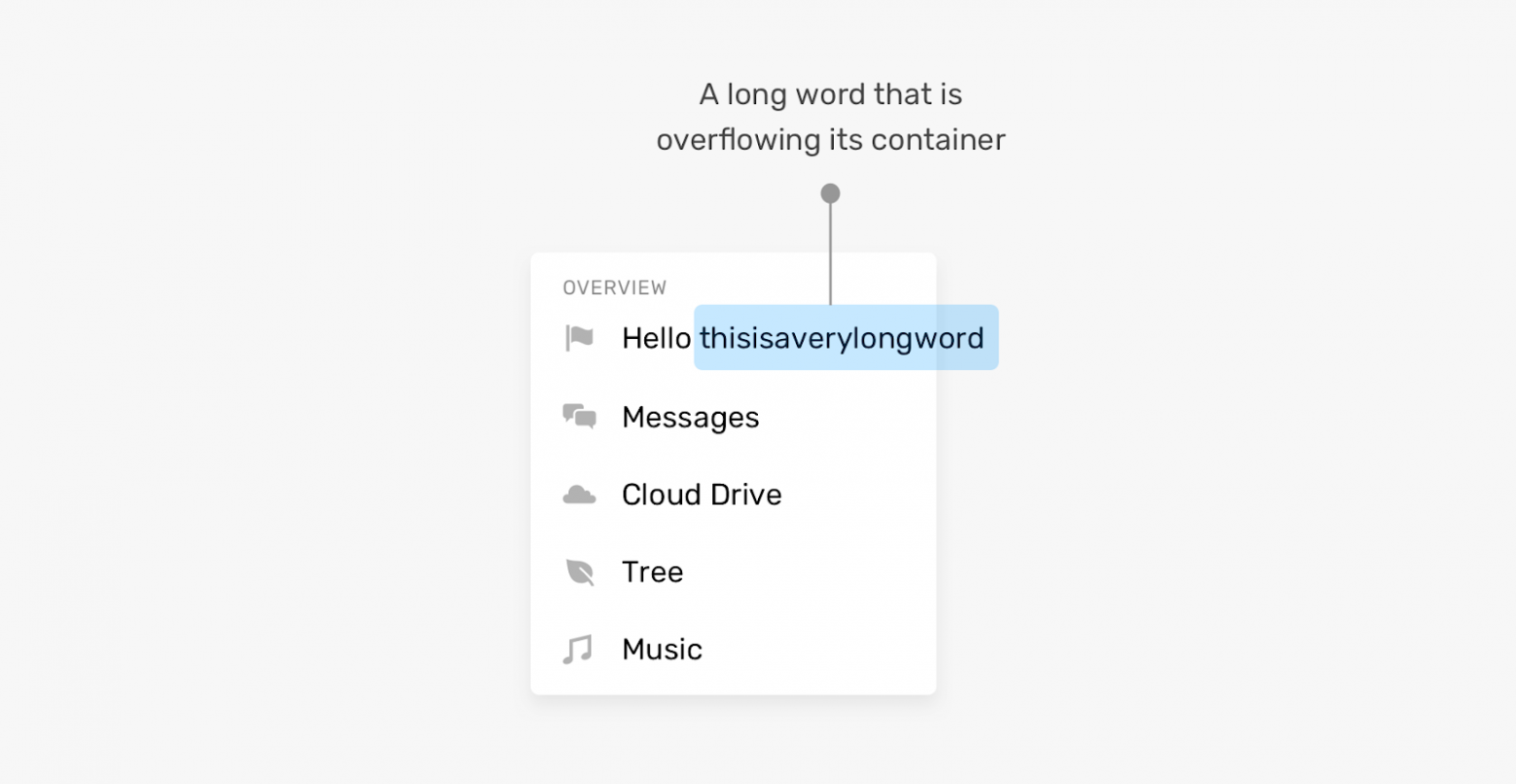
Слово вышло за пределы контейнера
Фронтенд-разработчик должен быть готов к такому, заранее приняв решение о том, как страница должна вести себя в подобных ситуациях. К счастью, существуют CSS-свойства, созданные специально для того чтобы решать подобные проблемы.
Кроме того, проблемы на страницах могут вызывать не только слишком длинные, но и слишком короткие тексты. Вывод короткого текста в элементе, не рассчитанном на такой текст, может либо «сломать» интерфейс, либо, как минимум, сделать так, что этот элемент будет странно выглядеть. Вот пример.
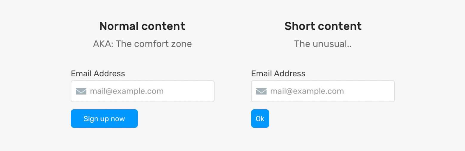
Кнопка, в которой выводится слишком короткий текст, выглядит необычно
Проблема тут в том, что кнопка, в которой выводится текст Ok, оказывается очень короткой. Я не говорю о том, что это — страшная проблема, но выглядит подобная кнопка не очень хорошо. Её, к тому же, в определённых ситуациях, может быть сложно найти на странице.
Что делать? Возможно, стоит настроить свойство кнопки min-width. Благодаря этому она сможет нормально выводить подписи разной длины.
Как видите, проблемы могут возникать как при выводе длинных, так и при выводе коротких текстов. Но, прибегнув к некоторым возможностям CSS, мы можем, по меньшей мере, ослабить влияние этих проблем на внешний вид и работоспособность страниц.
Длинные тексты
Теперь, когда мы обсудили проблемы, поговорим о возможностях CSS, которые позволяют наладить нормальную работу с длинными текстами.
▍Свойство overflow-wrap
Свойство overflow-wrap позволяет сообщить браузеру о том, что он должен разорвать слово, перенеся его на новую строку, в том случае, если слово не помещается в контейнер.
.card {
  overflow-wrap: break-word;
}
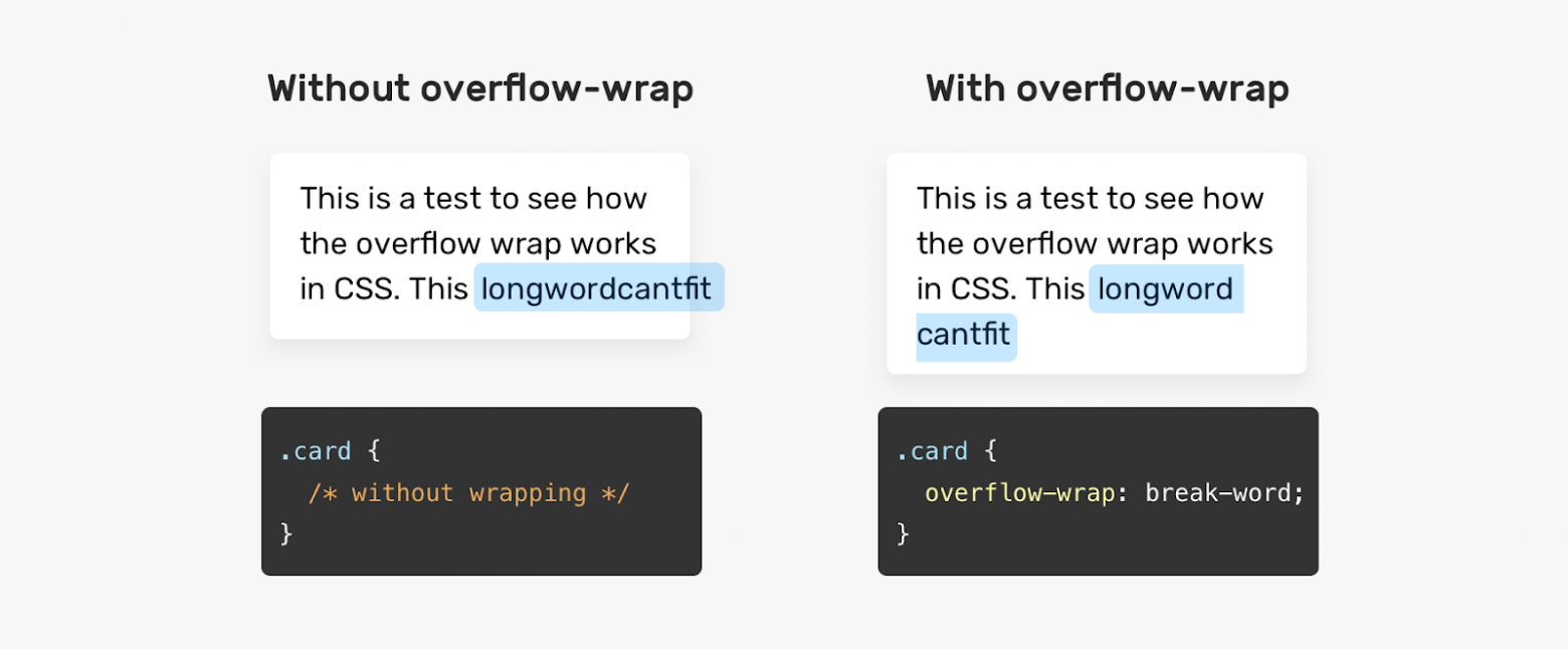
Без использования свойства overflow-wrap слово выходит за пределы контейнера
▍Свойство hyphens
Значение auto CSS-свойства hyphens позволяет сообщить браузеру о том, что он должен самостоятельно принять решение о разделении длинных слов с использованием дефиса и о переносе их на новые строки. Это свойство может принимать и значение manual, что позволяет, используя особые символы, предусмотреть возможность и порядок переноса слова на новую строку в том случае, если в этом возникнет необходимость.
.element {
  hyphens: auto;
}

Без использования свойства hyphens браузер не переносит слово на новую строку
Применяя значение auto свойства hyphens важно помнить о том, что браузер будет переносить любое слово, которое не помещается в строку. Что это значит? Взгляните на следующий рисунок.
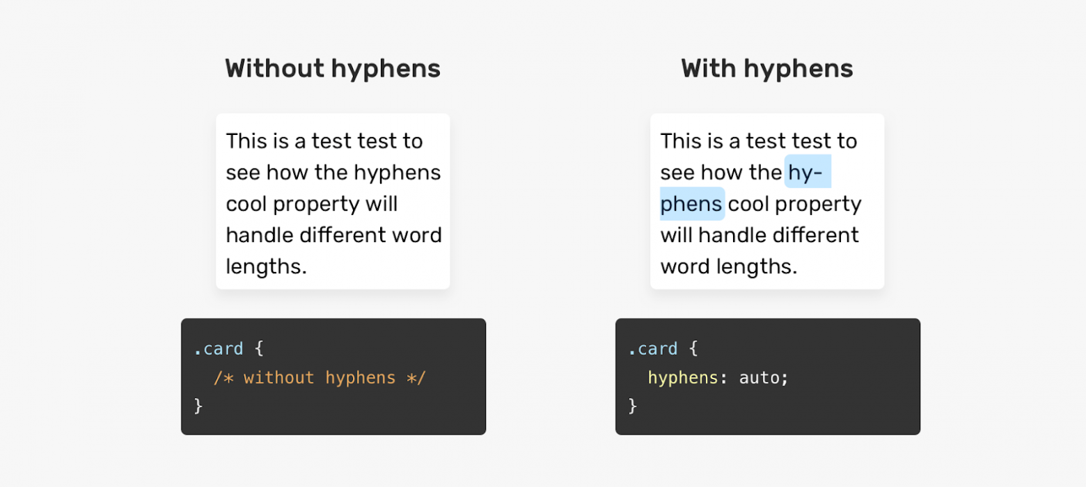
Браузер может использовать знак переноса в любом слове
Обратите внимание на то, что браузер использовал знак переноса в слове, которое вполне может быть целиком перенесено на новую строку. При использовании свойства hyphens: auto браузер способен разрывать даже такие слова, которые не выходят за пределы контейнеров.
▍Обрезка однострочного текста
При обрезке текста, для вывода которого предусмотрено поле, вмещающее лишь одну строку, предложение укорачивается, а в его конец добавляется многоточие, указывающее на то, что текст, на самом деле, длиннее того фрагмента, который выведен на экране.

Слева — однострочный текст, при выводе которого обрезка не используется. Справа — текст, при выводе которого используется обрезка
В CSS нет свойства, которое могло бы называться «text-truncation», применимого для настройки автоматической обрезки текстов. Тут нам понадобится комбинация из нескольких свойств:
.element {
  white-space: nowrap;
  overflow: hidden;
  text-overflow: ellipsis;
}
▍Обрезка многострочного текста
Если нужно обрезать текст, для вывода которого предусмотрено поле, вмещающее несколько строк, нужно прибегнуть к CSS-свойству line-clamp:
.element {
  display: -webkit-box;
  -webkit-line-clamp: 3;
  -webkit-box-orient: vertical;
  overflow: hidden;
}
Для того чтобы это сработало, необходимо использовать и свойство display: -webkit-box. Свойство -webkit-line-clamp позволяет указать максимальное количество строк, по достижении которого текст надо обрезать.

Сравнение обрезки однострочного и многострочного текста
Минус этого подхода заключается в том, что, если у элемента будет настроено свойство padding, нормальный вывод текста может быть легко нарушен. Настройка этого свойства приведёт к тому, что часть текста, которая, как ожидается, должна быть скрыта, окажется выведенной после обрезанного текста.

Настройка свойства padding приводит к нарушению вывода текста
▍Вывод длинных текстов в полях, поддерживающих горизонтальную прокрутку
В некоторых ситуациях непрактично организовывать разрыв слов или их перенос на новые строки с использованием дефиса. Например, если имеется поле, в котором должен выводиться фрагмент JavaScript-кода, такой код будет тяжело читать в том случае, если слова будут выводиться с переносом на новые строки. В подобном случае облегчить работу с текстом можно, предусмотрев возможность горизонтальной прокрутки содержимого поля.
.code {
  overflow-x: auto;
}

Поле, в котором осуществляется перенос слов на новые строки, и поле, в котором применяется горизонтальная прокрутка
▍Свойство padding
В некоторых случаях, когда у элемента не настроено свойство padding, вспоминают об этом лишь встречаясь с проблемами, появляющимися при выводе данных на страницах. Взгляните на следующий пример.

Проблема при выводе подписи к флажку
Тут имеется набор флажков. Подпись одного из них выводится слишком близко к другому. Причина этого заключается в том, что при проектировании макета, используемого для вывода флажков, не настроены промежутки между ячейками сетки, в которых размещены данные. Этот пример, кстати, взят с реального сайта (Techcrunch).
Короткие тексты
Я знаю о том, что проблемы, связанные с короткими текстами распространены не так сильно, как проблемы, связанные с длинными текстами. Но возможность их возникновения, всё равно, очень важно учитывать при проектировании пользовательских интерфейсов.
▍Установка минимальной ширины элемента
Вернёмся к примеру, который я приводил в начале статьи.
Кнопка, в которой выводится слишком короткий текст
Как справиться с проблемой, возникающей при выводе на кнопке очень короткой надписи? Решить эту проблему можно, воспользовавшись свойством min-width. При таком подходе ширина кнопки, даже при выводе в ней короткой надписи, не будет меньше заданного значения.

Результаты настройки минимальной ширины кнопки
Теперь, когда мы поговорили о проблемах вывода длинных и коротких текстов и о решениях этих проблем, давайте разберём несколько практических примеров.
Практические примеры
▍Карточка профиля пользователя
Карточки профиля пользователя часто содержат достаточно длинные тексты. В частности, проектируя подобную карточку, разработчику почти невозможно заранее узнать о том, насколько длинным будет имя пользователя. Как же быть?

Имя пользователя обычной длины, помещающееся на карточке целиком. Обрезанное длинное имя, выводимое в одной строке. Обрезанное длинное имя, выводимое в нескольких строках
Проектируя подобную карточку можно подготовиться к выводу в ней длинного имени пользователя, применив один из следующих двух приёмов:
/* Решение 1 */
.card__title {
  text-overflow: ellipsis;
  white-space: nowrap;
  overflow: hidden;
}

/* Решение 2 */
.card__title {
  display: -webkit-box;
  -webkit-line-clamp: 2;
  -webkit-box-orient: vertical;
  overflow: hidden;
}
Как видите, длинный текст можно обрезать, выведя его либо в одной строке, либо — в нескольких строках.
▍Навигационные элементы
При работе над макетами мультиязычных сайтов нужно учитывать тот факт, что тексты, имеющие один и тот же смысл, но написанные на разных языках, могут иметь различную длину.

Названия навигационных элементов, выведенные на разных языках
Длина слова About из LTR-языка больше, чем длина аналогичного по смыслу слова из RTL-языка. При выводе на таком языке соответствующий пункт навигационного меню выглядит слишком коротким. Известно, что если в дизайне страниц используются маленькие области, с которыми нужно взаимодействовать пользователям, это плохо сказывается на UX. Как исправить проблему? В данном случае можно просто настроить минимальную ширину навигационного элемента:
.nav__item {
  min-width: 50px;
}

Решение проблемы короткого текста
Если вас интересуют вопросы вывода данных на разных языках — взгляните на этот мой материал.
▍Поле для вывода содержимого статей
В полях для вывода объёмных текстов вполне могут попадаться очень длинные слова, не помещающиеся в контейнеры. Особенно часто с этим можно столкнуться при работе с сайтами на мобильных устройствах.

Длинное слово выходит за пределы контейнера
Здесь имеется длинное слово, которое выходит за пределы контейнера и является причиной появления горизонтальной полосы прокрутки. Выше мы уже говорили о решениях подобных проблем, которые заключаются в использовании CSS-свойств overflow-wrap или hyphens.
Например, эту проблему можно решить так:
.article-content p {
  overflow-wrap: break-word;
}
▍Оформление виртуальной корзины для покупок
Названия товаров, которые покупатели интернет-магазинов «кладут» в корзины, могут быть очень разными. Это может быть и одно слово, и несколько строк. В следующем примере длина названия товара такова, что текст перекрывается кнопкой для удаления товара из корзины. Причина этого в том, что при проектировании макета корзины не было уделено достаточного внимания настройке расстояния между элементами.

Вывод коротких и длинных названий в макете, который настроен неправильно
Решить эту проблему можно, настроив внутренние или внешние отступы элементов. Конкретные действия зависят от ситуации. Здесь я приведу простой пример, предусматривающий использование свойства margin-right при настройке элемента, выводящего название товара.
.product__name {
  margin-right: 1rem;
}
▍Flexbox-макеты и вывод длинных текстов
При выводе длинных текстов во Flexbox-макетах возможна ситуация, когда такие тексты переполняют родительские элементы. Взгляните на следующий пример.

Элементы выглядят нормально
Вот разметка к этому примеру:
<div class="user">
  <div class="user__meta">
    <h3 class="user__name">Ahmad Shadeed</h3>
  </div>
  <button class="btn">Follow</button>
</div>
Вот стили:
.user {
  display: flex;
  align-items: flex-start;
}

.user__name {
  text-overflow: ellipsis;
  white-space: nowrap;
  overflow: hidden;
}
Если имя пользователя не слишком длинно — всё выглядит нормально. Но что случится в том случае, если имя окажется достаточно длинным? В такой ситуации текст переполнит родительский элемент, а это «поломает» макет.

Длинное имя пользователя портит внешний вид страницы
Причина возникновения этой проблемы заключается в том, что размеры Flex-элементов не сокращаются до величин, которые меньше минимального размера их содержимого. Решить эту проблему можно, установив в значение 0 свойство min-width элемента .user__meta:
.user__meta {
  /* другие стили */
  min-width: 0;
}
После этого даже вывод в элементе длинного имени пользователя не испортит макет. Некоторые подробности об использовании свойства min-width при разработке Flexbox-макетов вы можете найти в этом материале.
Итоги
Надеюсь, теперь вы сможете справиться с проектированием элементов, поддерживающих аккуратный вывод длинных и коротких текстов. Я с большим удовольствием писал эту статью. Я, благодаря этому, вспомнил некоторые тонкости работы с разными текстами. А статья будет служить мне хорошим напоминанием о том, как важно обращать внимание на подготовку элементов страниц к выводу текстов разной длины.
Сталкивались ли вы с проблемами, связанными с выводом текстов разной длины на веб-страницах?


There are times when a really long string of text can overflow the container of a layout.
For example:

Here’s a big snippet with all the CSS players involved:
.dont-break-out {

  /* These are technically the same, but use both */
  overflow-wrap: break-word;
  word-wrap: break-word;

  -ms-word-break: break-all;
  /* This is the dangerous one in WebKit, as it breaks things wherever */
  word-break: break-all;
  /* Instead use this non-standard one: */
  word-break: break-word;

  /* Adds a hyphen where the word breaks, if supported (No Blink) */
  -ms-hyphens: auto;
  -moz-hyphens: auto;
  -webkit-hyphens: auto;
  hyphens: auto;

}
That would fix the issue for us:

Here’s the scoop:
overflow-wrap: break-word;makes sure the long string will wrap and not bust out of the container. You might as well useword-wrapas well because as the spec says, they are literally just alternate names for each other. Some browsers support one and not the other. Firefox (tested v43) only supportsword-wrap. Blink (tested Chrome v45) will take either one.- With
overflow-wrapin use all by itself, words will break kinda anywhere they need to. If there is an “acceptable break” character (like a literal dash, for instance), it will break there, otherwise it just does what it needs to do. - You might as well use
hyphensas well, because then it will try to tastefully add a hyphen where it breaks if the browser supports it (Blink doesn’t at time of writing, Firefox does). word-break: break-all;is to tell the browser that it’s OK to break the word wherever it needs to. Even though it kinda does that anyway so I’m not sure in what cases it’s 100% necessary.
If you want be more manual with hyphens, you can suggest them in your markup. See more on the MDN page.
Browser support
For word-break:
Desktop
| Chrome | Firefox | IE | Edge | Safari |
|---|---|---|---|---|
| 44 | 15 | 5.5 | 12 | 9 |
Mobile / Tablet
| Android Chrome | Android Firefox | Android | iOS Safari |
|---|---|---|---|
| 111 | 110 | 111 | 9.0-9.2 |
For hypens:
Desktop
| Chrome | Firefox | IE | Edge | Safari |
|---|---|---|---|---|
| 88 | 6* | 10* | 12* | 5.1* |
Mobile / Tablet
| Android Chrome | Android Firefox | Android | iOS Safari |
|---|---|---|---|
| 111 | 110 | 111 | 4.2-4.3* |
For overflow-wrap:
Desktop
| Chrome | Firefox | IE | Edge | Safari |
|---|---|---|---|---|
| 23 | 49 | 11 | 18 | 6.1 |
Mobile / Tablet
| Android Chrome | Android Firefox | Android | iOS Safari |
|---|---|---|---|
| 111 | 110 | 4.4 | 7.0-7.1 |
For text-overflow:
Desktop
| Chrome | Firefox | IE | Edge | Safari |
|---|---|---|---|---|
| 4 | 7 | 6 | 12 | 3.1 |
Mobile / Tablet
| Android Chrome | Android Firefox | Android | iOS Safari |
|---|---|---|---|
| 111 | 110 | 2.1 | 3.2 |
Preventing Overflow with Ellipsis
Another approach to consider is truncating the text altogether and adding ellipses where the string of text hits the container:
.ellipses {
  overflow: hidden;
  white-space: nowrap;
  text-overflow: ellipsis;
}
This nice thing about using text-overflow is that it is supported universally.
Examples
See the Pen Hyphenate Long Words by CSS-Tricks (@css-tricks) on CodePen.
See the Pen Ellipses by CSS-Tricks (@css-tricks) on CodePen.
See the Pen Figuring Out Line Wrapping by Chris Coyier (@chriscoyier) on CodePen.
More Resources
- Michael Scharnagl: Dealing with long words in CSS
- Kenneth Auchenberg: Word wrapping/hyphenation using CSS
- MDN: word-wrap, word-break, hyphens
- Spec: CSS Text Level 3
For the SCSS-inclined
These tend to be the kind of things you sprinkle into code where needed, so they make for nice @mixins:
@mixin word-wrap() {
  overflow-wrap: break-word;
  word-wrap: break-word;
  -ms-word-break: break-all;
  word-break: break-all;
  word-break: break-word;
  -ms-hyphens: auto;
  -moz-hyphens: auto;
  -webkit-hyphens: auto;
  hyphens: auto;
}
@mixin ellipsis() {
overflow: hidden;
white-space: nowrap;
text-overflow: ellipsis;
}