
Let’s talk about the various ways we can control how text wraps (or doesn’t wrap) on a web page. CSS gives us a lot of tools to make sure our text flows the way we want it to, but we’ll also cover some tricks using HTML and special characters.

Protecting Layout
Normally, text flows to the next line at “soft wrap opportunities”, which is a fancy name for spots you’d expect text to break naturally, like between words or after a hyphen. But sometimes you may find yourself with long spans of text that don’t have soft wrap opportunities, such as really long words or URLs. This can cause all sorts of layout issues. For example, the text may overflow its container, or it might force the container to become too wide and push things out of place.
It’s good defensive coding to anticipate issues from text not breaking. Fortunately, CSS gives us some tools for this.
Getting Overflowing Text to Wrap
Putting overflow-wrap: break-word on an element will allow text to break mid-word if needed. It’ll first try to keep a word unbroken by moving it to the next line, but will then break the word if there’s still not enough room.
See the Pen overflow-wrap: break-word by Will Boyd (@lonekorean) on CodePen.
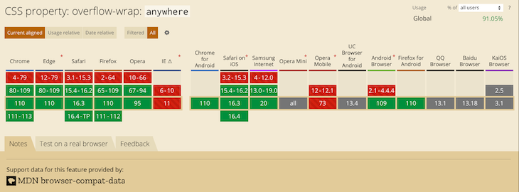
There’s also overflow-wrap: anywhere, which breaks words in the same manner. The difference is in how it affects the min-content size calculation of the element it’s on. It’s pretty easy to see when width is set to min-content.
.top {
  width: min-content;
  overflow-wrap: break-word;
}.bottom {
  width: min-content;
  overflow-wrap: anywhere;
}
See the Pen overflow-wrap + min-content by Will Boyd (@lonekorean) on CodePen.
The top element with overflow-wrap: break-word calculates min-content as if no words are broken, so its width becomes the width of the longest word. The bottom element with overflow-wrap: anywhere calculates min-content with all the breaks it can create. Since a break can happen, well, anywhere, min-content ends up being the width of a single character.
Remember, this behavior only comes into play when min-content is involved. If we had set width to some rigid value, we’d see the same word-breaking result for both.
Breaking Words without Mercy
Another option for breaking words is word-break: break-all. This one won’t even try to keep words whole — it’ll just break them immediately. Take a look.
See the Pen word-break: break-all by Will Boyd (@lonekorean) on CodePen.
Notice how the long word isn’t moved to the next line, like it would have been when using overflow. Also notice how “words” is broken, even though it would have fit just fine on the next line.
word-break: break-all has no problem breaking words, but it’s still cautious around punctuation. For example, it’ll avoid starting a line with the period from the end of a sentence. If you want truly merciless breaking, even with punctuation, use line-break: anywhere.
See the Pen word-break: break-all vs line-break: anywhere by Will Boyd (@lonekorean) on CodePen.
See how word-break: break-all moves the “k” down to avoid starting the second line with “.”? Meanwhile, line-break: anywhere doesn’t care.
Excessive Punctuation
Let’s see how the CSS properties we’ve covered so far handle excessively long spans of punctuation.
See the Pen Excessive Punctuation by Will Boyd (@lonekorean) on CodePen.
overflow-wrap: break-word and line-break: anywhere are able to keep things contained, but then there’s word-break: break-all being weird with punctuation again — this time resulting in overflowing text.
It’s something to keep in mind. If you absolutely do not want text to overflow, be aware that word-break: break-all won’t stop runaway punctuation.
Specifying Where Words Can Break
For more control, you can manually insert word break opportunities into your text with <wbr>. You can also use a “zero-width space”, provided by the ​ HTML entity (yes, it must be capitalized just as you see it!).
Let’s see these in action by wrapping a long URL that normally wouldn’t wrap, but only between segments.
<!-- normal -->
<p>https://subdomain.somewhere.co.uk</p> <!-- <wbr> -->
<p>https://subdomain<wbr>.somewhere<wbr>.co<wbr>.uk</p>
<!-- ​ -->
<p>https://subdomain​.somewhere​.co​.uk</p>
See the Pen Manual Word Break Opportunities by Will Boyd (@lonekorean) on CodePen.
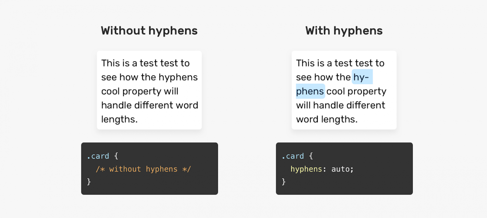
Automatic Hyphenation
You can tell the browser to break and hyphenate words where appropriate by using hyphens: auto. Hyphenation rules are determined by language, so you’ll need to tell the browser what language to use. This is done by specifying the lang attribute in HTML, possibly on the relevant element directly, or on <html>.
<p lang="en">This is just a bit of arbitrary text to show hyphenation in action.</p> p {
-webkit-hyphens: auto; /* for Safari */
hyphens: auto;
}See the Pen hyphens: auto by Will Boyd (@lonekorean) on CodePen.
Manual Hyphenation
You can also take matters into your own hands and insert a “soft hyphen” manually with the ­ HTML entity. It won’t be visible unless the browser decides to wrap there, in which case a hyphen will appear. Notice in the following demo how we’re using ­ twice, but we only see it once where the text wraps.
<p lang="en">Magic? Abraca­dabra? Abraca­dabra!</p>See the Pen Soft Hyphen by Will Boyd (@lonekorean) on CodePen.
hyphens must be set to either auto or manual for ­ to display properly. Conveniently, the default is hyphens: manual, so you should be good without any additional CSS (unless something has declared hyphens: none for some reason).
Preventing Text from Wrapping
Let’s switch things up. There may be times when you don’t want text to wrap freely, so that you have better control over how your content is presented. There are a couple of tools to help you with this.
First up is white-space: nowrap. Put it on an element to prevent its text from wrapping naturally.
See the Pen white-space: nowrap by Will Boyd (@lonekorean) on CodePen.
Preformatting Text
There’s also white-space: pre, which will wrap text just as you have it typed in your HTML. Be careful though, as it will also preserve spaces from your HTML, so be mindful of your formatting. You can also use a <pre> tag to get the same results (it has white-space: pre on it by default).
<!-- the formatting of this HTML results in extra whitespace! -->
<p>
What's worse, ignorance or apathy?
I don't know and I don't care.
</p><!-- tighter formatting that "hugs" the text -->
<p>What's worse, ignorance or apathy?
I don't know and I don't care.</p>
<!-- same as above, but using <pre> -->
<pre>What's worse, ignorance or apathy?
I don't know and I don't care.</pre>
p {
  white-space: pre;
}pre {
  /* <pre> sets font-family: monospace, but we can undo that */
  font-family: inherit;
}
See the Pen Preformatted Text by Will Boyd (@lonekorean) on CodePen.
A Break, Where Words Can’t Break?
For line breaks, you can use <br> inside of an element with white-space: nowrap or white-space: pre just fine. The text will wrap.
But what happens if you use <wbr> in such an element? Kind of a trick question… because browsers don’t agree. Chrome/Edge will recognize the <wbr> and potentially wrap, while Firefox/Safari won’t.
When it comes to the zero-width space (​) though, browsers are consistent. None will wrap it with white-space: nowrap or white-space: pre.
<p>Darth Vader: Nooooooooooooo<br>oooo!</p><p>Darth Vader: Nooooooooooooo<wbr>oooo!</p>
<p>Darth Vader: Nooooooooooooo​oooo!</p>
See the Pen white-space: nowrap + breaking lines by Will Boyd (@lonekorean) on CodePen.
Non-Breaking Spaces
Sometimes you may want text to wrap freely, except in very specific places. Good news! There are a few specialized HTML entities that let you do exactly this.
A “non-breaking space” ( ) is often used to keep space between words, but disallow a line break between them.
<p>Something I've noticed is designers don't seem to like orphans.</p><p>Something I've noticed is designers don't seem to like orphans.</p>
See the Pen Non-Breaking Space by Will Boyd (@lonekorean) on CodePen.
Word Joiners and Non-Breaking Hyphens
It’s possible for text to naturally wrap even without spaces, such as after a hyphen. To prevent wrapping without adding a space, you can use ⁠ (case-sensitive!) to get a “word joiner”. For hyphens specifically, you can get a “non-breaking hyphen” with ‑ (it doesn’t have a nice HTML entity name).
<p>Turn right here to get on I-85.</p> <p>Turn right here to get on I-⁠85.</p>
<p>Turn right here to get on I‑85.</p>
See the Pen Word Joiners and Non-Breaking Hyphens by Will Boyd (@lonekorean) on CodePen.
CJK Text and Breaking Words
CJK (Chinese/Japanese/Korean) text behaves differently than non-CJK text in some ways. Certain CSS properties and values can be used for additional control over the wrapping of CJK text specifically.
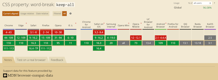
Default browser behavior allows words to be broken in CJK text. This means that word-break: normal (the default) and word-break: break-all will give you the same results. However, you can use word-break: keep-all to prevent CJK text from wrapping within words (non-CJK text will be unaffected).
Here’s an example in Korean. Note how the word “자랑스럽게” does or doesn’t break.
See the Pen CJK Text + word-break by Will Boyd (@lonekorean) on CodePen.
Be careful though, Chinese and Japanese don’t use spaces between words like Korean does, so word-break: keep-all can easily cause long overflowing text if not otherwise handled.
CJK Text and Line Break Rules
We talked about line-break: anywhere earlier with non-CJK text and how it has no problem breaking at punctuation. The same is true with CJK text.
Here’s an example in Japanese. Note how “。” is or isn’t allowed to start a line.
See the Pen CJK Text + line-break by Will Boyd (@lonekorean) on CodePen.
There are other values for line-break that affect how CJK text wraps: loose, normal, and strict. These values instruct the browser on which rules to use when deciding where to insert line breaks. The W3C describes several rules and it’s possible for browsers to add their own rules as well.
Worth Mentioning: Element Overflow
The overflow CSS property isn’t specific to text, but is often used to ensure text doesn’t render outside of an element that has its width or height constrained.
.top {
  white-space: nowrap;
  overflow: auto;
}.bottom {
  white-space: nowrap;
  overflow: hidden;
}
See the Pen Element Overflow by Will Boyd (@lonekorean) on CodePen.
As you can see, a value of auto allows the content to be scrolled (auto only shows scrollbars when needed, scroll shows them always). A value of hidden simply cuts off the content and leaves it at that.
overflow is actually shorthand to set both overflow-x and overflow-y, for horizontal and vertical overflow respectively. Feel free to use what suits you best.
We can build upon overflow: hidden by adding text-overflow: ellipsis. Text will still be cut off, but we’ll get some nice ellipsis as an indication.
p {
  white-space: nowrap;
  overflow: hidden;
  text-overflow: ellipsis;
}
See the Pen text-overflow: ellipsis by Will Boyd (@lonekorean) on CodePen.
Bonus Trick: Pseudo-Element Line Break
You can force a line break before and/or after an inline element, while keeping it as an inline element, with a little bit of pseudo-element trickery.
First, set the content of a ::before or ::after pseudo-element to 'A', which will give you the new line character. Then set white-space: pre to ensure the new line character is respected.
<p>Things that go <span>bump</span> in the night.</p>span {
background-color: #000;
}span::before, span::after {
content: 'A';
white-space: pre;
}
See the Pen Pseudo-Element Line Breaks by Will Boyd (@lonekorean) on CodePen.
We could have just put display: block on the <span> to get the same breaks, but then it would no longer be inline. The background-color makes it easy to see that with this method, we still have an inline element.
Bonus Notes
- There’s an older CSS property named
word-wrap. It’s non-standard and browsers now treat it as an alias foroverflow-wrap. - The
white-spaceCSS property has some other values we didn’t cover:pre-wrap,pre-line, andbreak-spaces. Unlike the ones we did cover, these don’t prevent text wrapping. - The CSS Text Module Level 4 spec describes a
text-wrapCSS property that looks interesting, but at the time of writing, no browser implements it.
Time to “Wrap” Things Up
There’s so much that goes into flowing text on a web page. Most of the time you don’t really need to think about it, since browsers handle it for you. For the times when you do need more control, it’s nice to know that you have a lot of options.
Writing this was definitely a rabbit hole for me as I kept finding more and more things to talk about. I hope I’ve shown you enough to get your text to break and flow just the way you want it.
Thanks for reading!
This guide explains the various ways in which overflowing text can be managed in CSS.
What is overflowing text?
In CSS, if you have an unbreakable string such as a very long word, by default it will overflow any container that is too small for it in the inline direction. We can see this happening in the example below: the long word is extending past the boundary of the box it is contained in.
CSS will display overflow in this way, because doing something else could cause data loss. In CSS data loss means that some of your content vanishes. So the initial value of overflow is visible, and we can see the overflowing text. It is generally better to be able to see overflow, even if it is messy. If things were to disappear or be cropped as would happen if overflow was set to hidden you might not spot it when previewing your site. Messy overflow is at least easy to spot, and in the worst case, your visitor will be able to see and read the content even if it looks a bit strange.
In this next example, you can see what happens if overflow is set to hidden.
Finding the min-content size
To find the minimum size of the box that will contain its contents with no overflows, set the width or inline-size property of the box to min-content.
Using min-content is therefore one possibility for overflowing boxes. If it is possible to allow the box to grow to be the minimum size required for the content, but no bigger, using this keyword will give you that size.
Breaking long words
If the box needs to be a fixed size, or you are keen to ensure that long words can’t overflow, then the overflow-wrap property can help. This property will break a word once it is too long to fit on a line by itself.
Note: The overflow-wrap property acts in the same way as the non-standard property word-wrap. The word-wrap property is now treated by browsers as an alias of the standard property.
An alternative property to try is word-break. This property will break the word at the point it overflows. It will cause a break-even if placing the word onto a new line would allow it to display without breaking.
In this next example, you can compare the difference between the two properties on the same string of text.
This might be useful if you want to prevent a large gap from appearing if there is just enough space for the string. Or, where there is another element that you would not want the break to happen immediately after.
In the example below there is a checkbox and label. Let’s say, you want the label to break should it be too long for the box. However, you don’t want it to break directly after the checkbox.
Adding hyphens
To add hyphens when words are broken, use the CSS hyphens property. Using a value of auto, the browser is free to automatically break words at appropriate hyphenation points, following whatever rules it chooses. To have some control over the process, use a value of manual, then insert a hard or soft break character into the string. A hard break (‐) will always break, even if it is not necessary to do so. A soft break (­) only breaks if breaking is needed.
You can also use the hyphenate-character property to use the string of your choice instead of the hyphen character at the end of the line (before the hyphenation line break).
This property also takes the value auto, which will select the correct value to mark a mid-word line break according to the typographic conventions of the current content language.
The <wbr> element
If you know where you want a long string to break, then it is also possible to insert the HTML <wbr> element. This can be useful in cases such as displaying a long URL on a page. You can then add the property in order to break the string in sensible places that will make it easier to read.
In the below example the text breaks in the location of the <wbr>.
See also
- The HTML
<wbr>element - The CSS
word-breakproperty - The CSS
overflow-wrapproperty - The CSS
white-spaceproperty - The CSS
hyphensproperty - Overflow and Data Loss in CSS
When working on a website or a web app texts are often overlooked, that’s when issues like overflowing text occur. To solve that, you can use some solutions like truncating or ellipsizing a text (add three dots) or wrapping the text.
Page contents:
- Wrapping text;
- Truncating text.
Overflowing text content quite often happens in the following cases:
- For long words;
- For long URL’s;
- On mobile devices;
- For narrow container elements;
- For table cells;
- For button elements.
Depending on the CSS styles you have, the text overflow will usually look either like a horizontal scroll or like a cut-off content.
Consider the following issue. There’s a fixed-width container on a page with a link containing and pointing to a long URL. The link text will overflow the container and will look messy, as well as it can produce an unwanted horizontal scroll on smaller screen sizes.
1. Wrapping text
1.2 The word-break property
One way to handle long text in CSS is to wrap it to the next line. This approach is handy when you don’t have to worry about text spanning multiline. When using word-break property you have two options how to wrap it:
break-all— this will break text once the characters don’t fit inside the containerbreak-word— this will break text once the characters don’t fit inside the container but it will preserve the word sequence. NOTE: this is a deprecated API and it is not recommended to use.
.container a {
  word-break: break-all;
}
Browser support for word-break property: https://caniuse.com/word-break
1.2 The overflow-wrap property
Another option to wrap text is to use the overflow-wrap property. This property also has two options for wrapping:
anywhere— will break text at any given point if it doesn’t fit;break-word— same asanywhereexcept it will break long words at arbitrary points.
.container a {
  overflow-wrap: break-word;
}
Browser support for overflow-wrap property: https://caniuse.com/wordwrap
2. Truncating text
2.1 The text-overflow property
The text-overflow property will add an ellipsis (will add three dots) to a text if it doesn’t fit inside the container. This approach is handy if you want to keep text in a single line. However, with some additional modifications, it can be made for multiline text as well.
The text-overflow property with a value of ellipsis must be set on a parent element, relative to the text. Two additional properties must be specified overflow and white-space.
NOTE: Learn how to handle text overflow for select tag.
Single line
.container {
  overflow: hidden;
  white-space: nowrap;
  text-overflow: ellipsis;
}
Multiline
For the multiline solution the white-space property must be removed, this way the text will be truncated on the last available line.
.container {
  overflow: hidden;
  text-overflow: ellipsis;
}
Browser support for text-overflow property: https://caniuse.com/text-overflow
2.2 The line-clamp property
A more modern approach is the line-clamp property which will limit the container text to a specified number of lines. As well as add the three dots at the end. This property will only work with a -webkit- vendor prefix and a display property set to -webkit-box or -webkit-inline-box.
Unline the text-overflow solution, this approach is straightforward and more understandable, when it comes to truncating multiline text. The line-clamp property must be set to the element that is overflowing and the value should be equal to the number of lines to span.
.container a {
  overflow: hidden;
  display: -webkit-box;
  -webkit-line-clamp: 1;
  -webkit-box-orient: vertical;
}
Browser support for the line-clamp property: https://caniuse.com/css-line-clamp
A full demo is available on CodePen:
See the Pen
Long text truncate and wrap with CSS by Tippingpoint Dev (@tippingpointdev)
on CodePen.
Note: This article is focused on the semantics of the English Language as the Writing System. Other systems, especially CJK (Chinese Japanese Korean) have conventions and overflow requirements that vary from English and are out of the scope of this article.
Text Wrapping
In CSS, overflow is the scenario when the content inside a fixed-width container, is wider than the container’s width. The default behavior of CSS is to render the content flowing out of the container. This may look ugly but this helps the developer see the issue and fix it — instead of the issue getting hidden which can cause potential missing information for the user. For example, a form submission button overflowing and becoming inaccessible. So to avoid such issues, CSS by default prevents Data Loss.
Content overflowwwwwwwwwww
CSS offers multiple capabilities to fix this issue.
Property: overflow-wrap (alias word-wrap)
This property applies to inline elements. It determines whether the browser should break an otherwise unbreakable string to avoid it from overflowing its parent’s width.
It has the following possible keyword values.
- normal
- Anywhere
- break-word
overflow-wrap: normal
When set to normal, the browser will break the string on default/natural opportunities, such as a blank space or a hyphen (‘-’) character. It will also leverage soft-hyphen entity ­ to break.
This is the initial value of the overflow-wrap property. So by default, every string will be broken at soft wrap opportunities, if any, on overflow.
This is how ‘ContentOverflowing’ and ‘Content-Overflowing’ will be handled.
ContentOverflowing
Content-Overflowing
overflow-wrap: anywhere;
This value allows the browser to break the string anywhere to avoid overflow.
Consider the following scenario with the default overflow-wrap: normal; value for a fixed-width container.
ContentOverflow
There is no blank space, a hyphen, or any other soft wrap opportunity in the string. Therefore, it overflows. If we apply overflow: anywhere;, we get the following, wrapped result.
ContentOverflow
overflow-wrap: break-word;
It behaves the same as overflow-wrap: anywhere;. The difference is that the former does not consider soft-wrap opportunities when calculating min-content intrinsic sizes. In case you have not explored extrinsic vs intrinsic sizing, Ahmed Shadeed provides a great resource. It breaks only those words which have a width smaller than the available width.
Content is Overflowing
Property: word-break
CSS offers another property, word-break for handling the same issue — overflows.
It has the following keyword values
- normal
- break-all
- keep-all
- break-word
word-break: normal;
Words will break at the default rules — such as a blank space, a hyphen, etc.
This is how ‘ContentOverflow’ and ‘Content-Overflow’ will be handled.
ContentOverflow
Content-Overflow
word-break: break-all;
Break the word at the point it overflows. It does not take into account if placing the overflowing word onto the next line will eliminate the overflow in the first place or not. This doesn’t apply to CJK writing systems.
ContentOverflow
word-break: keep-all;
For Non-CJK systems, the behavior is the same as word-break: normal.
ContentOverflow
word-break: break-word;
It has the same effect that word-break: normal; and overflow-wrap: anywhere; has. But unlike word-break: break-all; , it takes into account if placing the overflowing word onto the next line will eliminate the overflow.
For example, let’s see how word-break: break-word; handles the following scenario:
Content is Overflowing Again
We observe that the whole word ‘Overflowing’ was moved onto the next line instead of breaking as it can fit the available width without overflowing. If we apply word-break: break-all; to it, this is what we get:
Content is Overflowing Again
The word ‘Overflowing’ was broken at exactly the point where it otherwise caused the overflow. And it was not considered if moving it onto the next line eliminated the overflow or not.
overflow-wrap vs word-break
At a high level, both properties solve the same issue. But, a key difference lies in how both the properties approach the issue and the subtle aesthetic variation in their outcomes.
To visualize, consider a fixed and short-width container for the test “A Very LongWordThatHasNoBreakingPossibilities”.
A Very LongWordThatHasNoBreakingPossibilities
Let’s solve the overflow with overflow-wrap: break-word;.
A Very LongWordThatHasNoBreakingPossibilities
Now, let’s solve it with word-break: break-all;.
A Very LongWordThatHasNoBreakingPossibilities
Notice the difference? word-break: break-all; breaks the word even if placing the word on the next line would eliminate the need for breaking. This prevents large gaps before the breaks — and produces visually better results. The difference is more clearly visible in the overflow-wrap: anywhere; vs word-break: break-all; case. A case of the apparently twin properties. Consider you have a very short space to squeeze in a checkbox and a text which can not fit on the same line without overflowing. This is how the outcome looks like with overflow-wrap: anywhere;:
Photosynthesis
We observe that a lot of real estate beside the checkbox has been left unutilized. A better fix is provided by word-break: break-all;:
Photosynthesis
As observed, word-break discards the possibility of the word fitting the next line and prefers optimizing the usage of available real estate — this is often the better adjustment visually.
The above example receives its inspiration from MDN’s resource on text wrapping.
Summary
| Property | Value | Behavior | When To Use | Example |
|---|---|---|---|---|
overflow-wrap |
|
Break at natural line breakpoints such as blank space, a hyphen | When overflow is determined to not be a possibility |
Content |
anywhere |
Break between any 2 characters where the overflow occurs and consider soft wrap opportunities when calculating the min-content intrinsic sizes | When overflow should be handled by breaking long words. As discussed, the alternative option of word-break: break-all; produces visually better results |
ContentOverflow |
|
break-word |
Break between any 2 characters but do not consider soft wrap opportunities when calculating the min-content intrinsic sizes | When overflow should be handled by breaking only those words which have a width smaller than the available width |
Content is Overflowing |
|
word-break |
normal |
Break at default rules | When overflow is determined to not be a possibility |
Content |
break-all |
Break exactly where the content overflows | When overflow should be handled by breaking text exactly at the point of overflow — even if placing the word on a new line eliminates the overflow |
Content is Overflowing Again |
|
break-word |
Same as word-break: normal; and overflow-wrap: anywhere; — Break can create gaps unlike word-break: break-all; |
When placing the overflowing word onto the next line eliminates overflow. This can cause gaps. |
Content is Overflowing Again |
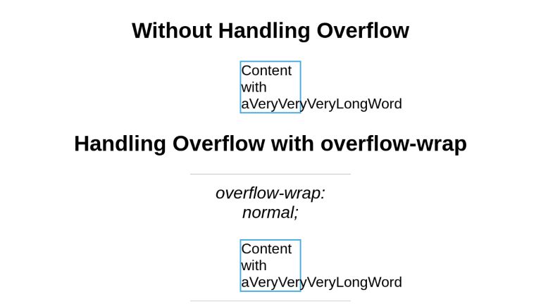
Examples
Here are examples from the above summary in a codepen to help demonstrate what the CSS code should look like:
<section class="centered">
  <h2>Without Handling Overflow</h2>
<div>Content with aVeryVeryVeryLongWord</div>
<!---->

<h2>Handling Overflow with overflow-wrap</h2>

<h3>overflow-wrap: normal;</h3>
<div class="ow-normal">Content with aVeryVeryVeryLongWord</div>

<h3>overflow-wrap: anywhere;</h3>
<div class="ow-anywhere">Content with aVeryLongWordThatDoesNotFit</div>

<h3>overflow-wrap: break-word;</h3>
<div class="ow-break-word">Content with aVeryLongWordThatDoesNotFit</div>
<!---->

<h2>Handling Overflow with word-break</h2>


<h3>word-break: normal;</h3>
<div class="wb-normal">Content with aVeryVeryVeryLongWord</div>

<h3>word-break: break-all;</h3>
<div class="wb-break-all">Content with aVeryLongWordThatDoesNotFit</div>

<h3>word-break: break-word;</h3>
<div class="wb-break-word">Content with aVeryLongWordThatDoesNotFit</div>
</section>
* { font-family: sans-serif; }

section.centered { text-align: center; }

div {
  display: inline-block;
  width: 130px;
  border: 3px solid #48abe0;
  text-align: left;
}

.ow-normal {
  overflow-wrap: normal;
}

.ow-anywhere {
  overflow-wrap: anywhere;
}

.ow-break-word {
  overflow-wrap: break-word;
}

.wb-normal {
  word-break: normal;
}

.wb-break-all {
  word-break: break-all;
}

.wb-break-word {
  word-break: break-word;
}

h3 {
  font-weight: normal;
  font-style: italic;
  border-top: 1px solid #b5b5b5;
  width: 30%;
  margin-left: auto;
  margin-right: auto;
  margin-top: 20px;
  padding-top: 20px;
}
Conclusion
This article has scratched the surface of text-wrapping. Wrapping in itself is a deeper topic as it is tightly coupled to the semantics of the target language. Moreover, it is becoming common to offer web content in multiple languages — aka Internatiolaisation/ Localisation — which makes learning it more important than before for the developers.
There are times when a really long string of text can overflow the container of a layout.
For example:

Here’s a big snippet with all the CSS players involved:
.dont-break-out {

  /* These are technically the same, but use both */
  overflow-wrap: break-word;
  word-wrap: break-word;

  -ms-word-break: break-all;
  /* This is the dangerous one in WebKit, as it breaks things wherever */
  word-break: break-all;
  /* Instead use this non-standard one: */
  word-break: break-word;

  /* Adds a hyphen where the word breaks, if supported (No Blink) */
  -ms-hyphens: auto;
  -moz-hyphens: auto;
  -webkit-hyphens: auto;
  hyphens: auto;

}
That would fix the issue for us:

Here’s the scoop:
overflow-wrap: break-word;makes sure the long string will wrap and not bust out of the container. You might as well useword-wrapas well because as the spec says, they are literally just alternate names for each other. Some browsers support one and not the other. Firefox (tested v43) only supportsword-wrap. Blink (tested Chrome v45) will take either one.- With
overflow-wrapin use all by itself, words will break kinda anywhere they need to. If there is an “acceptable break” character (like a literal dash, for instance), it will break there, otherwise it just does what it needs to do. - You might as well use
hyphensas well, because then it will try to tastefully add a hyphen where it breaks if the browser supports it (Blink doesn’t at time of writing, Firefox does). word-break: break-all;is to tell the browser that it’s OK to break the word wherever it needs to. Even though it kinda does that anyway so I’m not sure in what cases it’s 100% necessary.
If you want be more manual with hyphens, you can suggest them in your markup. See more on the MDN page.
Browser support
For word-break:
Desktop
| Chrome | Firefox | IE | Edge | Safari |
|---|---|---|---|---|
| 44 | 15 | 5.5 | 12 | 9 |
Mobile / Tablet
| Android Chrome | Android Firefox | Android | iOS Safari |
|---|---|---|---|
| 111 | 110 | 111 | 9.0-9.2 |
For hypens:
Desktop
| Chrome | Firefox | IE | Edge | Safari |
|---|---|---|---|---|
| 88 | 6* | 10* | 12* | 5.1* |
Mobile / Tablet
| Android Chrome | Android Firefox | Android | iOS Safari |
|---|---|---|---|
| 111 | 110 | 111 | 4.2-4.3* |
For overflow-wrap:
Desktop
| Chrome | Firefox | IE | Edge | Safari |
|---|---|---|---|---|
| 23 | 49 | 11 | 18 | 6.1 |
Mobile / Tablet
| Android Chrome | Android Firefox | Android | iOS Safari |
|---|---|---|---|
| 111 | 110 | 4.4 | 7.0-7.1 |
For text-overflow:
Desktop
| Chrome | Firefox | IE | Edge | Safari |
|---|---|---|---|---|
| 4 | 7 | 6 | 12 | 3.1 |
Mobile / Tablet
| Android Chrome | Android Firefox | Android | iOS Safari |
|---|---|---|---|
| 111 | 110 | 2.1 | 3.2 |
Preventing Overflow with Ellipsis
Another approach to consider is truncating the text altogether and adding ellipses where the string of text hits the container:
.ellipses {
  overflow: hidden;
  white-space: nowrap;
  text-overflow: ellipsis;
}
This nice thing about using text-overflow is that it is supported universally.
Examples
See the Pen Hyphenate Long Words by CSS-Tricks (@css-tricks) on CodePen.
See the Pen Ellipses by CSS-Tricks (@css-tricks) on CodePen.
See the Pen Figuring Out Line Wrapping by Chris Coyier (@chriscoyier) on CodePen.
More Resources
- Michael Scharnagl: Dealing with long words in CSS
- Kenneth Auchenberg: Word wrapping/hyphenation using CSS
- MDN: word-wrap, word-break, hyphens
- Spec: CSS Text Level 3
For the SCSS-inclined
These tend to be the kind of things you sprinkle into code where needed, so they make for nice @mixins:
@mixin word-wrap() {
  overflow-wrap: break-word;
  word-wrap: break-word;
  -ms-word-break: break-all;
  word-break: break-all;
  word-break: break-word;
  -ms-hyphens: auto;
  -moz-hyphens: auto;
  -webkit-hyphens: auto;
  hyphens: auto;
}
@mixin ellipsis() {
overflow: hidden;
white-space: nowrap;
text-overflow: ellipsis;
}Время на прочтение
8 мин
Количество просмотров 30K
Когда, пользуясь возможностями CSS, создают макет страницы, важно учитывать то, что в различных элементах этой страницы могут выводиться короткие и длинные текстовые материалы. Страницы, кроме того, нужно тестировать на предмет того, как они отображают тексты разной длины. Если разработчик чётко понимает то, как обрабатывать различные тексты, выводимые на странице, если он соответствующим образом спроектировал макет, это способно избавить его от множества неприятных неожиданностей.

Есть много ситуаций, в которых изменение некоего текстового фрагмента путём добавления или удаления всего одного слова способно заметно изменить внешний вид страницы, или, что ещё хуже «поломать» макет и сделать невозможной нормальной работу с сайтом. Когда я только начинал изучать CSS, я недооценивал последствия, к которым может привести добавление единственного слова в некий элемент или удаление из него всего одного слова. Здесь я хочу поделиться различными способами обработки текстов разной длины средствами CSS.
Обзор проблем
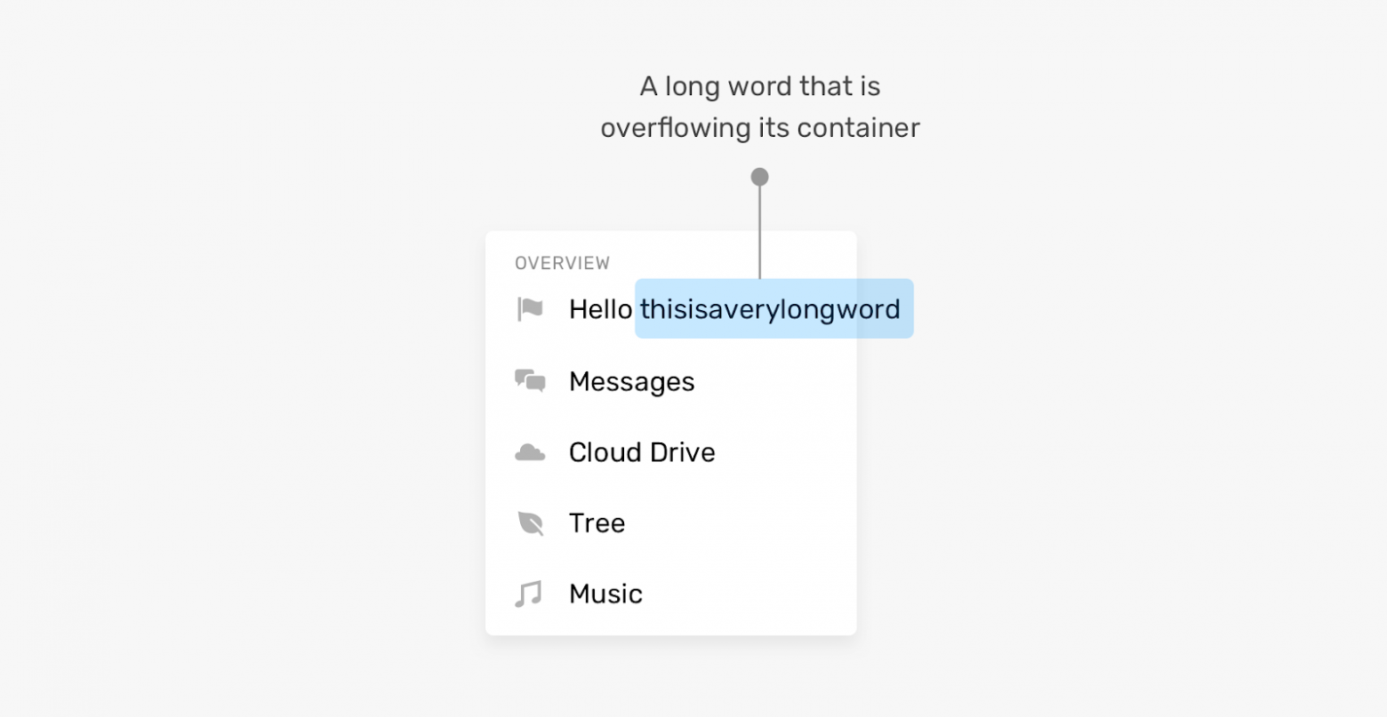
Прежде чем я расскажу о том, как работать с текстами средствами CSS, мне хотелось бы остановиться на проблемах, связанных с выводом текстов. Предположим, у нас есть вертикальное меню.

Вертикальное меню при переносе имени пользователя на вторую строку выглядит необычно
В начале меню выводится имя пользователя. Длина имени может варьироваться. Особенно — если речь идёт о мультиязычных сайтах. В правой части вышеприведённого примера видно, что имя пользователя, при достижении им определённой длины, занимает две строки. По этому поводу можно задаться несколькими вопросами:
- Нужно ли в такой ситуации обрезать текст?
- Нужно ли размещать текст в нескольких строках? Если да — то каково максимальное количество таких строк?
Это — пример того, что происходит, если в некоем элементе выводится такое количество слов, которое превышает количество, на которое рассчитывал разработчик. А что если некое слово просто оказывается очень длинным? Если используются настройки, применяемые по умолчанию, то такое слово просто выйдет за пределы своего контейнера.
Слово вышло за пределы контейнера
Фронтенд-разработчик должен быть готов к такому, заранее приняв решение о том, как страница должна вести себя в подобных ситуациях. К счастью, существуют CSS-свойства, созданные специально для того чтобы решать подобные проблемы.
Кроме того, проблемы на страницах могут вызывать не только слишком длинные, но и слишком короткие тексты. Вывод короткого текста в элементе, не рассчитанном на такой текст, может либо «сломать» интерфейс, либо, как минимум, сделать так, что этот элемент будет странно выглядеть. Вот пример.
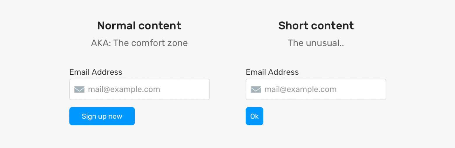
Кнопка, в которой выводится слишком короткий текст, выглядит необычно
Проблема тут в том, что кнопка, в которой выводится текст Ok, оказывается очень короткой. Я не говорю о том, что это — страшная проблема, но выглядит подобная кнопка не очень хорошо. Её, к тому же, в определённых ситуациях, может быть сложно найти на странице.
Что делать? Возможно, стоит настроить свойство кнопки min-width. Благодаря этому она сможет нормально выводить подписи разной длины.
Как видите, проблемы могут возникать как при выводе длинных, так и при выводе коротких текстов. Но, прибегнув к некоторым возможностям CSS, мы можем, по меньшей мере, ослабить влияние этих проблем на внешний вид и работоспособность страниц.
Длинные тексты
Теперь, когда мы обсудили проблемы, поговорим о возможностях CSS, которые позволяют наладить нормальную работу с длинными текстами.
▍Свойство overflow-wrap
Свойство overflow-wrap позволяет сообщить браузеру о том, что он должен разорвать слово, перенеся его на новую строку, в том случае, если слово не помещается в контейнер.
.card {
  overflow-wrap: break-word;
}
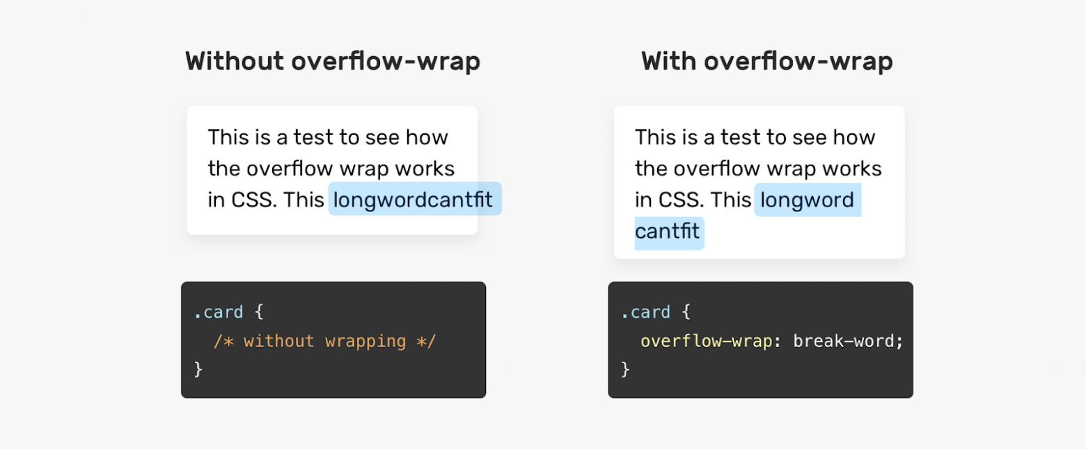
Без использования свойства overflow-wrap слово выходит за пределы контейнера
▍Свойство hyphens
Значение auto CSS-свойства hyphens позволяет сообщить браузеру о том, что он должен самостоятельно принять решение о разделении длинных слов с использованием дефиса и о переносе их на новые строки. Это свойство может принимать и значение manual, что позволяет, используя особые символы, предусмотреть возможность и порядок переноса слова на новую строку в том случае, если в этом возникнет необходимость.
.element {
  hyphens: auto;
}

Без использования свойства hyphens браузер не переносит слово на новую строку
Применяя значение auto свойства hyphens важно помнить о том, что браузер будет переносить любое слово, которое не помещается в строку. Что это значит? Взгляните на следующий рисунок.
Браузер может использовать знак переноса в любом слове
Обратите внимание на то, что браузер использовал знак переноса в слове, которое вполне может быть целиком перенесено на новую строку. При использовании свойства hyphens: auto браузер способен разрывать даже такие слова, которые не выходят за пределы контейнеров.
▍Обрезка однострочного текста
При обрезке текста, для вывода которого предусмотрено поле, вмещающее лишь одну строку, предложение укорачивается, а в его конец добавляется многоточие, указывающее на то, что текст, на самом деле, длиннее того фрагмента, который выведен на экране.

Слева — однострочный текст, при выводе которого обрезка не используется. Справа — текст, при выводе которого используется обрезка
В CSS нет свойства, которое могло бы называться «text-truncation», применимого для настройки автоматической обрезки текстов. Тут нам понадобится комбинация из нескольких свойств:
.element {
  white-space: nowrap;
  overflow: hidden;
  text-overflow: ellipsis;
}
▍Обрезка многострочного текста
Если нужно обрезать текст, для вывода которого предусмотрено поле, вмещающее несколько строк, нужно прибегнуть к CSS-свойству line-clamp:
.element {
  display: -webkit-box;
  -webkit-line-clamp: 3;
  -webkit-box-orient: vertical;
  overflow: hidden;
}
Для того чтобы это сработало, необходимо использовать и свойство display: -webkit-box. Свойство -webkit-line-clamp позволяет указать максимальное количество строк, по достижении которого текст надо обрезать.

Сравнение обрезки однострочного и многострочного текста
Минус этого подхода заключается в том, что, если у элемента будет настроено свойство padding, нормальный вывод текста может быть легко нарушен. Настройка этого свойства приведёт к тому, что часть текста, которая, как ожидается, должна быть скрыта, окажется выведенной после обрезанного текста.

Настройка свойства padding приводит к нарушению вывода текста
▍Вывод длинных текстов в полях, поддерживающих горизонтальную прокрутку
В некоторых ситуациях непрактично организовывать разрыв слов или их перенос на новые строки с использованием дефиса. Например, если имеется поле, в котором должен выводиться фрагмент JavaScript-кода, такой код будет тяжело читать в том случае, если слова будут выводиться с переносом на новые строки. В подобном случае облегчить работу с текстом можно, предусмотрев возможность горизонтальной прокрутки содержимого поля.
.code {
  overflow-x: auto;
}

Поле, в котором осуществляется перенос слов на новые строки, и поле, в котором применяется горизонтальная прокрутка
▍Свойство padding
В некоторых случаях, когда у элемента не настроено свойство padding, вспоминают об этом лишь встречаясь с проблемами, появляющимися при выводе данных на страницах. Взгляните на следующий пример.

Проблема при выводе подписи к флажку
Тут имеется набор флажков. Подпись одного из них выводится слишком близко к другому. Причина этого заключается в том, что при проектировании макета, используемого для вывода флажков, не настроены промежутки между ячейками сетки, в которых размещены данные. Этот пример, кстати, взят с реального сайта (Techcrunch).
Короткие тексты
Я знаю о том, что проблемы, связанные с короткими текстами распространены не так сильно, как проблемы, связанные с длинными текстами. Но возможность их возникновения, всё равно, очень важно учитывать при проектировании пользовательских интерфейсов.
▍Установка минимальной ширины элемента
Вернёмся к примеру, который я приводил в начале статьи.
Кнопка, в которой выводится слишком короткий текст
Как справиться с проблемой, возникающей при выводе на кнопке очень короткой надписи? Решить эту проблему можно, воспользовавшись свойством min-width. При таком подходе ширина кнопки, даже при выводе в ней короткой надписи, не будет меньше заданного значения.

Результаты настройки минимальной ширины кнопки
Теперь, когда мы поговорили о проблемах вывода длинных и коротких текстов и о решениях этих проблем, давайте разберём несколько практических примеров.
Практические примеры
▍Карточка профиля пользователя
Карточки профиля пользователя часто содержат достаточно длинные тексты. В частности, проектируя подобную карточку, разработчику почти невозможно заранее узнать о том, насколько длинным будет имя пользователя. Как же быть?

Имя пользователя обычной длины, помещающееся на карточке целиком. Обрезанное длинное имя, выводимое в одной строке. Обрезанное длинное имя, выводимое в нескольких строках
Проектируя подобную карточку можно подготовиться к выводу в ней длинного имени пользователя, применив один из следующих двух приёмов:
/* Решение 1 */
.card__title {
  text-overflow: ellipsis;
  white-space: nowrap;
  overflow: hidden;
}

/* Решение 2 */
.card__title {
  display: -webkit-box;
  -webkit-line-clamp: 2;
  -webkit-box-orient: vertical;
  overflow: hidden;
}
Как видите, длинный текст можно обрезать, выведя его либо в одной строке, либо — в нескольких строках.
▍Навигационные элементы
При работе над макетами мультиязычных сайтов нужно учитывать тот факт, что тексты, имеющие один и тот же смысл, но написанные на разных языках, могут иметь различную длину.

Названия навигационных элементов, выведенные на разных языках
Длина слова About из LTR-языка больше, чем длина аналогичного по смыслу слова из RTL-языка. При выводе на таком языке соответствующий пункт навигационного меню выглядит слишком коротким. Известно, что если в дизайне страниц используются маленькие области, с которыми нужно взаимодействовать пользователям, это плохо сказывается на UX. Как исправить проблему? В данном случае можно просто настроить минимальную ширину навигационного элемента:
.nav__item {
  min-width: 50px;
}

Решение проблемы короткого текста
Если вас интересуют вопросы вывода данных на разных языках — взгляните на этот мой материал.
▍Поле для вывода содержимого статей
В полях для вывода объёмных текстов вполне могут попадаться очень длинные слова, не помещающиеся в контейнеры. Особенно часто с этим можно столкнуться при работе с сайтами на мобильных устройствах.

Длинное слово выходит за пределы контейнера
Здесь имеется длинное слово, которое выходит за пределы контейнера и является причиной появления горизонтальной полосы прокрутки. Выше мы уже говорили о решениях подобных проблем, которые заключаются в использовании CSS-свойств overflow-wrap или hyphens.
Например, эту проблему можно решить так:
.article-content p {
  overflow-wrap: break-word;
}
▍Оформление виртуальной корзины для покупок
Названия товаров, которые покупатели интернет-магазинов «кладут» в корзины, могут быть очень разными. Это может быть и одно слово, и несколько строк. В следующем примере длина названия товара такова, что текст перекрывается кнопкой для удаления товара из корзины. Причина этого в том, что при проектировании макета корзины не было уделено достаточного внимания настройке расстояния между элементами.

Вывод коротких и длинных названий в макете, который настроен неправильно
Решить эту проблему можно, настроив внутренние или внешние отступы элементов. Конкретные действия зависят от ситуации. Здесь я приведу простой пример, предусматривающий использование свойства margin-right при настройке элемента, выводящего название товара.
.product__name {
  margin-right: 1rem;
}
▍Flexbox-макеты и вывод длинных текстов
При выводе длинных текстов во Flexbox-макетах возможна ситуация, когда такие тексты переполняют родительские элементы. Взгляните на следующий пример.

Элементы выглядят нормально
Вот разметка к этому примеру:
<div class="user">
  <div class="user__meta">
    <h3 class="user__name">Ahmad Shadeed</h3>
  </div>
  <button class="btn">Follow</button>
</div>
Вот стили:
.user {
  display: flex;
  align-items: flex-start;
}

.user__name {
  text-overflow: ellipsis;
  white-space: nowrap;
  overflow: hidden;
}
Если имя пользователя не слишком длинно — всё выглядит нормально. Но что случится в том случае, если имя окажется достаточно длинным? В такой ситуации текст переполнит родительский элемент, а это «поломает» макет.

Длинное имя пользователя портит внешний вид страницы
Причина возникновения этой проблемы заключается в том, что размеры Flex-элементов не сокращаются до величин, которые меньше минимального размера их содержимого. Решить эту проблему можно, установив в значение 0 свойство min-width элемента .user__meta:
.user__meta {
  /* другие стили */
  min-width: 0;
}
После этого даже вывод в элементе длинного имени пользователя не испортит макет. Некоторые подробности об использовании свойства min-width при разработке Flexbox-макетов вы можете найти в этом материале.
Итоги
Надеюсь, теперь вы сможете справиться с проектированием элементов, поддерживающих аккуратный вывод длинных и коротких текстов. Я с большим удовольствием писал эту статью. Я, благодаря этому, вспомнил некоторые тонкости работы с разными текстами. А статья будет служить мне хорошим напоминанием о том, как важно обращать внимание на подготовку элементов страниц к выводу текстов разной длины.
Сталкивались ли вы с проблемами, связанными с выводом текстов разной длины на веб-страницах?


The word-breakCSS property sets whether line breaks appear wherever the text would otherwise overflow its content box.
Try it
Syntax
word-break: normal;
word-break: break-all;
word-break: keep-all;
word-break: break-word;


word-break: inherit;
word-break: initial;
word-break: revert;
word-break: revert-layer;
word-break: unset;
The word-break property is specified as a single keyword chosen from the list of values below.
Values
normal-
Use the default line break rule.
break-all-
To prevent overflow, word breaks should be inserted between any two characters (excluding Chinese/Japanese/Korean text).
keep-all-
Word breaks should not be used for Chinese/Japanese/Korean (CJK) text. Non-CJK text behavior is the same as for
normal. -
break-wordDeprecated -
Has the same effect as
word-break: normalandoverflow-wrap: anywhere, regardless of the actual value of theoverflow-wrapproperty.
Note: In contrast to word-break: break-word and overflow-wrap: break-word (see overflow-wrap), word-break: break-all will create a break at the exact place where text would otherwise overflow its container (even if putting an entire word on its own line would negate the need for a break).
Note: While word-break: break-word is deprecated, it has the same effect, when specified, as word-break: normal and overflow-wrap: anywhere — regardless of the actual value of the overflow-wrap property.
Formal definition
Formal syntax
word-break = normal | keep-all | break-all | break-word
Examples
HTML
<p>1. <code>word-break: normal</code></p>
<p class="normal narrow">This is a long and
 Honorificabilitudinitatibus califragilisticexpialidocious Taumatawhakatangihangakoauauotamateaturipukakapikimaungahoronukupokaiwhenuakitanatahu
 グレートブリテンおよび北アイルランド連合王国という言葉は本当に長い言葉</p>

<p>2. <code>word-break: break-all</code></p>
<p class="breakAll narrow">This is a long and
 Honorificabilitudinitatibus califragilisticexpialidocious Taumatawhakatangihangakoauauotamateaturipukakapikimaungahoronukupokaiwhenuakitanatahu
 グレートブリテンおよび北アイルランド連合王国という言葉は本当に長い言葉</p>

<p>3. <code>word-break: keep-all</code></p>
<p class="keepAll narrow">This is a long and
 Honorificabilitudinitatibus califragilisticexpialidocious Taumatawhakatangihangakoauauotamateaturipukakapikimaungahoronukupokaiwhenuakitanatahu
 グレートブリテンおよび北アイルランド連合王国という言葉は本当に長い言葉</p>

<p>4. <code>word-break: break-word</code></p>
<p class="breakWord narrow">This is a long and
  Honorificabilitudinitatibus califragilisticexpialidocious Taumatawhakatangihangakoauauotamateaturipukakapikimaungahoronukupokaiwhenuakitanatahu
 グレートブリテンおよび北アイルランド連合王国という言葉は本当に長い言葉</p>
CSS
.narrow {
  padding: 10px;
  border: 1px solid;
  width: 500px;
  margin: 0 auto;
  font-size: 20px;
  line-height: 1.5;
  letter-spacing: 1px;
}

.normal {
  word-break: normal;
}

.breakAll {
  word-break: break-all;
}

.keepAll {
  word-break: keep-all;
}

.breakWord {
  word-break: break-word;
}
Specifications
Browser compatibility
| Desktop | Mobile | |||||||||||
|---|---|---|---|---|---|---|---|---|---|---|---|---|
| Chrome | Edge | Firefox | Internet Explorer | Opera | Safari | WebView Android | Chrome Android | Firefox for Android | Opera Android | Safari on IOS | Samsung Internet | |
word-break |
1 |
12 |
15 |
8 Don’t use 5.5 No version of Internet Explorer supports the |
15 |
3 |
≤37 |
18 |
15 |
14 |
2 |
1.0 |
break-word |
1 |
79 |
67 |
No |
15 |
3 |
≤37 |
18 |
67 |
14 |
2 |
1.0 |
keep-all |
44 |
12 |
15 |
5.5 |
31 |
9 |
44 |
44 |
15 |
32 |
9 |
4.0 |
See also
overflow-wraphyphensline-break- Guide to wrapping and breaking text
CSS
-
width
The width CSS property sets an element’s The min-width and max-width properties override Defines the width as an absolute value.
-
will-change
The will-change CSS property hints to browsers how element is expected Warning: will-change is intended to be used as last resort, order try deal with
-
word-spacing
The word-spacing CSS property sets length of space between and tags.
-
writing-mode
The writing-mode CSS property sets whether lines of text are laid out horizontally vertically, as well direction which blocks progress.
Editor’s note: This complete guide to word-wrap, overflow-wrap, and word-break in CSS was last updated 24 February 2023 to reflect the reflect the most recent version of CSS, include interactive code examples, and include a section on how to wrap text using CSS. To learn more about the overflow property, check out our guide to CSS overflow.
Making a site responsive so that it displays correctly on all devices is very important in this day and age. Unfortunately, despite your best efforts to do so, you may still end up with broken layouts. Broken layouts can happen when certain words are too long to fit in their container. Content overflow can occur when you are dealing with user-generated content you have no control over, such as the comments section of a post. Therefore, you need to apply styling to prevent content from overflowing their container.
Content overflow is a common problem for frontend developers. On the web, overflow occurs when your content doesn’t fit entirely within its containing element. As a result, it spills outside. In CSS, you can manage content overflow mainly using the overflow, word-wrap, overflow-wrap, and word-break CSS properties. However, our focus in this article will be on the word-wrap, overflow-wrap, and word-break CSS properties.
Jump ahead:
- Using
word-wrap,overflow-wrap, andword-breakCSS properties- How does content wrapping occur in browsers?
- What is the difference between a soft wrap break and a forced line break?
- Understanding the
Word-wrapandoverflow-wrapCSS propertiesNormalAnywhereBreak-word
- Implementing the
Word-breakCSS property- Setting
word-breaktoNormal - The
Break-allvalue - Using the
Keep-allvalue
- Setting
- What is the difference between
overflow-wrapandword-break? - How to wrap text using CSS
- Troubleshooting CSS content overflow with Chrome DevTools
Using word-wrap, overflow-wrap, and word-break CSS properties
You can use the word-wrap, overflow-wrap, or word-break CSS properties to wrap or break words that would otherwise overflow their container. This article is an in-depth tutorial on the word-wrap, overflow-wrap, and word-break CSS properties and how you can use them to prevent content overflow from ruining your nicely styled layout. Before we get started, let us understand how browsers wrap content in the next section.
How does content wrapping occur in browsers?
Browsers and other user agents perform content wrapping at allowed breakpoints, referred to as soft wrap opportunities. A browser will wrap content at a soft wrap opportunity, if one exists, to minimize content overflow. In English and other similar writing systems, soft wrap opportunities occur by default at word boundaries in the absence of hyphenation. Because words are bound by spaces and punctuation, that is where soft wraps occur.
Although soft wraps occur in space characters in English texts, the situation might be different for non-English writing systems. Some languages do not use spaces to separate words, meaning that content wrapping depends on the language or writing system. The value of the lang attribute you specify on the HTML element is mostly used to determine which language system is used.
This article will focus mainly on the English language writing system. The default wrapping at soft wrap opportunities may not be sufficient if you are dealing with long, continuous text, such as URLs or user-generated content, which you have very little or no control over. Before we go into a detailed explanation of these CSS properties, let’s look at the differences between soft wrap break and forced line break in the section below.
What is the difference between a soft wrap break and a forced line break?
Any text wrap that occurs at a soft wrap opportunity is referred to as a soft wrap break. For wrapping to occur at a soft wrap opportunity, you need to make sure you’ve enabled wrapping. For example, setting the value of white-space CSS property to nowrap will disable wrapping. Forced line breaks are caused by explicit line-breaking controls or line breaks marking the end or start of blocks of text.
Understanding the Word-wrap and overflow-wrap CSS properties
The name word-wrap is the legacy name for the overflow-wrap CSS property. Word-wrap was originally a non-prefixed Microsoft extension and was not part of the CSS standard, though most browsers implemented it with the name word-wrap. According to the draft CSS3 specification, browsers should treat word-wrap as a legacy name alias of the overflow-wrap property for compatibility.
Most recent versions of popular web browsers have implemented the overflow-wrap property. The draft CSS3 specification refers to the overflow-wrap property as:
This property specifies whether the browser may break at otherwise disallowed points within a line to prevent overflow when an otherwise-unbreakable string is too long to fit within the line box.
If you have a white-space property on an element, you need to set its value to allow wrapping for overflow-wrap to have an effect. Below are the values of the overflow-wrap property:
overflow-wrap: normal;
overflow-wrap: anywhere;
overflow-wrap: break-word;
You can also use the global values inherit, initial, revert, and unset with overflow-wrap, but we won’t cover them here. In the subsections below, we will look at the values of the overflow-wrap CSS property outlined above to understand the behavior of this property.
Normal
Applying the value normal will make the browser use the default line-breaking behavior of the system. For English and other related writing systems, line breaks will therefore occur at whitespaces and hyphens, as shown below:
.my-element{
    overflow-wrap: normal;
}
In the example below, there is a word in the text that is longer than its container. Because there is no soft wrap opportunity and the value of the overflow-wrap property is normal, the word overflows its container. It describes the default line-breaking behavior of the system:
See the Pen
overflow-wrap-normal by Joseph Mawa (@nibble0101)
on CodePen.
Anywhere
Using the value anywhere will break an otherwise unbreakable string at arbitrary points between two characters. It will not insert a hyphen character even if you apply the hyphens property on the same element.
The browser will break the word only if displaying the word on its line will cause an overflow. If the word still overflows when placed on its line, it will break the word at the point where an overflow would otherwise occur. When you use anywhere, the browser will consider the soft wrap opportunities introduced by the word break when calculating min-content intrinsic sizes:
.my-element{
   overflow-wrap: anywhere;
}
Unlike in the previous section, where we used overflow-wrap: normal, in the example below, we are using overflow-wrap: anywhere. The overflowing word that is otherwise unbreakable is broken into chunks of text using overflow-wrap: anywhere so that it fits in its container:
See the Pen
overlow-wrap-anywhere by Joseph Mawa (@nibble0101)
on CodePen.
Most recent versions of desktop browsers support overflow-wrap: anywhere. However, support for some mobile browsers is either lacking or unknown. The image below shows the browser support:
Break-word
The value break-word is like anywhere in terms of functionality. If the browser can wrap the overflowing word to its line without overflowing, that is what it will do. However, if the word still overflows its container even when it is on its line, the browser will break it at the point where the overflow would otherwise occur:
.my-element{
   overflow-wrap: break-word;
}
The example below shows how the browser breaks the overflowing text when you apply overflow-wrap: break-word:
See the Pen
overflow-wrap-break-word by Joseph Mawa (@nibble0101)
on CodePen.
Notice that the text appears the same as in the last subsection. The difference between overflow-wrap: anywhere and overflow-wrap: break-word is in the min-content intrinsic sizes.
The difference between anywhere and break-word is apparent when calculating the min-content intrinsic sizes. With break-word, the browser doesn’t consider the soft wrap opportunities introduced by the word break when calculating min-content intrinsic sizes, but it does with anywhere. For more about min-content intrinsic sizes, check out our guide here.
The value break-word has decent coverage among the most recent versions of desktop browsers. Unfortunately, you cannot say the same about their mobile counterpart. It is, therefore, safer to use the legacy word-wrap: break-word instead of the more recent overflow-wrap: break-word.
The image below shows browser support for overflow-wrap: break-word:
The most recent versions of desktop browsers have support, while support for some mobile browsers is unknown.
Implementing the Word-break CSS property
Word-break is another CSS property you can use to specify soft wrap opportunities between characters. You can use this property to break a word at the exact spot where an overflow would occur and wrap it onto the following line.
The draft CSS3 specification refers to the word-break CSS property as:
This property specifies soft wrap opportunities between letters, i.e., where it is “normal” and permissible to break lines of text. It controls what types of letters the browser can glom together to form unbreakable “words” — causing CJK characters to behave like non-CJK text or vice versa.
Below are the possible values of the word-break CSS property. Like overflow-wrap, you can use the global values inherit, initial, revert, and unset with word-break, but we won’t cover them here:
word-break: normal;
word-break: break-all;
word-break: keep-all;
Break-word is also a value of the word-break CSS property, though it was removed. However, browsers still support it for legacy reasons. Specifying this property has the same effect as word-break: normal and overflow-wrap: anywhere.
Now that we know the break-word CSS property and its corresponding values, let us look at them in the subsections below.
Setting word-break to Normal
Setting the value of the word-break property to normal will apply the default word breaking rules:
.my-element{
   word-break: normal;
}
The example below illustrates what happens when you apply the styling word-break: normal to a block of text that contains a word longer than its container:
See the Pen
word-break-normal by Joseph Mawa (@nibble0101)
on CodePen.
What you see is the browser’s usual word-breaking rules in effect.
The Break-all value
The value break-all will insert a line break at the exact point where the text would otherwise overflow for non-Chinese, non-Japanese, and non-Korean writing systems. It will not put the word on its own line, even if doing so will prevent the need to insert a line break:
.my-element{
   word-break: break-all;
}
In the example below, I am applying word-break: break-all styling to a p element of width 240px containing an overflowing text. The browser will insert a line break at the point where an overflow would occur and wrap the remaining text to the following line:
See the Pen
word-break-break-all by Joseph Mawa (@nibble0101)
on CodePen.
Using break-all will break a word between two characters at the exact point where an overflow would occur in English and other related language systems. However, it won’t apply the same behavior to Chinese, Japanese, and Korean (CJK) texts.
It doesn’t apply the same behavior for CJK texts because CJK writing systems have their own rules for applying breakpoints. Creating a line break between two characters arbitrarily just for the sake of avoiding overflow might significantly change the overall meaning of the text. For CJK systems, the browser will apply line breaks at the point where such breaks are allowed.
Using the Keep-all value
If you use the value keep-all, the browser will not apply word breaks to CJK texts, even if there is content overflow. The effect of applying keep-all value is the same as that of normal for non-CJK writing systems:
.my-element{
   word-break: keep-all;
}
In the example below, applying word-break: keep-all will have the same effect as word-break: normal for a non-CJK writing system such as English:
See the Pen
word-break-keep-all by Joseph Mawa (@nibble0101)
on CodePen.
The image below shows the browser support for word-break: keep-all:
This value has support in most popular desktop browsers. Unfortunately, it is not the case for mobile browsers. Now that we have looked at the overflow-wrap and word-break CSS properties, what is the difference between the two? The section below will shed light on that.
What is the difference between overflow-wrap and word-break?
You can use the CSS properties overflow-wrap and word-break to manage content overflow. However, there are differences in the way the two properties handle it.
Using overflow-wrap will wrap the entire overflowing word to its line if it can fit in a single line without overflowing its container. The browser will break the word only if it cannot place it on a new line without overflowing. In most cases, the overflow-wrap property or its legacy name word-wrap might manage content overflow. Using word-wrap: break-word will wrap the overflowing word onto a new line and goes ahead to break it between two characters if it still overflows its container.
Word-break will ruthlessly break the overflowing word between two characters even if placing it on its line will negate the need for word break. Some writing systems, like the CJK writing systems, have strict word breaking rules the browser takes into consideration when creating line breaks using word-break.
How to wrap text using CSS
As hinted above, if you want to wrap text or break a word overflowing the confines of its box, your best bet is the overflow-wrap CSS property. You can also use its legacy name, word-wrap. Try the word-break CSS property if the overflow-wrap property doesn’t work for you. However, be aware of the differences between overflow-wrap and word-break highlighted above.
Below is an illustration of the overflow-wrap and word-wrap CSS properties. You can play with the CodePen to understand their effects:
See the Pen
how-to-wrap-text by Joseph Mawa (@nibble0101)
on CodePen.
Troubleshooting CSS content overflow with Chrome DevTools
More often than not, you might need to fix broken layouts caused by content overflow, as complex user interfaces are now commonplace in frontend development. Modern web browsers come with tools for troubleshooting such layout issues, such as Chrome DevTools.
It provides the capability to select an element in the DOM tree so that you can view, add, and remove CSS declarations and much more. It will help you track down the offending CSS style in your layout and fix it with ease.
To open the Chrome DevTools, you can use the F12 key. When open, it looks like in the image below. Selecting an element in the DOM tree will display its corresponding CSS styles. You can modify the styles and see the effect on your layout as you track down the source of the bug:
As already mentioned, if you have white-space property on an element, set its value to allow wrapping for overflow-wrap: anywhere or overflow-wrap: break-word to work.
Setting the value of overflow-wrap property to anywhere or break-word on a table content won’t break an overflowing word like in the examples above. The table will overflow its container and create a horizontal scroll if necessary. To get the table to fit within its container and overflow-wrap to work, set the value of the table-layout property to fixed and set the table width to 100% or to some fixed value.
Conclusion
As pointed out in the above sections, overflow-wrap and word-break are similar in so many ways, and you can use both of them for line-breaking controls. The name overflow-wrap is an alias of the legacy word-wrap property. Therefore, you can use the two interchangeably. However, it is worth mentioning that the browser support for the newer overflow-wrap property is still low. You are better off using word-wrap instead of overflow-wrap if you want near-universal browser support.
According to the draft CSS3 specification, browsers and user agents should continue supporting word-wrap for legacy reasons. If you are looking to manage content overflow, overflow-wrap or its legacy name word-wrap might be sufficient. You can also use word-break to break a word between two characters if the word overflows its container. Just like overflow-wrap, you need to tread with caution when using word-break because of limitations in the browser support.
Now that you know the behavior associated with the two properties, you can decide where and when to use them. Did I miss anything? Leave a comment in the comments section. I will be happy to update this article.
Is your frontend hogging your users’ CPU?
As web frontends get increasingly complex, resource-greedy features demand more and more from the browser. If you’re interested in monitoring and tracking client-side CPU usage, memory usage, and more for all of your users in production, try LogRocket. https://logrocket.com/signup/
LogRocket is like a DVR for web and mobile apps, recording everything that happens in your web app, mobile app, or website. Instead of guessing why problems happen, you can aggregate and report on key frontend performance metrics, replay user sessions along with application state, log network requests, and automatically surface all errors.
Modernize how you debug web and mobile apps — Start monitoring for free.
Веб-пространство построено на контенте, а контент состоит из слов, и возможно из очень длинных. Всем «участникам» всемирной паутины рано или поздно приходится иметь дело с длинными словами:

Пример
Каждый день в сети я встречаю практически все виды дефектов отображения, связанных с длинными словами – «сломанные» макеты, обрезку слов и ситуацию, которая приведена на изображении выше.
- Переносы
- word-break
- Overflow-wrap
- Эллипсис
- Заключение
- Окончательное решение
Первое решение для длинных слов — это применение переносов.

Пример
.hyphens {
  -webkit-hyphens: auto;
  -moz-hyphens: auto;
  -ms-hyphens: auto;
  hyphens: auto;
}
Поддержка браузерами: CSS-переносы поддерживаются во всех популярных браузерах, за исключением браузеров, реализованных на основе движка Blink (Chrome, Opera, Android). Здесь описаны все распространенные ошибки в Chrome. Я также протестировал Safari 5.1 под Windows, в котором переносы поддерживаются, но для моих тестовых слов все они добавлялись не в тех местах, в которых нужно.
Кроме этого, переносы во многом зависят от правил языка. Вам нужно определить атрибут lang в родительском элементе. Также нужно помнить, что другие языки, кроме английского, поддерживаются в браузерах на весьма низком уровне.
Вы также можете использовать библиотеку JavaScript, такую как Hyphenator.js, которая работает со многими языками и многими браузерами. Недостатком этого решения является то, что вам нужно будет загружать много дополнительных скриптов JavaScript, что может существенно снизить производительность.
Так как не все браузеры полностью поддерживают перенос слов, давайте попробуем это свойство CSS, которое указывает, следует ли разрывать строки внутри слов:

Пример
.word-break {
  -ms-word-break: break-all;
  word-break: break-all;
  word-break: break-word;
}
Поддержка браузерами: Свойство CSS word-break поддерживается во всех браузерах, за исключением Opera Mini и старых браузеров Opera на основе Presto.
Еще одно возможное решение данной проблемы — использование word-wrap (overflow-wrap). Еще одно свойство, которое указывает, может ли браузер разбивать строки внутри слов:

Пример
.word-wrap {
  word-wrap: break-word;
  overflow-wrap: break-word;
}
Поддержка браузерами: Свойство CSS word-wrap поддерживается во всех браузерах. В некоторых из них для нормальной работы требуется указывать унаследованное имя word-wrap (а не overflow-wrap).
Еще один вариант для решения проблемы длинных слов — это усечение:

Пример
.ellipsis {
  overflow:hidden;
  white-space: nowrap;
  text-overflow: ellipsis;
}
Поддержка браузерами: Text-overflow поддерживается во всех основных браузерах.
На первый взгляд кажется, что этот метод неплохо справляется с нашей проблемой, но он имеет ряд недостатков. Прежде всего, он будет обрезать любой текст, занимающий более одной строки, даже если вы использовали короткие слова, и они прекрасно разместились бы в нескольких строках. Кроме этого слова могут обрезаться так, что исходное слово будет приобретать другое значение.
Пожалуйста, не используйте text-overflow: ellipsis, потому что сокращать слова — это не работа CSS. Только, если вам действительно необходимо это сделать на стороне сервера, и только после полного сокращения слов.
Я проверил все приведенные выше примеры и их сочетания в следующих браузерах: IE7, IE8, IE9, IE10, IE11, Edge, Firefox 39 (Windows, Linux, Mac), Chrome 44 (Windows, Linux, Mac), Opera 30 (Windows, Mac) , Safari 8 (Mac), Safari 5.1 (Windows), Android-5 (Nexus 6), Android 4.4 (Nexus 5), Android 2.3 (Galaxy S2), IOS 8.3 (iPhone 6), IOS 7 (iPhone 5S), IOS 6 (iPhone5), Opera Mini (Android 5), Opera Classic (Android 5), Opera Mobile (Android 5) и Windows Phone 8.1 (Lumia 930), используя реальные устройства и BrowserStack. По этой ссылке вы найдете список всех 26-браузеров, по этой ссылке — результаты их тестирования.
В интернете можно найти и такое решение:
.hyphenate {
  -ms-word-break: break-all;
  word-break: break-all;
  word-break: break-word;
  -webkit-hyphens: auto;
  -moz-hyphens: auto;
  hyphens: auto;
}
Хотя это прекрасно работает в большинстве случаев, я выяснил, что в Firefox перенос не будет работать (хотя он и поддерживается) в сочетании с word-break. Как и word-break, это свойство не поддерживается, и не будет работать в Opera Mini.
В то же время overflow-wrap прекрасно поддерживается браузерами. Я протестировал следующее решение, используя overflow-wrap и перенос.
.hyphenate {
  overflow-wrap: break-word
  word-wrap: break-word;
  -webkit-hyphens: auto;
  -ms-hyphens: auto;
  -moz-hyphens: auto;
  hyphens: auto;
}
Этот код выводит переносы во всех браузерах, в которых они поддерживаются, и разрывы строк во всех остальных. Хотя я и протестировал это решение в 26 различных браузерах, но до сих пор не уверен, что оно будет работать в 100% случаев — если вы найдете какое-нибудь исключение, пожалуйста, дайте знать об этом в комментариях к статье.