
Excel Chart Templates — Free Downloads

PINE BI: Ultimate Excel Charting Add-in: Insert custom charts with a simple click & other charting tools!
Excel also allows almost unlimited chart customizations, by which you can create many advanced chart types, not found in Excel. Below you will also find these advanced chart templates available for download.
You will also find some chart templates available for download for standard Excel charts.
Instead, click here if you are looking for information about creating, saving, and using Chart Templates within Excel.
Advanced Chart Templates

Gauge Chart
Also known as: Dial Chart, Speedometer Chart
Description: Gauge charts use needles to show information as a reading on a dial. They are often used when comparing KPIs or business results against a stated goal.
Learn More: Gauge Chart Tutorial
Gauge Chart Builder Add-in
7 Different Gauge Chart Templates. 5 Style Presets. 9 Color Palettes. Fully customizable.

Tornado Chart
Also known as: Sales Funnel Chart, Butterfly Chart
Description: A Tornado Chart is a modified version of the bar chart where the data categories are displayed vertically in a way that resembles a tornado.
Learn More: Tornado Chart Tutorial

Burndown Chart
Also known as: N/A
Description: Burndown charts represent work left to do vs. time. It is useful for predicting when all work will be completed.
Learn More: Burndown Chart Tutorial

Step Chart
Also known as: N/A
Description: A Step Chart is a line chart that uses vertical and horizontal lines to connect data points in a series, creating a step-like progression.
Learn More: Step Chart Tutorial

Thermometer Chart
Also known as: Goal Chart
Description: Thermometer charts show the current completed percentage of a task or goal relative to the goal.
Learn More: Thermometer Tutorial

Quadrant Chart
Also known as: N/A
Description: Quadrant charts are scatter charts with a background that is divided into four equal sections, allowing you to categorize data points into the four quadrants
Learn More: Quadrant Tutorial

Ogive Chart
Also known as: Cumulative Frequency Graph
Description: Ogive charts are graphs used in statistics to illustrate cumulative frequencies.
Learn More: Ogive Chart Tutorial

Bullet Chart
Also known as: Steven Few’s Bullet Graph
Description: A modified column or bar chart used for tracking performance(s) against goal(s). Alternative to Gauge chart.
Learn More: Bullet Chart Tutorial

Mekko Chart
Also known as: Marimekko Chart, Mosaic Plot
Description: 2D stacked chart where the column width usually represents the relative size of a segment and the height breaks down each segment.
Learn More: Mekko Chart Tutorial

Normal Distribution Curve
Also known as: Bell Curve, Gaussian Curve, Bell Plot
Description: Symmetrical graph that illustrates the tendency of data to cluster around the mean.
Learn More: Bell Curve Tutorial

Stem and Leaf Plot
Also known as: Stemplot
Description: Diagram that splits each data point into a «stem» (the first number(s)) and «leaf» (usually last digit) to display the frequency distribution of a data set.
Learn More: Stem and Leaf Tutorial

Polar Plot
Also known as: N/A
Description: A polar plot is used to define points in space within what is called the polar coordinate system.
Learn More: Polar Plot Tutorial

Venn Diagram
Also known as: N/A
Description: A Venn Diagram uses circles to show relationships among sets where sets have some commonalities.
Learn More: Venn Diagram Tutorial

Panel Chart
Also known as: N/A
Description: Panel charts are charts that have multiple regions, each region displaying a different set of data, rather than showing all data in a single region.
Learn More: Panel Chart Tutorial

Timeline Chart
Also known as: Milestone Chart
Description: Timeline charts are used to visualize status of projects in chronological order.
Learn More: Timeline Chart Tutorial

Progress (Bar and Circle) Charts
Also known as: N/A
Description: Progress charts are used to display your progress towards a goal.
Learn More: Progress Chart Tutorial

Population Pyramid
Also known as: N/A
Description: Population Pyramids are used to visually display subsets within a population.
Learn More: Population Pyramid Tutorial

Excel Basic Chart Templates

Column Charts
Description: A Column Chart is a data visualization where each item is represented by a rectangle, where the magnitude of the values determines the height of the rectangle.
Learn More: Column Chart Tutorial

Bar Charts
Description: A Bar Chart is a data visualization where each item is represented by a rectangle, where the magnitude of the values determines the width of the rectangle.
Learn More: Bar Chart Tutorial

Area Charts
Description: An Area Chart is similar to a line chart, except the area below the line is colored in to emphasize magnitude.
Learn More: Area Chart Tutorial

Line Charts
Description: A line chart is a graph that uses lines to connect individual data points over a time interval.
Learn More: Line Chart Tutorial

Pareto Chart
Description: A Pareto Chart is a hybrid of column and line charts that displays the relative importance of factors in a data set.
Learn More: Pareto Chart Tutorial

Waterfall Chart
Also Known As: Bridge Chart, Flying Bricks Chart, Cascade Chart, or Mario Chart
Description: A Waterfall Chart visually breaks down the cumulative impact of sequential positive or negative values on a final outcome (ex. various income and expense items on the final profitability).
Learn More: Waterfall Chart Tutorial

Sales Funnel Chart
Description: A Sales Funnel Chart dissects different stages of a process, typically sorting the values in descending order (from largest to smallest) in a way that visually looks like a funnel—hence the name.
Learn More: Sales Funnel Chart Tutorial

Candlestick Charts
Description: A candlestick chart shows the open, high, low, close prices of an asset over a period of time.
Learn More: Candlestick Chart Tutorial
-
There are many places to get free Excel templates, and you can start by looking on Microsoft’s website. HubSpot also offers popular Excel templates. Other free templates may ask you to provide your email address so you will end up on a marketing list, but you can find a template to meet almost any need.
-
We will always keep your personal information safe. We ask for your information in exchange for a valuable resource in order to (a) improve your browsing experience by personalizing the HubSpot site to your needs; (b) send information to you that we think may be of interest to you by email or other means; (c) send you marketing communications that we think may be of value to you. You can read more about our privacy policy here.
-
When you create a document in Excel, you can choose «New From Template» from the «File» menu and you can browse the options Microsoft gives you. For more options, HubSpot and other sites offer free Excel templates for almost any purpose you can think of.
-
Absolutely. Just sharing some free knowledge that we hope you’ll find useful. Keep us in mind next time you have marketing questions!
-
You can get more free templates for Excel on the Microsoft Office website, from HubSpot’s Resource Library or Business Templates Library, or on many other websites that offer specific types of templates for different uses.
-
You can download templates for Excel from Office.com by following the instructions. Many other sites like (like ourselves, Hubspot) offer free excel templates for everything from invoices to budgets to charts or timelines in our Business Templates Library.
-
Excel is a very useful tool for marketers. You can use Excel to plan marketing budgets, blog editorial strategies, SMART marketing goals, online ads, SEO, social media, lead generation, and reports. HubSpot’s Free Excel Marketing Templates makes executing marketing strategies a breeze.
We’re committed to your privacy. HubSpot uses the information you provide to us to contact you about our relevant content, products, and services. You may unsubscribe from these communications at any time. For more information, check out our Privacy Policy.
Plot a course for interesting and inventive new ways to share your data—find customizable chart design templates that’ll take your visuals up a level. Whether you use charts in research, in presentations, or to keep track of personal projects, there’s a chart template that’ll help you get started.

Document your data easily with customizable chart designs
Charts serve a lot of purposes: To display data, to keep track of plans and goals, to impart and organize information. Charts can also be kind of a snooze. But they don’t have to be. Start all your chart plotting with a designer-created customizable template. Charts aren’t strangers to presentations; businesses of all sizes often find themselves in need of audience-ready charts. Starting with a template is a great way to get clear, quality charts every time. Charts can be a great way to share data quickly and visually at a glance. Try them out in resumes, sales materials, and anywhere else high-level data needs to be organized.
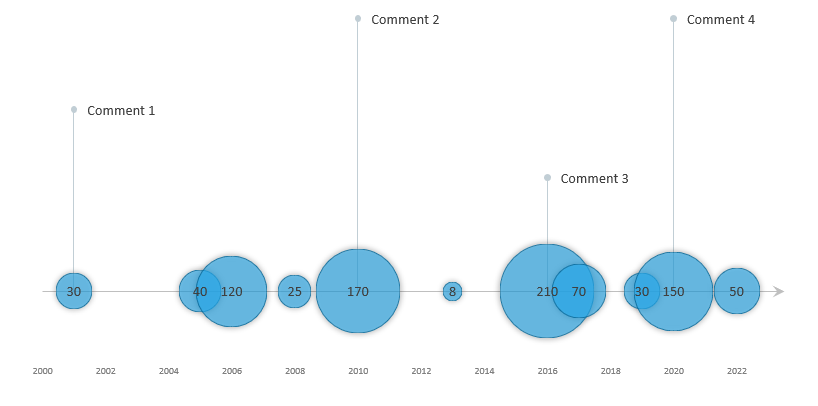
The timeline template uses a custom bubble chart, a great Excel visualization tool if you want to show data over time. For example, use the bubble timeline graph to identify trends, highs, and lows.
Track your team’s performance or your company’s market share over time. To create an easy-to-read graph in a few steps, follow our guide or download the template.
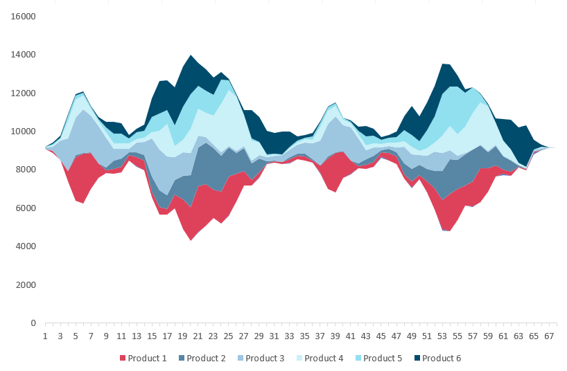
If you want to visualize a huge amount of data, use the stream graph. The chart is based on a stacked area chart and represents the evolutions of numeric values. The chart handles multiple categories and uses different colors to identify each series.
This tutorial covers creating a stream graph template step-by-step using Microsoft Excel.
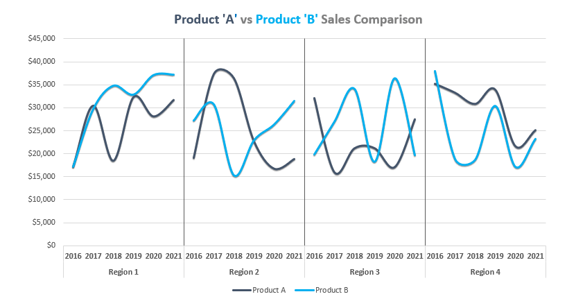
In this guide, you’ll learn how to create a chart template using a cycle plot. The chart is great for comparison purposes. It’s a combo chart and uses error bars, line charts, and dummy series. We’ll prepare the data first then build a pivot table to create a layout for the template. Using a panel chart, we can manage multiple data series in a single graph.
It is not a standard, built-in Excel graph, but they’re not too hard to create. Our tutorial describes all the important steps to build a panel chart.
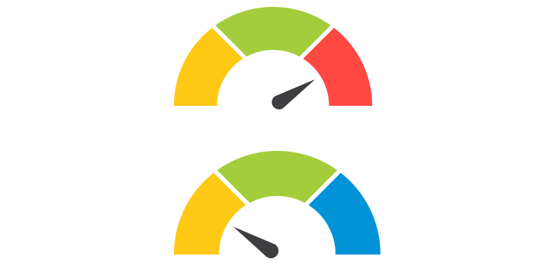
This Excel chart template is based on a combo chart. You can create gauges easily, and it’s only a few steps necessary. First, prepare your data set and build the zones for the given criteria. After that, insert a donut and a pie chart. Because we want to use a single data point for tracking KPIs, format the pie series. Let’s see the doughnut series. Use the red, yellow, and green scheme for the given slices. That’s all. Download the free chart template!
Speedometers are great alternatives to bullet charts. If you need to build a perfect dashboard, we strongly recommend using it. In this tutorial, you will learn how to build a widget from the ground up! We’ll talk about the simple formula that is behind the graph.
The score meter chart template is a smart chart that helps you to display values on a quality scale. Are you want to show your KPIs using a dynamic chart? You have to follow only a few steps! The template is based on multiple stacked bar charts. First, create a simple table for your data set. Split the range (from 0% to 100%) into five areas, like poor, uncertain, fair, good, and excellent.
You’ll use an array formula to decide that in the FREQUENCY column, what value will correspond to the actual value. Apply a custom color scale for each section from red to green. Your chart template is ready to use!
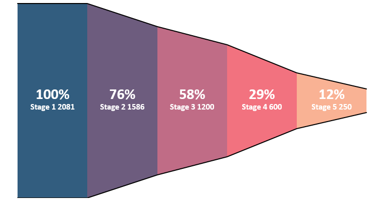
Sometimes we need to build custom charts. What if you want to analyze your sales funnel? As we mentioned above, some built-in Excel charts are outdated. The funnel a marketing tool that raises many interesting questions. The graph show areas using multiple levels in a process. If you are using Microsoft Excel, you have only a basic chart with limited functions. Read more about our automated solution! Get the best funnel chart that you have ever seen. Take a closer look at the video to see what is under the hood.
No one likes to work with useless reports. The Bullet Chart is one of the best usable chart types in Excel. It is a solution to reach your goal: creating a dashboard to show the data on a single screen. A bullet chart is an answer to this. At first glance, a gauge chart is a great tool, but it can be useful if you want to show only one data point. Otherwise, – if you need to show more than one value – a bullet graph is a widely accepted tool. It is the best possible choice for displaying the differences between plan vs. actual values. Is this simple little tool able to compete with it? It will turn out by the end of the article! You have to show all important KPIs on one page. So, the bullet chart is a great choice if you want to create Excel chart templates.

How to use conditional formatting on charts? Formatting cells is easy in Excel. Custom shapes can improve this useful function; you can highlight elements and build a dynamic chart template. As you know, Excel charts have some limits.
Take a closer look at the chart template; we will show you how all this is possible. In a nutshell, conditional formatting charts can do way more things than most of you think. Control your dynamic shapes using a small VBA code. Download the sample workbook, and play with the graph!
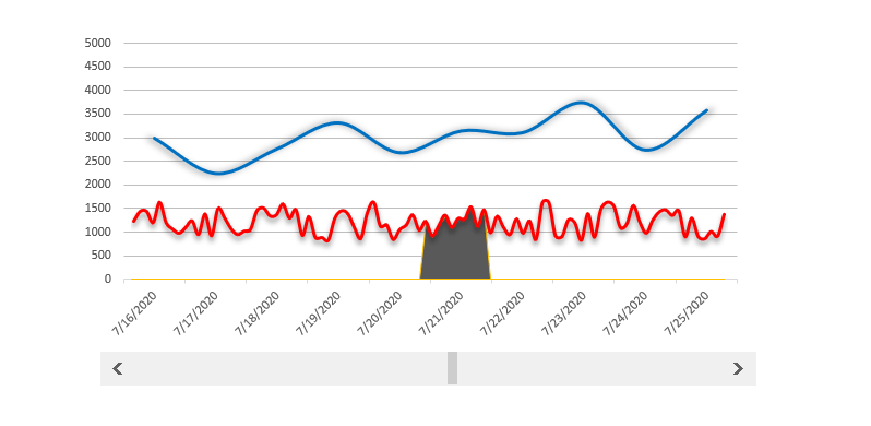
The scrolling period chart template helps you if you want to track a longer period and within it a highlighted period. There are two options to show the results of a period. The first one is when we create a detailed statement. This variant is especially for analysts, and every little detail is displayed on the chart.
In the second case, we are building a graph and only show the key events. The purpose of this is that the manager overviewing the report wouldn’t get lost in the details. You can make strategic decisions based on the graph. Good to know that it’s a combo chart; we need a line chart and an area type.

The org chart template is nothing else than a snapshot of the organized corporate structure. Not only Excel but Word and PowerPoint also contain tools for this job. Today’s article will show a quick solution. Using our small add-in, you can create an org chart with only a few clicks. If you have the mood, use VBA SmartArt objects to build advanced chart types in a short time.
You can achieve great results if we use Microsoft Excel to increase efficiency and reduce the time consumed by work. We spent a lot of time figuring out more and more automatization. The demonstrated example will show you again that Excel’s possibilities are almost endless. Download the chart tool!
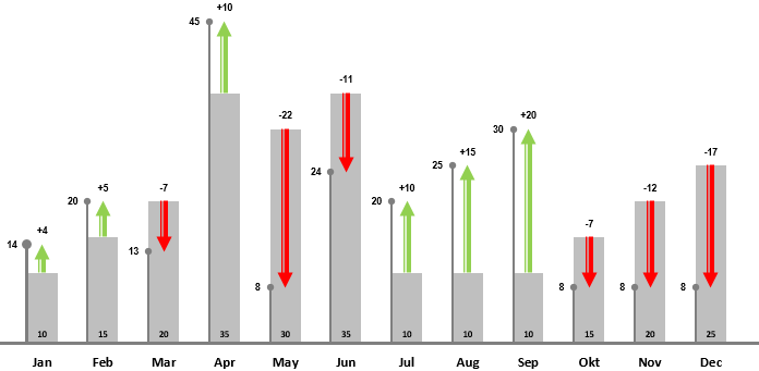
In this tutorial, you will learn how to transform bars into a stunning variance chart. If you are using a variance chart template, you only need to provide the actual value and the target value. For example, you want to compare the sales of two companies for the last 12 months. Note: we recommend you using combo charts for financial purposes.
How to create the template? As first, add data for the bars. We are using grey bars to display the plan value. On the lollipop chart, we’ll show the actual value. With the help of green and red arrows, it’s easy to show the differences. The green arrows are pointing upward, and the red arrows are pointing downward on the final chart. That is all! The template provides dynamic updates. If you change single or multiple values, the chart will reflect.

We are using variance charts in everyday work in Excel. Comparing the planned value with the actual value is your goal if you are in sales. The chart template is based on a modern report. Using a simple drop-down list, you can take a closer look at the sales performance by year. It’s a bit special because, under the hood, you’ll apply conditional formatting instead of a default chart.
We recommend you using Excel form controls to create advanced dynamic charts. With the help of a drop-down list, you can show two different periods on the same chart. It can be helpful if you have a small space for your chart. Don’t hesitate and download our free chart template.
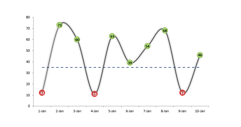
The conditional color chart template is an interesting experiment for extending Excel toolbox. Today’s article will help us in the solution of a very rare but important issue. So far we could mostly have the opportunity to use Excel conditional formatting function with cells, and with a little thinking we can easily make a spectacular Excel chart template also. What is this all about? When we color or assign distinctive signs the cells than we talking about conditional formatting. The aim of today’s presentation is to display values by assigning color codes in connection of if they are larger or smaller than a given parameter (average).
Would you like to see some great interactive charts and templates? With the help of these, the graphs speak for themselves. We were working hard to create better and diverse data visualizations for you. I hope you will find the result of today’s guide useful. Let us see the details: the sample data set is simple. There are income, expenses, and profit is the difference between these two. In the column Plan / Actual, we can see how the planned income and expenditures take shape compare to the actual data. In the last column, you can find the differences in percent. If the value is over 100 %, then we over-fulfilled the plan; obviously, this is the goal. The template uses linked picture technic.
Today’s presentation, the Quick KPI Chart will give you lots and lots of help if the phrase key performance indicator is not new to you. Small, Simple, Smart, Quick are the words that first come to mind when we think about an excel template or excel dashboard. Many people or even excel gurus think it is astoundingly complicated workflow to create an excel dashboard. Fortunately there are situations when we don’t have to struggle for making something spectacular. We’ll introduce such little trick in today’s article. We hope that after you have reached the end of the article and tried the excel template, again take a big step toward getting to know the possibilities of Excel. As you will see, there are no limits!
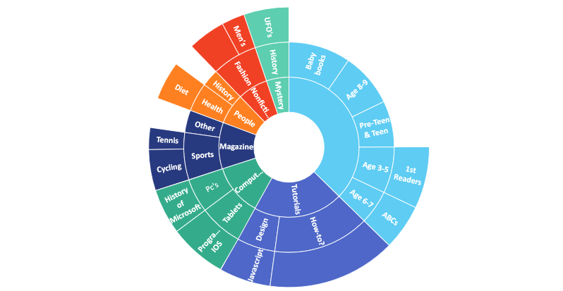
The sunburst chart comes in Excel 2016. The template is great if you are using a higher level of data visualization. In the example, you need to show hierarchical data in a circular format. On the graph, each level of the hierarchy is represented as a ring. In the article, we will show all the advantages of this smart chart: the items on the top-level show up in the inner ring.
Sub-categories are displayed as outer rings. Segments in each ring are sized proportionally using a value series. It’s easy to show multiple categories on a circular format graph. All right; starting with the basics, let us see how the sunburst chart template is good!
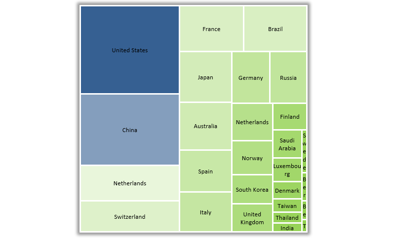
Excel Treemap Chart was introduced in Excel 2016. What if you are using Microsoft Excel 2013? In this version, it’s not a default chart. Our new chart utility is ready to use and works fine with Office 2013. With its help, you can create new – never-before-seen templates. Compare the sales by years, manage the risks easily!
From now on, you can create advanced heatmaps with zero programming skills. Otherwise, time-consuming tasks will turn into a daily routine. You will see why the treemap chart is universal. We don’t want to use up your patience, so let’s start right away!
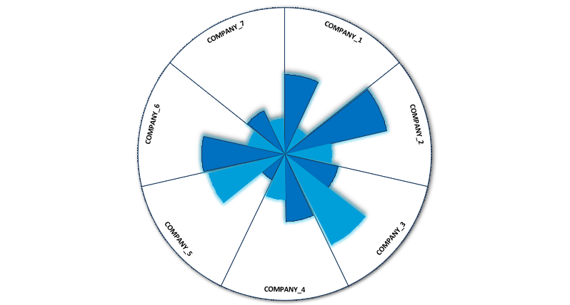
The radar chart shows multiple categories (scoring, risk, or sales) on one graph. It’s fully able for easy comparison. The solution, in a nutshell: All groups turn into points on the graph. The distance from the center displays the value of the score in the given category. A line connecting each data point in the category represents the data source. Multiple data sources become multiple colored areas on the chart. This guide will show you how to build a spider chart. The free editable worksheet is available for download!
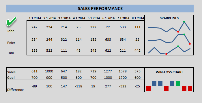
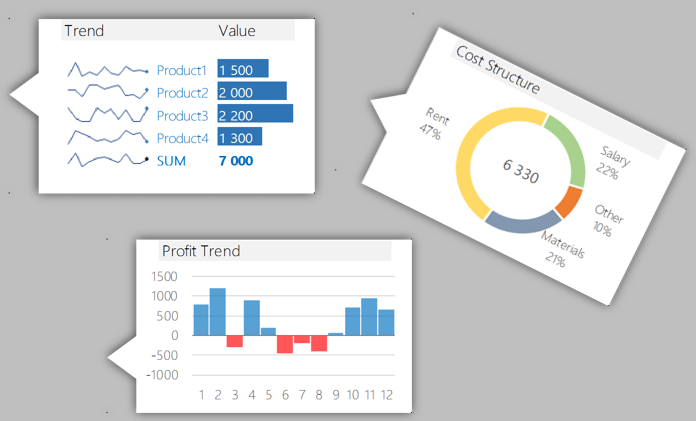
From Excel 2013, you can use a new chart type named sparklines. Sparkline is mini charts located in single cells. Each cell shows a series of data in your range. It helps bring meaning and context to numbers being reported. Select the data and insert chart!
This type of graph – compared with classic chart templates – is meant to be embedded into what they are reporting.
To create new styles, use the Design tab on the ribbon and customize your sparklines to match whatever visual style you need. If you find a space-saving method, use sparklines instead of charts.
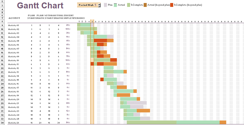
Gantt chart templates are useful tools for managing and scheduling projects in Excel. If you want to build a graph, you have two options. With a few steps, you can turn a simple bar chart into a Gantt Chart. In this case, Chart Formatting is important. As first, right-click on any of the bars on the chart to modify existing charts. Remove extra spaces between the graphs using the Gap Width. Another solution is based on conditional formatting. You can use different colors to highlight the task status.
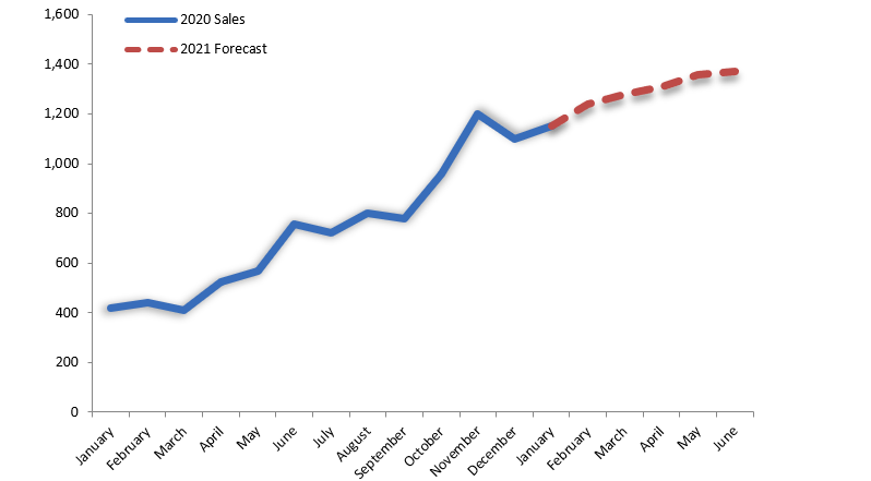
How to create a sales forecast chart in Excel? We need to show the actual value and the forecasted values on the same chart in some cases. In the example, we will show two graphs and apply a simple trick. The first graph shows the monthly data for two years. Insert a graph with two series. You can find the dates in column B. Enter the actual values in column C.
The main task is to leave some cells with blanks below. Now add the forecasted values in column D from that date down with blanks above. Format the two series the way you want them to appear. Use one line chart with solid and another line chart with a dashed line. If you want to insert new months, delete a forecast value and replace it with the actual value.
Home / Excel Charts / Top 10 ADVANCED Excel Charts and Graphs (Free Templates Download)
Charts are one of the most important parts of Microsoft Excel. It helps us to present our data understandably. In Excel, we have different kinds of charts and graphs to present our data in different ways.
Even there are a lot of advanced charts and graphs which we can create in Excel by making small amendments in default charts. Now the bad news is, most of the Excel users don’t explore charting techniques much. But you can learn to create all those charts with little extra effort.
The benefit of using advanced charts in Excel is they are focused on a specific kind of data and make it more understandable. Today in this post, I have a list of Top 10 Advanced Excel Charts and Graphs, just for you.
And these charts can help you to become a charting Expert and you can become a charting sensation in your office overnight and that’s why it’s a part of our Advanced Excel Skills list.
Note: For each chart, there’s a detailed step-by-step tutorial which you see and learn to create it and you can also download all the templates from here to learn more.
What is an Advanced Excel Chart or Graph?
An Advanced Excel Chart or a Graph is a chart that has a specific use or presents data in a specific way for use. In Excel, an advanced chart can be created by using the basic charts which are already there in Excel, can be done from scratch, or using pre-made templates and add-ins.
Below is the list of top advanced charts and graphs which are covered in this guide.
1. Step Chart
A step chart is an extended version of a line chart. It’s perfect to use when you want to show the changes that happened at irregular intervals. Unlike the line chart, it doesn’t connect data points using a short distance line. It uses vertical and horizontal lines to connect the data points.

Step Chart’s Benefits
- It helps to show the exact time of change.
- Gives the real trend of the data throughout the period.
- In a line chart, it’s not possible to show the constant period, but in the step chart, you can present this.
- Shows you the actual numbers of the changes that happened in a period.
2. Milestone Chart
A milestone chart is also known as a timeline chart. It’s one of the favorite charts of project managers and helps them to track their project’s progress simply. It’s just like a time in which each stage of the project is captured with the date of completion.
Milestones are tools used in project management to mark specific points along a project timeline. These points may signal anchors such as a project start and end date, a need for external review or input and budget checks, among others. – Wikipedia

Milestone Chart’s Benefits
- It’s simple to create and easily understandable.
- You have all the important information in a single chart.
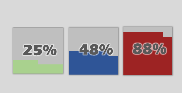
3. Waffle Chart
A waffle chart is more likely a square pie chart. It’s a bunch of 100 small squares where one square represents 1% of the total value. I’m sure you have seen it in dashboards and news article graphics. And, to create it we need to use conditional formatting.
Waffle Chart’s Benefits
- Best for single point target vs. achievement.
- Easy to create and simple to understand by the user.
4. Tornado Chart
When it comes to showing the comparison of different things with each other tornado chart can be useful for you. It looks like a real tornado where large items are on the top and lowest at the bottom. And, each item has an opposite item for comparison.

Tornado Chart’s Benefits
- It can easily compare items for two different time periods.
- Also, figure out the top and bottom items.
5. Gantt Chart
The gantt chart is one of the most useful chart for project managers. It can help us to track the project’s progress. Unlike a milestone chart, a Gantt chart can track completion days, delayed days, days pending, totals days, etc. In short, it’s a complete chart to track your projects with all the important details which everyone requires.

Gantt Chart’s Benefits
- It’s a complete chart with all the details to track a project.
- It makes it easy to take a decision and we can review our project plan regularly in order to locate conflicts or other problems.
6. Bullet Chart
A bullet chart is just like a column chart but instead of multiple columns here we have only one. It can help us to track a single point target vs. achievement. There are three major components of a bullet chart:
- A target marker to represent the target.
- An achievement bar to represent the actual value.
- A comparison range which for the color theme.

Bullet Chart’s Benefits
- Best chart to track a single point target vs. achievement.
- It serves as a replacement for dashboard gauges and meters.
7. Thermometer Chart
A thermometer chart is another useful chart to track a single point target vs. achievement and can help us to present our data understandably. It looks like a thermometer where the entire chart presents the target and filled part is the achievement. The filled part goes up as the achievement increase.
Thermometer Chart’s Benefits
- It’s simple to understand and easy to create.
- It’s a perfect chart to use in dashboards.
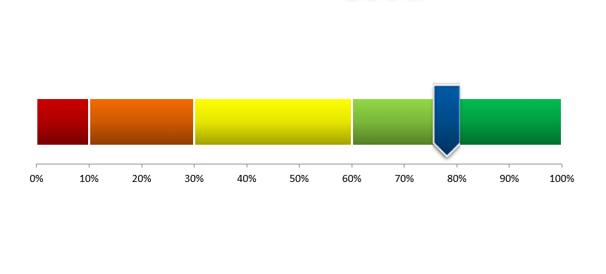
8. Speed-o-Meter
It’s a kind of thing which you can find in your day-to-day life [Just look at the SPEEDOMETER in your car]. It’s also known as a Gauge chart.

Speed-o-Meter’s Benefits
- It can help you to present single point data in your dashboard and KPIs.
- It’s easy to create and simple to understand for users.
9. Population Pyramid
A population chart is a two-sided bar chart that helps us to compare the population of different age groups of genders.
Population Pyramid’s Benefits
- While comparing two items you can easily understand which group is growing.
- We can also use it to compare items for two different time periods.
10. Pictograph
A pictograph is not a separate kind of chart. By creating a pictograph we can use an image in a chart to make it more presentable. Just like we have used an icon in the below chart to present the number of employees in a company in different age groups.
Pictograph’s Benefits
- Using a picture in a chart makes it more meaningful.
- It helps us to take our charting skill to a whole next level.
Conclusion
Advanced charting techniques are one of those things which differentiate Experts from novice Excel users.
As I said by using advanced Excel charts makes your data more focused and easily understandable. You can also use them in your dashboards and templates to make them more effective.
I hope the list of charts which I have shared with you will help you to get better at charting but now you have to tell me one thing.
Do you have another chart that you use frequently in your work?
Share with me in the comment section, I’d love to hear from you, and please don’t forget to share this list with your friends. I’m sure they will appreciate it.
You Must Check Out These
Interactive Charts in Excel | Add a Vertical Line in a Chart in Excel | Add a Horizontal Line in a Chart in Excel | Dynamic Chart Range in Excel | Dynamic Chart Title in Excel | Copy Chart Formatting to Another Excel Chart | Add Secondary Axis in Excel Charts